Logitech Debuts Wave Keys for Mac: Ergonomic Keyboard for Apple Enthusiasts

In an exciting announcement today, Logitech expanded its “Designed for Mac” lineup with the introduction of the Wave Keys for Mac, an ergonomic keyboard crafted to provide comfort and enhance productivity for Mac users. This launch, set to coincide with the release of other Mac-centric peripherals in Logitech’s portfolio, underscores the company’s commitment to creating seamless, user-friendly experiences within the Apple ecosystem.

Designer: Logitech

Ergonomics Meets Mac-Specific Design

The Wave Keys for Mac stands out as Logitech’s first ergonomic keyboard specifically designed for the Mac, adapted from the Wave Keys that launched at the end of last year. Emphasizing comfort and usability, it features a signature wave shape that ensures a natural typing posture. This wavy design positions the hands, wrists, and forearms in an optimal manner, reducing strain and promoting comfortable typing throughout the day.

A key highlight of the Wave Keys for Mac is its cushioned palm rest, which comprises three layers: memory foam, high-density foam, and a knitted fabric covering. This thoughtful design offers 57% more wrist support compared to traditional Logitech keyboards without palm rests, making it an ideal choice for prolonged use.

Compact and Versatile

The compact layout of the Wave Keys for Mac is not only space-saving but also strategically designed to promote a more natural shoulder position while using a mouse. This makes it a practical addition to any desk setup, particularly for those who prioritize ergonomics without compromising on functionality.

Further enhancing its appeal, the keyboard includes easy-to-use +4° tilt legs, allowing users to adjust the keyboard’s angle to their preference for maximum comfort.

Seamless Integration and Personalization

Logitech’s commitment to enhancing user experience is evident in the Wave Keys for Mac’s seamless integration with macOS, iPadOS, and iOS devices. Users can connect up to three Apple devices simultaneously and switch between them effortlessly with the tap of a button. This multi-device capability is complemented by the Logi Options+ app, which enables users to personalize their keyboard shortcuts and optimize their workflow.

The Wave Keys for Mac also boasts an impressive battery life, capable of lasting up to three years on the included AAA batteries, reducing the need for frequent replacements and ensuring consistent performance.

Sustainable Design

In line with Logitech’s dedication to sustainability, the Wave Keys for Mac is made with 48% post-consumer recycled plastic, excluding the plastic in the printed wiring assembly, receiver, and packaging. This eco-friendly approach aligns with Logitech’s broader initiative to reduce the carbon footprint of its products and promote environmentally conscious manufacturing practices.

This launch is part of a broader initiative by Logitech to cater to the needs of Mac users. Alongside the Wave Keys for Mac, Logitech is also introducing other products such as the MX Keys S for Mac, MX Keys S Combo for Mac, MX Anywhere 3S for Mac, and MX Keys Mini for Mac. These additions are designed to enhance productivity, streamline workflows, and ensure ergonomic comfort for Mac users.

Delphine Donné, Vice President and General Manager of Personal Workspace Solutions at Logitech, highlighted the company’s focus on integrating user-centric solutions with the Apple ecosystem while maintaining a strong commitment to sustainability. “With a focus on optimizing workflow, productivity, and comfort, our Designed for Mac portfolio empowers Apple users to unleash their creative potential and enjoy day-long comfort at the desk without sacrificing Mac compatibility and look,” said Donné.

The Wave Keys for Mac will be available for purchase in May 2024 at a price of $59.99.

The post Logitech Debuts Wave Keys for Mac: Ergonomic Keyboard for Apple Enthusiasts first appeared on Yanko Design.

DIY Macintosh Studio is an ingenious dock for the iPad mini and Mac Studio

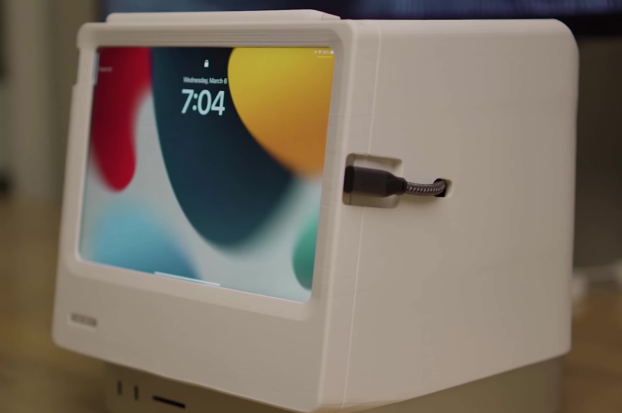
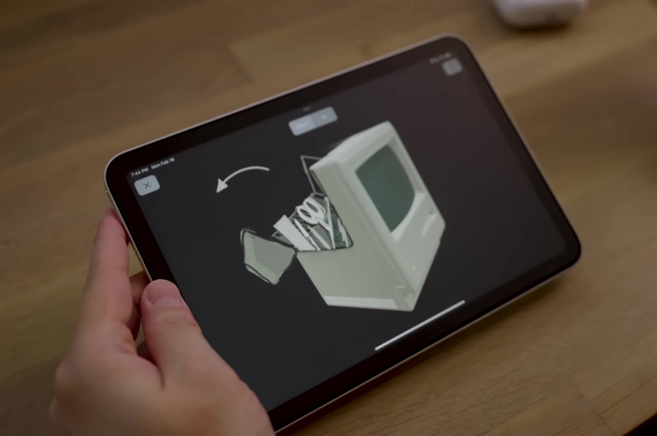
They say necessity is the mother of invention, so it’s probably not surprising that some of the best and sometimes even outrageous designs were born out of someone’s itch, as they call it. Take for example this rather interesting DIY project that gives a home for an iPad mini and hides the Mac Studio in plain sight. While there’s no shortage of products that address those needs separately, this creative solution manages to combine both in an inspired way, paying homage to the product that catapulted Apple to fame 40 years ago: the venerable original Macintosh. Of course, it isn’t just a superficial nostalgia trip, but one that also harnesses some of the best features of Apple’s product design today.

Designer: Scott Yu-Jan

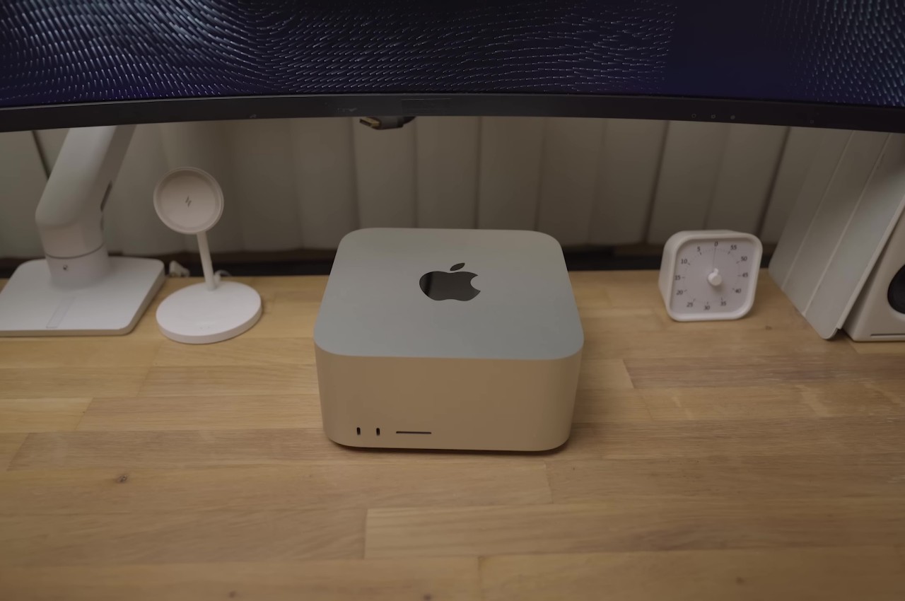
Although it’s patterned after the Mac mini, the powerful Mac Studio is exponentially taller, and its presence can’t be ignored when you place it under a monitor. On the other side of the fence sits the lightweight and compact iPad mini, which has gained a lot of features that almost make it suitable as a desktop device. These two products come from very different lines but share the same family spirit. Putting them together might sound superficial, but this 3D-printed modular case manages to pull it off so tastefully.

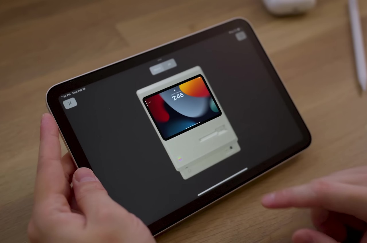
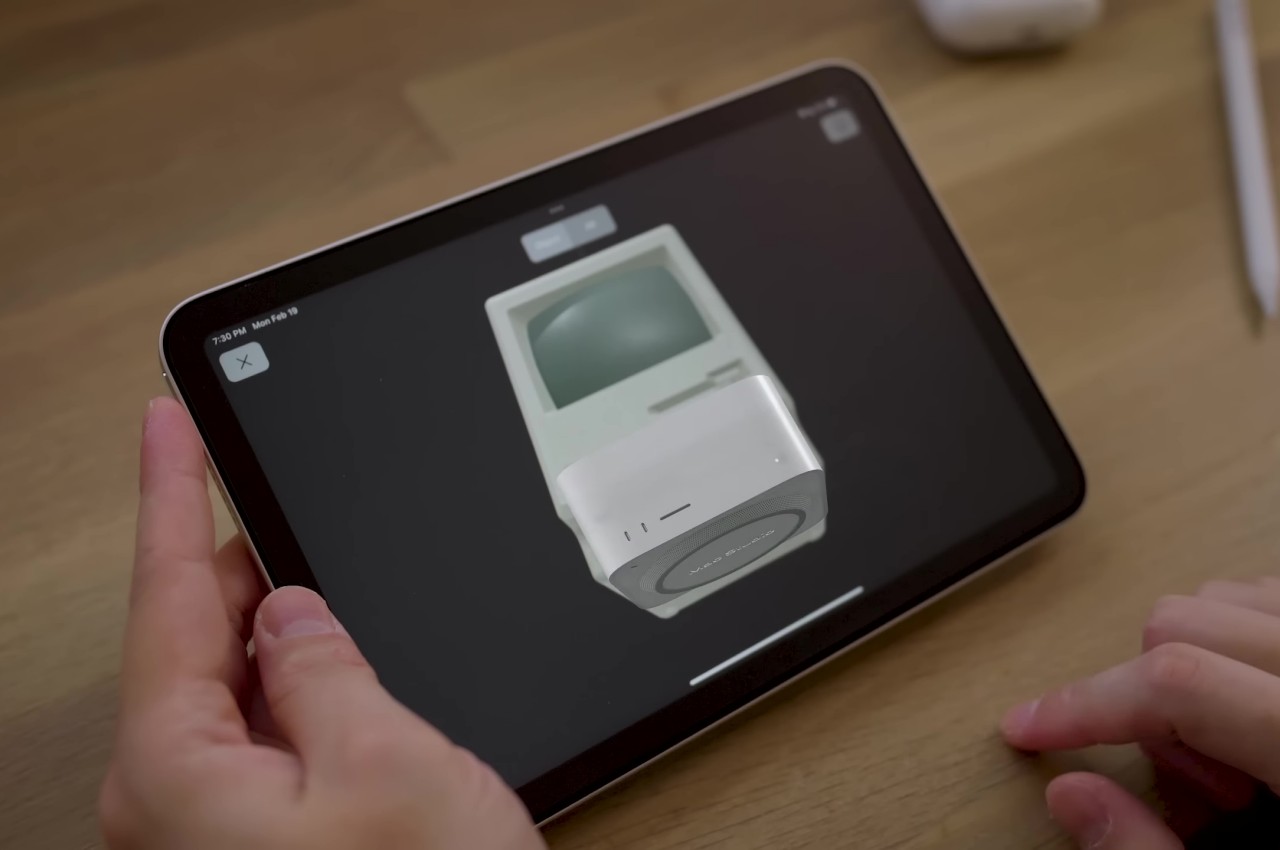
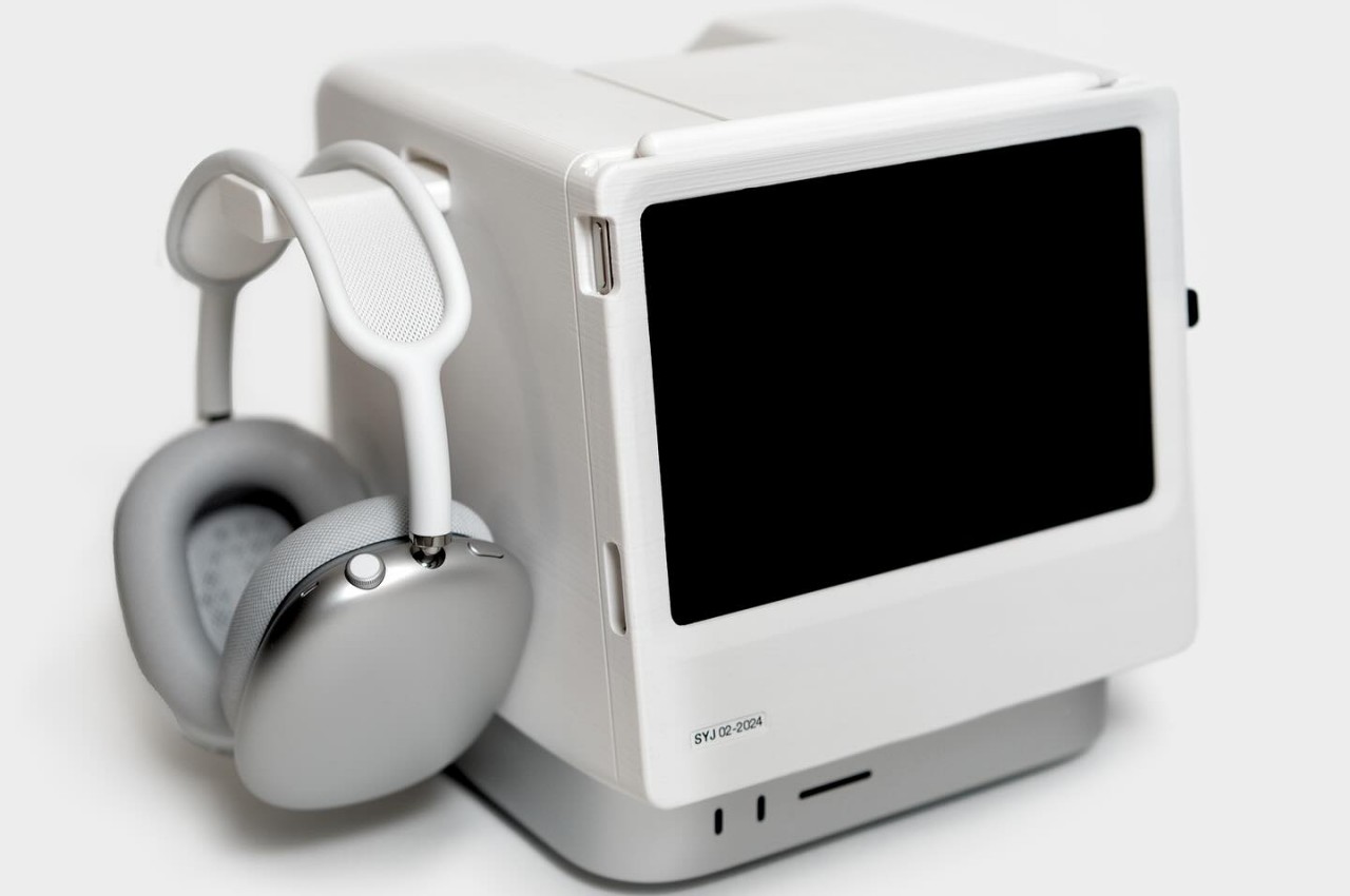
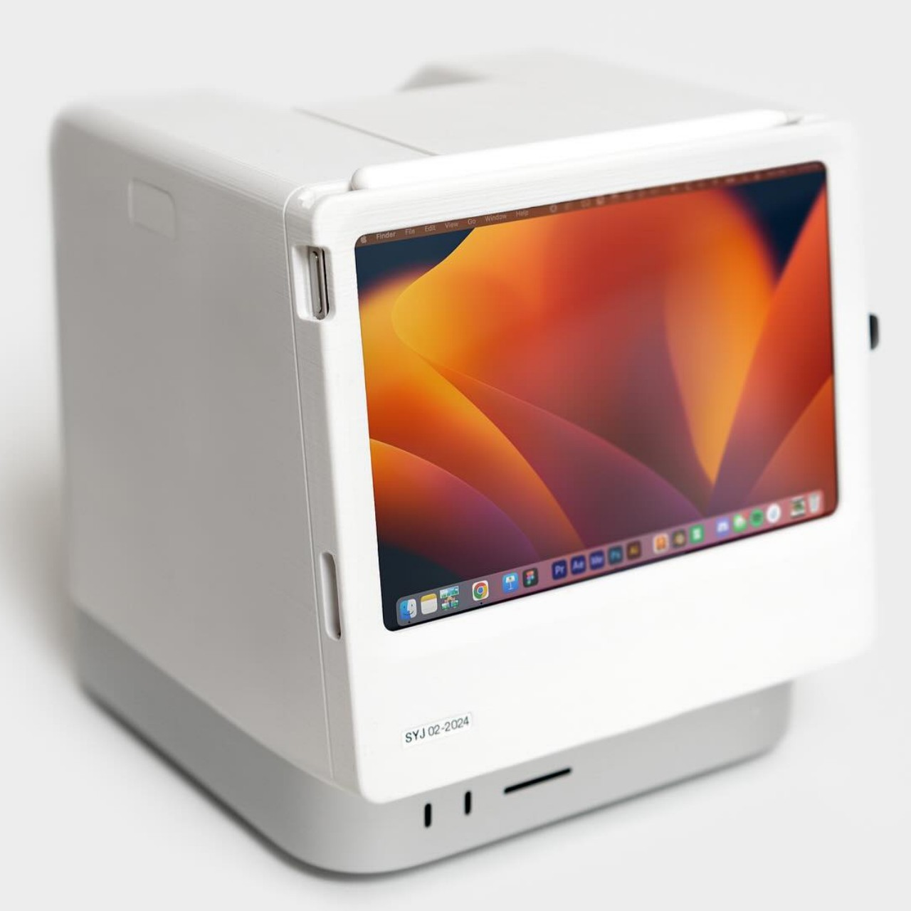
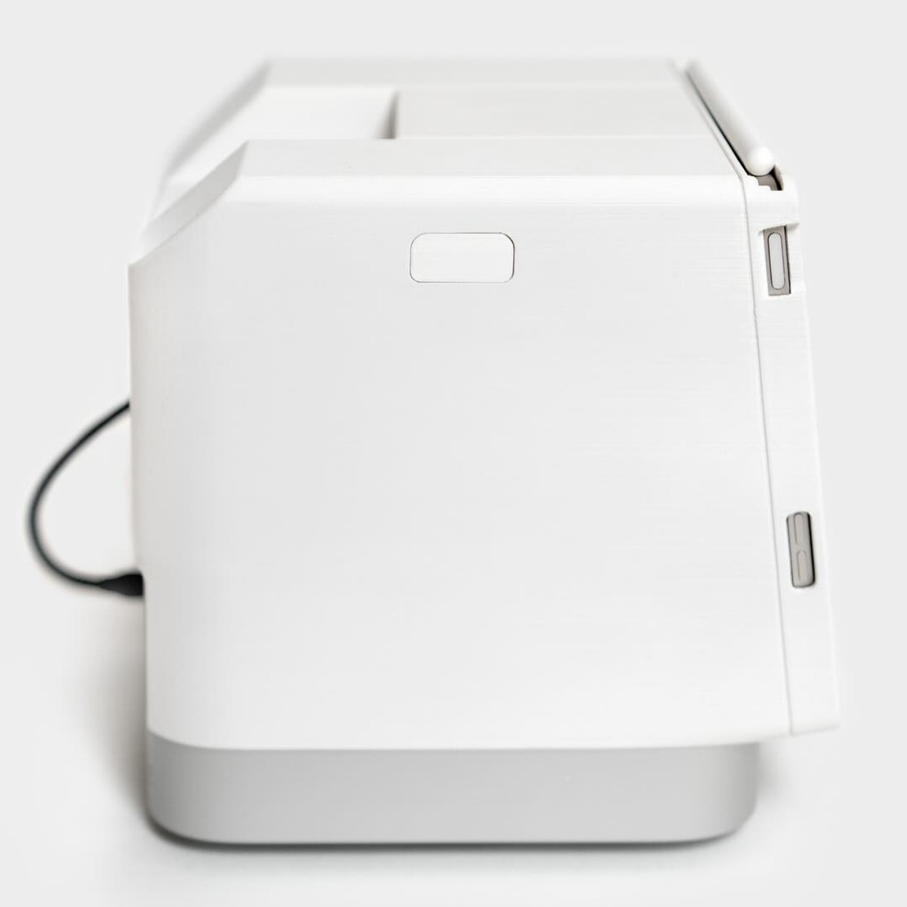
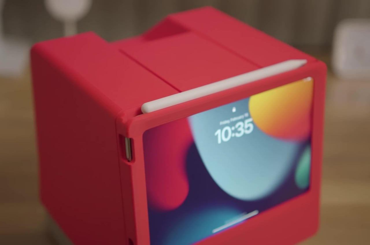
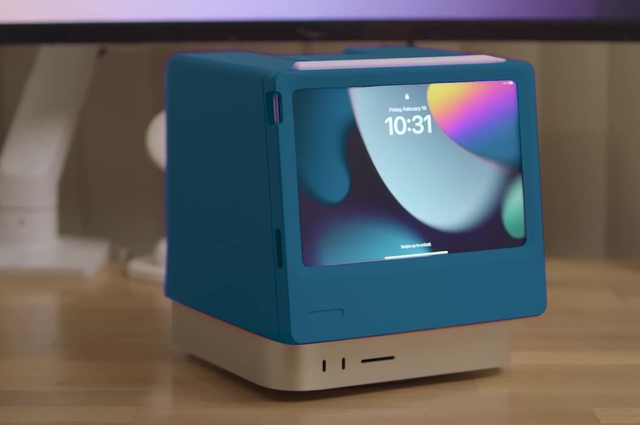
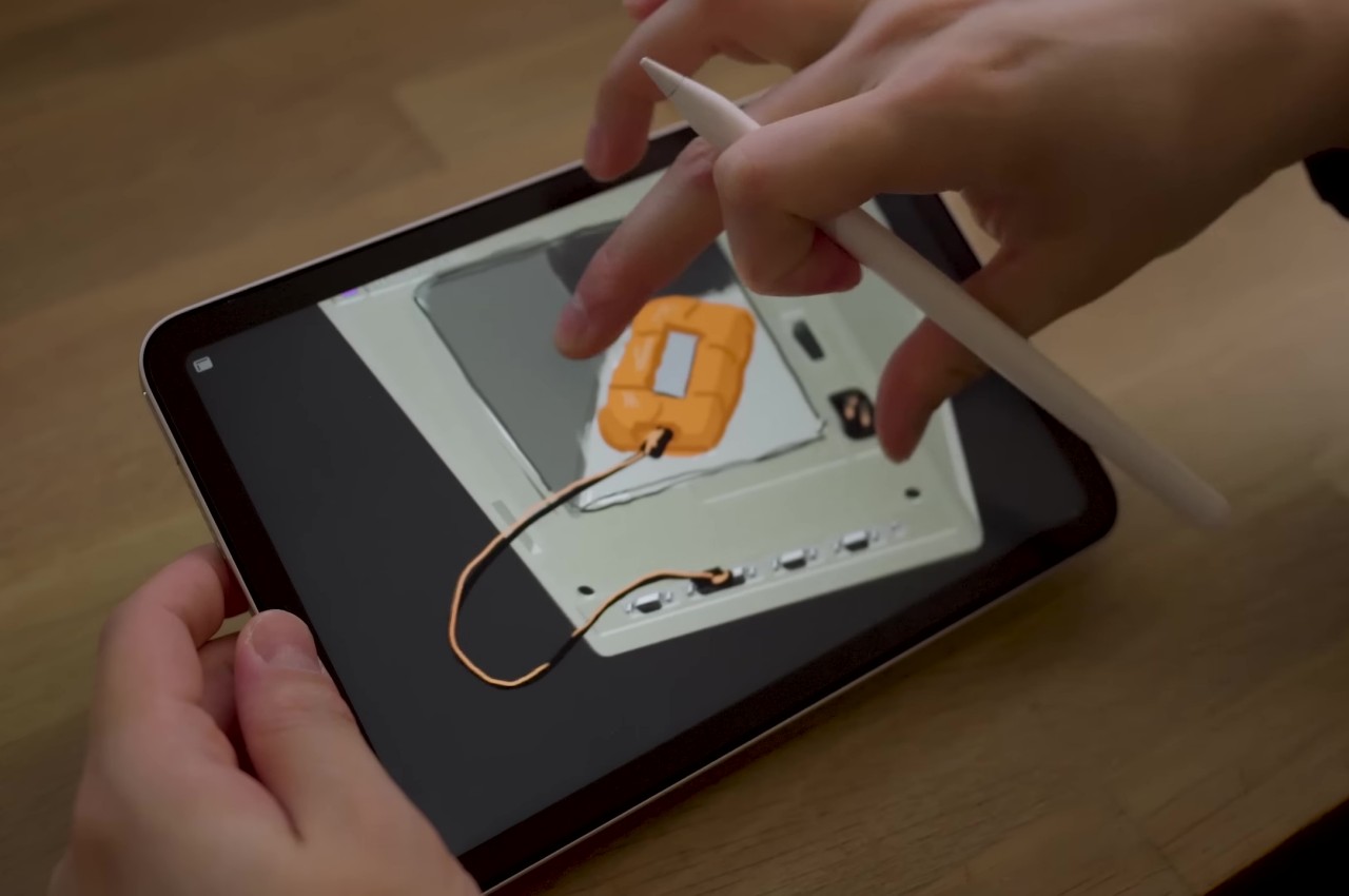
Dubbed the Macintosh Studio, the enclosure sits on top of and snugly hugs most of the Mac Studio, leaving only the ports near the bottom unrestricted. The front of the contraption has a slot for the iPad mini to slide in securely and connect to the Mac Mini via a single USB-C cable. This way, the iPad mini is always charged and ready to go when you need it, while also serving as a second screen for the Mac Studio thanks to Apple Sidecar. This gives both devices a customized home without removing anything from their functionality. You can even draw on the iPad quickly, though the position and angle of the screen won’t be ideal for working on art and designs.

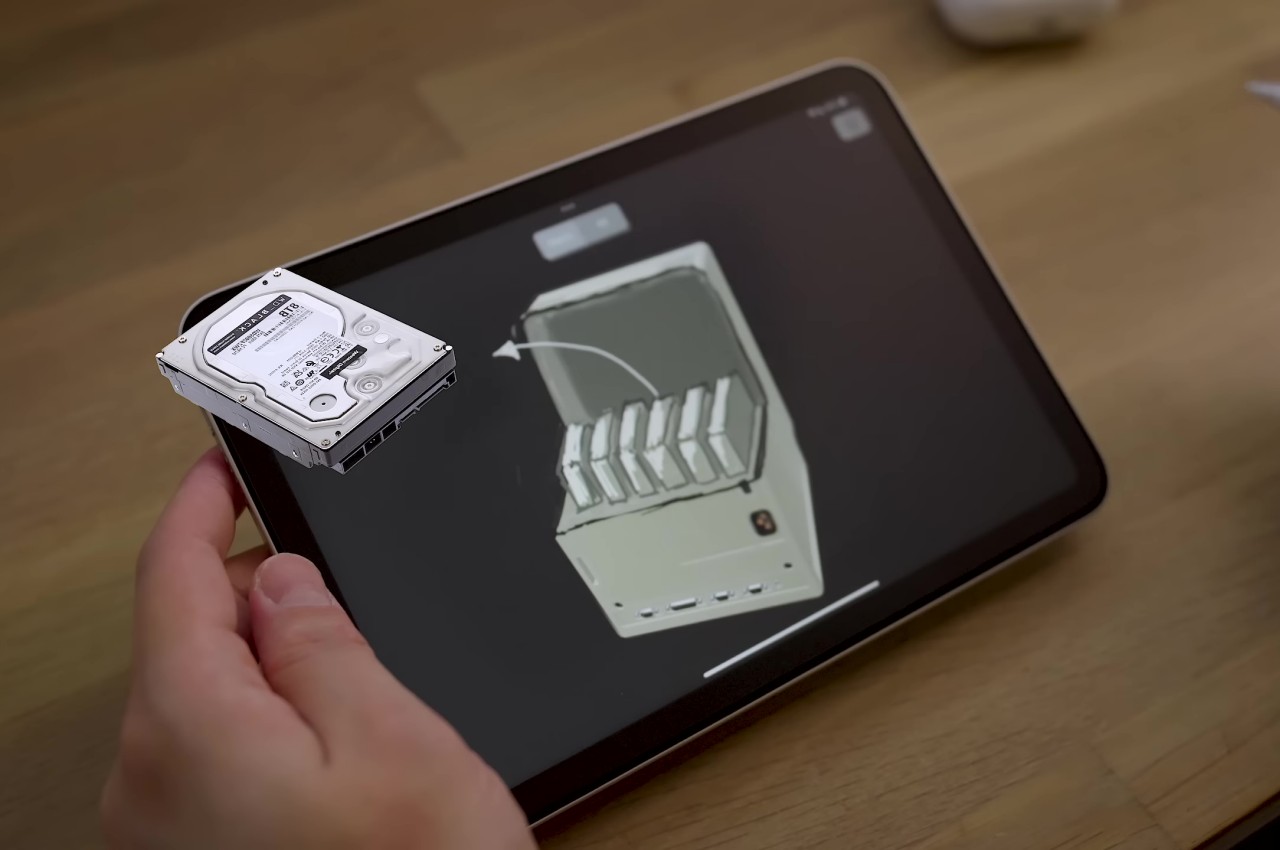
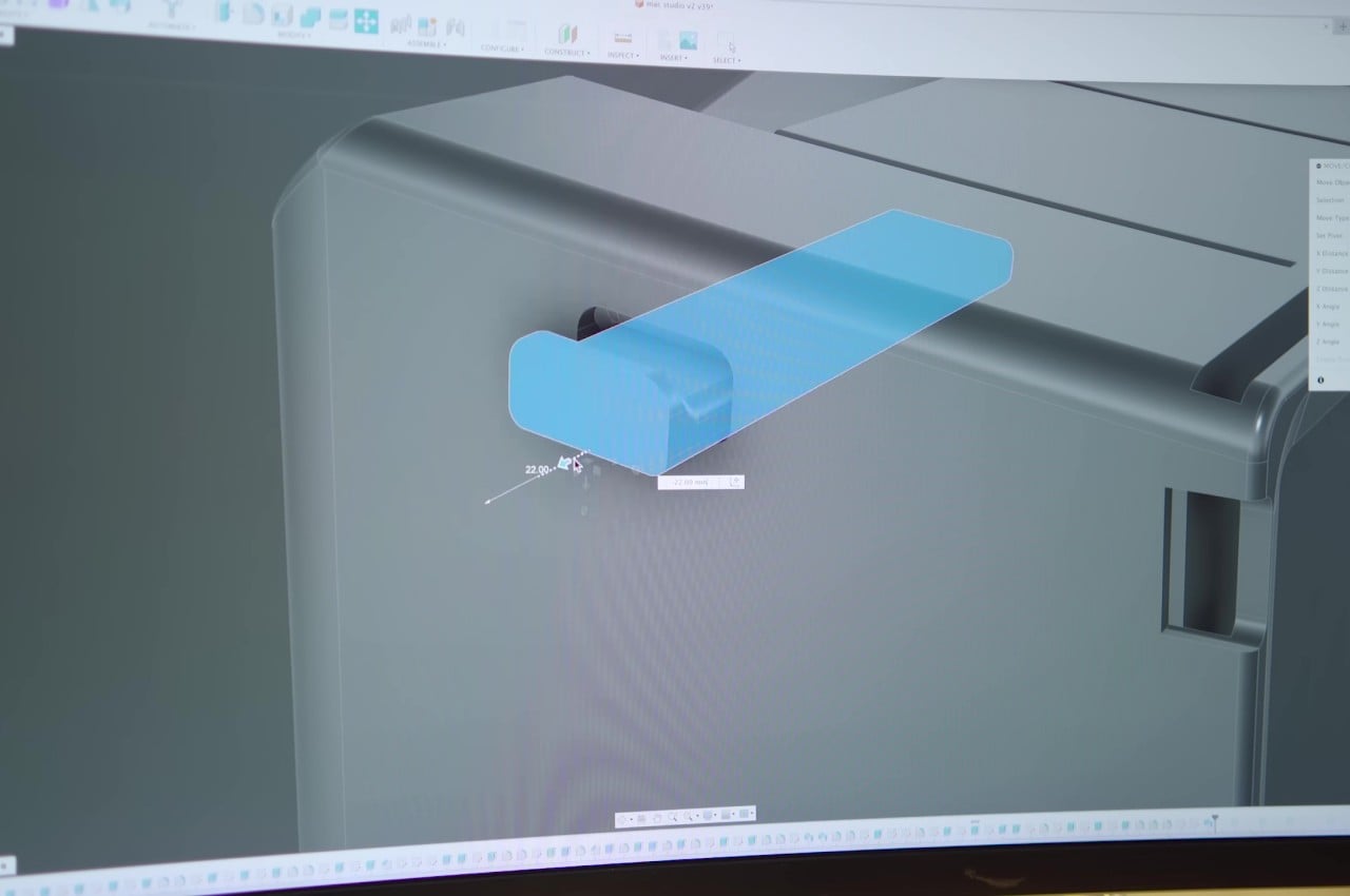
The Macintosh Studio design doesn’t just copy the original Macintosh’s form but manages to insert a few modern conveniences to take advantage of all the unused space at the back. There’s a retractable headphone hook at the top, for example, as well as interchangeable drawers for a single portable hard drive or a stack of SSDs. There are other possible designs, but these two, in particular, add value to the experience while still staying within reasonable limits.

Given that it’s simply a 3D-printed enclosure, there’s plenty of flexibility when it comes to the color of the Macintosh Studio. A variety of hues could make it look like a hybrid of the Macintosh and the colorful iMacs, adding a bit of life to what is normally a plain and drab silver aesthetic. All in all, the design is quite ingenious in how it manages to solve two rather different problems while still preserving the individual values of each product.

The post DIY Macintosh Studio is an ingenious dock for the iPad mini and Mac Studio first appeared on Yanko Design.

Celebrating 40 Years of the Apple Macintosh: A Beacon of Human-Centric Design

As we celebrate the 40th anniversary of the Apple Macintosh, we reflect on how this technology has transformed our lives. The Macintosh changed how we interact with computers and redefined our relationship with technology. In 1984, Apple introduced the Macintosh, a computer that put the future at our fingertips. It embraced the philosophy of human-centric design long before it became a popular term in design circles.

Designer: Apple Computer, Inc.

Its graphical user interface (GUI) was a significant departure from the cumbersome command-line interfaces of the time. Using icons, windows, and a friendly desktop metaphor made technology accessible and approachable. This leap was not solely about technology but also about how humans interact with it.

On January 24, 1984, Steve Jobs famously unveiled the first Macintosh by dramatically pulling it out of a bag. The personal computer boasted a 9-inch black and white display powered by an 8MHz Motorola processor and 128KB of RAM. In classic Steve Jobs style, he then produced a 3.5-inch floppy drive and inserted it into the computer, much to the delight of Apple shareholders. Jobs had famously said, “We want to put an incredibly great computer in a book that you can carry around with you and learn how to use in 20 minutes.” At its launch, the original Macintosh cost $2,495.

Design Aesthetics: More Than a Machine

The all-in-one design of the Macintosh broke the mold. Its compact, boxy frame, complete with a built-in 9-inch screen, was an object of desire – sleek, stylish, and something you wouldn’t mind having on your desk. Looking back, it was more than a machine; where multiple layers of innovation and thoughtful design choices distinguish it from anything else of its time, it was a piece of art that complemented the user’s space.

The Macintosh computer differed from the early personal computers as it didn’t have a bulky, segmented design with separate units for the monitor, CPU, and keyboard. Instead, it had a compact, all-in-one design. This unique design of integrating the monitor and computer into a single unit was not only space-efficient but also symbolically significant. It represented a unified, holistic approach to computing, aligning with the philosophy that technology should seamlessly integrate into people’s lives without complicating them.

The friendly beige plastic casing, rounded edges, and compact size make it appear warm and approachable. The designers wanted to communicate that technology can be pleasant and welcoming rather than intimidating and alienating. Steve Jobs, known for his attention to detail regarding aesthetics, believed that good design was integral to the user experience. He famously said, “Design is not just what it looks and feels like. Design is how it works.” He believed good design, not just a superficial veneer, was essential to make things look good.

Did you know that the Macintosh had some fantastic design elements? One of the most unique features was the handle on the computer’s top. Not only was it functional, but it also represented portability and personal ownership. It made you feel like the Macintosh was your personal computer, one you could take charge of and create your own. This feature reflected a shift in how we see computers, from impersonal corporate machines to personal tools for creativity and expression.

The Macintosh’s 9-inch screen may seem tiny now, but it was a big deal in the day. It’s what made the Mac look so cool and funky. The cool thing about it was that it showed graphics and text in a way that had never been seen before. It was like a window into the heart of the Macintosh, showing everyone what made it unique and innovative.


Bridging Human and Machine: The Mighty Mouse – A Closer Look

When Apple Macintosh introduced the mouse, it wasn’t just another peripheral device. It changed the way we interact with machines. This tiny device played a massive role in connecting the digital world with its users. It transformed the personal computer from a specialized tool to an accessible and creative medium.

The mouse, tailored for the human hand, turned physical gestures into digital actions. Its design was simple yet effective – a small, palm-sized device with a single button, embodying the principle of simplicity and ease of use. This approachability was crucial. It invited users who might have been intimidated by the complexity of computers to explore this new world. Steve Jobs, ever the proponent of intuitive design, understood this connection, emphasizing, “We made the buttons on the screen look so good you’ll want to lick them.” The mouse was an extension of this philosophy, making the digital environment tangible and inviting.

Before the Macintosh, interacting with computers mainly involved typing commands – an efficient method for experts but alienating for novices. The mouse changed that, making computing a more intuitive, point-and-click experience. This change was akin to learning a new language where actions and commands became visual and direct. The mouse demystified the computer, aligning its use more closely with natural human behavior and less with the need to learn complex command languages.

The mouse was integral to the success and functionality of the Macintosh’s GUI. It allowed users to navigate the interface easily, interact with icons, open windows, and use menus. This ease of navigation made the computer’s advanced capabilities accessible to a broader audience, fostering a more inclusive digital culture. The mouse and GUI combination was a powerful duo that set the standard for future user interfaces, influencing the design of operating systems and software for decades. Applications became more visually oriented, focusing on ease of use and accessibility. Programs like MacPaint and MacWrite showcased what was possible with this new form of interaction, allowing users to create graphics and documents in previously unimaginable ways on a personal computer.

Over the years, the mouse has evolved, gaining more buttons, adopting new technologies like laser tracking and wireless connectivity, and even transforming into touchpads and touchscreens in modern devices. However, the core principle remains: technology should adapt to human needs, not vice versa.

In celebrating the 40th anniversary of the Macintosh, the significance of the mouse in bridging humans and machines cannot be overstated. It was a bold step towards making technology more personal, intuitive, and human. The Macintosh’s mouse was a harbinger of a future where technology becomes an extension of ourselves, seamlessly integrated into our daily lives, facilitating creativity, productivity, and exploration in the digital realm.

Echoing Steve Jobs’s vision, he said, “It’s in Apple’s DNA that technology alone is not enough — it’s technology married with liberal arts, married with the humanities, that yields us the result that makes our heart sing.”

The Macintosh made our hearts sing then, and forty years on, its legacy continues to inspire.

The post Celebrating 40 Years of the Apple Macintosh: A Beacon of Human-Centric Design first appeared on Yanko Design.
This retro gaming console is actually a mini PC disguised as a classic Macintosh

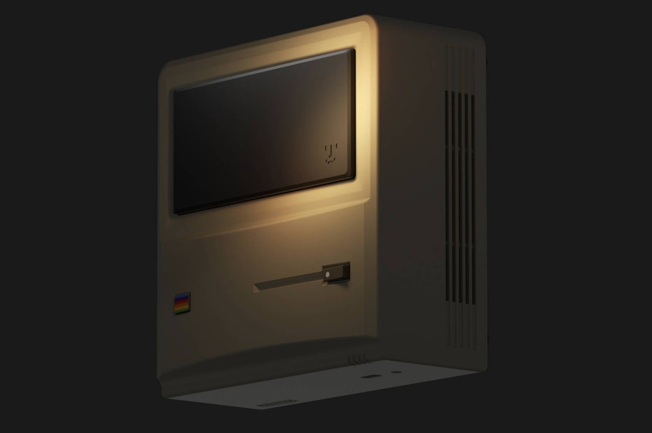
Nostalgia is a very powerful emotion, especially judging by the number of successful “retro” products sold in the market in the past years. Although the flood has seemingly trickled down a bit, it continues to flow especially in the gaming scene. Old gaming brands have suddenly resurfaced to bring nearly forgotten designs to the present, taking previous generations down memory lane while introducing today’s gamers to old-school experiences. While some of these retro consoles actually try to relive the past, this interesting and rather cute box might take your head for a spin with its Mac design and PC internals, combined to offer not just a gaming computer but a piece of desk decoration as well.

Designer: AYANEO

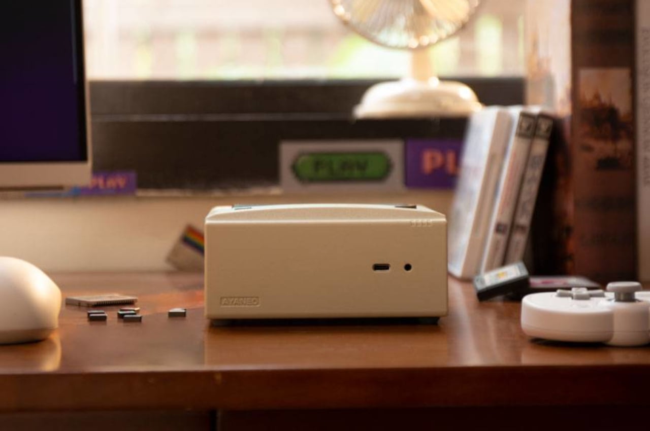
Compared to the computers put out by the likes of Atari and Commodore, the early PCs didn’t really have a memorable design that would go down in history as iconic computers. It was the original Apple Macintosh, instead, that captured people’s attention and imagination of what a home personal computer should look like. Of course, that was decades in the past, but the imagery has stood the test of time as proof of the design’s timeless character. AYANEO, a brand better known for gaming handhelds, is now taking that immensely popular design and giving it a rather curious twist.

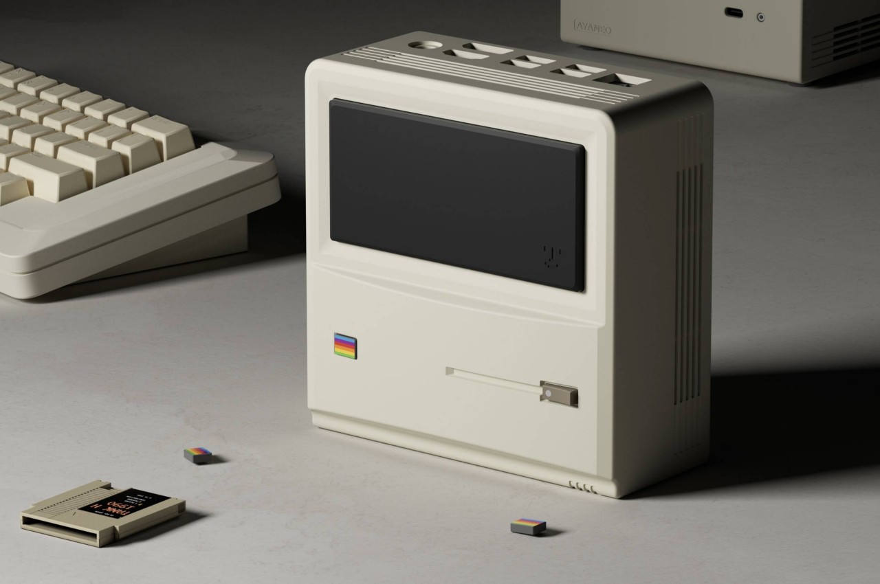
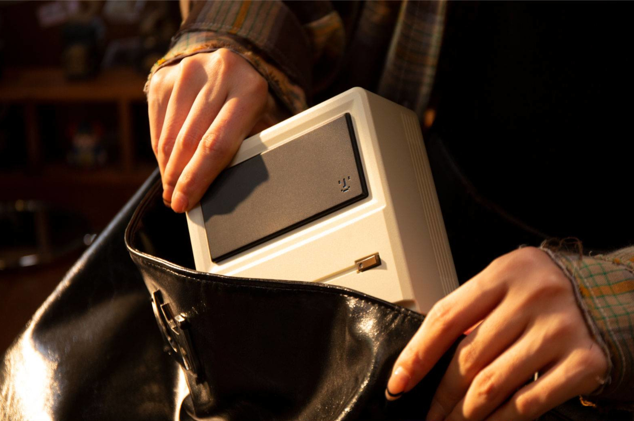
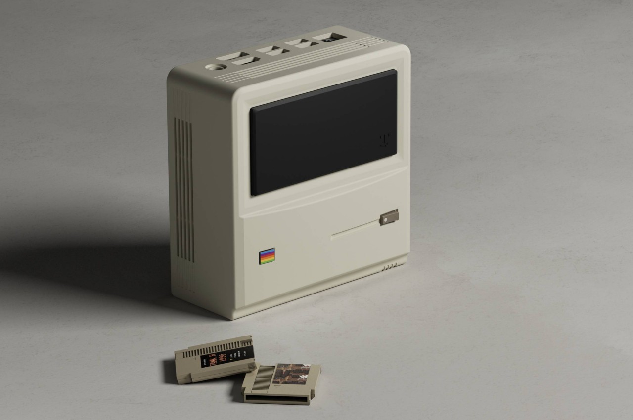
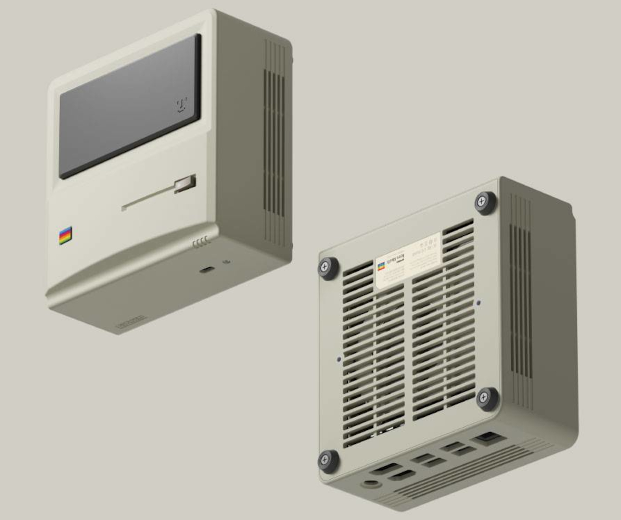
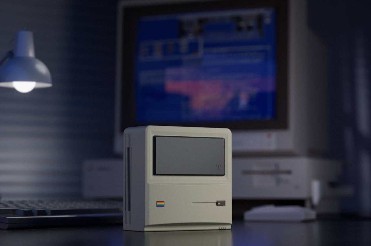
As part of its AYANEO REMAKE concept line, the AYANEO Retro Mini PC AM01 slaps the old Mac design onto a new machine. The basic elements that have distinguished one of Apple’s earliest successes are there, tweaked a bit to avoid potential controversies, of course. There’s the telltale sign of a floppy drive, as well as a square rainbow badge that’s a nod to the old Apple logo. There’s a black rectangle near the top that’s purely cosmetic, denoting where the screen is supposed to be located. There’s nothing there, though, which is a bit of a waste, but it doesn’t really matter considering how the mini PC is used.

Unlike the Mac, the AYANEO Retro Mini PC is meant to lie down on its “back” rather than standing up, with that black rectangle in the rear. That’s because the ports for the computer are actually located on what would have been the top and bottom sides, so it has to be horizontal to actually be useful. Of course, this product is a gaming console anyway, not a standalone computer with a built-in display, so you’ll need to plug in peripherals to make it work. And yes, it runs Windows 11, which, given the eternal rivalry between Macs and PCs, some might find a bit insulting.

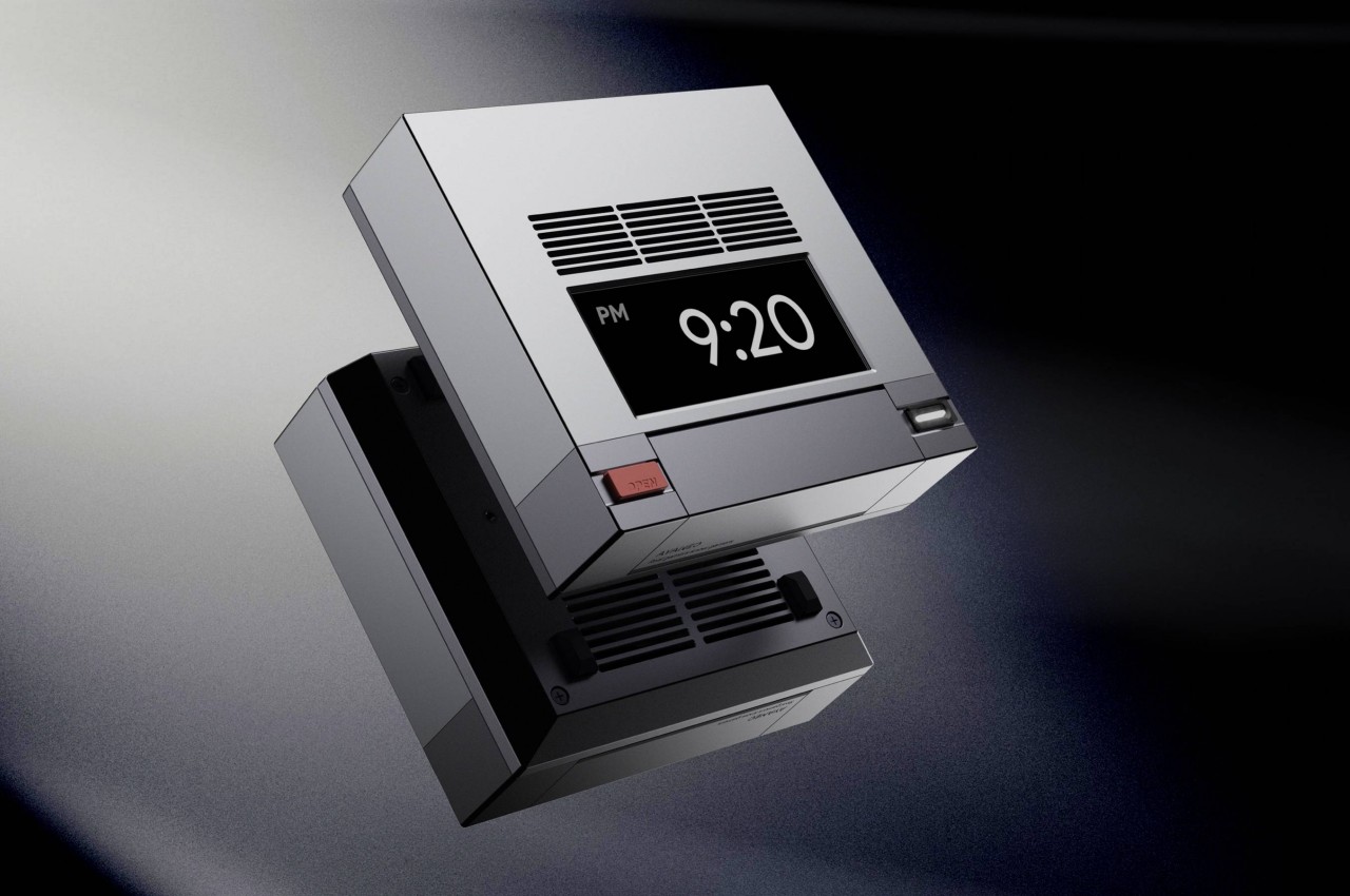
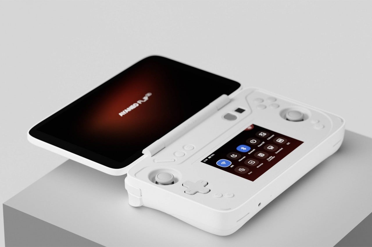
AYANEO has other retro designs also in the pipeline, including the Retro Mini PC AM02 that takes after the classic NES design. Curiously, that one does have a functional mini display since it can actually be used upright. It’s also working on a handheld that brings back the dual-display design of the not-so-old Nintendo DS, though the practical purpose of that second display is yet to be revealed.

The post This retro gaming console is actually a mini PC disguised as a classic Macintosh first appeared on Yanko Design.
This adorable miniature Macintosh is actually an innovative multi-functional docking station

Laptops have become so powerful that they’ve started to rival some desktops, except for the part that they’re forever limited in how many devices you can attach to them. At most, you’ll probably have five to seven, depending on how thin the laptop tries to be. It’s not really unusual for many owners to expand their portable computer’s capabilities using hubs and docks, especially now with the use of USB-C and the related Thunderbolt technologies almost everywhere. These accessories, small as they may be, still take up space on your desk and can be a source of distraction. So why not put an eye-catching and enviable design on that dock, turning it into a unique homage to the original Apple Macintosh, one of if not the first to blaze a trail for personal computing.

Designer: RayCue

Click Here to Buy Now: $169 $249 (32% off). Hurry, for a limited time only! Raised over $145,000.

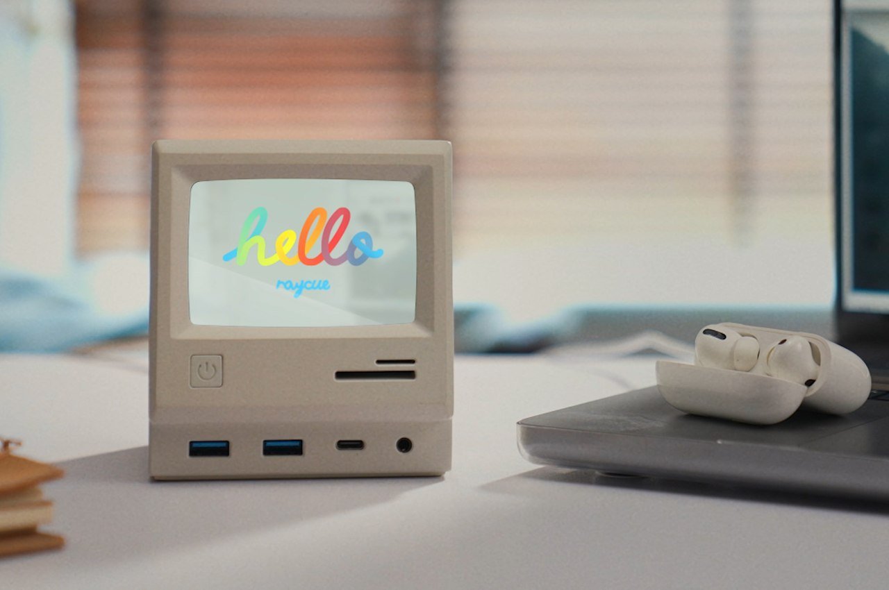
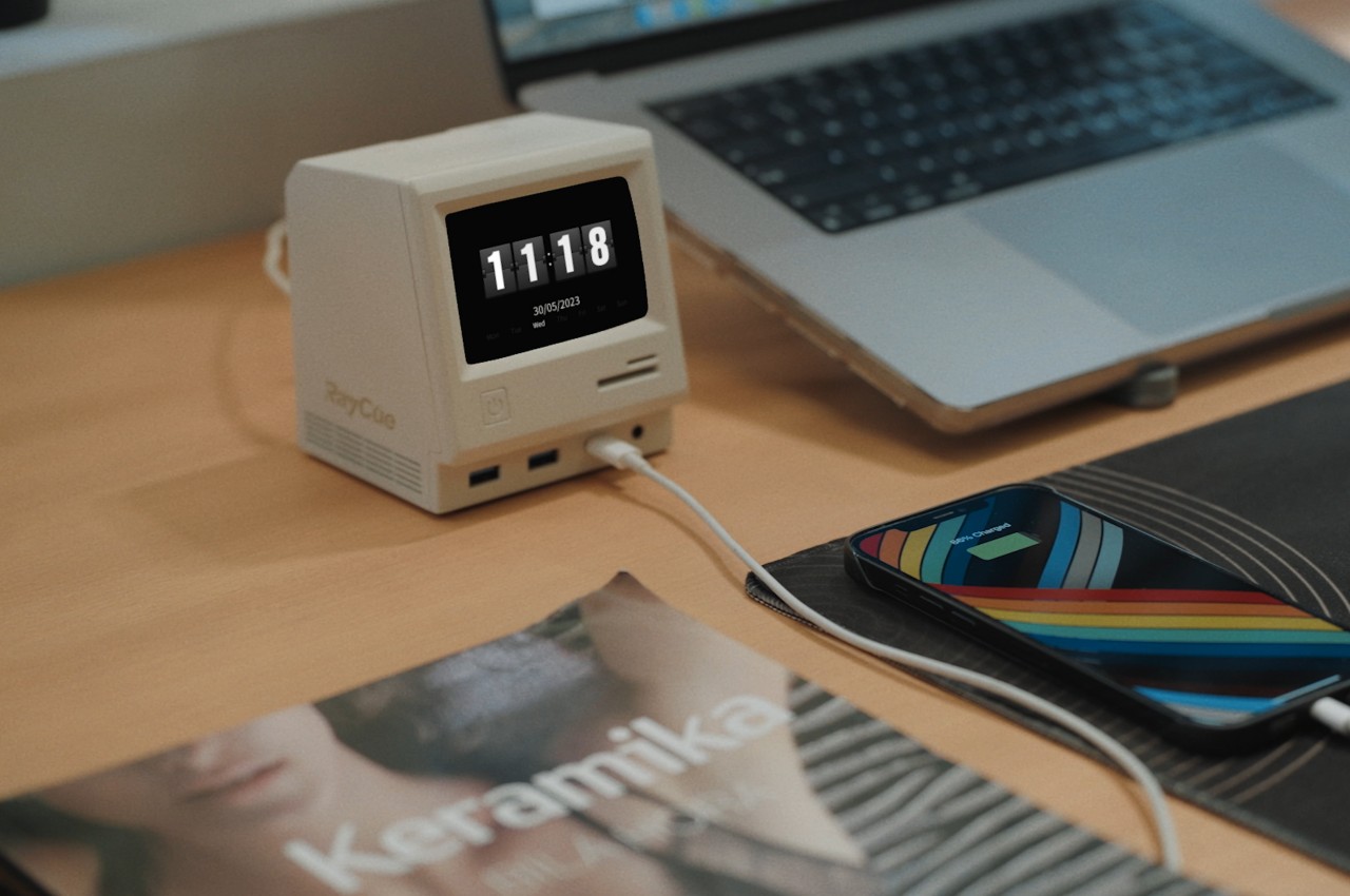
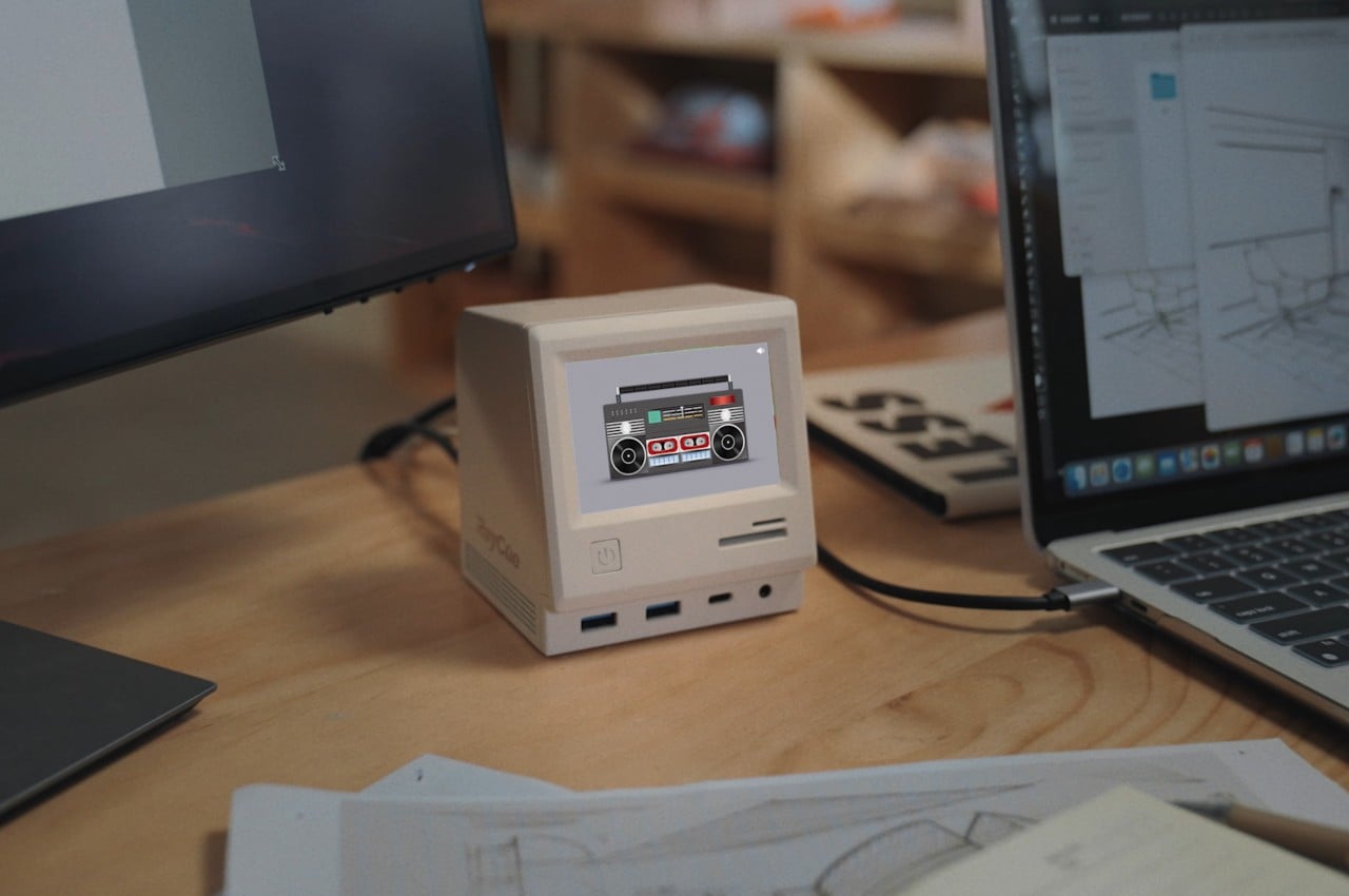
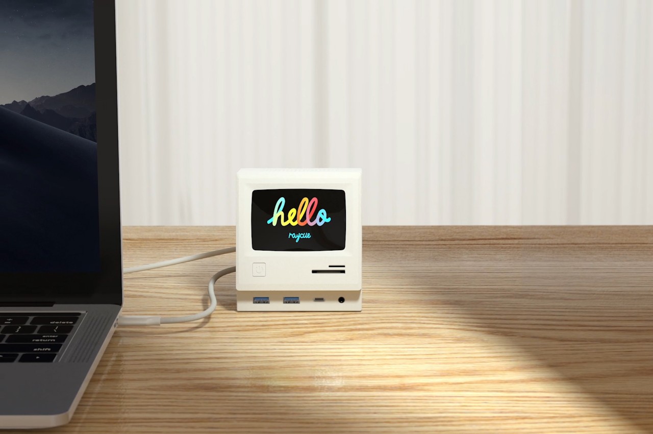
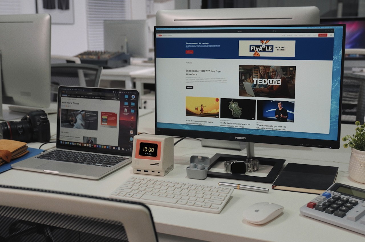
You’d be forgiven for mistaking this docking station as a fancy desktop toy, given how cute and attractive it is. The RayCue 128K is basically inspired by the design of the pioneering Macintosh from 1984, from its chunky and boxy design to its off-white paint job. There’s even a keyboard-like partner that uses the same motif to complete the faithful recreation. That design alone already makes it a worthy addition to your desk, bringing life and fun to your work, but it’s more than just a piece of eye candy. It is, after all, a docking station, but it goes above and beyond the call of duty compared to your standard docks.

The RayCue 128K Pro, for example, boasts 14 ports of different kinds, including three different types of USB ports, SD/TF card readers, an Ethernet port, a 3.5mm headphone jack, and not one, not even two, but three 4K 60Hz HDMI ports. As if that number wasn’t already impressive, these video out ports support DisplayLink Apple MST (multi-stream transport), making it possible to connect that many extra monitors to your MacBook. With a powerful DC-in capable of accepting up to 130W of power, the RayCue 128K can charge not only your laptop but also other devices for a total of 100W of output.

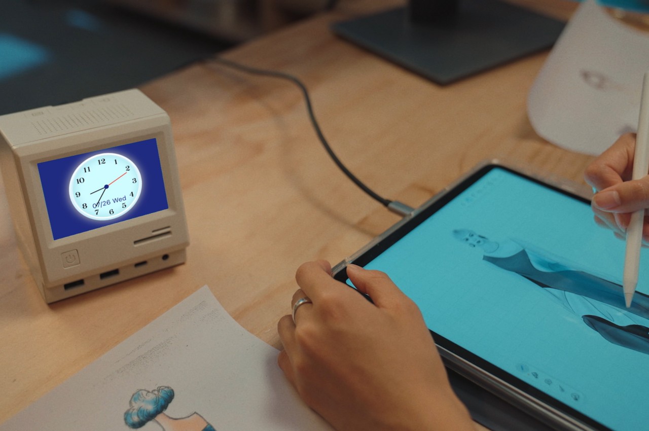
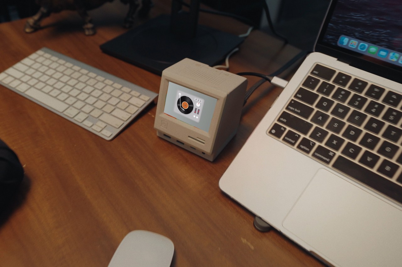
But as they say on TV, “there’s more!” The screen on the RayCue 128K isn’t just for show and is, in fact, a 3.5-inch IPS color screen that can display the time, calendar, media information, and even photos, turning the dock into a true decorative accessory to enhance your working experience. It doesn’t end there either, since the box also hides a Bluetooth Speaker, making it a jukebox to help keep your focus. It’s going to keep you entertained and productive and might even turn you into the envy of your friends.

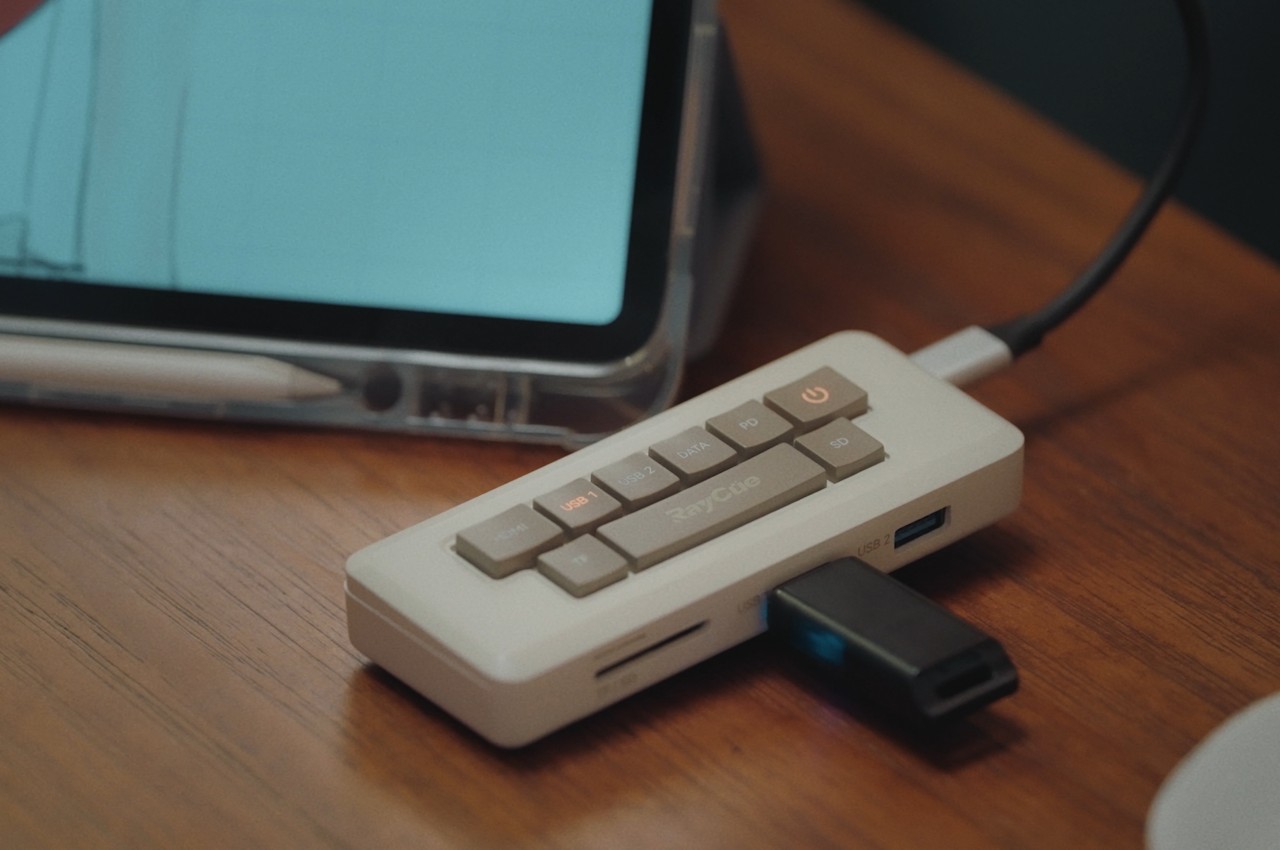
Given how it works, you can’t really take the RayCue 128K with you wherever you go. That’s where the RayCue 128K Pocket comes in, a portable 7-in-1 hub that comes in the form of a miniature Macintosh keyboard. It might not have all the bells and whistles of the Pro dock, but it still has plenty to offer, including a 4K 60Hz HDMI port and card readers. If you’re going to put a docking station on your desk, you might as well put something that offers the best impact and experience. With the RayCue 128K Pro and Pocket, not only are you getting a powerful dock and hub, you’re also getting an adorable yet functional decoration that gives a nod to the personal computer that started it all.

The post This adorable miniature Macintosh is actually an innovative multi-functional docking station first appeared on Yanko Design.
Shargeek’s tiny 35W GaN fast charger is an adorable retro throwback for all Apple fans!

Looking for a good fast charger for your iPhone? Shargeek just designed the perfect one!

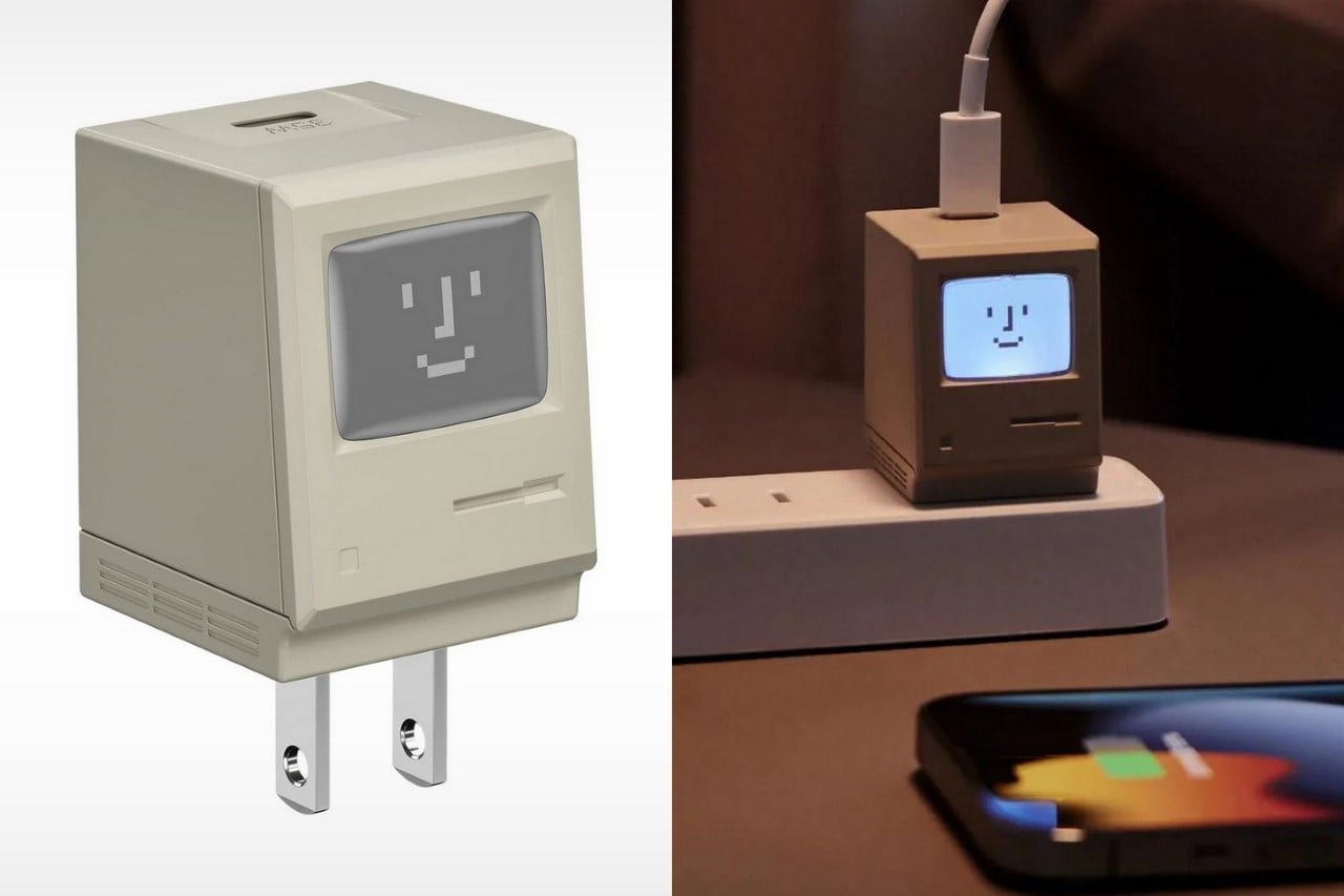
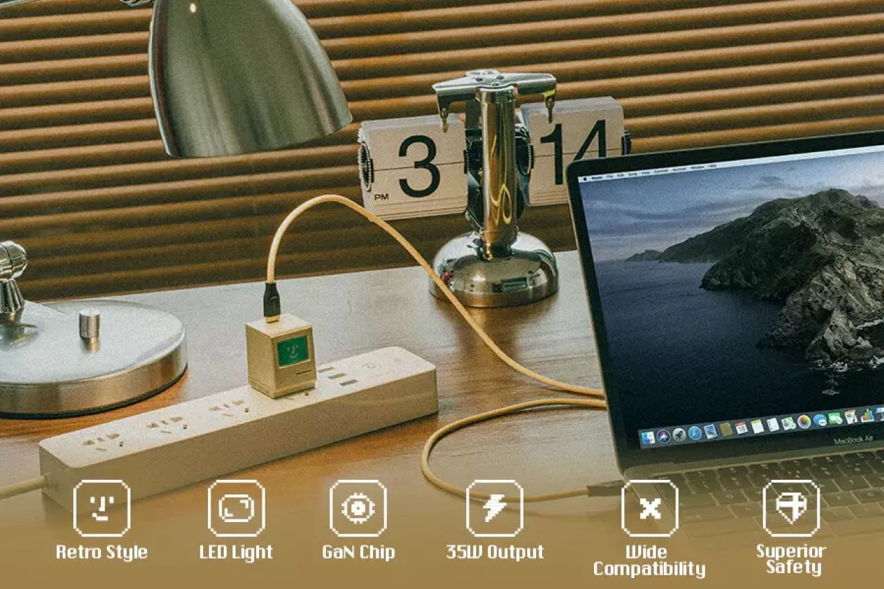
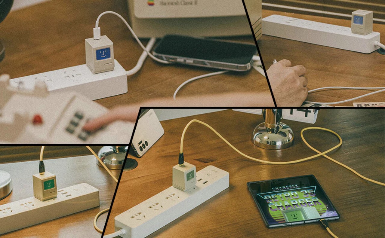
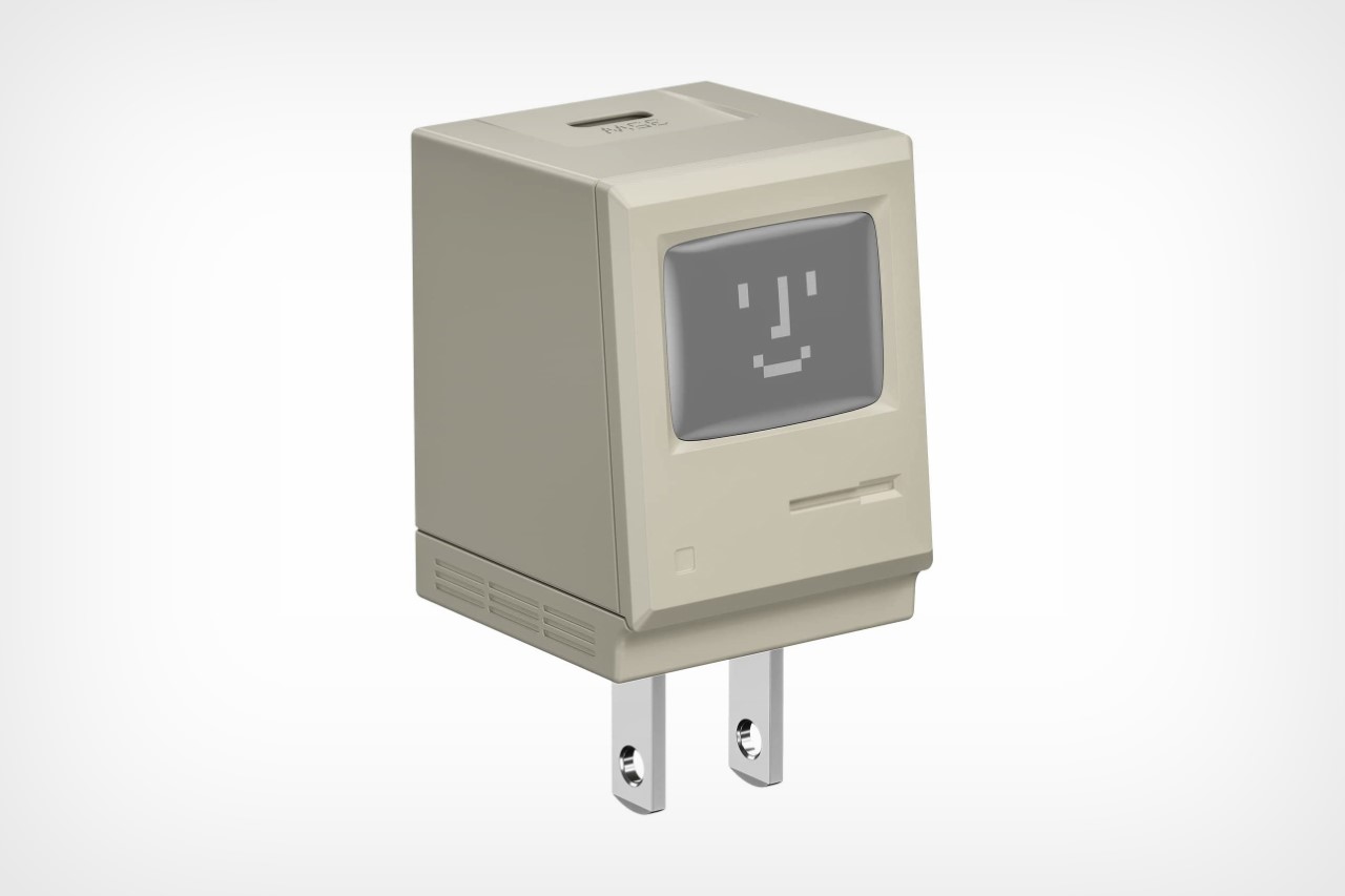
Now the Retro 35W GaN Charger from Shargeek isn’t as impressive as is much more popular transparent cyberpunk-inspired power bank, but it has a different sort of appeal that most tech nerds will instantly fall in love with. The charging brick models itself on the original Macintosh computer, complete with the MacOS ‘smiling’ logo displayed on the tiny computer’s screen. Built with a GaN semiconductor on the inside, the tiny charger comes with a max output of 35W, which is enough to fast-charge your iPhone or any other device. Plug it in and not only does it charge your device, but the Mac’s screen comes to life too, lighting up in various colors to let you know your device’s charging status!

Designer: Shargeek

Click Here to Buy Now

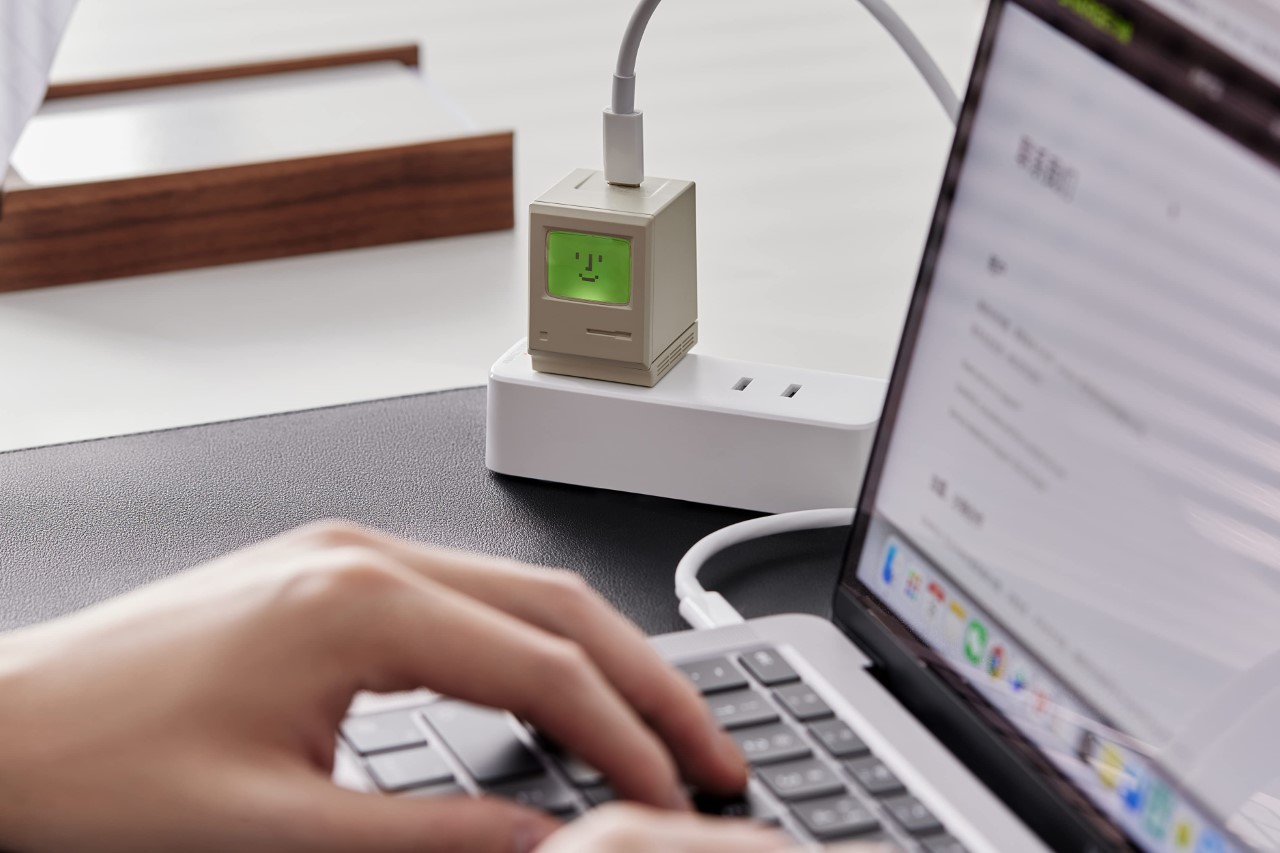
The highlight of this tiny charger is its design. Created as a perfect tribute to the Macintosh and also a rather funny juxtaposition of an old-tech exterior but a state-of-the-art GaN interior, the charging brick sits on your plug socket or extension board, smiling at you while delivering juice to your devices. The smiling screen also comes with its own LED backlight which just feels like an incredibly joy-giving experience on its own. Plug your charger in and the backlight lets you know the charging status. A white light means ‘not charging’, while yellow, blue, and green lights range between normal to fast, and finally ‘super’ charging.

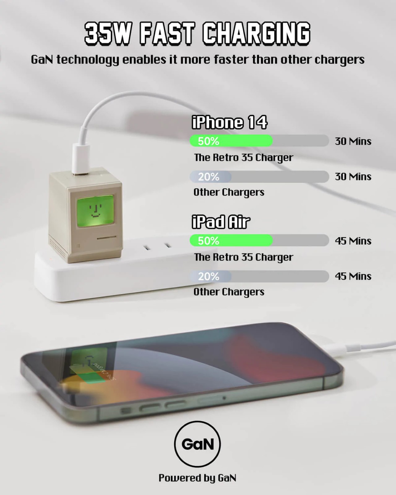
As adorably tiny as it looks, the Mac-shaped charger packs a punch. Powered by GaN Ⅲ technology, the charger delivers up to 35W of power in its tiny avatar, charging devices like your phone, tablet, TWS earbuds, drone, handheld gaming console, and even your laptop. Its ability to deliver high wattage to your devices makes them charge faster (that’s putting it simply) – for instance, the Retro 35W GaN Charger gates your iPhone 14 from 0% to 50% battery in just 30 minutes.

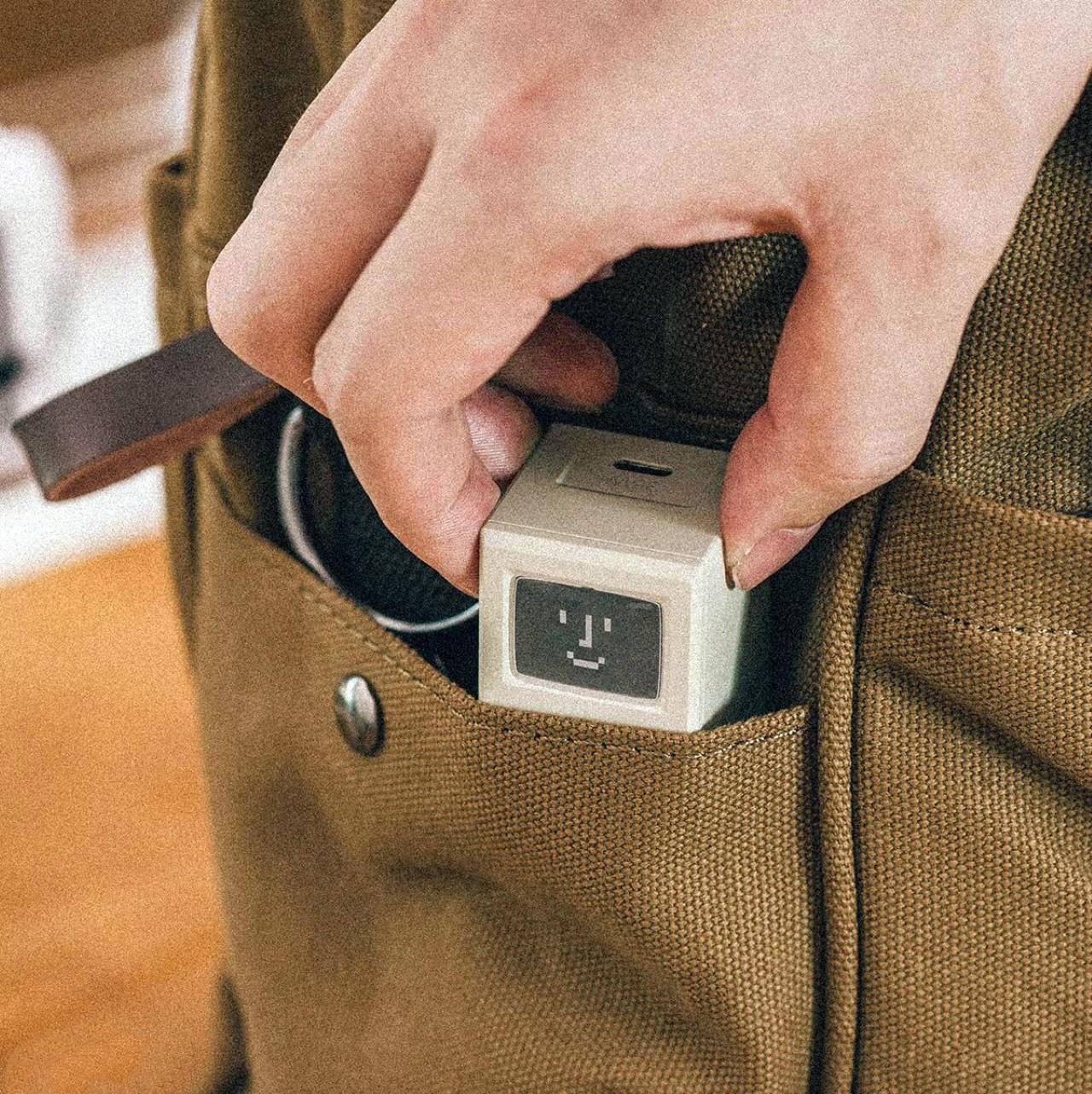
The retro-inspired charger is compatible with a wide range of devices, almost an antithesis to Apple’s own ‘walled garden’. It’s tiny enough to fit in your pocket and weighs a mere 55 grams or 2 ounces. Each Shargeek Retro 35W GaN charger also comes with a set of DIY stickers that you can place on the tiny Mac’s screen, effectively changing your charger’s ‘wallpaper’!

Click Here to Buy Now

The post Shargeek’s tiny 35W GaN fast charger is an adorable retro throwback for all Apple fans! first appeared on Yanko Design.

Retro 35 USB-C Charger Looks Like a 1984 Macintosh Computer

Nostalgia: it’s a great tool to use to sell things to people. In this case, preying on the fond memories of the Macintosh Classic to sell 35W chargers. And it’s working too; I just bought a two-pack. Currently, an already-funded Indiegogo campaign, the Retro 35 GaN Charger by SHARGEEK, is a 35-watt plug capable of high-speed charging of electronic devices, including laptops, but probably not that big laser thing they use to open portals to The Upside Down in Stranger Things.

And not only does this little Mac charge your device, but it also lights up different colors to let you know just what kind of charging it’s doing, with white indicating no charging, yellow normal charging, blue fast-charging, green super-charging, and no light indicating no load for the past five minutes. Now, if only it played sound effects too.

The Indiegogo early bird special will get you this charger for $25. It’s actually not a bad price for a 35W charger, especially not for one with more personality than a boring black or white cube. Granted, it’s going to live the entirety of its life in the rat nest of other cords under my desk and probably never be seen, but I’ll still know it’s there… illuminating the darkness with its smile like an evil clown.

[via DudeIWantThat]

Retro Macintosh Theme with icons gives your MacBook a vintage 1984 Apple vibe!

Sure you can have an M1 chip inside your Apple machine, but that doesn’t mean you can’t be old school!

Aptly titled OS (which stands both for operating system as well as old school), this wallpaper and icon pack from Ben Vessey gives your bleeding-edge MacBook or iMac a nifty retro appeal. Back in 2021, Vessey made a similar set of icons for the iPhone that used Apple’s ‘Shortcuts’ workaround to let you make bespoke shortcuts for operations on your phone. The OS extends this same vintage appeal to the Mac machines too, with the original ‘hello’ wallpaper from the 1984 Mac, and a pack of 166 matching vintage icons for all your common software and apps.

Designer: Ben Vessey

Vessey’s OS comes in both dark as well as light themes, depending on which look you’re going for. Each pack includes 5 dynamic macOS wallpapers in 6k, so the wallpaper doesn’t pixelate on even your high-end iMac displays.

Most of Vessey’s painstaking work can be seen in the individual app icons he designed for all the popular apps. Sure, Apple’s own apps got a vintage makeover, but Vessey had to make vintage versions of almost every conceivable software/app ever as well as for extensions and folders. You can view some of his work below.

Once you change the wallpaper, applying the icons is easy using an external client like IconChamp (not included with the pack). Vessey’s pack, however, does include icon files for the Mac as well as for Windows, should you choose to give your non-Apple machine a makeover! You can buy the OS (Old School) – Silver pack on Vessey’s website for £5.99 ($7.49), or splurge on the Gold pack for £49.99 which also includes 5 custom icons of your choice.

The post Retro Macintosh Theme with icons gives your MacBook a vintage 1984 Apple vibe! first appeared on Yanko Design.

This Macintosh Pocket computer concept makes us wish we had a time machine

They always say that hindsight is 20/20, but that really doesn’t mean much when you can’t change what has already happened. Many of us would probably try to undo things or make different decisions based on what we already know happened, but that just isn’t possible. To be fair, our predecessors did the best they could, based on information they had at that time, and even the greatest visionaries couldn’t have predicted the ups and downs that would change the world for better or worse. The young Steve Jobs of the 80s, for example, probably never saw the iPhone or even the BlackBerry coming, so we can only imagine how things could have turned out if Apple had the knowledge and resources to make a pocket computer back in the days. Fortunately for us, somebody asked that same question and came up with a rather intriguing answer.

Designer: Rex Sowards

Apple did try to briefly venture into the pocket computer market, but the Newton was more aimed at Palm, which was a Titan in that niche market during that era. It wasn’t exactly pocketable by any standard, but it did try to introduce innovative ideas and features in the personal digital assistant (PDA) market that was thriving at that time. The Newton, however, barely lasted a decade, especially after it failed to meet the returning Steve Jobs’ infamously high standards.

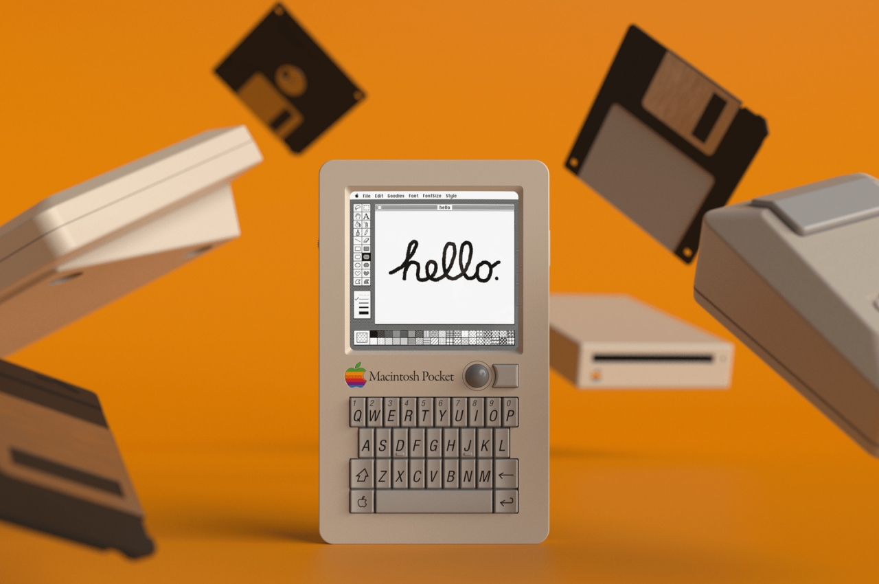
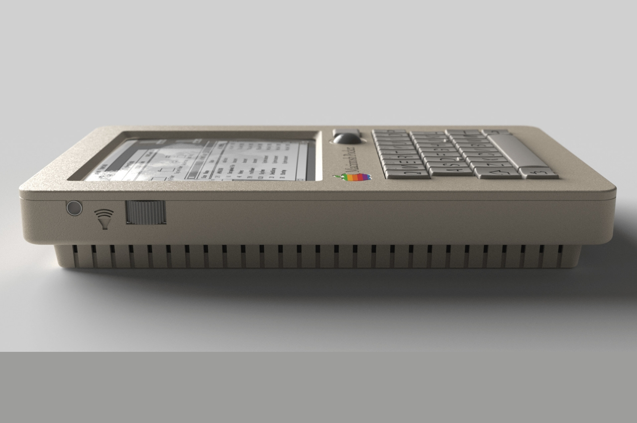
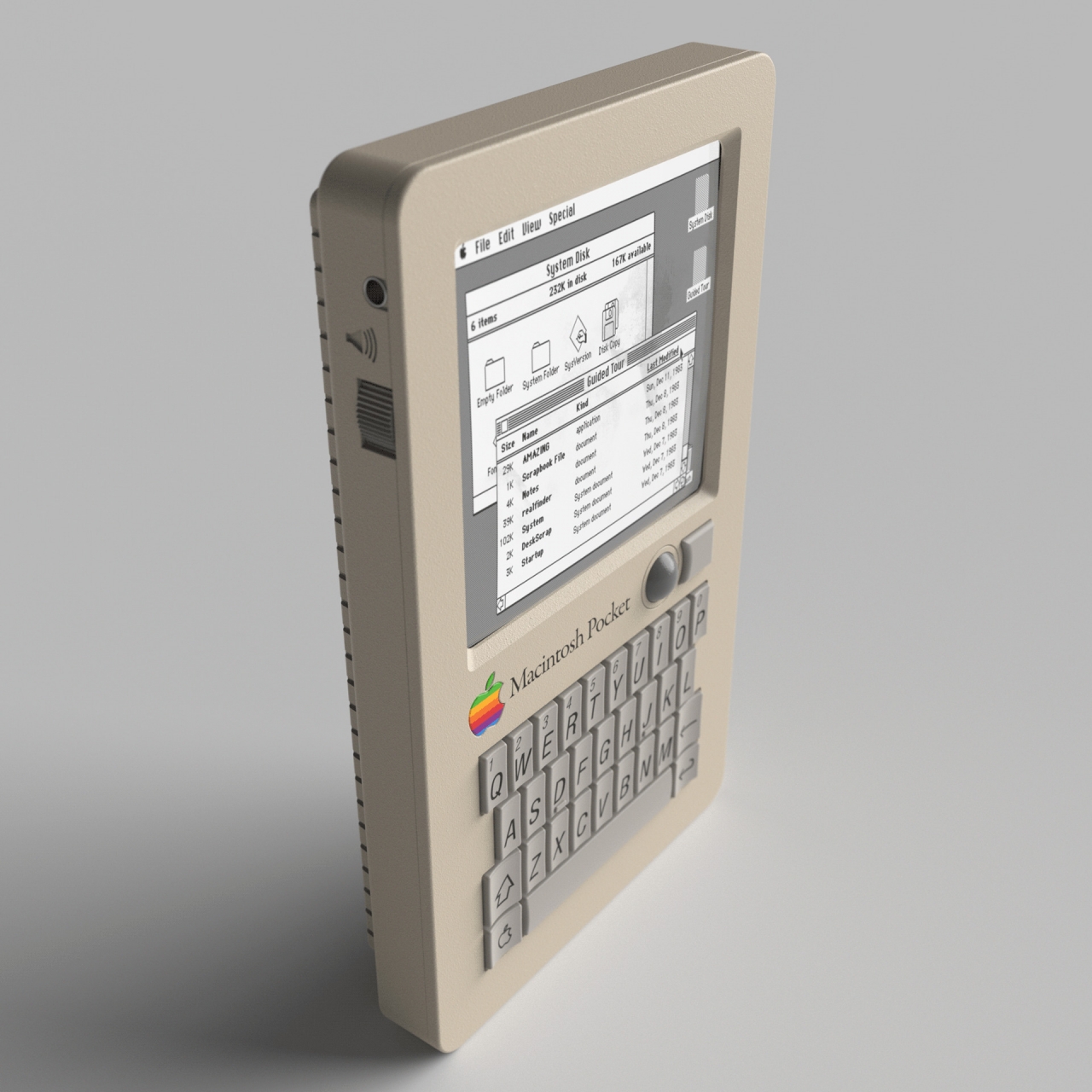
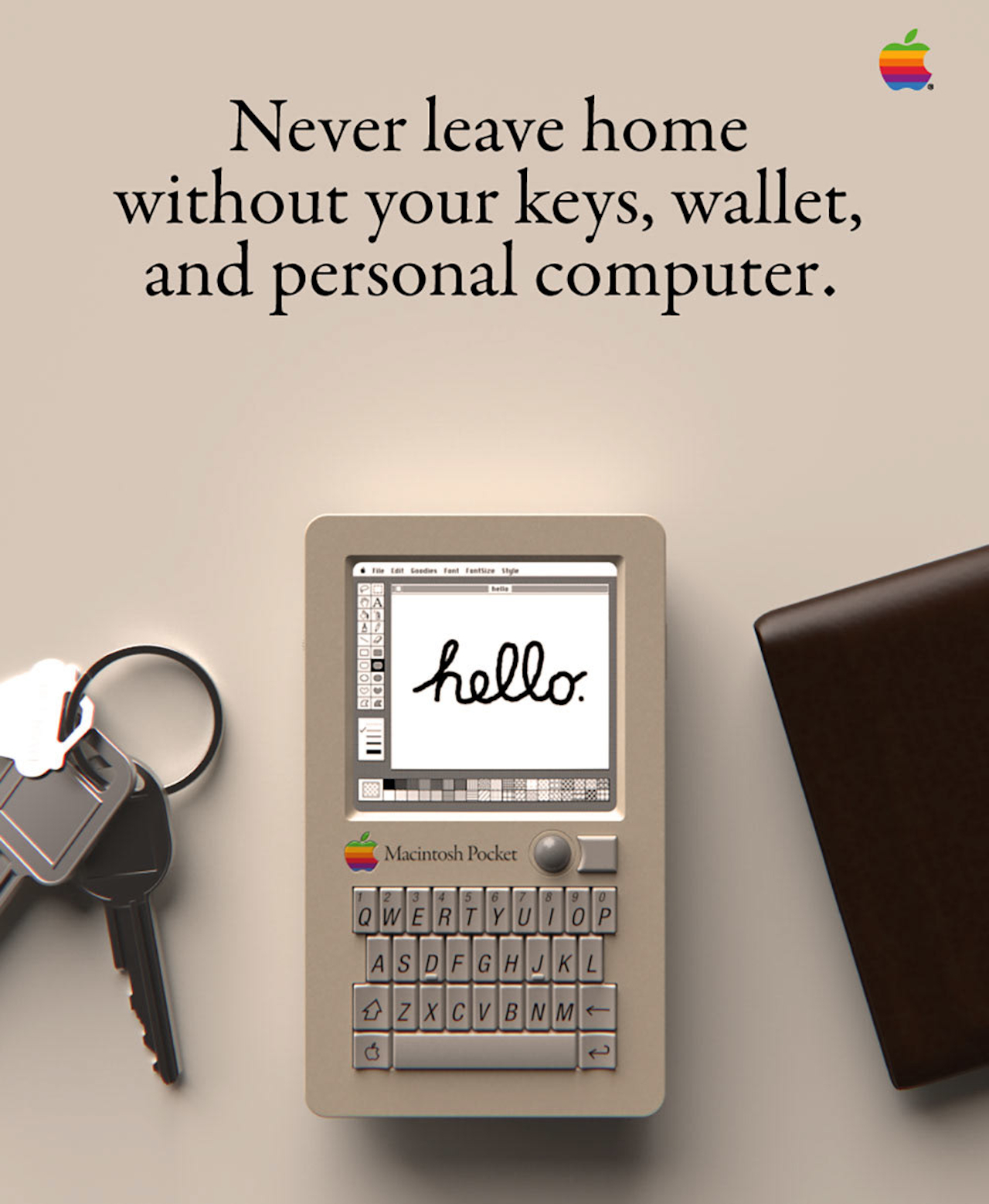
This Macintosh Pocket isn’t a simple rehash of that failed concept, though. Instead, it takes its DNA from two unlikely sources. On one side, you have a QWERTY keyboard in a cramped space that has become synonymous with BlackBerry. On another side, you have the two-step chassis of a Game Boy Pocket of that generation, hence the “Pocket” in the concept’s name. At the same time, you still have the telltale design language of Apple from the late 80s to early 90s, like that off-white color scheme and Macintosh keycaps.

The concept doesn’t simply slap on a display and a keyboard on a Game Boy body and call it a day, though. There was a great deal of thought given to how the mouse pointer would be controlled for a device of this size. A touch screen and a BlackBerry-esque touchpad were both out of the question, and a Lenovo nib is probably just as unlikely. Instead, Sowards took his inspiration from the PowerBook’s iconic trackball, reduced in size, of course. He even took the extra step to pattern the button after the PowerBook’s design, making it curve around the trackball on one edge rather than being perfectly square.

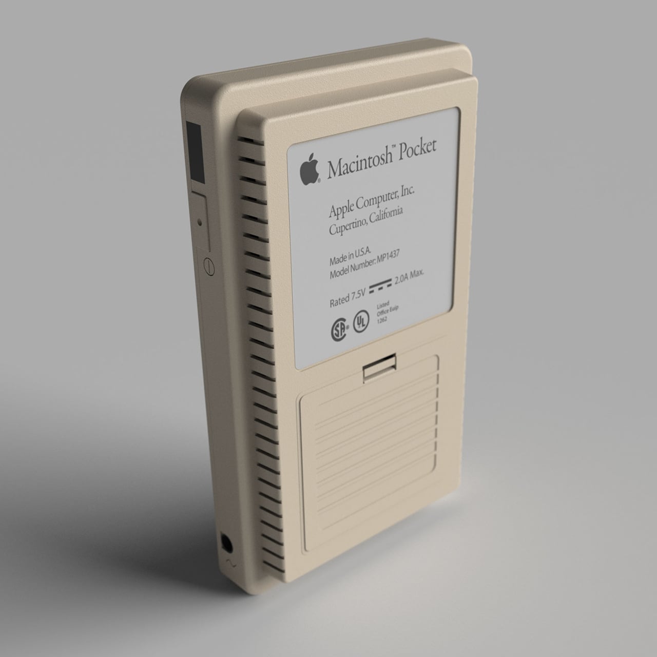
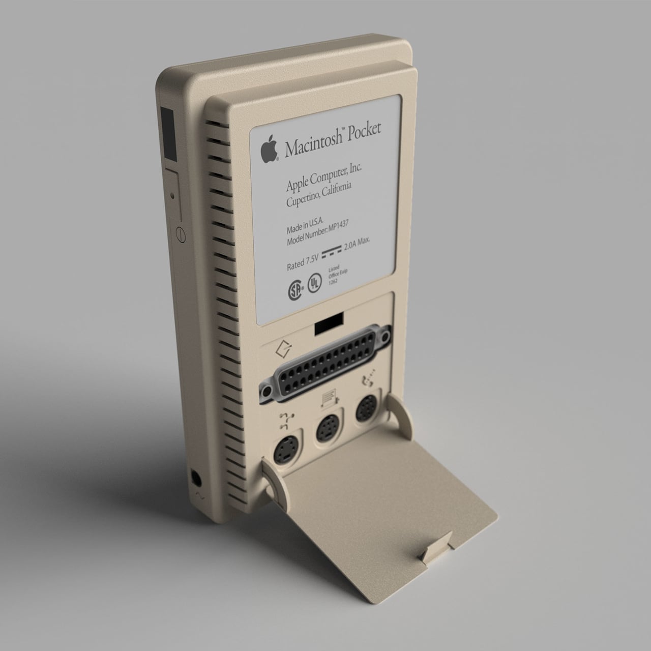
The back of this device is equally interesting in how it hides the ports that were standard on the Macintosh Classic. The most logical positions for these would be on the sides, but that would have cluttered the gadget’s design, a big no-no for Apple. Hiding it behind a panel where the Game Boy’s batteries would have been is a rather sneaky way to keep the design clean without losing functionality. Unsurprisingly, there is absolutely no room for a floppy drive of any size.

It’s probably questionable whether the Apple of the 80s would have adopted such a design, even if they magically foresaw BlackBerry’s becoming the de facto standard mobile device in the business world. It’s still an interesting thought experiment, though, combining designs and lessons learned by various companies across various industries. The craziest thing about this concept, however, is that it is probably completely doable today, thanks to 3D printing and small PCBs. It won’t be able to run the old Mac OS, though, at least not legally, but it could still be an interesting foray into what could have been if the stars were just aligned differently.

The post This Macintosh Pocket computer concept makes us wish we had a time machine first appeared on Yanko Design.

Mini 1980s Macintosh Computer Keycaps: Nostalgia at Your Fingertips

Drawing direct inspiration from the Macintosh 128K of the 1980s, this mechanical keyboard escape and tab keycap set brings the nostalgia back to your own modern computer. Gosh, they sure don’t make them like they used to, do they? No, they don’t, because they used to make them with a ~6MHz processor, 128kB of RAM, a single-sided 400kB floppy drive, and no internal storage. Even my toaster has more processing power.

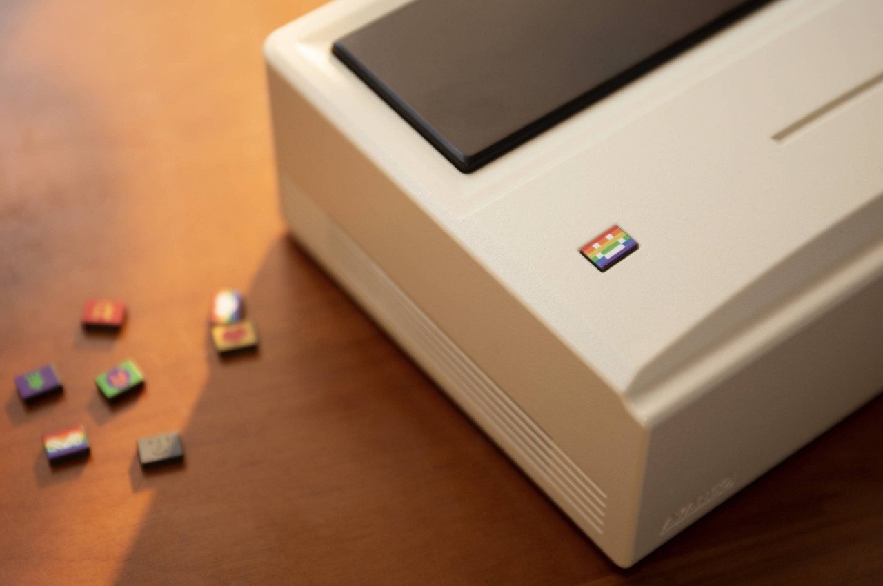
Handcrafted by Etsy seller CCcoolArt and available through their store for $24, the escape key features the Macintosh computer body with a translucent screen and five interchangeable screen stickers (Apple logo, light face, dark face, Tetris, and heart). The tab key features the likeness of the old Macintosh keyboard and mouse. Could you imagine trying to use one of these computers now? People go nuts when the internet is slow; what if everything was slow? It would be a total global meltdown.
One of the best things about the set is that if you have an RGB light-up keyboard, the monitor will glow thanks to the translucent screen. How about that! With an escape key like that, you’re sure to be the talk of the town. Or at least the talk of anybody who sees your keyboard. I mean, I’d definitely say something. Probably something along the lines of, “Hey, cool keys, I’m going to take them.”