Desk accessories concepts help reduce risk of sitting at the desk the whole day

As someone who spends almost the entire working day (and sometimes beyond) at a desk and in front of the computer, you can say that I face a lot of issues when it comes to my posture, my eyesight, and my muscles. I’ve tried several ergonomic products and also exercises to help me take a break from my regular work and literal position but I’m still having some regular problems from being a desk potato. I know that there are a lot of risks that will eventually (and some have already) make an appearance in my health journey so products that can help alleviate the strain on my body are always welcome.

Designers: Haneul Kang, Dohui Kim, Dagyeong Kim, Jeongyoon Kim, Yunseo Jung
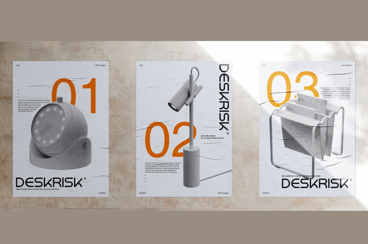
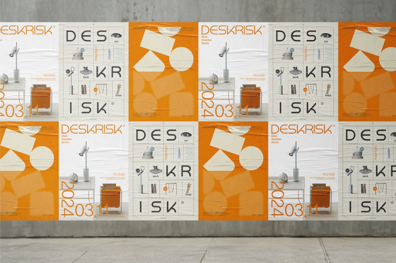
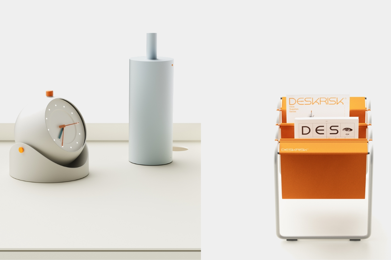
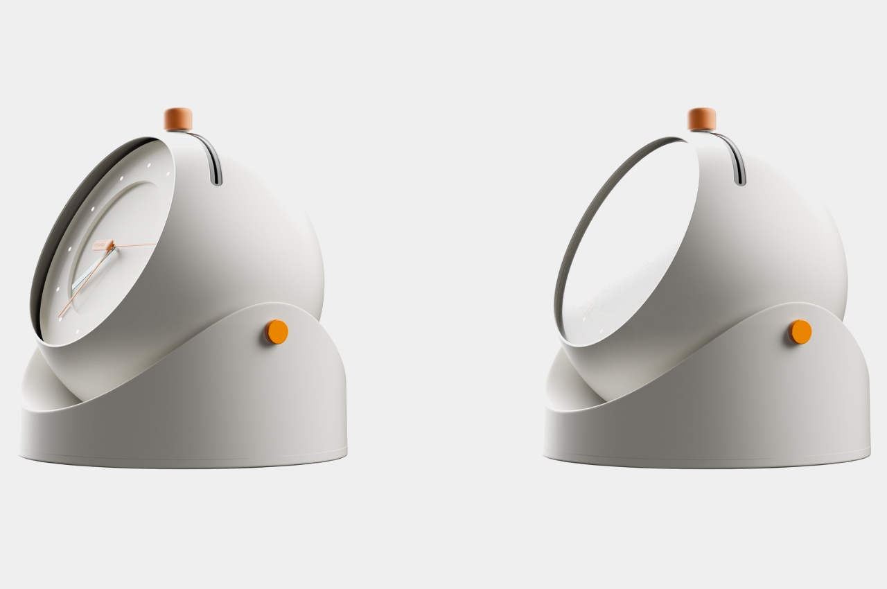
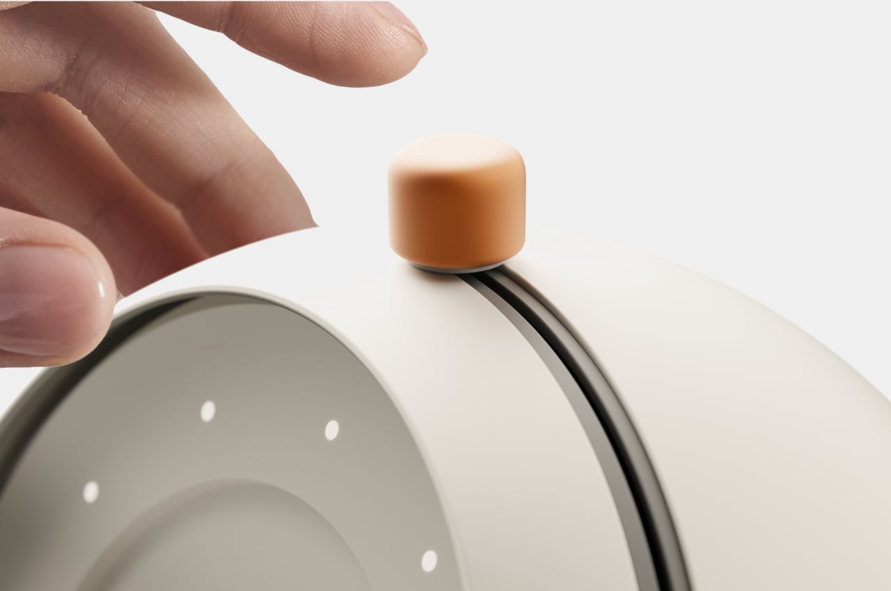
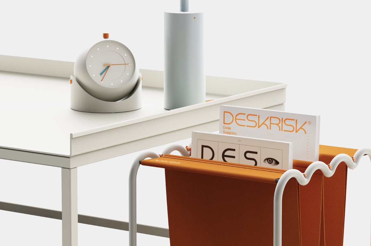
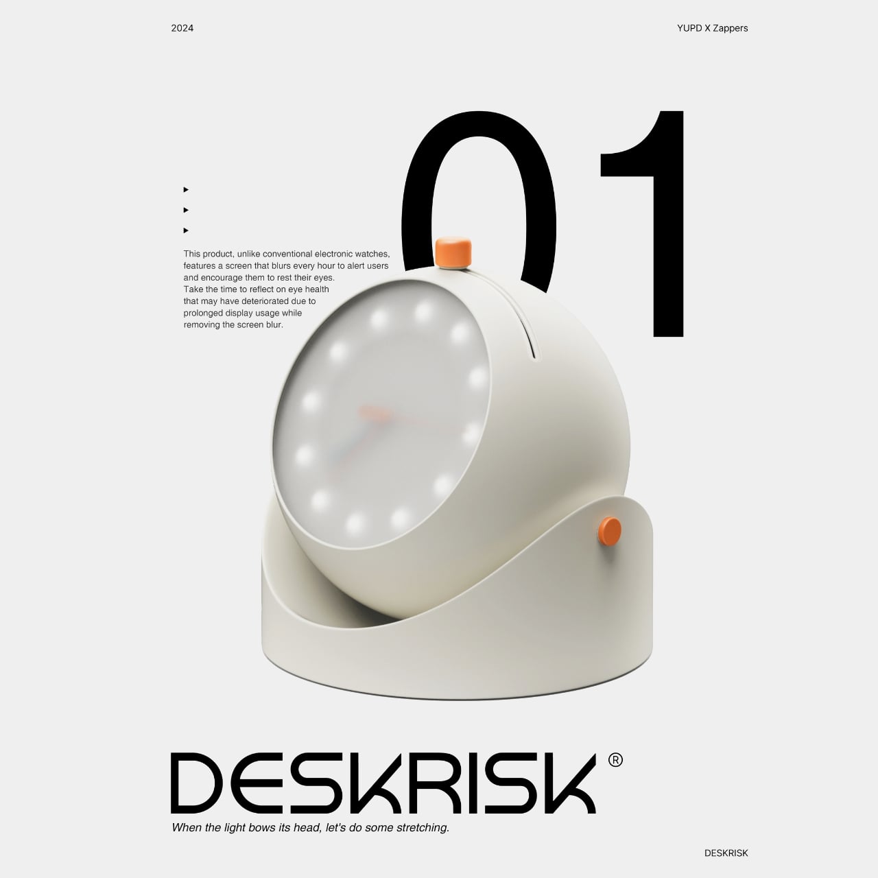
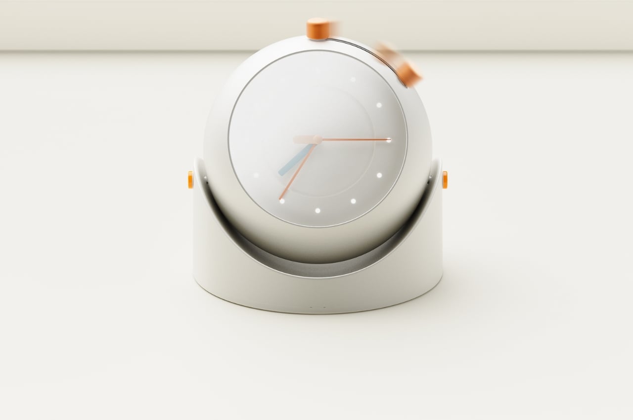
A group of designers have come up with concepts for a series of products that can help with this problem. The collection is appropriately called DESKRISK as we all know that even if we are sitting seemingly safely at our desks, we’re still exhibiting risky behavior that will eventually need some sort of intervention. The first product is a desk clock that will remind us to take a break from staring at our screens to take better care of our eyes. The screen will blur after some time which resembles the dry eyes we experience a lot of times. After you’ve rested for a few minutes, you can move the button on the clock sideways to wipe away the blur and start the countdown all over again.
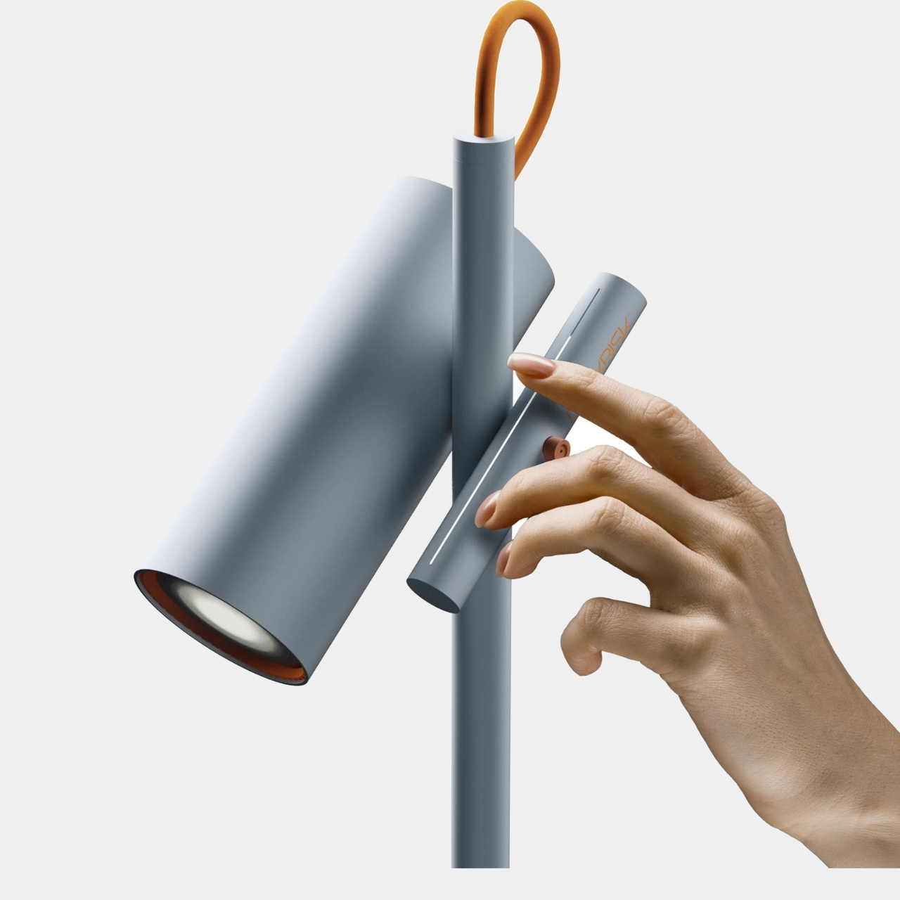
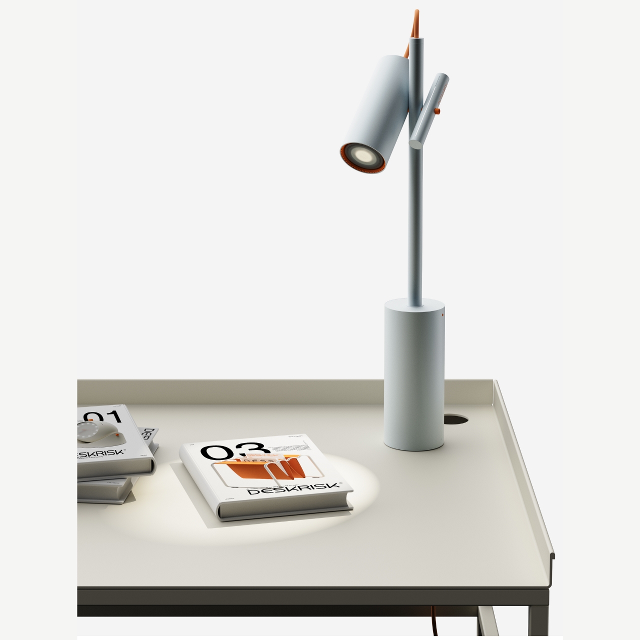
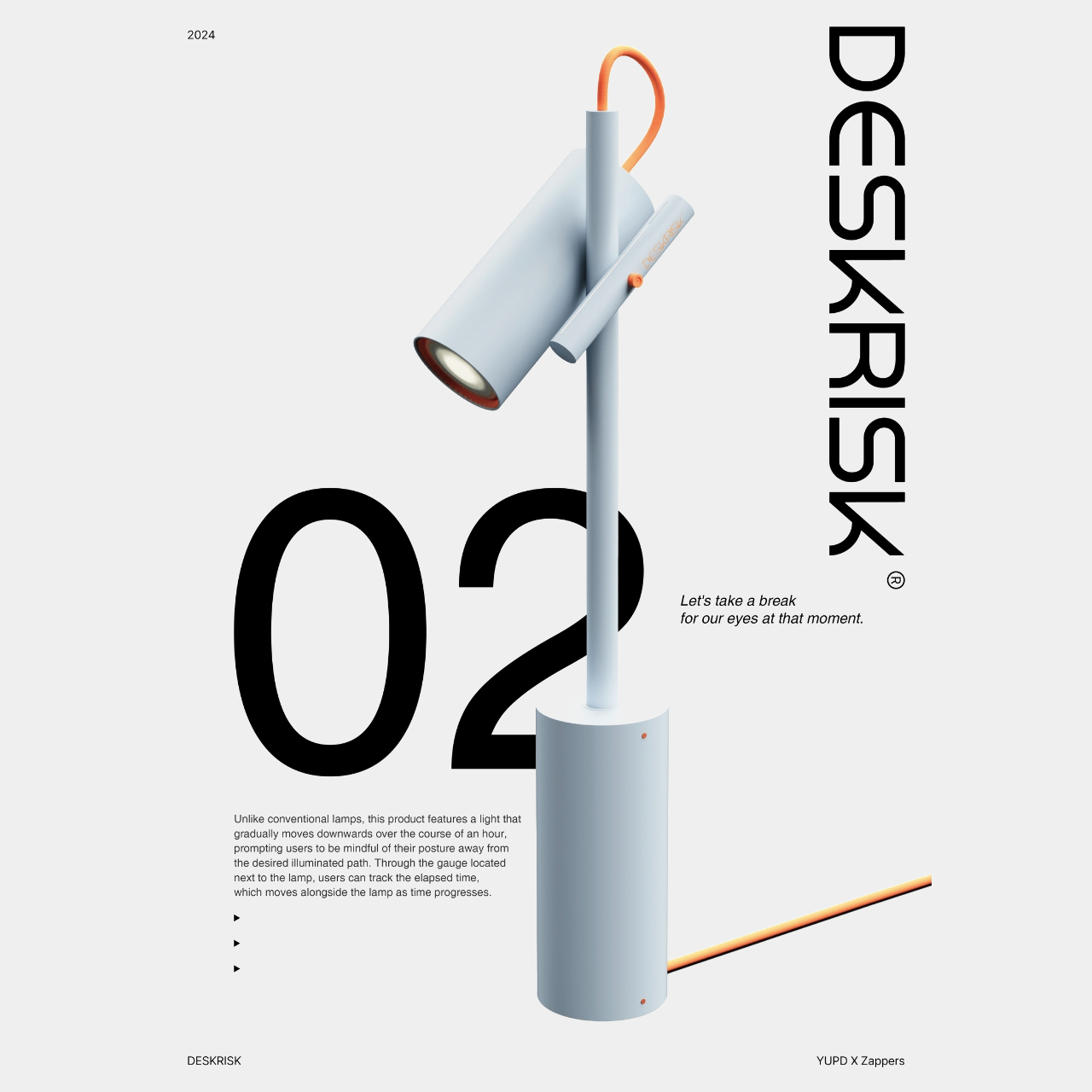
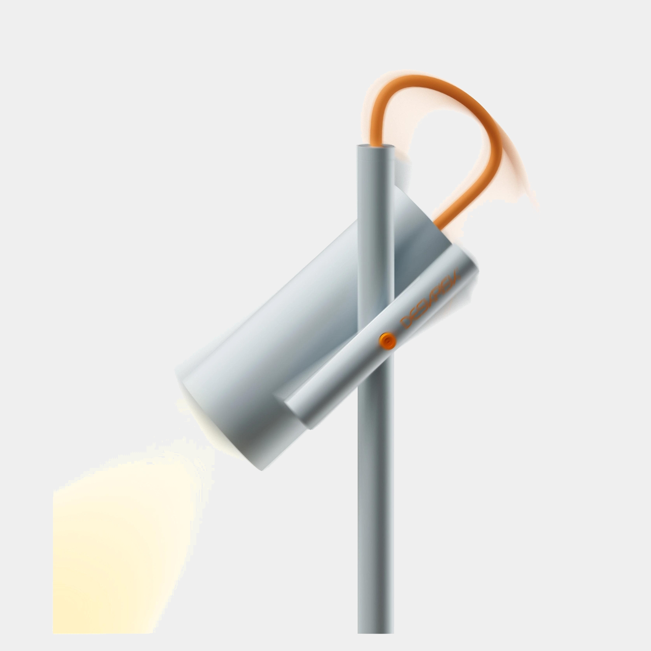
The next product is for those who need help with their posture while sitting at the desk for a long time. Well this is for if you’re using a lamp light source at your desk. The lamp has a light that will gradually move downwards from the angle you set after an hour. This way you are reminded to move along with the light source so that we’re not just bowing down towards our screens. There’s a gauge next to the lamp that also helps you track how much time has elapsed. You can also adjust and reset the angle by moving this gauge bar.
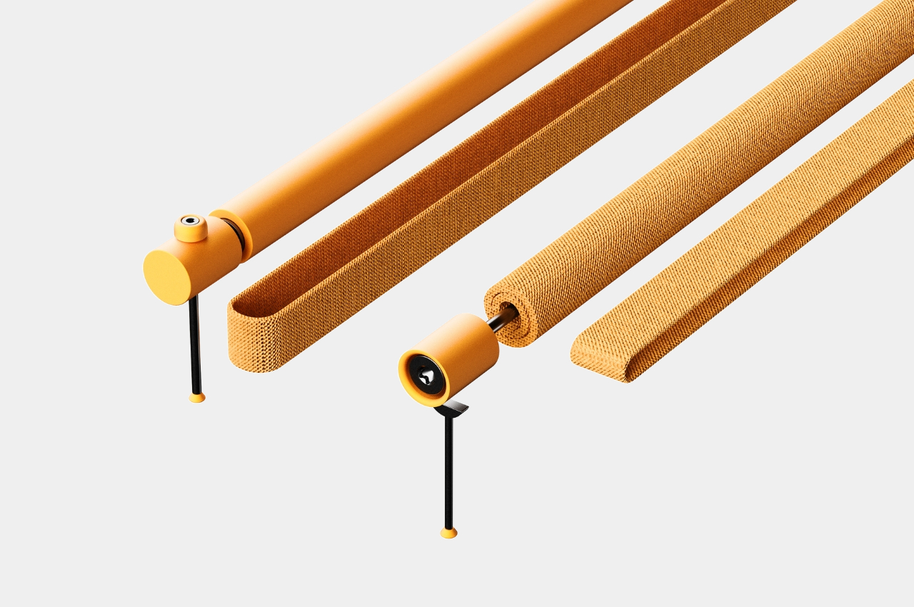
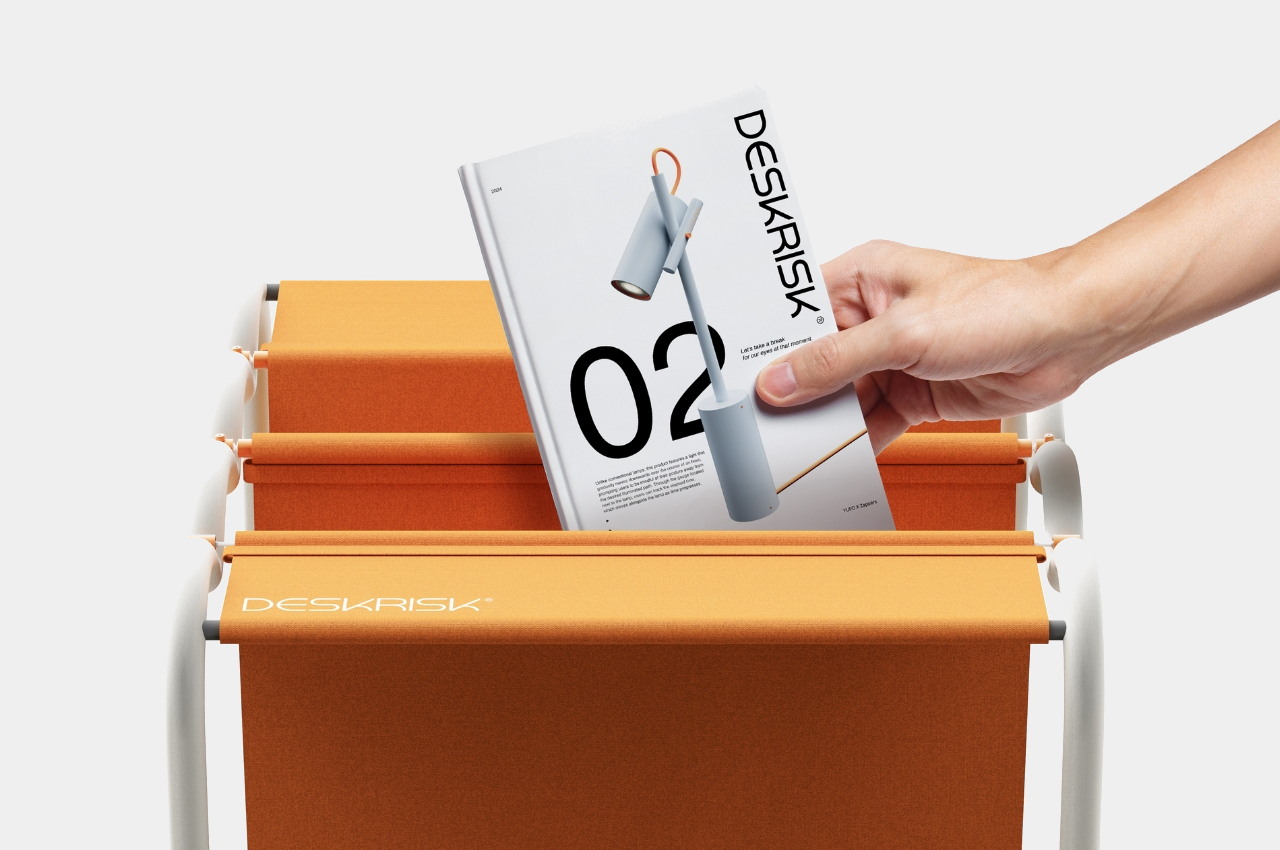
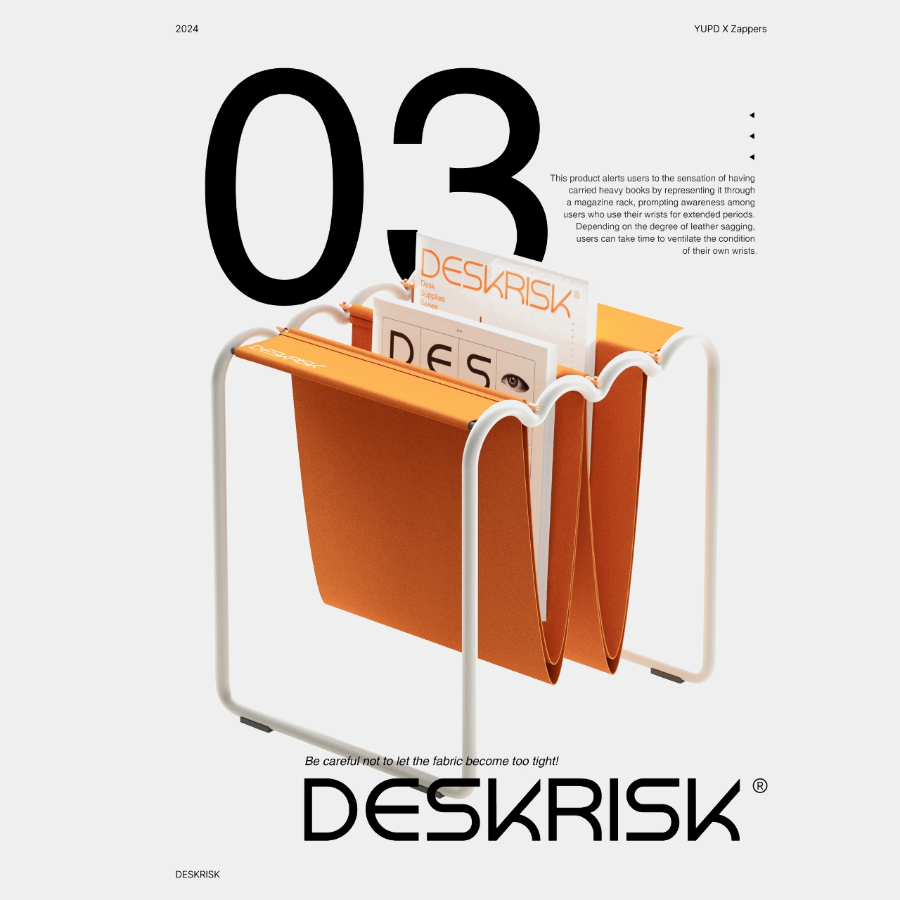
The last one may probably be the most useless for me, at least from what I understand from their product description. It’s a magazine rack that will supposedly resemble carpel tunnel syndrome or at least the overstretched wrist ligaments that come from having the same position at your keyboard for a long period of time. The sagging fabric will lengthen according to the size or weight of the books or magazines inserted. How this will help me with my wrist problem is unsure at this point. But aside from that, the other Deskrisk products are pretty useful for people like me who are at risk with the nature of our work.
The post Desk accessories concepts help reduce risk of sitting at the desk the whole day first appeared on Yanko Design.

Magazine rack concept defies common sense with intersecting tubes to hold your books

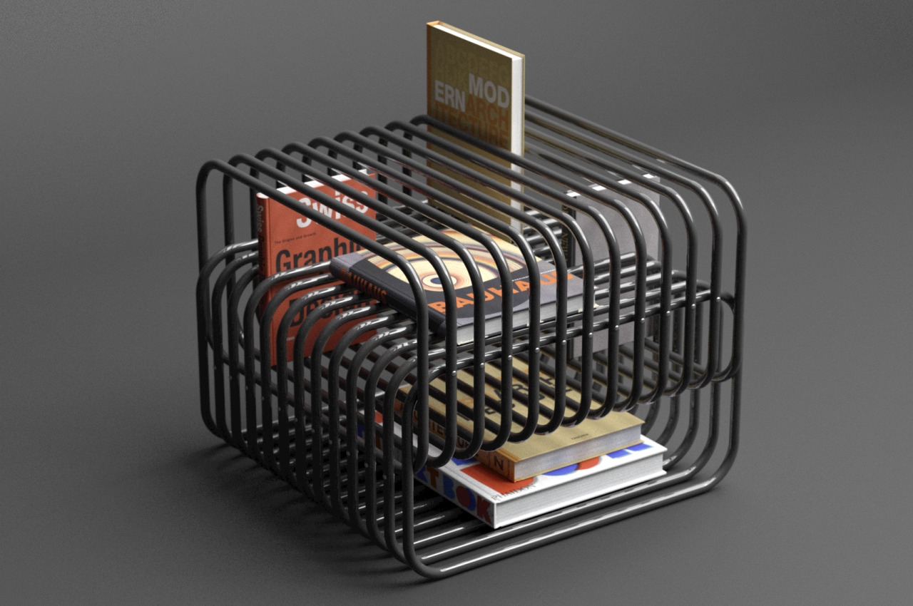
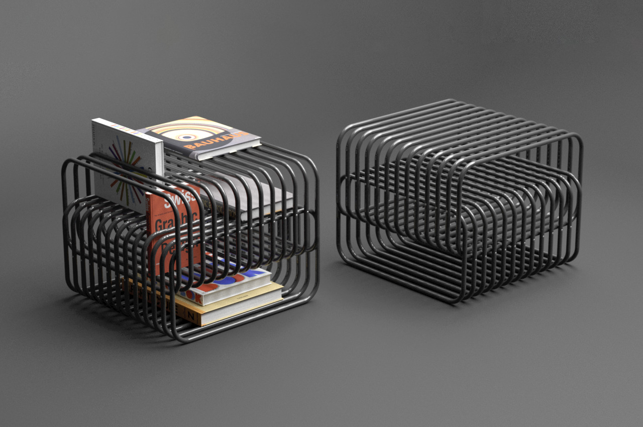
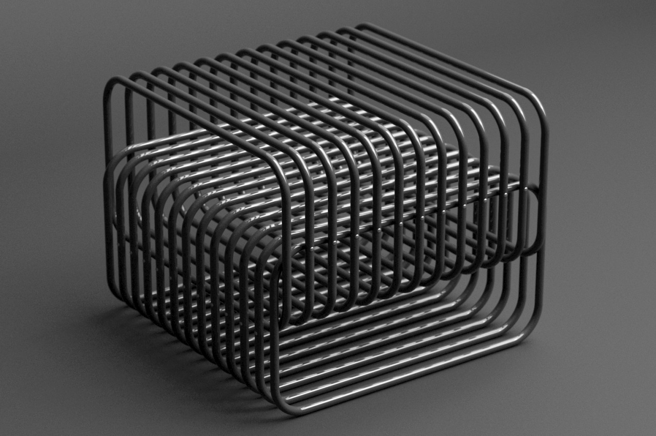
We’ve seen an almost endless train of design ideas for furniture, ranging from shelves to chairs to tables. The latter even come in different types, functioning as dining tables, work desks, or anything in between. Although table designs can vary greatly, the one thing that they all have in common is a solid and whole surface to place things on top of them. This is true for almost any piece of furniture as well since there always needs to be a flat surface to hold things or bodies. That’s the kind of standard design that this magazine rack and side table in one throws out the window, utilizing two intersecting groups of tubes to hold up books and magazines in an almost illusion-like manner.

Designer: Deniz Aktay

Although we rely on them critically, it’s almost too easy to trick our brains and our eyes with optical illusions and crafty designs. Logic would tell us that slipping a book into a slot like a grill would let the book fall without something to stop it. That “something,” however, doesn’t need to be the ground or a flat surface, just like what this Interspace magazine rack design concept tries to demonstrate.

The rather confusing piece of furniture is actually made of two groups, both of them a row of steel tubes bent to form a loop. Normally, if you put anything in the space between tubes, it would fall down to the opposite side. The trick that Interspace uses is to connect the two groups perpendicularly to each other while also leaving a small gap in the middle where the bottom of one extends beyond the top of the other or vice-versa.

This creates a sort of natural “stopper” for anything that goes in between the gap since the intersecting tubes below it serve as the “floor” for the item. This works whether inserting the book from the top or from the side. The empty areas formed at the top and bottom of the structure also become spaces for reading materials that might be too thick for the grill. Because of the intersecting design of the tubes, arranging books can become almost like a puzzle, where you decide the best place for them in between the gaps.

The curious form of steel tubes intersecting with one another also creates a rather curious visual, almost to the point that it could confuse the eyes because of the play of form, light, and shadows. The top surface of the rack can also serve as a side table, admittedly for larger objects that don’t risk falling into the gaps. You could, theoretically, also put your drink on top, though it’s probably best to have some tray in between for good measure.

The post Magazine rack concept defies common sense with intersecting tubes to hold your books first appeared on Yanko Design.
Union brings you side table and magazine rack in one

For people who live in smaller spaces like apartments or condominiums, we always look for furniture and appliances that can perform more than one function. You need to maximize the space that you have so you look for things that are 2-in-1 or can serve as more than just one thing. We’ve featured a lot of multi-functional concept products here on the website and I personally hope that some of these can become actual products. I wouldn’t mind having some of them in my place.

Designer: Deniz Aktay

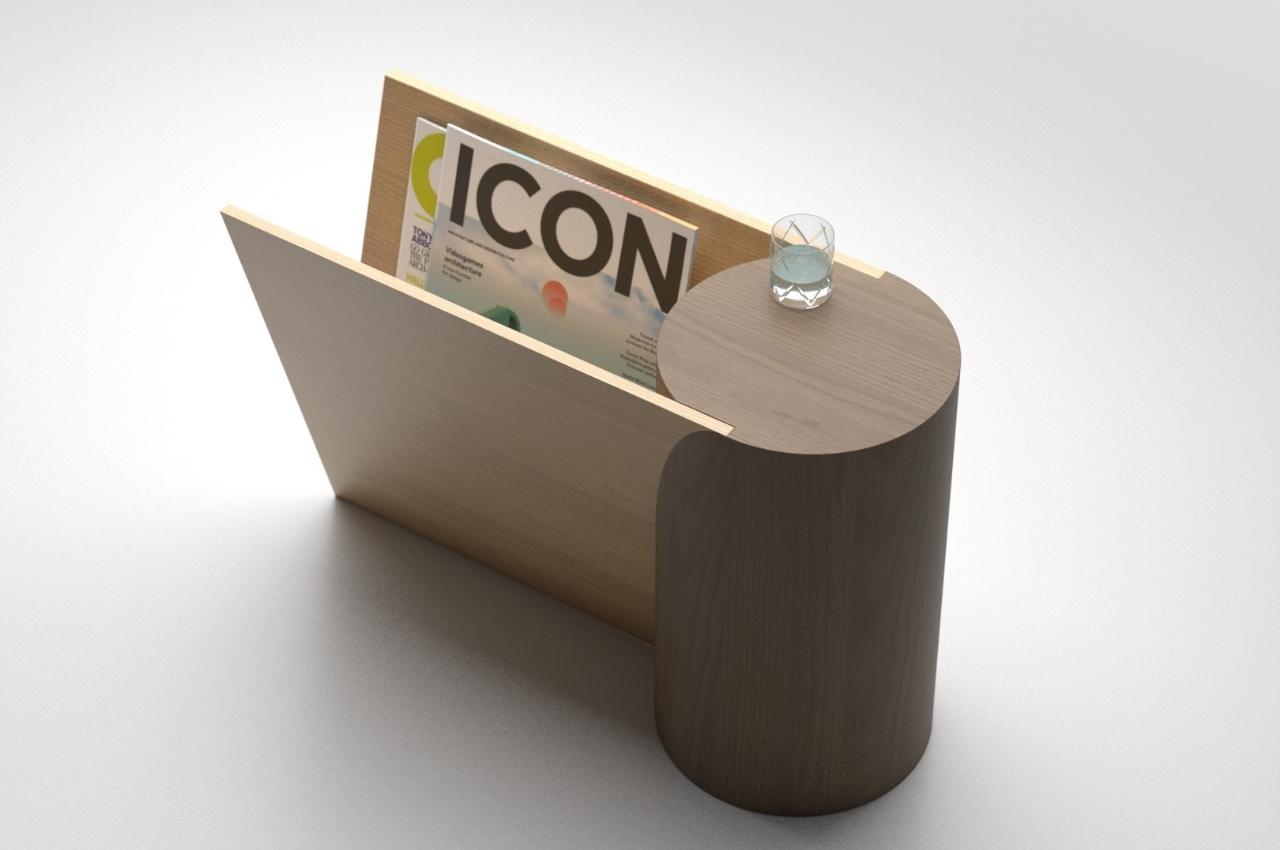
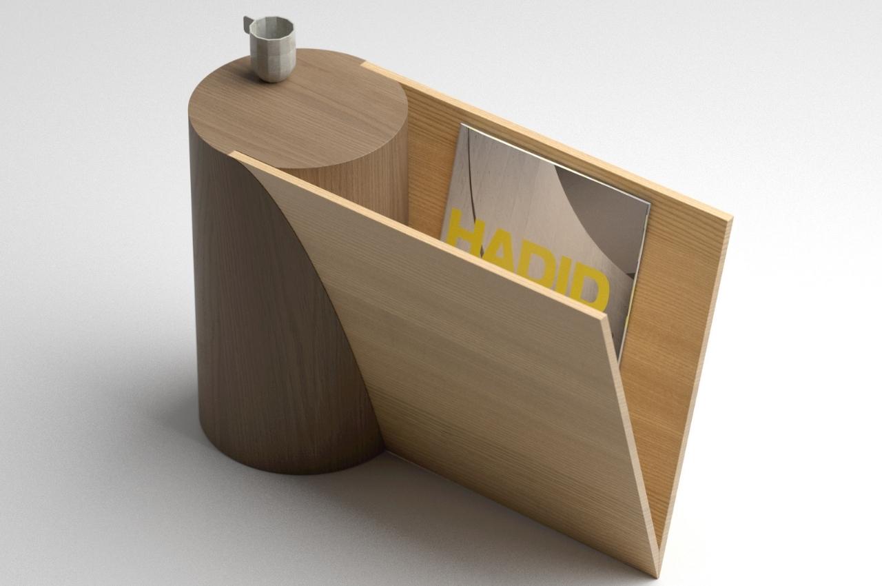
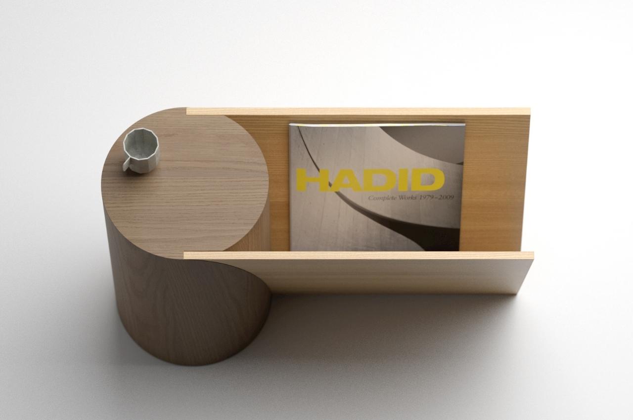
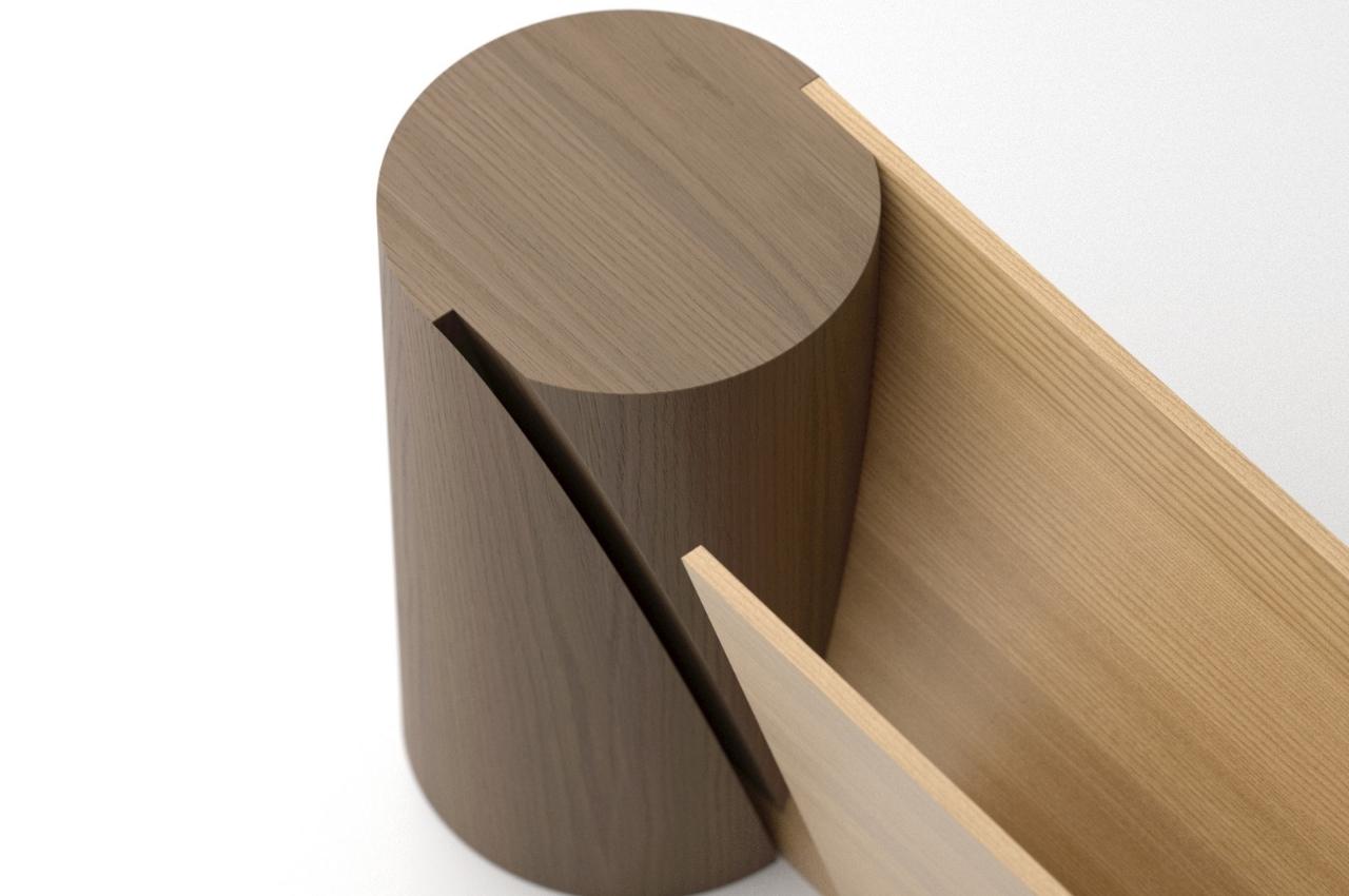
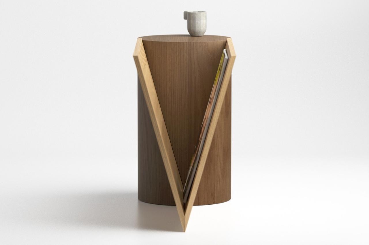
This concept is for a side table that can also serve as a magazine rack. The idea is for these two staples for a living room to be found in just one form. You have a cylindrical shape to serve as your side table where you can place your drink, keys, the book you’re currently reading, or whatever you need to put down, probably next to the sofa or your chair. But aside from that side table, you also get a connected magazine rack where you can place your, you guessed it, magazines. It can also store books, papers, or whatever will fit into the rack.

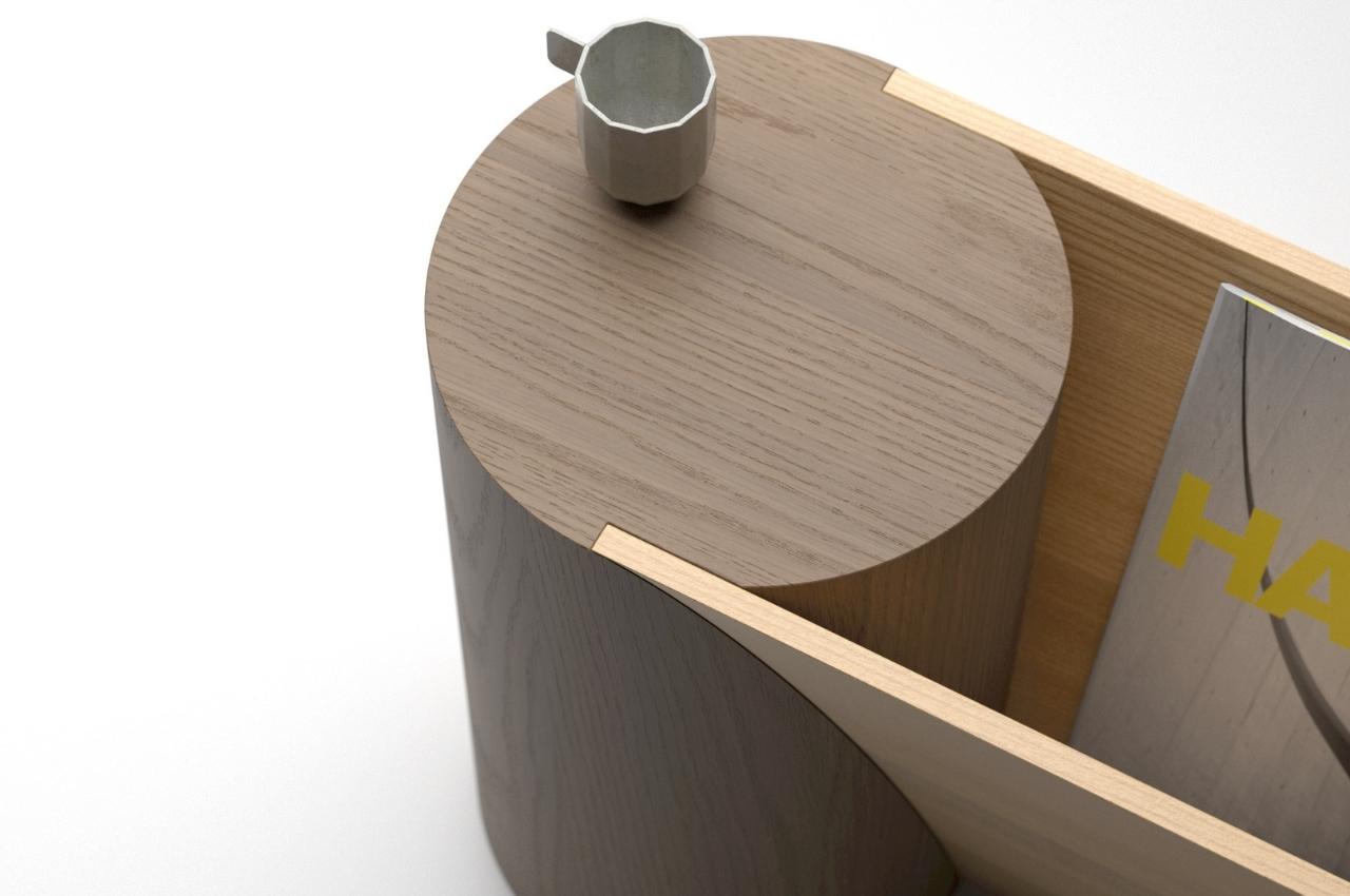
What makes Union stand out is that there is a nice interaction between two geometrical shapes: the circular and cylindrical side table and the triangular shape of the two planes. They are not just placed next to each other but they actually intersect as part of the table is inside the rack. Or depending on your perspective, part of the triangular rack is inserted into the cylindrical table. Either way, in just one piece of furniture, you already get multiple uses for it.

Aside from being functional, Union actually is pretty decorative, especially if your house’s theme is wood or timber. The cylindrical part uses a darker wooden color while the magazine rack has a lighter color. The contrast of the shades of wood actually works instead of being distracting. So you also get sculpture-like furniture that can be a conversation piece as well.

The post Union brings you side table and magazine rack in one first appeared on Yanko Design.
This multifunctional coffee table transforms into a sitting bench and more furniture to save you space!

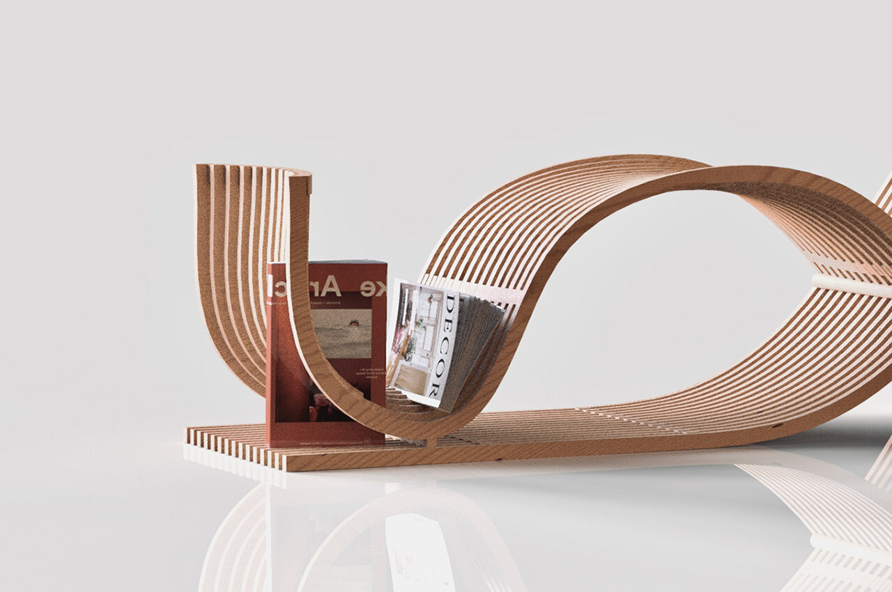
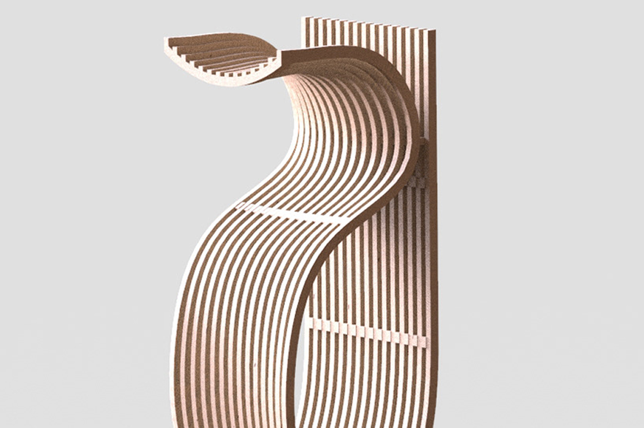
Saving space in tiny homes should be considered a sport. Finding the right furniture and storage organizers can take a while, but the wait is always worth it once the right pieces come along. One way to save space is by choosing multifunctional furniture like the & Chair from Taiwan-based designer Shin Chen, a piece of furniture that blends storage into a coffee table that doubles as a high stool and bench.

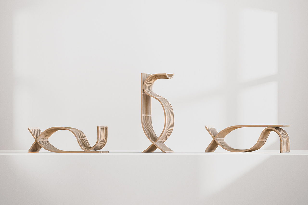
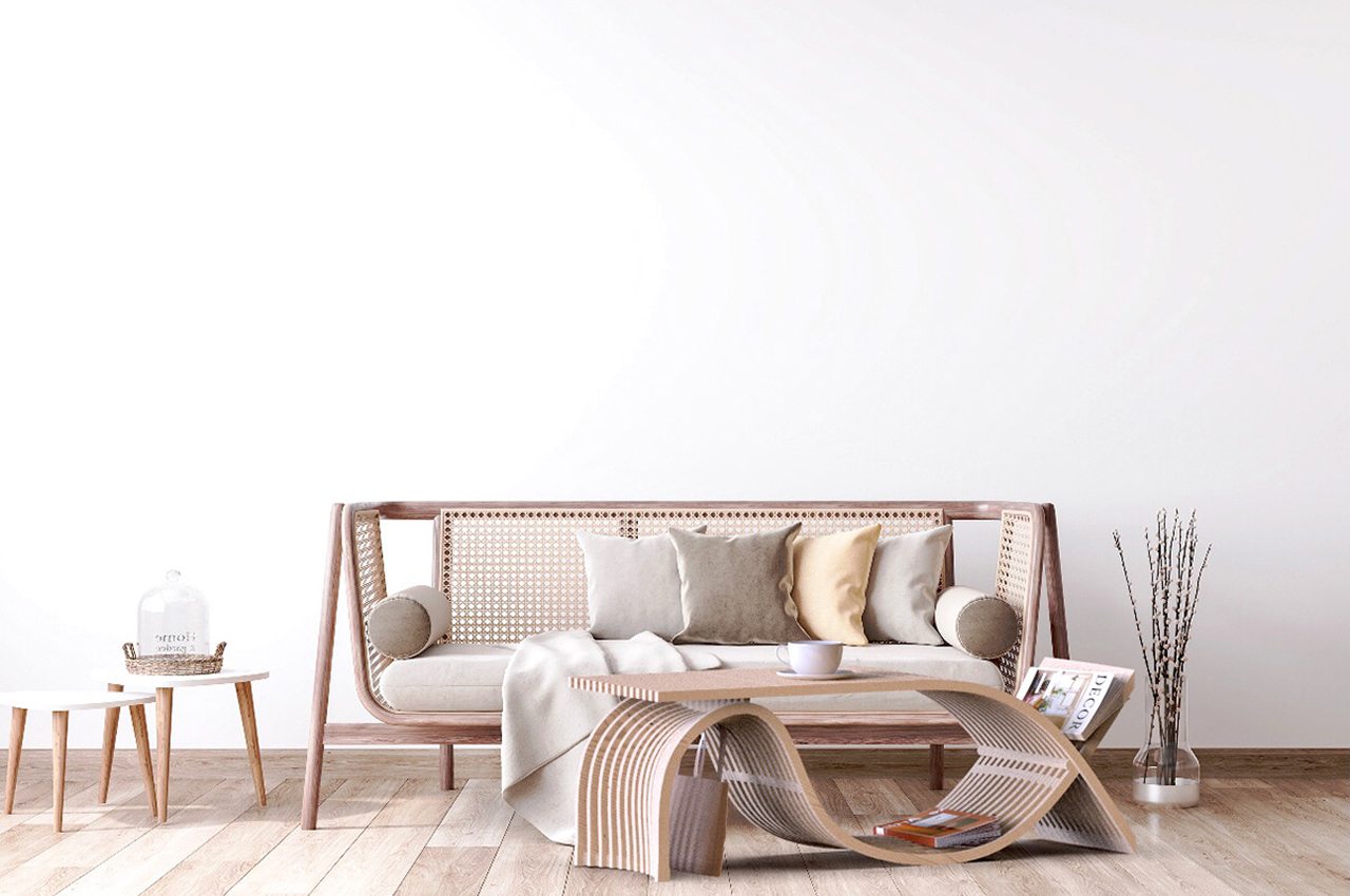
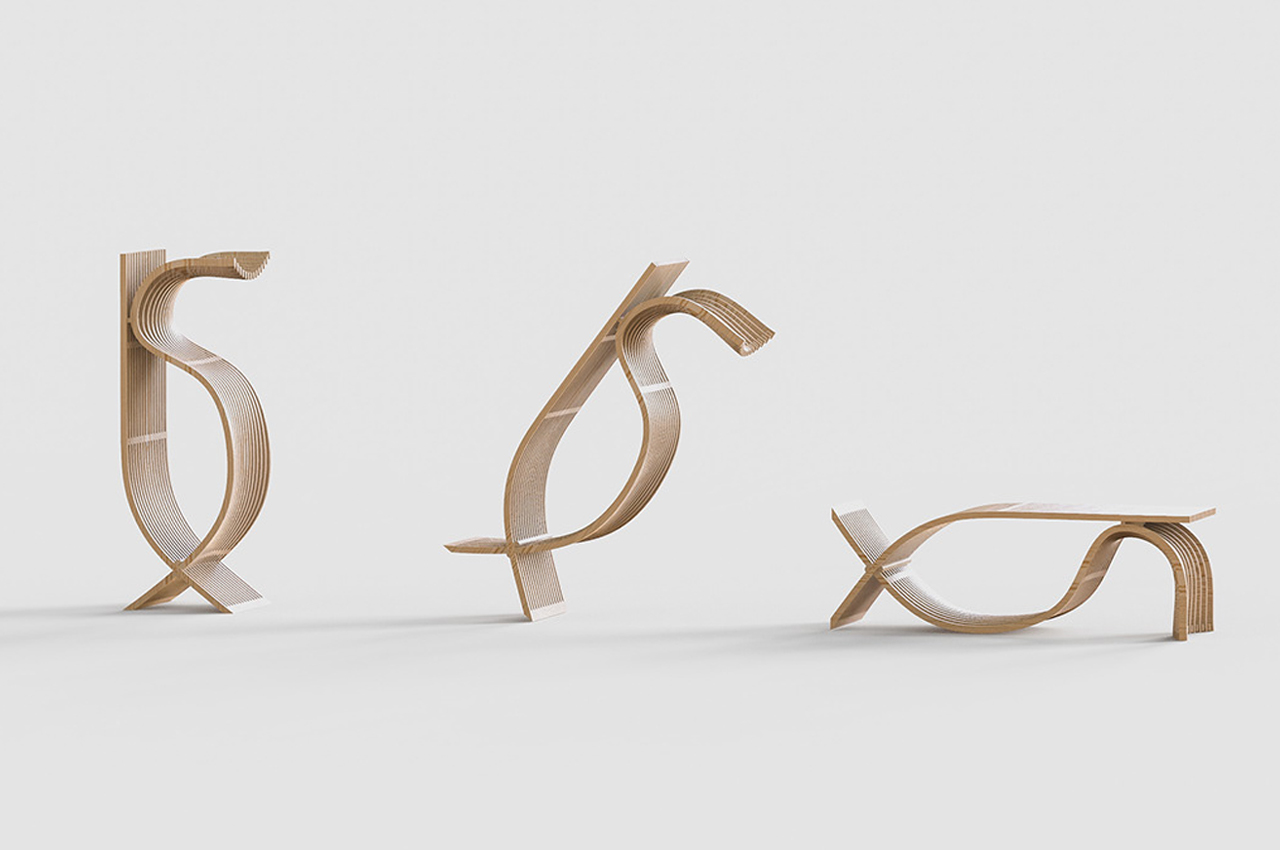
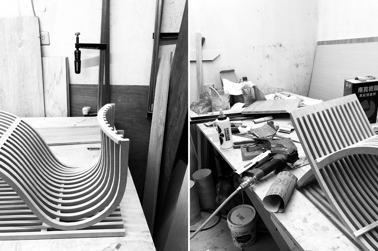
Inspired by the shape of the ampersand, & Chair flows into a natural shape, handmade from a collection of sustainable materials like felt and ash wood. & Chair can be positioned in different placements to change its use‒from upright to horizontal, the & Chair changes function as it changes position. When placed upright, the & Chair morphs into a standing coat rack with ample drawer storage, where smaller items like magazines and umbrellas can be stored. Then, users can bring the & Chair down, allowing it to work as a coffee table with storage space made available through a slot-and-rack system, where magazines and coffee table books can be kept. The & Chair can also always work as a bench when placed horizontally, making for an inviting entryway sitting bench where you can tie your shoes or a more discreet seating area for overflow in the living room.

Modeled after the ampersand, the & Chair’s name is symbolic for its multifunctionality, bringing out its chameleonic personality. Designed from warm, natural wood, the & Chair enhances each living space with a hint of abstract Scandinavian design marked by its wooden structure and unique shape that changes with each of its different uses.

Designer: Shin Chen

The & Chair functions as a coffee table, storage organizer, and sitting bench, making it an ideal piece of multifunctional furniture for small living spaces.

Using a slot-and-rack storage method, magazines and coffee table books can be stored in the & Chair when its placed horizontally on the floor.

When positioned upright, the & Chair can work as standing coat rack.

Moving from upright to horizontal, the position of the & Chair defines its use.

The & Chair is hand constructed from sustainable building material is felt and ash wood.

What a rack!

percha_magazine_rack_1

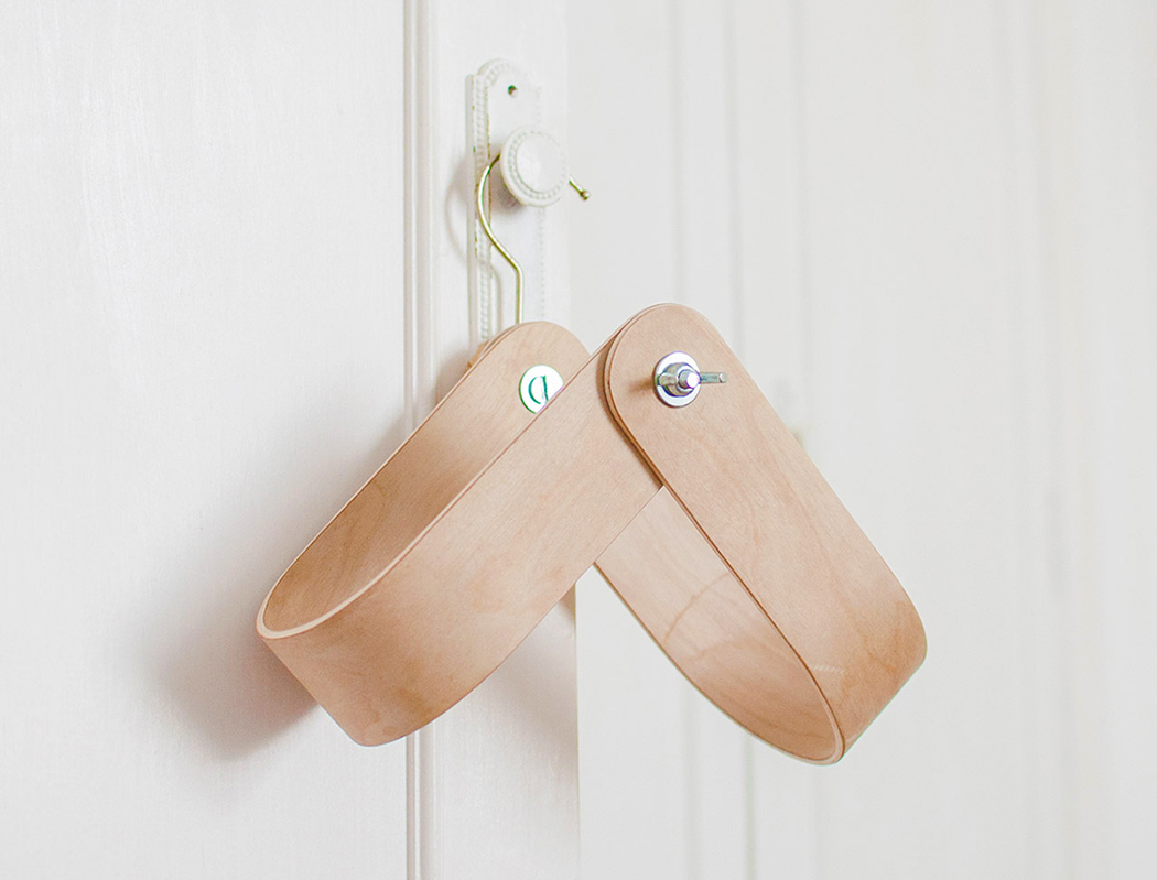
Creativity really shows when you’ve got hardly any resources to solve a problem. I’m not saying the Percha was a result of that, but this magazine rack design has that magic to it. Looking more like a refined version of something a bachelor would make to store magazines, the Percha takes a unique idea and molds it into a well polished, beautiful and contemporary looking product! 💡

Designer: Rafael Fernández

percha_magazine_rack_2

percha_magazine_rack_3

A Pretty Place for Your Wine and Things

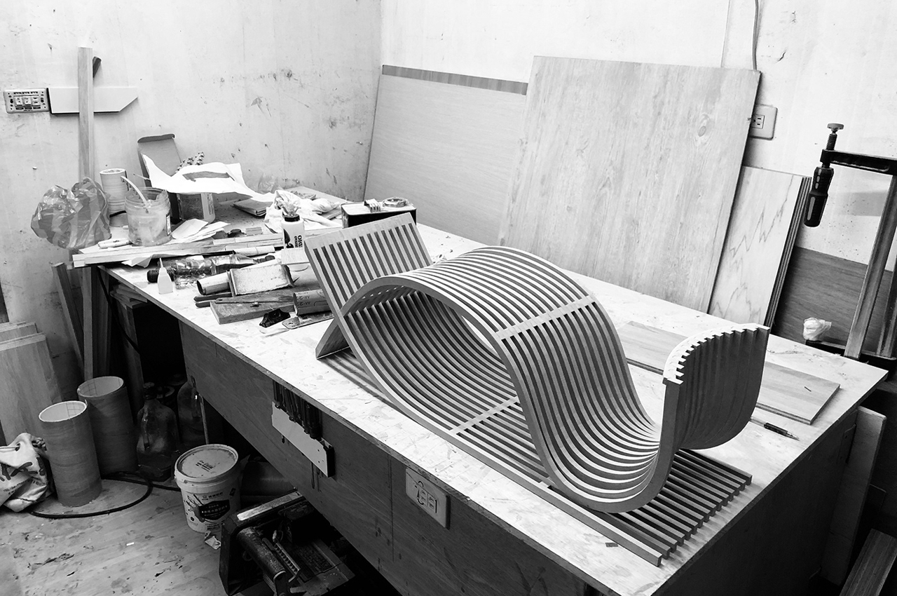
Molded from a near-paper-thin wood layers, Incurva is found at the intersection of modern design and craftsmanship, serving as a sophisticated wall or floor ornament that functions to hold your favorite things! Ideal as a wine or magazine rack, its rigid material safely cradles bottles, books, and more. In chromatic contrast of walnut and beech veneers, they’re an easy addition to a variety of interior styles, classic and contemporary.

Designer: Formabilio

-
Yanko Design
Timeless Designs - Explore wonderful concepts from around the world!
Shop CKIE - We are more than just concepts. See what's hot at the CKIE store by Yanko Design!
(A Pretty Place for Your Wine and Things was originally posted on Yanko Design)

Related posts:

  1. K-wine – Finger Food Wine Plate by Matteo Bertanelli & Michele Di Monte
  2. Welcome to the Wine, Wine West
  3. Wine? Wine Knot!


Drops of Functionality

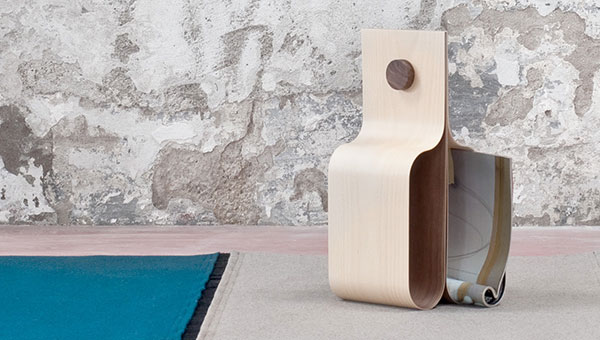
The function of this modern furniture piece isn’t immediately obvious, but that’s just a part of its appeal! The Drop magazine stand’s functional tear-drop shape provides an elegant storage solution for all your periodicals and it also makes a great bookmark. Just place your current read over the top to save the page until you’re ready to pick it back up. The unique construction is made of 3mm birch sheets bound with a lamination technique that makes it possible to mold in just one major manufacturing process.

Designer: Designest

-
Yanko Design
Timeless Designs - Explore wonderful concepts from around the world!
Yanko Design Store - We are about more than just concepts. See what's hot at the YD Store!
(Drops of Functionality was originally posted on Yanko Design)

Related posts:

  1. Faucet with Functionality
  2. 3D Tiles Offer More Functionality