No this isn’t the Hololens, it’s a Surface VR headset!

My brain oscillates between being excited by the prospects of a Microsoft-branded VR device, as well as the disappointment caused by this product’s conceptual nature. Honestly, AR is the future, and while we’re still figuring out how to make VR better, I don’t see VR being used as anything other than an escape from reality. AR, or Mixed Reality, the technology that the Hololens is built around, is much more suited for life-changing, job-changing activities… from having medical students perform mock-open-heart-surgery, to engineers virtually controlling drones that can fix aircraft engines from within. That doesn’t mean Microsoft shouldn’t chase VR!

This is the Surface VR concept, by Max Dahl. Rather cleanly following the Surface’s quadrilateral-loving aesthetic. In fact, the VR headset’s front facade, built with the Microsoft logo, looks virtually exactly like the Surface series of laptops, and the grille around its rim only reinforces that belief.

The conceptual Surface VR packs two cameras, located on the top left and right corners of the front face, although the are spaced much further apart than human eyes, which seems to be the one detail that’s gnawing at me. Other than that, the Surface VR comes with buttons as well as trackpads on both the left and right temple, allowing you to intuitively and easily cycle through VR content without needing a remote.

Designer: Max Dahl

Microsoft and the Microsoft logo are trademarks of Microsoft Inc., registered in the U.S. and other countries. All product and company names are trademarks™ or registered® trademarks of their respective holders. Use of them does not imply any affiliation with or endorsement by them. This is a conceptual project for learning purposes.
Home Security Never Looked So Good!

orbit_home_security_layout

With security systems becoming ever more present in domestic settings, and smart hardware slowly becoming a centre point in our lives, now may just be the perfect time for a unique home-security camera to be introduced!

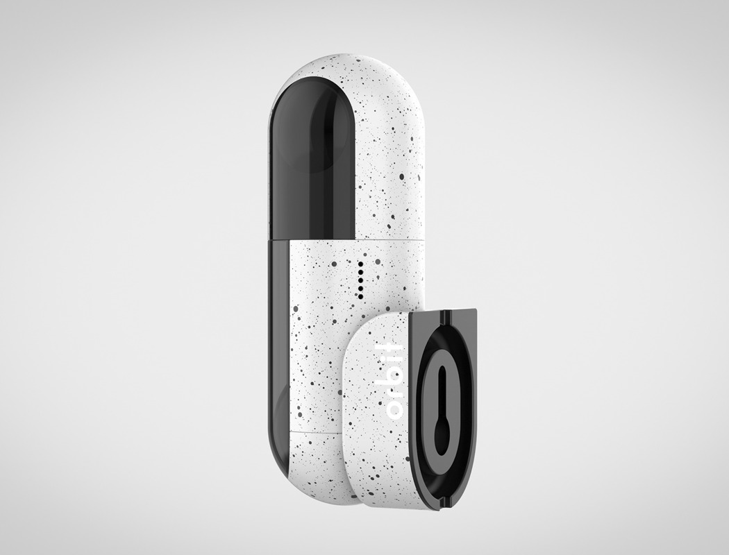
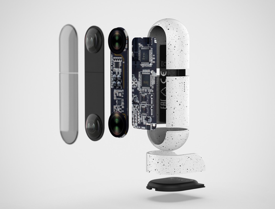
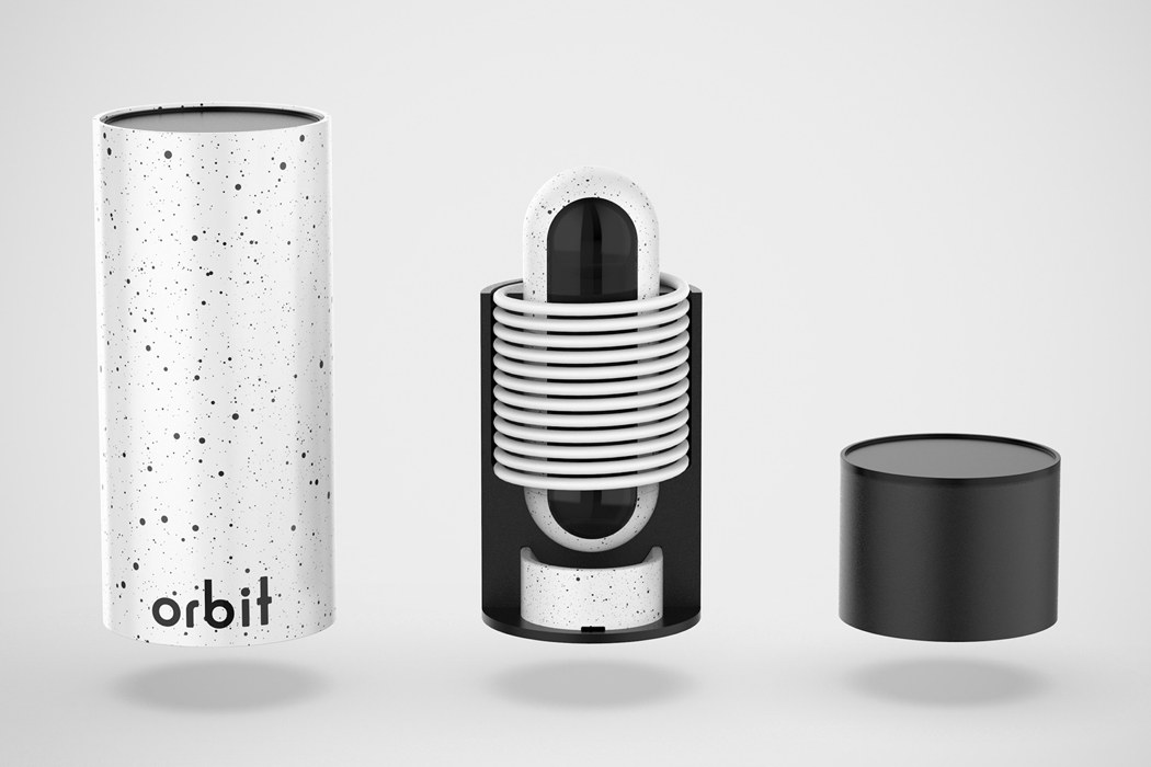
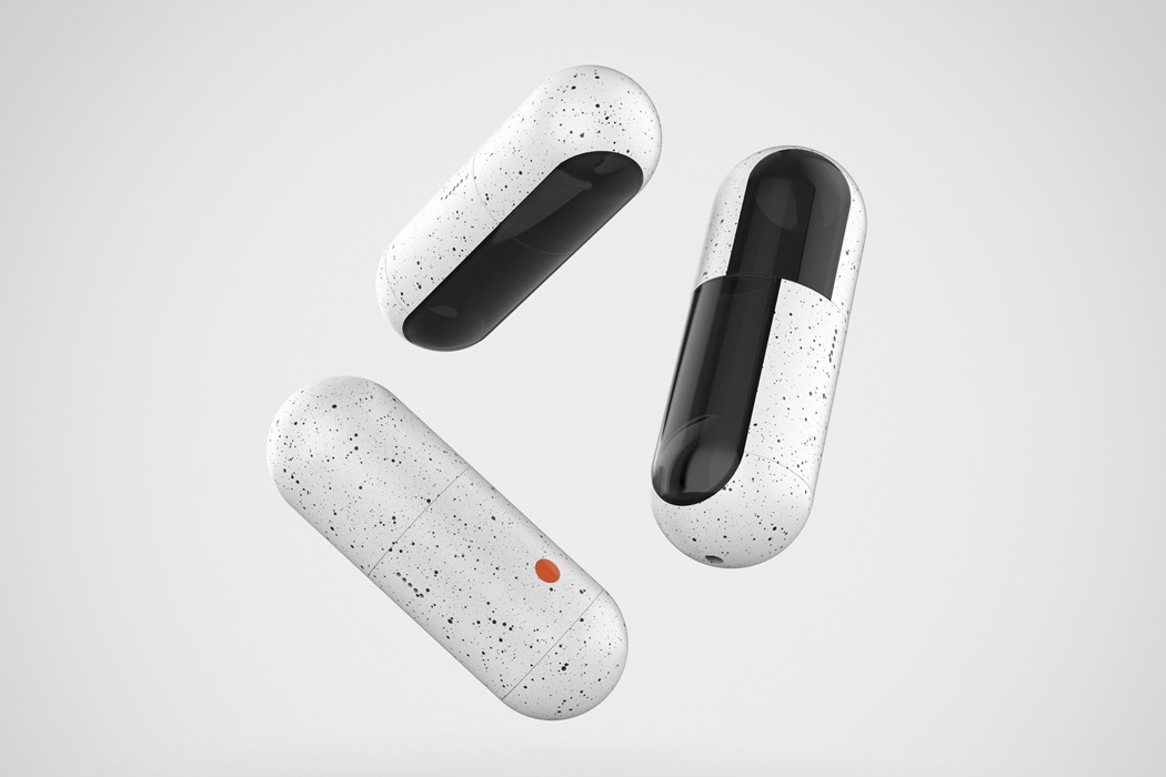
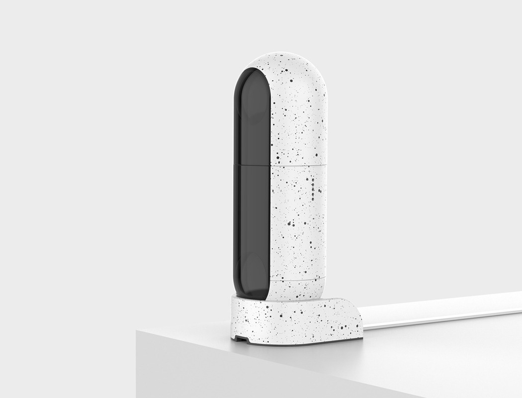
Meet, ORBIT, designed to work with existing smart systems, and carrying a design that shares its DNA with materials intended for space exploration, we certainly think it’s a desirable piece of kit! Packed within the simplistic, polycarbonate exterior is not one, but two cameras; positioned at the top is a 360° camera for unparalleled coverage, while the bottom remains stationary and boasts a wide-angle lens!

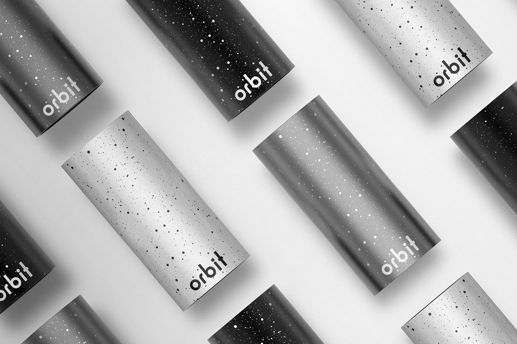
Its designer, Max Dahl, considered every aspect of the product in great detail, this is particularly noticeable in its sleek packaging; Orbit arrives in a cylindrical tube that shares the same, speckled, finish as Orbit, once opened the device is displayed on a pedestal surrounded by the logical organization of the complimenting accessories!

Designer: Max Dahl

orbit_home_security_01

orbit_home_security_02

orbit_home_security_03

“The exterior design features a polycarbonate compound, containing glass fiber. This material is very durable, lightweight, and shock-resistant as well as tolerant to humidity and temperature changes. The other remaining mechanical and electronic parts are sensitive which is why the chassis becomes the frame to which other parts of the camera are attached,” Dahl explains.

orbit_home_security_04

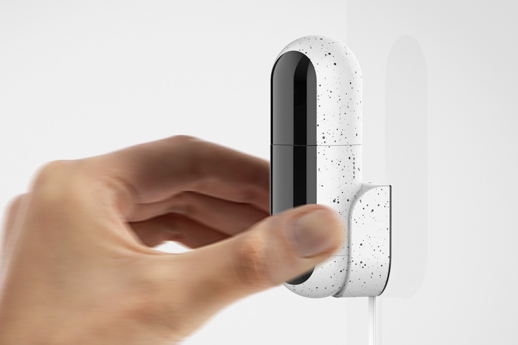
“Orbit it based around the idea of customizable positions, this is achieved by a magnet in the base of the docking surface. Unlike other smart home cameras the user is not required to mount it one given position”

orbit_home_security_05

“When designing the packaging for the Orbit brand I wanted the unboxing experience to maintain the same clean and logical sensibilities as the camera itself. The packaging features the same material finish as the camera inside, white, grey, and black”

orbit_home_security_06

“Orbit packing is easy to open, the design intention was to be as unobtrusive as possible allowing for a seamless experience. By having everything stack tightly together it reduced the overall packaging footprint and keeps the opening experience personal and unique”

This article was sent to us using the ‘Submit A Design’ feature.
We encourage designers/students/studios to send in their projects to be featured on Yanko Design!

A walking (joy)stick for the blind!

cloudandco_cane_1

Design for so many people is such a visual medium, one must ask oneself… If you remove sight from the design experience, does it still remain a good product? I find designing for the visually impaired quite an interesting domain, because they experience products in a way we don’t, or more importantly, cant. Try doing whatever it is you’re doing right now (eating a meal, perhaps) with your eyes closed. It’s a completely different experience that most people may not be comfortable with.

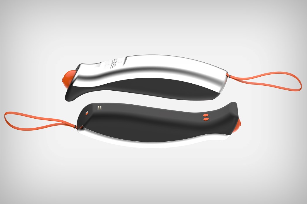
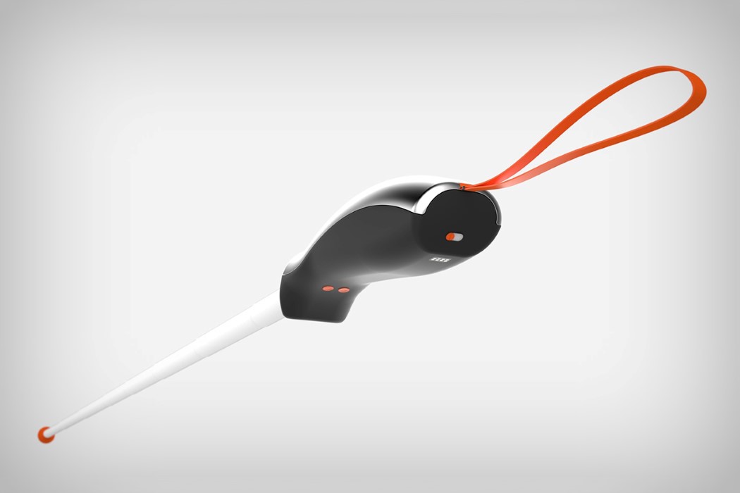
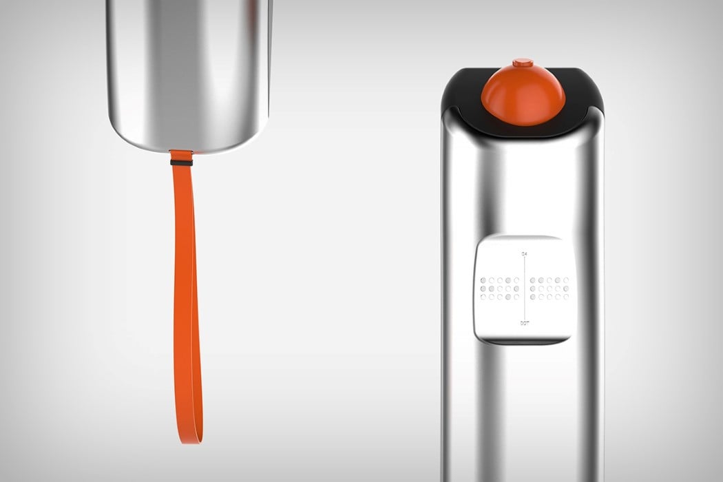
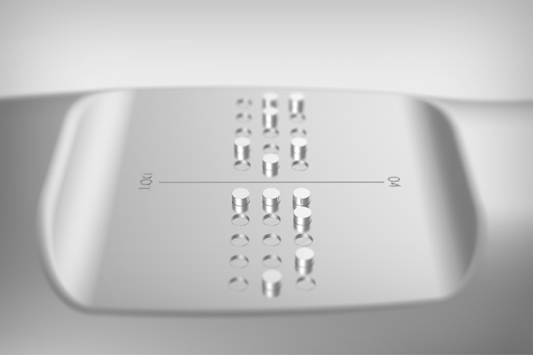
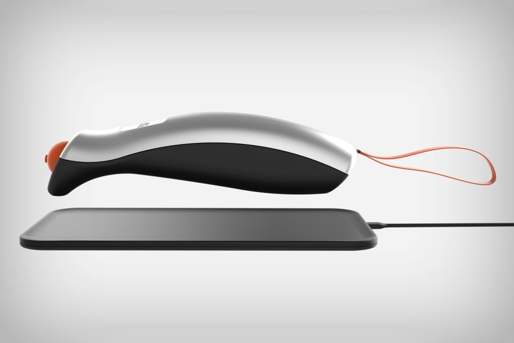
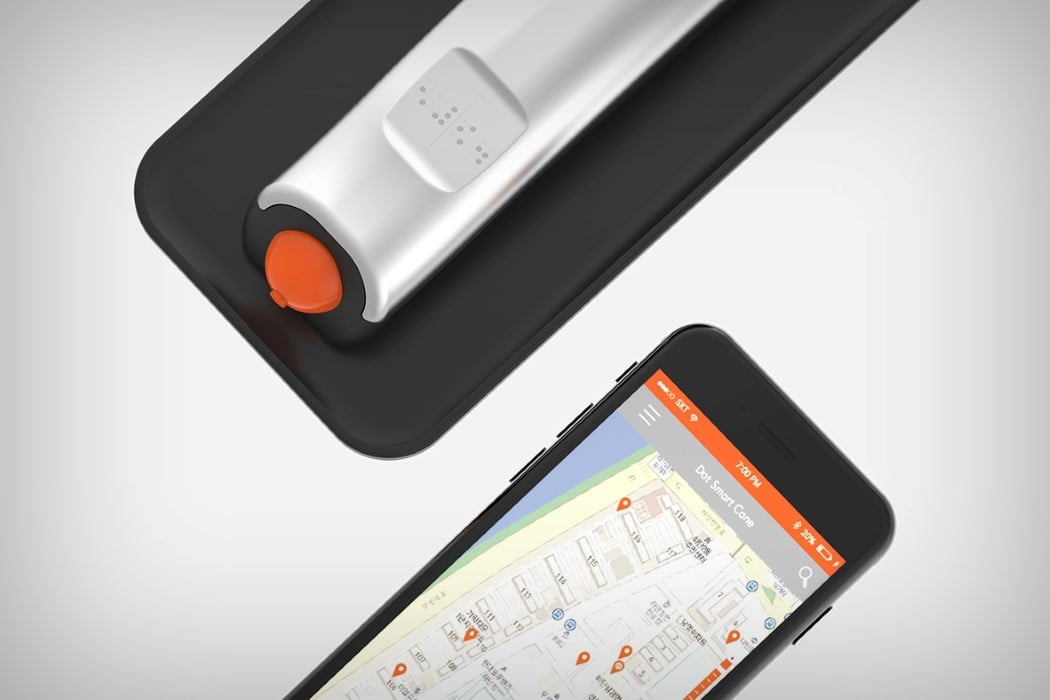
The Cloudandco Smart Cane by Brandon and Max takes on the challenge of designing a product with an experience that is far from visual. The ergonomic smart cane comes as just a joystick handle with an automatic telescoping stick that shoots out when switched on. However, the walking stick doesn’t stop there. It connects to an app on the smartphone, actually guiding the user to destinations they set. The Smart Cane can give off vibration and audio feedback, guiding its user to their destination. Users can toggle through destinations using a button on the top. There’s even a braille panel on the back that can communicate with the user.

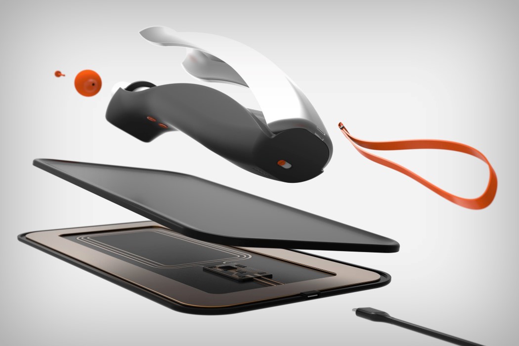
The Smart Cane takes its non-visual experience further by allowing the users to charge it wirelessly. Instead of having them fiddle with ports and cables, the Smart Cane can just be placed on its charging pad and it automatically gets charged for when it’s required next!

Designers: Brandon Cooke & Max Dahl

cloudandco_cane_2

cloudandco_cane_3

cloudandco_cane_5

cloudandco_cane_6

cloudandco_cane_7