Billboard that smells like French Fries tempts you to go to McDonald’s

There’s a chocolate drink factory near our place and when the wind blows down the main street, the smell of chocolate fills the entire area and every person is brought back to their childhood drinking a cup of hot cocoa in the morning. Also, on my walk to and from the office and my house, I pass by a McDonald’s store. When I’m especially hungry, that distinct smell of burger and fries (and sometimes chicken) actually tempts me to make a detour and enter the store to buy my dinner.

Designer: TBWANeboko and Raul & Rigel for McDonalds
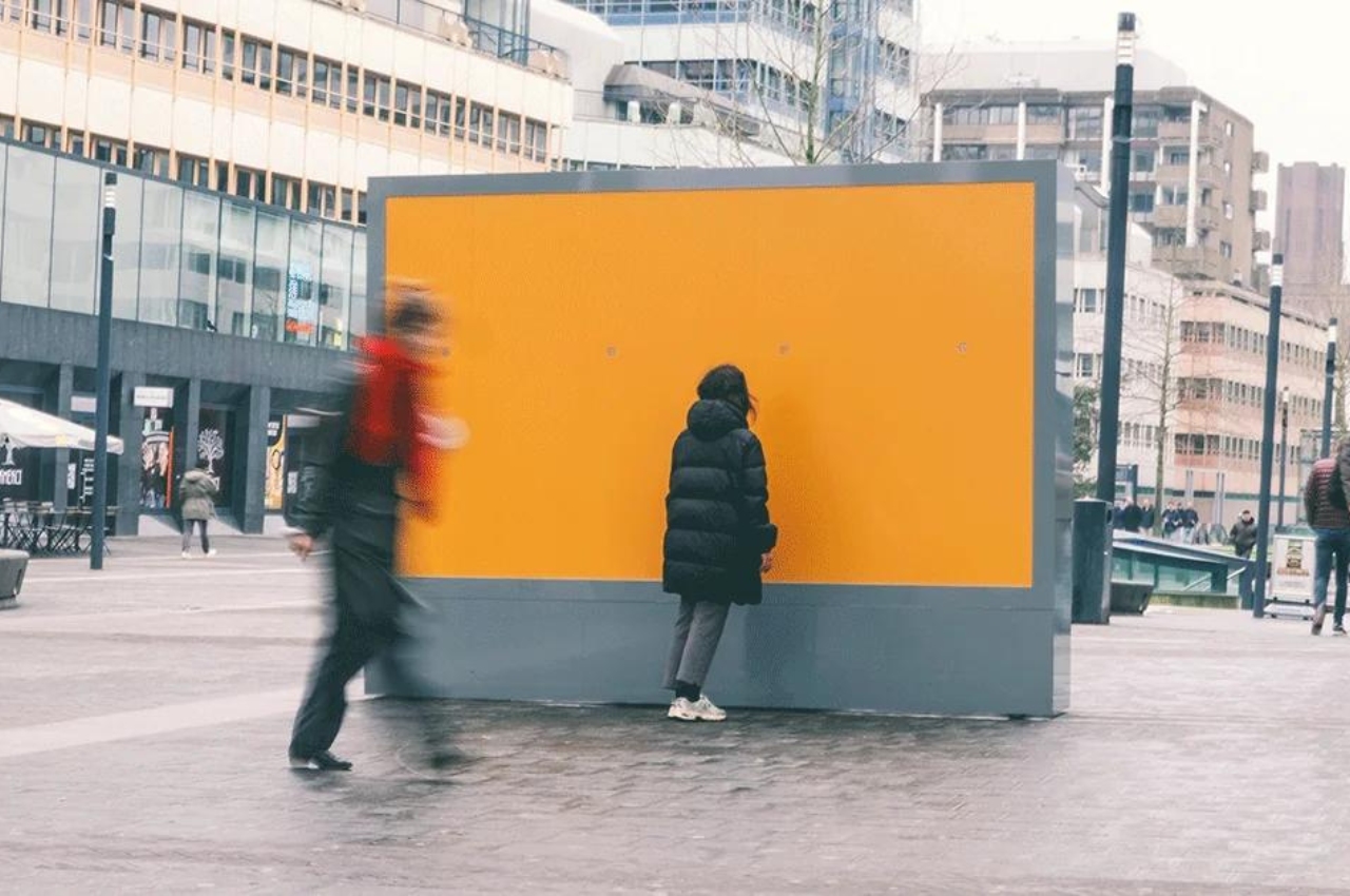
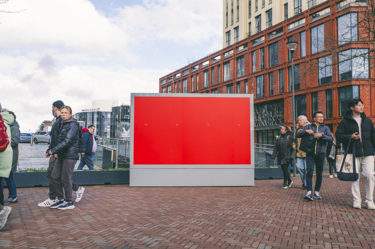
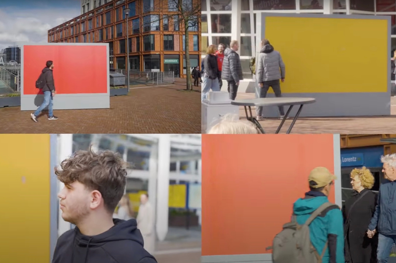
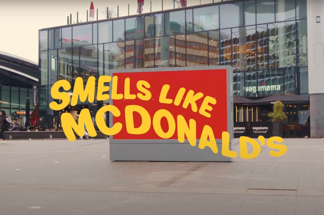
There are just some food brands that triggers our olfactory nerves and makes us want to buy their products to satisfy this craving brought about by smell. McDonald’s believes they’re one of those brands and in Netherlands, they’re putting this to good, creative, and aromatic use. Their ad agency TBWANeboko worked with production company Raul&Rigel to put up a series of unbranded street billboards with just the red and yellow colors. When you pass by within 5 meters of them, you get to smell the distinct aroma of McDonald’s French Fries, hopefully triggering a craving.
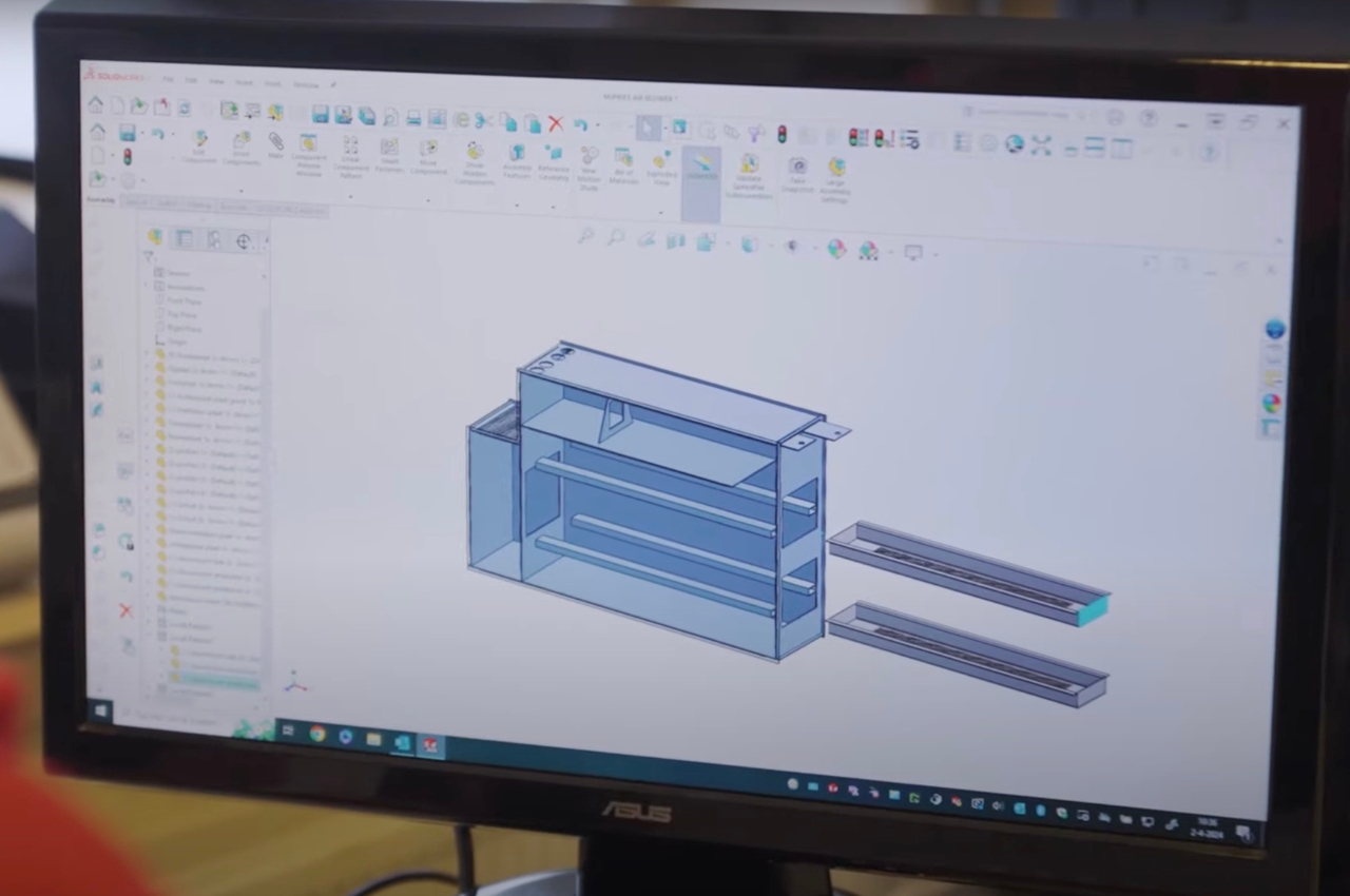
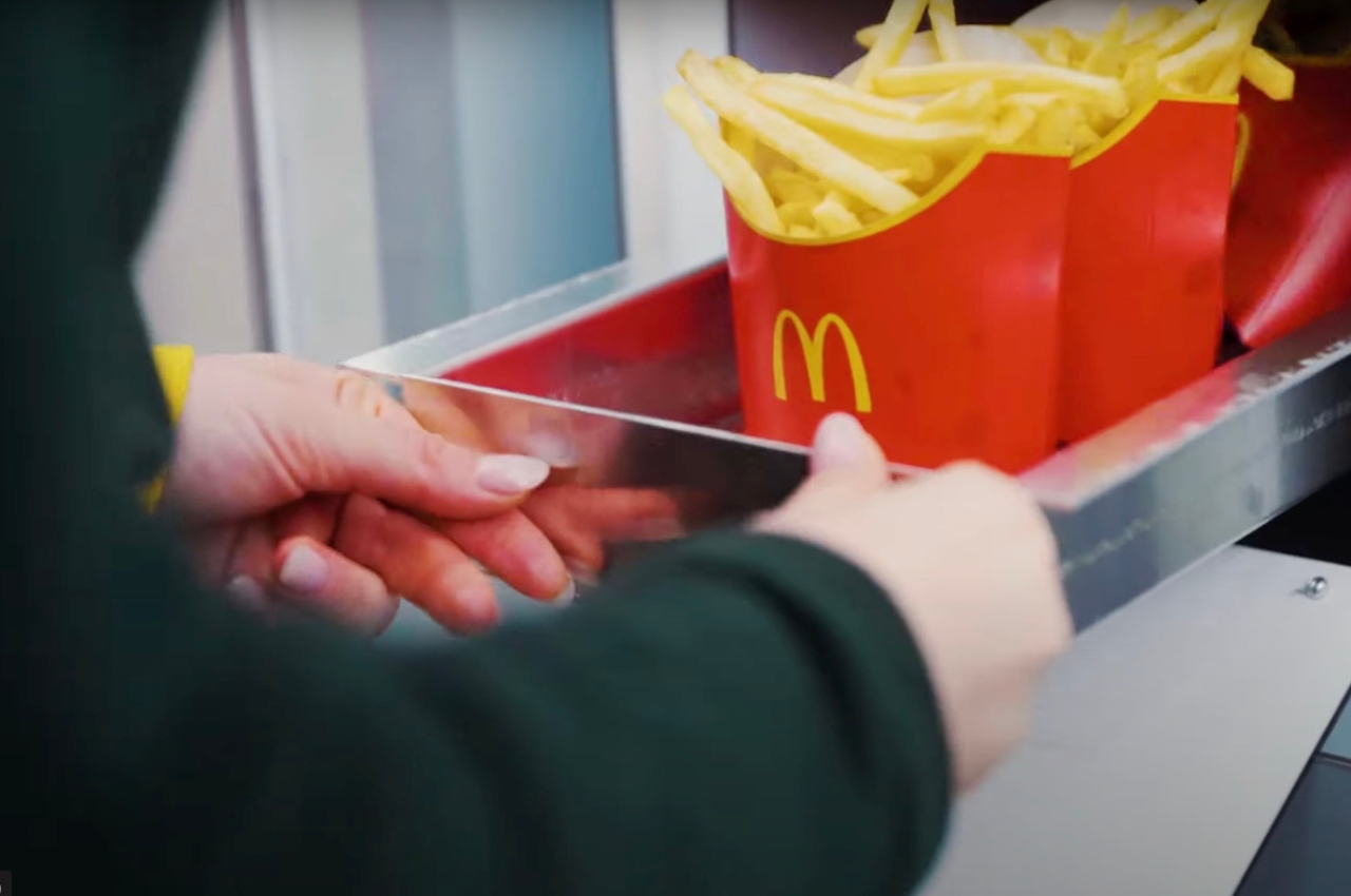
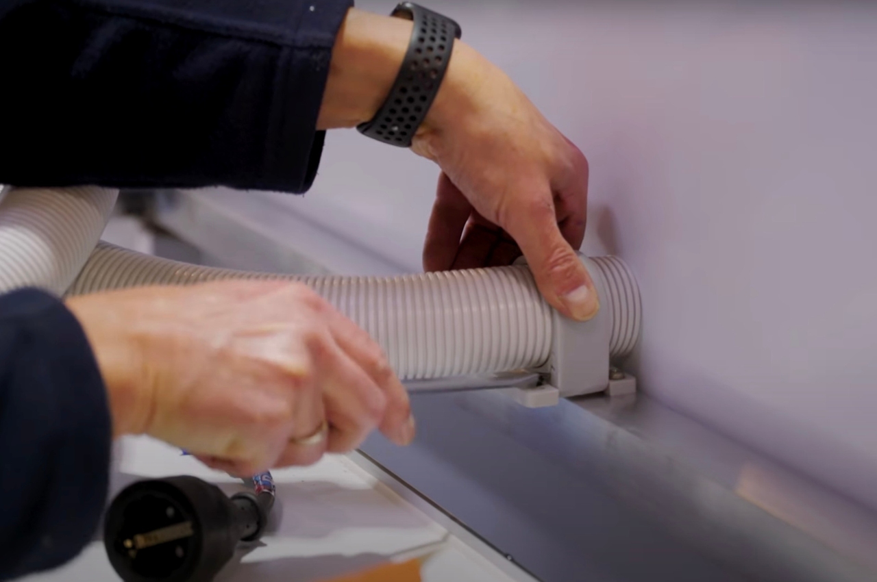
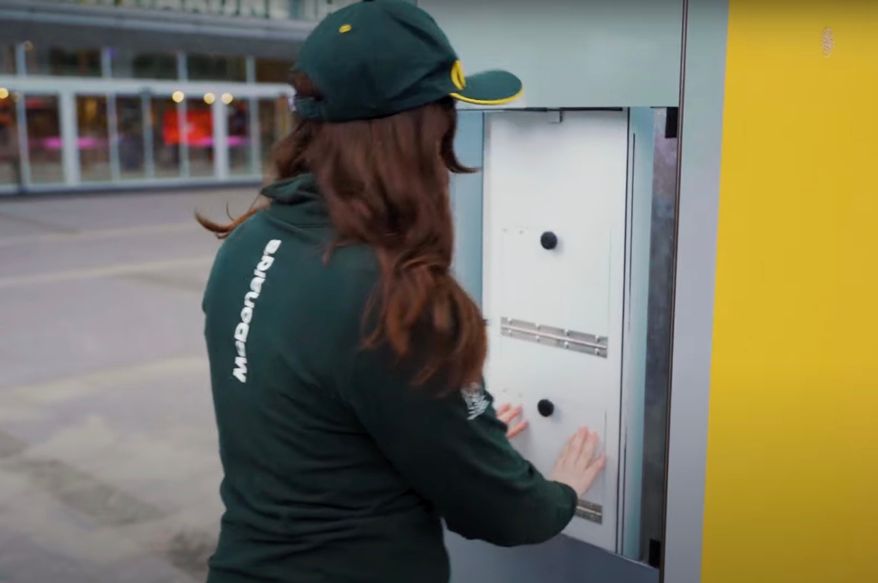
These scented billboards actually have a hidden compartment in them to store the aforementioned fries. There’s also an internal heat and ventilation system that is responsible for intensifying this smell and tempt anyone passing by to get fries. Of course they are located strategically near a McDonald’s, 200 meters away in fact, so that you can sate that craving and get your favorite fries (and maybe other things) because of that billboard smell.
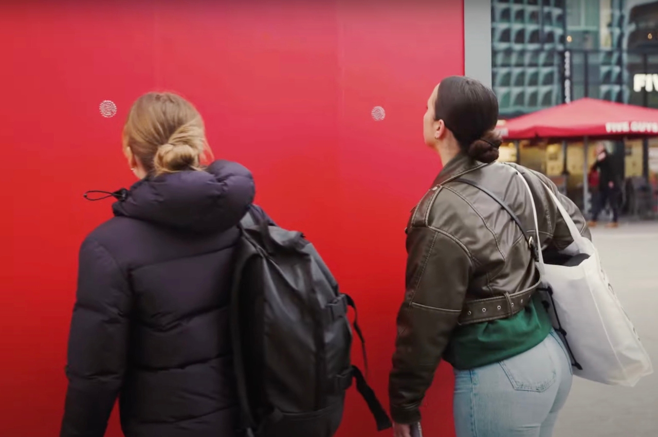
It’s a pretty creative way to take advantage of that feeling evoked in us when we smell something so distinct. It’s bad news though for people like me who are trying to stay away from carbs. Good thing that fries-scented billboard is only in the Netherlands, although passing by that McDonald’s every day is already temptation enough.
The post Billboard that smells like French Fries tempts you to go to McDonald’s first appeared on Yanko Design.
McDonald’s uses iconic brown paper bag for order in campaign

Most restaurants would probably have campaigns encouraging you to go and visit their establishment and have a meal inside. But probably for fast food places, they would not like people to linger at their store and take up space. In Norway, McDonald’s customers usually eat their meals at the store or in their cars. So the fast-food chain started a campaign to encourage people to eat their favorite McDonald’s meals in the comfort of their own homes.

Designer: Julie Wilkinson from Makerie Studio

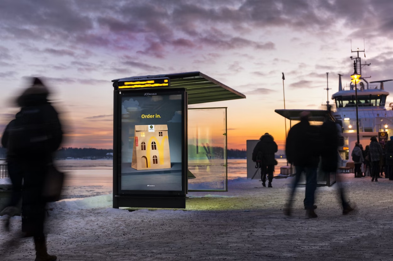
For this campaign that has a very simple tagline “Order in.”, they used something that’s very familiar to those who are ordering food to go: the takeout (or takeaway) bag. The outdoor camapaign features the omnipresent brown bag but hand-cut to show the traditional apartment buildings found in Norway with square and arched windows plus an arched doorway. They wanted to make sure that there was a balance between the iconic look of the bag and an instantly recognizable building.

The hand-cut image was then captured on camera by photographer Catharina Caprino for the campaign and there were no digital touch-ups for this. Everything was done in-camera, including the window light turned on in one of the windows. The minimalist design of the imagery that will be used for the campaign adds to the pretty simple message that they want to convey. The paper bag is already pretty simple so they just needed a couple of elements to complete it.

McDonald’s ad agency in Norway, Nord DDB Oslo, will be populating the country’s major cities with this imagery with the aforementioned tagline. They will be doing it in a pretty appropriate season which is winter. It will be too cold to go out or even eat in the car so they want customers to enjoy their ordered meals in the comfort of their heated homes.

The post McDonald’s uses iconic brown paper bag for order in campaign first appeared on Yanko Design.
McDonald’s Opens Its First LEED Zero Carbon Restaurant in Hong Kong

Living in a sustainable, conscious, and smart manner has become not only a necessity but our moral obligation and duty toward the planet. Our homes should seamlessly integrate with, and nourish the planet, not drain her resources and reduce her lifespan. Being at one with Planet Earth, while taking rigorous care of her has never been more of a priority. In an effort to encourage an eco-friendly way of life, sustainable architecture has been gaining immense popularity among architects. And, McDonald’s has jumped onto that bandwagon with its outlet in Tai Wo, Hong Kong.

Designer: McDonald’s

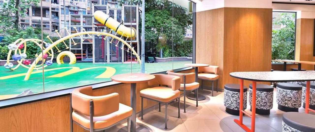
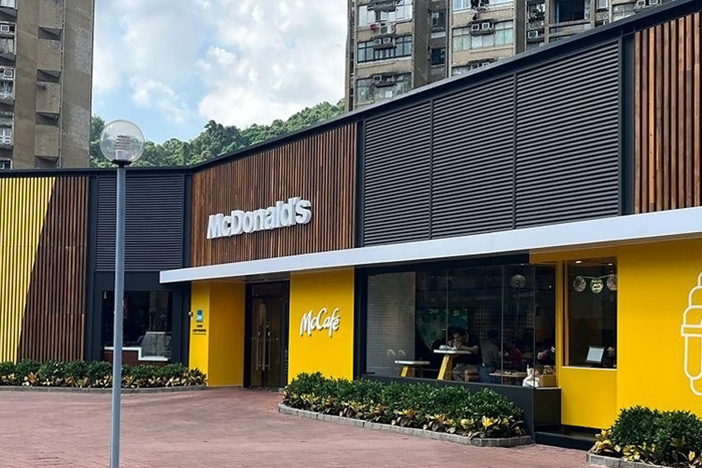
McDonald’s Tai Wo outlet in Hong Kong recently underwent a renovation that transformed it into a prime specimen of sustainable design and architecture. The restaurant is a testament to how sustainability can be incorporated almost anywhere with the right direction, effort, and intention. The Tai Wo location is Hong Kong’s first LEED Zero Carbon restaurant certified by the US Green Building Council. The building will save 848.22 metric tons of carbon dioxide which equates to planting more than 36,000 16-foot-tall trees!

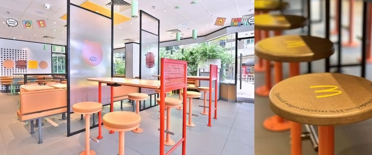
The space is defined by twenty commendable sustainability efforts, which are working throughout it. McDonald’s collaborated with eco-social startup HK TIMBERBANK, and designed the exterior facade which is crafted from local trees. These trees fell either due to old age or typhoons. In fact, even the furniture and décor inside are built using recycled materials. McDonald’s also teamed up with CLP Power Hong Kong to set up a solar power system on the rooftop.

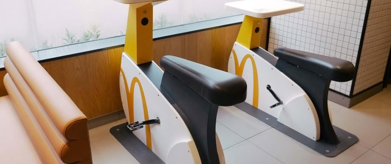
The entire building is marked with smart devices to monitor energy consumption and indoor air quality. In fact, the restaurant has also signed a “green lease” with the landlord to share data connected to sustainability and lay down low-carbon operational guidelines. It incorporates an education corner that is packed with sustainability-themed books, providing integral reading material to the next generation. Cool phone-charging bikes that can be ridden by visiting families have been added to the space as well. McDonald’s is also releasing a new line of Happy Meal books and coloring games that encourage children visiting to learn about environmental protection.

The post McDonald’s Opens Its First LEED Zero Carbon Restaurant in Hong Kong first appeared on Yanko Design.
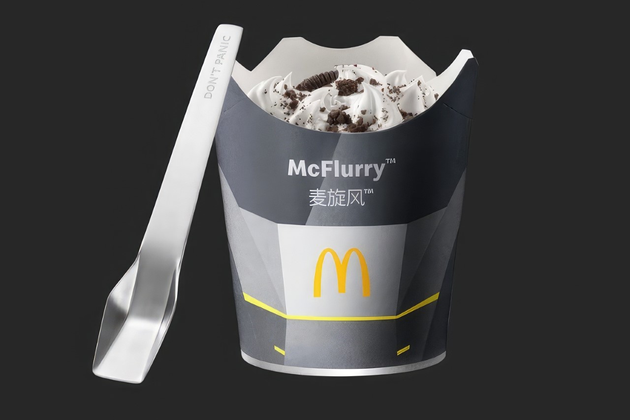
McDonalds ‘Outshines’ Tesla with their Metal “CyberSpoon” for the McFlurry

Have you ever looked at the Cybertruck and thought “Hmmm… cutlery”? Apparently someone at McDonalds’ China Office did.

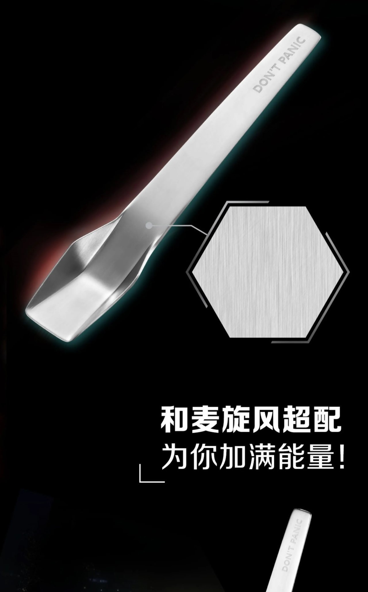
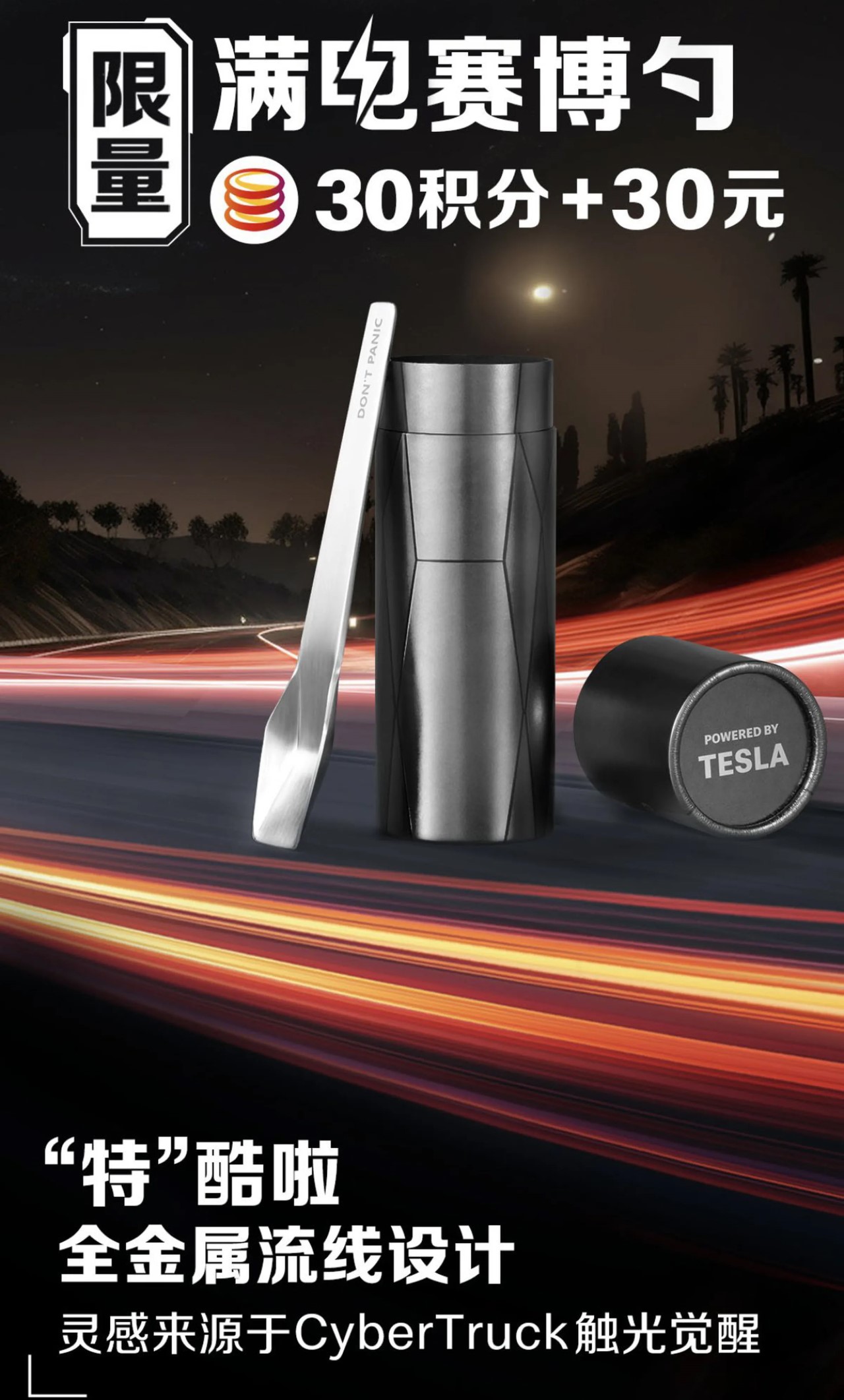
Limited to just 50,000 units, these spoons are only available in select McDonalds outlets across China. Created as a partnership between the golden arches company and Tesla’s China team, the Cyberspoon comes with its own storage tube that has “powered by Tesla” stamped on the end. Even Elon Musk dubbed it as a probable fake on X (formerly known as Twitter), only to realize it wasn’t a fan-made parody!

Designers: McDonalds & Tesla

The spoon comes stamped out of sheet metal, with the iconic geometric pattern popularized by the Cybertruck in 2019. The words “Don’t Panic” are etched onto the spoon’s stem, and the metallic piece of cutlery sports a brushed finish from top to bottom, quite like its inspiration.

This isn’t the first time Tesla’s Chinese operation has launched a weird Cyber-themed product. Earlier this year the automaker even announced a similarly angular cat nest made from cardboard. The spoon’s limited to a few thousand units, so getting your hands on them probably won’t be easy. Tesla’s Weibo account announced the Cyberspoon starting at just 30 yuan (around $4). If you’ve got more to spare, consider buying a Cyberwhistle instead…

The post McDonalds ‘Outshines’ Tesla with their Metal “CyberSpoon” for the McFlurry first appeared on Yanko Design.
McDonald’s designs takeout bags that turn into an outdoor table in Milan

Most of the time, when I order take out from a fast food chain, that’s because I want to eat it at the office or at my house. Because I live in a pretty humid country, very rarely would I want to actually eat outdoors. And even if I wanted to enjoy fresh air while gobbling up fries , there are not enough places where I can just sit down (or stand up) and enjoy my lunch or snacks. If you live in Milan (I wish I did for many reasons), McDonald’s has a solution for you.

Designer: Leo Burnett for McDonald’s

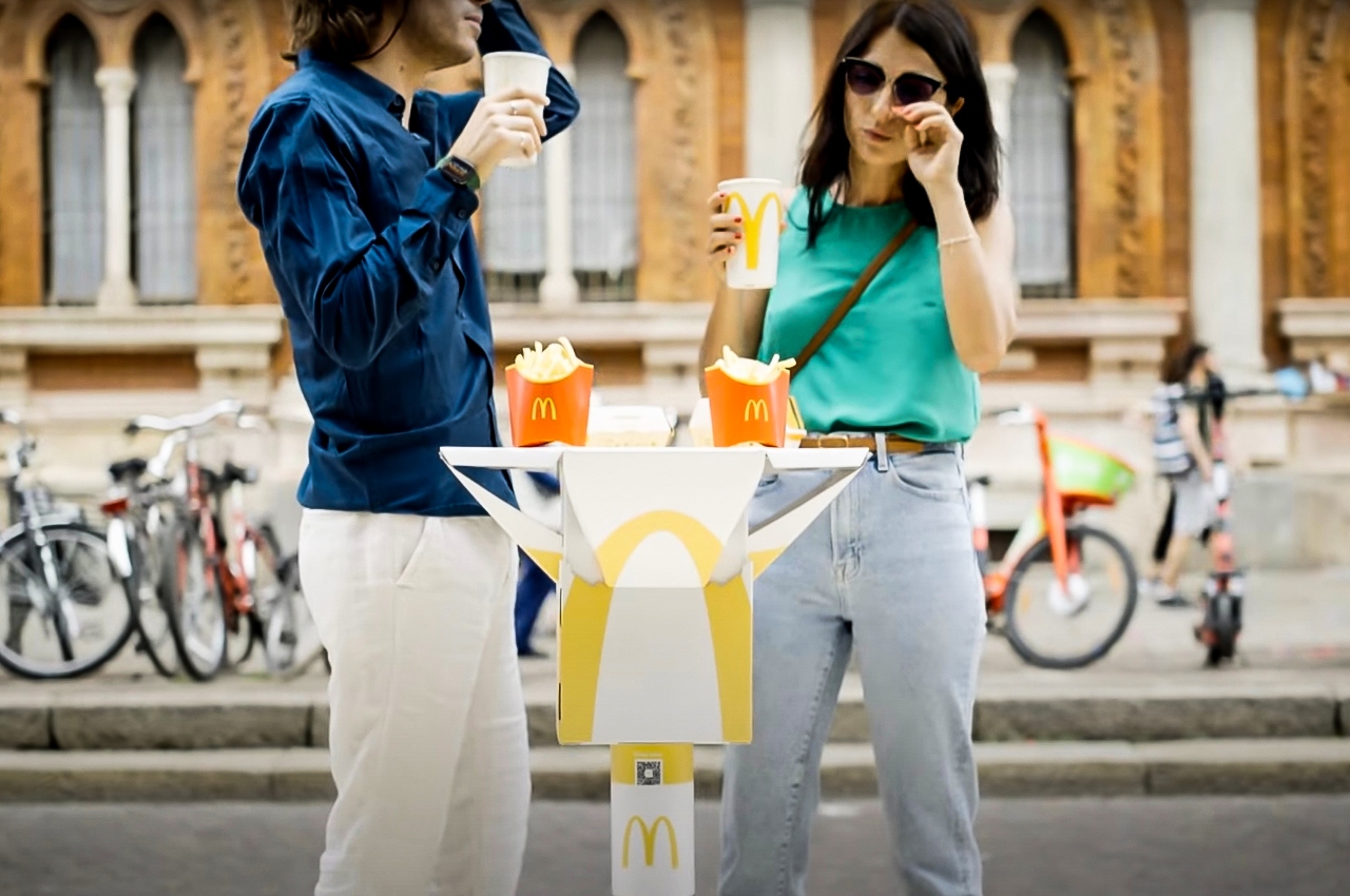
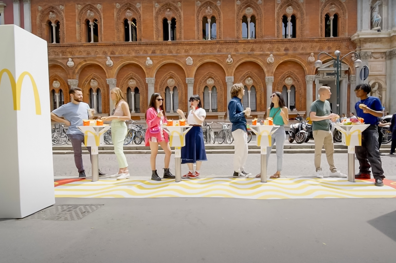
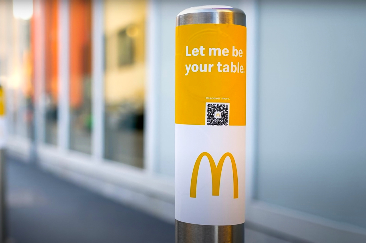
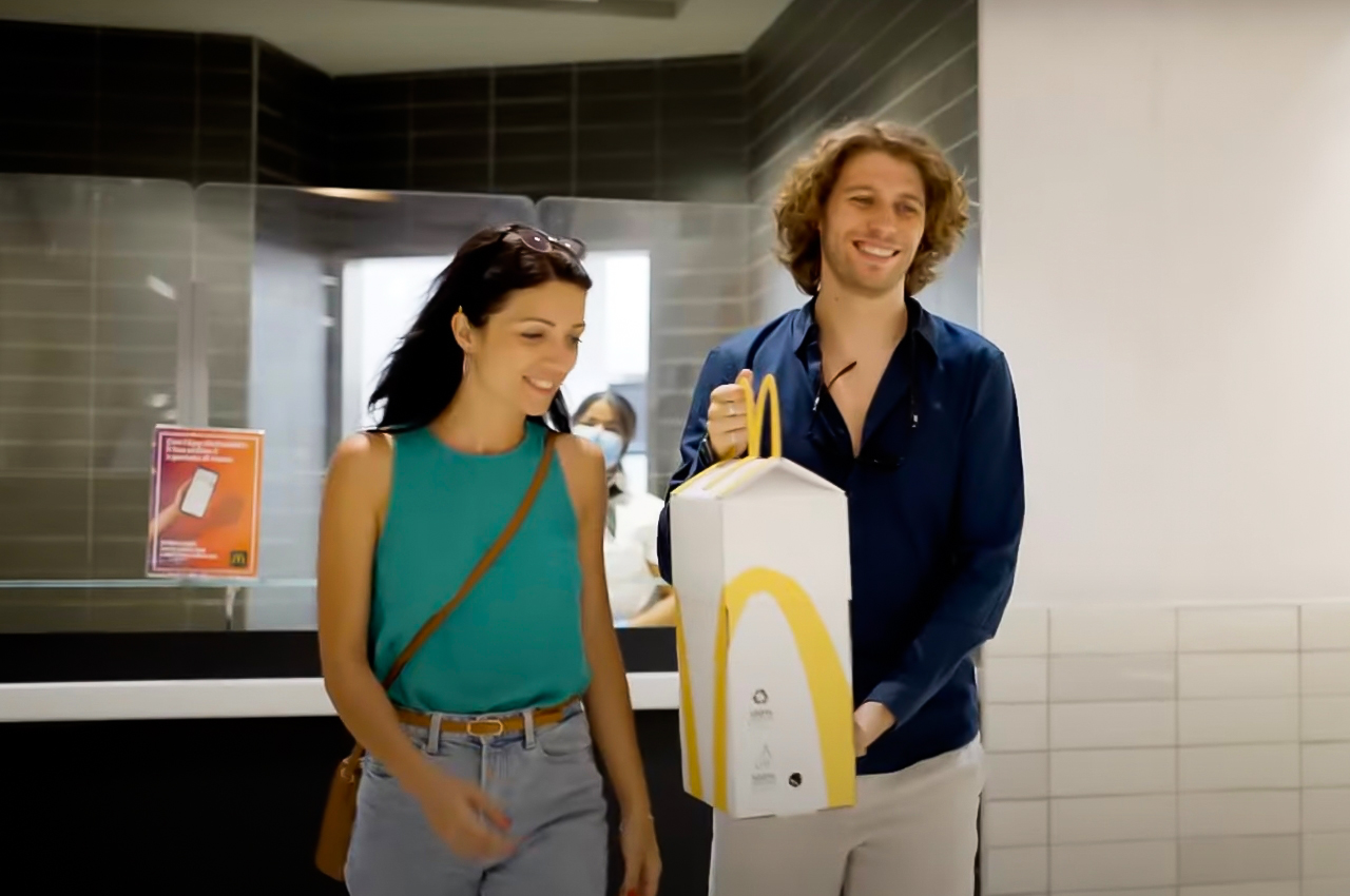
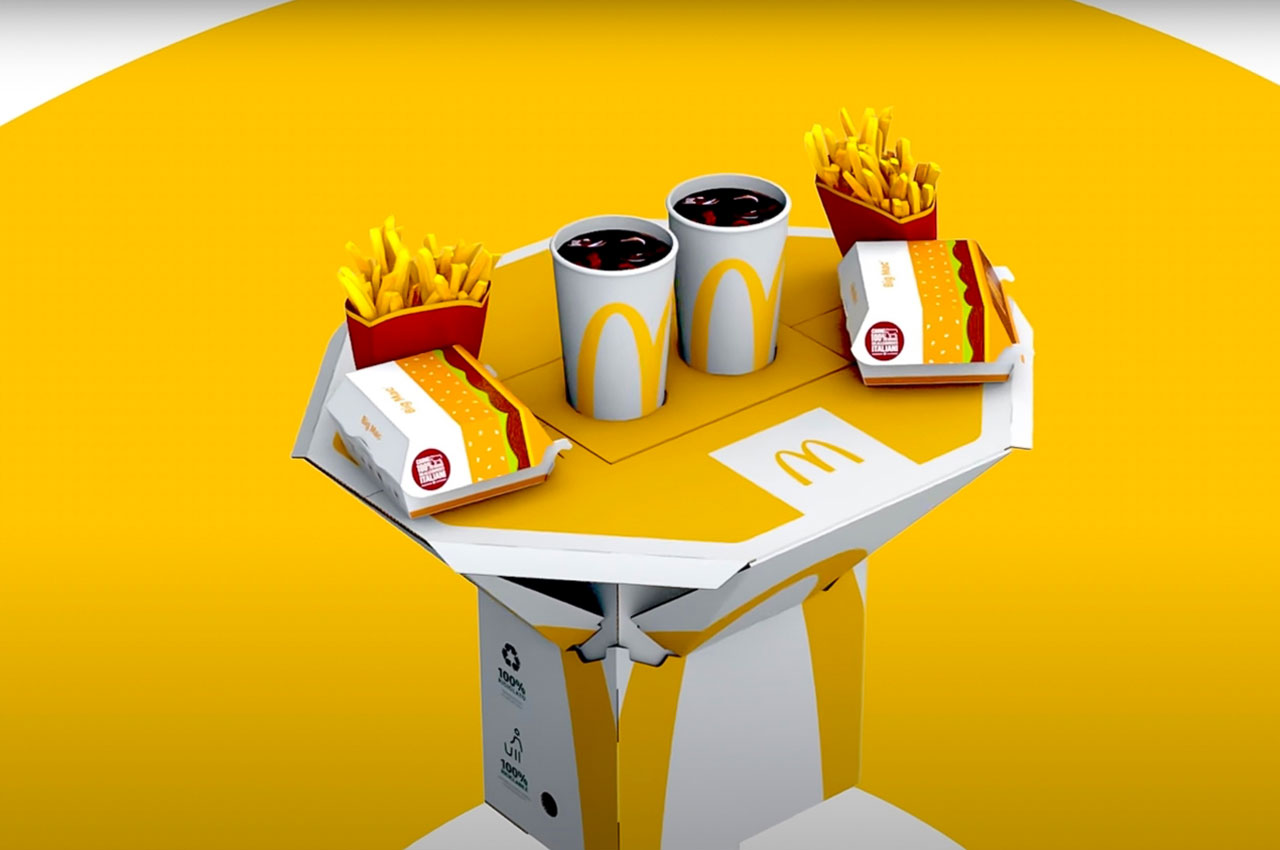
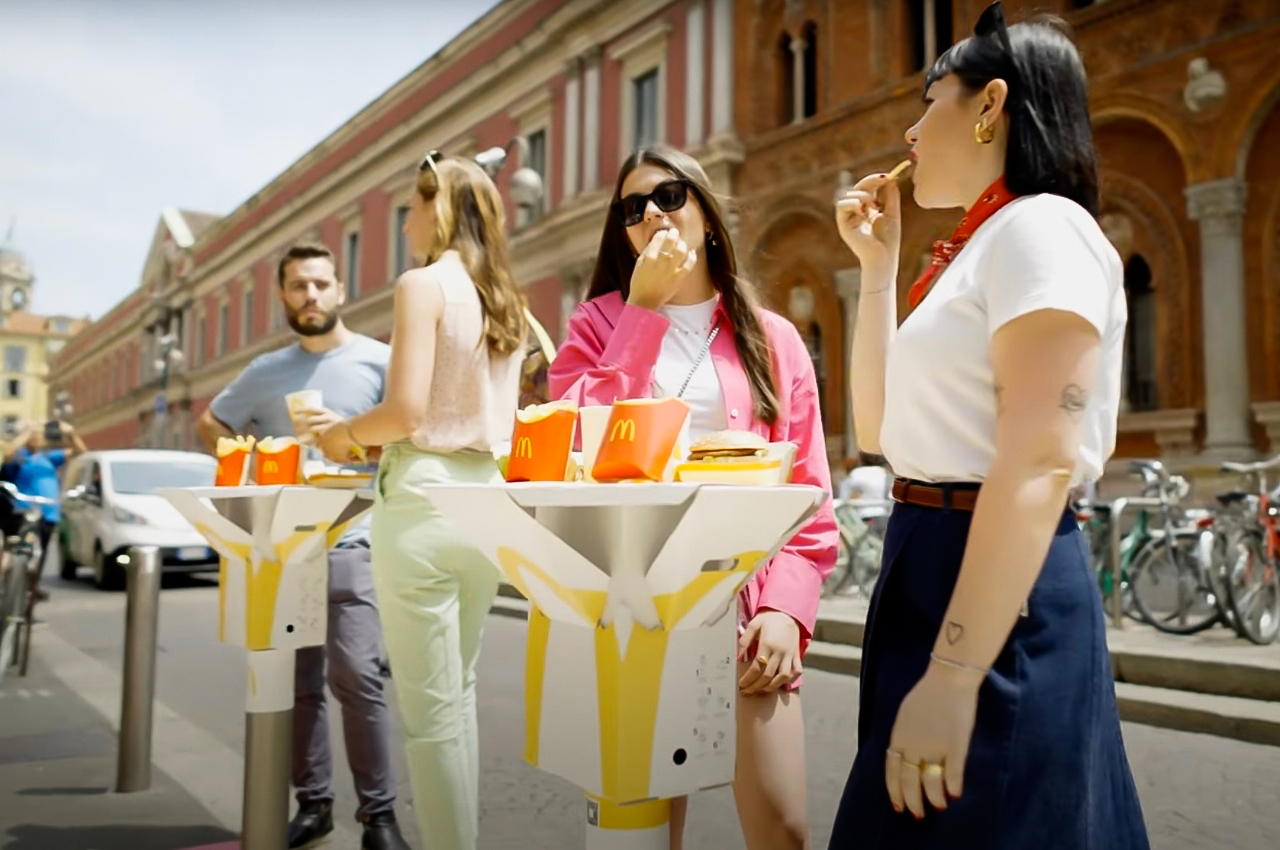
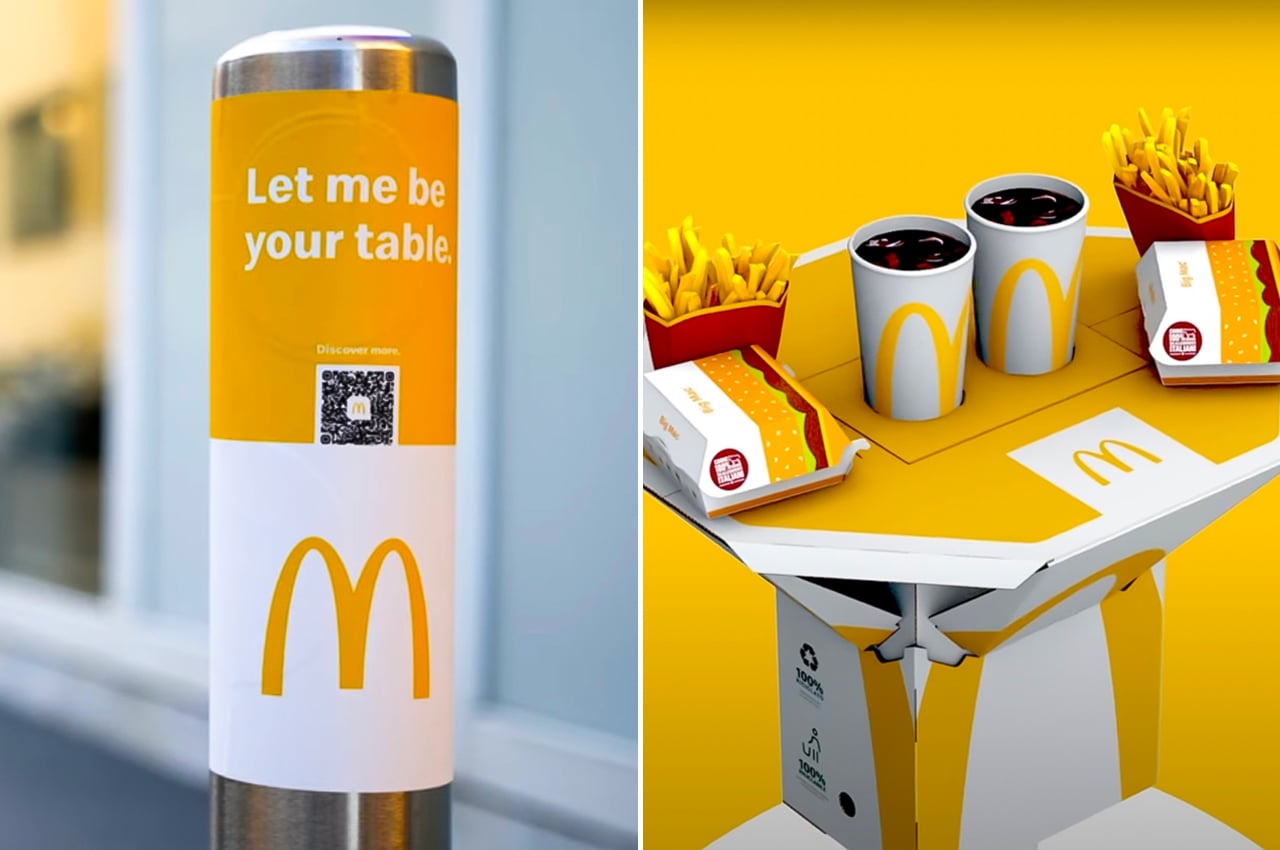
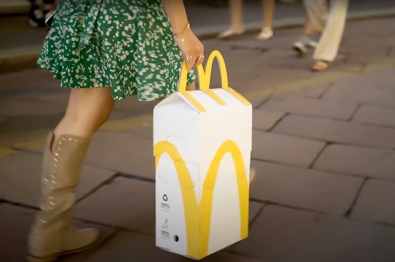
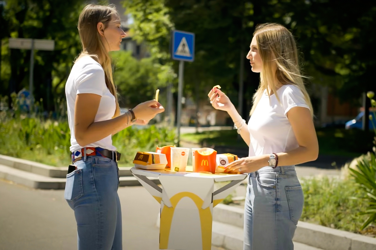
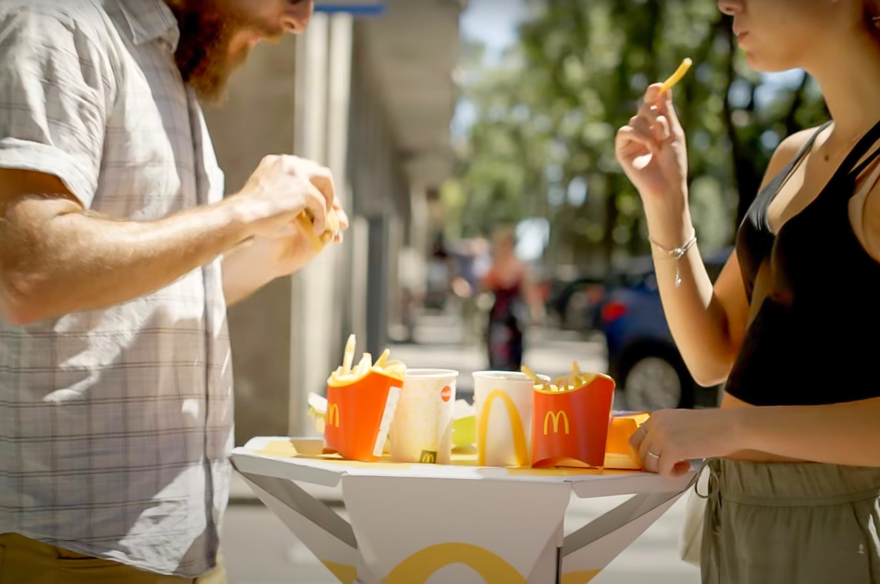
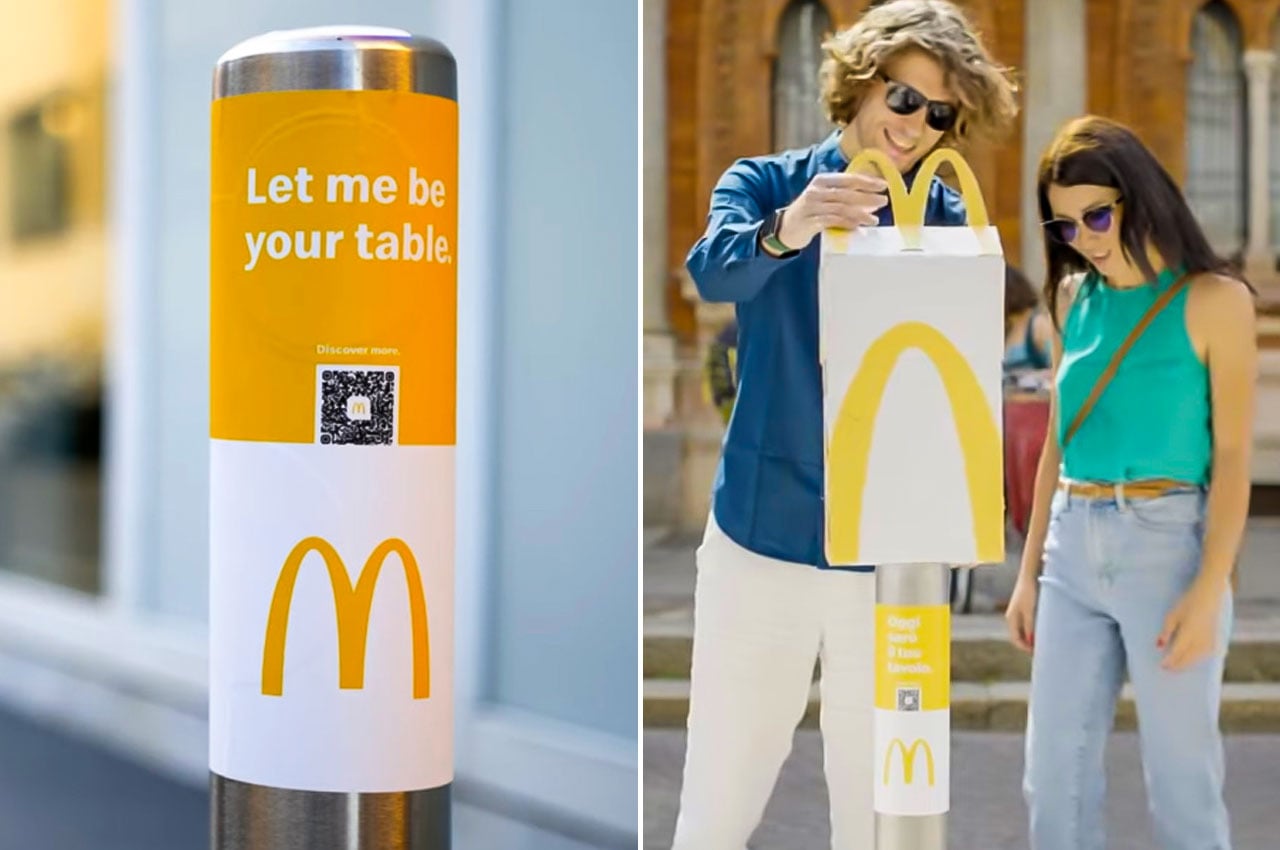
For this year’s Milan Design Week, they released a limited edition TableBag which serves as not just your takeout box but can also be turned into an outdoor table, provided you have a post to place it on. They actually provided some of these posts and they come with a sign that says “Let me be your table.” although they didn’t really say if any other post or short pole will do.

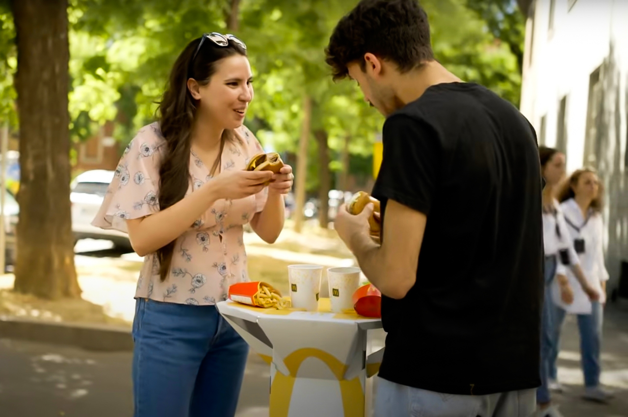
The take out box doesn’t look like the usual one you get from the fast food chain. In fact, it is pretty big considering that you will turn it into a sort of table. Once you’ve unfolded your cardboard tabletop, it’s enough to fit in two sets of burgers and fries and cup holders for a pair of drinks as well. When you’re done using it as a table, you can bring it to a recycle bin since the entire thing is fully recyclable.

If you’re expecting this table top to be available at the McDonald’s near you, sorry to say that these were only for a few, lucky people who ordered through their app in Milan. It is a pretty interesting idea though that other countries can adapt, although as mentioned, it’s hard to eat outside where I’m from so it probably won’t reach a lot of places.

The post McDonald’s designs takeout bags that turn into an outdoor table in Milan first appeared on Yanko Design.
McDonald’s France teams up with Elium Studio to create a range of reusable tableware to reduce waste

Packaging is a major component of the food industry, and the fact that hundreds of millions of container boxes, cups, trays, cutlery, and cans are being discarded away, creating ginormous amounts of waste, and hurting the environment is an alarming concern. Single-use packaging is lethal to the environment, and it’s a sad reality that most fast-food chains serve their food in single-use containers and cups. And, McDonald’s is no exception to this! However, McDonald’s France has decided to take a step in the right direction, which is the more eco-friendly and sustainable route. Let’s find out more.

Designer: Elium Studio

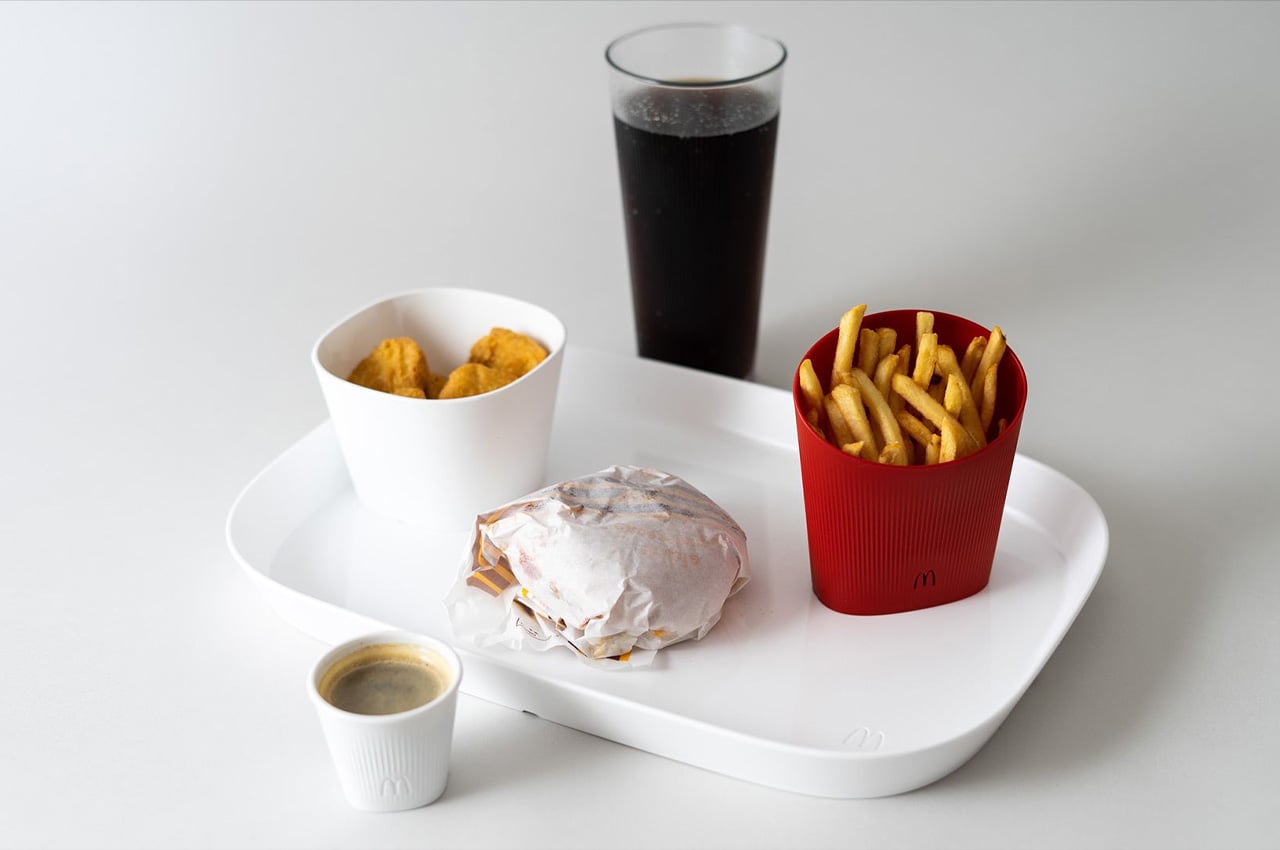
The French global design studio Elium Studio collaborated with McDonald’s France to create reusable tableware that can be utilized in the iconic fast-food chain’s restaurants. Most of the containers used by McDonald’s today cannot be reused, whether they’re plates or cups, they need to be thrown away after a single use. France, as a country, has been taking holistic steps to reduce waste. For example, in January 2023, France announced that restaurants with more than 20 seats need to offer their customers reusable and washable serving container alternatives. So, this step by McDonald’s France is truly a move of solidarity in the right direction.

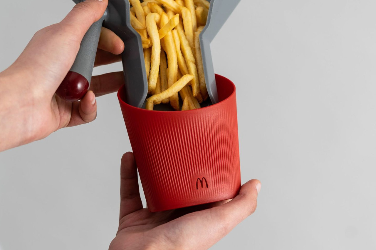
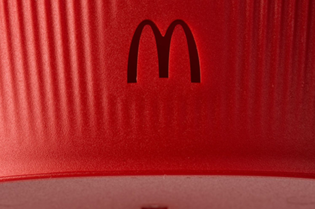
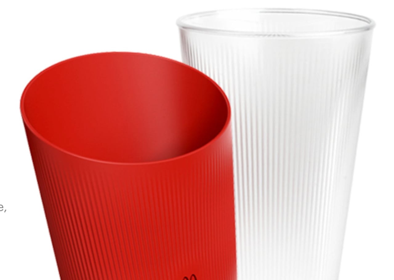
Elium Studio designed a range of rather colorful and cute tableware that will be made using ‘Tritan’. Now, what is Tritan? Tritan is a plastic resin that is similar to glass and ceramic in its hardness and transparency and preserves the organoleptic qualities of food, which basically means it successfully retains the taste and smell of the food. The tableware was integrated with vents, graining, and striations to impart it with improved functionality and elevate the customer’s dining experience. Elium Studio and McDonald’s France have been working on this project for the past two years, and the result is truly commendable.

The tableware products retain McDonald’s original essence and design philosophy. The container for the french fries is still the iconic red we are so accustomed to, however, it is a much more eco-friendly option, as compared to its predecessor. I do believe this initiative by McDonald’s France could encourage other fast-food chains to make greener and more sustainable choices.

The post McDonald’s France teams up with Elium Studio to create a range of reusable tableware to reduce waste first appeared on Yanko Design.
Artist Crafts Entire McDonald’s Out Of Felt: McPlushies

Felt artist Lucy Sparrow went and constructed an entire McDonald’s restaurant out of felt, complete with a menu board, food items, a drink machine, seating, and wall art. Wow. Would I try to eat the fries? Of course, I’d try to eat the fries; I am a terrible decision-maker, aren’t I?

The McHappiness store was recently on display at the SCOPE Art Show in Miami Beach, Florida, and undoubtedly brought much McHappiness to everyone who got to see it. I only wonder if Lucy’s ice cream machine was out-of-order or not. The last time the ice cream machine at my local McDonald’s wasn’t out-of-order? Late 2018, and I go regularly.

I wonder just how many hours Lucy worked on crafting the store because I imagine it was quite a few. I mean Rome wasn’t built in a day, and this is way crazier than Rome. I mean, at least in my opinion. Now, if you’ll excuse me, I have a change.org petition to start to make the McRib a permanent menu item.

A hat tip to Rusty of Rusty’s Electric Dreams for the heads up.

This McDonald’s Gaming Chair looks so tempting and so wrong at the same time

We’re already nearing the end of the year, but you’d be forgiven if you felt we went back in time to April or moved fast forward to next year’s date. With gaming continuing to be a highly profitable market, more companies are trying to get their toes wet and claim a piece of the pie. That includes companies with totally no direct connection to video games, like fast food chains. Although not as ridiculous as KFC’s “KFConsole” gaming PC, McDonald’s UK office is apparently trying to get its game on with a similarly contentious product aimed at PC gamers. On the one hand, it might hit all the right notes for a gamer’s dream chair. On the other hand, it also checks all the wrong stereotypes and encourages a lifestyle that further paints gamers in a negative light.

Designer: McDonald’s UK (via Facebook)

Parents used to tell kids not to eat while using the computer, though that was probably more from fear of damaging the computer with spilled drinks or ruining keyboards with oils and crumbs. Eating in front of the computer does have such dangers, but it also develops an unhealthy habit of not eating properly or not drawing the line between personal life and work life. Unfortunately, that’s the kind of unbalanced lifestyle that most people have in mind when thinking of gamers, and McDonald’s isn’t doing this market any favors even as it tries to sell them its latest gimmick.

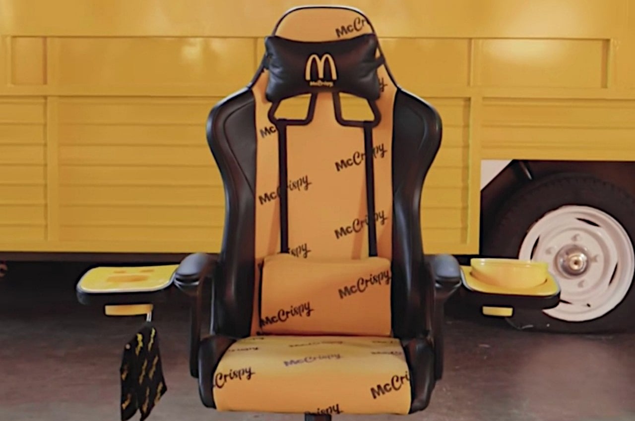
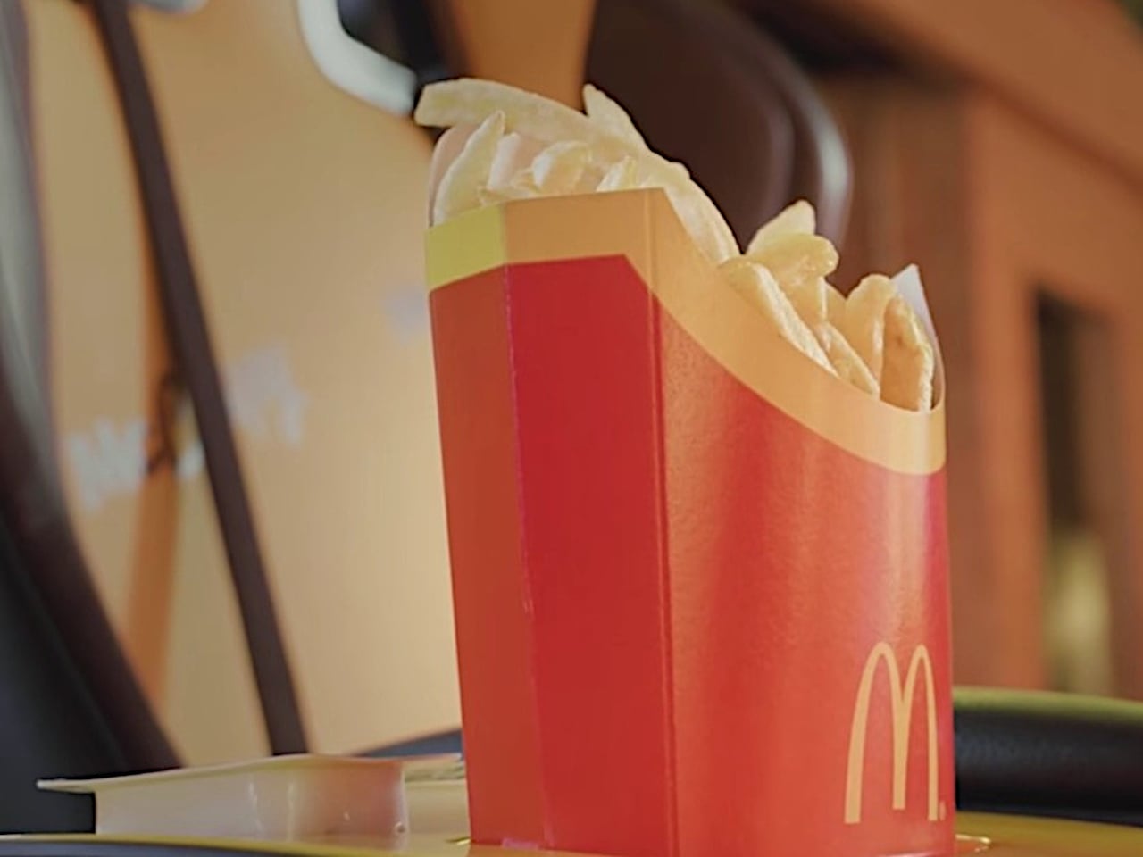
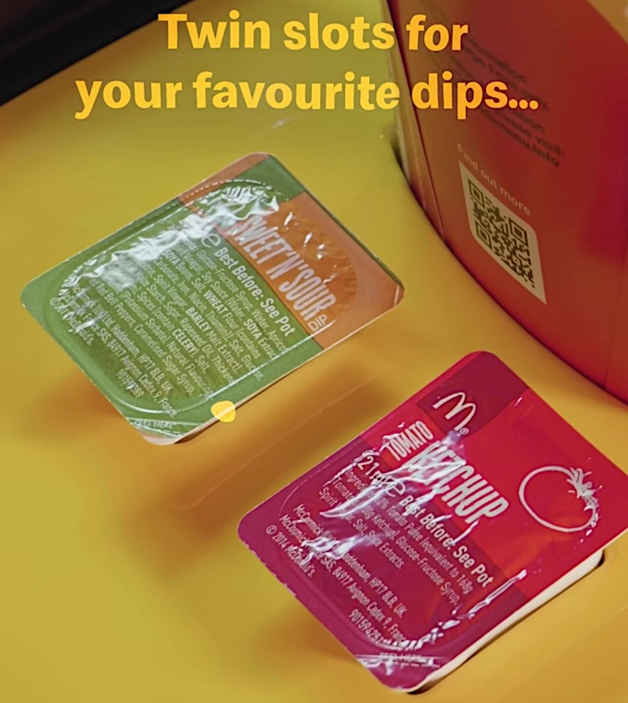
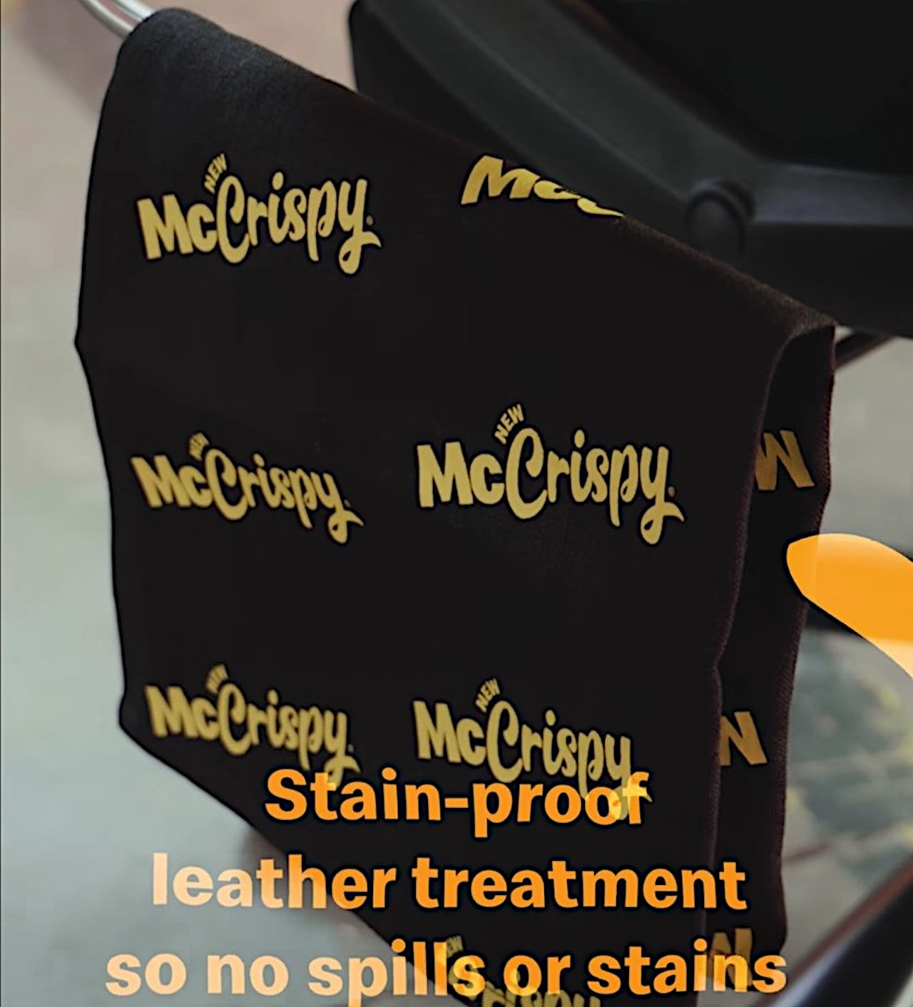
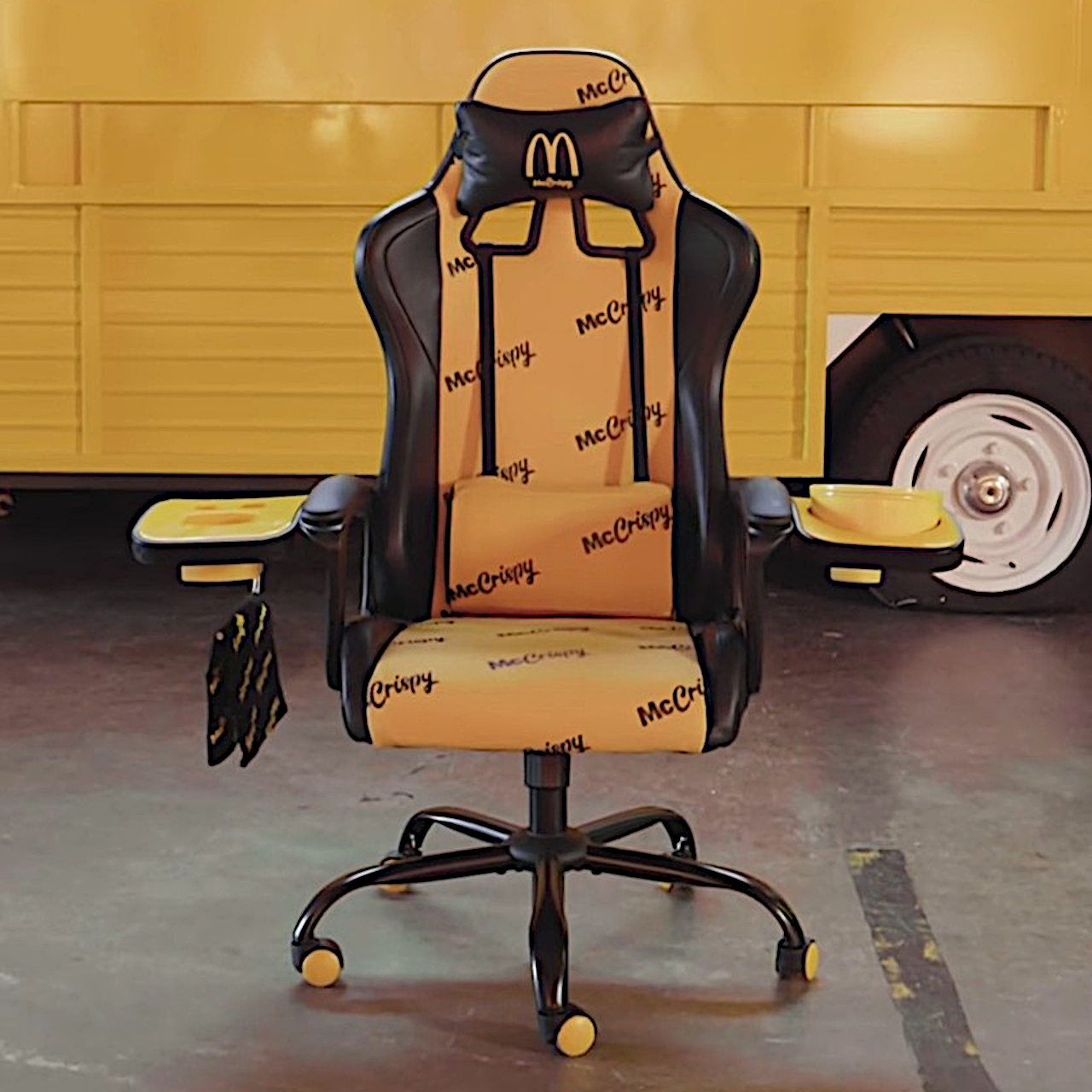
Formally called the McCrispy Ultimate Gaming Chair in honor of its newly-launched chicken sandwich, the chair adds dedicated compartments for gamers to enjoy the meal, complete with all the sides and drinks. On the right side, you have a container for fries, two dedicated slots for dips, and a hanger for a towel to wipe your mouth and hands with. On the left, there’s a hot box that will keep that McCrispy or any other food warm. There’s also a holder for a large drink, and it’s thankfully situated near the back, far away from potential accidents.

For avid PC gamers, it definitely promises the ultimate convenience of having your food within easy reach. It doesn’t have to be McCrispy meals either, as the containers and holders can be used for other food as well. That’s not going to help improve a gamer’s physical and mental health, not to mention it still runs the risk of ruining expensive gaming peripherals with oils from foods. It won’t harm the chair itself, though, since McDonald’s promises it uses stain-proof leather.

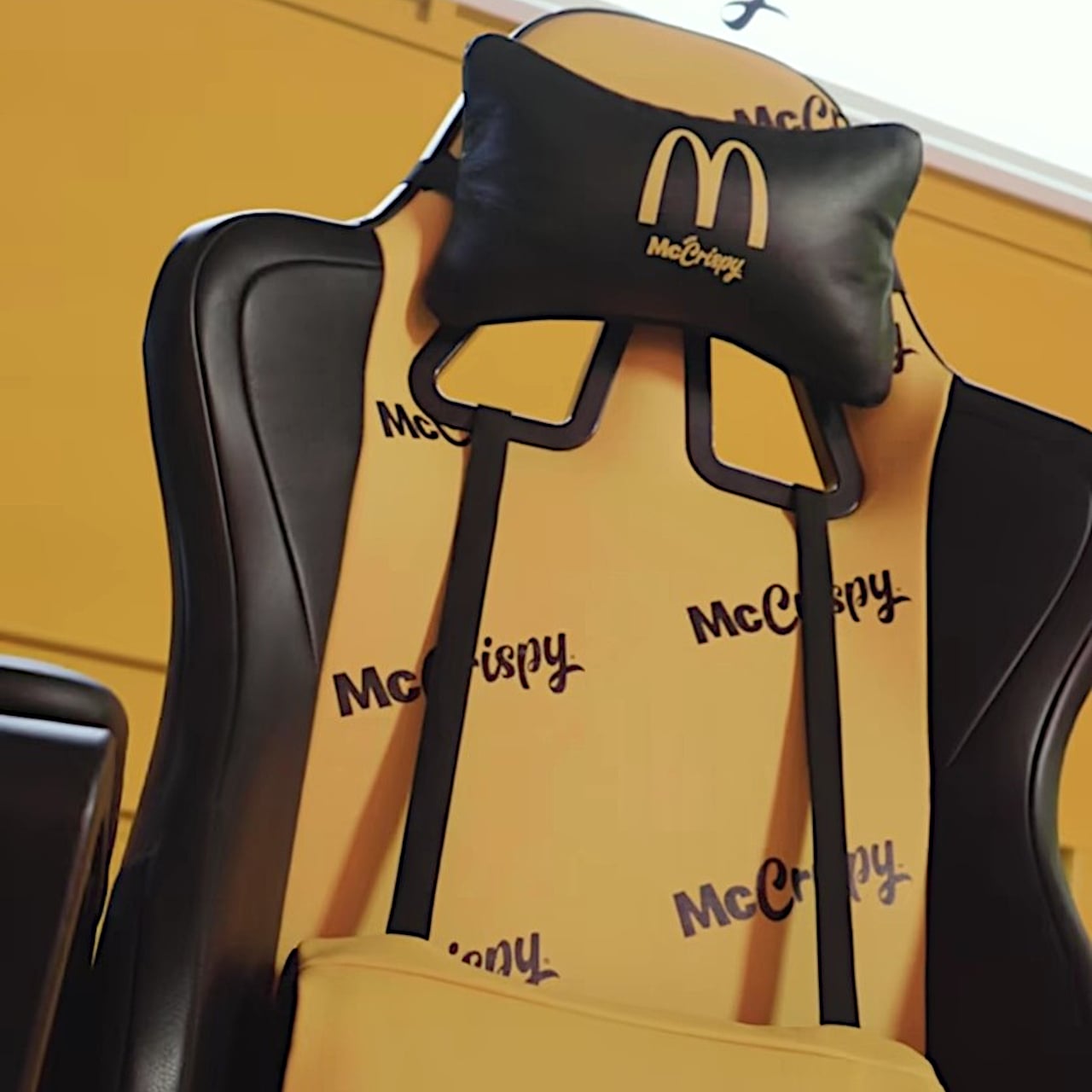
This is admittedly something that only a die-hard McDonald’s fan will probably want to grab, not that it’s available anywhere else except through a raffle. The chair is full of McCrispy branding with a gold and black motif that’s not exactly that appealing to many people. Then again, it could have been worse since the brand’s official colors are gold and red.

The post This McDonald’s Gaming Chair looks so tempting and so wrong at the same time first appeared on Yanko Design.
UK McDonald’s net-zero carbon restaurant tries to make the environment a bit healthier

You might have guilty feelings when chowing down on that hamburger, but one McDonald’s restaurant in the UK might at least let you feel good about staying green while you’re there.

Fast-food and health are two words that never really got along well with one another, and it isn’t just about humans’ bodily health either. Sometimes worse than other restaurants because of their nature and their processes, fast-food chains have also become perilous to the health of the planet, particularly through their net carbon emissions. As one of the world’s biggest culprits, McDonald’s is trying to set an example and opened the first net-zero restaurant in the UK, though it still comes up short of being net-zero in the true sense of the word.

Designers: Scurr Architects and AEW Architects for McDonald’s

It’s no longer enough to just say that you’re using recycled materials for cups or utensils these days. Those are important first steps, of course, but not enough to earn you a “net-zero” badge for your building. For that, you’ll need to significantly reduce your carbon emissions in almost every aspect, including the construction, operation, and demolition of the establishment.

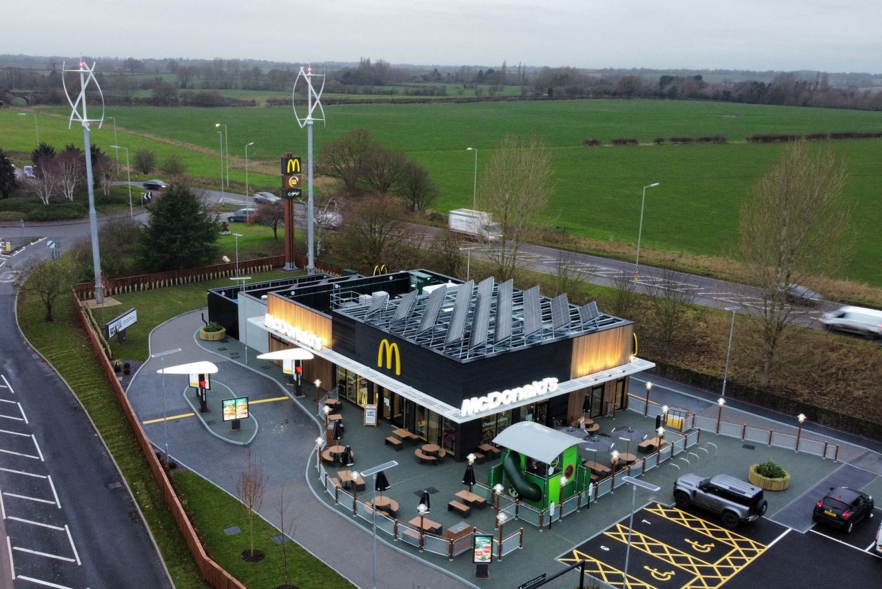
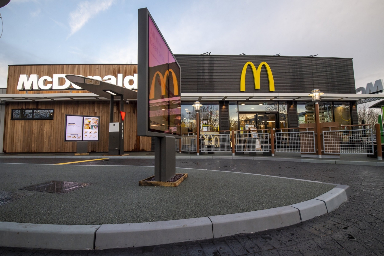
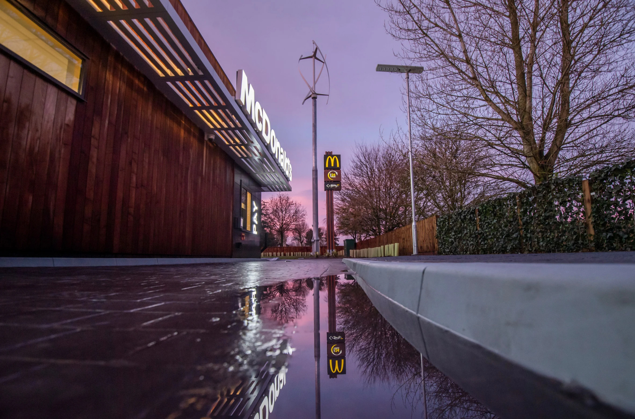
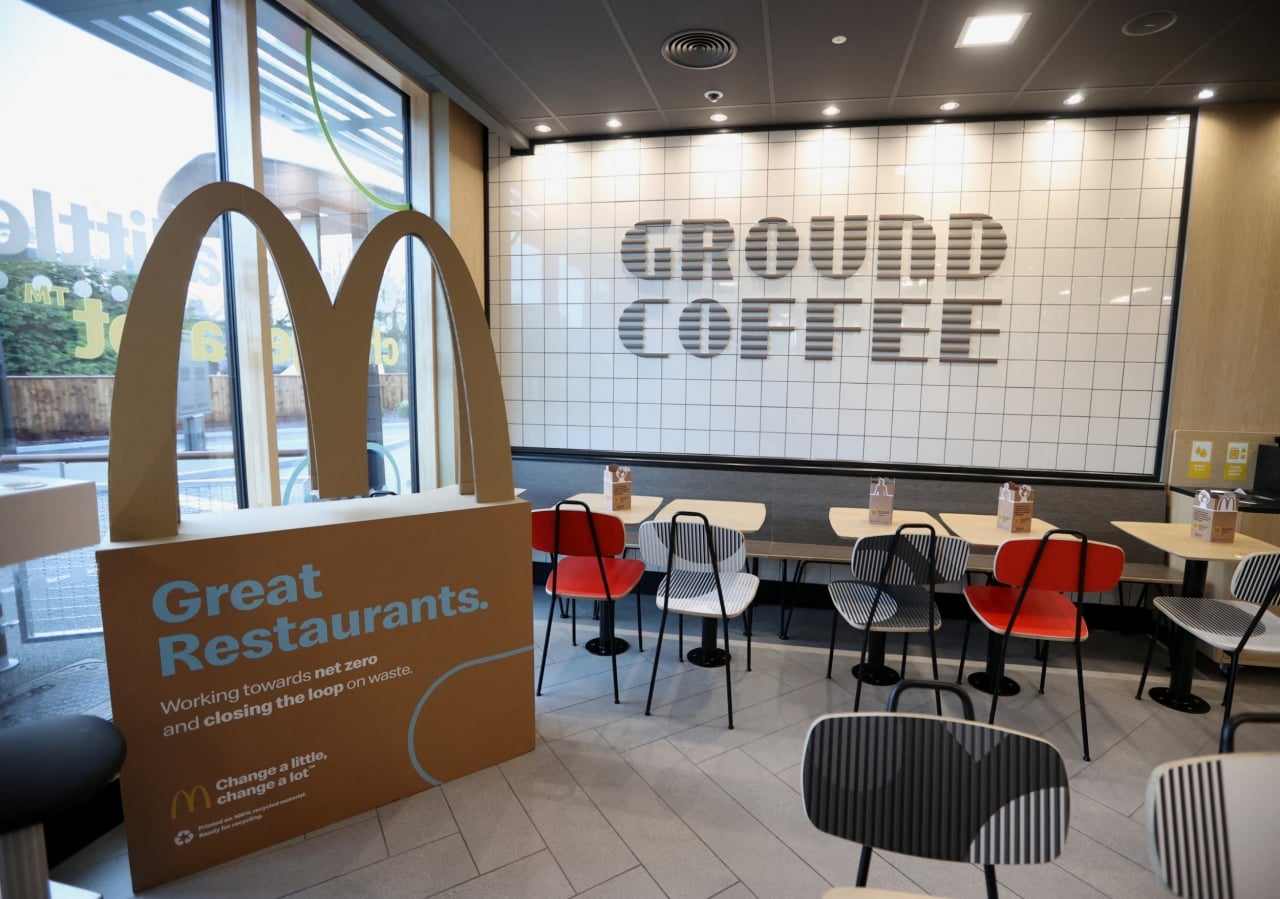
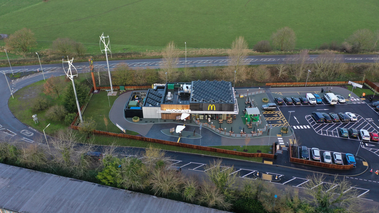
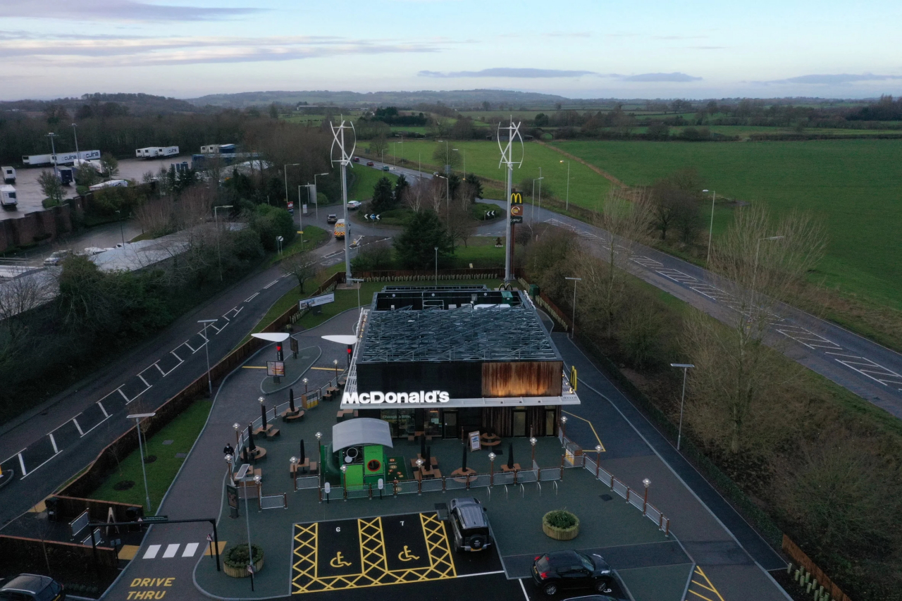
McDonald’s Market Drayton branch in the UK tries to check off a few of those boxes, particularly in the materials they used. Wall insulation is made from sheep’s wool, while parking lot kerbstones are each made from 182 recycled plastic bottles. Even the signage is made from McDonald’s own coffee beans as part of the company’s “circular waste solution.” All of these while retaining the same familiar design of McDonald’s restaurants around the world, or at least in the UK.

The day-to-day operations of the restaurant are also almost zero, with power being provided by two on-site wind turbines and 92 square meters (990 square feet) of solar panels. Strictly speaking, however, the restaurant can’t be considered truly net-zero because it doesn’t take into account consumption-based emissions, according to Dezeen.

It’s still an important step forward for the company as well as the UK’s net-zero carbon buildings thrust, especially considering how much foot traffic and how many customers a single McDonald’s branch gets on a single day. That said, it’s also just one in tens of thousands of McDonald’s locations around the world that still have to adopt the fast-food chain’s sustainable programs. It’s just the first step, of course, and McDonald’s plans to move forward in the years to come, including vegan, plant-based menus by 2025.

Photos courtesy of Anthony Devlin/PA.

The post UK McDonald’s net-zero carbon restaurant tries to make the environment a bit healthier first appeared on Yanko Design.
This McDonald’s in China Has Exercise Bike Dining Tables

When it comes to healthy living, McDonald’s is one of the last places that comes to mind. I mean, did you ever see the movie Super Size Me? Well, at one McDonald’s location in China, you can work off a little of your high-fat and high-carb lunch while you eat. Yes, these unique tables have a workout bike built into them. Take a bite of your Big Mac, then pedal. Eat a french fry… pedal again. Peloton has nothing on this!
The TikTok video below shows one satisfied customer as she chows down on her burger and gulps down a Coke while she pedals. Surely she burned off at least five calories of the 500 she just ate, right?
@cris13yu

mc da China kkkk amei a ideia

♬ som original – cris13_u

Apparently, the exercise bicycles weren’t designed for fitness but instead are meant for wirelessly recharging gadgets while you eat – which makes a lot more sense for today’s tech-dependent society. The bikes are installed at the environmentally-friendly McDonald’s Jieyang Wanda Plaza restaurant, which opened last September.

[via Gizmodo Japan]