Should you upgrade to the new Ray-Ban Meta Wayfarer Limited-Edition Transparent Model?

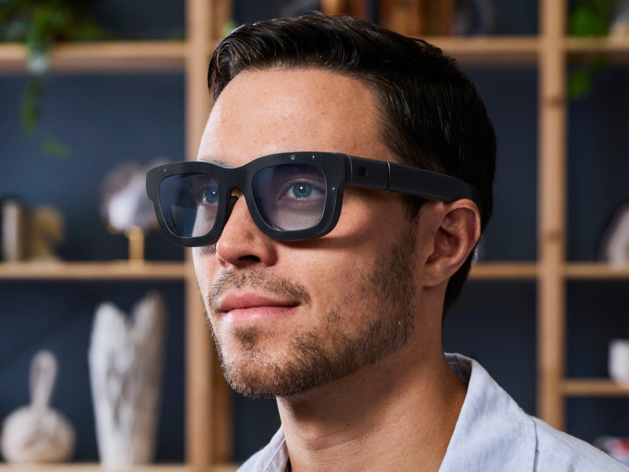
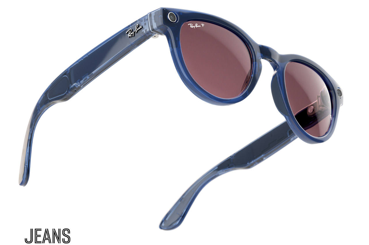
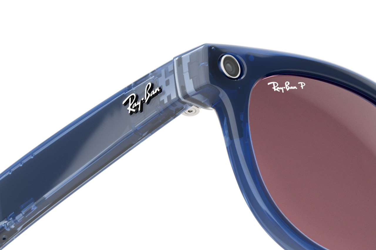
Ray-Ban’s Meta Wayfarer glasses have quickly become the intersection of fashion and technology, combining classic style with advanced smart features. Recently, Ray-Ban and Meta unveiled the new Shiny Transparent Wayfarer, featuring exposed internal components and Clear to Sapphire Transitions lenses. While this new model pushes the boundaries of what smart glasses can look like, the big question is: should you upgrade, especially if you already own a pair? Let’s break it down.

Designer: Ray-Ban + Meta

If Money Is No Object, Then Yes—Go for It
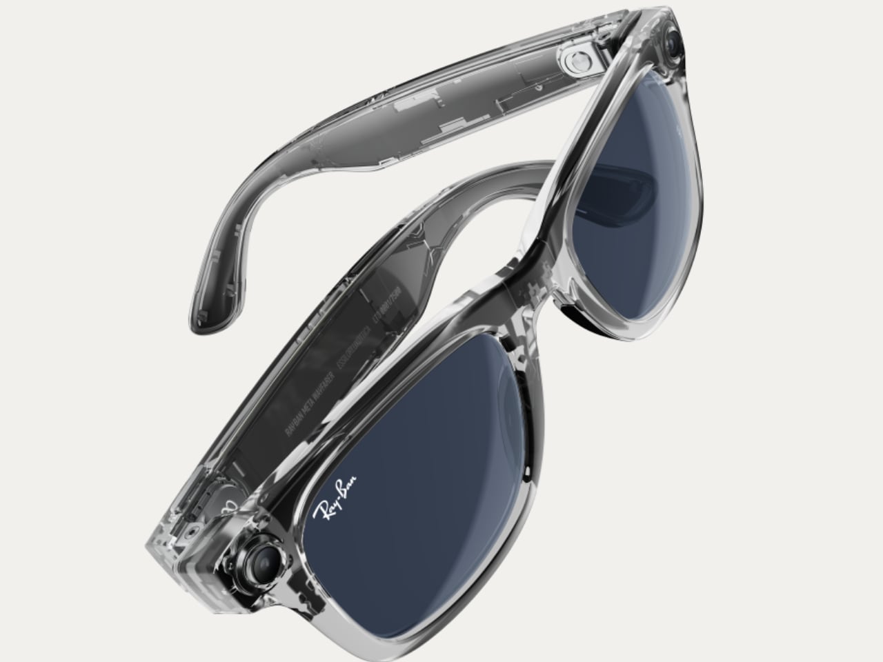
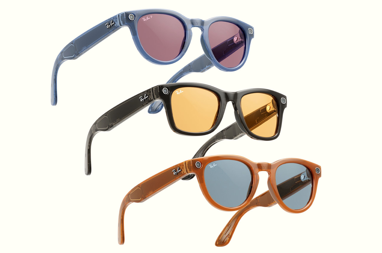
If price isn’t a barrier, the decision to upgrade is straightforward. At $429 USD, the Shiny Transparent Wayfarer offers a visually striking design that showcases the internal technology, creating a futuristic look that stands apart from the Matte Black version. The Clear to Sapphire Transitions lenses add another layer of sophistication, adapting to light conditions and giving the glasses a sleek sapphire tint when outdoors. This is an easy yes for those who enjoy staying at the forefront of wearable tech.

If You Want the New Lens Transition, It’s Worth Considering

If your current Ray-Ban Meta Wayfarer comes with standard clear lenses or basic non-adaptive sunglasses, upgrading to the new Transitions lenses could make a big difference in how you use the glasses day-to-day. The Clear to Sapphire Transitions lenses offer a smooth transition between indoor and outdoor settings, making it easier to adapt to different lighting conditions without needing to switch eyewear. When you’re indoors, the lenses remain clear, providing a natural and unobstructed view. However, once you step outside, they automatically darken to a sleek sapphire tint, adding a touch of style and protecting your eyes from harsh sunlight. For anyone who finds themselves frequently moving between environments, this flexibility could be a major convenience.
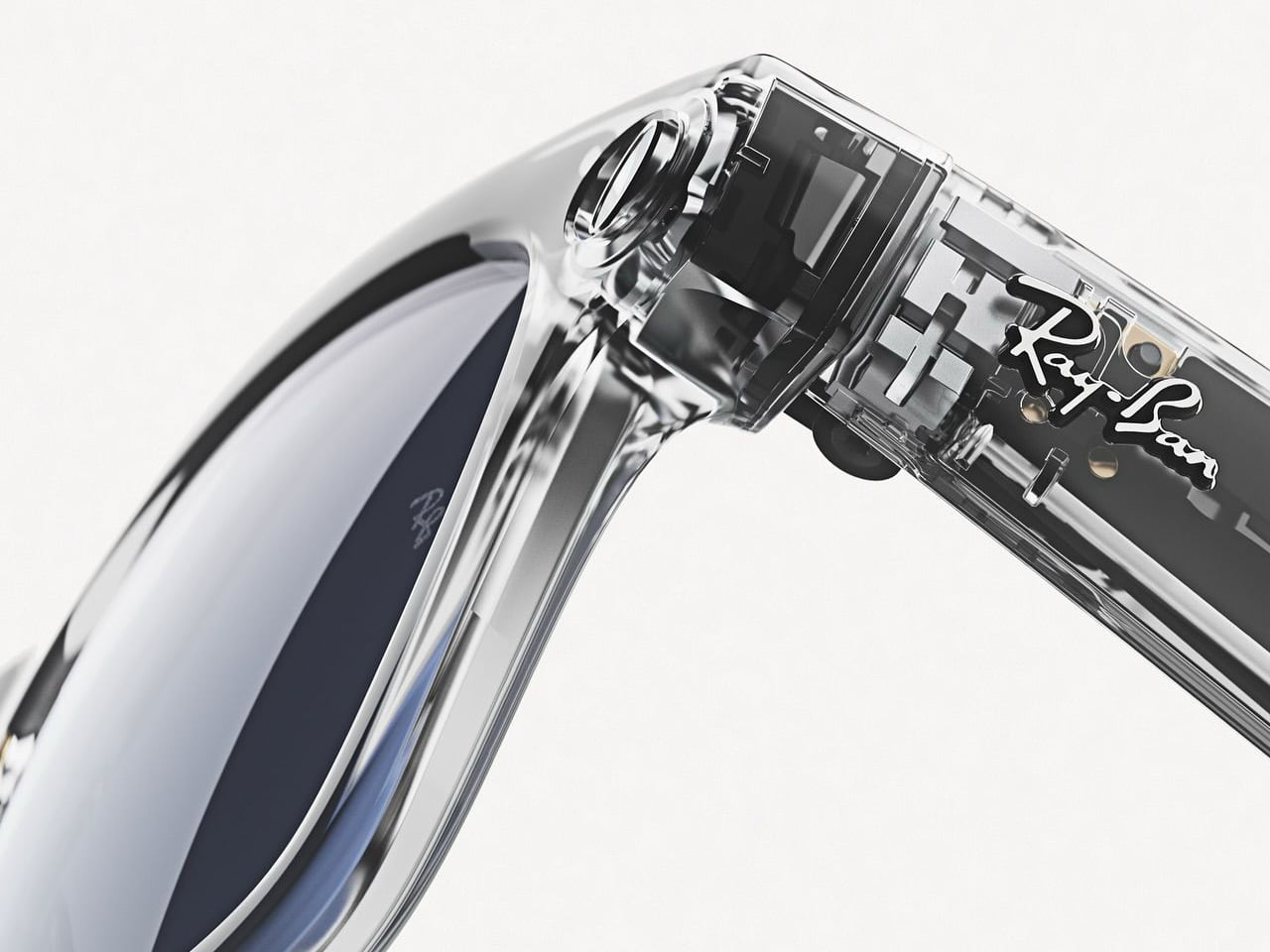
On the other hand, if you already own a pair with Clear to Green Transitions lenses, the upgrade may not offer enough of a difference to justify the change. Both lenses provide the same adaptive functionality, adjusting to light to enhance your vision while adding a color tint. The real difference lies in the aesthetic—whether you prefer the cooler sapphire tint or the more classic green hue. If you’re satisfied with the current performance and look of your lenses, there may be little reason to make the leap unless the sapphire color truly appeals to you.

If You Want a New Design with Exposed Tech, Then Yes

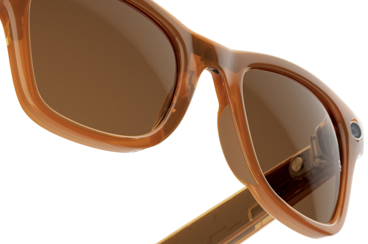
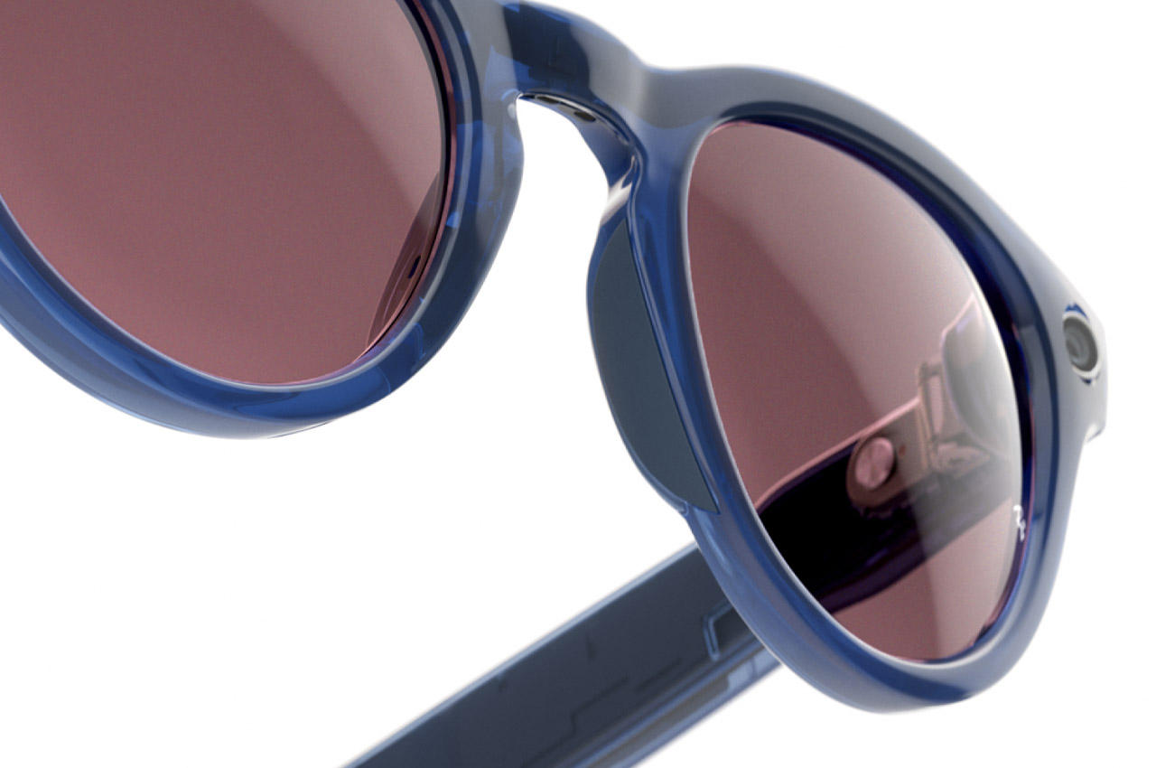
The most noticeable difference in the new model is the Shiny Transparent frame. This design exposes the inner workings of the glasses, giving them a high-tech look that contrasts with the more traditional Matte Black frame. The transparent frame brings an aesthetic shift, showcasing the cutting-edge technology that powers the glasses in a more visually pronounced way. It’s an intriguing design choice for those who appreciate a bold, futuristic look.

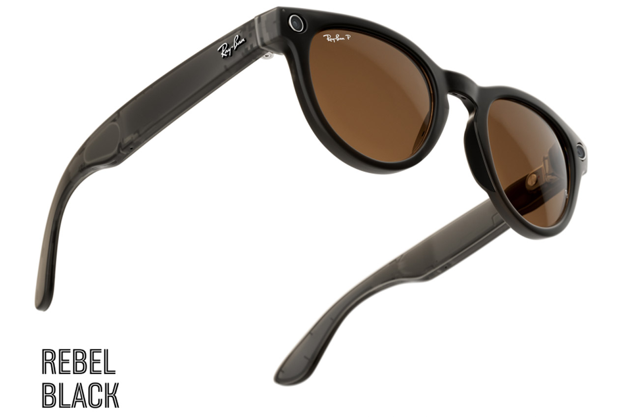
If you’re drawn to a more tech-forward, modern aesthetic, this new design is worth considering. The transparent frame is eye-catching and adds a fresh dimension to the Ray-Ban Meta Wayfarer collection. For those who want their eyewear to make a visual statement, the exposed components are a step forward in wearable tech design. However, if you prefer a more classic and understated look of the Matte Black Wayfarer, you might find that the new frame doesn’t offer enough reason to make the switch.

For Me, It’s a Hard No

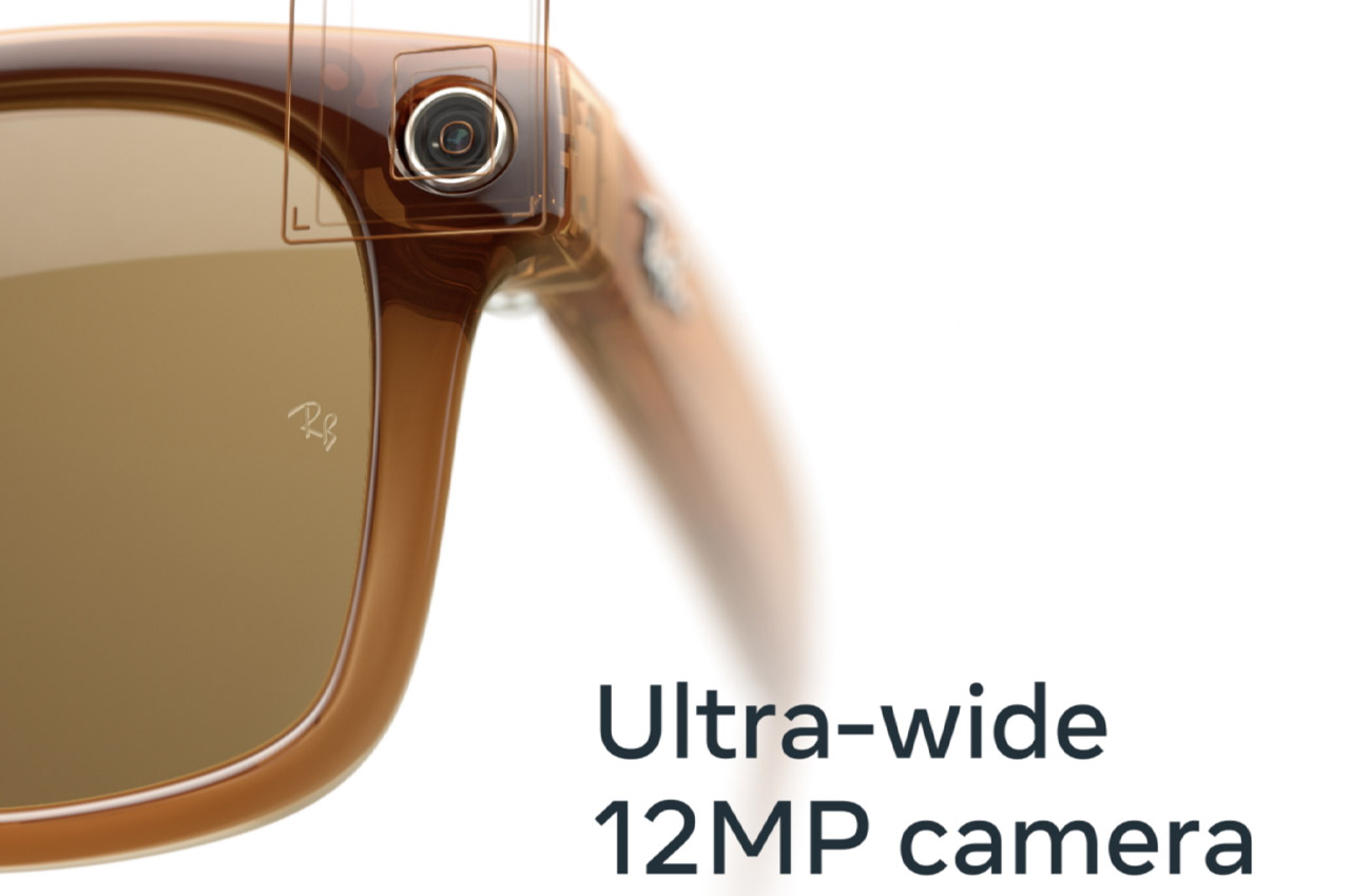
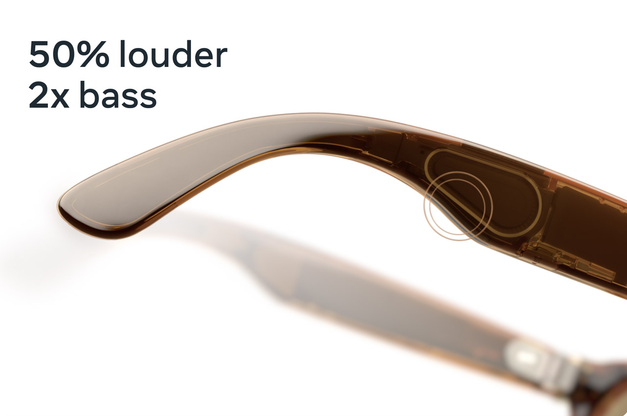
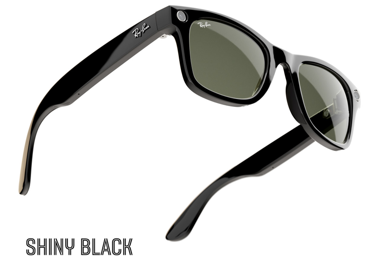
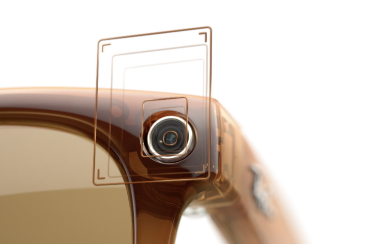
For anyone who already owns the Matte Black Wayfarer with Clear to Green Transitions lenses, upgrading to the new Shiny Transparent model may not be necessary. Your current pair offers the same core features—AI-powered assistance, a 12MP camera, open-ear speakers, and a touchpad for easy control. The Clear to Green Transitions lenses provide excellent functionality, and if you’re happy with the design and tech you already have, there’s no pressing need to make the switch.

The Introduction of AI-Powered Features

With the recent updates, Ray-Ban and Meta have significantly improved the AI capabilities of the glasses. Now, you can use voice commands by simply saying “Hey Meta” and follow up with additional commands without repeating the wake word. The glasses can also remember important details like where you parked your car or set reminders for when you land after a flight. The ability to send voice messages via WhatsApp or Messenger while your hands are occupied adds an extra layer of convenience for staying connected on the go.

One of the more impressive AI features is real-time video assistance. Whether you’re exploring a new city or browsing the aisles of a grocery store, Meta AI can offer real-time help by identifying landmarks or suggesting meals based on the ingredients you’re looking at. Additionally, real-time language translation for Spanish, French, and Italian can remove language barriers, and future updates will likely support more languages.

Expanding Partnerships with Major Platforms

The glasses also support deeper integrations with platforms like Spotify and Amazon Music, but Ray-Ban has expanded these offerings to include Audible and iHeart as well. Now, you can use voice commands to search and play music or audiobooks without touching your phone. This makes the listening experience even more seamless, allowing you to ask questions like “What album is this from?” while on the move. These expanded partnerships deepen the glasses’ role in day-to-day media consumption.

The collaboration with Be My Eyes is another significant step in making the glasses more accessible. This app, designed for individuals who are blind or have low vision, pairs users with sighted volunteers who provide real-time assistance. The glasses’ camera allows the volunteer to see what the wearer sees, enabling them to help with tasks like reading mail or navigating new environments.

Are You Going for It?

Ultimately, the decision to upgrade comes down to personal preference and how much you value the new design and lens options. If money isn’t an issue or you’re drawn to the transparent frame and sapphire lenses, the upgrade makes sense. However, if you’re content with your current Matte Black Wayfarer with Clear to Green Transitions lenses, there’s no pressing reason to switch. The new features and design are exciting, but your existing pair still holds up as a stylish, highly functional piece of wearable tech.

The post Should you upgrade to the new Ray-Ban Meta Wayfarer Limited-Edition Transparent Model? first appeared on Yanko Design.
Meta’s futuristic Orion AR Glasses have Holographic Displays and Neural Control. Apple should take notes

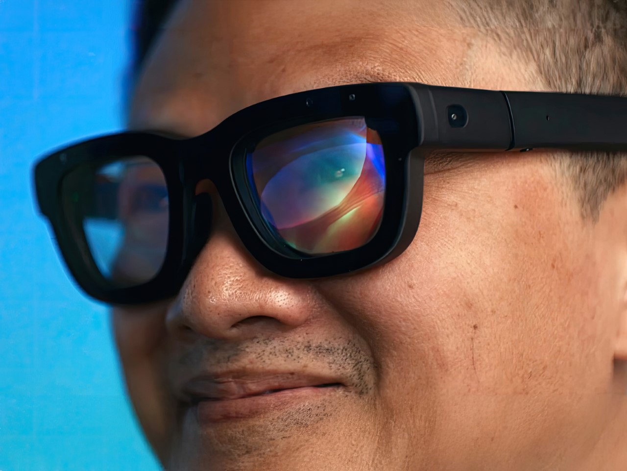
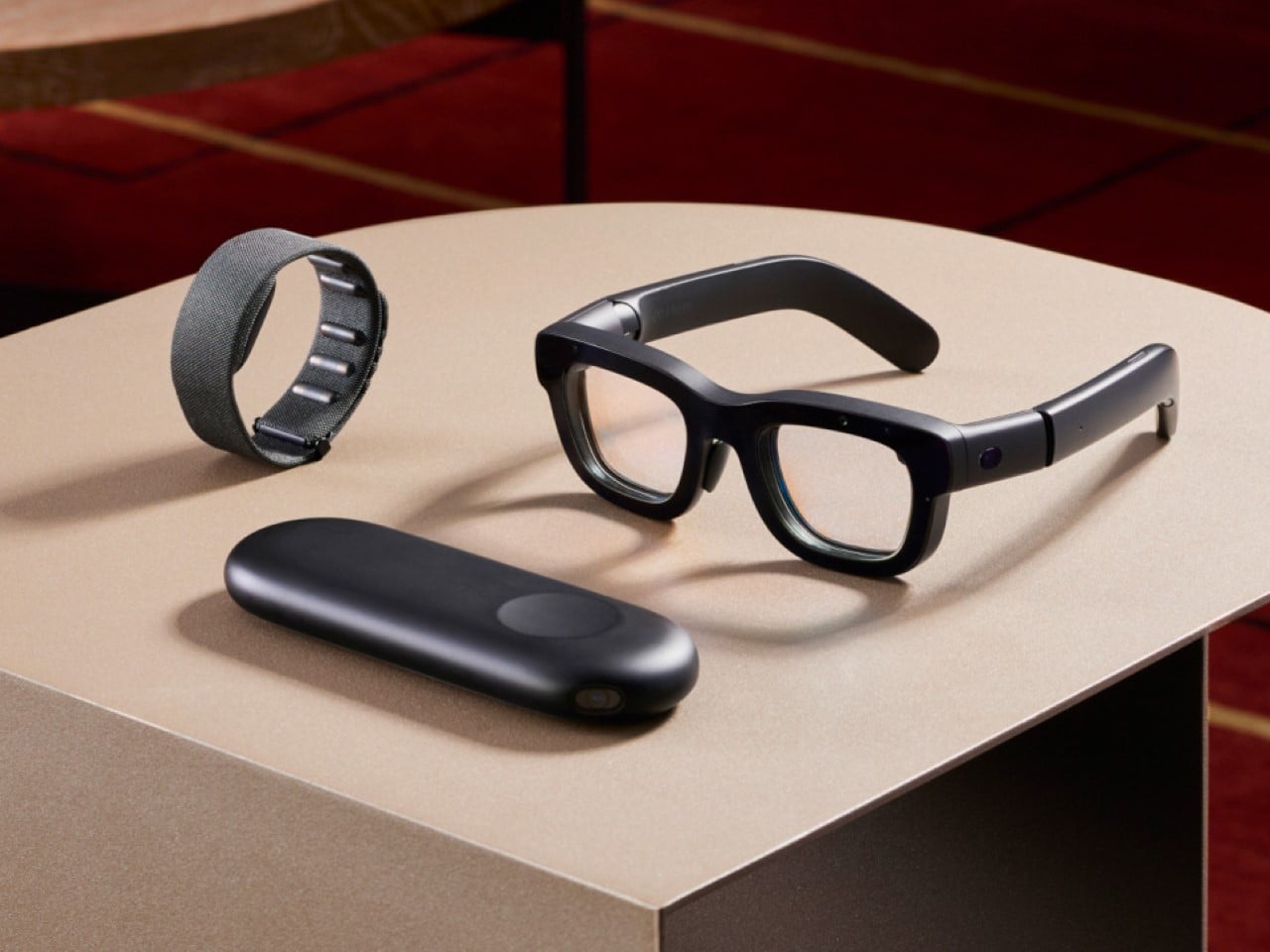
At the Meta Connect 2024 keynote, not only did Mark Zuckerberg debut actual Augmented Reality with holographic displays and neural control, it did so in a device that’s smaller, lighter, and one could argue, more socially acceptable (aka stylish) than Apple’s Vision Pro. Dubbed the Orion, it’s simply a developer prototype for now, but Meta hopes to refine the design, improve the displays, and actually sell it at an affordable price to consumers.

Designer: Meta

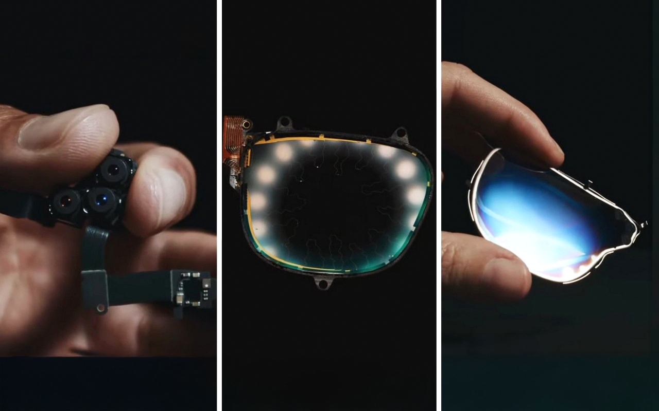
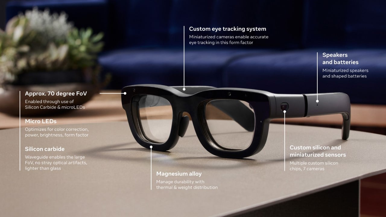
Orion is not a bulky headset—it’s a sleek, spectacle-like device that weighs under 100 grams, making it comfortable for extended use. This is an impressive feat considering the amount of technology packed into such a small form factor. While Meta Quest Pro and Apple’s Vision Pro are capable of mixed reality, Orion’s fully transparent, holographic display takes things to a different level. Instead of the passthrough experiences that blend digital elements on top of a live camera feed, Orion projects 3D objects directly into the real world using innovative waveguide technology. The frames are made from magnesium, a super-light metal known for its strength and ability to dissipate heat (something even NASA’s relied on for its space hardware).

The core of this magic is a set of tiny projectors embedded within the arms of the glasses. These projectors beam light into lenses that have nanoscale 3D structures, creating stunningly sharp holographic displays. Zuckerberg emphasized that you could go about your day—whether you’re working in a coffee shop or flying on a plane—while interacting with immersive AR elements like a cinema-sized virtual screen or multiple work monitors.

But it’s not just about visuals. The glasses also facilitate natural social interaction: you can maintain eye contact with others through the transparent lenses, and digital elements seamlessly overlay onto the real world. Need to send a message? Instead of fumbling for your phone, a hologram will appear before your eyes, letting you reply with a quick, subtle gesture. This fluid integration of the digital and physical worlds could set Orion apart from its competitors.

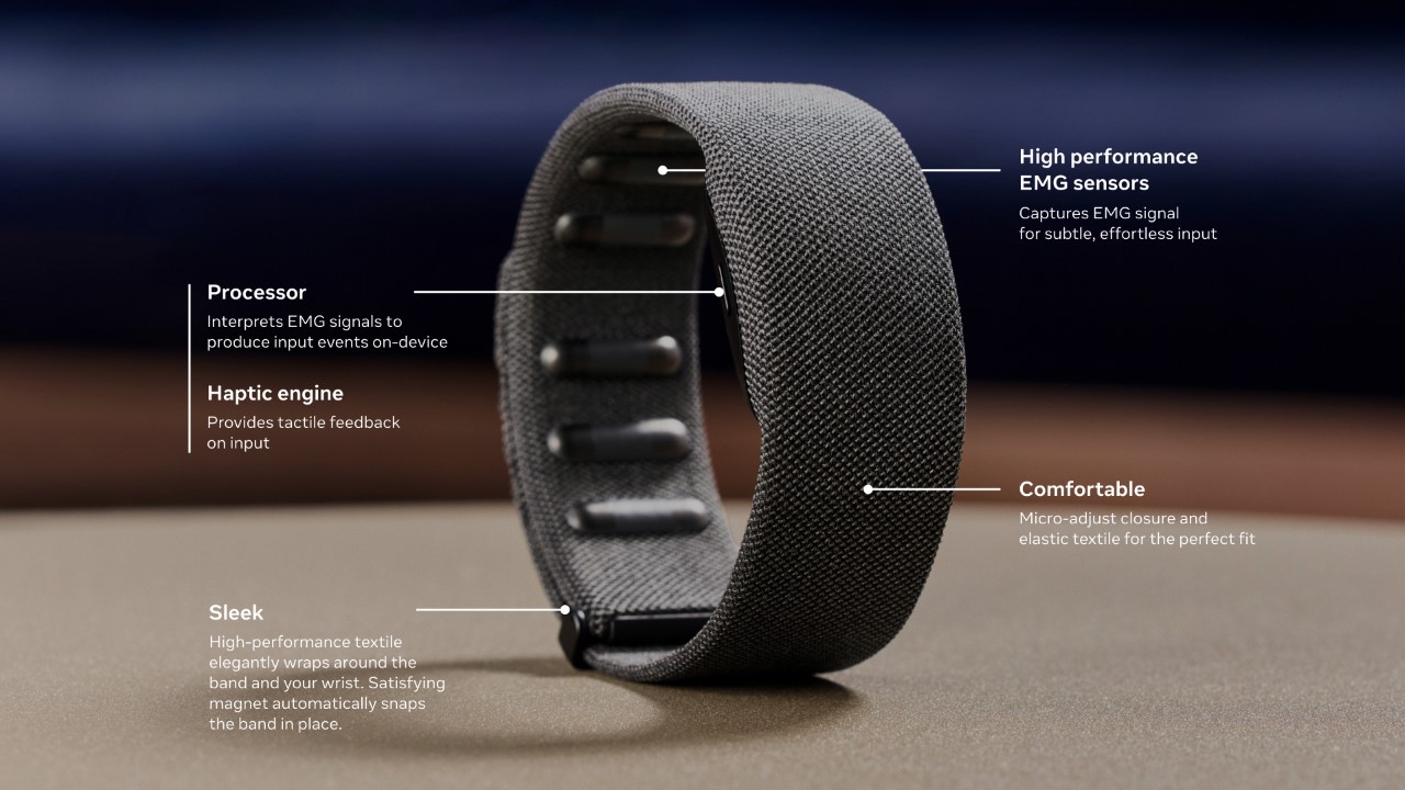
When it comes to control, the Orion glasses offer several interaction modes—voice, hand, and eye tracking—but the star of the show is the neural wristband. In contrast to the Vision Pro, which relies on hand gestures, eye-tracking, and voice commands, Orion takes the next step by reading neural signals from your wrist to control the device. This neural interface allows for discreet control. Imagine being in a meeting or walking down the street—gesturing in mid-air or speaking aloud commands isn’t always convenient. The wristband can pick up subtle electrical signals from your brain and translate them into actions, like tapping your fingers to summon a holographic card game or message a friend. This introduces a new level of human-computer interaction, far more intimate and nuanced than what’s currently available on the market.

While Apple’s Vision Pro and Meta’s previous Quest Pro have been praised for their intuitive interaction systems, Orion’s neural control represents a massive leap forward. It reduces the friction of interacting with digital elements by cutting down on the physical and vocal gestures required, creating a more seamless experience.

One of the key differentiators for Orion is its display technology. Unlike the Vision Pro or Meta Quest Pro, which rely on cameras to pass a live feed of the outside world onto a screen, Orion offers true augmented reality. The glasses project digital holograms directly into your field of view, blending with your surroundings. This isn’t just a camera feed of your environment with digital elements superimposed—it’s real-world AR with transparent lenses that you can see through as you would normal glasses. The holograms are bright enough to stand out even in varied lighting conditions and sharp enough to allow users to perceive fine details in their digital overlays.

Zuckerberg illustrated this with examples: receiving a message as a floating hologram or “teleporting” a distant friend’s avatar into your living room. The display architecture is entirely new, made possible by custom silicon chips and sensors integrated into the glasses, offering a level of immersion that’s more subtle yet more profound than the pass-through systems we’ve seen so far. In a private demo, he even played a metaverse version of Pong with key industry experts like Nvidia CEO Jensen Huang, and investors like Gary Vaynerchuck and Daymond John of Shark Tank.

For all its innovation, Orion is still in the development phase. Zuckerberg was candid that Orion is not yet ready for consumers. Instead, it will serve as a development kit for Meta’s internal teams and a select group of external partners. This will help refine both the hardware and software, as well as grow the ecosystem of apps and experiences that will make Orion valuable when it eventually hits the consumer market. There’s also the matter of affordability—Zuckerberg mentioned the team is working to improve manufacturing processes to bring the cost down. As it stands, this isn’t a device you’ll see in stores next week, but it’s a crucial step in realizing Meta’s vision for the future of AR.

The potential for Orion is vast. Zuckerberg envisions it as the next major computing platform, capable of reshaping how we work, play, and interact with others. By leveraging the power of true augmented reality with a groundbreaking neural interface, Orion positions itself as more than just a wearable gadget—it’s an entirely new way of interfacing with the digital and physical worlds. For now, it’s an exciting glimpse into what the future might hold. The Orion glasses may not be in your hands today, but their arrival could redefine the entire AR landscape in the years to come.

The post Meta’s futuristic Orion AR Glasses have Holographic Displays and Neural Control. Apple should take notes first appeared on Yanko Design.
Meta’s new ‘Affordable’ Quest 3s Headset leaks online, hinting at strong Spatial rivalry with Apple

With multiple rumors floating around that Apple is dead set on building an affordable version of its Vision Pro headsets (probably named the Vision Air), it seems like Meta is doubling down on the affordable headset space too, with the upcoming Meta Quest 3s – a budget alternative to the Quest 3 from just last year.

Images of the Quest 3s leaked around March this year, but new details are finally emerging as Meta is getting ready to launch the affordable headset, both to pre-empt Apple as well ByteDance (the TikTok company) that’s also rumored to be debuting a headset as soon as August 20th.

Designer: Meta

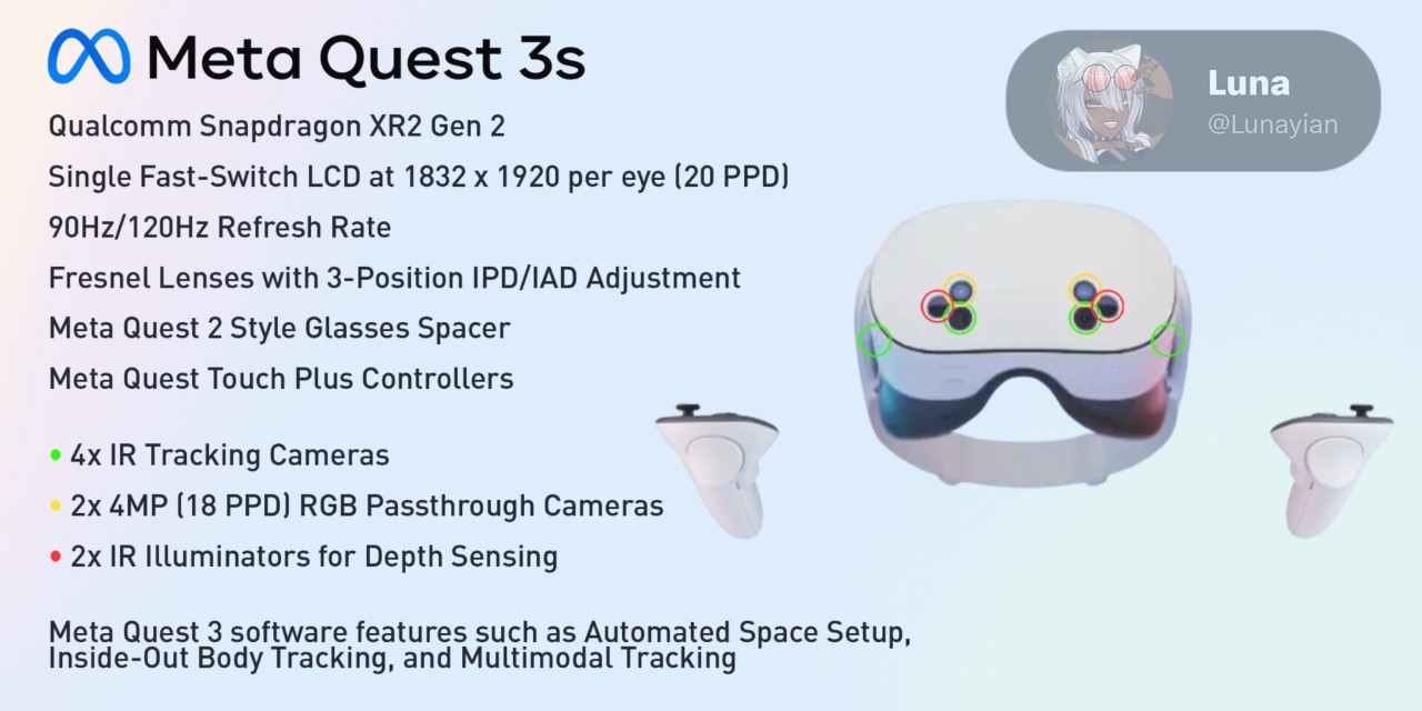
The Quest 3S will reportedly house the same Snapdragon XR2 Gen 2 processor found in its predecessor, ensuring it maintains robust performance capabilities. This processor is specifically designed for XR devices, providing the necessary computational power to handle complex VR and AR applications seamlessly. The inclusion of this processor suggests that Meta isn’t compromising on core performance, which is crucial for maintaining the immersive experience users expect from their devices.

The Quest 3S will feature 1832 x 1920 fast-switching LCD panels. While this might not be as high-end as some OLED displays, it still offers a refresh rate of 90/120 Hz, which should be more than adequate for most users. This choice helps keep costs down while still providing clear, fluid visuals. For users who might be new to VR, the slightly reduced specs in the display won’t be a dealbreaker, especially when considering the price.

The headset will come equipped with Fresnel lenses, which are known for being lightweight while offering a wide field of view. This design helps make the Quest 3S comfortable to wear, even during extended sessions. Additionally, the headset will feature a three-position inter-pupillary distance (IPD) adjustment, so users can adjust the lens spacing to get the sharpest possible view based on their eye spacing. These kinds of thoughtful features show that Meta is keeping the user experience front and center, even with a more budget-friendly model.

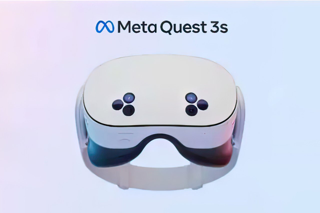
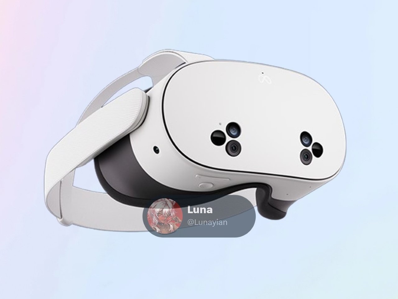
The design of the Quest 3S has also been a topic of conversation, particularly due to its unique triangular camera clusters that have surfaced in leaked images. These clusters are expected to house two 4 MP RGB passthrough cameras, four infrared (IR) tracking cameras, and two IR illuminators for depth sensing. This array of sensors is designed to ensure that the headset can accurately track movements and provide a realistic sense of depth, essential for an immersive experience. There’s also an action button, which is rumored to be customizable, allowing users to tweak the functionality to suit their preferences.

Meta’s decision to maintain the Quest Touch Plus controllers in the 3S suggests a commitment to a consistent user experience across its XR ecosystem. These controllers have been praised for their ergonomic design and precision, making them a valuable asset for both VR newcomers and veterans. The use of these familiar controllers will also likely reduce production costs, allowing Meta to pass savings on to consumers.

As for pricing, although nothing has been officially confirmed, it’s expected that the Quest 3S will come in at under $300. This makes it a highly competitive option in the XR market, especially as other companies like ByteDance prepare to launch their own budget-friendly headsets. With the XR space getting more crowded, Meta’s move to introduce a more affordable yet capable device could be a game-changer, opening up mixed reality to a much wider audience. The Quest 3S seems poised to offer a well-rounded experience without breaking the bank, making it a promising choice for those looking to dip their toes into the world of VR and AR.

The post Meta’s new ‘Affordable’ Quest 3s Headset leaks online, hinting at strong Spatial rivalry with Apple first appeared on Yanko Design.

Logitech MX Ink stylus for Meta Quest gives creators a new tool for mixed reality

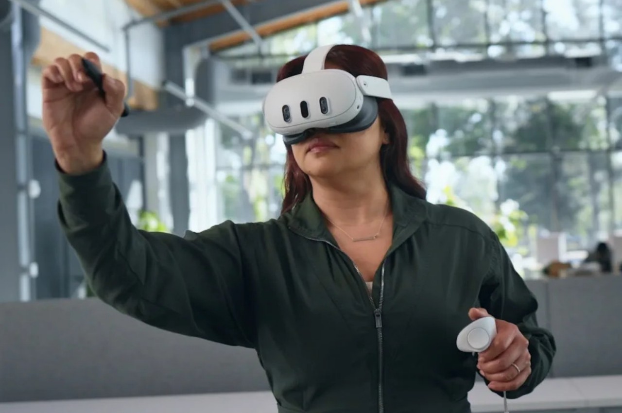
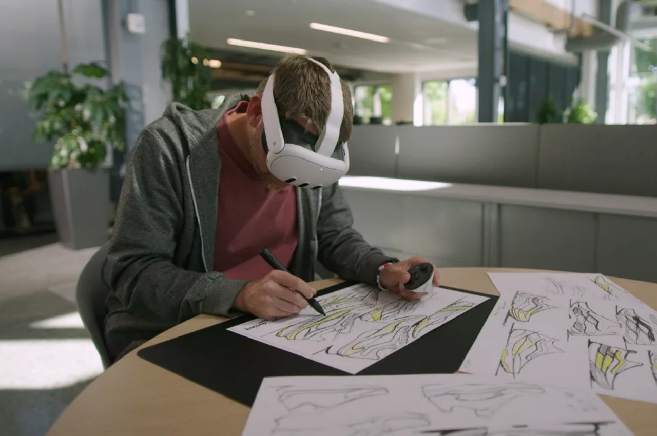
Mixed reality platforms, or spatial computing as Apple calls it, try to seamlessly blend digital objects into the real world, but that illusion quickly breaks down when it comes to manipulating those virtual pieces directly. Yes, tapping on buttons in thin air or pinching the corner of floating windows might feel a little natural, but creating content, especially 2D and 3D objects, is less believable when all you have are two “wands” in each hand. For decades, the stylus has been the tool of choice of digital artists and designers because of its precision and familiarity, almost like holding a pencil or paintbrush. It was really only a matter of time before the same device came to mixed reality, which is exactly what the Logitech MX Ink tries to bring to the virtual table.

Designer: Logitech

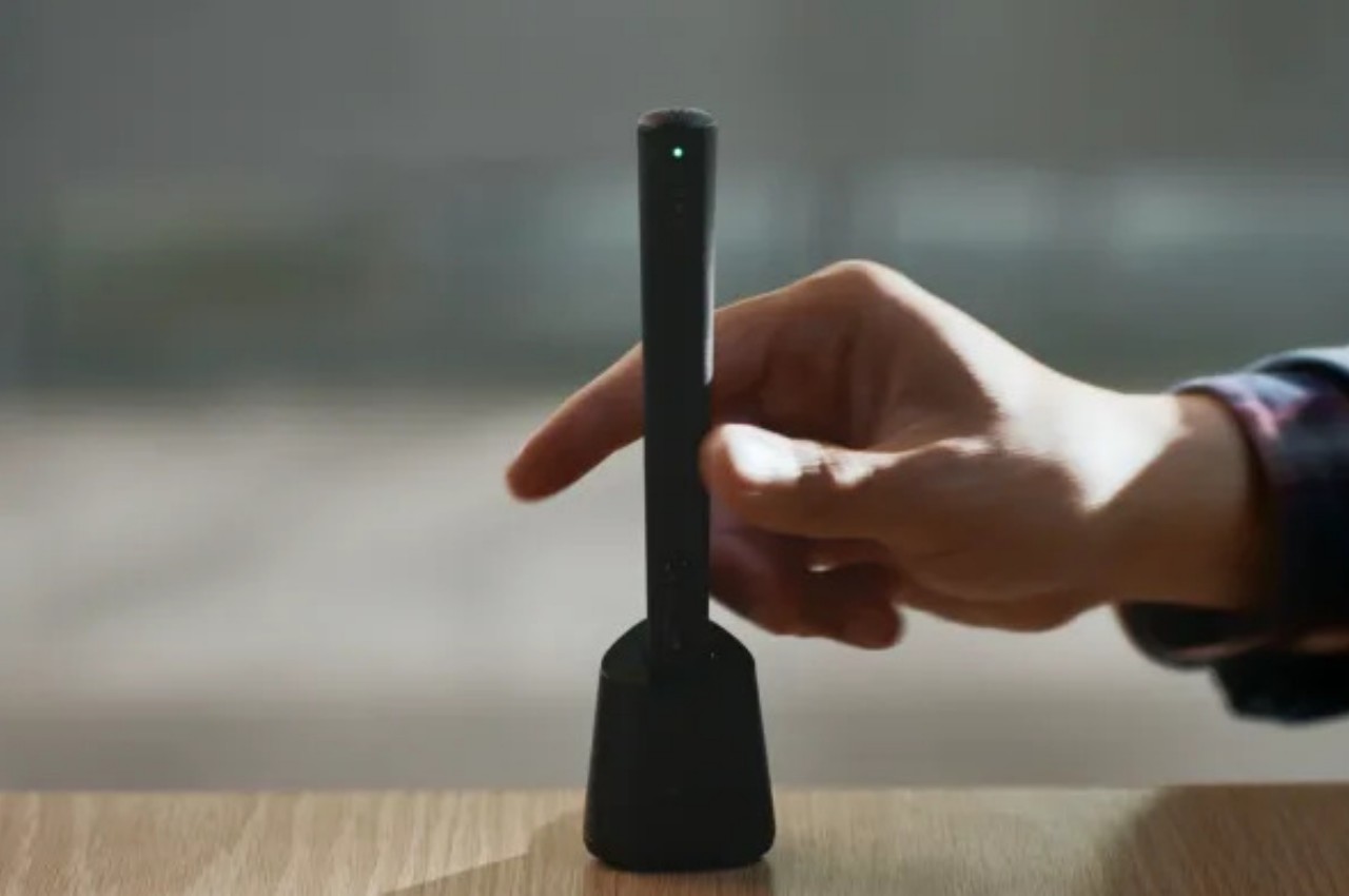
The Logitech MX Ink is practically a stylus designed to work in virtual 3D space, but while that description is simplistic, its implications are rather world-changing. It means that creators no longer need to feel awkward about waving around a thick wand, making them feel like they’re playing games more than painting or modeling. Artists, designers, and sculptors can now use a more convenient and intuitive tool when moving around in mixed reality, bolstering not only their productivity but also the quality of their work. Admittedly, the MX Ink is bulkier and heavier than most styluses, closer to a 3D printing pen than an Apple Pencil, and drawing on air is still going to feel unnatural at first, but it’s significantly better than even drawing with your finger.

What makes Logitech’s implementation a bit more special is that it works in both 3D and 2D spaces. The latter means that you can still draw on a flat surface and feel the same haptics and pressure sensitivity as a Wacom stylus, for example. This means you can easily trace over a sketch or blueprint on paper and bring that up to a 3D space for fleshing out. Or you can paint artistic masterpieces on a physical canvas without actually leaving any mark on the paper.

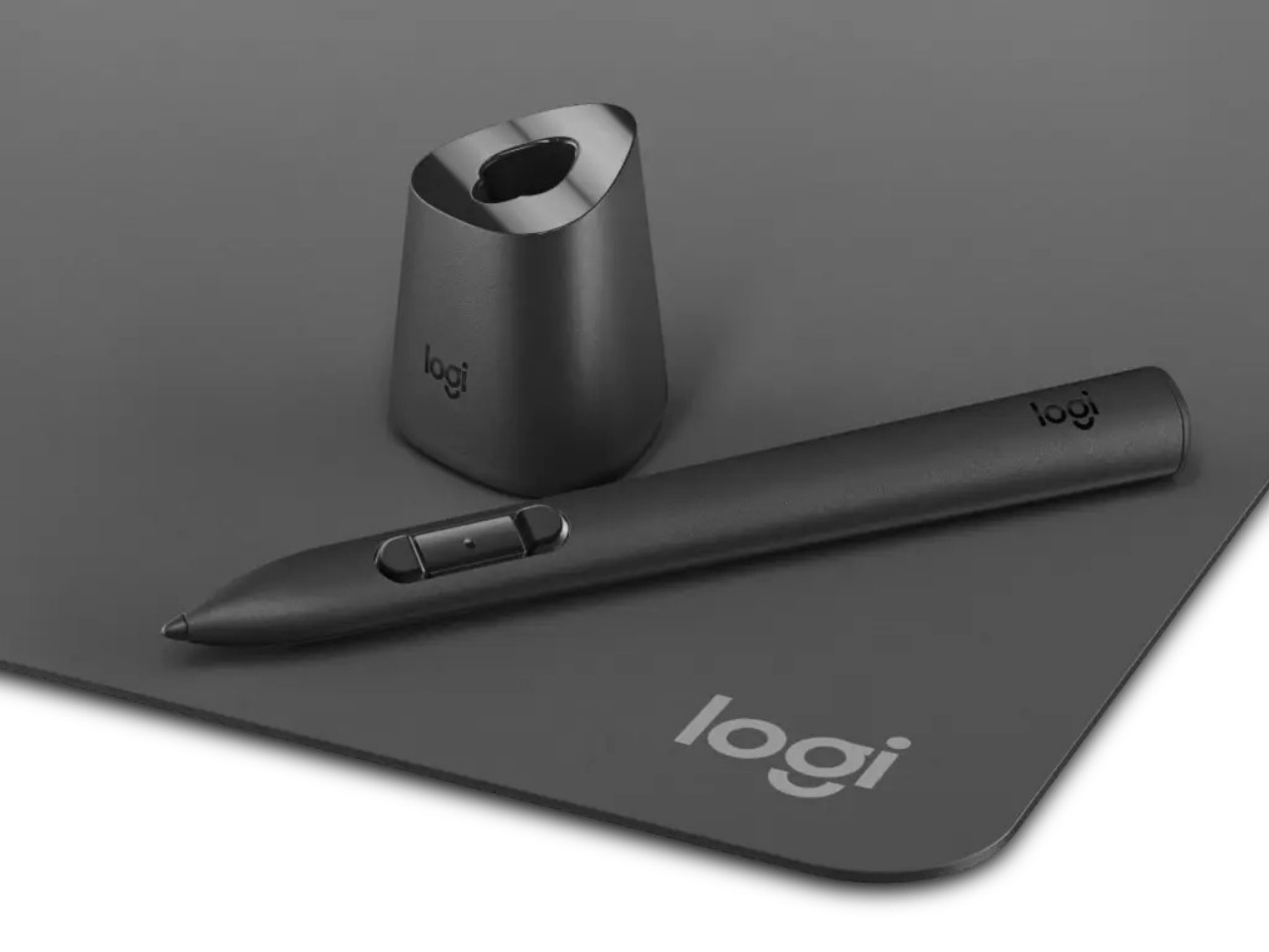
The MX Ink is a standalone product, but Logitech is also offering optional accessories to further reduce the friction of working in mixed reality. The MX Mat offers a low-friction surface for drawing with the stylus in 2D, though the MX Ink can actually work on most flat surfaces anyway. The MX Inkwell is a stand and wireless charging station for the device, letting you simply lift it from the dock to start drawing and then put it back without having to worry it won’t be charged and ready for your next work session. Without the MX Inkwell, the stylus will have to charge via a USB-C connection, and Logitech doesn’t even ship a cable with it.

As promising as this new creativity tool might sound, its use is limited to the Meta Quest 2 and Quest 3 headsets, ironically leaving the Quest Pro out of the party. This is boasted to be the first time the Quest headsets support more than two paired controllers at the same time, which means you can connect the MX Ink and simply switch between it and the regular Quest controllers without having to reconfigure anything every time. The Logitech MX Ink goes on sale in September with a starting price of $129.99.

The post Logitech MX Ink stylus for Meta Quest gives creators a new tool for mixed reality first appeared on Yanko Design.
Meta Quest 3S images leak online, hinting at an even more affordable VR headset

Upscaled using AI

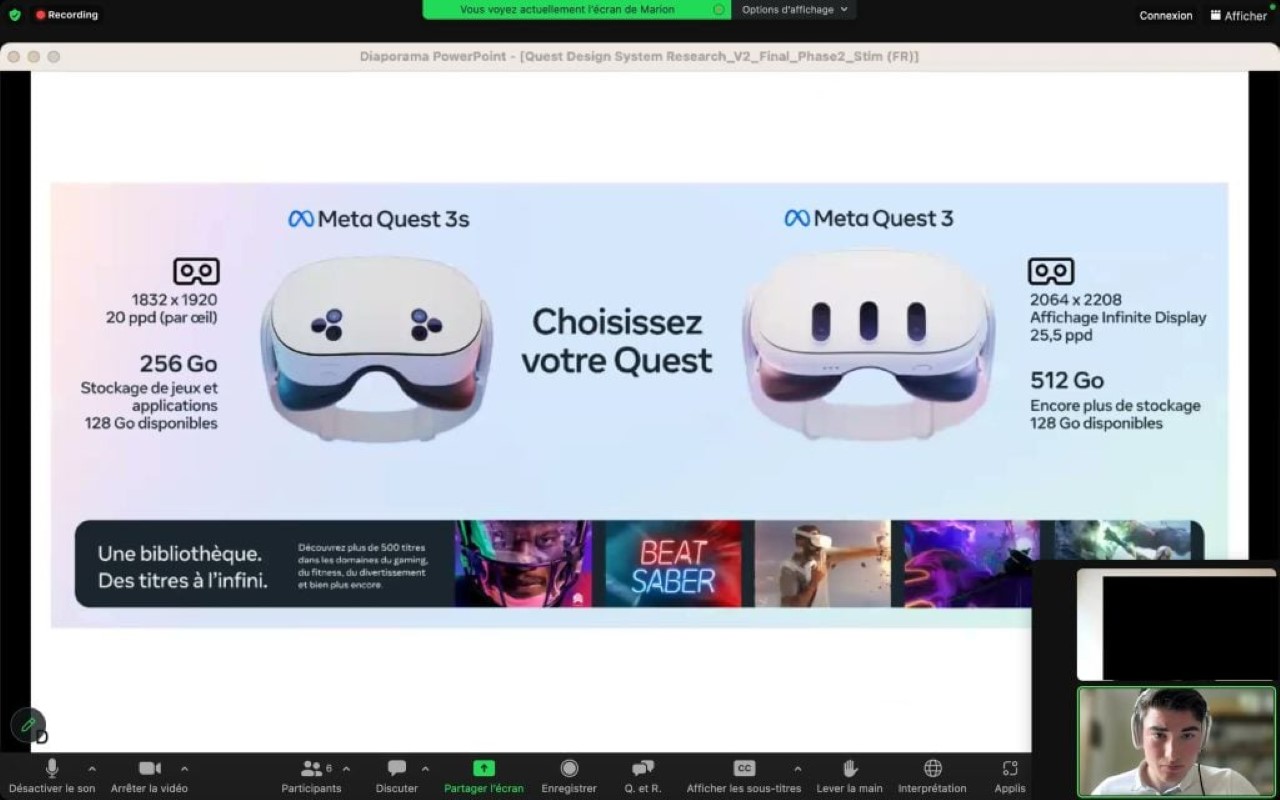
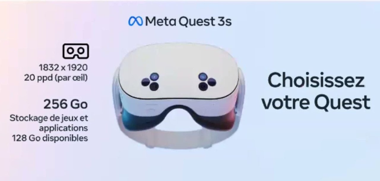
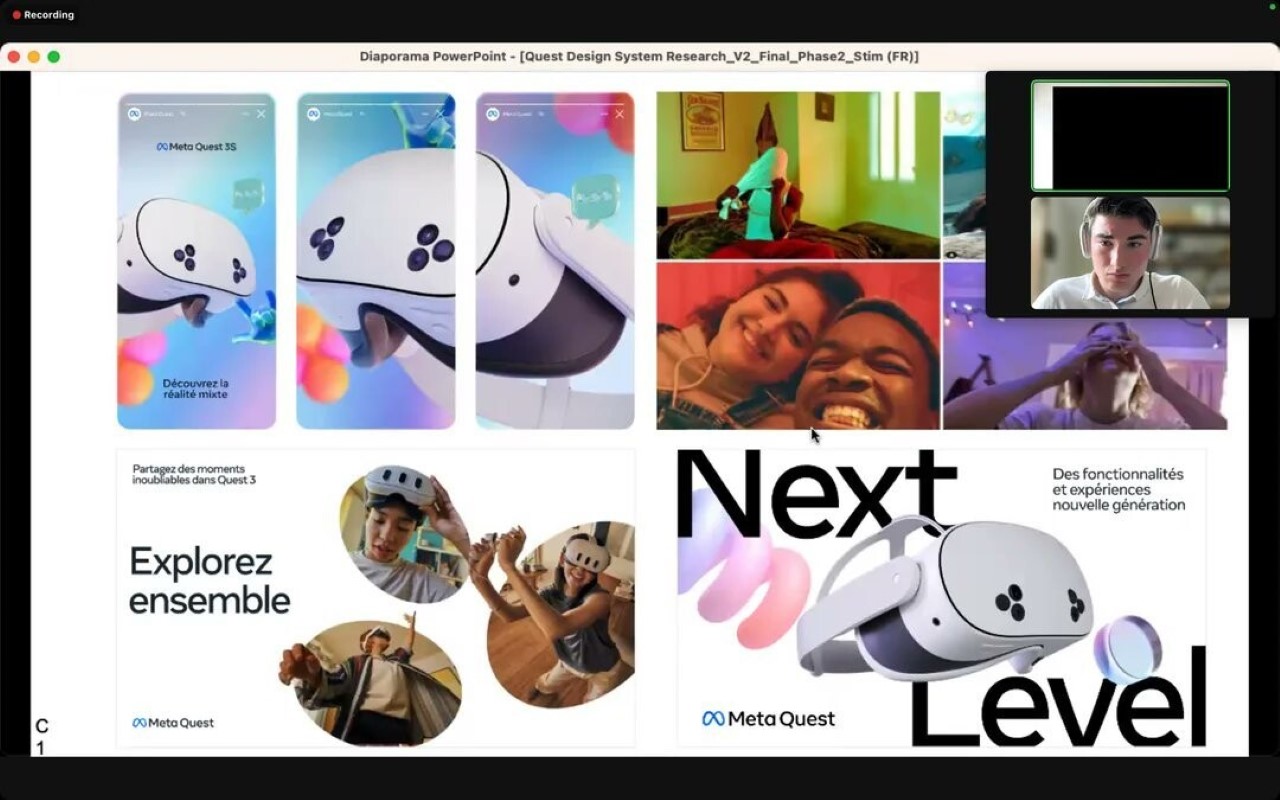
The Meta Quest 3 was supposed to be the cheaper alternative to the Meta Quest Pro… but now leaked photos from an internal presentation show a new device called the Meta Quest 3S, a ‘lite’ version of the already wildly popular VR headset. Sparked by user u/LuffySanKira on Reddit, screenshots supposedly from a Meta user research session offer a glimpse of the potential Quest 3s. The images showcase the rumored headset alongside the standard Quest 3, revealing some key specifications.

Designer: Meta

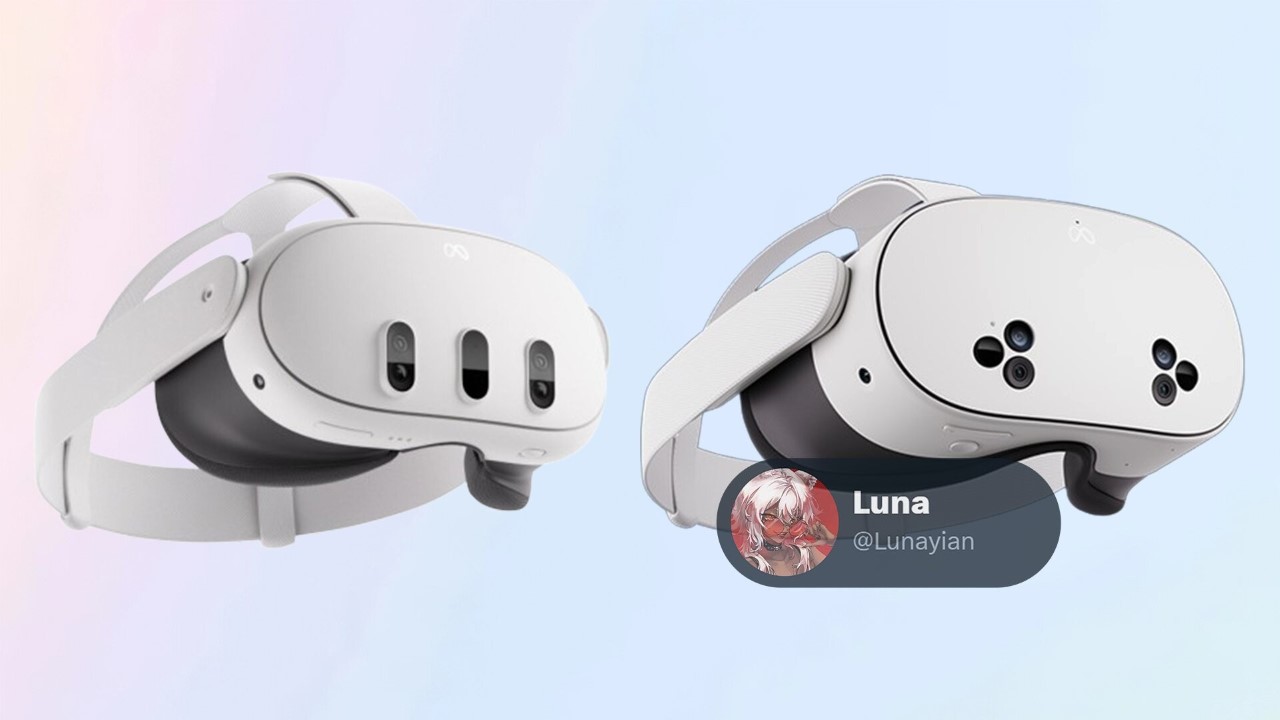
The Quest 3s is expected to be a more affordable version of its pricier counterpart. According to the leaks, it will feature a display resolution of 1920 x 1832 with 20 pixels per degree (PPD). This falls short of the Quest 3’s rumored 2208 x 2064 resolution and 25.5 PPD. Storage capacity is also speculated to be lower at 256GB compared to the Quest 3’s 512GB.

The leaked images provide a visual comparison as well. The Quest 3s appears slightly smaller overall, with the most noticeable difference being the front sensors. The Quest 3 has three oval cutouts, while the Quest 3s sports a configuration of six stacked cutouts, three on either side. These leaks are yet to be confirmed by Meta. However, they offer an exciting possibility for VR fans seeking a more accessible entry point into the world of virtual reality.

The post Meta Quest 3S images leak online, hinting at an even more affordable VR headset first appeared on Yanko Design.
Microsoft Mesh lets you hold virtual meetings around virtual bonfires

The hype around the so-called Metaverse seems to have died down a bit. Even Facebook, which changed its name to Meta to emphasize its new mission, has been rather silent on that front, especially in light of AI being the hottest thing in tech these days. With the launch of the Apple Vision Pro, however, interest in mixed reality, as well as AR and VR, is once again on the rise. As such, now seems to be the best time for Microsoft to also make widely available its own virtual meeting platform, Microsoft Mesh, encouraging a new approach to hybrid work arrangements that will have attendees “sitting” around digital bonfires or posh virtual rooms, all for the sake of trying to make people feel more connected even when they’re all just sitting in their own homes.

Designer: Microsoft

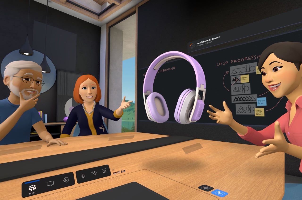
In order to shake off the image of something only for games and entertainment, platform developers like Meta and Microsoft try to make mixed reality technologies something that’s actually useful for serious business as well. These usually involve providing virtual spaces for meetings, creating avatars that represent employees, and holding more interactive and livelier gatherings that would otherwise be a boring experience of watching people’s faces in a grid of boxes. In other words, they try to recreate the feelings and emotions of meeting in person when they physically can’t.

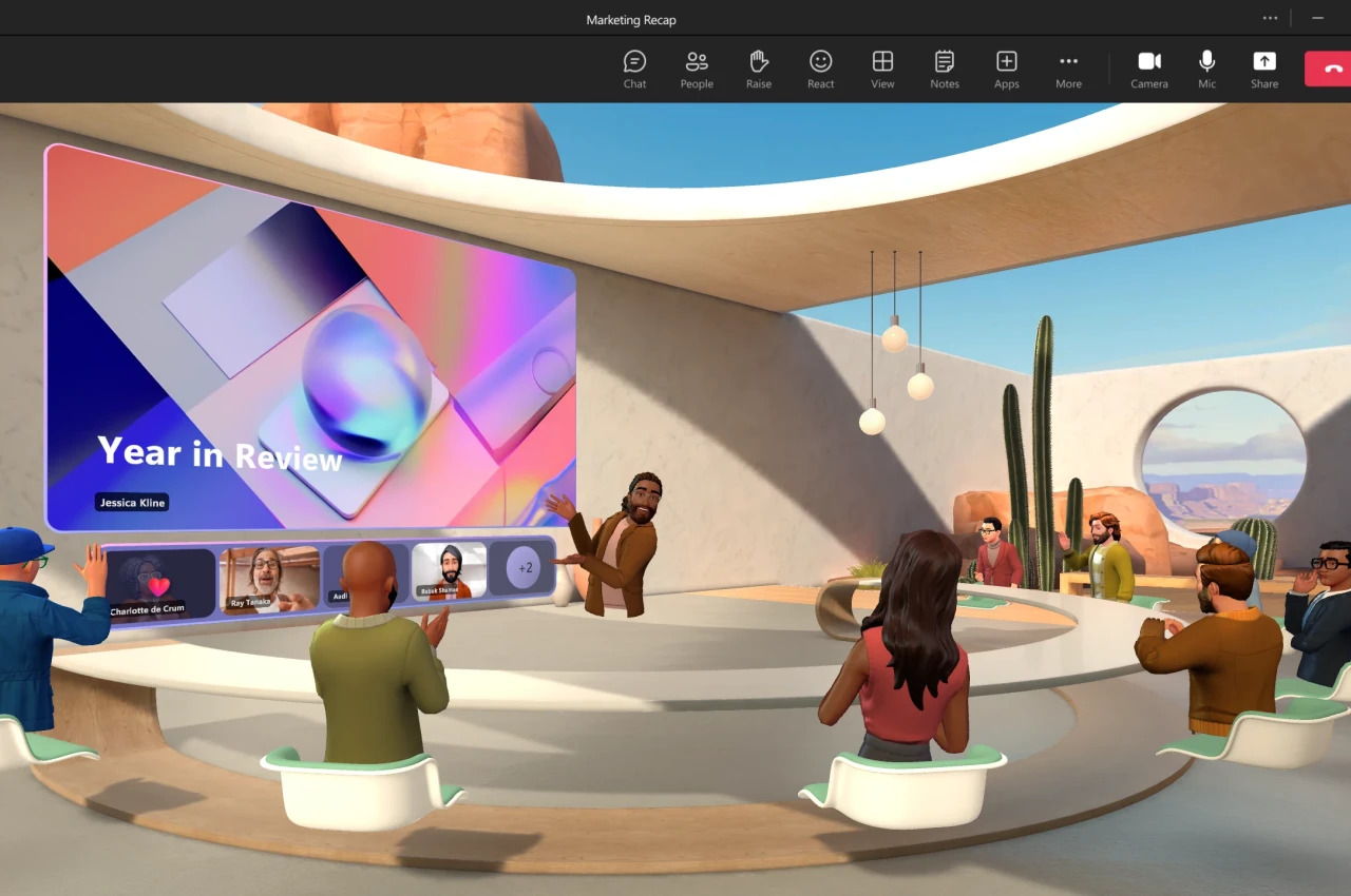
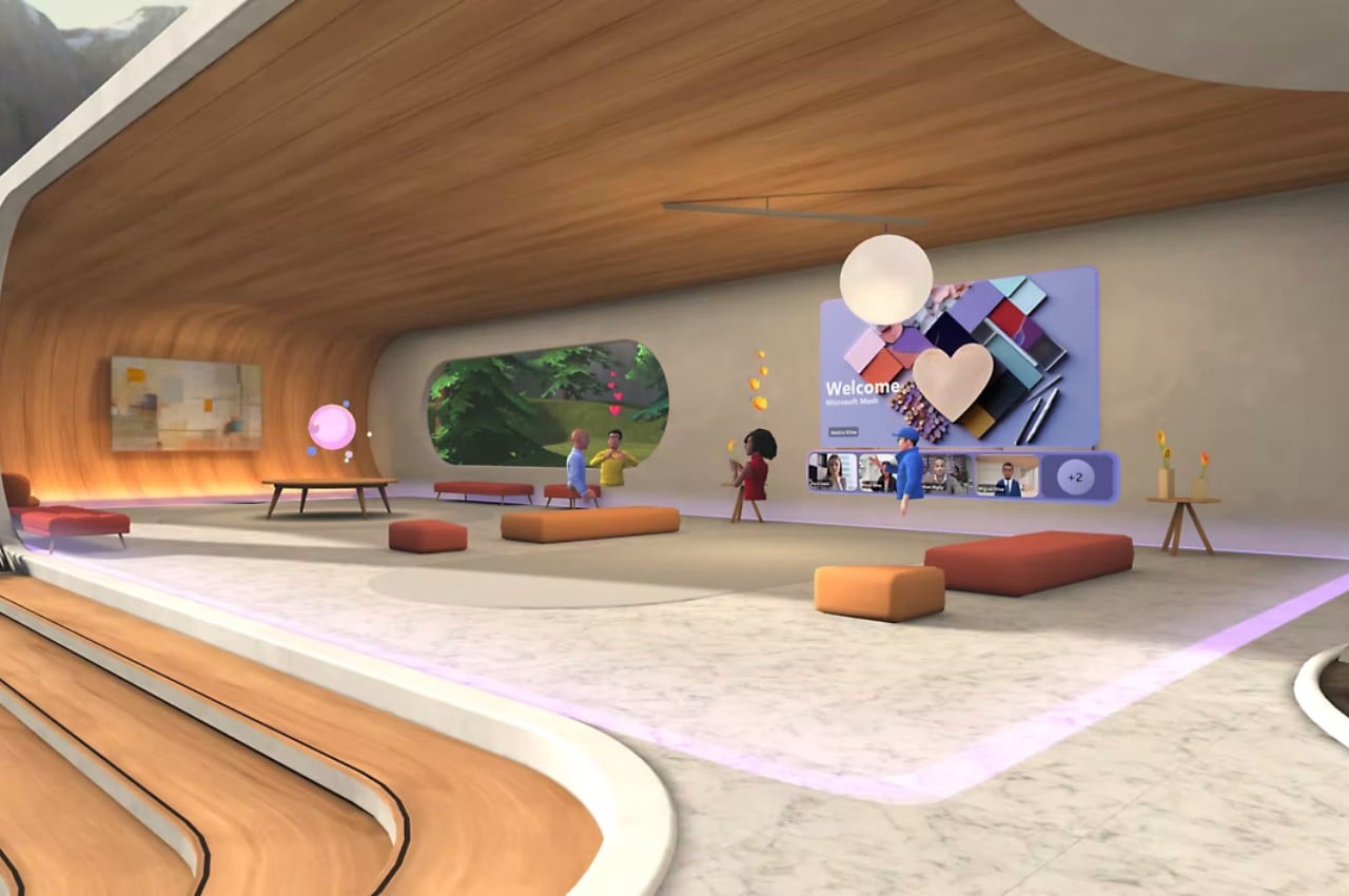
Microsoft Mesh is Redmond’s solution to this problem. Think of it like a VR Microsoft Teams and is, in fact, integrated into Microsoft’s collaboration platform. With just a few clicks, you can turn a flat, literally and figuratively, meeting into a 3D virtual experience, complete with bars, chairs, fires, and, of course, a screen inside a screen for showing presentations to your team. You’ll have to create your own personalized avatar, preferably something close to your real-world appearance, and you can decorate your spaces the way you want, including company logos, of course.

1

Microsoft is leaning heavily on its no-code tools to make Mesh more enticing, in addition to having it tied to Microsoft Teams in the first place. Designing the area is a simple process of dragging and dropping assets as you would in a 3D game editor, thanks to a collaboration with Unity 3D. But if that is already too complex, Microsoft Co-Pilot offers an easier method that utilizes AI to translate your prompts into captivating virtual interiors, or at least the semblance of one. Whether it’s just a simple stand-up meeting that needs everyone to be on their toes, a brainstorming session that requires a bit more creativity, or a presentation that needs to keep people attentive, a virtual meeting space is probably going to help spice things up a bit.

Mesh comes at an interesting time when businesses are actually pushing for their workers to return to the office completely. For many companies, however, hybrid has become an unavoidable and permanent reality, with both the benefits and drawbacks it carries, particularly when it comes to the indirect interaction between humans. Microsoft Mesh is being positioned as the next best thing to support those social connections even when actual physical cues are absent. It’s now being made available for Windows PCs, but those who want a more immersive and convincing experience can enjoy it using their Meta Quest headset. That said, you’ll need a Microsoft subscription as well, so it’s not exactly something that everyone can experience.

The post Microsoft Mesh lets you hold virtual meetings around virtual bonfires first appeared on Yanko Design.
Ray-Ban Meta are a cool pair of AI-embedded smart glasses you’d want to wear often

Meta in partnership with Ray-Ban has launched the second generation of their smart glasses today. A refreshing take on their 2021 Stories smart glasses, these are named more attractively as the Ray-Ban Meta Smart Glasses. The company is refraining from calling them the successors to the first ones, since they were not fancied by the tech community in general.

That said, the new version also comes with built-in speakers and five microphones to attend calls or seamlessly use the voice assistant. Meta is positioning them as a daily wearable to click photos and videos from your eye’s point of view. Pretty interesting isn’t it?

Designer: Meta

They were released during the Connect event and the hardware alone has a significant bump up compared to the Stories smart glasses. There’s a 12MP wide-angle camera capable of recording videos at 1080p/60fps and 32GB on-board storage. The photos and videos are much crisper now, enough for you to stay in the social media limelight. If you want, the recorded videos can be live-streamed to Facebook or Instagram via a nearby paired device. However, in this option, the quality can deteriorate if your internet connectivity is slow.

According to Meta the new open-back speakers are 50 percent louder and leak less noise, so you can keep your conversations incognito. The bass has a thump and the vocals are much clearer which in combination with the spatial audio elevates the listening experience. The design has also got a bump up, as the glasses have thinner arms and the larger touchpad is very easy to use. Tap and swipe gestures for controlling the volume levels and recording videos, make these smart glasses intuitive.

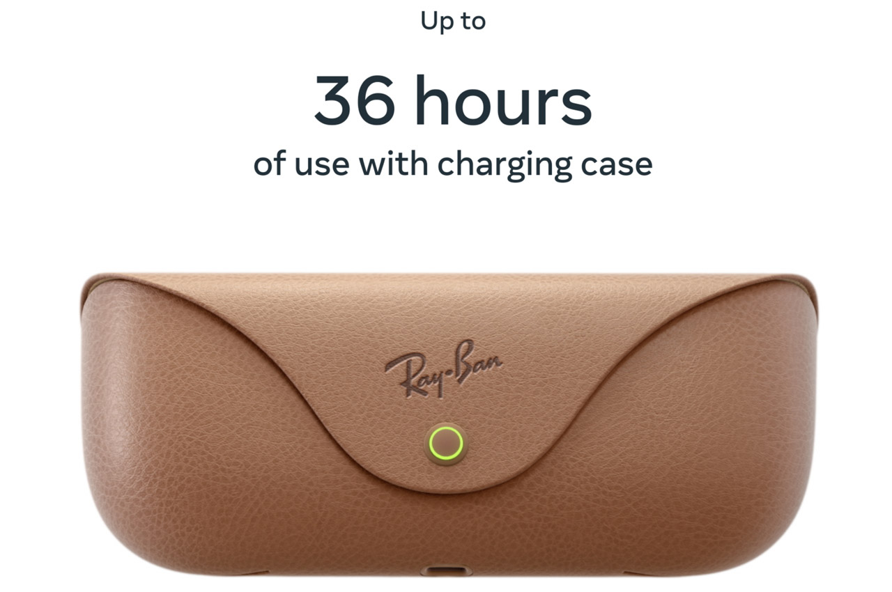
Ray-Ban Meta smart glasses with 36 hours of battery life in the accompanying case look better than most of the other major competitors in the market. They no longer feel like a concept rushed into the production stage and solve the intended purpose.

The glasses are up for pre-order in the US, Canada, Europe and Australia right away for a price tag starting at $299. You can opt for the polarized version costing $329 or the transition lenses for $379. The official sale for the smart glasses available in cool color options will commence on October 17.

The post Ray-Ban Meta are a cool pair of AI-embedded smart glasses you’d want to wear often first appeared on Yanko Design.

A “Threads from Instagram” App Existed Back In 2019… And It Was NOTHING Like Twitter

Before Zuckerberg launched the world’s most exciting and fastest-growing social media app, he struggled to make Threads relevant. Yes, “Threads from Instagram” was an app that launched in October 2019, but shut down in 2021 following just thousands of downloads and an abysmal performance. Here’s what the original Threads app was all about, why it failed, and more importantly, what it says about Zuckerberg and Meta’s culture of innovation and stealing ideas.

It sure sounds surprising, but not many people will remember Threads from back in the day. I barely remember it too, but it was Instagram’s way of making the network more social again. The team realized that as IG was slowly descending into irrelevance (this was before Reels were a thing), people were mainly using the app to DM each other rather than to actually view content. Nobody was tagging friends in posts anymore – they were simply sharing posts and memes with their close friends, creating a microcosmic network in the messages section rather than in the actual home feed. People loved using IG’s filters too, but instead of mass-publishing their content on stories or on their profile, they were much more comfortable sharing it with 3-4 tight-knit friends instead. Seeing this, Mosseri-led Instagram decided that this was worthy of a new app entirely. An IG without the Insta or the Gram. Just DMs and AR filters… or simply, a Snapchat clone.

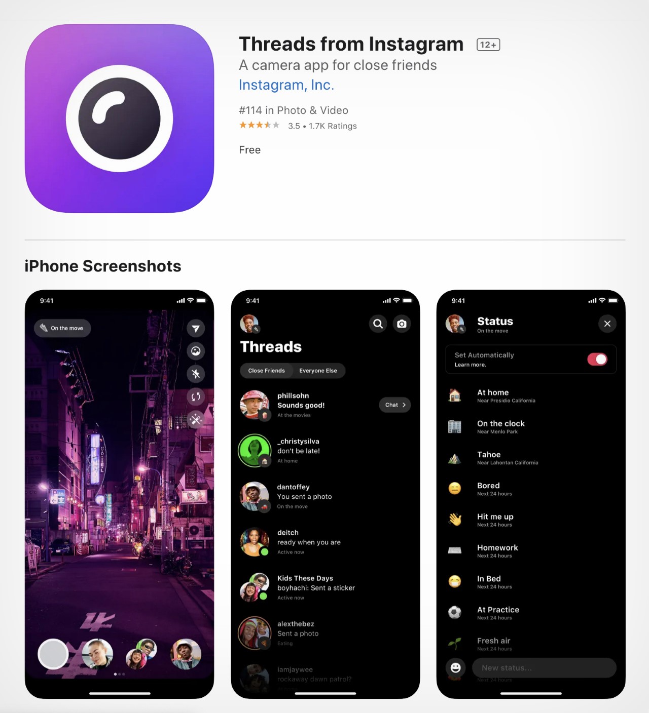
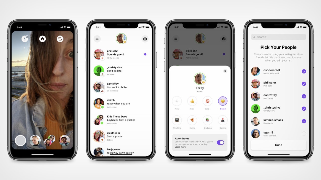
This Threads app was also tied inextricably to your IG. In a way, it was pretty much a stripped-down version of IG that just had a camera, AR filters, and DMs… exactly like Snapchat. You could chat with friends or other people on IG, and you could use your Instagram’s Close Friends feature to share videos of yourself or stuff around you with your immediate social circle. The app debuted in 2019, but took nearly 6 months to actually catch any momentum. It barely had any users, and had roughly 2.5k ratings on the app store, making it Meta’s worst-performing app. Instagram finally shuttered it in 2021, but little did Mark and Mosseri know that Threads would have its ground-shattering glow-up just 2 years later.

A screenshot of the original ‘Threads From Instagram’ App Store profile.

It seems like Zuckerberg knew he wanted to make a microblogging platform back in 2021, and Threads was perfect for this ‘phoenix rebirth’. TechCrunch reported in July of 2021 that Facebook (back when it was still called Facebook) was testing out twitter-like features on some public pages. A year later, Zuckerberg made a joke about acquiring Twitter and was legally forced to buy it. The timing couldn’t be more perfect for Zuckerberg, as he saw Musk slowly running Twitter into the ground. Smelling blood in the water, Meta began building out its Twitter clone in January this year, and just as Musk made an announcement that Twitter was limiting how many posts its users could see per day, Zuckerberg forced the launch of Threads in its ‘new app who dis’ avatar. The Threads app caught on like wildfire (even though it was riddled with quite a few dark design patterns), and currently sits at over 100 million users in a record time of 10 days. To give you a sense of how big a deal that is, Twitter has 500 million users…

While it isn’t clear whether Threads will be able to ride this wave of success and internet dominance (whether people continue using Threads after 1 year is still anyone’s guess), it really does prove that Meta, led by Zuckerberg, has cultivated a reputation for ripping off successful ideas than actually coming up with them. Like every overgrown company (i.e., monopoly), Meta defeats competition either by acquiring, or by stealing. Aside from building Facebook, it’s difficult to think of anything that Zuckerberg has built successfully from scratch. Instagram was acquired in 2012, and Whatsapp and Oculus in 2014. Zuckerberg tried hard to acquire Snapchat too, but after sensing resistance, merely copied the ephemeral ‘Stories’ feature. Reels were introduced in 2020 to combat TikTok, which couldn’t be acquired because it was owned by Chinese company ByteDance. Meta tried hard to launch Internet.Org in third-world countries but faced huge resistance, and even tried and failed at launching Libra Coin, its own crypto-based payment network (also rebranded as Diem). Even their hardware efforts were a flop, with the Portal camera that barely made a dent, the RayBan partnership that seems to have been forgotten, and the Meta smartwatch that never even saw the light of day.

Threads, however, reinforces Meta’s corporate tendency to blatantly copy winning ideas. It’s definitely being touted as the company’s latest success story, but it builds entirely on an existing microblogging platform, which was pretty much ripped off in the process. The name “Threads” isn’t new either, but its personality certainly is…

The post A “Threads from Instagram” App Existed Back In 2019… And It Was NOTHING Like Twitter first appeared on Yanko Design.
Apple Vision Pro vs. Meta Quest Pro: The Design Perspective

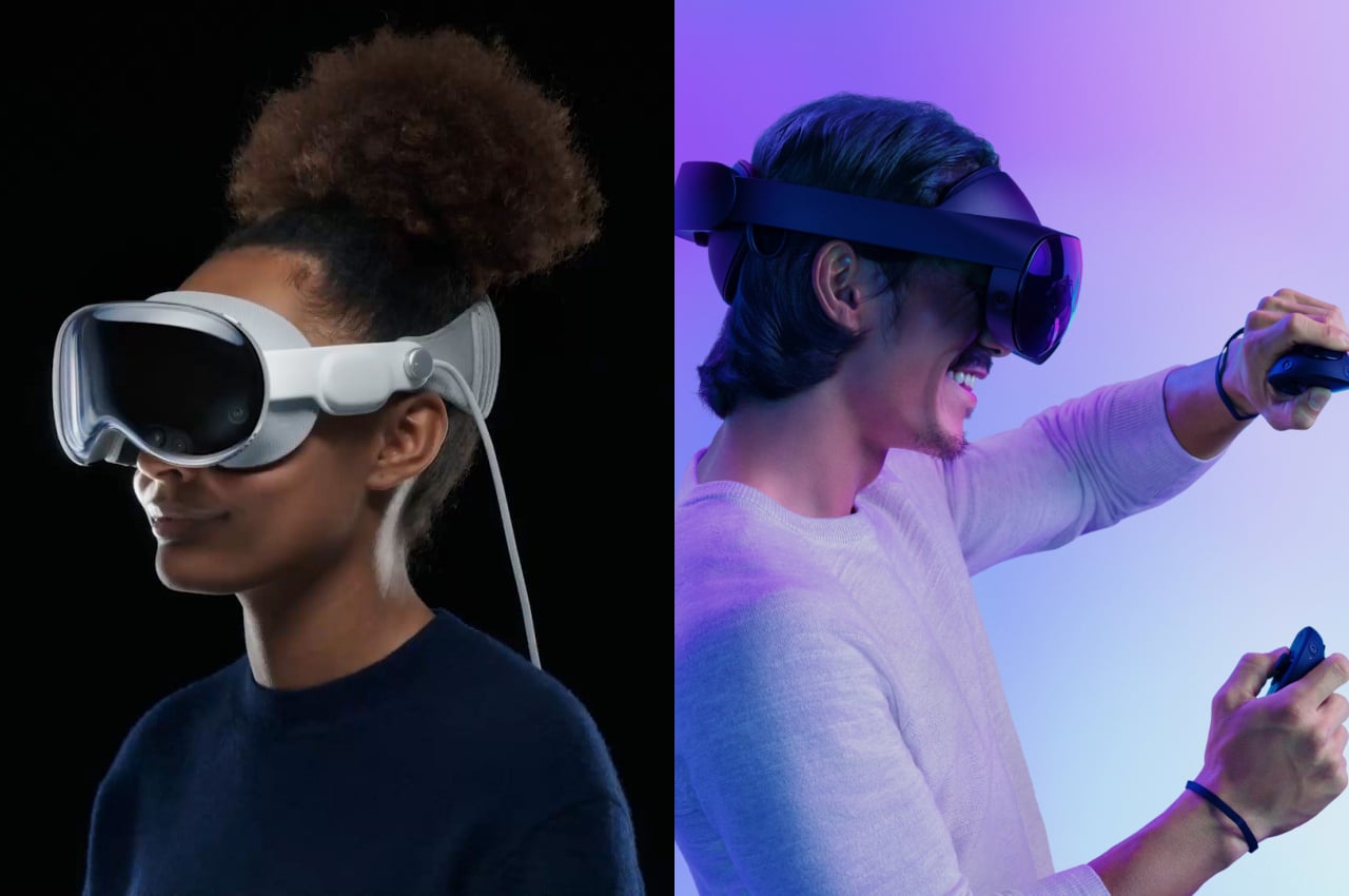
Apple finally took off the veils from its much-anticipated entry into the mixed reality race, and the Internet was unsurprisingly abuzz with comments on both sides. Naturally, comparisons were made between this shiny newcomer and the long-time market leader, which is now Meta, whether you like it or not. Given their already tenuous relationship, the launch of the Apple Vision Pro only served to increase the rivalry between these frenemies. It’s definitely not hard to paint some drama between the two tech giants vying for the same mixed reality or spatial computing market, whichever buzzword you prefer to use. But is there really a direct competition between these two products, or do they have very different visions with almost nothing in common except for having to put a screen over our eyes? We take a deeper look into the Apple Vision Pro and the Meta Quest Pro to see where they differ not only in their design but also in their vision.

Designer: Apple, Meta

What is the Meta Quest Pro

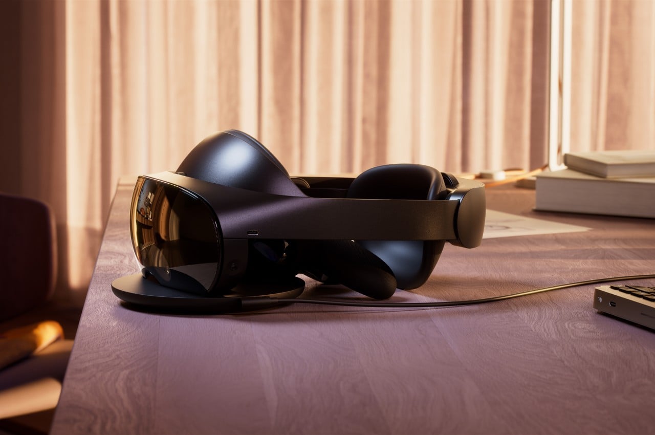
Let’s start with the older of the two, one that dates back to the time when Facebook was also the name of the company. Originally created by Oculus, the Quest line of VR headsets soon bore the Meta name, though not much else has changed in its core focus and the way it works. In a nutshell, the Meta Quest Pro, along with its siblings and predecessors, falls under the category of virtual reality systems, which means it gives you a fully enclosed experience confined within virtual walls. It practically blocks off the rest of the real world while you’re wearing it, but the Quest Pro now has a “passthrough” feature that lets you see the world around you through the headset’s cameras, but the quality is definitely lower than what your eyes could naturally see.

In terms of product design, the Quest Pro doesn’t stray too far from the typical formula of consumer electronics, which is to say that there’s plenty of plastic material all around. To be fair, Meta aimed to make the Quest hardware more accessible to more people to help spread its adoption, so it naturally had to cut a few corners along the way. The choice of materials was also made to lighten the gear that might be sitting on your head for hours, but it also doesn’t remove the less-than-premium feel, nor does it completely alleviate that heft.

To its credit, the design of the Quest Pro does help make the headset feel a little less burdensome by balancing the weight between the front and back parts. While the front has most of the hardware and optics that make the Quest Pro work, the back has the battery that powers the device. Having that battery present still adds to the overall weight of the machine, but Meta opted to prioritize mobility and convenience over lightening the load.

What is the Apple Vision Pro

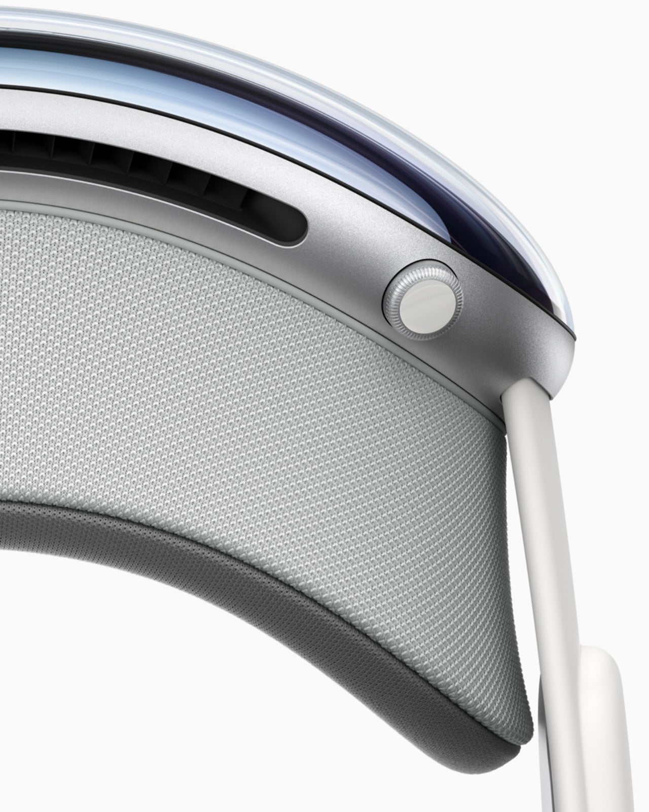
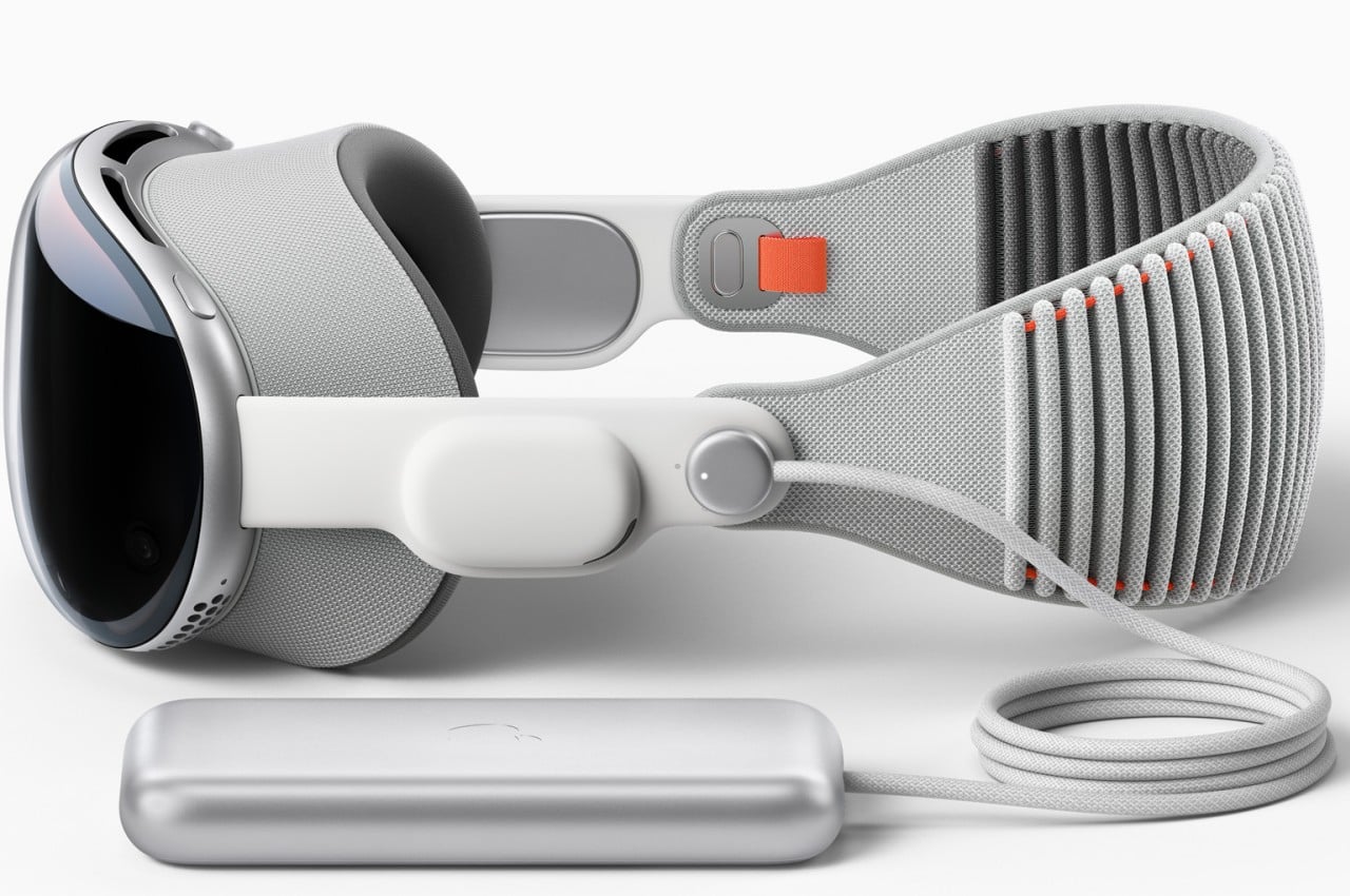
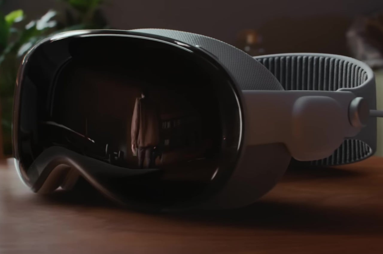
The Apple Vision Pro, in comparison, takes an almost completely opposite approach from the Meta Quest Pro or all other headsets in general. In typical Apple fashion, the company paid special attention to design details that make the hardware both elegant and comfortable. The Vision Pro makes use of premium materials like laminated glass and woven fabrics, as well as heavier components like aluminum alloy. It’s a device that looks elegant and fashionable; an undeniable part of Apple’s hardware family.

Apple’s answer to the battery problem is both simple and divisive. The Vision Pro simply doesn’t have a battery, at least not on the headset itself. You’d have to connect an external power source via a cable, though that battery can be shoved inside your pocket to get it out of the way. It doesn’t completely hinder mobility and even opens the doors for third-party designs to come up with other ideas on how to solve this puzzle.

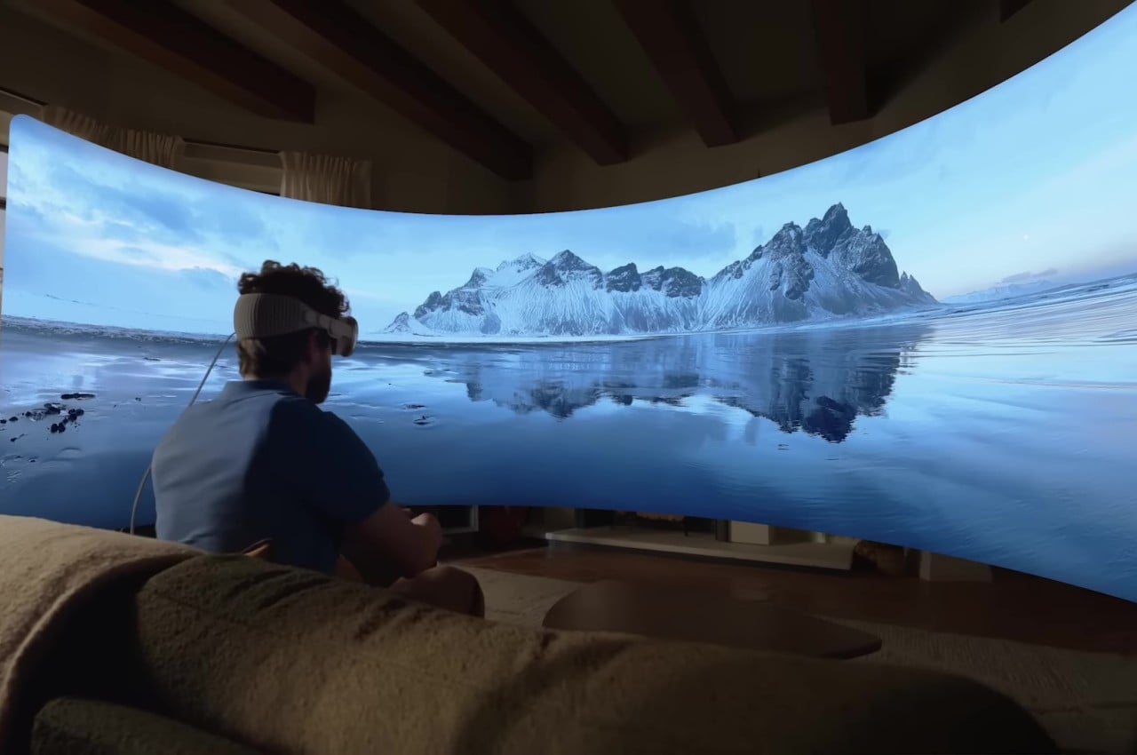
The biggest difference between Apple’s and Meta’s headsets, however, is in their use and purpose. The Vision Pro is closer to being an augmented reality headset compared to the Quest Pro, blending both virtual and real worlds in a single, seamless view. The Vision Pro also has the ability to block out or at least dim everything aside from the virtual window you’re using, but that’s only a side feature rather than a core function.

VR/AR vs. Spatial Computing

At its most basic, the Meta Quest Pro is really a virtual reality headset while the Apple Vision Pro is designed for a form of mixed reality now marketed as “spatial computing.” To most people, the two are almost interchangeable, but those sometimes subtle differences set these two worlds apart, especially in how they are used. It’s certainly possible to mix and match some features and use cases, but unless they’re specifically designed to support those, the experience will be subpar.

The Meta Quest Pro, for example, is the first in its line that can be truly considered to have AR functionality thanks to its higher fidelity “passthrough” feature, allowing you to see virtual objects overlaid on top of the real world. That said, its core focus is still on virtual reality, which, by nature, closes off the rest of the world from your sight. Looking at the world through cameras is really only a stopgap measure and can be a little bit disorienting. That’s not even considering how most of the Quest ecosystems experiences happen in virtual reality, including the use of “normal” computer software, particularly ones that require using a keyboard and a mouse.

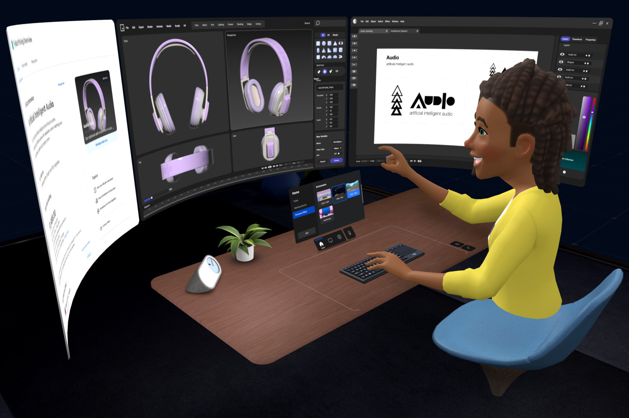
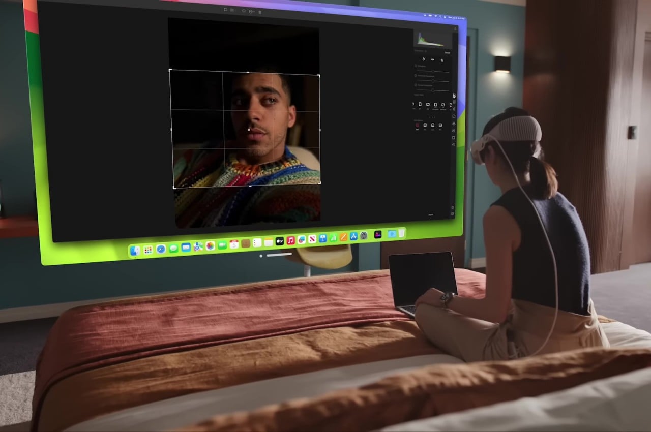
On the other hand, the Apple Vision Pro was made specifically for mixed reality, specifically spatial computing, where the real and the digital are blended seamlessly. In particular, it puts those applications, including familiar ones from macOS and iOS, in floating windows in front of you. visionOS’s special trick is to actually have the real world affect those virtual objects, from having them cast shadows to tweaking the audio to sound as if they’re bouncing off the furniture in the room. The Vision Pro can emulate the enclosed view of a VR headset by darkening everything except the virtual window you’re using, but it’s unavoidable that you’ll still see some of the real world “bleeding” through, especially in bright ambient light.

The Vision Pro’s and visionOS’s capability to blend the real and the virtual is no small feat. Not only does it enable you to use normal applications with normal computer peripherals, it also makes better use of real-world space. It lets you, for example, assign specific applications and experiences to parts of the house. Apple’s technologies also create more natural-looking interactions with people, even if your actual body parts are invisible or even absent. All these don’t come without costs, though, and it remains to be seen if people will be willing to pay that much for such a young technology.

Controls and Interaction

The Meta Quest Pro hails from a long line of VR and AR headsets, and nowhere is this more obvious than in the way you interact with virtual objects. The headset is paired with two controllers, one for each hand, which are pretty much like joysticks with buttons and motion sensors. Make no mistake, the technology has come a long way and you no longer need to have external beacons stationed elsewhere in the room just to make the system aware of your location or that of your hands. Still, holding two pieces of plastic all the time is a very far cry from how we usually manipulate things in the real world or even from the way we use computers or phones.

Apple may have acquired the holy grail of virtual computing with its more natural input method of using hand gestures without controllers or even gloves. There’s still a limited vocabulary of gestures available, but we’re almost used to that given how we have been using touch screens for the past decade or so. At the same time, however, the Vision Pro doesn’t exclude the use of more precise input instruments, including those controllers, if necessary. The fact that you can actually see the real objects makes it even easier to use any tool, which expands the Vision Pro’s uses considerably.

Philosophy and Vision

Although it’s easy to paint the Apple Vision Pro and Meta Quest Pro as two sides of the same eXtended Reality (XR) coin, the philosophies that drive their design are almost as opposed to each other as the companies themselves are. Meta CEO Mark Zuckerberg was even quoted to have pretty much said that while downplaying the Vision Pro’s innovations. In a nutshell, he doesn’t share Apple’s vision of the future of computing.

It shouldn’t come as a surprise that Zuckerberg’s vision revolves around social experiences, something that might indeed be better served by a fully virtual reality. Not only does it make out-of-this-world experiences like the Metaverse possible, it can also make inaccessible real-world places more accessible to groups of people. Meta’s marketing for the Quest Pro mostly revolves around fun and engaging experiences, content consumption, and a bit of creativity on the side.

The Apple Vision Pro, on the other hand, seems to be about empowering the individual by breaking computing free from the confines of flat and limited screens. There are, of course, features related to connecting with other people, but most of the examples have been limited to FaceTime chats more than huddling around a virtual campfire. It has already been noted repeatedly how Apple’s presentation was bereft of any mention of social media, which some have taken as a knock against Facebook. Of course, social media is now an unavoidable part of life, but it exists only as just another app in visionOS rather than as a core focus.

Ironically, the Vision Pro is perhaps even more social than the Quest Pro, at least as far as more natural connections are concerned. Instead of fun yet comical avatars, people will get to see a life-like semblance of your bust during meetings, complete with eye movements and facial expressions. And when someone needs your attention in the meatspace, the Vision Pro will project your eyes through the glass, making sure that the other person knows and feels that you’re actually paying attention to them.

Pricing

It’s hard to deny how impressive all the technologies inside the Vision Pro are, and it’s easy to understand why Apple took this long to finally let the cat out of the bag. As mentioned, however, these innovations don’t come without a cost, and in this case, it is a very literal one. Right off the bat, Apple’s inaugural spatial computing gear is priced at $3,499, making it cost twice as much as the average MacBook Pro. It might be destined to replace all your Apple devices in the long run, but it’s still a very steep price for an unproven piece of technology.

The Meta Quest Pro is, of course, just a third of that, starting at $1,000. Yes, it uses less expensive materials, but its technologies are also more common and have stood the test of time. The Quest platform has also gone through a few iterations of polish, with developers creating unique applications that play to the hardware’s strengths. That said, although the Quest Pro sounds more dependable, insider insights at Meta have painted a somewhat uncertain future for the company’s Metaverse ambitions. Apple’s announcement might then serve to light a fire under Meta’s seat and push it to pick up the pace and prove that its vision is the right one.

Final Thoughts

As expected of the Cupertino-based company, Apple turned heads when it announced the Vision Pro. It blew expectations not just because of the quality of its design but also because of the ambitious vision that Apple revealed for the next wave of computing. Right now, it may all sound novel and gimmicky, and it will take some time before the technology truly takes root and bears fruit. Spatial computing has the potential to truly revolutionize computing, but only if it also becomes more accessible to the masses.

The Vision Pro isn’t a death knell for the Meta Quest but more of a wake-up call. There will definitely be a need for an alternative to Apple’s technologies, especially for those who refused to live in that walled garden. Meta definitely has a lot of work to do to reach the bar that Apple just raised. Whether those alternatives come from Meta or it might come from other vendors, there’s no doubt that the extended reality market just burst to life with a single “One More Thing” from Apple.

The post Apple Vision Pro vs. Meta Quest Pro: The Design Perspective first appeared on Yanko Design.

Apple Vision Pro for $999? An engineer built the Vision Pro’s eye + hand-tracking interface for the Meta Quest Pro

If every tech reviewer who got to try on the Vision Pro after Apple’s WWDC event can be considered a reliable source, the Vision Pro is absolutely ‘magical’. Almost everyone who got to try it on (even Disney’s CEO Bob Iger) has the same feeling of being simultaneously sucked in and blown away by how incredibly immersive and intuitive the tech is. The resolution is flawless, the eye-tracking is brilliant, and the overall experience has changed the minds of quite a few skeptics. There’s a downside, however… This magical experience costs a whopping $3500 USD.
For YouTuber ThrillSeeker, this downside seemed a little too rich. Ultimately, the Apple Vision Pro’s unique interface could be boiled down to three distinct features – Passthrough (the ability to see the world through your headset), Eye Tracking, and Hand Tracking… and the $999 Meta Quest Pro had all those three features. “I’ve been in VR for half a decade, and have been making videos about AR and VR for most of that time,” said the YouTuber, “I struggle to believe that Apple has somehow created something so radically superior, so transformative, that it warrants the use of the word Magical.” A lot of the Vision Pro’s magic is the result of its highly intuitive UI, which lets you interact with elements simply by looking at them and pinching your fingers. The Meta Quest Pro is capable of doing all these things too, although nobody at Meta really built them out… so ThrillSeeker decided to give things a go.

Designer: ThrillSeeker

ThrillSeeker started first by shooting a tweet to Meta’s CTO, Andrew Bosworth hoping for some leads and support, but understandably never heard from him (I assume everyone at Meta was just taking a while to recover from the Apple Keynote). Deciding to then take matters into his own hands (and eyes), he then went on to build the eye and hand-tracking system, designing a mock app drawer (the Vision OS home page) to test out his UI.

The entire interface was designed and coded within Unity, where ThrillSeeker tapped into the Quest Pro’s eye-tracking abilities and turned them into a controller of sorts. Most VR headsets ship with controllers, and these controllers use invisible lasers to point at objects, which the headset then recognizes as a cursor. ThrillSeeker simply turned the wearer’s eyesight into a laser pointer, allowing app icons to pop forward when you look at them (just like on the Vision Pro). Tapping your fingers would select/grab the icon, allowing you to manipulate it and move it around.

The pop-out 3D app icons

Even though highly preliminary, ThrillSeeker proved one thing – that Apple’s magical UI isn’t entirely inconceivable – it’s just that nobody at Meta (or Sony or HTC) ever thought of it in the first place. His demonstration proves that this eye and hand-controlled interface is absolutely possible with existing tech in a $999 Quest Pro device. ThrillSeeker is planning on making the APK for this demo available in the near future for all Meta Quest Pro users. We’ll add the link here as soon as he does!

The post Apple Vision Pro for $999? An engineer built the Vision Pro’s eye + hand-tracking interface for the Meta Quest Pro first appeared on Yanko Design.