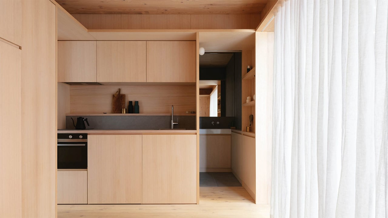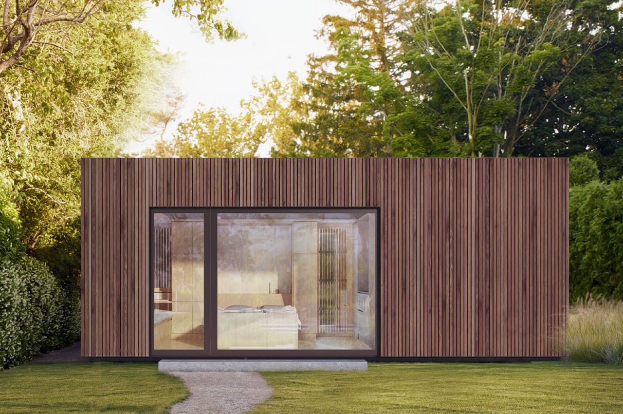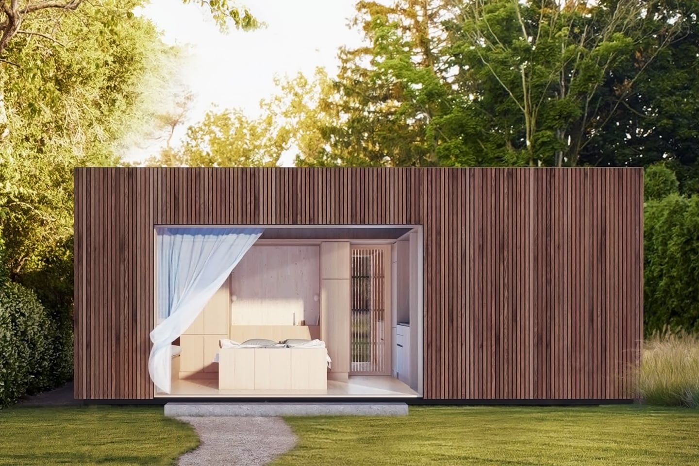
Prefabricated architecture minimizes construction waste, reduces carbon footprint, and has a quicker turnaround than a traditional home. Minima is a 215-square-foot (20-square-meter) prefab module designed to be a flexible structure to serve as a standalone tiny home or as an additional unit in the backyard that can be used as a home office or spacious guest house. It is constructed with CLT (cross-laminated timber) which is a sustainable material and cuts down on the carbon emissions that concrete produces. The modern micro-home is giving me major Japandi vibes!
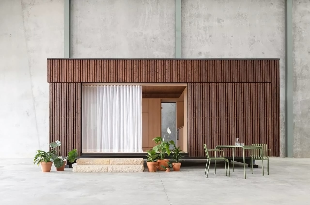
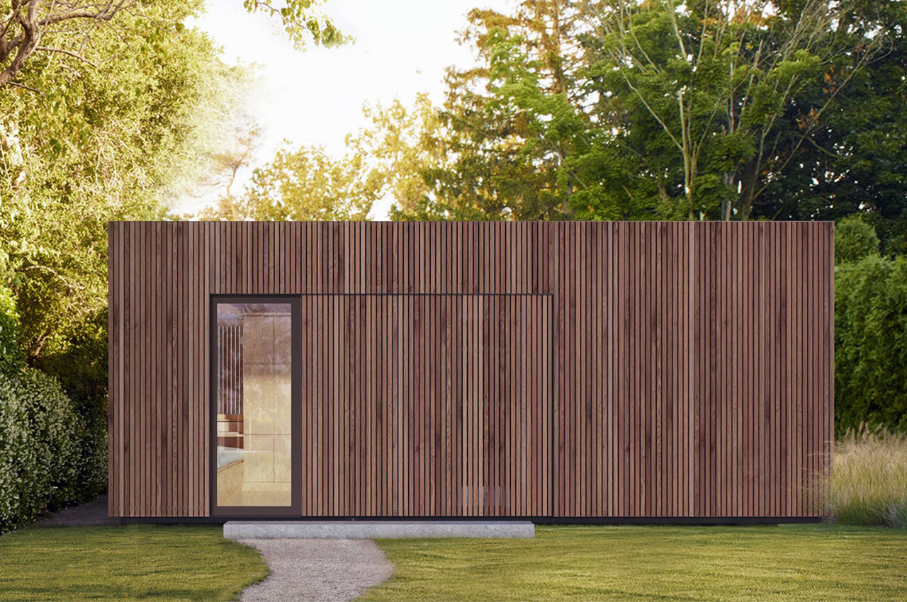
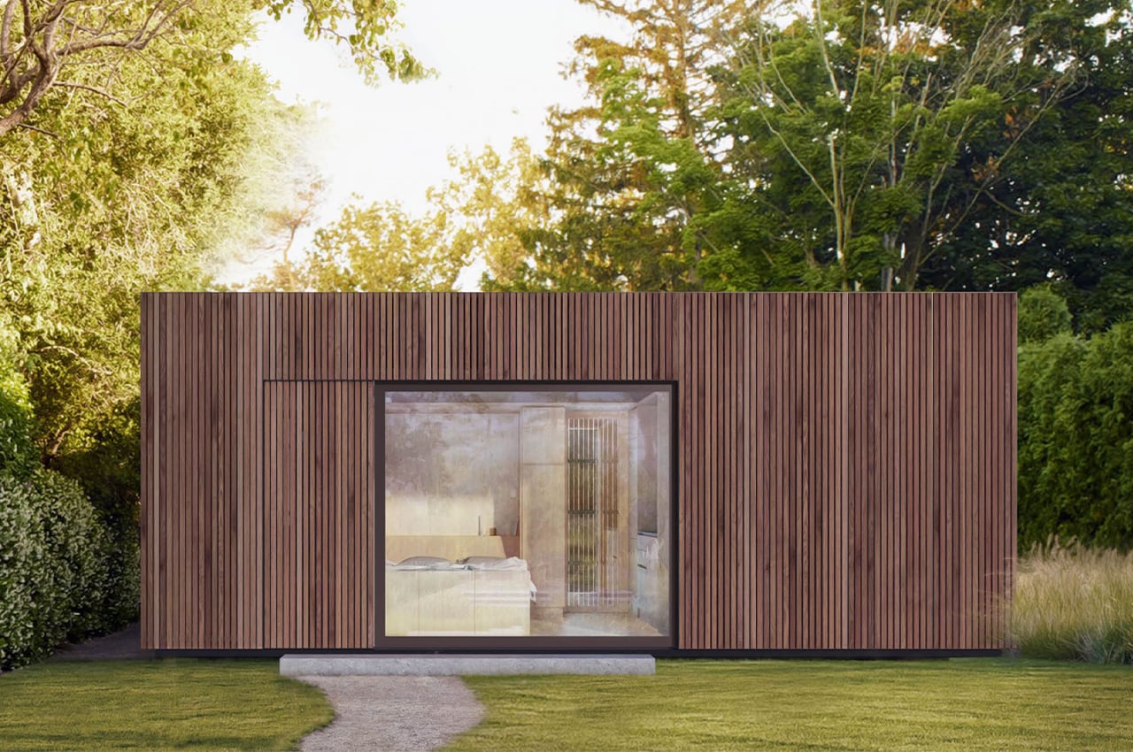
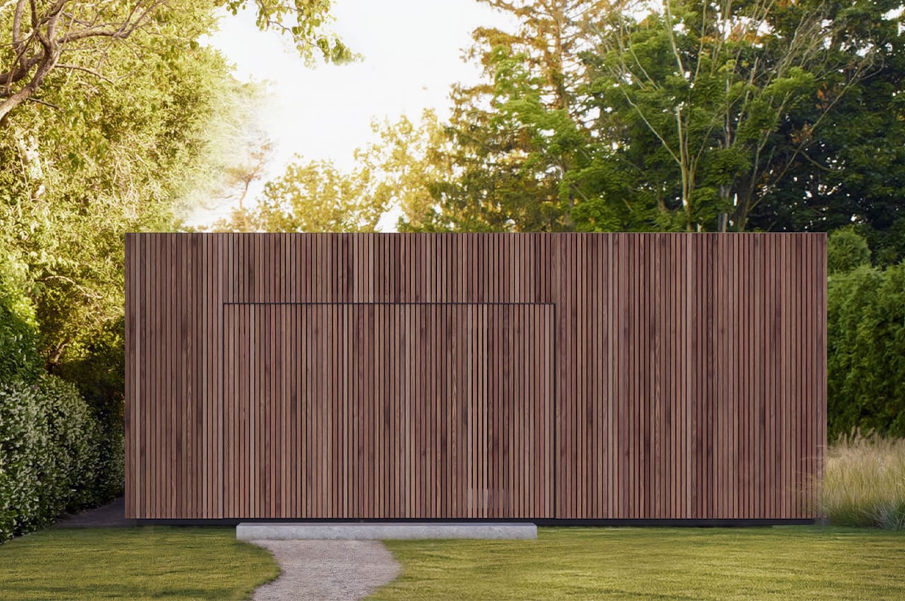
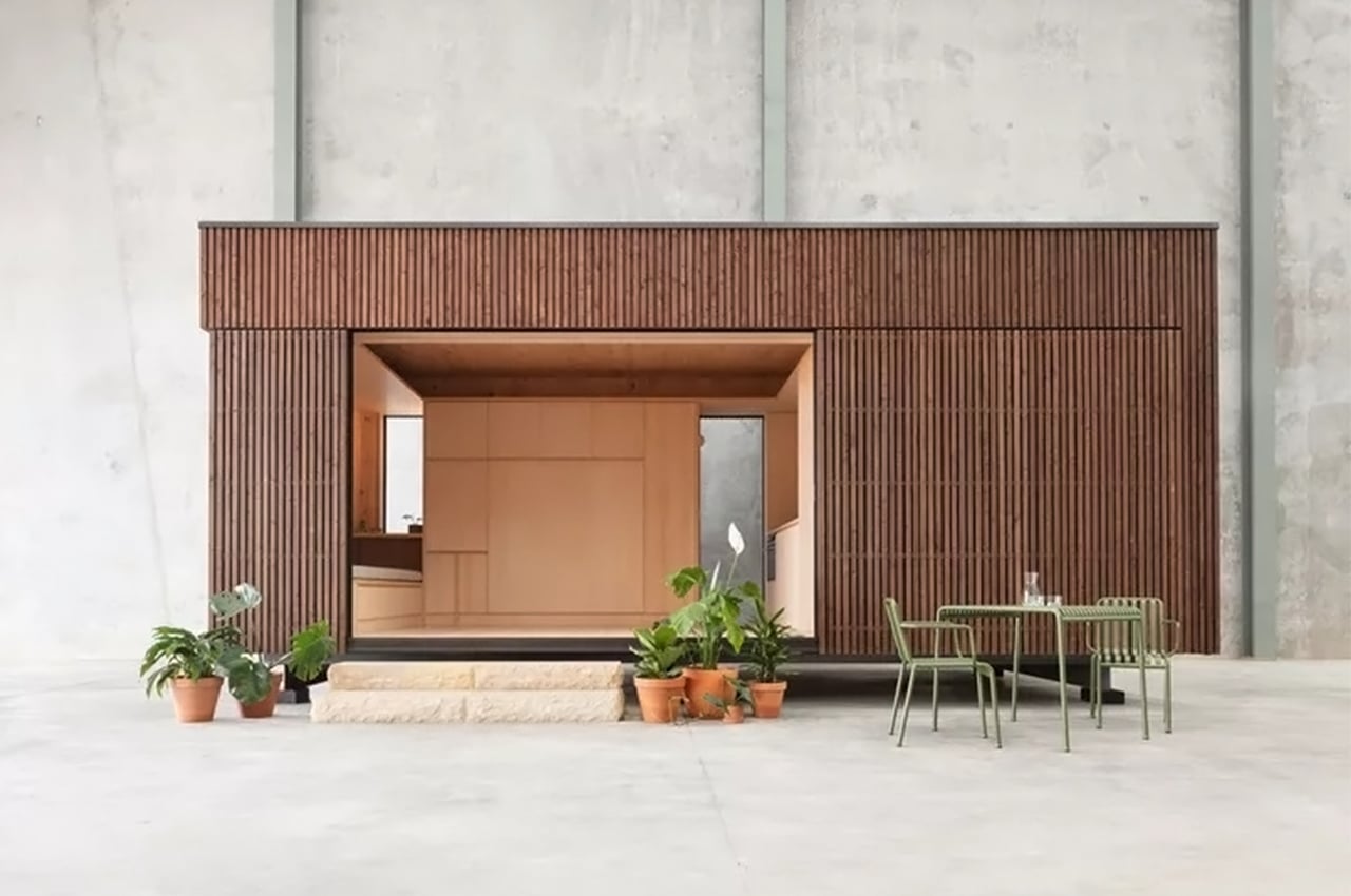
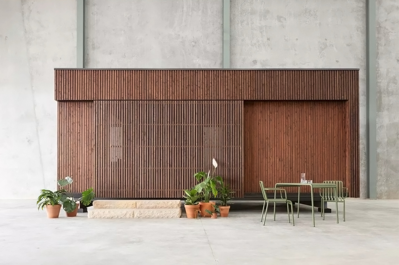
The boxy exterior is clad with a skin of cypress battens and a steel roof which maintains its minimal look. The unit has a streamlined, modern profile that still feels warm and human-centric. The facade opens up with hardwood-framed glass doors that can slide over to reveal its Scandinavian and Japandi-inspired interior. It can be partially closed off with a hardwood-encased screen door or a translucent curtain.
Australian studio TRIAS designed the unit in collaboration with prefab manufacturer FABPREFAB. The aim was to not only make architecturally designed homes more accessible and affordable but to make prefabs more widely appealing. “We did a lot of research into the Australian and overseas markets. In Australia, the emphasis tends to be on low cost, whereas in Europe the emphasis is on quality and longevity. This aligns perfectly with the philosophy of our practice. We wanted to create something consciously good quality, but also to explore how to make a prefab house not look like a prefab,” says Jennifer McMaster, Director of TRIAS.
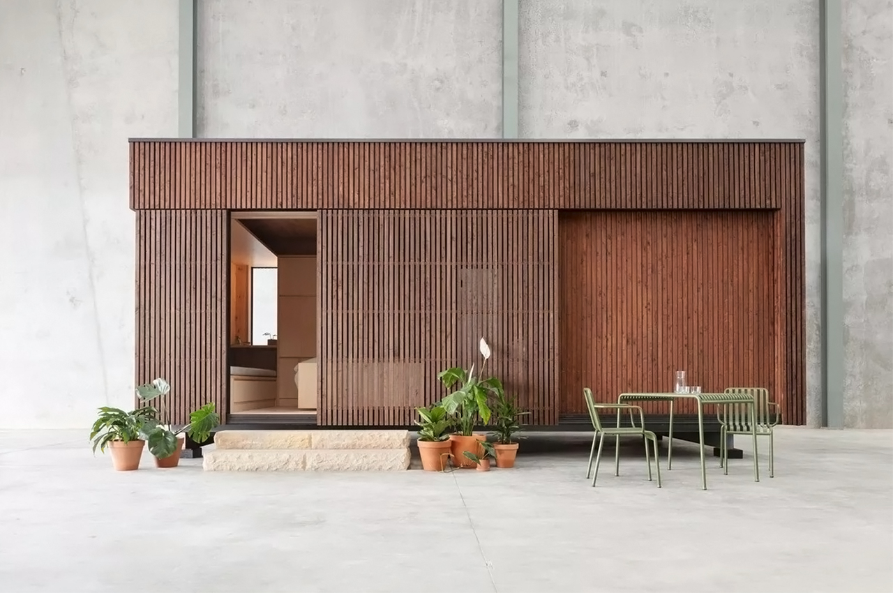
Minima doesn’t need a concrete foundation and instead uses a special type of ground screw that can ease relocation if necessary which heavily reduces the impact on the construction site’s surroundings. Since it is a modular design, you can add an extra module in a T-formation to double the area. The impressive prefab home could fit almost anywhere there might be open space creating more opportunities to build accessible and affordable communities that can be scaled.
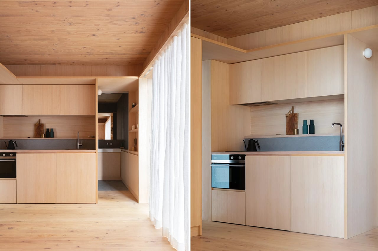
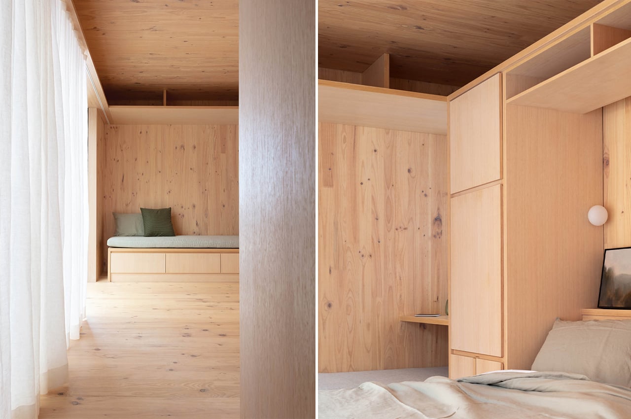
The compact floor area is divided into various zones that group different functions together. For instance, “wet” areas like the kitchen and bathroom are on one side of the micro-house while the living and sleeping areas are concentrated into one flexible zone in the center of the home.
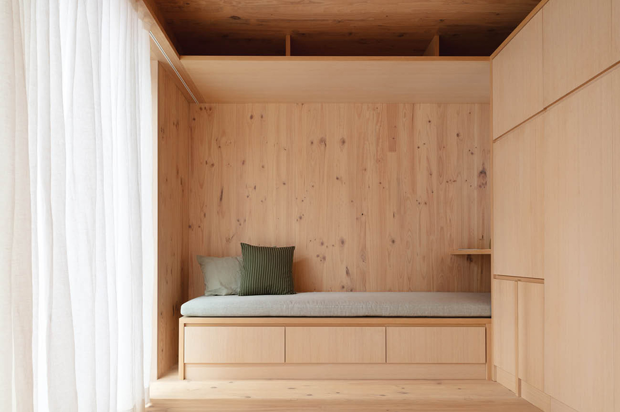
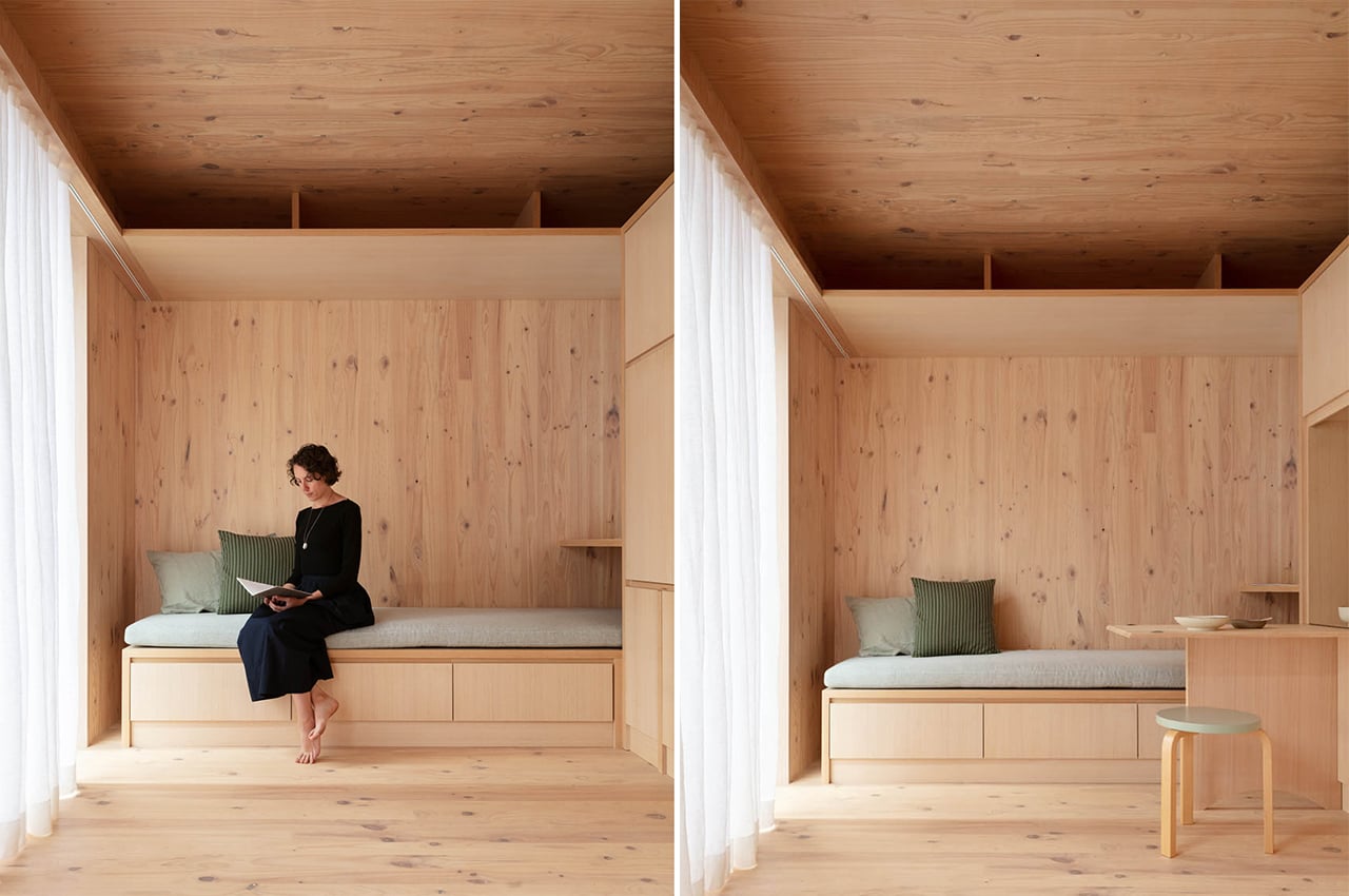
The interior walls, ceiling, and floor are covered with lots of cross-laminated timber (CLT) – a sustainable engineered wood product that involves layers of fast-growth timber that are glued perpendicular to each other, resulting in a structurally robust and fire-resistant material that not only looks good but is also perfect for prefabrication.
Everything in the home has been intentionally made to look seamless.”Keeping all the joints and lines as simple and seamless as possible is important in a small space. We’ve lived in tiny apartment spaces, so we know how critical those lines are in making a space feel larger,” adds Jonathon Donnelly, Director at TRIAS.
In the living area, there is plenty of built-in furniture to help save maximize space, like this integrated seating bench, which also has storage space tucked below and above. Right in the center, there’s a wall-to-floor cabinet that actually has a bed, table, and shelving integrated inside. During the day, the bed can be folded away, and a multifunctional table pulled out for eating or working on. At night, the bed can be pulled down to reveal a sizeable queen mattress, as well as lighting and storage behind.
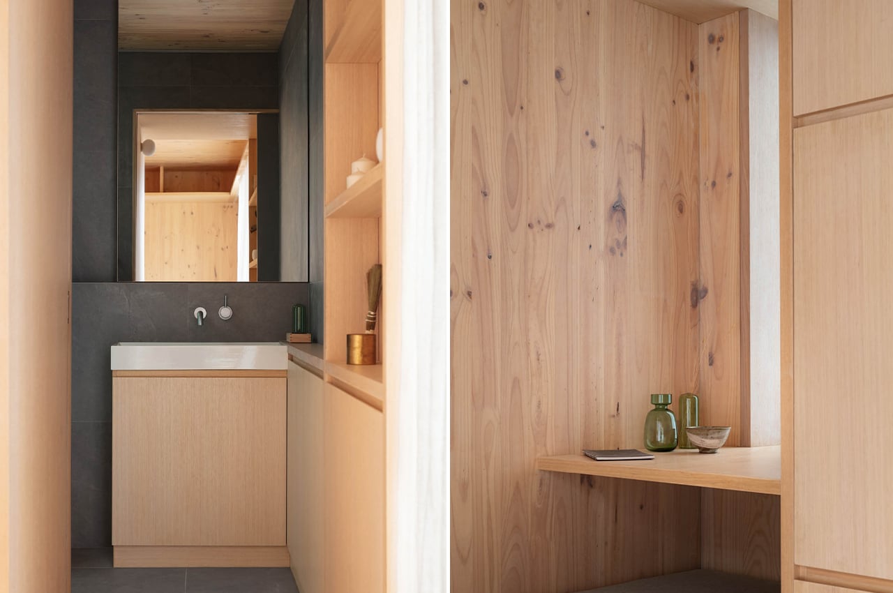
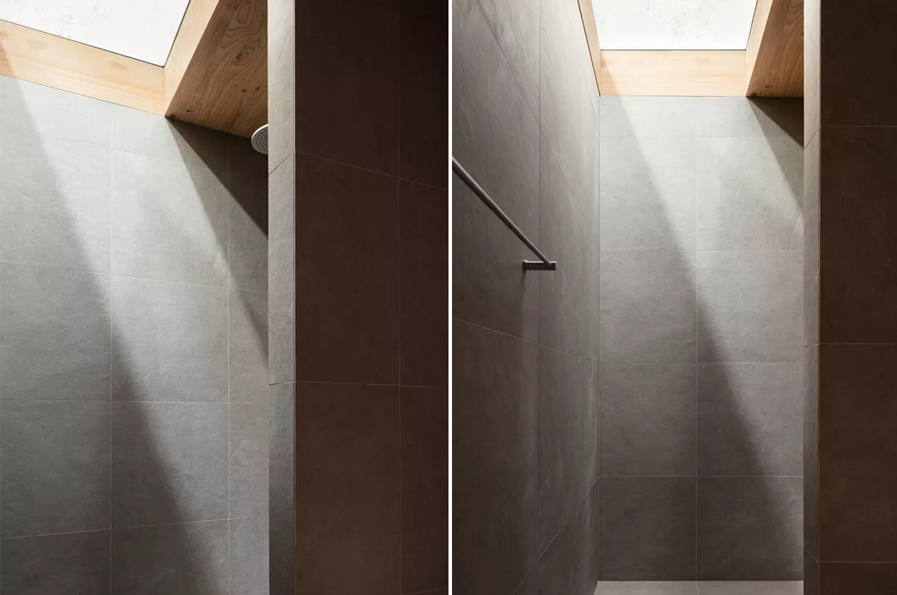
The kitchen features a pared-down countertop that has all the essentials of the sink, stove, oven, range hood, concealed refrigerator, and plenty of storage. Cross-ventilation is helped along with the addition of another small door off to the side of the kitchen, and which also functions as a secondary entrance. There is a bathroom behind the kitchen and past a pocket door. The slate-gray tiles, in combination with the CLT cabinets, create a soothing, calming atmosphere, lit with help of a skylight over the shower.
“Something that’s always stuck with us is a finding from a 2018 Grattan Institute report into Australian cities: ‘The quickest way to double density is to add something small to every existing block.’ Small insertions can help retain the suburban character while adding enormously to social cohesion and housing,” says the team and that wonderful sentiment is what we need right now to guide us away from skyscrapers and towards sustainable architecture.
Designer: TRIAS
