Top 10 Bathroom Challenges Solved With Smart Solutions

Designing a bathroom can be challenging due to the need to cater to various functions and utilities such as bathing, plumbing, maintaining a proper slope to prevent water stagnation, storage, and accommodating grooming activities. Here are solutions to some common issues that will help you to solve the bathroom design challenges that you face daily.

Designer: Lusso
Problem 1: Compact Bathroom
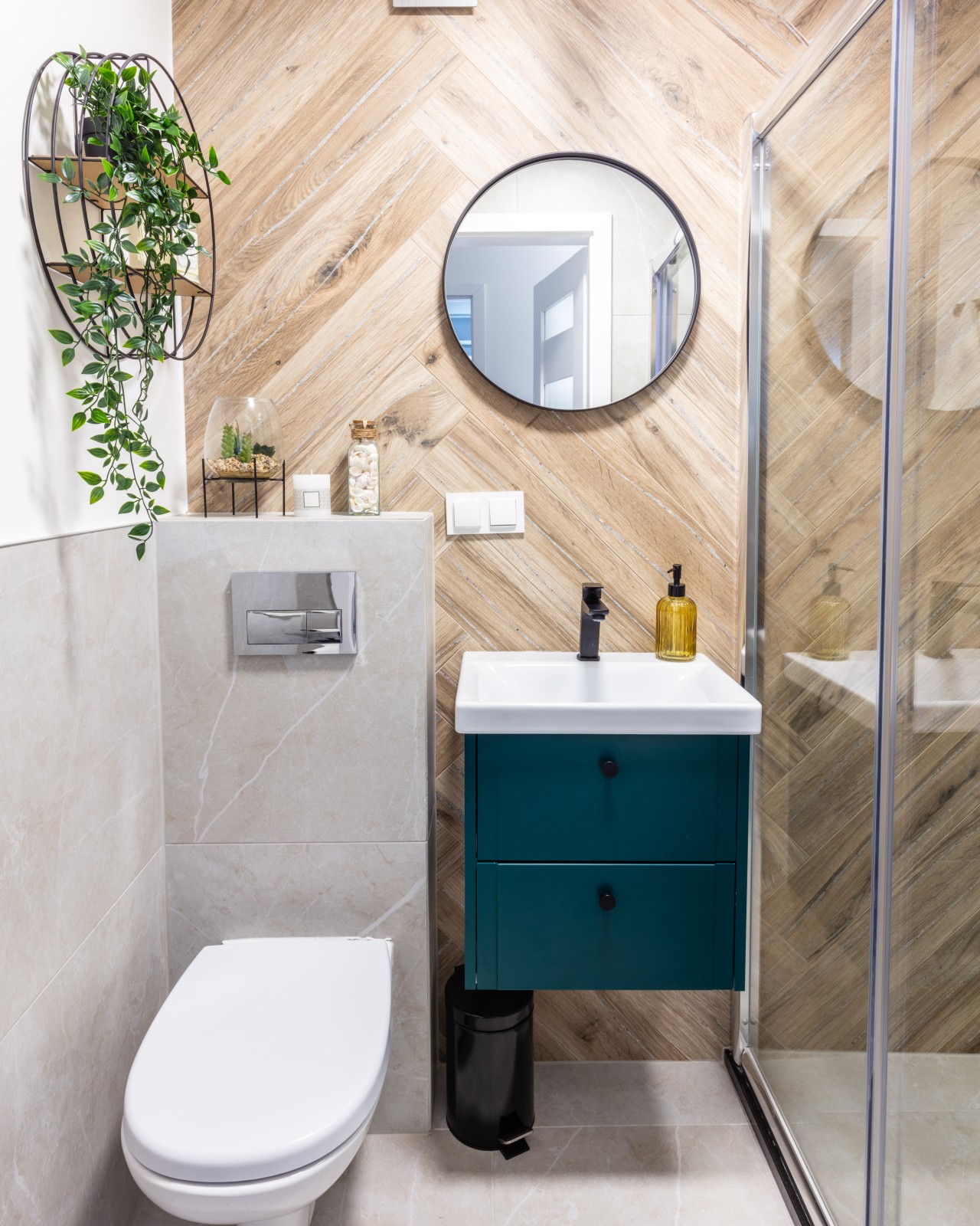
Image courtesy of: photocreo

Some bathrooms are so small that making space for a WC, sink, and shower can be challenging. In such an instance you can create a sense of spaciousness by freeing up the floor space and choosing wall-mounted sinks and toilets that are fixed above the ground. This is one of the best ways to give your washroom an open and airy ambiance and it also allows space for versatile storage below the sink.
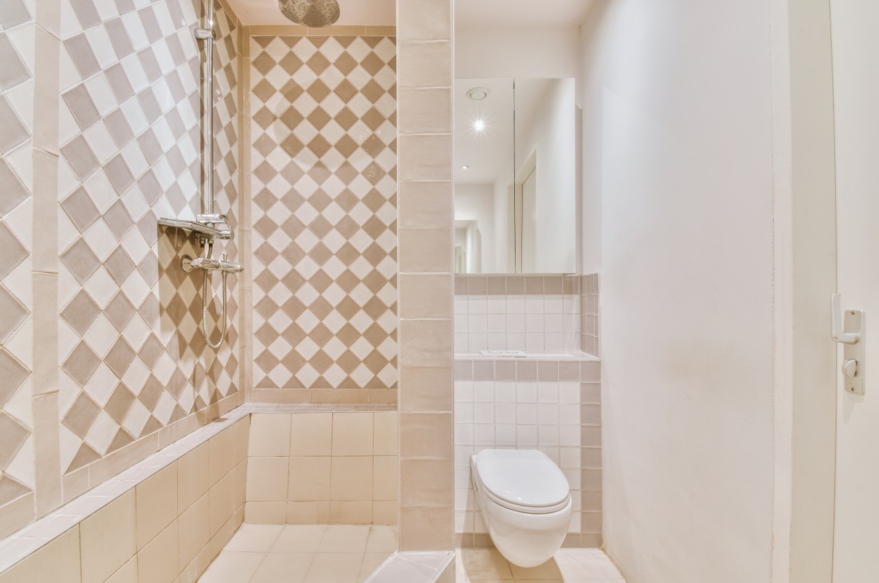
Image courtesy of: pro_creator

To make the bathroom look more spacious, install wall-to-wall mirrors to bounce light and visually double the space. Also, opt for paint colors such as light shades of blue, pastels, and white in semi- or high-gloss finishes to reflect light and give the impression of a larger bathroom.

Problem 2: No Window
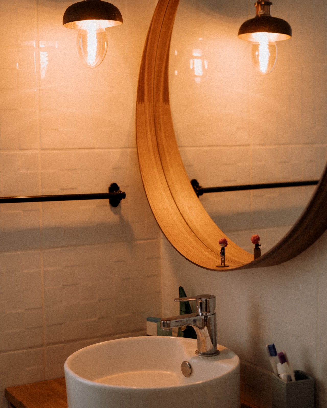
Image courtesy of: LesiaScotch

If your bathroom does not have a window, the space tends to look and feel dim. In such an instance it is important to enhance the lighting design to maximize illumination. Make it a point to integrate both overhead light fixtures and those around the mirror to distribute light throughout the bathroom.

Problem 3: Bad Ventilation
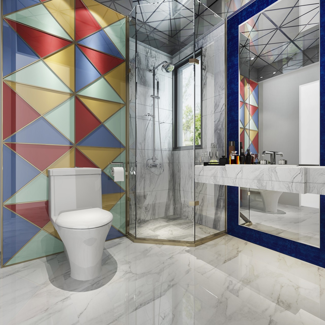
Image courtesy of: dit26978

Ventilation issues are common in older bathrooms despite having windows. Consider installing a shower exhaust fan with a built-in light. This promotes air circulation, dries the bathroom after each shower, and reduces the growth of mold and mildew. As a result, the bathroom stays fresh with minimal mold growth on the shower door. Additionally, make sure to keep the bathroom dry after each shower.

Problem 4: Insufficient Storage
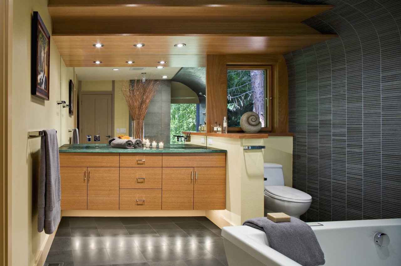
Image courtesy of: Mint_Images

Since small and mid-size bathrooms tend to be cluttered, the most cost-effective and practical bathroom storage solution is to upgrade standard mirrors to cabinet mirrors or medicine cabinets. The best part about these storage cabinets is that they are available in a variety of styles that not only enhance the bathroom décor but the items are not within reach of the children. It is highly recommended to upgrade to a vanity with drawers and cabinets with doors and add shelves over the toilet. This quick and easy conversion makes provision for extra storage for storing toiletries, razors, towels, etc without the hassle of a major renovation of storage.

Explore your storage preferences, from a single drawer to various compartments or open shelves for efficient storage. Extend cabinets vertically if needed and introduce unconventional solutions like baskets, wall shelves, freestanding cabinets, or a ladder for towels.

Problem 5: Underutilized Bathtub
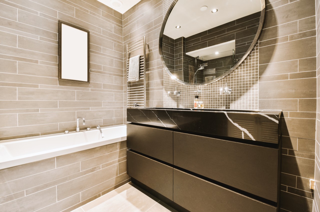
Image courtesy of: pro_creator

Using the bathtub can be difficult, especially for the elderly, so consider removing the bathtub and going for a walk-in shower instead for maximum accessibility. This addition increases floor space, creating a wider drainage area below the rainfall head. For a more refined look, you can bring in body steam for a spa-like addition, and replace the wall panels around the bathtub, without touching the rest of the bathroom tiles.

Problem 6: Insufficient Lighting
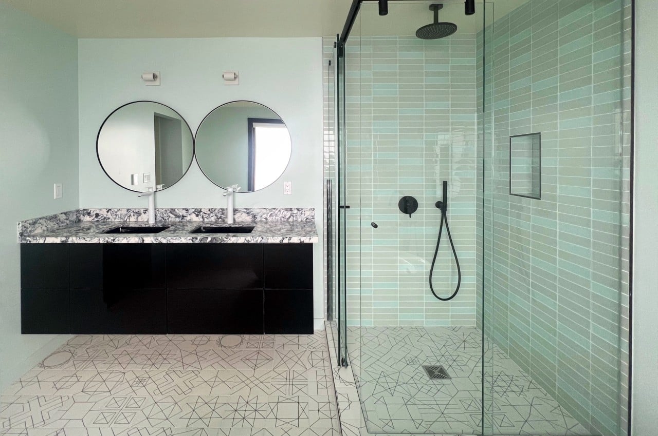
Image courtesy of: statuslapa

A dim bathroom can be very uncomfortable, especially without a window. One of the best ways is to brighten the space with a layered approach. Note that the light fixtures ensure adequate lighting for different purposes. Here are examples of each type of layered lighting scheme.

• Ambient lighting illuminates the entire bathroom and some examples of ambient lighting include ceiling fixtures, pendant lighting, and recessed lighting.
• Task lighting creates additional light in specific areas, such as over the vanity or in the shower. Wall lamps or lamps can brighten up specific areas. This light is designed for specific tasks such as shaving, makeup, combing, and hair styling. Light fixtures include mirrors with lights, wall lights, or pendant lights.
• Accent lighting emphasizes a special feature, such as highlighting a particular design or simply placing a chandelier over a soaking tub.

Choose energy-efficient LED downlights in bathrooms, ensure safe lighting in wet areas, and efficient lighting on basins. Enhance the overall atmosphere by placing bathroom wall lights on both sides of the mirror in windowless areas

Problem 7: Humidity and Dampness
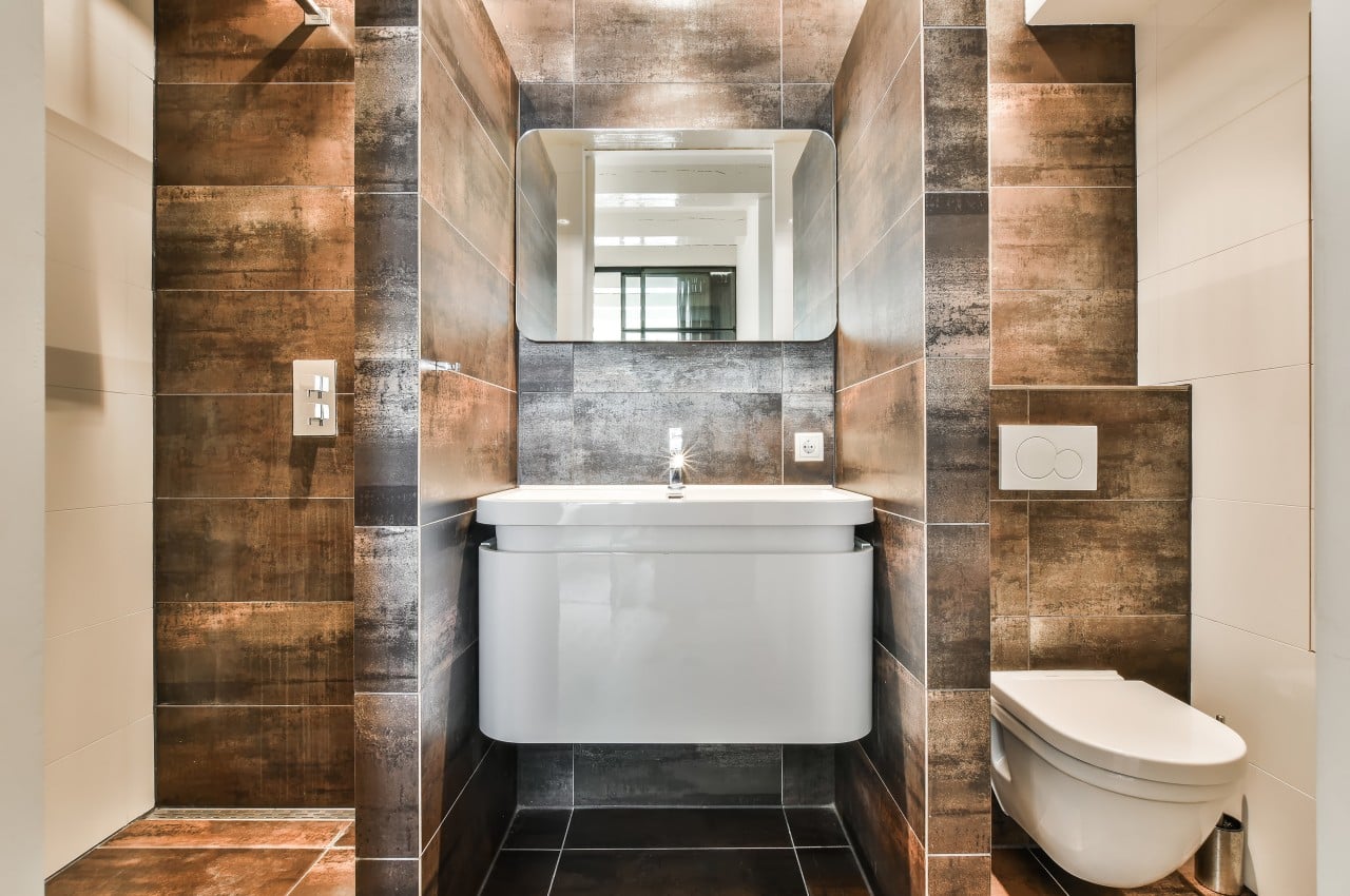
Image courtesy of: pro_creator

Fight damp bathrooms to prevent mold and health issues. When showering, leave the windows slightly open for fresh air that replaces the warm and cool air from the indoors. Make sure to clean HVAC ductwork and change filters regularly. Upgrade with air with high CFM-rated exhaust fans or choose a fan/UV light combination for better humidity control. If the bathroom doesn’t have a window, consider adding one for natural light and fresh air. Check your roof periodically for leaks that might be causing condensation within the bathroom.

Problem 8: No Wet and Dry Area
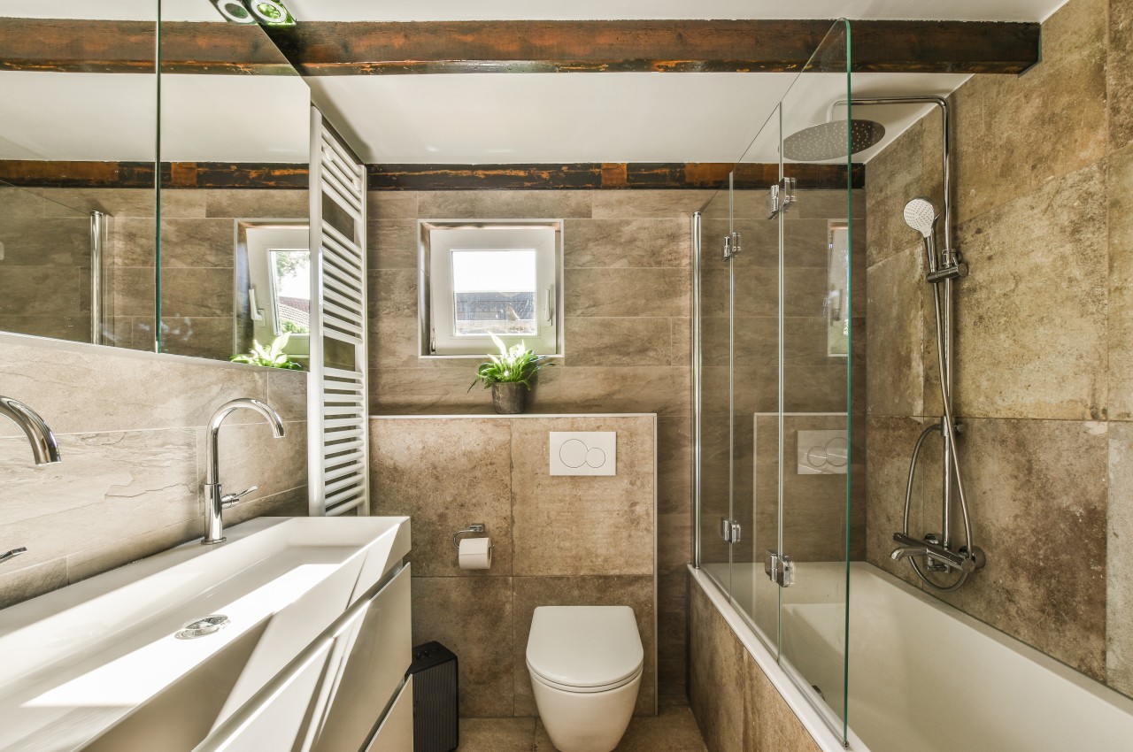
Image courtesy of: pro_creator

If the bathroom does not have a designated wet and dry area, the bathroom can get messy. Note that the wet area has a shower area, while the dry area has a WC and sink. This demarcation can be created with a glass divider that enhances the aesthetic and functional aspects of the bathroom, contributing to a better overall experience. In addition, the frameless screen ensures no visual obstruction and provides a clean, uncluttered view of the bathroom. A temporary and cost-effective way to create a dry bathroom is by using shower curtains.

Problem 9: Stagnant Water

Image courtesy of: pro_creator

When water drains slowly in the shower area, one remedy is to pour a large bowl of hot water into the drain. For a clogged drain, introduce a mixture of one cup of baking soda followed by one cup of vinegar, allowing it to sit for 30 minutes. This chemical reaction effectively reduces scum and completes the process by rinsing the drain with boiling water. Fix slow-draining showers quickly with a drain cleaner that clears clogs from hair, soap, and grime. Use enzyme-based options for a gentler solution, but follow instructions and use safety gear.

Alternately, if your showerhead has low water pressure, it may result from limescale buildup. Tie a packet of equal parts water and vinegar around the showerhead, submerging it for at least an hour, and use a soft brush to rinse the showerhead afterward.

Problem 10: Bathroom Odor
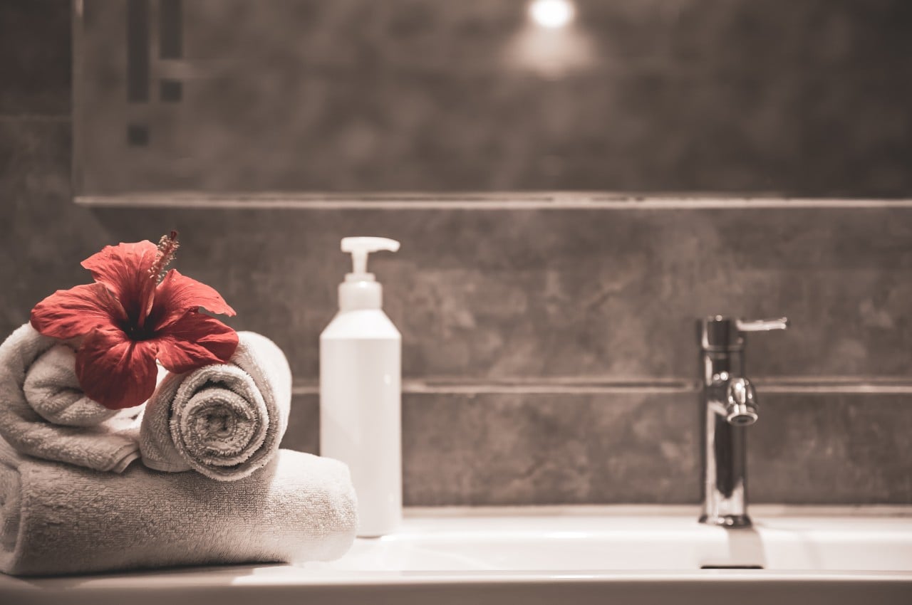
Image courtesy of: puhimec

Blocked drains, wet towels, and accumulated dirt in showers can cause unpleasant bathroom odors. Ensure proper ventilation to eliminate all odors, remove trash regularly, and have a thorough weekly cleaning schedule. Use air purifiers and essential oil diffusers to freshen up the space and make the atmosphere pleasant.

Another DIY method of removing toilet odors is to mix lemon juice with baking soda to make a paste and scrub the surrounding areas with vinegar to soak the toilet in while they are being sprayed on areas with suspicious odors. After 15 minutes, flush the toilet and use a brush dipped in vinegar to scrub off the residue. Flush again, and you’re left with a fresh-smelling bath.

These tips will turn your bathroom into an awesome place. With a little planning and smart choices, you can create a comfortable and functional bathroom with these effective solutions.

The post Top 10 Bathroom Challenges Solved With Smart Solutions first appeared on Yanko Design.
Smart mirror concept encourages you to reflect whenever you look at yourself

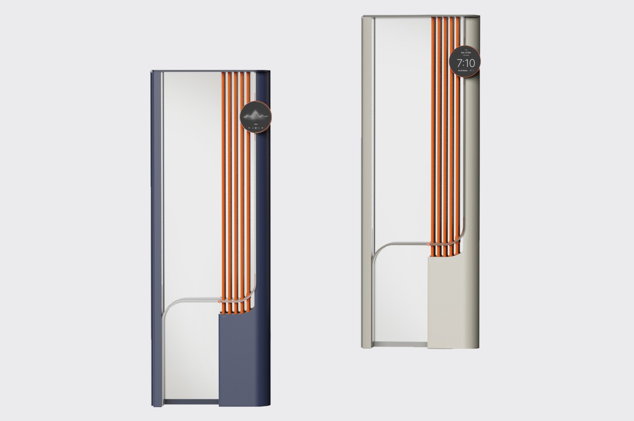
There are many things that we do out of habit in our lives, especially daily activities that we’ve gotten so used to that we could perform them with our eyes closed, at least figuratively speaking. Moving on autopilot is an important survival skill for modern-day humans, but it isn’t always a good strategy to apply to all things all the time, especially for our mental health. The idea of mindfulness or being present in the moment sounds almost so alien that people presume it requires some rigorous training or mental fortitude to do when all you really need is to pause from time to time and simply be aware of where you are and what you’re doing. That’s the kind of practice that this smart mirror product design tries to develop, motivating you to look inside yourself each time you look at your reflection.

Designer: Nahyun Kwon, Dayeong Kim, Mingyeong Chio

We look at a mirror several times a day but only a few of those times are we consciously checking ourselves for more than a split second. Whether we’re brushing our teeth, washing our faces, or even applying makeup, chances are we are thinking of other things while doing those actions. We don’t see or even recognize ourselves or our states, even when it’s directly staring at us.

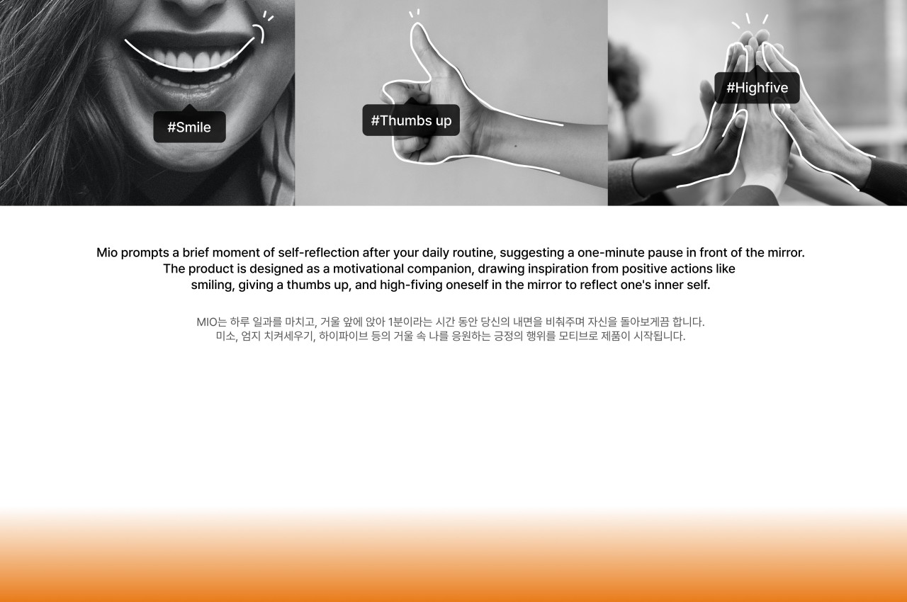
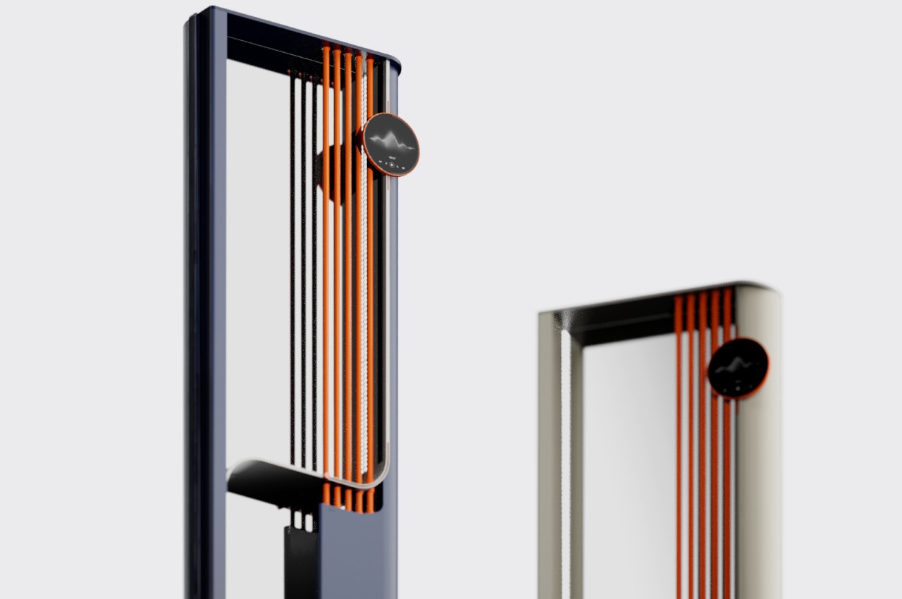
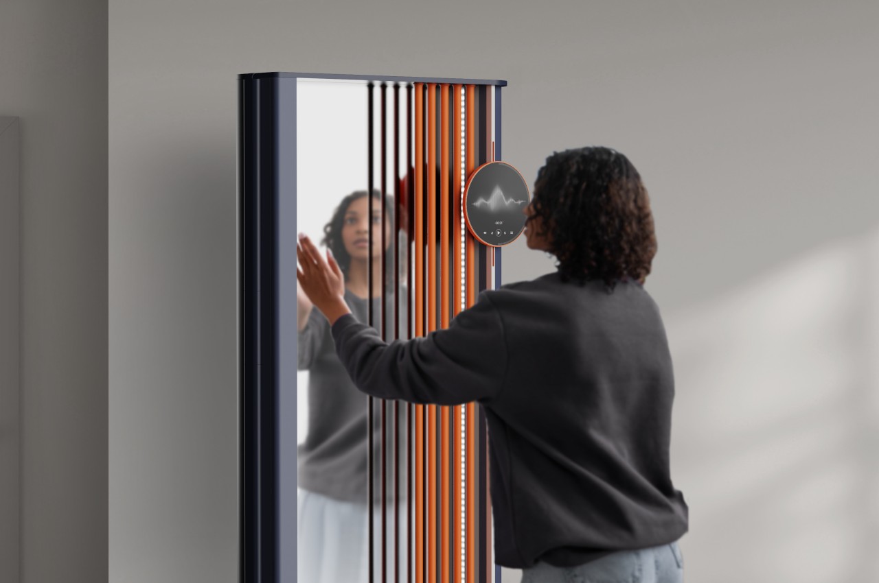
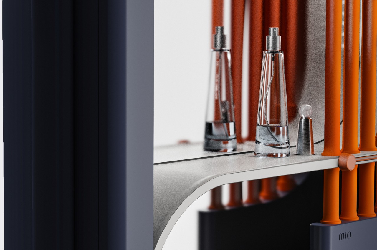
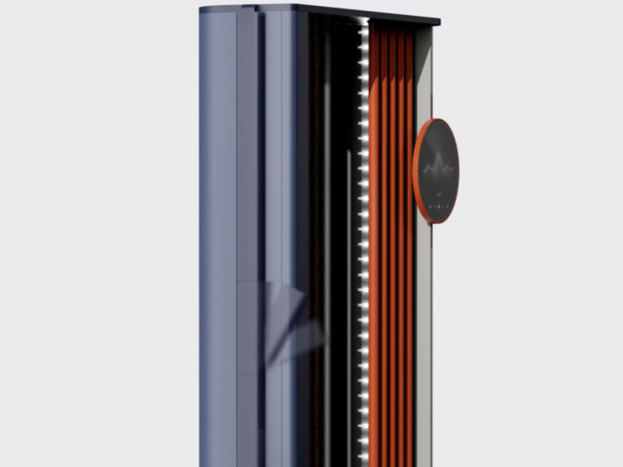
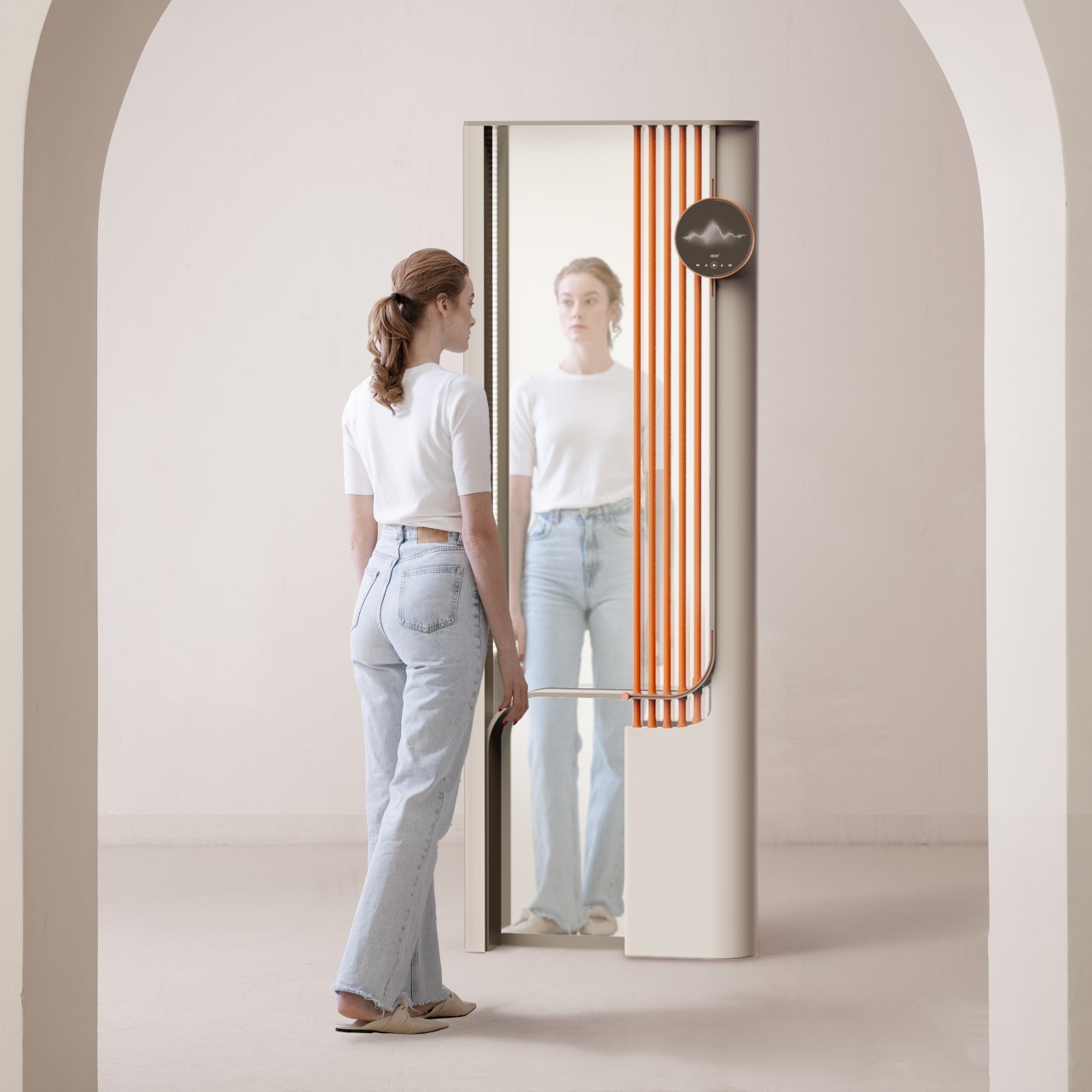
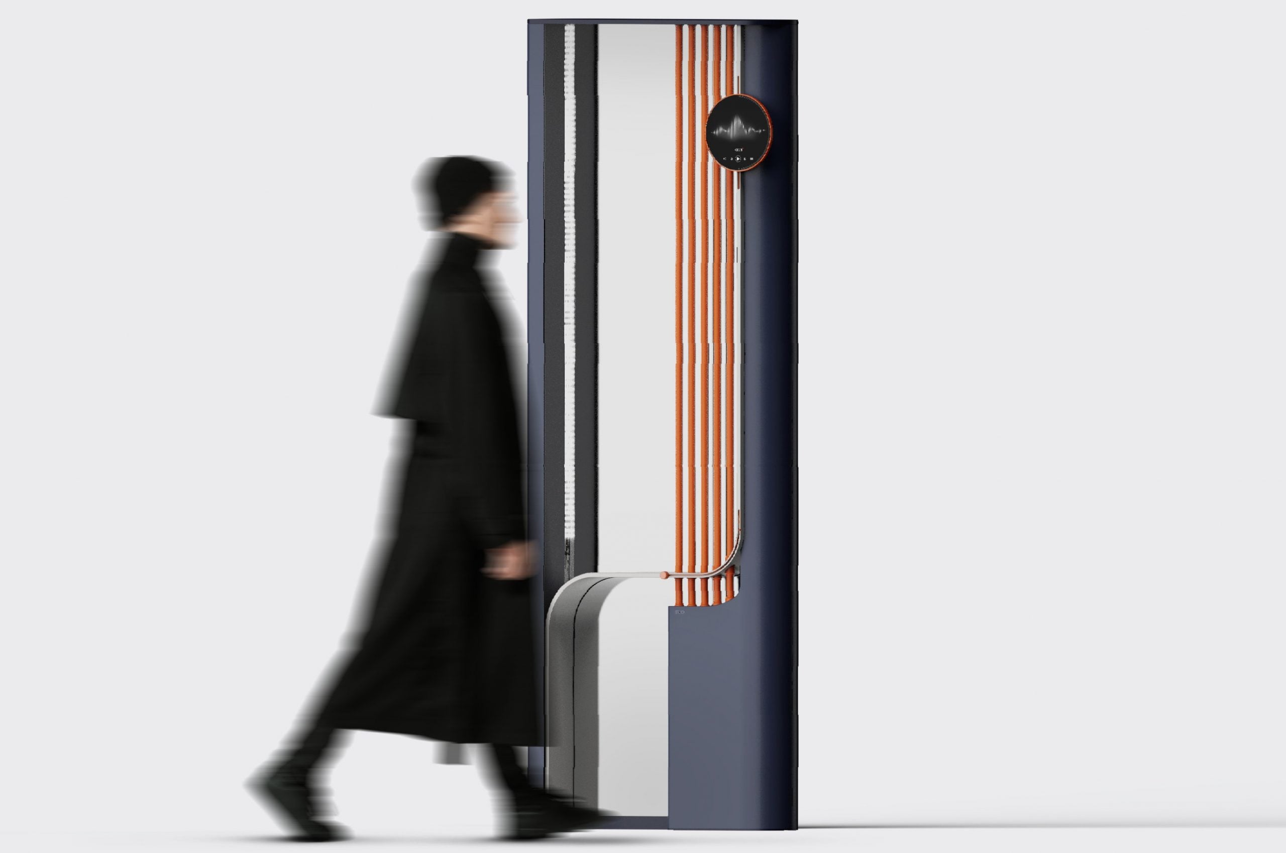
MIO is a mirror that encourages you to take a good hard look at yourself whenever you use it. Rather than nagging you multiple times a day to pause and exercise mindfulness, it simply associates the action with an activity you already do regularly until it becomes second nature. And it doesn’t do so using intrusive reminders or heavy-handed features but with gestures and controls that are integral to using the mirror in the first place.

https://mir-s3-cdn-cf.behance.net/project_modules/1400_opt_1/03592c187380207.658d8872c64b8.gif

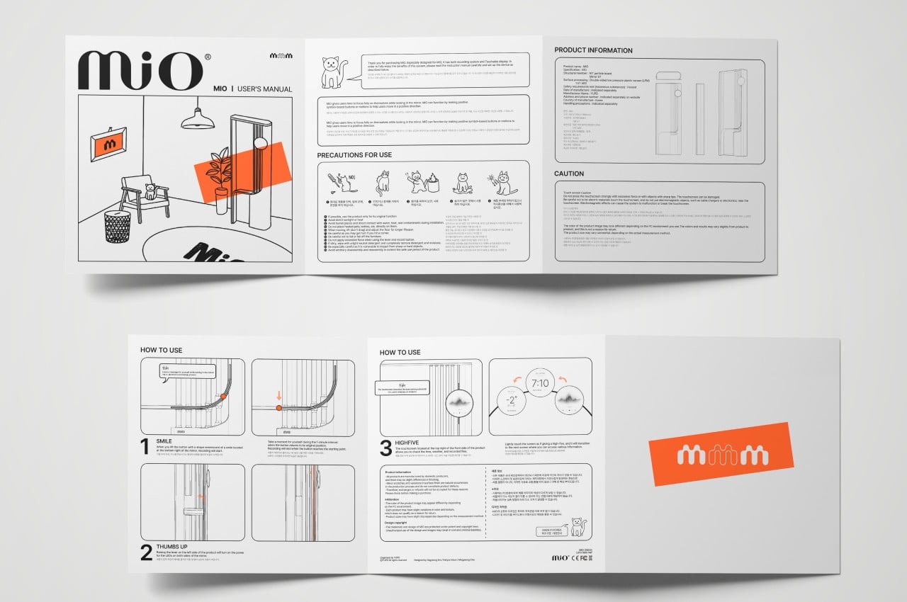
A lever on the side, for example, is needed to turn on the LED lights inside the frame for better illumination. The action and the control’s form are akin to a “thumbs up” gesture, reminding you to give yourself a pat on the back once in a while. There’s a “smile button” on the lower edge of the mirror that you can slide up to start a 1-minute recording of yourself, inviting you to smile your biggest smile or, at the very least, be truthful to the emotions you’re feeling at the moment. That button also acts as a timer for that recording as it slowly slides back down to its original position.

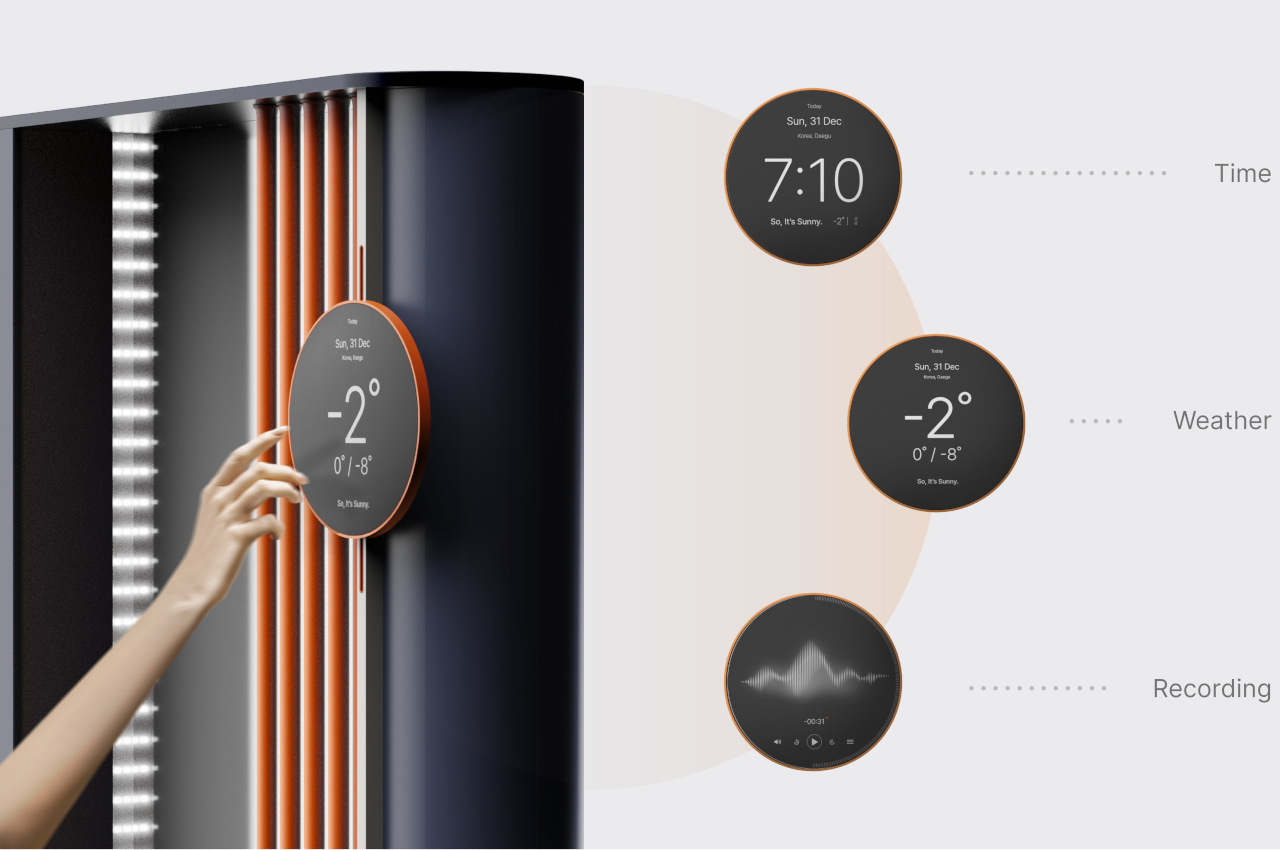
There is a separate circular display near the top and off to the side that shows the time, the weather, or other information you might need while preparing yourself and your face. Cycling through these screens of information requires touching the display, almost like giving it a high-five that, as silly as it might sound doing it by yourself, always generates good feelings. Whichever of MIO’s functions you use, it becomes a gentle reminder to take stock of your current emotional and mental state, at least long enough to see your true self before you rush off and lose yourself in the busyness of life.

The post Smart mirror concept encourages you to reflect whenever you look at yourself first appeared on Yanko Design.

Top 21 Spectacular Mirror-Sink Units to Elevate Your Bathroom Decor

The mirror-sink unit plays a key role in transforming the bathroom into a stylish space that is perfect for relaxation. The sink is available in numerous designs, such as twin basins for shared bathrooms, freestanding units, wall-mounted sinks, and under-counter and over-the-counter sinks, while the mirror is available in framed and frameless versions. Discover some elegant mirror sink units and choose the one that is best suited for your home.

Designer: Better Bathrooms

1. Soothing Colors

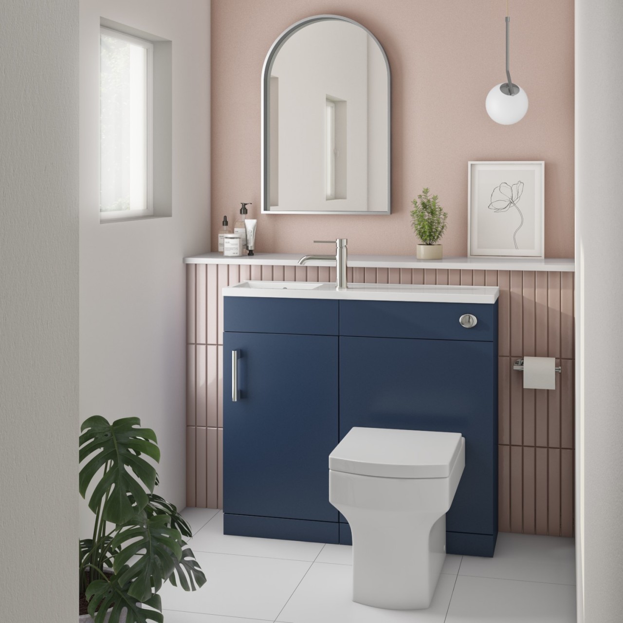
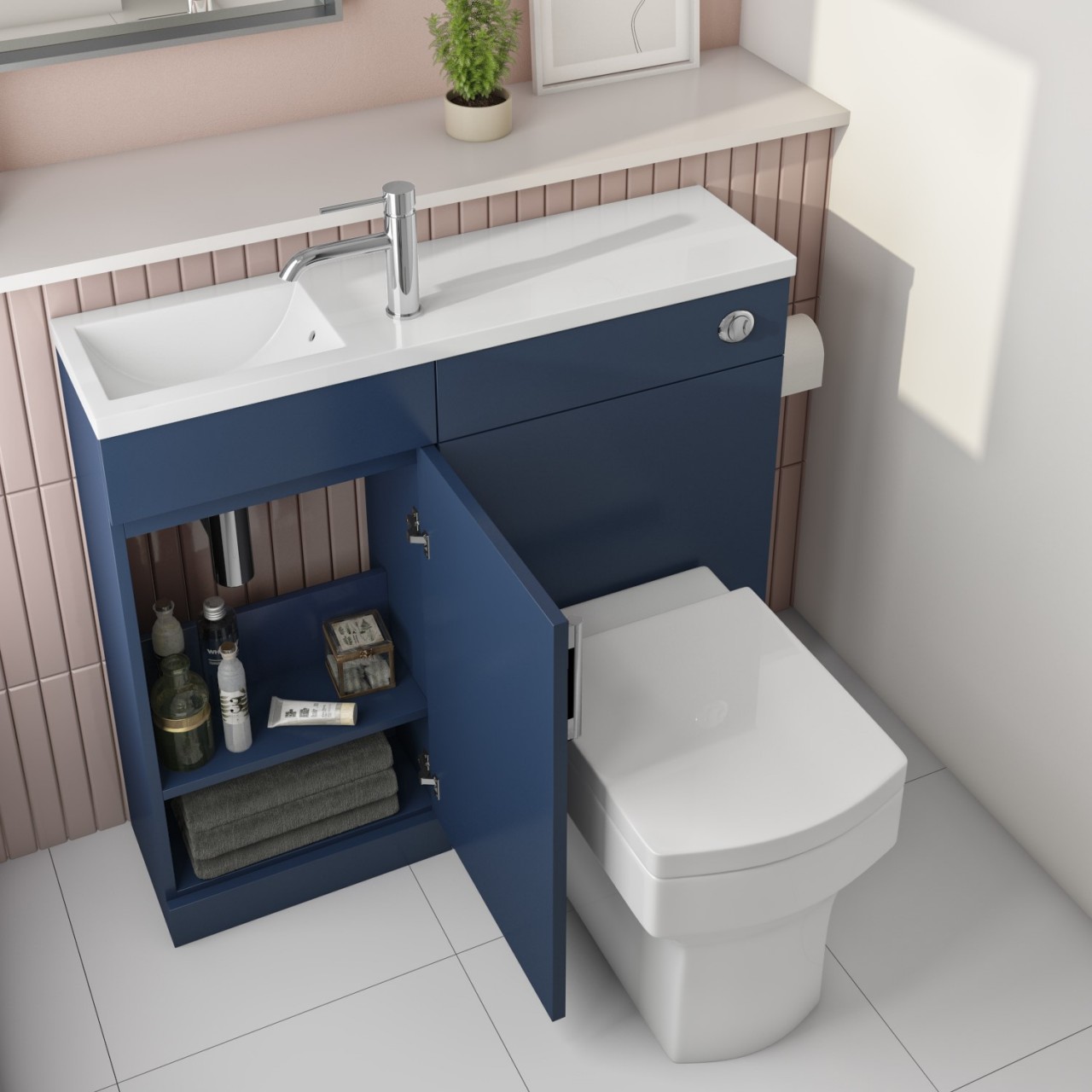
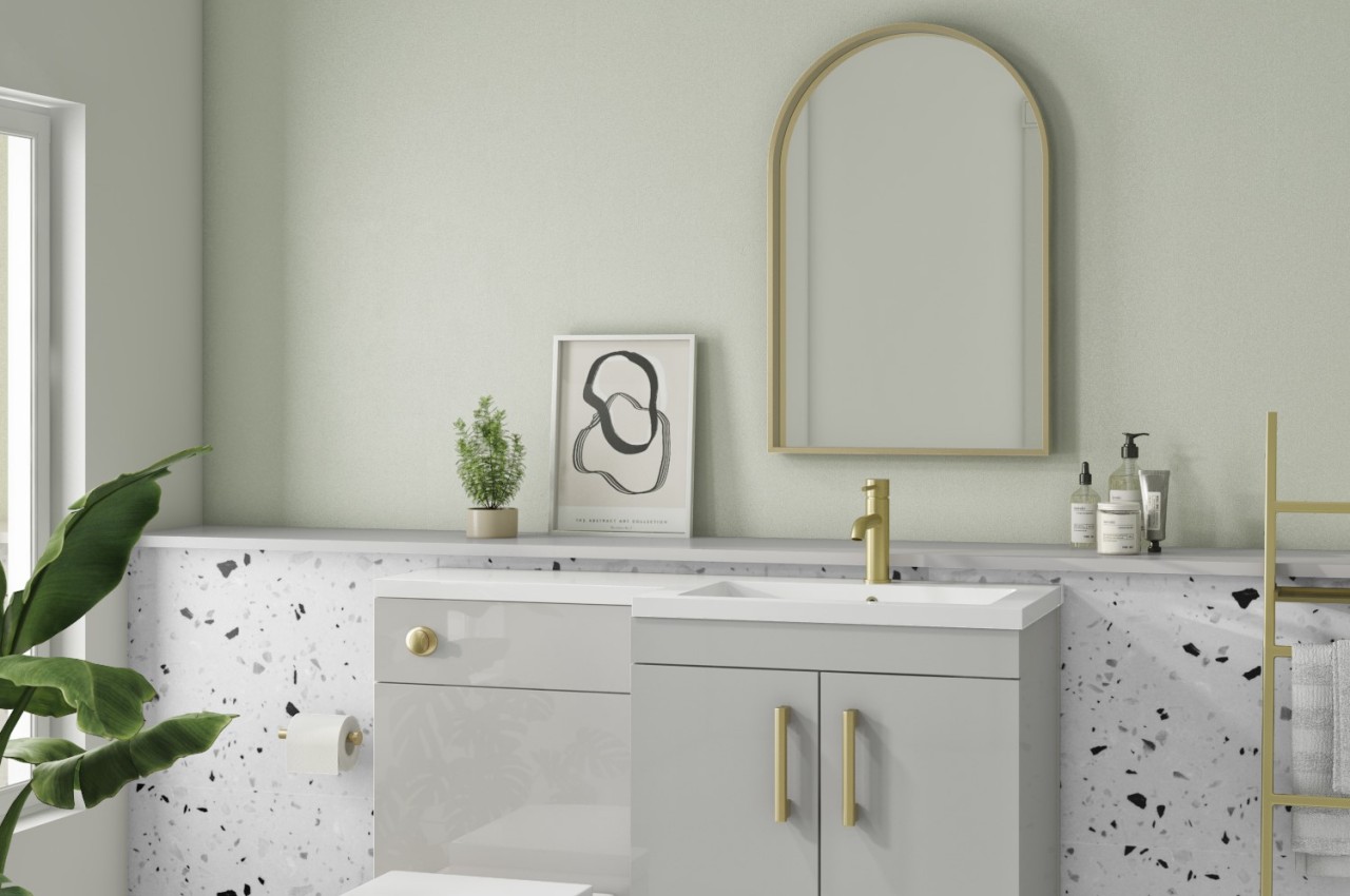
The mirror-sink unit fits into one side of this compact bathroom and provides utility without taking up much space. The sink is combined with the back panel of the WC, and the projection that accommodates the concealed flush is enough to house a slim base cabinet alongside a sleek countertop. The contrasting hues of Prussian blue cabinetry and pastel-hued walls along with the tiles create a soothing and restful vibe.

2. Cool Blue

Designer: Iya Turabelidze

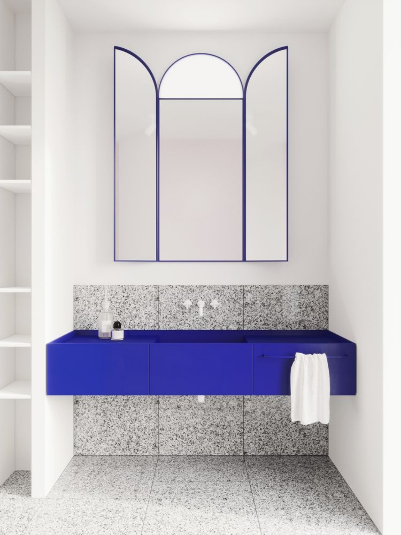
Just see how a blue countertop incorporates the sink and storage and transforms into a showstopper feature in this grey and white-hued bathroom while the blue rim of the mirror complements the countertop and completes the look. The mirror is strategically divided into three sections where the center features an arched mirror, while the sides incorporate mirrors that mimic open window panes.

3. Incorporate Backlighting

Designer: Appliances Direct

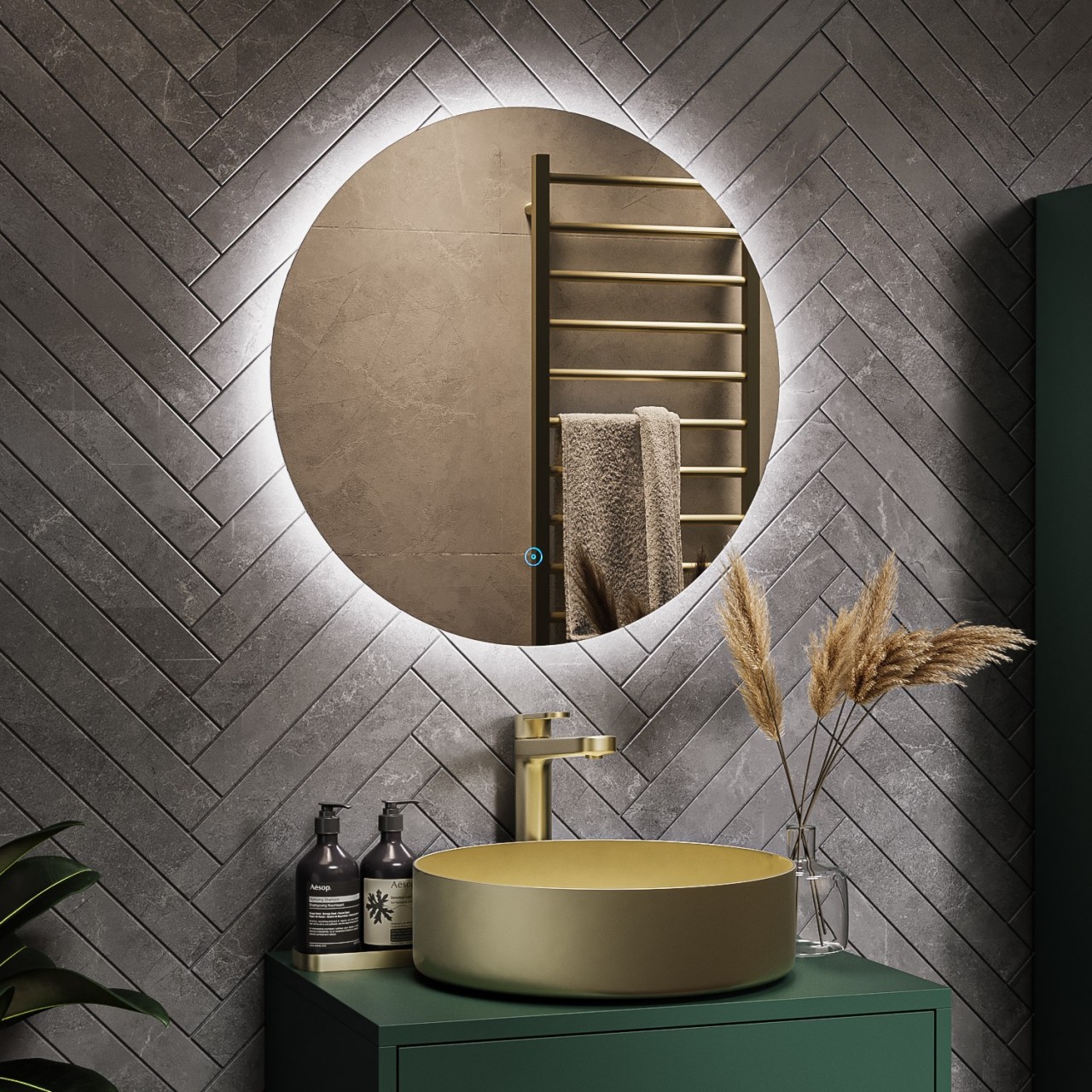
The circular mirror incorporates white backlighting and highlights the grey backsplash featuring a herringbone pattern of tiles. The golden sink and faucet infuse glamour and it is set on an olive green base, creating a soothing and relaxing atmosphere.

4. Luxurious Mirror

Designer: Tineke Triggs

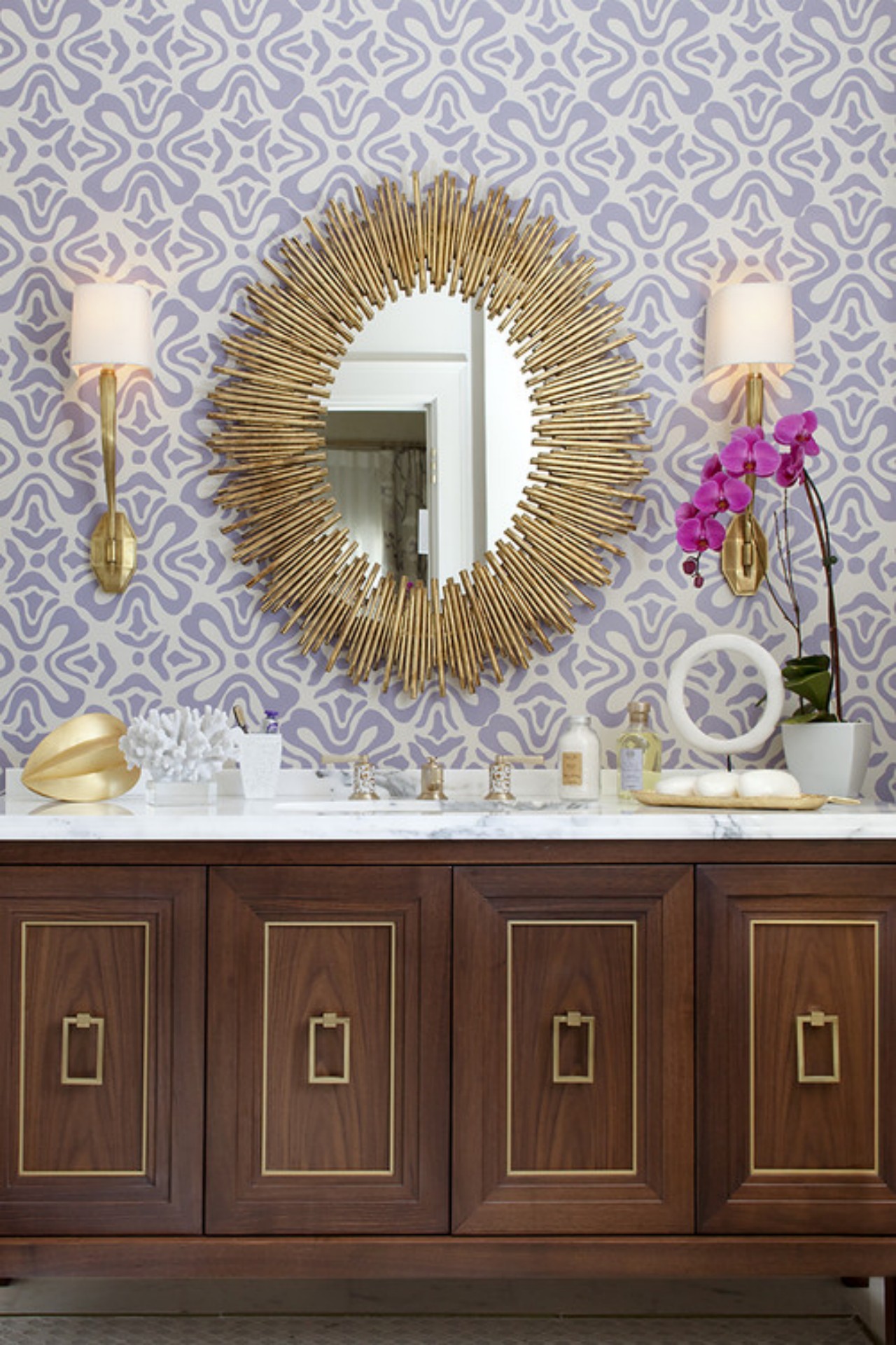
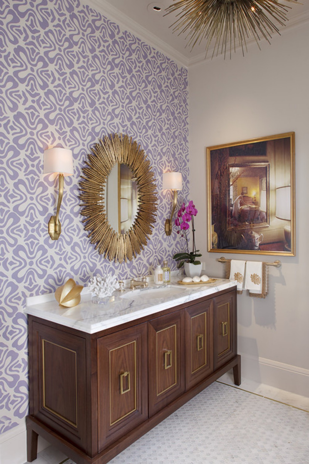
An oval mirror stands out with a golden frame that adds a tactile quality to the bathroom decor as it looks beautiful against the patterned mosaic backdrop of tiles. It is complemented by a set of two bracket lights on either side of the mirror to provide uniform lighting. The wooden cabinetry with golden handles and rectangular profile sections on the shutters adds a touch of glamour to the overall look.

5. Decorative Mirror

Designer: Two Bears Studio

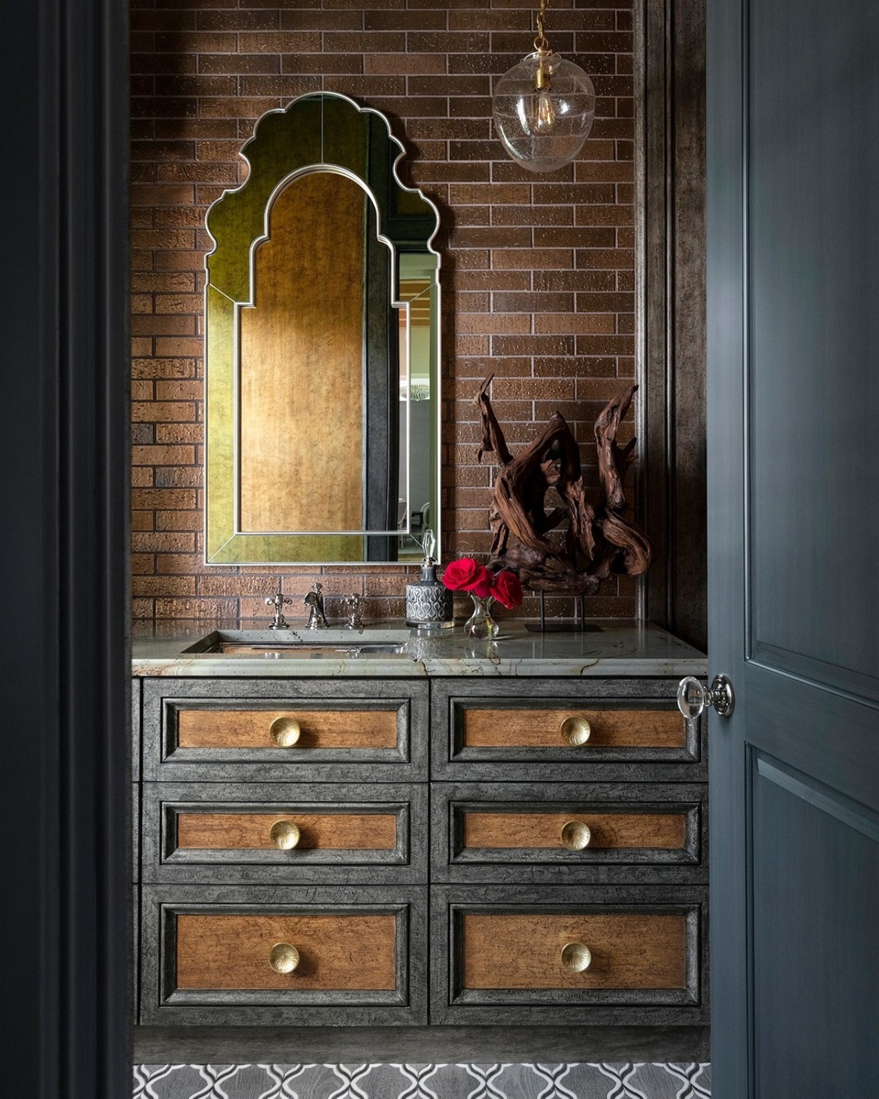
The decorative Venetian mirror breaks away from the conventional style and shapes of mirrors and makes a striking feature in this bathroom. It stands out against the brick wall, adding an eye-catching touch to the overall design, and complements the cabinetry in earthy hues of grey and brown.

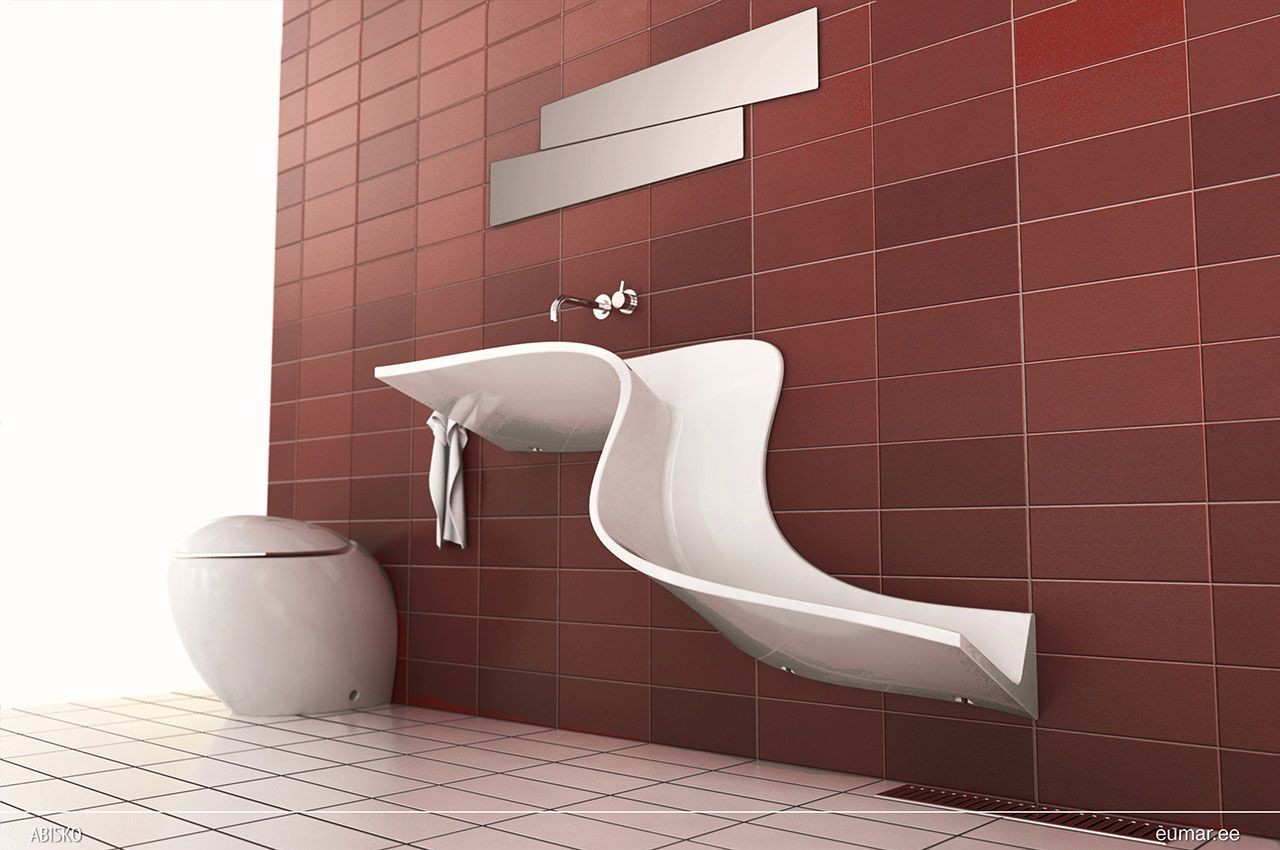
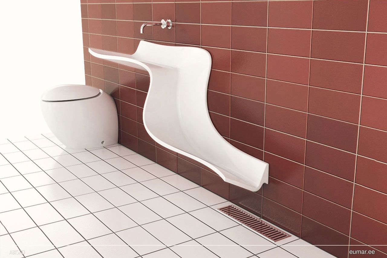
6. Waterfall Sink

Designers: Johan Kauppi and Eumar

The curved trough sink looks graceful and is a perfect fit for a contemporary bathroom when combined with a minimal mirror, as in this example. The water flows through the sink’s slide-like formation to mimic a waterfall. It creates a striking design feature that beautifully complements the terracotta-colored wall.

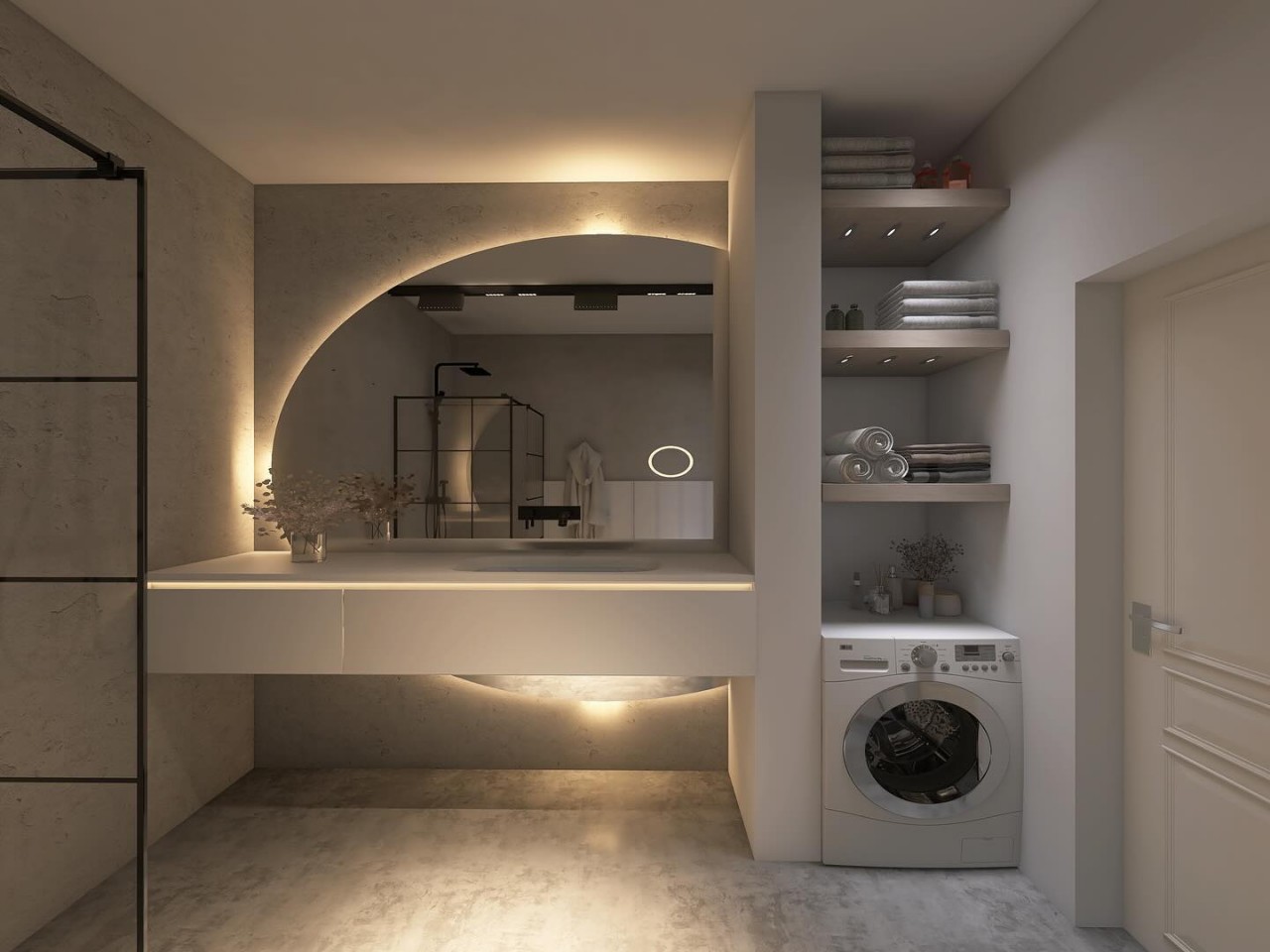
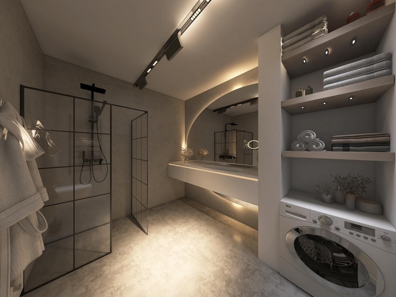
7. Functional Minimalism

Designer: Matty Design

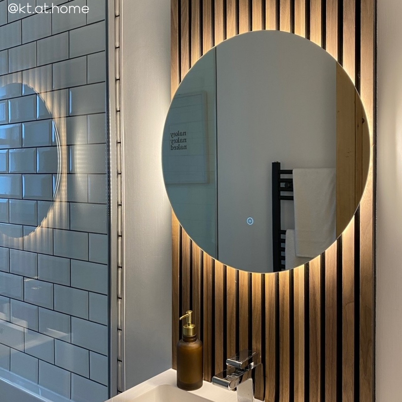
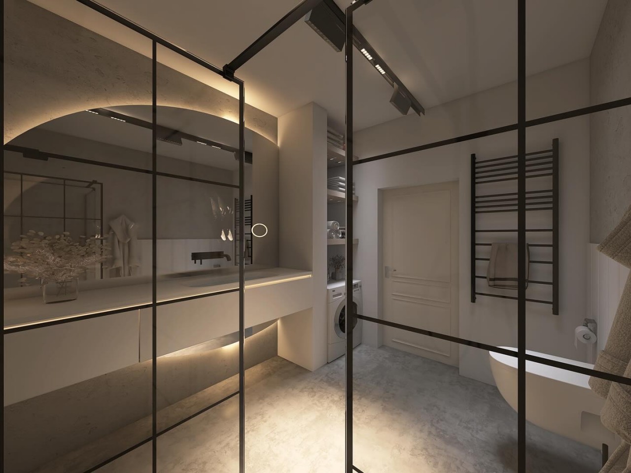
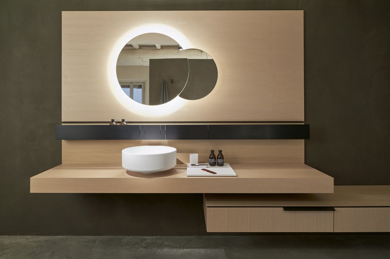
The minimalist bathroom is elevated by neutral-hued walls while a floating countertop intersects with a section of an oval mirror, which is backlit to create a clean and sublime visual effect. This bathroom is highly functional with provision for a washing machine and adequate shelves for storage.

8. Captivating Sink

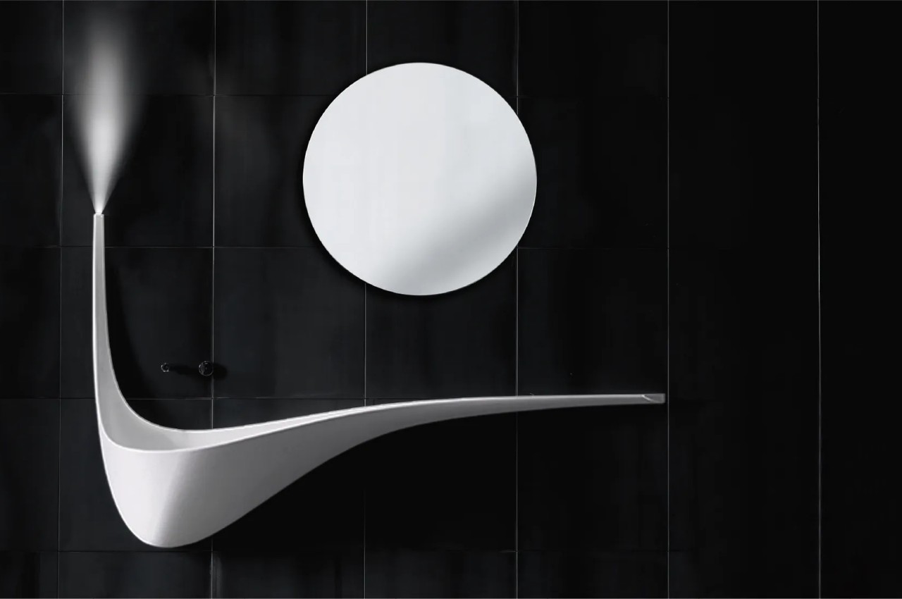
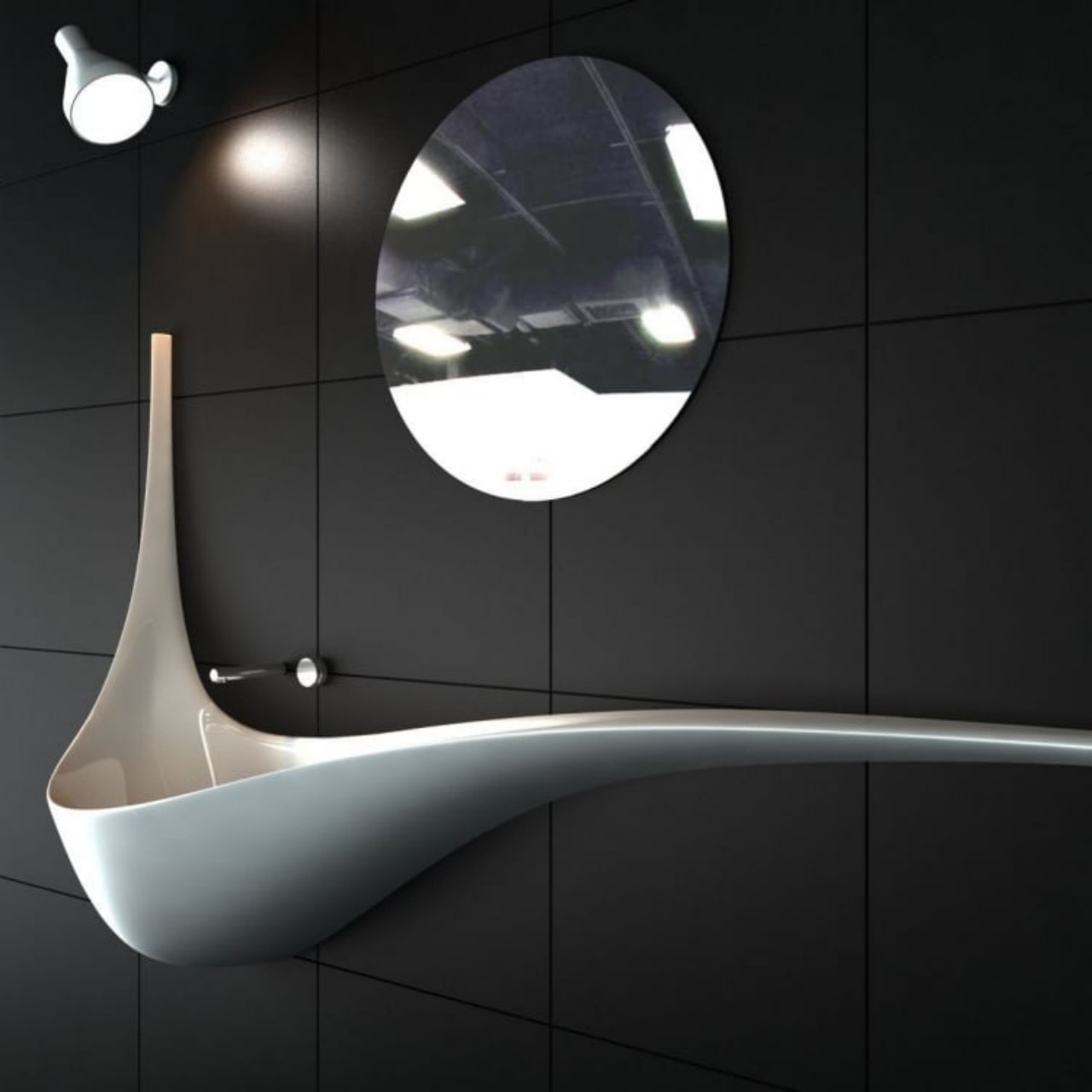
Designer: Falper

The mirror-sink unit features an interesting contrast of shapes where the elongated, curvaceous sink visually extends the bathroom. The round mirror complements the organic form of the basin to create an innovative composition.

9. An Organic-shaped Mirror

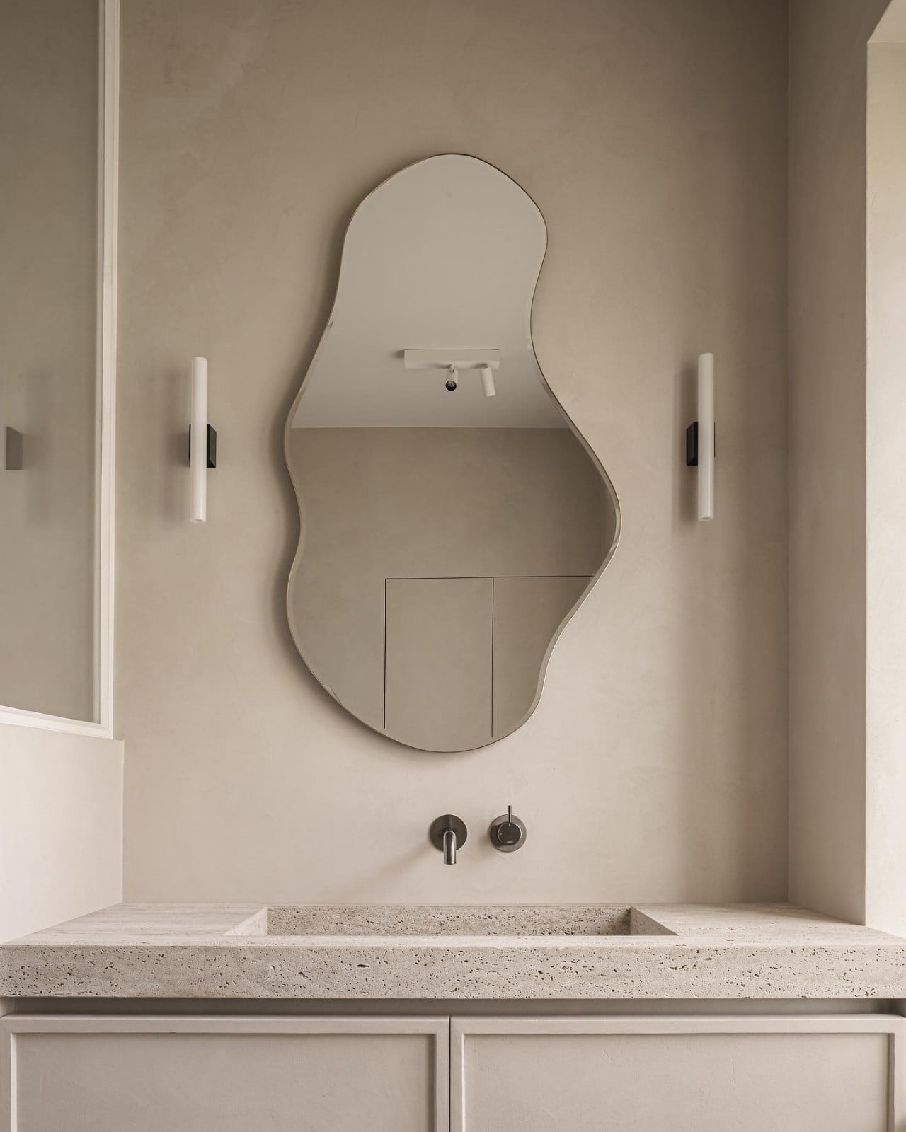
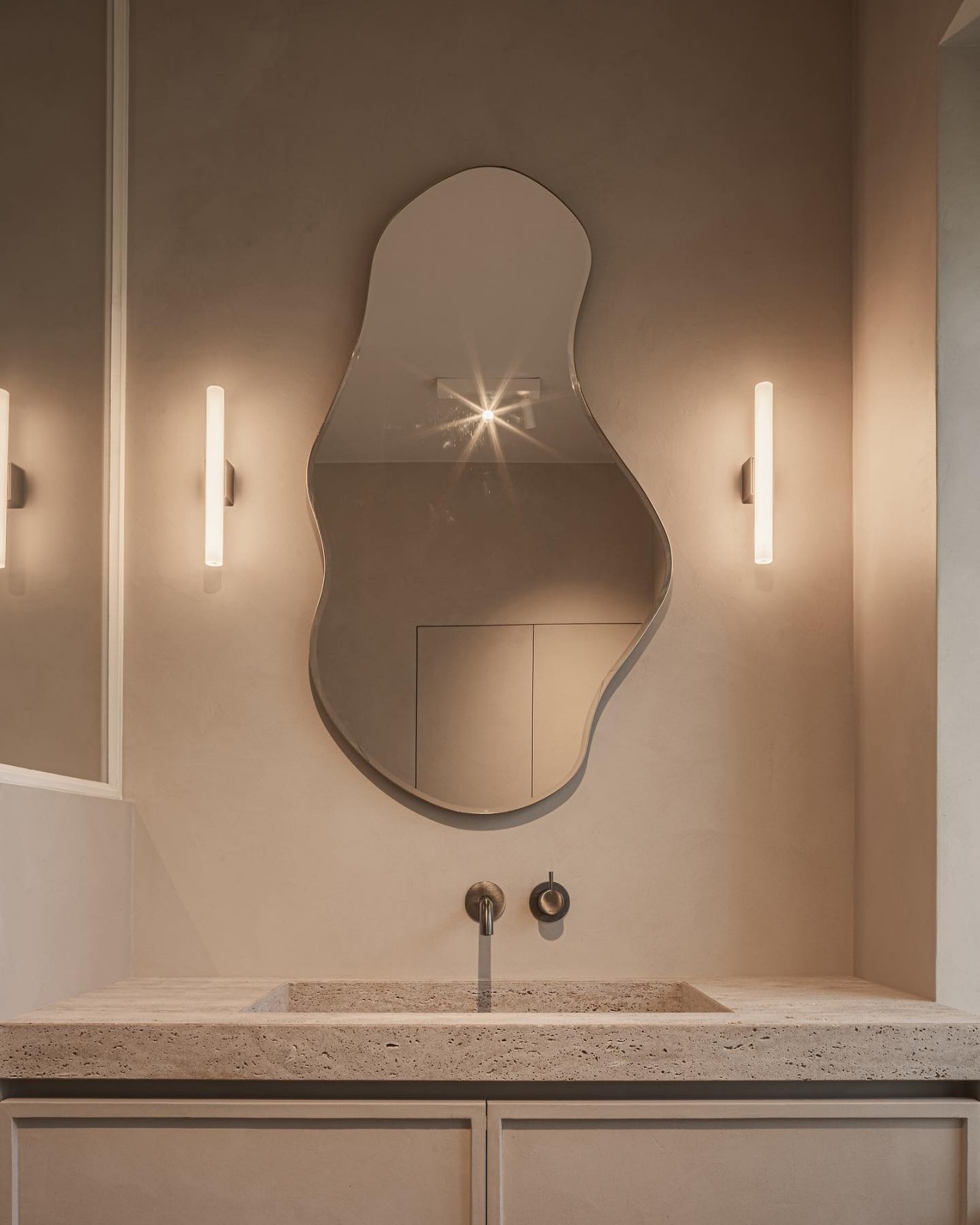
Designer: Laura Calleeuw

The mirror features an uncommon organic shape and deviates from the conventional circular, square, or rectangular mirror designs. It also complements the monochromatic look of the bathroom decor.

10. Botanical Backsplash

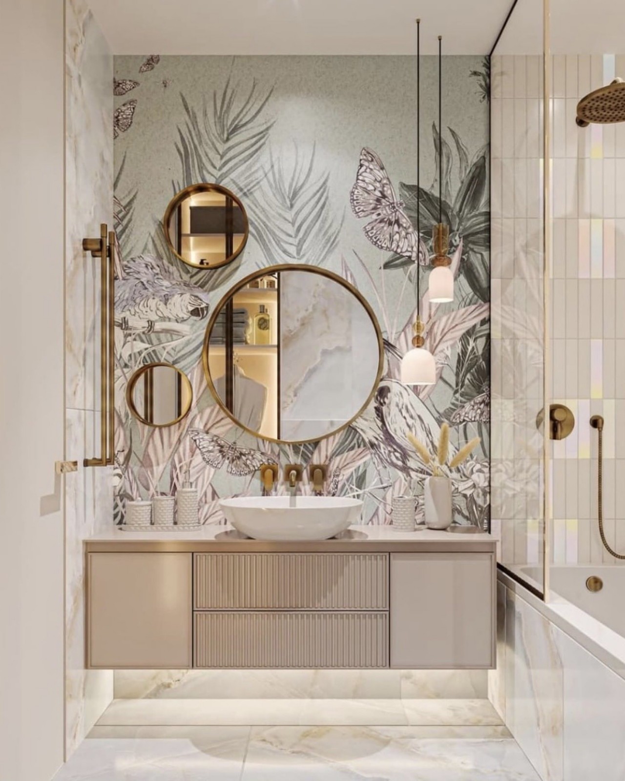
Designer: berg.interior

A composition of three differently-sized circular mirrors on a botanical backsplash in soothing hues adds plenty of character and stands out in the calming beige tones of the bathroom interiors. The touch of gold in the mirror frame, faucets, and hardware infuses a luxurious vibe into the overall look of the bathroom.

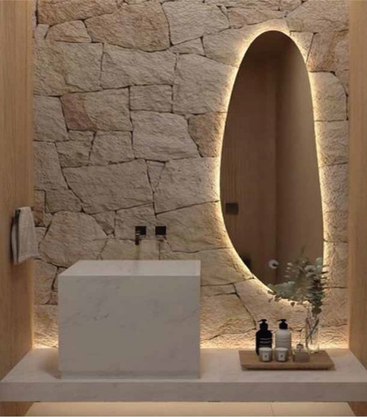
11. Tactile Surface

The backlit mirror provides soft, diffused lighting, and the stone-finished back wall adds subdued elegance and a touch of understated glamour. The countertop sits at a lower height, incorporating the sink within a marble cuboid that imbues an organic and earthy charm into the space.

12. Playful Color Scheme

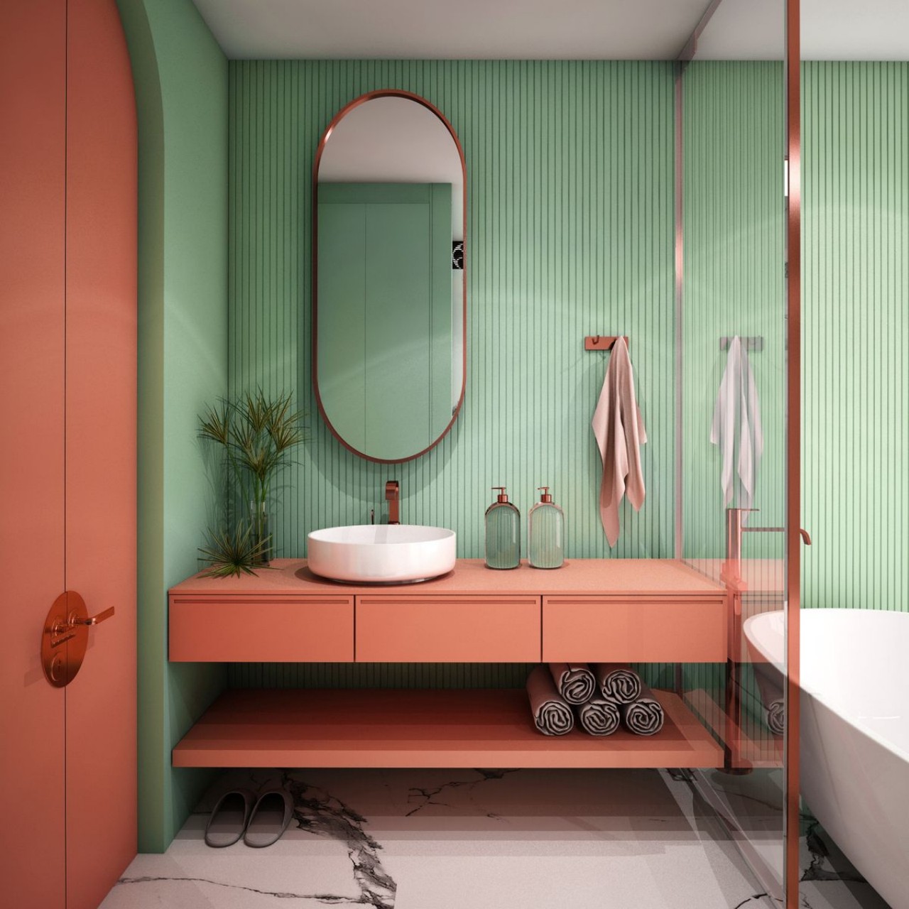
Designer: Ume Illustration

Hues of orange on the countertop and door combine with the green tiled walls to add plenty of color and offer a youthful and trendy look to the overall scheme.

13. Twin Vanity

Designer: Jasmin Kodzha

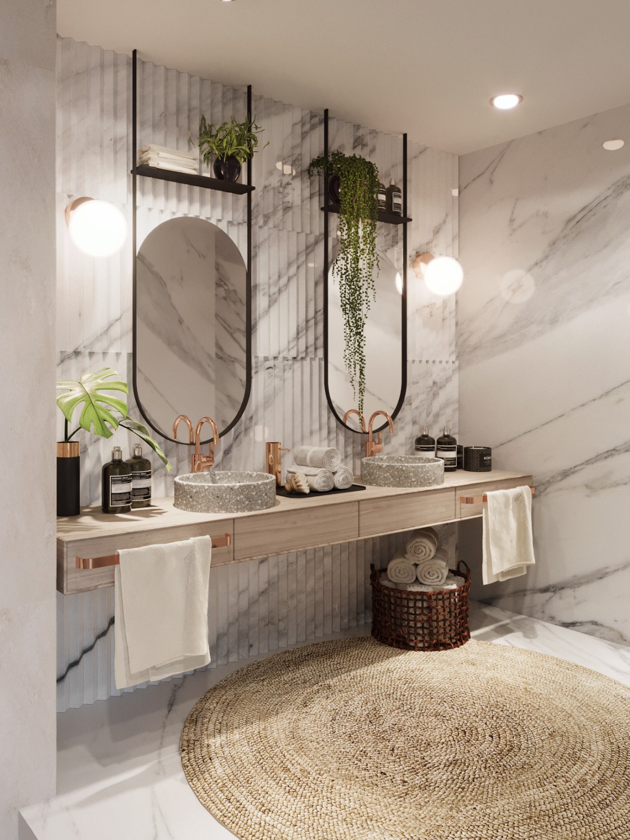
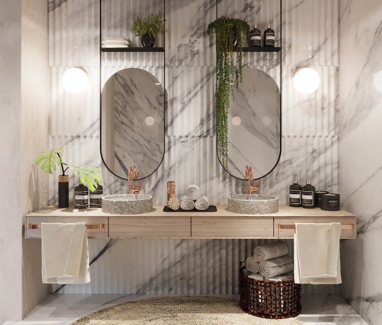
Twin or shared bathrooms come with generous space and can easily accommodate a twin mirror-sink combo with identical mirrors and sleek storage. Textured marble is used in the backdrop to enhance the overall aesthetic appeal while the jute rug adds a touch of character and completes the ensemble.

14. Sinuous Surfaces

Designer: Zemberek Design

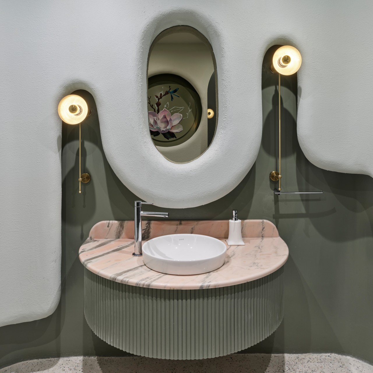
A dramatic contrast is achieved with an oval mirror positioned behind the small round sink and semi-circular countertop. The soothing color palette of earthy green and grey adds to the overall décor while the elevated grey façade strategically incorporates bracket lights and the oval mirror to give the bathroom a distinct character.

15. Bold Contrast

Desginer: Usine Studio

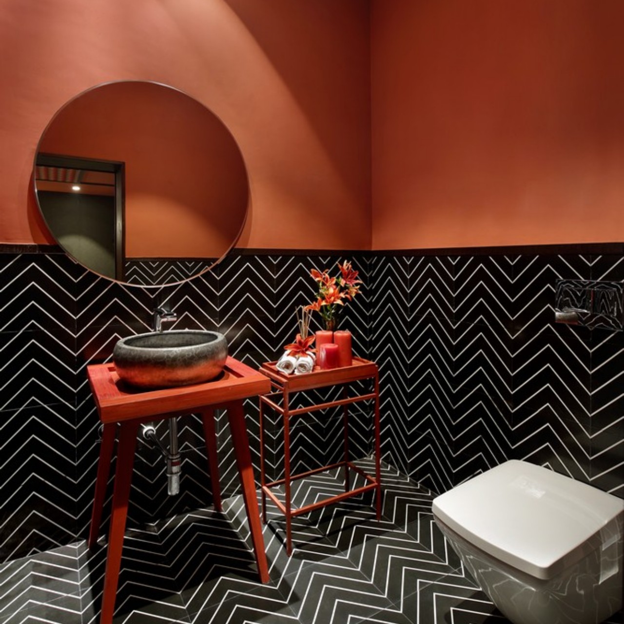
Just see how the black tiles are characterized with a herringbone pattern in white and continue as wall cladding to cover half of the wall and contrast with the burnt orange walls. A red table base supports the stone-finished sink in black and a similar color is used for the minimalistic side table for holding bathroom accessories.

16. Hexagonal Patterns

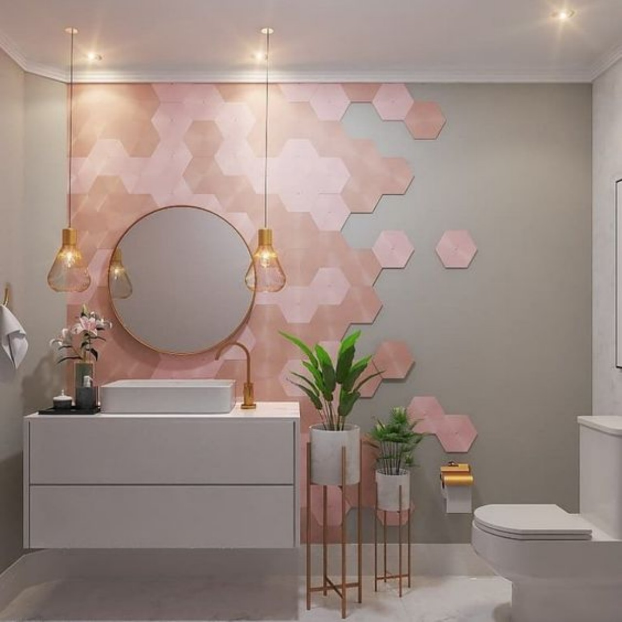
A floating countertop with provisions for two drawers holds the rectangular over-the-counter sink. Hexagonal tiles in pink hues form the backdrop of the circular mirror and are randomly placed to create an interesting composition against the backdrop of a grey-hued wall.

17. Pastel Hues

Designer: Gemini Tiles

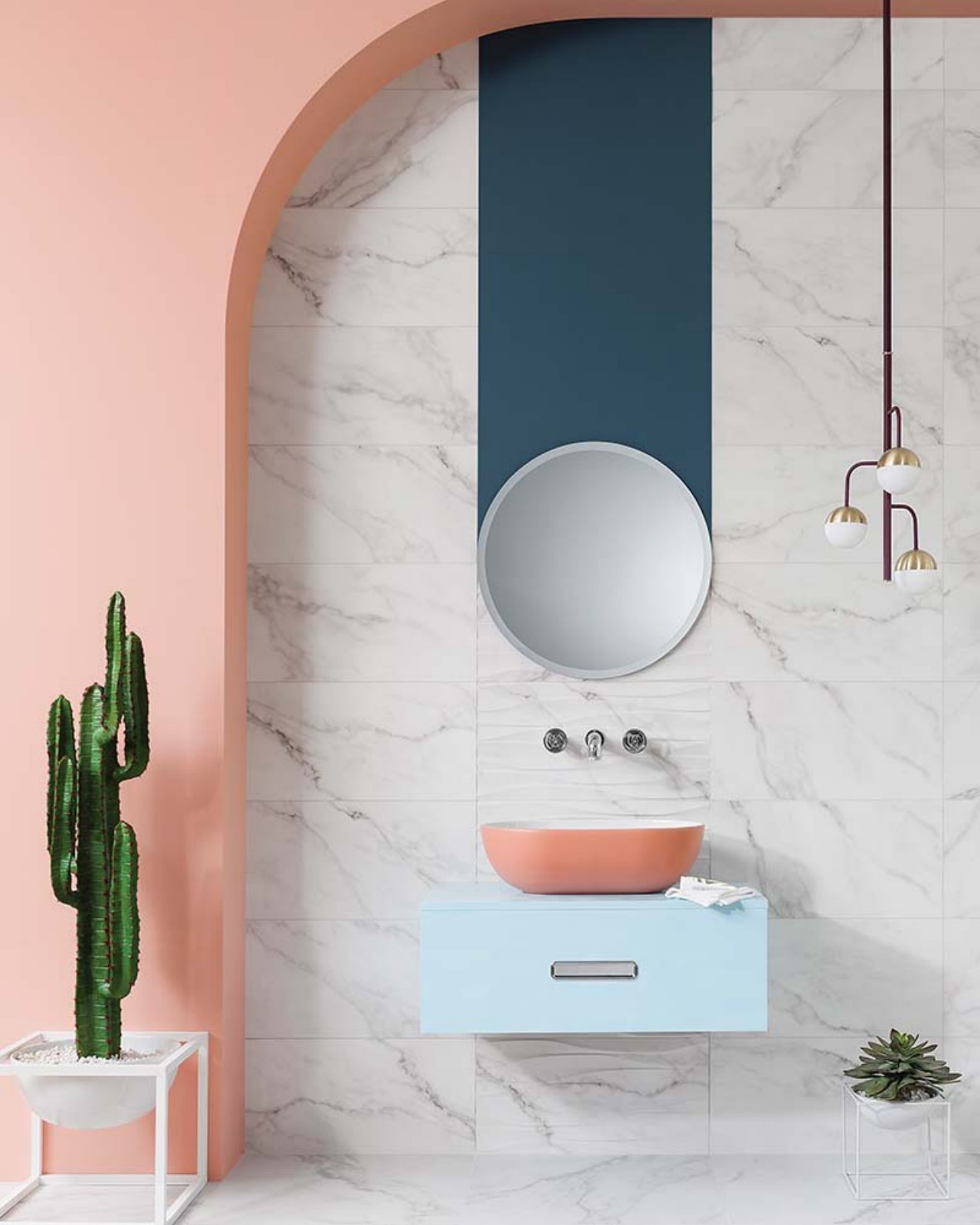
In this pastel-hued bathroom, the double wall is in peach, and the niche is clad in white marble incorporating the mirror-sink unit. A light blue base supports the peach color sink and a circular mirror connects to the double wall with a bluish-grey band. The cactus and succulent add color to the bathroom décor.

18. Earthy Vibes

Designer: Moamen Mahmoud Mano

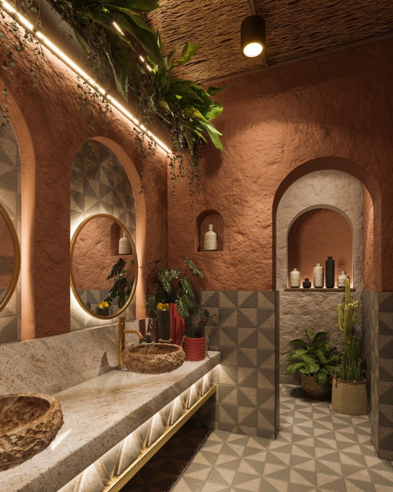
The bathroom exudes an earthy and warm ambiance and is reminiscent of a spa-like retreat. The unfinished look of the walls beautifully complements the solid wood vanity and incorporates stone finish sinks. Additionally, circular mirrors are fixed within arched niches and visually combine with gold faucets and patterned tiles to add a sophisticated touch.

19. Backlit Onyx

Designer: Antarya Design

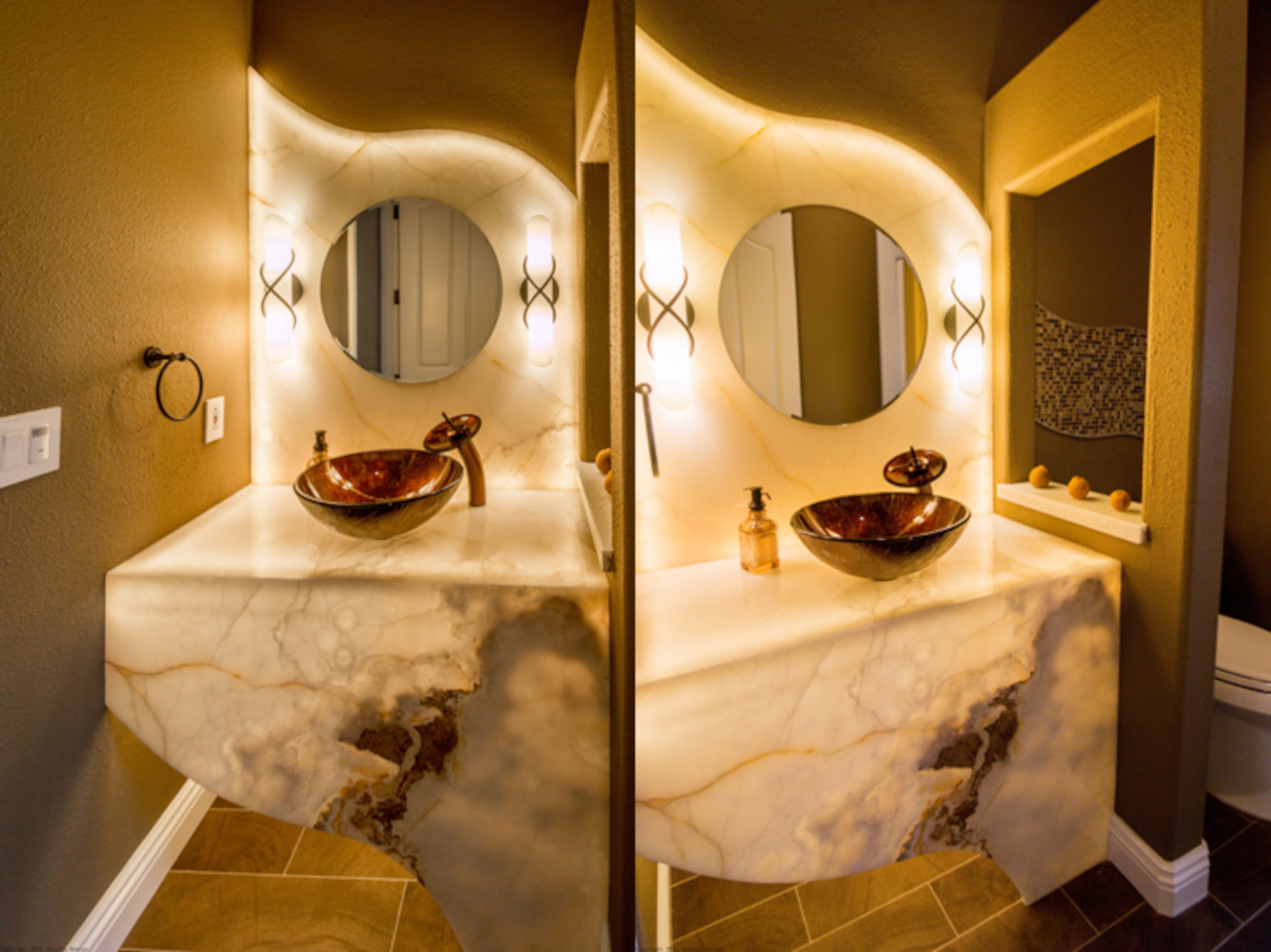
Use backlit onyx to enhance the ambiance of the bathroom with a golden touch as the stone’s translucent form radiates warmth. Onyx is a stunning fine-grained stone with distinctive patterns and is available in various shades of yellow, brown, green, black, white, red, and more. Its uniqueness lies in the rich layers and veining naturally formed over millennia via the growth and deposition of silica materials like quartz and moganite.

20. Sophisticated Glamour

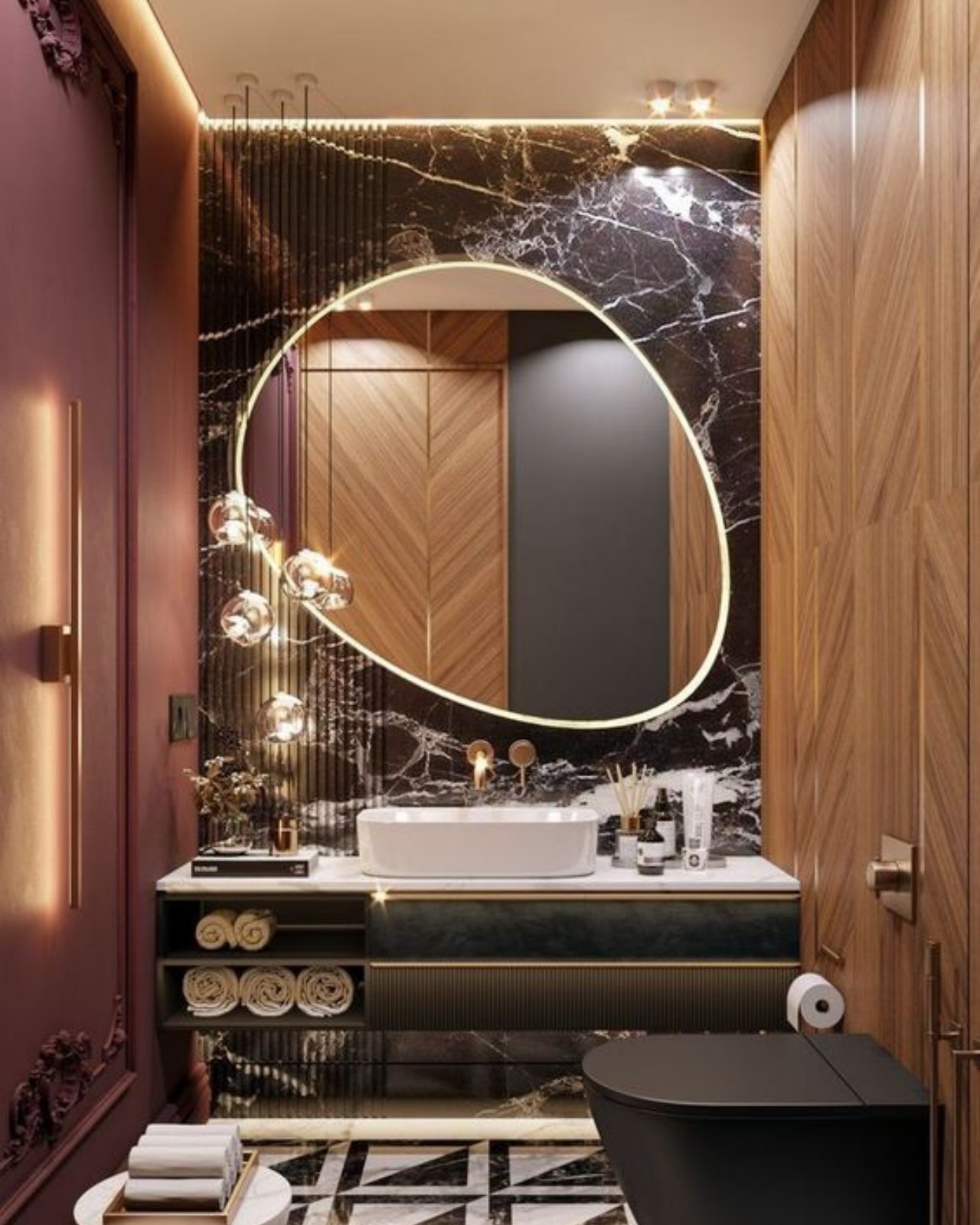
In this elegant and modern powder room, the counter’s sleek lines and the captivating illumination along the rim of the egg-shaped mirror form a stunning combination. The dark backdrop behind the mirror, along with the black and white floor patterns, adds gravitas to the overall design of the bathroom.

21. Warmth With Wood

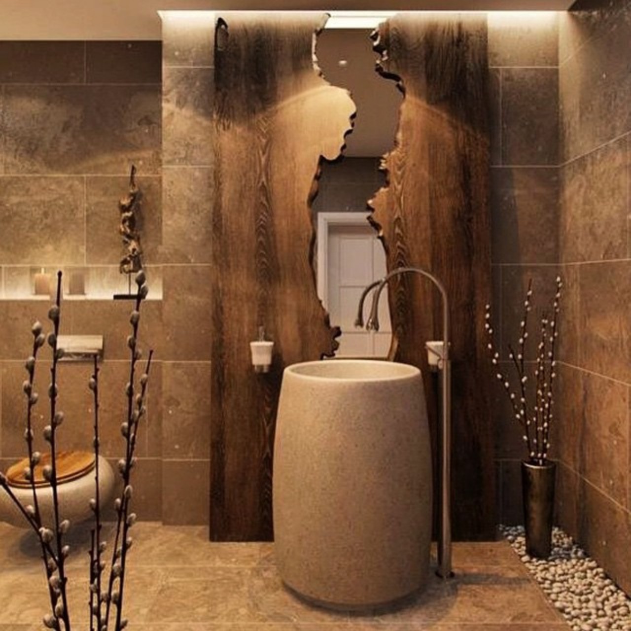
The bathroom exudes an earthy character due to the use of wood, natural stone, and diffused lighting. The organic-style mirror resembles a flowing river in between the wood, while the freestanding sink is reminiscent of a monolithic stone.

The post Top 21 Spectacular Mirror-Sink Units to Elevate Your Bathroom Decor first appeared on Yanko Design.

How a minimalist mirror can double the beauty of flowers and accessories

Everyone could use some decorative items in their house, whether it’s just a few flowers or jewelry on display. These small items can enhance the ambiance of a space by their mere presence, creating points of visual interest or setting a more welcoming atmosphere in a room. Unfortunately, we can only have so many of these, especially if we’re short on desk or shelf space. What if you could double the enhancing effects of colorful foliage or lustrous accessories without doubling the space they take up? That’s the kind of visual illusion that this rather unique desk accessory creates, strategically using a mirror to make you see double at no additional cost. Even better, the mirror itself is a work of art, making it a beautiful decoration piece even on its own.

Designer: soem

Click Here to Buy Now: $53 $59 (10% off at checkout). Hurry, Labor Day sales end in 48 hours!

Mirrors have long been used not just as functional products but also as decorative items. Some cultures even place greater value on these highly reflective objects, especially because of their psychological effects. Mirrors can play tricks on our eyes and minds, and these can be put to good use. For example, it can make a room look bigger than it really is or, in this case, double the number of beautiful items that your eyes can behold.

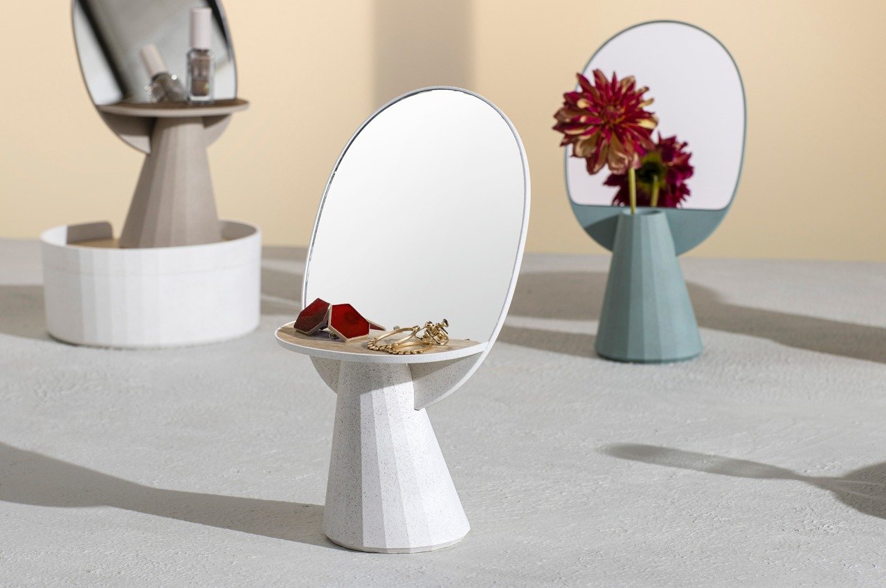
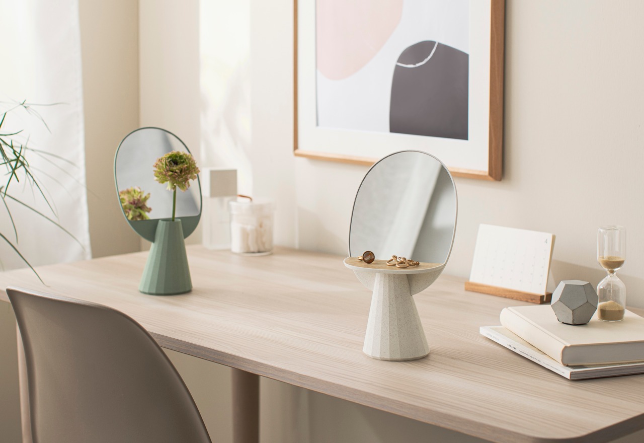
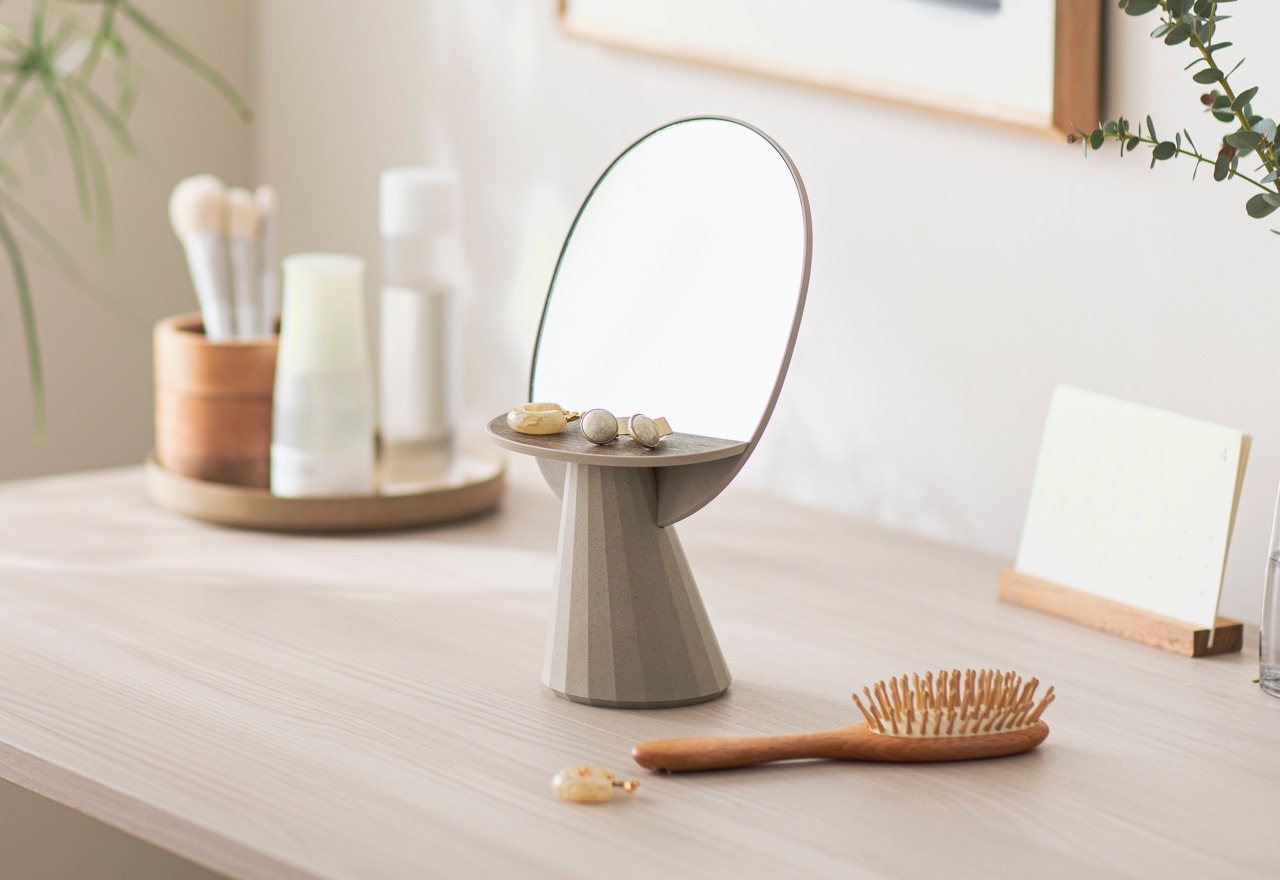
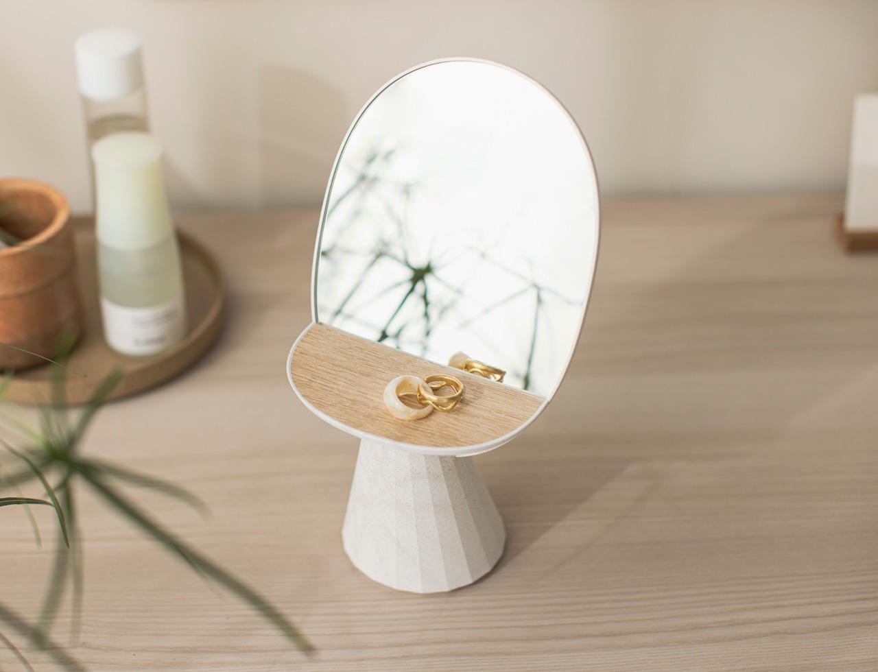
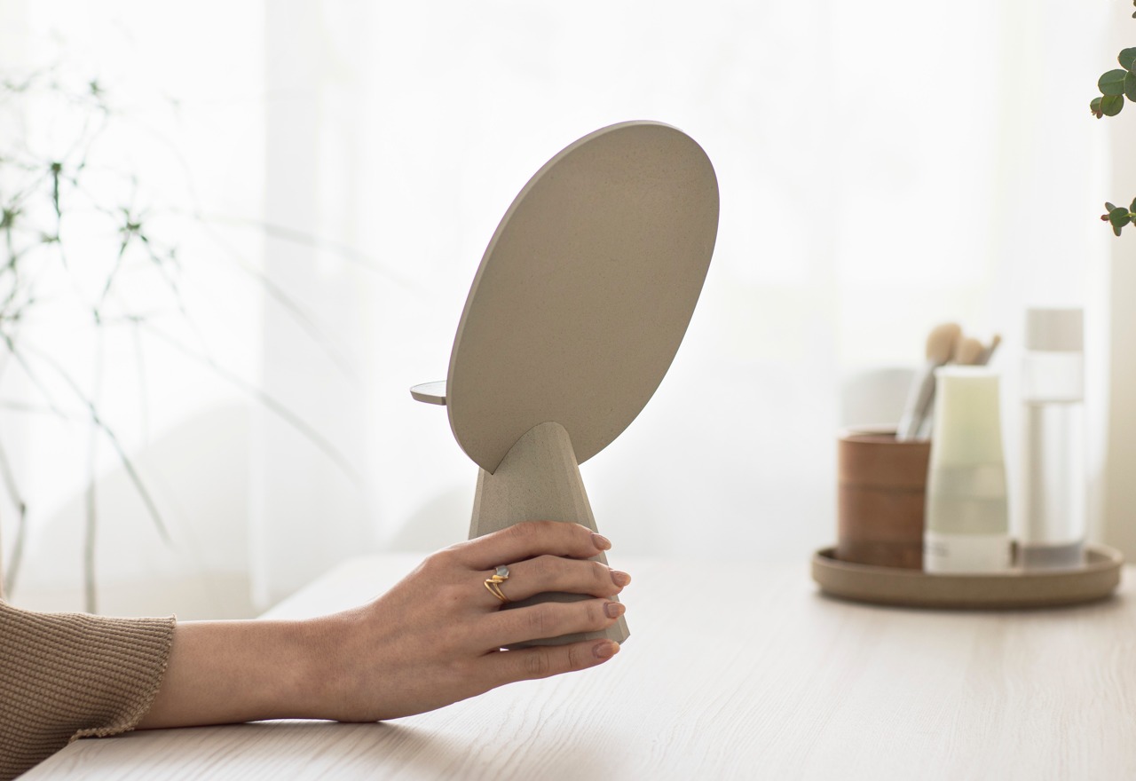
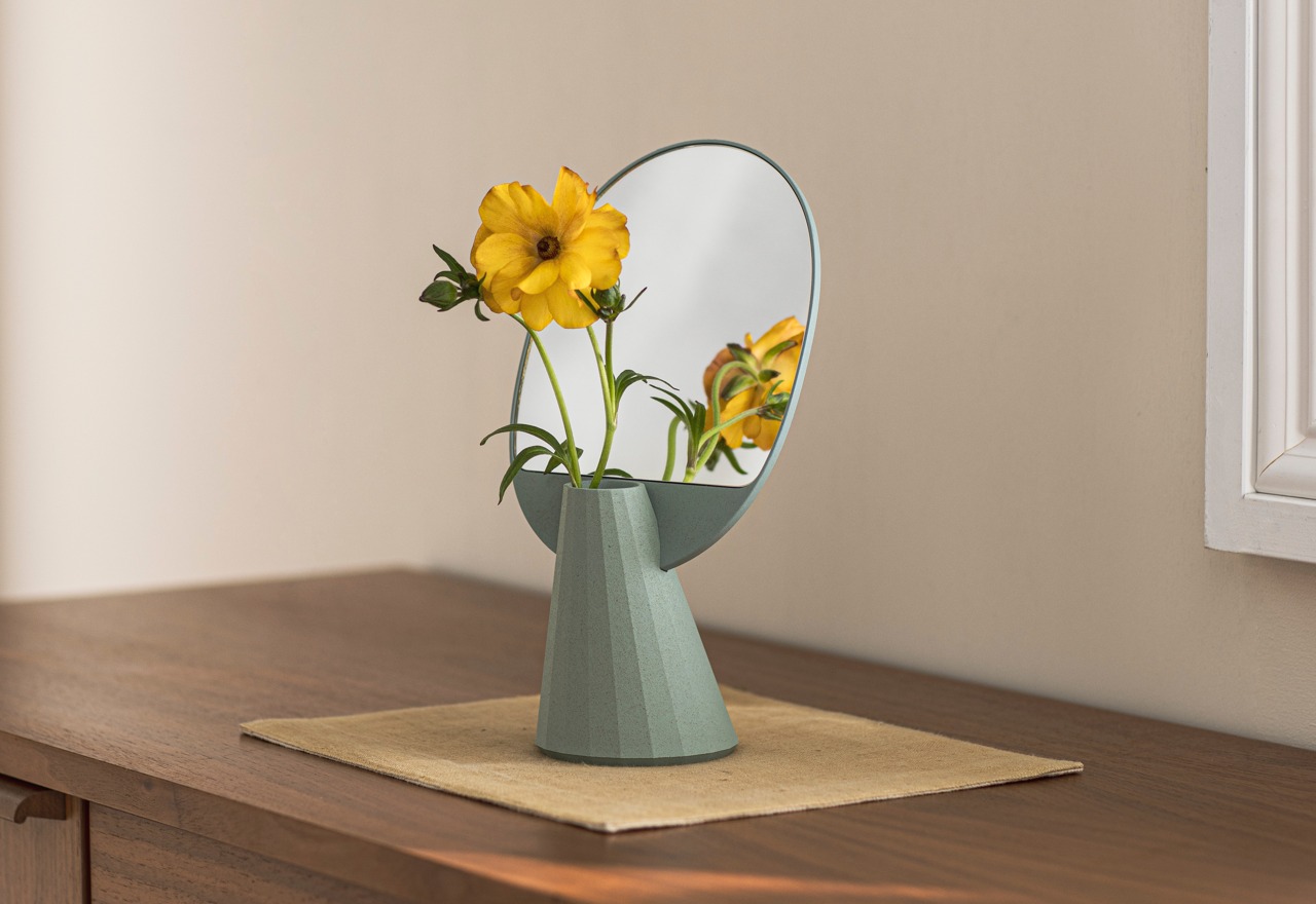
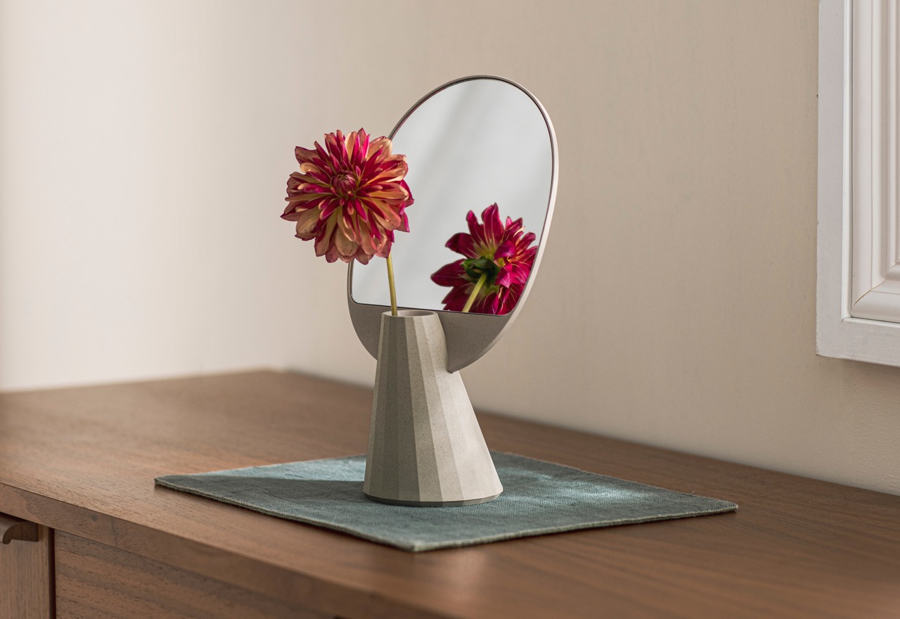
The Mirror Vase Stand is a unique, multi-functional object designed to amplify the decorative value of items in front of it by literally doubling them, at least visually speaking. Its base configuration functions as a holder for small items like accessories and jewelry that can potentially create a dazzling show as both objects and light get reflected again and again. In this form, the Mirror Vase Stand makes for a perfect dresser item, holding your jewelry and letting you put them on or take them off with ease.

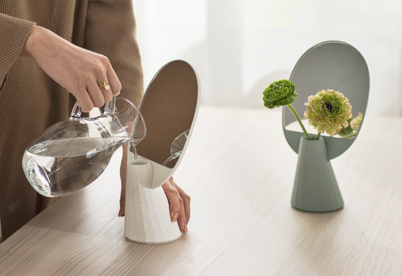
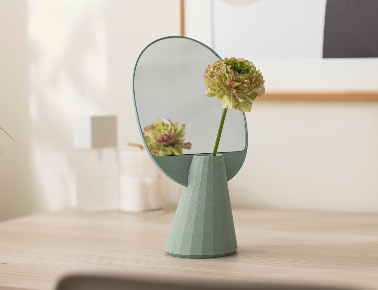
Remove that stand, however, and you’re greeted with a hollow container that can function as a vase. The small size makes you more intentional about the flowers and stems that you place inside it, but even just a single flower will be doubled thanks to the mirror. What’s more interesting is that the mirror has a profound effect even on the act of pouring water inside the vase, helping you pause and reflect on the process, no pun intended.

But even without flowers or jewelry, the Mirror Vase Stand can proudly stand on its own, pardon the pun. Its simple design is accented by the polyhedron shape of the slanted base, creating a play of shadows through its flat, faceted surfaces. The multipurpose vase’s beauty extends to its very soul, made from environment-friendly bioplastic material that uses rice husks to create unique visual details and a matte texture that enhances the product’s character.

Why settle for any old vase or accessory stand when you can have a beautiful one that can double its aesthetic value at no additional cost. Whether it’s flaunting jewelry, showcasing a single flower, or standing proudly on its own, this multipurpose Mirror Vase Stand is sure to add a touch of elegance and flair to any space, while also doing its part in keeping the planet healthy.

Click Here to Buy Now: $53 $59 (10% off at checkout). Hurry, Labor Day sales end in 48 hours!

The post How a minimalist mirror can double the beauty of flowers and accessories first appeared on Yanko Design.
Sustainable wireless power bank is also a compact mirror in disguise

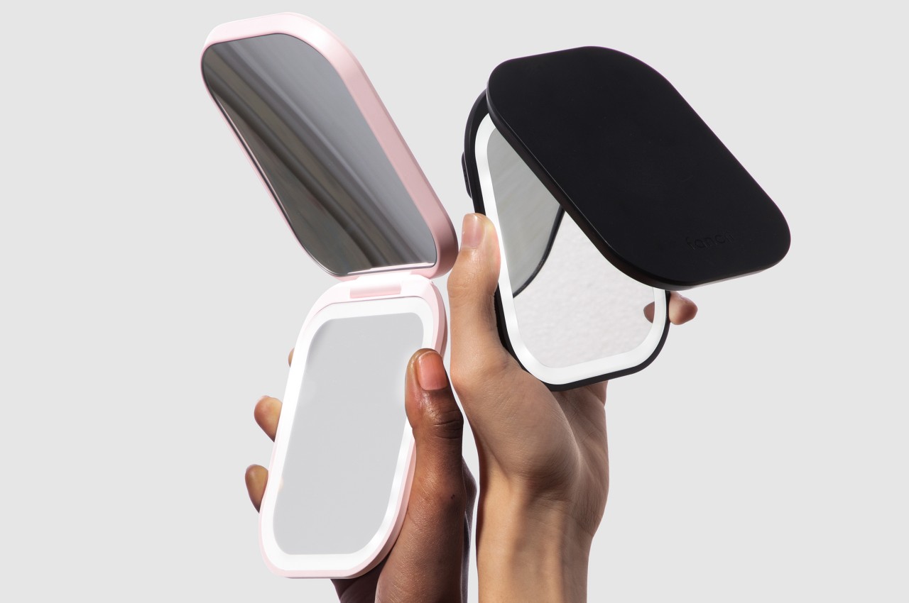
Our smartphones have become more powerful and more sophisticated, but the batteries that power them haven’t really changed much in the past decade or so. They have grown larger, yes, but most of the improvements in battery life come from making other hardware more power-efficient instead. Sooner or later, you’ll have to reach for a charger, which is why many people carry power banks with them when they’re often on the go. That means having yet another thing in your bag that doesn’t serve any purpose except in an emergency. Multifunctional products are on the rise these days, so this particular power bank design combines a useful mobile device with a common lifestyle accessory and wraps it in an eco-friendly package.

Designer: Lenny Ming Lo

Checking yourself in front of a mirror is less about vanity and more about respect for others and yourself. You don’t always have to look like you stepped out of a parlor, though some would definitely prefer that, but you will probably want to look decent and at your best to help give yourself a confidence boost. For some people, checking themselves doesn’t just happen in front of a bathroom mirror, which is why compact mirrors have become a common item in some people’s bags, especially for ladies.

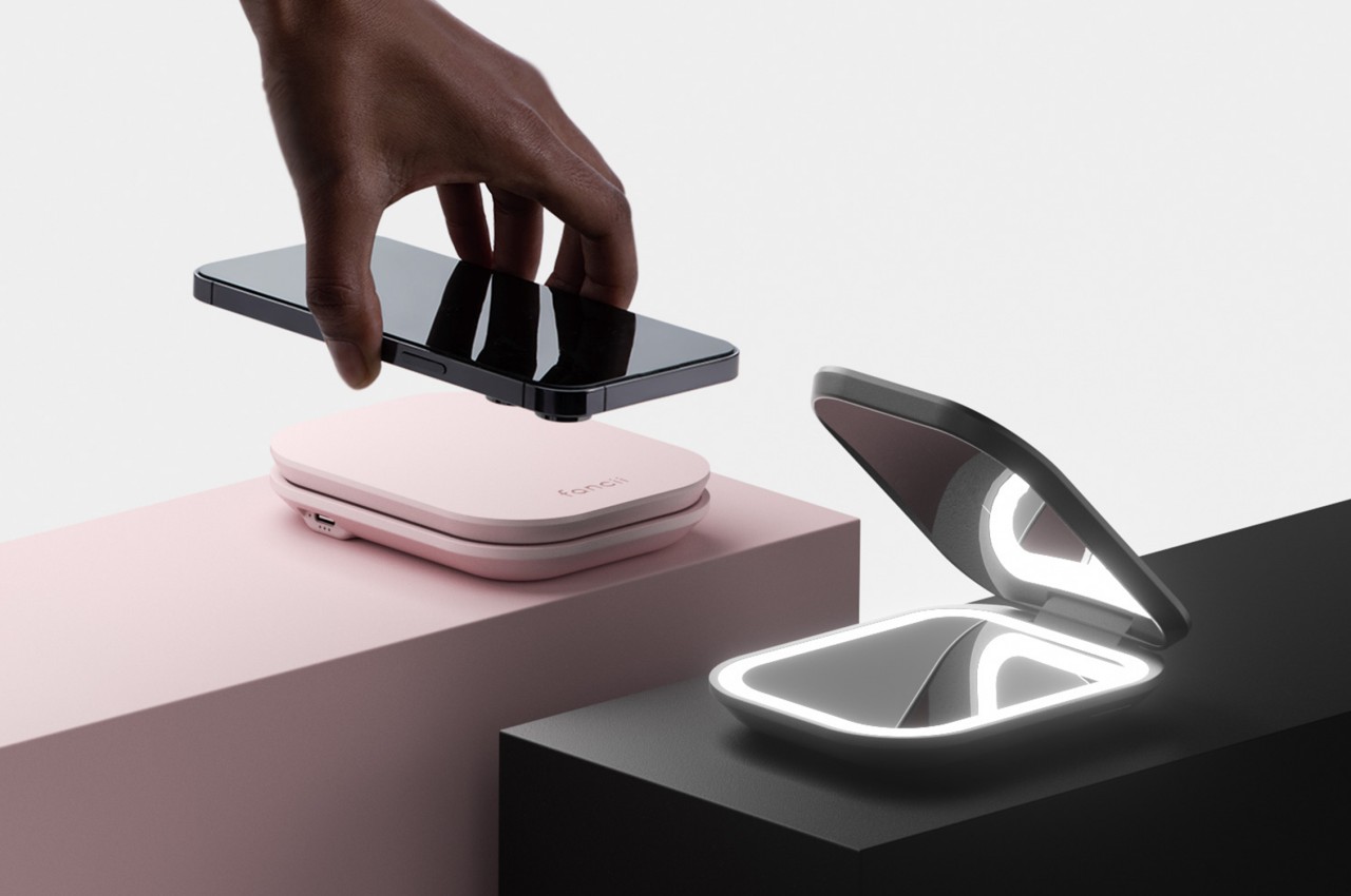
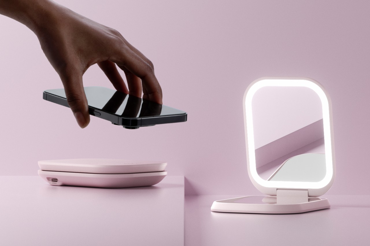
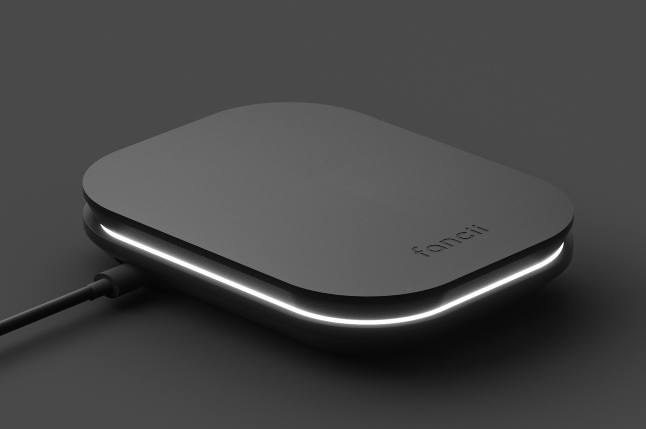
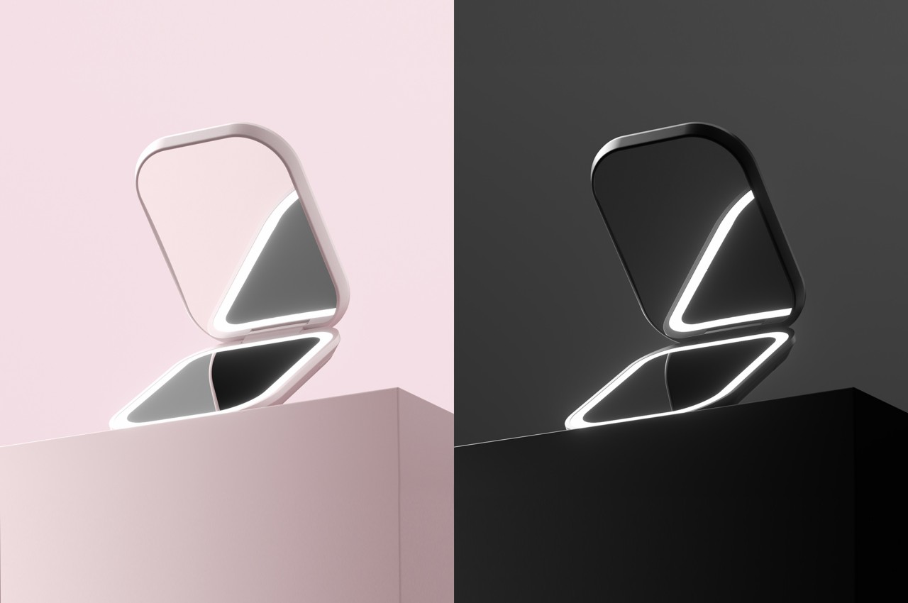
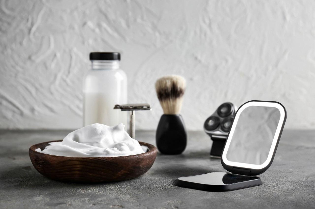
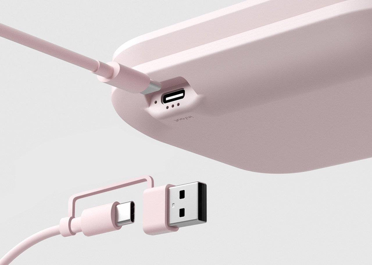
Mica is a lifestyle accessory that binds this item with yet another common thing in people’s bags these days: a small power bank to charge their phones in a pinch. You simply put down a compatible smartphone on its flat surface to begin charging, though you can also opt to charge via a USB cable if your phone doesn’t support wireless charging yet. Flipping the charger open reveals two mirrors on both sides, one with 3x magnification and the other with an LED light strip running around it.

More than just combining functions, however, Mica was thoughtfully designed to take inspiration from everyday objects. In particular, it looked at the basic form of bowls whose design hasn’t changed drastically over millennia. When folded shut, Mica looks like two flat bowls stacked on top of each other, giving it not only an interesting shape but also adding to its comfort of use and ergonomics.

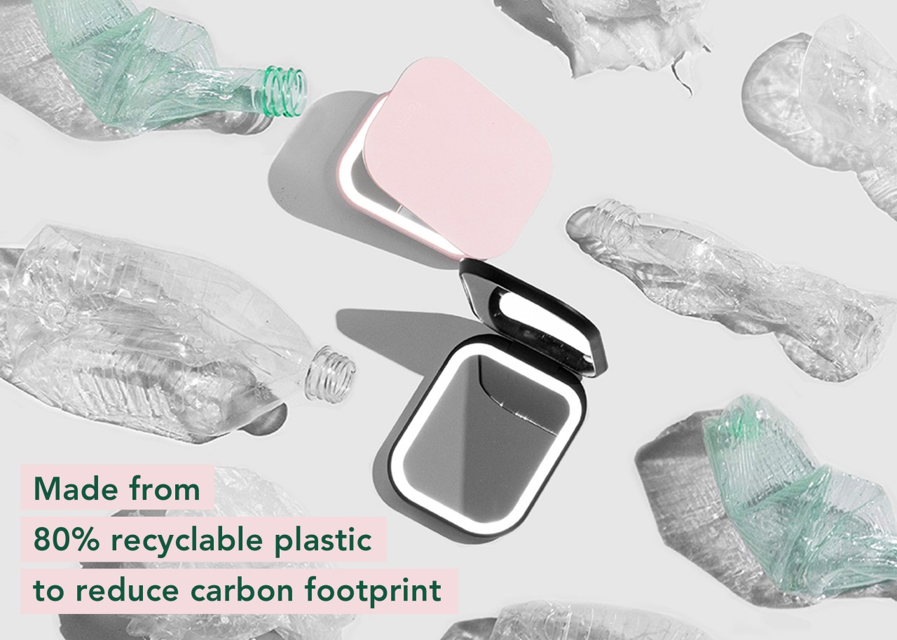
Mica was also designed with sustainability in mind, which is a rather surprising detail that might be easily lost on buyers. Most compact mirrors and power banks employ a lot of non-sustainable materials, so it’s a surprise this product uses 80% recyclable plastic to help reduce its carbon footprint. It’s not exactly a ground-breaking new product, but Mica’s combination of two common items and its sustainability focus make it a unique and desirable accessory to have in your bag.

The post Sustainable wireless power bank is also a compact mirror in disguise first appeared on Yanko Design.
How to give your home a budget-friendly makeover

Want to give your home a fresh lease of life but worried about costs? Well, it’s a common misconception that refreshing the look of a home is an expensive affair. From DIY ideas to a full-fledged renovation, it’s all about details and creative ideas that are easy on the pocket. Therefore, if you are on a shoestring budget, these creative strategies can help you to achieve a stunning look without breaking the bank. However, before starting any renovation project, make sure to create a realistic budget so that one can save money.

1. Organize the Furniture Layout

Reorganize the existing furniture layout so that the space looks well organized and there is adequate circulation space within the home. Moving the furniture away from the walls is highly recommended to create intimate seating in the living room. Add smart storage and introduce floating shelves to optimum use of the vertical space. For a clutter-free look, increase the built-in storage with modular storage units, storage beds, sofa-cum-beds to name a few. It is highly recommended to purchase practical and functional pieces of furniture from affordable brands.

Designer: ECRU STUDIO

2. Add a Pop of Colour

Wall paint is a cost-effective way to refresh the look of any space. It’s always good to choose a color palette that can create a cohesive look within the home. Go for a bold color or a light color scheme for a compact space to uplift the look. Turn an empty wall into a focus wall by painting it in a bold hue or add a pop of color to one or two accent pieces of furniture and style a neutral space. Breathe new life into old furniture by sanding and repainting it. Patterned or textured wallpaper creates an accent feature behind the bed. Using metallic finishes in gold and silver hues can instantly upgrade the look of any space.

Designer: Regan Baker Design

3. Invest in Soft Furnishings

Enhance the look of the interiors with soft furnishings. Replace old throw pillow covers with bright new cushion covers to add a pop of color. Mix and match colors and create an interesting composition and combine squares and design. Change the cushions with seasons. For example, use delicate floral prints for the spring season and deep colors alongside heavy texture for winter. Reupholstering furniture can freshen the home’s look, and choose drapery that complements the room’s furniture and overall color palette.

Designer: Sweef

4. Add Moulding

Decorate the home with Victorian-style moulding on the walls and ceiling to elevate the look of the interiors. Also, consider wainscoting to upgrade the look of blank walls, as it can work wonders in any room.

5. Introduce Wall Art

Create a statement gallery wall and decorate a bare or empty corner with wall art, photographs, porcelain plates, personal artwork, or a visually arresting painting. Choose frames that work together and create an art gallery-style wall display.

Designer: Lenka Daviesova

6. Accessorize the Home

Create an interesting vignette on coffee tables, consoles, and empty corners. Having a centerpiece with the color and fragrance of fresh or artificial flowers alongside candles, trays, trinkets, and tchotchkes is always wonderful. Source budget-friendly home décor items from antique shops, online portals, and stores during their annual sales. Avoid too many accessories and invest in large-size art to create a grand and impactful space. Style bookshelves by arranging books according to size or color and add art alongside mementos to add character.

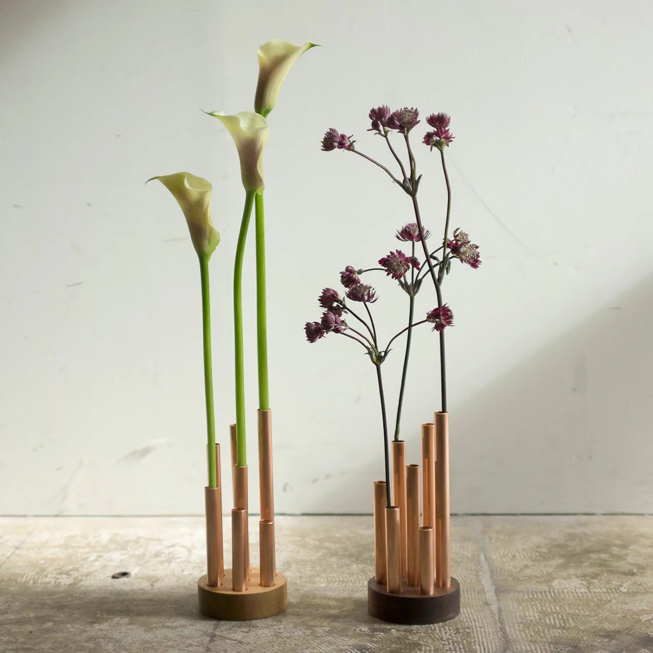
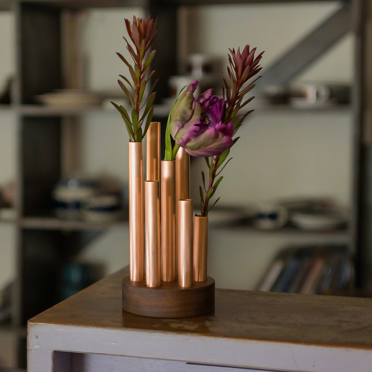
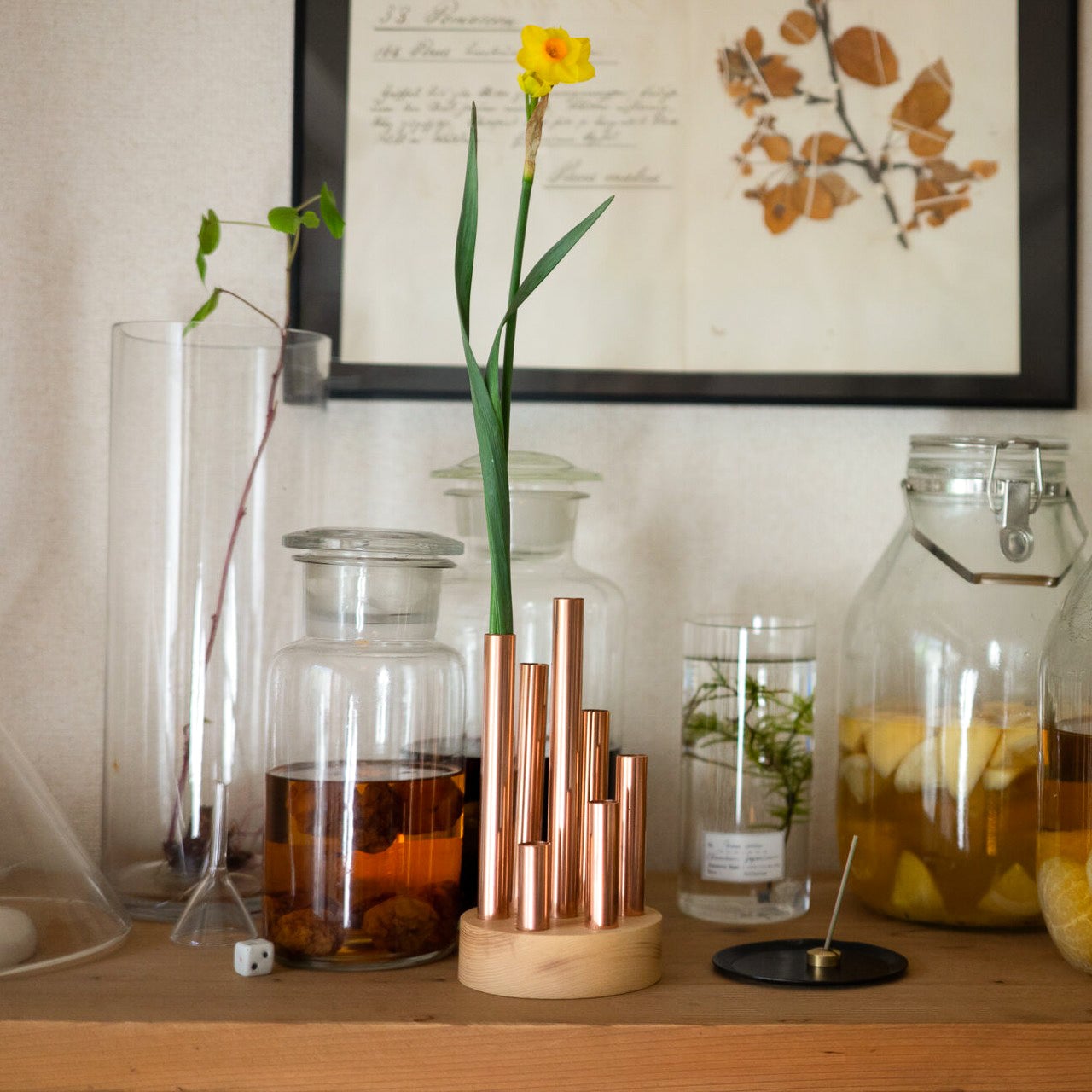
Click Here to Buy Now: Modular Flower Tubes ($149)

7. Replace Unsightly Items

Rusted faucets and unattractive hardware like door knobs, drawer pulls, or handles can be an eyesore, so one must polish them to retain shine and sparkle. Alternatively, one can replace these damaged pieces with new sanitary fixtures and stylish hardware and give a brand-new look to the home.

8. Introduce Mirrors

Mirrors are not only meant for the bathroom vanity and dressing table, but they also have the potential to create the illusion of extended space. Install a mirror in a narrow entryway or the end of the hallway to make it look doubly spacious. If the room is dimly lit, place a mirror opposite a window so that it reflects natural light and provides outdoor views throughout the day.

Designer: AC/AL Studio for Petite Friture

9. Add an Area Rug

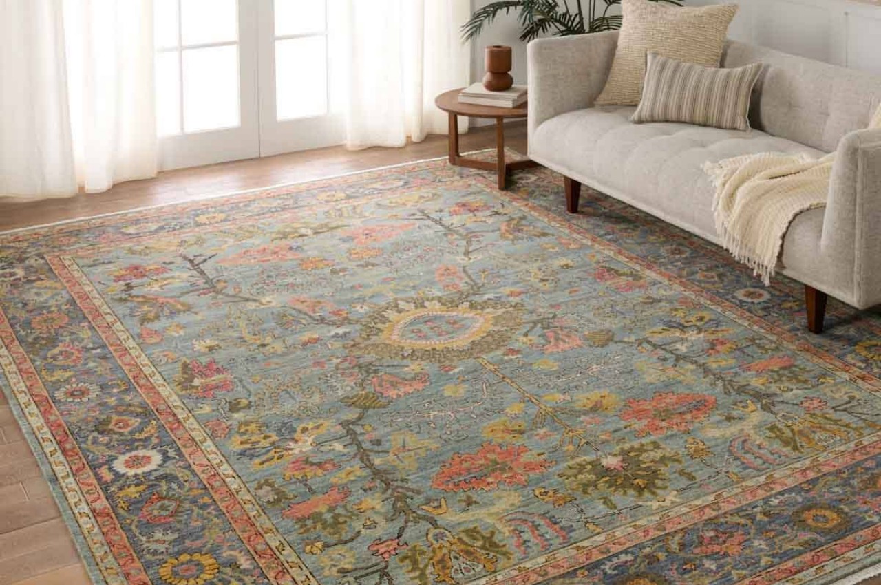
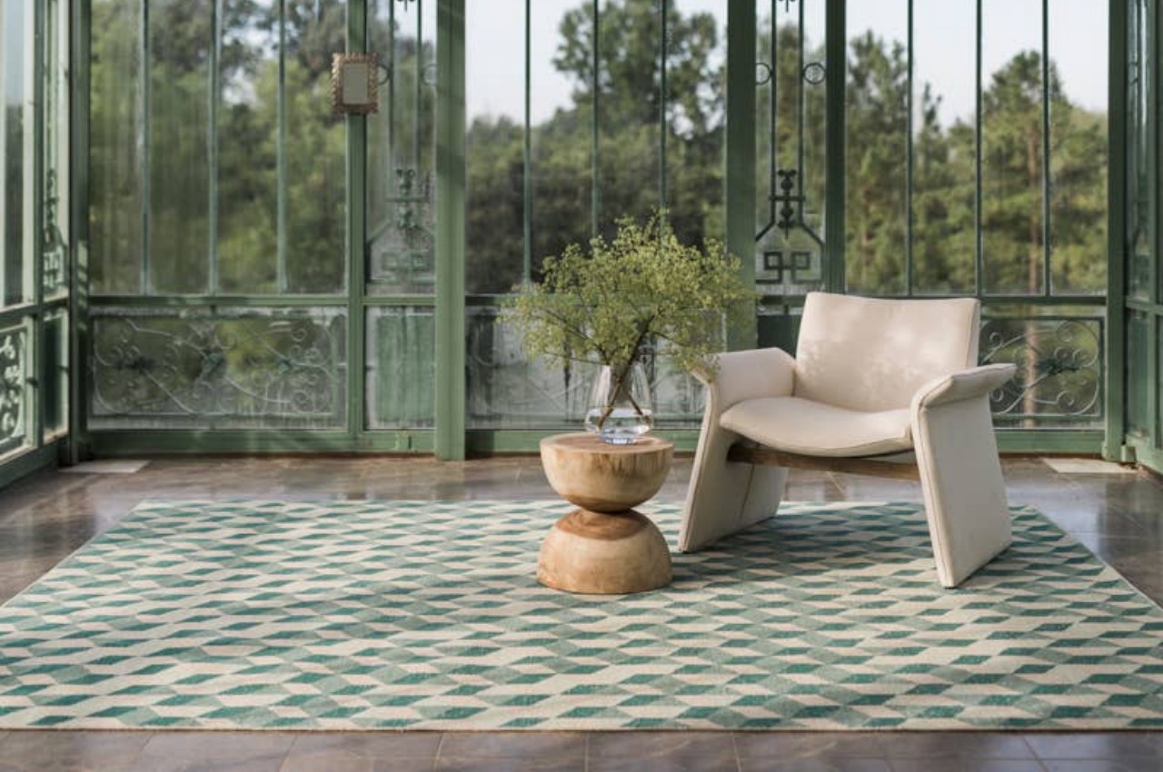
Introduce an area rug, as it is one of the easiest ways to add interest, color, and texture. Additionally, it demarcates areas in an open-plan home, adds softness, creates a layered effect, and changes the aesthetics of the space.

Designer: Jaipur Rugs

10. Good Lighting

It is important to find the right balance between natural and artificial light. Introduce a layered lighting scheme with a combination of ambient or general lighting, task lighting or focus lighting, and accent lighting to add depth. Swap uninspiring light fixtures with new ones; add dimmers to change the overall mood of the space and give it a quick makeover. From chandeliers and pendant lights to artistic sconces, consider statement wall lighting to conjure a warm aura and transform them into focal points in your home.

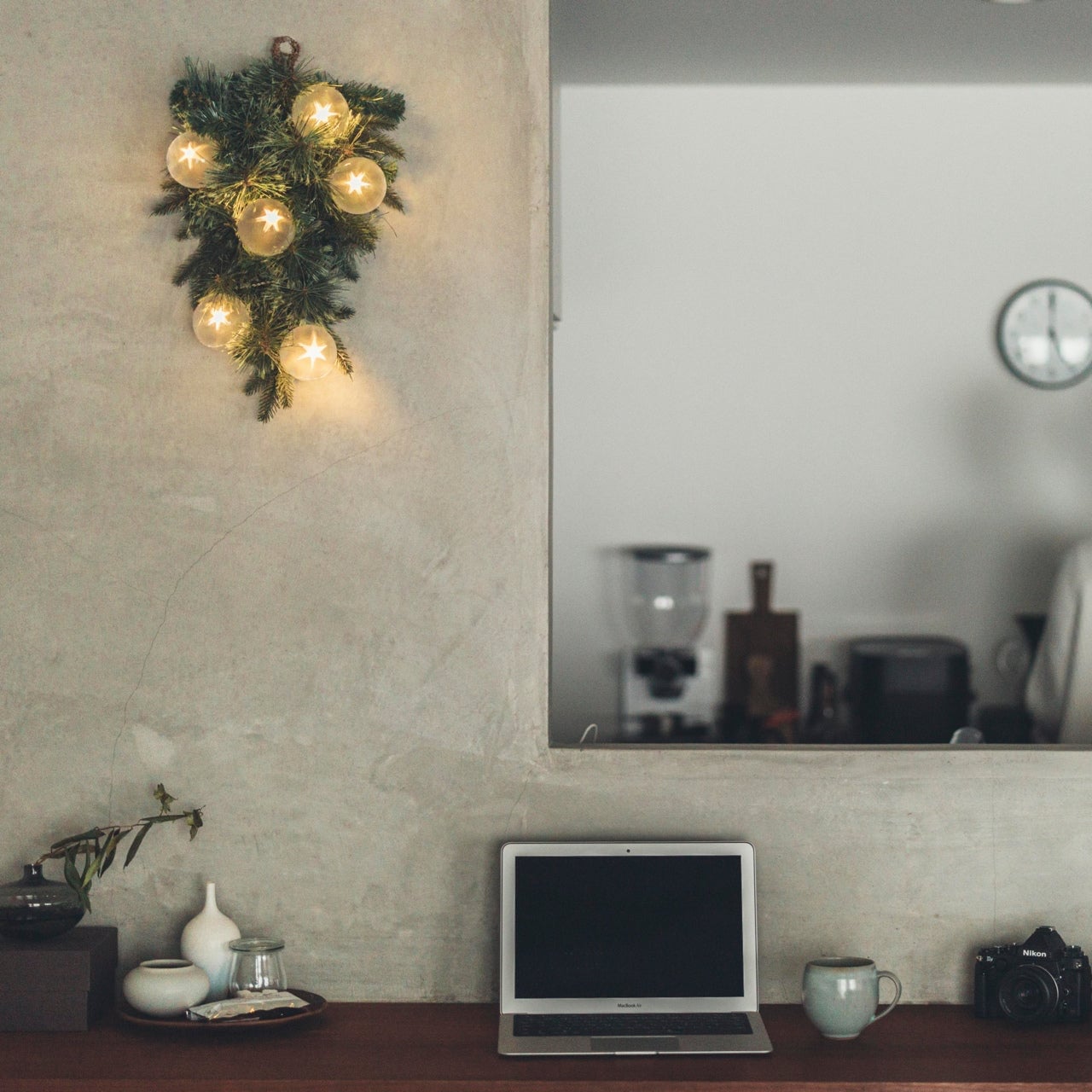
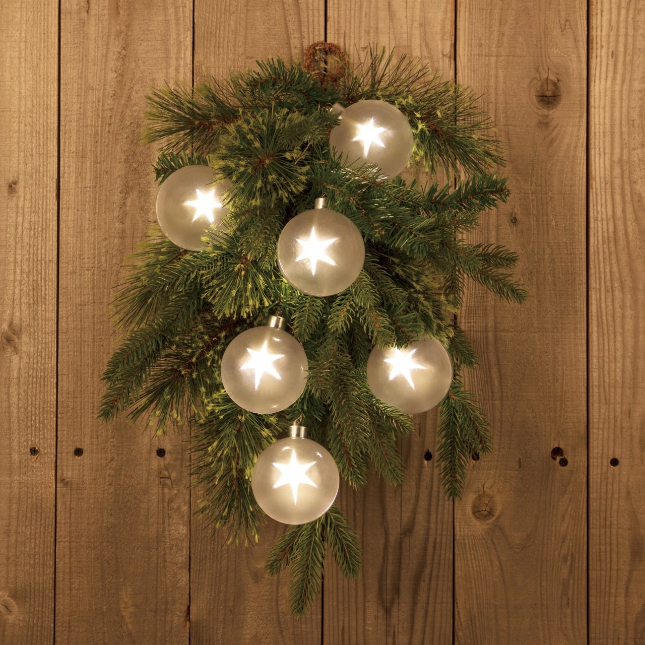
Click Here to Buy Now: Starry Wreath ($99)

11. Get Organized

Decluttering does not cost money, and less is always more. The first step is to clean the home and get organized. A clutter-free space looks very nice, and keeping the house clean is one of the most inexpensive ways of upgrading the look of the home. Cut the clutter, as cluttered spaces can look heavy and feel claustrophobic. Add a few pieces that can help in creating an organized space and reduce the number of accessories, display items, flowers, and so on. Before buying new items for your home, always remove outdated or damaged items from the house.

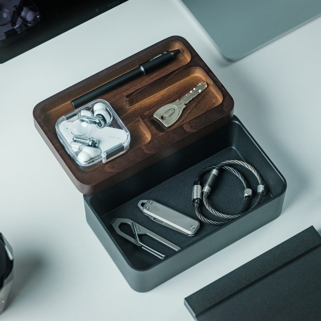
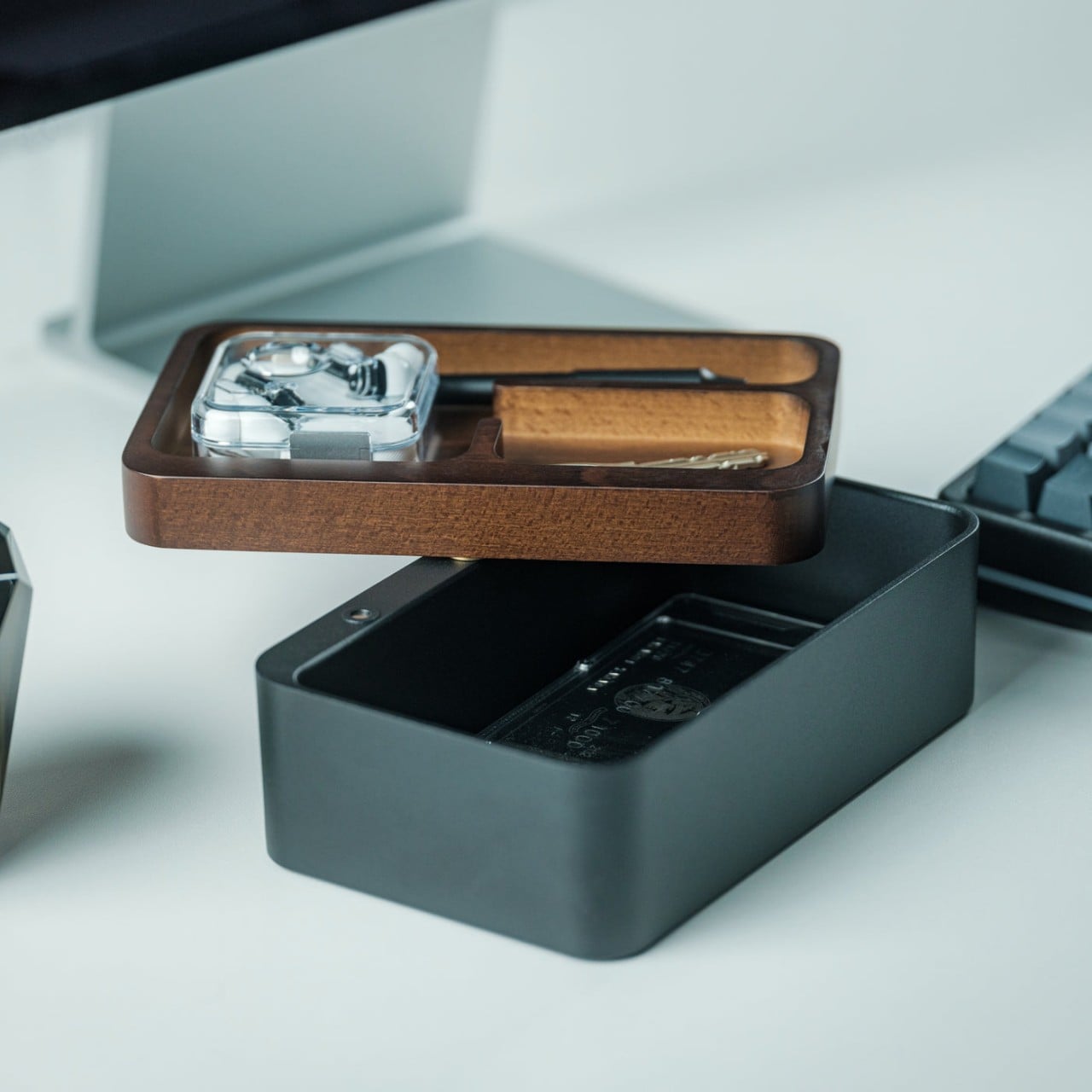
Click Here to Buy Now: Quick-Access Organizer ($69)

12. Upgrade Old Flooring

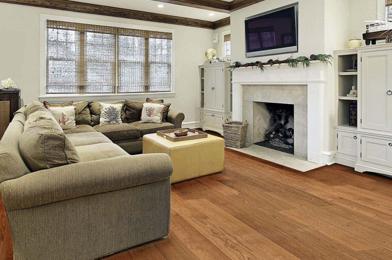
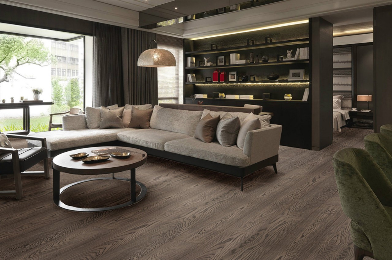
The flooring design and flooring material sets the tone of the interiors. Replace a shabby floor with laminated wooden flooring, linoleum, or vinyl flooring, as they are budget-friendly, lightweight, and can be laid directly onto the existing flooring. Roll out bright carpets and rugs to enhance the look of drab flooring but remember carpets tend to trap dust and should be vacuum cleaned frequently.

Designer: IM Wooden Floor

13. Conceal Messy Wires

Wire management has become a challenge as more and more electronic devices enter our homes. You can invest in a cable management box, bundle cords behind the furniture, run the TV wires inside the wall, tuck them into tubing, or insert them through baseboard accessories. It makes the house look clean and organized.

14. Go Green

Plants add color and texture and are an inexpensive way to accessorize interiors. They not only rejuvenate our homes by providing oxygen but also come with excellent air-purifying properties. Introduce hanging plants and succulents, or style them on a beautiful stand or in handcrafted planters. Large potted plants are a great way to fill dead corners and empty spaces and make a huge difference to the décor. One can also get inspired by nature and introduce materials like rattan, bamboo, jute, and wood into the home decor.

Designer: Studio Doss

15. Upgrade the Bathroom

If the bathroom looks dull and dreary, upgrade its look with a bright and colorful shower curtain that won’t burn a hole in your pocket. Infuse sophistication and make a statement with a head-turning mirror. Additionally, you can add color and pattern with waterproof peel-and-stick decals on the tiles of the bathroom and even the kitchen tiles.

Designers: Fabio Bortolani, Ermano Righi, Gergely Agoston, RD Agape for Agape Design

The post How to give your home a budget-friendly makeover first appeared on Yanko Design.
These colorful two-toned mirrors are the playful element your bedroom, living room & bathroom need

They say that the eyes are the mirror to one’s soul, which is a beautiful thought, but when it comes to doing up my hair, I do prefer a big bold mirror. Have you ever paid attention to the mirrors people place in their homes? They’re usually simple reflective surfaces with probably a thin metal border around them. Nothing special about them. They do the task, reflect your face and body back to you, and that’s about it. So when I came across some beautifully designed mirrors, they totally piqued my interest! Called the Wander Mirrors, these unique mirrors were designed by AC/AL Studio for Petite Friture.

Designer: AC/AL Studio for Petite Friture

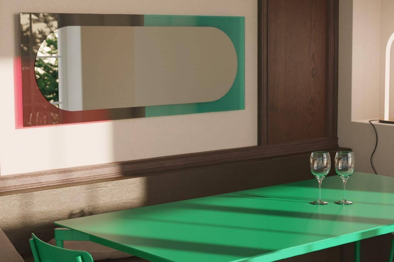
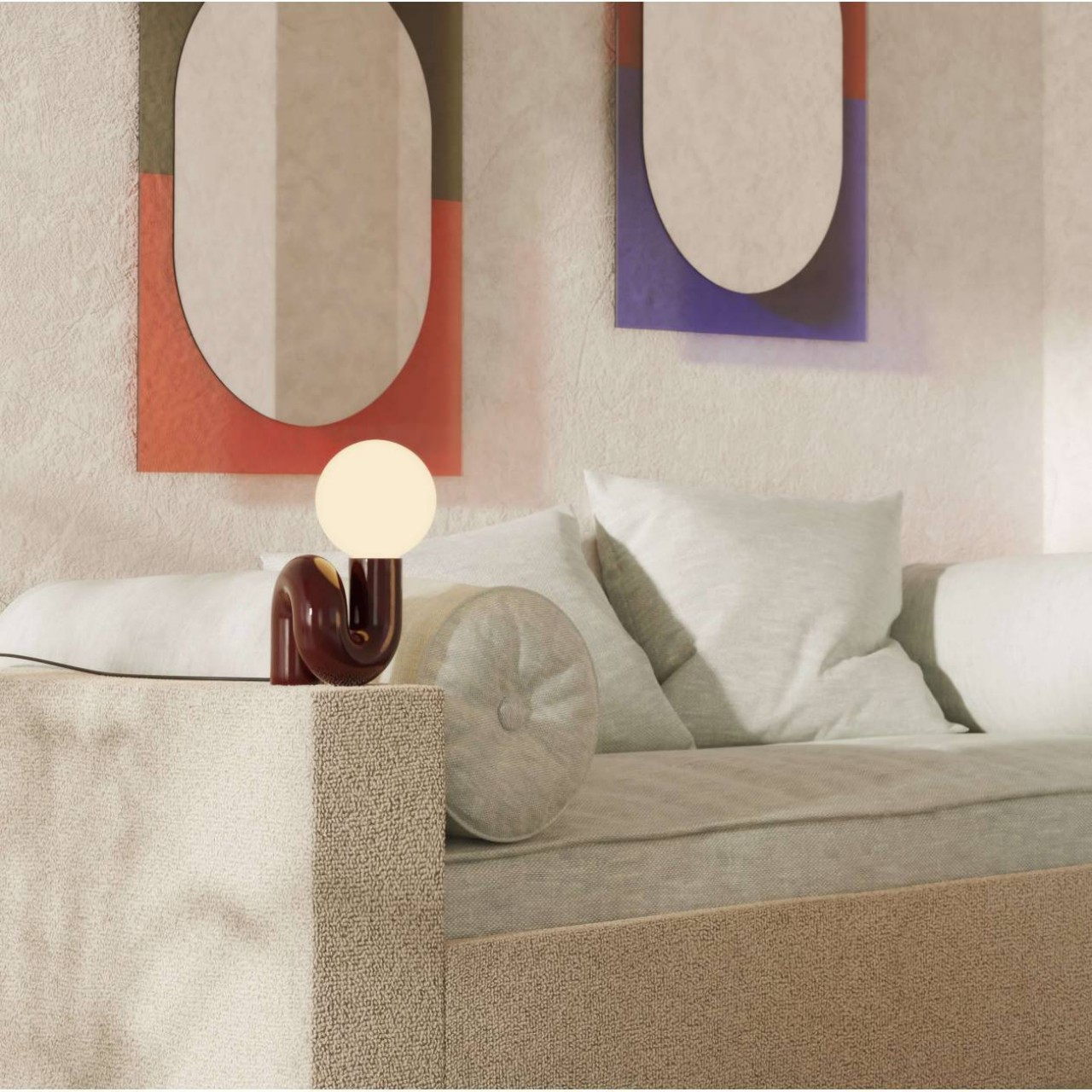
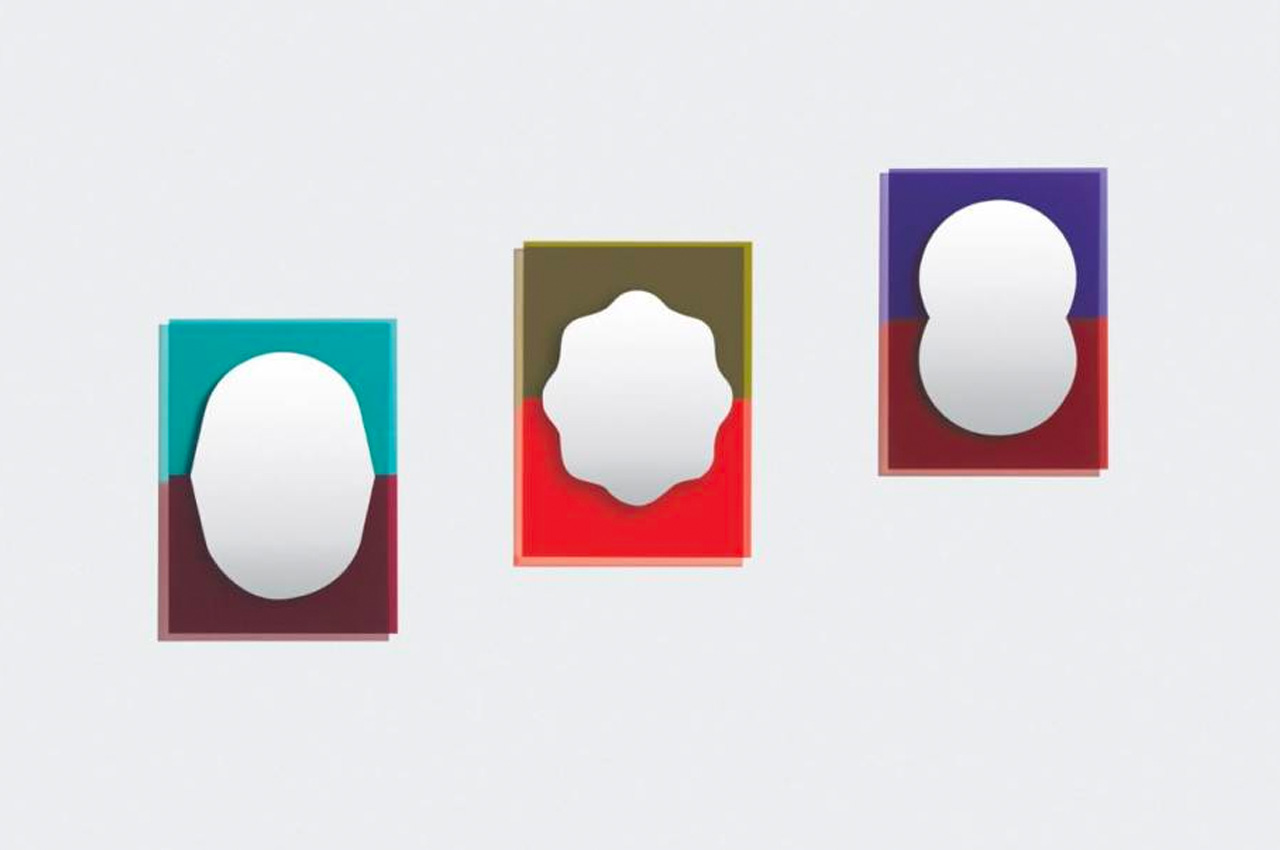
Designed by Parisian studio AC/AL Studio for Petite Friture, these innovative mirrors feature transparent two-toned glass frames that cast out a stunning colorful halo on its surroundings. The mirrors are mounted through a unique hanging system, allowing them to sit at a slight distance from the wall, which enables light to pass through the stained-colored glass, projecting the colors on the wall the mirror is mounted on.

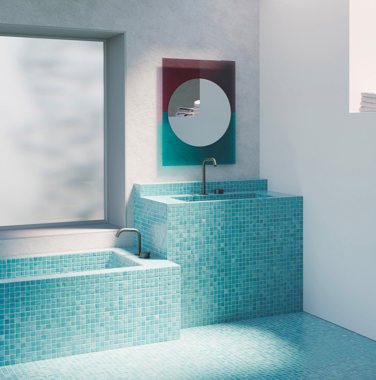
“The collection evokes a sense of freedom of the mind through its graphic lines and visually fun style. The transparent glass of the mirror adorns a meticulous bicolor print showcasing unique shades and original shapes,” said Petite Friture. The Wander Collection includes mirrors in three different sizes, so you can pick a size that works for your bathroom. The mirrors are available in two-tone colors – emerald with cherry, vermillion with khaki, and brick-red with purple. The varying color shades perfectly contrast one another, creating a stunning visual. In the middle of each pane, the colored glass effortlessly merges into a mirrored glass.

The size of the mirrors affects this section, which takes on a different shape. For example – for the larger rectangular Wander mirrors an elongated pill-shaped mirrored glass is used, whereas, for the smaller mirrors, ornate frames are utilized. The end result is whimsical and playful mirrors that will brighten up any bedroom/living room/bathroom they are placed into, adding a fun and exquisitely designed element to what would have been an otherwise boring old space.

The post These colorful two-toned mirrors are the playful element your bedroom, living room & bathroom need first appeared on Yanko Design.
This gorgeous floor mirror transports a lake shoreline into your room

Mirrors are great ways to add some accents to a room. Whether they’re actually functional or just decorative, their reflective surfaces alone are enough to bring some life to a space through a play of light, colors, and shapes. Even better, however, if a mirror is both useful and beautiful, which calls for some creative thinking and design. Most of the time, furniture makers focus on embellishing mirrors with rather fanciful frames, but some have also dabbled in changing the very shape of the mirror itself. This floor mirror, for example, might be a tight fit for some body types because of its irregular shape, but its play on forms creates an almost magical illusion of looking down at a lake’s shore from high above.

Designers: Maryna Dague Nathan Baraness

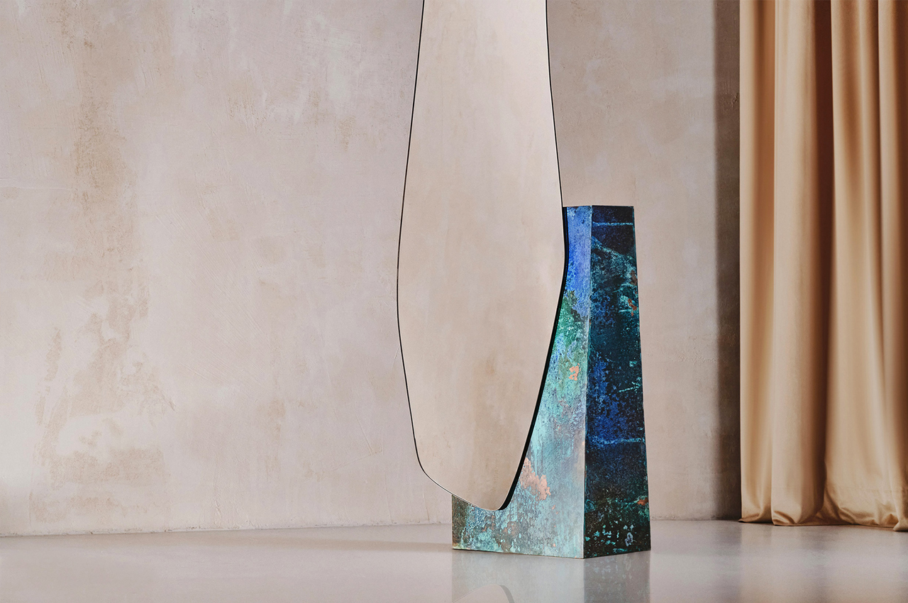
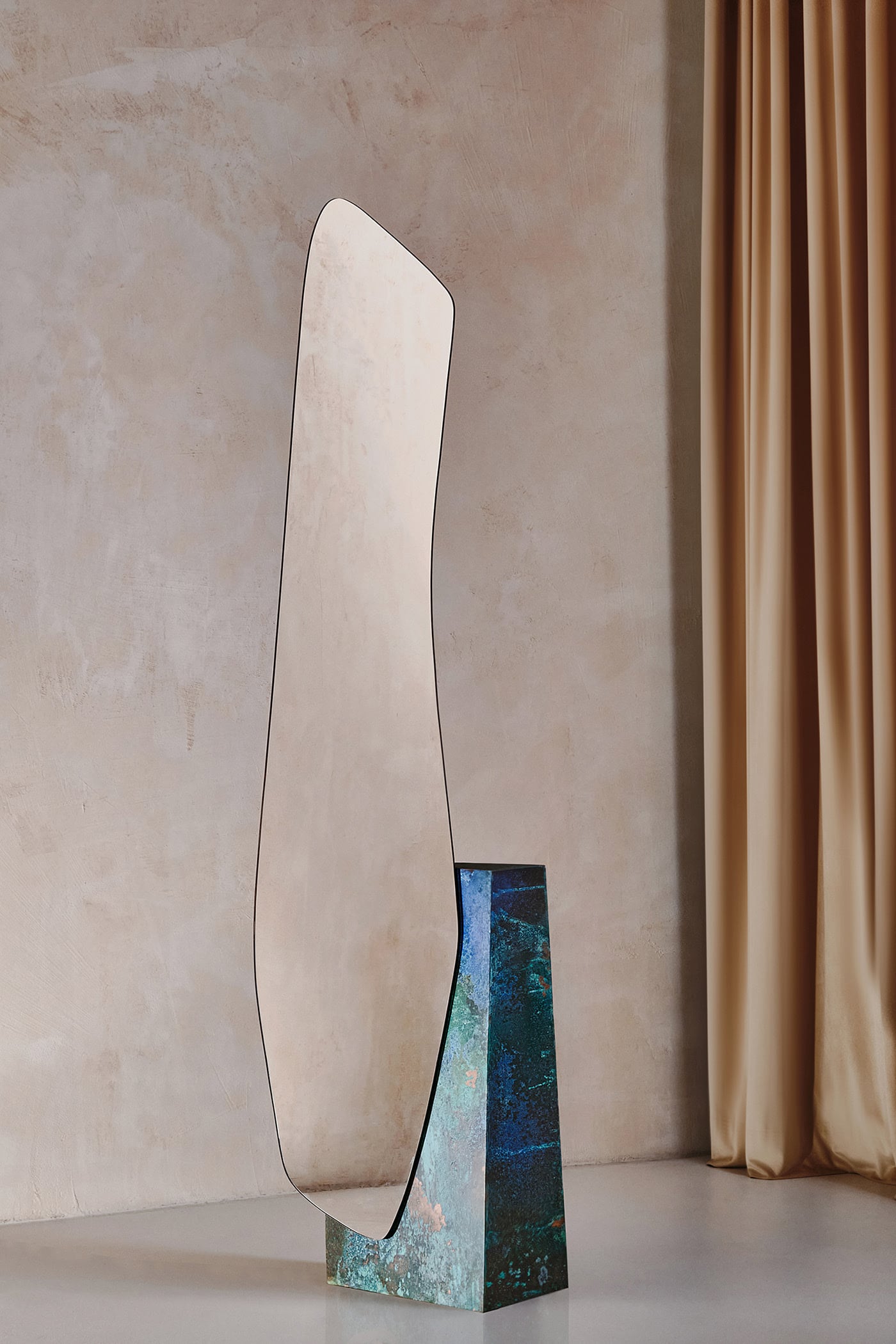
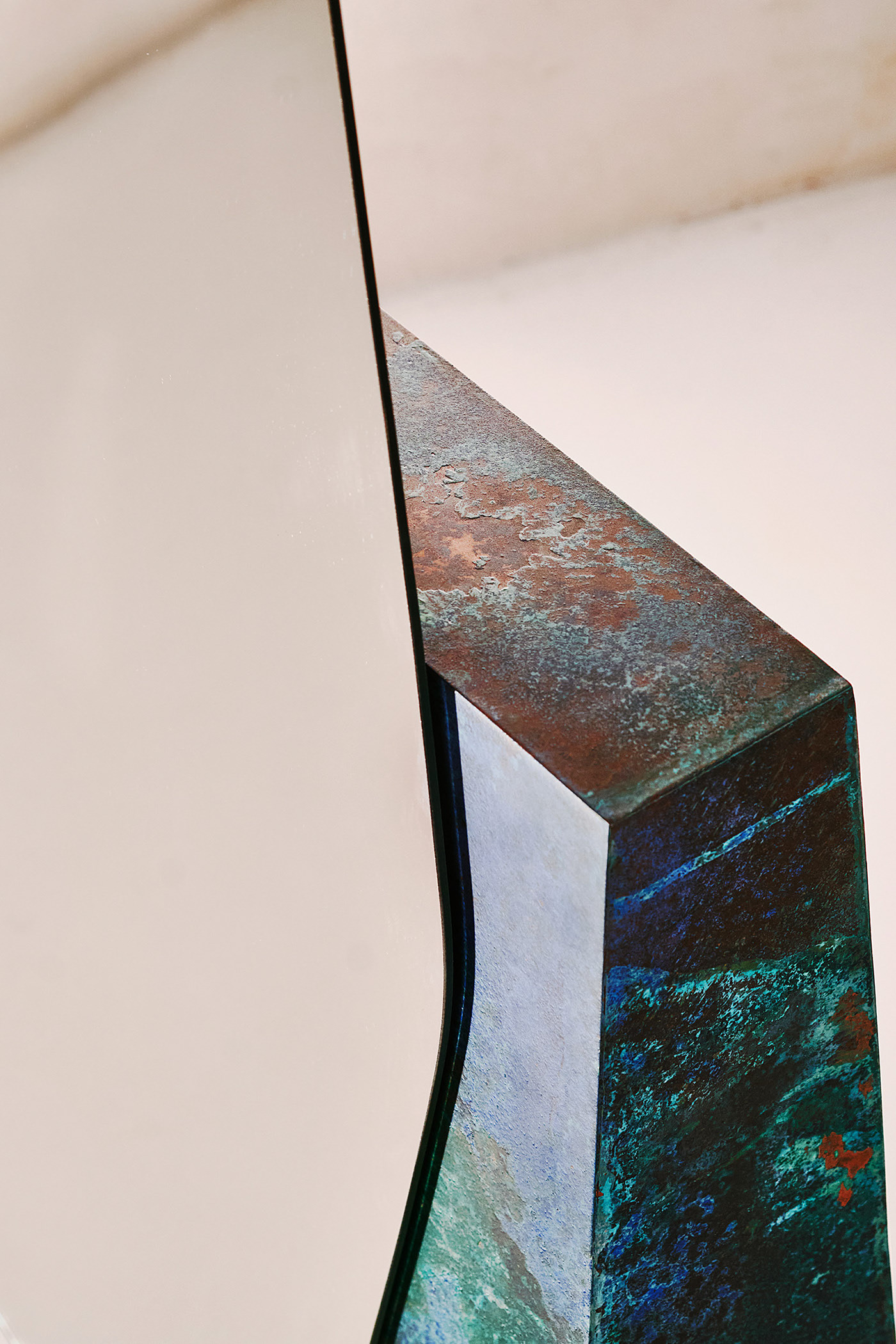
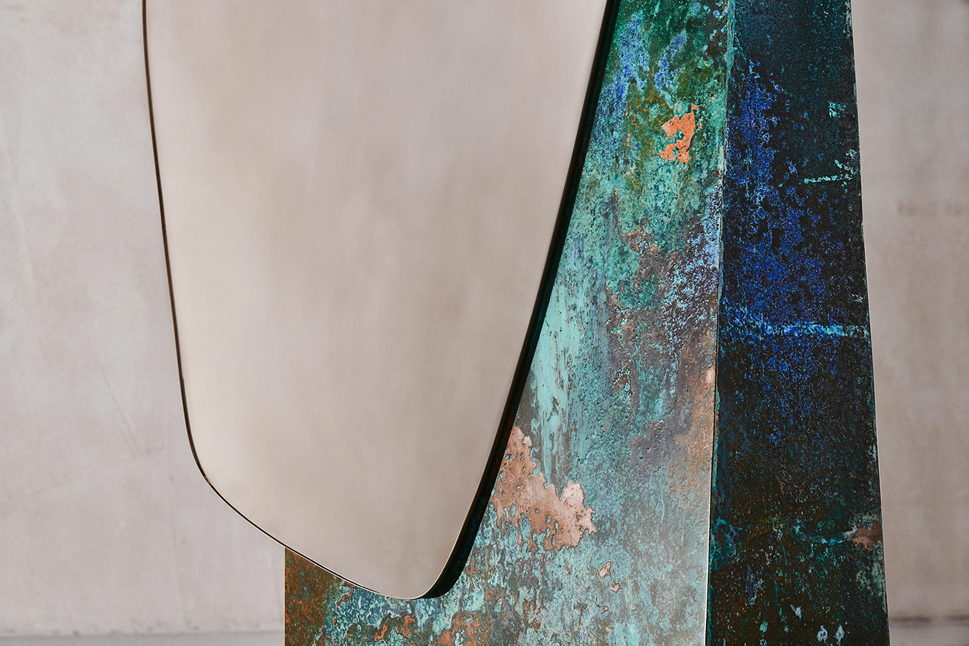
Very few things in nature have straight lines to the point that one famous architect was even quoted to associate curves with the divine. Even some natural things that one would think to be straight would have a few bumps and waves that make them look and feel more, well, natural. Despite their name, shorelines are, of course, never straight, and it’s that natural irregularity that this beautiful mirror uses to create a captivating visual inside any room.

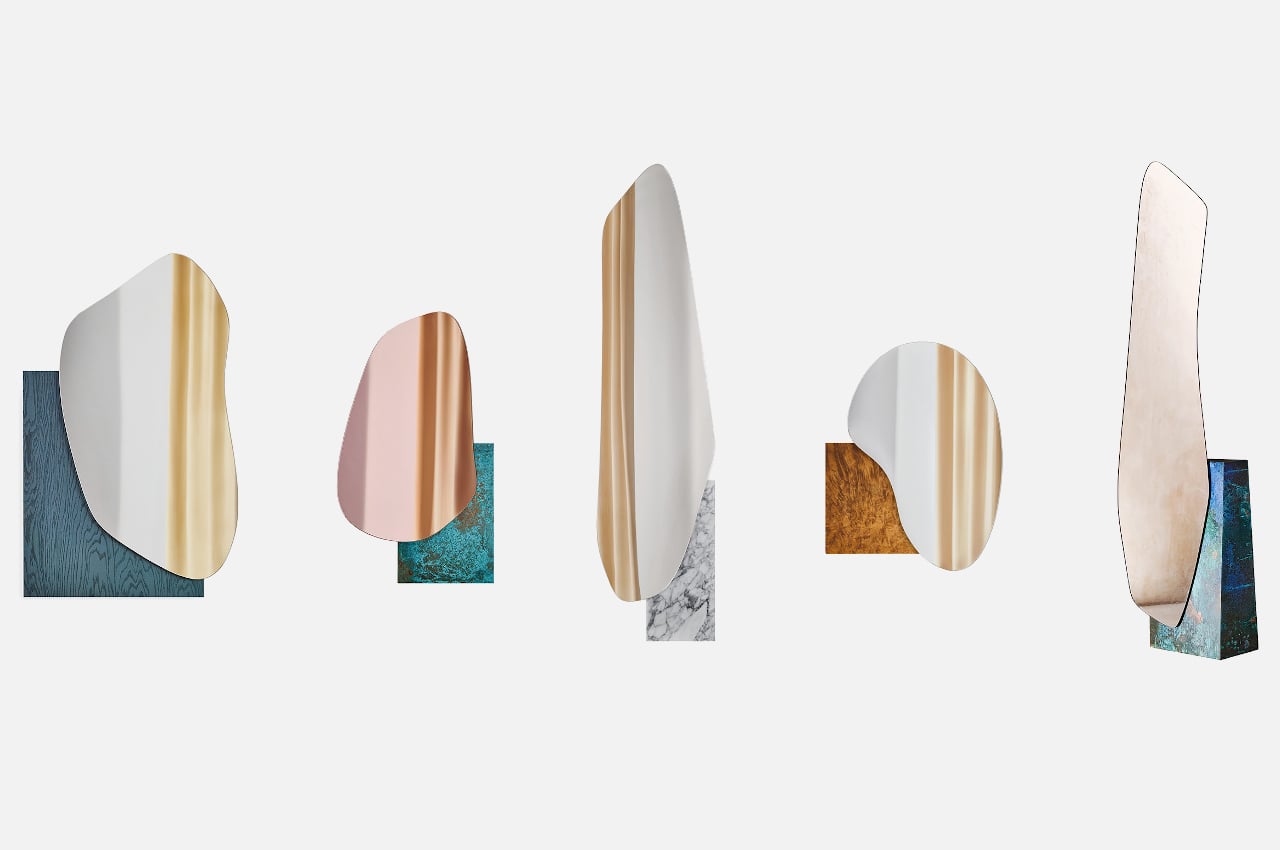
The shape of the mirror defies definition. Despite its irregularity, there is nothing jarring or disconcerting about its lack of corners and straight lines. Just like water in its natural state, it seems to have no discernible pattern to its curves. And just like water, it causes our minds to associate the loose shape with feelings of calm and mellowness.

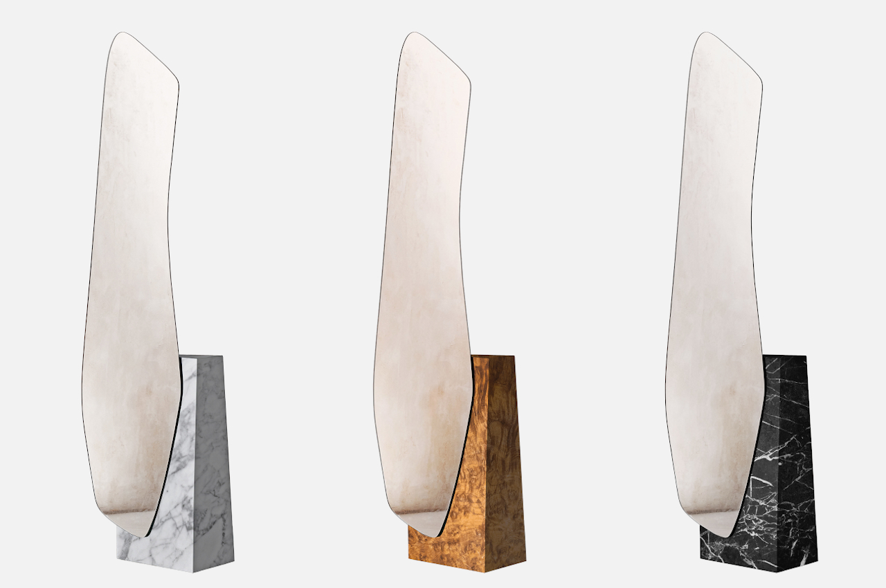
And then there’s the base, which is a solid block with sharp edges and a well-defined form. It contrasts with the mirror’s fluid form and is almost as if the mirror simply cut through a chunk of the base. Many shores look like this when viewed from the skies above, and it’s a reminder of how water can also be a destructive force, even when it’s slowly eroding stone and ground over time.

The “Lakes” collection of sculptural mirrors also includes other mirror shapes and sizes, some representing small ponds while others are like long gulfs. The bases can be made of different materials as well, from wood to metal to marble. One design even looks like a body of water to fit with the theme. No matter the shape or the material used, the Lakes mirrors successfully take a page from Mother Nature’s design book to create a piece of furniture that has a natural grandeur that instantly fills the room.

The post This gorgeous floor mirror transports a lake shoreline into your room first appeared on Yanko Design.
Furniture that plays with hues and shapes is sure to bring some color into your home life

The pervasive minimalism trend in design has made many products, particularly furniture, almost too plain. Of course, there is beauty in simplicity and uniform colors, but that doesn’t mean it’s the only way to go. In fact, there’s almost a sort of counter-culture flowing in the undercurrents today, offering maximalism as a salve to soothe many of the mental and emotional ills of today. One doesn’t have to go overboard, of course, in spicing up everyday life, and a new collection of everyday furniture shows how mundane objects can become the literal and figurative highlight of a room, with just the right interplay of colors, materials, and shapes.

Designer: Lisa Brustolin

On their own and with their peculiar designs, these pieces of furniture would have pretty much fit the description of minimalist products. Their basic shapes and base color schemes are not that uncommon, but as with anything in life, it’s the different ways you mix these elements up that really make a difference. And in this collection, it’s exactly that interaction of elements that makes them stand out without removing their primary function as usable pieces of furniture.

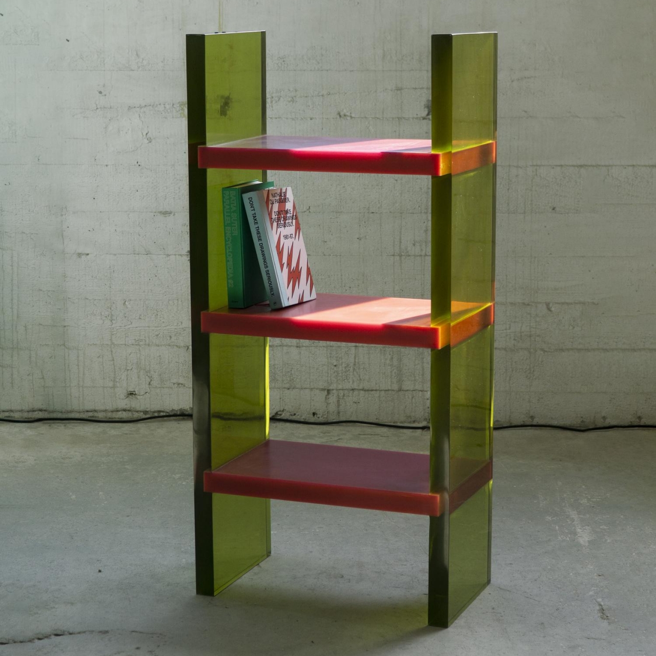
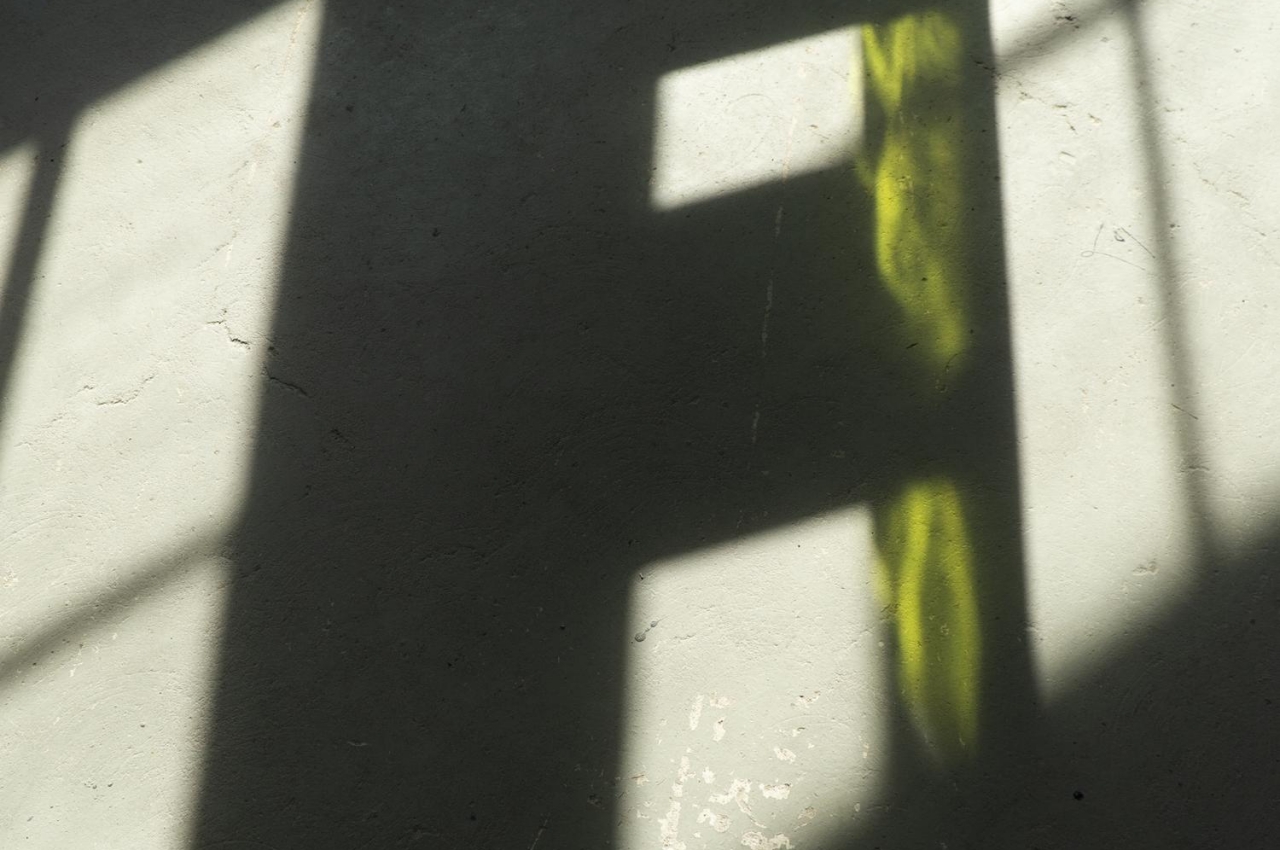
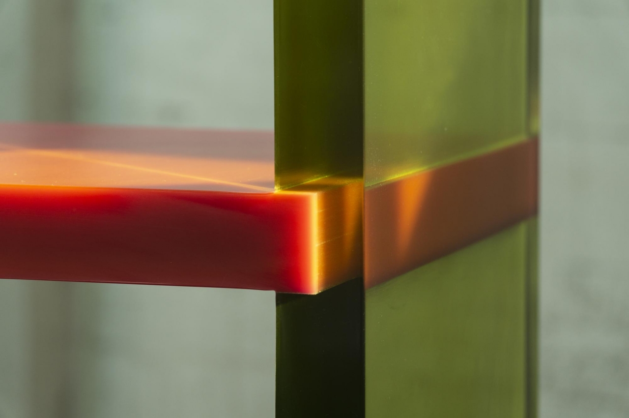
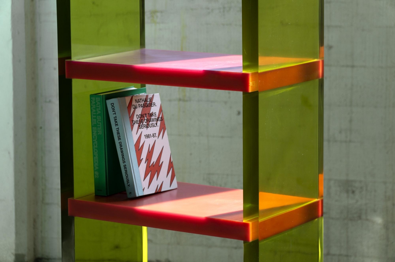
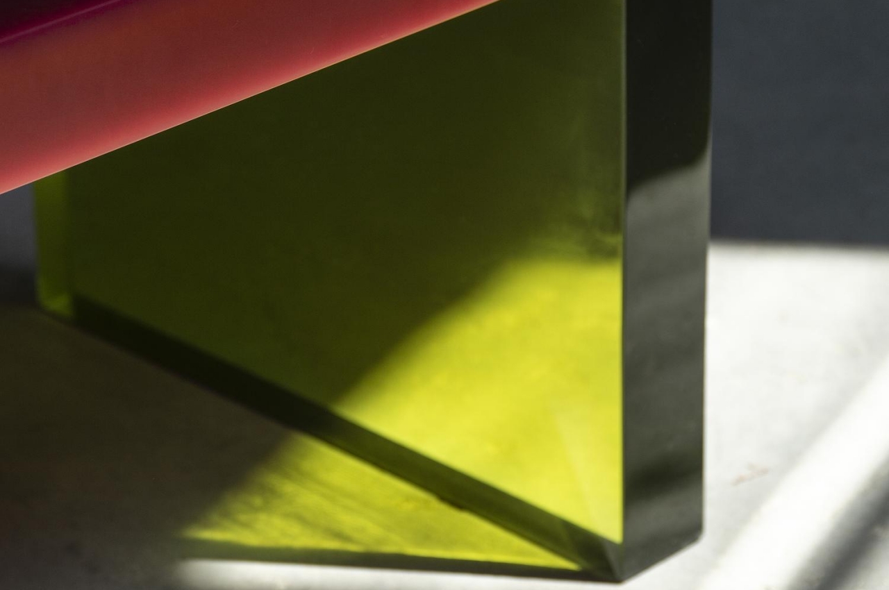
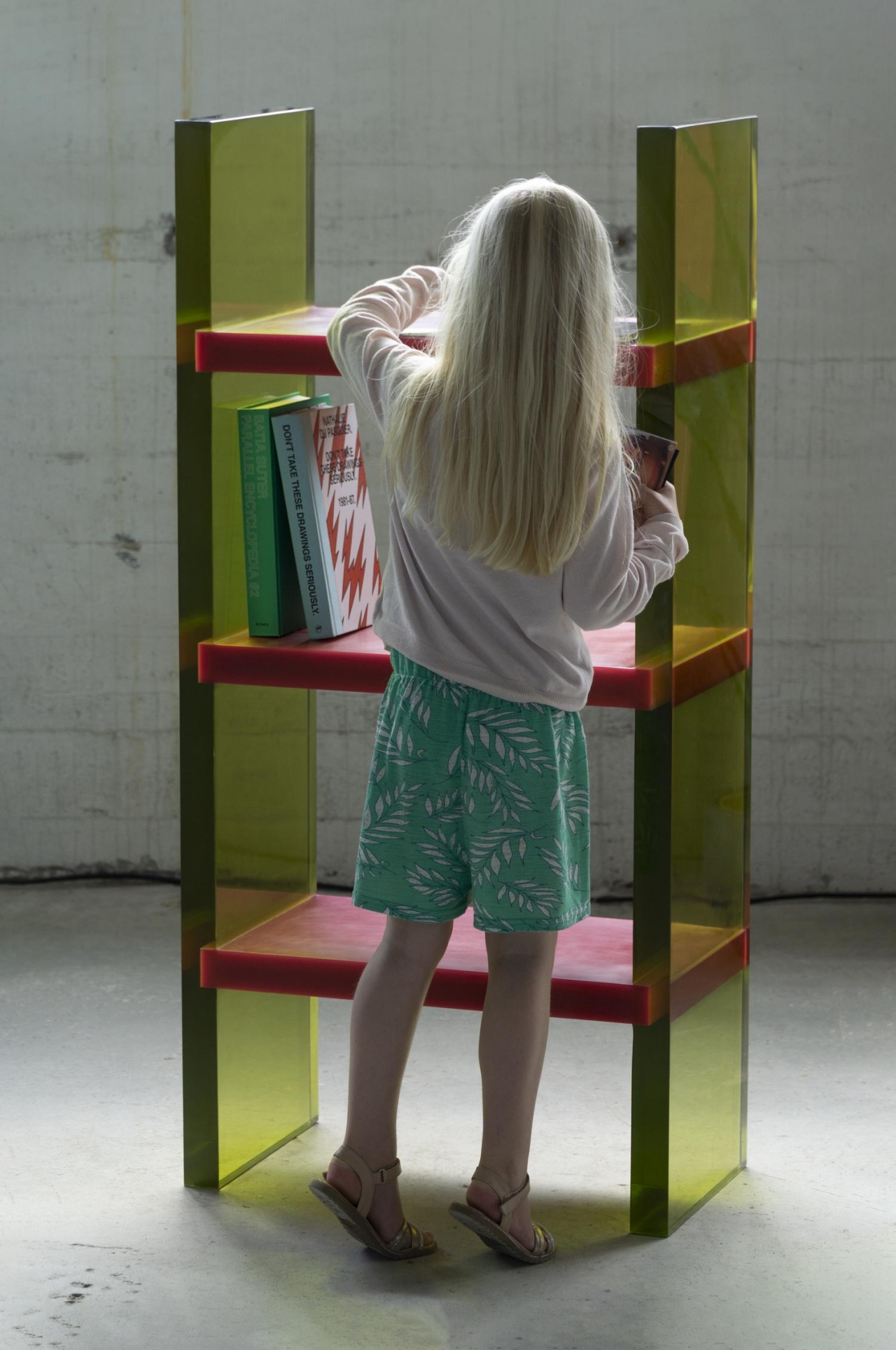
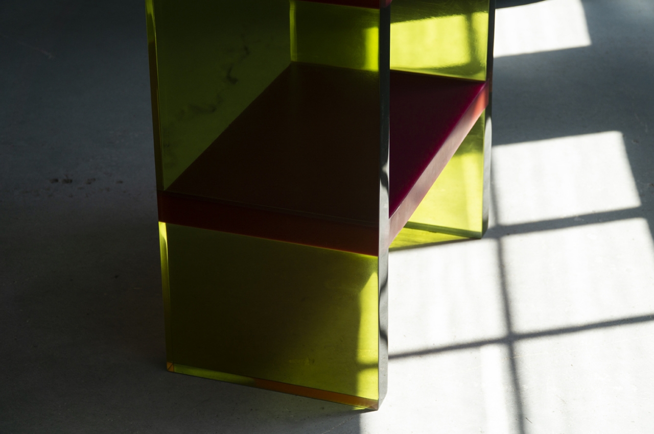
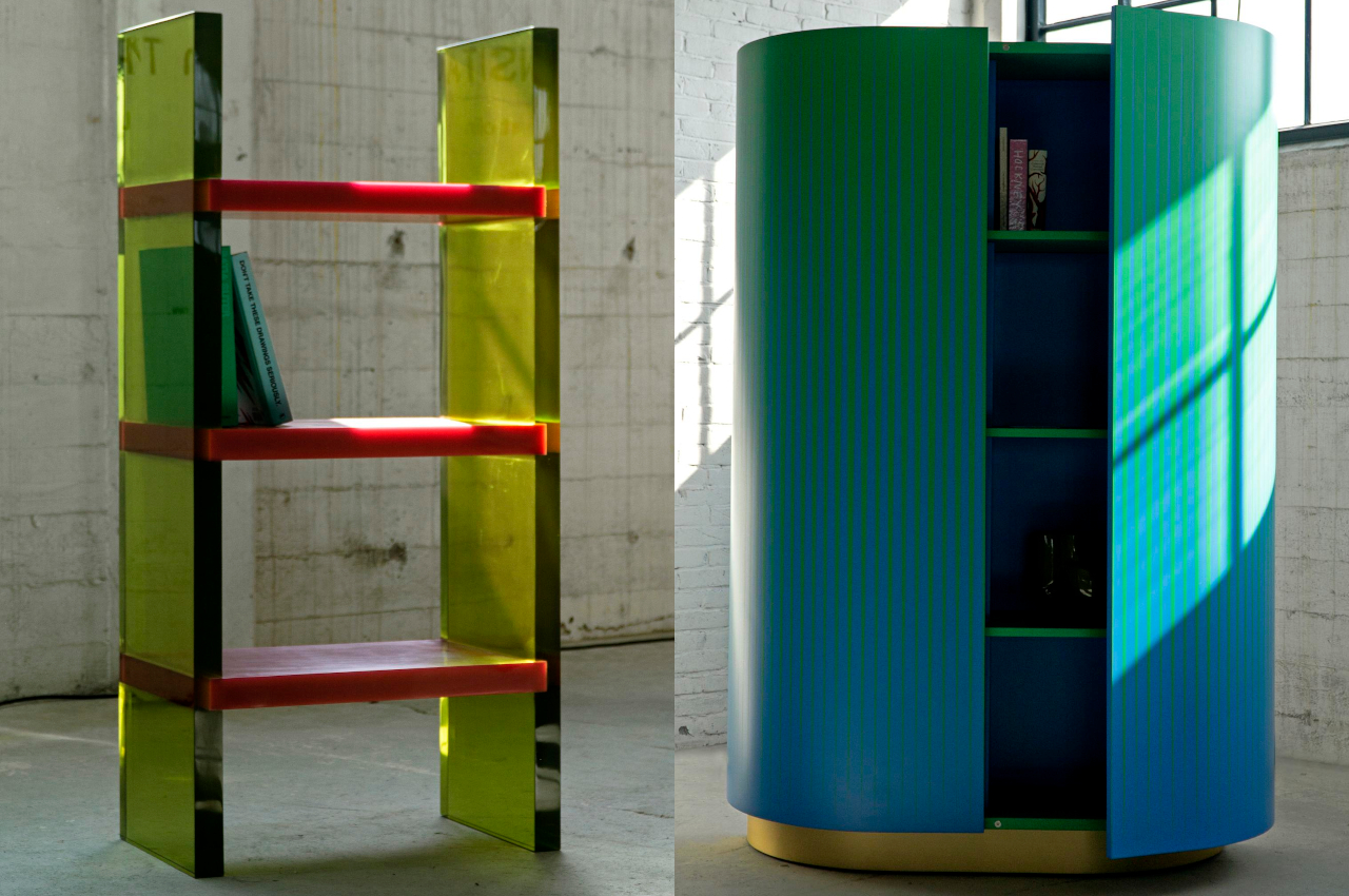
The translucent epoxy resin legs and opaque shelves already give the Differ Shelf a sharply contrasting motif. It is, however, the way the light bends, reflects, and refracts through those yellowish panels that turn the shelf into an almost dazzling light show, depending on where you stand. Given its unique visual properties, this shelf is designed to stand in the center rather than against a wall so that people can walk around it and view it from different angles. It truly differs from other shelves.

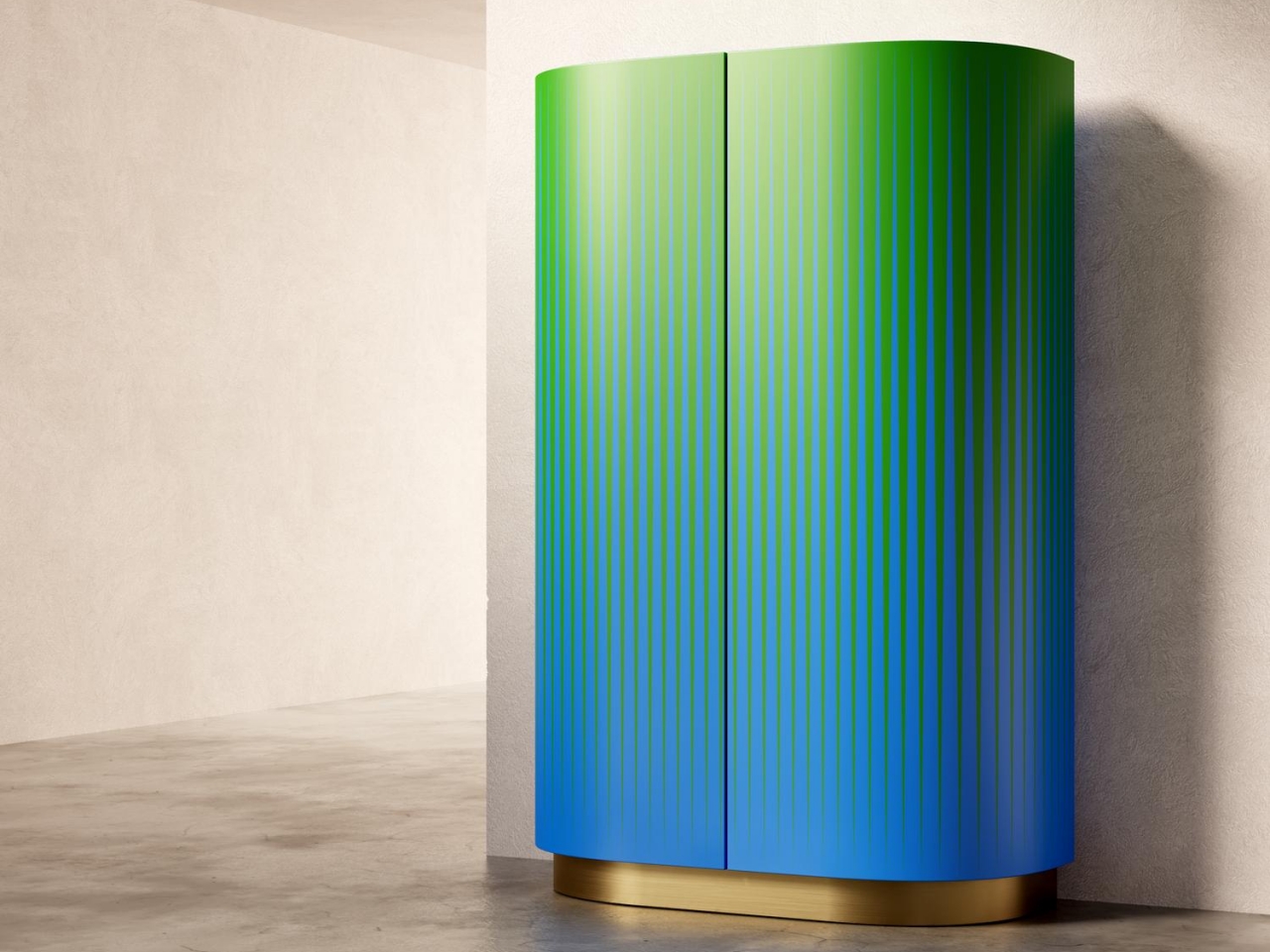
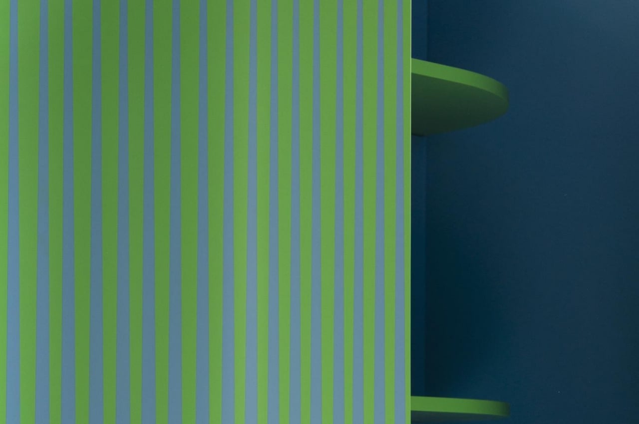
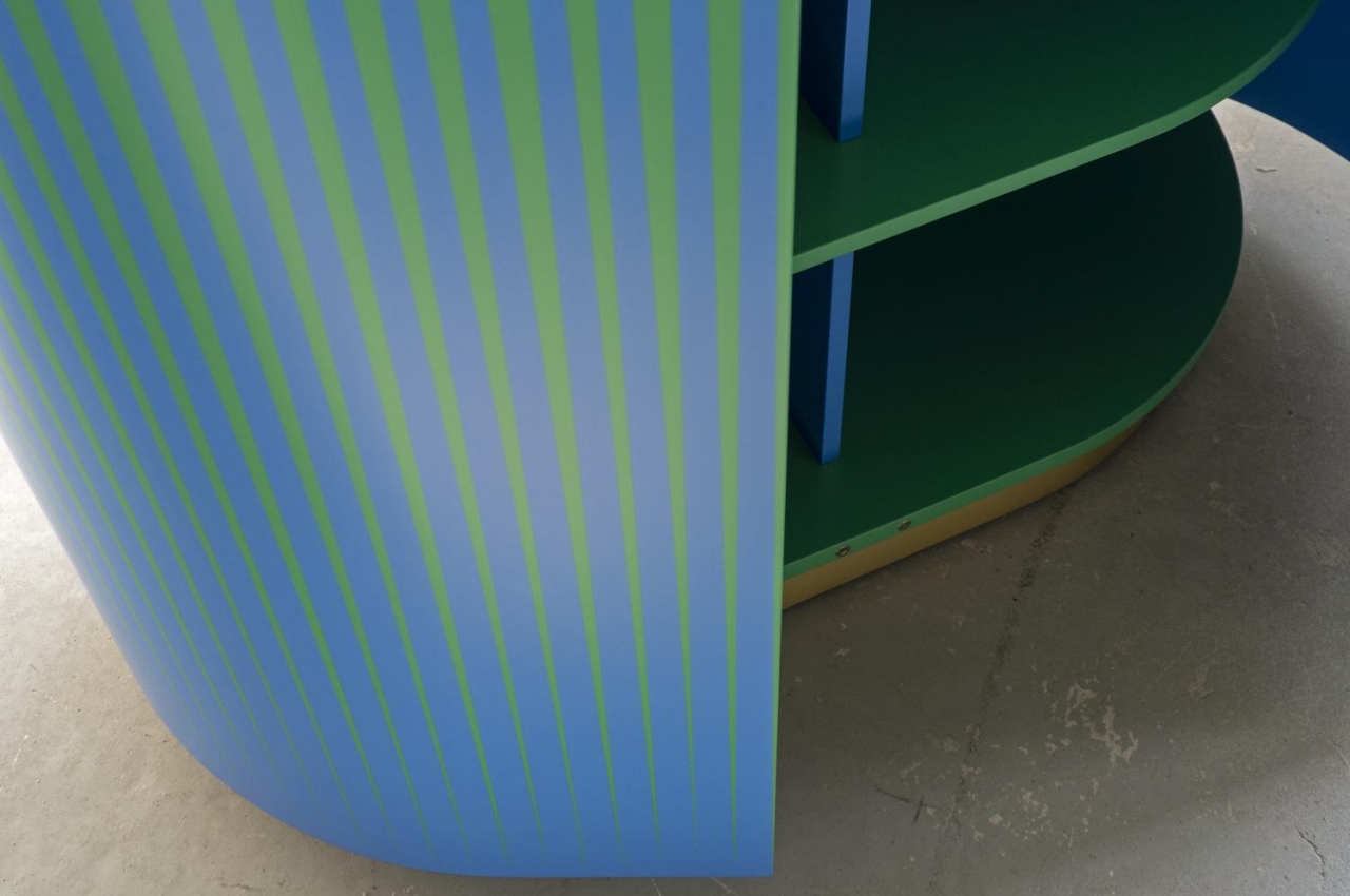
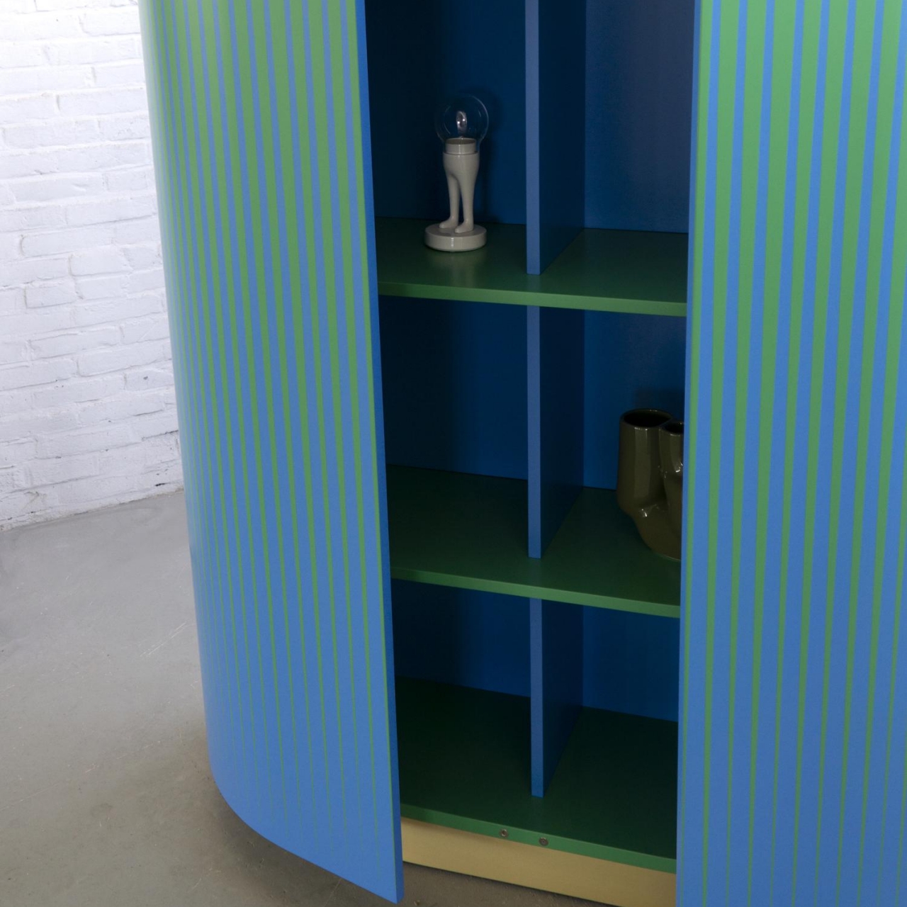
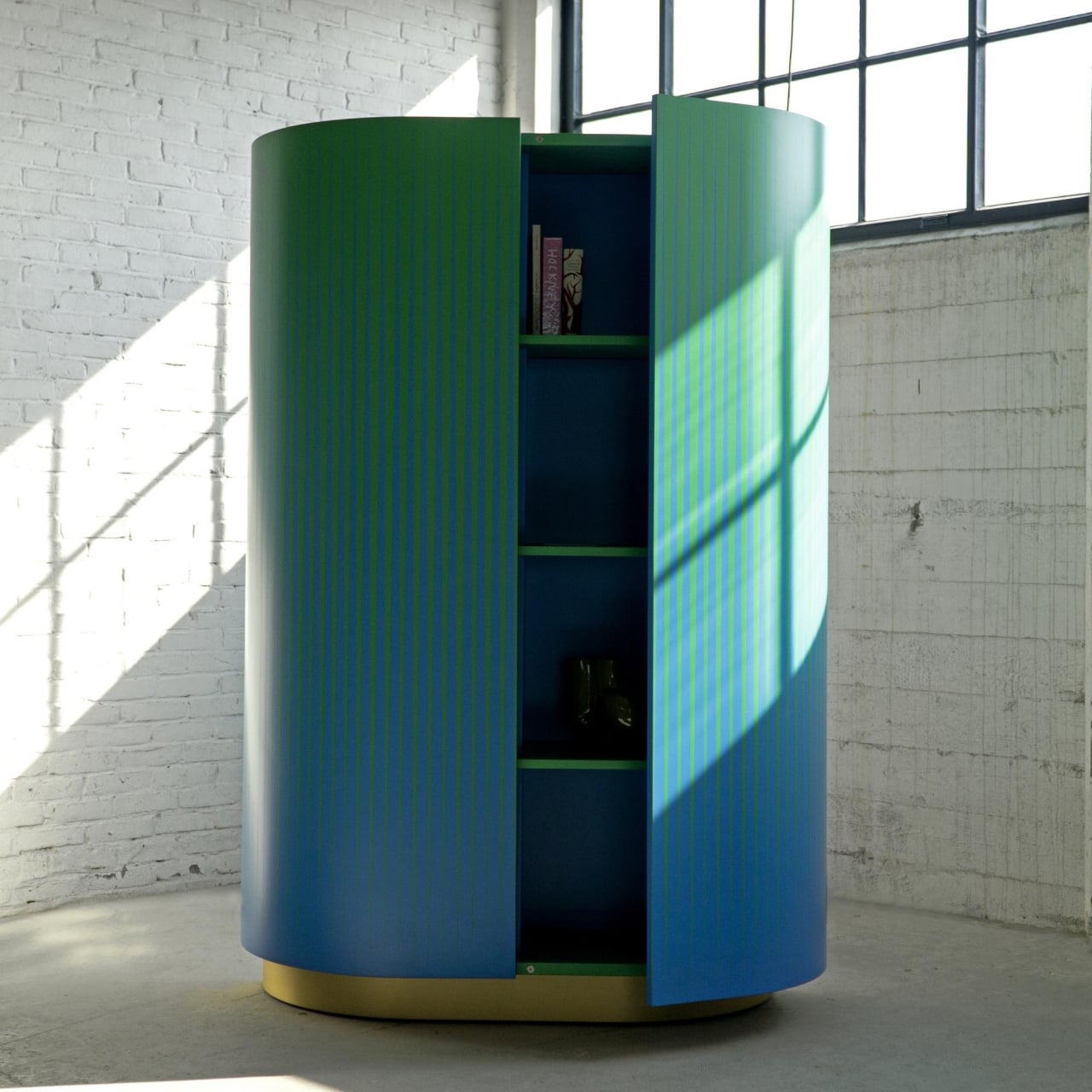
In contrast, the Opticabinet is meant to be viewed from afar in a corner or an edge of the room. Made by Venetian craftsmen from wood on a brass base, the alternating patterns of blue and green make it look like the cabinet’s exterior was expertly painted with a gradient color. Upclose, however, you can clearly see it’s all just an optical illusion created by shapes and contours.

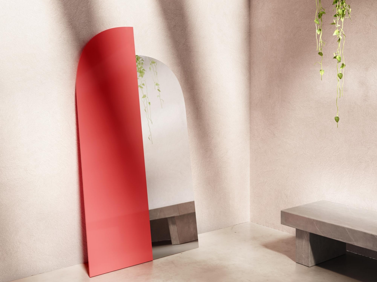
The Wrong Mirror is both the least complex but also the boldest of the collection, providing only half of the function it’s supposed to give. It puts a modernist twist on a classic arch mirror design, visually splitting a mirror in half and using the wrong scale and wrong material on the non-reflective half. Admittedly, you’ll feel a bit wrong looking into the mirror, but perhaps it could also be a thought-provoking metaphor like a glass that is half full or half empty.

Brustolin’s furniture collection displays an interesting way of giving shape to color, whether through a play of light or through optical illusions. At the same time, the quirky designs also give shape to expression at home or in your room, providing functional furniture that also stands like art pieces to complement your personal style and inclinations.

The post Furniture that plays with hues and shapes is sure to bring some color into your home life first appeared on Yanko Design.
Fiture offers a stylish fitness mirror that can fit with your room decor

There has been an uptick in personal fitness equipment and platforms in the past two years or so, with many people stuck at home and having no access to public gyms or outdoor spaces. Some of these seemed exorbitantly overpriced while offering little over common exercise machines. Others, on the other hand, are more accessible but make no effort to hide their less than aesthetic appearances. Striking a balance between useful and beautiful has been a delicate dancing act for many new companies, but one newcomer believes it has struck gold with a smart home device that lets you do your exercise in the privacy of your own room while it looks almost as pretty as your bedroom’s full-length mirror. In fact, it actually works like one.
Designer: Fiture

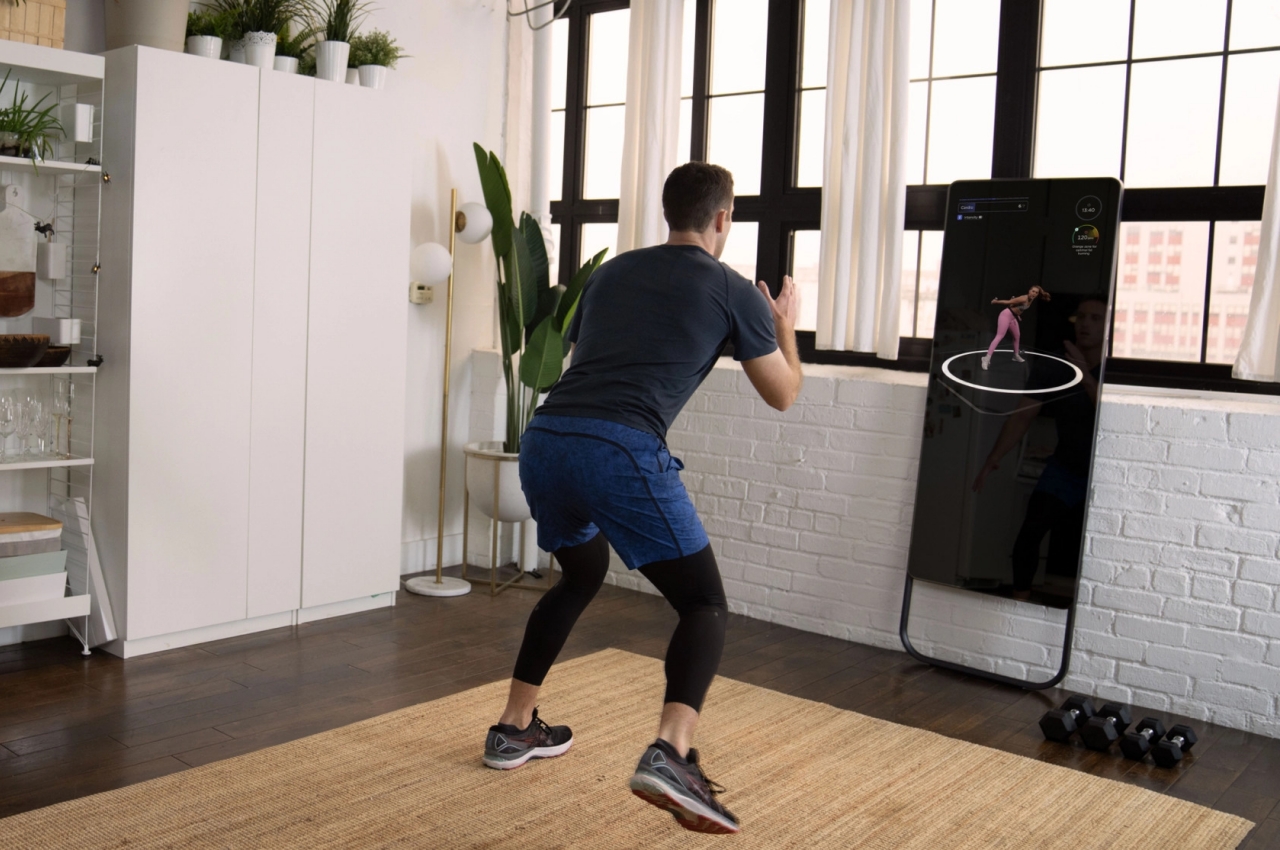
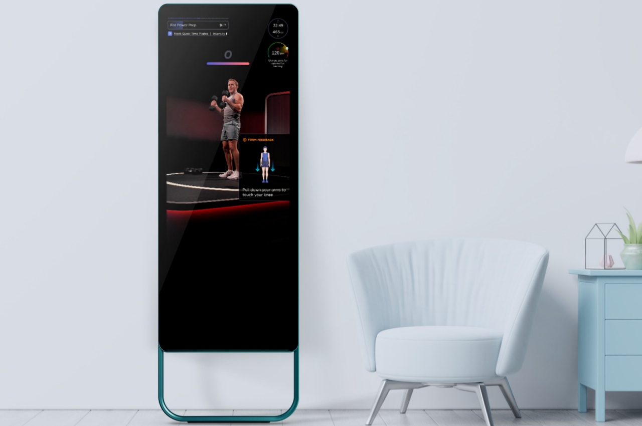
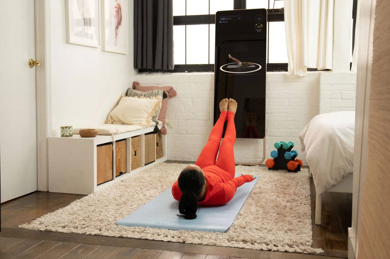
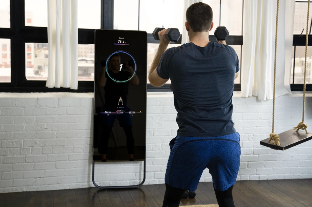
Fitness mirrors are not completely new, but they experienced a spike in interest and popularity in the past months as people tried to cope with having no access to gyms or personal trainers at home. The idea is to have a device that lets you communicate with a remote trainer while you go through your exercises at home. The mirror acts as a display that guides you through the reps while a trainer watches you from the other side of the wire. There are already quite a few of these in the market, but Fiture believes it has a better chance of ending up in your house because of two differentiating features.

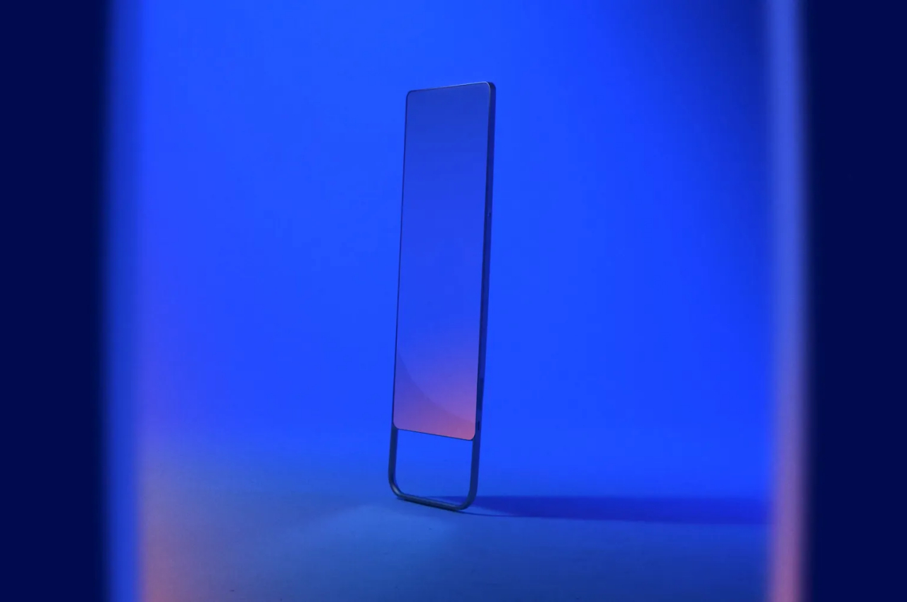
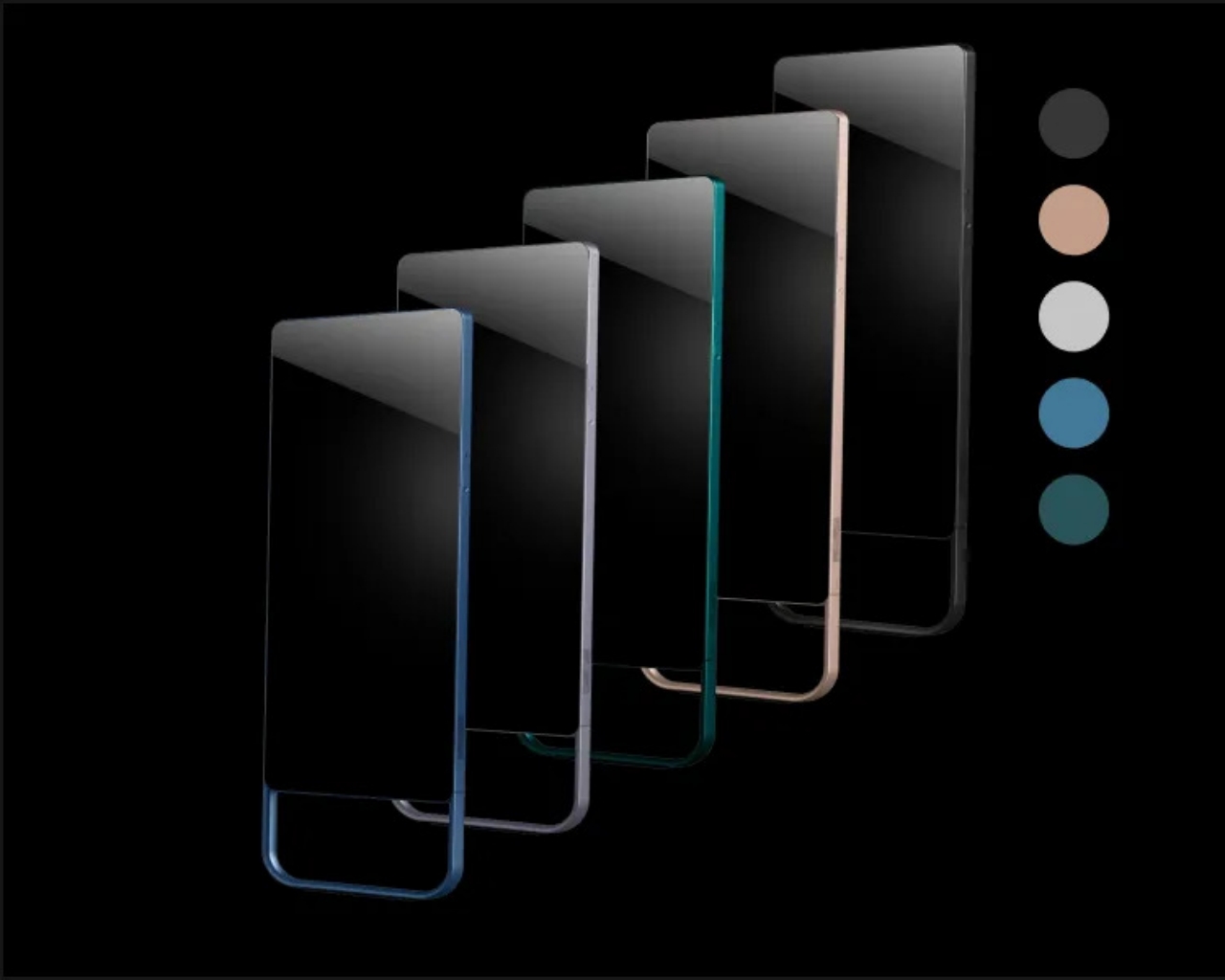
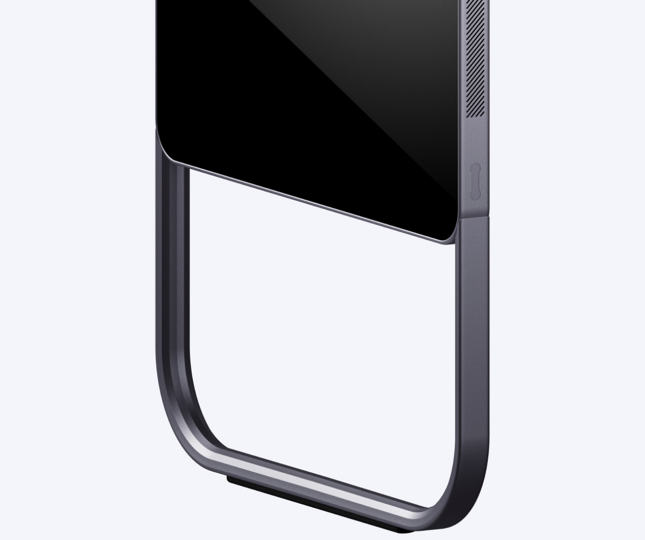
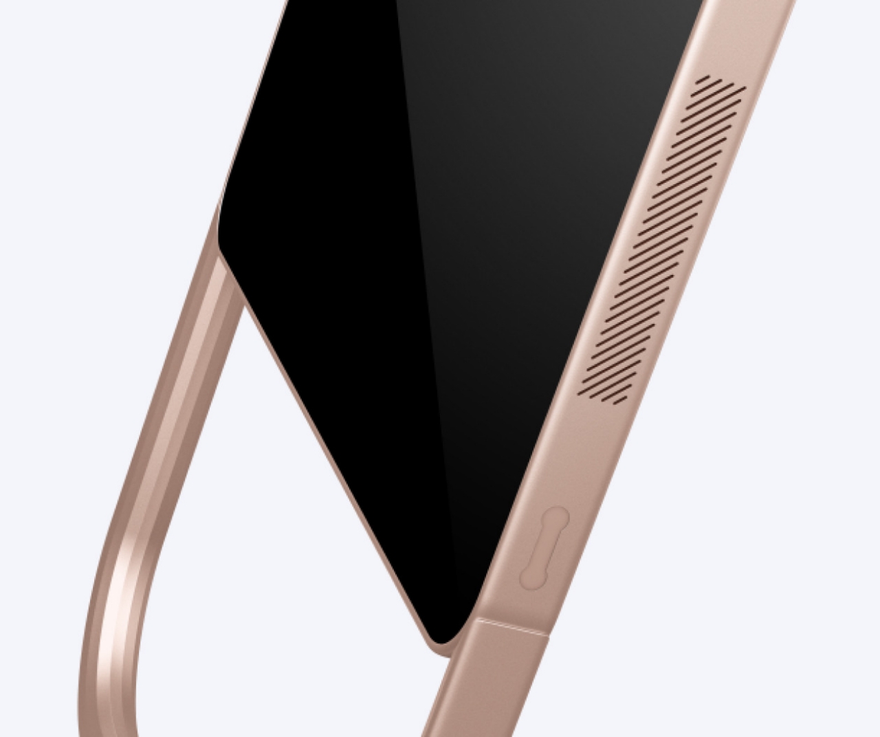
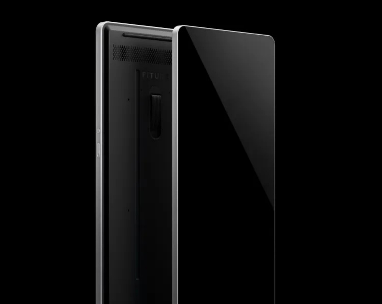
The first and the most apparent is that the Fiture fitness mirror actually looks more like a fancy home mirror than a machine masquerading as one. While the generically named “The Mirror” also lays claim to that title, the Fiture does one better by offering five colorways to match your decor or wallpaper. The shape of the mirror itself is more visually pleasing, employing rounded corners and brushed metal surfaces to make the frame look more aesthetic. The U-shaped legs provide stability when the mirror isn’t mounted on the wall while also giving it a more distinctive style.

Unlike other fitness mirrors, however, the Fiture isn’t a two-way mirror into your house, one of the biggest concerns interested buyers have. It’s for this purpose that the company invented what it calls “Motion Engine Technology” to protect your privacy. In a nutshell, the mirror and your trainer only see skeleton points as you move, so you can work out with bed hair, and no one will be the wiser. When not in use, you can even put on the magnetic camera cover to completely block out even this AI-based technology.

The Fiture isn’t cheap, of course, especially when you add the monthly subscription that gives you access to content and trainers. Then again, you might end up paying more with a gym membership that doesn’t give you the same privacy and convenience of an at-home workout. Plus, you also get to have a full-body mirror that doesn’t look like a fitness device when not in use. Just don’t forget to put on the camera cover when you’re dong using it, just in case.

The post Fiture offers a stylish fitness mirror that can fit with your room decor first appeared on Yanko Design.