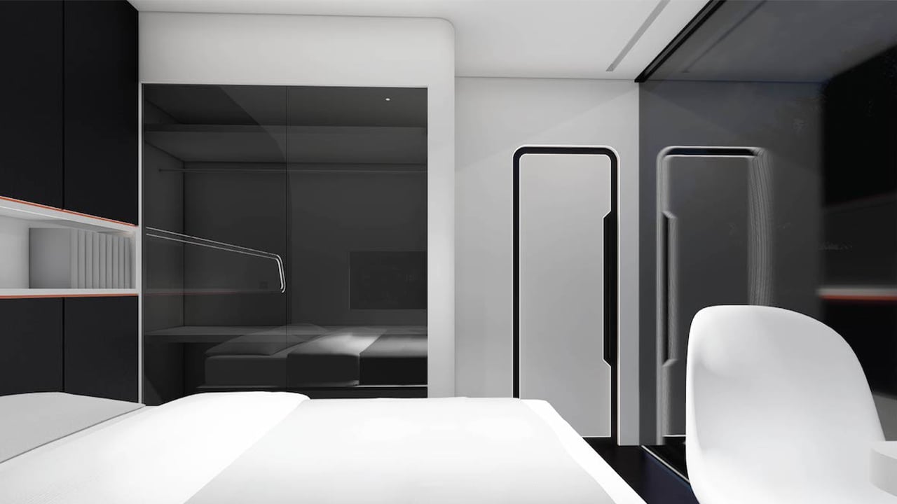
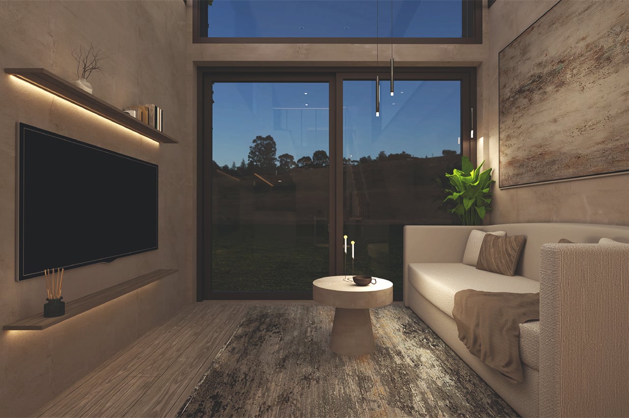
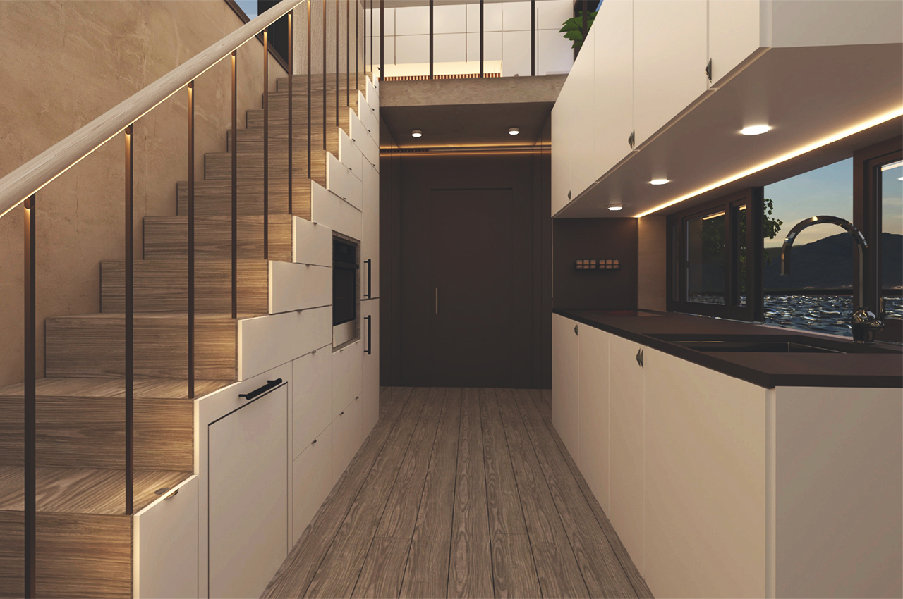
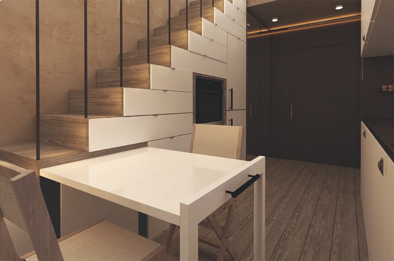
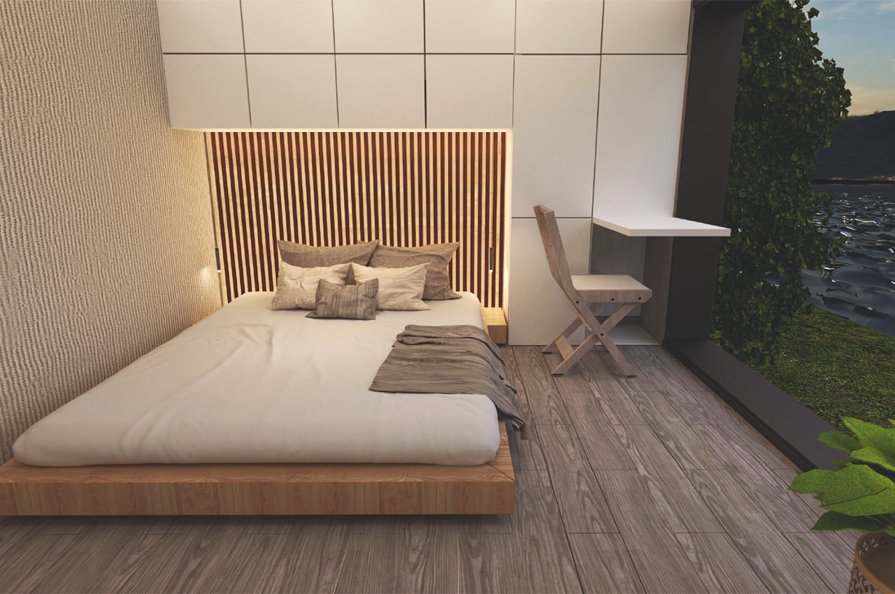
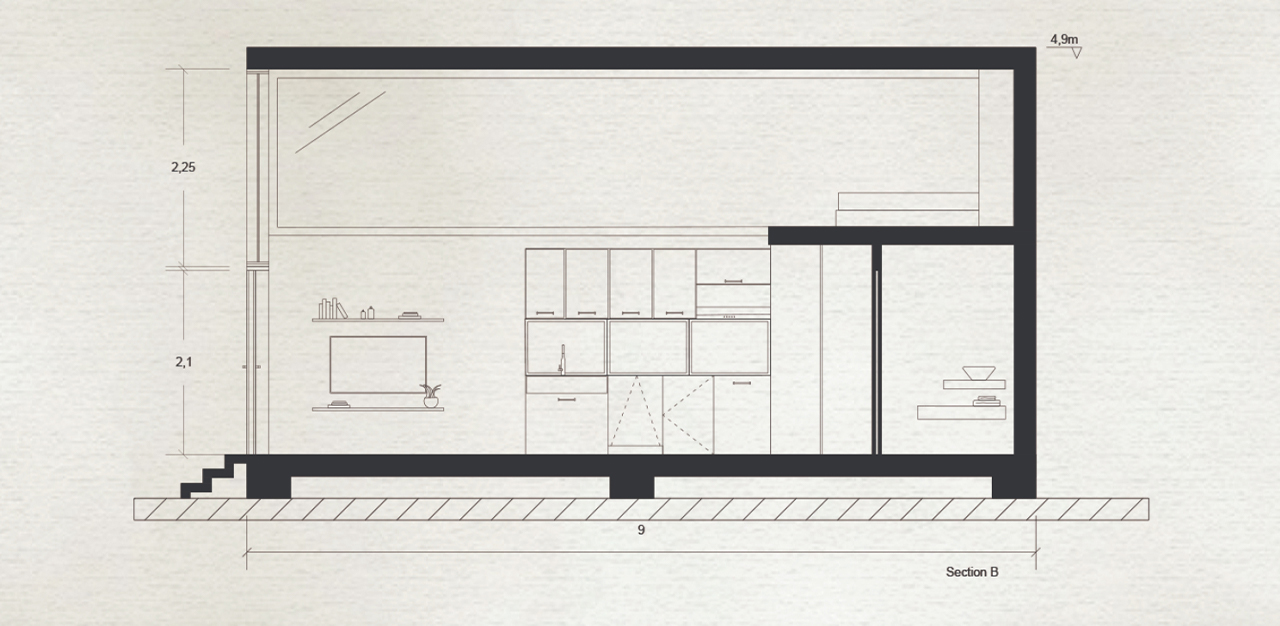
This modern tiny home is all about harvesting & using water sustainably!

Sustainable architecture is how we can make a large impact on the collective carbon footprint as residents and also for the construction industry which is the leader for carbon emissions. The more sustainable structures we have, the faster we can take bigger chunks of carbon away rather than just using less plastic for one essential item. Wai House is a perfect example of that, ‘wai’ means water in Maori and that is the core of this modern home‘s design.

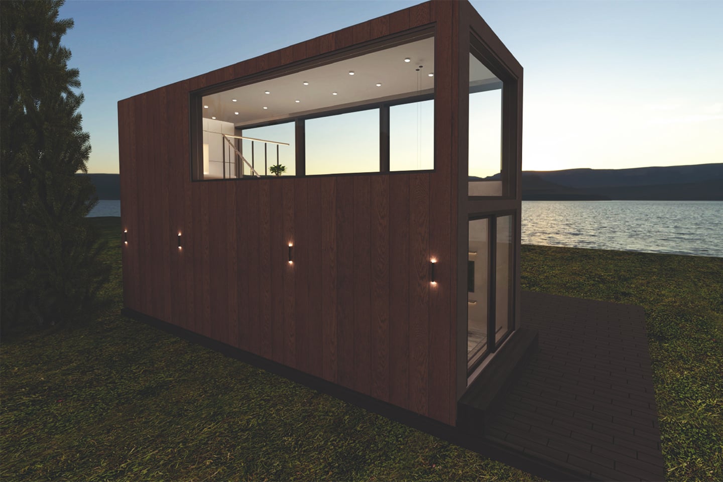
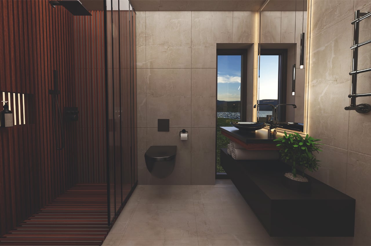
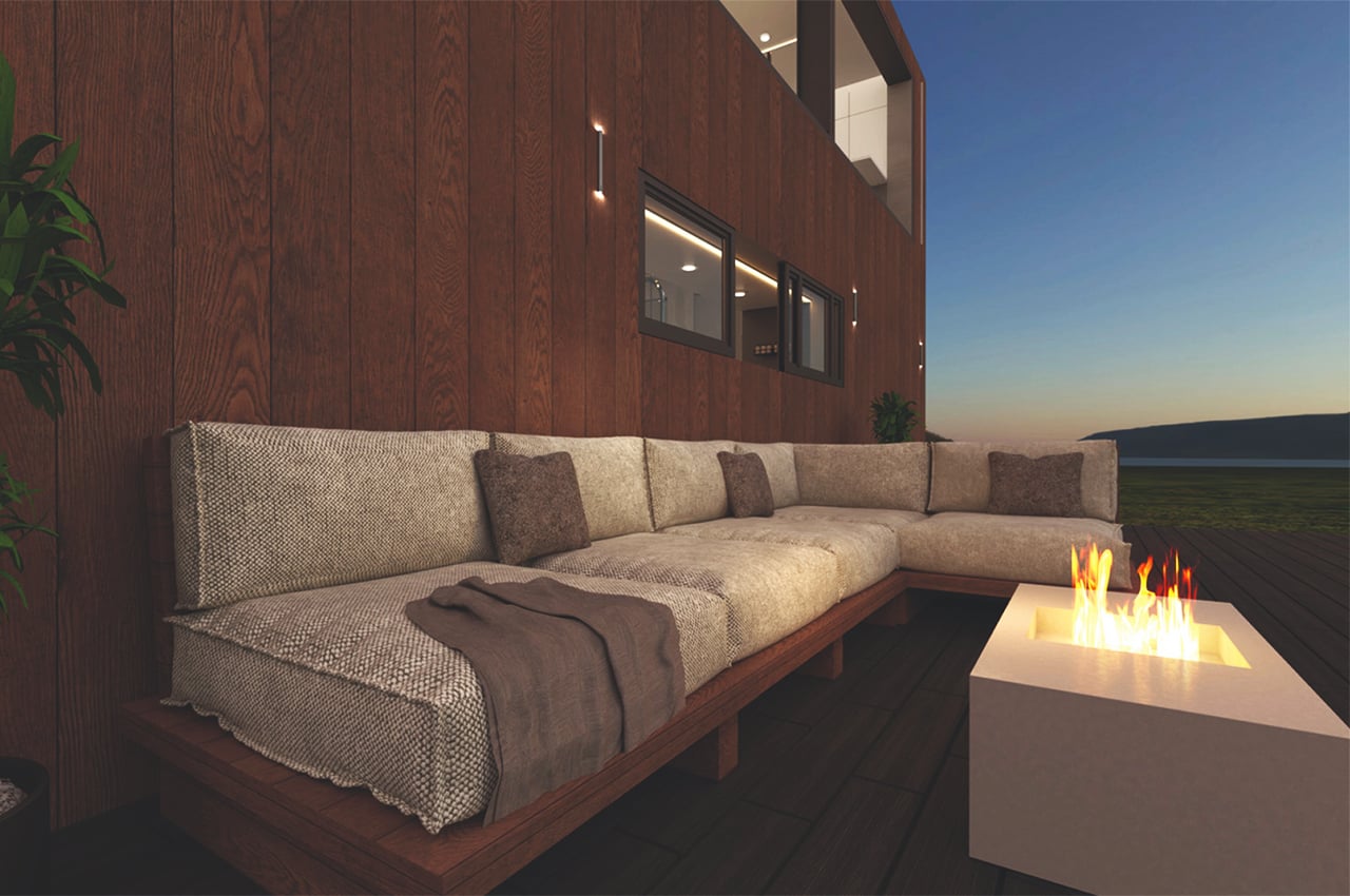
The modern architectural concept is designed to be built in New Zealand and focuses on collecting water and using it sustainably. The house itself is constructed with sustainable materials, cedarwood is used for the exterior cladding and the interiors use concrete with recycled plastic instead of sand. It has an almost Japandi-inspired aesthetic which is elegant enough on its own without taking away from the environment it is in.

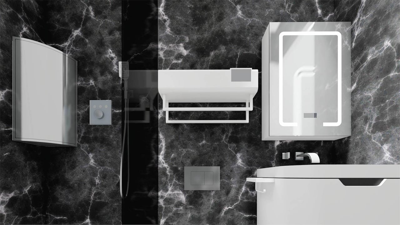
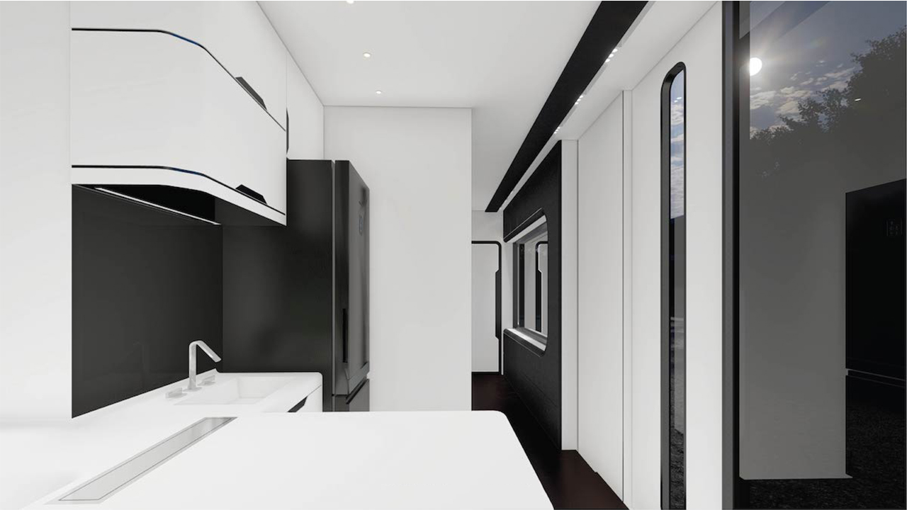
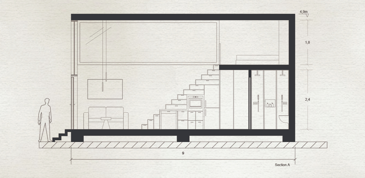
It is designed to collect and store rainwater for use with systems in place that funnel it to the kitchen, bathroom, and outdoor greenery. Since it is just a concept, there is potential for it to become even more sustainable by adding solar panels for energy efficiency. New Zealand also has a rich cultural heritage and that can be incorporated into the interiors through the fabrics used or the artwork to foster a stronger bond with the local community and give back to them.

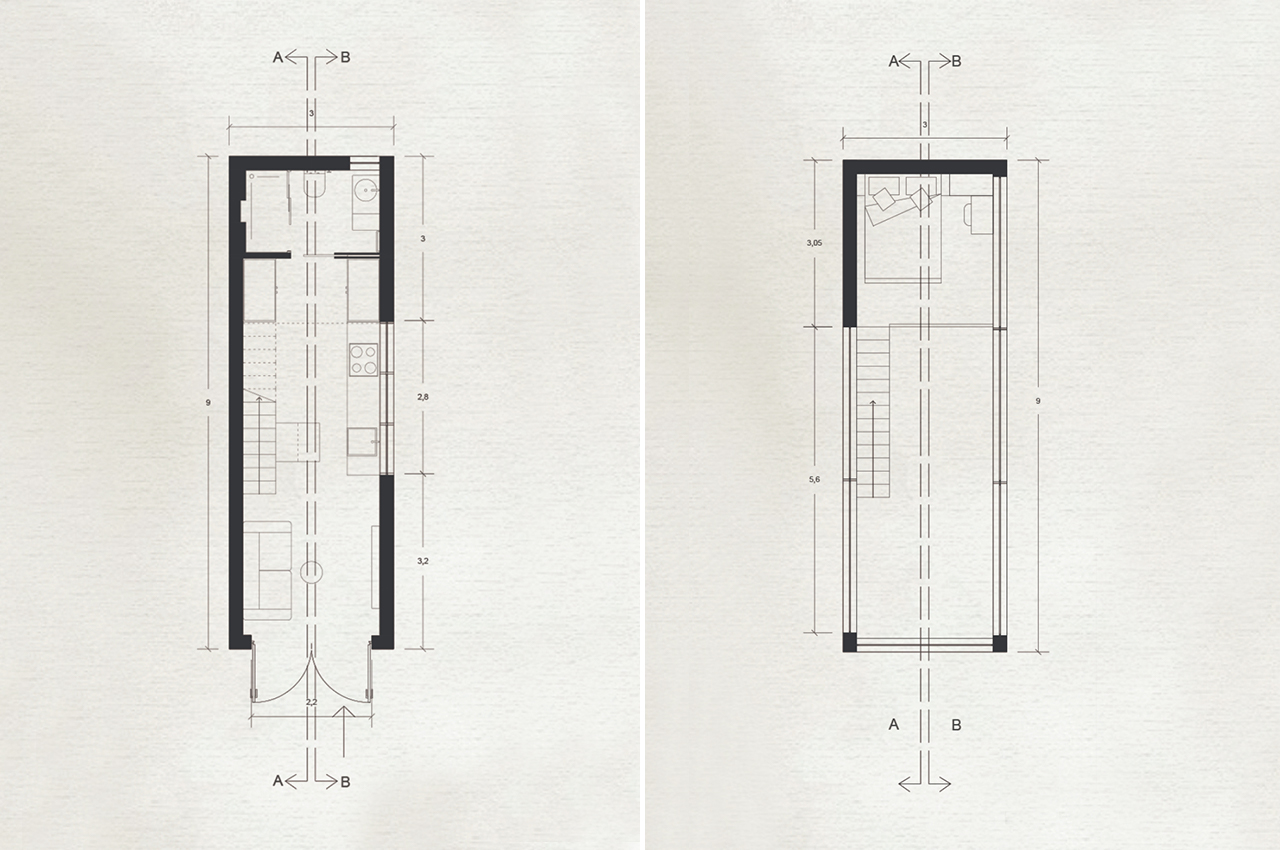
Wai House is perfect for a young couple who is willing to leave the traditional living standards and move to a smaller, yet spacious tiny home. With a smaller floor area compared to a traditional townhouse, the carbon footprint is also smaller and more so with the eco-conscious construction materials used. Wai House is also one of the noteworthy entries for the Green Product Award 2021 and we can see why – it perfectly blends minimalism, luxury, and sustainability into one compact home!

Designer: Marbella Design Academy

The post This modern tiny home is all about harvesting & using water sustainably! first appeared on Yanko Design.

This angular passive house is built on a tilt in New Zealand and leans into the wind!

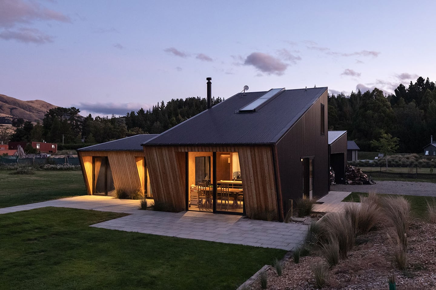
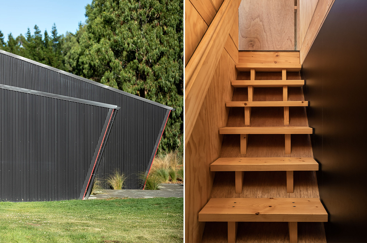
This modern house in New Zealand is a passive structure that won an award from the New Zealand Institute of Architects for its sense of fun and how the design carries through from outside to inside – it makes you feel like you are on a holiday but in a home that you can stay in all year round. The Long Grass House harmoniously blends affordability, sustainability, and liveability!

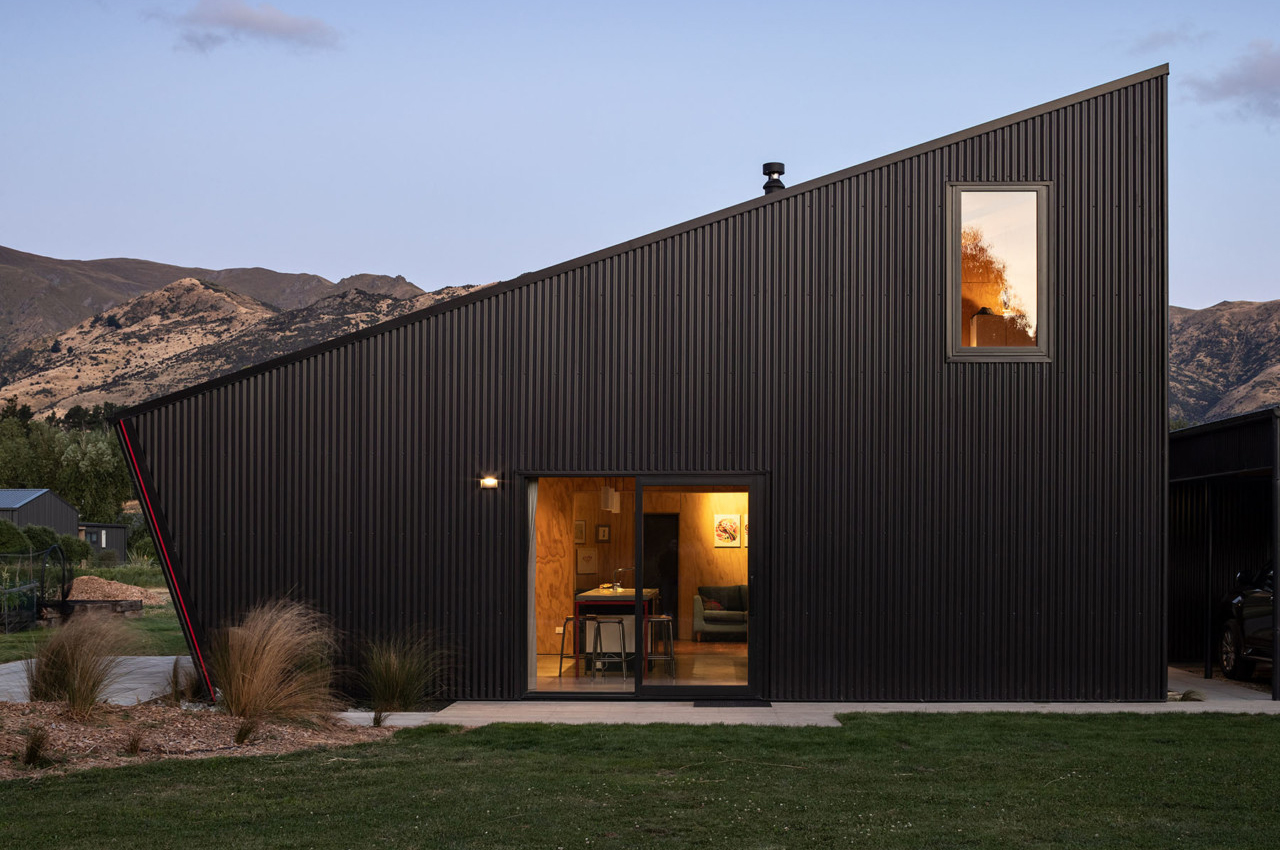
The use of inexpensive plywood in the interior and steel cladding on the exterior gives it an evergreen yet modern aesthetic with contrast. The interiors are engaging, with plenty of space, natural light, and material warmth. The design approach has been focused on including what is really needed in order to produce what is sufficient; positively reducing waste of both space and construction materials.

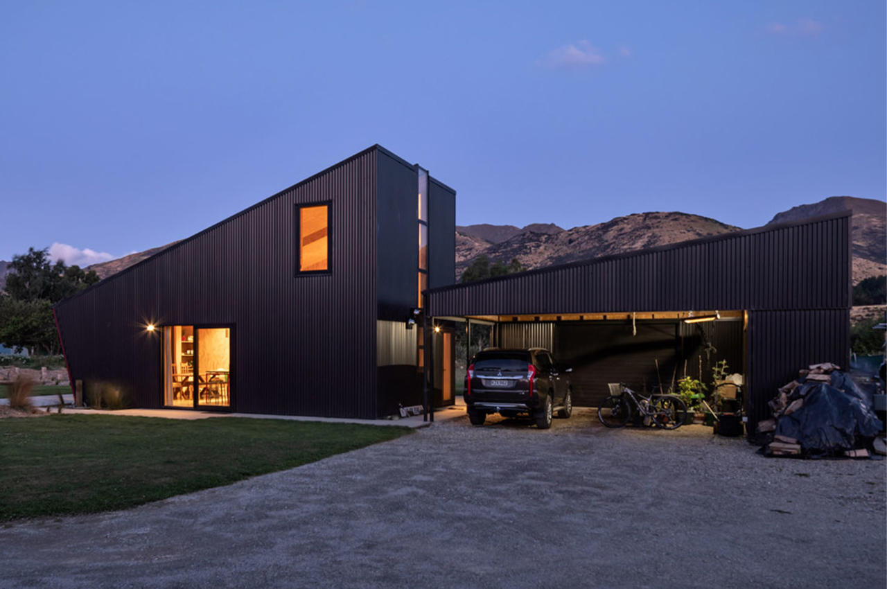
It showcases a simple plan for a medium-sized house with a spacious te garage and an interesting layout of the bathroom, laundry, and entrance. The garage and main structure complement each other and almost look like two perfectly angled Lego blocks! The jury that presented the award noted how the Long Grass House is a great example 0f how to use inexpensive materials and get real value out of them.

The angled ends are supposed to appear to be leaning into the prevailing wind, but it’s really a clever energy-saving trick to create overhangs that shade the windows from the northern sun. The architect notes: “The form of the building is compact giving a low form factor, and with its compactness comes low energy demand. Passive House Energy calculations were used to drive design decisions – using current climate data and predicted future climate data.”

A panoramic skylight runs near the length of the building and connects to a vertical window and you can see it from the inside in the kitchen. This light is minimal but eye-catching detail in the house which is designed with thrifty detailing, colourful trimmings, and simple geometric shapes. The wooden stairway leads to a loft above the bathroom and laundry.

“Every material and surface here is durable and will take some hard knocks—something that was central to all material decisions, including cladding. We wanted to ensure that every product we specified would stand the test of time in this harsh environment and be suitable for the family to live in with its changing needs for years to come,” said the team.

The house gets a lot of attention for the slopes that lean into the wind, but the real appreciation should go towards the simplicity and economy of the materials used throughout. Steel siding is one of the most durable and affordable materials for the exterior. While plywood is perfect for long-lasting interiors without increasing costs and maintaining a timeless look. The compact structure helps ensure low energy demand and Passive House Energy calculations were used to drive many design decisions using current and future (predicted) climate data. Long Grass House is perfect for a modern, eco-conscious family looking for a forever home on a budget!

Designer: Rafe Maclean

This modern eco-home features a garden roof and integrates the surrounding forest into its design!

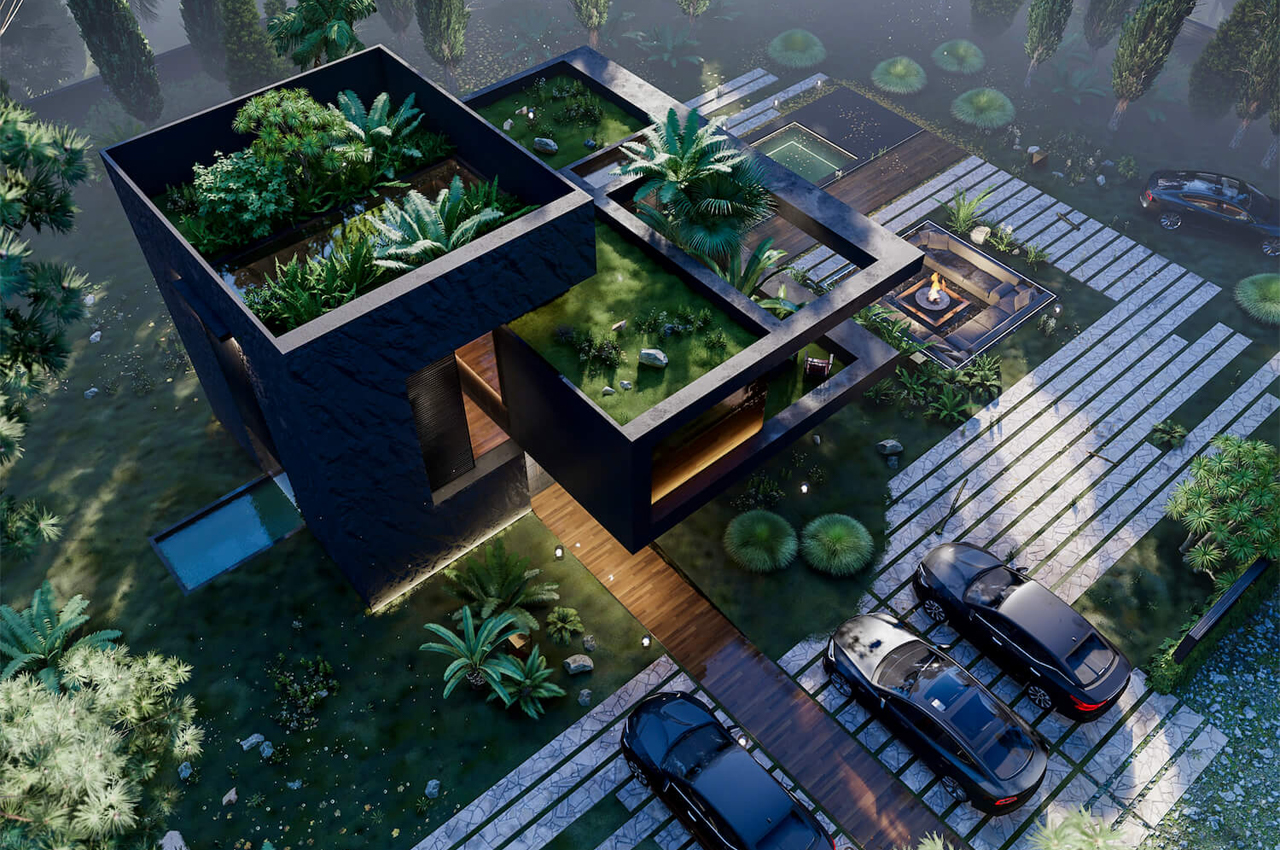
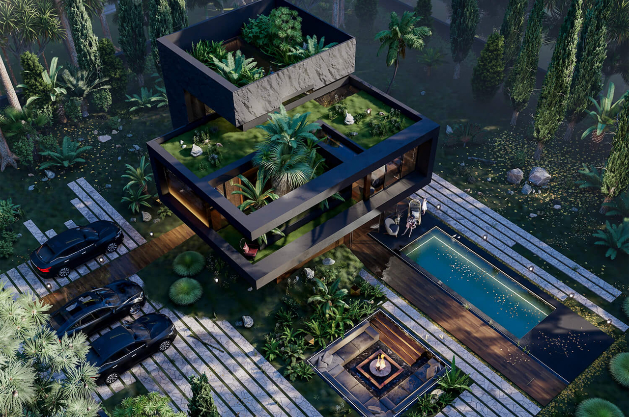
Hugging House is a modern eco-home architecture concept that features a garden roof and incorporates the natural landscape of the land into its layout.

Noticing the devasting changes that come with climate change, most modern architects look to the natural world for inspiration to help preserve it. Whether that means building a self-sustainable home using a ‘passive house’ construction method or incorporating biophilia into the design scheme, architects interpret earth’s many ecosystems in exciting and different ways.

Cuba-based Veliz Arquitecto conceptualized a modern eco home called Hugging House that integrates the land’s rolling terrain and surrounding trees into the layout of the building.

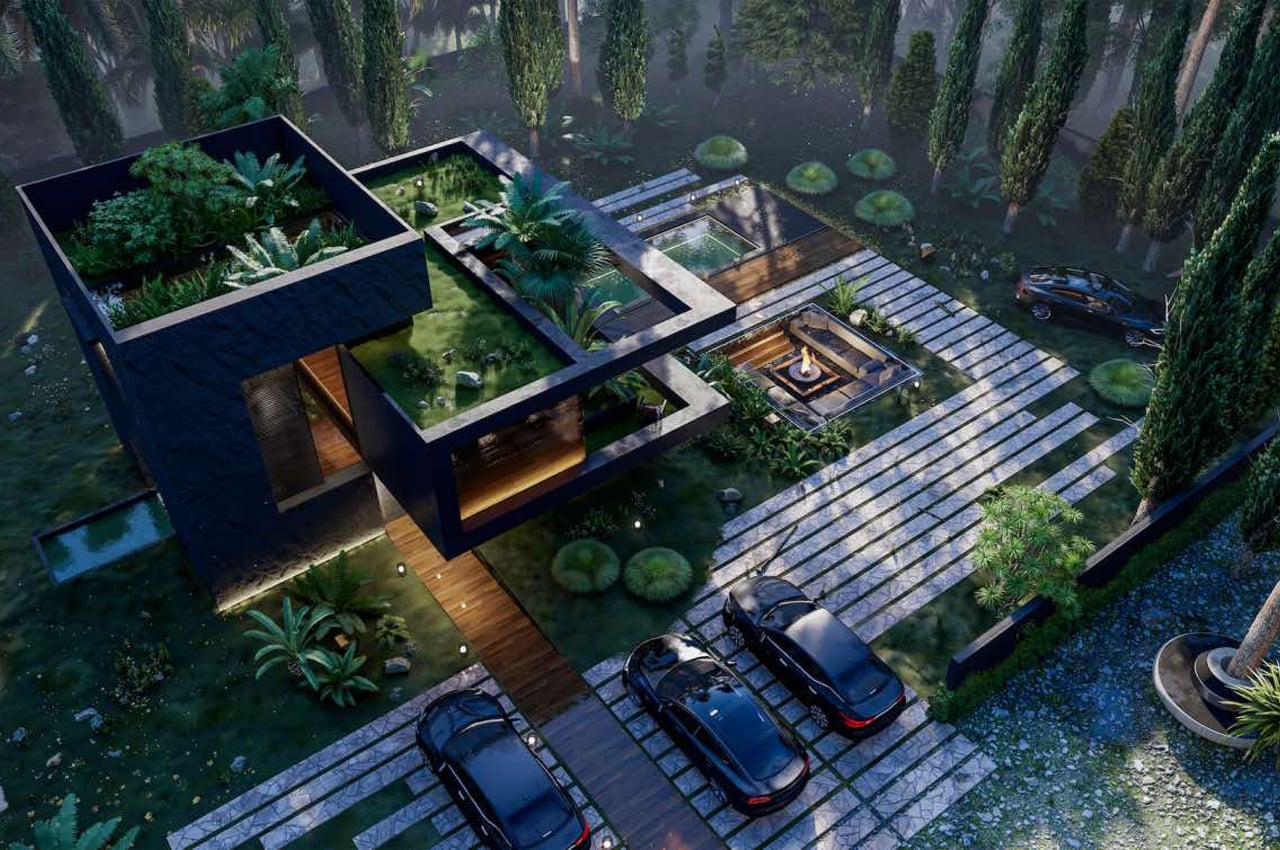
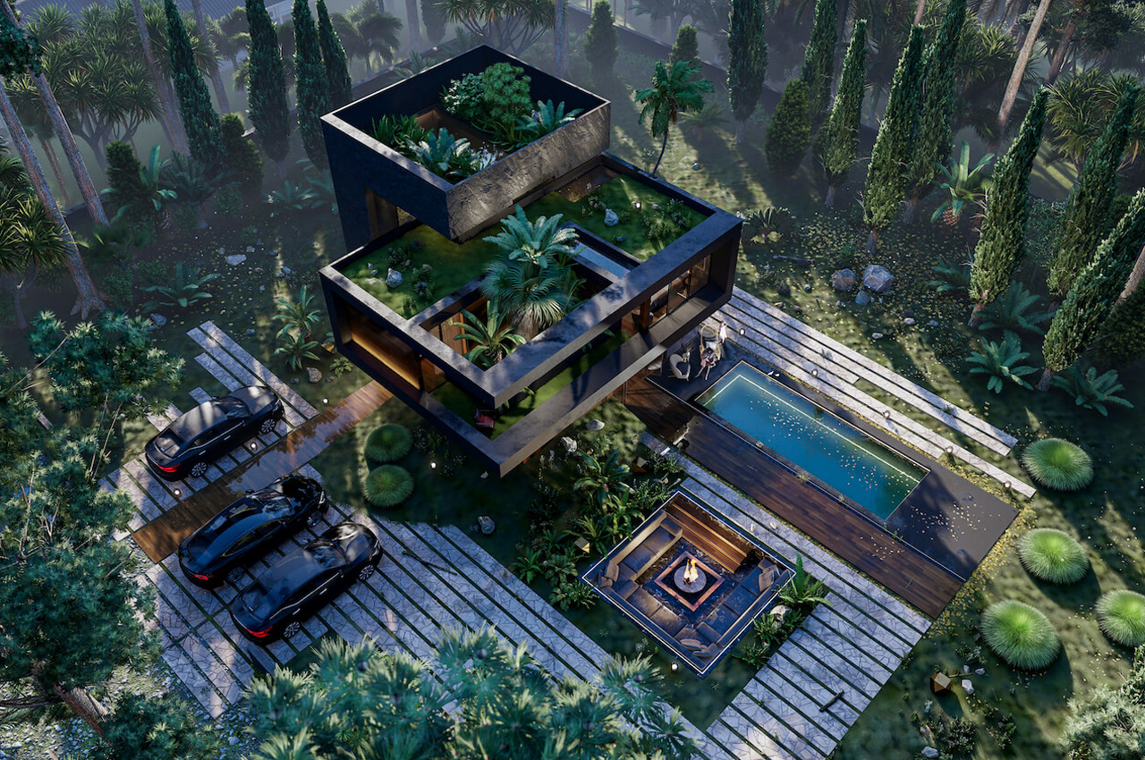
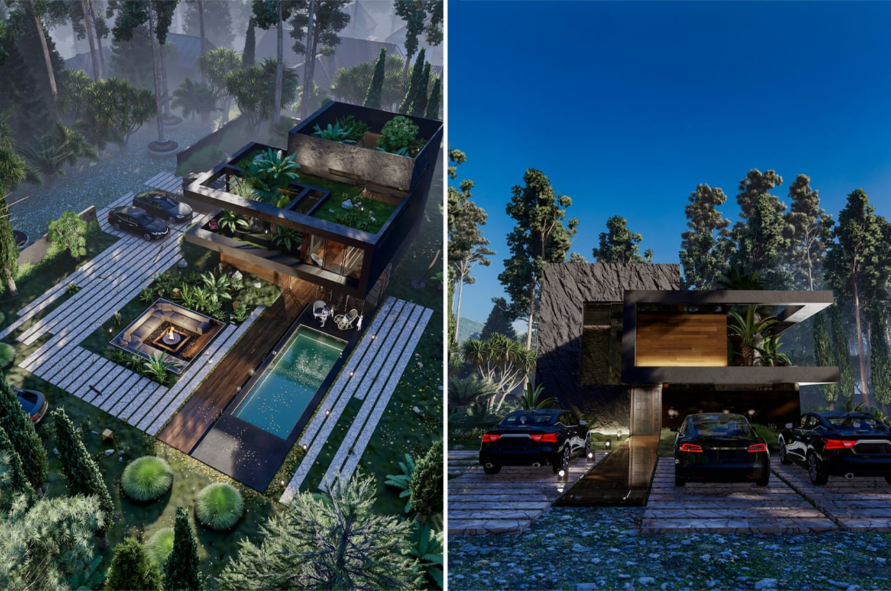
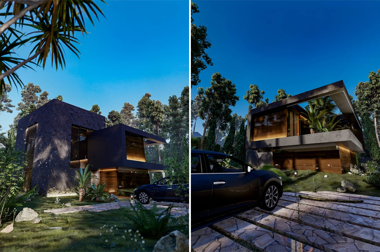
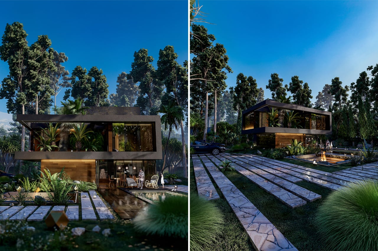
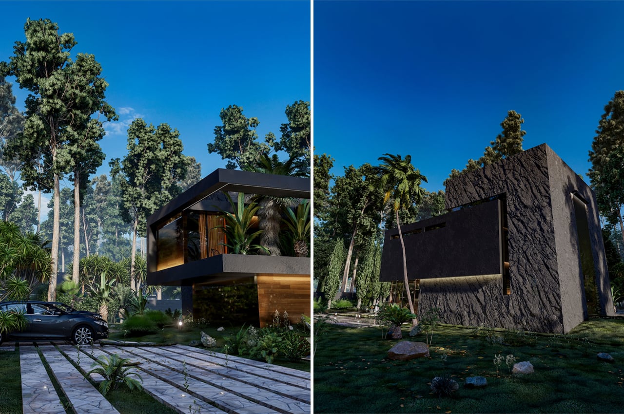
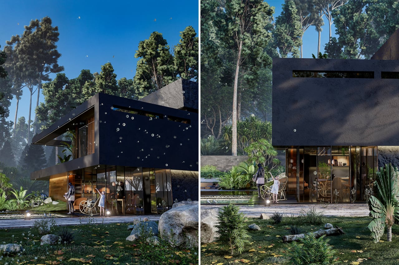
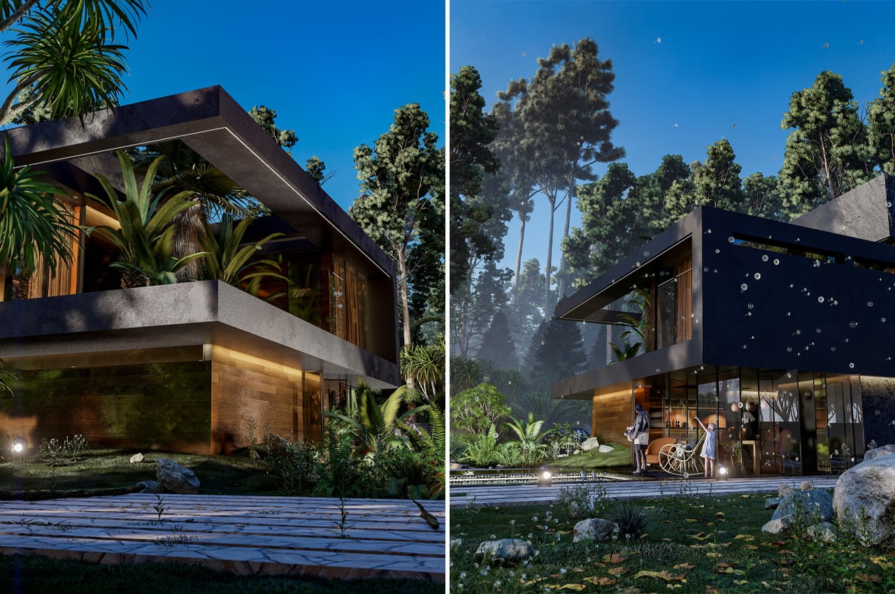
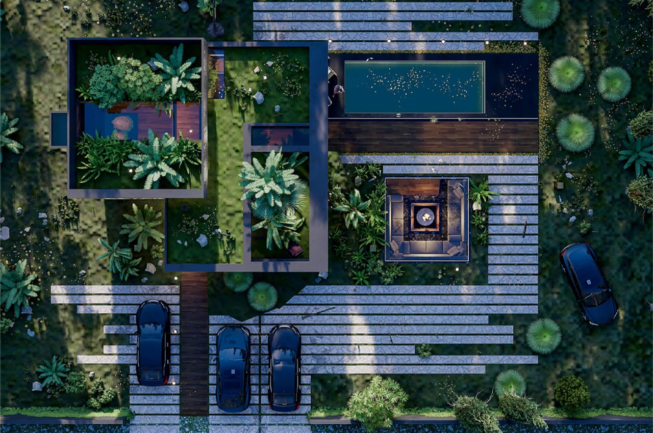
Hugging House is a large, bi-level, cantilevered home located somewhere with dense forestry and overhead treetop canopies. The two sections that comprise Hugging House merge together as if in an embrace. Concrete slabs comprise the home’s surrounding driveway that leads to the ground level and outdoor leisure areas.

Veliz Arquitecto’s Hugging House is still only in its conceptual phase, but if brought to life, Hugging House’s location would be fully incorporated into the layout of the home. Describing the design in his own words, Veliz Arquitectos notes, “We have taken advantage of the slopes of the land in order to create visual connections at different heights with the existing vegetation and beyond the landscape, as well as [used] the premises with which we always try to characterize the project.”

Choosing to merge the outdoor areas with the home’s entire layout led to some exciting design choices including a garden roof and abstract overall frame. The Hugging House’s garden roof is located in a terrace-like enclosure where residents can lay out and feel as close to nature as if they were sitting on the ground below.

In addition to the garden roof, Hugging House features a swimming pool, fire pit, and concrete driveway. On the inside, residents and guests can enjoy a living room, kitchen, dining room, bathroom, and laundry room.

Designer: Veliz Arquitecto

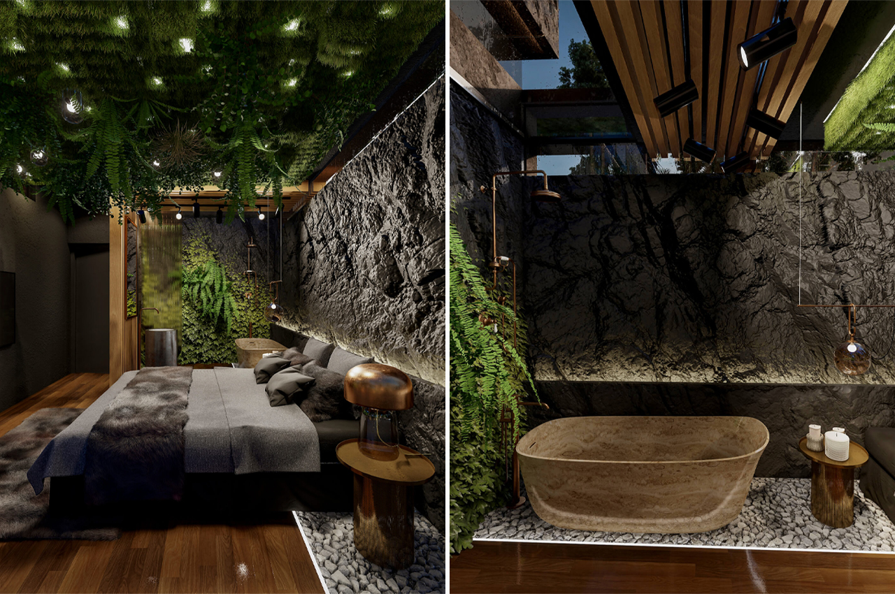
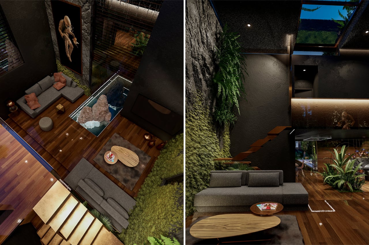
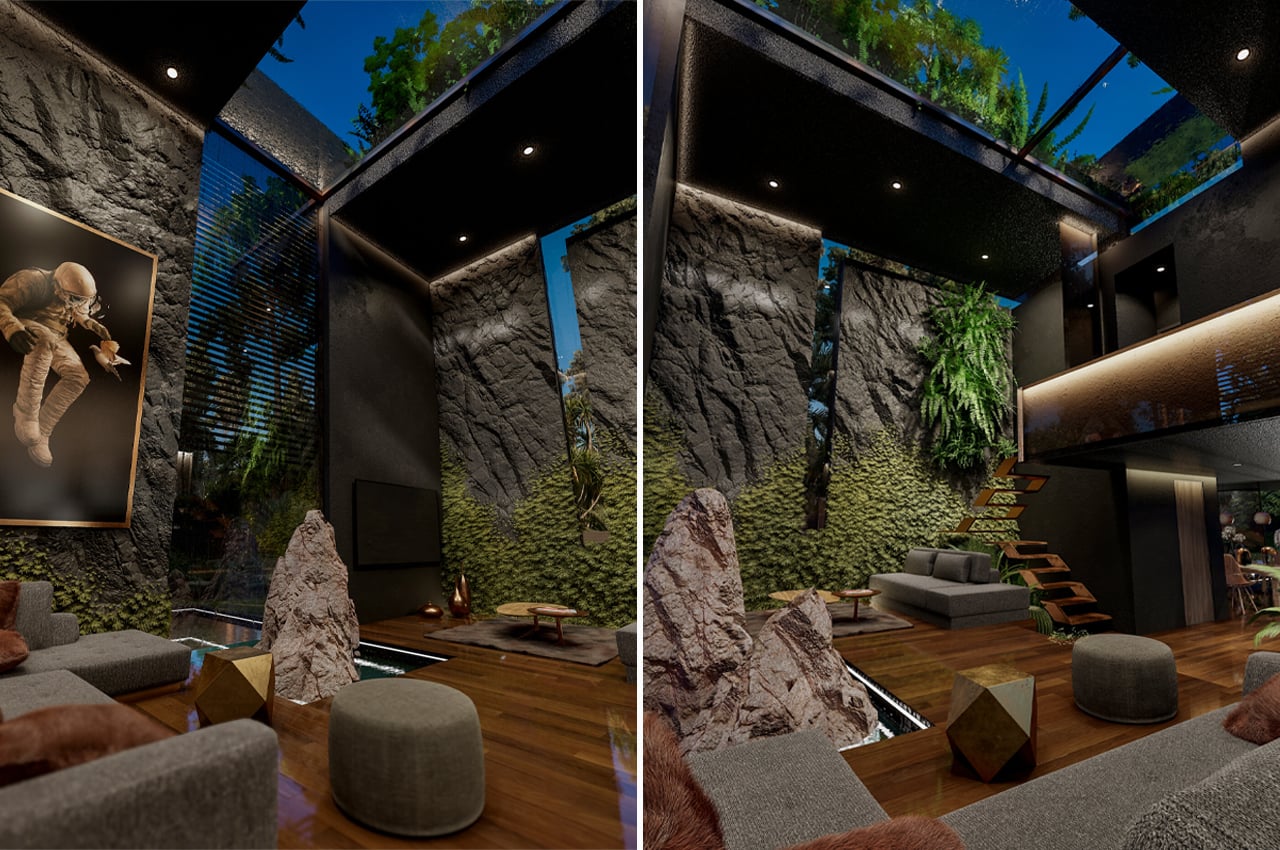
The inside also features garden walls and ceilings to further the home’s biophilic design principle. 

Upstairs, natural stone walls give the bedroom a sultry, cozy appeal.

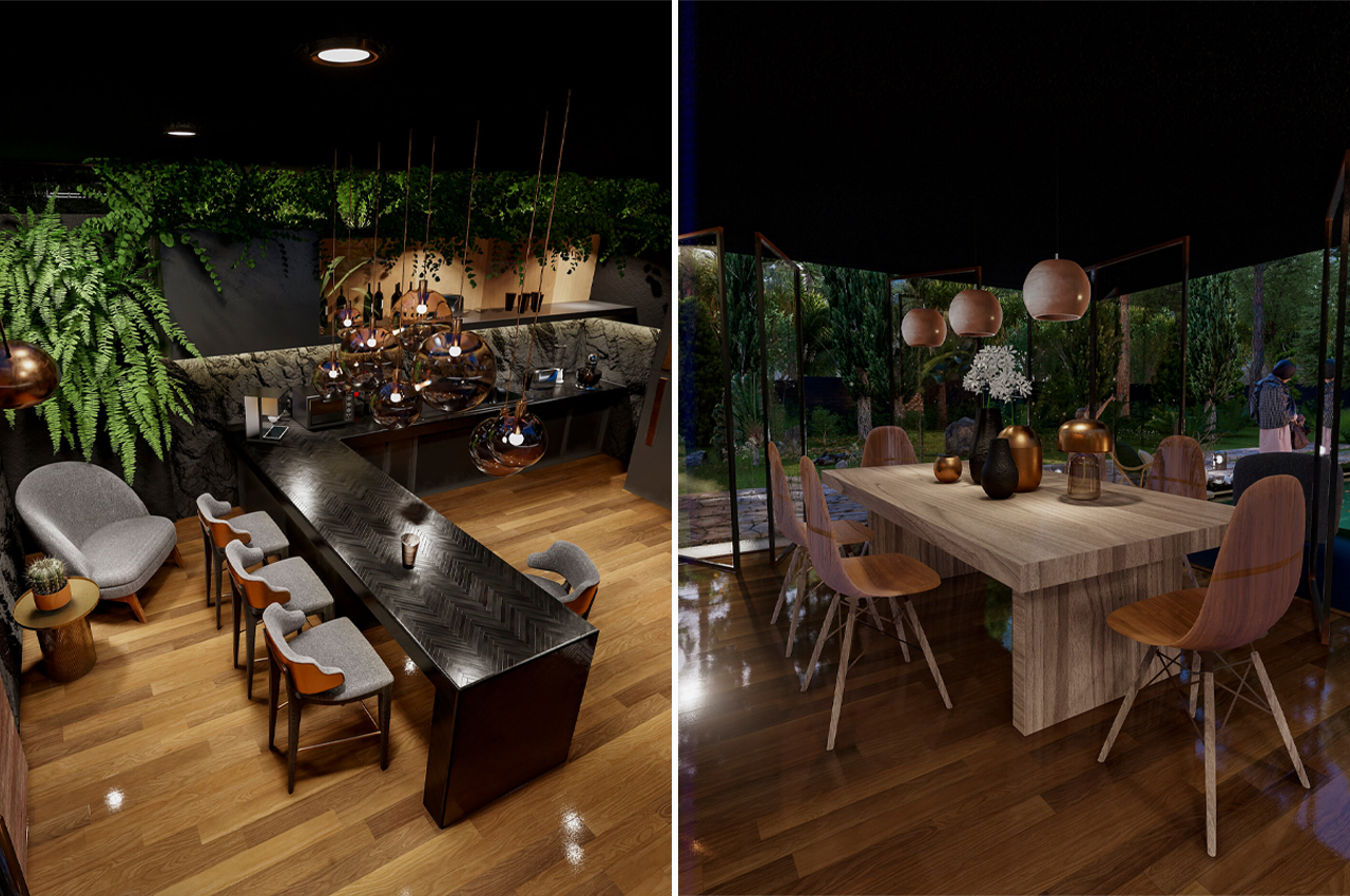
The dining area and bar room feature bright and dark design elements respectively. 

A floating staircase brings guests from the living room to the second floor. 

This AI-enabled tiny home gets a design upgrade making it more spacious and futuristic!


Nestron is one of my favorite tiny home builders – they are modern, minimal, and AI-enabled! The sure in tiny homes is not a design trend but an architectural movement that is here to stay, they are more affordable, more sustainable, and more conducive to our evolving flexible lifestyles when compared to traditional houses. Nestron’s latest model is the Cube Two X which has been built upon the existing Cube Two’s functionality and aesthetics with more upgrades keeping in mind a bigger family instead of a two-person household. Take the full virtual tour here!


Cube Two XD is a prefab unit available in two models – a one-bedroom or two-bedroom configuration, and is clad with steel and fiber-reinforced plastic. Singapore-based architecture studio has designed this modern home by drawing inspiration from sci-fi and spacecraft imagery.
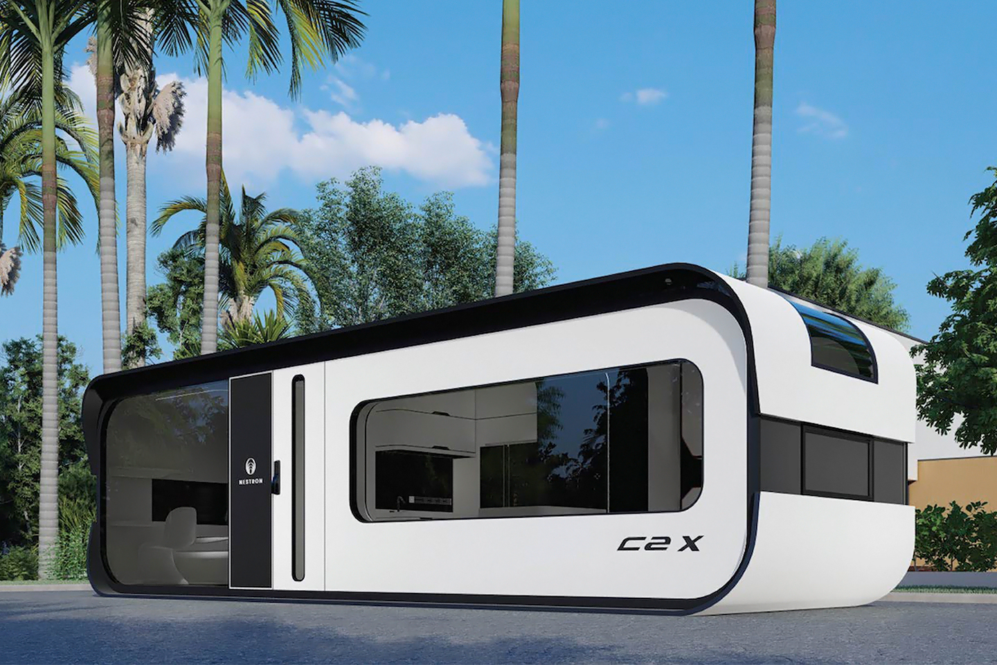
The company’s latest prefab builds on the aesthetics and the functionality of their Cube 2 model. “We figured it was time to give the Cube 2 line an upgrade, and thus Cube Two X was born,” Law says. Since the launch of their Cube series, Nestron received numerous requests for an even larger unit with the option for two bedrooms. The company responded to demand by creating Cube Two X, a scaled-up version of the Cube Two.
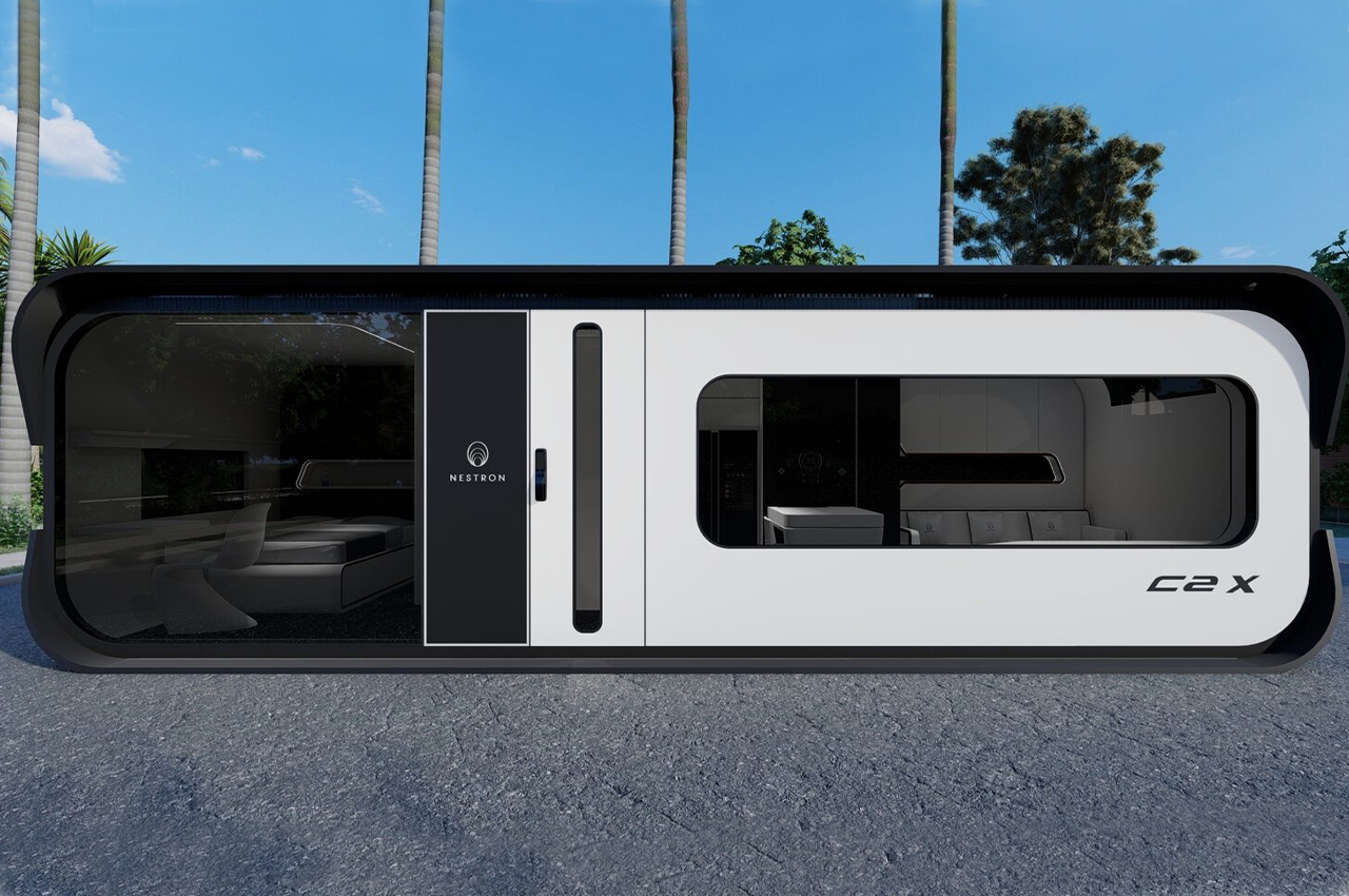
The one-bedroom and two-bedroom Cube Two X models offer 376 square feet of living space. The structure consists of a steel frame wrapped with fiber-reinforced plastic (FRP) siding that can withstand extreme heat and natural disasters.”All of our products are made with high-resistance materials,” Law says. “The FRP exterior wall panels are less likely to rust or corrode, and they hold up in high temperatures, harsh environments, and extreme weather conditions, including heatwaves, hurricanes, and earthquakes.”
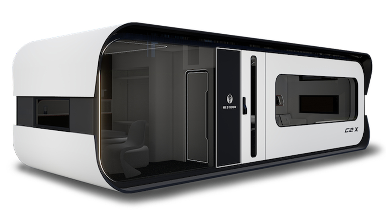
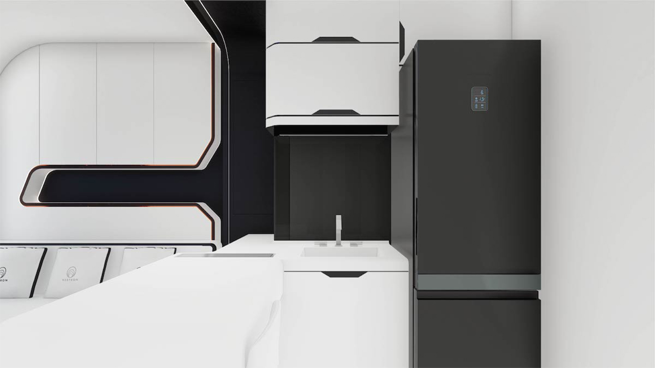
Built-in furniture preserves floor space in the tiny home. The designers outfitted the dining area with a built-in table for two and created a sleek built-in sofa for the living space. Optional features include electric-heated flooring, a smart mirror, a music system, and a concealed electric stove. “The invisible stove is a unique space-saving idea,” Law says. “It’s a seamless kitchen counter when you’re not cooking, but when you are, the counter transforms into a stovetop.”

Curved edges and voice-controlled tech lend a futuristic feel to the home, which is designed so that it can be shipped anywhere in the world and arrive move-in ready. “The home is fully equipped with built-in furniture that helps to maximize floor space,” Law says. “There’s no installation needed upon arrival. Much like how a washing machine works, our clients just need local contractors to wind up the power sockets and the water supply and then Cube Two X is a fully functioning home.”
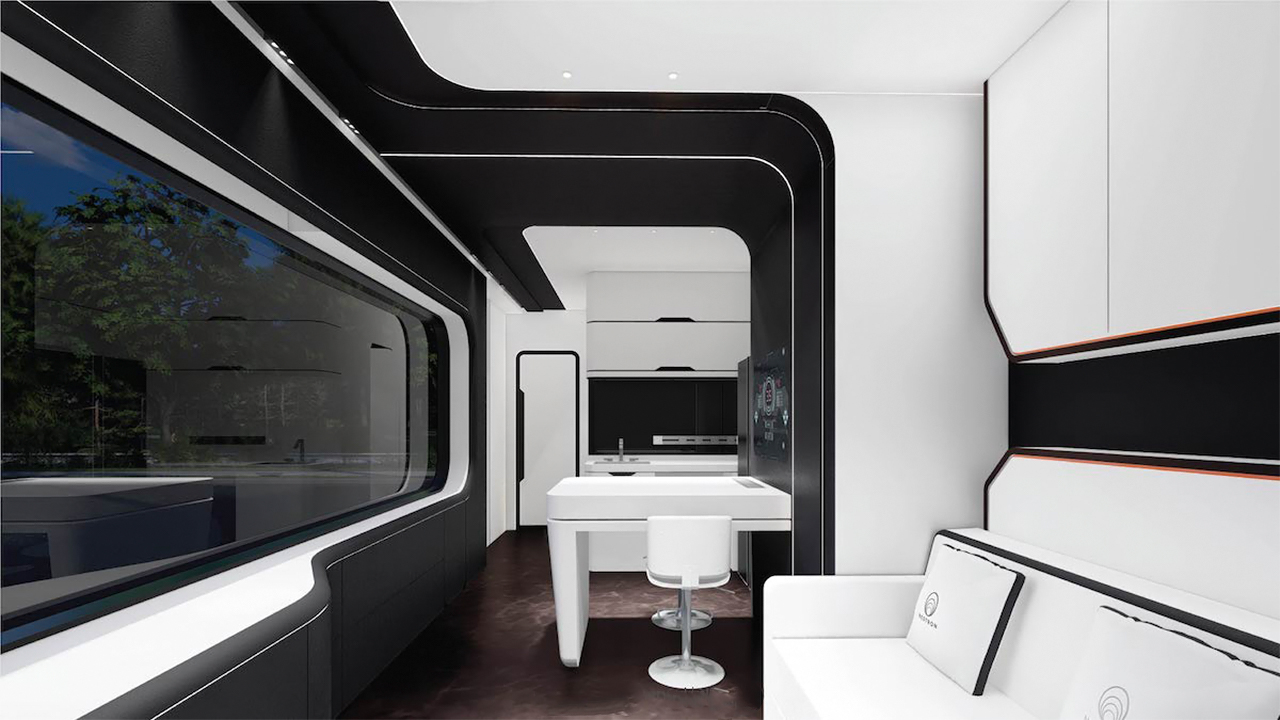
For how high tech the tiny home is, it makes a relatively low impact on the environment. “Ninety percent of the materials we use are recyclable,” Law says. “The interior wood wall panels, for example, are made from non-virgin wood and recycled plastic that’s environmentally friendly and 100 percent recyclable.”

The bedroom has a large built-in wardrobe and a recessed wall niche for storage above the bed. “We make a big effort to care for the environment because we believe everything starts at home,” he says. “Living in your home should be an experience that’s environmentally friendly—and we’d like for people to be able to live a sustainable lifestyle without additional effort.” The bathroom features a smart mirror and an electric pulse toilet.
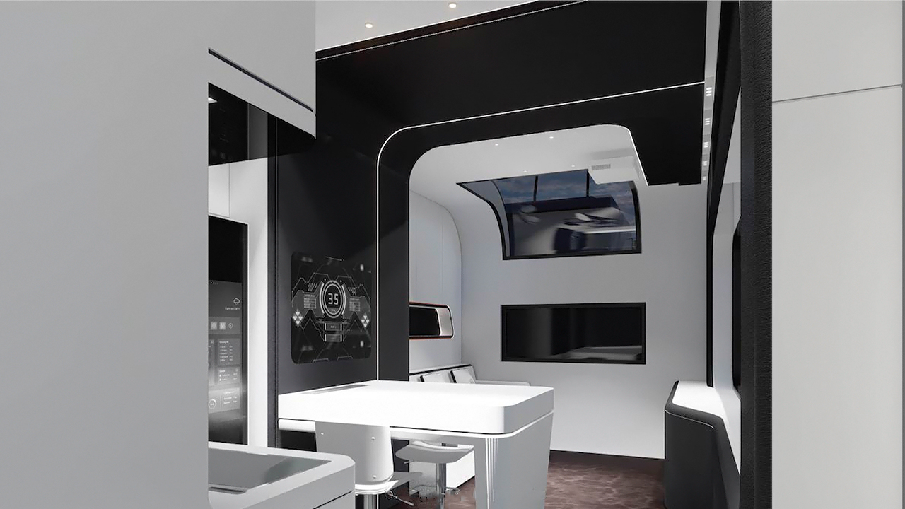
The Cube Two X is also prefabricated in a factory environment, which helps to reduce material waste. “This speeds construction time by up to 50 percent compared to on-site construction, which takes around one month,” Law says. “It’s a faster and more cost-effective process, ensuring we have no construction waste, as we use prefabricated molds to shape our products, which greatly increases accuracy.”
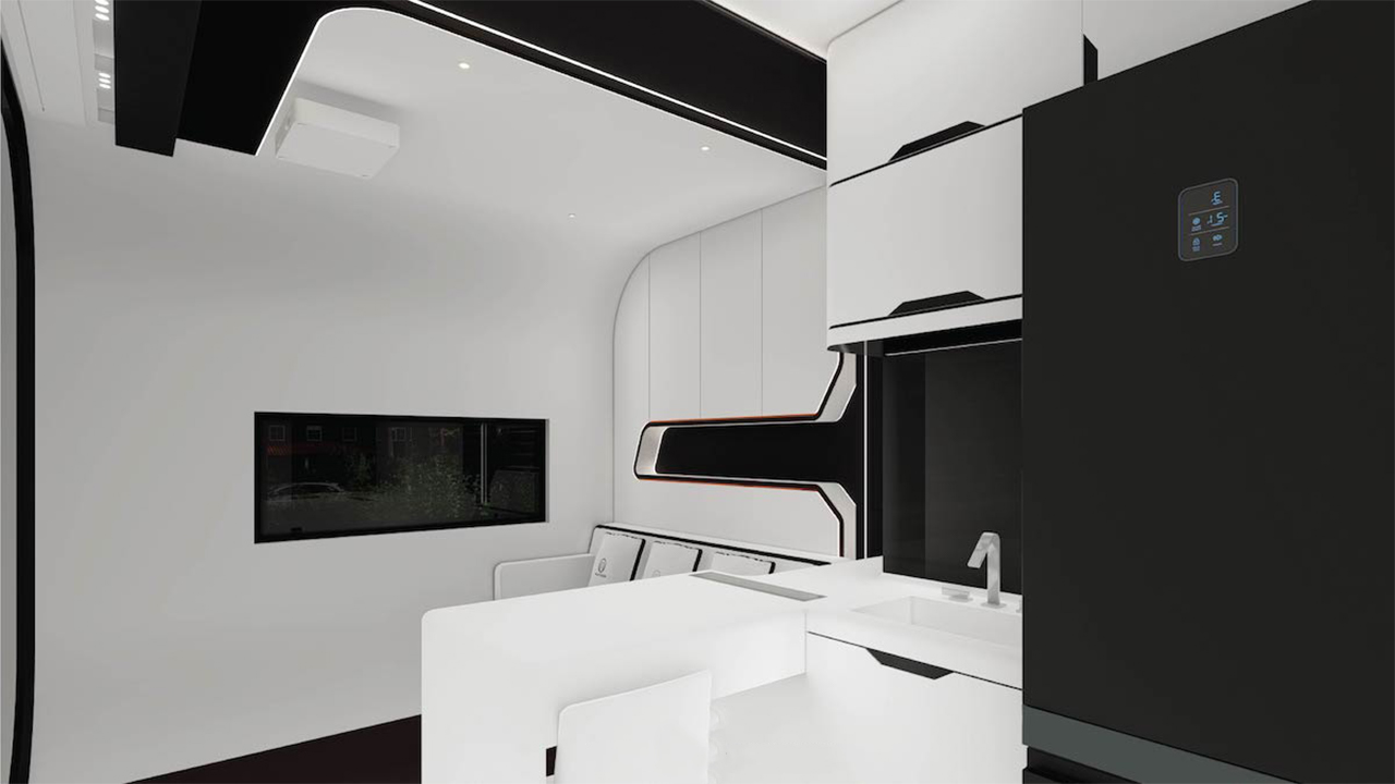
If the cinematic worlds of Stanley Kubrick’s 2001: A Space Odyssey and William Hanna and Joseph Barbera’s The Jetsons were combined to create a tiny home, it might just be Nestron’s Cube Two X – tech lovers and digital nomads are going to love this innovative home!

Designer: Nestron
This prefab house is an energy-efficient & modular dwelling made entirely from aluminum!


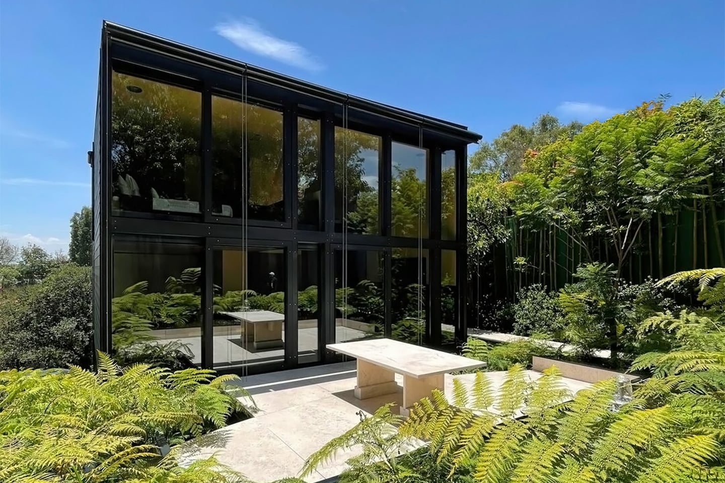
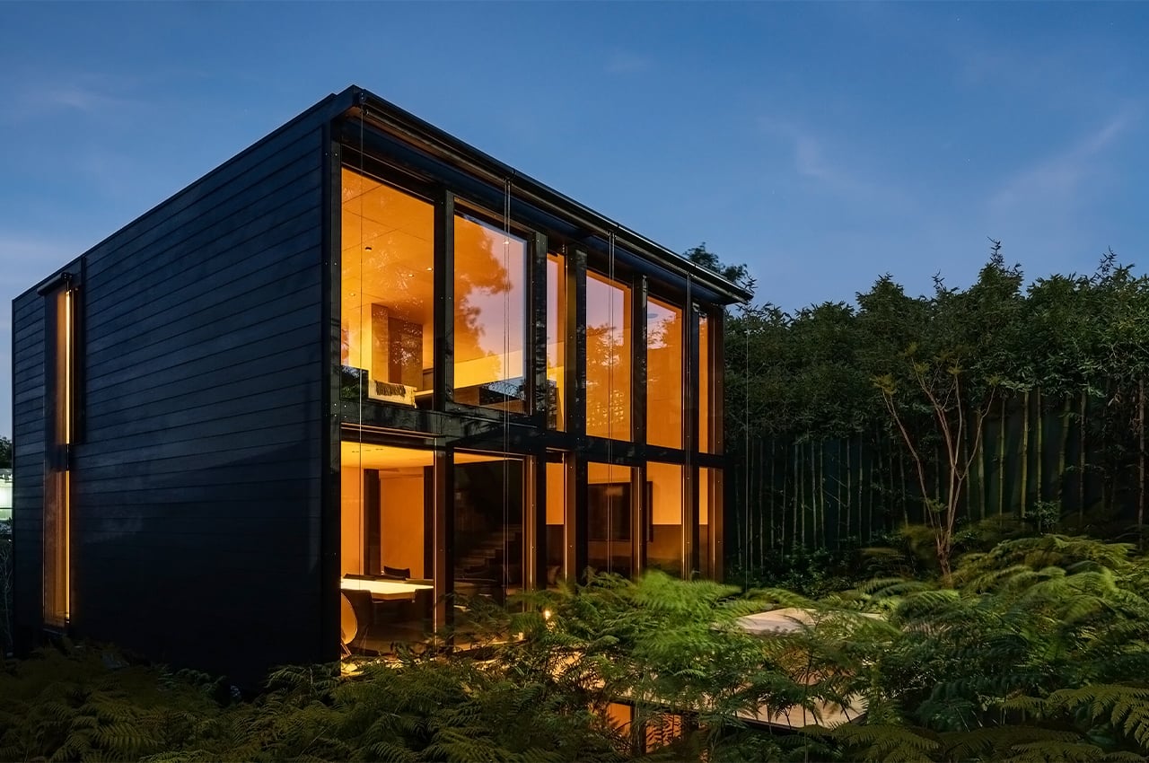
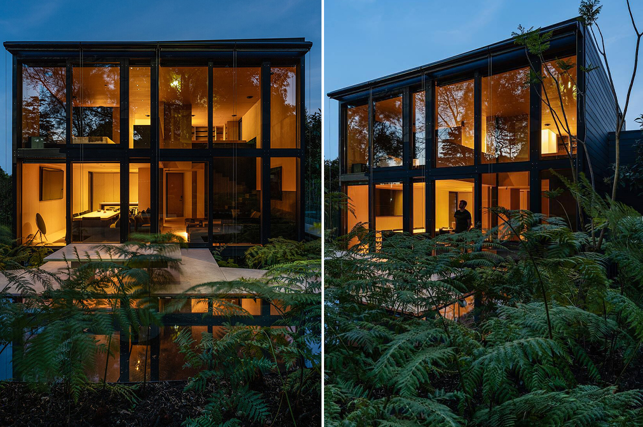
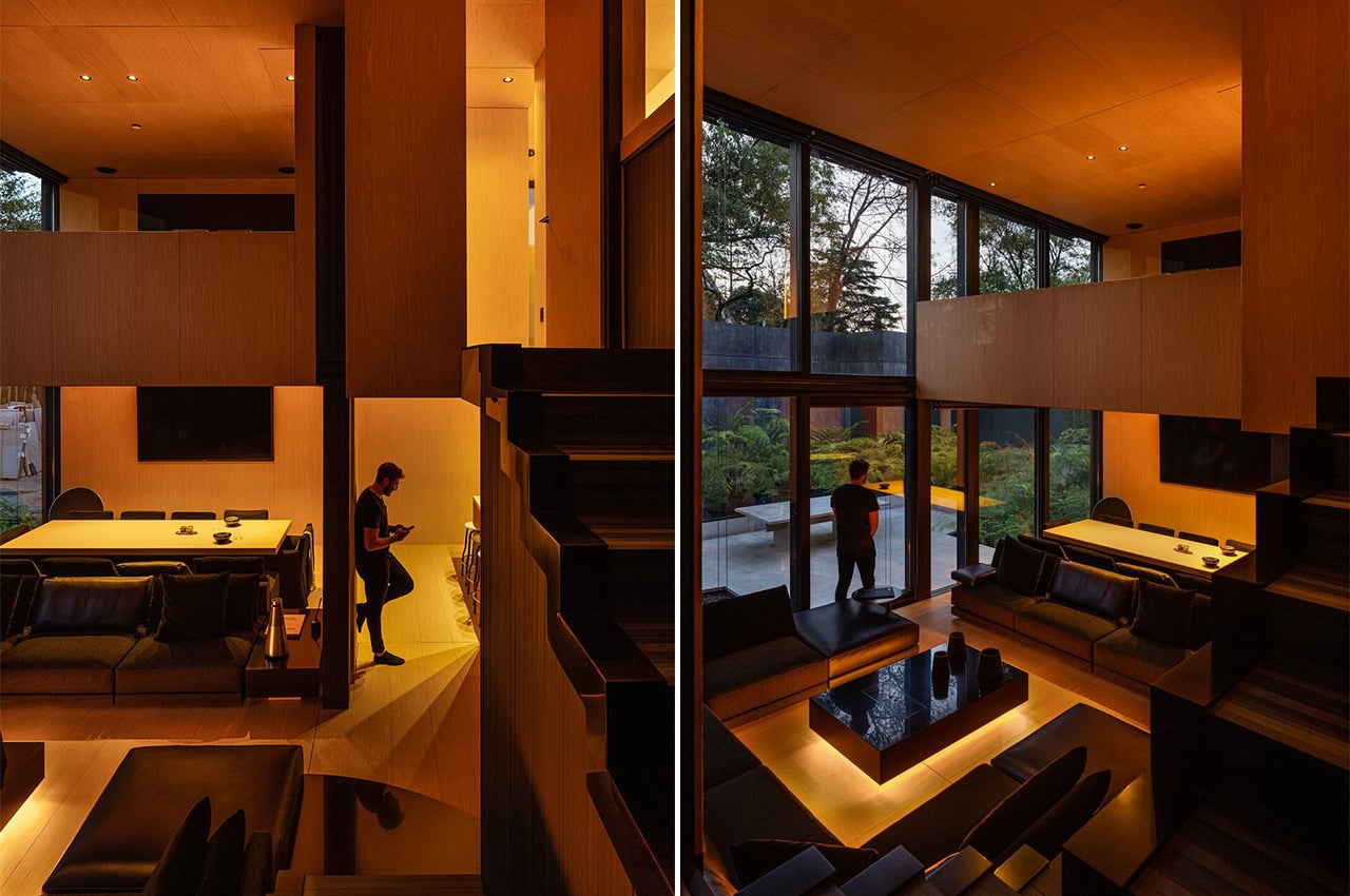
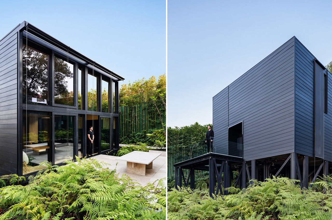
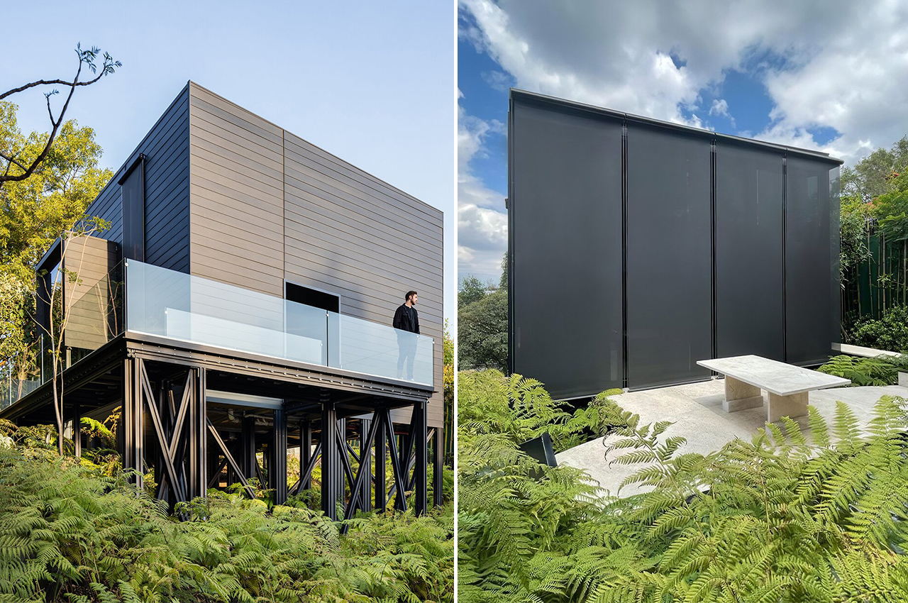
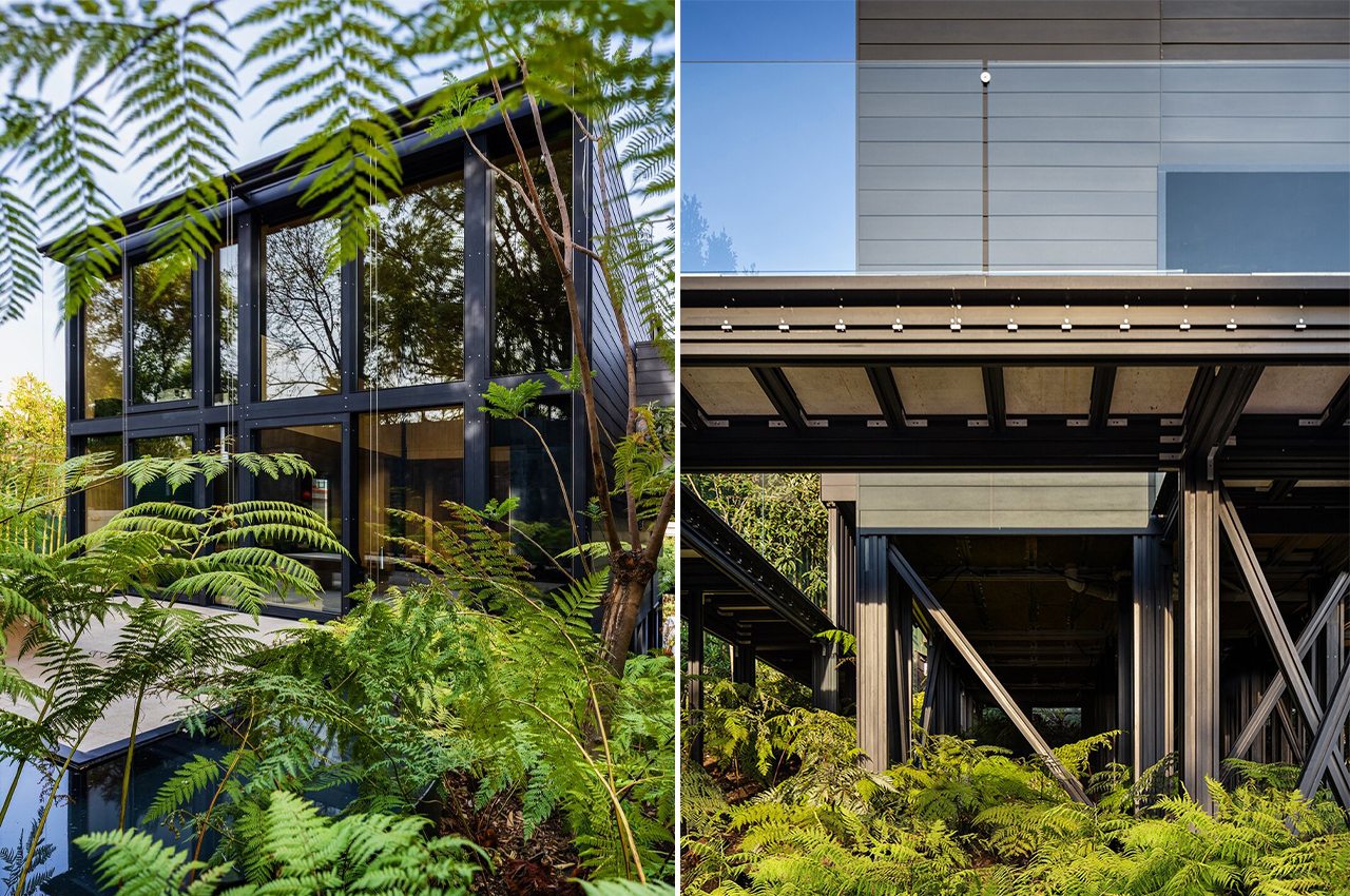
Prefab architecture is the future of the home construction industry – they reduce the impact on the environment, have a much faster turnaround time, and are relatively cost-effective. A shining example of what the future will look like is the Pi House that was assembled in 45 days on a wooded hillside in the Mexico City Colonia of Bosques de las Lomas. The highly energy-efficient home was built with an ingenious, fully customizable modular construction system, and only aluminum was used for the frame.
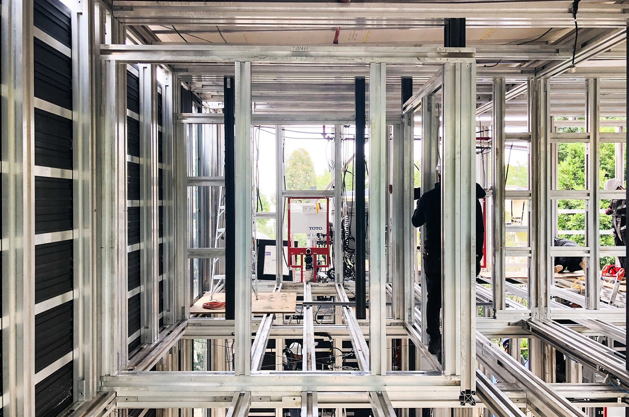
The prefab dwelling comes flat-packed in multiple boxes and can be assembled in 45 days without the help of heavy machinery. It uses extrusion-die aluminum framing that’s anchored with rebar to the ground or a poured concrete foundation. Just like a Lego set, there is a network of steel doughnuts that spans lengths of up to 30 feet to support the structure.

The aluminum studs link seamlessly to joists and the exterior cladding is clipped onto the frame. It’s a method that could be extended to 45 feet which makes it modular and easier to expand in case the home belongs to a growing family. Pi House can be shipped anywhere, the system allows it to be the perfect structure for single-family homes as well as larger projects like social housing.

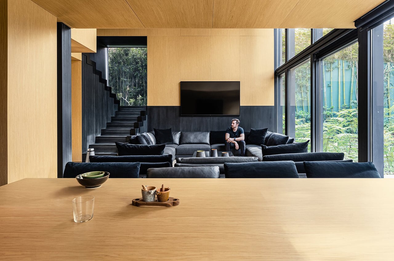
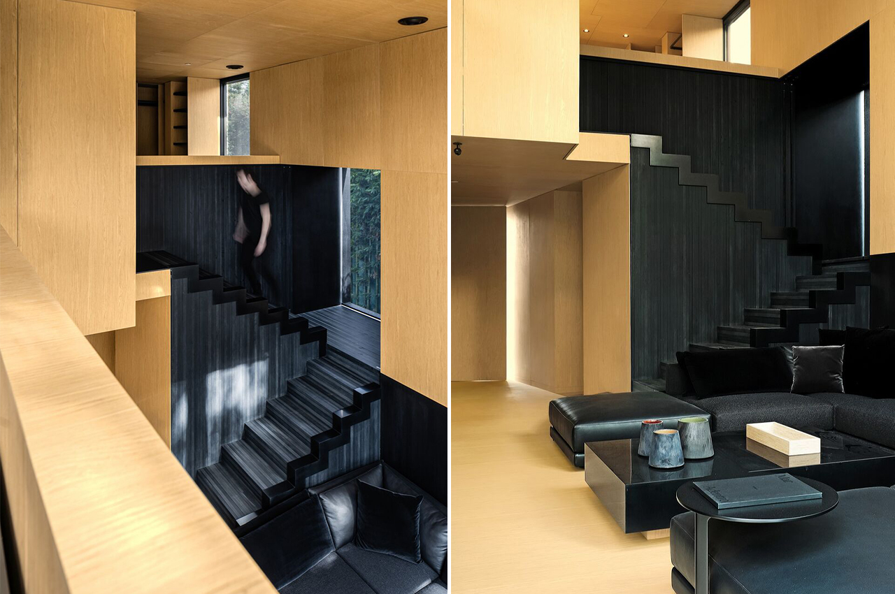
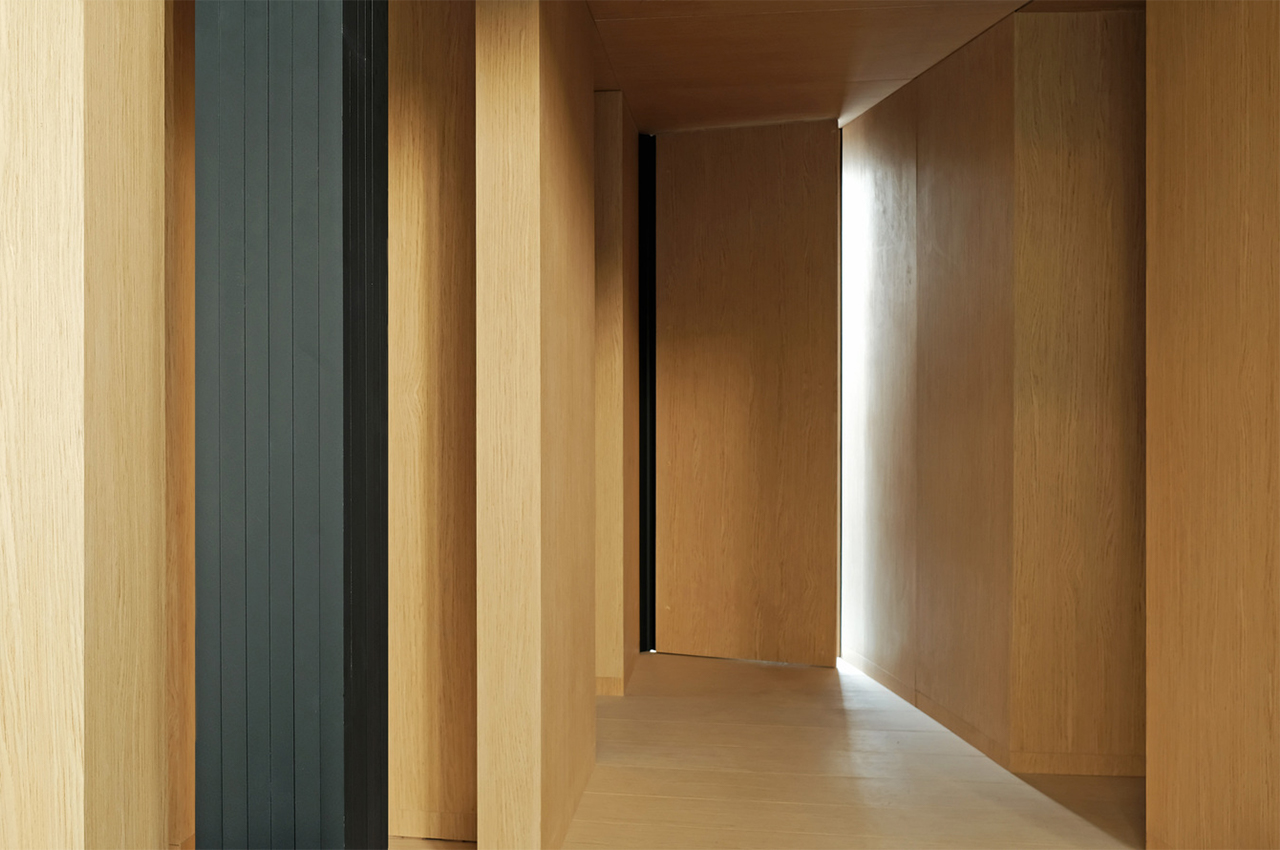
Pi Home can be fully customized right from the interior to furniture selection and even the fabrics to the veneer of the wall panels. The walls and floors are composed of MDF with the wood veneer clipped to the aluminum structure. Insulation between the exterior cladding and interior walls gives the home an energy-efficiency rating as high as R30 depending on its thickness.

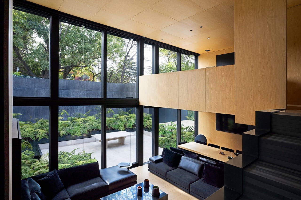
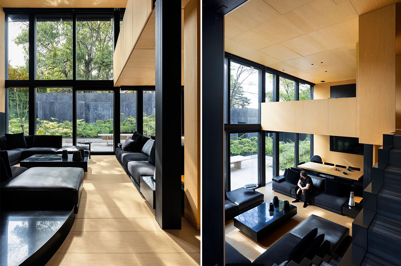
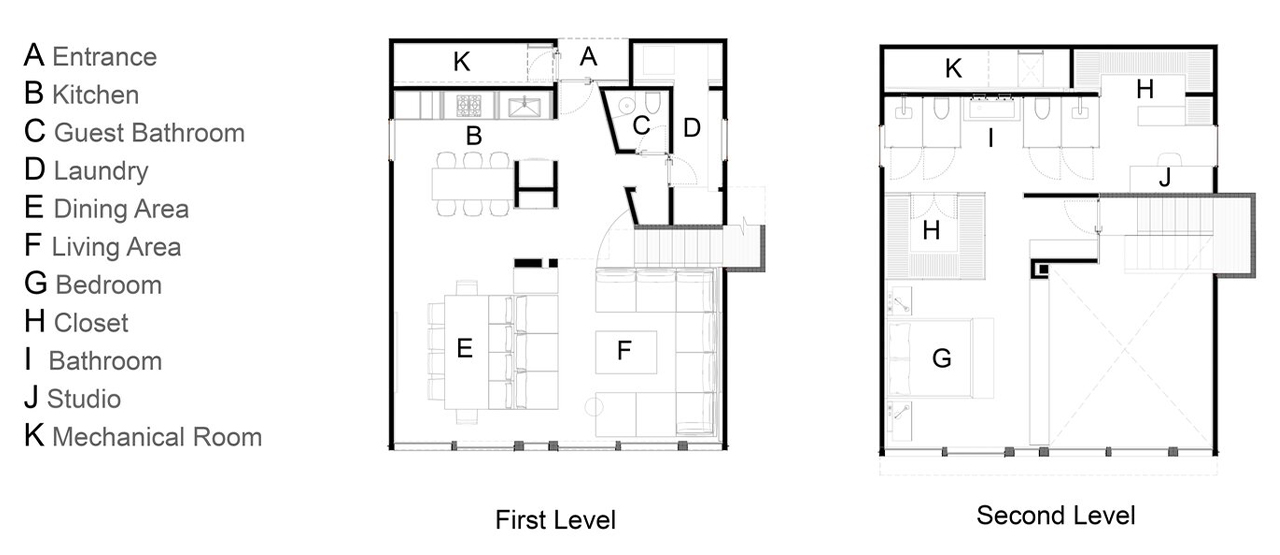
The rear curtain wall system opens to an outdoor patio raised above the wooded landscape. Retractable screens allow for shade and privacy in the living area. The main bedroom on the second floor takes advantage of the curtain wall’s openness. The first prototype is a luxurious version that is furnished with state-of-the-art appliances and high-quality materials.

The Pi Home is adaptable to different site conditions and has been engineered to withstand the earthquakes that are common to Mexico City. Double-glazed windows facing south provide both insulation and adequate heat gain for the cooler climate of the city’s higher altitude in Bosques de las Lomas. “You have all of this midcentury inheritance, but truly, when you visit these houses in California, it was all very aesthetic, but it was unlivable on a hot or cold day. We have to take the step and accomplish having efficient thermal living inside the house,” elaborates Aragonés.

Personally, I love the wraparound veranda the most. It is bordered with glass which creates additional outdoor space. The walls and joists have thermal and waffle insulation packages that meet California’s high R22 sustainability standards. This achieves a complete thermal break to prevent leakage of heat through the structure.

The sweeping windows are all double-glazed and using aluminum for the construction makes it a far more sustainable structure compared to traditional homes. Aluminum is one of the most easily and widely recycled materials giving the house an especially circular life cycle while those made with concrete are the biggest global contributors of carbon emissions for the construction industry.

“It’s important to emphasize this being not only a modular system, but a construction system, so it can transform according to the site’s topography and dimensions. If you need to adapt it for a particular project or landscape, you’re easily able to adjust the construction system,” adds Rafael Aragonés who is the son of architect Miguel Aragonés and an associate in the studio.

The Pi House has received an international patent in Switzerland for being the first-of-its-kind structure for aluminum houses and once the International Code Council building certified the process, Taller Aragonés will expand the market to California, New York, and Texas. The aluminum frame, speed of assembly, and cheaper shipping make it about a third of the cost of a typical construction — which is why I called it the modern home affordable of the future that will help more people become homeowners faster while reducing the carbon footprint at a family level.

Designer: Taller Aragonés

This modern house is designed to maximize panoramic views and energy efficiency!

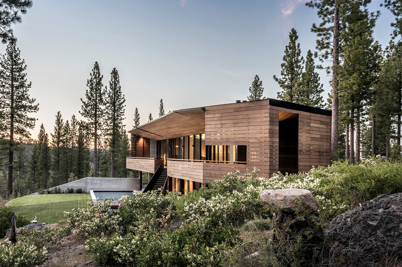
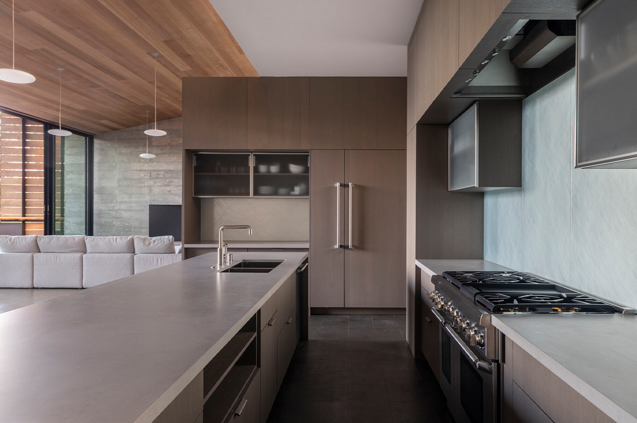
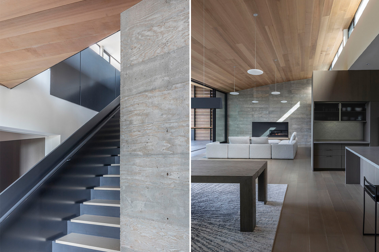
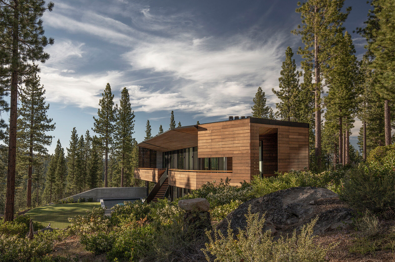
Most people think that living in an energy-efficient home means they have to sacrifice their dreams of owning a big house with a pool but that is a myth and Faulkner Architects is here to bust it beautifully! The client requested every room be oriented towards the Sierra Nevada Mountains. It took some out-of-the-box thinking, but somehow the design team managed to stay in the box while achieving that goal.

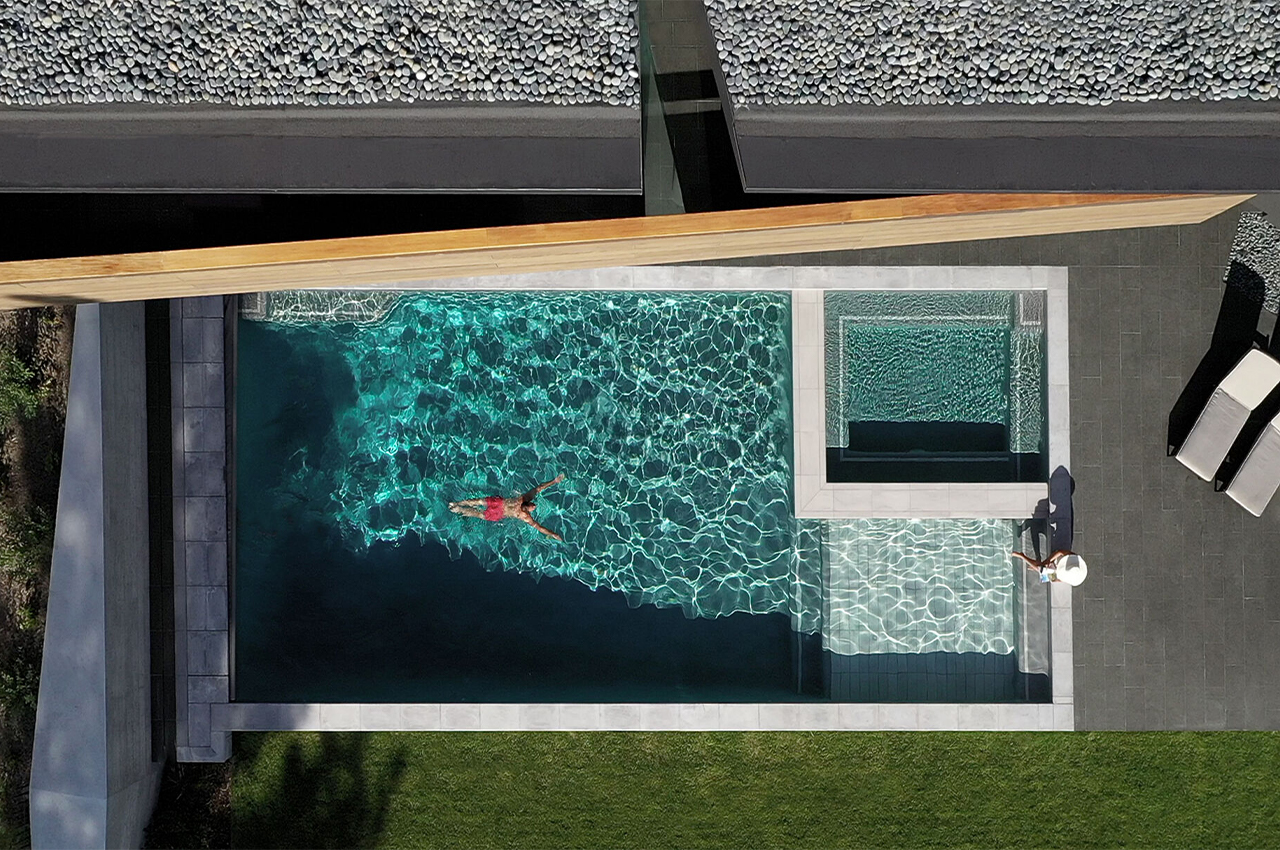
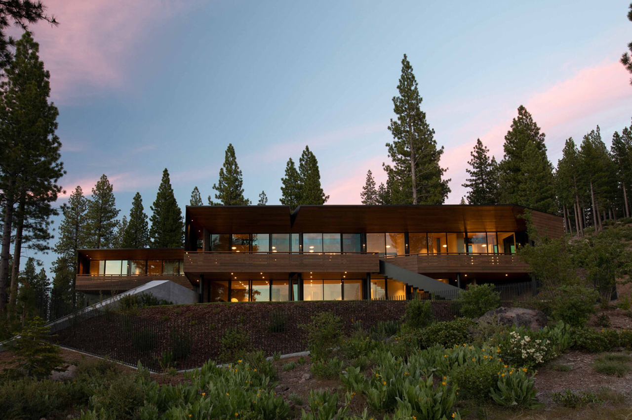
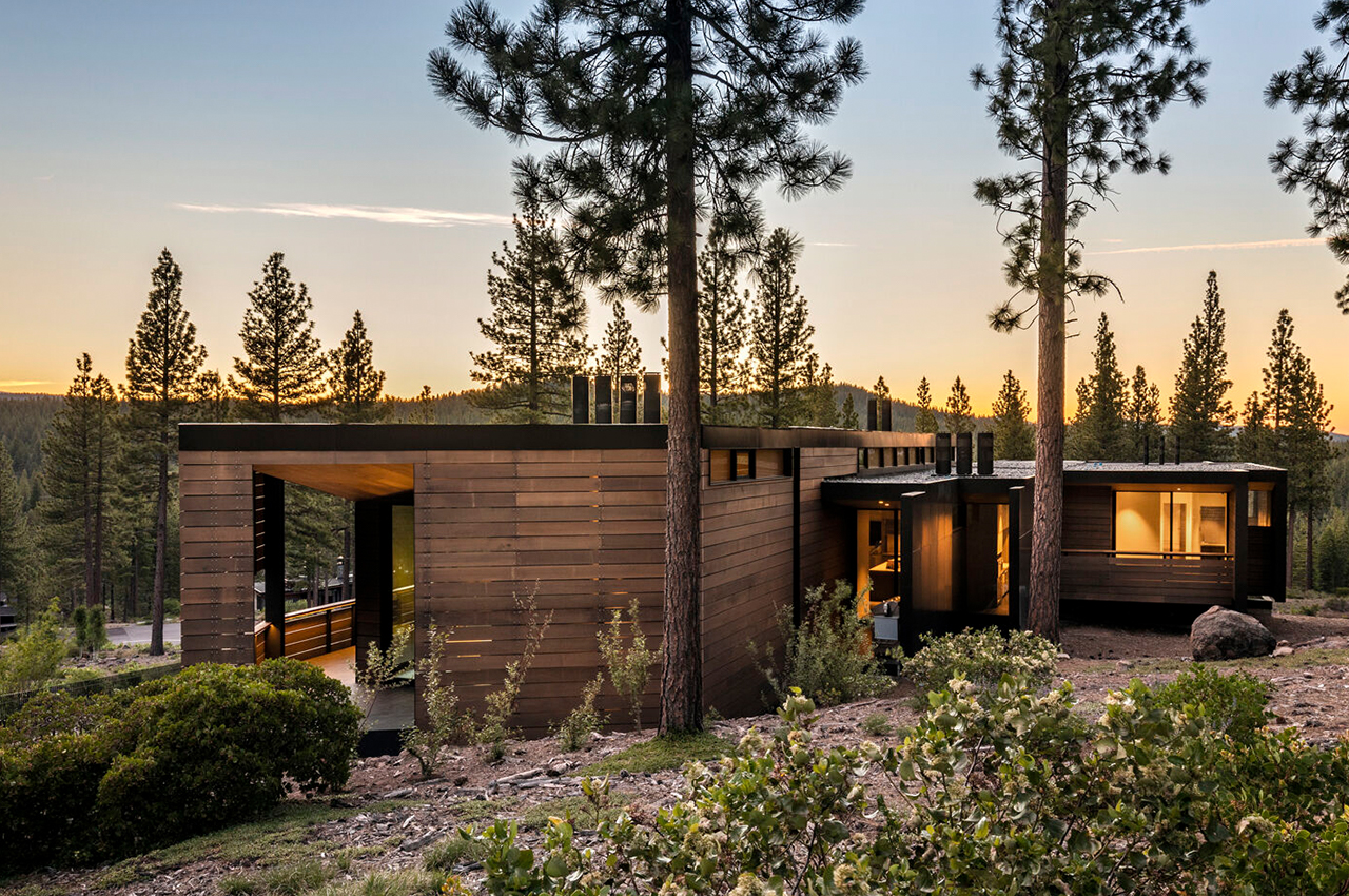
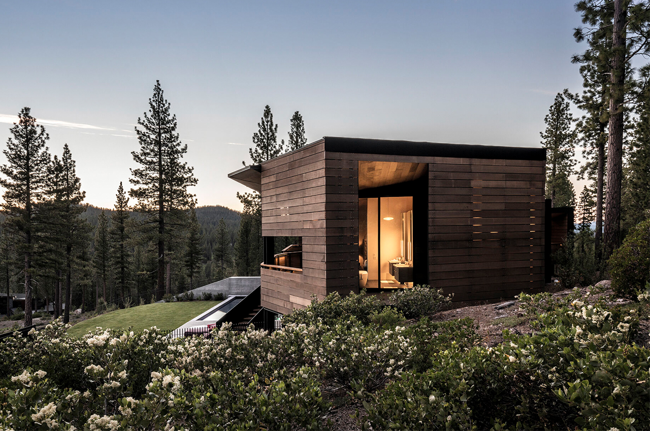
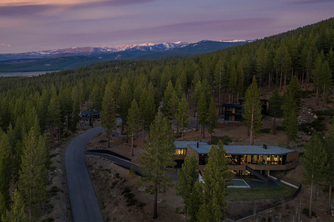
Called Viewfinder House, this home is located in Truckee, CA, a launching point for myriad outdoor activities in every season. Even at 7,200 square feet with a pool, the design offers unique architecture and environmentally friendly features. The body of the home is made up of two rectangular boxes, with connections between the spaces via covered porches. The lower level is contoured to match the property line, but the upper level is rotated to take full advantage of Pacific Crest mountain views.

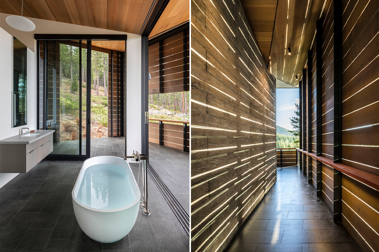
The team relied on steel for the base to hold up against deep winter snow, and an exterior rain screen of red cedar, which also shields the home from the street while allowing natural light to filter in. Passive design elements create shade and promote energy efficiency throughout the home, starting with the roof overhang that protects the glass doors from weather and solar gain inside the home. High-efficiency boilers conserve energy and work in conjunction with effective radiantly heated floors.

The back of the lower level takes advantage of earth sheltering to organically insulate the home, and natural ventilation is found through window and door placement. Faulkner Architects emphasized using enhanced-efficiency glazing and insulation for a tight construction envelope. According to a press release, these combined efforts help the building achieve a 14.5% improvement in efficiency, above the already strict California energy code. Outdoors, the surrounding hillsides are covered in native plants and mature trees. The materials removed from the pool and house excavation were saved and used for the nearby terraced landscaping.

Designer: Faulkner Architects

This cabin’s hexagonal extension forms an interesting geometric focal point for this rustic yet modern home

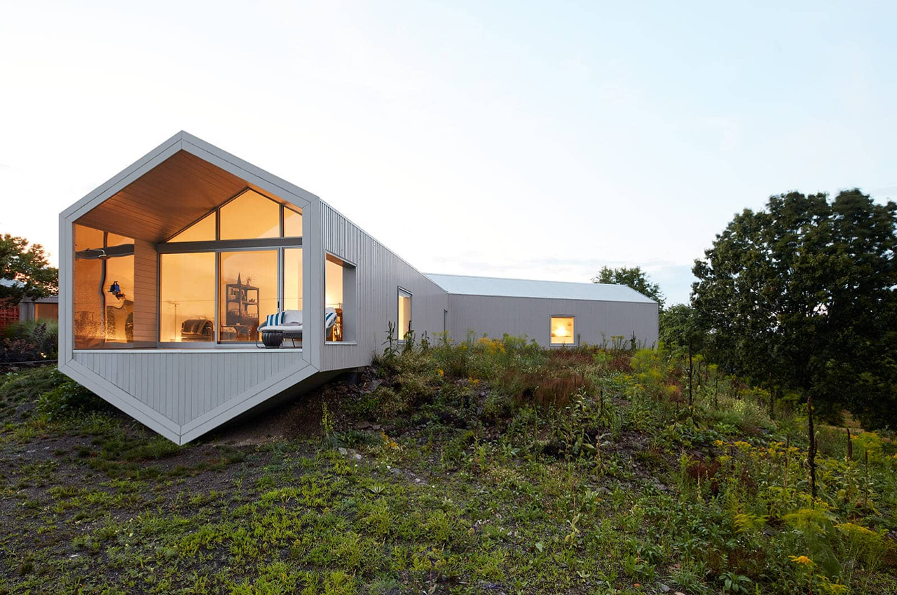
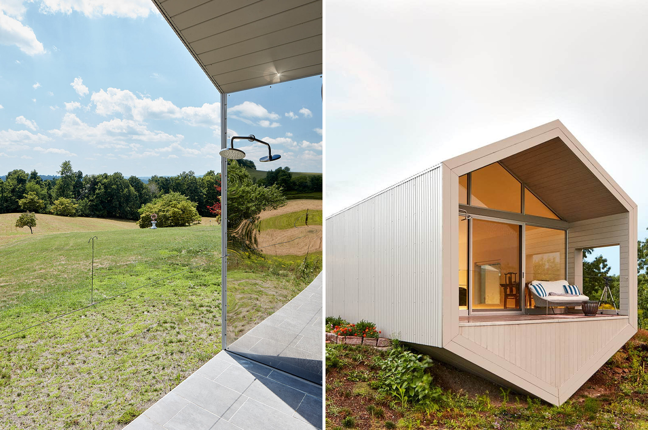
Adding extensions to your home is always a delicate job. Since it’s an extension, it should only complement the rest of your home like a pair of shoes that tie your whole outfit together. Finding balance in geometric, angular framing and exterior metal ribbing, architecture firm Reddymade collaborated with contemporary artist Ai Weiwei to build an artfully understated hexagonal extension on a Salt Point home in upstate New York.

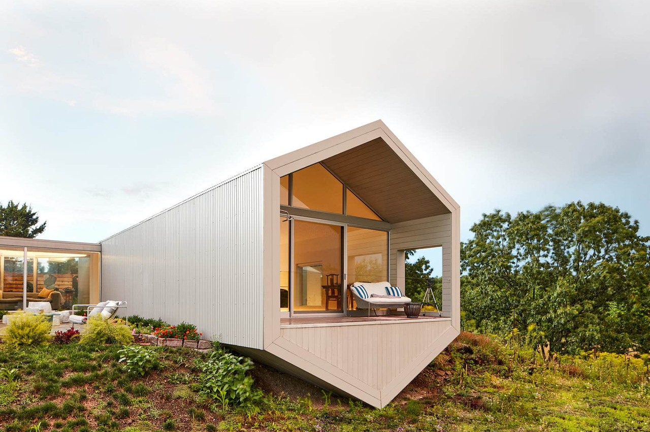
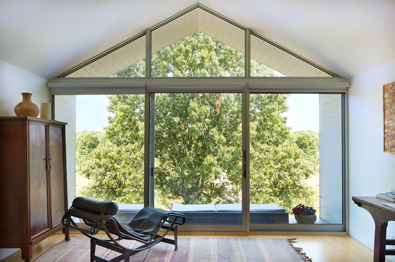
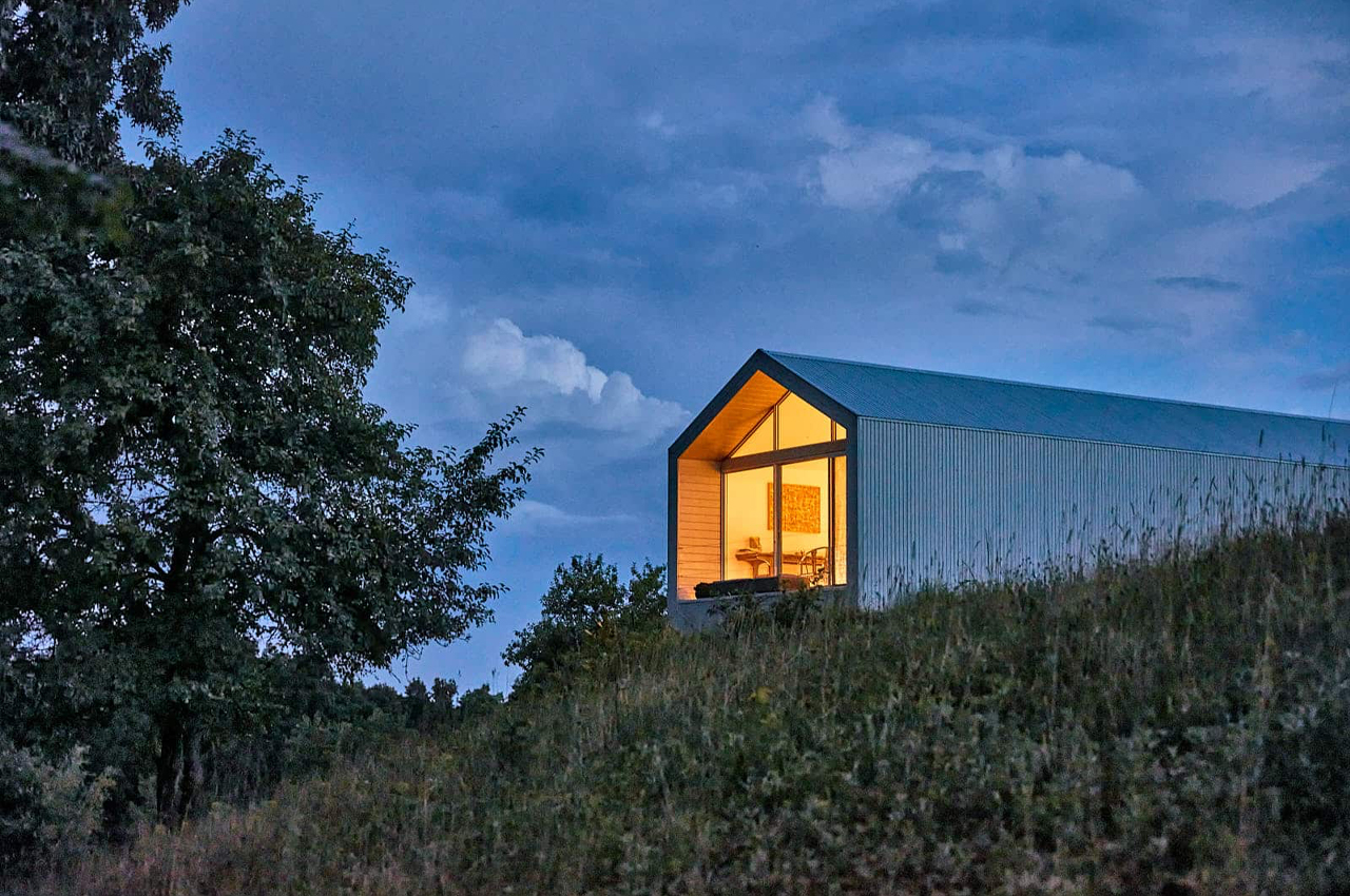
The six-sided extension connects to and extrudes from an enclosed, glass corridor, perching above a green, hilly lawn to overlook the home’s rural landscape. The project’s metal ribbing and optic white exterior offer contemporary flairs to the extension’s farmhouse style layout and rustic setting. Setting the tone for the interior’s airy, white, open spaces, the extension’s bright exterior feels right at home. Inside the home’s extension, Reddymade and Ai Weiwei made room for two bedrooms and living space.

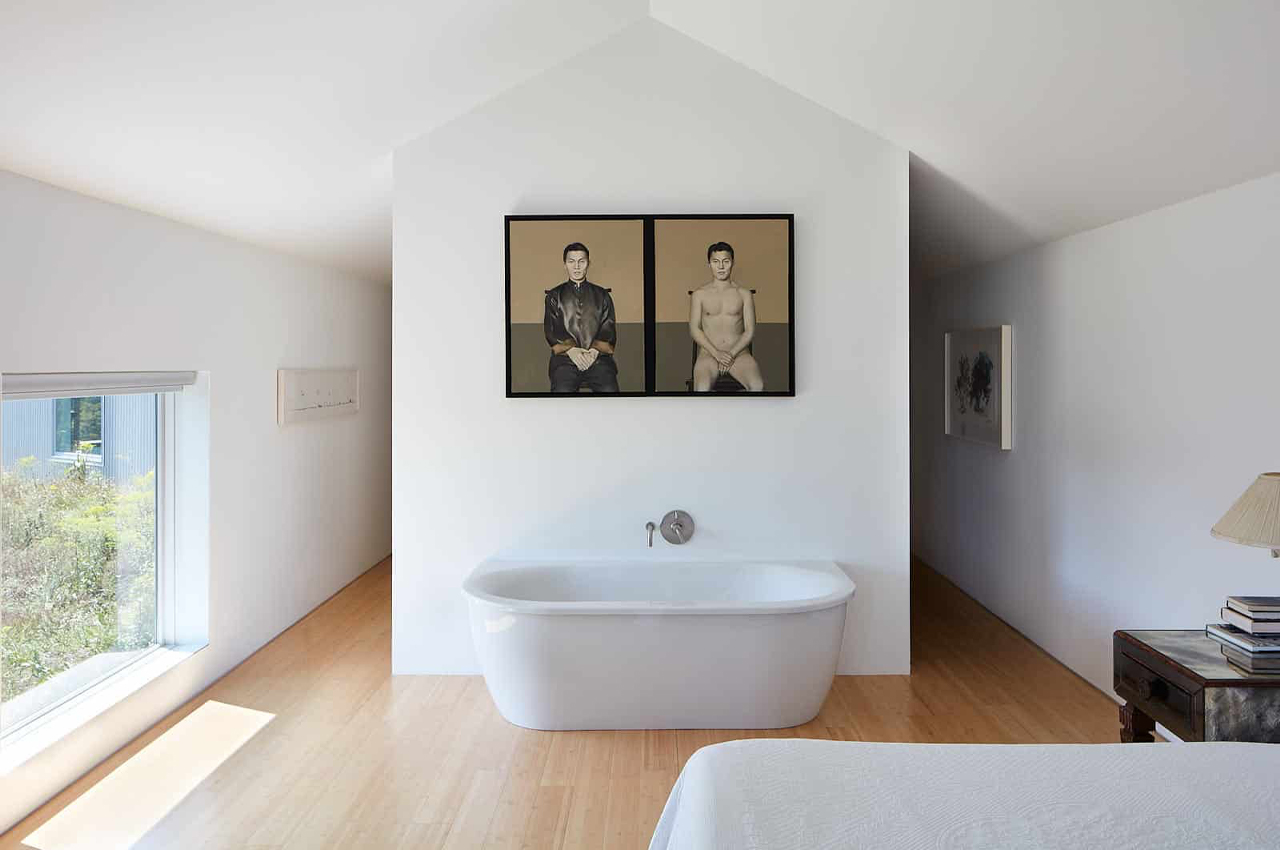
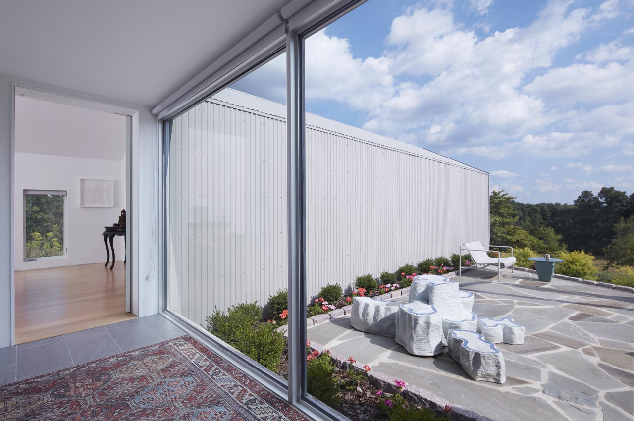
Adorning the walls with a curated collection of framed artworks, Ai Weiwei and Reddymade hit a collaborative sweet spot in their shared love for poetry and visual art. The extension’s gleaming inside walls provide a white canvas for furniture and a collection of artworks to take center stage. Similarly, the spotless white metal exterior merges seamlessly with the glass facades and white framing of the pre-existing home, bringing attention to and brightening the property’s rolling green hills.

“The extension was designed to be strikingly simple and minimal, which is reflected not only in its graphic language but also in its materiality. The metal rib exterior allows for a crisp edge and ensures project longevity. Through its materiality, it also has a relationship with the previously completed Artfarm on the property,” describes Reddymade founder, Suchi Reddy.

Designers: Ai Weiwei & Reddymade

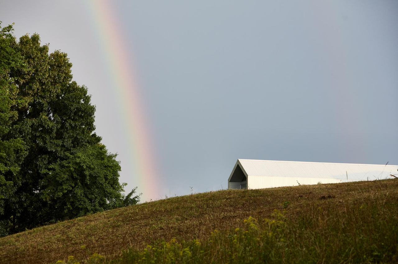
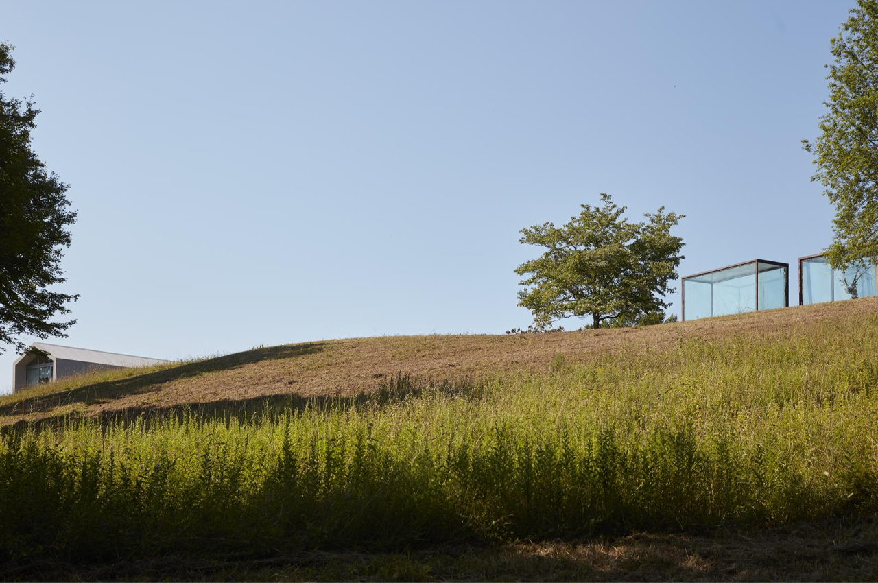
Perched atop a rolling hill in Upstate New York, this minimalist home extension adds a rustic twist to a midcentury modern home.

The hexagonal add-on extrudes from a glass corridor, attaching the extension to the pre-existing home.

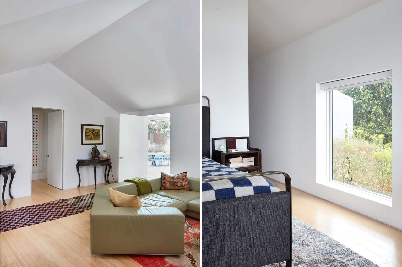
20th-century Italian interior design elements and glazed glass facades are brightened with optic white walls.

“Its simplicity and clarity of concept make it special. It is about adding an object to the property, on which the clients have installed sculptural artworks,” explains Suchi Reddy

Antique furnishings and modern touches tie up each room with balance in design.

“The extension has its own sculptural quality but simultaneously doesn’t feel like a showpiece. It’s humble,” Reddy continues.

Sculptural art pieces give the home a distinct personality that hovers between midcentury and contemporary design.

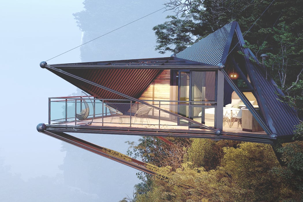
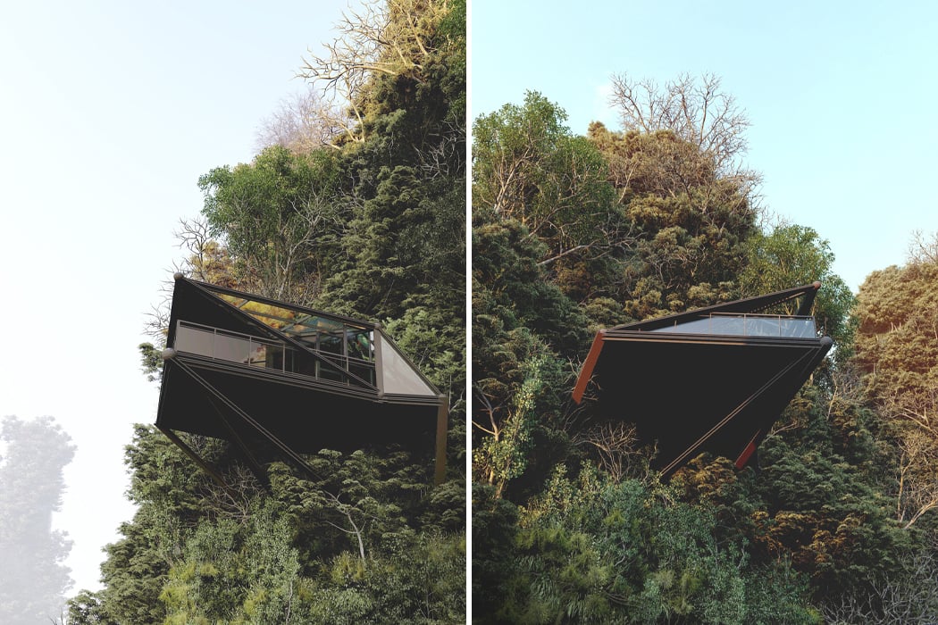
This cliffside cabin is supported by five suspension cables for a daunting jungle retreat!

3D visualizer and architectural designer Thilina Liyanage conceptualizes remote, escapist hideouts and villas stationed in rugged rainforests and off the sides of jungle cliffs. Most of Liyanage’s designs stand out for their intricate interweaving of natural materials like what appears to be bamboo and wooden beams to create life-size models of wildlife and other forms of nature. His most recent architectural conceptualization takes a new approach and envisions a cabin perched above steep cliff sides, one that is entirely made from glazed glass facades and metal cladding.

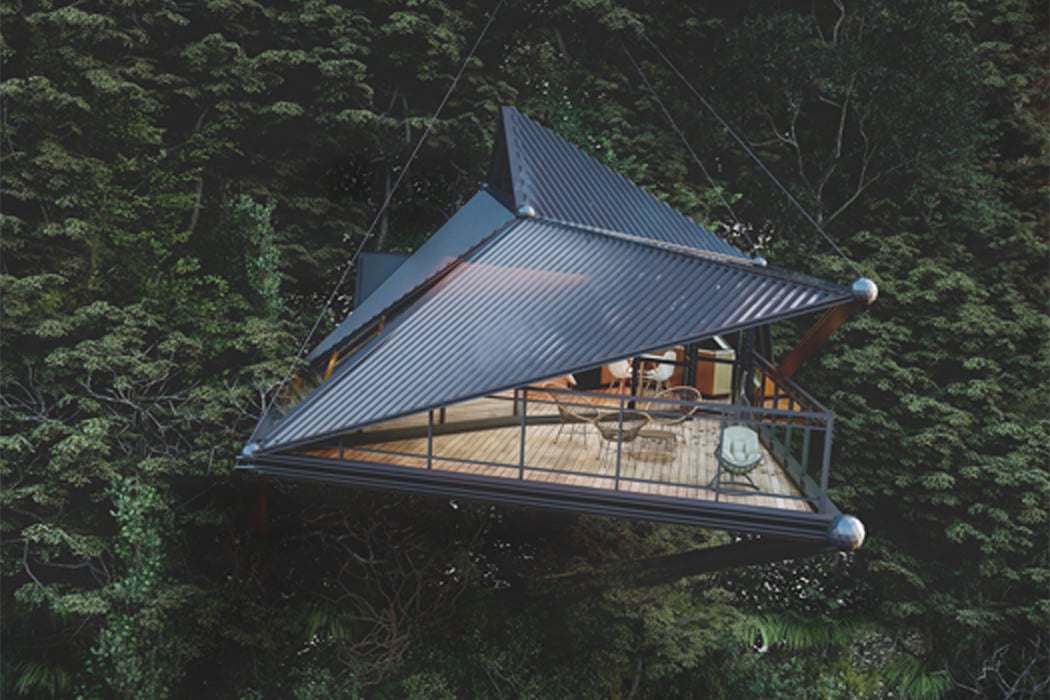
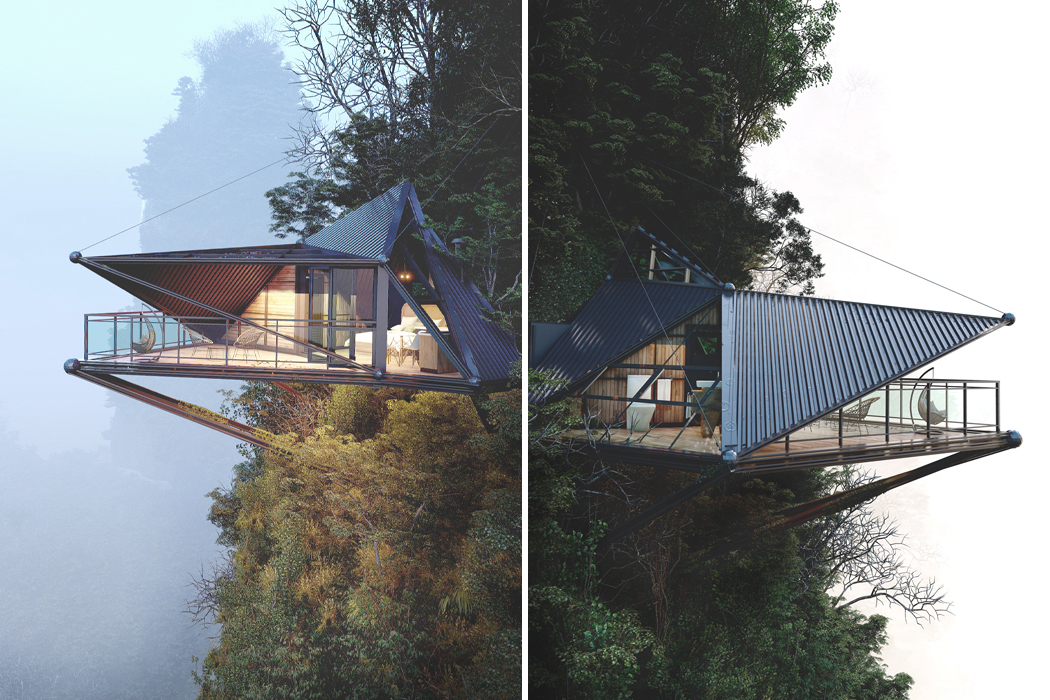
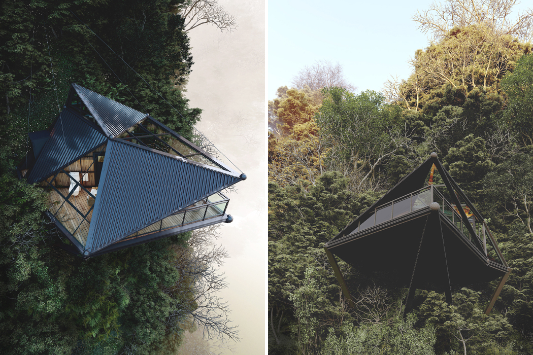
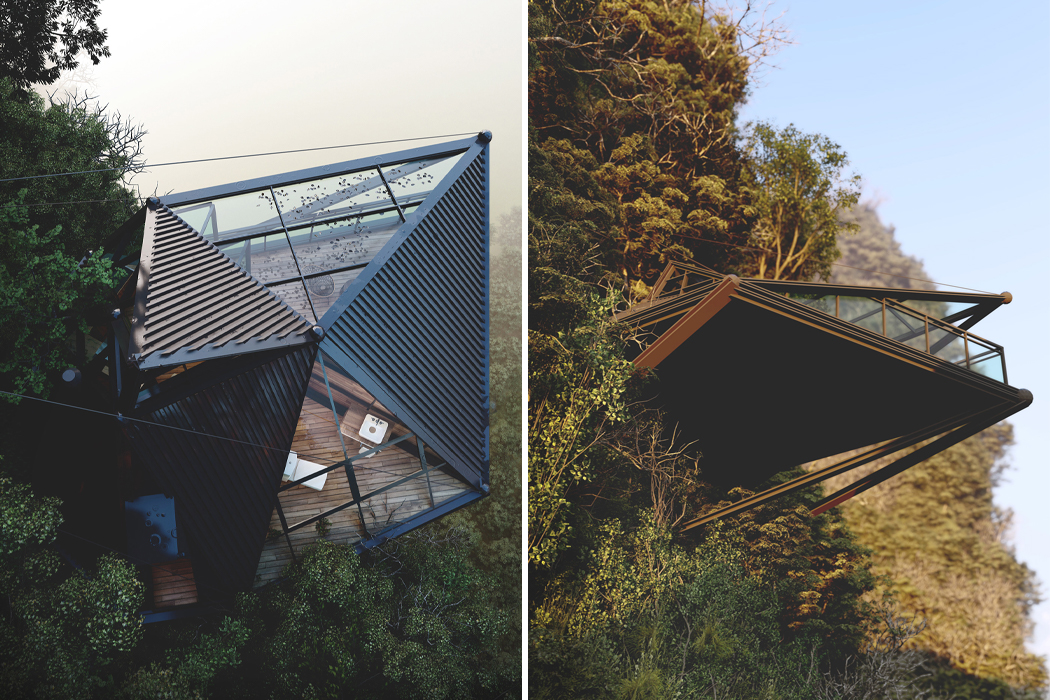
Liyanage’s Cliff Cabin, as he calls it, suspends from the side of a mountain, hovering in midair. In his 3D conceptualization, Liyanage visualizes Cliff Cabin locked in place above four support beams that are bored into the cliffside to create a secure enough foundation for Cliff Cabin to rest atop. In addition to its bottom support, four high-tensile cables are attached to the cabin’s roof and balance the cabin by drawing it back away from the cliff’s edge, evenly distributing the weight of the cabin. Globular spheres lock the cables in place and add an elegant and tidy touch to the cabin as a whole.

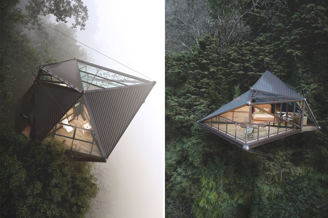
Cliff Cabin takes on a primarily triangular shape, with right triangle glass facades sharpening the cabin’s sides and protruding out to their center of convergence. Cliff Cabin is more modern in design compared to Liyanage’s previous architectural visualizations, lending room for the exterior to mainly consist of metal cladding and glass windows. Inside, however, Liyanage’s Cliff Cabin seems to be entirely made up of natural wood elements, creating a cozy ambiance in contrast to the durable and daunting exterior. The cabin’s natural wood accents and metal overhead awnings seem to merge on the cabin’s deck, where a metal roof protects the cabin’s guests from bad weather and wooden panels line the floor below.

Designer: Thilina Liyanage

Suspended above a mountainside with support from high-tensile cables and steel beams, Cliff Cabin is as eye-catching as it is daunting.

Clif Cabin perches from the cliffside like a life-size bird’s nest.

Taking on a triangular shape, Cliff Cabin is more modern by design with glass window skylights and metal roof cladding.

Cliff Cabin’s weight is evenly distributed across the four metal beams that work as the structure’s foundation as well as the four high-tensile suspension cables.

While the exterior of Cliff Cabin is entirely constructed from glass and metal, the cabin’s interior finds warmth in natural wood elements.

A giant blue slide sits in the middle of this modern family home!

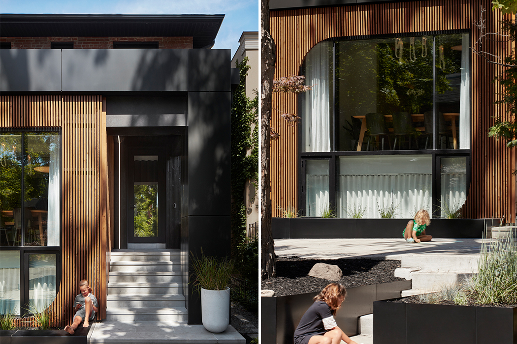
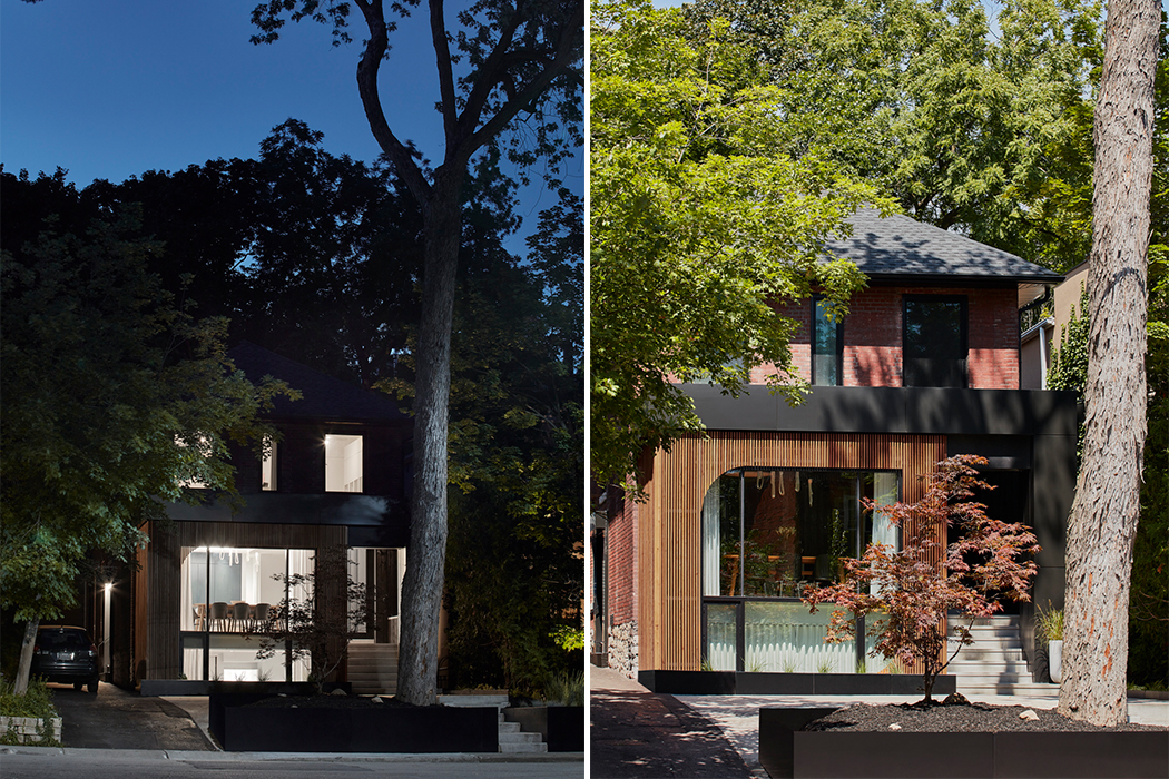
Who said slides were only for kids? Reflect Architecture answered the calls of all us adults who still love the thrill of going down a slide and no longer have to be embarrassed about it. The team renovated a house for a young family living in Toronto, Canada, by brightening its otherwise minimal interiors with a pale blue slide that runs in the center of the structure. It is a skill to have a slide in a family home without taking away from the grown-up aesthetic. This is the only way I would like to leave the home for work or come down for breakfast!

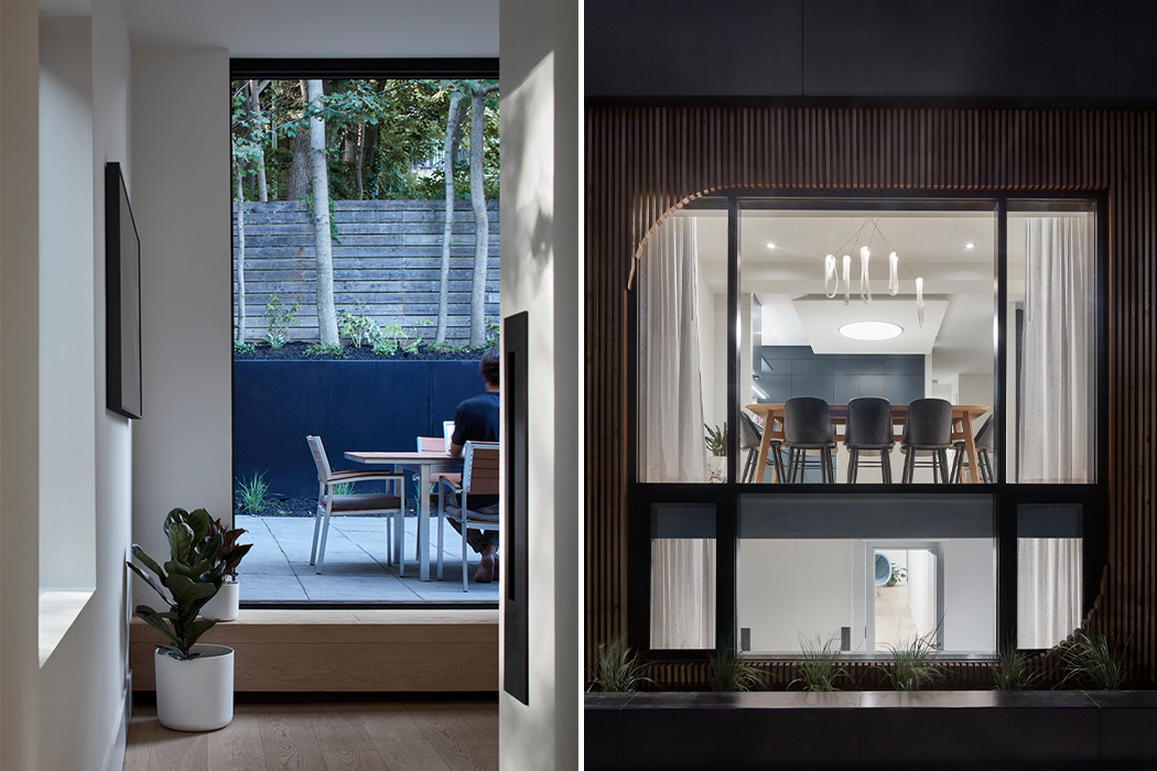
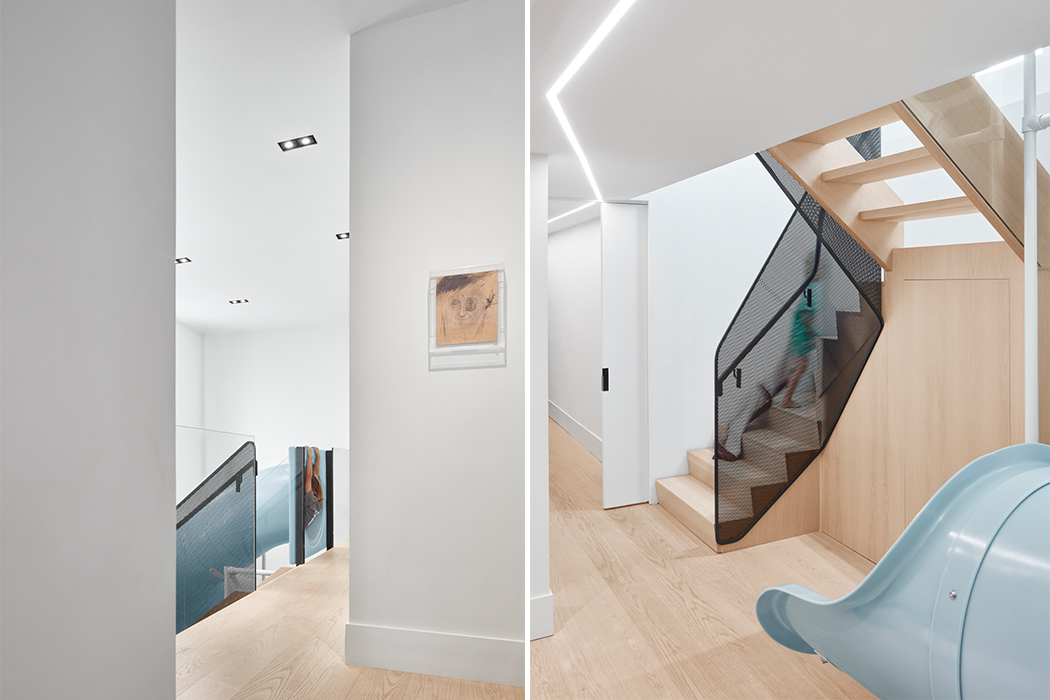
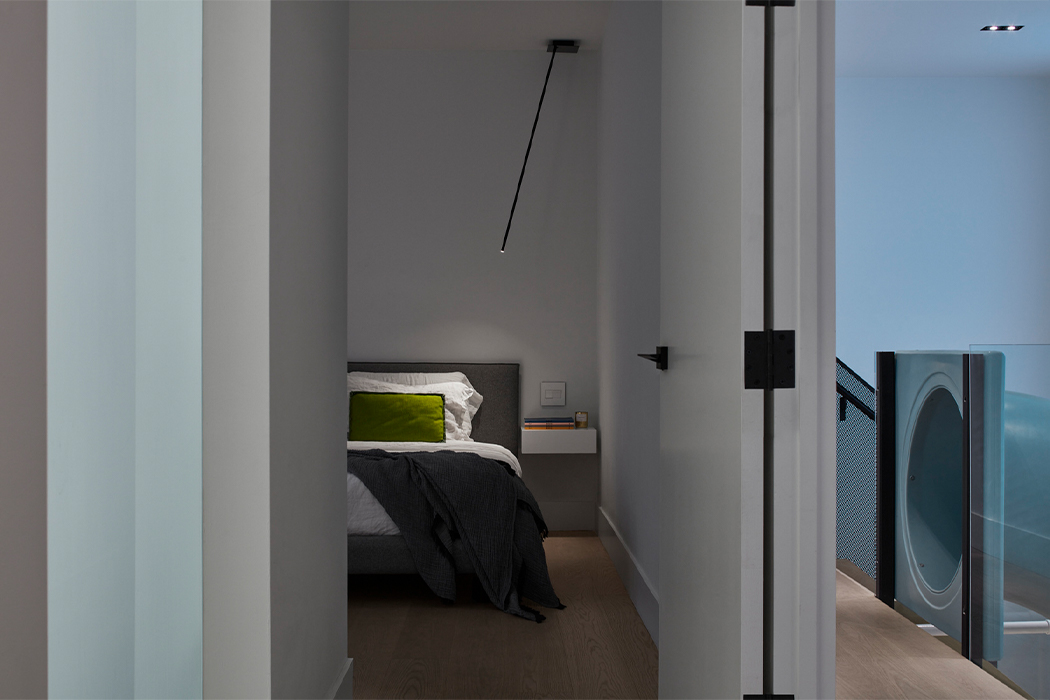
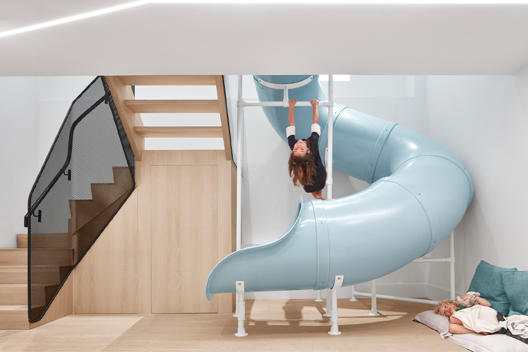
The renovated house is named Walker and the updated layout aimed to create lighter, open spaces that better serve the family’s lifestyle while pro more bonding and playtime. At the heart of the house is the children’s twisting blue slide which connects the basement level to the ground floor. It was included to liven-up the lower-level, bring in natural light to the space, and make it “not basement like”. The parents are entrepreneurs in the health and wellness space so it was important to have a feature in the house that encouraged better mental and physical health, therefore elements were picked to integrate play in their lives. “When I got the initial design brief, they noted wanting to keep the second floor as a separate unit to rent out and hence we combined the basement level with the lower level to create a single-dwelling for the family,” said the team.

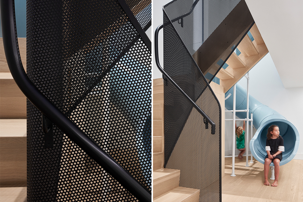
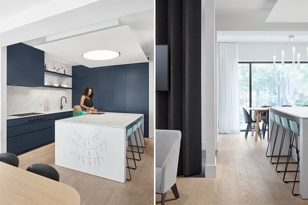
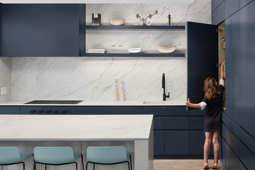
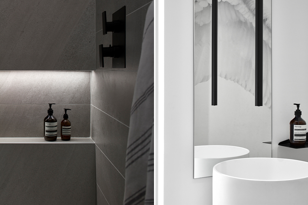
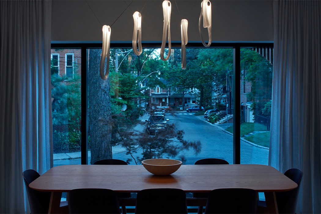
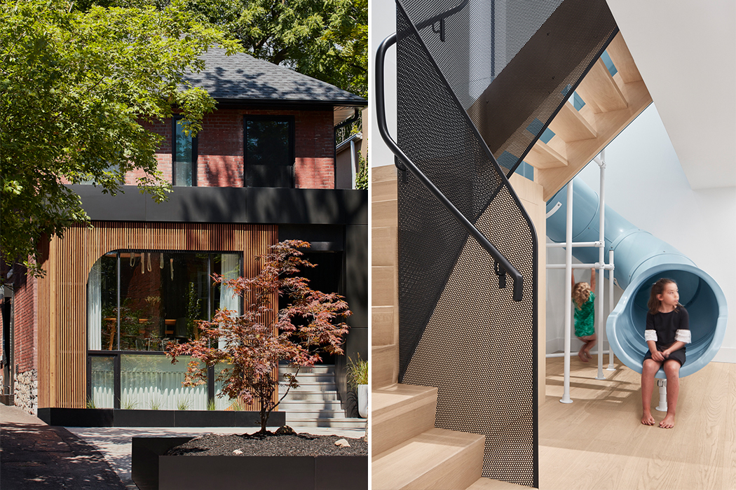
The now brightened-up basement is where three children’s bedrooms are located with three bathrooms and a guest bedroom. The ground floor is where the couple gets their space with the master bedroom and ensuite. Common areas like the study kitchen, dining, and entertainment zone are also on the ground floor. The two floors are also connected via a folding wooden staircase next to the slide. This staircase is lined with a perforated-metal balustrade and lit by night lights integrated into the ceiling so nobody has to crawl up a slide – something we have all learned is basically a kid’s version of mission impossible. Windows were expanded and sliding doors were added to open up the house some more. The street-facing side of the lower level features metal panels, wooden louvers, and dark wood cladding that has been treated using the Japanese technique of ‘shou sugi ban’. Walker’s interiors showcase a simple and minimal material palette of light wooden textures, marble countertops, white walls with pops of color in cabinets, and of course the slide. The client wanted a “calming canvas to live their life on” and Reflect Architecture delivered!

Designer: Reflect Architecture