New Patent Shows Motorola’s Foldable Tracks and Bends to Your Will: A Smarter Hinge for the Future

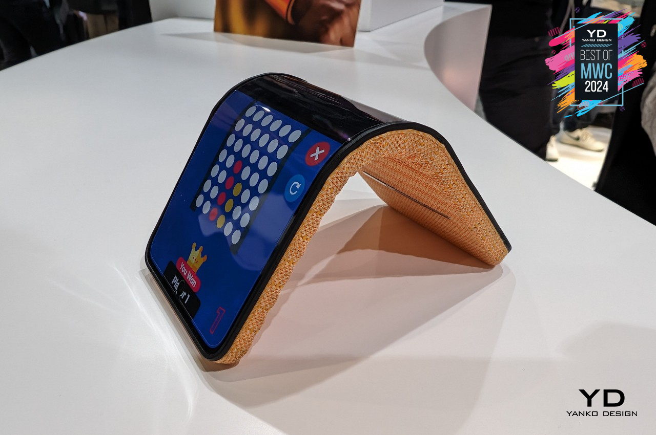
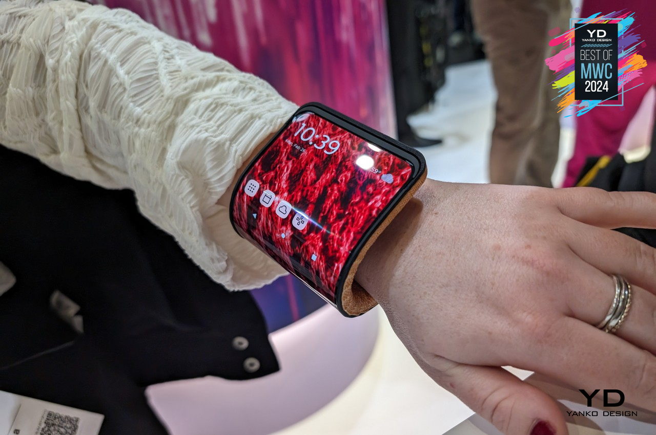
Motorola is pushing the boundaries of foldable smartphones with a new patent that introduces a hinge mechanism capable of autonomous adjustment, adapting seamlessly to user movements. This novel approach aims to make foldable devices more intuitive, elevating the user experience to new levels of comfort and convenience.

Designer: Motorola + Lenovo
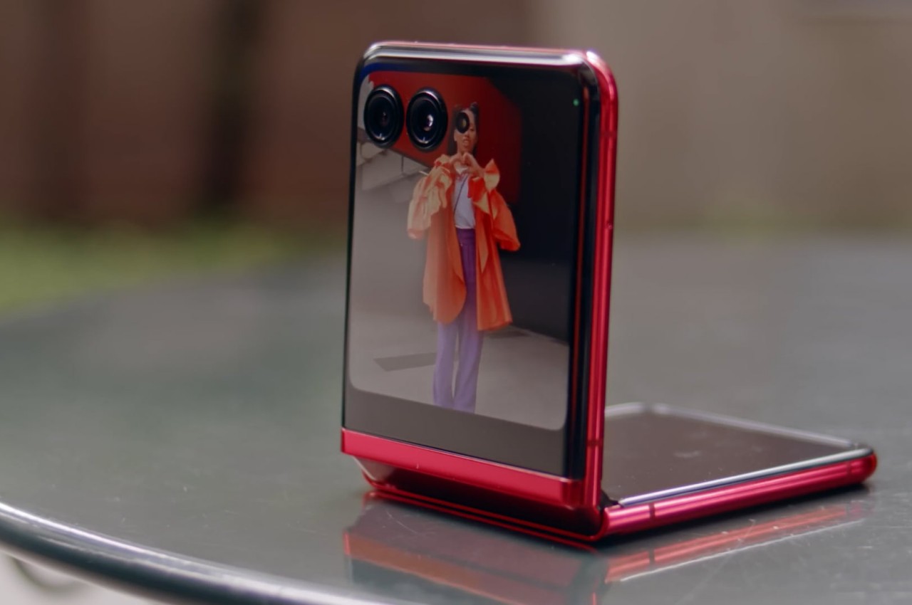
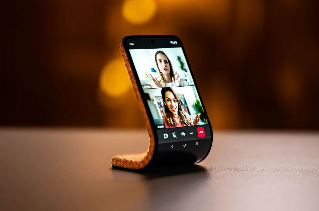
The patent, titled “Autonomous Form Factor Control of a Foldable Mobile Device,” describes a hinge that can automatically adjust its position using a combination of shape memory alloys (SMA) and linear resonant actuators (LRA). The hinge dynamically shifts its angle to optimize viewing based on the user’s movements, offering a physical solution to an ergonomic problem. It’s similar in concept to Apple’s Center Stage, but instead of software adjusting the frame, this device physically adjusts itself to keep the user in view.

Breaking Down the Technology

The hinge utilizes Shape Memory Alloys (SMA), which are smart materials originally developed for aerospace applications. SMA can change shape when exposed to heat, which is generated here through electrical currents or kinetic energy. As the user moves, SMA expands or contracts to tilt the hinge, ensuring the display remains aligned with the user’s position. Imagine watching a video or participating in a call where the screen moves to stay in sync with you—Motorola aims to deliver this convenience.

Image: 91mobiles

Linear Resonant Actuators (LRA) work in tandem with SMA to provide precise linear movements. They function like a spring system to keep adjustments smooth and accurate. Together, these components allow for dynamic hinge movement, eliminating the need for awkward manual repositioning during use.
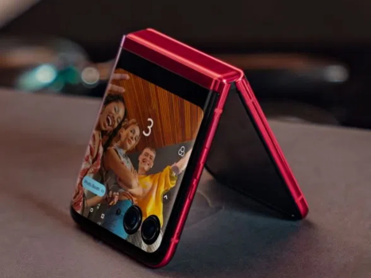
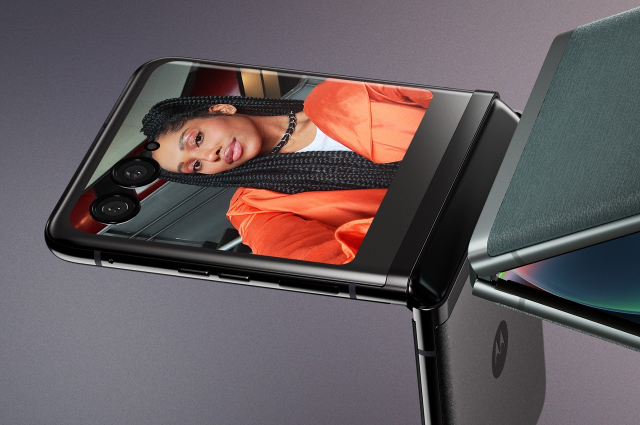
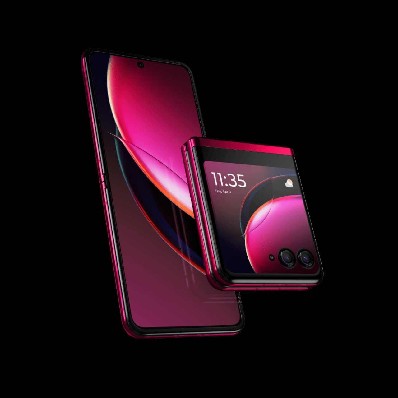
Motorola RAZR Plus

How It Works

Motorola’s patent images show the foldable phone using onboard sensors, including cameras, to track user movement. Depending on whether the user moves closer, farther away, or remains still, the hinge adjusts accordingly. The patent outlines different modes, like Tent Mode and Stand Mode, each designed to provide an optimal screen position for varying user activities.

In Figure 3, the hinge changes its elevation in response to the user’s head movement, keeping the display at an ideal angle. If the user leans forward, the hinge tilts upward; if they move back, it lowers. This feature improves ergonomics and reduces strain, creating a more comfortable viewing experience.

Image: 91mobiles

Unlike software-only solutions that rely on reframing the content, Motorola’s hinge brings a tangible, mechanical adaptation to user movement. This could also enhance shared viewing experiences, such as group video calls or presentations, making it easier for everyone to see the screen.
Lenovo’s Auto Twist AI PC Proof of Concept at IFA 2024

Motorola’s innovation isn’t happening in isolation—Lenovo showcased a similar concept at IFA 2024 with the Auto Twist AI PC Proof of Concept. Lenovo’s vision involves AI-controlled hardware that autonomously adjusts itself, bridging the gap between software-driven user personalization and physical hardware adaptability. The Auto Twist AI PC leverages AI to change the laptop’s configuration and position, adjusting to different modes, such as laptop, tablet, or tent mode, based on user activity. It can even close the lid when left unattended, providing convenience and security.
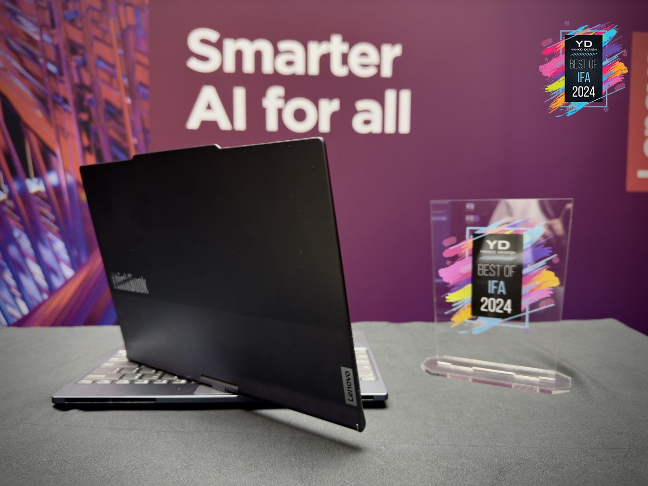
This concept from Lenovo shares parallels with Motorola’s patent for a dynamic folding hinge. Like Motorola’s hinge that autonomously adjusts based on user movement, Lenovo’s design integrates motorized hinges and AI to create a fluid transition between different laptop modes. The idea is to reduce the need for manual intervention and make the devices more user-friendly. While the Lenovo Yoga series has long offered flexibility through multiple modes, the Auto Twist AI PC takes this a step further by introducing autonomous adjustments. The ability to track user positioning and proactively respond by shifting configurations could significantly enhance the user experience—very much in the same vein as Motorola’s foldable phone.

Why This Matters

With CES 2025 around the corner, I expect Motorola and Lenovo to have proof of concepts for us to test. This autonomous hinge system is a significant step forward for foldable and convertible technology. While foldable devices are often seen as cutting-edge, they sometimes lack the functionality that justifies their complexity. By introducing automatic hinge adjustments, Motorola is making foldable phones more responsive and effortless to use. Whether multitasking, consuming content, or going hands-free, this design solves a usability problem that has limited the practicality of foldable devices.
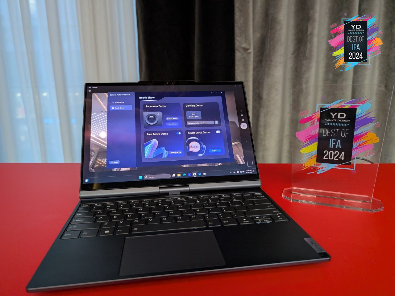
Lenovo’s proof of concept shows how AI-driven automation could become a broader trend across different types of devices, including laptops. Both Lenovo and Motorola envision a future where devices anticipate user needs and make physical adjustments, moving away from passive tools requiring constant manual configuration to smart companions that enhance the user experience.

Comparison to Existing Solutions

Motorola’s innovation draws parallels with Apple’s Center Stage but pushes the idea further by integrating physical hardware movement. Instead of relying solely on software, this solution combines mechanical adjustment with tracking to create a more immersive, seamless user experience.
Patent images detail Tent Mode and Stand Mode, showcasing the benefits of automatic adjustment. In Tent Mode, the hinge adjusts to keep the screen centered for easy content sharing or watching videos hands-free. Stand Mode tilts the screen to align with the user’s eye level, enhancing comfort and reducing strain.

Why This is Notable

  • Motorola’s foldable phone can autonomously adapt to users’ needs, making it innovative and practical.
  • Integrating SMA and LRA provides a robust hinge design that reacts to user behavior, enhancing comfort and usability.
  • Lenovo’s Auto Twist AI PC concept hints at a future where more devices incorporate AI-driven physical adjustments.
  • This adaptability could become standard across laptops, tablets, and foldable phones, focusing on devices that adapt to human behavior.
  • Motorola and Lenovo’s hinge technologies could redefine foldable devices, turning them into adaptive companions that offer everyday benefits.
  • These advancements set new benchmarks for the foldable and convertible market, aiming to transition from concepts to consumer-ready products that transform the industry.

The post New Patent Shows Motorola’s Foldable Tracks and Bends to Your Will: A Smarter Hinge for the Future first appeared on Yanko Design.

Motorola Edge 50 Neo leak shows off Pantone colors and minimalist design

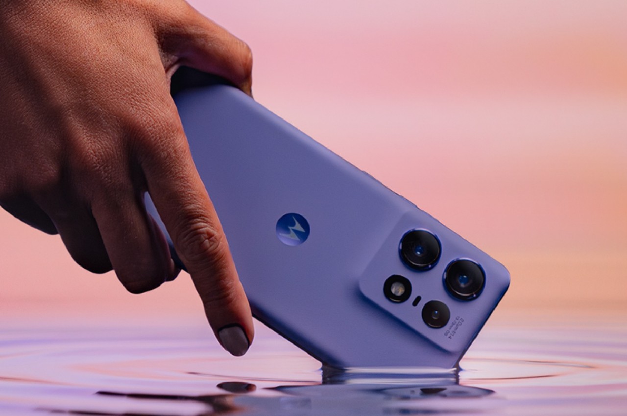
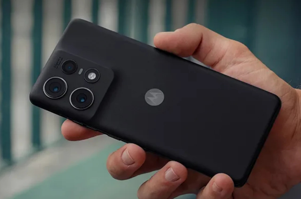
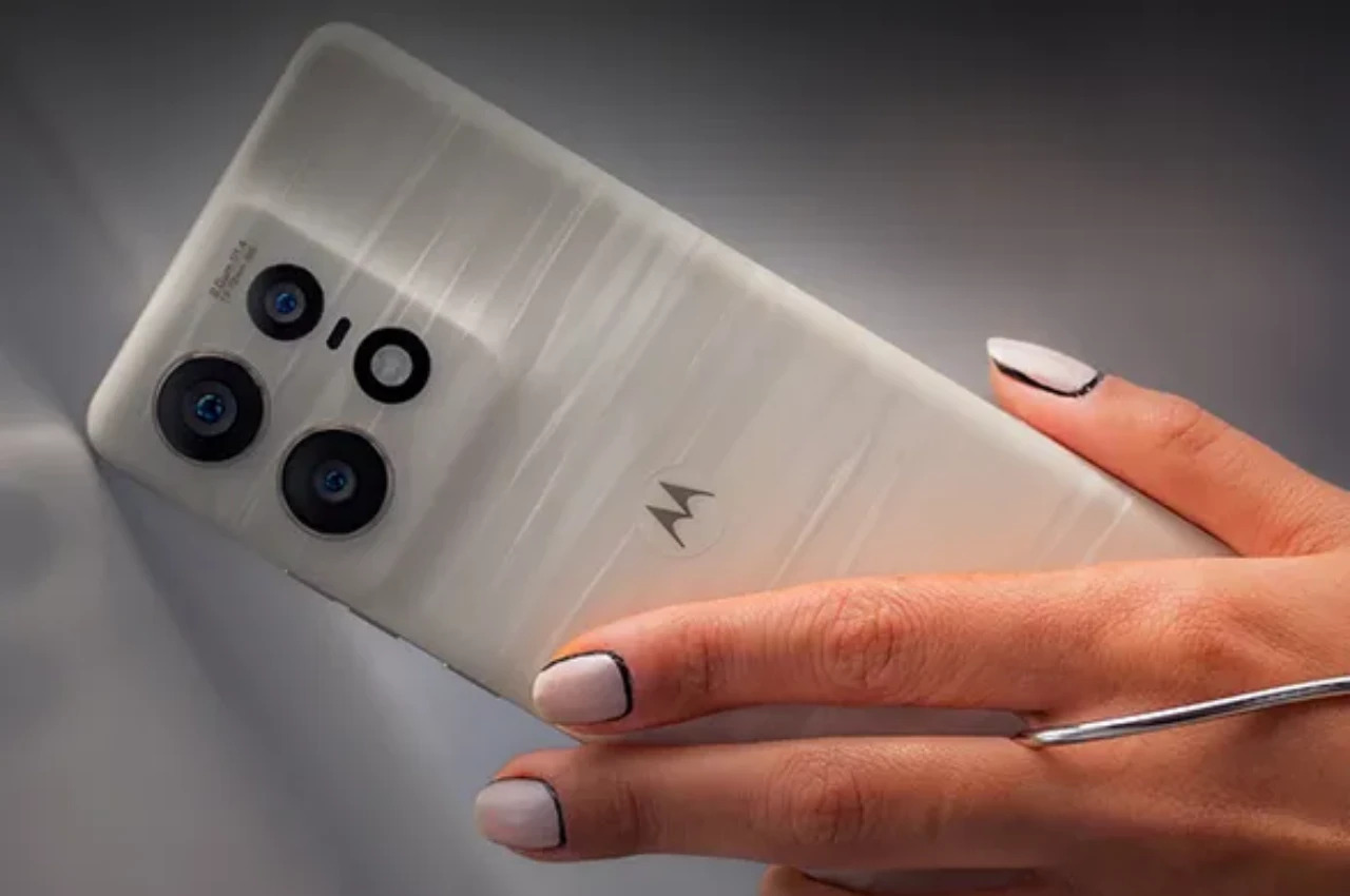
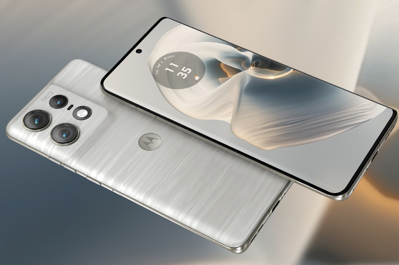
Smartphone brands have thankfully become more conscious of the design of their phones, or at the very least are now talking more about that aspect of the product. Not everyone gets it right, of course, especially if you look at some of the ginormous camera designs on phones these days. Once in a while, though, you come across a design that still delivers the promise of powerful cameras without being as in your face as their other kin. This year, Motorola’s Edge 50 series seems to have hit the target with a smooth and elegant minimalist design, as shown by leaked images of the upcoming Motorola Edge 50 Neo. Strangely enough, it calls to mind a design that we actually liked and wished stuck around longer.

Designer: Motorola (via Evan Blass/evleaks)

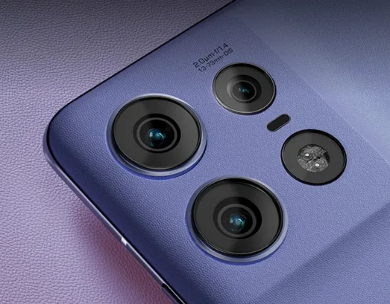
In 2022, we reviewed the OPPO Find X5 Pro which seemed to defy convention with a rear design that ditched the usual metal island that surrounded smartphone cameras. Instead, it used a gentler, curving slope that looked distinctive, less noisy, and more elegant, but it sadly didn’t last more than that year’s OPPO flagship. Whether by coincidence or by design (pardon the pun), it’s like that aesthetic has suddenly resurfaced where we least expect it.

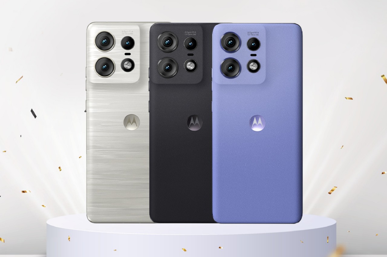
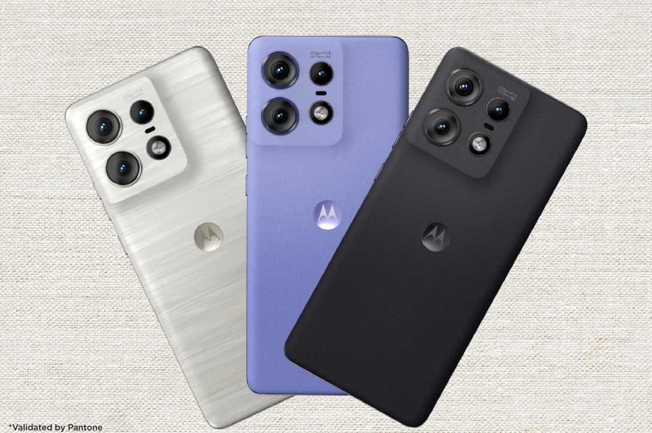
A serving of official-looking renders reveals the design of the Motorola Edge 50 Neo or at least its back, and we can’t help but get a sense of deja vu. Not that we’re complaining, since it’s quite a striking and unusual appearance, and it’s not even limited to this particular model. All members of the 2024 Edge 50 family bear this same design language, including the Motorola Edge 50 Fusion with only two cameras on its back.

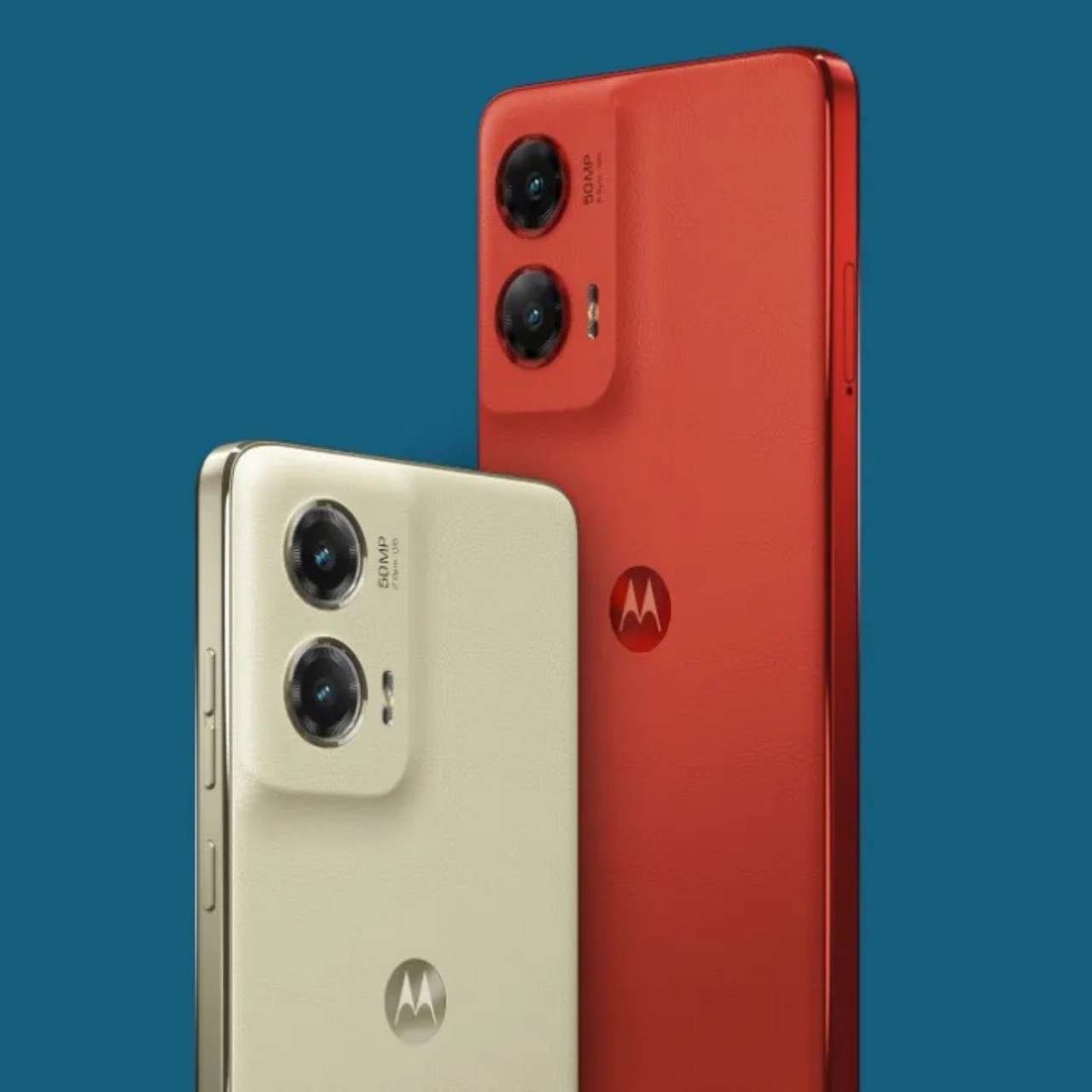
Also like its other siblings, the Edge 50 Neo is Pantone-certified, a mark it bears proudly as well. This particular model will come in four color options: Grisaille (Gray), Nautical Blue, Poinciana (Red), and Latte (Beige). The images also suggest that the phones will bear the same textured material on their back, which not only gives them a luxurious feel but also improves their grip.

Other than these visual details, however, not much is known about the Motorola Edge 50 Neo just yet. It will have three cameras, and it might follow in the footsteps of the base Edge 50 model with a 50MP main camera, a 10MP 3x optical zoom telephoto camera, and a 13MP ultra-wide shooter. But as beautiful as this phone looks, consumers might end up a little bit confused as there will be not only two, not even three but four Motorola Edge 50 models to choose from when the “Neo” finally launches.

The post Motorola Edge 50 Neo leak shows off Pantone colors and minimalist design first appeared on Yanko Design.

Motorola just debuted its AirTag Killer with Android-compatible tracking and a clever extra feature

Motorola just announced its Android-based device tracker, and I’m sure if you saw it too, you’d have the same thoughts as I did. It looks very familiar… Almost too familiar. Modeled precisely on Apple’s AirTag, the Moto Tag is a tiny tracking device that works within the Android OS, allowing you to effectively and accurately track your belongings. When I first saw the Moto Tag, I found myself feeling a familiar sense of smugness at the fact that an Android company copied Apple (they did with the removal of the headphone jack, with the camera notch)… but then I remembered that the inverse is also true. The WWDC event was pretty much Apple announcing Android-like features for the iPhone, and rebranding Artificial Intelligence to Apple Intelligence. The catch there was that Apple took its sweet time to implement these features, but also did a better job. If you extend that benefit of doubt the other way, it becomes a lot easier to appreciate the Moto Tag for what it brings to the table.

Designer: Motorola

Like the AirTag, the Moto Tag is a small, circular disc slightly larger than a quarter. It boasts a user-replaceable CR2032 battery that Motorola claims will last a full year on a single charge. While it lacks a built-in keyring loop (there’s a clever reason why it copies the AirTag so shamelessly), it integrates seamlessly with the revamped Google Find My Device network. This ensures easy pairing with countless Android smartphones, allowing users to locate and even make the Moto Tag play a sound for easier retrieval.

Looking towards the future, Motorola has equipped the Moto Tag with ultrawideband (UWB) technology. This paves the way for “precision tracking,” a feature that will provide detailed on-screen instructions for finding the tracker when you’re in close proximity. While similar to Apple’s Precision Finding with AirTags, this functionality currently awaits an update to Google’s Find My Device network.

However, the Moto Tag boasts a unique feature that sets it apart: a built-in button. This button, cleverly placed where the “M” of the Motorola logo sits, can be pressed to make your paired smartphone ring. This comes in handy in those moments when you’ve misplaced your phone but have the Moto Tag within reach.

The multi-functionality doesn’t stop there. The button can also be used to trigger the camera shutter or recording button on Motorola phones, or any Android phone for that matter, making capturing content on the go a breeze. Finally, the Moto Tag is IP67 rated for dust, water, and dirt resistance, ensuring it can withstand everyday bumps and spills without compromising its tracking abilities.

But before you bash Motorola for being unimaginative or blatantly copying a product’s shape and size, there truly IS a clever reason why Motorola probably chose to make their tracking device look almost exactly like their competitor. Apple’s AirTag already has a flourishing accessory ecosystem. From holders and hangers to carabiners and even stickers that let you attach your AirTag to the inner lining of suitcases and laptop bags, the AirTag has no shortage of accessories to accompany it… and by copying the AirTag’s form factor, Motorola’s ensured absolute compatibility of every one of these accessories with the Moto Tag too. It’s genius, to leverage your competitor’s success to boost your own product. Isn’t it?!

The post Motorola just debuted its AirTag Killer with Android-compatible tracking and a clever extra feature first appeared on Yanko Design.

Motorola Razr+ 2024 foldable phone upgrades might be invisible to the naked eye

After a short lull, we are entering the second half of this year’s batch of smartphones, most of which will be focused on foldable designs. While Samsung naturally grabs the spotlight, it’s hardly the only game in town. Motorola will try to beat Samsung to the punch next week when it reveals the latest iteration of the spiritual successor to its iconic RAZR clamshell, a foldable phone that some might even consider to have a better design. It seems, however, that expectations need to be tempered a little, as the 2024 Razr+, or the Razr 50 Ultra in other markets, might not carry any visible mark of being a new model, as the improvements will mostly be internal and invisible, at least based on this latest leak.

Designer: Motorola (va @MysteryLupin)

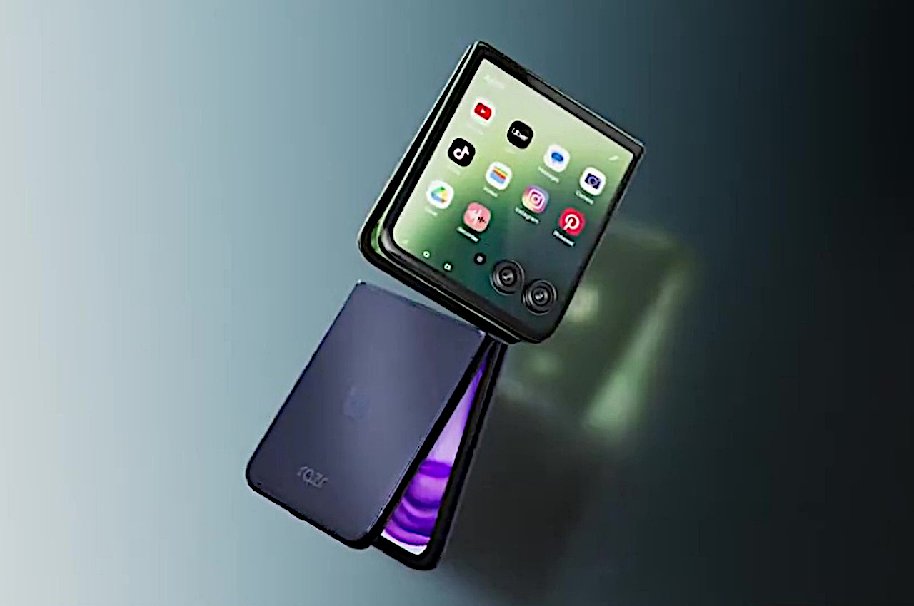
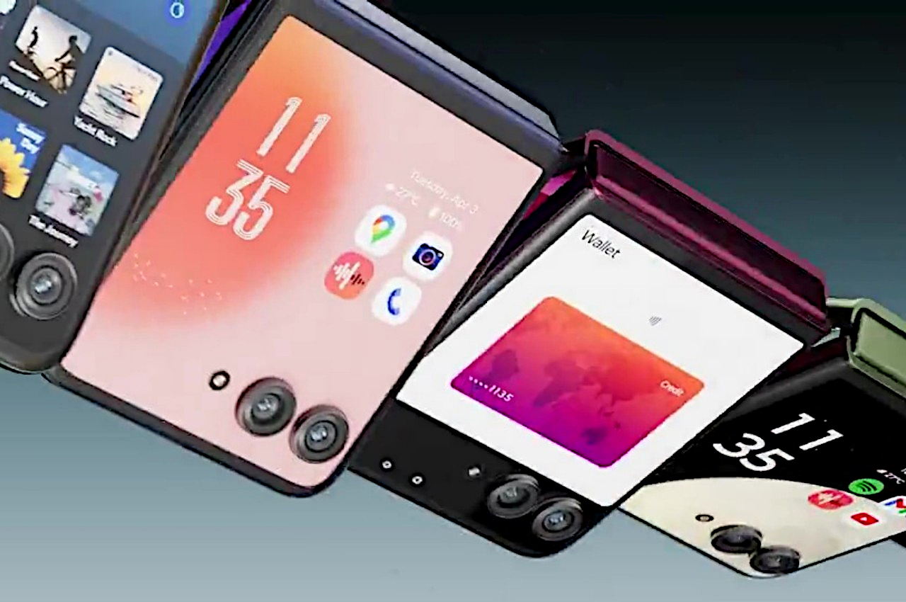
To give credit where credit is due, Motorola has always taken the bolder stance when it came to the design of its clamshell foldable. It was the first to use a large second screen on its back, and it’s now the only one that has a Cover Display that, well, covers the entire surface of the phone’s upper back. There will always be debates on whether having two holes on that screen for the cameras is better or worse than the tab-like cutout on the Galaxy Z Flip, but there’s little argument that it opens the door to more functionality, including displaying the same app on the outside that runs inside.

This signature feature of the Motorola Razr+ line isn’t going to change this year apparently, not even to slightly increase the screen size (the base Motorola Razr/Motorola 50, however, is getting the full-screen treatment this year). In fact, you might not be able to distinguish the 2023 and 2024 models just by looking at them. Of course, there will be upgrades, but most of them are the invisible features of the phone, and we’re not talking just about specs.

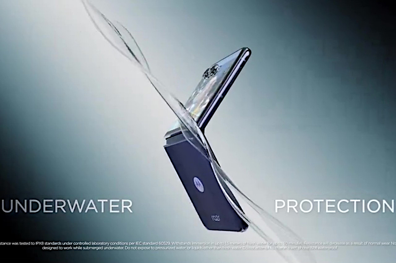
For example, this year’s Motorola foldable will bump up the water protection, though worryingly at the cost of dust protection. According to a leaked promotional video, the Motorola Razr+ (2024) will have an IPX8 rating that’s more in line with what Samsung offers. That means it will survive an accidental dip in a pool or sink, but there’s no guarantee it will be protected from dust or smaller particles. Unfortunately, some might argue that the latter is actually more fatal to foldable phones and their hinges than water damage.

There’s also an indication that one of the cameras will finally have a telephoto lens, but the number of cameras won’t be increasing by one either. That suggests that Motorola will either ditch the regular “wide” camera or the ultra-wide shooter, though the latter is probably more likely. Again, it trades one feature for another, and hopefully, the benefits will far outweigh the sacrifices for Motorola’s customers. The Motorola Razr+ or Razr 50 is expected to debut next week.

The post Motorola Razr+ 2024 foldable phone upgrades might be invisible to the naked eye first appeared on Yanko Design.

Motorola Razr+ 2024 foldable phone: News, Rumors, Price, and Release Date

Google I/O 2024 has come and gone, and despite rumors and expectations, a new foldable phone was nowhere in sight. Of course, the Google Pixel Fold is hardly the only game in town, nor is it the only one that’s expected to debut really soon. Perhaps beating both Google and Samsung to the punch, Motorola’s next-gen foldable could be hitting shelves as early as June, though it will still be competing with the likes of the Samsung Galaxy Z Flip rather than the OnePlus Open and other larger foldables. Unofficial information about the device is quite thin, but the ones we’ve already heard are quite substantial and paint an interesting picture, one that could make the Motorola Razr+ 2024 or Motorola Razr 50 Ultra the clamshell foldable to beat this year.

Designer: Motorola

Motorola Razr+ 2024: Design

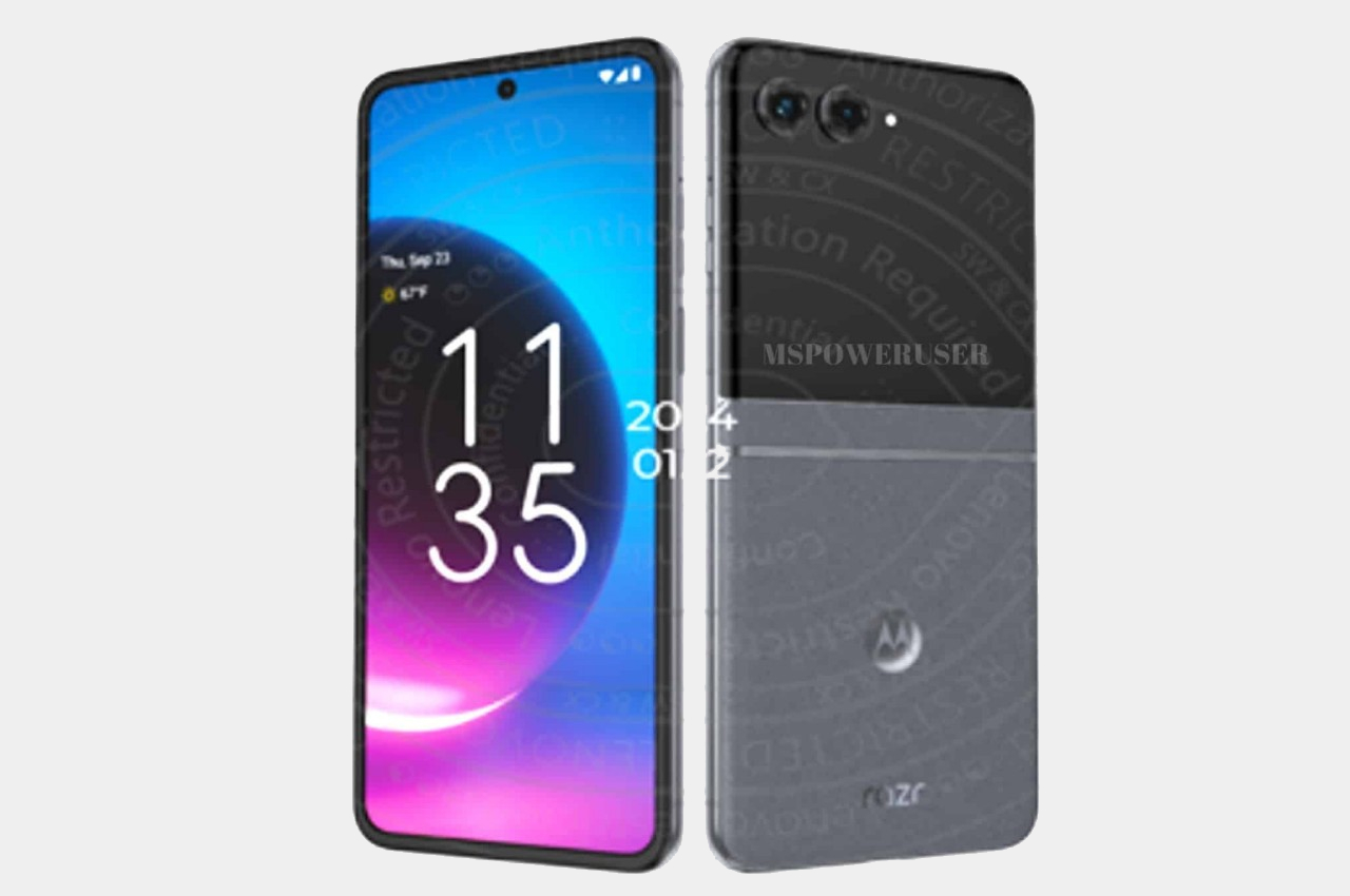
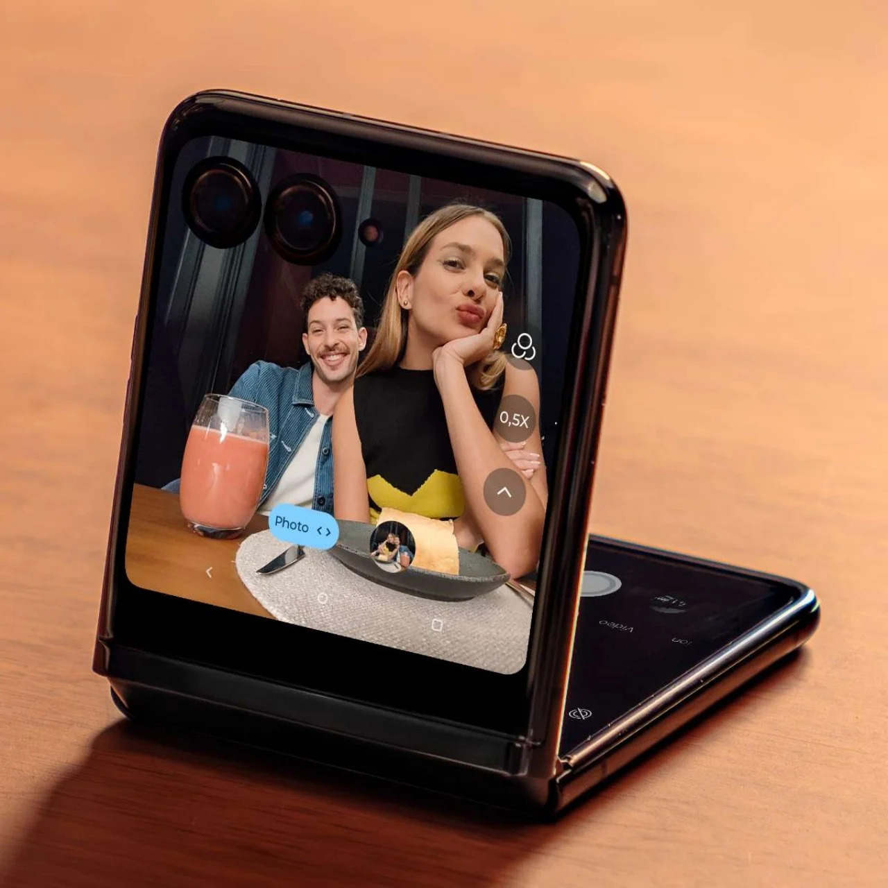
According to sources, this year’s Motorola foldable would look exactly like last year’s Motorola foldable, save for some changes in screen size. That means the Motorola Razr+ 2024’s external screen will still cover the entire surface of the upper half of the phone’s back, leaving only room for the camera lenses themselves. It might sound like a letdown and a sign of lack of innovation over at Motorola, but sticking to a design that works is also a sign of maturity, especially since the design is only a year old.

Image courtesy of: MSPoweruser

Motorola’s design for its Cover Screen is admittedly divisive. On the one hand, it’s the only foldable of its kind that utilizes the whole area, while others make do with tiny rectangles, even tinier circles, or a square with an uneven cutout to make way for cameras. On the other hand, this also makes for a weird arrangement that actually cuts out part of the display anyway, making the image or text in that area inaccessible.

Motorola is also the only brand that allows normal apps to run on that external screen, which is both an advantage and a disadvantage. Regardless, it seems to be sticking to its guns for one more year, offering an experience that, while faithful to the design spirit of the original RAZR, isn’t afraid to go beyond to offer something new and useful.

Motorola Razr+ 2024: Specs and Software

While the Moto Razr+ 2024, or Moto Razr 50 Ultra, won’t look any different on the outside, it will be a very different beast on the inside. Of course, there’s the new Qualcomm Snapdragon 8s Gen 3 leading the changes, and there will supposedly be a larger external screen at 3.9 inches up from last year’s 3.6-inch Cover Screen. There will also be 12GB of RAM paired with 256GB of storage, while the battery has been expanded from 3,800mAh to 4,000mAh.

Given the expected launch windows, the 2024 Razr will be running Android 14 out of the box, and while it might sound like Motorola would upgrade it once Android 15 comes out, there’s not really any certainty. After all, the Motorola Razr+ 2023, which launched with Android 13, still received Android 14 half a year later. Despite being once owned by Google (now under Lenovo’s stewardship), Motorola’s track record for Android updates sadly isn’t that impressive.

Motorola Razr+ 2024: Cameras

Part of the big upgrades coming to the Motorola Razr+ 2024 according to those rumors is an upgrade to the camera system. It will now have not one but two 50MP cameras, one of which has a wide lens while the other is capable of 2x telephoto zoom. Given how Motorola advertises its foldable phone as a sort of mini camcorder, more capable cameras are definitely in order. The 32MP selfie camera, on the other, might remain the same as last year.

Motorola Razr+ 2024: Price and Release Date

There has been no word on the exact date when the Motorola Razr+ 2024 will be launched, which might go by the name of Motorola Razr 50 Ultra in other markets, but all signs point to yet another June release. In fact, the device was spotted making its way through a certification process, suggesting that its debut is close at hand. The leak also confirms what we’ve heard about the design, that it would be a dead knocker for last year’s model.

Image courtesy of: 91mobiles

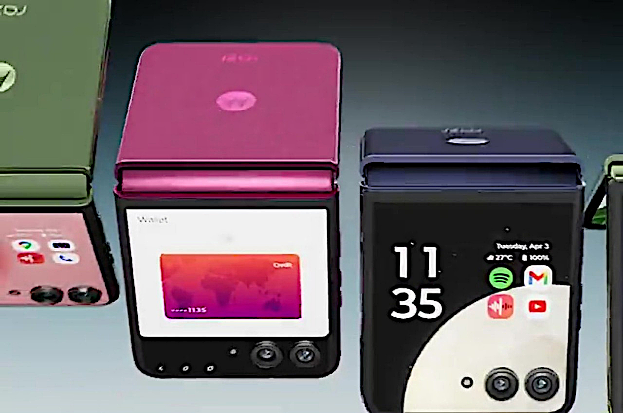
That leak also “revealed” the color options for the Razr+ 2024, which include Blue, Orange, and Green instead of last year’s Black, Magenta, and Peach. But the more interesting detail about the phone is its starting price of $999 for the base model with 12GB of RAM and 256GB of storage. That’s the same price for half the capacity last year, so it will definitely make the Motorola Razr+ 2024 the cheapest flagship foldable in the market.

Motorola Razr+ 2024: Final Thoughts

Although they are younger than the larger foldables like the Galaxy Z Fold, clamshell-style foldables have become better accepted and sought after. They’re usually more affordable and look more stylish, bringing to mind the flip phones of old. They’re pocketability makes a bit more sense to most people who don’t need a phone that turns into a tablet, and their accessible price tag makes them feel more like regular flagships rather than overpriced novelties.

Of the many foldable flip phones in the market right now, the Motorola Razr+ 2024 seems to offer a more reasonable balance of features and price, especially one from a reputable brand. It looks like this year will show a significant upgrade, at least internally, while still keeping the design that has won fans. That said, Motorola’s Android updates don’t inspire confidence, and we’ve yet to see it make any improvements in that regard.

The post Motorola Razr+ 2024 foldable phone: News, Rumors, Price, and Release Date first appeared on Yanko Design.

Moto G Stylus 5G 2024 lets you play with a pen without breaking the bank

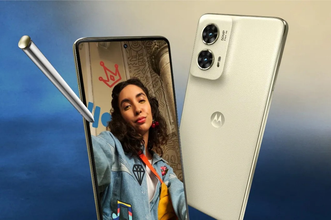
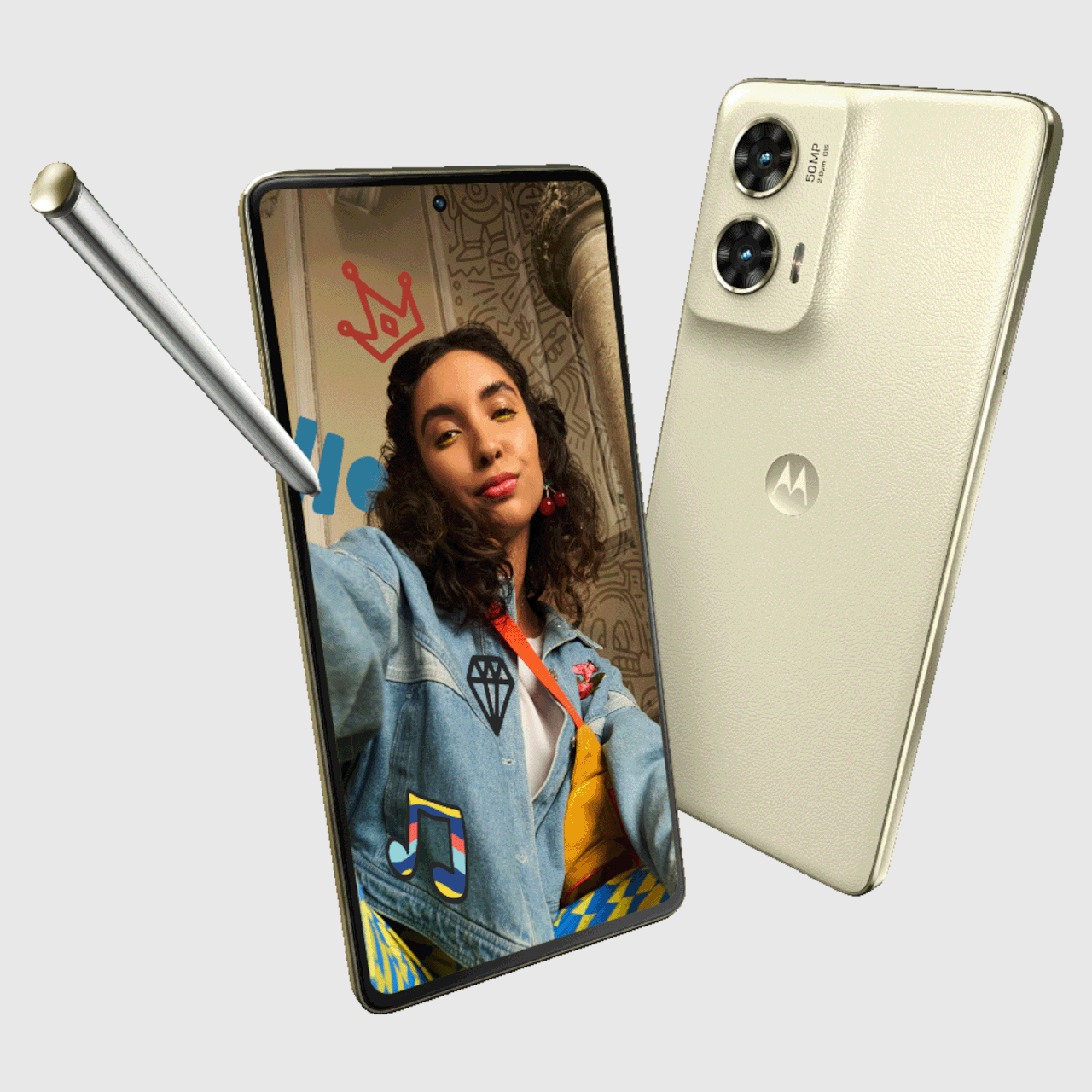
The announcement of the new Apple Pencil Pro has put the stylus in the spotlight again. This input tool isn’t just limited to tablets and large screens, though that’s where they have the most use because of the bigger digital canvas. Thanks to the Samsung Galaxy Note, now the Galaxy S Ultra series, it has been demonstrated that there is also some benefit to having a stylus on smartphones. Unfortunately, Samsung does seem to have a monopoly on that design or is at least the best-known example, but it isn’t the only game in town, and Motorola just revealed its latest contender that makes an admittedly attractive offer, at least if you’re not too intent on making pro-level artwork on it.

Designer: Motorola

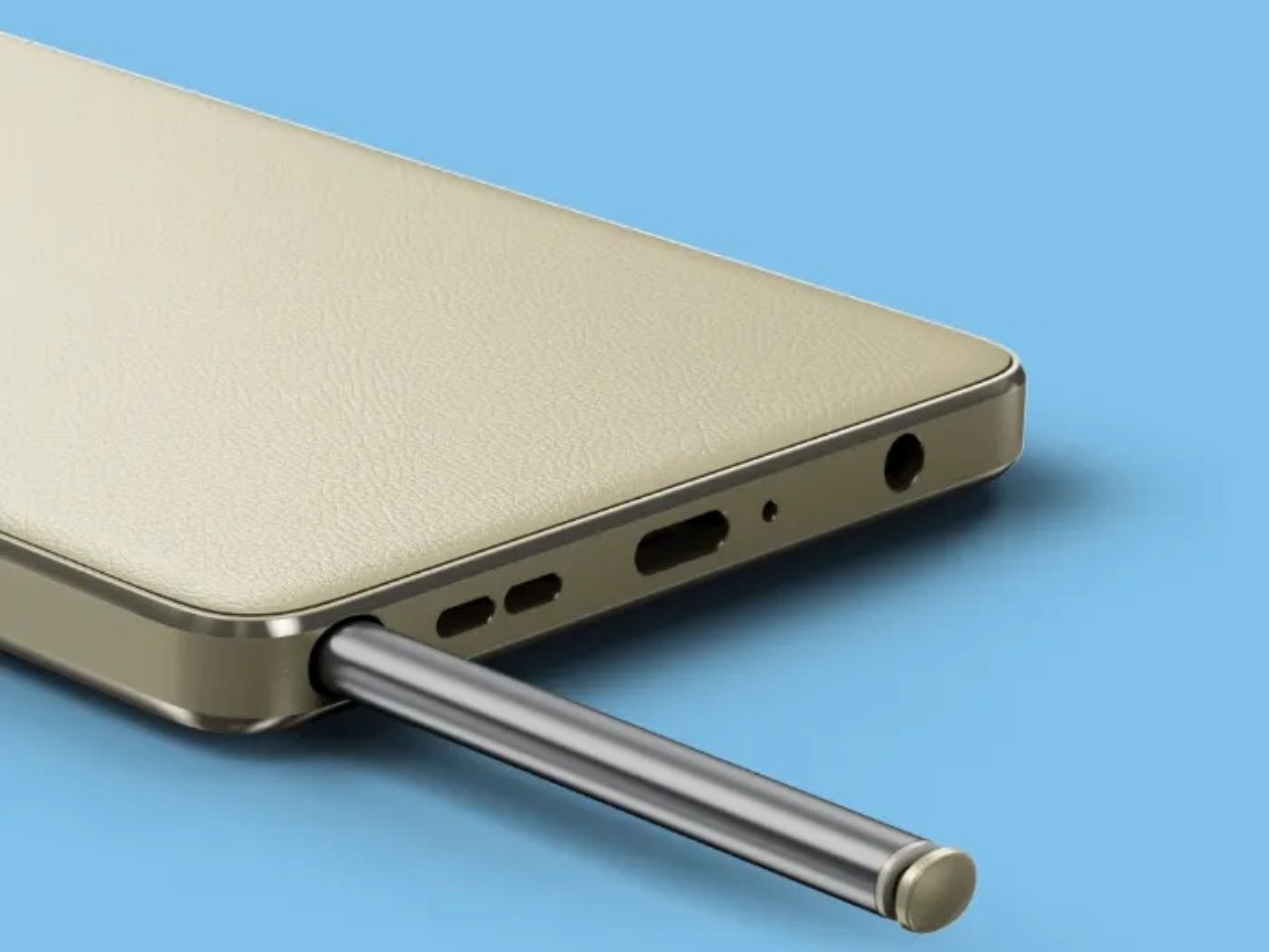
The stick inside the Moto G Stylus 5G (2024) is exactly that: a stick that works in place of your stubby finger. Unlike the Wacom-powered S Pen of the Galaxy S Ultra phones, it doesn’t have pressure sensitivity, rotation and tilt detection, or Bluetooth-enabled button functions. That’s actually not a big deal-breaker if all you really want to do is scribble notes, annotate pictures and documents, or even start a rough sketch that you’ll continue on a computer or laptop. For these purposes, the Moto G Stylus is more than sufficient, especially with upgraded sensitivity and new software arriving in this model.

The rest of the smartphone is a bit of a mixed bag, though thankfully leaning more on the positive side. It runs on a Snapdragon 6 Gen 1, which is the same processor it used for last year’s model. It does have more memory this time around, with 8GB offering a bit more wiggle room for apps. Another thing that is the same is that it still has a headphone jack, though no one will probably complain about that.

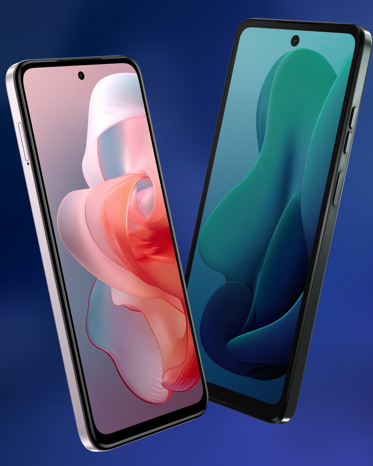
The fourth-gen Moto G Stylus 5G does bring some considerable upgrades to the table, starting with a larger 6.7-inch 120Hz screen, though it’s still stuck with a 1080p resolution. The 5,000 mAh battery might still be the same, but it now supports 15W wireless charging on top of fast 30W wired charging. The main camera still has 50 megapixels but has upgraded specs. It is joined by a new 13MP ultra-wide camera, while a new 32MP selfie shooter is on the front.

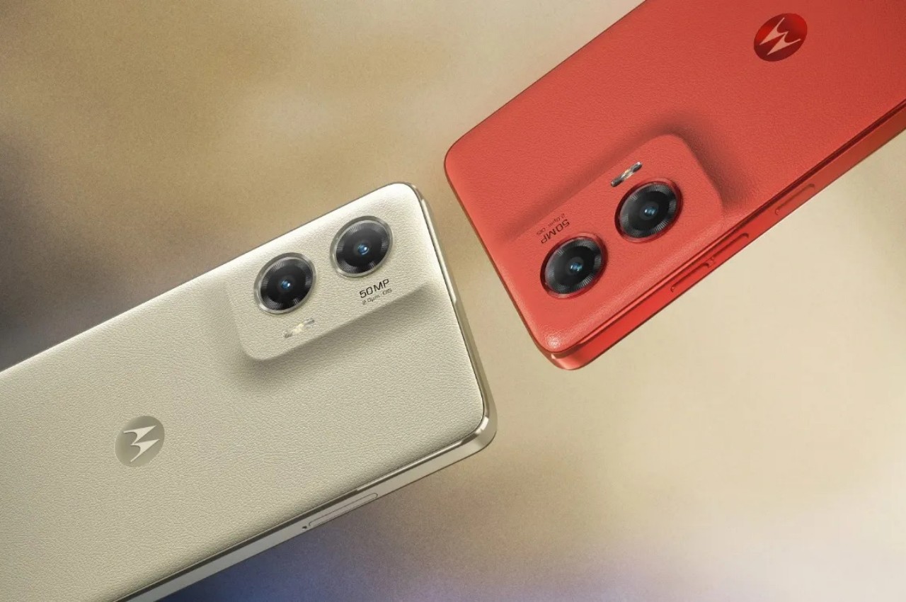
The Moto G Stylus 5G 2024 isn’t going to win awards when it comes to specs, but its $399 price tag is easily a fourth of the launch price of the Galaxy S23 Ultra. Motorola’s stylus-toting smartphone, however, does score points when it comes to looks, with a vegan leather material, a clean, minimalist rear design, and two colorful options that aim to inspire your creativity just by looking at it and touching it. The Moto G Stylus 5G (2024) goes on sale on the 30th of May.

The post Moto G Stylus 5G 2024 lets you play with a pen without breaking the bank first appeared on Yanko Design.

Elegant, minimalist smartphone design meets appealing features and price tag

Smartphone manufacturers are now thankfully more aware of the important role that design plays in a product’s success, especially its aesthetics and materials, but some tend to go overboard with that knowledge as well. We’ve seen pretty overbearing and garish phone designs that steal your attention in an aggressive way, particularly with camera bumps that make you feel like they’re the most important feature. The smartphone design landscape right now is dynamic, exciting, and sometimes a little too lively, so there are times when you want to take a breath of fresh air and settle down with something simple yet beautiful. That’s the kind of minimalist beauty that Motorola seems to be bringing with the new Edge 50 Pro, but it’s fortunately more than a pretty face, at least for a mid-range smartphone.

Designer: Motorola

Truth be told, the Motorola Edge 50 Pro’s design looks a bit familiar, at least if you’ve been keeping watch on the key market players for the past two years or so. Back in 2022, we reviewed the OPPO Find X5 Pro, a refreshing break from the design trends of its time. What differentiated OPPO’s flagship and this new Motorola entry is that their backs are made from a single, unbroken sheet of material with no visual or material break from the rest of the panel.

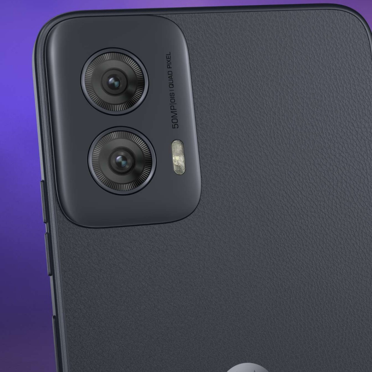
This trait gives the Motorola Edge 50 Pro a smooth and gentler aesthetic, exactly like how the cameras slope gracefully upward rather than being confined inside a metal enclosure. Other than the camera lenses and the iconic Motorola “bat logo” dimple, the phone’s back is pretty clean yet also attractive, a fitting tribute to the pervading minimalist design trend. Motorola also paid careful attention to the materials it used for the phone, which include soft vegan leather and eye-catching pearl acetate, surprising choices given the phone’s market segment.

The Motorola Edge 50 Pro runs on a Qualcomm Snapdragon 7 Gen 3 and has a decent though underwhelming set of cameras led by a 50MP main sensor. A similar 50MP selfie camera is housed in a rather noticeable punch-hole cutout on the forehead of the 6.7-inch 1220p 144Hz screen. A real killer feature, however, is the 4,500 mAh battery with a 125W super-fast charging speed and support for equally fast 50W wireless charging.

As a mid-range smartphone, the Motorola Edge 50 Pro thankfully comes with a matching price tag that starts at around $400, which is a pleasant surprise given its features. But just like the OPPO Find X5 Pro, limited availability and exposure might make this simply elegant smartphone fly under the radar despite the closer look it probably deserves.

The post Elegant, minimalist smartphone design meets appealing features and price tag first appeared on Yanko Design.

Moto G Power 5G (2024) is a budget phone with surprising tricks up its sleeve

Although a lot of the attention, and probably sales, are poured on high-end premium smartphones, the range of devices and designs is far wider than what you might see represented in media. There are, of course, products designed to be more affordable, though they unsurprisingly have to cut some corners when it comes to features. Sometimes, however, there are a few that seem to rise to the challenge of providing more for less, incorporating designs and features you wouldn’t expect from their price tags. The new Moto G Power 5G (2024) seems to be one of those, packing a few pleasant surprises that could put the device on people’s maps.

Designer: Motorola

The Moto G has been Motorola’s budget line for many years, and that family has a few members designed to cater to very specific needs. The Moto G Power, as its name suggests, is focused on delivering solid battery life, at least more than your average smartphone. The 2024 iteration of this phone isn’t any different, bearing a 5,000 mAh pack you’d only see on more expensive models, but that’s only half of its appeal.

A large battery would normally mean longer charging times, which is why a 30W TurboPower charging feature is more than just a nice-to-have; it’s a necessity. This year, however, Motorola went the extra mile and added 15W wireless charging for convenience. It’s definitely not the fastest wireless charging technology, but how many $300 smartphones can you name that even have any wireless charging support at all? That immediately makes the Moto G Power 5G (2024) more notable than any of its peers, but it doesn’t stop with the hardware features either.

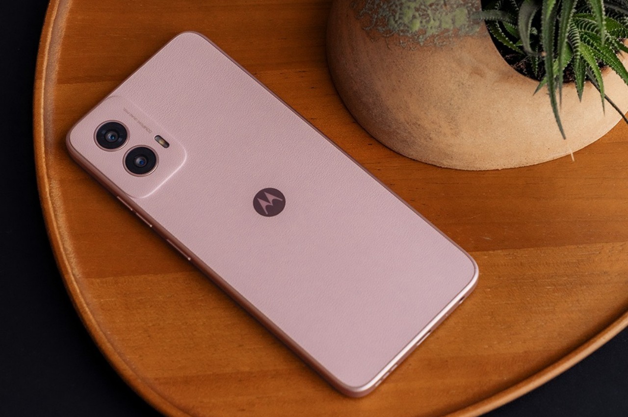
This new Moto G Power also comes with a faux leather back, an attempt to make it look stylish despite its price point. Granted this synthetic leather can sometimes look tacky, though it seems to be simple and elegant, at least based on Motorola’s marketing materials. Again, it’s not exactly a groundbreaking feature, but one that is rarely seen on budget designs.

That said, the phone doesn’t have much to boast about when it comes to performance, though it’s not exactly an underdog either. It packs a 2.2GHz MediaTek processor with 8GB of RAM, a 50MP main camera paired with an 8MP ultra-wide shooter, and perhaps to audiophiles’ delight, a 3.5mm headphone jack. And if the Moto G Power 5G (2024) is still a bit too much for your wallet, Motorola is also launching the $200 Moto G 5G (2024) with slightly less powerful features, no wireless charging, but the same fancy faux leather design.

The post Moto G Power 5G (2024) is a budget phone with surprising tricks up its sleeve first appeared on Yanko Design.

Moto Watch 40 design straddles the line between smartwatch and fitness band

Smartwatches have more or less become a stable presence in today’s modern lifestyle to the point that no one will make fun of you anymore for wearing a screen on your wrist, except those coming lovers of classic mechanical watches. That said, not everyone is a fan of these hi-tech timepieces and would prefer something less distracting and more focused on just the health-tracking aspects. Dedicated fitness bands, however, often come in sporty and rugged designs, as if the only ones that would wear them are athletes or very active people who don’t mind strapping a rubber or silicone band on their wrists, even on formal occasions. That’s where the new Moto Watch 40 comes in, offering a wearable that almost looks like a stylish smartwatch but is a fitness band at heart.

Designer: CE Brands (Motorola licensee)

Although there was a bit of experimentation in the beginning, smartwatches today come in only two shapes: a square or a circle. Although circular smartwatches were touted to be classier or more stylish because of their resemblance to the majority of luxury timepieces, the Apple Watch has constantly made the case for equally elegant designs on square smartwatches. Unsurprisingly, there are some manufacturers that have even opted to walk the same path, producing smartwatches that, for better or worse, look like the Apple Watch.

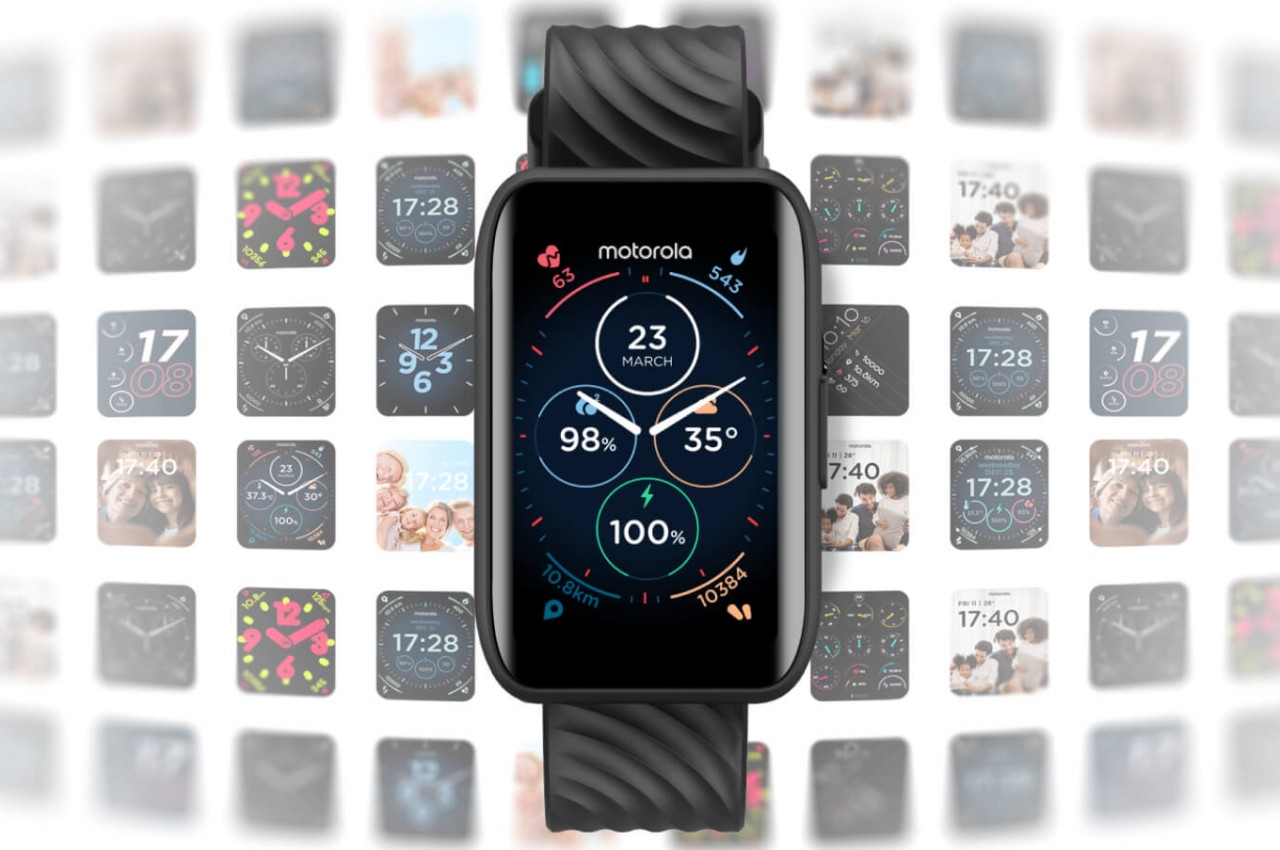
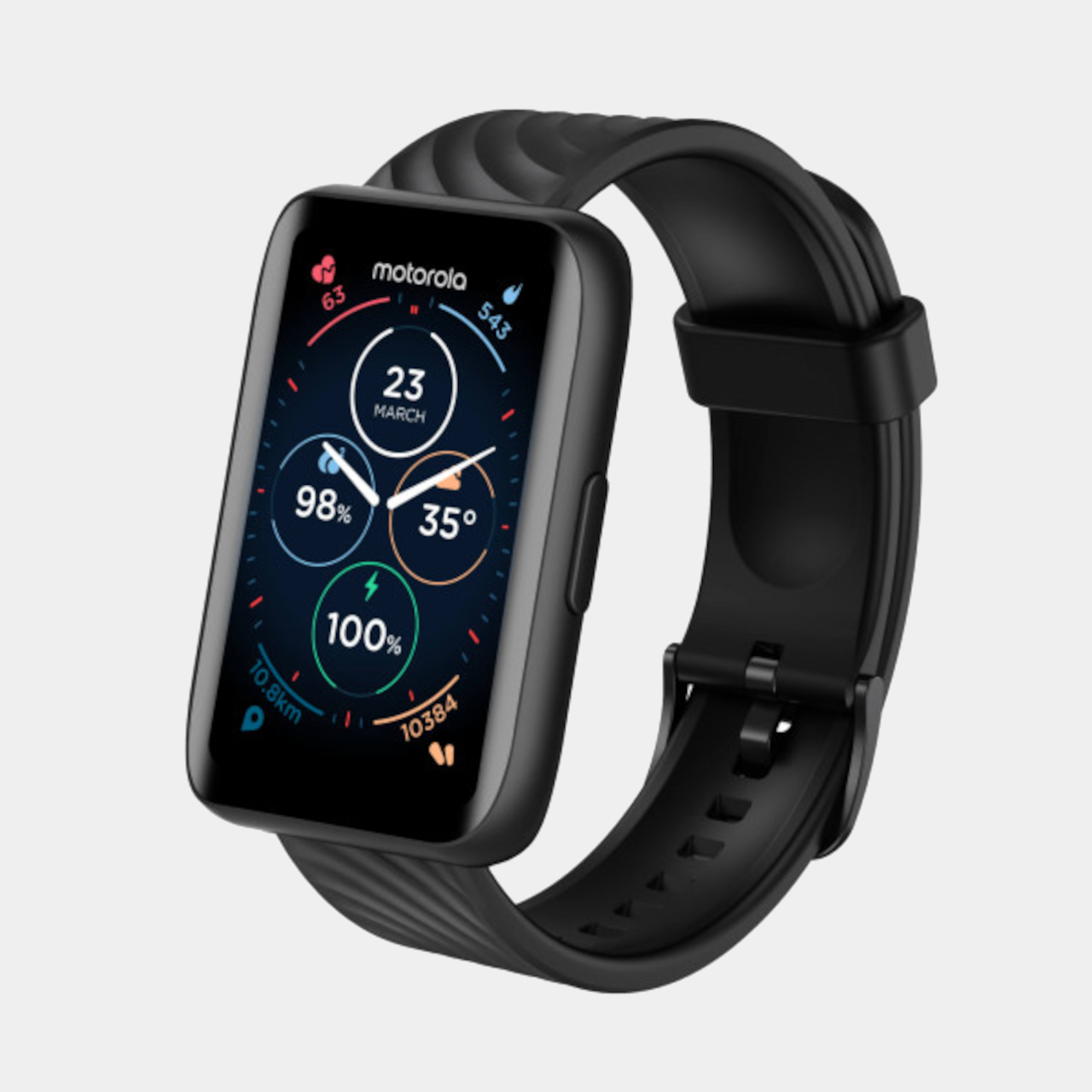
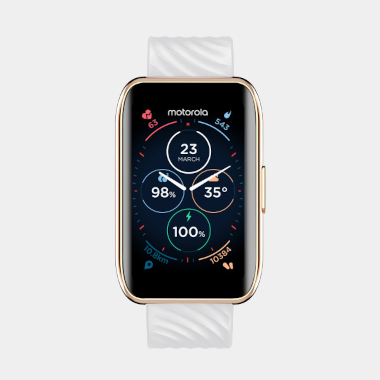
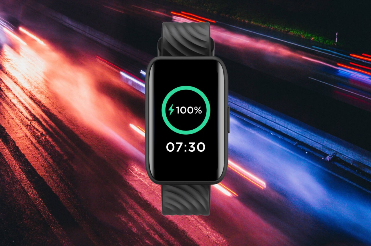
The Moto Watch 40, however, is neither of those and is walking the fine line between smartwatch and smart band instead. It has a rectangular body, more common with fitness trackers, but the size of the device and its general appearance are more in line with smartwatches. It has a screen that curves at the edges, giving it a refined appearance compared to the rugged looks of common fitness trackers.

At the same time, however, its limited functionality leaves no doubt that it isn’t a smartwatch either. It has a variety of sensors for tracking activity, including blood oxygen levels and even sleep, but you won’t be seeing a lot of the advanced functions and options you’d find on a smartwatch. It supports only viewing notifications, so you’ll have to pull out your phone if you want to reply to messages or even take calls. Its 10-day battery life may sound a little disappointing, but the Moto Watch 40 compensates with an advertised charging speed of 25 minutes only.

That combination of essential functions and stylish design will set you back for only $64.99. It might sound like a tempting proposition, especially when other fitness bands are either too expensive or too informal. That said, even a wrist-worn device might still be too conspicuous for some people, and a smart ring that would let them wear their favorite mechanical watches could be the perfect compromise instead.

The post Moto Watch 40 design straddles the line between smartwatch and fitness band first appeared on Yanko Design.

Motorola brigns Pantone Color of the Year 2024 Peach Fuzz to its smartphones

The moment Pantone announced their Color of the Year for 2024, we expected a lot of brands to officially and unofficially carry the Peach Fuzz tones for their respective products. If that is a color that you prefer or if you like that shade, then good for you as all year round you’ll see different brands and products carry the hue. If you’re not a fan, well, you’ll have to endure it and just look for other colors that match your preferences. If you’re the former and you’re looking for a new Android phone, then Motorola is a very good option.

Designer: Motorola

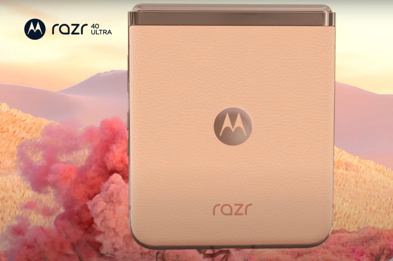
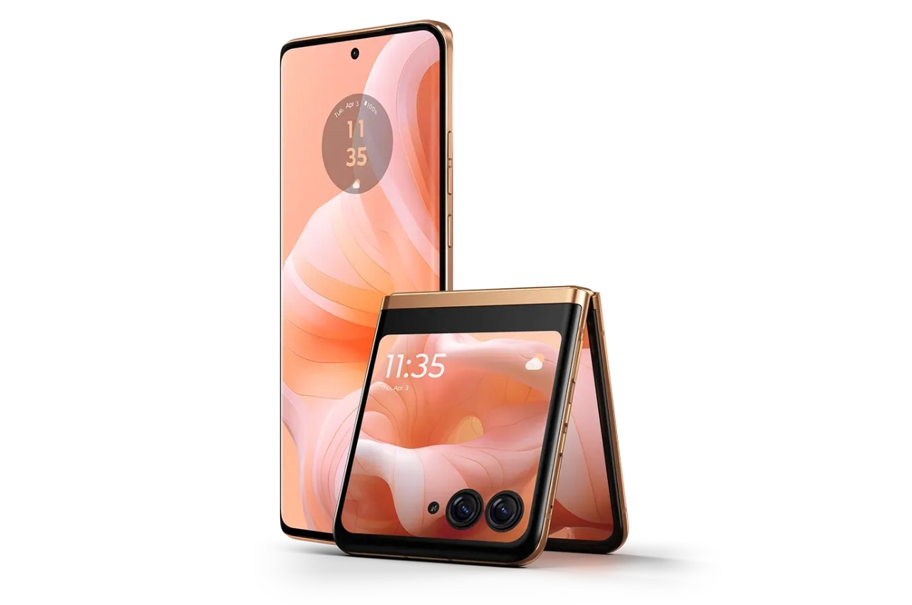
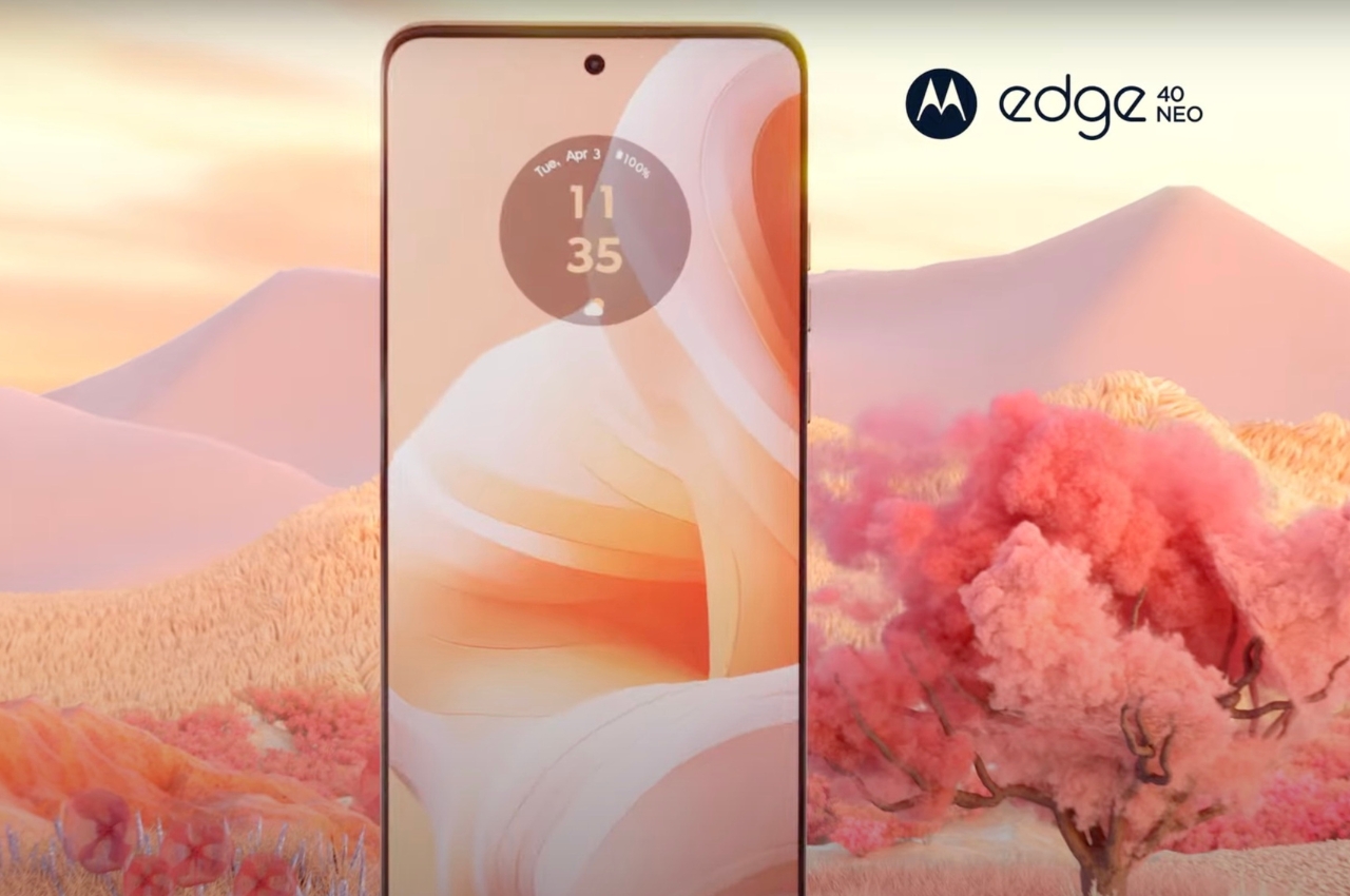
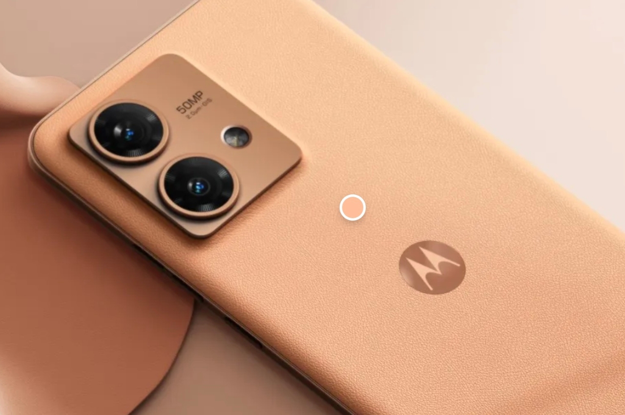
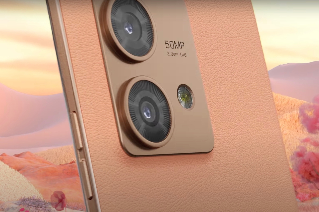
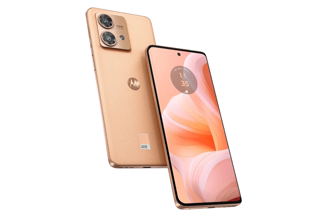
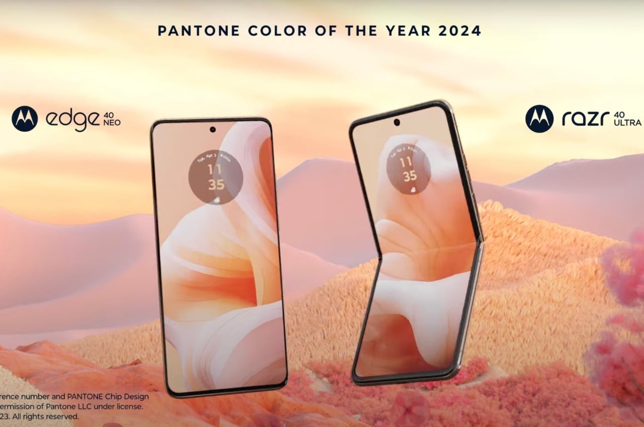
Motorola has come up with a tie-in with Pantone to bring Peach Fuzz versions of two of their newest smartphones, the motorola razr 40 ultra and the motorola edge 40 neo. The only difference between these versions of the smartphones and the original iteration is that they’re carrying the warm and cozy hues of the color of 2024, “highlighting the importance of shared moments” through the combination of Pantone’s “mastery of color” and Motorola’s “legendary design”
.

For those who prefer a more hip and modern device, the flippable design of the motorola razr 40 ultra / razr+ with the Peach Fuzz color with the vegan leather finish might appeal more as they’re branding it for the extroverts. It boasts of several camera modules like its 12MP dual cam, the 13MP ultrawide lens, and the 32MP wide selfie camera. Those looking for a more “sophisticated” smartphone can go with the motorola edge 40 neo with its 6.55-inch P-OLED display, 5,000 mAh battery, and camera setup (50MP main, 13MP ultrawide lens, 32MP selfie cam).

Both Motorola and Pantone believe that color deepens our interaction with our devices as they express our individuality and preferences. The Peach Fuzz color in particular was chosen to harness “connection, community, and personal wellbeing”, which is what Motorola also wants to encapsulate in their smartphones.

The post Motorola brigns Pantone Color of the Year 2024 Peach Fuzz to its smartphones first appeared on Yanko Design.