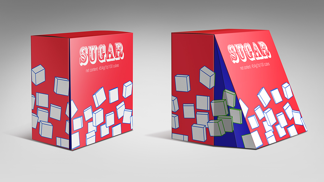
When the packaging is too perfect.

cube_sugar_1

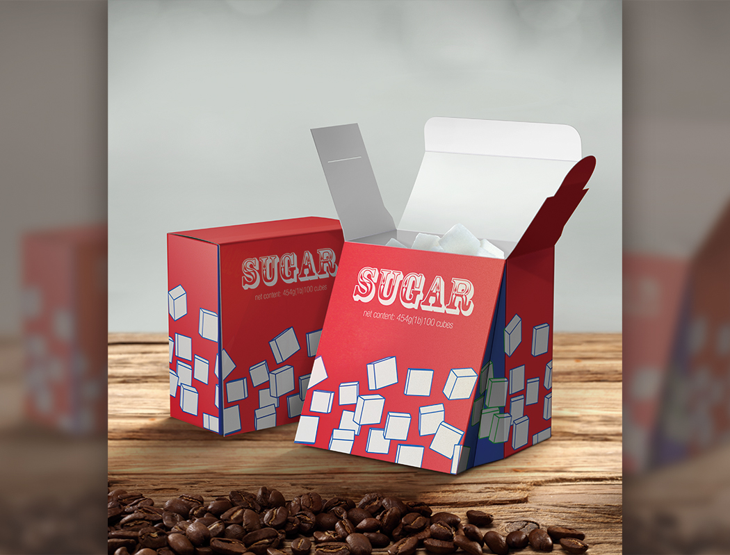
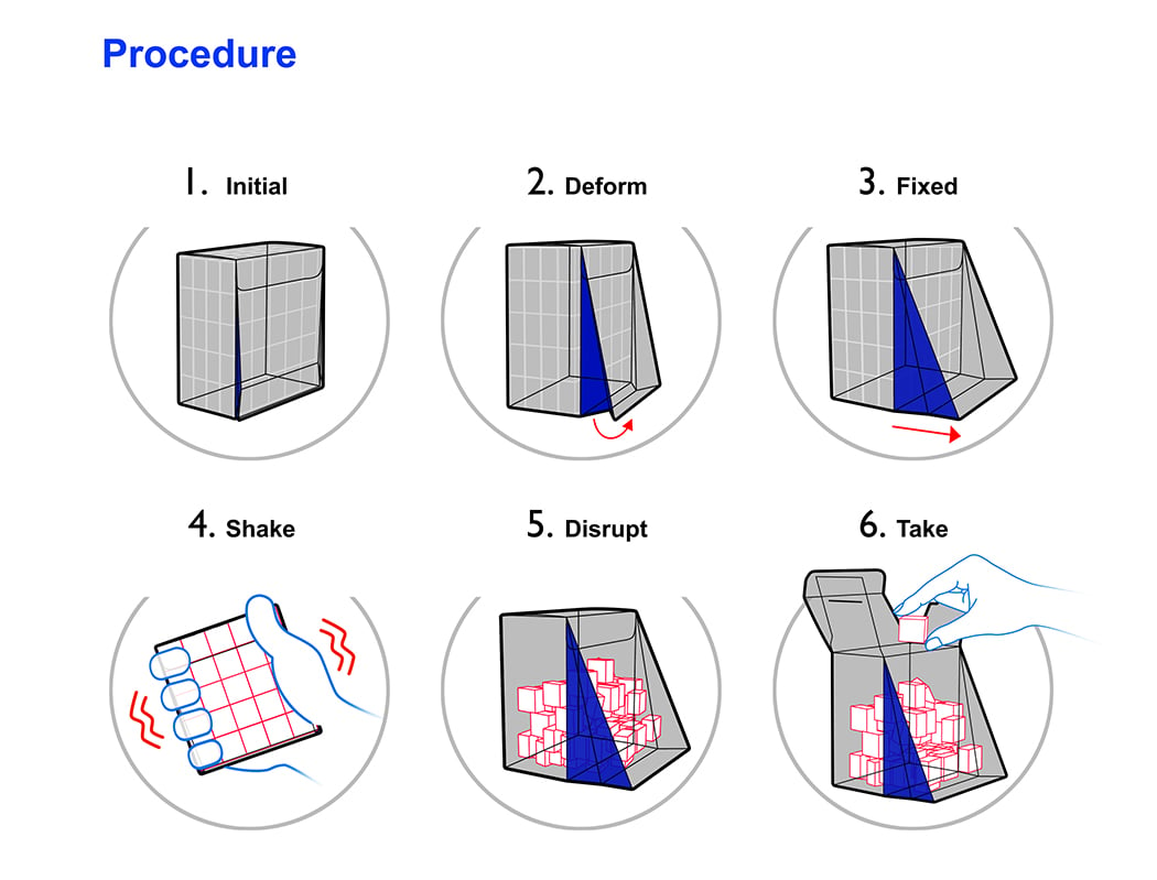
The good thing about sugar cubes is how convenient they are. They’re standardized, so it’s much more accurate to say two cubes of sugar than two spoons (spoons vary in size, you see). Cubes also make efficient use of packaging, because they fit perfectly into cuboid shaped packages. You see, while they fit in perfectly, it’s the taking out that’s a hair-pulling affair. One usually has to tip the package over and have five, ten, or a whole bunch fall out. Then take one and rearrange the rest. What the Cube Sugar packaging cleverly does, is that it allows you to mess up the arrangement of cubes on the inside, so you can easily pick up a single cube. The front flap has a bellow detail that allows it to expand outwards, increasing space on the inside, so that the cubes can break formation. It ain’t rocket science, but it’s a simple, beautiful idea!

Designers: Dr. Gao Fenglin, Huang Xiaofei & Zhou Buyi (Nanoin).
cube_sugar_2

cube_sugar_3

Bevelicious!

bevel_cup_pack_1

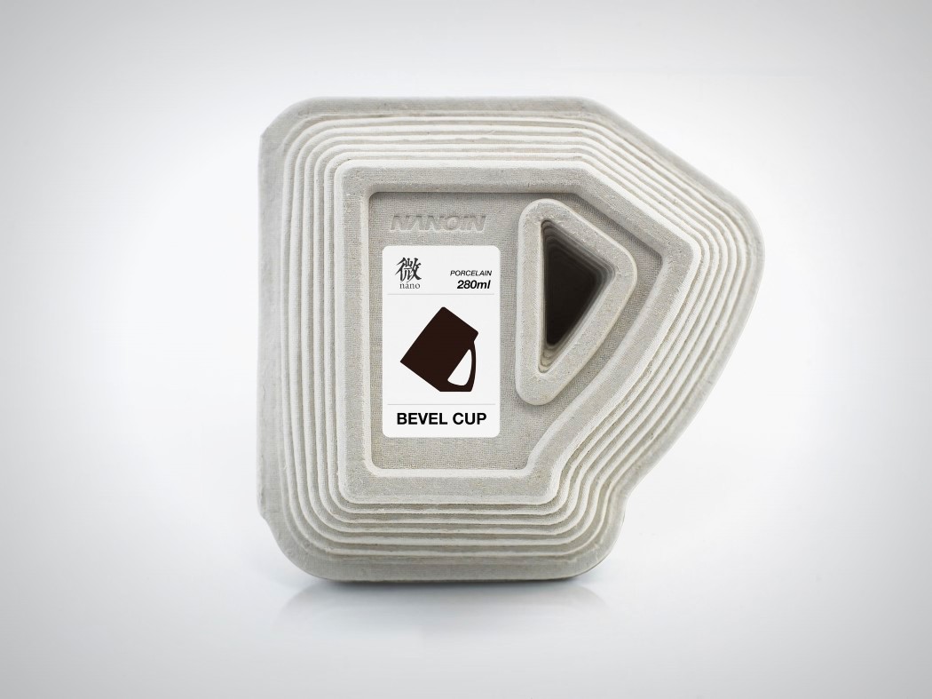
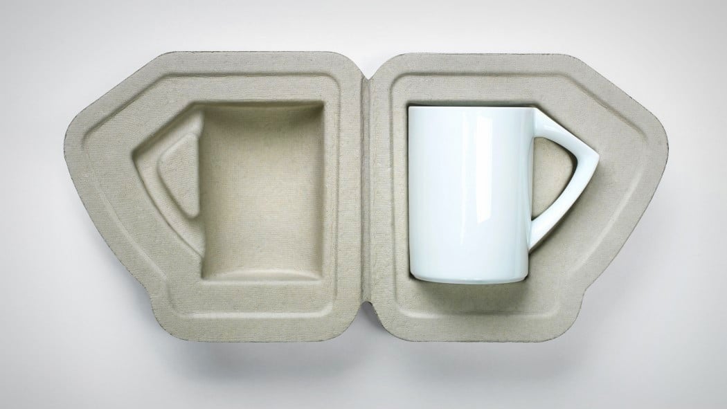
The Bevel cup comes in a unique design. It has some neat acrobatic abilities that give it the power to stand diagonally, upside down; but that’s not what attracted me to the Bevel cup. The packaging for the cup was more of a driving factor for me, and knowing that the design group put as much effort into the packaging as they did with the cup, really impresses me!

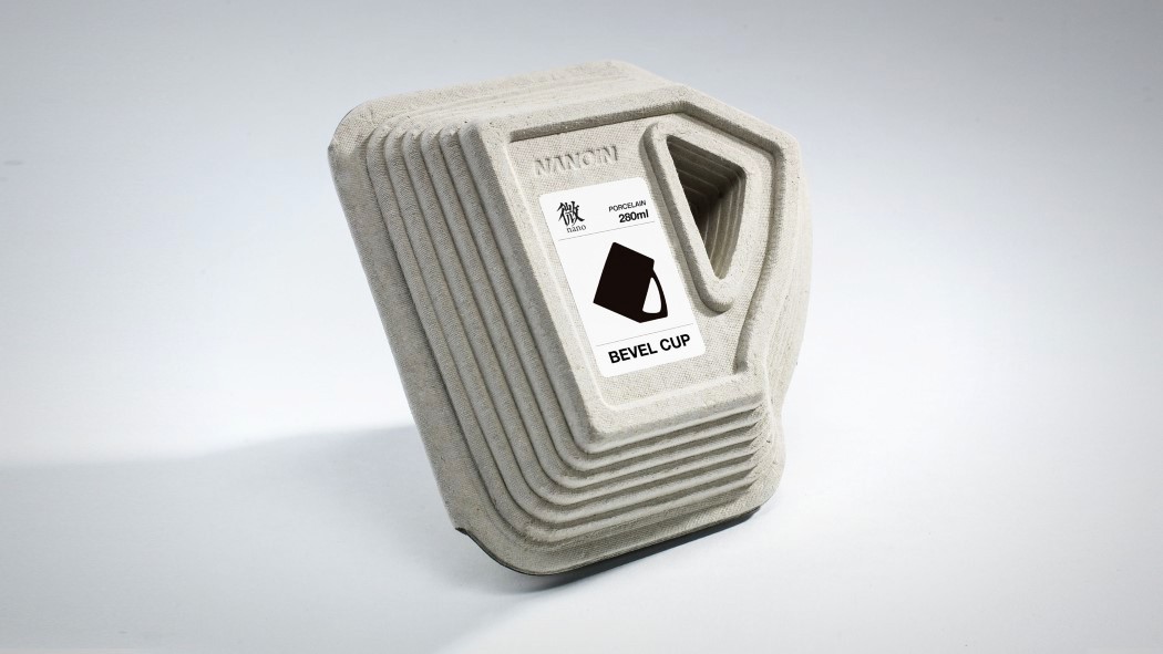
Every product you see around you came to you packaged in a cuboid box. Which is okay. They’re easy to manufacture, they’re stackable…but they’re way too mainstream. The Bevel cup’s packaging takes a more egg-six-pack approach, but boy, does it stand out! The bevel design manifests itself on the periphery of the box, creating a 3-d printer-esque robust outer box that really highlights the cup’s outline. Also, an impressive way to sell the bevel story! This get’s my thumbs up!

Designer: NANOIN Design

bevel_cup_pack_2

bevel_cup_pack_3