Nendo Installs A Carbon-Capturing Wall In A Contemporary Japanese Home

Most of our modern infrastructure and architecture is bad on concrete, and the production of cement used in concrete is one of the biggest causes of worldwide carbon dioxide emissions. This constitutes a serious issue that must be addressed, especially with the current state of our Planet Earth. In this effort, Nendo displays a specimen of a greener and cleaner way to construct and build with its Block-Wall House. The Block-Wall House is partially built using a new concrete that captures carbon dioxide instead of emitting it!

Designer: Nendo & Kajima Corporation
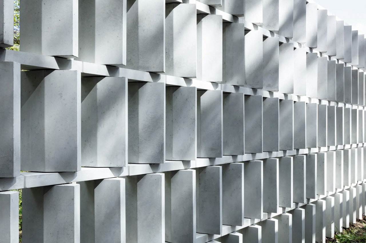
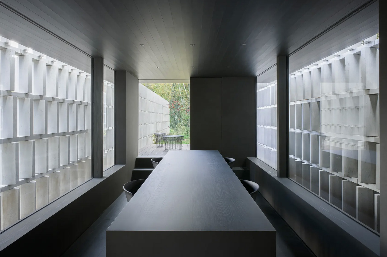
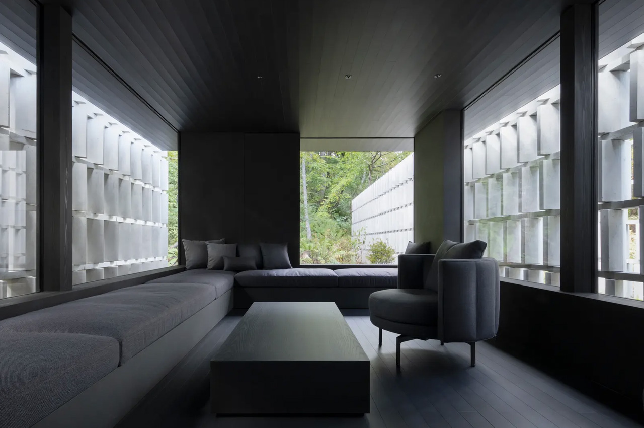
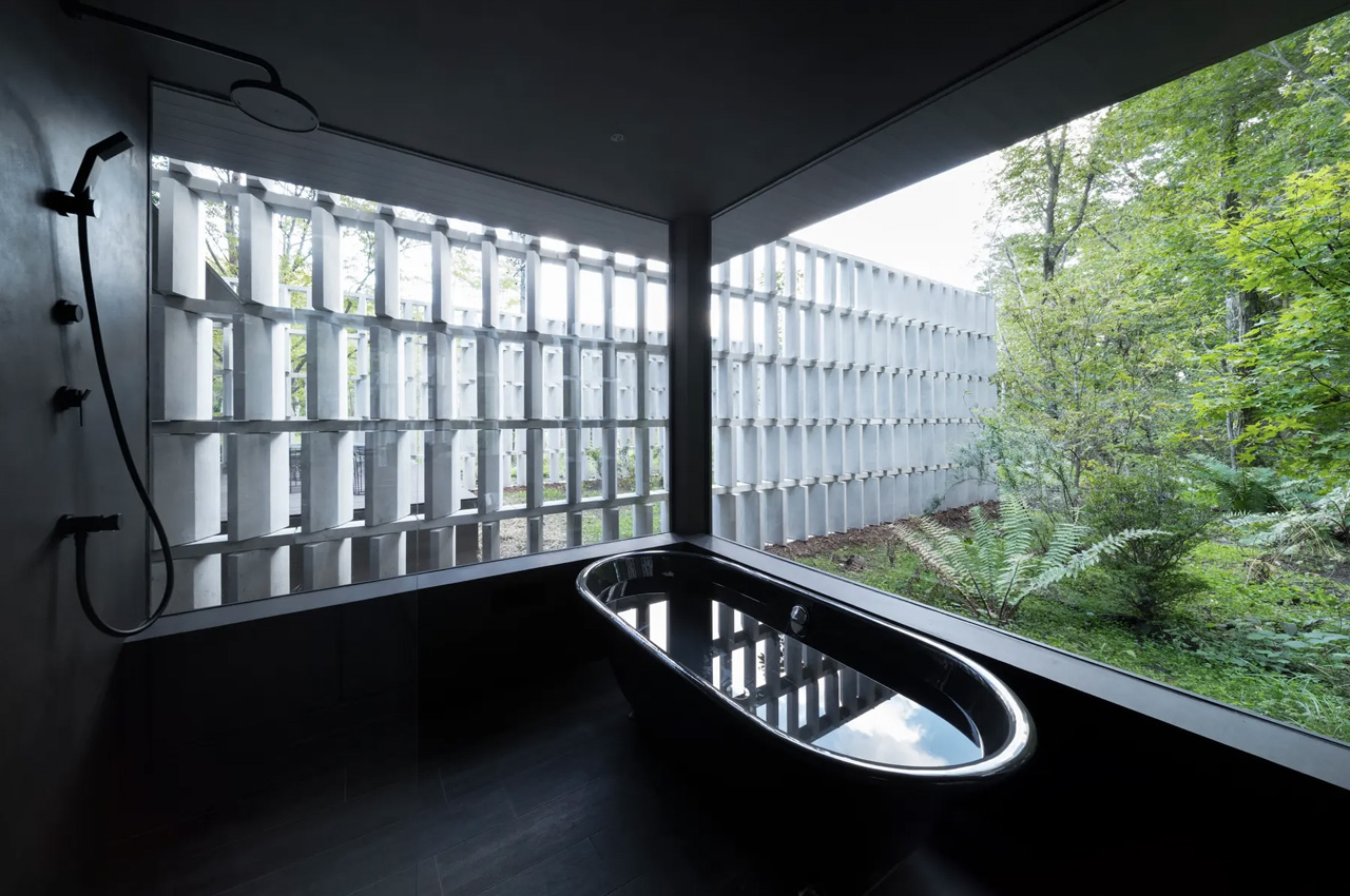
Tucked away in Japan’s Nagano Prefecture, the Block-Wall House is located next to a rural road. The house features a lot of glazing, to offer privacy against pedestrians and passing vehicles. The home is equipped with an angled screen which lets residents look out but makes it quite difficult for a passerby to glance inside. This screen is made using 2000 blocks which have been arranged in parallel rows to form five walls, with a length of 360 feet. This screen is made from the aforementioned sustainable and novel concrete!
This newly developed concrete is made by the Kajima Corporation in collaboration with the Chugoku Electric Power Co, Denka, and Landes Co. The concrete is named CO2-SUICOM, and for its production, a special cement mixture is placed in a curing chamber, and carbon dioxide is pumped into the chamber for absorption. This absorbed CO2 gets stuck inside the concrete and is not released. It is as strong as regular concrete!

“Generally, concrete hardens through a chemical reaction between cement and water,” explains Kajima Corporation. “But with CO2-SUICOM, over half the cement is replaced with a material we call γ-C2S. Instead of reacting with water, γ-C2S reacts with the CO2 in the air to harden. After mixing the materials needed to create CO2-SUICOM, the concrete can be placed in a location with high CO2 levels so it can capture the CO2 and harden, trapping the gas inside. For example, a thermal power plant or other facility that produces carbon-heavy exhaust gases can redirect the gases into a carbon sequestration chamber, where concrete products made with CO2-SUICOM can be placed to capture the CO2 in the gases.”
Currently, the price of producing CO2-SIUCOM concrete is about three times higher than usual concrete in Japan. Hence, work is being done to bring down the price, and Kajima Corporation believes that the concrete will become more economical in the future.
The post Nendo Installs A Carbon-Capturing Wall In A Contemporary Japanese Home first appeared on Yanko Design.

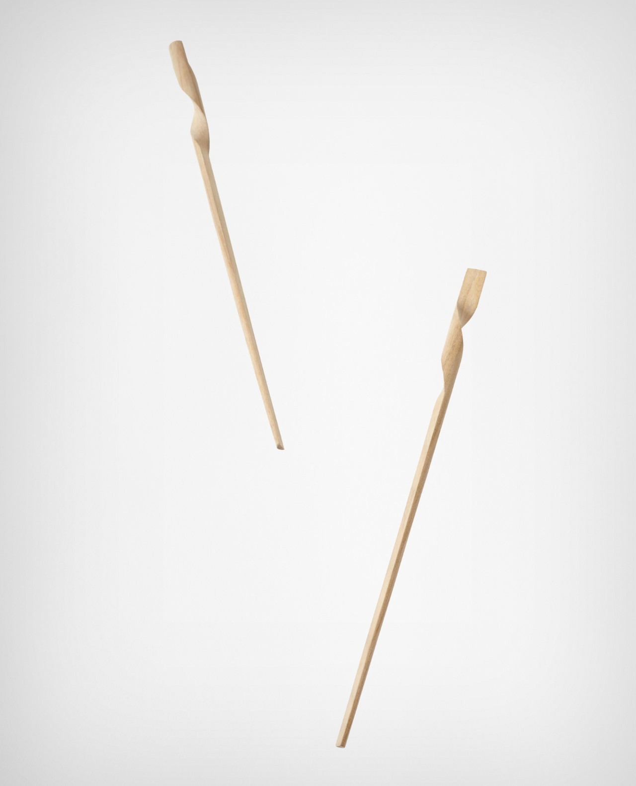
Nendo’s redesigned chopsticks intertwine into each other to create a singular cohesive form

Chopsticks are a 4000-year-old eating implement that has remained untouched. And, for almost four centuries, the quaint town of Obama in Fukui Prefecture, Japan has manufactured beautiful lacquered chopsticks. The lacquered chopsticks are considered the hardest and the most beautiful of the Japanese lacquer chopsticks, and they’ve been named ‘Wakasa-nuri’. Nendo teamed up with Hashikuru Matsukan – a manufacturer who has continued the Obama legacy. Nendo gave a contemporary and innovative twist to the age-old chopsticks!

Designer: Nendo

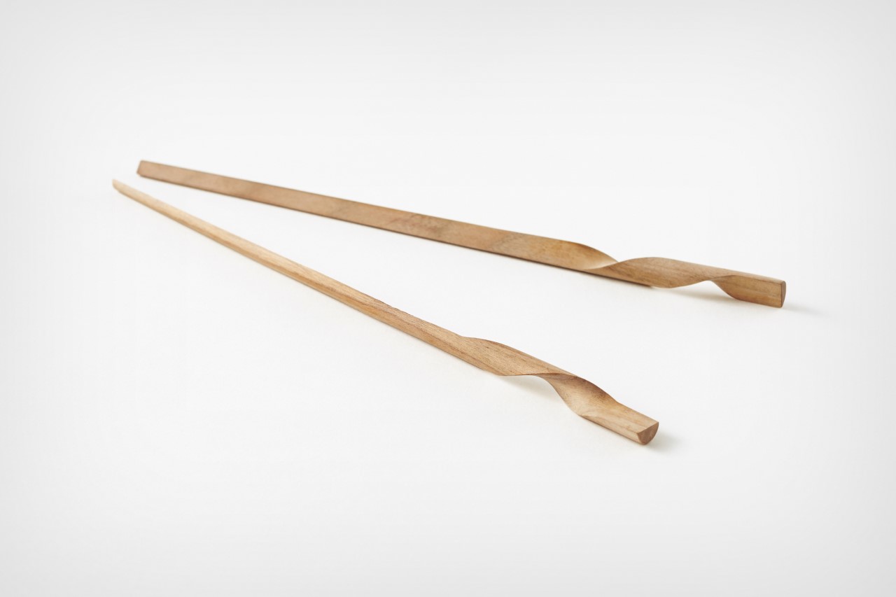
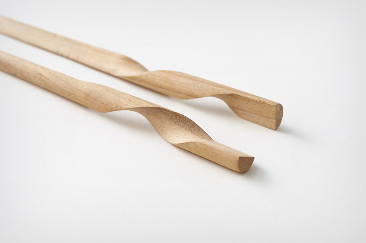
Called the Rassen or spiral chopsticks, these unique chopsticks merge fun and functionality to create a product that is quintessentially Japanese, yet quite contemporary. The Rassen chopsticks can be joined together to create one convenient single unit, and they can be detached or separated whenever you need to use them! Rather than having two separate pieces of tableware, you have a single unit in the shape of an elongated cone. When you pull both the chopsticks apart, you notice an interesting twist in their wooden handles.

The entire experience of bringing the chopsticks together and then separating them becomes a fun and amusing experience. It feels like you’re playing with a jigsaw puzzle! Using the chopsticks to eat your meals, brings joy and a certain sense of playfulness to your everyday ordinary meals. Putting them back together is really quite swift and easy too, and it eliminates the fear of losing one of them.

While designing the Rassen chopsticks Nendo had the intention of giving people a small ‘!’ moment. We often find many small ‘!’ moments in our day, and these tend to make our days brighter and richer. Nendo wanted to contribute and add a ‘!’ moment in people’s lives with their lovely chopsticks. These chopsticks are handmade by artisans, and Nendo also utilized a multi-axis CNC miller to build the unusual yet useful utensils.

The post Nendo’s redesigned chopsticks intertwine into each other to create a singular cohesive form first appeared on Yanko Design.

Nendo Designed The Perfect Obsessively Ergonomic Fork For Eating Cup Noodles

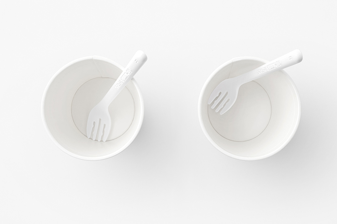
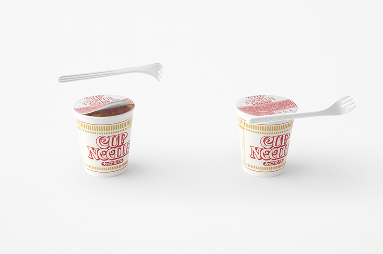
Cup noodles are a popular and quite common meal in Japan, although they are not limited to Japan anymore. They’ve become a quick and fun meal for people all over the world, and I’m no exception. I love a cup of hot and spicy noodles that are ready in a matter of five minutes – I mean how cool and convenient is that?! The right way to eat noodles from a cup is with the help of chopsticks and a spoon, that really is the best way to enjoy some noods! But of course, that is the tough way, and most people prefer forks. But, the typical fork that accompanies cup noodles is often un-ergonomic and really uncomfortable to eat with! The angle just doesn’t sit right, and it is difficult to scoop noodles and veggies with it. This is where Nissin teamed up with Nendo to create an obsessively ergonomic fork quite simply dubbed ‘The Fork’.

Designer: Nendo x Nissin

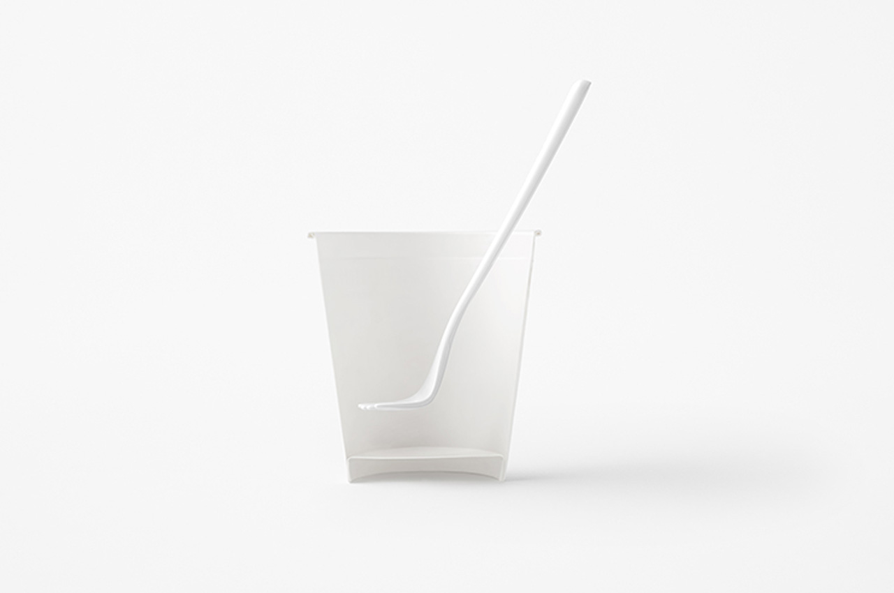
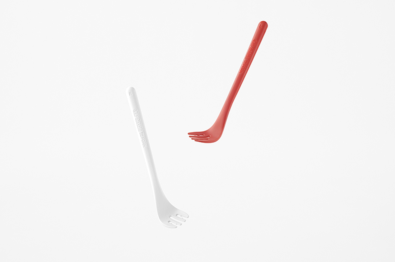
The Fork was designed after taking into consideration hours of user observation, to create a piece of cutlery that makes your noodle-eating experience smooth and hassle-free. The fork features a 128-degree arch at the neck which is perfect for scooping up noodles. The arch effectively limits the strain of lifting your elbow when scarfing down noodles. The left and right sections of the head have rounded edges, that perfectly fit against the walls of the cup, making it easier to lift up and consume the noodles.

The neck of the fork is marked with a shallow dip that is great for scooping up veggies and toppings, so you don’t miss out on them! There are little bumps between the various slots to ensure the noodles don’t slip off, while a small clip holds down the lid, as you wait for the hot water to prepare your instant noodles. What makes the Fork even more interesting and useful is that it comes in two variants – one for lefties, and one for righties! Nendo and Nissin really thought of everything. The left-hand version comes in a bold red color, while the right-hand version is available in white.

The post Nendo Designed The Perfect Obsessively Ergonomic Fork For Eating Cup Noodles first appeared on Yanko Design.

Nendo designs unique beer can with two angled pull tabs to create the perfect liquid-to-foam ratio

I love Japanese design studio Nendo, their designs are minimal timeless classics that manage to stay relevant irrespective of the passing trends and fads. And, Nendo recently unveiled a new and innovative beer can with two angled pull tabs that can control the liquid-to-foam ratio of your drink. The alternative beer can precisely control the level of foam that is created while opening it! Pretty cool, right? We thought so too.

Designer: Nendo

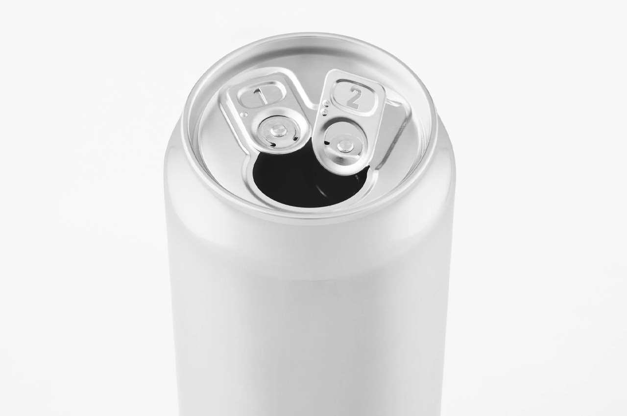
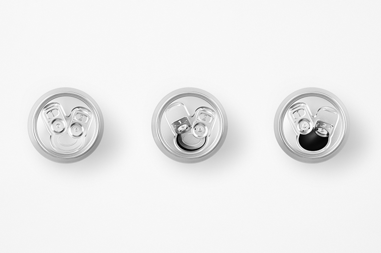
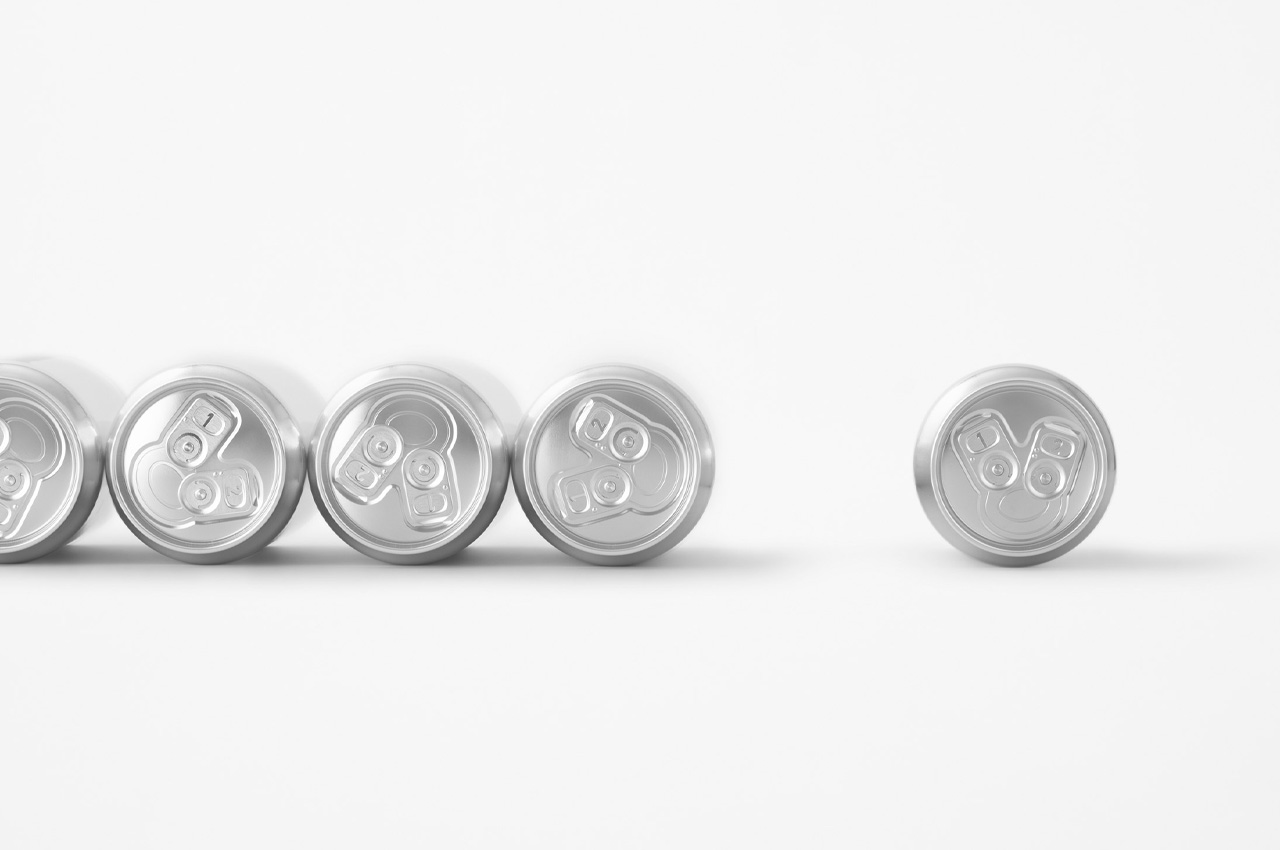
The minimalist-looking can is cylindrical in shape, and is colored a somber grey. It has a sleek and slender form that features two angled pull tabs instead of the singular tab you find in traditional beer cans. Nendo designed the beer can in an attempt to “create an ideal foam” when you pour yourself a glass of beer – ensuring that you have the perfect amount of bubbles, not too much, not too less.

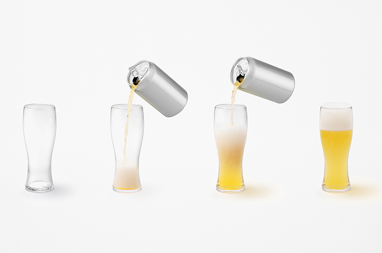
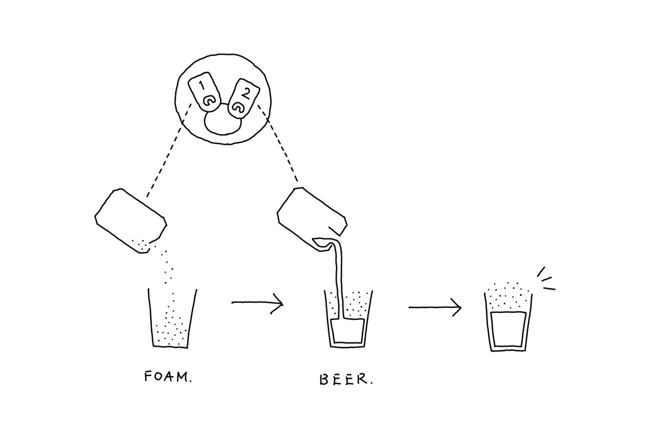
As mentioned earlier there are two tabs. The first tab is labeled ‘1’, and as you tug at it, it opens the lid only slightly, applying a certain amount of pressure on the can, allowing the foam to bubble up. The user can then pour the foam into a glass, before proceeding to open the second tab labeled ‘2’. When you pull at this tab, it opens the lid completely, allowing the beer to flow out seamlessly without any excessive foam or bubbles pouring out, preparing the perfect glass of beer! “In this way, a glass with a liquid-foam ratio of 7:3, the so-called golden ratio, can now be easily achieved with canned beer,” said the studio.

“Beer heads [the foamy top of poured beer] are considered essential for having beer taste better, at least in Japan. A layer of foam with adequate thickness acts as a lid to prevent beer from coming into contact with the air and keeps it from releasing aroma, flavor, and carbonation,” said Nendo. Hence, through their thorough research, Nendo realized that by creating a can with a smaller first opening, the bubbles produced can remain concentrated in the slim slit. The two angled tabs placed opposite to one another also allow the users to flick them open easily.

The post Nendo designs unique beer can with two angled pull tabs to create the perfect liquid-to-foam ratio first appeared on Yanko Design.
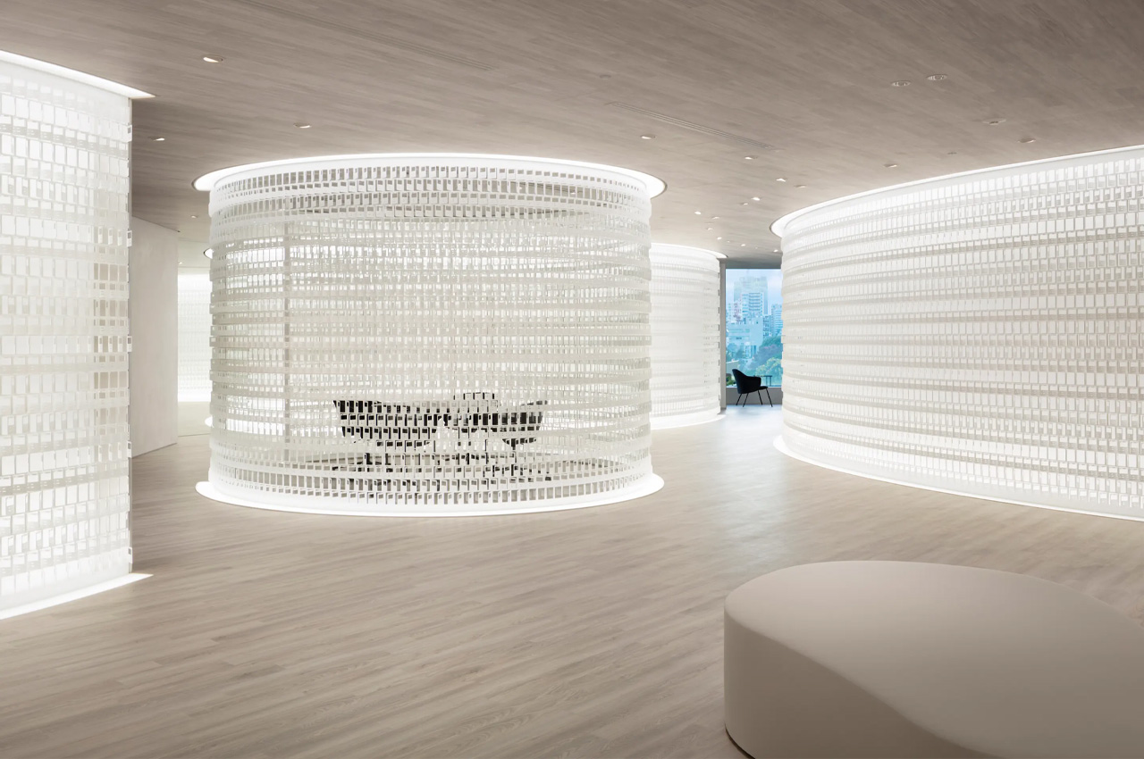
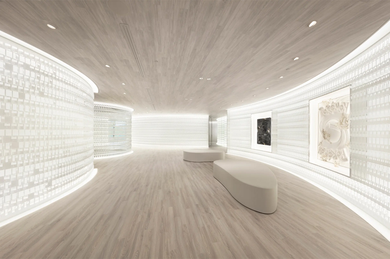
Nendo stacked up Pokémon co-owner’s new office with hundreds of steel cards inspired by the iconic trading cards

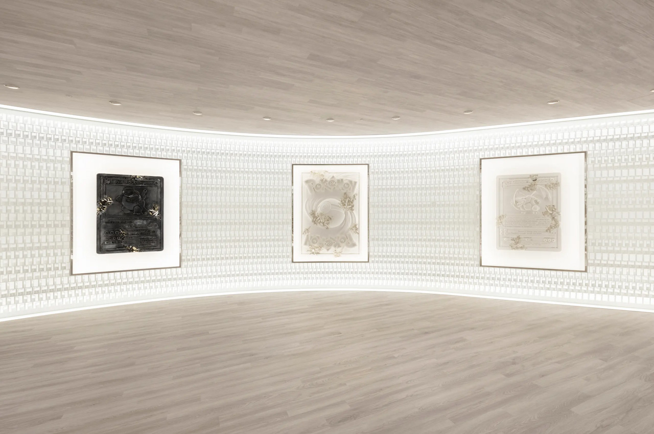
I think most kids in the 90s, specifically the guys, were absolutely obsessed with Pokémon. Collecting, exchanging, and even buying and selling Pokémon cards was a major trend, something that continues to be popular even today. In fact, some of the Pokémon cards from the 90s are the most expensive ones today, and collectors are always looking out for them! So, when Nendo was tasked with designing a huge new office space for Pokémon co-creator Creatures Inc., the design firm obviously took inspiration from the company’s iconic trading cards.

Designer: Nendo

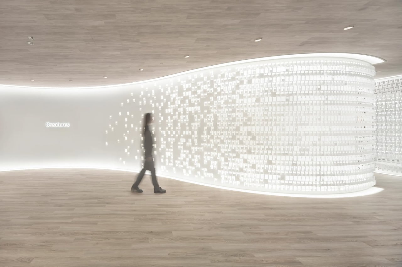
Nendo drew heavy inspiration from the ever-famous Pokémon cards and delicately interspersed them throughout the office space, resulting in a playful and intriguing workspace that is marked by thousands of steel trading cards. Located in the Tokyo headquarters of Creatures Inc., Nendo focused on creating an impressive entrance and meeting space for the office. The aim was to ensure that both elements were flexible, futuristic, and absolutely eye-catching.

“Since its release in October 1996, the Pokémon Trading Card Game has long been loved by fans worldwide. What makes the cards so special is that every piece is filled with creative ideas with a touch of emotional value. Thus, the interior design of the office naturally came to reference such vocabulary from the manufacturing process of the cards,” said Nendo.

Nendo steered clear of conventional office designs. It abandoned the concept of a traditional office with rectangular tables in rectangular rooms. Instead, the firm designed the space in different shapes and sizes. Curved walls were integrated into the space. “Furthermore, creating every table with an original organic form allows users to adjust the layout according to the meeting format or the number of participants,” explained Nendo.

Nendo agrees that the design process was rather complicated and complex. They created an abstract graphic pattern of a Pokémon Trading Card with accurate dimensions and then engraved it into a 2.3-mm (0.09-in)-thick sheet of steel utilizing a laser cutting machine. If you look closely at the office, you’ll notice hundreds or even thousands of cards being used to create it. Each card was carefully placed at one of twelve different angles, to regulate and control the light and views that enter the various meeting rooms and office spaces.

The post Nendo stacked up Pokémon co-owner’s new office with hundreds of steel cards inspired by the iconic trading cards first appeared on Yanko Design.
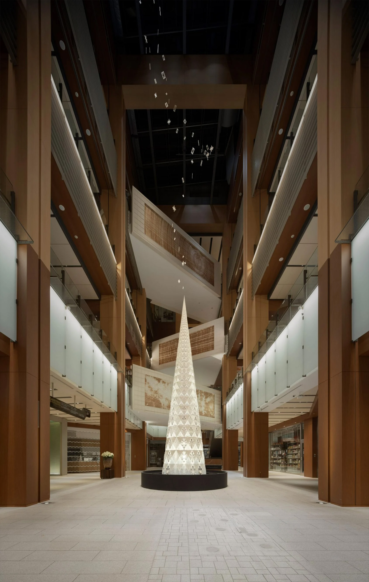
Nendo’s polyhedral Christmas tree with sparkling star-shaped cutouts will get you in the holiday mood

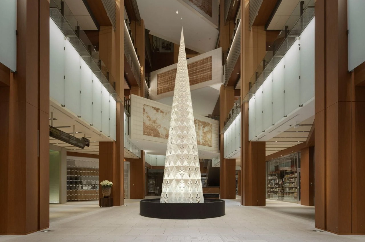
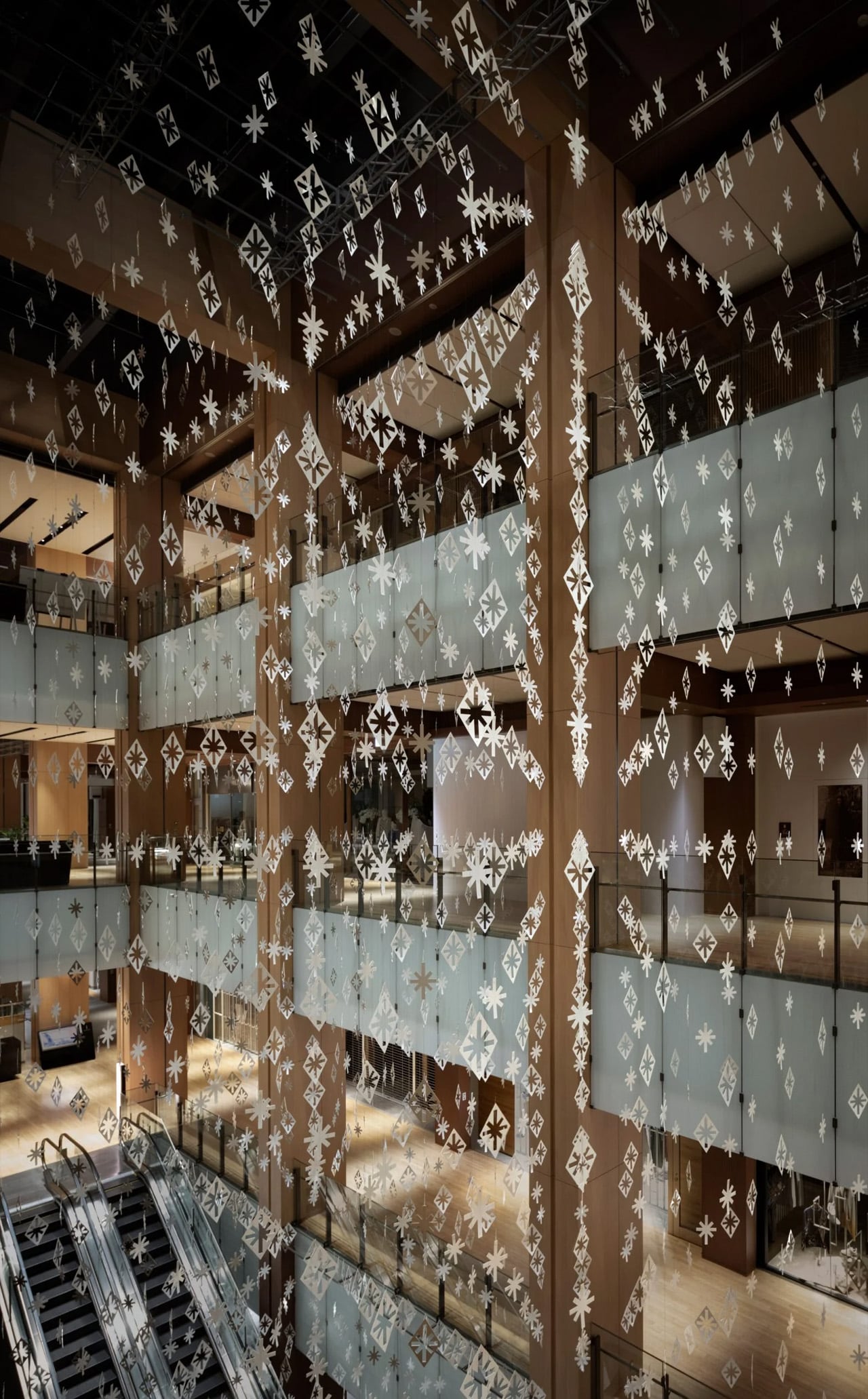
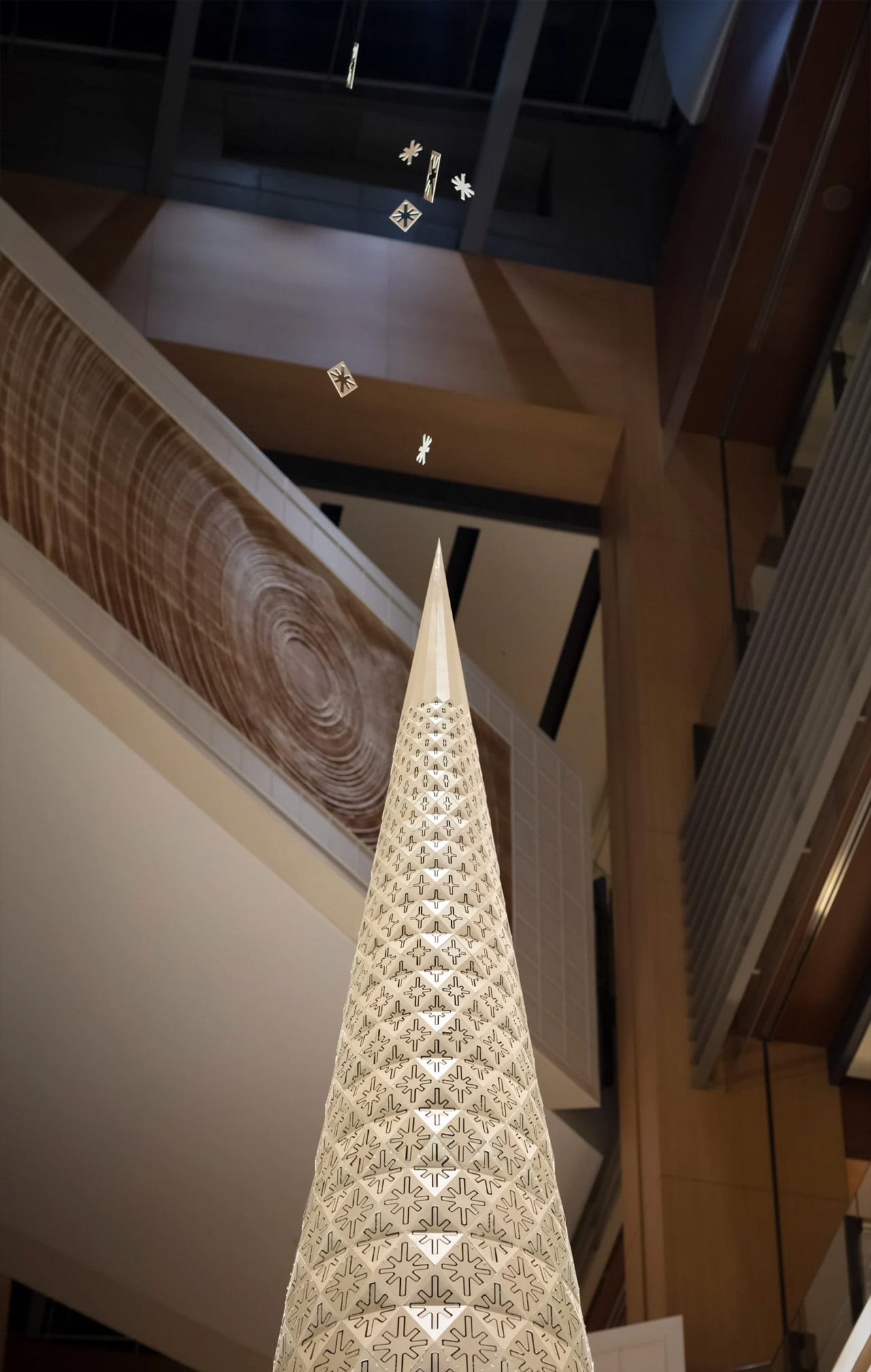
One of my favorite design studio Nendo recently created a gold-colored Christmas tree for the Tokyo Midtown shopping center in Roppongi, Tokyo, putting the whole of Tokyo and me in a Christmassy mood! The beautiful tree features kinetic cutouts, which were designed to mimic “sparkling lights”.

Designer: Nendo

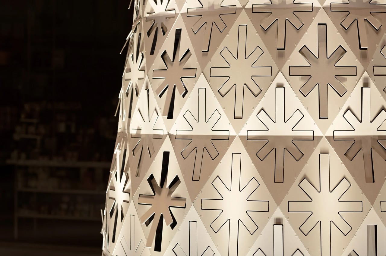
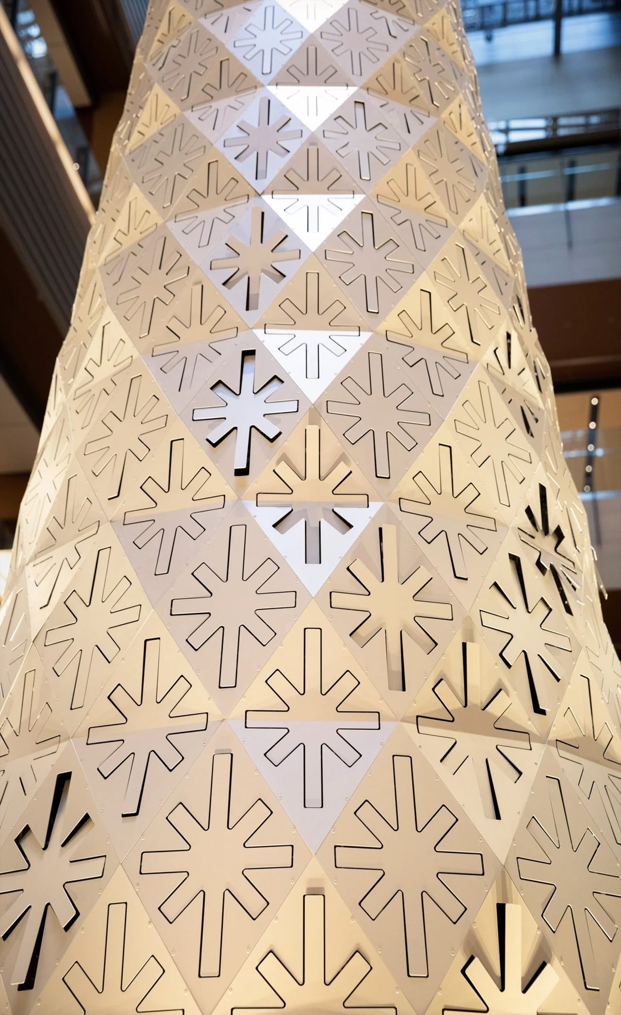
Standing tall at 7.5 meters, the stunning Christmas tree has been placed in the middle of the shopping center and boasts a polyhedral surface crafted from flat metal panels that create a pyramid as a result of being bolted together. The panels feature little fluttering stars, and behind them are positioned 416 small and compact fans. The fans have been designed to move the panels in different patterns – up, down, and across the tree.

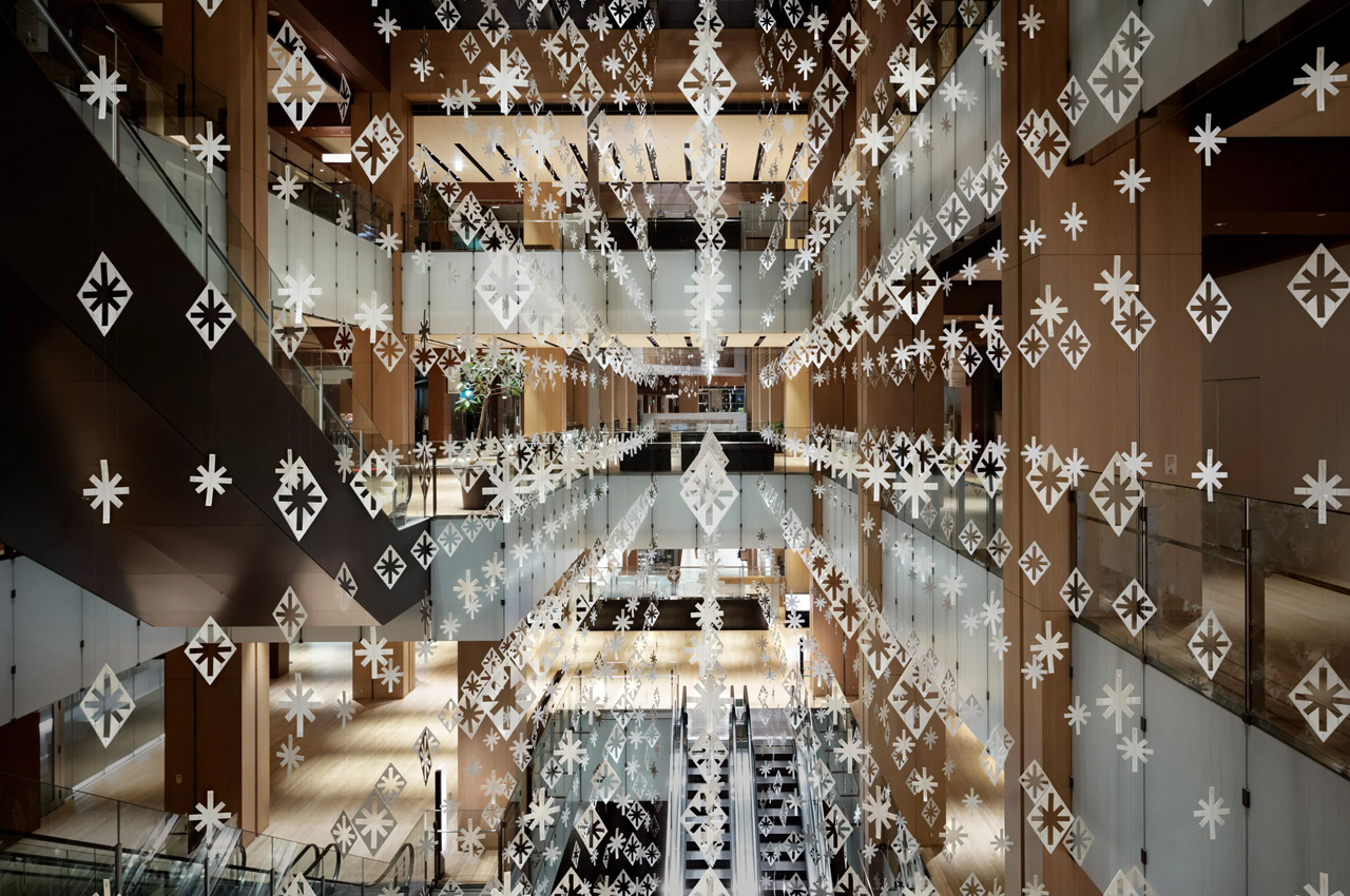
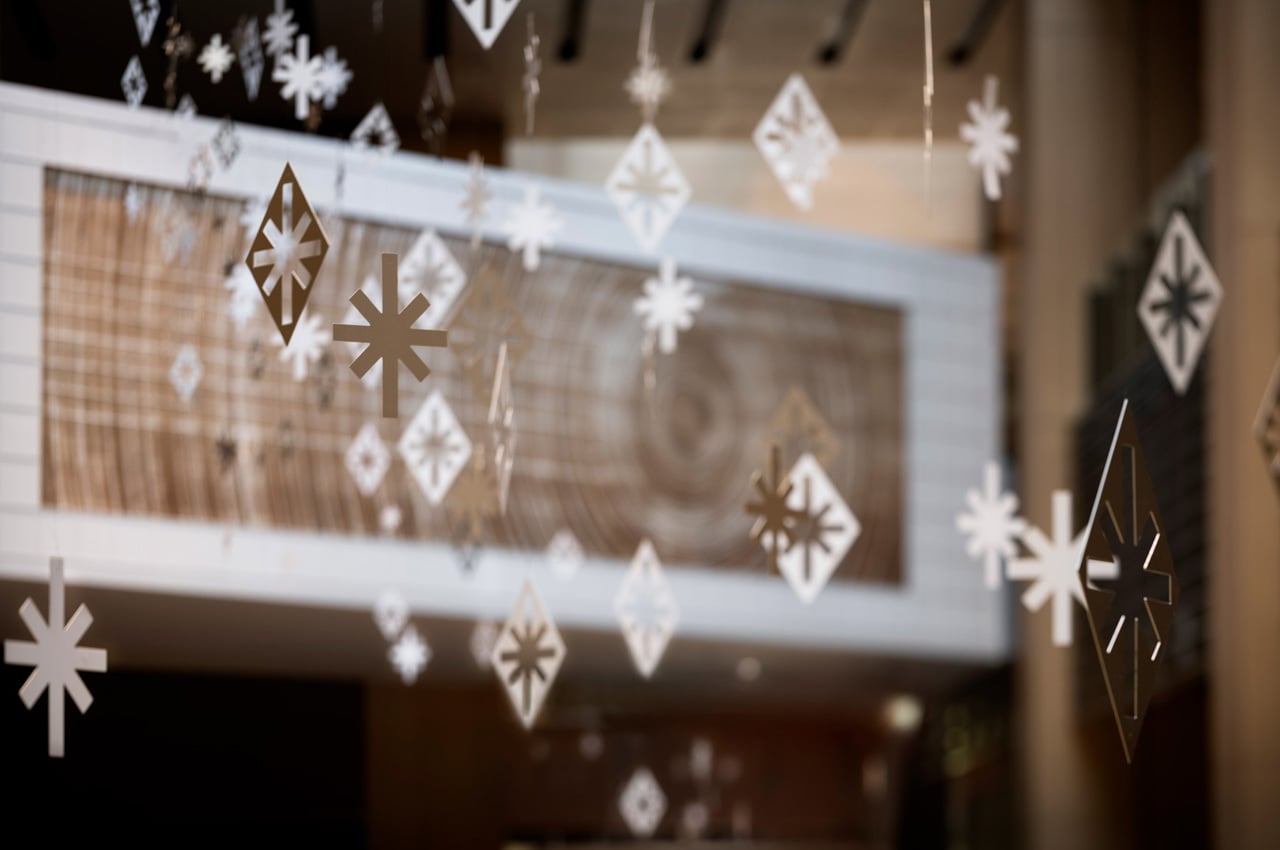
“The pieces not only sway and move with the wind but can also stop swinging in the air catching the wind at the programmed timing. By continuously receiving a certain amount of airflow, the pieces also float upward in a sustained manner,” said Nendo. The star-shaped patterns were designed to resemble sparkling lights and seemed to be swirling or flowing rhythmically around the tree, in a mesmerizing up-and-down pattern. Cutouts in the same color, that is matte champagne gold, have been hung from the ceiling.

“The theme glitter in the air translates to creating the uplifting and shimmering atmosphere, the very essence of Christmas, by literally generating ‘glitters’ by ‘air’,” said Nendo. These glittery and beautiful pieces are positioned on Tokyo Midtown’s garden terrace as well as its galleria and atrium terraces.

The post Nendo’s polyhedral Christmas tree with sparkling star-shaped cutouts will get you in the holiday mood first appeared on Yanko Design.
This ‘invisible snow globe’ has a secret design detail hidden in plain sight

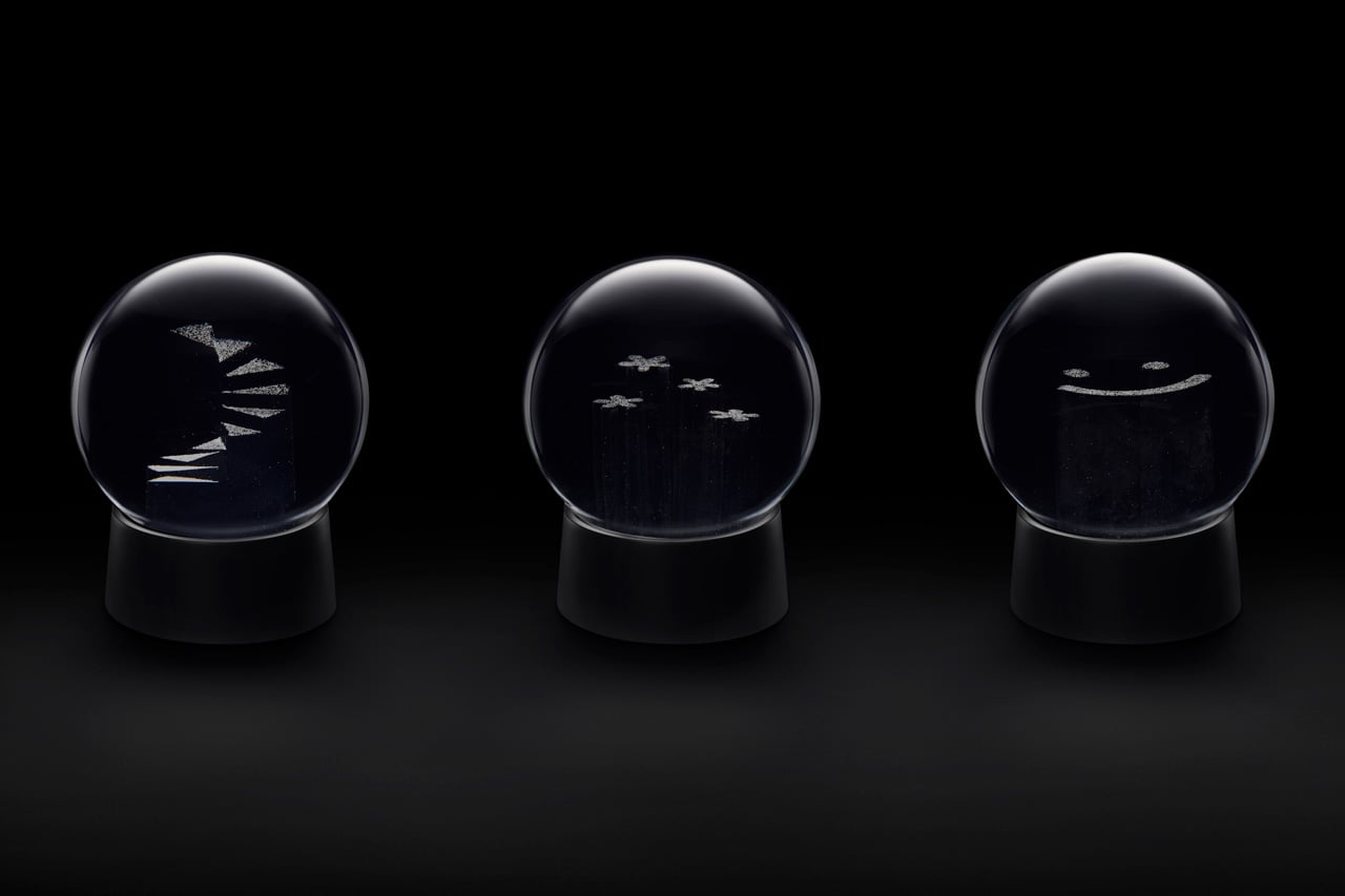
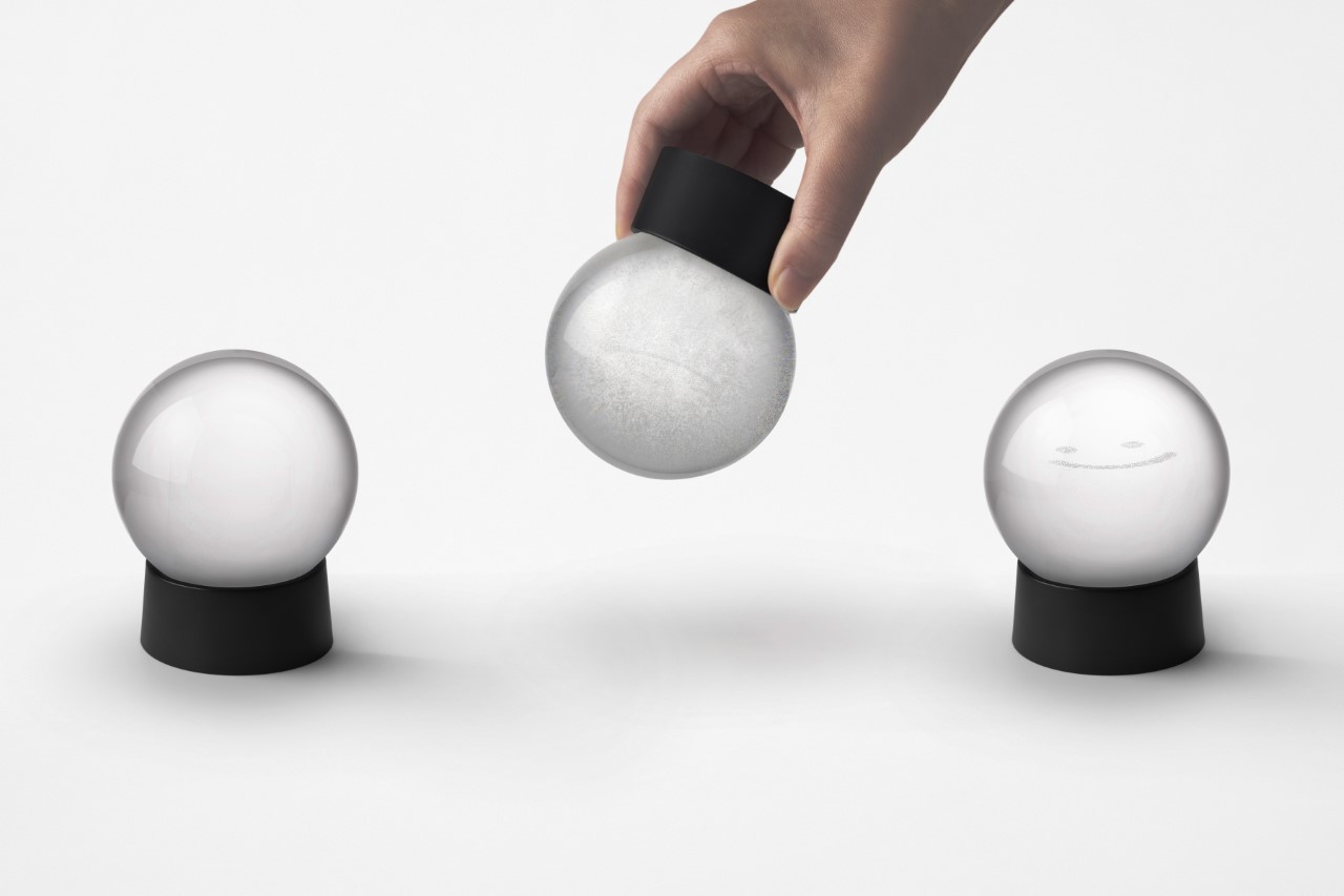
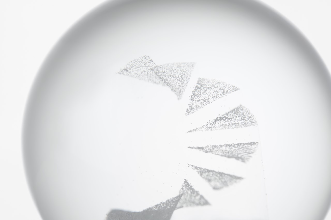
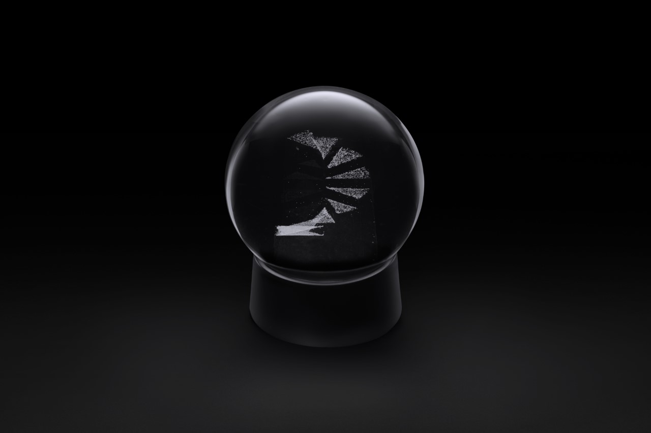
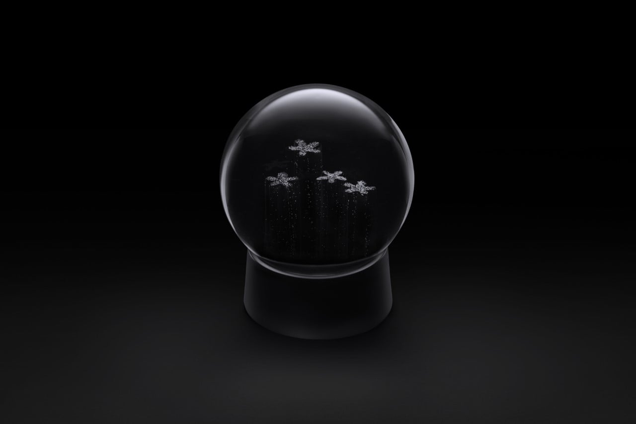
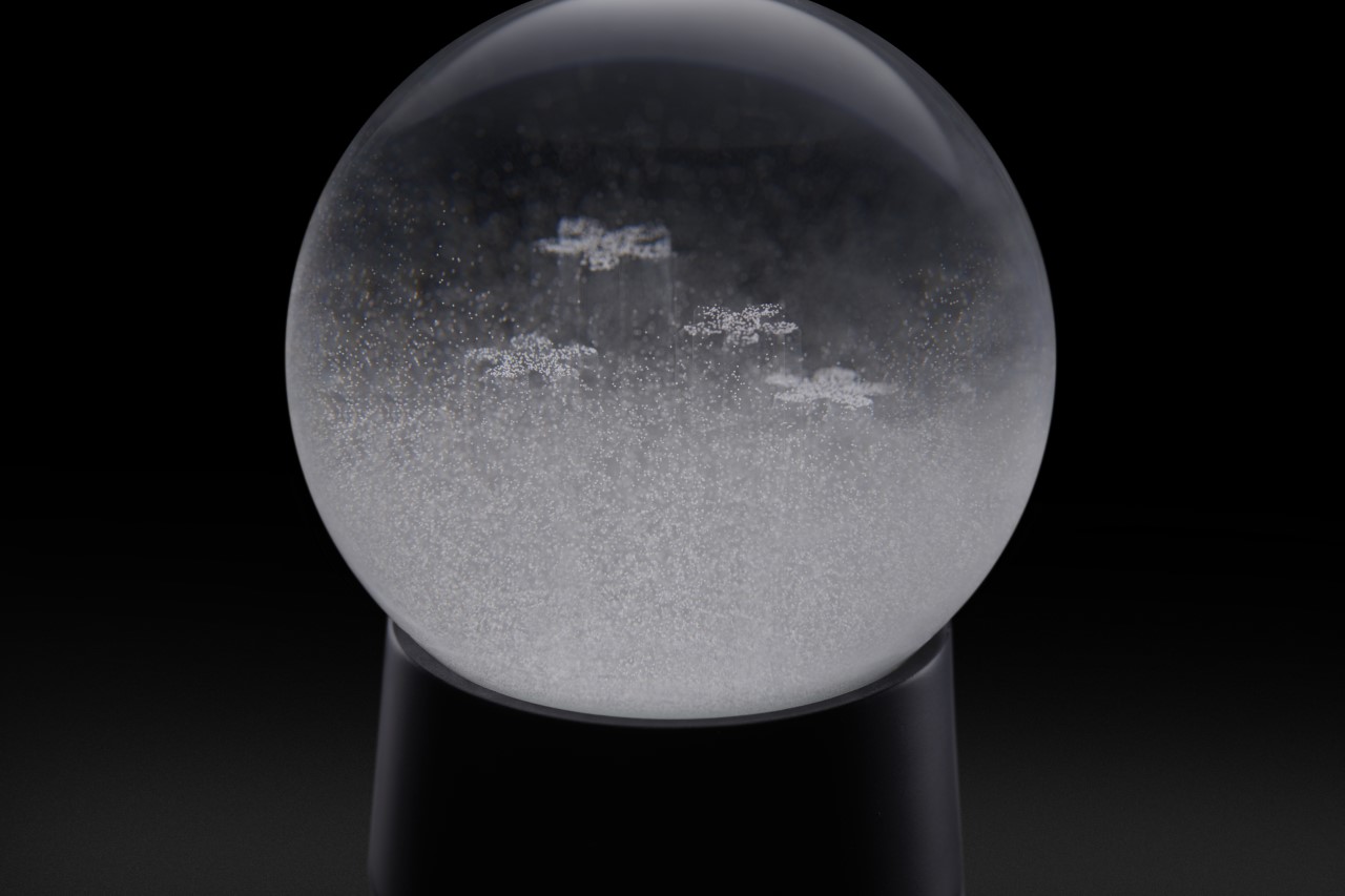
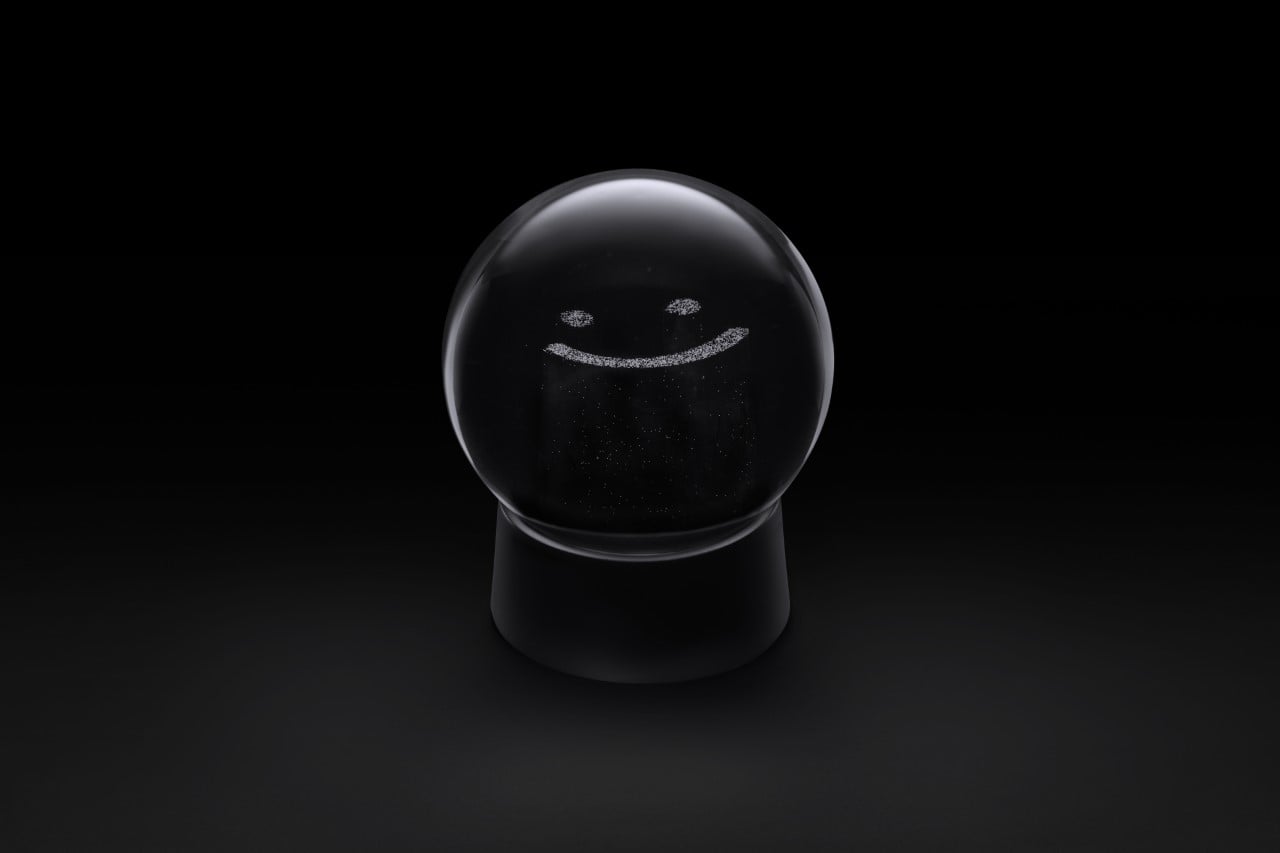
Created by Nendo, the Invisible Snow Globe has more than what meets the eye. While it looks like an empty sphere filled with liquid and suspended microparticles at the bottom, shake it and you finally see what’s so special about the snow globe. Rather than having the snow gradually settle down on the bottom of the sphere, some of the particles seemingly levitate in mid-air, creating either a spiral staircase, a set of flowers, or a smiling emoticon. It’s baffling at first and entertaining immediately after, as you see the snow particles suddenly defy gravity to create designs in ‘thin air’. This, Nendo says, was created so that the joy of watching a snow globe would last well beyond the short time it takes for those snowflakes to fall to the ground.

Designer: Nendo

Aptly dubbed the Invisible Snow Globe, this rather fascinating winter-themed tabletop toy is the result of a nifty optical illusion. Most snow globes are filled with diluted glycerine, which has an estimated refractive index of 1.333 to 1.475, which allows it to bend light a certain way. Nendo’s snow globes come with ultra-transparent silicone resin structures inside the globe, with a refractive index that almost matches that of the diluted glycerin. If you’ve ever seen those absorbent polymer balls that go invisible in water, this is pretty much the same phenomenon. The structures turn invisible in the diluted glycerin, making them difficult to spot… however, when you shake the snow globe, the snow microparticles rest on top of them, making their vague outline visible to you.

“By initially erasing the existence of the object, the impression and the role of snow is emphasized, and the design allows enjoyment of visual changes over time”, the Japanese designer said. Designed to evoke a sense of childlike whimsy, Nendo’s Invisible Snow Globes come in three variants, dubbed the ‘Spiral Stairs’, ‘Flowers’, and ‘Smile’. They’re listed on Nendo’s online store with each globe going for ¥12,100 or $87.9, although the entire collection is sold out as of writing this piece.

The post This ‘invisible snow globe’ has a secret design detail hidden in plain sight first appeared on Yanko Design.
Nendo’s reinterpretation of Dior’s Medallion Chair is a masterclass in form and minimalism

The Medallion Chair has remained an iconic part of Dior’s visual imagery all the way back since 1947 when Christian Dior first got Victor Grandpierre to decorate his salon. It cemented its place in Dior’s design language in the 1955 Diorama and the 1958 Miss Dior perfume campaigns, becoming a signature element in the brand’s visual imagery, like the ‘Bar’ jacket or Cannage pattern. This year, Dior asked 18 renowned designers and studios to put their personal spin on the Medallion Chair for Salone del Mobile 2021… among them was Nendo, who’s reinterpretation managed to catch our eye for exactly the opposite reason – the fact that it was so minimal you’d probably never spot it!
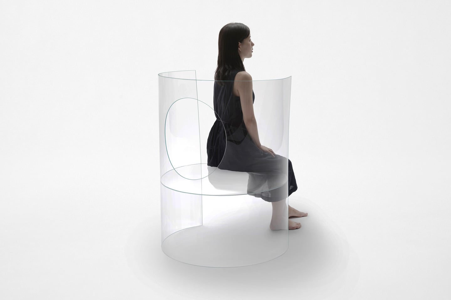
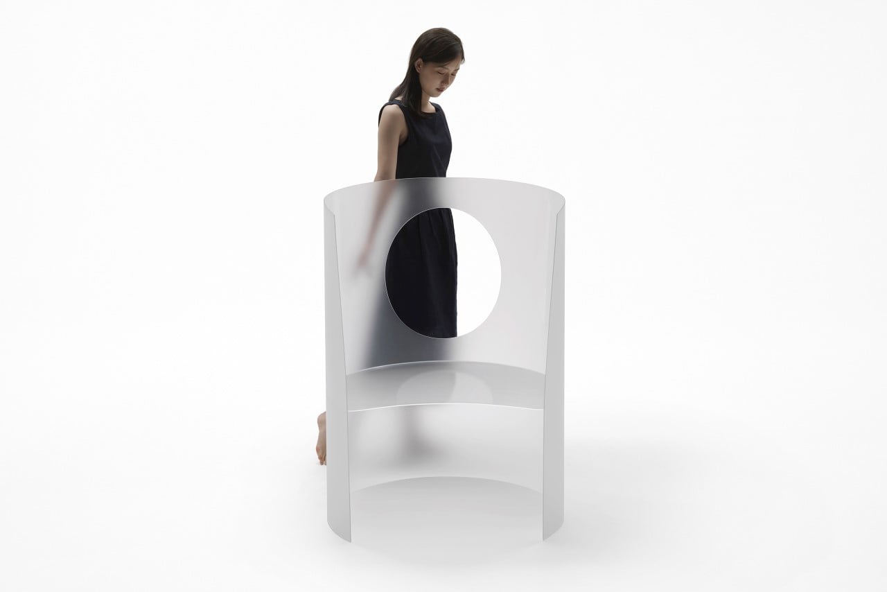
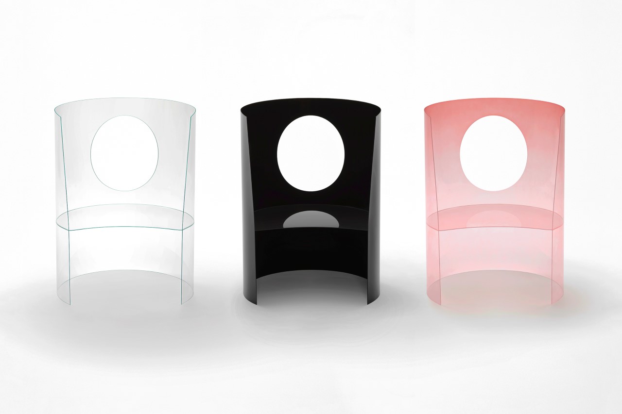
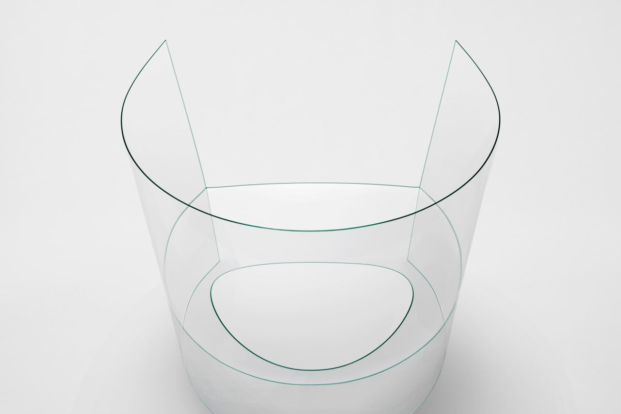
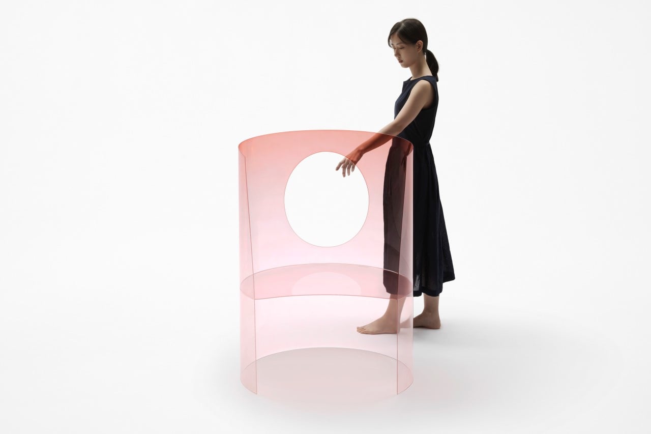
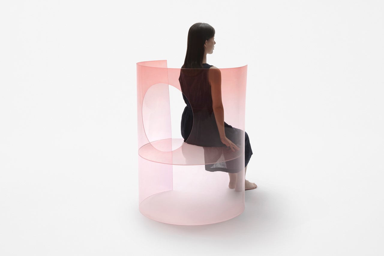
Nendo’s Chaise Medallion 3.0 plays around with forms, surfaces, gestalt, and minimalism on a level that’s beyond compare. It’s every bit as visually iconic and memorable as the original Medallion Chair, but flips the entire chair’s design inside out… literally. Challenging every notion of what a chair should look like, Nendo’s redesigned chair is worthy of being a modernist prop in Dior’s studios. It comes fabricated from curved sheets of 3mm thick glass that can support the weight of a person (even though it doesn’t look like it could). The chemically hardened glass is incredibly transparent (to the extent that you’d probably walk right past it) while being scratch-resistant and having higher flexural strength. Its fragile, all-transparent design makes it almost look precious, transcending it beyond simple furniture.

The minimalist reinterpretation immediately makes sense when you see that medallion-shaped cutout in the chair’s backrest. Playing on the positive and negative aspects of the chair’s form, Nendo’s redesign inverts the classic and simplifies it to its bare minimum. It’s a medallion chair without essentially being a medallion chair. Just the way a silhouette of a logo is still the logo, while essentially being a stencil or a silhouette. It’s a common graphic design trick that not many people use in 3d forms and products, but Nendo does it exceptionally well, almost giving us a masterclass in gestalt and minimalism.

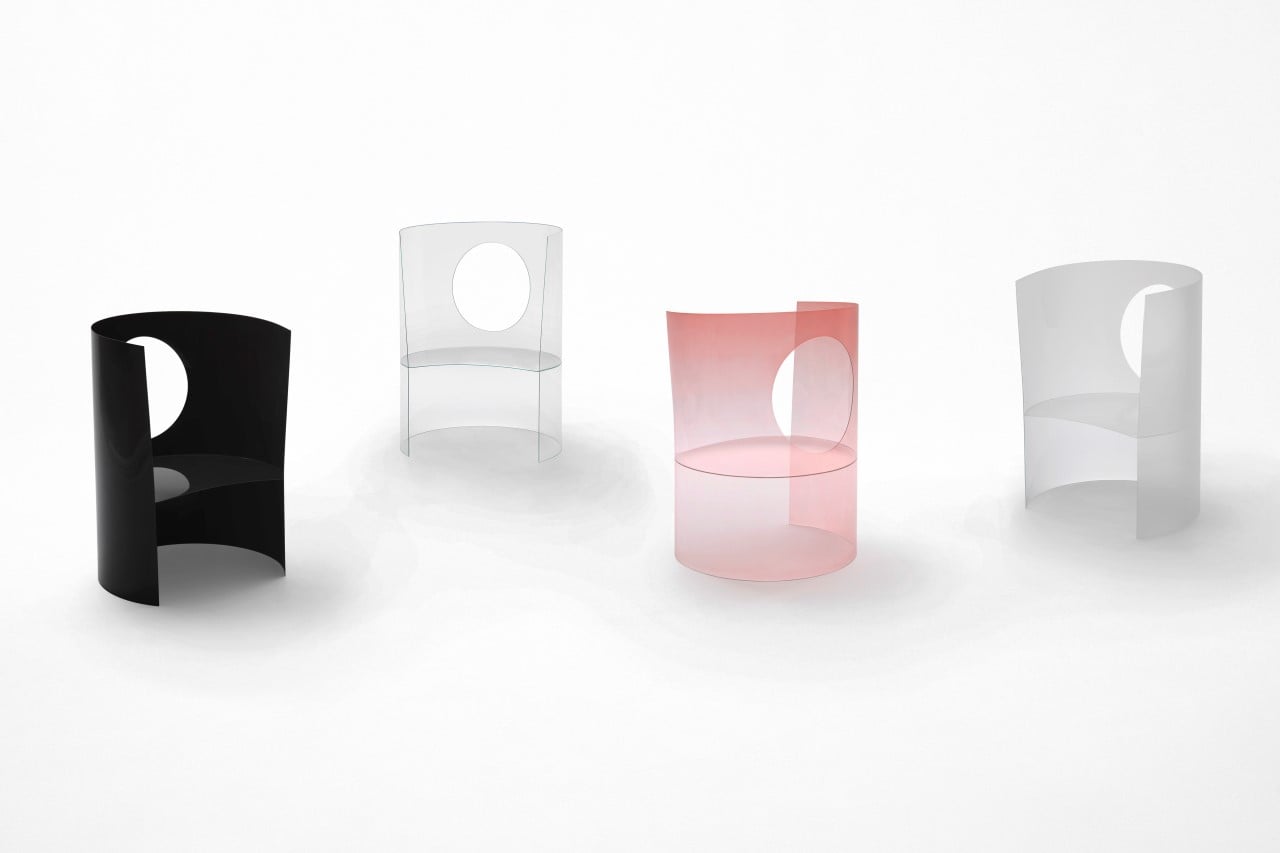
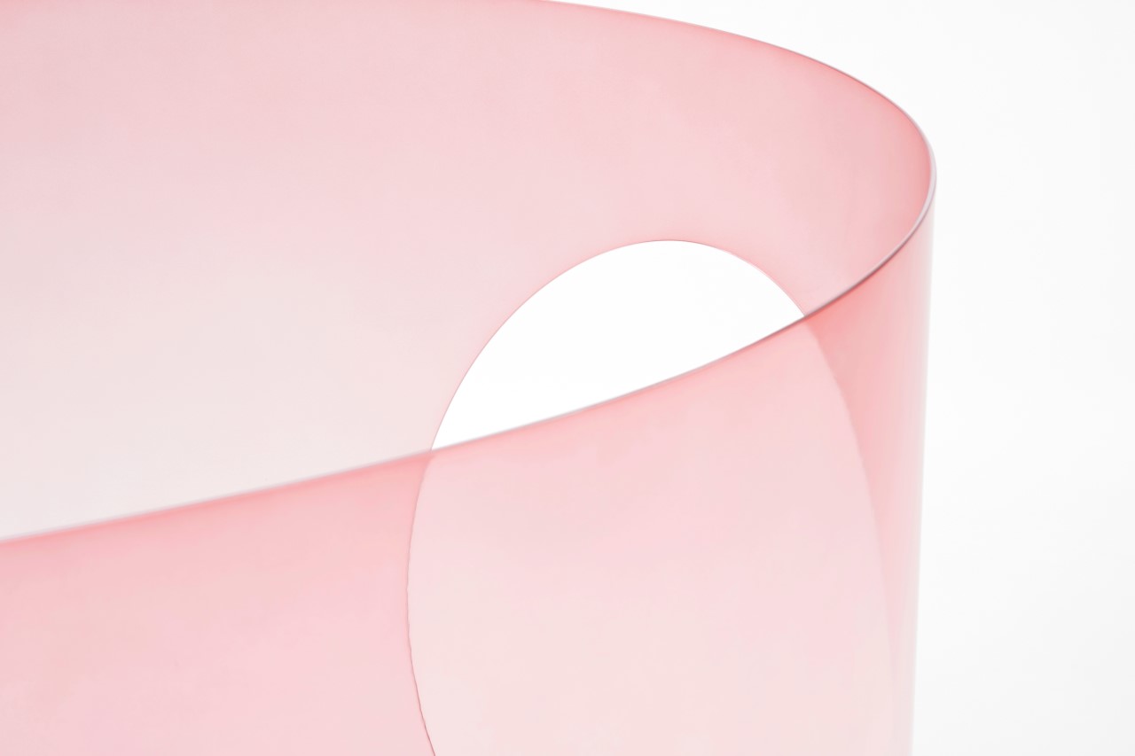
Having made appearances as an icon or a prop in multiple of Dior’s perfume advertisements, the chair’s redesign in glass feels like the most natural progression, making it look quite like a perfume bottle itself. It comes in similar color-ways too, including an all transparent design, a frosted design, an opaque black variant, and a pink ombré that’s highly evocative of the Dior brand and its perfume lineup. Nendo’s Chaise Medallion 3.0 will be displayed at this year’s Salone del Mobile alongside as many as 30 other redesigned Medallion chairs. Be sure to spot it!

Designer: Nendo for Dior

The ViXion is a mixed-reality headset designed specifically for people with low-vision and night-blindness

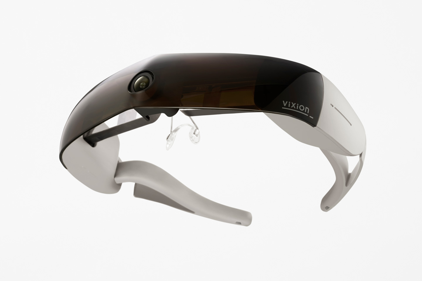
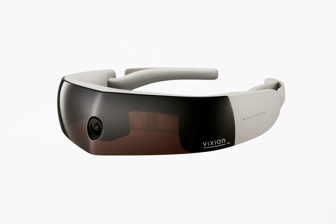
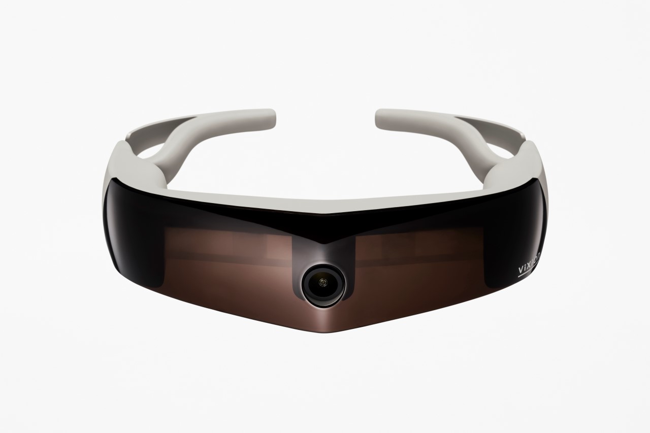
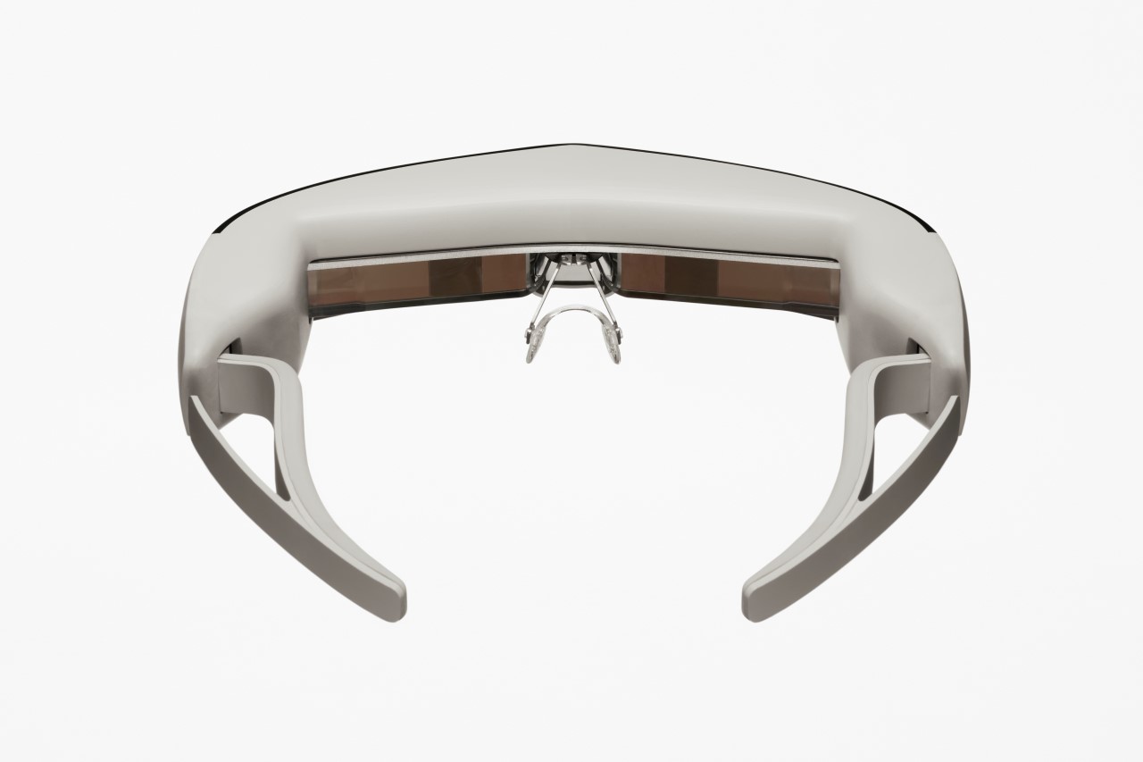
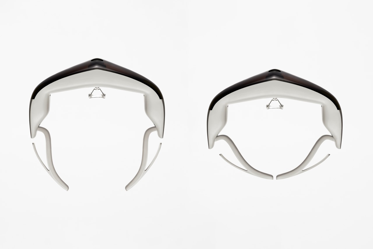
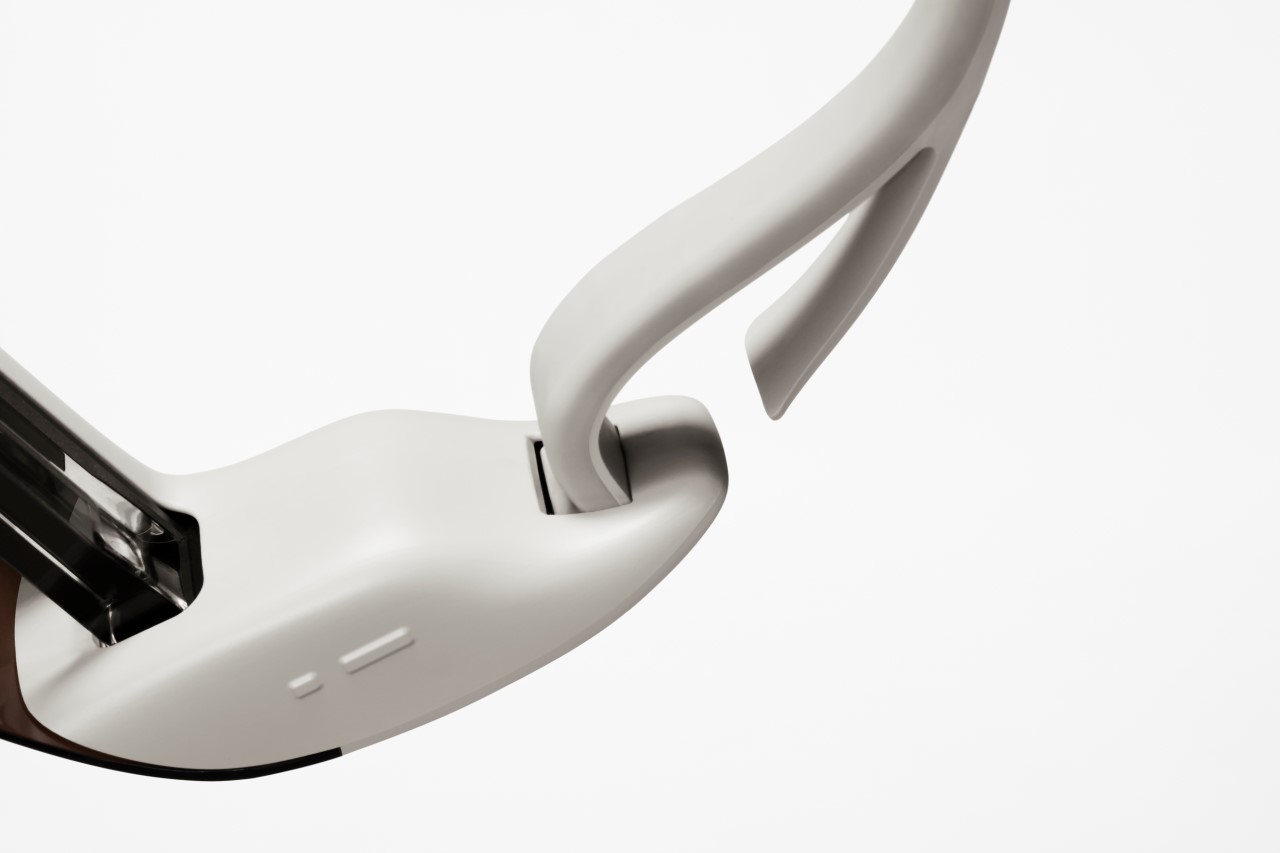
Partnering with Japan-based startup ViXion, Nendo has unveiled an eponymously named mixed-reality headset that’s designed specifically for people with reduced visibility. ViXion is a sleek headset that helps the legally blind (or people suffering from night blindness) see around them. The headset comes with a camera that captures the world ahead of the wearer, while an internal processor increases the visibility of the footage by amping up the brightness and the contrast, and projects the images onto the wearer’s eyes, allowing them to see better.

Fundamentally doing exactly the opposite of what sunglasses do, the ViXion is a headset that aids people with low vision, low peripheral vision, or night blindness, by brightening what’s ahead of them. The headset is characterized by a slim visor with a fisheye camera at the center, capturing footage across a wide periphery. The footage is processed to increase its visibility and then projected onto a semitransparent mirror display in front, for the viewer to clearly see. The wearer can also switch between black and white vision, black and white inversion, and high-contrast colors to match their visual needs.

Designer: Nendo

Olympic Cauldron designed by Nendo “blossoms” open to reveal the eternal fire of the Tokyo Olympics


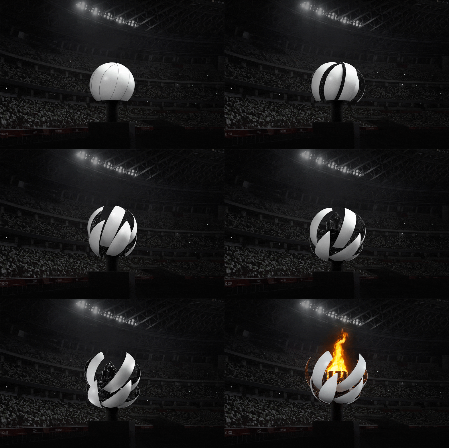
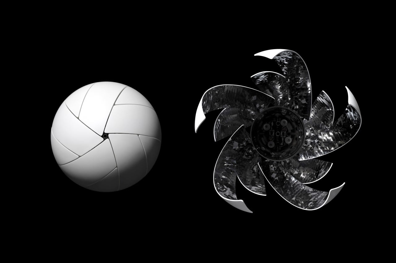
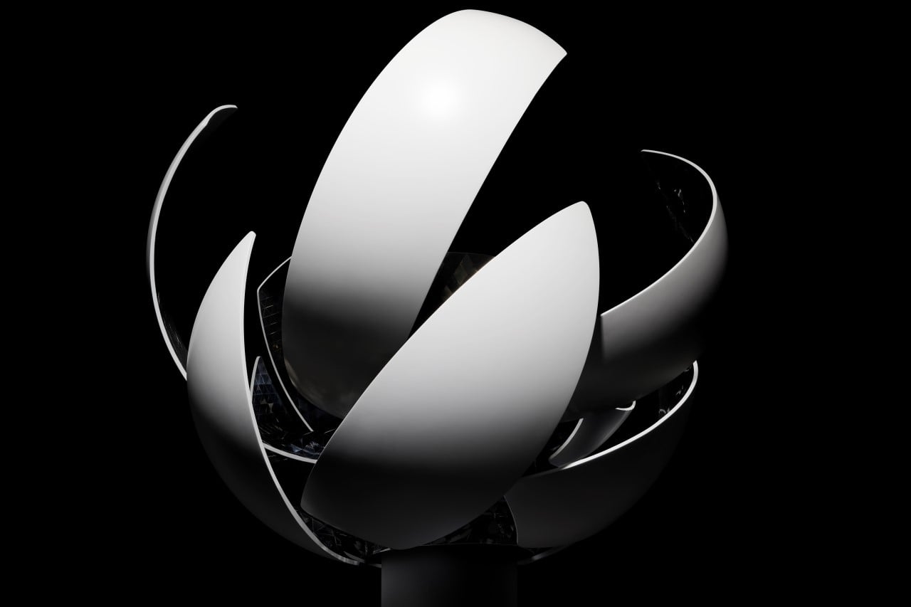
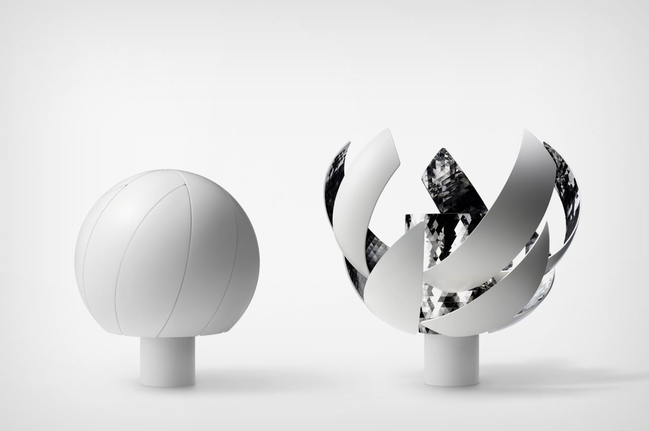
The cauldron, which was lit on Friday to flag off the Tokyo Olympics, was created on the philosophy of “All gather under the Sun, all are equal, and all receive energy”. Showcased as the centerpiece of the Olympic Opening Ceremony, the ‘kinetic’ cauldron started by first assuming a spherical shape, blooming open to reveal the fire-pit within. The fire was fueled by hydrogen energy too, keeping in line with Japan’s commitment to an eco-friendly Olympics.

Designer: Nendo

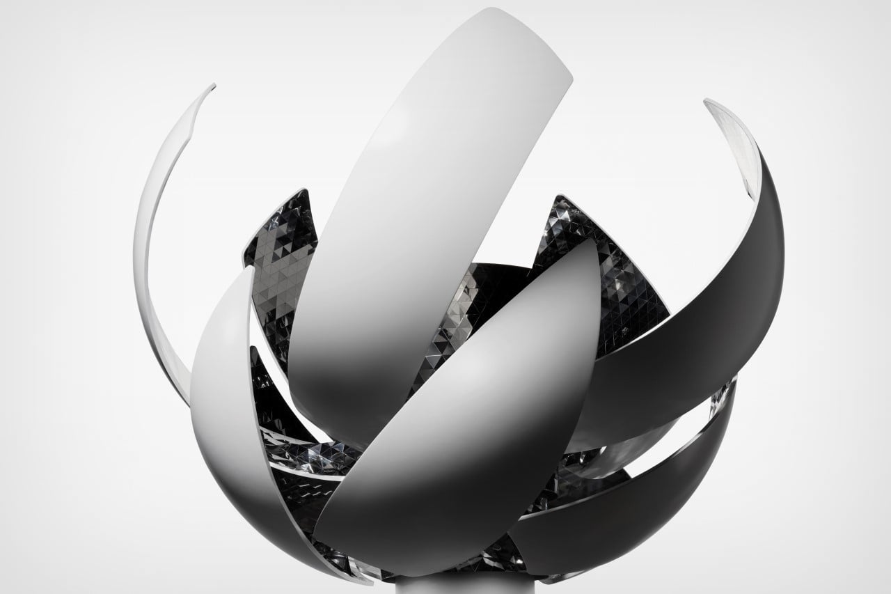
The cauldron is the handiwork of Japan-based design studio Nendo, based on an underlying concept by Mansai Nomura, the Chief Executive Creative Director of the planning team for the Opening and Closing Ceremonies at the Tokyo 2020 Olympics and Paralympics. The design was arrived at after 85 different iterations, including trapping flames in a heat-resistant glass orb to even a concept with a spinning inferno, designed to look like a spherical sun. The final design uses ten aluminum panels with reflective interiors that open upward and outward, “blooming” to welcome the final torchbearer. “This expresses not only the Sun itself, but also the energy and vitality that can be obtained from it, such as plants sprouting, flowers blooming, and hands opening wide toward the sky”, says Nendo founder Oki Sato.

A distinct feature of the cauldron was its use of Hydrogen fuel, a zero-emissions source of energy. The hydrogen was produced at a facility in Fukushima Prefecture, which is currently undergoing recovery from the Great East Japan Earthquake that occurred in 2011. Given that Hydrogen burns with a colorless and transparent flame, sodium carbonate was added to it, to give it the unmistakable yellow hue associated with the sun. The sodium carbonate was sprayed into the fire at varying angles, creating that shimmering effect of firewood being stoked.

The overall cauldron measures 3.5 meters (11.4 feet) in diameter when open, and weighs 2.7 tonnes. Each of the 10 aluminum panels weighs a stunning 40 kilograms, and was meticulously cut from a 10 mm thick aluminum plate and molded using a special hot-press machine to eliminate any warping due to heat. The internal drive unit was designed to be as compact as possible, while also being highly waterproof, fireproof, and heat resistant. Mirrors on the inside of the aluminum panels helped ‘multiply’ the effect of the fire by creating shimmering reflections, and the entire installation was repeatedly tested for heat and wind resistance to prevent any error even under highly varying conditions.

At the finale of the opening ceremony on Friday the 23rd, the cauldron was revealed within the Kengo Kuma-designed Tokyo National Stadium, and was lit with the ceremonial fire by Japanese tennis player Naomi Osaka.