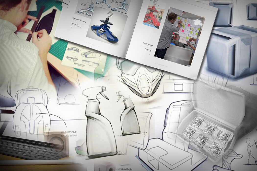
How To Market Yourself As An Industrial Designer

How to market yourself as an Industrial Designer v1

If we were talking about marketing a product we’d look to define our target audience, identify where they can be found in their highest concentration, understand where their attention is, build their trust and make them aware of the positive impact the product will have and WHY they should have it. There’s more to it, but you get the gist. As designers, you know this, but it can be easy to forget the basics when it comes to marketing YOURSELF and not a product. In this post, we take a look at how you can promote yourself more effectively with the goal of increasing the chances of landing the design job you want most.


‘REMARKABILITY’

Designers that are WORTH talking about, GET talked about, and that’s how it should be. So, being remarkable in the first place sits above everything else. It’s the number one pillar of successful marketing and must be your first step. All the effort promoting yourself to get the attention of the people you want to build relationships with is useless if you have nothing great to direct their attention to once you get it. If you don’t have a great portfolio in place to show once you capture the attention, then all you are doing is creating noise. It’s damaging to your reputation and you lose trust. You need that foundation first and foremost. For a start-up, it’s having a great product. For a design graduate, it’s having a great portfolio. (For tips on this, check out our post on portfolio improvement HERE). As Gary Vaynerchuk said, “If your product is shit, the greatest marketing in the world is just going to expose that”.


MAKE YOURSELF DISCOVERABLE

There are only really two scenarios you are trying to foster.
1) Someone who makes or impacts decisions regarding the hiring of new design talent sees you and your work. Let’s call them Robert.
2) Someone who Robert trusts tells him that he should see you and your work.

Hiring is all about people. Robert is your target audience, and you want as many Roberts as possible to see your work. If you create an outstanding portfolio as a PDF and submit it directly to job openings that you find online, it is possible you will land a job with only 5 people on the planet ever seeing your portfolio. However, it limits the number of people in your target audience that will see your work. In order to maximize your exposure, you need to make yourself discoverable.

A good start is to sign up to sites that can host your portfolio for free. There are several sites that have a huge base of portfolios including Coroflot, Behance, Arts Thread, Issuu, etc. On top of this, having an Instagram feed that documents the journey of your design work is incredibly worthwhile. There is a great Industrial Design community on Instagram, and by engaging in that community you can capture the attention of experienced designers in the industry – many of whom post when the design firm they work for are looking for new designers. Use hashtags like #idsketching and #industrialdesign to find relevant content and accounts to follow and get involved in things like Weekly Design Challenge and Sketchwars. Instagram marketing is a huge subject in its own right. My main point here is that there is a high concentration of designers who give a lot of their attention to that platform, so it’s a place you need to be engaging if you wish to market yourself effectively.

You should also have your own website with a blog and email list using MailChimp. This way, you have your own audience you can market yourself to forevermore. If you don’t use sign-up forms and capture details, your dream contact might stumble upon your site and never return. Building an email list allows you to keep them updated with your design work. Adding the contacts you develop a closer relationship with to your LinkedIn account is also a good way of achieving this.


ENTER COMPETITIONS REGULARLY

Another great aspect of signing up to sites like Coroflot and Arts Thread is that they host competitions for the benefit of students and recent graduates. For example, Arts Thread recently organized a competition with Levi Strauss & Co. All entries have been selected down to 20 finalists, and 2 individuals will be chosen to land a summer internship at Levi’s headquarters in San Francisco. For those two students, landing that placement further contributes to marketing themselves effectively. They will get to show their skills to experienced designers in a world class team, build their network, learn new skills and add this to their résumé. It all adds to increasing their chances of landing a job when they graduate, and it all started from being aware of the competition in the first place. So, get signed up to these sites and keep a finger on the pulse.

Entering competitions regularly not only puts you in the running for winning prizes (internships, awards, cash, etc) but you also build your project experience and accelerate your own learning. Sometimes the prize will be exhibiting your work to a large audience at a prestigious event. Again, it all contributes to marketing yourself even further. Who knows, Robert might be there.

adesign_last_cfe
Read our article on How Awards Help Your Design Career


REACH OUT FOR PORTFOLIO REVIEWS

Portfolio reviews are one of the most effective ways for young designers to market themselves and build deep relationships with key individuals simultaneously. Not everyone will say yes. People lead busy lives. However, if you ask 100 senior designers and design managers for 45 minutes of their time to jump on a video call and go through your folio – a few are going to say yes. Even better, target people you respect who live locally and meet them in person. Be honest, be sensitive to their time, but make it clear what you are looking for. Offer to buy them lunch or do something thoughtful to show you really care.

The reason portfolio reviews are so valuable is that it’s essentially an interview. If you can break through and get them then the Roberts of this world end up learning more about you and your work than the 200 candidates who actually applied for a job at that company and got nothing but a rejection email. If you can do this with multiple movers and shakers, and turn it into a long-term relationship – you’ve opened a door that can potentially help you later down the line. Just remember to do something thoughtful to say thank you and leave a lasting impression.


ATTEND INTERVIEWS, AND DON’T WRITE THEM OFF DUE TO YOUR OWN ASSUMPTIONS

I mentioned that portfolio reviews can have a similar effect to interviews in the way that you get to meet decision makers. They get to see your work, learn more about you and you grow your network. Well, these benefits only come with interviews if you attend them.

I meet many graduates who get asked to attend interviews and decline them because they end up building up their own assumptions of what the job and company are really like and convince themselves it’s not right for them. Although it might not be the perfect role for you, there is no harm in having a conversation to find out more. There is nothing to lose. The other thing to consider is that a Design Manager at one business who interviews you could well be working for a different business 6 months down the line that is your ideal company to work for. If you decline interviews, you miss the opportunity to build your network and make yourself known. Whether it is events, competitions, interviews or conferences – try to say ‘Yes’ more and you’ll build your network. You’ll increase the likelihood of serendipitous encounters. Remember the two scenarios from before that we are trying to foster? Well, you are much more likely to meet your target audience if you are engaging in the same activities as them, using the same platforms, attending the same events – in as many instances as possible. Use LinkedIn to identify the individuals you wish to meet the most, and introduce yourself. There is no downside. So, get out there, improve your portfolio, build your network, meet people, enter the competition, say YES, attend the event – and say “Hi” to Robert for me…


Nick Chubb

ABOUT THE AUTHOR

Nick Chubb is a Senior Industrial Designer at IDC in London, designing consumer products and medical devices for some of the world’s leading brands. He has a 1st Class Masters Degree in Product Design and assesses hundreds of design portfolios each year. He acts as lead portfolio advisor at Arts Thread, and is often invited to give talks at leading Universities on the subject of design. Learn more at nickchubbdesign.com


Portfolio Improvement Program

ONE-TO-ONE PORTFOLIO IMPROVEMENT PROGRAM

If you wish to take your design portfolio to the next level and land more interviews at the companies you love most, check out Nick’s One-to-One Portfolio Improvement Program. Learn more at nickchubbdesign.com/portfolio-improvement-program

Thinking Of Studying Industrial Design?

thinking_of_studying_design_layout

Studying design at University is a big decision. I was invited to give a talk at the V&A Museum in London to share my thoughts on design as a career path with students who are currently weighing up their options, as there are a lot of reasons why it’s a great subject to study. If you are coming to the end of high school and it’s something you are thinking about, this post is for you.

OPPORTUNITY TO MAKE REAL IMPACT FROM DAY 1

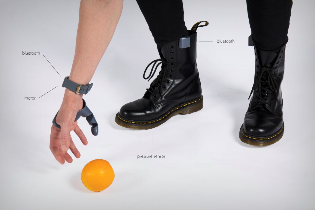
If coursework wasn’t your thing at school, and you preferred exams – a degree in Industrial Design may not be for you. It’s mainly project-based. In a lot of subjects, it can be highly theoretical. However, if you study design you will be identifying and creating solutions to real-life problems. All good design schools run live projects with established brands. If you’re good, you can expect to be presenting your solutions to Design Managers of global brands by your second year. On another note, presentations are something you will be giving A LOT. My point is – it’s highly practical and it’s REAL from day one. Aiming to solve real problems for real people, improve quality of life and help grow businesses through innovation. It’s meaningful and you’ll take pride in the work you do.


third_thumb_4

EVER-EXPANDING KNOWLEDGE (IN SOME NICHE AREAS)

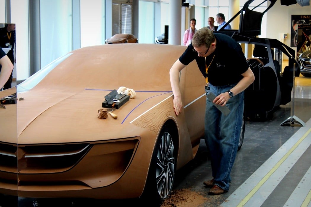
When you study Industrial Design and get deep into a project, you immerse yourself in research of a specific area. You study the market, analyze user behavior, understand consumer perceptions and organize focus groups. You reverse engineer competitor products, research patents and record the opinion of experts. This continues in more depth for projects in industry, and it’s great because you get to learn so much about so many different areas. For me recently, I’ve been learning all about a particular surgical procedure and a new technology that goes with it. It’s fascinating. You will constantly learn about new materials, manufacturing processes and technologies.


clay_modeling

DEPLOY A WIDE VARIETY OF SKILLS

For me, Industrial Design was an easy choice because I loved how it brought together so many different skills that I enjoyed. As a designer, you can meet with users and conduct observations, develop the visual language of a product through sketching, build models, refine designs in CAD, do some testing and deliver a client presentation – all in the space of a week. When you mix this across different projects, you get a lot of variation in the work you do and it keeps it exciting. It’s also not the type of job where you are locked in a room by yourself for 8 hours a day. You have very interesting debates and collaborate with lots of different types of people.


positive_people

MEET AND WORK WITH POSITIVE PEOPLE

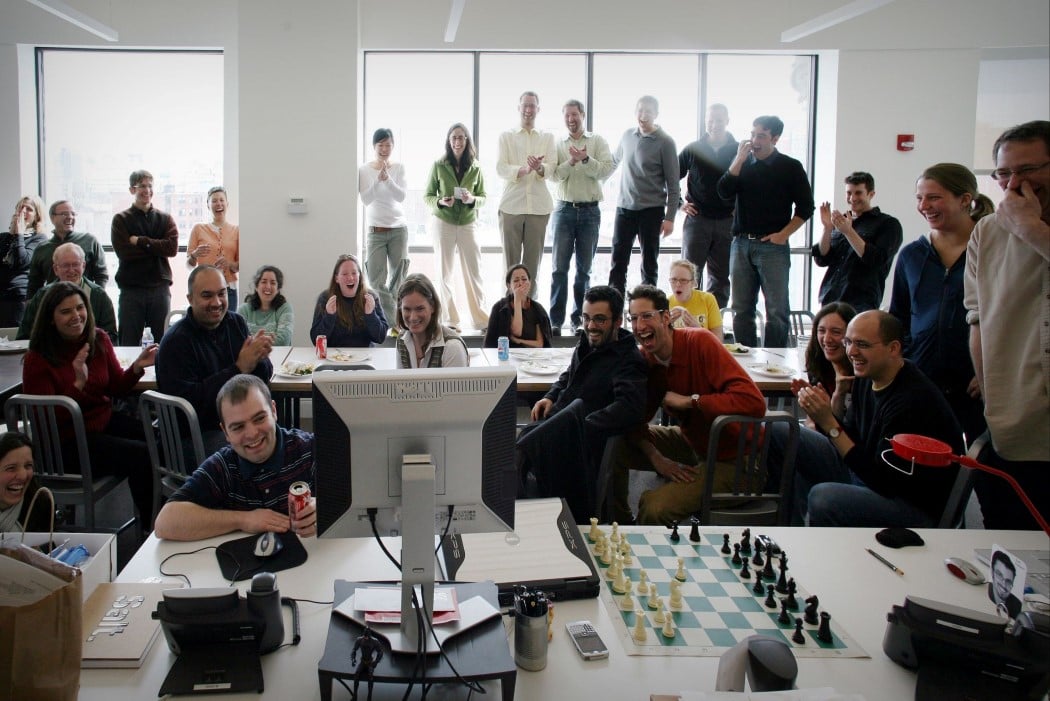
One thing I found at University and also in the different design teams I’ve worked with is that you get a diverse melting pot of people – and these characters tend to be quite interesting. Pro-active and driven individuals. Creative go-getters. Self-starters with unique interests. When you get into design, you don’t tend to work with people who hate their jobs. It’s never like that. It’s more uplifting and optimistic. People in design are usually passionate about what they do. Most of them LOVE it. It’s a good environment to be in.


shanghai

OPPORTUNITY TO TRAVEL

As an Industrial Designer, it’s likely that you will travel to the Far East. I’ve been to quite a few different cities out there now, with trips lasting a few weeks at a time – and I love it. I’m not saying all design jobs offer the opportunity to travel, but it’s highly likely considering the amount of manufacturing done in the Far East and the global nature of business. I’ve traveled abroad for different reasons in different jobs. For research, presentations, testing and for extra resource required in other offices. It’s not a certainty – but if travel is something you’re looking for in a career, then depending on the role, design can offer it.


A VALUED SKILL SET IF YOU WANT TO GO INTO OTHER AREAS

If you want to be an Industrial Designer, then you really need to study design or engineering. However, don’t think that you’ve just pigeon-holed yourself by getting a Degree in design. I truly believe that studying design gives you a highly sought-after skill set that can stand you in good stead for many types of roles. Perhaps it’s the ‘problem solving’ nature of design. I know people who have studied Industrial Design and gone on to be successful in Marketing, Branding, Business Development, Buying, Sourcing, Compliance, Sales, Graphics, Lighting, Engineering, Web Design, UX Design, Soft Goods Design, Packaging, Retail Design and Recruitment. There is also the opportunity to start your own business developing your own products and taking them to market or setting up shop as a consultancy.


art4leg2web

POSITIVELY IMPACT PEOPLE’S LIVES

Design has the power to solve meaningful problems for people. If you get into design, you can positively impact people’s lives. You could argue that this impact is more direct for medical projects compared with others – but products of many different types have the potential to bring someone pleasure and value. The things you buy that you love, whatever they may be, had to be designed by someone – and now that someone can be you if you choose this path.

Products can also make things easier for people, and give them more time to do the things that they REALLY want to do. Take a washing machine as an example. Nobody wants to wash clothes by hand. Before the washing machine was designed, people all over the world were spending hundreds of hours doing something they didn’t want to do, and now they can spend that time however they want. This is one example that people can easily connect with. My point is – you can impact the way we live and help shape the world of tomorrow.


cycle

FUSE DESIGN WITH YOUR OTHER INTERESTS

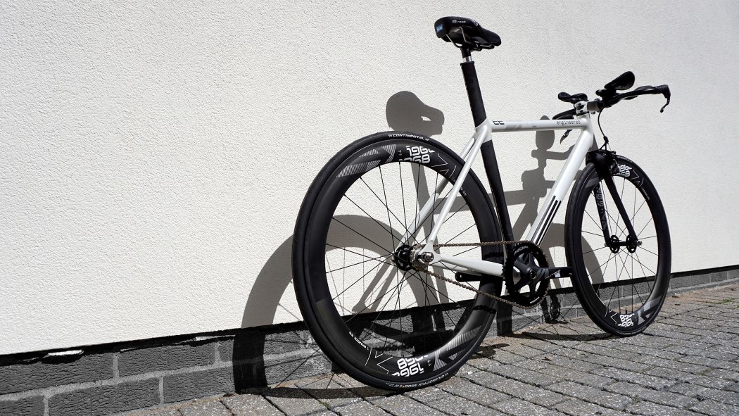
For me, design IS the main thing I love, regardless of the subject area of the project. However, if you love cycling, and design comes second to that, then guess what? – someone needs to design bicycles and cycling gear! Design gives you the opportunity to combine your other interests with your work.

The truth is, it’s a competitive game to get into. But don’t let that stop the journey from getting started in the first place. There are so many reasons why it’s an incredibly fulfilling career. If it’s what you like doing the most and it appeals to you, then jump in. Take the first step and get moving. See you at the top!


Nick Chubb

ABOUT THE AUTHOR

Nick Chubb is a Senior Industrial Designer at IDC in London, designing consumer products and medical devices for some of the world’s leading brands. He has a 1st Class Masters Degree in Product Design and assesses hundreds of design portfolios each year. He acts as lead portfolio advisor at Arts Thread, and is often invited to give talks at leading Universities on the subject of design. Learn more at nickchubbdesign.com


Portfolio Improvement Program

ONE-TO-ONE PORTFOLIO IMPROVEMENT PROGRAM

If you wish to take your design portfolio to the next level and land more interviews at the companies you love most, check out Nick’s One-to-One Portfolio Improvement Program. Learn more at nickchubbdesign.com/portfolio-improvement-program



Check out: Ten Tips to improve your Industrial Design Portfolio

Ten Tips to improve your Industrial Design Portfolio

Ten Tips For Your Industrial Design Portfolio - Cover Image

For an Industrial Designer, there are few things more significant than your portfolio. It’s the number one reason you still haven’t landed your first design job. Alternatively, it’s the main reason you got the job you are in. We all understand its importance, so here are a few pointers.
By no means have I figured it all out or published a blueprint for the ultimate portfolio. However, I’ve learned a lot along the way and received some great advice from top guys at places like IDEO, Nike, Fuseproject and Google – and I feel there are some really great points to pass on. So, here are 10 thoughts to consider:

Show Your Process

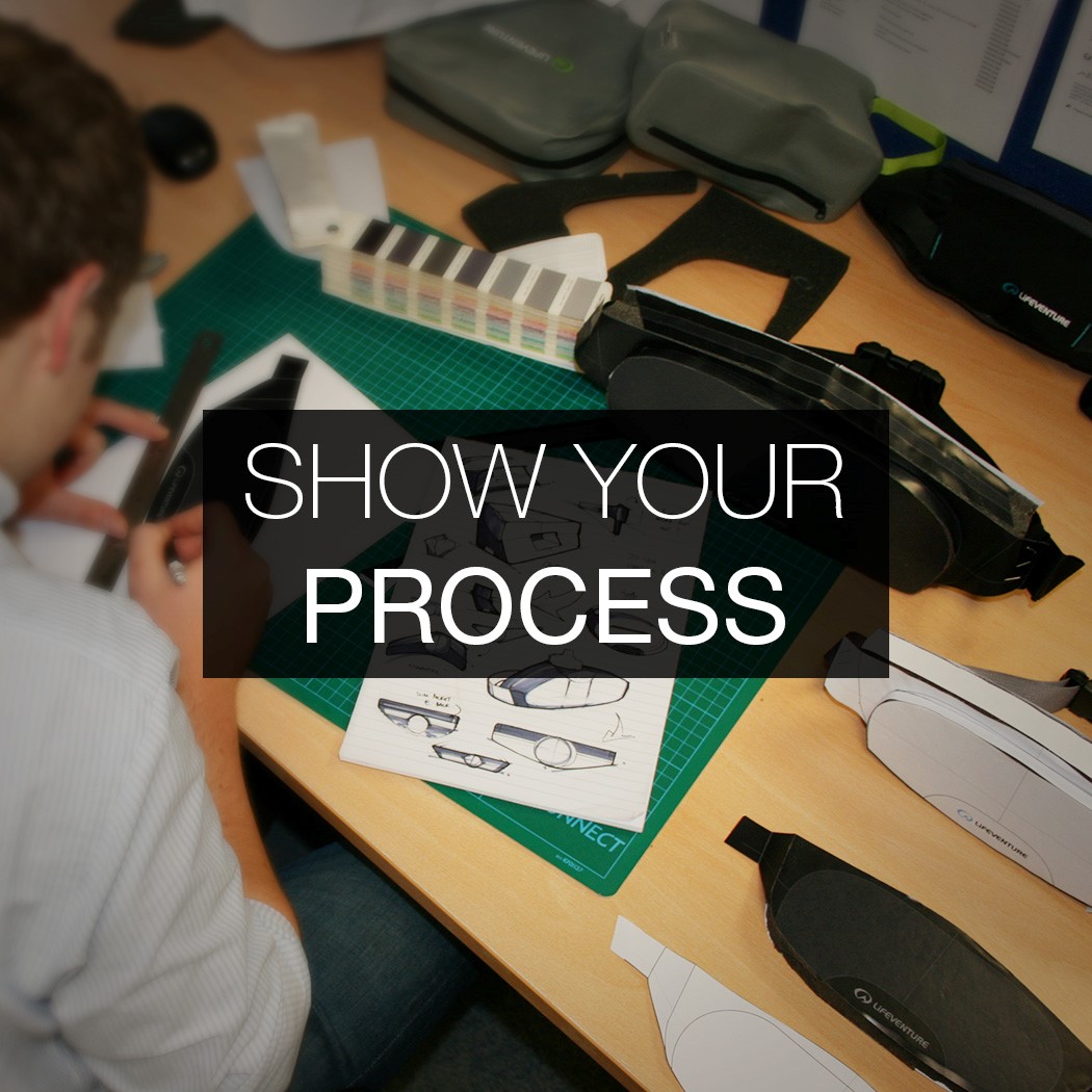
01. SHOW YOUR PROCESS

Your portfolio should not look like a catalog of the products you’ve designed. You’re not trying to sell your products, you’re trying to sell YOU. In order to do this, you need to show your thought process and how you got to the end solution. If you only show images of the final product, then that is the only thing you can be judged on. With no evidence of initial ideas and how you approached different aspects of the project, you make it impossible for a reader to assess the thinking behind your approach. If I’m reviewing your work, I may dislike a certain aspect of the final design, but might appreciate the way you got there. If you don’t show the development journey then you don’t allow for this appreciation.


Convey Multiple Skills

02. CONVEY MULTIPLE SKILLS

In order to sell YOU, think about what capabilities you can convey. One great exercise is to note down a list of the skills you have, and make sure these skills are evidenced in your portfolio.

Rendering is only one skill. A lot of portfolios fail to show a range of skills beyond KeyShot, so think about incorporating hand sketches, Photoshop renderings, Illustrator linework, and prototypes.


Present Projects Not Snippets

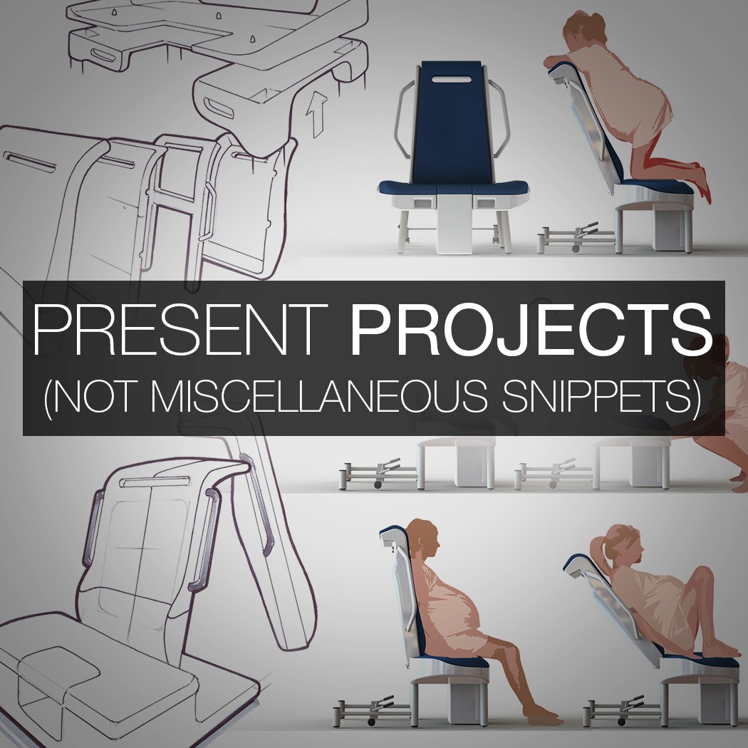
03. PRESENT PROJECTS, NOT MISCELLANEOUS SNIPPETS

In recent years, I’ve seen graduates compile a page of random drawings and group them on a page titled ‘Sketching’. This presentation style of miscellaneous snippets is NOT the way to go. The work should not be grouped by skill. There’s no story in that. More importantly, there’s no storytelling ABILITY being conveyed.

Instead, your portfolio should be presented through projects, and the skills are entwined within those projects. Not every project needs to communicate EVERY skill. One project might focus more on a mechanical challenge and another may focus on form, but the skills are integrated into projects – not isolated in a separate section.

Tailor Your Work To The Business

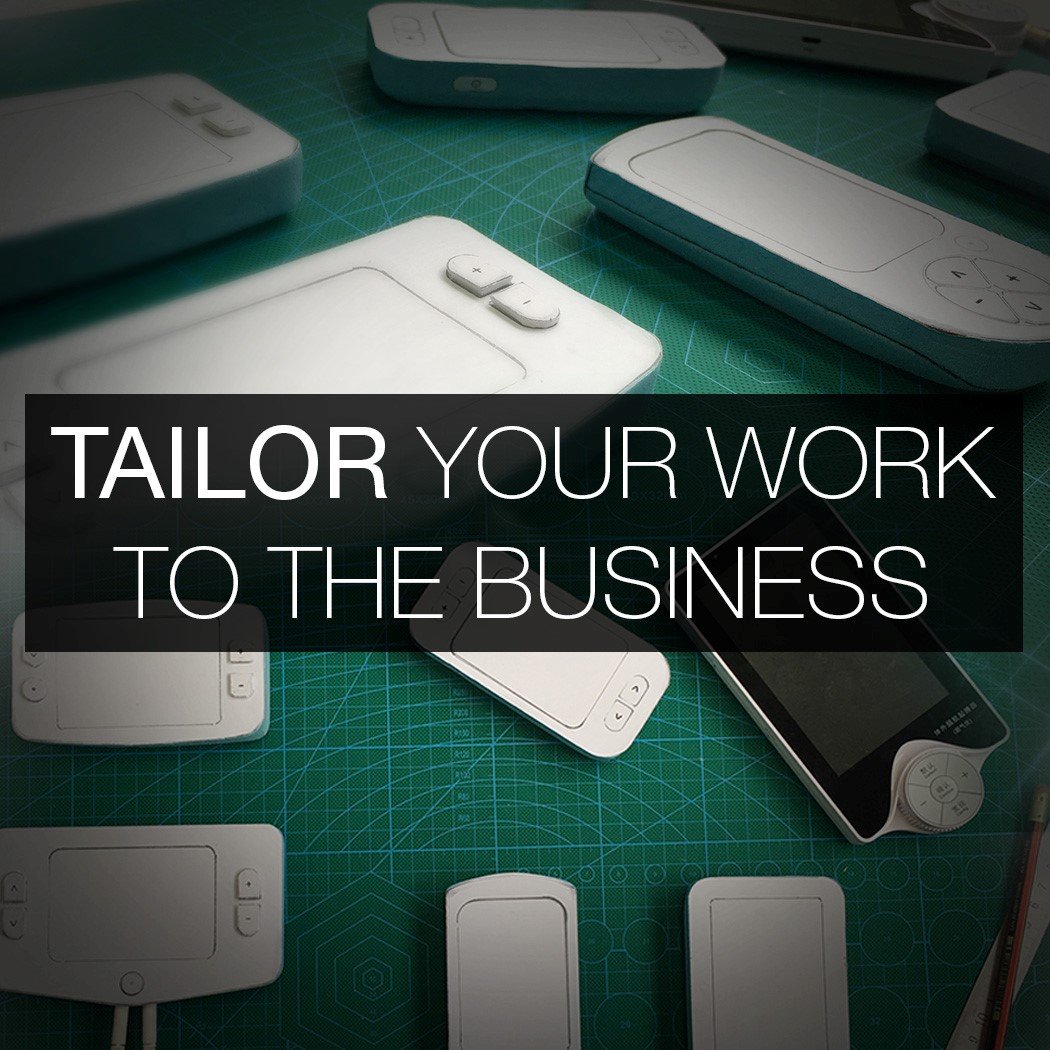
04. TAILOR YOUR WORK TO THE BUSINESS

When you build your level of design experience, you have more projects in your locker than you need for an application. So, you base your decision of which projects to include based on which are the most relevant to that specific business.

When you are just graduating, you can still adopt the same mindset even though you have a limited number of projects. The way you can do this is by shifting the focus of the project. You are in control of your portfolio and have the ability to draw attention to whatever you like. For a large, complex project you will not go through every aspect of the design in an application portfolio. So, if you know that the particular role you are applying for requires more of an understanding of mechanics, then draw more attention to that aspect of the project. Tailor your portfolio for each application.


Focus On The Role

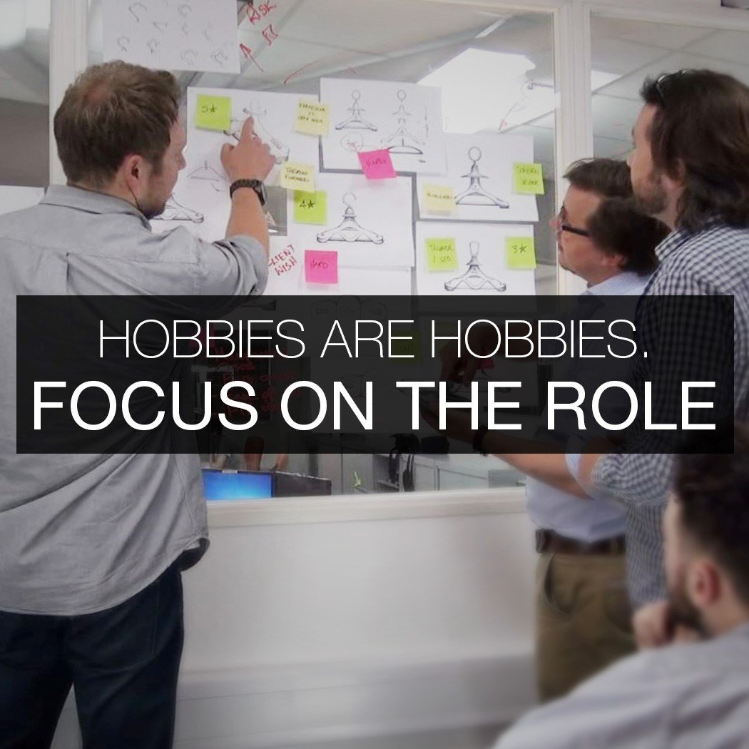
05. HOBBIES ARE HOBBIES. FOCUS ON THE ROLE.

I often get asked by ID students if they should include graphic design work within their portfolio. The answer is always no. The reason is because your portfolio itself should be a shining example of your sensitivity to graphic design, layout, and proportion. The question normally comes from those who enjoy developing brand identities on the side or have a graphics freelance gig designing menus for local restaurants. There is a tendency to include things just because you CAN do them. Just because you can, it doesn’t make them any more relevant.

Photography skills are important as a designer, but not as important as being a great designer. That is what must come first and foremost. Make sure that you don’t infringe on your ability to present yourself as a great designer by clouding the portfolio with a lot of ‘side skills’. I’ve seen 22-page
design portfolios where the last 8 slides were personal photography. This is detrimental. Instead, plant a seed in your résumé by mentioning other skills and present more detail in the interview (if you land it). First and foremost, focus on communicating the fact you can design great products.


Reduce Word Count

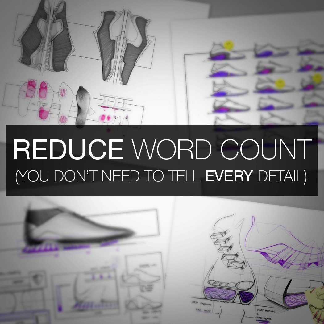
06. REDUCE WORD COUNT. YOU DON’T NEED TO TELL EVERY DETAIL OF THE STORY.

The purpose of the initial application portfolio is not to land the job. It’s to land the interview. When you adopt this mindset, your application portfolio will improve. It only needs to create enough intrigue for the Design Manager or Senior Designer to say “Ok, let’s bring her in for an interview”. The speed at which the reader will flick through your work is rapid. Barely enough time to read sub-headings, let alone a huge paragraph. Engineering roles are different, but for Industrial Design positions, I skim it incredibly fast and stop when something jumps out and makes a visual impact. Only then will I read a few of the details. There are two main levels being assessed. One is the quality of the visual communication. The second is the quality of the actual ideas and concepts. (Behind a great idea drawn badly, is still an individual with great ideas). Both are being judged.

However, the point to take away here is that it MUST be visually impactful in order to catch attention in the first place and draw the reader in. You don’t need to describe every task and every detail in long paragraphs. You can tell the full story in the interview. Telling the story through text is too easy. It’s lazy. A key differentiator is in being able to capture the important aspects of a story in a visual and creative way. So, reduce your word count and make a visual impact.


Clarify The Premise

07. CLARIFY THE PREMISE

One thing that contributes to a poor experience from the reader’s perspective is when you are 4 pages into a project and have seen various sketches, images and renderings, yet you STILL don’t fully understand what the project is about. You’re still asking yourself what the whole point is and what problem is being addressed.

This happens when you don’t clarify the premise at the beginning and make it completely understandable. By not filling this gap in the reader’s understanding, you skip on before they are on the same wavelength. It’s what Chip & Dan Heath refer to in their book Made To Stick as ‘The Curse Of Knowledge’. As in, because you know the subject area so well and are very close to it, you struggle to break it down effectively for someone seeing it for the first time. Taking a step back and being able to do this is a very important skill for any designer.

You must take the reader on a journey where they understand each step. When you do this well, and clarify the problem, it means the reader fully understands what needs to be addressed, and can therefore have a heightened appreciation for the actual ideas within the ideation pages. They get a greater sense of what you are trying to achieve and start connecting with your work on a level deeper than just seeing nice visuals. Allowing for this deeper connection through more effective storytelling is the difference between a good portfolio and a great portfolio.


Keep It Simple

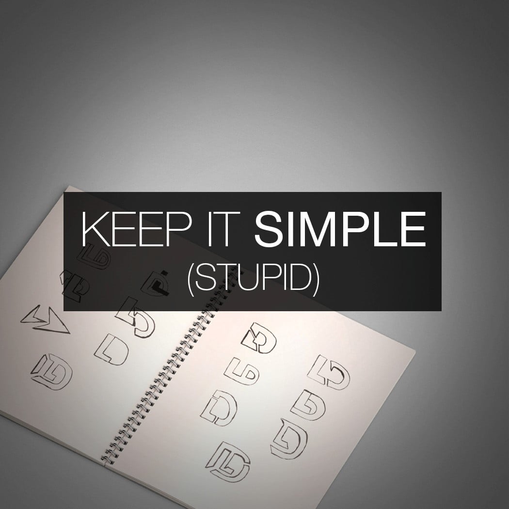
08. KEEP IT SIMPLE (STUPID)

I often come across individuals who are trying to land their first job in a design team, presenting themselves as ‘JHS Designs’. It’s not appropriate. You are John Smith, trying to land a job, so put your name on the cover and not some corporate nonsense. The other thing I see is initials turned into a logo that’s barely readable, and garish borders on every page. Stick with your full name in a simple typeface and get rid of the border. Do away with the clutter, go full width and let the work speak for itself. Keep it simple (stupid).


Be Concise With Commoditised Work

09. BE CONCISE WITH ‘COMMODITIZED’ WORK

What I mean by ‘commoditised’ work is the type of content that doesn’t really show how good you are as a designer. I’m talking about the types of pages that anyone could put together, that don’t show the skills that help separate applicants.

For example, statistics from market research sat next to generic images you found online, followed by a page of existing competitor products and their features, followed by a page explaining target users. Although these are things that may be carried out during the project, they are the types of things that should be done as concisely as possible (if at all) in an application portfolio. It comes back to the point about not needing to tell the ENTIRE story in the initial application because you can go into the detail in the interview. Graduates show too much of this sort of work.

Naturally, we are drawn to pages that are rich in ‘hard skills’. Sketches, ideation pages, visuals of refined concepts and exploded view renderings. These types of things are more individual and help give a better steer as to whether you would bring them in for an interview because they are ‘easier’ to separate if they’ve been done poorly or to a high standard.

Although research stats and personas help with the understanding of the details of the project, they have less influence on the decision to bring in for an interview. Therefore, your portfolio wants to have a high concentration of ‘skill-rich’ pages. People often don’t do this because they lack confidence, so put in the hours and make those pages great. There’s no other way around it.


Nail Down The Hero Shot

10. NAIL DOWN ‘THE HERO SHOT’

Although your portfolio should not look like a catalogue of renders and photographs of the final product, your presentation of the final product is still a VERY important element. The advice I’ve received time and again from some big-hitters in the industry is that less is without doubt more.

Many portfolios show multiple photographs of the final product on one page in a grid layout. This is the fastest way to lose all visual impact. Less on the page is the way forward. It requires a lot more skill to select ONE image. The right image. The one that simultaneously shows the product in context, communicates its purpose and is visually striking. A picture paints a thousand words, but only if it’s a great picture.

When thinking about your hero shot, don’t look at what other students are doing. If you are designing a wireless speaker for the home, go and see how Bang & Olufsen are presenting their latest product in GQ magazine. Look at the billboard campaigns for the latest Tom Ford sunglasses or social media ads for the latest Dyson fan. Look to the best in the world for inspiration, not the best in your class. You will instantly up your game.

Also, creating an image of the product being used in context usually requires more skill to make it look great, compared to rendering out of context against a white background. Sometimes these clean renders in white space are appropriate, but if you know the ideal image is to show the product underwater on someone’s wrist, then push yourself to visualize this. You’ll develop this ability faster and contribute to your own growth, instead of building a moat around your skill set.

So, that concludes ten things to consider when putting your portfolio together. We wish you the best of luck in crafting the best version you can, and moving closer to the job you want most. Go ahead and bookmark this page for future use, or share it with a friend who’s gearing up for that job interview!


Nick Chubb

ABOUT THE AUTHOR

Nick Chubb is a Senior Industrial Designer at IDC in London, designing consumer products and medical devices for some of the world’s leading brands. He has a 1st Class Masters Degree in Product Design and assesses hundreds of design portfolios each year. He acts as lead portfolio advisor at Arts Thread, and is often invited to give talks at leading Universities on the subject of design. Learn more at nickchubbdesign.com


Portfolio Improvement Program

ONE-TO-ONE PORTFOLIO IMPROVEMENT PROGRAM

If you wish to take your design portfolio to the next level and land more interviews at the companies you love most, check out Nick’s One-to-One Portfolio Improvement Program. Learn more at nickchubbdesign.com/portfolio-improvement-program