Braun’s aesthetics come to life in this chair design!

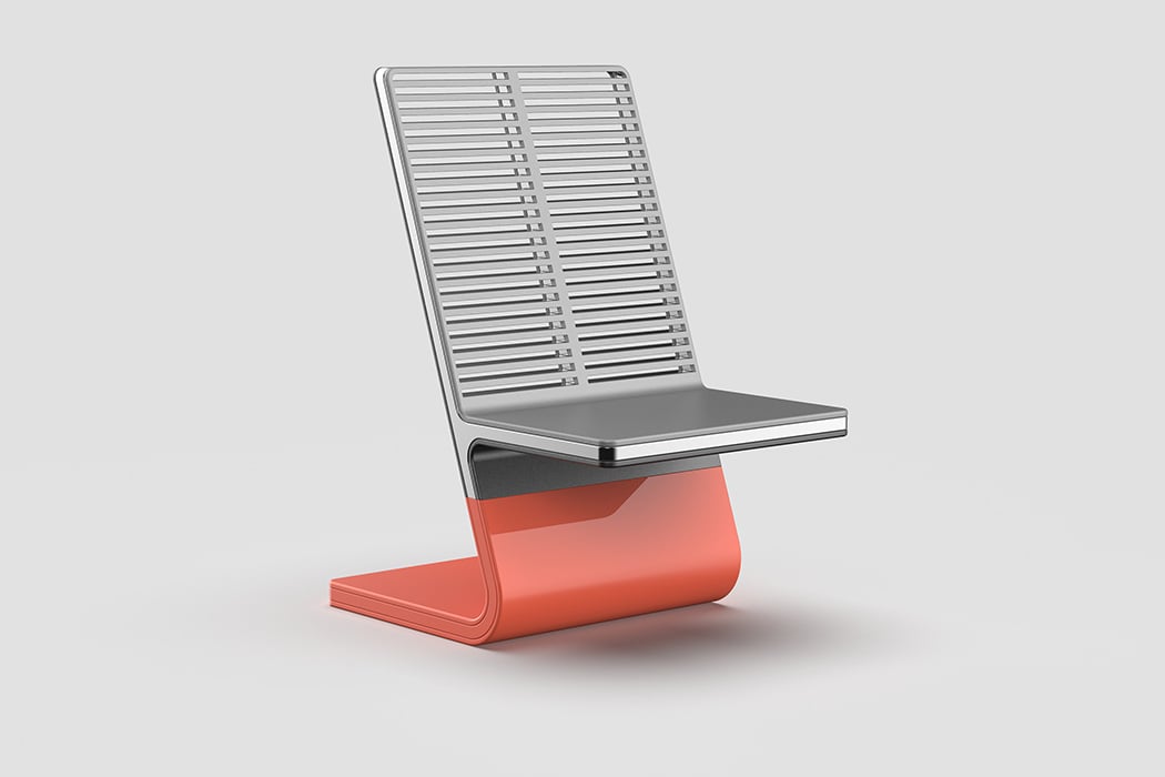
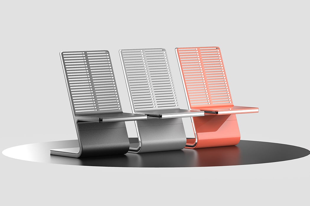
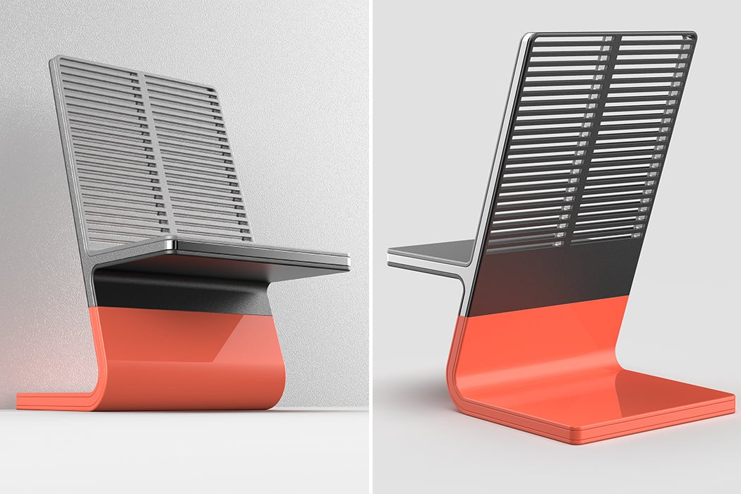
When Dieter Rams said “Good design is as little design as possible” – these words became the holy grail that every industrial designer would swear by. While the Braun legacy covers electrical appliances with its distinctive design language, designer Nikhil Kapoor wanted to bring that language to the world of furniture design – giving birth to the Braun Chair!

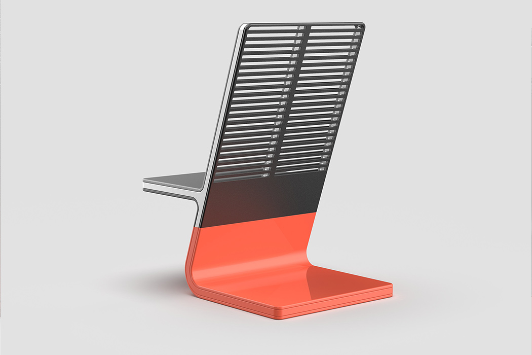
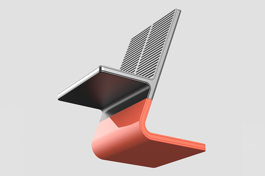
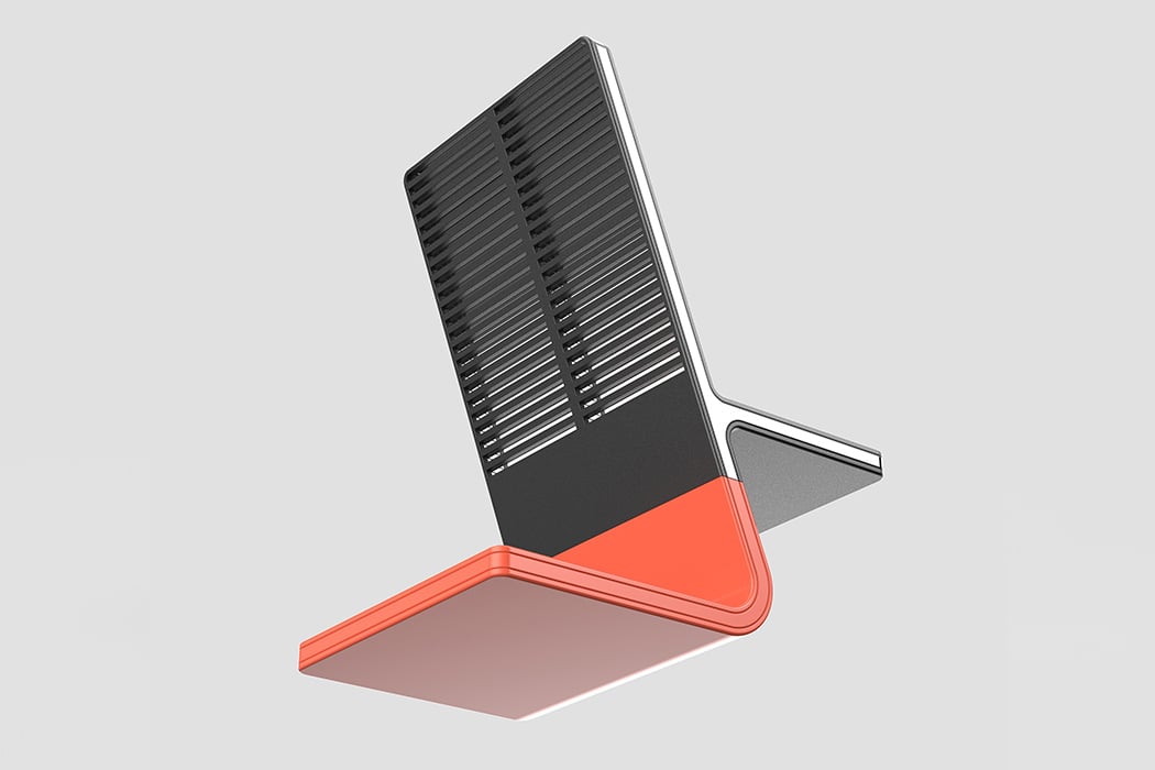
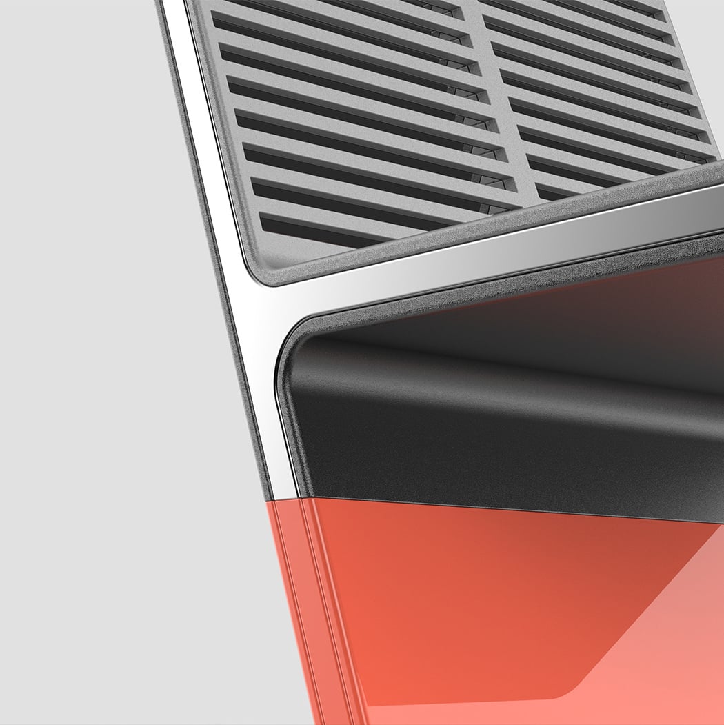
The first thing that catches my attention while looking at the chair is the simplistic nature of the design – reducing the essence of a chair to an almost z-shaped curve! The backrest of the chair uses a grill-based pattern to allow for ventilation while paying homage to the speaker grill’s widely used in Rams’ designs for radios, clocks, and kitchen appliances making them quietly understandable and agreeable. Keeping in tune with the philosophy, there are seemingly modest elements that uplift the chair – one such is the use of a shiny metallic strip running across the edges of the chair, making it a visual focal point. The bottom of the chair protrudes to balance the weight of a person sitting on the chair. Given the unibody and sturdy look of the chair, it seems more fit for use in a public space – such as parks, bus stops, or even on a sidewalk.

The Braun design philosophy remains evergreen, and this chair is the perfect example of it. Modern, minimal, and elegant, this is a chair that can blend in with the present and will stay with you in the future!

Designer: Nikhil Kapoor
The Balance Watch bases itself off the duality of Yin and Yang

The Balance Watch bases itself off the duality of Yin and Yang

Visually split into two distinct parts, the Balance watch says all it needs to with its name, and the watch face design. Taking inspiration from the Yin-Yang, the Balance watch is all about showcasing a duality. A duality between colors, themes, and even technology, because aside from being half black and half white, the Balance Watch is also half-analog, half digital.

Looking like a normal mechanical watch, the Balance’s watch face is actually half-parts a dynamic e-ink display. The black surface serves as a display unit, through which the hands appear, and on top of which lies the white half-dial piece, adding contrast and drama to the watch face.

The hands come with their own interpretation of duality, with black and white hands (and dot indicators at the end of them) and tell the time against the watch’s dual-colored surface. The white part of the watch surface comes with a subdial, and to complement it, the e-ink display has a ‘subdial’ too that displays the date and time. The e-ink display even works in tandem with your phone when connected, giving you notifications when you’re getting a call or a message, and if you really want to spice the two-tone layout, you can even get the display to show off black and white patterns, giving you the duality of visual drama vs plain-ness!

Designer: Design Magnet

The Balance Watch bases itself off the duality of Yin and Yang

The Balance Watch bases itself off the duality of Yin and Yang

The Balance Watch bases itself off the duality of Yin and Yang

The Balance Watch bases itself off the duality of Yin and Yang

The Balance Watch bases itself off the duality of Yin and Yang

The Balance Watch bases itself off the duality of Yin and Yang

The Balance Watch bases itself off the duality of Yin and Yang

The Balance Watch bases itself off the duality of Yin and Yang

The Balance Watch bases itself off the duality of Yin and Yang

The Balance Watch bases itself off the duality of Yin and Yang

The Balance Watch bases itself off the duality of Yin and Yang

The Balance Watch bases itself off the duality of Yin and Yang

Hoverboard? Segway? Both?

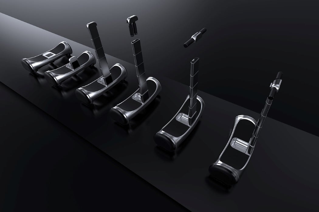
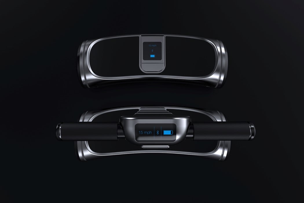
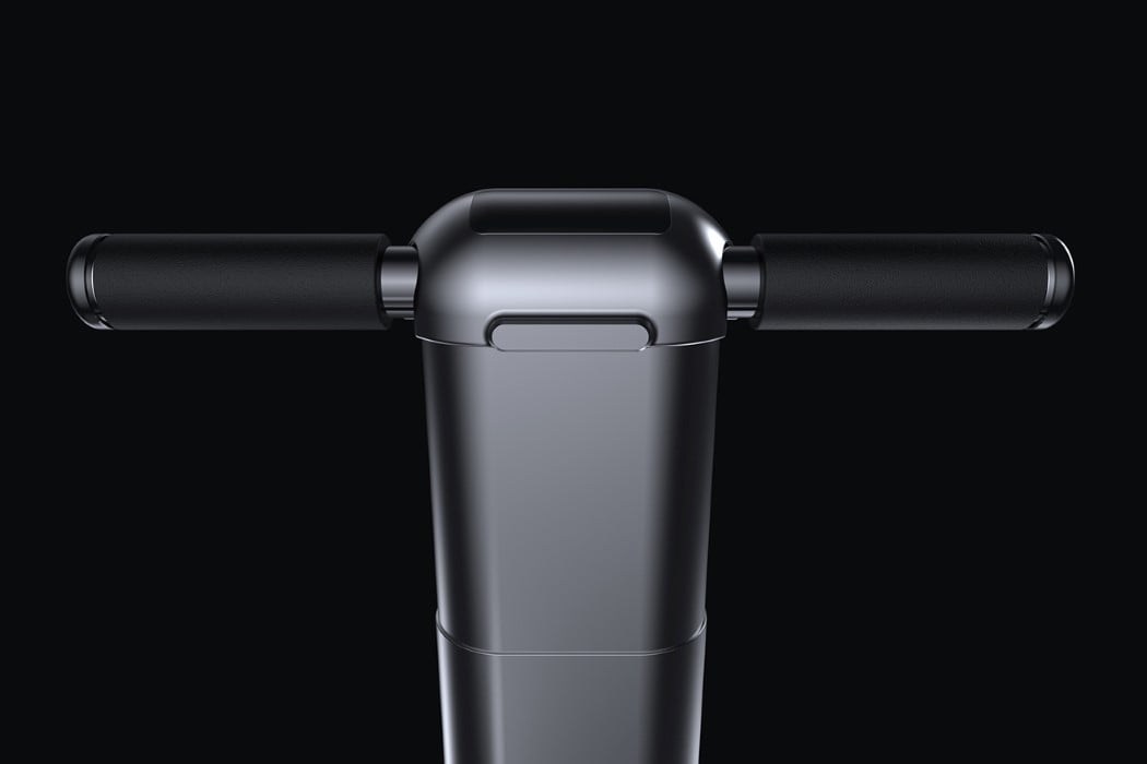
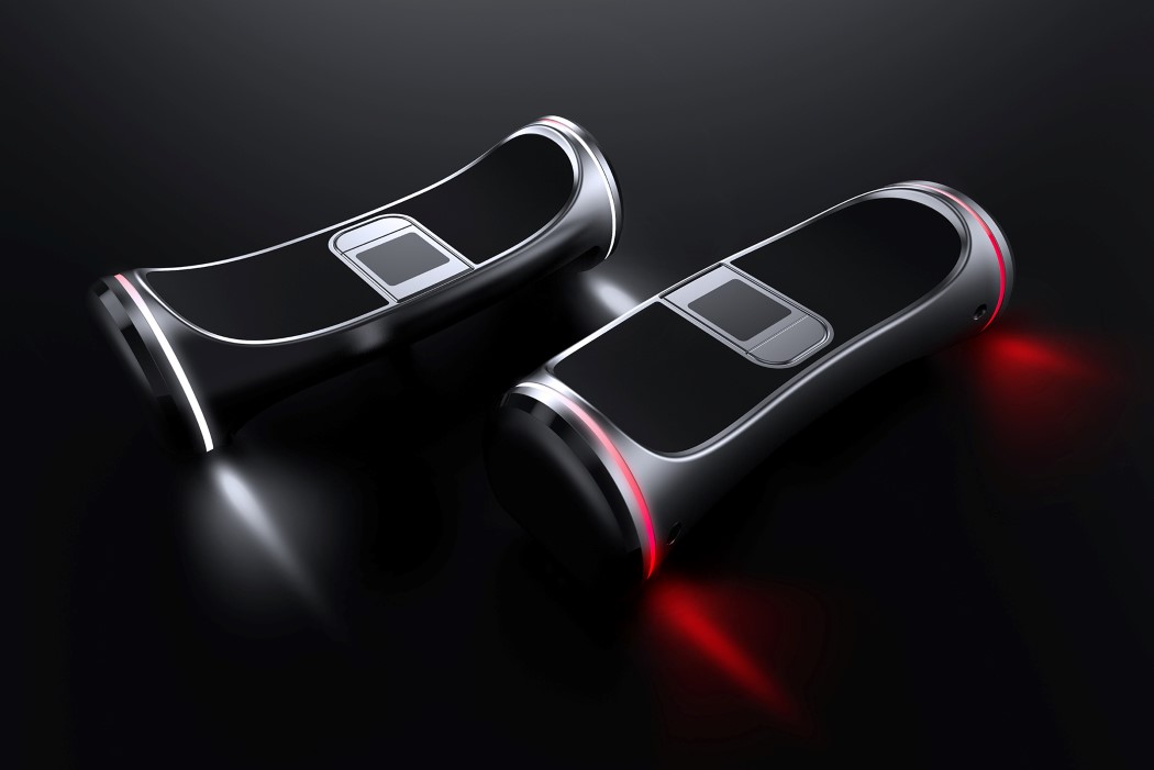
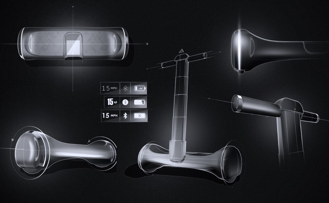
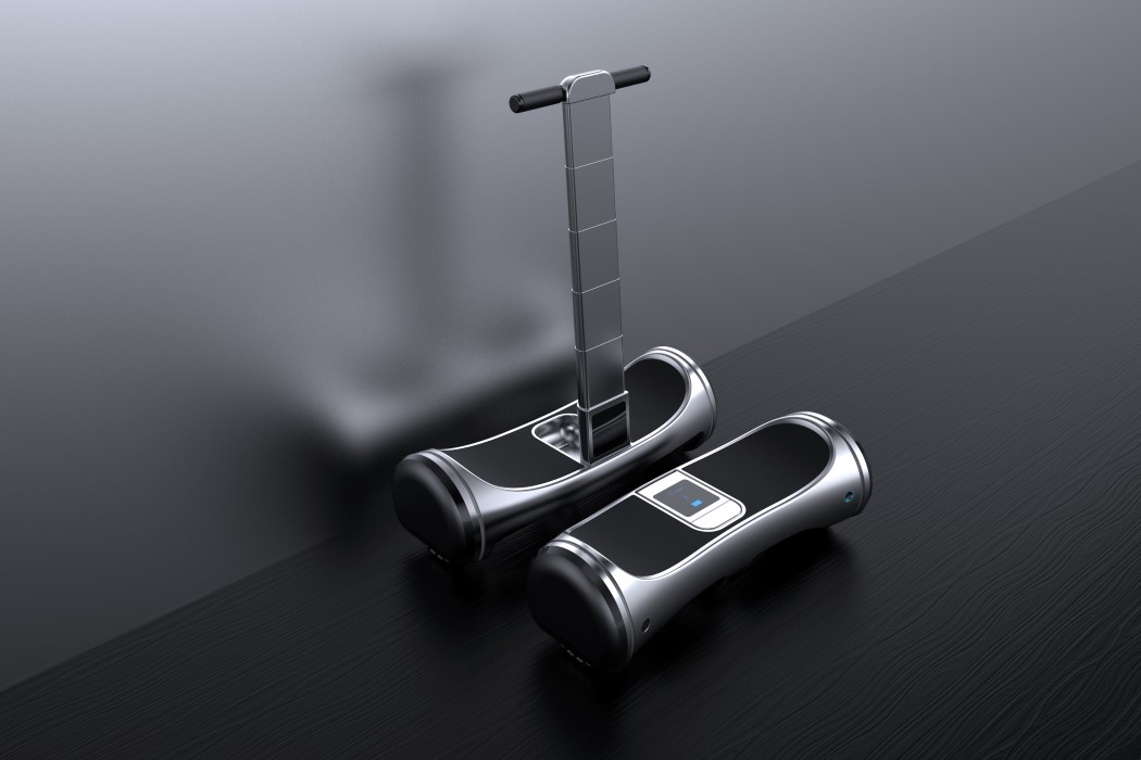
The Hoverboard 2.0 is practically a stroke of genius. Designed to be an intuitive, functional, and user-friendly device, the Hoverboard 2.0 can switch between being a regular hoverboard and a Segway, thanks to its telescopic handle system that occupies an incredibly small footprint when folded down. It’s so small, it fits right into the hoverboard itself. Open it out, take the upper hub and pull the handles outwards before docking it back in and you’ve got yourself a Segway. In either format, you’ve got yourself a screen right under your nose that gives you a brief overview of things like battery life, speed, Bluetooth connectivity, etc.

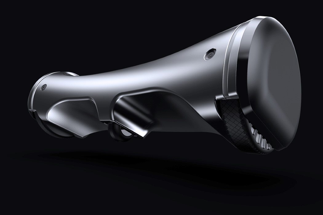
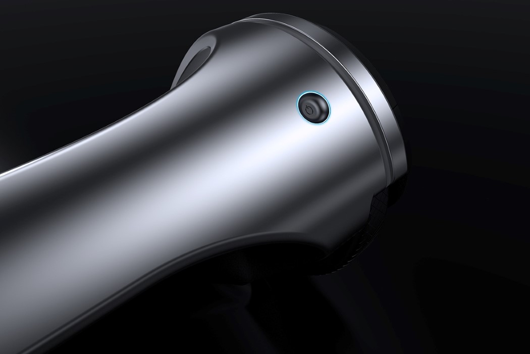
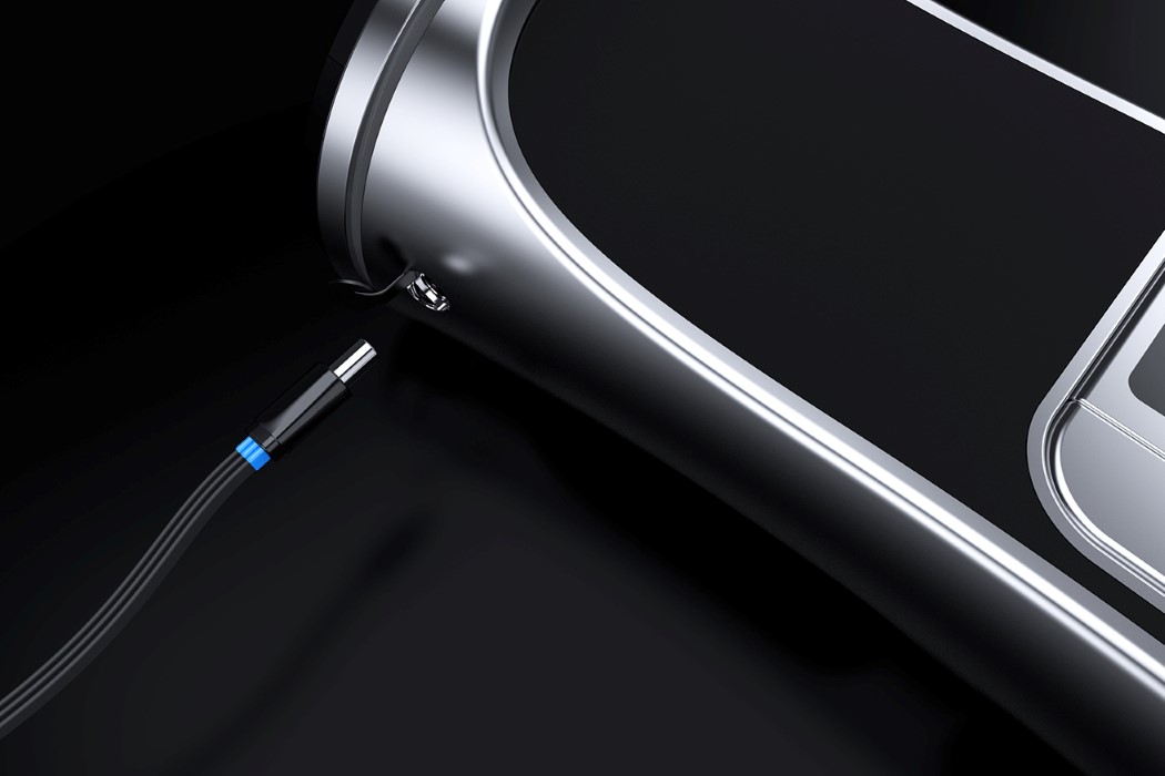
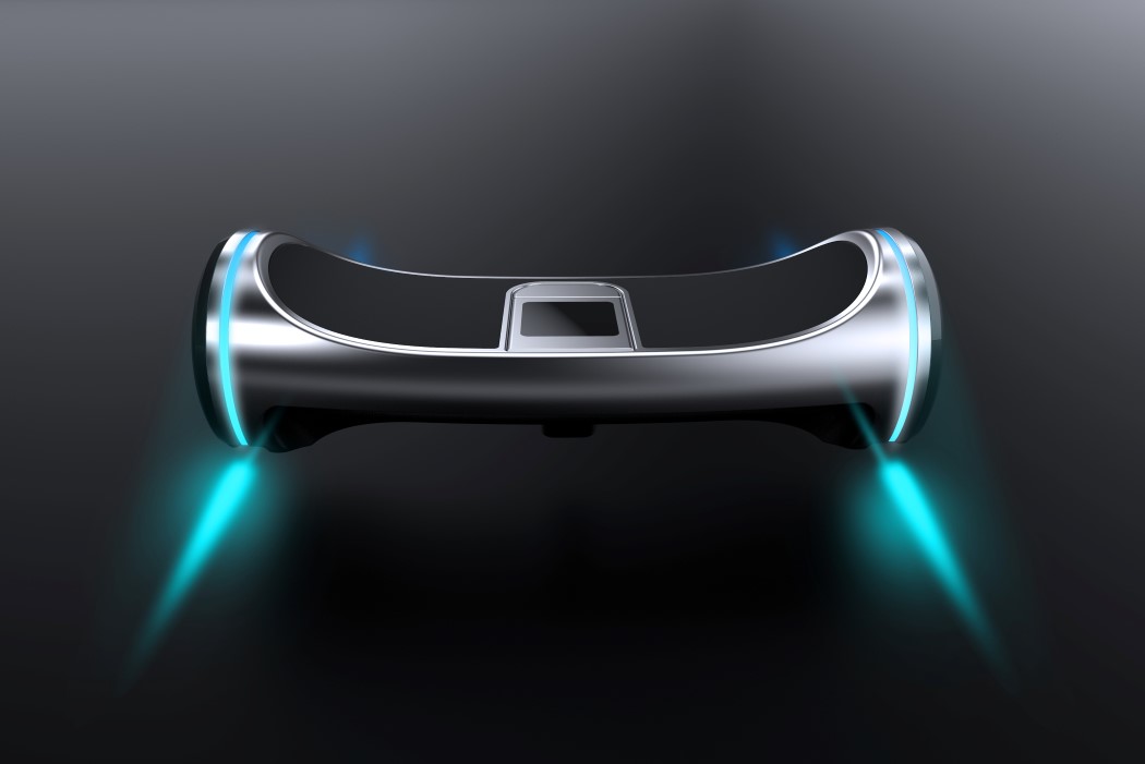
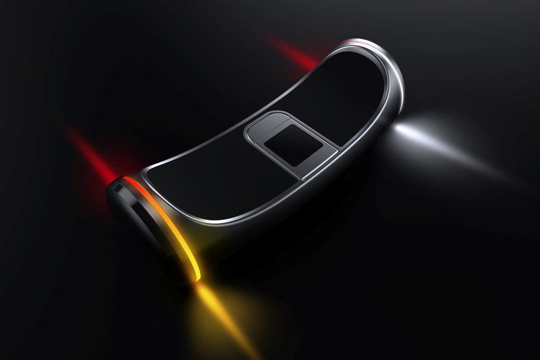
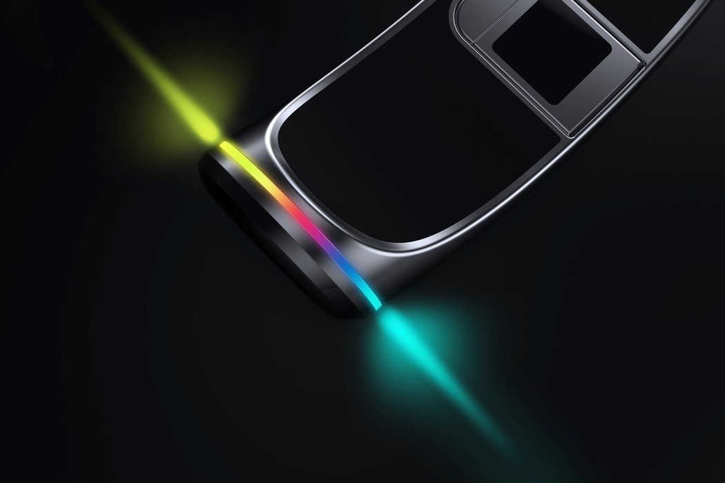
The Hoverboard comes with three wheels, a charging port on one side, and a recessed power button on the other. The side-most wheels have LED rings around them that not only light up when the Hoverboard is operational but also act as indicators/taillights, making the Hoverboard 2.0 a true, all-round mobility solution for the future!

Designers: Nikhil Kapoor, Ujwal I.K. & Pragya Charu Manihar.

hoverboard_two_1

hoverboard_two_12

hoverboard_two_2

hoverboard_two_3

hoverboard_two_4

hoverboard_two_5

hoverboard_two_6

hoverboard_two_9

hoverboard_two_10

hoverboard_two_11

Print

hoverboard_two_8

A Cool-culator!

cal_2point0_1

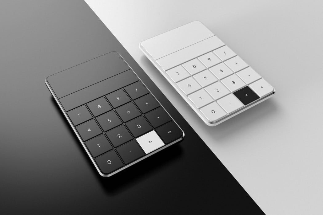
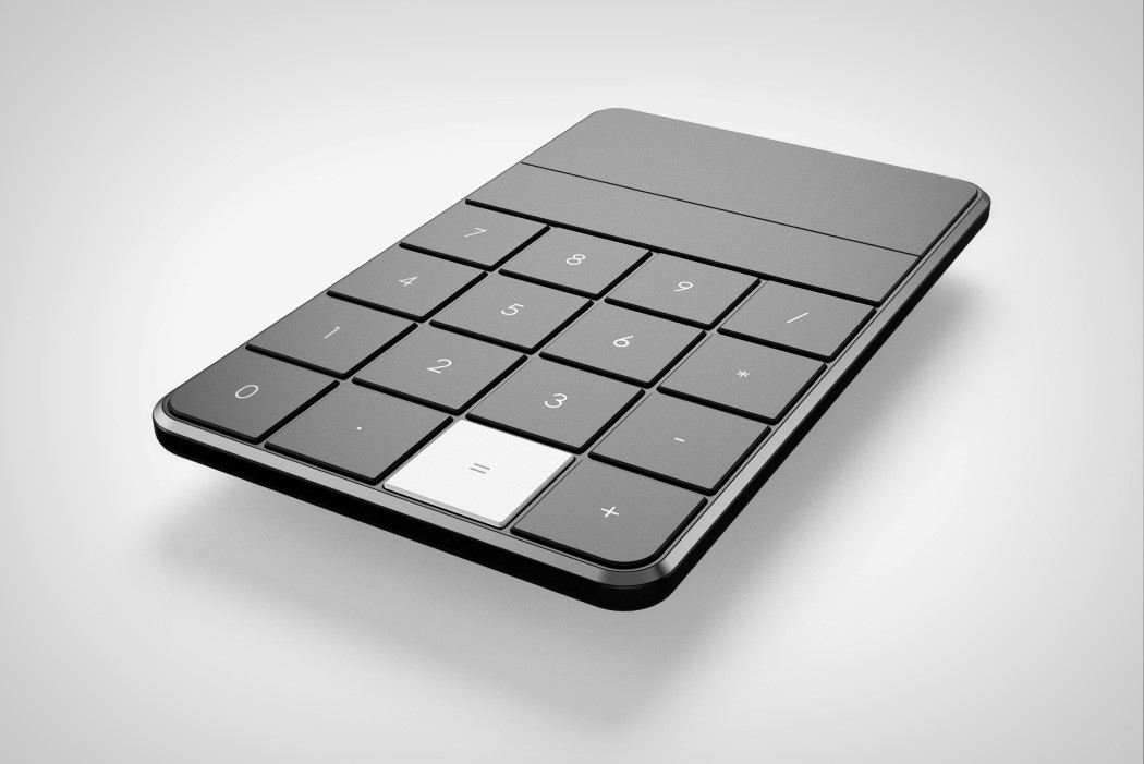
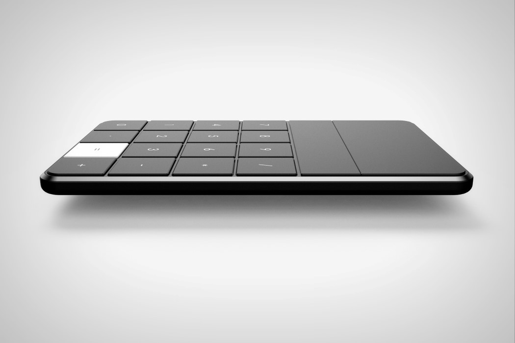
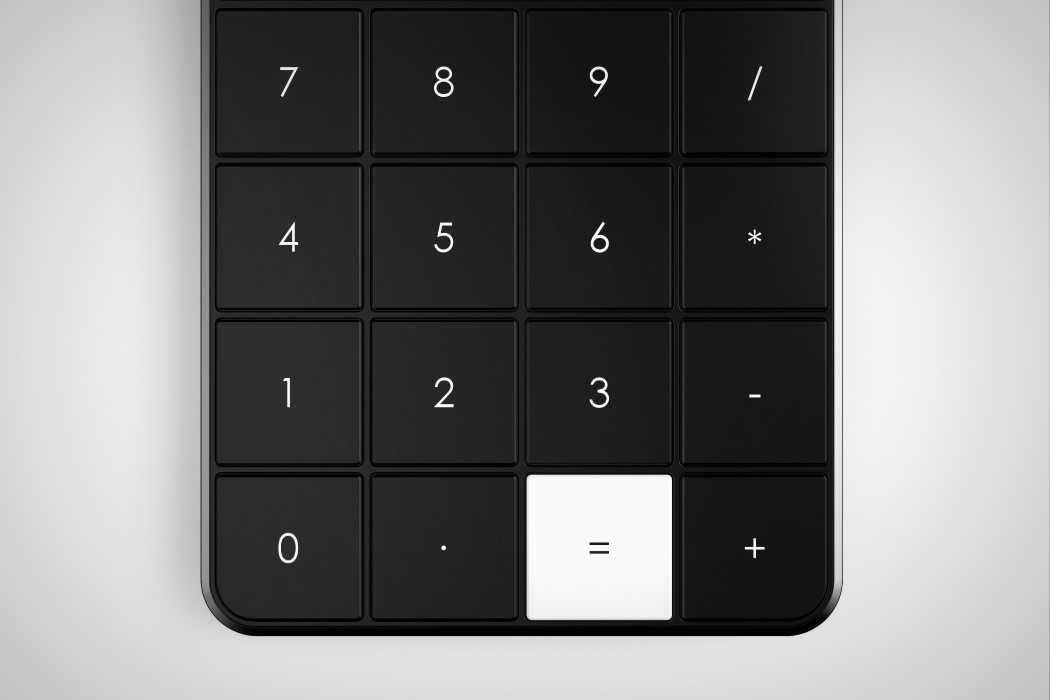
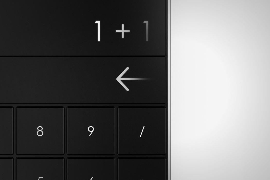
Everything about the Calculator 2.0 by Nikhil Kapoor is amazing. The product is just mesmerising to look at, and it comes with an incredibly sleek design that even makes use of a touch bar below the screen (clever, eh?). The entire product has a monochrome vibe to it with jet black keys and screen with just the ‘=’ key in white, really punctuating the design in a beautiful way.

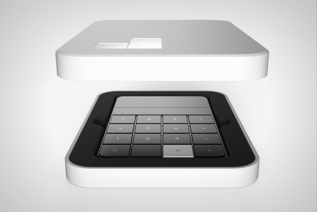
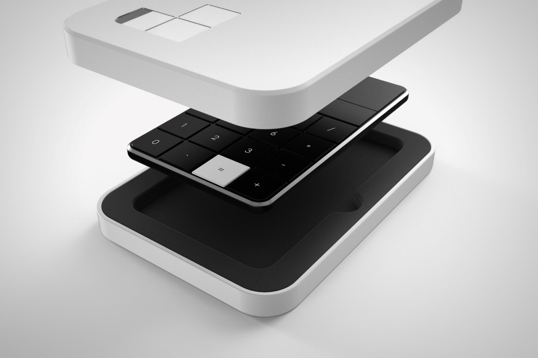
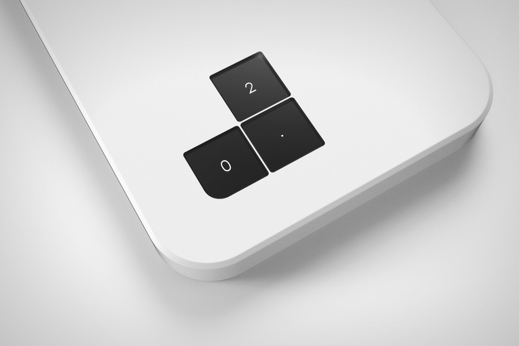
The Calculator 2.0 was featured on Yanko Design in 2014, but it’s latest development (and a seriously brilliant one) is the packaging. The Calculator comes fitted inside a white box with three square cutouts that align perfectly with the 2, 0 and the decimal keys. This itself becomes the branding for the box containing the Calculator “2.0”. Just some really smart designing!

Designer: Nikhil Kapoor

cal_2point0_2

cal_2point0_3

cal_2point0_4

cal_2point0_5

cal_2point0_6

cal_2point0_7

cal_2point0_8

cal_2point0_9

cal_2point0_10

Calculator 2.0

For a good part we can credit Apple for redesigning the calculator, more as a swanky app than as a product. To take it into the real world, we have here the Calculator 2.0, a device that breaks away from the boring, boxy object to being something trendy. Take a look at the aesthetics and simplistic design.

Designer: Nikhil Kapoor

-
Yanko Design
Timeless Designs - Explore wonderful concepts from around the world!
Shop CKIE - We are more than just concepts. See what's hot at the CKIE store by Yanko Design!
(Calculator 2.0 was originally posted on Yanko Design)

Related posts:

  1. Hopscotch Calculator
  2. Wooden Weight Calculator


Cycling With illume

The illume is a bicycle that combines a simple bike design with advanced technology. To overcome the problems of riding at night, the design merges the indicator, brake and headlights into the frame in a way that it affords a safer ride. A lithium-ion battery and an actuator that transforms kinetic energy to electrical energy power the lighting system that is integrated into the frame.

Crafted from aluminum and carbon fiber, ‘illume’ provides complete suspension with a suitable form.

Designer: Nikhil Kapoor

-
Yanko Design
Timeless Designs - Explore wonderful concepts from around the world!
Shop CKIE - We are more than just concepts. See what's hot at the CKIE store by Yanko Design!
(Cycling With illume was originally posted on Yanko Design)

Related posts:

  1. Red Bull Illume by Fullaluv Studio
  2. Lumigrids While Cycling