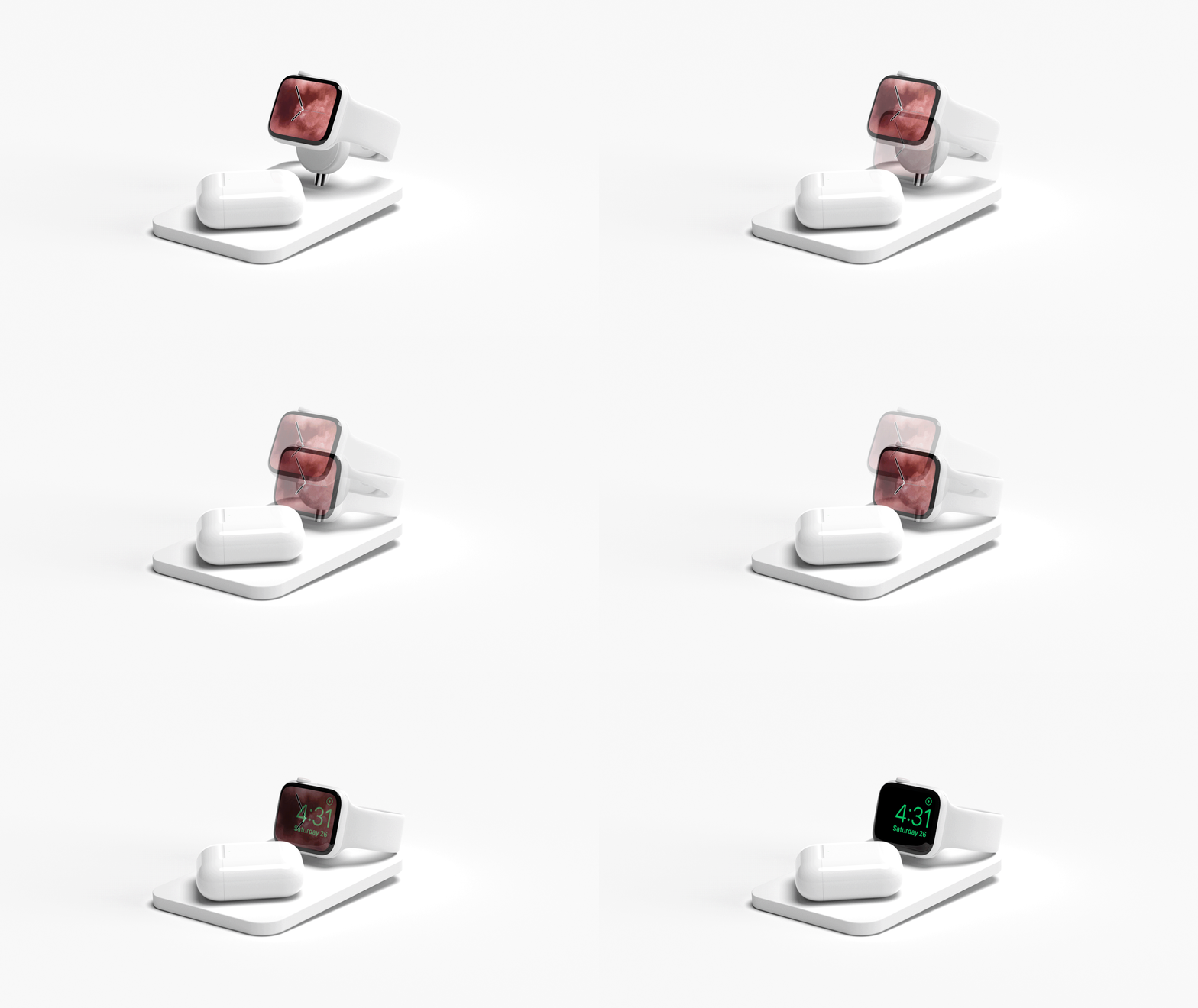
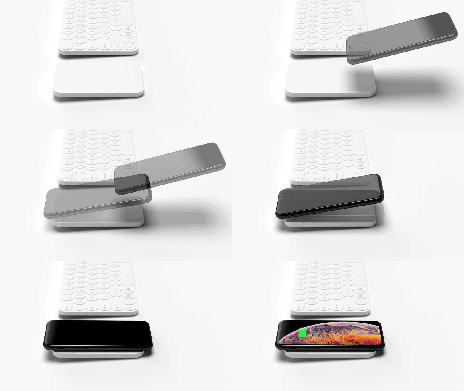
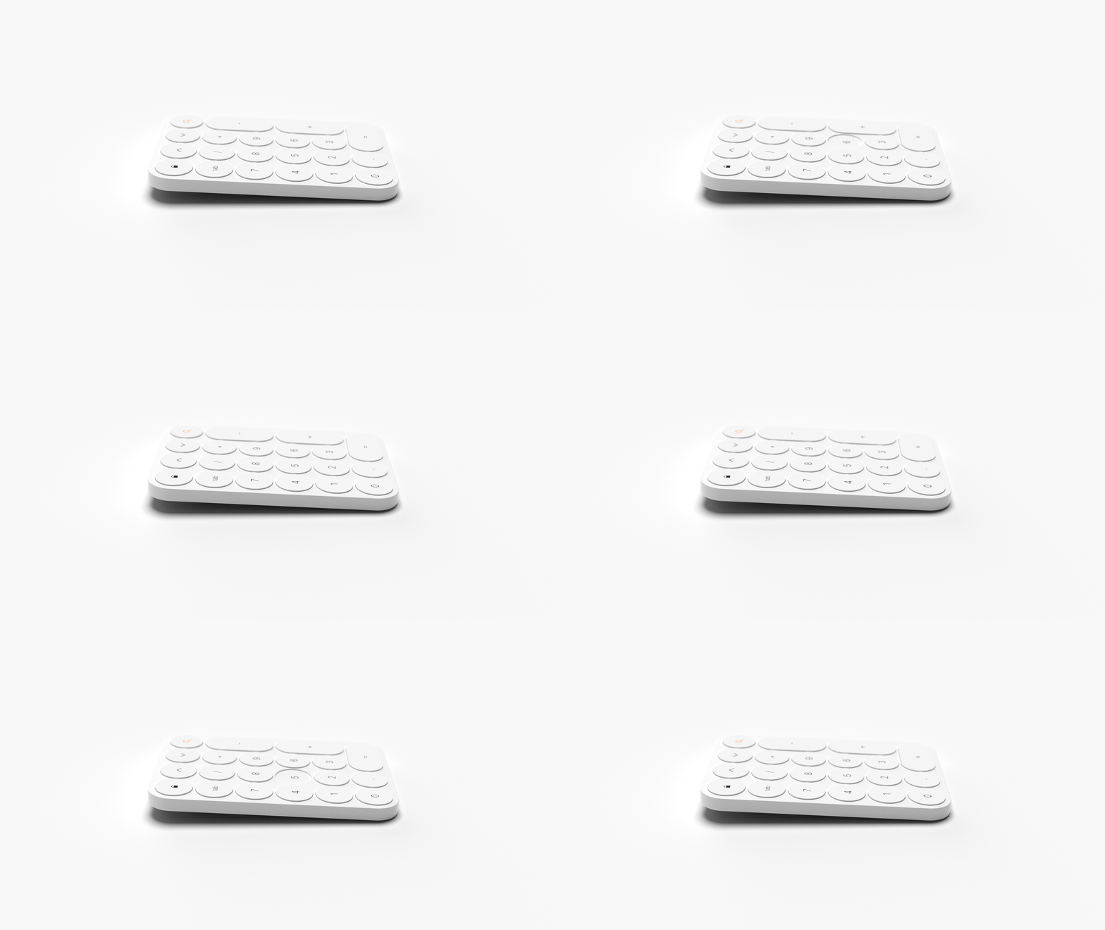
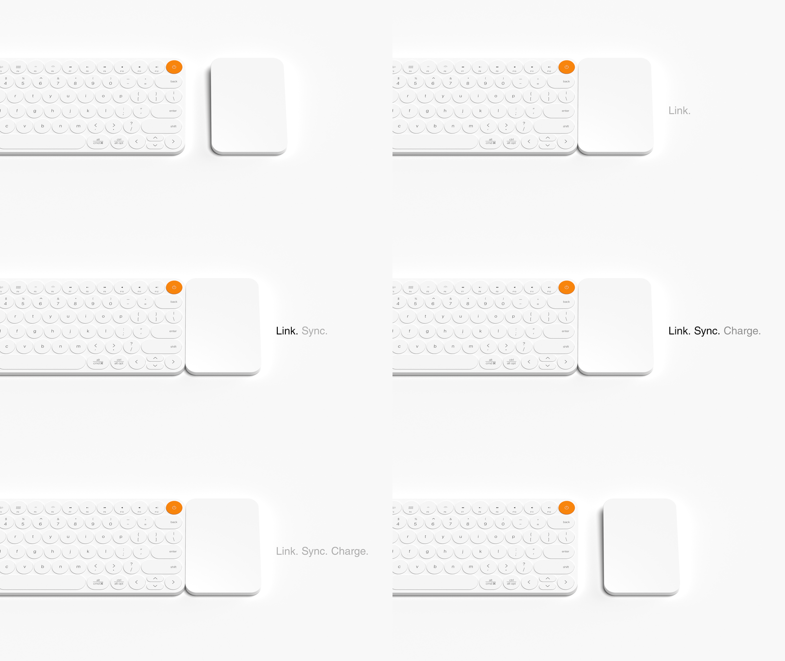
This keyboard’s magnetic accessories create the ultimate modular desk setup!

Now that we work from home I feel like we are more aware of how quickly our workspaces can become cluttered. Not just with snacks and numerous mugs of coffee but also with the tech accessories! I personally find myself using a lot more cables and peripheral accessories and that is bound to happen because I am not in an office set up and still trying to keep everything functioning smoothly in the available space I have for working and living. Modular keyboards like this were specifically designed to address this very issue and Link is the latest concept design aimed at giving the user a clutter-free computer accessory ecosystem.

Having a visually harmonious, intuitive, and efficient set of tech accessories allows the user to keep all devices and peripherals charged and in sync at all times – its the same calm you experience when you start your day on a clean, organized desk! Link is a collection of essential computer accessories that are integrated to work together to optimize functionality for the user right from wireless charging devices to compact input devices. “The goal of this project was to design an ecosystem of peripherals that aims to deliver an experience that is customizable, easy to use, and adaptable to the computer users’ needs at a moment’s notice,” says the designer. So no more scampering around for a certain jack if you have to plug in a non-Apple device or having a network of cables that just take up more space + energy!

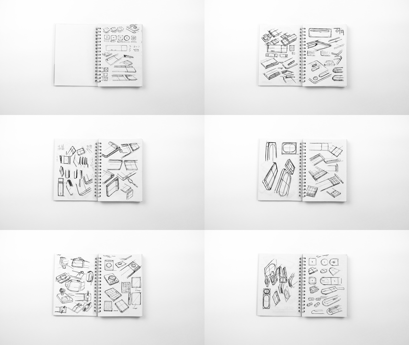
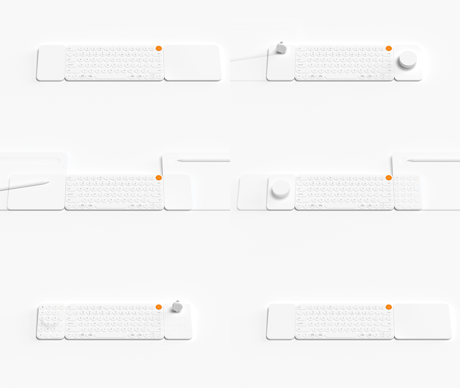
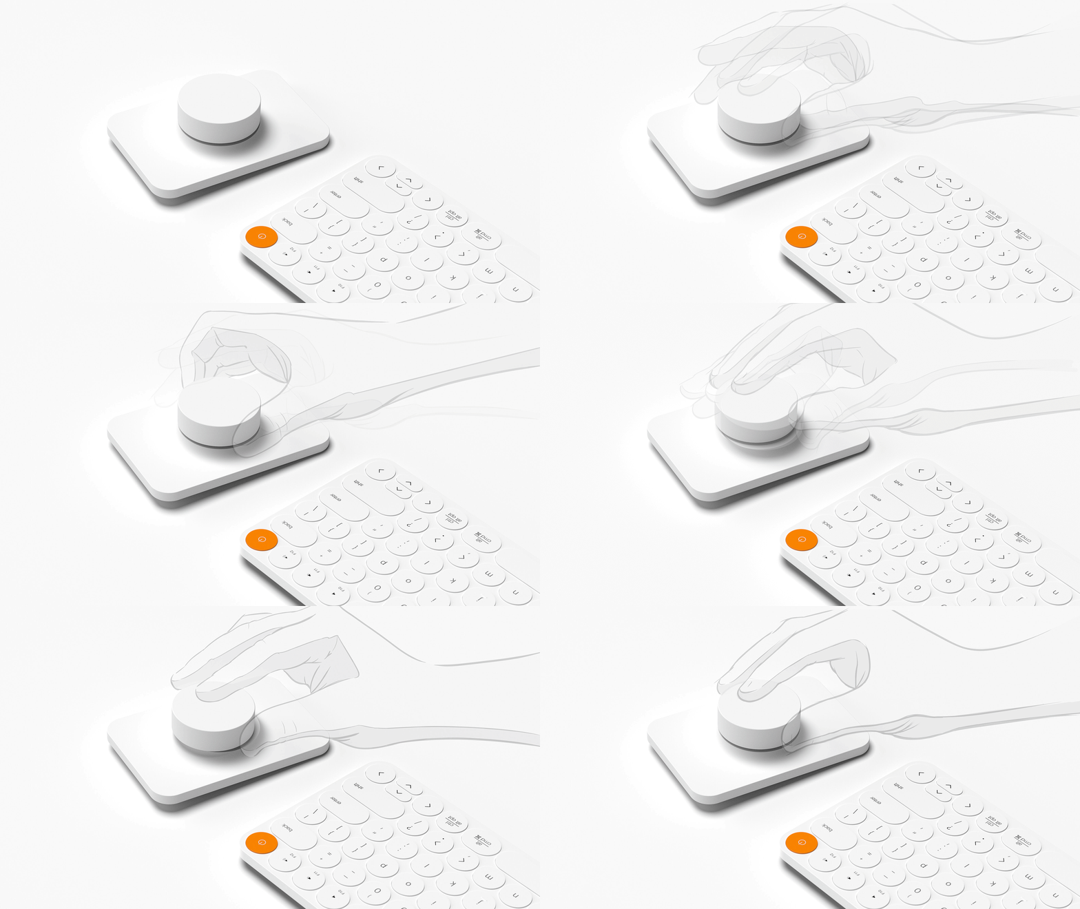
The designer felt the need to create a truly effortless, delightful, and seamless user experience that went beyond beautiful aesthetics. Link is a one-stop-shop to keep devices charged, synced, and ‘linked’ together with as minimal cables and inconveniences as possible. The keyboard is a constant at everyone’s desk and therefore the peripheral devices were formed to work around it like modular accessories. The set includes the keyboard along with ’tiles’ which are the peripheral accessories. These tiles include a drawing tablet, wireless charging pads, a touchpad, a number pad, and a dial which is the most interesting of them all. “Pan around. Zoom. Select. Click. Clack. Rotate. The Dial instantly becomes your favorite digital input tool,” says the designer about including the playful accessory. All modules are battery operated and magnetically connect to the side of the keyboard to dock and recharge when low on charge before being reused again. It also comes equipped with NFC, Bluetooth, and wireless charging capabilities to make it the ultimate unifying hub. Less is more, and less is specifically one cable.

Designer: Evan Stuart

link1

link9

link7

link2

link4

link6

link5

link3

link8

This simple sticker gives your laptop an instant numpad!

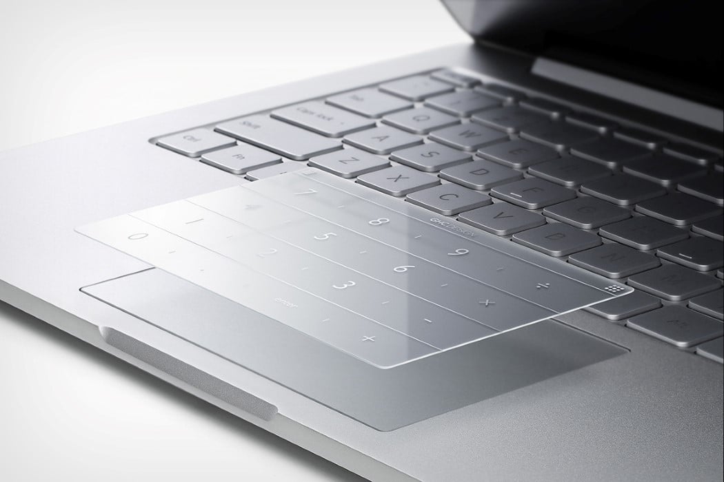
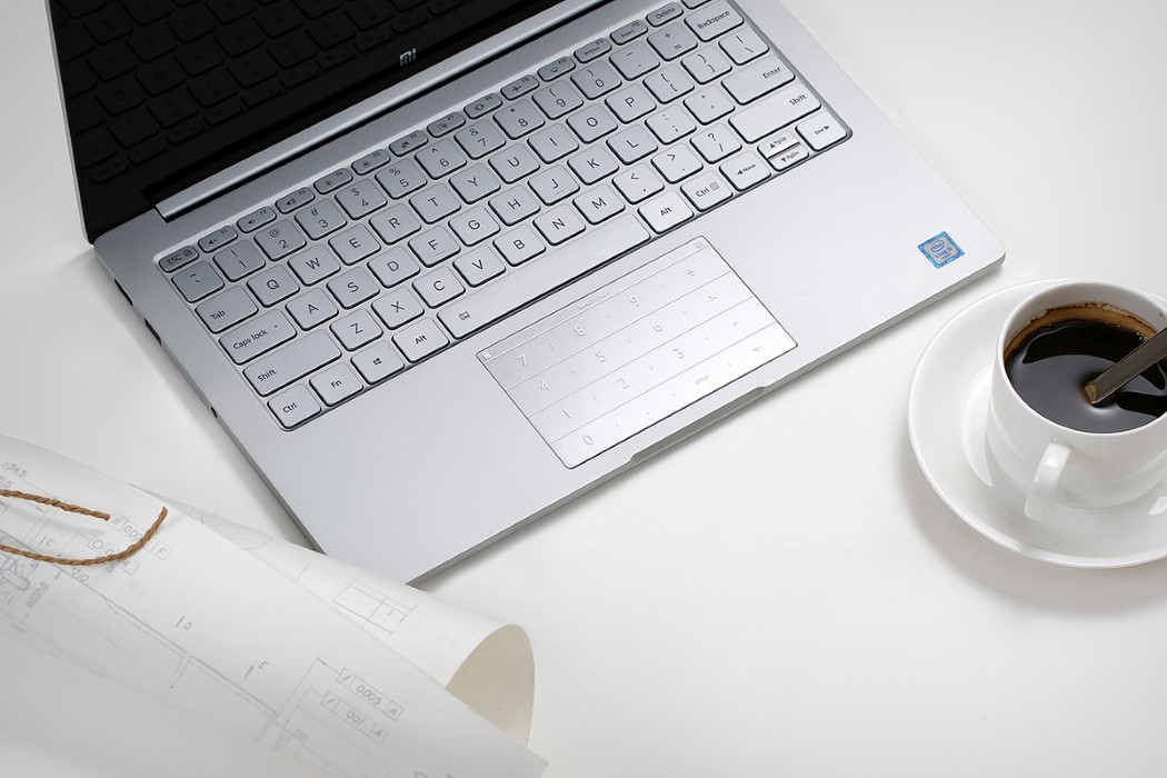
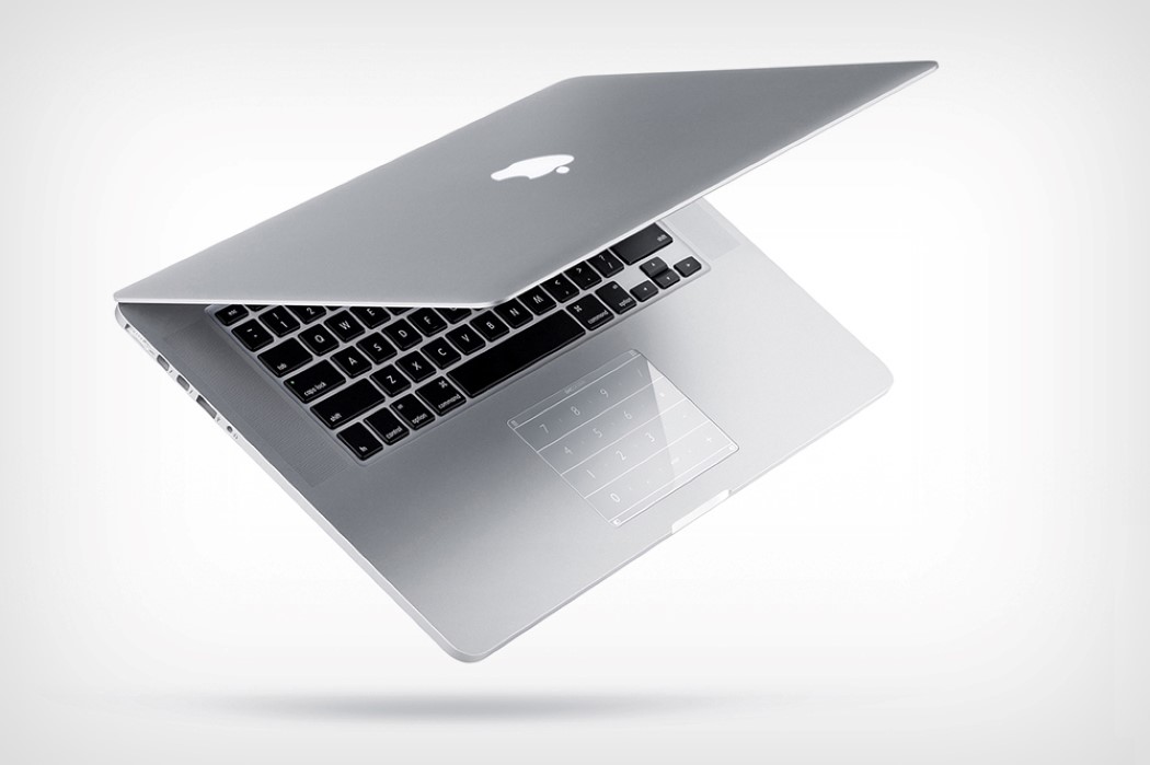
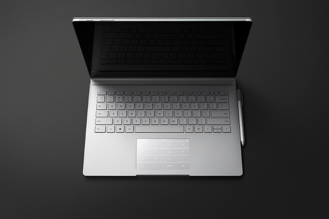
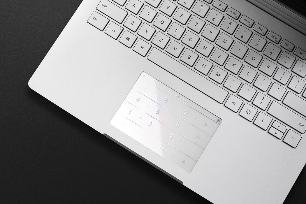
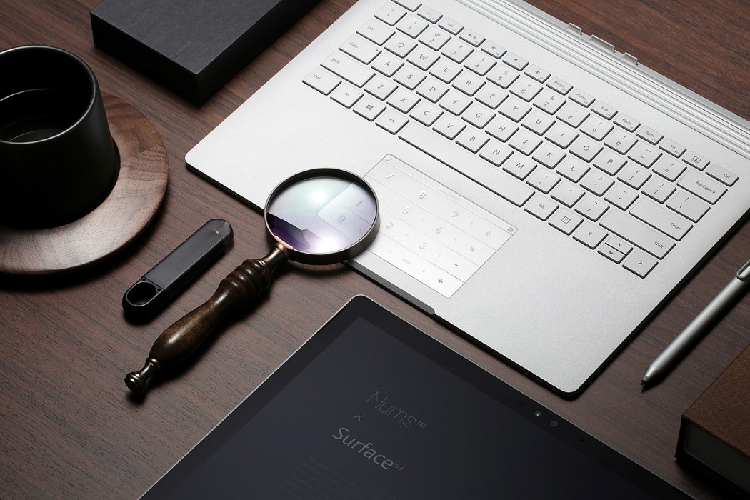
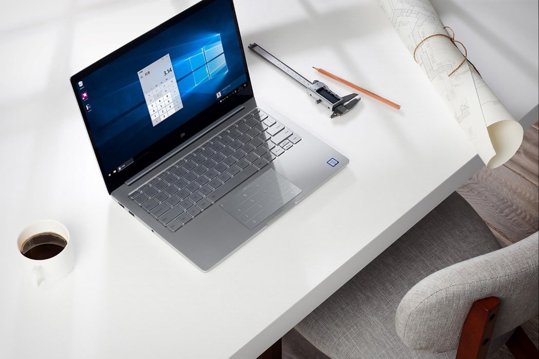
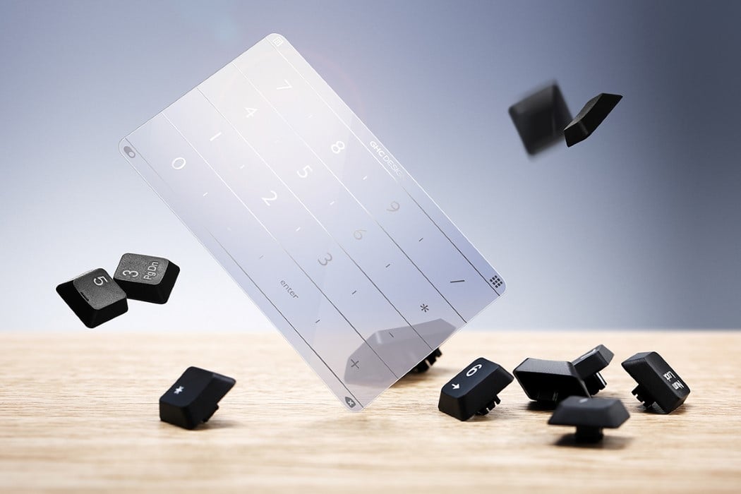
NUMS is an absolutely stunning product (and a winner of the coveted Red Dot Award), purely for its simplicity and effectiveness. It recognizes a problem, and solves it in the most ingenious way possible, without extra moving parts, and without a learning curve. A simple transparent piece of plastic with adhesive at one end and no circuitry whatsoever, the NUMS just sits on your laptop, giving you the magic of a numpad (and much more) on your portable computing device.

In order for laptops to stay portable, they sacrifice the expendable elements like the Numpad. Given that the numbers already exist above the qwerty layout, a numpad to the right is expendable, and laptops either use that real estate to add speaker grills, or shave off the numpad to create thin 13″ laptops. The NUMS brings that expendable element back for everyone who craves having those buttons at their fingertips (from gamers to coders to accountants).

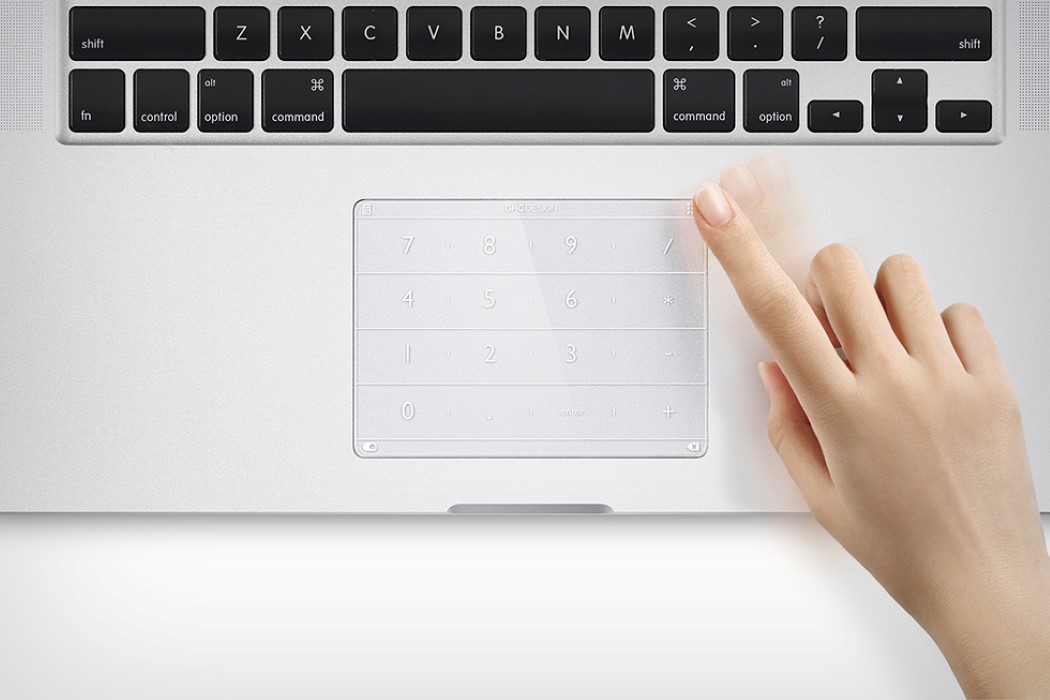
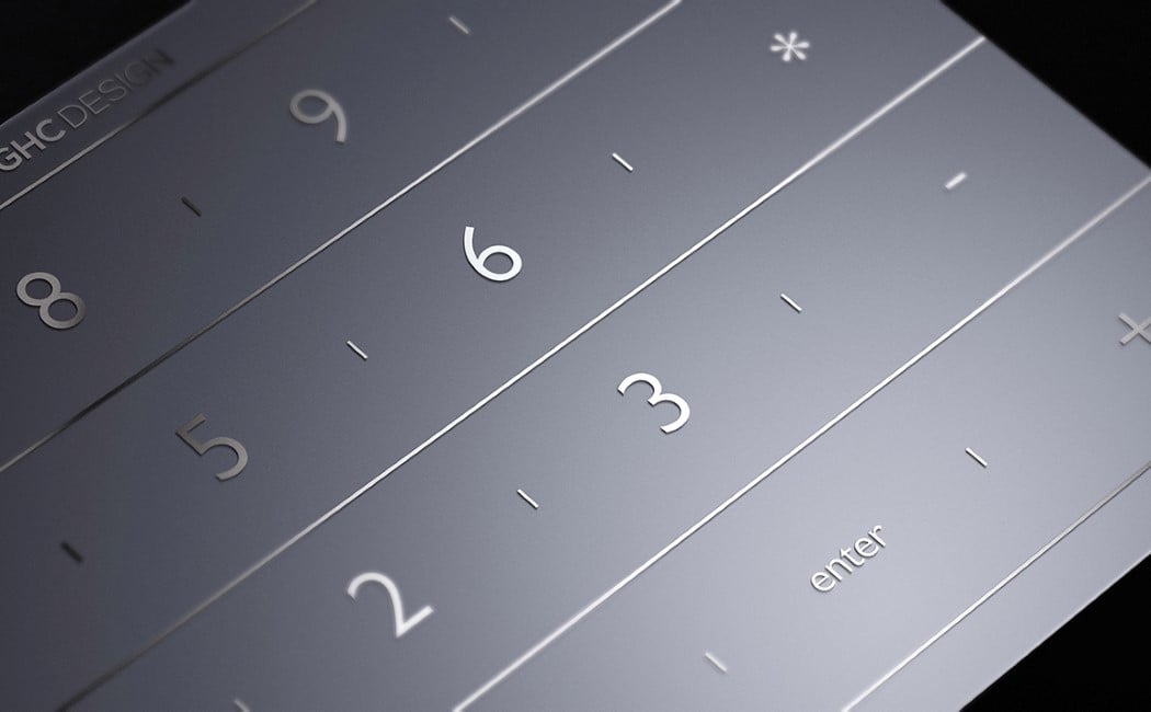
In principle, the NUMS is simple. A sticker sits on the laptop trackpad, quite like a phone’s screen guard. It doesn’t interfere with the trackpad’s functioning (in fact, it gives the pad a smooth, finger-loving texture), however, it augments the trackpad’s abilities. Printed on the sticker is a complete numpad, along with a few other buttons. Install the NUMS driver and the NUMS sticker converts your trackpad into a functioning numpad. Swipe down diagonally from the top right corner to toggle between trackpad mode and numpad mode. When in the numpad mode, the printed numbers on the NUMS sticker denote keys, and you trigger keystrokes by touching them (you’ve even got audio feedback for a wonderfully complete UX). You could use the numpad to work in accounting softwares or even in games. Swiping down diagonally from the top left triggers the calculator, allowing you to crunch numbers in an instant without taking those five annoying steps to boot the calculator app. The NUMS even has its own hotkey setting mode, allowing you to create shortcuts of your own, so your trackpad instantly goes from the least used feature (real people use mice, alright?) to perhaps the most feature-rich part of your laptop. Who thought a small plastic sticker and a powerful idea could accomplish so much?!
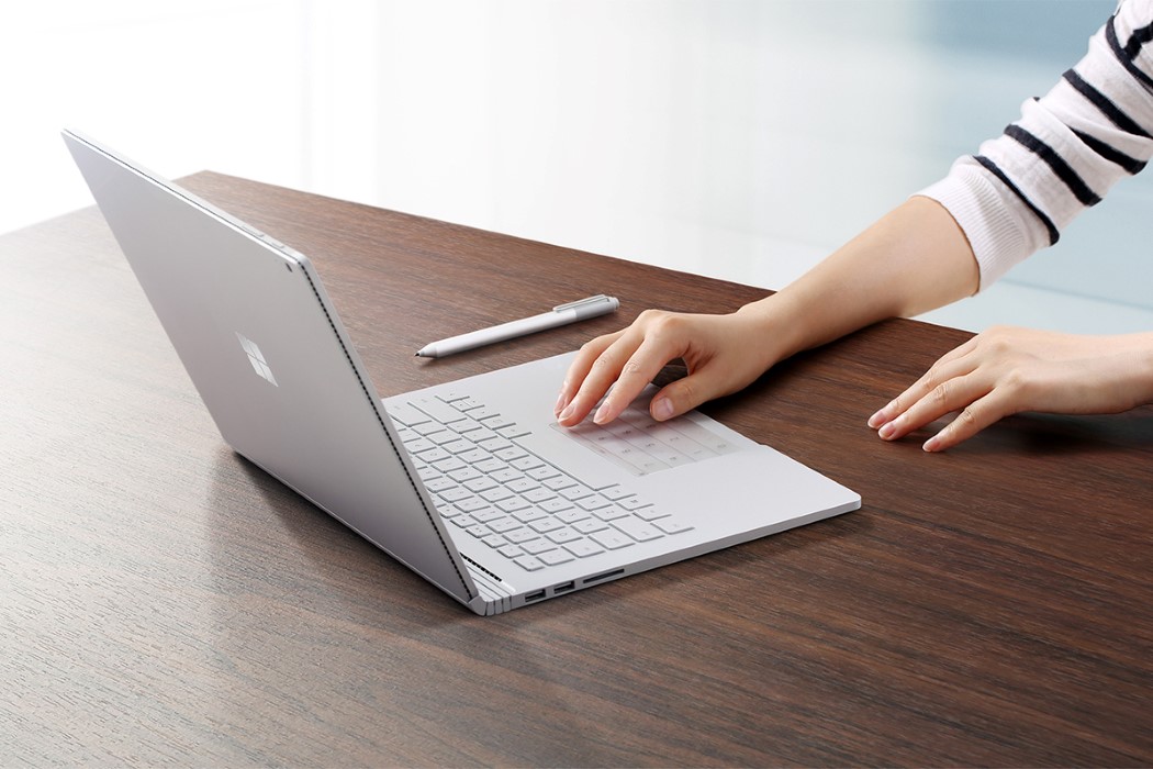
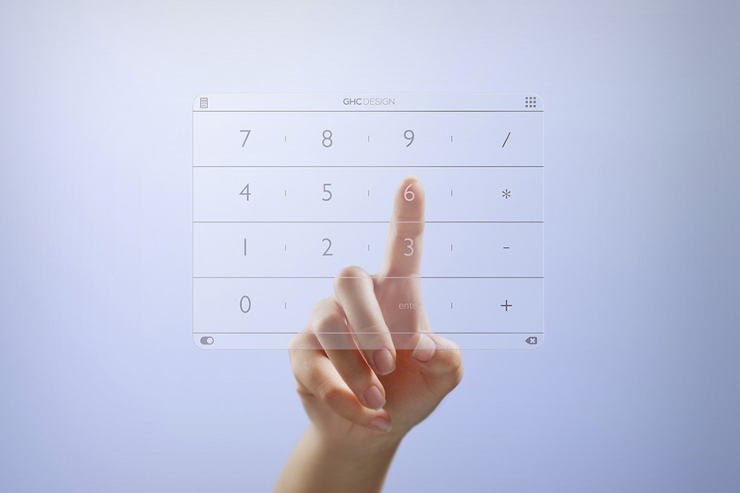
The NUMS is a winner of the Red Dot Best Of Best Award.

Designer: Gong HuaChao (GHC Design)

Click Here to Buy Now (Compatible with 15″ MacBook Pro 2016)

nums_numpad_1

nums_numpad_2

nums_numpad_3

nums_numpad_4

nums_numpad_5

nums_numpad_6

nums_numpad_7

nums_numpad_8

nums_numpad_9

nums_numpad_10

nums_numpad_11

nums_numpad_12

nums_numpad_13

Click Here to Buy Now (Compatible with 15″ MacBook Pro 2016)

Click Here to Buy Now (Compatible with older MacBook Air and MacBook Pro 2012-2015)

Why do phones and calculators have different numpads?

keypadwars-01

Take into account all the places that utilize the number pad and you’ll notice a disparity that’s quite odd but humanity seems to have made peace with.

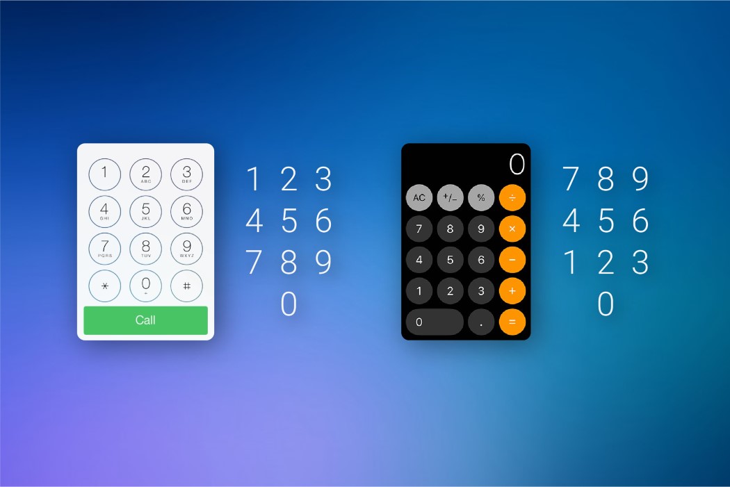
The number pad. You see it everywhere, from your dialer, to your calculator, to your PIN bypass on the phone unlock screen. You’ll see it on the right of your keyboard on your computer (if you’ve got a numpad), and you’ll see it in your ATM machines, cash registers, card readers, security systems, and if you’ve still got one, your landline phone. The numbers, for obvious reasons, are the same… but the layouts aren’t. Phone dialers and ATM machines have it starting at the top with 1, going down to 9 and ending with a 0 at the base, sitting between the asterisk and the hashtag; but you look at the calculator, the cash register, or the computer’s number pad and it’s the other way around. The zero or the lowest value sits at the bottom and it increments moving upwards, ending with nine right at the top. It’s always bewildered me that we’ve had these two separate systems for separate machines, even today. There’s no fixed reason for the difference in layout, but there seem to be a few interesting theories to define exactly how we arrived at this bizarre predicament.

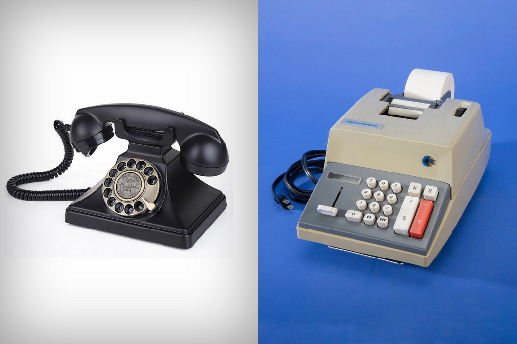
My favorite theory takes us on a time-traveling trip. The reason the two keypads have different layouts today is because they were two completely different products, using different technologies, for different purposes. Long before the modern day touch-tone phone, we were used to the rotary phone, which arranged the numbers from 1 to 0 on a circular dial that you’d rotate (the zero was actually treated as a 10. I explain why a little later*). With the advent of touch-tone hardware in the 50s, companies decided to stick roughly to the current layout, having the 1 at the starting, and the 9 and 0 (or ten, as they called it) at the end. They followed the calculator’s 3×3 matrix for the 1 to 9 (arranged from left to right), putting the 0 at the bottom, between the * and #.

The calculator, on the other hand, had been designed long before the modern phone, and used a format with 789 at the top. The design of the calculator was based on that of the cash register. The keypad’s layout wasn’t an evolutionary one like the telephone, but a functional one. The 0 was placed intentionally at the bottom of cash registers because with the currencies that were used, the 0 was pressed much more often than any key, so it made sense to keep it within hands reach. Having currencies with the denominations 1, 2, 5, 10, 20, 50, 100 etc, it also made more sense to keep these lower numbers towards the base too. So the 1 and 2 were placed immediately above the 0, making the cash register easier to operate. The calculator simply followed this functional format.

telephone_calculator

A rotary telephone and a calculator (or an adding-machine)

*In the days of rotary dials the pulse signaling system was known as ‘loop-disconnect’. Each digit dialed produced a series of quick disconnections in the ‘loop’ just milliseconds long. Dialing a 1 creating one disconnection, dialing 2 created two disconnections in the loop. The telephone exchange (or the central office) could detect these disconnections and step the electro-magnetic mechanical switches that then connected you to the number you dialed. Dialing a 0 would create 10 disconnections in the loop, so what looked like a 0 was actually a 10, if you count the number of disconnections in the loop.

The second theory also seems interesting because it talks about creating two separate counter-intuitive, reversed layouts on purpose. The calculator was invented long before the touch-tone telephone and was used for data-entry. Data-entry professionals using these calculators had gotten into the habit of crunching numbers at incredible speeds. The touch-tone phone, however, couldn’t operate at those speeds and oftentimes would end up missing a number or two. Phone companies then decided to reverse the layout to “confuse” people, allowing them to take more time to dial the number correctly, giving the telephone enough time to register the number dialed. Marvelous, isn’t it?! It’s a shame that none of these theories can be claimed as the one-true reason we have different keypads.

It’s worth also noticing how in the phone, the 0 falls after the 9 since it’s actually considered to be a 10, and how on the calculator the 0 falls before the 1 because it’s treated as a 0 or a number with no value. In both their formats, the 0 finds itself at its appropriate place, according to the value assigned to it! I still find it silly that we’ve held onto this strange past all these years, but the history lesson (and its share of speculative theories) that comes with it definitely makes me look at this strange duality with awe!