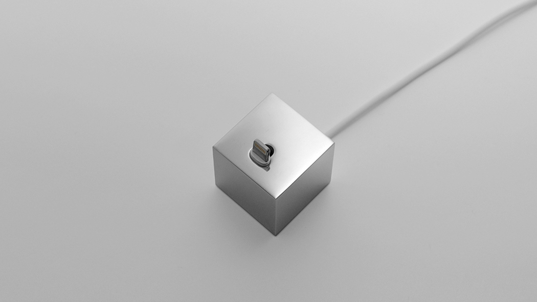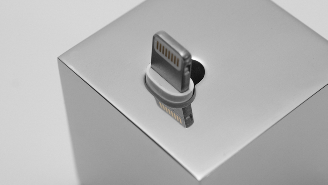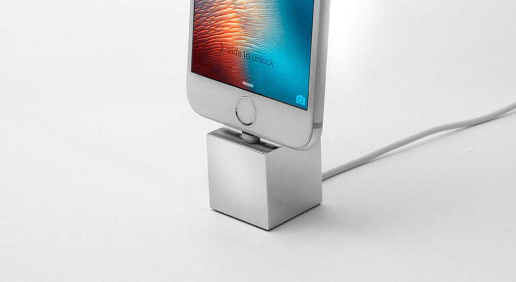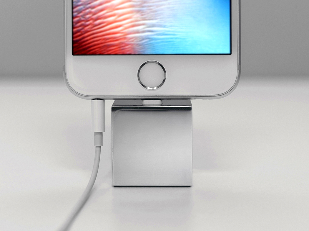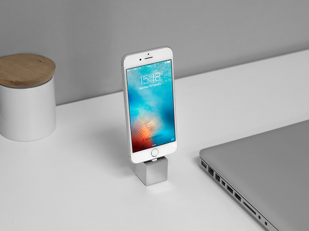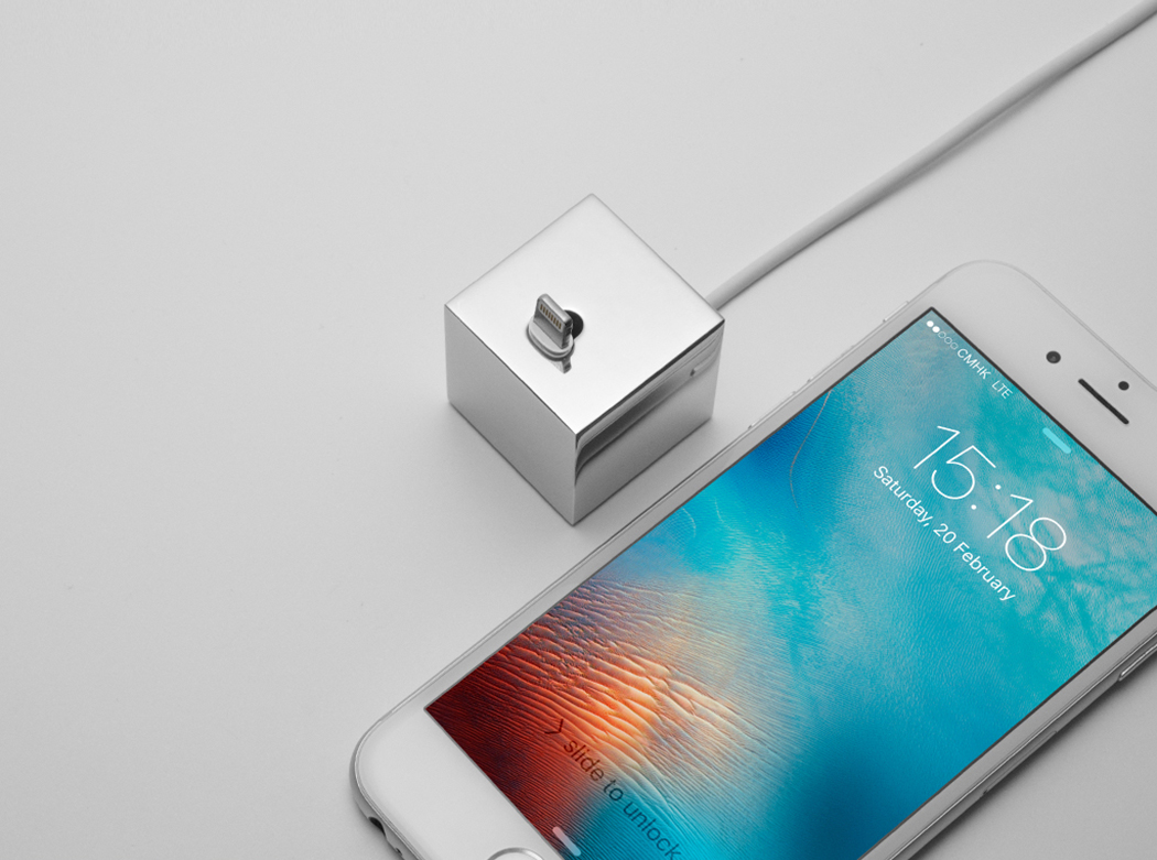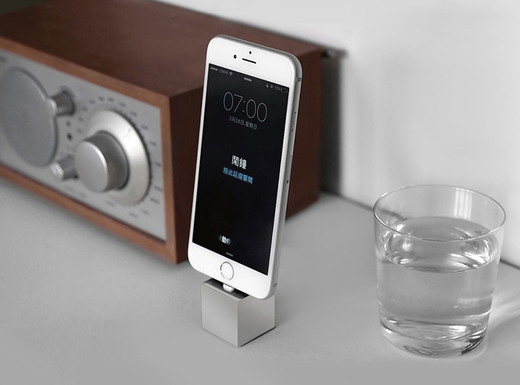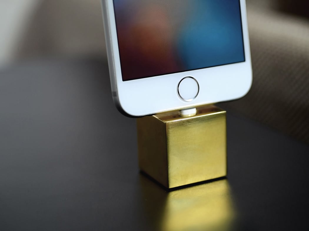
I’m in a dilemma. I really like the minimal approach to the Q dock by OOSH, but the gadget geek/designer in me can’t ignore the glaring problem I see in the design. The Q dock has this beautiful minimal thing going for it, but at the risk of not providing a proper docking space for the phone. The phone literally rests against the weight of the lightning connector, which seems like a disaster waiting to happen. However, I could be wrong. Maybe the iPhone’s port and the lightning pin can withstand that much of bending stress, but given how sacredly I treat my technology, I’d probably have to pass.
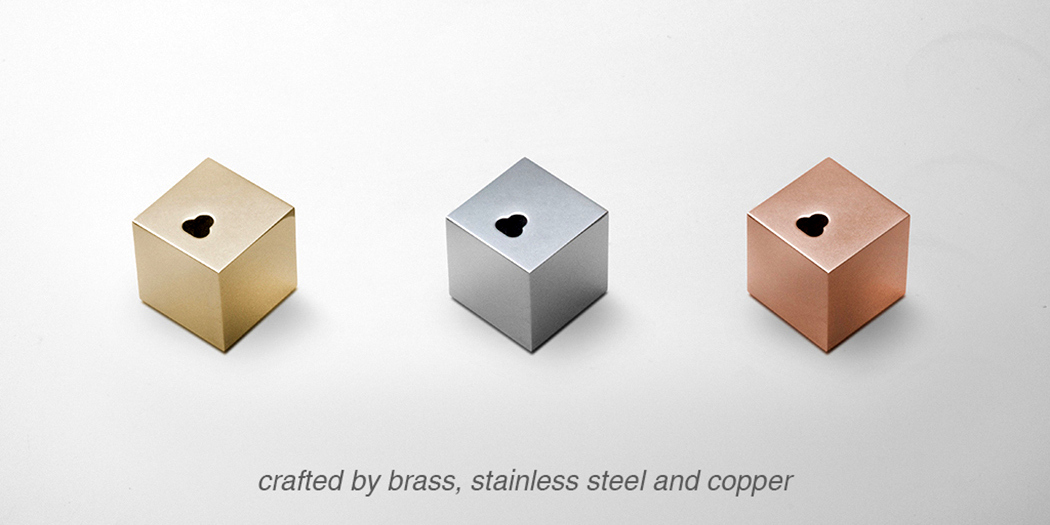
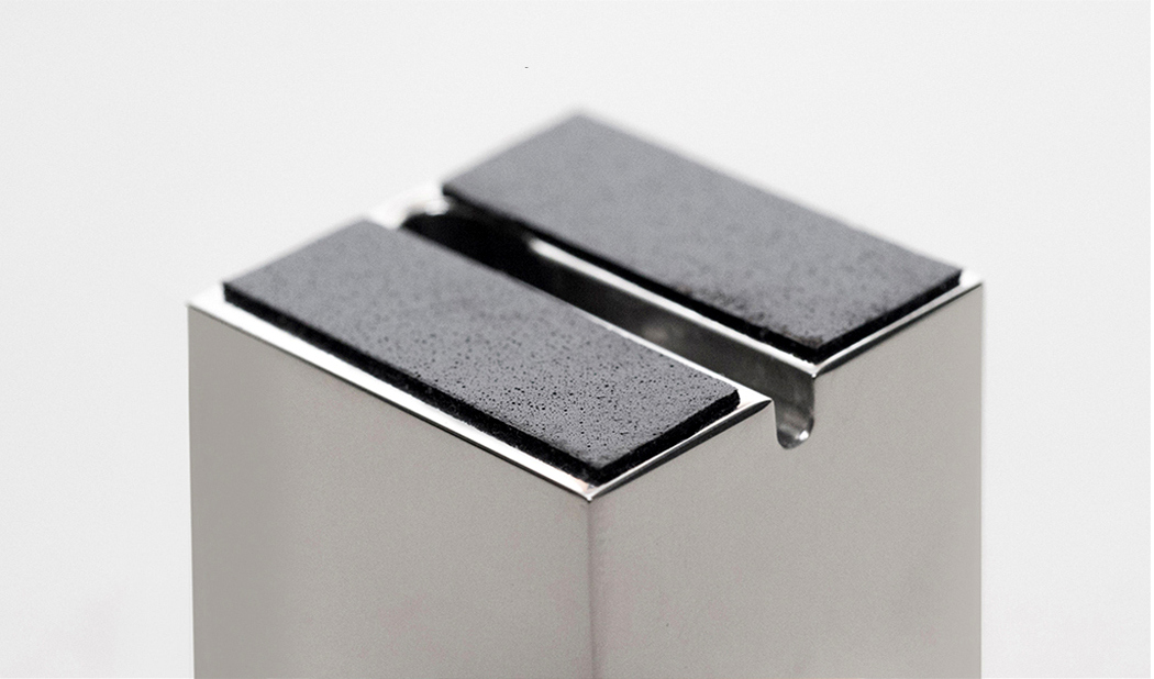
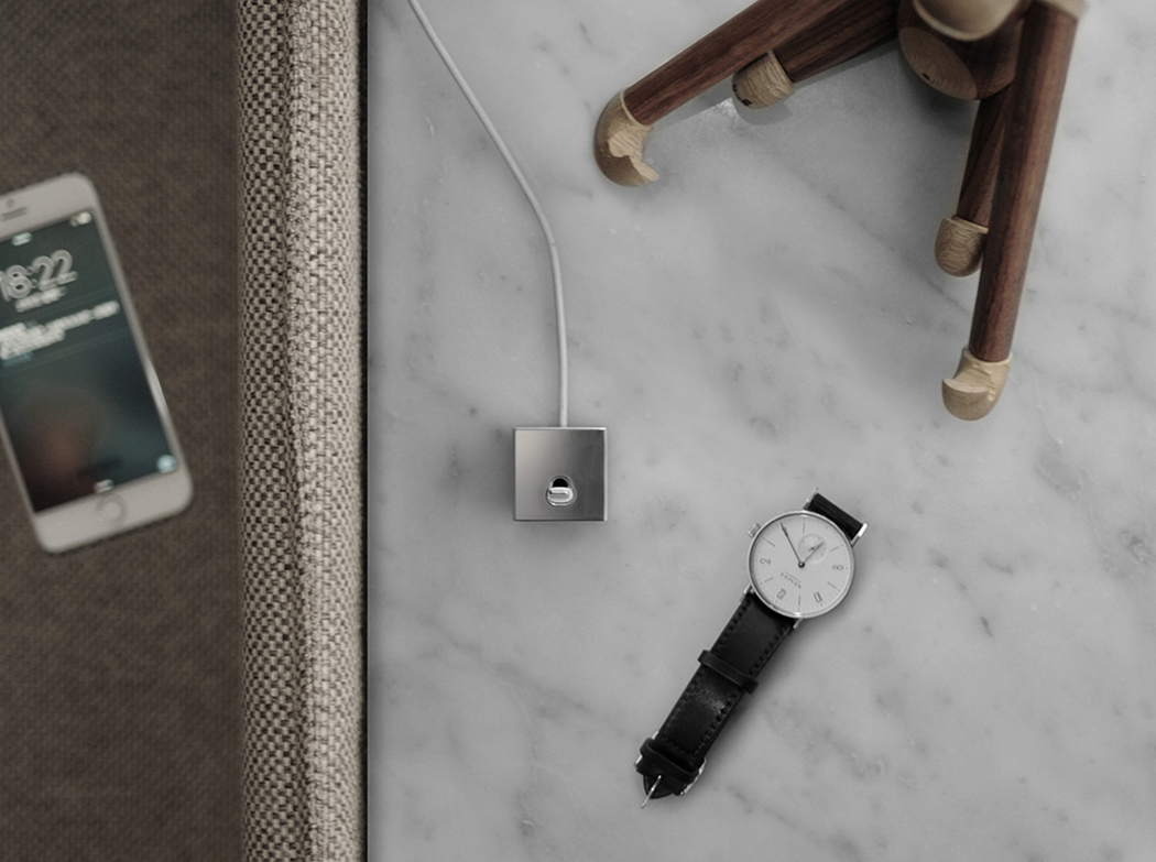
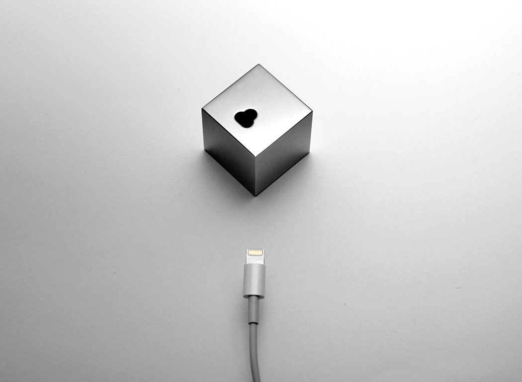
The dock, however has quite a gem-like, clear cut design. Available in three materials, copper, brass, and stainless steel, the Q comes with friction-building rubber pads at the base. The Q’s finish is also such that it ages with time. The metal begins corroding in a beautiful manner, giving the dock the impression of being time-tested and antique.
Designer: OOSH Design
