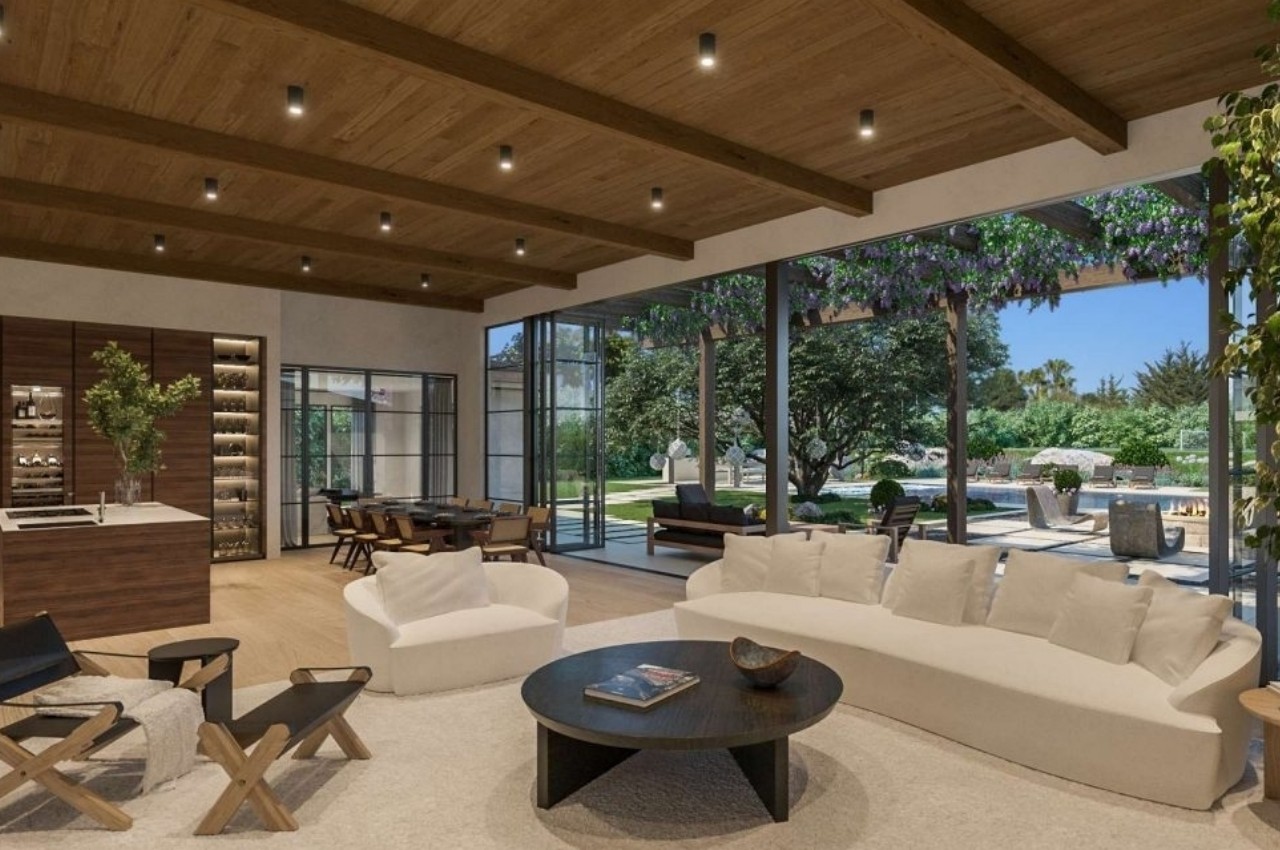
The contemporary open-plan living space is designed as a large multifunctional room that can serve different purposes. For example, during the global pandemic, these open areas were used for lounging and entertaining and transformed into multifunctional zones perfect for attending Zoom calls, learning, exercising, entertaining, and so on. The free-flowing plan and seamless flow of spaces in an open-plan layout make it more social and interactive. However, the biggest challenge of designing an open-plan space is efficiently dividing it into different zones that infuse warmth, privacy, and intimacy. Here’s the secret to maximizing space and creating a well-designed multipurpose living space.
Demarcate Spaces
In an open-plan design home, demarcate the floor plan into different zones such as the kitchen, seating area, dining space, and bar. If the house is in design-phase or construction-phase, create arches that allow a smooth transition from one space to another and introduce different stepped levels to add depth and dimension and to create a well-defined space. One of the most recent trends is to introduce curved surfaces and design elements that can soften the space, give it an organic touch, and combine it with mid-century furniture.
If the space is too large to handle, break the layout into smaller sections with room dividers or open shelving that can improve functionality and enhance the home’s storage. L-shaped is highly preferred instead of rectangular arrangements as these layouts result in a well-defined nook at one end of the home that can be used as the kitchen or dining area. Dedicate one section to the bar, as it can transform into a perfect entertainment zone.
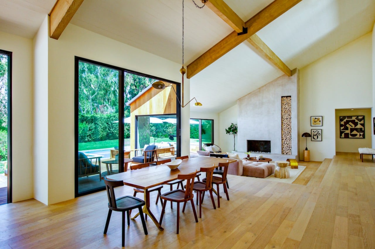
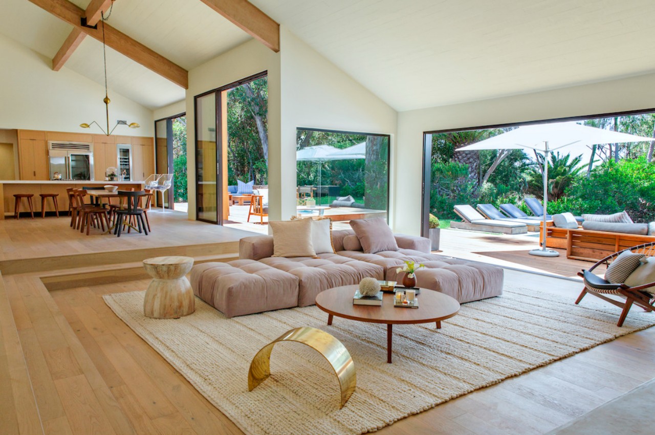
Designer: Saffron Case Homes
Connect The Seating Areas
Create a cohesive space by planning multiple seating areas within the open-plan layout. This can be achieved by placing the sofas back-to-back. Group an L-shaped or curved sofa with chairs to create an intimate seating experience. If the couch’s bare back is visible, place a bookcase sideboard to camouflage it and accessorize the tabletop with table lamps, books, and decorative pieces. Make sure these furniture pieces have the same height and length as the sofa running along its back. The location of the dining table should be such that the connection between the living and dining space ensures an easy flow of conversations.
It is highly recommended to embrace a unifying theme to bind the space together. Then, accessorize the space and accentuate the space with statement furniture. Use the same furniture material and color palette to create a cohesive design. In addition, invest in furniture with wheels and demarcate a children’s play area if there are children around.
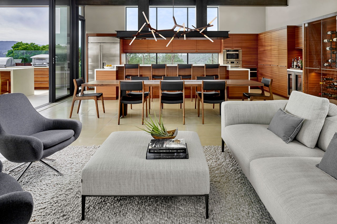
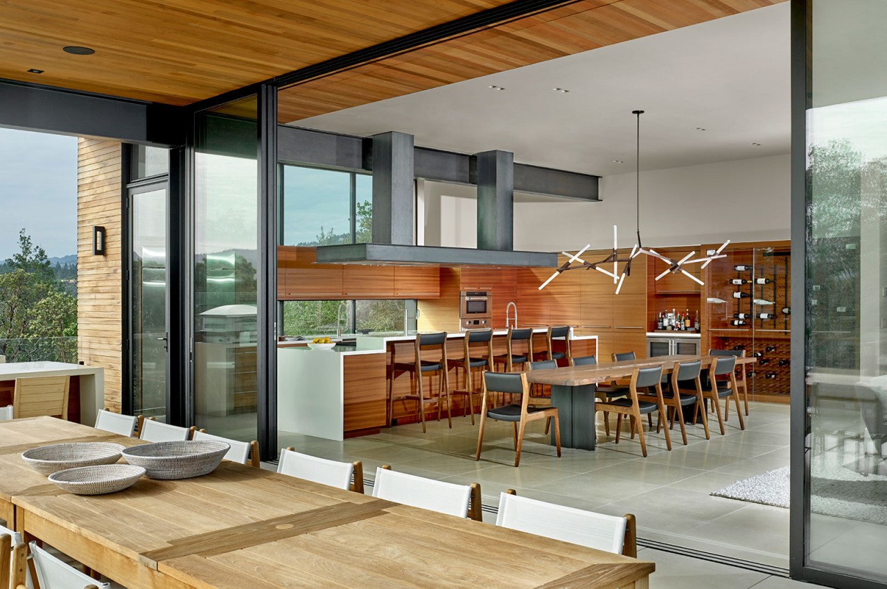
Designer: Zack de Vito
Segregate The Kitchen
If you are uncomfortable with an open kitchen, section off the kitchen with a glass wall or glass door. This is one of the best ways to establish a visual connection between the kitchen and the living cum dining area. In addition, a strong exhaust and chimney in the kitchen must prevent the kitchen odors from penetrating the outdoors. Note that if the exhaust system isn’t sound, the cooking smells released due to frying, roasting, and tempering may cling to the fabric of the furniture and upholstery of the living room.
Another way to improve the kitchen’s functionality is by introducing partial walls to set up kitchen islands and breakfast bars. Highlight these areas with a combination of dropped and raised ceilings that can visually demarcate the space. Consider a different flooring material to define the kitchen.
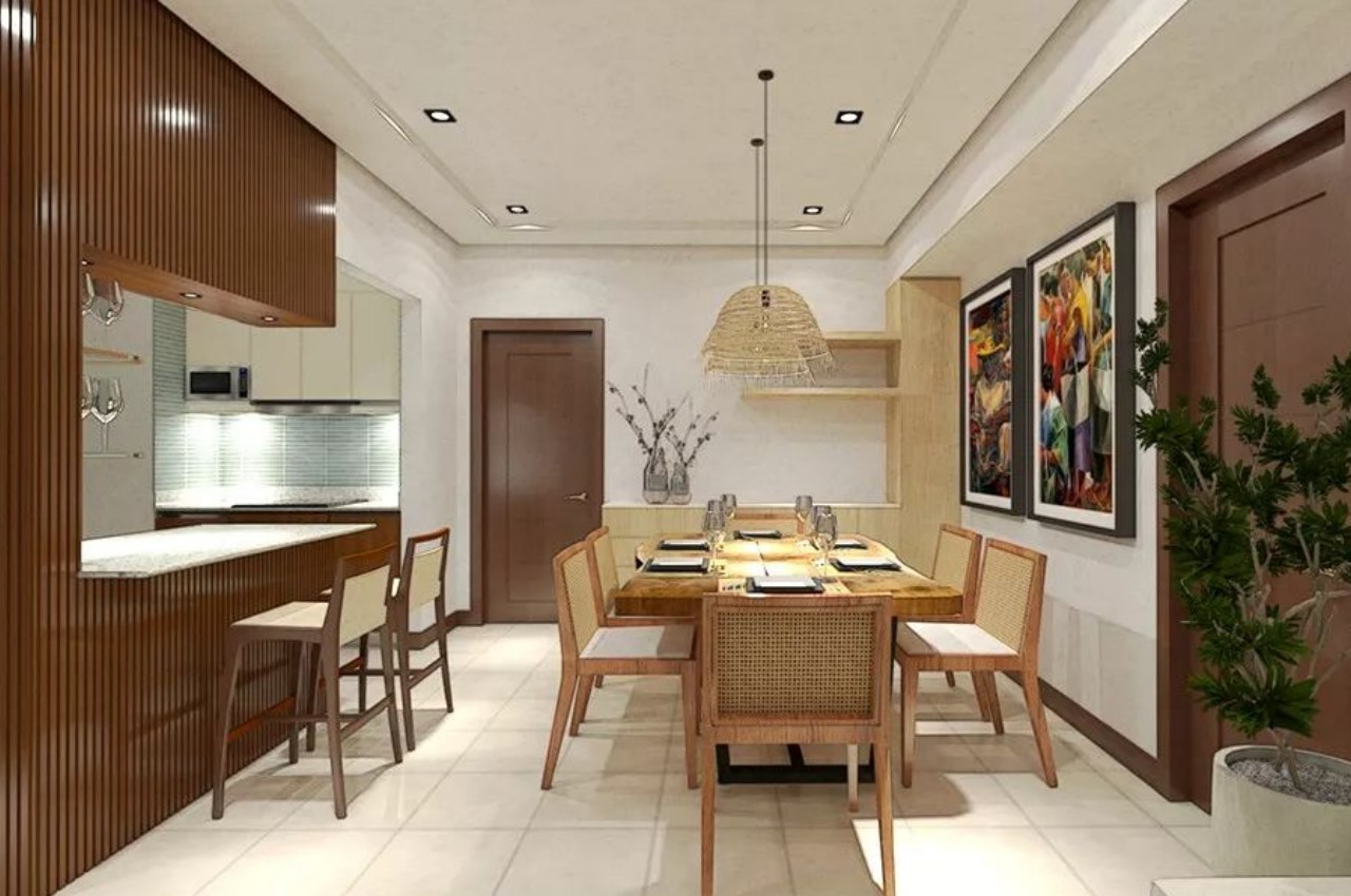
Designer: IA Interior Design
Zone With An Area Rug
In an open-plan space, one can create a room-within-a-room with rugs. This is one of the best ways to infuse warmth, add texture, offer a warm underfoot, and create a cozy and inviting atmosphere. One can layer the space with two or more rugs or a carpet with a consistent pattern.
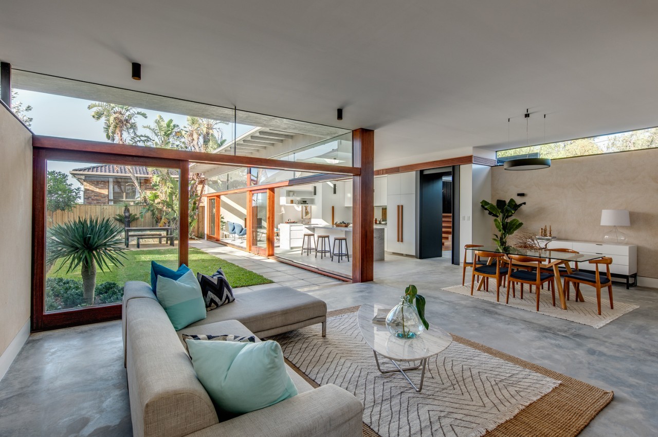
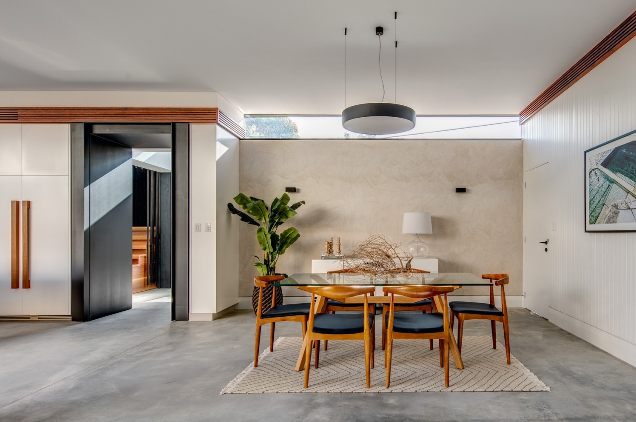
Desinger: Roth Architects
Choose The Color Palette
It is highly recommended to opt for a consistent color palette within the different seating and functional areas within an open-plan layout. For example, introduce an accent color in the walls or upholstery to highlight different clusters of the seating arrangement. If the space is large, go for dark wall tones to create a warm cocoon-like atmosphere.
Create Balance
Pay attention to the scale and size of the individual pieces of furniture and ensure that they are proportionate to the scale of the interiors. Note that oversized pieces of furniture make the space feel smaller and smaller pieces of furniture make the space appear larger. However, do not crowd the area with too many furniture pieces — rather, try to achieve a clean, clutter-free look.
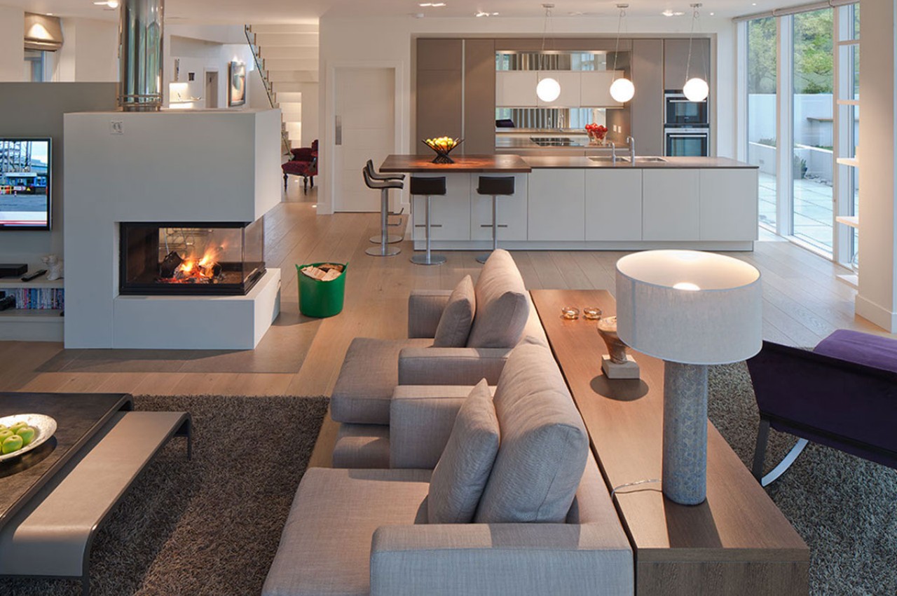
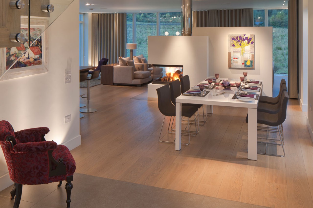
Designer: M&J Design
Introduce Built-In Storage
As an open-plan layout caters to multiple functions, it is not always possible to keep it clutter-free. Less is more, so make space for everything so that the space is organized and everything should be close to hand but easy to stash away. Make optimum use of the alcoves of the property to make space for built-in storage. A back-to-back bookshelf can work as a divider, and clever usage of the under-stair area can make room for plenty of organized storage. Invest in boxes and wicker baskets to organize toys, books, TV remotes, and other necessities.
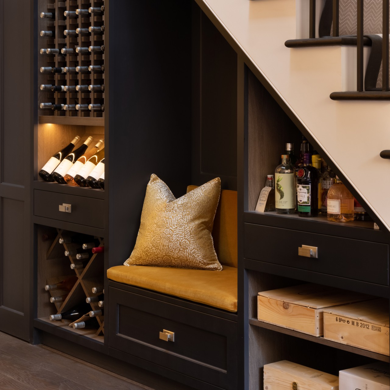
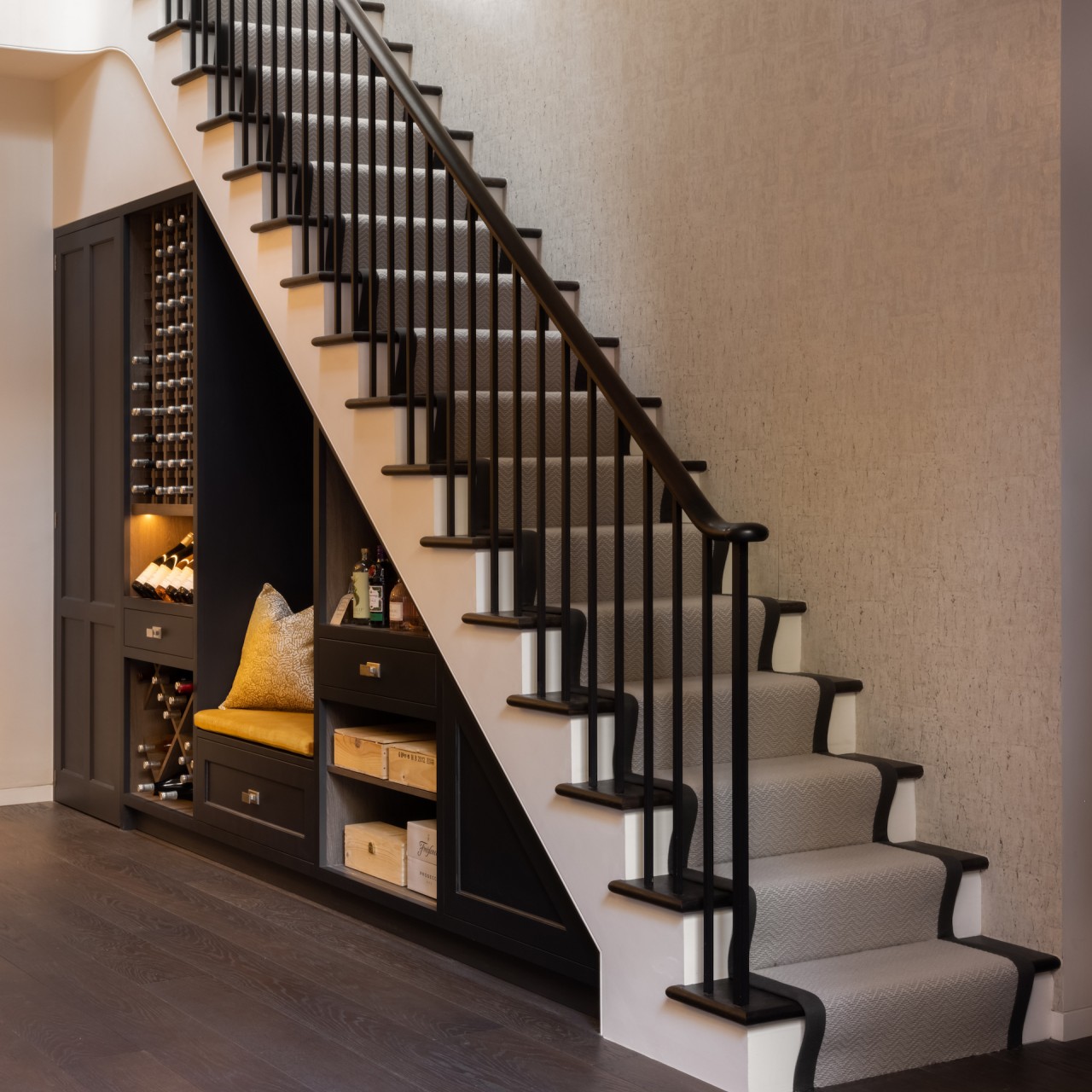
Designer: Humphrey Munson
Create An Indoor-Outdoor Connection
Capture the outdoor views and bring in plenty of natural light with large spans of glass glazing. When the glass panels open the living areas into the garden, the backyard becomes an extension of the living area and provides a seamless indoor-outdoor connection. It offers a bright and airy look and makes the space look visually bigger.
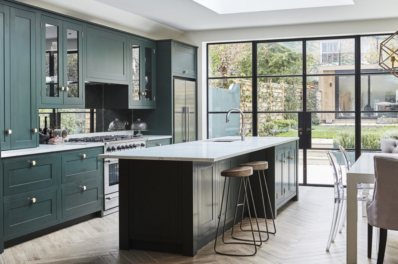
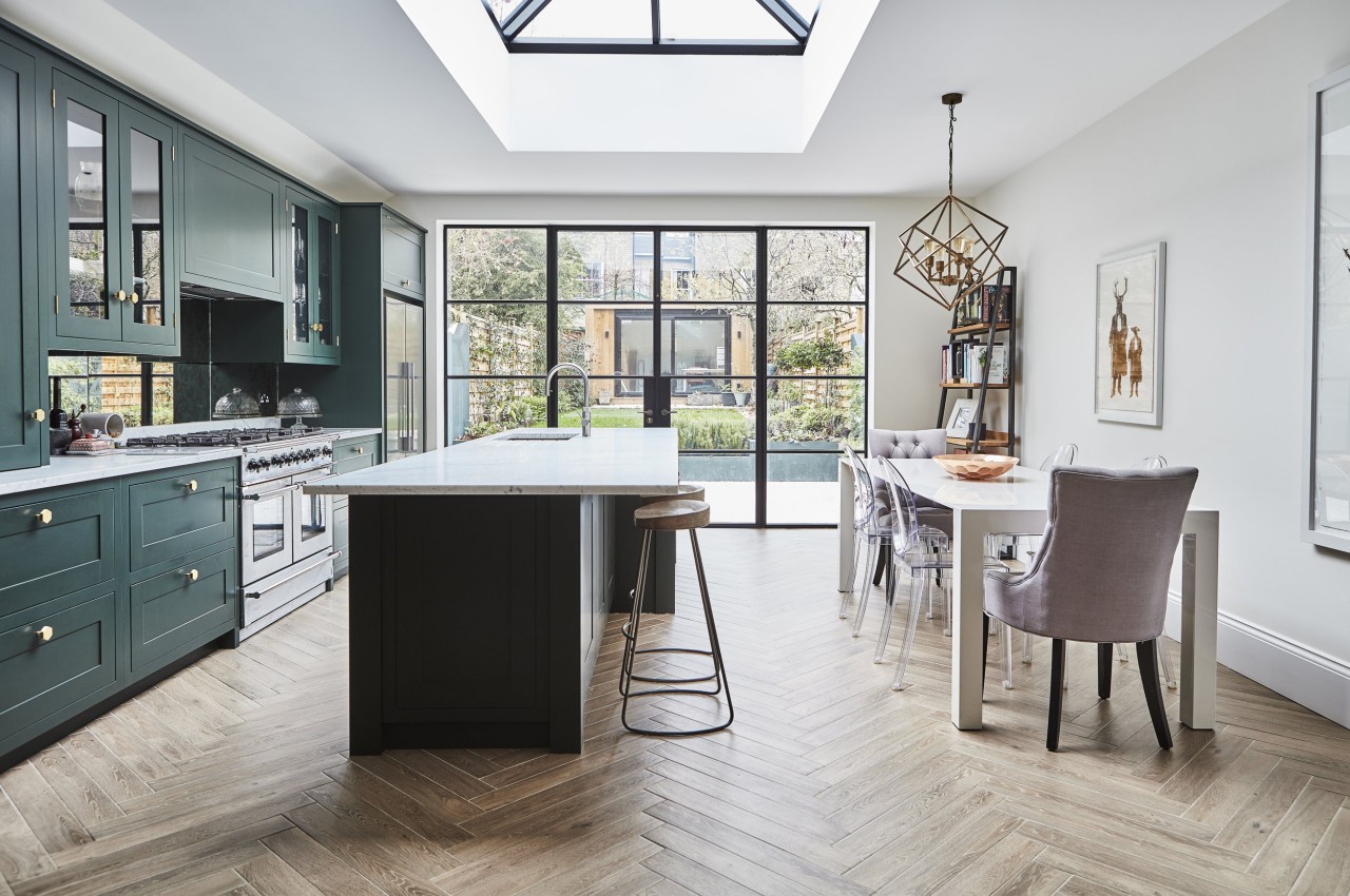
Designer: Blakes London
Accessorize
Large spans of space might lack character, so create a personalized space with accessories, patterns, and rich textures. Create a feature wall with bold wallpaper with botanical prints and beautify the space with vibrant foliage and houseplants to create a visual connection between different home areas. Finally, create a focal point in each zone to catch the eye and bring clarity to the overall décor of the open-plan space.
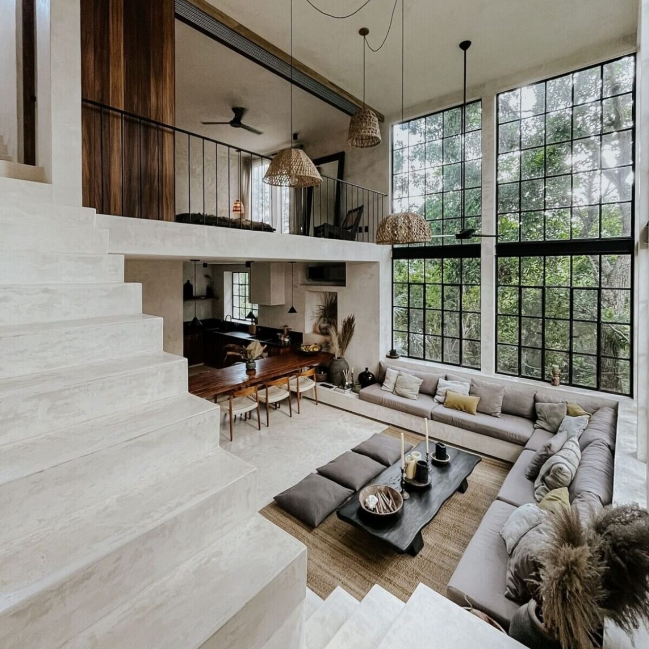
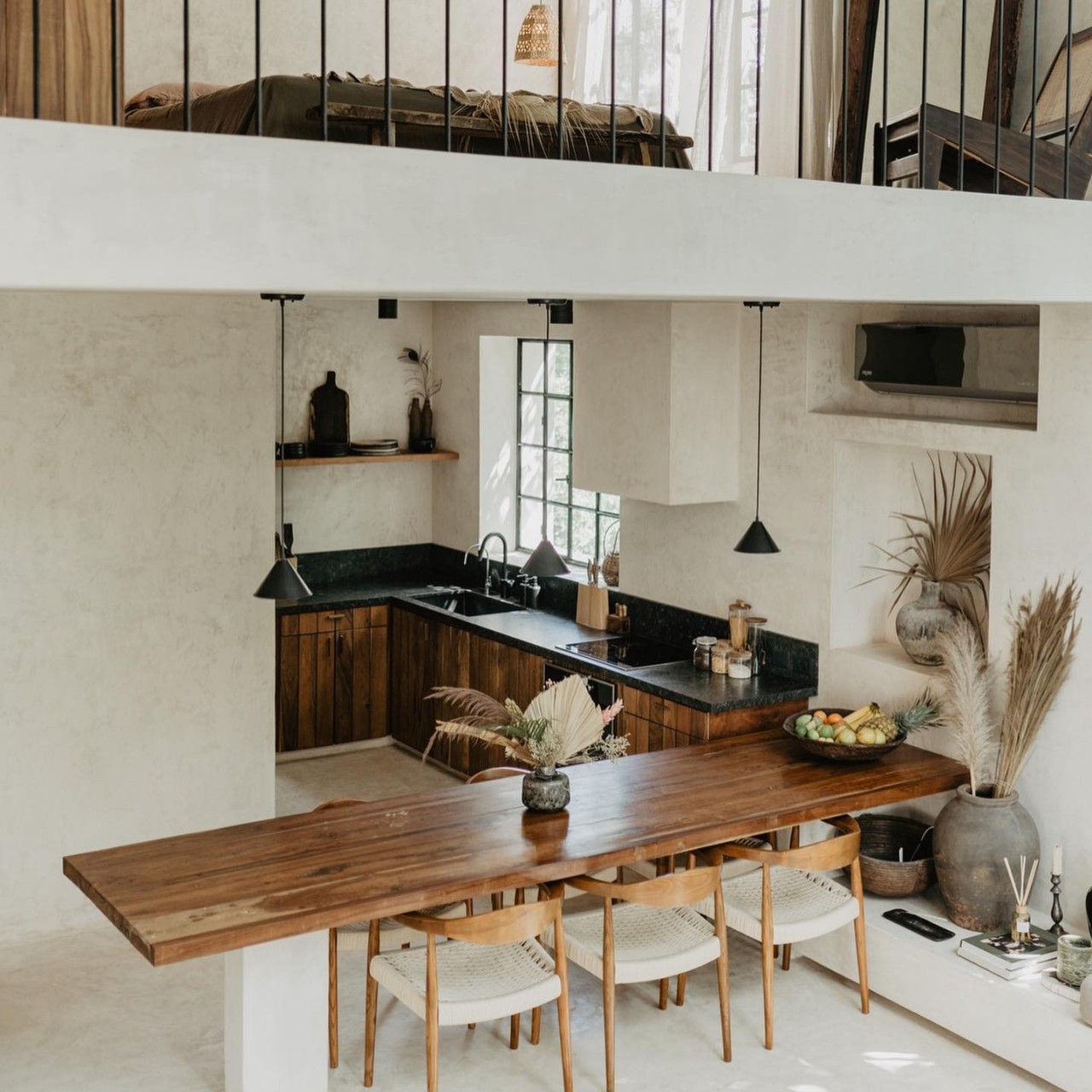
Designer: Terreo Studio
Focus On Lighting
Create a layered lighting scheme with provision for ambient lighting, task lighting, and accent lighting. The lighting layers can be achieved with wall sconces, chandeliers, and pendant lights. Introduce dimmers for the ambient lighting, as the open concept is multifunctional and should be able to cater to different moods for different occasions. Stylish pendant lights and under-counter lighting can illuminate the countertop with the task or focused lighting. Introduce a cluster of pendant lights above the dining table to mark its position and hang attractive light fixtures in different areas of the open plan to restrict different areas. Use accent lights to highlight the architectural design features or decorative elements, if any.
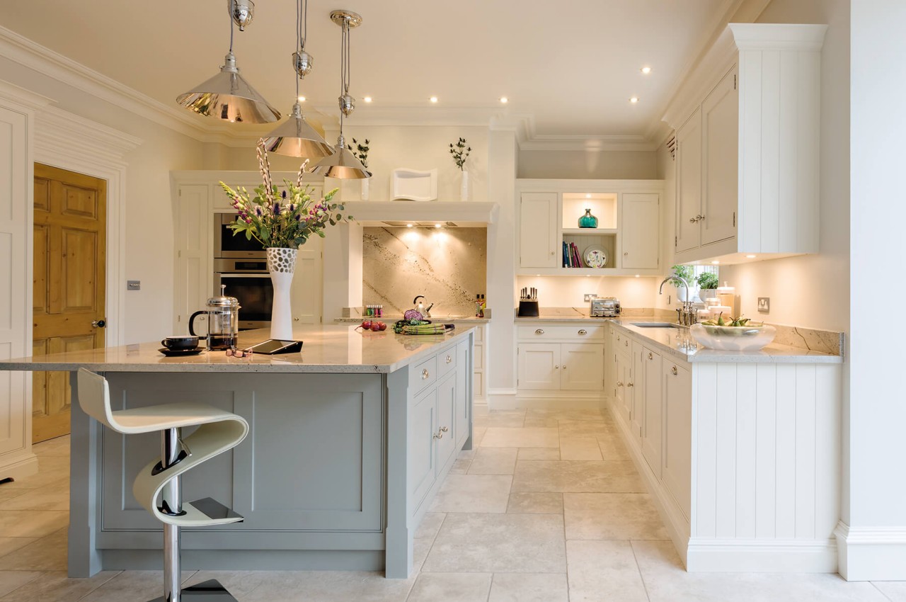
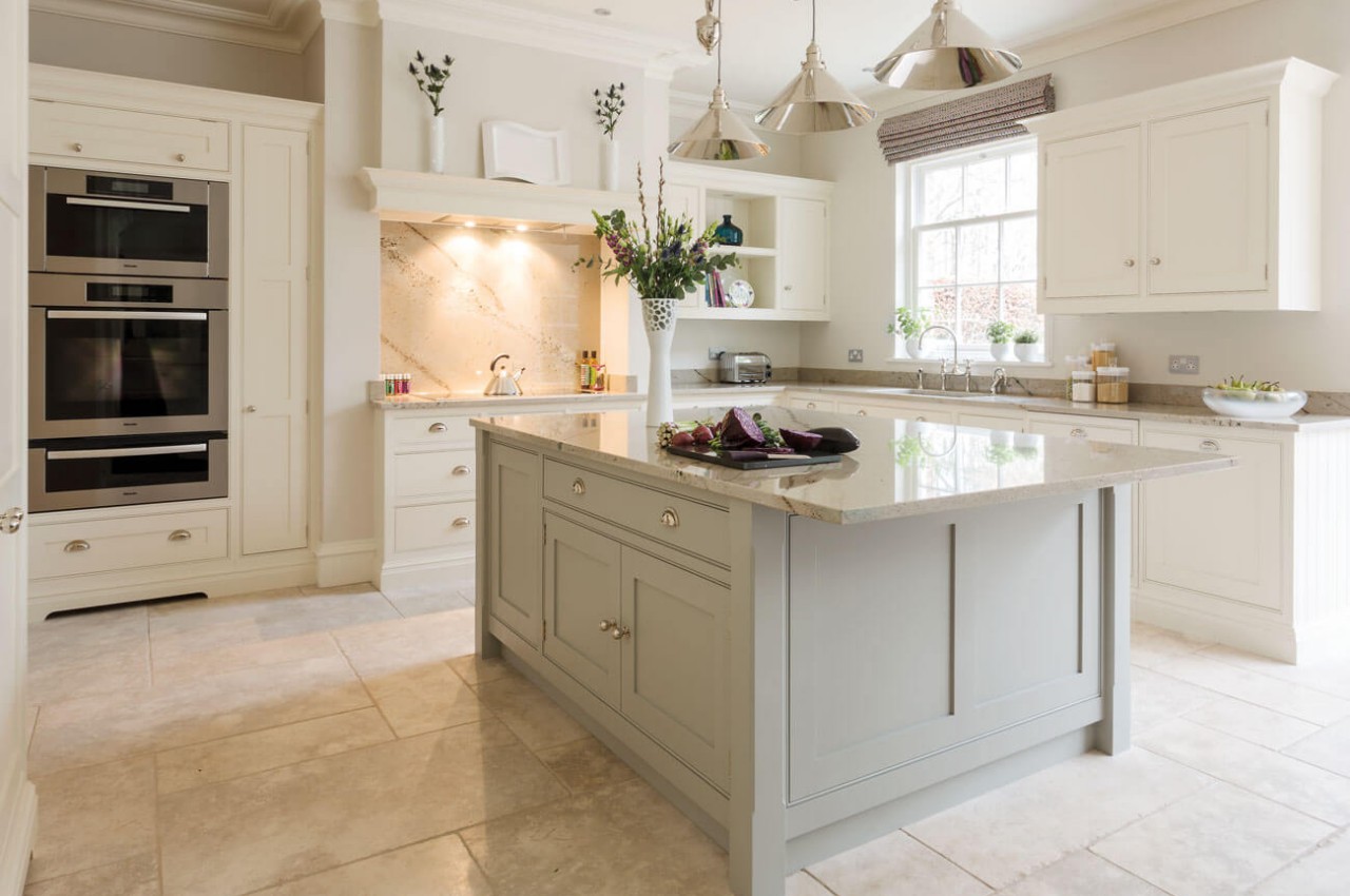
Designer: Tom Howley
Sound Reduction
In an open-plan living, there are no walls, so the voice can easily echo and move from one space to another. Introduce soft furnishing like carpets and curtains that can absorb sound and reduce the decibel level of the home, especially if there are high ceilings.
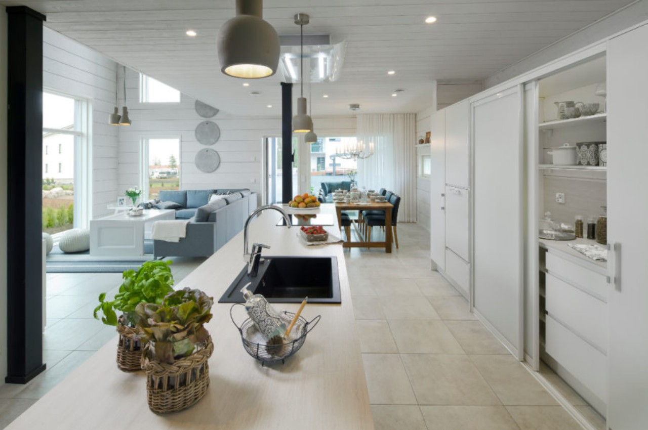
Designer: Honka
When working with an open-plan design home, it is always good to visualize how you intend to use the spaces. Then, make sure to give it a personal touch to improve the aesthetics and functionality of the area as per the individual requirements of each member of the family.
The post How to define different zones and maximize space in an open-concept space first appeared on Yanko Design.








 Your wireless carrier is usually beholden to using proprietary cellular network tech from the likes of Ericsson or Nokia, but there may soon be a more universal technology that could benefit your bank account. Vodafone has started the first European...


