Organic Elegance: 10 Ways to Embrace the Organic Furniture and Décor Trend

The latest trend in interior design, known as ‘organic shapes,’ embraces soft, oversized curves and luxurious silhouettes, creating a welcoming ambiance in any space. This trend transforms furniture and décor, mirroring the fluidity of nature for a serene atmosphere. From curved sofas to asymmetrical curvaceous tables, it’s a common design feature that adds a touch of modern sophistication to interior spaces.

Organic shapes consist of flowing lines and sweeping curves inspired by nature, free from rigid structures, sleek lines, or sharp angles. These forms reflect the natural contours that are found in landscapes and greenery. Additionally, their soft shapes evoke feelings of comfort and calm. Here are the top 10 why organic shapes are a growing trend in interior design.

Designer: Superlife
1. Natural Elegance

Organic shapes are reminiscent of the natural world and offer a visually appealing and soothing effect. Our eyes are naturally drawn to these shapes and remind us of the innate beauty found in the world around us. And just like nature, this beauty doesn’t always come from complexity but from unexpected simplicity.
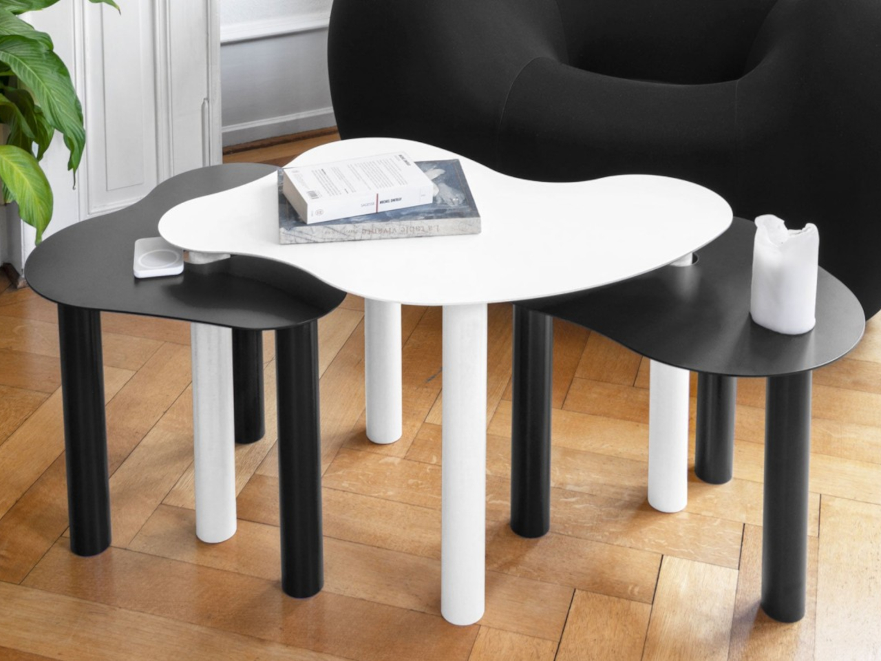
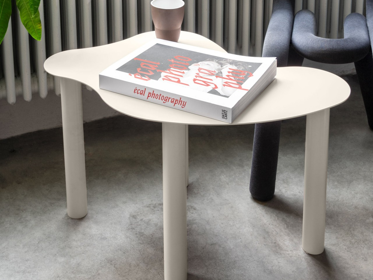
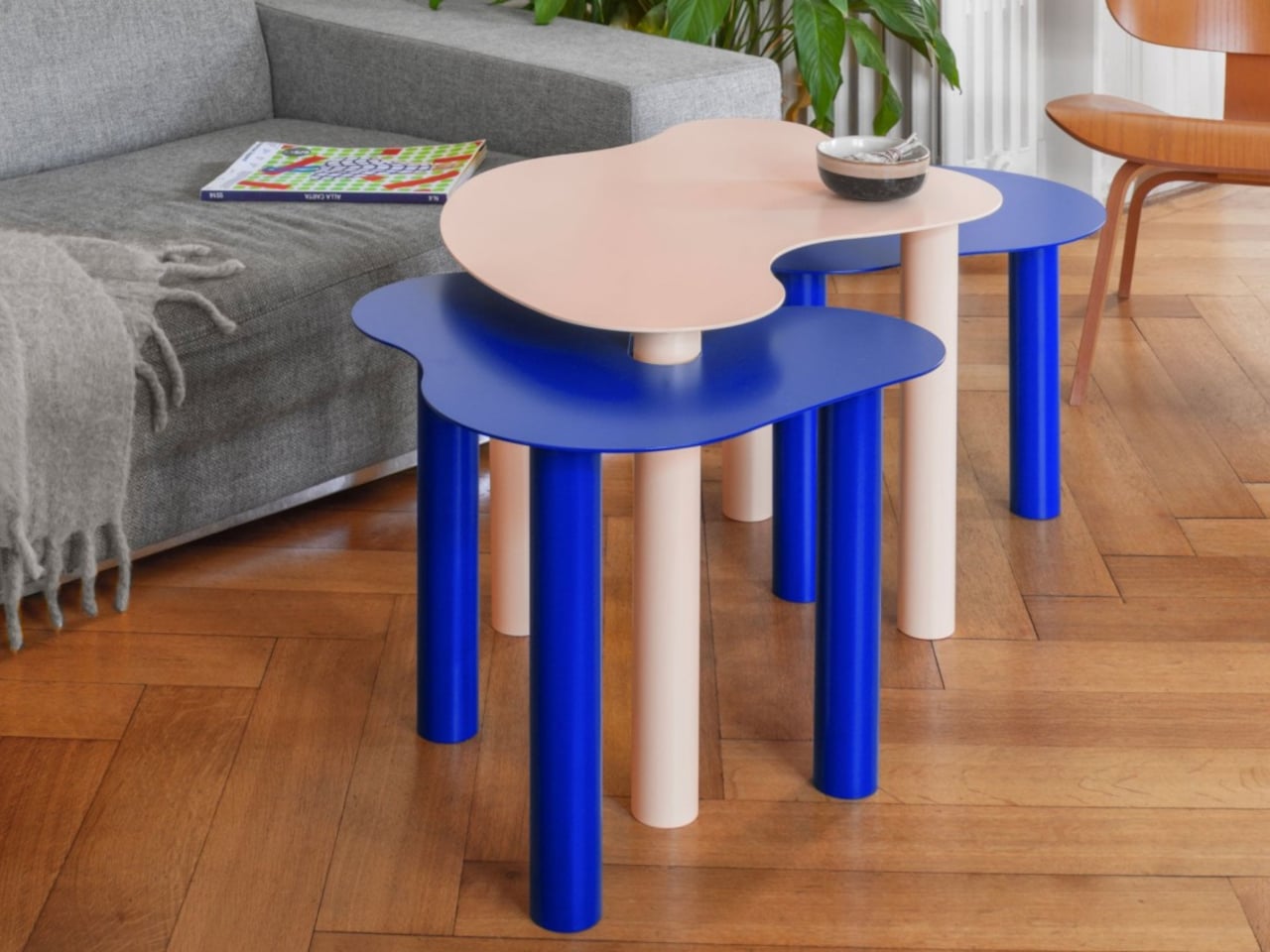
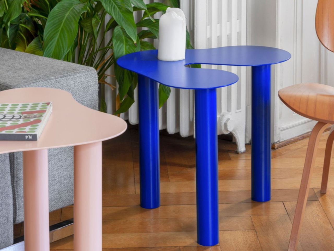
In this example, the Flow table collection harmonizes functionality with nature-inspired design, resembling the fluidity of water and organic cell structures. With varying heights and shapes, these tables offer both structural art and practical utility, evoking a serene yet lively ambiance reminiscent of nature’s harmony.

2. Infuses Calm

Organic shapes feature flowing lines that bring in a feeling of comfort and tranquillity, creating an inviting and relaxing ambiance. We see this in the contours of mountain peaks, the curves of the shoreline, or the colors of the seasons. Some cultures easily incorporate these themes in their designs, and Japan is one of the most popular examples of this kind of design philosophy.
Designer: Nendo for Paola Lenti

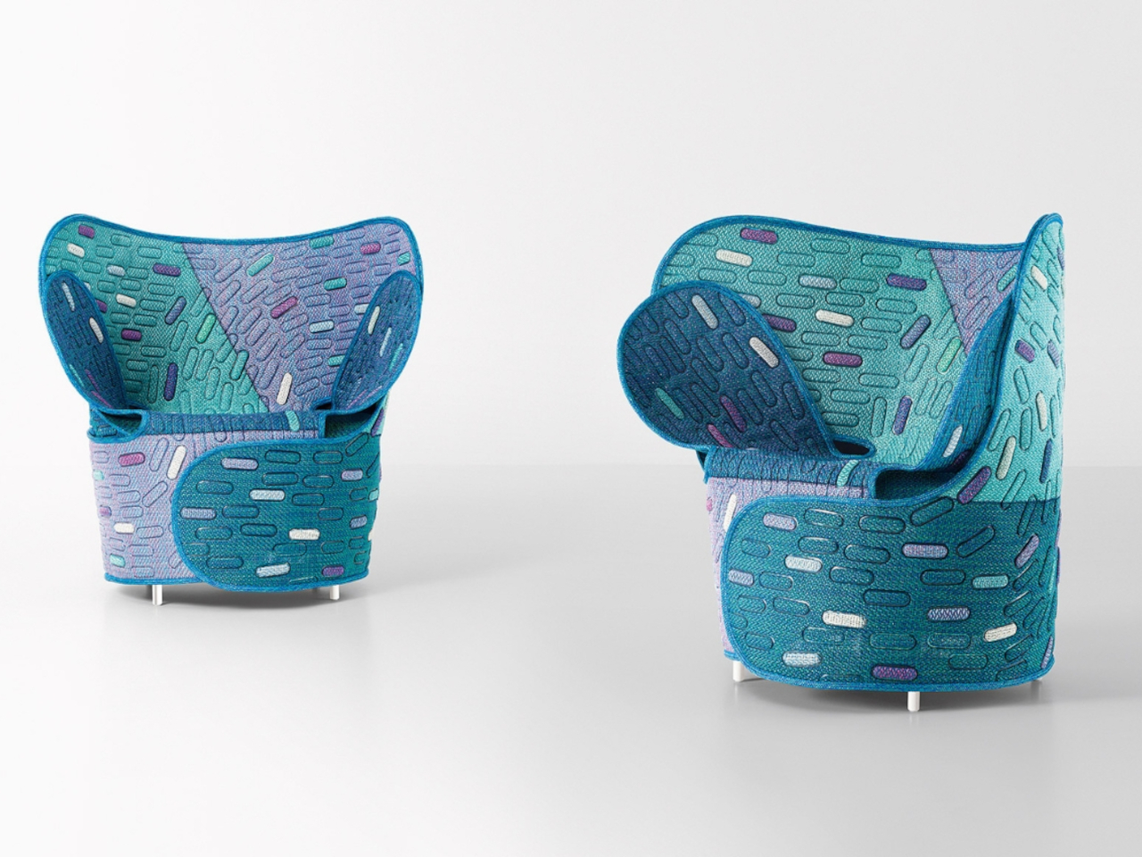
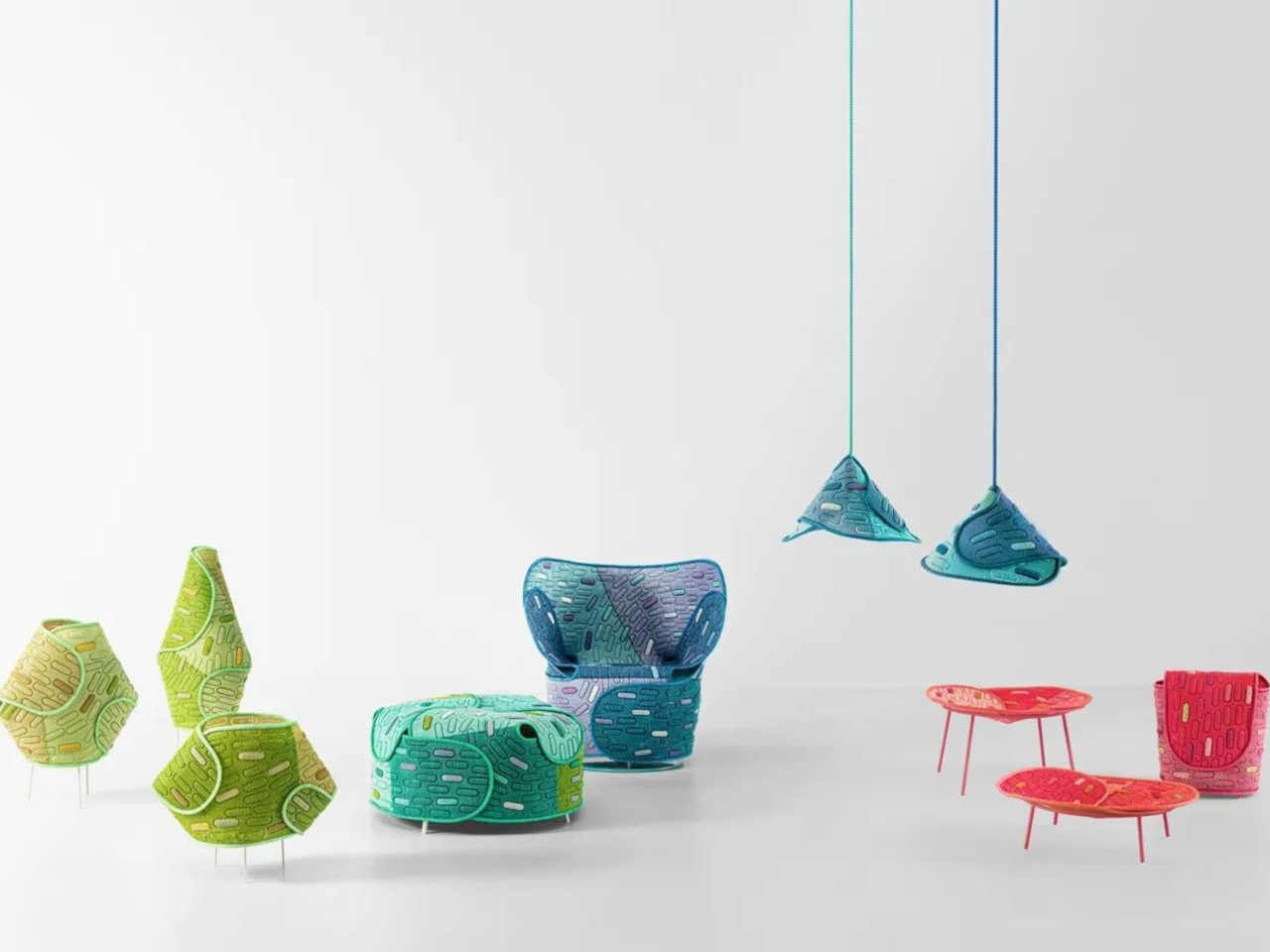
Paola Lenti’s collaboration with Japanese design firm Nendo for Milan Design Week unveils the Hanara-shi series. Inspired by Japanese cherry blossoms and samurai armor, this organic-shaped collection features suspended lamps, baskets, floor lamps, armchairs, and poufs. Crafted from recyclable, waterproof Maris mesh, the furniture showcases an innovative design with recovered cutoffs for upholstery, blending beauty and sustainability seamlessly.

3. Versatile Design

Organic shapes find their best fit in furniture, lighting, accessories, and various architectural details. Almost any object can benefit from incorporating organic shapes, but these objects sing a different tune when given such a facelift. From utilitarian tools to accent pieces, they take on a more human character just by having smooth-flowing surfaces and curved forms.
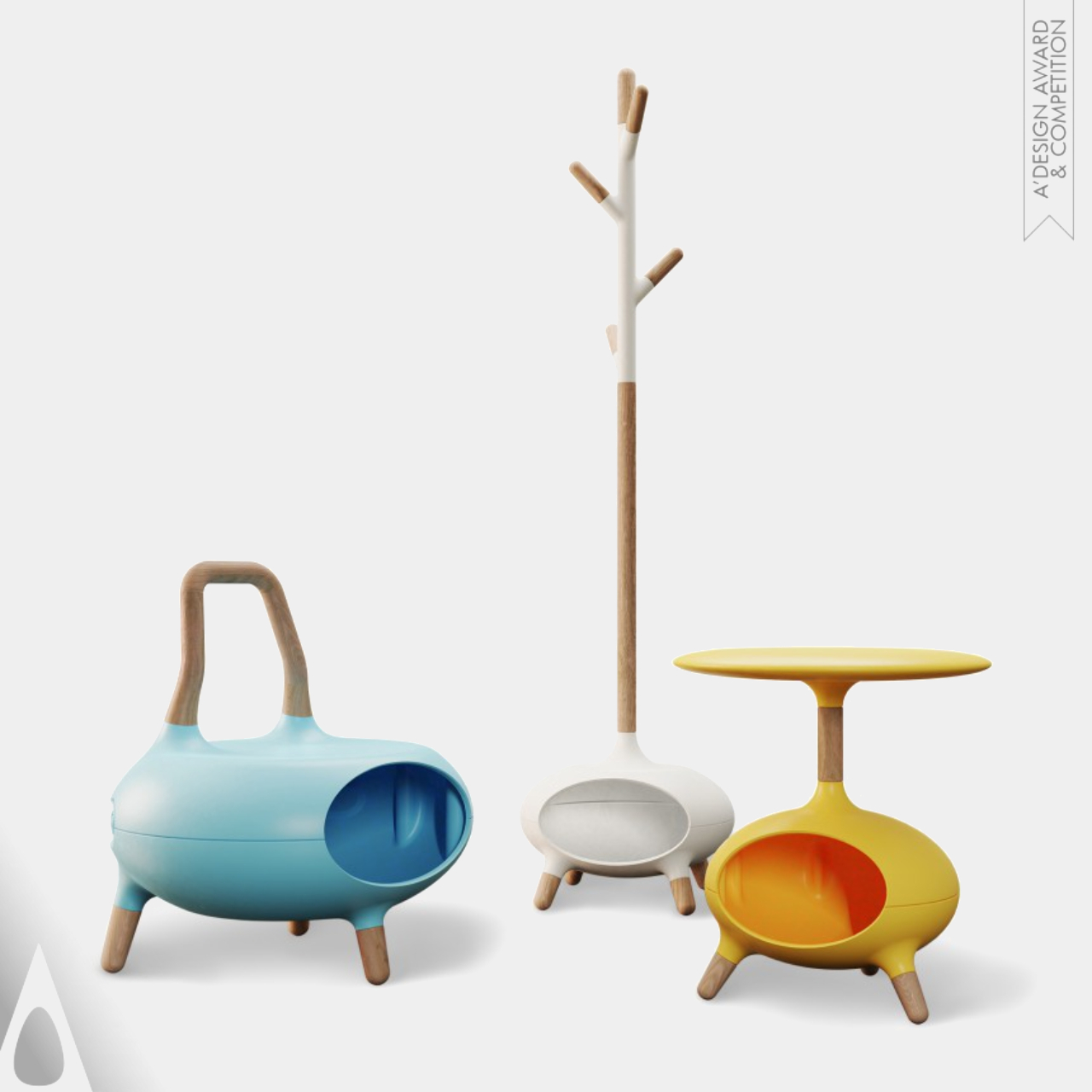
Designers: Wei Jingye, Song Kexin, Zheng Xiaolei and Zhou Haoyuan

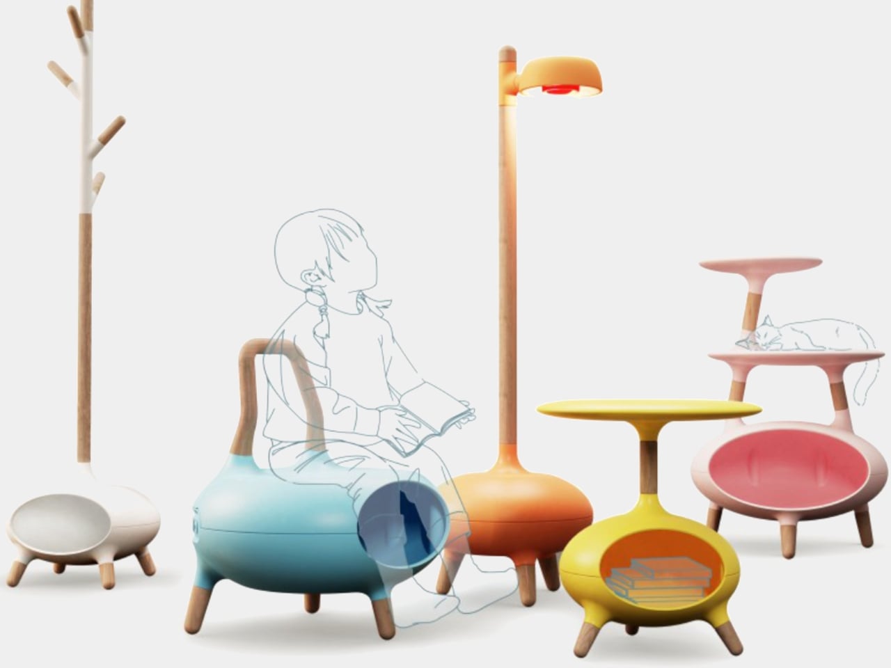
The Wowo Multipurpose Furniture is a solution for homes with both kids and pets. This innovative collection offers versatile pieces designed to accommodate both human and furry family members. Crafted with comfort in mind, the hollow structures provide a cozy spot for pets to rest while kids enjoy comfortable seating. Made with high-quality materials including solid wood and utilizing advanced 3D-printing technology, Wowo furniture ensures durability and longevity.

4. Timeless Aesthetics

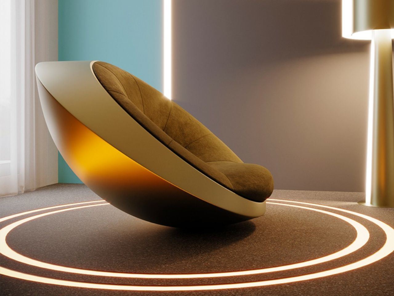
The organic shapes are a timeless design trend that will not go out of style for years to come. This distinctive rocking chair draws inspiration from the fascination with UFOs, featuring a bowl-shaped exterior crafted from fiberglass or carbon fiber for stability. Its regal design and ergonomic shape offer comfort and support, while luxurious Italian leather or fine fabrics adorn the upholstery. With its unique appearance and versatile design, this curvaceous chair serves as a captivating centerpiece, inviting users to experience an otherworldly seating experience reminiscent of floating on air.
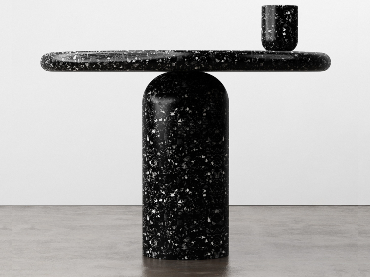
Designer: Mavimatt

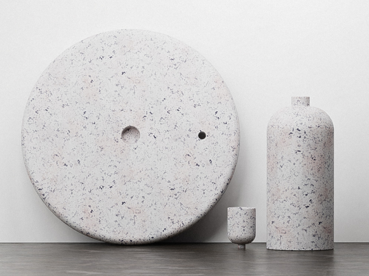
The “Balance” side table concept combines elegance and an organic shape with a precarious design, challenging expectations of stability. Crafted from terrazzo and recycled materials, it features interlocking mechanisms for security. Its dynamic appearance sparks conversation, blending aesthetics with sustainability.
Designer: Stuart Cole

5. Biophilic Design

The organic shape design trend is rooted in biophilic design principles, supporting well-being through a connection with natural elements and fostering a sense of harmony with the environment. In this case, the association with nature becomes a bit more evident, creating a stronger effect that resonates with the rest of the space.
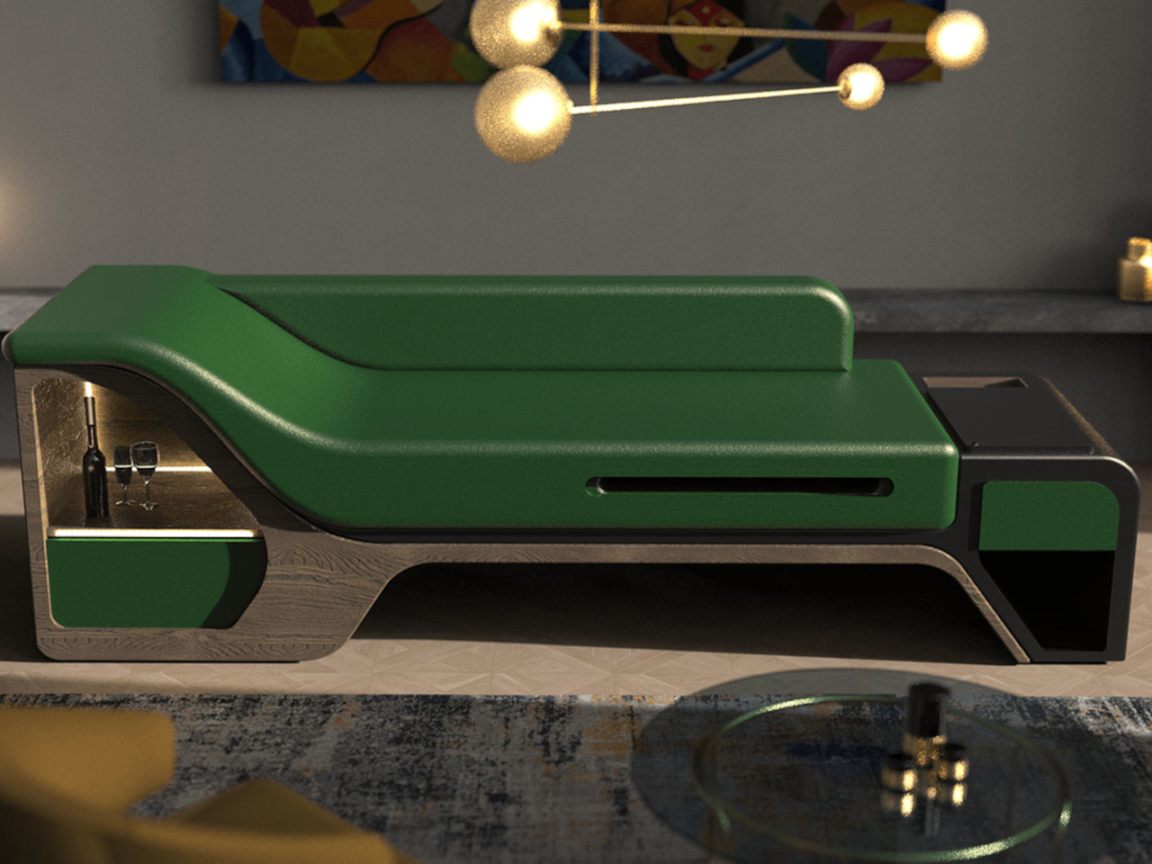
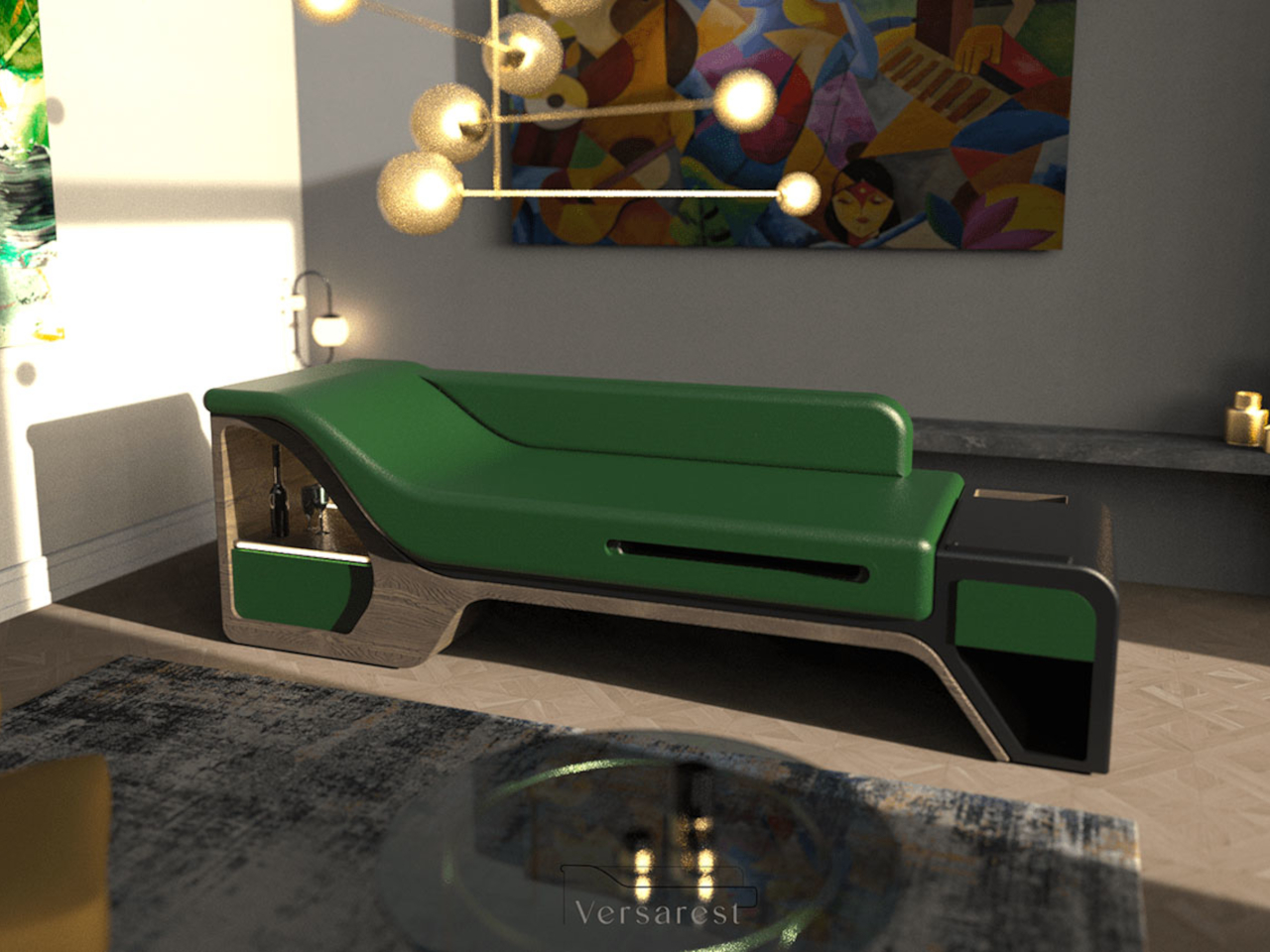
Designer: Gokul Retheesh

The VersaRest Chaise Lounge is crafted with a wooden oak base and luxurious full-grain leather upholstery, it offers unparalleled comfort and style. This innovative sofa with a biophilic vibe integrates hidden storage drawers, adjustable tables, and integrated LED lighting. This thoughtful design combines convenience, luxury, and versatility in one elegant piece.

6. Enhances Creativity

The fluid lines of organic shapes allow for creativity, paving the way for unique aesthetics to emerge. It’s not easy to incorporate curves in a typically flat product, and it requires some outside-the-box thinking to pull off an organic shape that combines form and function in a harmonious way.
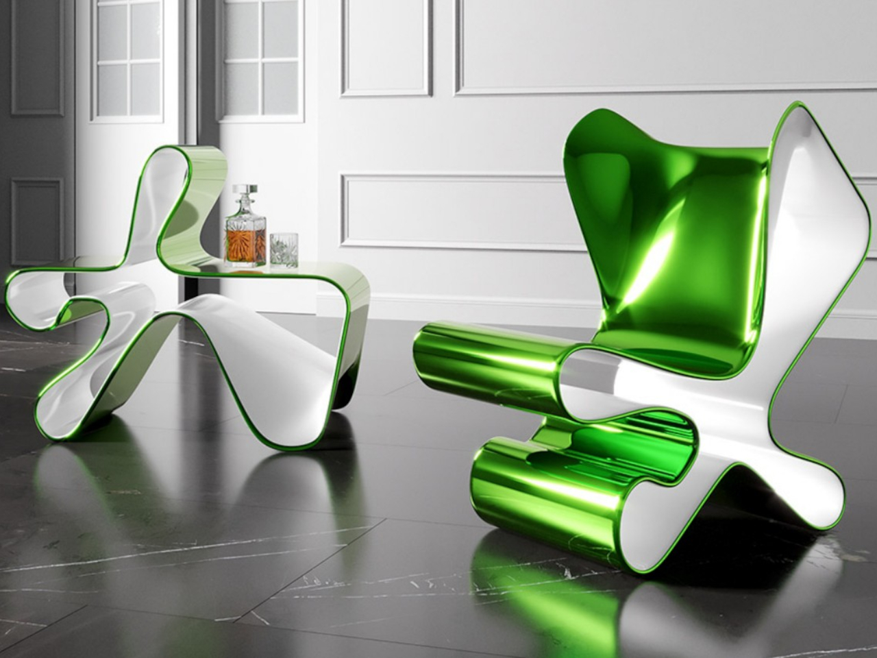
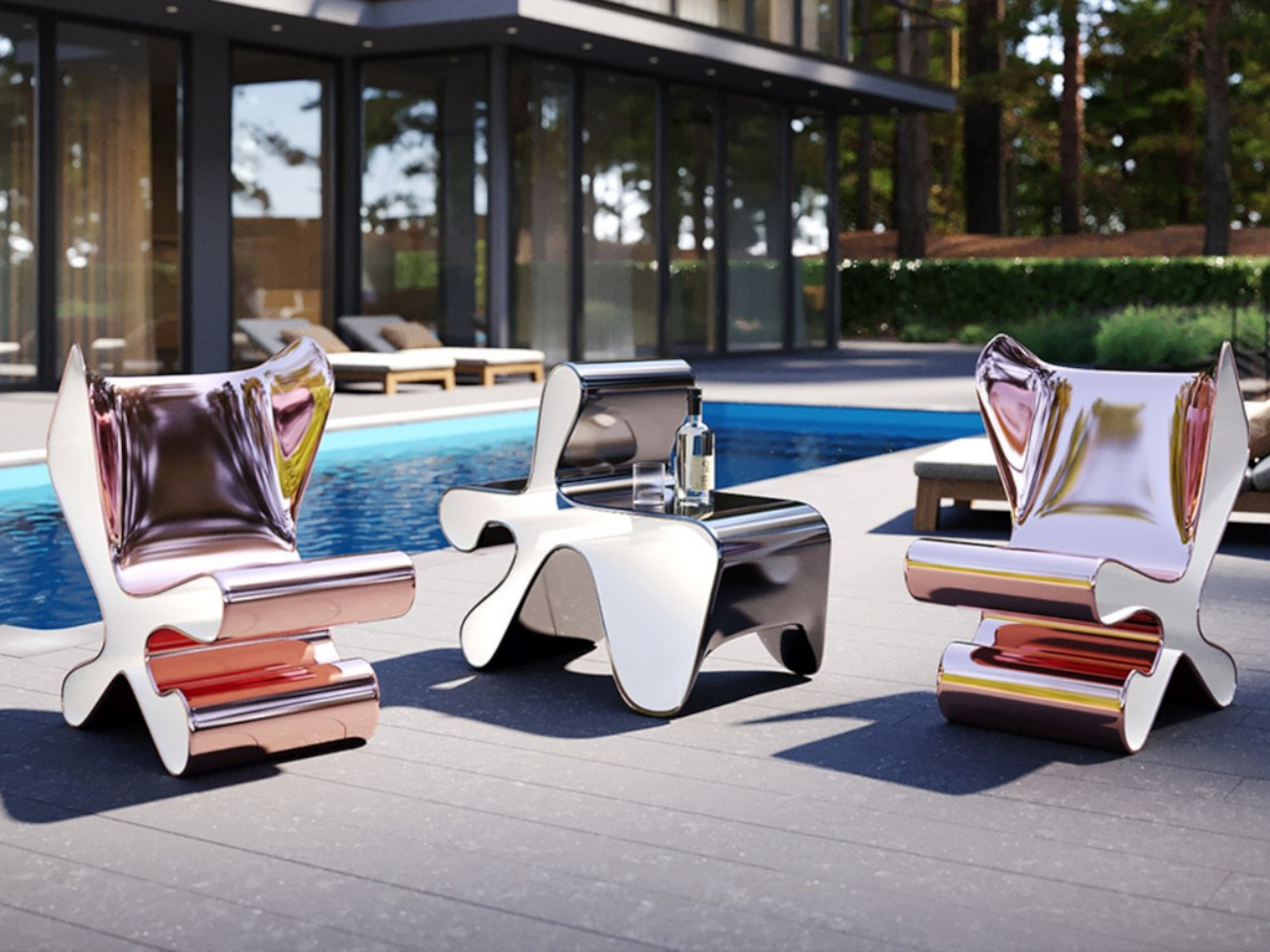
Designer: Mavimatt

Chairs often serve as impromptu shelves due to limited space. Imagine a chair seamlessly transforming into a shelf or table—a solution offered by Metamorfosi. Unlike conventional multifunctional furniture, it remains fixed, its hollow shape concealing three functions: chair, table, and bookcase. Handcrafted with dynamic organic shapes and glossy finishes, it blurs the line between furniture and art, offering elegance and versatility.

7. Softens the Interiors

The curvaceous shapes of organic furniture contrast with the sleek lines of straight walls, ceilings, and furniture, contributing to a sense of balance and harmonious design. Incorporating organic shapes into lighting fixtures, such as pendant lights with rounded shades or sconces with flowing lines, adds softness to the interiors.
Designer: Kosmos Architects

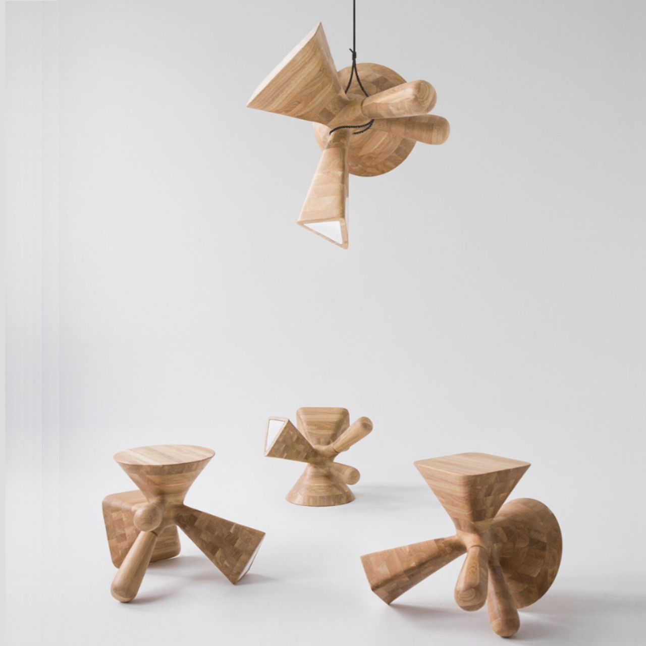
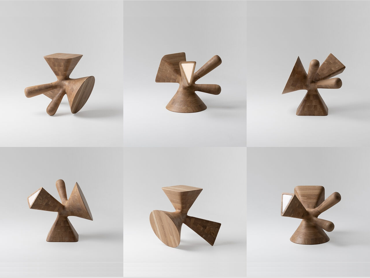
“The Dice” by Kosmos Architects is a versatile furniture piece inspired by dice markings. Crafted from oak wood using robotics technology, it transforms into a stool, coffee table, leg bench, and lamp with a frosted glass interior. Lightweight and portable, its organic silhouette serves functional and decorative purposes, making it ideal for small spaces or on-the-go lifestyles.

8. Adaptable Design

Another benefit of organic shapes is their ability to seamlessly blend with traditional, modern, and transitional design styles, making them a highly adaptable design element. The best part is that mixing and matching organic shapes with other decor styles can result in a distinctive and eclectic aesthetic.
Designer: Julian Topor

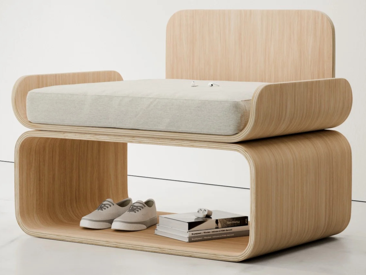
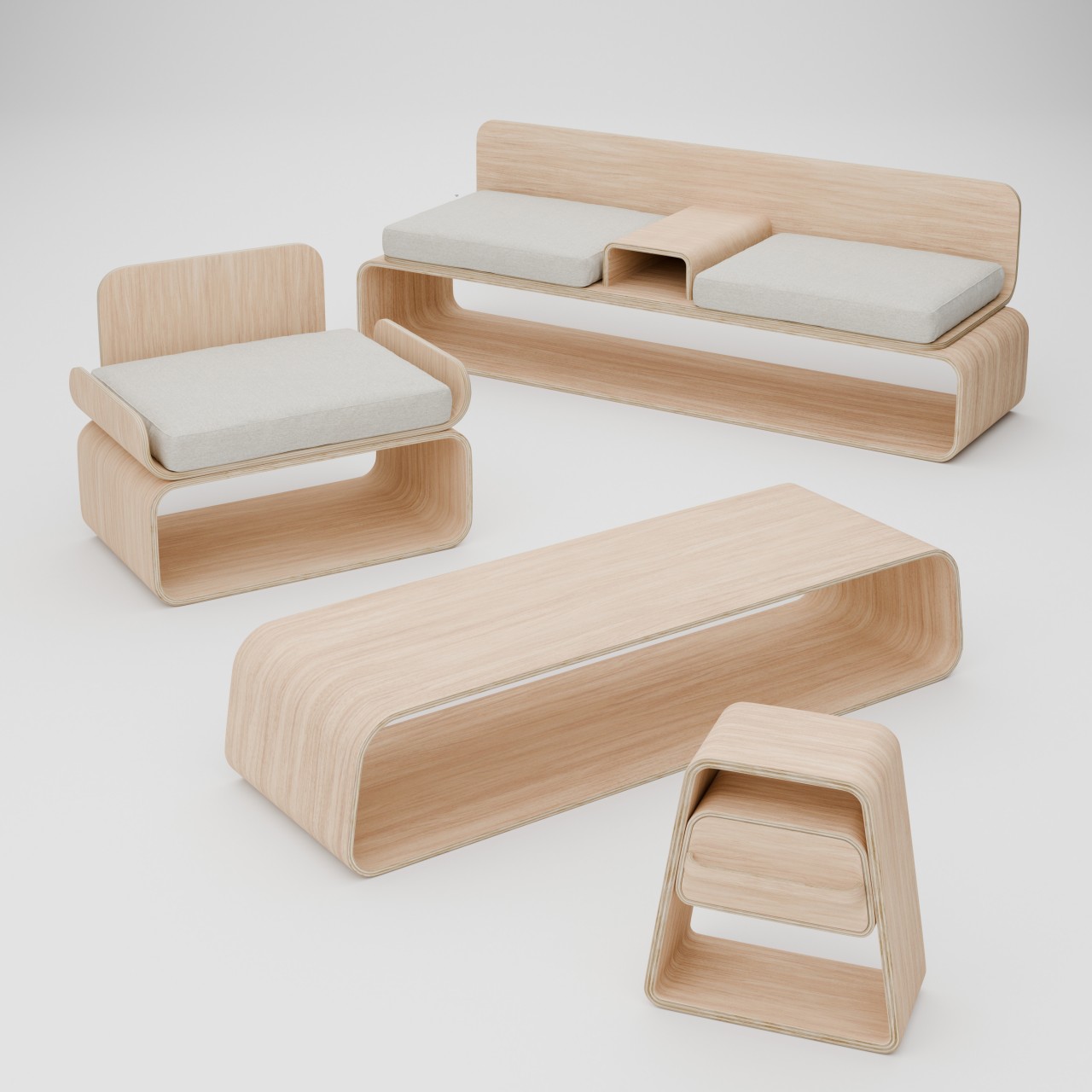
The KURVE furniture collection redefines space-saving design with minimalist plywood pieces. Each item boasts curved layers that offer both organic aesthetics and functionality, featuring a chair, couch, table, and nightstand. Crafted from a single sheet of plywood, the chair’s unique backless box design maximizes storage, while the couch includes a central console and compartments. The trapezoidal table and nightstand provide sleek storage solutions, perfect for small spaces.

9. Beautifies the Space

The natural curves in furniture and art can enhance spaces, bringing a positive vibe and elevating the overall atmosphere. A substantial piece of furniture or artwork featuring organic shapes offers an excellent opportunity to make a statement in your home.
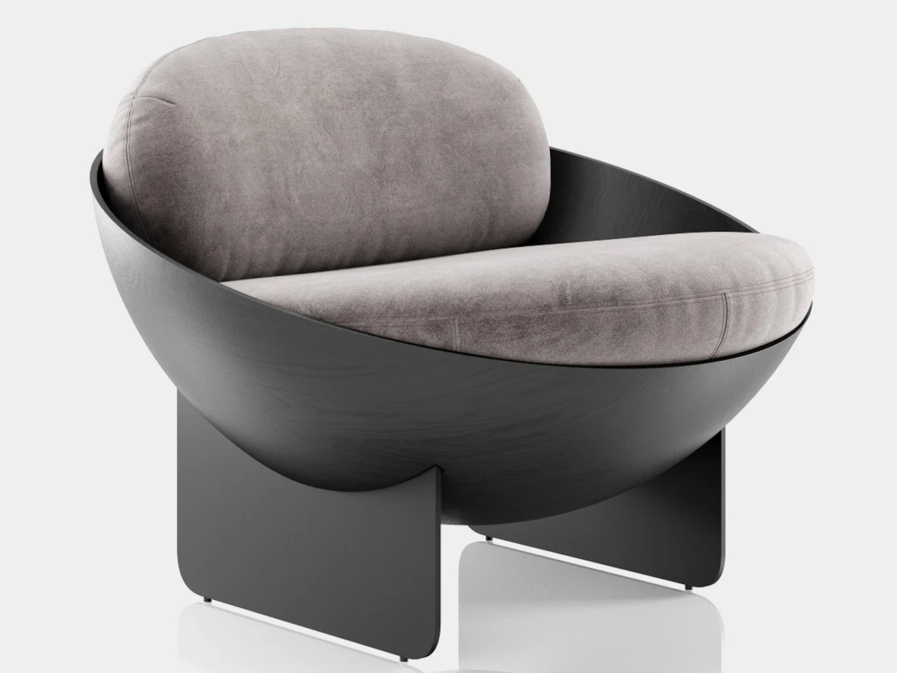
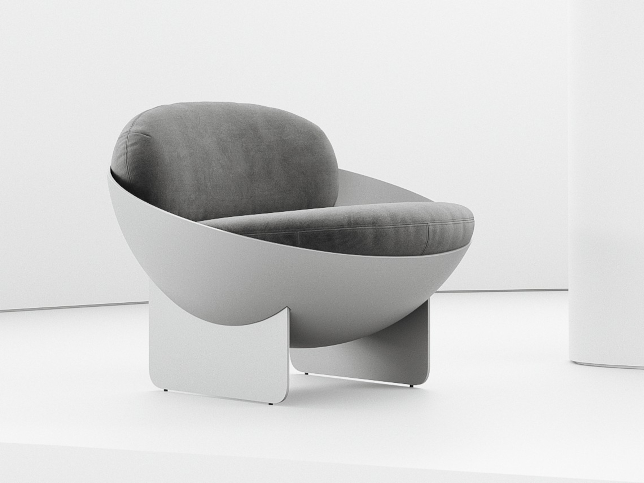
Designer: Mauricio Coelho

The Oco chair concept blends simplicity and visual intrigue with its unconventional bowl-shaped design. Crafted from carbon steel and fiberglass, it offers structural stability with subtle material details. However, concerns about comfort arise due to the thick cushions potentially lacking adequate support for the back and exposed edges posing discomfort. Minor adjustments could enhance ergonomics without compromising its geometric elegance.

10. Organic Accents

Small organic accents, like a vase or bowl, can greatly alter the overall ambiance of your interiors. Opting for pieces made from natural materials such as wood, stone, or ceramic mirrors the curves of nature.
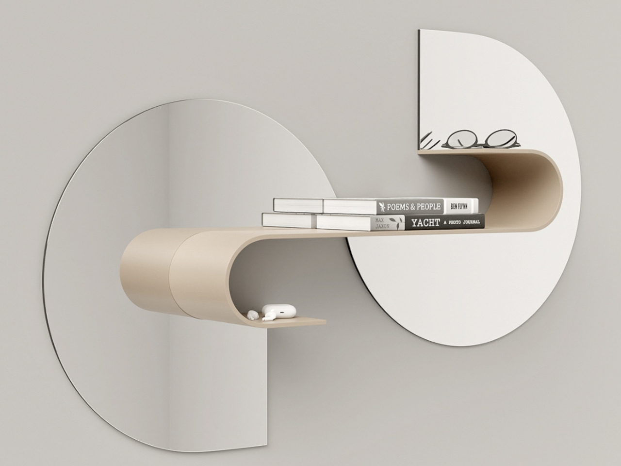
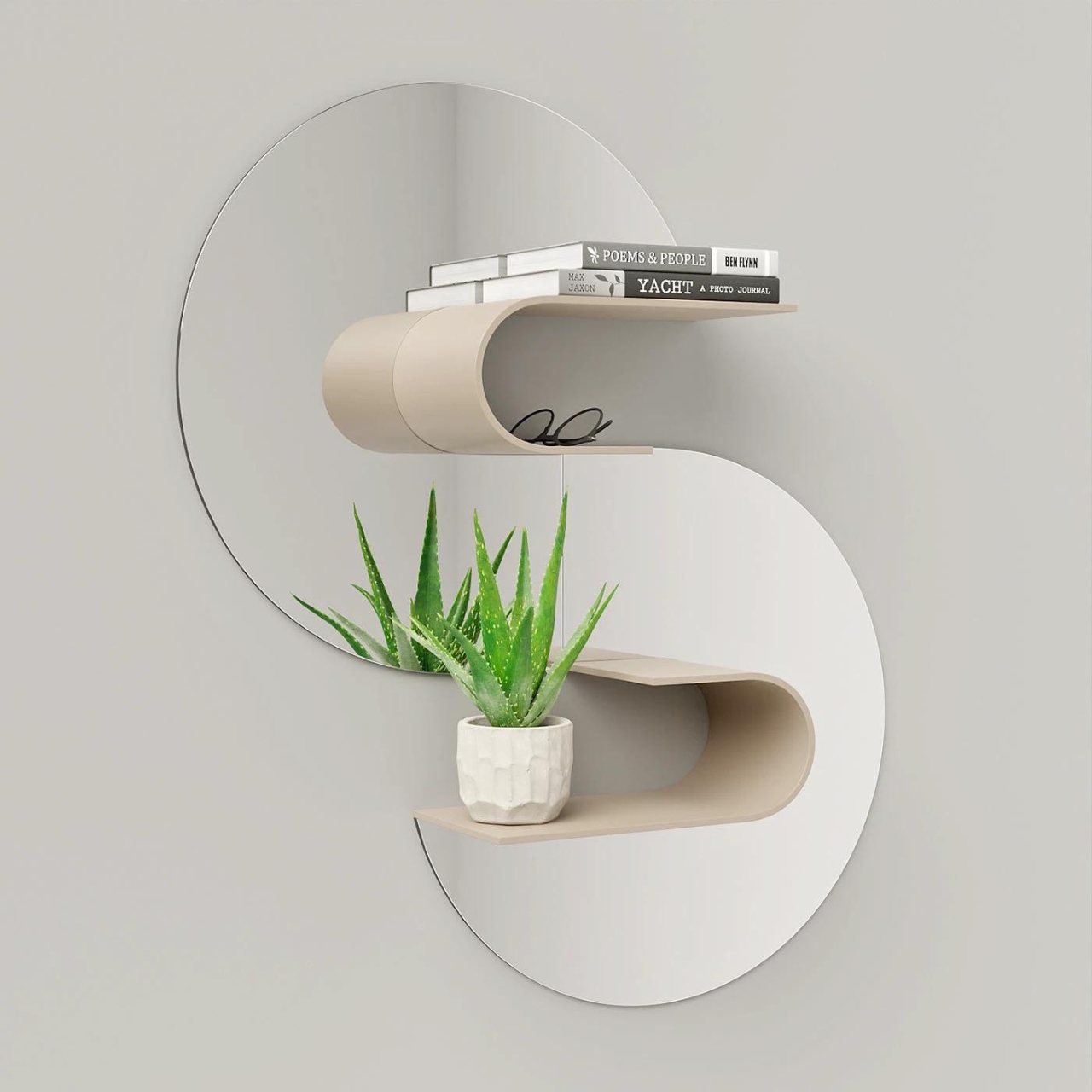
Designer: João Teixeira

Wave is a groundbreaking shelf concept that transforms your space. Not just for books, Wave doubles as a mirror, enhancing both functionality and style. While it may not offer a complete mirror reflection, its wavy shape adds a distinctive touch to any room. With around 4-5 parts, assembly is a breeze, ensuring versatility in placement. While it may not cater to those seeking a full-length mirror, Wave embodies a harmonious blend of form and function, making it an ideal addition to modern living spaces.

This Sculptural Bench Is The Thought-Provoking & Conversation-Starting Furniture You Need In Your Home

Crafted by Madrid-based designer Verónica Mar for Les Ateliers Courbet, the Soul Sculpture Bench embodies a minimalist yet spiritually sensitive design. Inspired by the universe’s intricate spiral patterns, it seamlessly merges nature with design, serving as a versatile piece for private or public spaces. More than seating, it sparks contemplation about the universe’s beauty and connections, inviting viewers to reflect and discuss.

Incorporating organic shapes into your decor doesn’t just add visual interest and dimension. It also creates a dynamic and visually stimulating environment that captures the imagination and inspires creativity. And it doesn’t need to be elaborate or extravagant, either, allowing more freedom in crafting products that stimulate the eyes and calm the mind.

The post Organic Elegance: 10 Ways to Embrace the Organic Furniture and Décor Trend first appeared on Yanko Design.

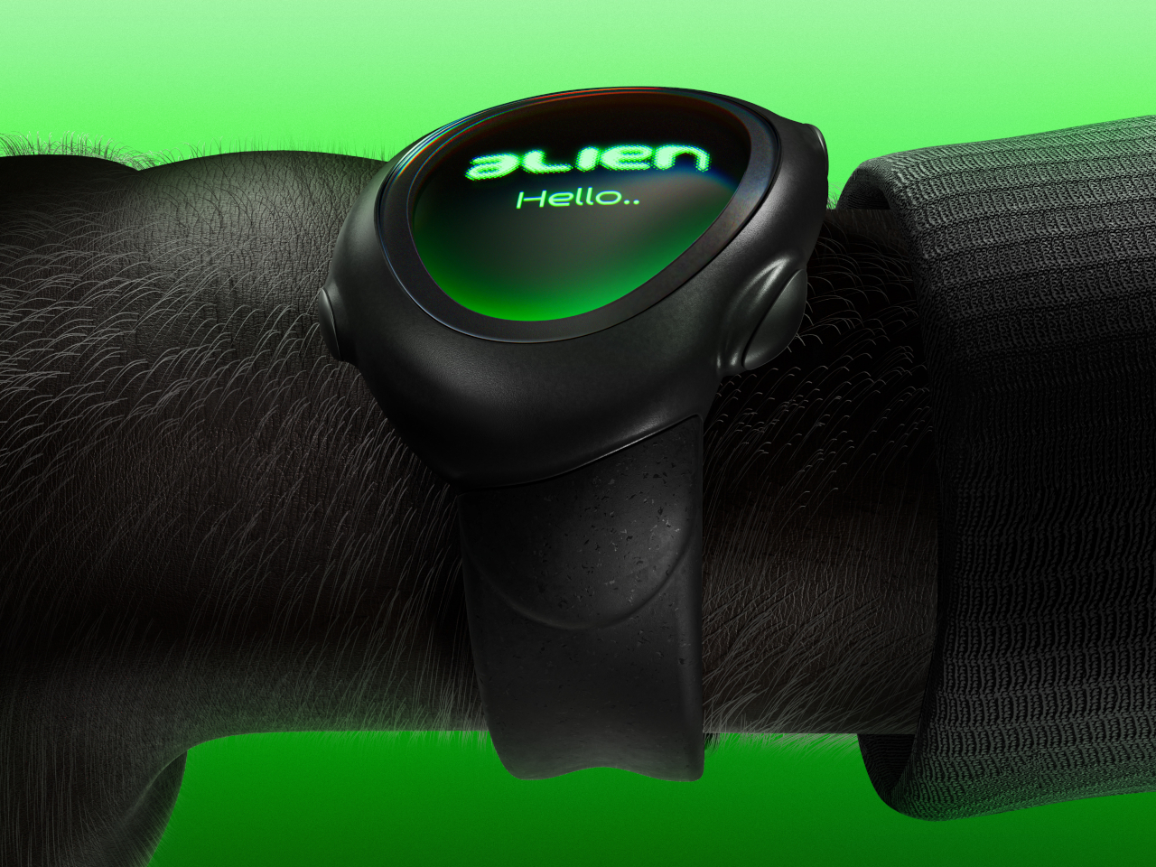
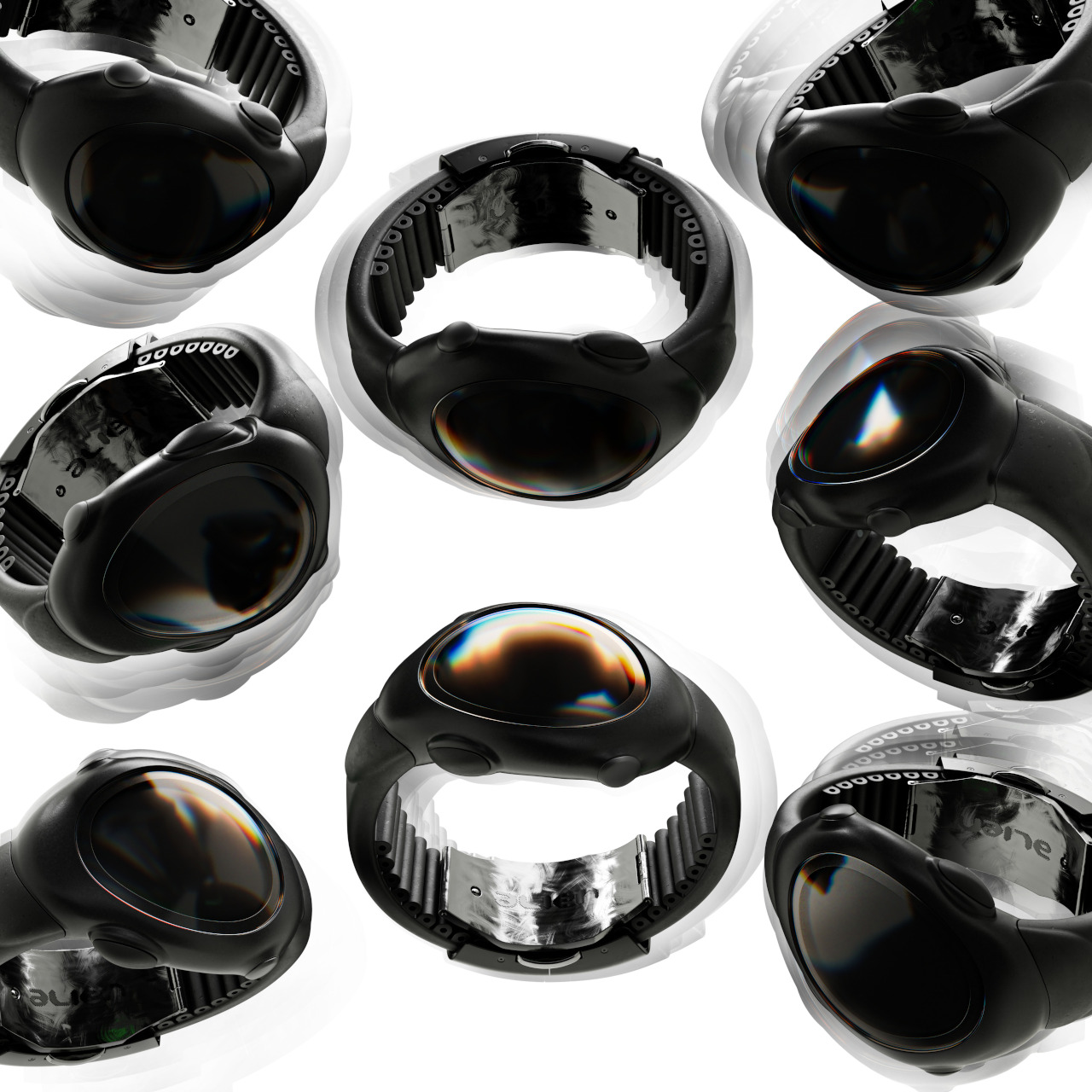
Alien-inspired smartwatch concept eschews conventional design for more organic aesthetics

Smartwatches today have evolved from miniature smartphones on our wrists to miniature health clinics on our wrists. The design of these wearable devices has finally settled down to a handful of designs, most of which try to mimic the appearance of classic timepieces. There is, however, still plenty of room for exploration, for designs that redefine the product category or challenge the status quo. This design concept, for example, tries to look farther ahead into the future, when conventions no longer hold water and where today’s unfamiliar, alien aesthetics would ironically look more natural and more human.

Designer: Olga Orel

Smartwatches had a hard time finding its niche in the market. They were too technological to match the majesty of mechanical watches, but also too underpowered to be the multi-purpose wrist-worn communicators of science fiction. In the end, smartwatches today adopted the core design convention of traditional wristwatches, be they the sporty kind or the luxurious timepieces. But does it really have to be that way? Do smartwatches need to look like, well, watches?

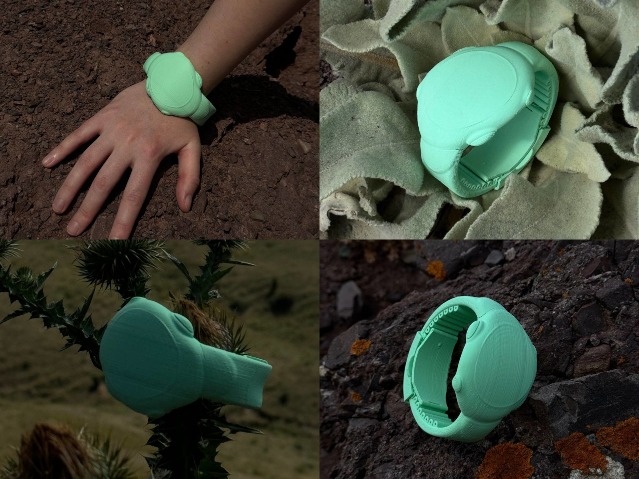
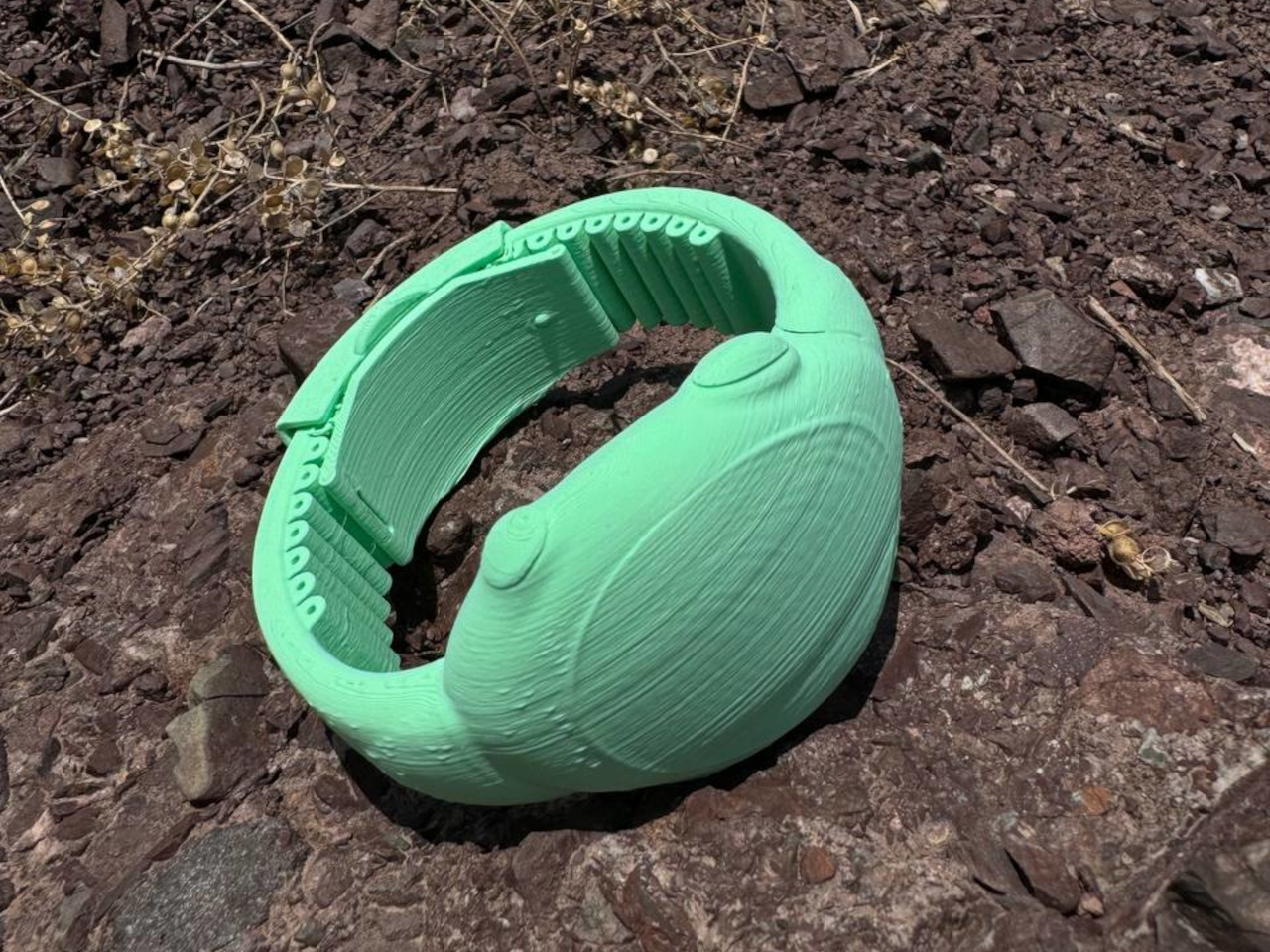
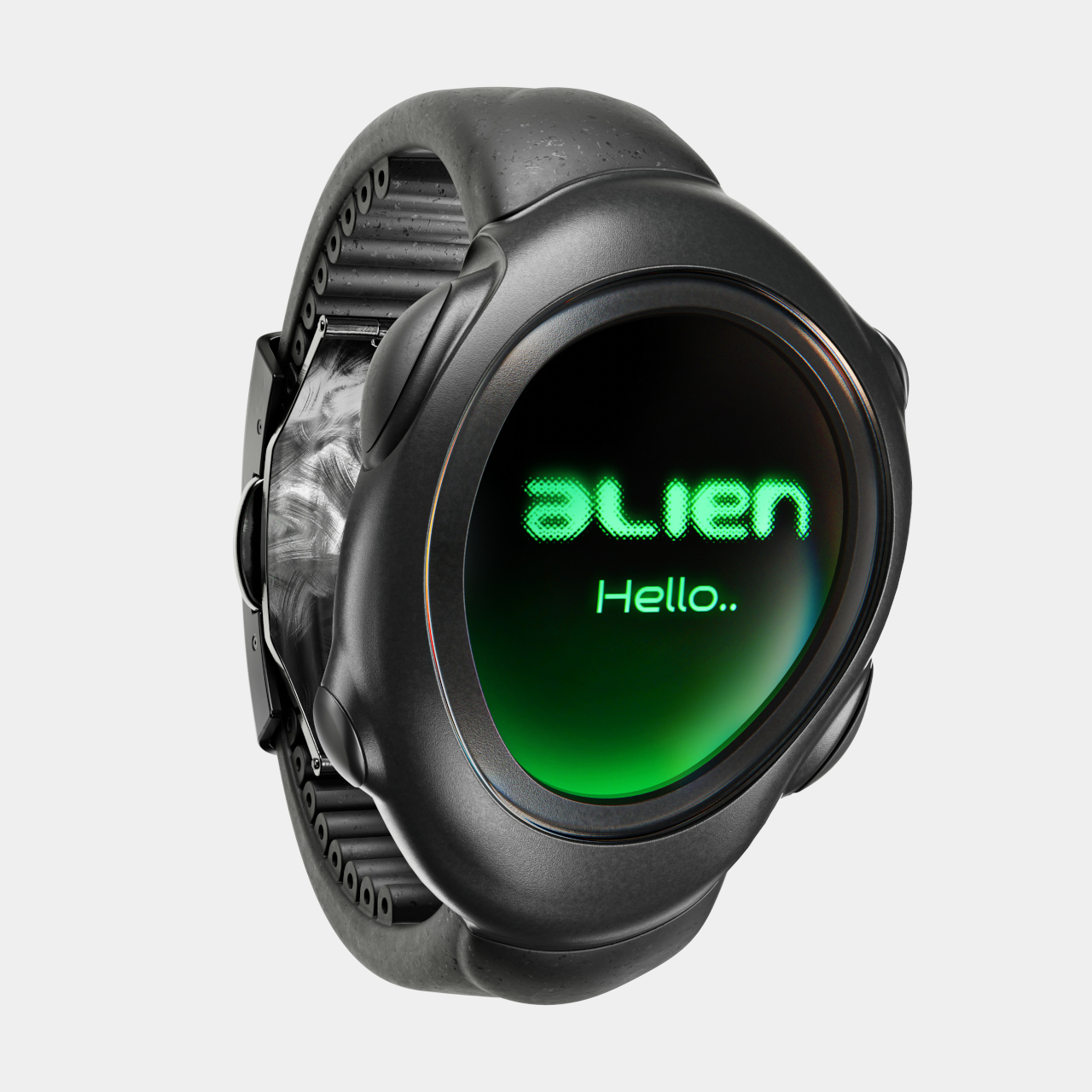
The ALIEN concept gives an empathic “no,” embracing a design language that is more organic and ironically closer to us than its extraterrestrial name would suggest. Its asymmetrical and amorphous design, not to mention the matching domed display, gives it that otherworldly character seemingly pulled out from some 90s sci-fi flick, with its eerie green glow and dark brushed metal surface. Of course, there’s nothing to stop a manufacturer from using other color motifs or materials, but it would still look alien compared to common smartwatches.

The irony is that, freed from the restrictions of circular and square watches, ALIEN can take on shapes that better conform to people’s wrists, offering a more natural, more ergonomic, and more pleasing curvature that is more human-centric. Even the buttons seem to organically grow out of the watch’s body rather than just jutting out like an artificial add-on. And unlike most smartwatches today, it isn’t content to have just one button but can have as many as four in each corner.

This unconventional design also changes the user experience, though not always in good ways. Because the shape of the screen is non-standard, there is more flexibility for different UI elements and arrangements, but it can also make things more confusing as well. Humans are creatures of habit, and smartwatches try to offer a uniform experience across different models or even platforms to make it easier for owners to switch from one watch to the next. That is, unfortunately, one of the disadvantages of this concept design, making the interaction and experience a little foreign and, well, alien.

The post Alien-inspired smartwatch concept eschews conventional design for more organic aesthetics first appeared on Yanko Design.

Organic-shaped room divider is designed to smell like caramel, doubling as a aroma diffuser

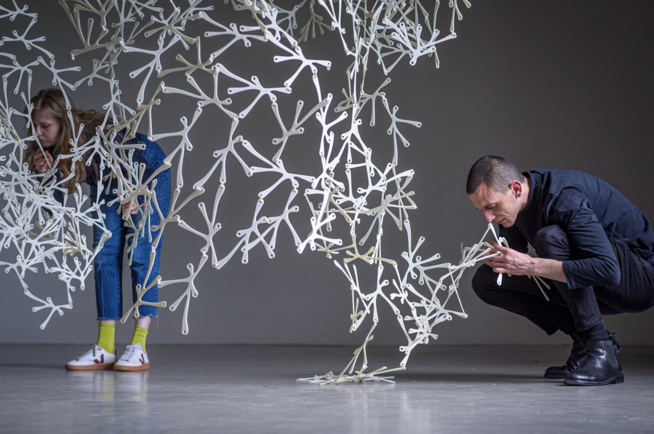
When it comes to room dividers, we usually think of bamboo screens, cloth curtains, shell curtains, accordion or folding portable doors, etc. Most of the time they’re just solid and not that imaginative. But what if you could make these dividers more decorative and artistic? Even better, what if the dividers are made from eco-friendly materials? That’s the idea behind this unique, sustainable, well-designed, and apparently aromatic room divider.

Designer: Crafting Plastics and Office MMK

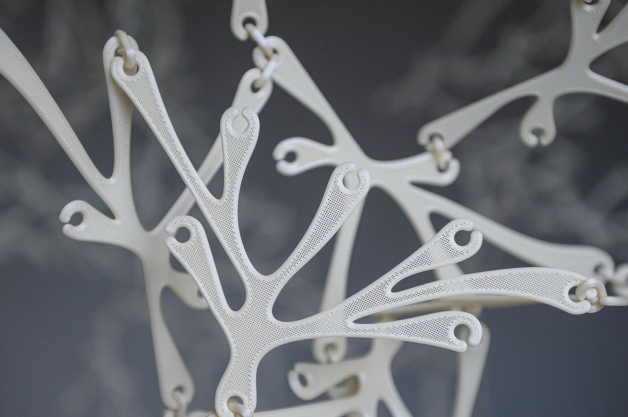
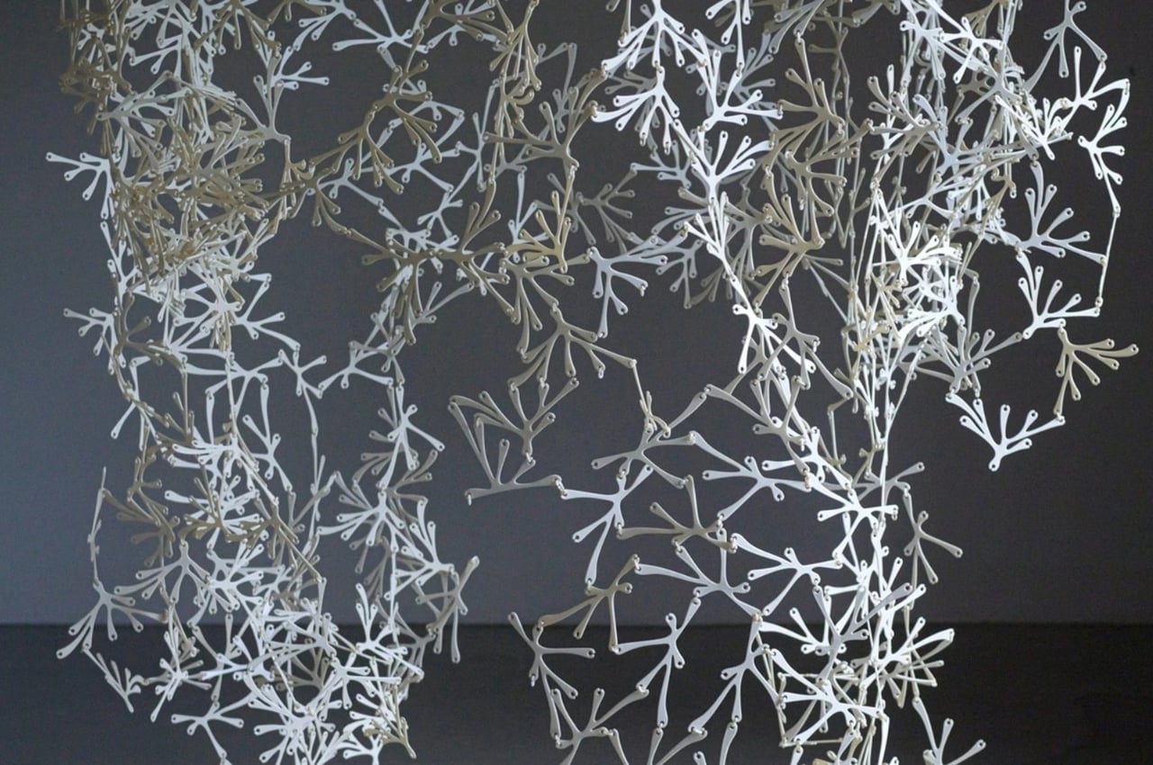
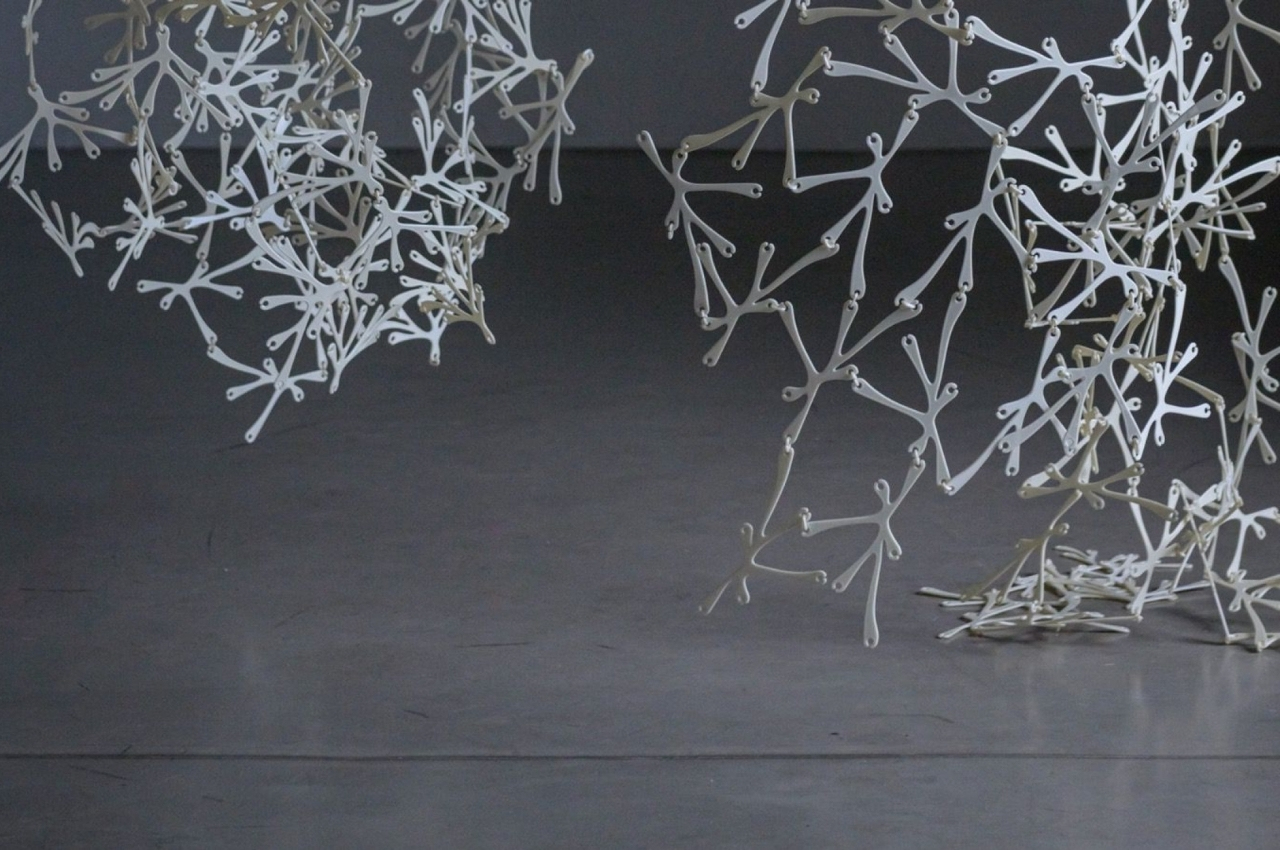
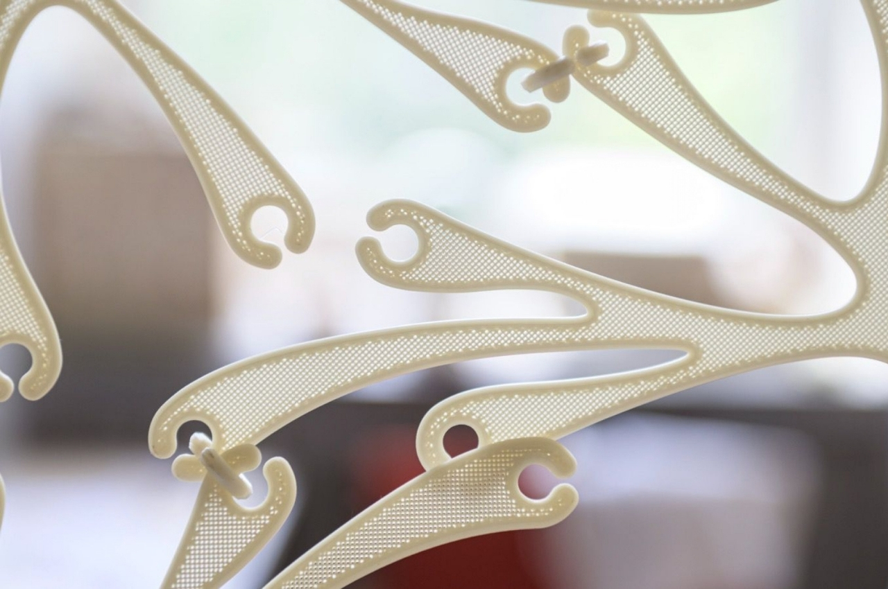
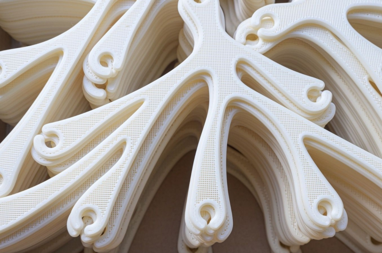
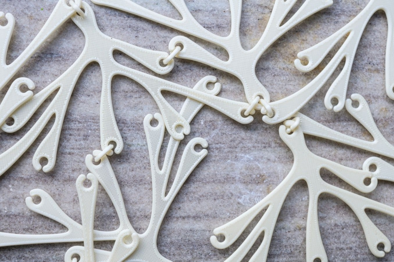
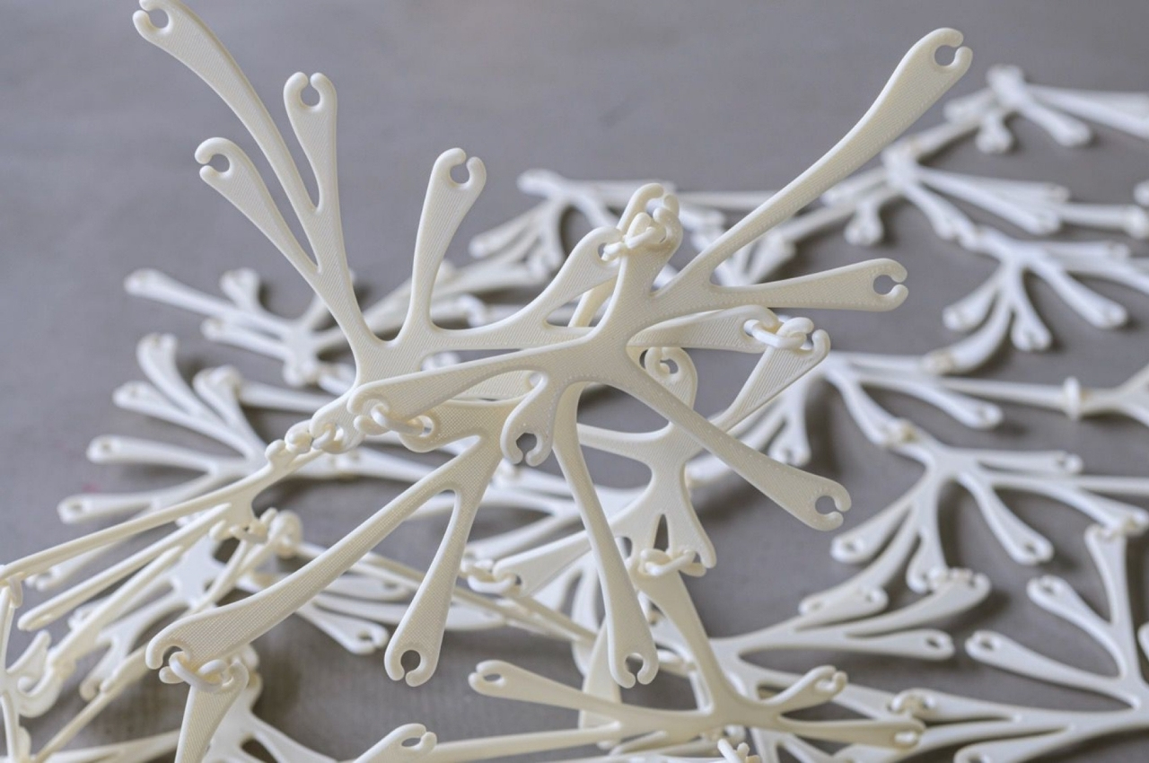
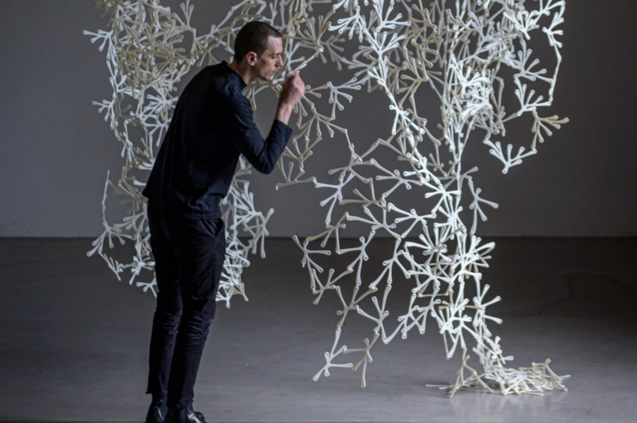
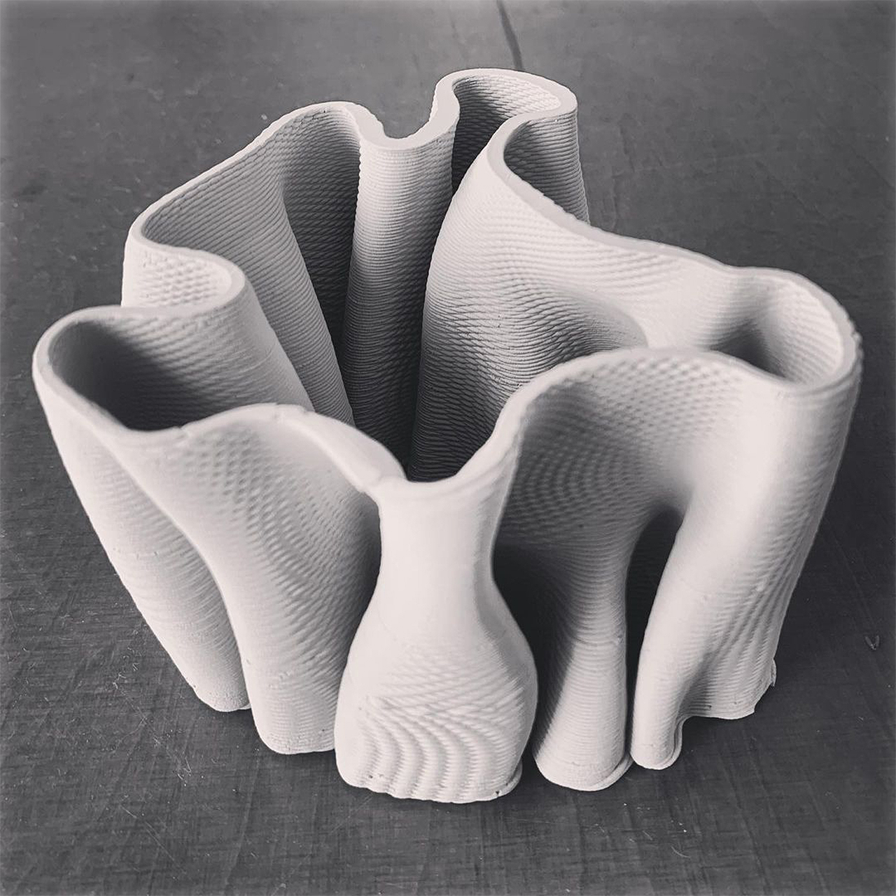
BreaZea is a modular 3D printed room divider made from bioplastics which in turn are from a combination of cornstarch and sugar. Its shape is an organic design inspired by things like corals and leaves. There are two different designs that can be combined according to the user’s preferences. You get a curtain-like divider that looks more like a piece of artwork than just simple furniture.

But what makes it truly unique is that they wanted it to “smell”. Normally, bioplastics are odorless but they wanted people to associate it with a certain, pleasant smell just like what do with fresh wood. They worked with a scientist to come up with a smell that’s close to the materials that the bioplastics are made from, which is a sugary and caramel-y aroma.

They are experimenting with oil-based and water-based scents that they can add to the bioplastic before it is 3D printed or add it to the finished product. Even that smell is also something connected to the organic design as it doesn’t have a “regular shape” but comes “from very tiny places and spreads around.”

And since this is a sustainable product after all, the BreaZea can be placed in an industrial compost when it reaches the end of its lifecycle. It will become biodegradable in 60-120 days just like most things made from bioplastics.

The post Organic-shaped room divider is designed to smell like caramel, doubling as a aroma diffuser first appeared on Yanko Design.

Sustainable modular acoustic panels are made from a unique blend of up-cycled textile and mycelium

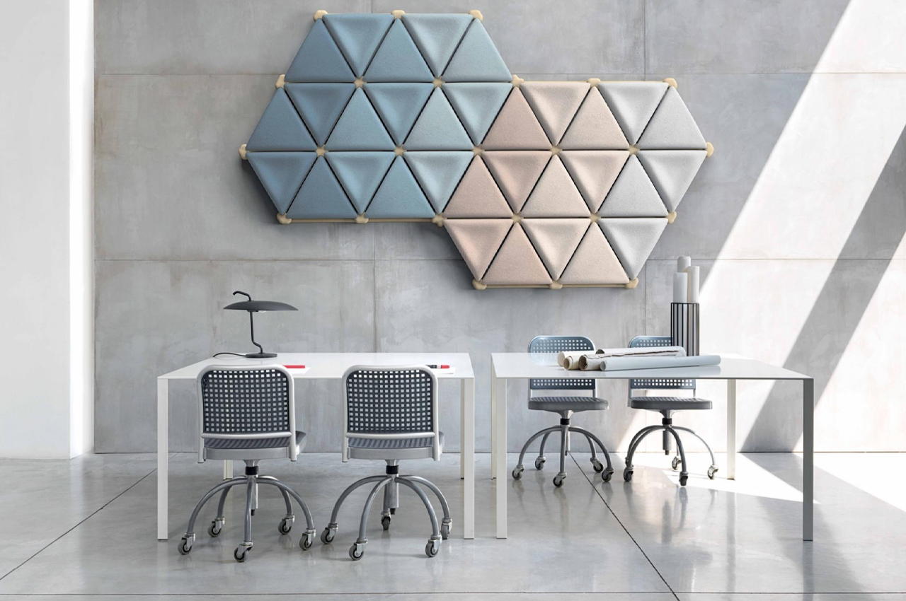
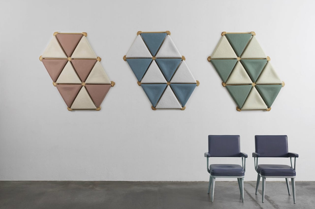
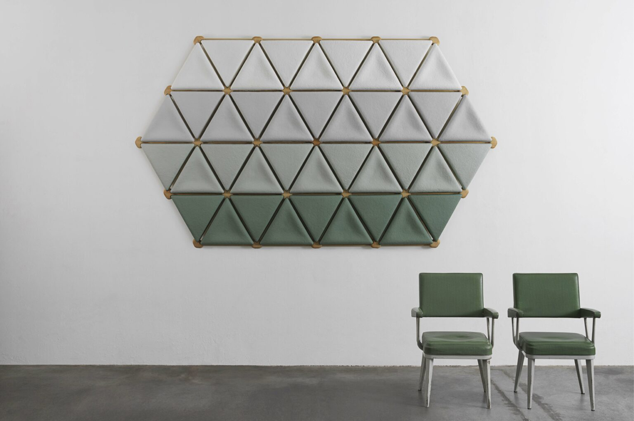
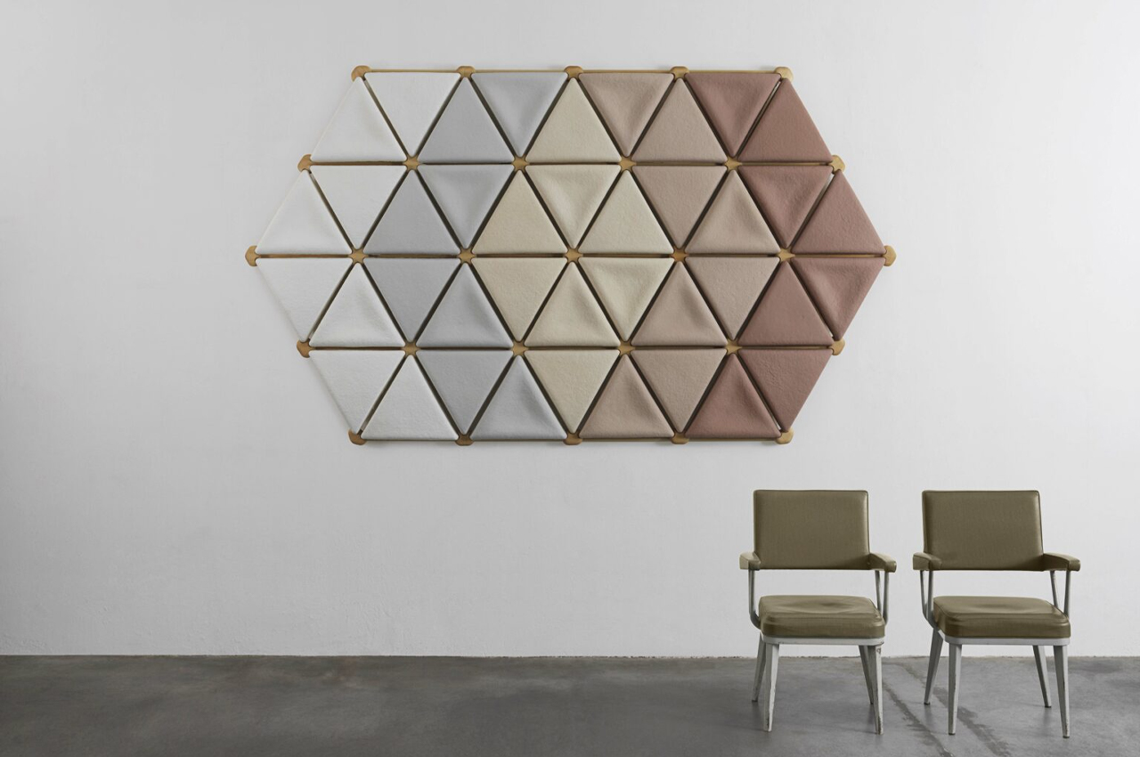
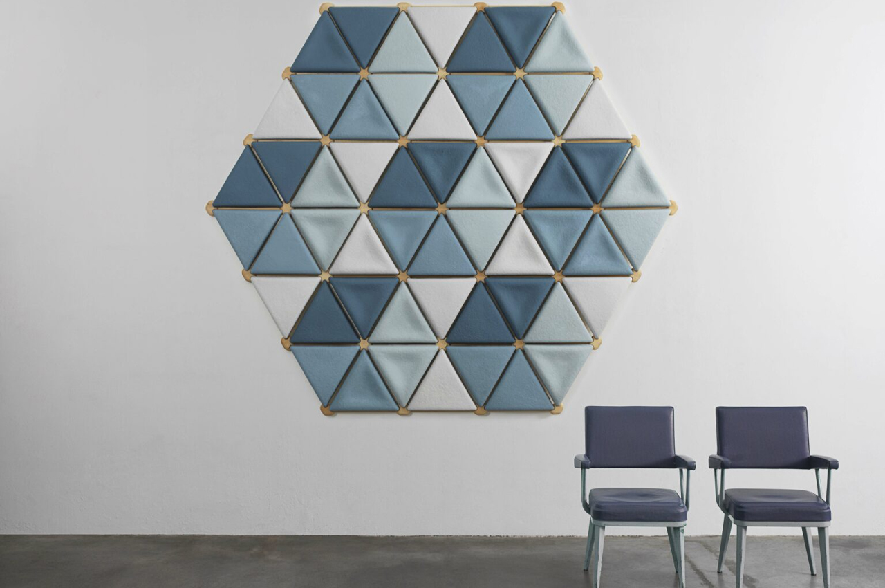
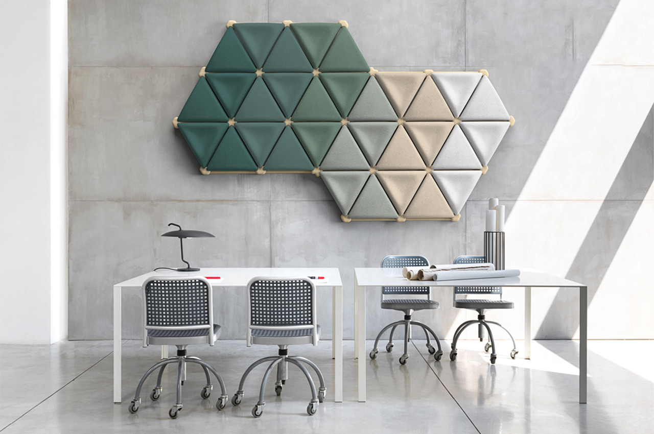
Foresta System is a modular acoustic panel design made from a unique blend of fungal mycelium and upcycled textile material.

Mycelium is like nature’s hidden superpower. Mushrooms can be used for anything from cooking, health and wellness, and even construction. Packed with industrial-level strength, mycelium is a natural fungi material that has recently been used as building materials for various construction projects.

Designer: Mogu

From home building to furnishing needs, mycelium provides an organic, yet durable construction material. Now used to create interior acoustic panels, the Foresta System designed by Italy-based Mogu takes a unique blend of mycelium and upcycled textile materials to create modular acoustic panels.

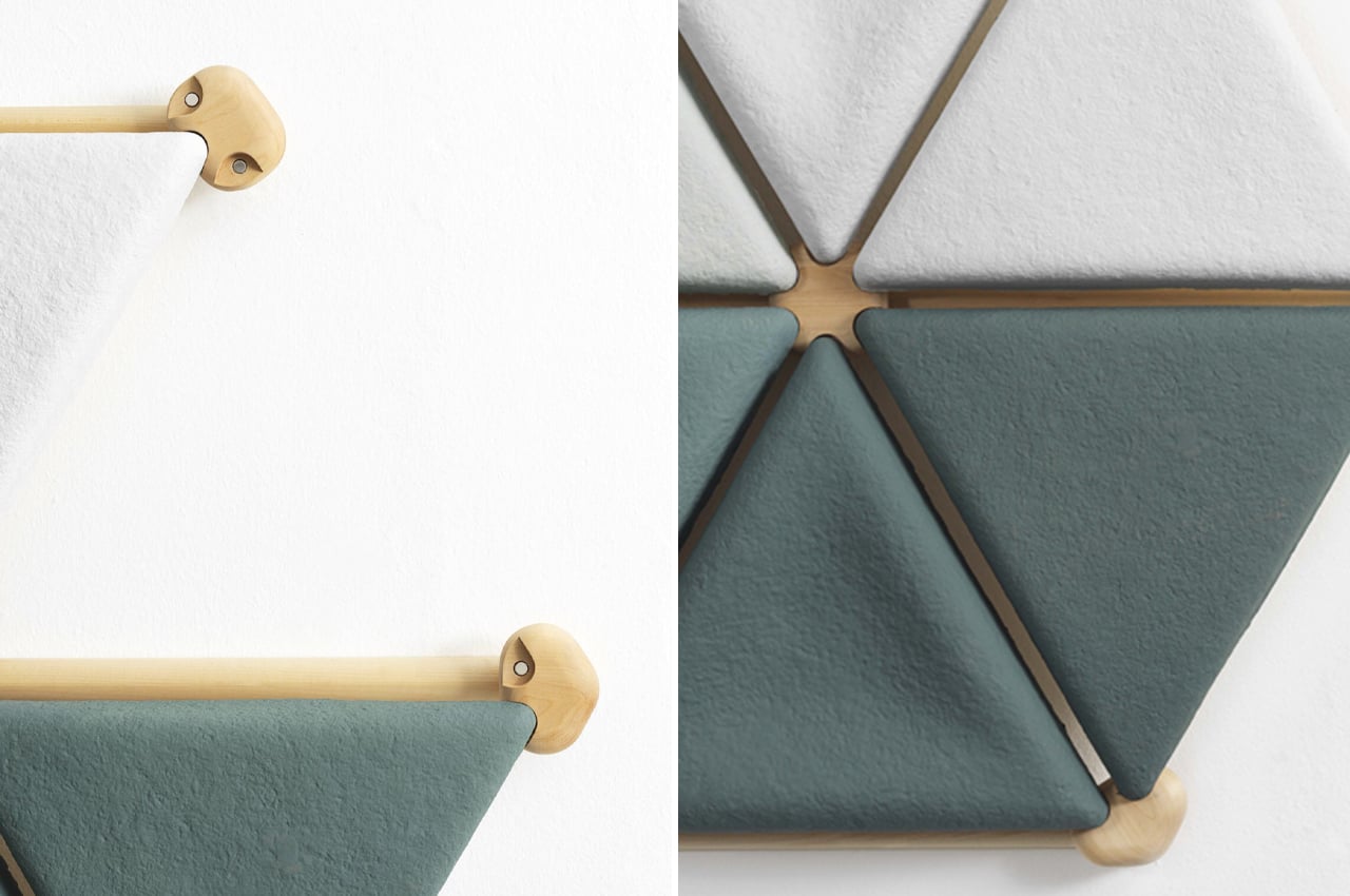
Constructed from a mix of mycelium panels, wood branches, and nodes, the timber frame that supports the different parts of Foresta can be mechanically fixed to the wall or vertical surface. Each node also carries integrated magnets that allow the acoustic panels to be mounted on the timber frame, allowing for easy removal and assembly.

The first of its kind to integrate mycelium into its build, Foresta has been granted the winning prize of the 2022 German Design Awards for its eco-conscious and innovative design. 100% circular by design, none of Mogu Acoustic products are made with synthetic material, nodding towards the company’s “extremely virtuous manufacturing cycle,” as the German Design jury suggests.

Made entirely from fungal mycelium and upcycled textile materials, Foresta is a collection of modular acoustic panels used to minimize the acoustic levels of noisy spaces like restaurants, offices, and retail businesses. Using the latest technologies in wood processing such as product parametric modeling, robotized production lines, and advanced manufacturing, Mogu was able to combine the refined aesthetics of wooden design with the cutting-edge nature of fungal mycelium to produce a truly innovative product.

The post Sustainable modular acoustic panels are made from a unique blend of up-cycled textile and mycelium first appeared on Yanko Design.

This smart indoor garden uses hydroponics to cultivate plants in a growth tray that resembles natural outdoor landscapes!

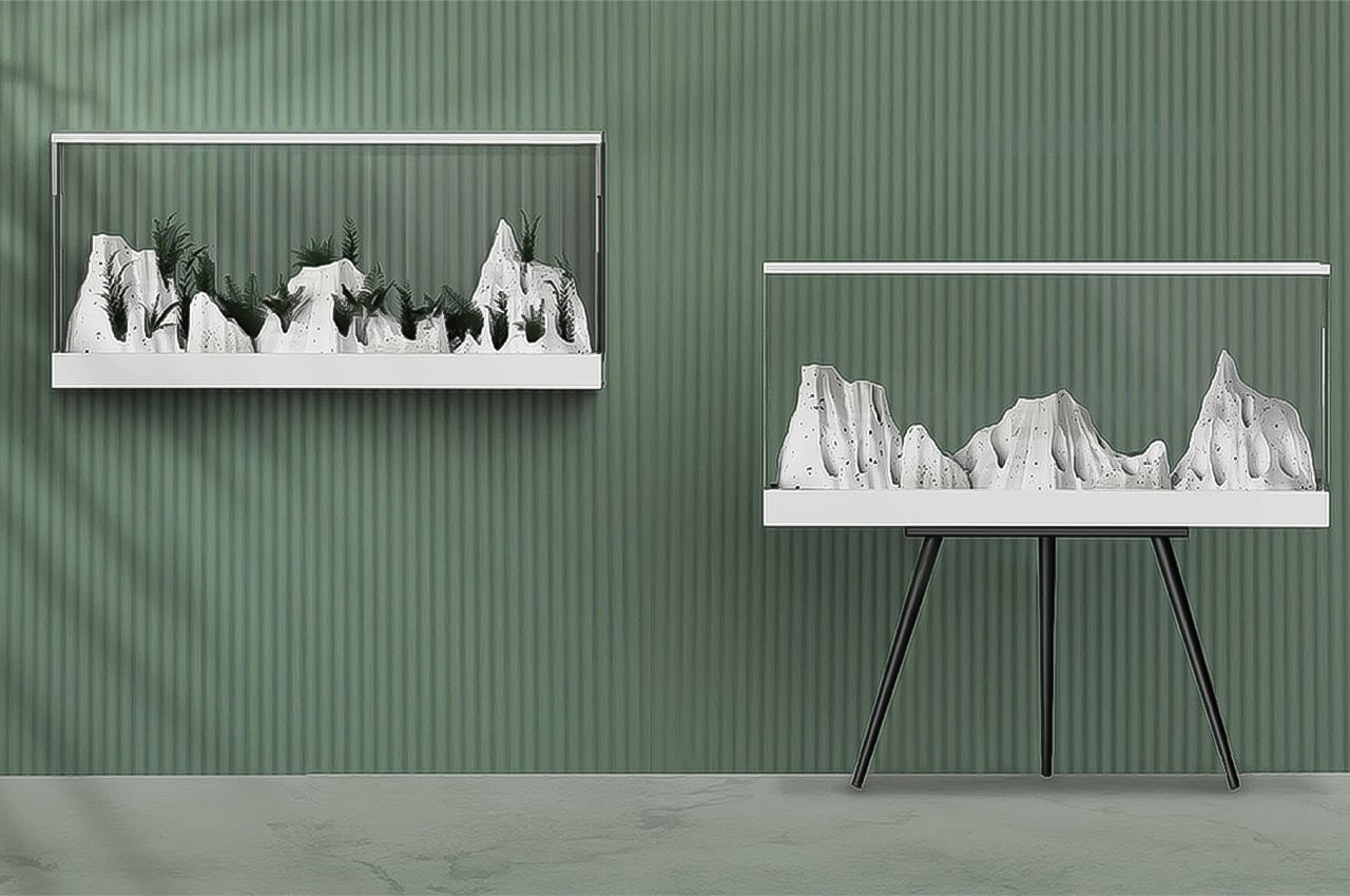
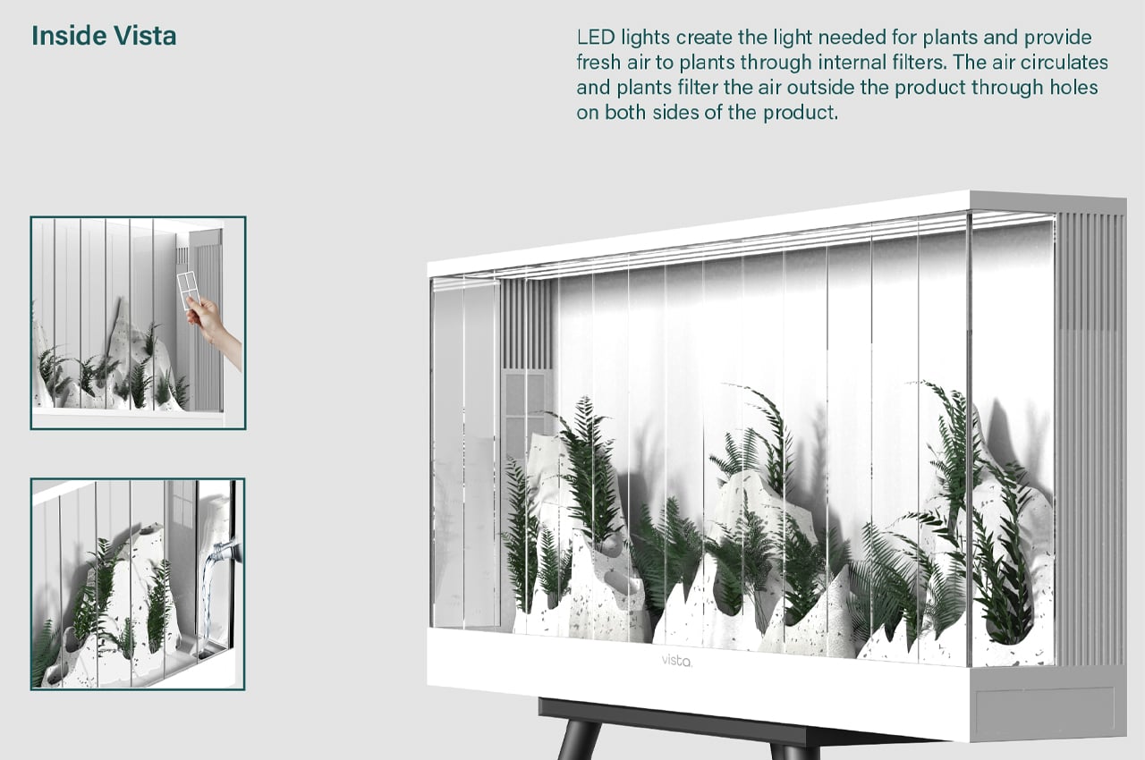
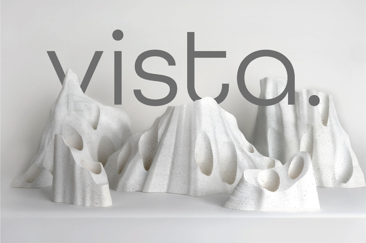
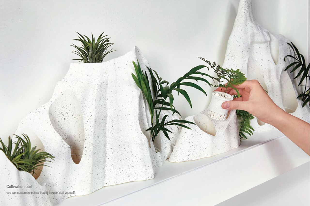
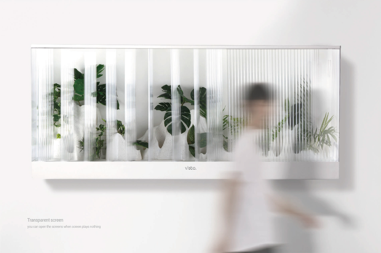
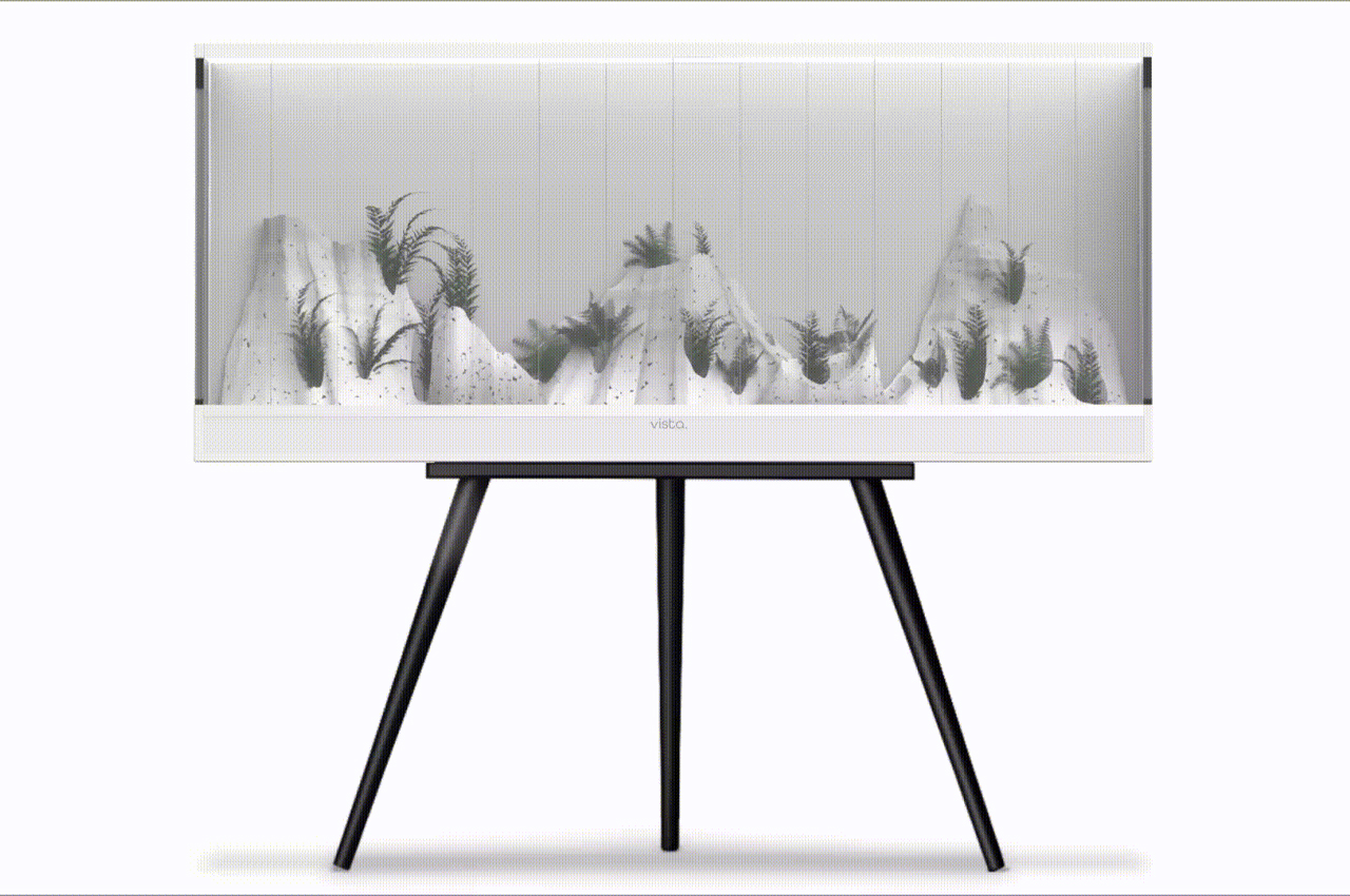
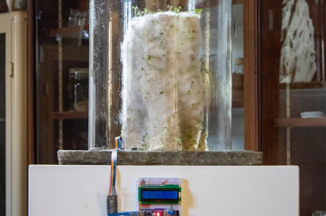
Vista is a smart gardening system that uses hydroponics to cultivate lush greenery in a growth tray that mimics the natural terrain of a mountainous landscape.

Smart gardens have taken the design world by storm in recent years. With so much of our time now spent indoors, we’re craving the freshness and beauty of nature. Even so, many of the smart gardens currently on the market are too sterile and rigid to actually make us feel close to nature.

Too many of the smart gardens on the market today prioritize function over aesthetics, amounting to cold, vertical farms that would look more at home in a research center’s greenhouse than a living room. That’s why designer Juhyuck Han created Vista, a smart garden appliance that mimics a landscape’s natural terrain and scales it down to fit in our homes.

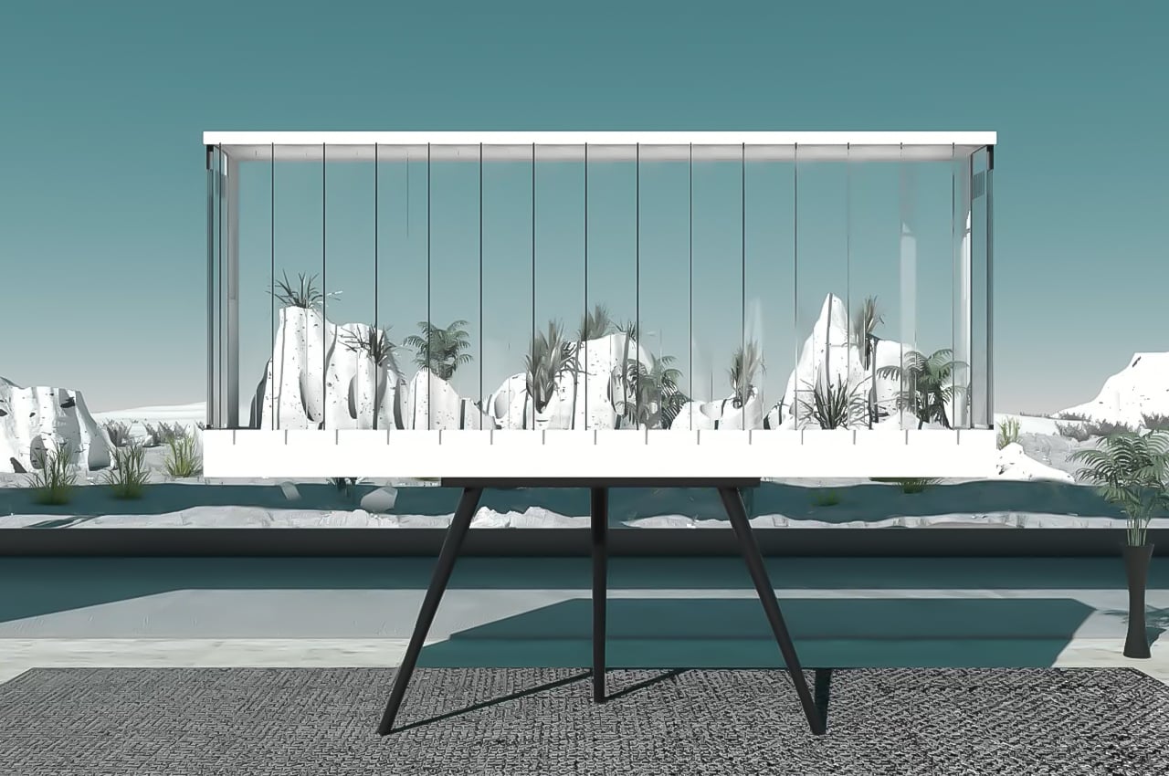
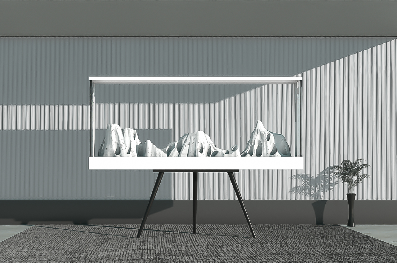
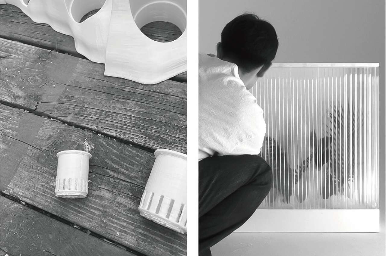
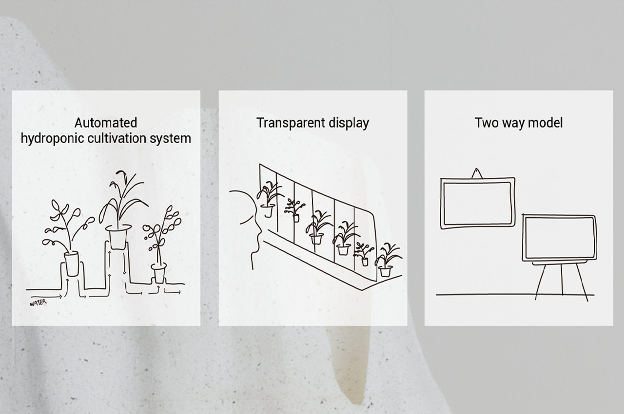
Designed to either stand alone or be mounted on an interior wall, Vista takes up around the same space as a large fish tank. Featuring a hydroponic gardening system, Vista’s grow tray mimics the terrain of a natural landscape to bring users closer to nature. Through an immersive structure and smart technology, Vista combines functionality with aesthetics to create a gardening experience.

Trading a cold structure for a design that appeals to the senses, Han notes, “It designed a new smart green appliance that allows you to feel nature and experience growing plants in natural scenery, not in such an artificial box. Vista is a smart green appliance that brings natural scenery into the product and provides a new experience that seems to be cultivated directly in nature.”

Measuring the size of a large fish tank, Vista is designed to be the centerpiece of any interior space. The entire hydroponic cultivation system is encased within a transparent, panoramic glass container that comes with its own array of smart features.

Equipped with GPS technology, the glass container reveals various pieces of daily information such as the weather, temperature, date, and time. Defined by a louver window system, Vista’s plants are also kept ventilated with plenty of fresh air.

Designer: Juhyuck Han


GIFS:

http://www.hongik-id-degreeshow.com/wp-content/uploads/kboard_attached/3/202110/6175210895c841213678.gif

http://www.hongik-id-degreeshow.com/wp-content/uploads/kboard_attached/3/202110/6175210895acd7313998.gif

The post This smart indoor garden uses hydroponics to cultivate plants in a growth tray that resembles natural outdoor landscapes! first appeared on Yanko Design.

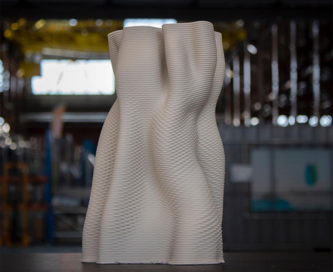
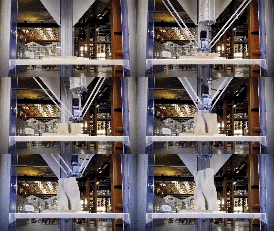
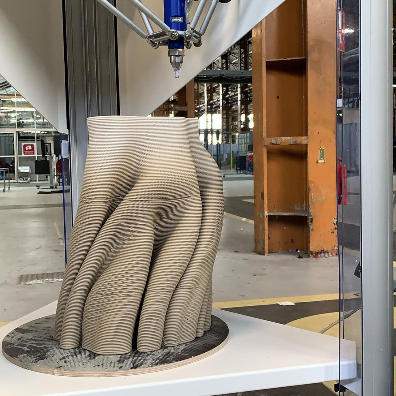
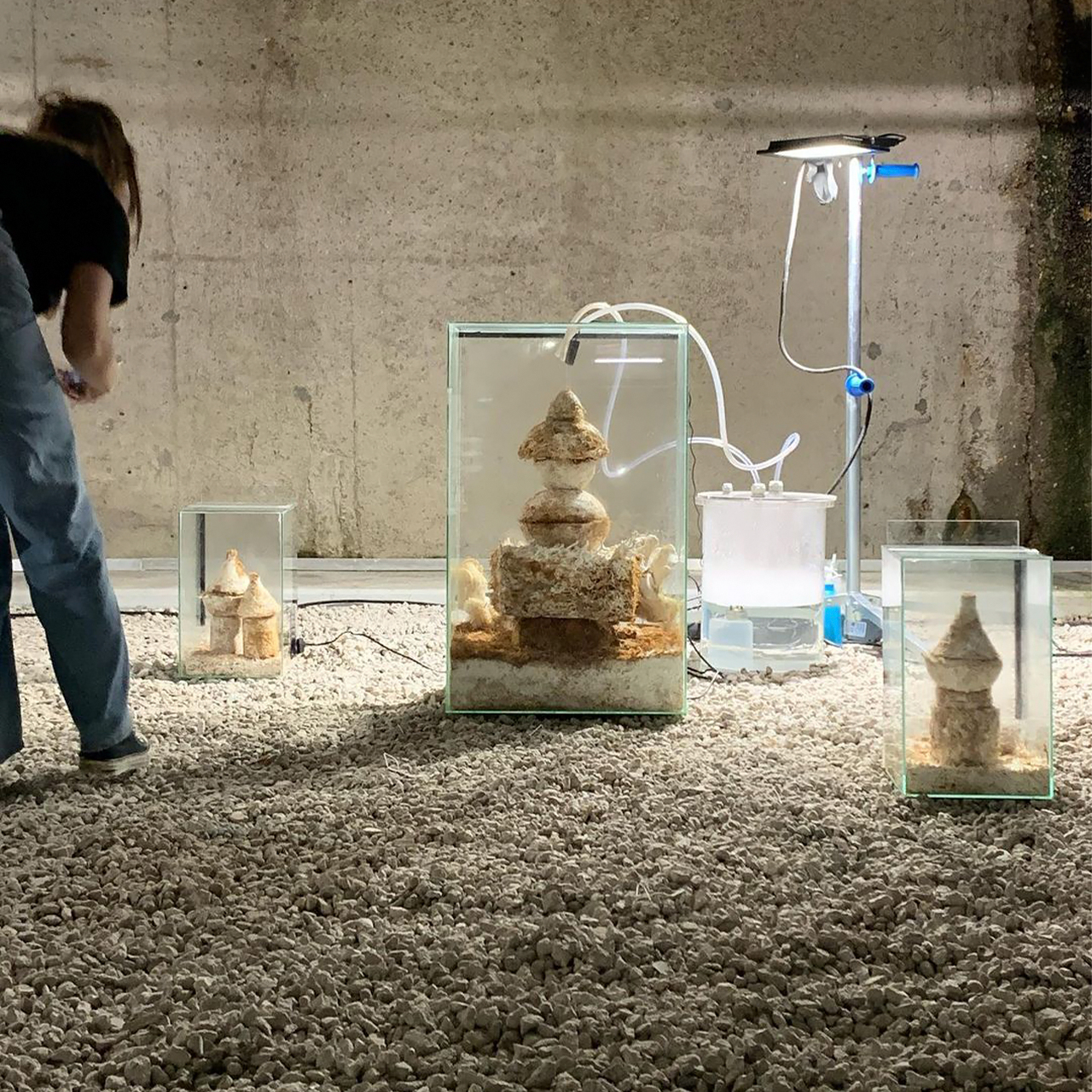
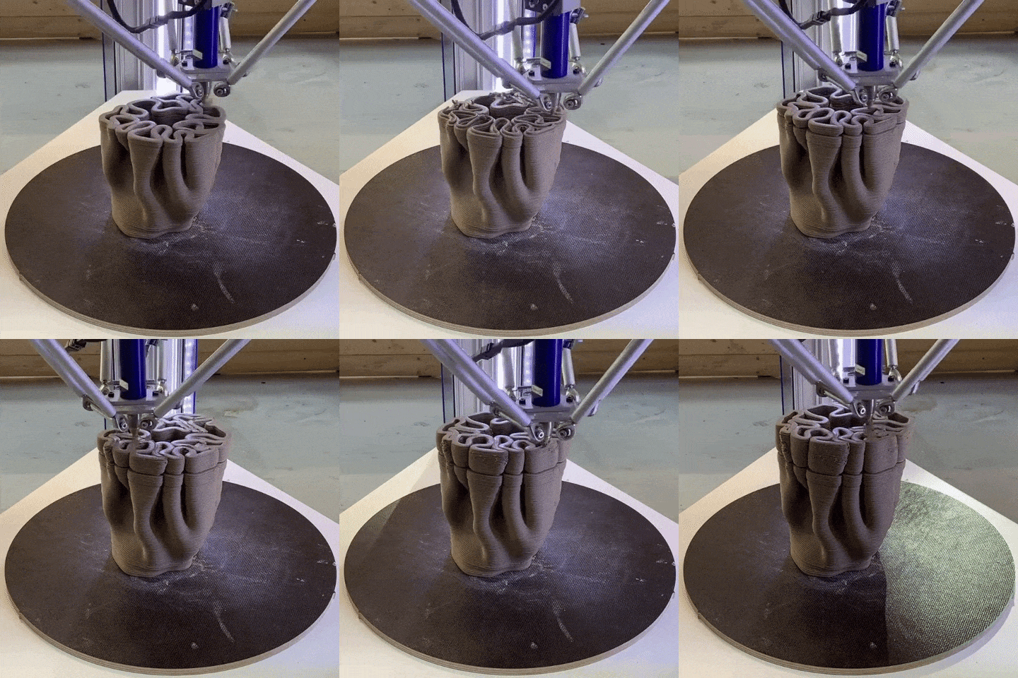
This 3D printed urban reef is constructed from mycelium to increase biodiversity in cities!

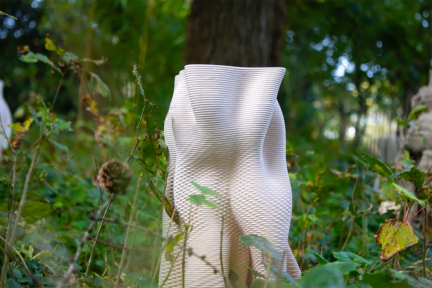
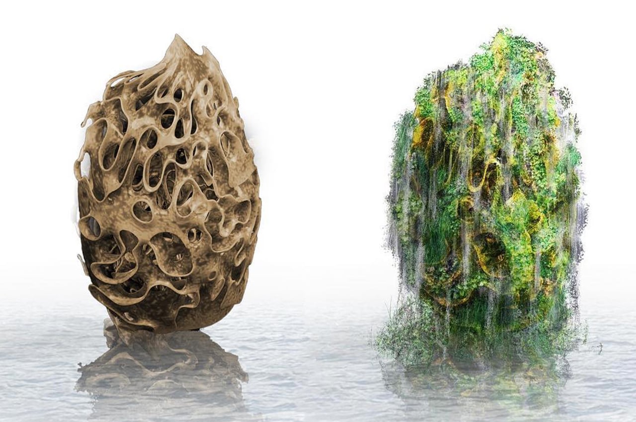
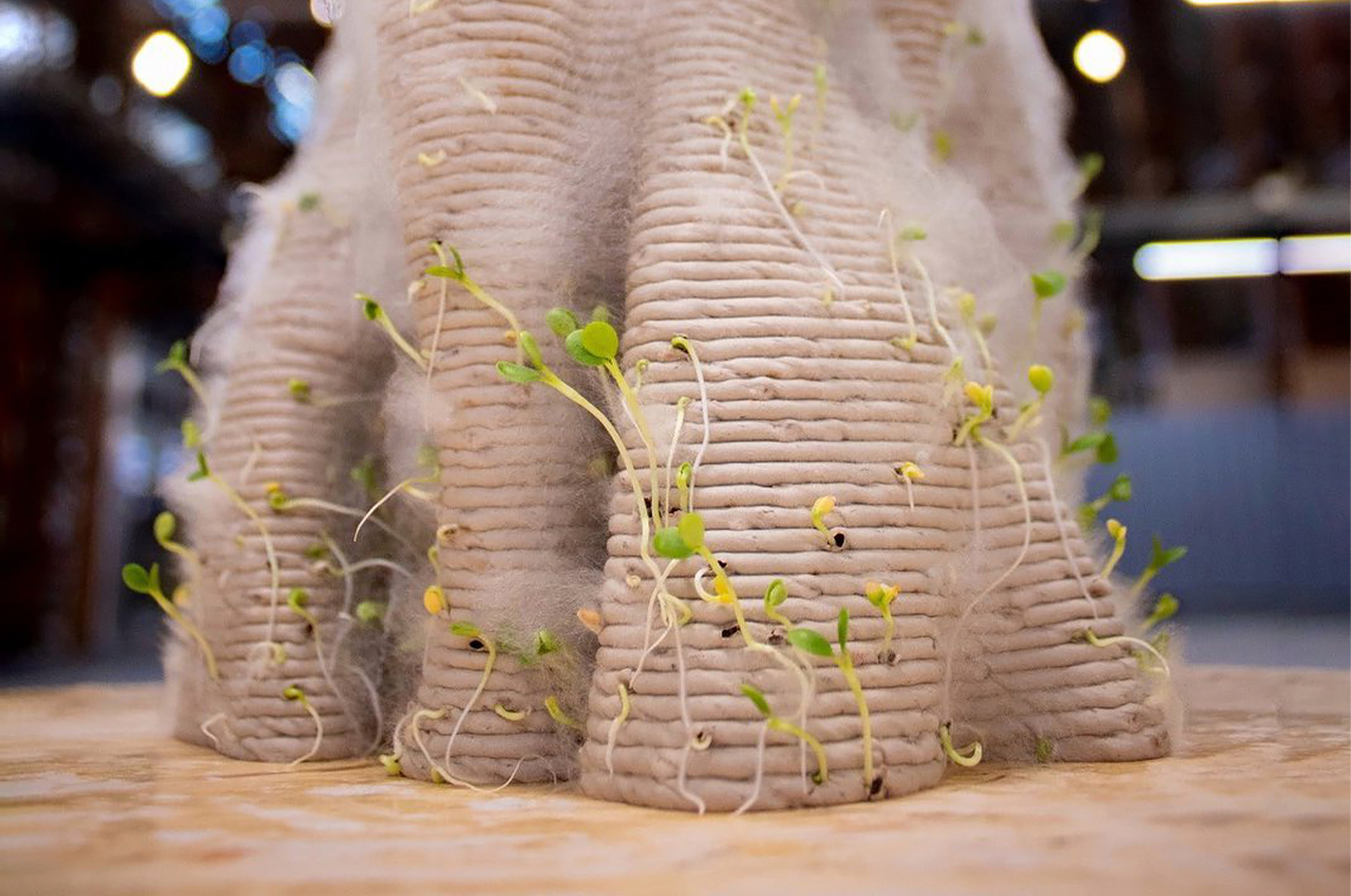
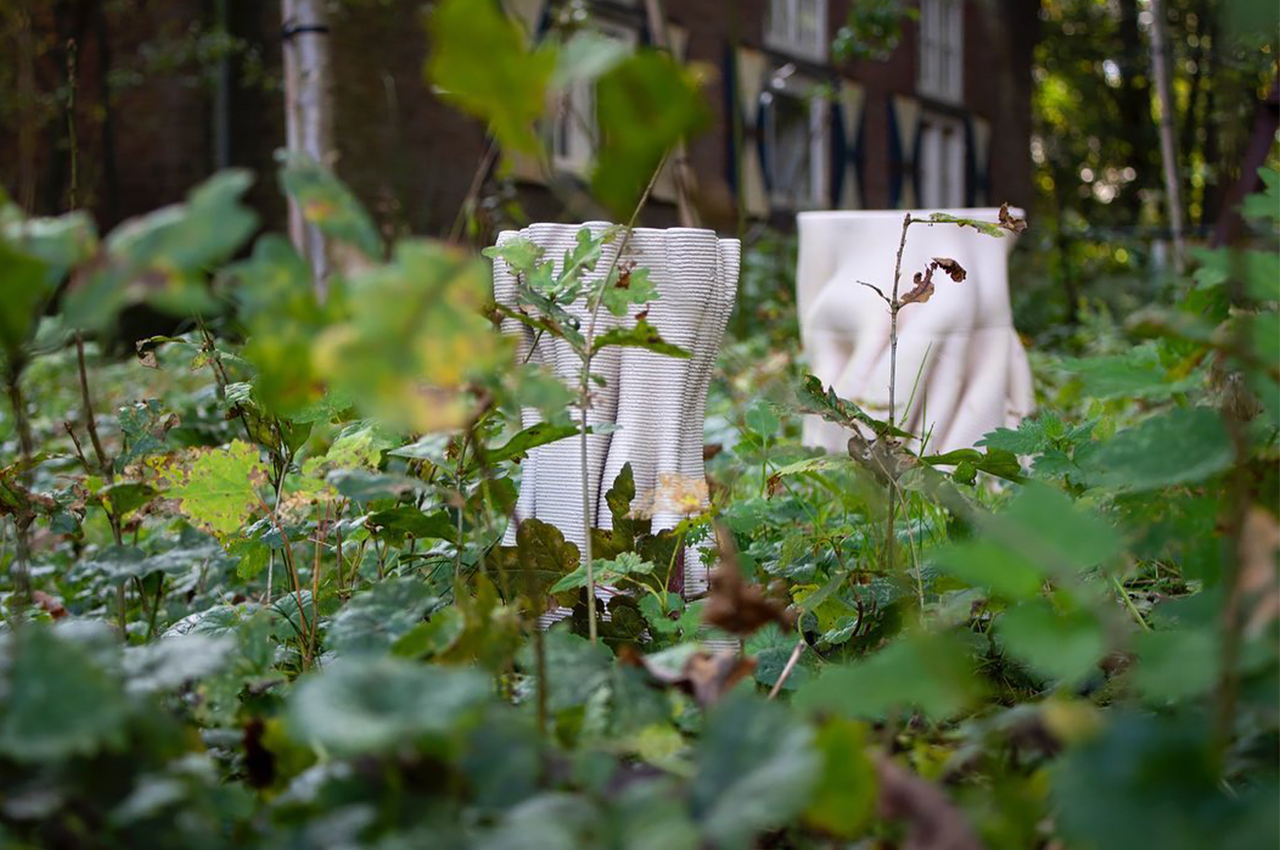
Mycelium is a natural material taking over the sustainable design world one industry at a time! A Netherlands-based company is hopping on that train – they are experimenting with mycelium and computational design to create a series of 3D-printed urban reefs that will stimulate water circularity and biodiversity. In simpler terms, your concrete jungle where dreams are made of will be more jungle and less concrete so more living organisms can thrive!

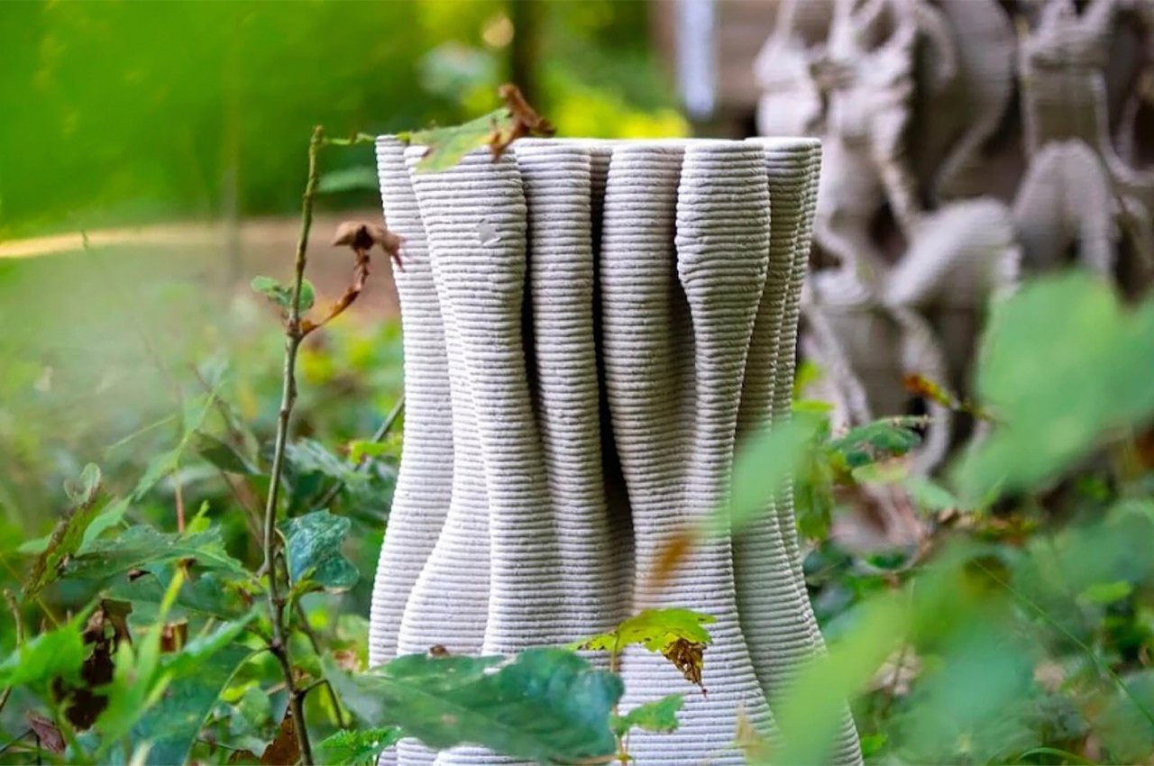
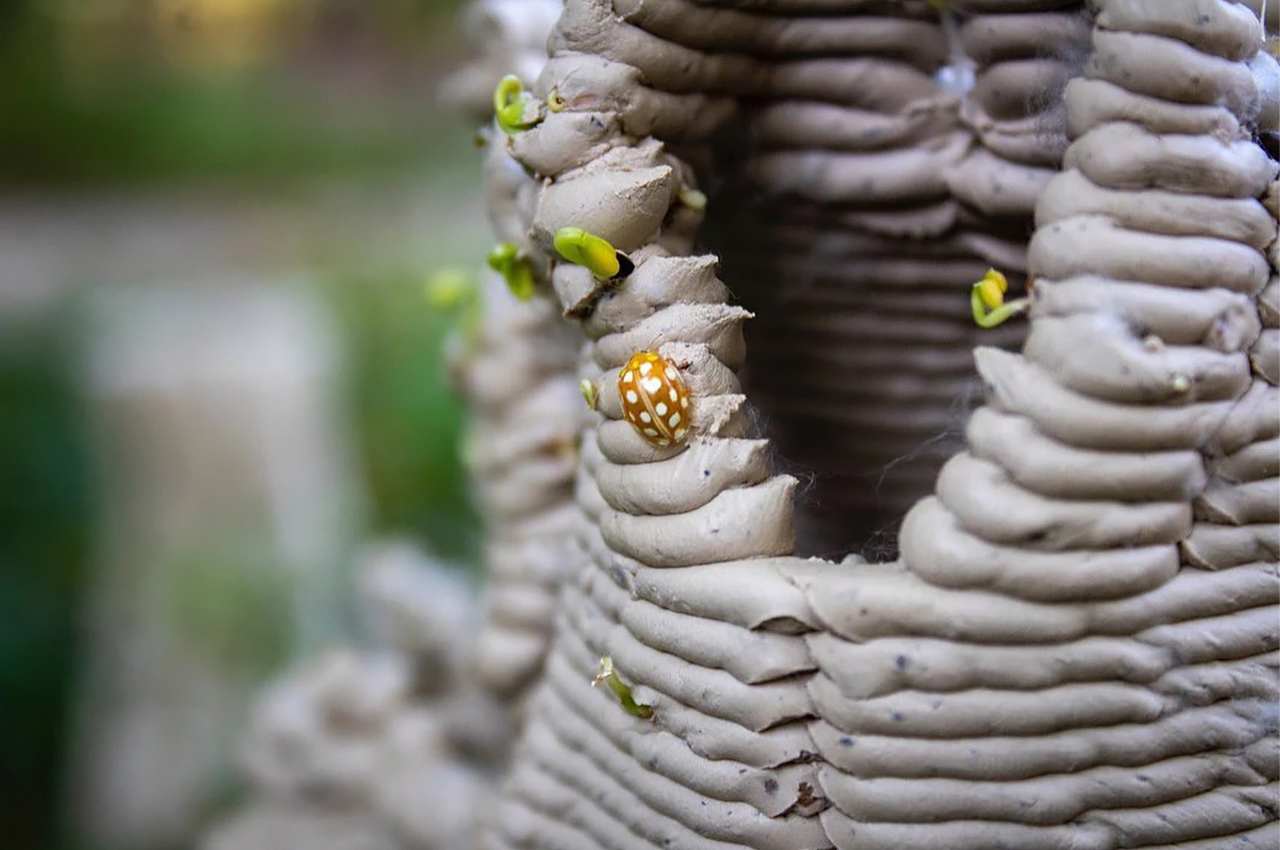
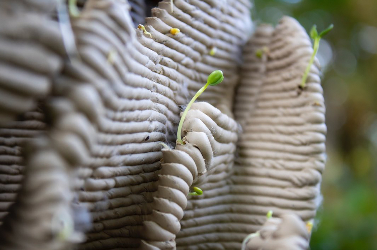
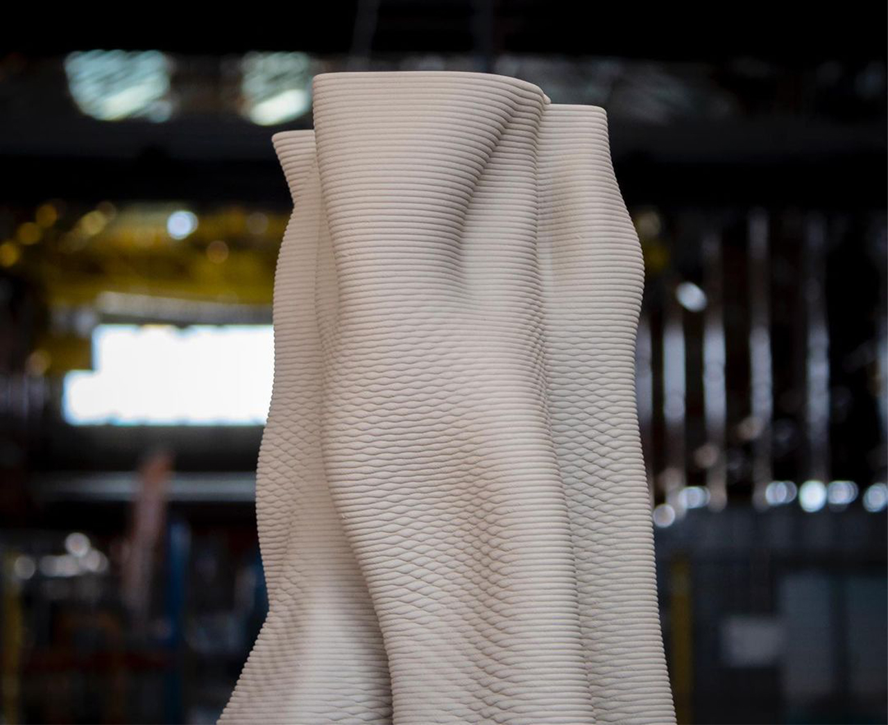
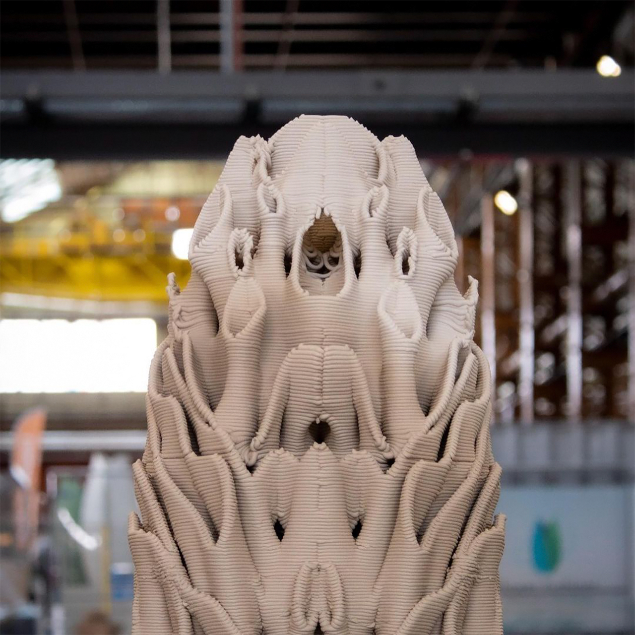
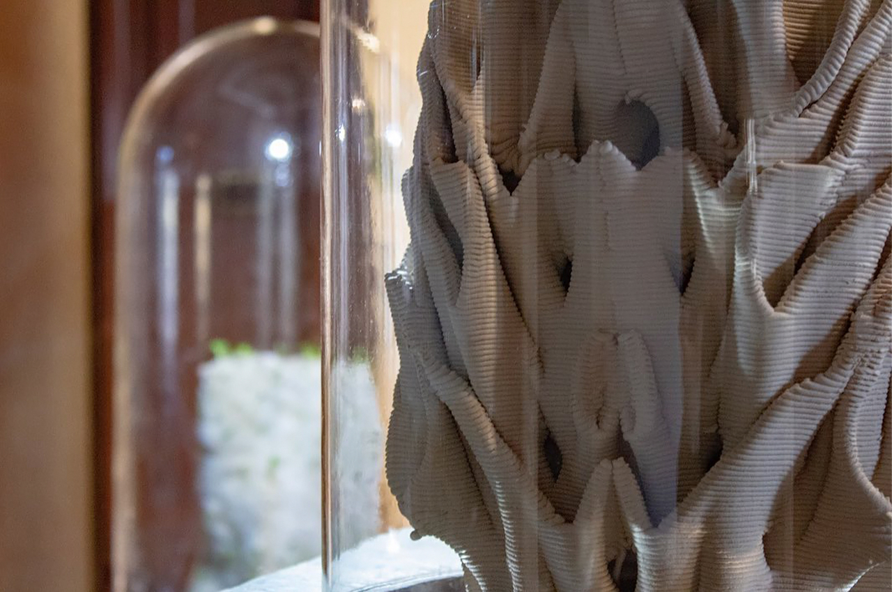
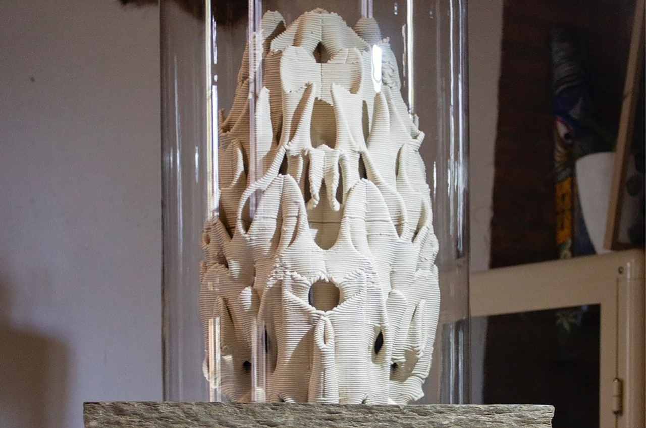
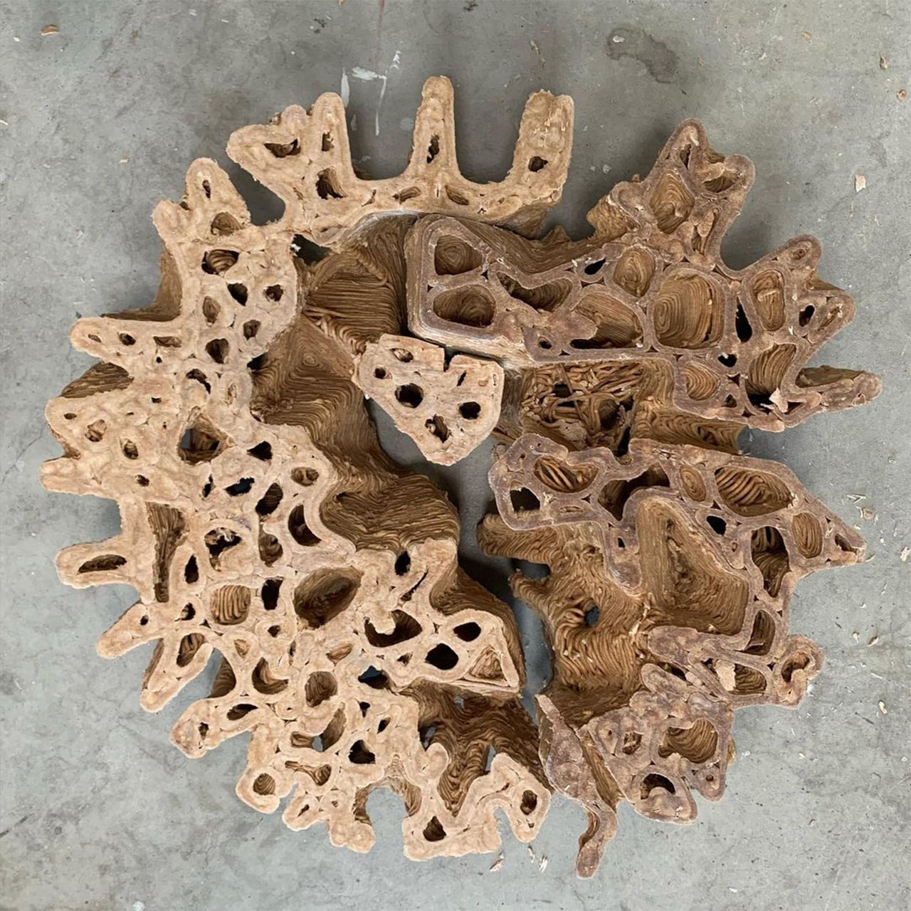
Dutch designer duo Pierre Oskam and Max Latour came up with this innovative solution to make cities more biodiverse. It involves using natural materials to create structural ecosystems that can be integrated within existing environmental elements (eg. fountains). A 3D printer is used to create complex geometrical designs with porous materials like ceramics and composites (made from coffee grounds and mycelium). The moisture in the air is able to pass through and create the perfect environment for various fungi to grow thus bringing the structures to life!

“The most feasible option we are working with is ceramics, but since baking it requires a lot of energy we are investigating more sustainable alternatives,” says Latour. The studio is also experimenting with materials made from coffee and algae. At present, the team has developed two concept products as a result of their research, first in the form of the “Rain Reef” rain collector with an undulating shape that increases the contact area of the water and the potential hatching surface for vegetation.

“It is 3D printed with a porous material (made from a mixture of seeds, coffee grounds and mycelium), which can get saturated with the collected rainwater, making it accessible to vegetation growing on the outside,” explains Latour. “The intention is to develop a printable material which is porous, durable, sustainable and bio-receptive.”

The second product is the “Zoo Reef”, which Urban Reef intends as a substitute for fountains in cities. “There is a lot of potential for biodiversity stimulation around urban fountains,” says Oskam. “We propose a complex labyrinth of spaces which are all interconnected. By differentiation in sizes, orientation regarding sun, wind and rain, varieties of microclimates would develop.”

“Rather than determining top-down which organisms should live where, a range of potential habitats is generated.” They might be early in the research and development phase but Latour and Oskam’s Urban Reef project could have real-world applicators in the future. As an idea, it’s not so dissimilar from a living wall, except in this case the choice of materials and the structural design promotes their integration within cities without human intervention.

urbanreef1

“At Urban Reef we consider the city as a potential habitat to organisms, not exclusively humans,” the duo explains. “We position ourselves as human within the natural environment deviating from the modernist view of the human transcending nature. From that perspective, we aim to gain a profound knowledge of natural processes to both integrate those in our design methods as well as design with ecologies in mind.”

Designer: Pierre Oskam and Max Latour

urbanreef2

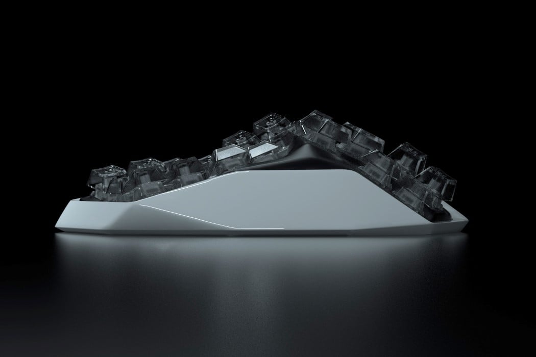
Inspired by Westworld, the Am Hatsu is the world’s first split keyboard with an organic metal body

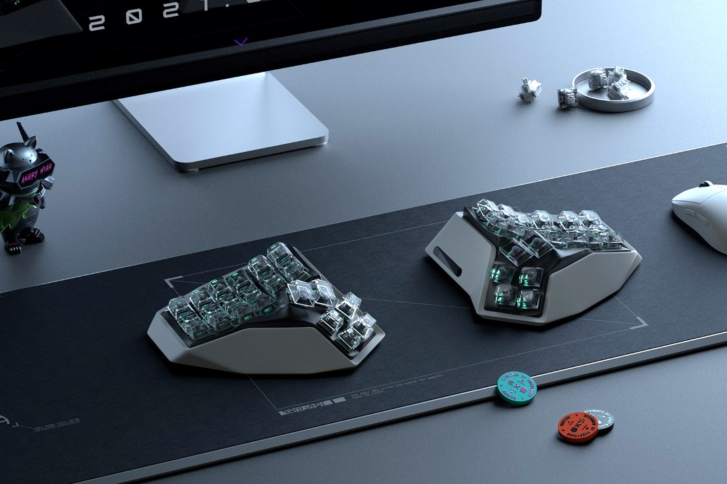
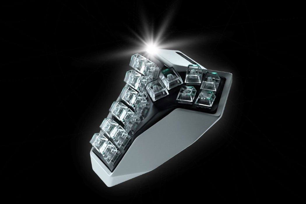
Look at the Am Hatsu keyboard and it instantly feels like it was fabricated by highly advanced robotic equipment. Part organic, part futuristic, the split keyboard was inspired by the sci-fi series Westworld. Its unique surface and key placement help relieve wrist pain while allowing you to sort of look like a cyborg as you browse the interwebs.

The Am Hatsu’s organically shaped metal surface is the result of 5-axis simultaneous CNC machining, an expensive fabrication technique that yields pretty remarkable results. The organic keyboard layout sits on a low-poly metal base, within which lies the keyboard’s internal hardware. The Am Hatsu runs on a low-frequency communication protocol that allows both keyboards to communicate with each other as well as your input device (laptop, desktop, tablet, etc) in real-time, ensuring that there’s absolutely zero lag between both keyboards while you type. “This ensures the best performance when it comes to power consumption, anti-interference ability, and latency”, says Angry Miao, the company behind Am Hatsu.

The keyboard was launched under Angry Miao’s “Make Art Not Tech” vision. It takes its inspiration from the intro sequence of HBO’s Westworld, where multiple specialized tissue-printing robots come together to build a living bionic man. The keyboard’s curved surface pays tribute to the sci-fi series while also aiming at enabling a much more comfortable typing experience by allowing your wrists to rest in their natural position. The unconventional 4×6 key layout also minimizes repeated movement of fingers, allowing you to type effortlessly.

The Am Hatsu is by no means your regular consumer-tech device. Its specialized manufacturing methods and state-of-the-art internals bring the keyboard’s price up to a mind-bending $1600 per unit. Early-bird purchasers will receive a special 20% discount by acquiring an NFT to authenticate their pre-order, although given how expensive it is to make one of these keyboards, your deposit is only eligible for a refund before July 29th – when production begins. The keyboard is limited to just 100 units in this initial run, so if you’ve got an arm and a leg to spare… although wait, you’ll need both arms to type!

Designer: Angry Miao

Colani would have loved this vertebrae-inspired chair

The Beel Chair’s unique biodynamic aesthetic literally takes inspiration from the part of your body that rests against it… the spine! Mimicking the shape of two vertebral bones, connected together by a spinal column, the Beel chair offers comfortable sitting and healthy posture, while being flexible, thanks to the backrest’s design.
Designed by Selami Gündüzeri, the Beel is reminiscent of the design aesthetic championed by German design stalwart Luigi Colani, who passed away at 91 today. Always one to shun the use of straight lines because everything about our world is dominated by curves, right from its shape to its orbit, to every creature within it, Colani was a strong proponent of embracing nature’s curves and of practicing organic design not just for visual fulfillment, but for ultimate ergonomic comfort too. Selami’s Beel chair is perhaps a perfect example of that philosophy.
The Beel Chair is a winner of the A’ Design Award for the year 2019.

Designer: Selami Gündüzeri