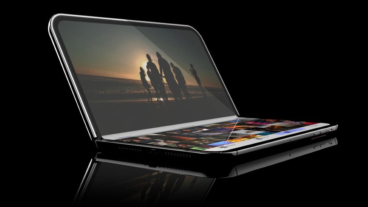
Apple Secures Patents for Future Foldable iPhone and iPad


Apple’s latest patent reveals a new hinge mechanism for foldable devices, marking what should be a big improvement in durability and user experience. By strategically positioning the rotational axes above the hinge, Apple effectively minimizes screen stress during folding. This smart design choice will combat premature wear—a longstanding challenge in foldable devices—but also extend the device’s operational lifespan. The inclusion of synchronization gear plates ensures that both halves of the hinge move in perfect harmony, eliminating the risk of uneven folding that can damage the screen and compromise the device’s stability.

Designer: Apple
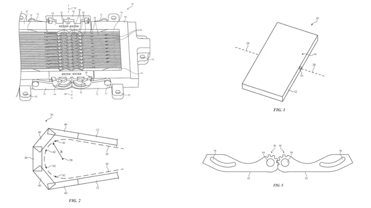
Image credit: USPTO

Additionally, Apple has innovated by introducing asymmetric friction clips within the hinge mechanism. These clips adjust the resistance based on whether the device is being opened or closed, increasing resistance when unfolding to prevent abrupt opening and decreasing it when folding to facilitate a smooth closure. This feature significantly enhances the tactile feedback during use, offering a seamless interaction that contributes to the overall mechanical integrity and user satisfaction.
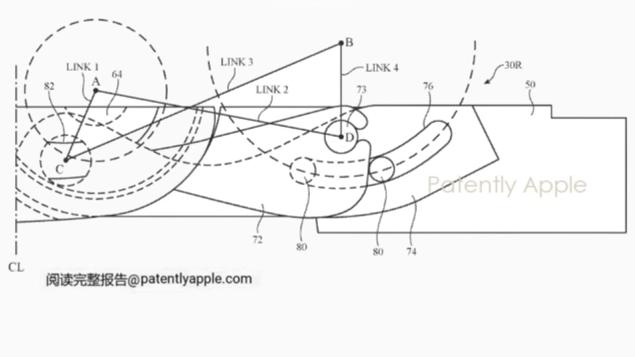
Image credit: patentlyapple.com

Looking ahead to the potential mass production of a hybrid foldable iPad-MacBook in 2027, as highlighted by Apple analyst Ming-Chi Kuo, it’s evident that these hinge innovations could play a crucial role. The synchronization gear plates and asymmetric friction clips are likely key features that enhance the durability and usability of this new device. This technology is expected to give Apple a competitive edge in the foldable device market, which I also imagine improves daily user interactions by making the device more reliable and easier to handle.
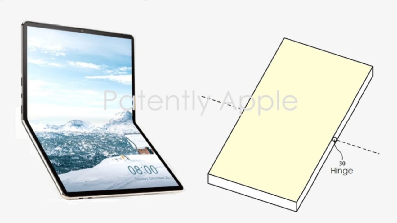
Image credit: patentlyapple.com

In comparing Apple’s hinge technology with competitors like Honor and Xiaomi, distinct differences emerge. Honor’s “Falcon Hinge,” used in their Magic series, offers robust support for multiple folding angles and aims for a sleek, gapless design that protects the screen while enhancing the device’s aesthetic appeal. Xiaomi, on the other hand, employs a “dual-hinge” design in devices like the Mi Mix Fold, which allows for complex folding actions such as inward and outward folds, providing users with exceptional flexibility. Both companies focus on structural integrity and adaptability but approach the hinge design from different angles, with Xiaomi also emphasizing precision manufacturing to maintain a slim profile without sacrificing durability.

Image Credit: Honor Magic v2 hinge

Apple’s approach, however, integrates advanced stress management techniques and user-centric features more assertively. Positioning the rotational axes above the hinge significantly reduces direct strain on the screen, enhancing the device’s longevity. Furthermore, the use of asymmetric friction clips provides nuanced control over the device’s folding mechanics, likely delivering a superior tactile experience when opening and closing the device compared to the more conventional mechanisms used by Honor and Xiaomi.

Image Credit: Xiaomi Mix Fold 3

Overall, Apple’s hinge technology showcases a minimalist and functional design in hopes of setting new standards for durability and user experience in the foldable device industry. This progressive approach highlights Apple’s dedication to innovation. It showcases their potential to shape future technology trends, possibly revolutionizing the design and usage of foldable devices across the industry and promoting their widespread adoption by consumers.
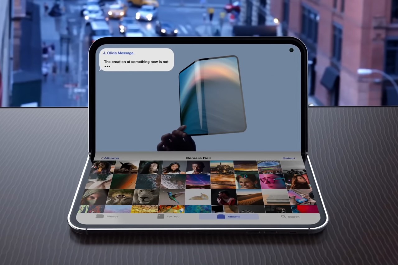
The next big Apple event, “Let Loose,” is scheduled for May 7th. This event is expected to focus on a new OLED iPad Pro, rather than showcasing any new foldable technology. However, Apple has additional events planned for the summer, including WWDC 2024 and possibly an iPhone event in September. It seems that we’ll still have to wait a while before seeing a foldable iPhone or other folding devices from Apple, even as the company is securing crucial patents in this area.

The post Apple Secures Patents for Future Foldable iPhone and iPad first appeared on Yanko Design.


Touchscreen iMac like the Microsoft Surface Studio hinted by Apple patent

Apple products have always been hailed by designers, and its computers have long been the tool of choice for many digital content creators, especially graphic artists. None of those computers, however, have ever sported a touchscreen, even one that supports the Apple Pencil, an irony that isn’t lost on many digital artists. This means they have to settle for external drawing tools or, for some more daring users, mods that combine MacBook internal with a drawing tablet. A Mac that can instantly be used as a digital canvas is definitely going to be an artist’s dream, and based on a patent that Apple has filed, that dream could still become a reality, and it already has the perfect design for that.

Designer: Apple

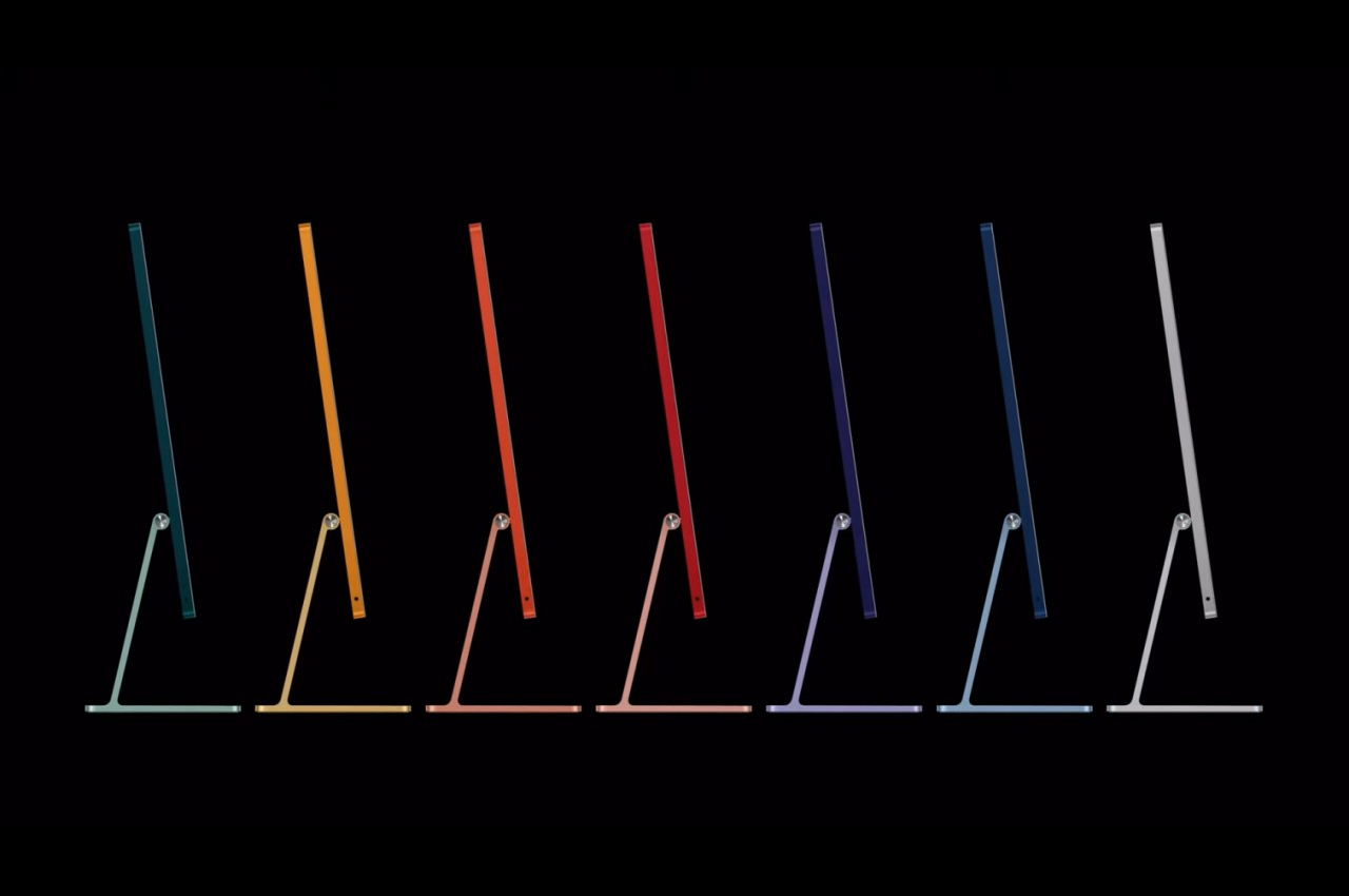
Apple M3 iMac

Apple might have plenty of reasons not to put touch screens on iMacs and MacBooks, but those reasons are starting to drop one by one. It might not want to muddle the lines that separate its Macs and iPads, for example, but you can already run touch-based iOS apps on Macs for years now. And it’s not like it’s lacking the technology to make it all possible, as proven by the highly successful iPad Pro and Apple Pencil.

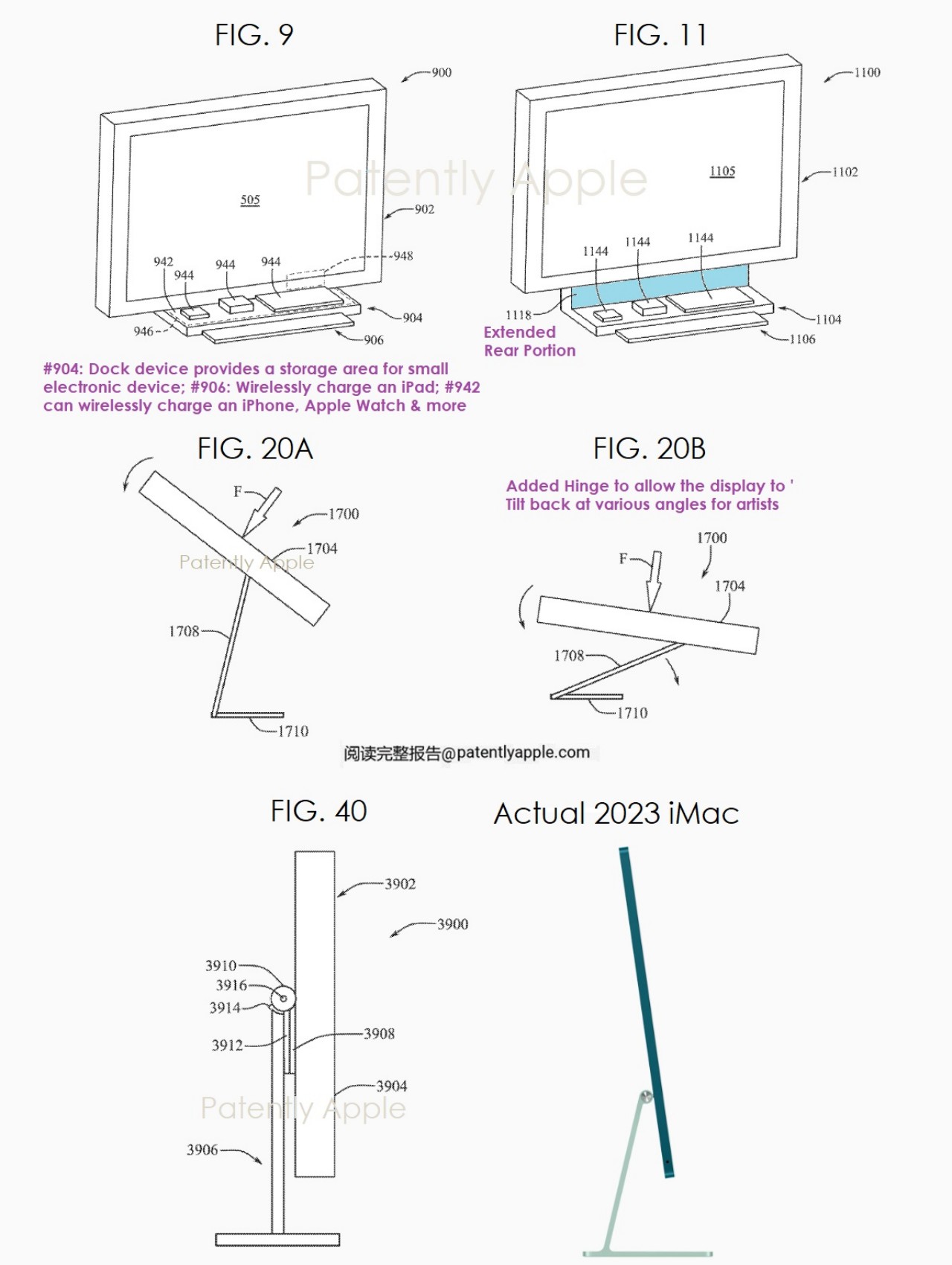
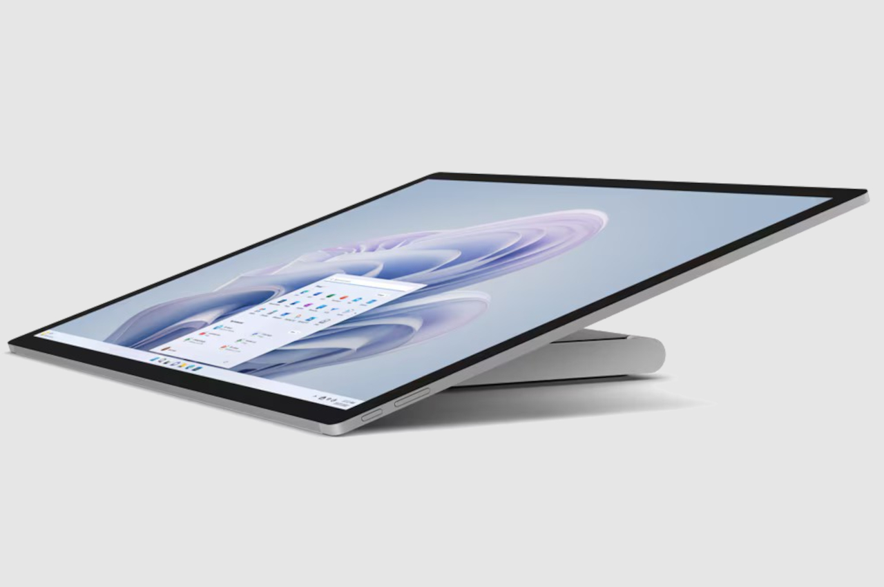
A patent unearthed by Patently Apple reveals that the company has indeed, been toying around with that idea, though it’s not exactly surprising given how many ideas tech companies patent all the time. Admittedly, the patent’s focus is less on the touch screen itself but more on the stand and hinge mechanism that would let you tilt and even pull the whole iMac down to the desk’s surface, making it more comfortable for artists to draw on. It’s an instant display tablet without having to buy an expensive Wacom or switch to a different technology from the one you might already be familiar with.

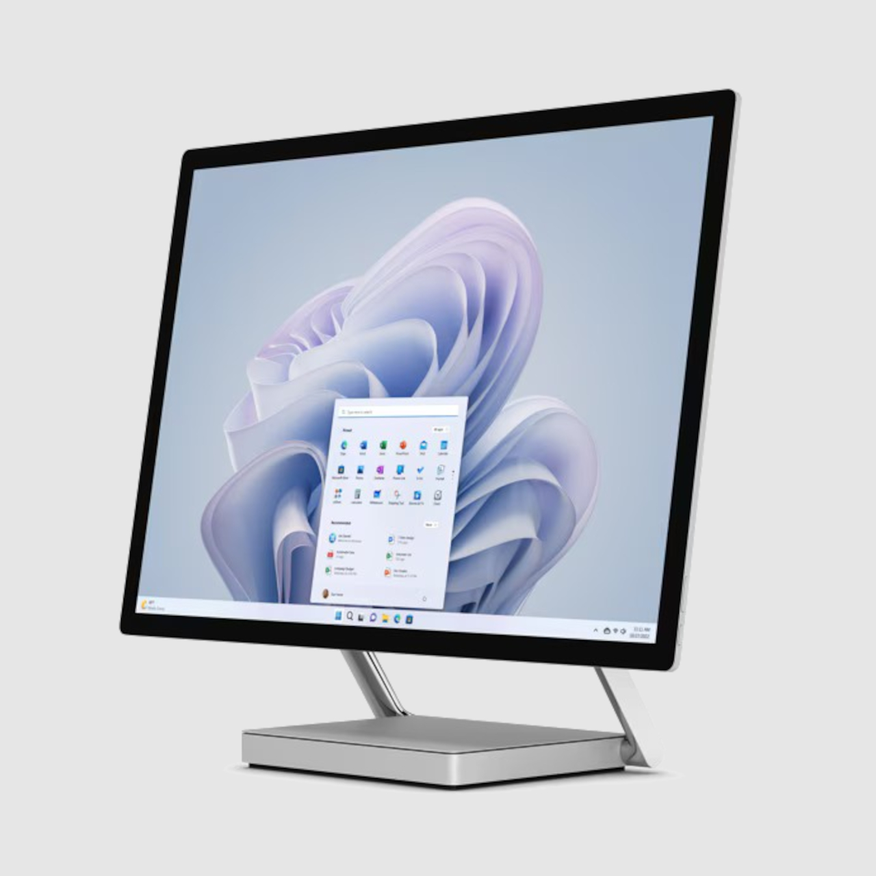
As weird as that idea might sound, it has actually already been done before and with surprising success. The Microsoft Surface Studio pictured at the top is one of the company’s unexpected hardware champions, quickly endearing itself to content creators. It is almost exactly what Apple’s patent describes, an all-in-one computer with a stand and hinge that lets you tilt and turn it whichever way you need to, and it comes with a touch screen, too!

Microsoft Surface Studio

It’s not hard to imagine how such a feature could be a game changer for artists on Macs, making their workflows more seamless. Of course, it’s far too premature to get excited over this patent, because tech companies also have a tendency not to implement even a fraction of the patents they hold. And given Microsoft already has an implementation of this design, it might still come down to a legal battle if Apple does decide to push through with a touchscreen iMac since it filed the patent years before the Surface Studio came out.

The post Touchscreen iMac like the Microsoft Surface Studio hinted by Apple patent first appeared on Yanko Design.

Wider, more ergonomic Samsung foldable phone might be in the works

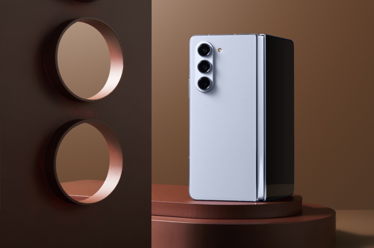
Samsung might be one of the pioneers of the whole foldable phone craze, but the disadvantage of being the first is that you risk getting things wrong the first time around. In contrast, hindsight is 20/20, as they say, and many of its competitors have used that advantage to catch up and even overtake Samsung at its own game. Of course, the tech giant isn’t content to just sit around while others outrun it, and it has been catching up with “innovations” like a hinge that lets the phone fold flat. Now it seems that Samsung will be catching up in another aspect, with a Galaxy Z Fold that’s a little bit wider when folded and, therefore, easier to use as a regular phone.

Designer: Samsung (via Pigtou and David Kowalski/xleaks7)

To be fair, Samsung was sailing on uncharted waters, so it was bound to miss a few marks. For its inaugural foldable phone, Samsung aimed for a tablet that was like a mini iPad mini or, closer to home, a smaller Galaxy Tab A, which meant it adopted a vertical or portrait format when unfolded. That meant it would have an extremely narrow phone when folded, which was heavily criticized for being awkward to hold and nearly unusable as a regular “candy bar” smartphone.

In contrast, foldable phones like the OPPO Find N and the Google Pixel Fold aimed for a more “traditional” horizontal or landscape tablet design, which had a few direct benefits in terms of consuming content like videos or even books. More importantly, however, it also meant that the folded form of the phone more closely resembles regular smartphones with a wider and sometimes shorter design. In over five generations, Samsung has never changed its design on that front, but that might not be the case with the Galaxy Z Fold 6 or later models.

OPPO Find N3

OPPO Find N2

Vivo X Fold 2

Google Pixel Fold

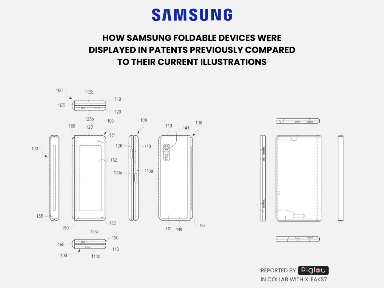
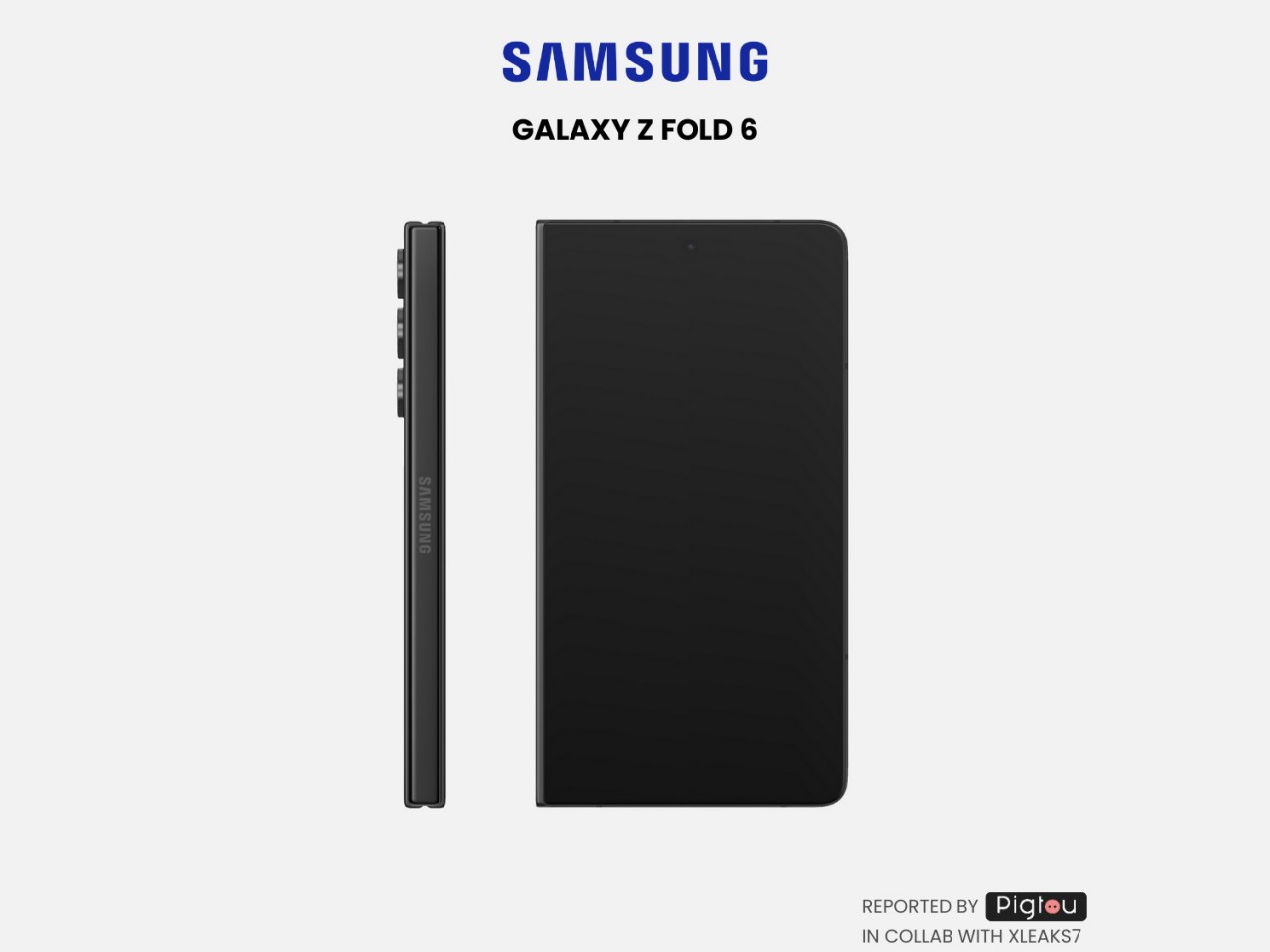
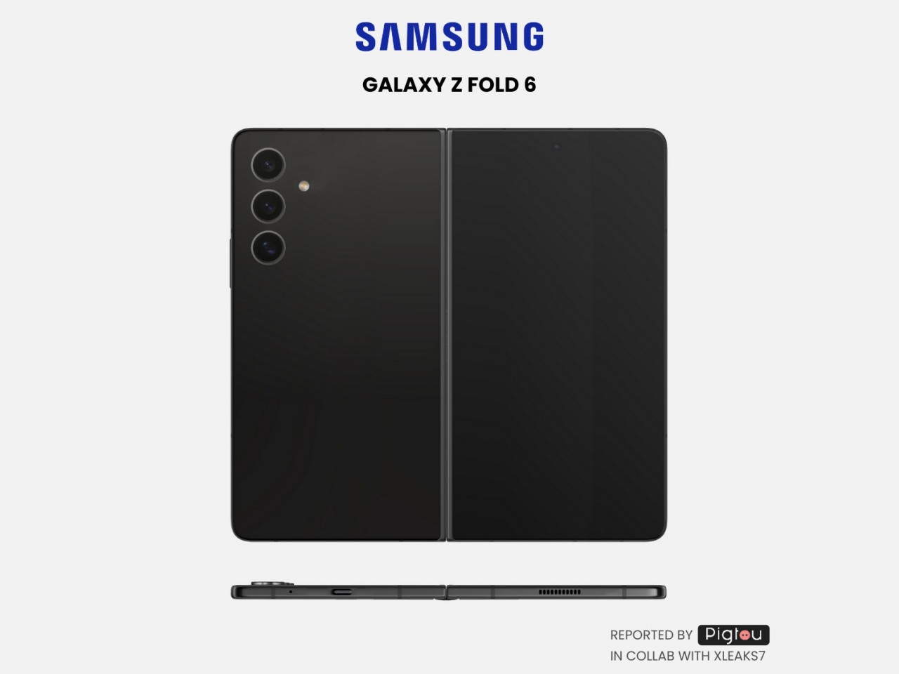
A recent patent filed by Samsung reveals a foldable design that is significantly different from its status quo in more ways than one. First, it is noticeably wider when folded, giving it a shape that will feel more natural to use compared to the recent crop of Galaxy Z Fold models. Additionally, it’s also significantly thinner, both folded and opened, which would go a long way in increasing the usability of an otherwise heavy and bulky device. In other words, it would be the foldable that Samsung should have launched in the first place if it had the benefit of hindsight five years ago.

Of course, a patent doesn’t immediately mean it will be implemented, whether in the Galaxy Z Fold 6 or future incarnations. It is at least proof that Samsung is aware of the shortcomings of its current design and is taking steps to correct its course. It would definitely be grand if it could launch such a sleek foldable this year, but such a thin design would also go against calls for bigger batteries or a built-in S Pen. For now, other brands still have an advantage over Samsung in some aspects, including and especially the price of such a premium piece of technology.

The post Wider, more ergonomic Samsung foldable phone might be in the works first appeared on Yanko Design.

Leaked Apple Patent hints that the next-gen Pencil will sport a rotating element

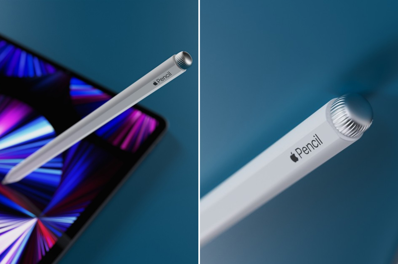
Steve Jobs openly despised and ridiculed the styluses that were the mainstays of pocket PCs and Palm devices that predated smartphones, but more than a decade later, Apple would embrace the stylus and make it its own. Granted, the styluses of Jobs’ era were nothing more than glorified sticks to poke at tiny screens, providing no additional benefit to the user experience. The Apple Pencil was, of course, anything but simple, and it has succeeded and thrived in a market dominated by long-time player Wacom. Of course, there are really no other options when working with an iPad, but Apple’s premium tablets probably wouldn’t have enjoyed as much success if the Apple Pencil didn’t exist. Of course, the creativity tool is hardly perfect, and this concept based on a newly awarded patent brings a touch of style to a more powerful Apple Pencil of the future.

Designer: Sarang Sheth

The first Apple Pencil was a minimalist’s dream, a simple, nondescript white cylinder that opened the iPad Pro to whole new worlds of creativity. There was, of course, plenty of room for improvement and innovation, and the second-generation Apple Pencil brought a faceted barrel for a better grip, as well as a touch-sensitive area you can double tap to trigger some function inside an app. While it was a significant step up from the first-gen Pencil, it was still leagues behind something like a Wacom pen, often regarded as the gold standard when it comes to styluses.

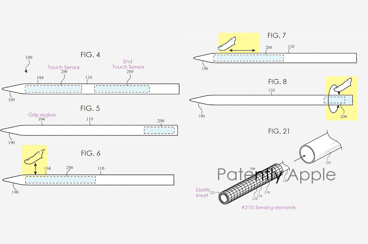
Apple is naturally aware of the limitations of its own stylus, but it is also aware of how the Pencil’s minimalist design played a big role in its favorable reception. Simply adding buttons would have solved one problem at the expense of a well-loved trait, so that was definitely a no-go. A newly awarded patent (reported by Patently Apple), however, reveals one idea that the Cupertino-based company has played with, one that could hit two birds with one stone.

In a nutshell, it extends the second-gen Apple Pencil to include another touch-sensitive area, one near the middle of the stylus, to expand the number of gestures that people can use. For example, rather than just double-tapping the area, one can also slide their finger on the touch-sensitive surface. This gesture can be mapped to some action, such as changing the size of a brush or scrubbing the timeline of a video.

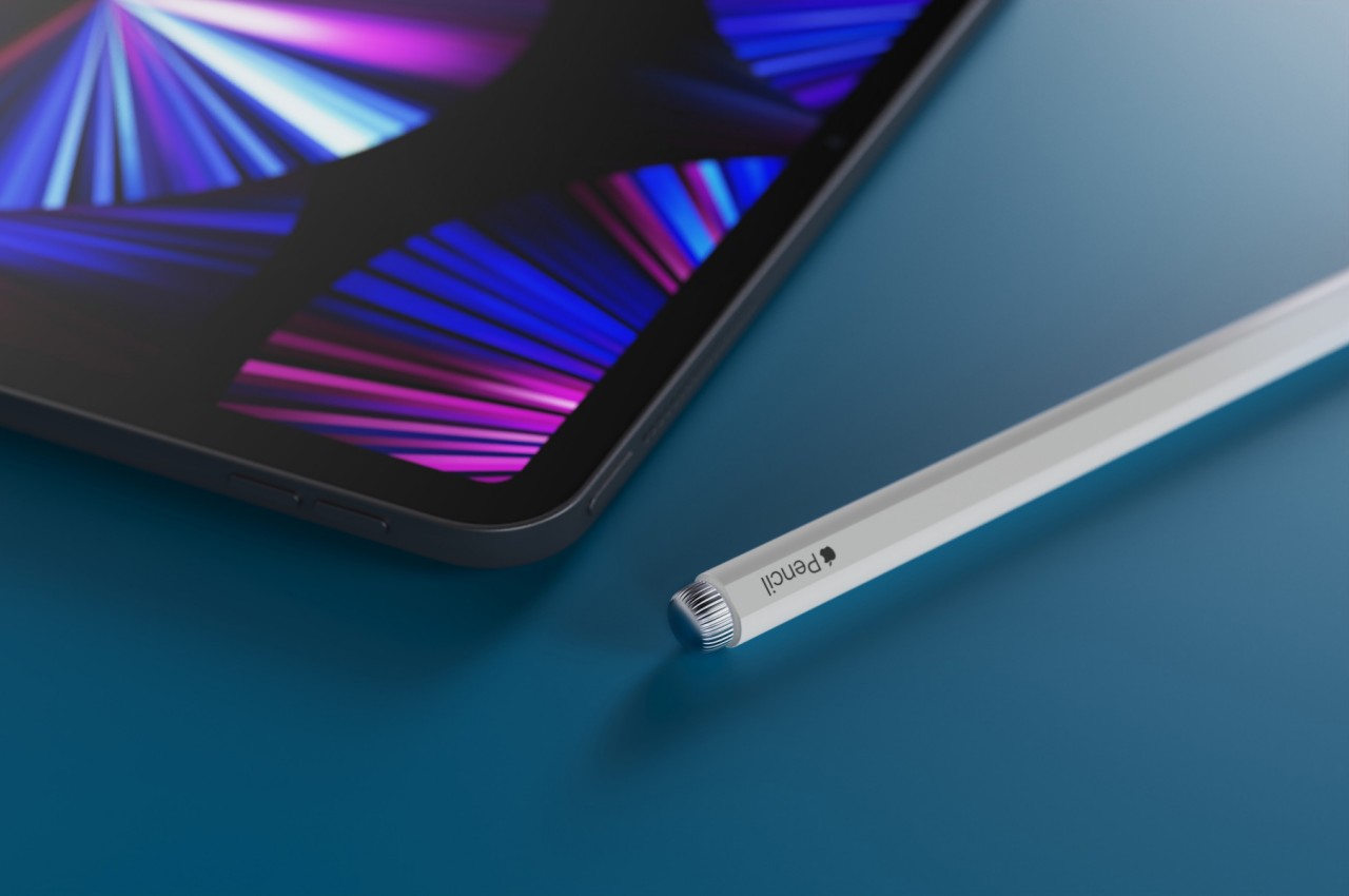
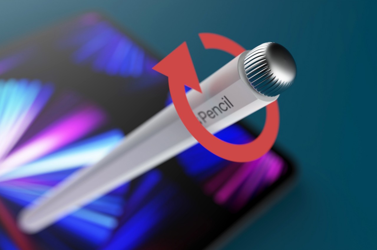
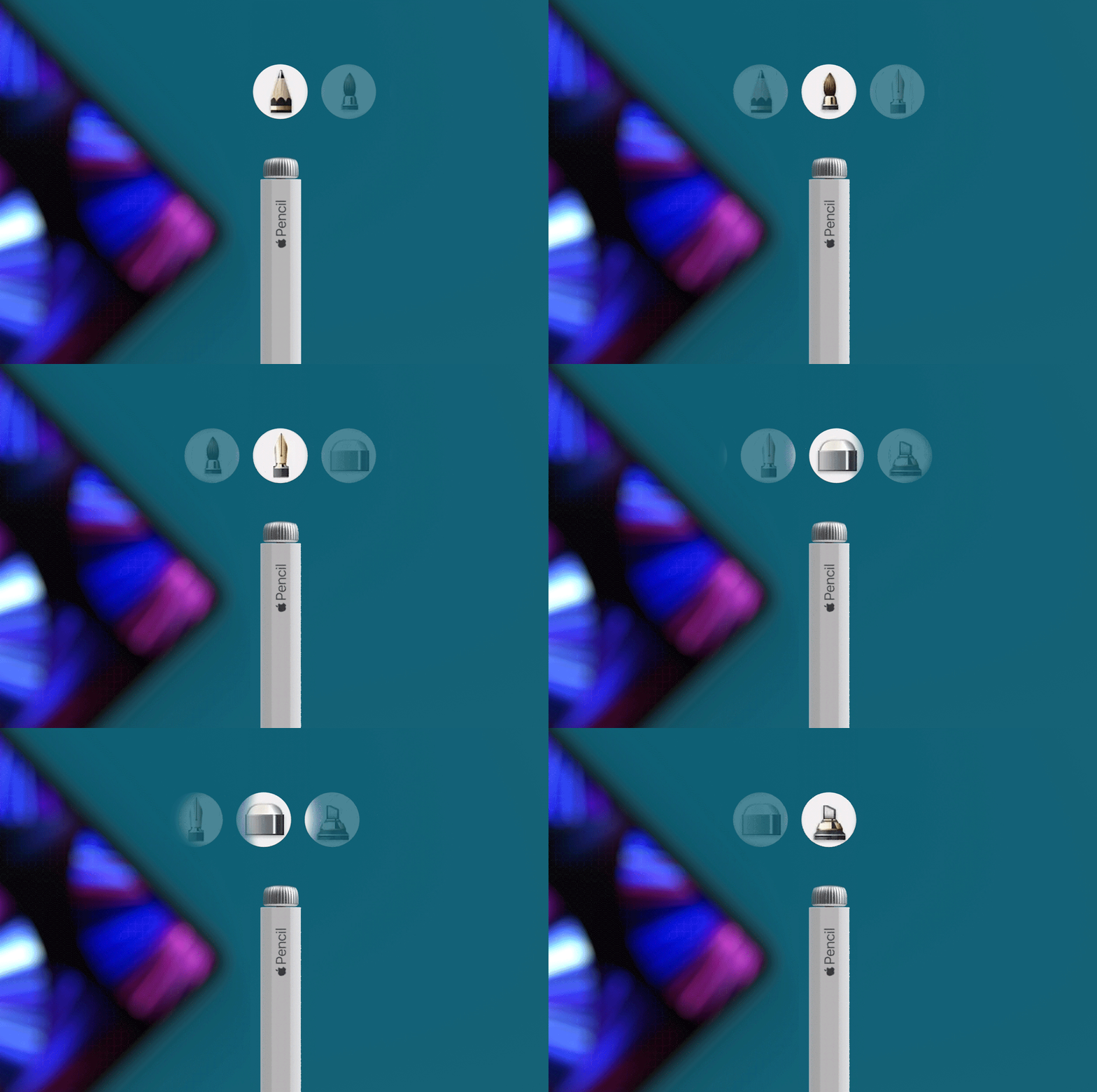
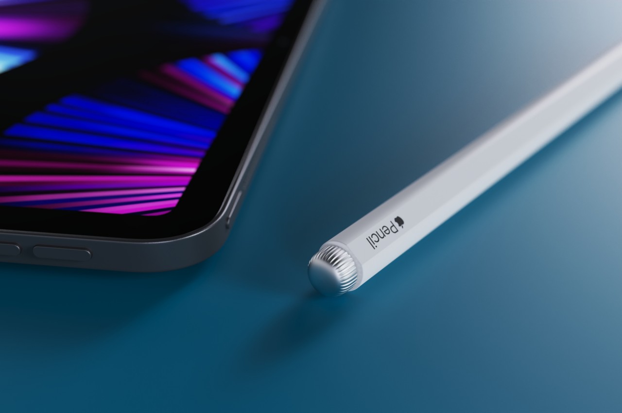
The patent also mentions the possibility of a twisting motion for the Pencil, one that could be tied to a motion sensor inside the barrel. Rather than complicating the internals of the Apple Pencil, however, this concept design opts for a more direct approach that also turns out to be more elegant. It adds a knob on the top end of the Pencil with a design similar to the Apple Watch’s crown. The control mechanism is simple, intuitive, tactile, and stylish. It is unambiguous in its function, requiring no additional training or mental shift to use.

Admittedly, this design requires the use of the other hand to turn that knob, but it also means that there will be no accidental activation or triggers just because you have a fidgety hand. It breaks away from the Apple Pencil’s unibody design and minimalist appearance, but it also adds an embellishment that is still in line with Apple’s aesthetics. Whether Apple implements even the original design laid out in the patent is still a matter of conjecture, but it hopefully has an upgrade ready for the Apple Pencil ready for artists, designers, and creatives soon.

The post Leaked Apple Patent hints that the next-gen Pencil will sport a rotating element first appeared on Yanko Design.
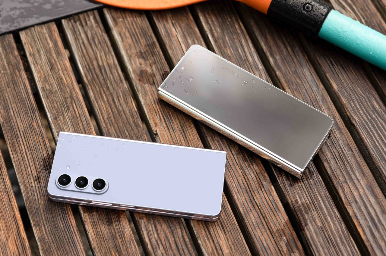
Toyota Patents Dog Walking Robot That Can Pick Up After Your Pet

Because picking up poop is one of the least desirable aspects of dog walking, Toyota recently applied for patents related to a dog-walking robot that can even clean up after a dog takes care of its business. The future, ladies and gentlemen! It finally doesn’t involve me standing around with a plastic bag on my hand, waiting to pick up a turd.

The “guidance vehicle” features a moving platform that an owner can ride on, which moves along a pre-programmed route, constantly monitoring to ensure it maintains a safe distance from the dog. And when your dog does pee, it sprays a jet of water to help dilute the urine, so it doesn’t kill the grass. And when it poops? It uses a robotic arm to pick up the nuggets, so your neighbors don’t yell at you and/or become passive-aggressive.

Will Toyota’s dog walking robot ever see actual production? That’s debatable, although stranger things have happened, including Toyota applying for dog-walking robot patents in the first place. But if it ever does see the light of day, they better call it the Pet Prius.

[via Autoblog]

Samsung foldable phone concept seems to be inspired by Tetris

Flexible displays open up a world of possibilities, though some of them might make less sense than others.

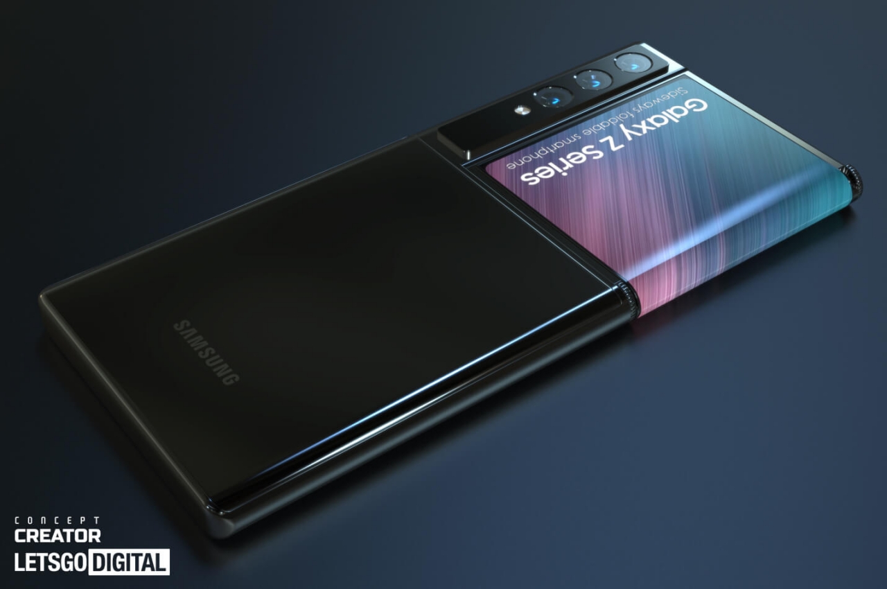
Samsung is probably regarded as a king of foldable phones, though its dominance is being challenged a bit by an upstart like OPPO. It still has a wide lead and has plenty of resources to through at R&D. For more than a decade, the company has been dreaming up the different ways foldable devices can change and improve our lives. Some of those dreams do end up becoming actual products, but many remain within the realm of ideas formalized as patent filings. One such patent involves a phone with a flap, which is probably the most accurate way to describe this concept that both makes sense and doesn’t at the same time.

Designer: Jermaine Smit (Concept Creator)

The current breed of foldable phones uses screens that fold right in the middle, whether vertically or horizontally, inside or out. That’s not the only way to fold, of course, but companies are limited by current manufacturing technologies and materials. In the world of patents, however, it’s almost a free for all affair, as long as you can get the design or idea approved first.

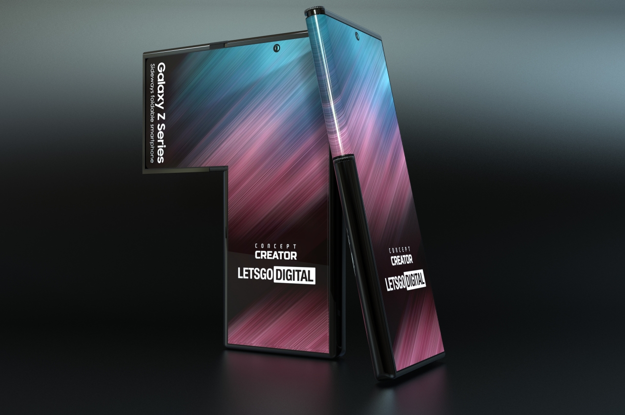
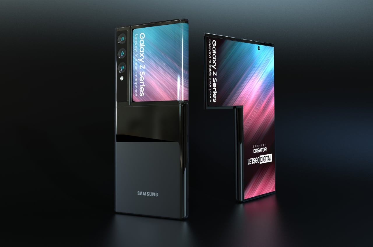
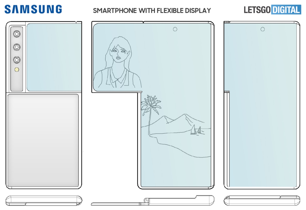
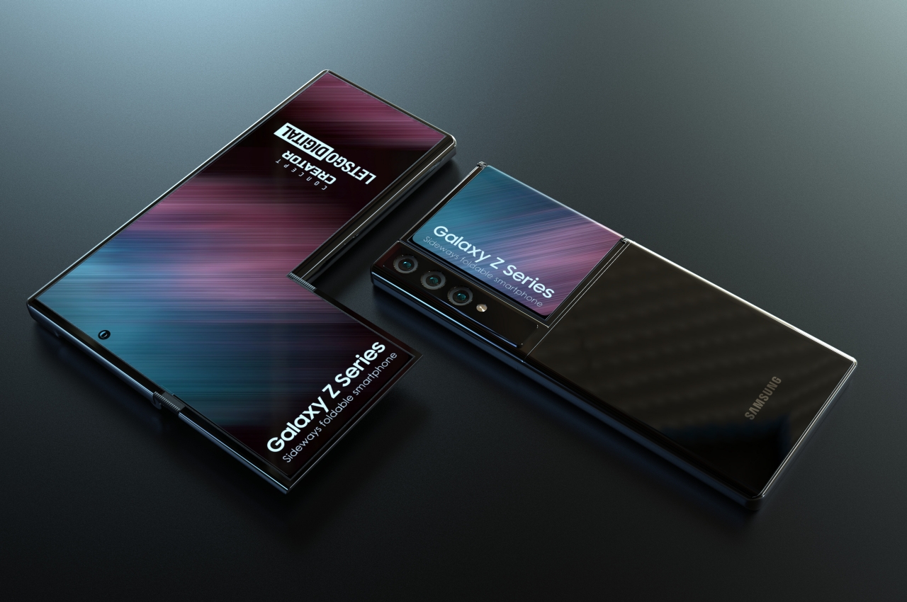
With very few constraints, Samsung envisioned a phone that, when laid out unfolded, resembles a shorter version of the L-shaped Tetris block. The top half of the screen extends to the left, and that extension folds back like a flap, with the folded screen facing the same way as the cameras. This transforms the phone into a more regular shape, like the I-block of the same game.

The patent reported by LetsGoDigital almost has an uncanny resemblance to one of LG’s weirdest phones, the LG Wing and its swiveling screen. That existing phone forms a T-shape, though, again like a Tetris block, with a smaller square screen that acts as a secondary display. Samsung’s idea is almost similar but with one extra trick that LG couldn’t pull off.

That flap seems to be functional even when folded, which makes it possible to display things like notifications on the backside of the phone. It can even be used as a viewfinder, allowing the owner to take selfies with the more powerful main cameras. The curved part of the screen at the edge can also be used as a display for something like the date, battery status, and maybe even a ticker for notifications.

When unfolded, that extra screen could display a different app or extended controls for the same app. Conversely, you can use the top portion to watch a video in full, leaving the bottom half of the screen for typing or other things. Unfortunately, the LG Wing proved that a successful implementation relies heavily on software as much as hardware, and not even Samsung, with its fancier Android skin, is there yet. Then again, this is just a patent after all, and it’s simply an act of calling dibs on an idea, whether or not Samsung ends up implementing something as odd as this.

The post Samsung foldable phone concept seems to be inspired by Tetris first appeared on Yanko Design.

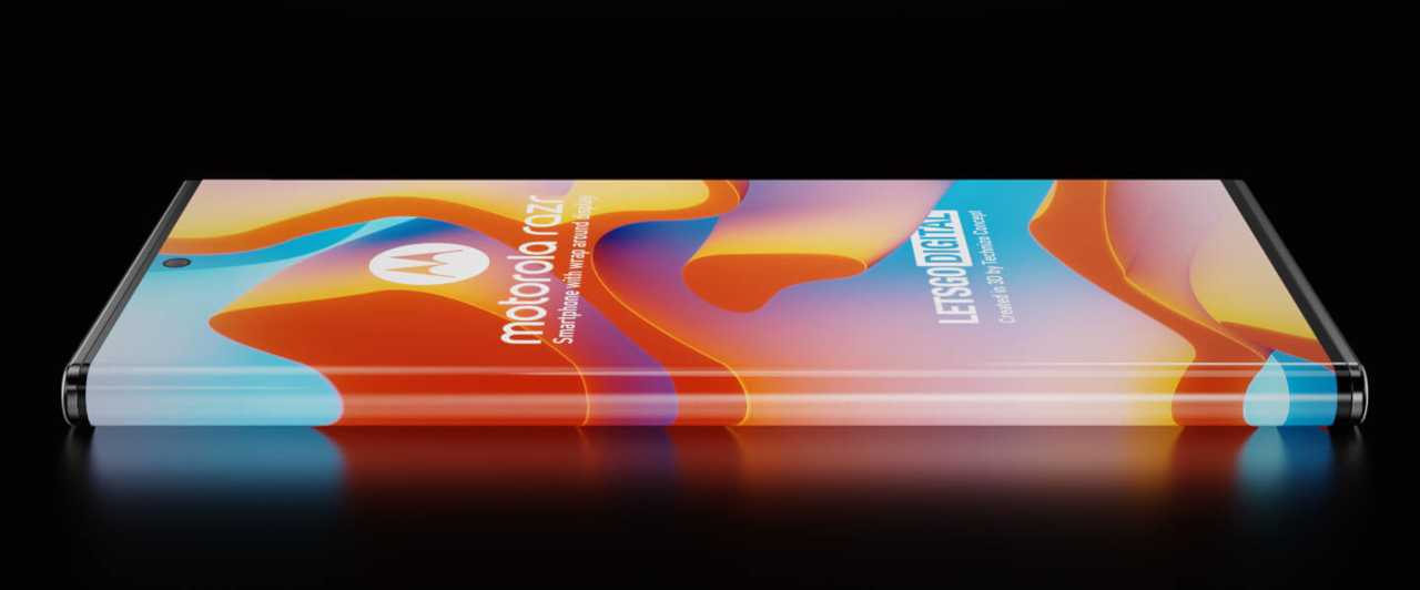
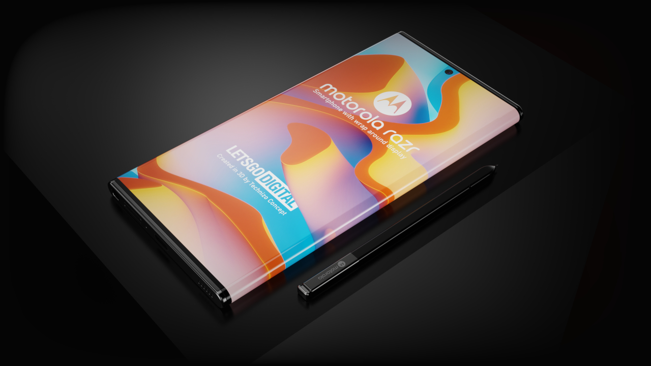
Motorola wrap-around display phone concept is pretty but also pretty impractical

A phone that’s almost 100% screen has some benefits, but the ergonomic and practical concerns could outweigh those.

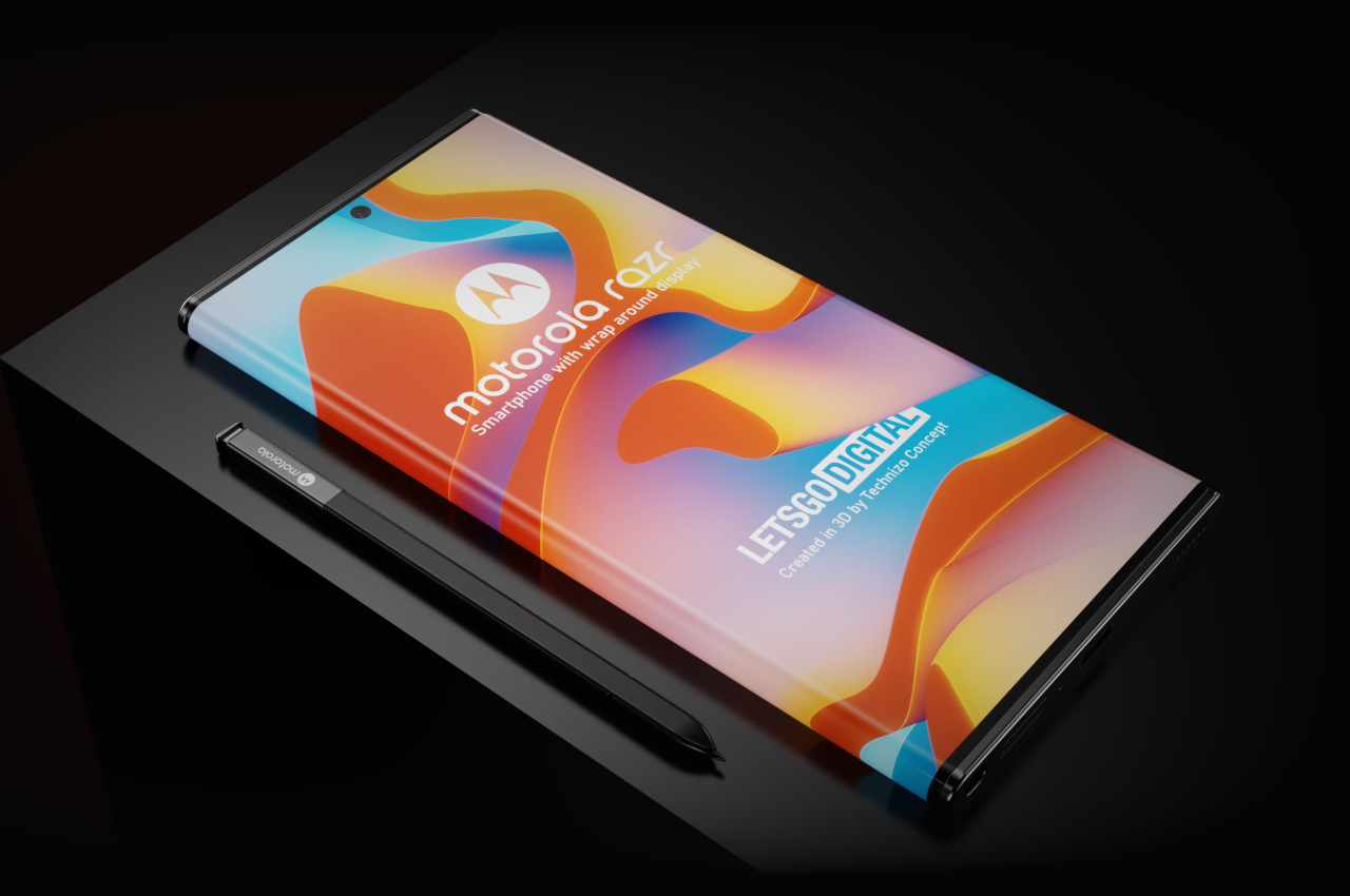
Most of the time we spend on our smartphones is, of course, spent on the screen. It is, after all, the primary point of interaction and feedback on modern mobile devices. Despite its importance, the screen actually covers less than half of a phone’s surface, which some might consider being a waste of space. Unsurprisingly, phone makers have been trying to come up with ways to take advantage of all the places where you can put a display on the phone, and Motorola’s patent reveals how that beautiful but unusual design can actually become useful.

Designer: Parvez Khan (Technizo Concept) for LetsGoDigital

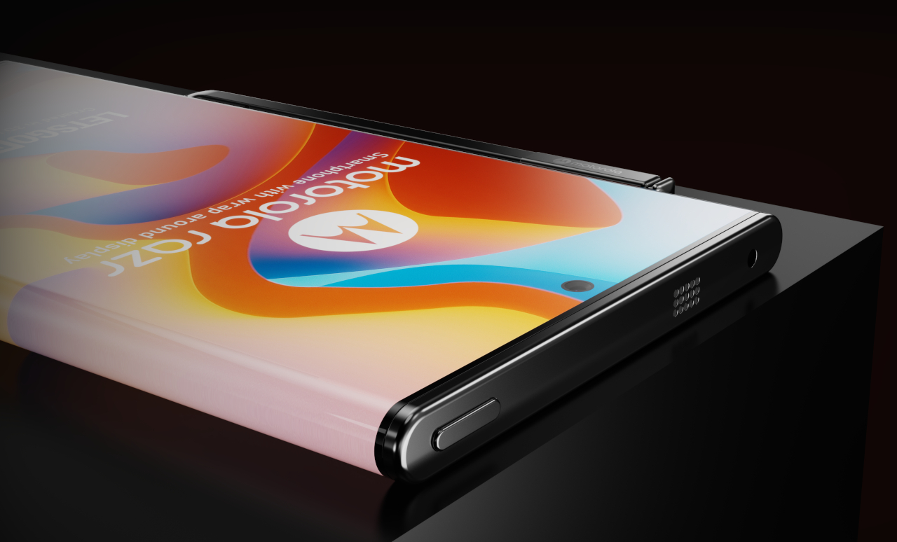
Phones with displays that wrap around the body and leave almost nothing uncovered are right up there with foldable phones, transparent displays, and holograms that spark people’s imaginations. Given how small phones are compared to laptops or even tablets, it’s understandable that manufacturers and consumers will want to take advantage of every piece of real estate available on the pocketable device. Motorola is hardly the first to try, but it is one of the few to go the extra mile and explain why you might want to have an all-display phone.

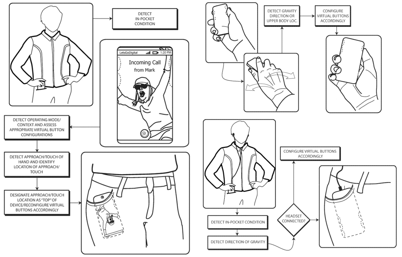
Flexibility will be the name of the game for a phone where there is practically no front or back. No matter how you pull it out from your pocket or your back, that side facing you will always be the front, and the software will adjust the elements on the screen to match. You might not even have to fully pull out the phone, as long as you can see a small part of the screen. Again, the software could adjust the user interface elements, so you can immediately see who’s calling and swipe to reject or accept the call, even if only the “bottom” part of the phone is visible from your pocket.

Such a phone with a wrap-around display will have to do more work than most phones to pull this off. For one, it will need to use a variety of sensors to determine which direction the phone is facing in a pocket. The software running on the phone needs to be especially dynamic, as it needs to shift UI elements around to match the position and orientation of the phone. There are no physical volume controls, for example, and the phone will have to know on which side to place those depending on how a person is holding it.

Those might be easier to pull off than resolving some usability and ergonomic concerns that an all-screen phone might introduce. Phones whose screens curve off to the sides are sometimes criticized for accidental taps from palms for fingers. An all-screen phone might not have room for cameras either, and the current state of under-display cameras still leaves a lot to be desired. And then there’s the problem that dropping the phone on any side can actually damage the screen, knocking scores off its repairability and sustainability.

The post Motorola wrap-around display phone concept is pretty but also pretty impractical first appeared on Yanko Design.

Apple countersues headphone maker Koss in AirPods patent dispute

Apple is striking back at Koss, which filed a patent infringement lawsuit last month related to AirPods and Beats. It countersued the maker of the first stereo headphones, asking for a court to rule that Apple didn’t infringe any of the five patents...

Koss sues Apple and Bose for allegedly copying wireless headphone tech

Koss isn’t faring as well as some companies in the wireless headphone space, but it might compensate for that through a string of lawsuits. As Patently Apple reports, Koss has sued Apple, Bose, JLab, Plantronics and Skullcandy for allegedly violating...