Nothing Phone (2) Review – The Best Battery Life + Flagship Features on an Android Phone

PROS:


  • Resilient Battery Life

  • Premium Design with more 'Functional' Glyphs

  • Beautifully clutter-free Nothing OS

CONS:


  • The sudden price bump

  • Camera still needs some tuning

  • Glass back is still highly slippery

RATINGS:

AESTHETICS
ERGONOMICS
PERFORMANCE
SUSTAINABILITY / REPAIRABILITY
VALUE FOR MONEY

EDITOR'S QUOTE:

Come for the Glyph Interface... Stay for the incredible Battery Life. The Phone (2) nails its basics well and then some. The price bump hurts a bit, but it's definitely worth it for the Mid-Range Flagship Killer.

This year’s Nothing Phone (2) is an even bigger deal than last year’s grand launch. You see, it’s easy to launch a company or a product range, but it’s incredibly difficult to sustain the momentum and energy a year after its launch. Pei shows that he’s still got that mojo, and even more so considering Nothing is rumored to be announcing new products under their CMF sub-brand. It’s been a hot minute since Nothing unveiled the Phone (2) and let’s just say, even with strenuous use, I’ve charged this device probably once every 2-3 days. Sure, one could argue that loading it with multiple apps, media, etc. does have its own effect on battery life, but even for first impressions, this phone’s battery seems to be the biggest standout… especially considering how companies are experimenting with dual-screen folding phones, much to the detriment of the overall battery life.

Click Here to Visit the Nothing Website
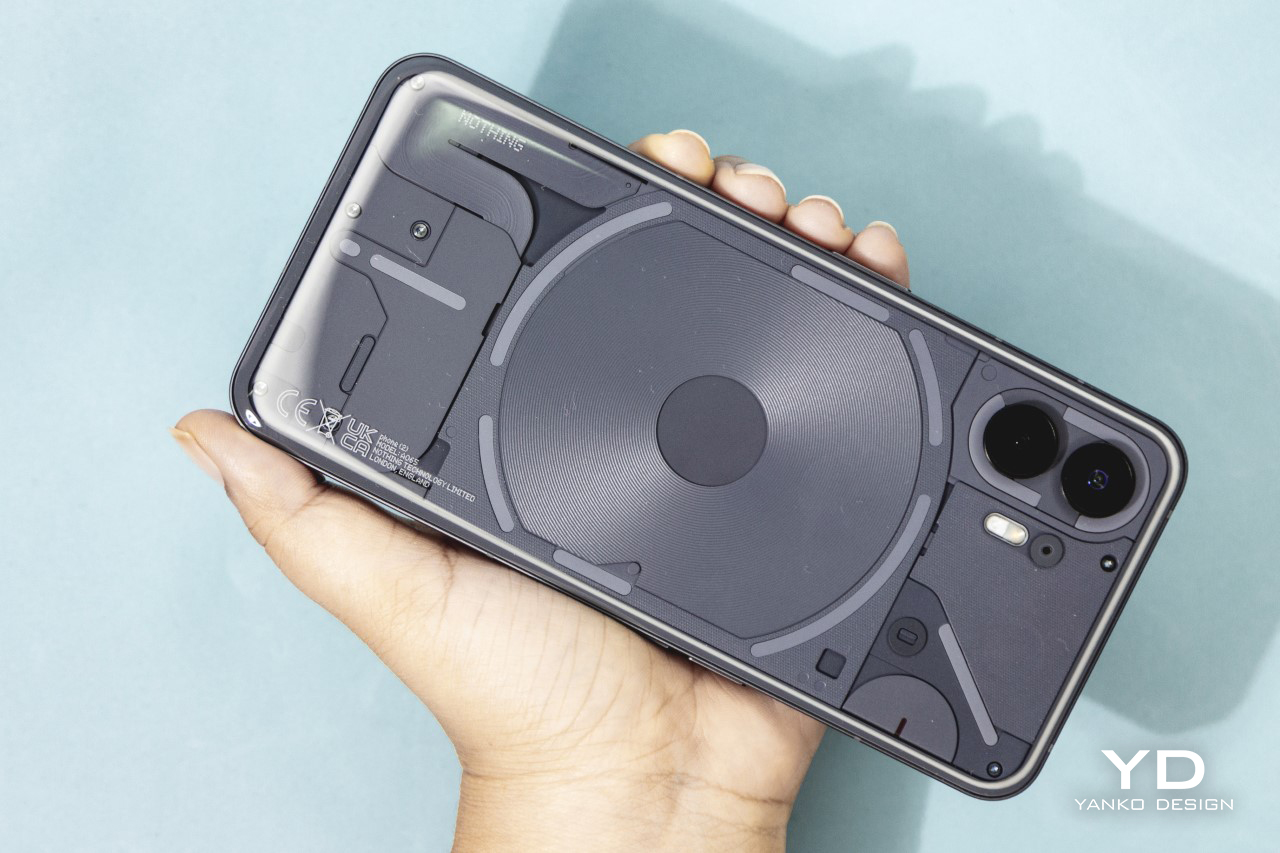
About the Phone

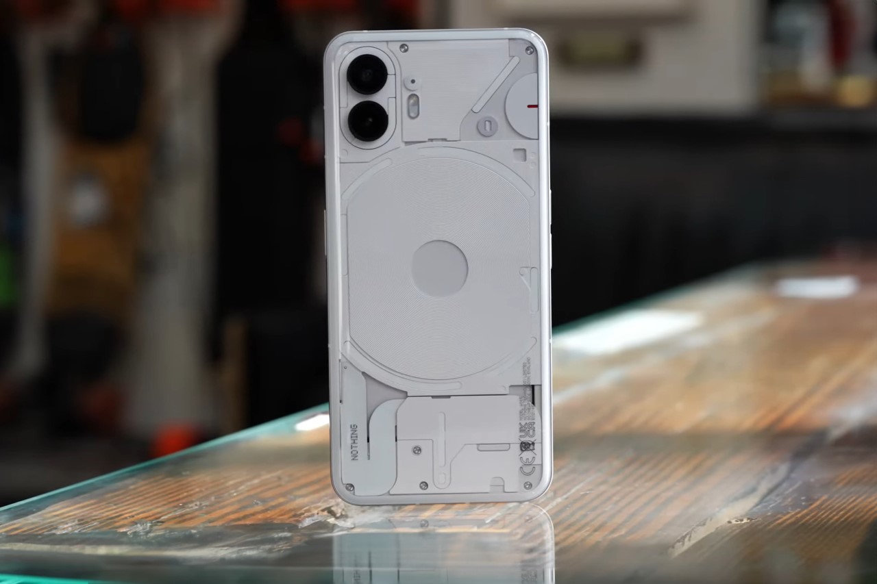
The Phone (2) is an iterative exercise in Nothing’s grand scheme of making technology more transparent and more fun. Last year’s Nothing Phone (1) laid the groundwork for the range, and this year, the Phone (2) hopes to carry the baton further with a design that just comes with subtle improvements. After all, if it ain’t broken, don’t fix it, right?  The Phone (2) has better versions of everything, from the chipset and hardware to even the Glyph Interface and color (that grey color is just gorgeous to look at). It comes with a few unique accessories too, including a pretty neat-looking charging cable and a transparent SIM ejector tool. Moreover, this year’s Phone (2) also gets an improved Sustainability score over its predecessor thanks to the use of as many as 53 parts made from sustainable materials, including plastic-free packaging. The phone’s also designed to be repairable, using screws to assemble components rather than glue. All this comes at a price, though… and the Phone (2) sees a significant bump by $100, starting at $599 for the 128Gb model.
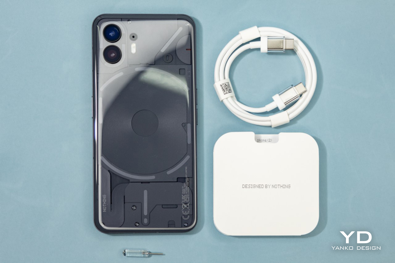
New and (Slightly) Improved Design

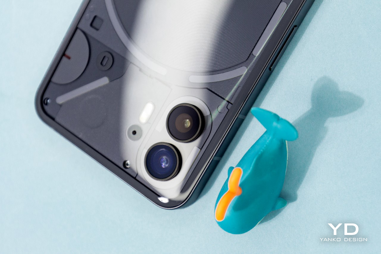
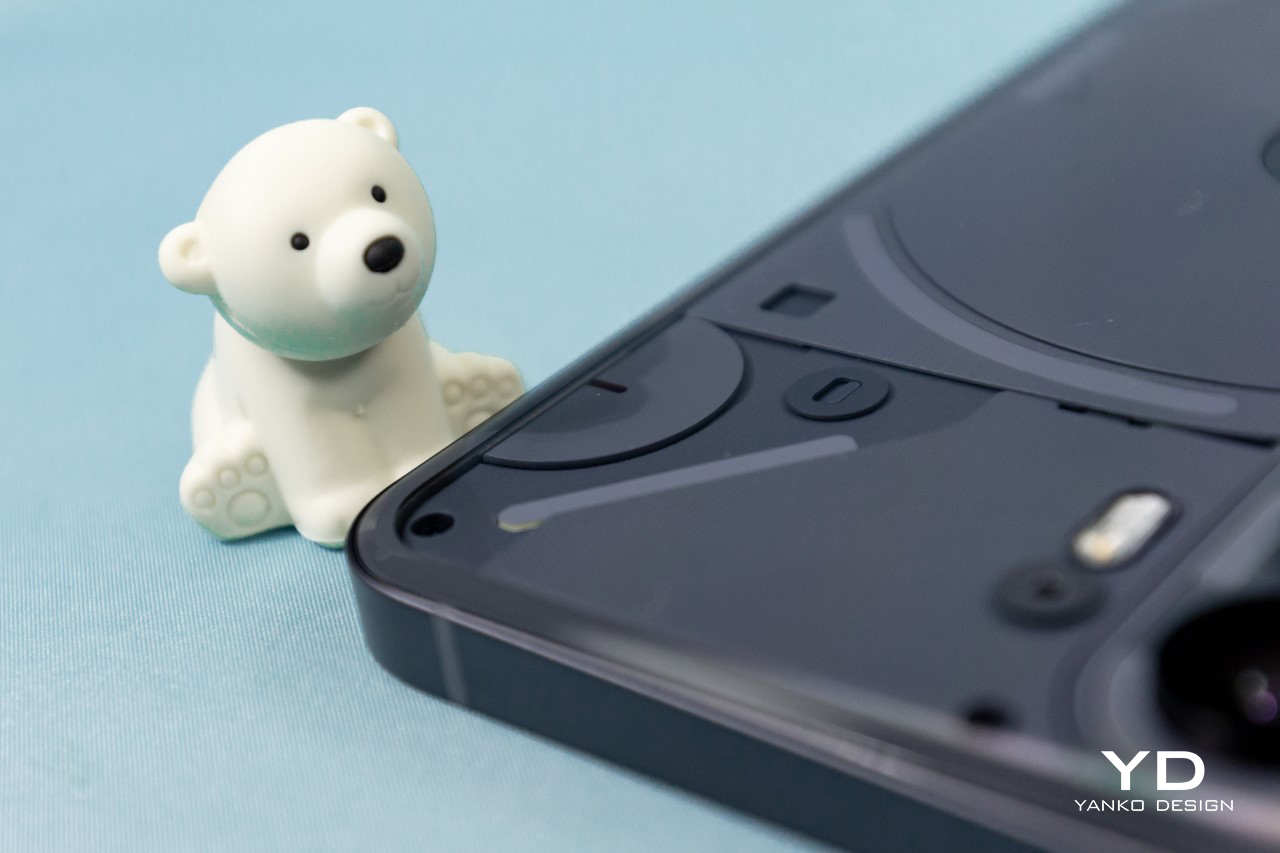
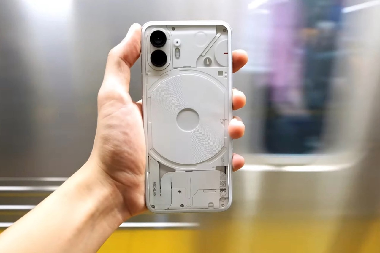
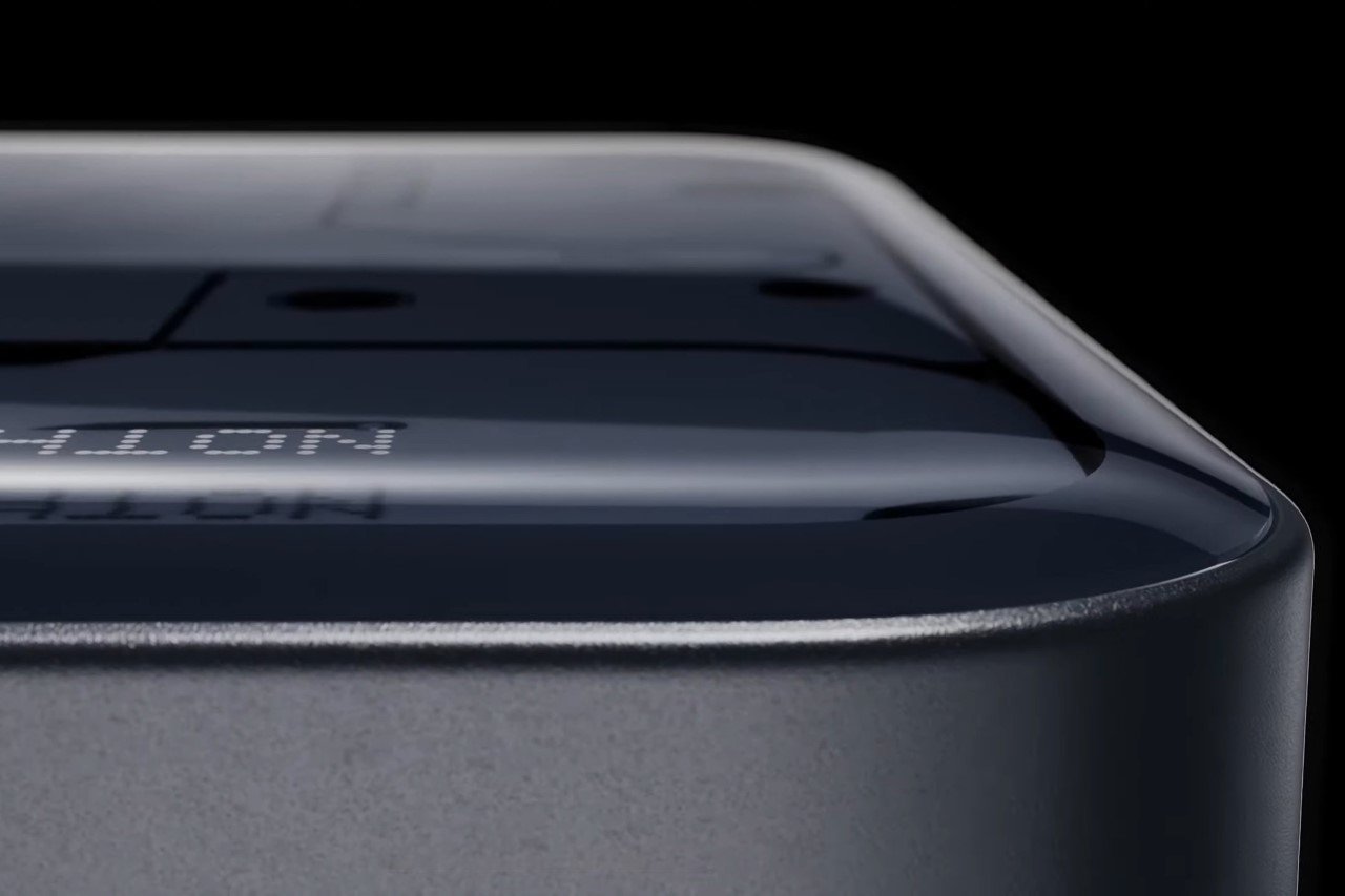
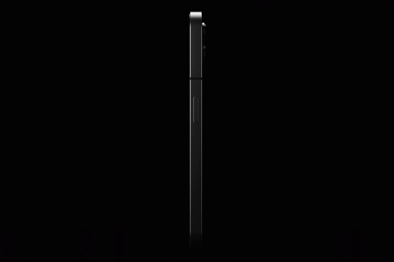
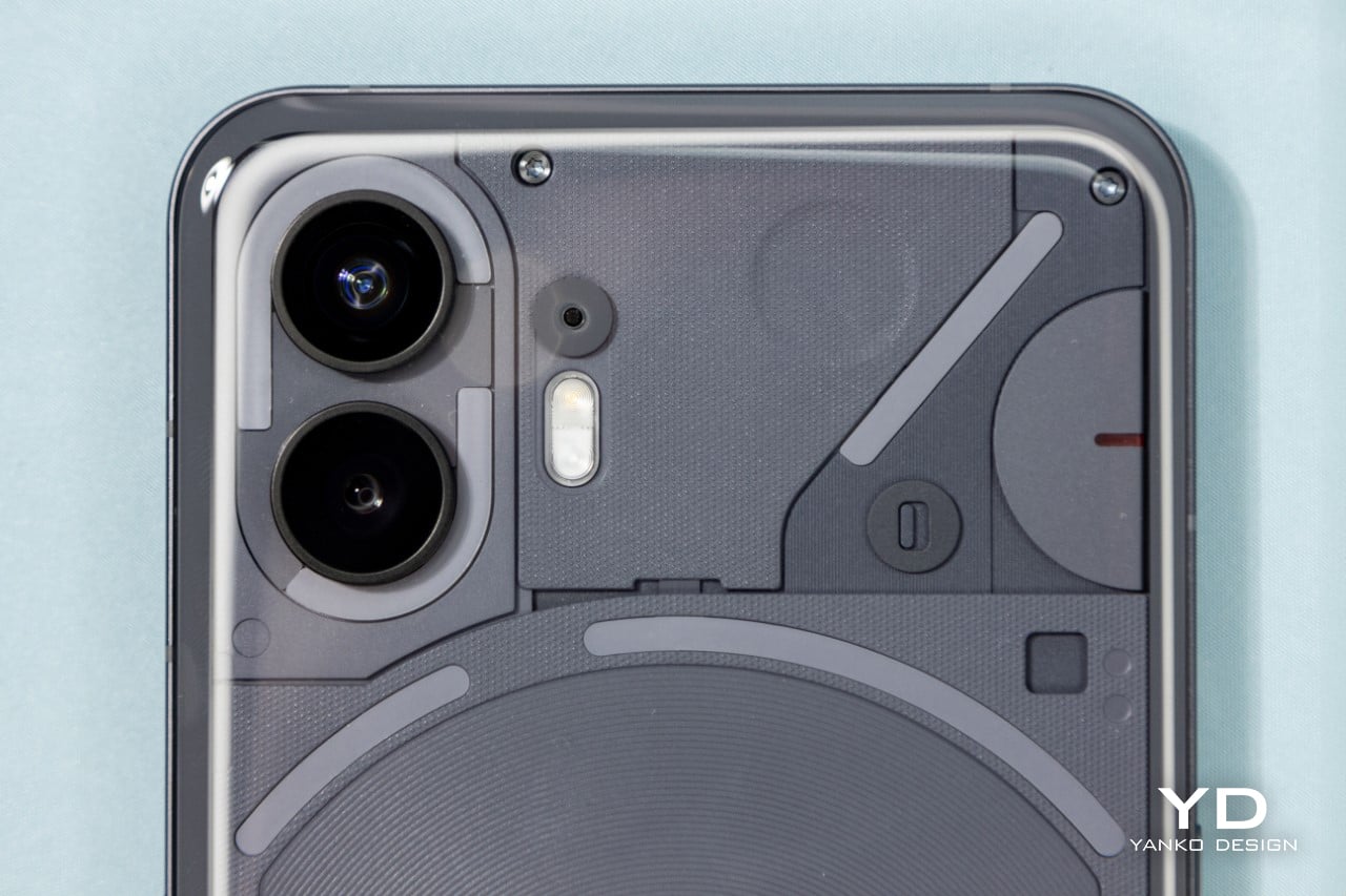
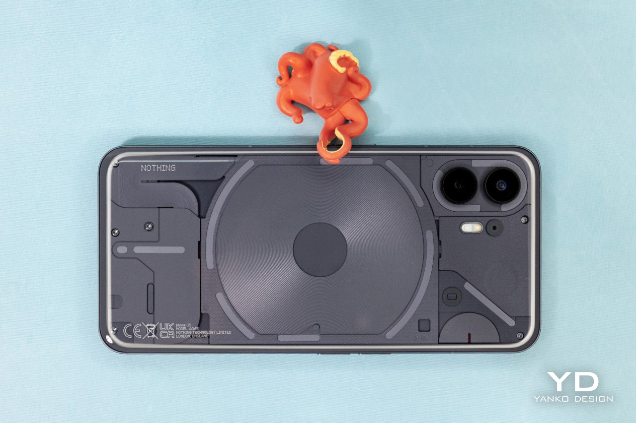
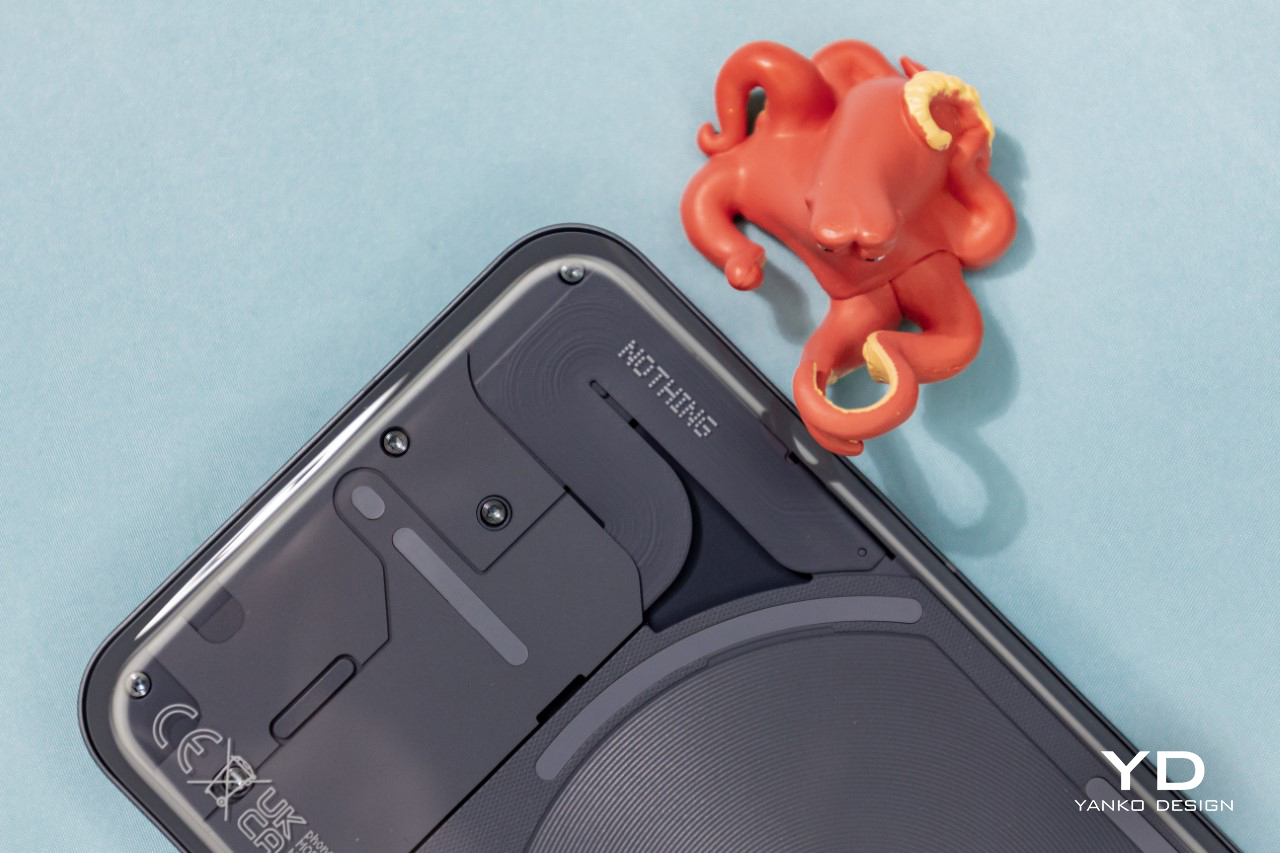
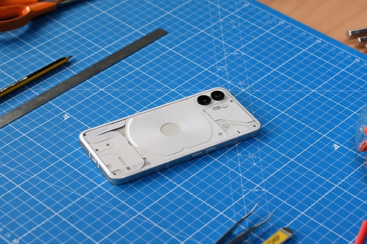
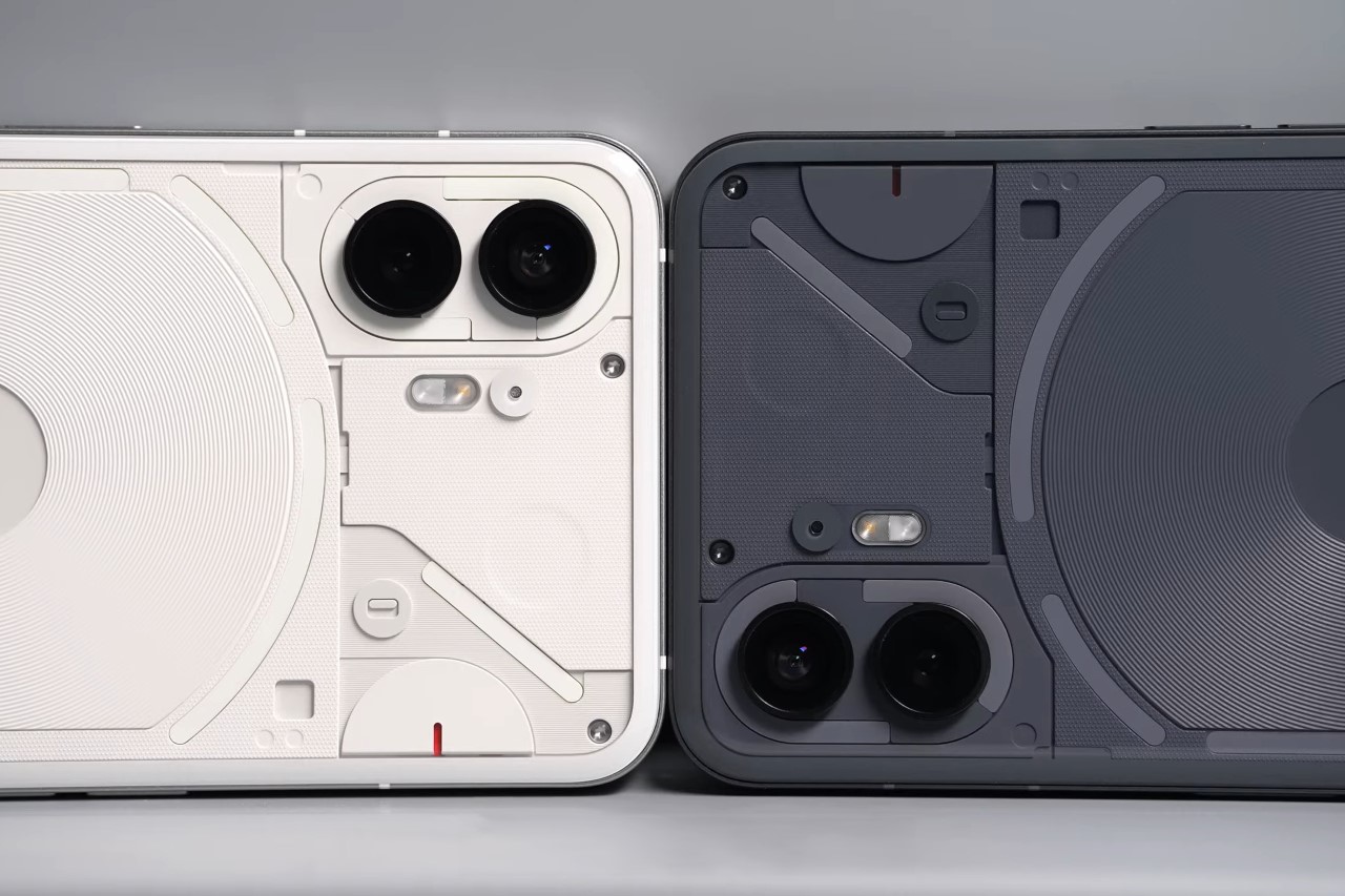
The Phone (2)’s design doesn’t see massive changes – in part because radically changing designs can be incredibly expensive with re-tooling and re-engineering costs really piling up, and also because the Phone (1) was already designed with a recognizable visual language. With the Phone (2), there are four stand-out differences. The first is the presence of a grey colorway over last year’s white. The grey arguably looks better because it provides the right amount of contrast between the transparent elements on the back. It doesn’t respond well to damage, however, as the grey paint scratches off the metal chassis pretty easily if you drop the phone. The second difference is the slightly curved back, which makes the phone look noticeably thinner, more premium, and easier to grip (even though that glass back is notoriously slippery). The third is a little less obvious, but it’s the central alignment of the front-facing camera, and the fourth… well, the fourth difference pretty much gets its own section in this article.

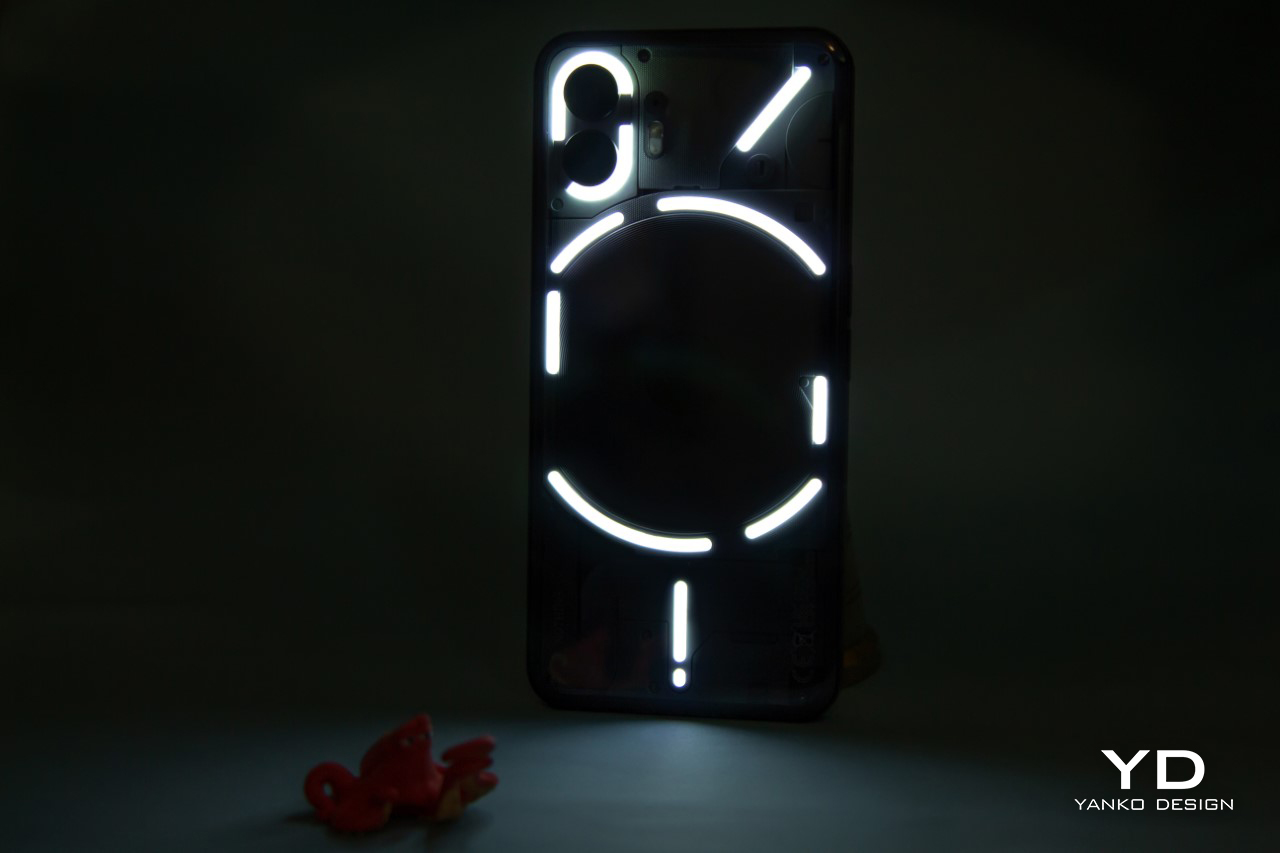
Glyph Interface Gets More Character

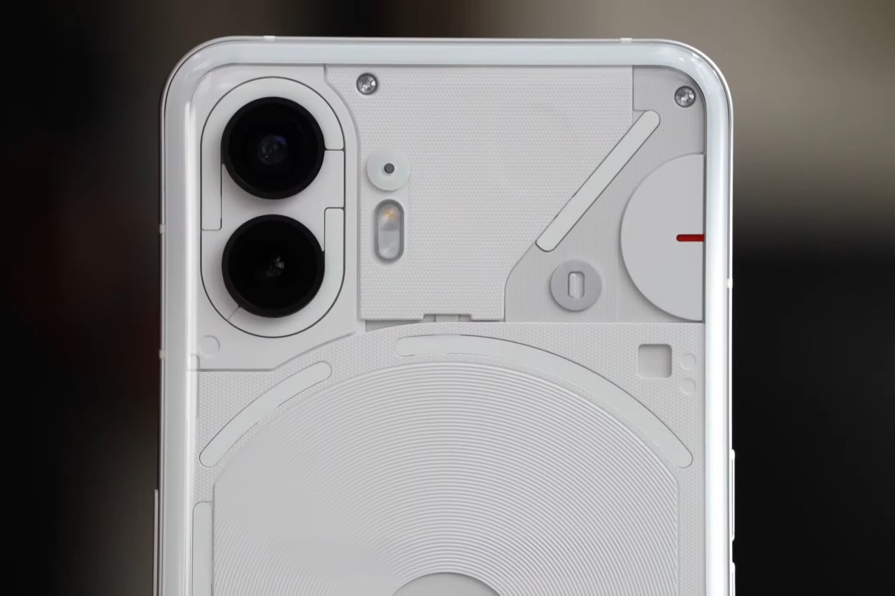
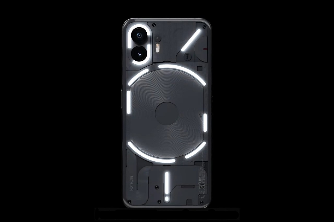
Last year’s Glyph Interface felt a bit like an unfinished project. This year’s Glyph Interface opens more avenues for functionality. Now with 11 different zones, the interface has the ability to ‘communicate more’ information, pretty much embodying the same logic of pixels. More pixels, more information. The 11 dedicated zones can be used in a multitude of ways, beyond just the flashy ringtone or camera light. You can assign glyph lights to apps, creating notification lights out of them so you know when you get a notification, and which app it’s from, even when the phone is face-down. The lowest glyph works as a status bar during charging, and now a glyph arc on the top right works as a countdown timer, with LEDs gradually turning off to make the light strip shorter as a visual indication of time. This feature, funnily, wouldn’t work unless the phone detected itself being kept face down. It required a bunch of tries, although when it worked, it worked flawlessly.
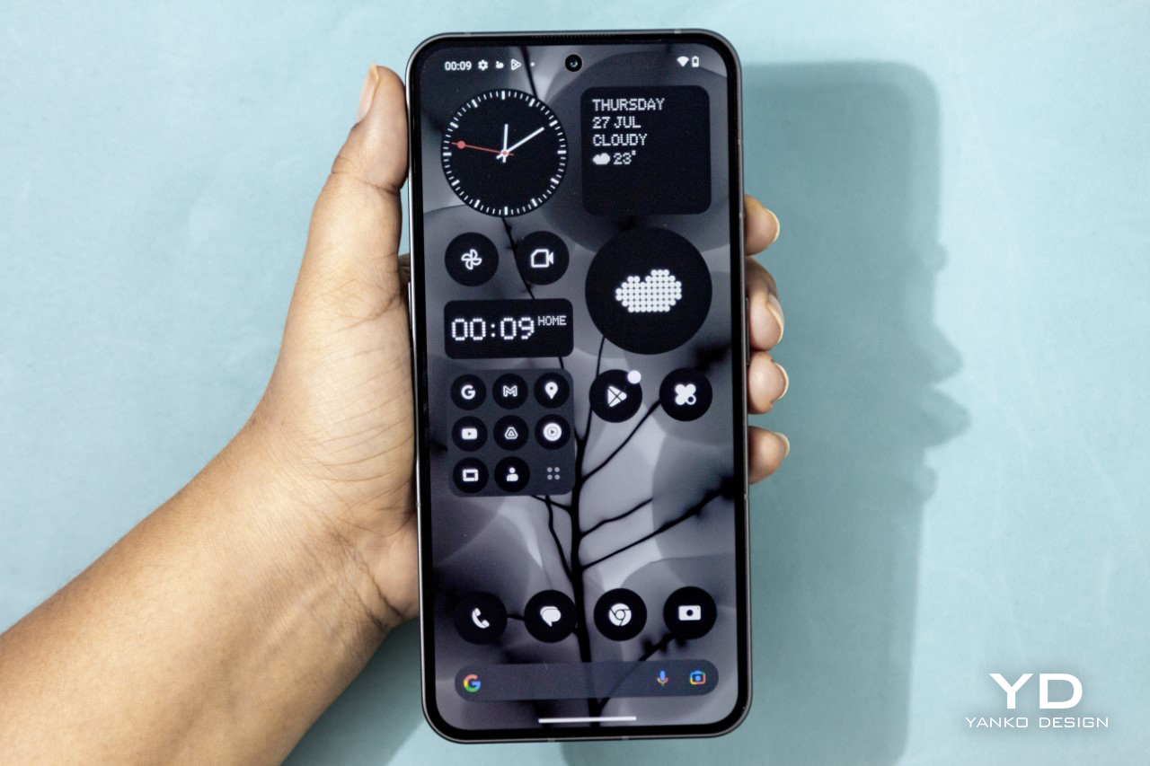
The NothingOS

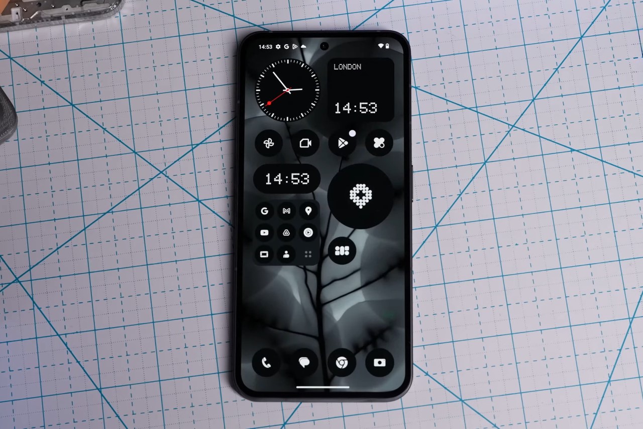
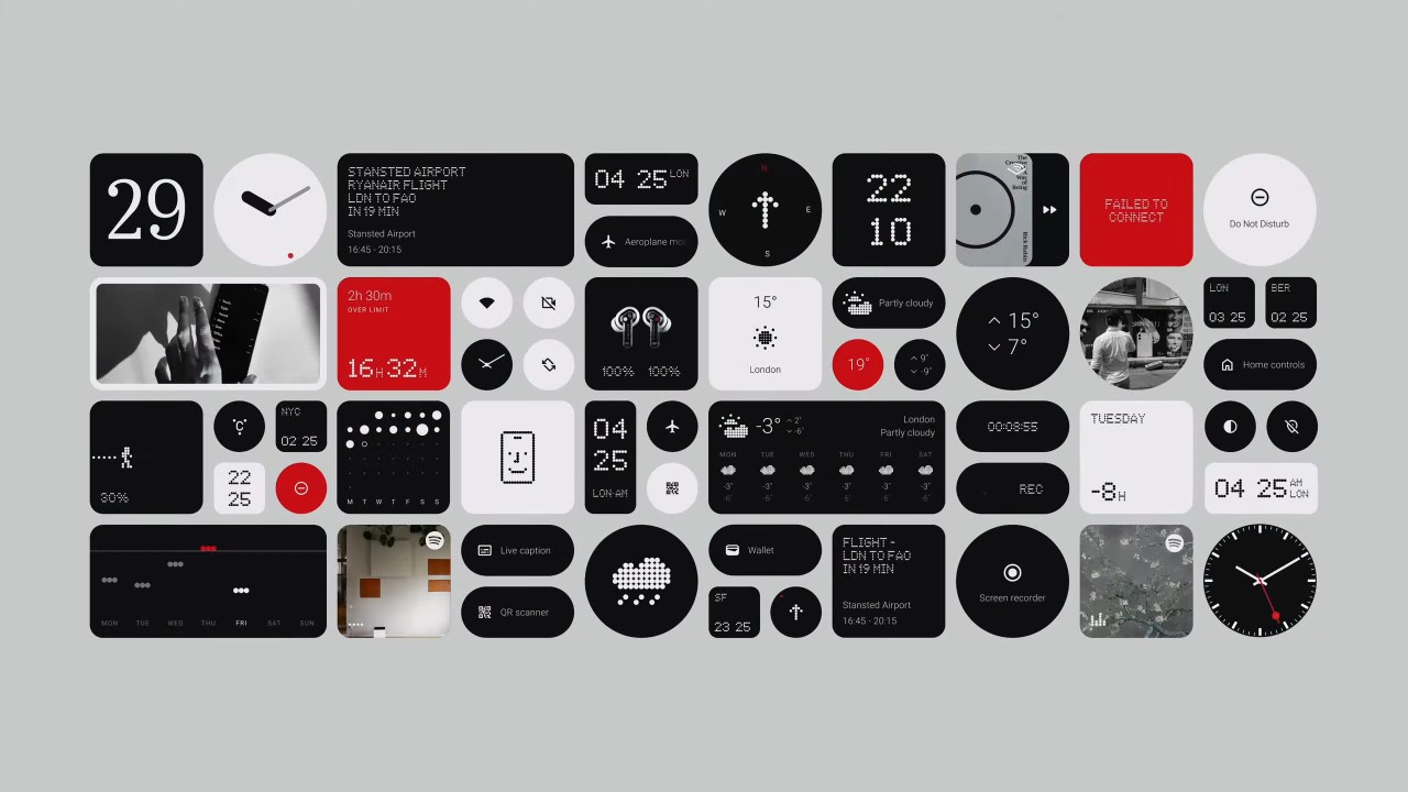
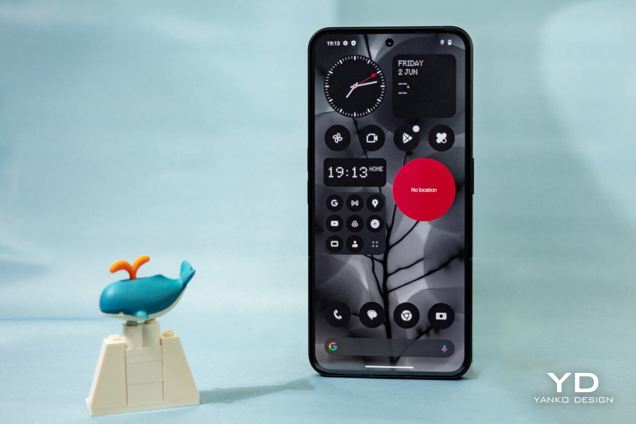
The NothingOS 2.0 is by far the cleanest, most satisfyingly minimal launcher I’ve seen on any Android phone. It’s one of the things that doesn’t get mentioned often, but is perhaps the most important part of the phone’s entire experience. The Phone (2) comes with Nothing’s OS 2.0 bundled along with it, and the second you switch it on, you realize how unified it looks, how snappy it is, and how incredibly devoid of bloatware the phone is. In a world where smartphone companies still load their phone with apps you probably won’t ever use, the Phone (2) comes surprisingly light. It has JUST the essential apps, all with black-and-white icons, and widgets that fit beautifully into the phone’s home screen. While Nothing claims to make technology fun, the OS actually makes tech fun-ctional. There’s a fair amount of intent with which Nothing built out this OS, and I noticed a fair boost in my focus while using the app. I wasn’t distracted by tonnes of pixels and icons and colors. The OS made me feel rightfully clear-headed rather than distracted.
The Camera

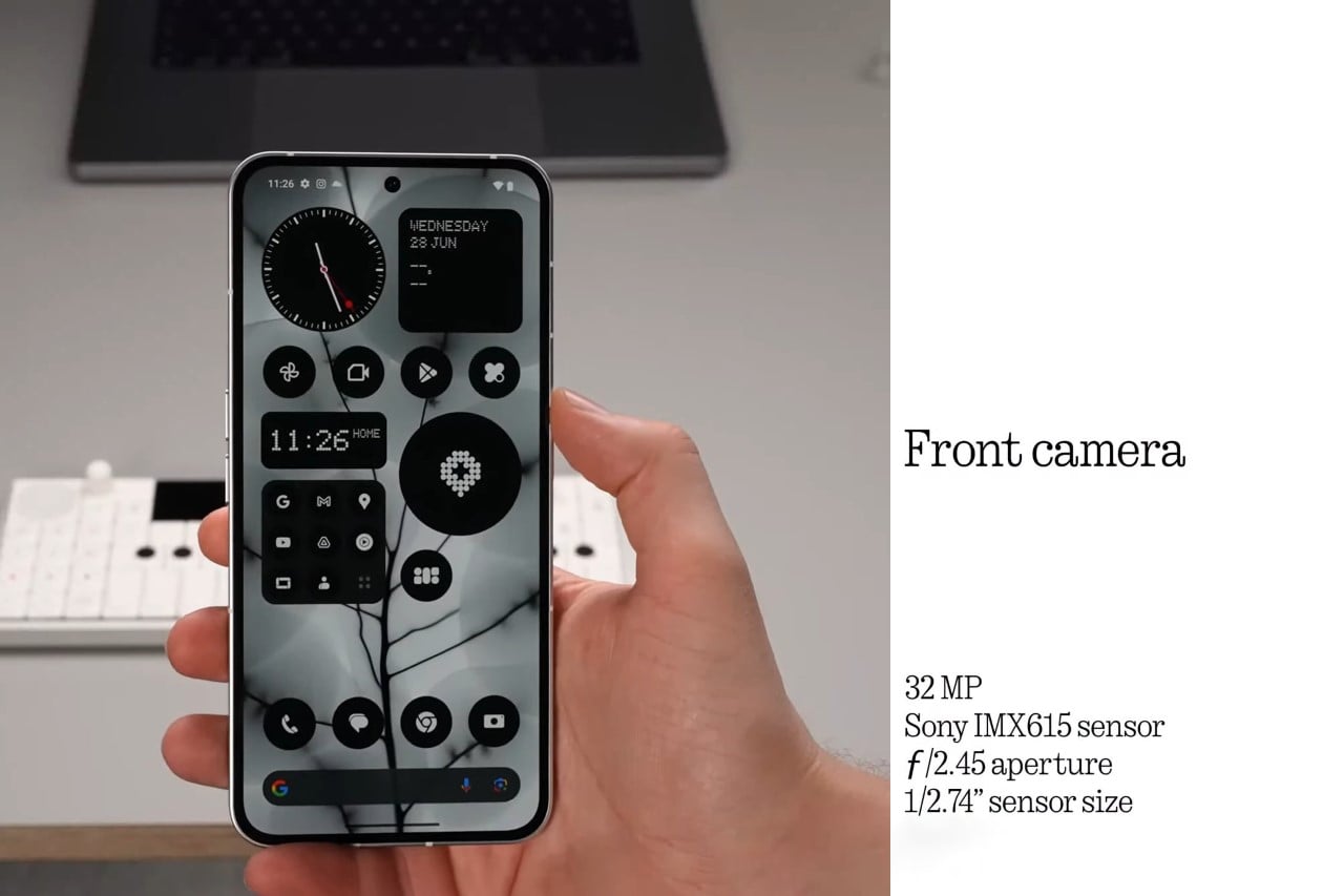
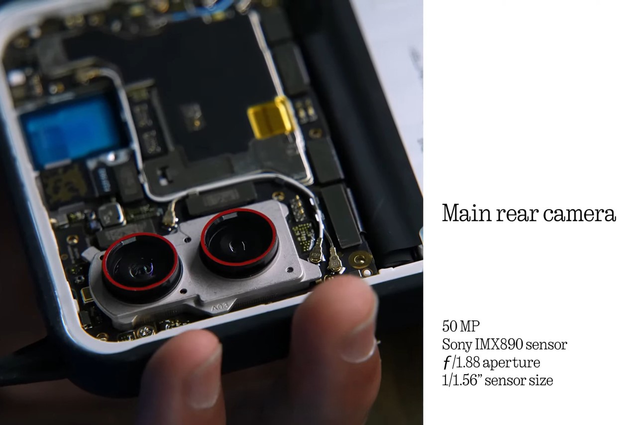
Last year’s phone got a pass for having a fairly decent camera, but this year it seems that even though Nothing took notice, it wasn’t enough. Sure, as far as specs, go the Phone (2)’s camera measures up rather well, with the front camera now getting bumped up to 32 megapixels, and the rear cameras getting a few improvements with HDR, low-light photography, and blur removal. The camera still, however, saturates colors a little too much (sceneries look incredibly green and vivid to the point of looking a little artificial), and low-light photography doesn’t really hold a candle to Google, Samsung, or Apple’s tech. Optical stabilization is good during video, although it feels like the phone overcorrects a bit, and the Macro mode seems quite good at working with details up-close. On its own, the camera is decent, but it’s come a long way when compared to last year’s Phone (1) camera.
The Performance + Battery

If there’s a single area where the Phone (2) vastly exceeded its predecessor, it’s this. Last year’s smartphone had a pretty noticeable problem with heating up while charging or with heavy use, but this year the Phone (2) cruises through with no hiccups. Games work exceedingly well on the app and scrolling through sites is responsive and snappy. However, the one feature we were thoroughly impressed with was this year’s battery upgrade. With a 4700mAh battery, the Phone (2) lasts comfortably long with regular use, and even more on standby. With constant use, I managed to easily cruise through an entire day without needing to pull out the charger. In fact, I could go more than 24 hours without charging the phone. In idle mode, however, the phone comfortably lasted for half a week without needing a charge. If there’s one feature that thoroughly impressed me with this phone, it’s how reassuringly good the Phone (2)’s battery life was.

The Price

I want to say the price bump caught me by surprise but honestly, it didn’t. Ultimately, companies need to make money, and an affordable smartphone doesn’t pay for R&D. Last year’s $499 phone was purely priced to create a hype cycle, but this year’s $599 phone hopes to sustain Nothing’s growth. After all, Pei did the exact same thing with OnePlus, bumping up the price with each subsequent model before launching the OnePlus X (which was a low-range offering), which blossomed into the Nord series. It isn’t inconceivable that Nothing will probably launch a budget-friendly range of phones too, although that would most likely come under its CMF sub-brand. However, until then, the Phone (2) starts at $599 for the 128GB 8GB RAM variant, going up to $669 for the 256GB 12GB RAM model and a sizeably high $745 for the 512GB 12GB RAM variant.
The Verdict

The Phone (2) somewhat loses its title of being the flagship killer, because with an average price of $669, it’s pretty much in flagship territory. That being said, the Phone (2) somewhat makes a case for itself with its features and fundamentals. I don’t recommend it for content creators or people looking to own a phone with a measurably great camera… but for people looking to own a phone that’s exciting, has a great OS, works remarkably well, and stuns with its battery life, the Phone (2) is a solid pick. The Phone (2) stands out brilliantly against a sea of otherwise boring designs, and Nothing does a fairly good job on its promise of making technology fun.

Click Here to Visit the Nothing Website

Photo Credits: Pratik Dhamapurkar
The post Nothing Phone (2) Review – The Best Battery Life + Flagship Features on an Android Phone first appeared on Yanko Design.
Nothing Phone (2): A Fine-Tuned Flagship Killer, With A Touch of ‘Fun’

Last year, Carl Pei took to the stage to proclaim that Tech had become boring, and it was time to inject some fun back into the industry again. In hindsight, the Phone (1) was an ideal proof of concept to show how exciting phones could be… The Phone (2), which officially launched today, shows a more iterative, refined version of exactly where Nothing is heading as a “small team with big ambitions”.

The launch of the Phone (2) is just as informal as last year’s Phone (1) keynote, and it’s a conscious effort on Nothing’s part to make sure that phone announcements aren’t highly precise, highly engineered, rehearsed monologues that are repeated year after year (major shots fired at Apple). Instead, Carl doubles down on the idea of keeping things fun by pairing up with Casey Neistat and sitting on a rollercoaster for the first few minutes, before vlogging the keynote just like Casey would.

Designer: Nothing

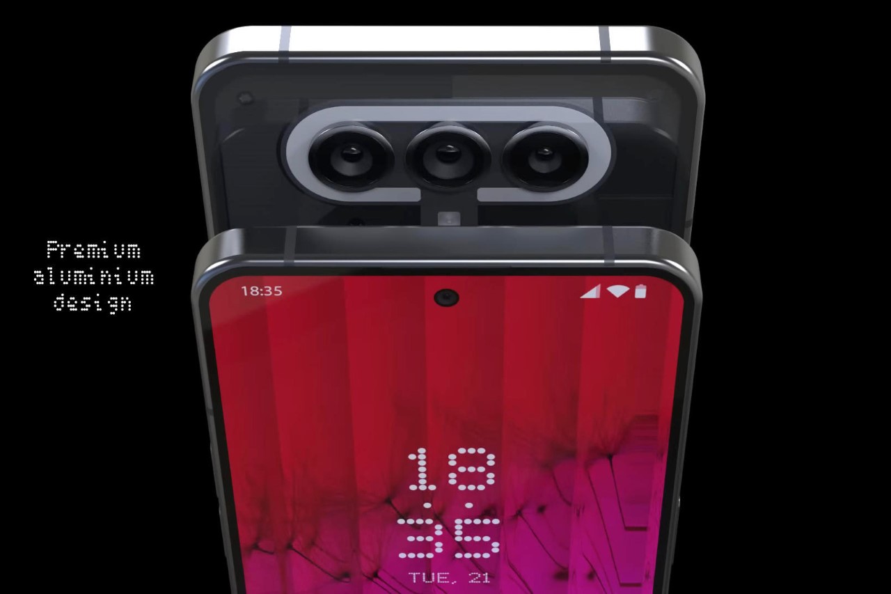
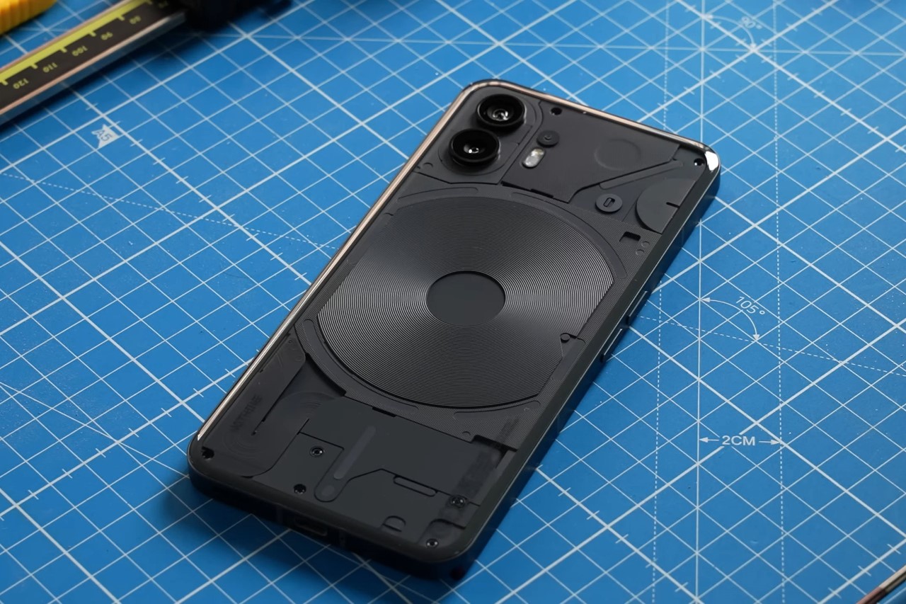
The Phone (2) comes with some significant improvements, but its design still remains familiar. The reason? Not just cost (because retooling, re-engineering, etc. eats into a lot of capital), but also to make sure that the phone’s design remains iconic and memorable. If it ain’t broken, don’t fix it… but definitely refine it to make it better. To that end, the Phone (2) comes with some pretty eye-catching visual refinements in the form of a new Glyph Interface that’s much more detailed and responsive than in the past. Unlike last year’s interface, this year has 11 individual LED panels, with individually addressable LEDs that can respond to different apps and features. The back of the phone also has a mildly curved glass that creates a uniquely comfortable experience as you hold the phone (so that edge doesn’t dig into your palm), and on the front, the selfie camera now shifts to the center instead of sitting in the corner. The phone also ditches the black colorway for a slate, anthracite-like gray that helps you appreciate the transparent rear fascia.

Pei mentions that even though Phone (1) was a proof of concept in a lot of ways, its overwhelmingly positive response proves that the company’s on the right track. Nothing has sold nearly 2 million Phone (1) units to date, and the device has even won a lot of design and tech awards (we gave the Phone (1) an award at the Mobile World Congress this year too). This has helped Nothing hire more designers, engineers, and solidify partnerships to make Phone (2) even better. Every aspect of the Phone (2) sees some form of an upgrade, from the chipset to the display, battery, camera module, and even the OS.

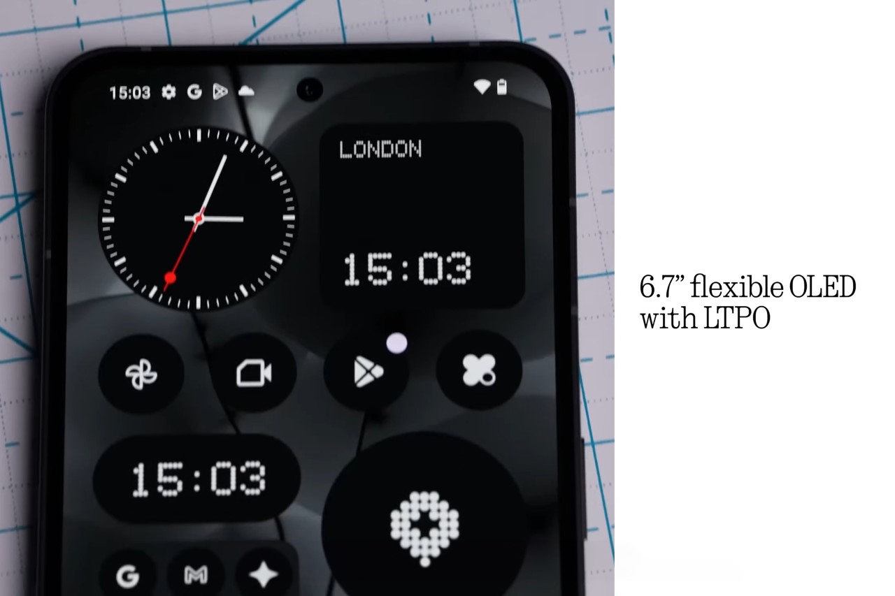
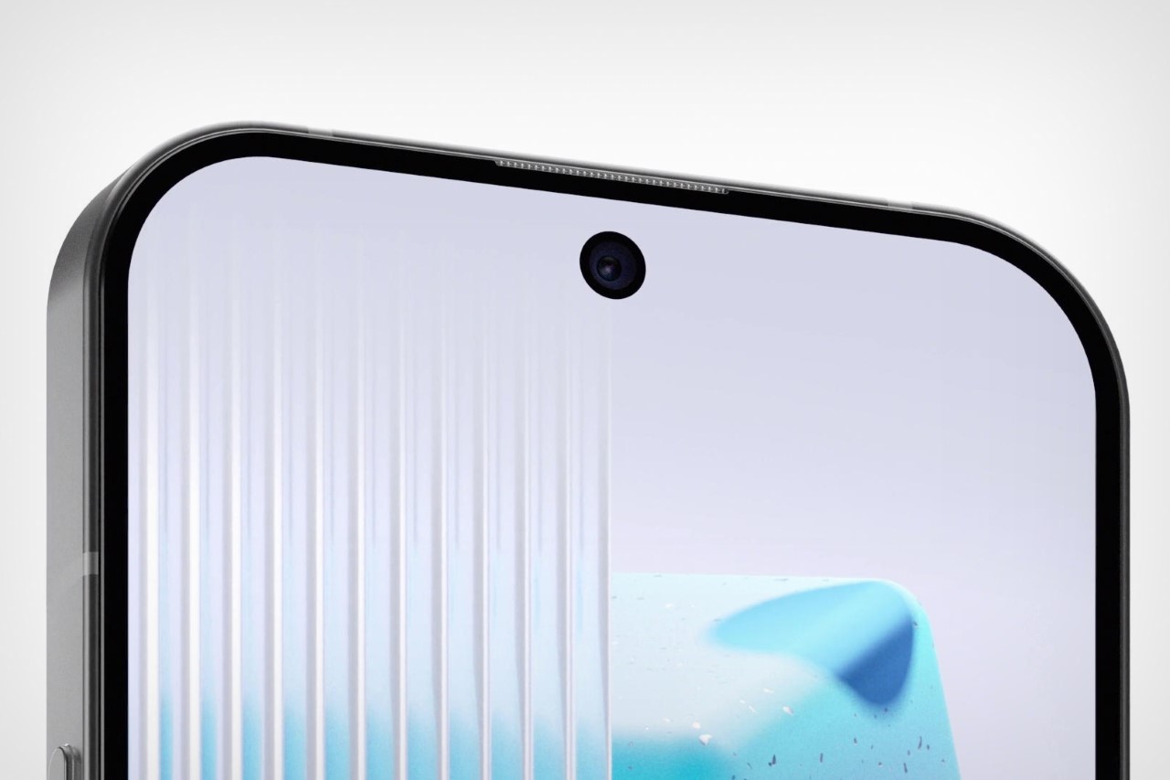
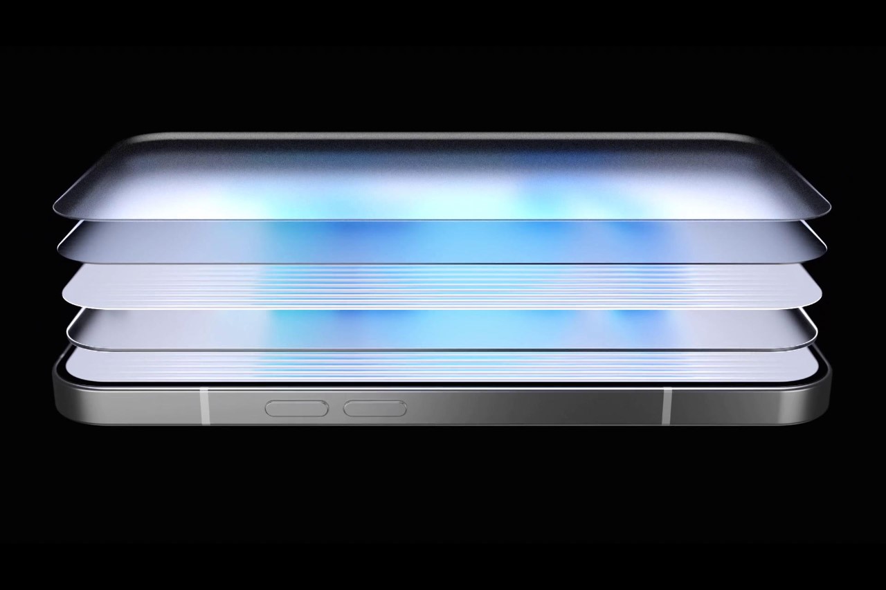
The front shows a great amount of iterative refinements on Nothing’s parts, in the form of a 6.7″ OLED display that now has 0.35mm slimmer bezels than before, and a 1600 nits peak brightness. The camera hole punch gets shifted to the center to aid the phone’s symmetric appeal and the UI, and the screen is now OLED LTPO, which means it can rapidly alternate between 120Hz and 1Hz refresh rates to reduce battery consumption and give you an always-on screen that rivals most flagships. The screen pulls power from the Phone (2)’s upgraded 4700mAh battery, and while Carl doesn’t specifically mention how the battery upgrade translates into hours of usage, he does mention a 40% bump in battery life compared to the Phone (1).

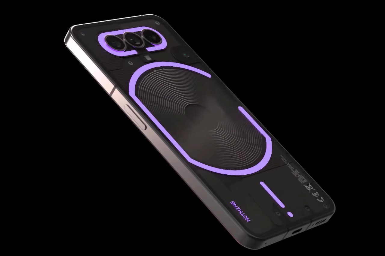
The Glyph Interface on the back is perhaps the most visible refinement of all. With multiple LED bands, it can now say and do a lot more than its predecessor. It’s a lot more responsive, customizable, and has a few tricks up its sleeve like a custom LED strip can light up to let you know you’ve got an ‘important’ notification pending. An LED arc on the top right works as a progress bar, helping you intuitively use the phone’s countdown timer; and integration with apps like Uber and India’s food delivery giant Zomato can show progress meters like how close your cab driver or delivery agent is next to you.

The new Glyph Interface has 11 zones instead of last year’s 5.

The new curved glass back highlights the phone’s premium appearance and hand-feel.

The new Nothing OS 2, which is expected to roll out soon, shows a beautiful monochromatic consistency with app icons, widgets, and other home-screen elements. Unlike other smartphones that have an explosion of color on their displays, with app icons fighting for your attention, the Nothing OS 2 focuses on, well, nothingness… or rather on Pei’s vision for a phone OS that’s fun and classy to look at. Last year, Pei revealed the Nothing OS by highlighting the company’s audio recording app. This year, Nothing unveiled a new Glyph composer feature, with a collaboration with Swedish House Mafia to help users build their own ringtones, glyph patterns, and personalized audio-visual experiences.

While the cameras look relatively the same, Nothing touts a few improvements on the camera front too, thanks in big part to the phone’s new Snapdragon 8+ Gen 1 chipset, and a new ISP that shoots better images and video. The front camera gets a bump up to 32 megapixels, after last year’s 16-megapixel camera, and the dual-lens primary shooter features a 50MP camera like last year, but with a few significant software upgrades including better HDR, motion detection, blur removal, and low-light photography. How this pairs up to the smartphones of 2023 is still to be determined as the phone hasn’t gone on sale yet. We’re also excited to see what MKBHD’s camera tests for this year reveal, given that the Phone (1) didn’t fare pretty well last year. Our own verdict should be out soon too, as we review the Phone (2) for ourselves.

That being said, the Phone (2) is quite an interesting development for Nothing, proving that it’s getting something right as it slowly moves towards smartphone domination as other Android competitors still push out ‘boring’ phones that all look the same and don’t deliver anything materially different. The Phone (2) goes on sale this week, with pre-orders open on the nothing.tech website, and a flagship-killing $599 price tag.

The post Nothing Phone (2): A Fine-Tuned Flagship Killer, With A Touch of ‘Fun’ first appeared on Yanko Design.
Nothing Phone (2) to roll out in summer 2023 with Snapdragon 8+. Here’s what it might look like…

The moment Carl Pei departed OnePlus and unveiled the Nothing brand, all of us knew exactly what was in store. When the Ear (1) TWS earbuds dropped, we knew it was just a precursor to a smartphone. Surely enough, Pei took the stage in the summer of 2022 to announce the Phone (1), a device that promised to shake the status quo. The Nothing phone (1) was unveiled with pretty impressive specs and a ridiculous £399 GBP ($475 USD) price tag – ridiculous by flagship standards, definitely. It’s been almost a year since that landmark moment, and looks like Nothing is gearing up for round 2. The company just announced that the Phone (2) will be revealed at a keynote event ‘this summer’, and following Pei’s visit to Mobile World Congress this year, we know that it’ll be using the Snapdragon 8+ Gen1 chipset.

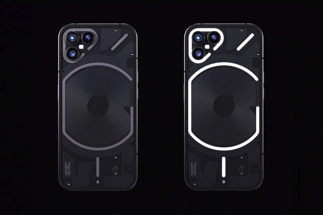
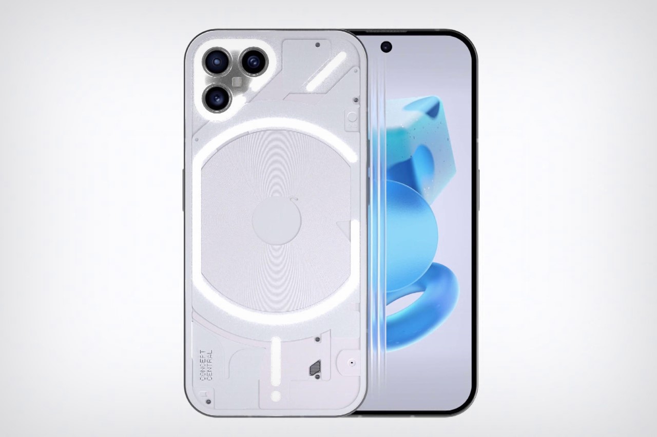
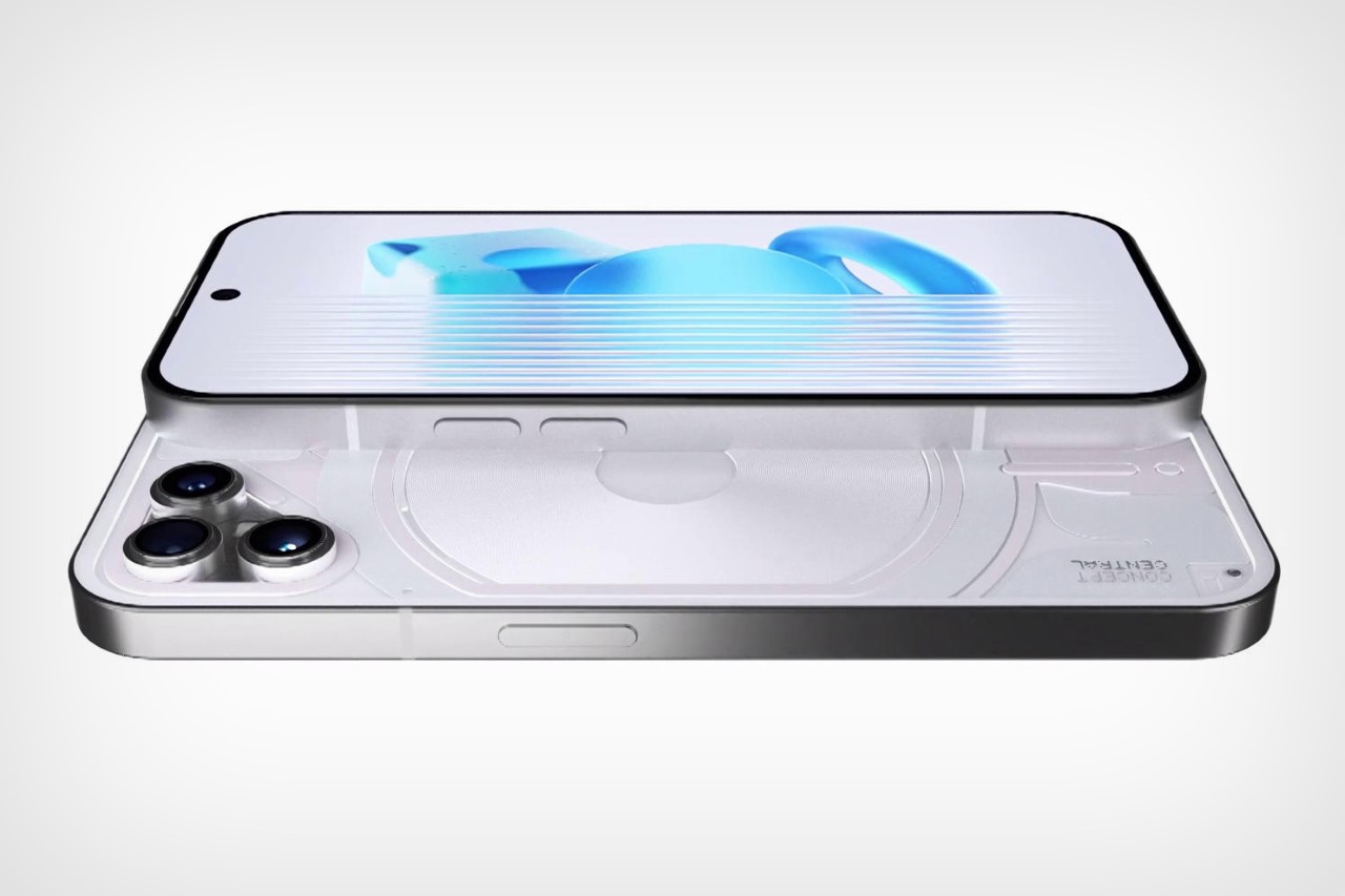
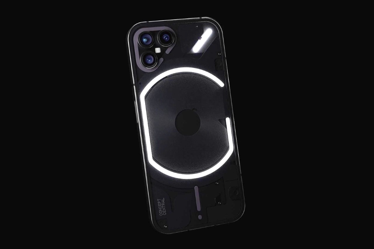
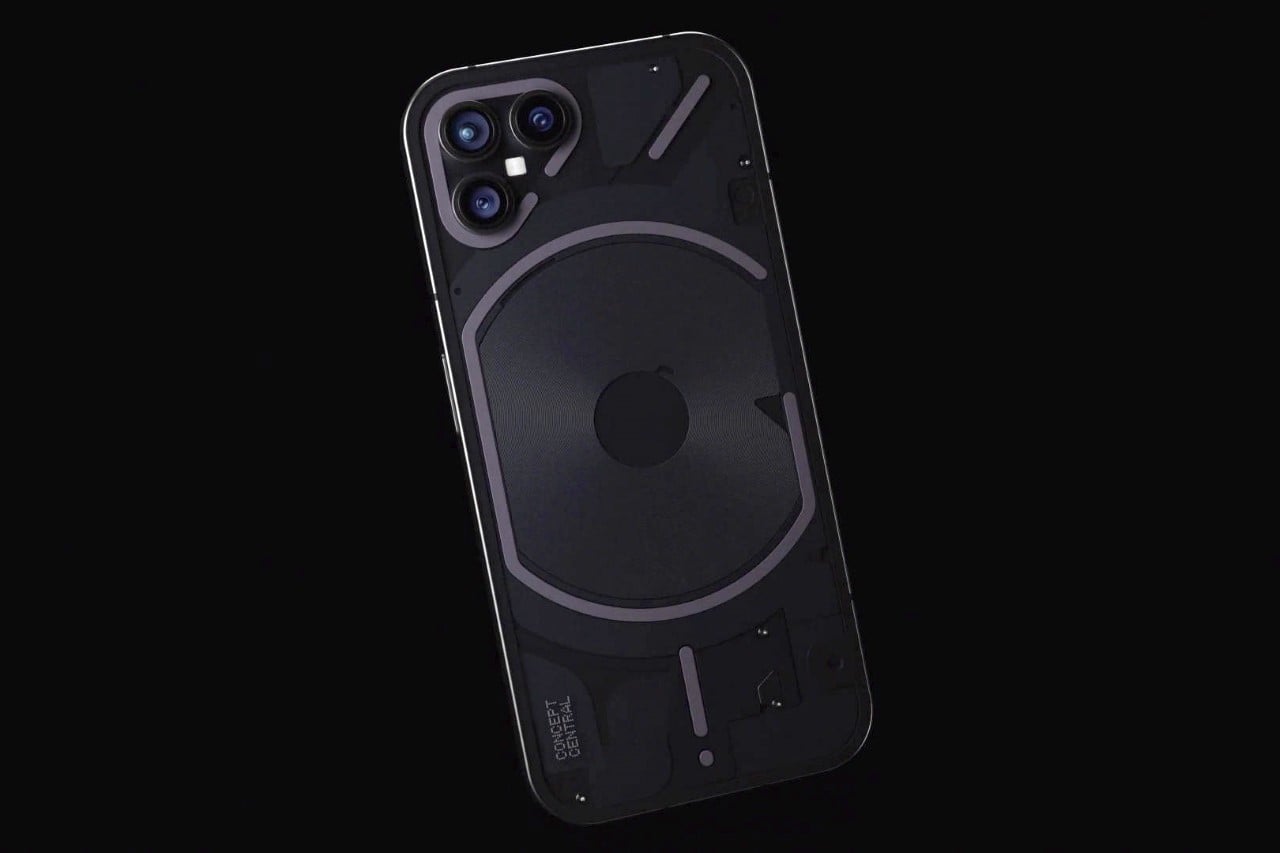
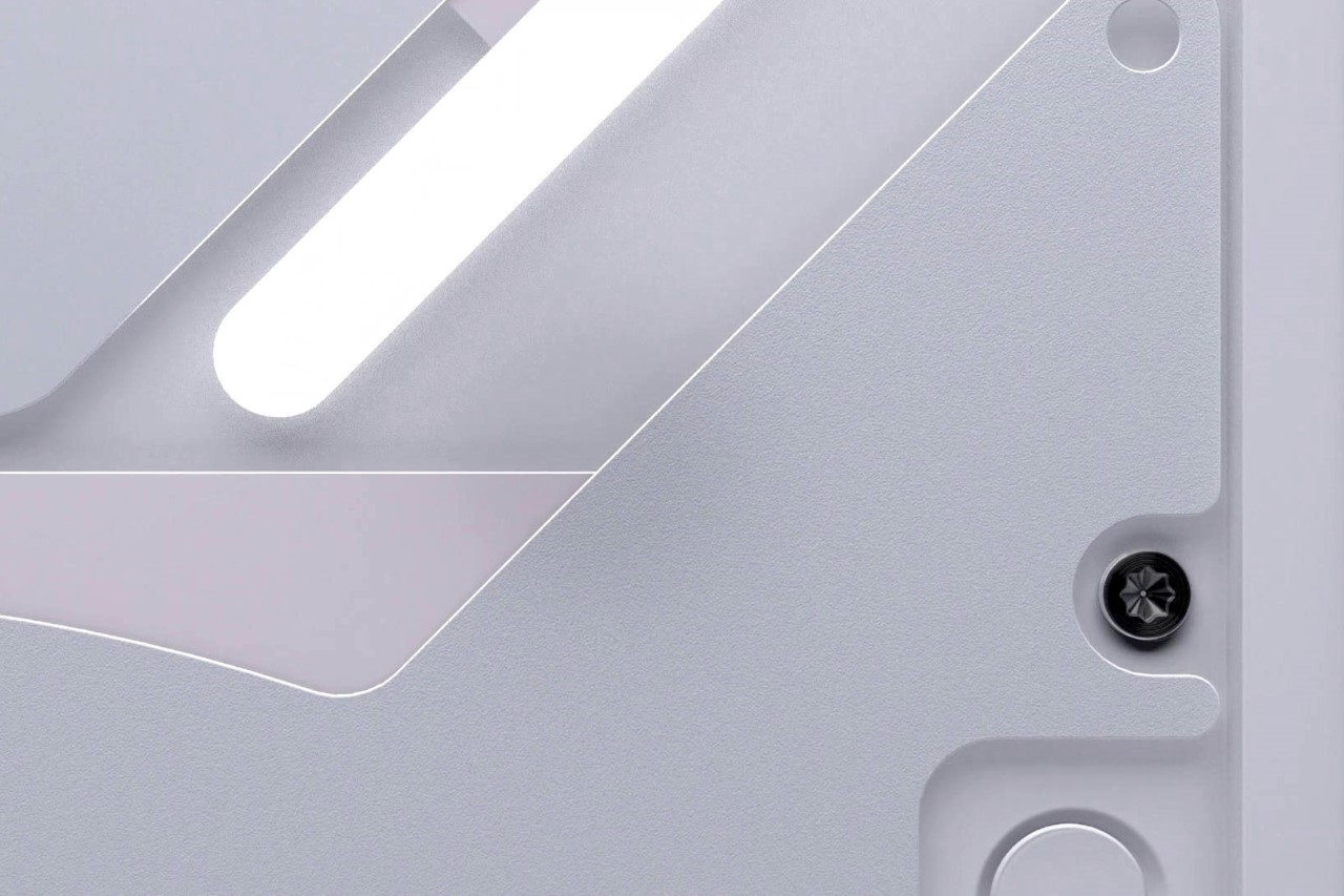
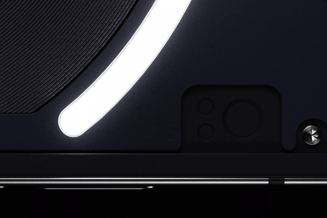
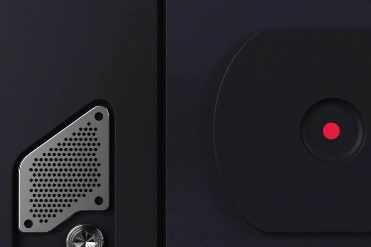
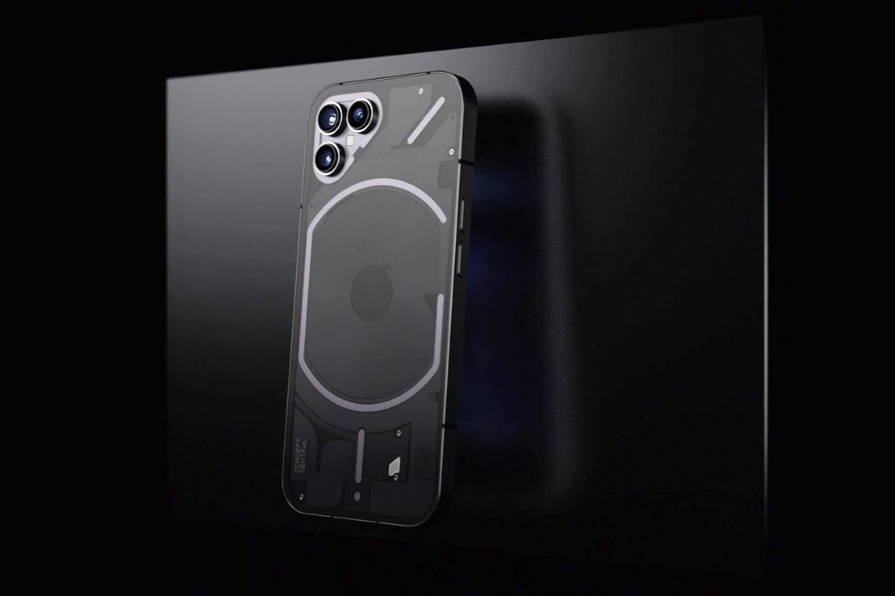
However, the upcoming Phone (2)’s specs just dropped online, and the company (just like last time) released a cryptic render of a close-up that highlights one thing for sure – the Phone (2) will be an exercise in iterative improvement, just like the Ear (2) which released earlier this year. This concept by YouTuber Concept Central showcases what the new Nothing phone could look like. It retains the transparent design language and Glyph Interface, but makes just enough changes to really set the 2nd generation model apart.

Designer: Concept Central

The thing with making smartphones is that it’s an incredibly difficult task on a shoestring budget. For a company like Nothing, changing the design of every subsequent model means redesigning, re-engineering, and re-tooling… and that can drain a startup’s capital. That’s why the Ear (2) looked so similar to the Ear (1) because it hoped to establish two things. One, that Nothing’s design is on point, and that something that doesn’t look old and outdated doesn’t need revamping. And two, it’s easier to establish a brand by sticking to a visual design but making minor changes over the years. The Phone (2) concept from Concept Central reinforces that fact.

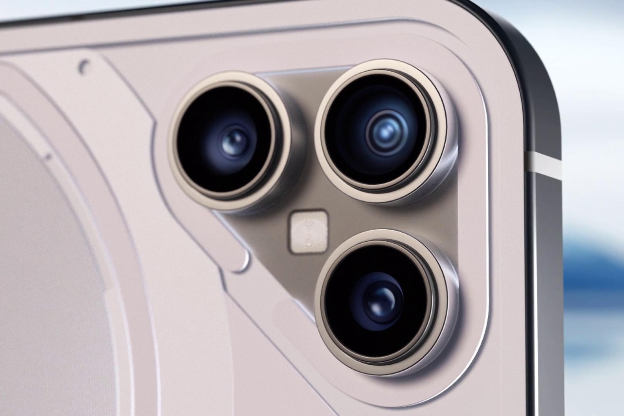
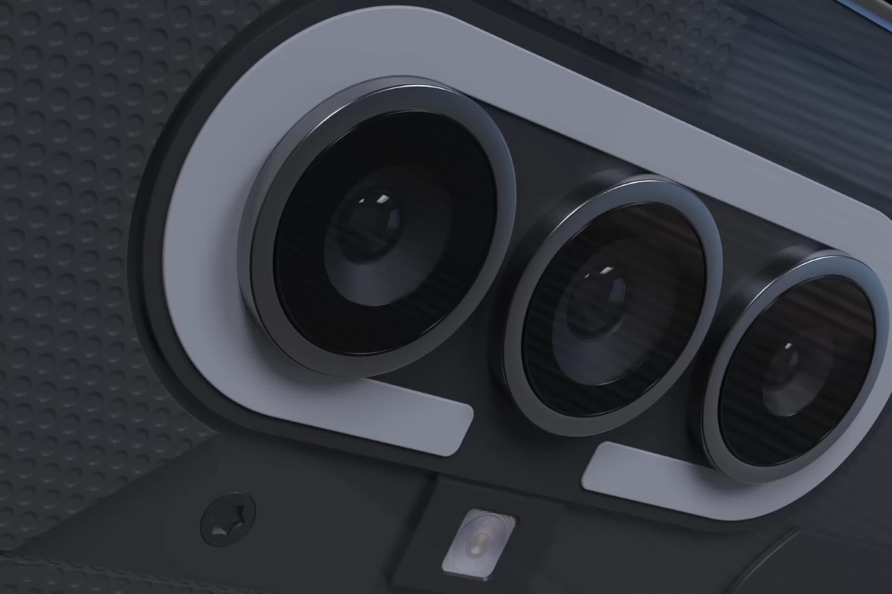
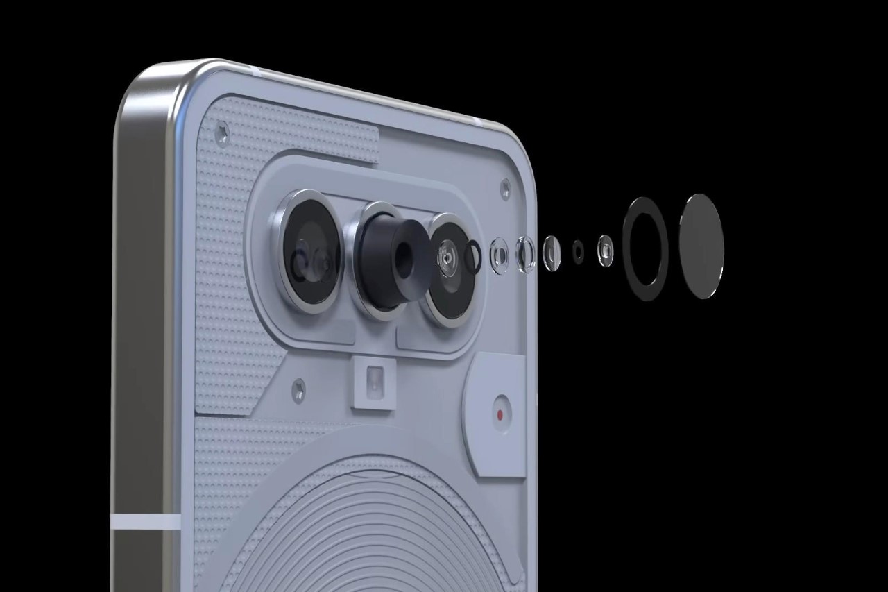
The Phone (2), for the most part, looks a lot like its predecessor, but has one glaringly obvious change – the camera array. Now with three cameras instead of two, the smartphone gets a minor (yet significant) makeover. The Glyph Interface gets a slight change, which in turn acts as a visual symbol of progress, and the camera system gets an upgrade, with a third lens added to the mix. This 3-lens array would also probably help the Nothing Phone (2) shine better in MKBHD’s blind smartphone camera tests.

The Glyph Interface has a touch of familiarity, but is different enough to look like an ‘upgrade’.

The side profile remains unchanged, giving the phone consistency.

The unique camera bump not only looks appealing on the Phone (2), but it would also make the device differentiate itself from the iPhone

The front of the phone looks exactly the same, although it runs the latest NothingOS 1.5 launcher on top of Android 13. Google is expected to announce Android 14 this week, although I’ll be surprised if the new Nothing Phone (2) gets the upgrade this soon.

As per GSMArena, the upcoming Phone (2) is rumored to come equipped with the powerful Snapdragon 8+ Gen 1 chipset, along with either 8GB or 12GB of LPDDR5 RAM and 128GB or 256GB of UFS 3.1 storage. Its display is expected to measure 6.55 inches and feature an AMOLED panel with FullHD+ resolution, a 120Hz refresh rate, and an in-display fingerprint reader. The potential specs also include a 50MP main camera with OIS, as well as two other cameras, likely an ultrawide and auxiliary cam. The Phone (2) is also said to have stereo speakers and NFC capabilities. Additionally, the phone is rumored to boast a large 5,000 mAh battery that supports fast charging and wireless charging.

The post Nothing Phone (2) to roll out in summer 2023 with Snapdragon 8+. Here’s what it might look like… first appeared on Yanko Design.
Nothing Phone (2) concept renders show a new glyph interface centered around a 3-lens camera layout

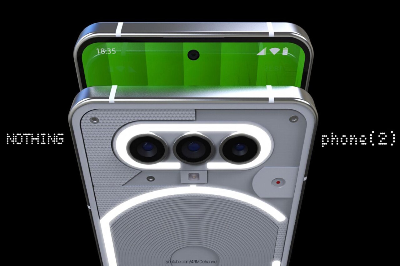
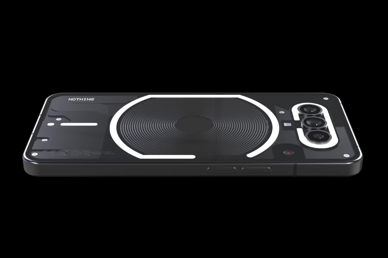
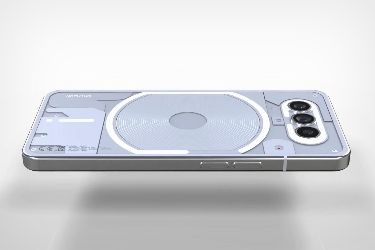
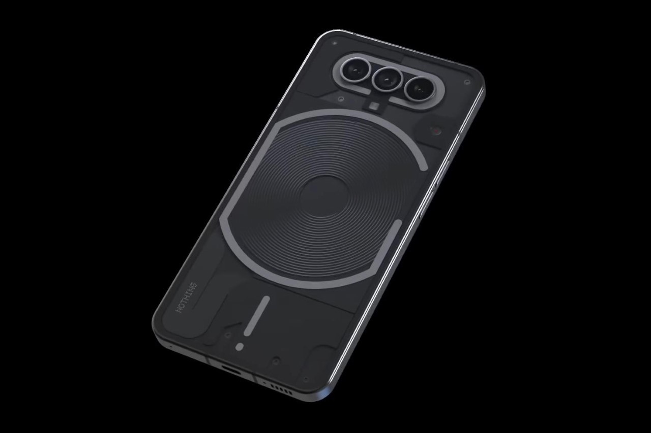
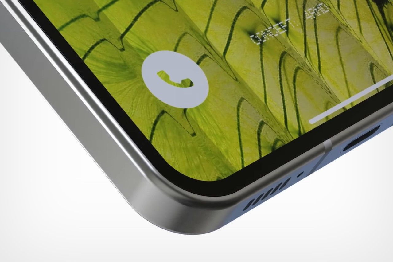
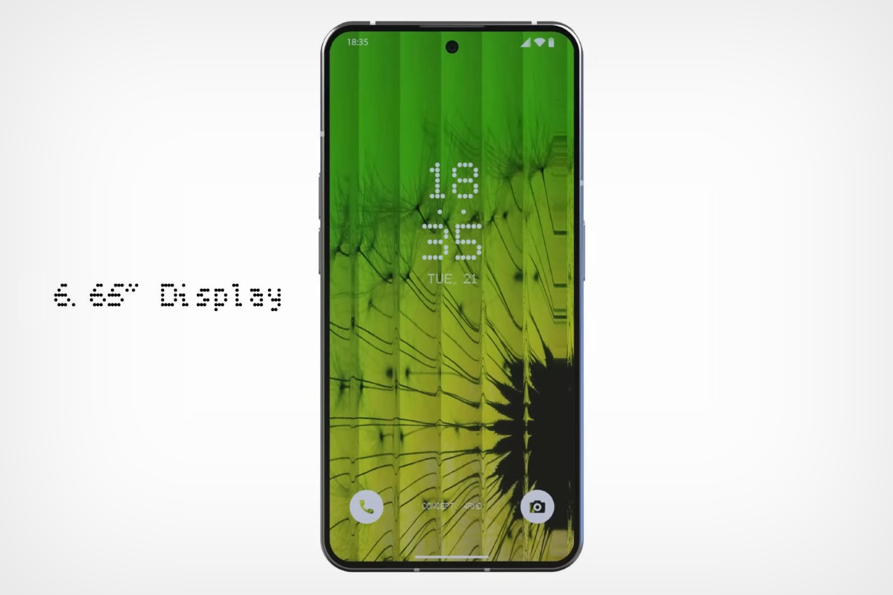
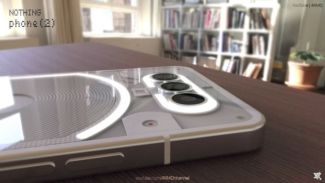
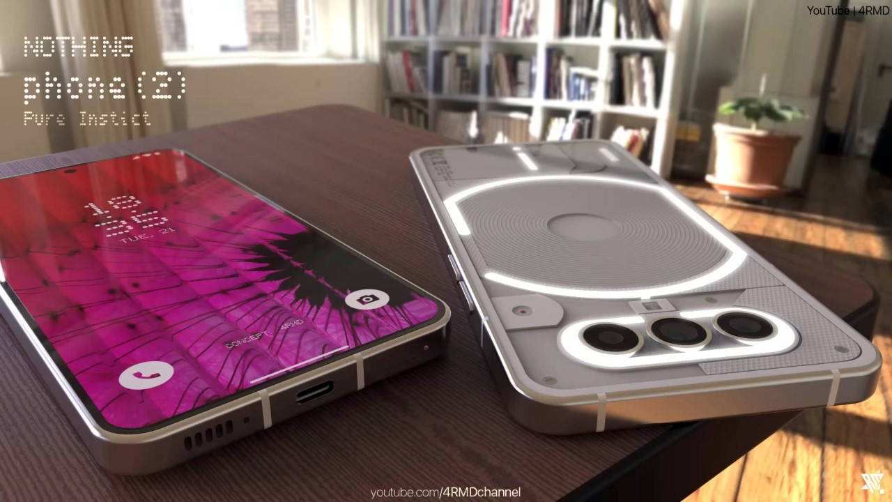
As we anticipate the launch of the Ear (2), Nothing’s 2nd gen TWS earbuds, here is a look at what we can expect from the 2nd gen smartphone which should also drop sometime this year. The Phone (2) will, for the most part, look a lot like the Phone (1), barring a few minor design tweaks and hardware upgrades. Concept designer 4RMD put together this dapper-looking handset to show us what the Phone (2) could potentially look like. The rendered concept features the same aluminum chassis with a transparent rear, a slightly modified Glyph Interface to reflect the new 3-lens camera setup, and a 6.65-inch AMOLED display on the front with thinner bezels than before and a 120Hz refresh rate and 1200nits peak brightness. As per Carl Pei’s announcement at the Mobile World Congress, the 2nd gen phone will also feature Qualcomm’s Snapdragon 8+ Gen 1 chipset.

Designer: 4RMD

Completely refreshing a phone’s design is incredibly expensive, so chances are the Phone (2) will rely on a design not too different from the Phone (1), so it can use a lot of the same parts as a result. The new phone looks pretty much identical in terms of shape and size, while the only notable design change lies in the 3-lens camera array on the top. This also means the Glyph Interface stays the same for the most part, featuring only a minor change on the top with the removal of the ‘Antenna’ LED strip and a horizontal and slightly longer ‘Camera’ LED arc. You’ve still got the G-shaped LED strip around the wireless charging coil, and the exclamation-mark LED strip near the USB-C port.

Further keeping things simple, the Phone (2) retains its predecessor’s black and white color variants, while highlighting the phone’s see-through back as a design feature. I honestly can’t get enough of how beautiful the components look through the transparent Gorilla Glass Victus panel, and it’s great to see Nothing embracing this feature moving forward.

The one true visible change is the new phone’s camera layout, which now has three cameras instead of two. Arranged horizontally, the layout feels similar to the Pixel’s camera bumper, with a slight nod to the 7T, which was one of Carl Pei’s last OnePlus models before he departed the company in October 2020. The new layout features a dream team of three 50MP shooters, including one Wide, one Ultra-Wide, and one Telephoto to put the Nothing Phone (2) firmly in the camera race for 2023.

Although personally a big no-no for me, 4RMD also hid one more easter egg in his design in the form of RGB LEDs in the Glyph Interface. While I personally think the white LEDs have a lot of character for a device that small, the Phone (2) concept’s Glyph Interface can now shine in a variety of colors, blinking blue for Twitter, Pink for Instagram, Yellow for Snapchat, Red for YouTube, Green for Phone Calls, and a host of other colors depending on the app or type of notification.
The same AMOLED display and flat-edge Aluminum chassis, but with thinner bezels.

The launch date of the Phone (2) is unclear at this point, although judging solely by its predecessor, should happen sometime in the first half of this year with the phone being available for sale starting July 2023.

The post Nothing Phone (2) concept renders show a new glyph interface centered around a 3-lens camera layout first appeared on Yanko Design.