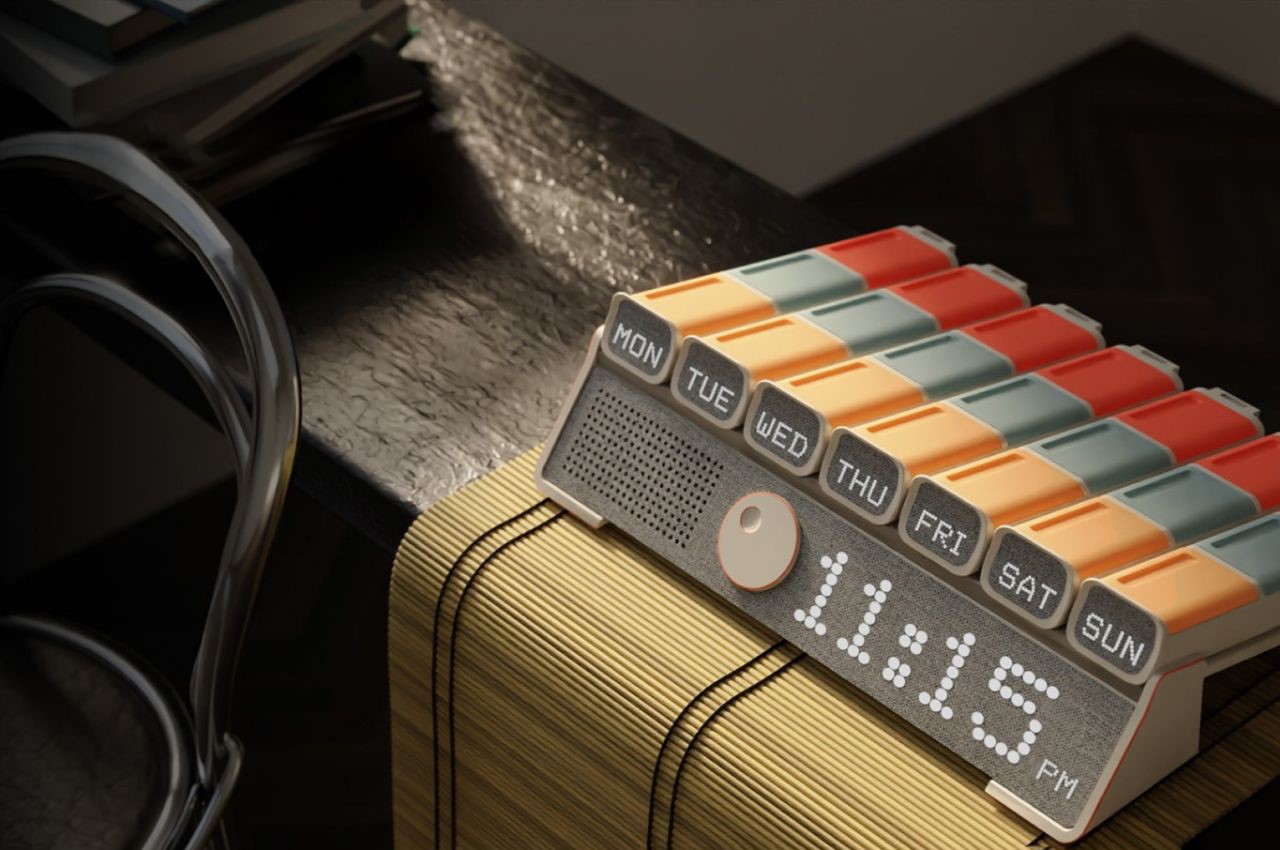
MedEasy: A Medicine Box That Reminds The Elderly Of Their Dosages

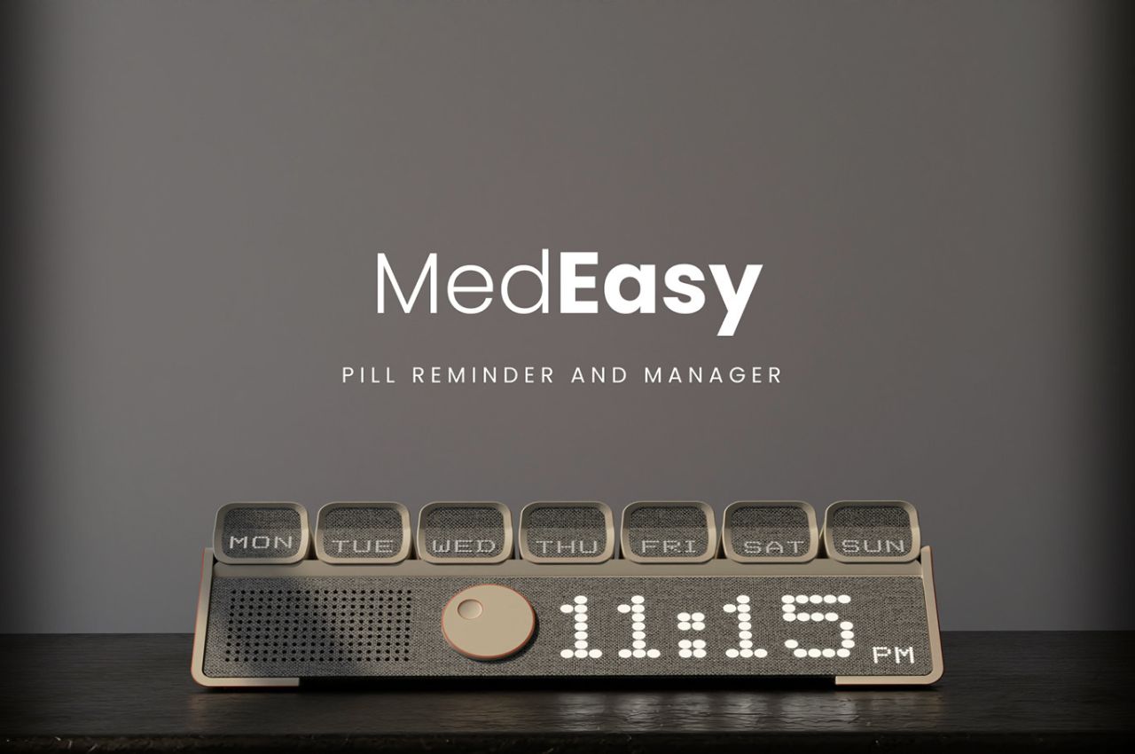
MedEasy, a thoughtful medicine box designed for the elderly, aims to address the challenges faced by seniors in managing their medications independently, focusing on regions in India with a significant population of elderly individuals living alone, such as Tamil Nadu and Nagaland.

Designer: Tarun Pahadiya

The primary goal of the MedEasy project is to create a product that serves as a reliable companion for the elderly, helping them remember, manage, and stock their medicines efficiently. With a focus on addressing the loneliness prevalent among seniors living alone, the product aims to contribute to the well-being of this demographic, which constitutes 5.7% of senior citizens in India.
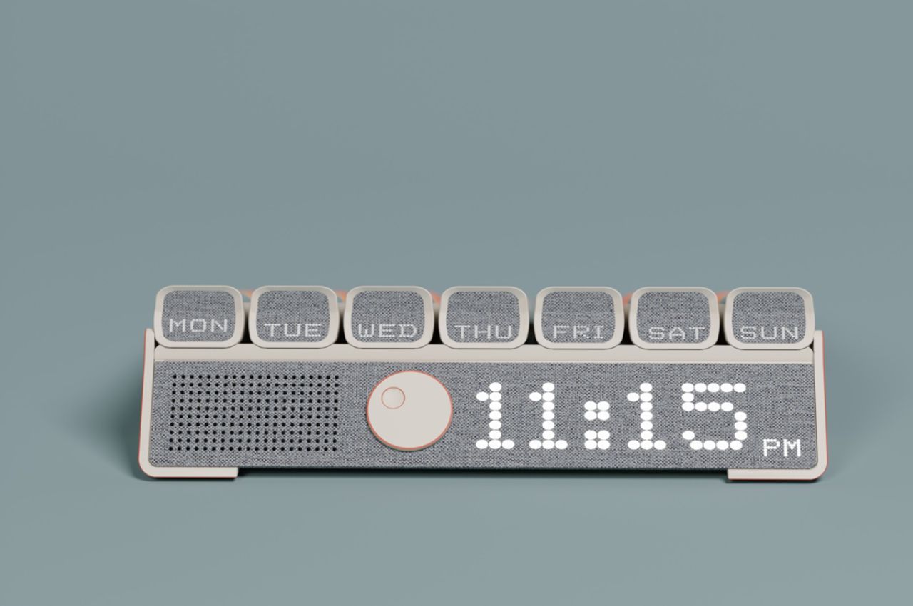
MedEasy primarily caters to elderly individuals who struggle with proper medication adherence due to memory issues or limited motor activities. This includes elderly family members, individuals living alone with forgetfulness concerns, and those dealing with Alzheimer’s issues. Secondary users encompass caretakers, including nurses, young family members, doctors, and NGO helpers who interact with the product to support the primary users.
Conducting extensive market research revealed key insights, emphasizing the importance of addressing sensory degradation with age, monitoring proper medication dosage, reducing dependence on others for medication, and creating a positive and engaging process for medication adherence. Additionally, the elderly often avoid taking their prescribed doses consciously, necessitating reminders and easy refill and dispensing mechanisms, however, I believe there could be a more emotional approach to motivating them to take their dosages which can be explored, rather than just reminders if they avoid them on purpose.
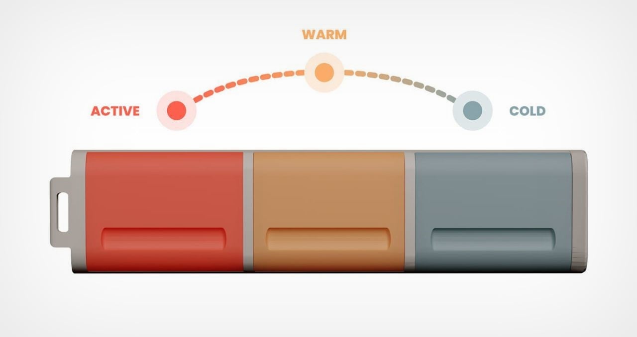
Inspired by the “less but better” ethos of Dieter Rams, the designer employs a minimalist, functional, and timeless design. The prototype underwent rigorous testing, focusing on the sliding-out day sections, the ambidextrous nature of the product, and the ease of interaction with the opening of cells. The color palette reflects morning, noon, and night cues, fostering a visually captivating aesthetic.
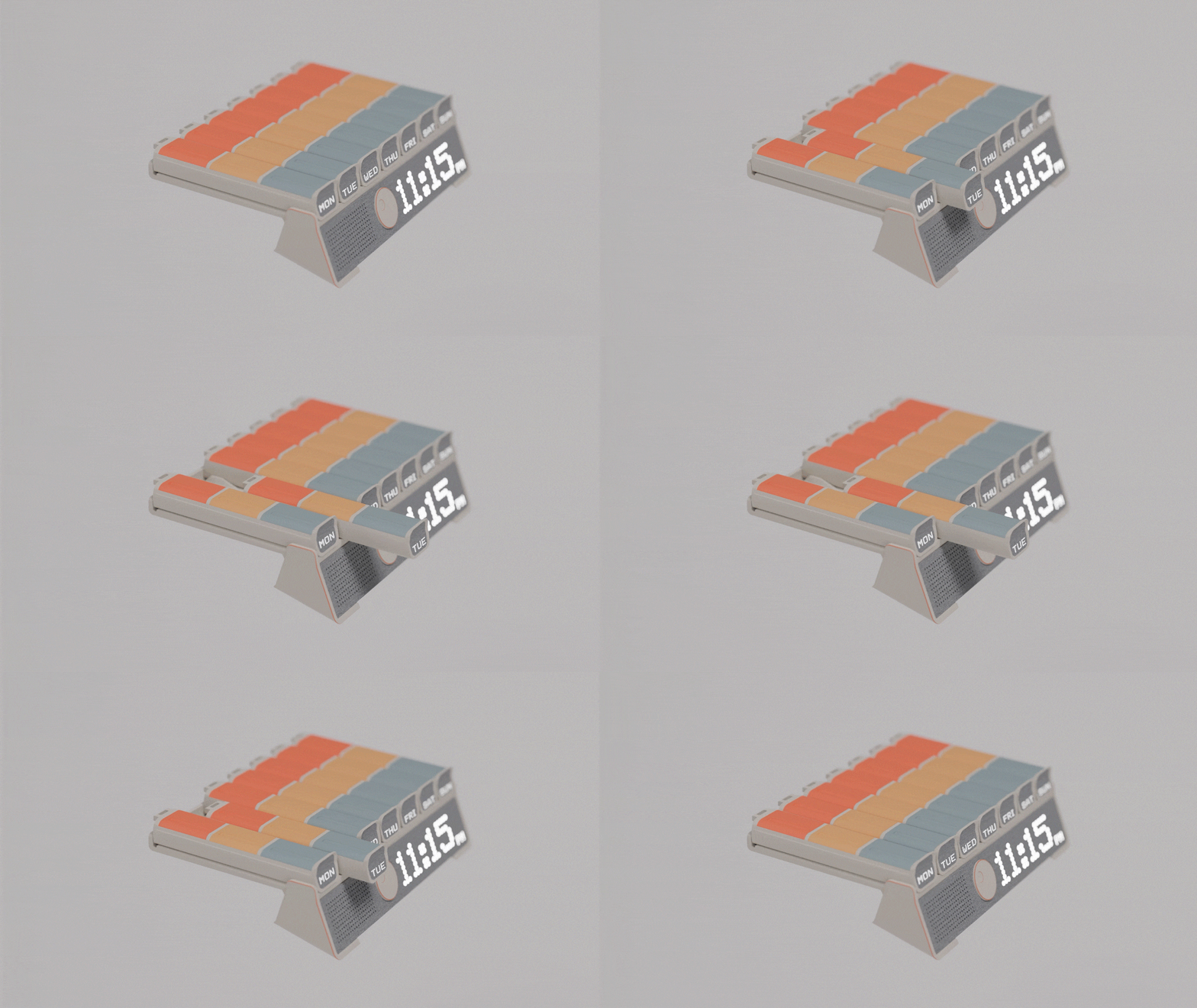
Slide Action: The sliding mechanism allows users to effortlessly remove cells, reducing physical effort while providing a smooth experience.
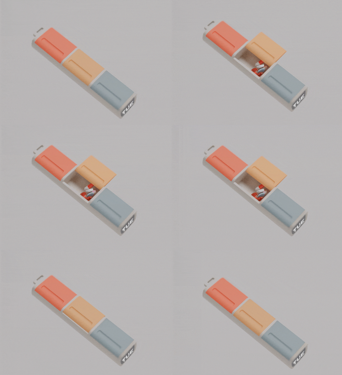
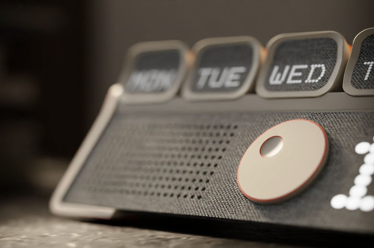
Physical Controls: The product incorporates minimal yet impactful physical controls for essential functions, ensuring ease of use with scrolling and selection.
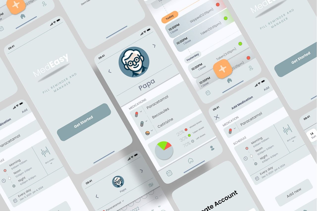
Clean UI: Employing a simple and calm visual language to minimize visual complexity, fostering a welcoming approach to enhance user interaction with the product.

App Support: The inclusion of a user-friendly app enhances the medication management experience, providing interfaces for tracking medications, dosages, and schedules. This feature enables remote monitoring and management by caregivers, ensuring timely adherence and reducing the risk of errors.

MedEasy is not just a medicine box; it’s a comprehensive solution that empowers elderly individuals to take control of their medication regimen. By combining thoughtful design, cutting-edge technology, and a user-centric approach, MedEasy contributes to the well-being and independence of seniors, ensuring they can lead fulfilling lives with confidence and peace of mind.
The post MedEasy: A Medicine Box That Reminds The Elderly Of Their Dosages first appeared on Yanko Design.
An Apple Watch strap with an integrated pillbox seems like quite a brilliant idea

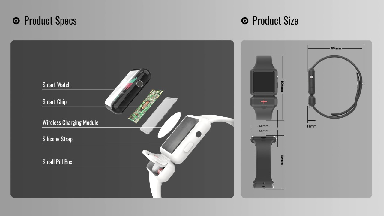
Although conceptual, the Apple Watch Pillbox highlights a rather novel use-case for the company’s health-tracking smartwatch, building on its personality of being a life-saving piece of tech.

Every year, as Tim Cook takes the stage to announce the next series of the Apple Watch, he simultaneously also talks about how many letters and emails he’s received from people claiming that the watch saved their life. Whether it was detecting a fall or a crash, to any anomalies in body temperature or heart rate, the watch is great at knowing when something is off (either noticeably or not) and alerting you or your caretaker as soon as possible. This watch strap with an integrated pillbox takes the watch one step further, helping people stay healthy by following their medication routine religiously.

Designer: Zhiwen

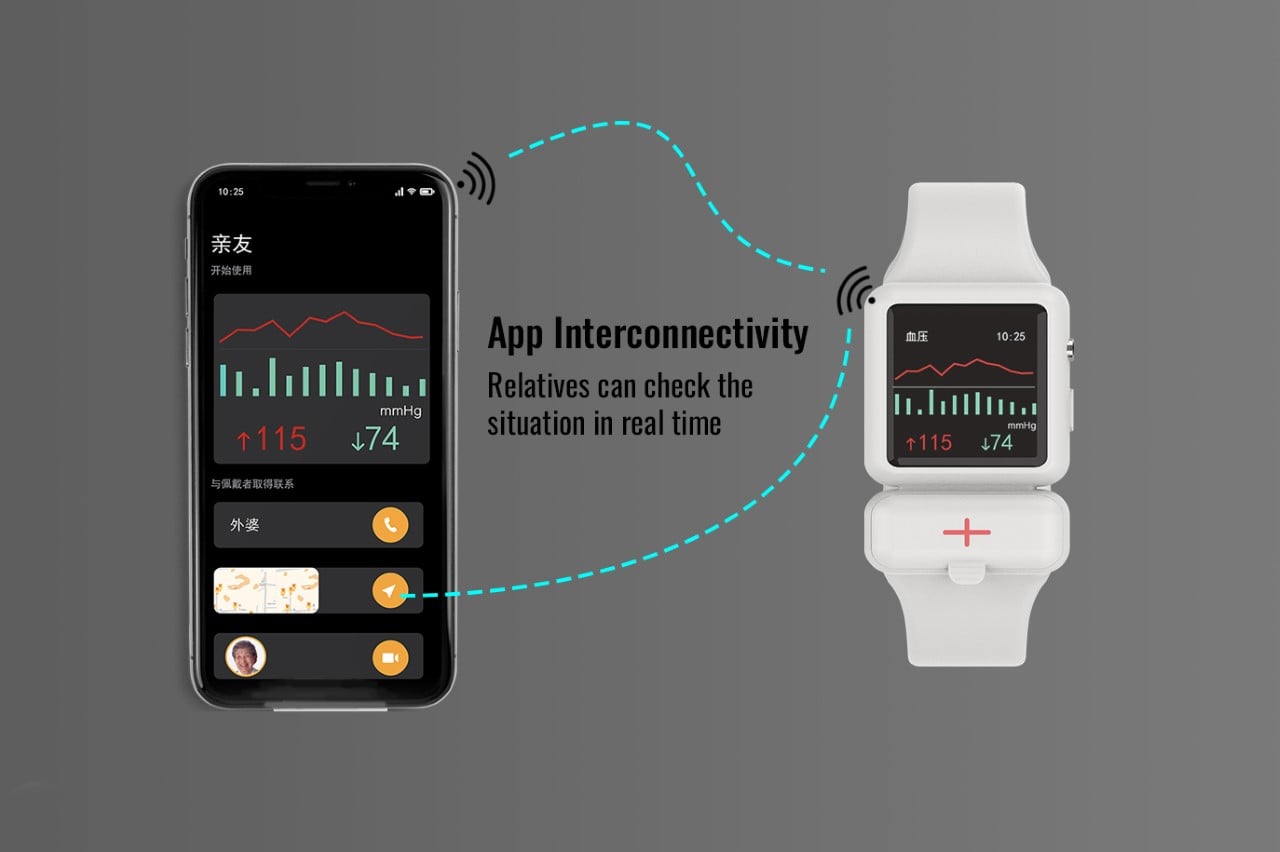
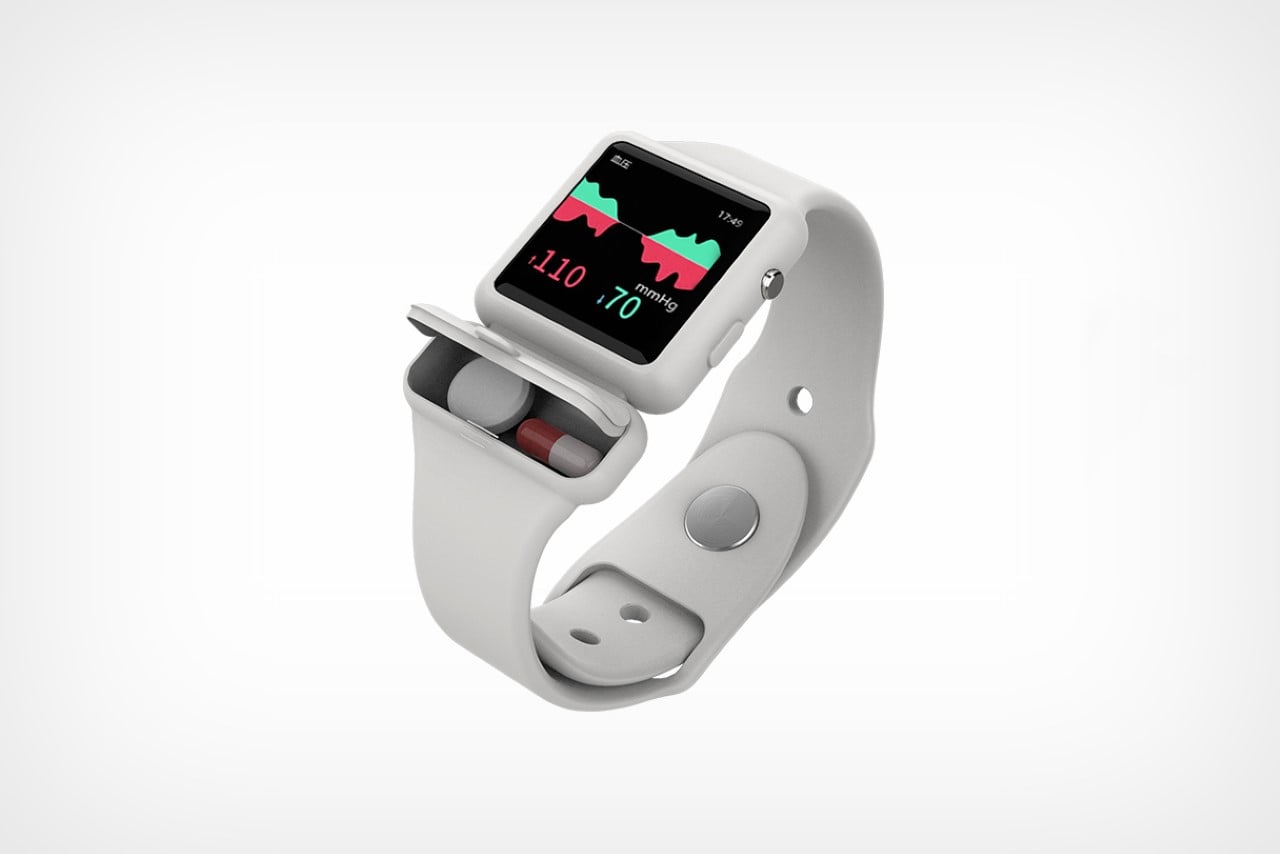
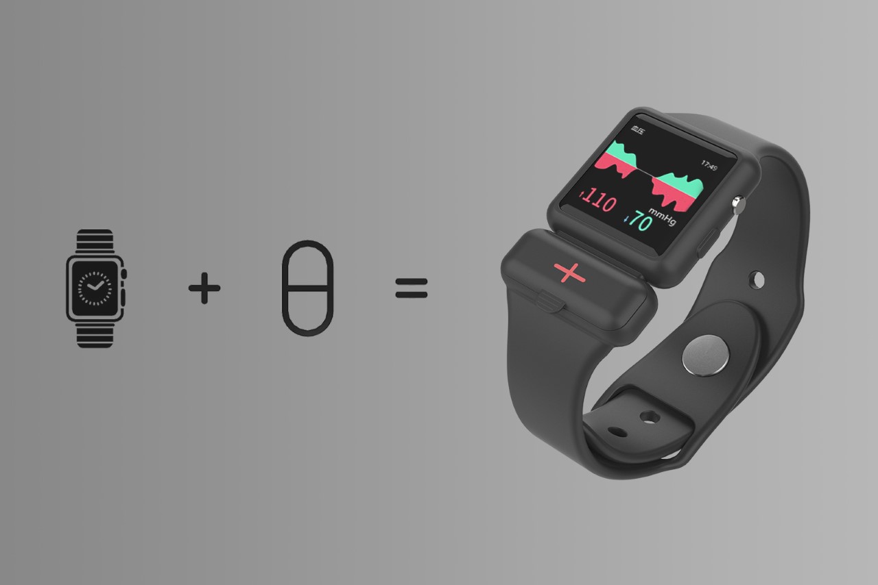
Designed as a simple silicone strap and sleeve that attaches to your Apple Watch, the Apple Watch Pillbox gives you a tiny pill container right underneath the watch body, letting you easily carry your medication with you wherever you go. The watch permanently sits on your wrist so the chances of forgetting to carry your meds are much lower, and a health-monitoring app on the watch constantly tracks your health and reminds you to take your meds at exactly the right time.

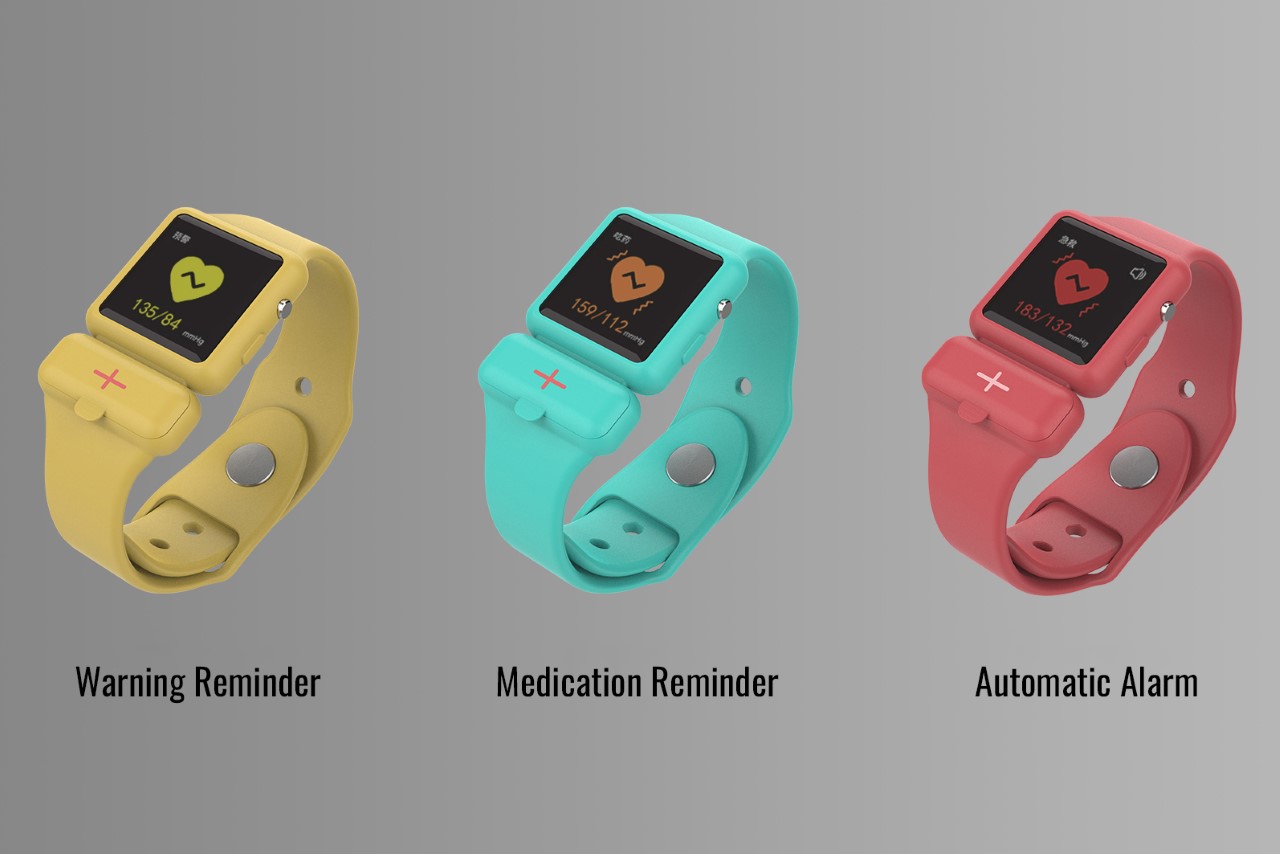
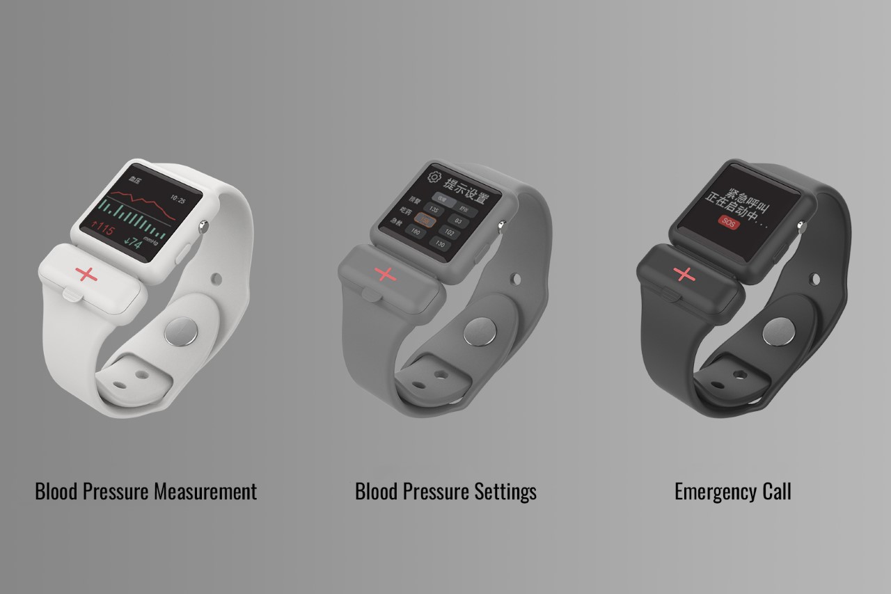
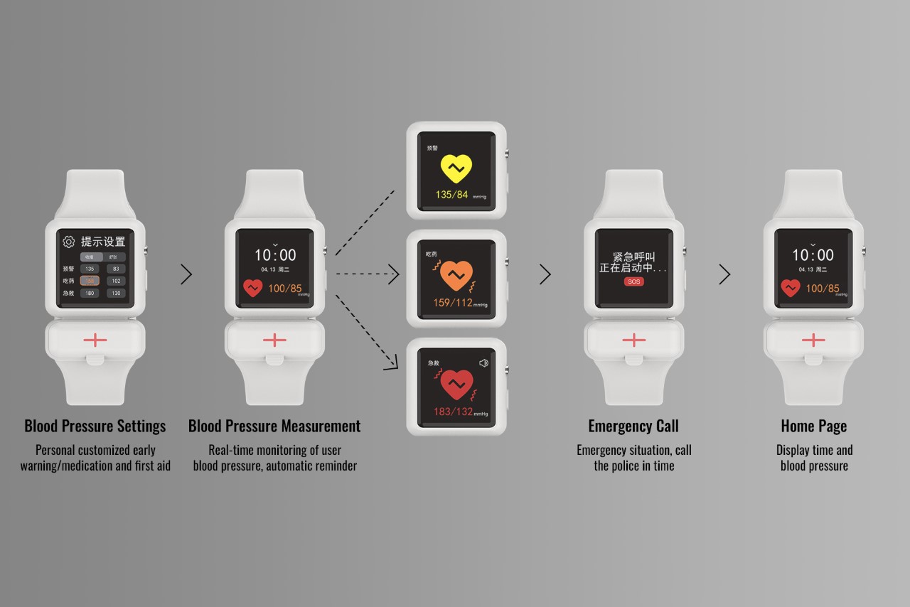
The way the app, at least in this situation, works is by tracking the wearer’s blood pressure – a feature that isn’t there on the Apple Watch yet, but we’re working with hypotheticals, at this point. When the watch detects an anomaly, it gives you a gentle notification, allowing you to be aware. If the situation worsens, the watch lets you know it’s time to take your meds, and if there’s no improvement, the watch alerts your caretaker/guardian so they can check in on you. Caretakers can also remotely keep track of your health stats too, just as a safety measure.

Although the Apple Watch can’t actively measure its wearer’s blood pressure, the idea of having a pillbox attached to your watch has various merits. For starters, the watch can measure your heart rate, take an EKG, and even check your blood O2 levels. It’s estimated that in the future, the watch will be able to non-invasively check your blood sugar levels. In such a scenario, knowing exactly when to take an insulin shot would be absolutely crucial. Similarly, for people suffering from a variety of ailments that require monitoring and medication, having a health tracker on your wrist along with a pillbox sounds like a pretty neat idea.

The post An Apple Watch strap with an integrated pillbox seems like quite a brilliant idea first appeared on Yanko Design.
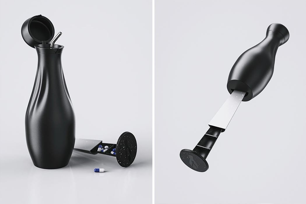
This water bottle and pillbox hybrid was designed to restore young cancer patients’ confidence!

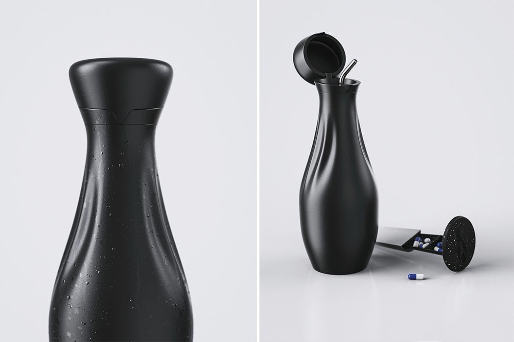
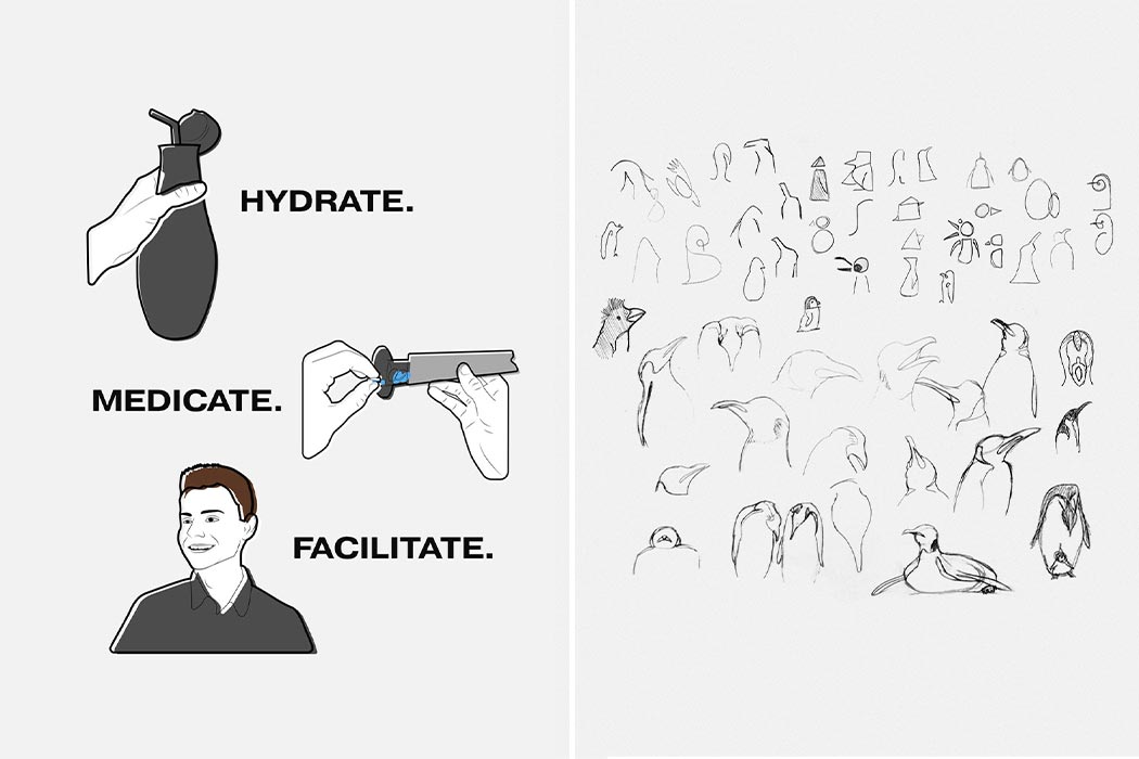
Pengu was born out of empathy for those diagnosed with cancer. It is heartbreaking and life-changing at any age, but more so when you are a teenager or young adult (TYA) because it takes away from their chance at having a normal developmental trajectory during a phase of life that is crucial for social, cognitive, and emotional development. Pengu was designed to improve the quality of life for TYA cancer patients on hospital leave or in remission by helping them feel and live a little more independently.

At this age, usually, a TYA patient would be moving out for school, getting their own space, experimenting with career options, and more but it all comes to a giant pause as their life suddenly revolves around health appointments. The constant monitoring and check-ups are bound to make anyone feel like they don’t have control over their life, and especially with a disease like cancer, so Pengu – a water bottle and pill holder hybrid – is a small product that can make a big impact by giving them a little control back. It helps to smoothly facilitate two critical things for the patient – taking their medication on time and hydrating enough. These two tasks are things the best of us forget all the time, but it is something vital for a patient’s recovery and therefore can’t be missed. With Pengu, the user will not have to feel conscious about having a big pillbox and the medicines will be easier to access compared to being in their bags. When the user starts to streamline their own basic needs of taking medication and drinking water, it starts to slowly build back their confidence about being able to leave home and readjust to life outside cancer. Besides, Pengu is sleek, minimal, and stylish so it takes away the feeling of “people are watching me when I have my pills.”

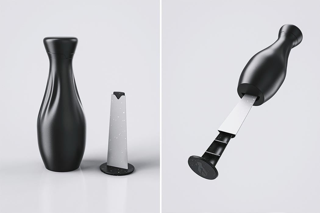
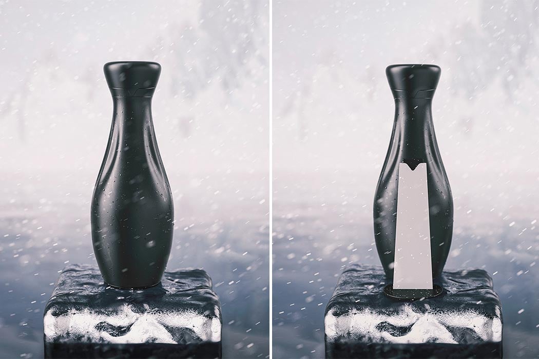
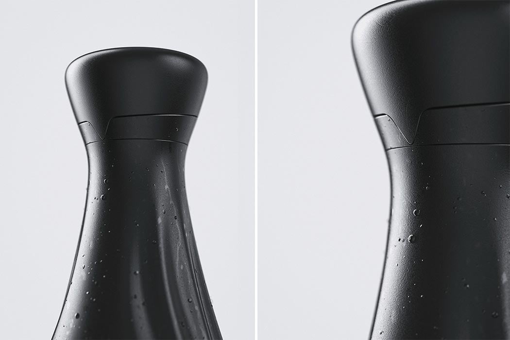
The name might hint on the fact that the form was inspired by the emperor penguin and their chick. “The subtle ribbed touch points on each side represent the flippers, whilst the shut line of the lid represents the beak. The pill holder slots into the base of the bottle, similarly to how the penguin would shield its chick from the cold,” explains Spence. Even the CMF was thoughtfully picked out to mimic the water-resistant feathers of the penguin. The jet black color is bold yet minimal and the bottle is powder-coated in stainless steel for sturdiness and insulation. Since it is still a concept, it would be fun to see if there was a digital element to it like subtle reminders to hydrate or take pills. The penguin is a symbol of resilience – no matter how harsh the storm, they must keep moving forward to survive and it is a beautiful reminder to those fighting cancer every day.

Designer: Shane Spence

Wrist-worn Medication Reminder

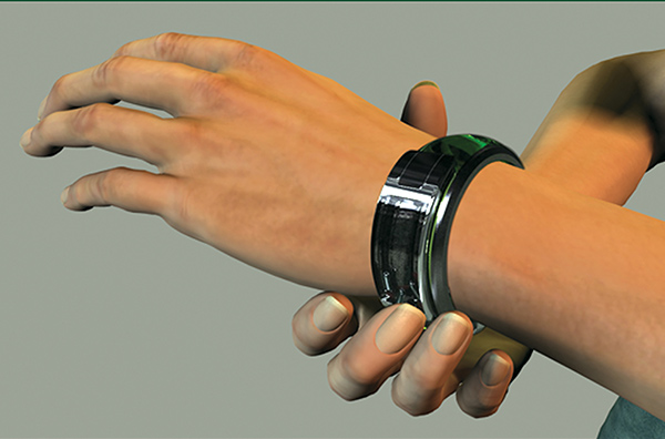
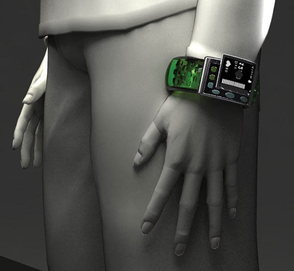
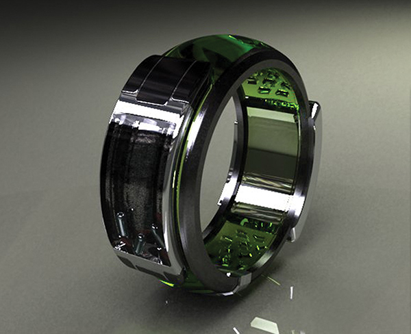
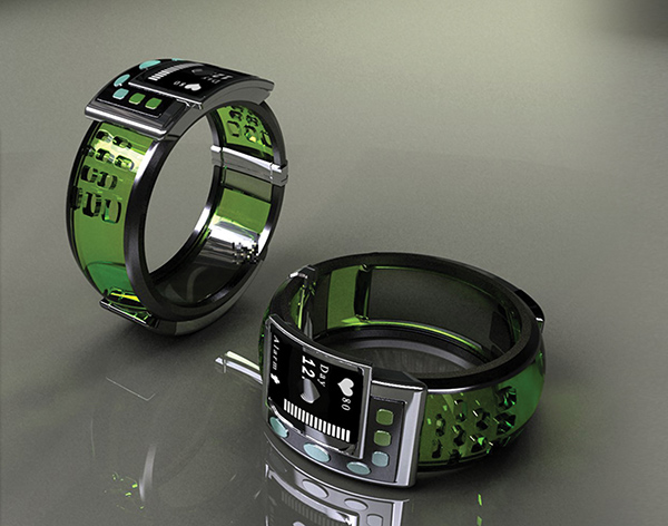
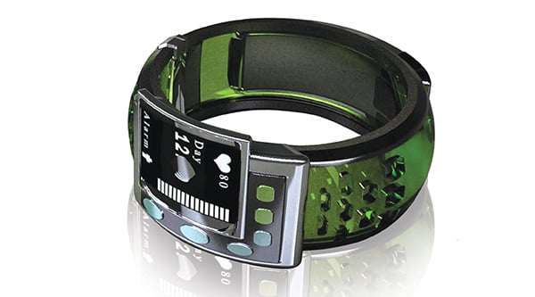
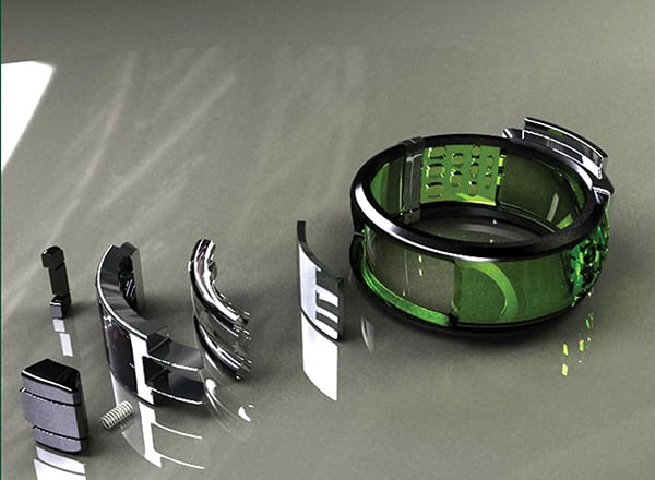
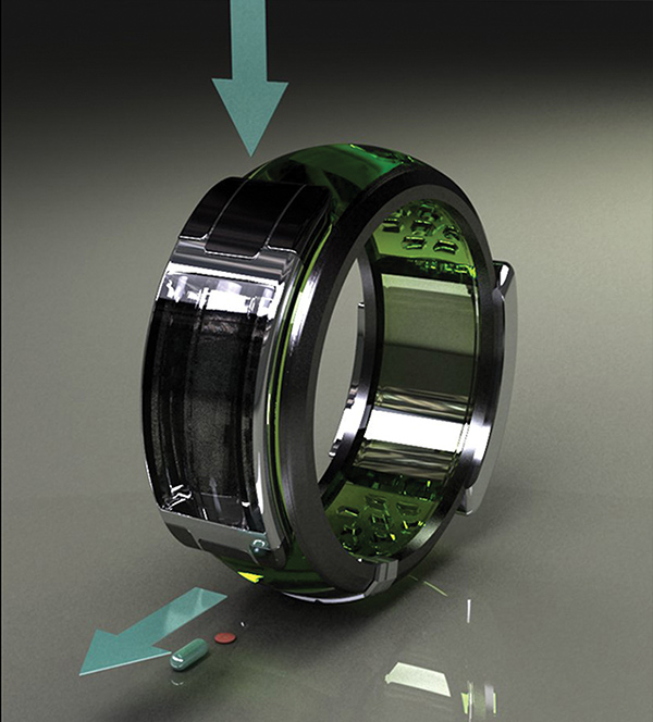
Because Alzheimer’s is associated with memory loss, a suffering patient’s ability to remember to take the medication that helps them can be severely reduced. This solution helps with a regimented dosing program by integrating a small pillbox into the back of a wristwatch. The timepiece then alerts patients when its time to medicate, giving them a sense of independence from external help.

Designer: Asal Hazrati

-
Yanko Design
Timeless Designs - Explore wonderful concepts from around the world!
Shop CKIE - We are more than just concepts. See what's hot at the CKIE store by Yanko Design!
(Wrist-worn Medication Reminder was originally posted on Yanko Design)

Related posts:

  1. Global Warming Reminder
  2. Outta-the-door Reminder
  3. Wearable Water Reminder