A Detachable Kitchen Speaker that Adapts to Your Needs as a Host

Music has always been an integral part of human gatherings and social events. Whether it’s hosting a backyard barbecue, having friends over for dinner, or simply enjoying a relaxing evening with loved ones, music sets the mood and brings people together. However, finding the right speaker that seamlessly adapts to different situations has been a challenge for many homeowners. That’s where CHORD, the innovative kitchen speaker, steps in to address these common problems and provide a delightful audio experience.

Designer: Alexander Marovec
One common issue faced by hosts during parties or gatherings is the struggle to fill the room with sound while still maintaining a comfortable volume for conversations. Traditional speakers often force hosts to crank up the volume, resulting in a loud area near the speaker and reduced audio quality in the far corners of the room. This problem has been a constant hindrance to creating a vibrant and enjoyable atmosphere for guests.

When it comes to choosing a speaker for our home, we usually have several key values in mind. Flexibility ranks high on the list, as people desire a speaker that can be easily moved around and set up in different areas of their backyard or home to ensure high-quality sound throughout the property.

Convenience is another crucial factor, as hosts seek a speaker that effortlessly connects to and plays their music without any hassles. Moreover, homeowners want a high-quality speaker that delivers exceptional sound, ensuring that their guests and themselves can enjoy the music while cooking or conversing.

Aesthetics play a significant role too. Many homeowners desire an at-home speaker that not only provides fantastic audio but also complements their interior décor, making it both functional and aesthetically pleasing.

Currently, the market lacks a speaker that offers the perfect blend of flexibility for parties and the consistent performance needed for a good home-based speaker. This presents a golden opportunity for an innovative solution that enhances the food preparation and party hosting experience.

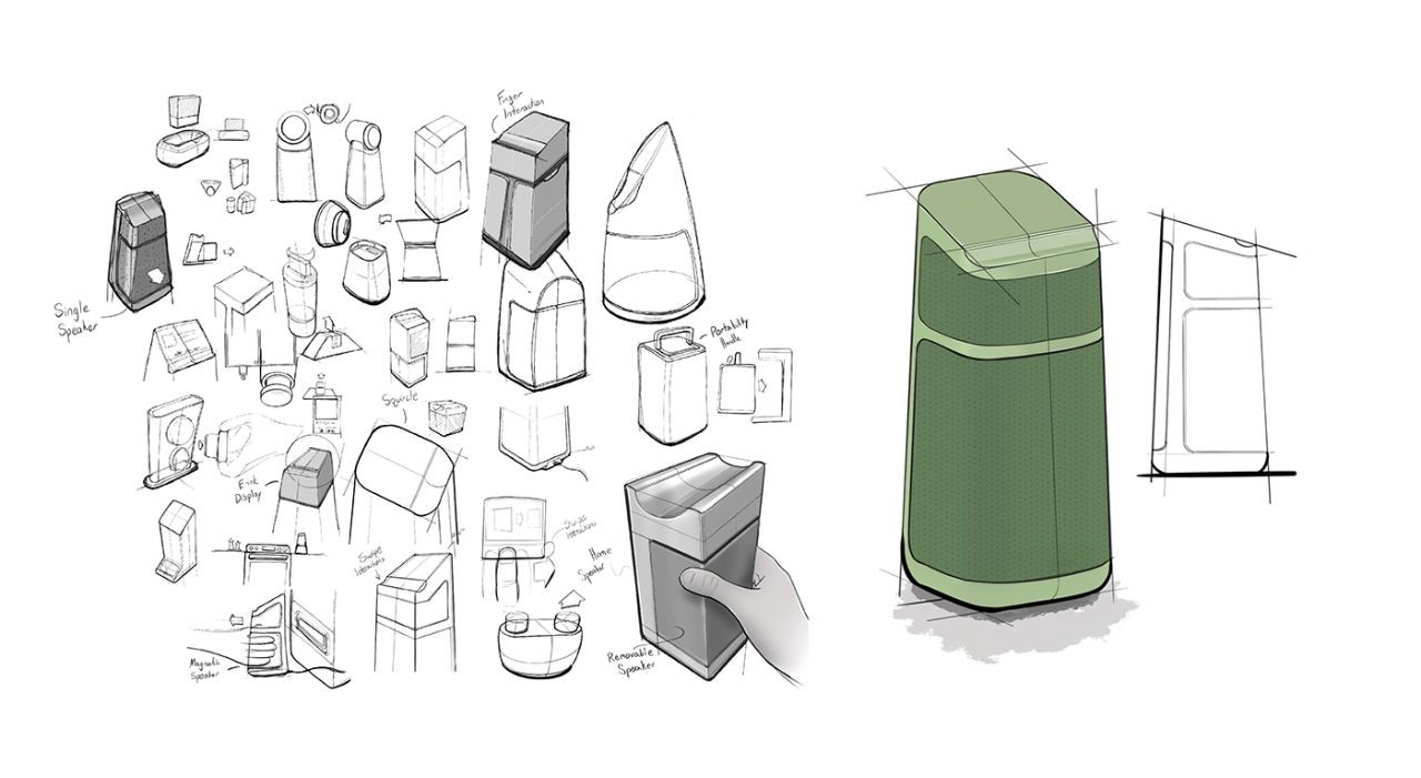
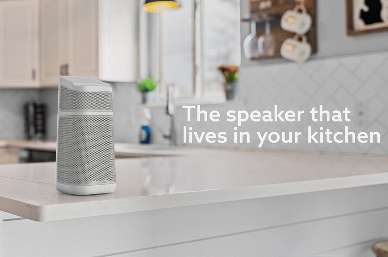
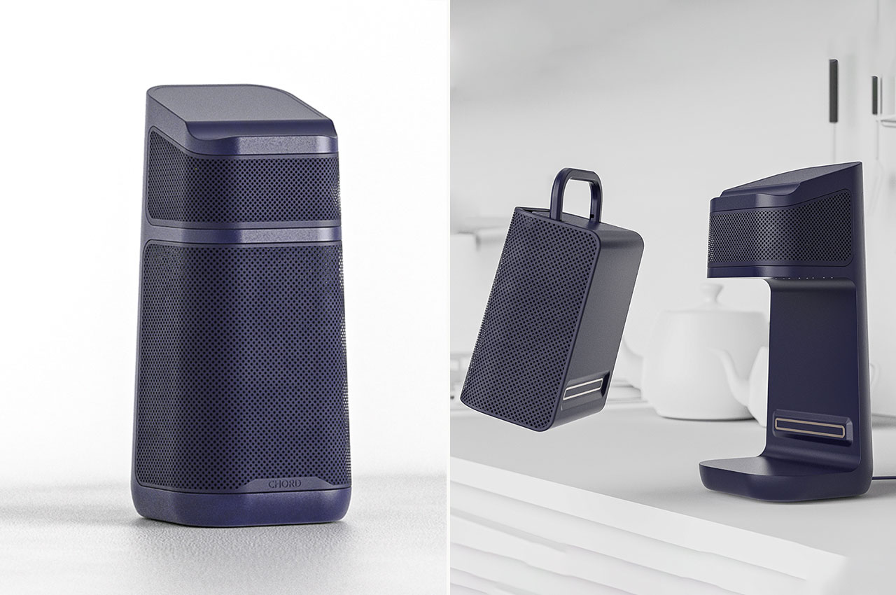
CHORD is a revolutionary kitchen speaker designed to cater to all the needs and values of modern homeowners. It aims to provide an unparalleled audio experience that adapts effortlessly to different situations, making it a must-have addition to any household.

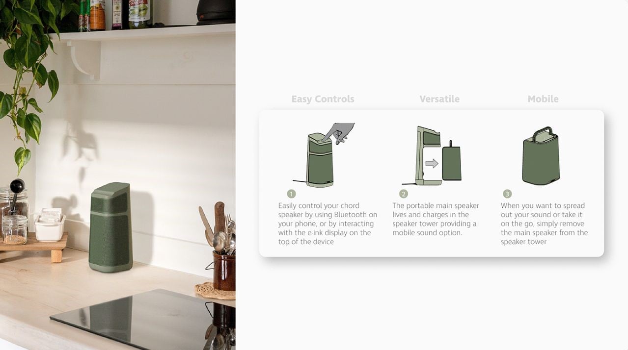
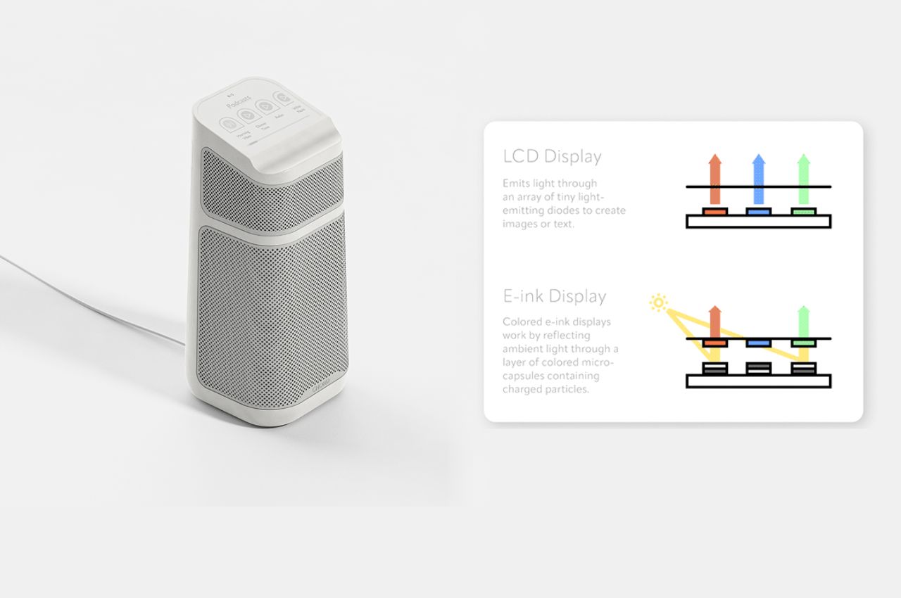
With CHORD, controlling your music has never been easier. You can effortlessly connect your devices through Bluetooth, and for added convenience, there’s an e-ink display on top of the device, allowing for intuitive and user-friendly interactions. The e-ink display offers several advantages, including low power consumption, easy readability, high visibility even in bright light, and the ability to hold an image without power. This ensures reduced eye strain and fatigue, as well as sharp text and high contrast for improved readability.
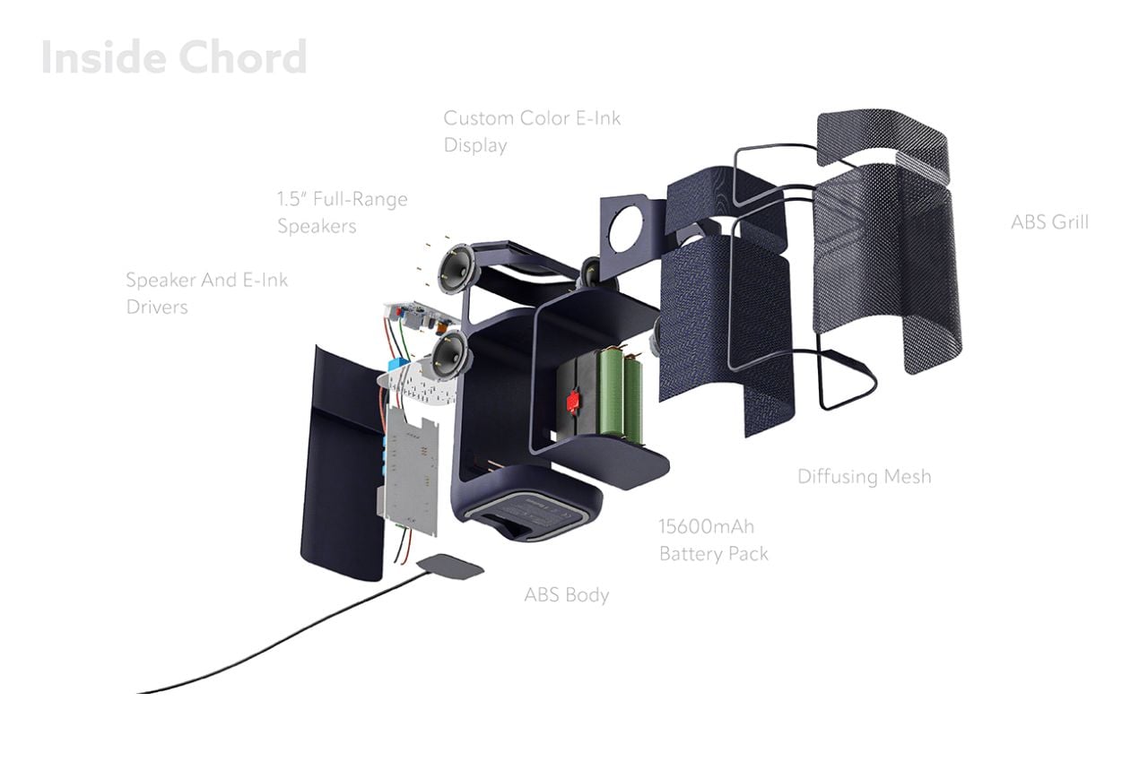
Moreover, CHORD’s main speaker is portable and lives within the speaker tower, providing a mobile sound option that can be easily moved around. This allows you to take the music wherever you go, be it in the kitchen, the backyard, or even another room.

CHORD features cutting-edge inductive wireless charging technology, eliminating the hassle of dealing with tangled cords and making it incredibly convenient to charge the speaker tower. With an impressive battery life of 8 hours, CHORD ensures that the music keeps playing throughout the party.

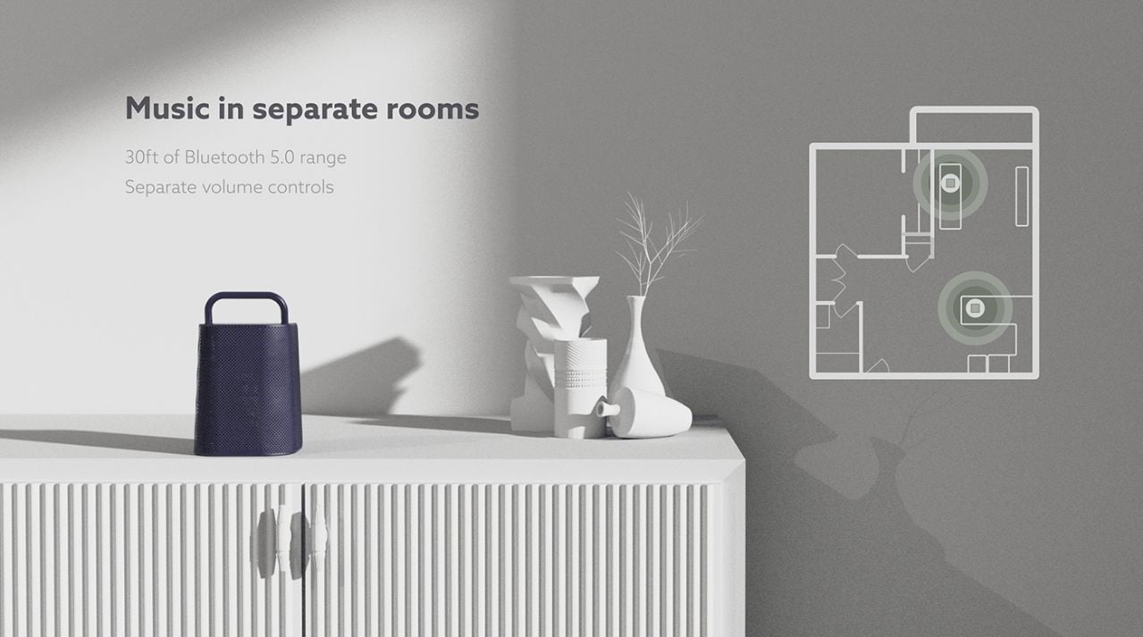
Designed with a fold-up portable handle, CHORD can be carried around effortlessly, making it the perfect companion for outdoor activities or spontaneous gatherings. Additionally, the speaker offers a 30ft Bluetooth 5.0 range, allowing you to connect your devices with ease and control your music from a distance.
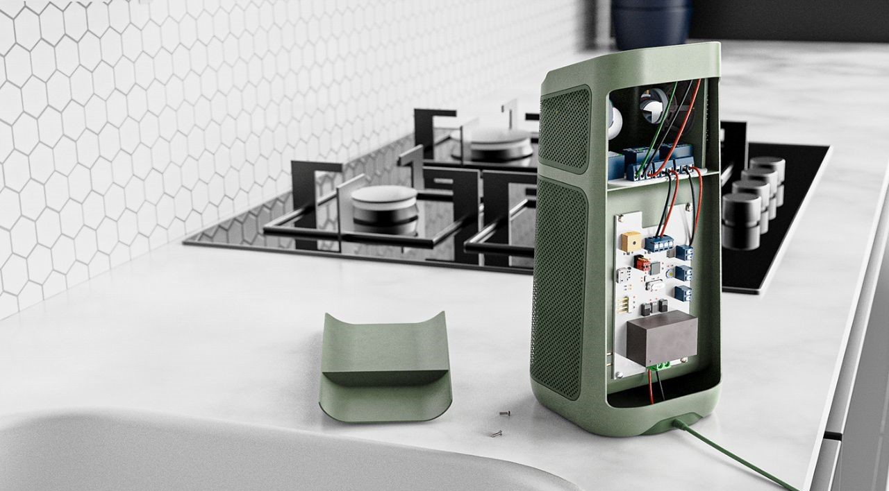
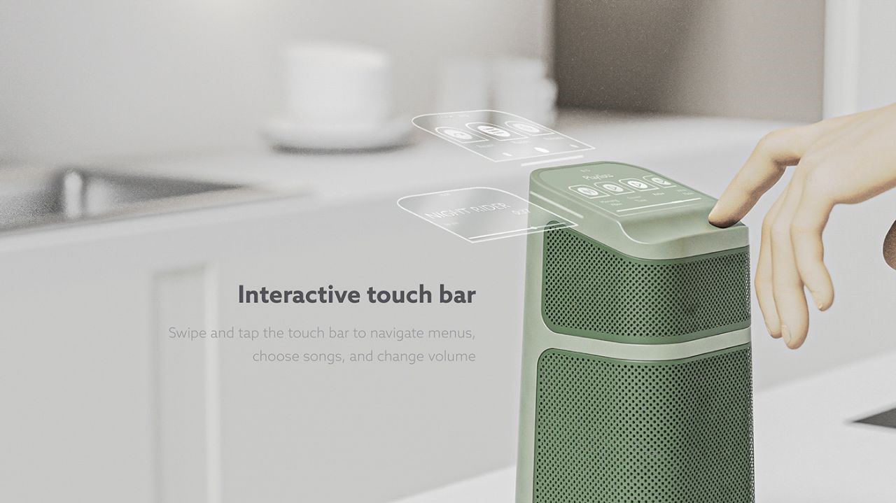
CHORD understands the importance of maintaining the right volume balance. With separate volume controls, you can easily adjust the sound output according to your preferences and the setting of the party.

Furthermore, CHORD supports multi-room music, enabling you to have synchronized audio playback in different areas of your home. This feature allows you to set up multiple CHORD speakers throughout the house, creating an immersive audio experience for all your guests.
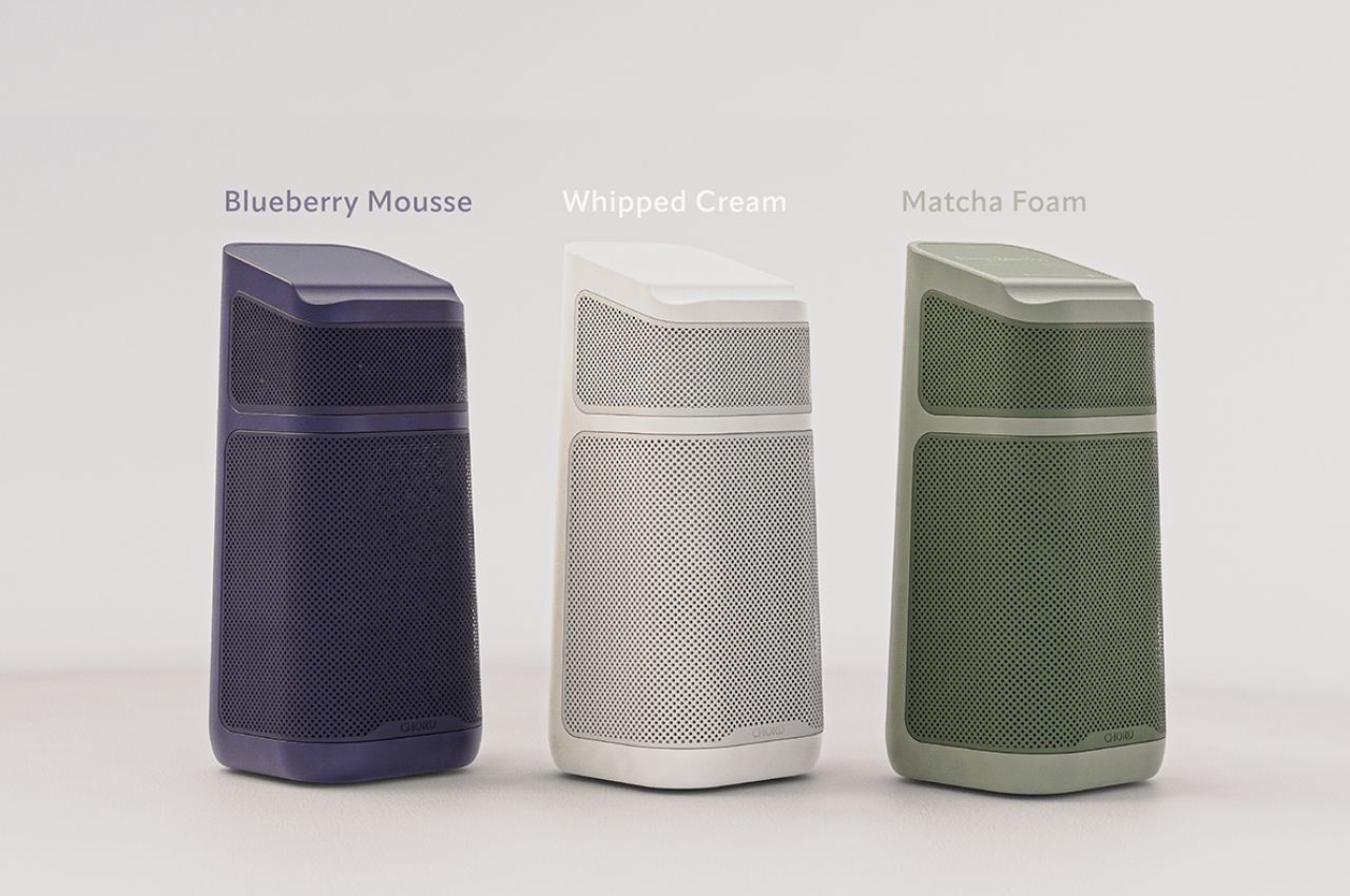
CHORD comes in three stylish colors – matcha foam, blueberry mousse, and whipped cream – designed to complement your kitchen’s taste and interior décor. It blends seamlessly with your surroundings, adding a touch of elegance and modernity to your living space.

CHORD has set out to redefine the concept of kitchen speakers, addressing the common problems faced by hosts and homeowners. With its adaptability, ease of use, high-quality sound, and aesthetic appeal, CHORD stands as the ultimate solution for anyone looking to elevate their music experience in both indoor and outdoor settings.

Experience the convenience, flexibility, and superb audio quality that CHORD offers – the adaptable kitchen speaker that reimagines how you enjoy music in your home.
The post A Detachable Kitchen Speaker that Adapts to Your Needs as a Host first appeared on Yanko Design.
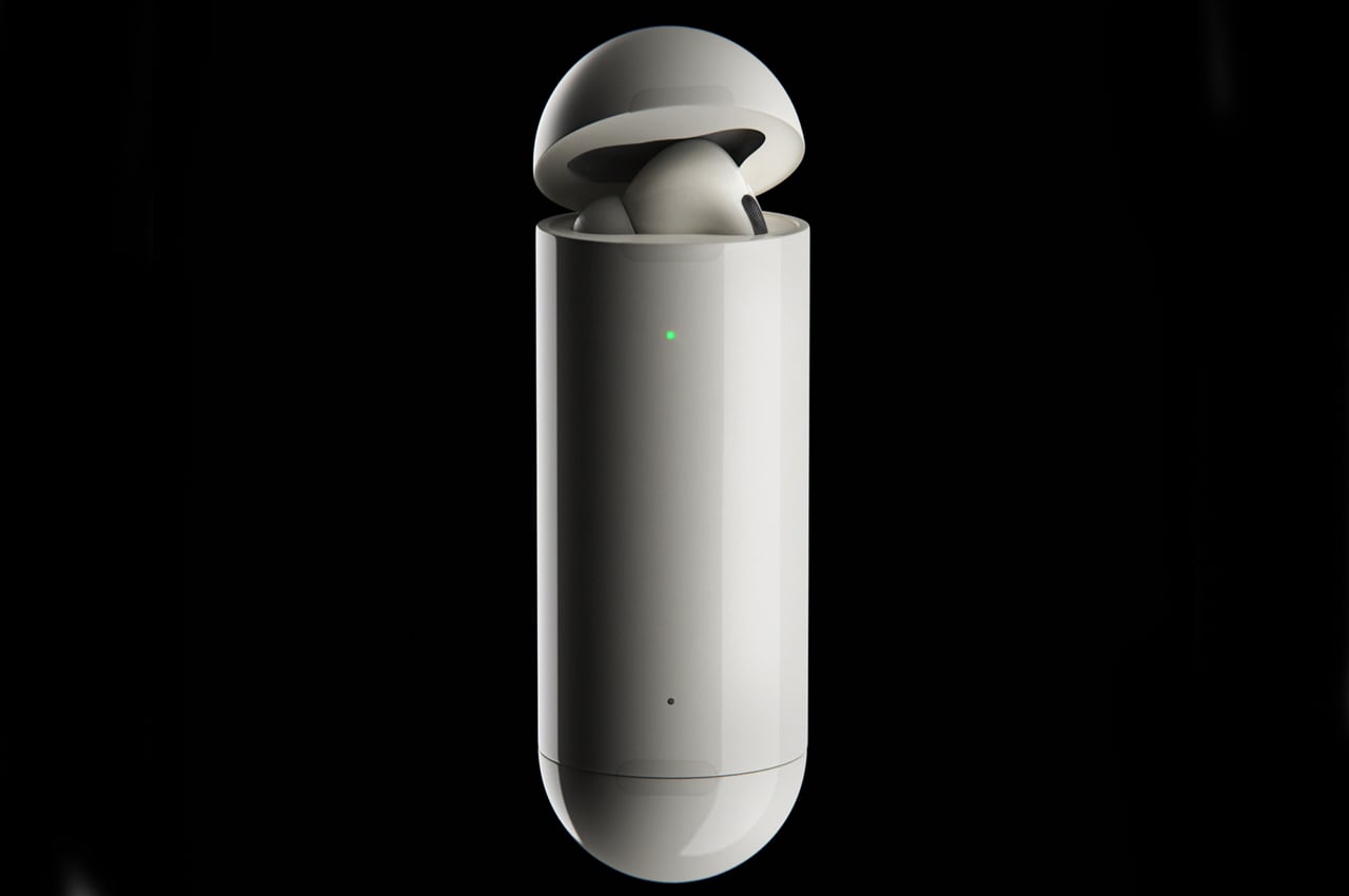
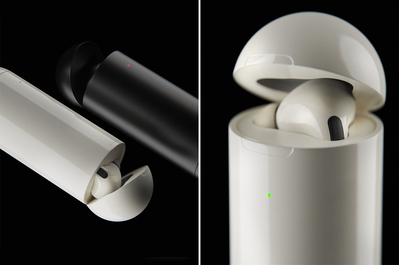
This new AirPods Pro case takes on a barrel shape to fit in pockets with your other EDC items!

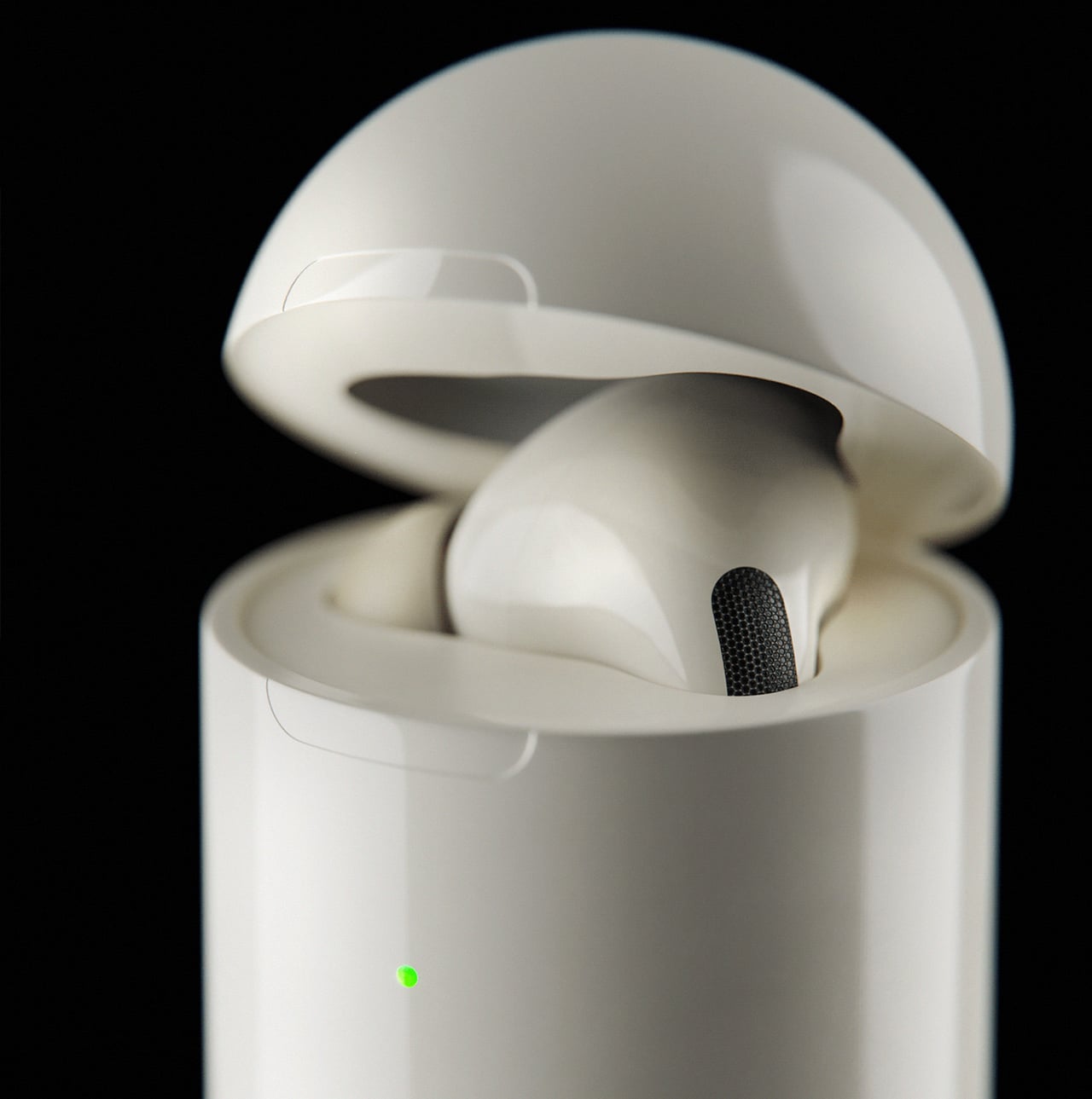
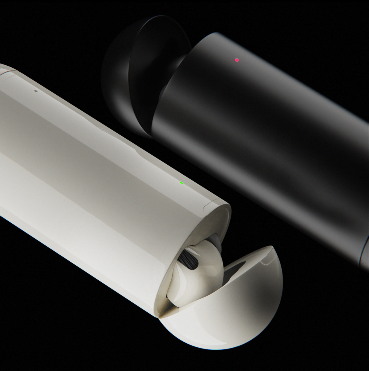
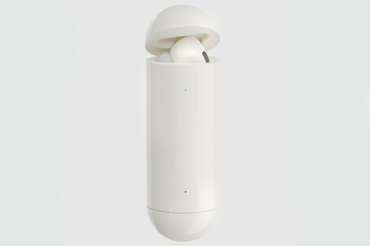
Antón visualized an AirPods Pro case concept that holds each AirPods Pro in vertical placement, swapping out a rectangular build for a barrel-shaped case.

The new case for AirPods Pros is even wider than the previous generation of AirPods. Wedging that case into your pocket between your keys, wallet, and other EDC items is uncomfortable and makes our pockets too bulky. Iván Antón, a product and graphic designer based in Madrid, recently visualized an AirPods Pro Case concept that gives the case a vertical edge, ditching a wide body for a slim, barrel-shaped one.

The current case for AirPods Pro is about 20mm wider than the AirPods case, a substantial difference that requires a lot more room in our back pockets.  In contrast to the bulkier, horizontal AirPods Pro case, Antón’s concept case would fit nicely into any pocket even if it’s already stuffed with your house keys, wallet, and whatever else. Individual charging lights emanate from both ends of the cylindrical case to accurately indicate how much battery juice each AirPod has. Antón also visualized the AirPods Pro case in a matte black, a shade that we’ve yet to see Apple experiment with on charging cases for AirPods and AirPod Pros.

EDC items like house keys, wallets, lighters, and multi-tools fill our pockets daily. Finding the space to carry our charging cases for AirPods can get difficult considering the little room we do have. 3D visualizer and product designer Iván Antón created an AirPods Pro case that swaps out a bulky, rectangular build for a cylindrical one that can easily slide into the fullest of back pockets.

Designer: Iván Antón

Logitech unveils the first TWS earbuds designed specifically for your work-from-home needs


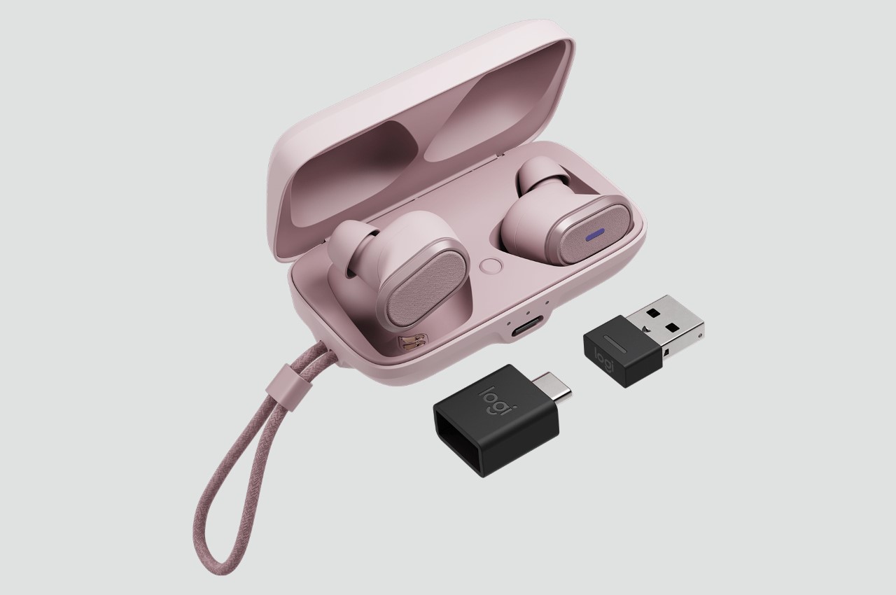
The first true wireless earbuds to be certified by Zoom, Google Meet, and Microsoft Teams, Logitech’s Zone True Wireless Earbuds were made specifically for online meetings.

It seems like every company with even the smallest connection to audio gear has its own TWS earbuds. Whether they’re designed to be affordable, or high-definition, or to have active noise-canceling, or to work perfectly with your phone or the rest of your wearable gear, every company wants a slice of the TWS pie, and more often than not, they just get drowned out because of the sheer competition… and Logitech seems to have understood that. Rather than jumping onto the bandwagon, Logitech decided to build the scenario before building the product. Meet the Logitech Zone Truly Wireless – earbuds designed and calibrated for work and business.

The earbuds can be paired with your laptop as well as your smartphone so you can go about your day from either device, whether it’s watching training videos or listening to music while you work, answering calls, or even attending online meetings. They’re designed to work seamlessly with common calling applications across most platforms and operating systems, and are certified by Microsoft for Teams and Skype for Business, by Google for Meet, and by Zoom.

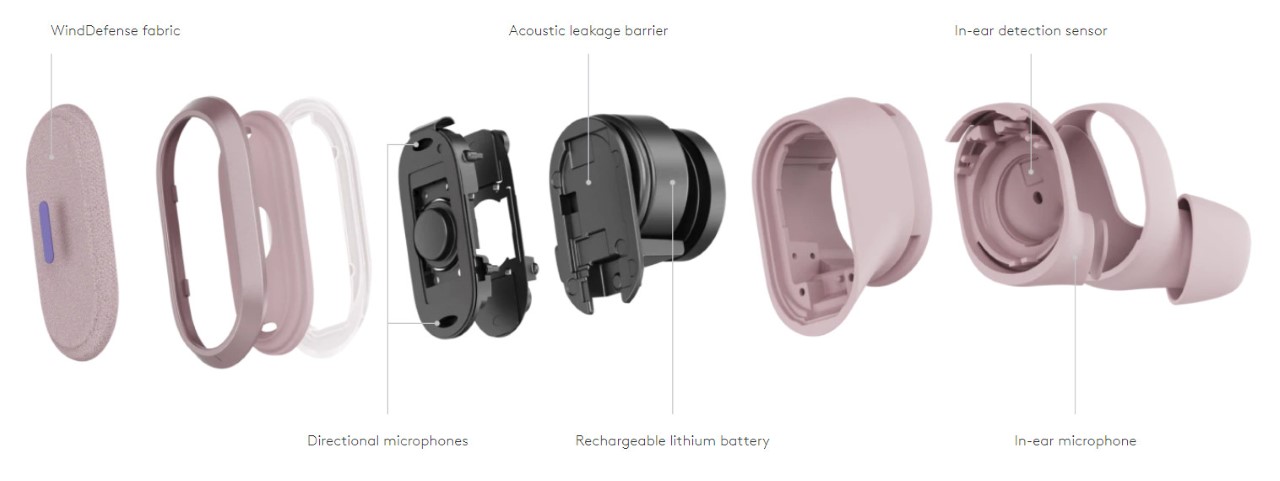
Each earphone is equipped with a 3-microphone array – one to pick up your voice, and two more beamforming microphones to actively cancel out any noise. If you’re in a windy part of your home (or even if you’re outdoors for a bit while attending a meeting), a wind-blocking fabric on the outside helps cut out the gushing sound of wind, for a better audio experience not just for you, but for everyone else on the call.

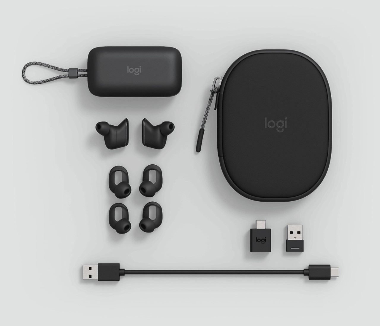
The earphones can be controlled via the Logi Tune app on your phone or desktop. The app allows you to calibrate sound thanks to a 5-band equalizer, and even mute-unmute your microphone directly without needing to look for the appropriate button on your video-calling app/program. They boast of a 6-hour battery life, enough to last through even the longest meetings, and an overall of 24-hours with the charging case. If you’re running low on battery and you really need to enter a call, a mere 5-hours of charging within the case will give you one full hour of use. Oh, and the case wirelessly charges too!

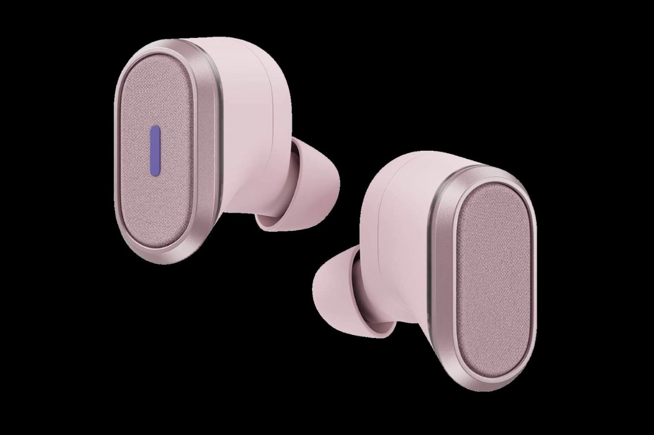
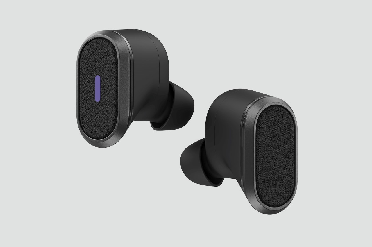
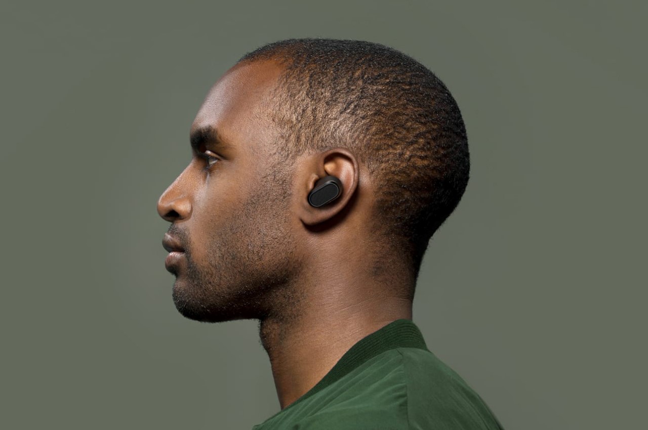
The earphones come in two contemporary colors, black and a light pink, and they’re designed to discreetly fit into your ears without hanging out and looking too obvious like your AirPods. Moreover, you can use them outside work too (they’re great for listening to music) and even at the gym, since they’re rated IP68 water and dust resistant. The Logitech Zone True Wireless Earbuds will go on sale this fall for $299.

Designer: Logitech

Carl Pei’s Nothing debuts its first product – a pair of TWS earbuds with a ‘zero-secrets’ transparent design


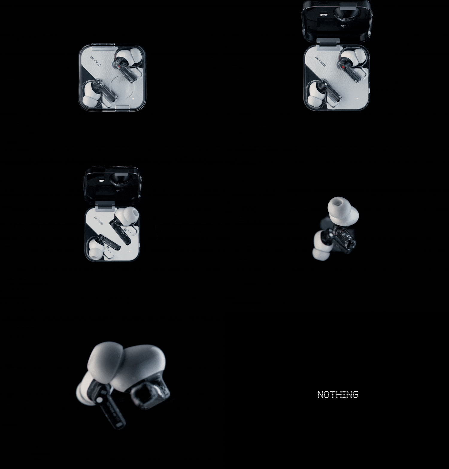
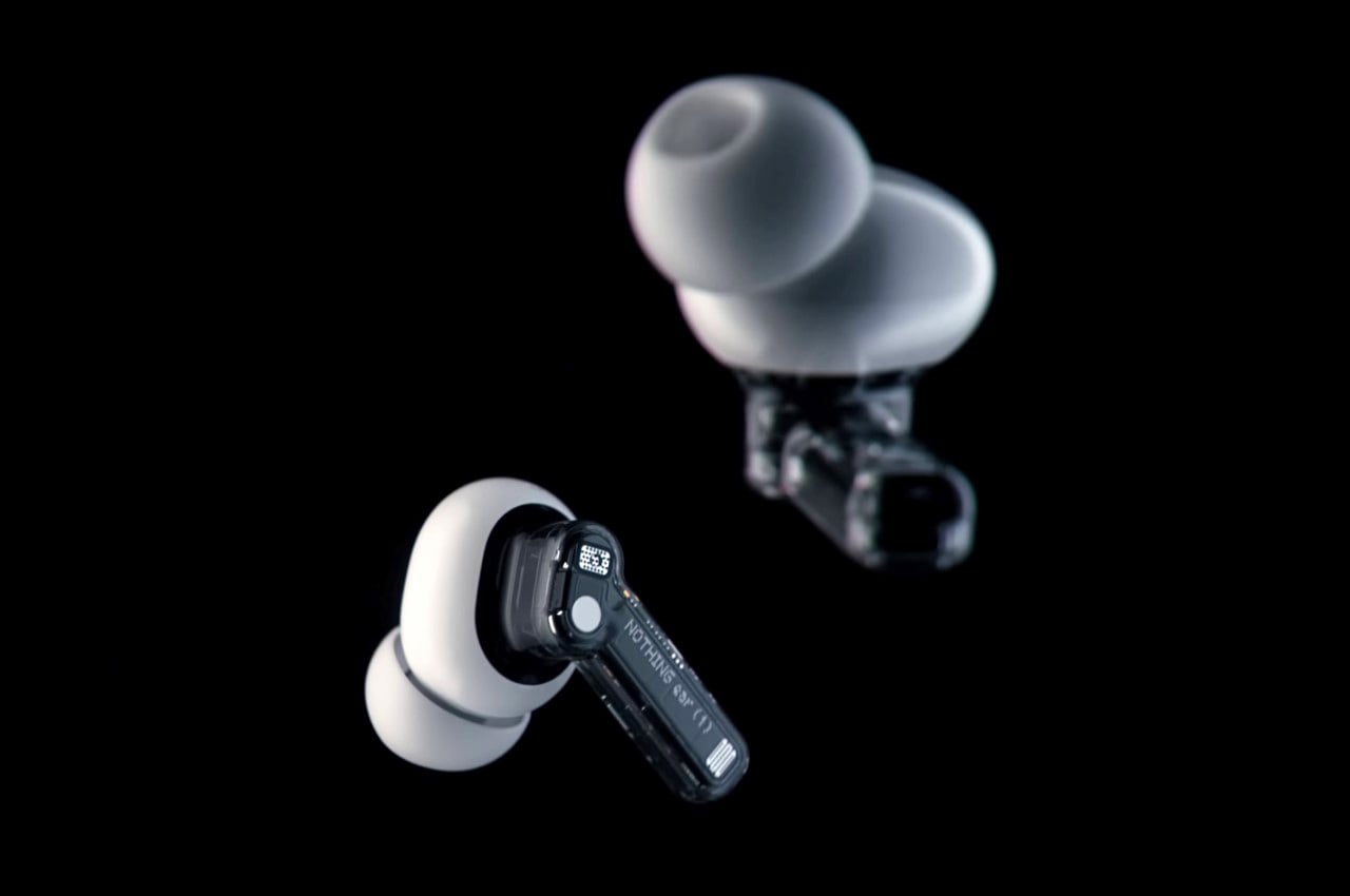
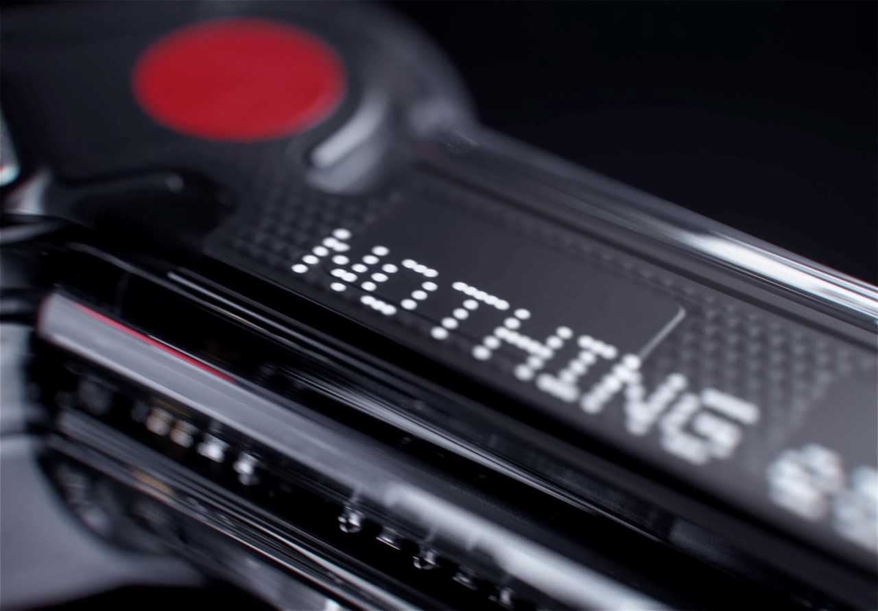
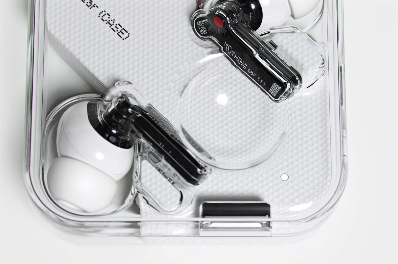
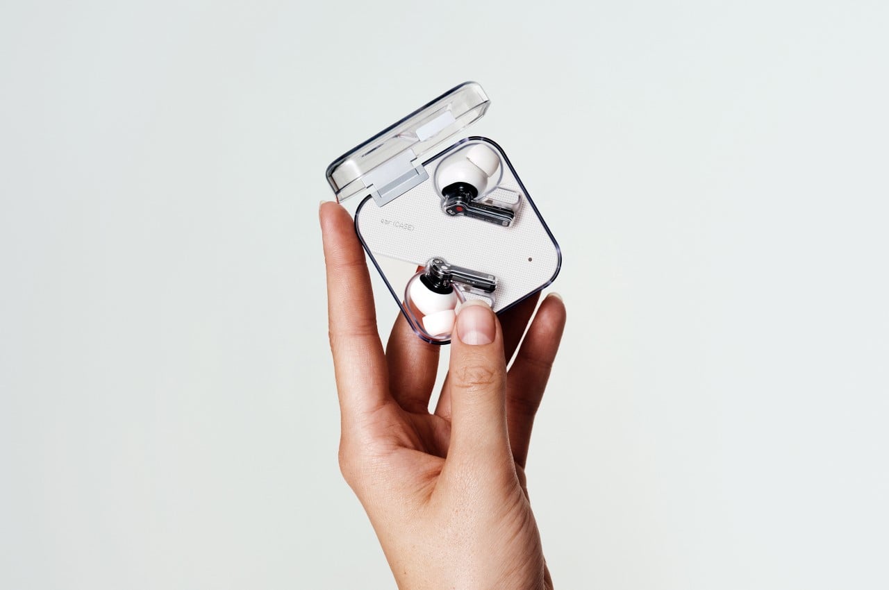
There was a time when you could take a screwdriver and practically fix anything. A radio, a telephone, a washing machine, all you’d need was a simple tool to help you inspect, replace, and repair parts and your product was good as new, but that isn’t the case today. Try venturing a guess on what’s really inside your smartphone, or how your TWS earbuds work, and the regular consumer will probably draw a massive blank. We take these complex products for granted because they do their job without a fuss, but without even really knowing how beautifully complicated they are on the inside. Nothing, former OnePlus founder Carl Pei’s latest venture, is lifting the veil on products with its brand of minimalist ‘nothingness’. The ear (1) marks Nothing’s debut in the product space and comes with a rather alluring transparent design. The earphones sport a transparent housing that lets you really appreciate the design and detail gone into the product’s inner assemblies, and a transparent case accentuates the brand’s ethos… of being a breath of fresh air in a saturated tech space that’s all about making black and white boxes.
Partnering with Teenage Engineering over the design of the ear (1), Nothing highlights the fact that the design’s beauty lies in ints inherent rawness. “Nothing like you’ve seen before, the raw beauty of ear (1)’s stripped-down aesthetic features transparency to expose the engineering, including microphones, magnets, and circuit board. Everything that is ear (1) is there with purpose”, the brand mentions in a press release.

The earphones boast a massive 11.6mm audio driver, tuned to perfection by the folks at Teenage Engineering, who have established themselves as one of the leading audio-tech brands of our time. The audiophiles at Teenage Engineering painstakingly dialed in the software and hardware for balanced bass, mid, and treble performance, and equipped the TWS earbuds with Bluetooth 5.2 for incredible connectivity.

The earbuds sit rather tightly in your ear thanks to liquid silicone ear-tips, and are even equipped with ANC – a feature that’s definitely worth praise given the TWS earbuds’ $99 price tag. The ANC can be controlled with different modes – like a Light mode for moderate cancelation in a relatively noise-free setting, and a Maximum mode for much noisier environments like in the outdoors, or in public transport. A Transparency mode lets you easily listen to the world around you when you’re walking down roads or you need to pay attention to your surroundings, and the ear (1)’s built-in Clear Voice Technology dramatically reduces distractive background noise, like the wind.

Yet another noteworthy feature is the earbud’s battery life – a cumulative 34 hours, along with the charging case. I’ll admit, there’s definitely an allure to being able to see the earbuds inside their case – it’s almost like a work of art… and you’ve got to admire the way every single element in the earphones is visible, including the magnets that cause the buds to align inside the case. The transparency does trigger a human response to think that the earbuds are fragile, but Nothing ensures that they’re built to a world-class standard. They come sweat and water-resistant, and each earbud weighs a stunningly low 4.7 grams. The case charges wirelessly too, and is Qi-compatible.

The launch of Nothing’s ear (1) quite mirrors how OnePlus established itself as a brand. When OnePlus launched its first phone, it capitalized on crowd fanfare brought about by an alluring design, an extremely competitive price, and a highly limited edition drop that had the crowd begging for more. Nothing seems to be employing a similar strategy too, given its rather eye-catching transparent design and transparently low price. The TWS earbuds will also be available via limited drops on their website nothing.tech. Open sales will begin on 17 August 2021 across 45 countries and regions, including the UK, USA, and Canada.

Designer: Teenage Engineering and Nothing

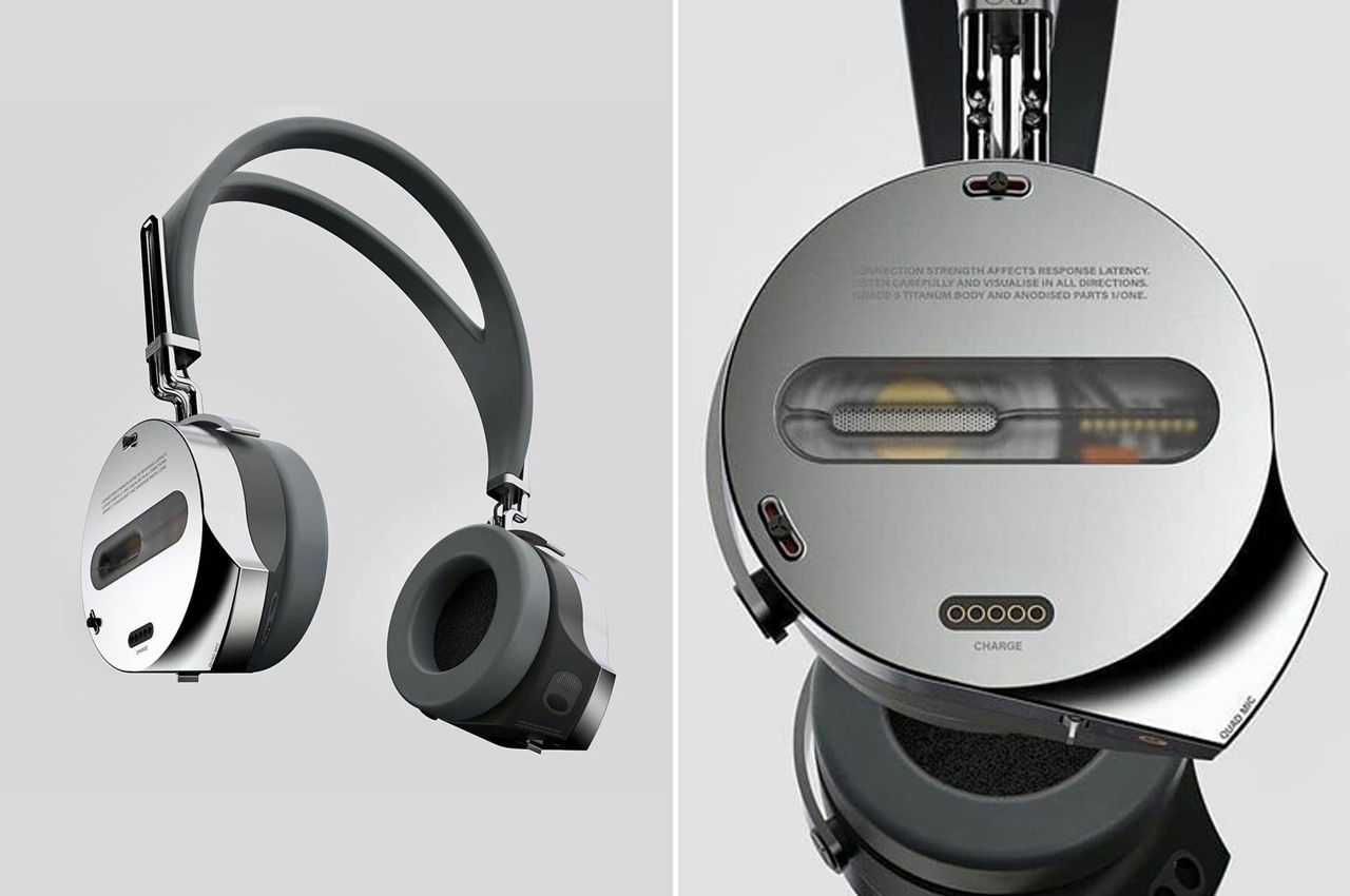
These sleek gaming headphones go stalk-less to deliver crystal clear audio!

Gaming is a full sensory experience. Your seat has to pass the Goldilocks test, an HD screen brings everything into focus, and the audio needs to be crystal clear. That means that the right pair of headphones can change the whole game. Reconceptualizing gaming headphones to meet their personal requirements, design team Vasudevansr visualized a pair that moves past bulky hardware and poppy audio to instead deliver headphones that mean business.

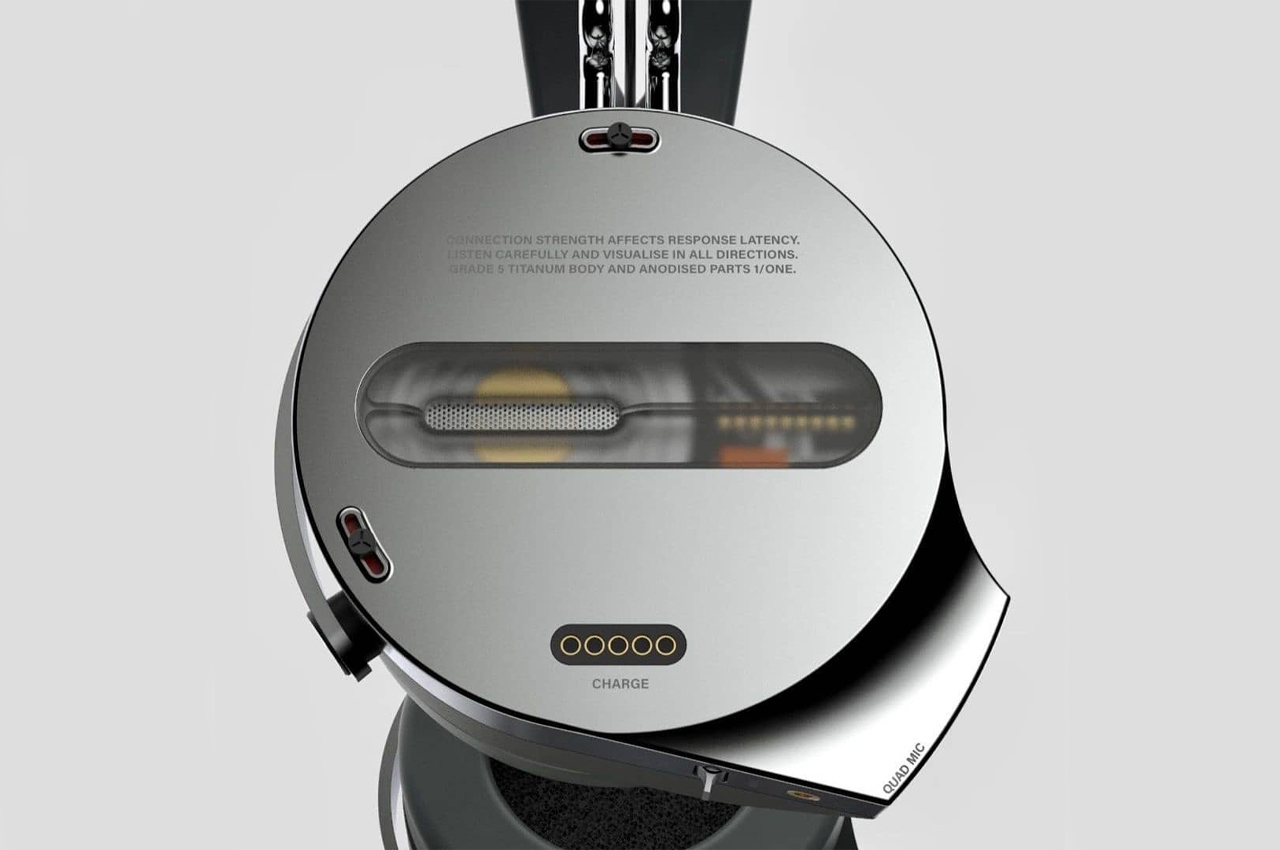
Vasudevansr Design initially felt inspired to design its own pair of headphones to elevate the gaming experience. Frustrated by the jumps and general scratchiness that microphone stalks fail to equalize, Vasudevansr designed a pair of stalk-less headphones so that gamers don’t have to speak directly into the microphone to be heard. Confessing to this, Vasudevansr describes his initial inspiration, “I have a general dislike for stalks poking out of the units and for people who breathe into it,” they told Student Design Showcase on Instagram, “A slight protrusion from the main body, housing two microphones on each side is my idea of tackling the [microphone] stalk issue aesthetically.” Ditching the microphone stalk for an internal input and output system, Vasudevansr’s gaming headphones look sleeker and should deliver crisper, less shrill, and muffled audio.

Communicating with other gamers across servers is half the fun of playing video games, but not when all you’re listening to is someone’s breathing. To remedy this, Vasudevansr integrated an internal audio system that would be able to capture a full spectrum of frequencies without the bulkiness that accompanies protruding microphone stalks.

Designer: Vasudevansr Design

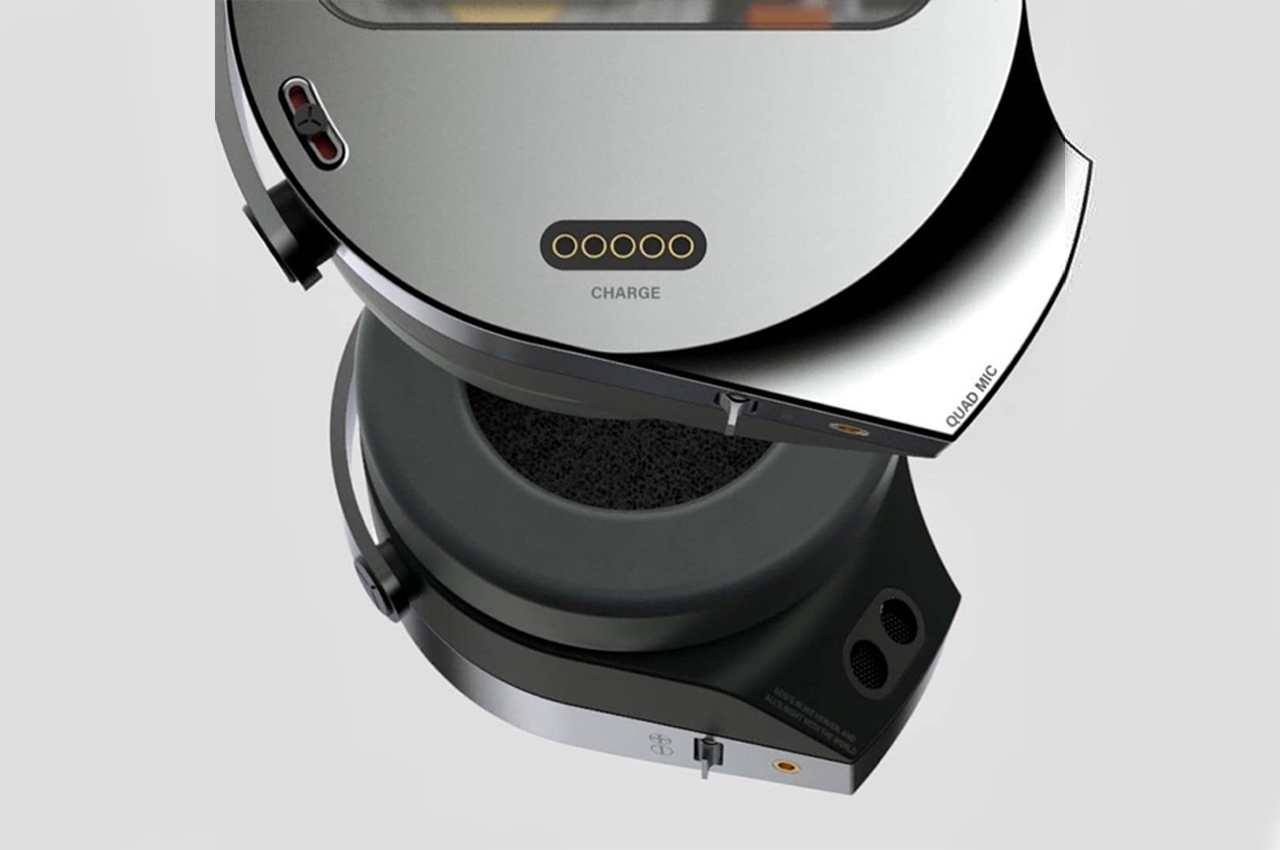
An internal audio system is contained in each earbud, equipped with dual microphones to pick up a full spectrum of frequencies.

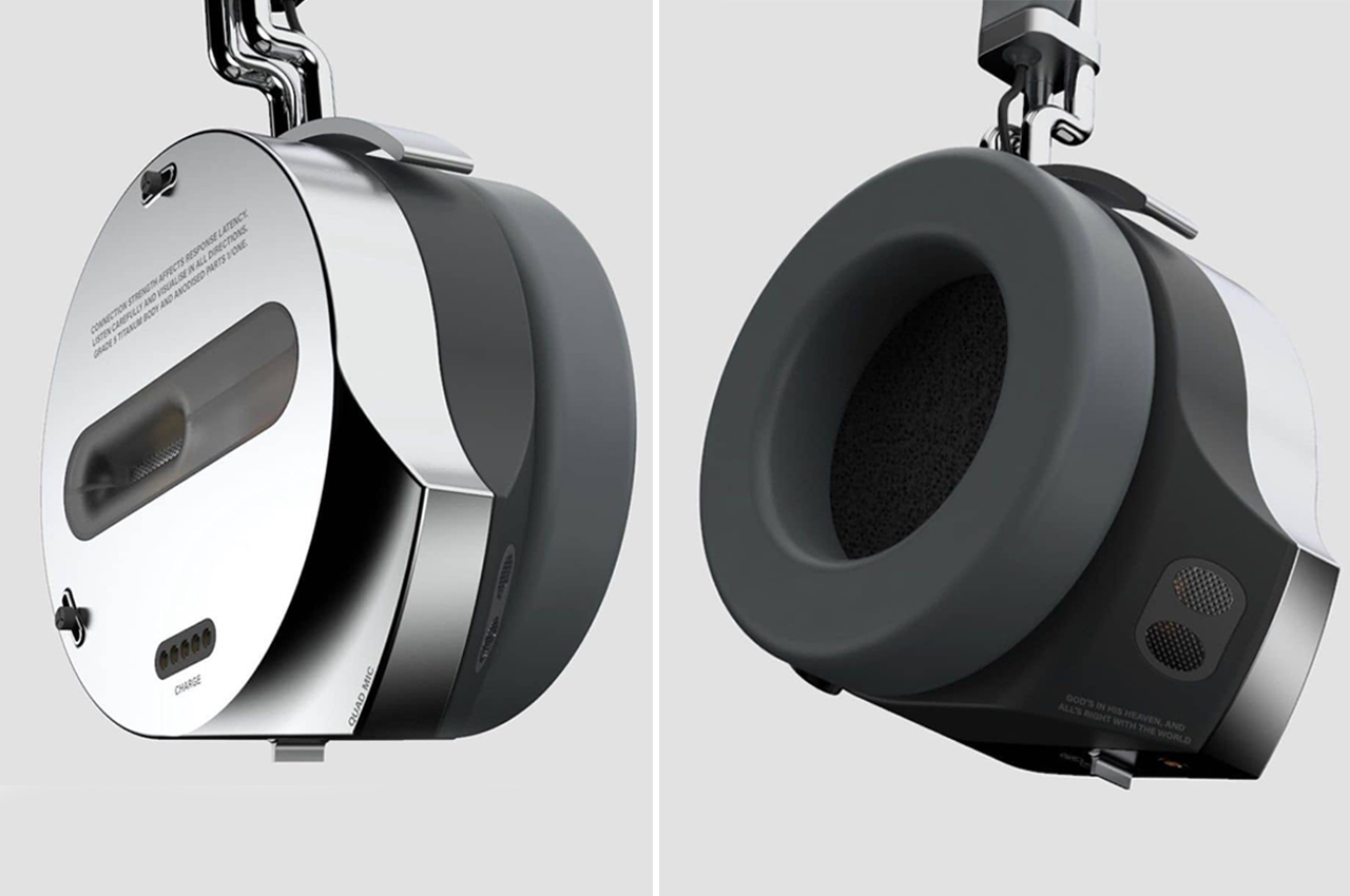
A tough, metallic outer ear borders the headphones’ inner cushioning, which wraps the user’s ears.

Ditching the stalk microphone for an internal, slightly protruding microphone gives Vasudevansr’s headphones a cleaner look.

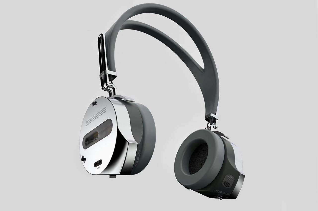
The pair of headphones have a slightly exposed look to them, offering view of its internal structure.

Roland’s new mobile mixer aims at turning your smartphone into a full-fledged recording and production studio


The smartphone is already a capable content-creating beast… Roland just makes it better by allowing it to interface with the rest of your pro-recording and production gear.

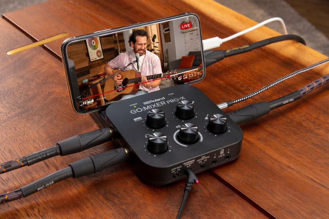
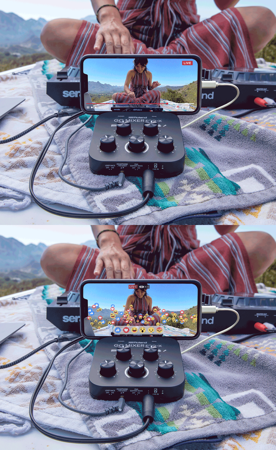
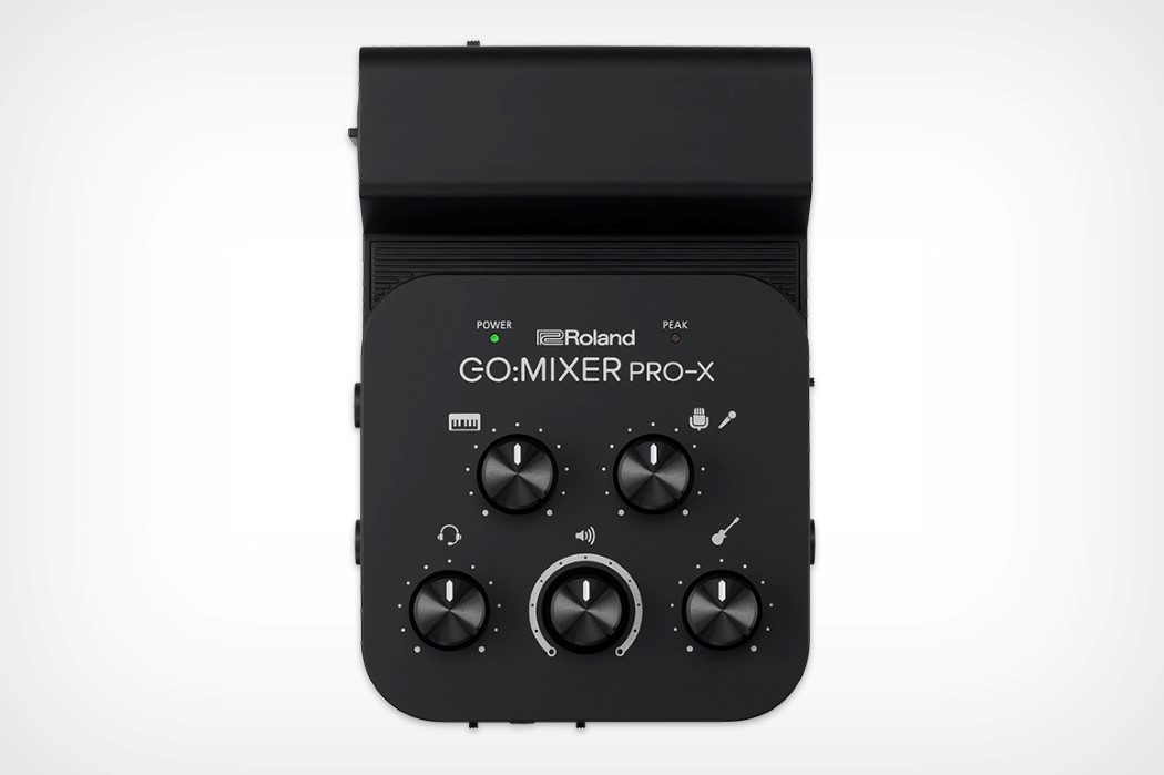
You can’t plug your electric guitar or studio mic into your smartphone. Believe me, I’ve tried. I fancy myself a bit of a musician and I’ve always wanted to be able to record directly into my smartphone without relying on my phone’s third-grade microphone, but that isn’t possible for multiple reasons – one of them being the fact that tech companies hate putting ports on phones. That’s sort of where Roland comes in with its GO:MIXER PRO-X, a hardware interface that lets you hook multiple recording and musical instruments to your phone, turning it into the ultimate studio. Perfect for mobile-based content creation and impromptu live-streams (something that’s absolutely sparked amidst the pandemic thanks how easy TikTok has made it to be an overnight star), the Roland GO:MIXER PRO-X is a handy, pocket-sized portable mixer that lets you connect your phone to practically every music/performance instrument around you.

Roland GO:MIXER PRO-X Portable Smartphone Recording Studio

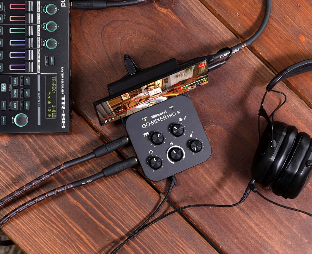
Designed to be compatible with iOS as well as Android smartphones, the GO:MIXER PRO-X is a nifty piece of hardware for musicians, performers, presenters, and even podcasters. Just plug it to your smartphone and you suddenly have an entire variety of ports and knobs for all your recording gear. The GO:MIXER PRO-X connects to your smartphone via its USB-C or Lightning-connector interface and supplies power to it too, keeping your phone juiced during your recording/performance. It has dedicated inputs for microphones, guitars, synths, bass, and even drums, while knobs on the top let you control their gain, balancing the audio to your liking.

Roland GO:MIXER PRO-X Portable Smartphone Recording Studio

If you cringe at the idea of having to host a proper professional livestream with AirPods in your ears, the GO:MIXER PRO-X brings back the familiar 3.5mm headphone line-in, allowing you to connect monitoring headphones in to listen to the audio feed going into your phone. You can use it solo, controlling and balancing your sound, or you could switch on your phone’s camera and position yourself in front of it, giving the mixing duties to a fellow colleague or sound-engineer. Instead of needing to have expensive audio/video recording, monitoring, and studio equipment, all you need are your instruments, your smartphone, and the GO:MIXER PRO-X. It’s perfect for musicians, podcasters, radio hosts, DJs, interviewers, and even teachers who conduct online classes. After all, your smartphone’s more-than-capable hardware/software shouldn’t get kneecapped by its inability to connect to pro-grade recording equipment, right?

Designer: Roland

Roland GO:MIXER PRO-X Portable Smartphone Recording Studio

Roland GO:MIXER PRO-X Portable Smartphone Recording Studio

Roland GO:MIXER PRO-X Portable Smartphone Recording Studio

Audiophile-approved earbuds designs that perfectly replace your Apple AirPods!

I love a good pair of earbuds! In fact, I really can’t function without my personal earbuds. Once my earbuds are in, the rest of the world is out! I deep dive into the world of my favorite tunes, away from real-world problems, happy in my own little audio bubble! Hence, owning a pair of innovative and perfect earbuds is an absolute necessity for me, and I’m sure that’s the case for other music lovers out there as well! Quite a few of us are Team AirPods all the way. However, great earbuds go beyond Apple as well. And this nifty list includes all of them! This collection of exciting designs has a pair of earbuds for everyone! From earbuds that magnetically hang like a necklace to earbuds that snap onto your phone – these earbuds provide unique design solutions and are a must-have for audiophiles!

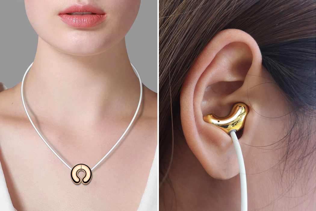
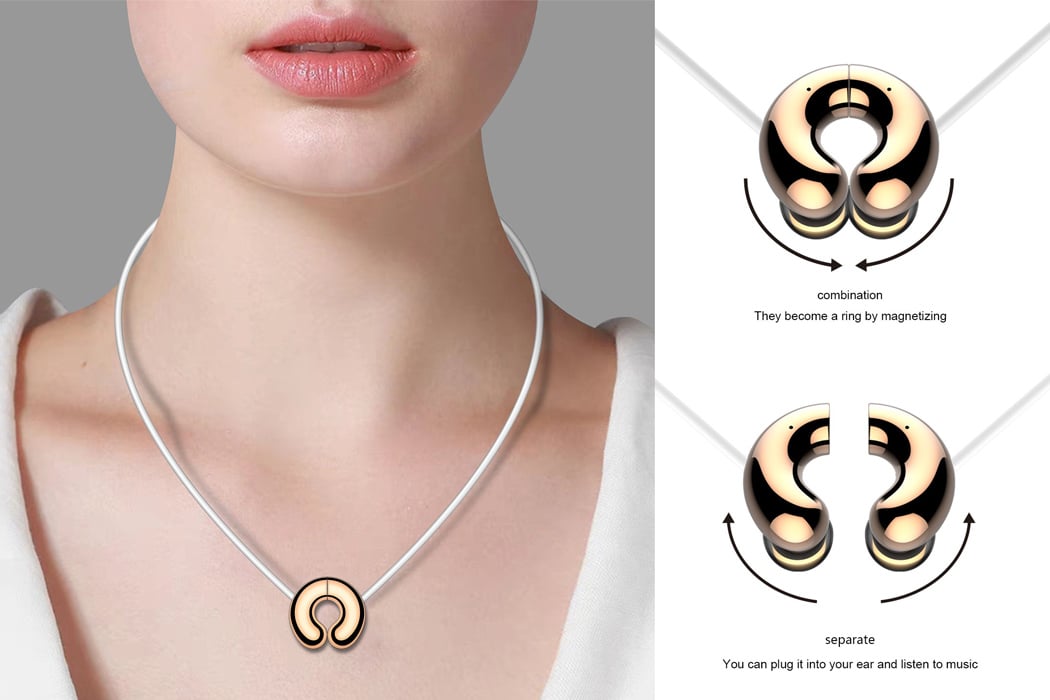
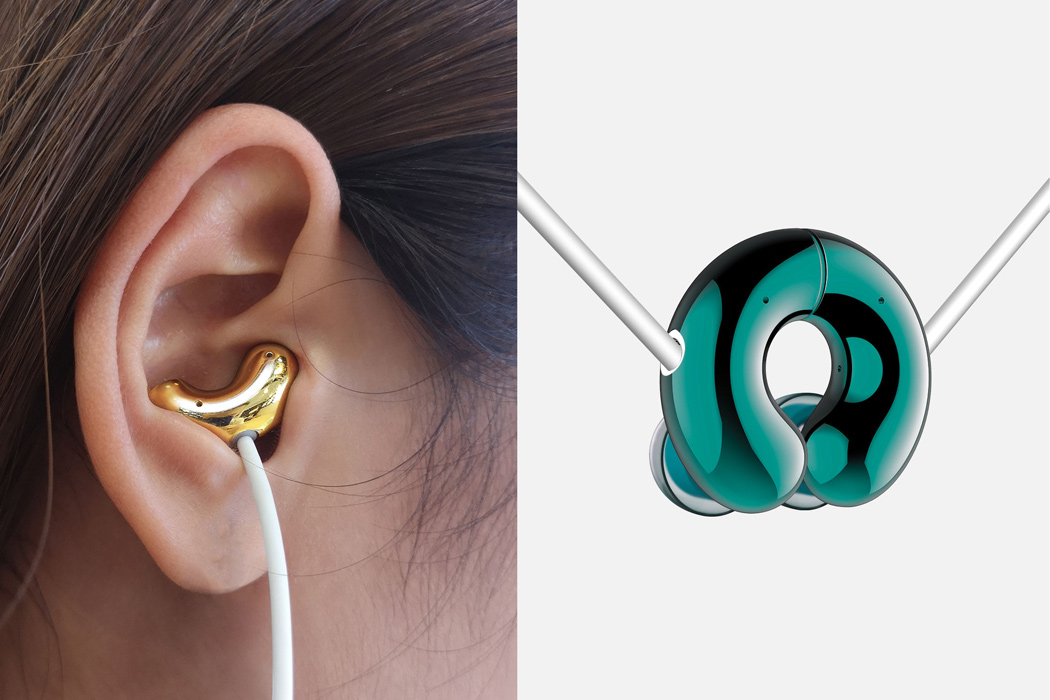
Designed by Yibai Science & Technology from Shenzen, these are called the “Jade Culture Earphone Jue 20.” That’s a bit odd name but everything else about these conceptual wireless earbuds listed on iF Design Award 2020 is super cool. When not in use, the earbuds magnetically lock together to take the form of a necklace pendant that’s suspended by the tethering wire. Then again, when you want to listen to your favorite tunes, simply separate the pendant and get groovy. Picture this scenario – your buddy compliments, “This pendant looks so cool, bud”, and you’ll detach them and plug into your ears to their amazement, “It’s my pair of earbuds, mate!” Added bonus – you surely won’t lose one of the earbuds as there is no accidentally falling down- speaking to you AirPods!

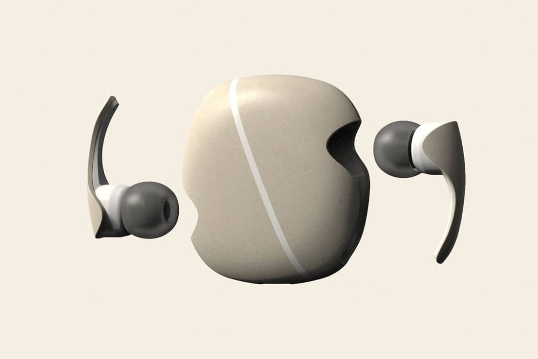
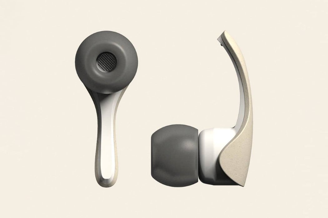
Named Koishi, after the Japanese word for Pebble, the TWS Earphones come with a soft, pebble-inspired form that’s beautiful to look at, comfortable to store in pockets, and can even be stacked one above another as Zen Stones. They come in three stone-inspired colors and even sport a slightly mottled stone texture. Running right through the case is a light strip that helps let you know when the earbuds are charging, or when they’re low on charge. However, it also visually guides you to instinctively know where the earphones are, so you can glance at the case and pull the earbuds out without fiddling to find them.

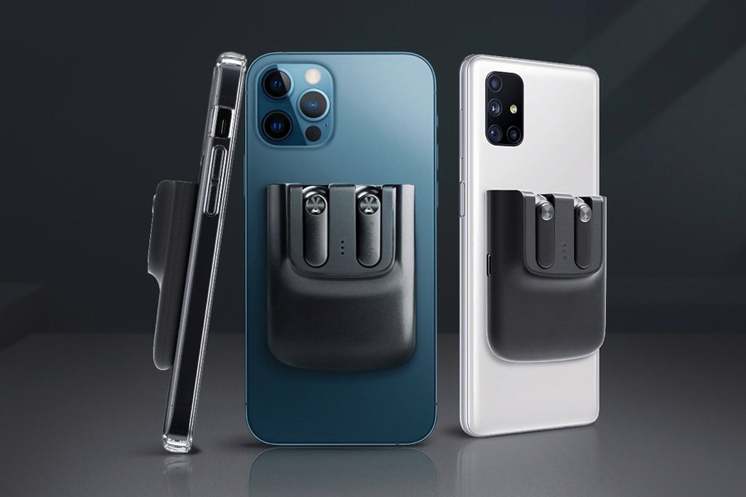
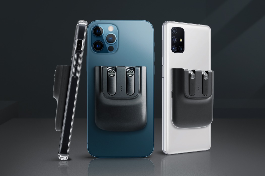
The Snapods are a pretty formidable pair of earbuds on the spec sheet, but their clever magnetic attachment system really puts them in a different league altogether. They’re designed to snap directly onto any of the iPhone 12 phones, although a simple stick-on metallic ring lets you turn any smartphone (Android or iOS) into a Snapods-ready smartphone. This also means you could attach the Snapods to phone cases, tablets, or even your laptop! And of course, the Snapods charge wirelessly (even though they come with a USB-C port), which means you can snap them off your phone and onto your wireless charger to juice them. Theoretically, if your phone supports reverse charging, you could simply charge them by placing them on the back of your phone too!

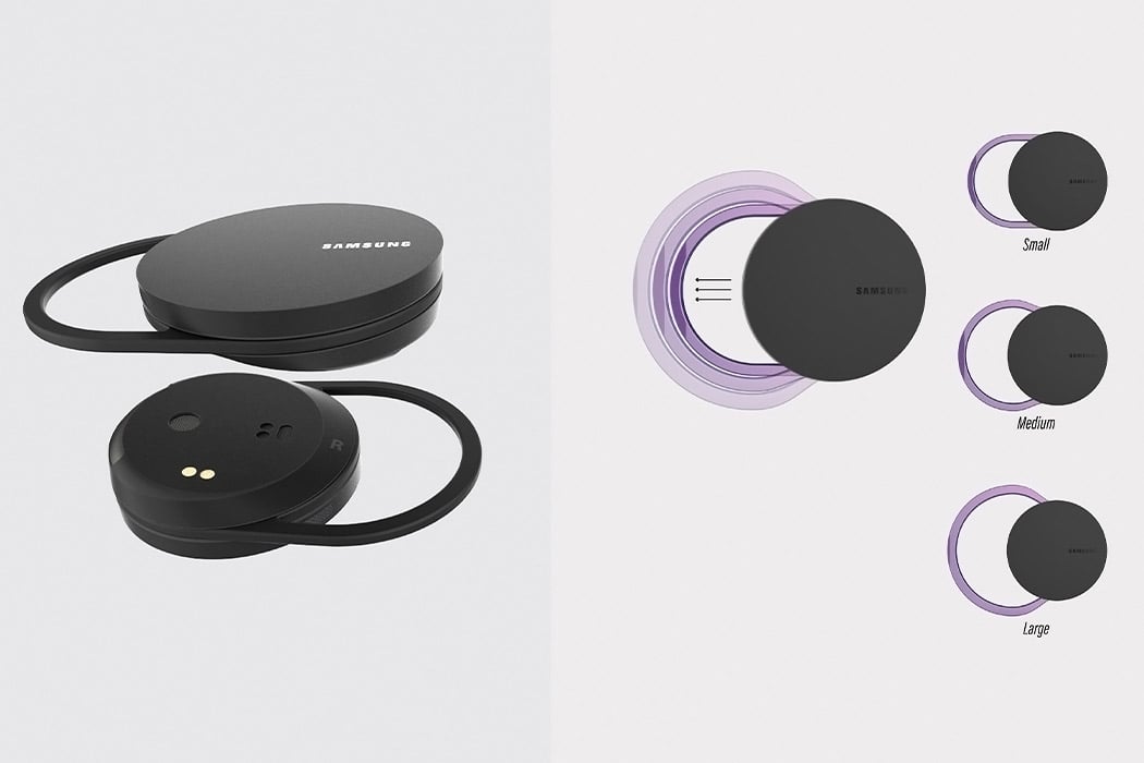
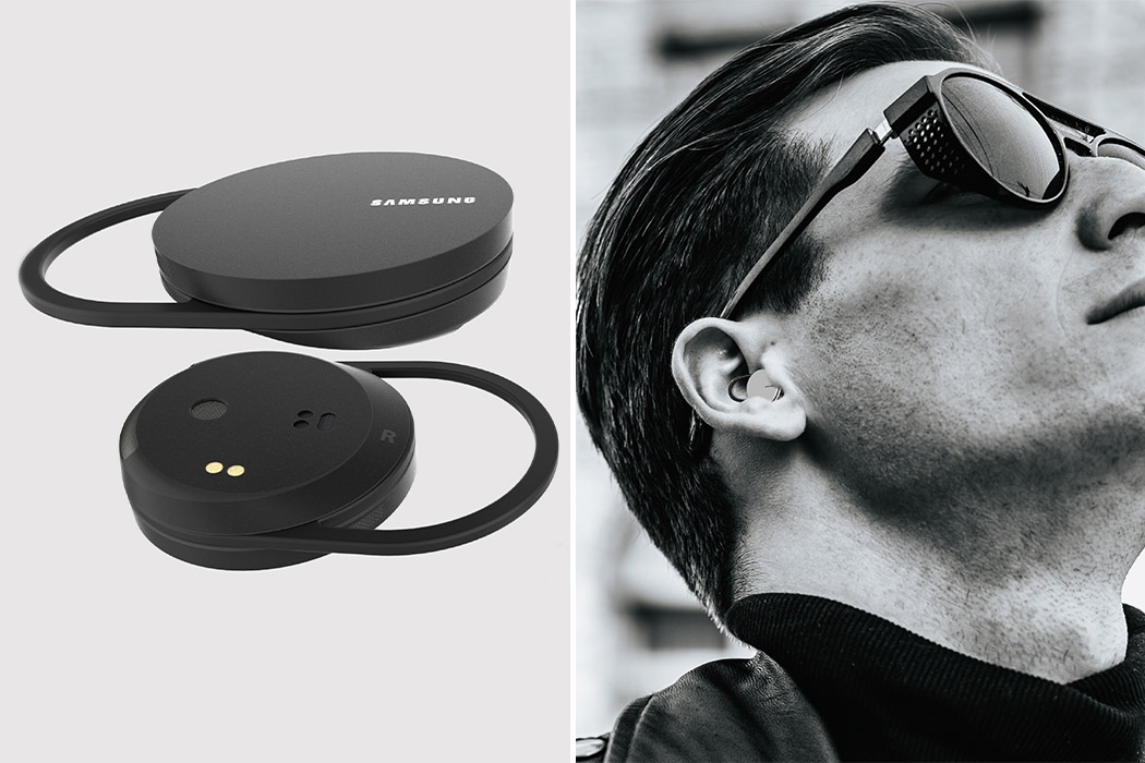
The Yinyang earbuds are influenced by the duality of the millennia-old cultural concept of yin and yang. The Chinese philosophical thought behind the yin and yang is the balance between two forces that oppose and complement each other at all times. These conceptual Samsung earbuds are designed to reflect that philosophy by striking a perfect balance between user experience and portability. Yinyang earbuds are created to be the smallest in the market so that they can fit everyone (a problem I personally go through with my first-gen AirPods). The compact size will be achieved by getting rid of the ear tips.

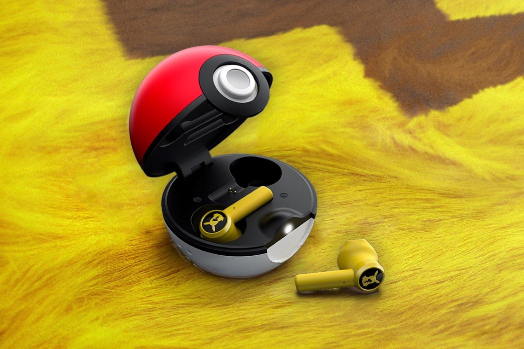
Razer’s limited edition Pikachu earbuds are awesome for all the right reasons. Not only are they an absolutely delightful-looking pair of familiar yellow earbuds, they even push the limit by coming in a Pokéball shaped charging case – which is even more exceptional because it’s a ‘charging’ case and Pikachu’s an electric type Pokémon! The adorable earbuds are essentially a limited variant of Razer’s Hammerhead earphones, but in yellow, and with a Pikachu graphic replacing the Razer triple-snake logo. The truly wireless earbuds dock magnetically into a Pokéball-shaped charging case, which may not be tiny enough to fit into your pocket, but which noob carries Pokéballs in their pockets? The earbud case has a tiny lanyard that’s perfect for strapping around your hand as you walk around and get jealous looks from fellow Pokémon lovers.

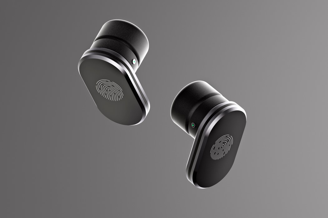
Think of it. The situation’s been perfectly set up. FaceID or facial recognition seems counter-intuitive now, considering everyone’s wearing masks, and there’s little chance companies are going to embrace a fingerprint sensor on the phone again for quite a while. This solution, by Alvaro Navarro, seems perfect for a lot of reasons. A. It’s absolutely convenient because truly wireless earbuds already have touch sensors on them. B. It’s easy to implement too and can work with practically any smartphone. C. It could be a great business model, allowing companies to push out more earbuds as a result (good design and good business don’t always intersect though), and D. It could be a much more secure way of unlocking your phone.

The TWS earphones’ unique shape comes with a specially designed 3D acoustic chamber that helps make the audio sound richer, with better, more distinct basslines… while also helping reduce sound distortion as well as providing organic noise isolation of up to -35 dB, allowing it to rival the Airpods Pro’s active noise cancellation tech just through its ergonomic design. The amount of careful consideration built into the Lytte HarmoniQ is truly remarkable. Each earphone casing is meticulously 3D printed using DLP printing tech (a feature that allows it to have that unique acoustic chamber shape) and hand-polished to look as remarkable as it does. Just like most smart earphones, the Lytte HarmoniQ supports iOS as well as Android integration, with the ability to tap, double-tap, and long-press to control music playback as well as smartphone functions (including summoning the phone’s voice AI).

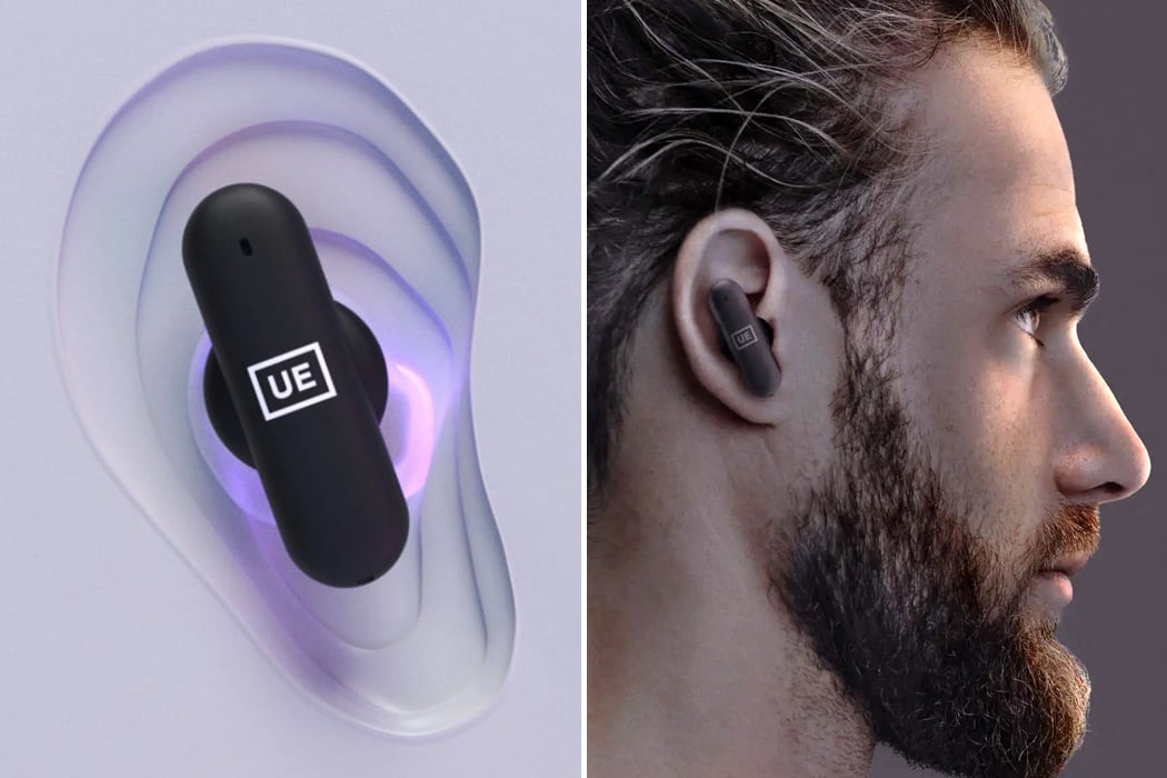
If you’ve still been struggling to find a perfect-fitting pair of earbuds (like I am) that you can’t just do without, Logitech-backed Ultimate Ears may have just thought up a solution in the form of UE Fits – true wireless earbuds that offer a custom fit. The earbuds come integrated with LEDs to trigger the special gel-filled ear tips to harden and mold in the unique shape of your ears for enhanced sound quality and noise cancelation. This package sounds pretty futuristic since we are still in the era of silicone ear tips or foam tips that fill the ear canal for finer audio output. UE has fitted the earbuds with the Lightform technology to mold the tips to your ears for a customized perfect fit in under 60 seconds. For the fitting process, the earbuds have to be paired to an Ultimate Ears app.

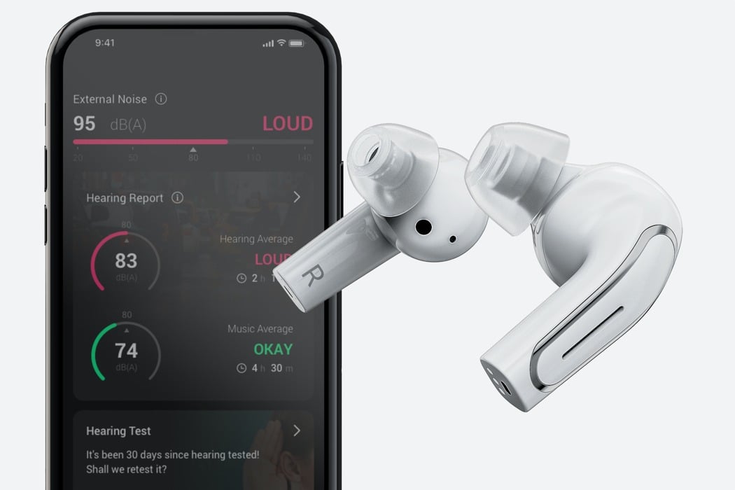
Designed to work BOTH as TWS earphones for most consumers, as well as FDA-approved hearing aids for the impaired, the Olive Pro provides an enhanced hearing for everything – nearby sounds, music, and conversations. Outwardly, they slightly resemble the AirPods Pro with the bulb and stem design, and with the silicone earpiece… and believe it or not, that’s not subtle plagiarism, it’s a design feature. You see, by bridging the gap between medical devices and consumer-tech, the Olive Pro makes it ‘cooler’ and less of a social stigma for the hearing impaired to wear these aids. Designed to help them blend into society, the Olive Pro’s consumer-centric aesthetic helps normalize an affliction. On the hardware front, the Olive Pro boasts powerful drivers and microphones that work to seamlessly distinguish between noises, voices, and music.

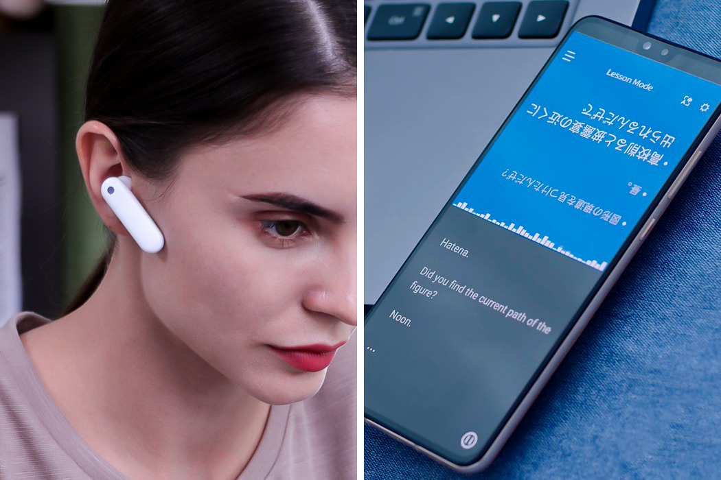
Created as a successor to the CES 2019 Innovation Award-winning WT2 earphones, the Timekettle M2 is a pair of TWS earphones that have an unusual two-part design, the reason behind which becomes incredibly evident once you realize what they’re actually designed for. There are two main components to any conversation – talking to a person, and listening to the person talk to you. It’s only natural that earphones designed to facilitate conversation would embrace those two parts, right? The Timekettle M2, in that regard, isn’t your standard TWS earbuds. Sure, they’re meant for listening to music and podcasts or giving commands to your phone’s voice AI, but their prime feature is the ability to foster a multi-lingual two-way conversation by allowing two people to wear one earphone each as the M2’s onboard translation engine seamlessly fills in the gaps.

Apple-inspired designs to fulfill your tech dreams as we countdown to the WWDC 2021!

Apple’s WWDC21 is just around the corner! The air is buzzing with excitement, as we eagerly await to hear what Apple may announce. As we find ourselves biting our nails, and squirming in anticipation of what Apple has in store for us, let’s take a moment to appreciate all the inspiration this groundbreaking tech giant has provided. Apple’s ingenious and mesmerizing designs and design philosophy have inspired and influenced designers all over the world, resulting in some pretty unique Apple concepts! And, we’ve put together some of the very best. Enjoy these innovative Apple-inspired designs, as you count down the days to the WWDC!

Peisert’s Concept One embodies all the good aspects of Apple (and a few unsavory ones) into a design that’s meant for the entire family. It’s a luxury car, but it isn’t a sedan. Instead, the Apple One is a one-for-all sort of SUV that accommodates 4 or more people pretty spaciously. Its proportions (and especially that headlight) feel slightly like a cross between the Tesla Cybertruck and the Rivian SUV. The design is mildly angular but doesn’t come with any edgy surfaces or straight lines. Instead, everything curves rather organically… a feature also seen in the continuous curves found on Apple products. Speaking of Apple products (and also of unsavory aspects), the Apple One sports that infamous cheesegrater grille on the front. One could argue that an electric SUV wouldn’t need a grille, but Peisert probably took a creative call with that one there.

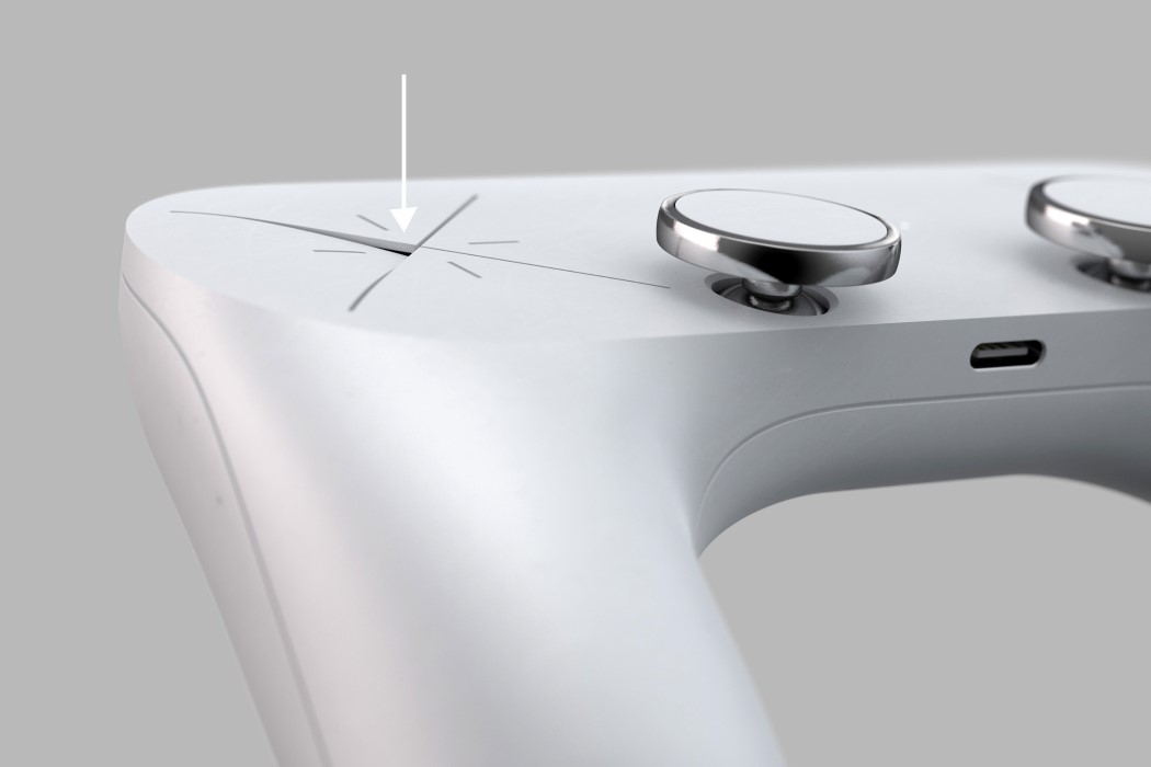
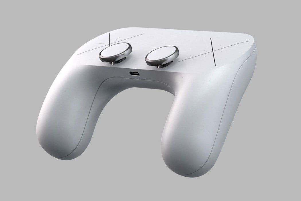
Sleek, with minimal details, and controls that are as baffling as the AppleTV Remote yet equally appealing. This may be Designer Hannes Geipel’s version of a Microsoft Surface Gaming Controller, but it definitely has a very strong Apple-esque vibe to it. The Surface Gaming Controller concept by Hannes Geipel boasts a brilliantly simple form. With absolutely no-frills, textures, accents, or color separation, the Surface Gaming Controller has a clean look to it that is a major contrast to Microsoft’s own Xbox controller. The Surface Gaming Controller comes with a soft, satin finish, and sports two rather slick-looking joypads with a metallic ring around them. The joypads lie perfectly in reach of your thumb, while two large X signs sit where you’d expect the D-pad and the XYAB buttons.

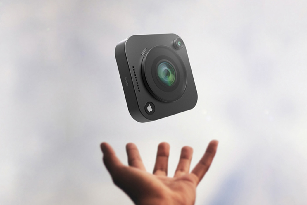
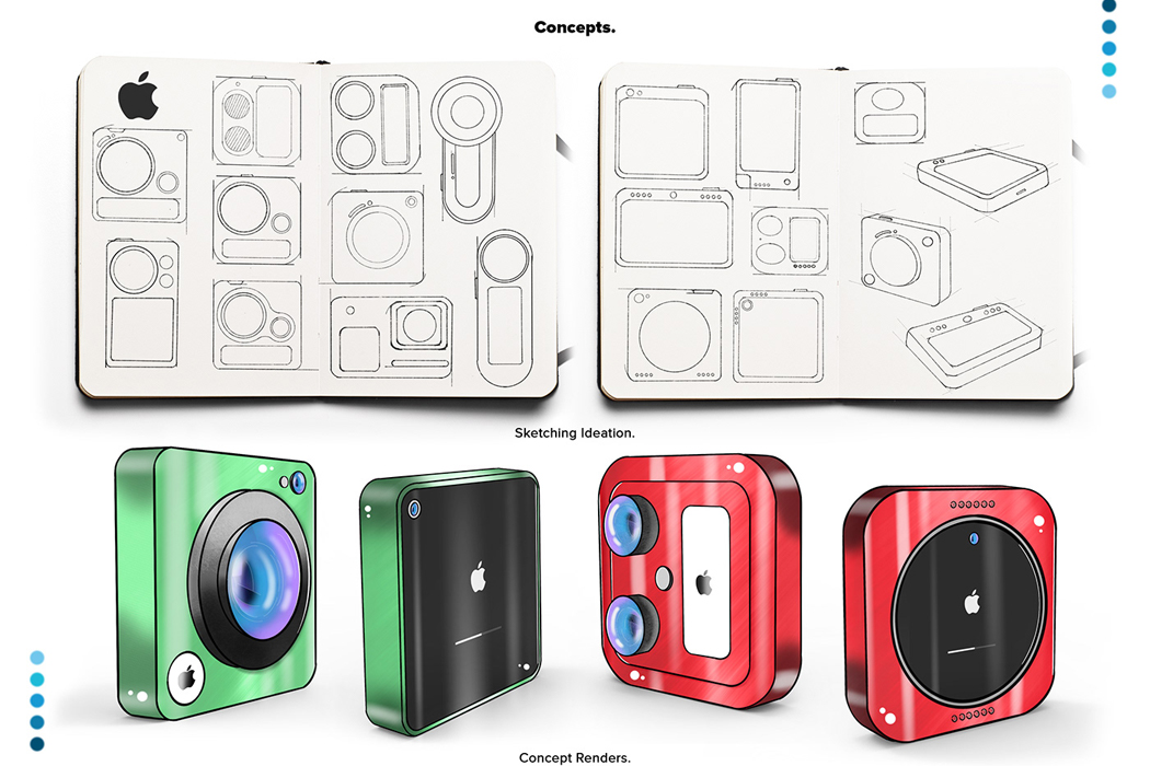
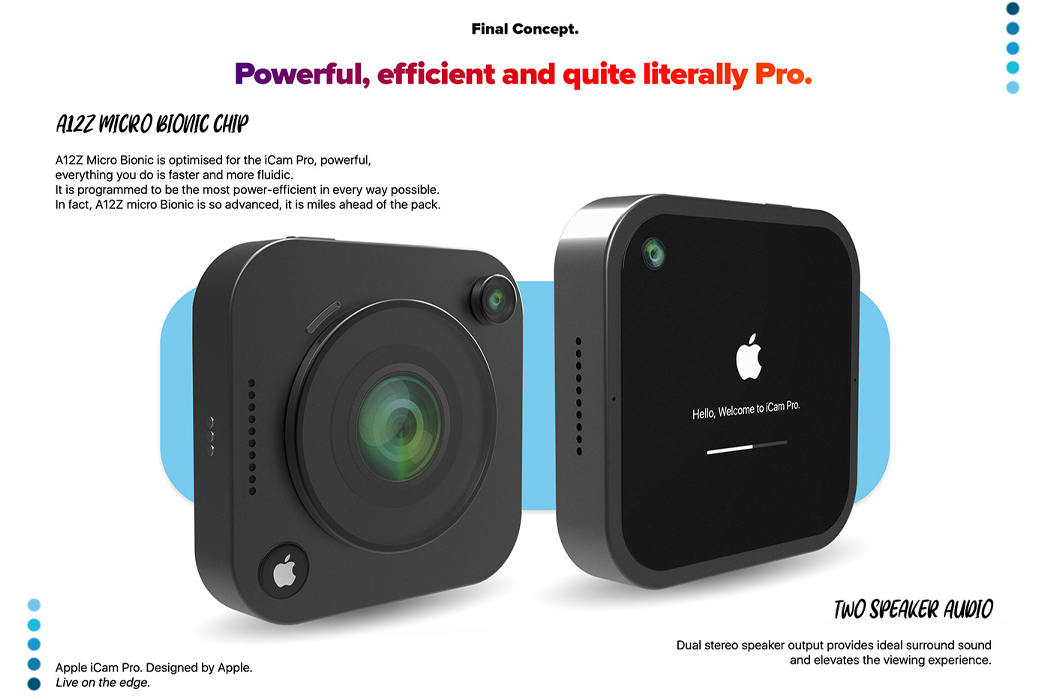
Inspired by living life on the edge and documenting travels along the way, the iCam Pro was conceptualized using top-grade technology fit for the adventure seeker who isn’t about to be held back by limiting camera setbacks. Equipped with Apple’s A12Z Bionic Chip, the concept of iCam Pro boasts lightning-fast feedback and the same power efficiency we’ve all come to expect from Apple. In addition to its ultra-fast microchip, the iCam Pro comes outfitted with LiDAR sensors, an advancement in camera technology that fills out Apple’s camera to take videography to another level. LiDAR sensors essentially use remote sensing to examine the Earth’s surface, and all of its nooks and crannies to deliver photos that are as close to the real thing as you can get from phone cameras. In a similar vein, a 12 MP ultra-wide sensor expands the camera’s view to deliver fuller photos, while the iCam Pro’s 22 MP wide camera captures crystal clear colors for more realistic documentation.

Apple announced that lossless audio was coming to Apple Music. With a new iPod, it’ll be like Apple going into the music-streaming war guns-a-blazing. Spotify’s slowly but surely dominated this space, and the new iPod could almost be Apple signaling that it’s taking the music domain pretty seriously. The iPod could drum up major interest the same way the Moto RAZR did – nostalgia is a powerful force. Moreover, the hardware would be no different from the iPhone 5 or the iPhone SE, given that the renders look pretty much exactly like those devices. Secondly, the new iPod has the ability to become Apple’s gateway device for a variety of iOS features (and probably even MagSafe, who knows). Kids could use it for listening to music, but could also potentially use the iMessage service on it. The iPod could leverage the power of Apple Arcade too, becoming a very affordable device that parents would buy for their kids in a heartbeat, tying them into the Apple ecosystem at an early age.

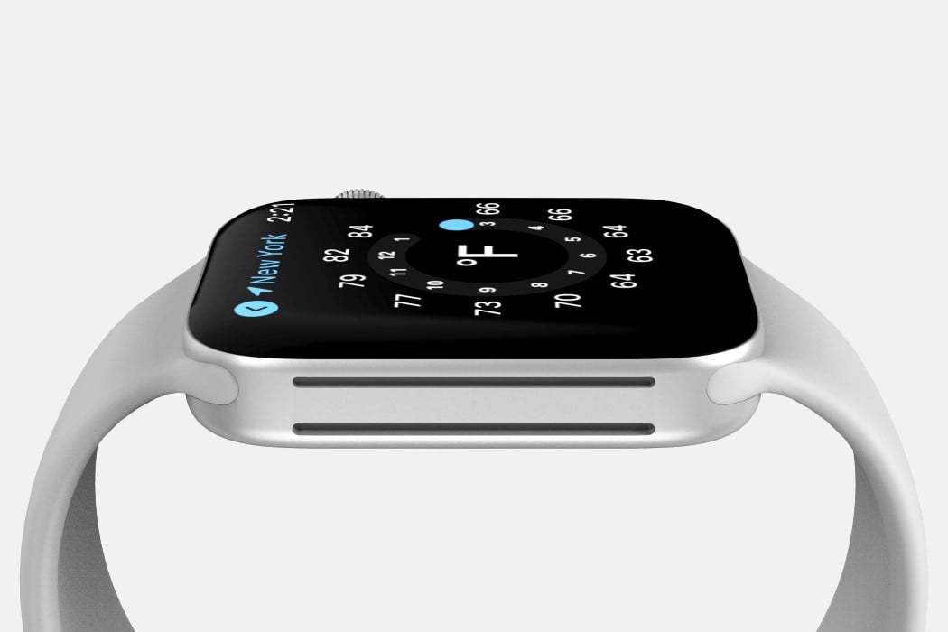
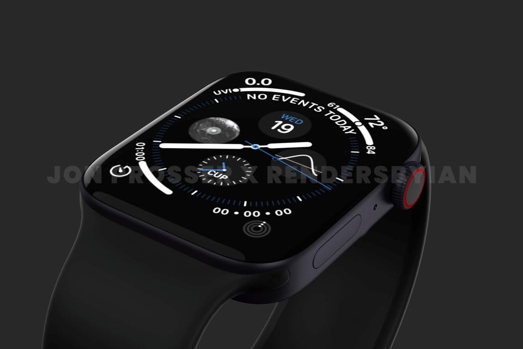
The rumor-mill of a new Apple Watch started back in 2020 when prominent Apple Analyst Ming-Chi Kuo hinted that a new design was in the works and could drop as soon as 2021. Now that we’re well into the year 2021, Prosser’s collaborated with Ian Zelbo to bring rumors and leaks to life in the form of pretty life-like renders. The renders are based on real images and CAD file screenshots supplied to Prosser by his network of sources. In order to protect the sources yet still share the designs with everyone, Prosser and Ian created these renders to show us exactly what they saw, and it seems like Apple is really beginning to streamline their design language. The ‘magical slab of glass’ analogy seemed to work really well for the iPad and its flat-edge design language finally carried onto the iPhone 12 last year and the iMac this year. According to the renders, the Apple Watch is getting a similar design upgrade with flat sides as opposed to the rounded ones, giving its screen a larger-than-life presence with minimal bezel interference.

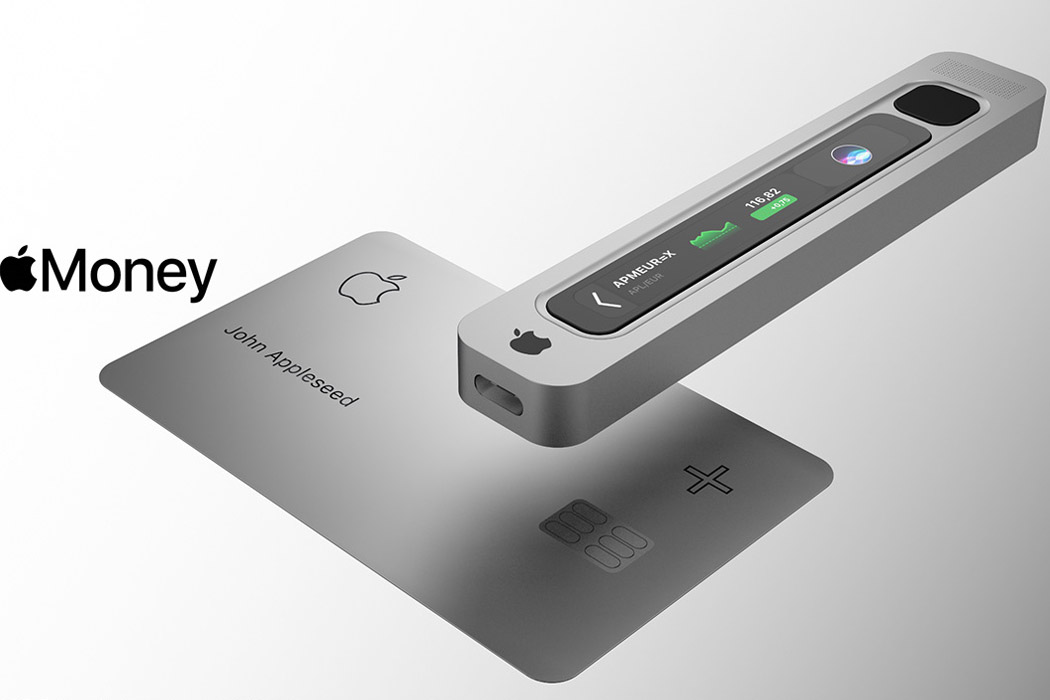
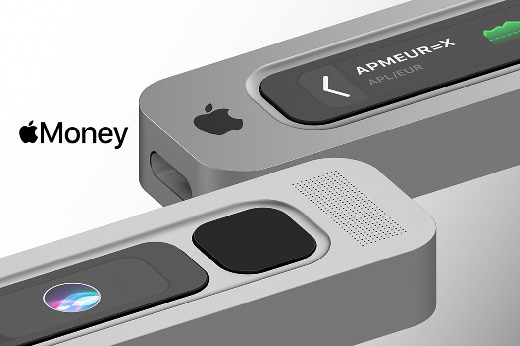
Creative director Antonio De Rosa gives our imagination wings with his ideation for Apple Money, the currency, and the electronic wallet that’ll make it all possible. The designer believes Apple Money will be available on the Apple Card+, scanned via the sleek gadget made out of aluminum, carrying the company’s signature design language. It’ll be connected to the Apple devices to create a mining ecosystem, one which is found in a decentralized family ecosystem. The device will be powered by the Apple Security Chip S2, capable of managing 27 assets and ERC20 tokens. Connected and approved devices will mine the digital money via a seamless app, keeping everything in the Apple ecosystem.

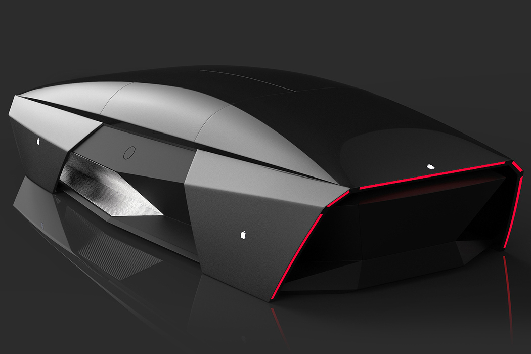
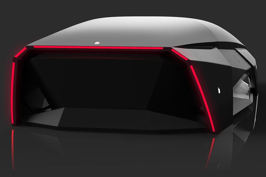
According to some sources, the Apple Car will not have any driver’s seat or even driving controls which could be a bummer for motorheads who love the feel of controlling their machine. What the Apple Car will look like is anybody’s guess but to give a close idea of what it may be like, Ali Cam’s Apple Car 2076 is a good reference point to take home some inspiration. Adopting Apple’s sharp design aesthetics, the car looks like a mouse shaped like a car at first glance, but then you realize it’s actually a minimal car concept. Loaded with advanced driving systems Ali envisions the blueprint far in the distant future – the year 2076 to be precise. The choice of year apparently is the 100the anniversary of Apple ever since it was founded by Steve Jobs, Steve Wozniak, and Ronald Wayne.

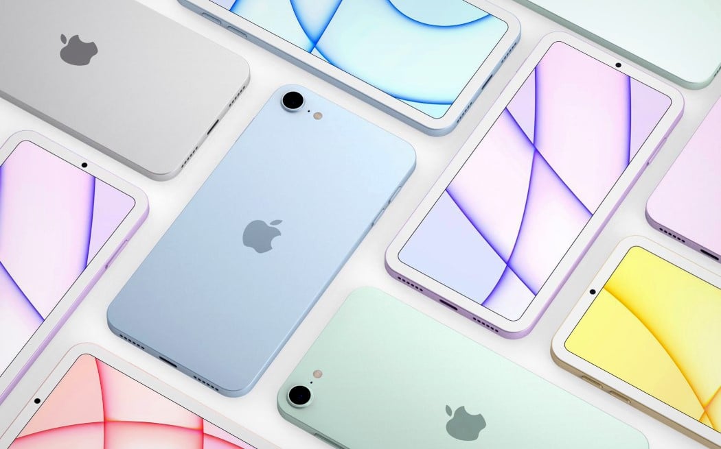
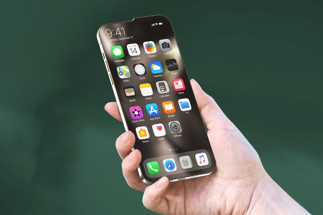
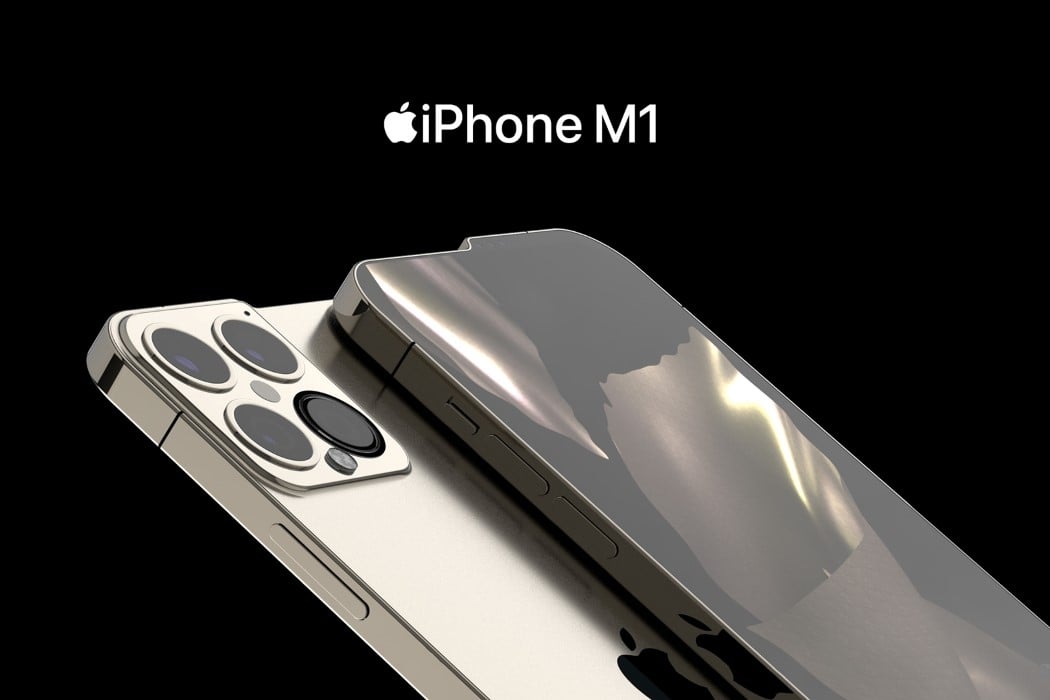
No matter how you cut it, the iPhone 13 looks unique – from the front, the back, and even the sides. The bump serves a practical purpose too. For once, the modern iPhone doesn’t have a notch. The iPhone 13 comes with a complete screen, as all the cameras and sensors that enable FaceID to sit on top, within that tiny 3-4 millimeter bump. Looking beyond it, however, the phone comes with speakers on the top as well as the bottom. The camera bump shifts slightly upward too, ensuring it’s perfectly aligned with the raised edge, thanks to the bump. Lastly, the conceptual phone flexes its muscles with its greatest feature yet, the Apple-made M1 chip.

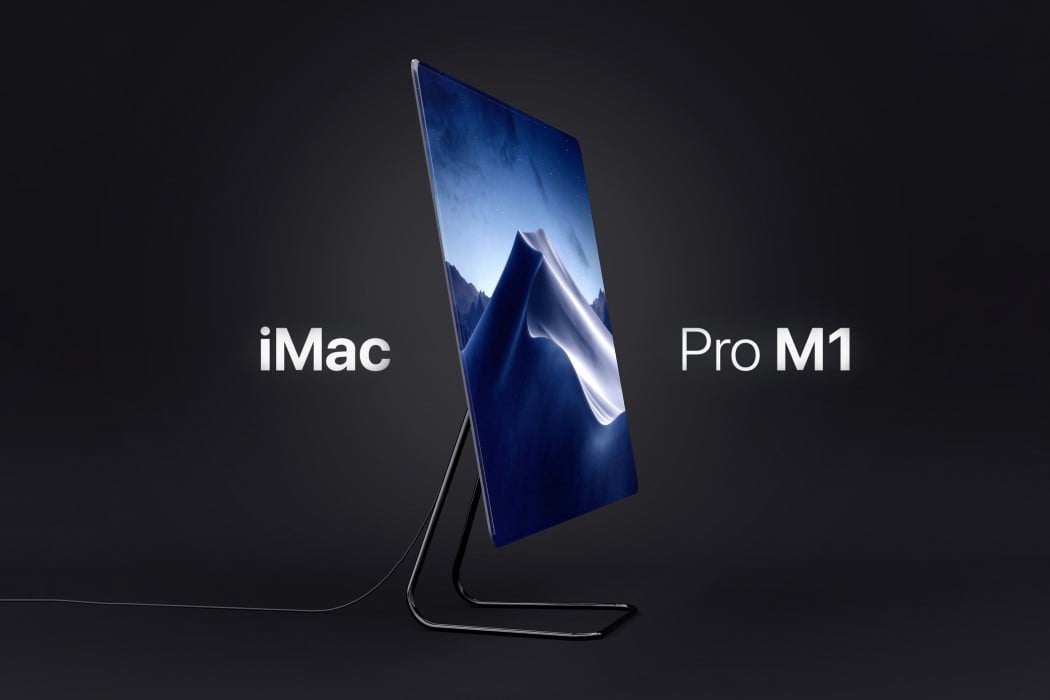
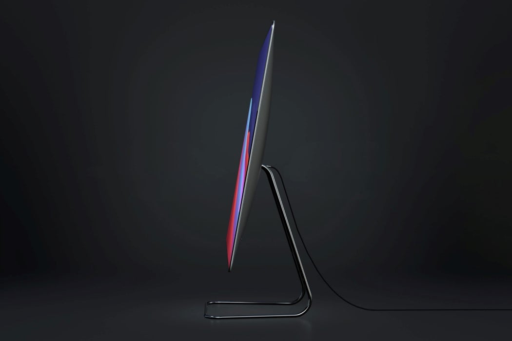
Instead of opting for a radical overhaul, Arlaud’s iMac Pro M1 concept takes the classic iMac Pro design and gives it minor yet significant visual upgrades. The conceptual all-in-one computer sports the crowd-favorite wedge-shaped profile with that slightly bulbed back. However, it absolutely gets rid of the bezels and chin on the front, sporting a gloriously infinite edge-to-edge display that’s an absolute pleasure to look at. Sure, the M1 may be the highlight of this computer, but that screen is the icing on the cake. If the M1 works behind the scenes to give you a great computing experience, that 100% screen on the front amplifies it, surrounding the user in Apple’s incredible, unmatchable UX.

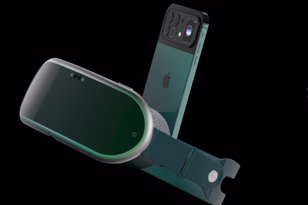
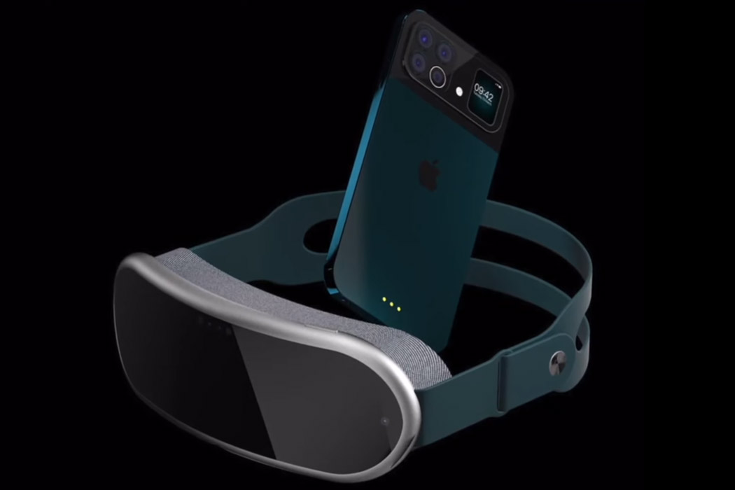
While iPhone 13 and the Apple VR headset cannot be launched in the same given timeframe – still it doesn’t deter imaginative designers from mustering up how the two products will look together. ConceptsiPhone has created a render of the two upcoming devices by Apple and mashed them together in a video dubbed iPhone 13 VR for creative writer’s delight. The VR headset is open to any imagination possible, and the folks over at ConceptsiPhone have taken that opportunity to show the world how the mixed reality headset will be like. It looks plush (after all it’s Apple) and is in sync with the design principles Apple has put in place for the headset – comfort and lightweight aesthetics. The strap looks reassuring as far as ergonomics go while the padding around the viewable area ensures utmost comfort.

These PS5 Gaming Earbuds are the perfect addition to Sony’s Playstation hardware ecosystem

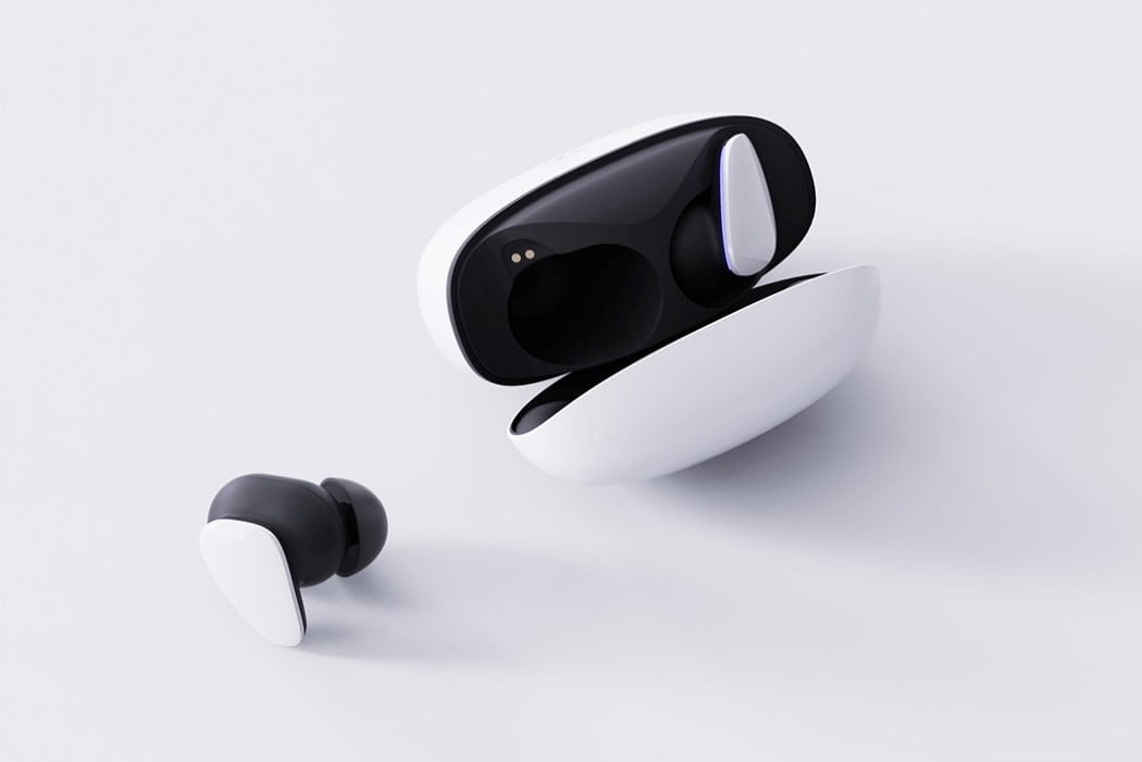
Titled the EVOLUTION 3D, these conceptual TWS Gaming Earbuds form the perfect successor to Sony’s Pulse headphones, giving PS5 gamers some much-needed variety.

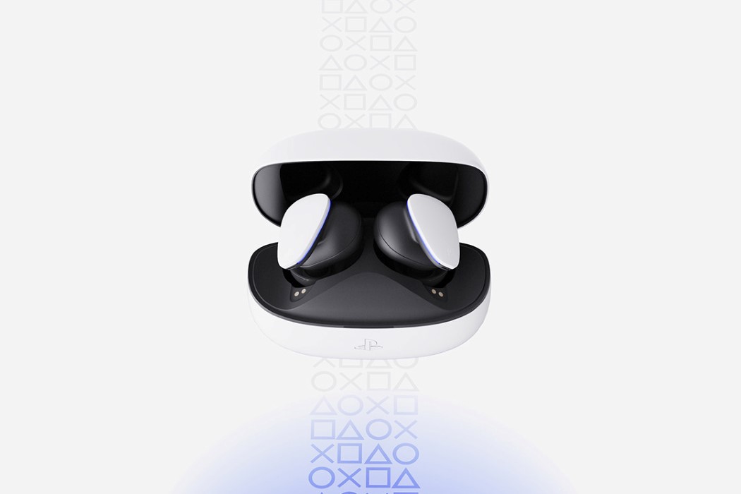
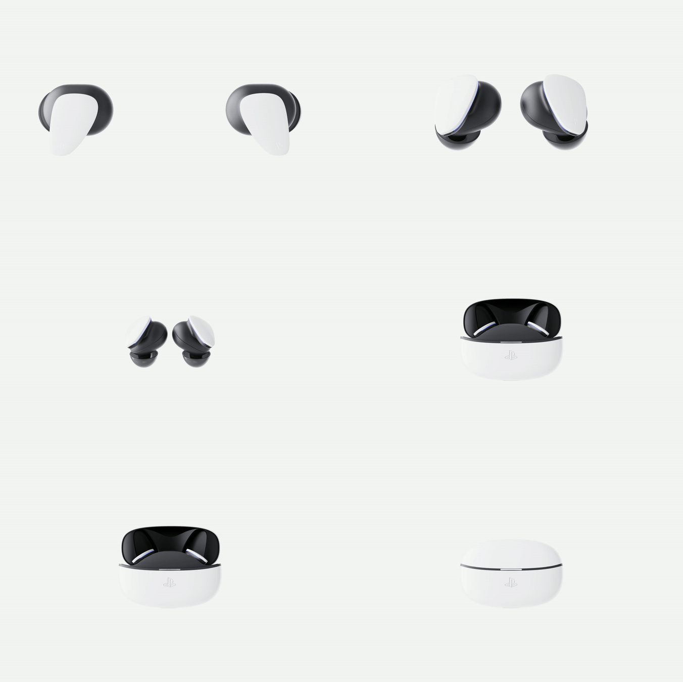
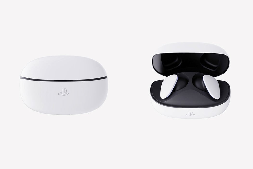
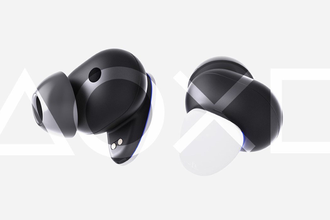
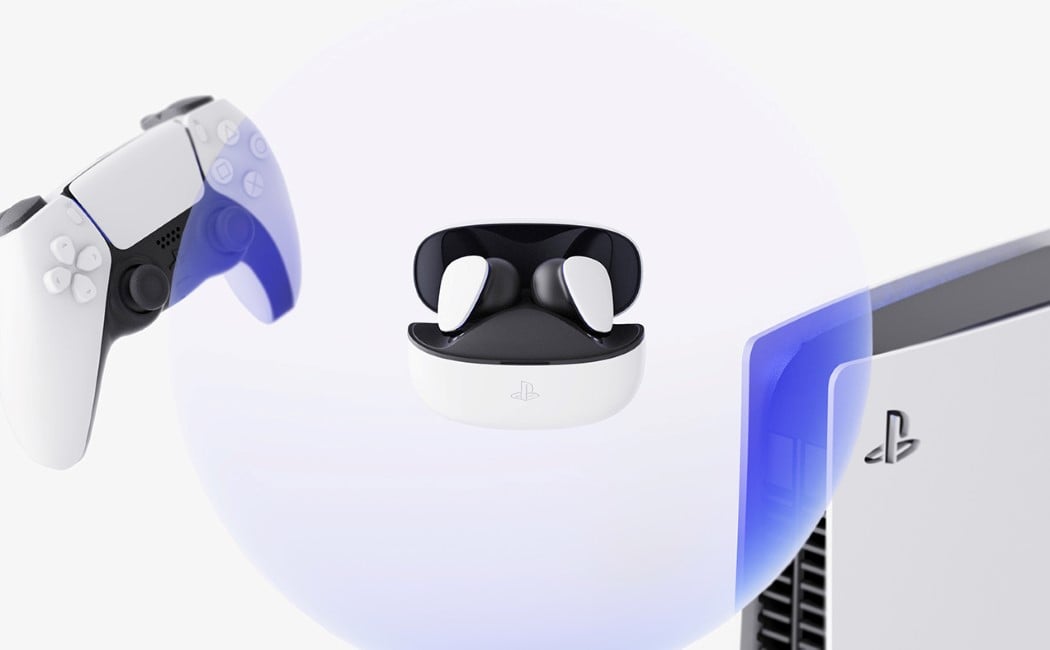
Every archetype of a gamer involves having a clunky pair of headphones with a microphone, but the EVOLUTION 3D wants to give that cliché an upgrade. By combining powerful gaming hardware with sleek, cutting-edge consumer tech, the EVOLUTION 3D creates allies out of two hardware categories that seldom see an overlap. The TWS earbuds come with the distinct PS5 visual style with the interplay between white and black surfaces. The case comes with an embossed version of the PS logo, and a soft, pebble-inspired form. Pop it open at the seam and it reveals the two earbuds docked in place. Designed to work with all devices but especially with your PS5, the EVOLUTION 3D provides a host of unique features that makes your gameplay much more interesting and immersive.

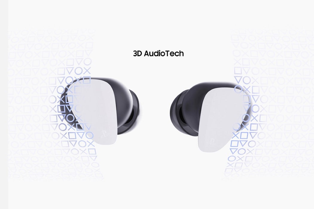
The earbuds are the brain-child of designer Adam Shen, who saw a void in Sony’s PS5 hardware offering and decided to fill it up. Visually, they fit perfectly into the PS5 lineup, although functionally, I wouldn’t be surprised if hardcore gamers still decided to stick to wired headsets. However, the conceptual EVOLUTION 3D earbuds make up for it with incredible features. Not only do they come with Active Noise Cancelling, they support 3D Audio too (like the AirPods Max), which means sounds don’t exist in a static space… they move around as you move your head, making the earbuds great for the PS5 but even better for PlayStation VR! If someone at Sony’s reading this, I hope you consider turning this concept into reality!

Designer: Adam Shen

This is a fan-made concept and the Sony PlayStation and PS5 logos are used for representational purposes only.

A smart helmet with SOS alerts + more product designs that emerged as the tech trends of May!

The month of May brought with it an influx of innovative and mindblowing tech designs! At Yanko Design, it was surely an exciting month for us, as we came across an array of intriguing designs that left a lasting impression on our minds. Each design broke through some barrier or convention in the tech world, bringing to us unique solutions, improved functionality, and immense value. From the downpour of tech designs that May introduced to us, we’ve curated some of the very best. Not only do these designs address tangible problems, but they also make our lives better, easier, and efficient in their own way. We hope you love these tech trends as much as we did!

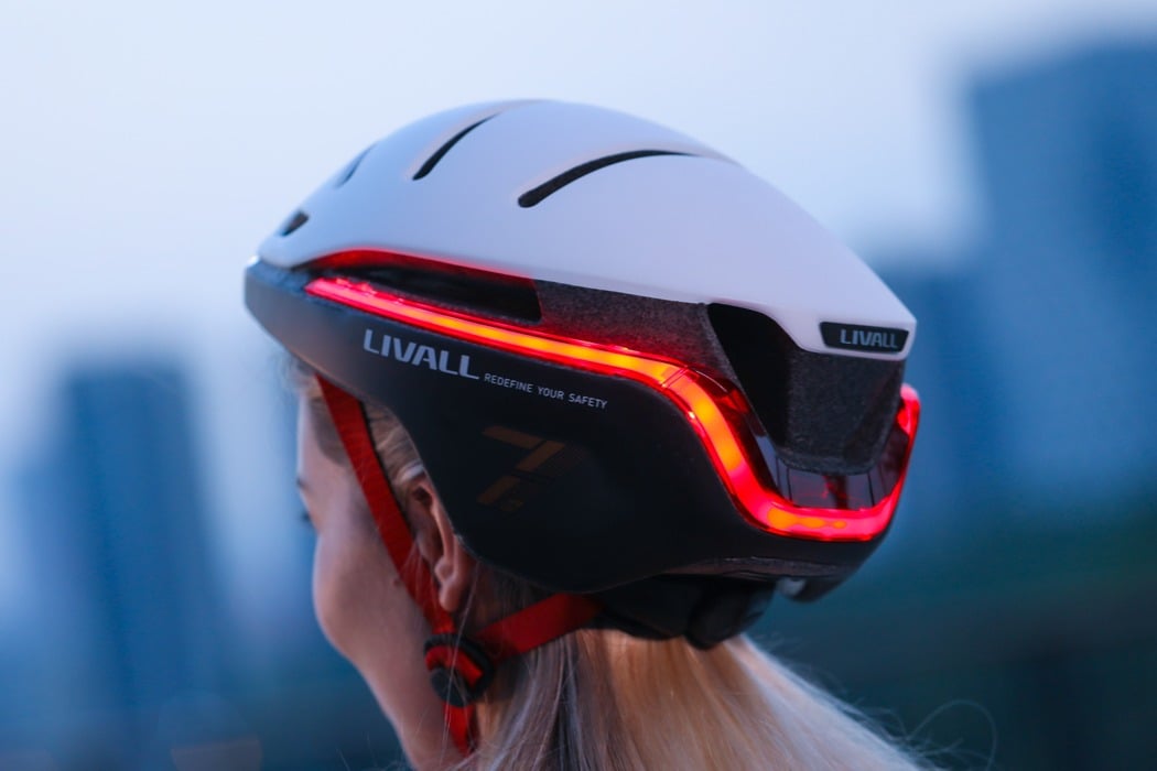
In a world where over 40,000 bicyclists die globally each year, the LIVALL EVO21 Smart Bike Helmet is aiming at impacting change by making bicycling smarter and safer. Apart from serving as protection for your head, the LIVALL EVO21 helps other motorists and pedestrians be aware of your presence and helps avoid a collision in the first place. The helmet’s aerodynamic outer shell comes with a built-in wide beam angle front light as well as a super bright 270° rear light and two turn indicators. Controlled by a tiny remote that straps to your handlebar, the lights offer 360° visibility to people around you, allowing them to be aware of your presence as well as of your intentions as you ride. The wide beam-angle headlight offers great visibility by shining a beam of light that’s wide horizontally as well as vertically, allowing oncoming traffic to spot you even if you’re cycling with your head down for better aero dynamism.

No matter how you cut it, the iPhone 13 looks unique – from the front, the back, and even the sides. The bump serves a practical purpose too. For once, the modern iPhone doesn’t have a notch. The iPhone 13 comes with a complete screen, as all the cameras and sensors that enable FaceID to sit on top, within that tiny 3-4 millimeter bump. Looking beyond it, however, the phone comes with speakers on the top as well as the bottom. The camera bump shifts slightly upward too, ensuring it’s perfectly aligned with the raised edge, thanks to the bump. Lastly, the conceptual phone flexes its muscles with its greatest feature yet, the Apple-made M1 chip.

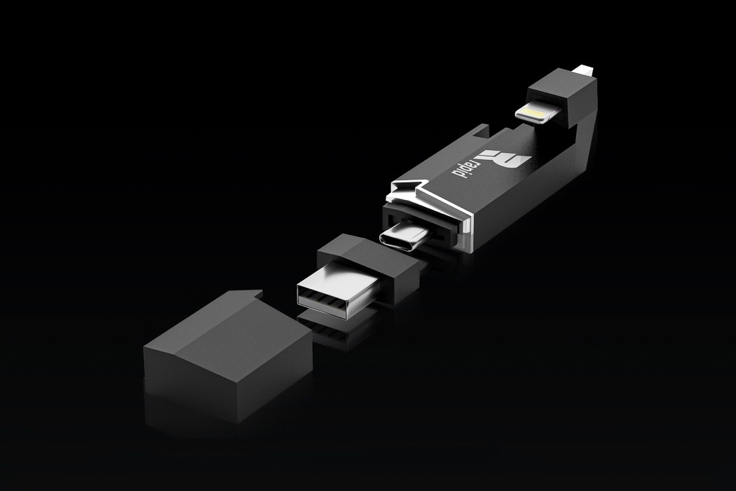
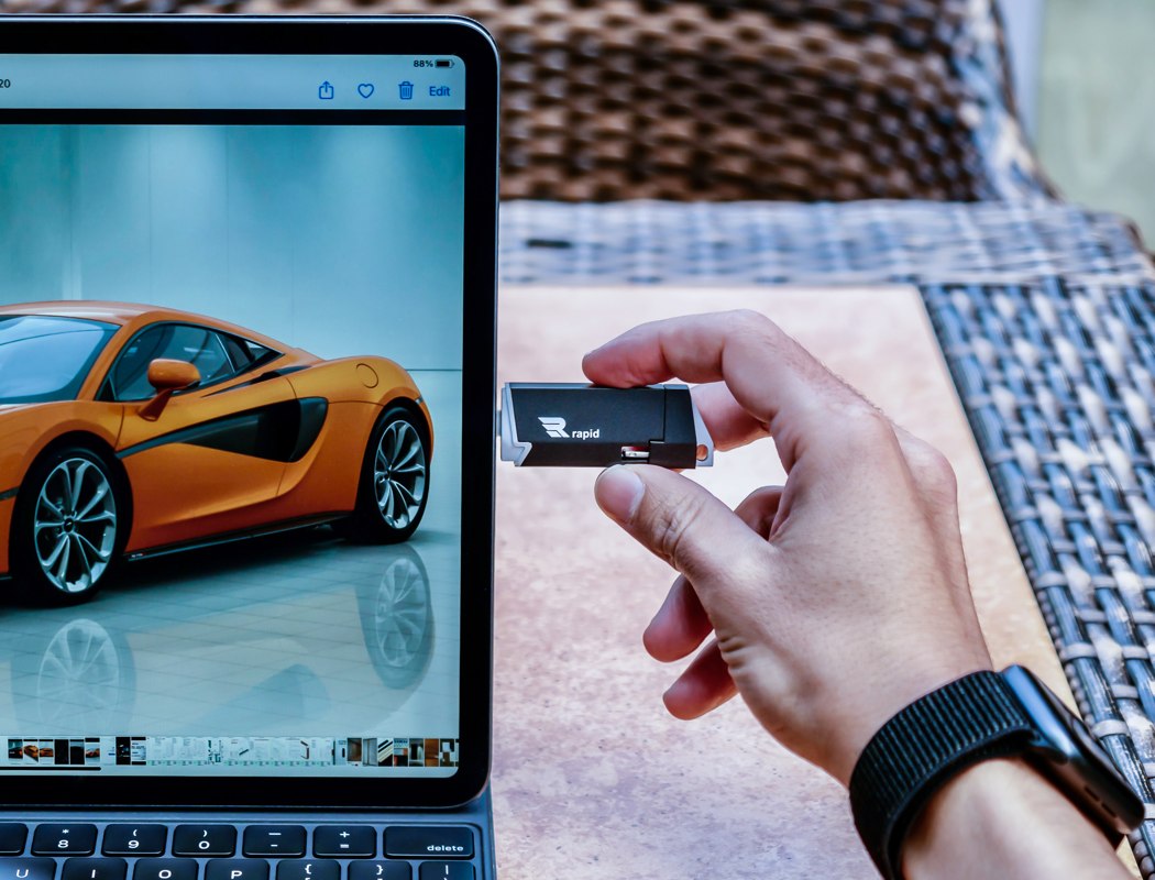
Designed to be extremely portable (they’re just about the size of your thumb) and equipped with unsettlingly fast read and write speeds, portable SSDs like the Rapid SSD are slowly killing cloud subscriptions because they’re A. always accessible anywhere, B. can’t be hacked because they aren’t on the cloud, and C. cheaper than cloud drives, because an SSD is just a one-time purchase, not a monthly subscription. Quite like the SSDs we’ve spoken about here before, the Rapid SSD puts up to 2 terabytes worth of storage right in your pocket. It’s about the size and shape of a pack of chewing gum but takes care of virtually all your storage needs. It also has 3 different ports that let you connect to virtually every device you own, from your smartphone to laptop, and from your tablet to your DSLR… and even your gaming console!

Inspired by living life on the edge and documenting travels along the way, the iCam Pro was conceptualized using top-grade technology fit for the adventure seeker who isn’t about to be held back by limiting camera setbacks. Equipped with Apple’s A12Z Bionic Chip, the concept of iCam Pro boasts lightning-fast feedback and the same power efficiency we’ve all come to expect from Apple. In addition to its ultra-fast microchip, the iCam Pro comes outfitted with LiDAR sensors, an advancement in camera technology that fills out Apple’s camera to take videography to another level. LiDAR sensors essentially use remote sensing to examine the Earth’s surface, and all of its nooks and crannies to deliver photos that are as close to the real thing as you can get from phone cameras.

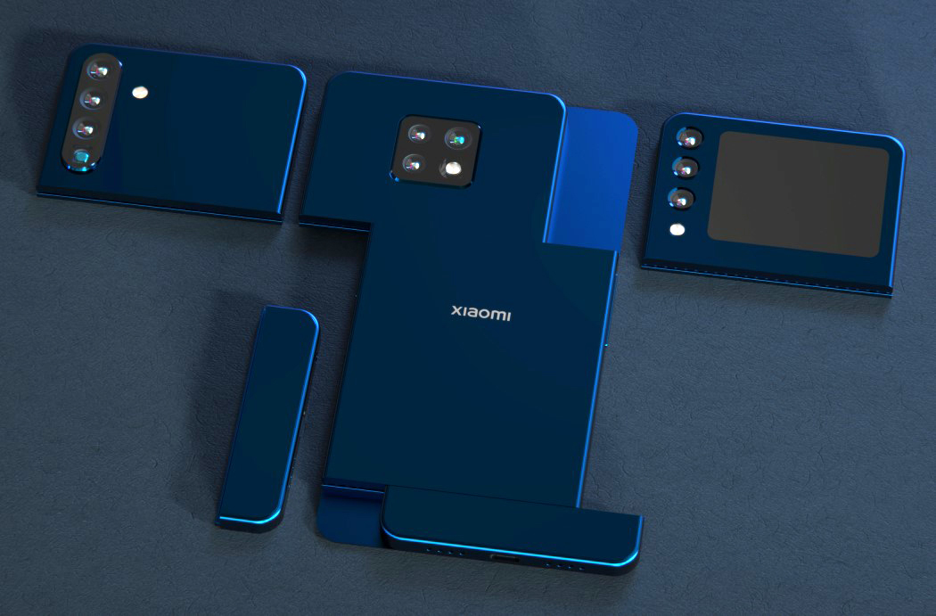
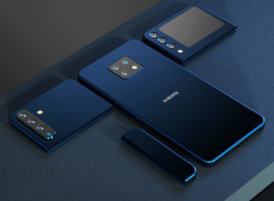
LetsGoDigital uncovered Xiaomi’s patent for a modular smartphone on the 26th of April and partnered with Jermaine Smit (aka Concept Creator) to bring the patent drawings to life. The phone’s components attach to one another using sliding dovetail joinery, with contact points that allow for communication between modules. Finally, a primary screen snaps on the front, hiding the crease lines and providing a large, bezel-less display. The three modules play a rather interesting role when combined. The upper module houses the camera but also contains the phone’s motherboard. The central module houses the battery, while the third includes the speaker along with the phone’s charging port. Conceptually, the modules would be interchangeable, but I wouldn’t be surprised if you had to switch the phone off prior to swapping parts.

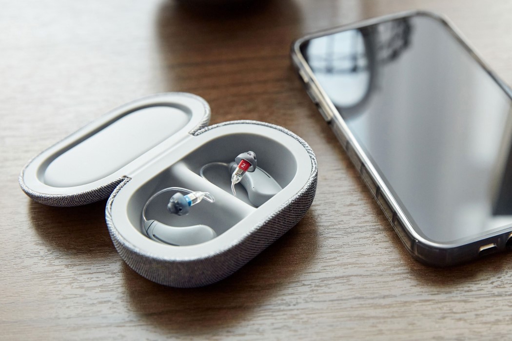
Bose just announced their latest product, the SoundControl™ Hearing Aids – the first FDA-cleared, direct-to-consumer hearing aid developed for adults with perceived mild to moderate hearing loss. They’ll be sold by Bose (as opposed to being available at medical stores) and can be directly purchased, worn, and controlled by the wearer without needing to visit a doctor for a prescription or even an audiologist for a hearing test and professional fitting. The SoundControl hearing aids partner up with the Bose Hear app that gives wearers complete control over their wearables through their smartphone. Using its revolutionary CustomTune technology, the app lets you personalize your hearing experience in under 30 minutes, which Bose says is “a seismic shift from the process required for conventional hearing aids”.

The rumor-mill of a new Apple Watch started back in 2020 when prominent Apple Analyst Ming-Chi Kuo hinted that a new design was in the works and could drop as soon as 2021. Now that we’re well into the year 2021, Prosser’s collaborated with Ian Zelbo to bring rumors and leaks to life in the form of pretty life-like renders. The renders are based on real images and CAD file screenshots supplied to Prosser by his network of sources. In order to protect the sources yet still share the designs with everyone, Prosser and Ian created these renders to show us exactly what they saw, and it seems like Apple is really beginning to streamline their design language. The ‘magical slab of glass’ analogy seemed to work really well for the iPad and its flat-edge design language finally carried onto the iPhone 12 last year and the iMac this year. According to the renders, the Apple Watch is getting a similar design upgrade with flat sides as opposed to the rounded ones, giving its screen a larger-than-life presence with minimal bezel interference.

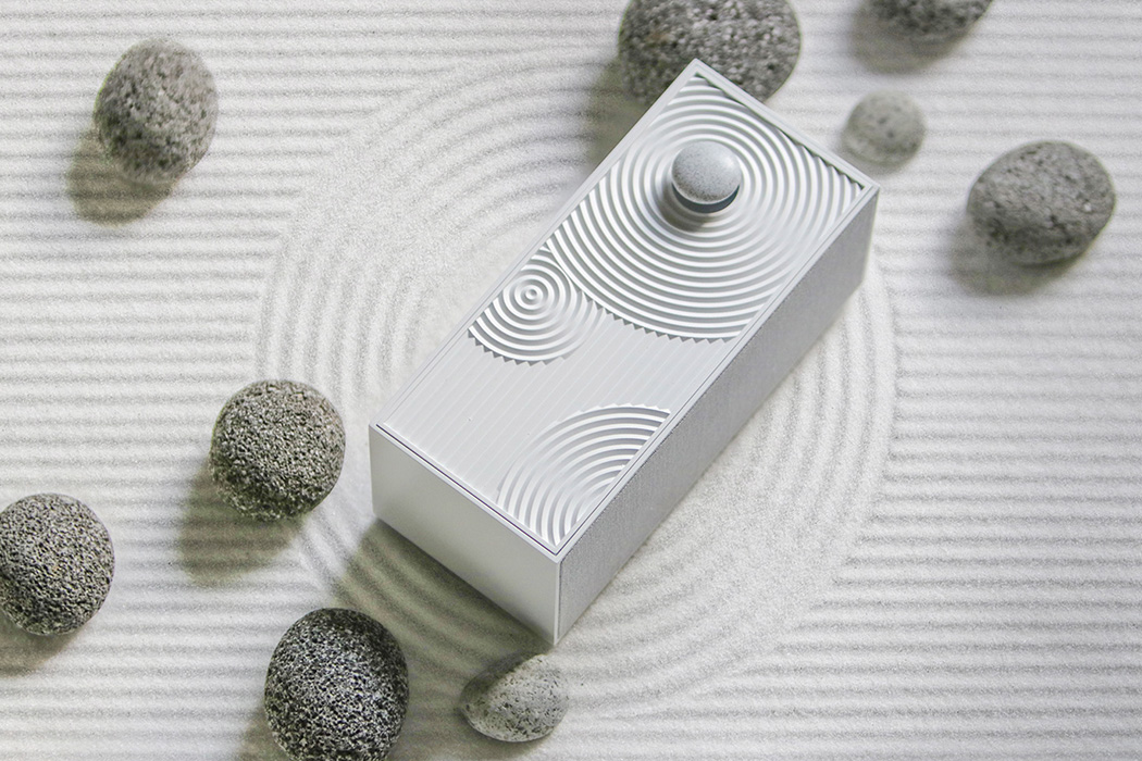
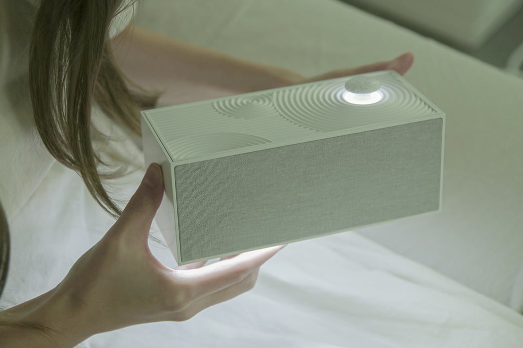
The Zen Garden speaker captures the minimalistic element of a Japanese garden by mimicking the repetitive patterns you find in the sand there. As a bonus, the rock on the top of the speaker doubles as a volume control know. The speaker boasts of a diffused white light that shines underneath the speaker and under the pebble/volume knob, amplifying the overall tranquility of the design. Music is known for its ability to help us transport ourselves to another space. We don’t need visuals, but we always need music to work on our mood. The Zen Garden speaker brings the visuals to help you meditate, or even take you through the streets of Kyoto, wandering as we feel that balance of tradition and modernity in one tiny little package guaranteed to look great even when not in use.
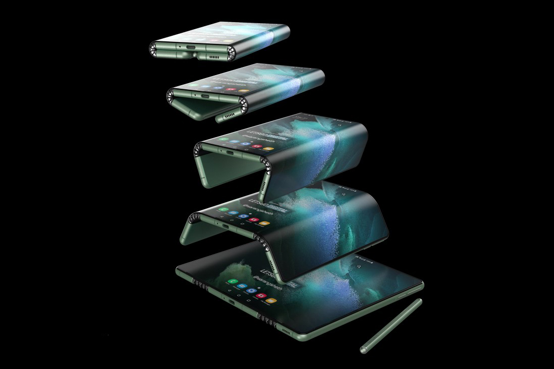
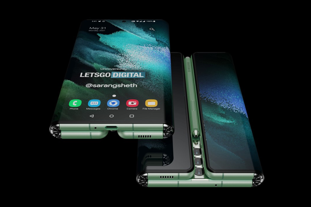
The Z Fold Tab concept takes on the avatar of a folding device with an outward screen. Although, unlike the Huawei Mate X or any of Royole’s Flexpai devices, the Z Fold Tab comes with two hinges on its massive screen, creating a novel folding format that has a rather interesting set of pros as well as cons. In its closed mode, the Z Fold Tab can obviously be used as a regular smartphone (albeit being slightly thicker) with a waterfall display on both left and right edges thanks to the folding screens (this obscures the volume and power buttons, but those could easily be translated to the screen via force-touch like in the Vivo Apex 2019). However, unfold the screens on either side and you have yourself a larger tablet.

The Snapods by Scendo are a pair of TWS Earbuds that come with a flat case that snaps right to the back of your phone. Building wonderfully on the capabilities of the MagSafe feature introduced in the latest iPhones, the Snapods make carrying earphones convenient. Just snap them to the back of your phone and you’ve got yourself a pair of earphones that are easy to store, quick to access, and hard to lose. The case’s design is inspired directly by where it’s located. Made to sit against the back of your phone, the Snapods case comes with a flat, wedge-shaped profile, making it easy to slip your phone into your pocket. The slim case doesn’t just dock the earphones, it charges them too, giving you an impressive 45 hours of playtime.