Amazon Echo Spot returns with a fresh new look that ditches the camera

We rarely hear about new smart speakers these days. Either they have died off or that all wireless speakers are expected to be smart anyway. Even rarer, however, is news on smart speakers with displays, a.k.a. smart displays, outside of a few select devices, like the Google Pixel Tablet, and rumors, like a new Apple HomePod with a screen. Even Amazon, arguably the brand that really kicked off the smart speaker market, is pretty silent, at least until now. Seven years after it first launched, the controversial Echo Spot is making a comeback, bearing an aesthetic that is more modern, more soothing, and, more importantly, more privacy-focused.

Designer: Amazon

The first Amazon Echo Spot launched in 2017 as the smaller sibling to the Echo Show, perhaps the market’s first smart display. It had a funky circular screen and was positioned as a hi-tech bedside alarm clock rather than a general-purpose smart speaker with a display like the Echo Show. Unfortunately, two things made it less palatable even to Amazon’s loyal following: its price and the fact that it had a camera, a big no-no for something that’s supposed to stay in a very private part of your home.

After what felt like forever, the second-gen Echo Spot is finally rolling out with a design that addresses both concerns. At $79.99, it’s immediately half the launch price of its predecessor, and Prime Members can even get it for only $44.99 for Prime Day. It also no longer has a camera, but you can still make audio calls as usual. At least you won’t have to worry about people peeking at you, accidentally or otherwise.

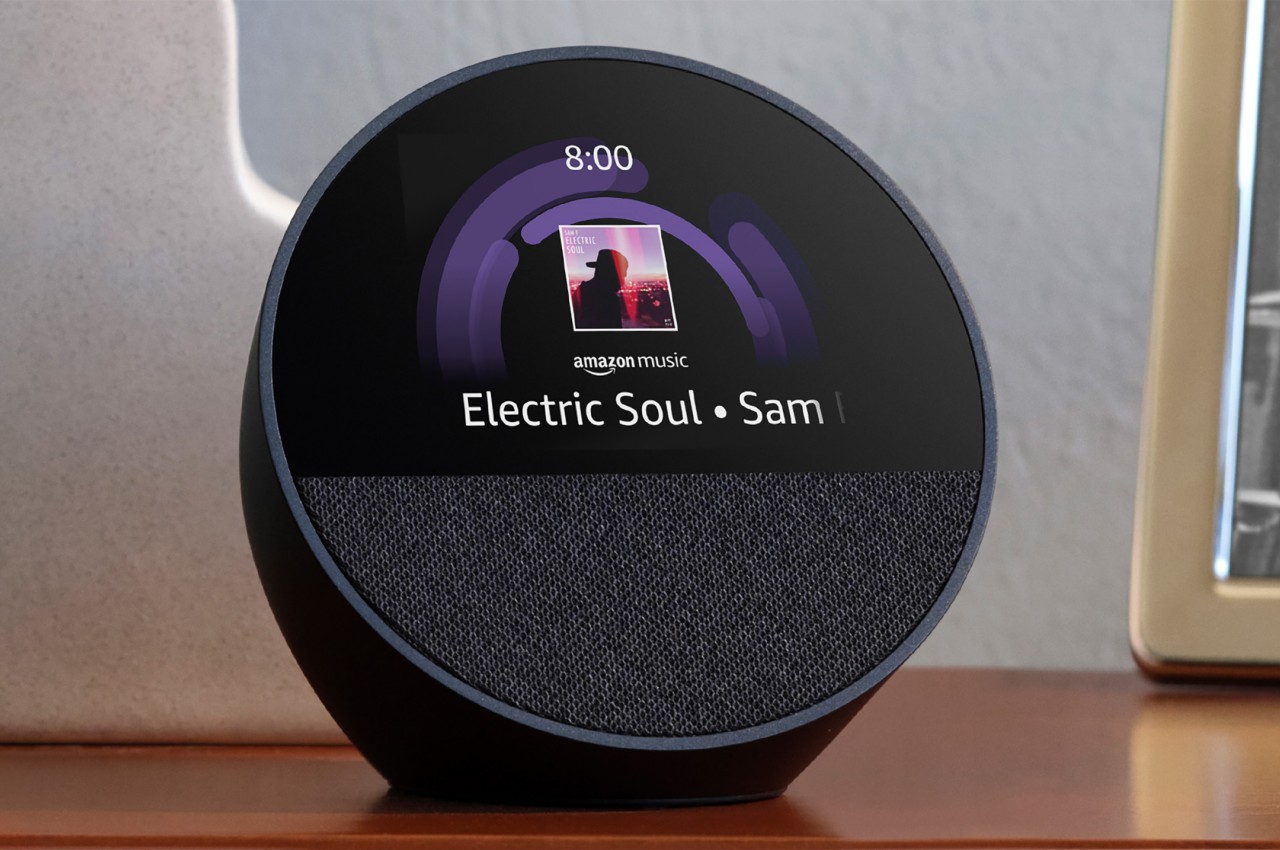
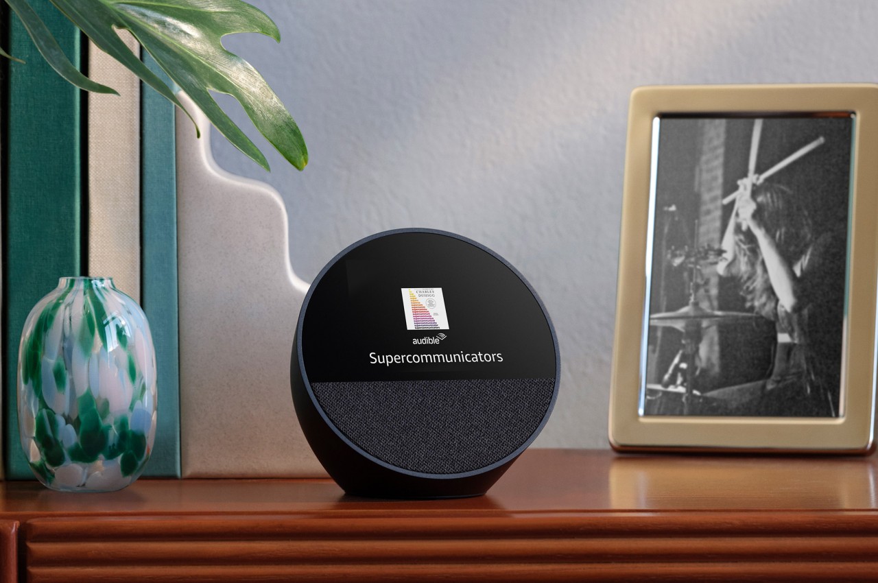
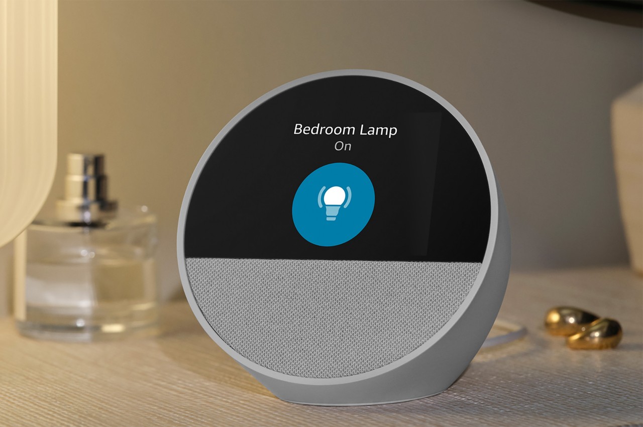
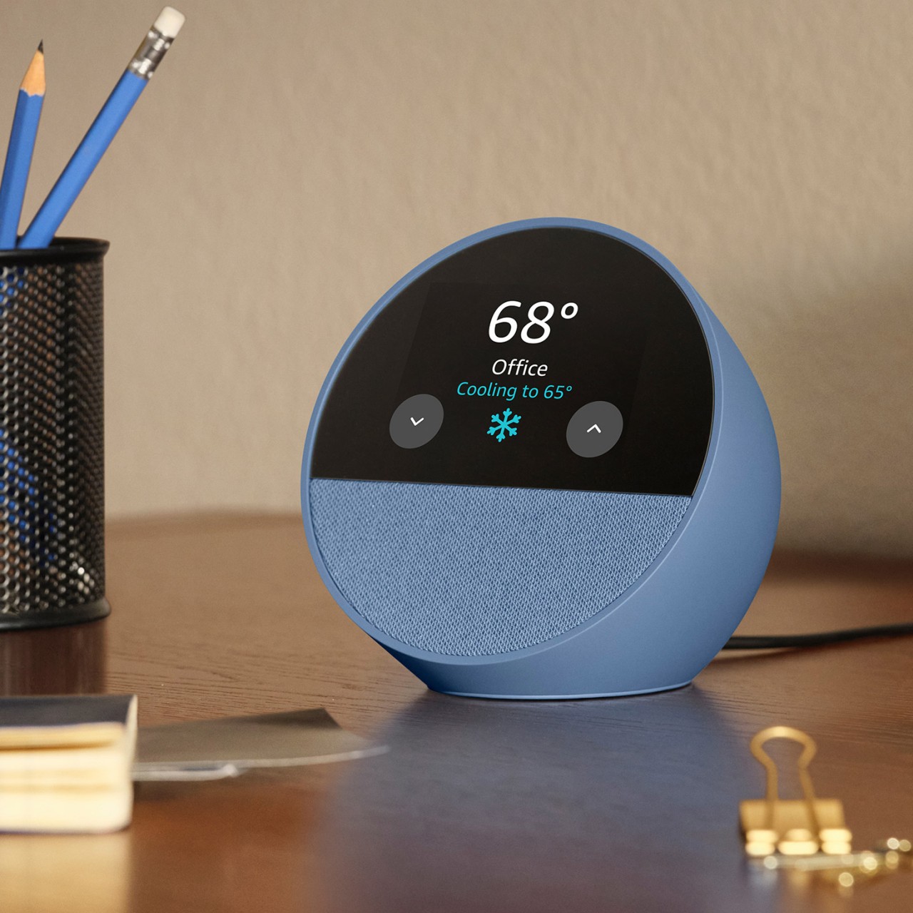
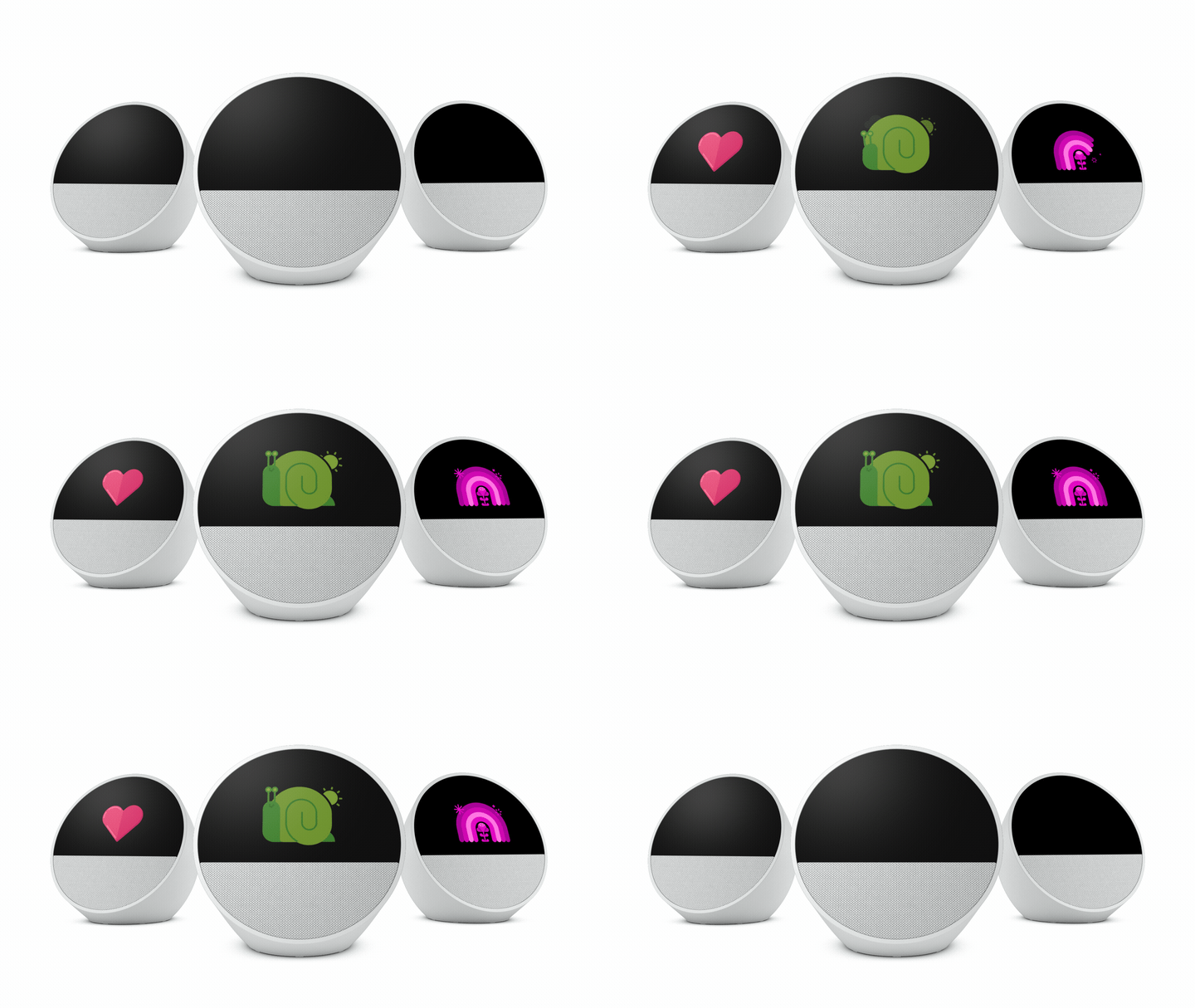
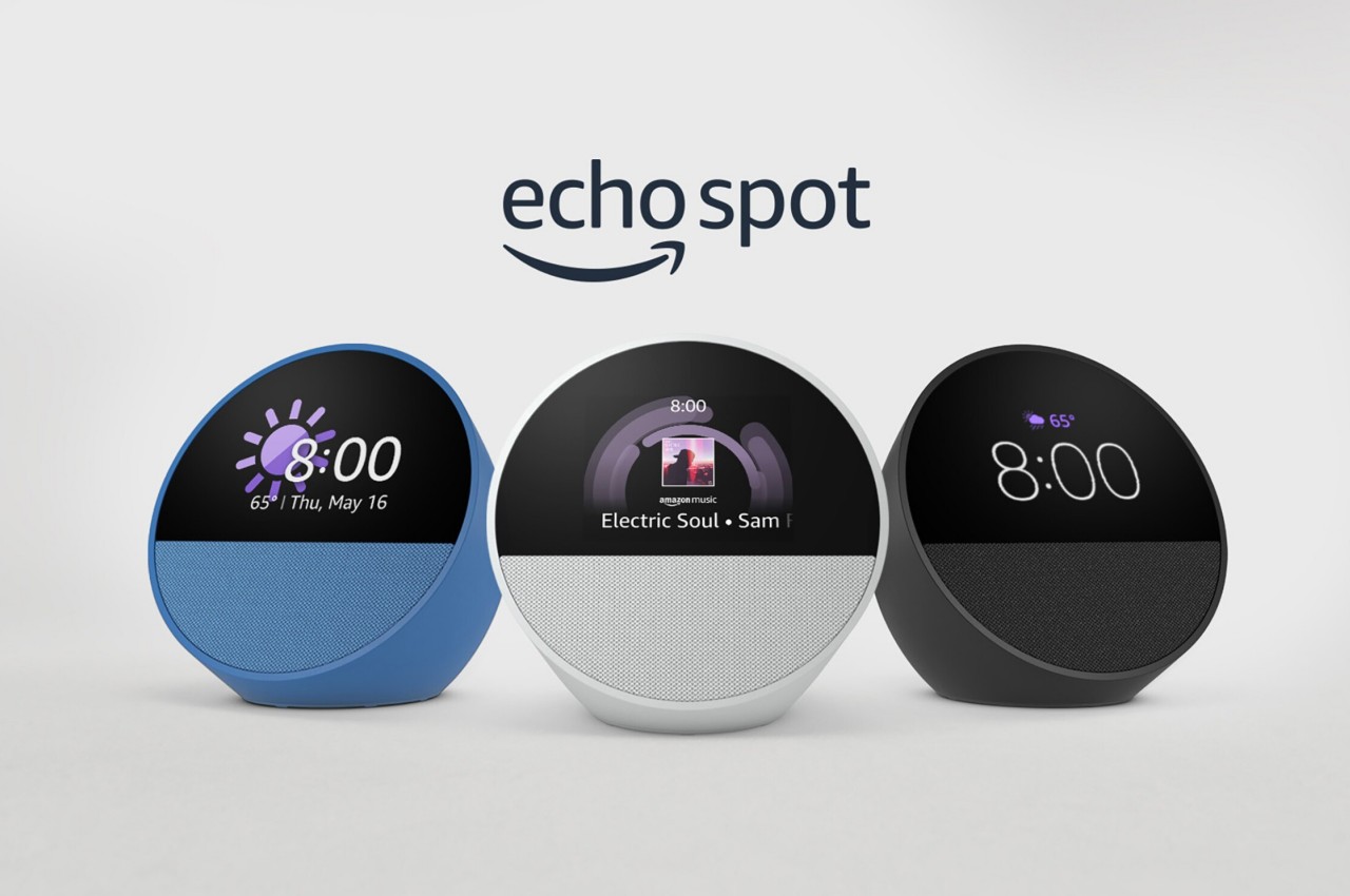
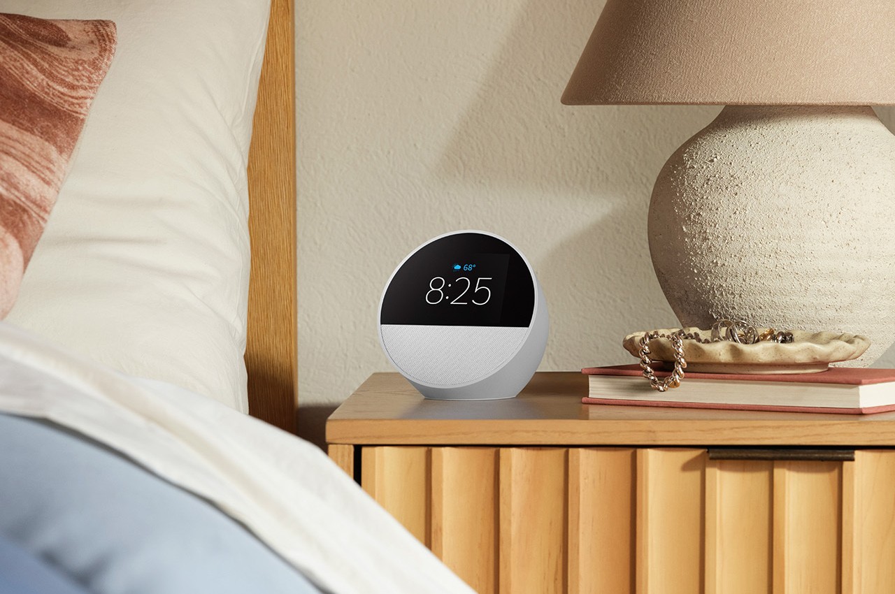
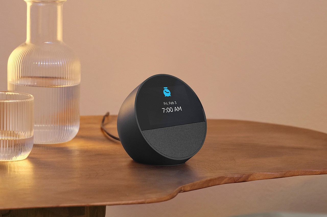
With that functionality out of the way, there’s no longer a reason for a full display on the front, freeing Amazon to adopt a new design that is admittedly more suited for a bedroom. It still has a spherical shape that looks more like a tilted bowl, and the outer surface is still the same matte plastic material. The front, however, is now split in half, with a brighter and more vibrant screen taking up the upper portion, and a fabric-covered 1.73-inch front-facing directional speaker. The new Echo Spot also comes in a new Ocean Blue colorway in addition to the traditional Black and Glacier White.

1

1

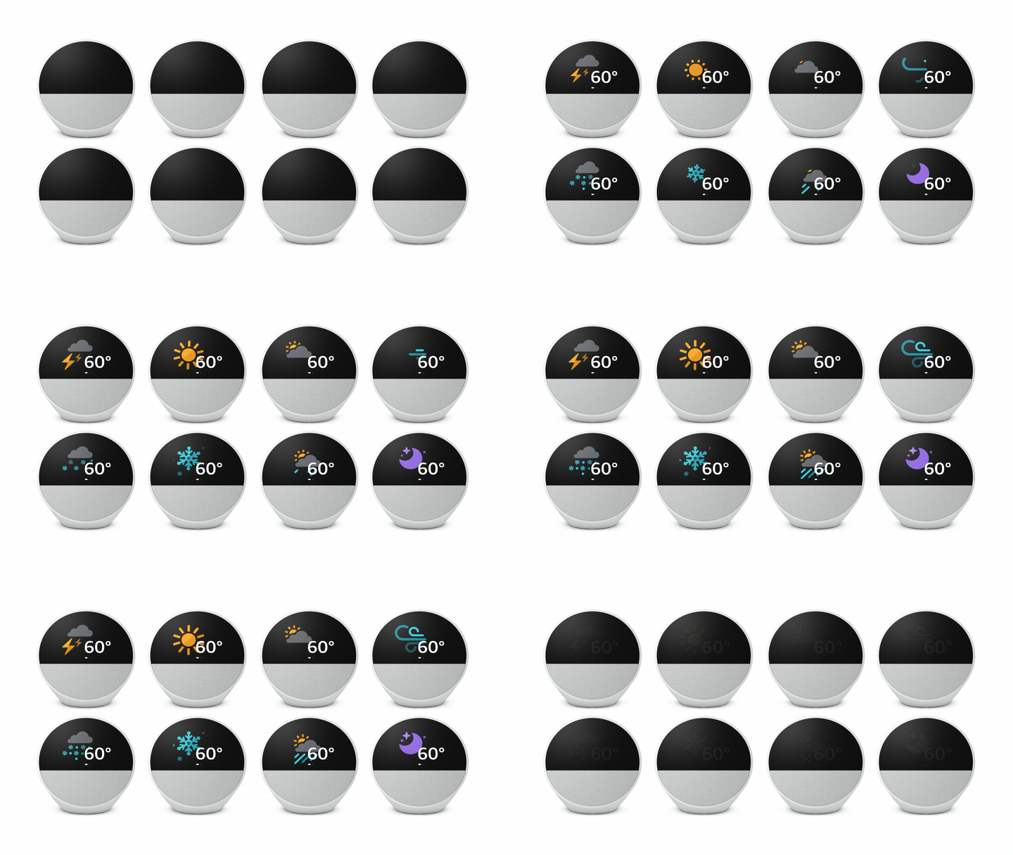
You can still touch that screen to control some of the speaker’s smart functions, though it really shines more when giving visual feedback to queries and commands. Being Amazon, the focus is on voice control and AI smarts, including routines and the ability to control other smart devices in the house. This does mean that the Echo Spot is always listening even if it is never watching, but there’s a physical mute button on its back when you really want that privacy in the bedroom.

The post Amazon Echo Spot returns with a fresh new look that ditches the camera first appeared on Yanko Design.

This Smartphone Won’t Collect Or Sell Your Personal Data… And It Has An Encrypted VPN Too

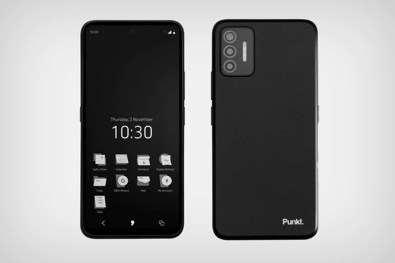
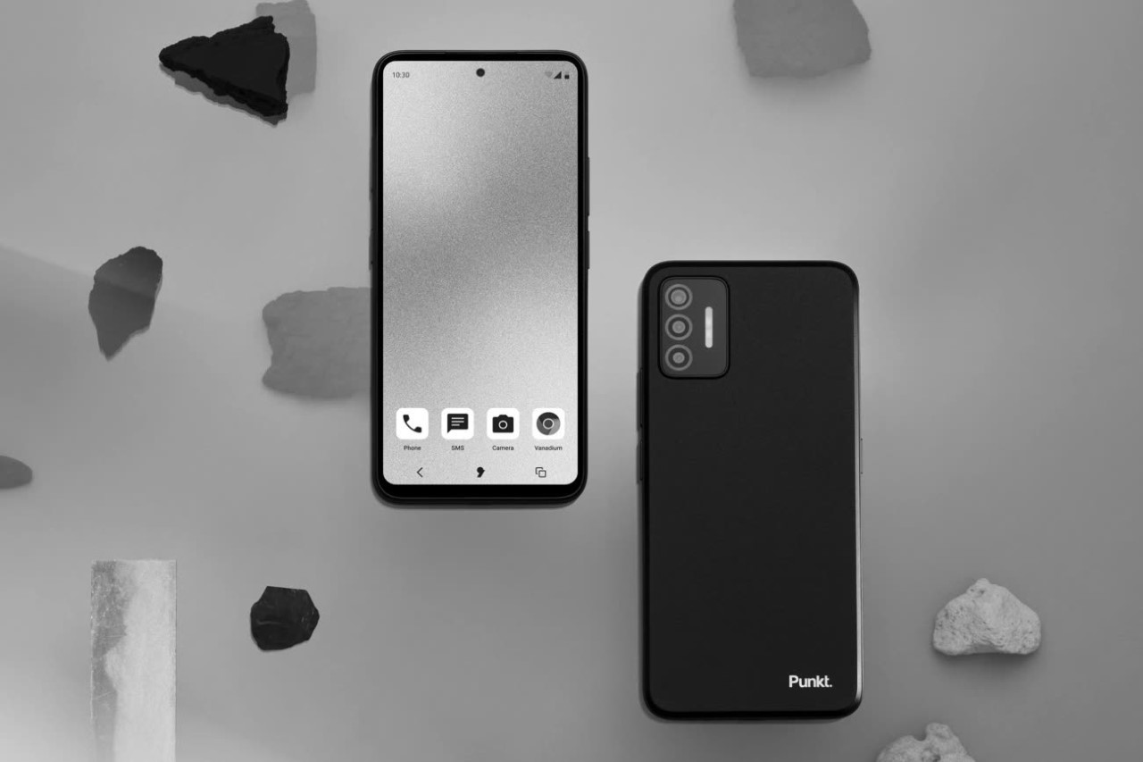
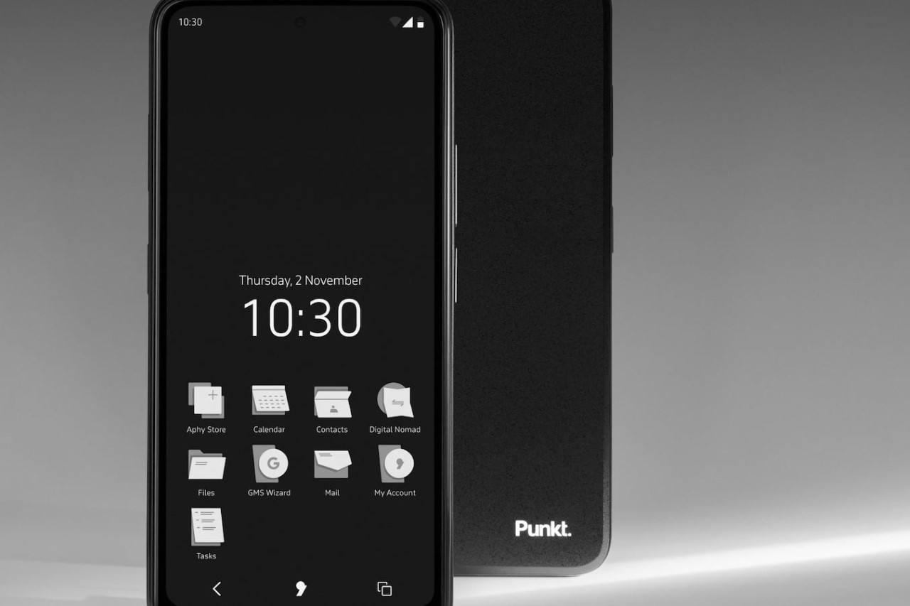
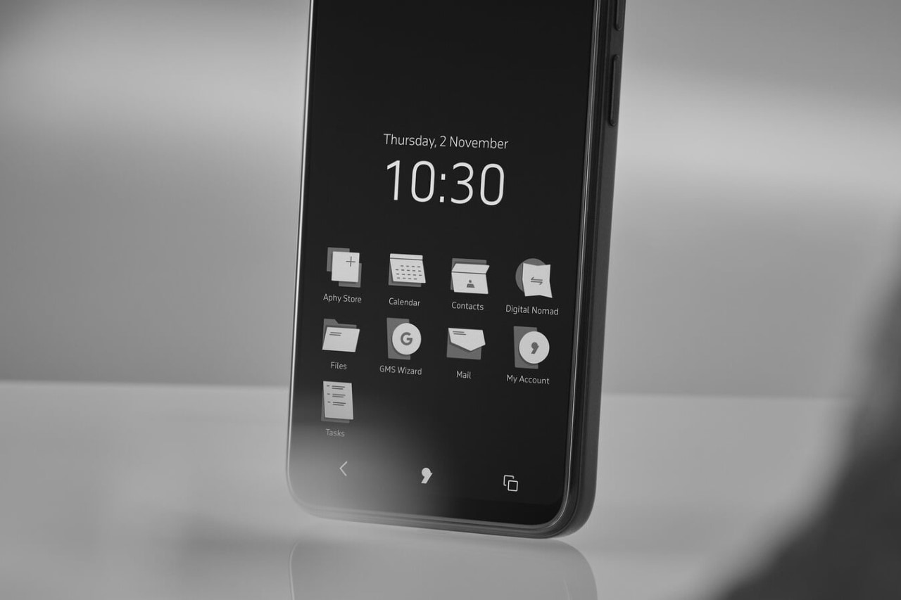
If you thought your iPhone was protecting your privacy, I have a bridge to sell you. Sure, Apple doesn’t sell your data to third-party data brokers, advertisers, and governments… but it does still collect your data. And hey, maybe Instagram and TikTok can’t track you across apps, but they can still track you on their own app. I’m not fear-mongering, although even if I did, it probably wouldn’t work because you (and I) have made peace with the fact that we’re giving away our data for convenience. There isn’t really any alternative, to be honest, aside from probably the quintessential ‘dumb-phone‘… and renowned dumb-phone makers Punkt have realized that there needs to be a better way. To that end, meet the MC02, Punkt’s first proper 5G smartphone that’s designed with data-security and privacy-protection in mind. It sports a minimal UI that tries not to inundate/addict you, has a built-in international VPN to keep your data from reaching the wrong hands (and even access geo-blocked content), and even runs Punkt’s Apostrophy OS, which individually partitions user data, restricting them to each individual application (so not even the OS can see your entire digital footprint). Your data also gets stored on a cloud server in Switzerland, far away from governments and state actors.

Designer: Punkt

The MC02 isn’t shy about its capabilities. It promises a secure, smarter way of using a mobile device, steering clear of the prying digital eyes that seek to profit from personal information. With over 90% of smartphone apps tracking users across the internet, the MC02 offers a unique choice: a digital sanctuary where user data is stored under Swiss jurisdiction, ensuring GDPR, HIPPA, and PCI compliance, and where a suite of on-device tools—email, calendar, contacts, notes, storage, and VPN—operates free from advertising-based data infiltration.

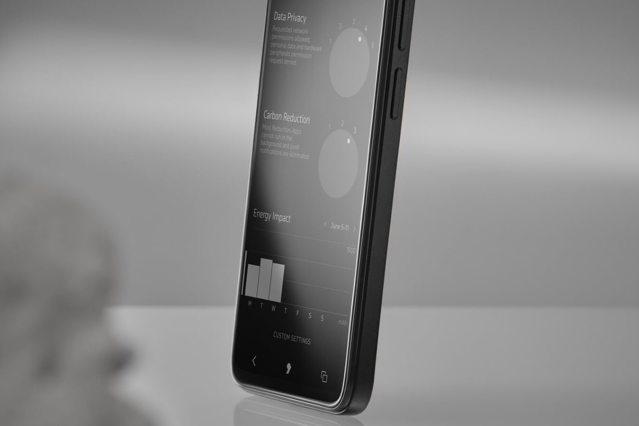
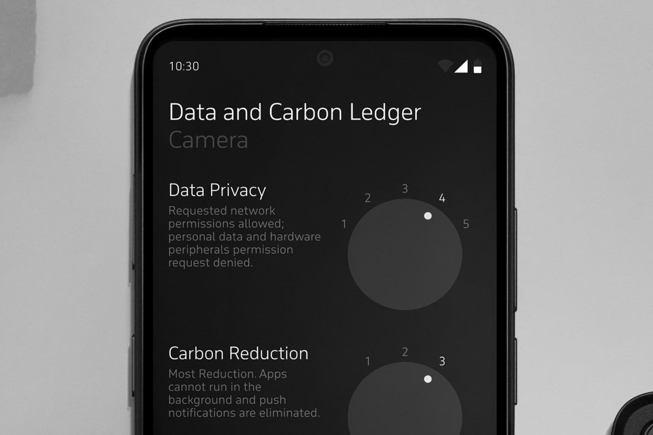
The phone itself is a marvel of minimalist design and intentional functionality, breaking the addiction cycle with tech while still being fairly modern. It features a 6.7” full HD+ screen, 64MP back and 24MP front cameras, 6GB RAM, and a long-lasting 5,500 mAh battery. But the MC02’s real allure lies in its operating system and ecosystem. Powered by Apostrophy and designed for data sovereignty, it includes a built-in VPN for secure browsing, a suite of secure communication tools, and a Carbon & Data Ledger for monitoring the privacy risk and environmental impact of individual apps.

Punkt takes a step further in personalizing the mobile experience with the MC02’s subscription model. The first 12 months of Apostrophy Services—a suite of security and privacy tools—are included in the purchase price, with a subsequent monthly tariff that ensures users know exactly what they’re paying for: privacy, not ads.

And as for the price of reclaiming your digital autonomy? The €699 ($755 USD) MC02 comes with a clear subscription model for the OS, the first 12 months of which are included in the initial purchase, followed by a $17 monthly fee for continued access to Apostrophy’s secure ecosystem. So, if you’ve ever wished to dial back the digital noise and take control of your tech life, the MC02 might just be the tech equivalent of finding that quiet corner in a bustling café—a sanctuary where your data, your choices, and your peace of mind are all part of the service.

The post This Smartphone Won’t Collect Or Sell Your Personal Data… And It Has An Encrypted VPN Too first appeared on Yanko Design.

The most sustainable smartphone is coming to the US with a very big catch

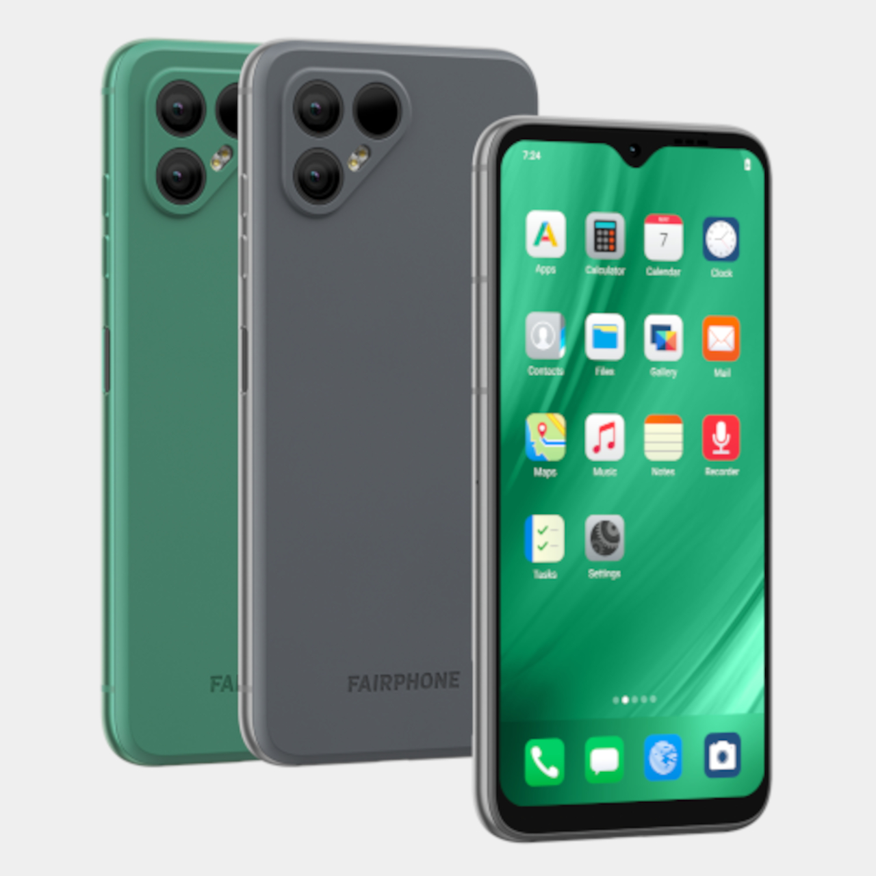
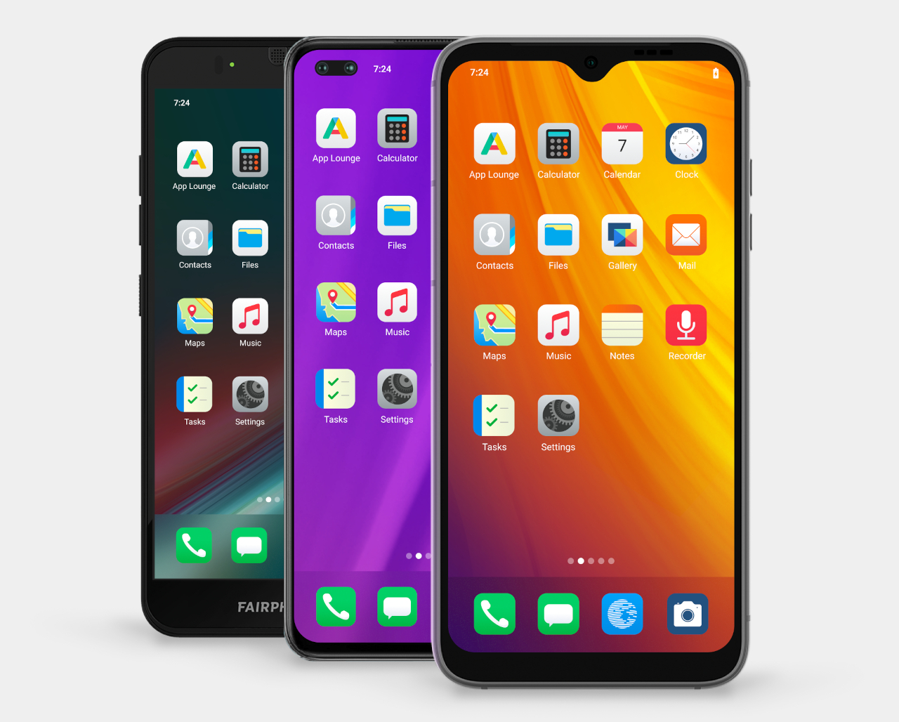
Finally recognizing the important role they play in saving the environment, smartphone manufacturers have started to implement steps to minimize their adverse effects on the planet. But even before “sustainability” started trending in the smartphone industry, there was one startup that dared to get the ball rolling and discussions started on how sustainable smartphones ought to be made. Since 2013, Fairphone has been putting out easy-to-repair handsets, though its limited availability has made it a deal-breaker for many interested buyers. That narrative is changing a bit with the arrival of the Fairphone 4 in the US, but it comes with a very big caveat that can be just as much a deal-breaker anyway.

Designer: Fairphone, Murena

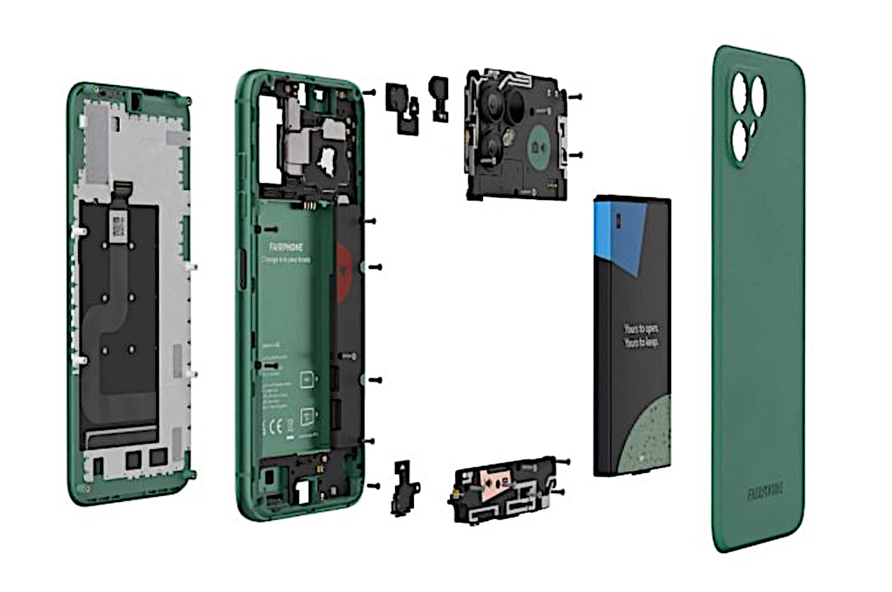
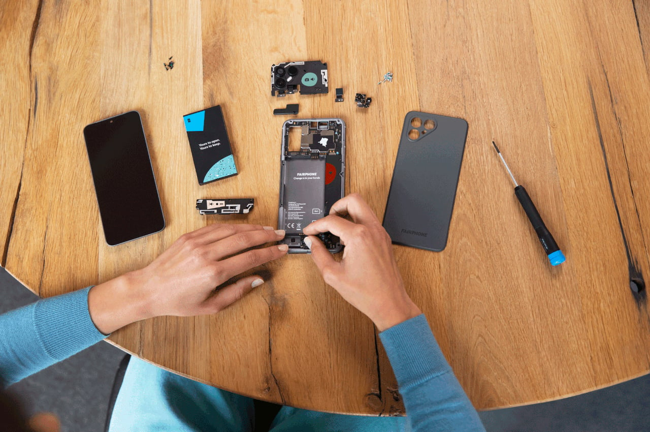
When it comes to sustainable and eco-friendly smartphones, it’s hard to deny that the Fairphone is the cream of the crop. Although it’s practically impossible for now to have a 100% sustainable phone, the Fairphone still checks the most boxes compared to any other brand. It uses recycled materials where possible and ensures they are all ethically can responsibly sourced. It has a system in place for the proper disposal of completely dead devices, but it also delays that inevitable fate by making it easy for owners to repair their own phones with replacement parts they officially sell. The latter is a practice that is thankfully now getting traction even among the likes of Apple, Google, and Samsung, though with more limited components and heart-stopping tedious processes.

The biggest problem with the Fairphone (aside from its slightly outdated specs) is its availability, limited primarily to the European region unless you’re willing to take the extra steps and risk importing one. That is changing now that the Fairphone 4 is being made available in the US, one of the largest smartphone markets. Fairphone isn’t the one selling it directly, though, and has partnered with another company named Murena not only to distribute the phone but also to put the latter’s own version of Android on it named /e/ OS.

Therein lies what might be the biggest determining factor for those who want to buy the Fairphone 4 in the US. /e/ OS is billed as a privacy-focused mobile platform, which practically means it doesn’t ship with Google apps and services. Instead, it provides its own app store, replacements for Google services, and the like. It might be possible to install Google Play Store after the fact (“sideload”), but the process might also be more involved than what consumers would be willing to put up with.

In short, the Fairphone 4 now being sold in the US is both sustainable and very private, and you can’t easily separate the two. It might be fine for those who do espouse both ideals equally, but others who simply want the most sustainable “regular” Android phone might have to continue looking elsewhere.

The post The most sustainable smartphone is coming to the US with a very big catch first appeared on Yanko Design.

Fiture offers a stylish fitness mirror that can fit with your room decor

There has been an uptick in personal fitness equipment and platforms in the past two years or so, with many people stuck at home and having no access to public gyms or outdoor spaces. Some of these seemed exorbitantly overpriced while offering little over common exercise machines. Others, on the other hand, are more accessible but make no effort to hide their less than aesthetic appearances. Striking a balance between useful and beautiful has been a delicate dancing act for many new companies, but one newcomer believes it has struck gold with a smart home device that lets you do your exercise in the privacy of your own room while it looks almost as pretty as your bedroom’s full-length mirror. In fact, it actually works like one.

Designer: Fiture

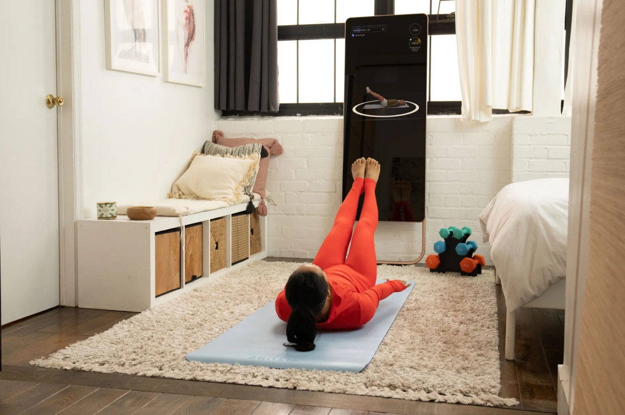
Fitness mirrors are not completely new, but they experienced a spike in interest and popularity in the past months as people tried to cope with having no access to gyms or personal trainers at home. The idea is to have a device that lets you communicate with a remote trainer while you go through your exercises at home. The mirror acts as a display that guides you through the reps while a trainer watches you from the other side of the wire. There are already quite a few of these in the market, but Fiture believes it has a better chance of ending up in your house because of two differentiating features.

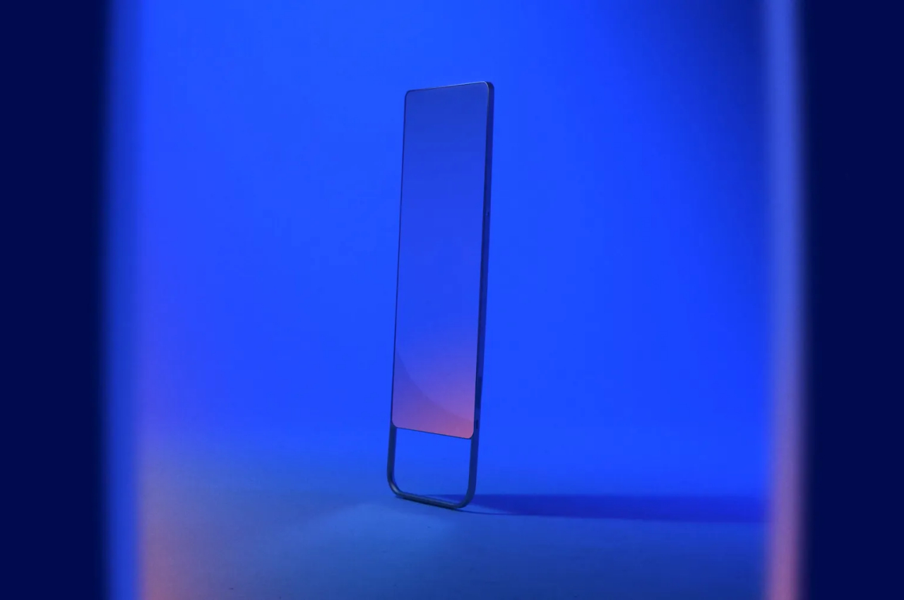
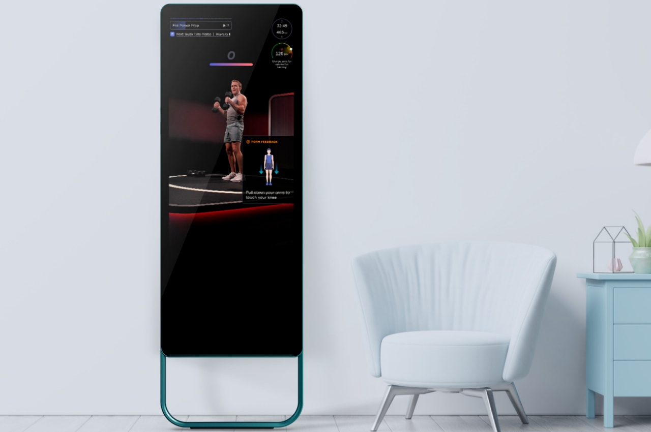
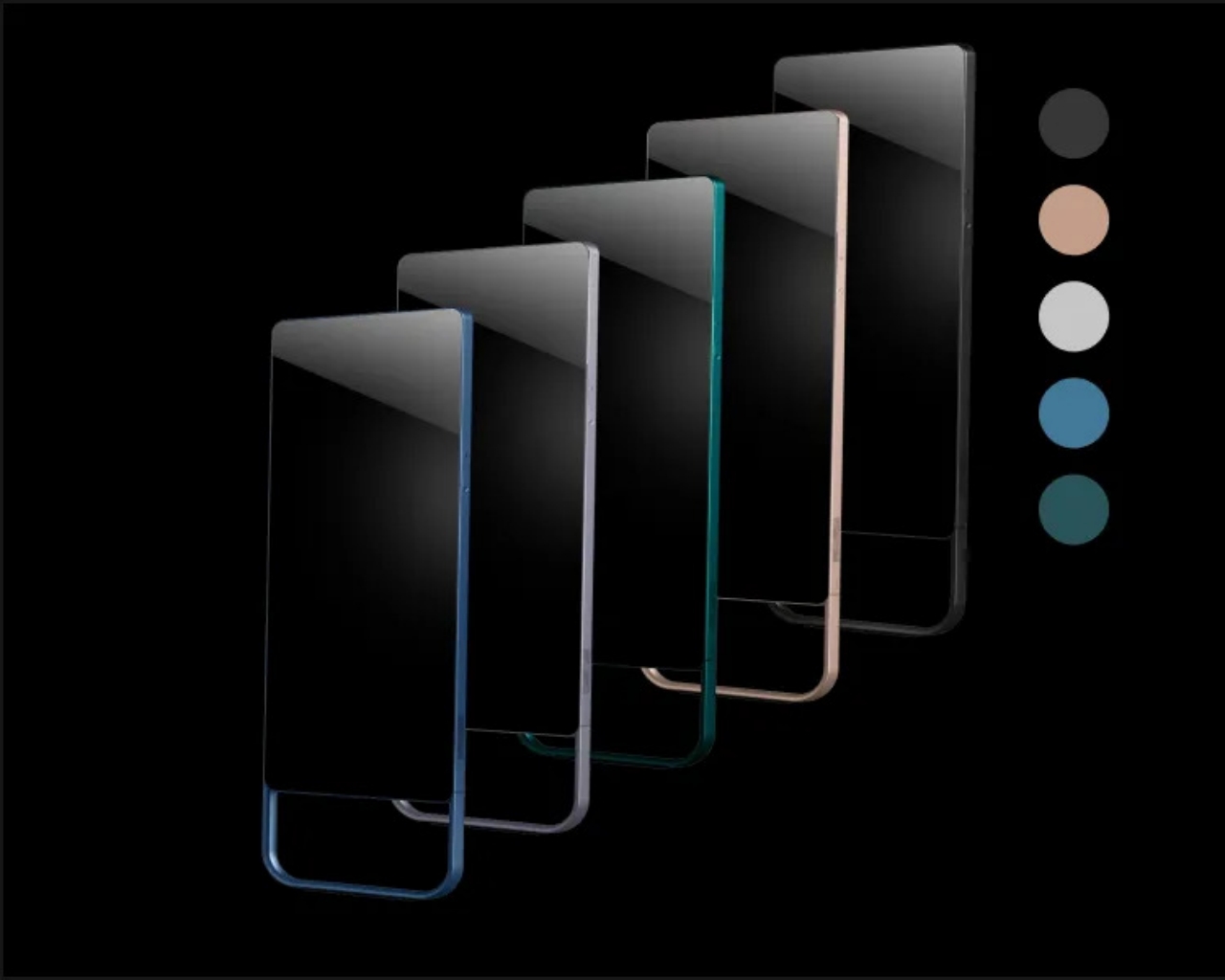
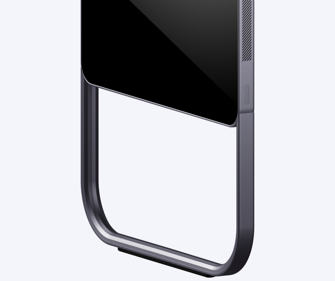
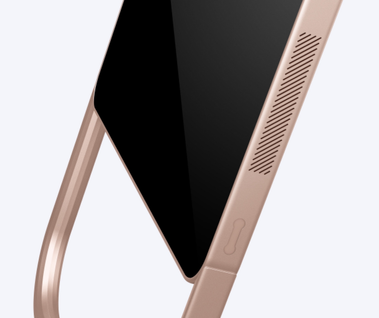
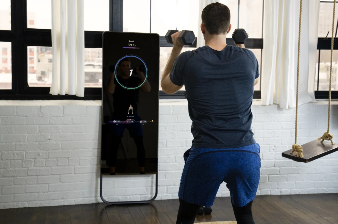
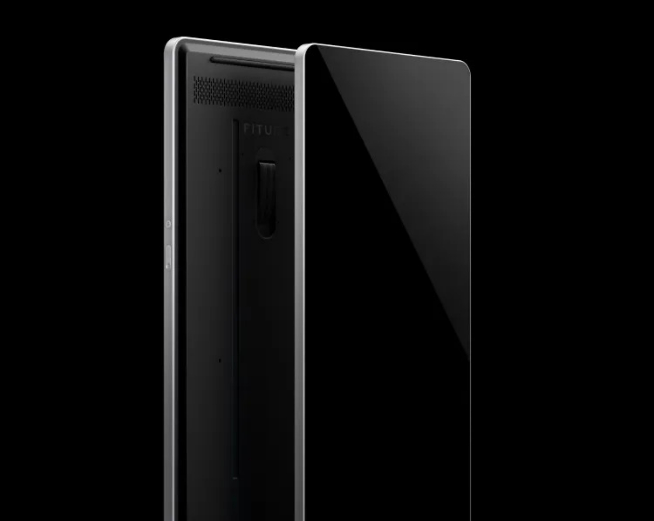
The first and the most apparent is that the Fiture fitness mirror actually looks more like a fancy home mirror than a machine masquerading as one. While the generically named “The Mirror” also lays claim to that title, the Fiture does one better by offering five colorways to match your decor or wallpaper. The shape of the mirror itself is more visually pleasing, employing rounded corners and brushed metal surfaces to make the frame look more aesthetic. The U-shaped legs provide stability when the mirror isn’t mounted on the wall while also giving it a more distinctive style.

Unlike other fitness mirrors, however, the Fiture isn’t a two-way mirror into your house, one of the biggest concerns interested buyers have. It’s for this purpose that the company invented what it calls “Motion Engine Technology” to protect your privacy. In a nutshell, the mirror and your trainer only see skeleton points as you move, so you can work out with bed hair, and no one will be the wiser. When not in use, you can even put on the magnetic camera cover to completely block out even this AI-based technology.

The Fiture isn’t cheap, of course, especially when you add the monthly subscription that gives you access to content and trainers. Then again, you might end up paying more with a gym membership that doesn’t give you the same privacy and convenience of an at-home workout. Plus, you also get to have a full-body mirror that doesn’t look like a fitness device when not in use. Just don’t forget to put on the camera cover when you’re dong using it, just in case.

The post Fiture offers a stylish fitness mirror that can fit with your room decor first appeared on Yanko Design.

This circular router tries to be an island of calm and privacy in your room

Home routers are often depicted as alien or futuristic objects in the room, but this privacy-focused design goes in the opposite direction to bring a sense of serenity instead.

Home networks have changed a lot in the past few years. The number of Internet-connected devices in our houses has multiplied, and that’s just counting the phones, tablets, and computers that connect to a single access point. Smart home devices often need to also connect to that same network, sometimes all of the time, often only occasionally. The more complex requirements of home networks have seen a rise in routers that try to spread the wireless waves across small spaces. Most of these routers are designed to look technical, geeky, and sometimes downright overwhelming. That doesn’t exactly help reduce mental and visual stress at home, which is why this router is designed to look like no other in an attempt to soothe people’s eyes and assuage their privacy fears.

Designer: Kritzer Design Studio

The minimalist and more human aesthetic that has started to grip computer accessories seems to have stayed clear of routers and modems. This class of devices has long passed a point where they could be conveniently hidden in a corner or on a shelf, especially considering how that could affect Wi-Fi network quality. Modern routers, especially the most advanced ones, seem to be designed to call attention to themselves by being more conspicuous. Often that’s through their sharp lines, multiple antennas, and dark, brooding colors.

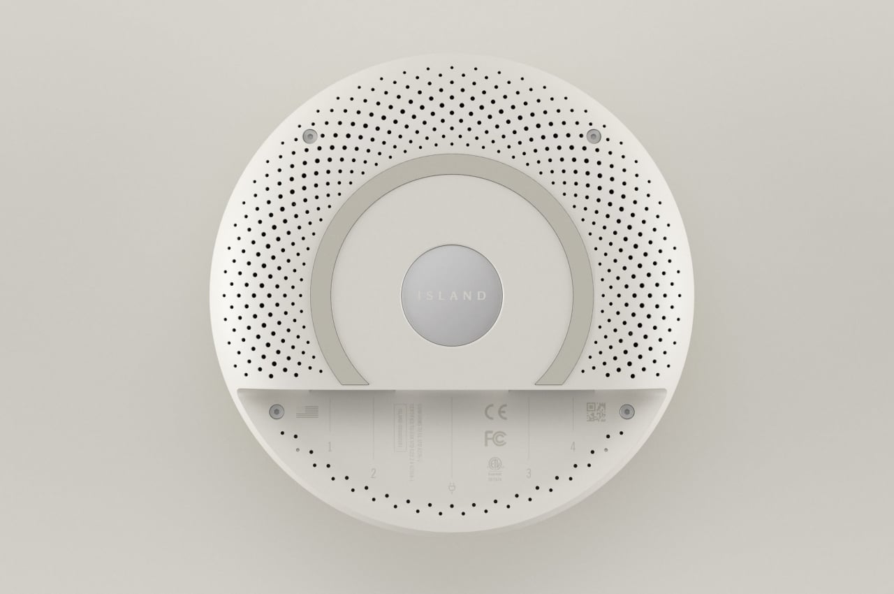
The Island stands in sharp contrast to this conventional design by being round and white. There is probably no shape that is more calming than circles, so this router has five concentric circles that seem to ripple out of a central sphere. These circles also rise ever so slightly, creating the appearance of a low mountain on top of that island metaphor.

While the Island router is already visually calming, its features are also intended to relieve people’s stress, especially over their privacy on the Internet. The router offers a built-in VPN service that can hide you from malicious actors that try to snoop into your browsing activities and eventually steal your information. Ideally, this VPN is already configured out of the box, so no software or app is needed to get it working, another source of stress for some less tech-savvy users.

The Island smart router is an example of how form can still follow function, even for something as technical as a router. Playing on the metaphor of a resort island that is guarded against unwelcome intruders, the Island tries to invoke feelings of peace and calm that have become critical in today’s workplace and home offices. It doesn’t even need foreboding antennas to transmit its signals, much like many mesh routers today that have eschewed the stereotypical router design. Its minimalist design and more generic form also make it a decorative piece that you can set on your desk or even stick to your wall.

The post This circular router tries to be an island of calm and privacy in your room first appeared on Yanko Design.

This indoor camera concept looks like a literal eyeball watching your every move

Unlike the Eye of Sauron, this home security camera looks less frightening and has a secret trick to keep it from seeing you all the time.

Smart home security cameras have exploded in popularity in the past few years, but they have also exploded in controversy. Having something that can see you 24/7 can be a horrifying thought for some homeowners, especially when it involves a third party, like a company that can take a peek at any time, whether you know it or not. At the same time, there is also a real and growing need to keep an eye (no pun intended) on things while you’re out, so both service providers and homeowners need to find a way to strike a balance between security and privacy. This concept tries to do exactly that by providing a quick and easy way to disconnect the all-seeing eye and immediately know when it’s sleeping.

Designer: Maurice Mischo

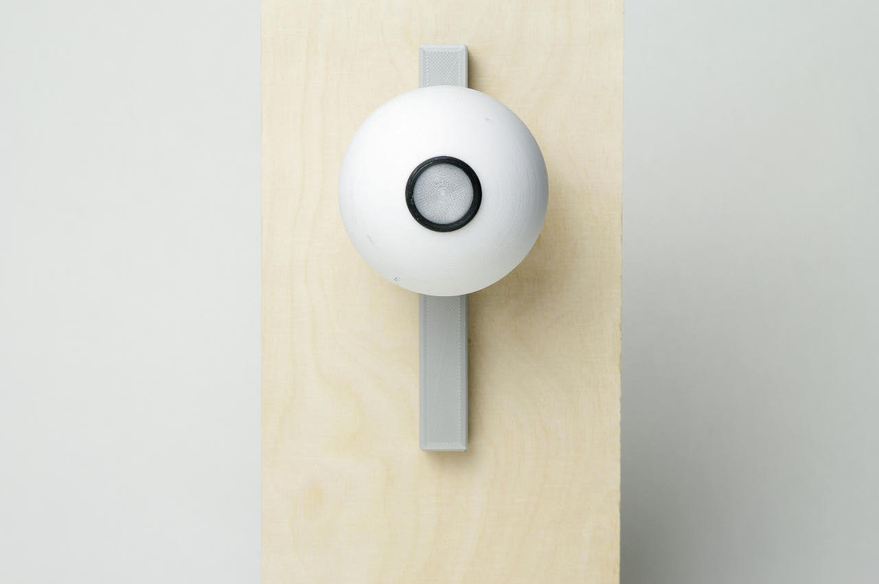
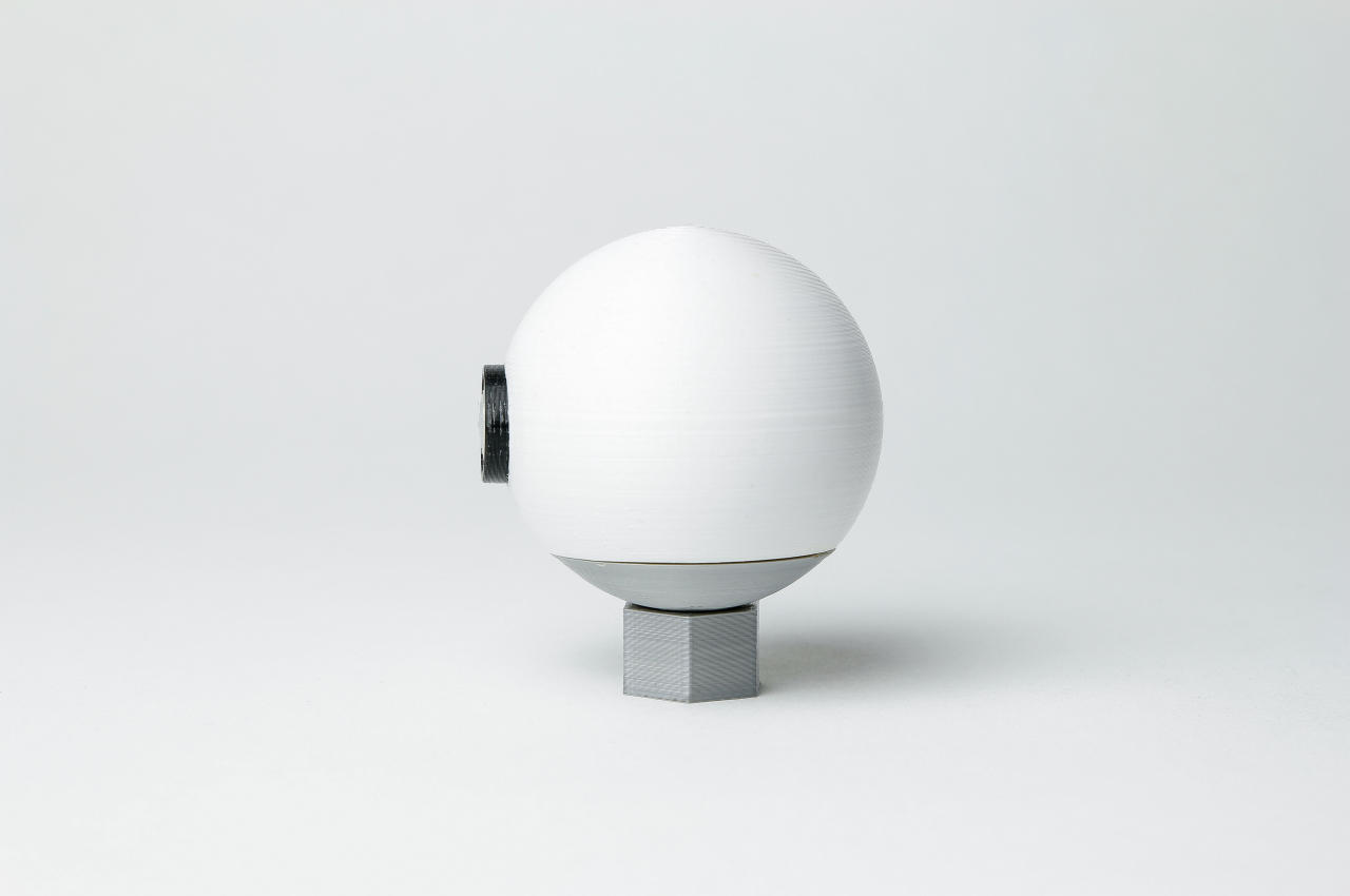
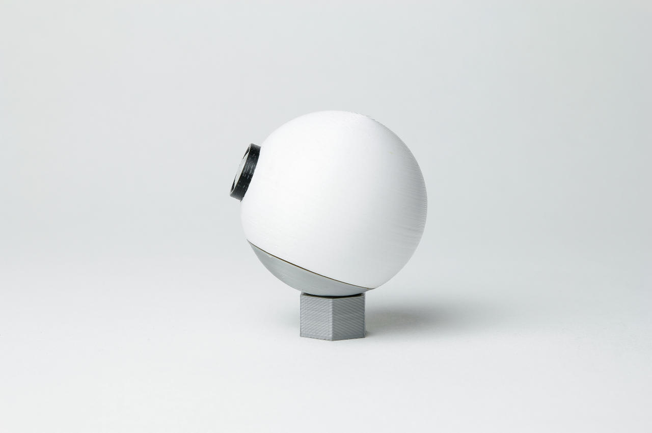
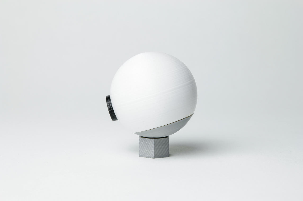
It’s almost ironic that the design of this indoor Wi-Fi camera is patterned after an eye. Nothing says “I see you” better than an eyeball, which is why connected camera companies intentionally design their products to look discrete and less intrusive. The design thinking behind this camera concept is even more bizarre when you consider that it’s meant to be one of the most privacy-respecting ideas out there.

The theme for the VISIO Wi-Fi camera concept might not exactly be “privacy” but “obviousness” instead. Given its form, it makes no qualms about being a camera and doesn’t masquerade as something else, like a living room decor or digital picture frame. You or your guests are unlikely to be caught unaware that there is an electronic eye that can see your every move within its field of vision.

Likewise, it will also be obvious when the camera is disconnected rather than having you guess its state. Many smart cameras have an off switch that you can only toggle via an app, so you might not be sure when it’s recording or not. Not all cameras have visible and unambiguous status indicators, so some owners might feel the need to just physically cover the camera when they want some privacy. That, however, might not stop it from still recording audio.

In contrast, the VISIO camera is completely disconnected when it isn’t connected to its base, which serves as its wireless power supply. Like any disembodied eye, this electronic optic won’t work unless it’s connected to something, though it would still have a small battery so that it could properly shut down when you remove it from its dock.

The VISIO compact Wi-Fi camera concept is genius in its simplicity. Easy to use and easy to distinguish, it takes a lot of guesswork and stress out of the equation of using a smart home camera. It is privacy-focused without being “in your face,” integrating that privacy feature into its design. Sadly, that might actually be contrary to the business goals of smart camera makers, which is why we’ll probably never see something as beautifully simple as this smart eye.

The post This indoor camera concept looks like a literal eyeball watching your every move first appeared on Yanko Design.

This X-shaped dystopian family residence is split into four quadrants to find privacy in the digital age

The Broken Home is an unconventional, X-shaped home whose layout has been optimized for the digital age and the need for privacy.

As we move deeper into the tech age, some architects are eager to bring us back to the analog days. Others are embracing this digital era to harmonize our living spaces with our technological needs. Whether it’s through smart technology or essentialist floor plans, architects are integrating technology into our home spaces in unprecedented ways.

Designer: Integrated Field Co., Ltd. (IF)

The Broken Home, from Integrated Field Co., Ltd. (IF), is a contemporary home designed specifically for today’s digital age that optimizes the home space for digital interaction and working from home.

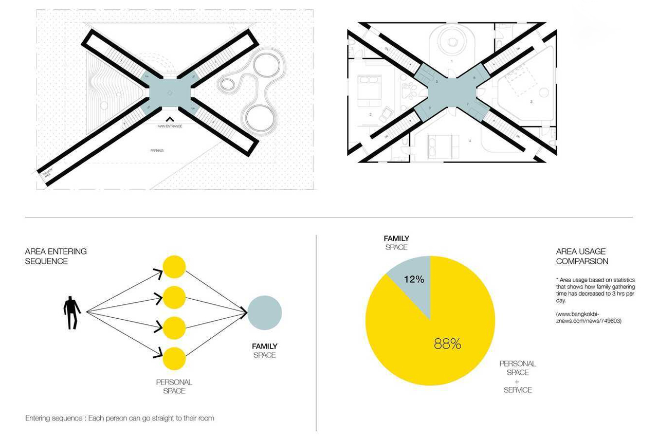
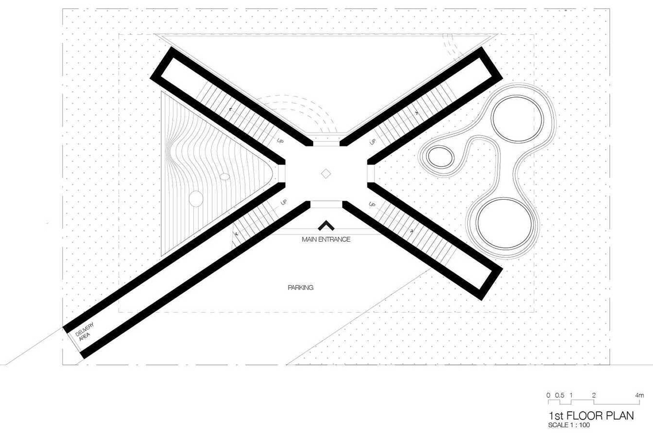
Primarily concerned with privacy, the Broken Home is envisioned with an X-shaped frame that separates private living quarters into four quadrants. As residents enter the Broken Home, a long corridor functions as a transitional passage, directing each resident to their respective living space. The architects at IF designed the Broken Home to have significantly fewer common spaces than traditional homes, reducing the common spaces to comprise only 12% of the home.

The choice to decrease the number of common spaces was a direct result of modern families spending more time in their private quarters with technology than time together in living spaces.

With the digital age defining the Broken Home’s floor plan and finished look, the IF architects integrated timely features like a specialized passage for directing online food deliveries and packages to their assigned recipient.

In addition to this, IF incorporated descending partition screens so residents can find privacy even in common spaces. For instance, instead of a chandelier, the dining area comes with overhead privacy screens that resemble the look of hair hood dryers from salons.

When residents are in their personal spaces IF made sure to include hidden features that aid residents during the workday. Each bedroom is equipped with indirect lighting to stave off the cold, harsh feeling of overhead light fixtures and wall spaces provide screening opportunities for live streaming and social media usage.

Fold-out furnishings help to make the most of the floor space and maintain the home’s minimalist appeal.

From the outside, the Broken Home appears like a refined, single-story residence. 

Inside the Broken Home, residents find the optimal conditions for living in the digital age.

The post This X-shaped dystopian family residence is split into four quadrants to find privacy in the digital age first appeared on Yanko Design.

Wireless charging cradle for phones blocks smart assistants from spying on you

Most phones today have settings to block apps from using the mic, but this wireless charging cradle goes the extra mile in promising total privacy in your bedroom.

Most of us today may have already taken for granted how our phones seem to always have an ear out for our next verbal command. The ubiquity of smart speakers or smart home appliances that also have this feature makes the likes of Apple Siri, Google Assistant, and Amazon Alexa unseen members of the household, always ready to lend a hand, sometimes even when you don’t want them to. Privacy has always been a thorny subject when it comes to smart assistants and their presence in homes, and one startup is trying to offer some peace of mind, at least as far as phones are concerned.

Designer: Pozio


Smartphone and smart speaker makers will fight tooth and nail to defend their practices when it comes to how smart assistants are always listening or not. They make the distinction that these devices are only always listening for the triggers that activate them but aren’t recording anything before those triggers are spoken. Unfortunately, anecdotes about misheard wake phrases and privacy violations may have made some a bit too paranoid.

You can always turn these features off from their settings, but that might not be enough for some. After all, you still have to trust that device makers and app developers are really playing by the rules they set themselves and respect the restrictions that people have set. Not everyone does so, unfortunately, which is why Pozio released a class of accessories designed to thwart privacy-invasive technology with technology.

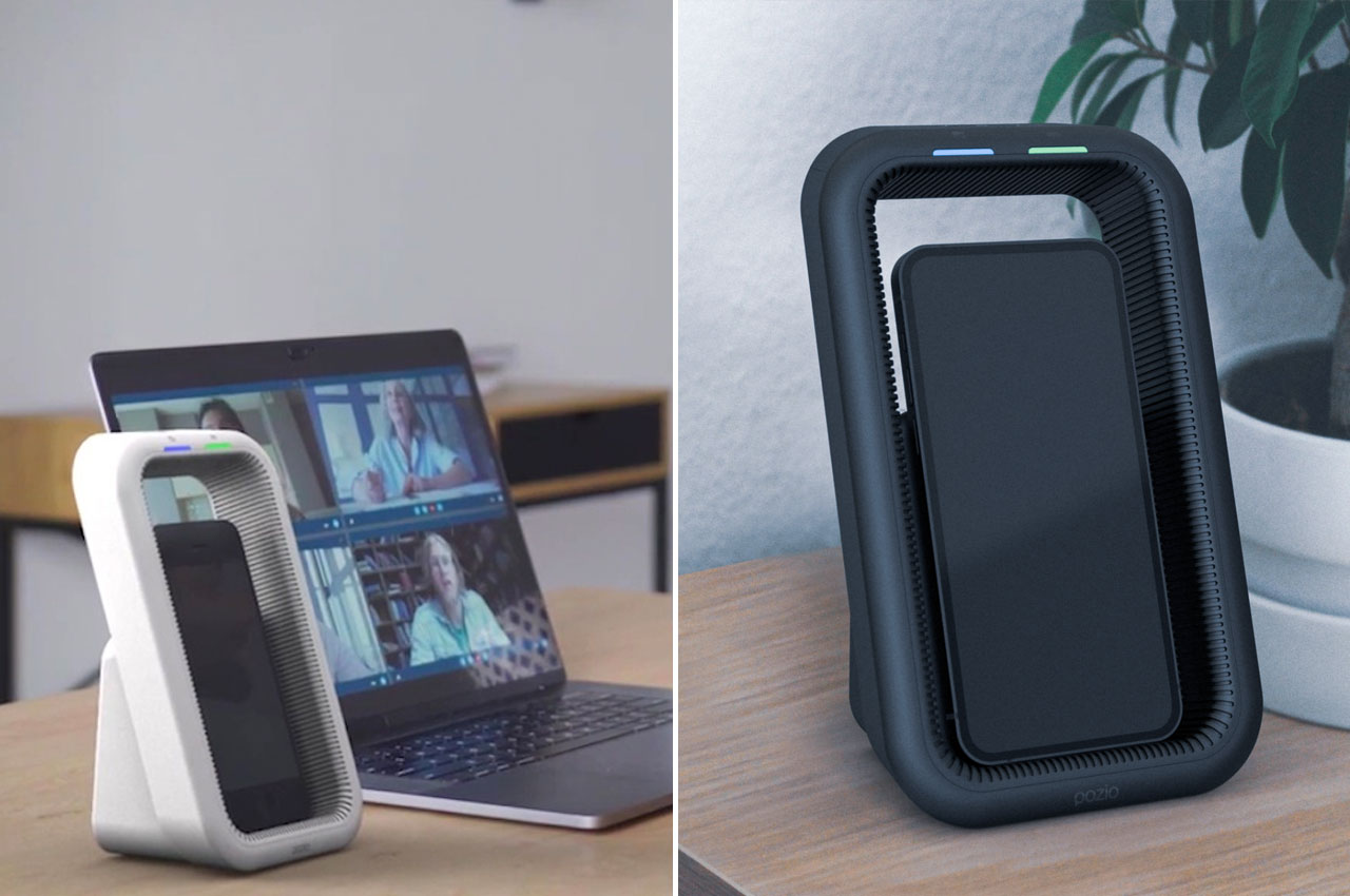
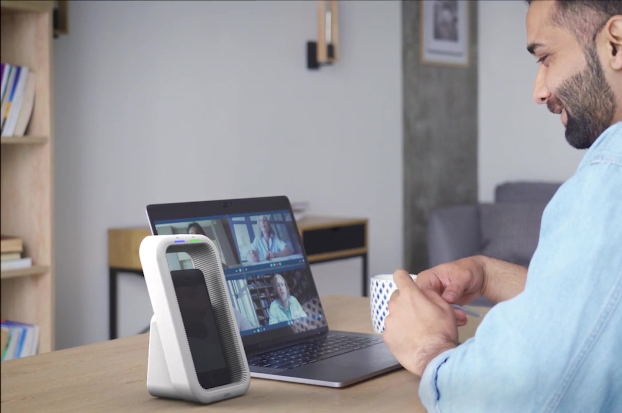
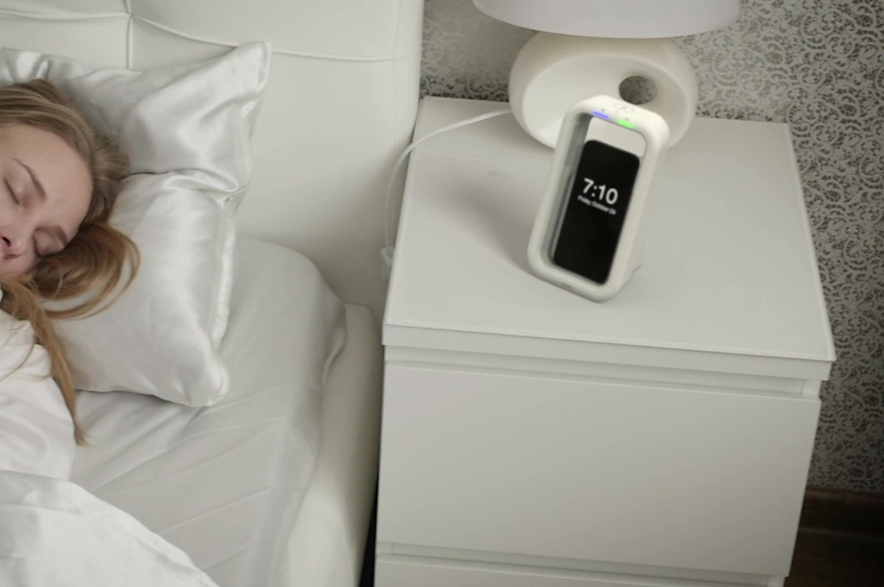
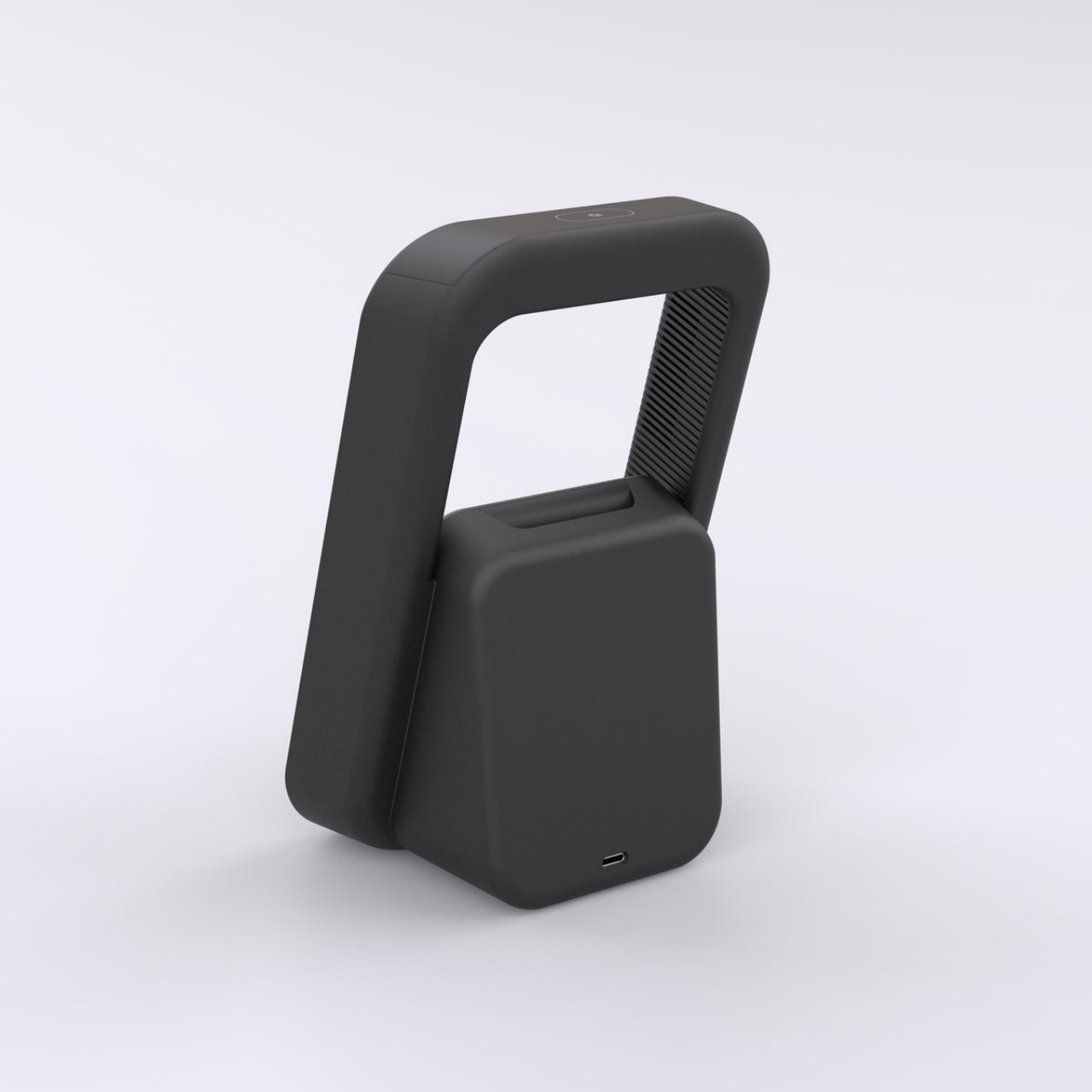
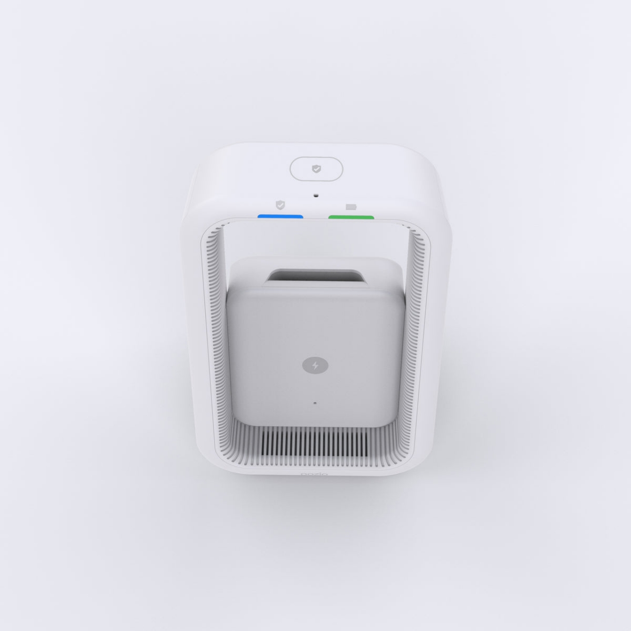
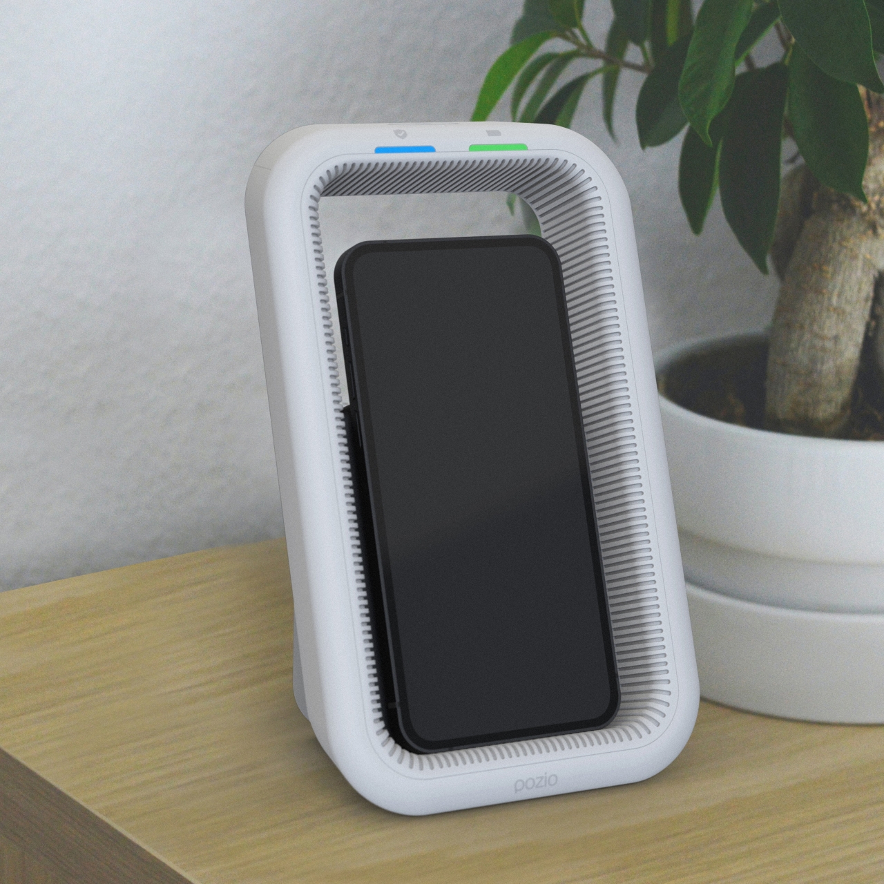
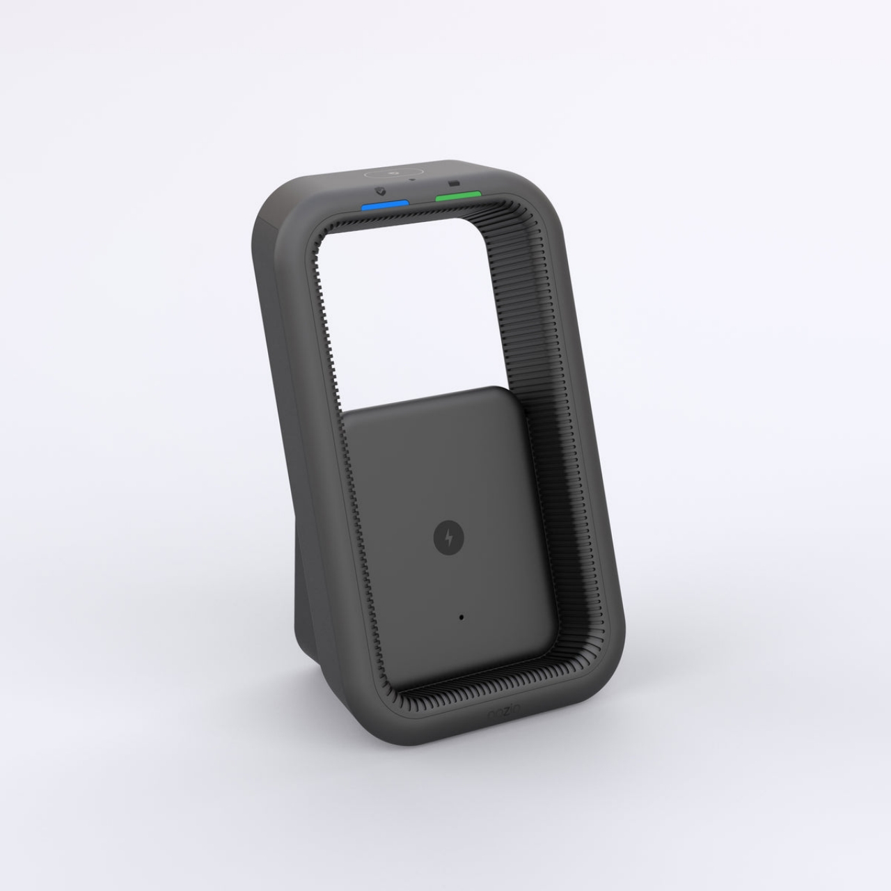
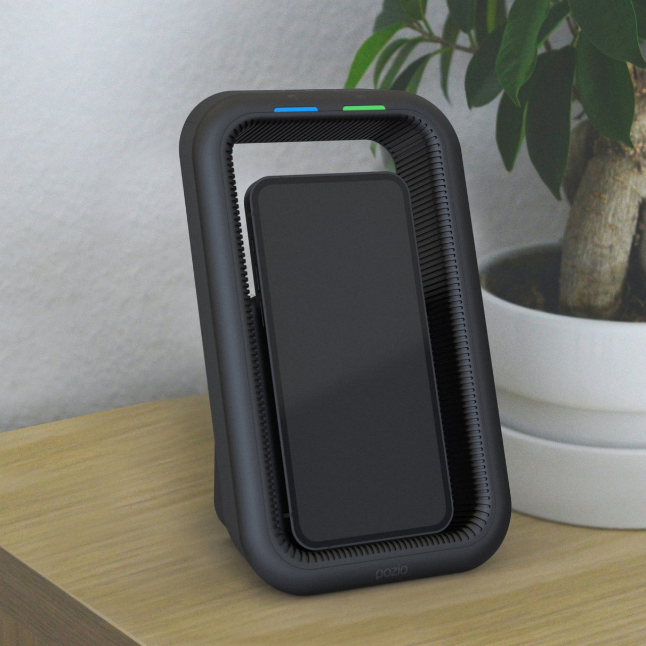
The Pozio Cradle looks like a rather odd wireless charging pad, one that keeps your phone upright inside an enclosure. This design, however, is intentional, as that wall around your phone emits what the company describes as “subaudible” that practically turns your phone deaf to your voice but remains silent for pets. The promise is that any app listening through the phone’s mics will hear nothing, even with settings enabled.

This won’t stop other devices in your room or house from still listening to your voice, which is why Pozio also created different “Shield Block & Talk” mounts for different smart speakers. Even then, however, there will be nothing to stop smart thermostats, smart TVs, or smart displays from still doing their thing, which makes products like these almost futile. Then again, if you filled your house with always-listening devices, you probably already know what you’re sacrificing in exchange.

The post Wireless charging cradle for phones blocks smart assistants from spying on you first appeared on Yanko Design.

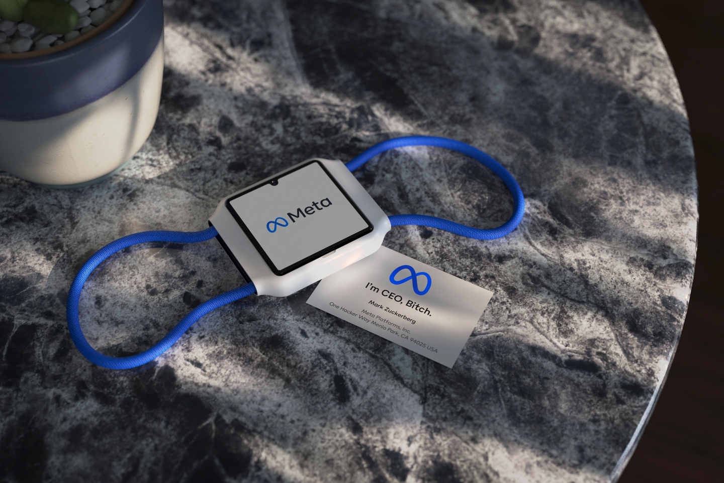
Meta Band with two cameras makes video chats and vlogging the center of your metaverse experience

Meta’s first stake in the Metaverse might not be a VR headset (even though the company killed the Oculus brand and promptly named it Meta) but a smartwatch that could make you lose more time in video chats, vlogging, and, of course, VR.

Even before Zucerberg’s Facebook rebranded itself to proclaim its new obsession, the social media giant was already rumored to have its eyes on the wearables market. Its focus on the Metaverse might have sounded like it would be ditching those plans, but, on the contrary, its vision for a smartwatch would fit in perfectly with this. Meta was recently granted a patent that shows its vision for such a wearable, and, to no one’s surprise, it’s going to be more about keeping in touch than keeping time.
Facebook Face

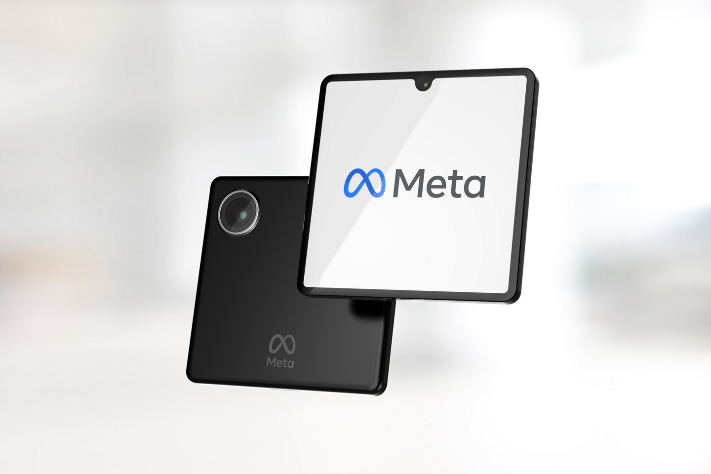
Meta’s idea for a smartwatch completely goes against most industry conventions, which is fairly typical for patent applications. It seems that the company hasn’t yet decided on whether it will aim for a typical round smartwatch or a square one that will surely earn Apple’s ire. No matter which design it chooses, the set of hardware features remain the same. There is at least one camera on its face, similar to rumors that abounded last year about a squarish Facebook smartwatch, but that’s hardly the most exciting part about Meta’s smartwatch.

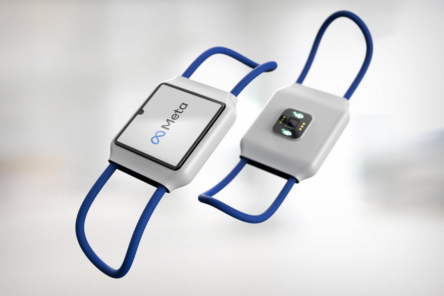
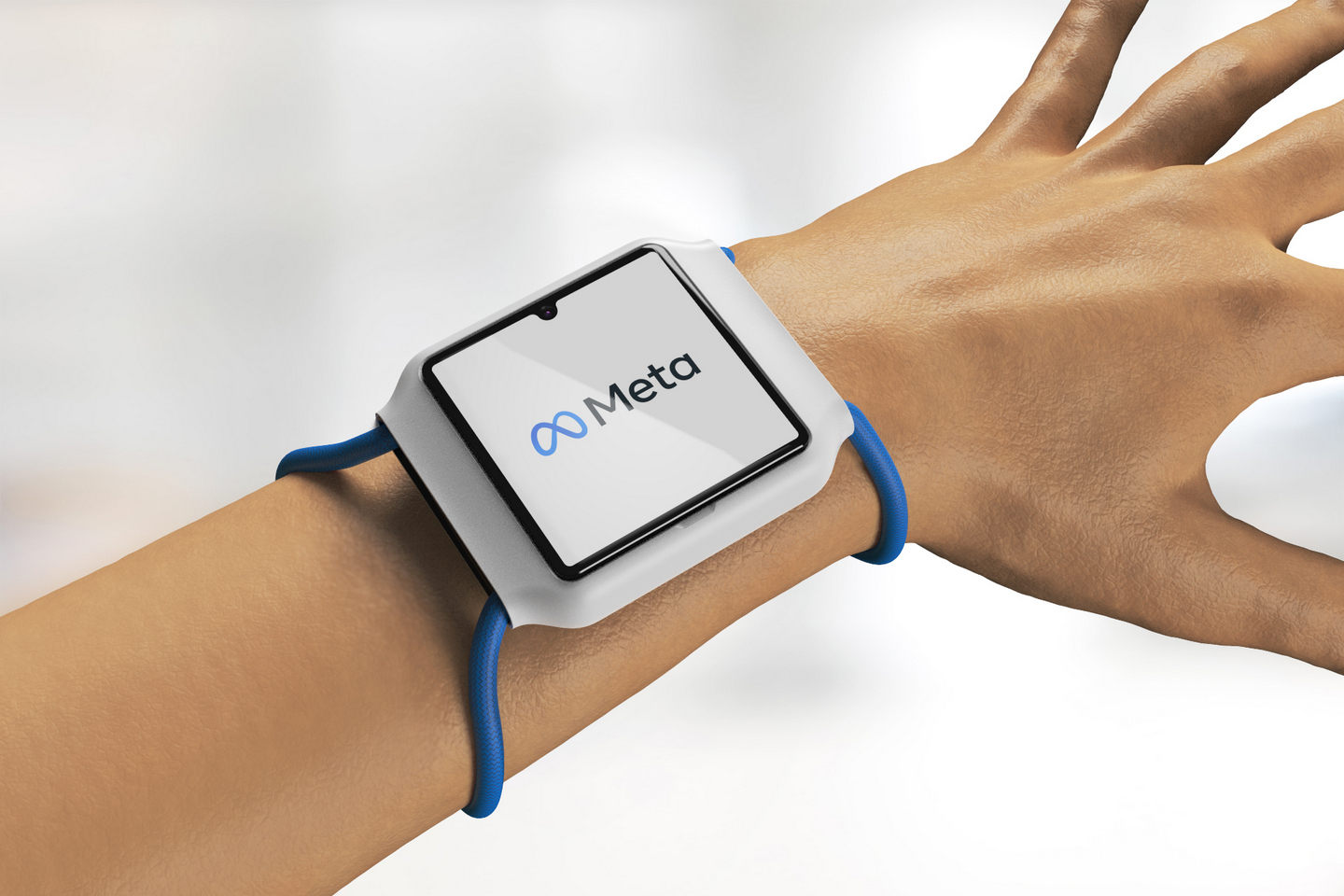
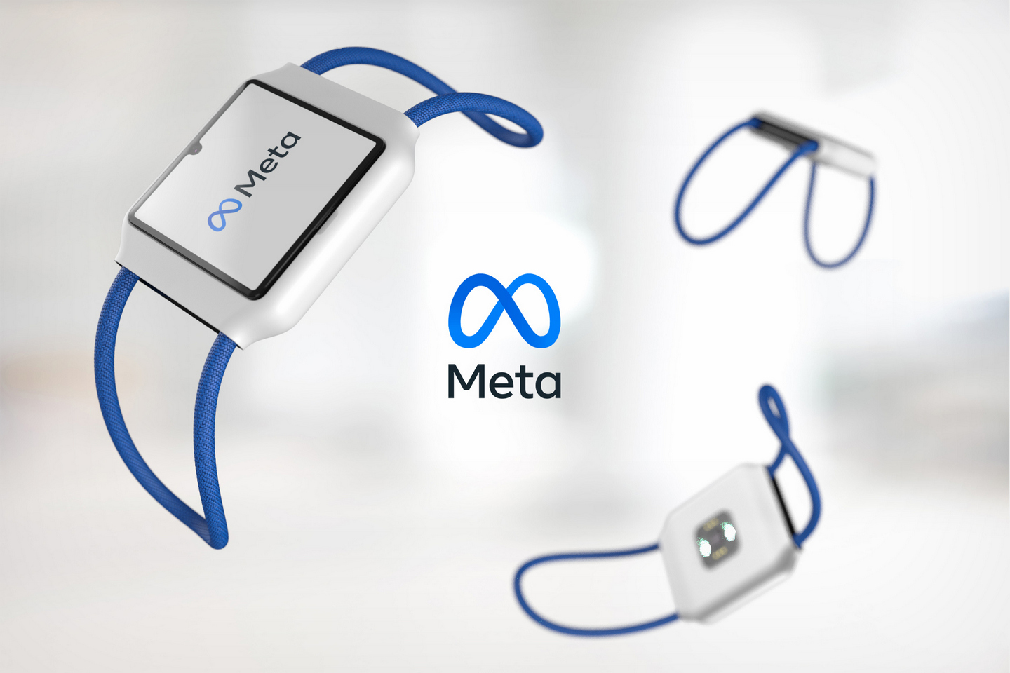
The form of the smartwatch itself is already atypical. While the screen has a square design like the Apple Watch, its body is a little more oblong if not rectangular. The case extrudes to the side and tapers gently down where the cords of the strap come out (more on that later). The body has a minimalist aesthetic that is almost free of any marks, and the only notable blemish in that design is the dreaded notch that houses a tiny camera inside.
Having a front-facing camera is quite on par for a company best known for capitalizing on any opportunity to be social. Back when it was still Facebook, it launched its first smart display product line, and Portal was clearly designed for video chats via Messenger. In addition to plain posts on social media, Meta has been doubling down on real-time communication channels, especially during the past years, where video chats have become critical to keeping human civilization from collapsing.

Thus Meta or Facebook-branded smartwatch with that core functionality wouldn’t be so far-fetched, but that might just be the tip of the iceberg. Rather than straining people’s arms when making video calls, it seems that Meta has envisioned a way to make such chats fun again. And it all starts with another camera on the watch.
Is two really better than one?

According to the rumor mill, the Meta Watch will have a second camera on its back that would have nearly the same capabilities as the one on the back of your phone. That means it would be able to record 1080p Full HD videos, whether for recording or for video calls and even have an autofocus system. Of course, that camera will be completely pointless if all it sees is the back of your wrist, and that’s where the other unique or almost incredulous “feature” of this smartwatch comes into play.

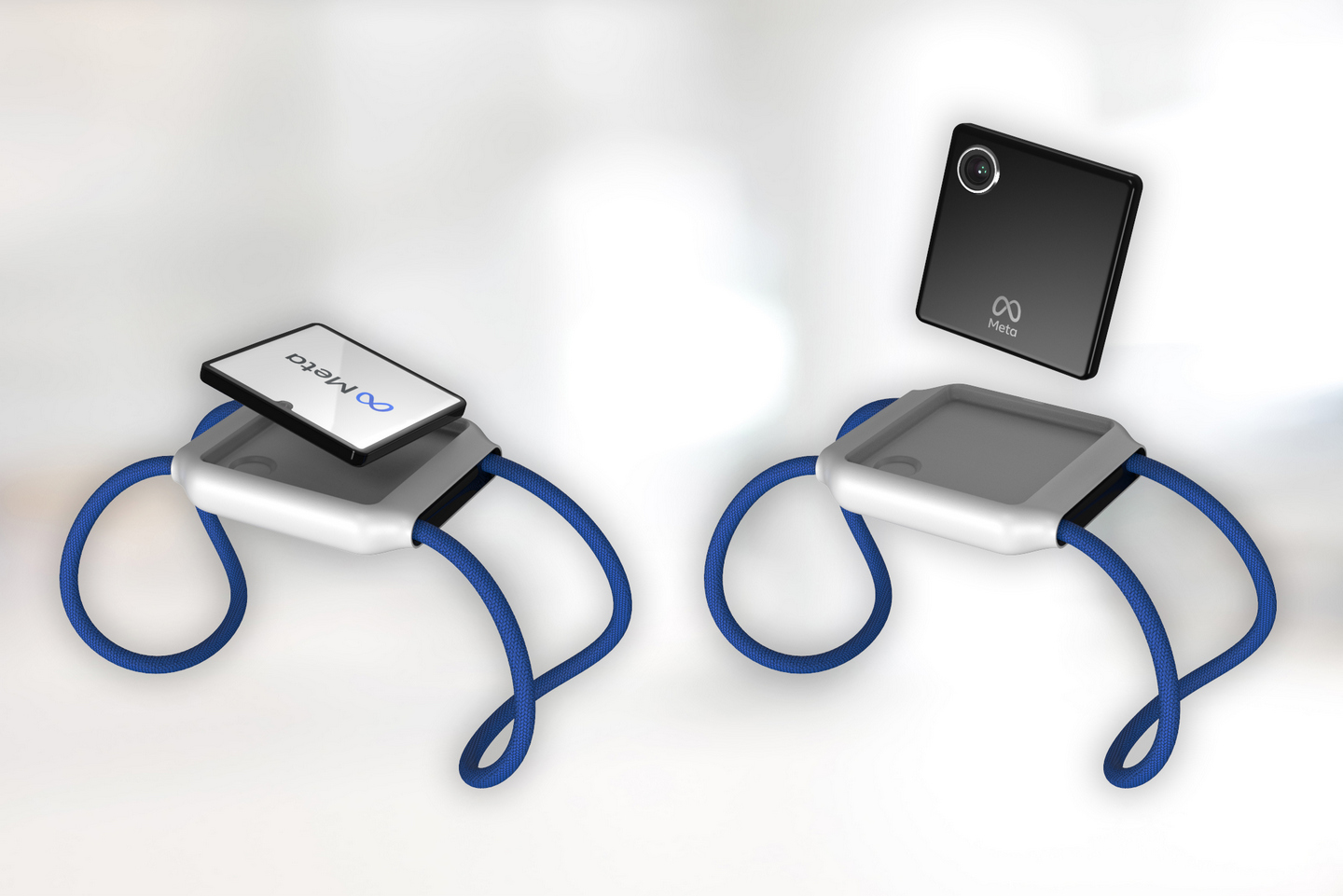
You will be able to detach the smartwatch from your wrist, or at least from the frame that magnetically holds the body in place. This frees that second camera to be used properly, turning the watch’s screen into a viewfinder. That’s a terribly inefficient camera, you might wonder, especially when you have a better camera hiding in your pocket. That might miss the point, though, because you have to see it from the eyes of a company that built its fortunes on keeping people connected or keeping them addicted to sharing things on its network.

Detached from the confines of your wrist, the Meta Watch easily becomes a rival to the GoPro, something you probably wouldn’t want to use your phone for. Action cams aren’t exactly known for their high-resolution screens or even their high-resolution cameras. They’re better known for being small and almost inconspicuous, ready to capture the action (hence the name) at any given time and place. Meta’s smartwatch will make it easy for Facebook users to record video or live stream without having to pull out their phones, especially in circumstances where holding a $1,700 piece of electronics would be tempting fate.

This two-camera setup could also go beyond straightforward video chats or streaming. Smartphones these days are capable of using both back and front cameras at the same time, often with the front camera’s video feed displayed as an inset on the viewfinder. A smartwatch screen is too cramped for that kind of interface, but the functionality could still be present. Imagine talking with a buddy or family and then popping out the watch to give them a better view of the picturesque lake in front of your vacation cabin. How’s that for FOMO?

Video chats, action cuts, live streams, and vlogging all have equal opportunity on a smartwatch with two cameras, especially one that you can pop out from its base. The design sounds a bit ridiculous at first, but it won’t take long to realize how much Meta can squeeze out of it to further its goal of bringing people closer together, which really means having these people use its products and services.

It’s all in the wrist

Meta’s patent doesn’t exactly talk about the design of the smartwatch strap other than the base that holds the watch itself in place. Oftentimes, straps are only an afterthought and only come into play when talking about comfort. It is, however, also a prime opportunity for innovation, as designer Sarang Sheth illustrates.

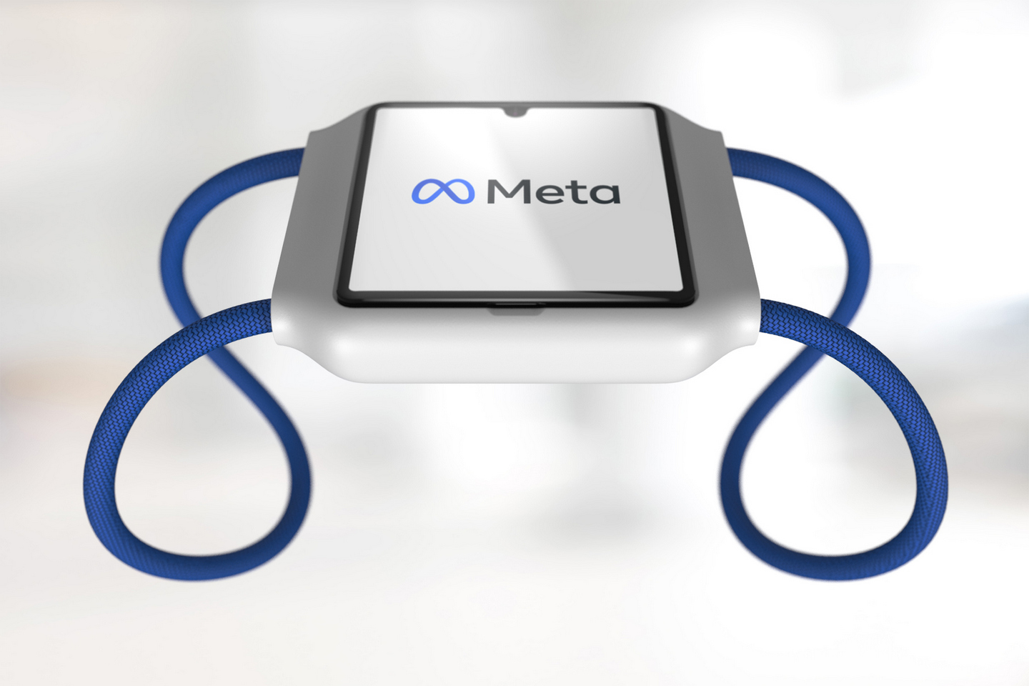
Rather than the typical watch wristband, the designer envisioned Meta using an elastic paracord that runs through the top and bottom of the smartwatch body, creating a complete loop. The material isn’t less comfortable than a strap made from leather, steel, or silicone. In fact, this more open design makes it easier for the skin to breathe more easily, reducing the risks of skin irritation.
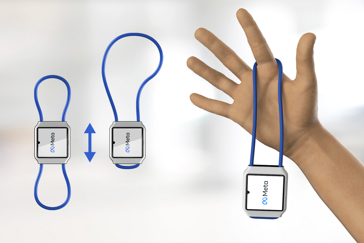
The most ingenious part of this strap design, however, is in the way it opens up the smartwatch to more uses without the need to buy accessories. Simply slide down the body to one end, and you can carry the Meta Watch like a pocket watch. It might even be possible to hang or wrap the watch on some other object for an ad hoc action cam setup.

There might even be opportunities here to add a metaverse flavor to the strap design. Something that may look as plain as a cord loop can have a fantastic appearance when viewed through digital eyes, allowing for customizations that wouldn’t be possible in the physical realm. There could be a market for such virtual designs, even perhaps sold exclusively through NFTs.

Even with its bare design, however, this kind of strap displays a unique character that matches the minimalist design of the body. There’s also a bit of symbolism at play here too, with a loop that is easily associated with infinity, Meta’s chosen logo.

Meta Time in the Metaverse

While these use cases sound typical for Meta, it might not be immediately clear where Meta’s Metaverse begins. After all, this smartwatch sounds more like a downsized smartphone, one that has direct access to Facebook and Meta’s other social networks. Those social networks are the foundations of Meta’s thrust to make mixed reality more social, and what better way to normalize that idea than by making it too easy for people to just chat all day long on their Meta watches.

Accessing the Metaverse from the tiny screen of a smartwatch might not be the most immersive experience, but it is the easiest way that won’t involve having to hold your phone all the time. Simply raising your wrist might be enough to carry on a conversation with someone through a metaverse network, and you won’t have to worry too much about not seeing what’s in front of you.

The detachable design of the watch also makes it the perfect companion to AR glasses. Ideally, such eyewear would have built-in cameras, but there are still technical limitations to how you can squeeze those sensors into a thin frame. More importantly, such cameras are too hidden and discrete that it raises privacy concerns that, in turn, reduce the glasses’ commercial potential (just ask Google). Nothing says you’re recording than having a detached smartwatch raised and pointed at some object, scene, or even person.

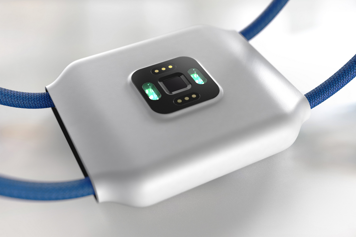
Even when not in use as a video recording device, Meta’s smartwatch also has indirect applications in the Metaverse. With biometric sensors for motion, heart rate, temperature, and more, the wearable could provide Meta with the necessary data for a more accurate representation of your Metaverse avatar or, more likely, to send you an advertisement on the best sports drink to help replenish your electrolytes.
Privacy Watch

While smartwatches are pretty much a mainstay in consumer electronics these days, a Meta Watch will still attract scrutiny and criticism more than any other smartwatch maker in the market. That’s not really because of the odd design of the watch itself, presuming it does come to pass, and more about the company. It may have changed its name, but Meta still has that effect on anything it touches.

It won’t be the first smartwatch to have a camera, but the mere fact that there are no more smartwatches with cameras today might clue you in on how the market collectively decided it was a bad idea. The privacy implications of having such a discrete recording device disguised as an ordinary, everyday accessory was too big a matter to ignore. Now imagine that same technology in the hands of a company that has been a poster child on how not to do privacy.

It doesn’t really matter where the camera is pointing at because there will always be a time when it will be able to see everything around you. A flick of the wrist or a turn of an arm could provide a bigger picture of a wearer’s surroundings, even when the camera is supposed to be disabled. Of course, Meta will always defend its privacy practices, and Facebook’s thousands of users clearly indicate how many might not mind that at all, as long as it brings convenience and social connection.

It’s still not clear at this point if Meta will actually pursue such a smartwatch design, particularly one that is admittedly as innovative as this. It’s only a matter of time, though, if it stays true to its Metaverse mission because, by then, anything and everything in the meatverse will be tied to the Metaverse.

Designer/Visualizer: Sarang Sheth
The post Meta Band with two cameras makes video chats and vlogging the center of your metaverse experience first appeared on Yanko Design.
Ford Clint self-driving car concept envisions more private carpooling

Clint Future of Community

The discussion on the future of travel has always been open. It’s actually unclear since we still live in a pandemic world. But like anything, there are endless solutions to problems that often arise.

A young Polish industrial designer has recently introduced a design that may be considered by those who believe in carpooling. Mikołaj Nicer teamed up with Ford Europe to complete the design. The project was developed last year with the aim of improving the vehicle interior as a response to the time.

Designer: Mikolaj Nicer

Clint Ford Travel

Two years into this pandemic, people around the world are still thinking of ways how to improve everything in their life whether at home, for work, business, or even transportation. Moving from one point to another is still crucial. There are groups that still carpool but with social distancing still being encouraged, it’s important this part is considered.

For commuters, privacy is more important than ever. CLINT is a solution for people who want flexibility. Those who want privacy while still in a cramped space can trust the Clint to give them that.

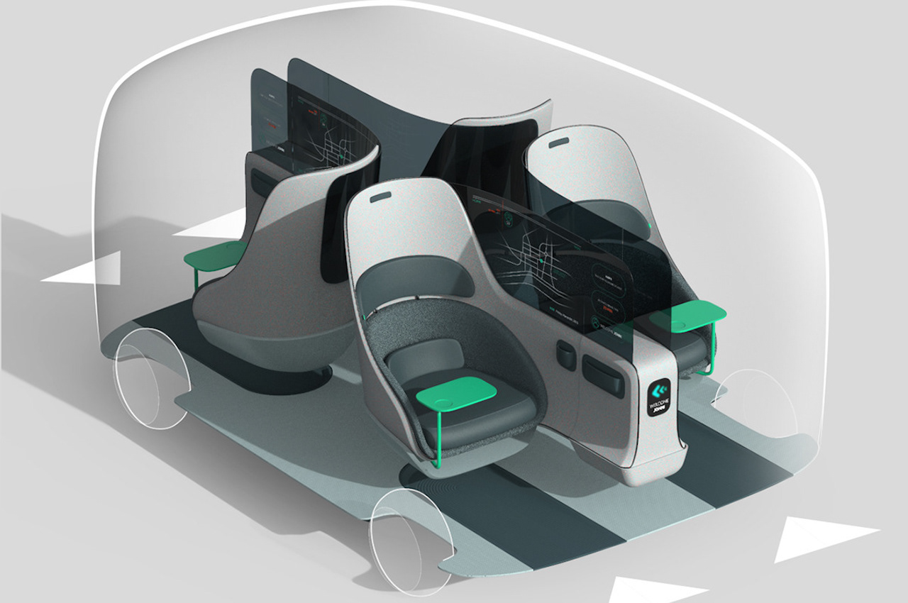
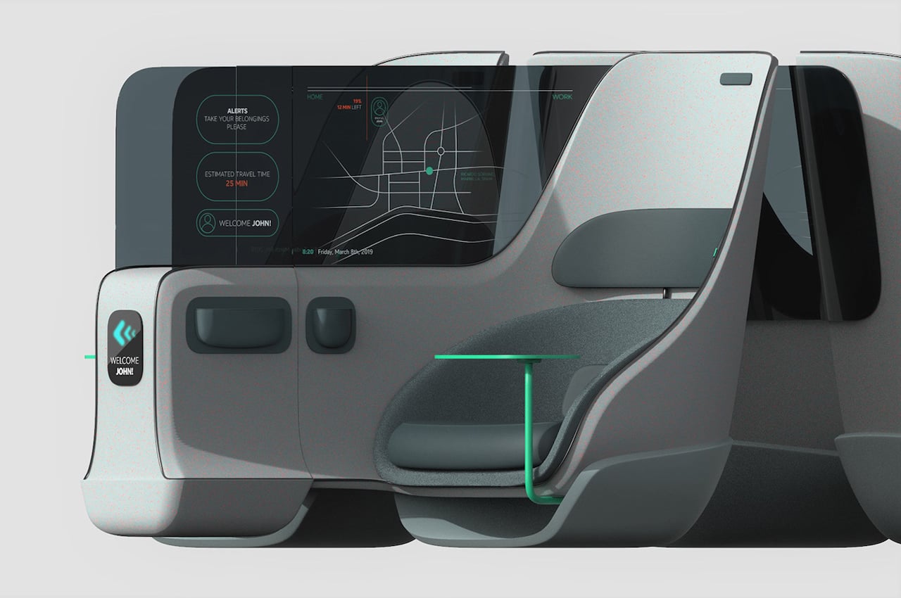
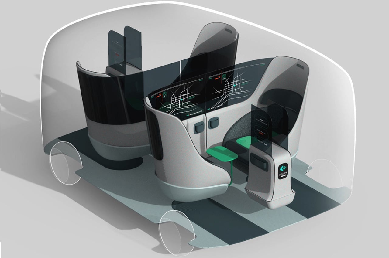
Clint Car Travel InteriorThe CLINT is mainly a special design of a vehicle interior. It includes a separate entrance for every passenger. Every traveler is given the chance to spruce up the space for all your individual demands. The era of autonomous vehicles may still be in its early stages but it can be fun to imagine the possibilities. Commuters can find it helpful they can enjoy the interiors that suit their needs.

1

The CLINT offers different modes. There is the Social Mode where all passengers can interact. The Pair Mode is for two people. The Privacy Mode is for those who really want to be alone and be separated from other passengers.

Clint Ford Social Mode 2

Clint Future of Commuting Pair

Vehicle interior design is promising. It’s being explored these days more than ever. There is a call to go smart and sustainable. But in this world where we’re getting used to not seeing people outside the comfort of our home, a bit of privacy matters.

Clint Ford Future of Commuting

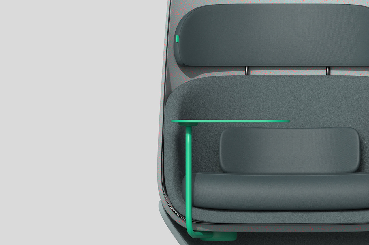
Mikolaj Nicer’s design for the interior vehicle appears like a futuristic business class seat on your favorite airline. There’s also a small table where you can place your smartphone or laptop—just like inside the airplane.

Clint Design Future

The future of commuting will soon be transformed with innovations like this. Such give us hope of a future that is mindful of others’ privacy, protection, and purpose.

Clint Travel CarsClint Ford Design

Clint Future of Commuting and Travel

The post Ford Clint self-driving car concept envisions more private carpooling first appeared on Yanko Design.