Modular power bank concept uses a series of wireless snap-on battery ‘bookmarks’ to give your phone 30 hours of charge

Battery Pods is a smartphone charging system comprised of a smartphone charging case and magnetic battery strips to supply your smartphone with 1400mAh worth of charge.

Everyone needs a charger, but no one wants to carry one around. Battery packs are bulkier than your smartphone and wire chargers depend on an outlet to actually work. So the question of how our phones will get battery remains. PS Design Studio, known for conceptualizing smartphone accessories, tried their hand at a solution with Battery Pods, magnetic battery strips that charge your phone by attaching to an accompanying phone case.
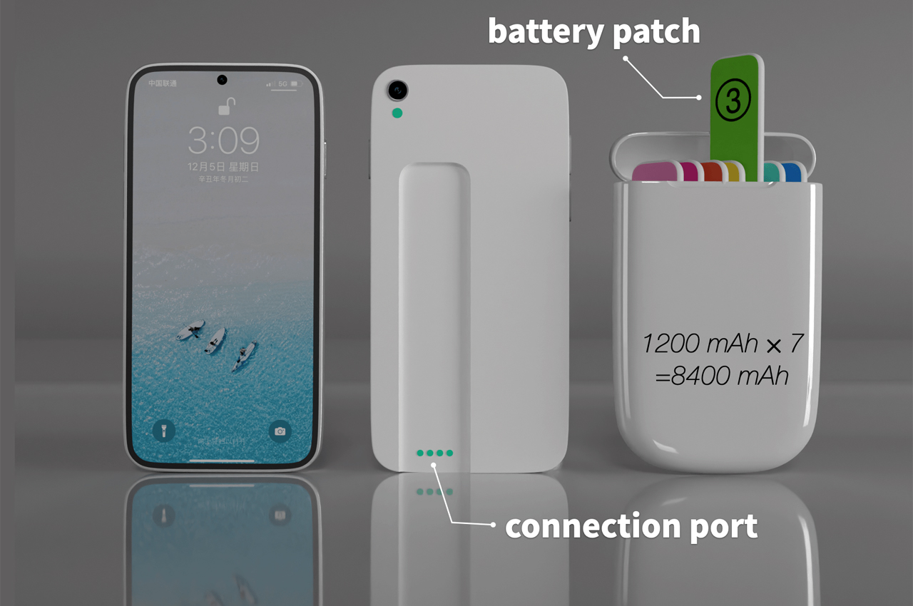
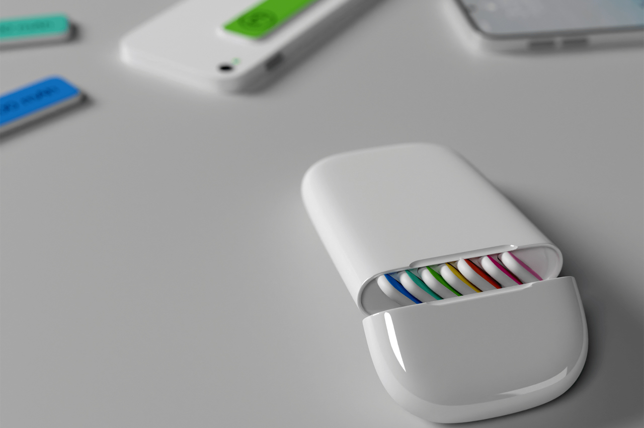
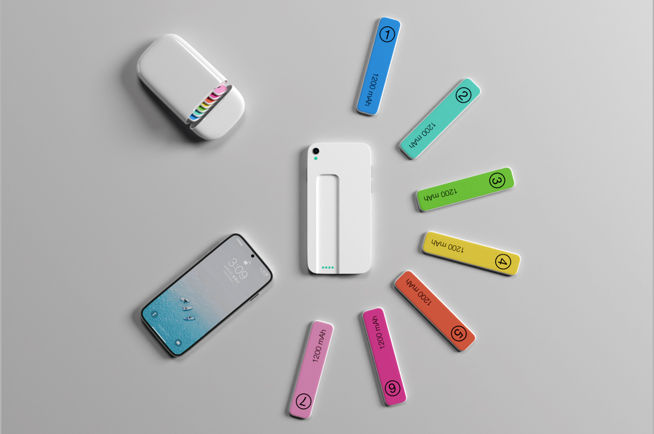
Similar to the battery pack of Airpods, Battery Pods come in a convenient carrying case that charges on the go. Complete with seven battery strips, each Battery Pod comes with enough battery to keep your phone charged throughout the day.
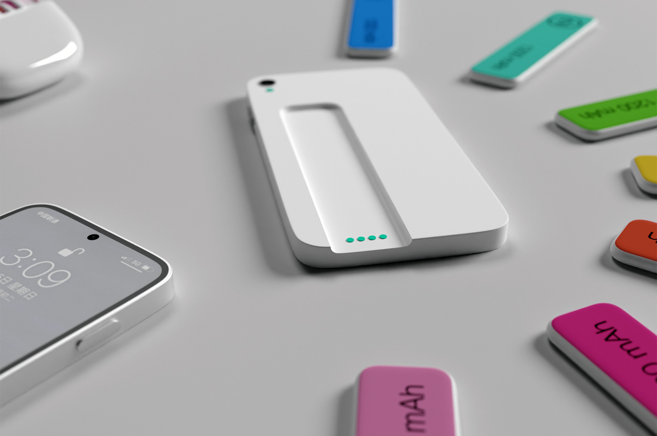
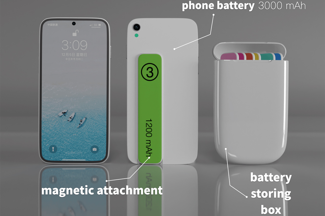
To get your smartphone all charged up, Battery Pods comes with a removable phone case that latches onto your phone and leaves a landing strip where the battery packs can magnetically attach. Once the stirp to attached to the phone case, users can charge their smartphones on the go.
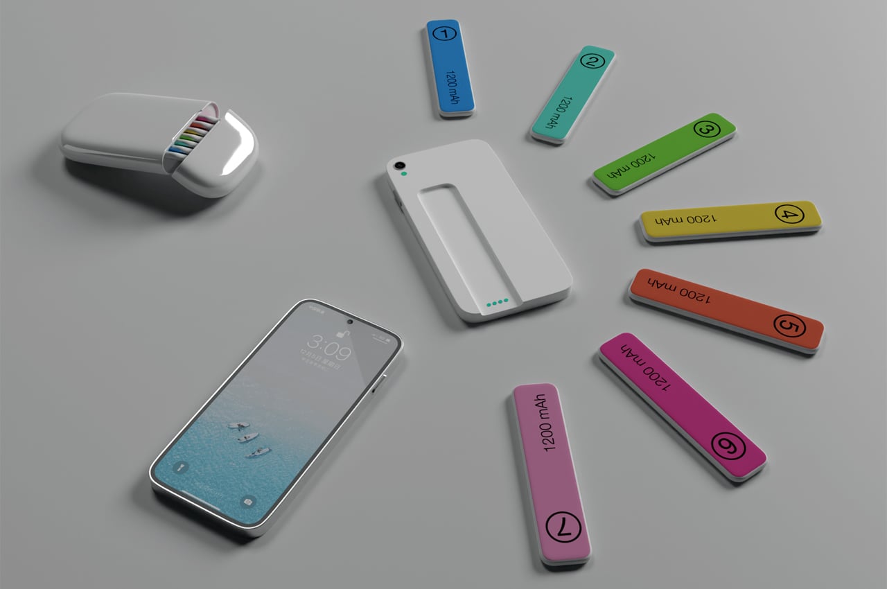
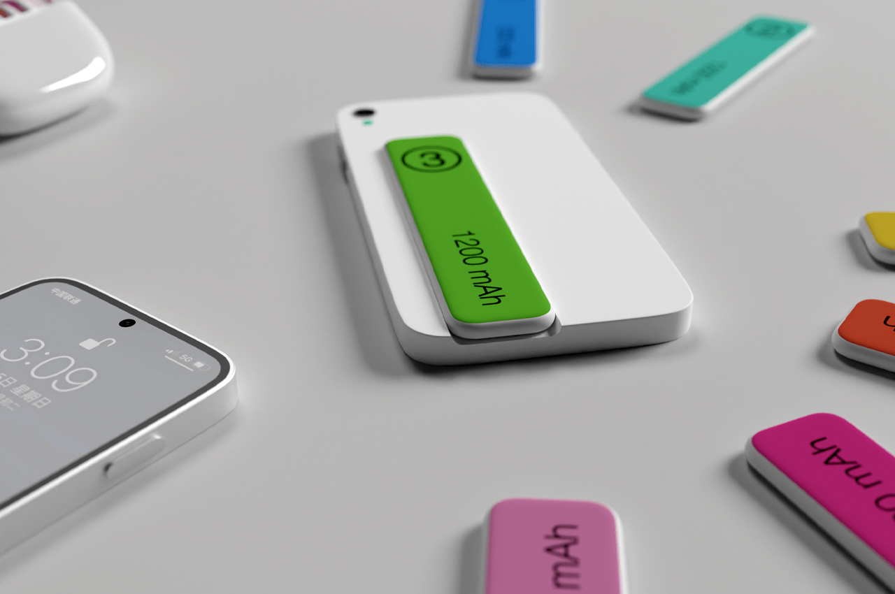
Each battery strip comes stocked with 1200 mAh, which, on a full charge, typically gives you 6-7 hours of phone usage time. The actual charging phone case comes with 3000 mAh worth of charge, giving you up to 30 hours’ worth of phone usage.
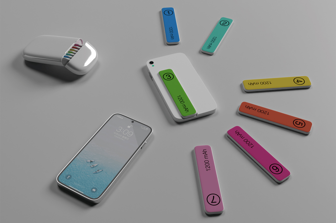
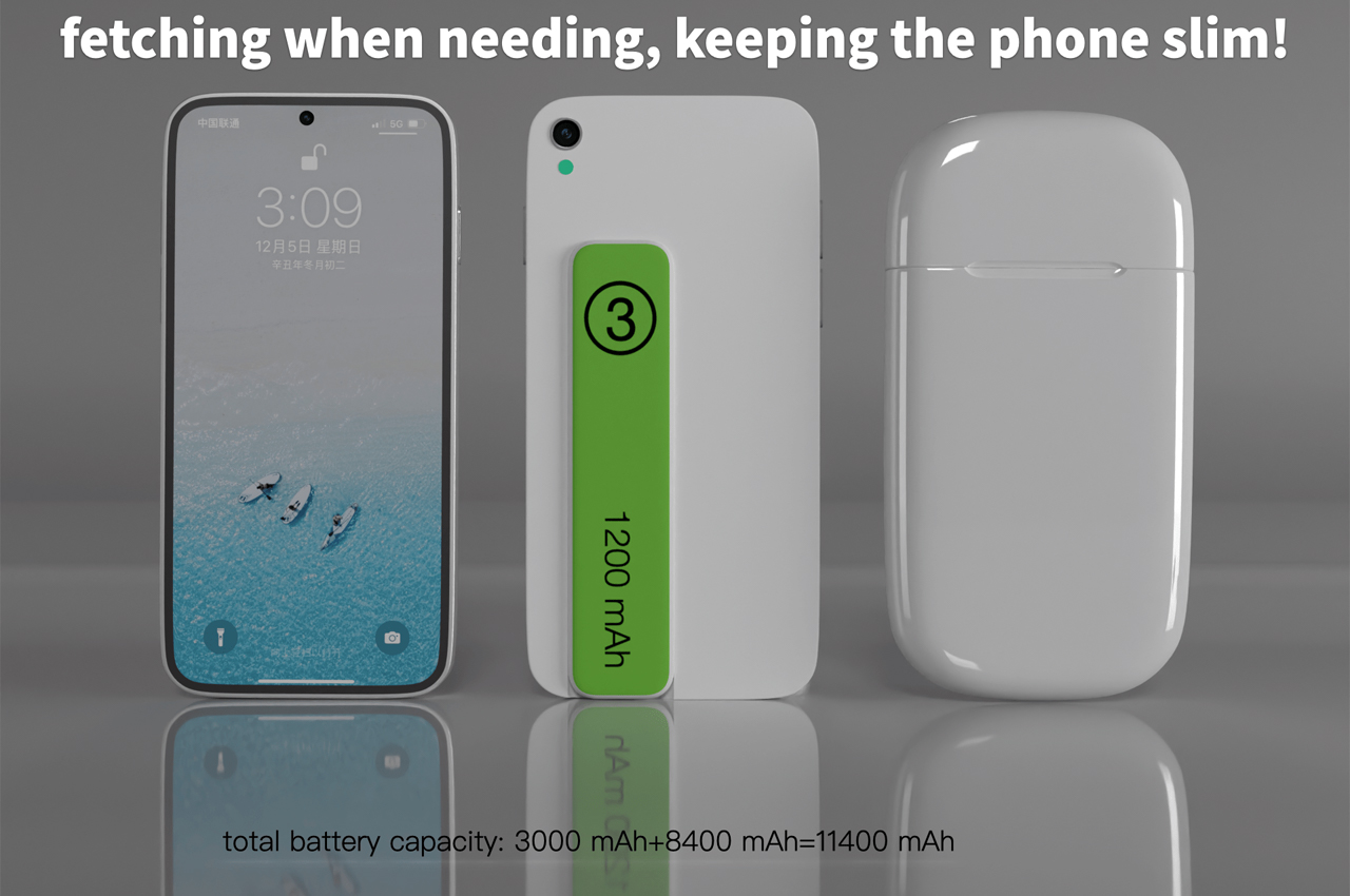
Conceptualized in an array of different colors, each battery strip keeps a color of its own, making it easier for users to decipher which battery strips have been used and which could still supply some charge.

Designer: PS Design
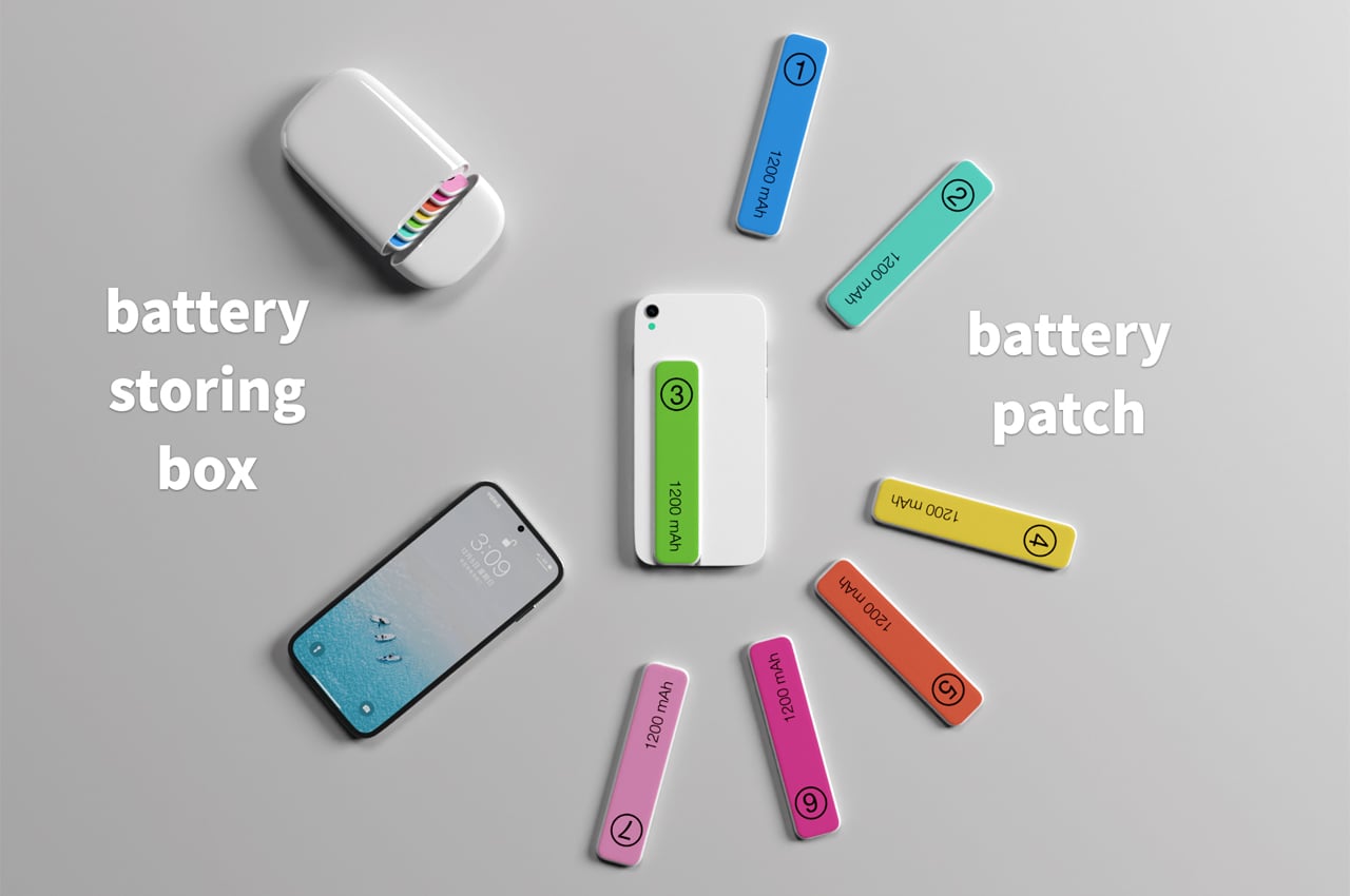
Seven magnetic battery strips fill the Battery Pods’ charging basin.
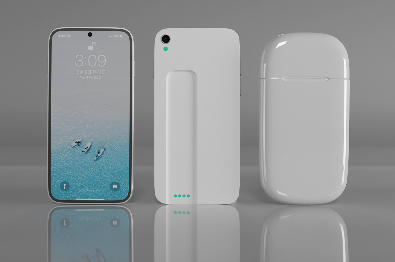
An accompanying phone case leaves a landing strip where the magnetic batteries can attach.

The post Modular power bank concept uses a series of wireless snap-on battery ‘bookmarks’ to give your phone 30 hours of charge first appeared on Yanko Design.
This iPhone 13 concept sports a rear camera with a 3-inch display inspired by the Mi 11 Ultra

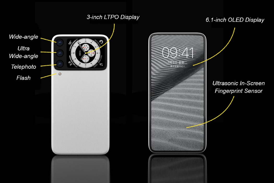
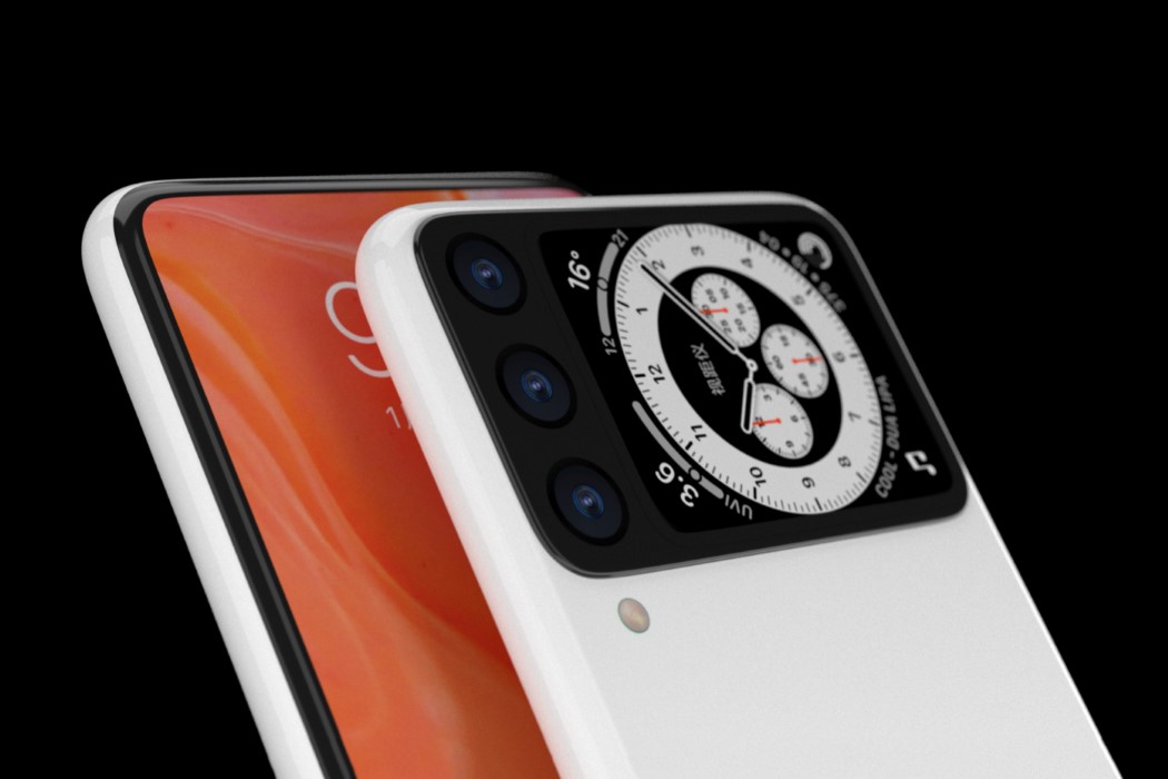
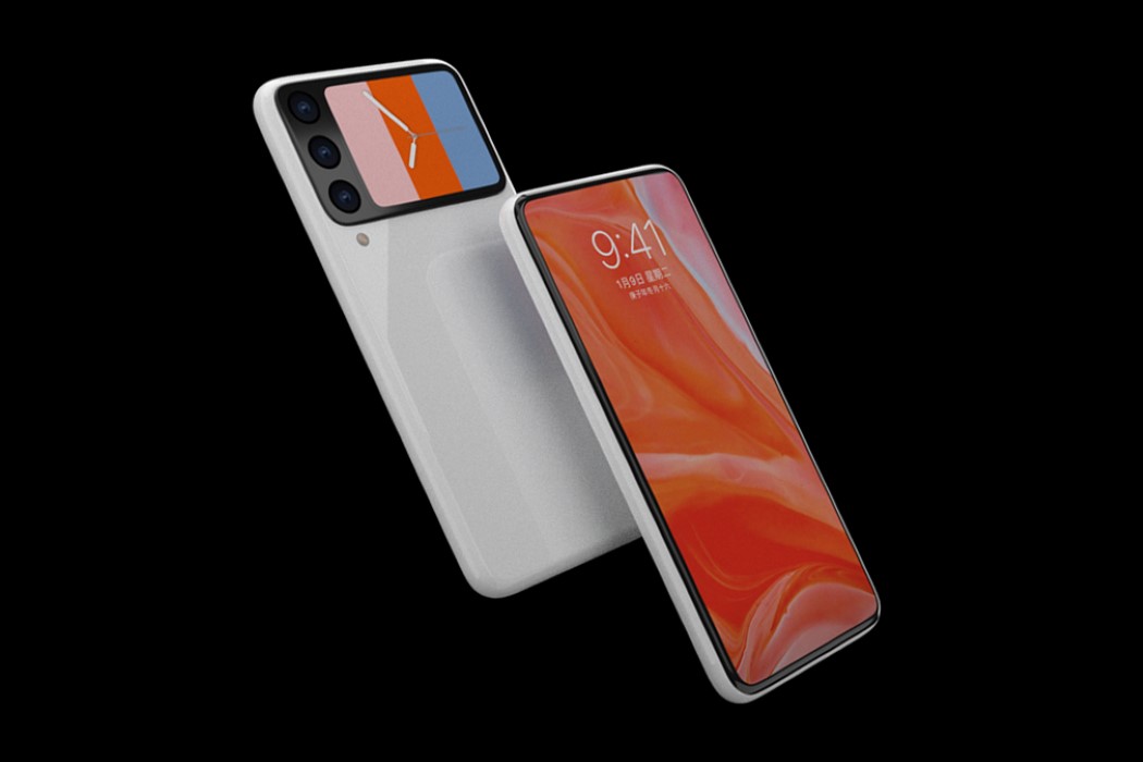
PS Design’s iPhone 13 concept poses a pretty interesting question. Wouldn’t it be nice if your smartphone had a display on the rear that let you see what was in the frame while you clicked selfies? Sure, you’ve got the front-facing camera for selfies, but hear me out. With multiple cameras and sensors on the smartphone’s rear, one could argue that the front-facing camera is a bit of a qualitative compromise. Instead, put a tiny display on the rear and use it to click all sorts of incredible selfies, while being able to compose your shot the way you want to. It’s something Xiaomi is apparently trying out with the Mi 11 Ultra, and it’s also something most folding phones have attempted too. PS Design’s conceptual iPhone 13 sports a secondary rear display too, although it’s capable of doing a lot more than just letting you click better selfies.

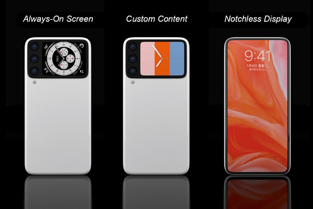
A better way to describe PS Design’s iPhone 13 concept is to compare the rear display to Apple’s closest product – the Apple Watch. The 3-inch always-on rear display practically mirrors the watch’s capabilities, allowing you to see the time, notifications, and a wide variety of other data on it. The display on the rear uses Apple’s low-temperature polycrystalline oxide (LTPO) technology to provide its always-on feature, and the fact that it sits right beside the main camera setup (and that it’s larger than the Mi 11 Ultra’s display), means the front of the phone can ditch the notch entirely, creating a beautifully bezel-less iPhone that leaves little to be desired.

Another feature on this conceptual device is its ceramic body… which does seem unusual for the iPhone line-up, but it borrows from Apple’s Watch series, offering high gloss, scratch-resistance, and the ability to hold onto color better (Apple’s red iPhones have shown the color fading over time). The white ceramic body does stand out well against the large black camera bump, almost making it look like the original Google Pixel smartphone (it’s a good look, tbh). Moreover, the large camera bump is coincidentally both wide and centrally aligned, which means the phone won’t rock when you place it on a flat surface… although, with that useful, always-on display on the back, you’re more likely to rest your phone with the camera bump facing upwards right at you!

Designer: PS Design