If you are a part of our Instagram community, you could have not missed this viral (and controversial!) post that shed light on gender bias in the design world. As conversations progressed, I realized the bias goes beyond genders and there are MANY segments of our audience who are underrepresented. We need to talk to and more about women, BIPOC, LGBTQ, and disabled groups – pay attention to their experiences, their needs, parts where they have felt left out of consideration when using a product or service. The post was a conversation starter but it needed to be followed by action, so Yanko Design teamed up with designer (and powerhouse) Ti Chang as well as Render Weekly to encourage participation from the global community with the aim of designing to break a bias.
“This is a chance to start to redesign products and experiences that do not address the needs of womxn and many underrepresented groups and historically marginalized communities. Let’s reimagine what could be! Let’s get these ideas out there by collaborating with EACH OTHER! Talk to your community, reexamine your privilege, reach out to this community and see if you can team up with them! Offer to realize other people’s ideas if you are super strong in rendering! If you have a great idea reach out to someone who is a great sketcher! Just get these ideas out there for us to see what a more equitable world COULD look like,” said Ti Chang.
Here are some of our favorites from the #RWDesignBias challenge –
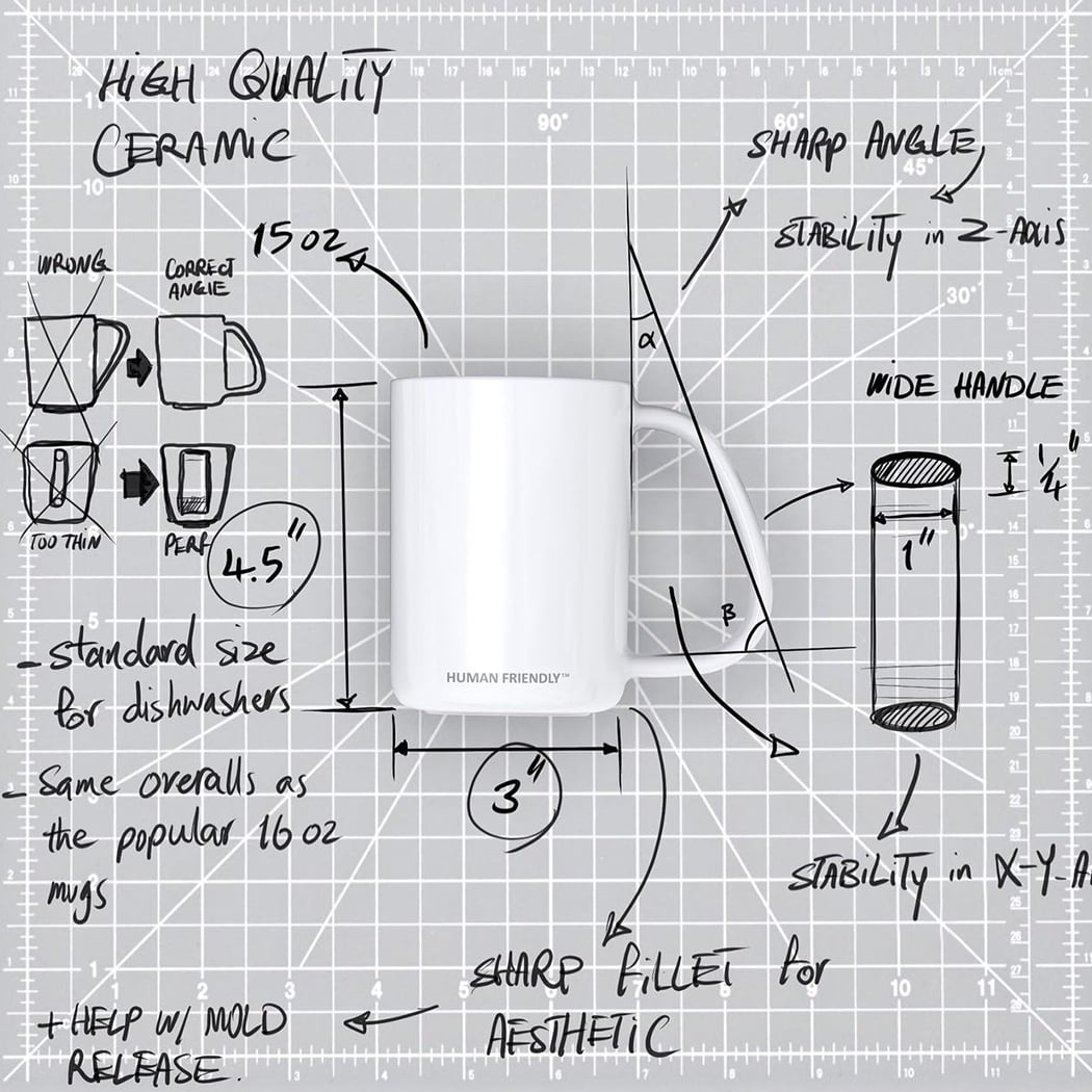
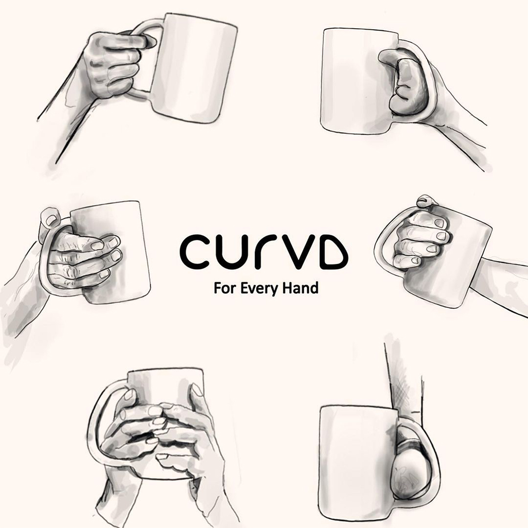
CURVD by Amin Hasani

Hasani is one of the co-founders of CURVD, a universal mug that works for everyone! “Disabilities do not exist, design flaws do. When a product fails to serve a person, that person is not disabled, the product just wasn’t designed right. The CURVD mug was designed to allow all hands, regardless of their hand capability or shape, to be able to enjoy a beverage without limitations,” says Hasani. The mug was launched as a human-friendly design with a patented handle that allows all people, regardless of their hand capability, to be able to enjoy a beverage without limitations. Enjoying a warm beverage is a universal joy and deserves a universal design.


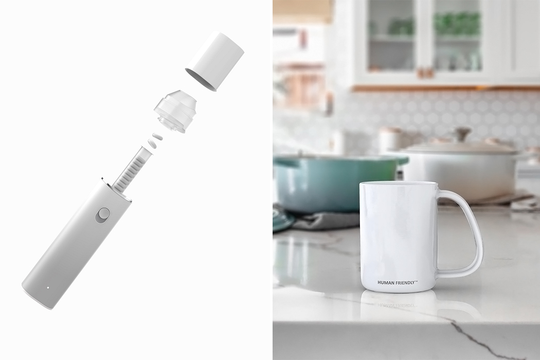
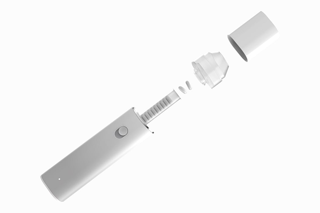
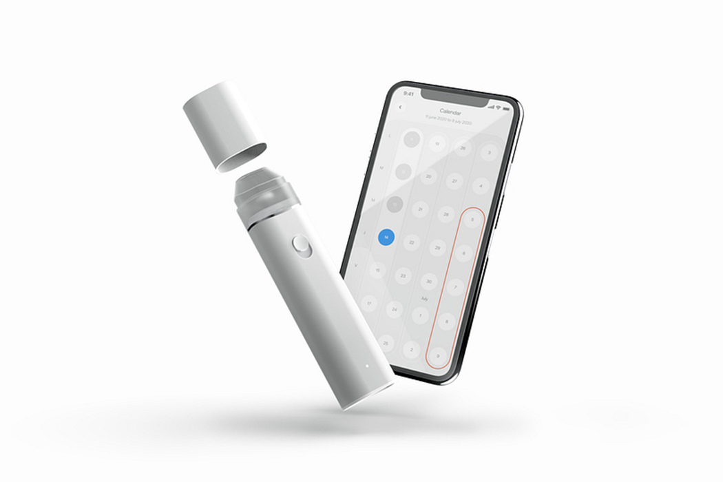
Maria Contraceptive Pill Dispenser by Romane Caudullo and Theotim Auger

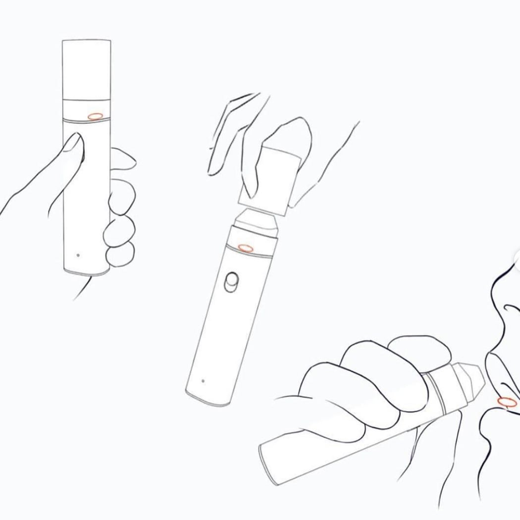
Maria is a smart pill dispenser specially designed for the contraceptive pill with the aim to free women from pill omission pressure and its side effects. “Because, while the pill benefits the whole couple, the woman is often alone in managing this contraceptive, the constraints, and stress associated with it. It seems to us right and necessary to use design to improve this treatment,” says the team. Maria makes it easy for women to take the pill and improves its effectiveness by making the process more efficient. A much-needed redesign that comes 60 years after the FDA approval of birth control pills!


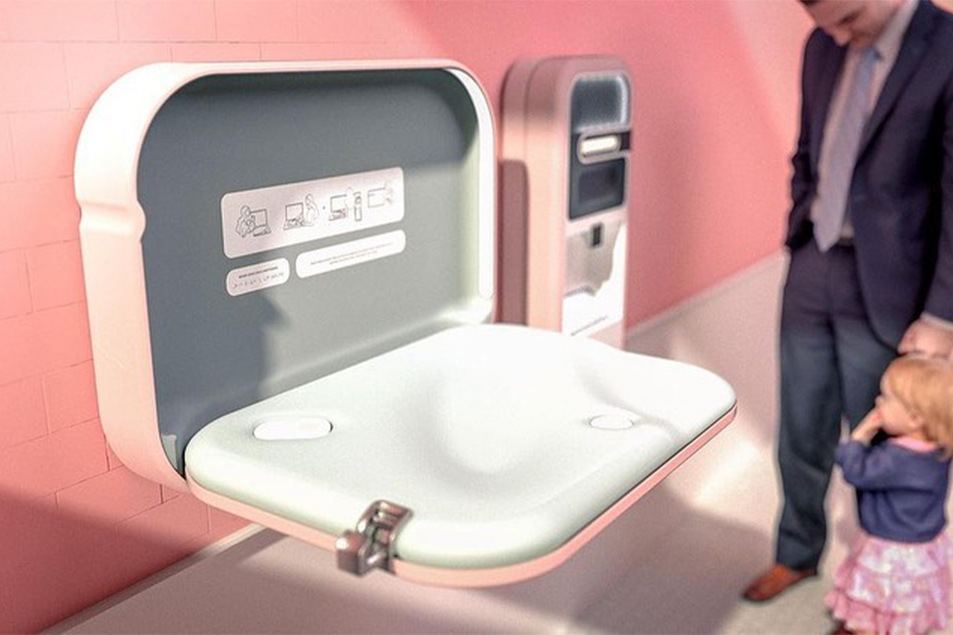
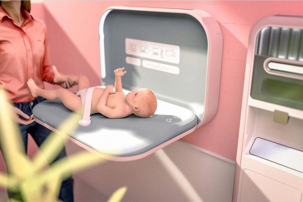
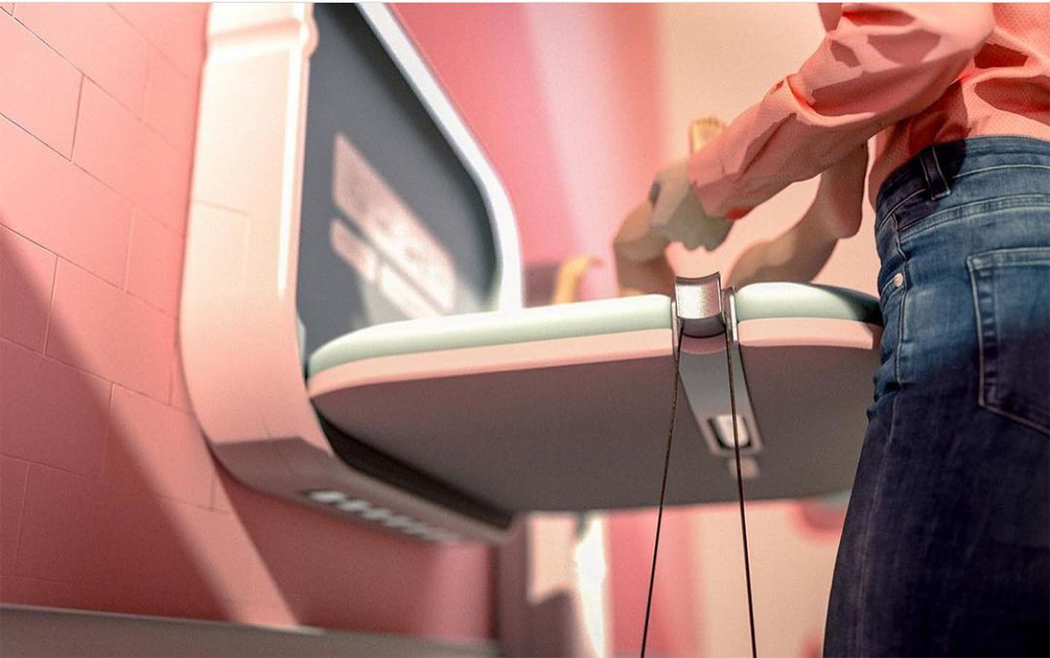
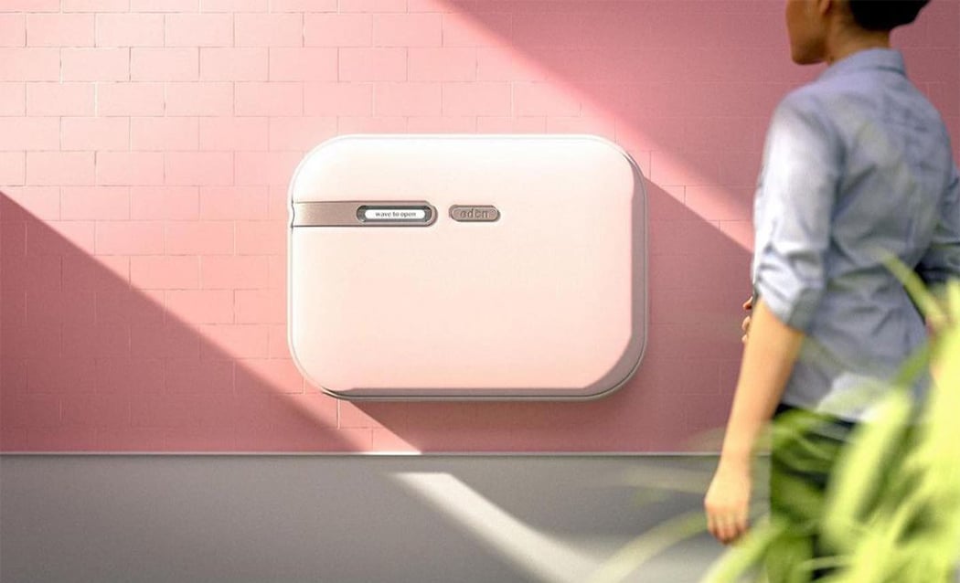
Changing Station by Claudia Miranda-Montealegre

Baby stations in public are only found in women’s bathrooms and do not take into account the needs of male caregivers. The current design does not feel safe, or hygienic, which leads to people using surfaces that might not be ideal (cars, floors, and counters/tables). This puts the burden on the female partners and takes away equal access from male partners. This conceptual baby changing station has a touch-less opening system, includes UV and alcohol self-cleaning capabilities, as well as integrated adjustable lighting. It upgrades the safety features to provide a comfortable experience for parents and infants alike. It also includes details such as hooks for bags, safety belts that can be adjusted using one hand, and a diaper dispenser for a seamless experience.


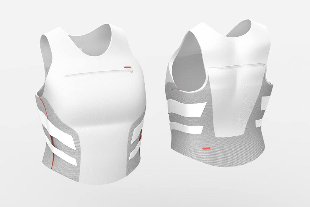
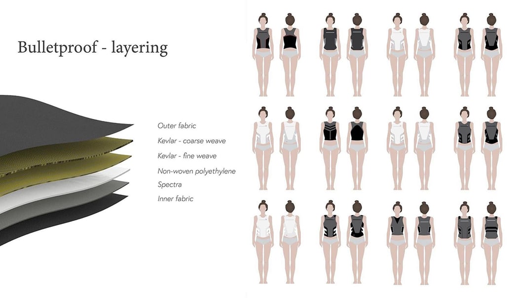
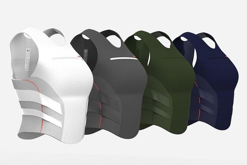
Pivot by Iris Ritsma

Even in 2020 majority of Personal Protective Equipment (PPE) is still being designed for the male body including body armor which is made to protect people from being harmed or even killed by gunfire. 71% of women working in emergency services wear PPE that is designed for men – it doesn’t fit women, their bodily movement, health issues, and more. Pivot is a soft concealable armor designed to optimally fit the anthropomorphic characteristics of women’s bodies. Each size comes with three variable chest sizes and the diagonal straps fit neatly around women’s naturally tighter waist with raised sides on the bottom provide extra freedom of movement in the hips. Pivot provides optimal protective coverage, maximizes women’s mobility, and increases women’s comfort significantly.


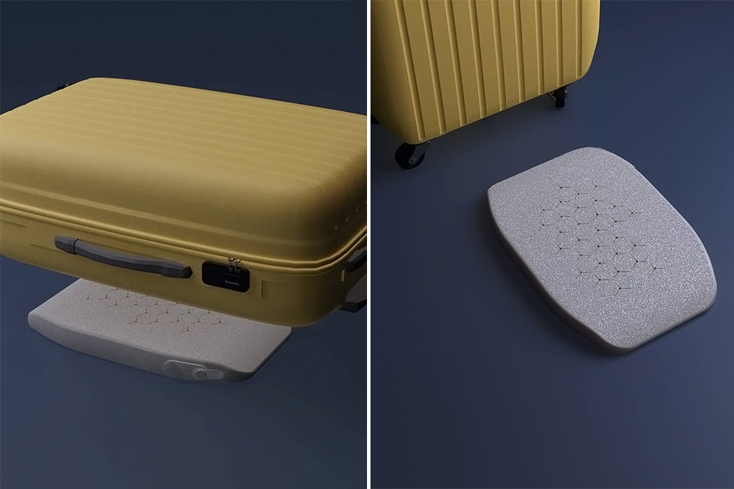
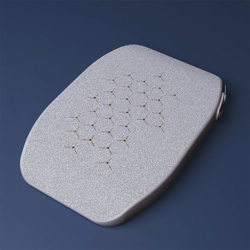
Liberia by Nipuni Siyambalapitiya

Current luggage scales in the market assume that most people can lift up a 50 lb/23kg on a hook/strap and weighed, it doesn’t take into account the elderly or those with disabilities. Liberia is a pneumatic luggage scale that allows you to weigh your bag WHILE packing! It is a pillow-like scale and accompanying app. It comes with an electronic air-pump that inflates it and a pressure-sensitive valve that records change in air pressure inside the scale as the weight on top changes. Buttons and tabs are large enough for people with low grip strength and have different tactile qualities, making it easy to maneuver the scale even if you can’t see too well. Simply place the deflated scale on the floor, put your bag on top, inflate the scale via the app and start packing while Libera tells you the weight in real-time.

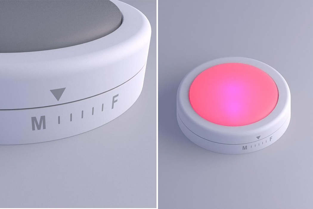
Interruption Buzzer for women by Kristi Bartlett

Trump interrupted Hilary Clinton 51 times during their debate and in 2020. This buzzer is inspired by the board game Taboo and aims to make group discussions easier. The AI-enabled meeting assistant combats the phenomenon of women being talked over in meetings. Put it in the center of the table at your meeting and adjust the dial to reflect the gender makeup of your group to make sure the contributions follow the proportions. The device will buzz annoyingly and loudly when it detects a woman being interrupted by a man or another woman. It will also turn blue if it detects that men are speaking more than 50% of the time and pink if the same applies to women. The goal is to keep your meetings purple – equal chances!

Diffuser by Caterina Rizzoni

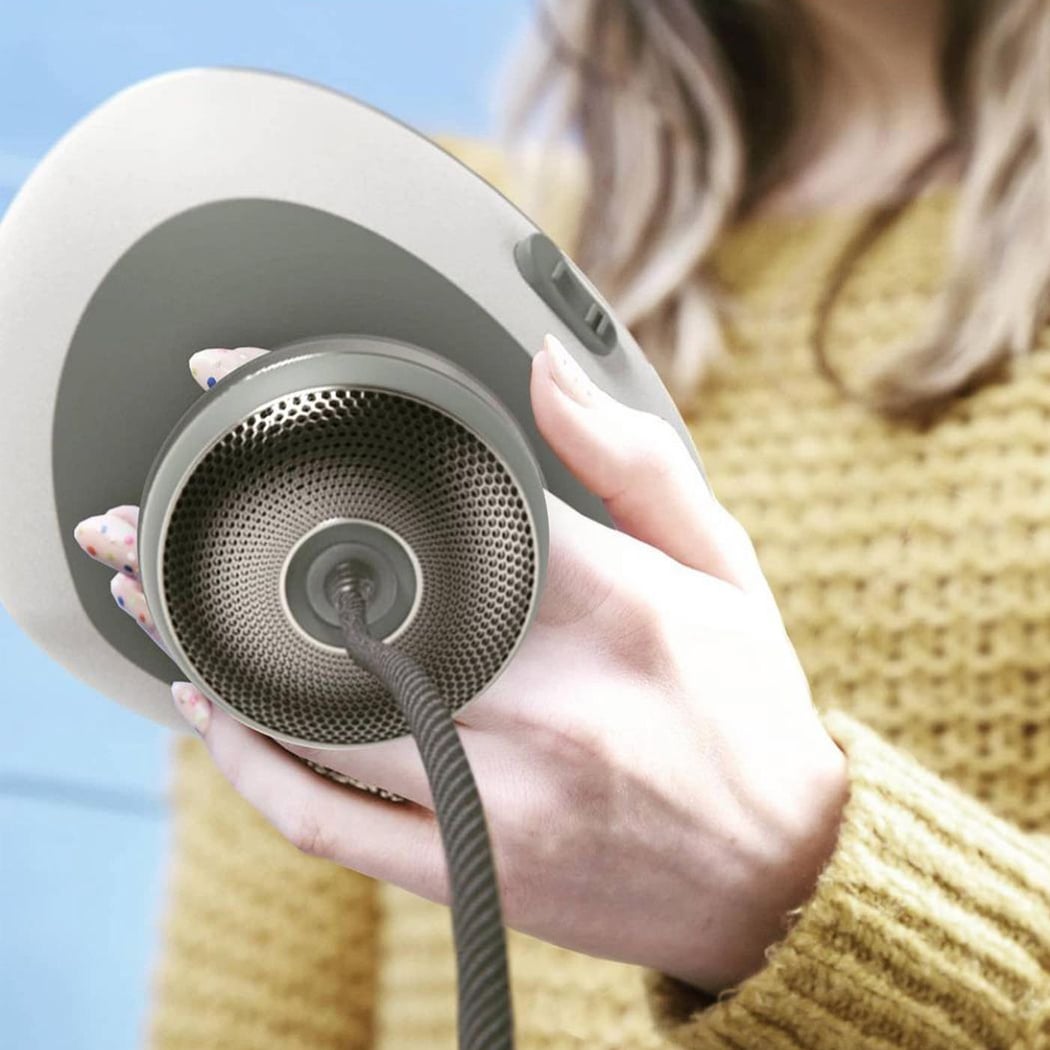
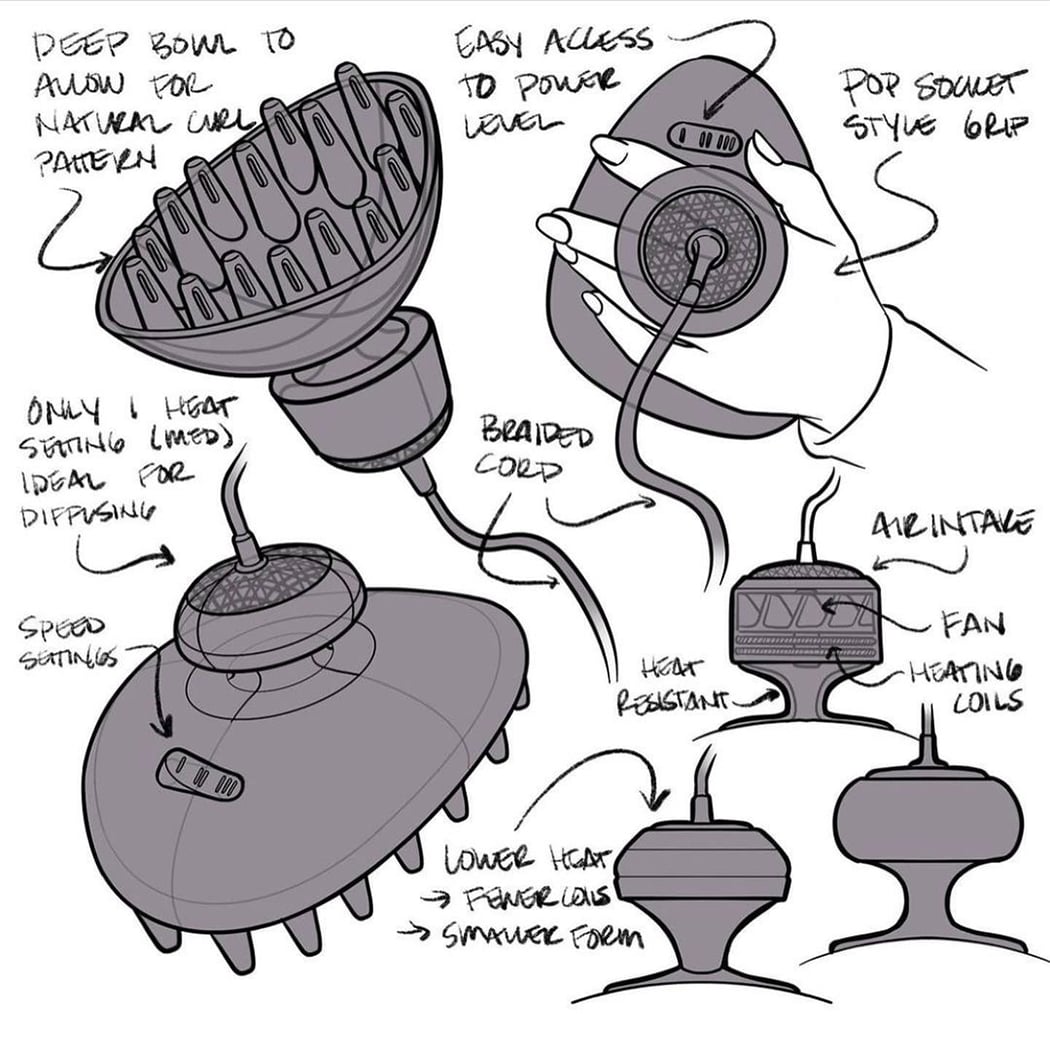
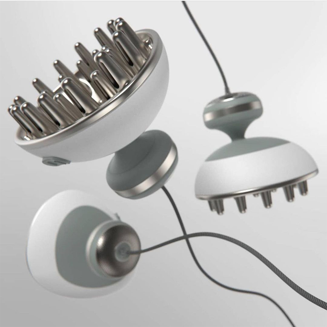
This diffuser re-imagines blow-drying curly hair, using a handheld form factor to help users offset discomfort and pain when using diffuser attachments on traditional dryers. Caterina spoke to over a dozen curly-haired womxn and relied heavily on design for usability. She aimed to reduce the ergonomic pain points present in the current design. This dryer was designed to protect naturally curly hair – the extra deep bowl saves room for curl pattern formation, while the dished fingers naturally conform to the user’s head. The use of metal for the diffusing end allows for even more drying from radiant heat, which means less airflow and less frizz! The soft braided cord easily swivels out of the way during use, and the soft heat-resistant over-mold on the body is easy to grip + easy to clean. Curly hair people are often forgotten like left-handed people and we need to break this bias.


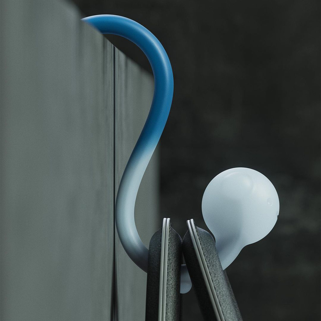
BAGPAL by Tim Zarki

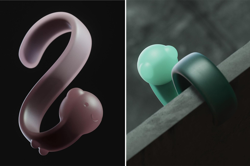
Public restrooms lack hooks to hang your bag from, and no one likes putting their bag on the gross public restroom floor. It is an uncomfortable and stressful experience, especially for women as they carry bags more often than men. BAGPAL can be used to hang your bag when you are using a public restroom and need both hands to change a tampon or pad. It is a multipurpose hook-shaped product that travels with you to hold your things when you can not. It has a strong stainless steel skeleton and colorful waterproof skin that is easy to clean when you wash your hands. With the pandemic, people are all the more careful of common surfaces and we don’t want to carry germs back home with us on our bags!


![]()
![]()
![]()
![]()
![]()
![]()
![]()
![]()
