What hoverboards were meant to be

foldable_balance_car_1

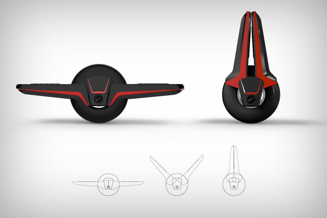
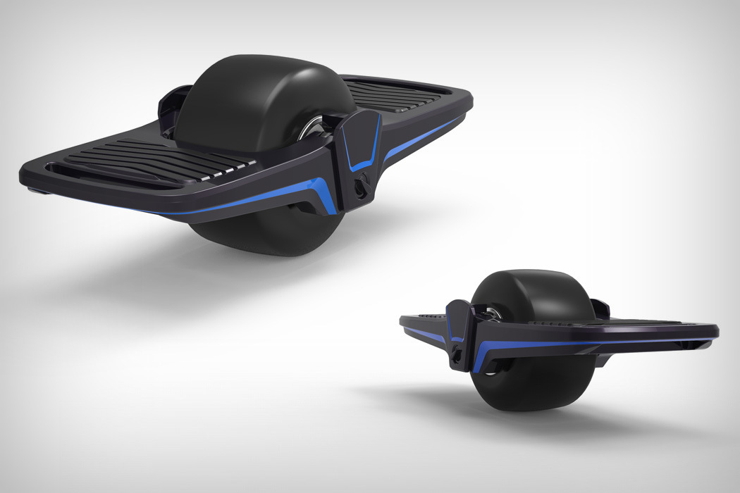
Oftentimes life-changing products are first releases as products of entertainment, to test the waters. Take for instance the VR headset, which was marketed heavily as a gaming device of the future. Now VR and even AR stand to change how humanity functions today. Similarly, the hoverboard was never initially released as a commute vehicle. It was touted as a toy with state-of-the-art tech that helped it stay balanced and let minute changes in one’s center of gravity act as controls for movement. Now that the human race is acclimatized to the idea of hoverboards, it’s here to change how we get from point A to B.

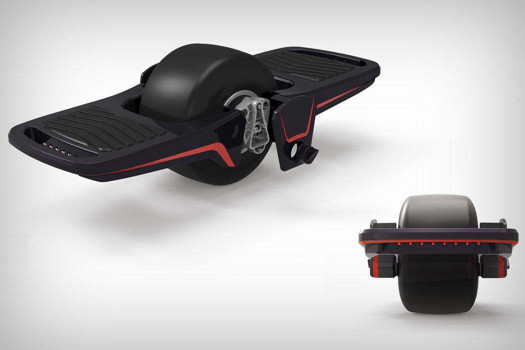
It’s for this precise reason the product above isn’t called a hoverboard (more synonymous with skateboards), but rather an Electric Balance Car. Designed to become your new mode of transportation (now that the time is right), the Electric Balance Car comes with a carbon fiber body and a foldable design that would put most hoverboards to shame. The Electric Balance Car is also poised to be the one electric commute vehicle most people will own, regardless of whether their car is electric or runs on fuel, since the purpose of the Balance Car is to be your last-mile-commute solution. Designed to be easily carried around, and small/convenient enough to fit into most cars or perhaps even strap onto your back, the Balance Car is what hoverboards intended to be… your new way to locomote.

The Electric Balance Car is a winner of the Red Dot Design Concept Award for the year 2017.

Designers: Huang Lin, Lu Heng, Mu Tong, Wang Ruihua & Zhang Bowen.
foldable_balance_car_2

foldable_balance_car_3

Biking just got a whole lot interesting

ergo_smart_goggles_1

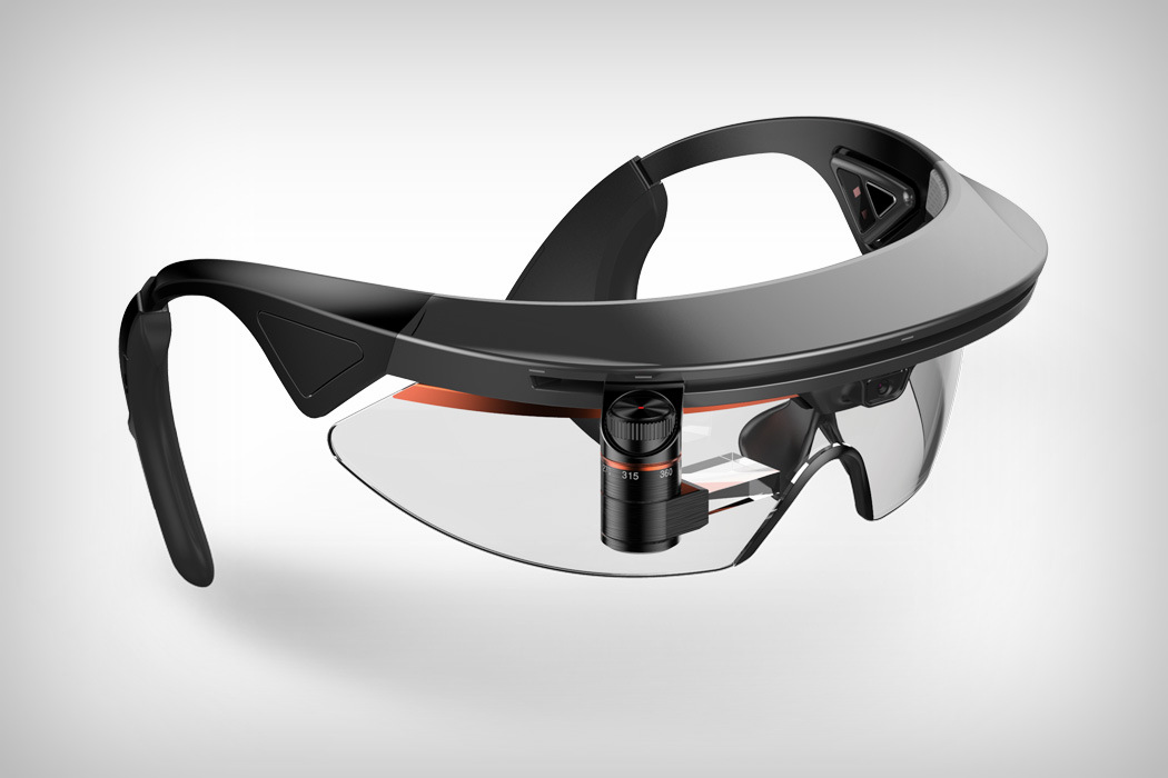
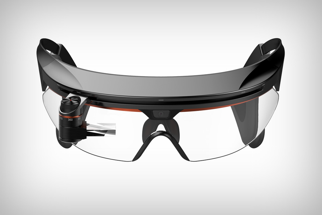
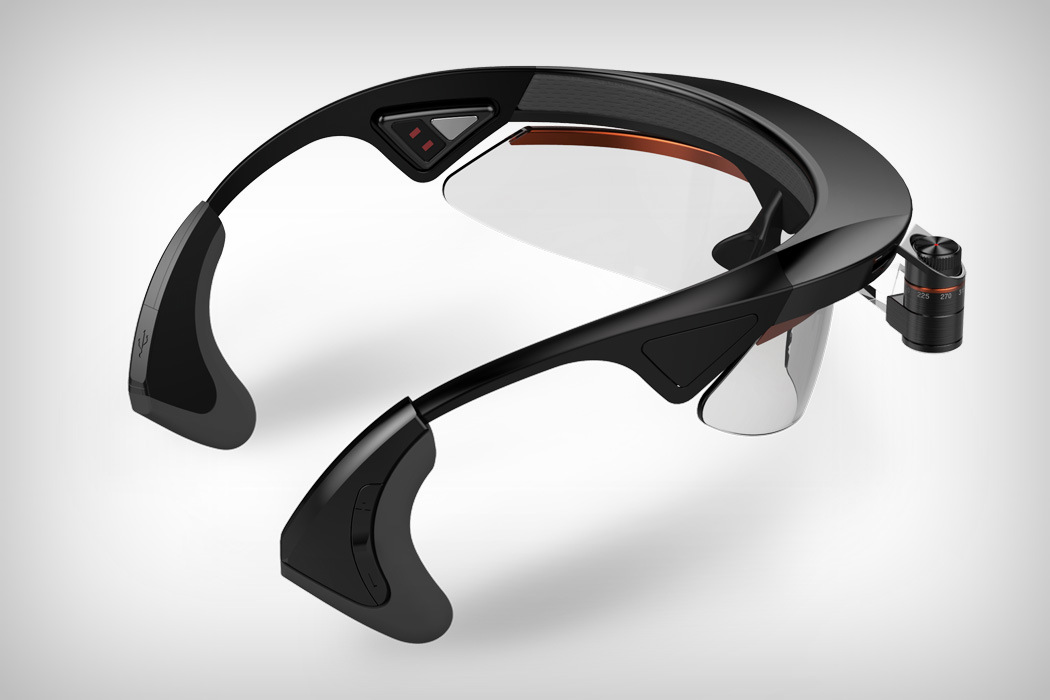
Looking like the Google Glass, but infinitely better and much more useful, the Ergonomic Smart Goggles allow bikers to have an easy to access HUD display to help them navigate through maps. The HUD unit comes with several placement-adjusters that allow the riders to position the HUD crystal wherever they want, be it in front of the right eye or the left. A camera sits right between the eyebrows, capturing your ride while allowing you to send pictures and videos to your social media or just be your head-mounted dashcam. Alongside its heads-up display, the Ergonomic Smart Goggles also come with two bone-conducting panels on the left and right temples that relay audio signals to their riders without the need for them to wear earphones and therefore cut out noise from the outer world. Designed to be infinitely customizable, and completely non-intrusive, the Ergonomic Smart Goggles may just be the only piece of tech you’ll need to rely on while commuting on two wheels!

The Ergonomic Smart Goggles are a winner of the Red Dot Design Concept Award for the year 2017.

Designer: U2system

ergo_smart_goggles_2

ergo_smart_goggles_3

A flute with Gesture-Control!

flux_flute_1

Any musician worth their salt will tell you that while electronic instruments offer a larger degree of control, they feel impersonal. A lot gets lost in converting electrical signals into audio, and this lack of expressiveness is what makes them sound robotic.

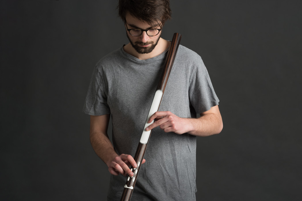
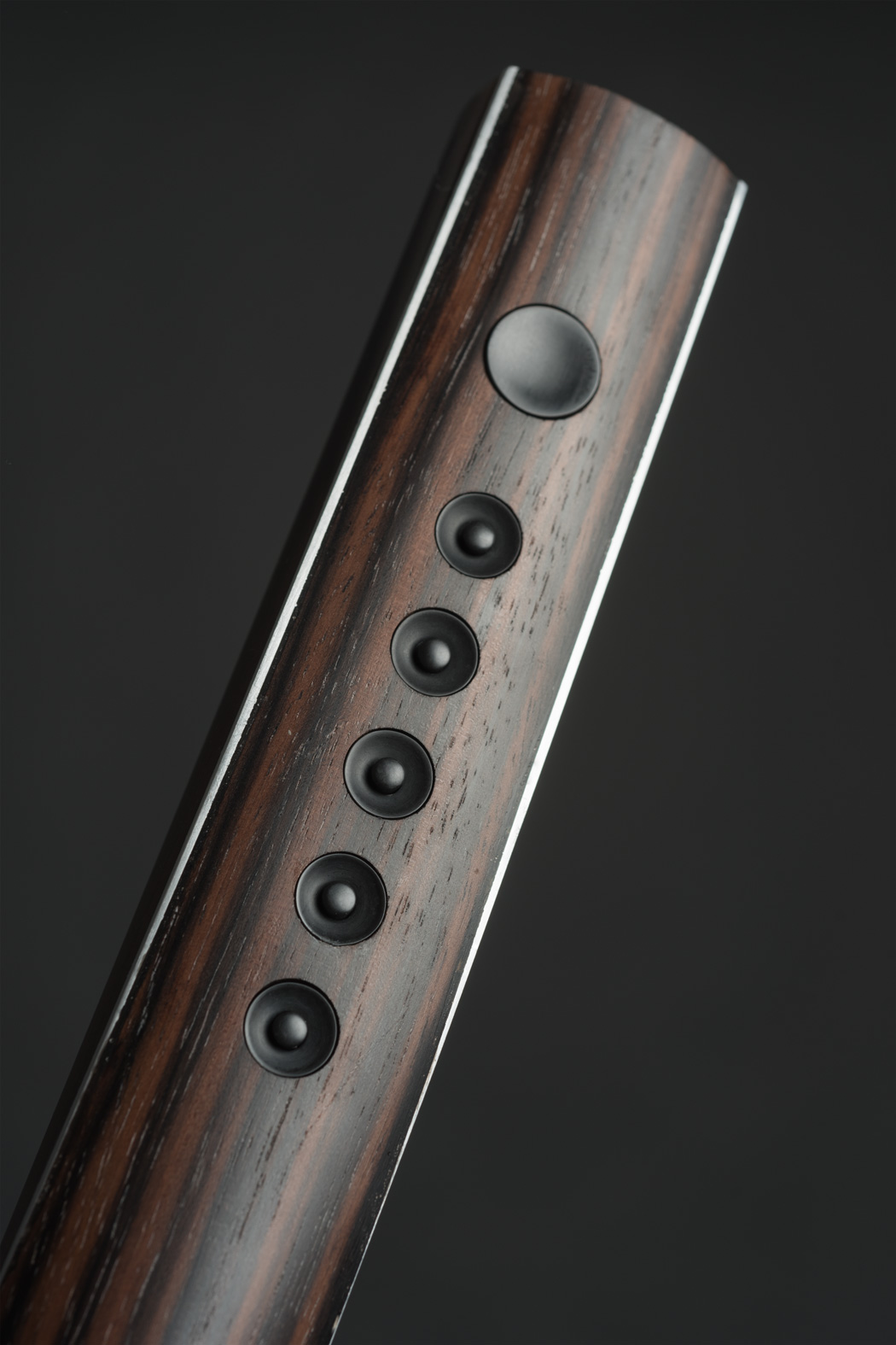
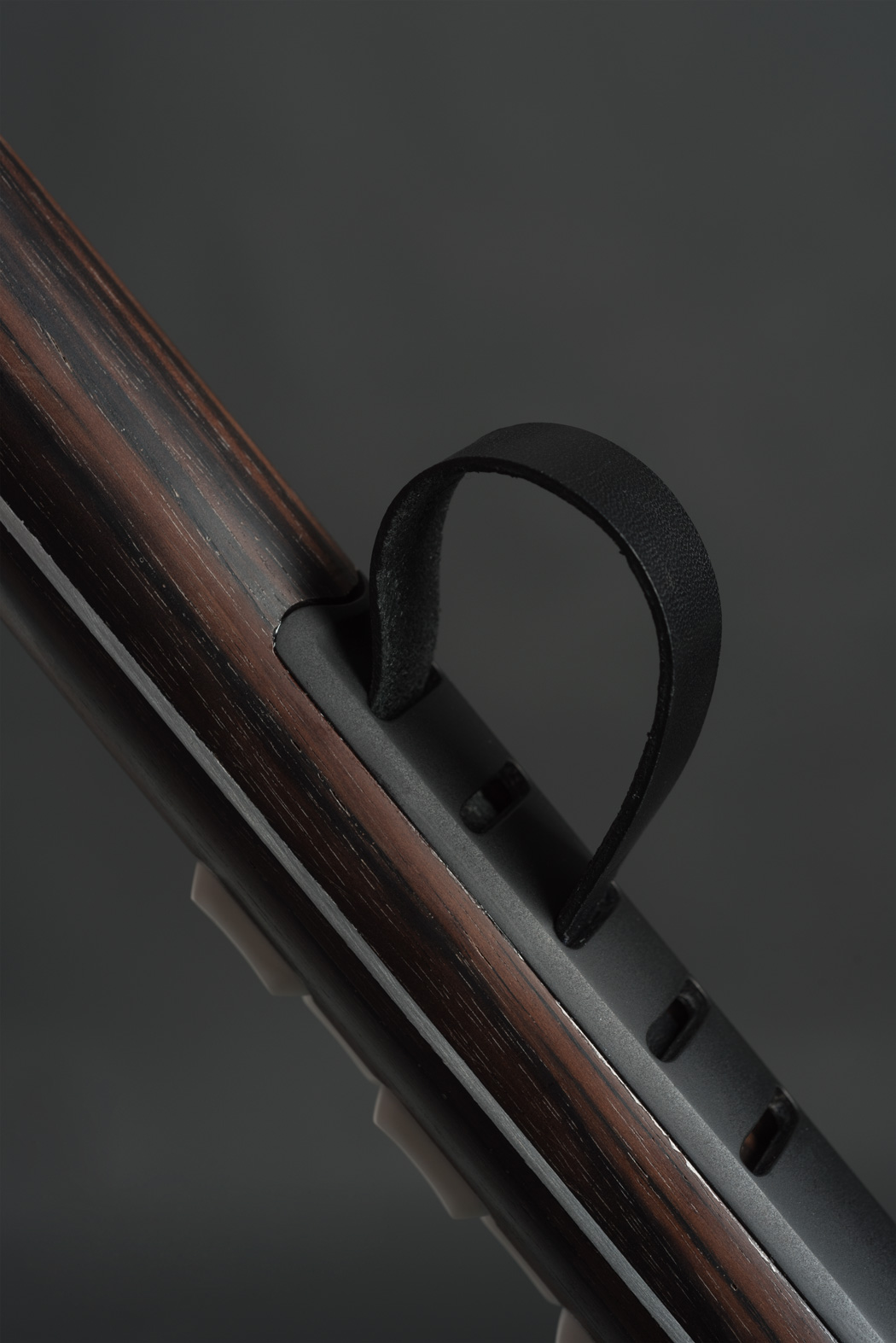
Flux, however, brings gesture control to the electronic instrument, allowing musicians to add their own personal touches and imperfections that help make the music sound natural. Made out of wood to give the instrument a natural feel, the Flux comes with buttons and a capacitive touch surface that records everything from the position of your fingers, to the angle, to even gestures, making sure the electronic audio signal captures as many details as possible. Designed to embody the aesthetic of high-end music equipment, the Flux lets you be as expressive as you would with an acoustic instrument while retaining full electronic control!

The FLUX is a winner of the Red Dot Design Concept Award for the year 2017.

Designer: Andrea-Alexandra Radulescu for ENSCI

flux_flute_2

flux_flute_3

It provides Knee-habilitation!

kneesup_1

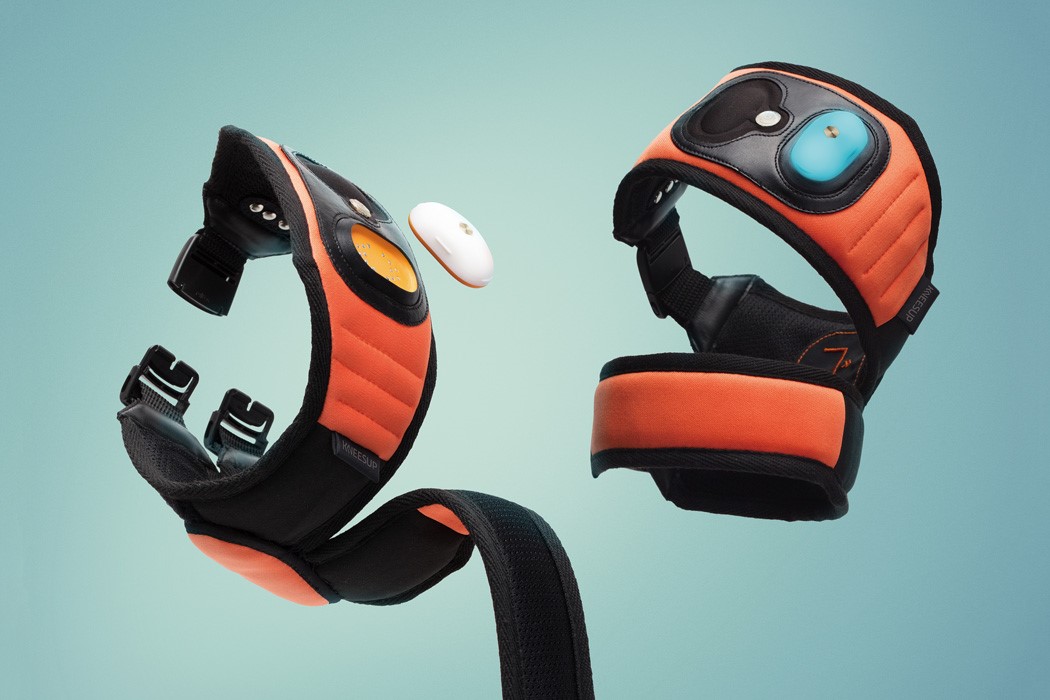
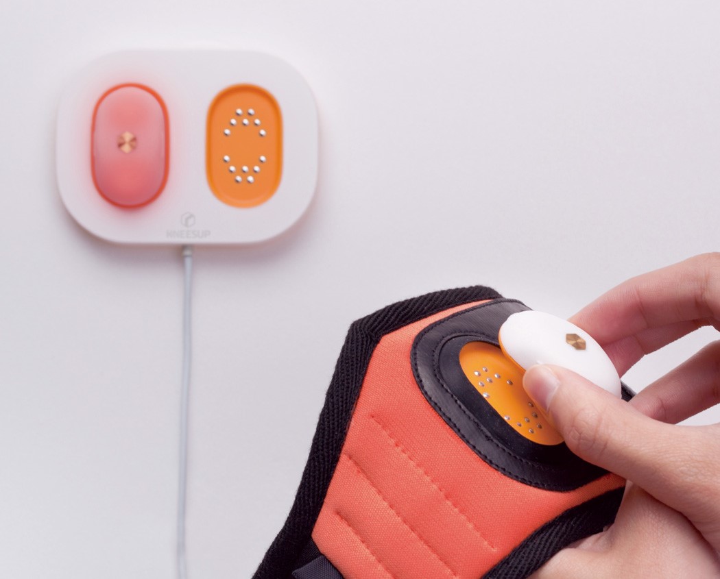
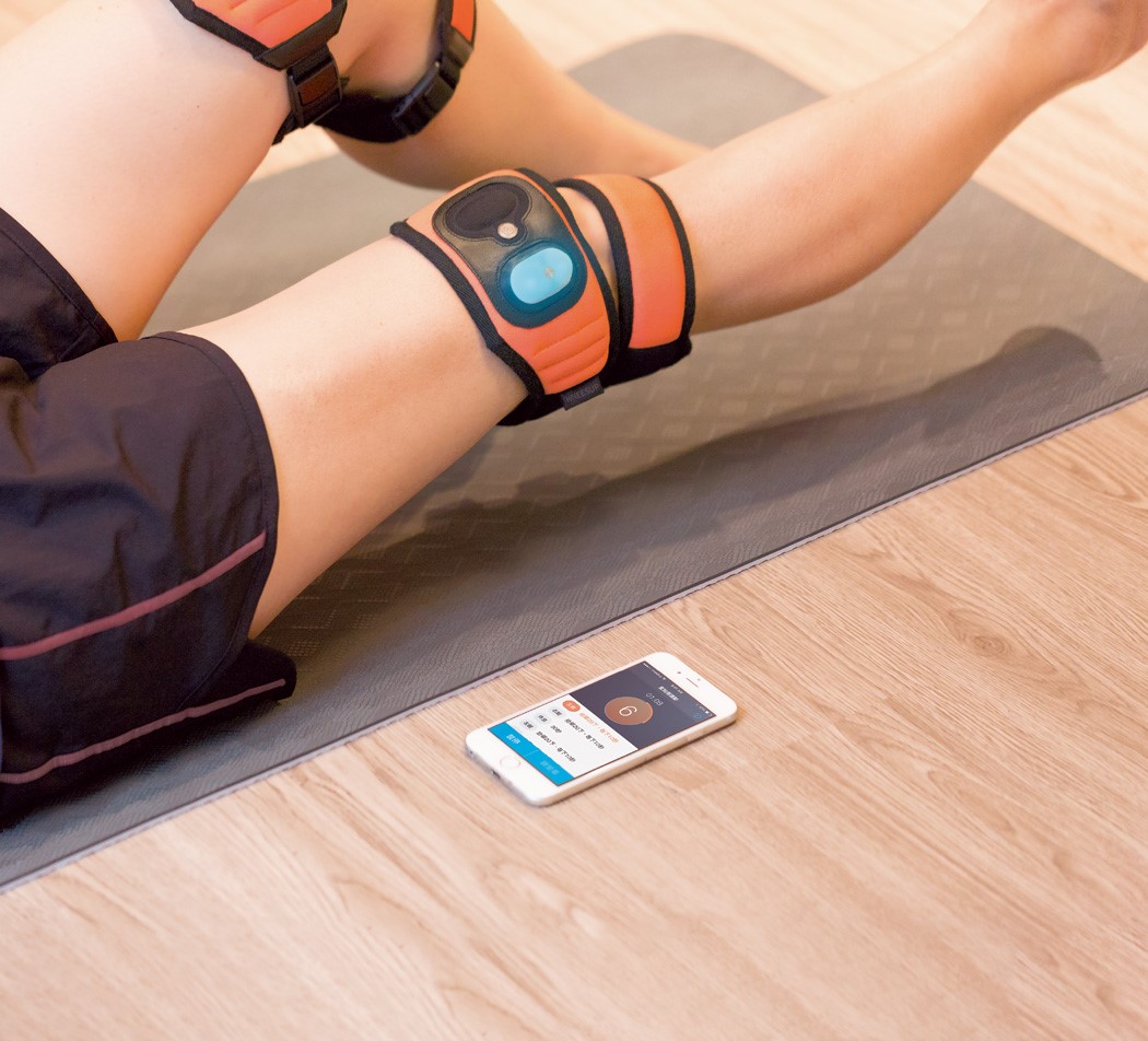
Providing rehabilitation to the kneecap, the Kneesup goes the extra mile by also coming with a health tracker in it. The lightweight device comes made of fabric, filled with air inside, not only cushioning the knee area but also making sure it doesn’t add any extra weight to the joint. Its ambidextrous nature allows it to be used on either leg with equal comfort and ease.

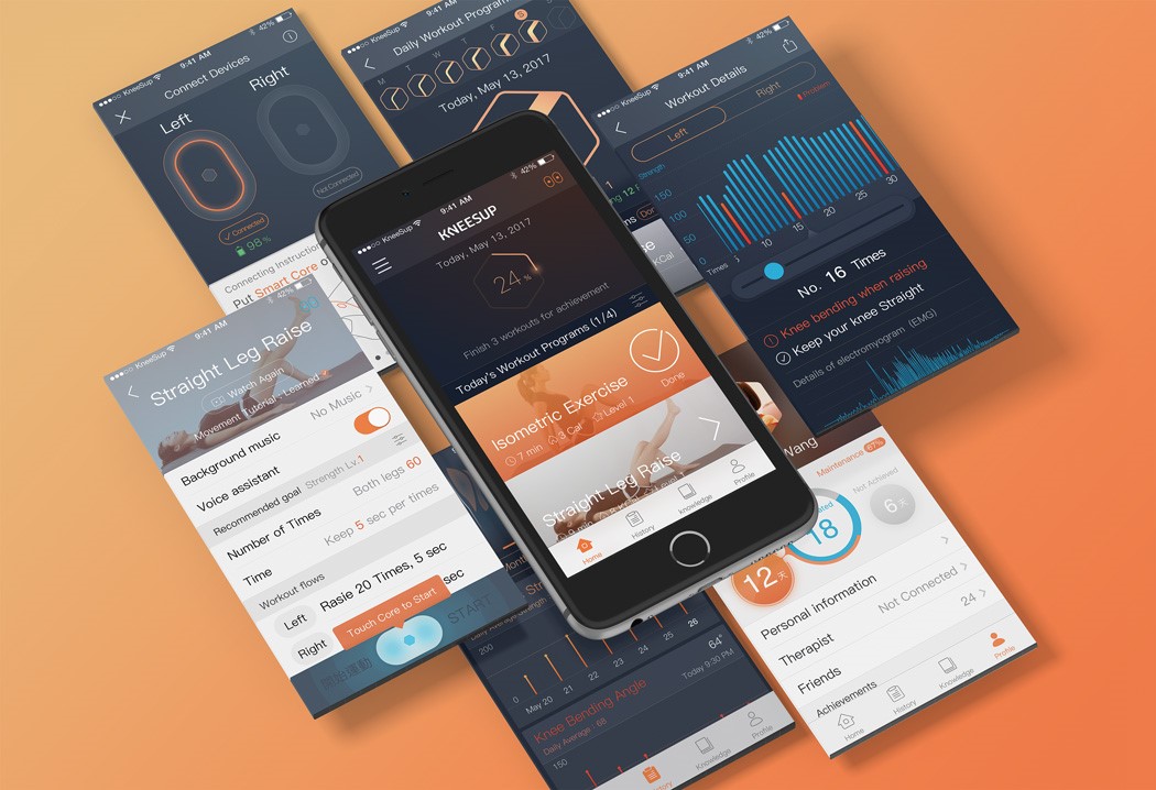
Designed to not only protect and prevent the kneecap from early stage degenerative arthritis but to also help wearers monitor their stats, the Kneesup comes with a small tracker that snaps onto the fabric sleeve that sits around your knee. Pairing with an app, the tracker allows you to track workouts and therapy sessions while also making sure you can monitor your health. So as to avoid confusion, the Kneesup comes with two separate easily swappable trackers for left and right knees. Providing physical as well as technical support, the Kneesup uses a software-hardware co-design that creates a smart rehabilitation experience!

The Kneesup is a winner of the Red Dot Design Concept Award for the year 2017.

Designer: Liu Yan-Fu

kneesup_2

kneesup_3

kneesup_4

The hand-axe 2.0

flexible_axe_1

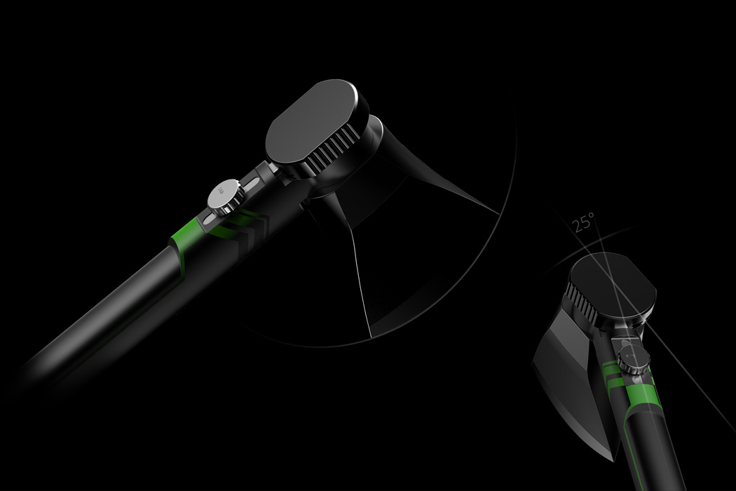
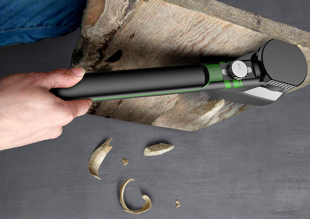
I’m no lumberer, but the Flexible Axe does seem like common sense to me. Imagine needing to slice a large piece of wood with a traditional axe. Its fixed blade means the axe cuts in exactly the same line as the handle, which means you need to adjust your grip to cut wood comfortably. The Flexible Axe puts the blade on a rotating pivot, allowing you to set an angle on the blade that lets you hold the axe itself in a manner that feels comfortable. Think of it being the lumberer’s equivalent of the FlexiClick drill that allows you to drill at right angles, or get into those tough spots. The Flexible Axe brings innovation to what’s possibly one of the oldest (if not the oldest) implements ever made by man. We’ve seen refinements to the humble axe that has been with us since prehistoric times, but probably nothing quite as revolutionary as this!

The Flexible Axe is a winner of the Red Dot Design Concept Award for the year 2017.

Designers: Huang Nuan-Ting, Li Ke-Jun & Lin Bing-Ta.

flexible_axe_2

Virtual reality, the educational tool

beyond_vr_1

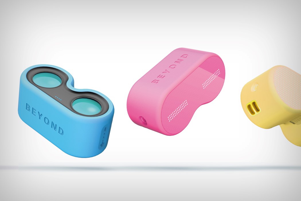
Yes, virtual reality is a rather wonderful piece of technology that lets you immerse yourself in digital surroundings, but it’s important to remember that it’s also a wonderful window into experiencing things we can’t. Whether it’s used for tourism or as an empathy machine, VR has a massive role to play in education, by allowing people to use their most powerful sense to experience something. Beyond VR aims at taking that approach by letting children use VR as not just an entertainment device, but almost like an experiential encyclopedia.

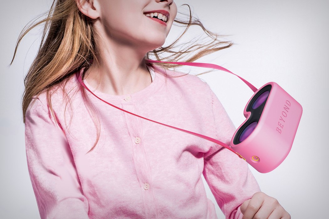
Made for children from ages 4 to 12, the Beyond VR is a headset and camera kit that allows kids to interact with and socialize with children across the world, allowing them to experience life across different countries and cultures. Beyond VR is designed to be a social tool that revolutionizes social networking, taking the traditional keyboard an UI away from the experience and allowing people to truly live in each other’s shoes.

The Beyond VR is a winner of the Red Dot Design Concept Award for the year 2017.

Designer: Daizo Industrial Design

beyond_vr_2

beyond_vr_3

beyond_vr_4

Re-envisioning air-conditioning

concealed_visible_ac_1

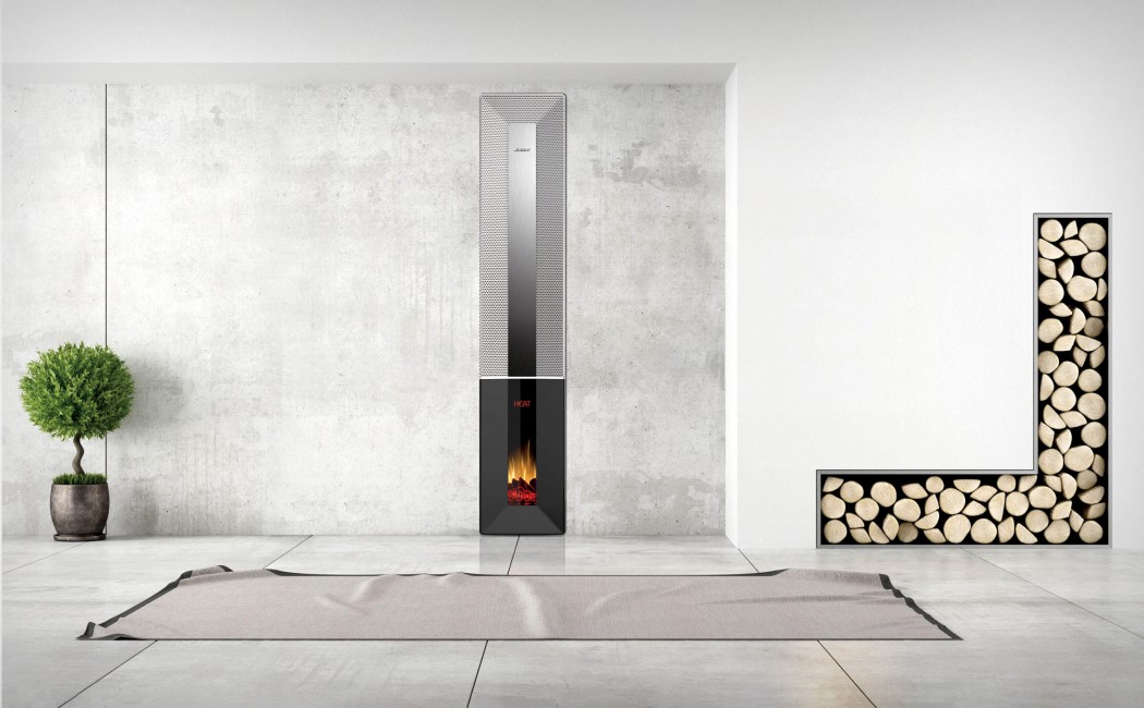
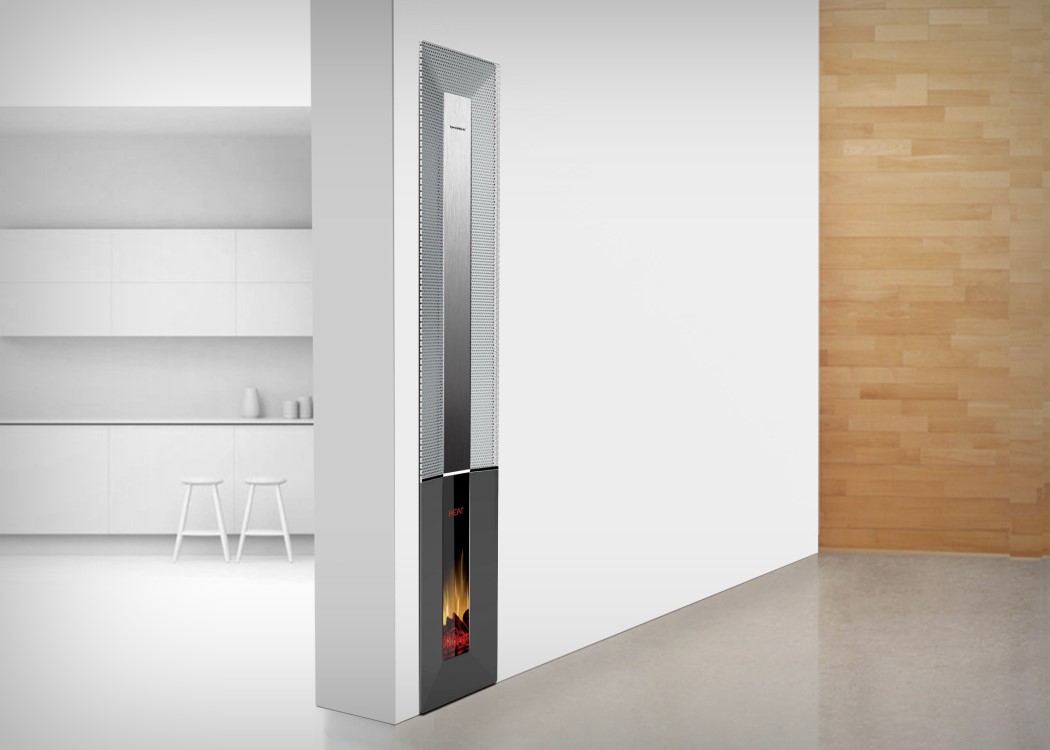
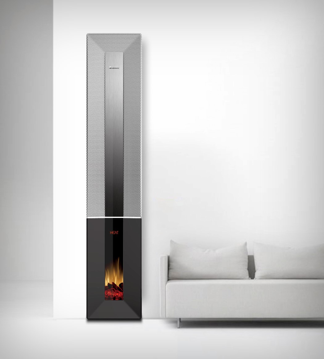
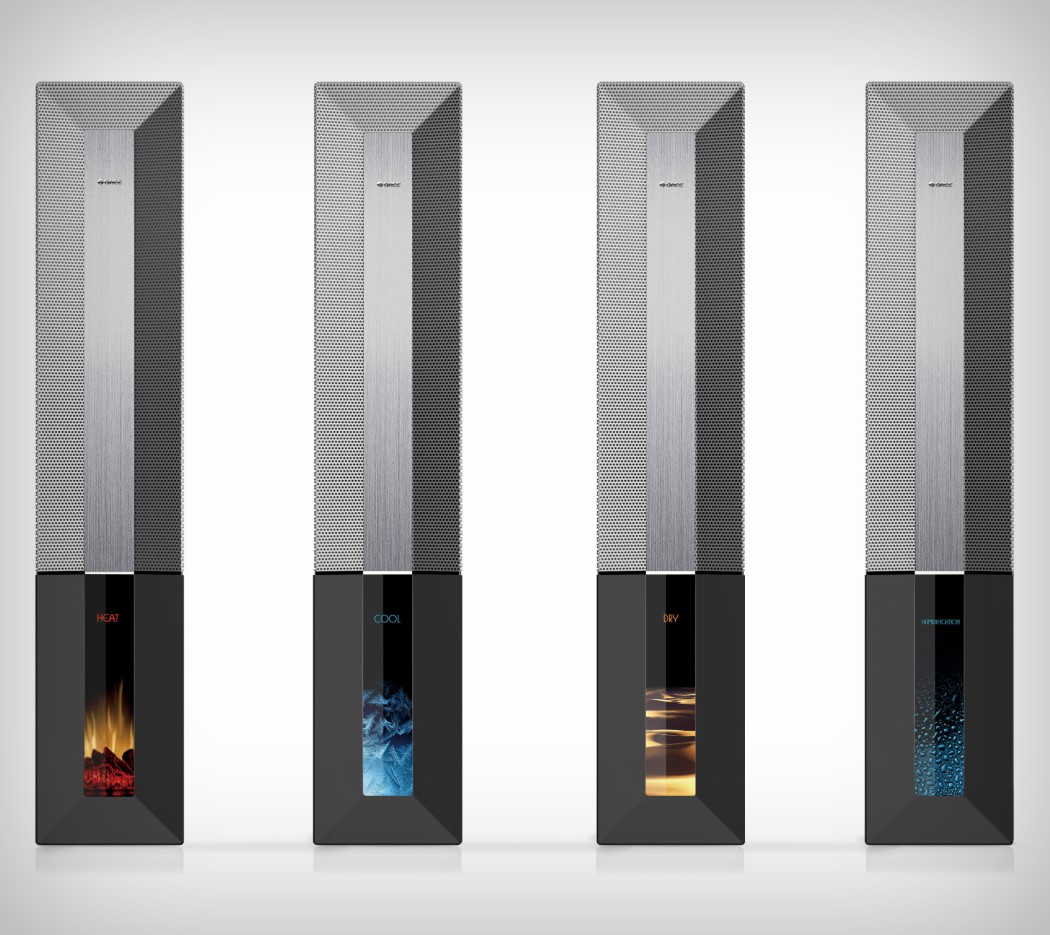
The “Concealed” air conditioner is what you get when you design an air conditioner with no constraints or past visual memory. Imagine describing the use of an AC to someone who’s never seen one before and asking them to visualize it, and you’ll get something that is true to the AC’s description. The Concealed Visible Air Conditioner stays flush within a wall, almost integrating itself into the building’s architecture like a radiator. It comes with an air outlet running along the top and sides, with a brushed metal panel on the front, and a screen at the base that instead of flashing numbers and mnemonic symbols like fans and water droplets, builds context, by visualizing what the AC is doing. If it’s heading the room up, the screen shows a fireplace… and frost for when it’s cooling down. The same goes for when it’s running in humidifier and dehumidifier modes. Displaying exactly the amount of information that’s relevant to us, and looking more like a slick magical temperature-controlling device than a bulky plastic-y appliance, the Concealed Visible Air Conditioner challenges what ACs should look like… and it’s high time designers and manufacturers took note!

The “Concealed” Visible Air Conditioner is a winner of the Red Dot Design Concept Award for the year 2017.

Designers: Chen Guangyu, Liu Jiachi (Gree Electric Appliances Inc.)

concealed_visible_ac_2

concealed_visible_ac_3

concealed_visible_ac_4

The bachelor’s favorite hanger

tooth_hanger_1

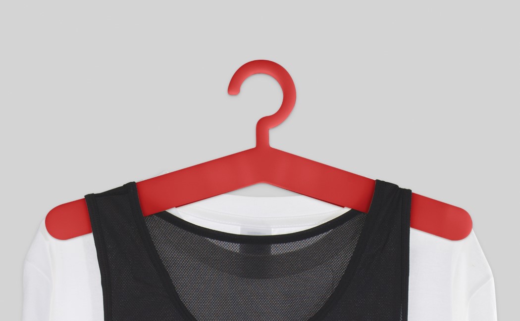
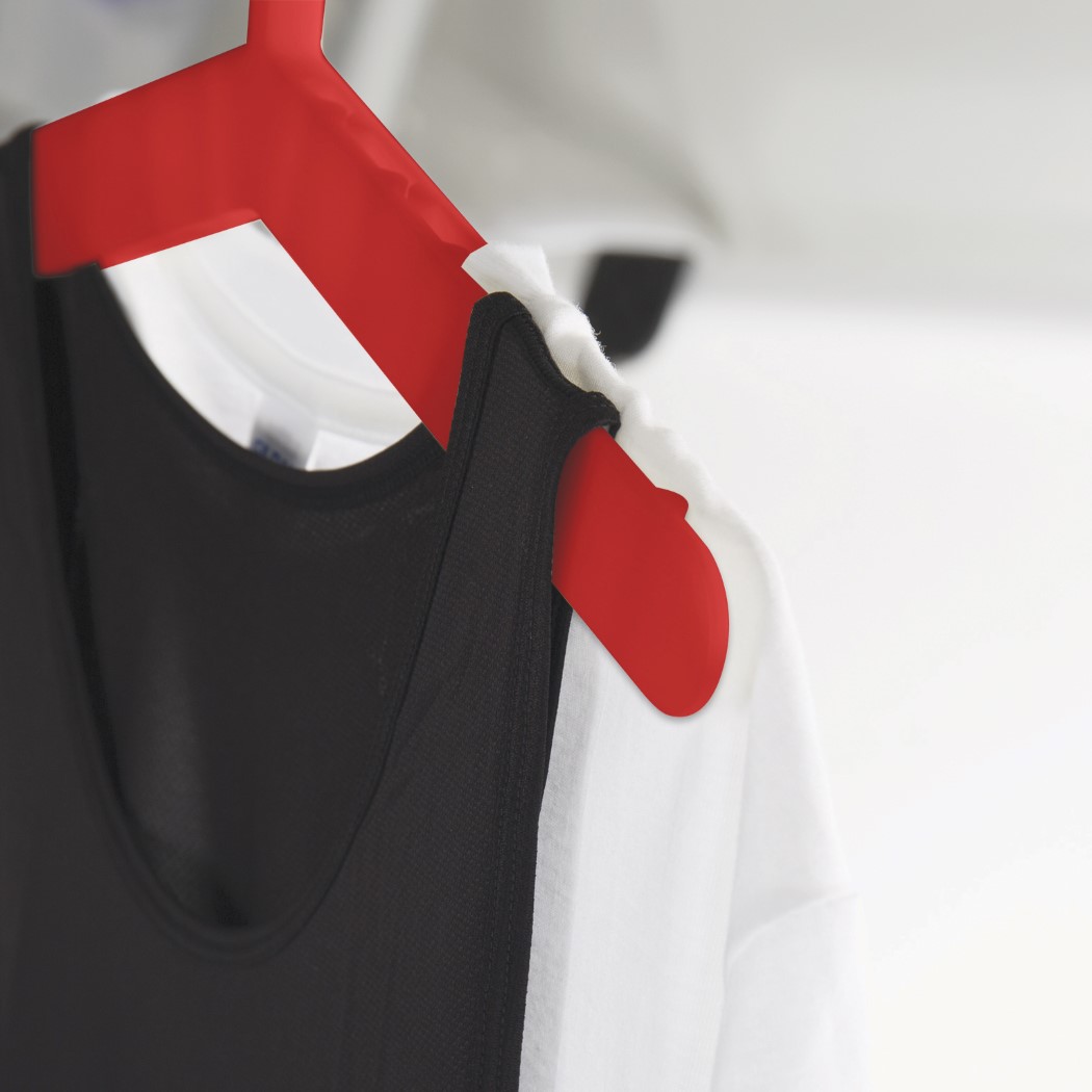
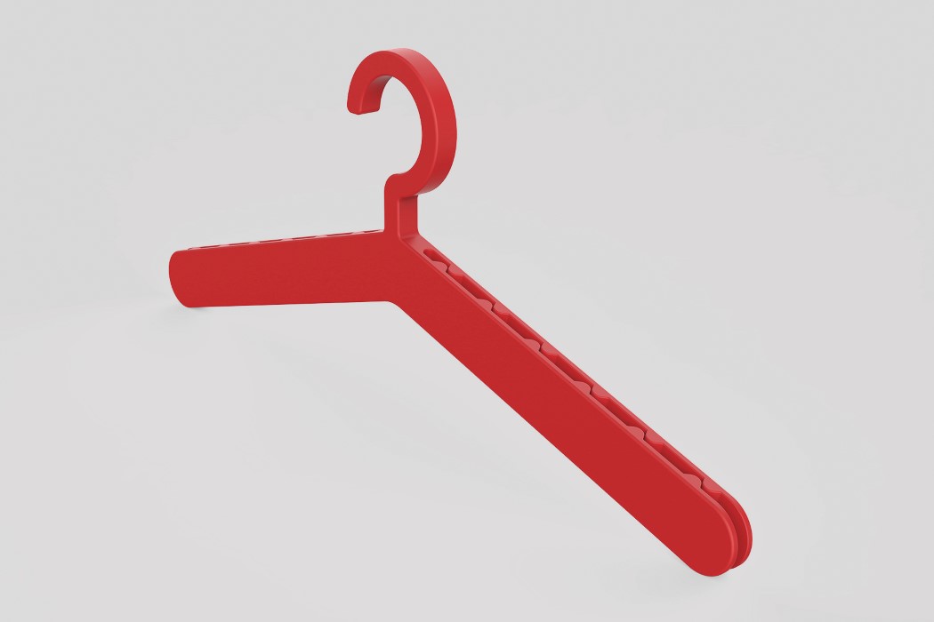
I hate folding my clothes, so automatically, I’m a hanger junkie. My wardrobe is just lined with hangers that hold my clothes upright so that they don’t wrinkle… so much so that I think that I may have a hanger problem. The Teeth Hanger was designed for my kind, combining the functions of a clothes-pin and a hanger into something that’s clearly much more advanced than the hangers I’m accustomed to using.

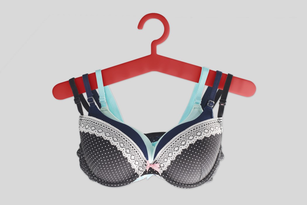
The Teeth Hanger basically not just allows you to hang your clothes in shape, it allows you to hang multiple clothes in shape. The hanger can be used conventionally, while also as a clothes pin, letting you clip multiple clothes together. Now you could either use this to create outfits, pairing apparel that you’d wear as a set… or you could be like me and cut down on the bazillion hangers you have so that you can use one Teeth Hanger to hang as many clothes as you need!

The Teeth Hanger is a winner of the Red Dot Design Concept Award for the year 2017.

Designer: Mainetti (HK) Limited

tooth_hanger_2

tooth_hanger_3

tooth_hanger_4

From O’clock to Whoa’Clock

Print

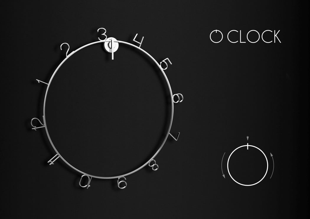
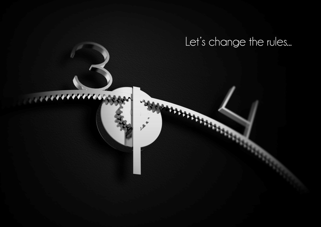
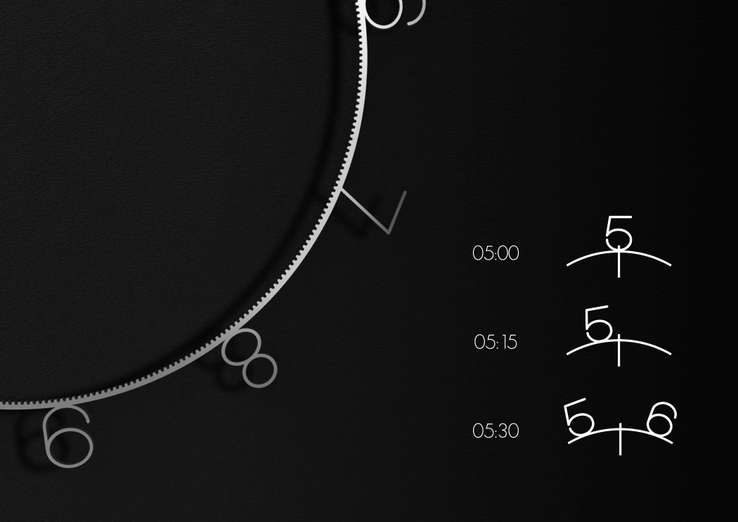
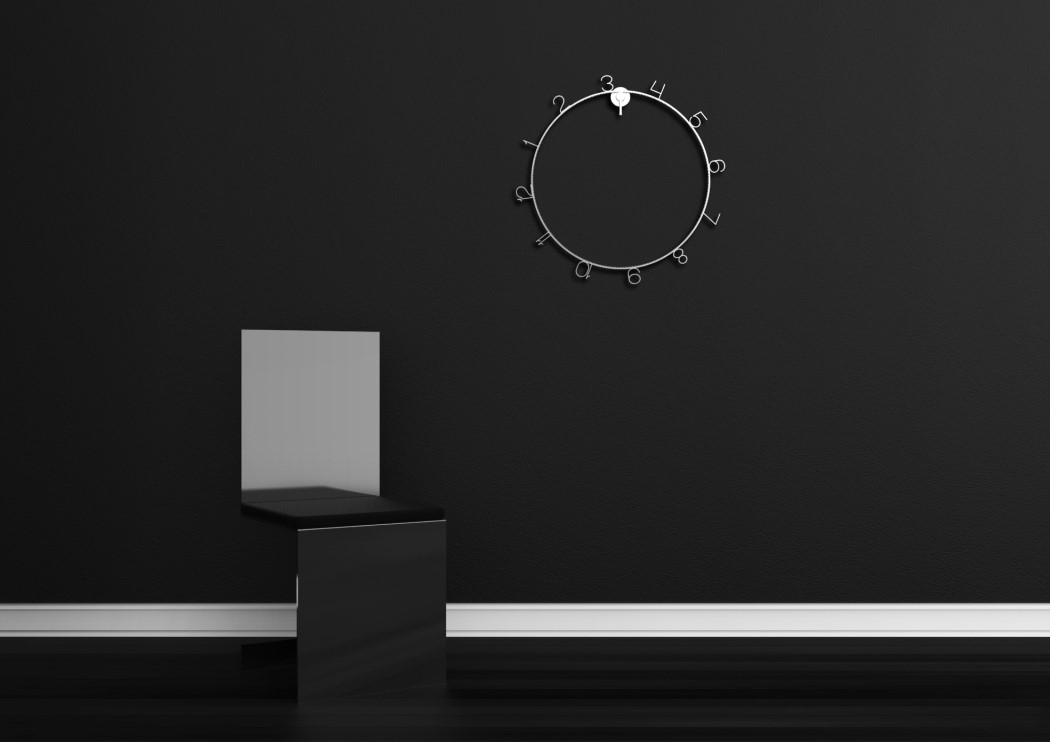
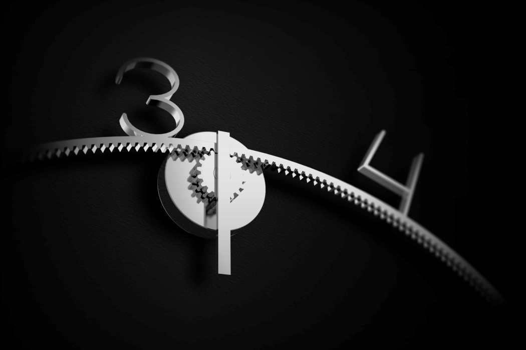
The OClock retains the cyclical quality of time, but challenges the notion that you need hands to tell it. Just using two gears, the clock lets an outer ring rotate while an axis lets you tell the time by reading its position on the outer ring.

The OClock explores an extreme form of minimalism that literally reduces the appearance of a product to something that’s almost not there. The two rotating gears are all that’s needed to tell the time, and reading the time isn’t particularly difficult either. The axis on top plots the journey between two numbers that are shaped into the outer ring. The position of the axis allows you to determine the time to the nearest handful of minutes. There’s no way of timing the seconds on the OClock, but then again, you don’t need to because it isn’t what the OClock set out to do. What the OClock however DID set out to accomplish was to present itself as a timepiece that challenges the notion of telling time using the conventional hand system, and to do it while maintaining a beautiful minimal aesthetic that is sure to enrich any wall it hangs on!

The O Clock is a winner of the Red Dot Concept Design Award for the year 2017.

Designer: Mike Simonelli

Print

Print

Print

Print

Why the Easy Basin is my favorite Red Dot Winner

easy_basin_1

Here’s a concept that’s every bit worthy of the Red Dot Design Concept Award it won. The Easy Basin keeps in mind its user and their experience. It does a damn near marvelous job of putting together meticulously planned design details that make sense first and become aesthetic notes later. All in all, you have a sensible, convenient, and aesthetic product that does what it sets out to do rather well, and enriches its user’s life.

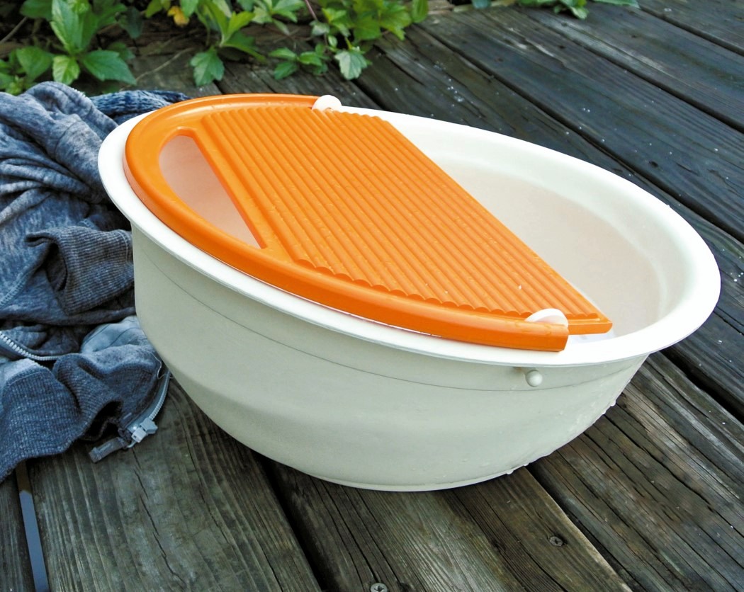
The Easy Basin is a basin/bucket designed to conveniently allow people to hand-wash their clothes. The Basin is large enough to wash up to 2-3 days worth of clothes, while also being small enough to carry. The concavity of the basin holds the clothes and the water/suds, allowing your dirty garments to soak in the soapy water. An opening on one half of the top allows you to access your garments inside, while a textured board on the other half lets you scrub your clothes against it, effectively cleaning them. The board itself is sloped, and the horizontal ridges not only provide a nice 3D texture for your clothes to rub against, they also guide the water to the sides and then down the board, back into the basin.

At the far end of the orange scrubbing board is a hole that acts as a water draining outlet. Just tip the Easy Basin over and the water drains out (effectively completing one wash cycle), without letting your clothes slip or slide out of the basin itself. A chamfer/flat-surface on the base of the Basin allows you to rest the basin in the tipped over position so that you don’t have to hold the basin in place while emptying the water out through the drainage hole. The drainage hole itself also serves as a handle when the board is opened/lifted upwards, allowing one detail to solve two purposes, and letting you easily lift the Easy Basin and carry it back once you’re done with washing your clothes.

Made out of plastic, the Easy Basin is lightweight yet sturdy and is a manufacturer’s dream come true since the entire product is just two molded parts. It merges sensible design with ergonomics to make a product that’s easy to use and also great to use while ultimately also being efficient, compact, and simple to manufacture. Need I say anything more?!

The Easy Basin is a winner of the Red Dot Design Concept Award for the year 2017.

Designers: Chen Yu-Sheng & Prof. Zheng Meng-Cong.

easy_basin_2

easy_basin_3

easy_basin_4