This award-winning Ambulance doesn’t need a road to ride on…

How does an ambulance reach a victim in a road/highway accident when there are more than a dozen cars stuck in a traffic jam between the ambulance and the site of the accident? Up until now, the only solution was to drive in the opposite lane, weaving through oncoming traffic to get to the victim. A band of Korean designers created the Median AMB, a special ambulance that can directly reach the point of the accident without getting affected by the traffic congestion created by the accident. The Median AMB sits on the road divider/median and drives up and down the highway almost like a monorail. It features sliding doors on both sides, seating for a driver and an assistant, and an area for a stretcher that holds the victim. When an accident occurs, it sends a beacon to the nearest Median AMB Station, located at intervals on the highway. Upon receiving a distress signal, the Median AMB drives down the dividers (which are now specifically aligned to serve as rails), right to the victim’s location, picks them up and brings them to a proper ambulance that can take the victim to the nearest hospital, helping save critical time and eventually lives too.

The Median AMB is a winner of the Red Dot Design Concept Award.

Designers: Hong Seonghwan, Lee Hyungtaek, Lee Taekkyung & Song Yoojin

This tiny box instantly transforms into an emergency wheelchair/stretcher when needed

This easy-to-stow collapsible wheelchair also becomes a stretcher when needed. At the simple push of a button, the Emergency Wheelchair transforms from a small suitcase-sized box to a wheelchair. The backrest and leg rest can be further adjusted to turn into a stretcher that can be maneuvered around using the small wheels at the base.

Designed for every conceivable scenario and engineered to make sure it effectively works in all conditions, the wheelchair is made of a magnesium alloy, high-strength factory plastic, and a flame retardant fabric. When not in use, it collapses back to the size of a suitcase, allowing it to be easily packed and stored back in its place.

The Emergency Wheelchair is a winner of the Red Dot Design Concept Award for the year 2018.

Designers: Chen Zhigang, Fan Xin, Hu Shiya, Liu Qiangjia & Zhou Chao.

Why carry your suitcase when your suitcase could carry you?

Admitted it’ll take a while for ‘riding suitcases’ to become a norm of sorts, but the Quadra is ideal for people who can’t lug their luggage around with them. Whether it’s a traveler with fatigue, a flyer who’s running late for a flight, or perhaps the noblest scenario, an elderly traveler or a traveler with special needs, the Quadra could be just the thing to help you and your luggage get from point A to B.

The Quadra, instead of being dragged or pulled, ends up driving you around the place. A step up from those self-driving suitcases we saw at CES last year, the Quadra fits an entire e-scooter into the suitcase, allowing you to pull it around when you want, and letting you drive it down airport lobbies.

The design of the Quadra packs a foldable handlebar, two wheels, and even a pair of leg-rests into it. One side of the suitcase ends up becoming your seat, and the entire suitcase effectively turns into a scooter that runs on an internal battery. Given that carrying batteries or power-banks in your check-in luggage is a big no-no, the Quadra is designed to be compact enough to serve as cabin luggage. Given that the wheels fold into the Quadra’s form, it would mean compromising slightly on storage space, but the Quadra still packs enough for a side-bag. Besides, let’s not discount the fact that it’s also the only side-bag that can drive you around the airport and spare you the fatigue brought about by constantly having to wheel luggage around with you as you walk from terminal to terminal.

The Quadra is a winner of the Red Dot Design Concept Award for the year 2018.

Designers: Kinson Chan & Rice Mak

The Median Ambulance cuts through highway traffic by riding on the road divider

How does an ambulance reach a victim in a road/highway accident when there are more than a dozen cars stuck in a traffic jam between the ambulance and the site of the accident? Up until now the only solution was to drive in the opposite lane, weaving through oncoming traffic to get to the victim. A band of Korean designers created the Median AMB, a special ambulance that can directly reach the point of the accident without getting affected by the traffic congestion created by the accident. The Median AMB sits on the road divider/median and drives up and down the highway almost like a monorail. It features sliding doors on both sides, seating for a driver and an assistant, and an area for a stretcher that holds the victim. The Median AMB drives down the dividers, right to the victim’s location, picks them up and brings them to a proper ambulance that can take the victim to the nearest hospital.

The Median AMB is a winner of the Red Dot Design Concept Award for the year 2018.

Designers: Hong Seonghwan, Lee Hyungtaek, Lee Taekkyung & Song Yoojin

A lifesaver that purifies and distills seawater for you

Conceptually one of the most clever things I’ve seen in a while, this is the Purifier Lifesaver, a lifesaving tube that can also purify seawater to make it drinkable.
The first rule of being stranded at sea is to never consume seawater. Given seawater’s high saline content, your kidneys actually end up dehyrating your body in an effort to get rid of the salt you consume, so having freshwater is perhaps the biggest key to surviving out in the sea. The Purifier Lifesaver actually builds a purification mechanism into the buoyancy device, allowing you to fill the tube with seawater (only to a certain degree, because you still want to float), while a straw lets you sip the seawater that gets pulled through a purification unit as you suck on the straw. Keeping you from dying of thirst/dehydration, the Purifier Lifesaver can help be the difference between surviving an ocean calamity and succumbing to it.

The Purifier Lifesaver is a winner of the Red Dot Design Concept Award for the year 2018.

Designers: He Yue, Wang Dading & Yuan Huaiyu.

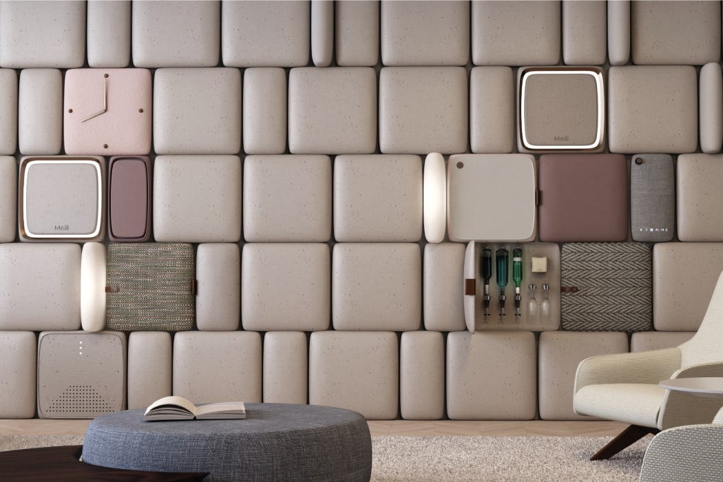
The M-Wall is probably the first wall with a user experience

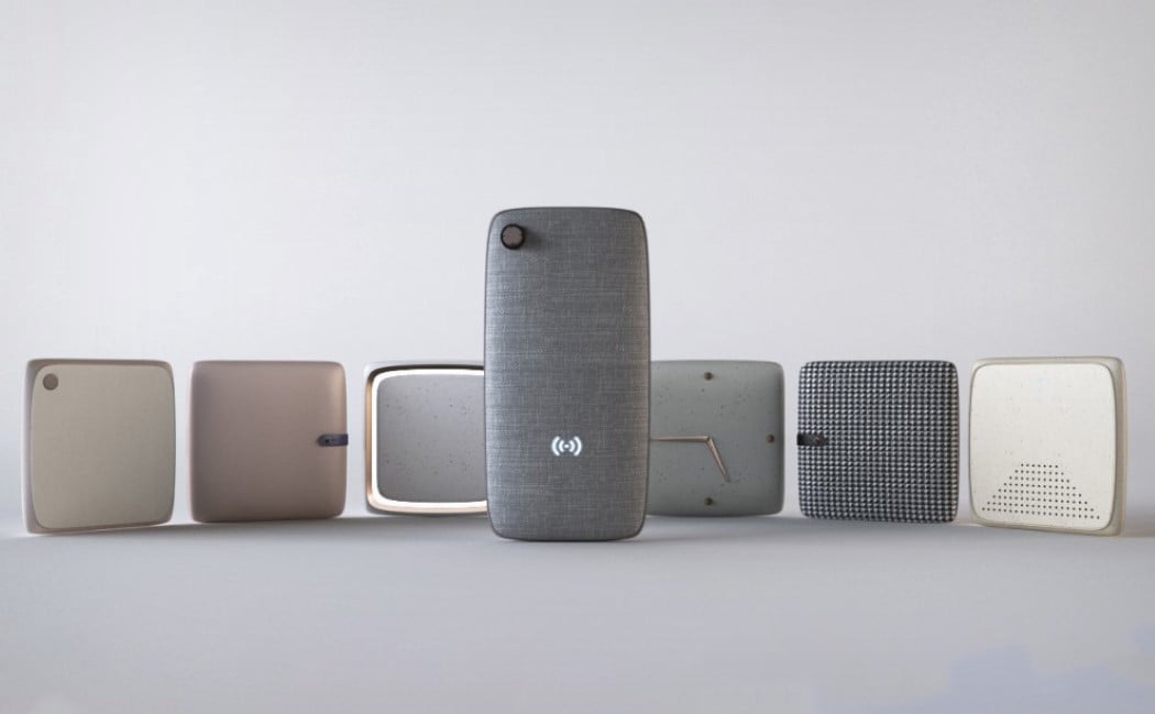
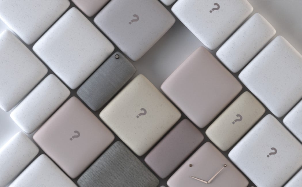
The M-Wall combines technology, beauty, and a user experience. Taking wall paneling and turning them into products/experiences, the M-Wall actually makes the wall a series of services, rather than a blank canvas. The soft, rounded paneling looks incredibly friendly, and hosts everything from clocks, thermostats, televisions, cabinets, lighting, speakers, and soft-boards, helping the wall transition from space to form.

The M-Wall conceptually isn’t completely new. Kitchens have for a long time come with products built flush into walls, allowing the entire cooking space to look clean, rather than be a cornucopia of appliances. The M-Wall takes that idea, bringing it outside the kitchen and into the living room, arguably in a way that’s absolutely refreshingly new. Its aesthetic interpretation is completely different from the silver metallic panels of integrated kitchen appliances. The M-Wall looks soft, calming, organized, functional, and I’m quoting Marie Kondo here, sparks joy!

The M-Wall is a winner of the Red Dot Design Concept Award for the year 2018.

Designers: Lin Chengyou, Tong Zhiqiang & Wang Fuyang.

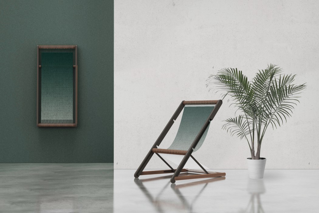
The Loom Chair becomes wall-decor when not in use

Named after and even designed to look like a tray pulled from a hand-looming machine, the Loom Chair comes with a wooden frame and a loom-style woven fabric in between. When opened out, the Loom becomes a relaxing deck-chair or beach-chair that one can sit on, perhaps sipping on a granita, with palm trees in the background. Fold the chair together, however, and it becomes a singular rectangular frame (that you can hang on the wall) with the seating fabric stretched from end to end like a canvas. The fabric even comes with a gentle gradient, giving it appeal, and making it truly look like beautiful wall-hung decor, allowing it to function as an aesthetic piece even when not in use.

The Loom Chair is a winner of the Red Dot Design Concept Award for the year 2018.

Designers: Kim Yousik & Yoon Junho

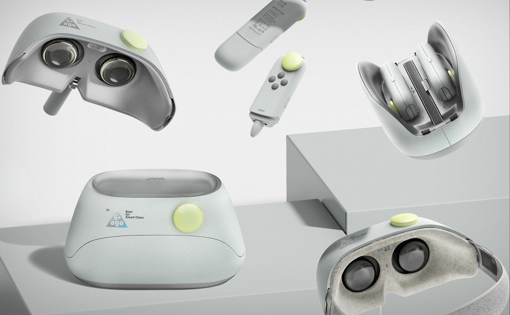
The Soar kit teaches tech to kids the right way

soar_vr_kit_1

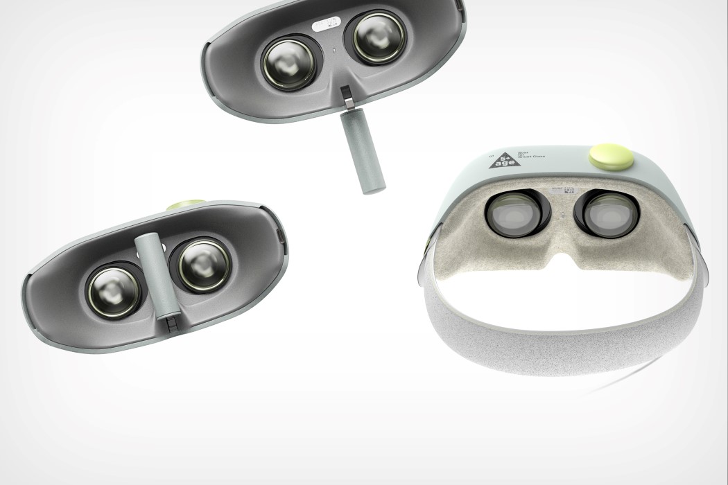
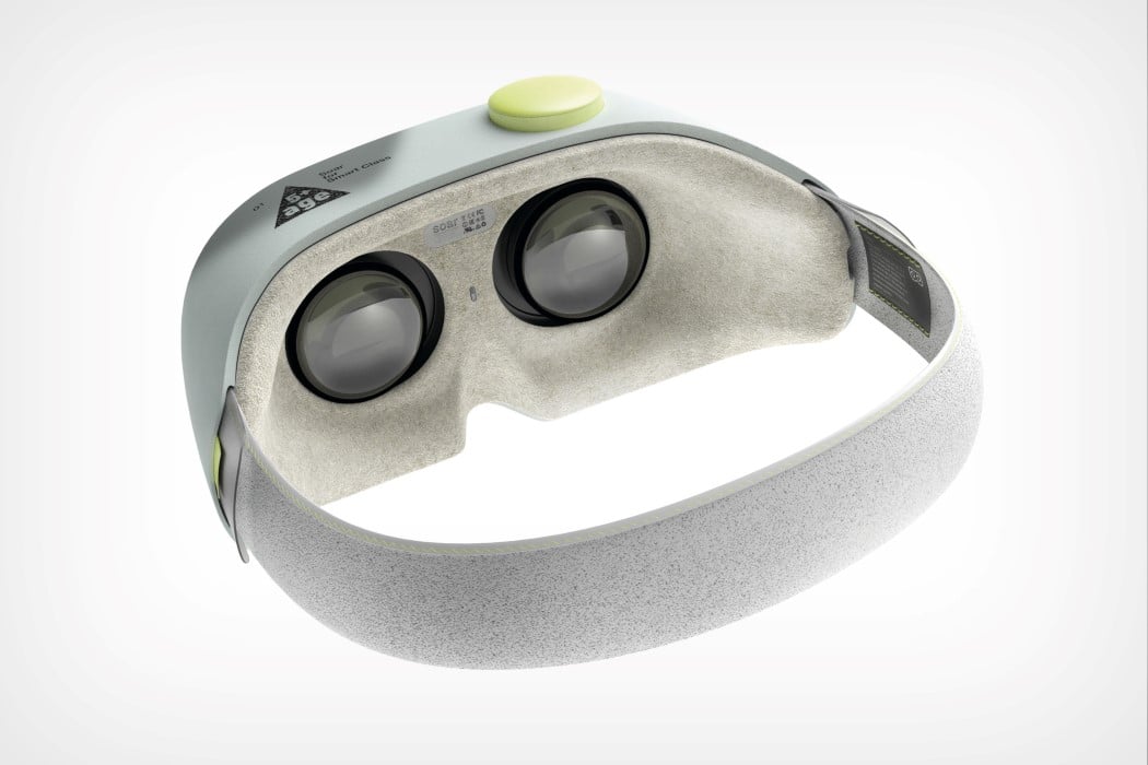
The future generation won’t look at VR headsets and controllers the same way we do. For us, the generation that used pens, pencils, notebooks, and blackboards, VR headsets and future-tech aren’t as easily accepted and integrated into our lives as they are with younger generations. The Soar ensures that this tech is introduced at a young age, in the right manner, to children. Rather than playing with an iPad or a VR headset first, the Soar ensures their first interaction is a positive learning experience.

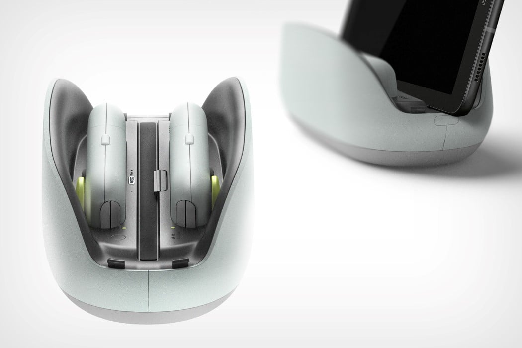
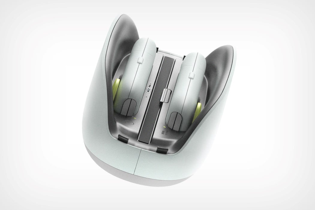
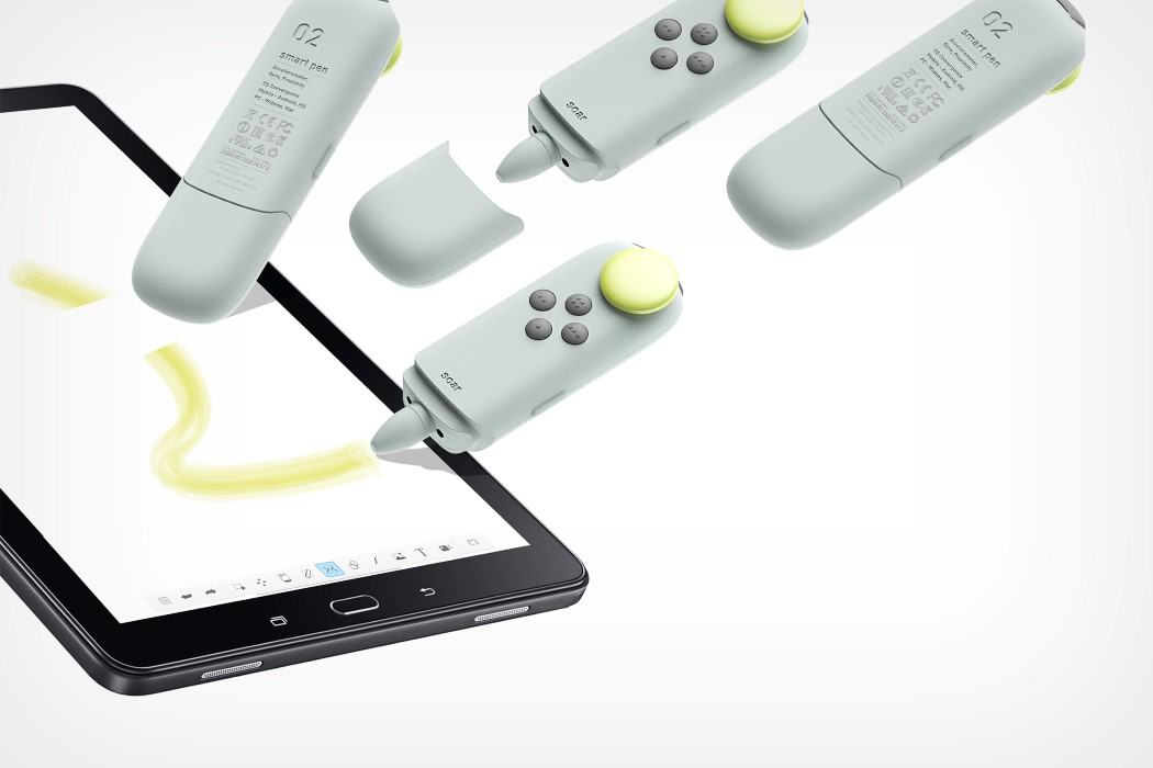
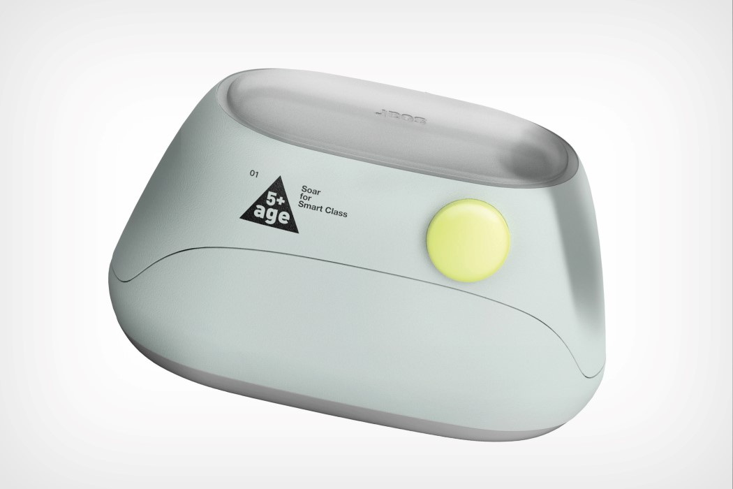
The design of the Soar kit is as perfect as it gets. A dock, a VR headset, and two controllers (with stylus heads) all come together into a singular form, nesting neatly within each other. The dock charges the devices, while the headset can be used for interactive experiences. The controllers can work either with the headset, or with a tablet that’s used separately. On the other end of each controller is a thick stylus that works as a drawing/coloring pen with the aforementioned tablet.

The Soar’s nesting design makes sure that the schoolchild has all their tools at their disposal. Its small form factor also makes it easy to carry around, and to school and back home… where rather than rely on their parents’ iPads or Nintendo Switches, or Oculus Rifts, they’ll be immersed in tech that’s built just for them, to induct them appropriately into futuristic technology.

The Soar is a winner of the Red Dot Design Concept Award for the year 2018.

Designer: Choi Jaewan

soar_vr_kit_2

soar_vr_kit_3

soar_vr_kit_4

soar_vr_kit_5

soar_vr_kit_6

soar_vr_kit_7

soar_vr_kit_8

The SiteWasp drone basically replaces the Supervisor at a construction site

sitewasp_1

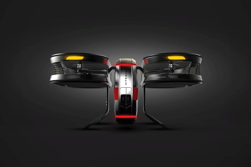
The power of flight, and the power of observation. These two qualities make drones incredibly good for reconnaissance, especially in places where it’s difficult to put a human, or a permanent closed-circuit camera.

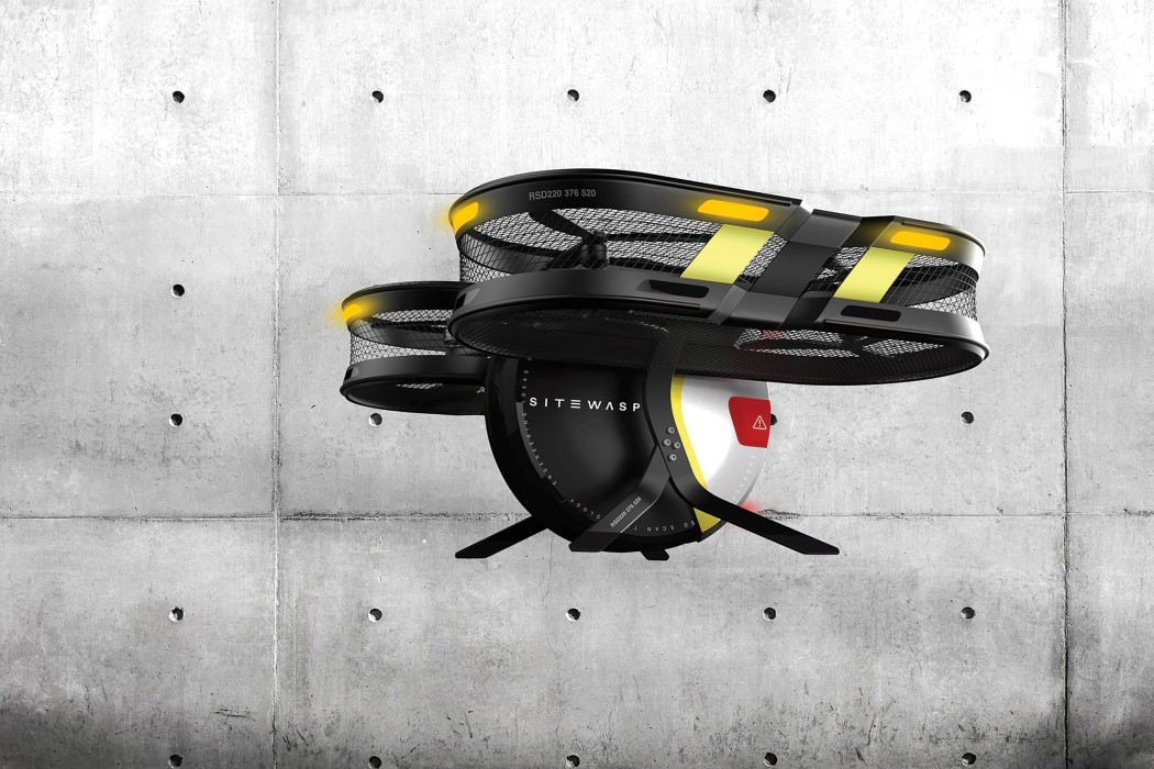
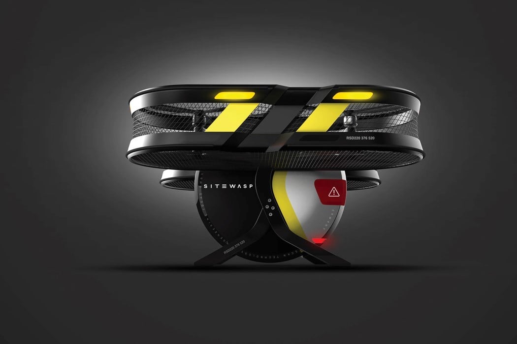
Designed for site-recon for buildings under construction, the SiteWasp was built to be your all-in-one monitoring drone. “The objective of the SiteWasp drone is to remotely provide stakeholders with construction updates, thus unifying the planning process and the building process. This 3D drone system scans, measures, analyses, and documents with high-resolution images the current state and process of construction. It uses the digital BIM (Building Information Model) so that all remote stakeholders can react directly to crucial errors and differences, which leads to a more synchronized and efficient workflow.”

Made to do a better job than a construction supervisor, and in less time, the SiteWasp can complete an entire recon in a matter of hours, whereas it would take a human days to complete an exhaustive check of the building and its progress. Built to do the job well, this quad-copter comes with a circular body and a camera that can rotate as much as 200° on this circular axis, which enables direct scans of both horizontal and vertical surfaces—all done without changing its position. The SiteWasp can also cover areas that are especially difficult for manual measuring like elevator tunnels.

The SiteWasp’s design is especially appropriate for the kind of activity it’s required to do. It makes the use of high-contrast colors so that it’s visible to the people around it, and even employs a robust mesh around its rotors to prevent any falling debris from damaging the drone while it’s in flight.

The SiteWasp received an Honorable Mention at the Red Dot Design Concept Award for the year 2018.

Designer: Sebastian Gier

sitewasp_2

sitewasp_3

The Life Knight brings the hospital to the injured

life_knight_1

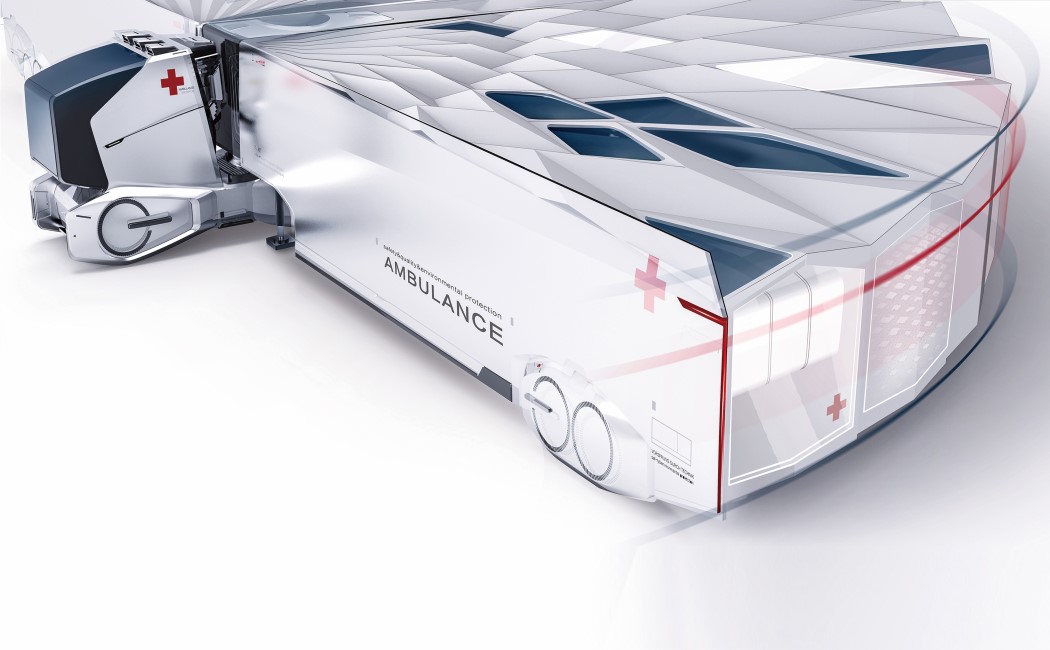
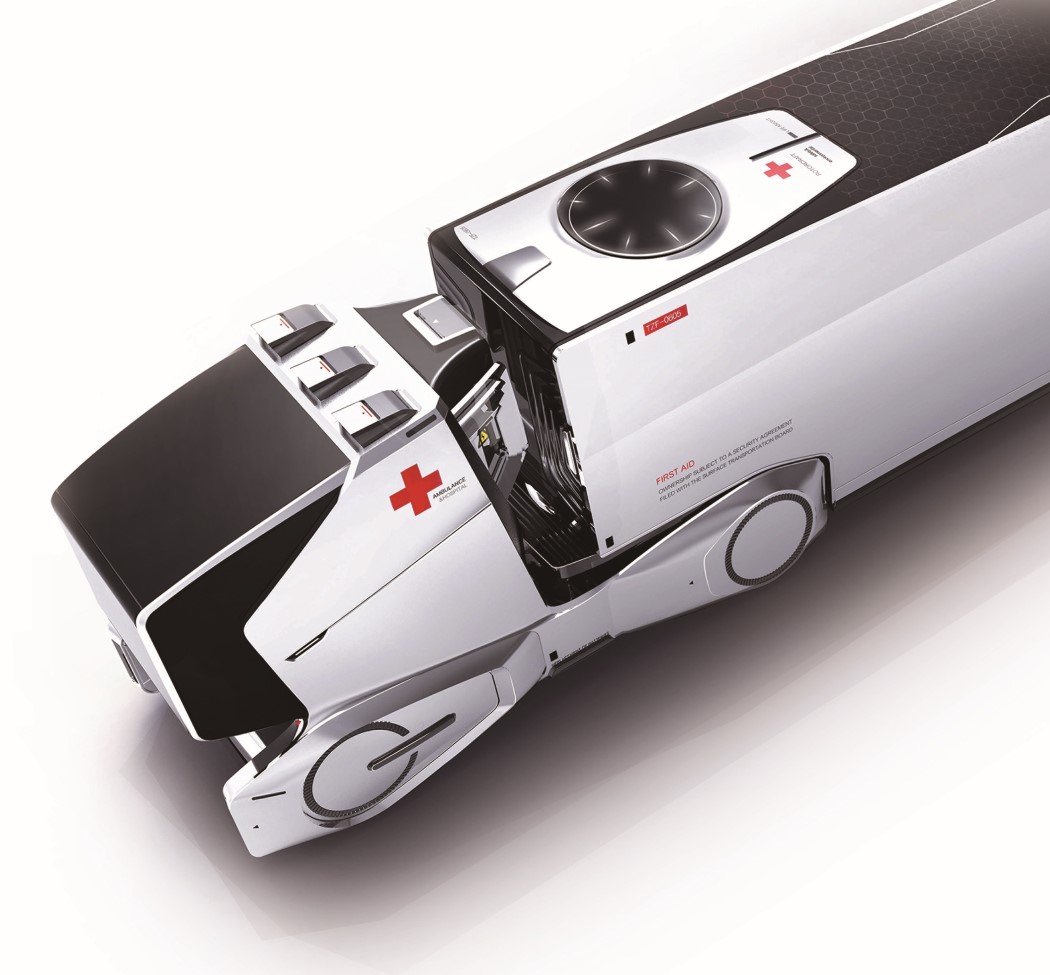
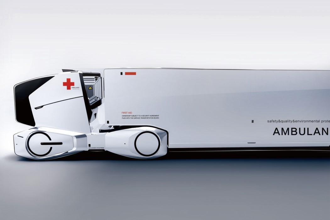
Think about it. When you deploy an ambulance, you’re essentially making two trips. One, to the patient, and the second, to the hospital after collecting the patient. This 2x journey is often the difference between life and death, and a problem that the Life Knight wants to solve.

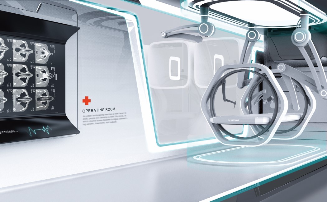
Designed to be deployed in areas with no access to medical care, i.e., disaster-struck zones or medically underdeveloped areas, the Life Knight is a moving hospital that reaches its destination and opens up into a full-fledged emergency room that can cater to more than one patient. Its body can be expanded—an inner crane structure extends outwards to create a makeshift hospital with 26 wards and an operating room fully equipped to meet the basic needs for treating mild to moderate injuries. Instead of driving patients to the hospital and wasting crucial time, the Life Knight brings the facilities of the hospital directly to its patients, halving the treatment time, and saving a lot of lives.

The Life Knight is a winner of the Red Dot Design Concept Award for the year 2019.

Designers: Prof. Baojun Li, Prof. Mingliang Song & Zhifei Tian

life_knight_2

life_knight_3

life_knight_4