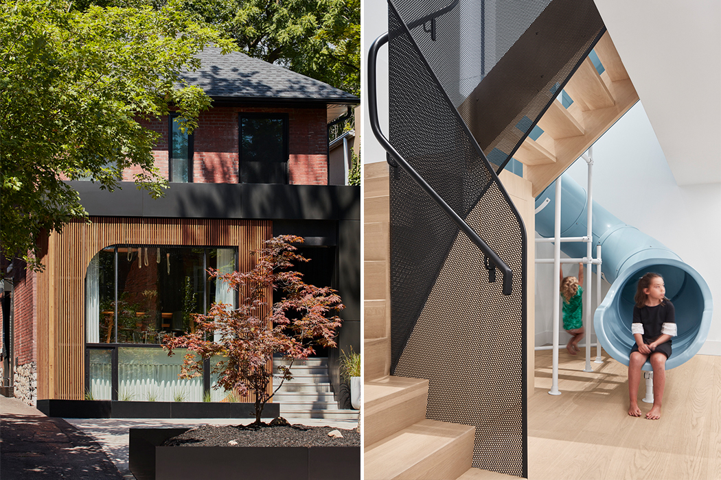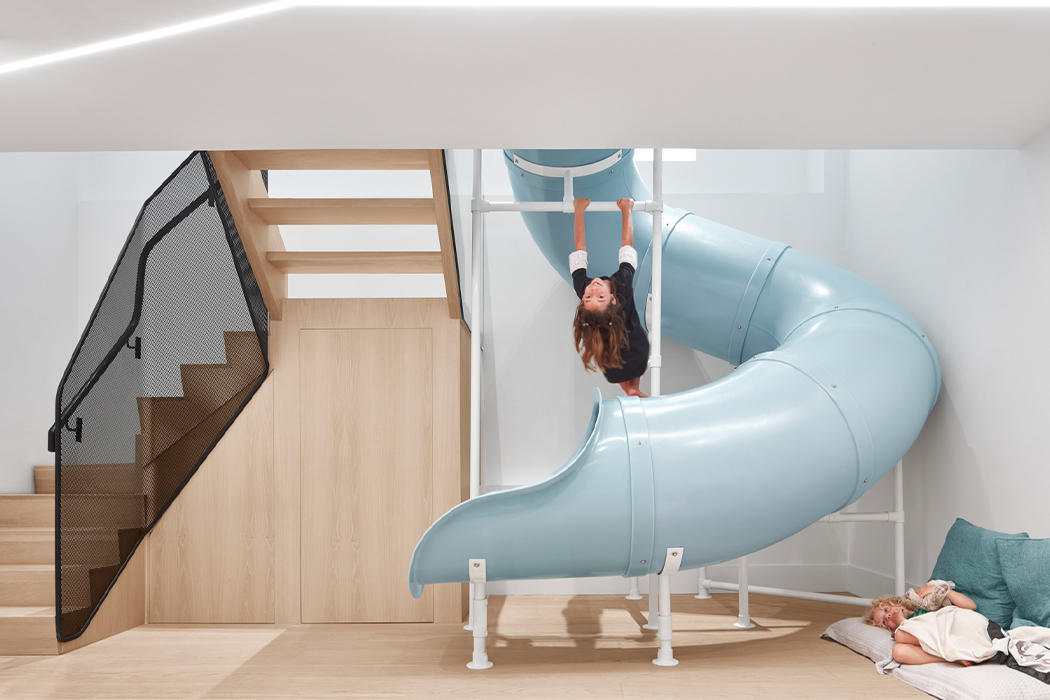
Who said slides were only for kids? Reflect Architecture answered the calls of all us adults who still love the thrill of going down a slide and no longer have to be embarrassed about it. The team renovated a house for a young family living in Toronto, Canada, by brightening its otherwise minimal interiors with a pale blue slide that runs in the center of the structure. It is a skill to have a slide in a family home without taking away from the grown-up aesthetic. This is the only way I would like to leave the home for work or come down for breakfast!
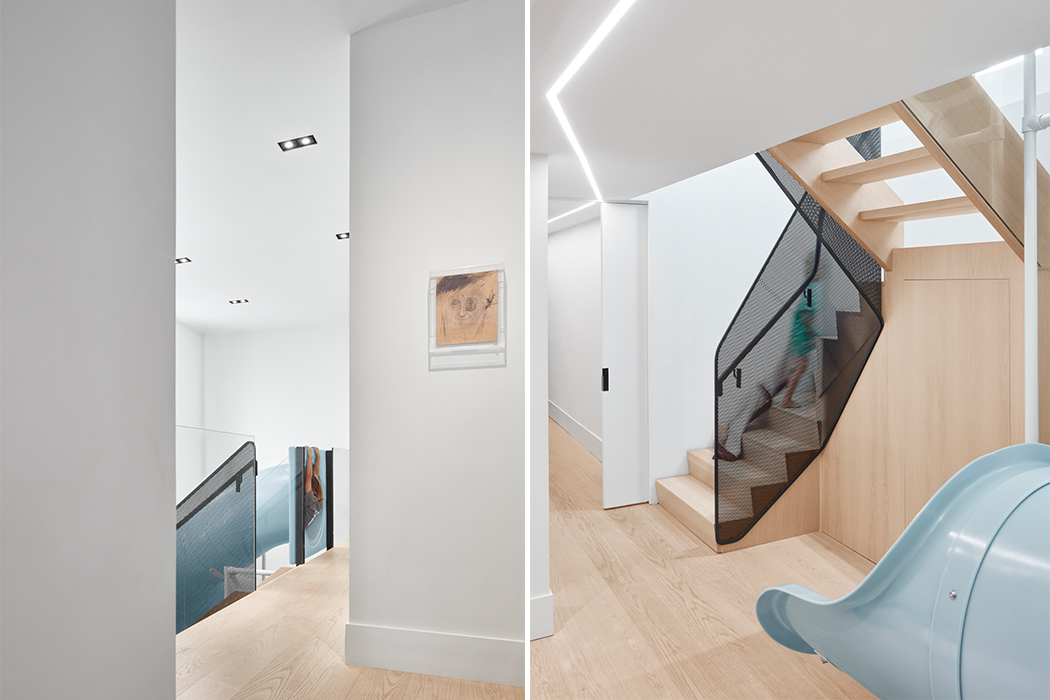
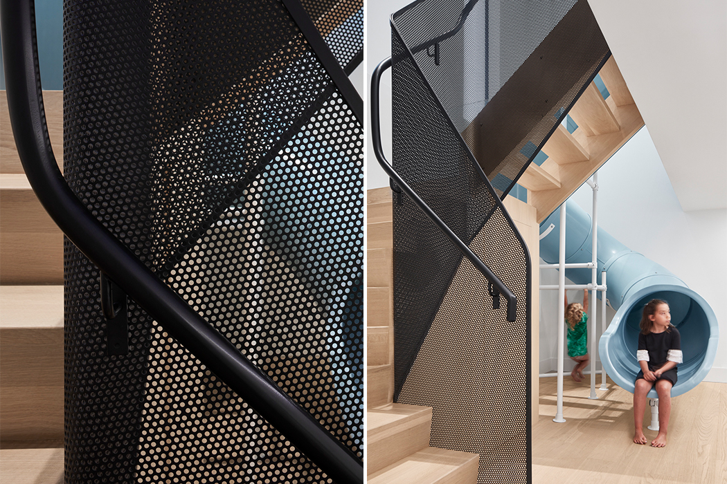
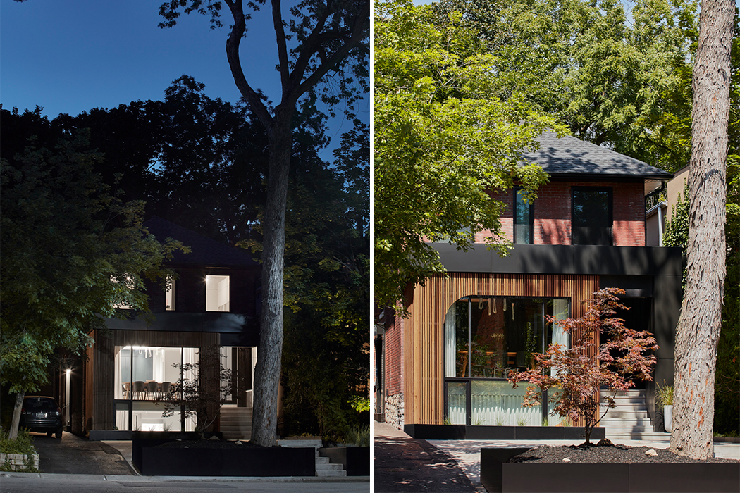
The renovated house is named Walker and the updated layout aimed to create lighter, open spaces that better serve the family’s lifestyle while pro more bonding and playtime. At the heart of the house is the children’s twisting blue slide which connects the basement level to the ground floor. It was included to liven-up the lower-level, bring in natural light to the space, and make it “not basement like”. The parents are entrepreneurs in the health and wellness space so it was important to have a feature in the house that encouraged better mental and physical health, therefore elements were picked to integrate play in their lives. “When I got the initial design brief, they noted wanting to keep the second floor as a separate unit to rent out and hence we combined the basement level with the lower level to create a single-dwelling for the family,” said the team.
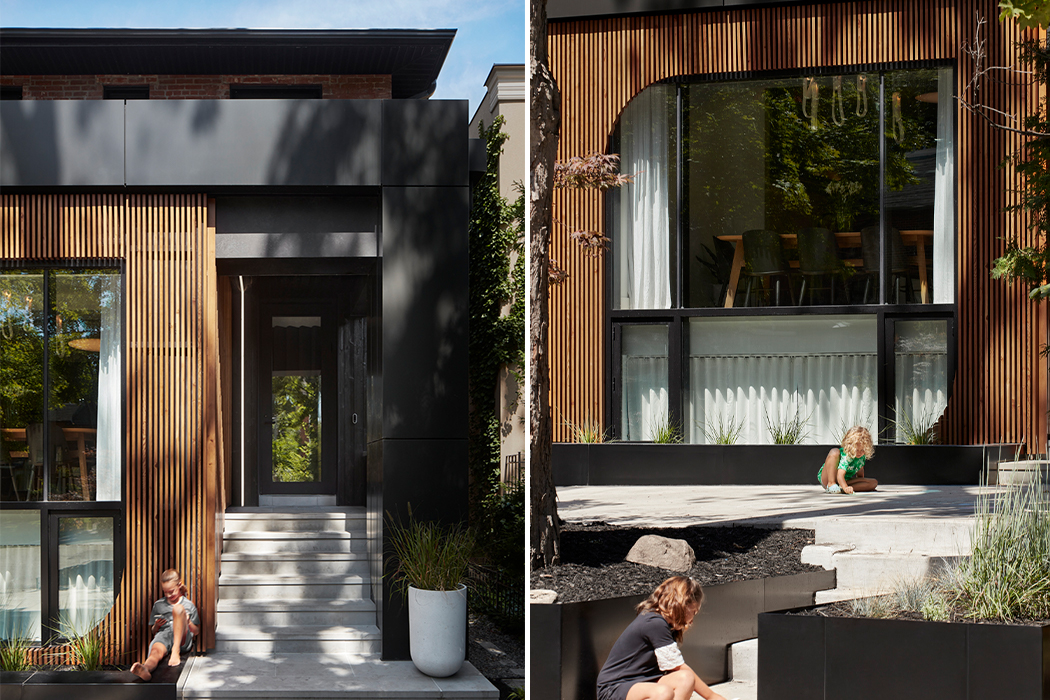
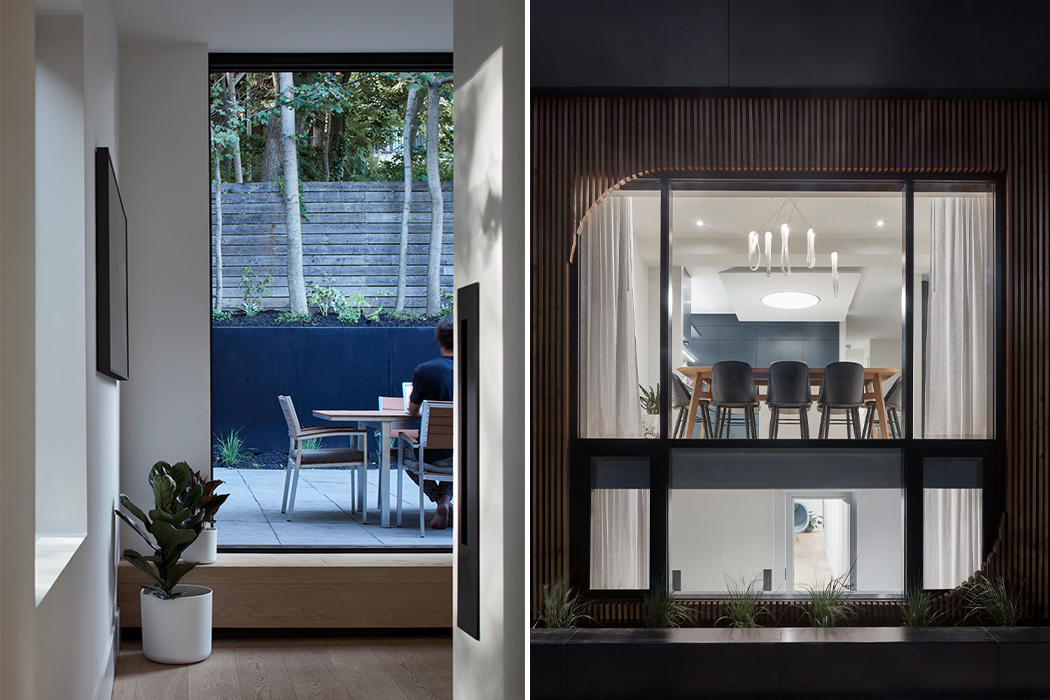
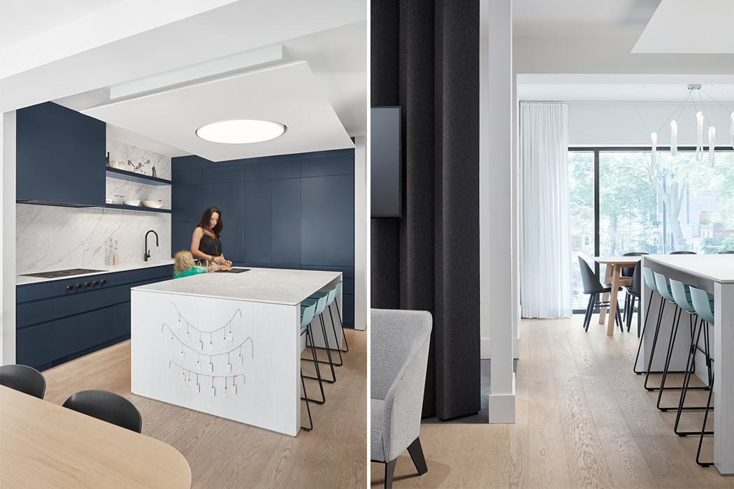
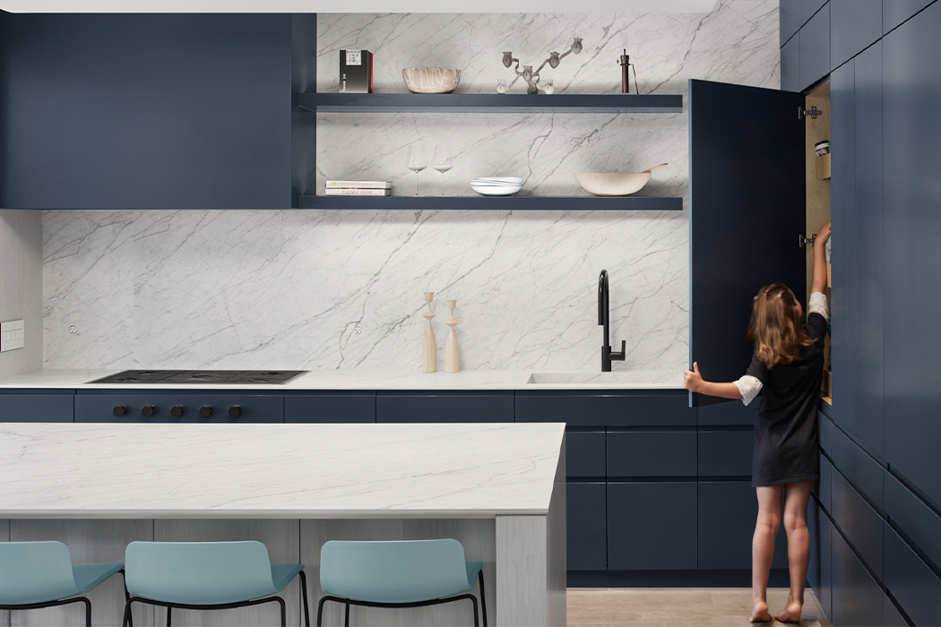
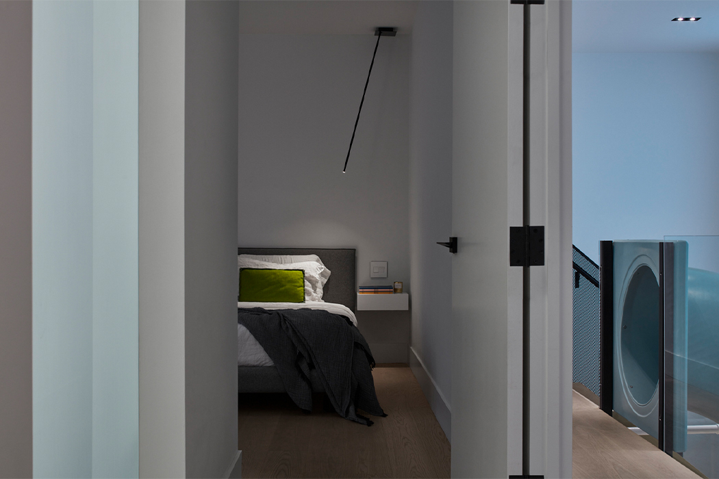
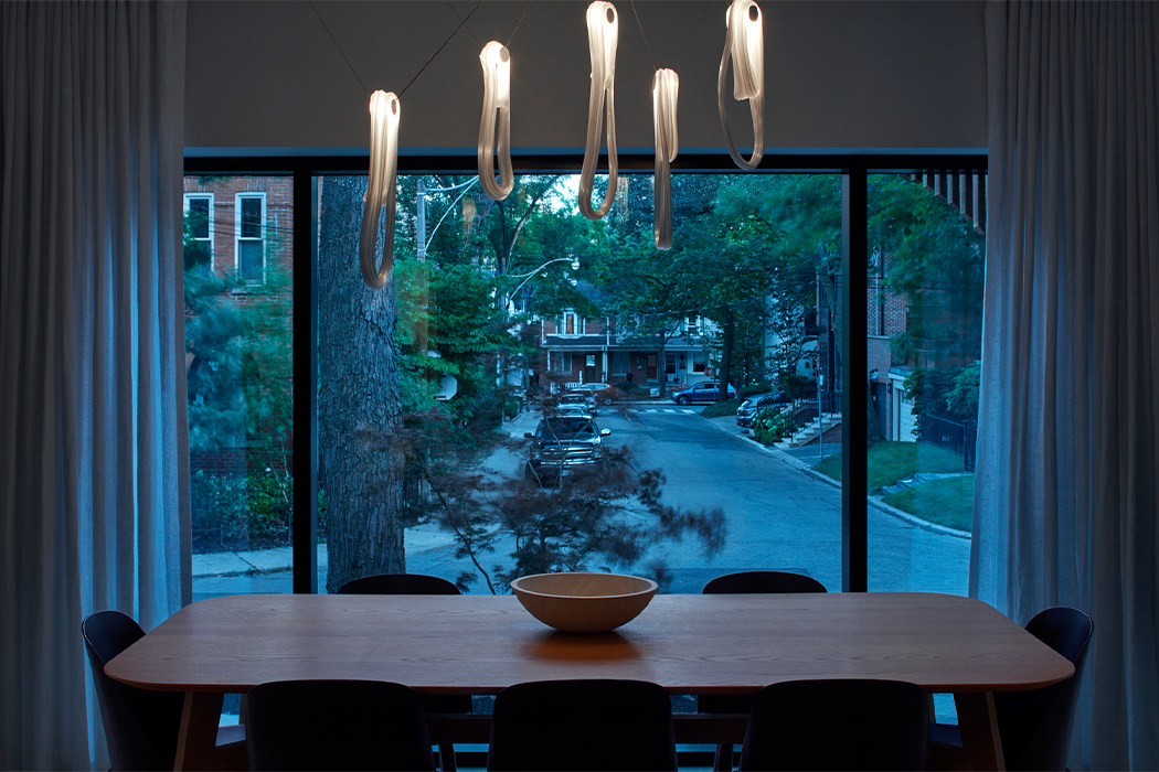
The now brightened-up basement is where three children’s bedrooms are located with three bathrooms and a guest bedroom. The ground floor is where the couple gets their space with the master bedroom and ensuite. Common areas like the study kitchen, dining, and entertainment zone are also on the ground floor. The two floors are also connected via a folding wooden staircase next to the slide. This staircase is lined with a perforated-metal balustrade and lit by night lights integrated into the ceiling so nobody has to crawl up a slide – something we have all learned is basically a kid’s version of mission impossible. Windows were expanded and sliding doors were added to open up the house some more. The street-facing side of the lower level features metal panels, wooden louvers, and dark wood cladding that has been treated using the Japanese technique of ‘shou sugi ban’. Walker’s interiors showcase a simple and minimal material palette of light wooden textures, marble countertops, white walls with pops of color in cabinets, and of course the slide. The client wanted a “calming canvas to live their life on” and Reflect Architecture delivered!
Designer: Reflect Architecture
