This Desktop Robot Toy Is A Delightful Tribute to the Iconic Apple IIe Computer

Imagine having a tiny robot on your desk that can transform into a mini version of the classic Apple IIe computer. That’s the Classicbot IIe for you! Standing at just 8.5 cm (3.35 inches), it’s like having a bit of tech history right at your fingertips. With its detachable arms and track feet, this little guy is both adorable and a fun nod to the past. It’s a playful companion that brings a smile to your face and sparks curiosity among your friends and colleagues.

Designer: Classicbot

Each Classicbot IIe is crafted with care and made from resin in small batches. This means every piece is unique, which adds a special touch to its charm. The attention to detail is spot-on, right down to the Duodisk 5″ floppy drive. It’s like a tiny, joyful celebration of retro tech that makes you smile every time you look at it. The craftsmanship involved in creating each piece is evident, turning it into more than just a desk accessory — it’s a piece of art that captures the essence of a bygone era.

The Apple IIe is probably one of the best-selling computers the company sold in that era. Since not everyone can get their hands on an honest-to-goodness replica, this robot is a fun hidden gem for those who love a bit of retro flair. Whether you’re a tech enthusiast or just someone who appreciates a good throwback, this little robot is a delightful companion. It speaks to the inner geek in all of us, reminding us of the early days of computing when floppy disks were all the rage and the sound of a modem connecting was music to our ears.

The best part? Switching it from a robot to a computer model is super easy and fun: just remove the arms and the tracks. The robot’s face naturally becomes the monitor, and its eyes make you think you’re playing the classic Pong game. It’s like having a mini Transformers on your desk! With a quick change, you can transport yourself back to the 1980s, a time when the Apple IIe was a revolutionary piece of technology.

Its small size makes it perfect for any workspace, no matter how cluttered. It’s a conversation starter, an icebreaker, and a reminder of how far we’ve come in the world of technology. The Classicbot IIe is not just for those who lived through the era of the Apple IIe; it’s for anyone who appreciates the journey of technology and enjoys a little whimsy in their day-to-day life.

If you love a good blend of history and playfulness, the Classicbot IIe is a delightful way to brighten up your day. It’s a cheerful reminder of how far technology has come, all while keeping things light and fun. It’s the perfect desk buddy for those moments when you need a break from the digital world, offering a tangible connection to the past. Right now it’s on pre-order for $85, and those who put in the money now will get their hands on a limited edition mini joystick accessory to really drive home that throwback design.

The post This Desktop Robot Toy Is A Delightful Tribute to the Iconic Apple IIe Computer first appeared on Yanko Design.

Casio calculator watch pays homage to the world’s first pocket calculator

It’s almost too easy to take for granted the conveniences we enjoy today thanks to modern devices like computers and calculators. Calculators might be a common sight these days, even on smartphones as a pre-installed app, but there was actually a time when these counting machines were only found in offices. Their bulky designs and expensive components limited their availability to businesses that could afford them, forcing other people to depend on manual calculations.

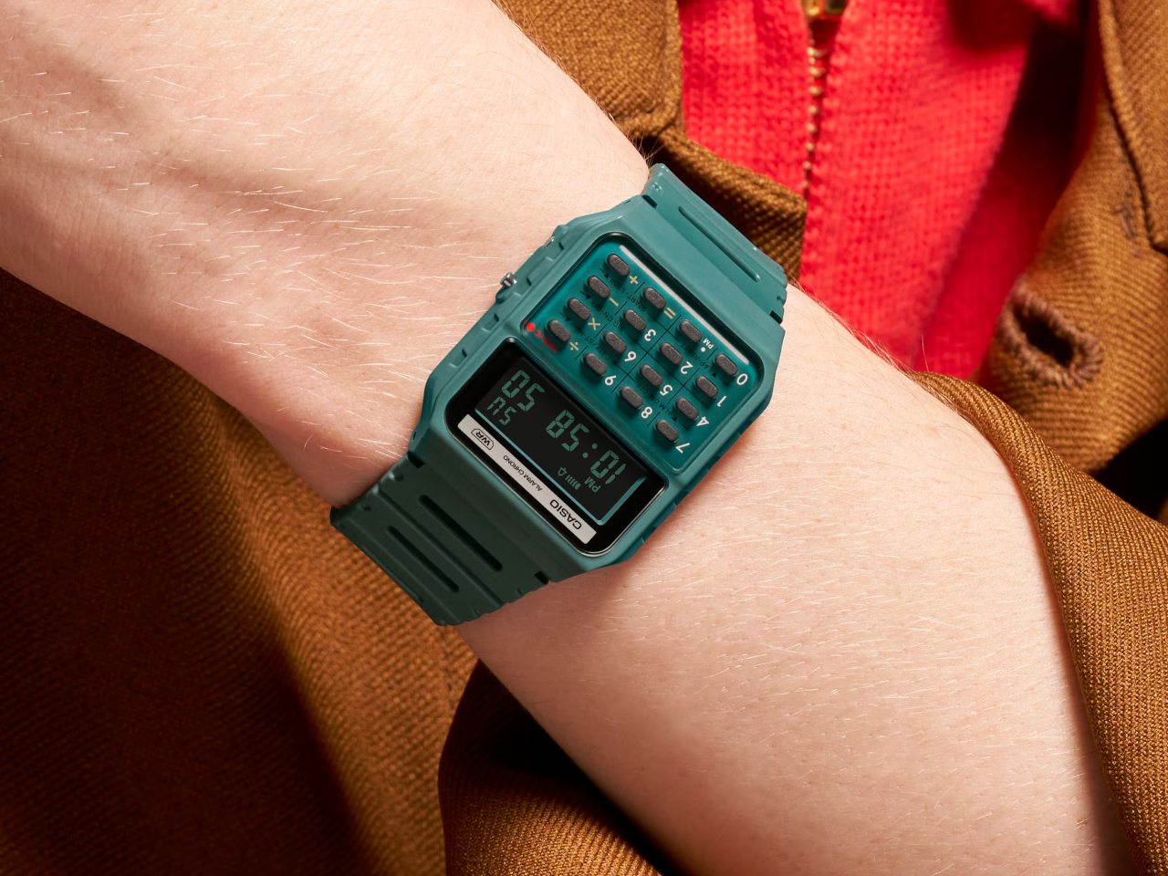
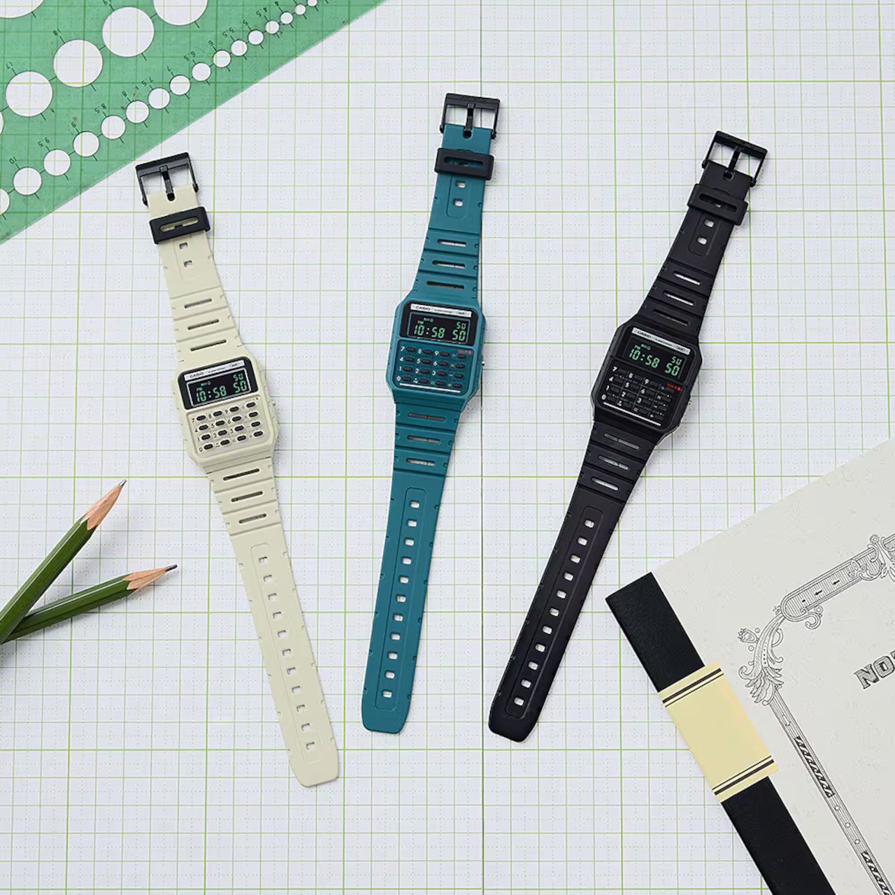
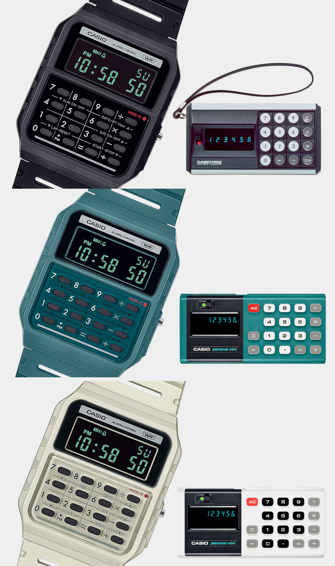
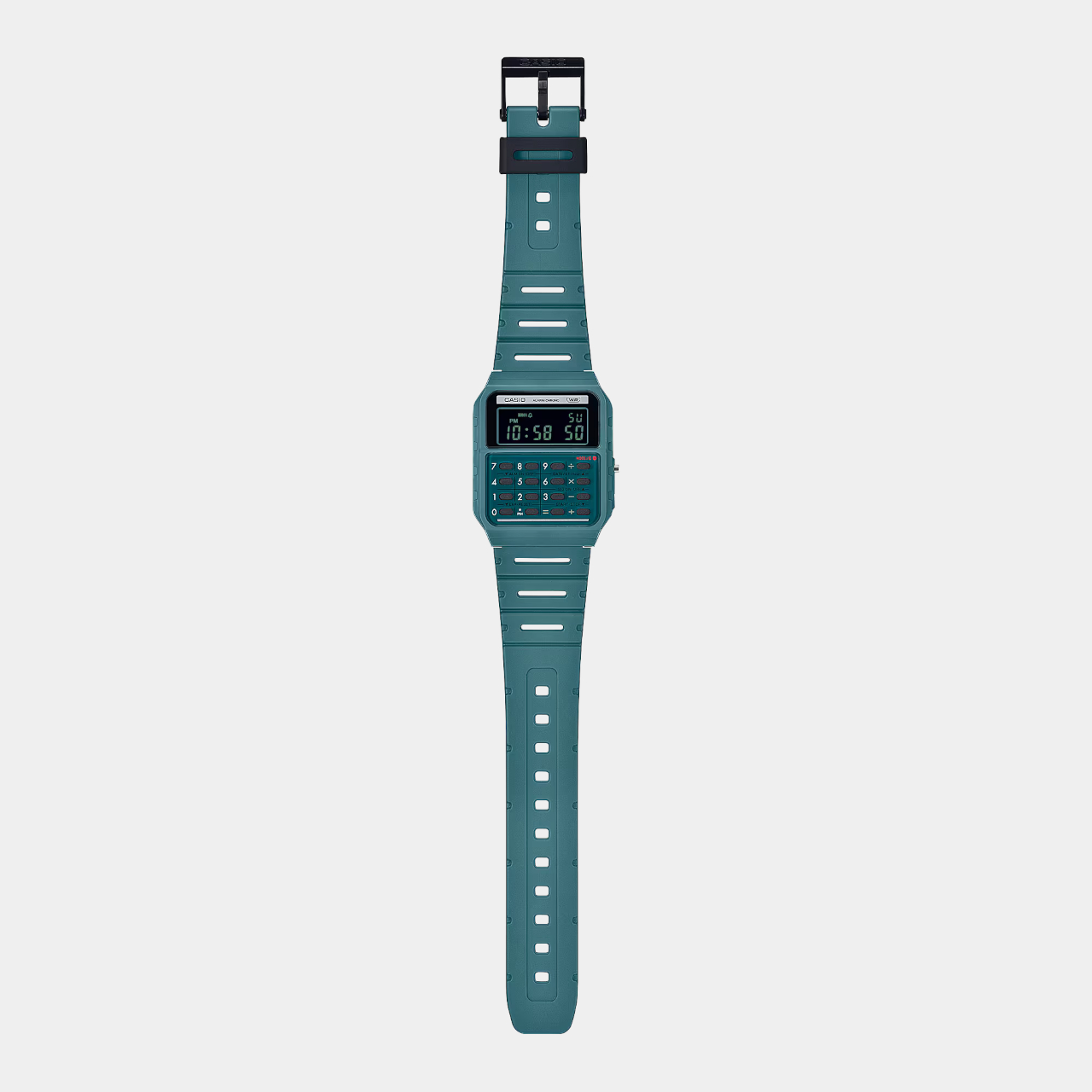
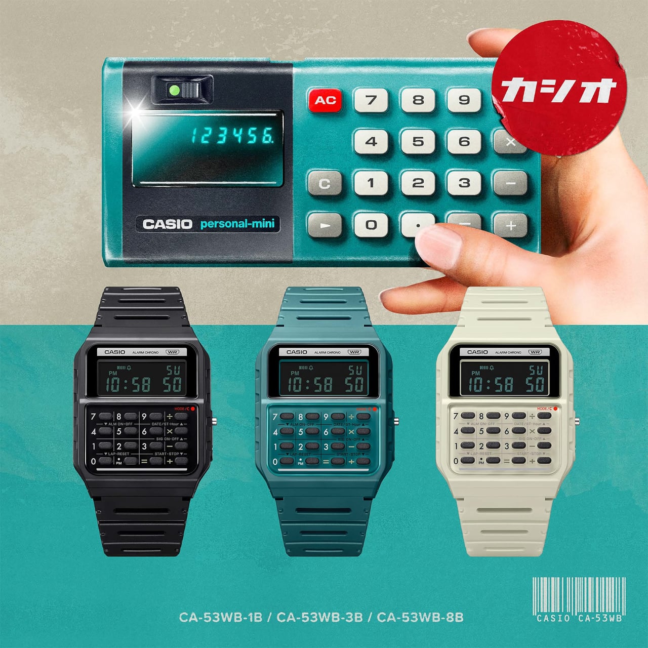
The first generation of personal calculators, large as they may be by today’s standards, truly revolutionized this industry, making it easier for professionals, students, and practically anybody to make complicated calculations in just seconds. To recognize one of these trailblazers, Casio just released a new version of its odd calculator watch, taking its design cues from its own Casio Mini pocket calculator from the 70s.

Designer: Casio

Wristwatches that cram tiny calculator keys in a small space aren’t exactly new. Whether they’re actually practical or convenient is hardly a concern, as they give watch lovers and Casio fans something to cherish. Especially in an age where everyone can use their phones for the same purpose, these timepieces become designs that combine nostalgia and novelty in one package.

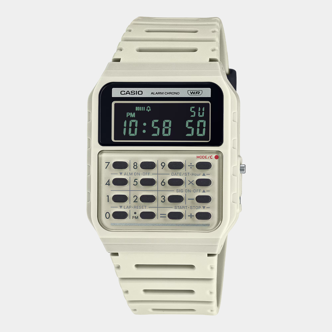
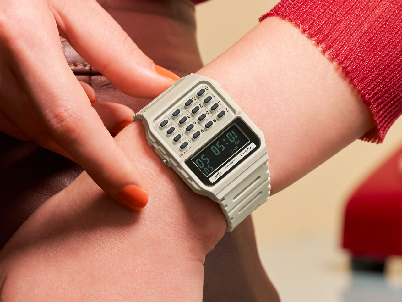
The new arrivals to this set don’t actually add new functionality, which would ruin the charm of this device, but tweak the design a bit for an even more retro look. The Casio CA-53WB watches specifically adopt the design elements of the Casio Mini from 1972, starting with the three color options available back in 1972: ivory, black, and blue-green. Unlike the other Casio calculator watches, these three use green text on a negative LCD, just like those old-school displays.

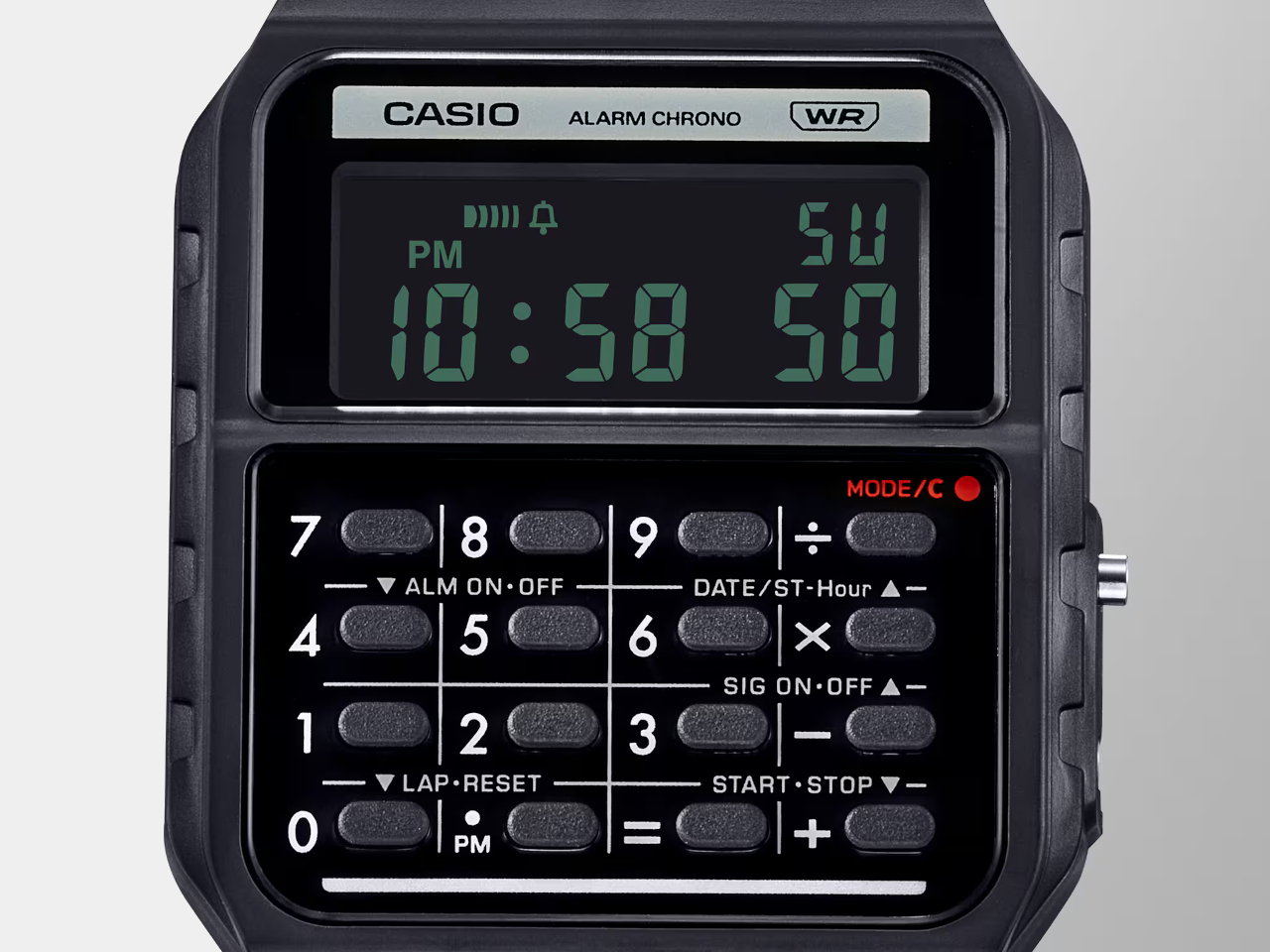
There are also more subtle design cues that might be more familiar to those who remember the original calculators. The number buttons, for example, are separated by grid lines, and the mode indicator uses a red color to emulate the power indicator of the old calculator.

In terms of functionality, the Casio CA-53WB is exactly like the other models, supporting up to eight digits for calculations and providing features like a stopwatch and an alarm. One modern improvement in the design is the use of bio-based resin for the watch band, reducing the product’s environmental impact. This blast from the past calculator watch costs $36, a few bucks more than the regular Casio calculator watches.

The post Casio calculator watch pays homage to the world’s first pocket calculator first appeared on Yanko Design.

This Teenage Engineering-inspired Cassette Player even has a “Bluetooth Cassette” for Spotify Playback

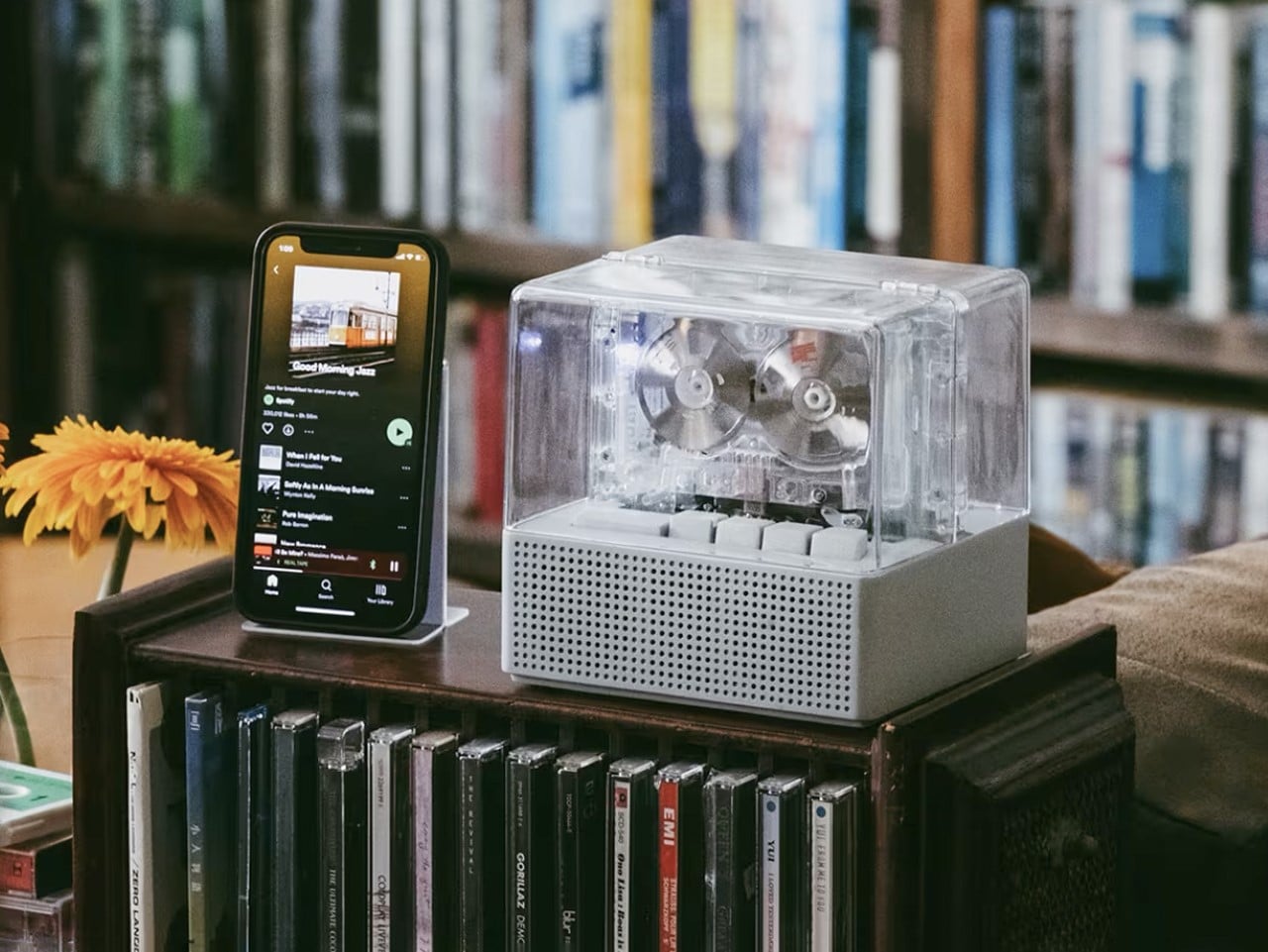
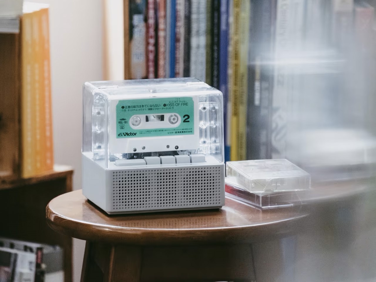
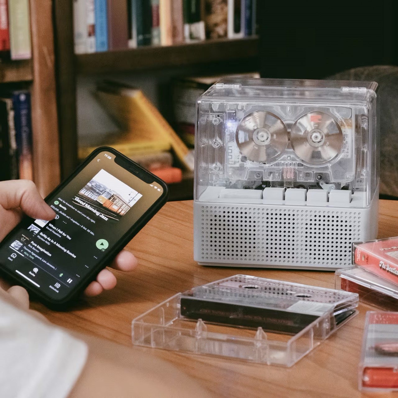
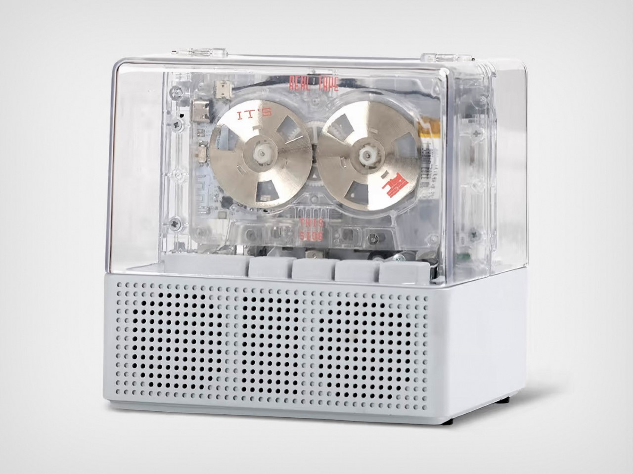
Form, function, emotion, the “IT’S REAL” Cassette player has it all. With its retro-meets-new-age charm, this cassette player encases your cassette in a transparent cover, allowing you to see the cassette’s reels rotate as the device plays music. But here’s the kicker – this thing isn’t just a cassette player, it’s a Bluetooth speaker too.

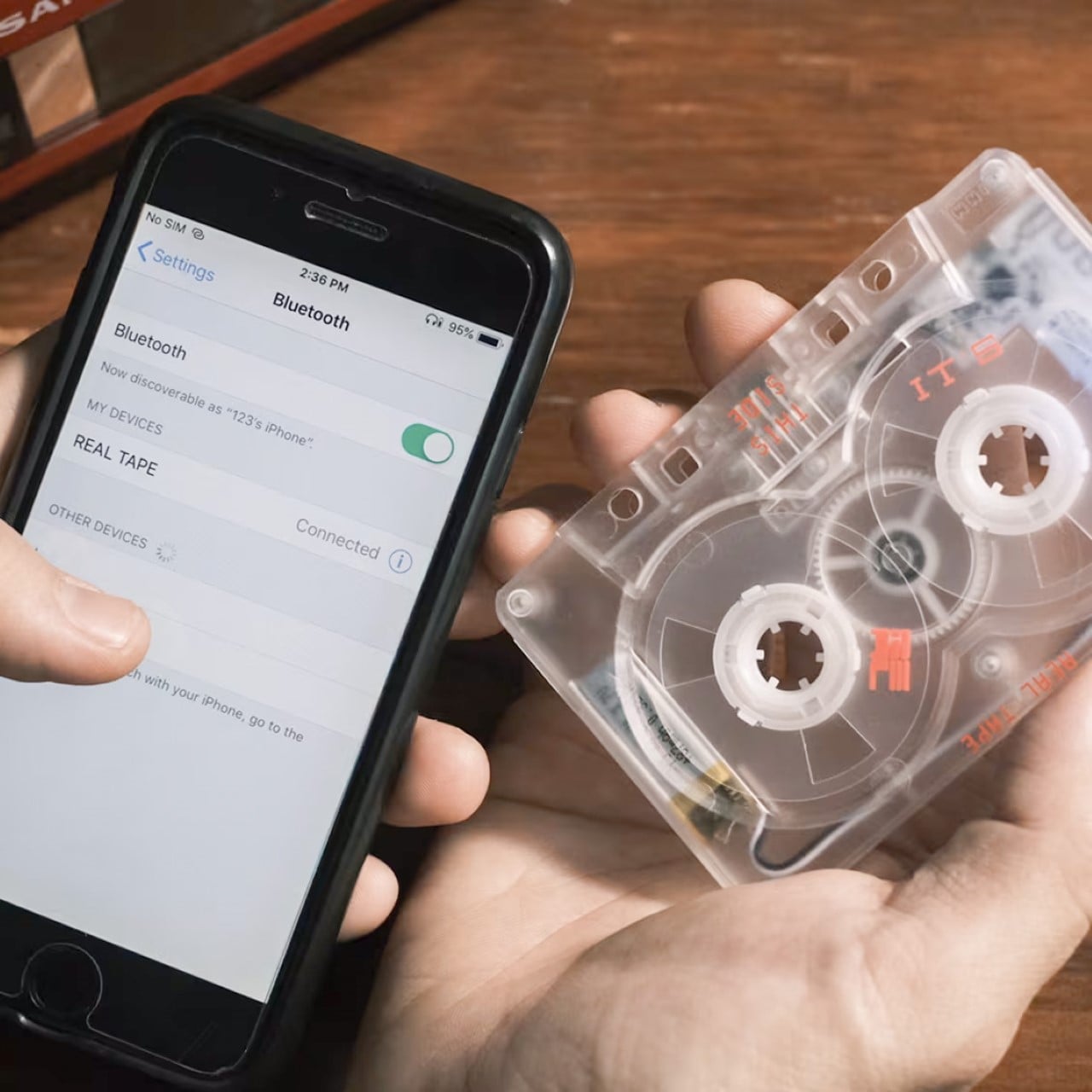
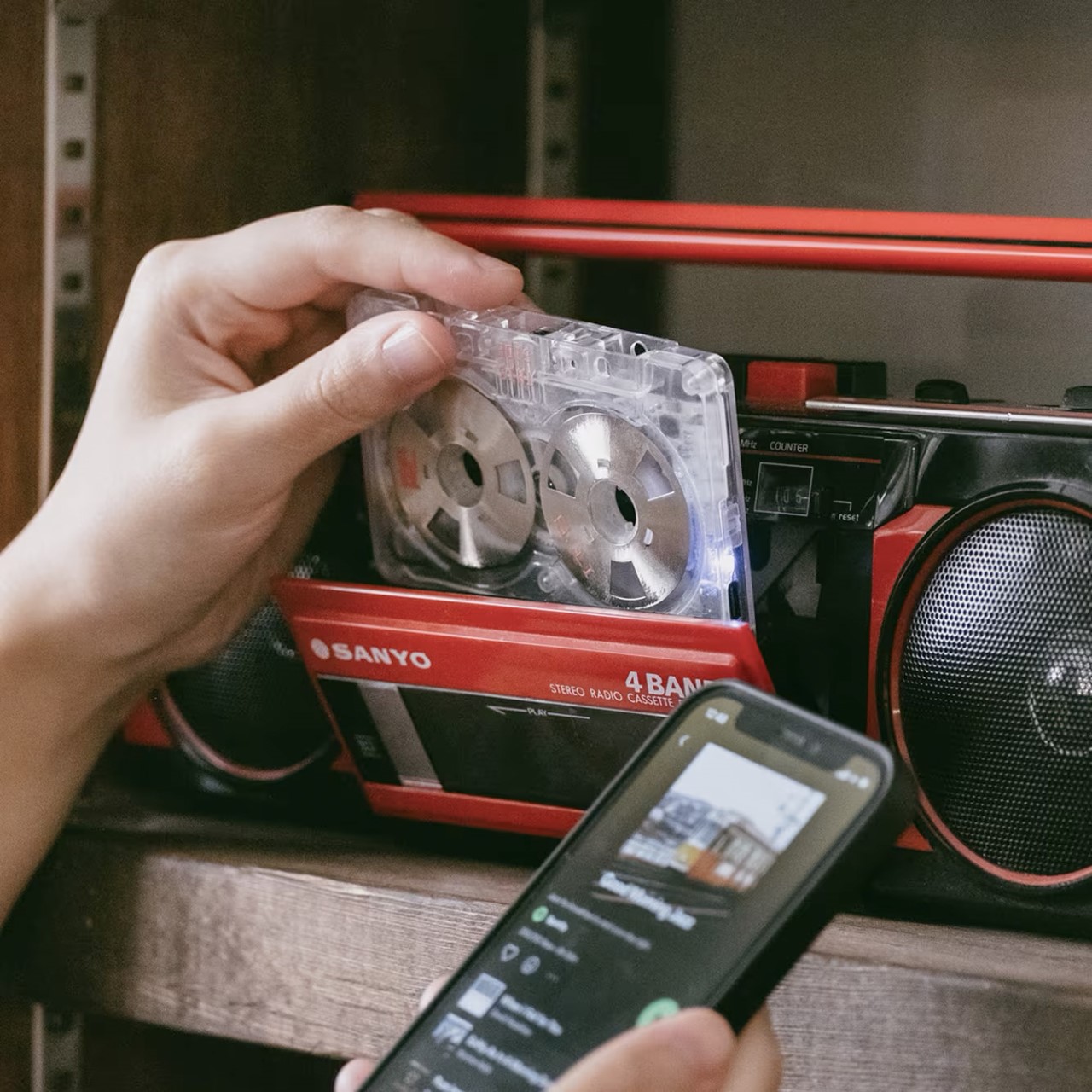
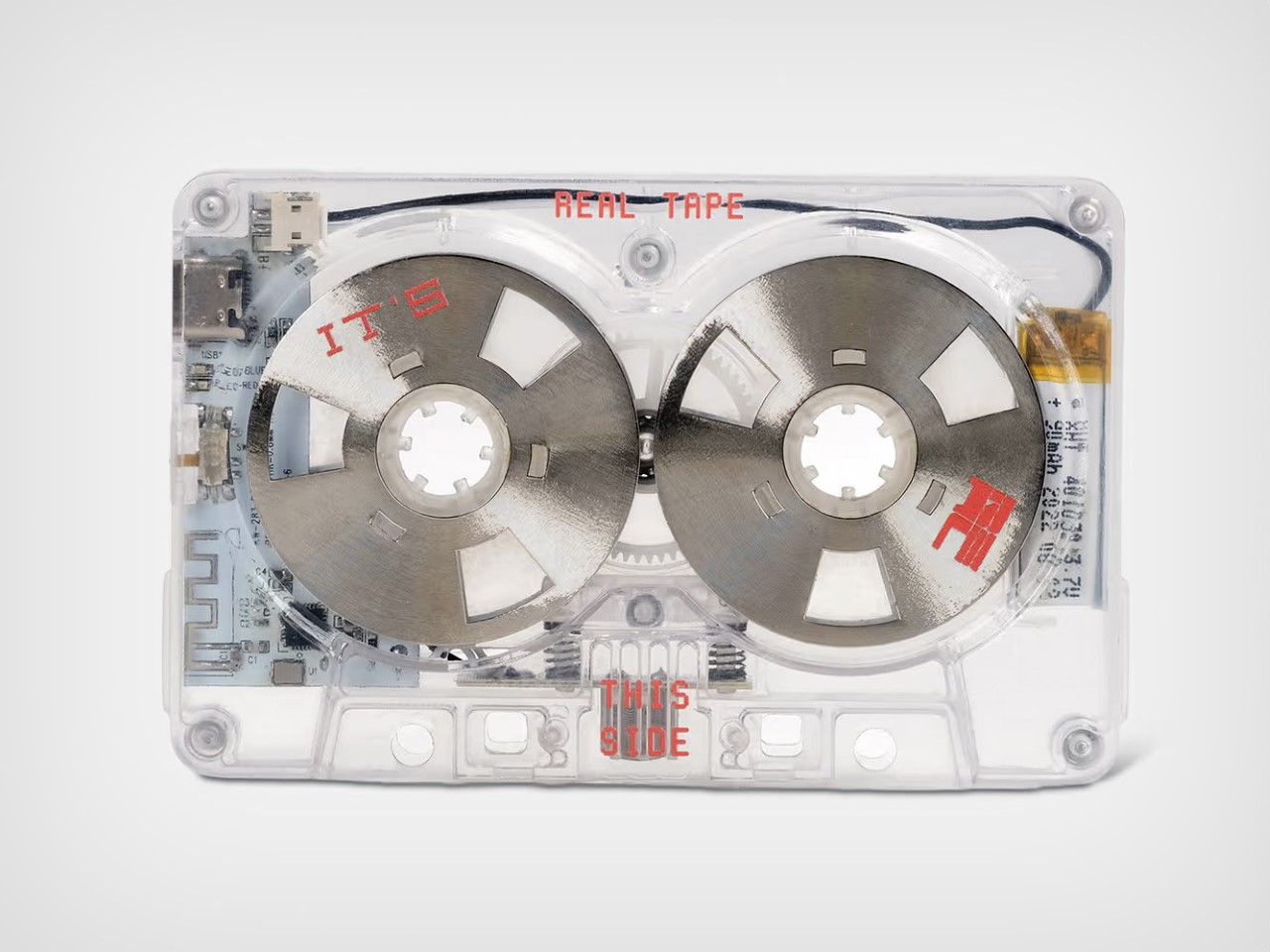
You see, each IT ‘S REAL player comes with its own “Bluetooth Cassette” that lets you connect your phone to the IT’S Real device. Put the Bluetooth cassette in and the appliance lets you effectively play Spotify, YouTube, Apple Music, or any streaming app on your cassette player. The Bluetooth cassette works with other devices too, allowing you to turn your dad’s boombox, or your 30-year-old car’s tape-deck into a Bluetooth-enabled device that supports your phone.

Designer: NINM Labs

Let’s break down the player by talking about its form, function, and emotion. If you were born in the early 90s or before, chances are your vision of a cassette player are a lot different from what the IT’S REAL looks like. Most cassette players had a template design – either they looked like a boombox, with the cassette in the middle and speakers on the side, or they looked like a Walkman, with a compact form factor and an Aux input for headphones. The IT’S REAL looks nothing like either of those.

It encases the cassette in a transparent outer housing, preserving and showcasing it as if it’s some sort of precious relic. This treatment is reserved for precious items, so to see a cassette player do this enhances the cultural and iconic value of the humble cassette. The transparent casing still retains its function, allowing the cassette to play while it’s inside, while front-firing speakers help you listen to the audio.

Put any cassette in and the IT’S REAL plays your old tapes, whether they’re albums or personally made mixtapes that were a standard fixture of music-sharing culture in the 80-90s before discs became a thing. Buttons underneath the transparent hood let you play, pause, rewind, fast-forward, or eject the cassette, following the traditional functionality of cassette players from before… but what really sets the IT’S REAL player apart, is that it comes with a “Bluetooth Cassette”.

While the IT’S REAL device is a purely traditional cassette player, the Bluetooth Cassette that comes along with it turns it into a Bluetooth speaker. Put the cassette in, start the player, and the cassette turns into a Bluetooth transmitting device, allowing you to pair a smartphone. Once paired, the cassette allows you to play music from your phone on the IT’S REAL’s built-in speakers.

Bluetooth 5.0 means the cassette pairs with your phone seamlessly, and here’s the kicker – it can be used with other cassette players too – not necessarily just the IT’S REAL. Pop the Bluetooth cassette into your dad’s boombox, your hipster uncle’s Walkman, or even your grandfather’s car that still has a functional cassette deck built into the car’s dashboard.

A lot of the IT’S REAL’s joy lies in its aesthetic and its retro-revival. The transparent design is beyond gorgeous, allowing you to appreciate the workings of the cassette player quite literally like some Teenage Engineering-like device that isn’t afraid to bare its electronics instead of hiding everything under a plastic facade.

The act of playing a cassette tape may have died 20 years ago, but just like fashion is cyclical, tech trends have a way of making a comeback too – and the IT’S REAL capitalizes on this retro joy beautifully while still being a Bluetooth-enabled future-friendly device that anyone can use and love.

For makers NINM Labs, this is far from their first rodeo. They debuted back in 2018 with the IT’S OK Cassette Player – a Walkman version of this product that did over $80,000 in funding from nearly a thousand backers. Soon after, the IT’S REAL Cassette Player made its Kickstarter debut, smashing past its funding goal by over 500%. The product is now available on the NINM Lab website for $151.86 USD.

The post This Teenage Engineering-inspired Cassette Player even has a “Bluetooth Cassette” for Spotify Playback first appeared on Yanko Design.

Retro devices reimagined with fun 16-bit displays

Retro designs in technology continue to be a strong trend, from retro consoles to instant cameras to record players. Most of these products try to update the classic aesthetics to modern standards, reinterpreting them without straying too far from the original. In other words, they’re mostly modern devices simply paying homage to the past.

There might be times, however, the original designs still have a lot of pull, especially for eyes that have never seen them before. This series of concepts tries to imagine some of those with completely classic designs, save for the addition of 16-bit displays and a splash of 80s colors that make them funky and hip in their own unique ways.

Desigers: Ahmed Esmael, Marwan Abbass

1

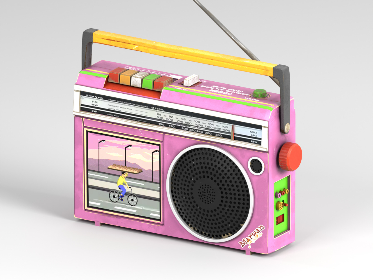
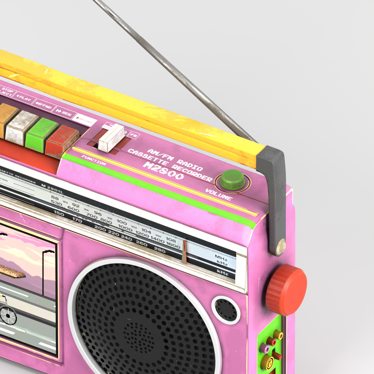
Music streaming has pretty much replaced the radio for most people, but the medium hasn’t completely died out. Radios, however, have become rarer outside of vehicles, and most designs these days tend to make the device almost invisible. This concept, in contrast, is as loud as it can be, both in sound and in appearance with its pink body and clashing color combinations.

What sets it apart, however, is the square display beside the circular front speaker. It’s not a modern touch screen for controlling the radio, but more of a useless but fun embellishment to the experience. It displays a 16-bit video that looks at home in games of that era, rendering an accompanying visual to the audio, whether it makes sense or not.

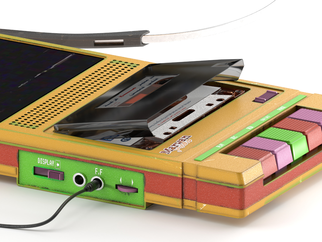
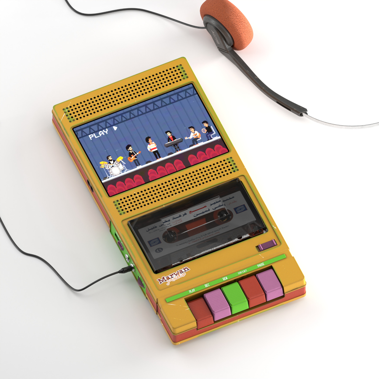
Very few people these days listen to cassette tapes. Unlike vinyl records, there’s almost no special audio quality to these small rectangular containers for brown tape that all too often gets tangled up. That said, some people still have a collection of these tapes, and this cassette player concept adds a unique twist to the device without twisting those tapes.

The color scheme for the device this time is a faded yellow, complete with green streaks of corrosion. But just like the radio above, the flat tape player integrates a screen that can play 16-bit videos. Although it doesn’t serve any practical function, it adds a bit of fun flavor to the music being played, making you want to look at the device even when it’s lying on the table.

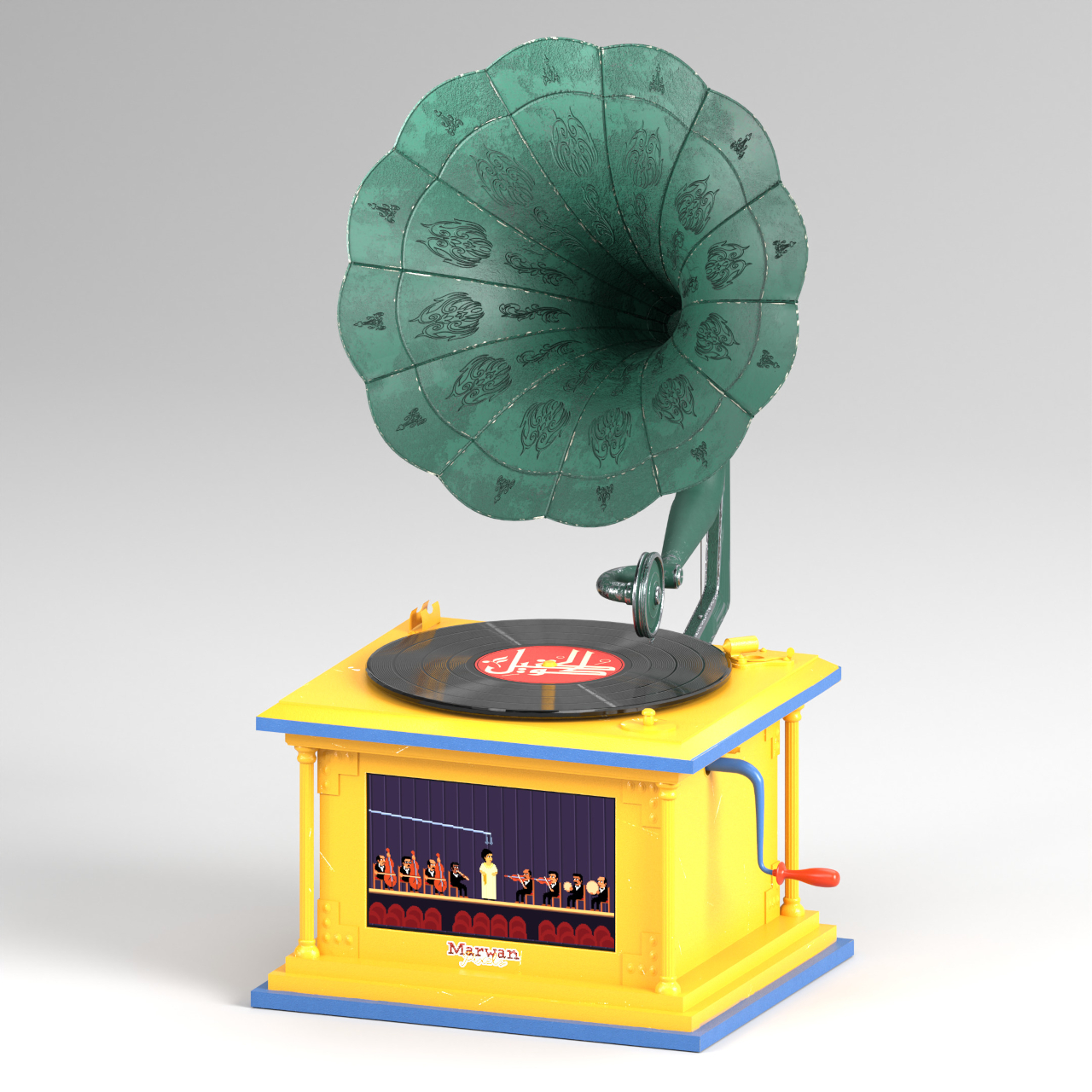
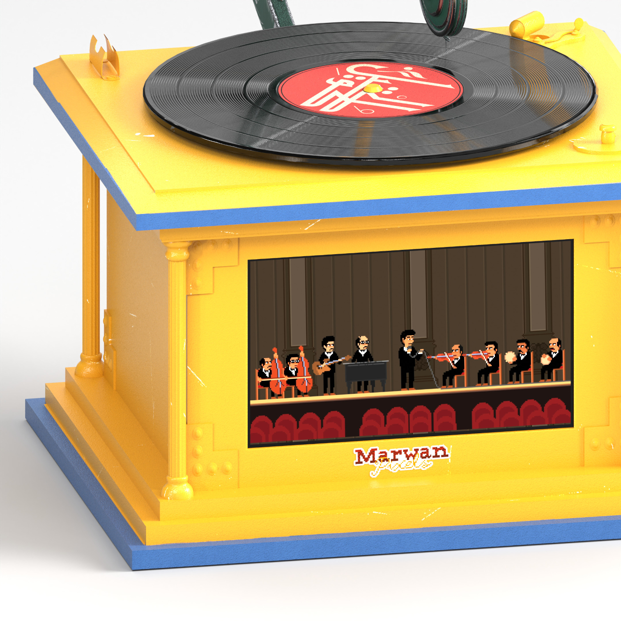
The record player in this Timeless Treasure collection steps farther back in time, adopting the form of a 40s gramophone. Its green, flower-shaped sound horn looks like copper that has aged over time, while the boxy platform has a mix of industrial and Art Deco details. Only the dominantly yellow color motif looks out of place and out of time, giving it an odd anachronistic flavor.

The large 16-bit display is again the center of attraction here, playing a pixelated video of an opera or orchestra performance. It could be related to the track being played, though it’s more likely a very generic clip for any and all kinds of records. It would probably be nice if each video was customized for different kinds of music, perhaps using some AI magic to make it happen.

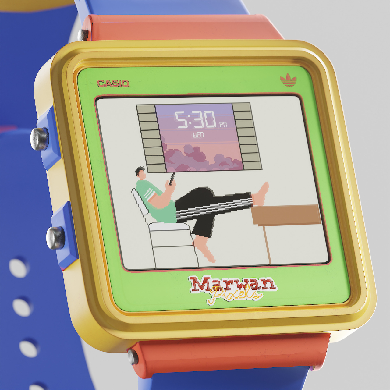
Old-school audio devices aren’t the only ones getting this 80s retro facelift, though a watch is hardly that old to qualify. More like an old-fashioned kids’ digital watch, this particular concept adds a lo-fi feel to this somewhat modern wearable, particularly when an alarm plays. Like the rest of the collection, it’s a fun touch that doesn’t add any functional advantage but gives the designs a new flavor.

The post Retro devices reimagined with fun 16-bit displays first appeared on Yanko Design.

Split-flap mechanical clock puts a dynamic piece of pixel art on your wall

As if constantly checking the time wasn’t distracting enough, having a clock that encourages you to look at it all the time spells trouble for your productivity. Riding the retro wave, this clock brings the popular pixel graphics design of yesteryears to your living space. Waiting for the clock hands to “turn” almost becomes a tense waiting game, and you probably end up losing more time just by watching it.

Klapklok, however, is more than just a quirky-looking clock. It’s also a unique audiovisual experience that brings delight to the senses at the turning of the hour. It makes time feel more dynamic and palpable, perhaps creating a stronger relationship to the concept of time compared to just passively looking at a regular clock, no matter how beautiful that might be.

Designer: Miniot

The split-flap mechanism used by old clocks and scoreboards is itself a blast from the past, but this clock employs it in a way that combines it with another retro design convention. Using 69 elements, the Klapklok creates what is practically a giant pixelated rounded square, where each “pixel” flips from white to black and vice-versa. Of course, the movement is anything but random, and the hands of the clock “move” every 2.5 minutes to tell the time.

The movement of the flaps is subtle but not altogether silent. It’s more like a gentle whisper than a rigid clank. Every hour, all 69 flaps quickly change to display the time as a number, creating a peaceful rustle like the flapping of butterfly wings. Despite the mechanical visual of flipping surfaces, the overall effect is more calming, almost mesmerizing.

It might all look simple, but this wonder clock is carefully handcrafted using premium materials. The base is milled out of high-performance bio polyurethane, while flaps are made from a paper-like yet durable composite material. The hinges are completely transparent to disappear from view and a metal USB-C cable for power perfectly complements the design, even if it’s always visible.

While its primary purpose is to tell time, Klapklok can also be used as a pixel art display. A smartphone app lets owners draw on that rounded square canvas, utilizing those 69 elements to show an icon or letters. It’s a fun and engaging feature that makes the clock useful even after you’ve grown tired of being distracted by its tempting design.

The post Split-flap mechanical clock puts a dynamic piece of pixel art on your wall first appeared on Yanko Design.

This Retro iPhone Case turns it into a Makeshift Old Windows PC with Clippy and Internet Explorer

Quite literally the opposite of Back to the Future, this iPhone 16 Pro case is more like “Forward to the Past”.

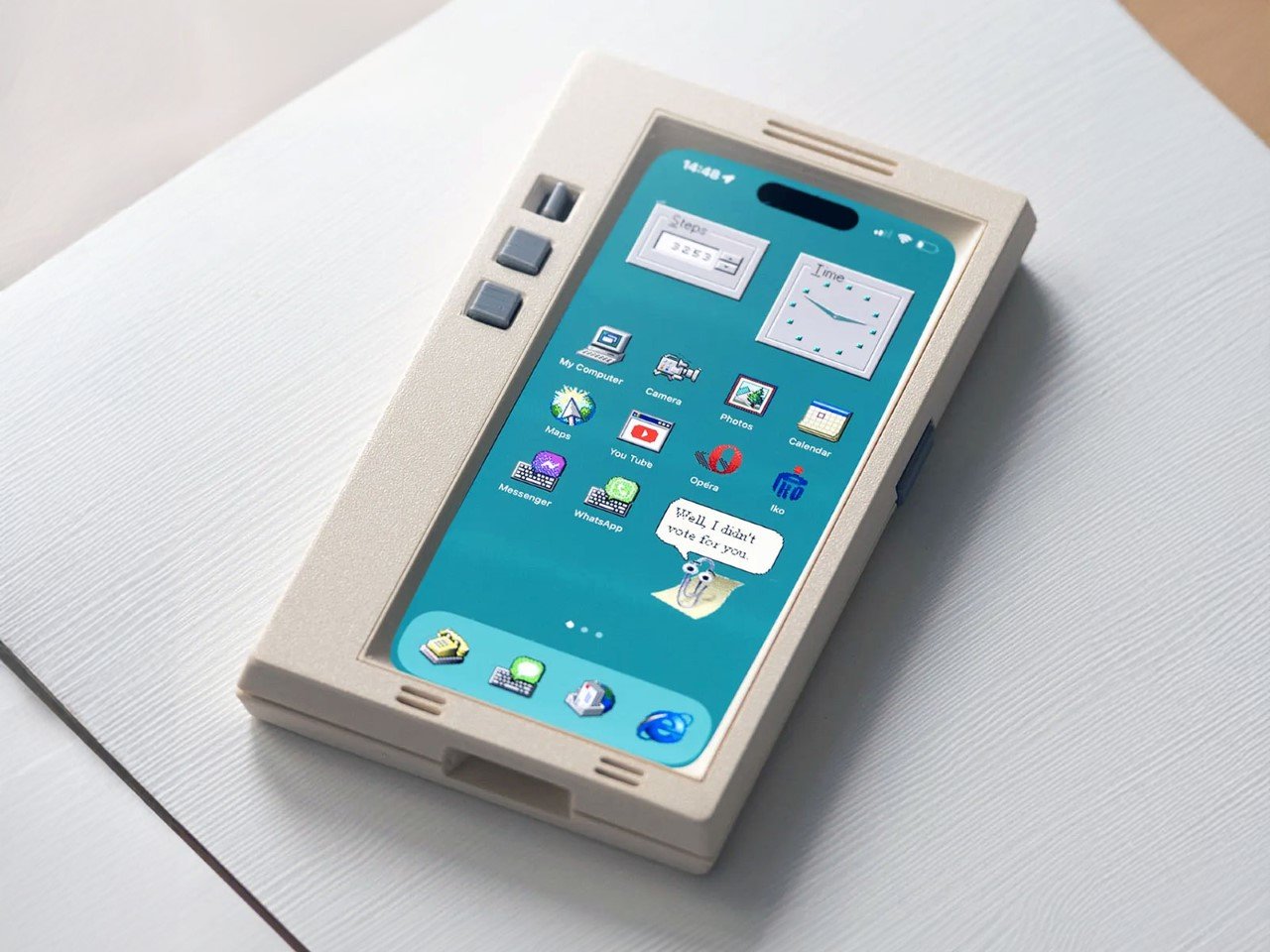
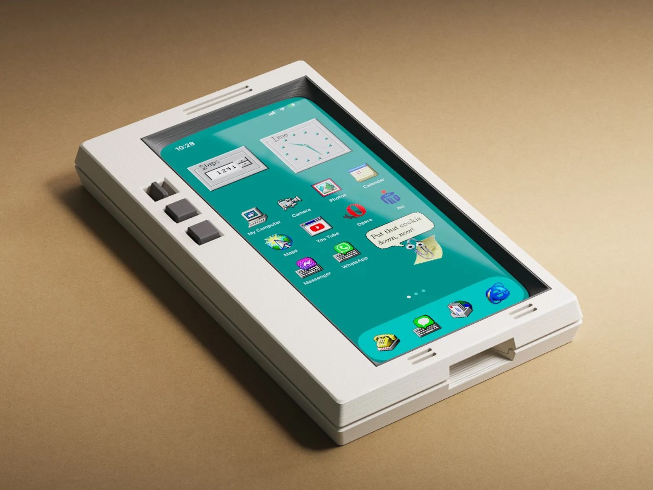
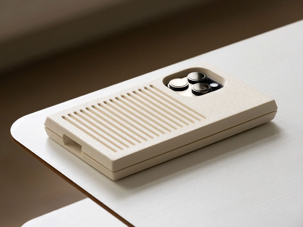
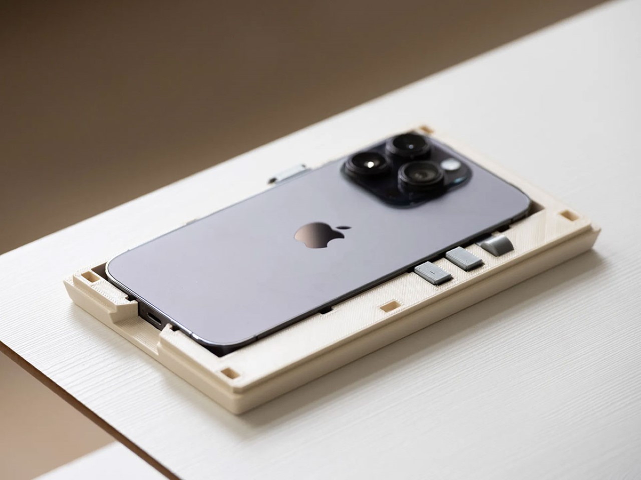
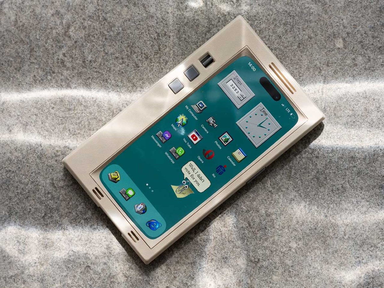
When you buy a phone, chances are you spring for a case immediately for one of two reasons – to either protect your phone, or to personalize it. However, Printables user Retron Print may have invented a new reason to add a case to your phone. Meet the iPhone Retro Case – a case that takes your cutting-edge smartphone and transforms it into a marvel of old-school technology. The two-part case sandwiches your phone in between, turning it into an old-timey CRT monitor (albeit with a functional main camera and dynamic island). To complement the case’s old-school design, Retron Print also equipped the phone with a retro home screen and custom icons and widgets. Although I’d personally love to have the iPhone stick to a Macintosh-based system, this one is unabashedly Windows, with a non-functional Clippy icon on the screen. Quite a downgrade from Siri and Apple Intelligence, no?

Designer: Retron Print

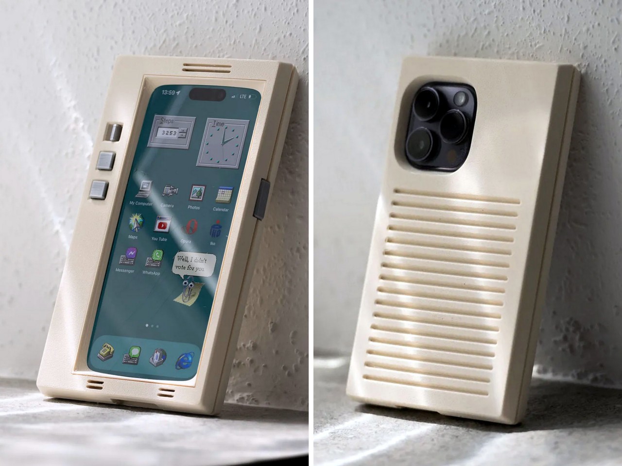
The beauty of the case is that it justifies every aspect of its retro design without compromise. Look at monitors from times of yore and they often had thick, chunky bezels. While most monitors came with a ‘chin’ which would either house a floppy disk reader or just control buttons, this retro case shifts the asymmetric chin to the side, with front-facing buttons that actually work. Built cleverly into the case’s mechanism are buttons that face forwards, but trigger the action and volume buttons on the side of the iPhone. The detailing’s prebuilt into the case’s design, and all you need to really do is 3D print and then assemble.

On the front, the case features an oval frame reminiscent of old CRT monitors, although it doesn’t obstruct the screen in any way. It’s a small but meaningful detail that gives the case a distinctly vintage vibe. Around the back, long, deep grooves evoke the look of classic desktop computers and also provide better grip. These thoughtful design elements ensure that while the case embraces nostalgia, it still offers the user a modern experience with improved functionality and tactile appeal. Meanwhile, speaker systems are accounted for too, with slots on the top and bottom that let you listen to audio from your iPhone.

When it comes to color options, Retron Print suggests using filament in shades like sandy beige, gray, or light brown to fully capture the retro essence. These muted tones are reminiscent of the classic electronics from decades past, enhancing the nostalgic appeal. This attention to detail extends to the print process itself. The case’s front and back panels are best printed on a textured print plate, adding an extra dimension to the overall look and feel, while the buttons should be printed on a smooth plate to maintain their tactile nature.

For those eager to bring a bit of retro flair to their iPhone, the case is available for iPhone 14 and iPhone 15 models. You can purchase the STL files for just $10 on Printables.com and print the case yourself, although this just includes the retro case’s 3D files and not the wallpaper and app icons. When it comes to color options, Retron Print suggests using filament in shades like sandy beige, gray, or light brown to fully capture the retro essence. These muted tones are reminiscent of the classic electronics from decades past, enhancing the nostalgic appeal.

However, commercial use of this model is restricted. To sell prints of this design, users must become a member of the Retron Print Commercial Club, ensuring that the creator, AndrzejG, receives credit and support for their work. This stipulation ensures that while the model is available for personal use, it remains protected against unauthorized distribution.

The post This Retro iPhone Case turns it into a Makeshift Old Windows PC with Clippy and Internet Explorer first appeared on Yanko Design.

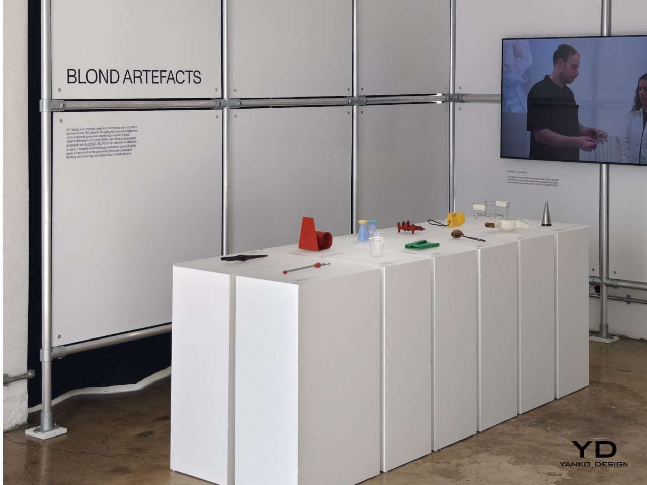
BLOND LABORATORY at London Design Festival 2024 revives old designs in unexpected ways

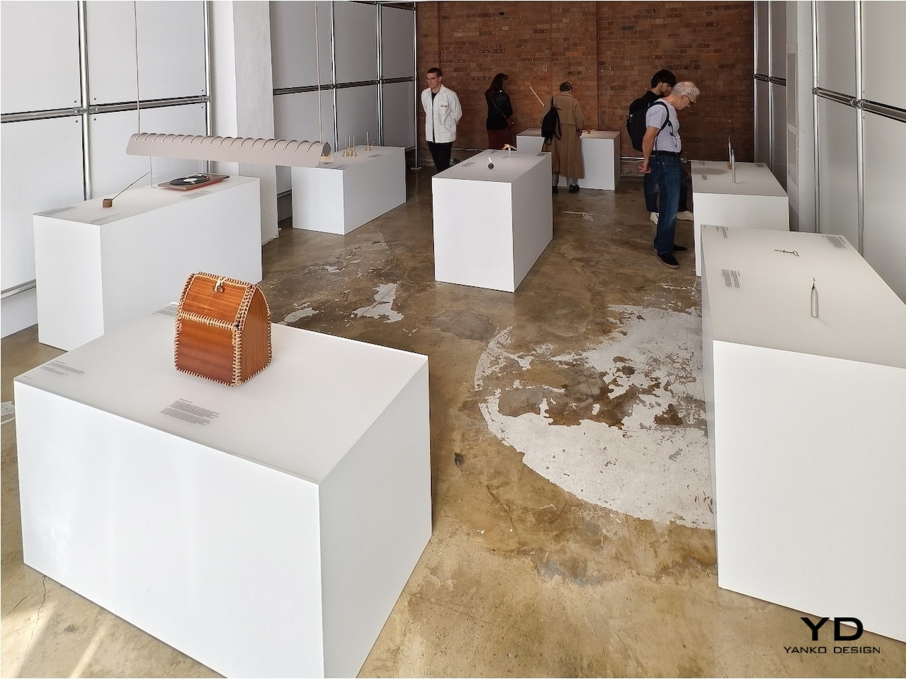
There are plenty of wise sayings about how the past guides our future, and nowhere is that perhaps more evident than in the design and fashion industries. “Retro” might seem like a passing fad, but this isn’t the first time that the design pendulum has swung back to the past for inspiration. This homage to the designs of our predecessors may be the guiding spirit behind famed London-based design studio BLOND’s ARTEFACT initiative, taking objects that are no longer in production or even in use and reimagining them in a completely different light. At the London Design Festival this week, the BLOND LABORATORY challenged a stellar roster of international designers and studios with this quest, and here are the responses that give these “offline” products a new kind of life in this modern world.

Designer: BLOND
From Us With Love: Mallet Flashlight

Opening wine bottles today is as easy as turning a cap, but true connoisseurs still prefer the classic cork that is just as difficult to remove as in the old days. Of course, we have it easy today as well with more modern tools, but the traditional corkscrew and its menacing metal spiral has always been the weapon of choice for that task. Even older designs used a single bent rod of metal, which is probably not as comfortable to use as those with wooden or even plastic handles.

Designer: From Us with Love
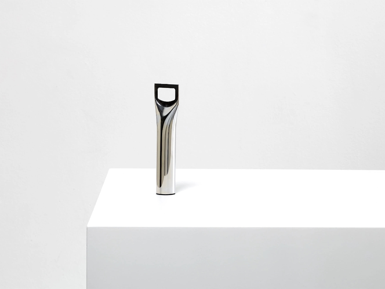
Turning something crude into an art object is the feat that From Us With Love accomplished. Taking a single rod of metal, flattening its top, and cutting out a hole in the middle resulted in a simple yet functional bottle opener. It embraces the functional minimalism of the old-school corkscrew and imbibed with the elegance of modern tools, a true retro design if there ever was one.

Hirotaka Tako: Marking Gauge Ikebana Lamp
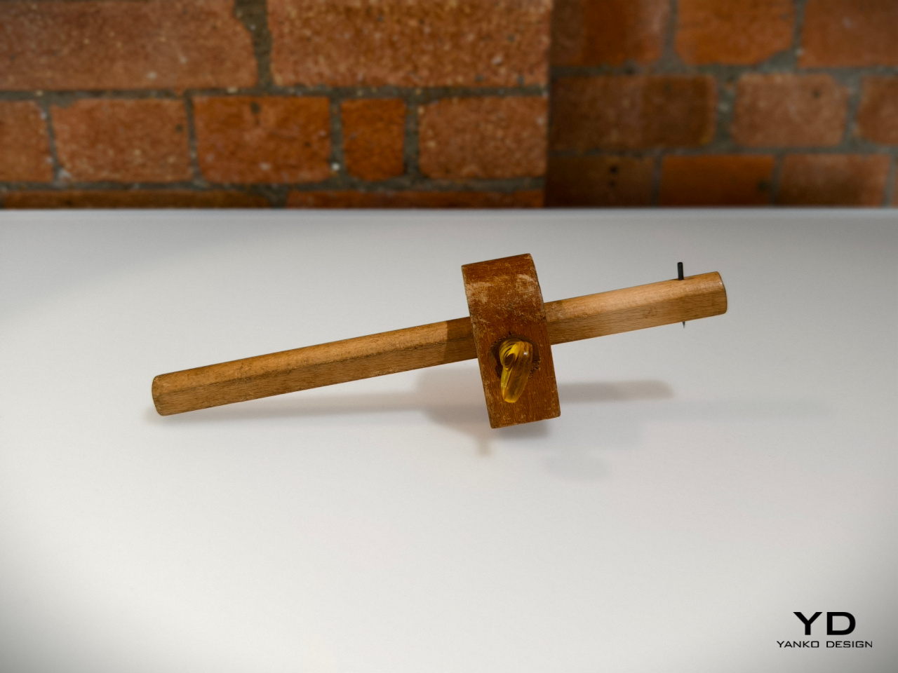
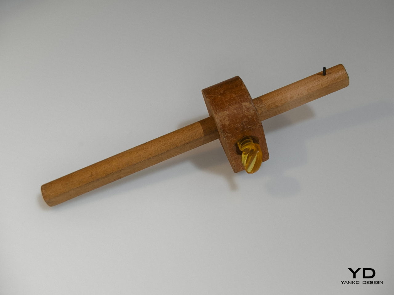
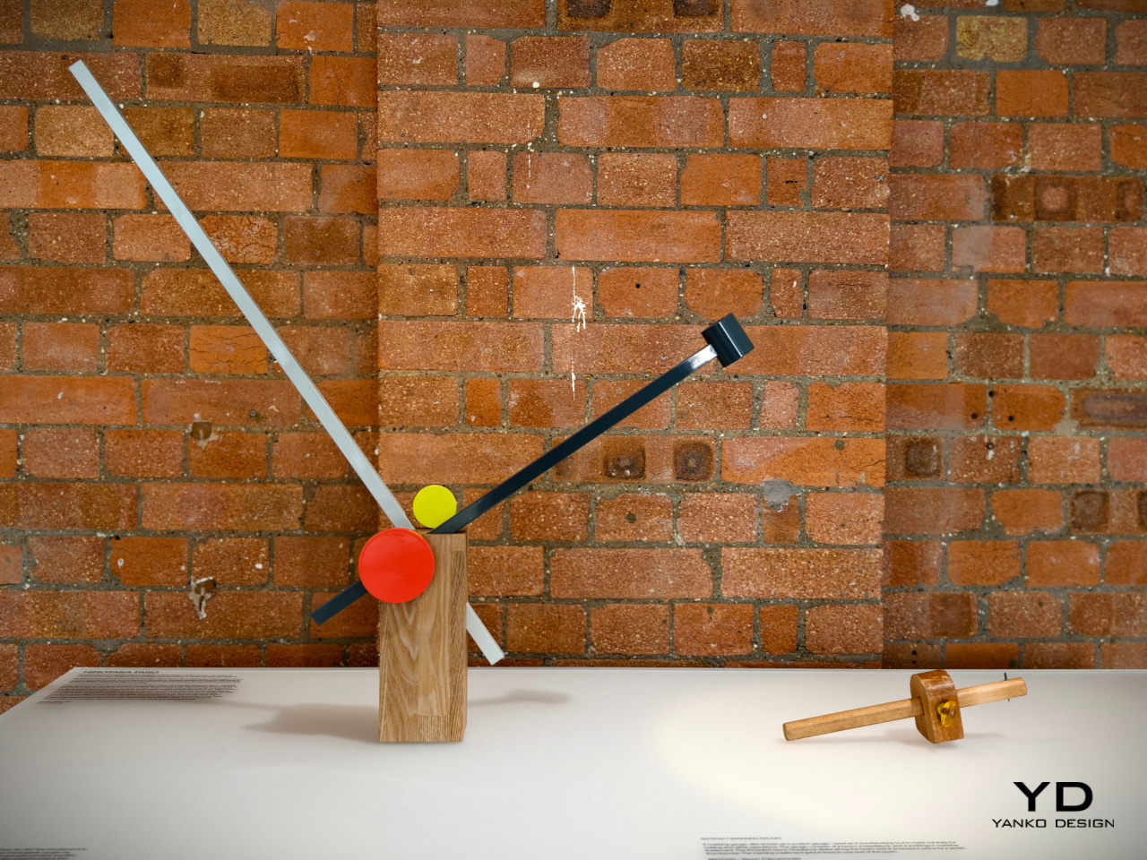
We enjoy a lot of convenient tools today that make it trivial to do things like measuring pieces of wood. In the old days before measuring tapes and meters, however, people had to make use of rather complicated tools that involved a wooden rod sliding inside a a block. This measuring gauge, though crude, created a rather interesting form that was not that different from a piece of art, which is exactly what inspired this rather geometric lamp design.

Designer: Hirotaka Tako
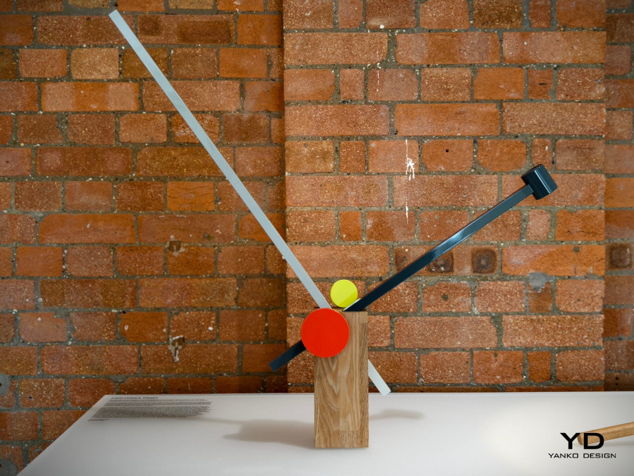
Taking inspiration from both this outdated tool as well as a Japanese art of floral arrangement, Hirotaka Tako designed a table lamp that similarly used the concept of inserting a long thin stick into something bigger. He likened the wooden rods to a flower stem inside a vase, exactly like an Ikebana arrangement. The result is a table lamp that is both functional and artistic, inspired by a tool that was anything but.

James Melia: Timber Basket Pendant Lamp
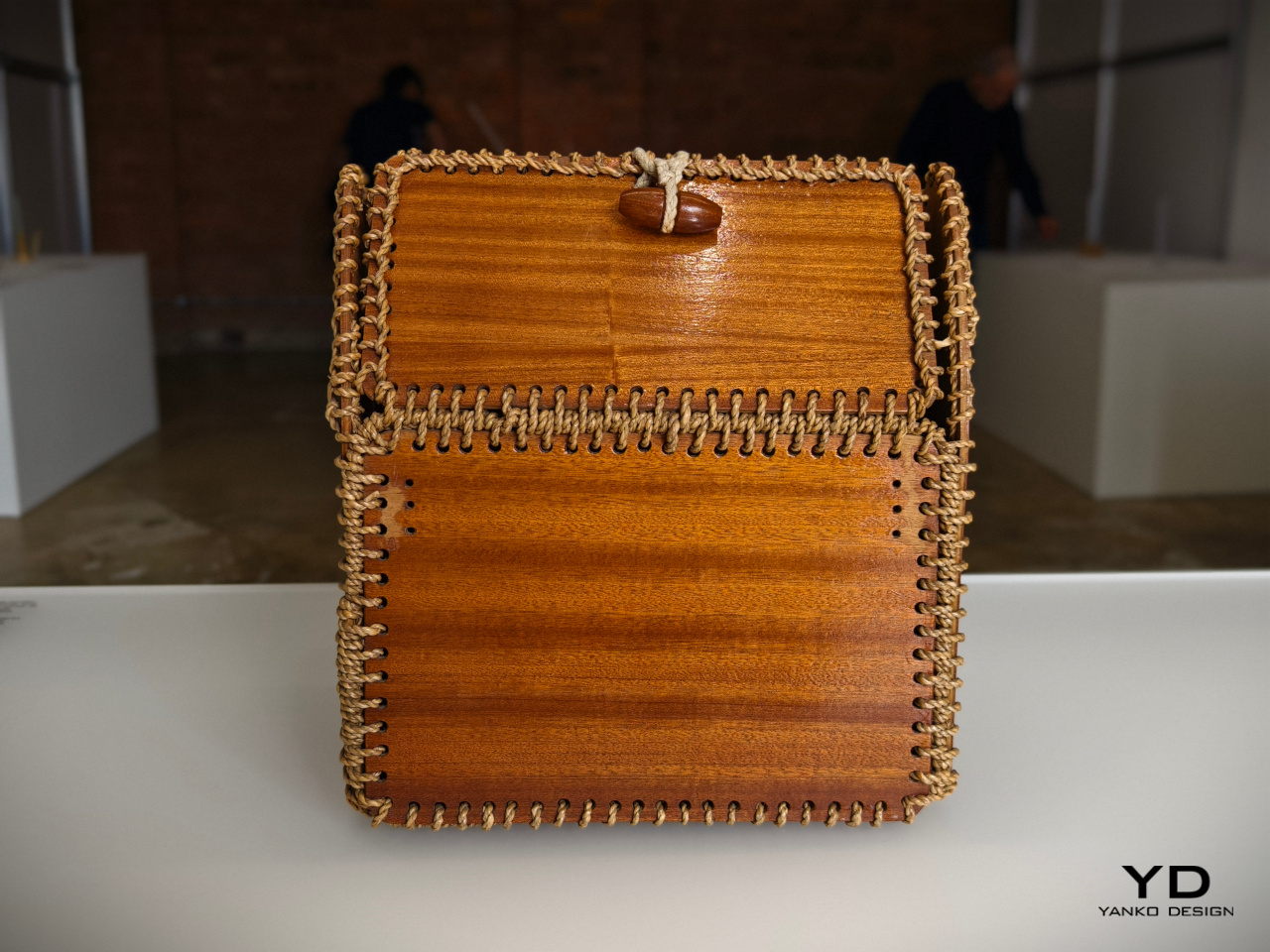
We take for granted the materials used to create modern products these days, not to mention the methods for making them. Today, we have machines that can print almost any shape imaginable, but past generations had to do things by hand, using stubborn and difficult materials. The rope patterns used to keep a timber basket together, for example, offered not only structural stability but also an interesting visual, one that can add a bit of a flair to an otherwise normal object.

Designer: James Melia
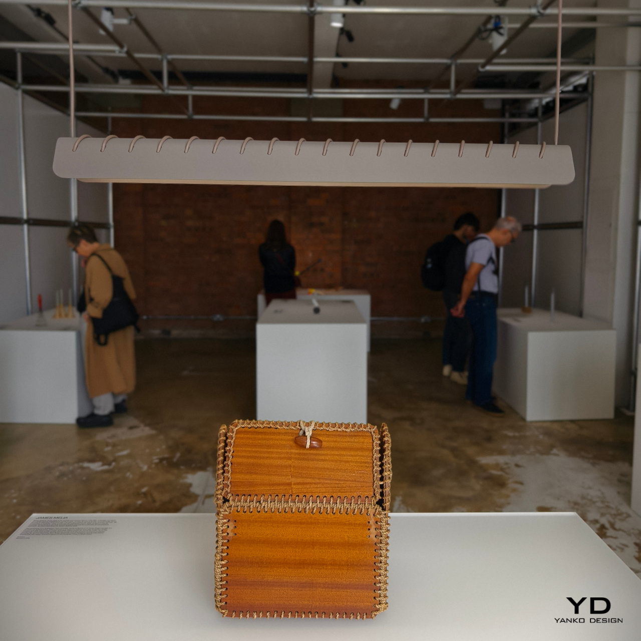
James Melia takes a hanging lamp’s power cord and stitches it along the length of its shade, creating a row of diagonal stripes that turns a plain lamp into an art object. That same cord is used to actually hang the lamp from a ceiling, reducing the number of parts involved in designing the lamp and creating a simpler and more sustainable design.

John Tree and Neal Feay: Tea Ladle Turntable
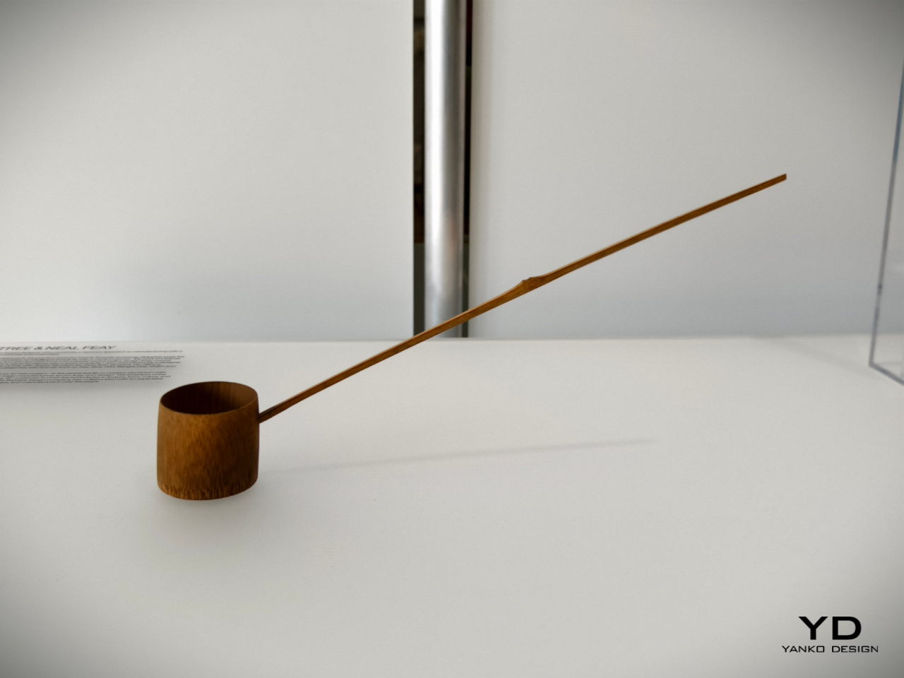
The Japanese are famed for their minimalist tools which are an art form in their own right. A simple scoop for tea powder, for example, takes the form of a bamboo ladle with a distinct charm. Though today’s tea lovers will probably use different tools, this traditional object still remains a staple in Japanese culture today as well as practices that recreate it. To some extent, it’s almost like the venerable turntable that has seen a renaissance and is getting some use even today.

Designer: John Tree x Neal Feay
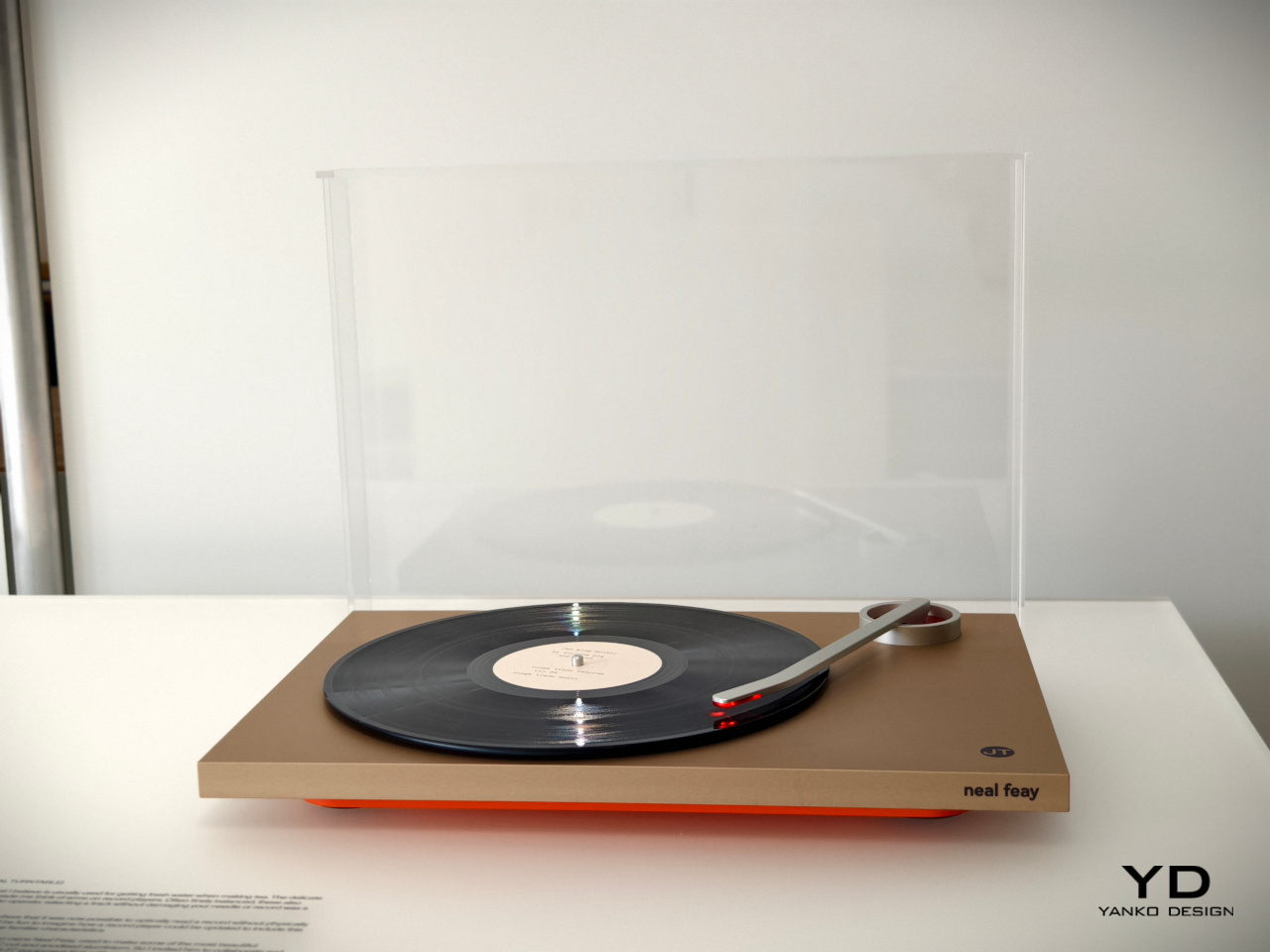
This optical turntable takes that delicate-looking bamboo tea ladle and transforms it into a turntable arm that preserves that spirit of gentleness. Rather than using a sharp pin to read the grooves of the platter, it uses light to avoid any physical contact and help preserve the vinyl material. It’s a gentle and delicate spin on a classic retro design, no pun intended.

Jon Marshall: Whisk Candelabra
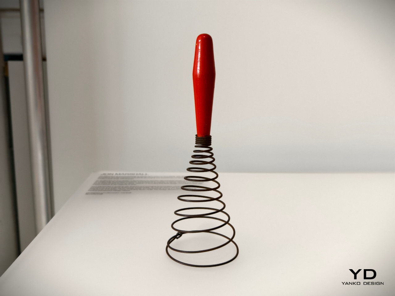
Today’s whisks are light, compact, and handy tools that use a few loops of bendable wire or plastic, a design that’s so far removed from the coiling iron wires of much older versions of the kitchen tool. Looking more like springs or even weapons, this antique whisk form isn’t very efficient at what it’s meant to do, but it admittedly looks novel and interesting to our modern eyes.

Designer: Jon Marshall
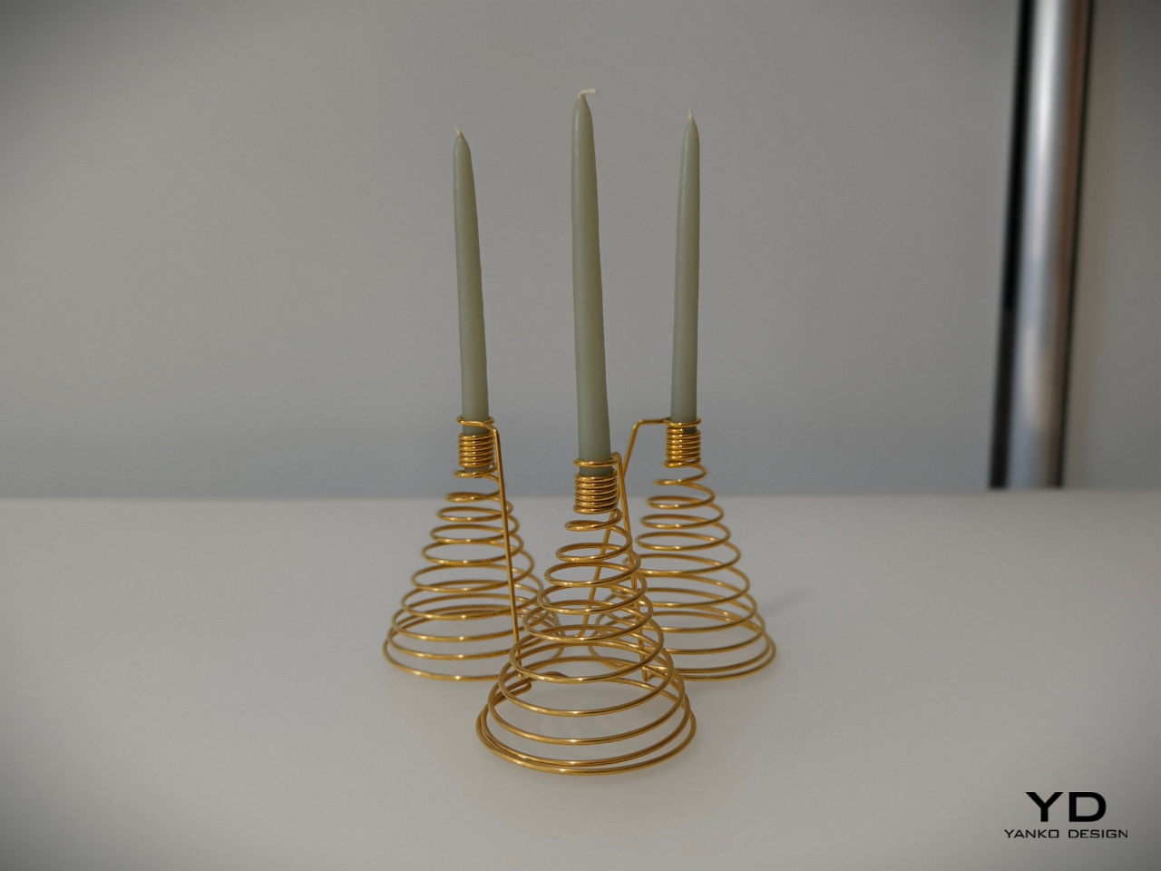
It might not make scrambled eggs, but this candelabra will definitely bring a bit of delight to your dinner table. The spiraling form of the base and the tight coils of the candle holder make for an interesting visual, but it’s when the candles are lit and the shadows dance that this rather luxurious-looking light fixture truly comes alive.

Julie Richoz: Balance Bird Balancing Lighter
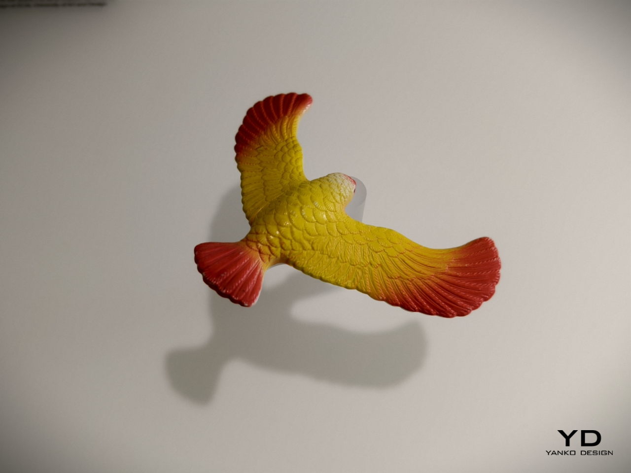
Kids tend to find science and math lessons boring until they encounter puzzles and feats that really blow their minds. Something as simple as a perfectly balanced eagle held up only by its beak is sure to pique curiosity, even those of adults. This ingeniously disguised pendulum is not an uncommon toy or desk ornament, but the same principles can be used to the same effect for other objects, including more utilitarian ones.

Designer: Julie Richoz
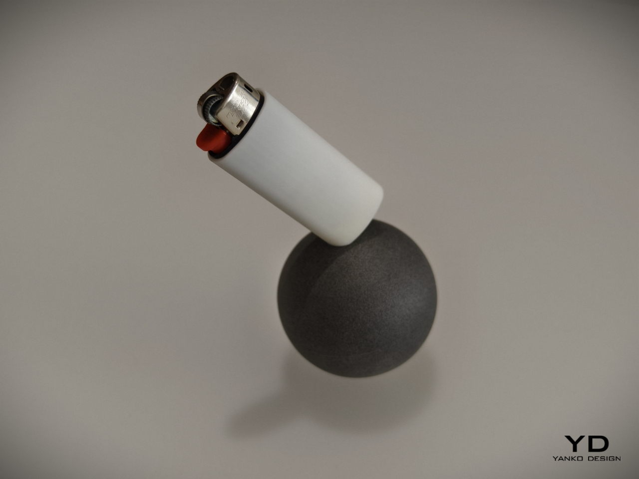
A lighter standing only one of its corners is definitely going to make you the talk of the party, and it provides not only an entertaining piece of decoration but also practical use. It will be easy to see if the lighter is missing from its base, and people who use it will be more likely to put it back on its perch just to marvel at its balancing act. It’s a very simple twist to a simple object but one that has a nontrivial effect on those who see it, all thanks to some inspiration from old objects we have taken for granted.

Maddalena Casadei: Mallet Flashlight
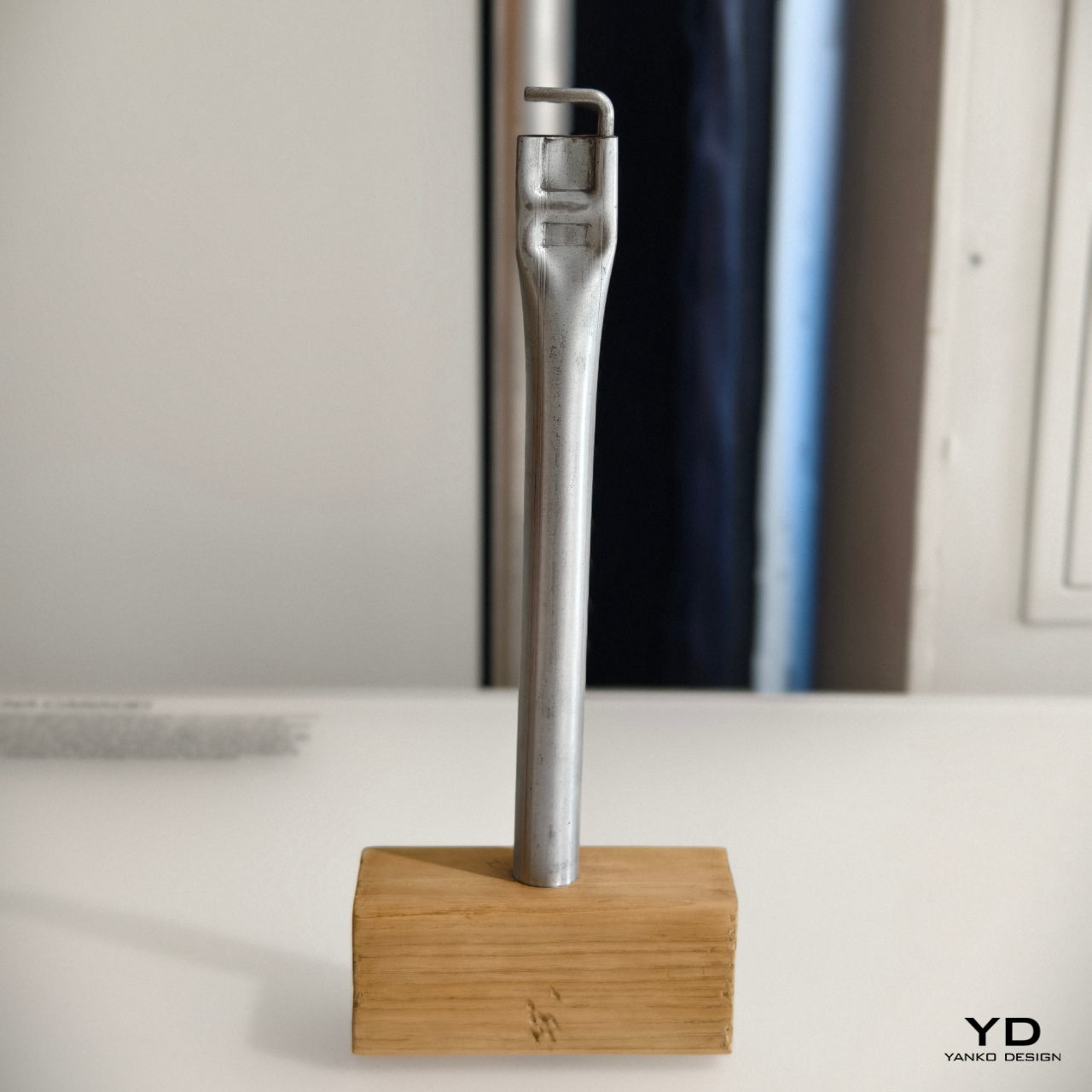
Most of us who have done any sort of handiwork may have used a hammer at one point in time or another. There are different kinds of hammers, of course, and one such type is the mallet. Often made with a heavy head to pound things flat, some old-school mallets would reverse the typical hammer design and use a steel rod handle with a wooden block for the head.

Designer: Maddalena Casadei
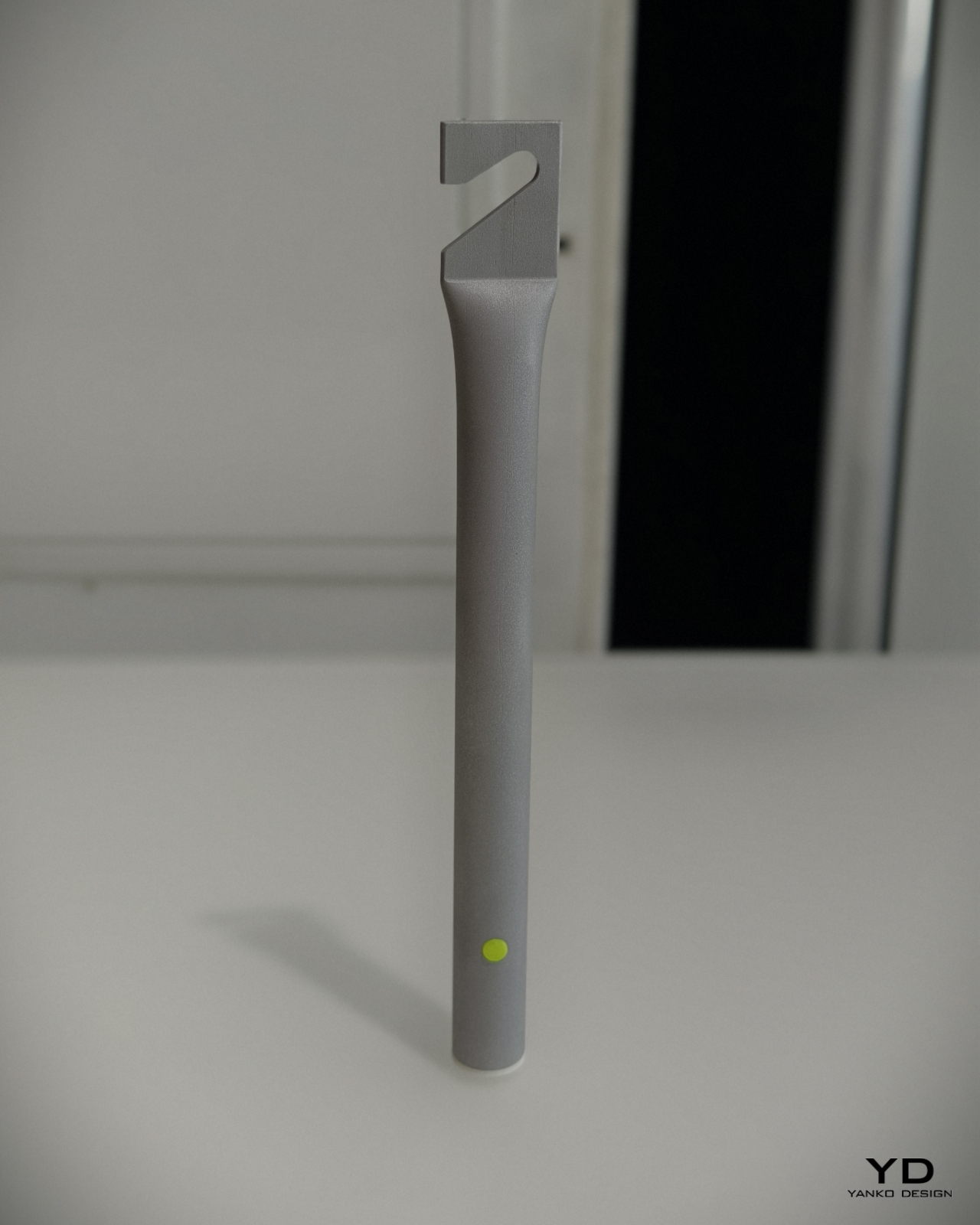
Maddalena Casadei took that raw-looking industrial metal handle to turn it into a cylindrical flashlight with similarly brutalist aesthetics. Instead of the wooden head, it has a small removable cone that serves as a diffuser for the light. On the opposite end is a flattened section with a hook that serves the same purpose as the hammer from decades ago: hanging the tool from walls or rods. It’s a rather interesting depiction of a flashlight that sheds off all the sleek and luxurious designs of its modern equivalents, embracing the utilitarian character of its inspiration.

The post BLOND LABORATORY at London Design Festival 2024 revives old designs in unexpected ways first appeared on Yanko Design.

This Retro Open-front CD Player also has an Ambient Lamp, FM Radio, and Bluetooth Speaker

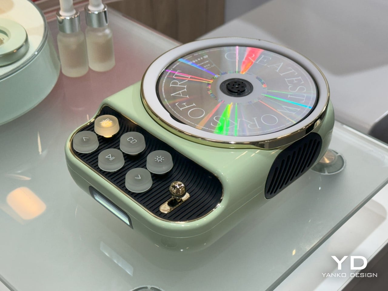
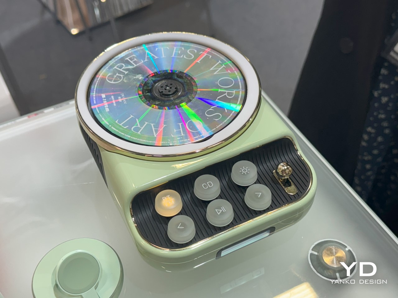
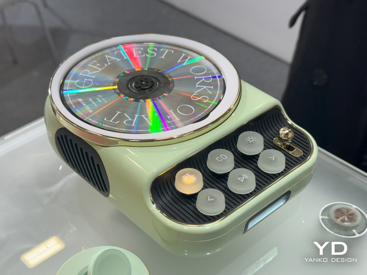
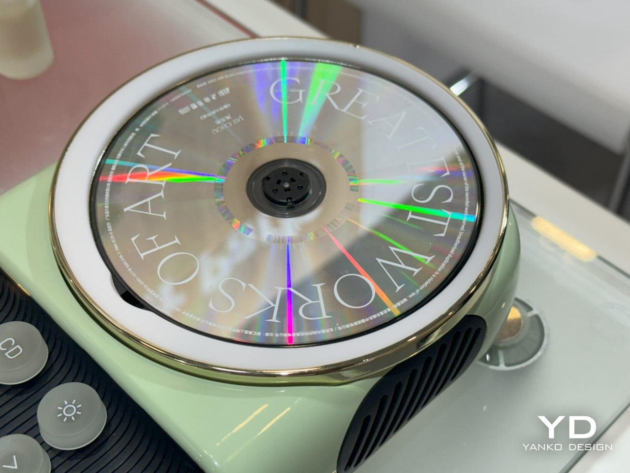
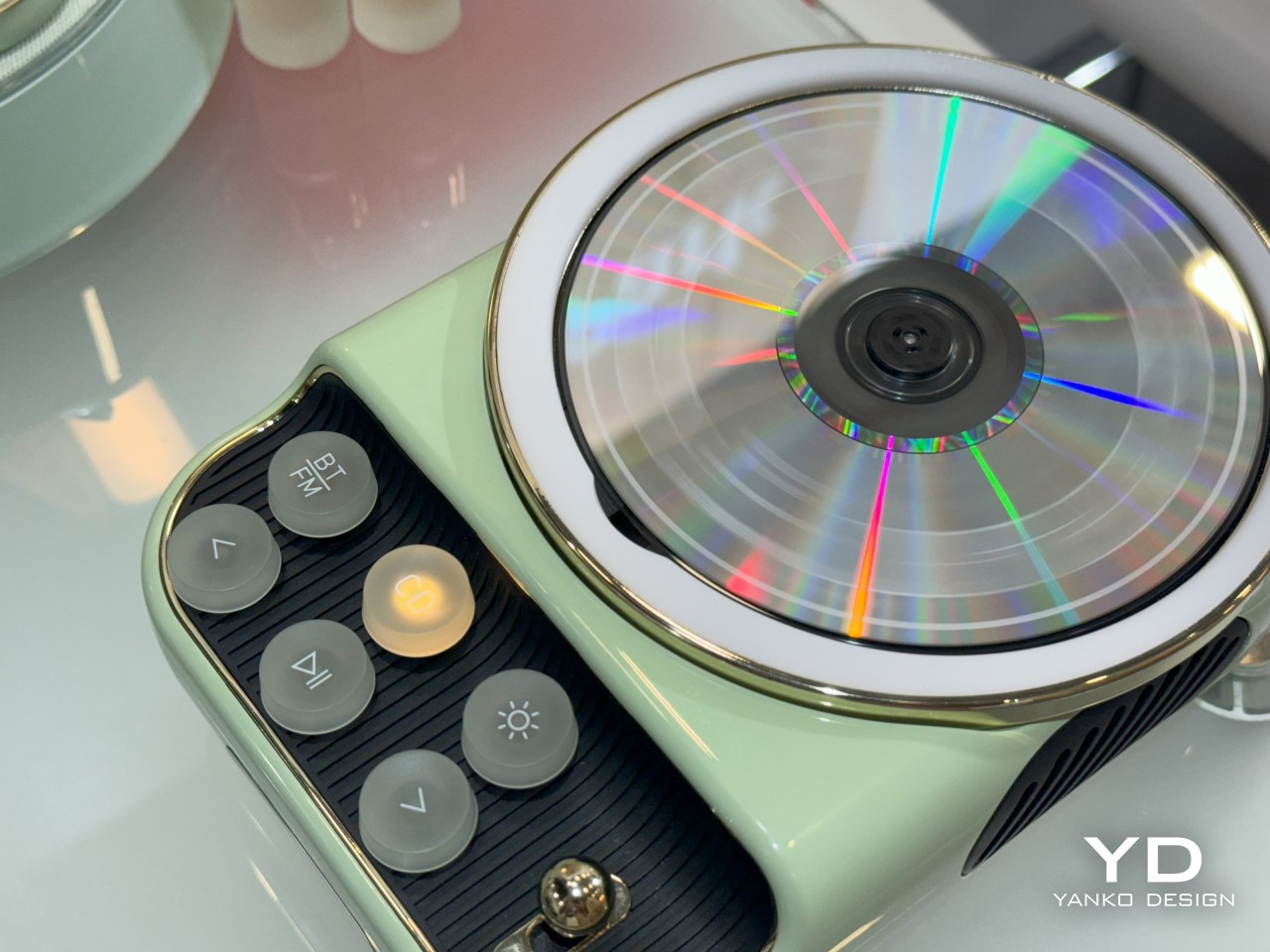
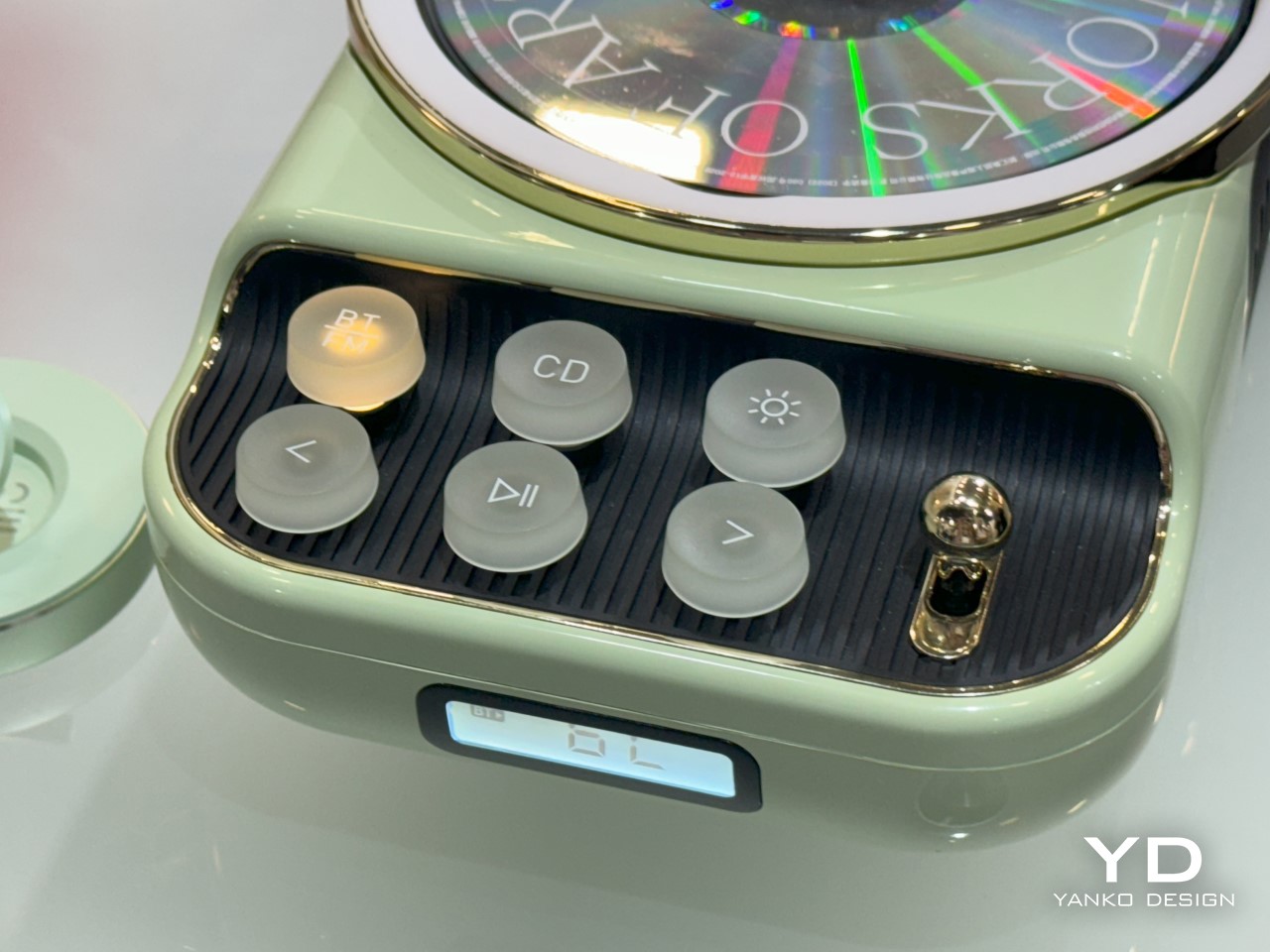
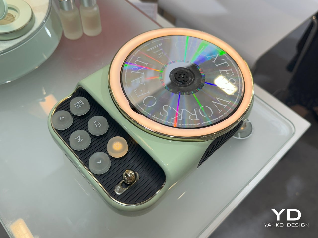
They say history always repeats itself. Vinyls are making a comeback right now, which means in a few years cassettes and CDs will make a resurgence all over again, and when compact discs do enter the mainstream, you’re going to be glad you had this cute CD player from Semetor. Spotted on the floor at IFA 2024, the K8 is a playfully retro CD player that embraces the design aesthetic of European appliances in the 50s. Designed with an open top that allows the CD to sit on its platter like a vinyl on a gramophone, the K8 comes with a few translucent typewriter-inspired buttons that let you control music playback. But wait, it’s 2024, and just being a CD player obviously won’t cut it… which is why the K8 also has an FM radio, a Bluetooth-enabled wireless speaker, and even an ambient lamp built into its adorable design.

Designer: Semetor

The K8 isn’t a cutting-edge CD player… but it’s cute. It has the adorable demeanor of one of lofree‘s older products, with its retro aesthetic that’s brought about by its rounded form and use of pastel shades. What instantly grabs your eye first is the open-top CD player. While most players usually conceal the CD within a casing, this one does not. You see the CD spin as you play music, and the disc’s radial spectral finish looks absolutely gorgeous.

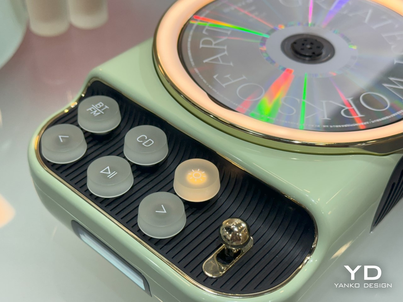
Playback is easy. For running a CD, just hit the CD button on the panel, and use the controls below to play/pause, or skip tracks. A BT/FM button lets you toggle the Bluetooth player or FM radio. Backlights in the button glow to let you know which mode you’re in, and a seven-segment LCD screen on the bottom allows you to see things like track number (for CDs) or radio station (for FM). A gold-plated ‘gear’ on the right side lets you switch on or off the K8.

If all that wasn’t enough, the K8 also packs a warm glow-light for ambient lighting. Hit the button on the top right and a halo around the CD player lights up. It isn’t enough to light a room, but it does bestow a warm wash of golden light in the immediate vicinity, perfect for late-night listening. Pair it with a nice soft jazz CD and you’re absolutely set!

The post This Retro Open-front CD Player also has an Ambient Lamp, FM Radio, and Bluetooth Speaker first appeared on Yanko Design.

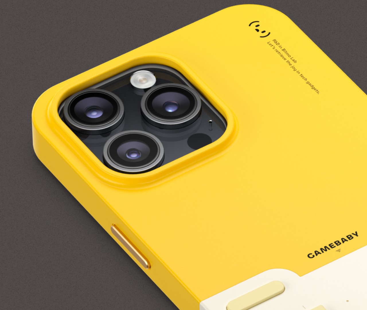
GameBaby is a protective case that transforms iPhones into retro gaming handhelds

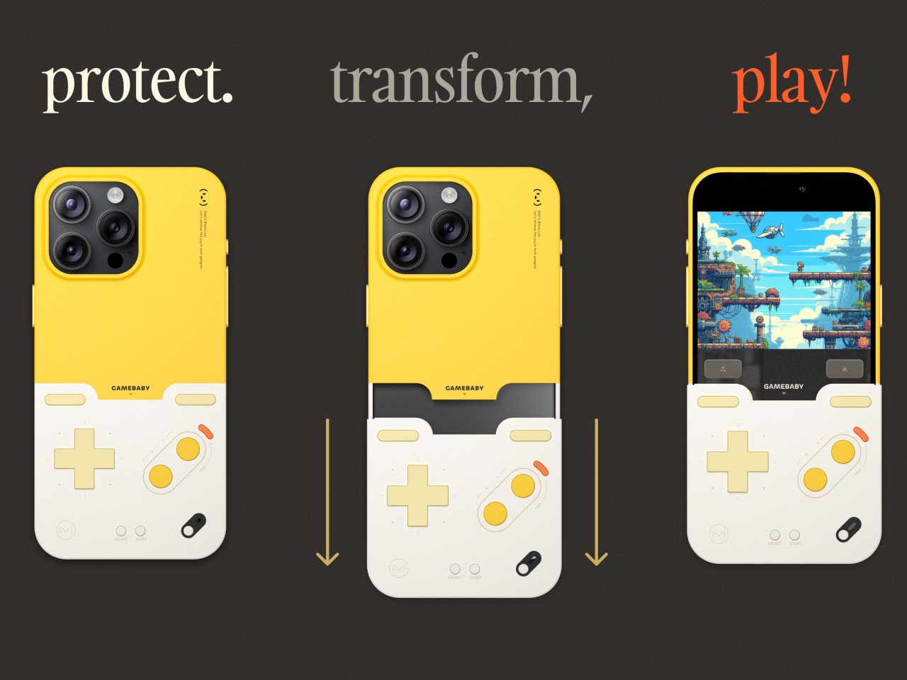
Video gaming is still a thriving and lucrative industry, and you don’t even need to own an expensive and heavy handheld PC to enjoy it. With Apple now allowing emulators into the App Store, there is a vast new source of titles to play, some of which aren’t exactly conducive to tapping on a flat screen. Game controllers for iPhones aren’t always the best solution, especially if it means carrying an extra accessory in your pocket. But what if you never had to remove that controller in the first place? That’s the idea behind this genius iPhone accessory that’s a GameBoy-like controller when you need it and a quirky protective case when you don’t.

Designer: Bitmo Lab

There are iPhone-compatible game controllers that attach to the smartphone but only makes sense if you hold it sideways like a Nintendo Switch. You can’t leave these permanently on the phone, of course, which means you’ll have to make sure you always bring it with you when the craving to play strikes. That could be a fleeting moment, however, that quickly evaporates while you try to strap the controller, turn it on, and pair it with the phone. Plus, the landscape orientation really only works for modern mobile games, not the ones from decades past.

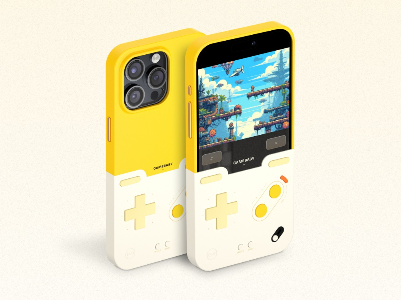
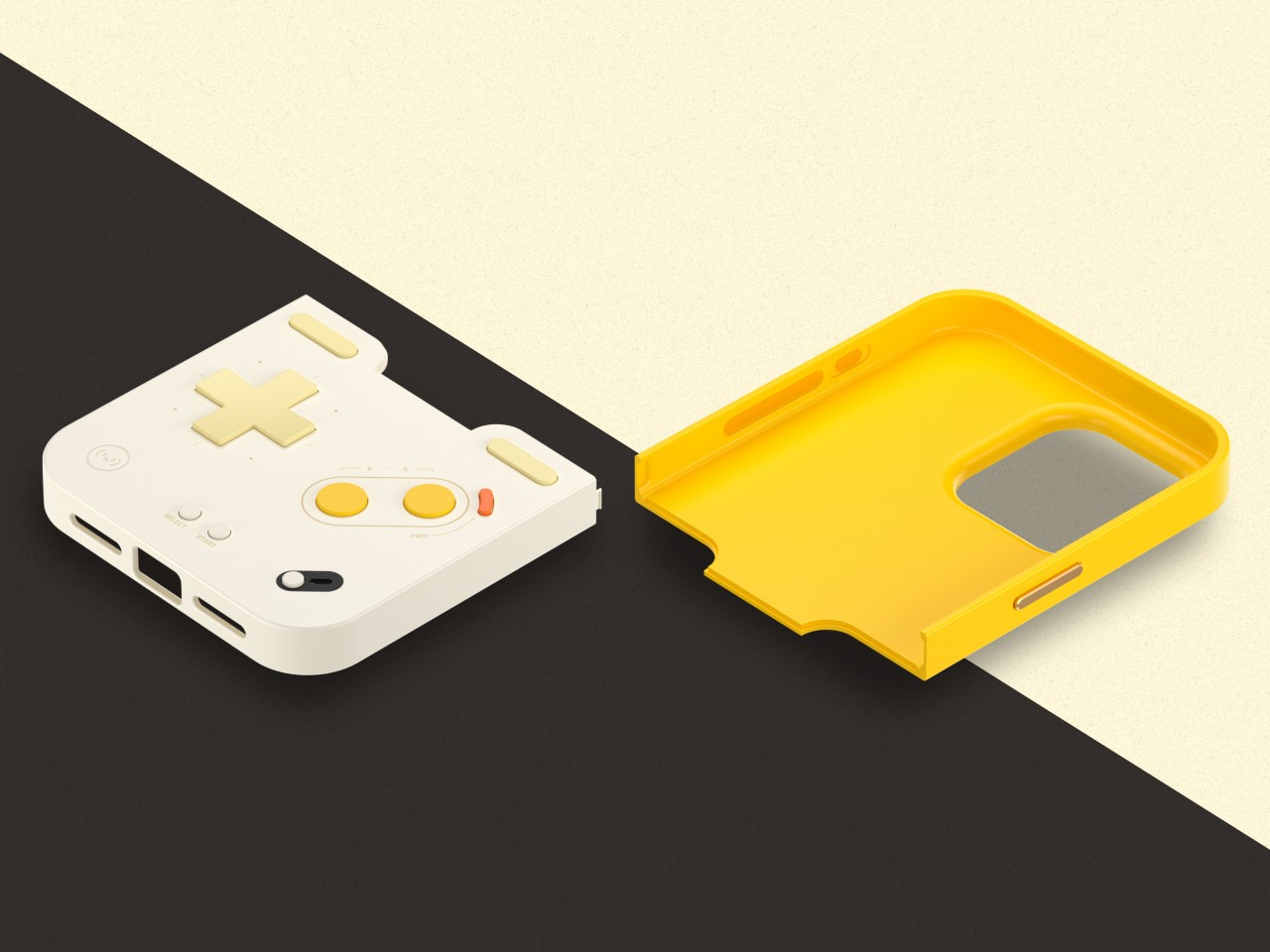
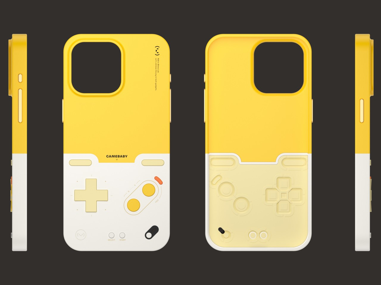
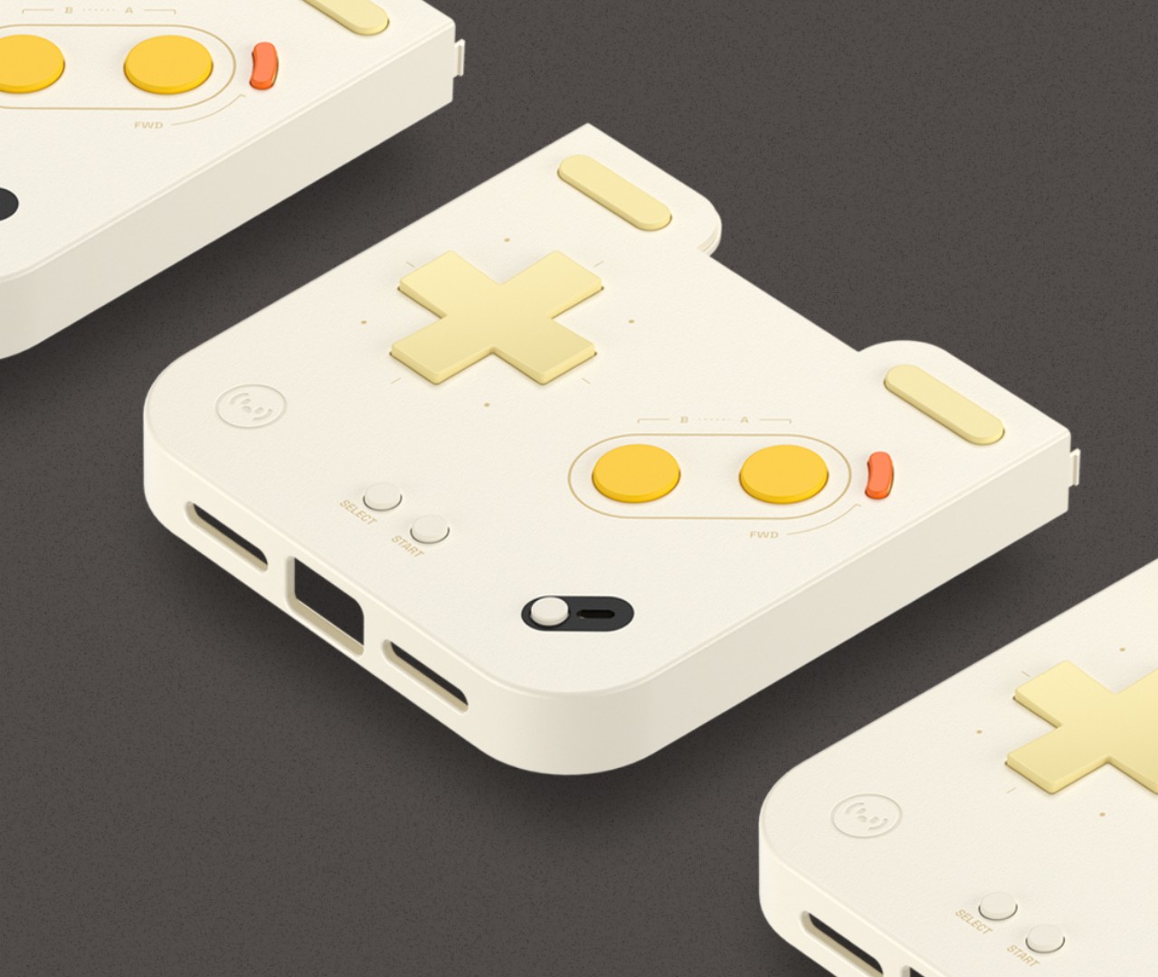
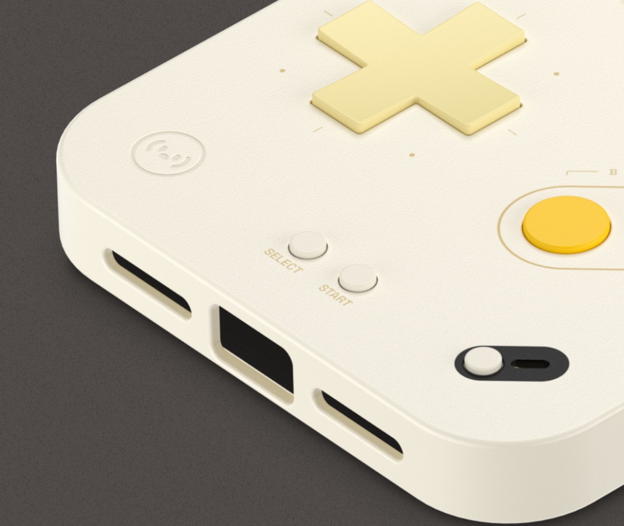
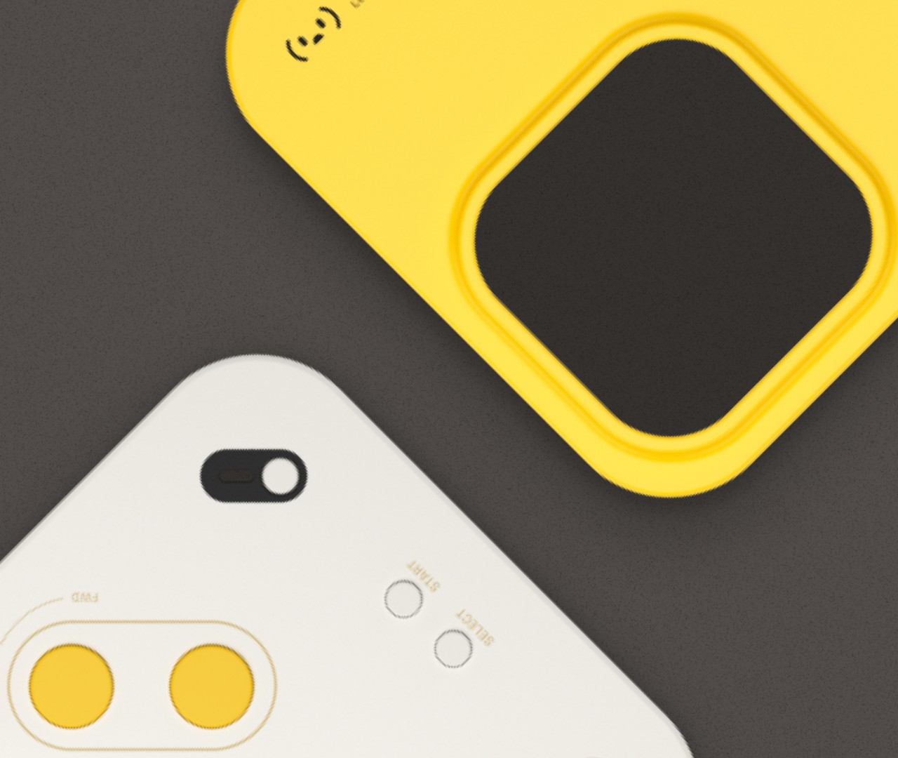
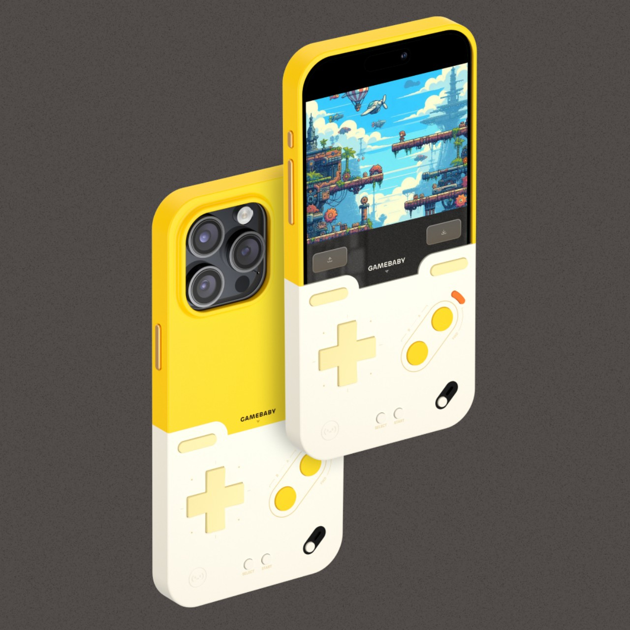
GameBaby is an innovative design that solves that problem while also paying homage to some of video gaming history’s greatest hits. It’s technically a two-part case for the phone that slides onto the top and bottom of the phone. The critical difference is that you can flip the bottom half around, revealing actual working buttons in the familiar layout of many old-school handheld consoles, particularly the GameBoy which served as this accessory’s inspiration.

Since the buttons go over the lower half of the iPhone screen, it offers direct input without the lag of Bluetooth or even USB connections. It also means there are no batteries to be worried about either. It’s really simply just a layer of buttons that give you a more tactile feeling than mashing your finger against the glass. And when you’re done playing, simply slide the case off, flip it again, and go on with your regular life.

The catch to this simple yet useful design is that it really only works with emulators that play retro games made for old consoles like NES, GameBoy, and similar. It works best with the Delta emulator now available on iOS, and Bitmo Lab has custom emulator skins designed specifically to match the layout of the physical buttons. The even bigger catch, however, is that GameBaby is only available for the iPhone 15 Pro Max and the upcoming iPhone 16 Pro Max, and only in a banana yellow and white color theme.

The post GameBaby is a protective case that transforms iPhones into retro gaming handhelds first appeared on Yanko Design.