This Single-Person Acoustic Pod Offers Solo Workspaces In Modern Offices

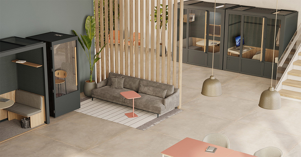
Honestly, in time I’ve really come to love office pods or work booths. Office pods have gotten supremely popular ever since COVID-19 hit, not only do they create little isolated spaces to work in, but they also provide a whole other level of privacy, that would have been otherwise unimaginable and completely unattainable in a commercial office. There are quite a few versatile options on the market when it comes to office pods, and a pretty neat one I recently came across is the Phone Booth Acoustic Pod.

Designer: Room

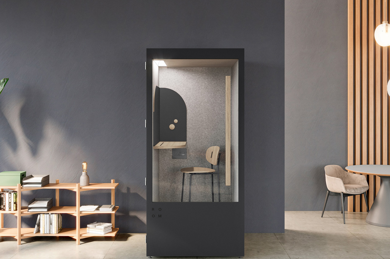
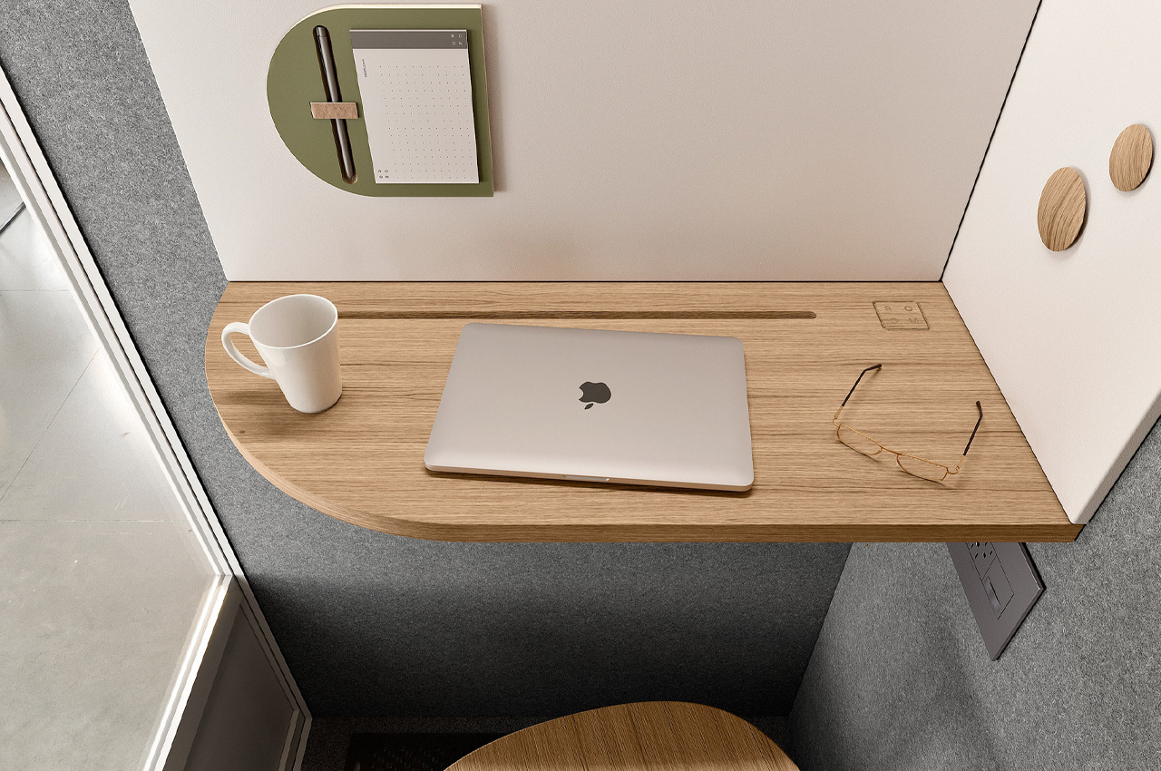
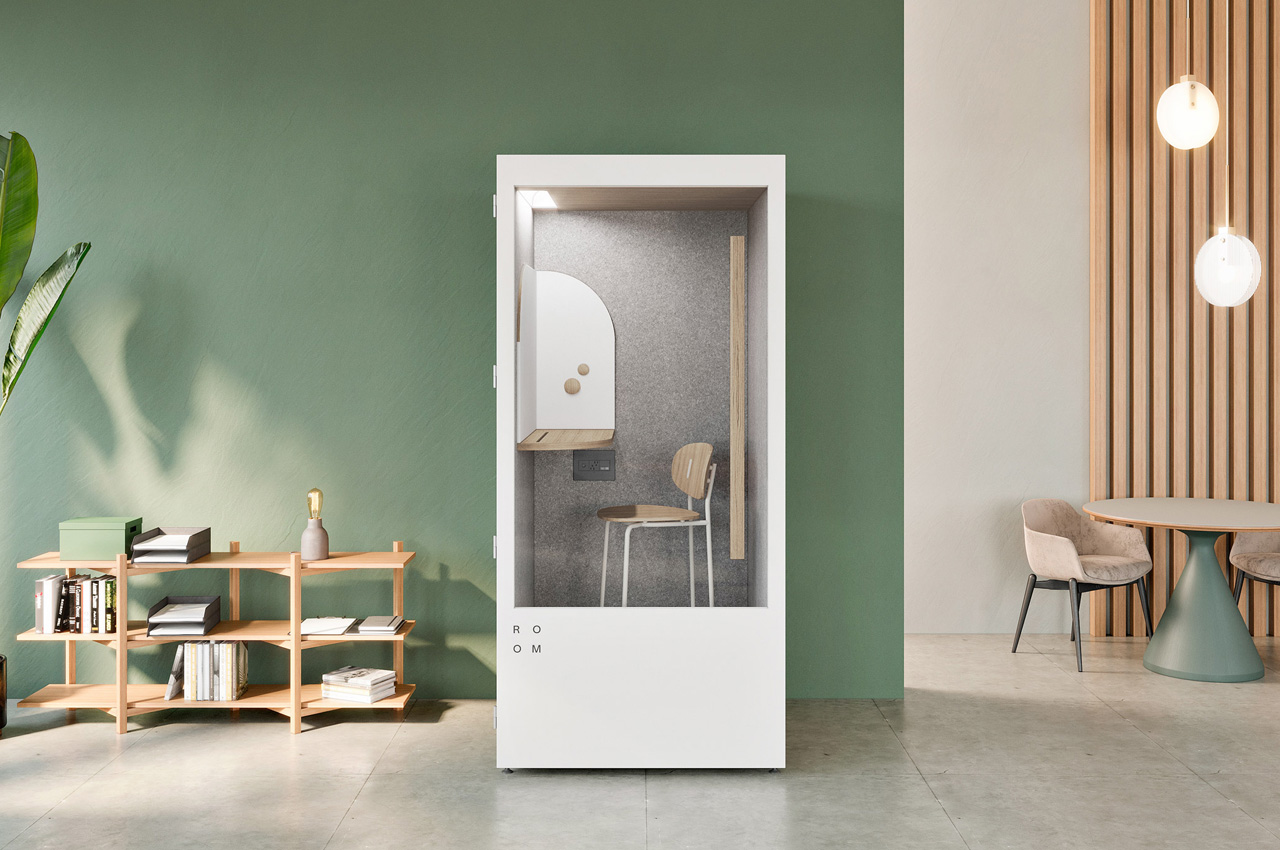
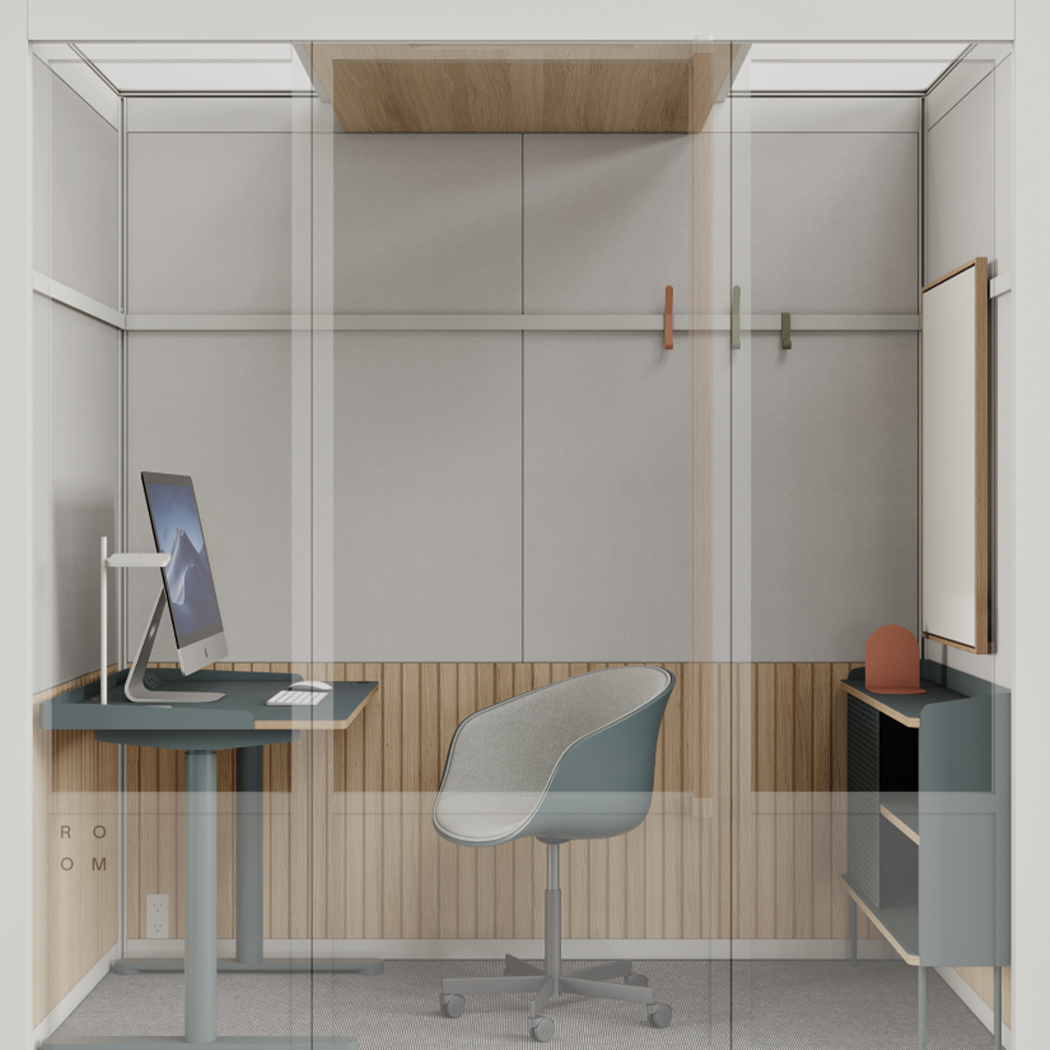
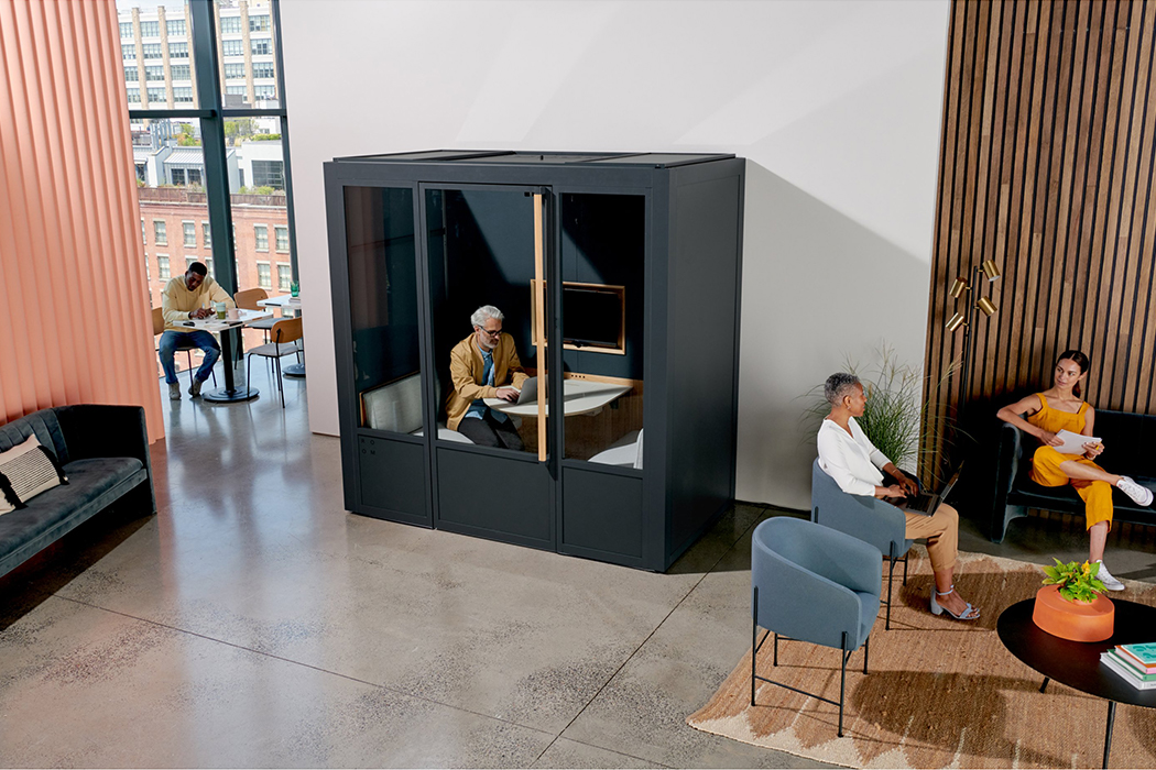
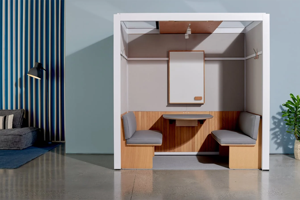
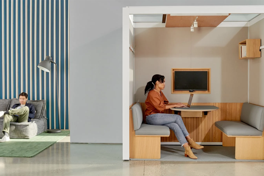
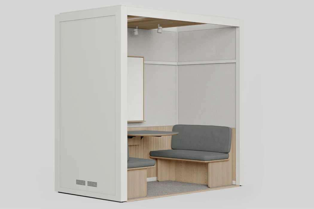
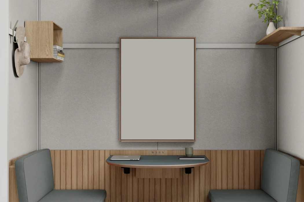
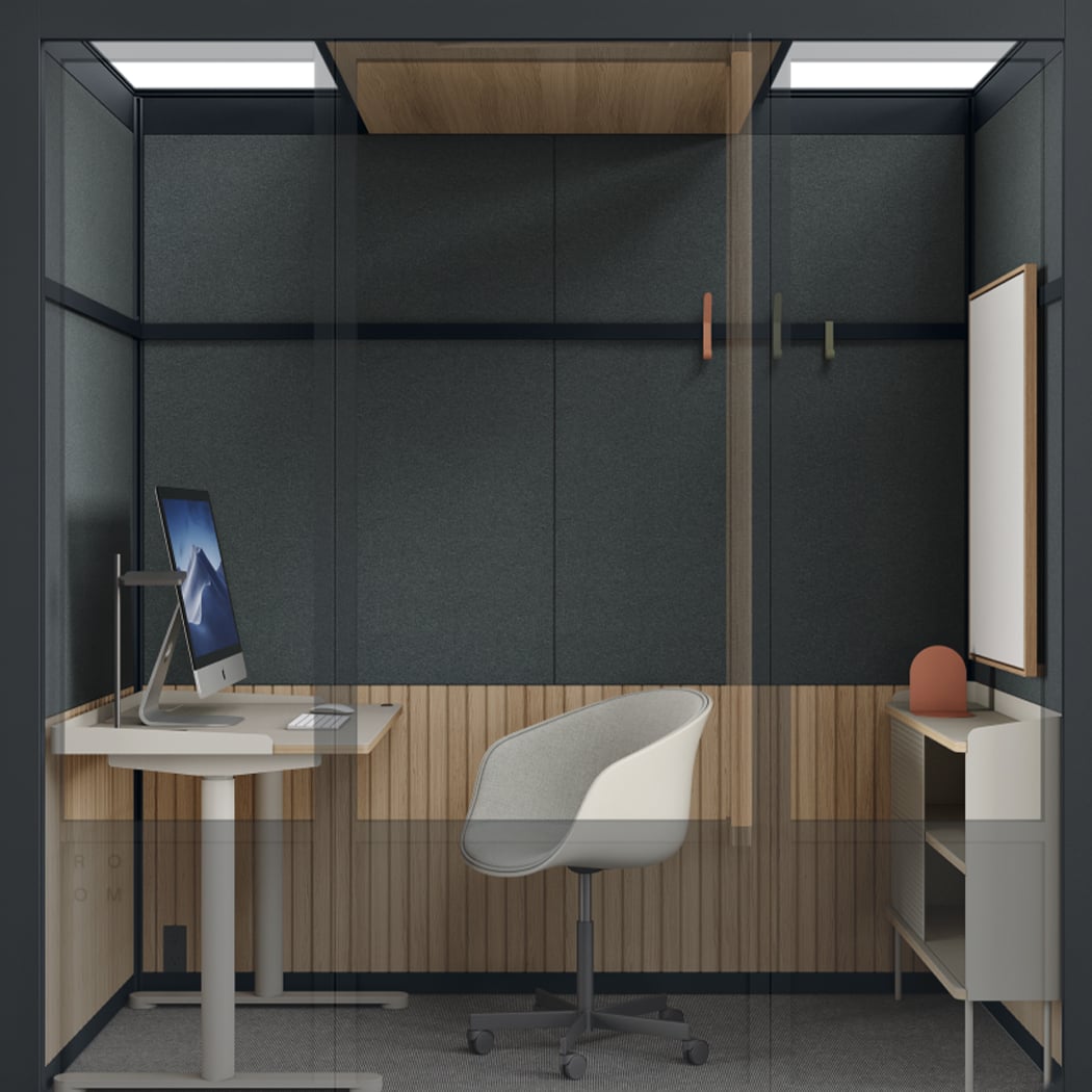
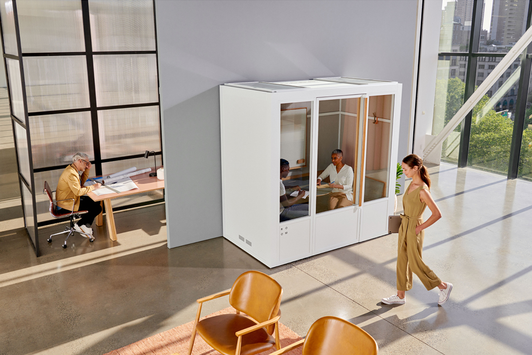
Acoustic pods have become a pretty common sight in corporate offices these days, and I hope this initiative is here to stay. Workplace furniture brand Room recently made an addition to the arena of acoustic pods in the form of the Phone Booth Pod. The Phone Booth is a single-person acoustic pod that offers solo workspaces in open-plan offices. The Phone Booth is the first product designed in Room’s catalog and it features three sound-dampening material layers that reduce noise by 30 decibels, to create a quiet and peaceful work environment.

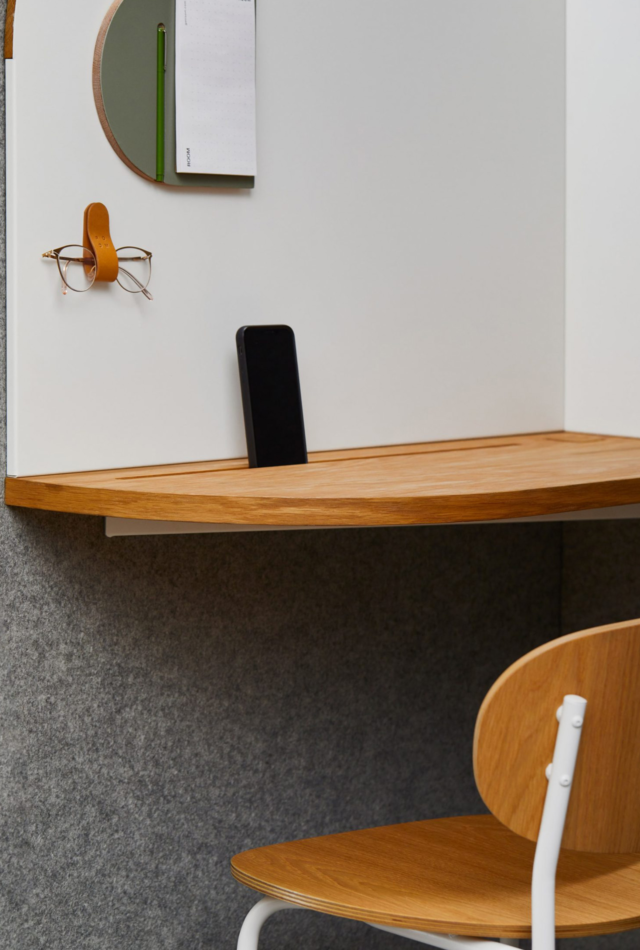
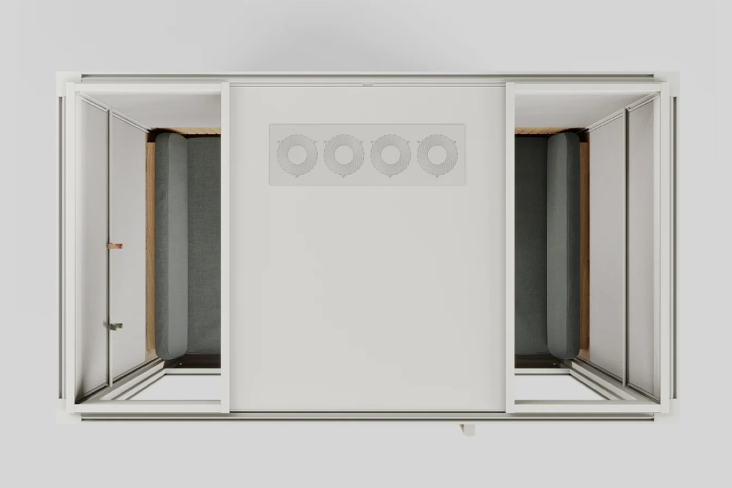
The Phone Booth is clad in sound-blocking MDF and lined with a sound-absorbing PET which is created from recycled plastic bottles. These features in addition to 100 percent natural wool finishes help to control the noise levels and form a soothing workspace. A LED light has been mounted in the ceiling, alongside two super quiet fans to maintain a clean air level inside the booth. The light and the fans can be controlled and operated via a smart sensor.

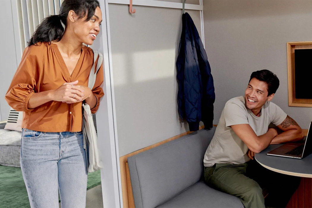
The Phone Booth acoustic pod is available in two colorway options – light and dark, both of which are accentuated with oak accents. The acoustic pod is delivered in a flat-packed form and can be assembled within an hour by two people with the help of only one tool. The acoustic booth can also be easily moved between locations with ease once it has been assembled. The Phone Booth acoustic pod would make an excellent and functional addition to modern workspaces, providing employees with solo work booths where they can enjoy some peace and quiet without being disturbed.

The post This Single-Person Acoustic Pod Offers Solo Workspaces In Modern Offices first appeared on Yanko Design.

Top 10 furniture designs for your living room

A beautiful piece of furniture can complete a room. It can be the final piece that makes a space come full circle, building a comfortable and cohesive haven, rather than a random area. Furniture pieces make or break a home, they add on to the essence or soul of a home, hence one needs to be extremely picky while choosing a furniture design. The design should be a reflection of you, and what you want your home to be. When you place a piece of furniture in a room, it should instantly integrate with the space, creating a wholesome and organic environment. We’ve curated a collection of furniture designs that we believe will do this! Each of these pieces is unique, well-crafted, and made with a whole lot of love, and the love really shines through in the fine detailing and workmanship. We hope you feel the love too!

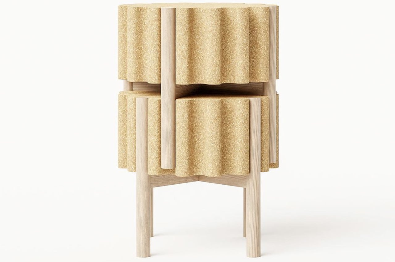
1. The Drum Stool
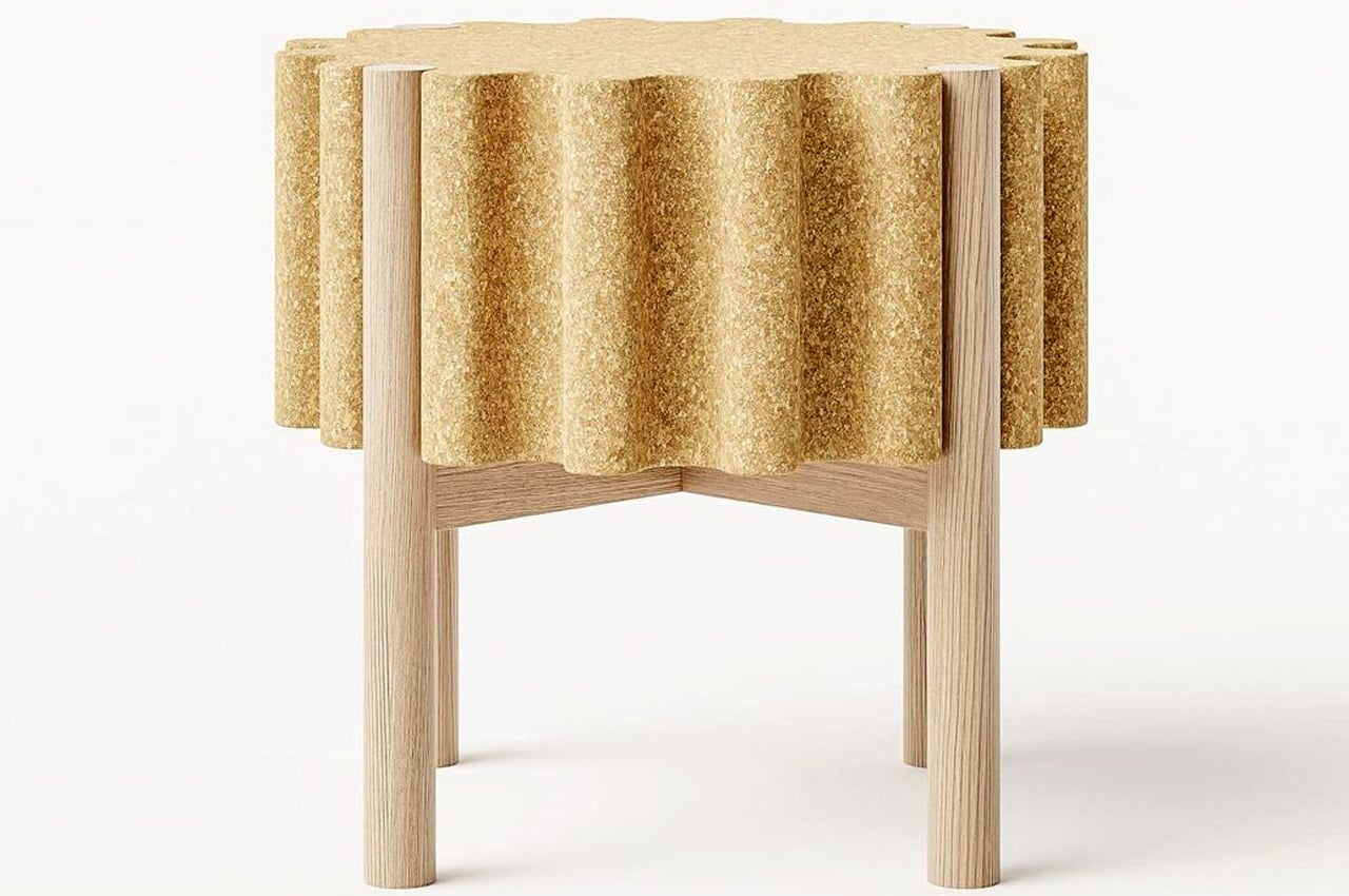
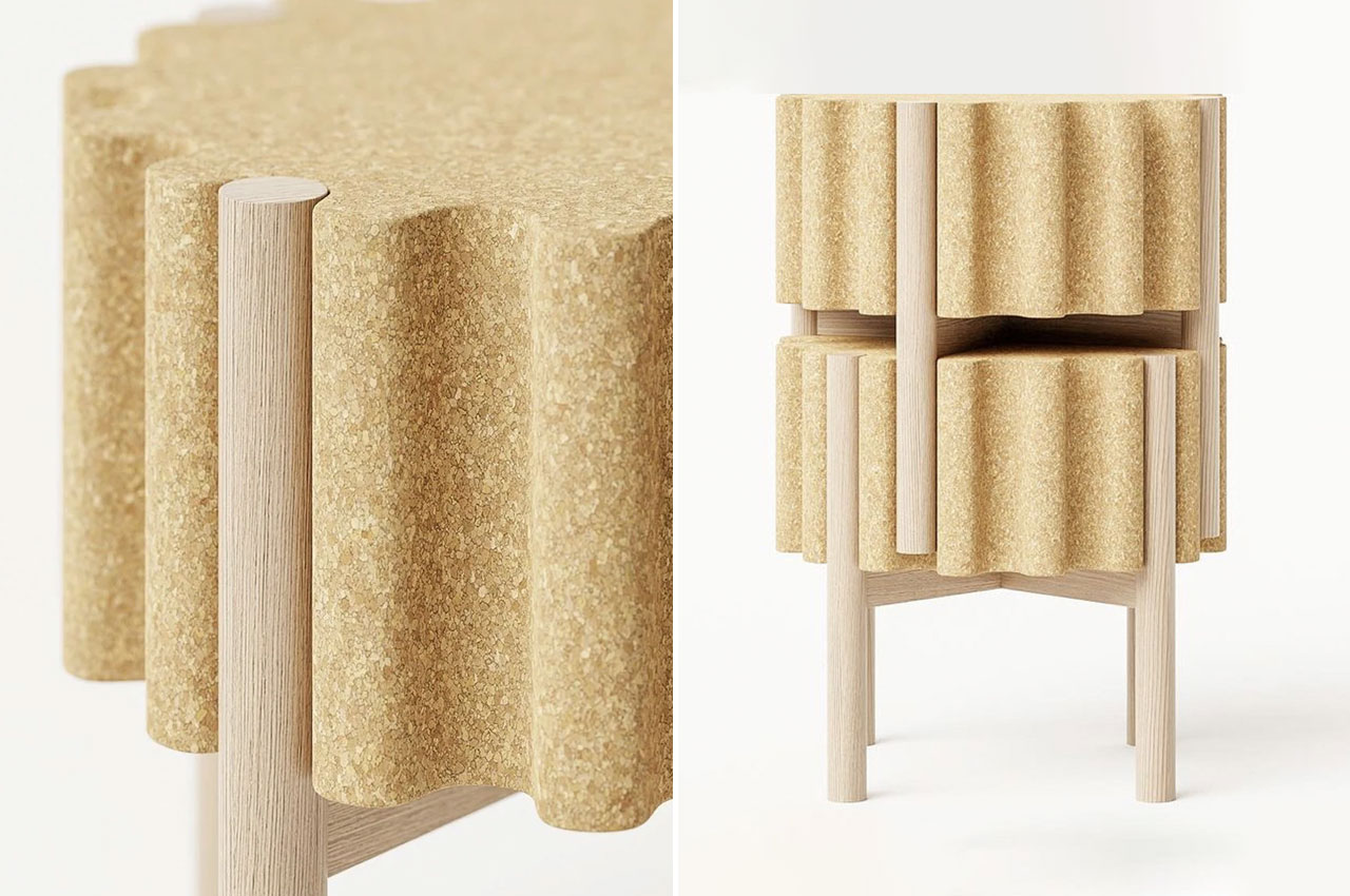
Designed By Teixeira Design Studio, The Drum stool is a minimal, clean, and stackable stool design that is also super sustainable. Although it looks like an adorable little wine cork, you will realize it offers so much more, once you take a closer look.

Why is it noteworthy?

Materials such as cork and wood were selected by Teixeira to build the stool, instantly making it a sustainable design. Cork was utilized to build the seat, while wood was used to create the legs.

What we like

  • The cork seat is comfortable and inviting and provides a grip while handling, so the stool is quite easy to move around and place in different positions

What we dislike

  • The wave pattern of the trimmed cork seat seems uncomfortable to sit on for long durations

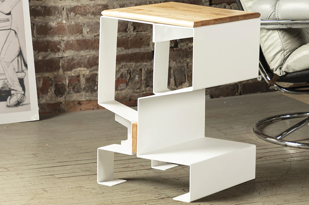
2. The Cheviot Side Table
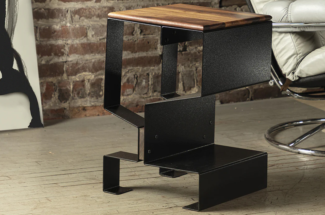
Designed by Ylisse, the Cheviot side table is built from sturdy steel featuring a long-lasting, heat-cured powder-coating finish. The finish offers resistance to everyday wear and tear. The table can be procured in two combinations – elegant walnut to match the black base, or iconic cherry to complement the white base.

Why is it noteworthy?

The Cheviot side table is a sophisticated and comfortable piece of furniture, with a simple and contrasting shape that perfectly complements modern homes. It features a mix of textures and contrasts which provide depth to our contemporary living spaces and supports a streamlined aesthetic.

What we like

  • Compact + space-saving design
  • Minimal and clean aesthetics

What we dislike

  • Colors may change over time, providing the wood with a more amber color – which may not be preferred by some

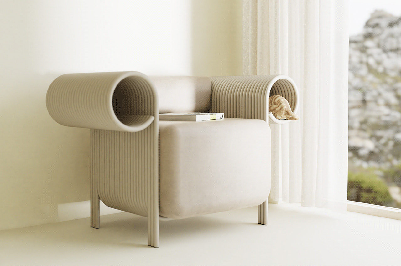
3. The Flow Single Sofa
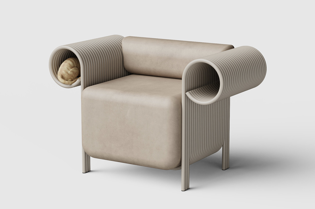
This minimal, elegant, and chic-looking armchair is called the Flow Single Sofa and is part of SUNRUI’s FLOW Collection. It literally looks like the Queen’s Chair if you look closely enough!

Why is it noteworthy?

The armchair has a bulky, space-consuming, and yet deeply elegant form that manages to represent, as well as downplay, the stoicness of the sofa. It has been equipped with spiral armrests that provide the sofa with a sophisticated and classy air.  The spiral armrests add an interesting and artistic element to the sofa and also quite amusingly resemble the Ionic Order. The Ionic Order is one of the orders of classic architecture and is defined by twin volutes or spiral scrolls.

What we like

  • Meets the needs of humans and pets alike
  • Creates a shared space where the owner and cat can spend some quality time together

What we dislike

  • If your pet pees or poops inside the armrests, it could be challenging to clean up

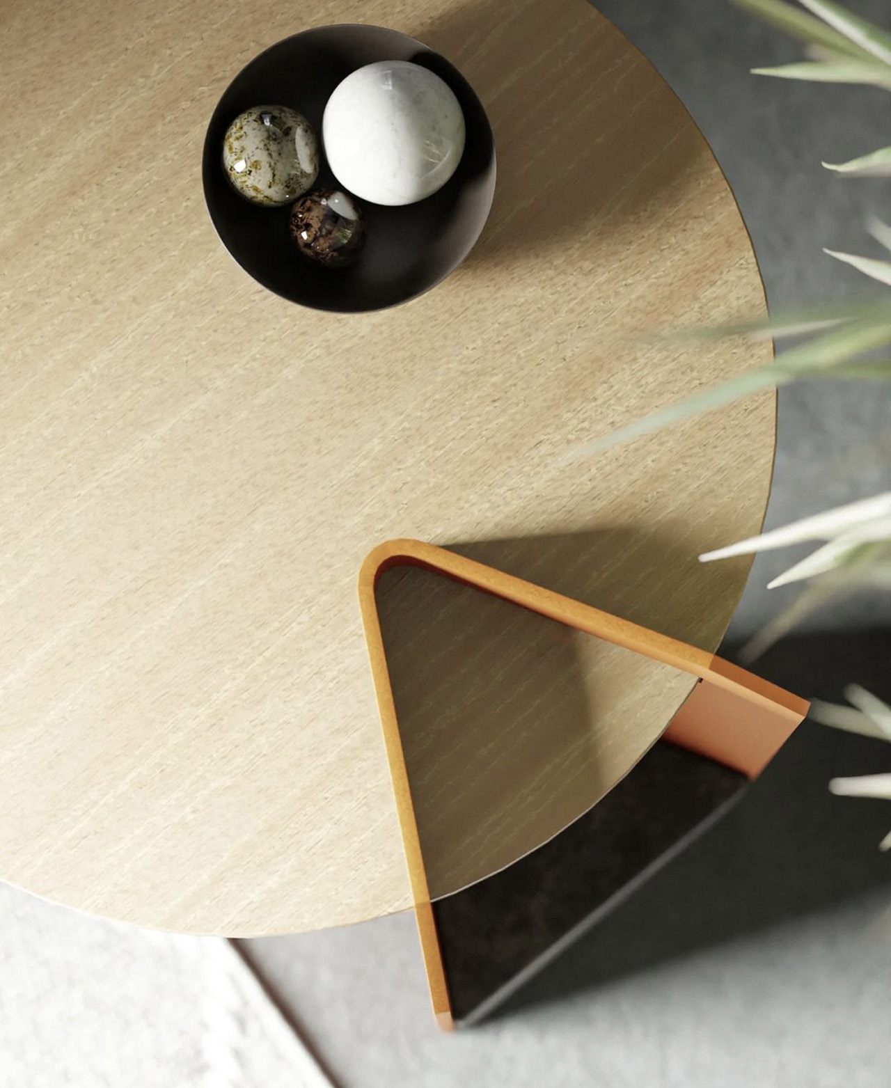
4. Sushant Vohra’s Stool
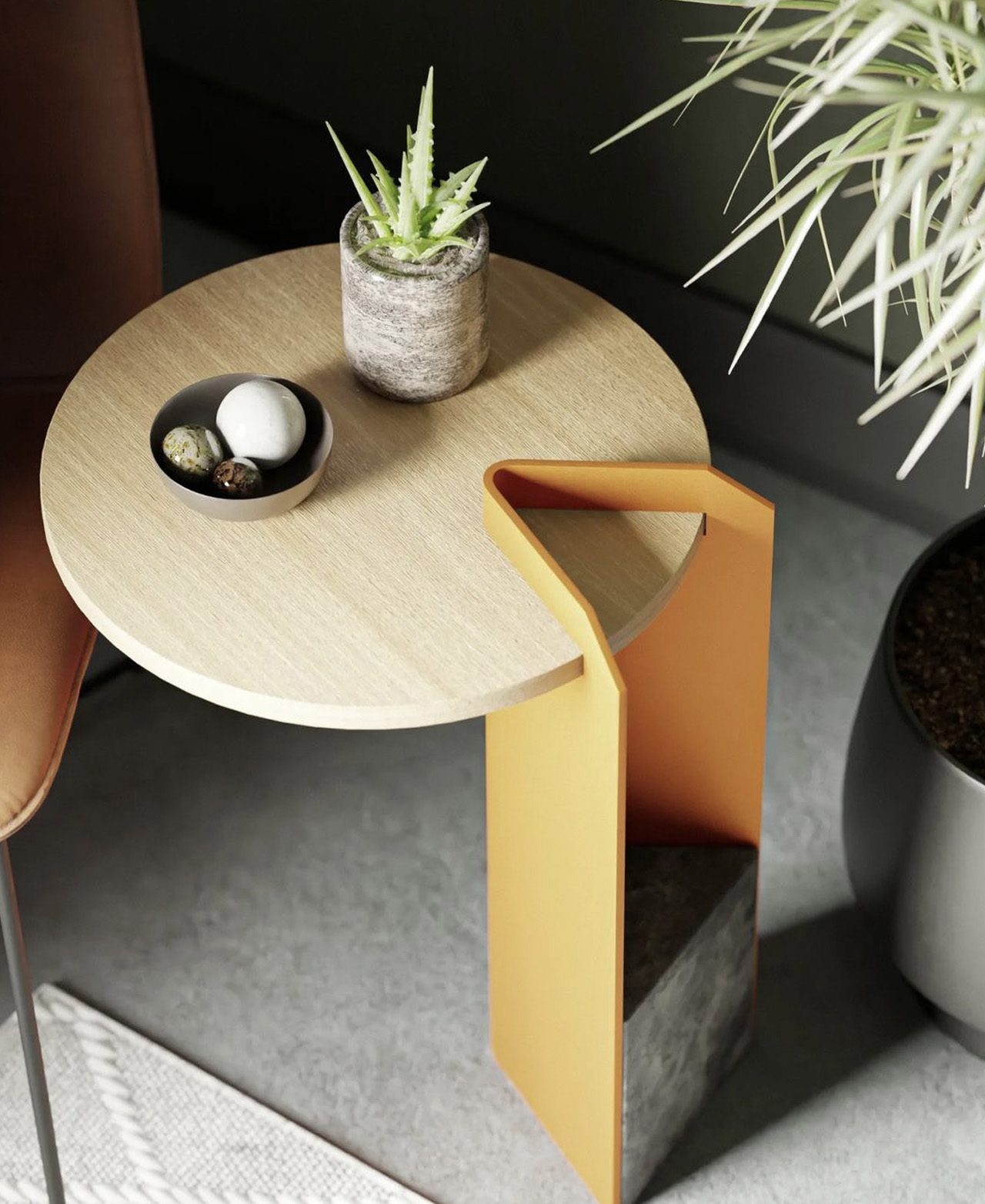
Designed by Sushant Vohra, this stool design is pretty cool! It has a compact, concise, and minimal form that makes it the perfect addition to any modern living room.

Why is it noteworthy?

It features a concise circular platform that serves as a seating section, with a concrete and clear coated sheet metal volume inserted into it, functioning as a support for the seating area. The result is a visually and geometrically interesting stool with a burst of orange that counteracts the otherwise minimal and simple appearance of the stool.

What we like

  • Interesting color contrast
  • Compact + space-saving form

What we dislike

  • The partition is not changeable or removable when the entire table top is needed

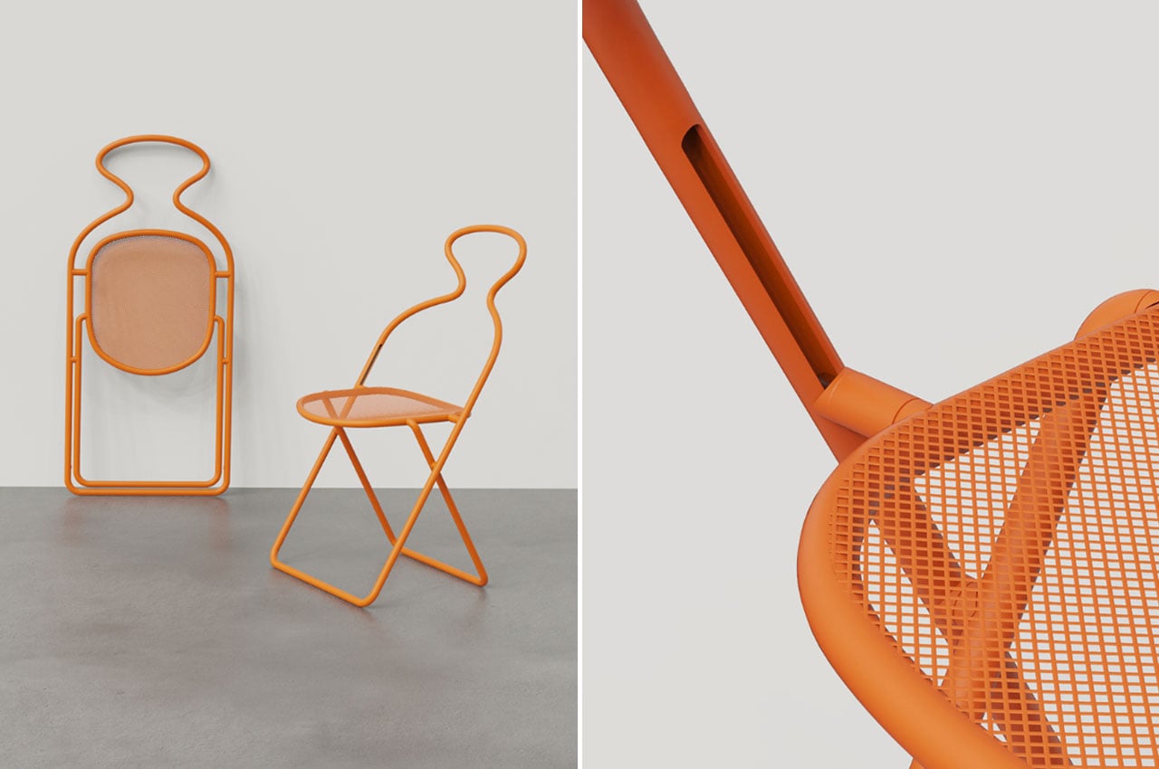
5. The Venus Folding Chair
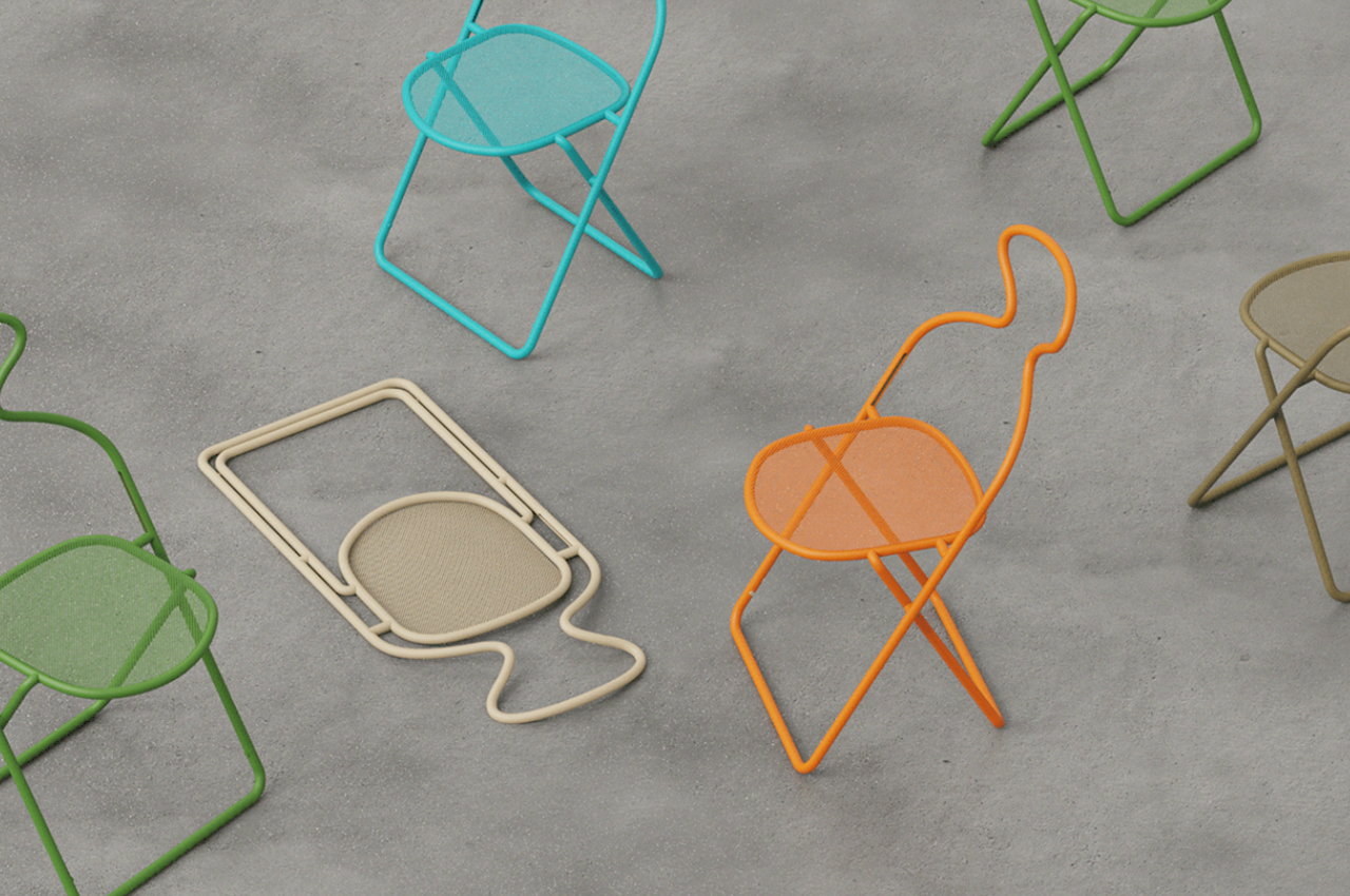
Created between 30,000 and 25,000 BCE, the Venus of Willendorf is one of the oldest and most important works of art. The Venus Fold Chair draws inspiration from this piece of art, and it functions as a cozy and comfortable seating option that can be easily folded.

Why is it noteworthy?

The Venus Folding Chair was built with great care and precise attention to detail, creating a product that perfectly marries form with functionality, as well as a bit of artistic flair. It has a unique space-saving mechanism which makes it a notable and significant design.

What we like

  • It’s an excellent seating option for people who host events or gatherings
  • Ideal for tiny flats, outdoor events, or temporary seating arrangements due to its compact and folding design, which makes storage simple

What we dislike

  • It doesn’t seem like a great seating option for longer durations of time

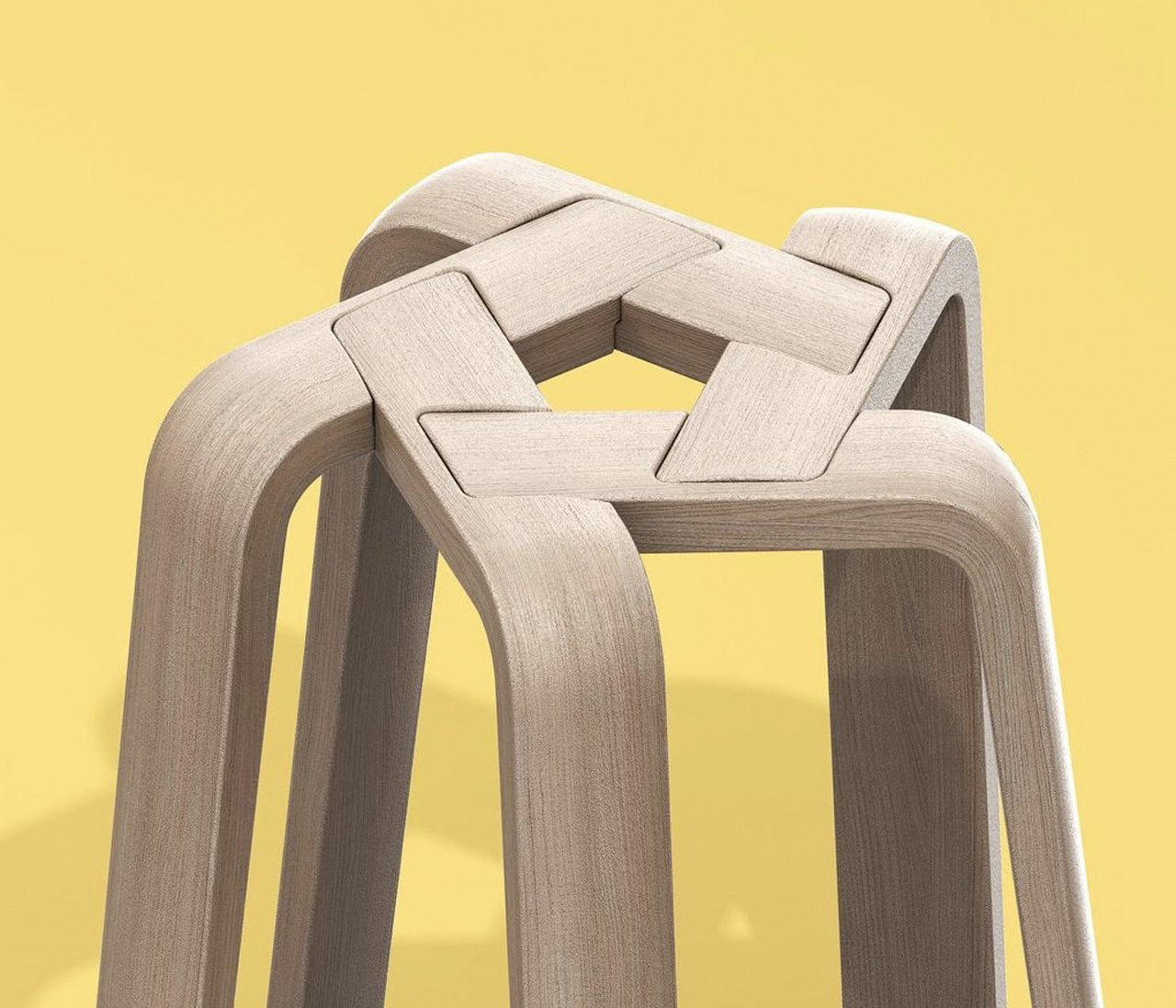
6. The Pentagon Stool
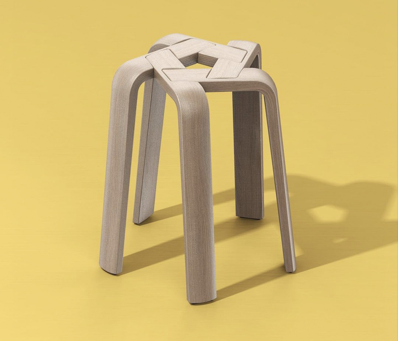
The Pentagon Stool is a clean and minimal low stool that was created by Designerd ™ using five identical pieces of hardwood.

Why is it noteworthy?

The hardwood pieces function as the legs of the stool, giving it its name ‘Pentagon’. The legs are woven together and held together using a star plate. The designer states that the leg element of the stool can be swiftly and efficiently produced in a one-line production.

What we like

  • Comes in a flat-pack design
  • Can be assembled with ease

What we dislike

  • The seating area is limited and may not be comfortable for all body types

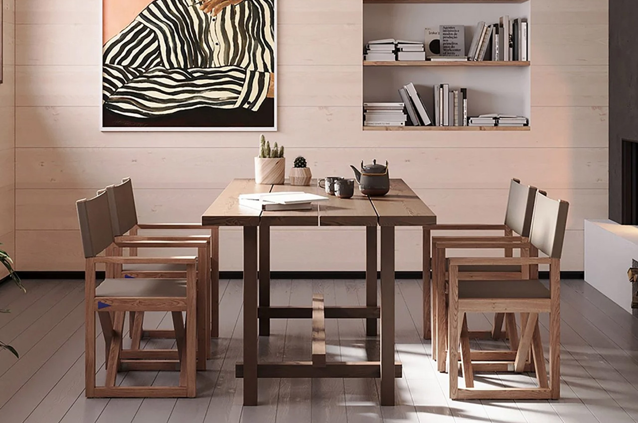
7. Brottö Chair
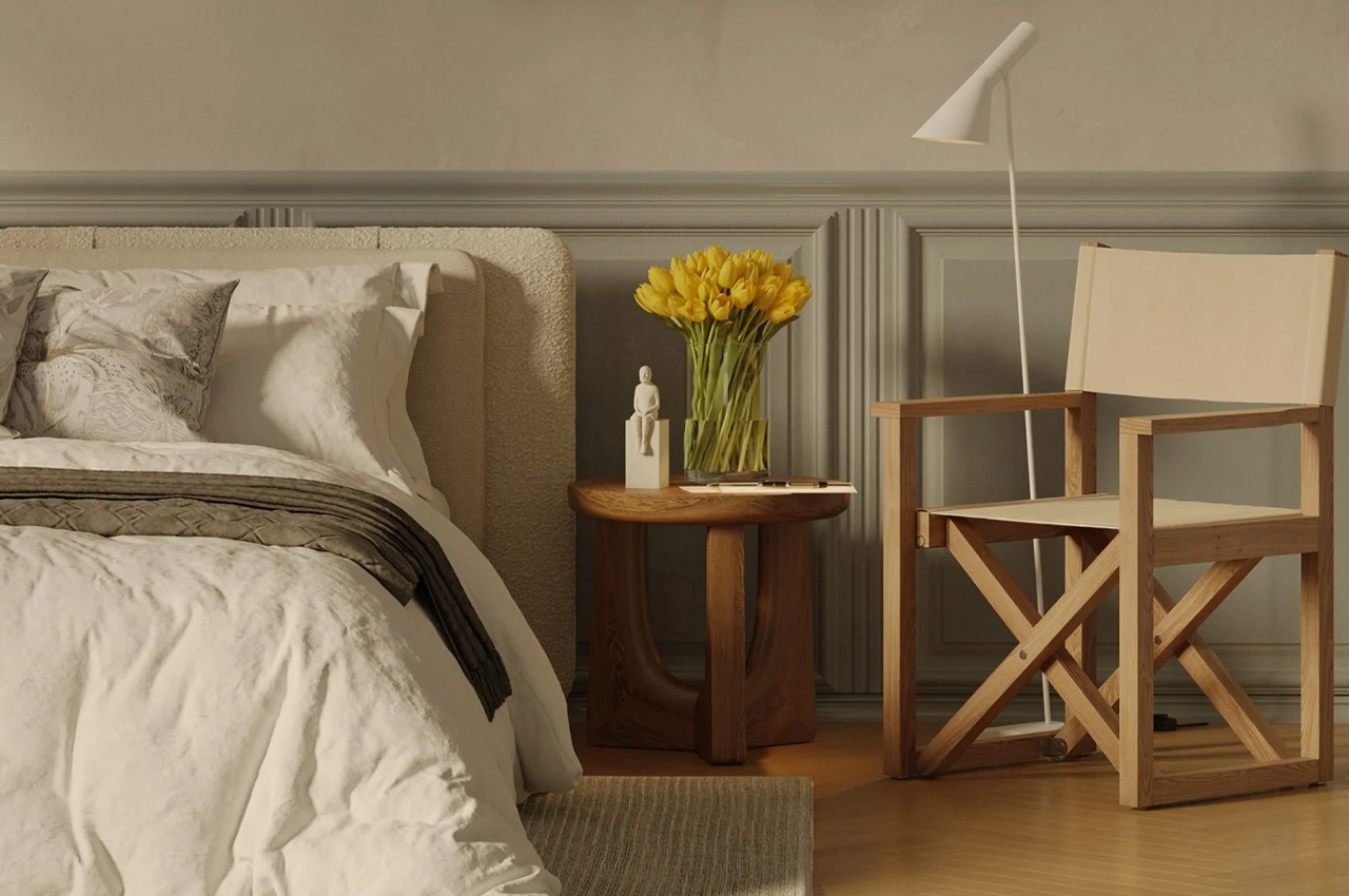
Swedish design brand Atolmar has designed an elegant directors-style chair built from teak, that can be used both indoors and outdoors. Featuring a hand-sanded teak frame, the minimal and clean chair can be utilized for both dinner and lounge settings.

Why is it noteworthy?

The back frame of the chair is slightly angled with an acrylic fabric back and seat to provide maximum comfort to the user. The chair can be compactly and efficiently folded into itself owing to the fabric seat and back. The seat and the backrest were created using a synthetic fabric which makes it water, stain, UV, and mold resistant, allowing it to withstand a variety of different outdoor weather conditions.

What we like

  • Available in a range of different colors including sand, nougat, and anthracite

What we dislike

  • The aesthetics are a bit simple and unassuming

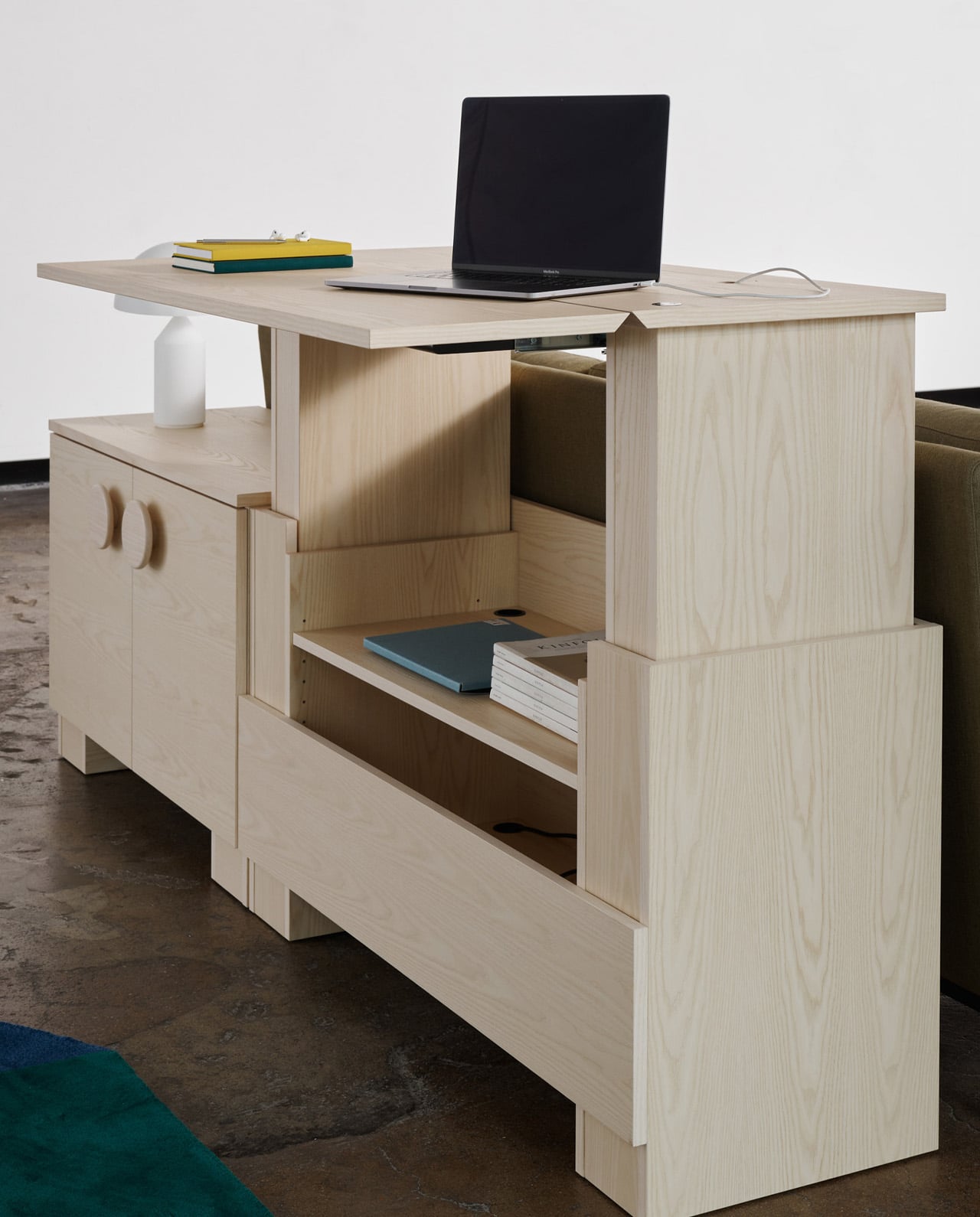
8. Kabinett
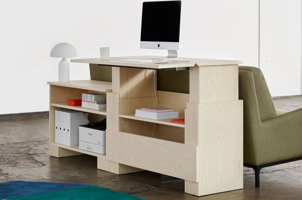
Conceptualized by Stockholm-based designer Alexander Lervik and manufactured by Finnish furniture manufacturer Adea, the Kabinett is a minimal and sturdy cabinet designed for modern home offices…that also doubles up as a work desk!

Why is it noteworthy?

Kabinett is a part of Adea’s Smartwork range, and it aims to function as an ergonomic set-up for home offices. While functioning as an efficient work table, Kabinett also serves as a rather stylish and elegant dresser.

What we like

  • Multifunctional + ergonomic design
  • Its minimal aesthetics are a plus point since this allows the furniture to seamlessly merge with all kinds of home offices

What we dislike

  • Bulky + space-consuming design, not ideal for small homes

9. The Fortune Cookie
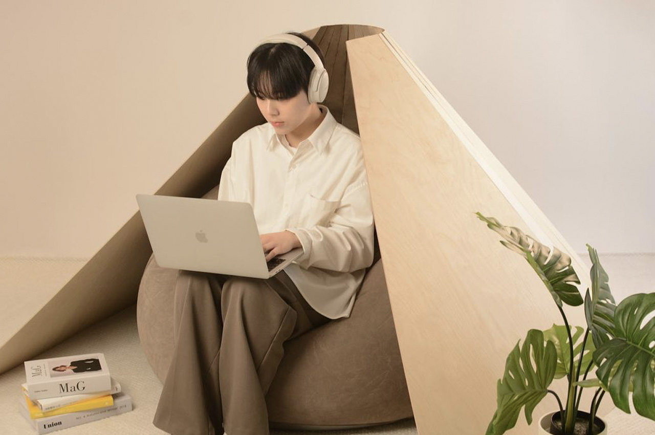
The Fortune Chair is designed by Hyeyoung Han and Hanyoung Lee, and it is an interesting mix between a chair, a pod, and a beanbag, and it also happens to look like a fortune cookie!

Why is it noteworthy?

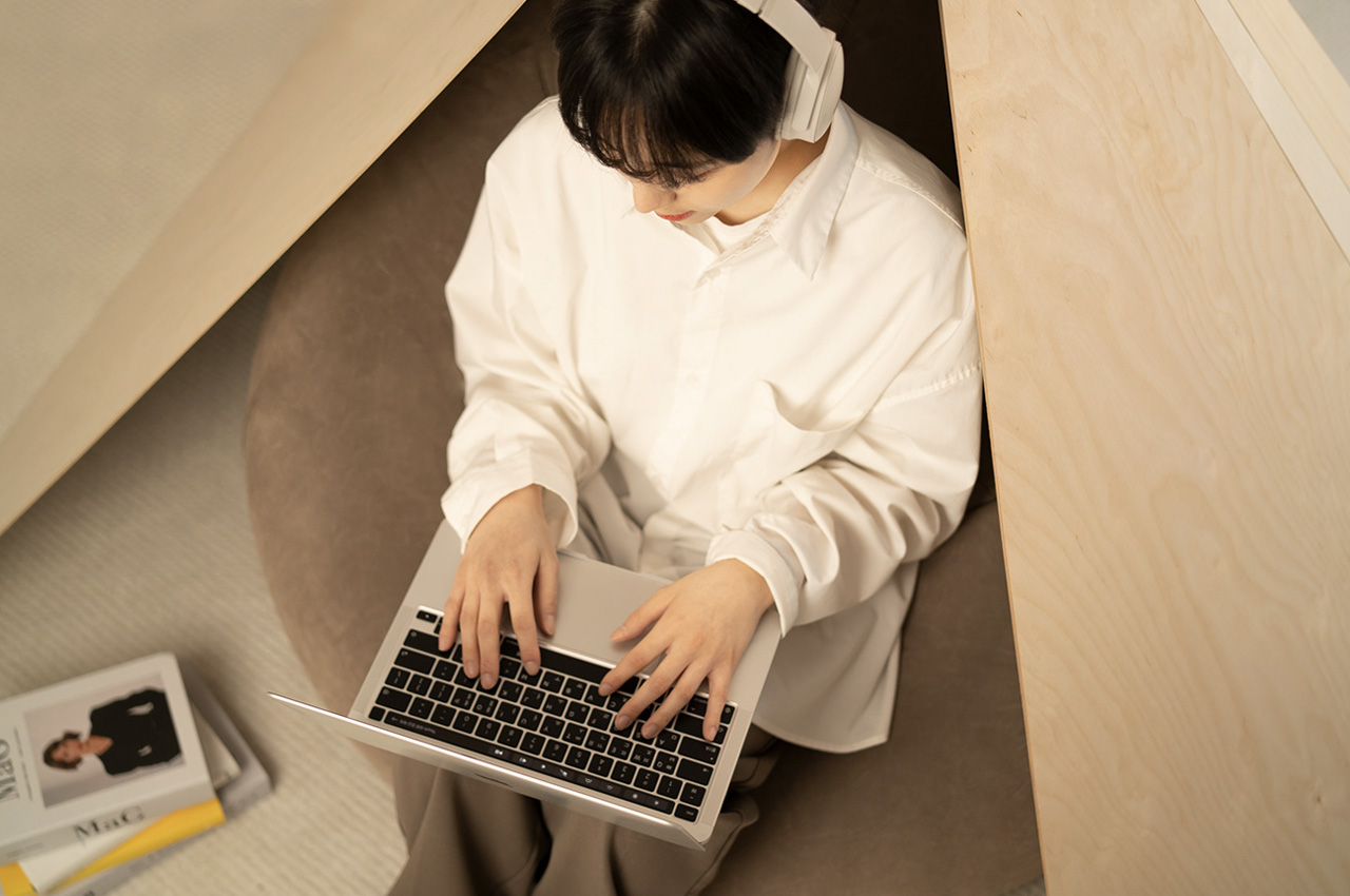
The innovative chair includes a fortune cookie-inspired wooden outer wall, which functions as a covering frame that surrounds the user. This outer wall creates a cozy, comfortable, and private space for the user to sit in. It looks and functions much like a fortune cookie!

What we like

  • The Fortune Chair functions as a little oasis for you to work in peace, much like the office pods we find today in commercial offices

What we dislike

  • Given the inwards curving design, the chair may become uncomfortable as the user cannot change their position frequently

10. Wormhole Coffee Table
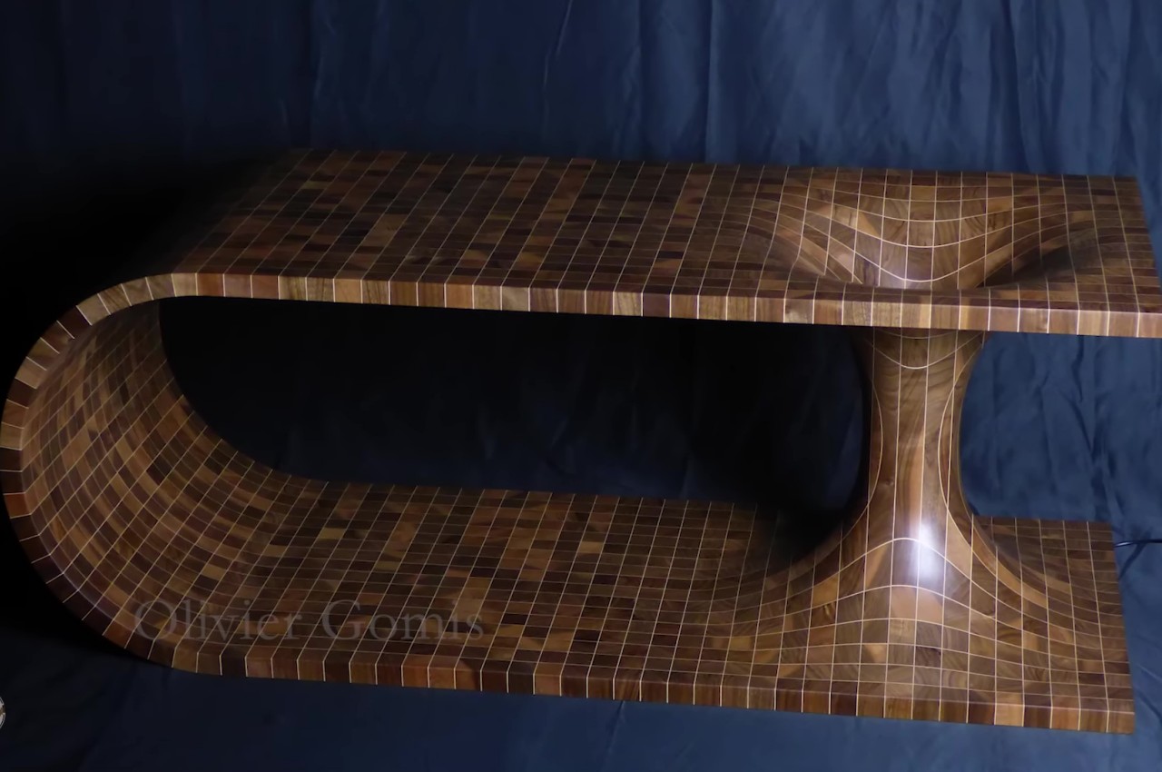
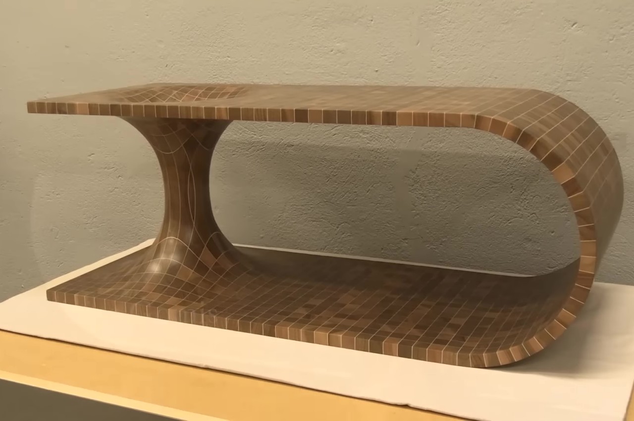
Wormholes can hypothetically connect two disparate points in spacetime via a tunnel. And they’re quite commonly found in science fiction! And this mind-blowing coffee table by Olivier Gomis attempts to convert the hypothetical wormhole into a physical manifestation.

Why is it noteworthy?

The shape of a table is already quite eye-catching on its own. It’s almost like a wooden plank that has been bent so that the two ends are on top of each other and then joined together by a double cone. These are then glued together with sheets of maple veneer in between, which give the appearance of those faint light lines that form the grid.

What we like

  • A lamp was installed in the center of the hole, giving the table an eerie appearance in the dark

What we dislike

  • The inward curving section provides a risk for products that could roll inside and get stuck like a marble or a coin

The post Top 10 furniture designs for your living room first appeared on Yanko Design.
Apple, Nasa, Buzzfeed & more use this office pod that has been soundproofed with 1000 recycled bottles!

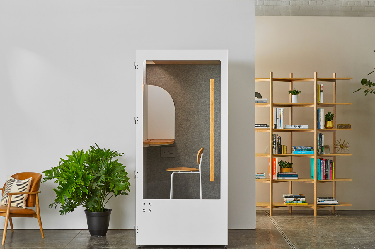
For most of us, it has been one whole year of working from home – congratulations! We have all adapted to the ‘unprecedented’ times in our own innovative ways as we share our homes with other people, pets, and do our best to work from home and not live from home which can be hard sometimes without a physical boundary to separate them. It left all of us wishing for our own office pod or productivity bubble where we can just zone in, something exactly like this Focus Room!

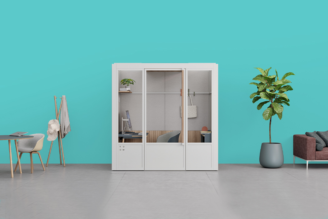
ROOM  is a company creating personal prefabricated home offices for our flexible lifestyle as more people choose to work remotely even as things open up. Each office pod is thoughtfully designed to give you privacy, encourage productivity, and create the psychological boundary between work and home so you can maintain a healthy balance. One of the coolest parts about these office rooms is that each booth’s soundproofing layers are made from 1000 recycled plastic bottles! “From design to delivery, we strive to lessen our impact on the environment. Our products are engineered with recycled materials and replace multiple cycles of construction, minimizing noise and our footprint,” says the team.

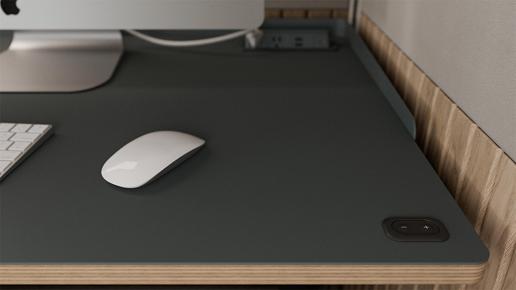
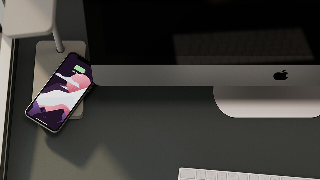
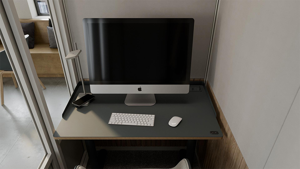
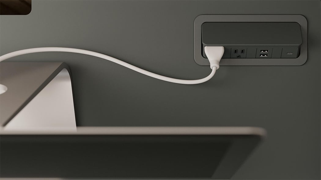
The comfortable setups ensure you have a place to zone-in and work without distractions with features that shield and block out noise disturbances. Your private office comes equipped with a desk, accessory rail, and built-in power too. You’ll also receive USB ports at your fingertips to keep your devices charged and the most impressive and efficient feature is the wireless charging integrated into the smart desk. These personal office rooms are shipped in four flat boxes and are sold directly to the user to cut out all the extra costs. ROOM’s rooms are a popular choice with Apple, NASA, Buzzfeed, Reddit, Hulu, Uber and more!

Designer: Room

Click Here to Learn More!

These air-ventilated and soundproof modular meeting room are here to improve those laggy Zoom meetings!

Work meetings during the age of COVID-19 have changed. Despite all of the memes about sitting in a meeting that could have been an email, the acute need for collaborative workspaces remains. The value of in-person collaboration has become that much more obvious with the onset of stay-and-work from home orders and teams of designers across the globe have issued solutions that both address and transcend the immediate needs brought on by the pandemic. The creatives at Room, a design firm dedicated to rethinking the modern workplace, developed their own solution for the changing needs of the modern workplace with their latest modular meeting room design.
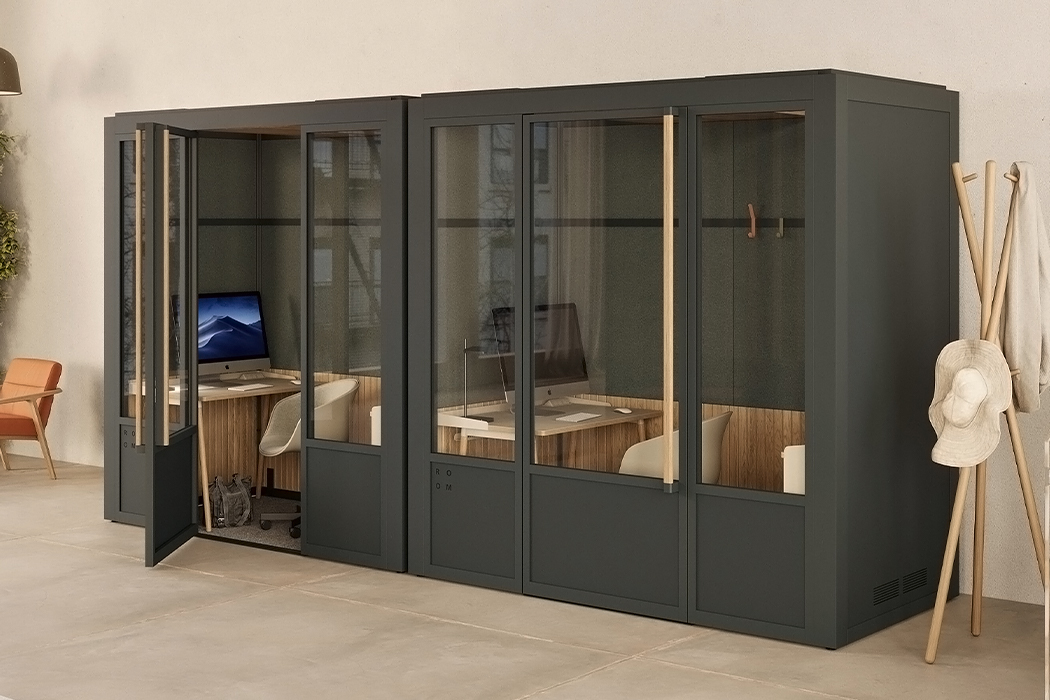
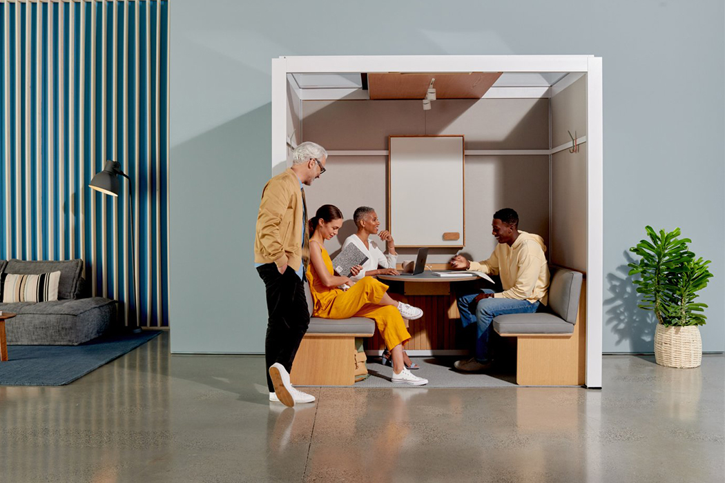
ROOM’s Meeting Room is a soundproof and air-ventilated external collaborative pod that can be placed almost anywhere in order to provide a meeting space that works for business meetings or presentations that require privacy. Silent fans located in The Meeting Room’s roof provide silent air-ventilation to keep the air fresh and moving for longer work meetings. Built as a prefabricated office pod, The Meeting Room comes equipped with all the office essentials such as a whiteboard, round table, integrated powerbox for charging, and even storage units like shelves and wooden boxes. The Meeting Room can be placed in any setting from preexisting office spaces to crowded spacious coffeeshops and it requires no construction for assembly. Just like those old phone booths, The Meeting Room provides a soundproof space with 27 decibels of outside noise reduction so that it can operate as a private working space or conference room for confidential matters. The Meeting Room’s powerbox comes complete with 3 AC outlets, two USB-A ports, one USB-C port, two CAT6 data ports, 1 HDMI port, and a camera connection for its Jabra’s 180-degree PanaCast. Additionally, the external pod’s lighting can be adjusted for dimming or brightening to fit different types of collaboration such as presentations or brainstorming.

In-person collaboration cannot be replaced by technological developments or virtual workdays, but while some try and figure out the ways by which it can be, adaptive workplace designs like the modular Meeting Room from ROOM offer a physical means for collaboration in the meantime. Outfitted to be a microcosm of the office buildings we’ve grown accustomed to, The Meeting Room delivers the conveniences that come with them and promotes both the economic sensibility and sustainability that comes with thinking modular.

Designer: ROOM

Click Here To Buy Now!

Google Magenta’s Lo-Fi Player is an AI-based virtual music studio

Lo-Fi Player, a new project out of Google Magenta, wants to help people play around with music creation -- no experience necessary. Lo-Fi Player is a pixelated, 2D virtual room that runs in a web browser. It lets you mix lo-fi hip hop tracks by click...

Architectural Designs that make you want to stay indoors!

Its been 13 weeks since 202o has started and it has brought the world to a staggering halt. With the current pandemic keeping us all locked in with only the internet at our disposal, there is no harm in fantasizing what our ideal homestay would look like. And boy, do we have some interesting options! From an enclosed courtyard, a sunken sofa to even a reading net in the library, each design here has an element that makes you want to spend more time indoors. Before I give it all way in my excitement to share, here is a curated collection of interior designs that make staying at home convenient and comfortable in these quarantined times. Who knows, this list may even inspire you to add some of these touches to your home. Stay indoors and stay safe!

Pam and Paul’s House is designed by local studio Craig Steely Architecture, located in a sloped site in northern California, with vast stretches of glass that overlook the treetops. The house is simple to look at from the outside, but inside, its the usage of elevation that differentiates it. A sunken sofa/ bed commands the attention in the living room, with block-like cushions to shape that space as needed. That sofa sure makes us want to dive into it, right from working from home to taking a small nap, it has us covered.

The Ortega Mora House designed by Estudio Transversal boasts of a courtyard enclosed within its angular space, creating the perfect retreat to relax in and cut off from the influx of rumors and news spreading across our digital channels. Perfect for meditation, or just spending some quality time with self, being quarantined in this home will be great for some self-love.

Christopher Duffy for British design brand Duffy London has created a swing table! Bringing the child-like joy of using a swing to a shared living space, this table is perfect for everything from working from home to holding important family meetings. With this table in place, the room is sure to be everyone’s favorite spot of the house!

Encouraging learning through dynamic spaces, Spanish creative studio Playoffice has designed the ‘reading net’, a meshed fabric suspended from the architecture of a family library. The hanging web is attached to the railings of a lofted path and creates a fun space for the children as well as adults to lose themselves in the imaginary world of the books they love.

A small alcove that doubles up as a sanctuary for anyone who wants to disconnect from the outside world, we are completely in love with this design by the homeowners of the Funkis Family Home.

Spanish architect Pia Mendaro defies convention and reconfigures the modern home in the design of Topo’s Shed – a home-cum-studio for her artist friend Clara Cebrian in Madrid. The brief was simple – she does not like overly designed things and thus, wanted something that could adapt to the needs that appear over a period of time. Something like a Potter-inspired ‘Ron Weasley house’, letting you add elements to the house as needed by the owner!

Dumitru Martiniuc of D3 Design Studio designed the Sixteen house, a place where dark interiors meet minimalism, making this the perfect modern bachelor pad. But what truly caught our attention is the skylight right above the bed, giving a glimpse to the starry sky as you lie in bed!

Now here is one of the things I would have in my home when I become a millionaire – a movie theater with double beds for lying down and watching your favorite movies! Called the ‘VIP Bedroom’, Cinema Pathé in Switzerland aims to give moviegoers an unforgettable experience possible from start to finish.

Miner Road designed by Faulkner Architects and located in Orlinda, California uses big windows to help the home stayer feel in touch with their surroundings. With plenty of natural light and great views of the woods, this quarantine would feel more like a retreat than social distancing!

The Sound in Mind is an interactive installation inside the Le Corbusier-designed Saint-Pierre church in Firminy, France. Visitors were invited to piece together tubes, to make listening devices in varying shapes and sizes creating different sound effects. “This project was about the participation of people, building their own sculptures and finding music as the end result.” said Suzuki.

Designers of the TIME 2018 Best Invention ‘ROOM One’ Need a Product Designer

ROOM is here to make room for people in the modern workplace. They create thoughtful designs that inspire new ideas, fresh perspectives, and a better way to work. Their first product is a soundproof phone booth for the open office. It takes away the noise and makes room for what’s essential. ROOM delivers directly from factory to business and keeps prices low so that their clients can invest in bigger ideas down the road, by rethinking and refining every step of the customer experience they offer thoughtful, modular solutions that grow with the business, leading the way to better Mondays and a brighter future. Since launching in May 2018, Room has acquired over 2000 clients, ranging from budding startups to Fortune 500 companies, such as JP Morgan, Nike, Google, and Salesforce. They are backed by Slow Ventures and notable angel investors from Silicon Valley, and TIME named our product one of the Best Inventions of 2018. ROOM’s belief is simple: What makes you different is what allows them to be different. They value diversity not only in terms of race, gender, sexual orientation, and religious background but also in the way you think and approach challenges.  Not only are they committed to creating a work environment where you can be yourself and but also ensure that everybody’s voice is heard. Diversity isn’t something the company simply preaches but something they practice everyday and taking care of their team is always a top priority. Apply now if you’re interested in creating solutions that improve life at work and are looking for a culture of growth, freedom, and accountability!

Designed with recycled materials and engineered to perfection, Room’s soundproof office phone booths are seamless, sustainable and simple, and was named one of the Best Inventions of 2018 by TIME. 

The Opportunity

With ROOM’s first product, ROOM One, they offer a moment of peace to everyone who has ever taken a phone call in the hallway, finished a spreadsheet in the quiet time at midnight, or sat alone in the stairwell to be alone and think big thoughts. As the company begins to expand their product offering, they’re are looking for a rockstar product designer who lives and breathes user-centric design, is passionate about sustainability, and has the skill to ensure that their products remain the most attractive ones on the market. The ideal candidate is a Product Design with experience driving consumer and furniture products from concept through production on time while championing the voice of the customer.

Responsibilities

– Support the product design process, alongside engineering, from brainstorming and concept generation through production.
– Create concept sketches and renderings to present to key stakeholders.
– Get your hands dirty making initial prototypes to verify new ideas.
– Act as a key stakeholder in developing ROOM’s product families and product roadmap.
– Cultivate a deep understanding of our customers and advocate for solutions based on their needs and pain points.
– Specify CMF (colors, materials, finish) for new products.
– Ability to synthesize an understanding of customer behavior, our brand, and market trends into a story and a product.

Requirements

– A degree in Industrial Design or an equivalent program.
–  4+ years of product design experience.
– Incredible 3D CAD Modeling Skills, especially with the surfacing. (SolidWorks strongly preferred).
– Ability to quickly create and iterate on photorealistic renderings (KeyShot, VRay, Cinema 4D, etc.)
– Knowledge of Adobe Creative Suite like the back of your hand.
– Jaw-dropping portfolio with demonstrated ability to execute on tight deadlines.
– Projects ranging across a variety of materials and manufacturing processes. Furniture and textile experience is a must.
– Experience in a startup environment where you have taken ideas from conception to production.
– Uncanny ability to juggle multiple priorities and make trade-off decisions when timeline, specs and/or budget don’t align.
– Confident self-starter who is comfortable working in a changing and ambiguous environment.
– Eager to wear multiple hats and do the next most important task, even when it is new, unfamiliar, or outside the scope of your daily work

Benefits

Health & wellness: Fully covered medical, vision, and dental insurance to take care of you and your family.
Unlimited PTO: Flexible vacation policy to allow you to unplug and recharge whenever you need it.
Equity: Company stock to honor your hard work and dedication.
Fully stocked kitchen and lunches: Weekly catered lunches and plenty of healthy snacks, coffee, and drinks to give you the perfect energy boost.
Commuter benefits: Pre-tax savings that make a difference in your budget and your morning commute.
Team events: Monthly team outings, dinners, and happy hours that inspire new conversations and lead to meaningful relationships.

Location

New York, NY.

Click here to Apply Now!


Check out all the latest design openings on Yanko Design Job Board

Volvo’s autonomous car is basically architecture with wheels

Let’s think about it for a second. If the most important aspect of a car (the driver) is removed, how much should a car look and behave like a car? It wouldn’t necessarily need steering wheels, a gear, pedals, rear-view mirrors, or a traditional dashboard, so what’s the difference between a self-driving car (without any of the above) and a cabin on wheels?

The only true constant in the case of a self-driving car is the traveler, believes Volvo. Focusing on the traveler’s experience, the voice in the video asks “What if autonomous travel can eliminate the stress that lurks between A and B?”. Volvo’s 360c wants to be perceived as not a car, but as an extension of your home. A moving home, or perhaps a modern-day caravan. The car is designed to be architecture on wheels, serving as a place of relaxation, entertainment, preparation, or even business… on the go. With an interior that focuses on being empathetic towards the traveler’s journey, the 360c can be a bedroom that allows you to de-stress on long travels, or have a relaxed commute to the workplace. It can also make your work commute a whole lot more productive by offering the connectivity and space of a mobile office, giving you as much as 2-3 extra hours in the day to be your most productive self.

The philosophical focus on the traveler results in a car that may fit into the traditional design outline of an automobile, but features a few key differences. The interior was given much more focus than the exterior, turning the boxy space into a room of sorts that can be used for work, play, and sleep. Generous use of glass lets you feel aware of your surroundings, while even providing the ability to tint it, turning the interiors into a more private area for work or to catch a few winks. The car completely does away with the steering wheel too, and while relinquishing that control may worry some, Volvo hopes that its brand image of car safety and reliability should help quell those doubts. The 360c is currently just being treated as a concept, but it provides a rather insightful window into Volvo’s direction in the coming future.

Designer: Volvo

volvo_360c_1

Volvo 360c Interior

Volvo 360c Interior

volvo_360c_3

Volvo 360c Exterior Safety

Volvo 360c Exterior Safety

volvo_360c_5

volvo_360c_6

Volvo 360c Exterior

Volvo 360c Exterior

volvo_360c_8

Designer: Volvo