The TATAMI ReFAB PROJECT Is A Product Of Fusing Japanese Traditions With 3D-Printed Sustainability

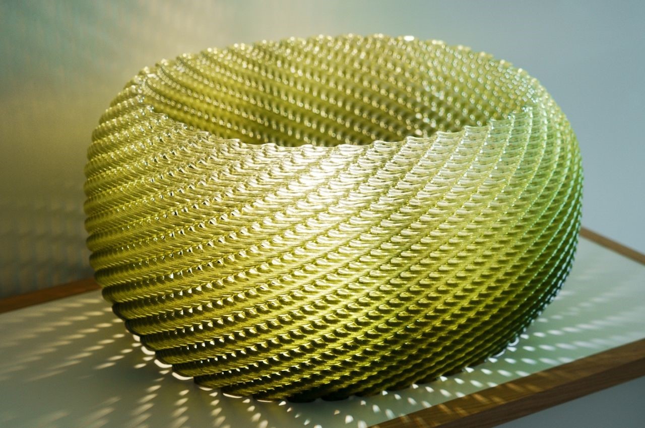
At the prestigious Salone Del Milano 2023 in Milan, Italy, the design lab HONOKA showcased their innovative TATAMI ReFAB PROJECT furniture series. This project, conceived by a team of forward-thinking product designers, leverages advanced manufacturing techniques like 3D printing to breathe new life into traditional Japanese tatami mats. The result is a fusion of heritage and cutting-edge technology that reintroduces the essence of tatami into contemporary living spaces.

Designer: HONOKA LAB

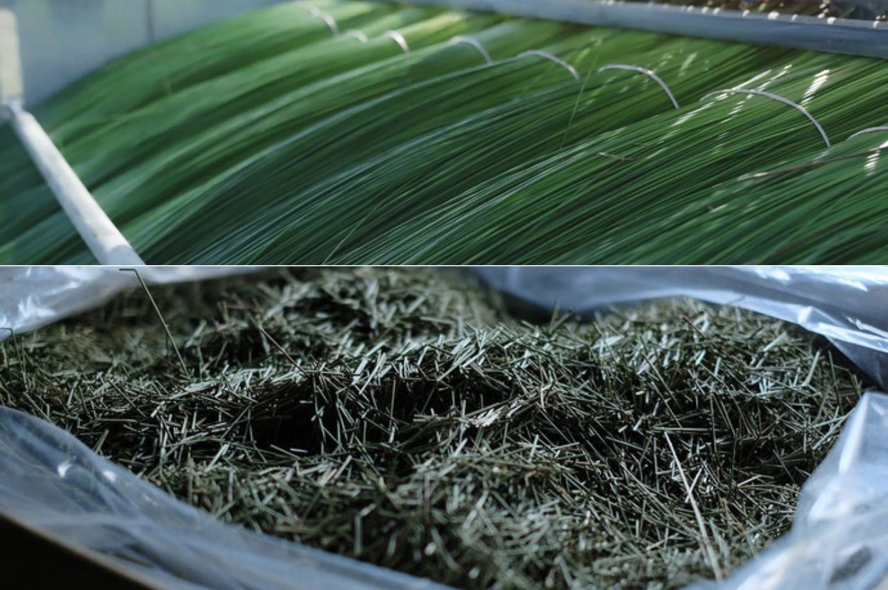
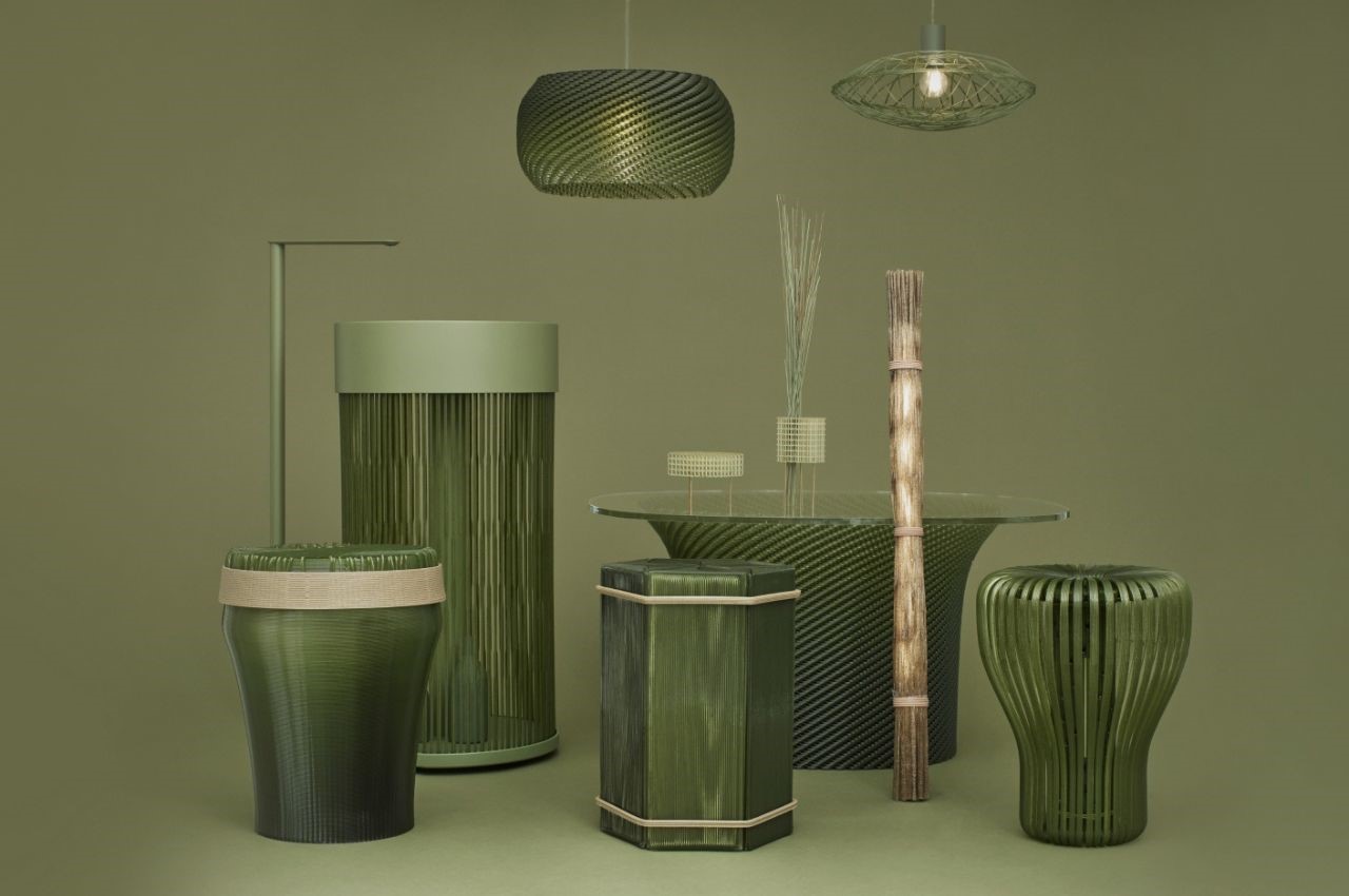
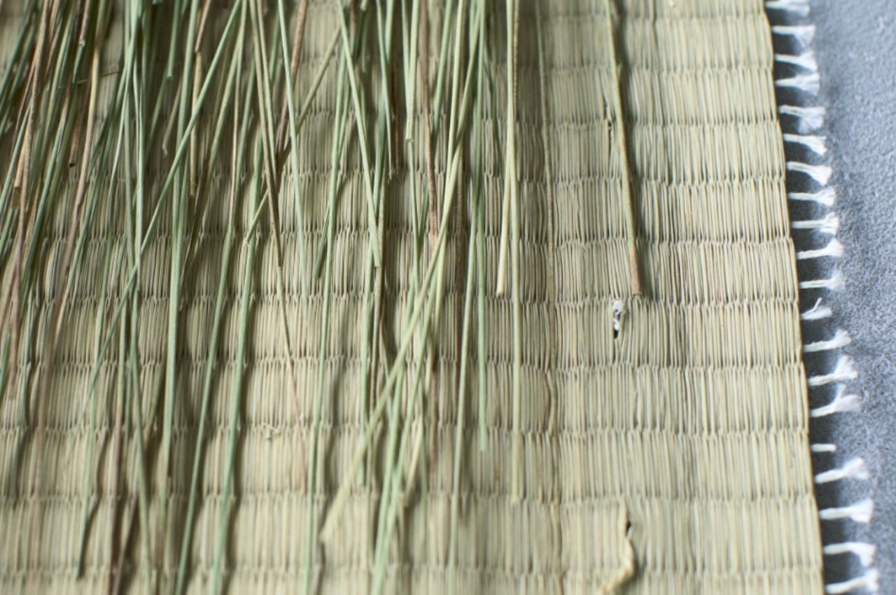
Tatami mats have been a staple of Japanese interiors for centuries, renowned for their aromatic qualities, humidity regulation, and odor reduction capabilities. HONOKA’s project aims to integrate these traditional benefits into modern furniture design. By blending recycled tatami with biodegradable plastic, they have created a sustainable material that is both adaptable and durable. This innovative composite can be 3D printed into a variety of functional and decorative home products, embodying the future of artisanal design while retaining a distinct connection to Japanese culture.

One of the key highlights of this project is its commitment to sustainability. Traditional tatami production often results in significant material waste, with nearly half of the plant-based material discarded. Honoka addresses this issue by recycling tatami waste and combining it with biodegradable plastic, significantly reducing the environmental impact. This material is not only eco-friendly but also versatile, allowing designers to explore new aesthetic possibilities and create unique forms that enhance modern living spaces.

The collection features several distinctive pieces that exemplify the versatility and beauty of the tatami-resin composite:

SORI and MUKURI:

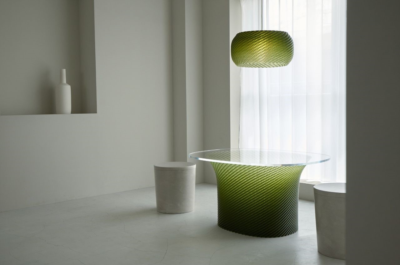
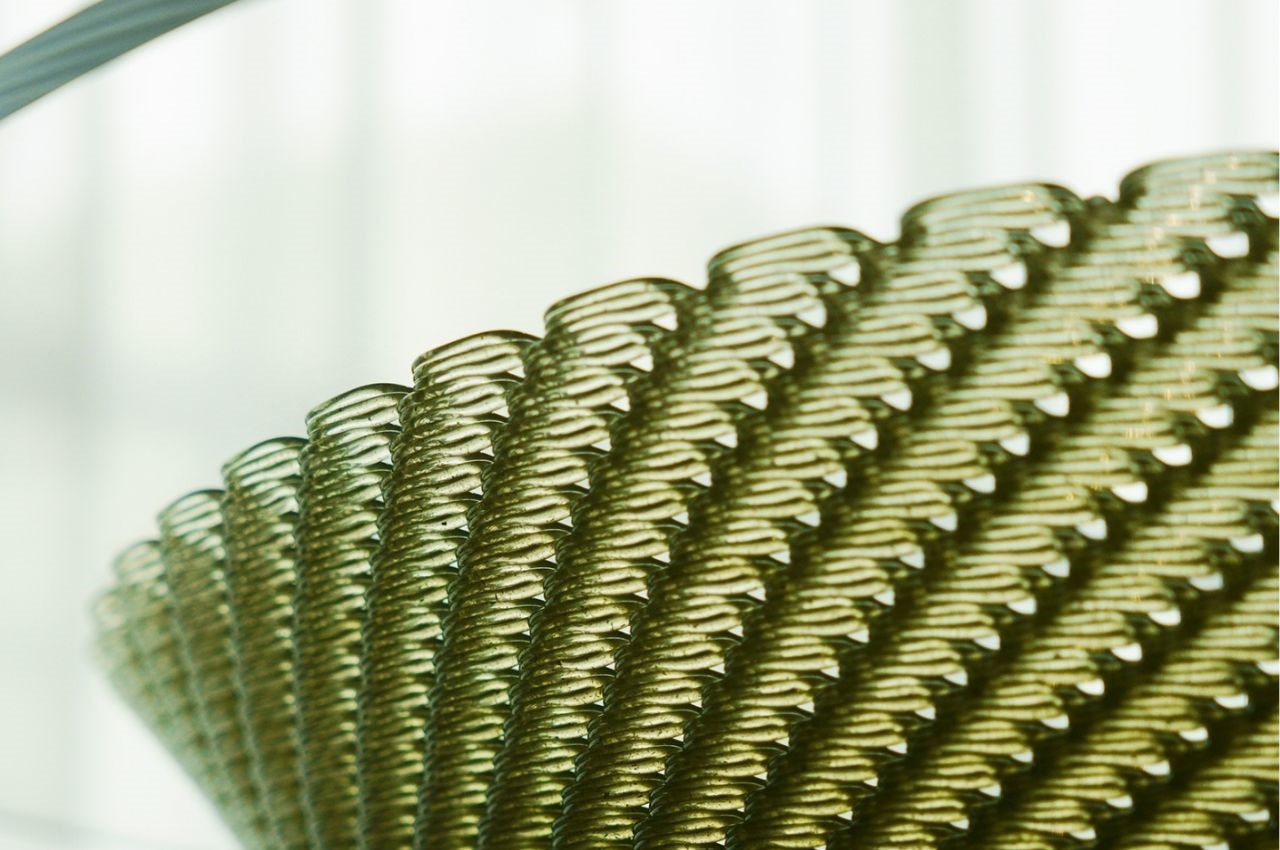
These knitted tatami-resin furniture pieces reinterpret traditional Japanese shapes and textures through 3D printing. The unique structure of these items offers moderate transparency and varying visual expressions depending on the viewing angle. They are sturdy enough to support glass and other heavy materials, making them ideal for dining tables.

CHIGUSA:

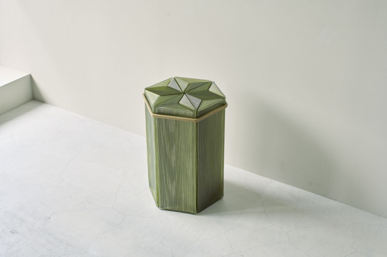
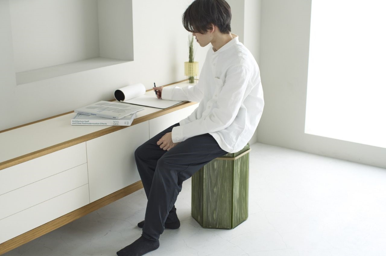
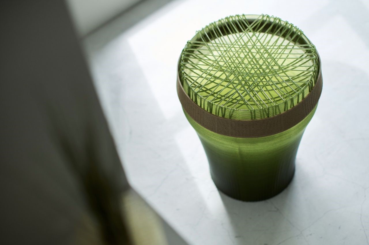
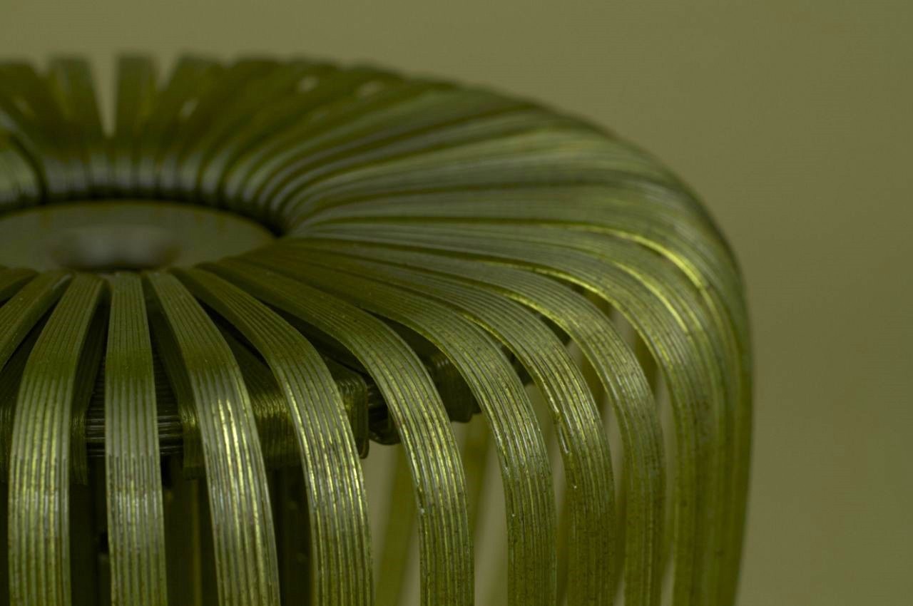
Inspired by the traditional Japanese “Sen-suji” pattern, this stool combines multiple 3D-printed parts. The vertical pattern of the elastic and durable tatami-mixed resin provides a resilient and comfortable seating experience.

TABA:

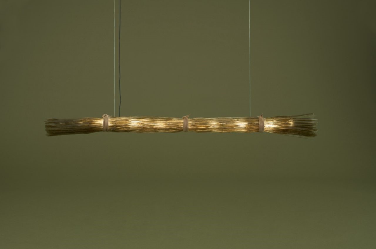
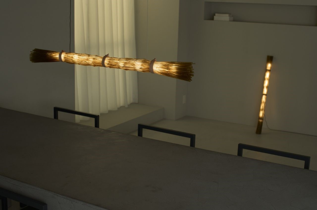
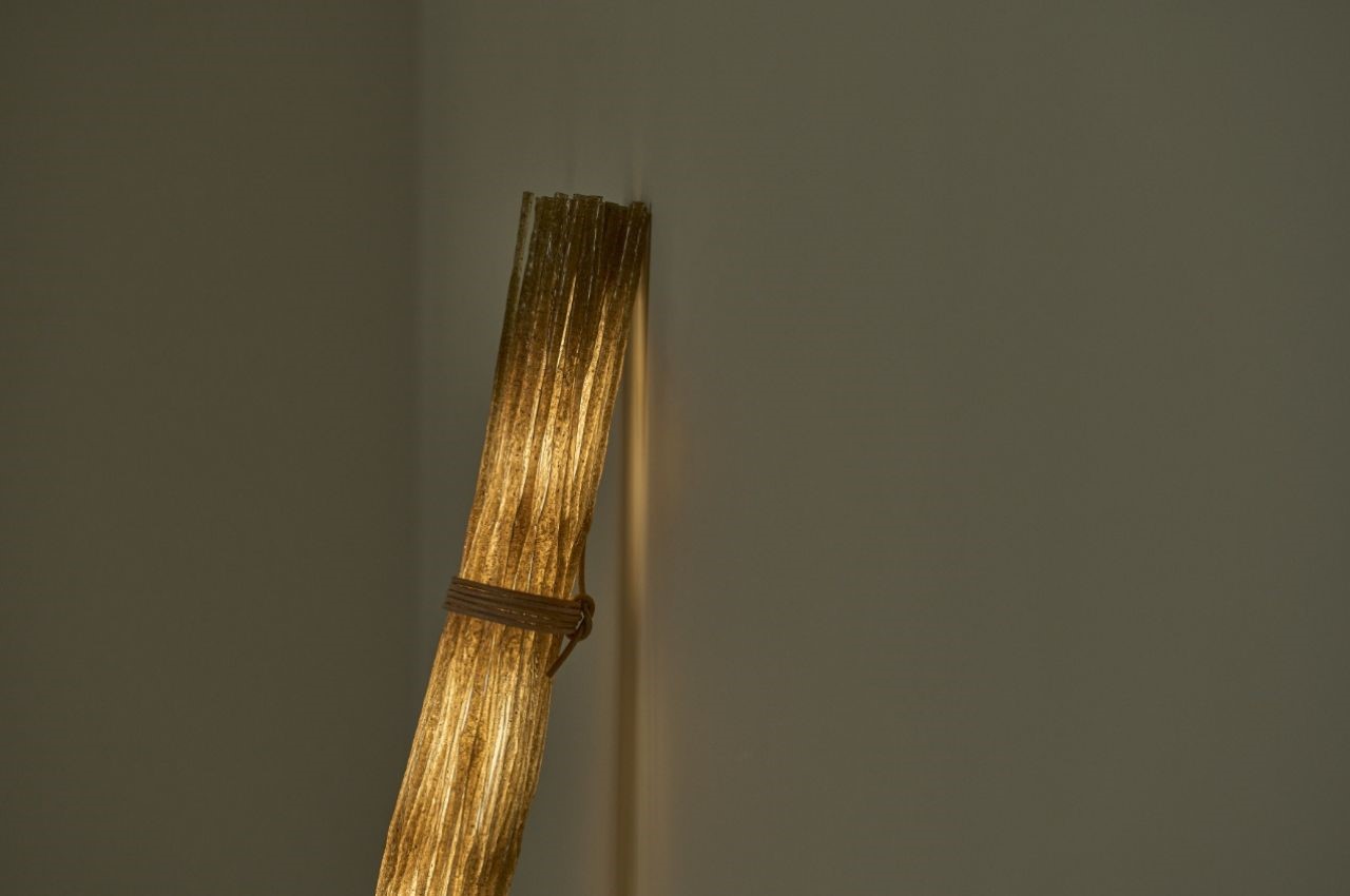
A lighting fixture designed to resemble bundled grass, TABA uses a dripping technique in its 3D printing process. The tatami-mixed resin diffuses light beautifully, with light spilling through the gaps in its branches, creating a soft, natural ambiance.

TACHIWAKI:

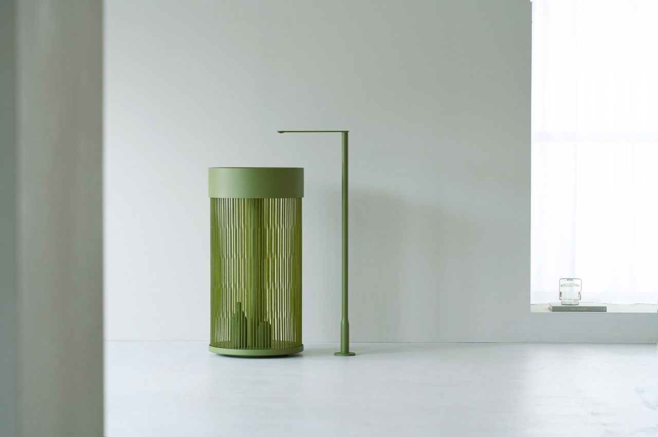
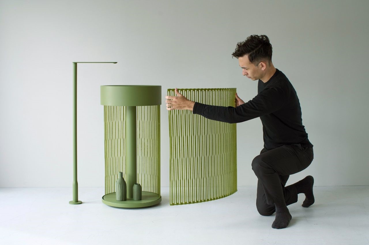
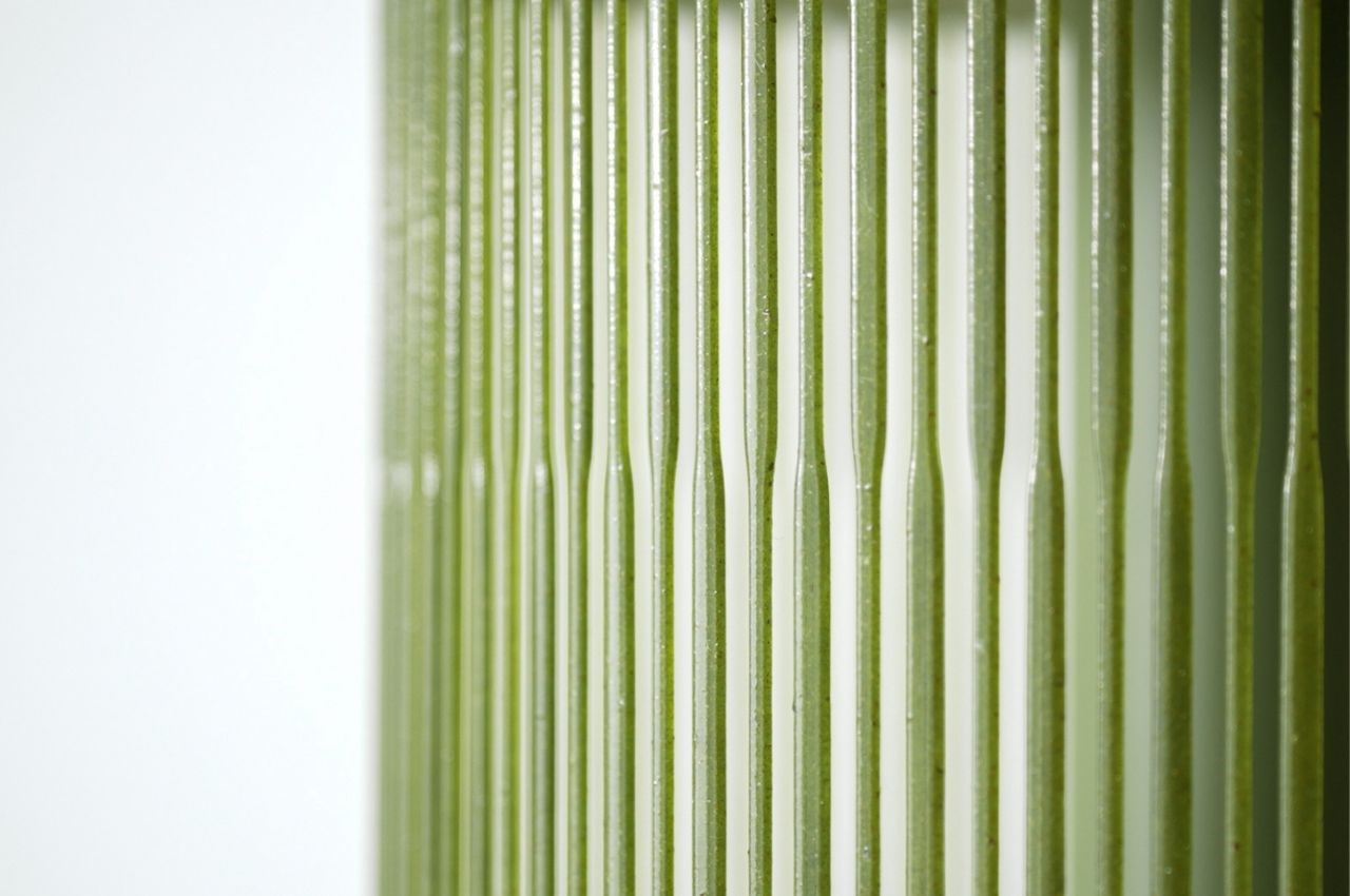
This self-standing basin, inspired by the Japanese “Tachiwaki” pattern, features multiple stripes created by varying the purging speed of the 3D printer. Its water-resistant nature makes it suitable for innovative bathroom designs.

YOCELL:

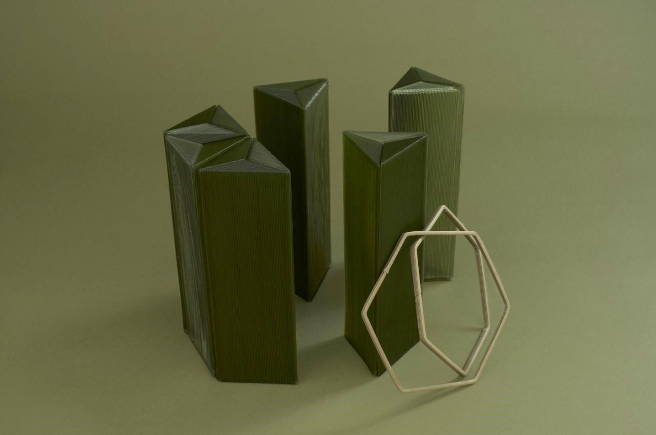
A stool that draws from the traditional Japanese “Asanoha” pattern, it uses the layer marks of the 3D printer to create unique visual effects by aligning them in different directions. The modular shape makes it sustainable even for transportation and packaging.

AMI:

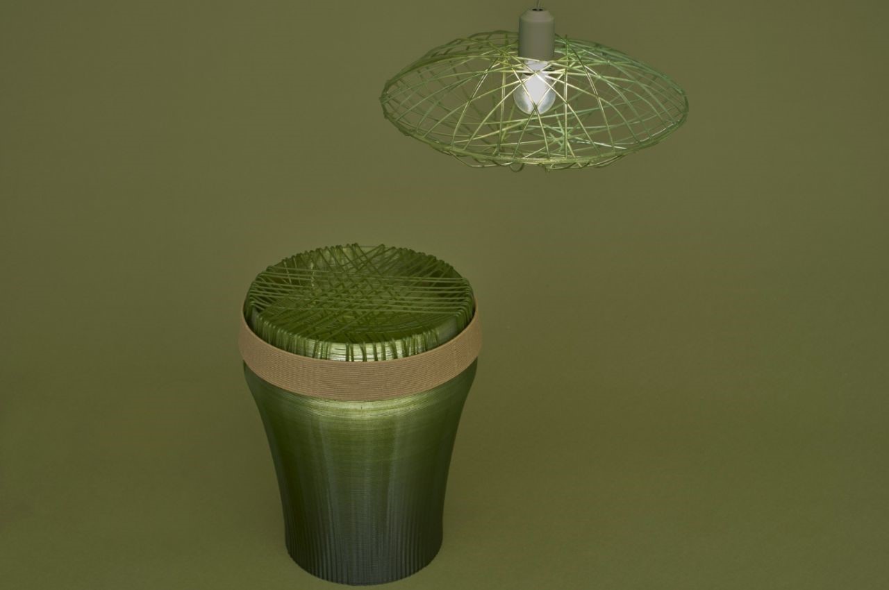
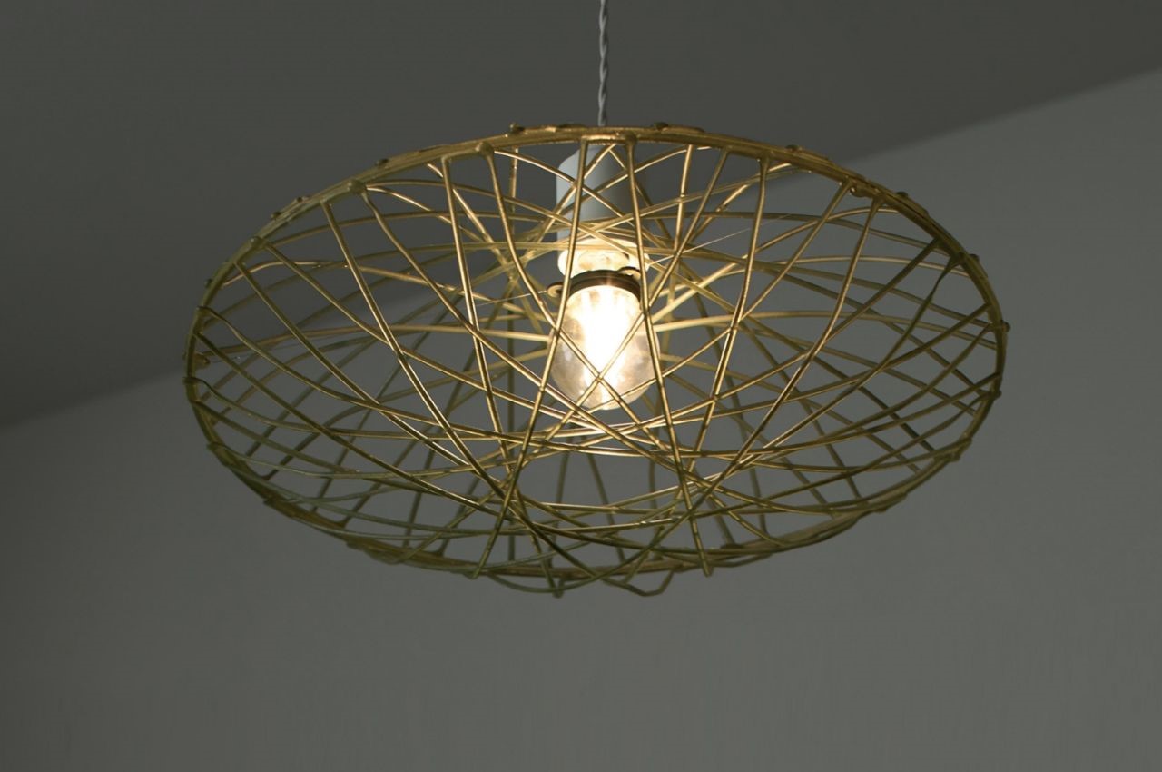
Combining the aesthetics of traditional Japanese 2D weaving with modern 3D printing, the AMI stool and lampshade feature intricate designs created by dripping resin from the air. The resulting pieces change their expression based on the viewing angle.

KOHSHI:

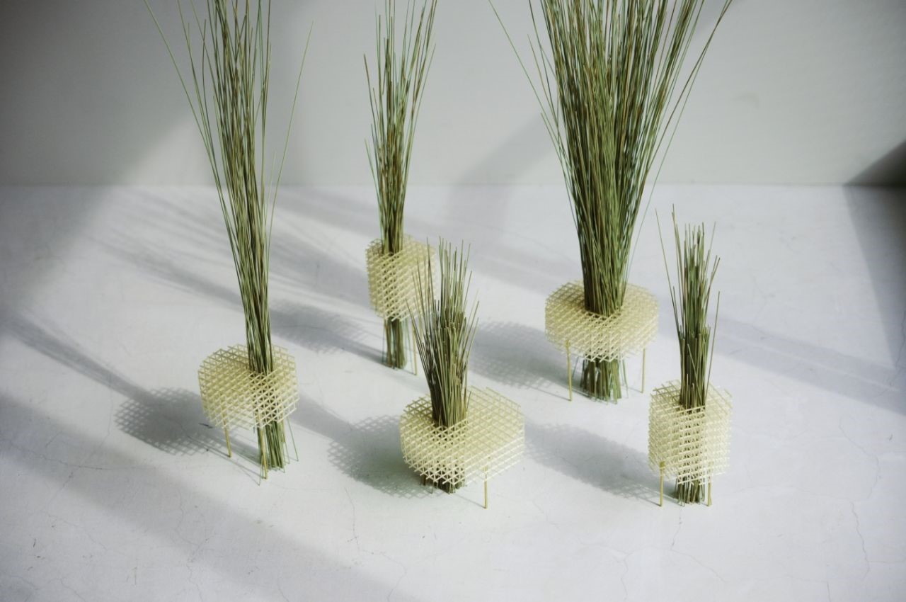
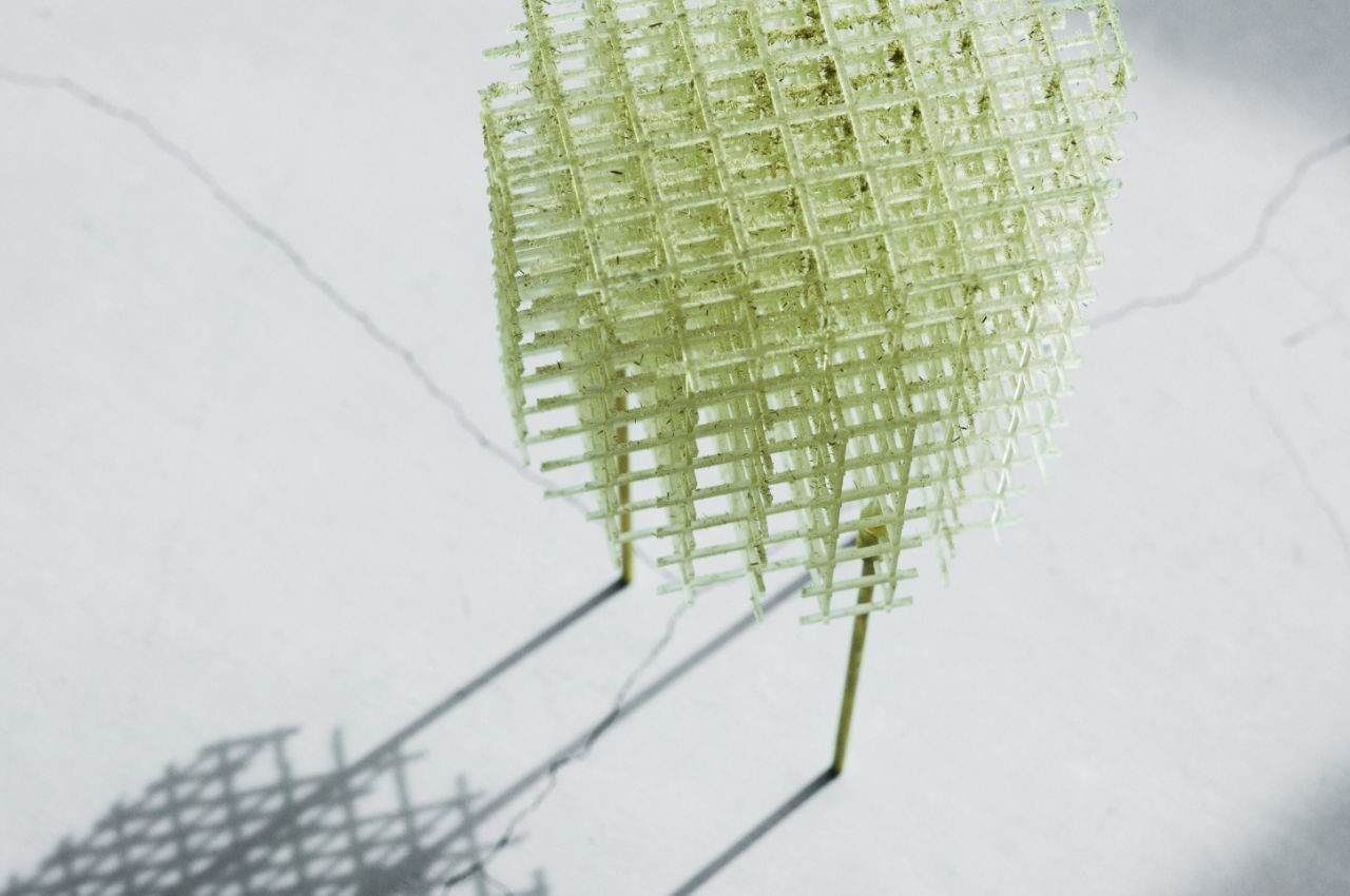
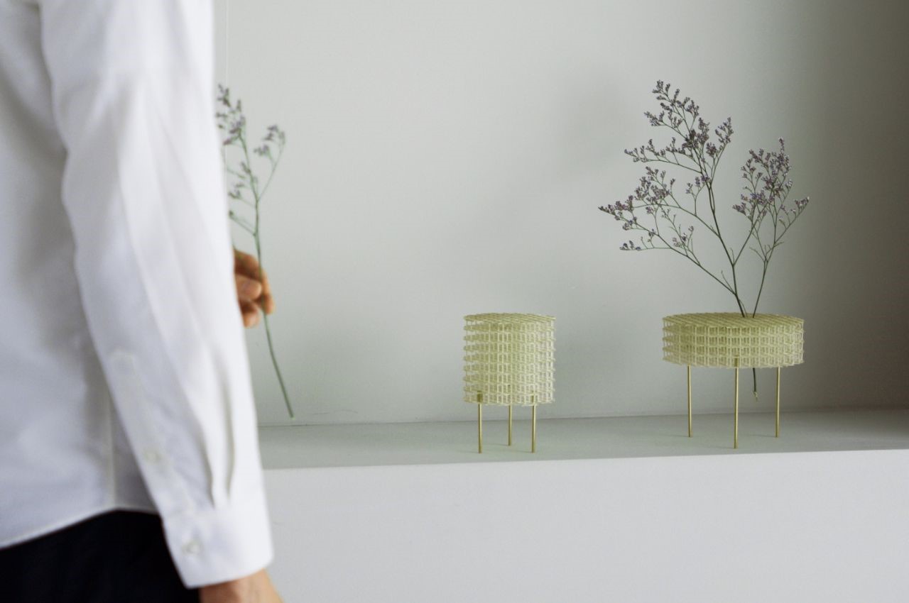
This lattice-like vase is reminiscent of Japanese architecture and allows for flexible plant arrangements, inspired by the art of Ikebana. This design has such a lightweight aesthetic, making any room feel airy. It’s perfect for minimalistic homes.

The post The TATAMI ReFAB PROJECT Is A Product Of Fusing Japanese Traditions With 3D-Printed Sustainability first appeared on Yanko Design.

Durat’s Sustainable Surfaces Merge Aesthetics with Environmental Ethics

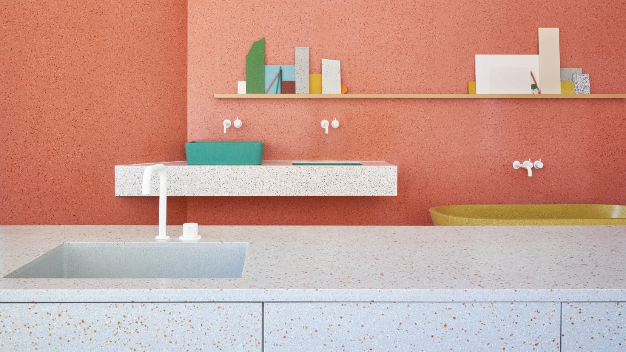
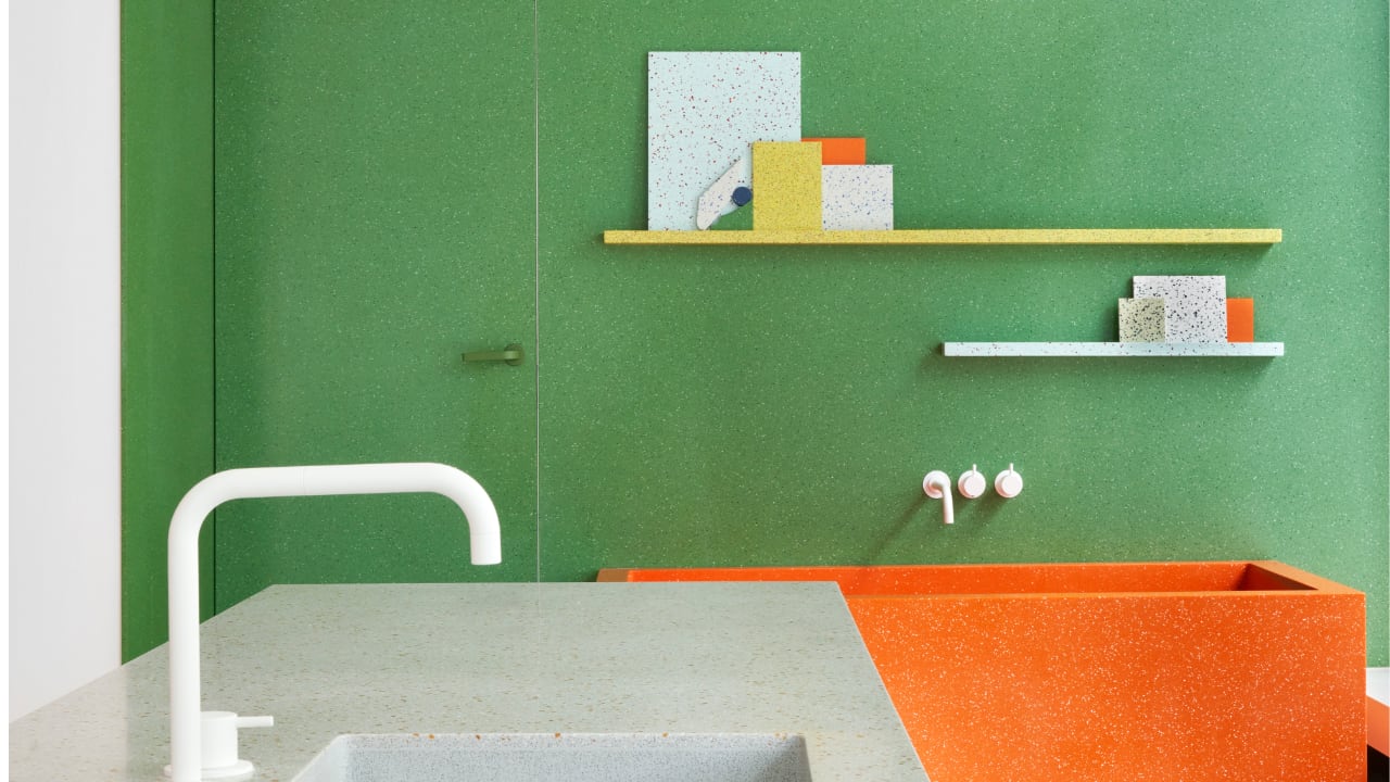
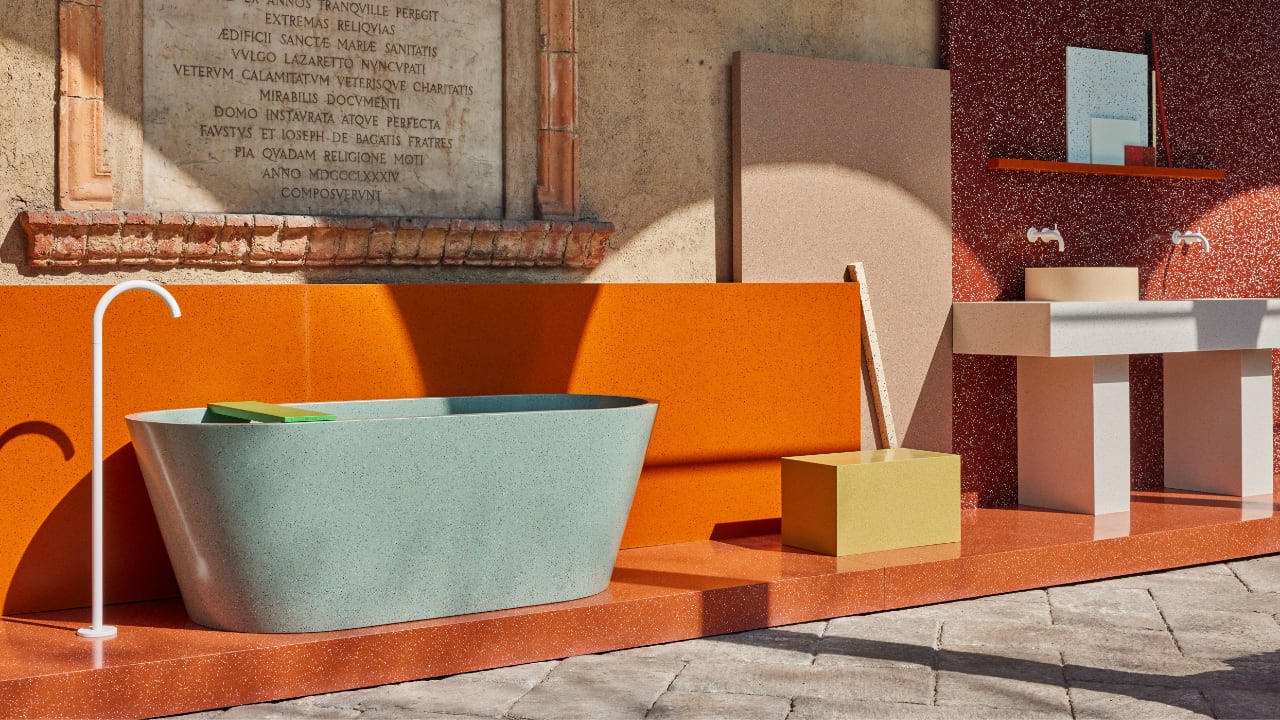
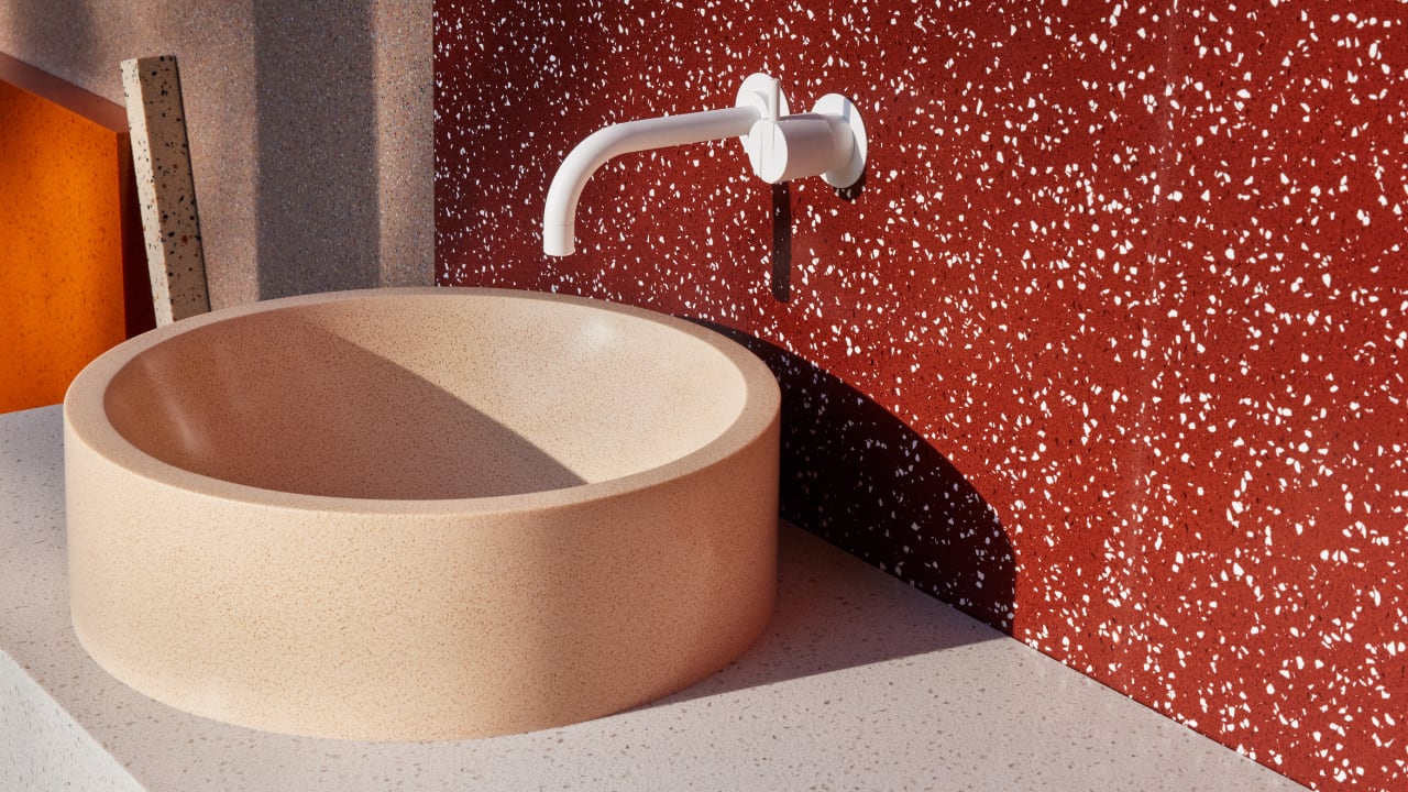
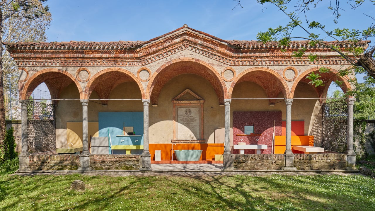
Since its establishment in 1990, Durat, a Finnish leader in sustainable design materials, has been at the forefront of both ecological innovation and aesthetic functionality. With a steadfast commitment to transforming industrial waste into high-quality, recyclable solid surfaces, Durat redefines the traditional use of recycled materials. At the core of its philosophy, deeply rooted in the principles of the circular economy, these values are evident in its product offerings and holistic approach to design and production. During Milano Design Week 2024, Durat showcased the “PORTA DEI COLORI” installation, a vivid illustration of their philosophy. This installation, brought to life by Linda Bergroth, symbolizes the marriage of sustainable practices with imaginative design. It demonstrates that recycled materials can be used beyond just practical applications, achieving significant artistic value.

Designer: Linda Bergroth + Durat

Unlike traditional countertop materials such as granite, quartz, or laminate, Durat’s sustainable solid surfaces present several environmental and functional advantages. Traditional materials like granite and quartz involve energy-intensive mining processes and often require long-distance transportation, which significantly impacts the environment. Additionally, laminate countertops may release volatile organic compounds (VOCs) due to the chemicals involved in their production. In contrast, Durat’s materials are crafted from recycled post-industrial plastics, significantly reducing the ecological footprint by minimizing waste and avoiding the depletion of natural resources. These surfaces are eco-friendly and fully recyclable at their life’s end, promoting a sustainable lifecycle.

Durat’s materials have the potential to outperform traditional options in terms of durability and ease of maintenance. While granite is robust, it can crack under severe impact and requires periodic sealing to prevent staining. Quartz, though less prone to staining, can suffer damage from excessive heat. Laminate, although versatile, is vulnerable to scratches, chips, and heat damage. In stark contrast, Durat surfaces are engineered for resilience and longevity, capable of withstanding wear, impact, and high temperatures without compromising their structural integrity or appearance. Their non-porous nature ensures they’re hygienic, easy to clean, and resistant to bacterial growth, making them ideal for both bustling commercial environments and busy home kitchens.

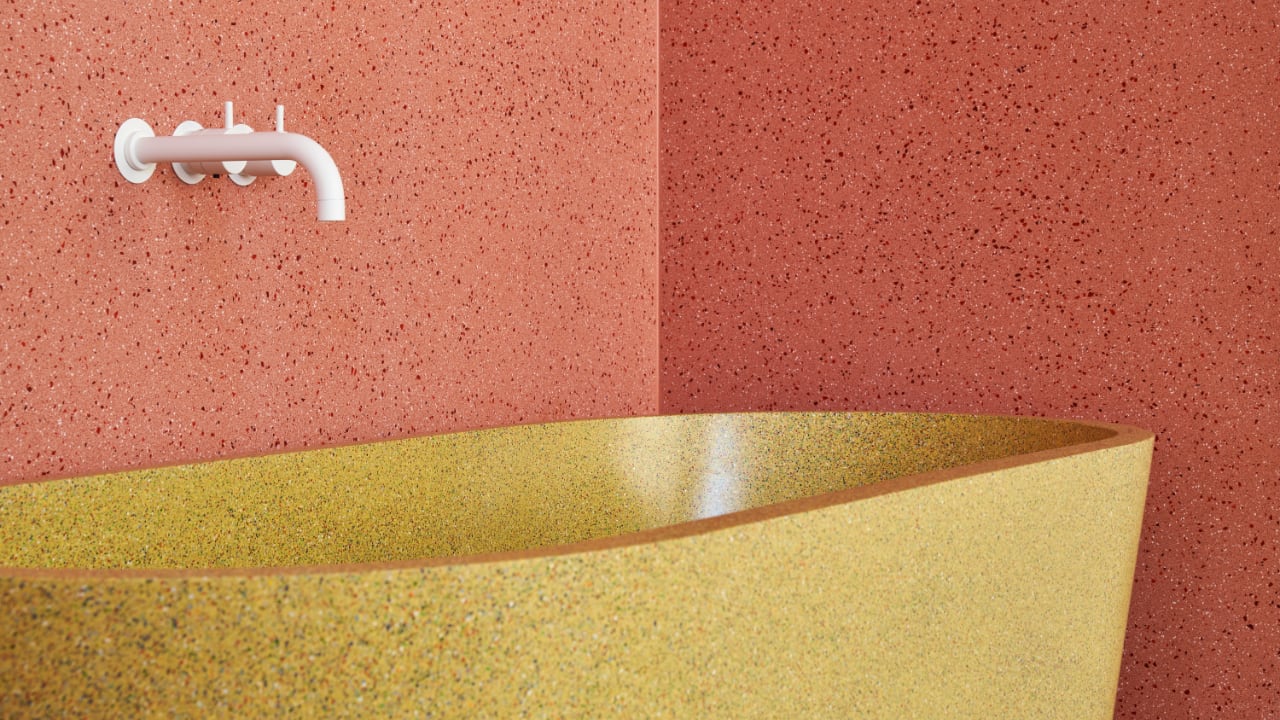
While traditional materials are often constrained by the availability of natural patterns and colors, Durat offers a refreshing alternative with its diverse range of over 300 colors, complemented by distinctive grit effects that create dynamic and continuously evolving patterns. This vast palette provides remarkable creative freedom, enabling designers and architects to precisely tailor their projects, pushing the boundaries of design aesthetics from the minimalistic to the avant-garde. These materials are lighter and more adaptable than their stone counterparts, simplifying the installation process and making repairs and refinishing easier. They also appeal to a wide array of consumers and professionals. Eco-conscious consumers and businesses appreciate Durat’s commitment to environmental stewardship, aligning perfectly with their sustainability practices. The durability and hygienic properties of Durat surfaces make them ideal for high-traffic areas like schools, hospitals, and retail spaces, where facility managers need long-lasting, easy-to-maintain solutions. Additionally, the ease of installation and maintenance makes Durat a favored choice among DIY enthusiasts, enhancing its popularity for home improvement projects and allowing for reduced installation costs while maintaining the material’s pristine condition over time.

This dedication ensures Durat’s solid surfaces meet today’s design professionals’ aesthetic and functional needs while also contributing positively to environmental conservation, positioning Durat as a leader in the future of sustainable modern design.

The post Durat’s Sustainable Surfaces Merge Aesthetics with Environmental Ethics first appeared on Yanko Design.

2024 Lamborghini Huracán Sterrato Debuts Exclusive Livery – All-Terrain Luxury Meets Design at Milan Design Week

At Milan Design Week 2024, Lamborghini unveiled the ‘All Terrain’ Ad Personam series for the Huracán Sterrato in a dazzling display that redefined what a super sports car can be. This limited edition series, featuring 12 uniquely designed vehicles, brilliantly reflects the earth’s varied landscapes through sophisticated design and technological advancements.

Designer: Lamborghini’s Ad Personam studio + Centro Stile

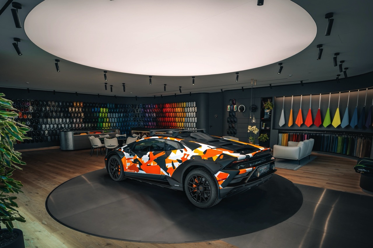
Stephan Winkelmann, CEO of Lamborghini, highlighted the Sterrato’s dual nature at the event. He emphasized its capacity as both a performance vehicle and an adventurous explorer, capable of forging new paths with the same ease as it races down a track. The design of the Sterrato, a product of the collaborative genius of Lamborghini’s Ad Personam studio and Centro Stile, embodies this ethos. Each version of the car is painted in a matte camouflage scheme that corresponds to different environments: NEVE (snow), SABBIA (sand), BOSCO (green track), and TERRA (gravel), further accentuated by a matte black finish on the roof, bonnet, and lower body, accented with unique colors, 19” matte black forged rims, and custom caliper colors.

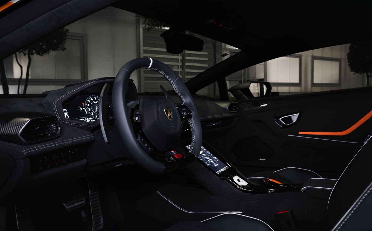
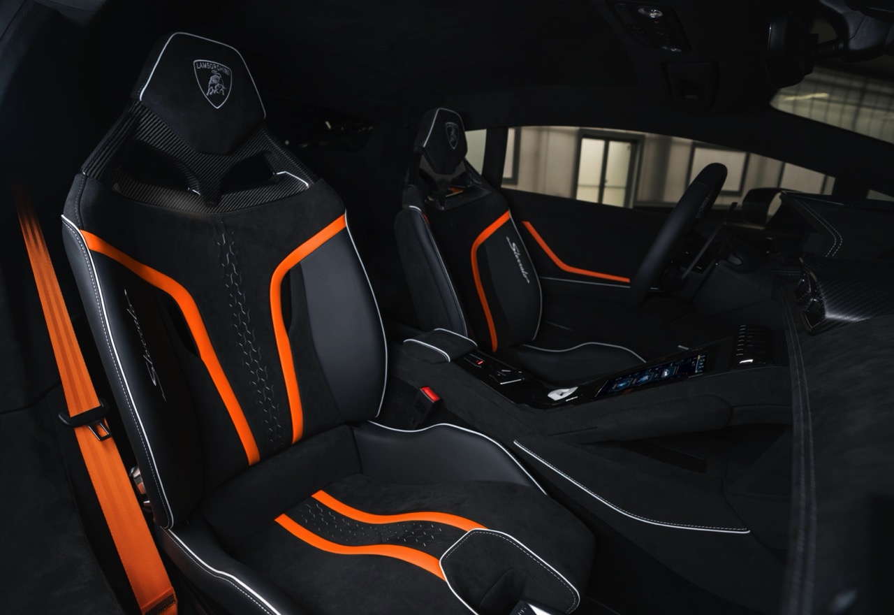
Inside, the Sterrato continues its thematic journey with dark chrome, carbon twill, and Alcantara finishes, enhanced with custom graphics and an Ad Personam plate that reflects the external livery. Mitja Borkert, Head of Design, shared, “The All-Terrain Sterrato is a true Lamborghini in its dynamic abilities and surprises by delivering the unexpected. It’s a joy to drive and ready for any adventure.”

The Milan presentation featured a dramatic stage display with a giant Trompe L’Oeil, created by an Italian artist, setting a perfect backdrop that echoed the power of nature and the promise of adventure.

I must admit, I’m quite envious that Tim Stevens had the opportunity to experience the Sterrato firsthand. In his review, Tim applauded the vehicle for its exceptional all-weather performance, dramatic styling, and the immersive sound of its 5.2-liter V10 engine. Though he pointed out some visibility issues and the absence of ‘Corsa mode,’ the Sterrato was praised for its robust performance across diverse conditions and its distinctive styling that builds on the legacy of the LM002.

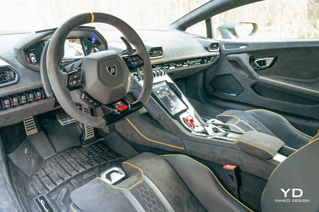
He described the interior as maintaining Lamborghini’s luxurious standards with bespoke elements that cater to both comfort and style. The car’s raised suspension and specialized Bridgestone Dueler AT002 tires exemplify its readiness for rugged terrain, while the powerful V10 engine assures a thrilling drive wherever you may roam.

Milan Design Week certainly wouldn’t have felt complete without these gorgeous, beastly performance cars making their mark. And for those now compelled to own one, a quick note: the 12 cars in this special Ad Personam series are already sold out, highlighting the allure and exclusive appeal of the Lamborghini Huracán Sterrato.

The event concluded with the unveiling of the Huracán Sterrato, demonstrating Lamborghini’s commitment to innovating car design and performance and marking an exciting new chapter in its legacy, which continues to challenge automotive conventions by merging aesthetic elegance with superior engineering.

The post 2024 Lamborghini Huracán Sterrato Debuts Exclusive Livery – All-Terrain Luxury Meets Design at Milan Design Week first appeared on Yanko Design.

Meritalia showcases unique Pesce furniture pieces at Milan Design Week

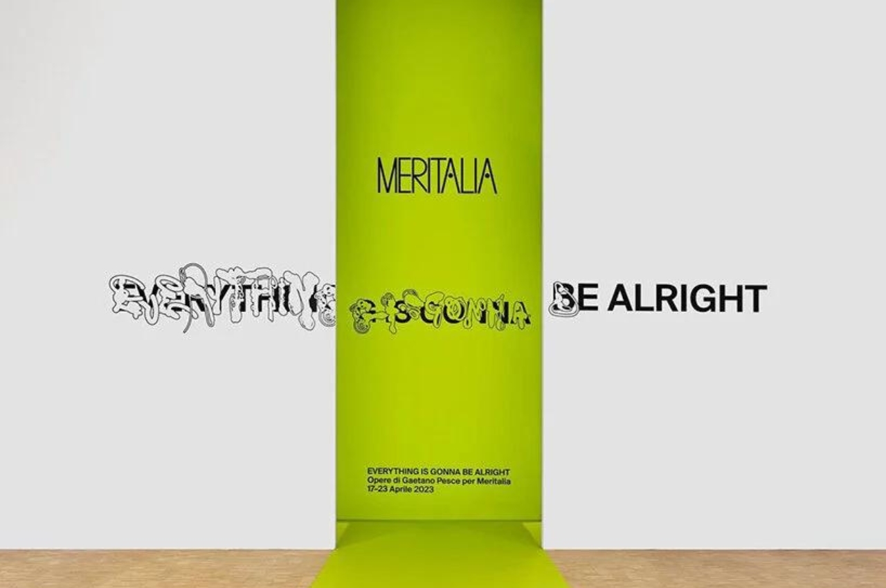
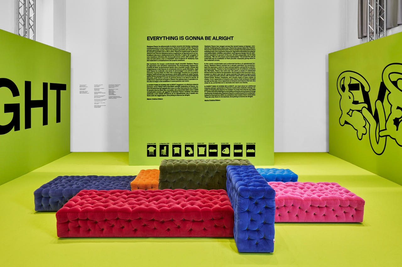
Italian furniture brand Meritalia is showcasing some of its most unique and artsy pieces created by long-time collaborator Gaetano Pesce. The exhibit is called “Everything Is Gonna Be Alright” and launches at the ongoing Milan Design Week. The famous sculptor, designer, and architect has contributed a lot to the aesthetics of the furniture brand over the past years and the exhibit itself is more than just a look at various chairs and sofas but can also be considered an art exhibit.

Designer: Gaetano Pesce

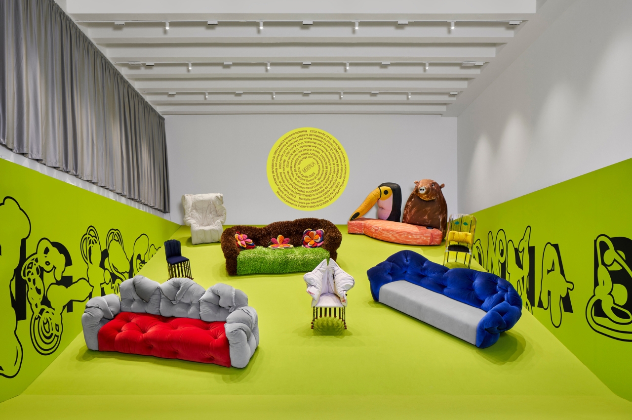
Just like the actual furniture itself, the exhibit space brings an “unusual and unstable choreography” as it reaches toward the sky rather than just have a flat space to showcase pieces that can be right at home in a C.S Lewis or Neil Gaiman storybook. Pesce is well known for playing around with color and materials and he was able to bring this sensibility in the “characters” that he created for the brand. The dream-like pieces are more art than just functional pieces of furniture so they’re perfect for this kind of exhibition.

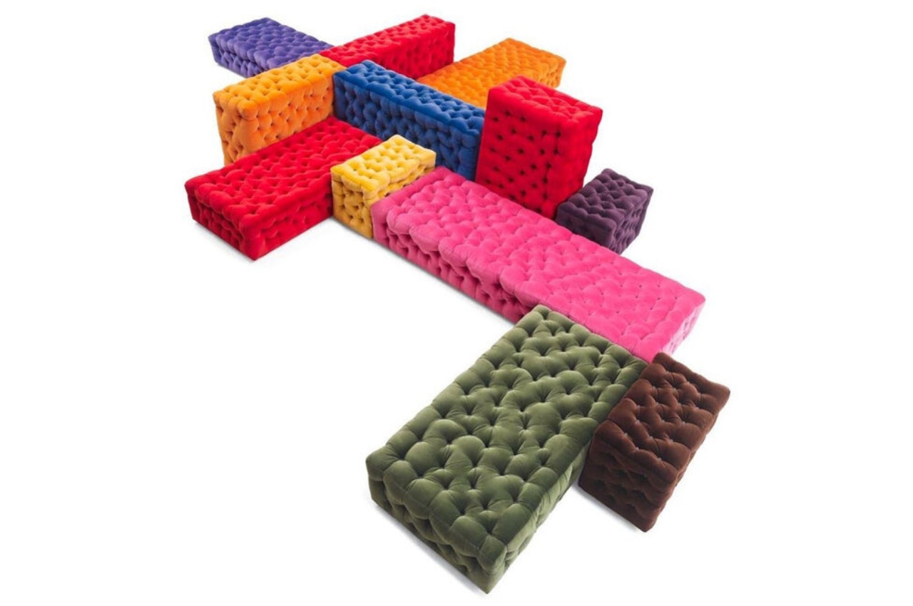
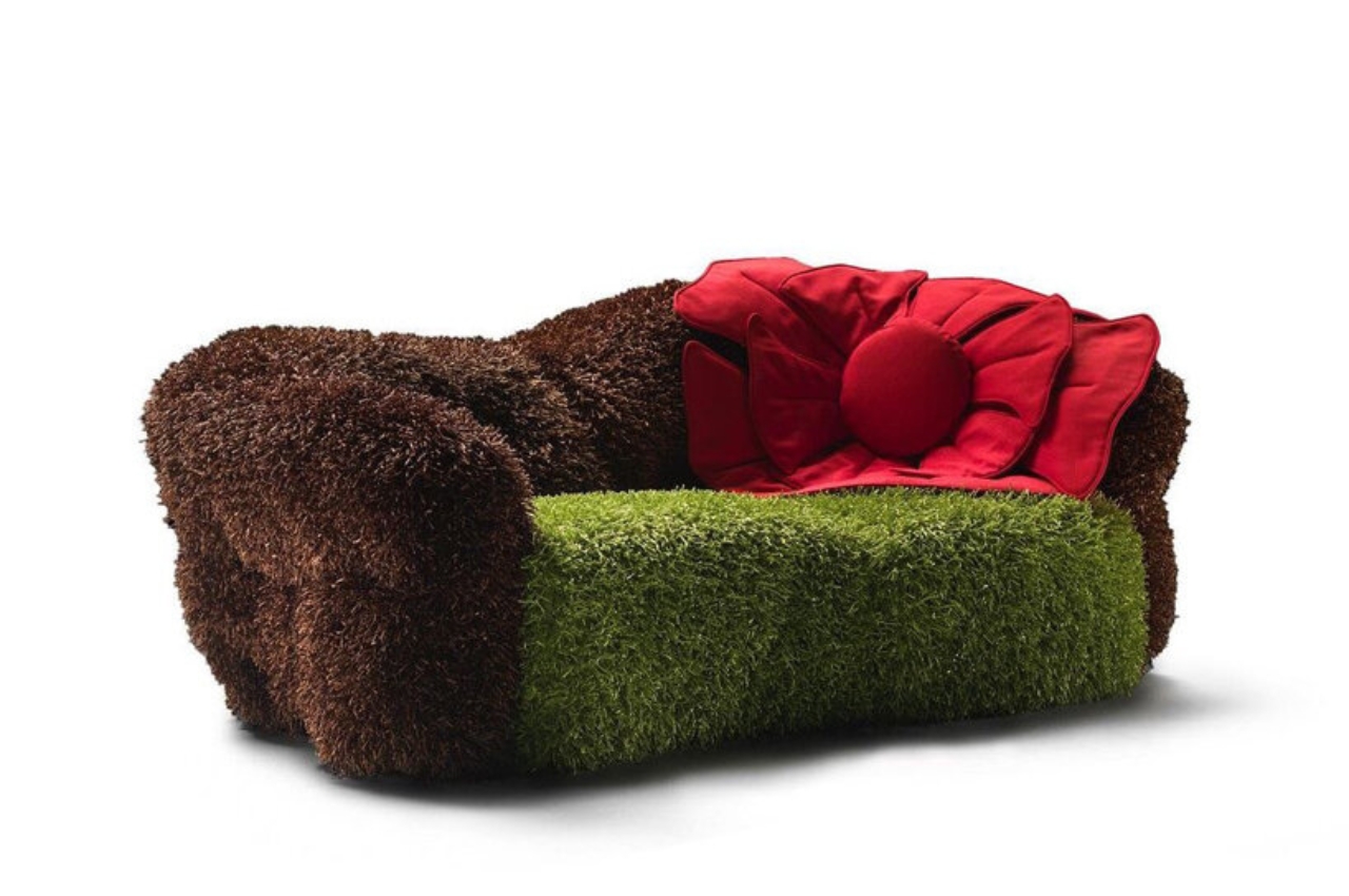
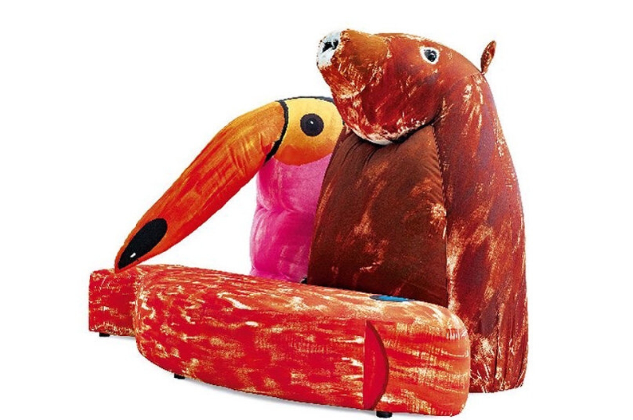
There are nine pieces included in the exhibit. This includes the modular La Michetta, made up of various colors and sizes of sofa pieces put together. You also see the soft couch called Nubola and the La Pagnotta chair that looks like a character from Alice in Wonderland. You also see the Shadow armchair with its various folds and creases as well as the Gli Amici, an upholstery collection with various fun characters.

The exhibit space uses a plane with neon green colored floors and walls sloping up to the sky. The walls also has various graphics that are also a reflection of the design aesthetics that Pesce brought to Meritalia. The “Everything Is Gonna Be Alright” exhibition can be found at MDW until April 23, 2023.

The post Meritalia showcases unique Pesce furniture pieces at Milan Design Week first appeared on Yanko Design.

Herman Miller design exhibit at Milan Design Week celebrates company’s 100 years

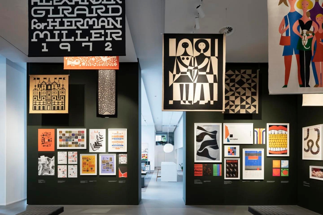
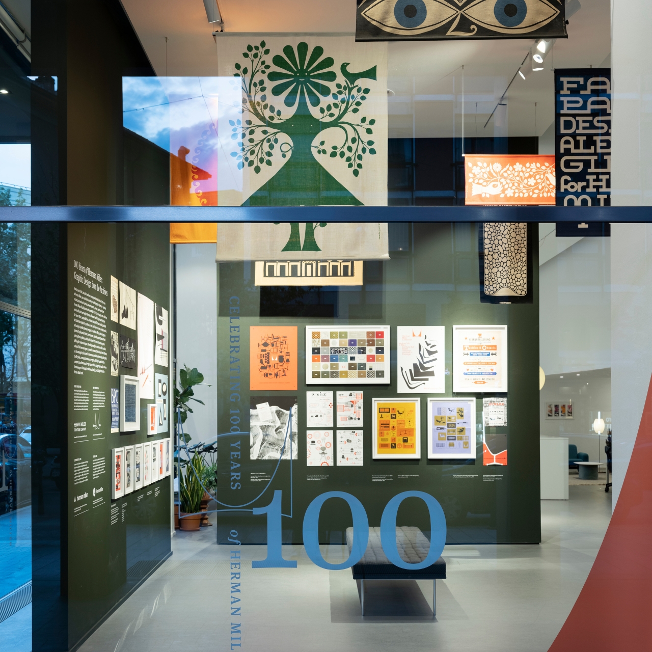
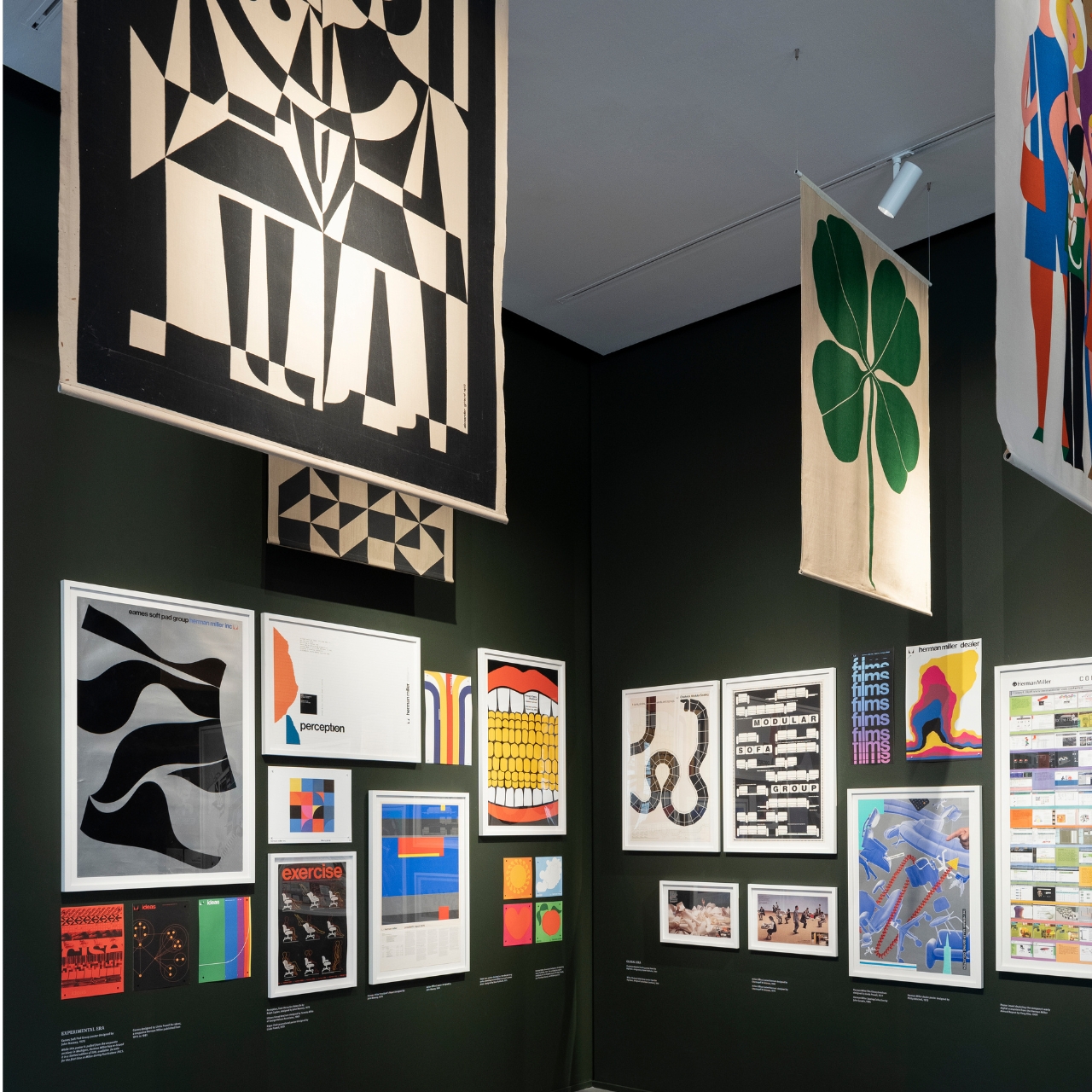
Herman Miller, one of the most highly-regarded office chair designers and producers, is celebrating the 100th anniversary of its brand name. To celebrate, they will have an exhibit of the rich history of their company’s graphic design journey. The exhibit will begin at the Milan Design Week and eventually go to Chicago in June. You would think that this exhibit is all about the furniture but is more the visual journey of their design and marketing materials.

Designer: Herman Miller

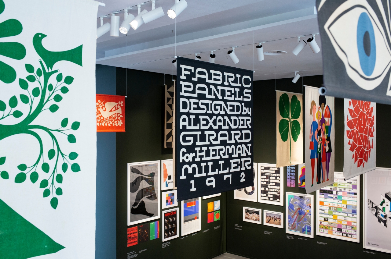
Founded by D.J De Pree, Herman Miller was launched back in 1923 and by 1930, they hired Gilbert Rhode to bring modern design sensibilities to their previously traditional furniture. His wife Peggy Rhode was his partner as she took charge of designing their marketing materials, matching the new direction that the company was taking. When George Nelson started designing for the company in 1945, pioneer graphic designers like Irving Harper and Tomiko Miho also brought in a new look to their designs.

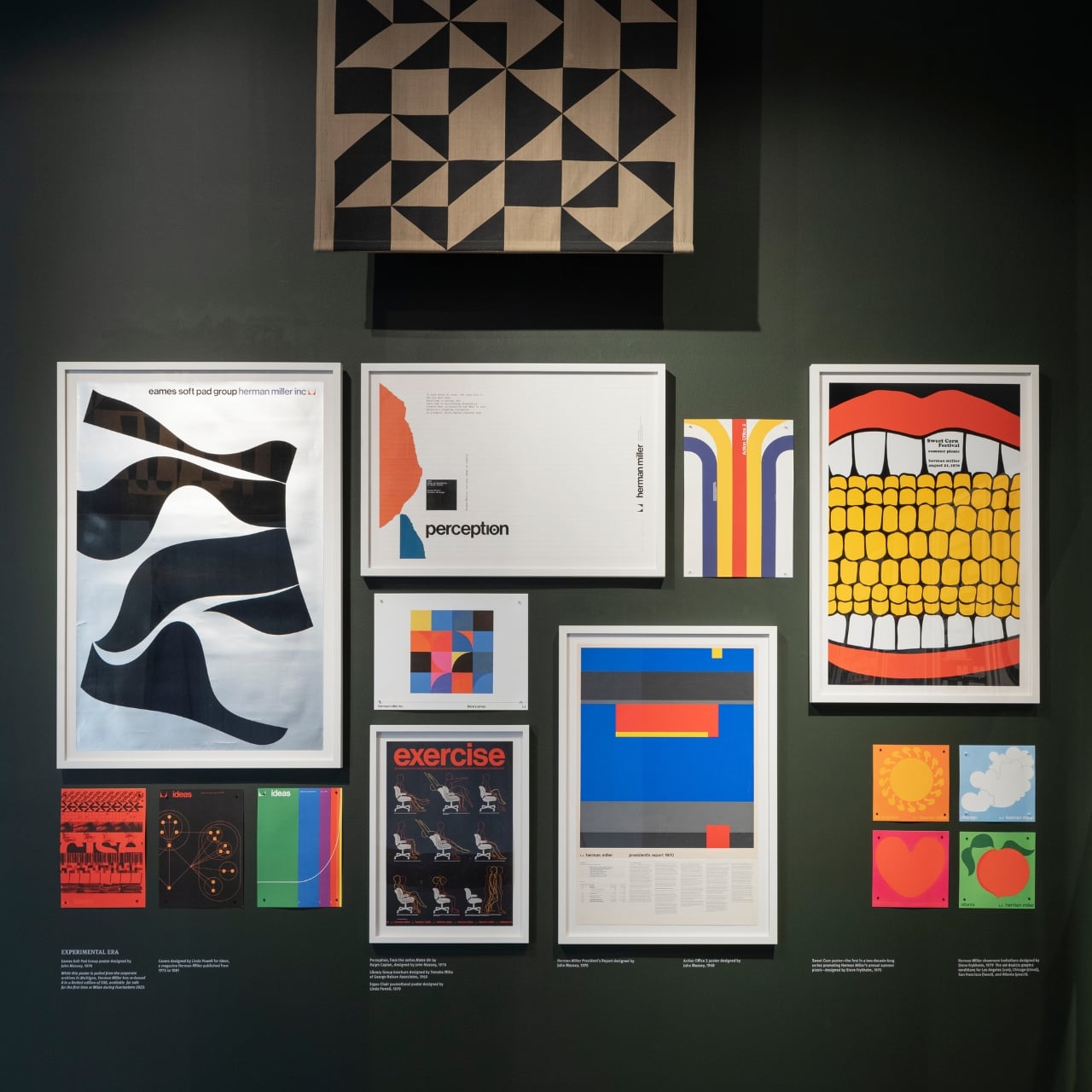
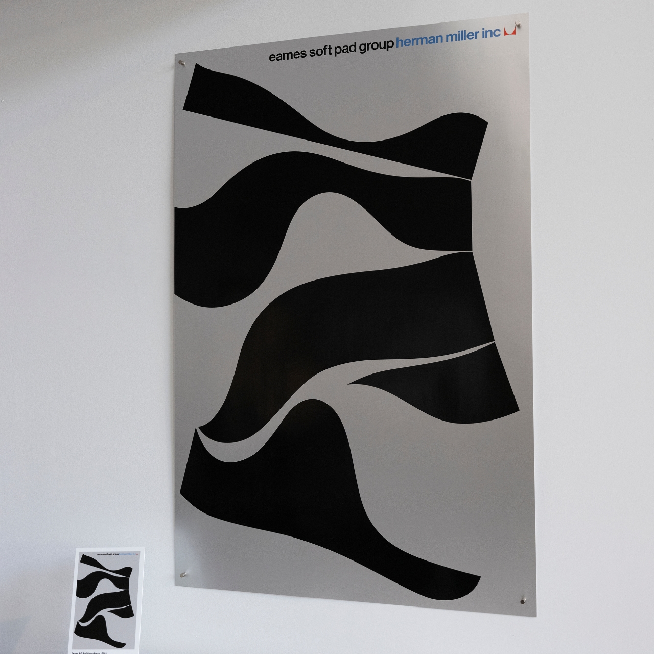
Designer John Massey and eventually his protege Steve Frykholm then brought the Pop Art look to the designs in the 60s and 70s. Barbara Loveland and Linda Powell then brought postmodern sensibilities in the 80s and 90s. For the textile division of the company, Alexander Girard is the name to remember as he used “graphics to create motifs with meaning” during his tenure as the founding director. His designs will also be on display at the exhibition. They will also be selling limited-edition prints of the Eames Soft Pad Group poster which is an iconic look for the brand.

The exhibit not only shows Herman Miller’s visual design journey but also looks like a history of graphic design over the past 100 years. You can see the various design movements for every decade so it’s also interesting how the company was able to keep up with all of that. It makes sense that they would put on this kind of exhibit rather than just show off their chairs or furniture (although they’re mostly pretty nice as well).

The post Herman Miller design exhibit at Milan Design Week celebrates company’s 100 years first appeared on Yanko Design.

The Best of Salone del Mobile 2022 – Smarter and Greener Living

Caring for ourselves and our families also means caring for the planet we all live on.

Recent events, including but not limited to the COVID-19 pandemic, have made us more acutely aware of the quality of our lives, whether we’re living well, comfortably, or, more importantly, healthily. It has also made many people more of the state of our planet, the only habitable planet that we know of, and how the way we live affects the Earth, no matter how seemingly insignificant it is. Salone del Mobile in Milan has always gathered the best designs and ideas in furniture and lifestyle products, and this year has showcased yet another wonderful selection of products from creative minds and innovative companies. This year’s exhibition has also shown a more positive bent towards not just the physical but also the mental well-being of people, not to mention a more conscientious effort to leave a positive impact on the environment. At Yanko Design, we recognize and highlight the best product designs not just for their beauty but also for their positive impact, and here are our Top 12 picks for Salone del Mobile 2022.
Antoniolupi Ofuro

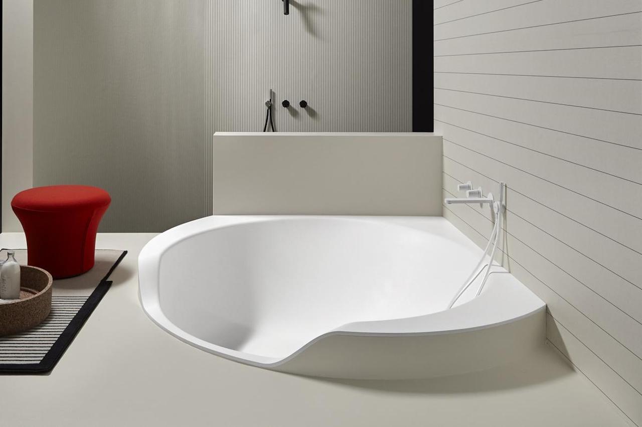
We sometimes take inspiration from the past to inform today’s designs, and sometimes we even look to other cultures for ideas. When it comes to bathing and cleansing, the Japanese are both famous and notorious for their relaxing areas and strict rules. Antoniolupi tries to capture the spirit and the feeling of a traditional Japanese soak without the rigid norms, resulting in a bathtub that is distinctive and unique in its appearance.
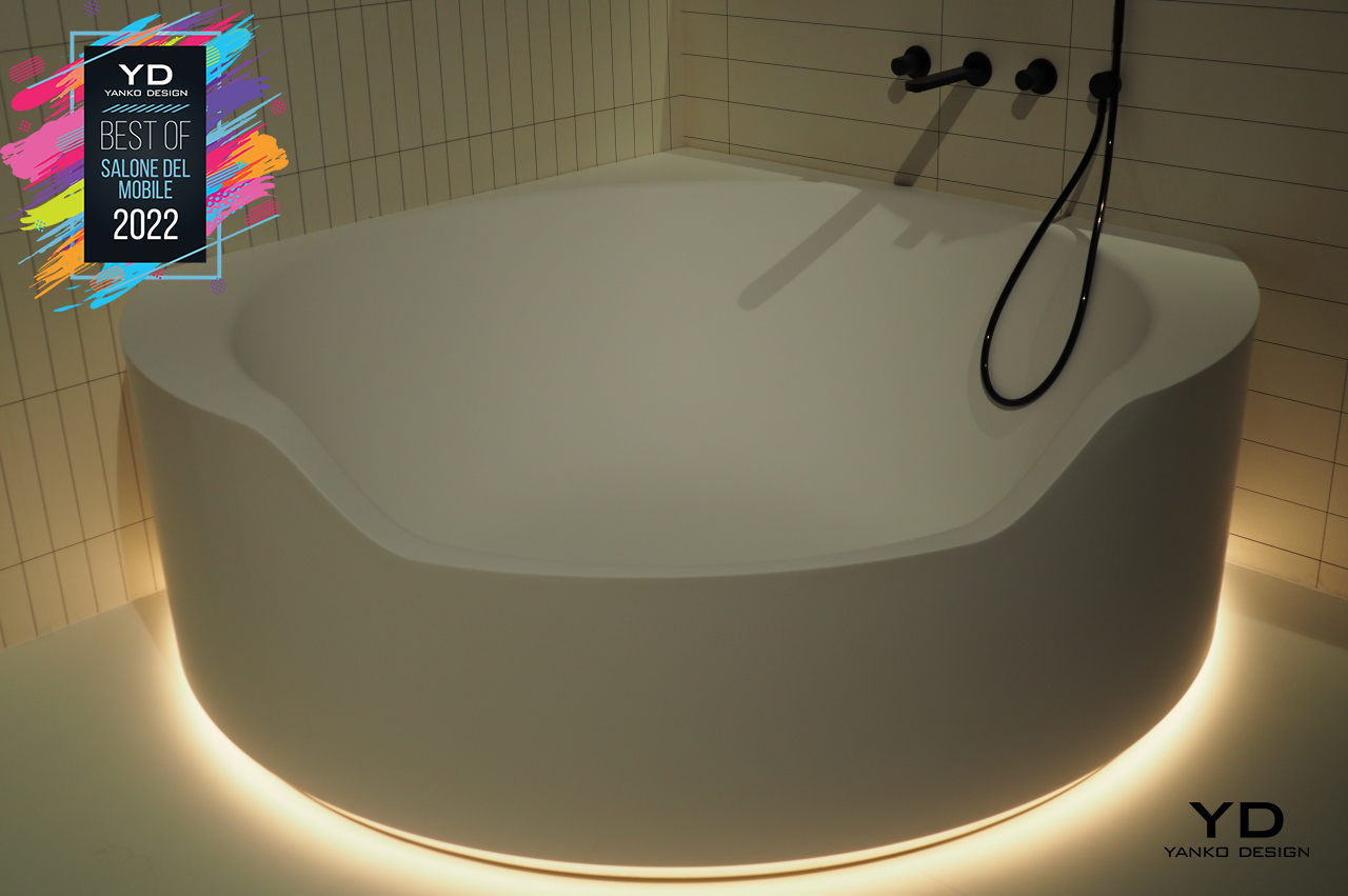
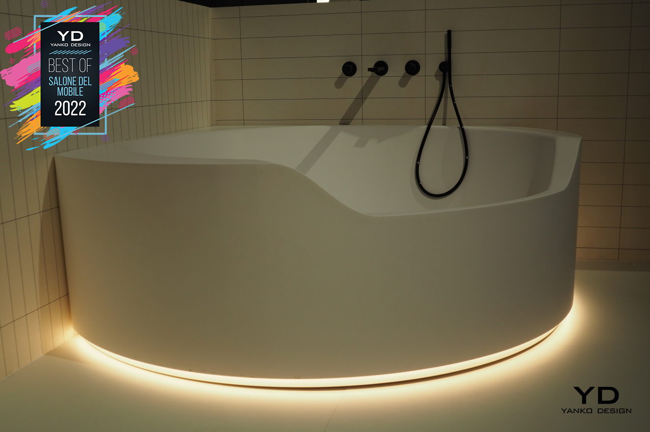
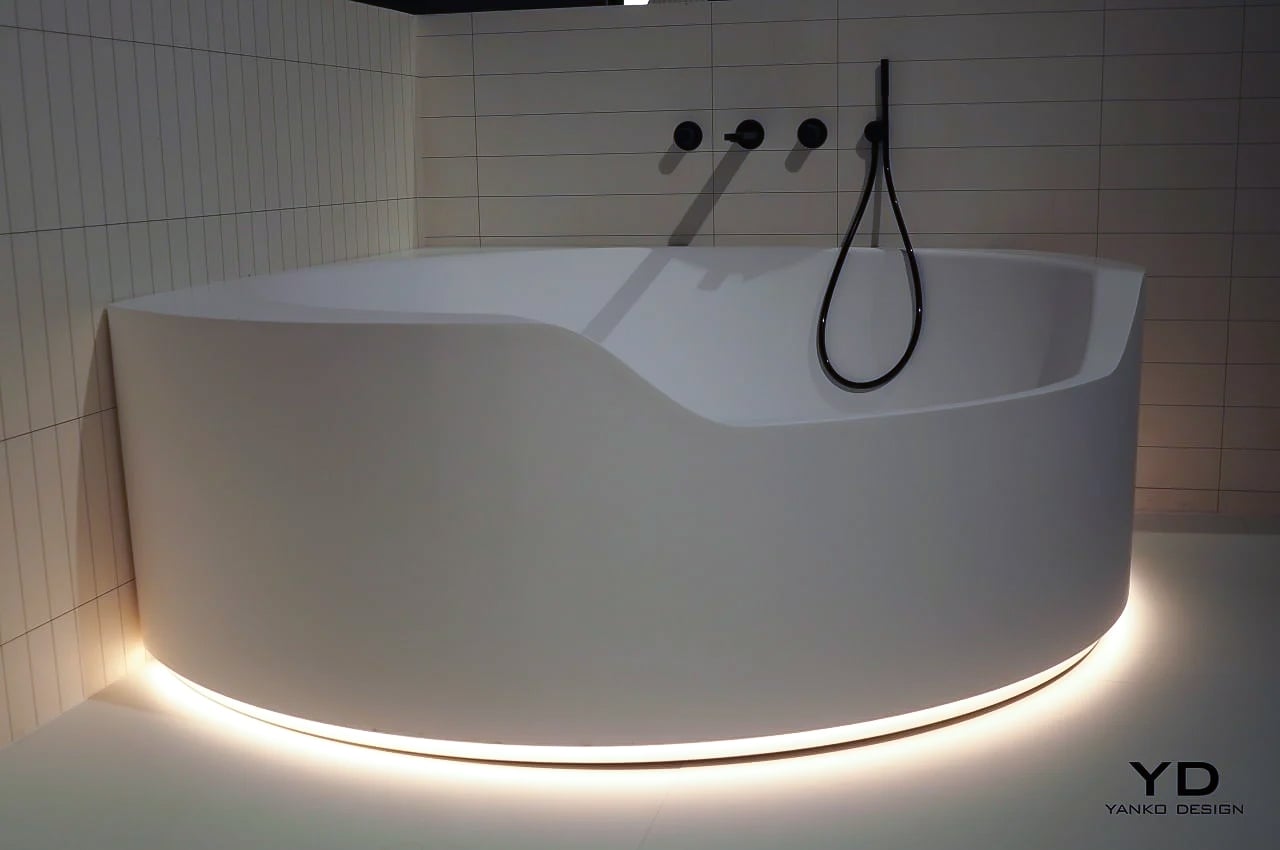
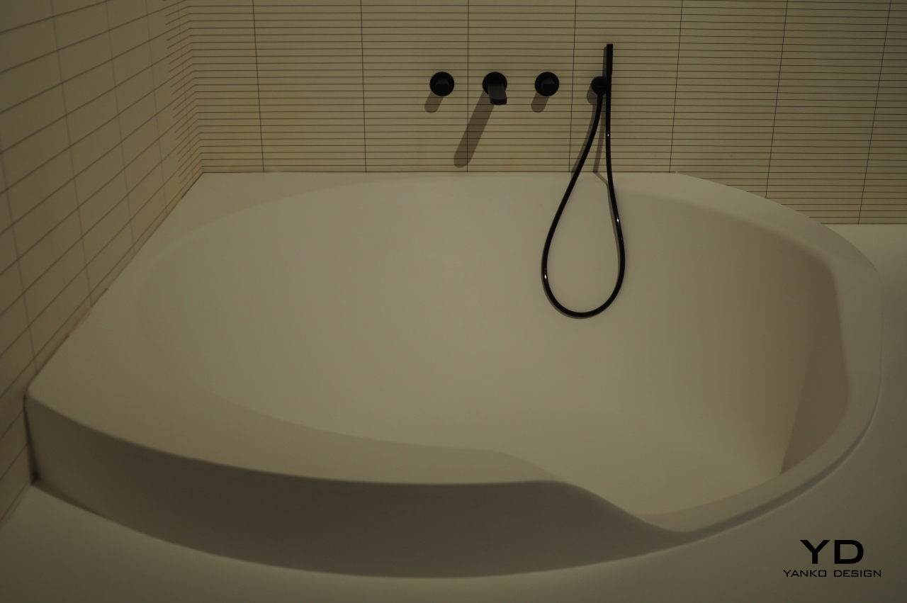
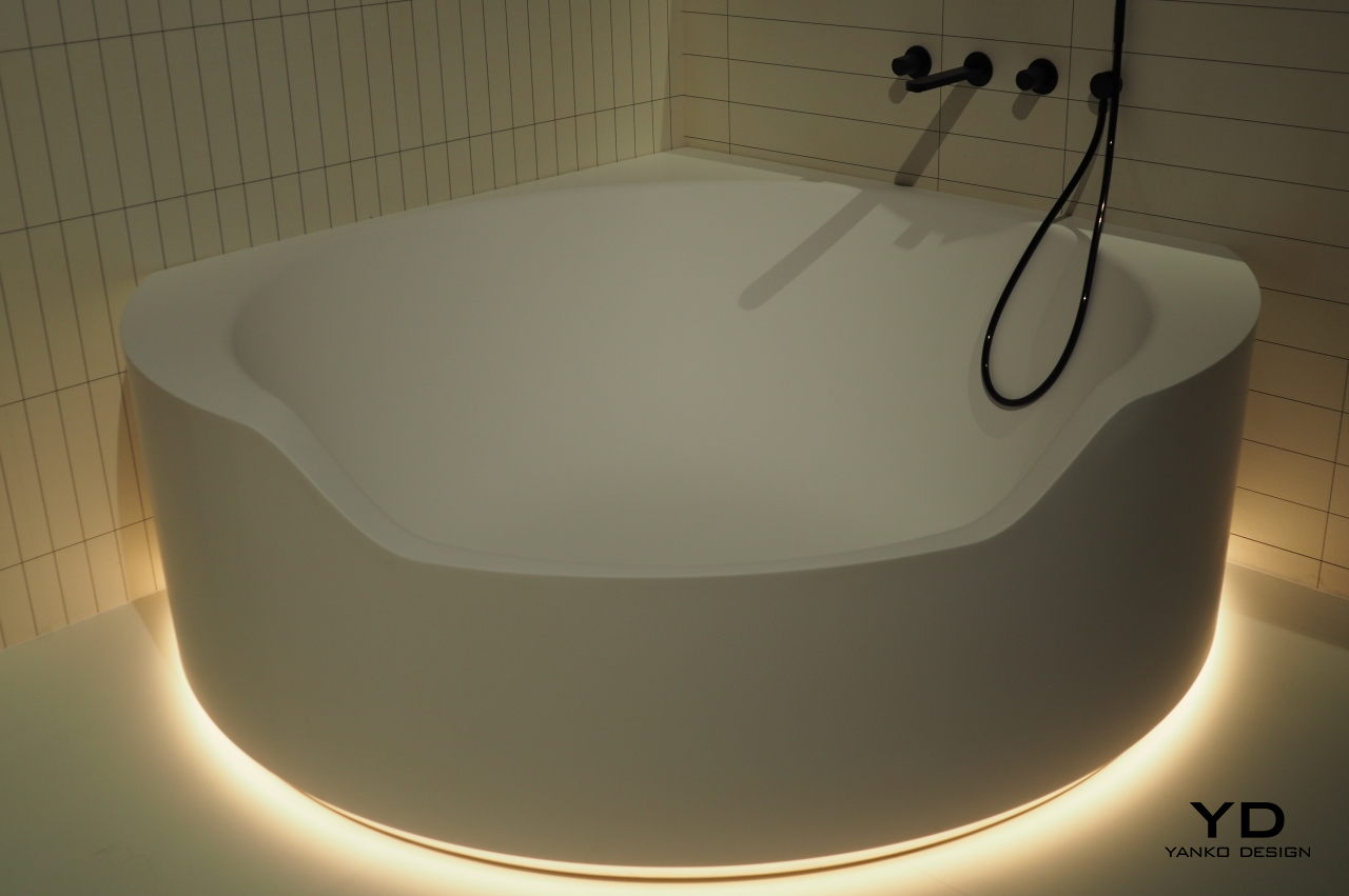
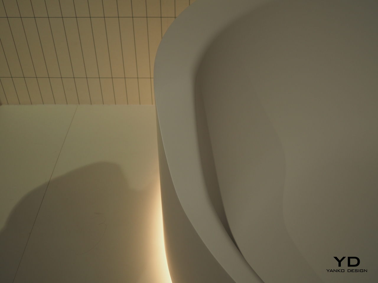
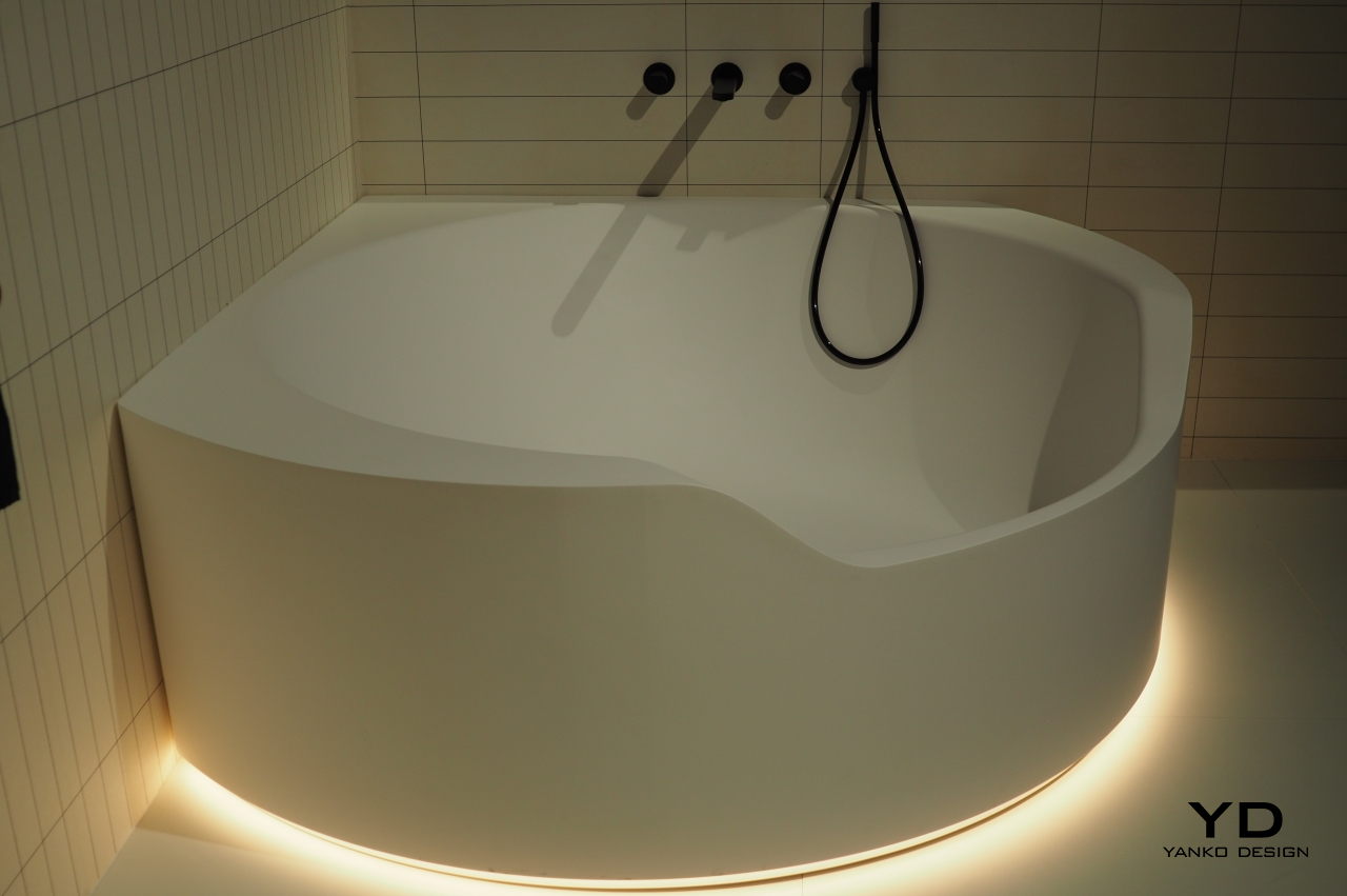
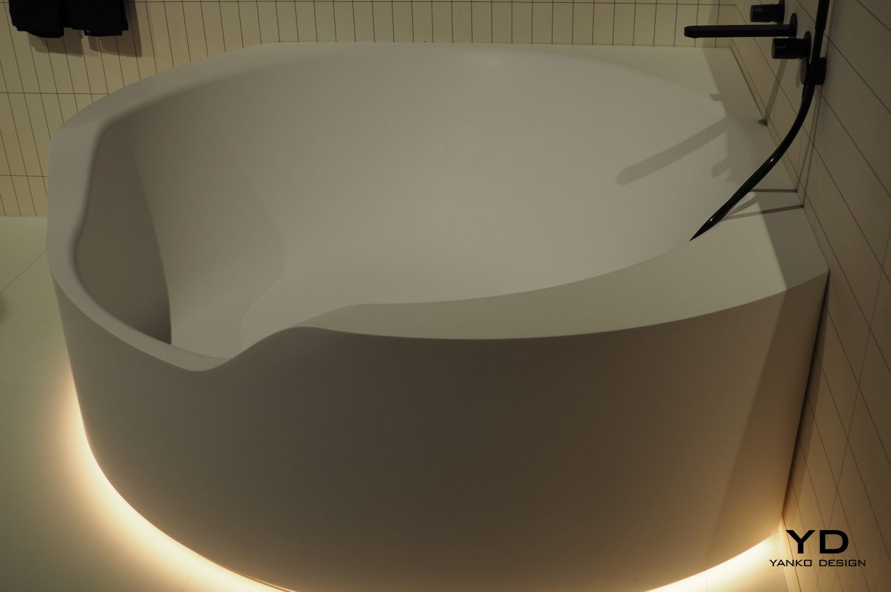
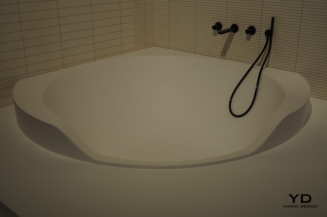
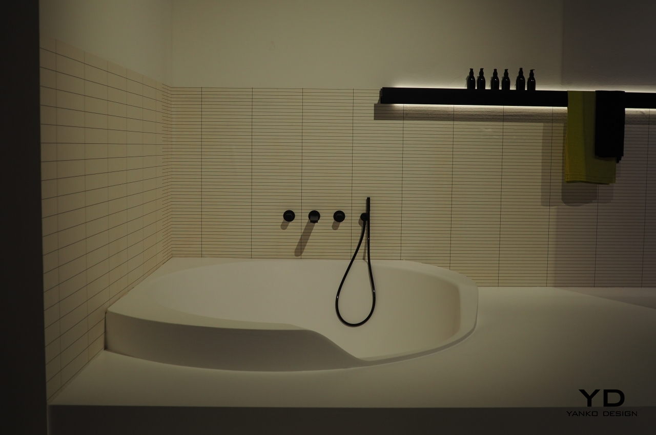
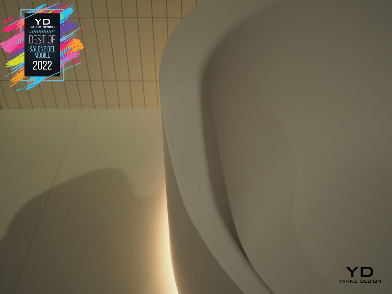
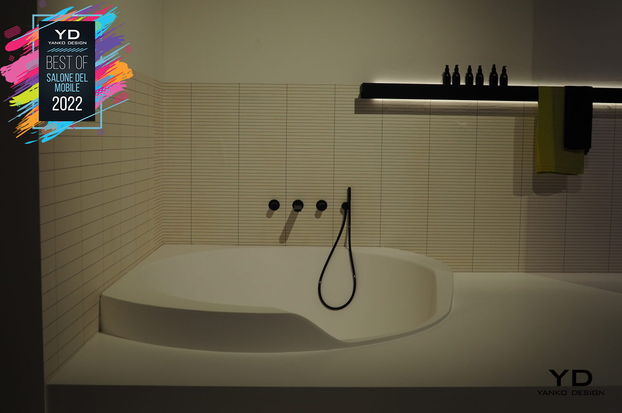
A circular basin with a notch, the Ofuro‘s lowered front edge tries to invite you to step into its relaxing waters and soak for a while to let your worries wash away. Optional LED lights at the base call to mind outdoor tubs that would be heated by firewood underneath, creating an almost otherworldly glow meant to take your mind to a higher plane. Made of the designer’s patented and eco-friendly Flumood, the Ofuro tub looks like it was sculpted from a single block completing the perception of wholeness and integrity that your mind needs while your body soaks and relaxes inside.
Artemide Integralis

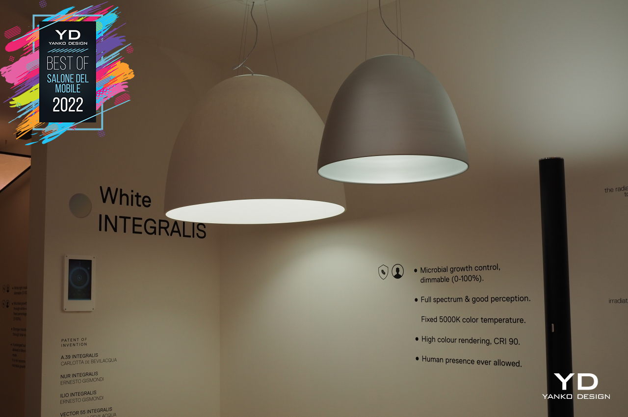
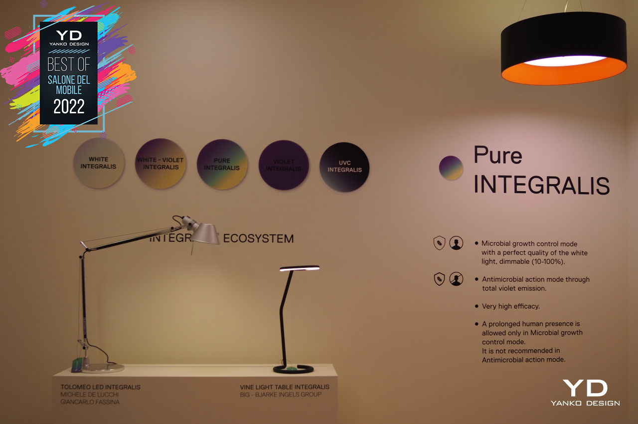
The COVID-19 novel coronavirus gave birth to plenty of new products that focused on cleaning the air in our homes and killing dangers that we can’t see with the naked eye. You don’t, however, have to stick some odd-looking contraption in the middle of your home just to benefit from these technologies, especially when all you need is to shine a better light on the problem. Artemide’s Integralis line of lighting products delivers both safety and beauty to create a safer space for the whole family, as well as the occasional visitors.
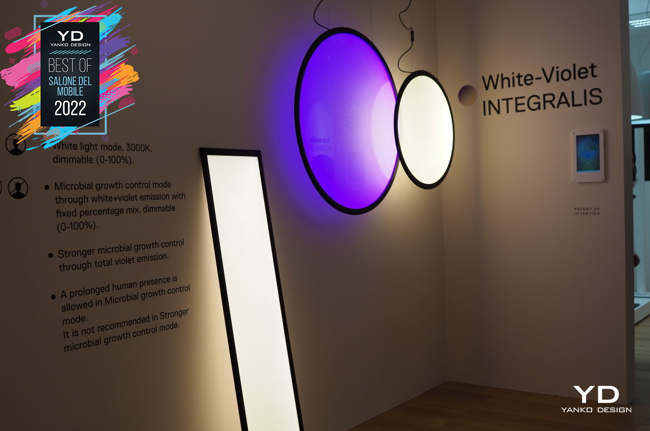
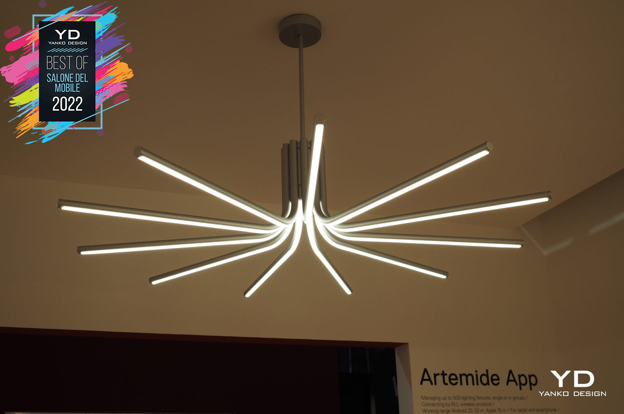
Homeowners can choose from a variety of designs and colors that fit their needs and their sense of style. The Discovery lamps, for example, employ geometric shapes like circles and rectangles to provide low-impact designs inside your home. In contrast, The Veil puts a canopy draped over 11 arms arranged like spokes in a wheel, diffusing the light to create a gentler and more comforting atmosphere while using ethically-sourced and sustainable materials to put your conscience at ease.
BORA X BO

Part of living a healthy lifestyle means eating healthy, and the best way to do that is to decide what you eat and how you cook your food. Cooking, however, sometimes feels more like a chore with very low ROI, especially when $you think of the cleanup afterward. The BORA X BO tries to do most of the work for you by employing some of the same technologies you have on your smartphone. You probably never expected you could even search on your oven!
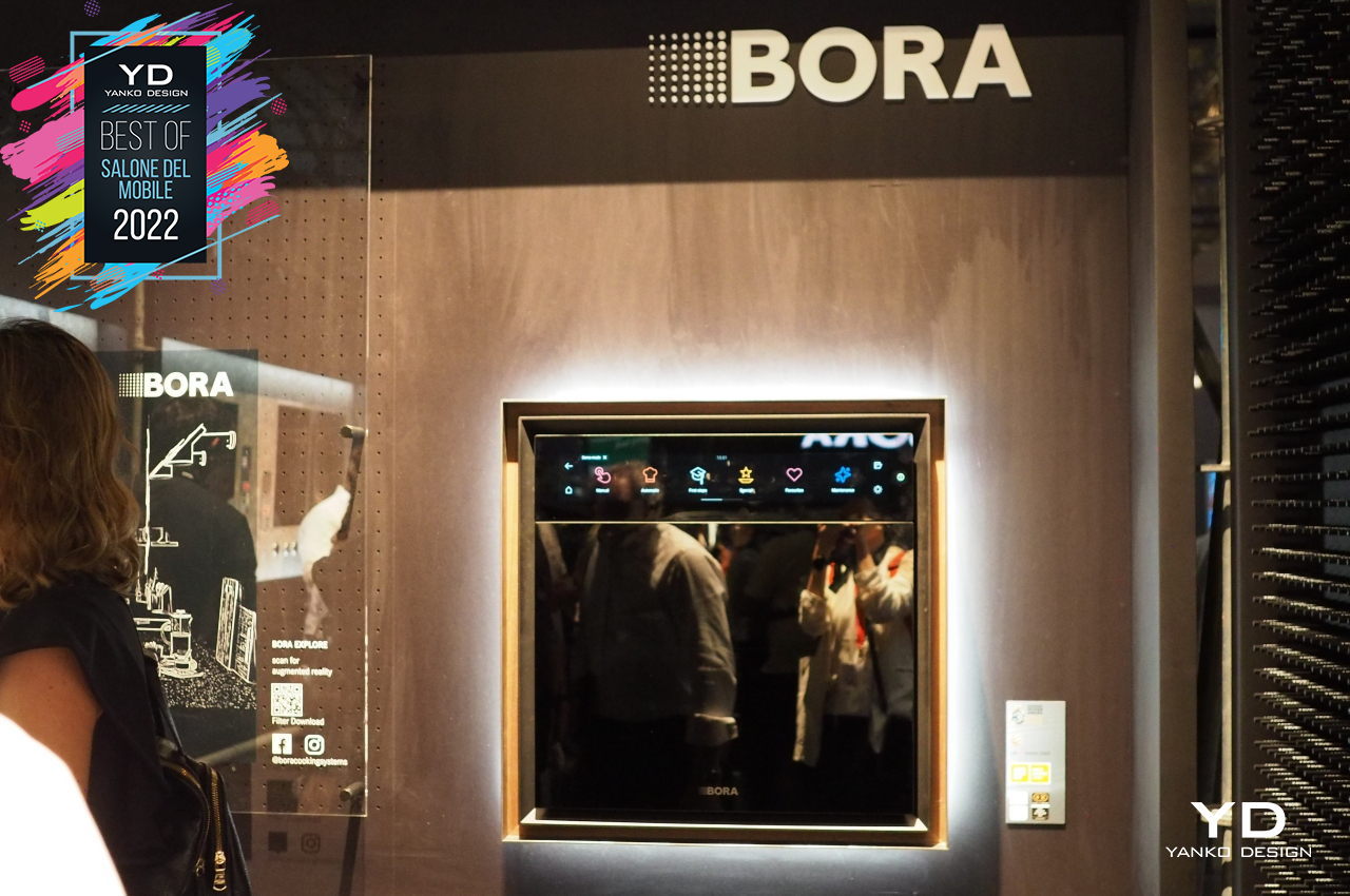
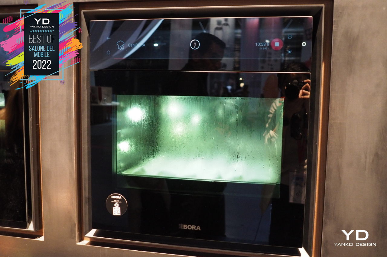
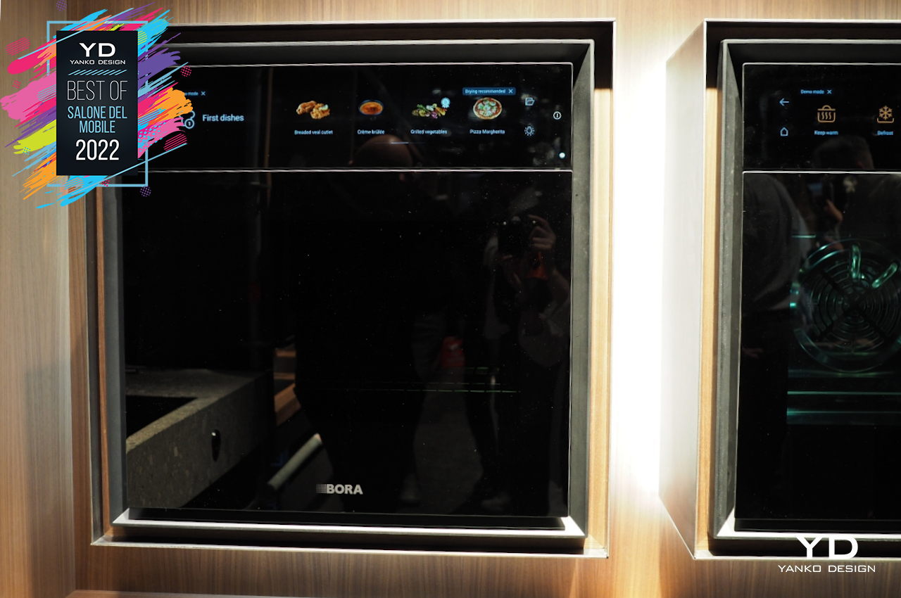
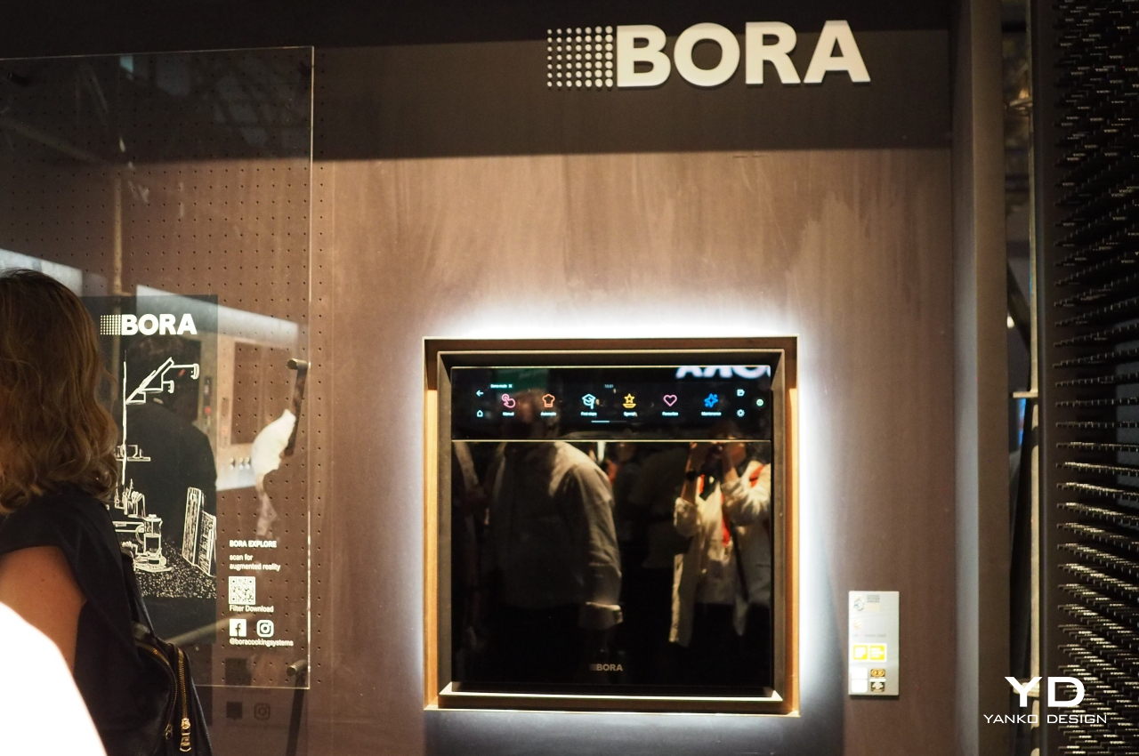
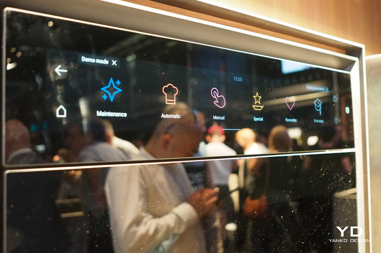
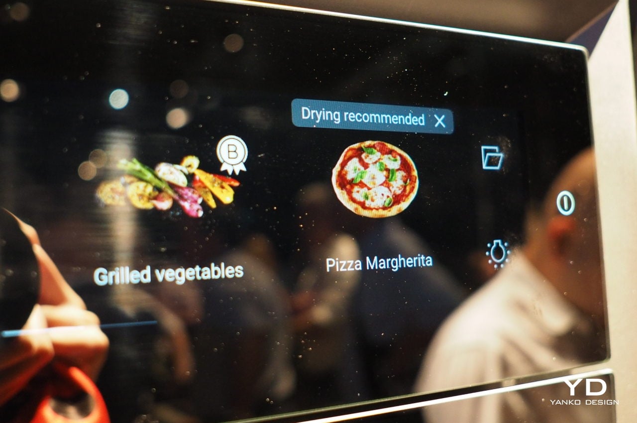
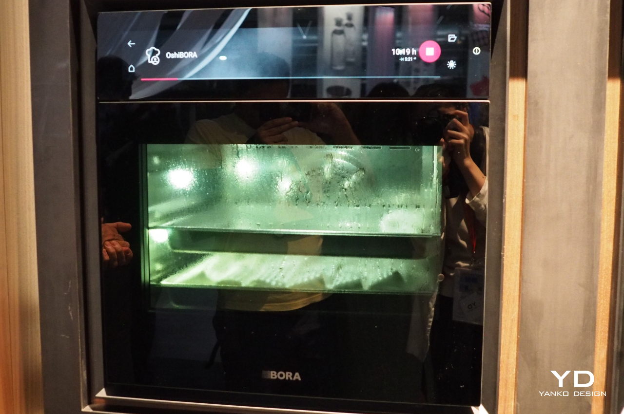
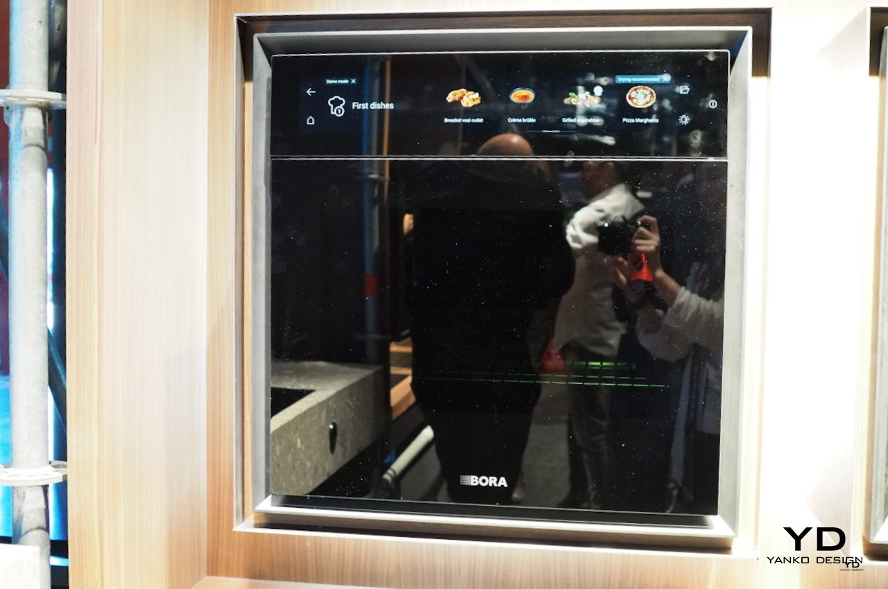
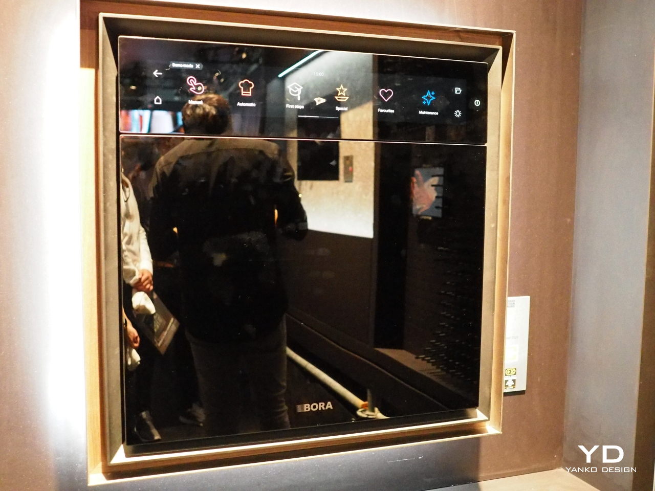
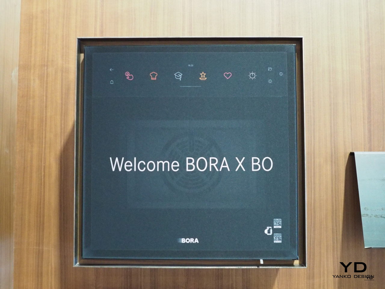
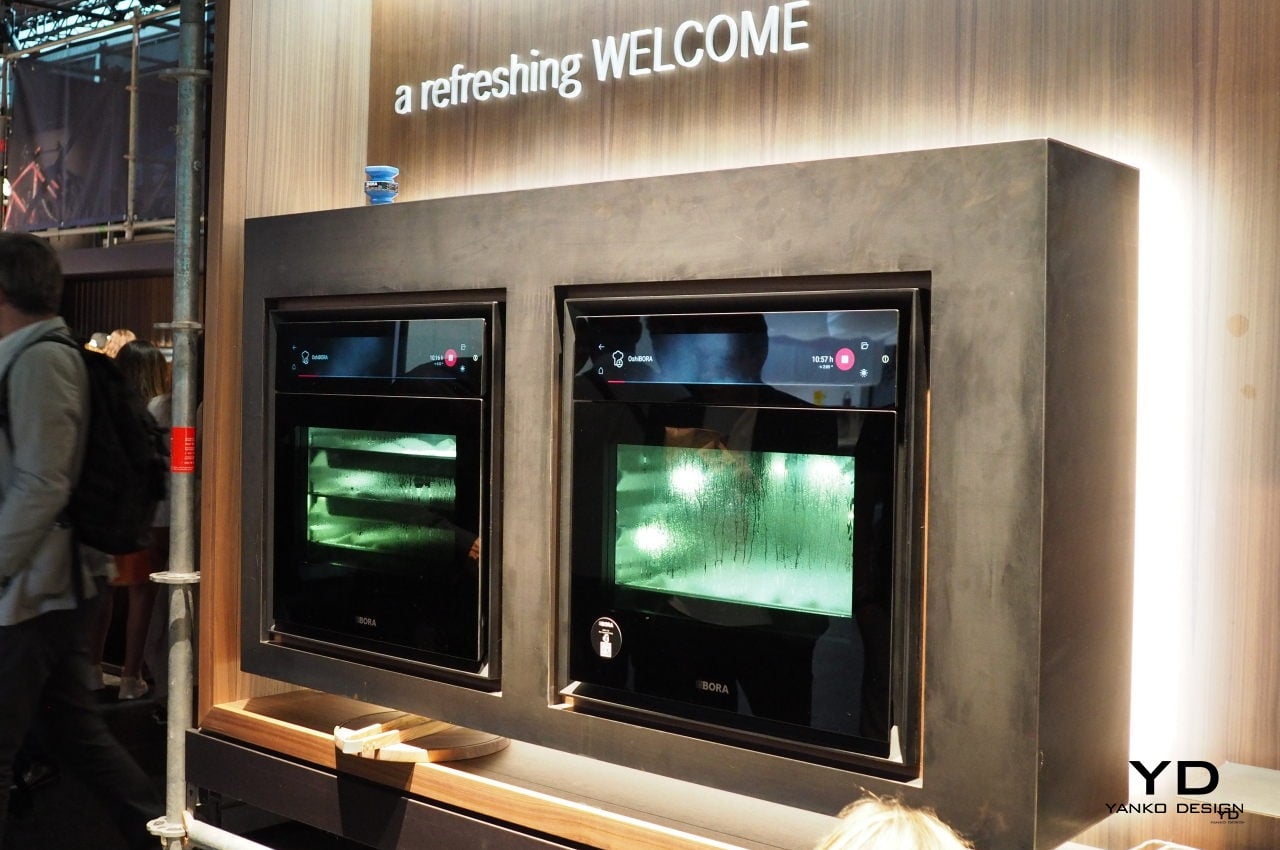
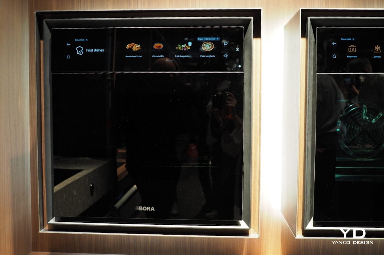
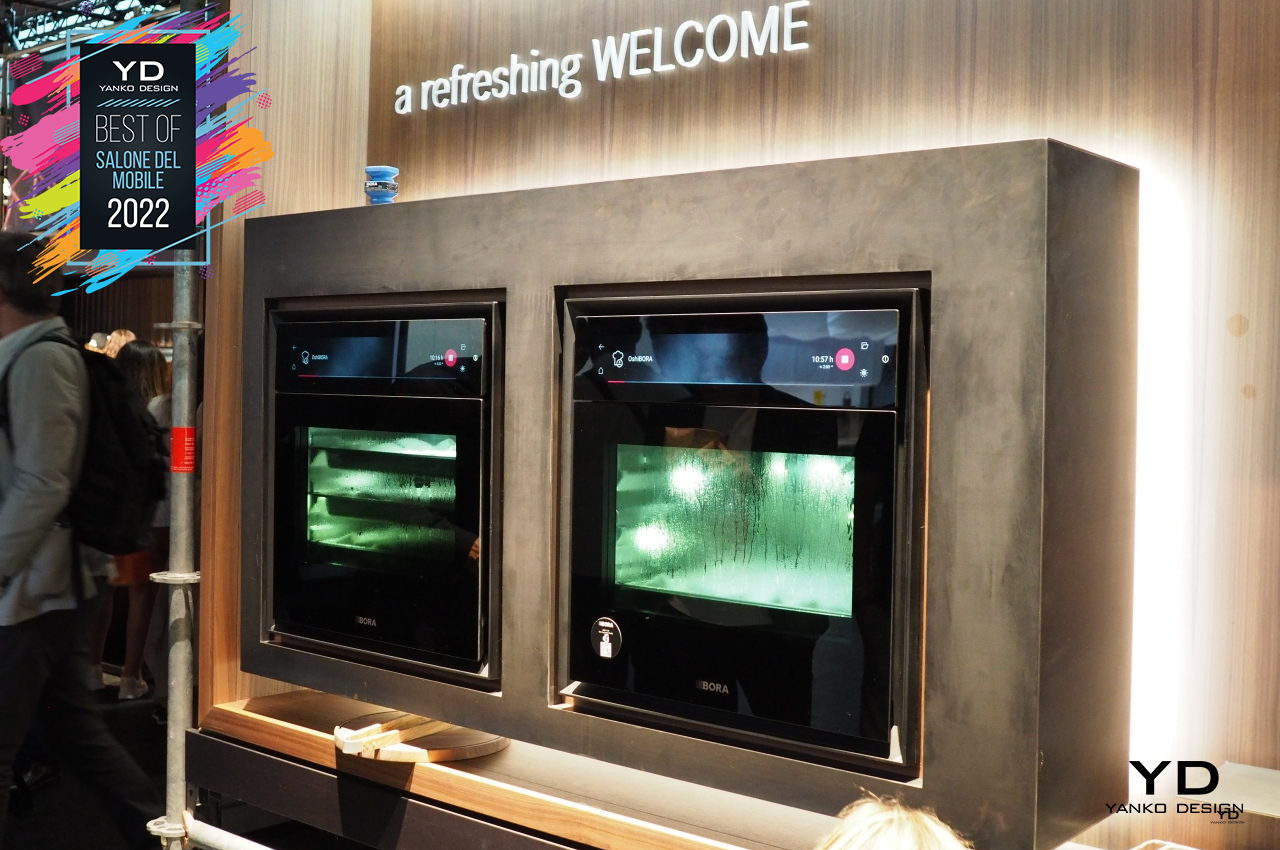
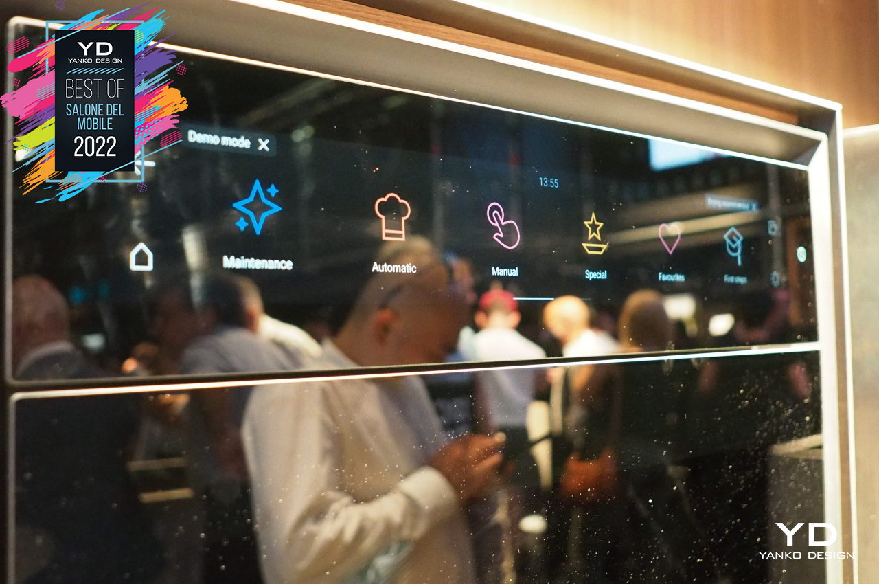
The smart steam oven offers a large touch screen that lets you choose how simple or how complex your cooking activity needs to be, allowing you to customize the interface to fit your habits and needs. Steam extraction and odor elimination prevent your kitchen from looking and smelling like a warzone, and self-cleaning means you won’t have to get your hands dirty from both cooking and cleaning. And if you’re at a loss on what to do, the oven even has its manual installed on the touch screen, so all you need to do is to search like Google.
Electrolux GRO

There is, of course, another aspect to our eating habits, and it probably shouldn’t be a shock to learn that feeding the planet is, unfortunately, killing it as well. Our over-reliance on meat and broken food systems contribute to the sad state our planet is in. Just because we’re eating the right things doesn’t make it easier for the planet, so Electrolux’s Better Living Initiative is envisioning a complete revamp of the kitchen, which doesn’t mean completely giving up meat.
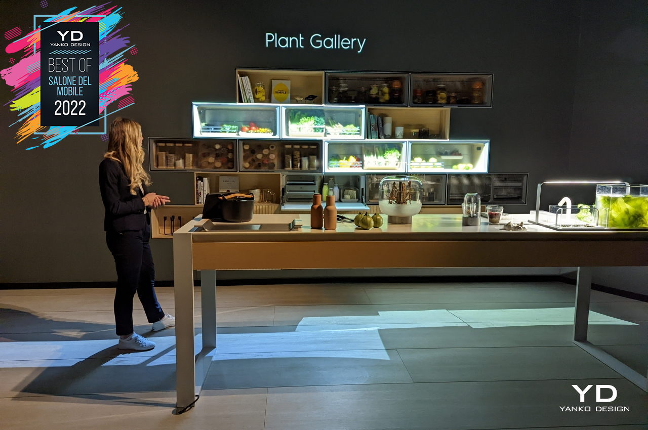
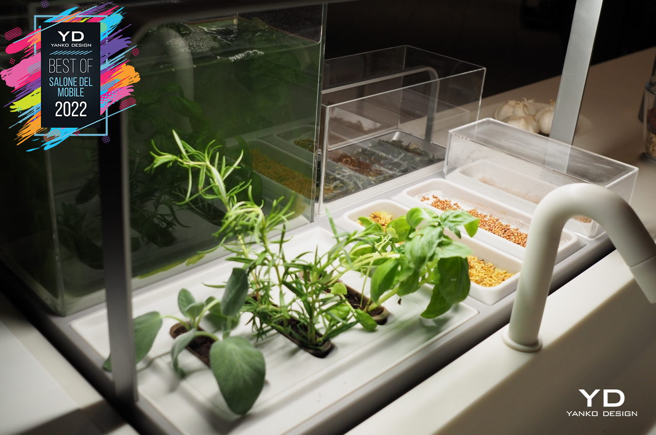
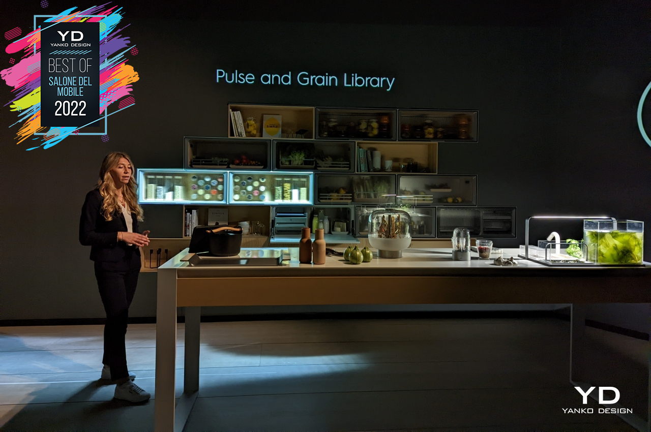
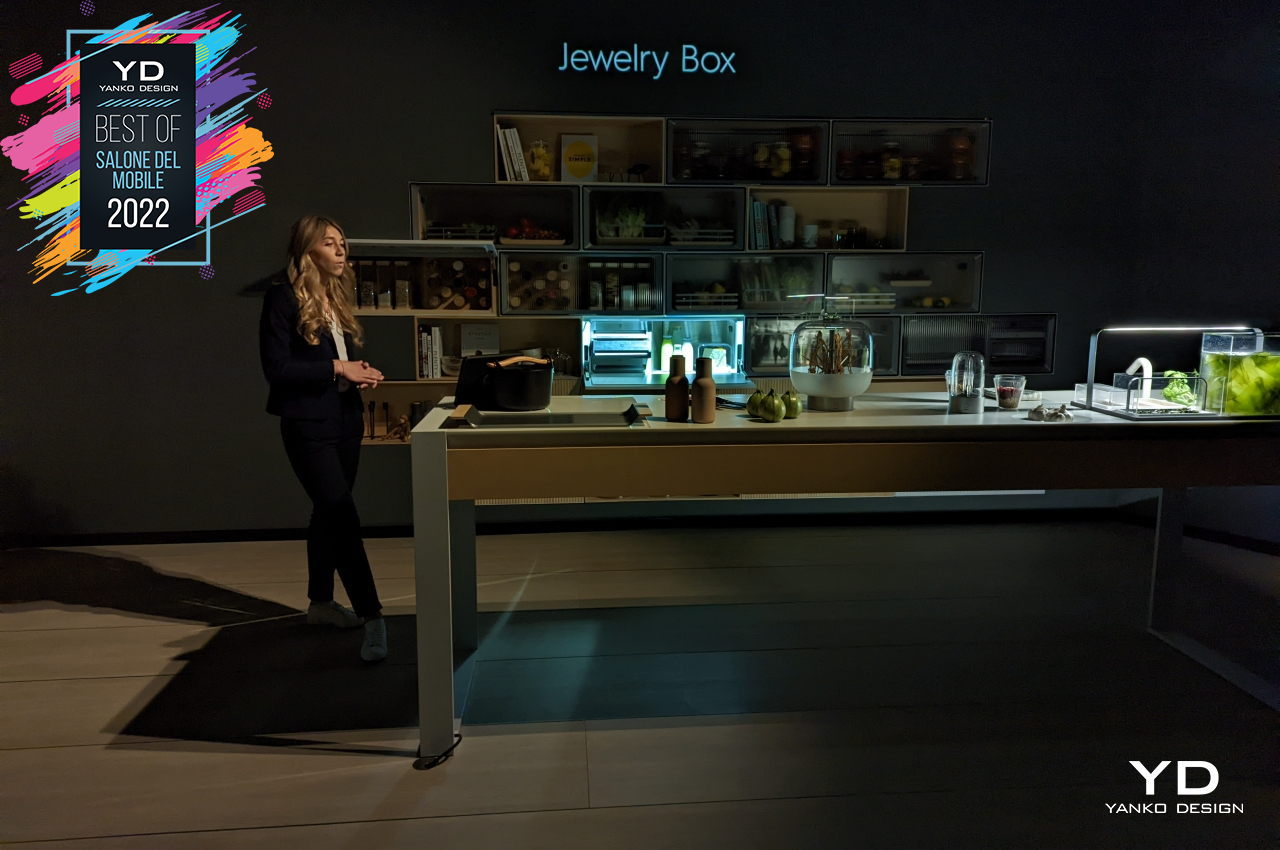
GRO, from the Swedish word “to sprout,” is a kitchen concept that tries to highlight and encourage better habits, both in eating and in sourcing ingredients for food. Naturally, plant-forward diets are the main focus, but a “Jewelry Box” storage is also part of the system, encouraging people to eat less but better meats. The modular compartments not only preserve veggies but also showcase their green beauty, while different containers and displays encourage experimentation with different ingredients, flavors, and scents. Eating green doesn’t have to be boring, and it should also help keep the Earth green as well.
Kartell TEA Lamp

Many homes are filled with products that bring delight to the senses, especially the eyes. These range from expensive art decorations to designer lamps to stylish aroma diffusers. In most cases, many of these lifestyle items were mass-produced, often using common materials that may not exactly be friendly to the environment. Fortunately, designers and companies have become more conscious of their role in nudging people towards more sustainable practices, particularly by presenting them with sustainable options that are as good or even better than the common lamp or furniture.
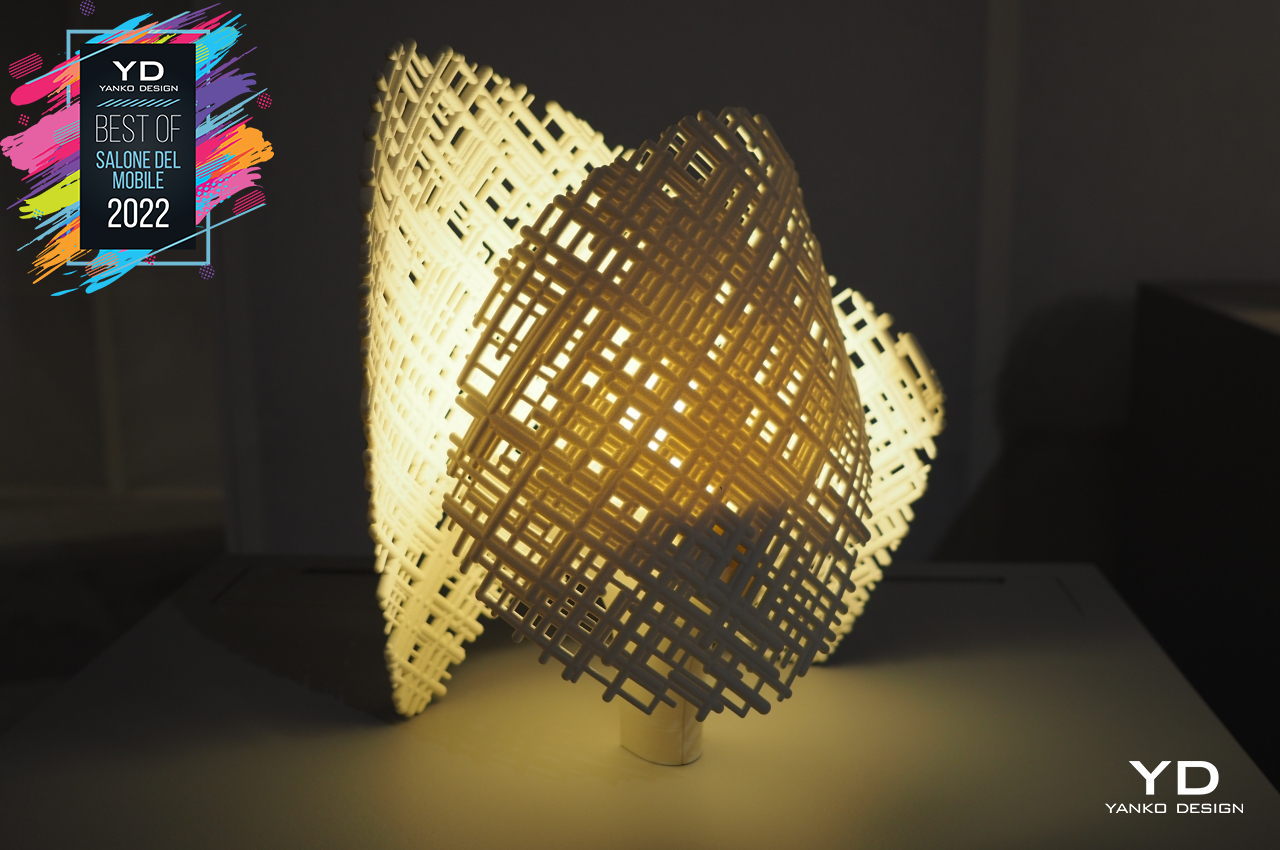
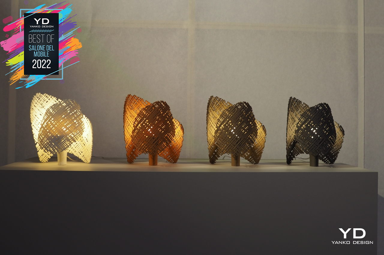
Kartell’s TEA lamps, for example, are made from recycled thermoplastics, but you wouldn’t be able to tell from the way they look. Shaped like abstract hands, the lamps’ external cover creates a chiaroscuro effect that makes light and shadow mingle in a visually interesting way. It is a shining example of how beauty can be created and molded from the things we throw away, giving credence to the saying that one’s trash can be another’s treasure.

Kohler Statement and Stillness

For many people, the bedroom is often the first room in the house they consider when thinking of a place of solitude and peace. For others, however, soaking in the tub or standing underneath the shower is their idea of a calming and relaxing moment. While some might be content with your run-of-the-mill furnishings, introducing some Zen into your bathroom will require things that will remind you to take a break using your eyes and your other senses. It’s for that exact purpose that Kohler launched its Statement shower and Stillness bath to offer a small oasis of well-being inside your home.
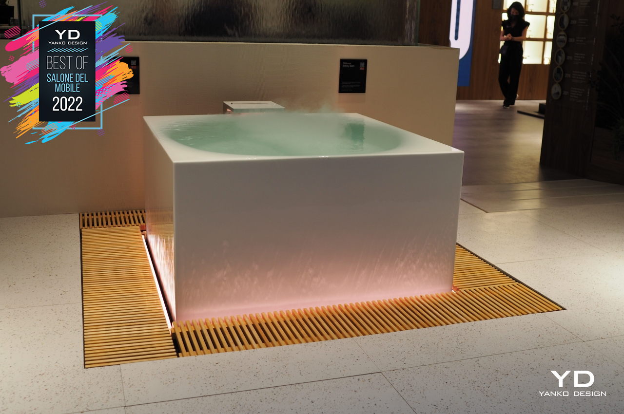
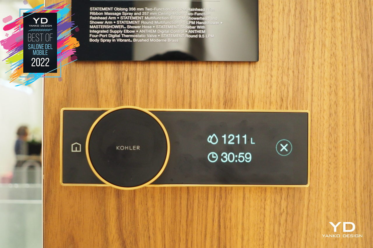
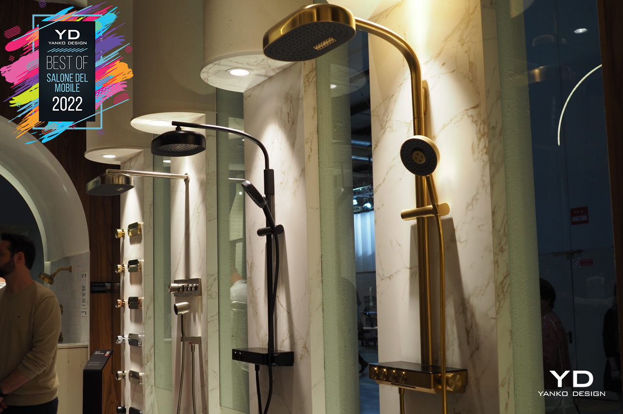
The Stillness bathtub uses water, light, fog, and aromas to set the mood for a relaxing soak. The Statement shower line, on the other hand, mixes beauty and functionality, creating an experience where you don’t have to worry about water not flowing smoothly out of the shower heads or taps. Both products create an inviting atmosphere for people to not only clean their bodies but to also wash away their worries and anxieties, even for a short while.
Kreoo Pave Stones

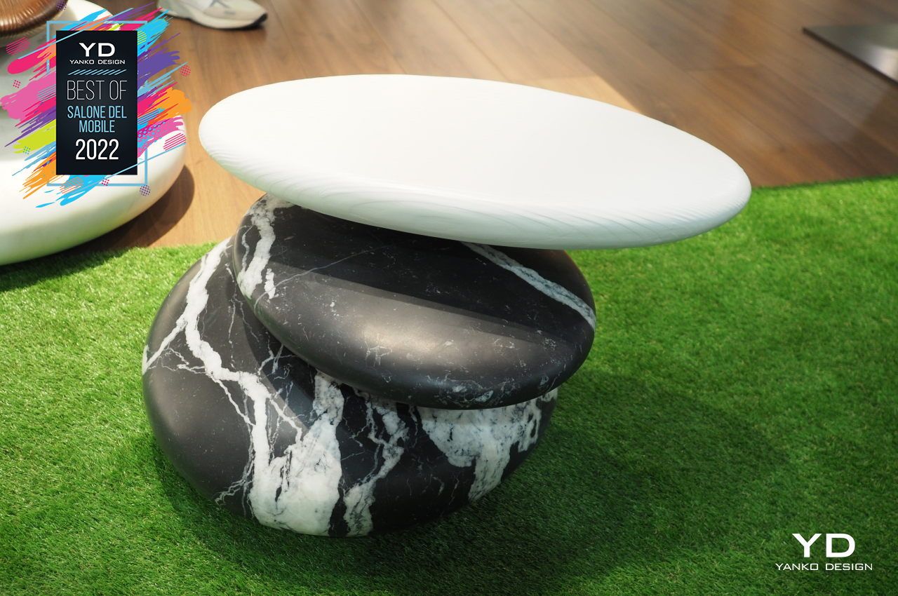
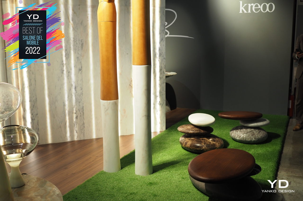
We have been witnesses to many creative and inspired artists throughout human history, but the greatest artist of them all is none other than Mother Nature herself. Through the flowing river and blowing winds, she’s able to create smooth pebbles that represent both the gentleness and power of natural forces that shape the Earth. The smooth pebbles are often used in Zen gardens as decorative and meditative pieces for that very reason, but Kreoo’s Pave Collection turns their design into something you can use and even sit on.
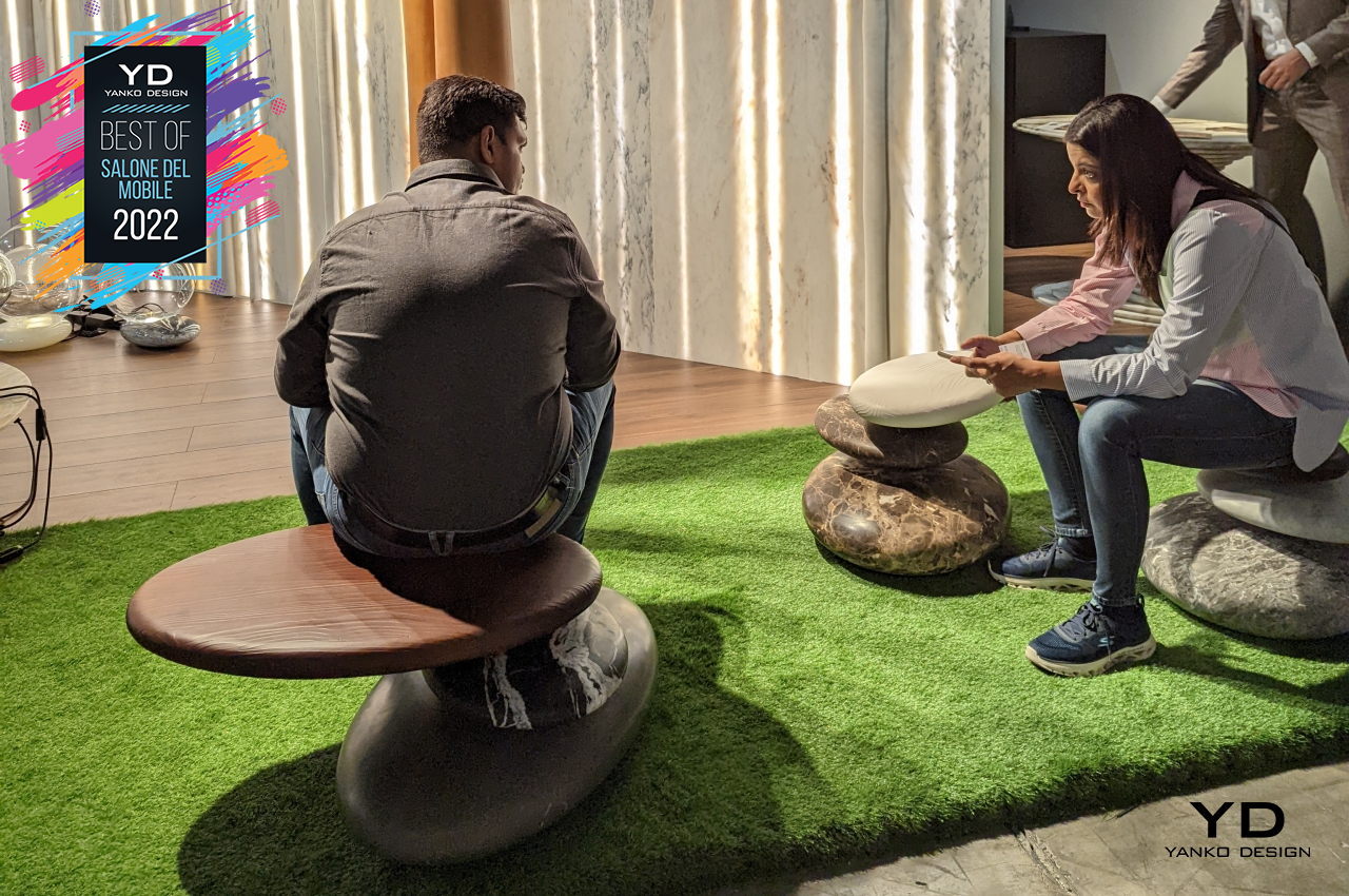
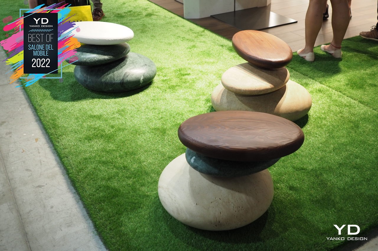
The Pave Stones, in particular, combine marble and wood shaped like these natural pebbles and turn it into an outdoor or even indoor seat. Thanks to modern manufacturing and processes, you don’t have to worry about this structure falling over from your weight. In fact, Kreoo stepped things up literally by combining two pieces of marble and one wooden “pebble” to create a piece of furniture that is just as thought-provoking as their miniature originals.
Megius Sauna and Shower

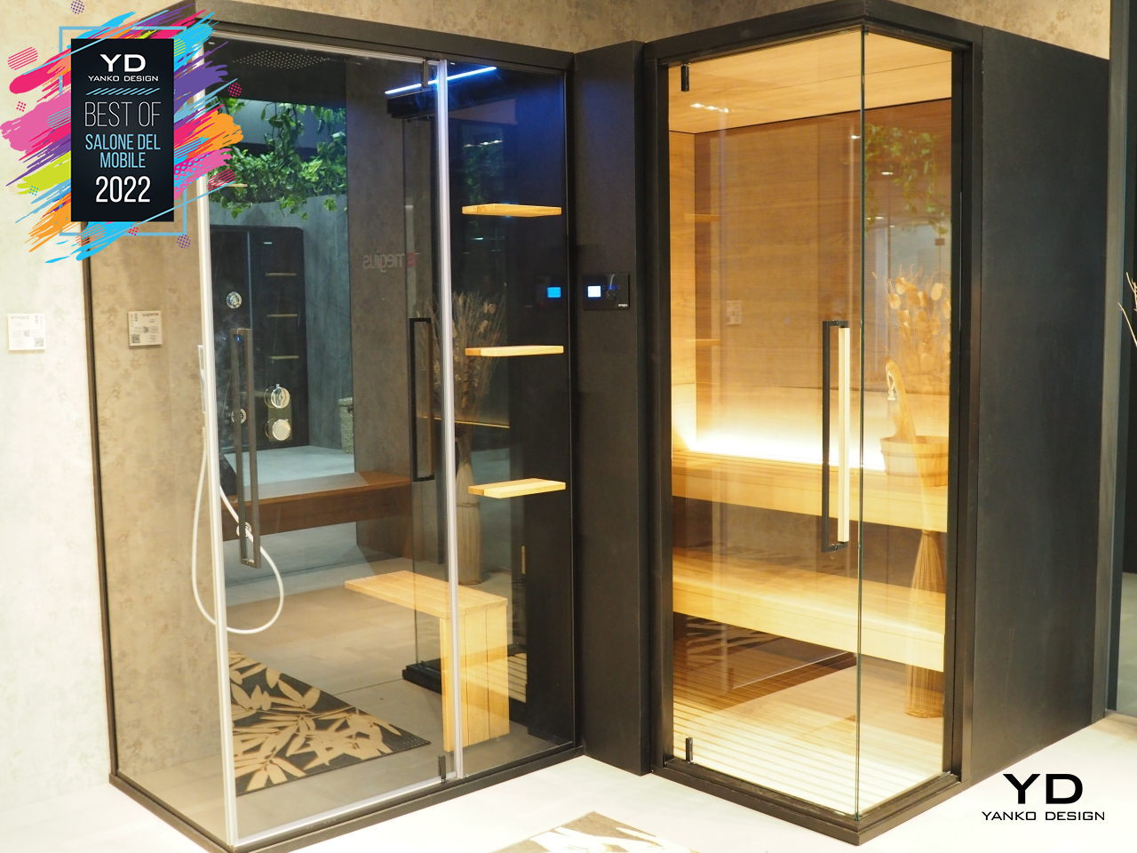
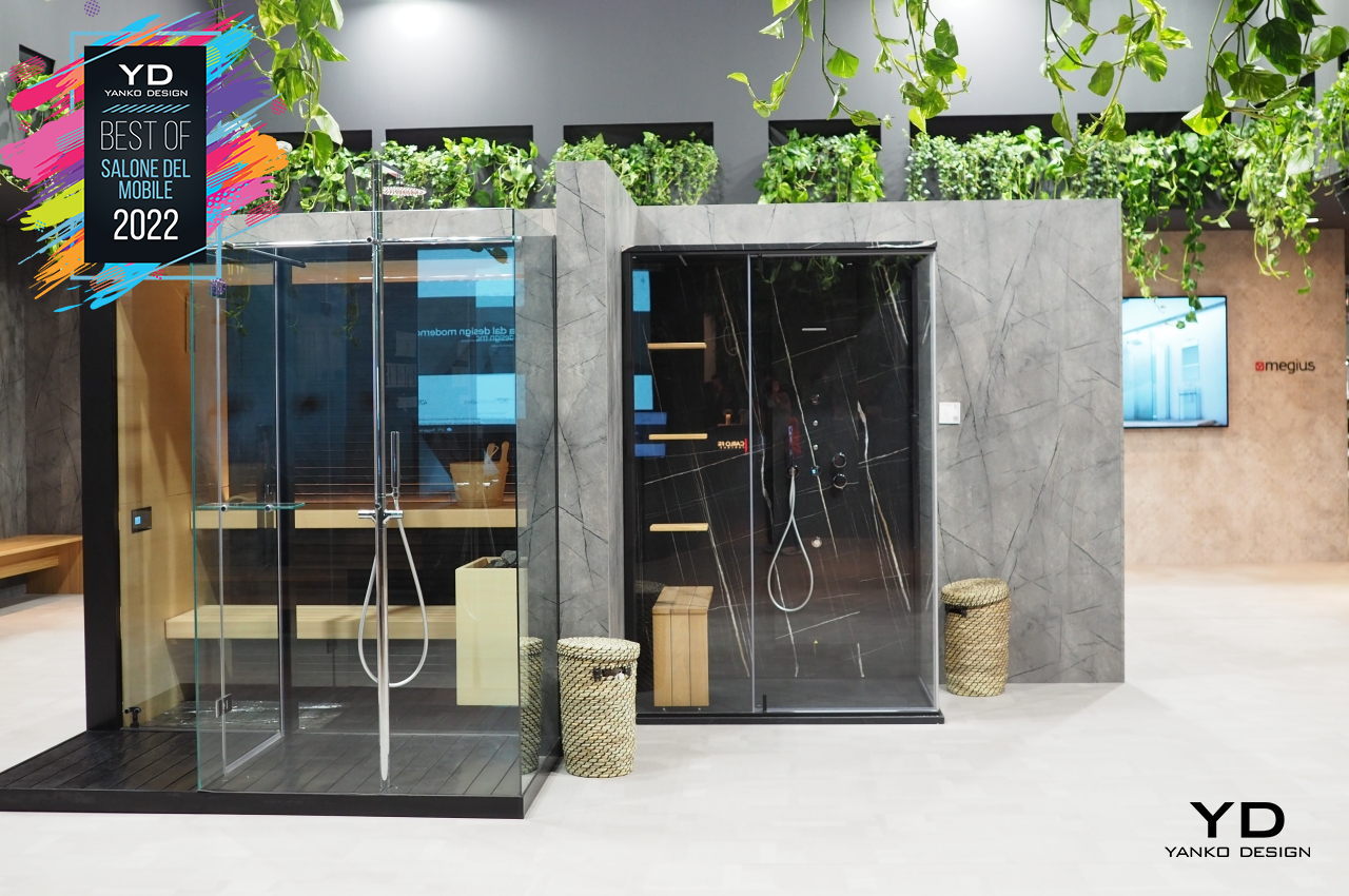
Many people are familiar with saunas, and most of them will imagine big public spaces filled with steam and awkwardness. What should be a relaxing activity can produce anxiety in people not used to being exposed inside an enclosed space. A lot more people would probably enjoy a short sauna experience if it were more private and more personal. Fortunately, shower expert Megius agrees too.
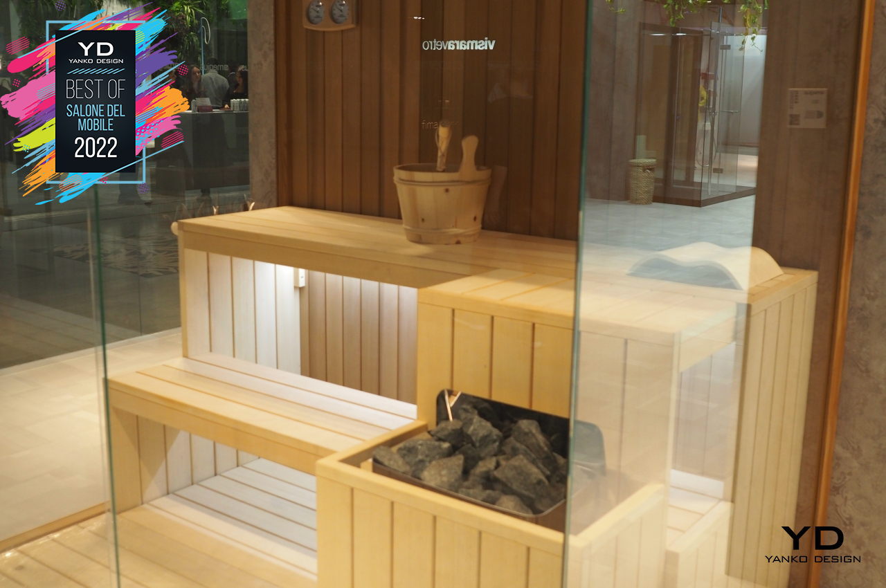
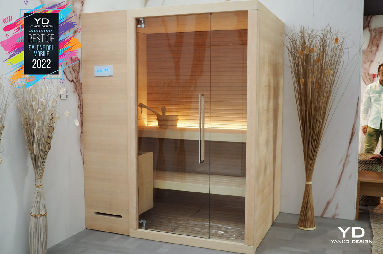
The Exen Sauna mixes glass and wood to create a more confined and intimate space for a single person to use, probably inside a private bathroom. This personal sauna is complemented by the Zen shower that puts a minimalist touch on the typical shower stall. Taking a shower shouldn’t just be for cleansing your body but could give you a psychological wash as well, especially when what you see before you exemplify clarity and simplicity.
pmstudio Progetto HUG

Wood is a more sustainable material for creating products and furniture, but that doesn’t mean it has no negative impact on the environment, especially when we don’t plant enough trees to replace the ones that we cut down. Recycling scrap wood, then, becomes an important step in completing a circular economy of wooden furniture, which is the kind of love the Progetto HUG is trying to give the environment.
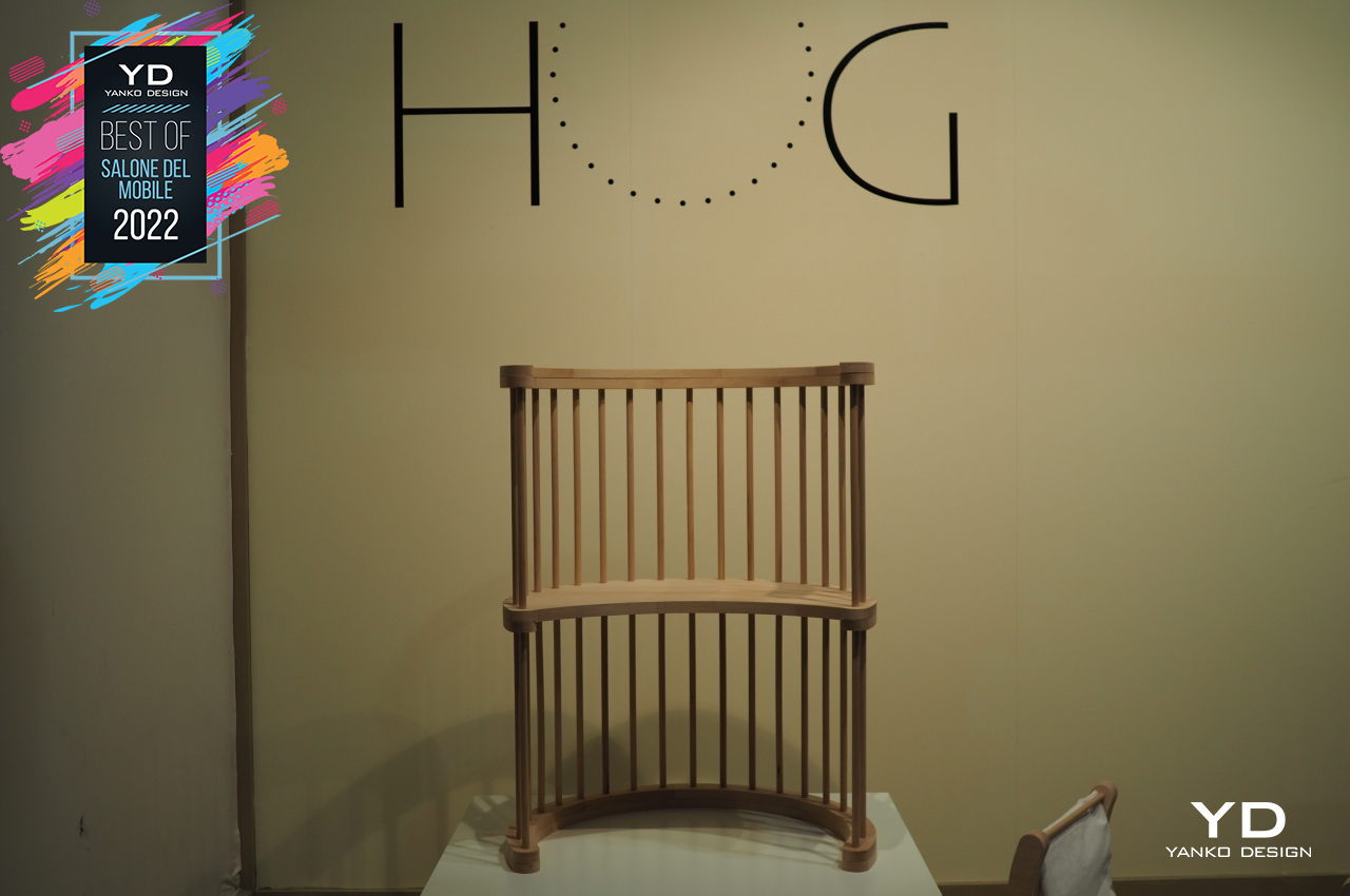
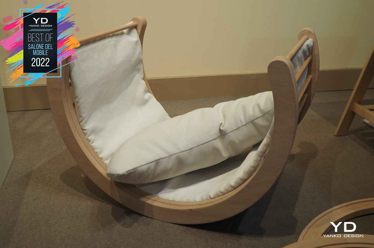
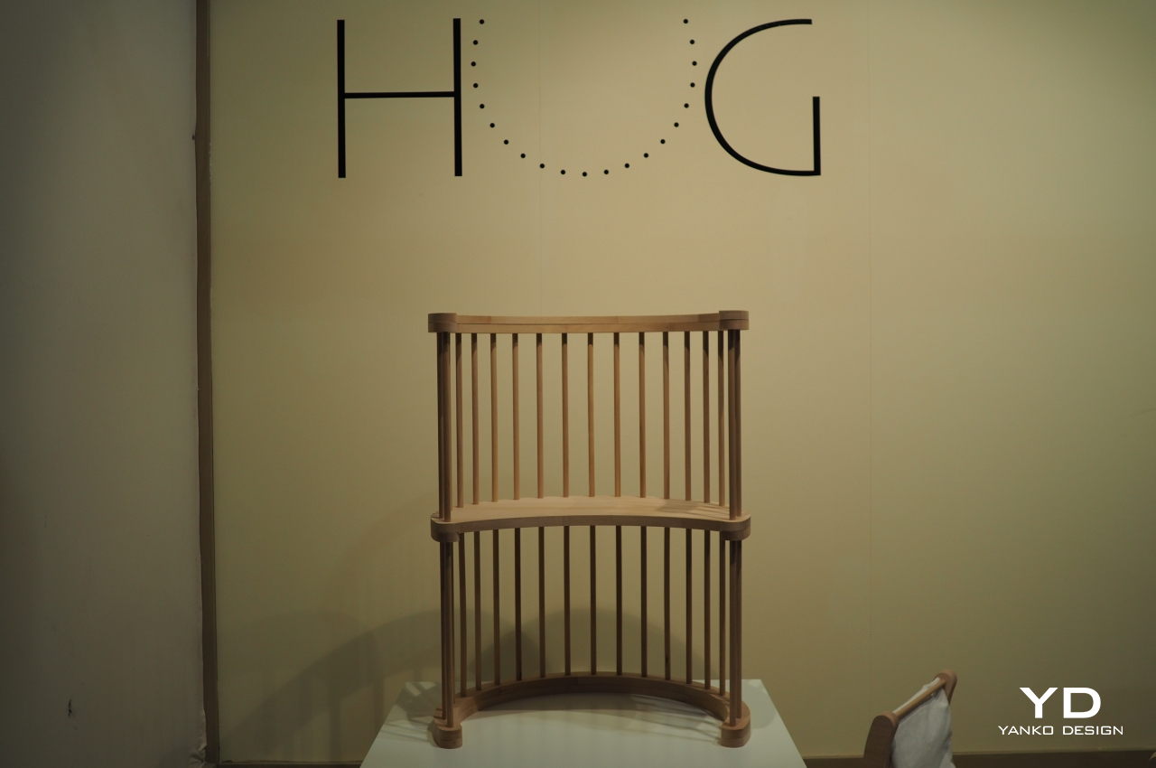
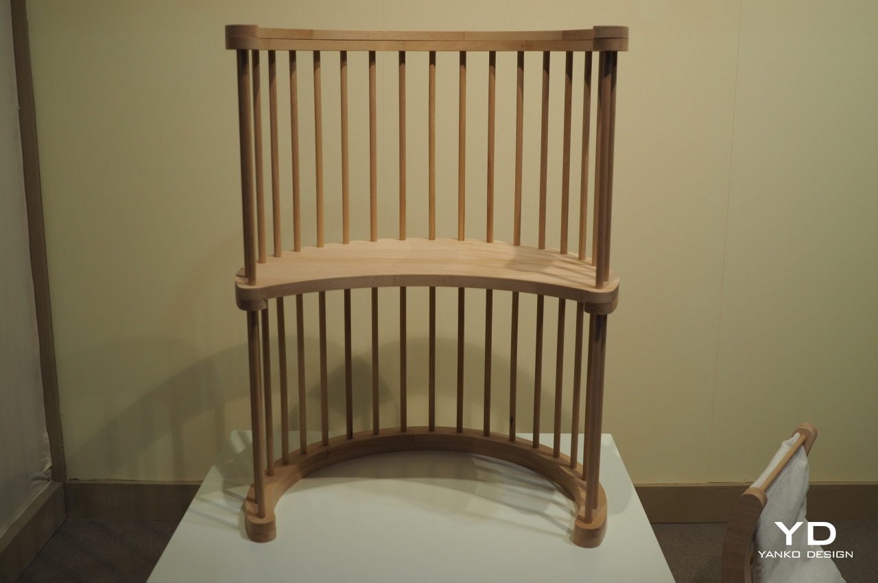
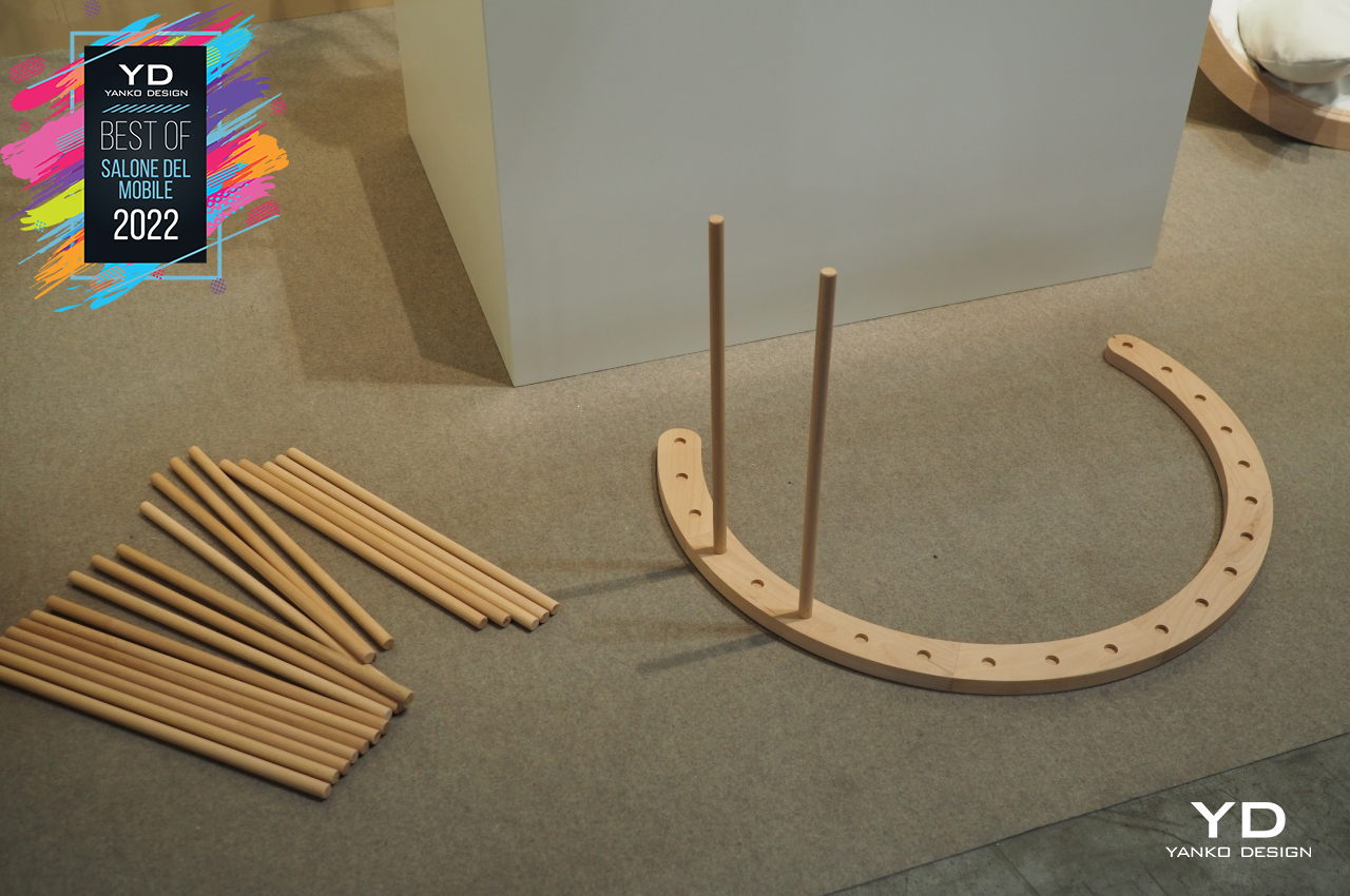
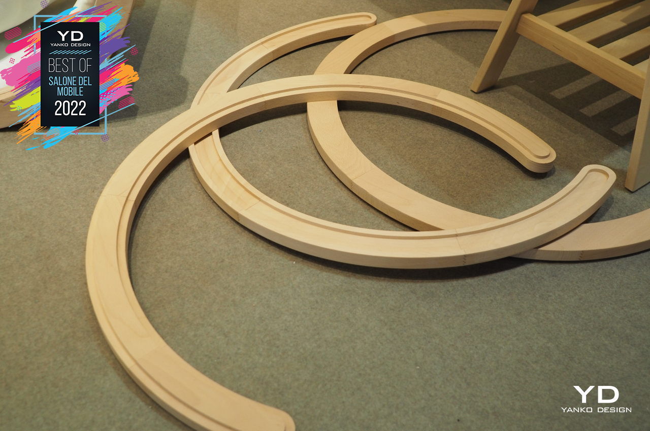
Designers Medeot Barbara and Piovesan Giulia created a multifunctional object made of recycled scrap wood that you can assemble into different pieces of furniture. It doesn’t use nails or glue to put together, so you can potentially reassemble the pieces into something else when your needs change. HUG creates an even more sustainable system, ensuring that these pieces won’t need to be recycled themselves anytime soon.
Pre/Use Guillotine

We often take a lot of everyday objects in our homes for granted. On the one hand, that’s necessary for survival because our brains would be overloaded if they took note of every object it encounters at every turn. On the other hand, we sometimes miss out on the interesting nuances of our own furniture, at least until it shocks us out of our stupor.
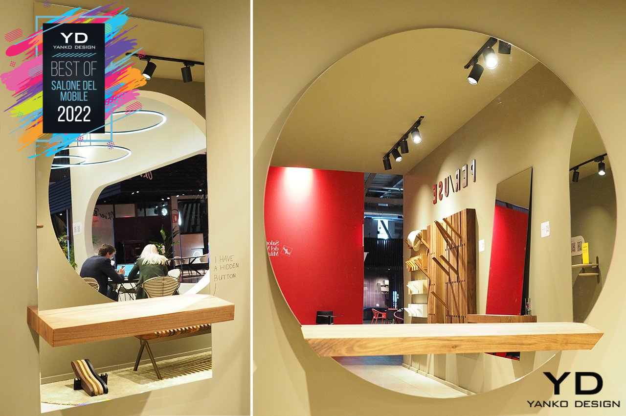
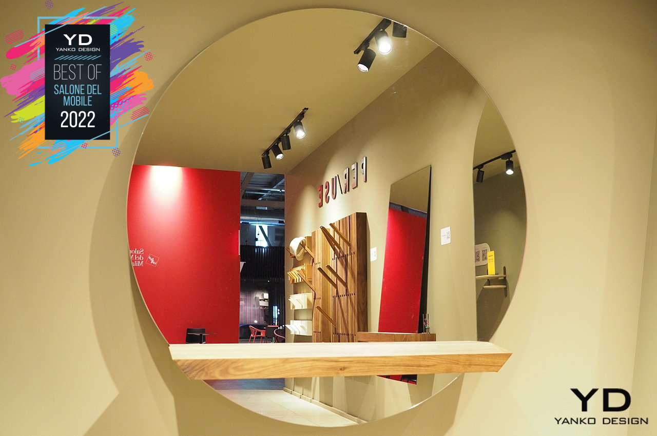
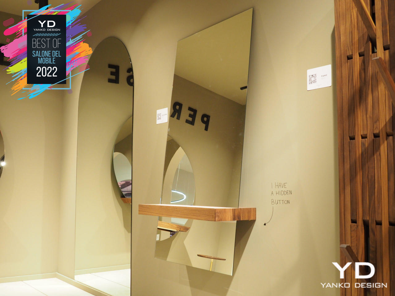
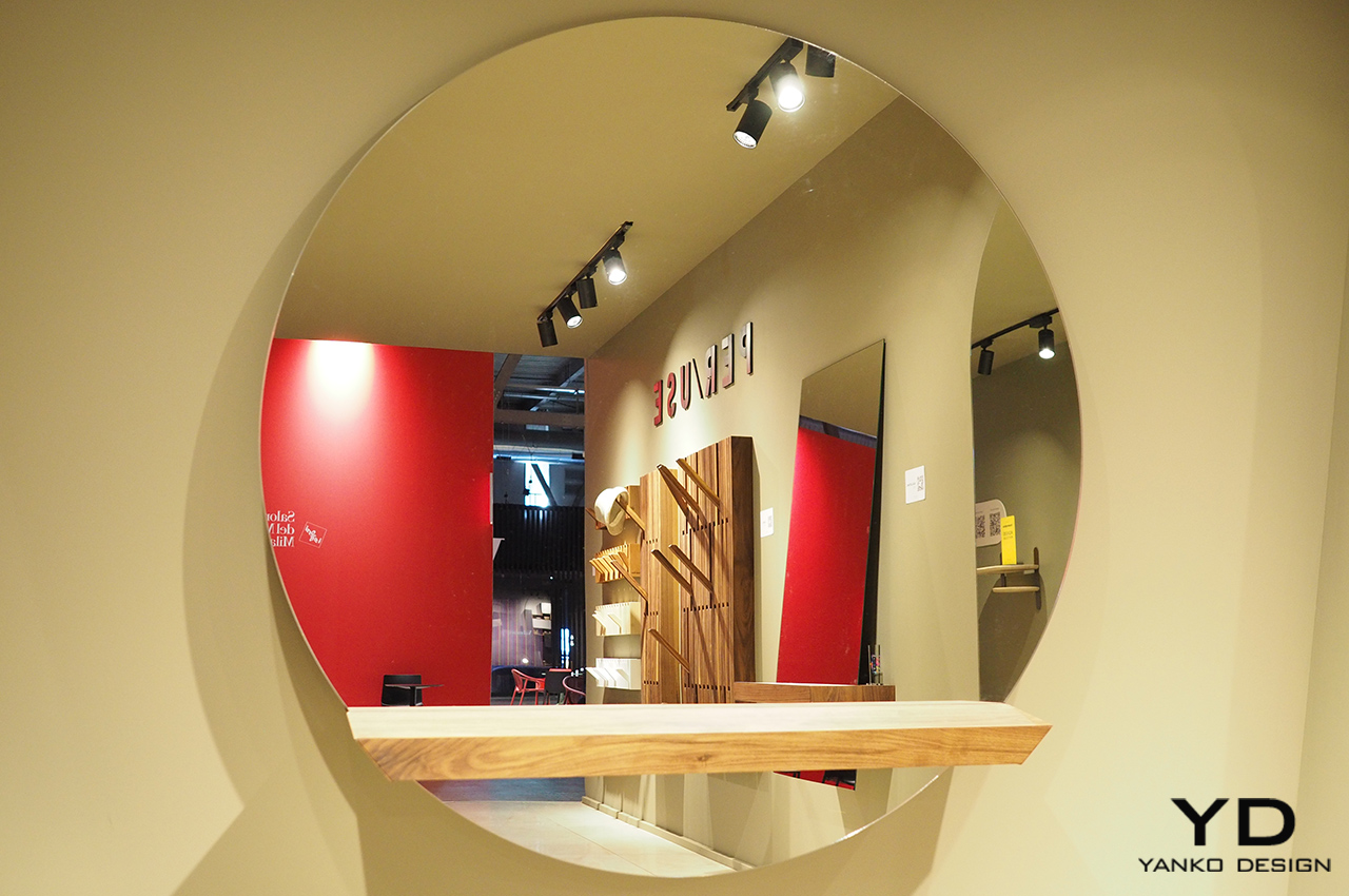
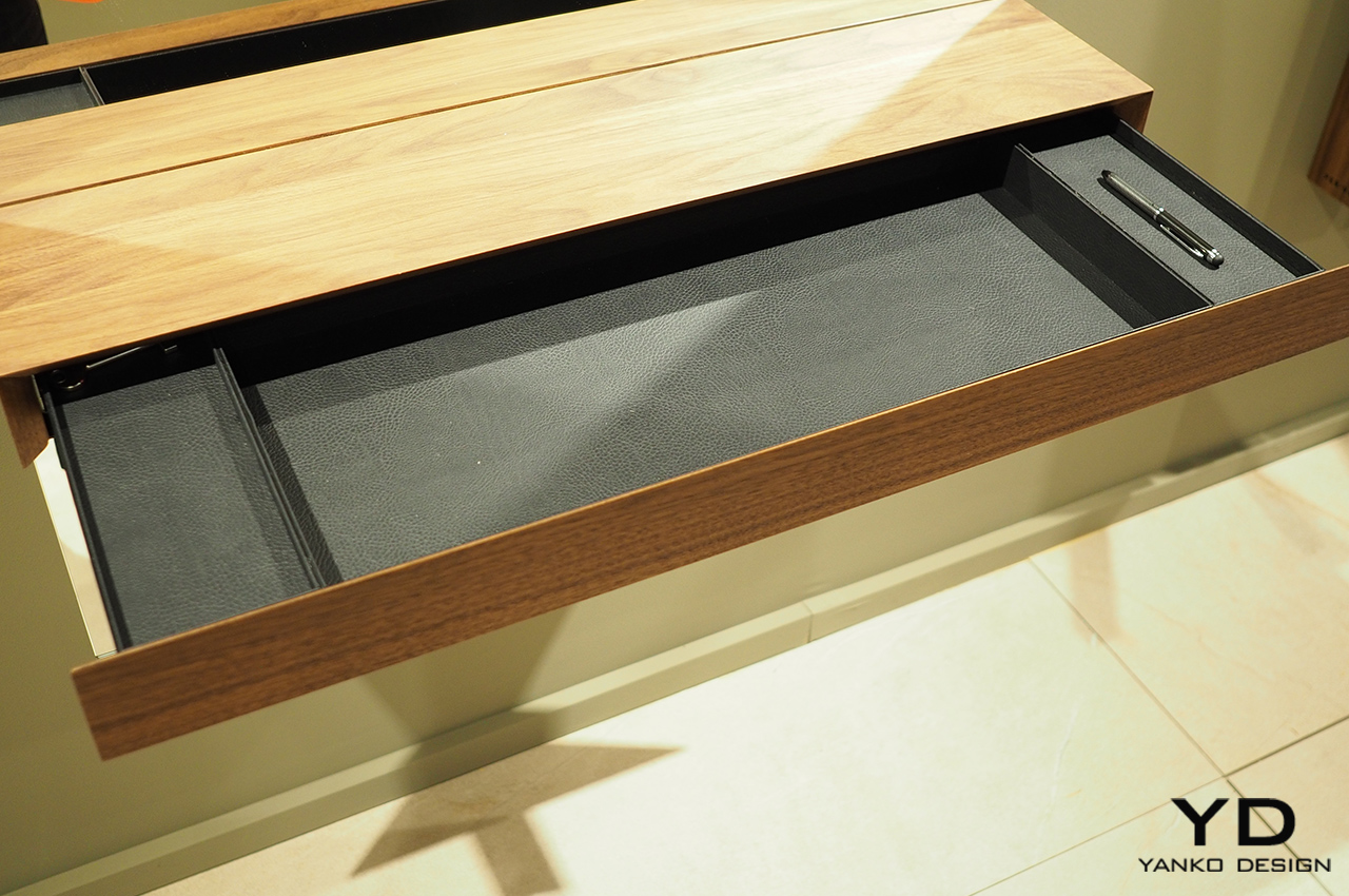
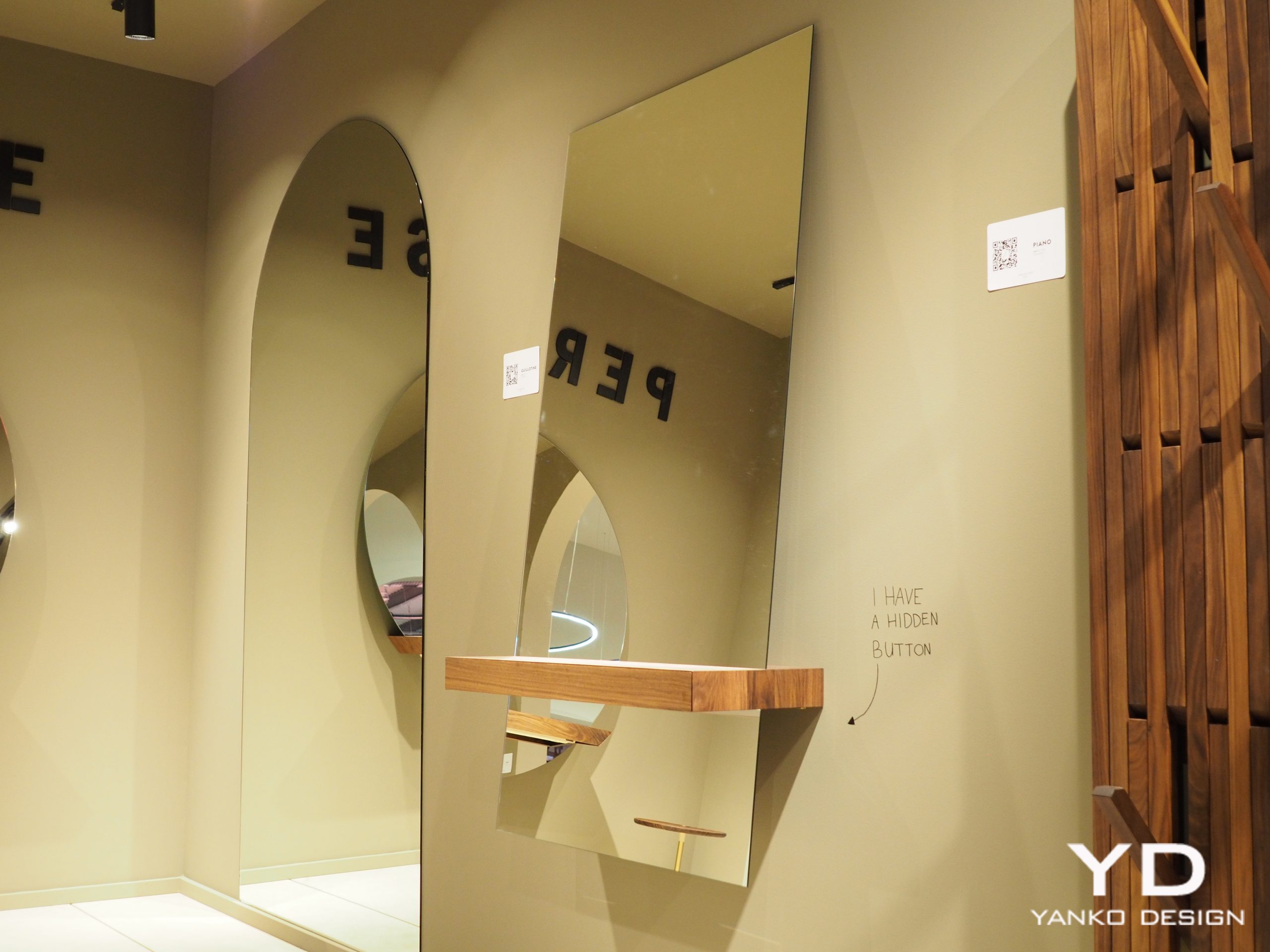
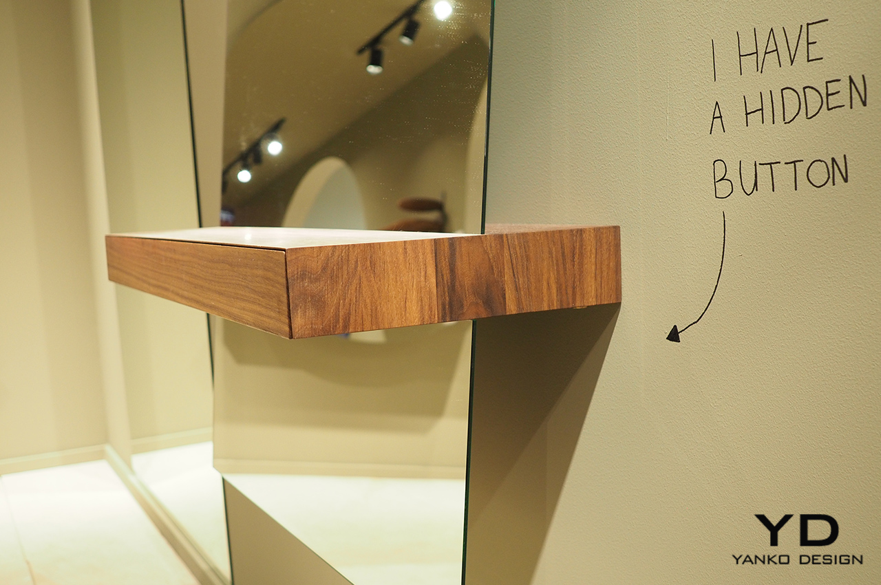
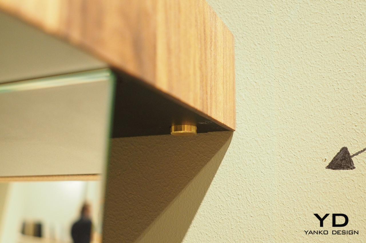
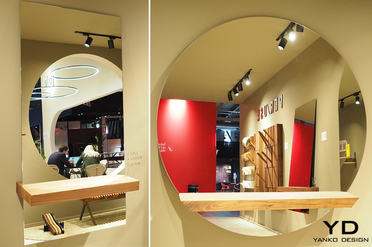
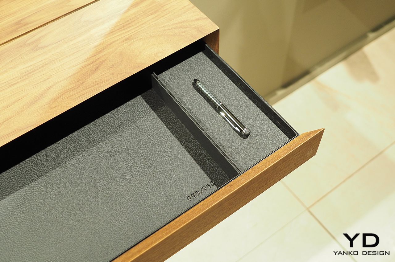
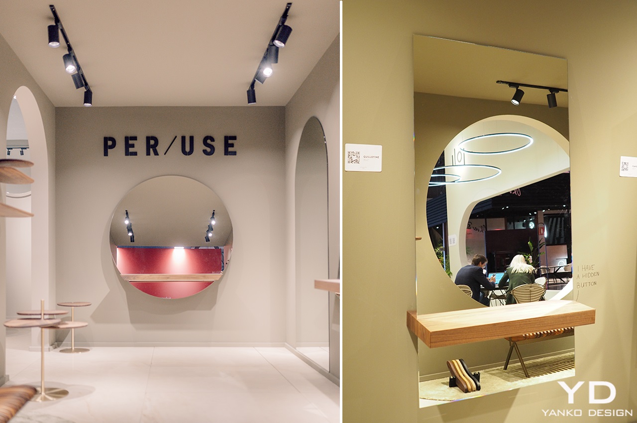
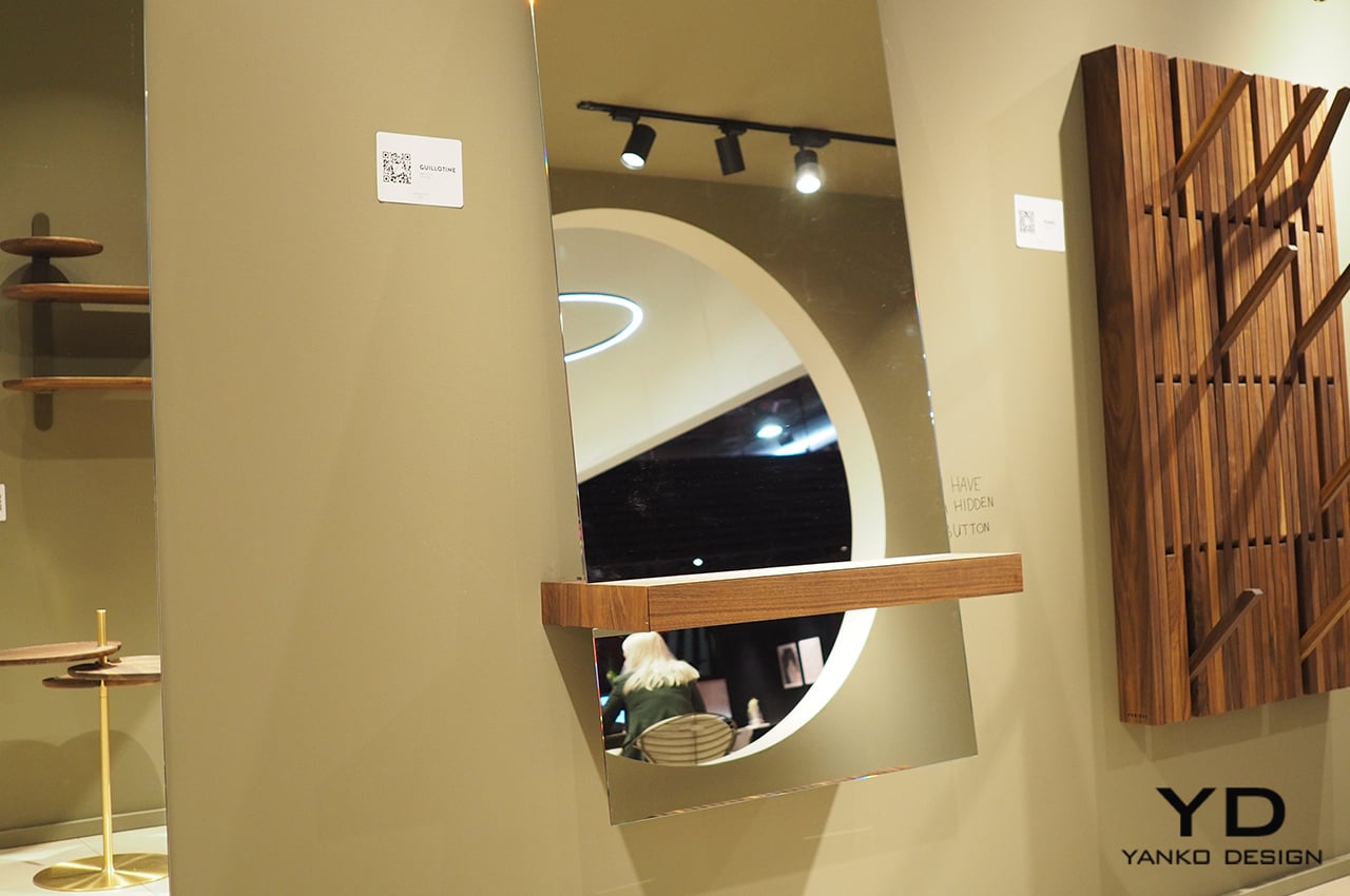
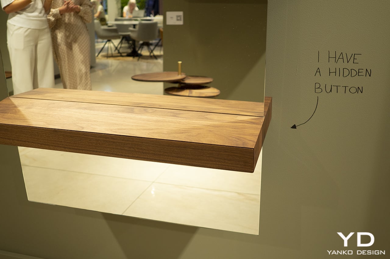
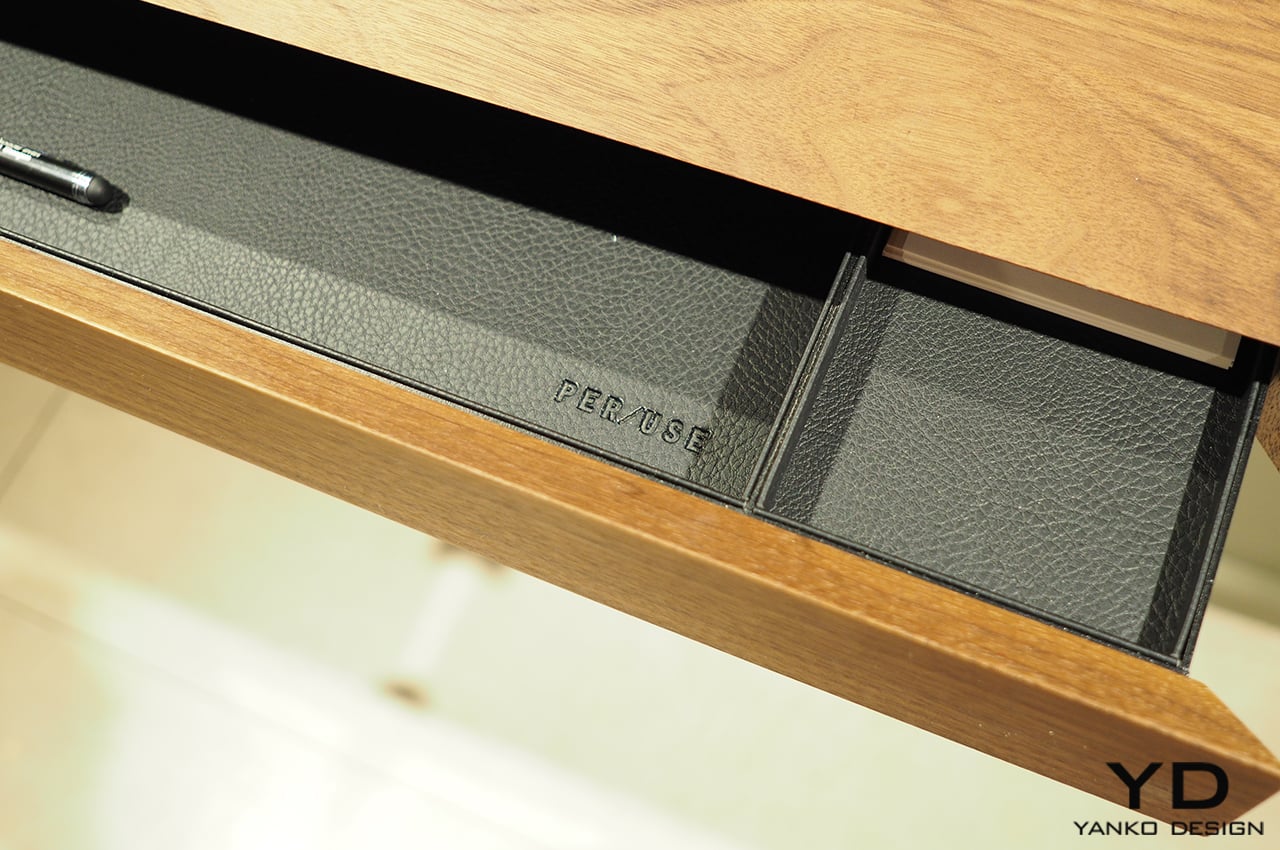
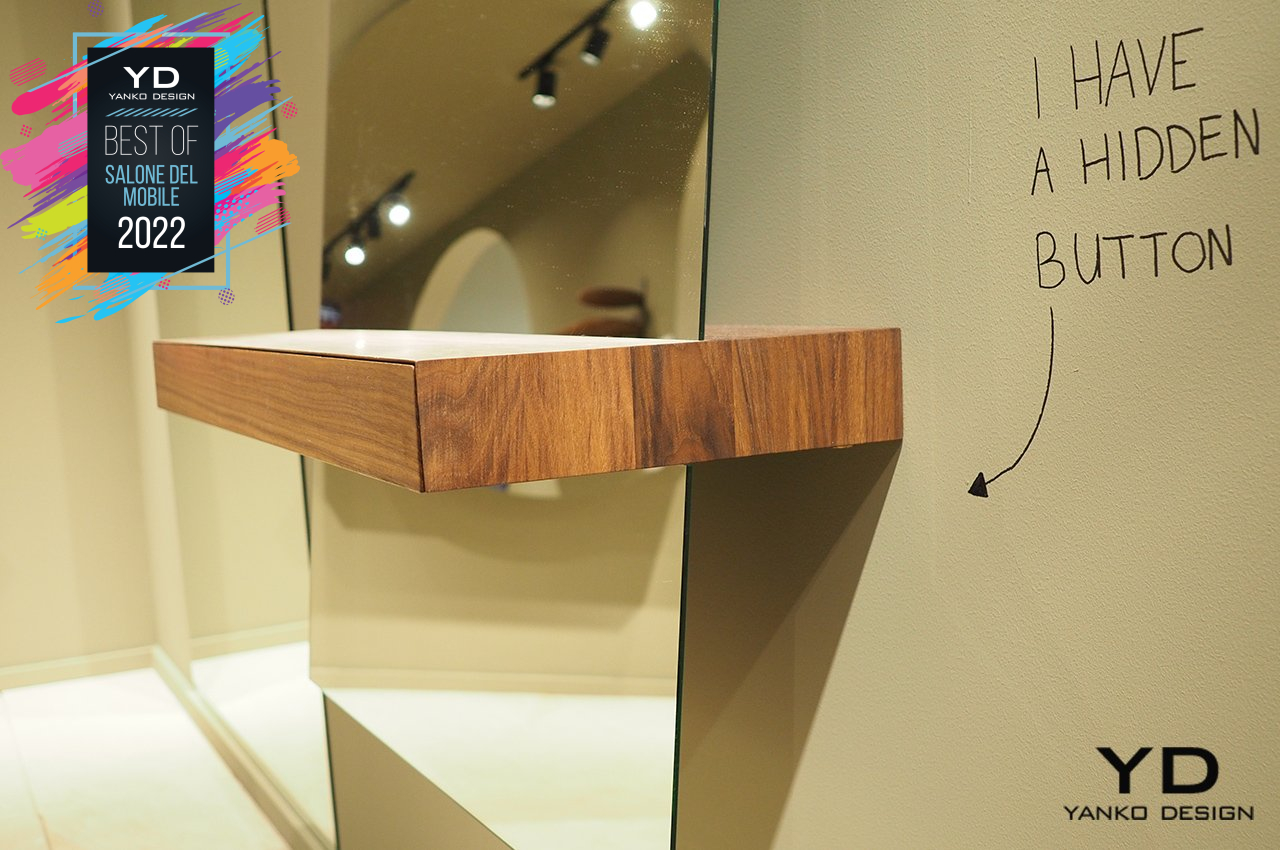
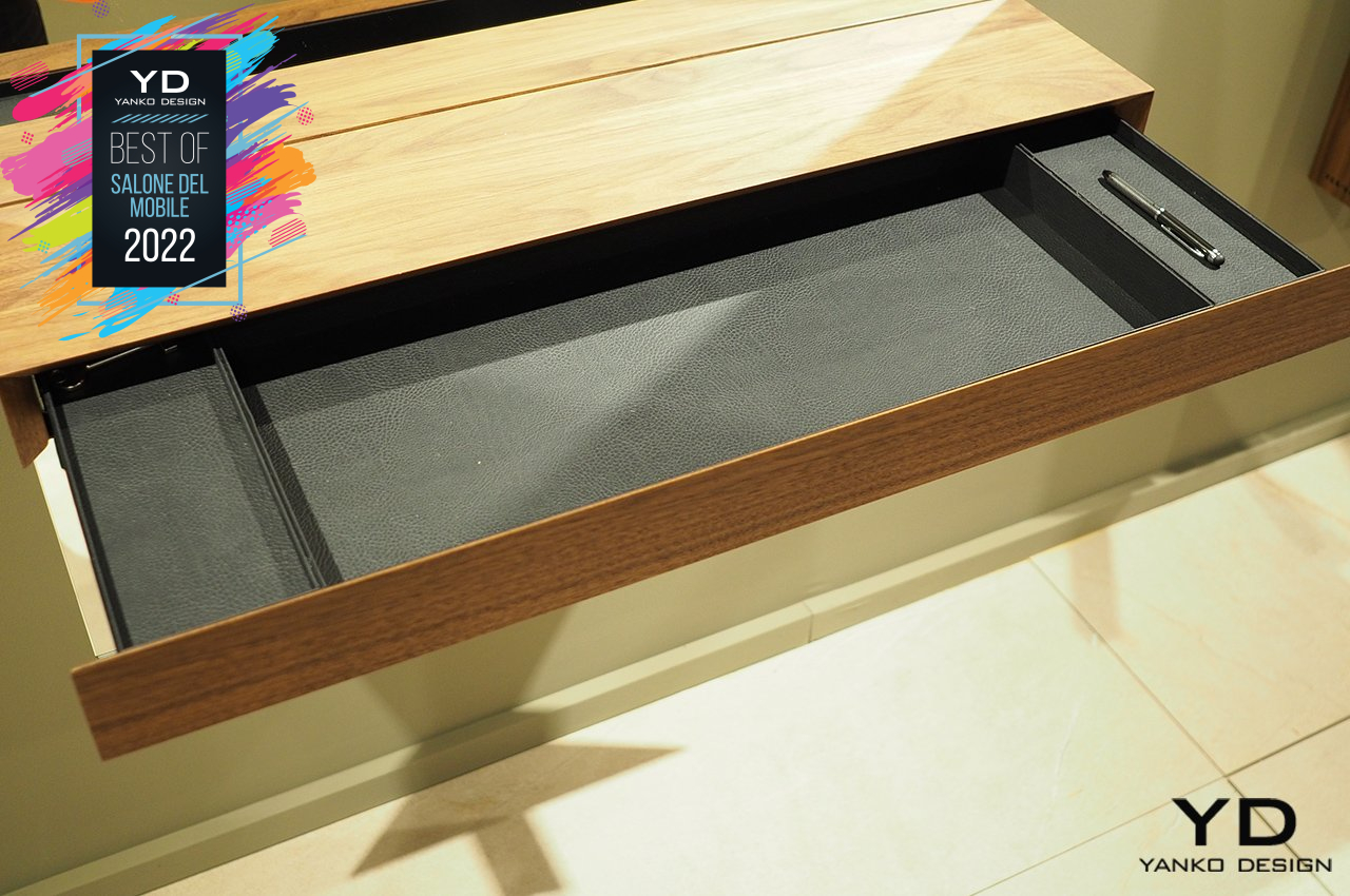
Named after a rather undesirable tool of punishment, Per/Use’ new Guillotine Mirrors use the metaphor of slicing through objects to create a rather thought-provoking design. It isn’t completely just visual, though, as the wooden block that the mirror cuts through actually hides a drawer that rolls out at the touch of a hidden button. It’s definitely a curious execution of a design, pun totally intended.
Samsung Infinite Line

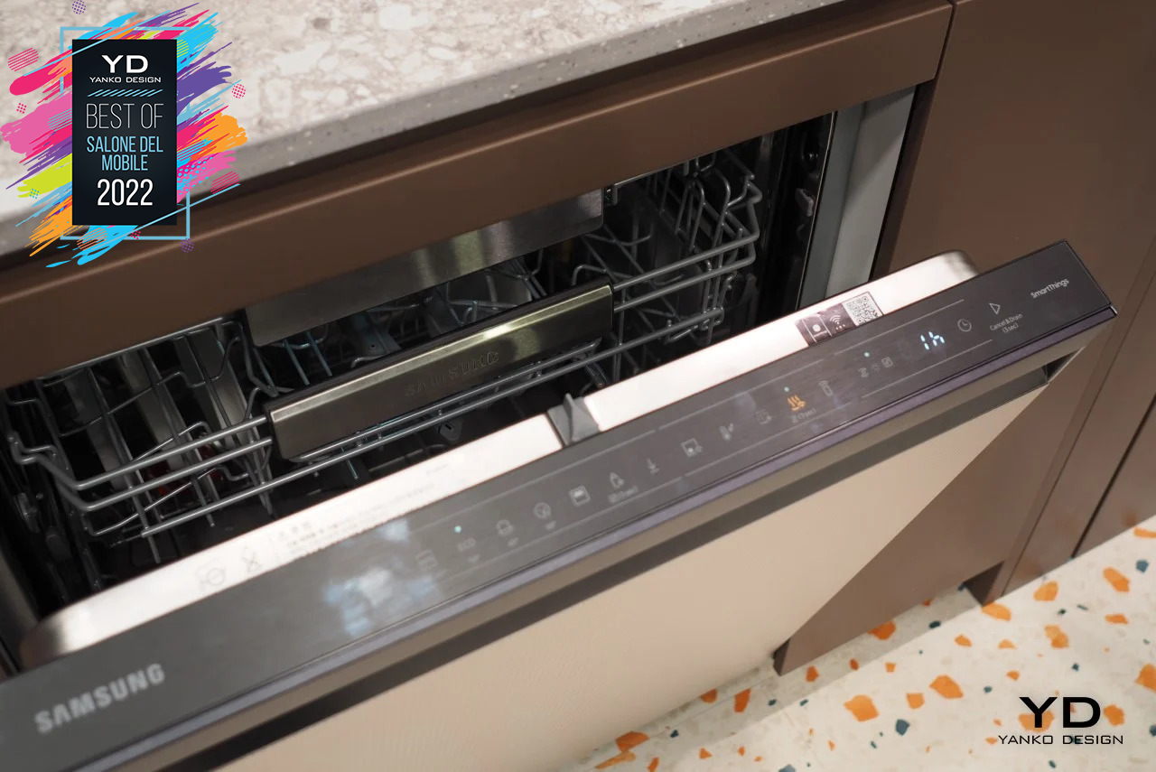
It might be better known for its smartphones, TVs, and computer monitors, but its area of expertise extends to almost all major appliances inside the house, from refrigerators to ovens to washing machines. Its Bespoke line of smart home appliances, in particular, has become its flagship brand to push Internet-connected and interconnected products to homes today. At Salone del Mobile 2022, it is expanding that vision with the Bespoke Infinite, a line specifically designed to deliver the kitchen of the future today.
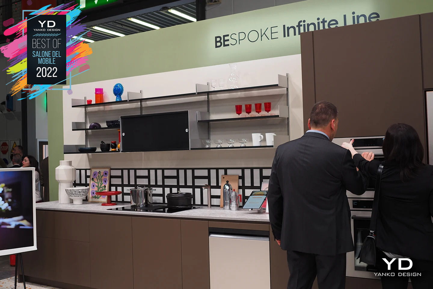
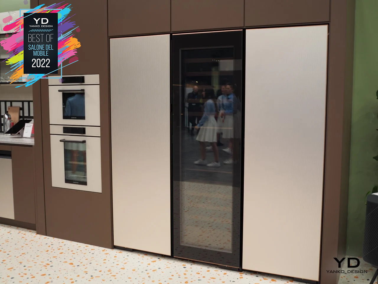
The fridge, for example, can automatically open when you swipe or tap your hand over the handle’s sensor, no more struggling with tight doors. The Family Hub smart refrigerator becomes an even better entertainment center in the kitchen to distract kids while you cook. And, of course, this new line is designed to look luxurious in any kitchen setting while also keeping one foot in sustainability through eco-conscious packaging and more efficient energy consumption.

Tubes Radiotori

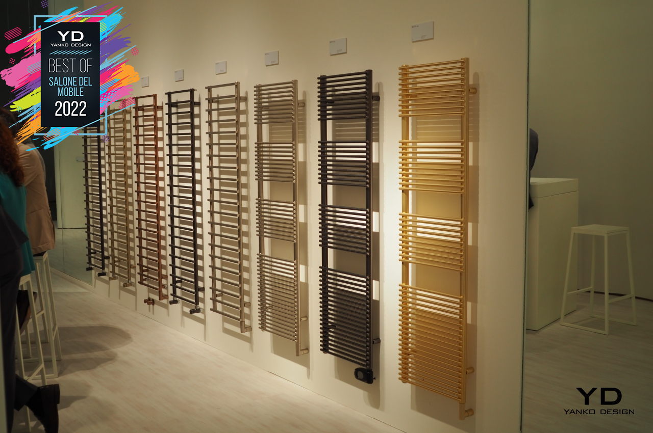
Heating is an essential part of the home in many regions, but the sources of heat haven’t exactly evolved with contemporary home designs. Many still look as industrial and unappealing as pipes hidden behind walls or underneath sinks, but they don’t have to be. Tubes Radiatori has been making radiators beautiful and stylish, almost disappearing into the background as part of the room’s decor.
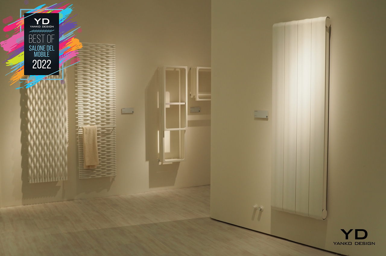
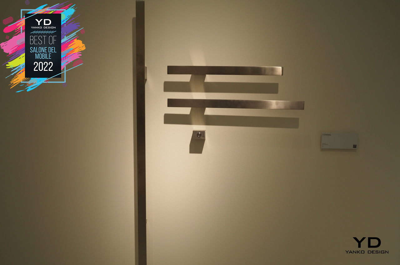
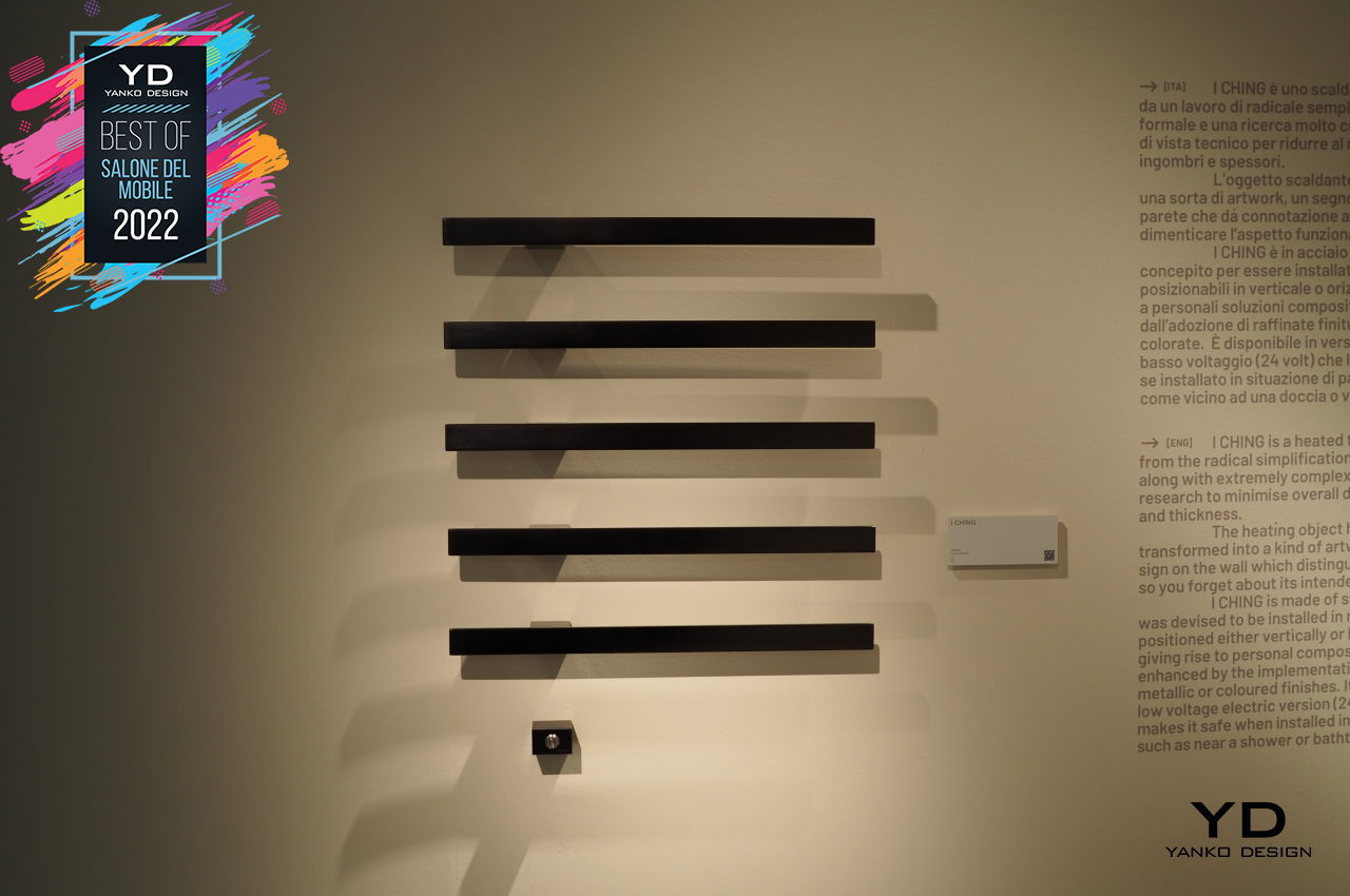
The Radiatori Trame, for example, hardly resembles a typical radiator, looking almost like a wall decor that just happens to give off warmth. The new Radiatori I Ching takes inspiration from the iconic writing, providing heated bars of steel where you can hang towels, bathrobes, and any other thing that you need to get dried quickly. Tubes Radiatori, like many on this year’s Best of Salone del Mobile, is proof that mundane things can be designed well, not just to look good but to also feel great for one’s self as well as the environment.
The post The Best of Salone del Mobile 2022 – Smarter and Greener Living first appeared on Yanko Design.
This mirror cuts through a secret drawer in the middle like the ‘guillotine’

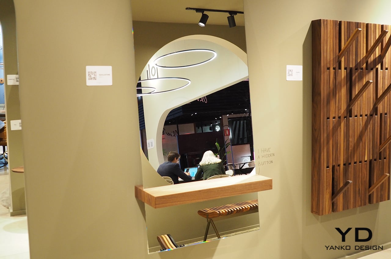
Guillotine was last used in the 1970s however its cruel imagery still sends shivers down my spine. For me, it would be the last thing to associate with a creation. But the Salone del Mobile floors brimming with completely out-of-the-box furniture and furnishing, is a crazy place to be in right now. It’s here that a mirror has been integrated with a mystery drawer that’s sliced through the middle to evoke an uncanny thought.

If you’re for mysterious designs, Guillotine designed by Jeffrey Huyghe for furniture brand Per/Use – best reckoned for its piano-style wall-mounted wooden hanger racks – is the idea that you’d want to instinctively install in your hallway. It’s not every day that we stumble upon ideas that are far stretched for general imagination; look beyond the obvious; or have a flavor out of the ordinary. So, when Yanko Design team, on their final day at the Milan fest, walked past the Guillotine, it was little the name but its appeal that got us drawn to Per/Use booth to hand out an award for this incredible creation.

Designer: Jeffrey Huyghe and Per/Use

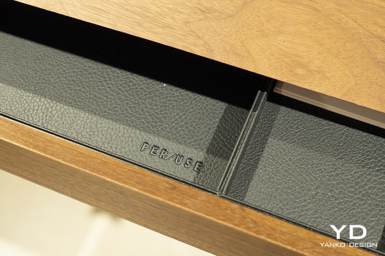
From the designers, the mirror combined with a full-size drawer crafted from walnut or oak wood is essentially ‘designed with the idea to keep your hallway clean and gorgeous.’ From how I perceive it, the interior accessory would make a great option to have in the bedroom as a weapon or valuables safe. Your pens, wallet, and jewelry can easily rest inside the leather padded interiors of the secret drawer that opens only with the push of a button installed on the underside.

More than the idea of a drawer with a button for functionality, the Guillotine – comprising rectangular and round-shaped mirror – is a dramatic interpretation of the execution machine. The design creates an interesting illusion of the mirror cutting through the drawer like a ‘guillotine.’ This can be perceived as, mirror and the drawer blending into each other, creating an identical form. As you see it from the front ’they appear as one!’

The post This mirror cuts through a secret drawer in the middle like the ‘guillotine’ first appeared on Yanko Design.

HUG embraces nature with a more sustainable way to make and assemble furniture

Wood is a favorite among designers for its natural beauty, the random grains that make each piece unique, and its more sustainable source. But while it is definitely better than ordinary plastic in that regard, the extensive use of wood also has a negative impact on the environment if left unchecked. Unlike money, wood does go on trees, trees that need to be cut down in order to become the literal building blocks of furniture and other products. Those trees need to be replanted, of course, but there’s also the matter of pieces of wood that are wasted and thrown away. Plastic and metal aren’t the only things that can be recycled, and HUG tries to do the same for discarded wood that can then be used to create other pieces of wooden furniture.

Designers: Medeot Barbara, Piovesan Giulia

Using wood, a biodegradable and more sustainable material compared to plastic, doesn’t mean that there will be nothing wasted. While pieces of scrap wood do eventually decompose or can be used for smaller items, they’re still considered wasted materials and wasted potential. Pieces of plastic can sometimes be broken down and recycled into other compounds, and cutoffs can be used to make other textiles. Scrap wood, likewise, can become the foundations for other products, like furniture built from the building blocks of Progetto or “Project” HUG.

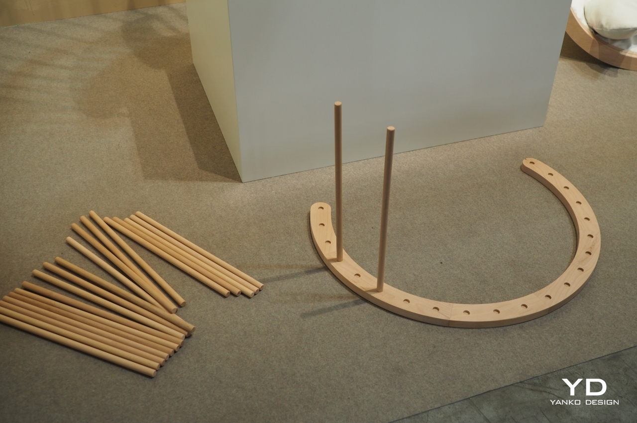
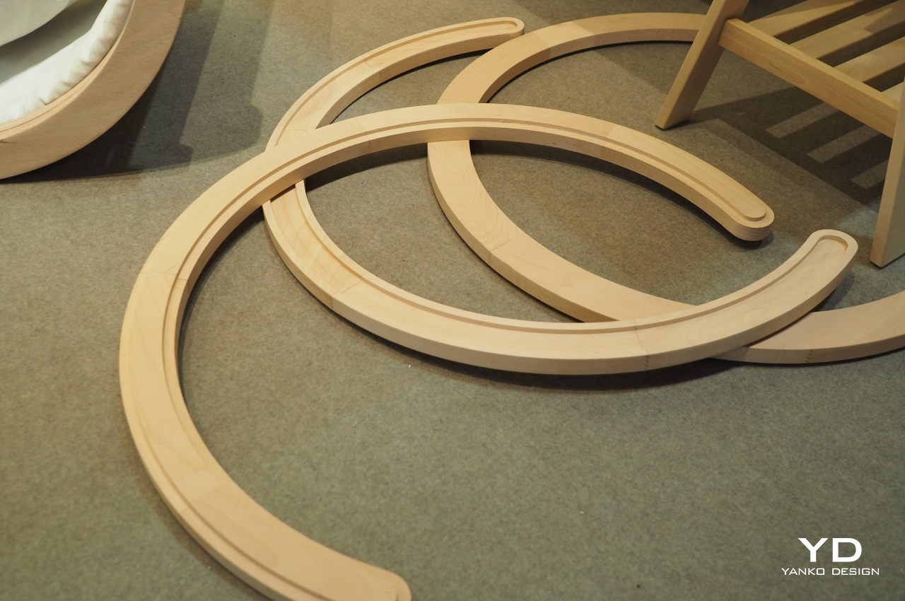
HUG isn’t simply about recycled scrap wood, though that is part of its appeal. It is defined as a “multifunctional object made up of simple elements” that can be assembled in different ways to create different pieces of furniture. In a way, it’s like a simplified LEGO system made of wooden parts, giving people the freedom to create chairs, shelves, or even benches that alternate between facing opposite directions. Best of all, you can even reassemble them as your needs change over time.

That is the third part of HUG’s appeal that they can be assembled and reassembled just as easily as LEGO bricks. That’s because the system doesn’t make use of nails or even glue, the latter being a potentially dangerous chemical that will harm the environment when it comes time to dispose of the product. Then again, HUG is designed to be reused again and again, so it’s not like it will meet the trash heap or the recycling plant anytime soon.

Progetto Hug is still in its infancy, but it definitely has a lot of potential, both in theory and in practice. The simplicity and modularity of the design make it easy to cram the parts in a flat-pack, and the flexibility of its assembly could see odd furniture constructions and ideas grow over time. The current iteration of HUG comes in a natural finish, but there could be more colors available in the future.

The post HUG embraces nature with a more sustainable way to make and assemble furniture first appeared on Yanko Design.

BORA X BO smart steam oven makes cooking feel like a chore

Many fitness gurus will say that the first and hardest battle in staying healthy and fit happens in the kitchen. Everyone knows that they should eat healthily, but very few know how to proceed from there. Preparing your own food is the most recommended way to keep tabs on what you eat, and that’s where most of us stop because of the work involved. Short of a Star Trek replicator or a robot that could actually make the food for us, most of us will probably settle for a cooking appliance that will at least take care of most of the other chores for us, like cleaning the oven or stove. BORA’s latest darling, the BORA X BO flex oven, comes close to being that dream smart oven, automating and taking care of many parts of the cooking process, leaving you free to focus on preparing and then enjoying your healthy dish.

Designer: BORA

Cooking is a multi-step process that may feel overwhelming for some, especially when they think about the cleanup they have to do afterward. Ovens, in particular, are notorious for being hard to clean, especially to get rid of odors. Keeping tabs on the food’s temperature and making sure you don’t stink up the whole house are tiring jobs in themselves, and you’ll be forgiven if you wished that ovens were smart enough to do that themselves. The BORA X BO is, thankfully, and it makes the cooking process a lot less burdensome, especially for the parts you might have taken for granted.

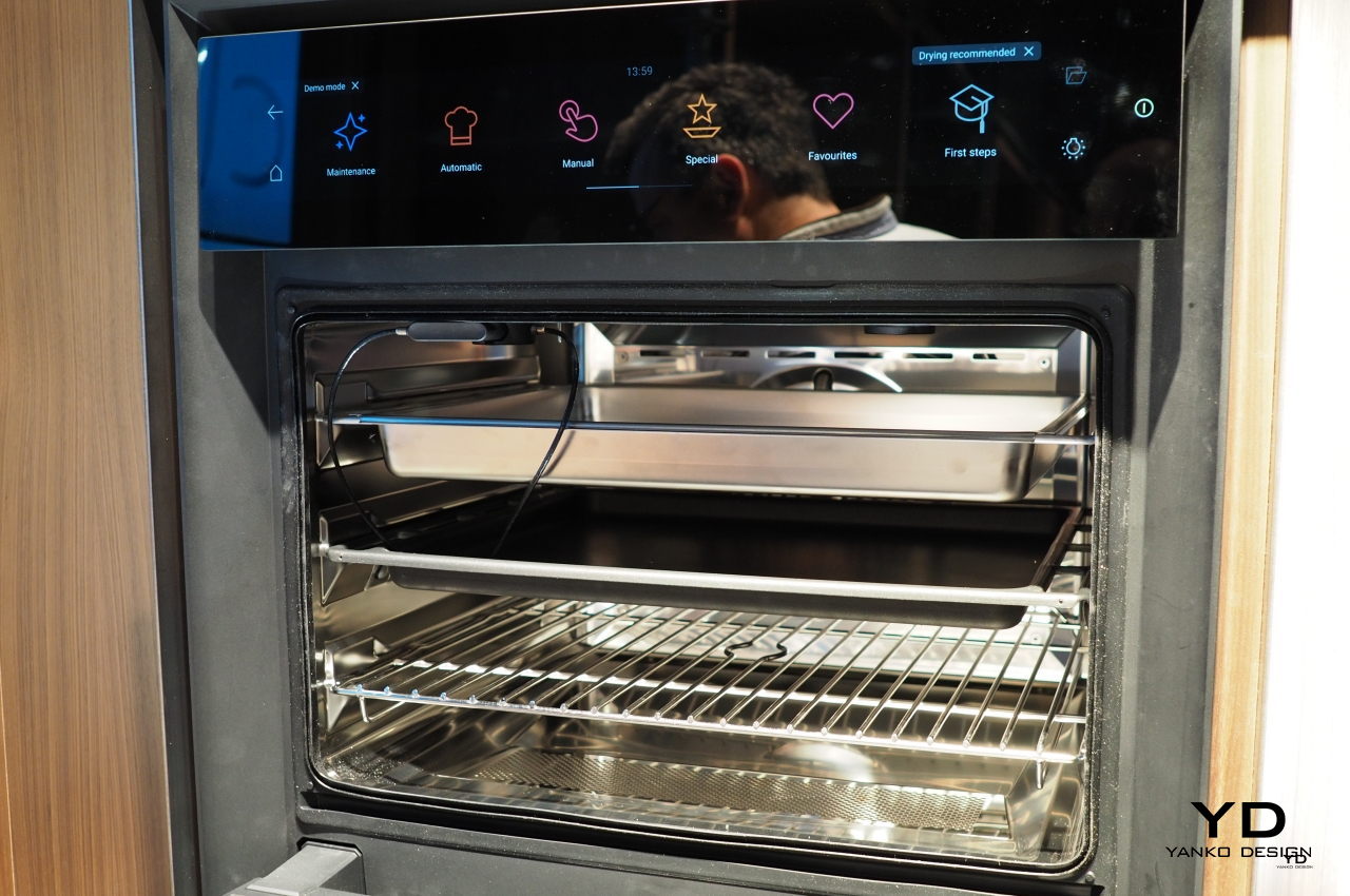
The BORA X BO can be as simple or as complicated as you’d like or need, scaling to users of different skill levels. All its operations are driven by a bright and colorful 19-inch touch display on top, including setting food preferences, looking up recipes, or manually tweaking each and every possible option there is. Or you could set it to automatic and let the oven do the heavy lifting for you. With so many features, you might easily feel overwhelmed, but you can customize the screen and rearrange things to fit our workflow. You can also search for settings and features using the on-screen keyboard, which is faster than tapping and swiping through menus. And since very few people actually read paper manuals, BORA included an animated guide right on the screen.

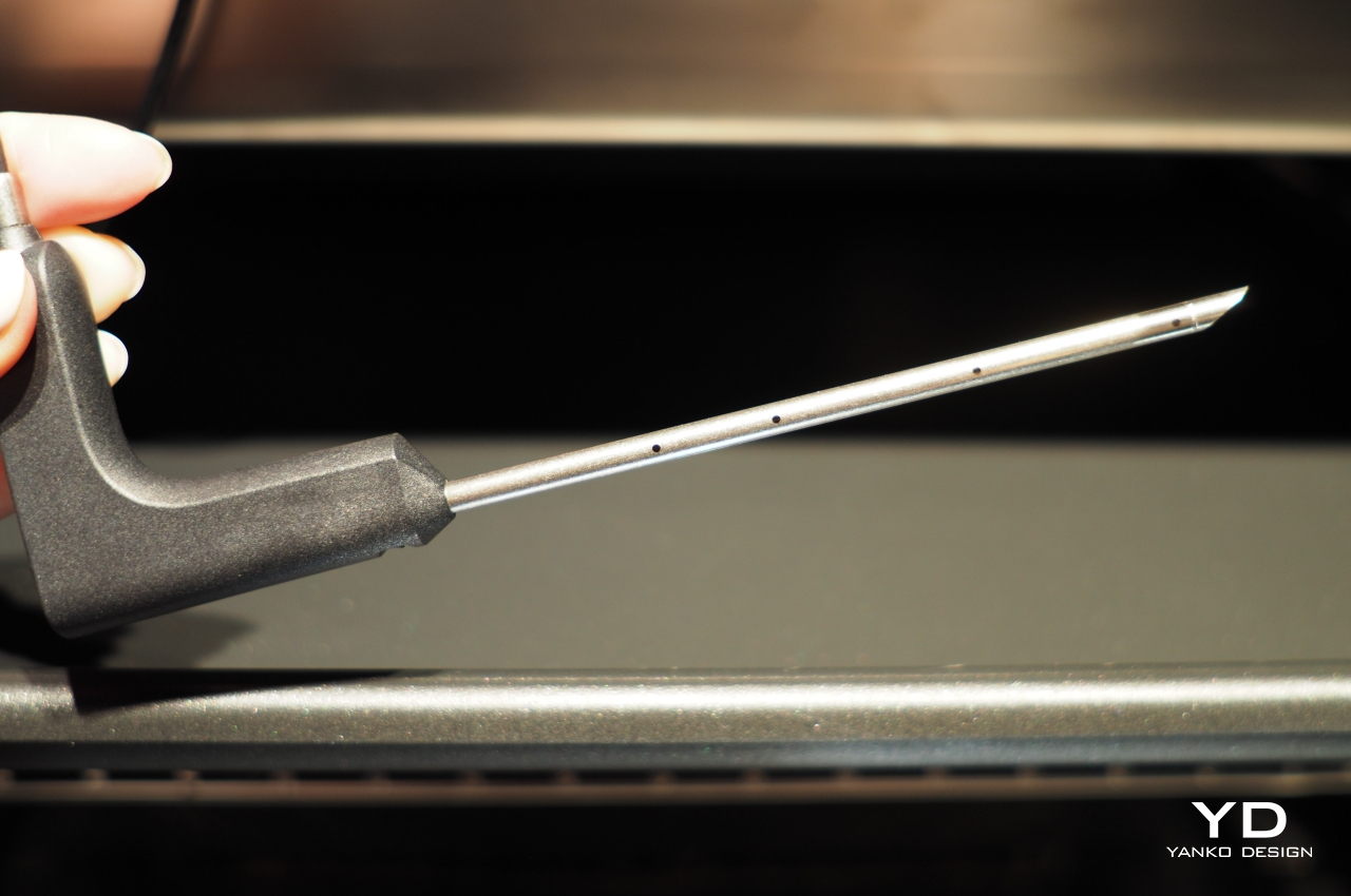
The oven supports plenty of cooking methods and recipes, but its intelligence and convenience go beyond the direct act of cooking. Worried that you didn’t stick the thermometer properly into your meat? The four points on the metal probe each have their own sensor, so you won’t have to fret over that. Worried that opening the oven door will suddenly flood your vision with steam and your kitchen with fish odor? BORA X BO will extract all the steam and filter the odor before you can even open the door. Want to make sure nobody accidentally touches the oven or its settings while you go walk the dog? Leave a message on the large screen for everyone to read.

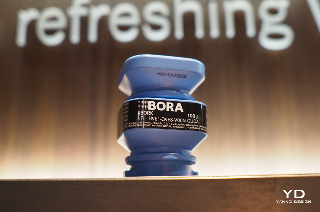
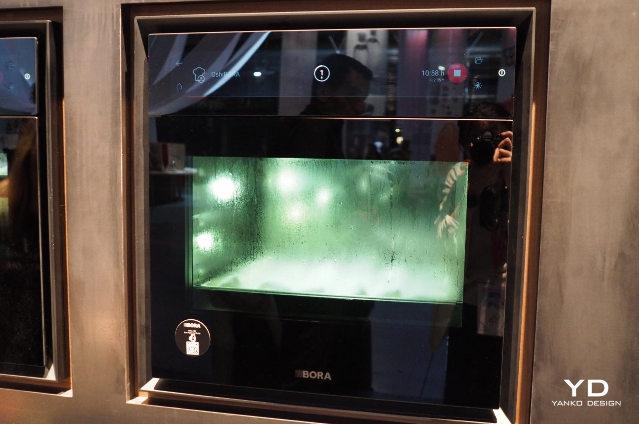
The BORA X BO also takes care of the most dreaded post-cooking task of all, cleaning. Put in the recyclable two-chamber cleaning cartridge, tap the cleaning function, and step back to watch the oven do its magic. It sprays and spins water and cleaning material around its stainless steel interior and automatically drains and dries it afterward, so you won’t have to lift a finger except to take out the single-use cleaning cartridge. Cleaning an oven has never been that easy or effortless.

The flex oven stands out not just in features but also in its handsome looks, its black panels and tinted front panel providing a sharp contrast against other fixtures in any kitchen. Multi-level LED lighting lets you see the food inside as they are, despite the tinted panel, helping remove the guesswork and ease worries about the dish’s state. While steam ovens have been around for years, the BORA X BO gives the cooking appliance a much-needed upgrade, making cooking almost as easy as using your phone.

OLYMPUS DIGITAL CAMERA

The post BORA X BO smart steam oven makes cooking feel like a chore first appeared on Yanko Design.
Ofuro bathtub immerses you in a Japanese-inspired relaxing soak

The bathtub industry is expected to grow in the coming years as real estate is seen to sustain growth. Many people believe we are already at the tail-end of the pandemic, which could mean the residential construction business will also begin to pick up. The more homes are built, the more the demand for home fixtures and bathroom fittings will increase. This means more consumers will have to shop for items for their future residences, even if it’s not always a fun activity to do. If you are planning the design of your future bathroom or want to renovate it, you need to decide what kind of bath accessories to get.

Designer: Carlo Colombo (Antoniolupi)

Ofuro Bathtub

Bathing can be an ultimate form of relaxation, but to achieve such a wonderful experience, your bathroom needs to have the right fittings, accessories, and shower system. Antoniolupi can help with several interesting bathroom furnishings as the company continues to design and deliver products with distinguished Italian flair. Antoniolupi is now a brand known for its exclusive bathroom accessories and mirrors, but it has since expanded to different product lines for the living space. It has teamed up with several designers to create products of the highest quality since most of the products are tailor-made. While other brands go for mass production, Antoniolupi keeps the tradition by offering customization on the design.

Antoniolupi Ofuro Bathtub

Antoniolupi Ofuro Bathtub

The latest product, the Ofuro series, comes from the traditional Japanese bath that involves soaking and relaxation. The use of the name gives the inspiration to create a bathing experience that is truly calming and comforting. Showers may not be enough, so bathtubs are preferred in some situations when you really need to destress and decompress. A few moments in the tub allow not just purification of the body but also of the soul and mind, as it is where you can be free from all the stress and worry of the day.

Antoniolupi Ofuro Bathtub

Antoniolupi Ofuro Bathtub

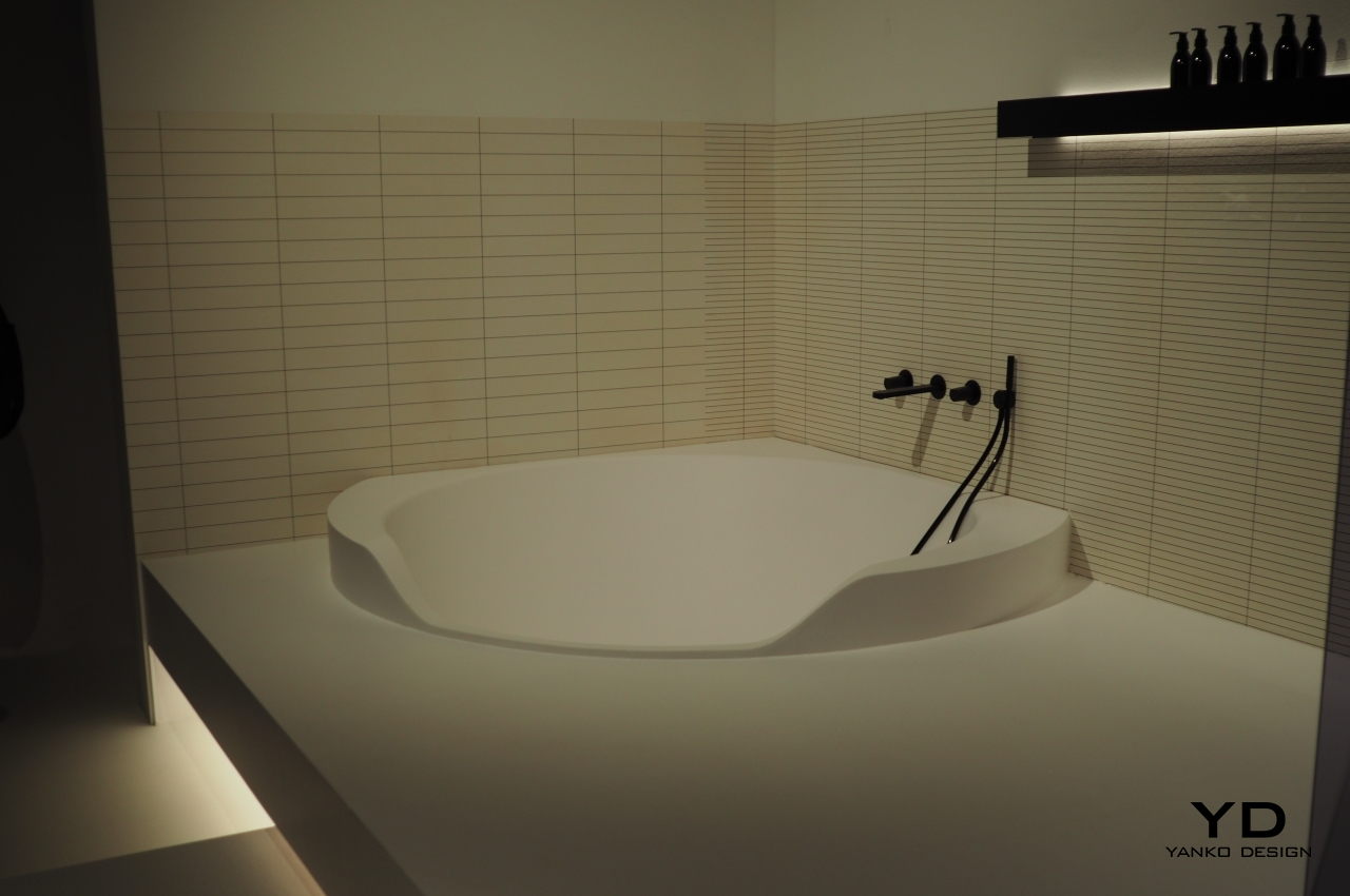
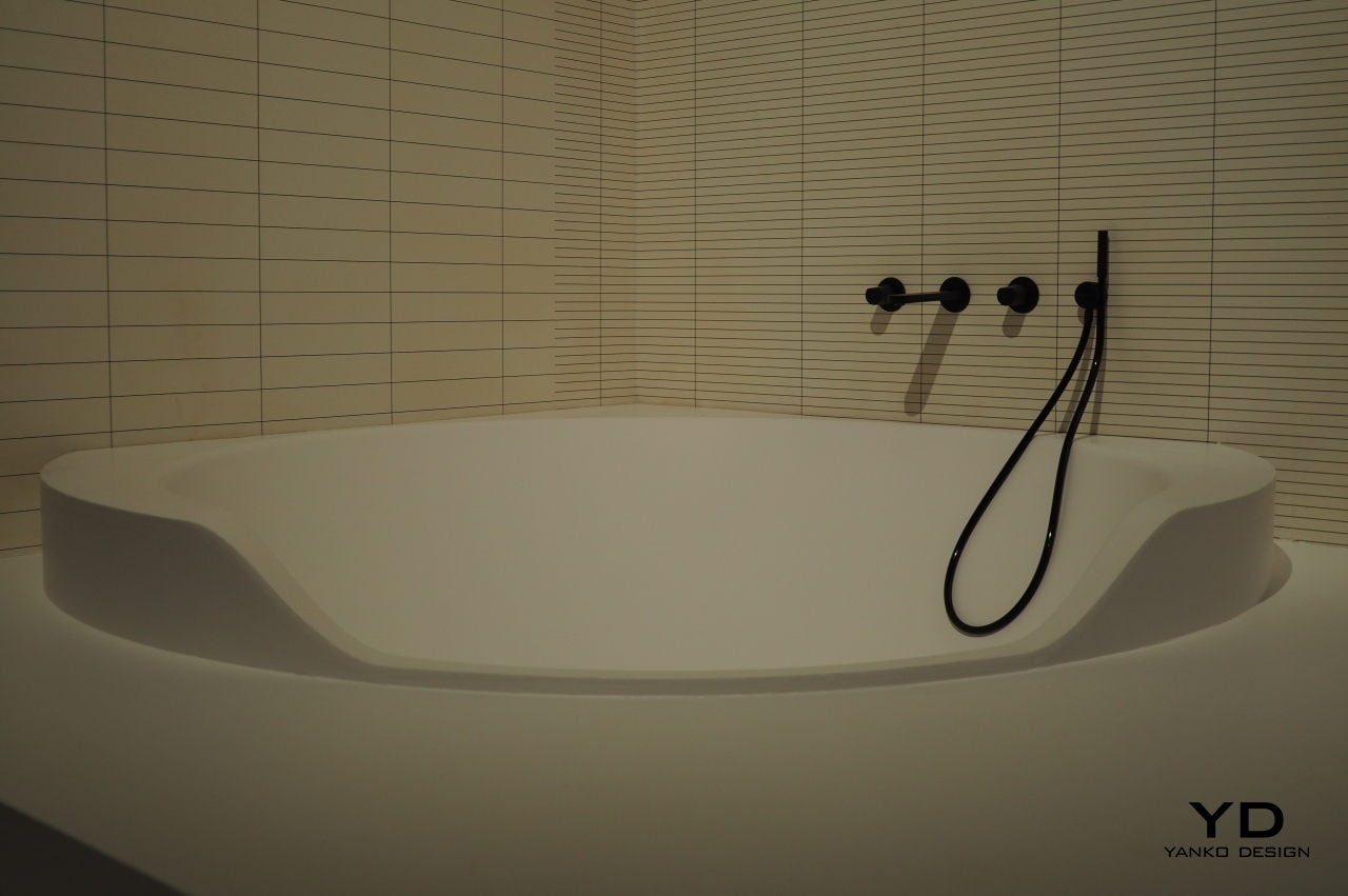
Antoniolupi’s Ofuro series is a response to such a need for wellness and healthy living. The idea of full immersion in hot water is why the Ofuro bathtub is large, looking like a large basin perched in the corner of the bathroom–just like the Japanese tradition. The Ofuro is created from Flumood, which is an innovative and ecological material that is very compact, non-toxic, and non-porous. It is said to be the ideal material for the bathroom, according to Antoniolupi as it’s been used on some of the brand’s projects, including the new bathtub currently showcased at Salone del Mobile 2022.

Antoniolupi Ofuro Bathtub

Antoniolupi Ofuro Bathtub

The satin white finish of the Ofuro bathtub makes it a pristine choice for bathrooms, especially if you are into the minimalist aesthetic. The bathtub looks like a work of art with curves, sharp edges, and straight lines–appearing to be carved from a single block, making it more special. An Ofuro bathtub will look great in the corner of the bathroom, and the edges’ thickness may vary depending on the space a user needs. The LED light around the bathtub edge looks imposing, resulting in an elegant and illuminating effect.

Antoniolupi Ofuro Bathtub

Antoniolupi Ofuro Bathtub

Antoniolupi Ofuro Bathtub

The post Ofuro bathtub immerses you in a Japanese-inspired relaxing soak first appeared on Yanko Design.