Everything You Need to Know About the Japandi Design Style

The emerging Japandi design trend melds the Japanese and Scandinavian modern interior design styles. Featuring a brilliant combination of Scandinavian functionality and Japanese minimalism, the design style is deeply rooted in simplicity and comfort. Although Japan and Scandinavia or the Nordic countries of Denmark, Sweden, and Norway are distinctly different in culture and geographically different, they are designed on the same principles. The origin of this design style dates back to 1853, when Japan lifted its border policies after years of seclusion. Shortly after this event, Danish designers and creatives started visiting Japan and got fascinated by Japanese oriental aesthetics.

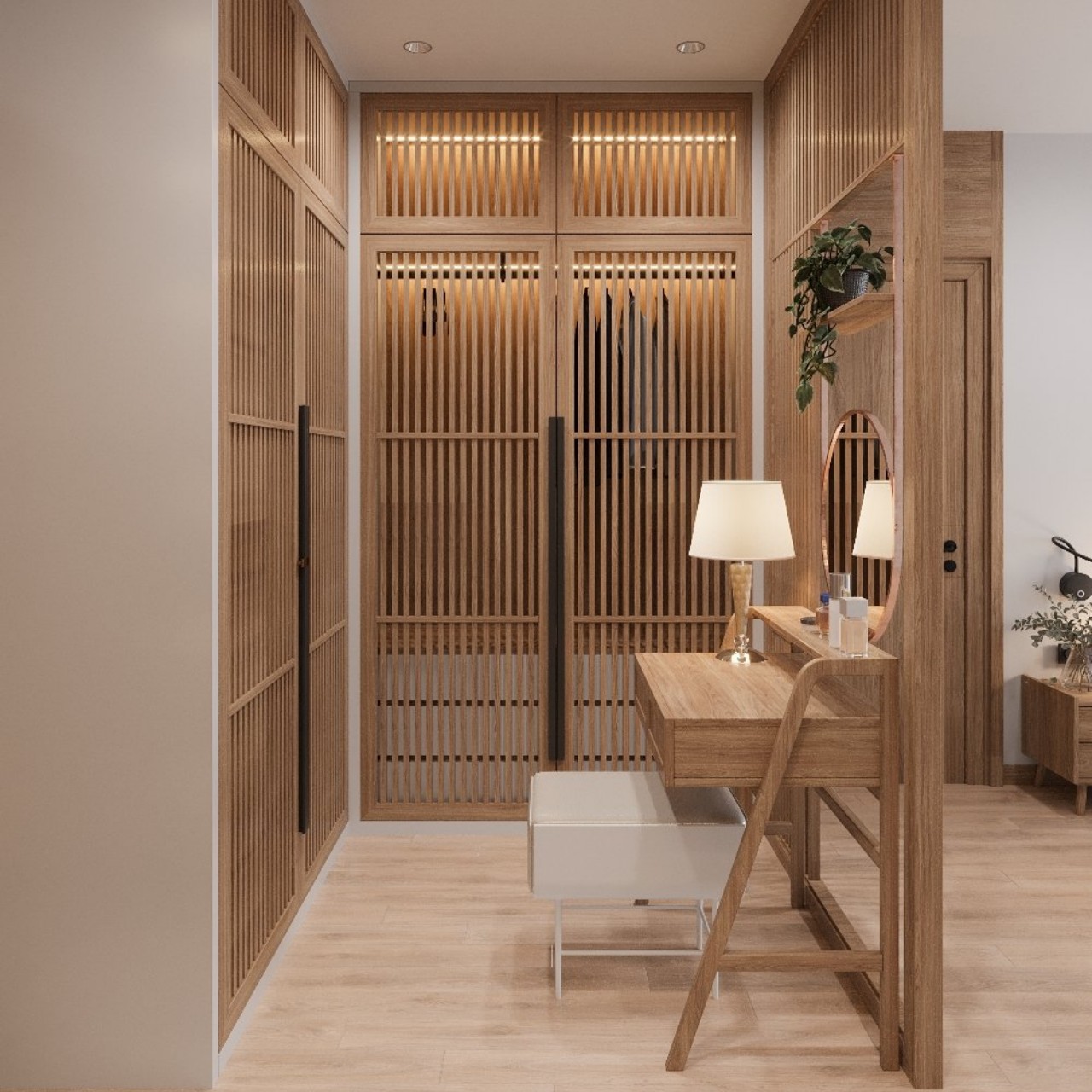
Designer: Ward 5 Design
Also known as the Scandi-Japanese style, the Scandi design follows the notion of “hygge,” meaning coziness, where the home should be your sanctuary that can exude elegance, conviviality, and well-being. The Nordics wanted to add warmth into the interiors so that their homes could feel peaceful and comfortable, especially throughout the cold and dark winters. It aims to improve everyday life and creates coziness with a mix of materials like velvet, leather, knits, and crochets and pays attention to furniture details. The Japanese design follows the concept of “wabi-sabi,” which values contentment and slow living and celebrates the beauty of imperfections. The fusion of “hygge” and “wabi-sabi” determines the critical elements of the Japandi design style. Since both these design trends have many standard features, their core philosophy is to merge the rustic Nordic décor with the sleek Japanese design and create a Zen vibe.
The prime objective of the Japandi design style is to design with intention. This style creates a warm and welcoming space with a fusion of clean lines with functional style. Moreover, its beautiful and practical design encourages one to stay close to nature. These design elements will help you to master your interiors and exteriors.

Beautiful Craftsmanship

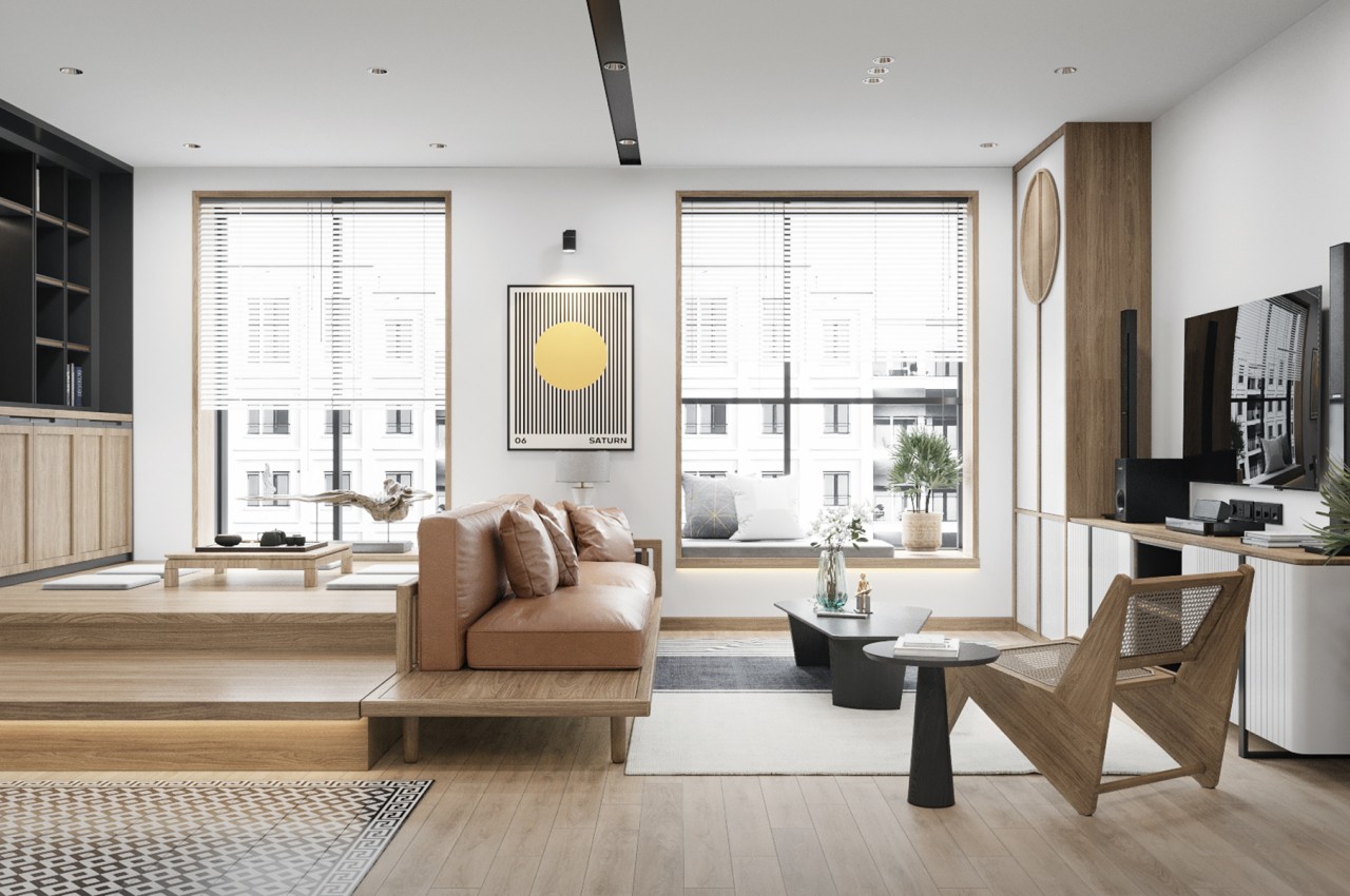
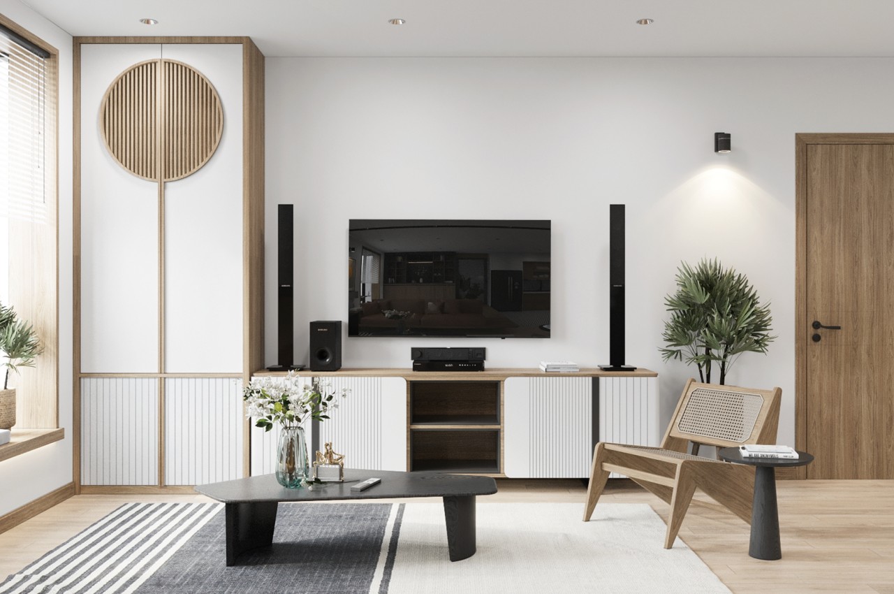
Furniture design forms one of the most important components of a Japandi interior design style. Look for artisan pieces of furniture with a timeless appeal so that one can use them for years to come, as the focus is quality instead of cheap throwaway pieces. Japandi furniture design makes a statement without adornment, the details are handmade, and each piece is unique, and there is no similarity between the two parts. Wood is the most prominent material in this design typology since it is readily available in Japan, and the country is known for its mastery of timber. Every piece is intentionally chosen in a particular space so that it can add meaning and purpose. For example, low-height furniture is evocative of the concept of being close to the earth.
Designer: Manh Duy

Warm Palette

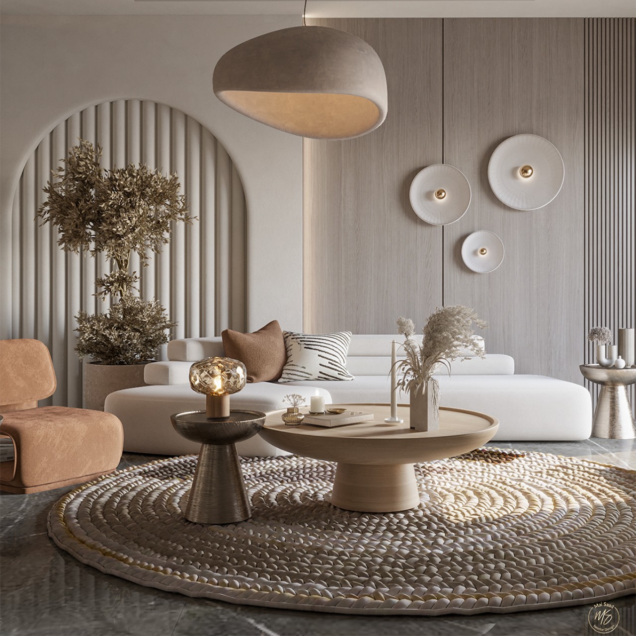
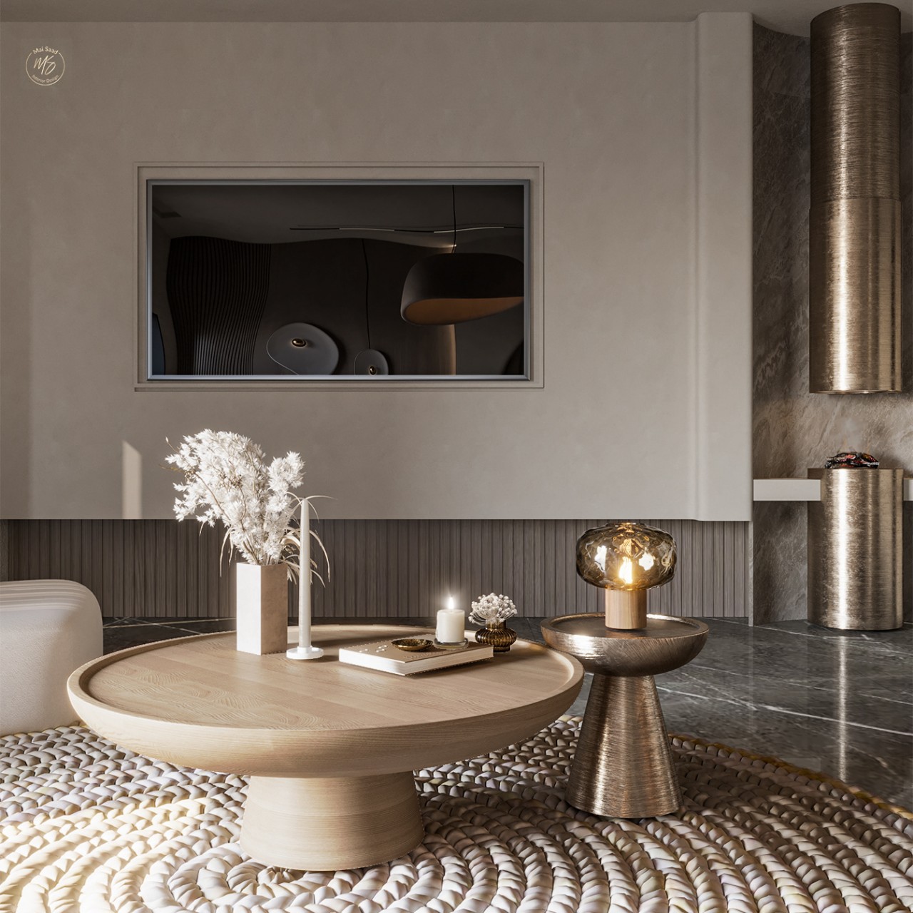
The Scandi palette is gray, white, and brown, while the Japanese palette incorporates autumnal hues and colors from the earth and the sky. Create an earthy feel with muted pearl gray and sky blue colors with hints of pale green. The colors of nature play wonderfully with the organic material of Japandi-style space. A bold color can be used as an accent in the decorative accessories and throw pillows to complement the wood tones. These colors can be layered to mimic the look of a natural landscape.
Designer: Nada Hasham

Sustainability

There is a focus on sustainability, the use of natural materials, and eco-friendly aesthetics. Japandi does not believe in the one-time-use culture, and the options should be environmentally safe. Avoid plastic and look for home décor items in natural materials like wood, stone, and woven textiles.

Both cultures have a deep fondness for nature and sustainability. In Japan, there is a psychological exercise called “Shinrin-yoku,” which means “Forest Bathing,” whose purpose is to inspire people to reconnect with the country’s forests. The Norwegian people follow the concept of “Friluftsliv,” also known as “Outdoor Life,” which is about spending time and enjoying the outdoors.
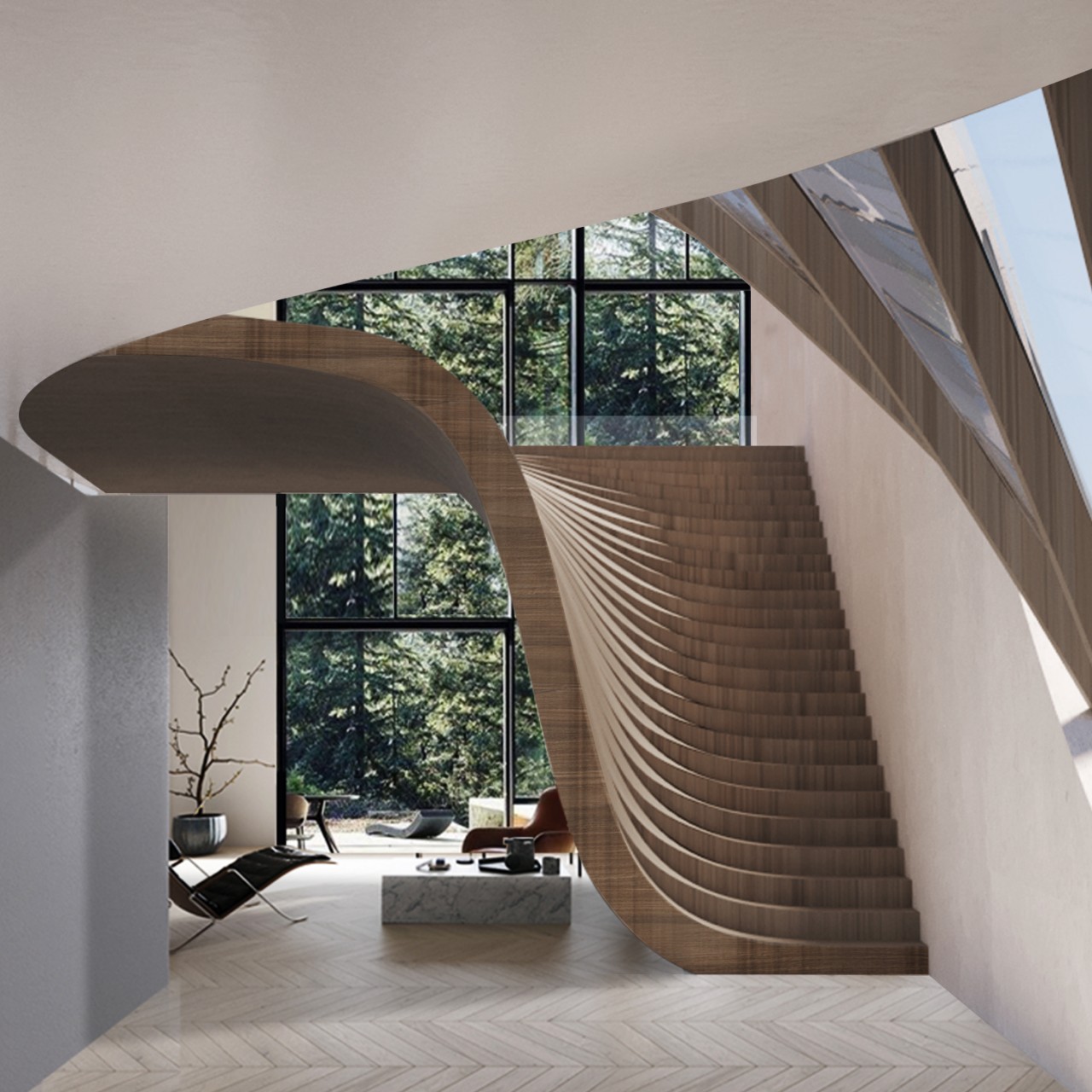
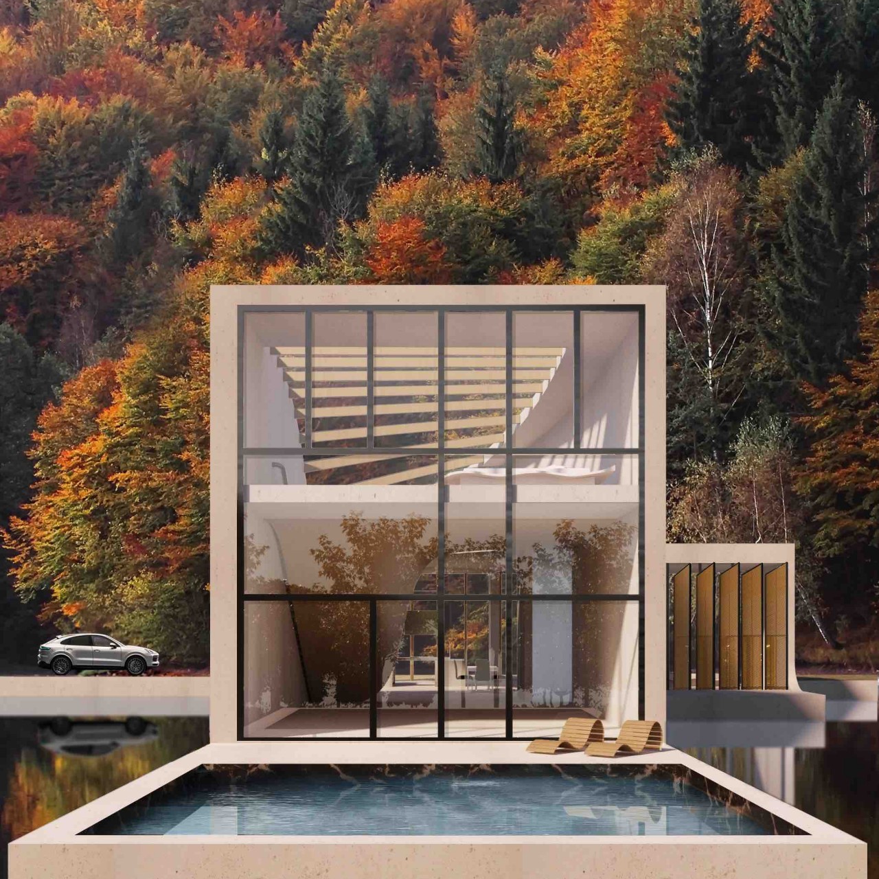
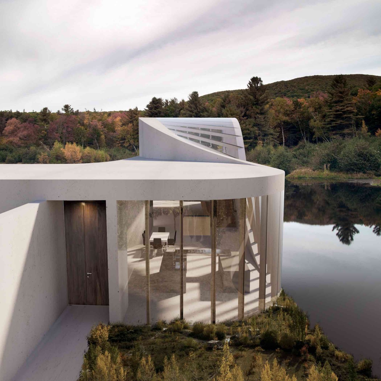
Designer: Sipal-WAFAI.Architecture

Use Organic Materials

Japandi focuses on natural materials like unfinished wood and incorporates organic materials like rattan, wicker, cane, wood, and bamboo, along with comfortable fabrics like cotton, linen, and hemp. A mix of materials creates a serene space. Moreover, the design style is distinctly organic, where the ceramics, bowls, and even lighting can be in organic materials.
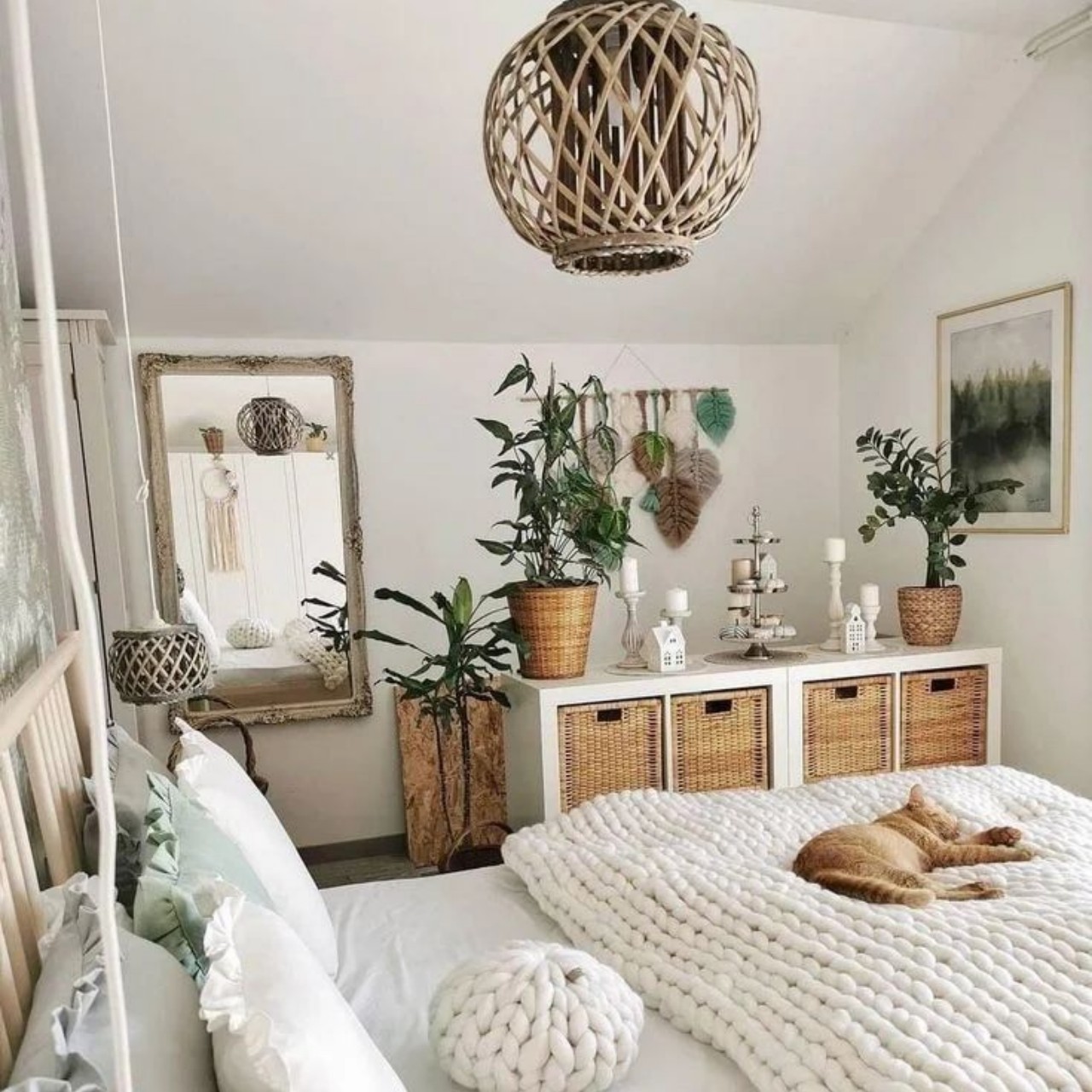
Designer: Delicate Decor

Introduce Plants

Plants and greenery work as genuine accessories and can bring in a sense of outdoor living. They purify the indoor air and form a decorative accent. The Japandi style has a profound respect for nature and focuses on less but bigger sizes of plants. To complete the picture, beautify the interiors and create a nature-inspired décor with houseplants like hanging vines and bonsai trees or beautiful plants in large ceramics. Plants create a warm and welcoming look and soften a minimalist interior.
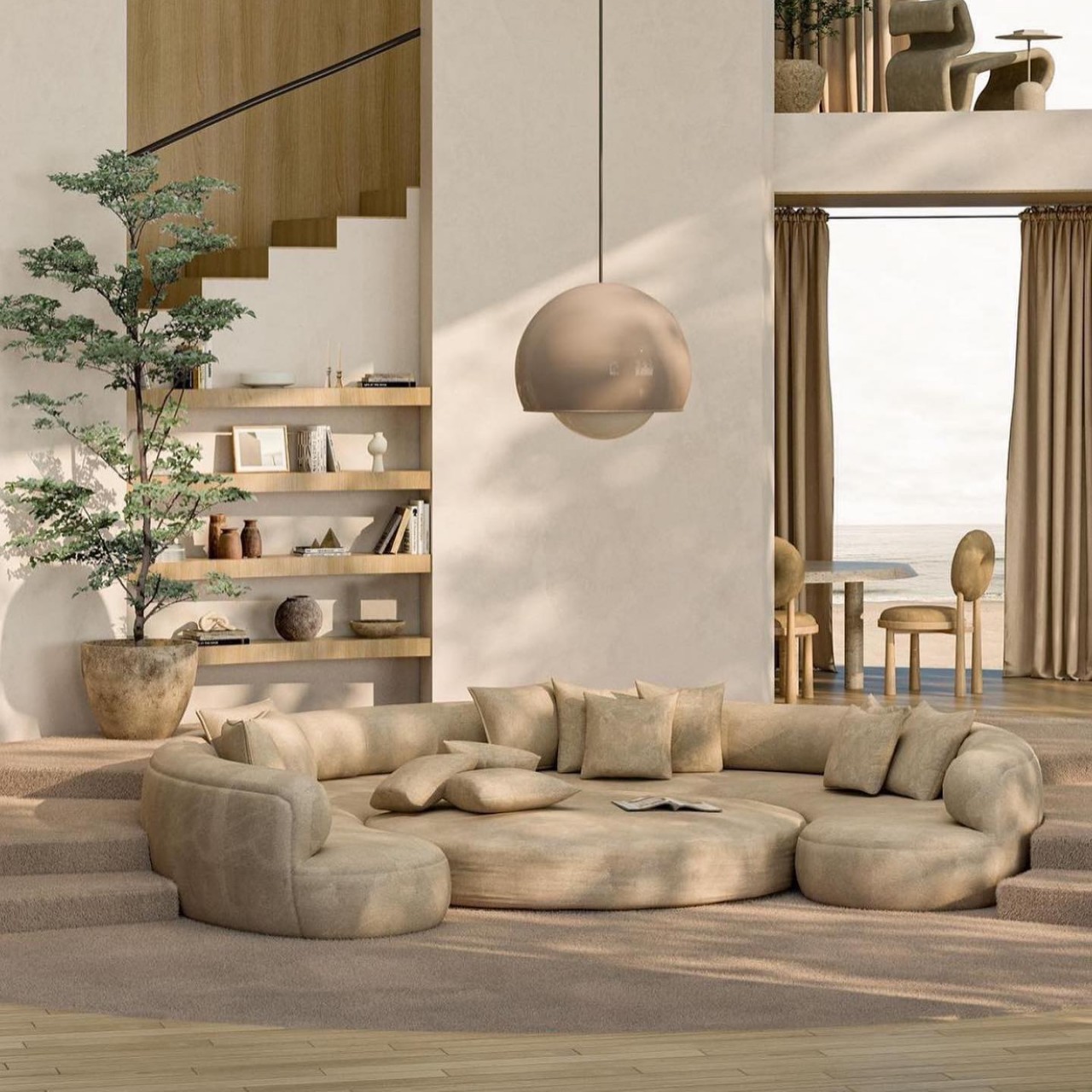
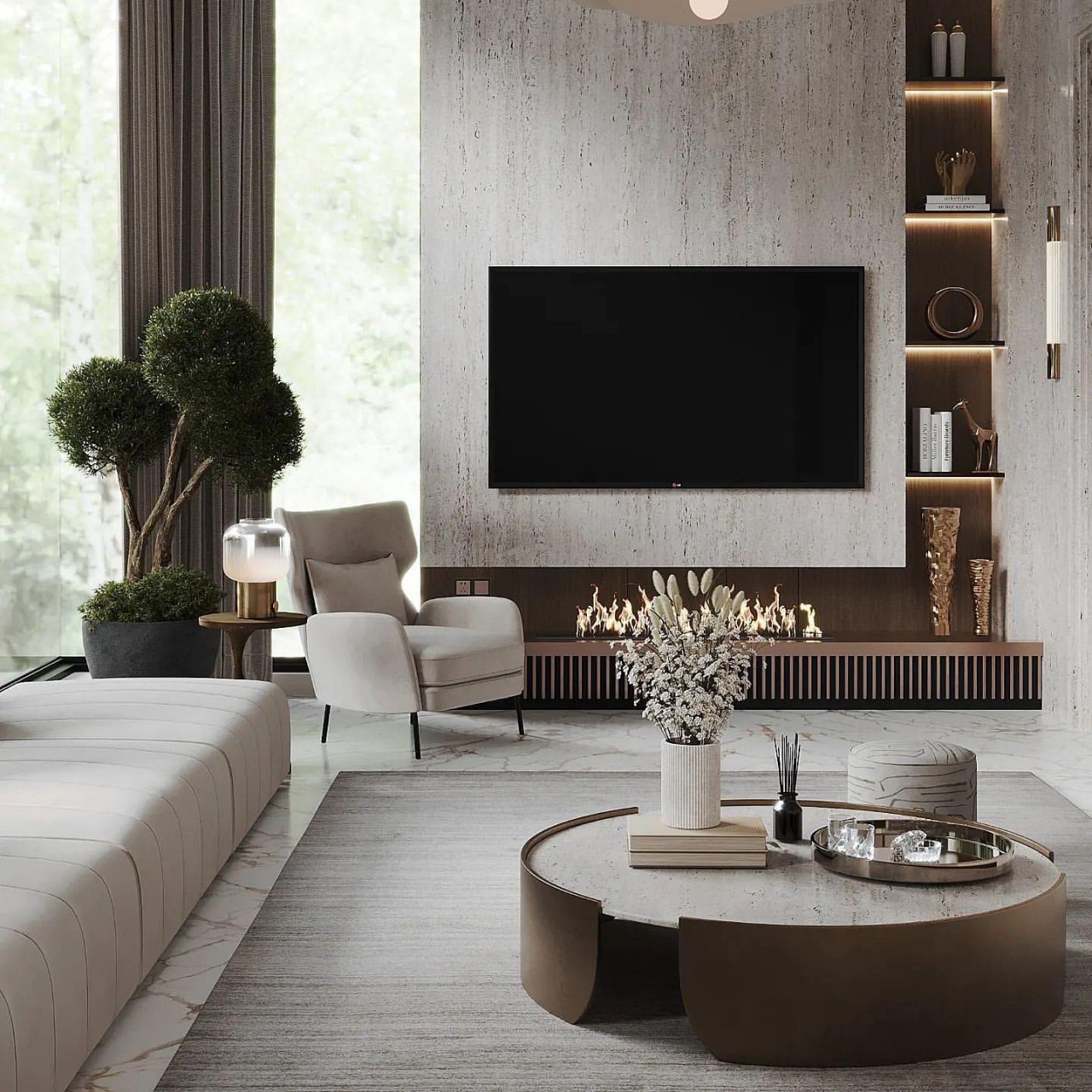
Designer: Japandi Lights

Decluttered Spaces

Japandi emphasizes comfort and simplicity, making every item functional yet aesthetically pleasing. There is a focus on openness and zero clutter so that the space looks clean, fresh, and minimal. An open-plan layout exudes a tranquil space connected with the outdoors to create a brilliant indoor-outdoor connection. If there is less space for storage, use natural storage solutions like wicker baskets, boxes, and trays. Use bamboo or folding screens to camouflage clutter.

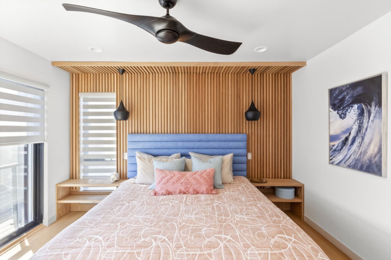
The bedrooms are minimalistic, with minimal window dressing, few art pieces, and comfortable bedding. A good curation of art pieces, mirrors, rugs, tables, and lamps infuses coziness without creating a cluttered look. Additionally, a Japandi bedroom supports rest and encourages a tech-free space that encourages sleep and minimizes distraction.
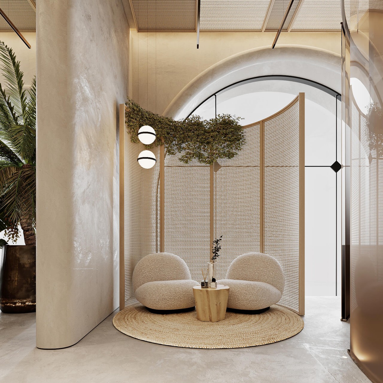
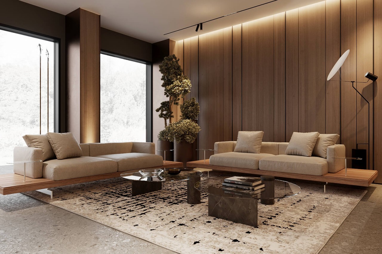
Designer: Hilight Design

Bring In Natural Light

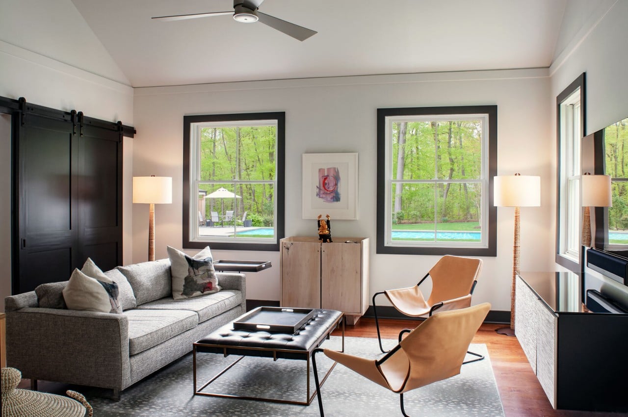
Natural light creates a bright, airy interior and is the gateway to the natural world. Japandi integrates large windows to bring in plenty of natural light while the reflective surface of neutral-hued walls bounces the natural light. If there is less natural light, one can use mirrors to reflect more light. The rooms should be softly lit for a tranquil interior. Consider industrial lights to add a Scandinavian vibe that can infuse warmth with handcrafted pendant lights or retro pendants in copper finish. Use floor lamps for a warm and cozy glow.
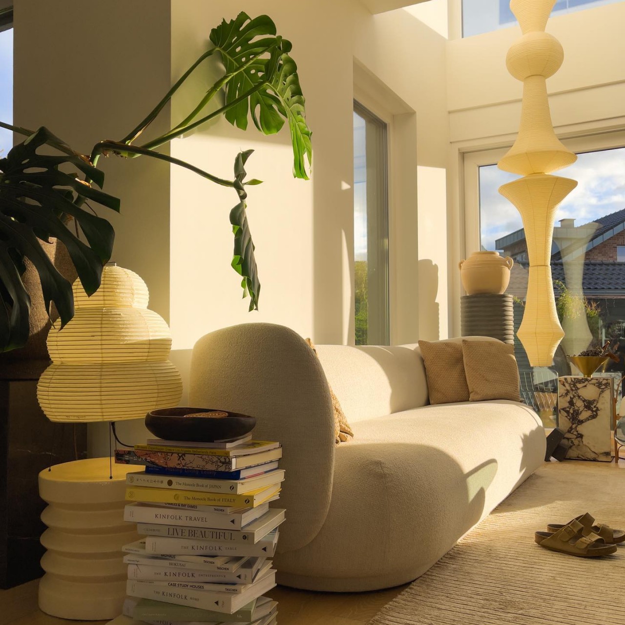
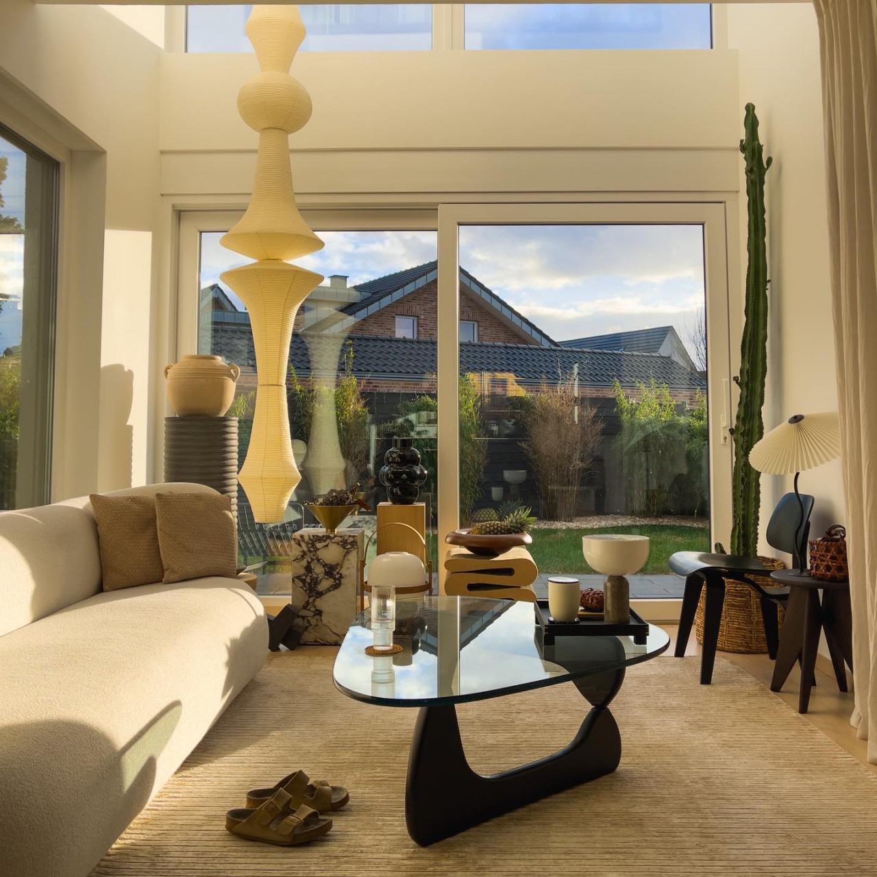
Designer: chrisfluence

Stripped Furniture

Japandi furniture uses different materials, textures, and colors, infusing peace, serenity, and a comfortable feel. One can accentuate the space with a chair or coffee table in a bold color. Create contrast with dark and light wood tones as Japan uses dark wood Cedar, Red Pine, and Cypress, while Scandinavia uses light wood oak, mahogany, pine, and teak. This is a great way to create visual interest, bring the space together, and create a warm and harmonious feel.
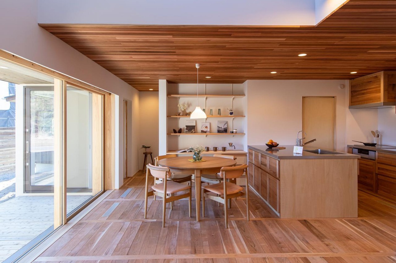
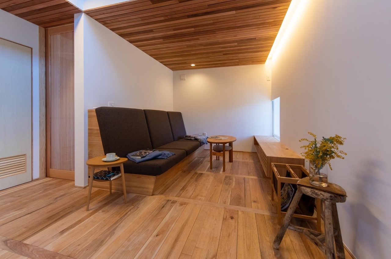
Designer: Hishida Komuten

Sumptuous Textures

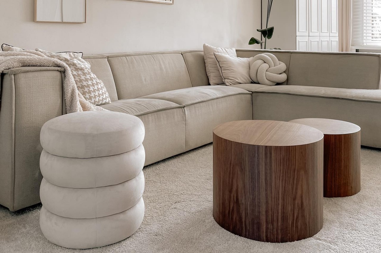
Japandi design infuses warmth and interest using sumptuous textures and fabrics. This can be achieved in the curtains, upholstery, and rugs, which will infuse warmth. A big cozy rug in natural materials is a must-have in a minimalist bedroom as it provides a warm underfoot whenever one enters or exits the bed.
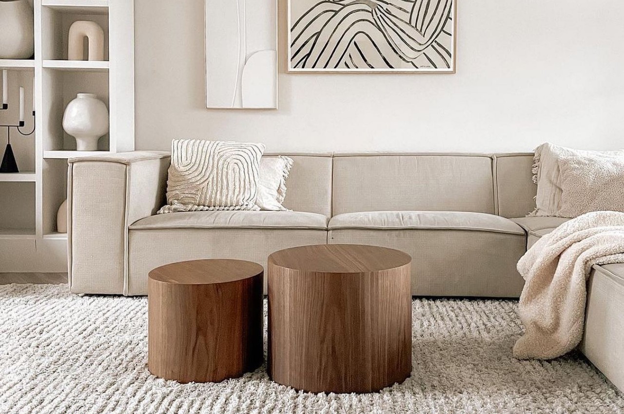
Designer: Veronique (Veer.enmeer)

Balance

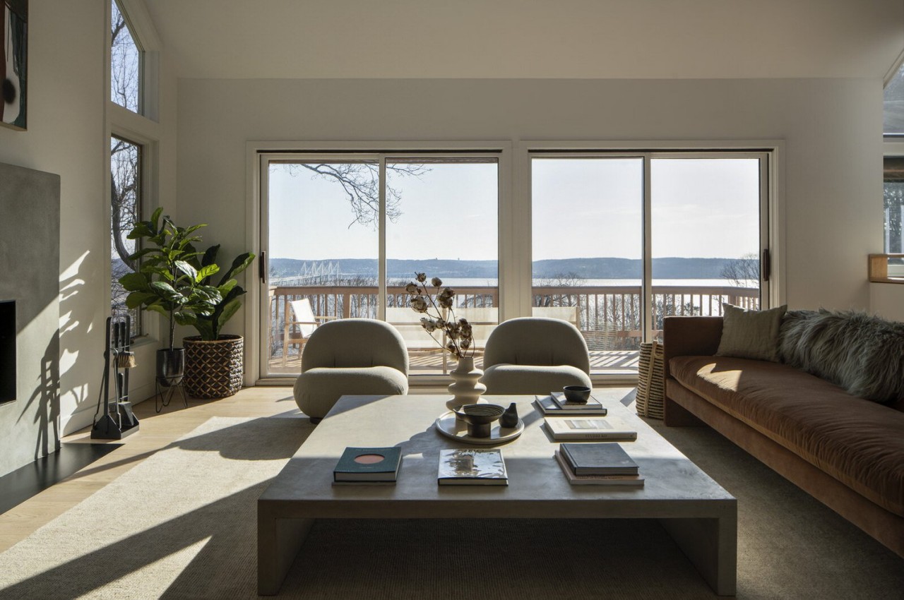
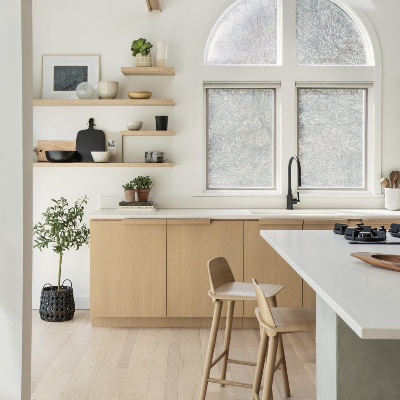
The Japandi style does not believe in symmetry but uses different furniture pieces that can create an organic feel. One must pay attention to the visual weight of each piece as this design style aims to create balance and promotes relaxation.
Designer: Stewart-Schafer

A fusion of Japanese minimalism and warm Scandinavian interiors has emerged as one of the most popular style combinations of the decade. These tips will help you to create your favorite look.

The post Everything You Need to Know About the Japandi Design Style first appeared on Yanko Design.

Asymmetrical sofa collection uses flexible foam for design and aesthetics

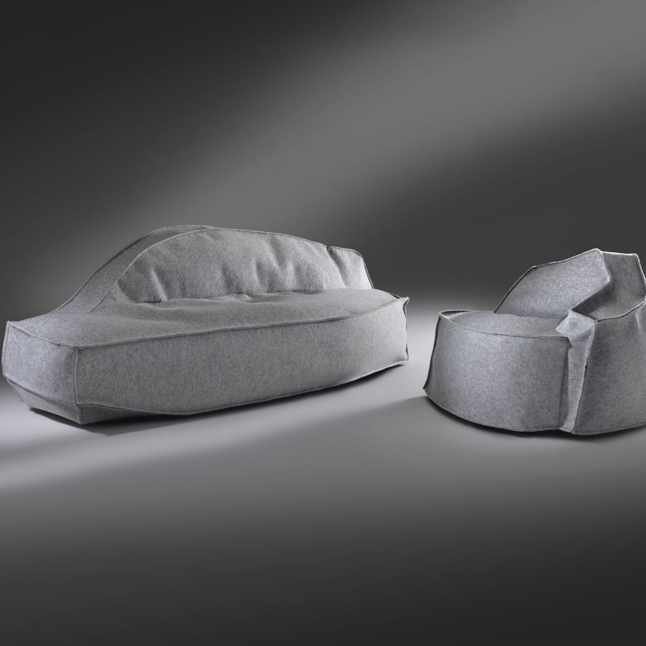
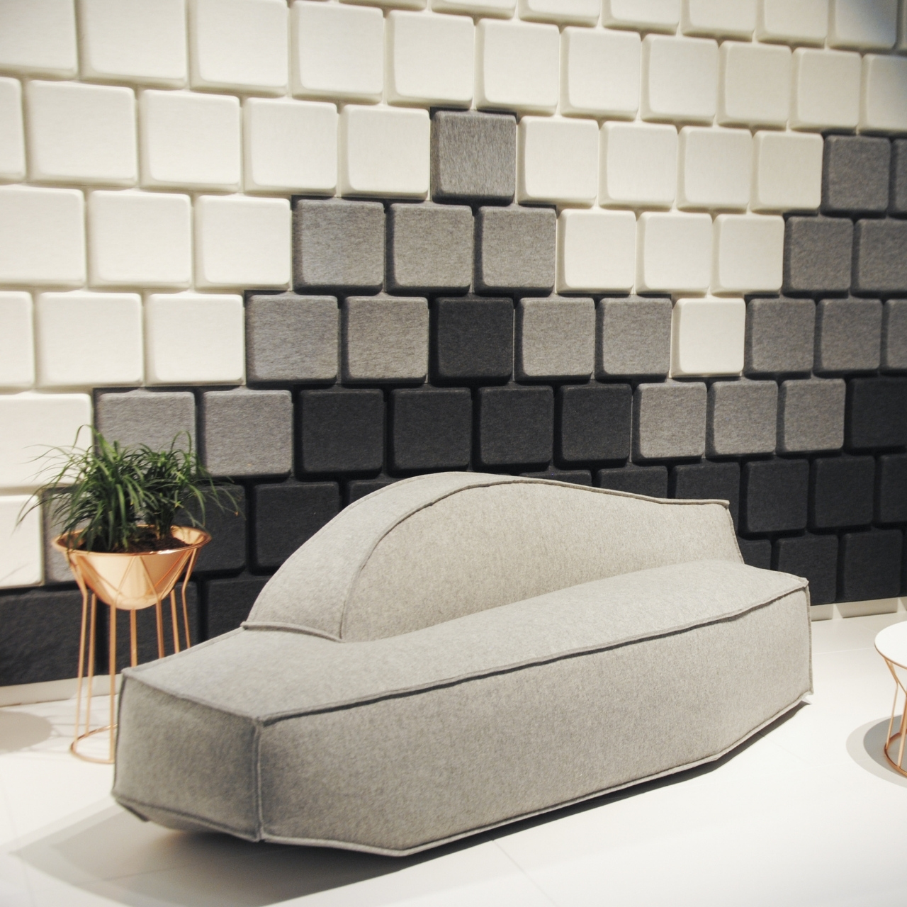
When looking for a sofa to buy for your place or to find one to sit on, comfort is probably the top priority. The design also adds to the appeal but sometimes, the unique or artsy-looking ones don’t seem all that comfortable. So if you find something that’s both, you probably should get on that, literally. When it uses a different kind of material than the usual sofas that you see around, that’s another pleasant bonus. This sofa collection from Swedish brand Offecct may be the real deal.

Designer: Jean-Marie Massaud for Offecct

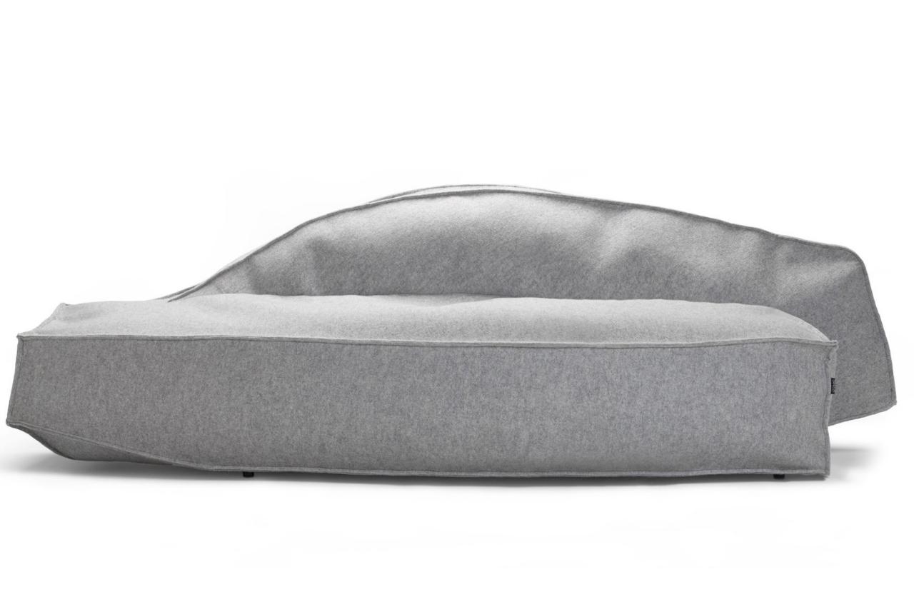
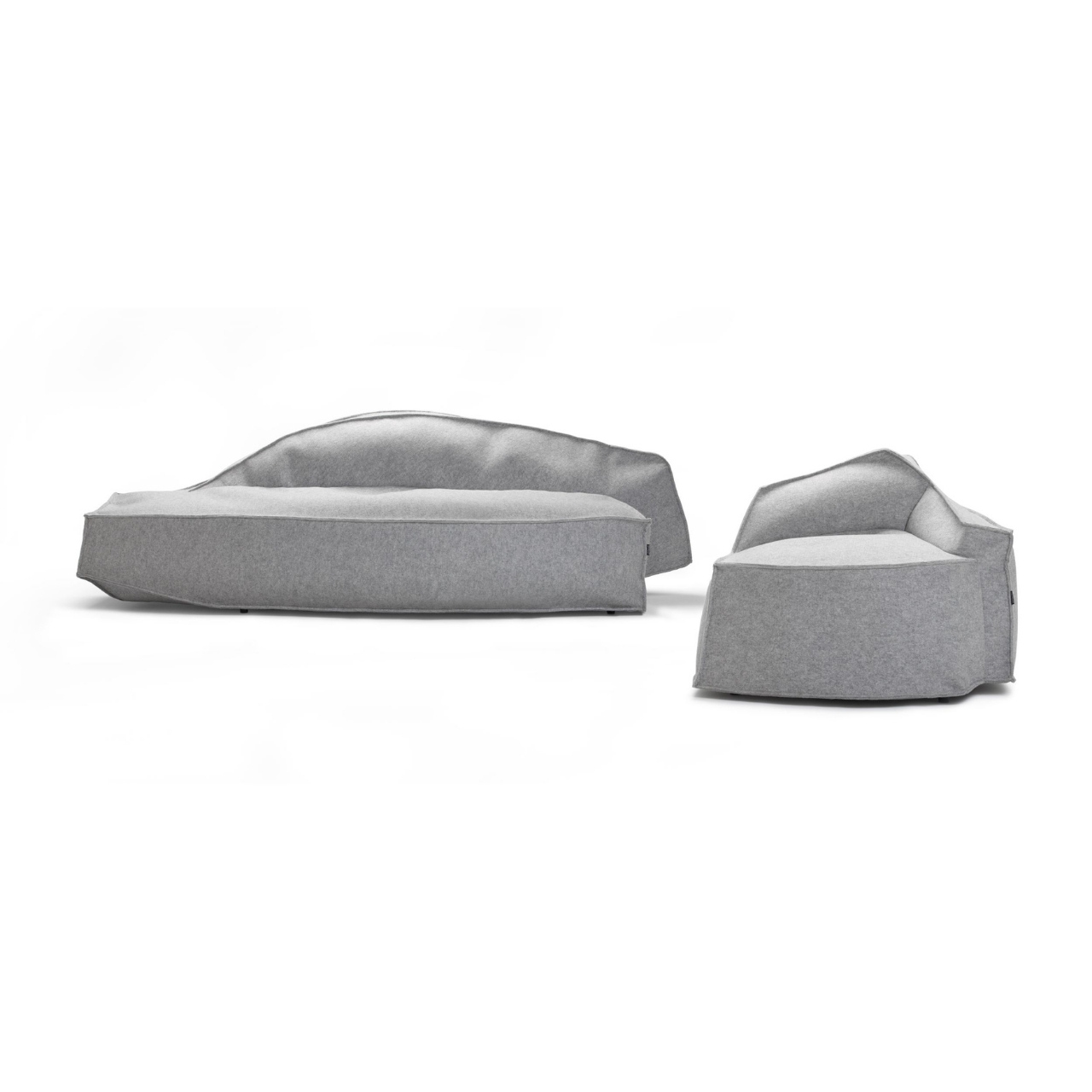
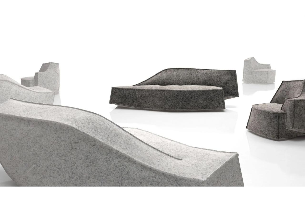
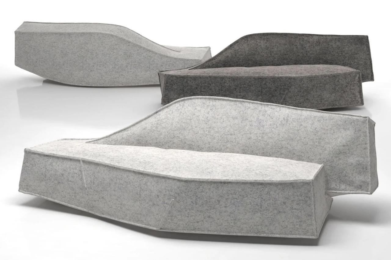
The Airberg sofa collection gets that comfy-looking feels for a sofa down pat. At first glance, it looks like the material is vacuum-filled but it’s actually made from flexible padding material. The inspiration for the design though is an “iceberg” filled with vacuum and also comfortable seating furniture. The asymmetrical design looks like the pieces belong in a museum so it will be an interesting conversation piece when you have one (or several) in your house or space.

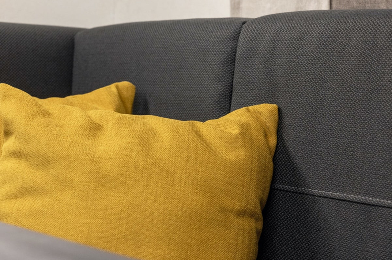
The various sofas in the collection are made from a flexible padding material with a structural case. The base is made from metal while the seat frame is a combination of metal and wood with a special integrated suspension system. The comfortable part of the sofa is made from textile and foam with the seat and the back made from cold foam. The upholstery is colored gray while the “legs” which are mostly hidden, are in chrome.

If you are into the Scandinavian aesthetic for your home, this will be a perfect addition to your living space. It’s also a bonus that they use materials and methods that are socially sustainable and environmentally friendly.

The post Asymmetrical sofa collection uses flexible foam for design and aesthetics first appeared on Yanko Design.

This wooden desk embraces minimalism through a simple build and removable storage space

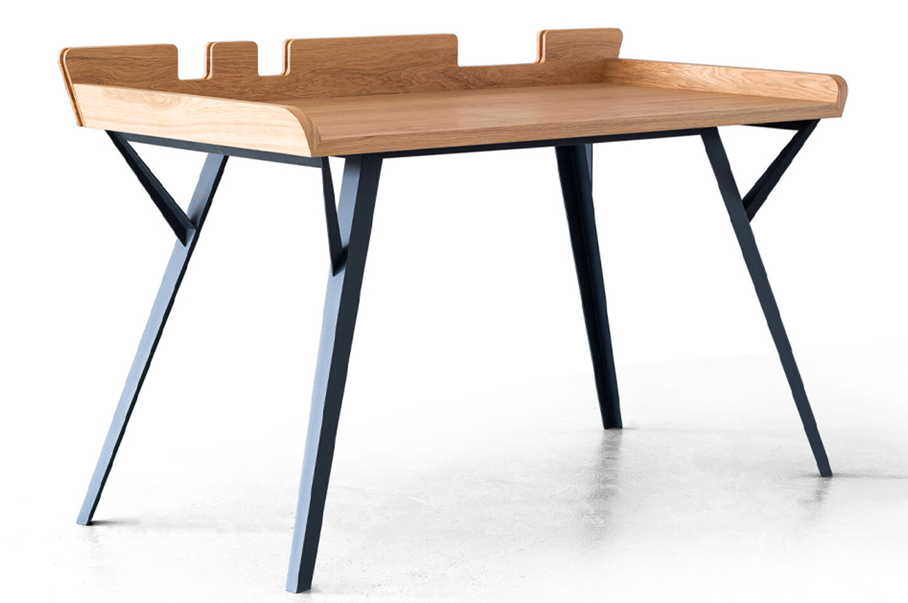
The Diag Desk is a minimalist, modern desk built to optimize desk space while incorporating storage elements like removable leather compartments.

When it comes to desks, the simpler the better. Desks that are rooted in simplicity, either through a minimalist approach or by embracing Scandinavian aesthetics, typically offer a lot of practicality while maintaining a stripped-down design.

Designer: Marek Błażucki

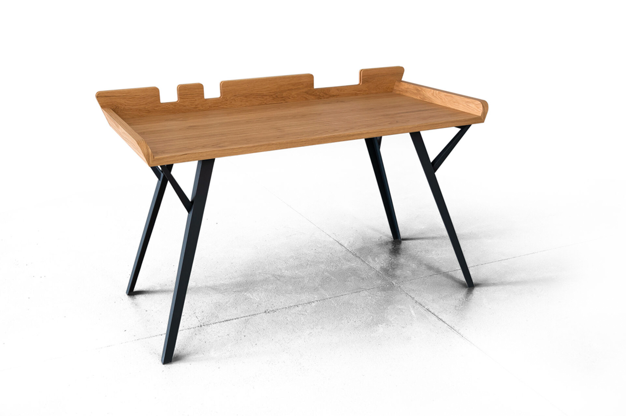
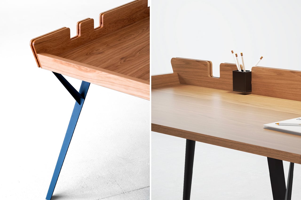
Considering its minimalist build, more space can be devoted to the desk’s tabletop, where most of the desk’s purpose is reserved. The Diag Desk from Polish designer Marek Błażucki is one kind of minimalist design that integrates storage systems into its build, ensuring that users have ample desk space while still keeping their necessary stationery within arm’s reach.

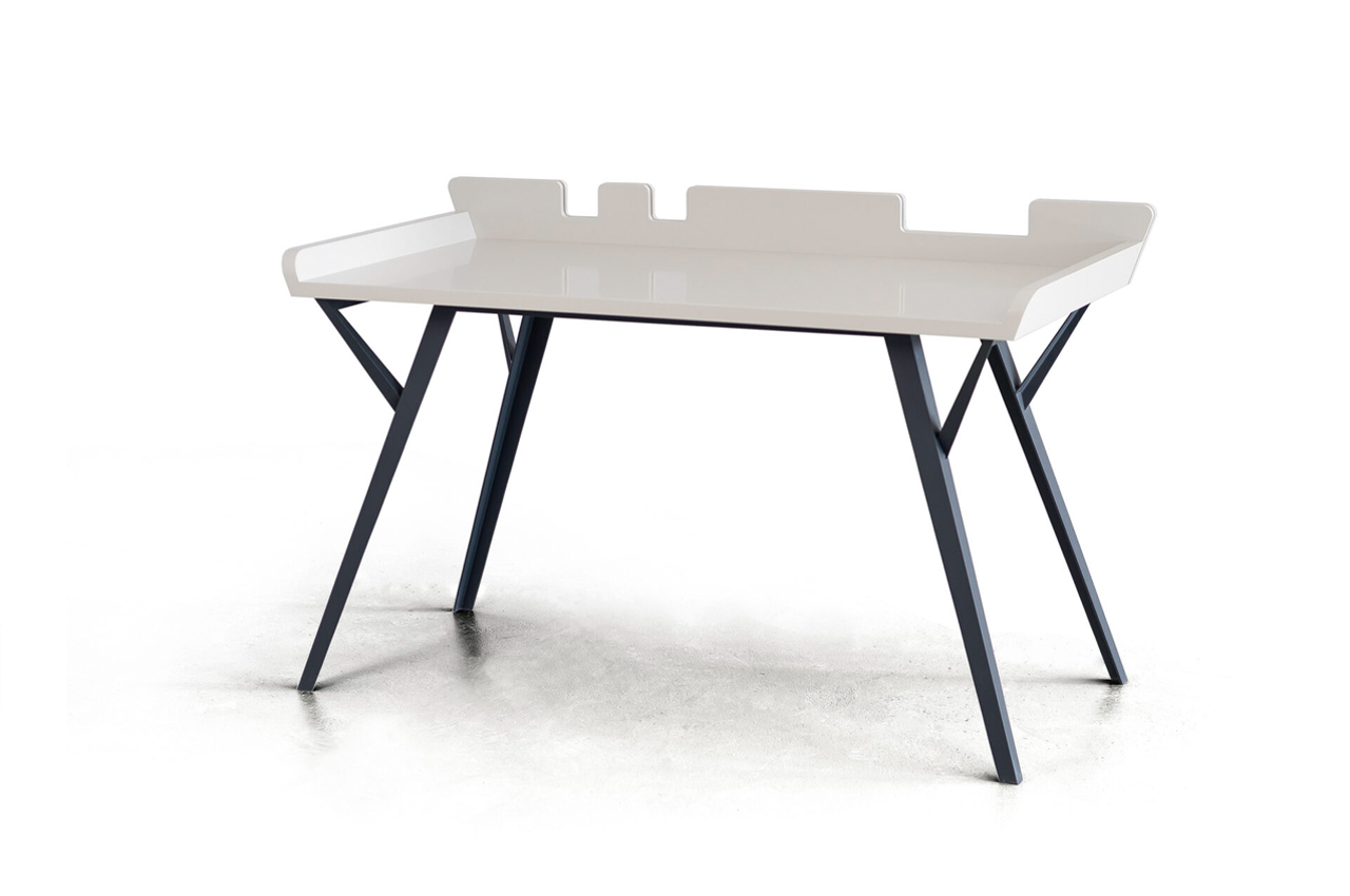
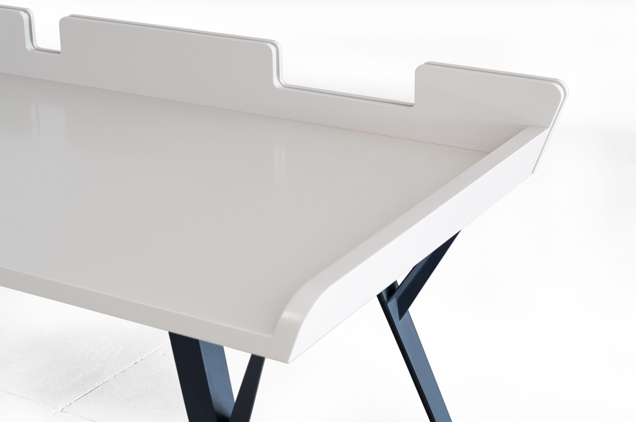
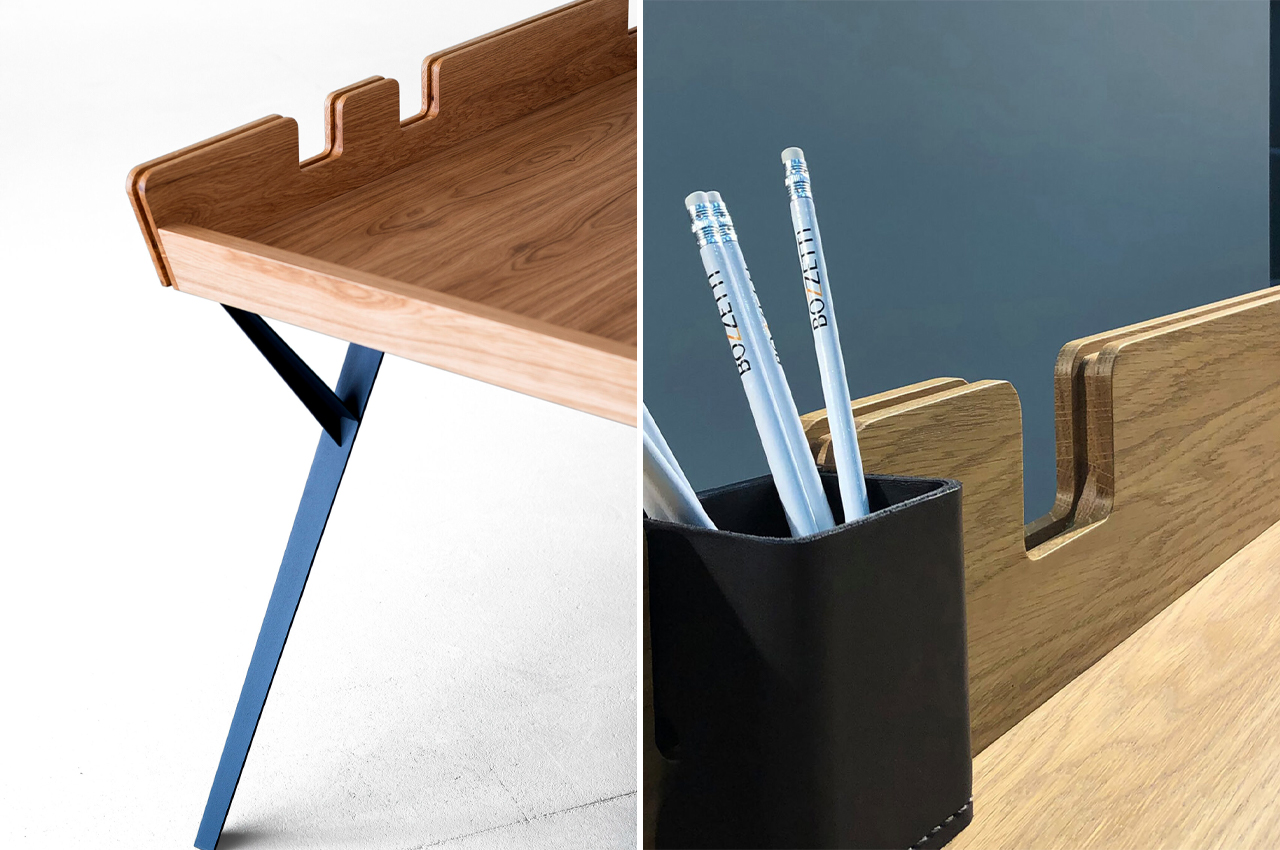
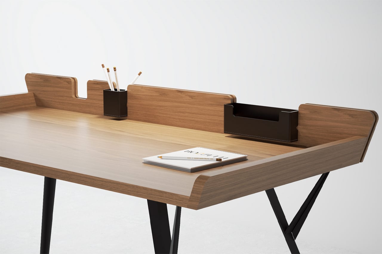
Recognized with an Honorable Mention from LOOP Design’s 2021 award season, the Diag Desk consists of a wooden desktop supported by four steel legs. The rectangular desktop is cradled by raised wooden lips that help organize your stationery items into a grid and prevent them from falling off the desk.

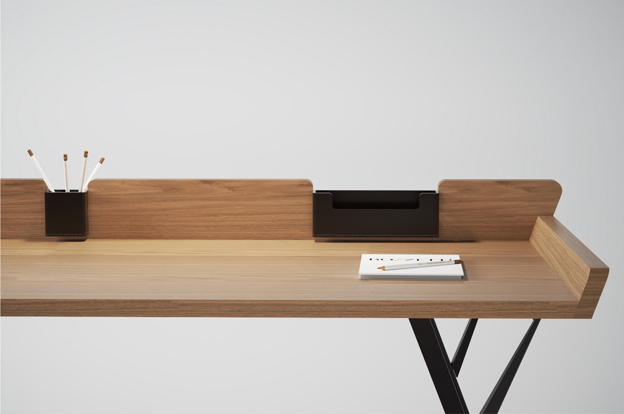
Along the backside of the desk, users can find integrated cavities where leather organizers can be strapped for extra storage. One cubic leather organizer can be used for loose items like writing utensils and measuring tools, whereas the rectangular organizer can store slimmer accessories such as business cards and smaller notebooks.

Offering plenty of leg height and room, the desk is raised to the average height of sitting desks. The desktop itself is conceptualized in either veneer/solid wood or lacquered MDF wood fibers, while the legs are constructed from brushed stainless steel or an anthracite structural lacquered base.

The post This wooden desk embraces minimalism through a simple build and removable storage space first appeared on Yanko Design.
This tiny cabin’s asymmetrical roofline uses a Scandinavian-inspired interior to keep warm during winter

The Luna is a tiny cabin from New Frontier Design that combines modern design elements with rustic appeal for a tiny cabin that’s destined for the winter.

‘Tis the season for tiny cabins. Growing in popularity, tiny cabins are the answer to our wanderlust amidst travel and other pandemic-related restrictions. The season is starting off strong with new tiny cabins that look more picturesque than ever in winter scenes filled with snow, pine trees, and candlelight. The tiny home builders at New Frontier Design Studio have been busy at work with their new tiny cabin, The Luna.

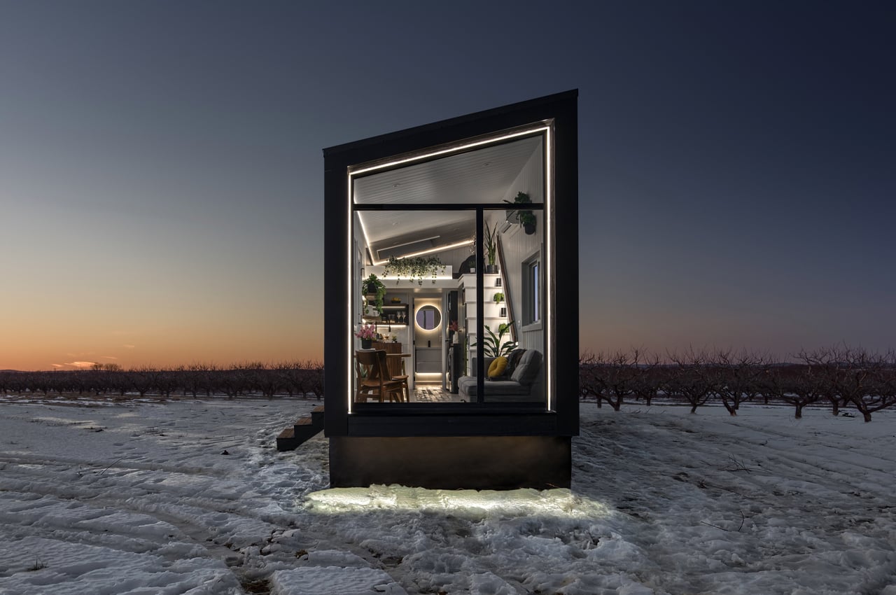
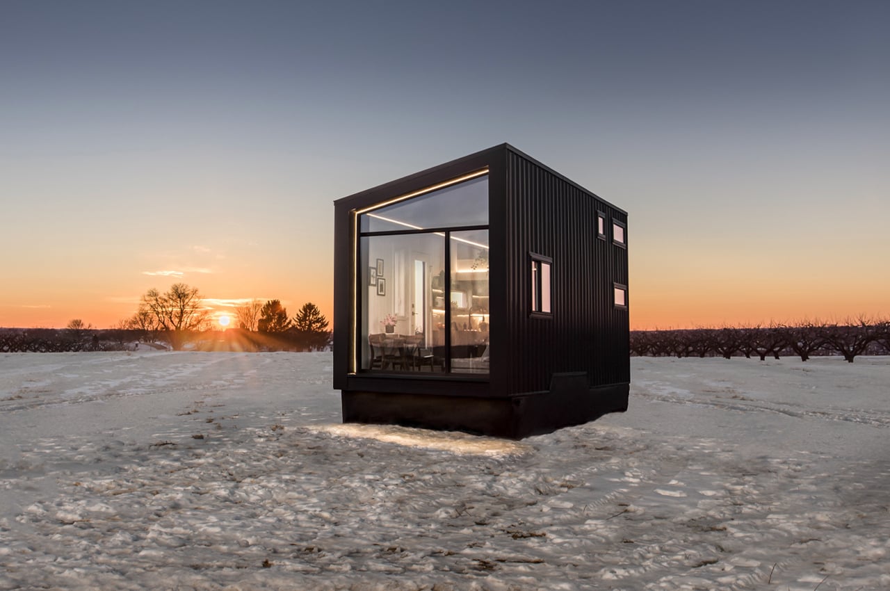
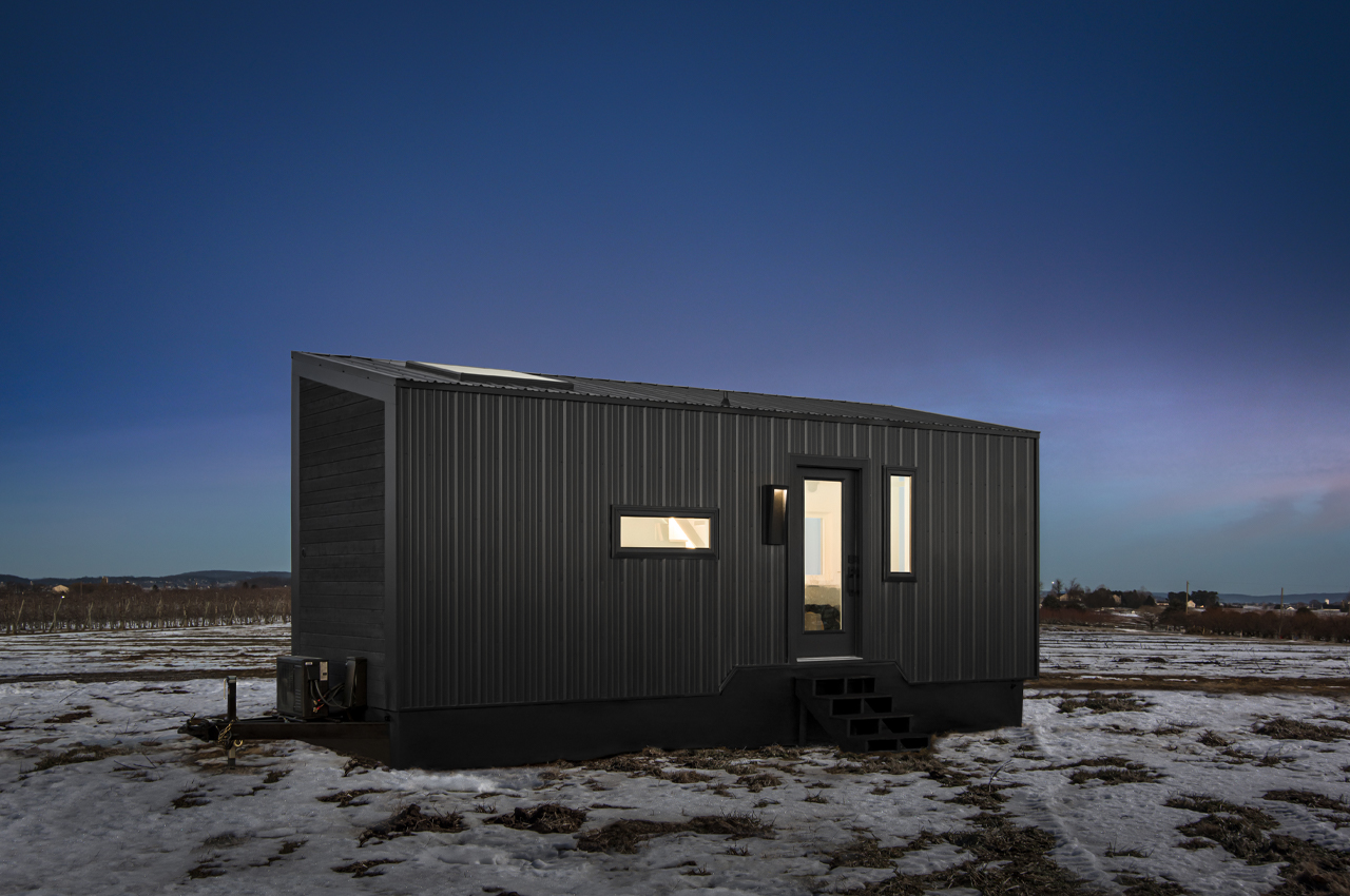
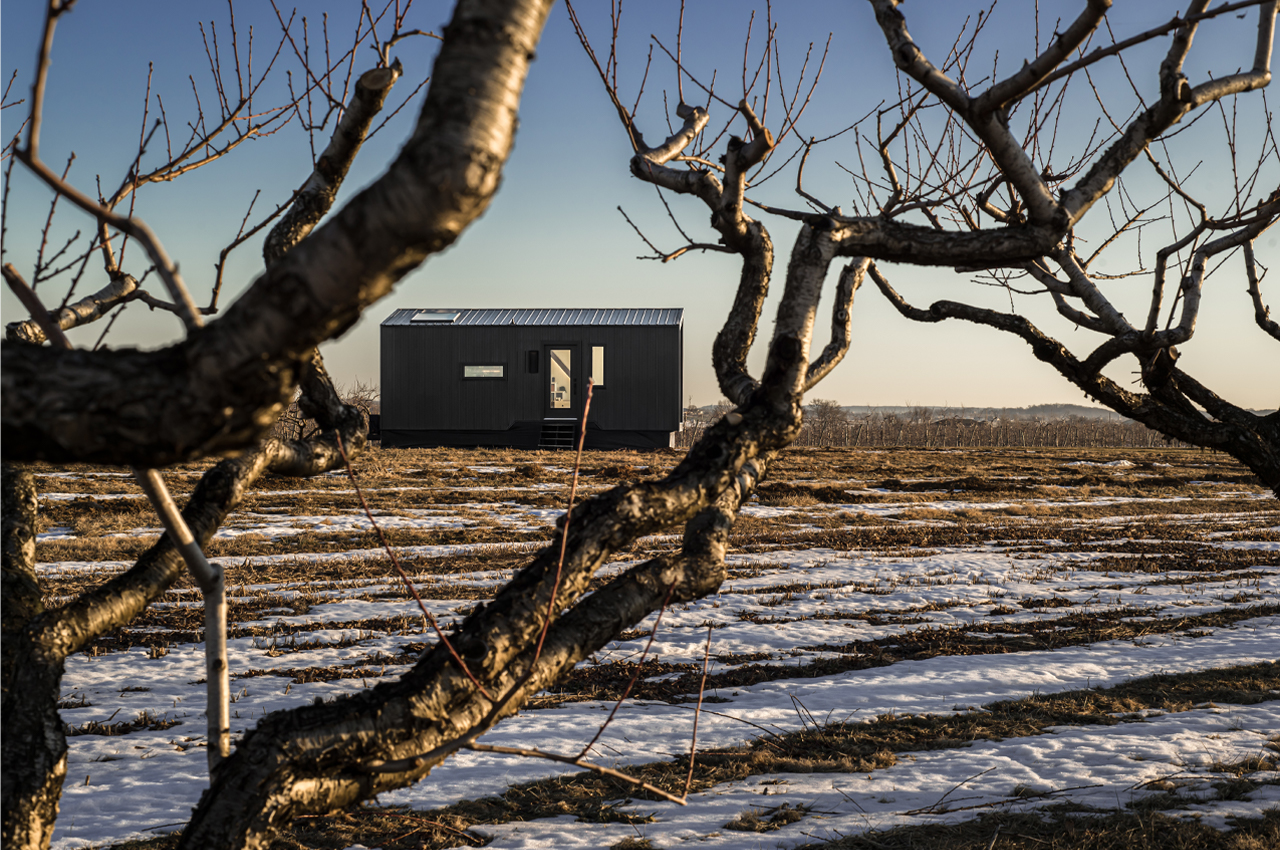
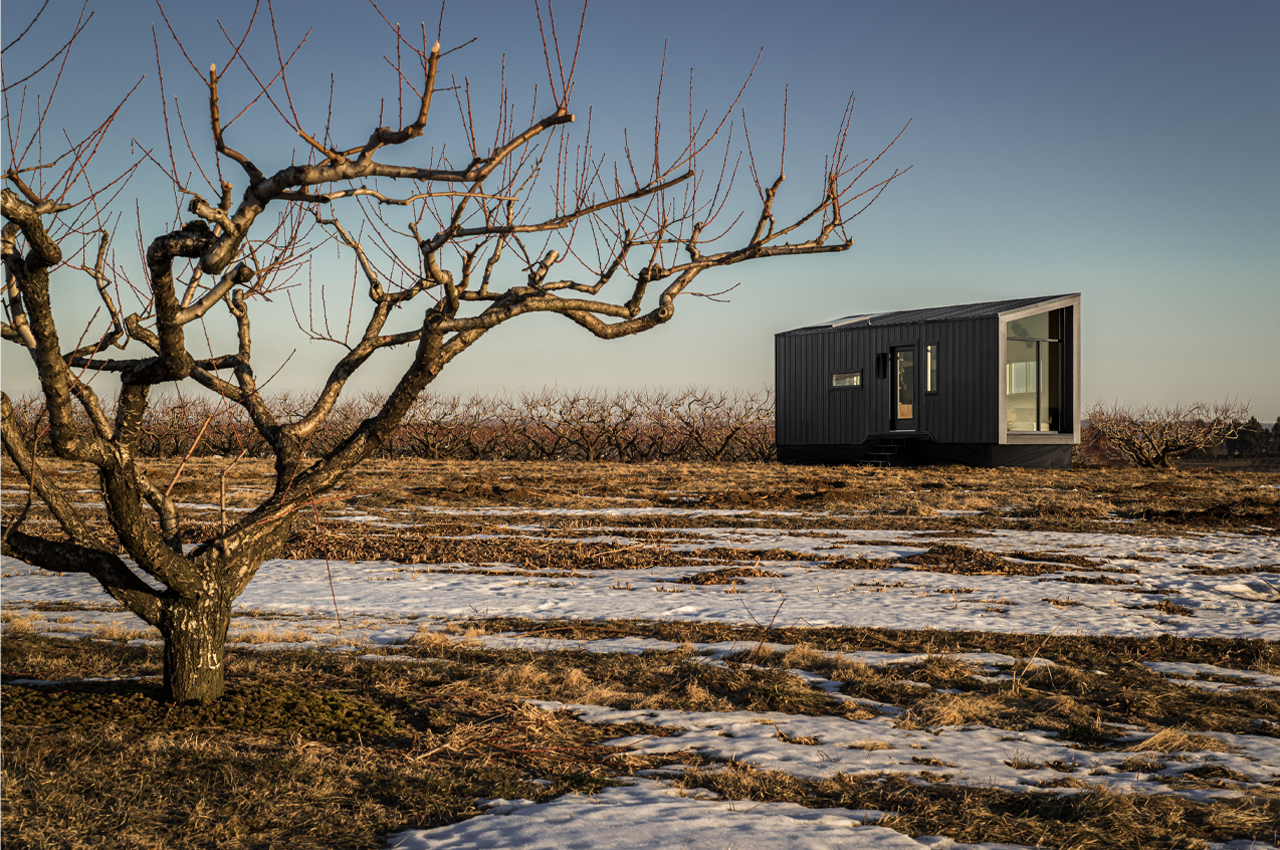
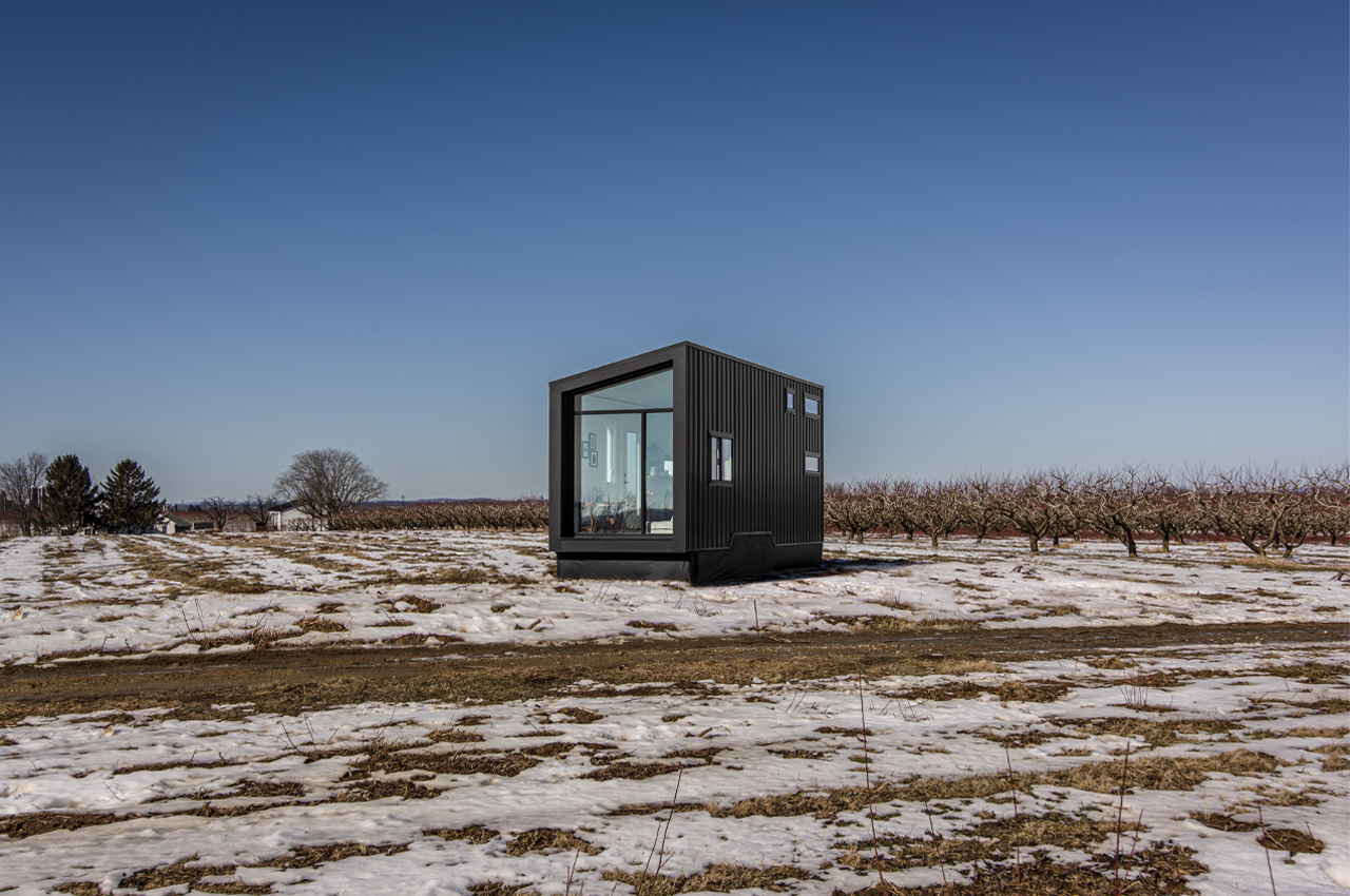
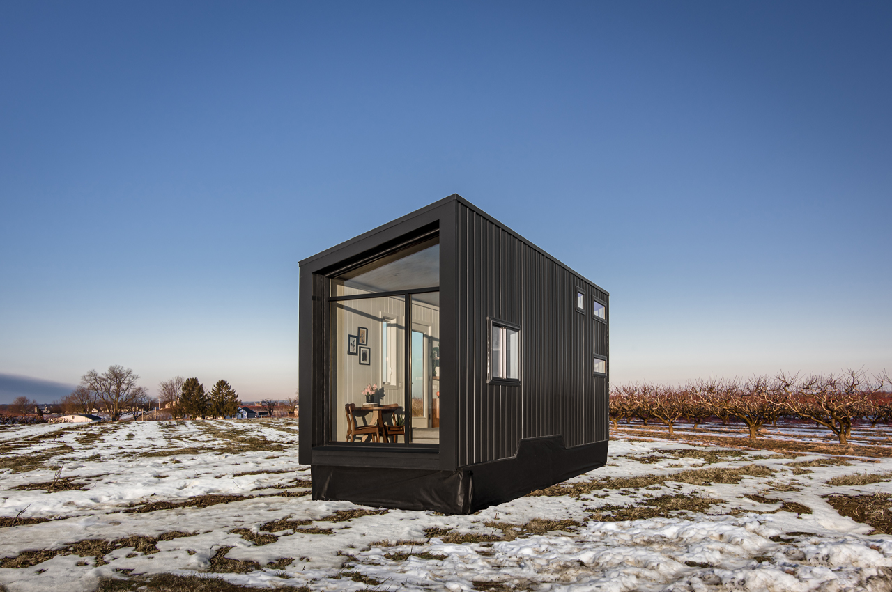
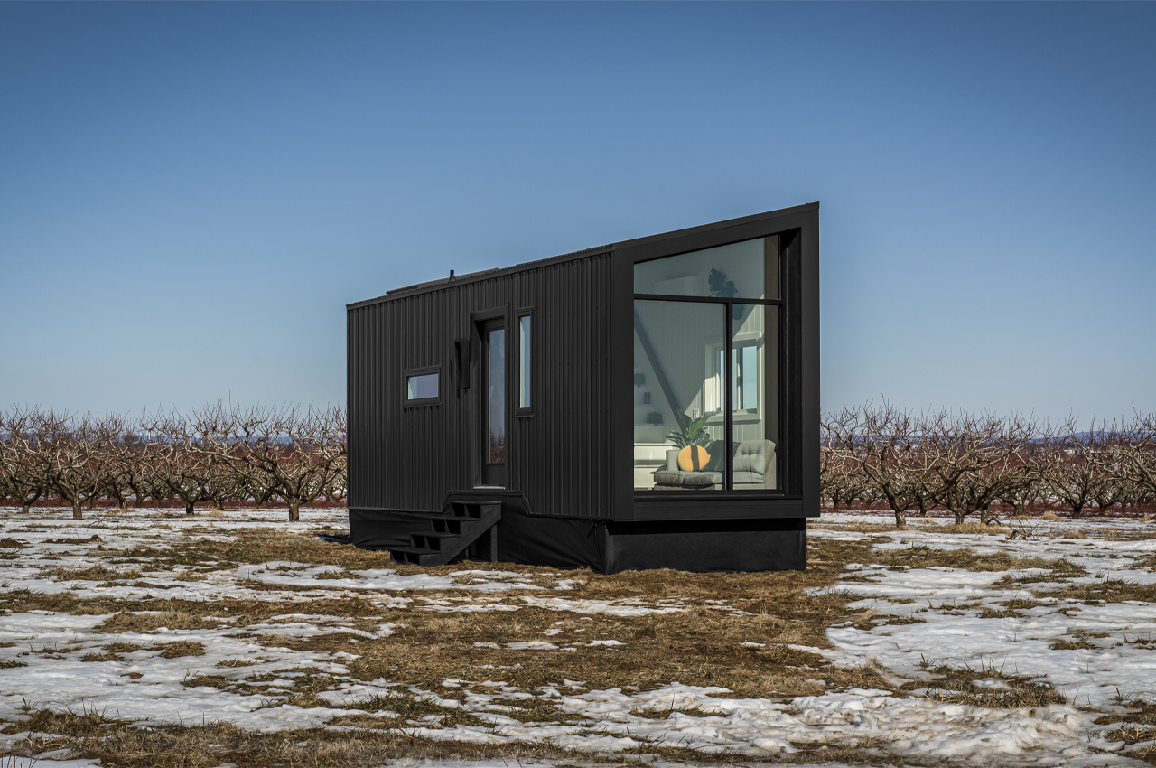
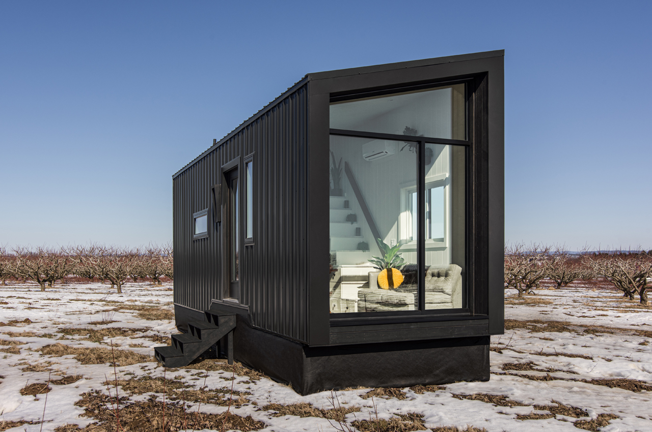
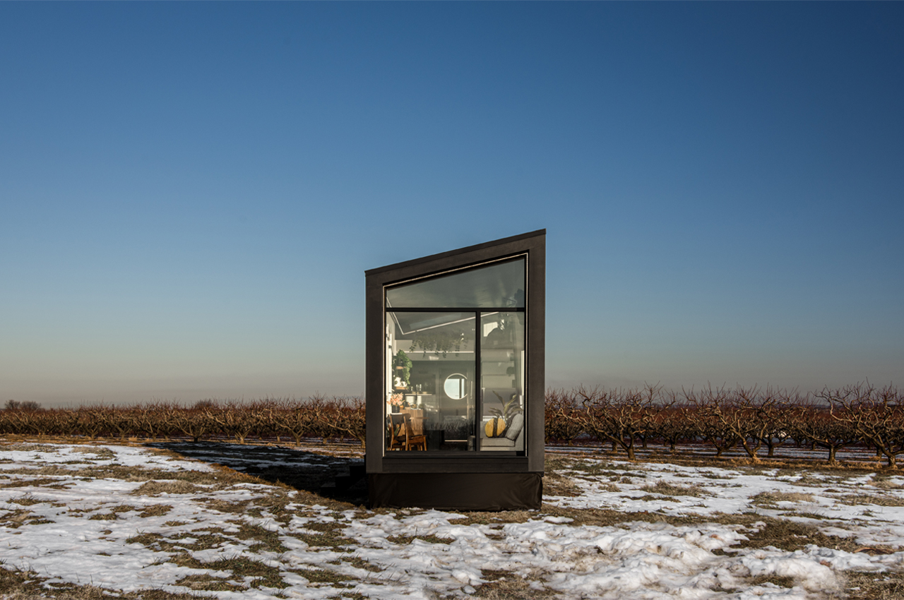
Defined by an asymmetrical roofline, The Luna embraces a geometric, angular profile to complement the natural ruggedness of snow-covered plots of land. Combining rustic energy with modern design, The Luna is clad in matte black, 100-year corrugated steel for a lived-in, yet contemporary look. New Frontier decided against filling up The Luna’s lengthier facades with windows, opting instead for a sweeping, floor-to-ceiling window wall on one end.

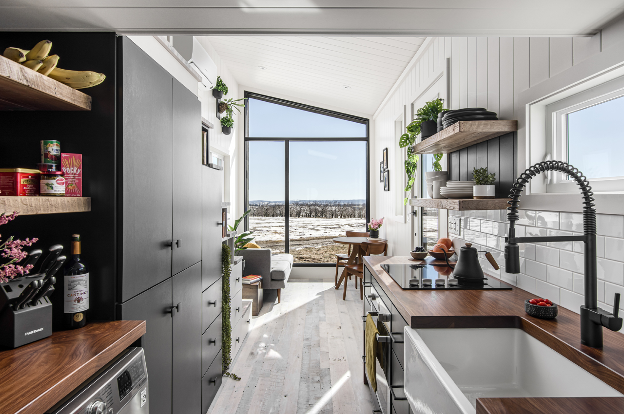
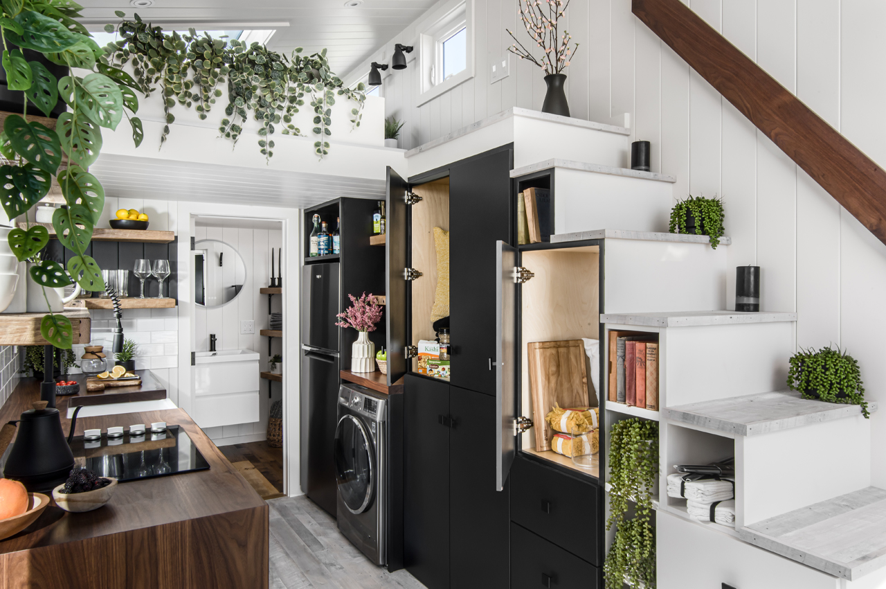
Immersed in the winter season’s full glory, the window walls drench The Luna with ample, winter light to bounce off the clean, white walls that line the interior. Walking through The Luna’s entry door, residents are immediately welcomed by a plethora of houseplants and Scandinavian-inspired design elements like white-wash pine wood flooring and minimalist furniture pieces. Just a few steps from the front door, a staircase leads to the main bedroom and doubles as a concealed storage system.

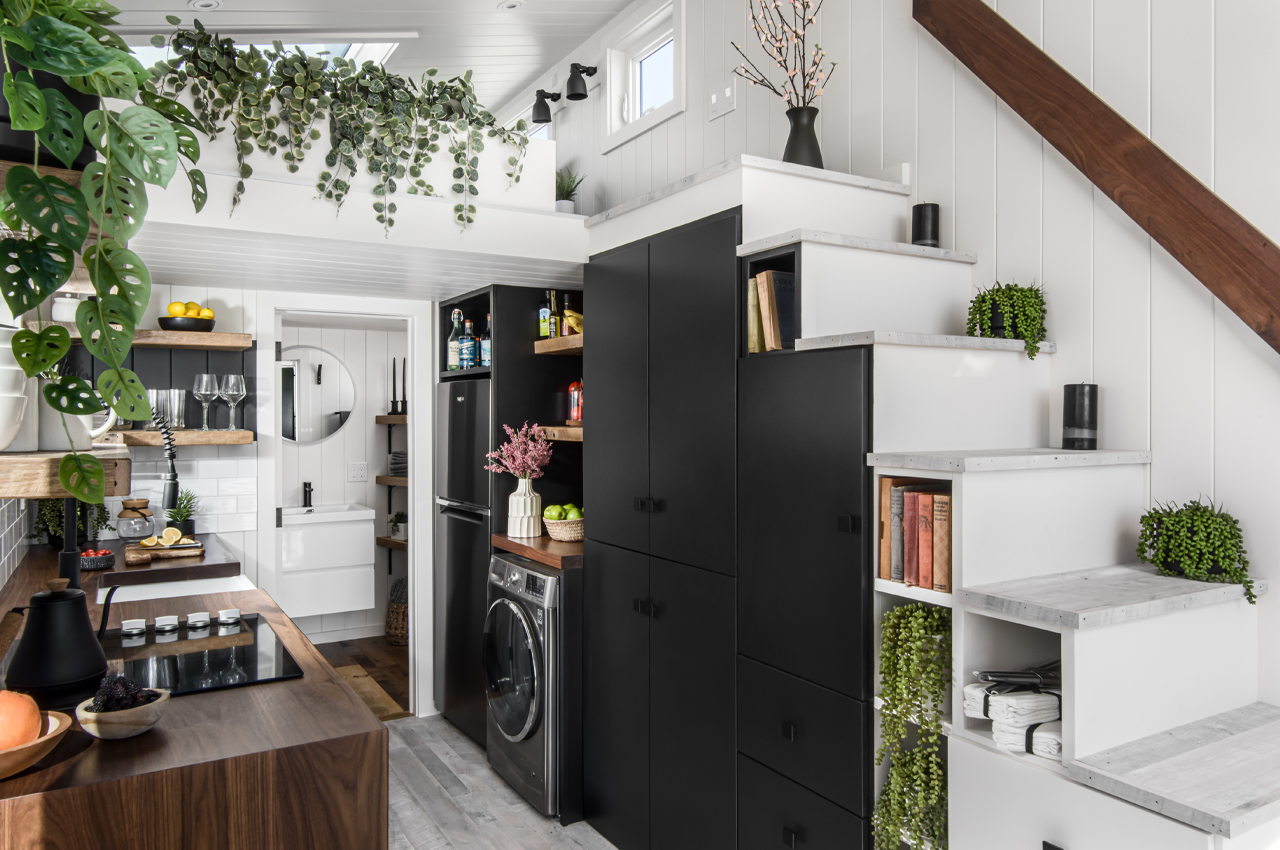
Leading from the cabin’s living room up to the main bedroom, the staircase brings homeowners to the main bedroom, where a king-sized bed awaits. Perched above the open-floor layout, guests of The Luna will enjoy unobstructed views of the surrounding landscape through a skylight and the window walls, where they’ll find the topmost views.

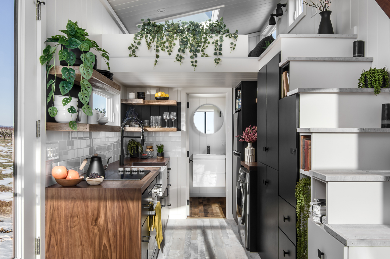
Just below the staircase, black cabinets and drawers provide enough storage space to fill up the cabin’s full kitchen. There, residents will find a full-sized refrigerator, laundry services, deep sink, induction stovetop, and oven. Just beyond the kitchen, the bathroom keeps a spacious shower and every amenity found in full-sized bathrooms.

Designer: New Frontier Design

Defined by an asymmetrical roofline, The Luna sweeping window walls find height through angles and geometric shapes.

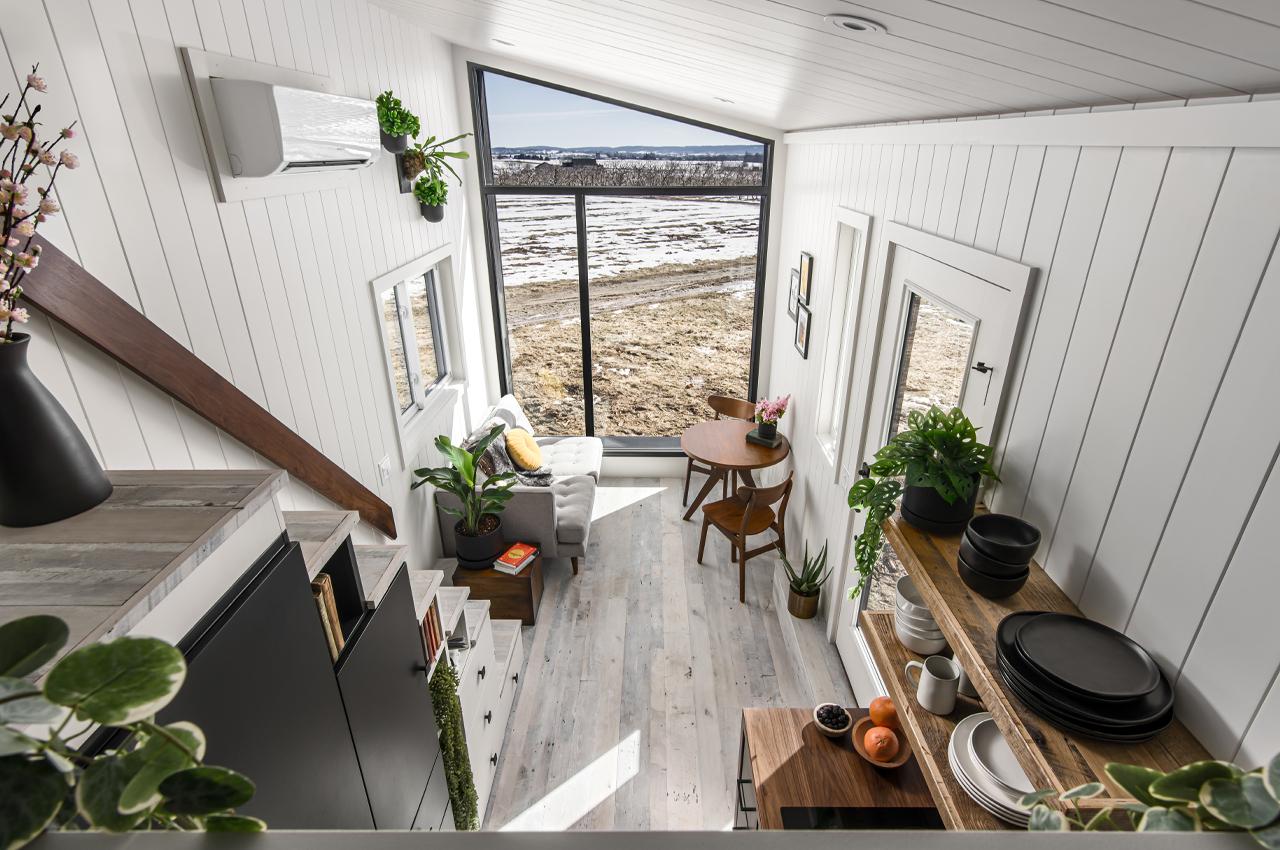
Inside, the bright winter light pours in through the window walls.

The staircase’s integrated storage system provides space for kitchen goods while remaining hidden from view.

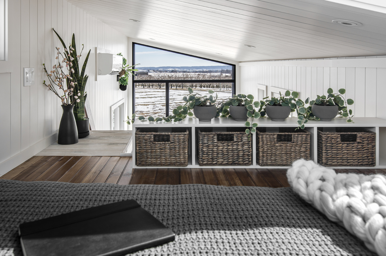
From the top-level loft, residents enjoy views through the window walls and skylight.

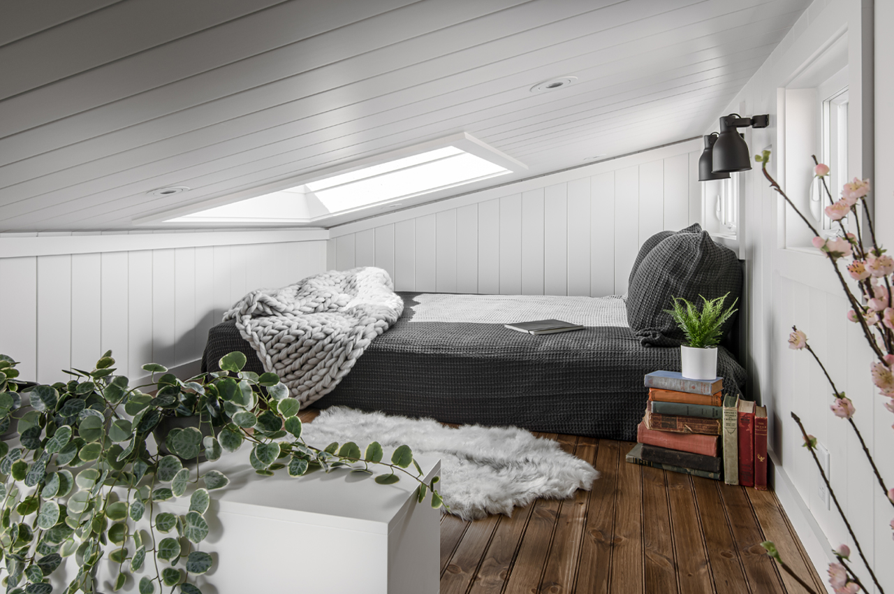
The asymmetrical roofline adds a touch of spatial coziness to the lofted bedroom while the skylight adds some height.

The post This tiny cabin’s asymmetrical roofline uses a Scandinavian-inspired interior to keep warm during winter first appeared on Yanko Design.
This Scandinavian tiny home on wheels comes with off-grid features for an eco-friendly escape to nature!

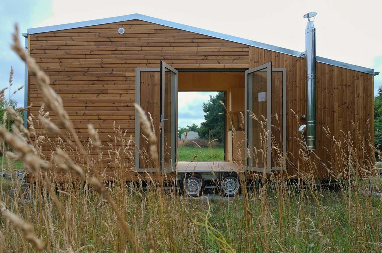
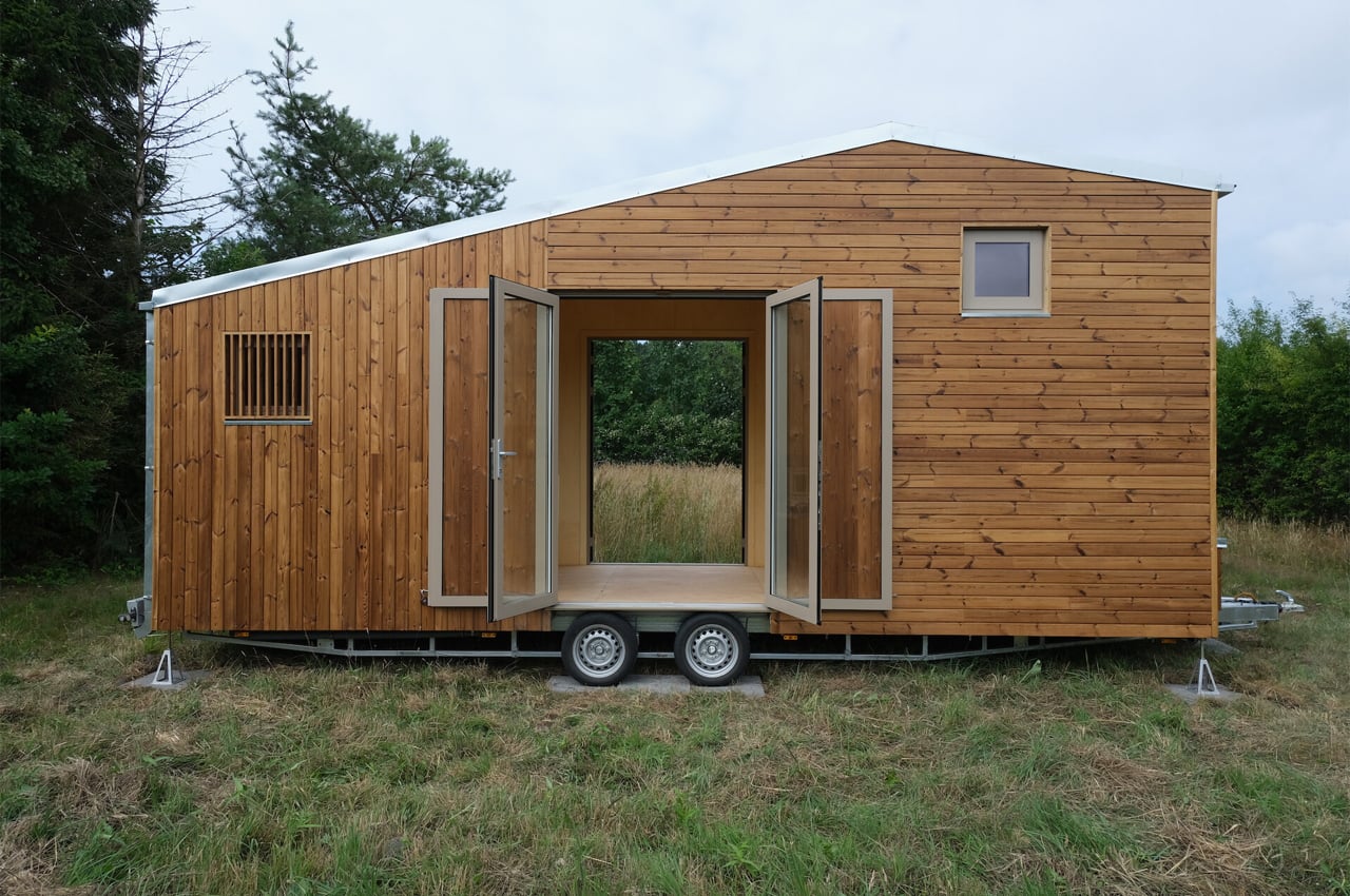
Poland-based Redukt built a tiny home on wheels that combines simplistic design with a clever layout to produce a mobile tiny home ideal for a family of four traveling through backcountry roads on a summer vacation.

When it comes to tiny homes, simplicity is key. It’s all about consolidated design and multifunctional interior elements. We’ve seen dining room tables and booths transform into daybeds and roofs unfurl into loft bedrooms. Tiny homes bring out the most innovative home features from designers that hinge on keeping the living space free from too much clutter.

Poland-based Redukt, a tiny mobile home company, found sophistication and an open-plan layout through simplistic and versatile design for their off-grid-prepared tiny home on wheels.

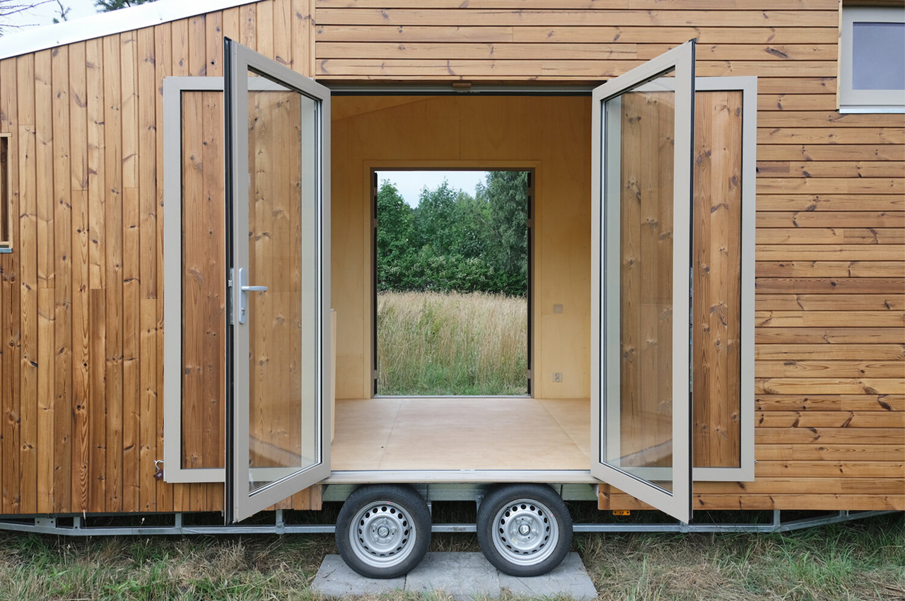
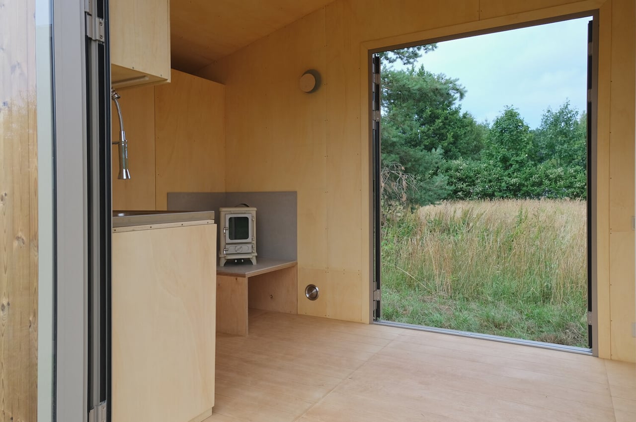
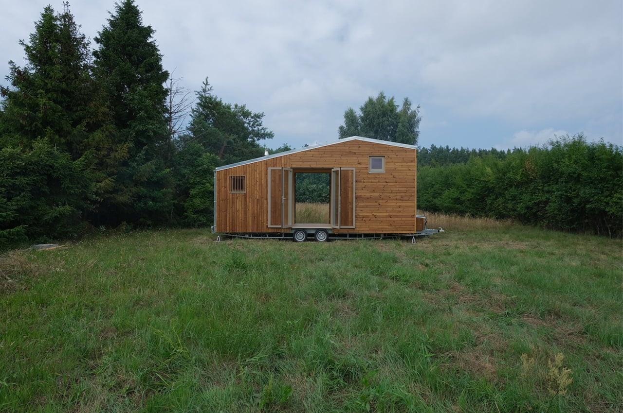
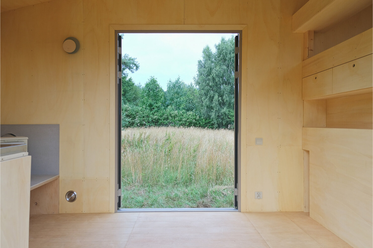
Prepared for all elements, Redukt’s tiny home on wheels is thermalized with oiled pine boards that give the home a tidy, yet natural personality. Dissolving the barrier between the outdoors and interior space, the tiny home comes with twin glass doors that are just short of reaching floor-to-ceiling heights.

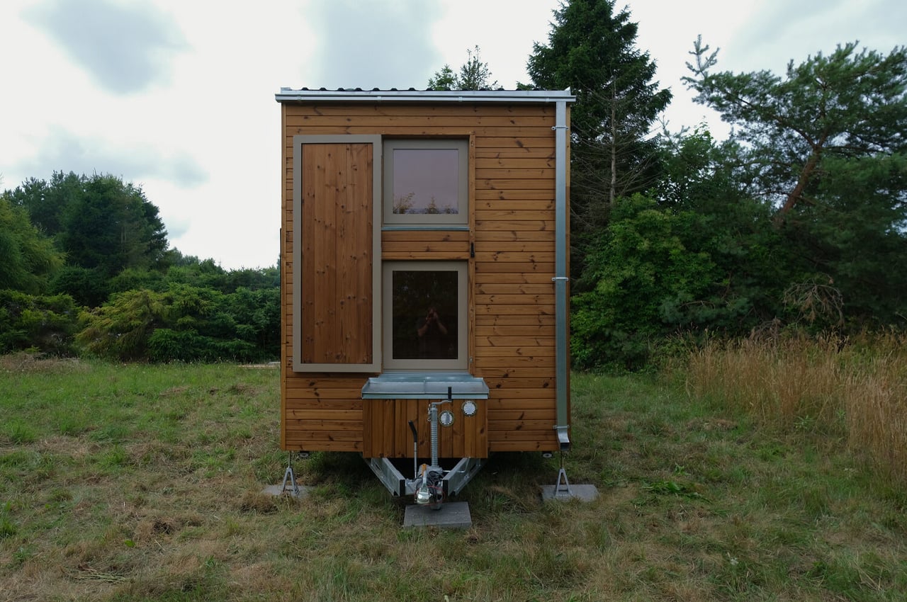
Keeping an off-center pentagonal shape, Redukt’s tiny home maintains an elegant look that’s prepared for all four seasons through the home’s roof topped off with galvanized metal sheets. Built to last, the metal sheets and pinewood facade were chosen as they only look better with time.

Outfitted with all the elements necessary for off-grid living, the team at Redukt equipped their tiny home with solar installation to generate electricity, a gas installation, and a composting toilet.

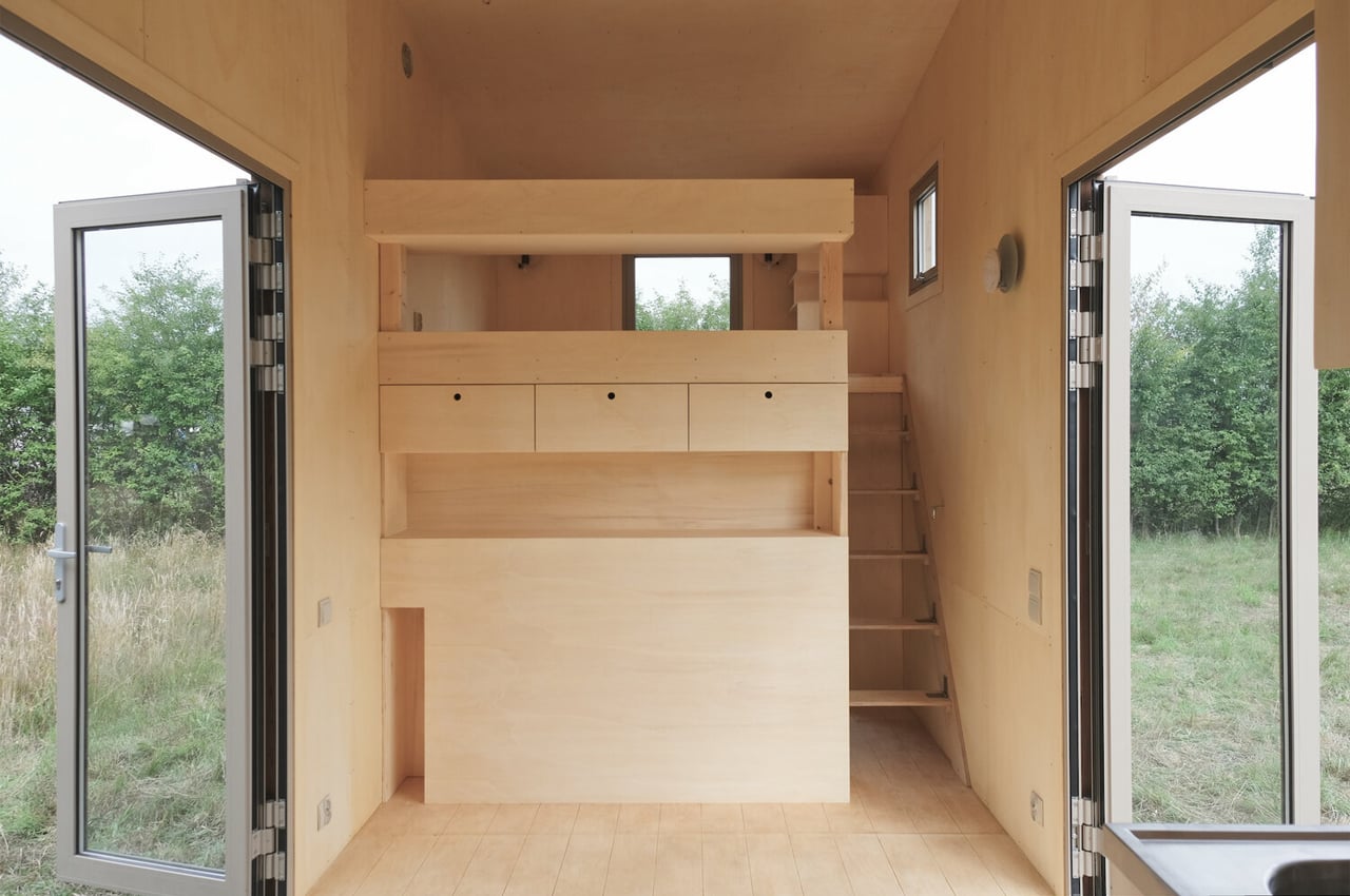
Measuring 7.20 x 2.55 x 3.95m, Redukt’s tiny home keeps enough space for an open, large living space, where additional sleeping arrangements can be placed either to accompany or replace a dining and living room.

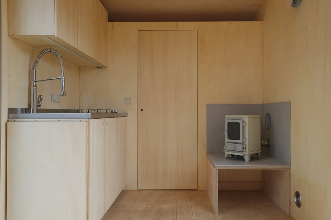
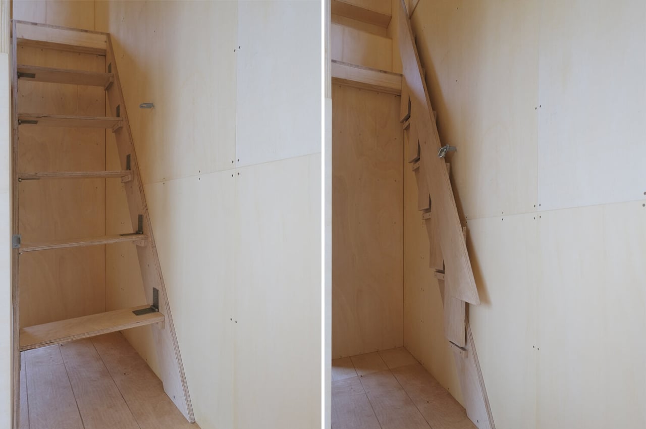
Designed for a couple with two children, the living space can remain for their kids while the adults can escape to a semi-low mezzanine accessible by a set of folding staircases. In addition to the bedrooms, a large kitchenette, bathroom, and plenty of storage space make living in Redukt’s tiny home feel a lot larger than you’d think.

Designer: Redukt

The post This Scandinavian tiny home on wheels comes with off-grid features for an eco-friendly escape to nature! first appeared on Yanko Design.
This sleek modern desk finds versatility and simplicity through a system of organizational wooden bars!

Bars is a Scandinavian-inspired desk design that finds versatility and simplicity through an organizational system of wooden beams.

Desks do it all for us. Not only do we work there, but they become our storage bins, our mail sorting cabinets, our coffee tables. With all of their versatility, these different uses aren’t typically put into consideration when designing desks.

When desks are built too simply, they run the risk of not being able to handle all of the supplemental uses we impose on them. The more complex the desk, the less likely we are to intuit all of its uses. Product designer, João Teixeira understood the assignment when he designed Bars, a minimalist wooden desk that’s built on intuitive design principles to balance versatility with simplicity.

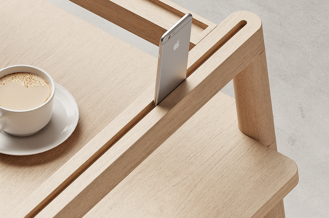
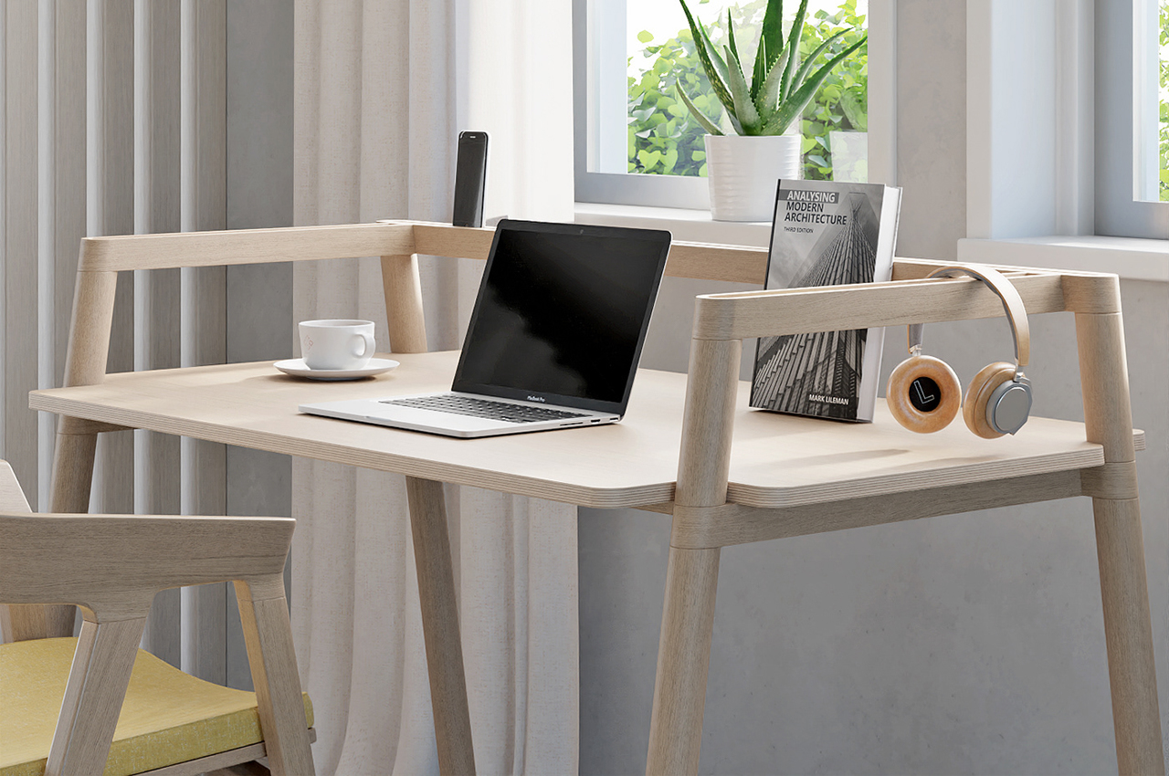
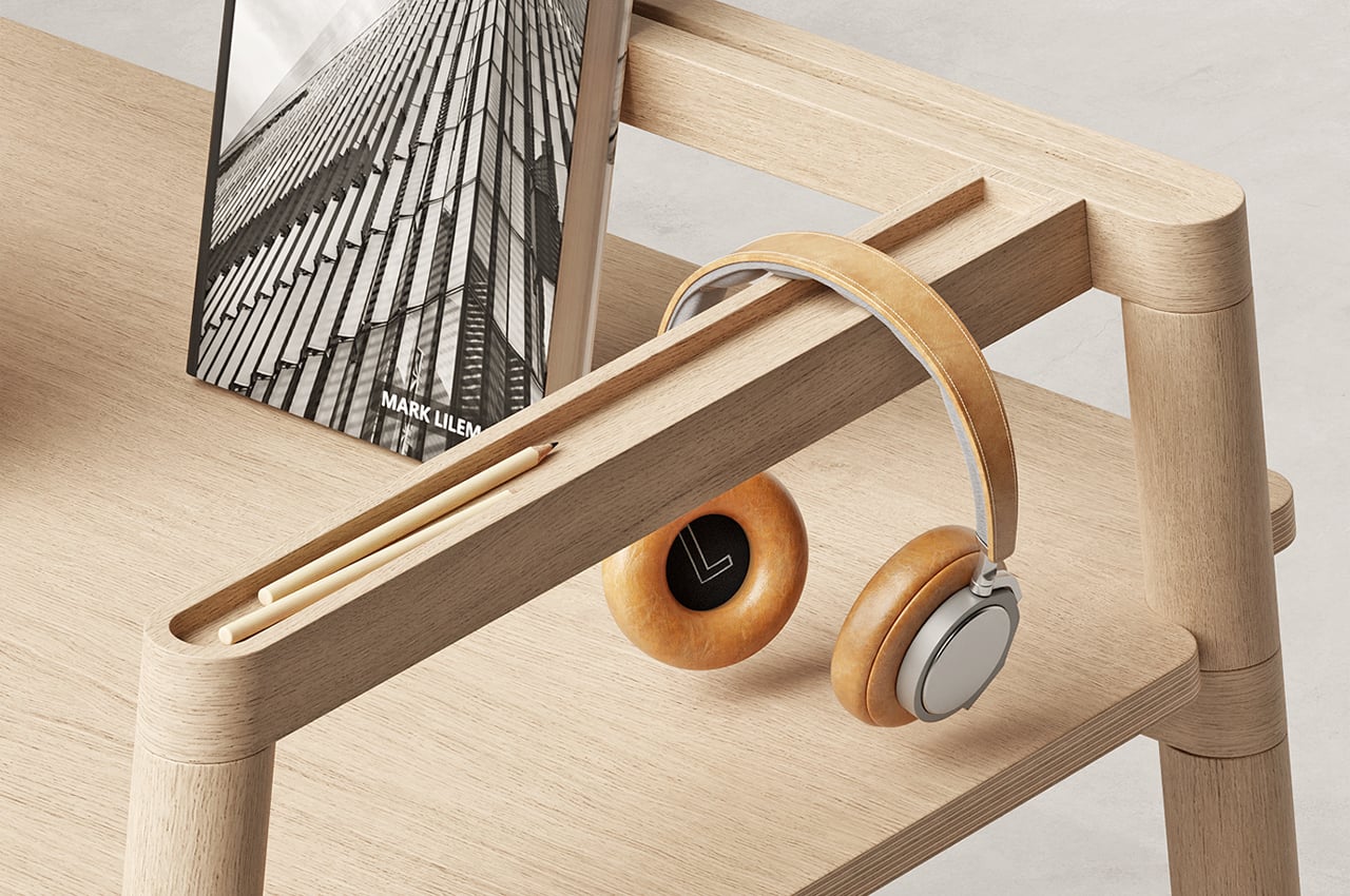
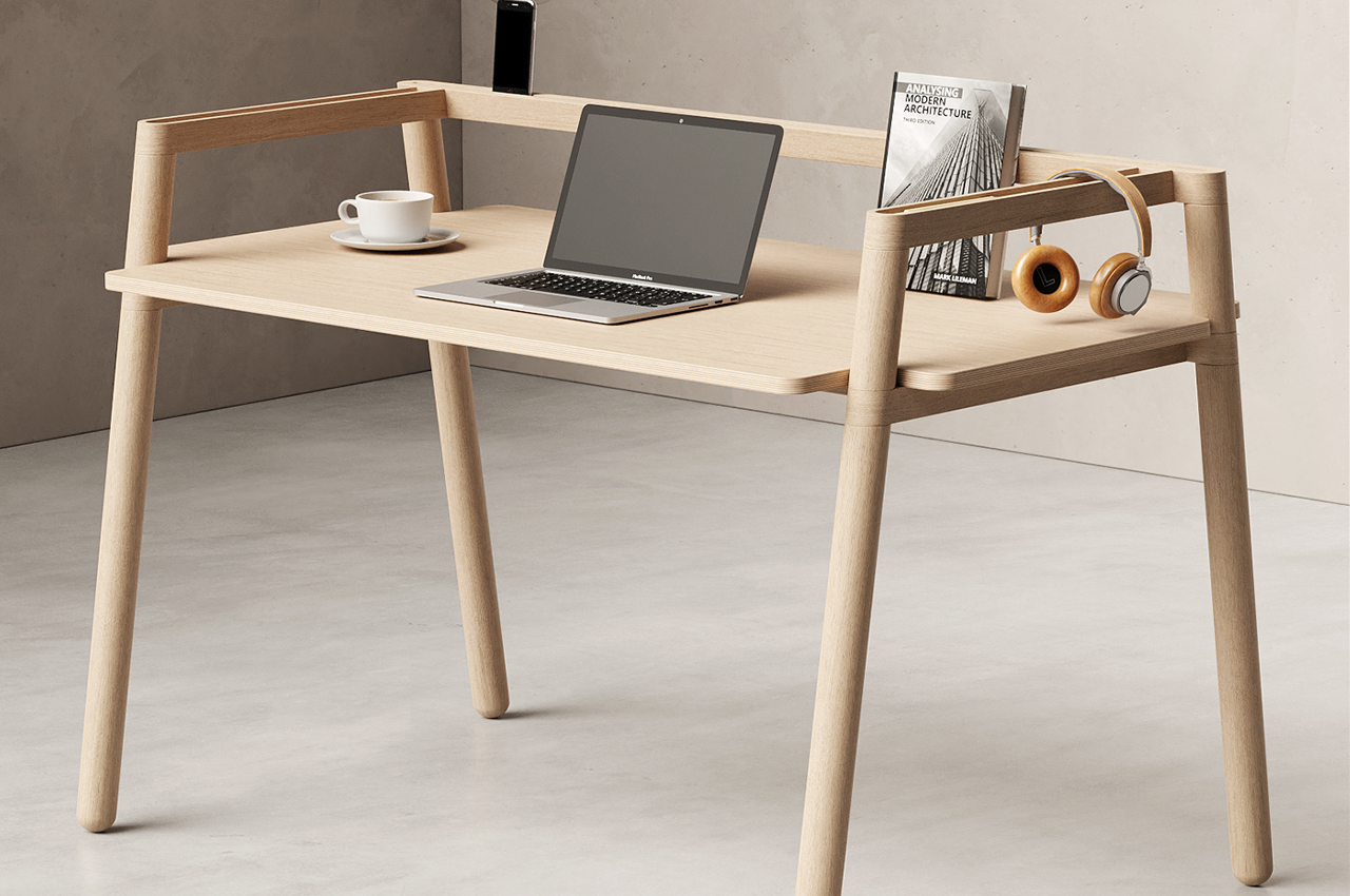
Aptly named, Bars is a modern desk that finds multiple uses through an overlapping system of wooden bars. Designed to help organize our work and off days, the system of bars provides clever, integrated storage options to keep our writing utensils and smartphones in designated areas and keep our working space free of clutter. Carved along each one of the wooden beams, Teixeira incorporated narrow, sunken storage bins that are just the right size to keep our erasers, pens, and stationery.

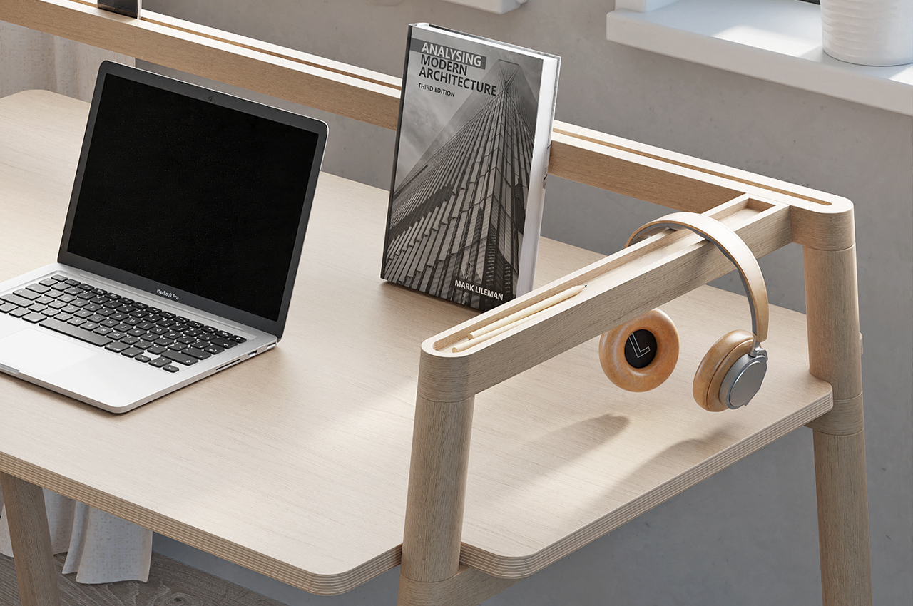
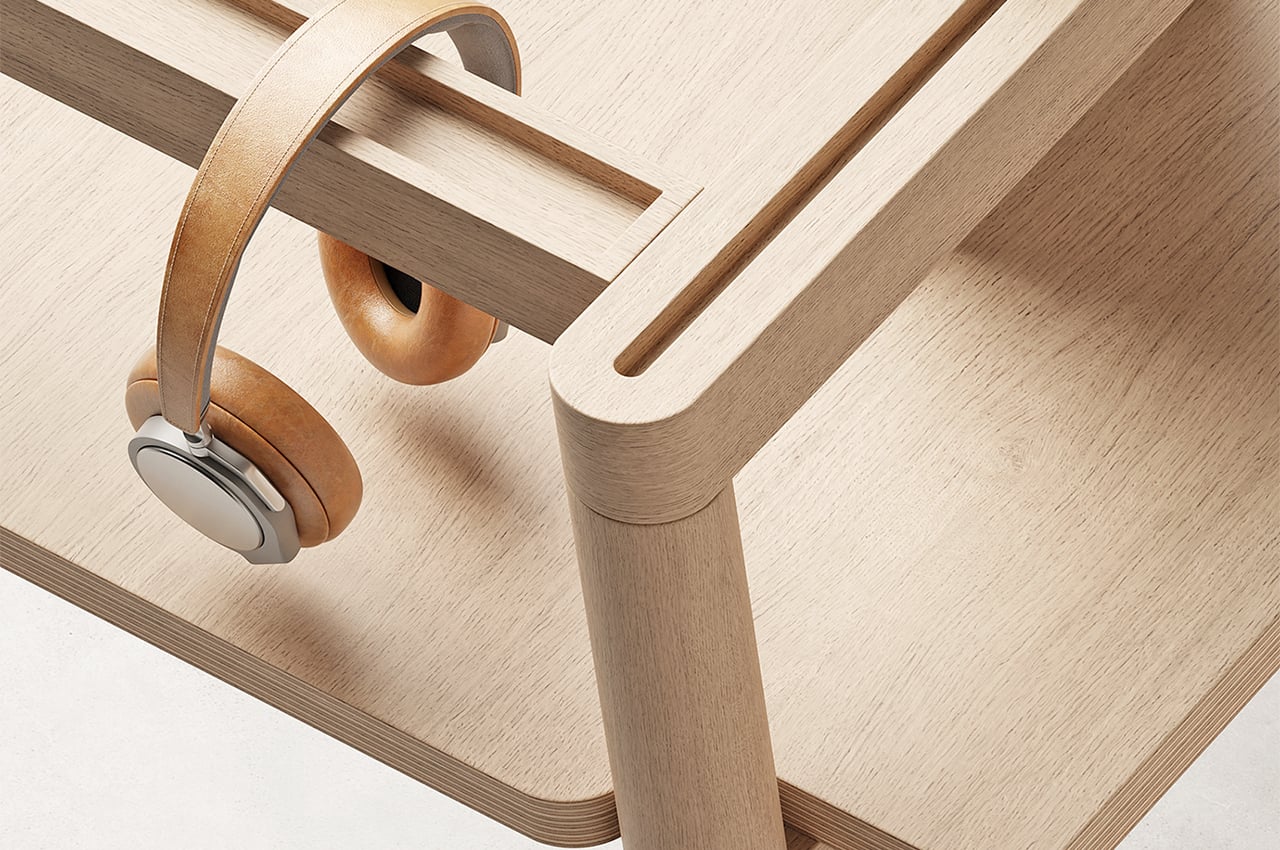
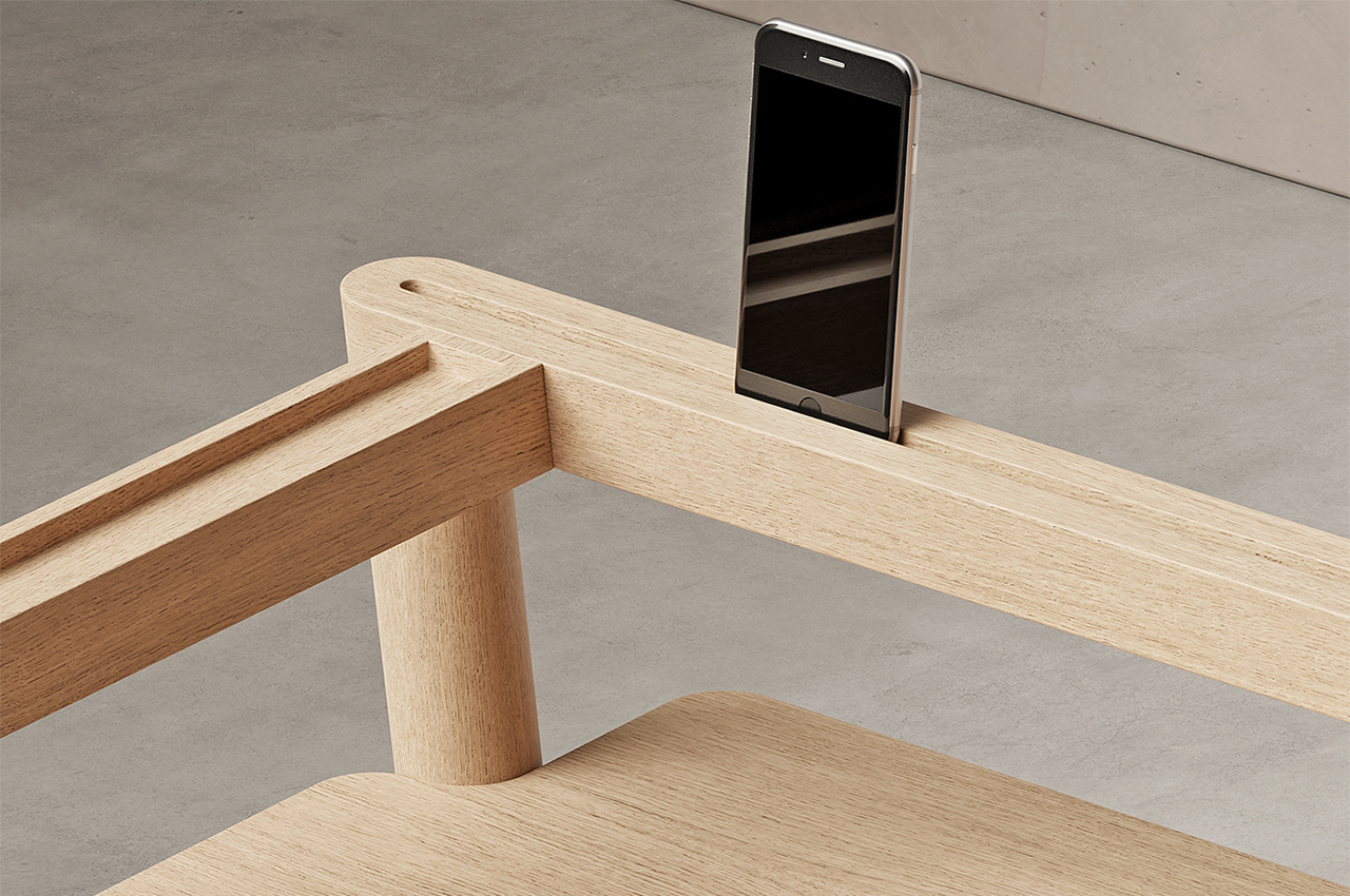
Along the desk’s rear wooden beams, Teixeira hollowed out a lengthy slot that fastens our smartphones into place while we work, keeping the threat of endless scrolling at arm’s length. Teixeira also envisioned the bars working as a sort of resting place for bulkier work-related items like over-ear headphones. Wrapping around three sides of Bars, the organizational system of wooden beams helps keep the desk’s working space free of mess so our workdays can be too.

Designer: João Teixeira

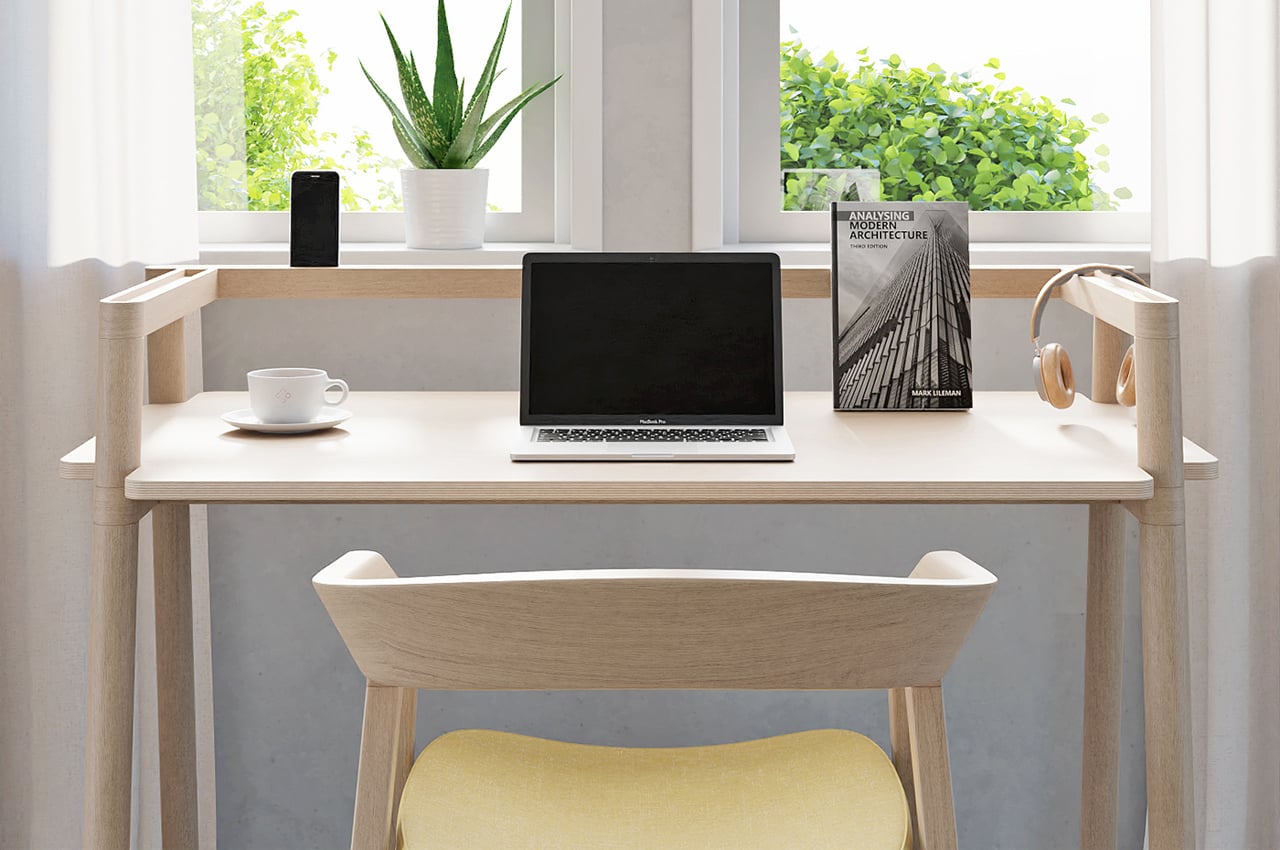
Bars is a simply built, yet versatile desk that keeps a modern, minimalist profile.

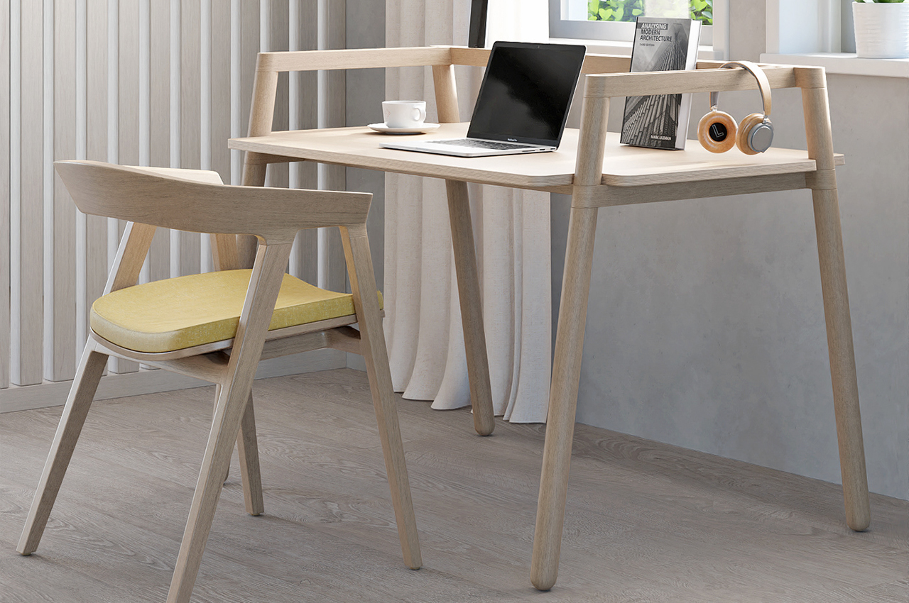
Inspired by Scandinavian design, Bars is minimalist by design and keeps a natural, polished wooden look. 

The post This sleek modern desk finds versatility and simplicity through a system of organizational wooden bars! first appeared on Yanko Design.
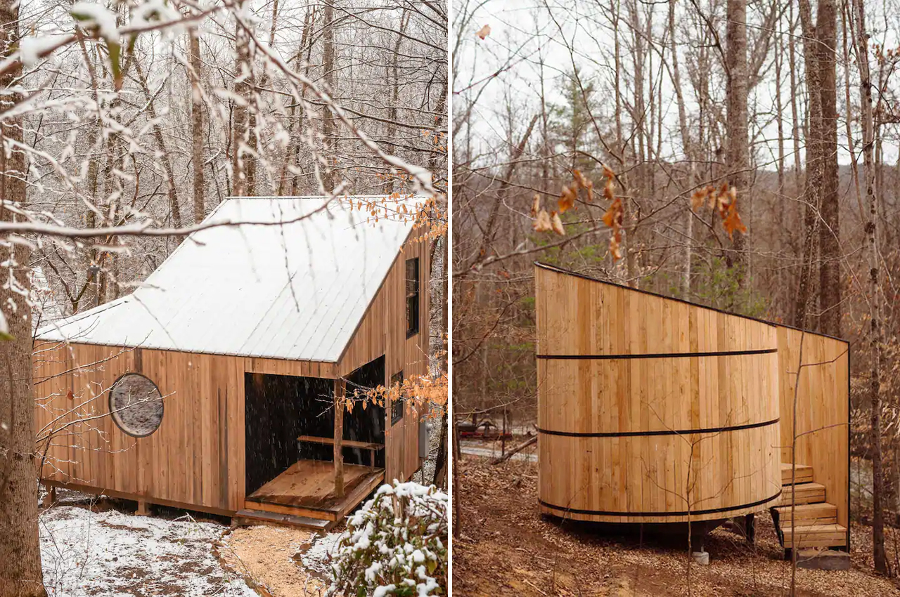
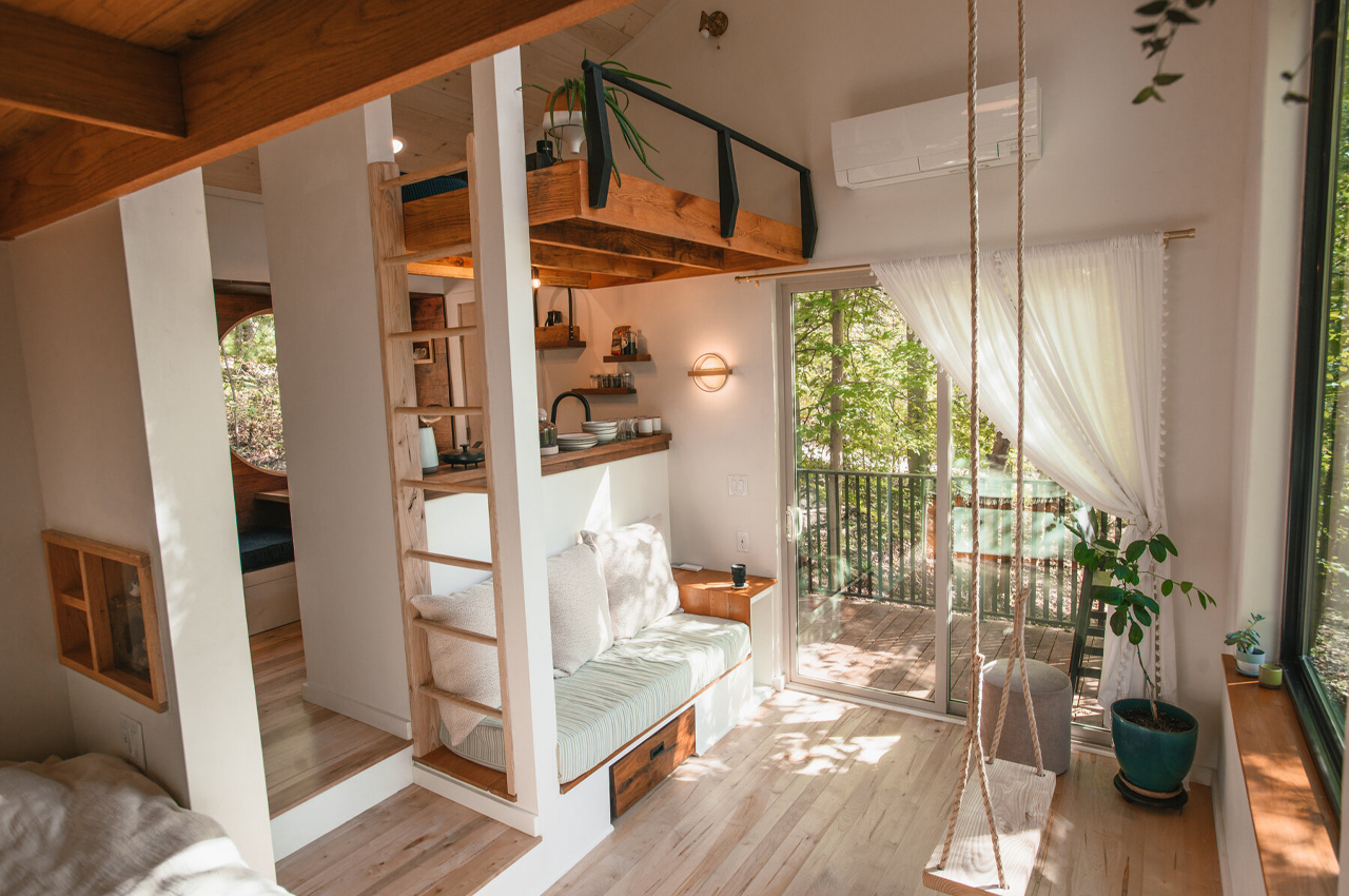
This tiny cabin built from local trees incorporates a blend of Scandinavian and Japanese design elements!

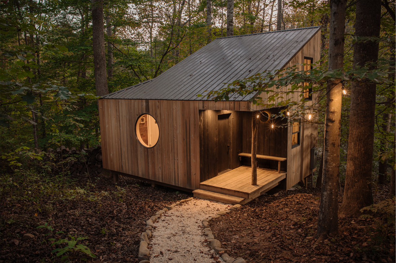
The Nook is a tiny cabin located in the woods of North Carolina’s Appalachia designed with Scandinavian, Japanese, and Appalachian handcrafted elements to weave local craftwork together with a personal history.

As summer draws to a close, winter is coming and so are the snowy getaways. While there’s something to be said about the slow summer days spent at a family cabin by the lake, cozying up beside a fireplace inside a log cabin somewhere in the woods where there’s snow and a hot cup of tea is still unmatched. In the Appalachian forest of Swannanoa, North Carolina, Mike Belleme, an established documentary photographer, felt inspired to devise his own wintry tiny cabin called The Nook.

Brimming with artisanal goods and artwork of local craftsmen and artists, The Nook was designed to bring the handcrafted touch of the old world into the modern era. Described as a “collection of stories,” Belleme designed The Nook to link his personal history to the surrounding forest and architecture of the cabin.

The tiny cabin is constructed from a collection of locally felled trees that Belleme memorized during a five-year stint spent in the Appalachian woods, during which he learned primitive building skills like creating a path of hand-split logs that leads to The Nook’s front entrance.

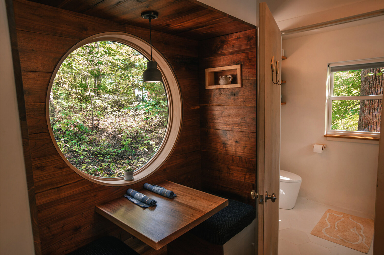
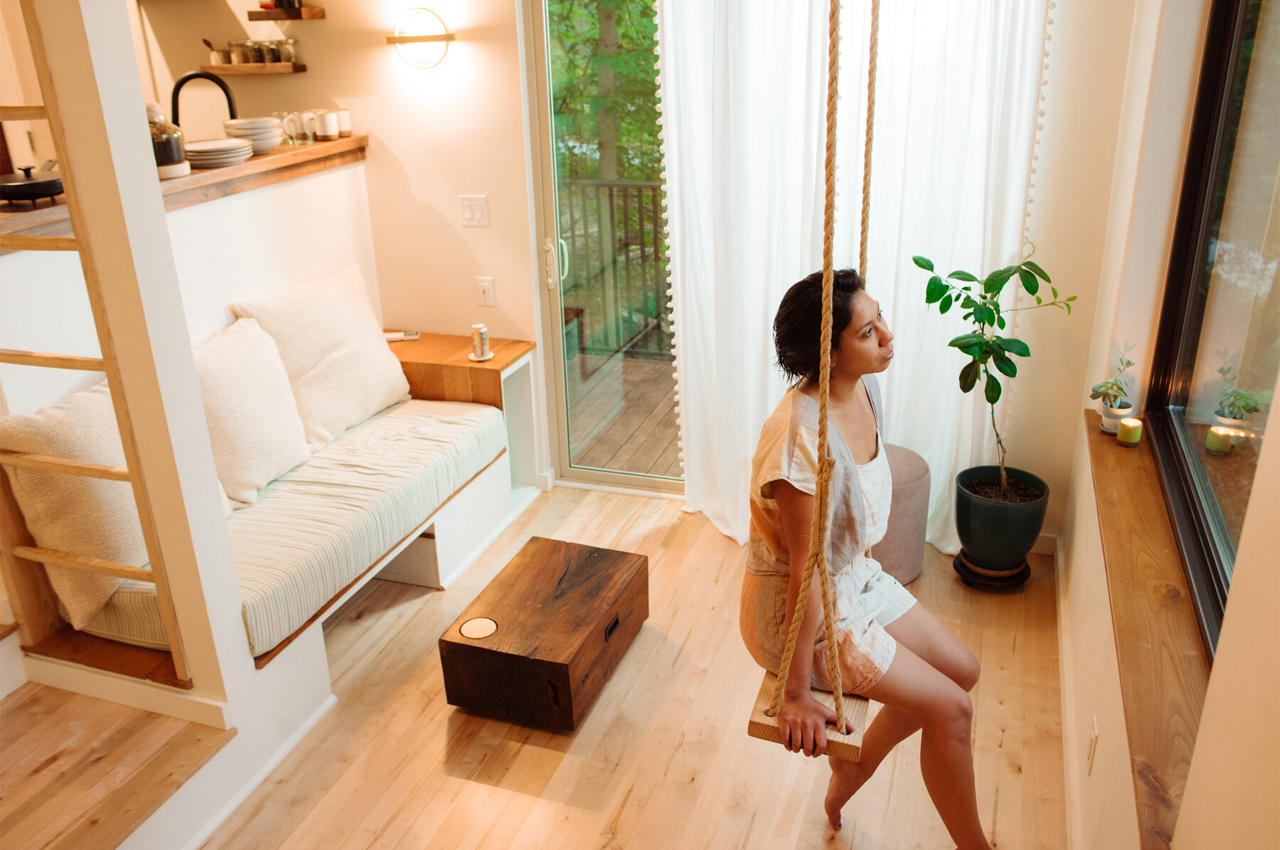
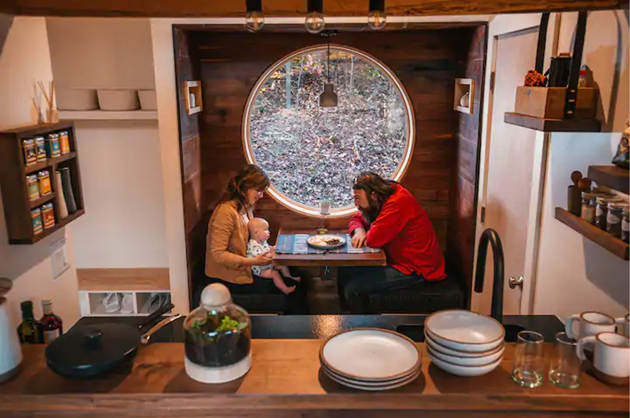
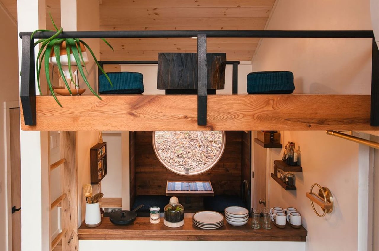
The timber that gives rise to The Nook varies between white oak, red oak, black walnut, and black locust all to mirror the trees that surround the tiny cabin. The different gradients of woodwork distinguish the rooms of the cabin. Contained within a mere 400-square-meters, The Nook’s living areas are combined into one and present as a single open volume, with the different rooms demarcated by shifting shades of timber. Where the living room expresses dynamic energy with lofty ceilings and cherry wood paneling, the kitchen keeps a more subdued profile achieved with an intimate breakfast nook wainscot in black walnut.

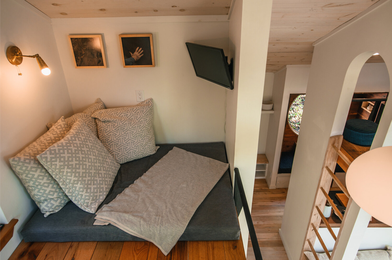
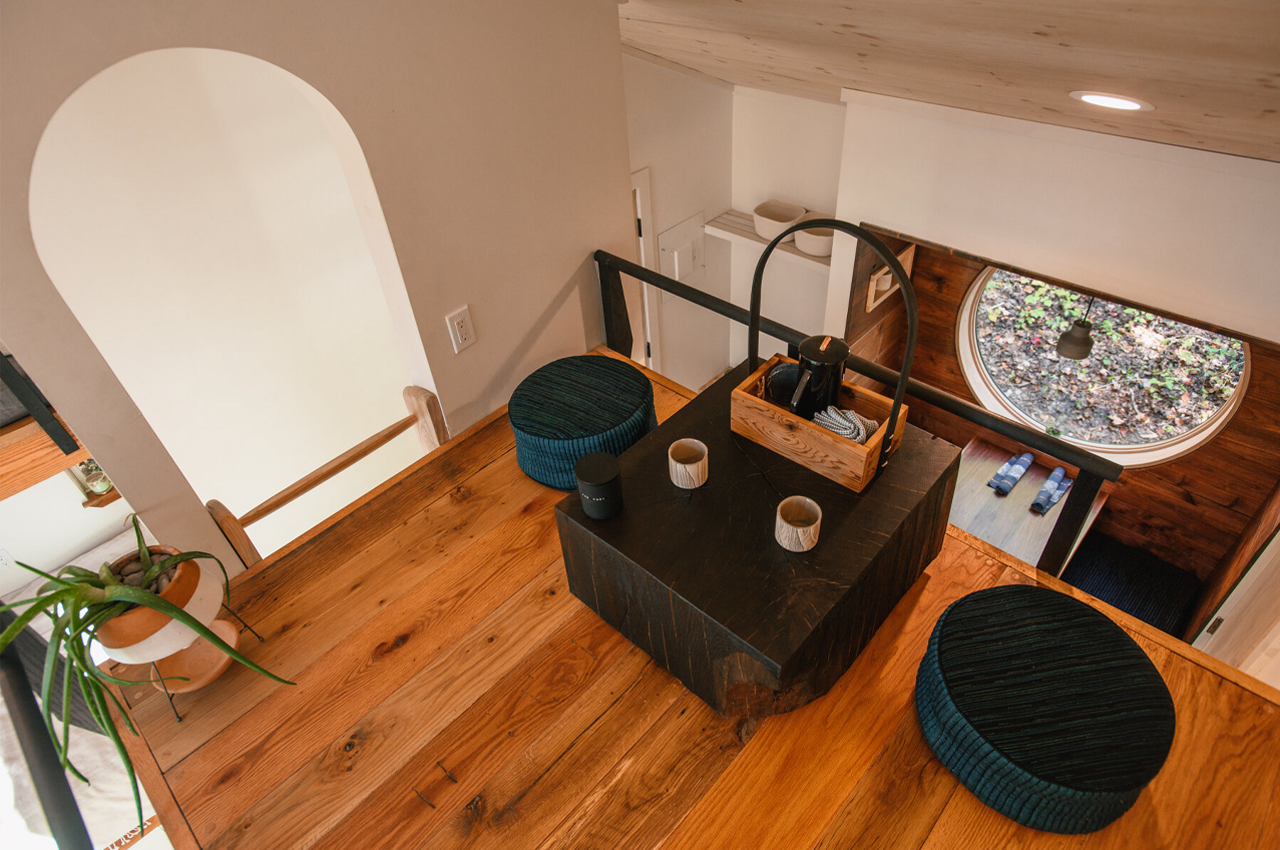
Striking a balance between different interior design cues and movements, Belleme describes The Nook’s design as a marriage between Japanese, Scandinavian, and Appalachian aesthetics. Just above the stripped-back kitchen, Belleme included a Japanese-inspired tea loft in tribute to his parents’ own living period in Japan, who moved on to launch one of America’s first Miso companies.

Every element of the home embodies a sense of minimalism, craftwork, and earthiness, weaving together Belleme’s personal history that brought him from the tea rooms of Japan to the felled trees of North Carolina. Describing the tiny cabin in his own words, Belleme notes on The Nook’s Airbnb listing, “This house is a collection of stories. Stories of cultural and personal history, ecology, and craft. To celebrate this area’s incredible legacy of craft, we’ve collaborated with some of the most talented makers in the region.”

Designers: Mike Belleme

Darker wooden planks line the floors of The Nook while brighter timber coats the ceilings. 

The Nook’s rear deck was also built by hand. 

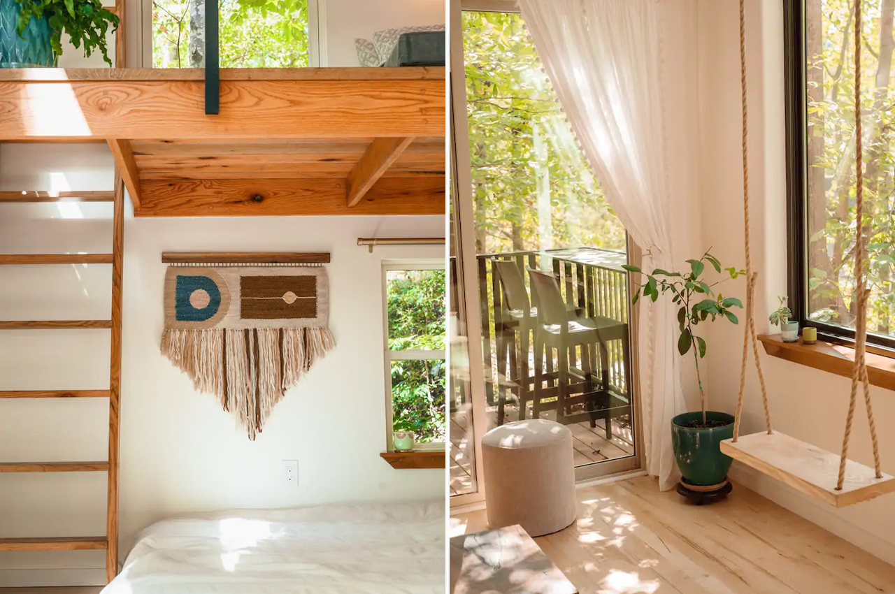
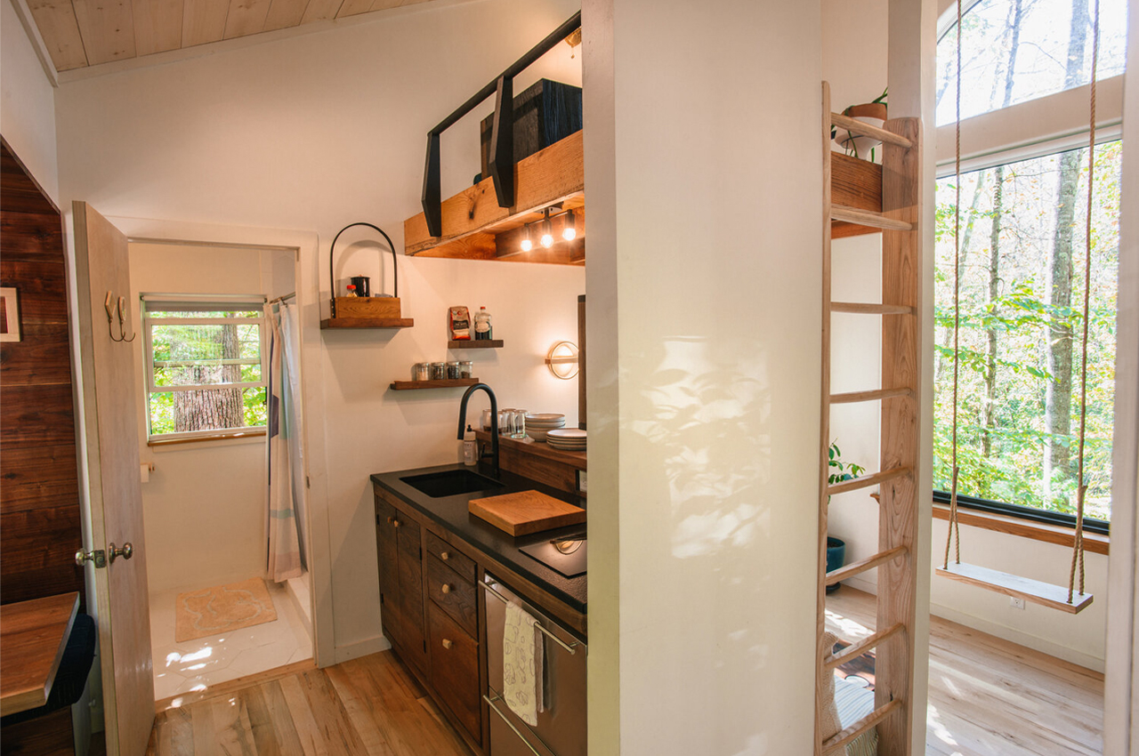
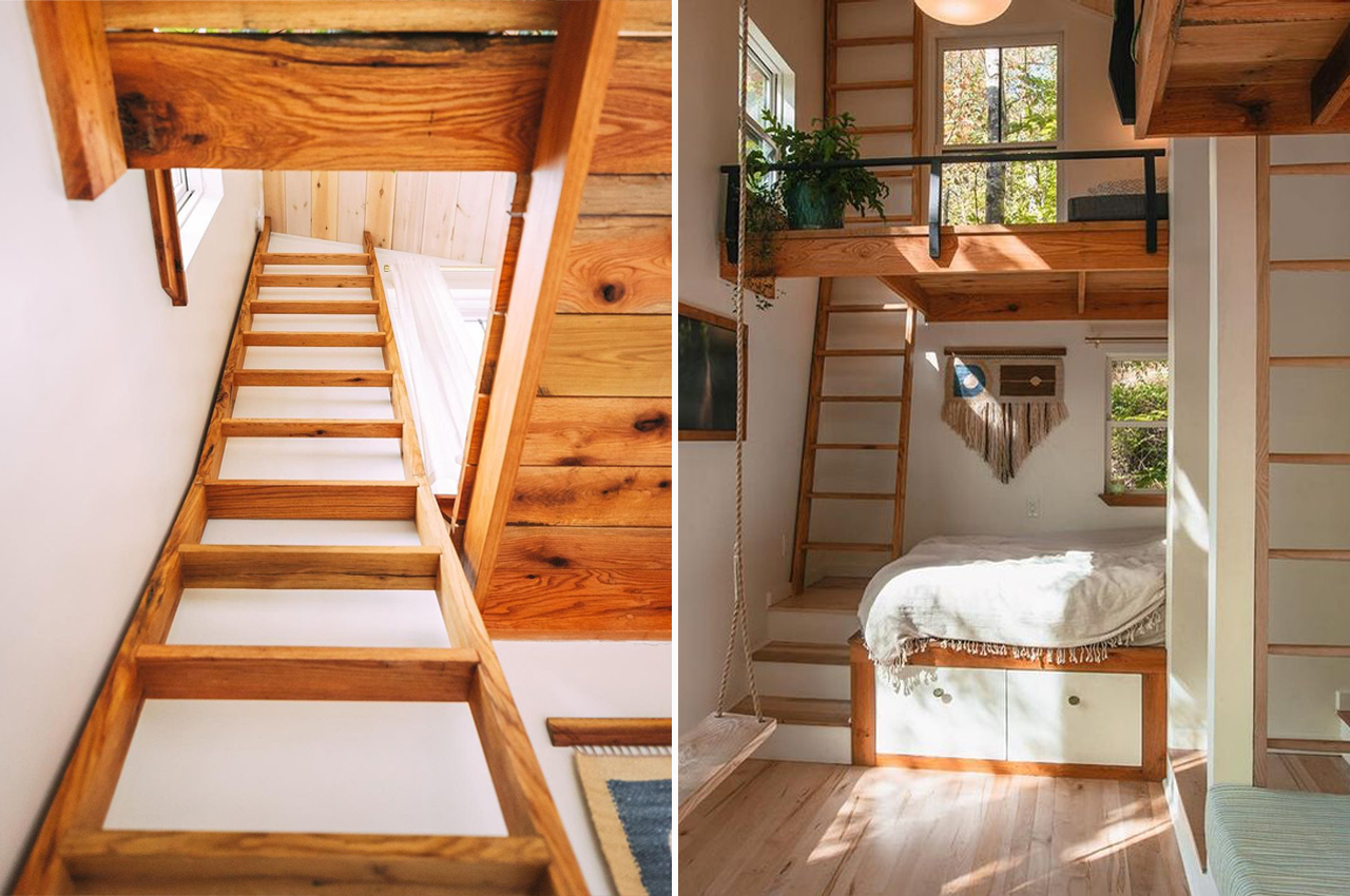
The Nook maintains an open interior space by incorporating elements like ladders that bring you from the ground-level living area to upstairs bedrooms. 

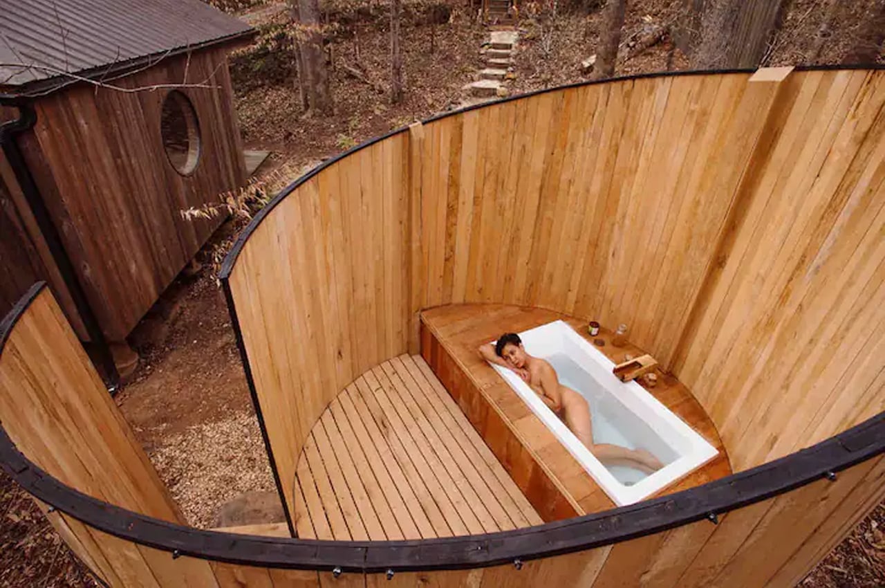
An outdoor semi-enclosed bath provides the perfect spot to unwind beneath the tree’s canopies. 

This Scandinavian-inspired caravan designed for a minimal mobile lifestyle gives the ultimate outdoor experience!

Hobby’s new Maxia caravan takes to Scandinavian design to merge the mobile lifestyle with hygge living, creating a caravan that feels a lot like your own private luxury city apartment on wheels.

The mobile lifestyle is all that’s on our minds nowadays. Getting away from the monotony of our routines and hitting the road to drive to our favorite camping spot or even all the way across the country sounds like the holiday we’re all looking for. Riding the tails of their Beachy caravan, Hobby, the world’s largest manufacturer of caravans, released their Scandinavian-inspired Maxia caravan that feels like riding in your very own mobile city apartment.

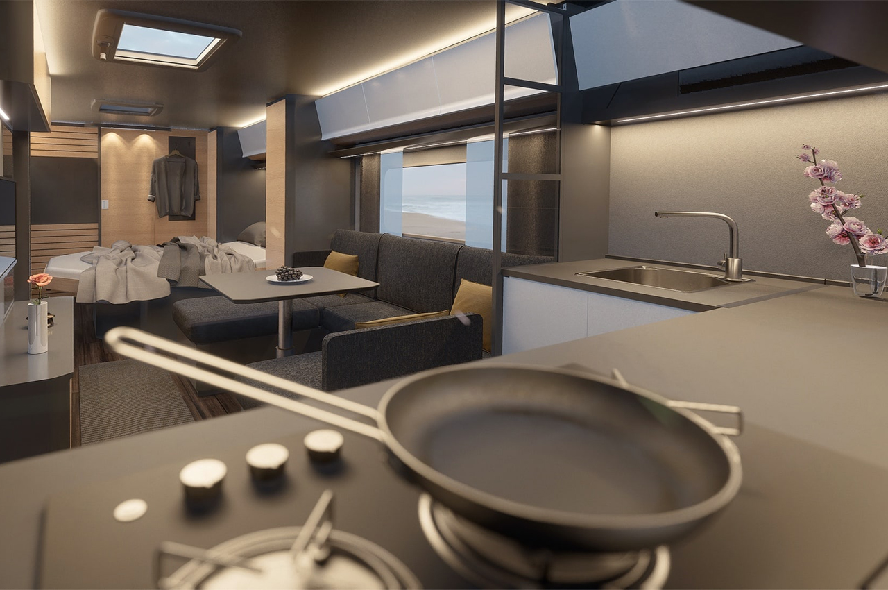
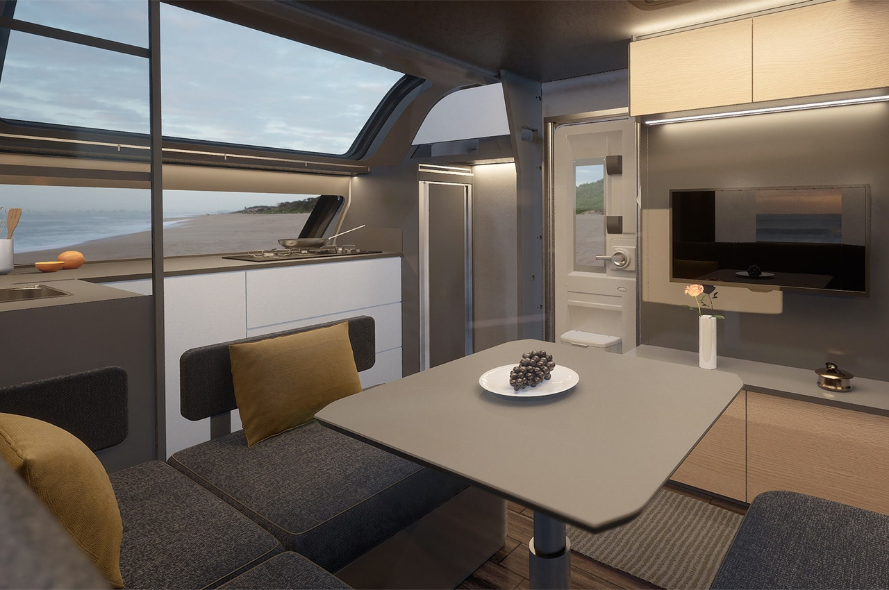
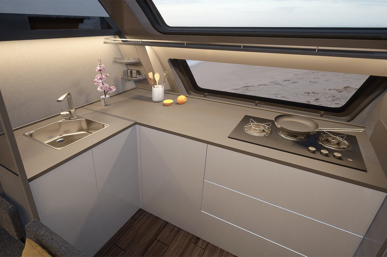
Maxia’s exterior holds onto the traditional look of a caravan, but smooths out its edges and rounds its windows to give the caravan an elevated, more seasoned look. Maxia’s front window slopes from the caravan’s roof down the curved front facade, lengthening the feel of the interior and offering fuller views of the outdoors through the dual-pane panoramic window. With an aim of transforming their caravans into, “the most beautiful places in the world,” Hobby designed Maxia for hygge-style living, outfitting the interior with comfort and simplicity in mind. Available in two different lengths that inspire two different layouts, Maxia 660 WQM is the longer of the two and accommodates up to four adults with full kitchen and bathroom areas.

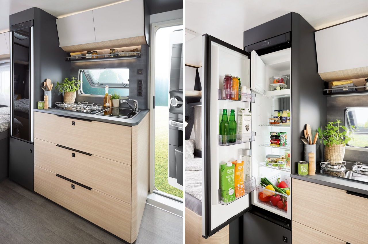
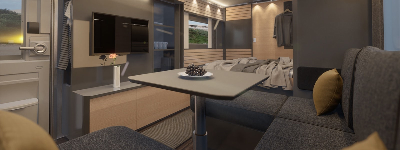
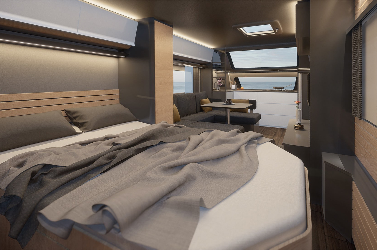
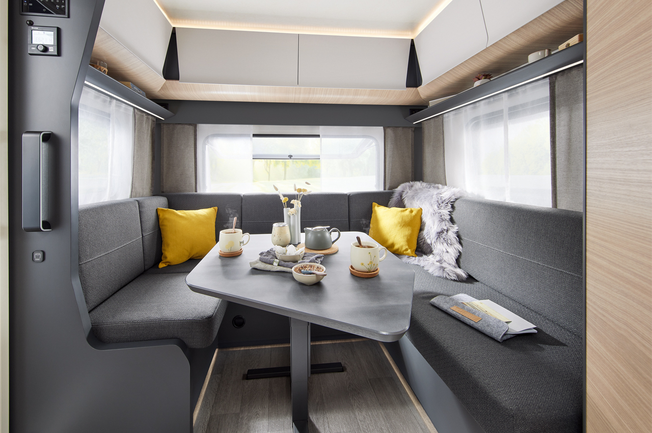
The dual-pane panoramic window frames the caravan’s L-shaped kitchen, where you can do everything you might in your home’s kitchen, including stovetop cooking with a gas hob and sink. The kitchen also comes equipped with a 157-L Dometic compressor refrigerator, stainless steel sink, swivel-out corner cabinet, push-lock drawers, and even a multifunctional splashback. Moving from the kitchen to the living area, a U-shaped sofa transforms into a bed come night for supplemental sleeping arrangements and functions as a dining area during the day for meals, hanging out, or working. The living area mainly hosts the caravan’s storage compartments, filling out benches and cabinets with plenty of wardrobe space, seating storage, even a heated coat rack.

Sticking to an open floor plan to allow plenty of movement and living space, the primary sleeping area is tucked away towards the back end of the caravan, only in front of the bathroom, for a little bit more privacy. The bedroom keeps a spacious fixed spring mattress positioned atop a sturdy beechwood bed frame that hosts more storage space underneath, accessible via a Lift-O-Mat that raises the mattress to reveal an under-bed storage area.

In addition to the open-floor layout and Scandinavian-inspired design, Maxia hosts an array of smart appliances and utility fittings to make holidays on the road run that much smoother, including a full electrical system, Truma Combi heater/water heater, 47-L freshwater tank, 23.5-L removable, rollable waste water tank, and Hobby Connect touchscreen- and app-based control and monitoring system.

Designer: Hobby

Hobby held onto a more traditional exterior look for Maxia, smoothing out its edges and lengthening its windows for a more elevated, refined look.

During the day, plenty of natural sunlight pours in through Maxia’s double-pane glass windows. 

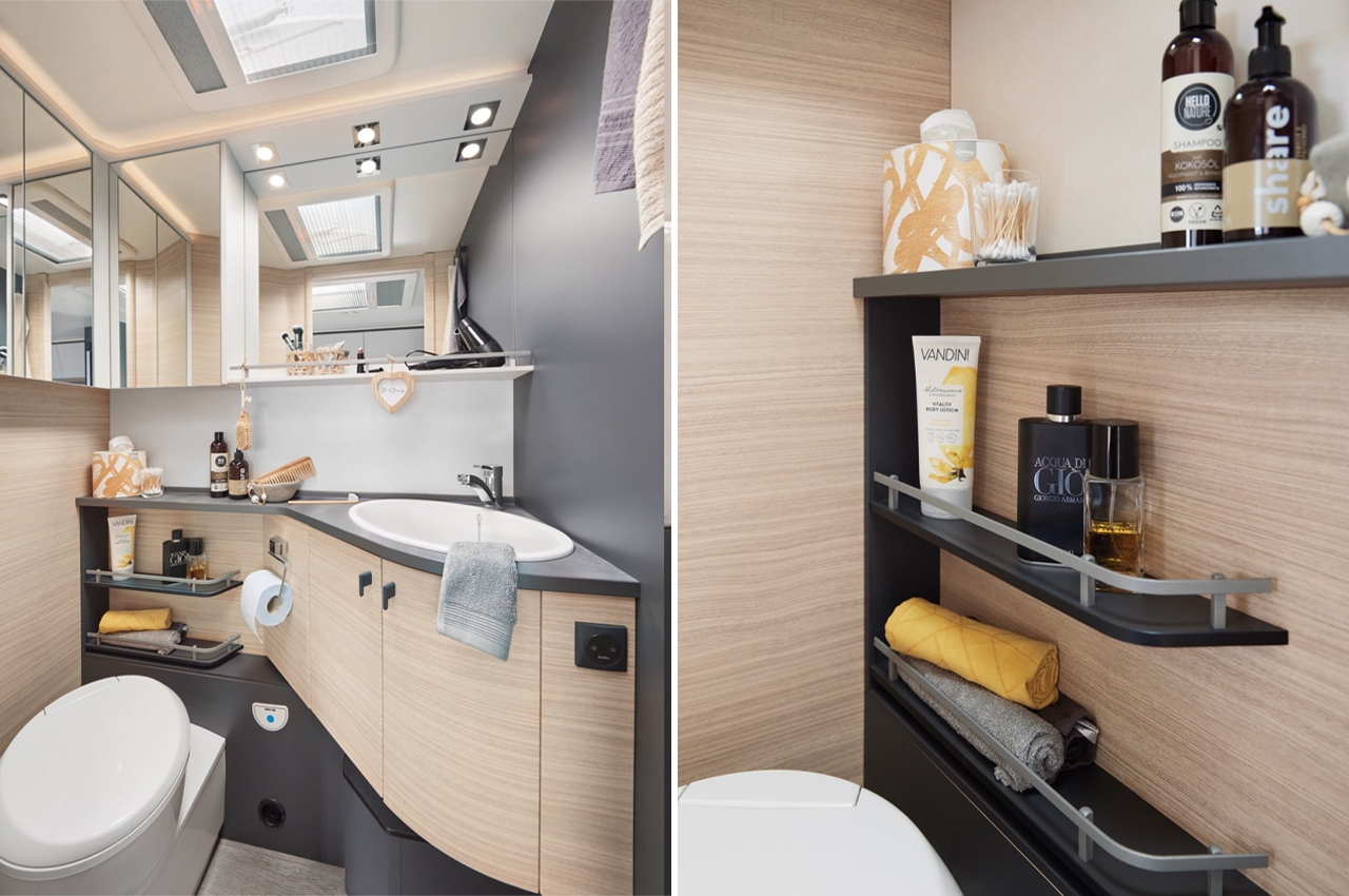
The bathroom provides even more storage space and comes complete with a THETFORD rotating toilet.

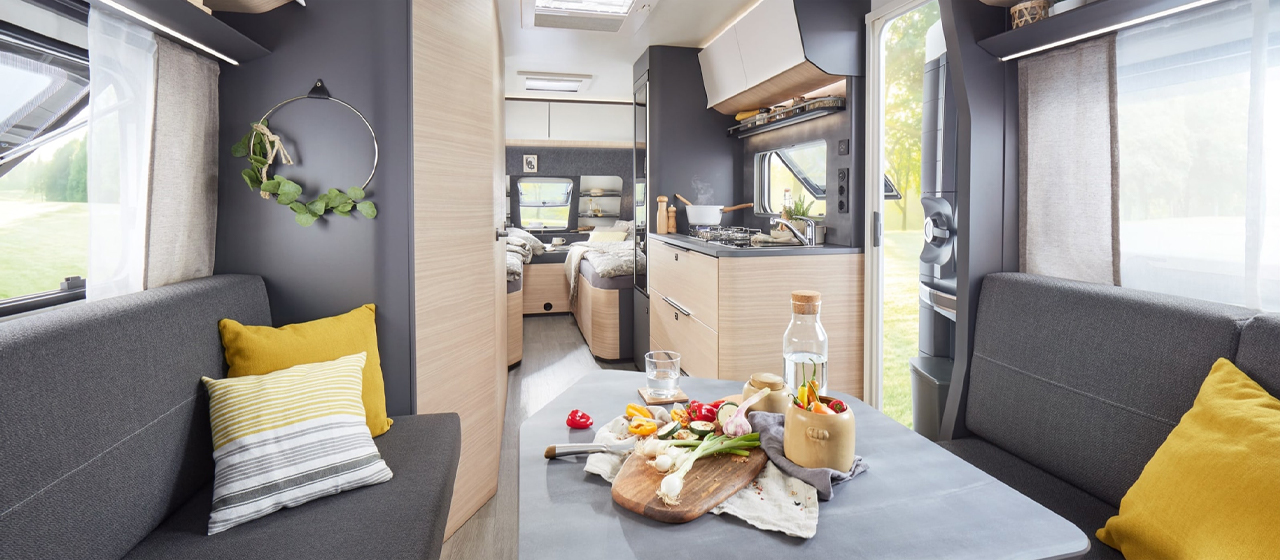
The sofas and dining benches are plush, yet easy to handle for quick late-night sofa-to-bed transformations. 

The dining area doubles as a workspace and living area during the day to offer plenty of space to unwind and relax. 

Scandinavian-inspired Storage Solutions for the modern millennial home owners who love an element of minimalism!

Our modern millennial homes have many virtues, but one thing they lack is…space! Space constraint is a major issue in the cramped apartments most of us end up in today. Although smart storage solutions can be a lifesaver in such tricky and compact situations. But let’s be honest, some of the shelf designs in the markets these days can be downright hideous. They may rate high on form and functionality and even manage to do their job pretty well, but when it comes to aesthetics, they can be an eyesore. But there are some ingenious furniture designers out there who have incorporated Scandinavian aesthetics + functionality into the simple shelf. Have you ever come across Scandinavian designs? There’s something so simply minimal, quaint, and awe-spiring about them. They manage to speak volumes without being loud, nor saying much. They always leave you with a warm feeling in your heart, and intense admiration for the attention to detail, and the delicate touches each design consists of. And these Scandinavian-inspired shelving designs promise to do exactly that! Modern and minimal, these shelving units are the storage solutions you’ve been looking for.

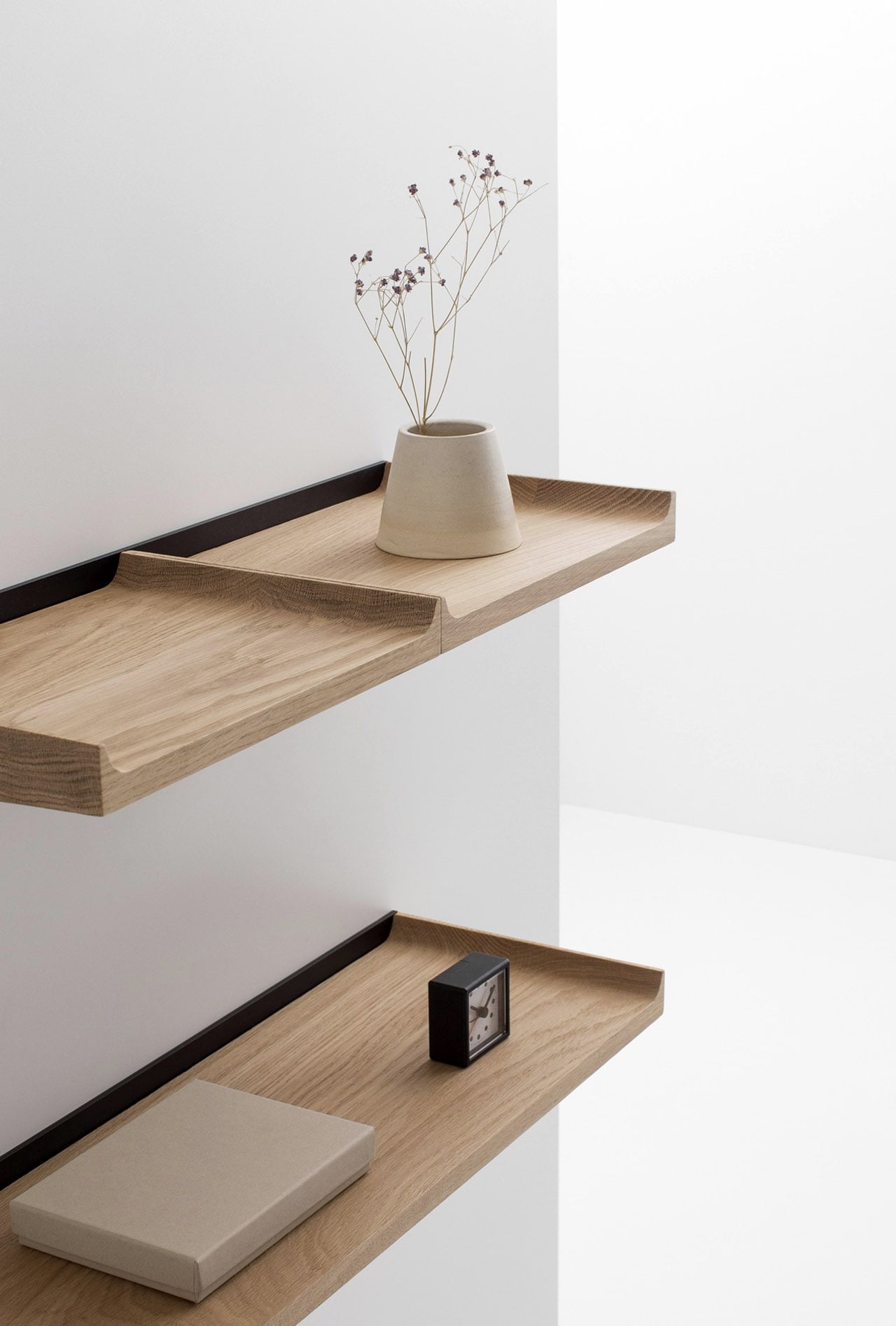
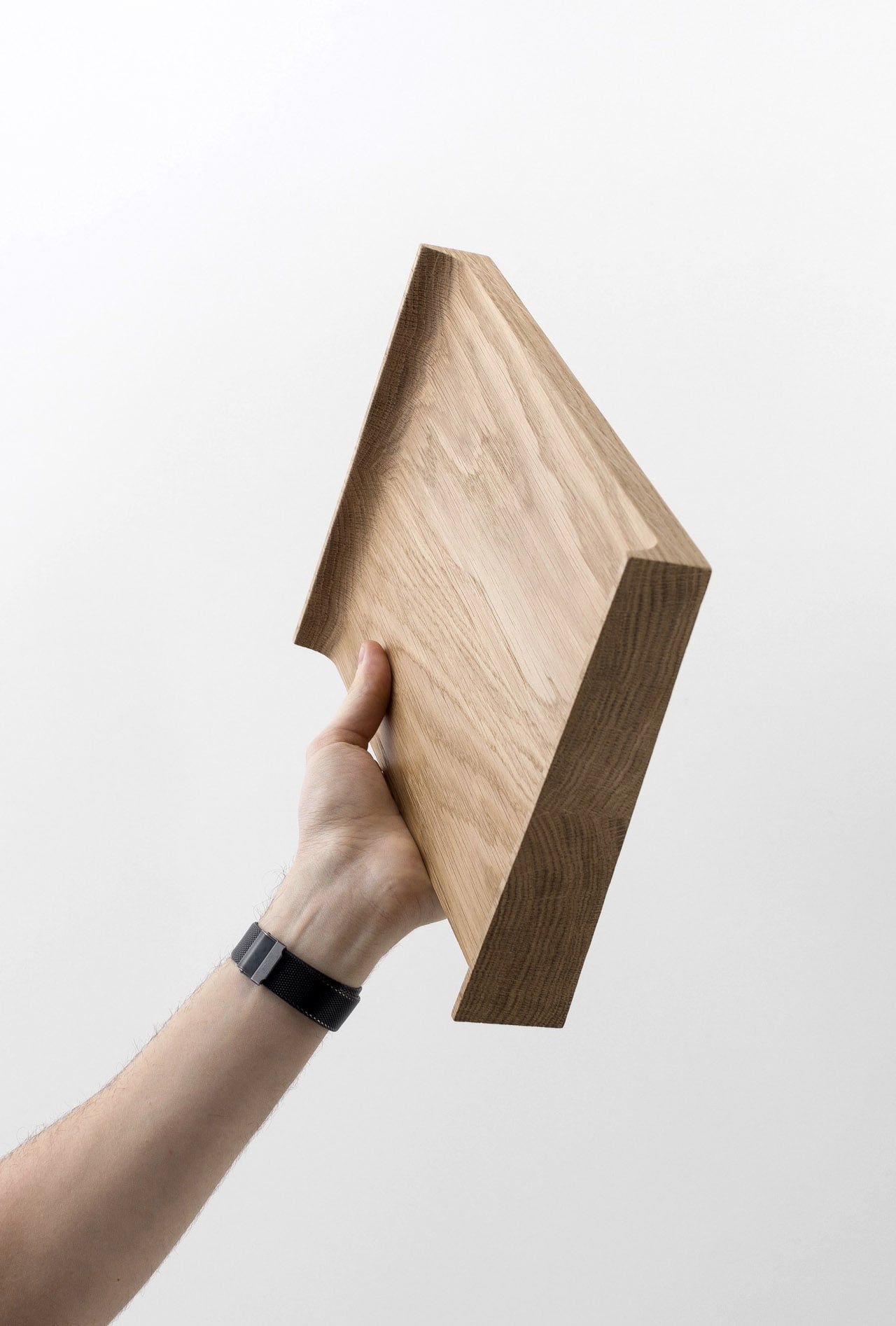
Designed by Julien Renault for Cruso, the NOTES Shelves is “an invitation to play with compositions and colors”. The artfully crafted slabs of light oak slide into a steel frame, creating a clean and minimal wall-mounted shelf that provides a wonderful storage space, while also allowing you to proudly display your favorite objects and artifacts. The shelves are so simple to set up, that you can do it by yourself at home, with the help of a standard tool (which is provided along with the shelving unit). The NOTES Shelves’ edges have been uniquely sanded and rounded, making them soft and smooth to touch.

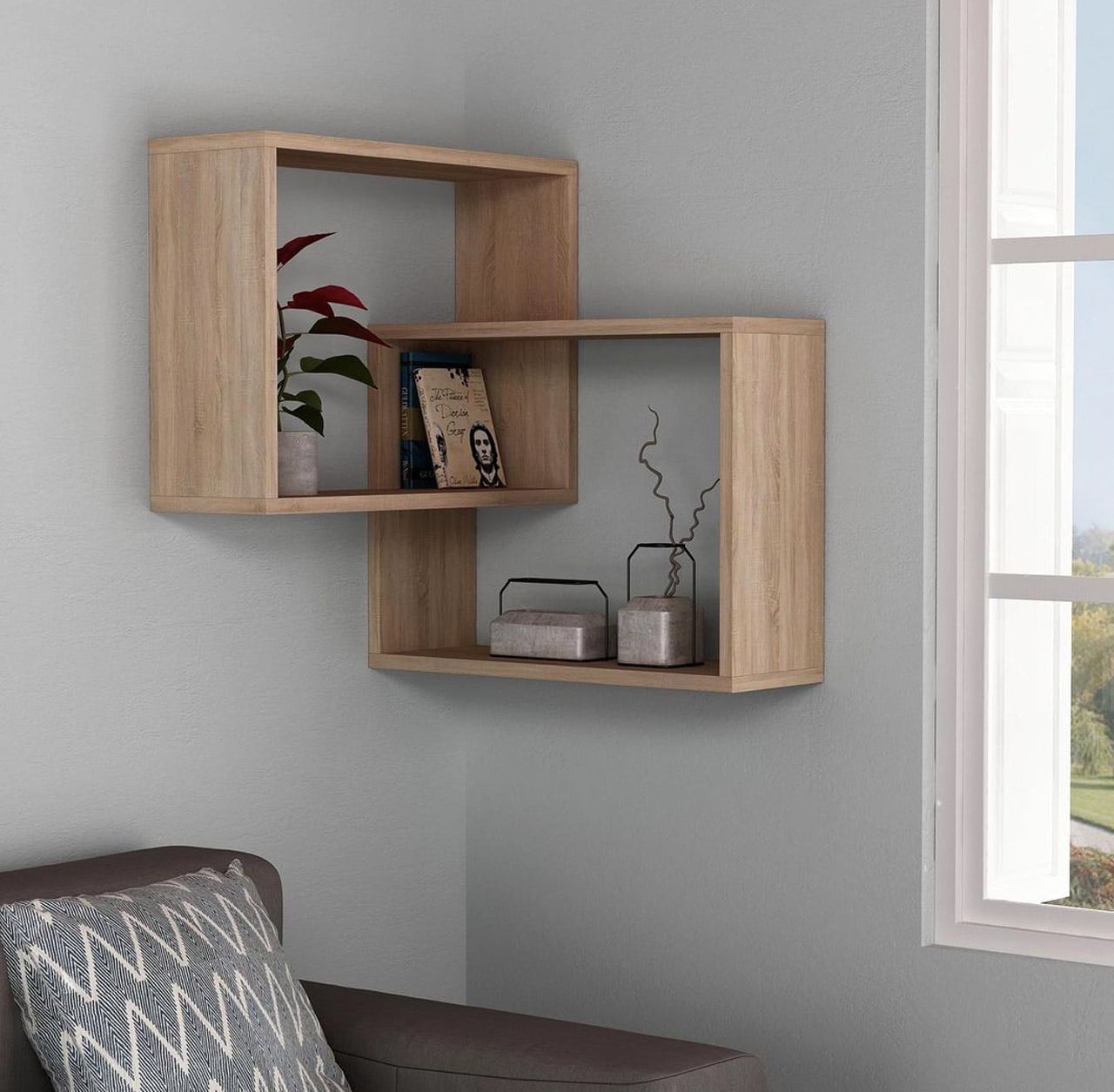
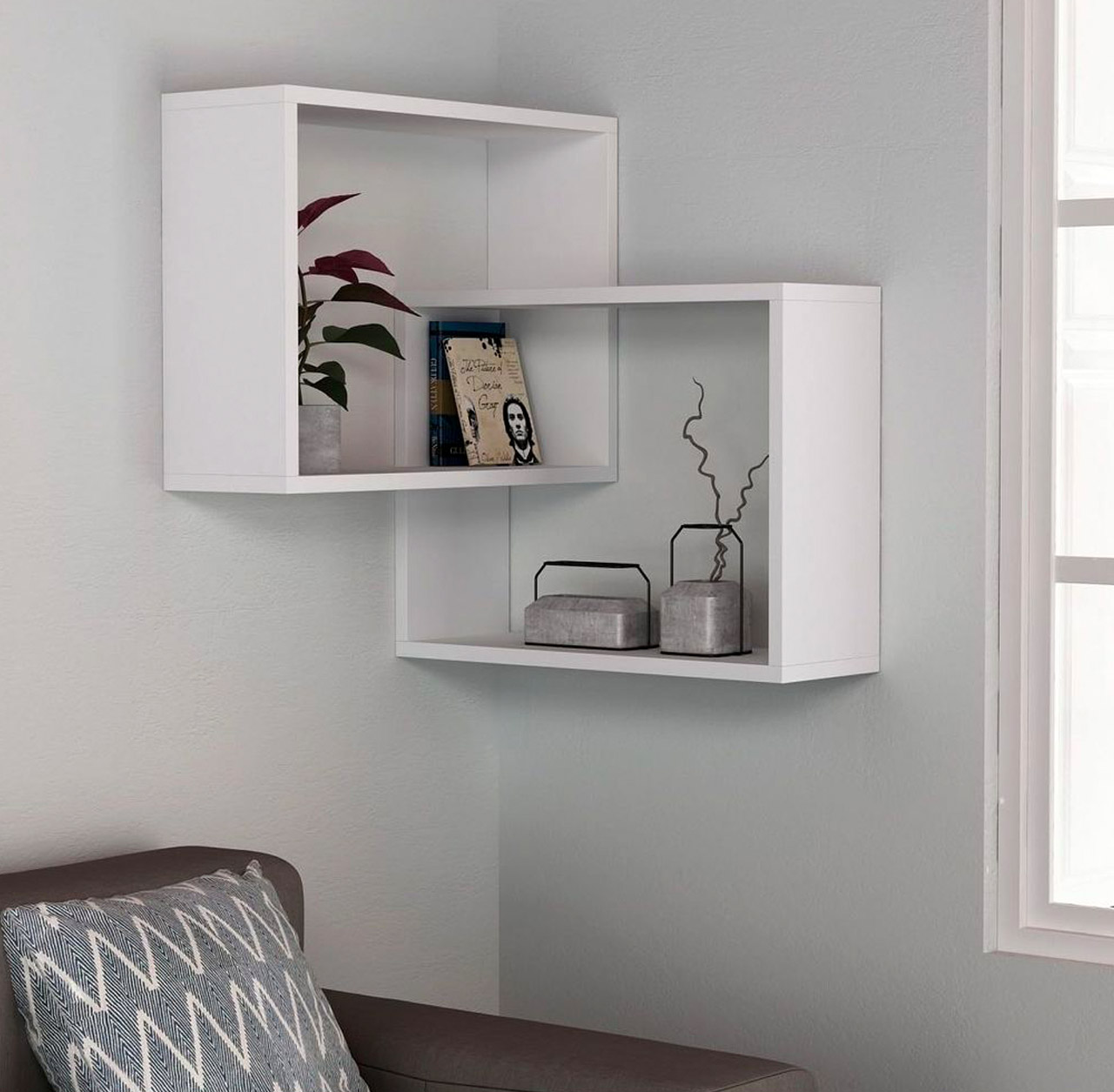
The Corner Shelves by Dose of Modern is a pair of square-shaped shelves that smoothly intertwine with one another, creating a cute little matrix of shelves! The shelves have been designed to be fitted into the corners of your home, thereby ensuring they do not take too much space, while they faithfully store your belongings. The wall shelves come in two color options – a clean white, and light beige. Their minimal aesthetics and colors help them artfully merge into any living space or room they are placed into.

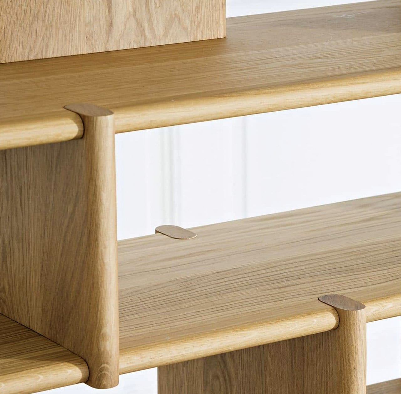
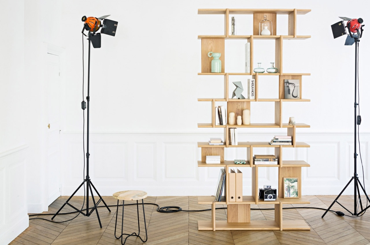
Designed by Pierre Charrié for Junddo Furniture, the Tana Modular Shelves is a configurable bookshelf whose dimensions can be selected and customized via an online configurator! So you can pick and create the ideal bookshelf for your home, according to your books and space requirements. Solid wood planks with soft rounded edges that are held together by a strong joinery system constitute the modular shelving unit.

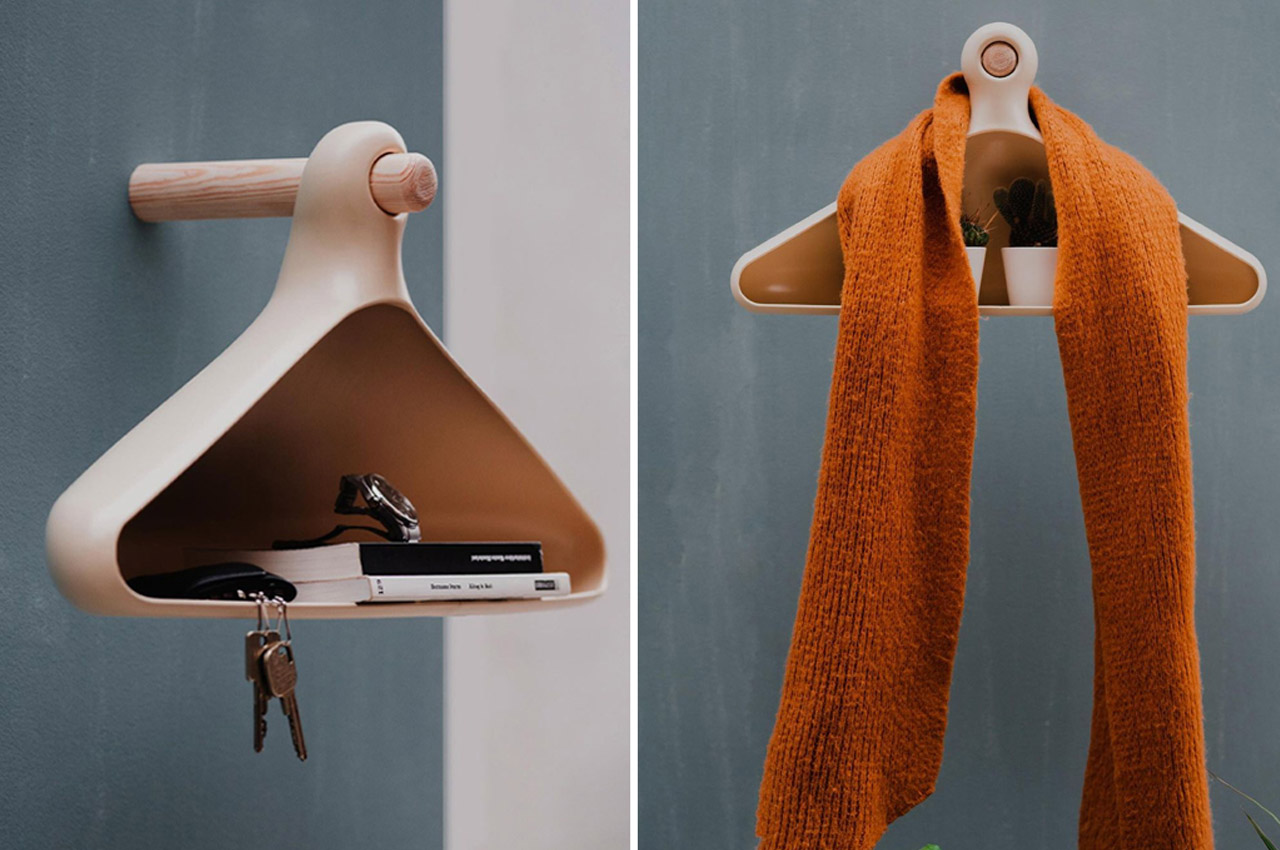
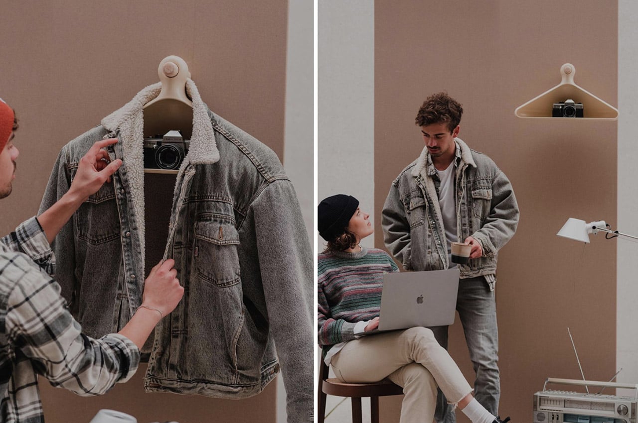
Student designers Calvin and Bence recently created their own interpretation of entryway storage with Bügal, a piece of fusion furniture that’s one half coat rack and one half shelf system. When conceptualizing Bügal, the student designers relied on 3D printing to establish a mold for the unit’s body before grinding, smoothing, and painting it over to achieve its finished, semi-matte, silicone-style look. The hybrid unit of furniture hangs from a wooden peg in a similar fashion to the traditional clothes hanger, but it ditches the hook grip for a more secure peg and socket.

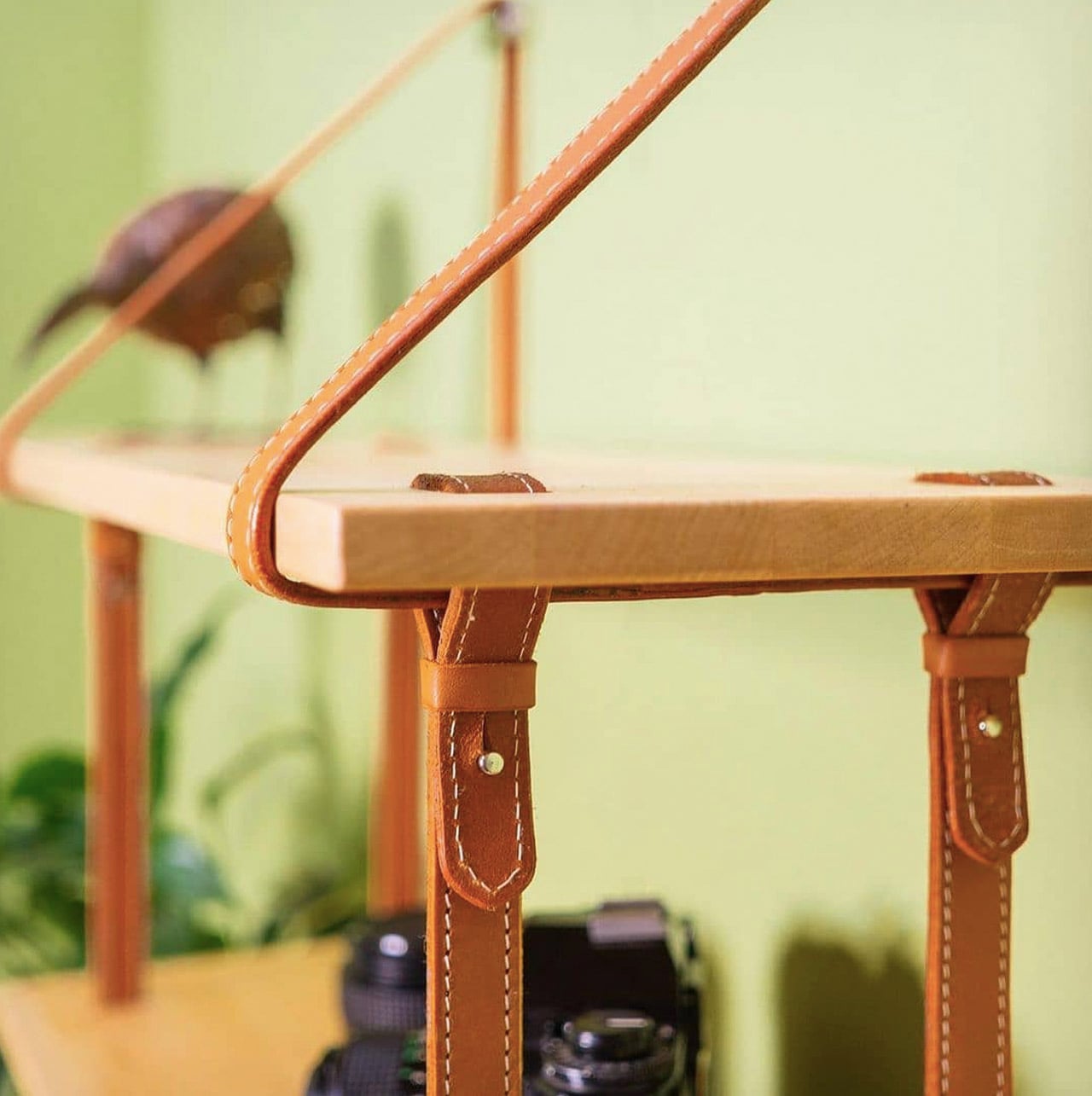
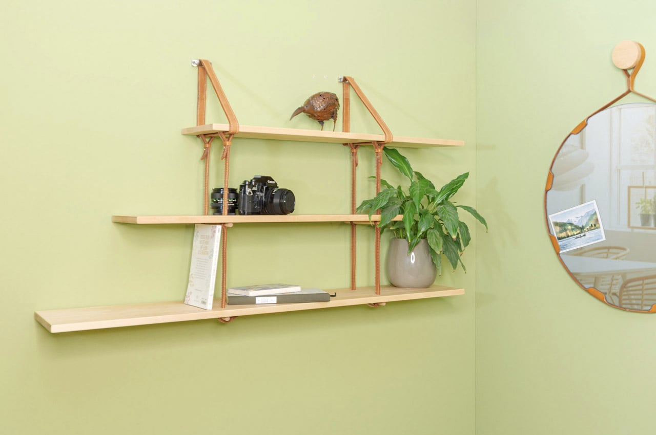
Designed by Maximilian Lötzer, the MYX shelf comprises of three elongated slabs of varying lengths, each crafted from birch wood. The slabs are held together by orange-colored leather straps, creating a product that combines the modern and traditional principles of carpentry and saddlery. The leather and wood complement each other, and merge with one another seamlessly, leading to a minimal shelving unit inspired by the functionality and aesthetics of Scandinavian design.
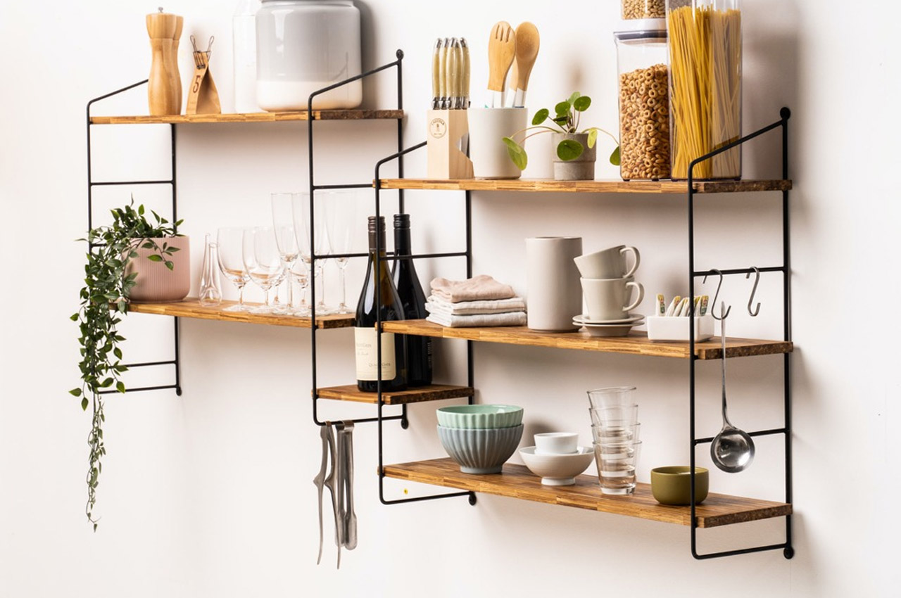
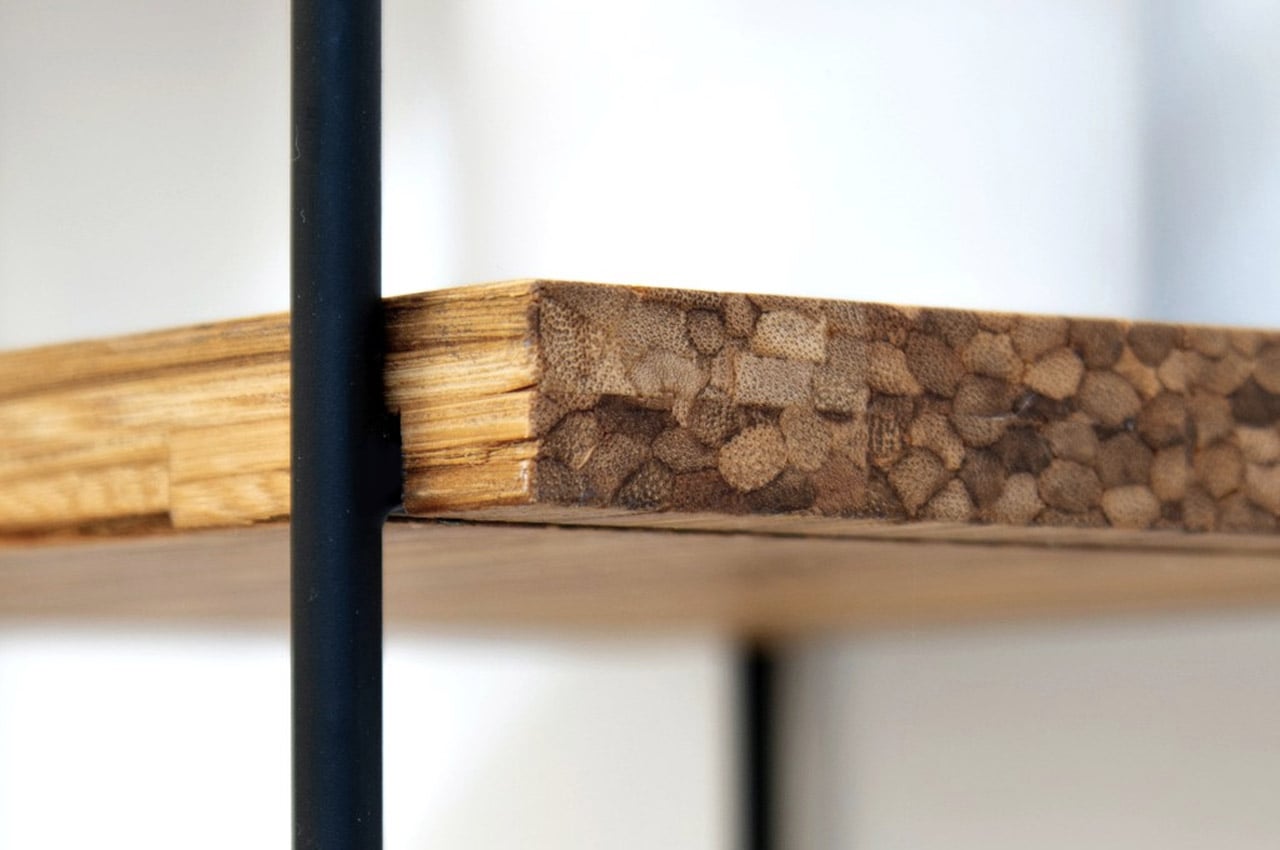
The SMĪLE Shelf may officially be an acronym for Sustainable Module for your Inspired Living Environment, but I’d like to believe it’s called SMĪLE because it literally puts smiles on peoples’ faces with its minimalist design and unique back-story. This modular shelf, designed for practically any interior aesthetic, any room, and for any scenario, comes made from recycled bamboo chopsticks. It is a modular system that relies on recycled steel frames that fix to a wall, holding shelves in between. The steel frames can be arranged practically in any orientation and arrangement, giving you the freedom to create your own shelving design that can even be expanded if you want to, in the future!

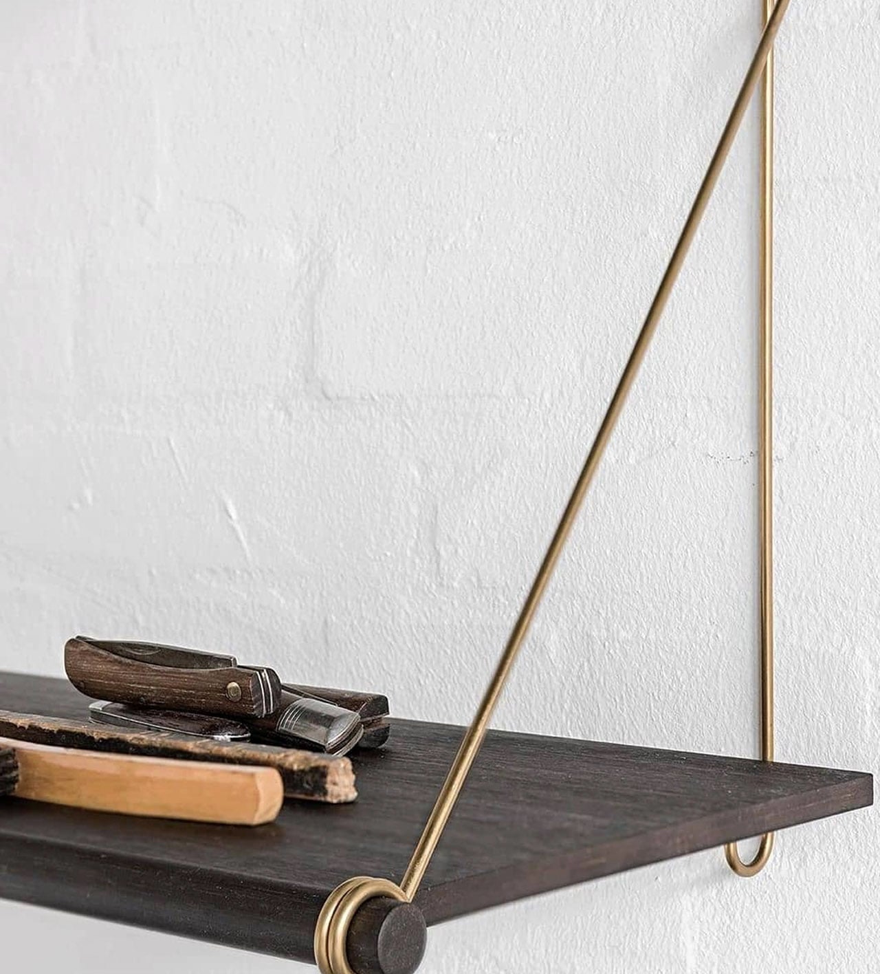
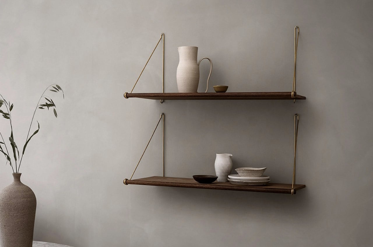
The Looped Shelf by We Do Wood is a true example of authentic Nordish design. Crafted from smoked oak, the shelf features looped-shaped brackets. The smoked oak brings an element of warmth to any living space, with the brass mounting brackets perfectly contrasting against it. You can set up multiple Looped Shelves to build a sturdy shelving system that creates its own powerful presence in any room.
The Sena Wall Shelf by Vitamin Design is made up of narrow elements constructed from solid wood. Subtle and reduced lines characterize the body of the wooden shelf. The shelf can be built made to measure, and configured according to your personal preferences. It’s also available in a wide variety of wood – ash, beech, core beech, cherry, maple, oak, knotty oak, walnut, knotty walnut. The extensive material and customization options help you create a shelving unit that’ll perfectly meet your storage needs.

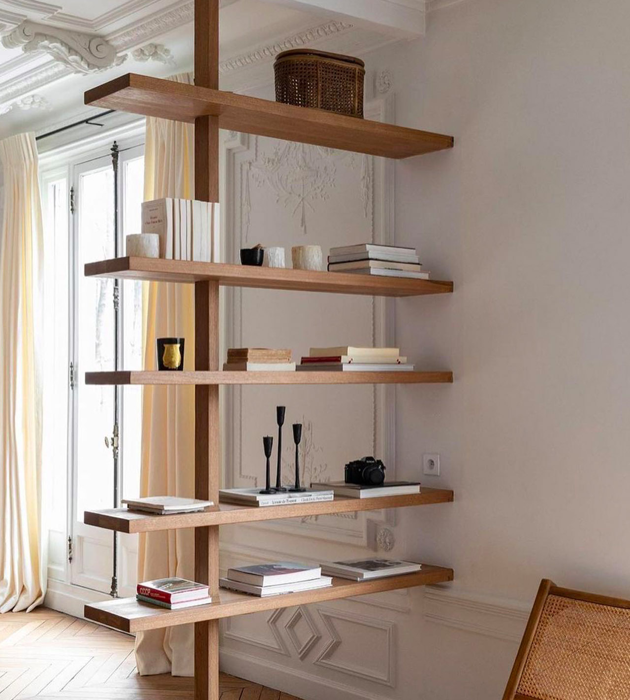
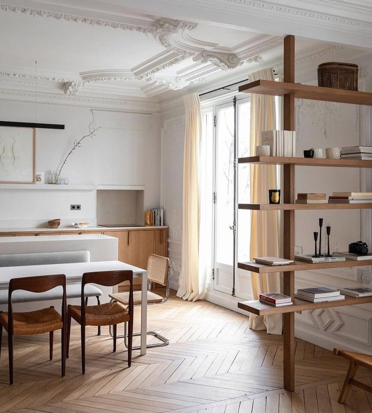
Designed by Martin Keller, the Pereire Bookshelf is an elegant and simple shelving unit that stores your books and other items quite spaciously and artfully. A long solid wooden pole on one side of the bookshelf supports the entire unit, while elongated wooden slabs function as the storage platforms for your belongings. The other end of the bookshelf is meant to be supported by a wall, making it partially wall-mounted.

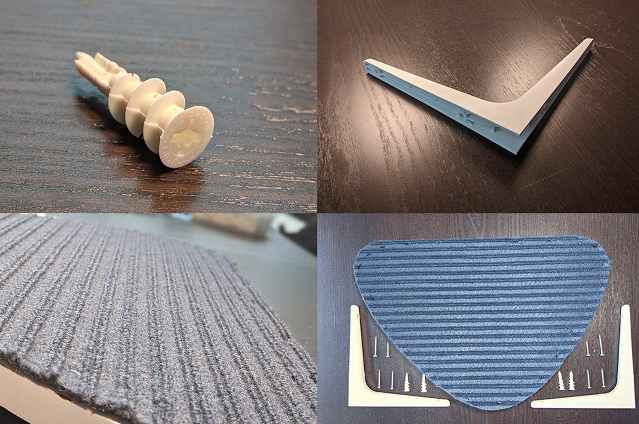
The Up-Cycled Cat Shelf use discarded pieces of wood that are finished, sanded, and smoothened to a standardized shape before being clad in a felt carpet for the cat to comfortably rest on without their nails digging into the wood. The shelf rests on two sturdy brackets sourced from IKEA, creating a setup that isn’t just robust and reliable but is literally just made out of 3 parts. Designed to look chic, but also be functionally sound for your neurotic cat, the Up-Cycled Cat Shelf can be placed anywhere at home, from the living room or bedroom to even the bathroom. It’s a shelving unit for your kitties!

This tiny home inspired by Scandinavian design comes with a small greenhouse and a porch swing!

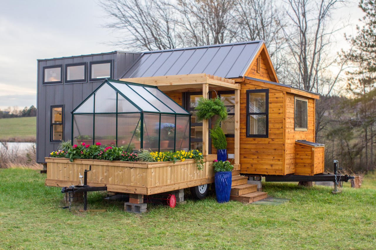
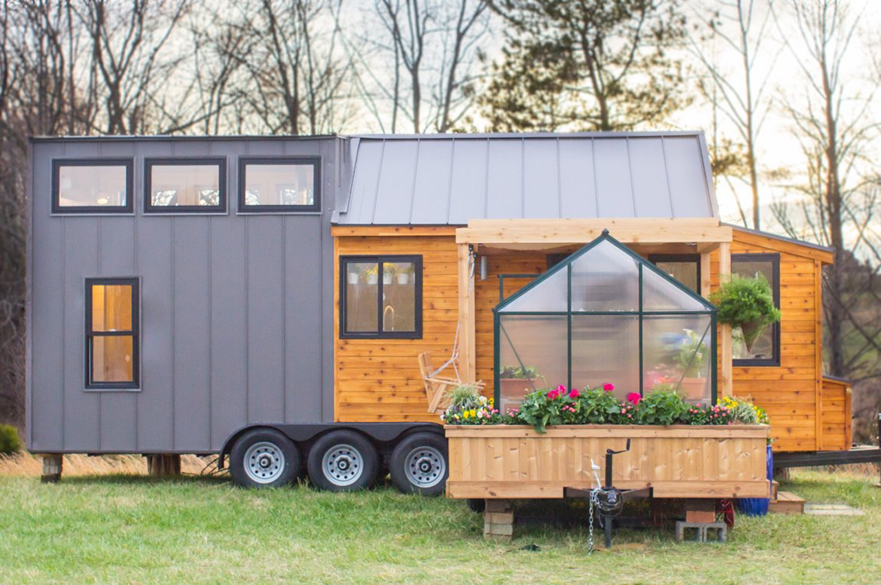
Elsa is a 323-square-foot tiny home defined by Scandinavian design that’s anchored with natural, earthy elements, like an outdoor, teeming garden and greenhouse attachment situated right beside a pergola-covered porch and attached swing for picturesque summer evenings spent in the garden.
For all of their innovative architectural feats and resource efficiency, tiny homes can’t seem to shake their tininess. That is until Elsa dropped in. While most of their appeal comes from their small size, when stretched to their edges, tiny homes can feel like small chateaus–spacious even. Designed and constructed by the small family-operated luxury tiny home building company called Olive Nest, Elsa is a not-so-tiny, 323-square-foot tiny home on wheels with an attached greenhouse, garden, and porch swing.
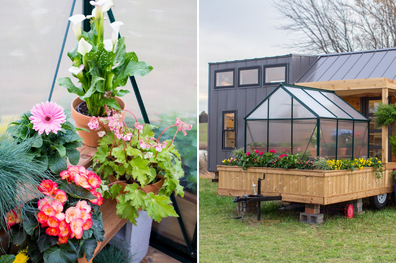
Elsa comprises 323-square-feet of living space while an exterior 85-square-foot trailer attachment that keeps a pergola-covered porch, attached swing, and even a greenhouse. The natural wood exterior attachment merges with the tiny home’s cedar shiplap, anchoring the home with earthy simplicity, as described by Melodie Aho, daughter to Mary Susan Hanson and Randy Hanson, the trio behind Olive Nest. Scandinavian design, an aesthetic that embraces clean and mostly unadorned, yet functional design, defines Elsa from inside, out. In direct contrast to the natural cedar shiplap, the left side of the house features standing-seam metal exterior siding, and just above the cedar shiplap section, a standing-seam metal pitched roof lengthens the inside loft bedroom ceiling.

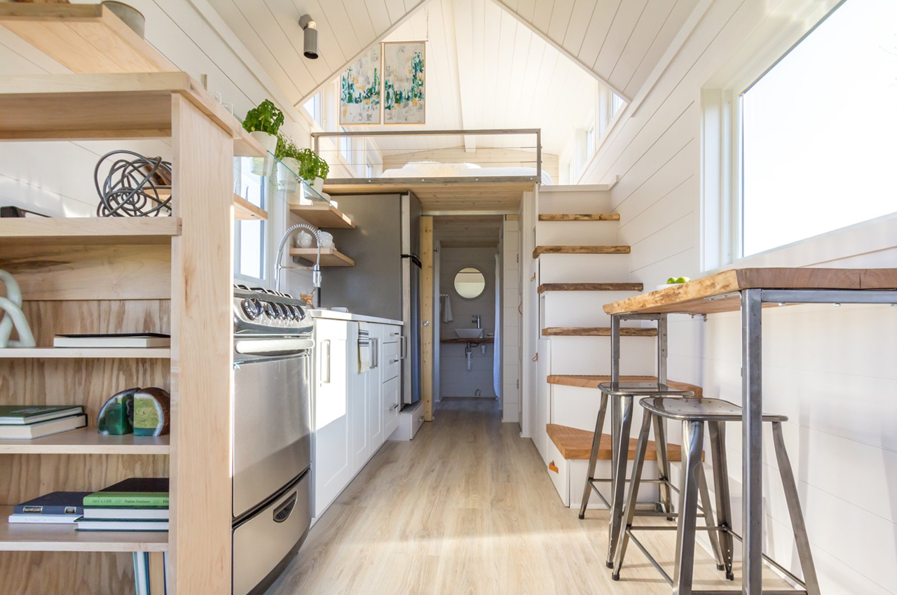
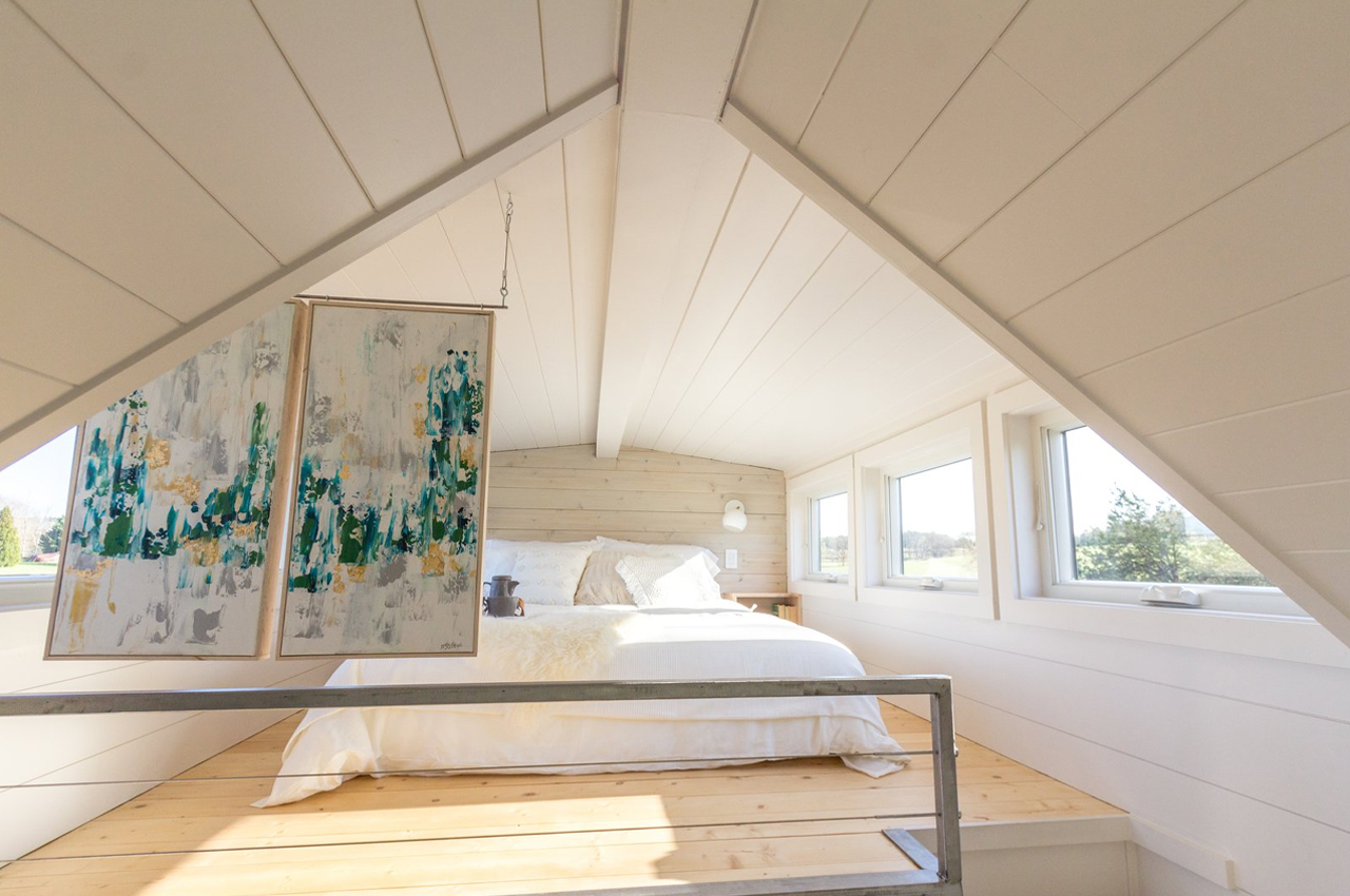
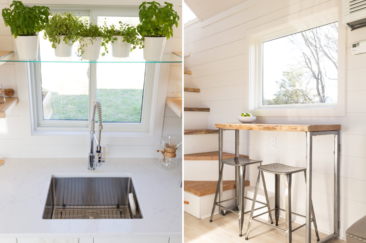
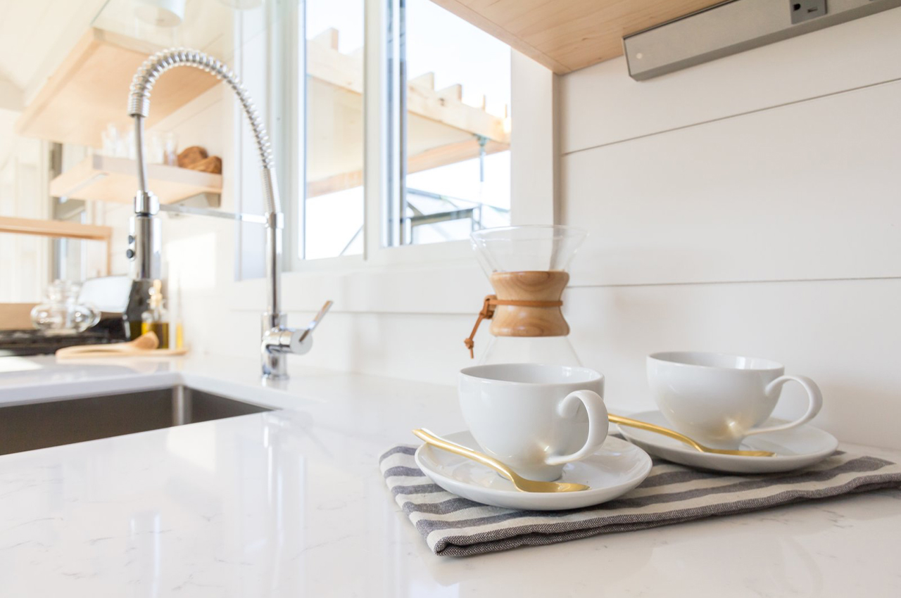
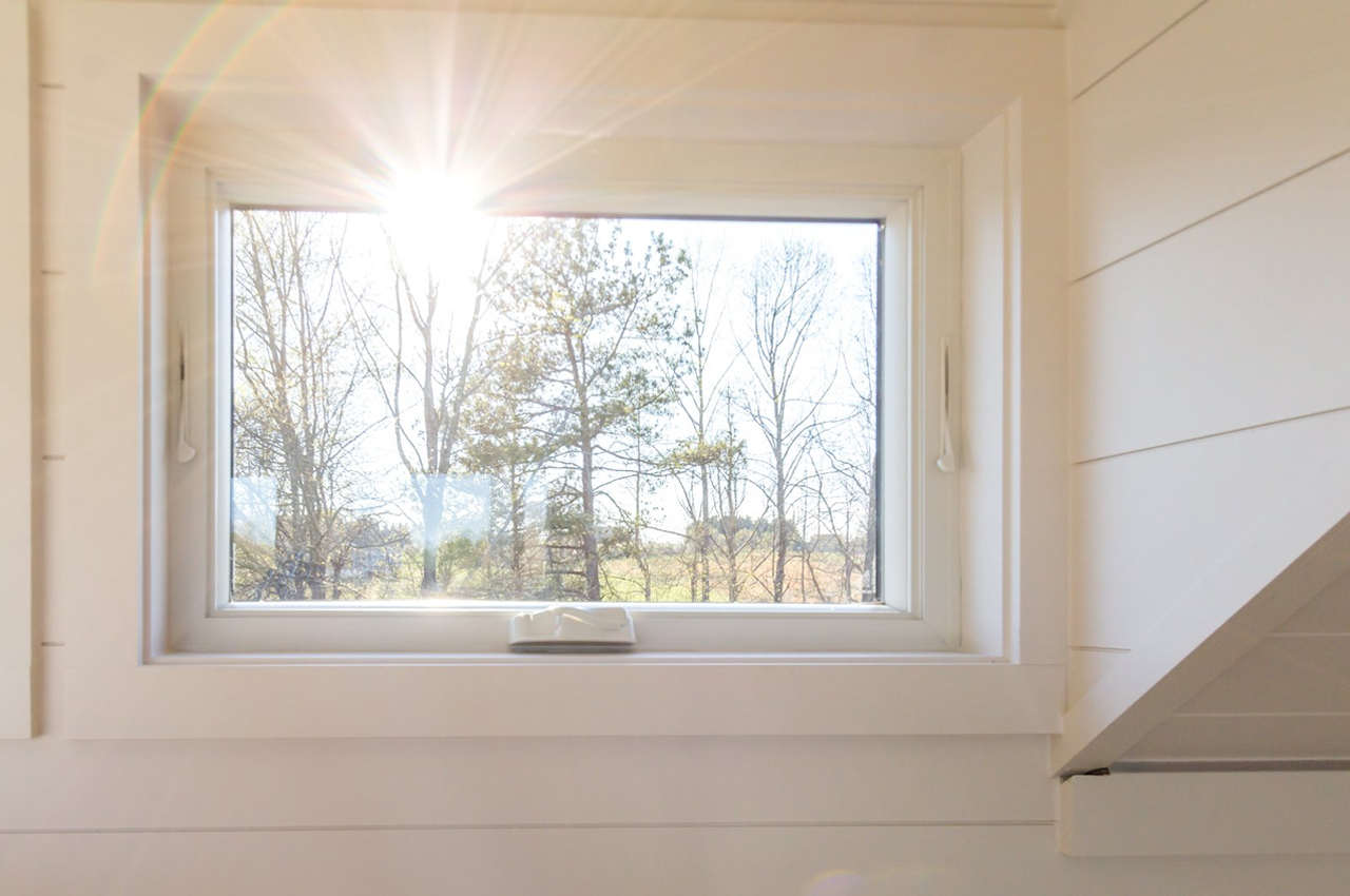
Echoing the exterior’s natural wood personality, white-painted shiplap line Elsa’s inside walls and are brightened by natural sunlight that pours in through fourteen windows on the home’s first floor. To maintain Elsa’s lofty appeal, Olive Nest describes, “We used lots of windows and kept the ceiling high for an open, airy look.” The kitchen especially feels open, with optic-white paneling and a gleaning quartz countertop that sparkles with natural sunlight ricocheting through the windows and glass shelving. The white-painted cedar shiplap continues throughout the home, rising even to the top floor loft bedroom where a queen-size bed is framed by six more windows.

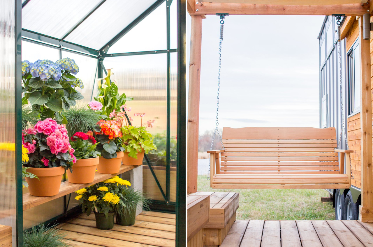
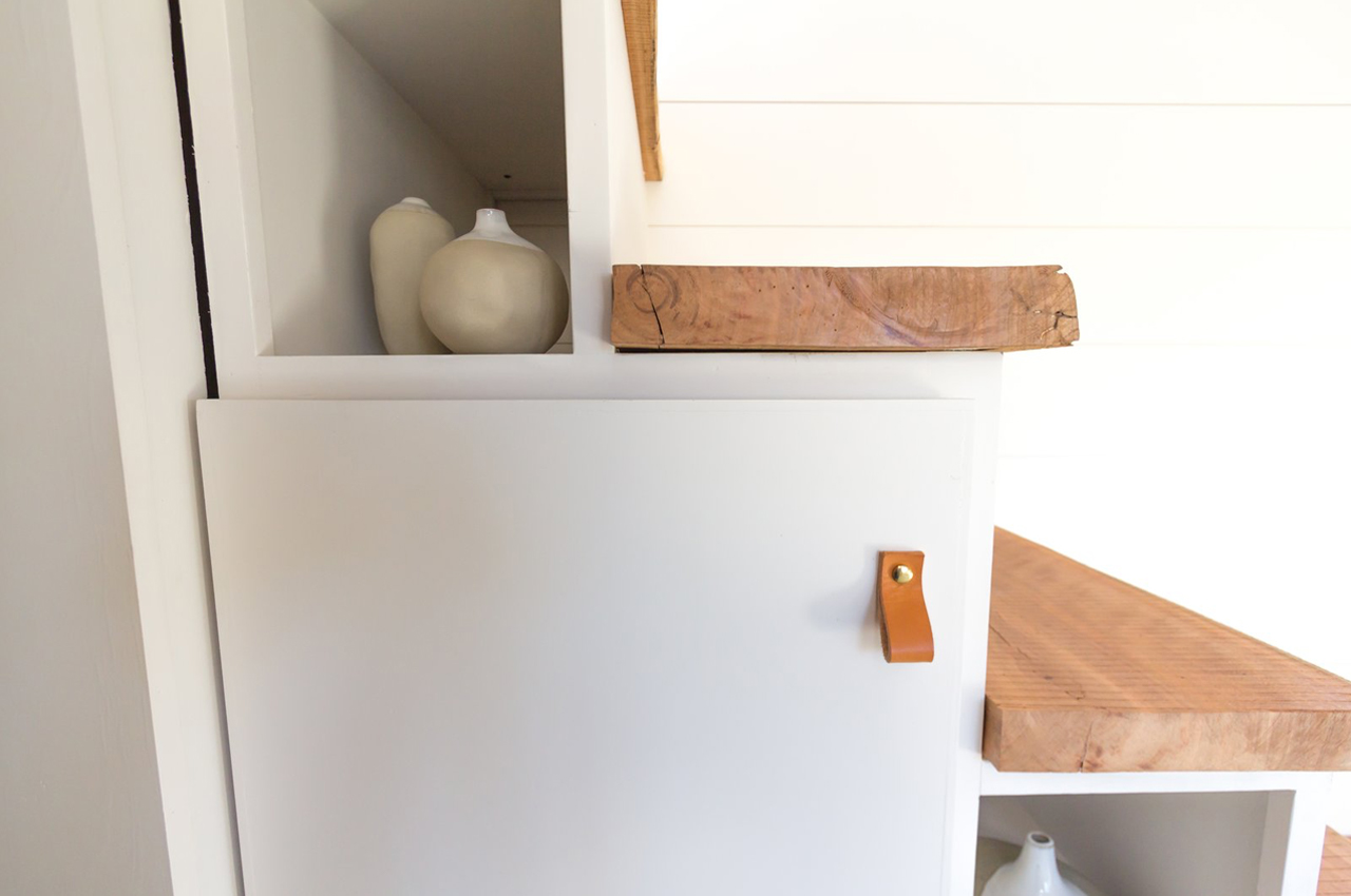
From the outside, Elsa welcomes residents and guests with a teeming porch garden and greenhouse, where you can relax on the porch swing. Then, the inside radiates a mellowed-down natural look with white-painted cedar shiplap that’s brightened up with natural sunlight. Throughout the home, accents like live-edge wood slabs and custom leather and brass fixtures work to remind residents of Elsa’s earthy simplicity, even in the details.

Designer: Olive Nest Tiny Home

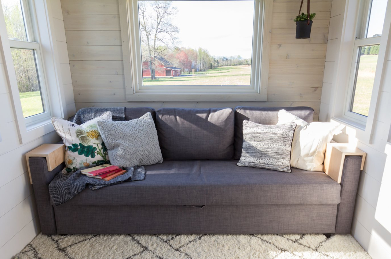
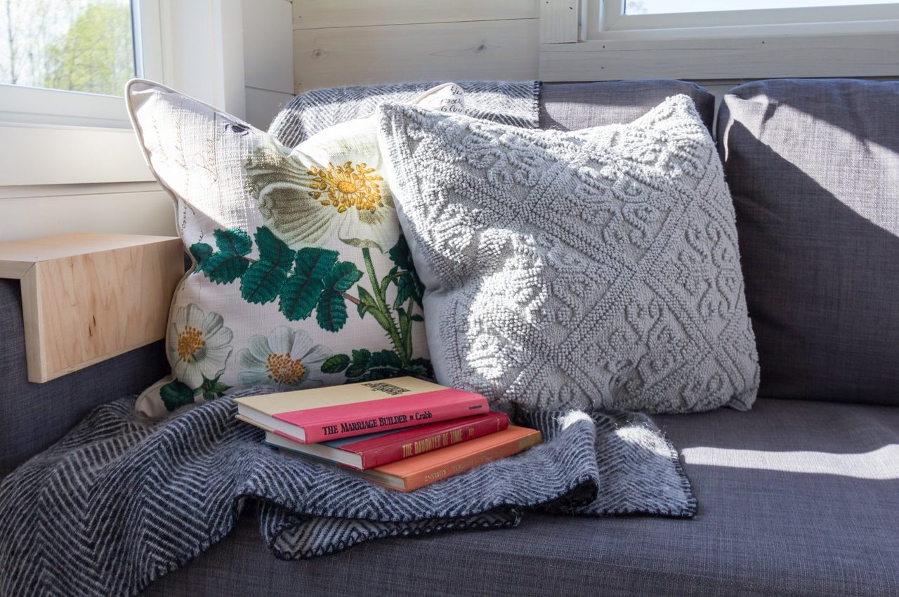
A cozy reading room bordered by expansive windows draws in plenty of natural sunlight. 

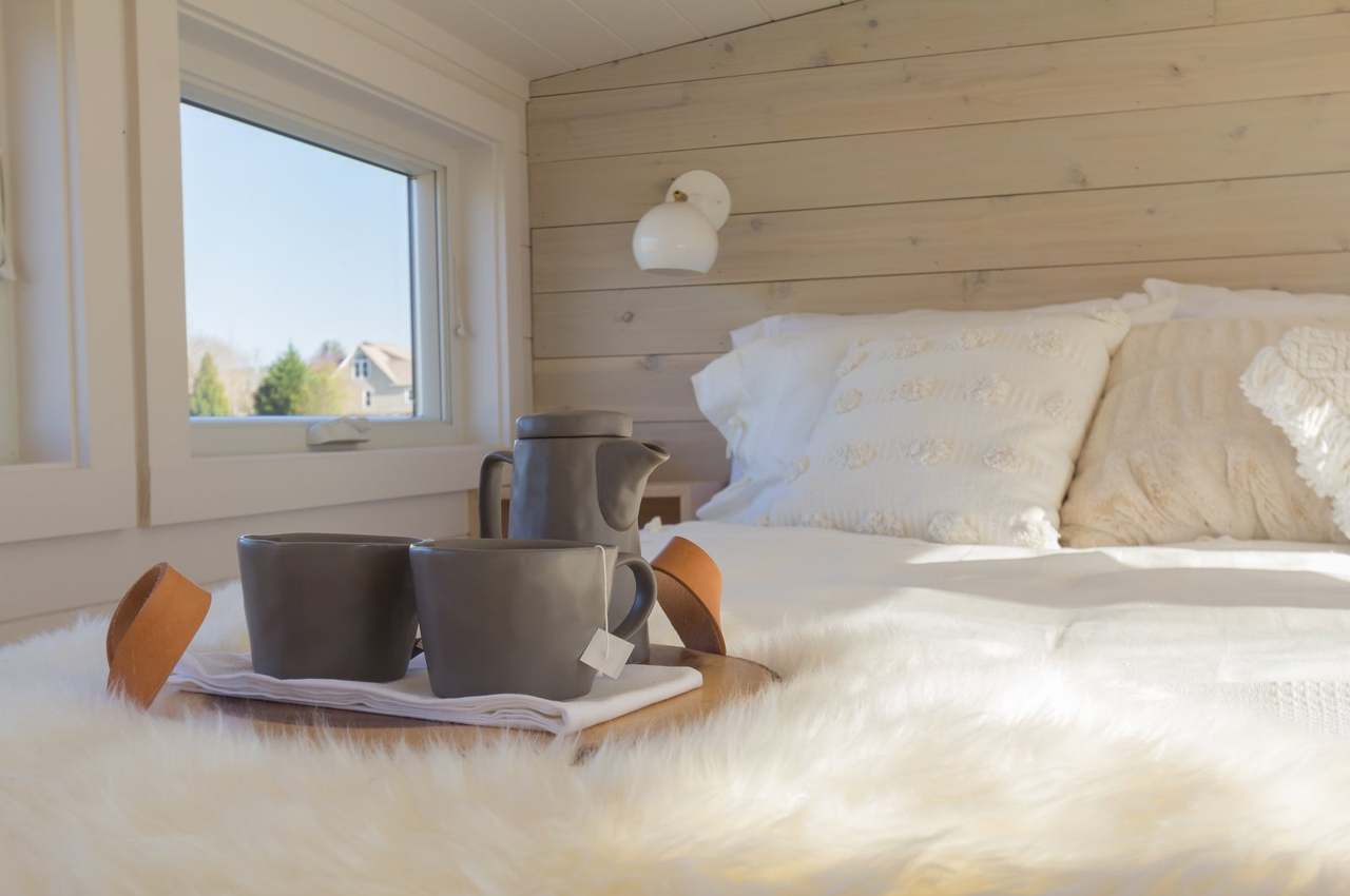
Upstairs, the loft’s bedroom is framed with six windows that brighten the queen-size bed’s white fabrics and the room’s white shiplap.

The kitchen trades in a worn white-painted shiplap look for optic white panels that merge with a sparkling quartz countertop.

Live-edge wooden slabs form the home’s staircase that leads to the loft bedroom. 

Outside, the garden teems with plant life and flowers to remind residents and guests of the home’s primary inspiration: nature.

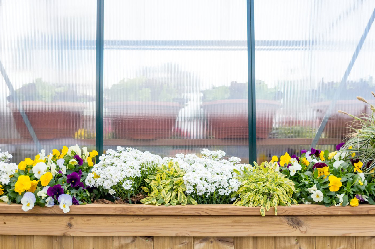
The greenhouse attachment buzzes with natural light outside and doubles as a privacy screen for the front porch.