Cubicle-like urban car concept envisions commuting havens of the future

Everyone travels, whether alone or with others, for work, school, or even leisure. Not everyone, however, enjoys traveling in the same way, especially those who prefer some quiet, solitary time during commutes. Unfortunately, most of the self-driving vehicle concepts seem to focus on turning cars into social spaces, practically removing boundaries between passengers. That’s probably fine for families and friends on their way to a vacation destination, but some people going to and from the office might prefer a bit of quiet downtime on the road. In contrast, this forward-looking design offers an alternative experience, one that envelopes the passenger in their own private space, and it seems to take inspiration from one of the most isolating designs man has ever made: the office cubicle.

Designer: Chloe Gao
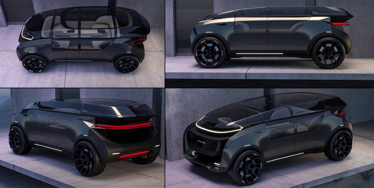
The idea of self-driving cars is for people to spare themselves the drudgery and exhaustion of driving so that they can spend more time on more important things. For some people, that might be making connections with other people in the vehicle, but others might prefer some “me time” instead. It’s for these people, especially the “Gen Z” group who value independence and personal immersion, that this urban commuting concept was designed.
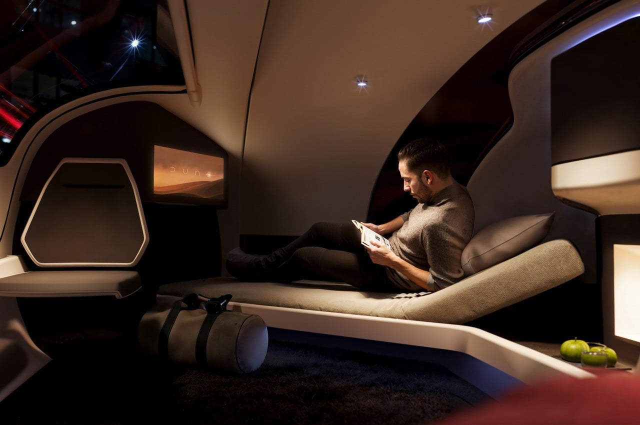
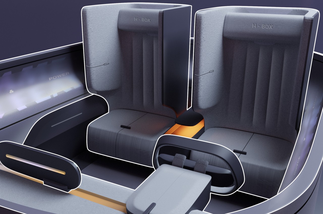
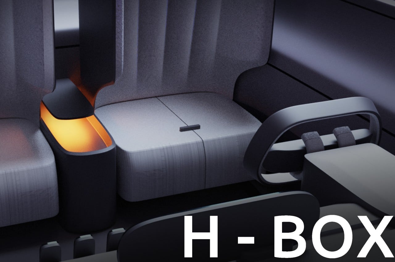
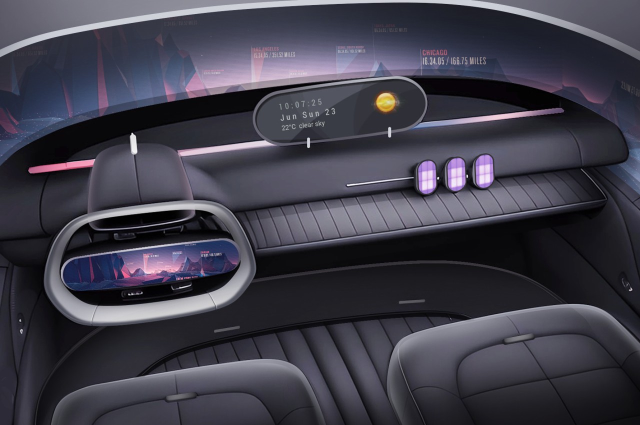
As its name suggests, the H-BOX concept turns the car into a box-like machine, and the two-seater model the chairs set to the back of the cabin. Unlike most self-driving automobile concepts, however, this seems to still pay heed to the need for manual control from time to time, so the “driver’s seat” can slide forward to take hold of the futuristic steering well if needed. That further widens the separation between the two seats, which might be a preferred configuration for two people who really want to be immersed in their own little corners.
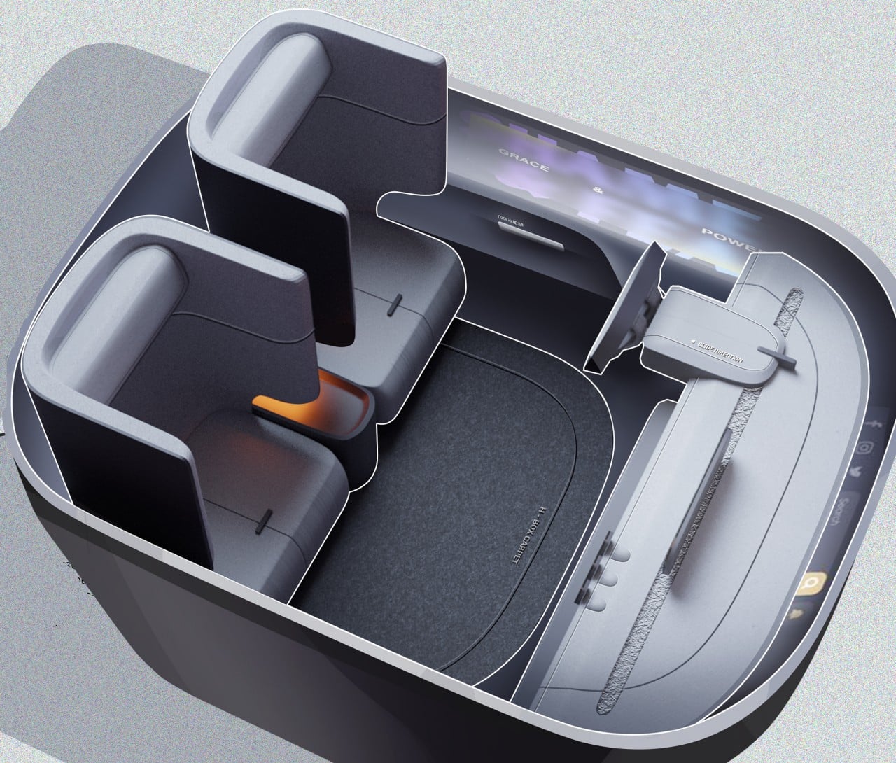
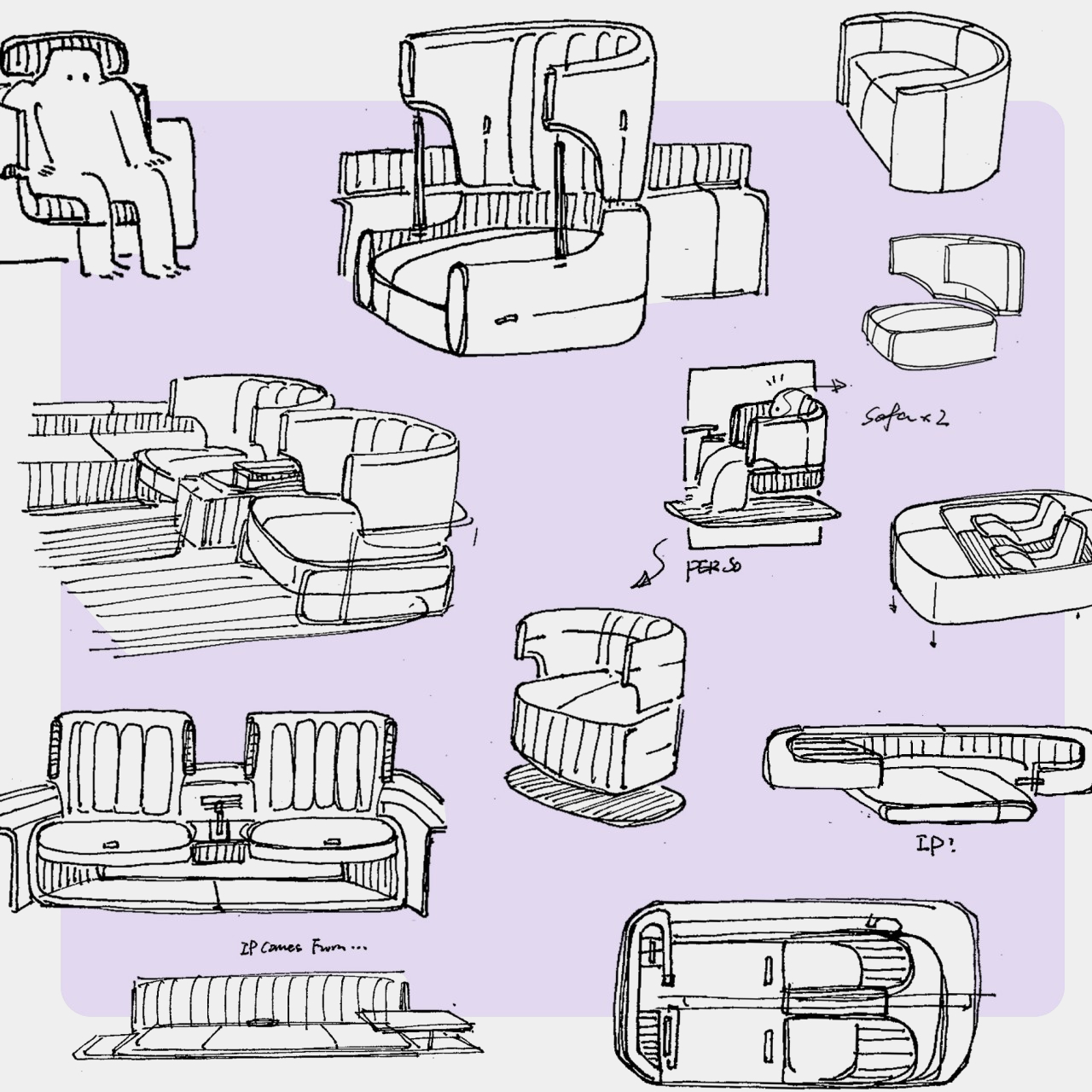
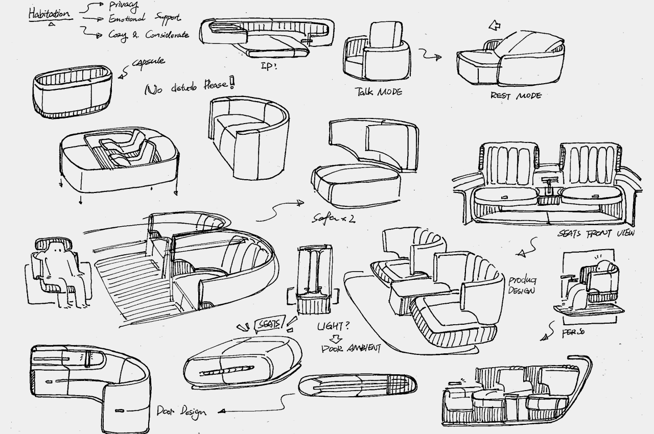
What makes the H-BOX distinctive, however, are the seats themselves. Where most designs would feature reclining seats that seem to offer the ultimate comfort, these surround the passenger from almost all sides except the front. In other words, it boxes them in, shielding them from the other person in the vehicle while still giving them a clear view of their surroundings. Admittedly, it doesn’t look like the most comfortable design, though it wouldn’t be impossible to have the seat move forward and the backrest lean backward for that same reclining effect.
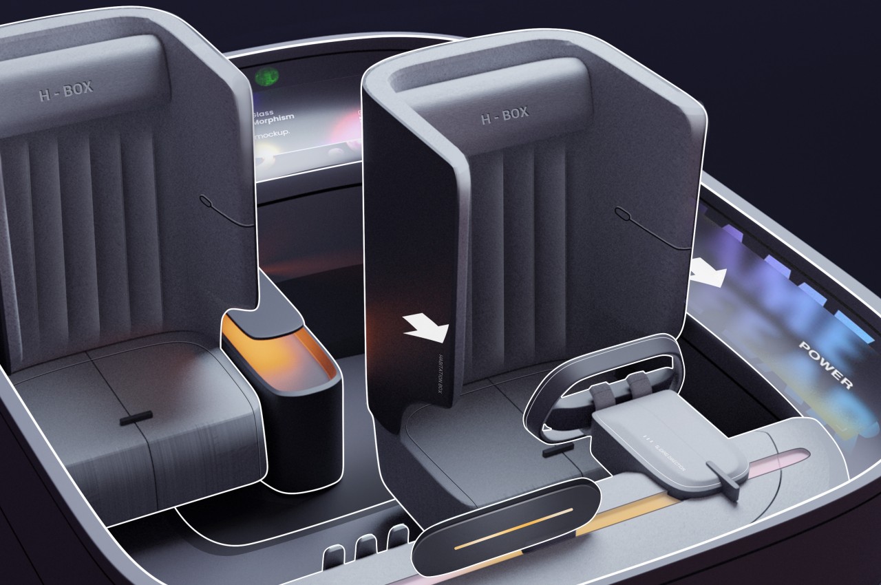
Then again, the purpose of this self-driving vehicle is to quickly get commuters to their destinations with minimum fuss and perhaps minimum interactions. At the same time, however, the interior of the vehicle still offers a convenient and advanced experience complete with a display that wraps around the interior of the cabin. It does seem to cater to a very niche audience, a generation that might no longer even be around by the time self-driving cars fully take root, but it could offer a more solitary experience for people who prefer to travel in peace and quiet.
The post Cubicle-like urban car concept envisions commuting havens of the future first appeared on Yanko Design.
Self-driving car concept is a hotel-like sleeping pod on wheels

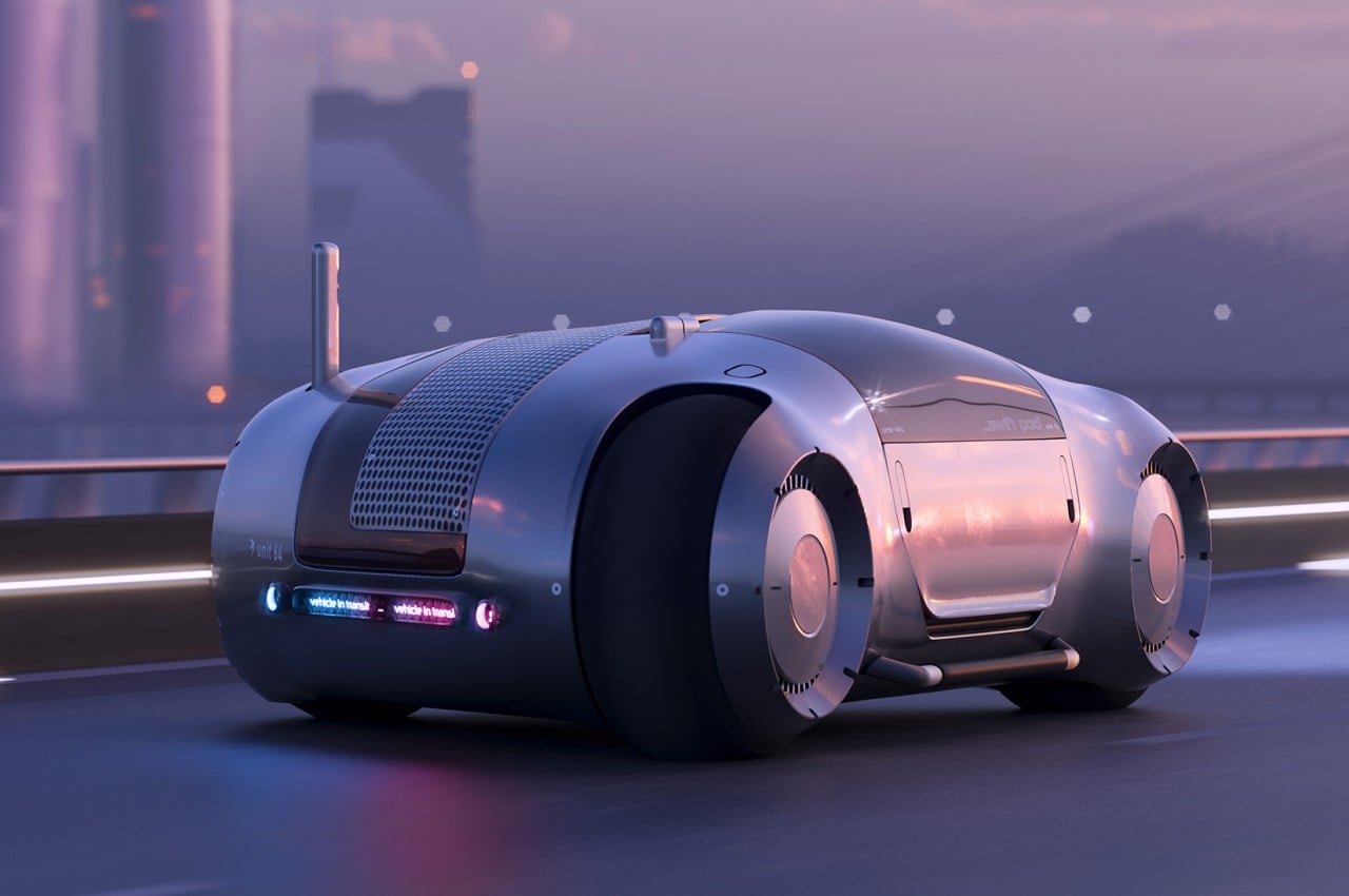
Autonomous vehicles are still a somewhat controversial topic these days, but even detractors and critics will begrudgingly admit that it is the inevitable future. Given a foolproof and safe implementation, it opens up plenty of opportunities for people to do more during their travels, especially over very long distances. They can be more productive with work, spend more quality time with family, or simply get a good night’s sleep in transit. The latter isn’t exactly comfortable to do with today’s car designs, but that’s only if you don’t let go of current conventions and limitations. This design concept for a mobile sleeping pod, in contrast, pulls out all the stops and demonstrates what’s possible with the right technologies, the right design, and especially the right shape.

Designer: Peter Stulz

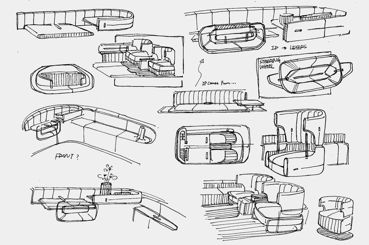
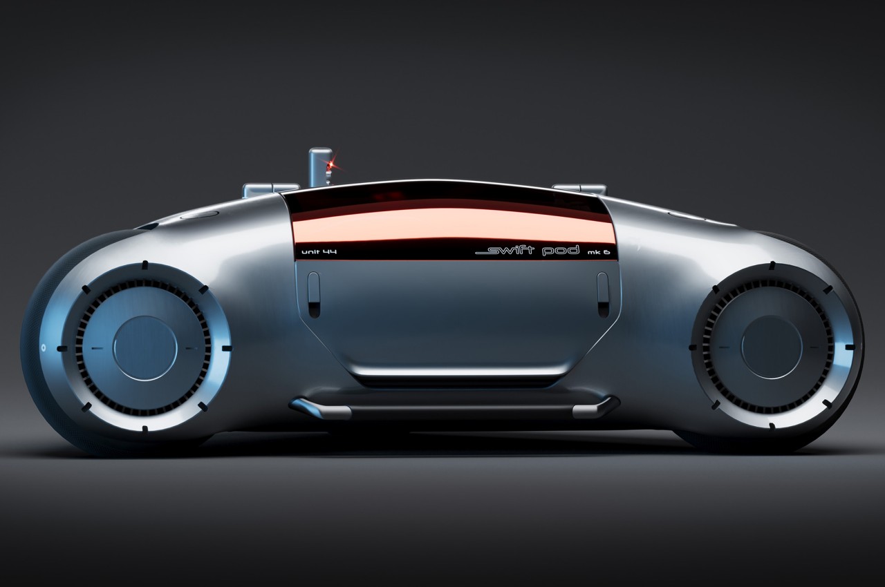
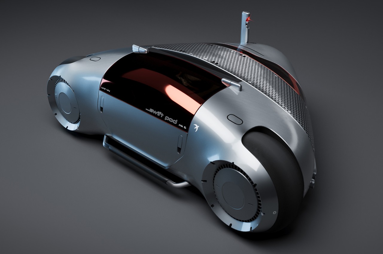
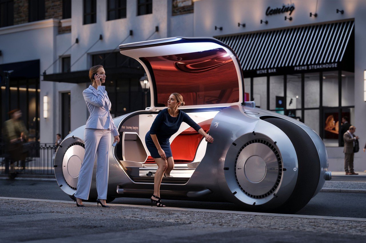
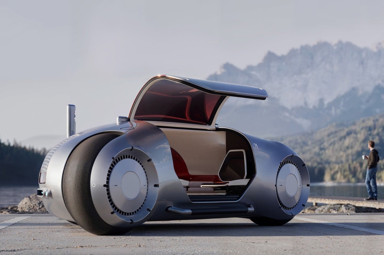
When viewed from its profile, the Swift Pod looks more like a gigantic motorcycle, a vehicle that stands on two wheels only. It’s definitely not your regular motorbike, even disregarding the significantly larger size, because it looks more like a cross between a bike and a car from the way it has a cabin instead of just a seat. When viewed from the top, however, the vehicle is revealed to actually run on three wheels, forming an odd triangle shape instead of a typical box you’d expect from cars.

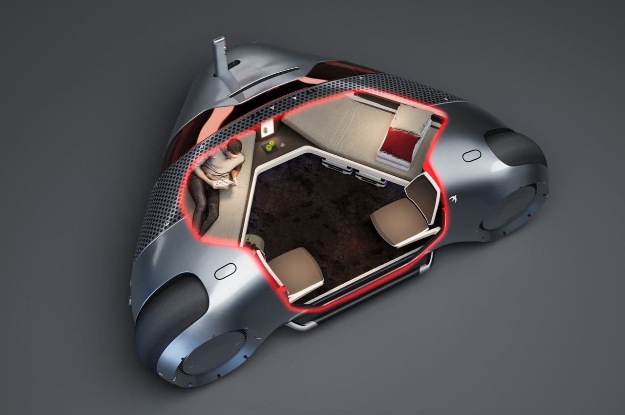
The choice of the shape isn’t for appearance’s sake, though, but was made to maximize available space inside while minimizing the vehicle’s size. After all, the Swift Pod is designed to have two adult-sized beds inside, one on each side of the triangle, in addition to two chairs, amenities, and, of course, the vehicle’s actual hardware and components. The concept, after all, is for a mode of transportation that will let you sleep through your journey, at least if you want to. There’s plenty of space for two people to do anything, including working if necessary.

The concept was inspired by how some people are able to get a decent amount of sleep on trains and planes, and that’s without a comfortable bed or other conveniences. With Swift Pod, you not only have a comfortable place to recline but also an entertainment system, snacks and beverages, and plenty of storage for your belongings. What it doesn’t have room for is a human or physical driver.

The Swift Pod concept only works if autonomous driving has reached a point where one can really entrust their safety to these invisible drivers. The design envisions an extremely smart self-driving vehicle that, after booking a ride like a taxi, would be able to determine the best path toward your destination and navigate the roads safely. While the default is to simply go from point A to point B in one go, the system also has room for stop-over breaks where you can get off, eat some heavier meals, and freshen up before you take the next leg of your journey in the comfort of a bed.

The post Self-driving car concept is a hotel-like sleeping pod on wheels first appeared on Yanko Design.

This Helicopter Is So Easy To Control, A Toddler Could Probably Operate It

With just one joystick and two touchscreen panels, the Skyryse One is making helicopters more autonomous, intuitive, and safe.

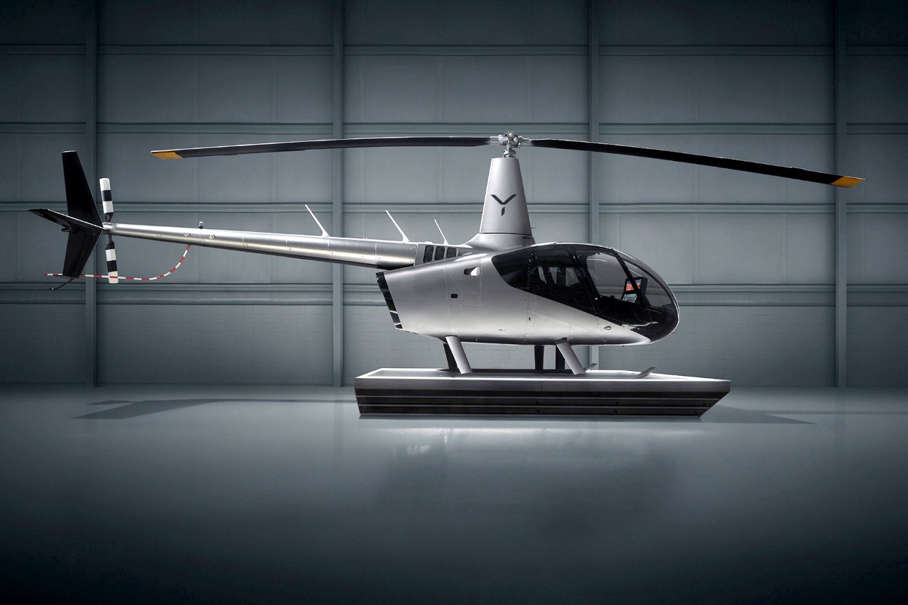
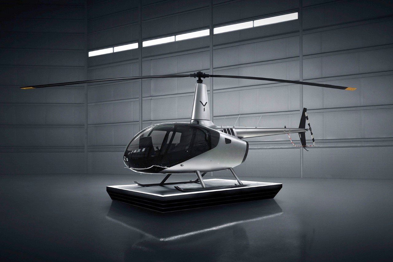
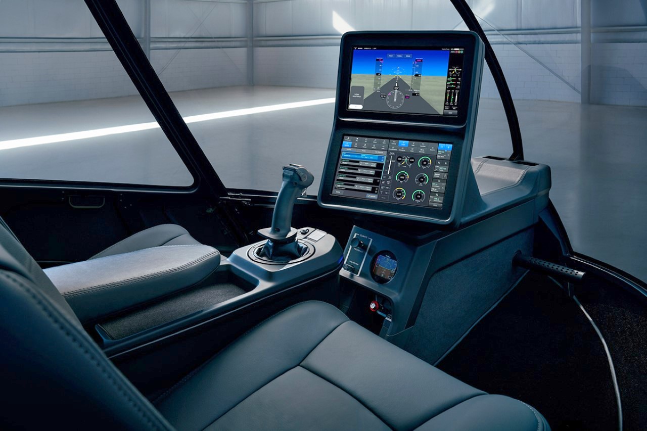
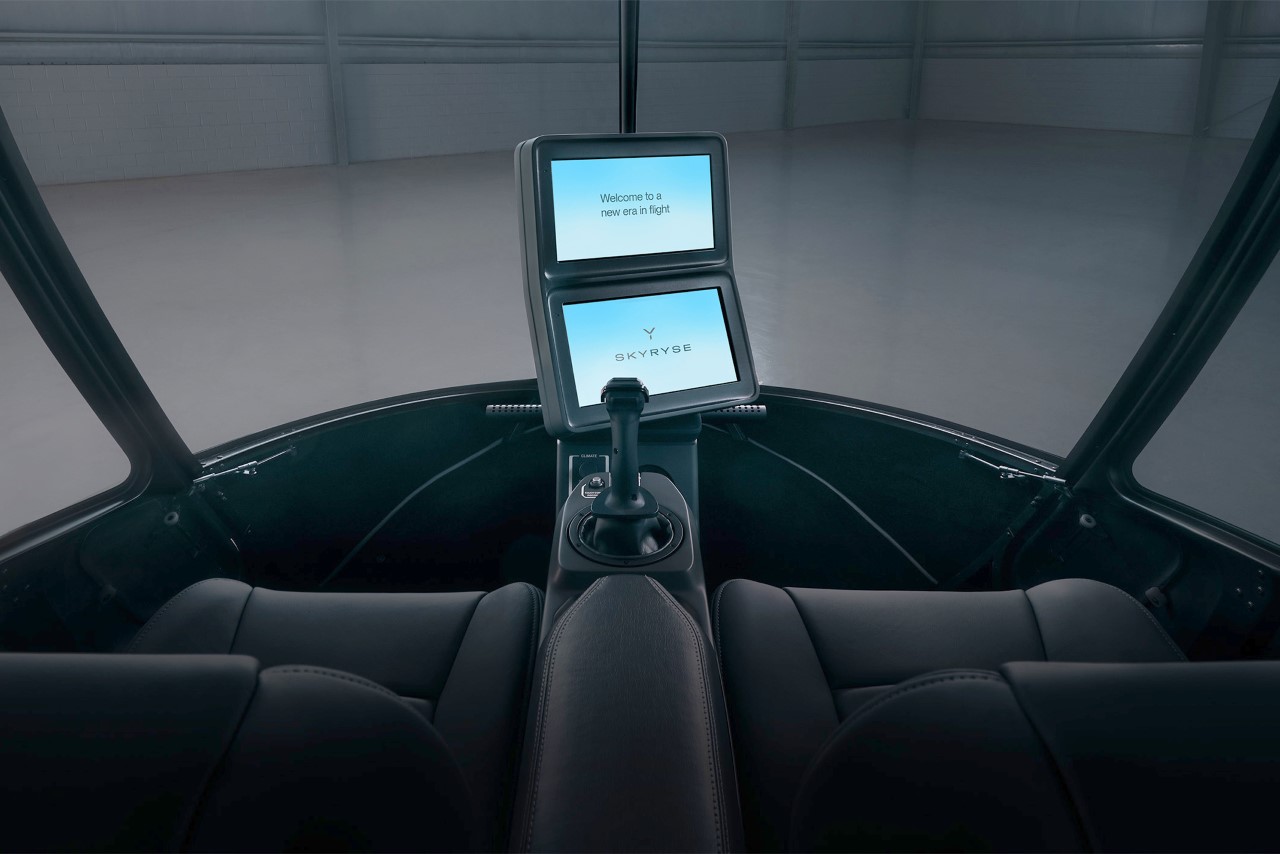
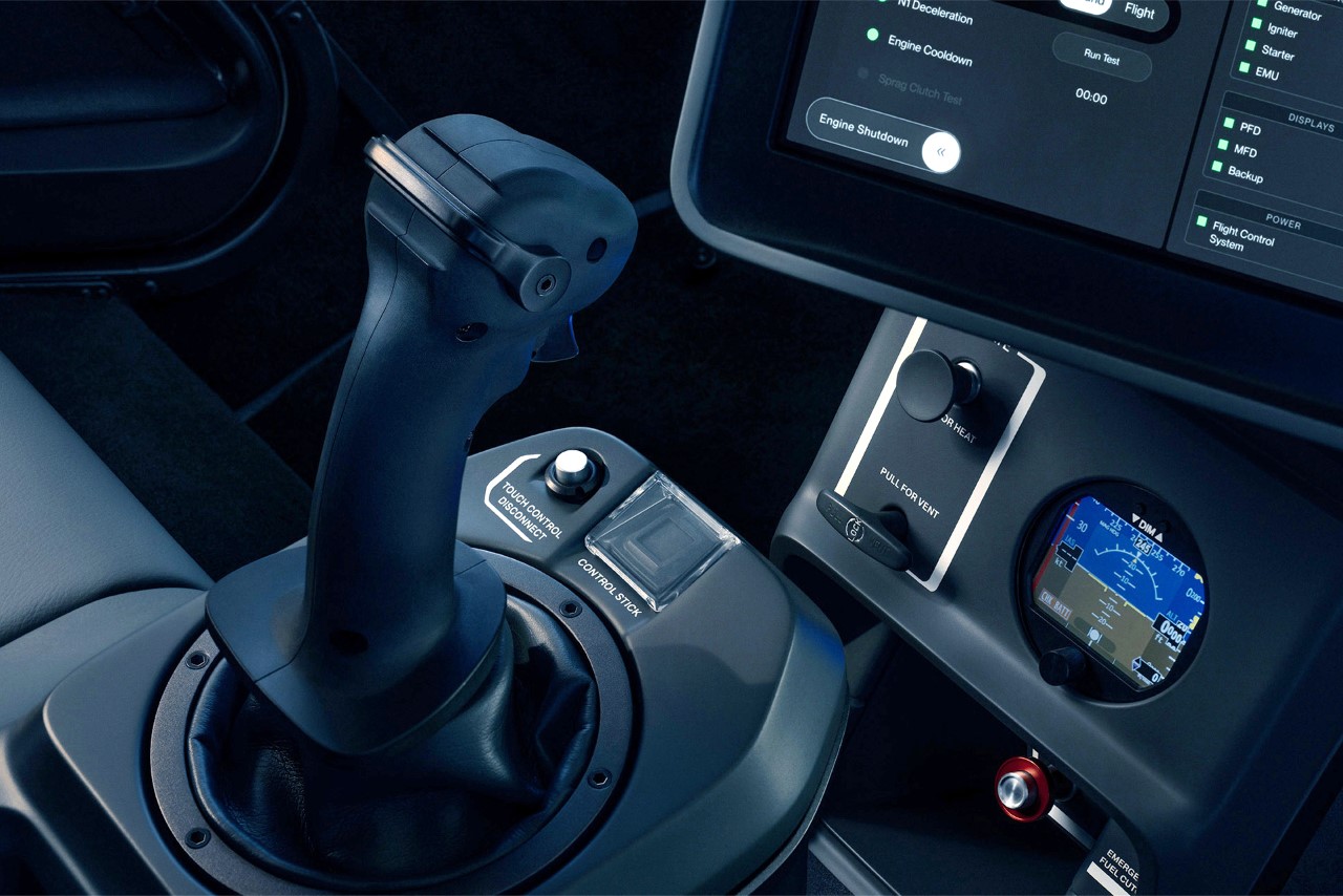
Helicopters, like pretty much any airborne vehicle, are notoriously difficult to operate. You’ve got controls in front of you, beside you, sometimes even above you – it’s no wonder you need a license with hundreds of hours of training to be able to professionally pilot one. While understandably, you’d expect helicopter pilots to go through rigorous training before being certified to operate a hunk of metal through the sky, there’s really no need for control panels and dashboards to be as complicated as they are. Founded in 2016, Skyryse has been working to simplify how helicopters are operated. Distinct from traditional helicopters, the Skyryse One eschews conventional controls like the cyclic stick, collective lever, throttle, and anti-torque pedals for a simplified control scheme centered around a single stick and a touchscreen interface. This design philosophy is built around Skyryse’s proprietary SkyOS system, which aims to enhance safety by streamlining operations and automating critical functions such as takeoff, hovering, and in the event of system failures, autorotation and landing. The company’s first-ever helicopter, the Skyryse One, puts this new control panel front and center. In fact the company claims it’s so easy to learn, you need just 20 hours of practice before taking to the skies.

Designer: Skyryse

Eschewing the traditional, mechanically complex controls found in helicopters, Skyryse introduces a fly-by-wire system controlled by a single four-axis control stick and two touch screens. This system, powered by Skyryse’s proprietary SkyOS, brings an unprecedented level of simplicity and safety to aviation​​​. Fly-by-wire, a technology where electronic systems replace mechanical ones, is not new to aviation but applying it to helicopters in such a simplified manner certainly is. The SkyOS enhances this system by continuously analyzing pilot input, environmental conditions, aircraft status, and flight parameters, ensuring the aircraft remains within a safe flight envelope​​​.

One of the most groundbreaking features of the Skyryse One is its fully automated autorotation capability. In traditional helicopters, autorotation is a complex emergency maneuver required when the engine fails, demanding immediate and precise actions from the pilot. The Skyryse One, through SkyOS, automates this process, significantly reducing the pilot’s workload and making emergency landings safer​​​.

Moreover, features like auto-pickup and set-down, swipe-to-start, and hover assist simplify operations that previously required intricate control and coordination. The inherent stability feature of the Skyryse One means that at any point, the pilot can release the controls, with the aircraft immediately activating autonomous protocols to maintain safe flying parameters.

Skyryse is making the dream of piloting more accessible. Despite its advanced technology, flying the Skyryse One only requires a standard helicopter Private Pilot License. For those already licensed for airplanes, transitioning to the Skyryse One involves just an additional 20 hours of flight training. This approach could significantly expand the helicopter pilot community by lowering the entry barrier to flying​.

As revolutionary as it is, the Skyryse One comes with a hefty price tag of $1.8 million. However, for aviation enthusiasts and professionals looking for the cutting edge of safety and simplicity, the investment might well be worth it. The company has started accepting a $2,500 deposit for reservations, with deliveries expected to begin following airworthiness certification​​​.

The post This Helicopter Is So Easy To Control, A Toddler Could Probably Operate It first appeared on Yanko Design.

California Regulators approve ‘Turquoise Blue’ car lights to indicate ‘Self-driving modes’

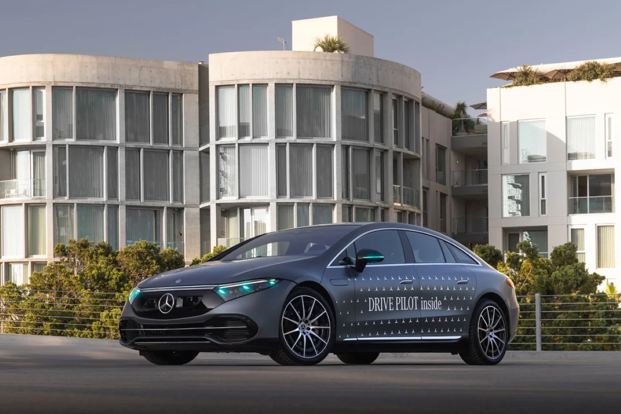
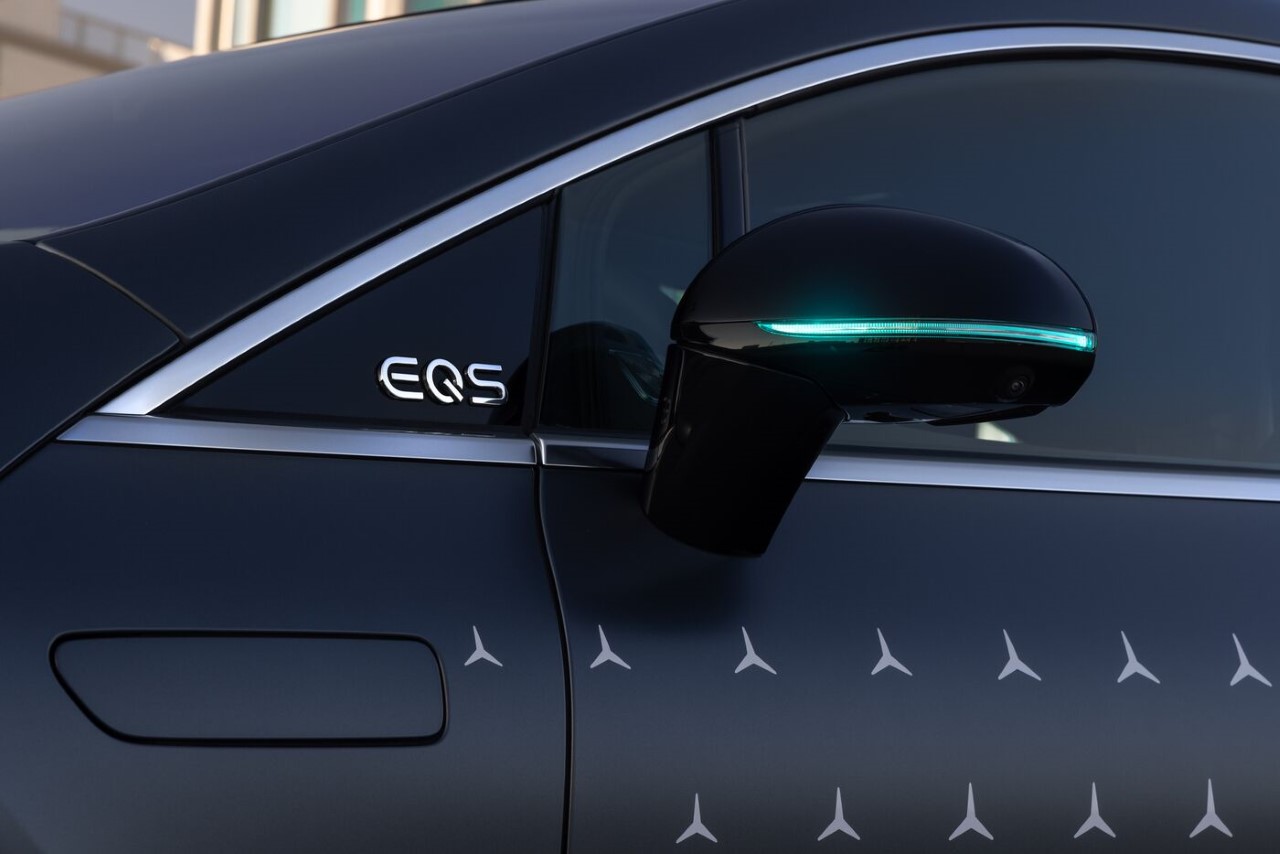
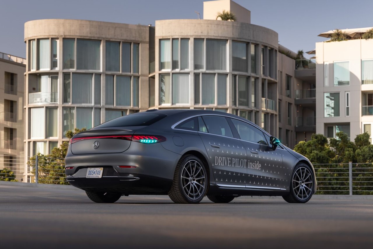
Even though it’s been nearly a decade since self-driving tech made it to our cultural forefront, we’re still in the process of figuring out how to make the technology safer, how to implement it in current urban setups, and more importantly, how to successfully legislate it. There’s always a moral conundrum with who is to blame if a self-driving car hits a pedestrian (the driver or the algorithm), but Mercedes-Benz approached this problem laterally by asking the question: How can pedestrians tell if a car is driven by a human or an algorithm? The answer comes in the form of a colored light. Regulators in California and Nevada have approved Mercedes’ use of a turquoise blue indicator (on the front, sides, and back) to help pedestrians and other cars know when the vehicle is being controlled autonomously.

Designer: Mercedes-Benz

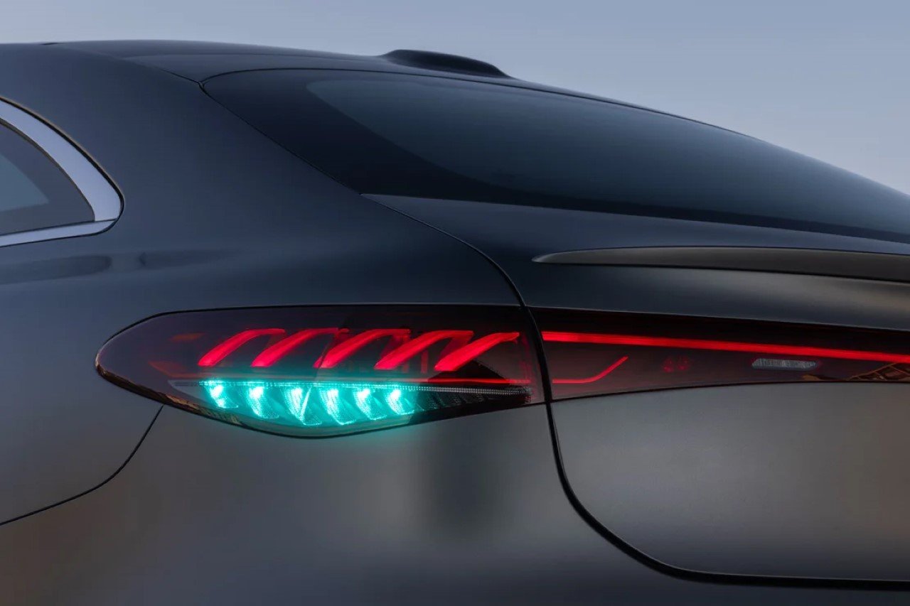
Let’s paint the picture: currently, U.S. cars typically sport three light colors – white for headlights and reverse lights, red for brake and rear lights, and amber for turn signals. Enter Mercedes-Benz, breaking the mold with its turquoise blue lights, a feature that will activate when their cars are driving autonomously.

The lights are part of Mercedes’ “Drive Pilot” system, a conditionally autonomous technology. It’s legal only in California and Nevada for now, where it’s been tested. The system allows drivers to relax a bit more in traffic jams on certain highways, even letting them take their eyes off the road when the vehicle is moving at speeds below 65 km/h. This is a leap from other driver assistance systems, like Tesla’s Full Self Driving or GM’s Super Cruise, which require drivers to remain vigilant.

The choice of turquoise blue is no accident. It’s distinctive, ensuring no confusion with existing car light colors, and it’s different enough from the darker blue used by police and emergency vehicles. This selection is backed by the Society of Automotive Engineers, though Mercedes is the first to receive approval for its use. This innovative color will make its appearance around the taillights and headlights of the vehicles equipped with it.

But why go to all this trouble for a color? It’s all about clarity and safety. The turquoise blue lights serve as a clear signal to other road users and law enforcement that the vehicle is under full automated control. This is crucial in situations where the driver might not be looking at the road, ensuring that onlookers don’t mistakenly think something’s amiss. Starting early 2024, this system will be available in Mercedes S-Class and EQS models in Nevada and California, but not beyond these states just yet​.

The post California Regulators approve ‘Turquoise Blue’ car lights to indicate ‘Self-driving modes’ first appeared on Yanko Design.

Futuristic crossover SUV explores a new design aesthetic with a staggered cockpit and headlights

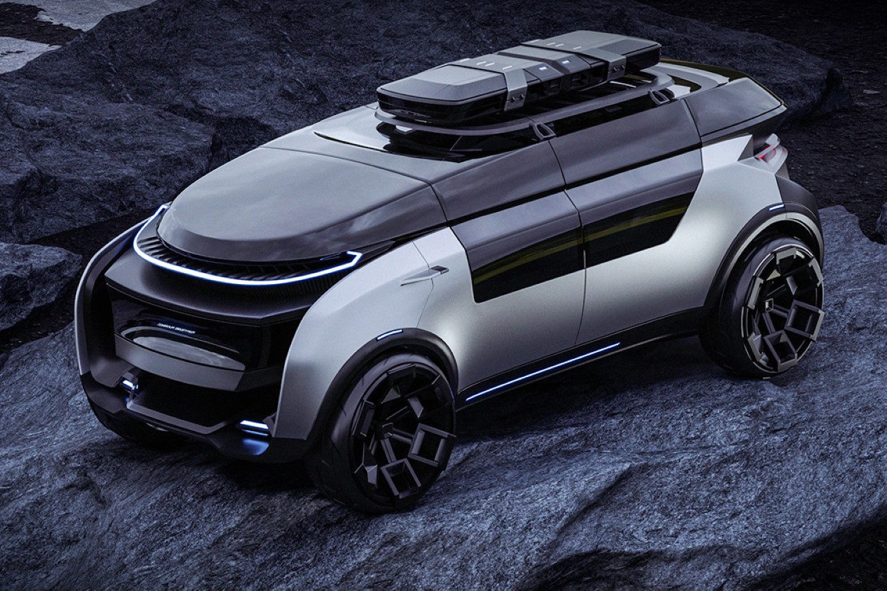
Although it doesn’t really appear traditionally aerodynamic at first glance, the DKM 2.0 has an aesthetic that feels minimal yet complex, and builds on the future of automotive design by having a radical visual approach.

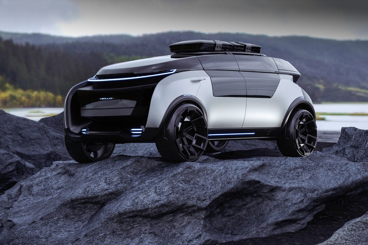
Designed as a fully autonomous vehicle, the DKM 2.0’s visual aesthetic immediately stands out as unique. Its silhouette looks nothing quite like any other car. It isn’t as maximal as a sports car, or as minimal as today’s electrified SUVs. Instead, it’s a fusion of the two, relying on multiple forms stacked on one another that have been merged and simplified. The car features a unique interior with seating designed more like a room than a car. Seats face each other, creating a cabin on wheels that allow passengers to socialize with each other as the car autonomously moves forward. The concept ditches the steering wheel and dashboard entirely too, in a bid to imagine what fully-autonomous vehicles can and should look like.

Designer: Vladislav Semenov

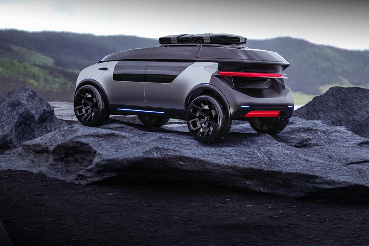
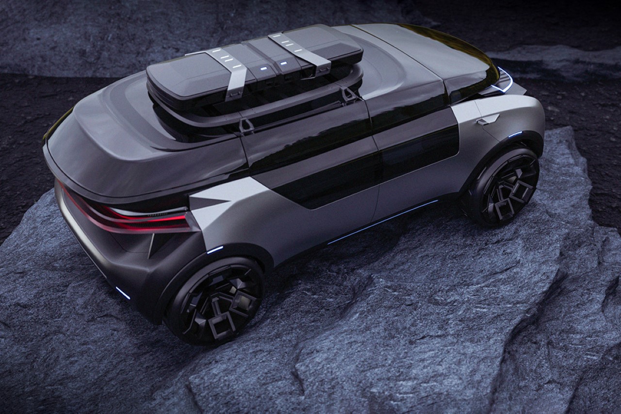
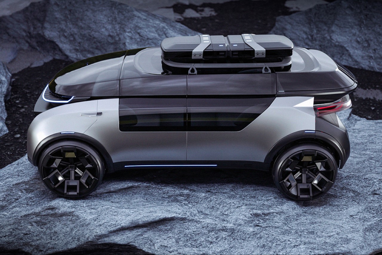
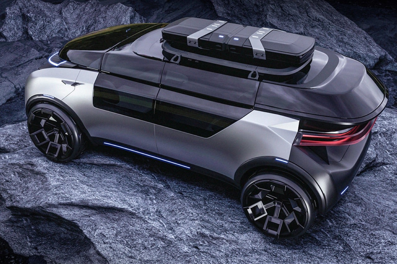
The car’s design comes from Kazakh automotive stylist Vladislav Semenov. As far as its references go, it seems like the DKM 2.0’s most notable inspiration comes from vision conceptual automobiles, combined with the realistic design of companies like Rivian, Canoo, and Polestar. There’s a level of purity in the use of silver and black, and those headlights look clean and futuristic as heck. However, the upper and lower halves of the car are designed in a staggered way that instantly draws the eye. The front of the car features a flat-ish panel where you’d expect the radiator grill, with the front fender emerging outwards, almost like shoulder blades. This probably helps guide air into the car’s intakes on each side, while the top has that razor-thin headlight, and then the ‘windscreen’ that emerges almost like an independent entity.

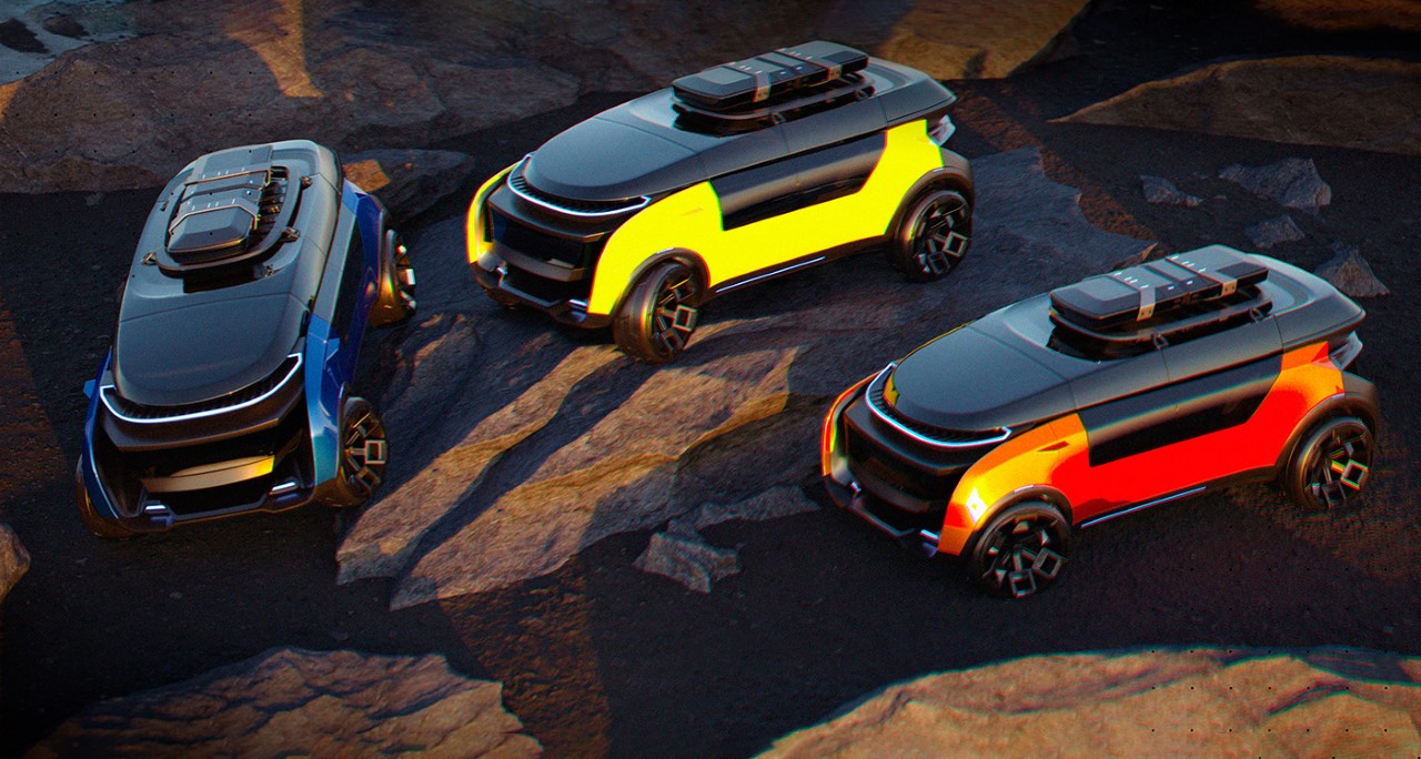
This unique stepped design provides an interesting visual, since it causes an obvious break in the surface, but it’s also where I suspect all the car’s sensors are housed. The stepped/staggered design can be viewed on both the front and the back, housing all the sensors, while the cockpit sits in between, and has what I imagine is a glorious view on both the sides as well as the top thanks to panoramic windows that extend all the way from the middle of the doors right to the top. Alternatively, the top can be used to place a cargo box (given that the amount of boot storage in this car hasn’t quite been made clear yet), which may obstruct your view a tad bit, but it’s a small price to pay for extra cargo.

The DKM 2.0 wasn’t designed for city roads. Its large build, high ground clearance, and rugged tires indicate that the car’s made for all sorts of terrain, be it urban or otherwise. As most SUVs and pickups go, the DKM 2.0 probably boasts a large range too, allowing families, friends, and colleagues to go on road trips without worrying about how to get places. The fully autonomous feature makes road trips easy and more fun, also giving you the possibility to break open a few beers on the way without worrying about having a designated driver!

The post Futuristic crossover SUV explores a new design aesthetic with a staggered cockpit and headlights first appeared on Yanko Design.

Hyundai wins the 2022 Red Dot Design Concept Luminary Award for their Hydrogen-powered Trailer Drone

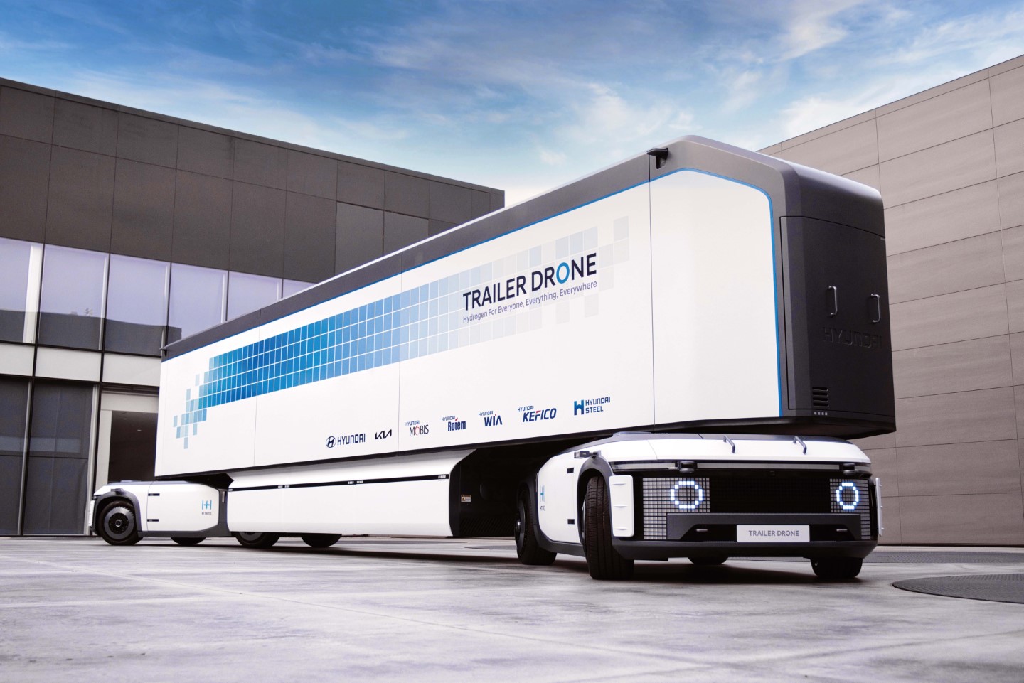
Out of more than 4000 entries to the Red Dot Design Concept this year, the Hyundai Design Center (the in-house studio for Hyundai Motor Company) edged out a win for their Trailer Drone – a unique and innovative future mobility solution that combines fuel cells, trucks, trailers and robots on a single platform to make logistics easier, faster, safer, and more sustainable.

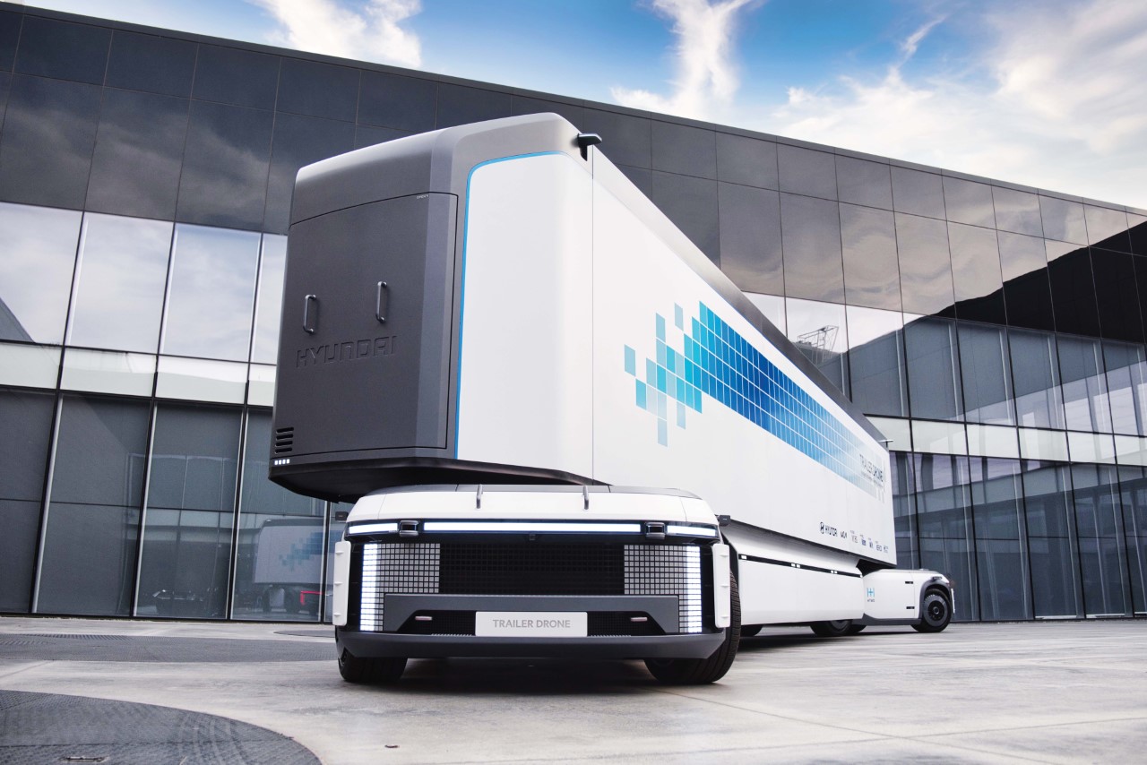
The Trailer Drone works on a fully autonomous framework, requiring absolutely no human intervention in the operational process. The large E-Bogies house the fuel cells as well as provide a large space for cargo, and are operated by the platform-shaped drones that plug into the front and rear, giving it increased and autonomous mobility. “The e-Bogie, derived from railroad car technology, is a driverless mobility concept that efficiently houses essential components such as propulsion, control, steering, and suspension units within a limited space”, say the Hyundai Design team led by team lead Lee SangYup.

Designer: Hyundai Design Center

The Trailer Drone is an exhaustive and modular ecosystem featuring E-Bogies and smart drone platforms that can operate them within warehouses as well as on roads with Level 5 autonomy. The lack of humans makes the entire operation safer and smarter, and the absence of a traditional ‘cockpit’ means more space to store cargo and additional room for fuel cells, boosting efficiency.

The E-Bogies house multiple hydrogen fuel cells, which provide power to the drone platforms while being 100% emission-free and safe for the environment. The hydrogen tanks, which are mounted at the front and bottom of the E-Bogies, provide a range of 1,600km per charge. The concept secured the Luminary Winner title at this year’s Red Dot Design Concept Award for its unique take on modularity and mobility. The team at Hyundai managed to build a self-sustaining emission-free framework that allows for the efficient transportation of cargo with little human intervention. The drones can transport cargo within storage yards as well as across cities/states, relying on smart level 5 autonomous technologies that allow them to efficiently get from A to B. In the event that multiple trailers need transporting, they link up wirelessly, forming an invisible train of sorts that can efficiently travel on roads and highways without having a human at the wheel.

The Trailer Drone is a Luminary Winner of the Red Dot Design Concept Award for the year 2022.

The post Hyundai wins the 2022 Red Dot Design Concept Luminary Award for their Hydrogen-powered Trailer Drone first appeared on Yanko Design.
These autonomous pods are re-imagining safe public-transit by making local trams and buses smaller

Although this sense of paranoia is fairly recent, the thought of stepping into an overcrowded bus or subway should probably strike fear and panic in most of us. Imagining “Public Transport” without the word “Public” can be difficult. How do you create a mass transit system that’s bespoke, and that doesn’t involve multiple people in close proximity? And moreover, how do you manage this system while ensuring it’s beneficial to the public and safe for cities?

Those are some really tough questions, and NewDealDesign seems intent on looking for the answers. Having worked on a whole slew of smart-mobility projects, including the recently debuted ‘Serve’, an autonomous delivery robot for Postmates, the San Francisco-based company carried their wealth of research and experience into Rolla – the future of city-based mass-transit.

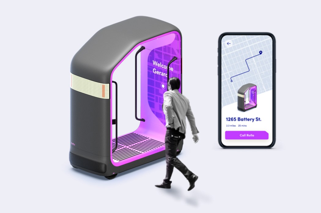
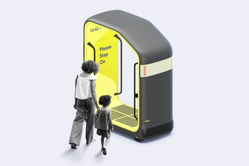
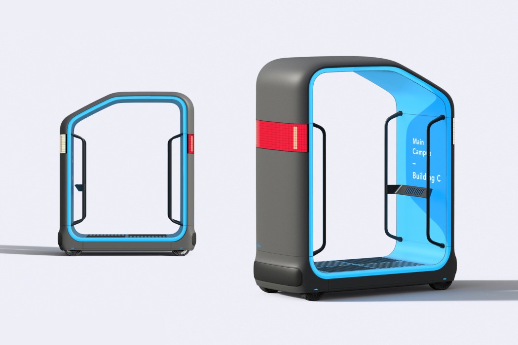
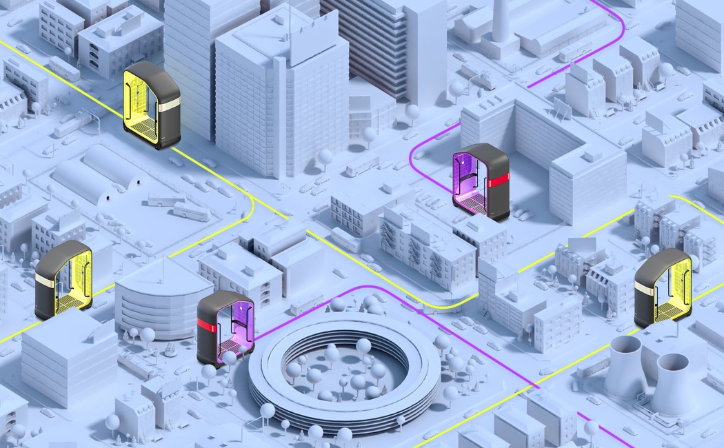
Rolla takes mass-transit and personalizes/isolates it. Think of something on the lines of individual ski-lifts, or cable-cars traveling on the same network… minus the cables. Designed as a cabin that moves, the Rolla is an entire network of human-sized, human-friendly pods that you can step in and step out of (another relevant example that comes to mind is that of an elevator). The Rolla has the ability to work on fixed routes like a public bus, allowing you to hail one and step in, as well as on personal routes, letting you summon a Rolla on an app. Designed for relatively short journeys, the pod allows you to stand within it as it travels to your stop.

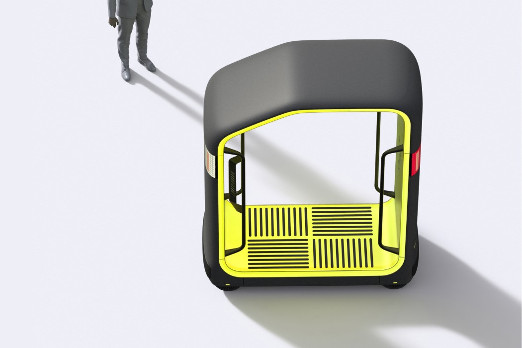
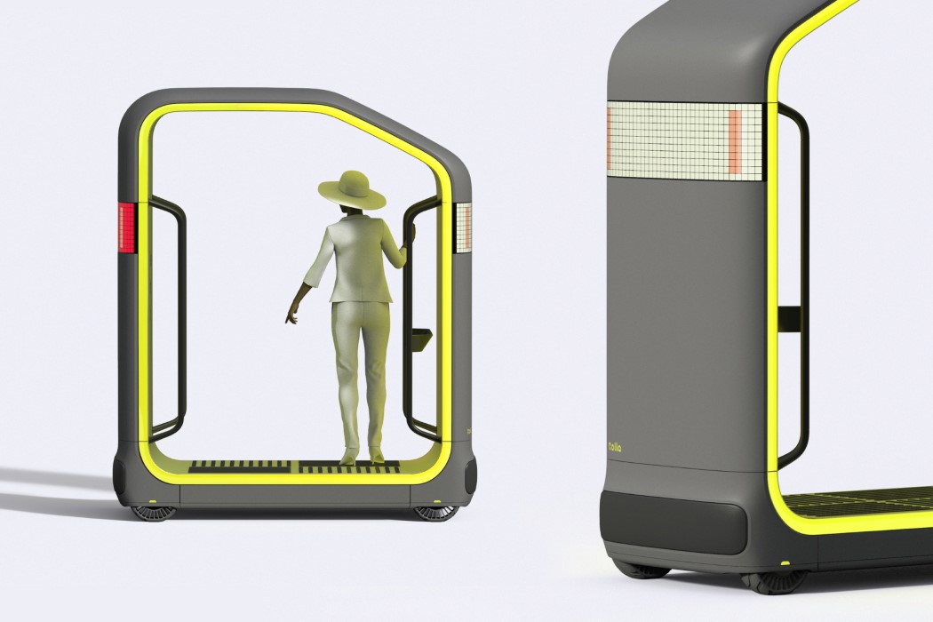
What the Rolla gets right is its simplicity and intuitiveness. It’s a culmination and combination of familiar experiences that let you easily trust it without ‘fearing the underlying tech’. The pod feels a lot like a bus or subway, allowing you to stand within it and grab onto a handrail, while the app for bespoke journeys works quite like a cab-hailing application. The pod’s relatively open too, sort of like a tram, enabling you to hop on and hop off in a heartbeat as it autonomously travels through the city’s networks. This small size and open format not only makes the Rolla friendly and unassuming, it also makes it easy to disinfect between journeys as the pod travels through a sanitation-station between multiple trips, cleaning itself for the next passenger.
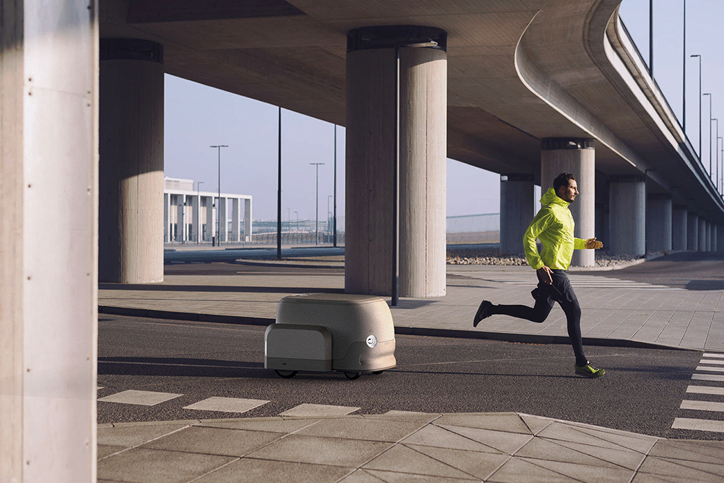
Its open and welcoming design is reinforced by an immersive and memorable experience. The almost SIM-card shape of the Rolla is instantly iconic, with expressive LED headlights on the front indicating the pod’s intent as it autonomously drives. The inside of the Rolla, however, is designed to be dynamic, with light-piping that gives the vehicle a designated color – yellow for public transport, purple for private transport, and blue for fixed private routes like within a campus. The interiors are outfitted with displays too, that tell you the route and time, welcome individual riders, and show your progress on a map for clarity.

While Rolla currently exists only as a concept, it provides a neat framework for how cities can adapt to the pandemic by providing public transit in a manner that’s safe. The individual pods can easily be deployed on a city’s roads with no additional infrastructure like stations or rails. They run on electric energy, and something as simple as solar panels could ensure that the vehicles run for longer on sustainable energy. They can operate on pre-designated bus routes too, reducing the need to plan out new routes, and given how easy it is to roll out new Rollas, the entire system of autonomous pods can easily be upgraded as cities expand!

Designer: NewDealDesign

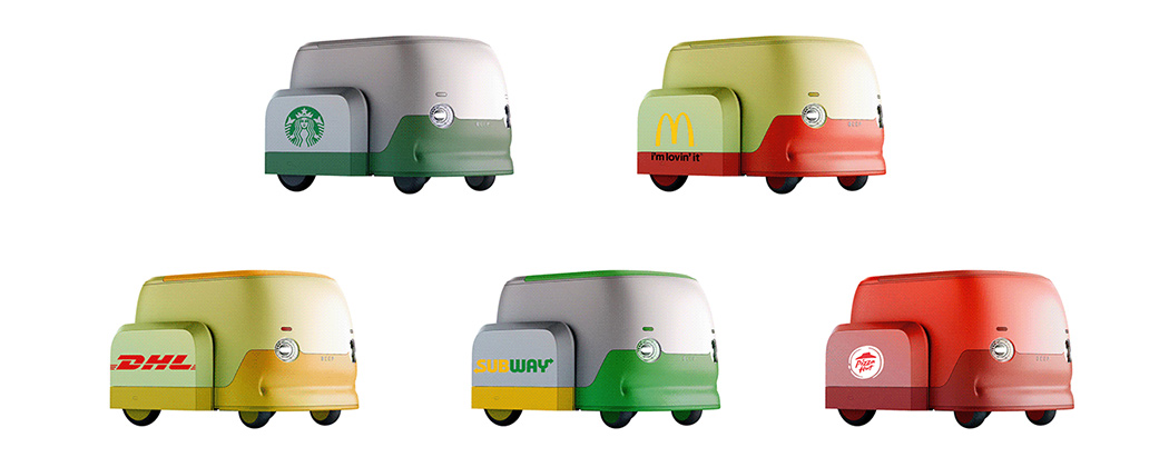
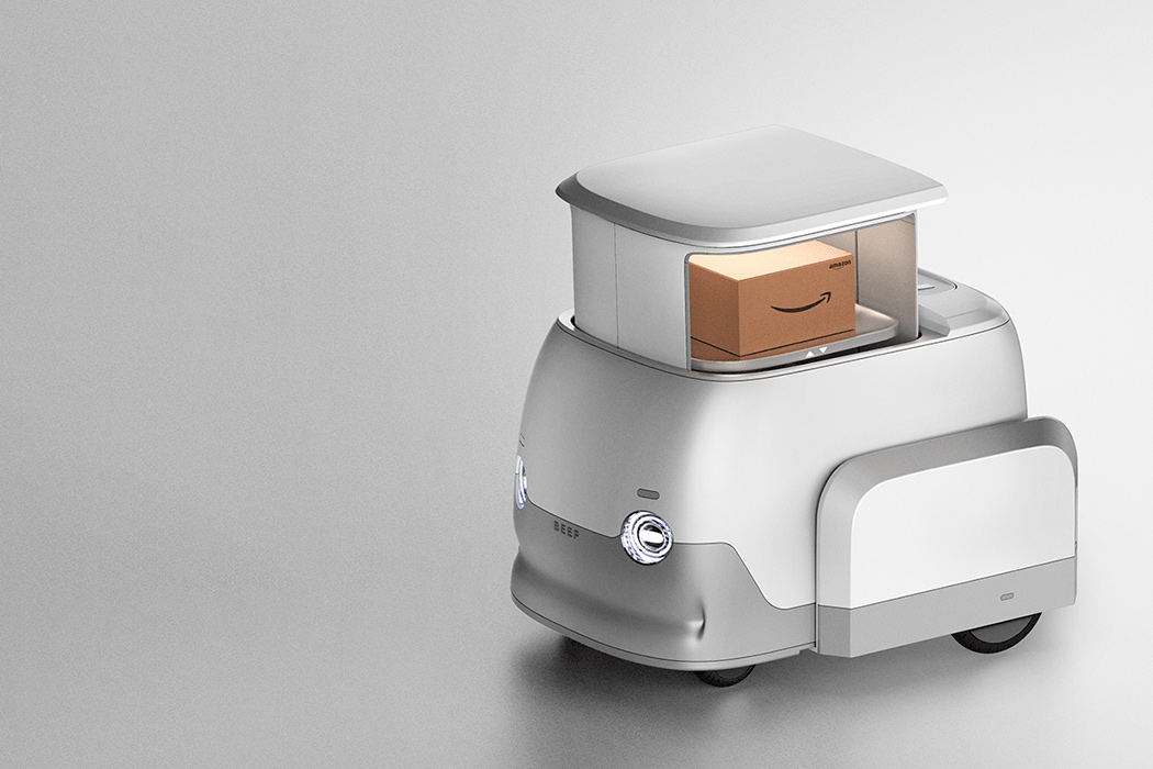
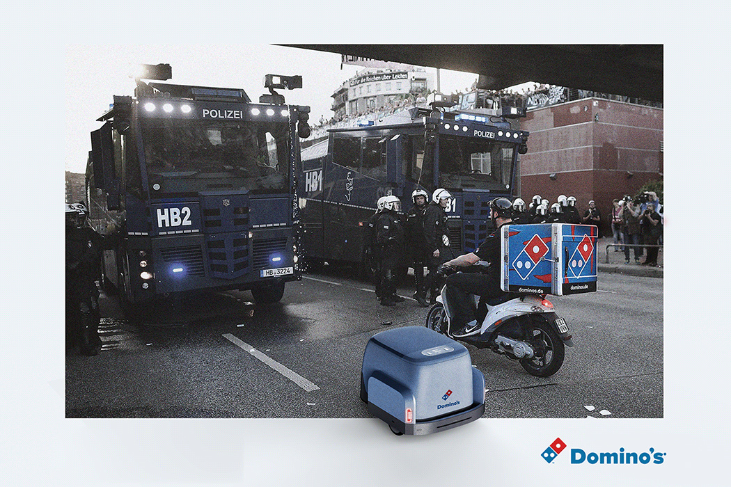
From UPS to Dominos, this self-driving vehicle is the eco-friendly delivery solution of the future

In looking for ways to reduce carbon emissions, especially in the transportation industry, designers have proposed solutions that would decrease carbon emissions from delivery trucks. Why so specific? The problem with these short-distance deliveries is that they burn a disproportionate amount of fuel compared to the size of the package being dropped off.

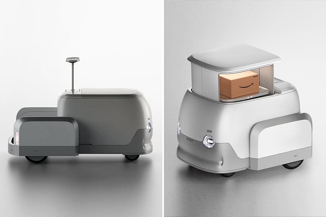
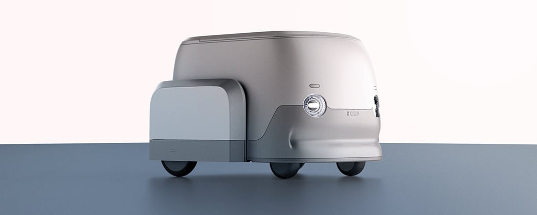
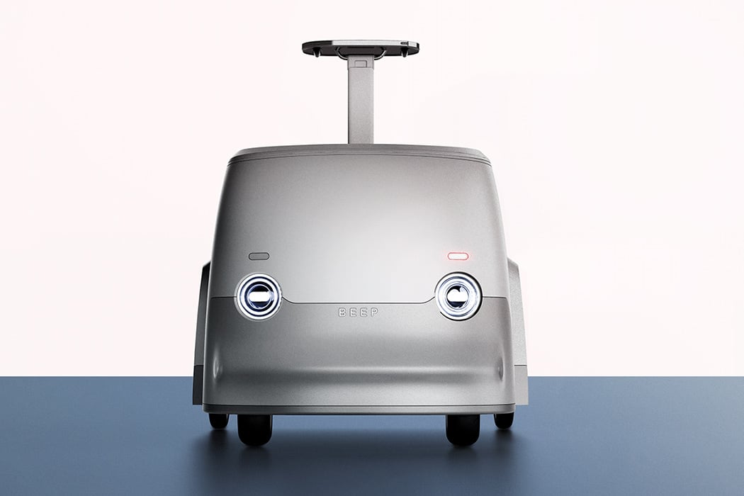
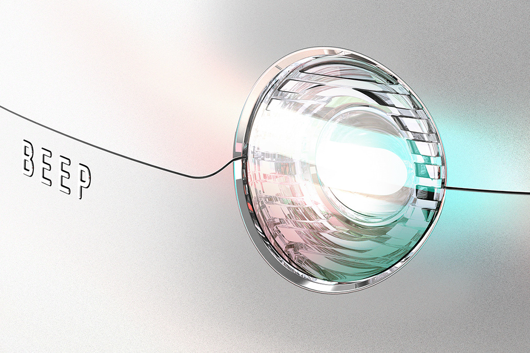
Here’s where we introduce the Beep, a self-driving vehicle that was designed for these short travels. On Yanko, we’ve featured other green transport vehicles that operate under similar principles: electric-powered bikes or scooters that mail carriers can use for the “last leg” of the package’s journey. The Beep stands out because, unlike other proposed designs, it doesn’t require a driver.

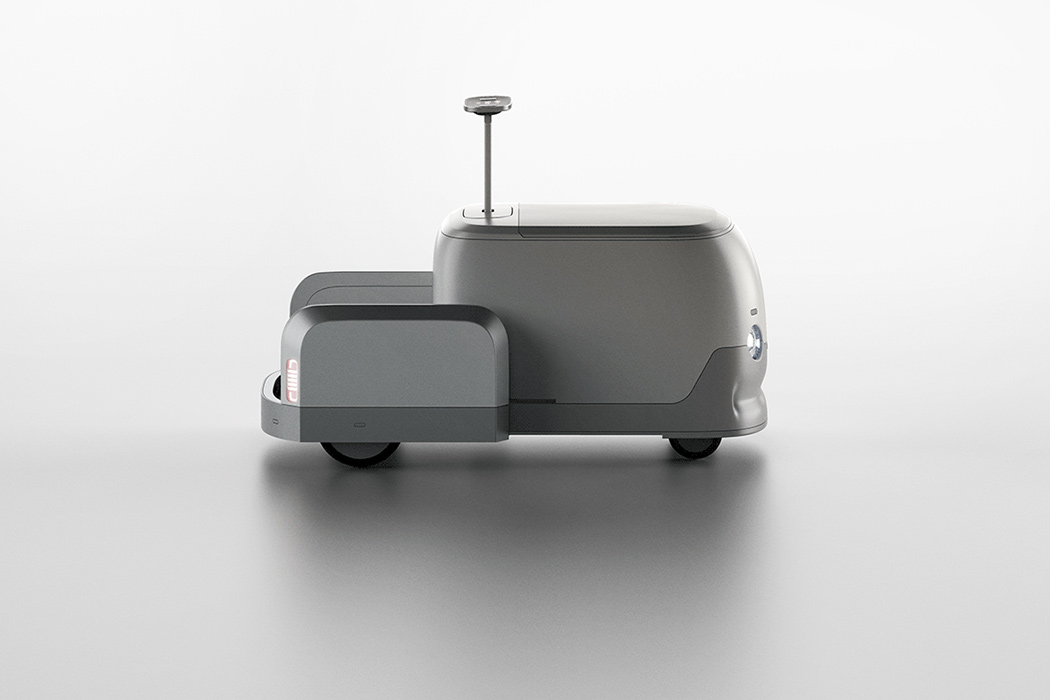
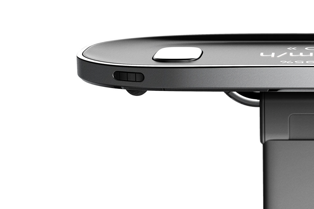
How would this system work in practice? Well, the Beep, with its short, compact design, can easily maneuver through local roads and tight alleys. Since the vehicle drives itself, the restaurant chains or delivery services that use them won’t have to train employees to use them. Quick note: the Beep can also be driven manually if preferred. In those cases, a handle and standing platform will pop out from the back of the Beep, allowing the user to ride it like an electric scooter.

The Beep’s storage container is sturdy enough to protect its cargo from harm. Additionally, the storage container is height-adjustable, so packages of any size can fit securely. Groceries or other food items will also stay fresh thanks to its climate-controlled interior. These two features demonstrate the Beep’s diverse capabilities — particularly, how it can be used to service a variety of different industries.

Designer: Dawn Studio

Amazon’s bi-directional robotaxi brings autonomous ridesharing + safety to futuristic urban spaces

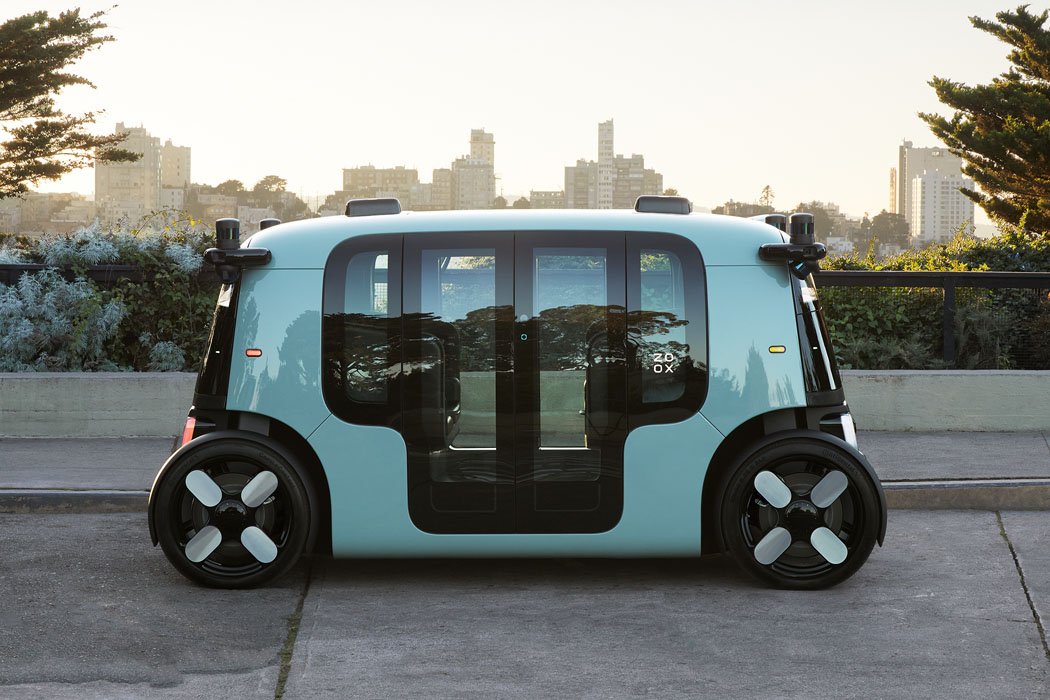
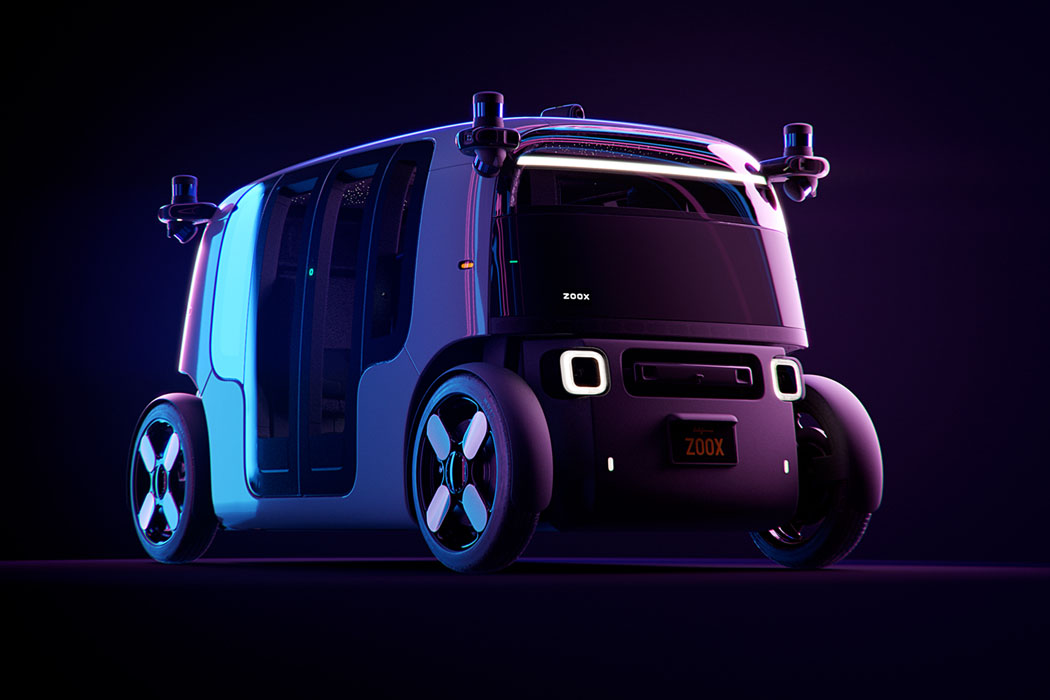
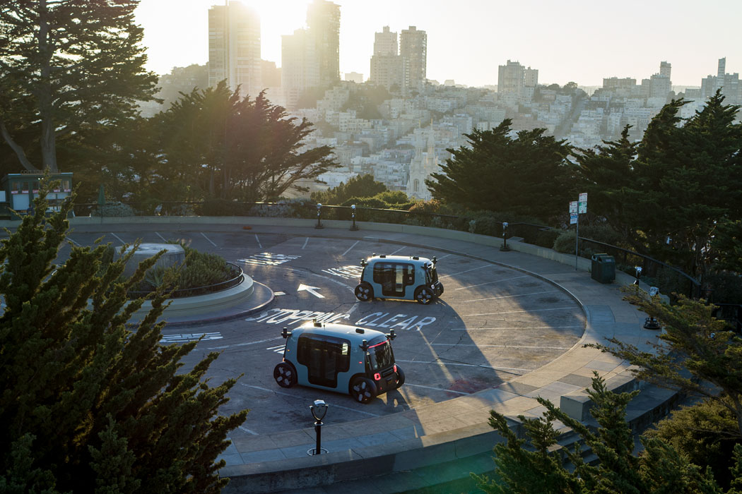
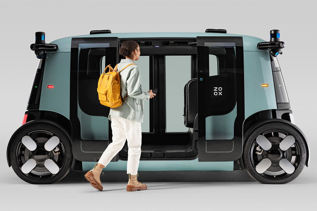
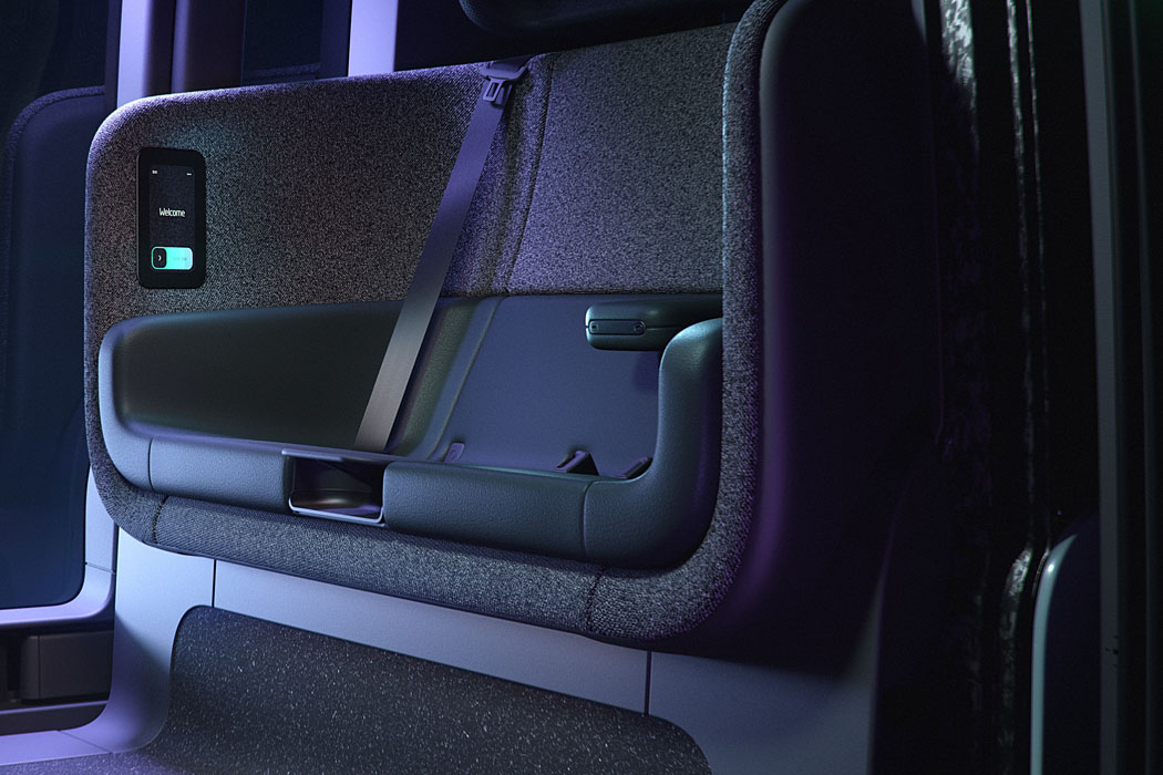
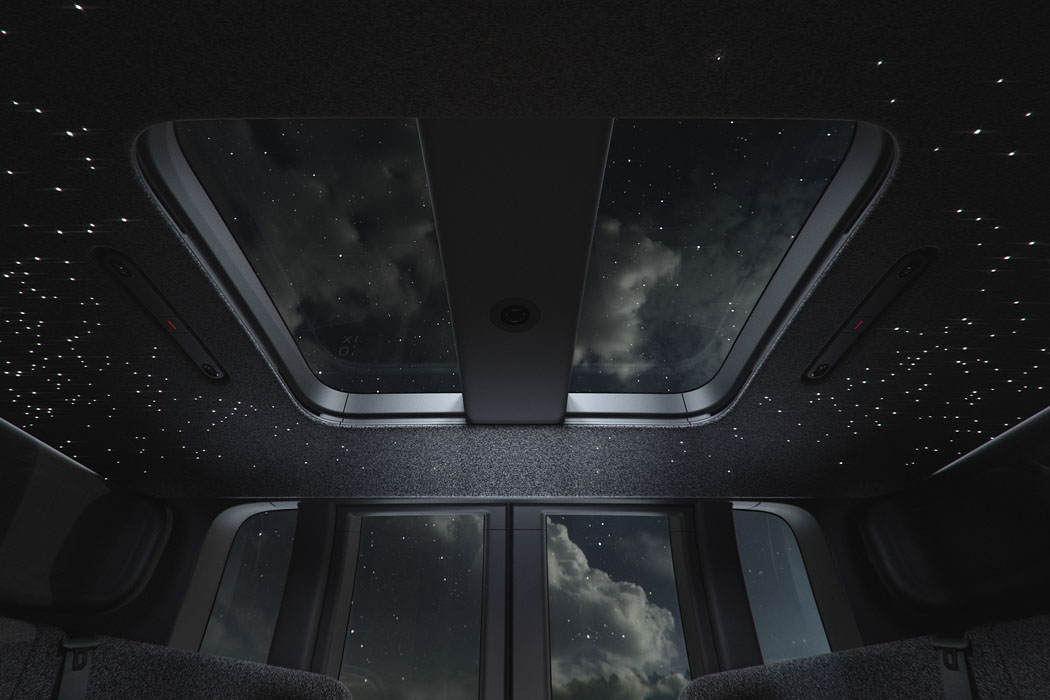
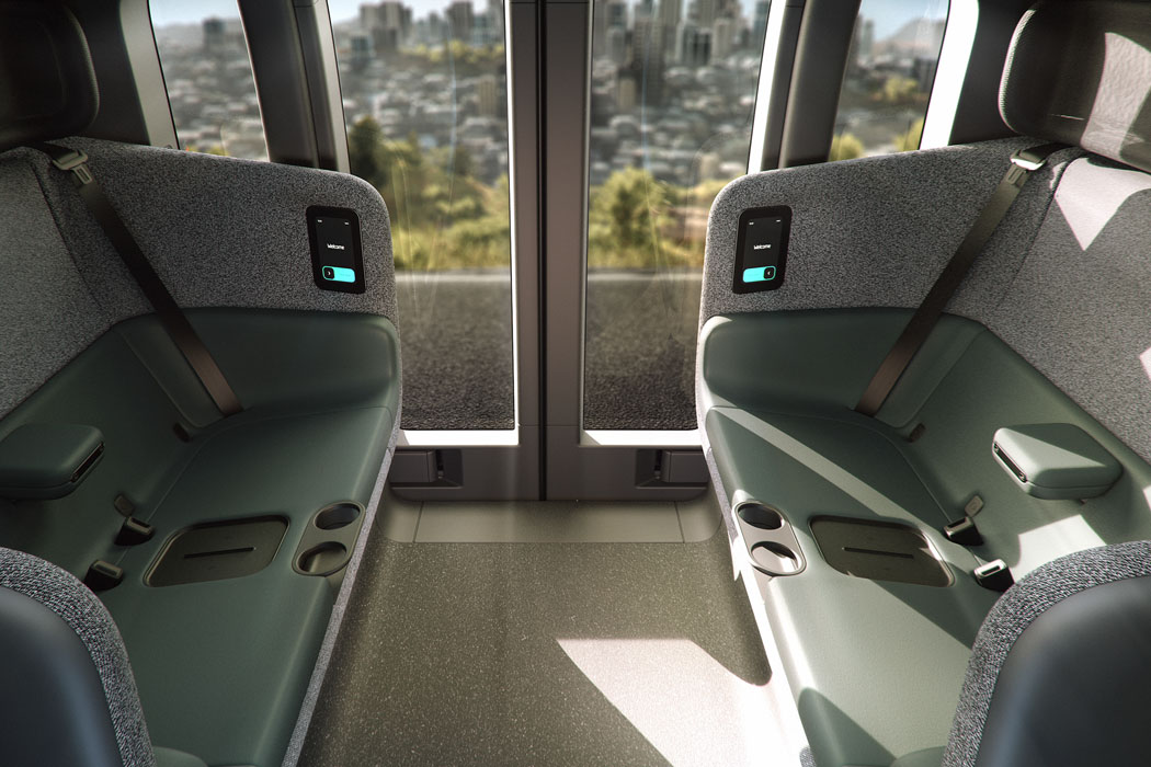
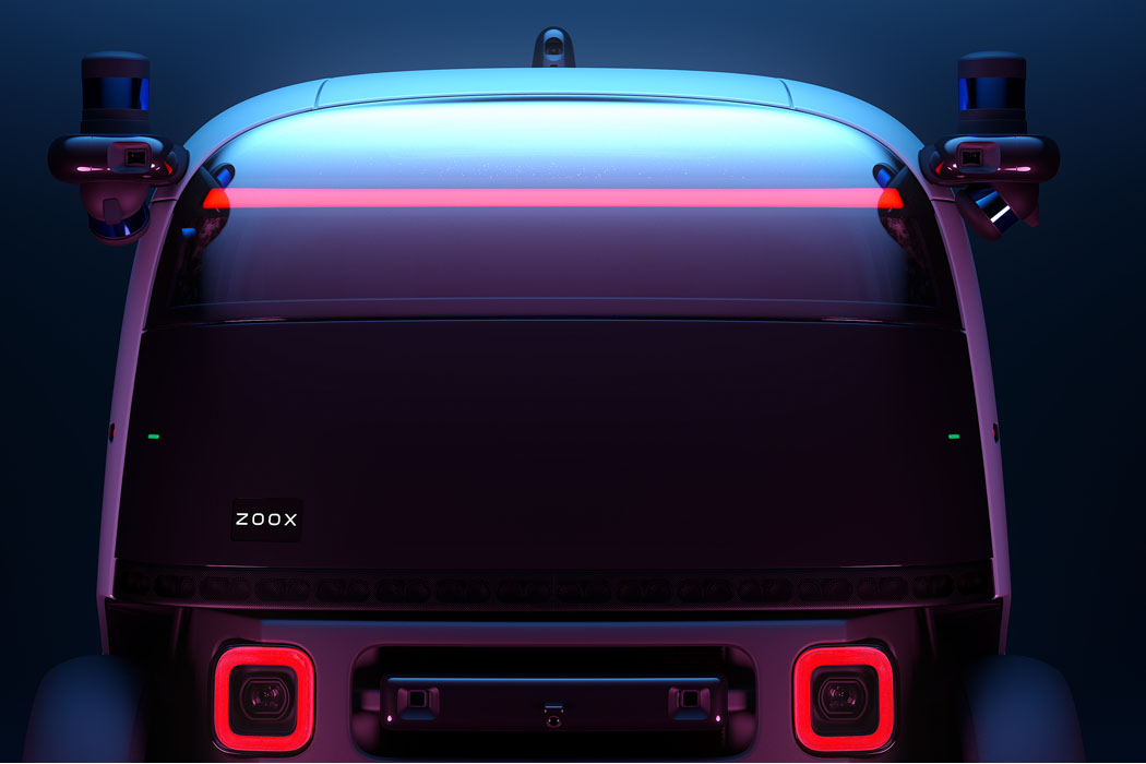
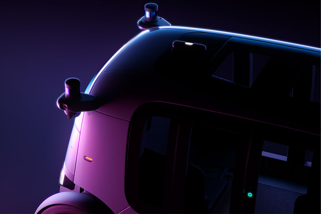
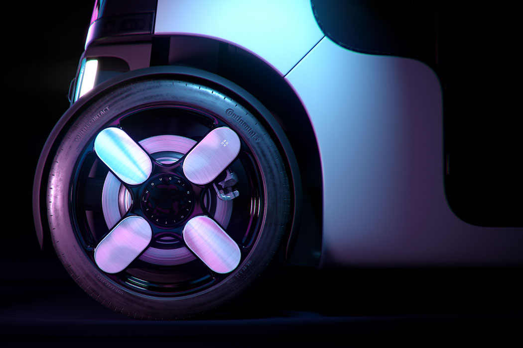
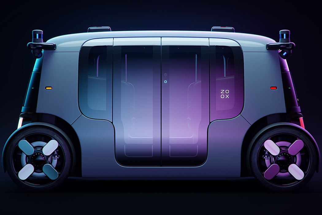
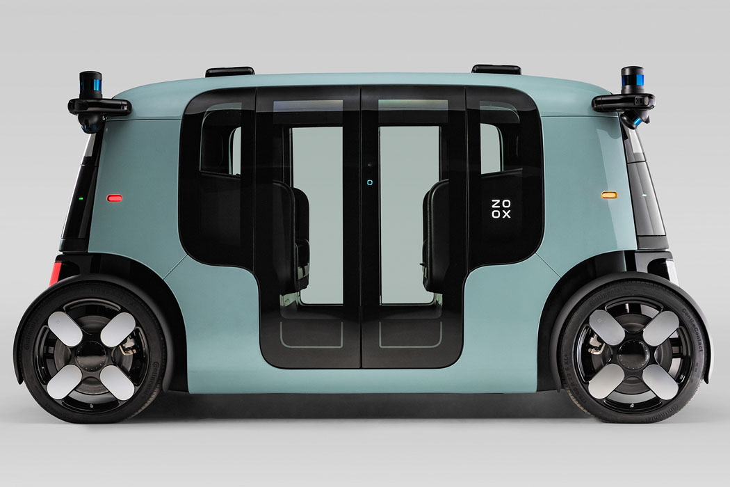
Driverless ride-sharing commute is what we are headed towards in the future, as one more exciting autonomous electric transport pod joins the likes of Nuro, Cruise Origin and Toyota e-Palette. Amazon-owned Zoox (acquired last year by Amazon) has been working relentlessly for six years towards its goal of bringing fully-autonomous robotaxi to the crowded urban landscape, which has finally been revealed. The on-demand ridesharing vehicle is “built for riders, not drivers,” as stated by the makers. According to Aicha Evans, Zoox CEO, “We are transforming the rider experience to provide superior mobility-as-a-service for cities. And as we see the alarming statistics around carbon emissions and traffic accidents, it’s more important than ever that we build a sustainable, safe solution that allows riders to get from point A to point B.” The all-electric four-wheeler looks quite polished and ready for the public roads, however, for now, it will be tested extensively on private roads before commuters can buy themselves a ride on-board the carriage-style vehicle having four seats facing each other.

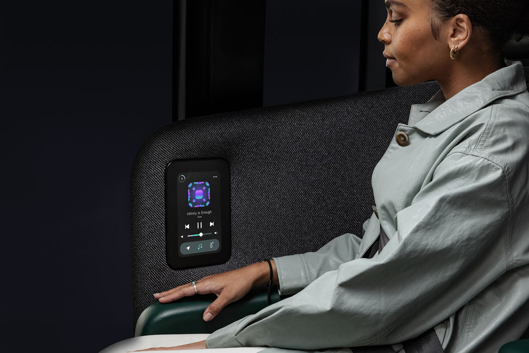
Zoox is a conventional cube-shaped with a unique bi-directional ride sans any steering wheel – having the capability to smoothly navigate tight spaces without much fuzz since it comes with a 4 wheel independent suspension system. The fact that it can move in any direction (independent turning wheels) and does not need to reverse (remember it is bi-directional) gives it an advantage on urban roads as it measures just 3.63 meters. The interior of the autonomous ride has charging ports and a small display is quite minimalistic with emphasis on passenger safety as there are next-generation airbags enveloping the passengers, providing five-star safety standards by Federal Motor Vehicle Safety Standards. To further enhance the safety of the riders, the vehicle is decked in six LIDAR pucks, multiple sensors, and cameras for a 270-degree field of view – covering the blind spots and having the ability to see objects 150 meters away en route for a safe ride. And it can achieve a top speed of 70 miles per hour, so you can rest assured of arriving at your destination on time.

At the heart of the electric vehicle is a 133kWh battery pack that makes the vehicle operational for 10 hours continuously on a single charge. There is no official word on the mileage, but it would be safe to assume that it should be capable of delivering at least 300 miles after one recharge cycle. Zoox is currently being tested in Las Vegas, San Francisco, and Foster City – and it will be commercially manufactured in the United States. For now, there is no word as to when you can hail a ride on this futuristic public transport vehicle, but the times look exciting in the coming years as Zoox looks the closest to commercializing its dream service.

Designer: Zoox