This automatic dog feeder customizes portion sizes based on your pet’s body composition

 Its quarantine and I am sure I am not the only one binge-snacking while binge-watching TV. I am also not the best influence on my dog because when I get my midnight cookie and he looks at me with puppy eyes, I give him a treat too. I feel guilty after eating out of boredom and follow up with some exercises at home, so while I plank those cookies away my dog cannot do that. And since we are in lockdown, I can’t take him out for his usual long runs….so he may come out of this pandemic a little chubby and it made me wonder if there are pet feeding devices that can change portions after assessing your pet’s health.

Its 2020, anything can happen and here we have ‘In The Dog’ which is an automatic feeder that analyses your dog’s body composition before every meal. Usually, I take my dog for his routine check-up every quarter and their diets may need to be altered from time to time, especially if they are growing puppies and a feeding device like this is very handy for pet owners. If your dog has health issues then this automatic pet feeder can help. It is hard to gauge how much food is right for your dog because they can’t tell you (and honestly, even if they could tell you they would never say no to food) so having a pet feeder that can take the guesswork out and keep your dog rightly fed is amazing!

The form of the feeder is modern and sleek, it has been designed to fit with all interior styles. Unlike the usual pet bowl that is chipping off, this doesn’t look like an eyesore in the room. The front has a camera and an LED light. It also includes a metal tread plate to check your pet’s health. It comes with an app for your smartphone which reports on your dog’s body composition and recommends the portion sizes, once you authorize the automatic pet feeder will dispense the food. It is a seamless way to keep a log of their daily diet which is insightful data for any vet during check-ups. Now my dog may come out of quarantine in the same shape as he was but I need a refrigerator that can do the same for me!

Designers: AB Rh+ Yang, Gyu Hyung Han and Seokmin Jang


This Microsoft concept keyboard packs a tablet, touchpad and charger!

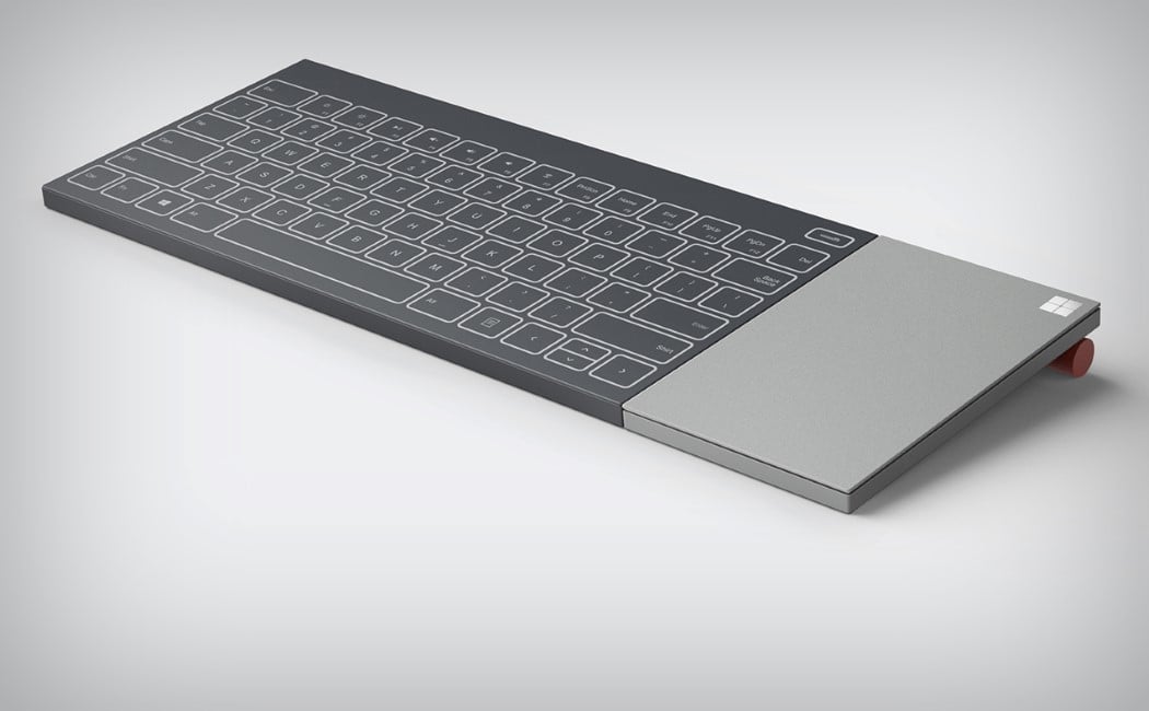
Nowadays work follows you everywhere! And with the help of innovative technology and smart devices, getting your work done anywhere anytime has become no issue at all. South Korean product designer Seokmin Jang of PDF Haus created a product that caters perfectly to the ‘Digital Nomad’. I guess we’re all Digita Nomads in a sense, since no matter where we go, we’re always connected through our smartphones and of course the prized Internet! Inspired by Microsoft’s design philosophy of a minimal design paired with maximum functionality, Jang came up with the ‘Microsoft All In One Keyboard’ concept. A keyboard that functions not only as a keyboard but as a tablet, touchpad and charging pad! Sounds pretty nifty, doesn’t it? It is. Instead of carrying several different devices, Jang’s keyboard packs four essential ones into a single design.

Designer: Seokmin Jang with PDF Haus
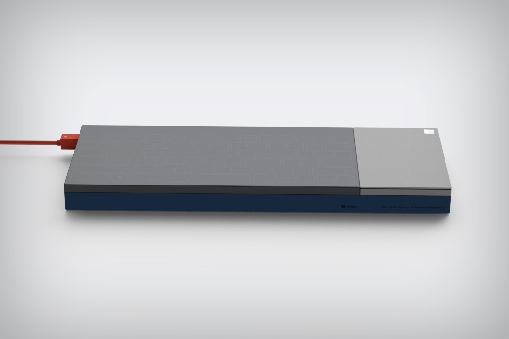
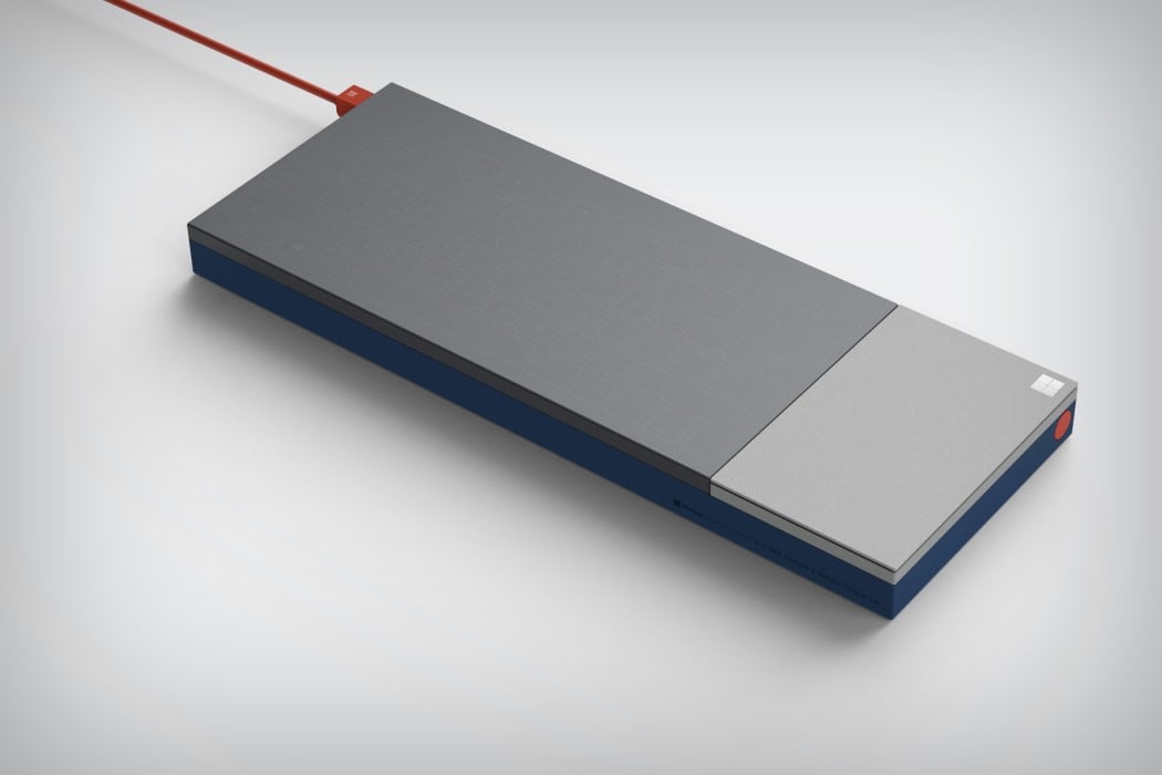
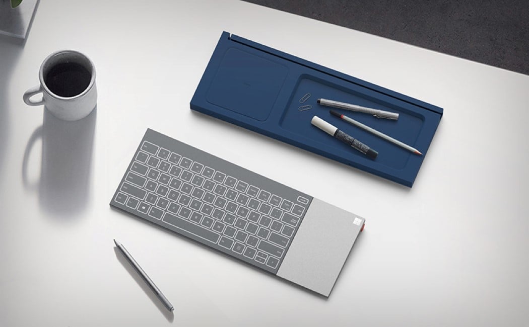
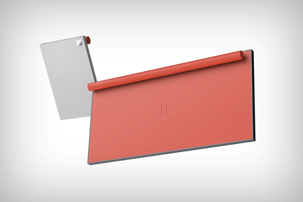
At first glance, the keyboard comprises of two sections, a grey and blue panel combined together. On separating the two sections, the grey one reveals itself to be a keyboard. The keyboard is modular as well and can be separated into two components!

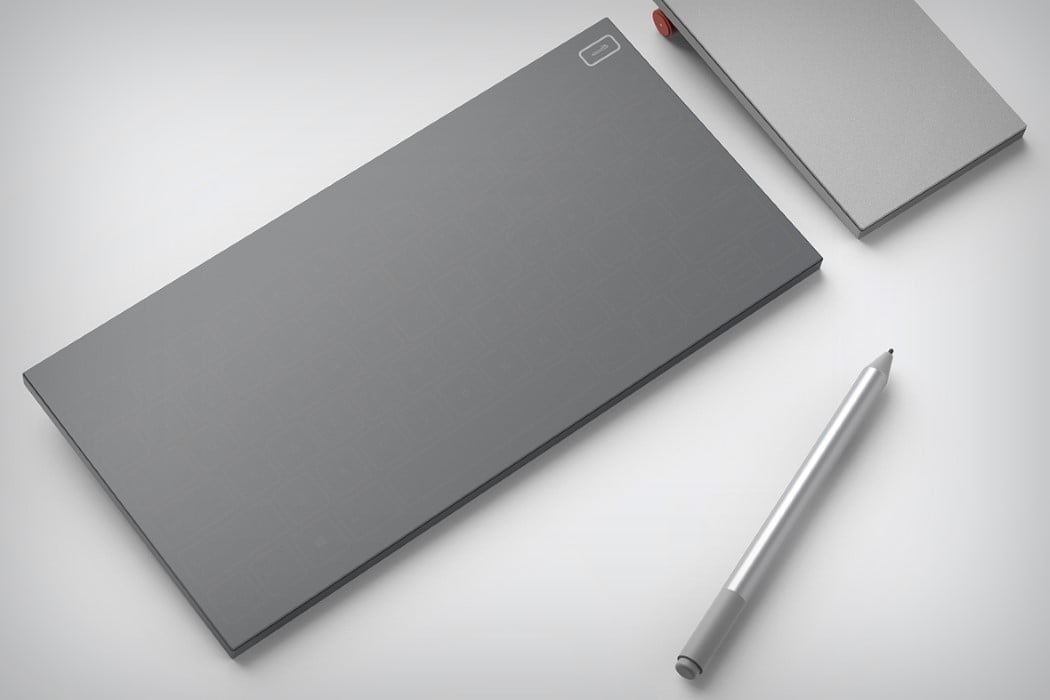
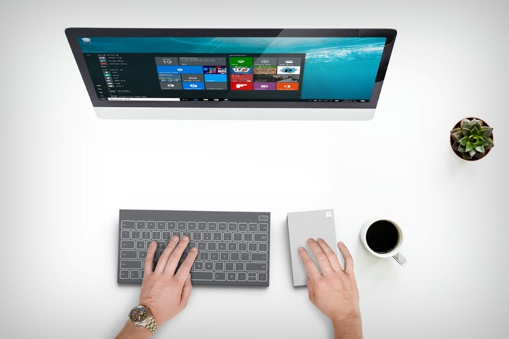
The longer component functions as a keyboard and a tablet. Press the button on its side and watch as a thin sheath covers the keys, allowing it to enter tablet mode. Grab a tablet pen, and start sketching and doodling away to your heart’s desire! Whereas the smaller component, a lighter grey in color, can be used as a touchpad. Combine it with the longer keyboard section, and your desktop, and you won’t ever need a mouse again.

Both the sections are supported by a red cylinder at the back, so you can prop them up at the angle you prefer.

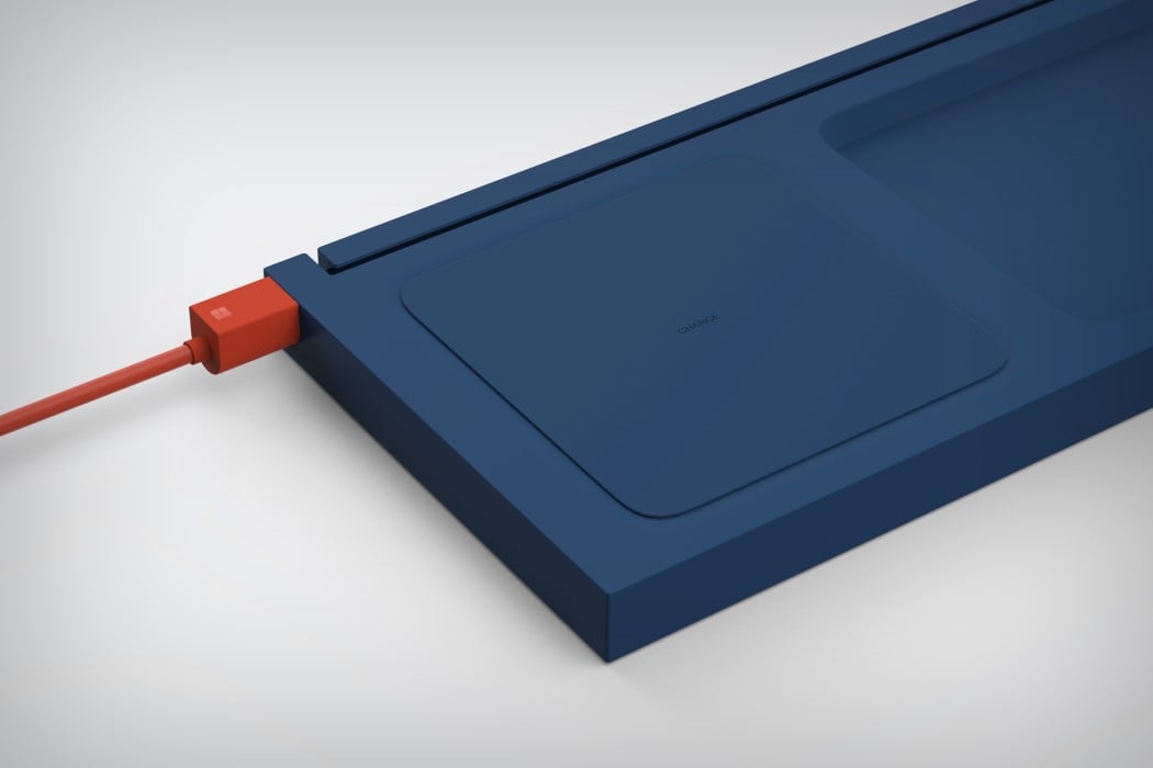
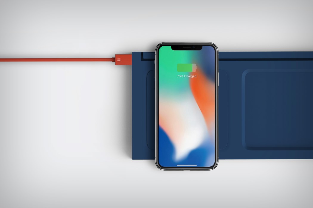
The second blue panel, which joins the keyboard at its underside unleashes quite a few surprises too! One end of it functions as a charging pad, connect a USB at its side, place your smartphone on the pad, and watch your phone get juiced up.

Jang managed to incorporate a handy storage unit as well! The other end of the panel forms a little crevice, where you can store your pens, pencils and other stationery items.

A thin slot across the panel can be used to place your other tablets, iPad, etc.

Jang’s Microsoft keyboard design is probably one of the most effective, portable and space-saving designs I’ve seen in a while. Instead of carrying a hoard of devices, you now have one product that meet’s all your digital needs. And might I add it’s pretty sleek and colorful too!

An Air Purifier with A Difference

greenery_air_purifier_layout

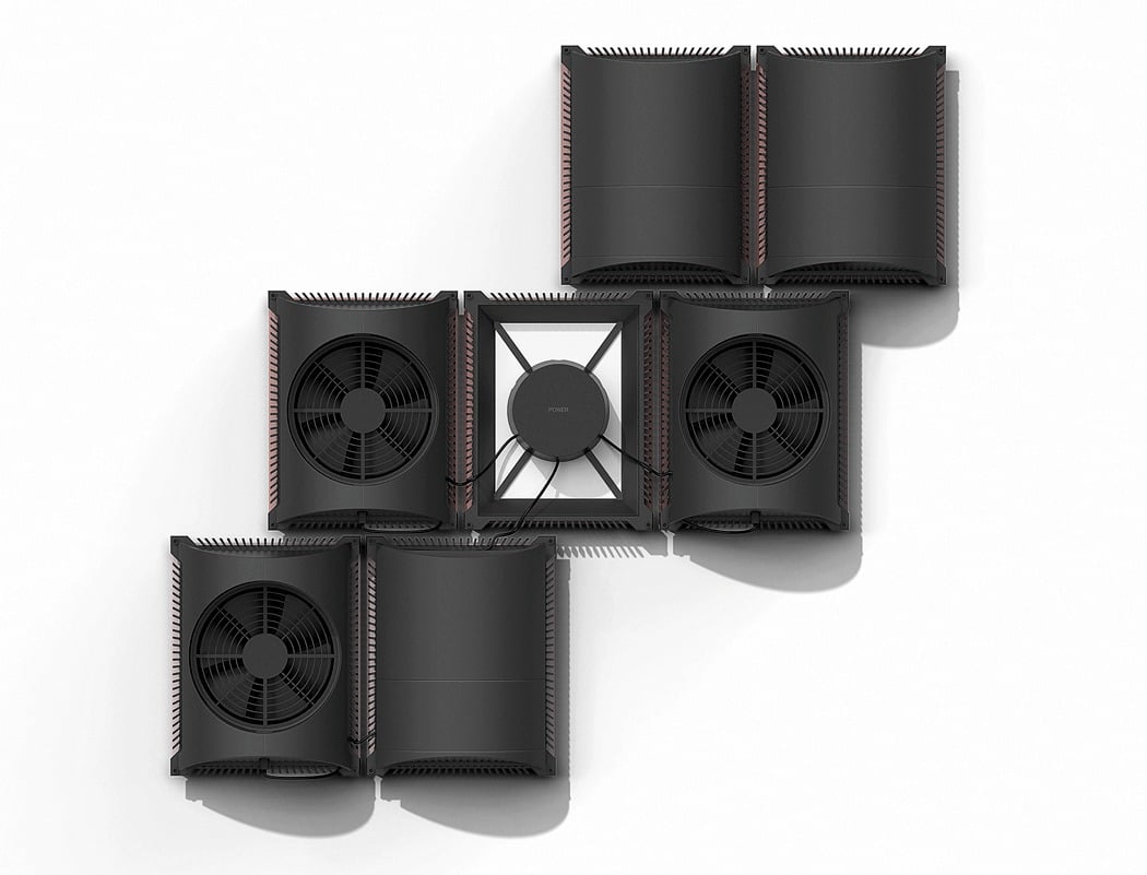
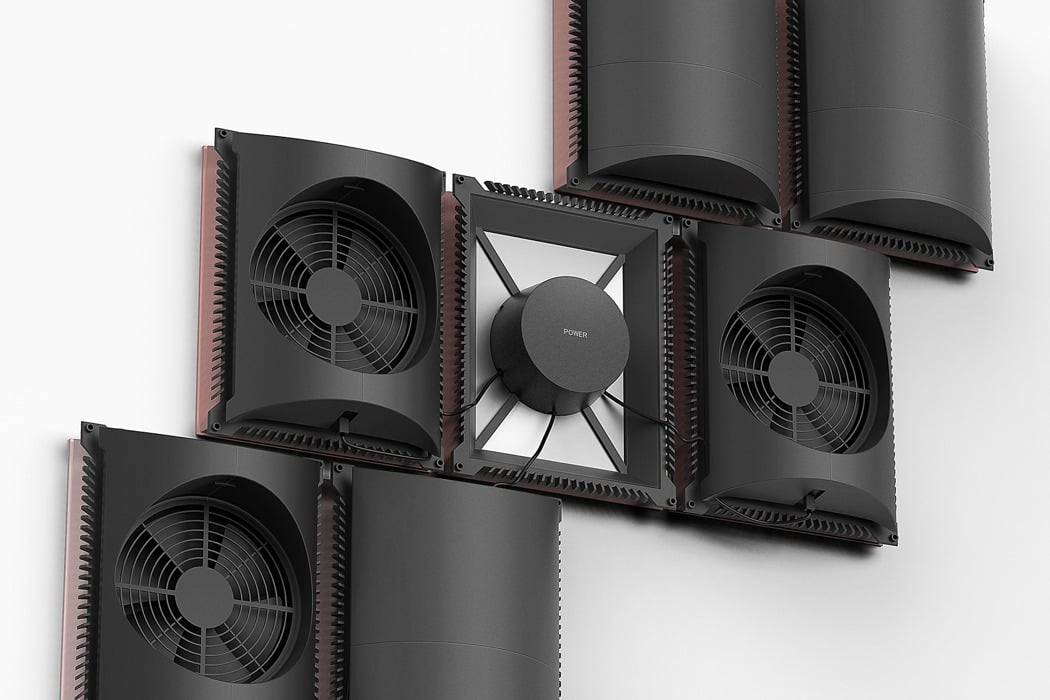
We have covered air purifiers multiple times in the past, where we have seen a vast array of forms and design directions, however, this one is very different from the rest!

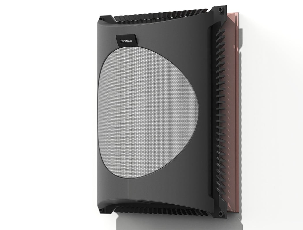
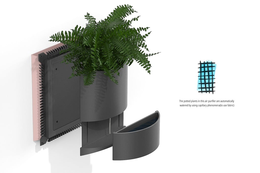
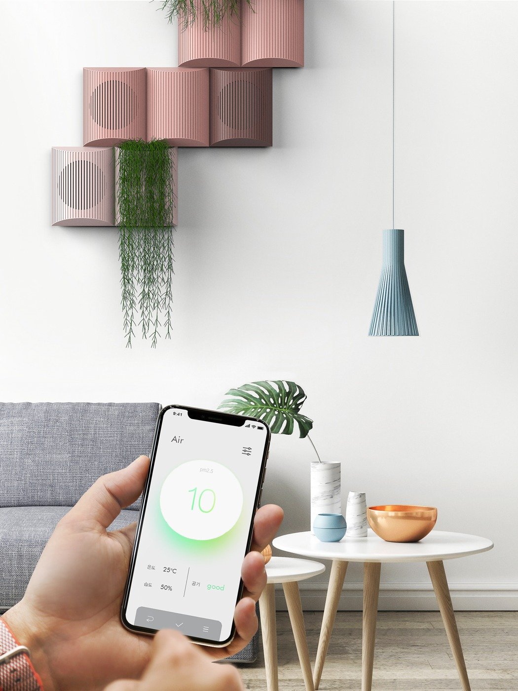
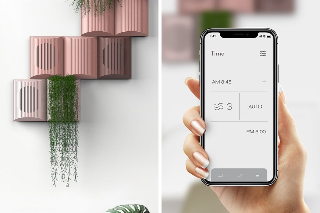
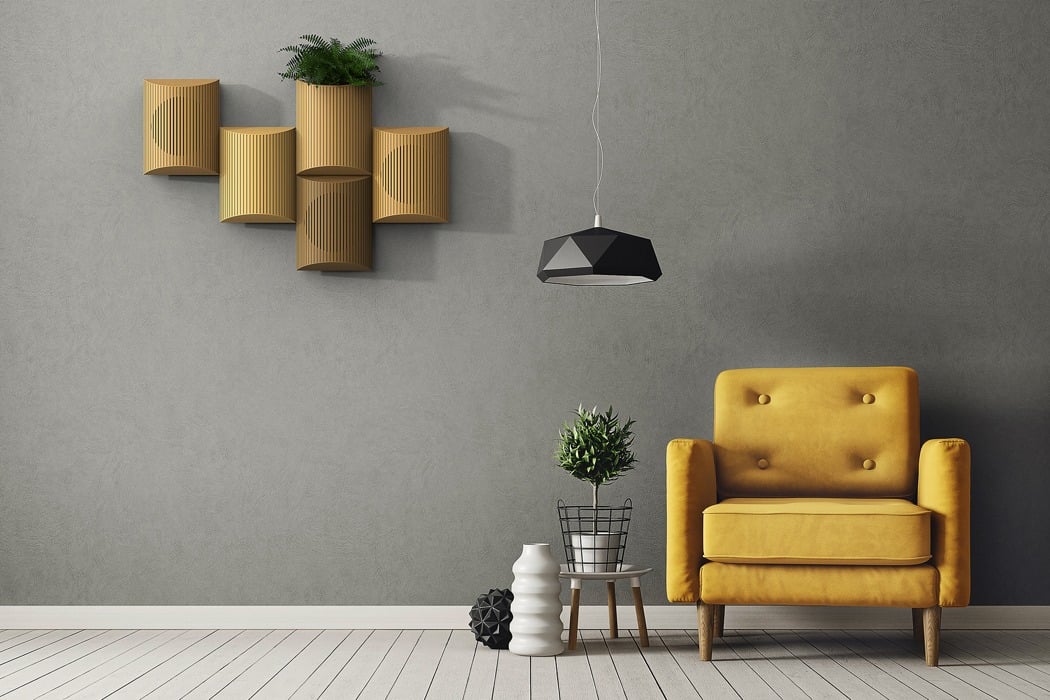
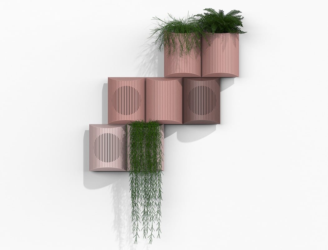
This is Greenery, a wall mounted air purifier that introduces an element of nature into the room… but for a very good reason! When a purifier is used, the windows in the room are closed and this increases the concentration of carbon dioxide. The addition of the greenery reduces the CO2 levels and makes it a healthier place to be!

Being wall mounted, Greenery’s design had to be carefully considered to ensure that the permanent fixture within the room would integrate seamlessly; the simplistic, pared-back and fuss-free approach is beautifully complemented by the addition of the natural greenery that cascades down its façade. As an added benefit, the plants require little-to-no human interaction, as they are watered using capillary phenomena!

Designer: Seokmin Jang
greenery_air_purifier_01

greenery_air_purifier_02

greenery_air_purifier_03

greenery_air_purifier_04

greenery_air_purifier_05

greenery_air_purifier_06

greenery_air_purifier_07

greenery_air_purifier_08

The keyboard that charges your devices.

keyboard_x_microsoft_1

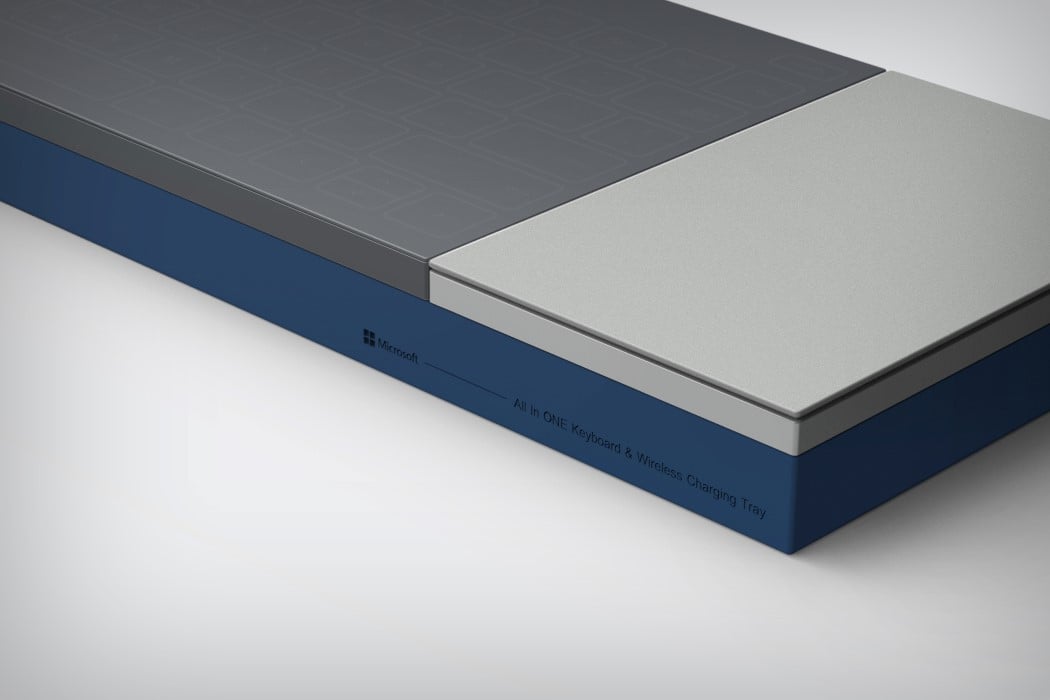
It’s funny how Microsoft’s new product design language is plain and simple visible in its logo. Clean geometric shapes, no fluff, no nonsense. If you look at Microsoft’s tablet, keyboard, or even its phones, you’ll see it. Seokmin Jang and PDF Haus cleverly caught on that trend and made what I can only assume is the most visually different and useful keyboard of all time. The All In One Keyboard comes with this unusual design that looks funny first, but makes a world of sense later. Fitting inside its cuboidal frame is a keyboard, a trackpad, and a wireless charging dock (that not only charges the keyboard but even your smartphones).
The keyboard uses capacitve ‘feather’ touch to remain sleek and svelte. A cylindrical member at its bottom positions it at just the correct angle to allow you to type with ease. You can use the trackpad alongside to work even faster. It uses the Microsoft Surface’s stylus, allowing you to attain a level of precision you normally wouldn’t get with your finger on a trackpad. The extra touch is the wireless charging dock, that lets you place your phone on it, and even doubles up as an office tray, allowing you to place stationery in the empty space on the right. In doing so, the All In One Keyboard elevates itself from being just a piece of tech, to being a product that looks at the context of work and office very carefully… which is what all productivity tools should do, right?

Designers: Seokmin Jang & PDF Haus

keyboard_x_microsoft_2

keyboard_x_microsoft_3

keyboard_x_microsoft_4

keyboard_x_microsoft_5

keyboard_x_microsoft_6

keyboard_x_microsoft_7

keyboard_x_microsoft_8

keyboard_x_microsoft_9

keyboard_x_microsoft_10

keyboard_x_microsoft_11