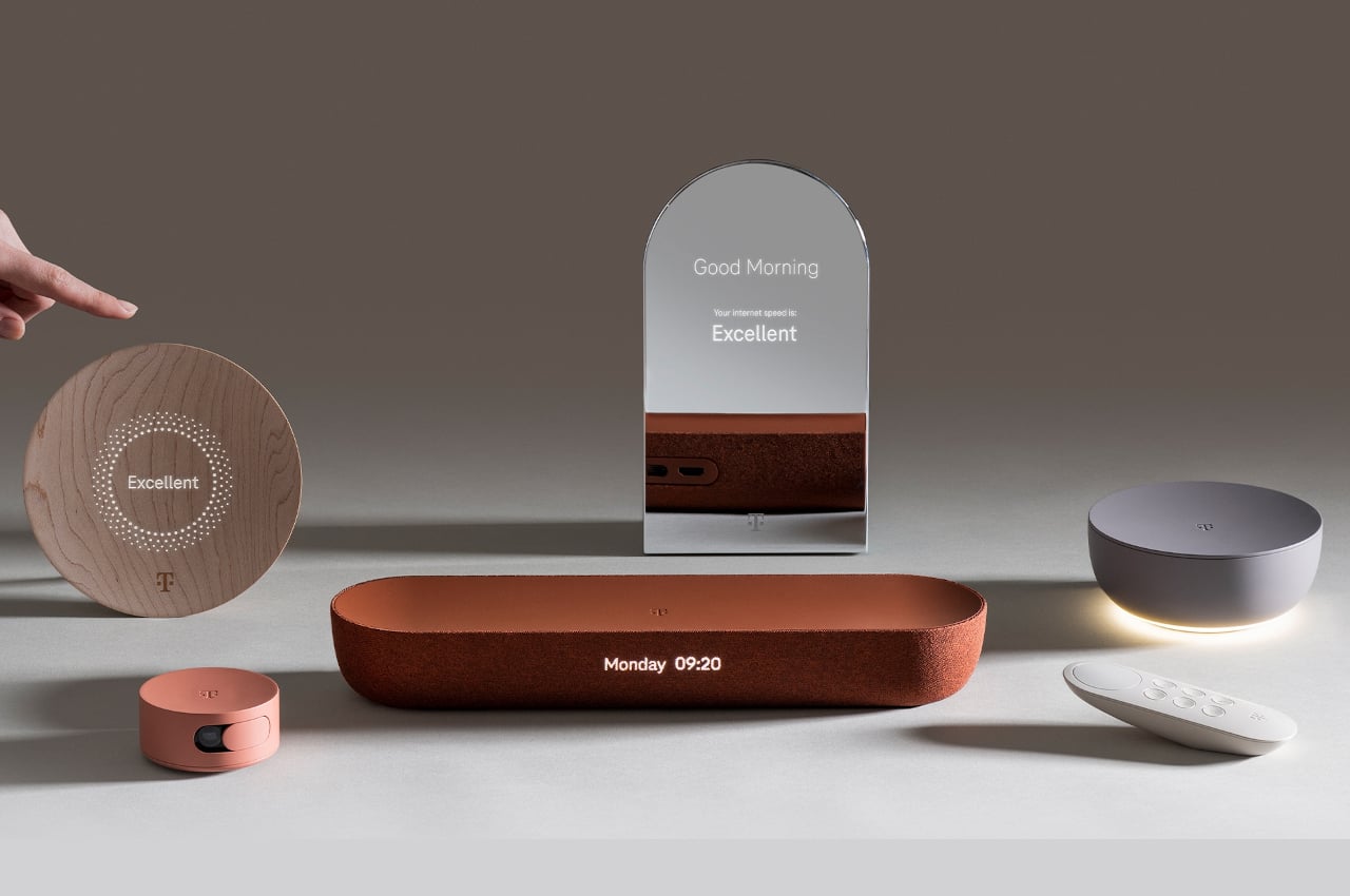
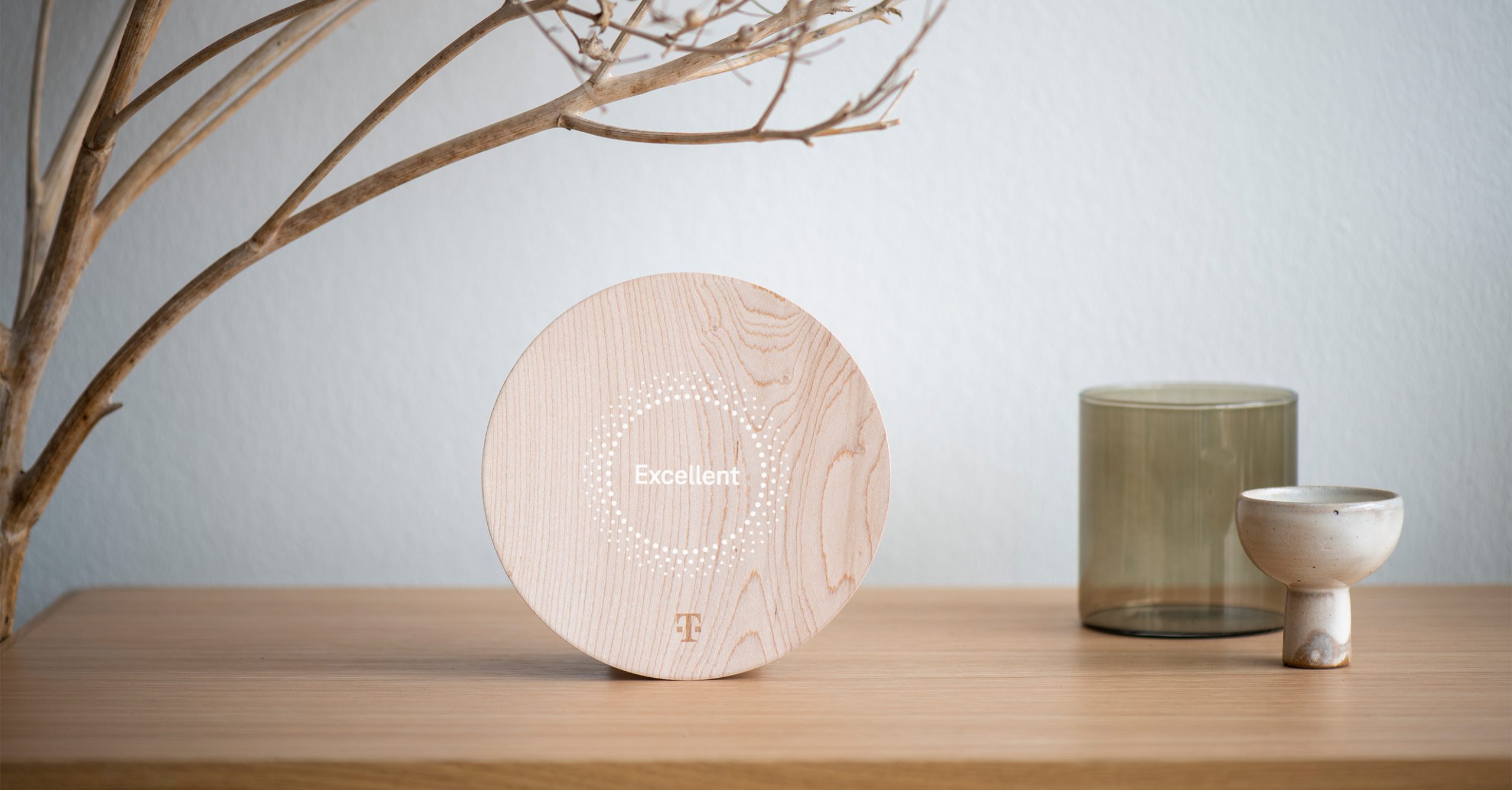
Homes are getting more and more connected these days, mostly thanks to the new breed of Internet-connected devices scattered across the property. Many of these try to disguise themselves as part of your room’s interior design, like smart speakers that try to grab our visual and aural attention, but most of these devices are unapologetic in looking the part of a technical object. That doesn’t have to be the case, of course, and there are many ways to better integrate these devices into what look like everyday household objects and accessories. That’s exactly the proposal that Deutsche Telekom Design is making through LAYER, making interior design an integral part of the product’s design rather than an afterthought.
Designer: Benjamin Hubert (LAYER Design)

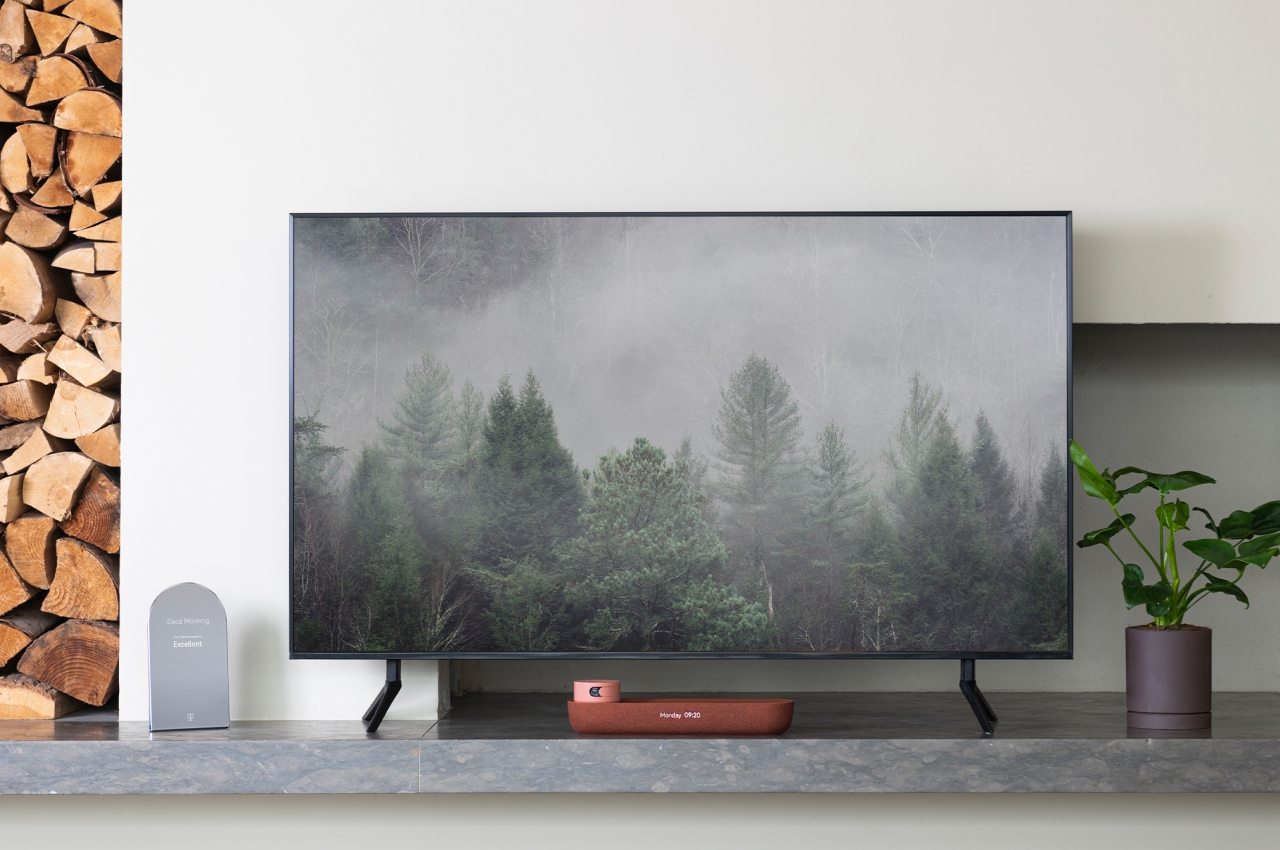
It’s not that difficult to spot devices and “smart appliances” inside a room. Even the smart speakers that try to be stylish and eye-catching don’t always blend well with their surroundings. And then there are devices that don’t even try to hide their presence and advertise their true nature. Routers and network meshes are the biggest culprits here, looking like alien structures inside an otherwise cozy abode, but set-top boxes and wireless speakers are sometimes just as bad.


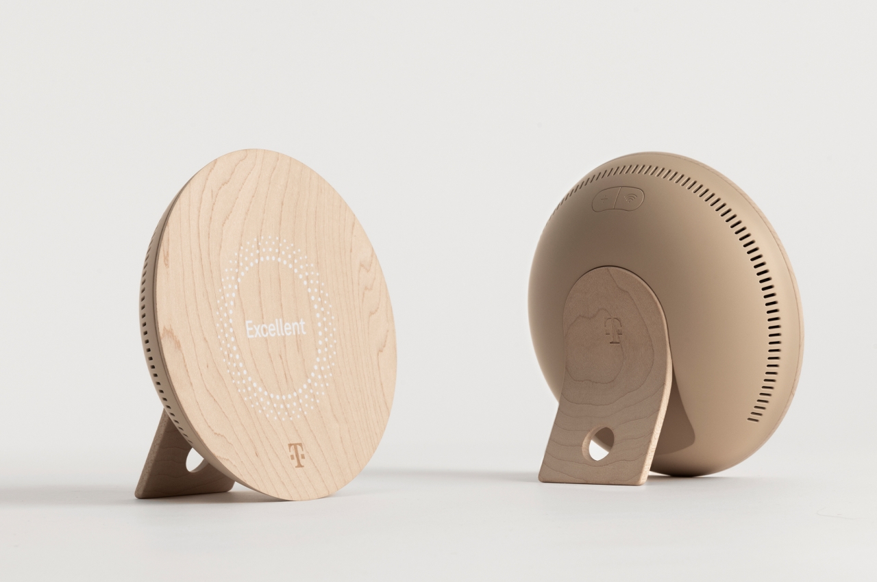
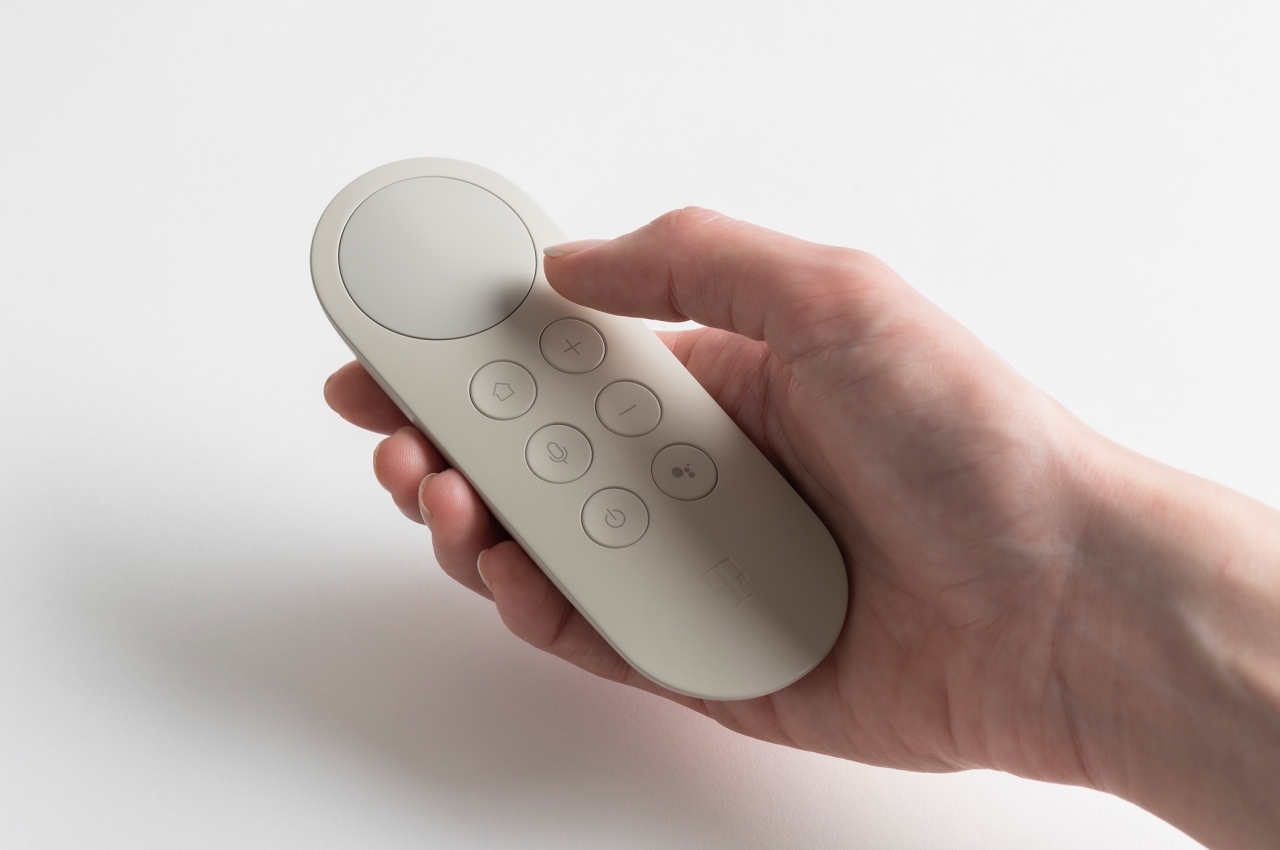
This visual and design inconsistency is no small matter when it comes to creating a conducive atmosphere for your home. There are psychological consequences to visual clutter as well as the nagging feeling of not everything matching your desired aesthetics. Fortunately, that doesn’t have to be the case, especially with today’s technologies, materials, and manufacturing processes. That’s the kind of smart home that Deutsche Telekom is trying to present with this “eclectic family” of connected devices that look more like decor than tech products.
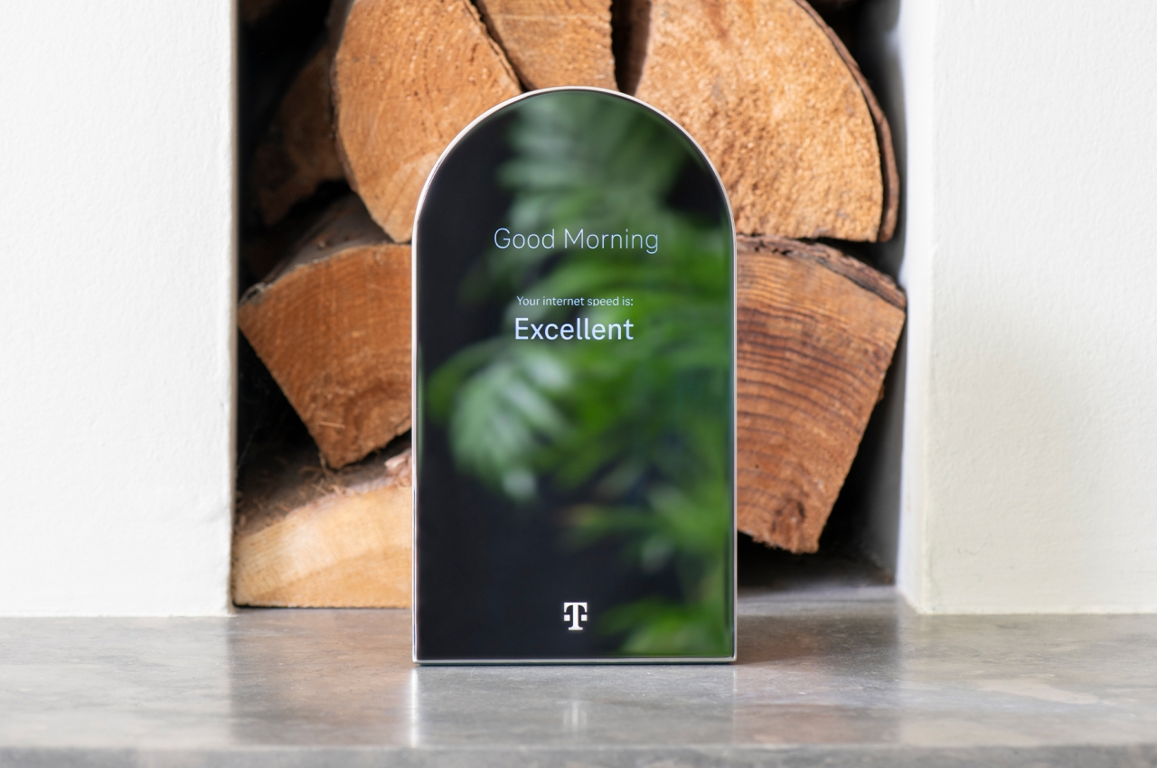
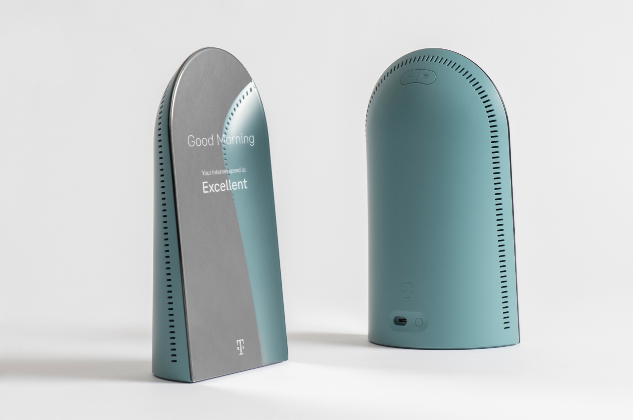

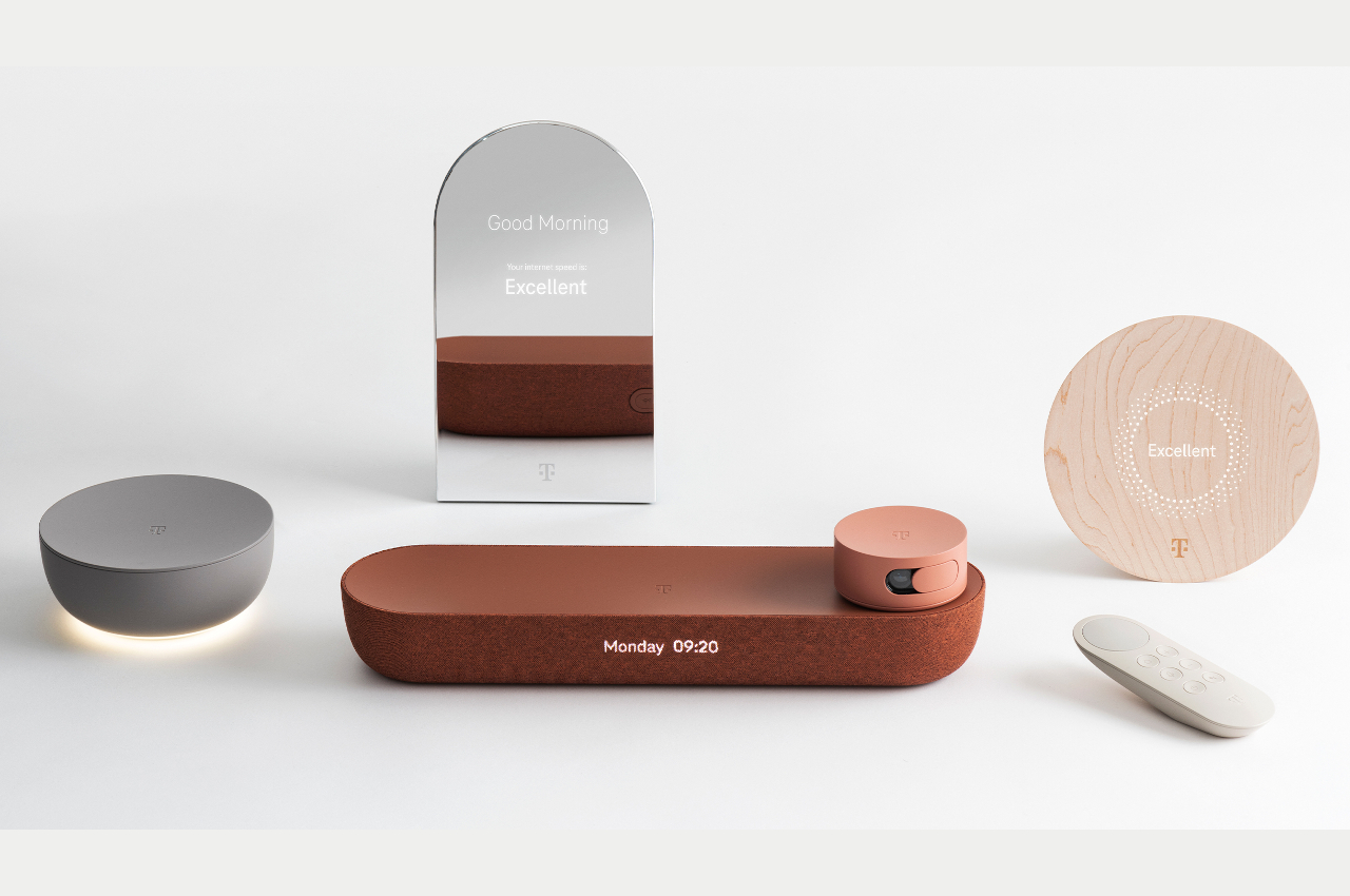
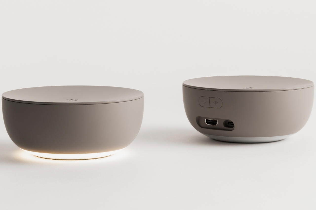
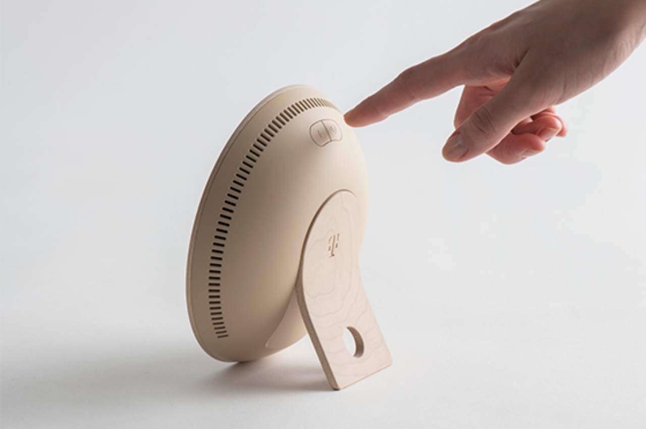
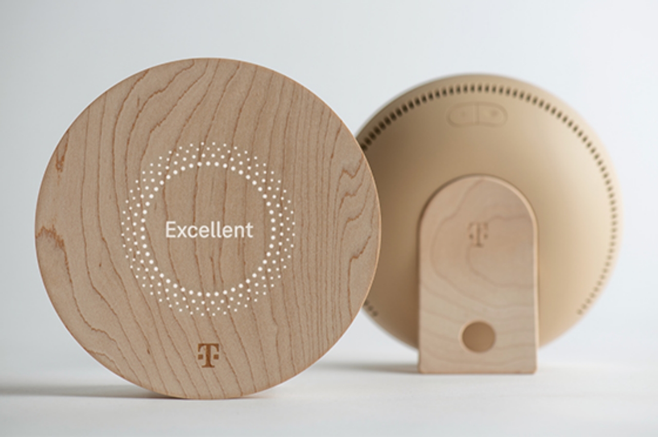
At the very top of that list is the router, which actually looks more like a desk mirror. In fact, it does function as one when the router’s display isn’t active. Even then, it only displays text rather than icons and images, making it a very minimalist piece of tech equipment. Joining it is a mesh repeater that masquerades as an upright wooden bowl decoration. They might even resemble some smart thermostats when hung on a wall, except without extraneous details and interfaces.

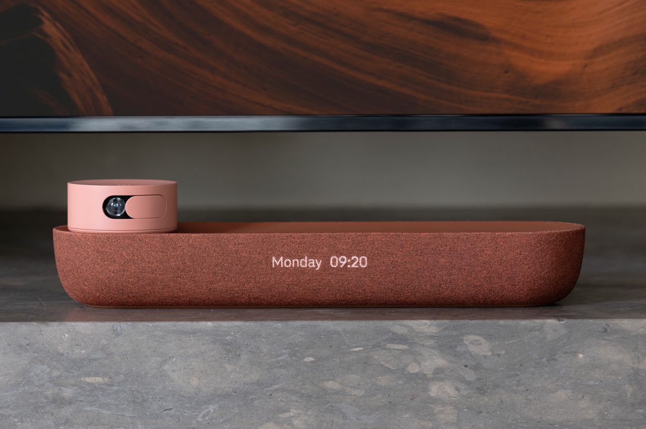
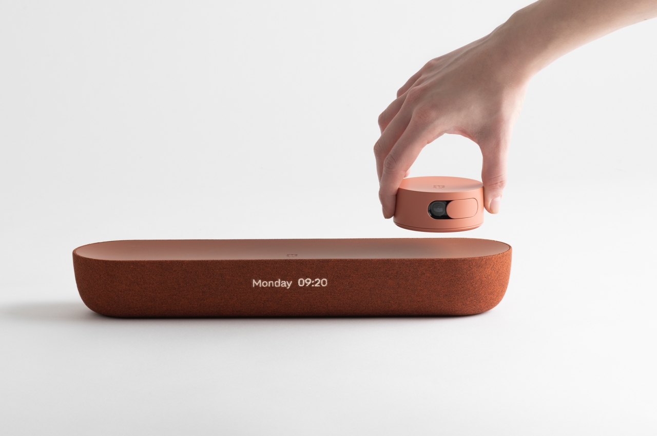
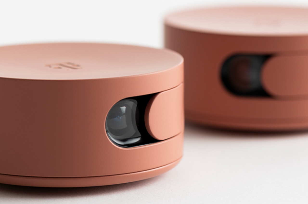
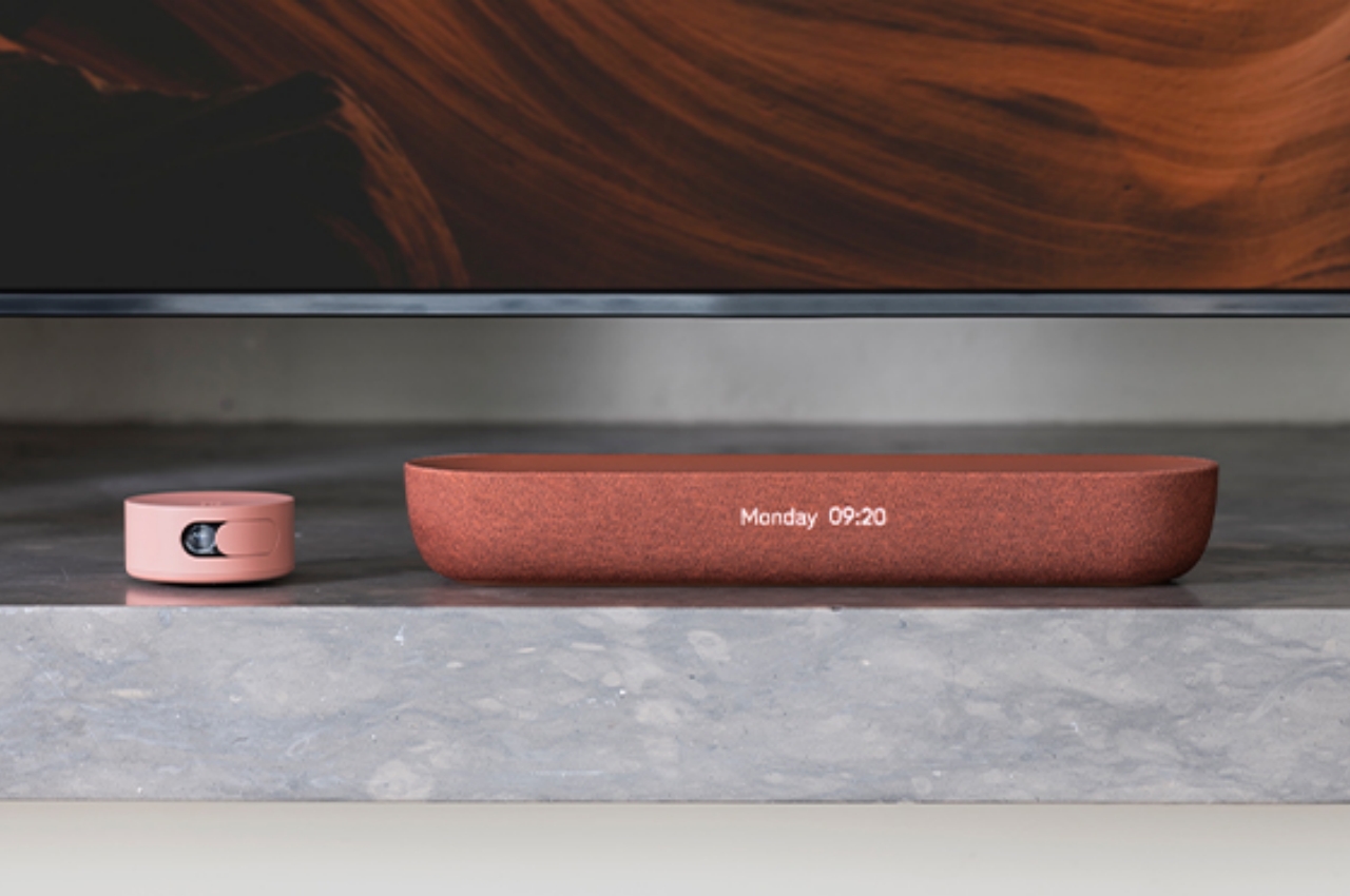
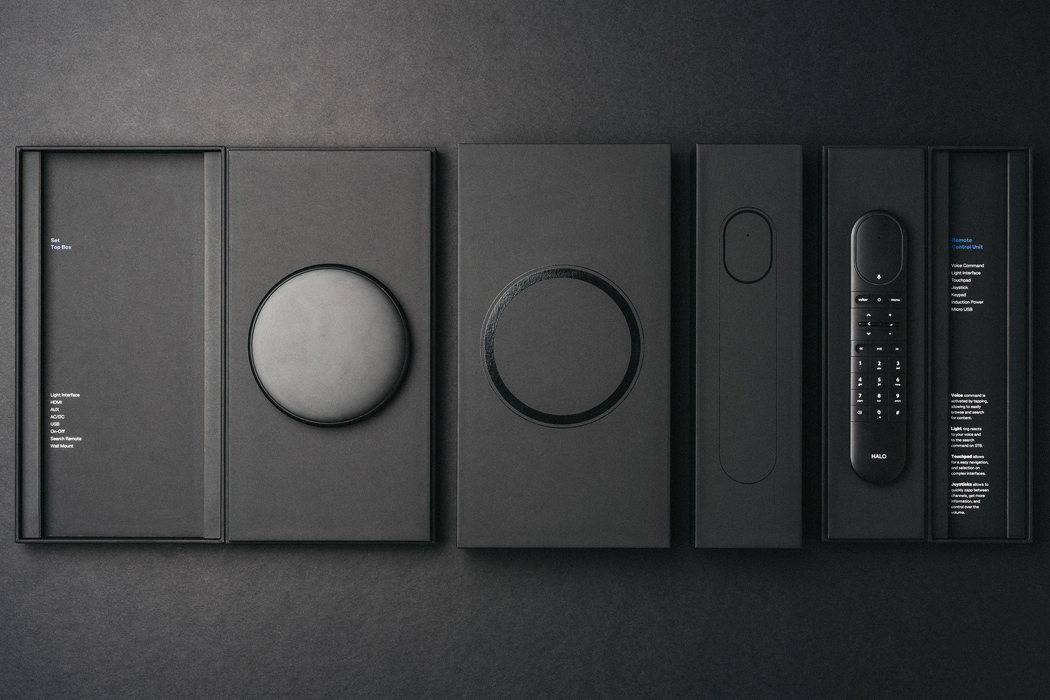
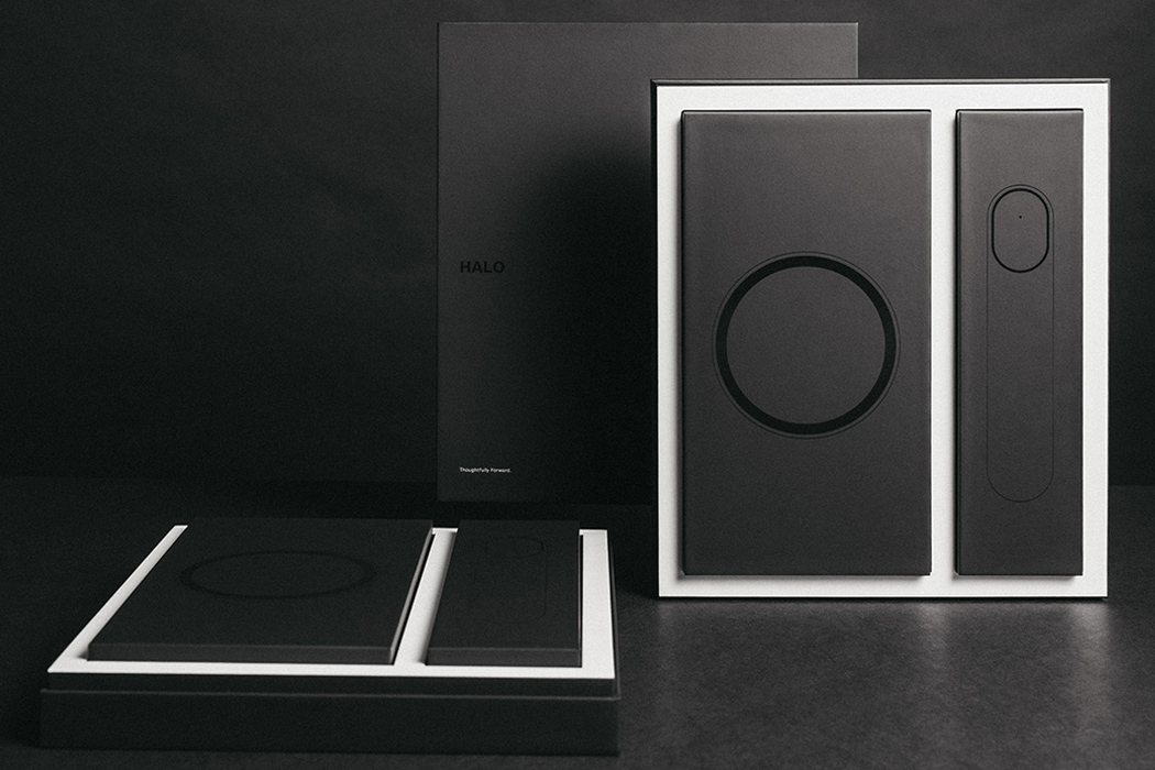
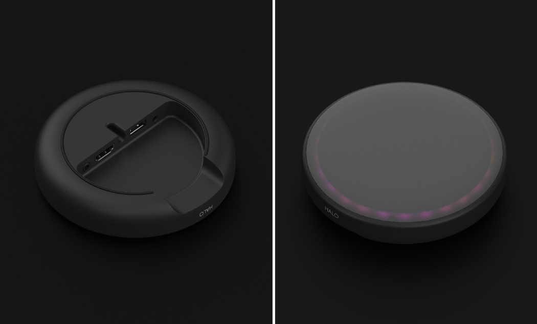
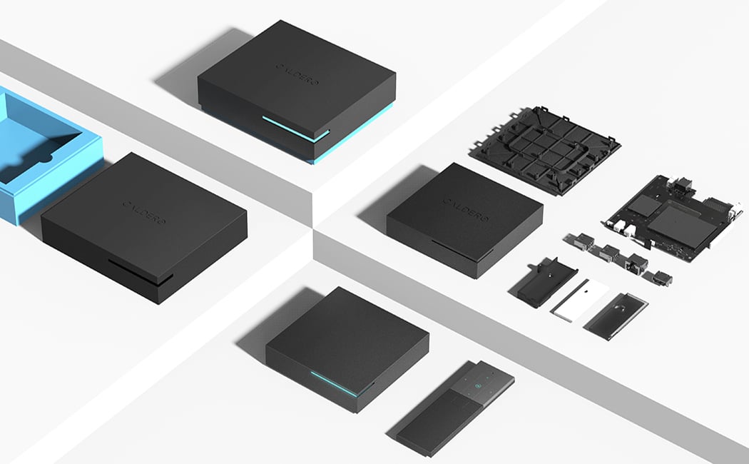
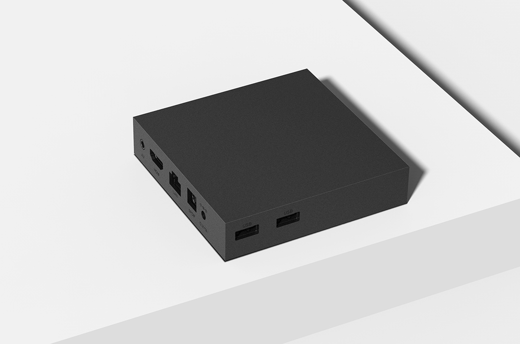
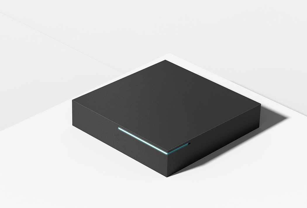
The set-top box/speaker does have telltale signs of an audio device, mostly due to the typical fabric-like surface that marks almost all speakers. Its minimalist design and text-based display, however, still make it a good candidate for interior design accessories. An interesting part of the product, however, is an accompanying webcam that’s no bigger than a can of tuna. There’s also a more typical set-top box that isn’t shaped like a box at all. Instead, it looks like a ceramic bowl that would be carefully put on display in the living room.
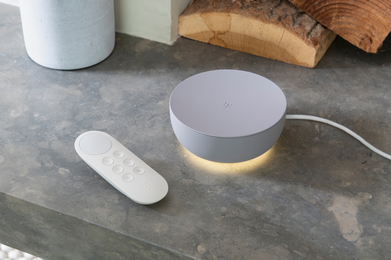
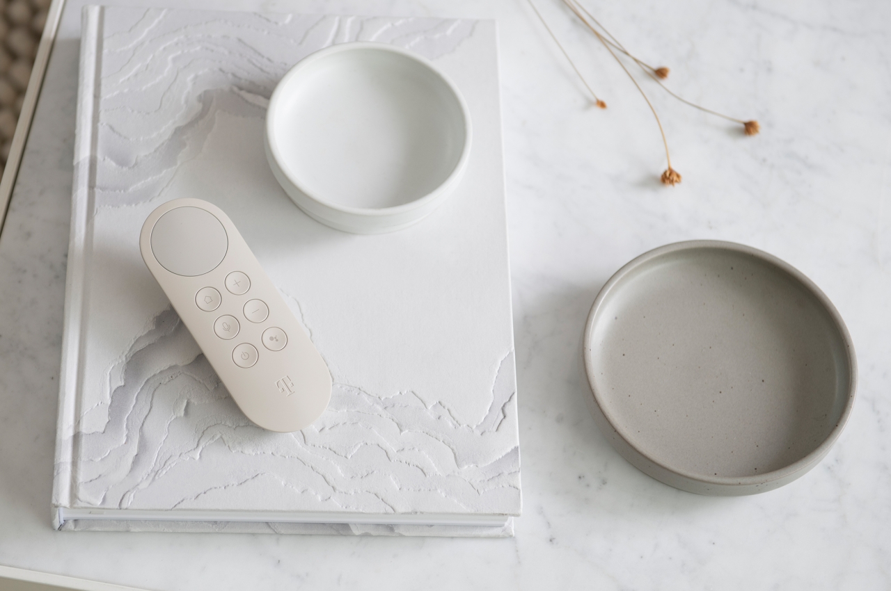
In addition to the designs themselves, this Home Harmony connectivity concept also tries to steer the ship towards more sustainable shores. Electronics are often made using plastics and unfriendly substances, but the use of wood, ceramic, and alternative materials will help make these objects not only blend in visually but also become a better part of people’s lives at home.

The post LAYER x Deutsche Telekom show how to hide tech in stylish home decor first appeared on Yanko Design.



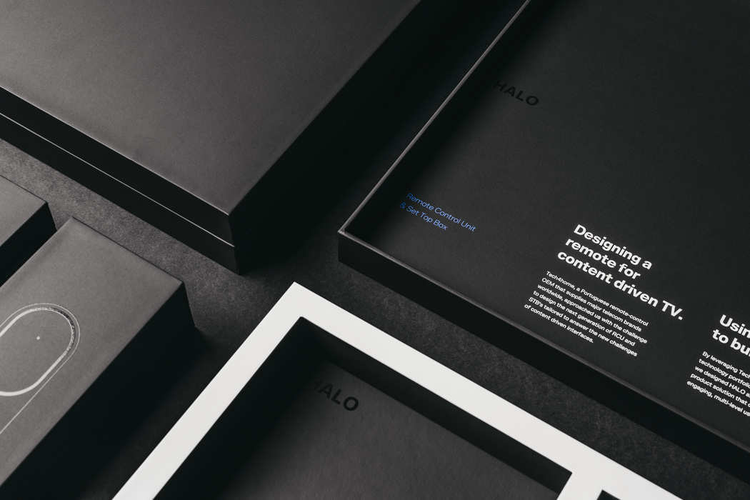
 Broadcom's success still depends in part on selling chips for cable set-top boxes, and it's apparently upset that TV viewers are headed elsewhere. The company has sued Netflix for allegedly violating eight patents covering data transfer and video pl...
 If you have an older Samsung or Vizio smart TV, you may have noticed a message from Netflix pop up on your screen. This week, Netflix began notifying customers that it will no longer support Samsung smart TVs, circa 2010 and 2011, or Vizio smart TV m...
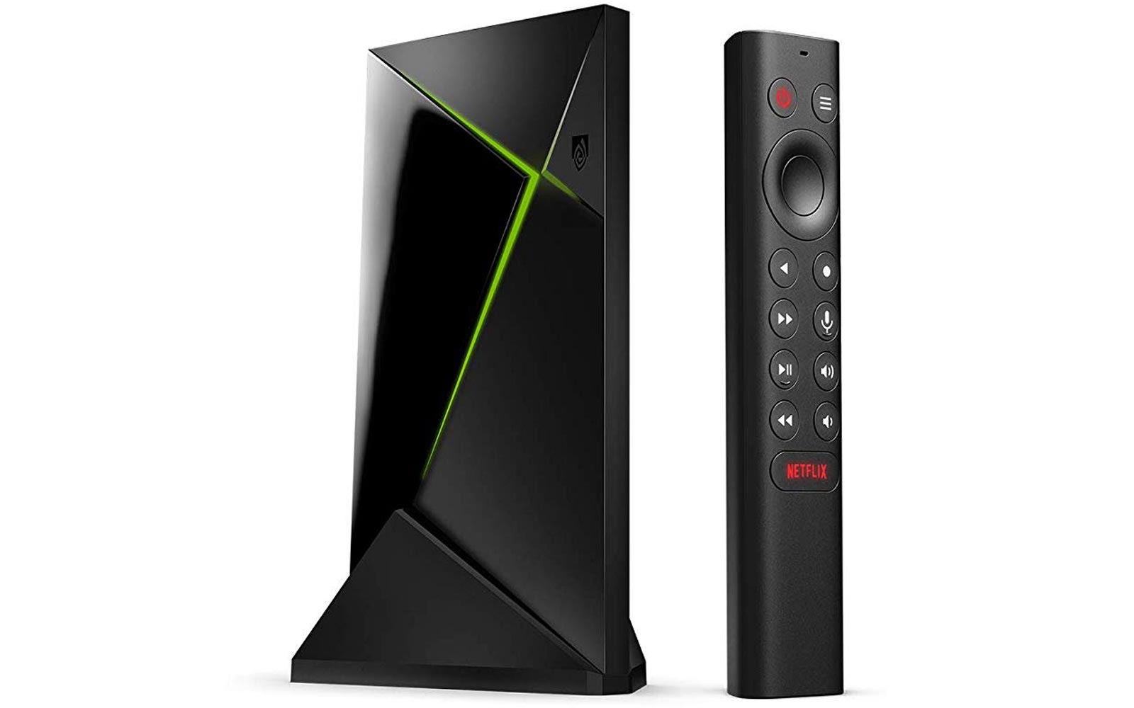 After multiple leaks, including two trips through the FCC, we've known for a while now that NVIDIA plans to update its venerable Shield TV Android set-top box. Thanks to an Amazon listing that was first spotted by Android TV Rumors and has since been...
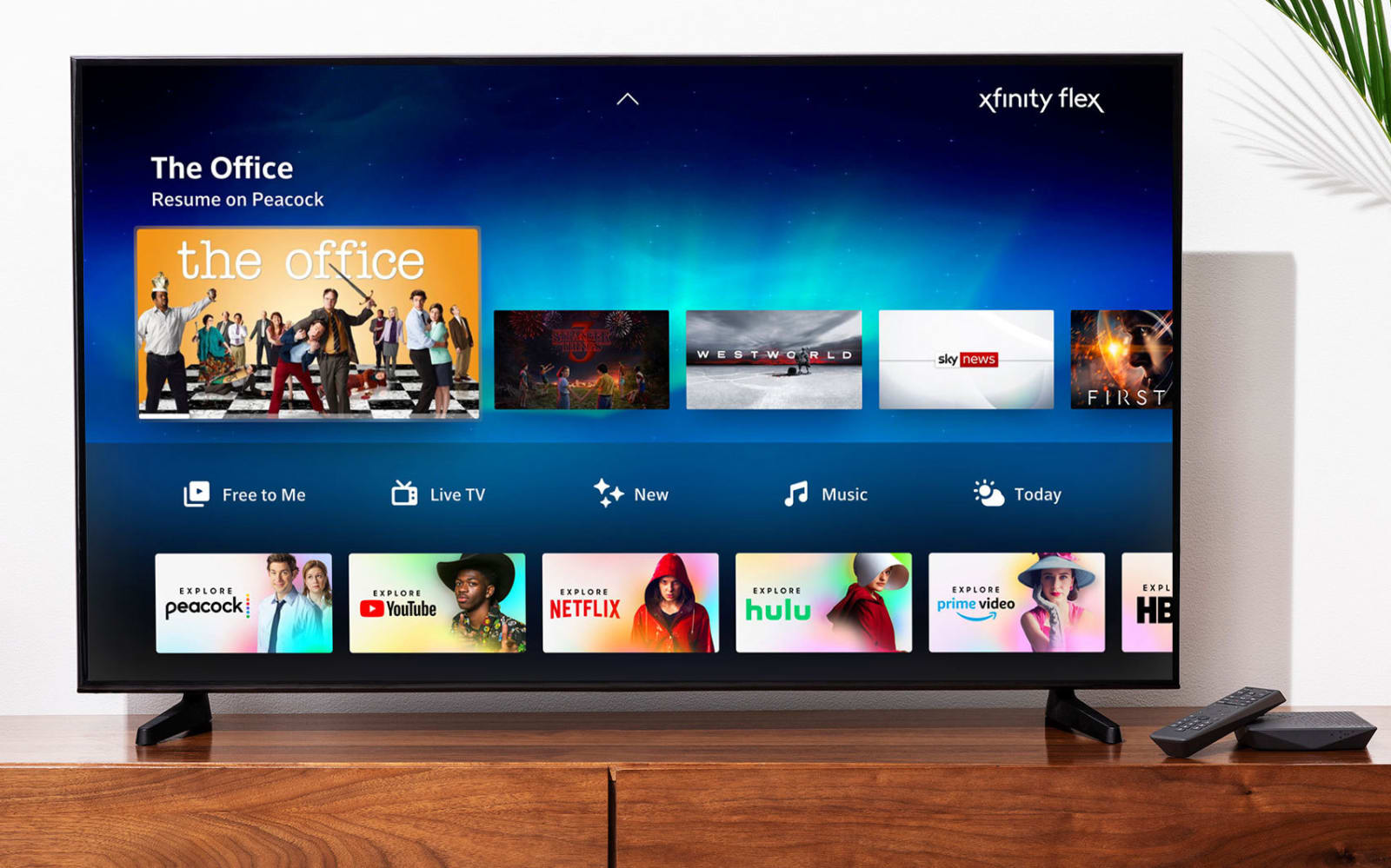 As of today, Comcast will provide its internet-only customers with its streaming TV service Xfinity Flex at no additional cost. Xfinity Flex, which is essentially a streaming device and platform, launched in March and originally cost $5 per month. No...
 TiVo, one of the early makers of DVRs, has been on the hunt for potential buyers. The company announced it is splitting its product and intellectual property licensing divisions on Friday, perhaps in hopes of becoming more attractive to buyers. It ho...
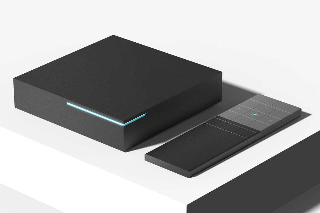
 Fresh off a successful IPO, Roku is keen to keep the momentum going. And what better way to do that than to launch a set of new devices, packed with a bunch of free (ad-supported) channels. The company tends to refresh its line-up in the fall, and th...