The GHOST Keyboard has markings on the front of the keys for a stealthy minimal appeal

Created as a part of Render Weekly’s design challenge, the Ghost Keyboard is interesting for its use, or rather overuse of minimalism (to the extent of possibly being counter-intuitive). The keyboard looks pretty standard, except for one crucial detail… the markings on the keys. Wellens’ Ghost keyboard doesn’t traditionally have the markings on the top of each key, as is expected, but rather takes on a different approach, with markings etched onto the front surface of the keys. Its stealthy appeal comes from the removal of a rather elemental detail, but the result is something incredibly interesting.

The Ghost keyboard should evoke one of two reactions. Exhilaration or confusion. To some, the lack of perceivable markings may be a major deal-breaker, but to others, who are so comfortable with typing while looking at the screen that they really don’t need the markings (because muscle-memory is a powerful tool), the Ghost keyboard is an incredibly unique and hauntingly beautiful keyboard that even comes with its own cushion-wrist-rest for the seasoned typist. My only concern about lusting over this beautiful piece of hardware? I haven’t memorized which punctuation mark sits over which number key. 🙁

Designer: Shaun Wellens for Render Weekly

The slimmest instant-camera ever made

m24004_camera_1

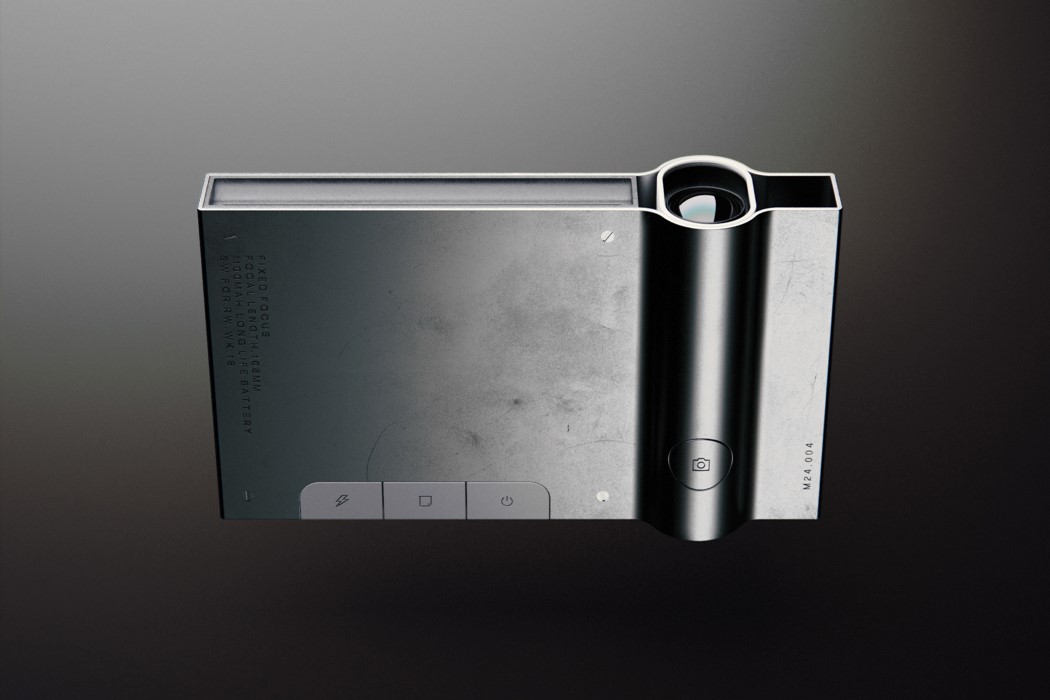
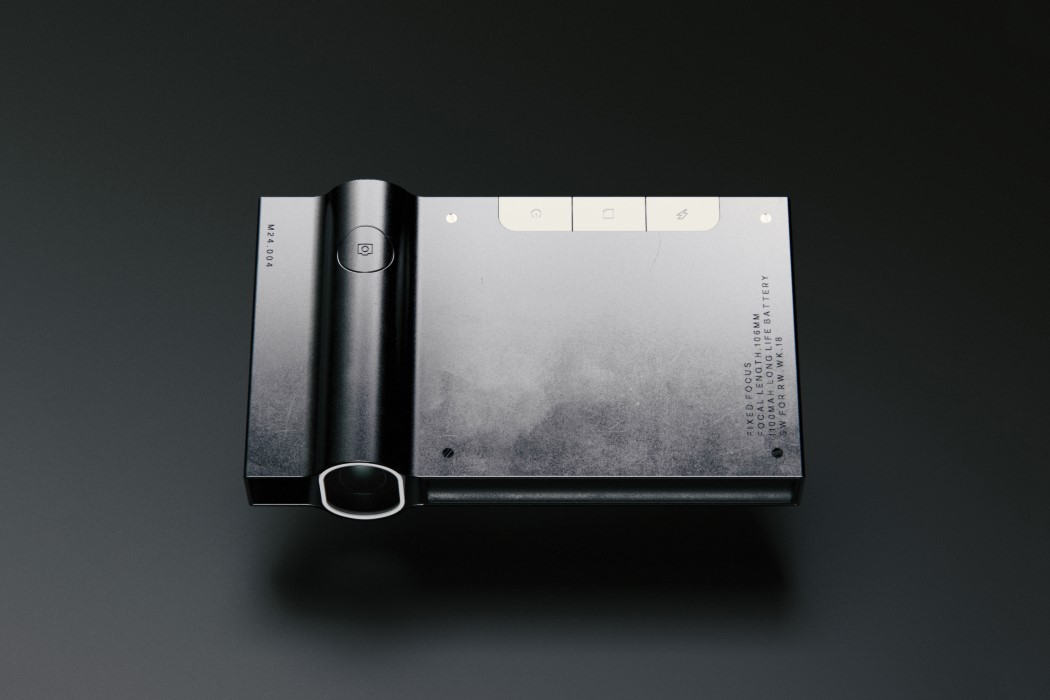
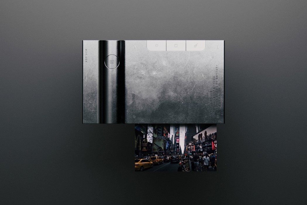
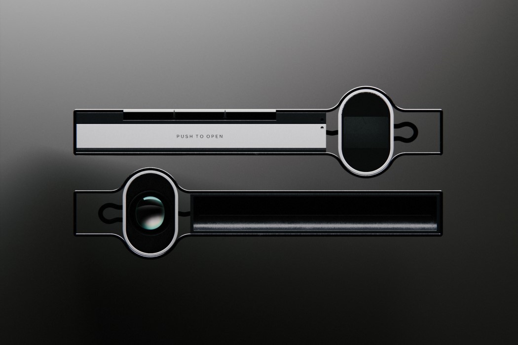
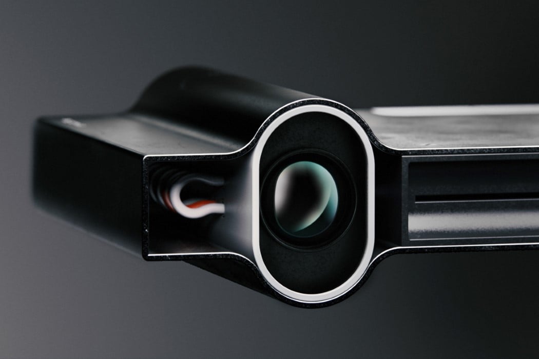
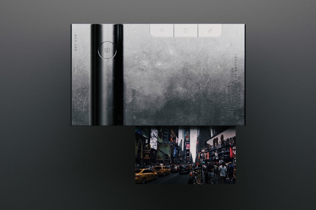
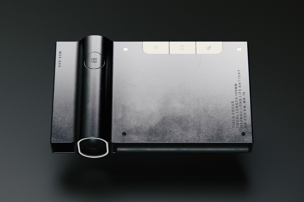
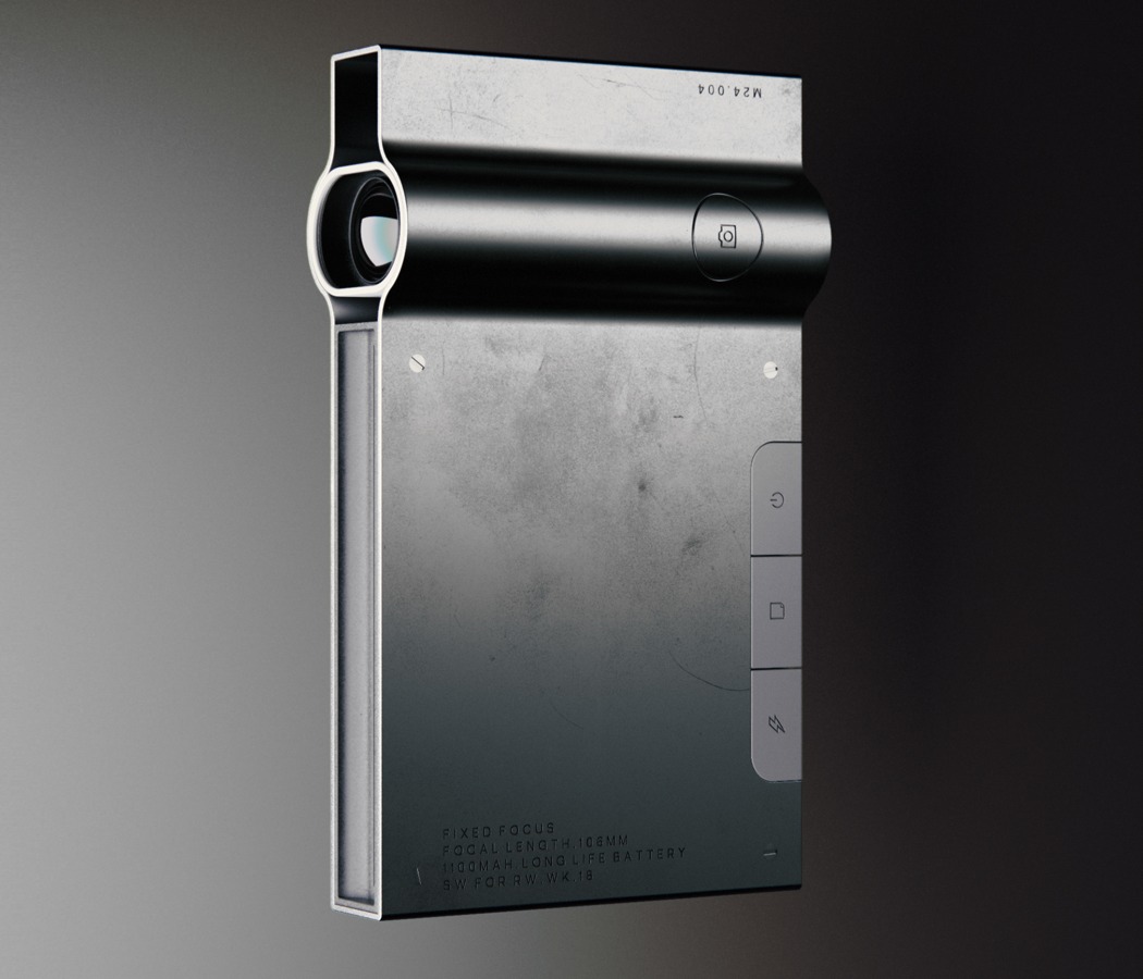
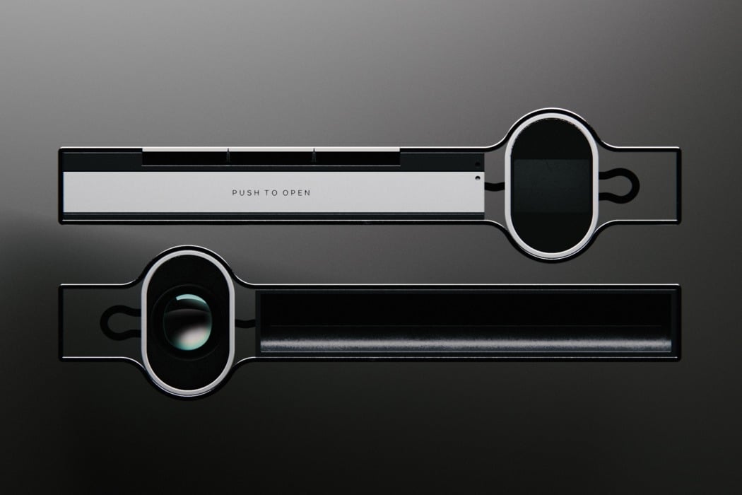
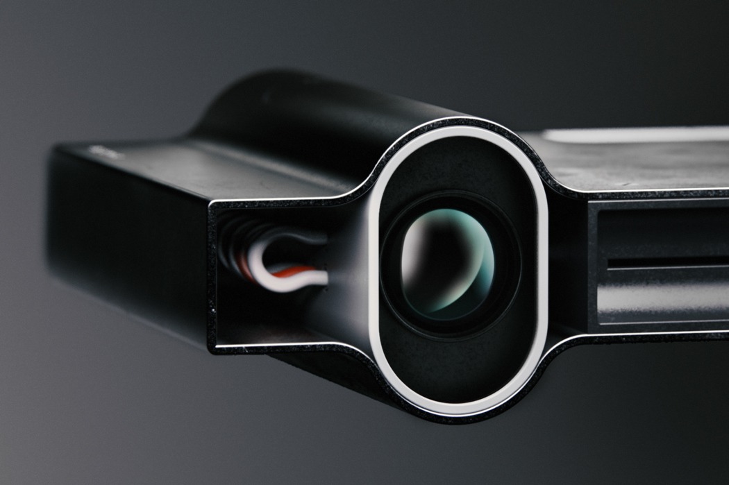
The M24.004 (that’s probably a codename) comes with an incredibly sleek design that’s thanks to a few key features. It lays its components out in a way so that they’re space-optimized. The lens is placed the way it is so that the battery can sit behind it, forming the cylindrical volume in the camera, while the printing paper and the basic PCB, the flatter components, fit in the rest of the flat frame. The absence of a screen cuts the thickness (by also reducing the load on the battery), and a hollow space at the opposite side of the camera lens actually serves two purposes. Wire management, and a very rudimentary viewfinder that you’re probably not going to use because the camera is so slim it doesn’t really block your face if you hold it near your eye while lining up the shot.

When you’re done, just take the print out, and slip the camera back into your laptop bag because it’ll easily slide in, thanks to its incredibly slick and slim profile! And I can’t get enough of that beautiful grungy distressed metal finish. Looks absolutely badass!

Designer: Shaun Wellens (The Anvil Studio)

m24004_camera_2

m24004_camera_3

m24004_camera_4

m24004_camera_5

Old-school Process Meets Modern Design

m24_print_camera_01

With the clear majority of photographs now being in a digital format, physical photos are looking more beautiful than ever before. They bring with them a wonderfully unparalleled sense of anticipation, as we eagerly wait to see the image develop before our eyes. Shaun Wellens wanted to rejuvenate this old-school emotion by encapsulating it into a device that’s fit for the modern day, and his creation came in the form of M24.004.

The M24.004 camera is an attention-stealing object, its clean, uniform lines and sharply engineered corners create a handsome, masculine aesthetic. This has only been emphasized by the rough, brushed metal finish that’s complete with exposed screws. The camera lens looks as if it is bending the casing outwards and this creates a beautiful interruption in the otherwise perfectly straight sides, adding a wonderful element of suspense to the design.

Designer: Shaun Wellens

m24_print_camera_02

m24_print_camera_03

m24_print_camera_04

m24_print_camera_05