Top 10 Styles of Open Shelving for Maximizing Storage

Open shelves and storage solutions not only tidy up your possessions but also incorporate them into your home’s decorative scheme. Open shelves come in various styles and configurations, each offering unique advantages and aesthetic appeal. Here are ten different types of open shelves to choose from.

Designer: João Teixeira
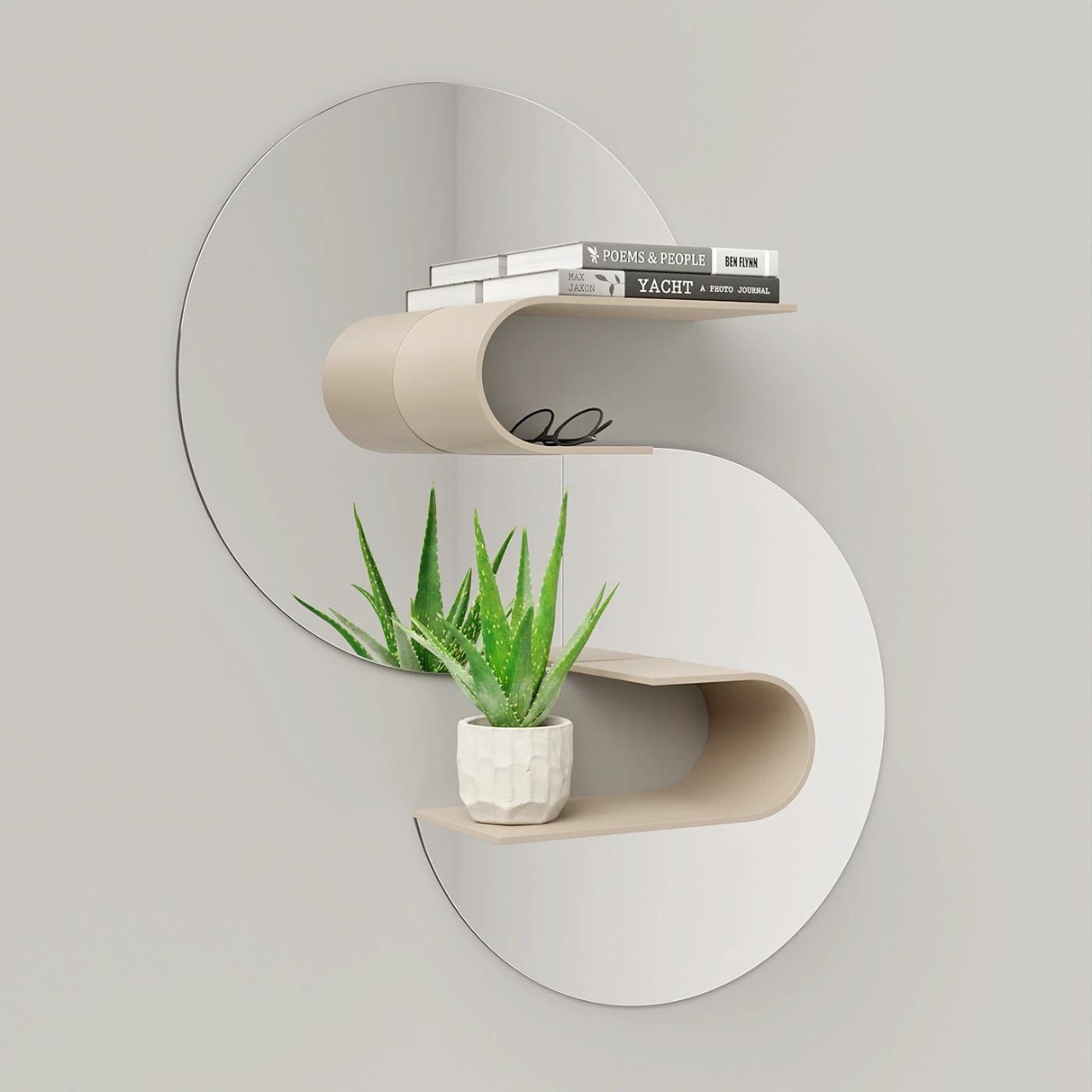
1. Floating Shelves
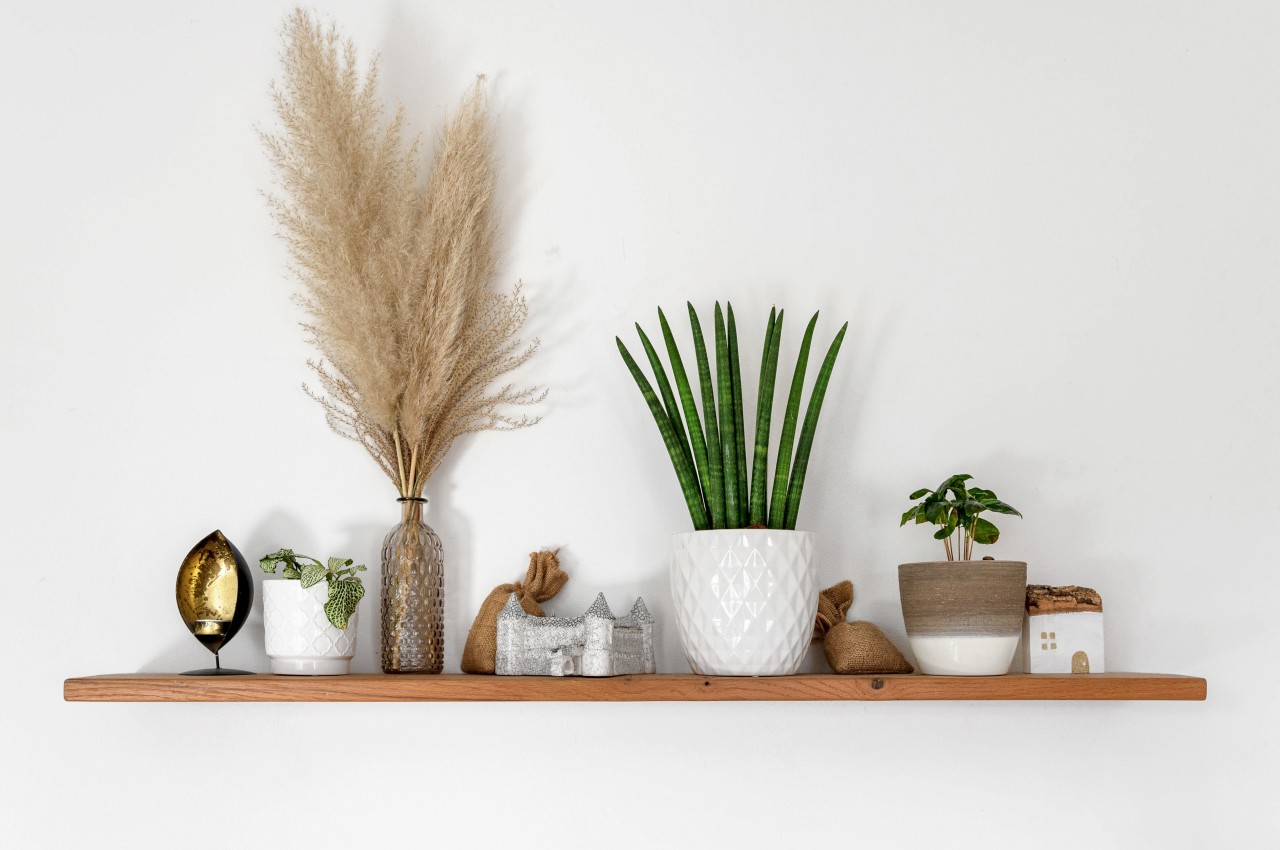
Image courtesy of: 9_fingers_

These are the most common types of open shelves that are mounted directly onto the wall to impart a floating effect as the brackets are concealed. It is best suited for modern homes and is perfect for displaying decorative items, storage containers, or toys in children’s bedrooms.

2. Wall-Mounted Shelves
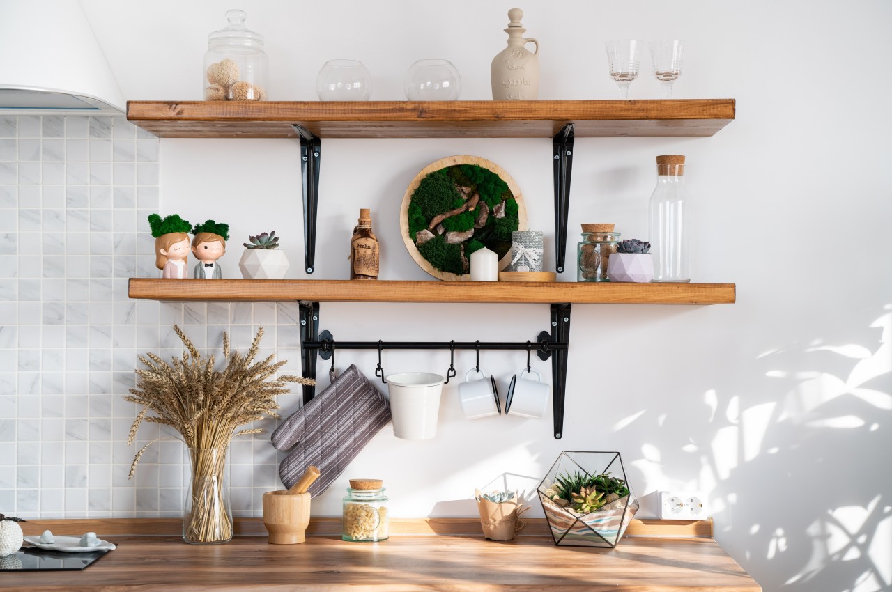
Image courtesy of: katrinasid

As the name suggests, these shelves are mounted on the wall supported by visible brackets and are available in multiple materials and designs.

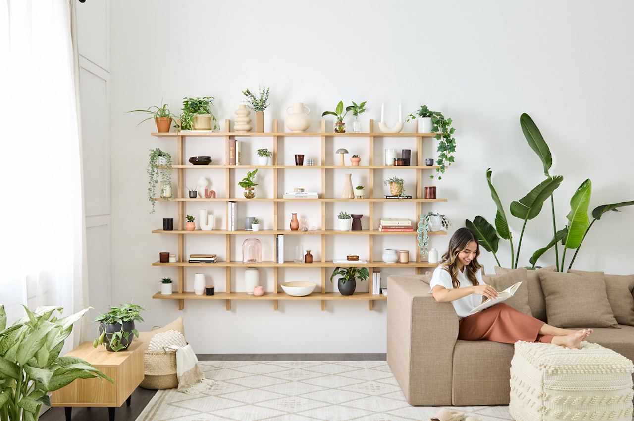
Designer: Evan Clabots for Cozey

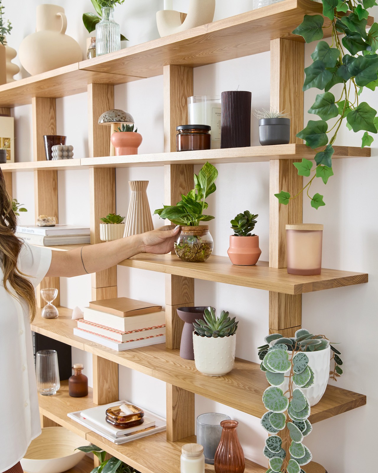
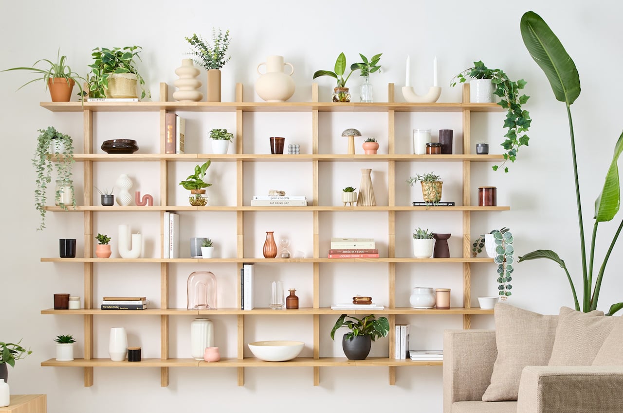
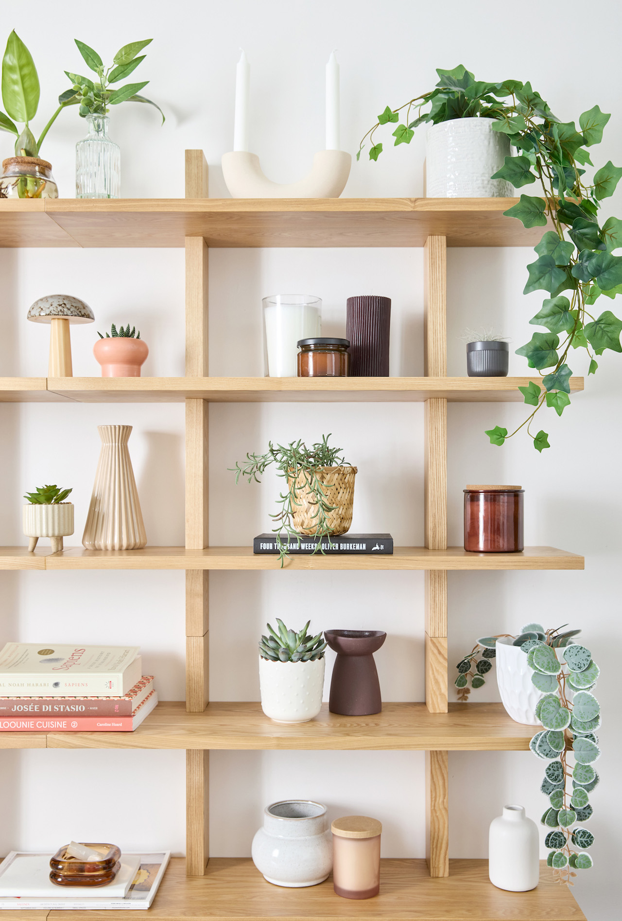
The Altitude Shelf, designed by Evan Clabots for Cozey, draws inspiration from Japanese and Danish woodworking traditions, boasting clean lines and a minimalist aesthetic. Easy to assemble with included hardware and a placement guide, this versatile shelf seamlessly integrates into any room, offering both functionality and style.
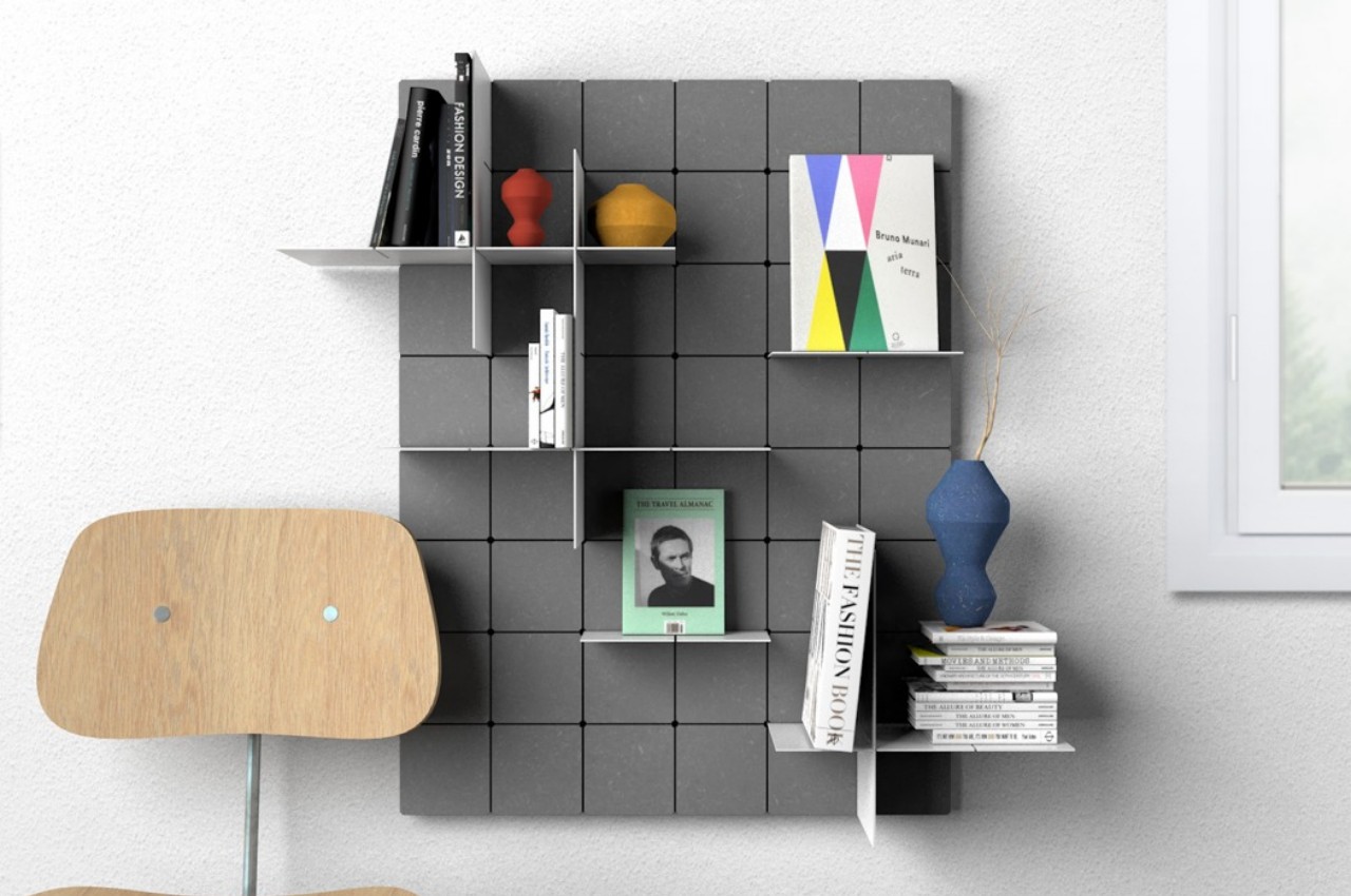
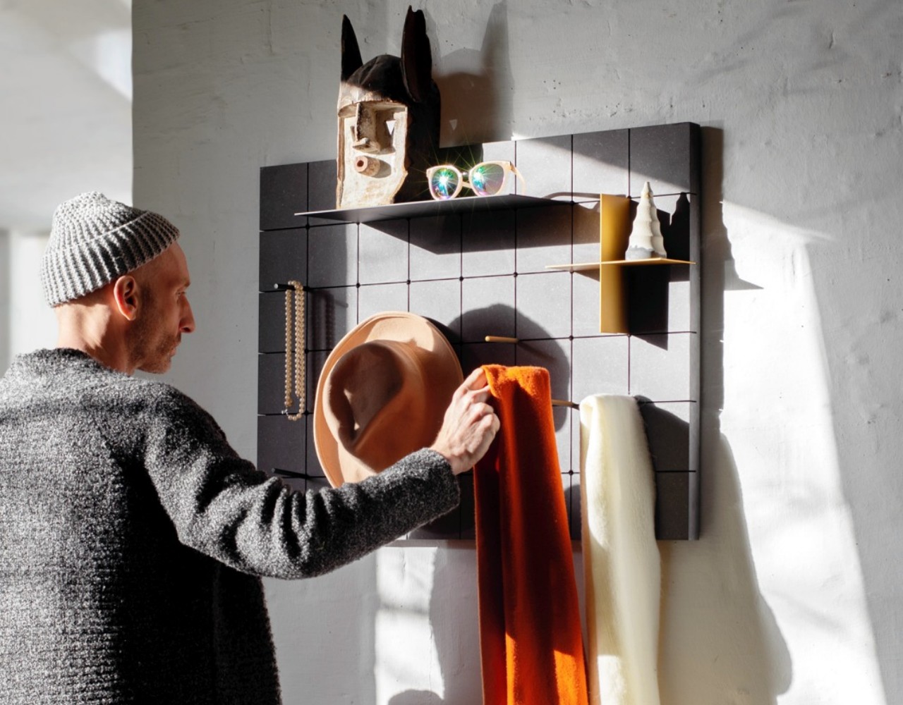
Designer: Markus Hofko of Von Morgen

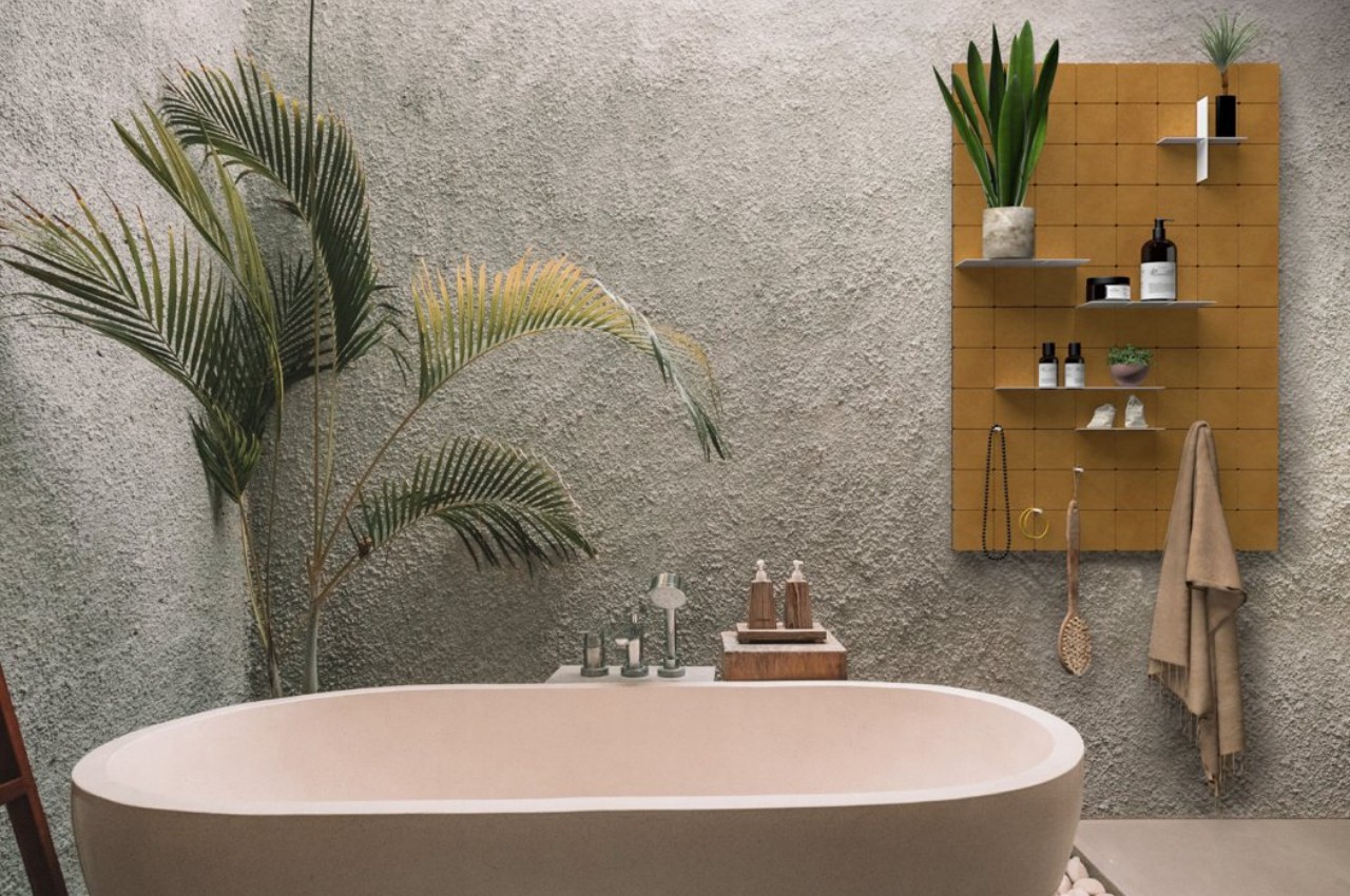
KUR!O’s innovative shelving unit offers customizable storage solutions with its grid base and interlocking shelving plates. It has evolved into a consumer-ready product featuring durable construction and additional features like dowels for hanging items. The base grid, made from wood-fiber boards, supports powder-coated steel panels, available in various colors for structural integrity and aesthetic appeal. With a modular design and playful color scheme, KUR!O adds contemporary flair to any space.

3. Cube Shelves

Available as rectangular or square-shaped shelves, these units can be used for storage and display. They can be used as individual units or can be combined to create an interesting display.
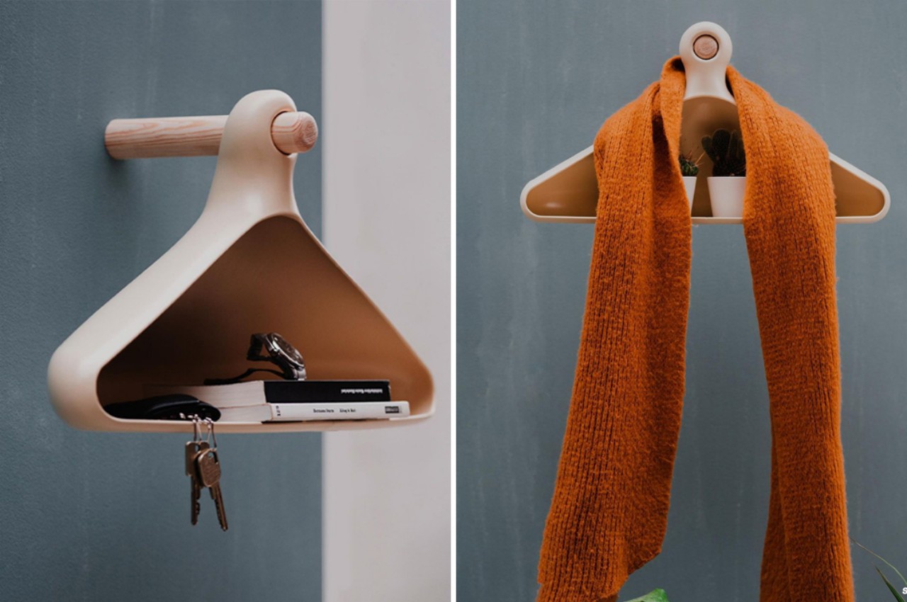
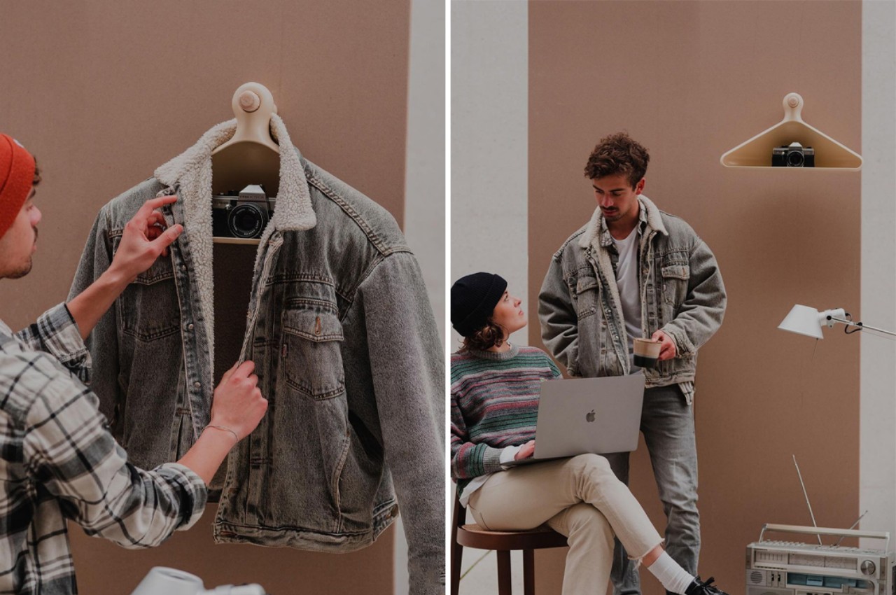
Designers: Calvin Middel & Bencekommt

Every foyer needs a storage solution for keys, jackets, and daily essentials. Student designers Calvin and Bence crafted Bügal designed a fusion piece blending a coat rack with a shelf system. Utilizing 3D printing, they molded Bügal’s body, achieving a sleek, semi-matte silicone finish. Bügal hangs securely from a wooden peg, accommodating multiple garments and bulky items like cameras or plants. Its deep pocket provides space for keys and phones, offering practical storage without sacrificing style.

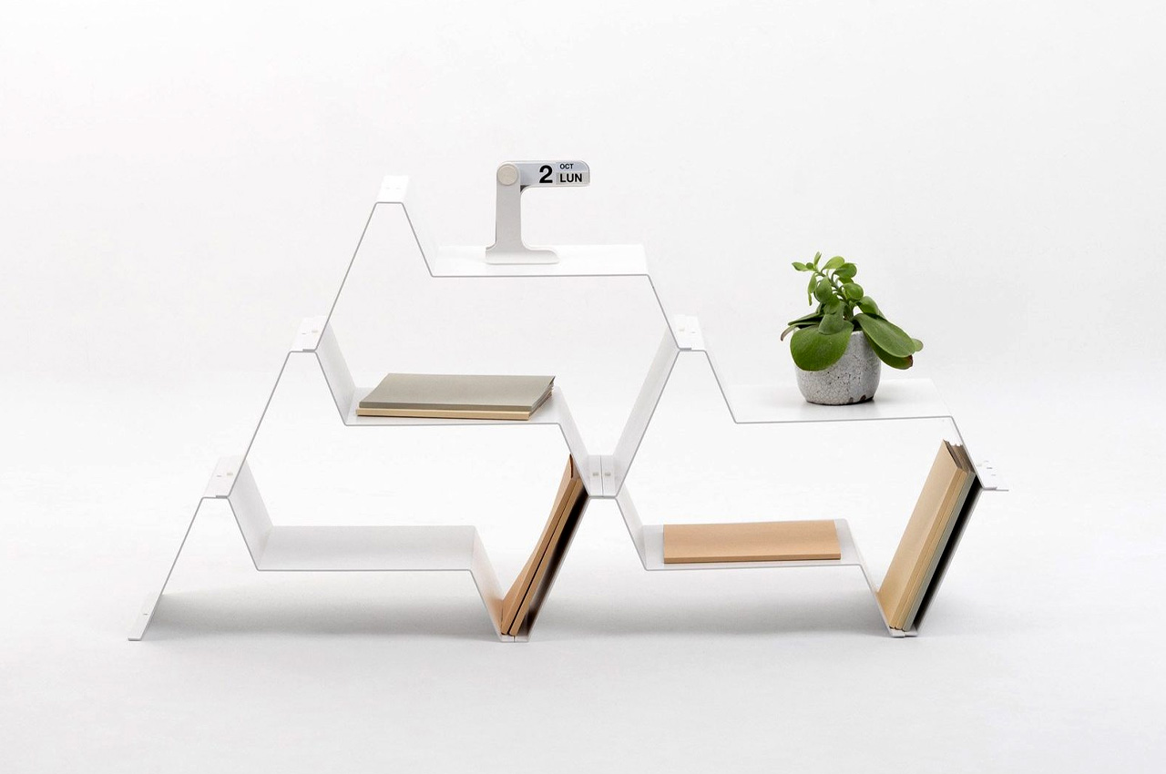
Designer: Jean Couvreur for Kabata

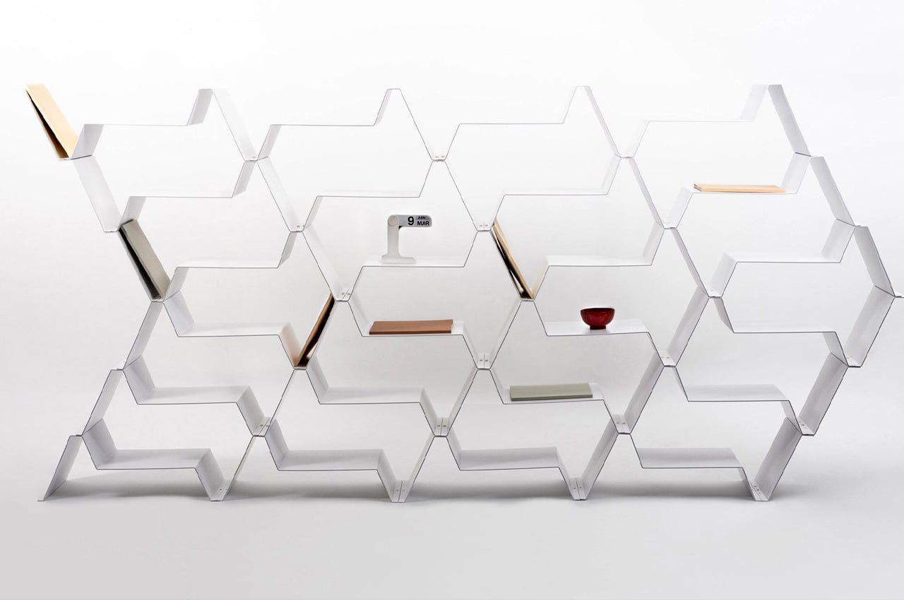
The Fréquence shelf by Jean Couvreur, designed for Kabata, offers a versatile storage solution for compact living spaces. It features minimalist aesthetics with clean lines and a sleek white finish. This modular shelving system allows for various configurations, serving as a bookcase, base unit, or room divider. Its geometrically shaped modules, crafted from durable aluminum, enable creative arrangements while minimizing material wastage during manufacturing. With its sturdy construction and modern design, Fréquence adds functionality and elegance to any home environment.

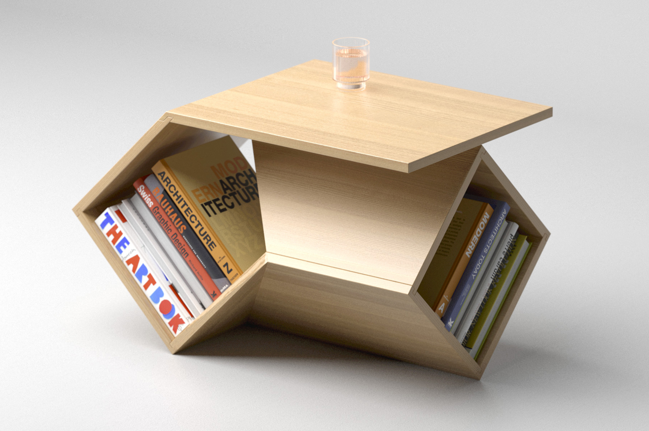
Designer: Deniz Aktay

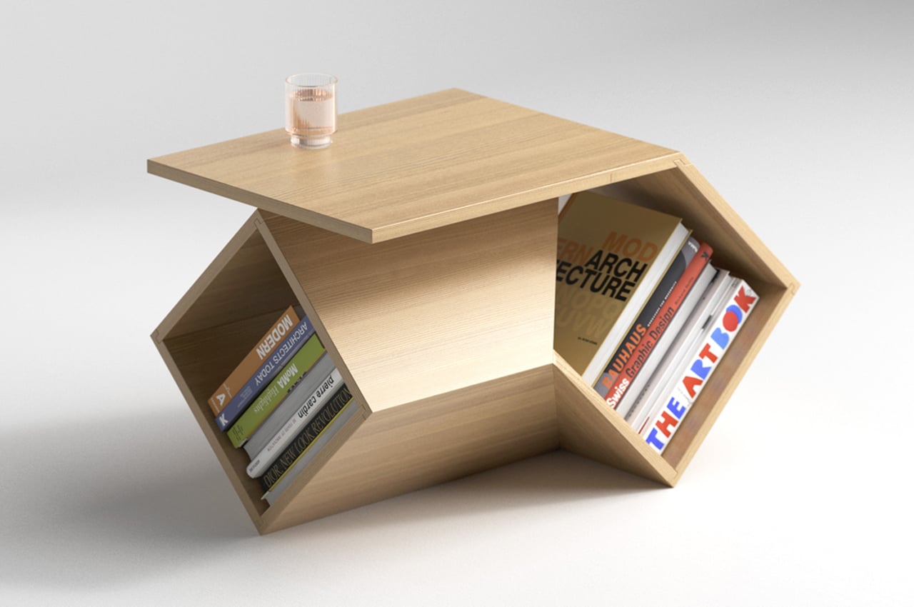
Deniz Aktay’s ‘Overlap’ table is a versatile and functional piece of furniture designed for modern living spaces. It features two rotated wooden boxes ingeniously joined to create a sturdy tabletop and storage unit. This compact yet stylish design prioritizes both form and function, offering ample storage while occupying minimal space. Its geometrically intriguing form adds a touch of sophistication to any room, making it a perfect fit for small corners or as a centerpiece in a living room.

4. Corner Shelves
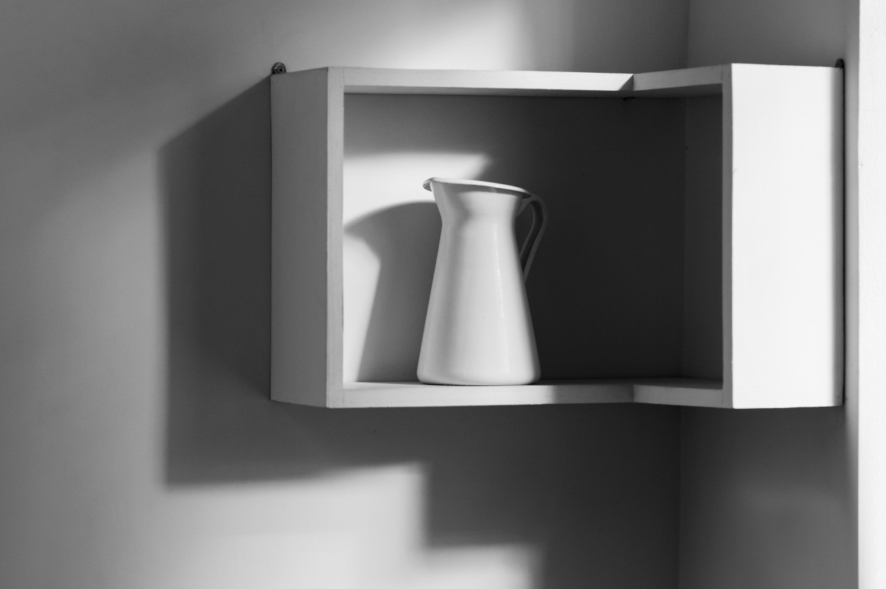
Image courtesy of: olegbreslavtsev

Make optimum use of the corners and maximize storage with corner shelves. These shelves are available in triangular and curved designs and are ideal for enhancing the utility of vacant corners.

5. Ladder Shelves
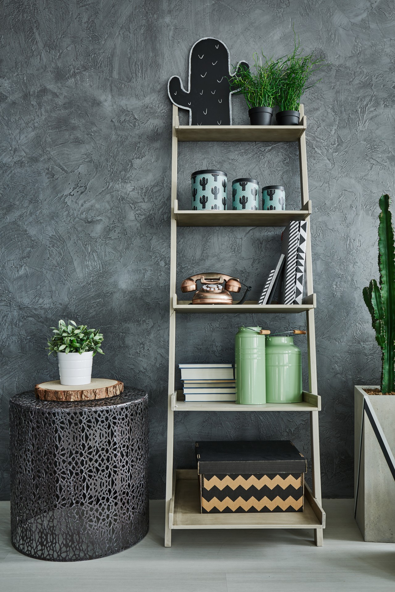
Image courtesy of: bialasiewicz

These shelves resemble a ladder, lean against the wall, and are perfect for displaying books, plants, and decorative accents. Note that these shelves are wide at the base and narrow at the top.

6. Pipe Shelves
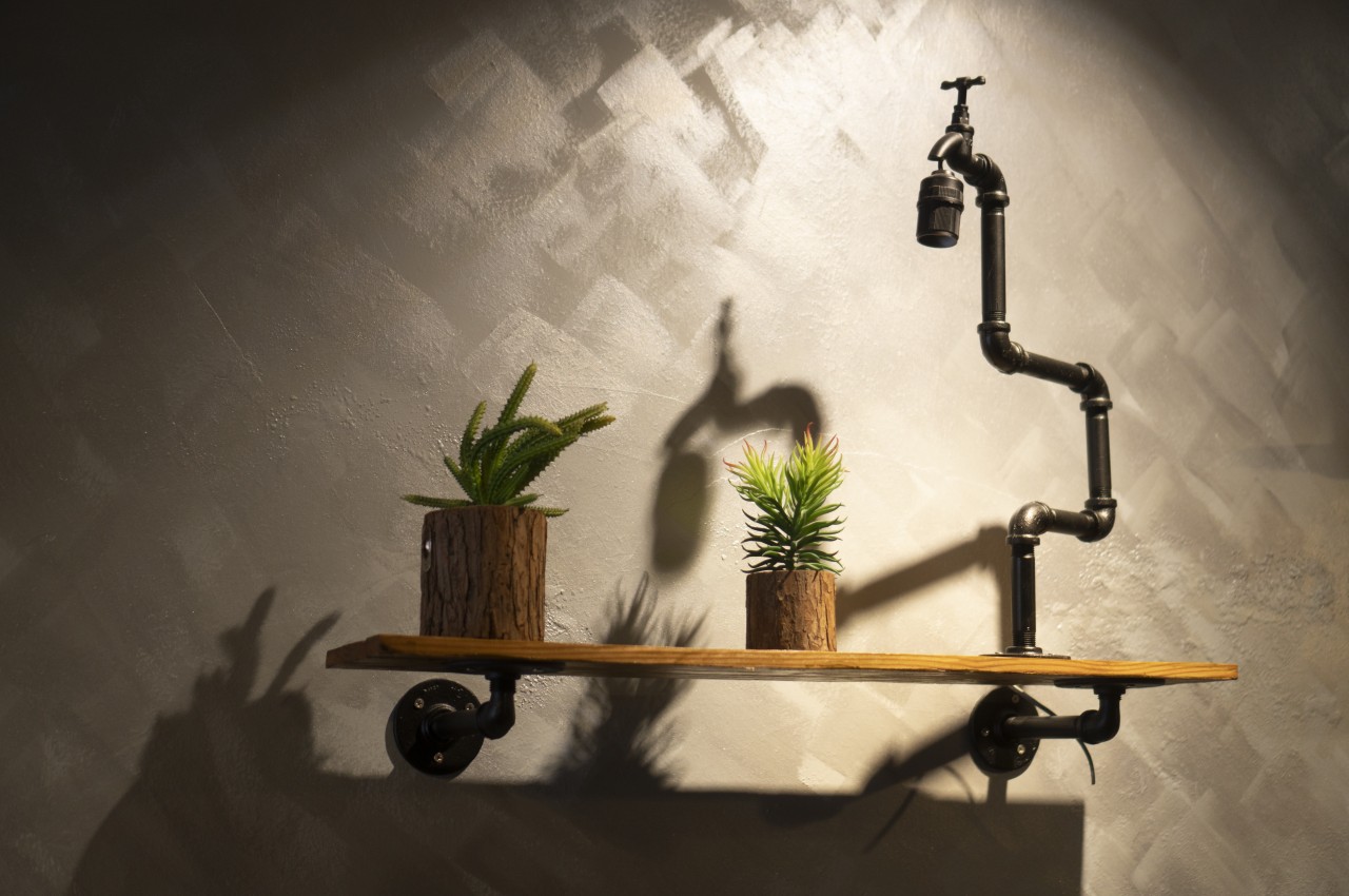
Image courtesy of: ckstockphoto

If you love the modern, rustic, or industrial look then go use metal pipes as the support brackets for holding wooden or glass shelves. These are perfect for a modern or rustic décor.

7. Cubby Shelves

These are open compartments of various sizes that provide flexible storage solutions and are very popular in offices and children’s bedrooms. These are perfect for storing books, baskets, and decorative objects.

Designer: Freia Achenbach

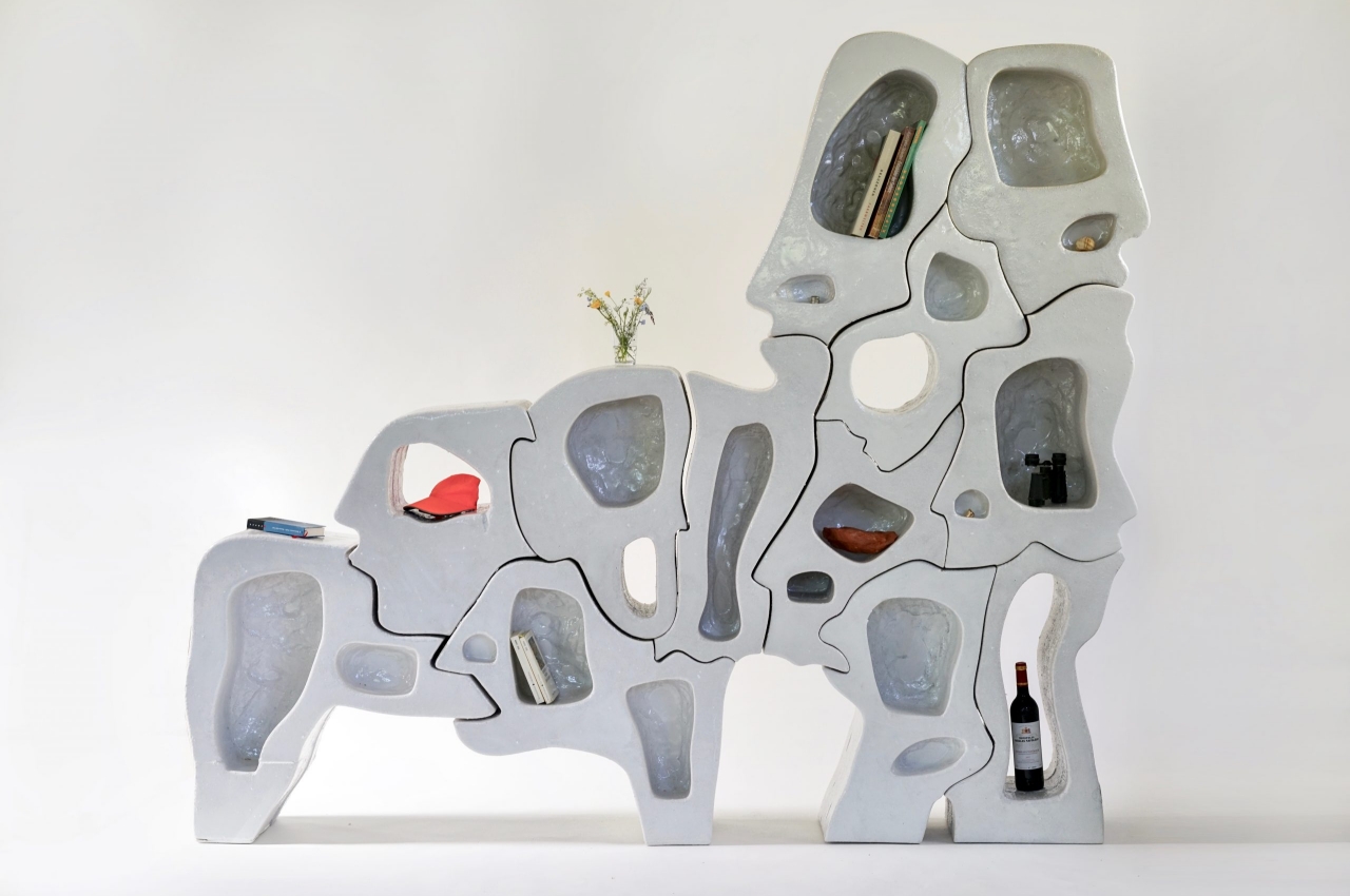
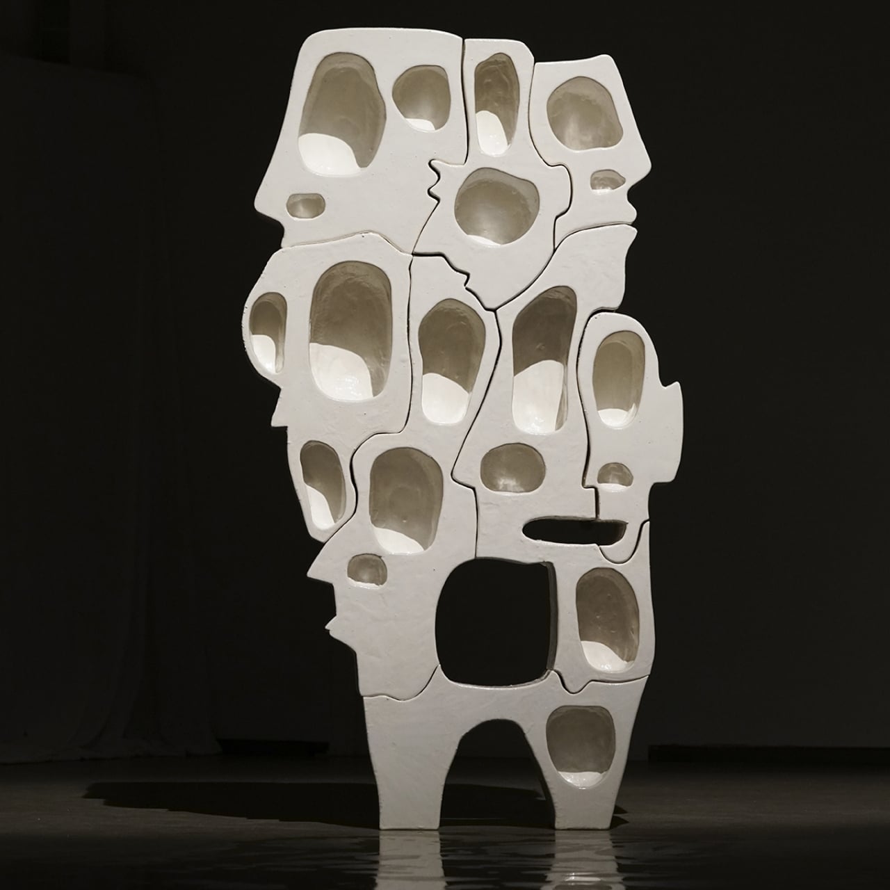
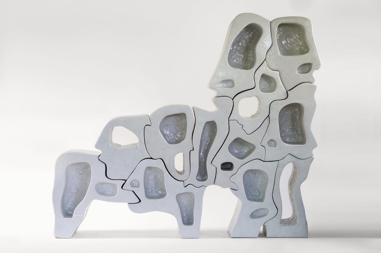
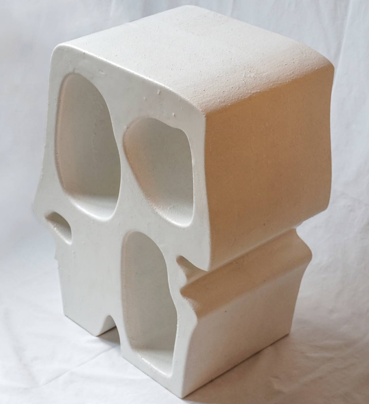
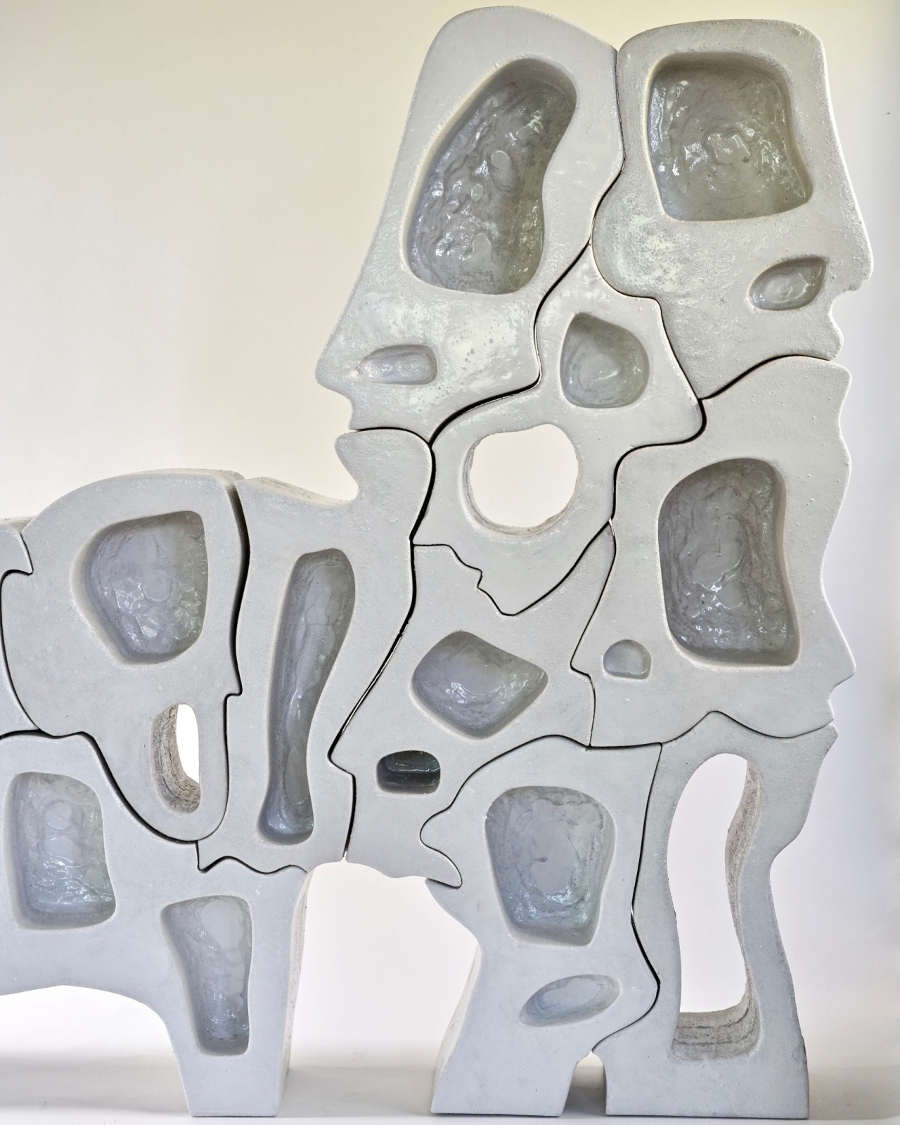
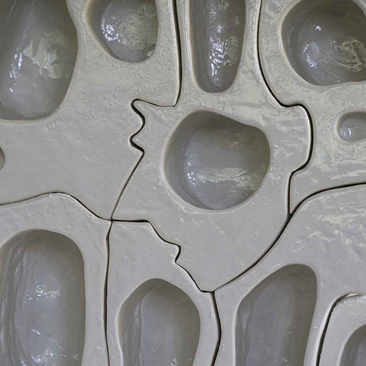
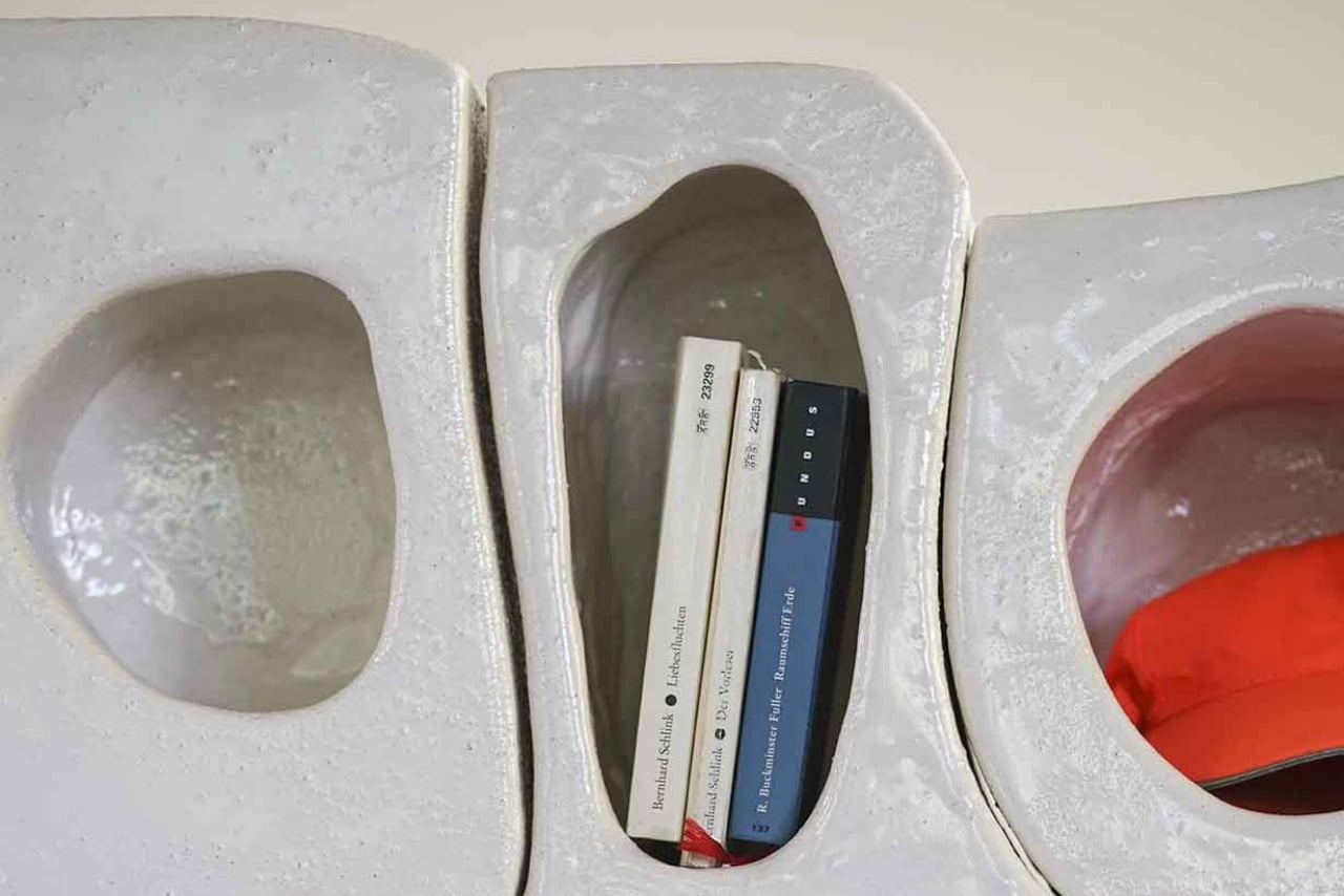
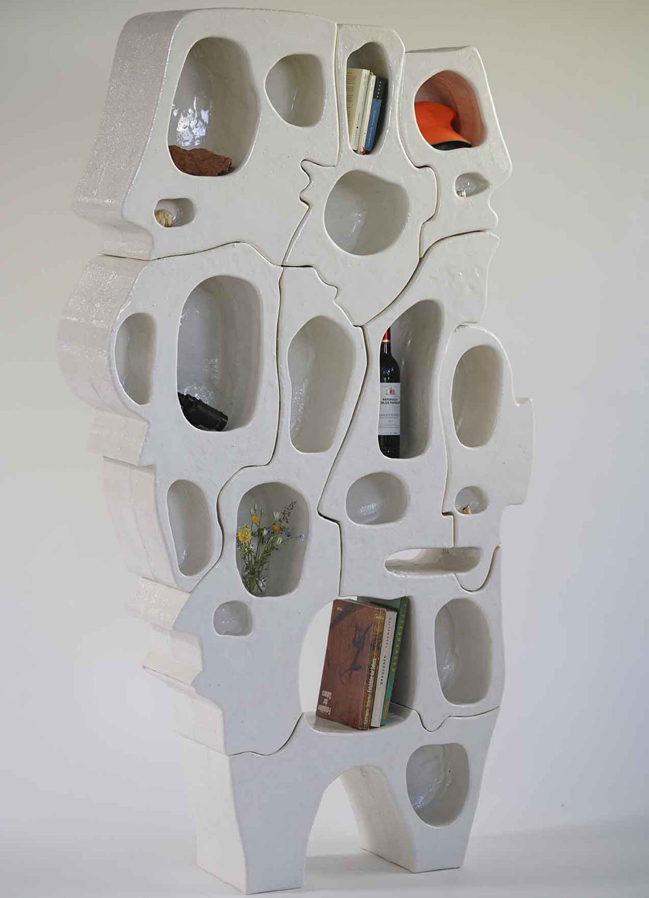
A shelf named “Spectator” captivates with interlocking puzzle piece design, subtly resembling distorted human faces. Hand-painted resin pieces create a glossy finish reminiscent of ivory and bone. While minimalist, it challenges observer roles, blurring lines between viewer and viewed. Despite its unconventional appearance, it seamlessly interlocks, symbolizing the mental space objects occupy. Though not the most functional, it offers a unique perspective, prompting contemplation on perception and cognition in a compact, artistic package.
Designer: Narbutas

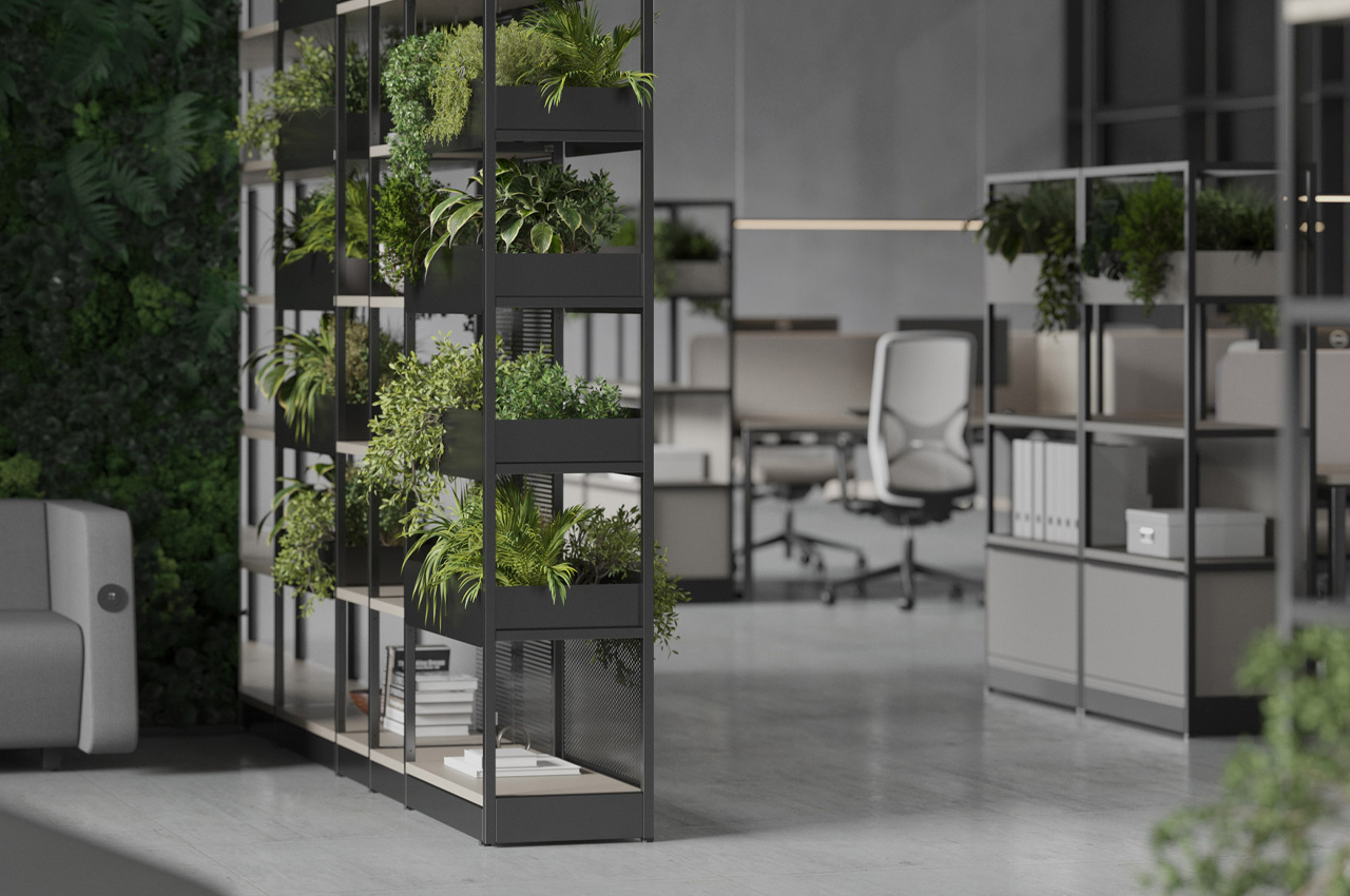
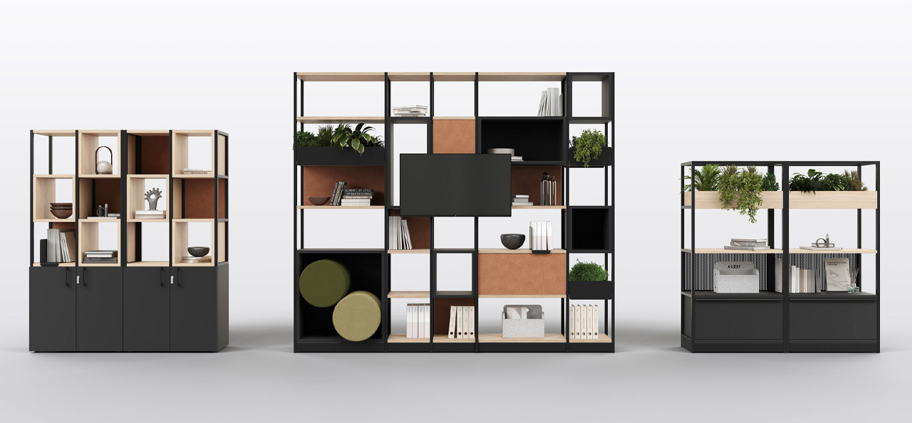
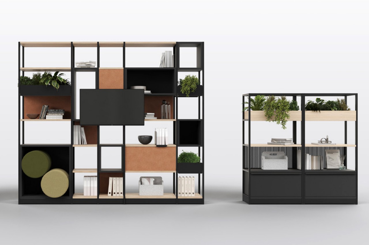
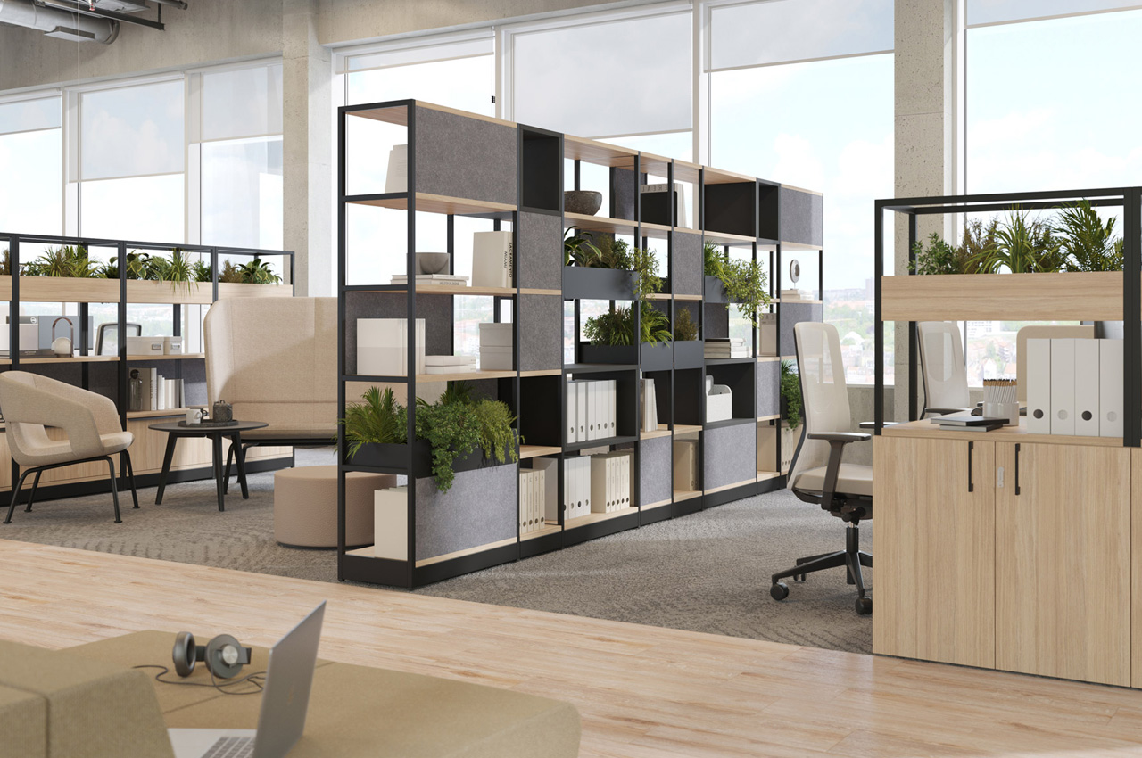
In major cities, space scarcity persists, particularly for independent millennials transitioning to their own homes. Office environments face similar challenges, necessitating efficient storage solutions. Narbutas’ Combus Shelving System addresses this need, offering versatile storage and space partitioning with customizable shelving types and heights. Its innovative configurations facilitate dynamic office layouts, while optional accessories enhance functionality. Made from recycled materials, it promotes sustainability and can be easily disassembled for reuse.

8. Wire Shelves
SSUCv3H4sIAAAAAAAACpxSy27DIBC8V+o/WJxjyQYb4/5K1MMakxgVgwU4bRTl34sfRKRqL72xszP7Gm6vL1mGOnCSo7fstkQhlkrNzlvw0ugAF4cdt0L3wqbIxRJapIDopTdWgkrBDjwfNIwigHpWaoHvaxI5D352wiXdJ/nlIcQkoXHw4hzqPhHj2MctzmJiTQZFSCF0SDA3dysWoa34v5Tb4z1uCGeh+XWZ7Z5MbYUSsC133Kjo49MLO65b7CSYe2mSrS6Gg3I/9p+s5FKfE5nxw2pFlHEza2+v6eRIGTNBp5azn0JNEfEBnAv0PuLpoYPxZkz6aOPXBfaqqA9OLGFJSEFoW+Oqwg2mLWE7YXN0kKHOOk4ccJ6UgV4sTR/Xfnhd0poxRknBtlR0Zjn8KL3/W9ZiXGLa7LKnn2X4h+x/+1mIsYaSqmSrnztfLi1QjwuMK1HkJ0pIXjUt5ECB5HVZtxwqVheAg+r+DQAA//8DAG5V65w5AwAA

Image courtesy of: bilanol

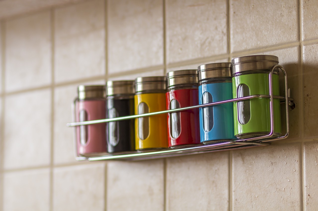
These shelves provide a lightweight appearance and are highly recommended for use in the kitchen, laundry room, or bathroom to store kitchen essentials and bathroom items.

9. Console Units

Some console units come with open shelves and are primarily used for storing books. These not only look neat but are versatile pieces of furniture that can be used in the entryway, living room, or bedroom.
Designer: Carlos Platz

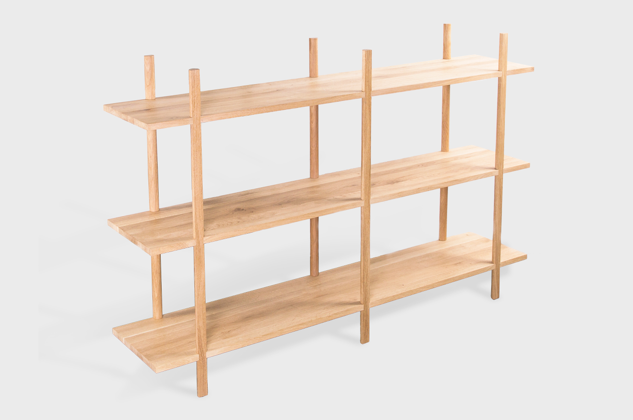
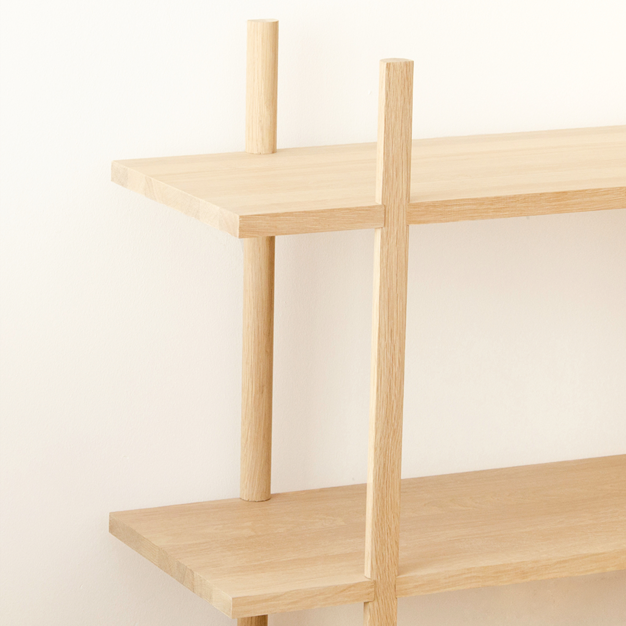
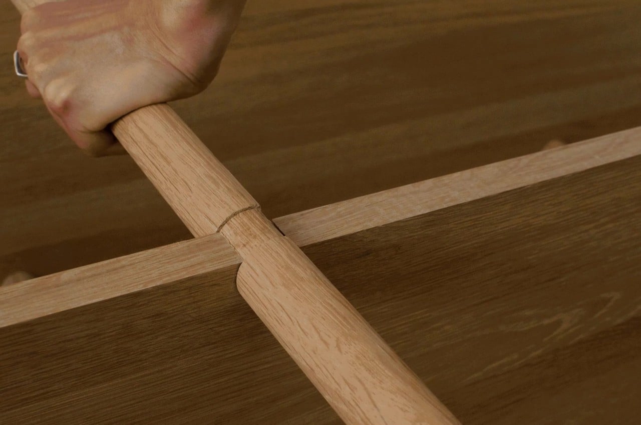
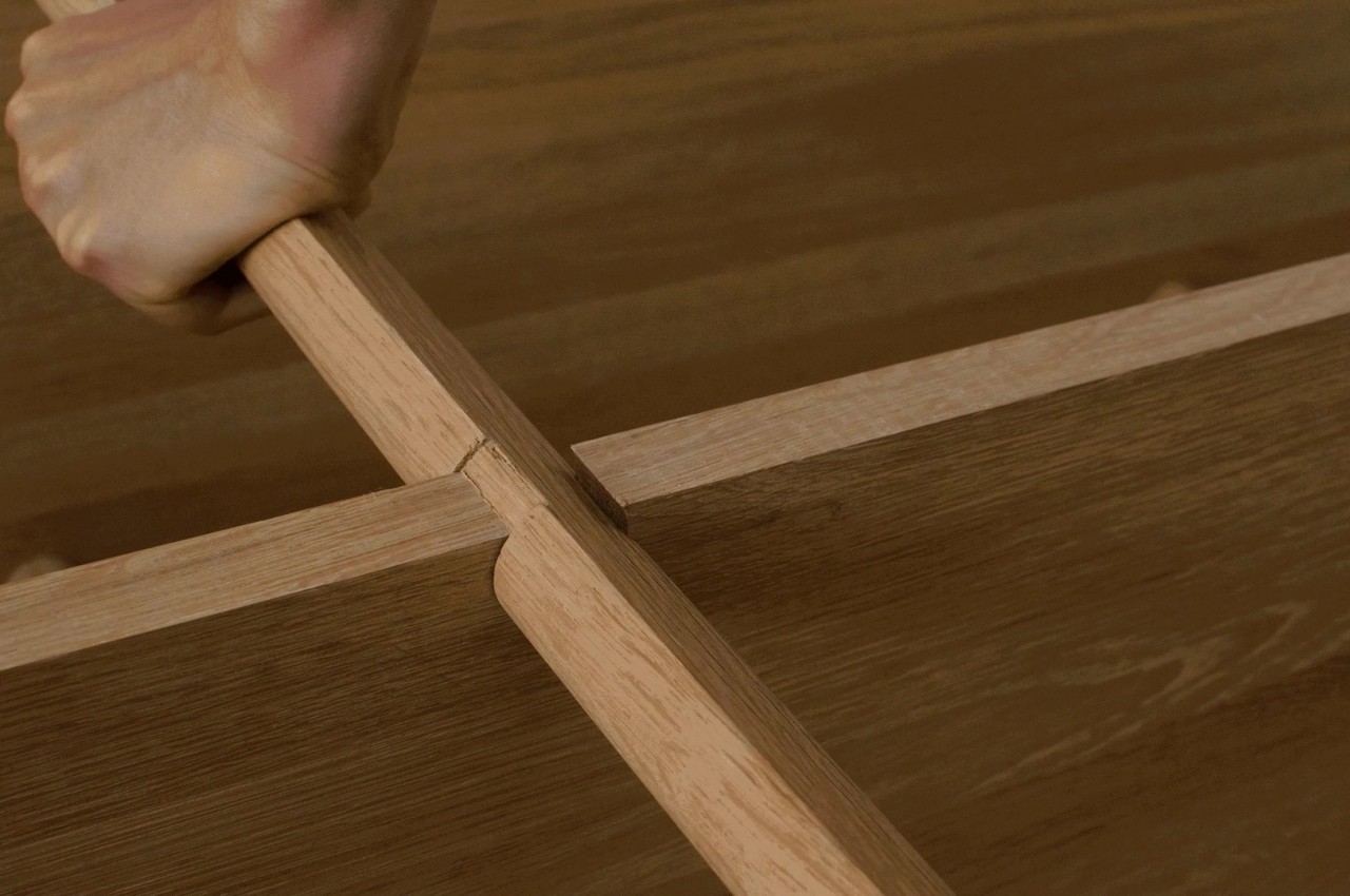
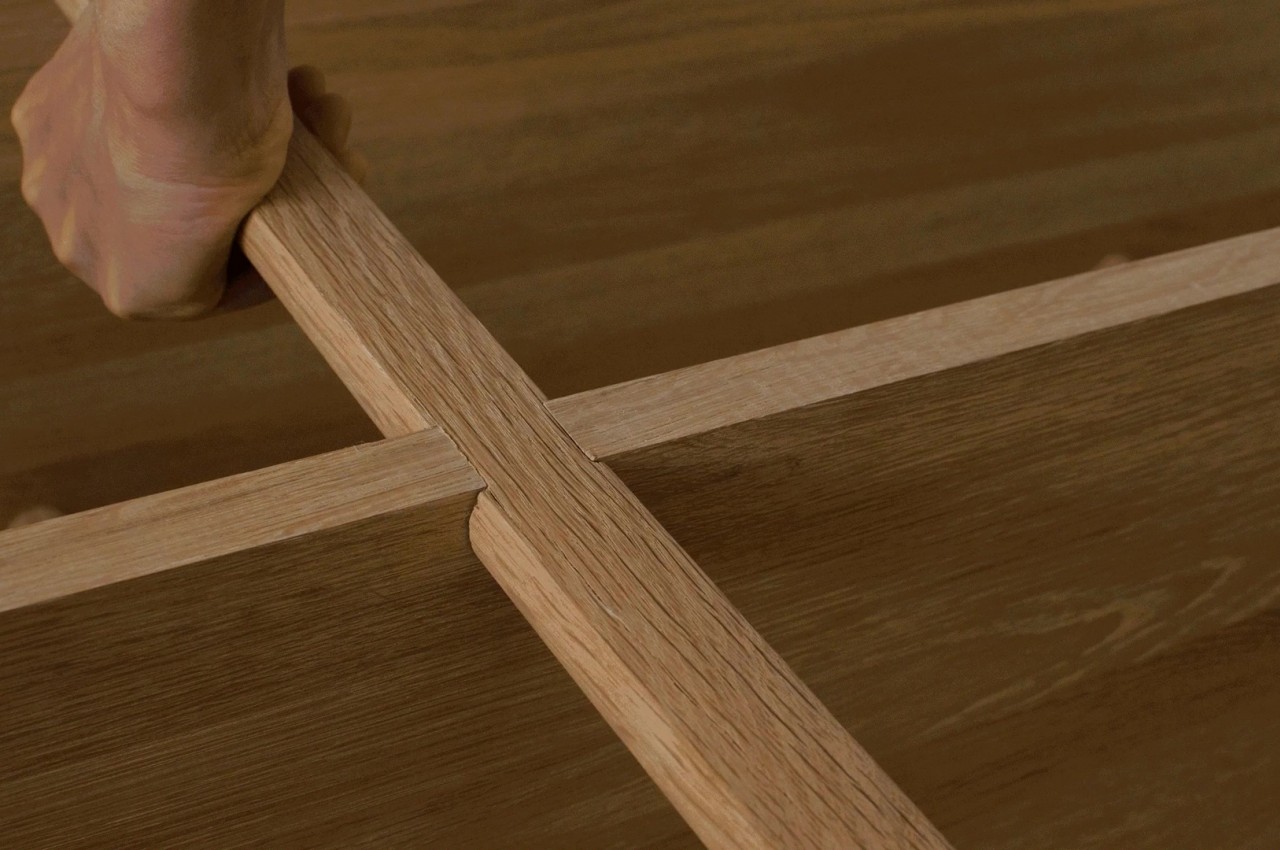
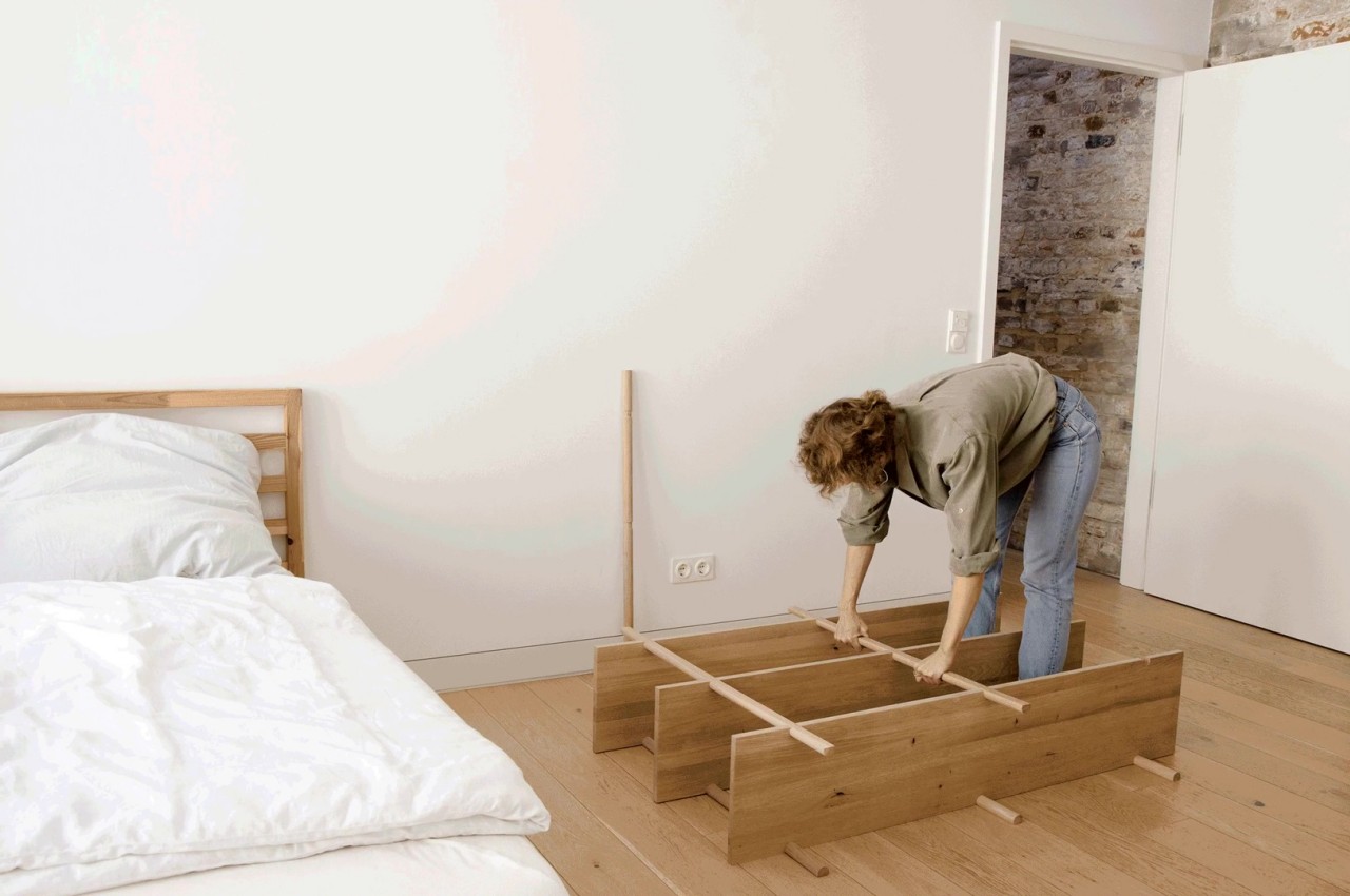
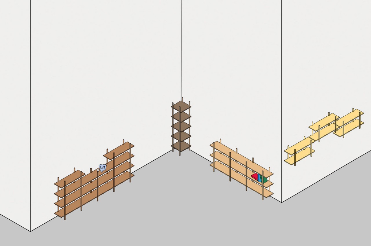
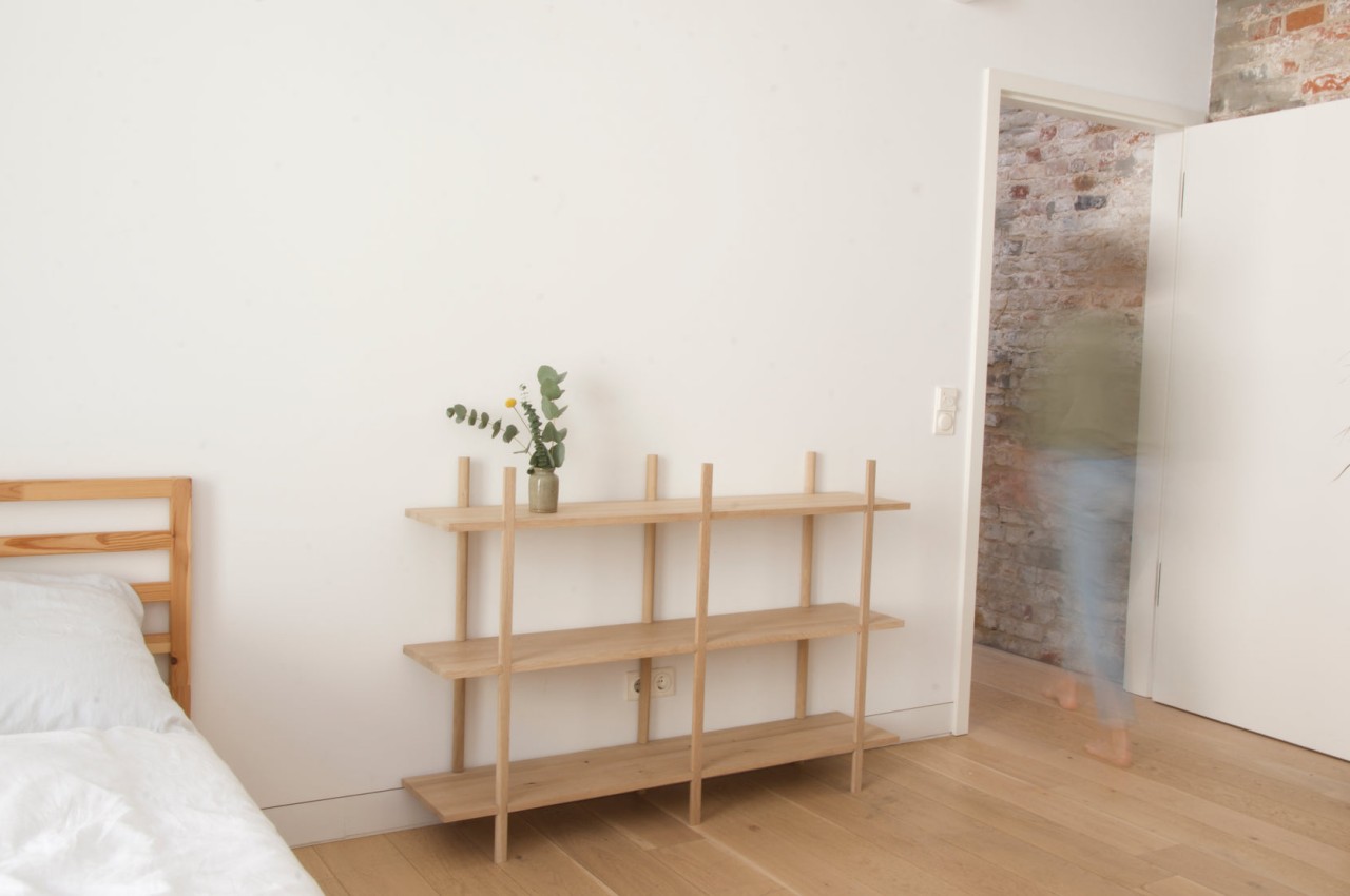
The Svolta shelving system epitomizes simplicity, with ingenious joinery inspired by alpine architecture. Using precise cutouts, it assembles effortlessly, relying solely on the shelves and legs themselves. Named after the Italian word for “rotation,” Svolta utilizes wooden pieces with fitted cutouts, allowing swift assembly. Crafted from sustainable European oak, it offers an elegant, scalable solution with minimal environmental impact.

10. Decorative Shelving

Some shelving units resemble a piece of wall art and can play a role in enhancing storage with creative shelving configurations of various colors, shapes, materials, and more.

Designer: Kengo Kuma for More Trees

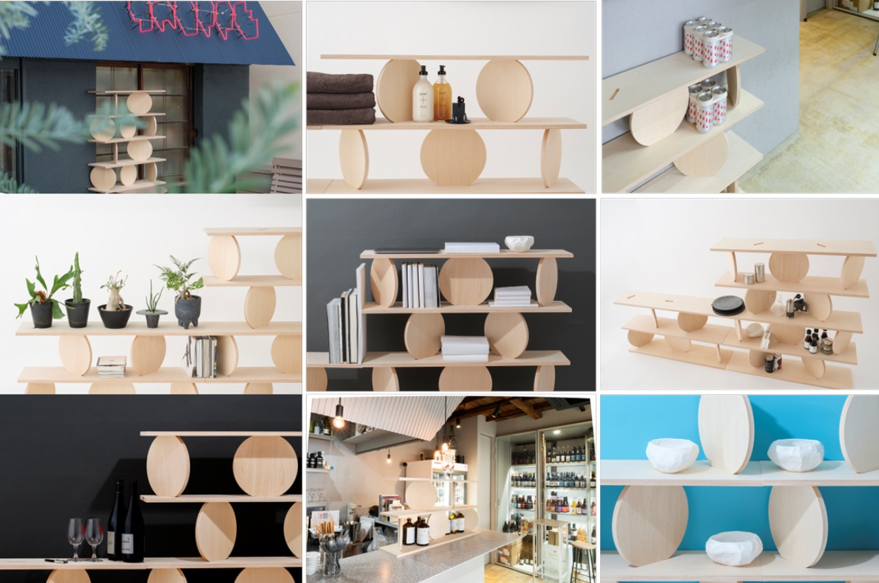
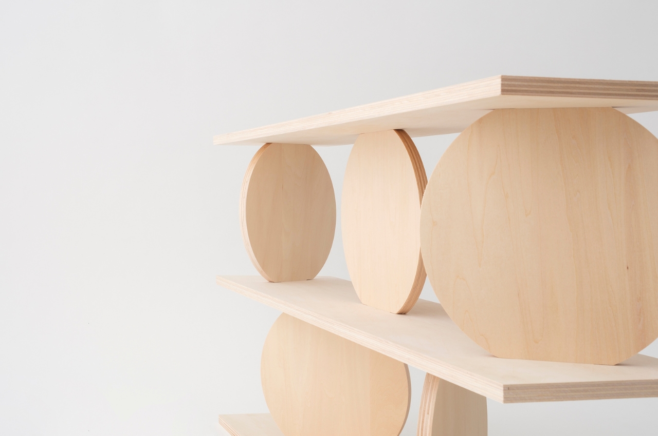
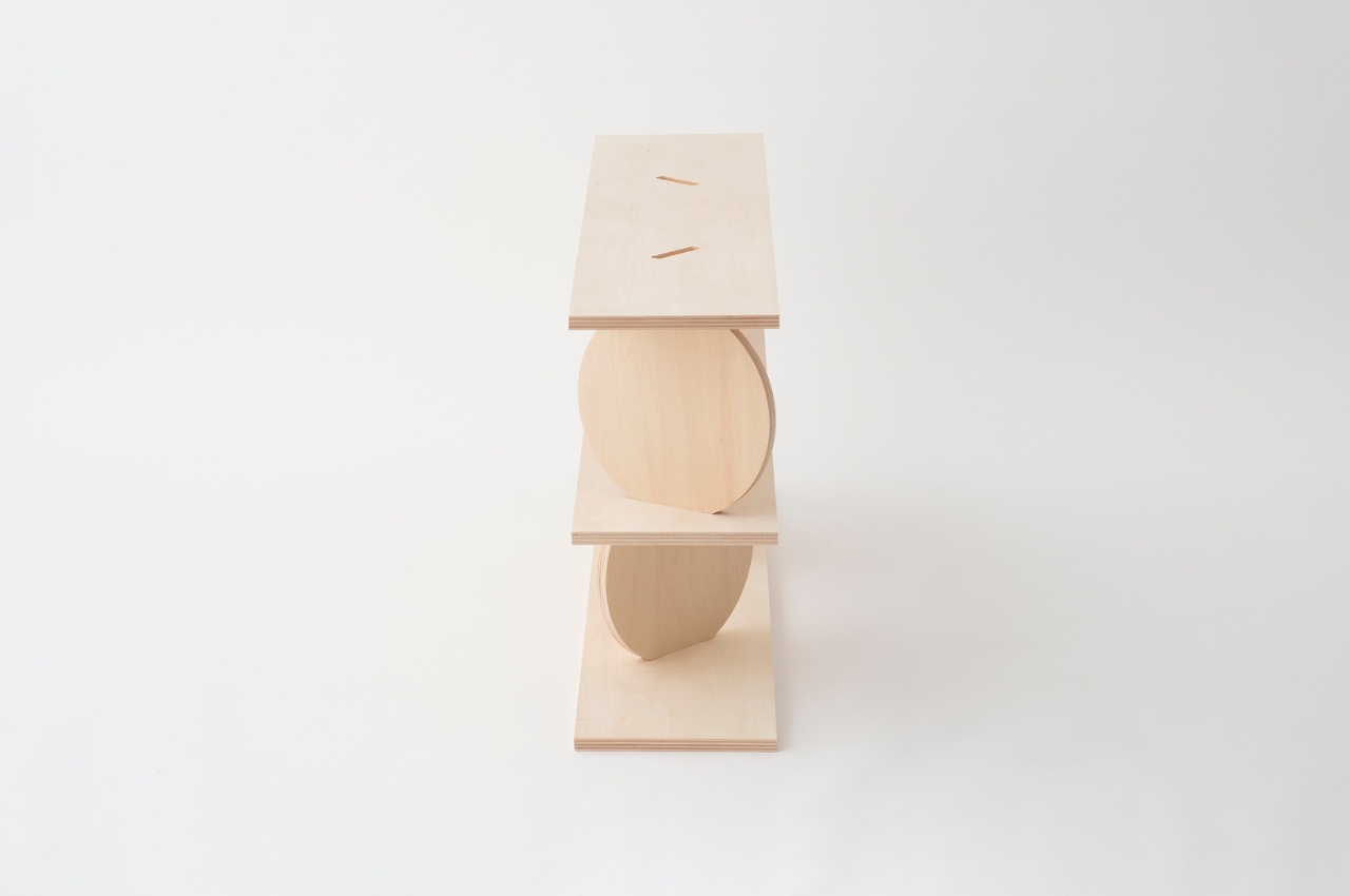
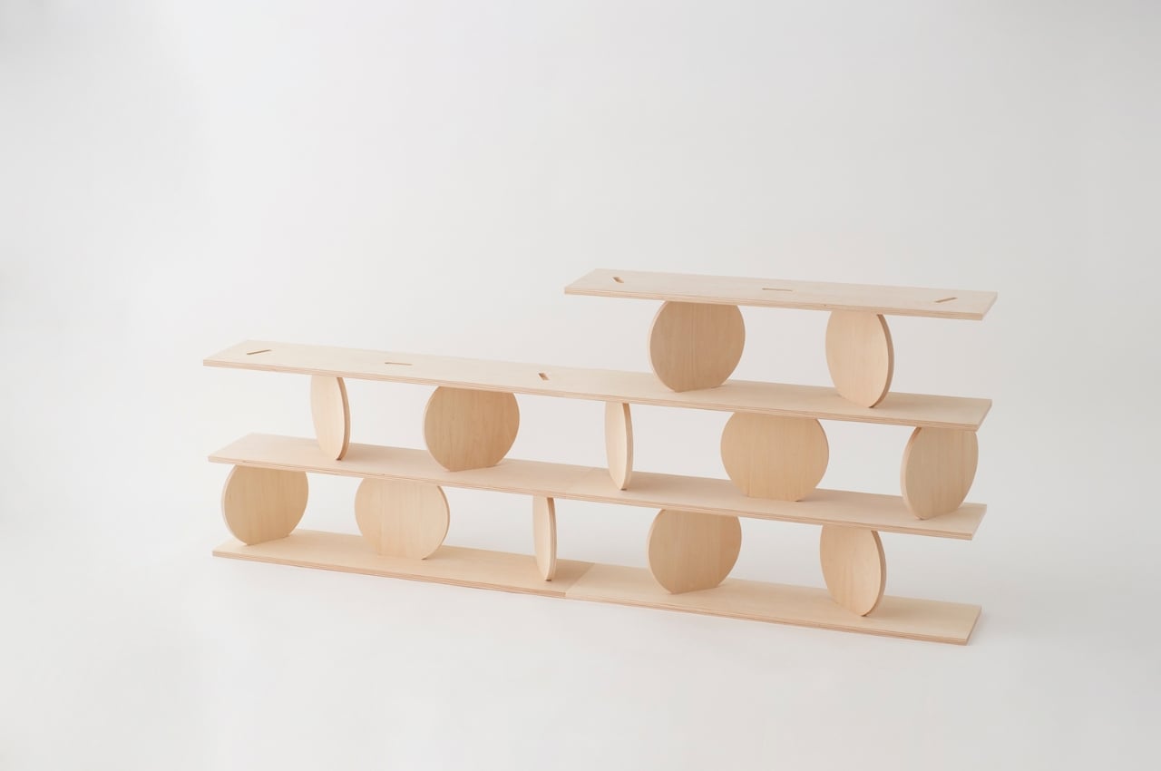
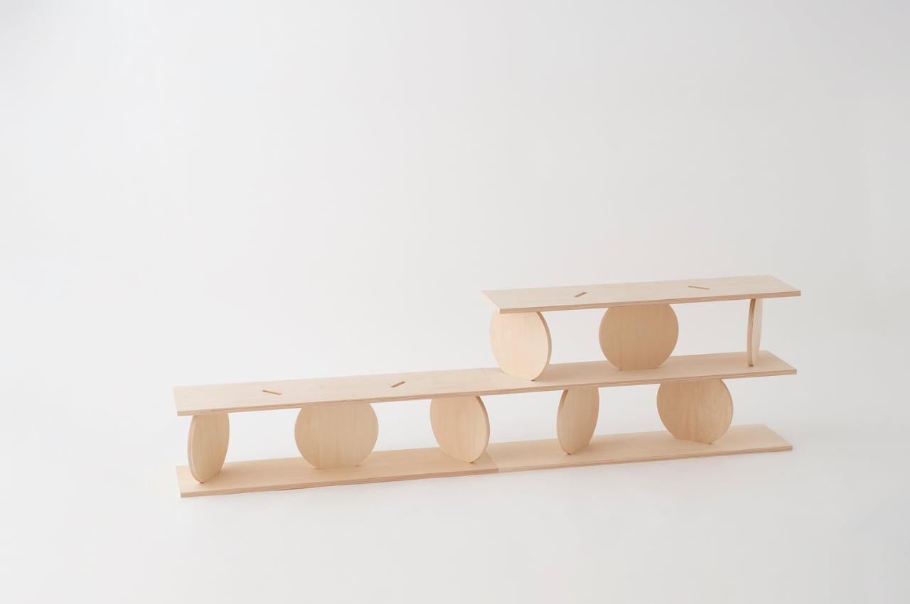
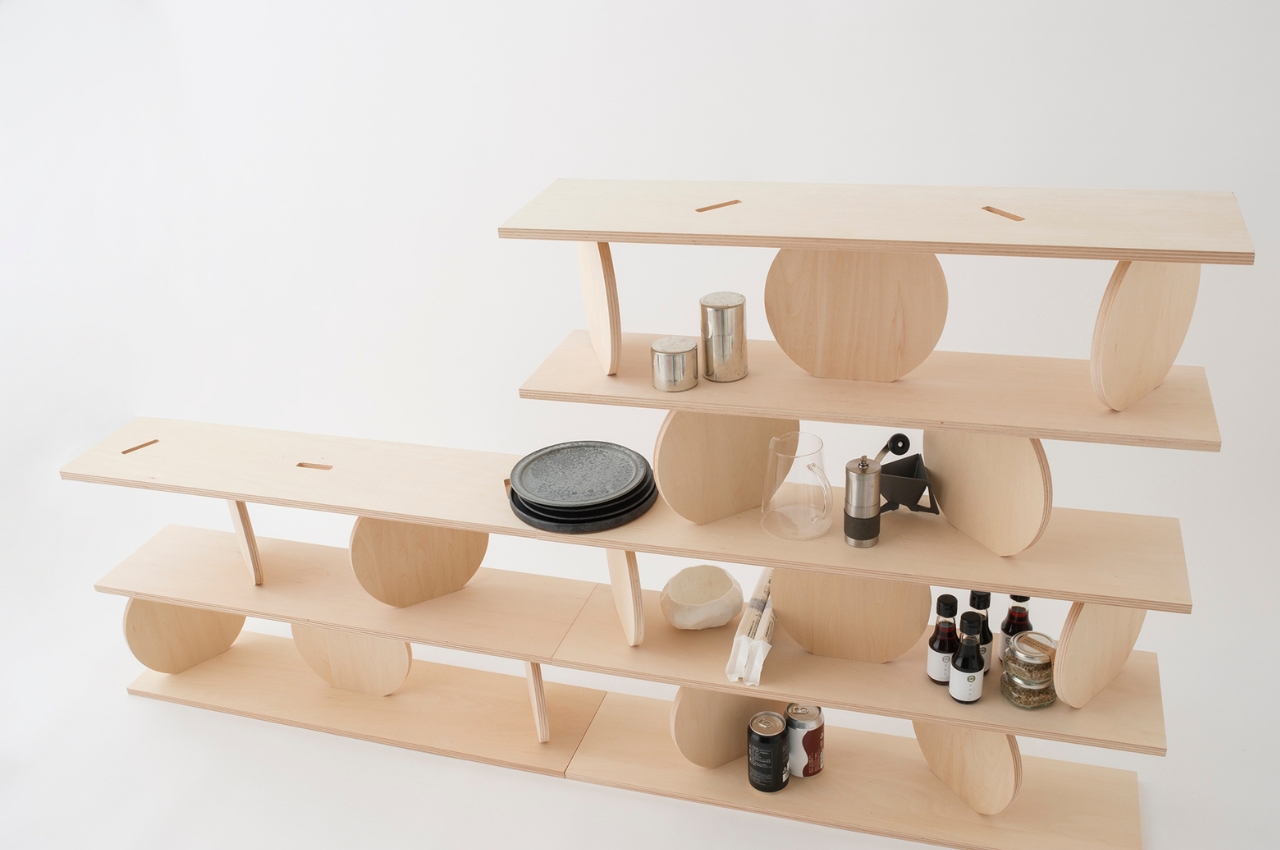
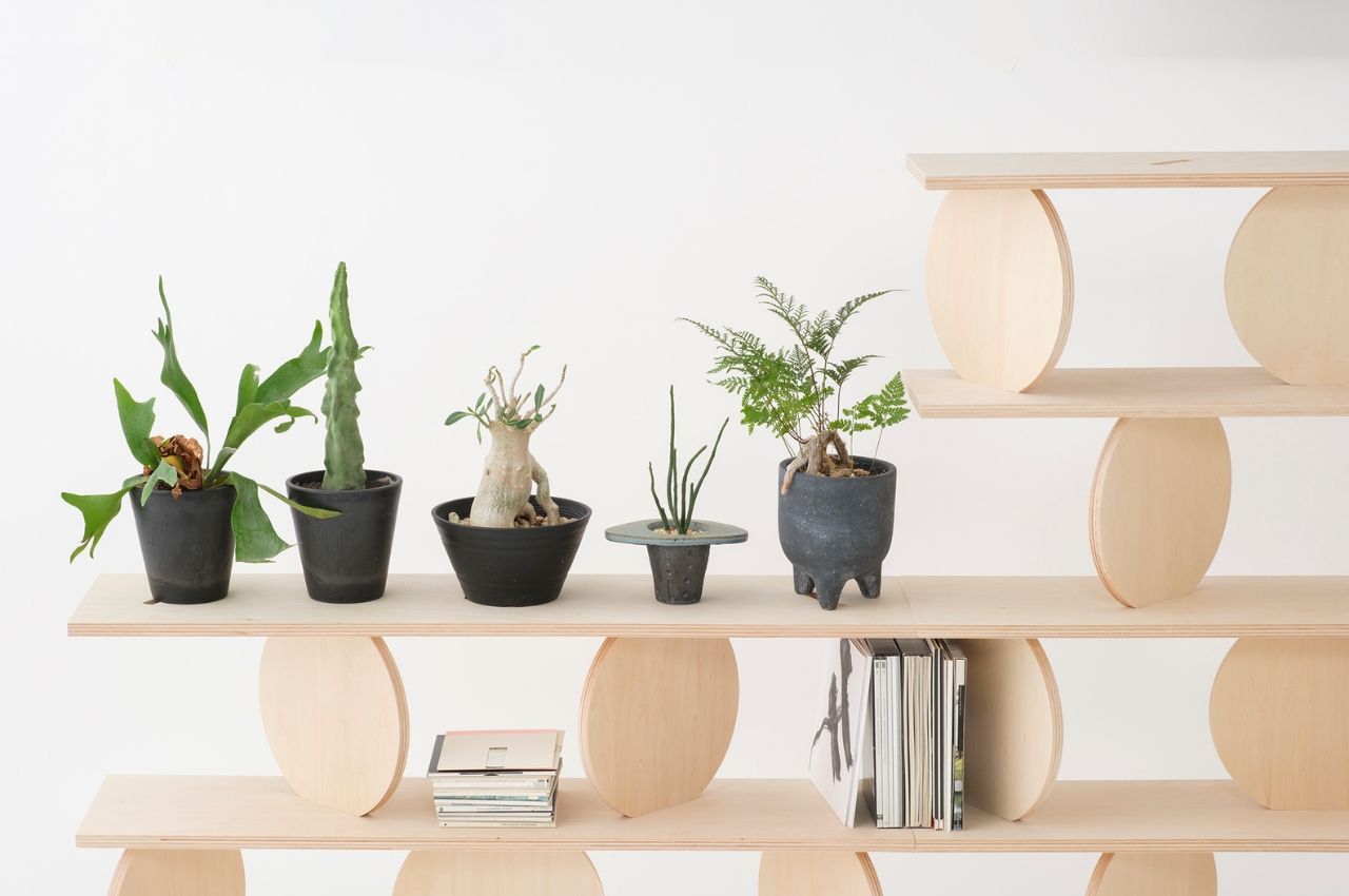
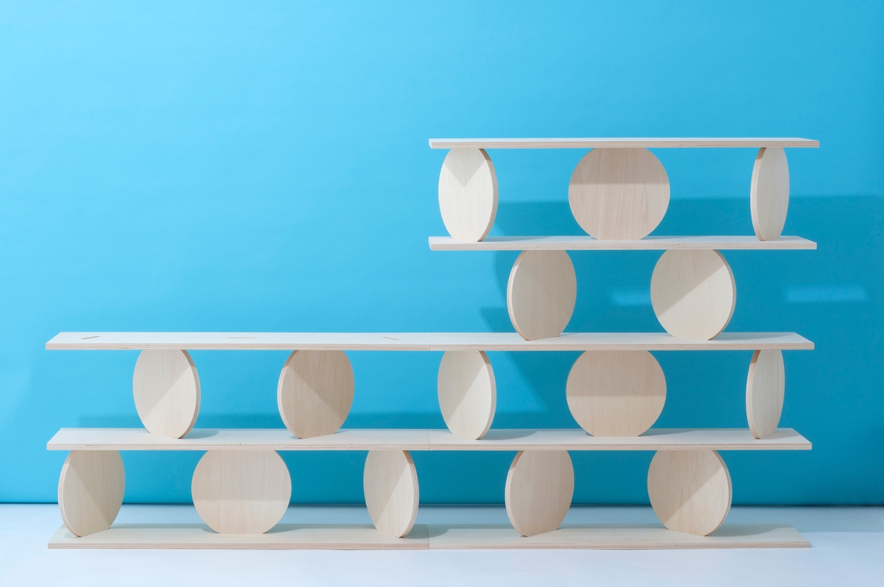
Marumarushikaku is a modular wooden shelf with assorted stacked shapes. Its unconventional design serves as both functional storage and captivating artwork. Comprising rectangular and round boards, it enables personalized arrangements. Despite its delicate appearance, it securely accommodates items like books and plants. Crafted from locally sourced wood, it adds a minimalist touch with rotating plates and is ideal for enhancing any office or living space.
Designer: Lisa Brustolin

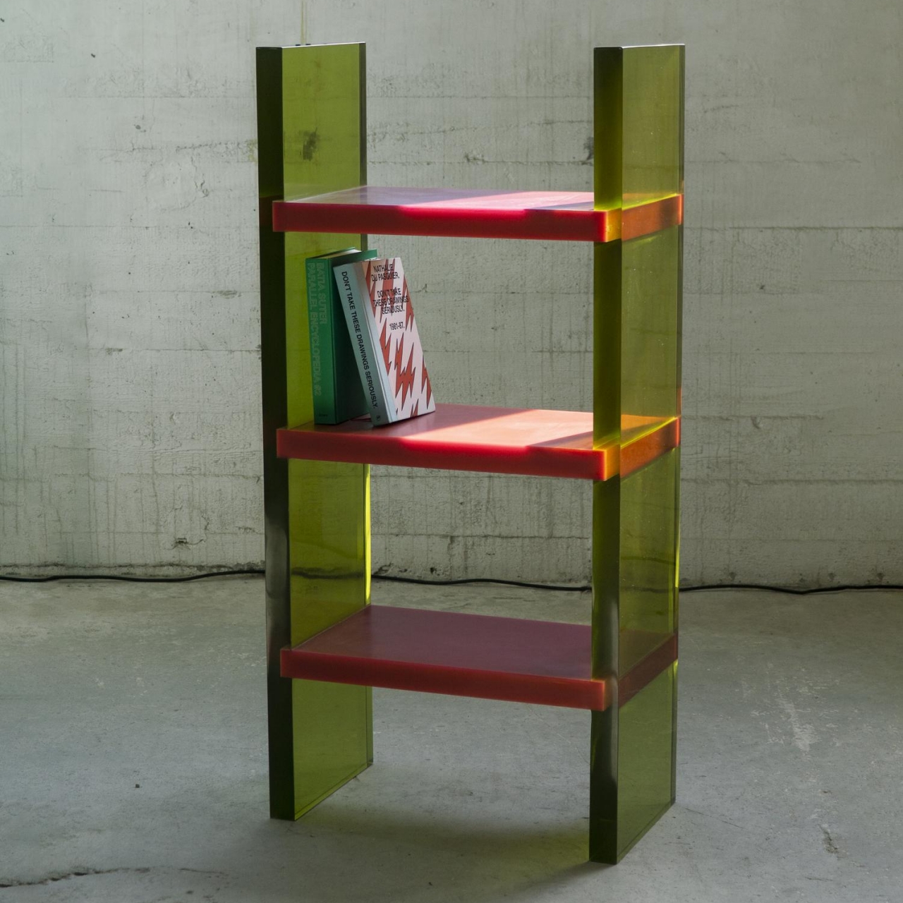
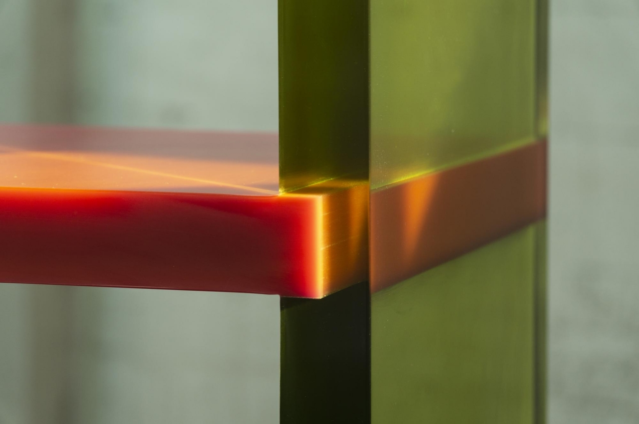
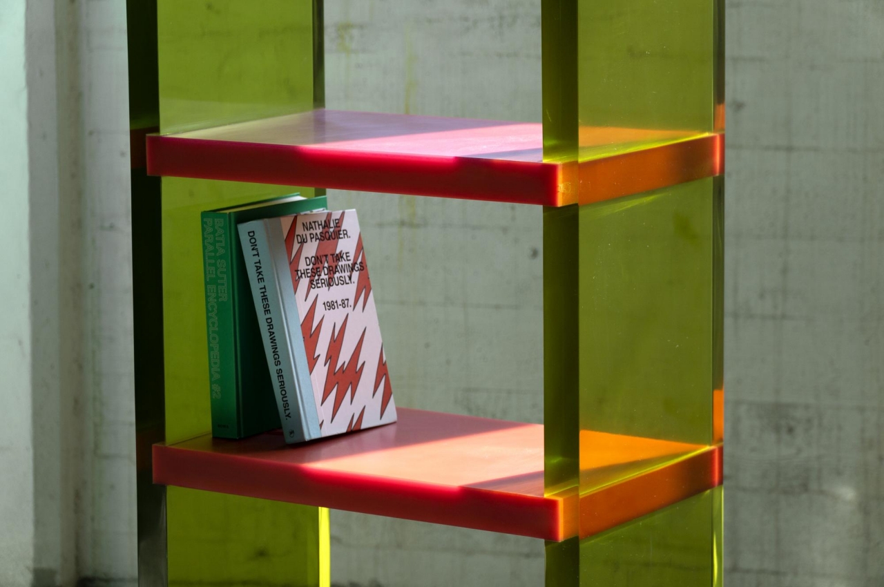
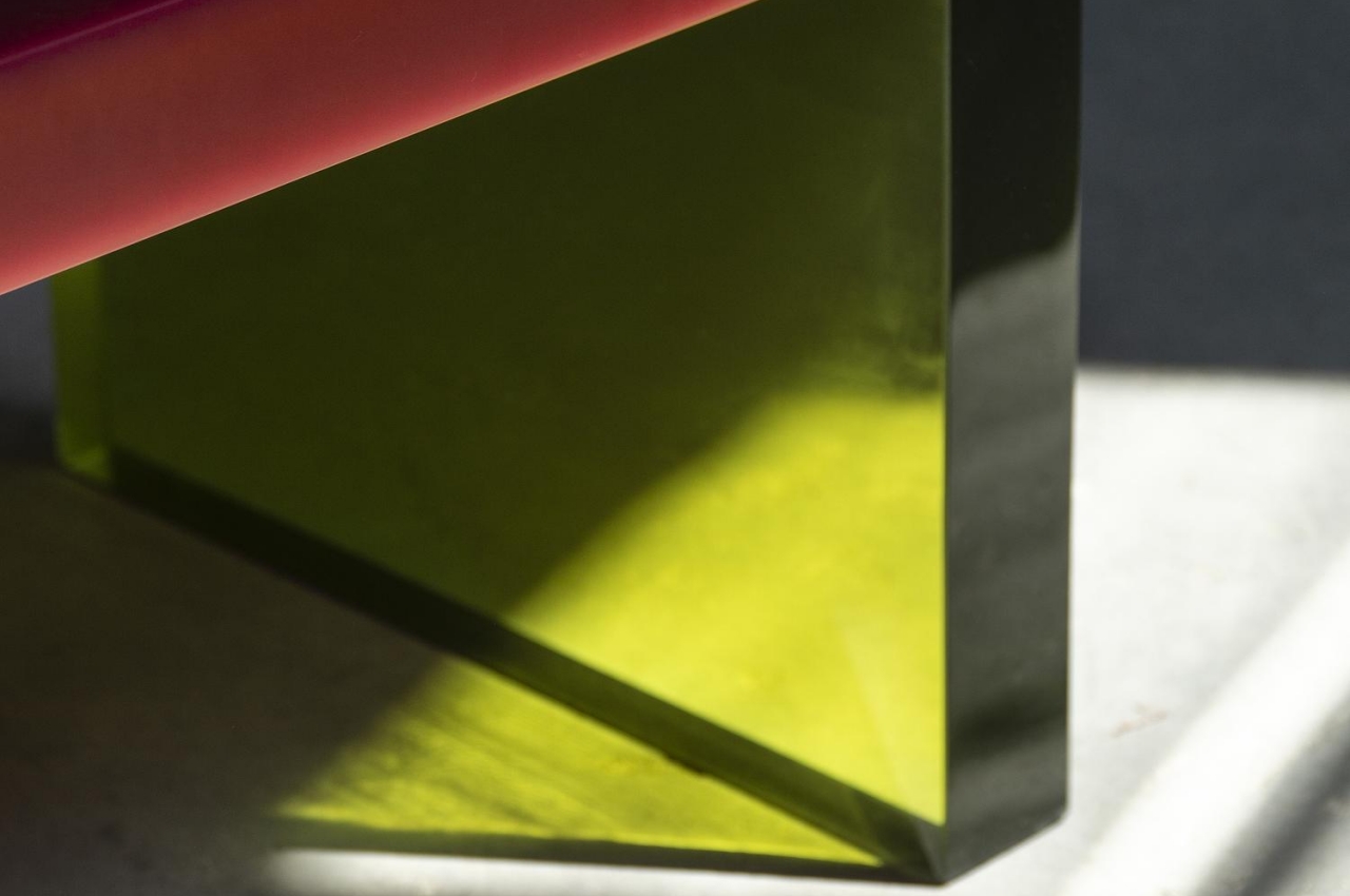
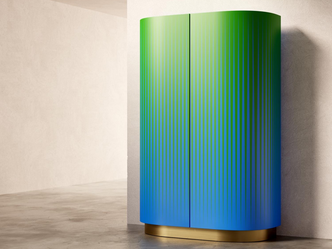
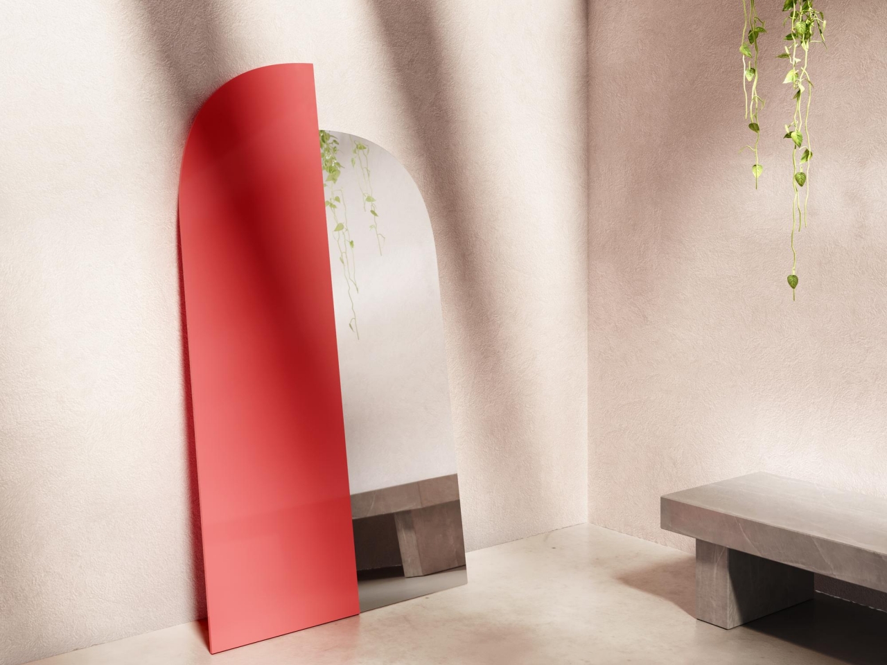
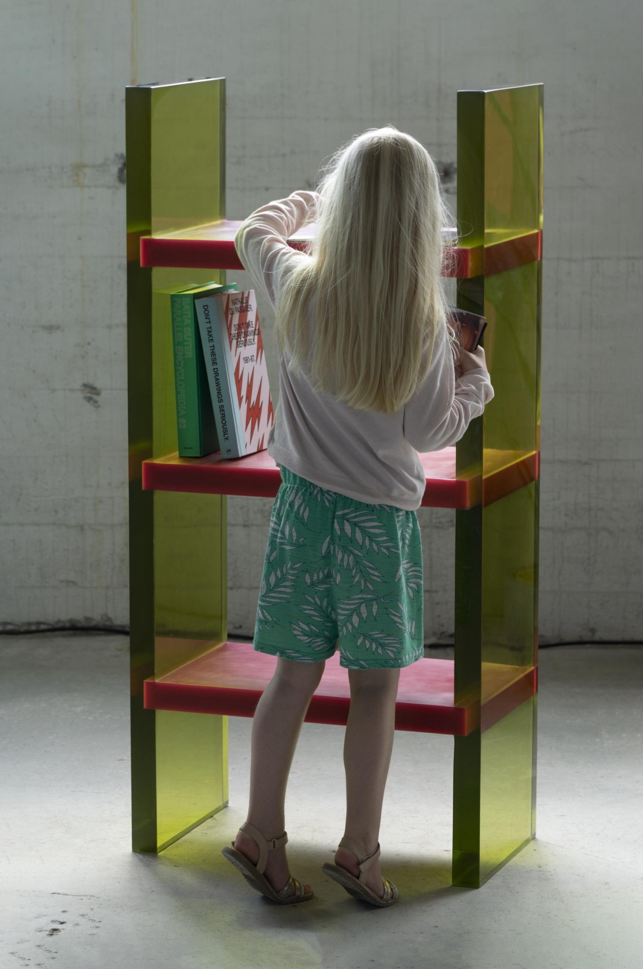
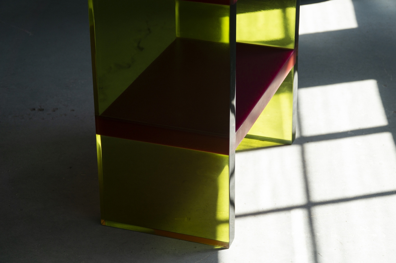
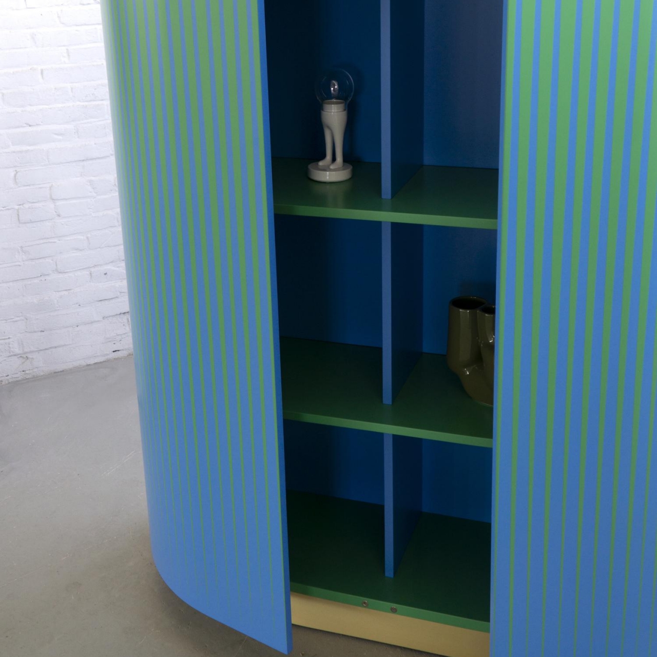
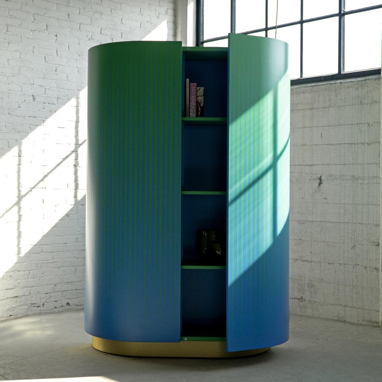
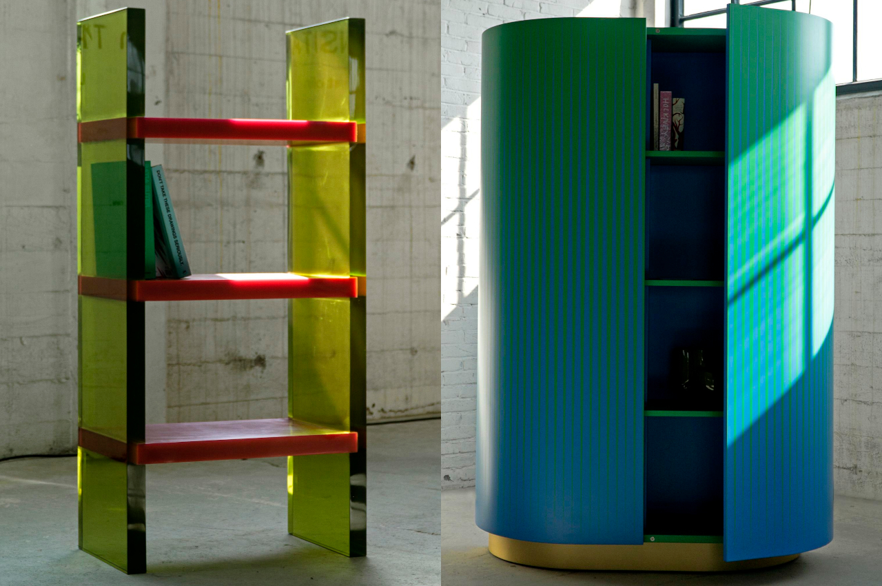
The new collection of everyday furniture challenges the prevailing minimalism trend in design by offering vibrant and visually intriguing pieces. Each item combines colors, materials, and shapes to create highlights in any room. For example, the Differ Shelf features translucent epoxy resin legs and opaque shelves, creating a captivating interplay of light. The Opticabinet, crafted by Venetian artisans, creates an optical illusion with alternating patterns of blue and green. Lastly, the Wrong Mirror offers a modern twist on a classic design, prompting reflection with its unconventional form and materials.
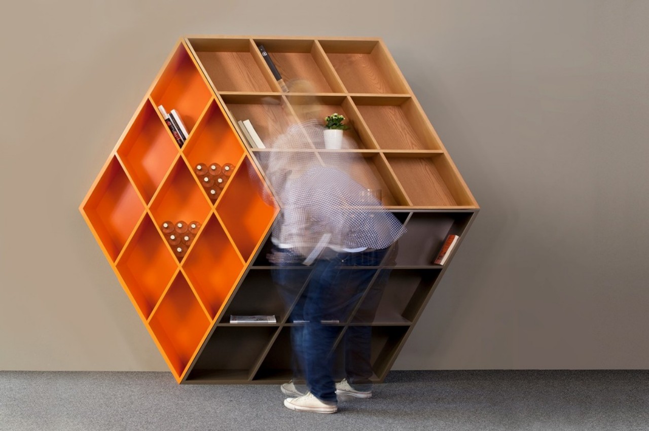
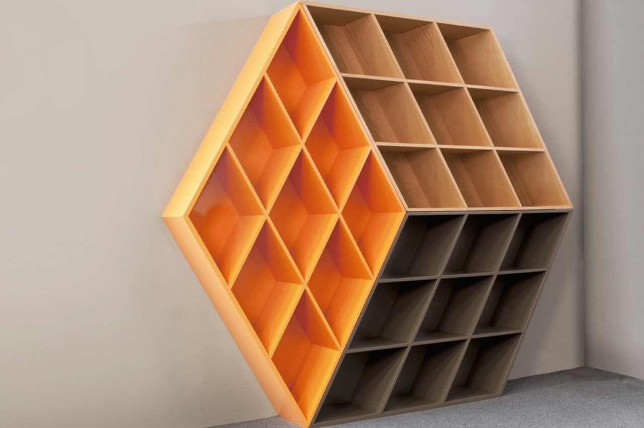
Designer: George Bosnas

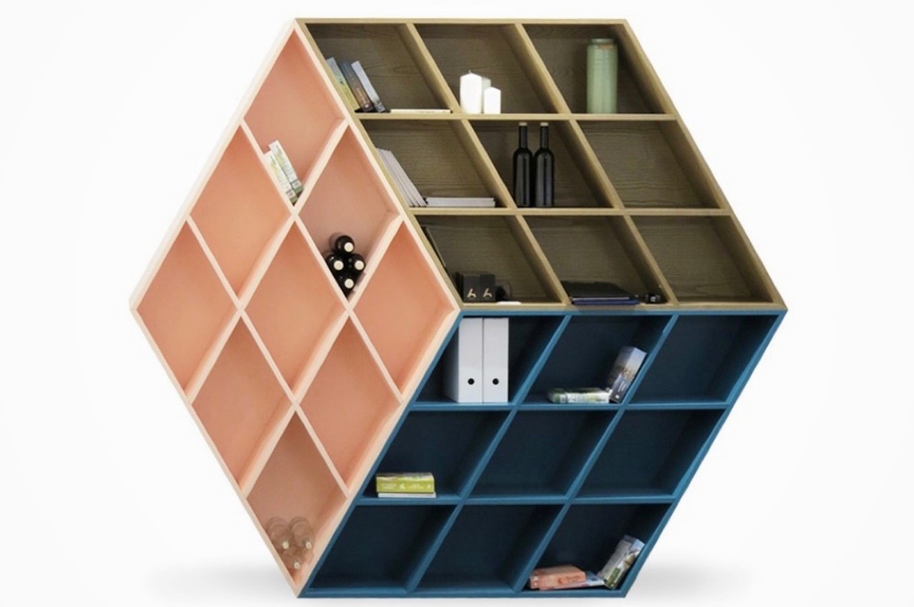
Drawing inspiration from the beloved 1980s toy, the Rubika bookcase seamlessly merges modern aesthetics with nostalgic charm. While resembling a three-dimensional cube from a distance, upon closer inspection, it reveals the dimensions of a traditional bookcase. This captivating illusion is achieved through a clever arrangement of cubby shapes and a blend of assorted woods, resulting in a visually dynamic and intriguing piece.

Each type of open-shelf design comes with different advantages, and aesthetics, and can be integrated with the decor of different rooms. However, choose the best one according to your individual preferences and space.

The post Top 10 Styles of Open Shelving for Maximizing Storage first appeared on Yanko Design.
Modular wooden bookshelf is inspired by Ryuichi Sakamoto’s vision

I’m always on the lookout for new furniture that will help me store and display all the knick knacks that I have lying around my house. Most of the time I choose those that are mostly functional and of course, affordable. But I’d also like to have some pieces that are decorative and can even look like sculptures or art pieces, even if they probably won’t hold a lot of my stuff. This modular wooden bookshelf would be a nice addition to my space, especially as it pays tribute to the late great Ryuichi Sakamoto.

Designer: Kengo Kuma for More Trees

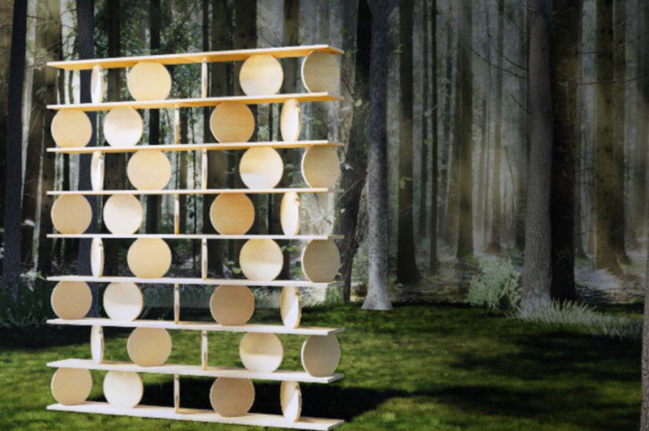
The acclaimed Japanese composer and pianist founded design company More Trees to create products made by local craftsmen using materials found in local forests in Japan. But before he could make the dream a reality, he passed away a year ago in 2023. His long-time friend Kengo Kuma has now taken over the company and is making the dream a reality by unveiling 〇〇□ (Marumarushikaku), a modular wooden shelf made up of different shapes stacked together. It can also looks like an art piece because of its unusual look and concept so you have a decorative shelf as well.

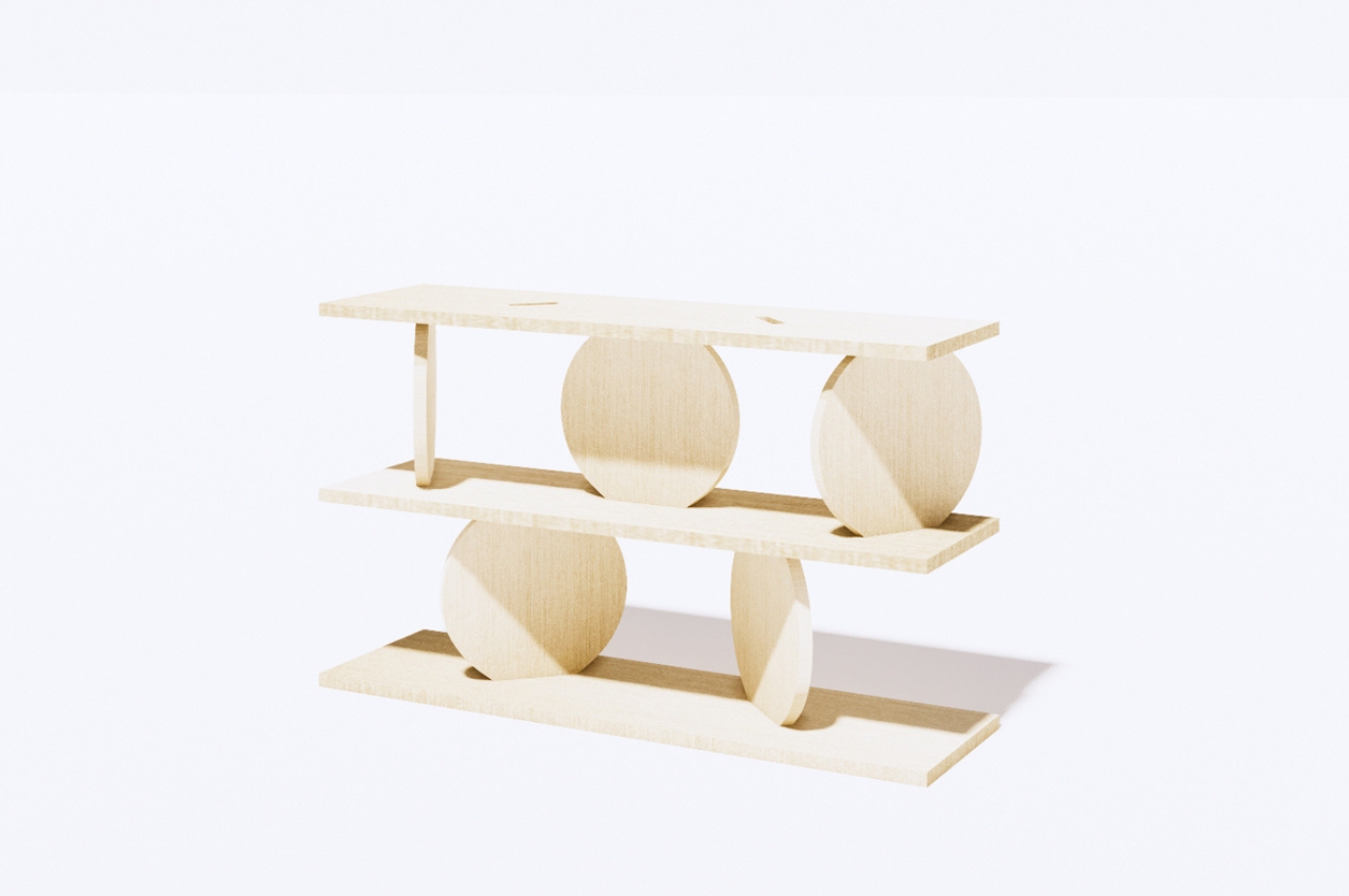
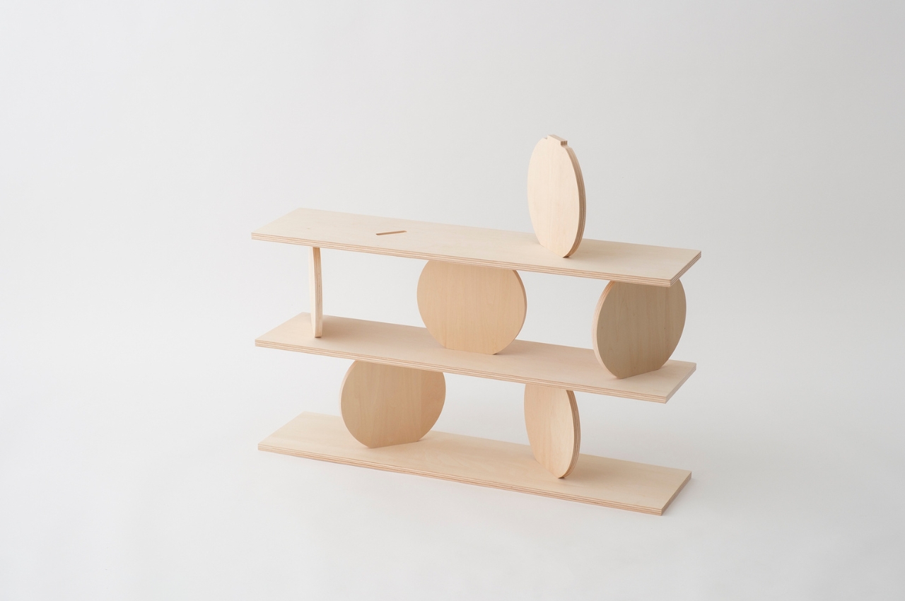
The structure of this piece of furniture is made up of rectangular shelf boards and round pillar boards stacked on top of each other. You can arrange the round parts randomly between the shelves so you can create your own look and design. It may not look that stable at first glance but you can place things like books, plants, bottles, pots, and other knick knacks that you need to display in your living space. The boards have slots where you can place the round parts in so it becomes an actual shelf that can hold and partition your various items.

The rotating plates and multi-leveled shelves made from wooden materials from local forests can add an interesting and minimalist look to your office or living room. The modular wooden shelf will be unveiled on the anniversary of Ryuichi Sakamoto’s passing on March 28 at the Ace Hotel Kyoto. They will be stacked up to eight levels so you can see that it works despite its seemingly “fragile” appearance.

The post Modular wooden bookshelf is inspired by Ryuichi Sakamoto’s vision first appeared on Yanko Design.

Top 10 Genius Storage Solutions For Those Who Love A Neat & Organized Home

One problem that never seems to leave us, especially if you’re living in a major city – is the lack of space! If you’re an independent millennial who recently moved out of their family home and into their own, then a major issue that you may be dealing with almost every day…is space constraints in your own home. Our modern millennial homes have many virtues, but one thing they lack is space! Space constraint is something most of us end up dealing with every day. Smart storage solutions can be lifesavers in such tricky and compact situations. And to make your lives easier, we’ve curated a whole collection of storage solutions that come in the form of furniture designs that, to be honest, are going to completely organize your home. Not only do these products comfortably store your belongings, but they’re also perfect for displaying those special items that you don’t feel like shutting away in a dusty cabinet. From a slithering sculptural table with smart storage surfaces to a modular Japanese-inspired shelving design – these innovative storage and display solutions are the additions your home needs.

1. The Cobra Table

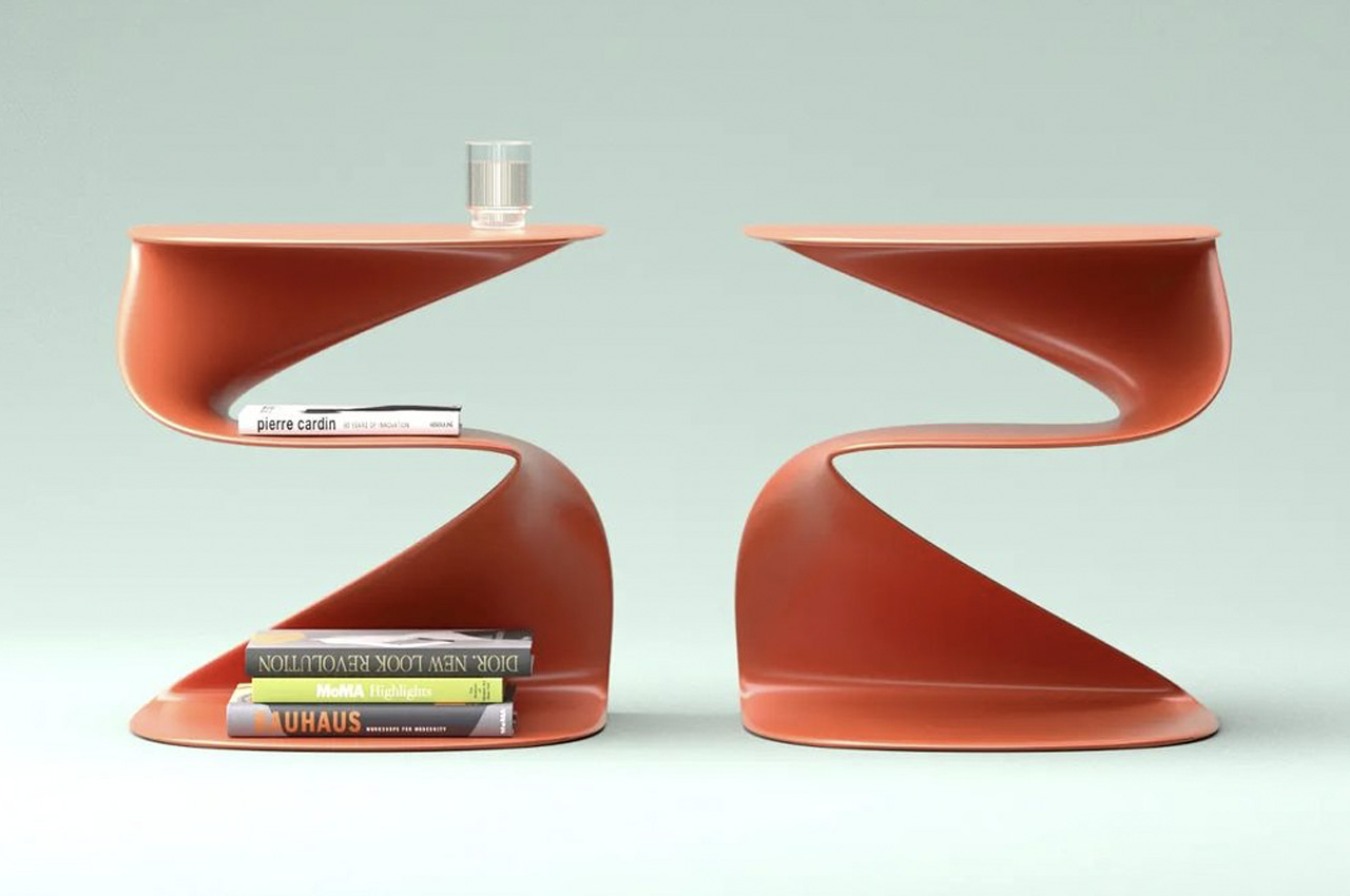
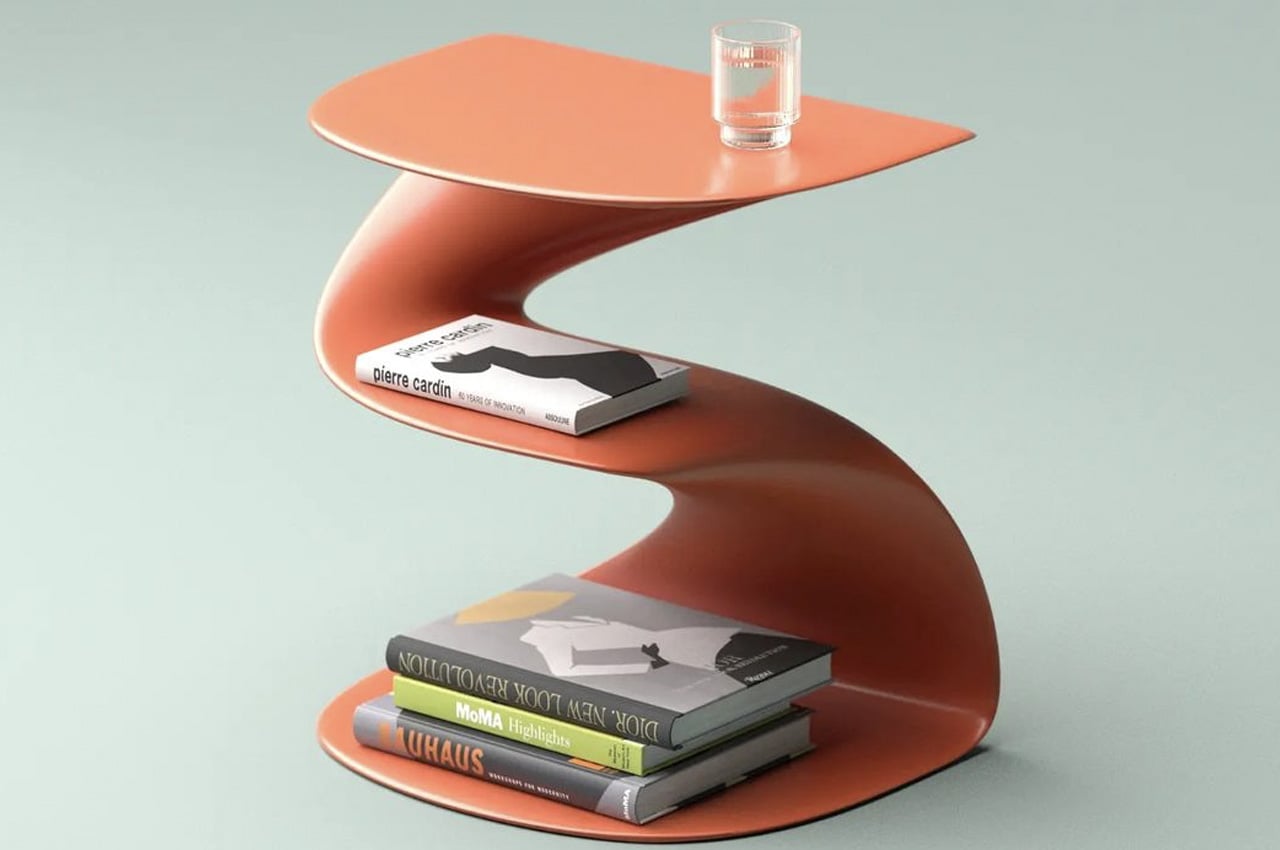
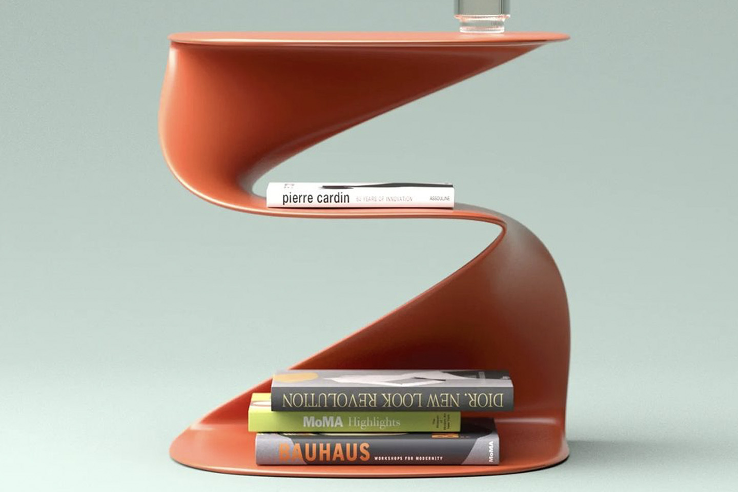
Designed by Deniz Aktay, the Cobra Table is artistic, sculptural but also super functional. It is inspired by a cobra, doing complete justice to its name.

Why is it noteworthy?

The Cobra table could be a small center table or a more suitable side table. It doesn’t have much of a footprint, and it has a snake-inspired form that is accentuated by a somewhat meandering shape.

What we like

  • No component or surface space of the Cobra table is left useless or unused

What we dislike

  • The slightly curved surface of the middle section means the books may slide off

2. Altitude Shelf

The Altitude Shelf is a new line of shelving by Evan Clabots that is inspired by clean lines and the minimal form of traditional Japanese woodworking.

Why is it noteworthy?

Although inspired by Japanese furniture, we can see bits of traditional Danish furniture in the piece as well. The shelving design is marked by clean minimal lines and no back panels which ensures that the design is open, airy, and free-flowing.

What we like

  • Modular design inspired by Japanese and Danish furniture

What we dislike

  • Bulky space-consuming design

3. Linea Collection

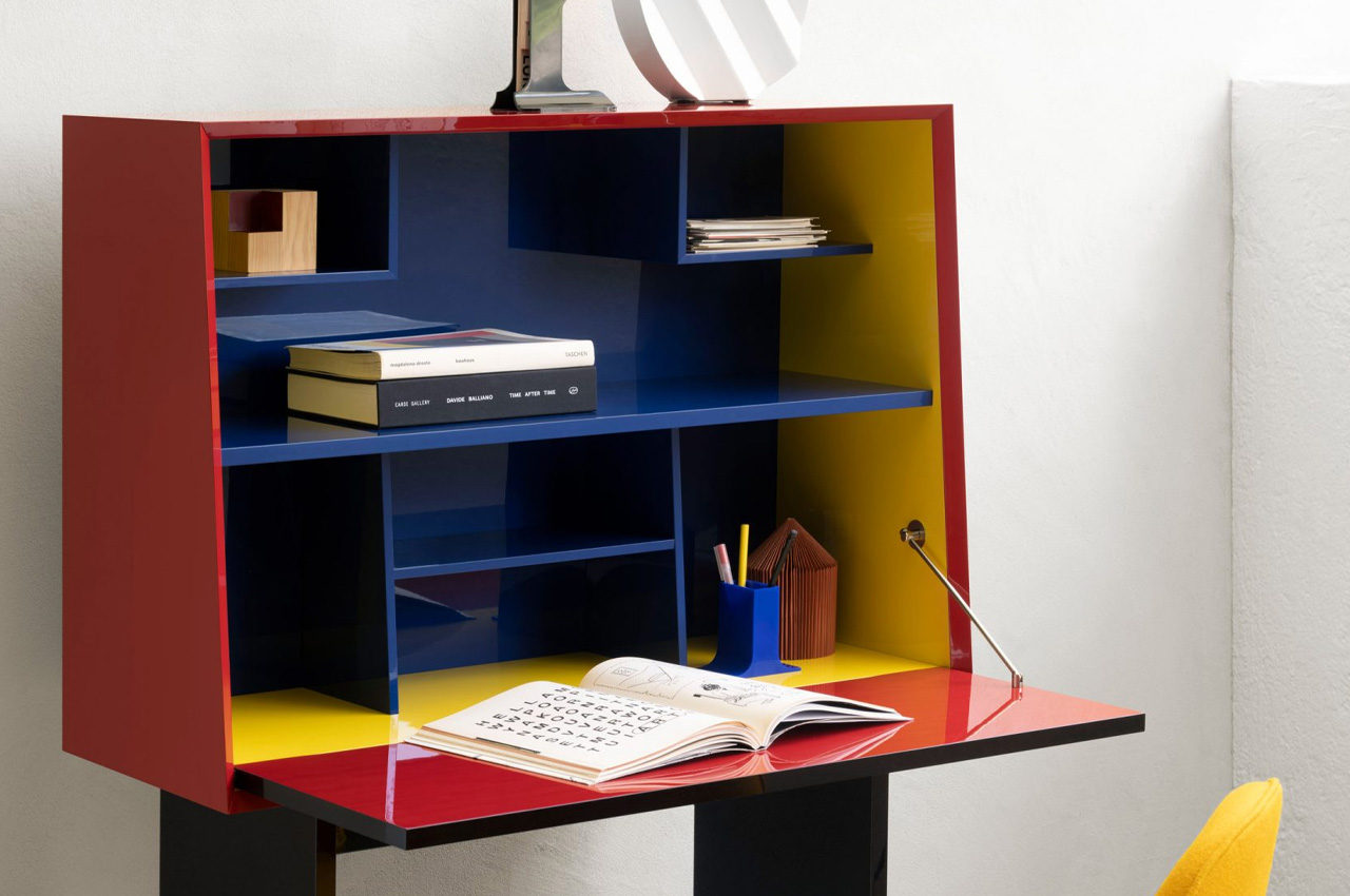
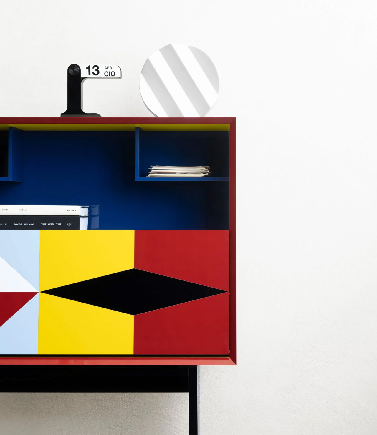
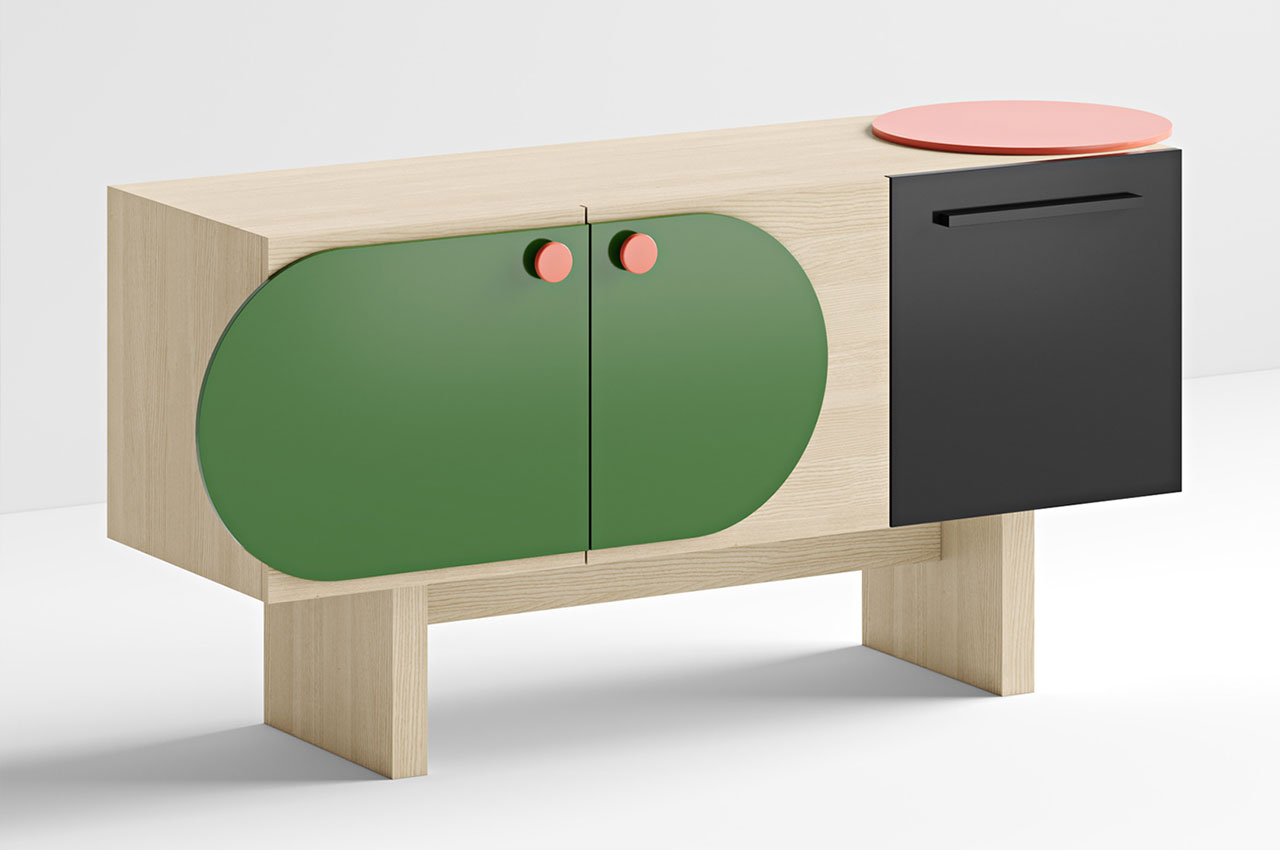
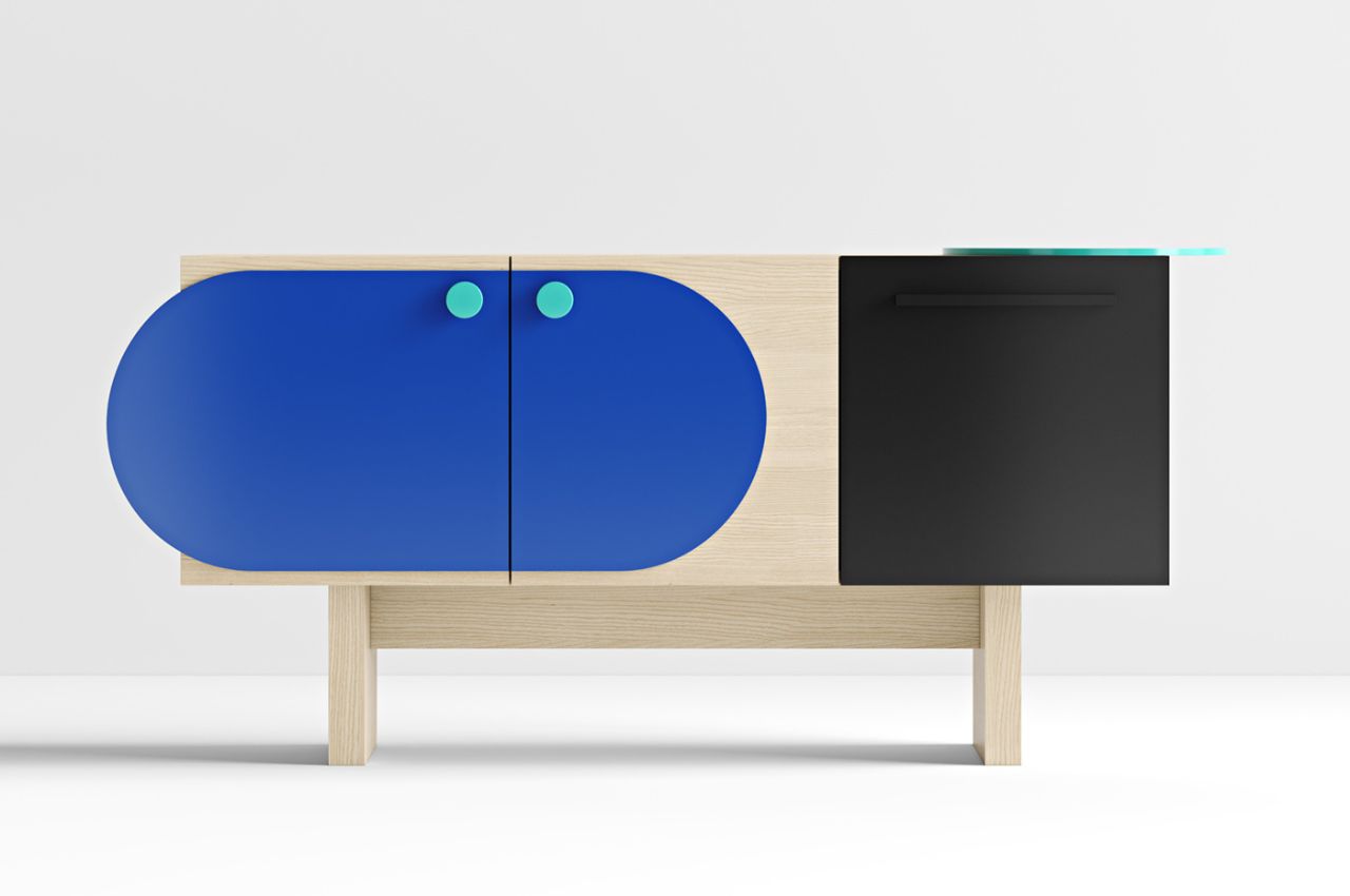
Italian furniture brand Porro is developing the Linea collection that was designed by late postmodernist architect and designer Medini a couple of years ago. The collection includes quirky and colorful storage units!

Why is it noteworthy?

Mendini created the designs by defining them with stunning cellulose acetate surfaces that feature inlays in primary colors. The collection is made up of three pieces – two sideboard cupboard units, and a writing desk.

What we like

  • Characterized by bold and bright colors, with playful contrasts between light and dark colors

What we dislike

  • The aesthetics may be considered too quirky by some people, and not preferred by everyone

4. Hideaway Swing Desk

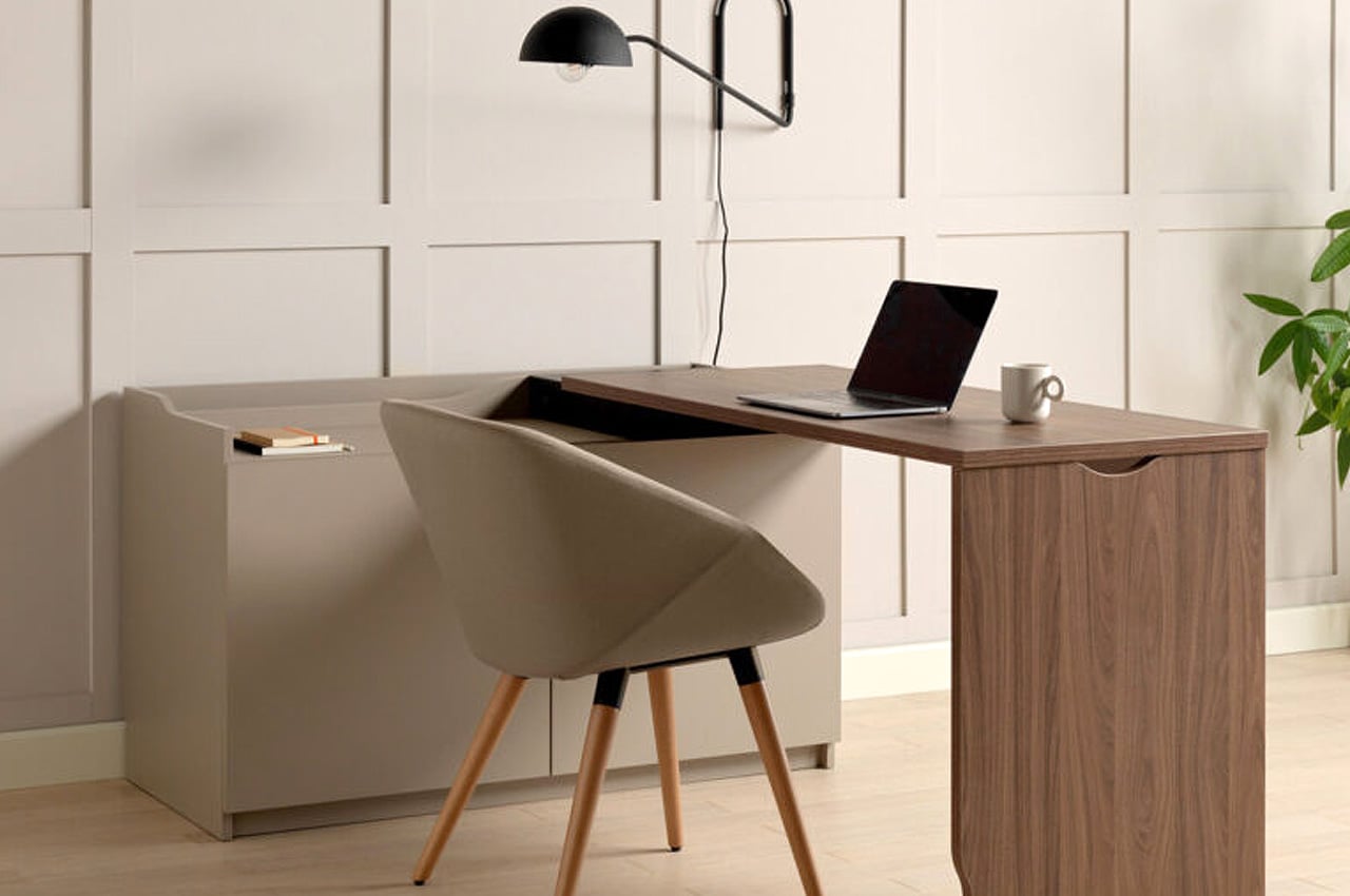
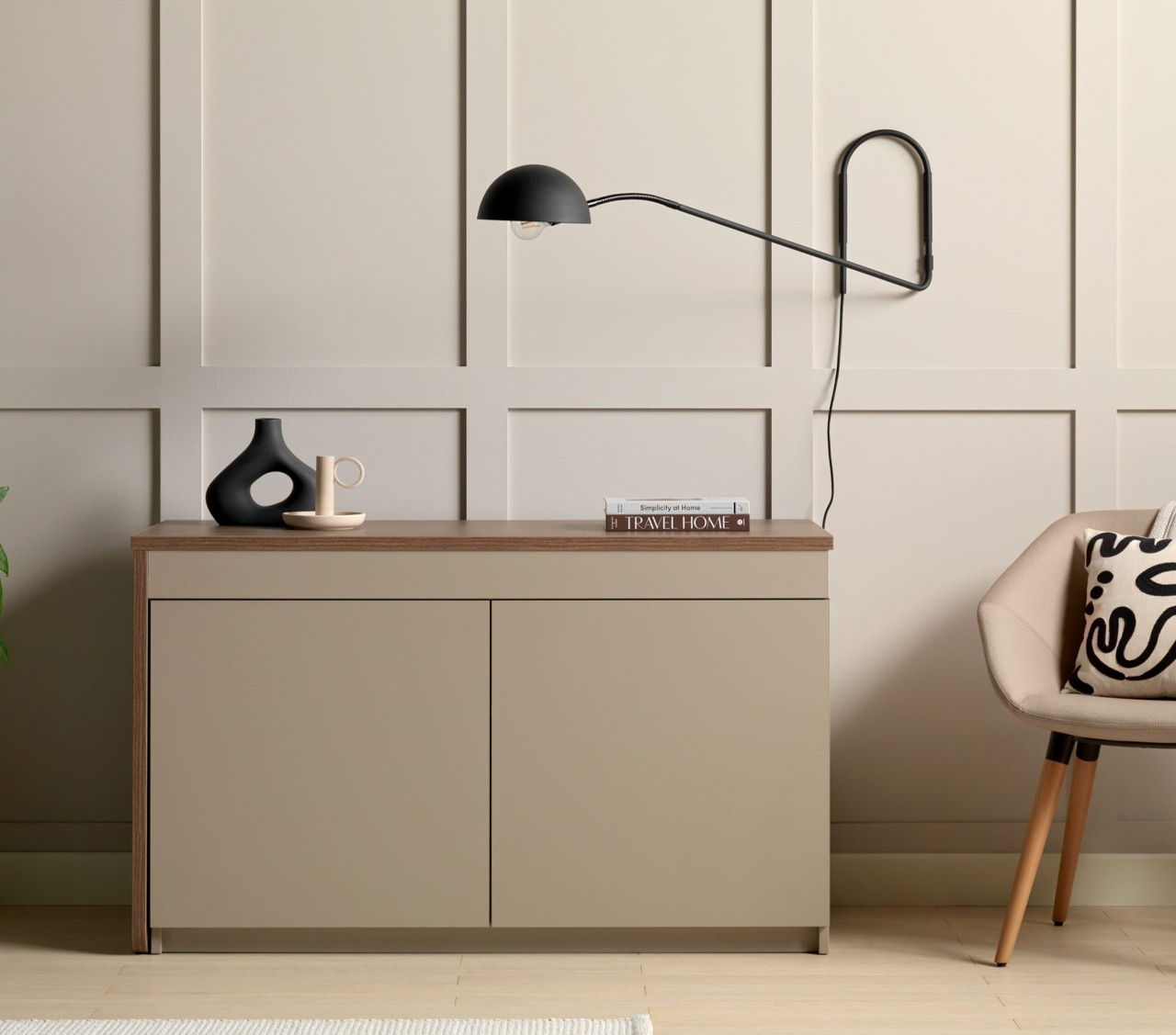
The Hideaway Swing Desk is no ordinary desk! Primarily because it’s not just simply a desk, it’s also a sleek and elegant sideboard.

Why is it noteworthy?

In its original state, the Hideaway Swing Desk functions as an excellent sideboard that is perfect for smaller homes. But when you move the furniture piece at a 90-degree angle, it transforms into a functional and sturdy workspace.

What we like

  • Designed to be a flexible storage solution that can solve a variety of problems in modern homes

What we dislike

  • Space-consuming + bulky design

5. Combus Shelving System

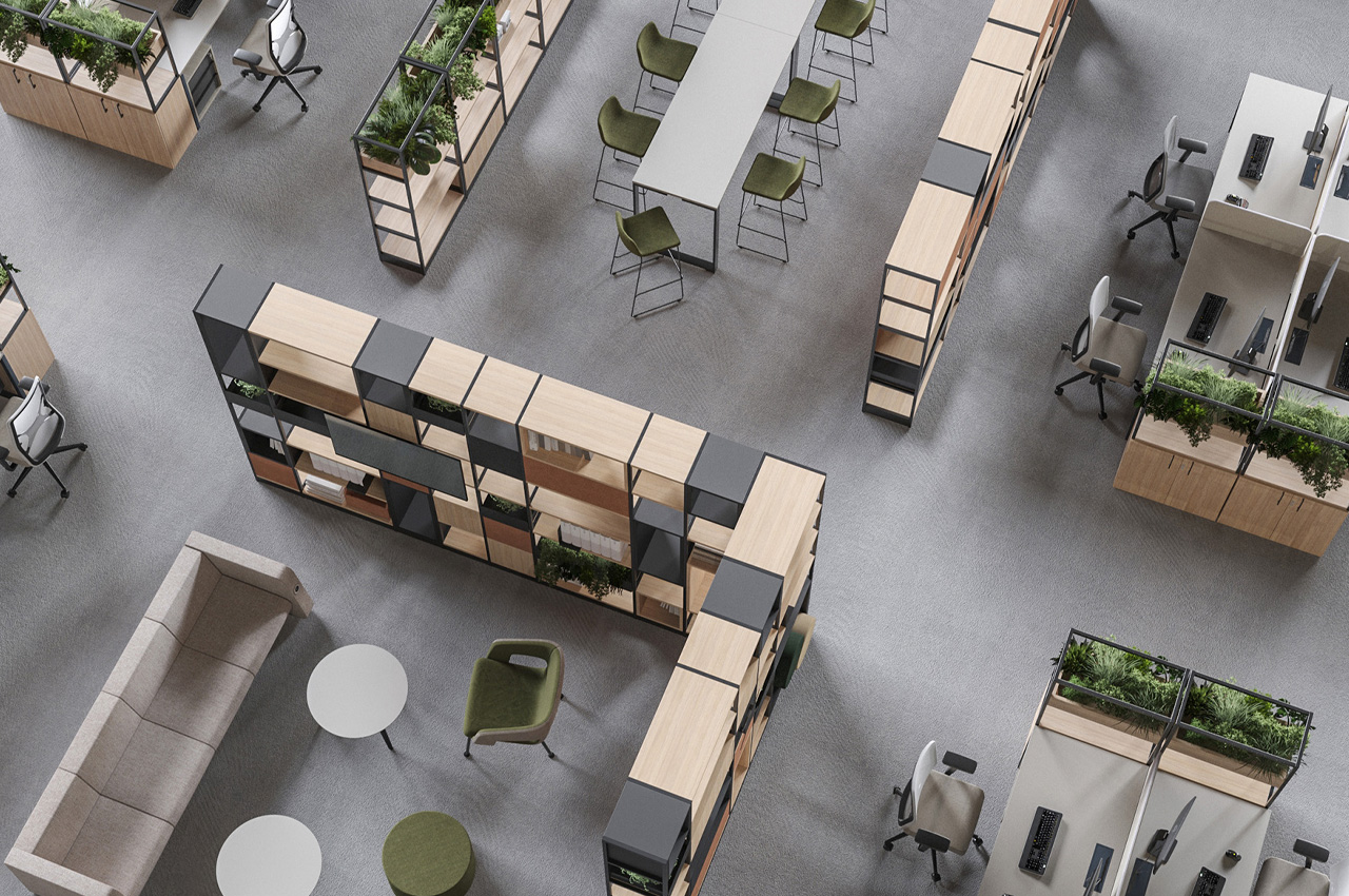
The Combus Shelving System is a super smart and functional furniture design that provides versatile storage and partition spaces in the office.

Why is it noteworthy?

Designed by office furniture brand Narbutas, the Combus Shelving System features a range of varied shelving types and heights, that can be customized in different finishes.

What we like

  • Can be integrated with accessories like planter boxes, metal bookends, and felt storage baskets

What we dislike

  • Not suitable for smaller office spaces with space constraints

6. Funky

Say hello to Funky! Funky isn’t just your ordinary everyday storage unit, it is designed to add an eclectic element to your home, that can spark conversation and lighten up your living space.

Why is it noteworthy?

The hallmark of Funky’s design is the perfect harmony between vibrant colors, and neutral, wherein each element complements the other, in turn uplifting the piece’s aesthetics and visual appeal.

What we like

  • Adds a touch of artistic charm to your living space
  • Versatile + adaptable design

What we dislike

  • It may not cater to everyone’s tastes and could be considered too eclectic for some

7. Nice Chair

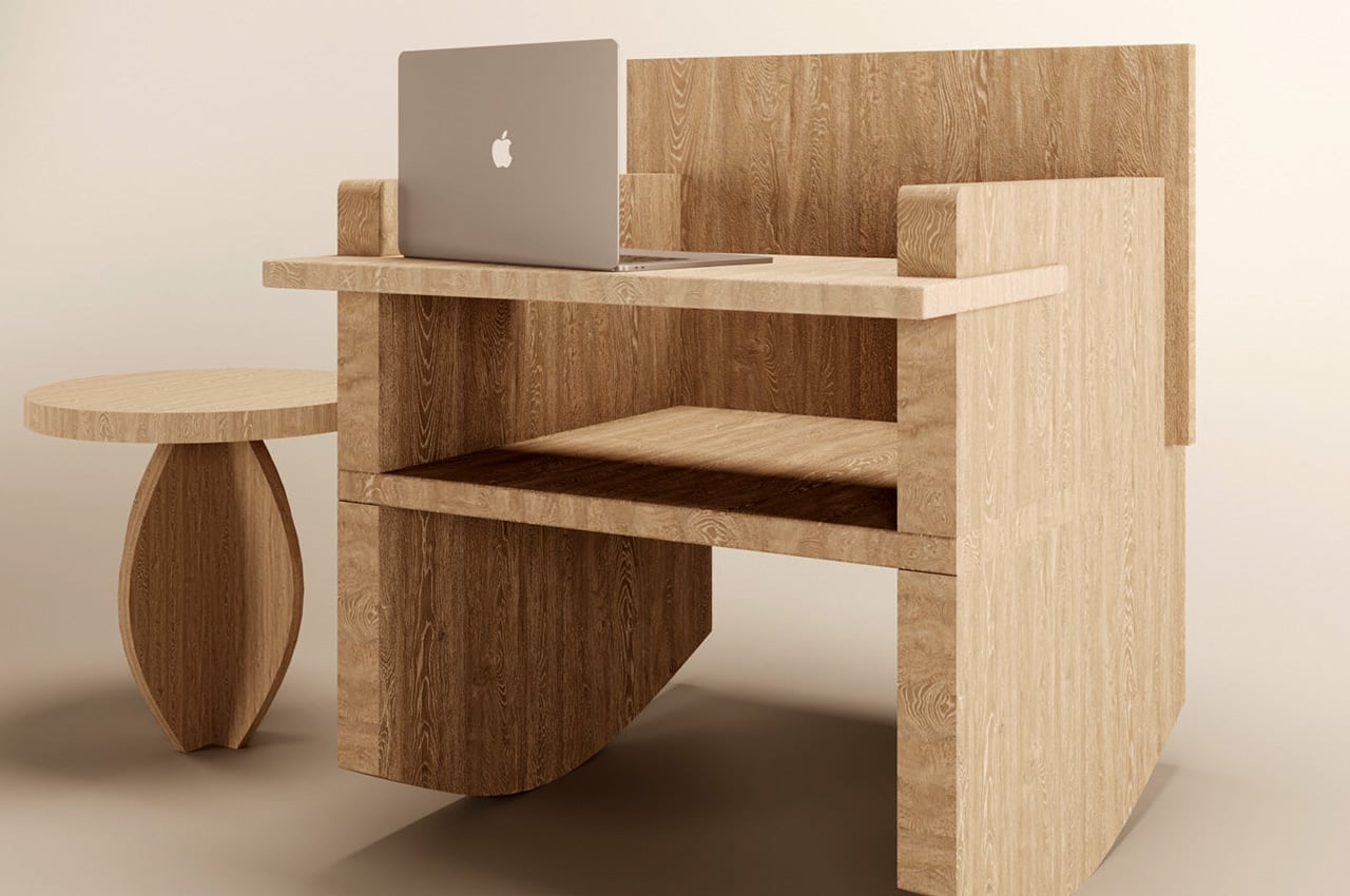
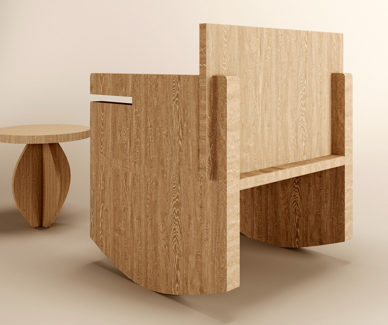
This unique-looking chair is intended to be a disassembled chair and it is called the Nice Chair! The Nice Chair is designed to occupy minimum space and can be easily assembled and disassembled.

Why is it noteworthy?

The Nice Chair can function as an ordinary chair to sit on, or as a rocker that moves back and forth. The rounded bottom edges of the chair enable it to rock back and forth, creating a mesmerizing lull that can guide anyone to sleep. You can also slide a tabletop between the ridges on the arms of the chair, to convert it into a workspace, that can hold and store your work accessories.

What we like

  • Multifunctional furniture design that can switch between two different modes

What we dislike

  • There is no way to stop the chair from rocking while working

8. SUNRIU Design

The Grid Chair by SUNRIU Design is a simple and tastefully designed chair with thoughtful details that make it quite unique. The otherwise ordinary wooden chair incorporates a few flat elements.

Why is it noteworthy?

The idea behind the Grid Chair was to tackle the issue of accidentally knocking over your coffee, or a glass of water while sitting on a chair or couch. The Grid Chair is made up of four planks of wood arranged in an interesting grid-like manner. The various lines of the chair stagger together to create a neat grid that creates extended flat surfaces on either side of the chair.

What we like

  • The extended surfaces serve as storage spaces to hold your coffee, books, and other knick-knacks

What we dislike

  • Space-consuming and bulky design not suitable for smaller spaces
  • The wooden edges of the extended surfaces are rough and raw and could hurt young children and babies

9. Fréquence Shelf

Designed by Jean Couvreur for Kabata, the Fréquence shelf is a minimal and sophisticated shelving design that functions as a multifunctional piece of modular furniture.

Why is it noteworthy?

The shelf includes a bunch of geometrically shaped modules that can be combined, mixed, and matched to create a variety of designs, according to your personal taste and preference.

What we like

  • The elements can be configured to create a small bookcase or a larger room divider

What we dislike

  • Bulky + space-consuming design

10. The Overlap Table

The Overlap table is a versatile furniture design that is commanding and functional. It can serve as a coffee table and a side table!

Why is it noteworthy?

I truly appreciate how the simple design prioritizes storage – something that modern homeowners will appreciate as well, considering the space constraint issues we all face nowadays.

What we like

  • Functions as a coffee and side table
  • Minimal + clean aesthetics

What we dislike

  • The box holds books only up to a fixed size and doesn’t allow for bigger books to be kept

The post Top 10 Genius Storage Solutions For Those Who Love A Neat & Organized Home first appeared on Yanko Design.
This furniture installation is inspired by industrial architecture

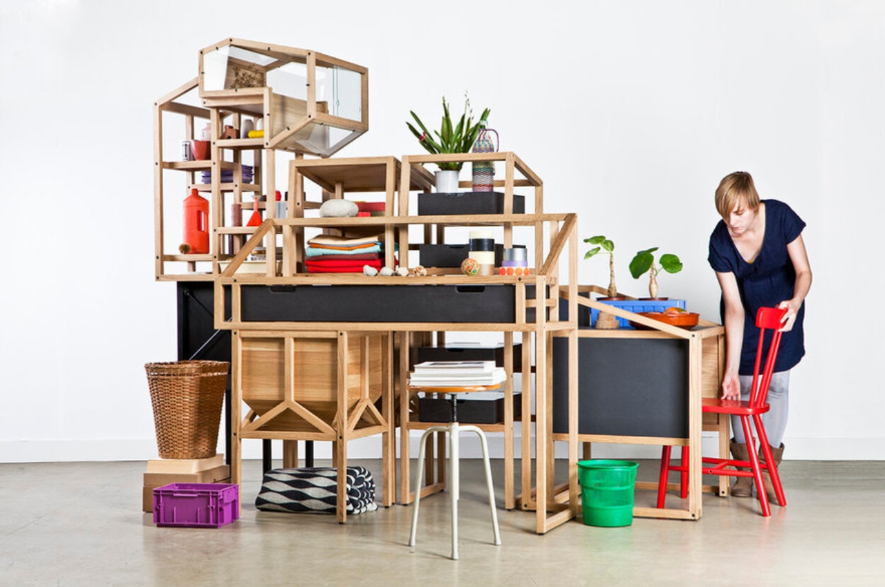
Bernd and Hilla Becher were German photographers (who first met as art students during the 50s) who were famed for their photographic documentation of the then-fading industrial architecture in Western Europe and North America. This phase of architecture was pretty important as industrial buildings at that time were slowly disappearing but were still a pretty interesting kind of architecture that was more functional than aesthetic. These “anonymous structures” were immortalized in the couple’s photographs.

Designer: Studio Mieke Meijer

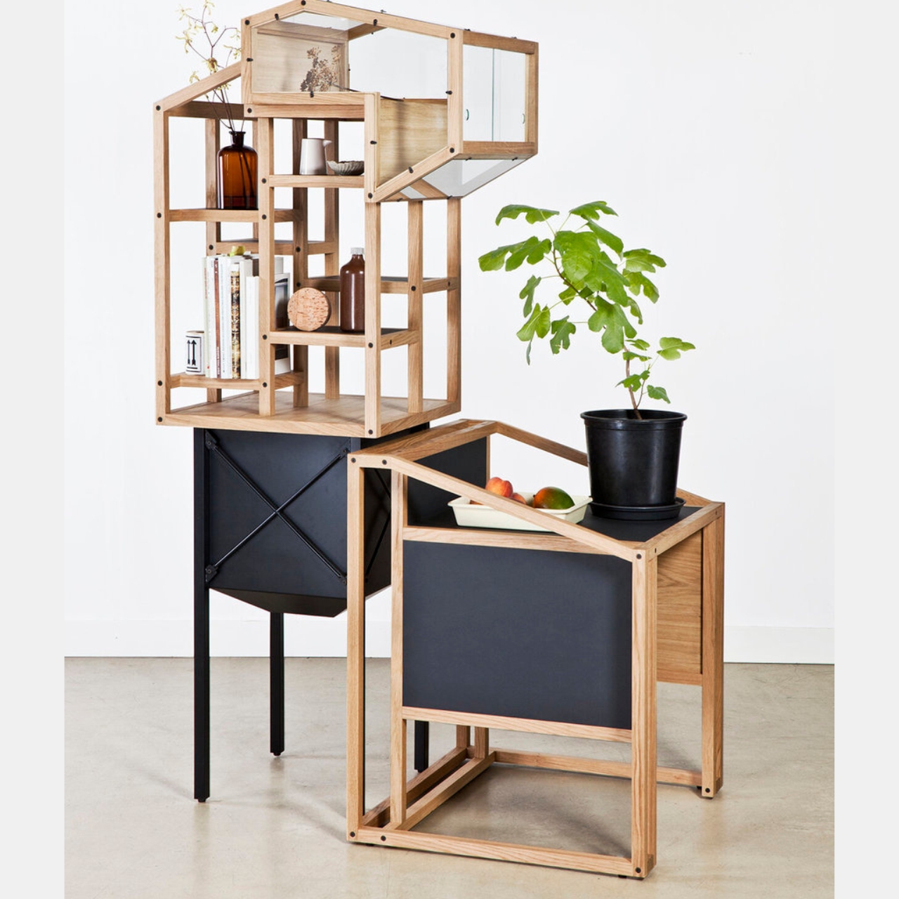
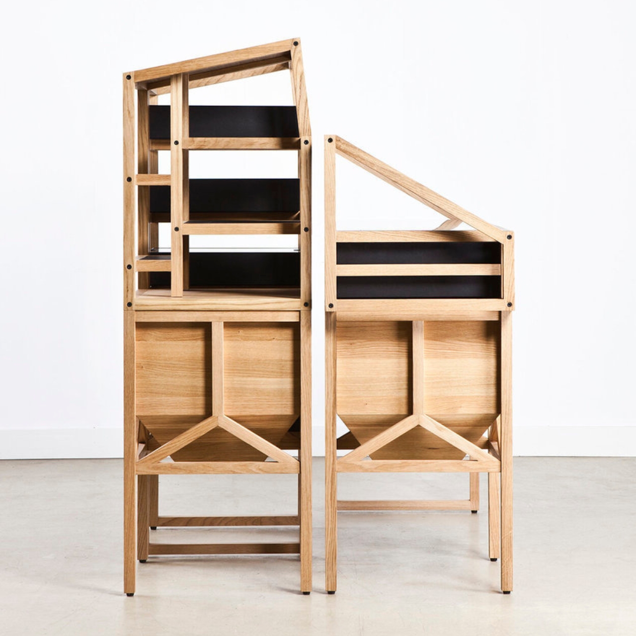
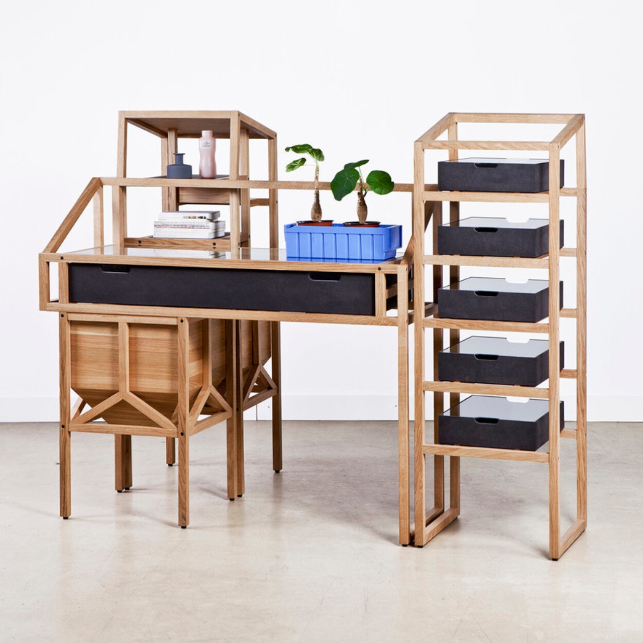
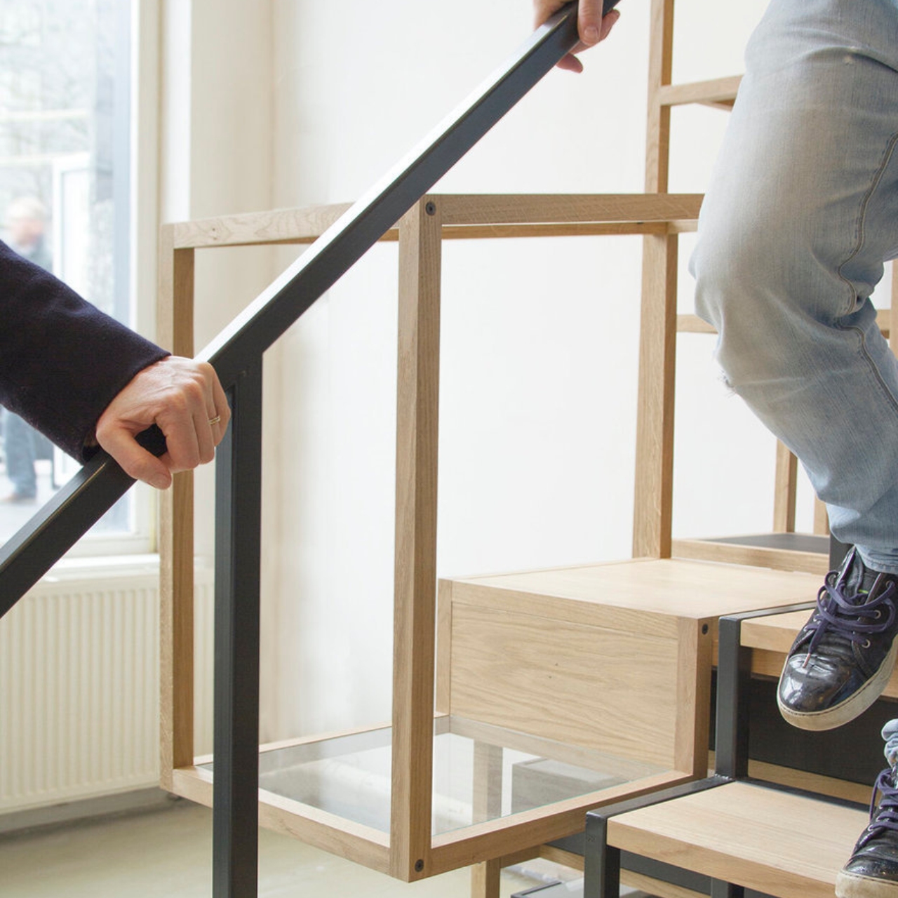
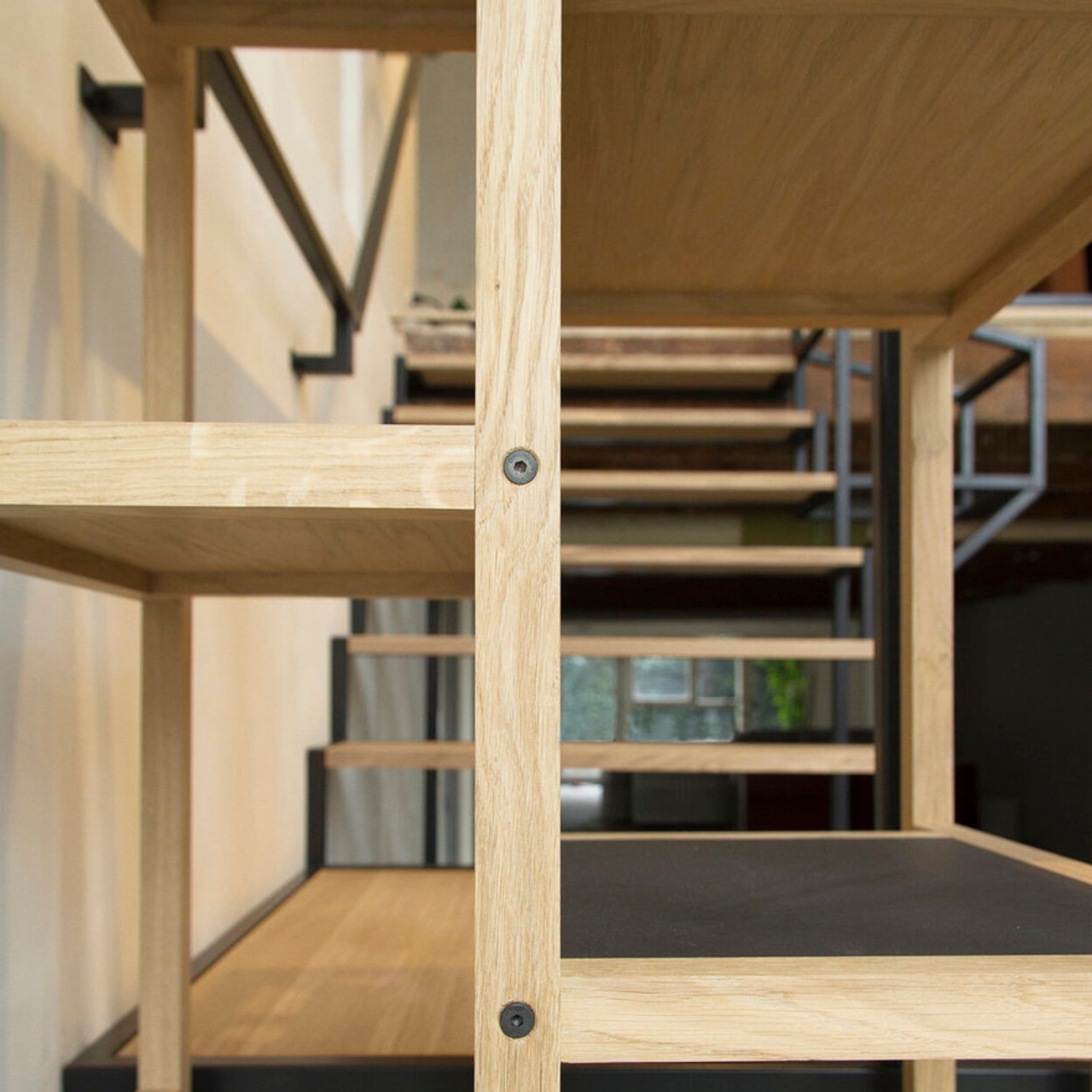
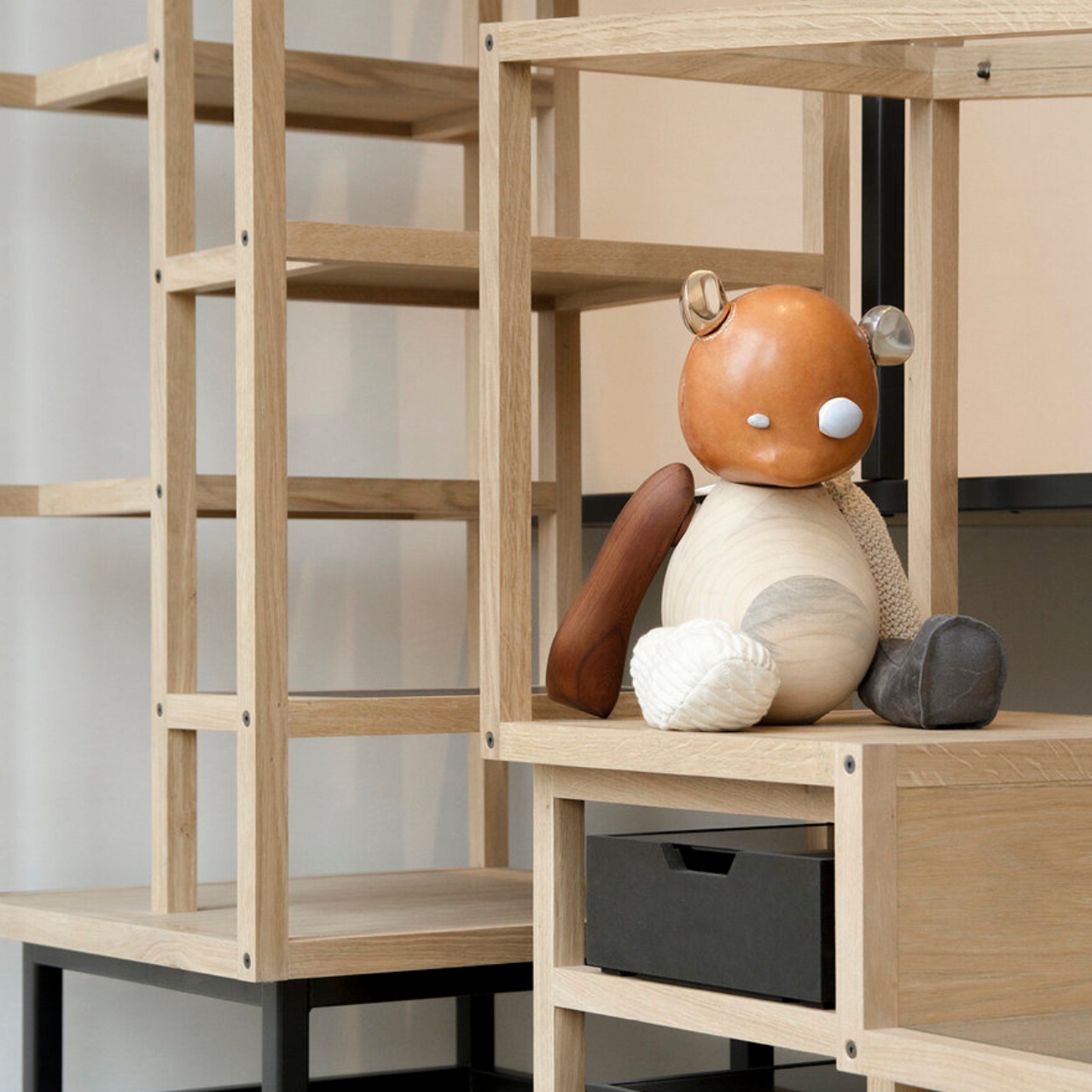
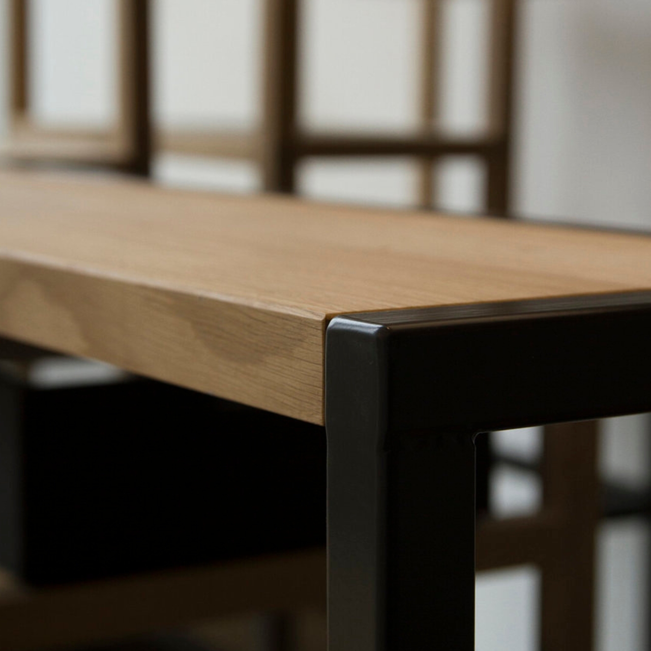
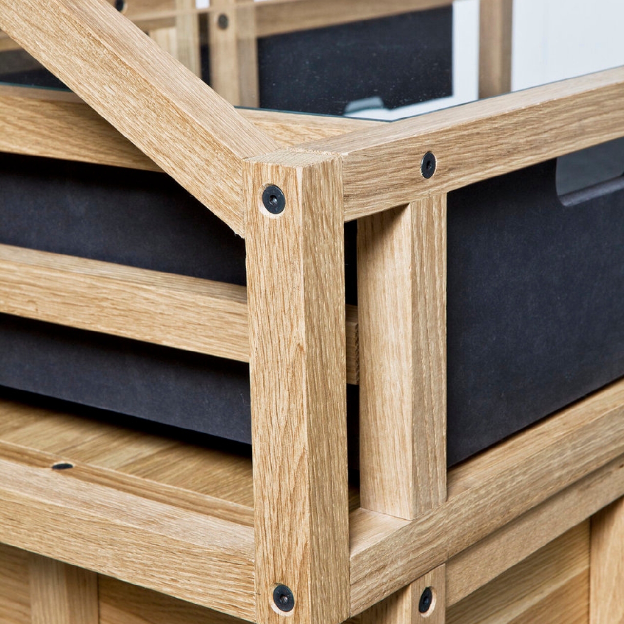
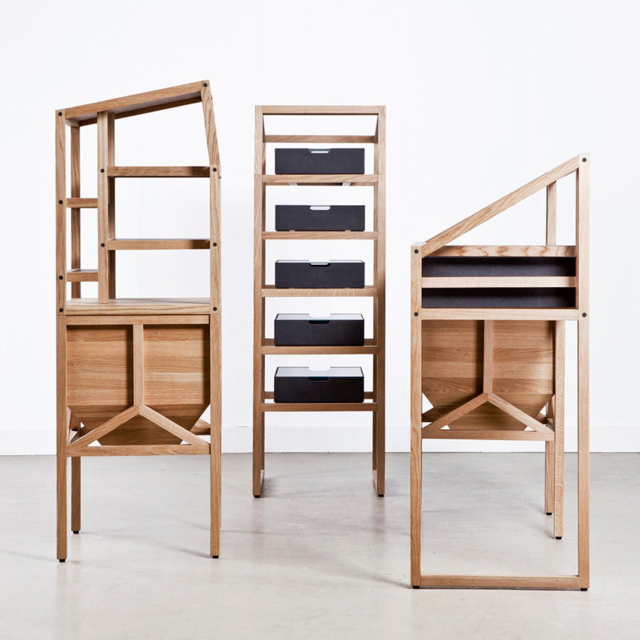
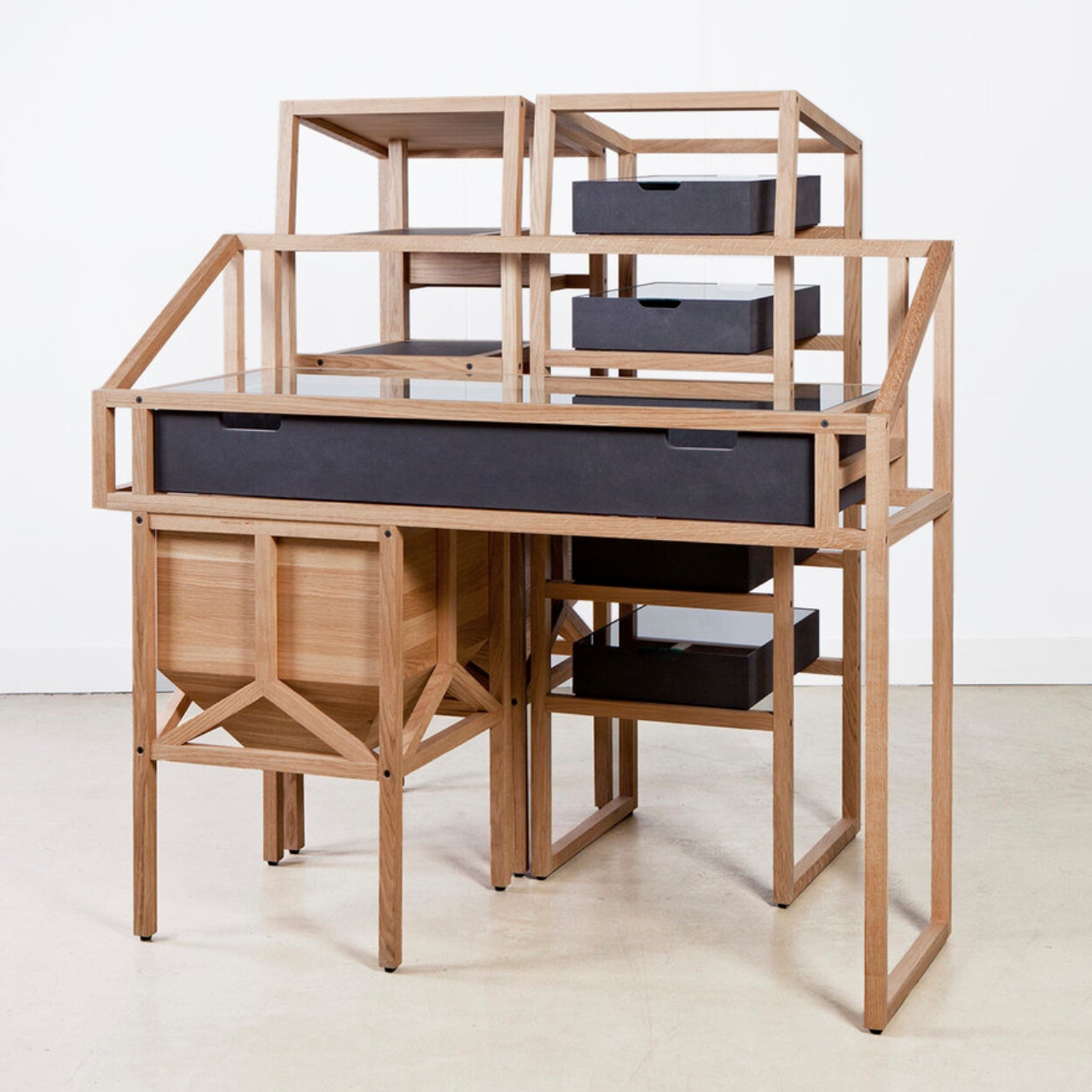
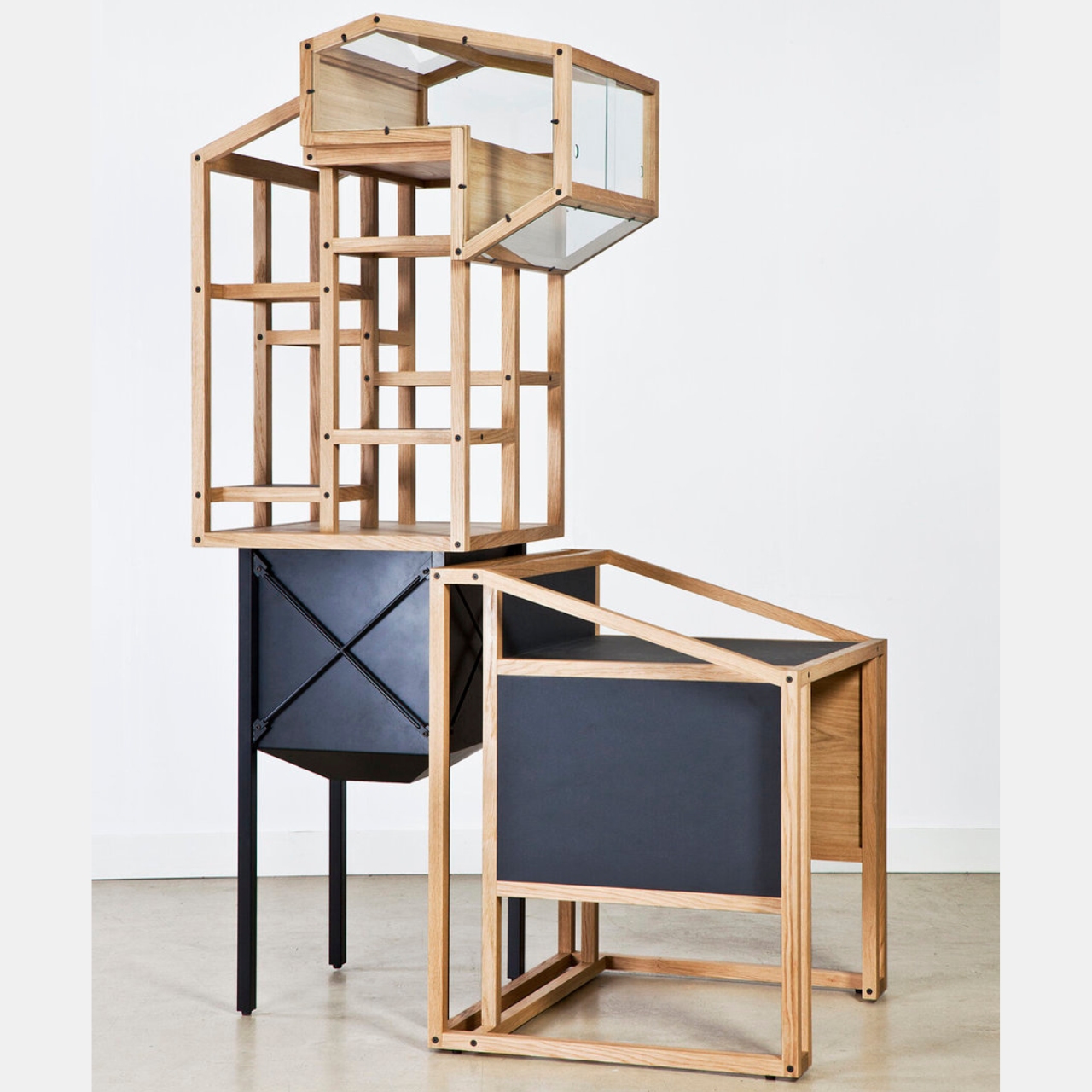
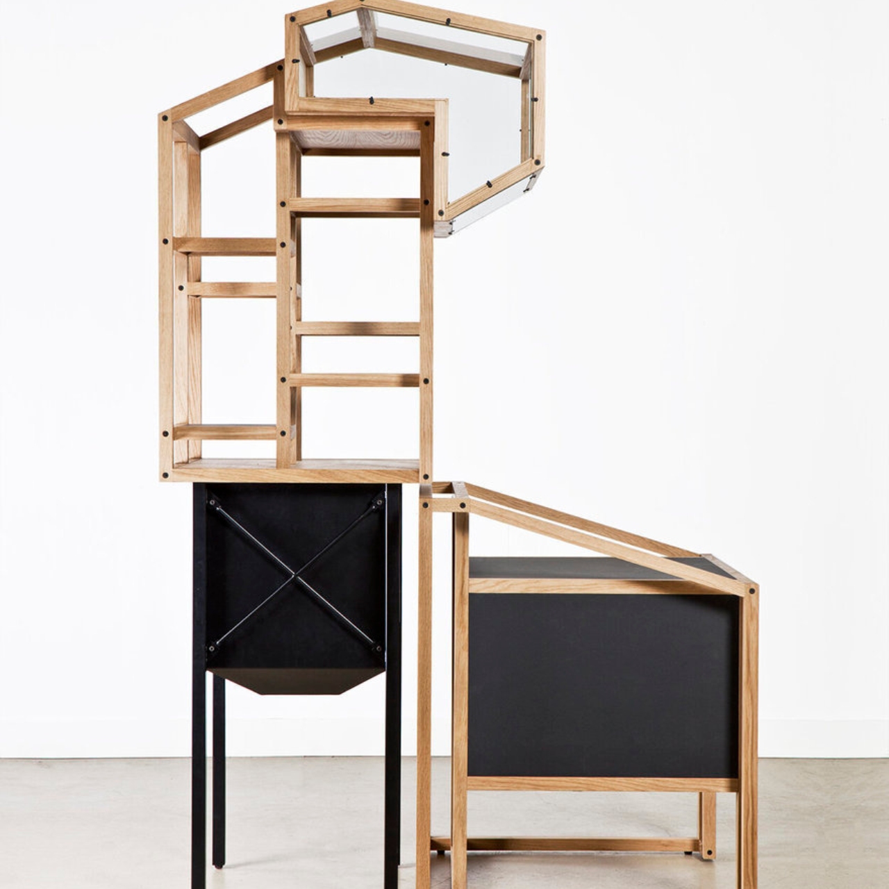
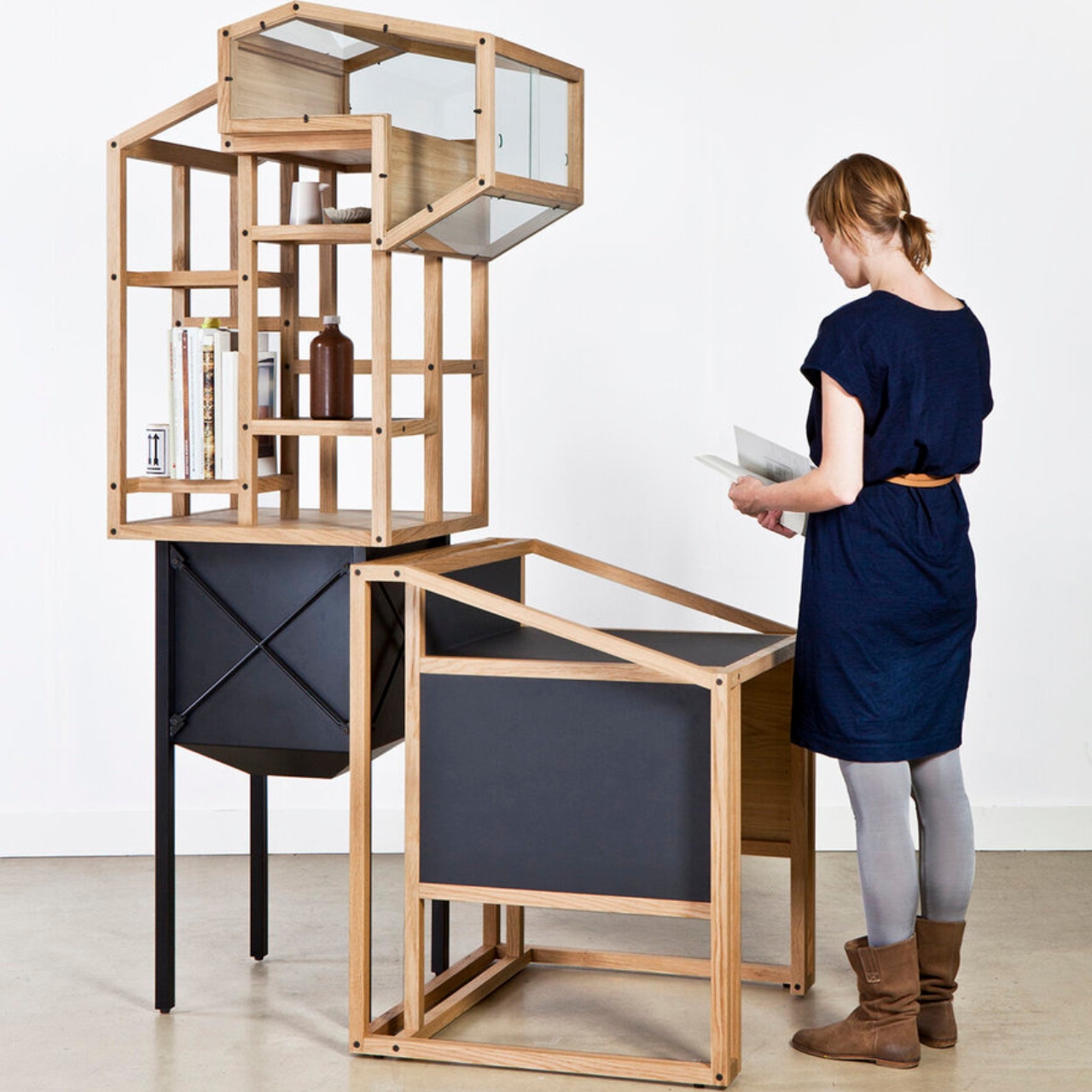
A Dutch design studio has now created a furniture installation series that was inspired by those photographs from the Bechers. The Industrial Archaeology Series pays tribute to these photographs as the designs for the furniture and the way they were put together is based on these industrial structures that they documented. The first in the series is the Gravel Plant 01, an installation of shelves and spaces made of different geometric shapes and sizes. They are both functional and decorative and can also be modular and put together to create an entire furniture system.

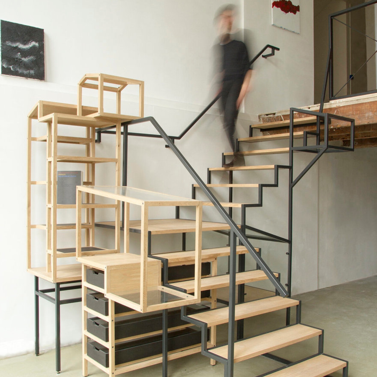
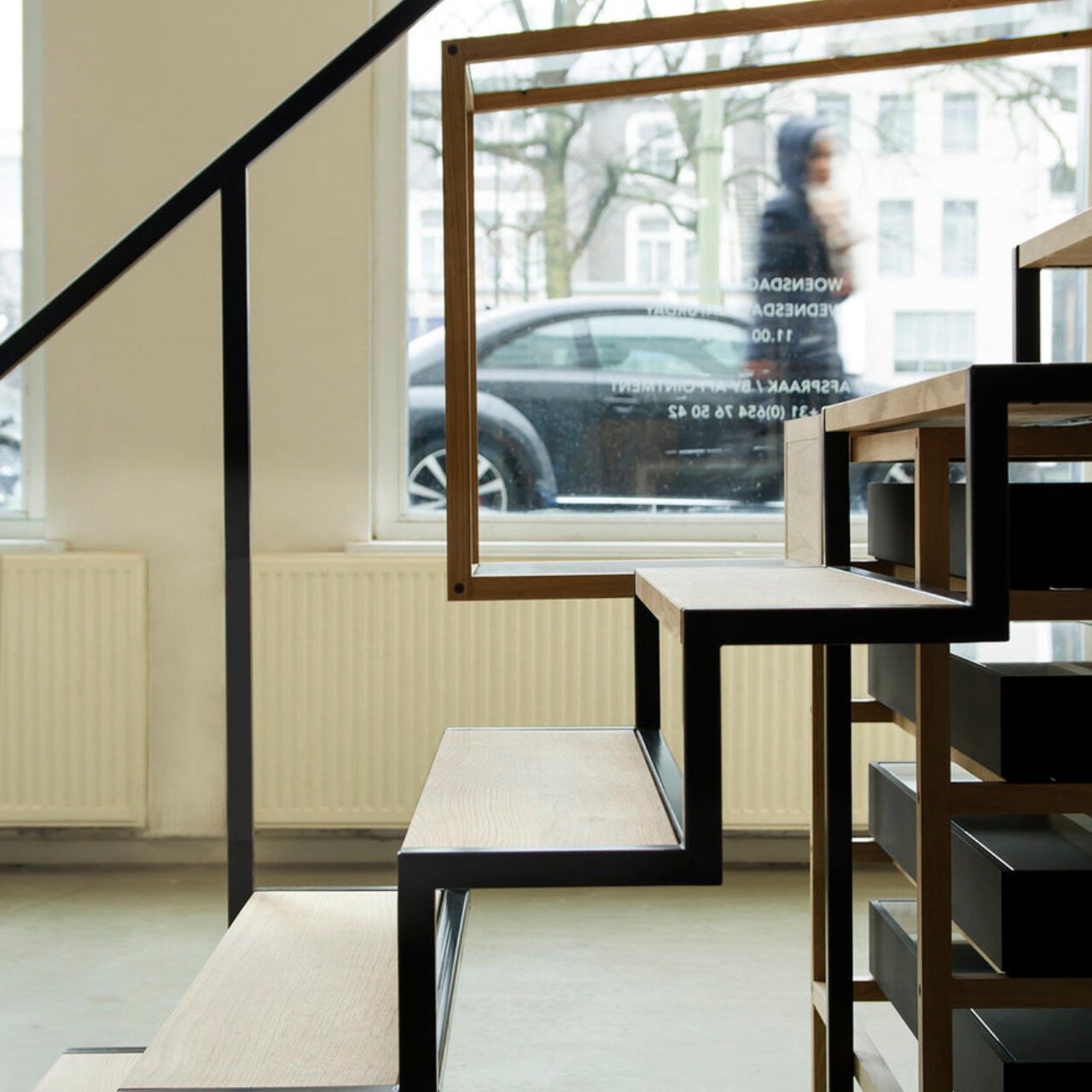
The Industrial Landscape 01 is a staircase installation at a gallery that is inspired by the landscape of olden days in quarry terrains where these industrial installations were the dominant structures. The design shows off actual stairs and shelves and containers, again with different shapes and sizes put together. There are stairs, shelves, drawers, and other spaces to place your decorations and stuff, also showing off a modular system that is decorative and functional.

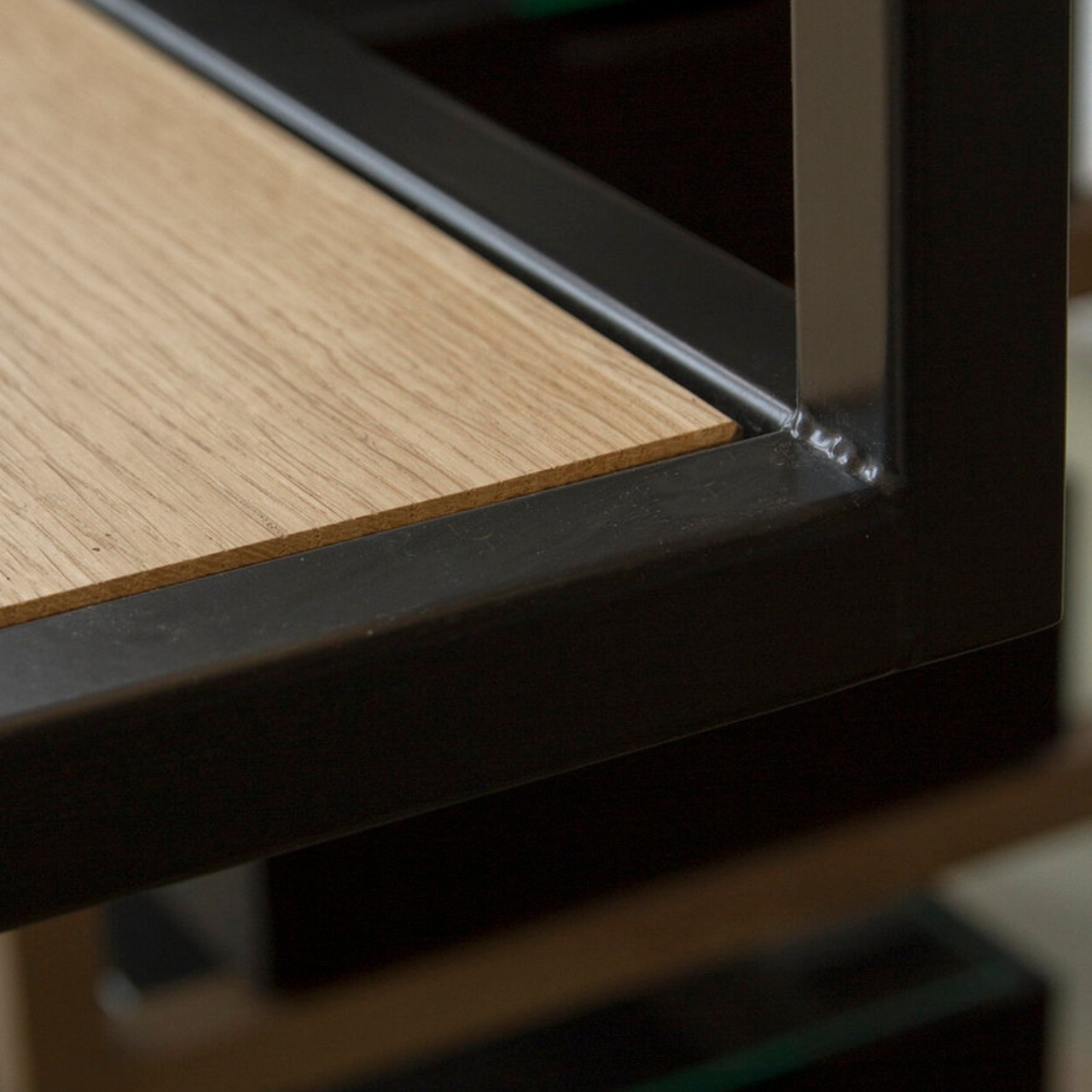
These installations are meant to restore these functional designs from the industrial structures this time enabling them for “studying, collecting, and storing”. The furniture are made from wood and steel, and seem to be stable enough to hold all your items and in the case of the staircase, actual people. Each piece in the installations are hand made and detailed “with outstanding attention to industrial details and skilled craftsmanship.”

The post This furniture installation is inspired by industrial architecture first appeared on Yanko Design.
This sustainable shelf requires no screws or tools to assemble

Looks can be deceiving, they say, and what might be simple could actually be complicated in reality. A simple desk, for example, might be minimalist on the outside but is hiding complex mechanisms in its drawers. Then again, the most successful and effective simple designs are actually born from sophisticated thinking and, at times, nontrivial concepts and theories. This wooden shelf, for example, is so simple through and through to the point that you might even wonder how it is able to hold its parts together. Fortunately, it does work as advertised, creating a flat-packed piece of furniture that is sustainable at every point, from its creation to its transportation and even to its assembly.

Designer: Carlos Platz

The market is filled with minimalist wooden shelves that can be shipped in a flat-pack and assembled at home. After all, IKEA has become a household name, almost literally, and is overflowing with such pieces of furniture. Unless they are formed from a single piece of material, most furniture is held together using screws, glues, or even pieces of plastic. This creates complexity that is hidden behind simple facades, a complexity that sometimes eats away at the planet little by little as well.

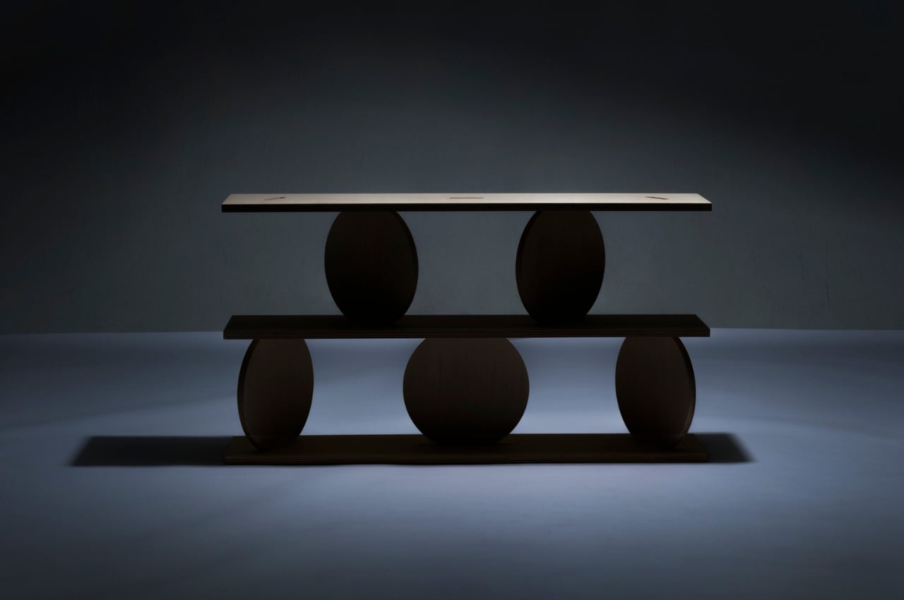
Inspired by the simplicity of alpine joinery and architecture, this wooden shelf throws out all those conventions to arrive at a connection system that is genius in its simplicity. There are no extra parts or materials that join the shelves and the legs together other than the shelves and legs themselves. There isn’t even any kind of adhesive to give you confidence that the shelf won’t just fall apart once you put something heavy. Instead, the shelf relies on shapes and physical to keep everything in its proper place.

Named after the Italian word for “rotation,” Svolta shelving uses pieces of wood that have special cutouts that fit into each other tightly. The shelves have circular cutouts where the legs are supposed to go. The legs, however, aren’t perfectly round but are like wooden rods split in half. The idea is that you insert the legs into the shelves sideways and then rotate them so that the groves match the shelves. With this design, a three-layer shelf with six legs can supposedly be assembled by a single person in just two minutes.

Keeping the design simple has other benefits that go beyond ease of assembly. The furniture can be packed more tightly to reduce packaging waste, and they can be transported easily and more efficiently, further reducing carbon emissions from transporting products. The shelf can also be made from sustainable materials and processes, and Svolta itself is made from European oak and finished with eco-friendly colorless hard oil. Even better, it’s a system that can scale to other types and sizes of shelves, creating a new shelving system that is so simple yet elegant that it feels almost like magic.

The post This sustainable shelf requires no screws or tools to assemble first appeared on Yanko Design.

This odd metal shelf tries to preserve your work-life balance

The boundaries between work and personal life have been blurring in the past few years, and recent work-from-home arrangements have only muddled the lines even further. As many people learned the hard way, it takes a good amount of mental discipline to separate the two when they’re working at home, but it’s not exactly impossible. Having a separate home office is ideal but isn’t always an option for those with limited space. In such cases, furniture can come to the rescue, creating a physical and visual boundary between different parts of your life. That’s exactly the kind of effect that this shelf is aiming for, creating a figurative and literal separation between work and rest, especially for those that tend to have their desks beside their bed.

Designer: Jeong Hyuk Kim

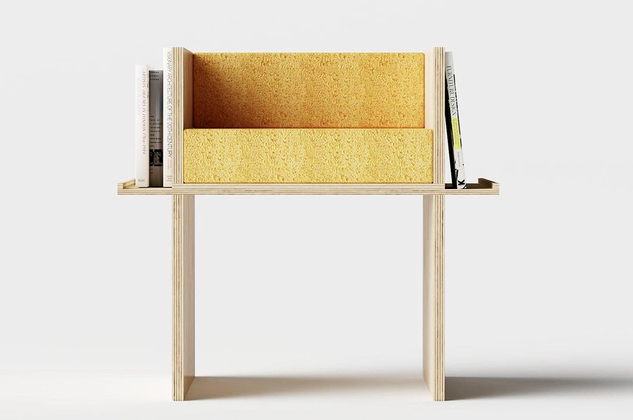
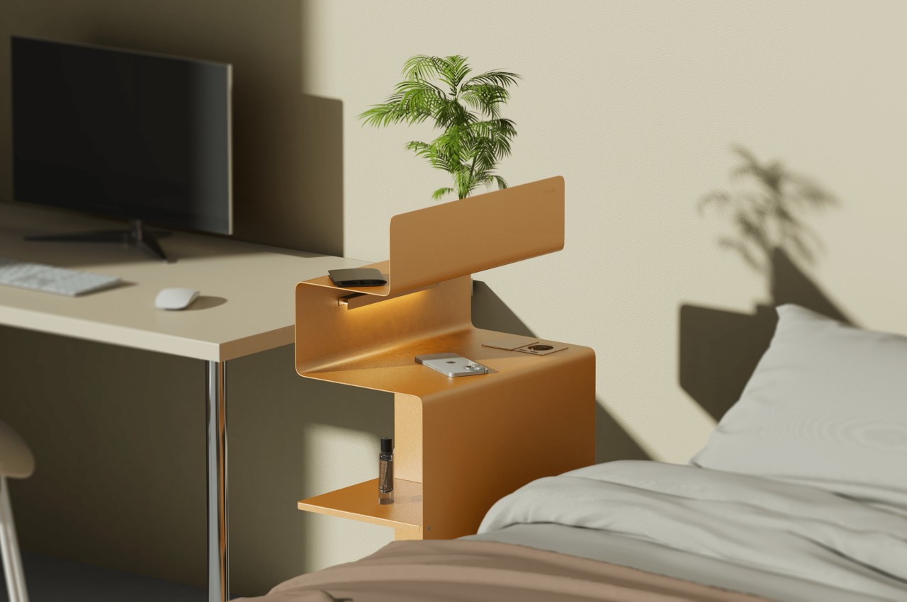
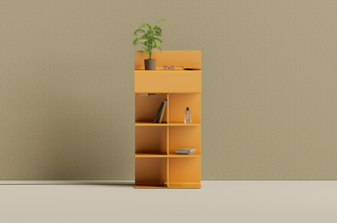
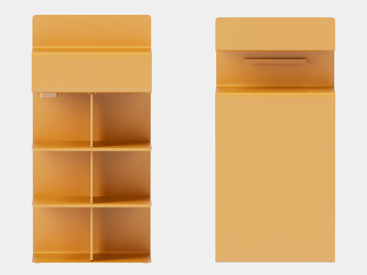
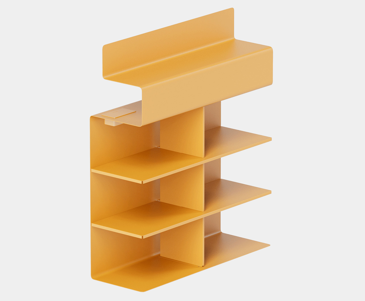
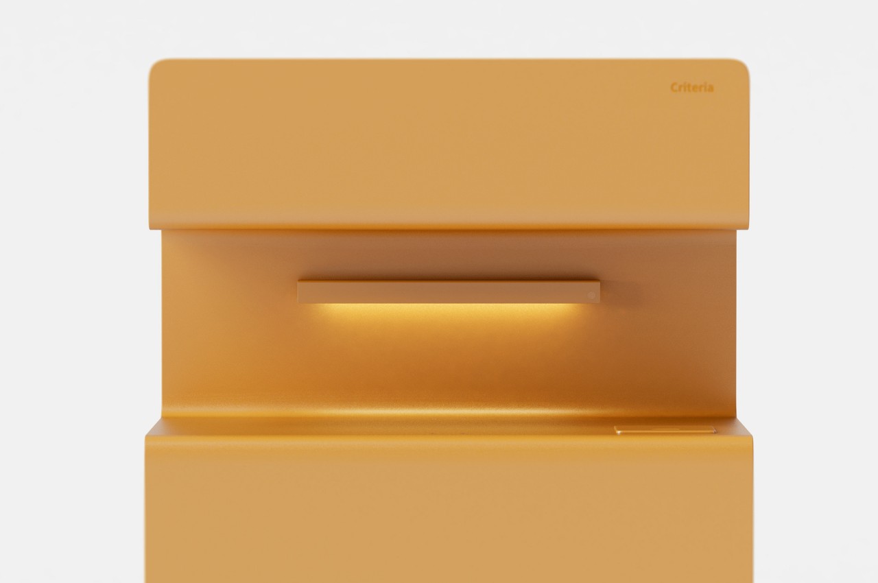
If you look at it head-on, this shelf looks almost stereotypical, with box-like spaces for items like books and a top surface for putting decorative items like plants and vases. Once you start viewing it from a different angle, though, you’ll immediately see how it’s not your conventional shelf, especially in the way its body seems to snake upward, creating another space on its back.

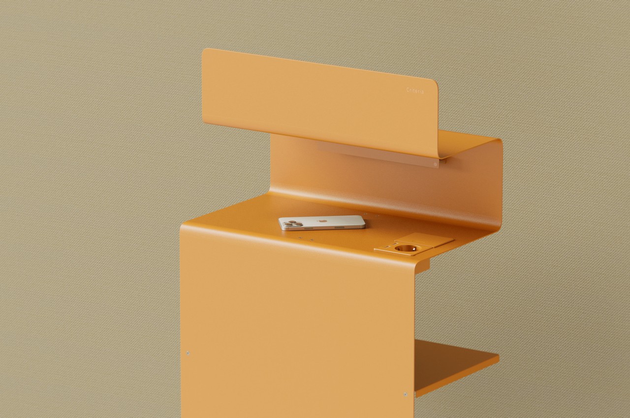
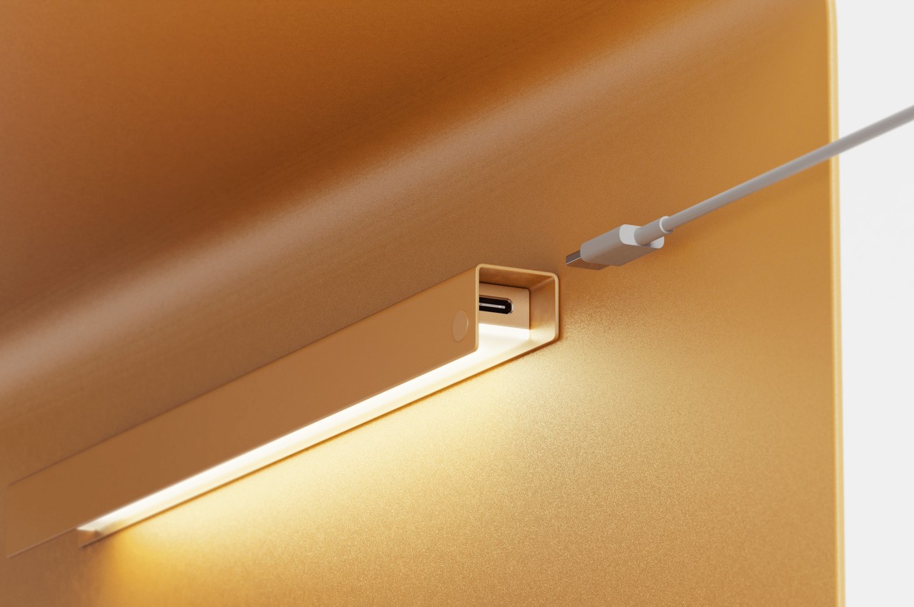
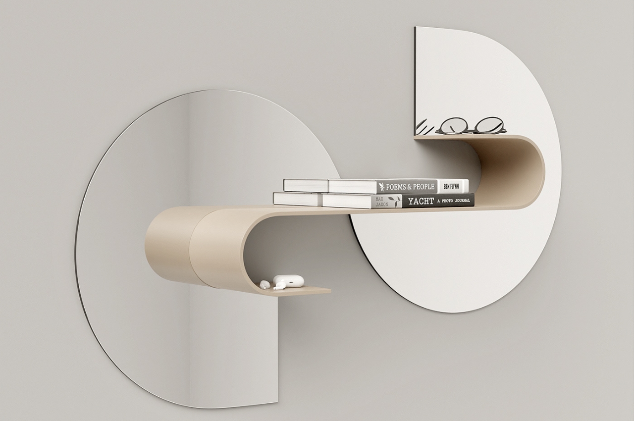
The Criteria shelf concept is actually a blending of two different types of shelves for different parts of the day. As mentioned, one is a typical shelf to store books, stationery, desk accessories, decor, and other items you might need for work. The opposite side of this shelf, however, also has a shelf but with more limited space. It also has lighting that would be more useful at night.

This is the “rest” part of Criteria’s functionality. While one side is designed for productivity, the other is designed as a temporary landing area for transit items like phones, books, watches, or glasses. In other words, it functions as a bedside night shelf, though its height might not be ideal for reaching out at night. The idea is to have a single piece of furniture serve two functions, depending on which side you’re facing. That only works, however, if both “faces” of the shelf are within arm’s reach in the first place.

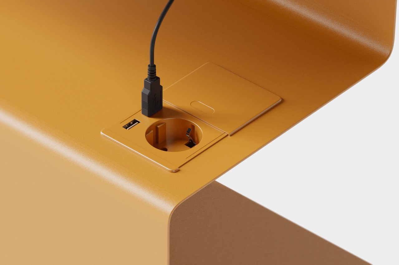
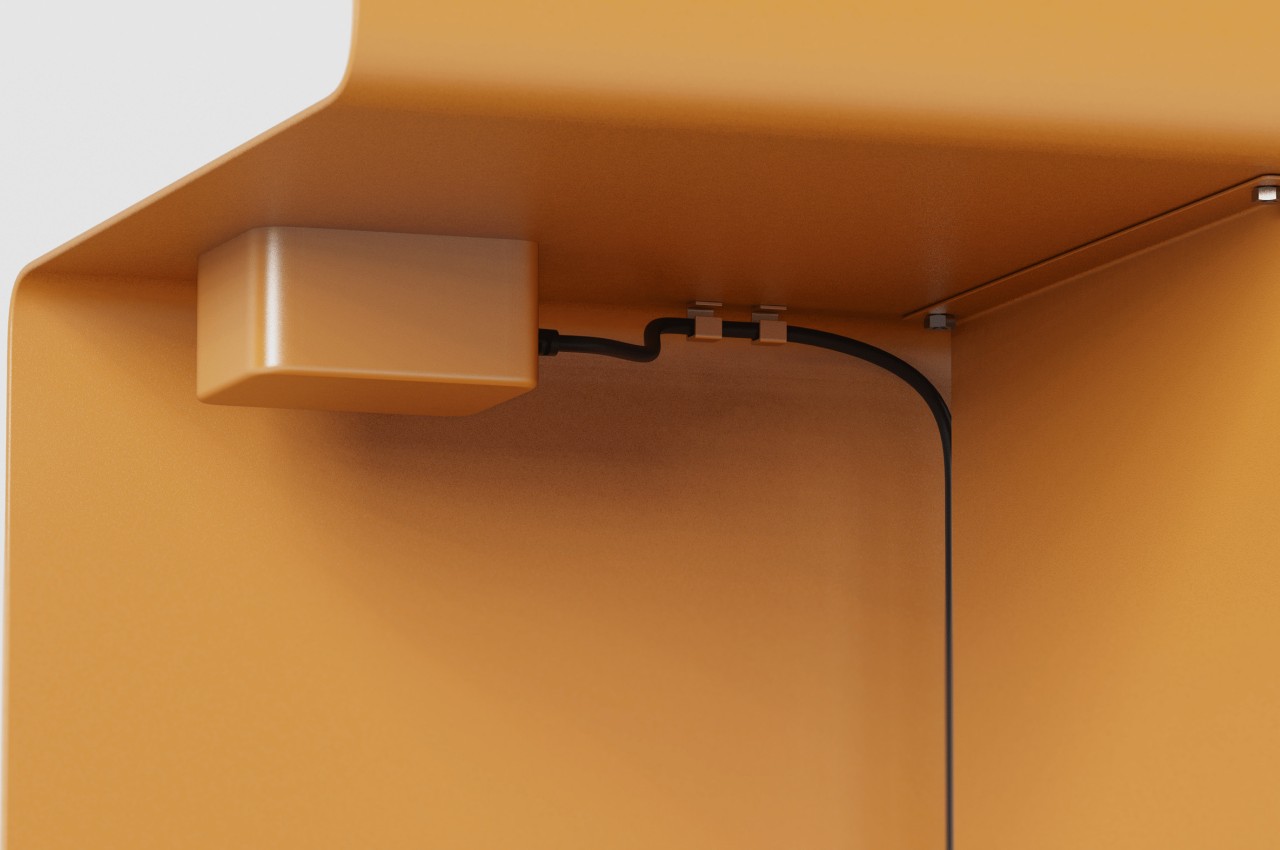
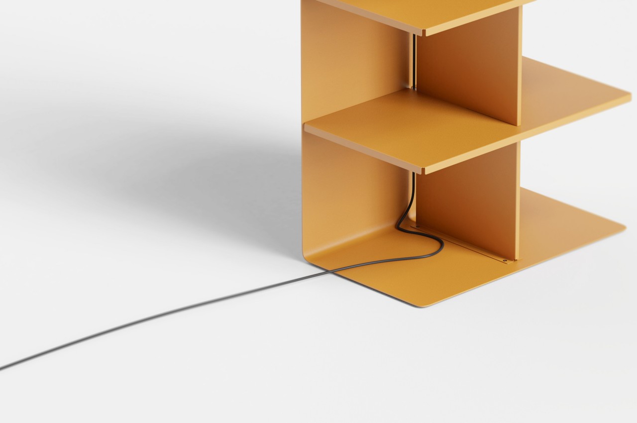
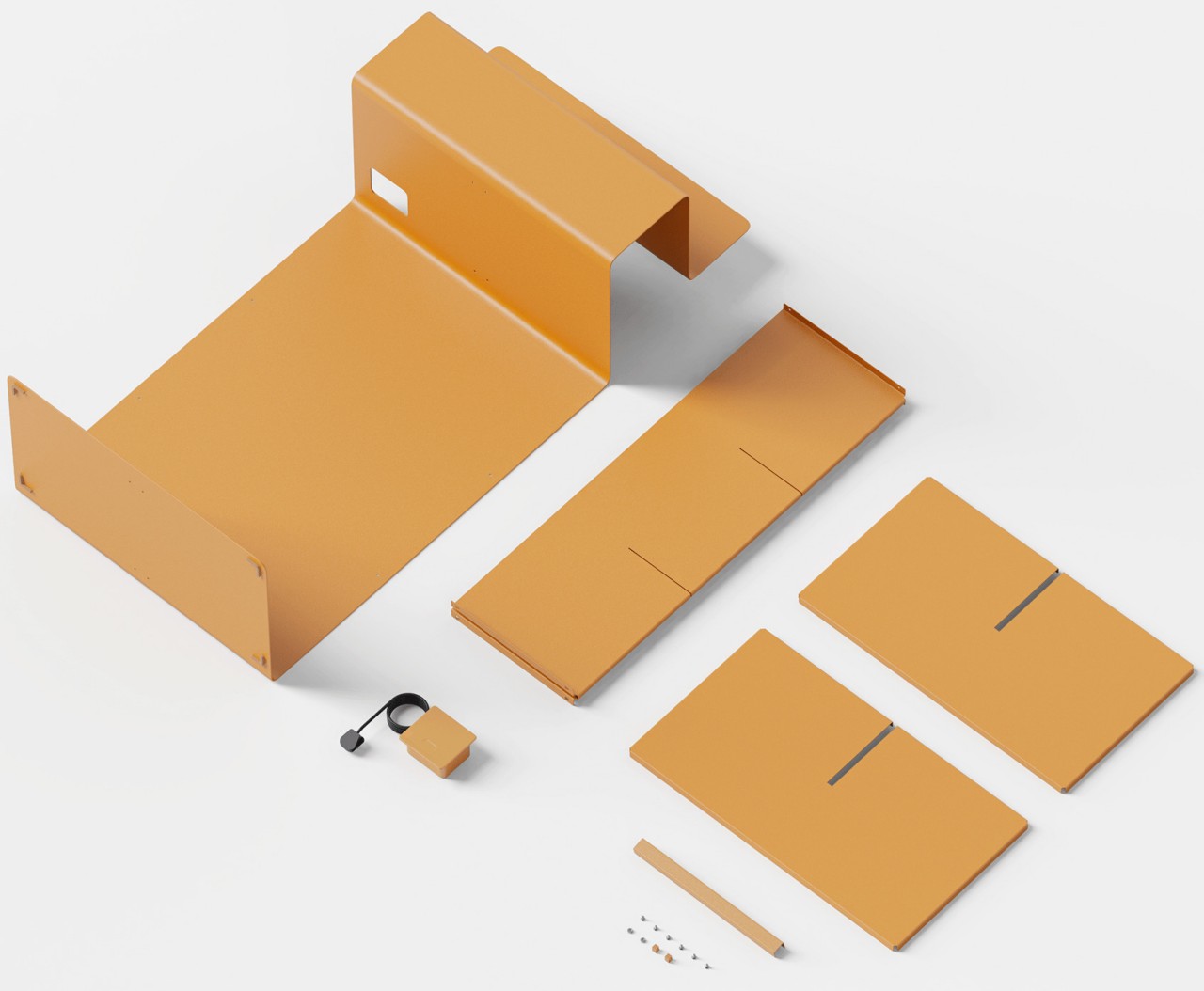
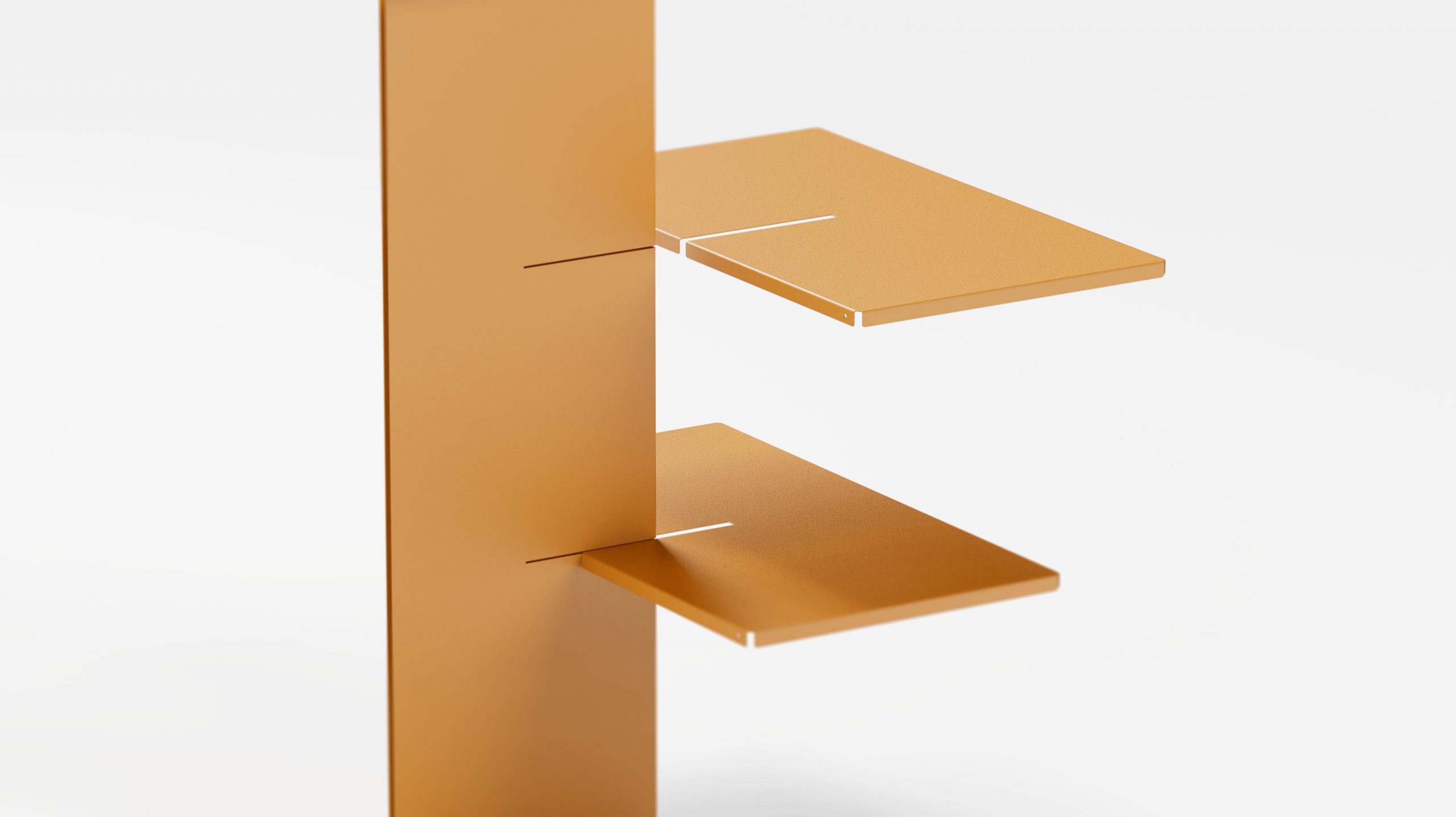
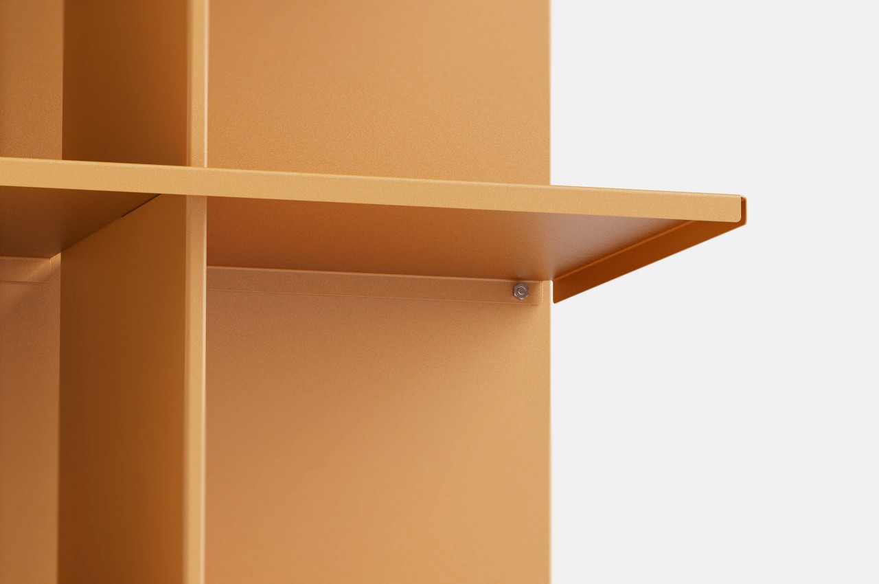
The skeleton of the shelf is made from a single sheet of metal bent to achieve this crooked shape. The central column and the shelves themselves are attached through gaps in the body. To prevent the metal edges from injuring people, they are bent to curve downward, creating a bit of safety. The shelf has a built-in power socket and USB ports for charging devices and powering the night lamp, and the gap between the spine and the shelf’s frame creates a path for the power cable to pass through.

The Criteria shelf concept presents a rather interesting solution to the problem of keeping a work-life balance at home. Rather than having a single shelf where work and personal items mix indiscriminately, it has two distinct areas for work and for rest. It’s also most metaphorical in how it shows two sides of the same shelf as if reminding people that, at the end of the day, these separate sides are still part of the same person.

The post This odd metal shelf tries to preserve your work-life balance first appeared on Yanko Design.
Spark furniture concept offers simple ways to tune your tables and shelves to your style

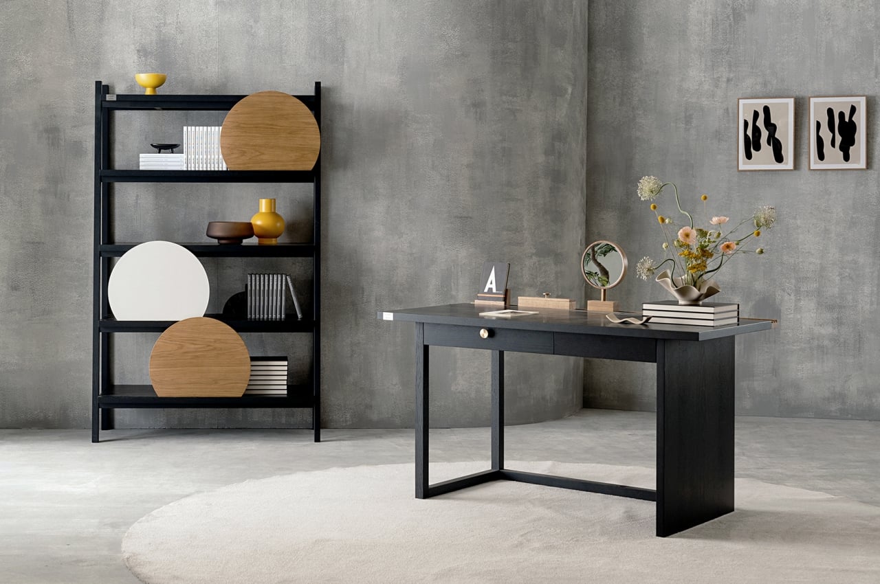
It’s not easy to find furniture or products that perfectly fit our needs and our aesthetic tastes, not unless we buy bespoke editions or commission someone to make them for us. Once in a while, we do come across a table or a shelf that sings to us, but most of us have to settle for furniture that carries a generic design for mass production. We often end up personalizing these home pieces with photos, organizers, vases, decor, and other things that make them unique and different from others of the same design. What if you could actually customize a mass-produced desk or shelf easily without having to buy additional accessories? That is the idea behind Spray, and it delivers customization in a simple yet effective way that doesn’t take anything away from its minimalist beauty.

Designer: Pavel Vetrov

Admittedly, there are plenty of furniture these days that try to flaunt their minimalism and configurability. Sometimes, however, the system is only visually simple but inherently complex. Hidden mechanisms, detachable modules, and moving parts might be out of sight, but they also make the product more prone to wear and tear, not to mention making them harder to repair or replace. In contrast, almost every option is within plain sight with Spray, and nothing requires screws, hinges, or anything metal for that matter.

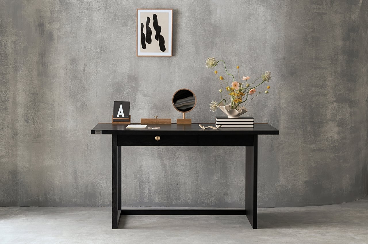
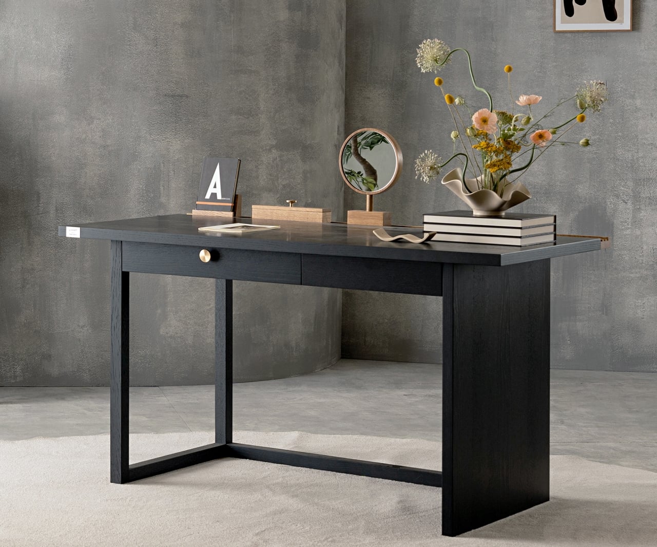
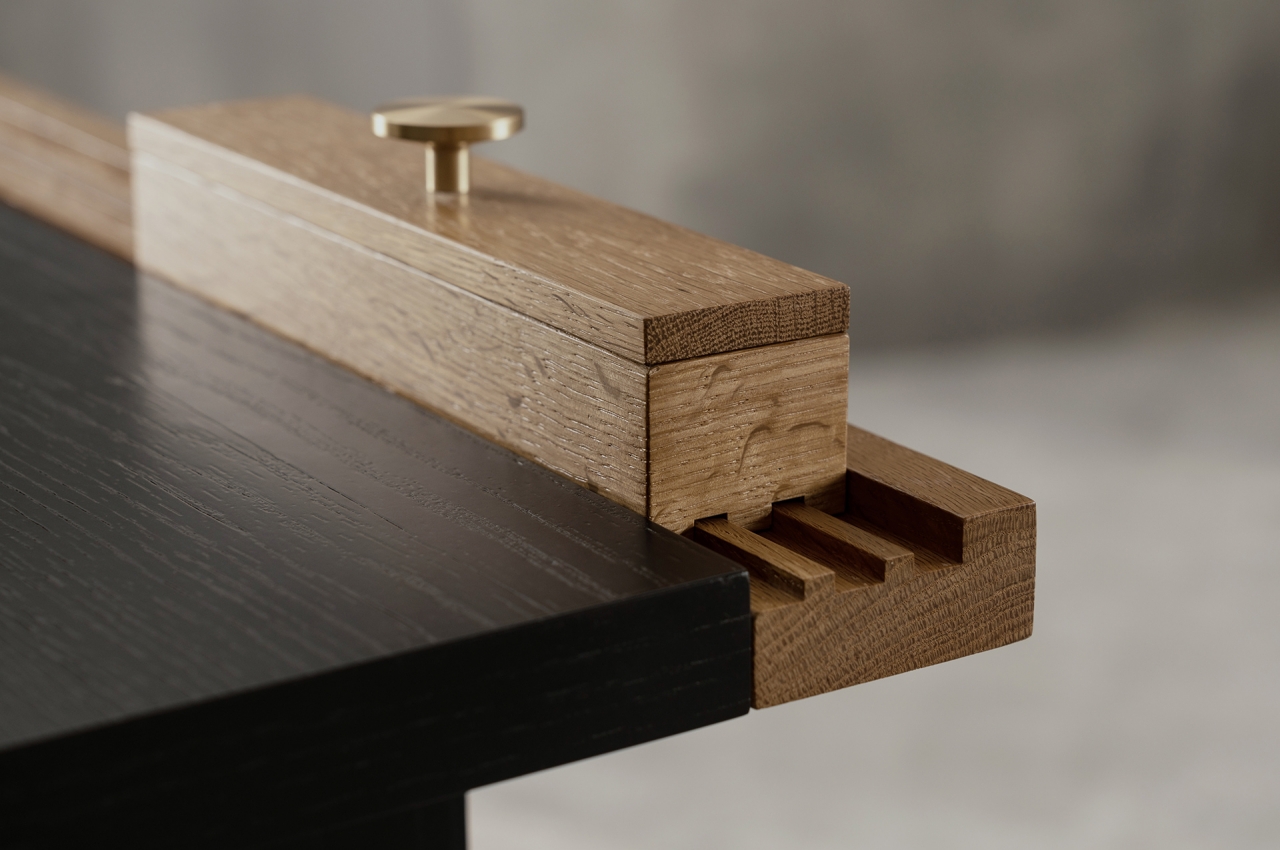
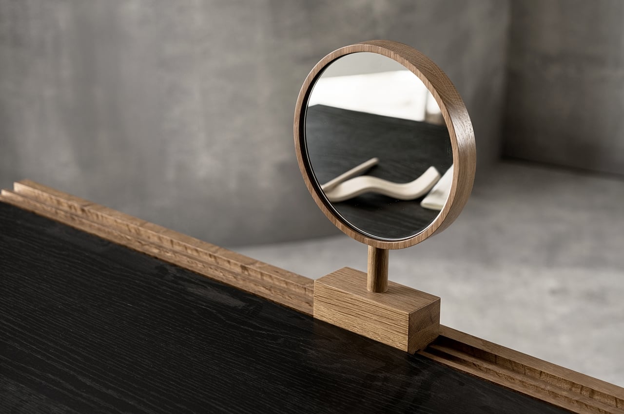
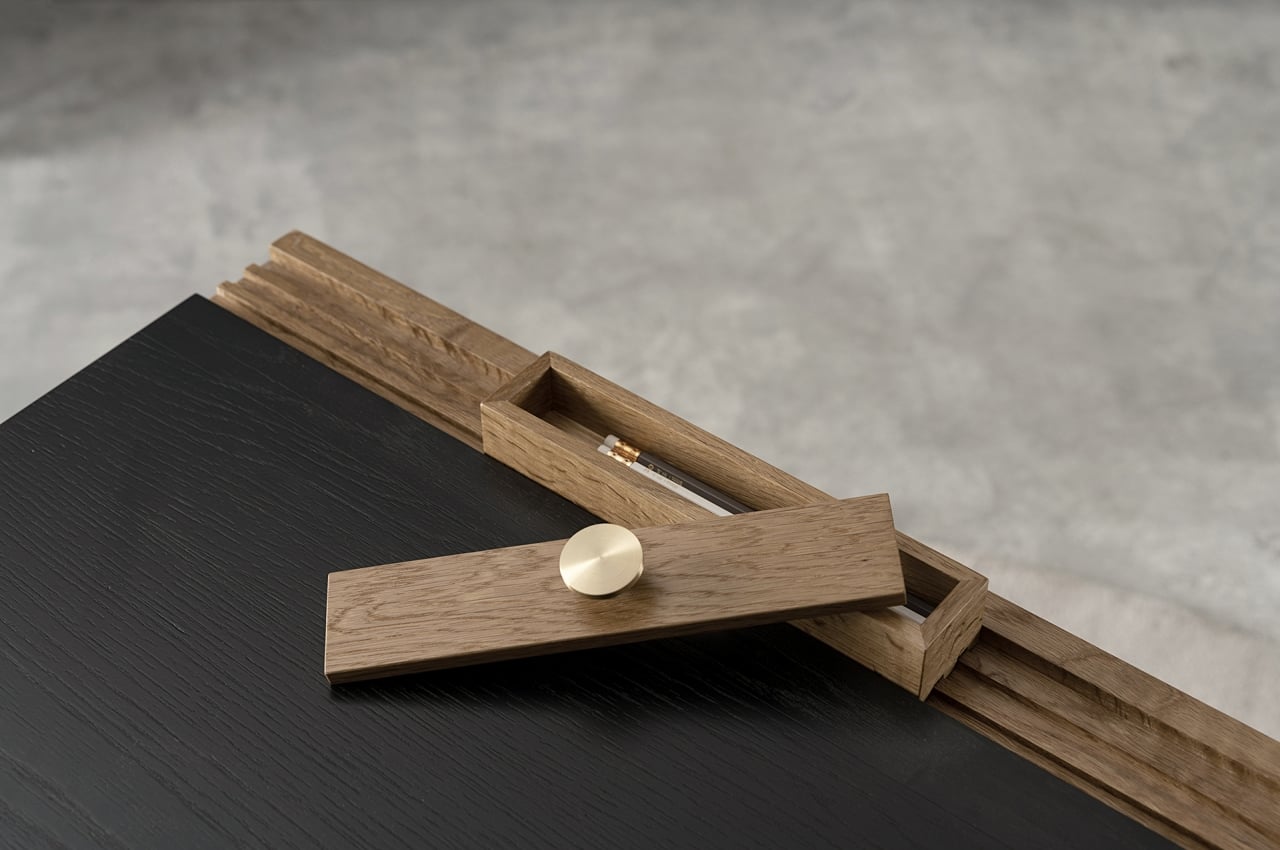
The desk, for example, offers a clean and open surface to work with, with no borders or hidden pockets other than a traditional drawer. There is a rail system on the back that does let you add certain functional pieces as you need. It’s all made of wood, so there are fewer chances of sliders getting unhinged or deformed. Although the concept already includes at least three of these “modules,” there’s plenty of room to add more if necessary, presuming they’re available.

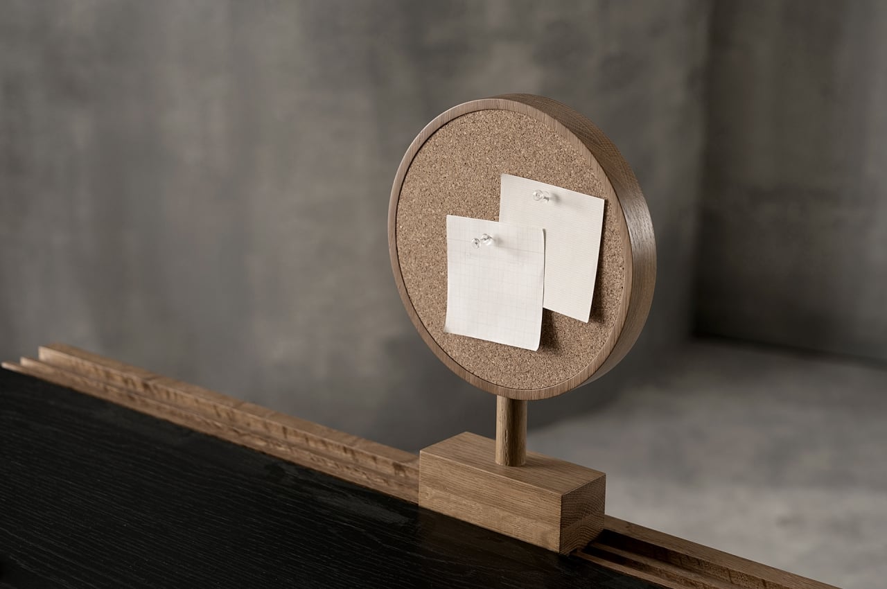
Interchangeable parts for the desk include a box for holding pens or other small items, a book stand, and a circle that has a mirror on one side and a corkboard on the other. In addition to being functional, they also add visual accents to the desk, their brown hues complementing the table’s black surface quite nicely. You can mix and match and put them in any order or position you prefer. The book stand, for example, can be easily detached when you need to read something up close. And at the end of the day, all these parts can retreat to the back, leaving your desk space clean and tidy.

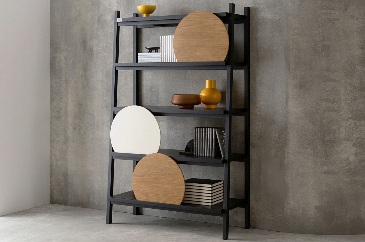
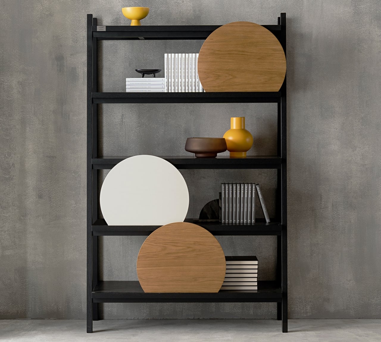
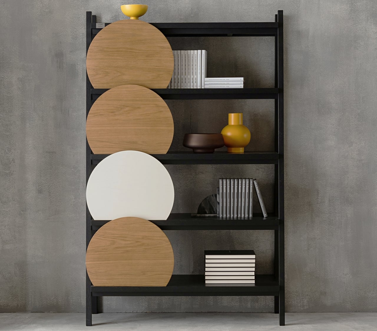
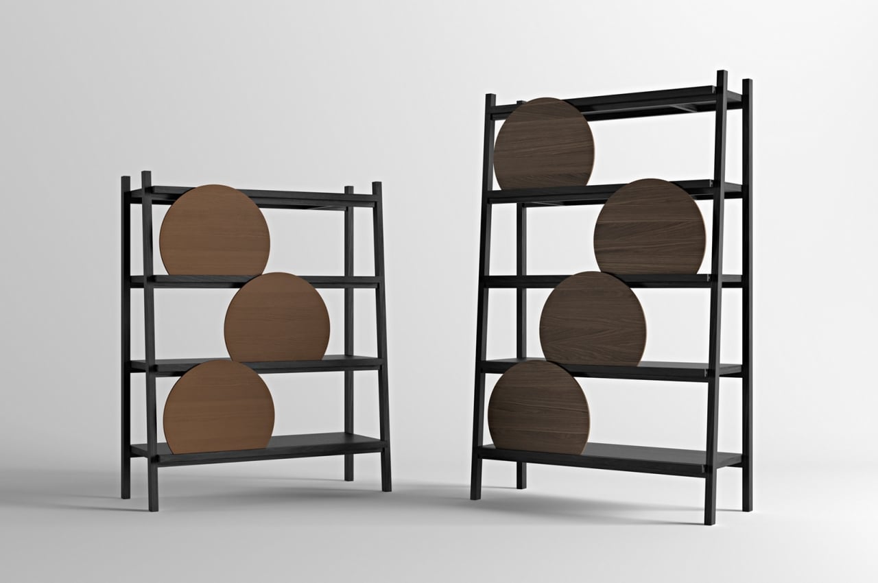
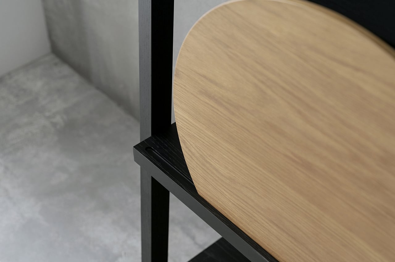
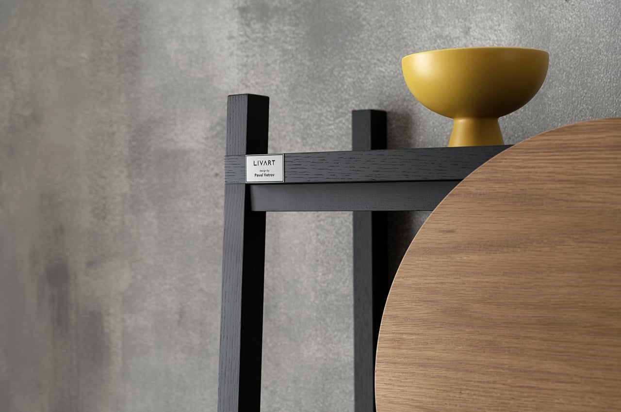
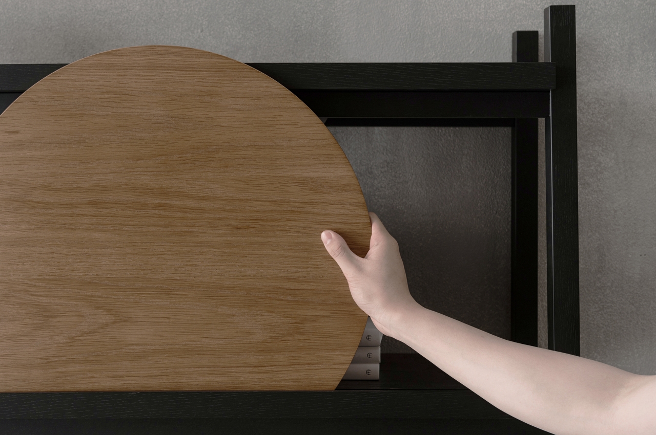
The Spray shelf uses the same rail concept but with a simpler, single groove in the front of each shelf. This is where wooden discs slide into place to add some variety to the furniture that is pretty much a simple wooden frame. These discs act as shields to hide things behind, and they can be positioned anywhere you like. They’re also entirely optional, in case you want to show everything you have on display.

Spray doesn’t do anything extraordinary to provide personalization options, and that is actually its biggest strength. It is simple, pure, minimalist, and beautiful, and it doesn’t let its flexibility get in the way. It’s definitely a refreshing take on a growing trend of products, both furniture and accessories, that start to go to the opposite extreme of becoming more complex in the name of flexibility.

The post Spark furniture concept offers simple ways to tune your tables and shelves to your style first appeared on Yanko Design.
These shelves look like abstract art of faces gazing at you and your collection

There is something both mystifying and unnerving about a beautiful shelf that seems to be staring back at you.

Shelves are often used as a place to display things that are important to us, from our favorite books to photos of loved ones or memorable events. In most cases, the shelves themselves are nondescript or minimal, designed to shine the spotlight on the objects they hold rather than on themselves. Of course, there are also times when shelves are so ornate and magnificent that they almost become the center of attraction. This particular shelf design is somewhat both, holding your mementos and possessions while also standing as an art piece in itself. It could even be an instrument of thought and discussion, provoking some contemplation on what it really means to see things and how our minds can work to fill in the gaps that were never there.

Designer: Freia Achenbach

“Spectator” is a rather apt name for this odd-looking shelf that seems to be made of interlocking jigsaw puzzle pieces. It does, however, raise the question of which one is the spectator and which one is the object of observation. You would think that you or your visitors would be the answer to that, but a closer look at the shelf’s pieces could give you an eerie feeling of being watched instead.

That’s because almost every single piece of this puzzle shelf would look like a distorted human face on closer inspection. In reality, of course, none of them are actual faces, at least none that would resemble reality. And yet, once we initially see those forms in the different pieces, it’s almost impossible to unsee them.

In that sense, the Spectator Series of shelves is as much a psychological art piece as it is a piece of furniture. In its small way, it demonstrates the wonder of our brains that try to fill in the gaps to complete forms and ideas, like how it is able to see faces in shapes that are so far removed from human heads. With so many faces hiding in plain sight, the roles of observer and observed are also reversed, at least in our mind’s eye again.

The shelf still adheres to minimalist design principles despite the odd shapes of its pieces. Each of those pieces is hand-painted with resin, giving it a glossy look that almost reminds one of ivory and bone, which probably helps reinforce that image of faces in the shelves. Just like a jigsaw puzzle, the pieces interlock perfectly in a fixed arrangement, so no other connecting part is needed to keep them together.

1

The Spectator shelves might not be the most practical furniture to hold your things, but it definitely puts them in a different perspective, figuratively and literally. Each negative space isn’t just a place to put your stuff into. It also becomes a metaphor for how these things occupy your mind, just like those comic strips and caricatures that put things inside your head in an almost comical and distorted fashion.

The post These shelves look like abstract art of faces gazing at you and your collection first appeared on Yanko Design.

Furniture that plays with hues and shapes is sure to bring some color into your home life

The pervasive minimalism trend in design has made many products, particularly furniture, almost too plain. Of course, there is beauty in simplicity and uniform colors, but that doesn’t mean it’s the only way to go. In fact, there’s almost a sort of counter-culture flowing in the undercurrents today, offering maximalism as a salve to soothe many of the mental and emotional ills of today. One doesn’t have to go overboard, of course, in spicing up everyday life, and a new collection of everyday furniture shows how mundane objects can become the literal and figurative highlight of a room, with just the right interplay of colors, materials, and shapes.

Designer: Lisa Brustolin

On their own and with their peculiar designs, these pieces of furniture would have pretty much fit the description of minimalist products. Their basic shapes and base color schemes are not that uncommon, but as with anything in life, it’s the different ways you mix these elements up that really make a difference. And in this collection, it’s exactly that interaction of elements that makes them stand out without removing their primary function as usable pieces of furniture.

The translucent epoxy resin legs and opaque shelves already give the Differ Shelf a sharply contrasting motif. It is, however, the way the light bends, reflects, and refracts through those yellowish panels that turn the shelf into an almost dazzling light show, depending on where you stand. Given its unique visual properties, this shelf is designed to stand in the center rather than against a wall so that people can walk around it and view it from different angles. It truly differs from other shelves.

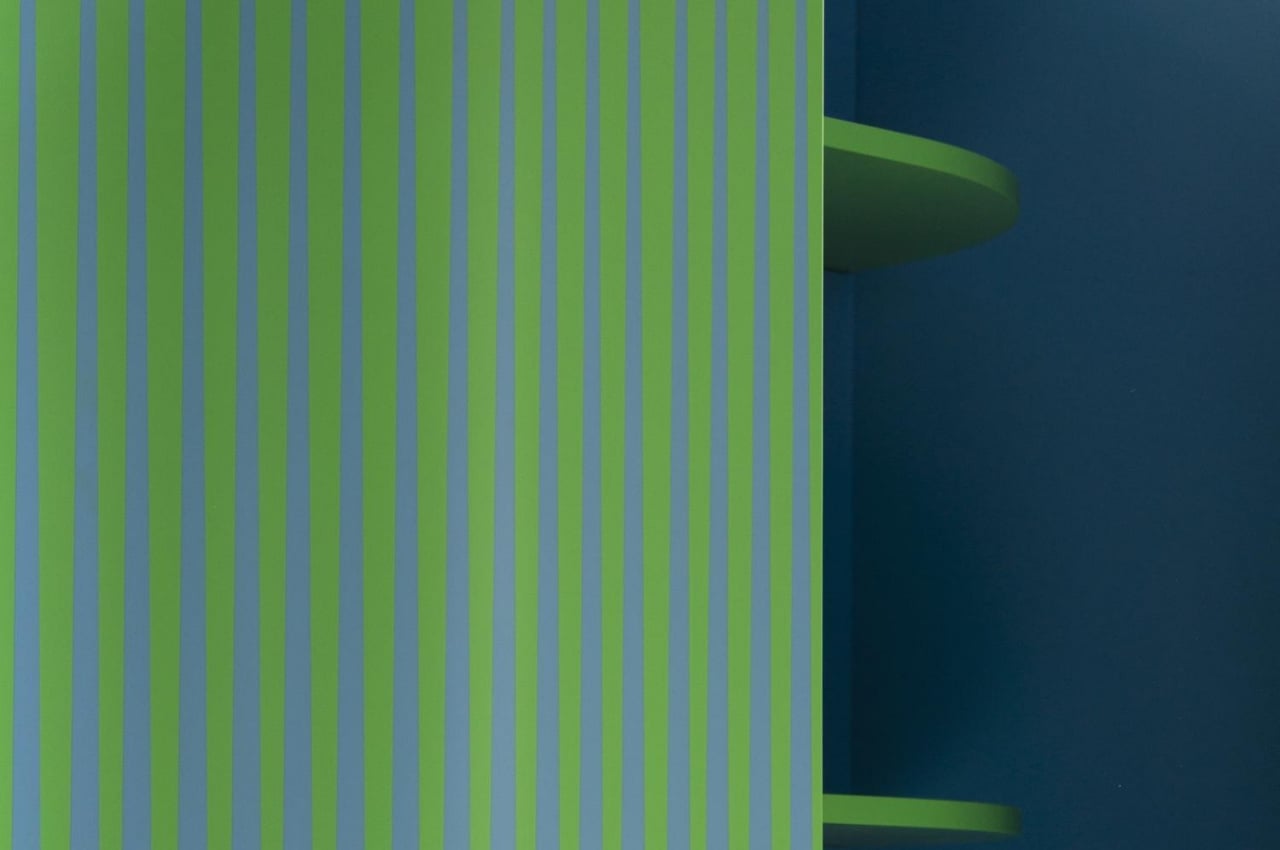
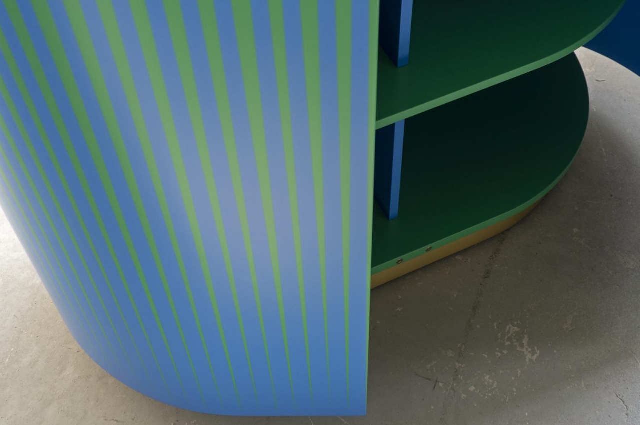
In contrast, the Opticabinet is meant to be viewed from afar in a corner or an edge of the room. Made by Venetian craftsmen from wood on a brass base, the alternating patterns of blue and green make it look like the cabinet’s exterior was expertly painted with a gradient color. Upclose, however, you can clearly see it’s all just an optical illusion created by shapes and contours.

The Wrong Mirror is both the least complex but also the boldest of the collection, providing only half of the function it’s supposed to give. It puts a modernist twist on a classic arch mirror design, visually splitting a mirror in half and using the wrong scale and wrong material on the non-reflective half. Admittedly, you’ll feel a bit wrong looking into the mirror, but perhaps it could also be a thought-provoking metaphor like a glass that is half full or half empty.

Brustolin’s furniture collection displays an interesting way of giving shape to color, whether through a play of light or through optical illusions. At the same time, the quirky designs also give shape to expression at home or in your room, providing functional furniture that also stands like art pieces to complement your personal style and inclinations.

The post Furniture that plays with hues and shapes is sure to bring some color into your home life first appeared on Yanko Design.
This table also serves as storage for your working and display needs

I have a lot of stuff. That’s the understatement of the decade. And I spend more than half of my day in front of a computer and therefore on a desk. When we started working from home during the pandemic, I had to look for a workstation that had a lot of storage so I could make the most out of my space at home, meaning it had to have storage functionality as well. And while I eventually got one that fit my needs, when I saw this concept for a desk and shelves, I wished there was something like that in the market as it’s perfect for my needs.
Designer: (Small Splash), koooo_tae

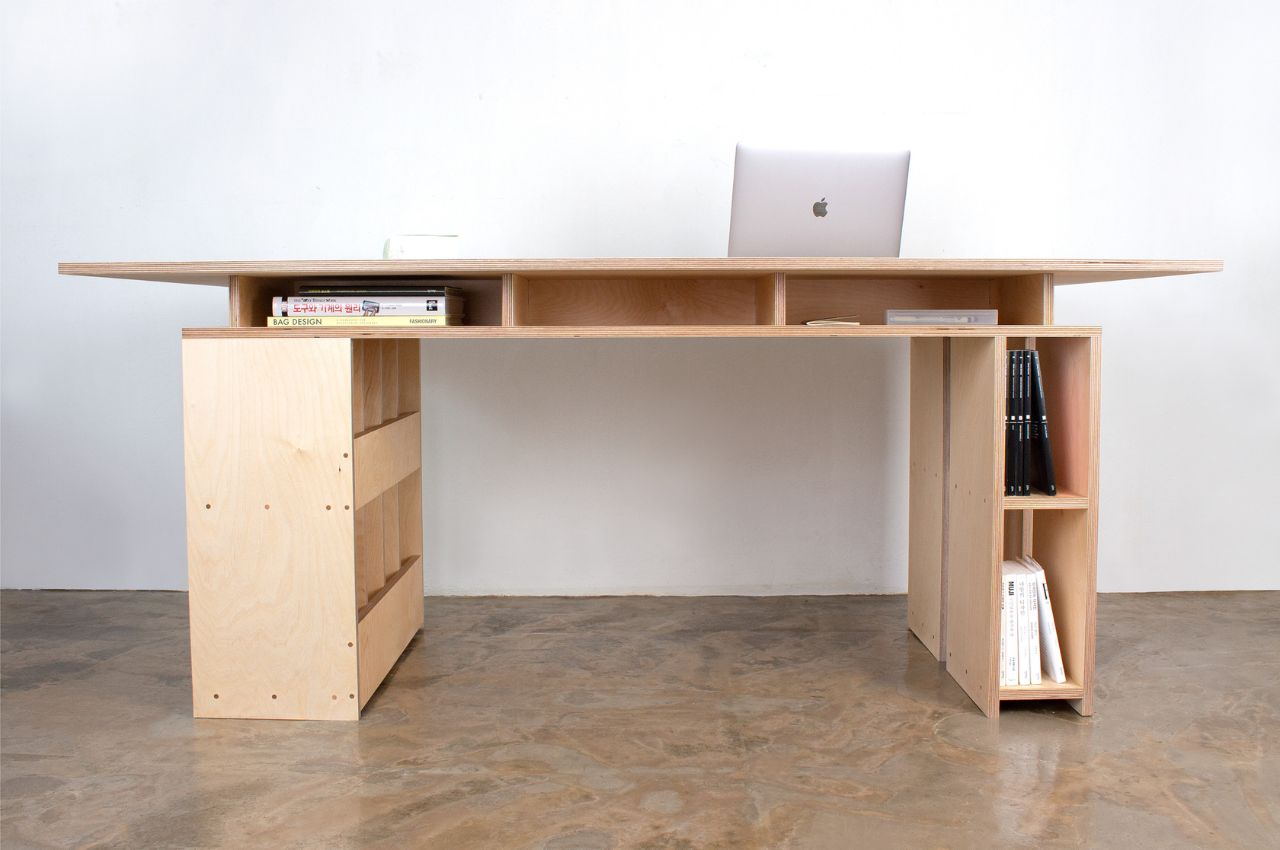
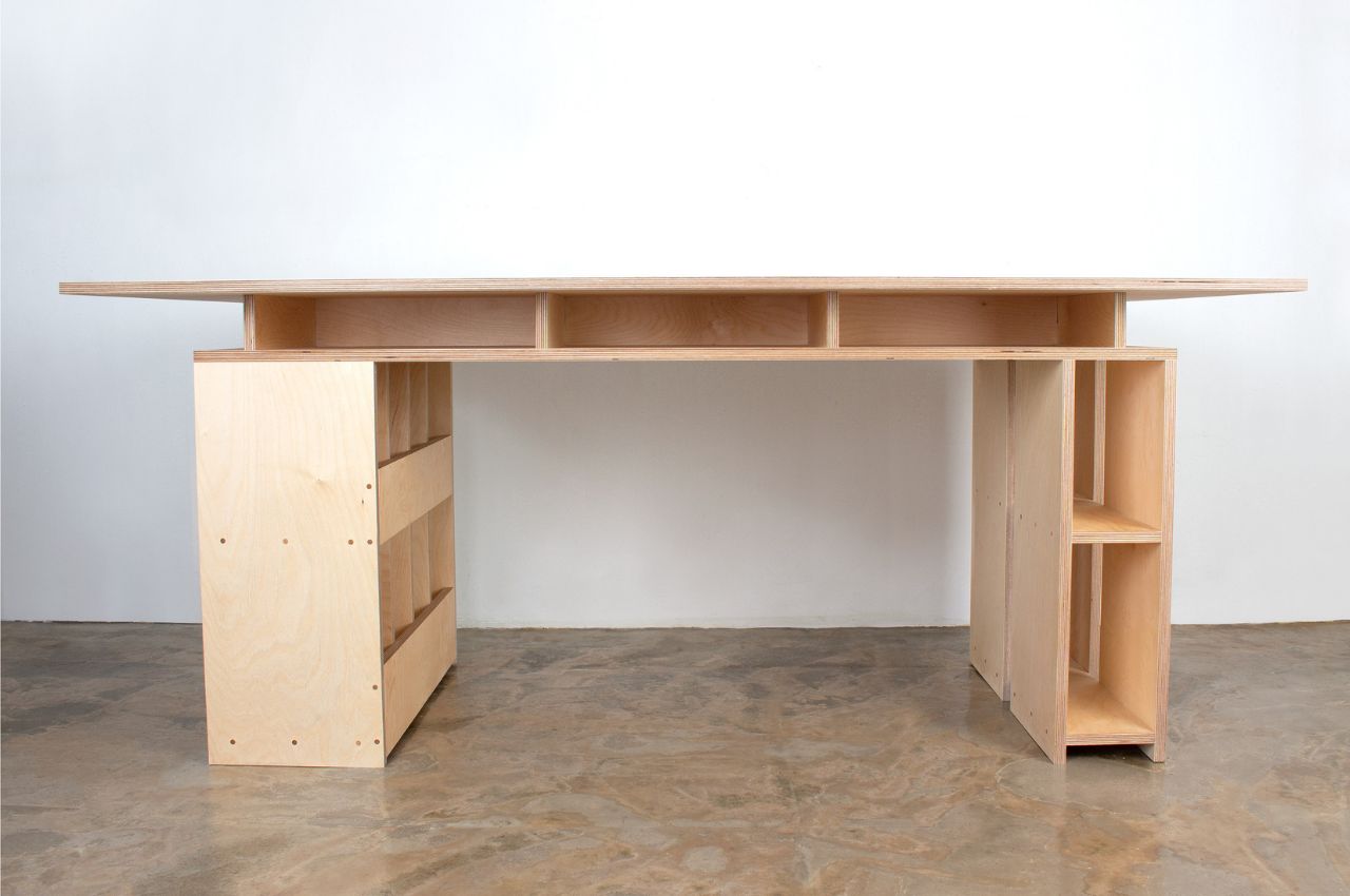
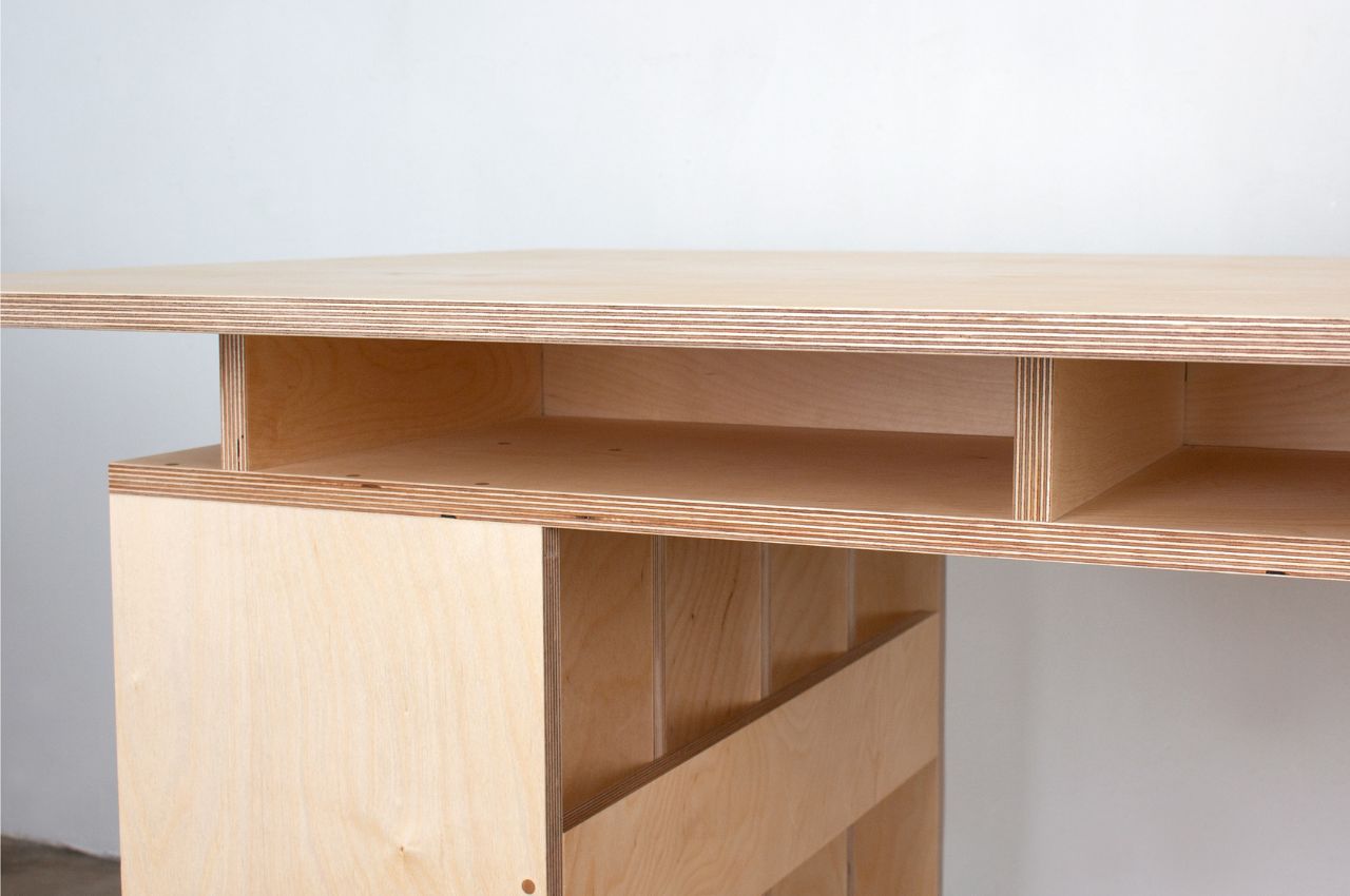
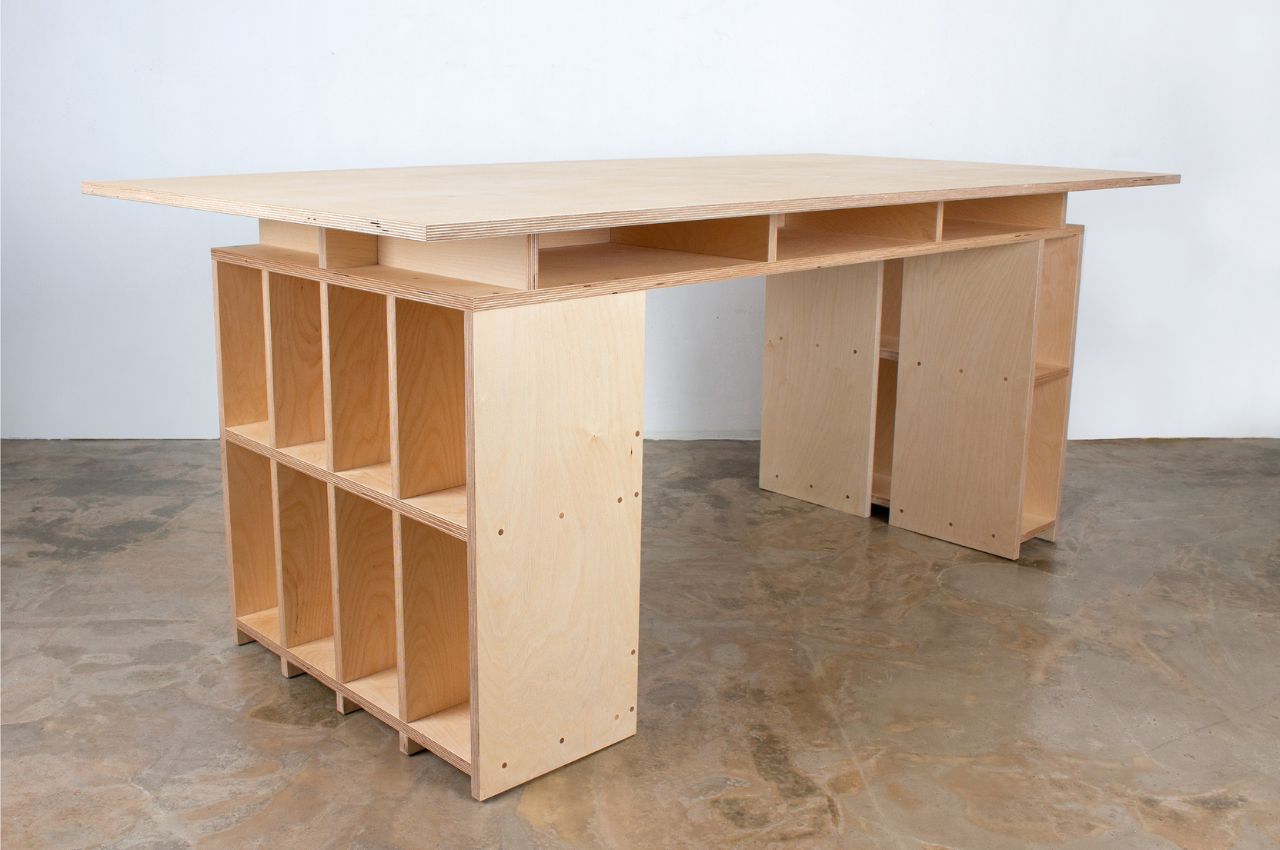
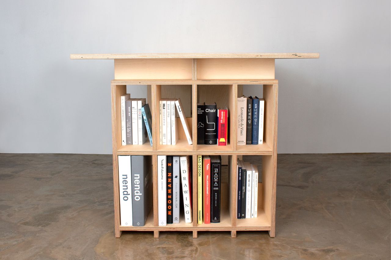
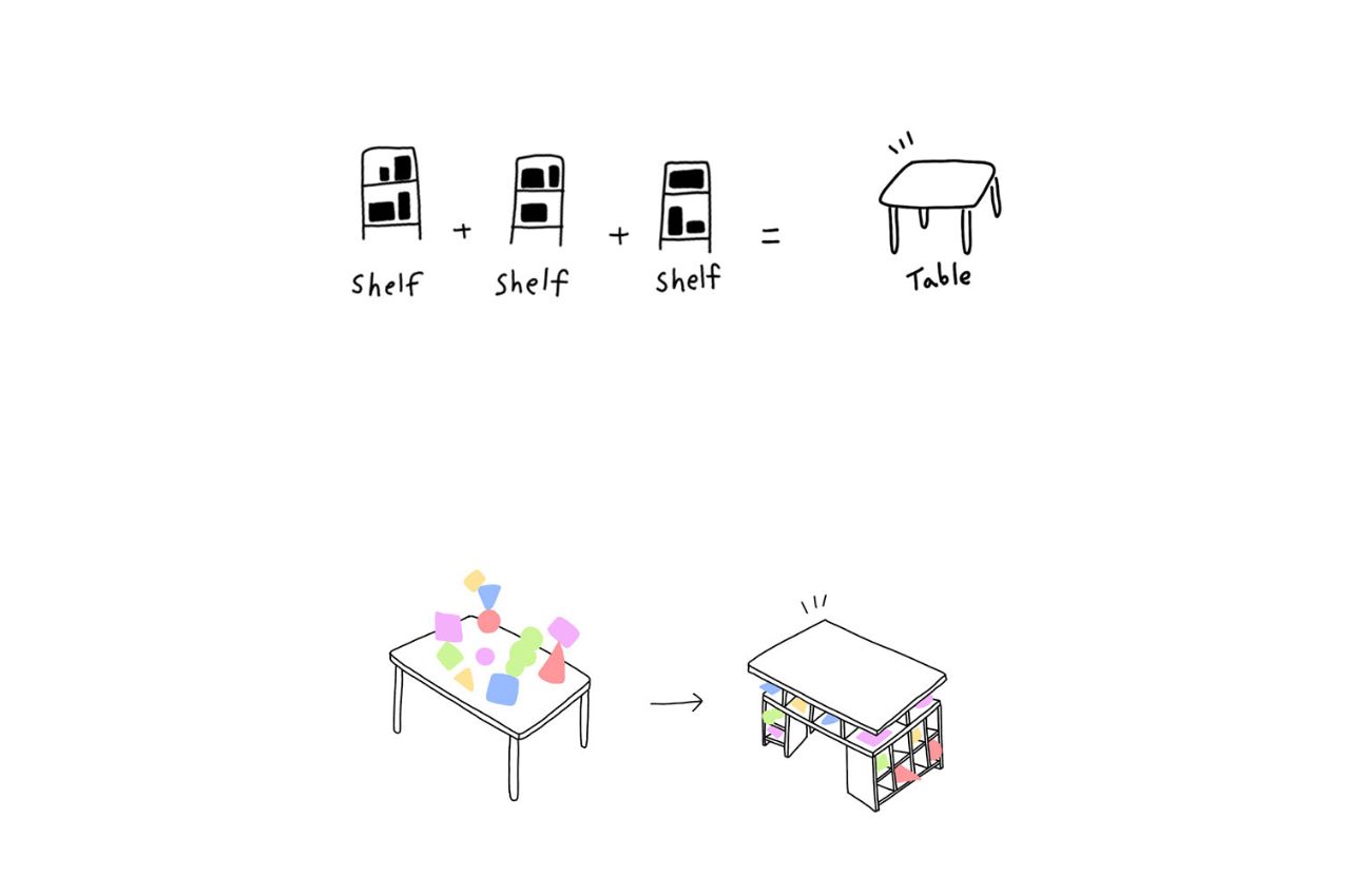
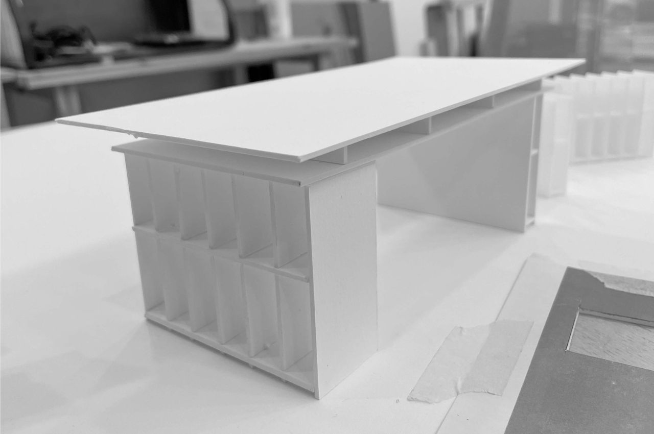
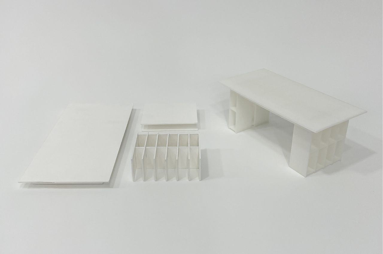
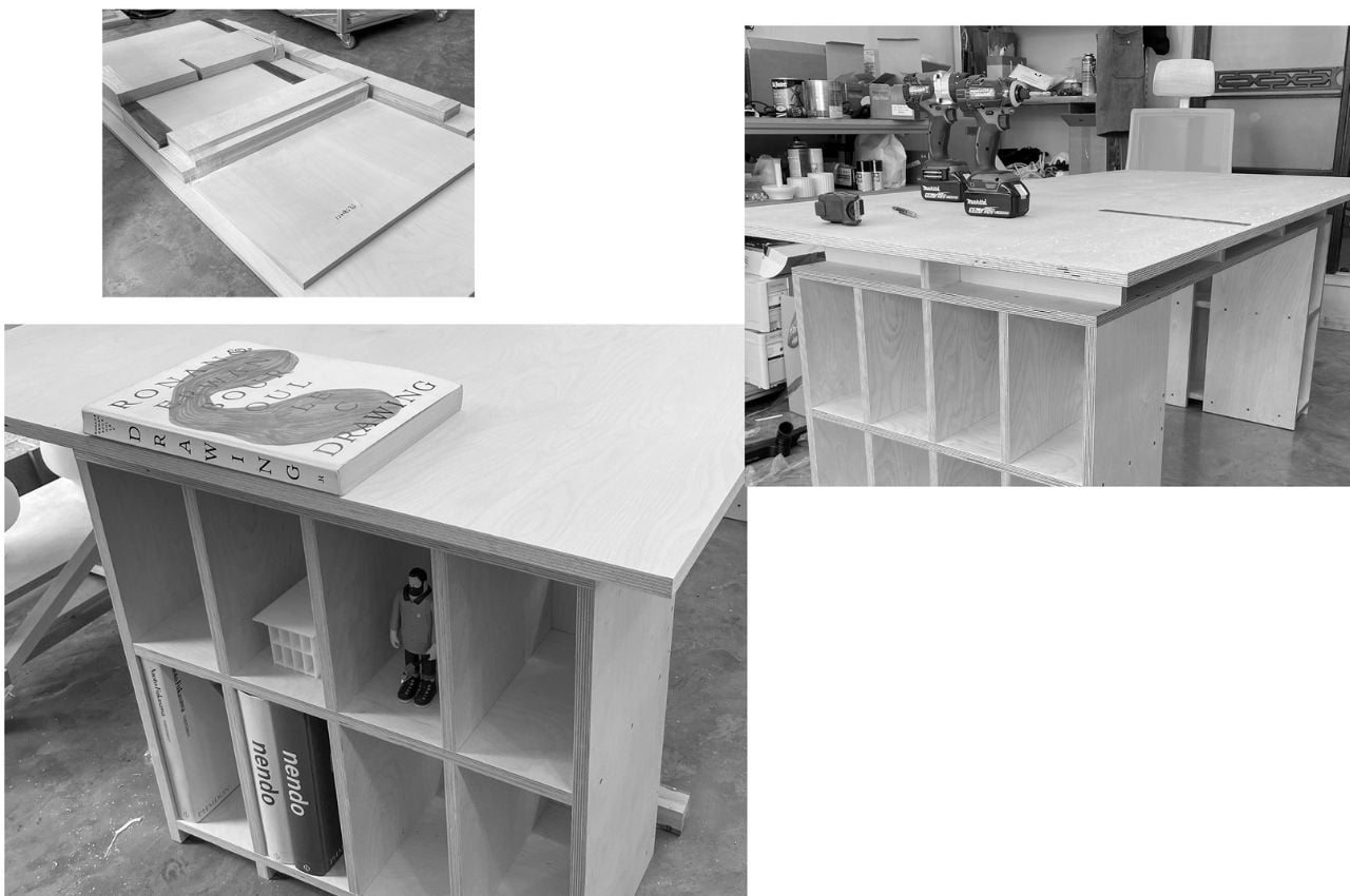
The Shelf x Shelf x Self table is both a table to work on and storage furniture as it was designed to have plenty of shelves. Underneath the table surface are tiny shelves where you can put your work supplies so they’re within easy reach. And if you place it in the middle of the room or not propped against the wall, you’ll be able to use all sides of the table to store your supplies, stationery items, devices, and other items you may need as you work.

The legs of the table are also designed to be shelves so there’s more room for storage. Here you can put things like books, decorative items, funko pops, vinyl albums, flowers, even food that won’t spoil. It really depends on you what you want to put in there, whether you want the shelves to be design-focused or if you want them to be more functional and have items near you without having to get up every once in a while while you’re working.

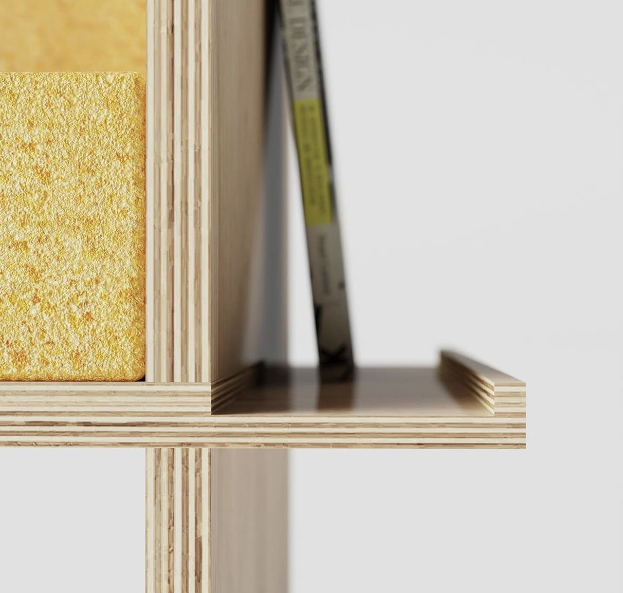
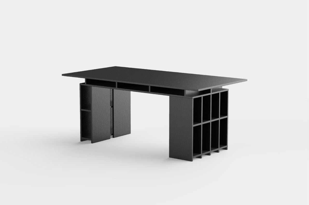
The Shelf x Shelf x Self table is made from white birch plywood and uses an oil finish. The renders show a more wood-like finish although if your aesthetic is more white or dark, that can also probably be done. It’s a pretty big piece of furniture, especially if you want to maximize the entire table for all its storage spaces. If you don’t want to use the table top for working, it can also be used as a storage and display area. This is actually perfect for me that has a lot of stuff, except that I may not have enough space in my place to fit this in with its 900x1800x755 dimensions.

The post This table also serves as storage for your working and display needs first appeared on Yanko Design.