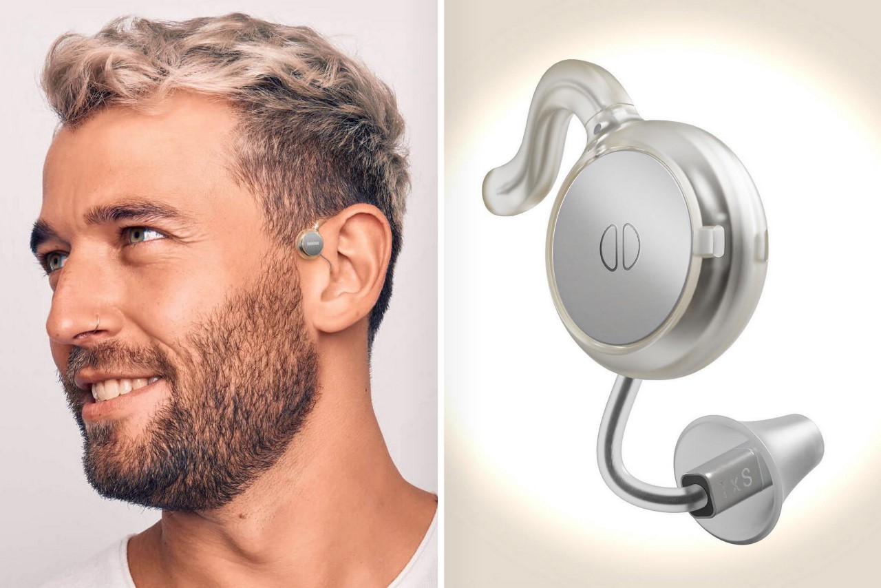
This hearing aid’s sleek redesign turns the medical device into a fashion wearable

“Medical devices don’t need to feel like a burden. Glasses are cool, so why can’t hearing aids be too?”

The spectacles are a stellar example of a medically corrective device that’s successfully transitioned into being an object of haute fashion. The pandemic saw a similar treatment to N95 face masks too, but for the most part, medical devices aren’t designed to ‘look good’. They’re either designed to be invisible (like those invisible braces that keep popping up in Instagram’s ads), or have such a medical-forward design that they actually end up deterring people. Nobody likes showing off their asthma inhaler or nebulizer, and people would much rather prefer a stylish walking stick over a pair of crutches.

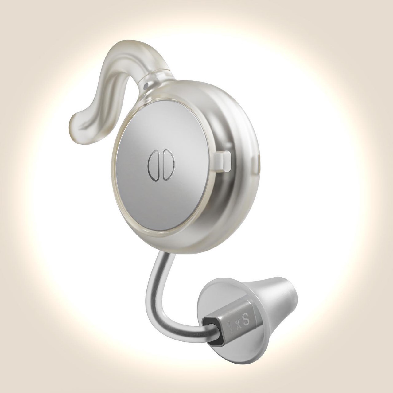
Hearing aids fall within that domain too, with most people agreeing that they have a design that can attract unwanted attention or sympathy, even though the people wearing them would just like to live a normal lifestyle. Designed to look modern rather than medical, the Overtone hearing aids are just about as stylish as high-fashion TWS earbuds. They sit comfortably around your ear, with a minimal design that features a small ear clip and a metallic disc that looks almost like a Neuralink implant.

Designers: Nick Morgan-Jones and Gray Dawdy (Overtone)
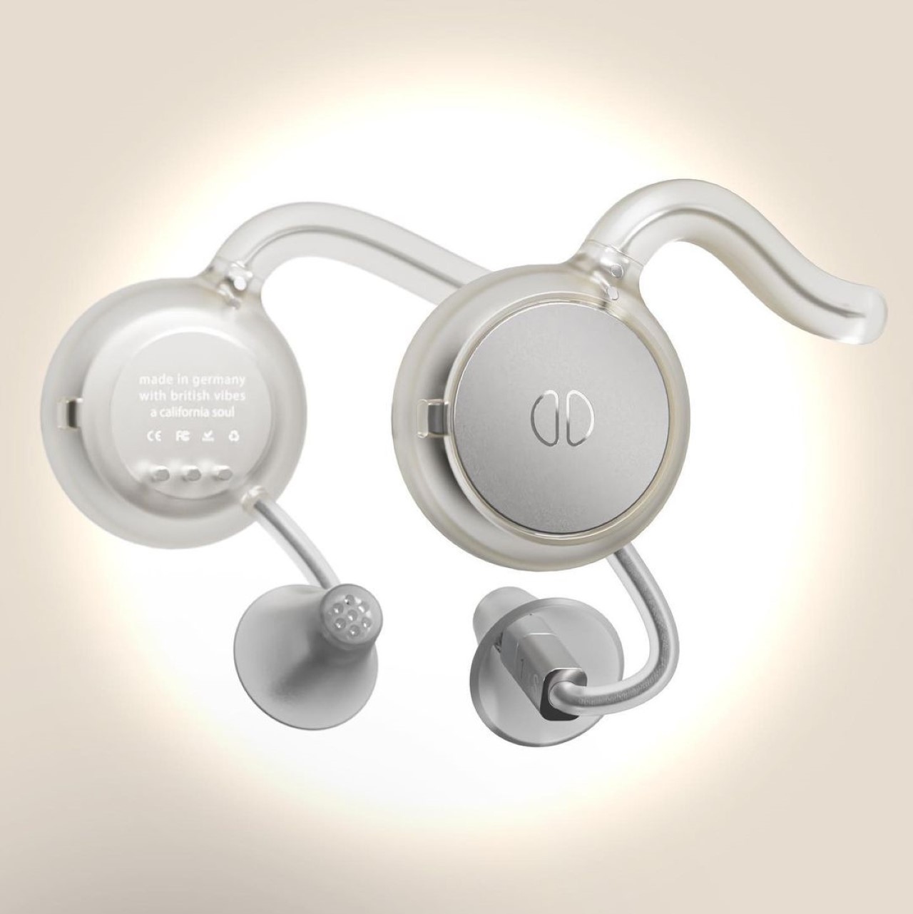
The Bluetooth-enabled hearing aids work to enhance your listening powers while being ‘unapologetically visible’. The individual earpieces hook to each ear, and pair with your smartphone to let you set up your hearing profile. Once configured, the Overtone earpieces let you clearly listen to sounds around you, while Bluetooth connectivity allows you to take calls or listen to music/watch videos through the earpieces themselves.
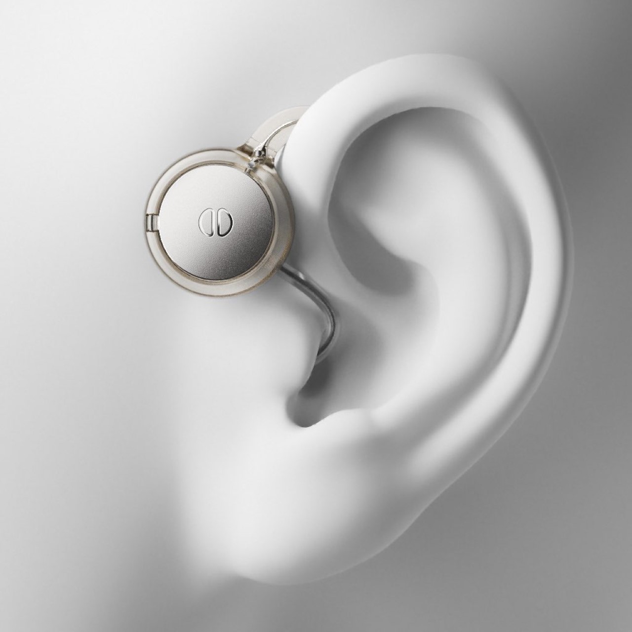

The Overtone was created by Berlin-based designers Nick Morgan-Jones and Gray Dawdy, who wanted to uplift hearing aids to a new fashion standard. “We’re building the hearing equivalent of designer eyewear,” said Morgan-Jones. To that very end, the Overtone has a design that feels minimal and universal. The transparent material and stainless steel details borrow directly from eyewear, while the overall design is made to augment your appearance by making you look like you’re from the future.


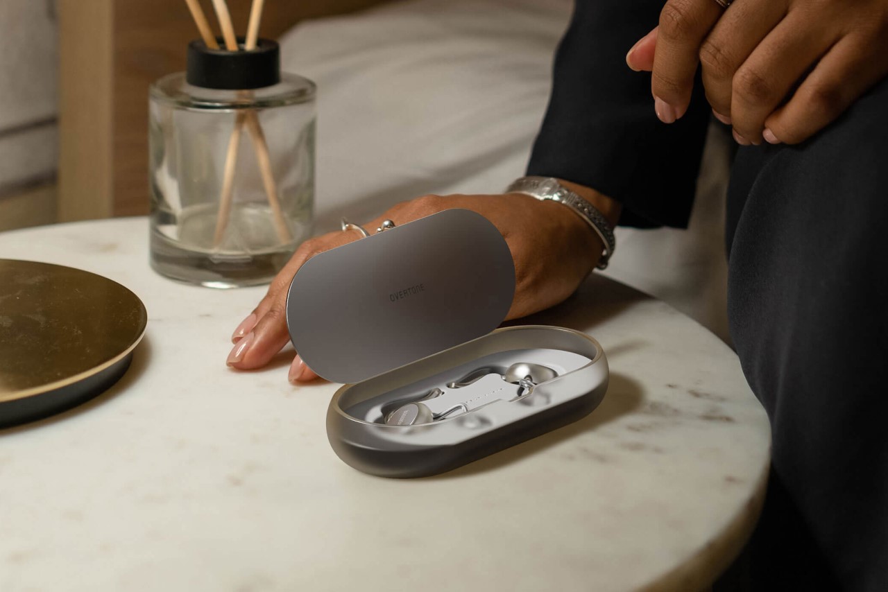
The Overtone is currently under development, with a waitlist open for people looking to buy their own pair of hearing wearables. The devices come with a 24-hr battery life on a full charge, and ship with a charging case that gives them an additional 36 hours of use.
The post This hearing aid’s sleek redesign turns the medical device into a fashion wearable first appeared on Yanko Design.
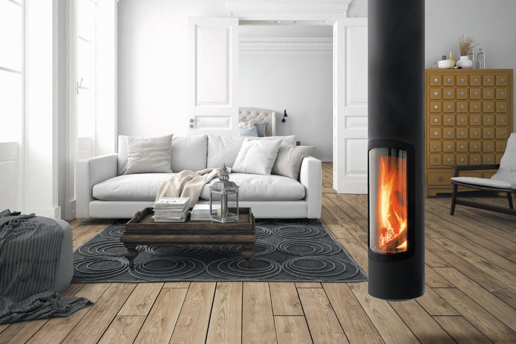
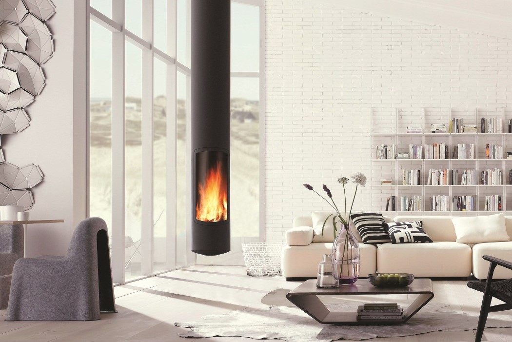
This sleek cylindrical fireplace suspends from the ceiling, giving your interiors a modern upgrade


It’s like if Scandinavian Design met Super Mario.

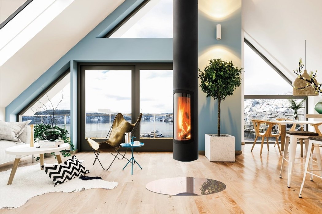
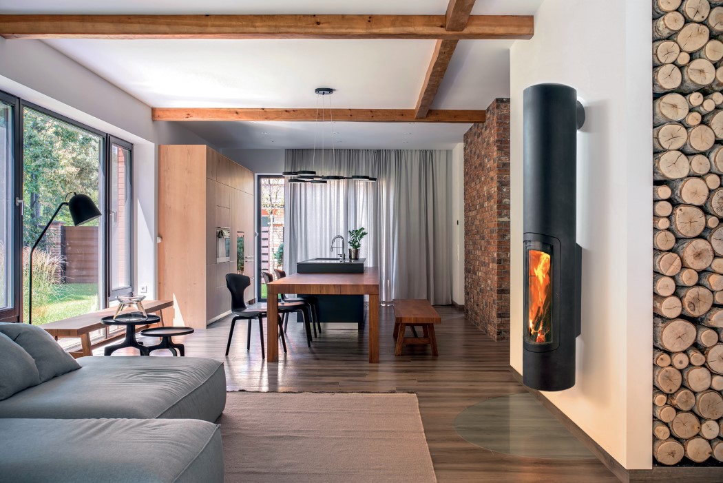
Fireplaces have traditionally always been the epicenter of a room’s decor, with furniture and objects placed in relation to it (armchairs facing it, portraits and trophies hanging above and around it). However, over the past few years, they’ve been gradually replaced by ugly, utilitarian radiators that usually hide behind couches or curtains. In a bid to give fireplaces a modern makeover, French manufacturer Focus has introduced the Slimfocus, an incredibly sleek cylindrical fireplace that can either be wall or ceiling-mounted indoors. Despite its minimal design, the Slimfocus has an incredibly captivating allure, almost like a chandelier that makes its way from the ceiling to the floor. The all-black fireplace comes with a transparent glass window that opens to let you access the fire-pit, and when closed, gives you a beautiful view of the dancing flames, as the thermal energy makes its way up the cylindrical shaft and radiates into the house.

Slimfocus Slim Modern Fireplace for Indoors

A winner of the German Design Award as well as the Interior Innovation Award, the Slimfocus’ black periscope-like design provides a brilliant contrast to virtually any interior. Its matte black paint helps it efficiently absorb and radiate thermal heat from the fire, supporting both wood and gas as fuel.

The fireplace can be hung from the ceiling, wall-mounted, or attached to the floor using a baseplate. The ceiling-hung variant of the Slimfocus is made-to-measure depending on the interiors and placement, and can be suspended via either a fixed or pivoting fixture. Compatible with low-energy buildings, Slimfocus draws in air for combustion through the smoke evacuation flue (balanced flue system). It can be installed in traditional homes too, drawing in air from the room (open flue system).

Slimfocus Slim Modern Fireplace for Indoors

Slimfocus Slim Modern Fireplace for Indoors

Designed to take up less space yet create a massive impact, the Slimfocus assumes a very commanding presence no matter which area of the room it’s located in. The closed fireplace immediately becomes a point of attraction, creating a pivot around which furniture can be oriented, and conversations can be had!

Designer: Focus Fireplaces

Slimfocus Slim Modern Fireplace for Indoors

Slimfocus Slim Modern Fireplace for Indoors

Slimfocus Slim Modern Fireplace for Indoors

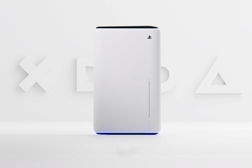
What if the PlayStation 5 was designed by Microsoft instead of Sony?

While I’m firmly of the opinion that the PlayStation 5 has a much more alluring design than the Xbox Series X, I can understand why some find the geometric, boxy design of the Xbox more soothing. It’s traditional, bordering on no-nonsense, and the straight lines seem like the logical decision in today’s hyper minimalist world where almost all of our gadgets are rectangular. Although, as boxy and straightforward as the Xbox Series X is, it’s just not a PlayStation… right?

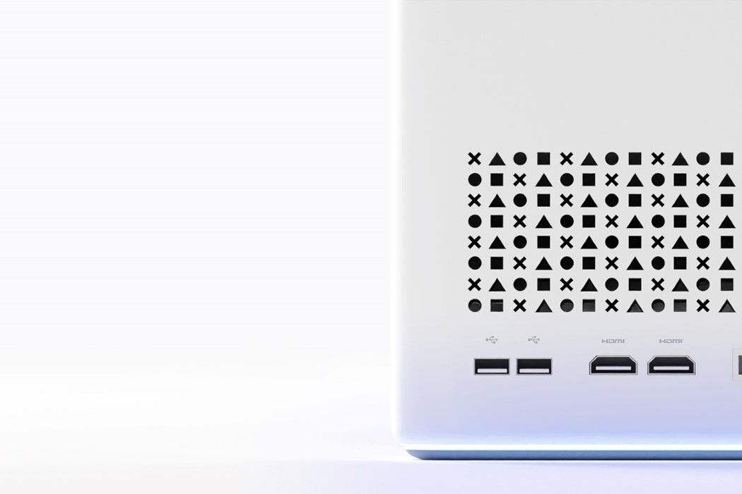
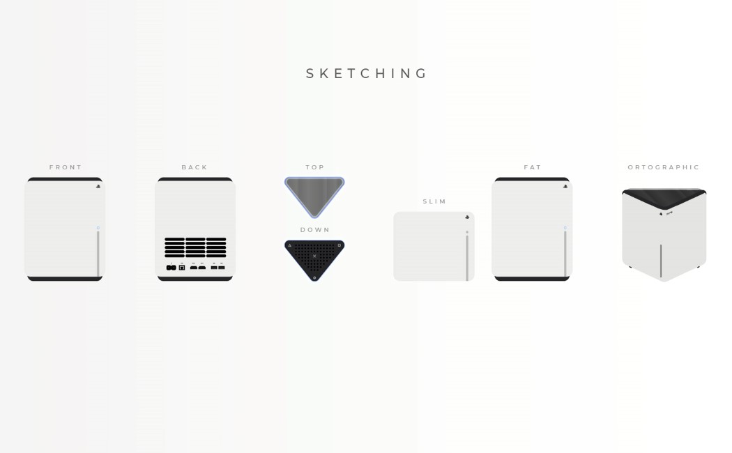
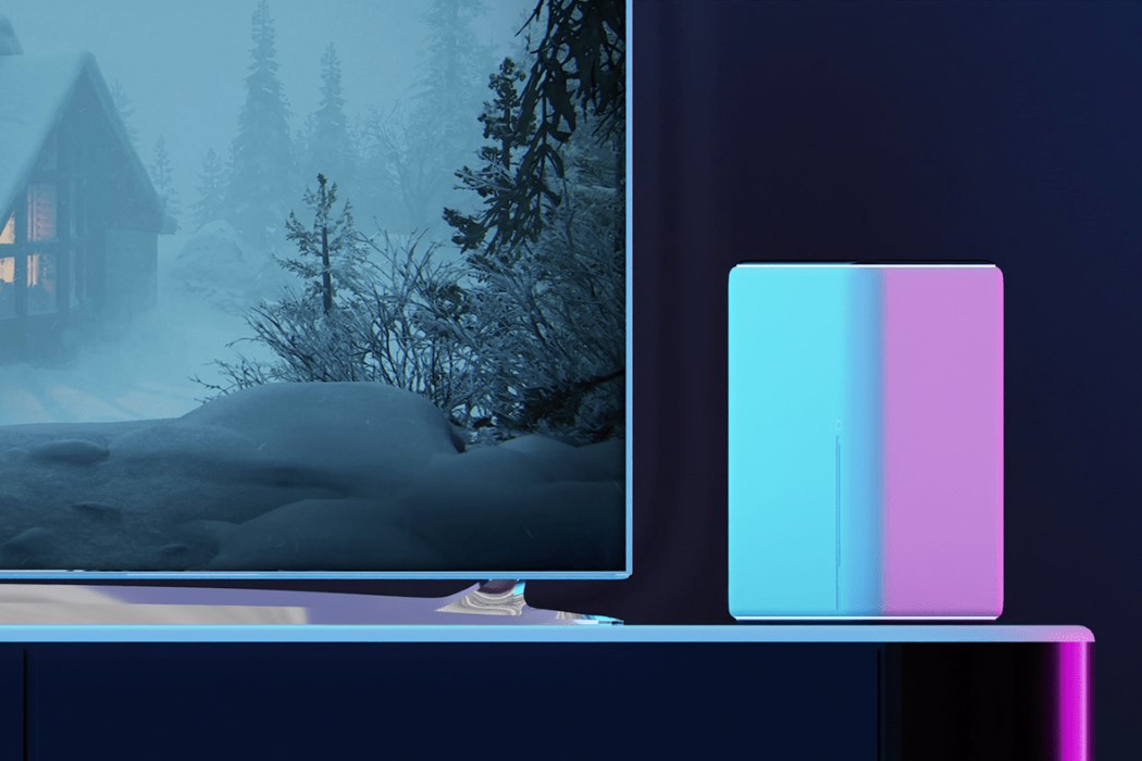
If you’re a PlayStation enthusiast who finds themselves ‘questioning’ the console’s organic design, Ismail Mits has a compromise for you. His PlayStation 5 concept features a geometric design that feels like a well-calibrated blend between the styles of Sony and Microsoft. The conceptual console is shaped like an extruded right-angled triangle. Its dynamic design lets you keep it any-which way on your table, and the triangular top plays in well with the triangular icon often used in the PlayStation visual assets. The ports are located on the wider face, while a neatly positioned slit on the front acts as the disc drive. The ‘boxy-yet-not-boxy’ PS5 concept sticks to the same Stormtrooper color palette of the original design, and even features the same blue lighting, albeit at the base of the device, allowing it to give the floor or your TV cabinet a nice wash of azure blue when the console powers on!

Designer: Ismail Mits

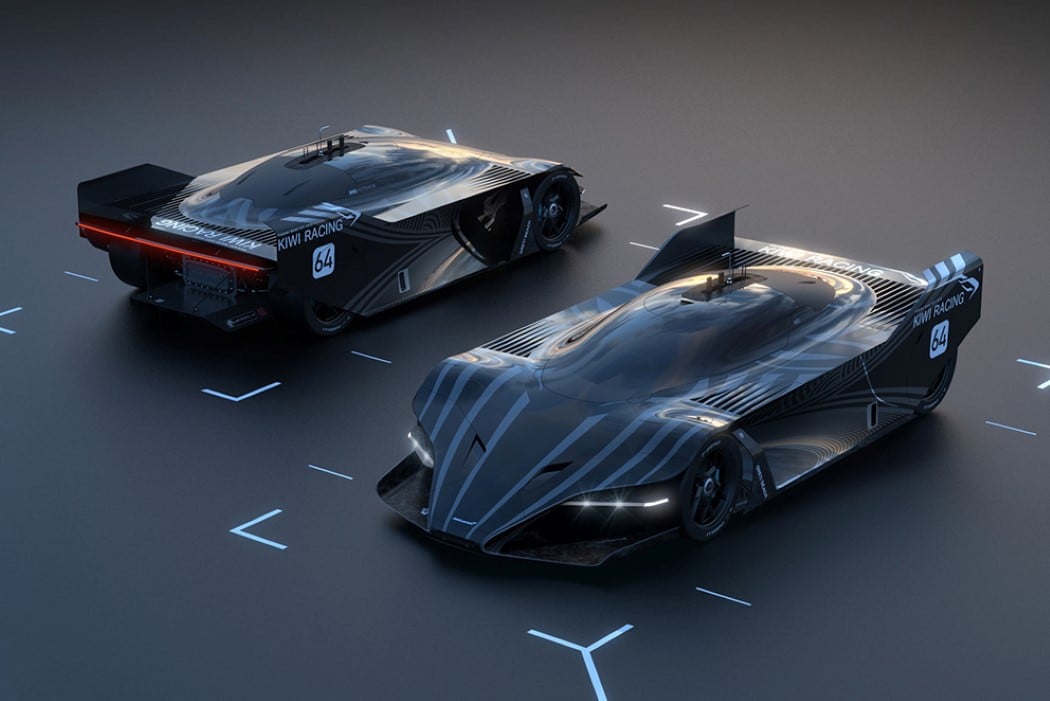
McLaren M8D Aotearoa Concept is a Maori-inspired lean, mean, racing machine!

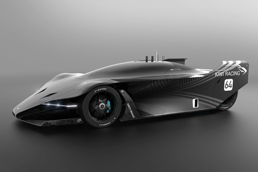
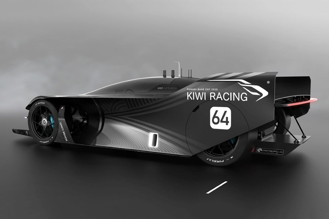
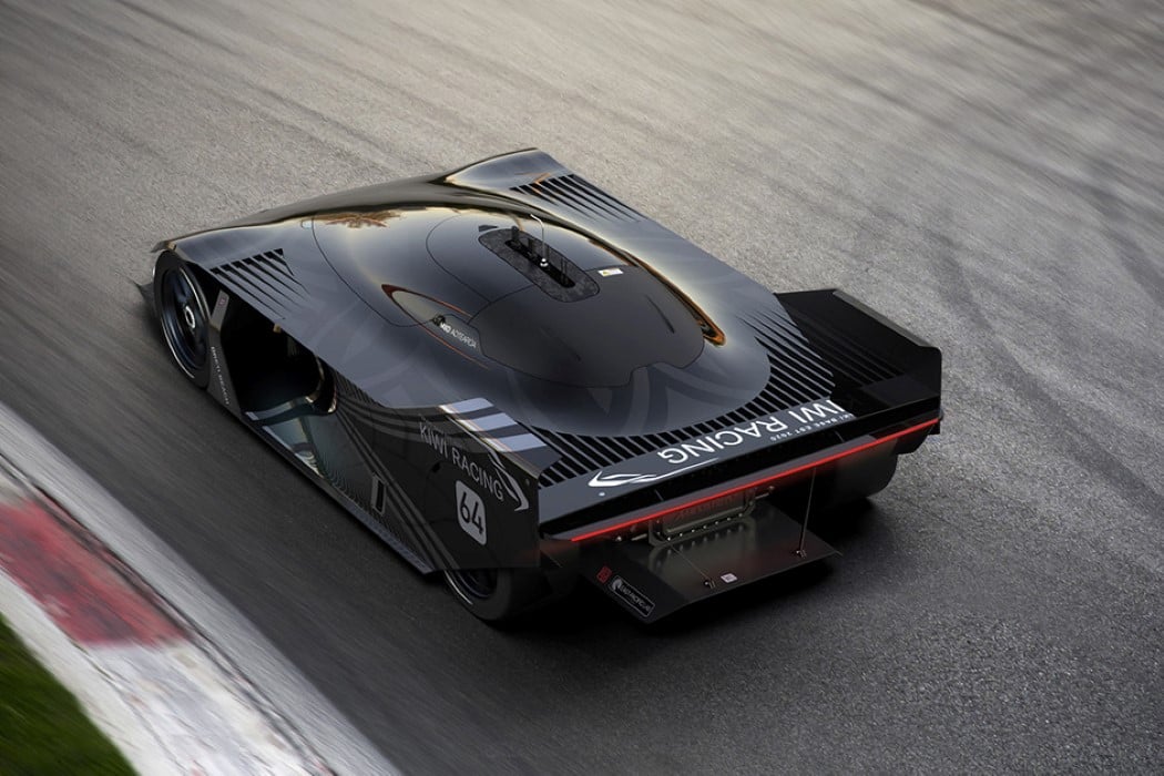
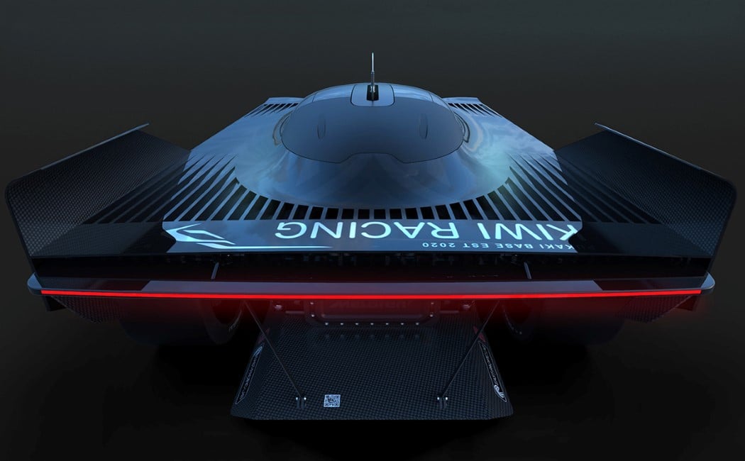
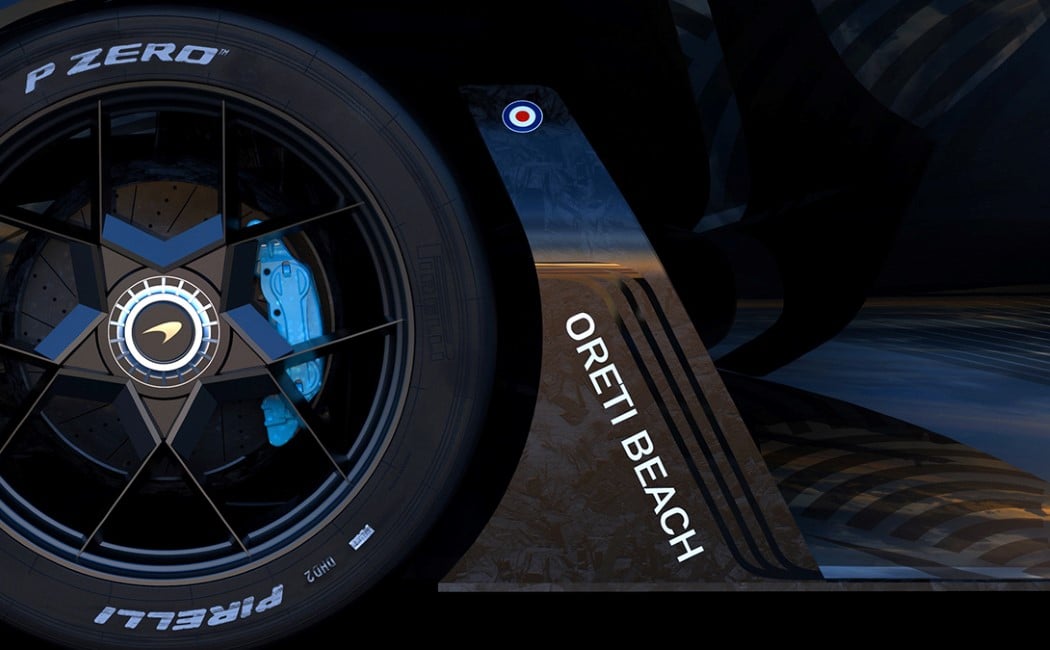
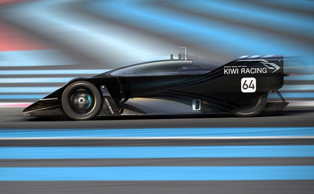
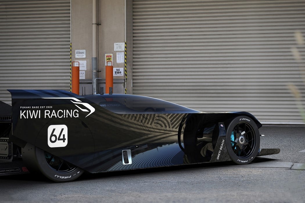
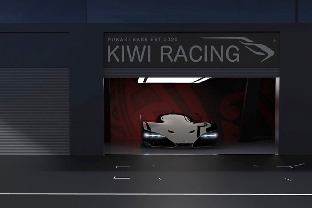
Look closely at the graphics on the side and you’ll immediately get the McLaren M8D Aotearoa’s source of inspiration. Named after the Maori term for the country of New Zealand, the Aotearoa is a Polynesian-themed racecar that combines sleek, aerodynamic forms with an allegiance to a fictional team called Kiwi Racing.

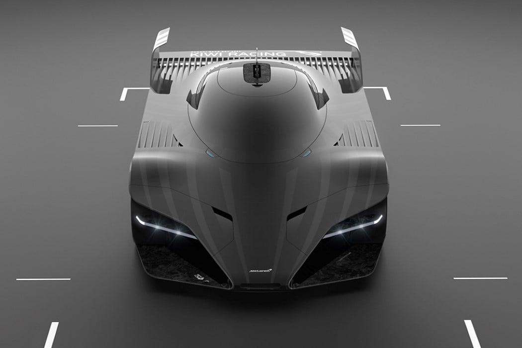
What immediately stands out with the Aotearoa concept is the way it adopts aspects of the Maori culture without being too obviously inspired. The car is both short and wide, giving it a much broader axle-track (space between left and right wheels) to resemble the stance of Maori warriors while they perform their Haka. That goes in line with the aggressive appeal of the car… the menacing headlights give the Aotearoa an instant warrior-like appeal and make it look menacing to its opponents. Its black paint-job is a hat-tip to the color of the sporting jerseys worn by the New Zealand teams, and the side even has a black-on-black Maori tattoo-inspired graphic with the words Kiwi Racing emblazoned near the rear-wheel.

The Mclaren M8D Aotearoa concept’s inspiration aside, it’s a pretty sweet looking racecar with a closed cockpit that merges beautifully into the rest of the body. The car carefully and cleverly balances the use of curves and straight lines, giving it a memorable front as well as side-view without openly compromising on aerodynamics. There’s ample room for airflow to minimize drag as the car races down the track, and even though its bodywork is mainly carbon-fiber, that dangerously low nose on the front and the spoiler on the back provide just the right amount of downforce to ensure that the McLaren M8D Aotearoa absolutely dominates on the track!

Designer: Yaro Yakovlev

The MINUS calculator explores extreme minimalism without sacrificing functionality

How much can you take away from something before you’ve taken away too much? The MINUS Calculator is a great example of a no-frills design that’s so incredibly simplistic, it seems like a monolithic slab of plastic, but it’s a sleek, minimal-yet-fully-functional calculator.

Making a product better isn’t always an additive process, it’s sometimes also subtractive. The MINUS calculator doesn’t come with buttons, color-coded keys, or even a screen for that matter. Everything manifests within the slick, monotone block that is the MINUS. The numbers are bas-relief molded into the calculator’s front panel, and a powerful LED screen shines through the panel’s translucent plastic. The only break in the calculator’s surface is in the top left corner, where the “=” button sits. The MINUS calculator also comes with a battery gauge built into its side, and a proprietary magnetic contact-pin charging port at its base that lets you snap the charger to it whenever it’s low on juice.

Designer: Telekes Design

The Rolls-Royce Apparition concept is a sleek, obsidian black, electric-powered beauty on wheels

Luxury vehicles have a new dark horse. Designed by LA-based automotive designer Julien Fesquet, the Rolls-Royce Apparition concept comes with a beautiful almost precious pebble-like exterior that takes the Sweptail and exaggerates everything we loved about it.

The Apparition is a long, lithe, elegant automotive artpiece with a visibly large wheel-to-body ratio. Its unusual proportions give it the appearance of a majestic panther, limbs outstretched, waiting to pounce on its prey, thanks to the incredibly lengthy hood/bonnet. The exaggerated hood angles ever so slightly at the end, resulting in a steeply raked windshield which covers the entire car in a bubble of tinted glass from front to back. The glass element finds itself on the front, cladding the area where one would normally expect Rolls-Royce’s long grilles – hinting at an electric drivetrain. The Spirit of Ecstasy emerges through the glass in glorious fashion, while chrome strips on either side separate the massive glass panel from the sides of the car.

The electric drivetrain, however, isn’t the only progressive element in the Rolls-Royce car’s design. The automobile even features digital rear-view mirrors along with equally razor-thin headlamps and taillights… and two spare tires, partially hidden by the front fenders in a gloriously modern reinterpretation of a common practice in Rolls-Royce’s earlier models! Fesquet created the Apparition as a personal project realized over a period of two weeks while at home during the lockdown. The Apparition “was the opportunity to improve my 3D and renders skills,” said Fesquet.

Designer: Julien Fesquet

Facebook just demonstrated what they claim is the world’s thinnest VR headset

Looking at this rudimentary prototype, one wouldn’t assume that a device so thin could be Facebook’s new stab at a consumer-grade VR headset. The company only recently announced it would be terminating sales and support of Oculus Go, its affordable VR headset… and that left a pretty obvious void in Oculus’s catalog of products. The creative minds sitting in Facebook’s Reality Labs (FRL), however, have been working on making VR headsets less clunky/bulky, and more like something you’d want to carry around and wear at work or at home.

Demonstrated at this year’s virtual SIGGRAPH conference, Facebook Reality Lab’s latest prototype VR wearable is, to mildly put it, ridiculously thin, measuring at just around 9mm. Designed to look like a pair of wayfarers, these glasses actually hold display units inside them, and Facebook’s research in viewing optics technology has helped them condense the headset from something that feels like a toaster strapped to your face, to a pair of frames that look like a pretty slick pair of shades.

So how is this even possible? How did Facebook manage to shrink a state-of-the-art headset into something that’s 9mm thick? Well, FB’s research blog’s been kind enough to release a GIF that shows exactly how the spectacles create the illusion of distance between the eyes and the display. It’s sort of similar to how binoculars work, in which mirrors are used to make a beam of light take a longer path within a small chamber. FB’s prototype headset, however, doesn’t use mirrors, but rather relies on a holographic lens. You see, a VR headset has three main components – a source of light (e.g., LEDs), a display panel that brightens or dims the light to form an image (e.g., an LCD panel), and a viewing optic that focuses the image far enough away so that the viewer’s eyes can see it (e.g., a plastic lens). LED and LCD panels can easily be compressed into slim modules that are paper-thin, but the trick has always been to make lenses thinner, and to reduce the large gap between the lens and the image. The prototype headset’s revolutionary holographic lens achieves this impossible feat by not just being thin, but by also creating the illusion of distance in a way that feels like the screen, that’s literally right in front of you, is a couple of feet away (there’s a demo GIF below too). This headset, for now, exists only in a prototype stage as the guys at Facebook’s Reality Labs try to work out the kinks in the design, from creating LED/LCD panels that are high-resolution and eye-strain-free, to accommodating other components like chipsets and batteries into the headset’s slim design.

“While it points toward the future development of lightweight, comfortable, and high-performance AR/VR technology, at present our work is purely research. In our technical paper, we identify the current limitations of our proposed display architecture and discuss future areas of research that will make the approach more practical. To our knowledge, our work demonstrates the thinnest VR display demonstrated to date, and we’re excited to see what the future holds”, say the guys at FRL.

Designer: Facebook Reality Labs

The ultra-minimal Zooz Concept 1 is an e-motorcycle that looks like nothing we’ve seen before

The Concept 1 from Zooz shatters the very perception of what a motorcycle should look like. Designed with the appearance of the skeleton of an e-bike, the Concept 1 feels like someone took a motorcycle and Marie Kondo’d the heck out of it… but within it sits a powerful 72-volt QS Motor, a controller, and under-slung battery pack jammed with Samsung 35E cells that allows the Concept 1 to travel at speeds of 60mph while weighing a mere 85lbs.

The Concept 1 is literally a design hybrid, with a front, seat, and back styled to look like a motorcycle and wheels to match… but with the most bare-basics metal-piping frame in the middle. “The purpose is to challenge the thinking of the audience,” says Zooz co-founder Chris Zahner. “It’s a bit of a poke in the eye, to force you to consider something new. The amazing thing about electric bikes is how simple they are. Motors, heat exchangers, exhaust systems and gas tanks are requisite masses on combustion motorcycles. But the electric motorcycle can leave a whole lot more room for interpretation, by minimizing the number of elements necessary.”

The result is a two-wheeler that is, on paper, an electric motorcycle… but visually challenges the very notion of what an electric motorcycle’s design language should be. For Zooz, the Concept 1 is just a one-off prototype that was designed to work as a proof-of-concept. Now that Zahner knows that it’s possible to create something so ground-breakingly minimal, he hits at more viable, consumer-ready models in the pipeline… although I’m not sure that the world is ready for something this deceptively thin and game-changing! What do you think?!

Designer: Zooz

The Novus Electric Motorbike redefines the term ‘sleek’

novus_electric_motorcycle_layout

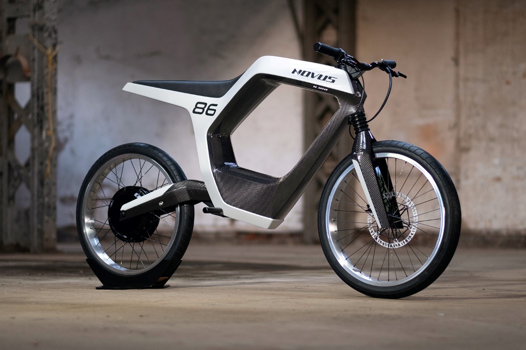
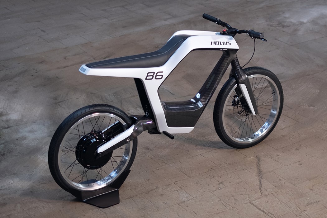
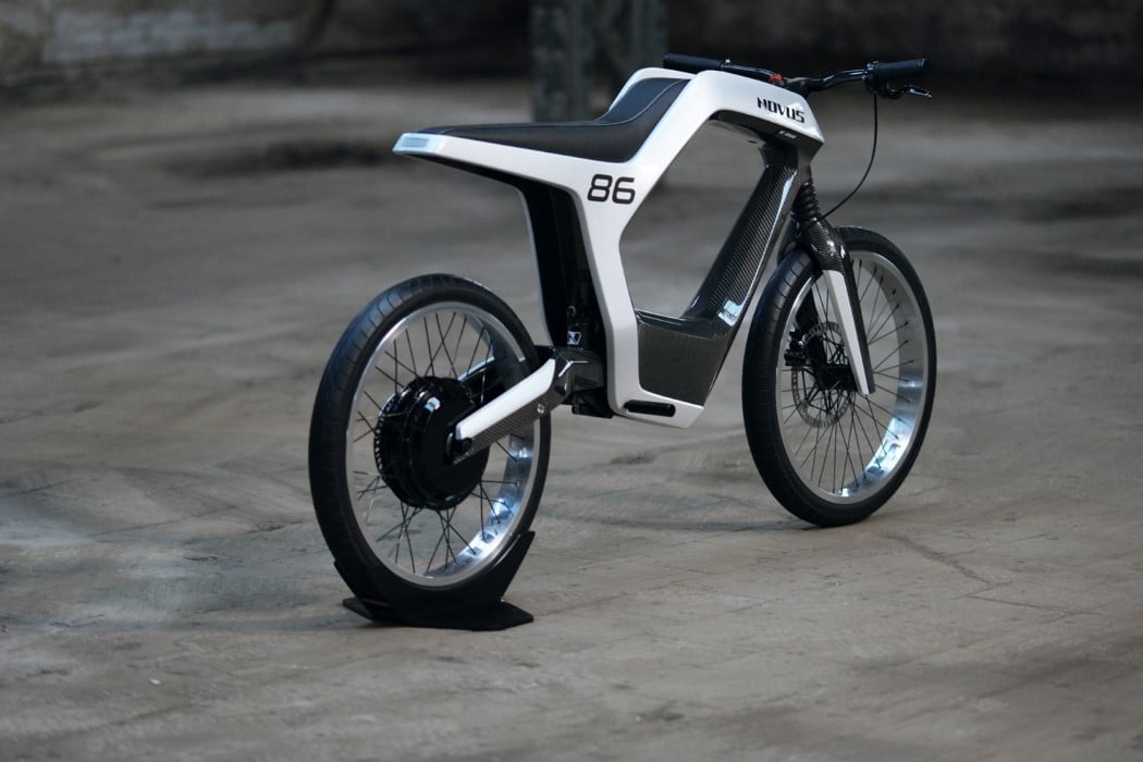
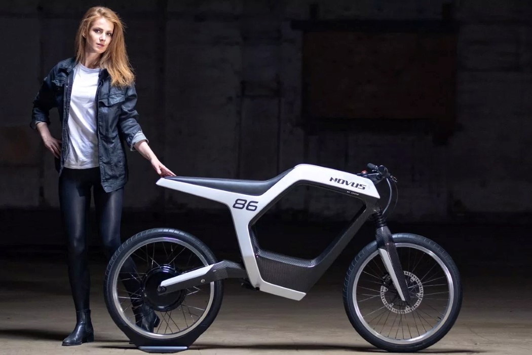
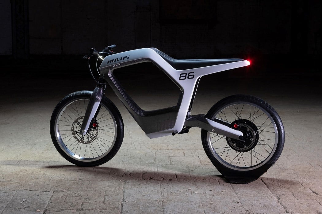
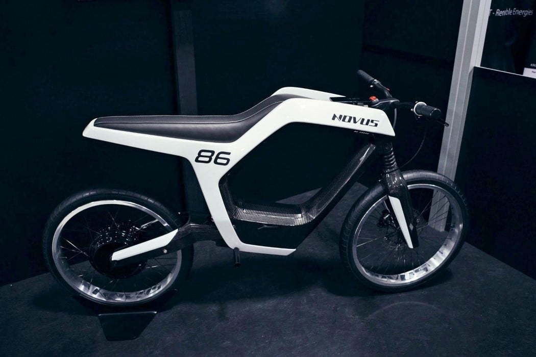
One’s general perception of a motorbike is usually of two wheels, a headlamp, a large fuel tank behind it and an engine below the tank. There’s also a seat, a taillight, and while we’re on the subject of general perception, a chain. Shift to an e-motorcycle and some of those components may adapt to the change in technology. The fuel tank is replaced by a battery, and the motorcycle’s form gets revisited to make it look ‘electric’, but all in all, it still looks like a motorcycle. The Novus e-motorcycle, however, turns things up a notch. For starters, it looks virtually skeletal, with its sleek, hollowed out design.

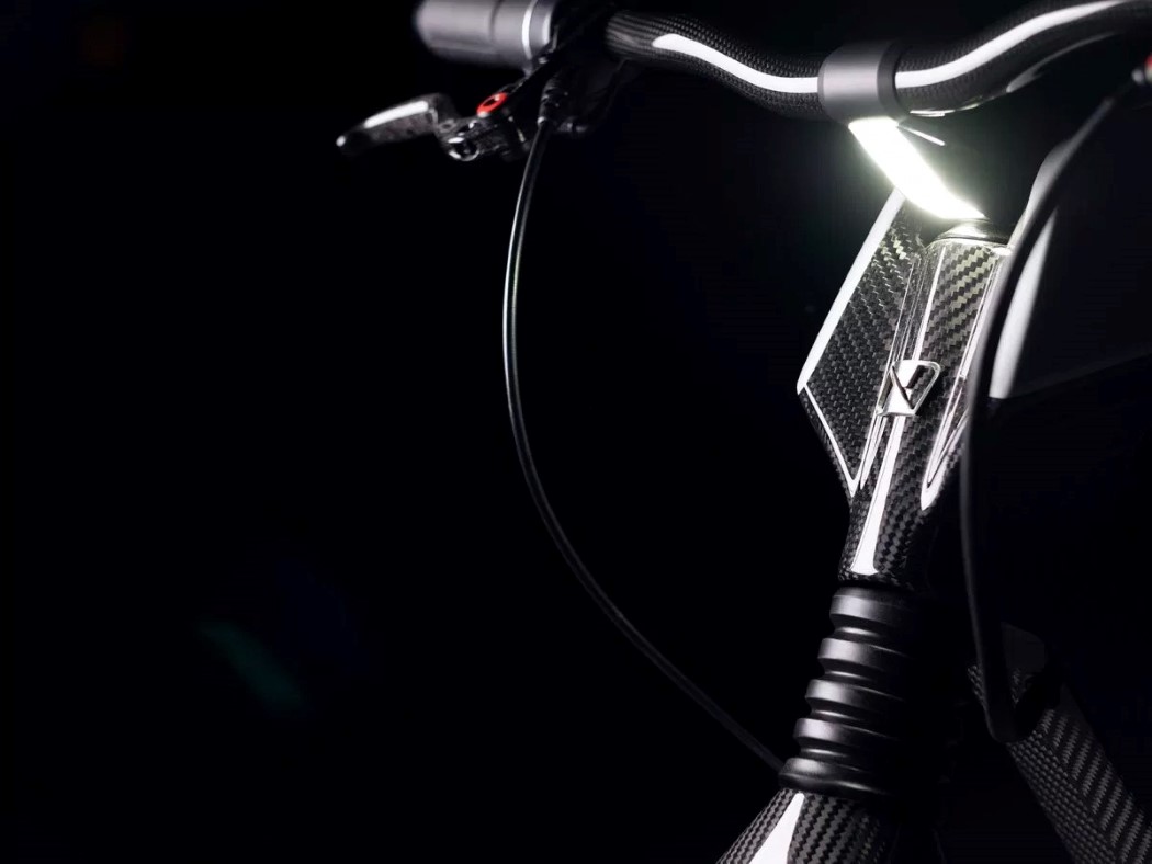
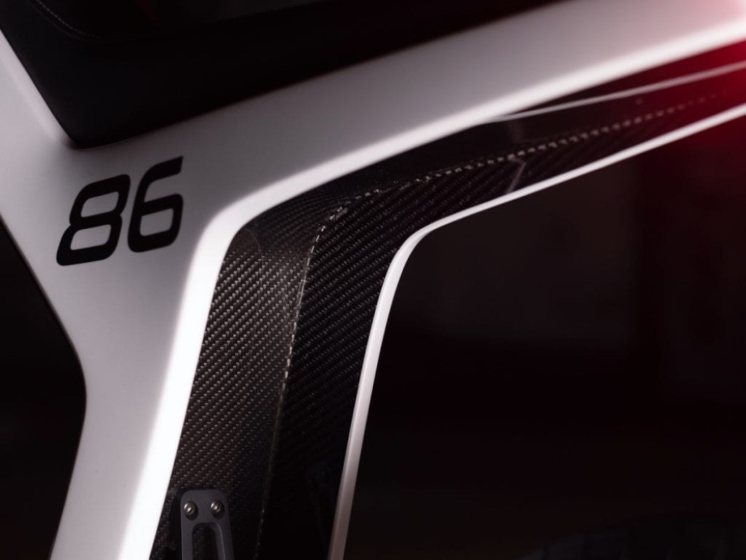
Minimal, and extremely lightweight, the Novus e-motorcycle boasts of an incredibly sleek outline of a frame that houses everything within it, from the battery and motor, to the suspension, to even the headlight and taillight, which are built flush into the form of the motorcycle. Despite this gravity-defying form, the Novus comes with a top speed of 60 mph and a range of 60 miles on a full charge.

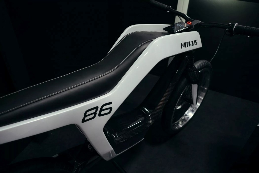
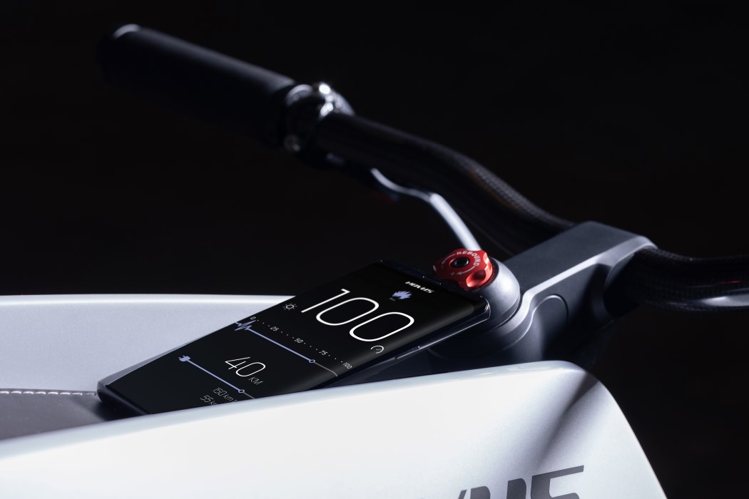
Built entirely by hand (a noteworthy feat in its own regard), the Novus comes with a hollowed out carbon fiber frame that integrates a battery into its lower half. The battery is connected to a 14kW brushless motor mounted on the hub of the rear wheel, which “produces a claimed 6.2kW (8.3bhp) and 200Nm (147ftlb) of torque”. Above its carbon fiber frame lies an incredibly long leather seat that extends from the taillight all the way till the front of the motorcycle. It ends on the front with an area to dock your smartphone which turns into the dashboard for the motorcycle, displaying all the necessary information from speed to battery level.

Showcased (and very well received) at CES 2019, the designers behind Novus are still working on refining the prototype and making it street legal. They plan on producing 1000 units of the Novus, although something so beautiful, minimal, pristine, yet powerful does come at a price. Something on the lines of $39,500 (plus VAT).

Designer: René Renger and Marcus Weidig (Novus)

novus_electric_motorcycle_1

novus_electric_motorcycle_2

novus_electric_motorcycle_3

novus_electric_motorcycle_4

novus_electric_motorcycle_5

novus_electric_motorcycle_6

novus_electric_motorcycle_9

novus_electric_motorcycle_7

novus_electric_motorcycle_8