The Nothing Robot Vacuum (1) brings transparent tech to Smart Homes, along with a Glyph Interface

If you think just about the Nothing.tech company ethos of bringing fun back to tech while still being design-driven and meaningful, that ethos can apply to pretty much any category of product. Sure, Nothing’s best known for their earbuds, phones, and even other accessories like the CMF Watch Pro… so here’s a proposition – what if we took Nothing’s ethos and brought it to other products that are a bit of a visual afterthought? The robot vacuum, for instance, is a fairly ‘boring’ looking product. Its job is literally to scuttle around the house cleaning up after your mess, so for the most part, its design is driven by function rather than expression. However, by bringing the robot vacuum under the Nothing design umbrella, Soo Hyun Lim and PDF HAUS have uplifted an otherwise dull-looking appliance into something that inherently feels more modern – because it borrows its design cues directly from Nothing’s modern-looking smartphones.

Designers: Soo Hyun Lim & PDF HAUS

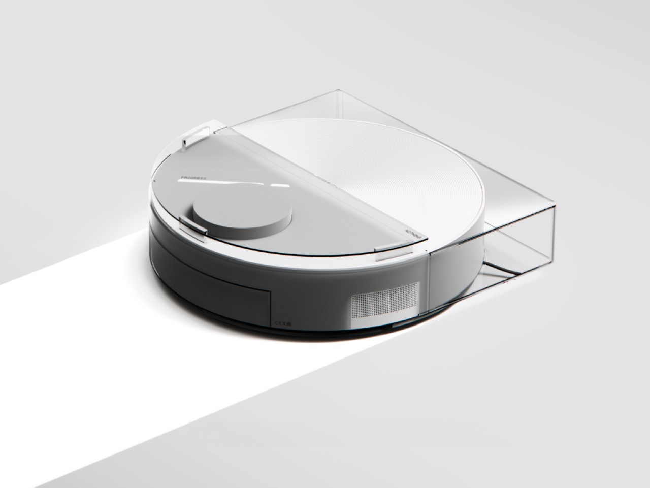
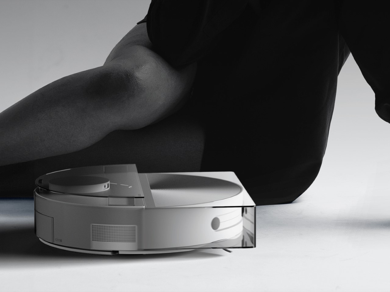
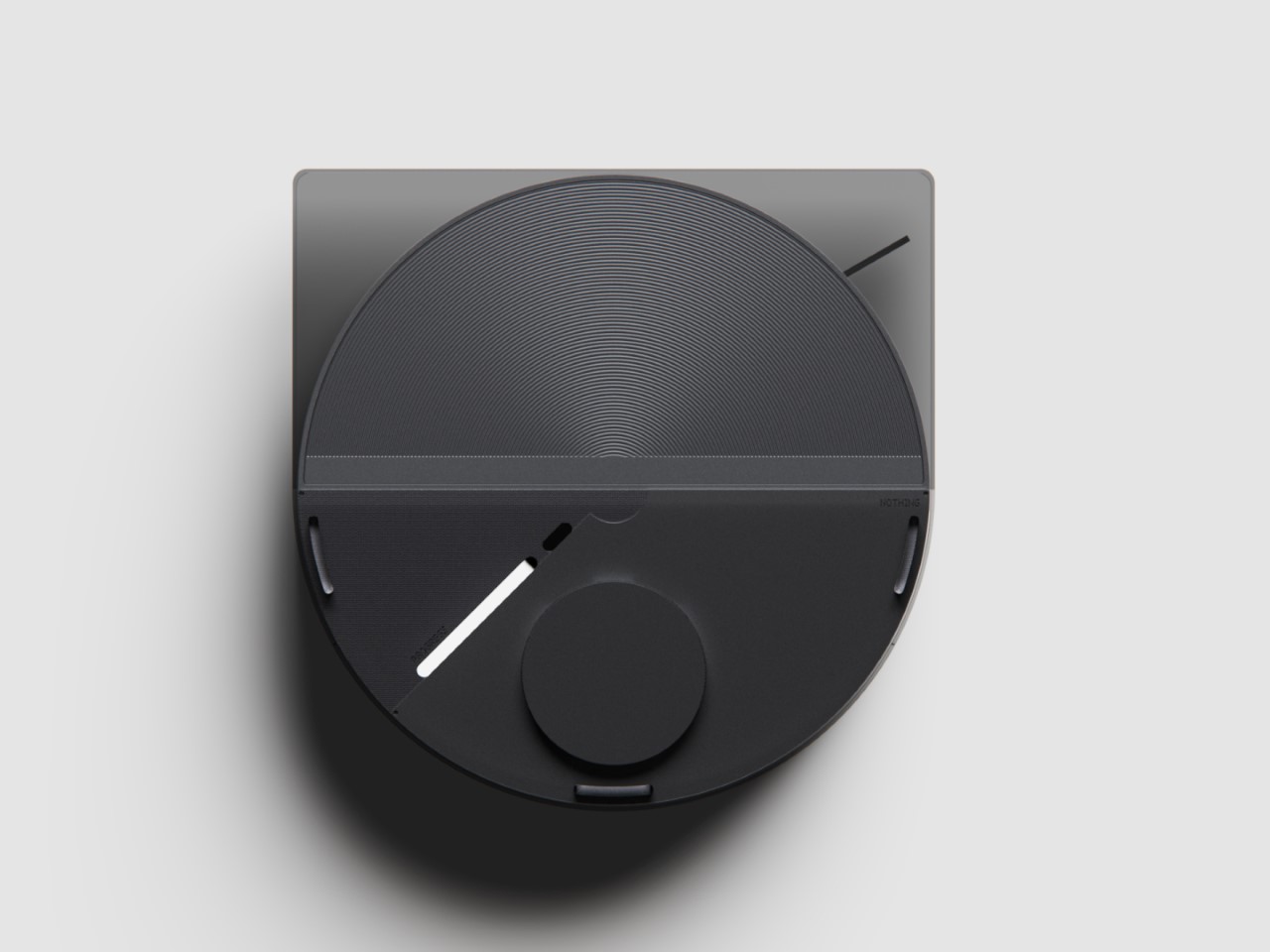
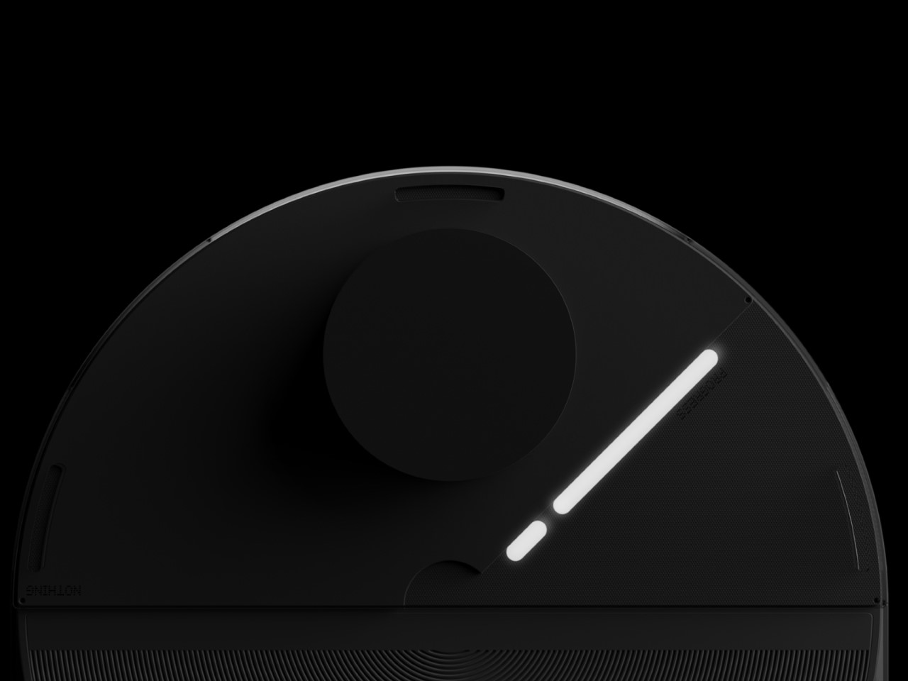
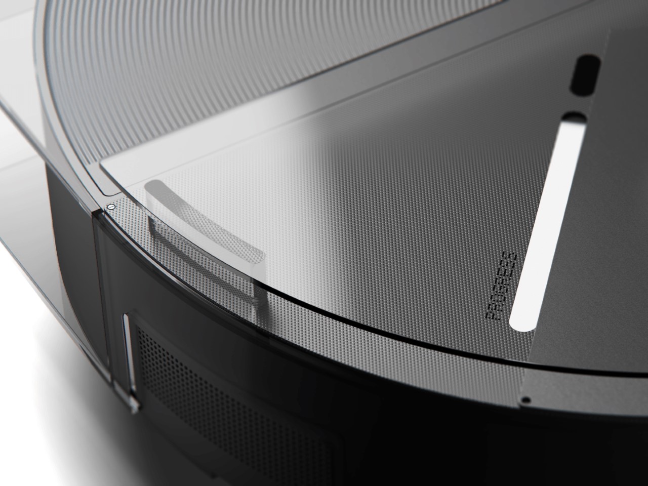
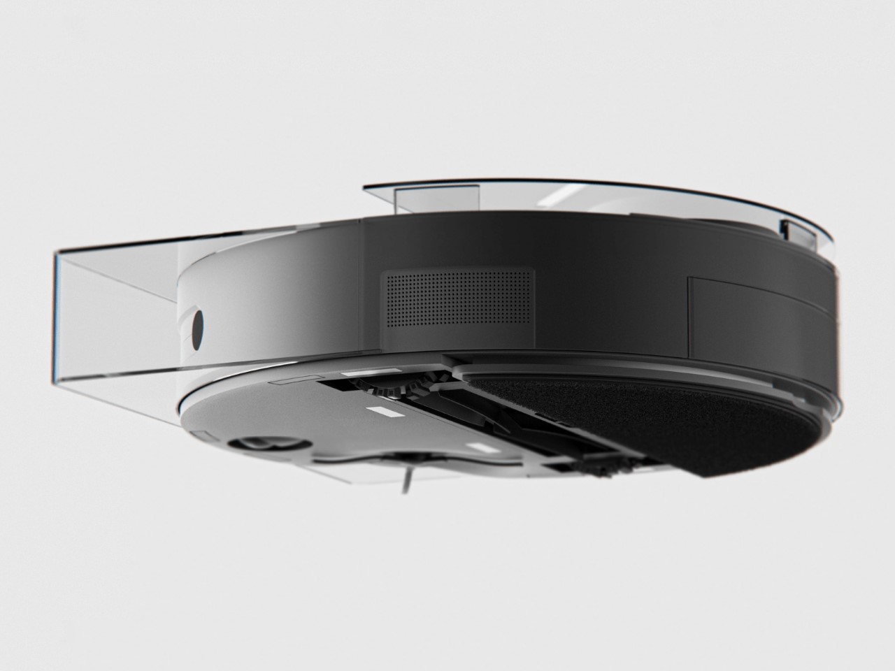
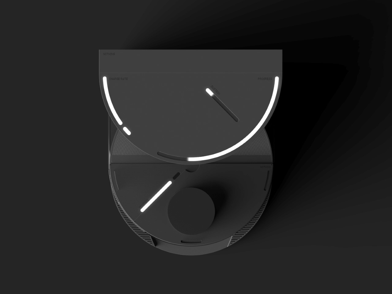
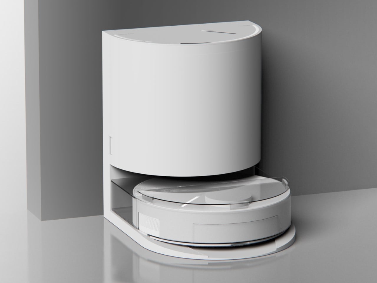
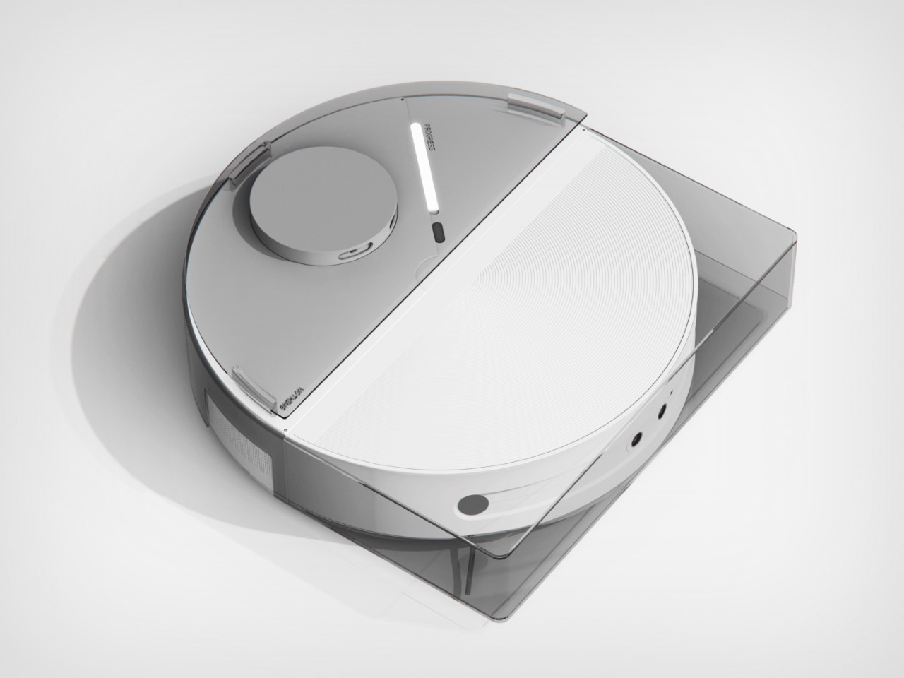
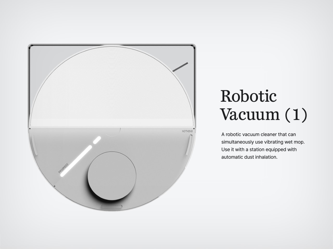
Meet the Nothing Robot Vacuum (1), a tongue-in-cheek fan-made concept that ports Nothing’s DNA onto a familiar product template. Most robot vacuums are the same shape and size, so how could you possibly make things interesting? Well, LEDs and transparent covers, of course! The Robot Vacuum (1) has a circular profile that’s then outfitted with a transparent D-shaped outer shell, giving it an almost ‘preserved in glass’ kind of look. Sensors are where they belong (on the front as well as on the top), and although you can’t entirely make a robot vacuum transparent, what with all the dust and dirt, Hyun Lim does something clever by bringing the Glyph Interface to the product. What does the interface do? Well, it acts as a progress bar that lets you know how much cleaning’s left. Similarly, Glyph lights on the vacuum’s docking station light up to indicate charging process as well as letting you know the fill-status on the station’s dustbin, so you know when to throw the trash out every week or so.

With the aesthetic appeal of a fancy turntable, the Nothing Robot Vacuum (1) highlights a kind of Bauhaus-meets-Scandinavian minimalism that companies like Bang&Olufsen have come to showcase so well with their products. The vacuum looks classy, not appliance-y, which is quite a win because of how menial its task actually is. I mean, sure some appliances have boring jobs, like thermostats and dehumidifiers, but that’s no reason they should look ‘boring’, right? Well, the Nothing Robot Vacuum (1) rejects that stereotype.

As far as the design goes, the vacuum comes in 3 colors – black, white, and grey. Just from a top view, you instantly recognize the Nothing design template. The Glyph Interface at the 7 o’clock position, the transparent elements along the body, and a radial pattern on the upper half of the circular top that sort of resembles the coils in the wireless charging zone on the smartphones. It’s simple, yet cleverly executed.

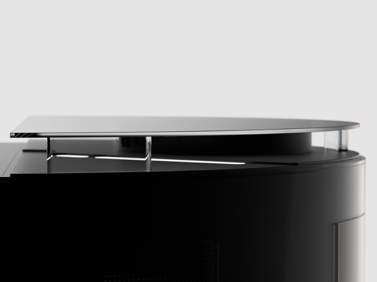
Just like with the phones, you’ve got microtextures galore, along with text screen-printed onto the transparent elements like the upper guard (that prevents the sensors on top from being damaged), and the front transparent bumper that helps the robot vacuum easily maneuver into corners. Moreover, Hyun Lim mentions that the vacuum is constructed from recycled plastic and aluminum, which seems like a nice sustainability touch that goes well with the ‘clean’ image of the vacuum cleaner.

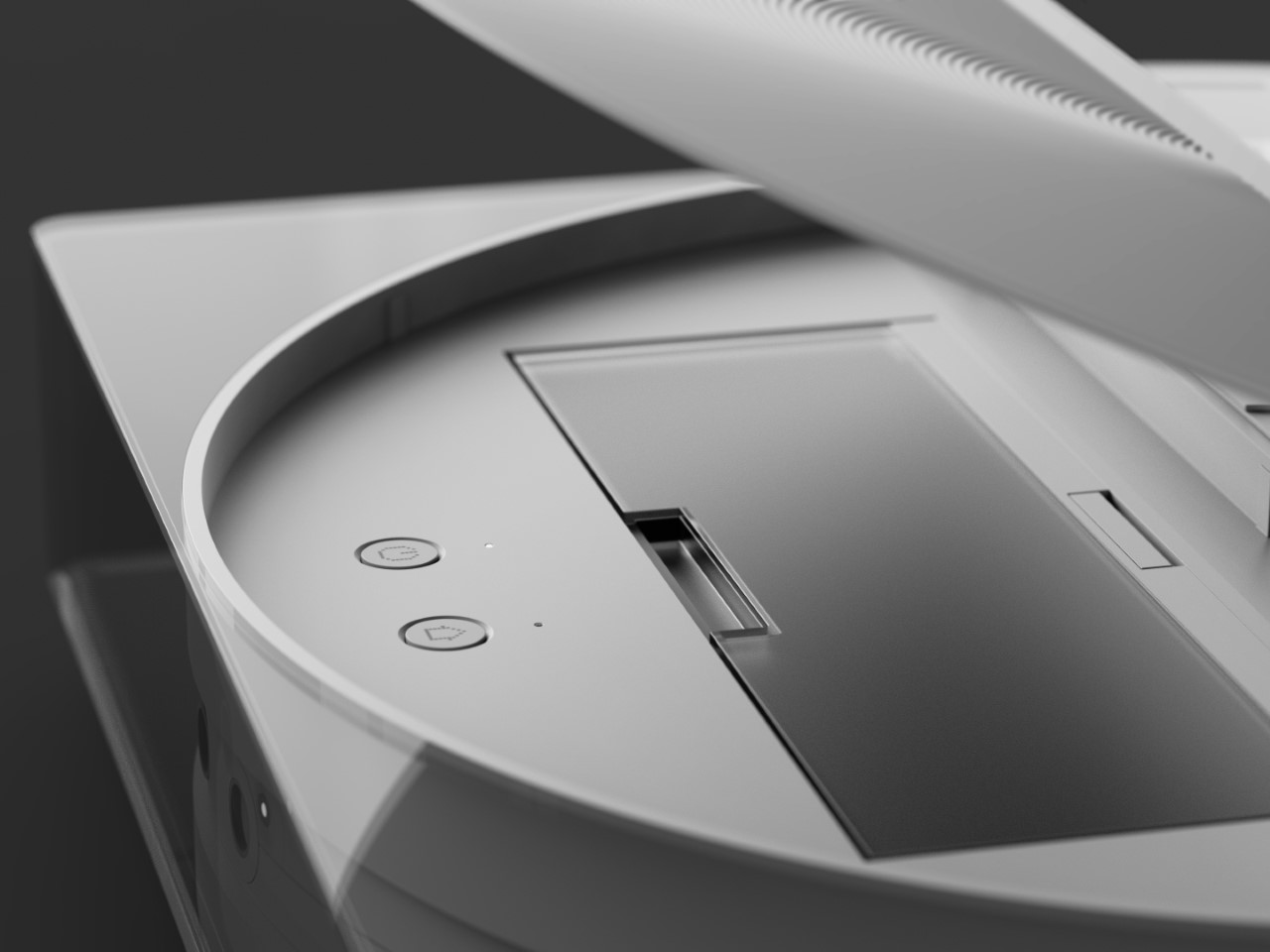
Although conceptual, Hyun Lim does give the robot vacuum a fair bit of detail. You’ve got a rotary broom on the front, along with a vibrating wet mop that helps get grease, grime, and other stains off your floor. The simple design is complemented by a simple UX – you can lift the lid to access the robot’s power button or open its water reservoir to replenish it between cleaning sessions. The sensors on the front and top help the vacuum navigate through the house, while an app on the phone gives you all the controls you need to set schedules, paths, no-go zones, and charging times. Plus, when the robot vacuum runs low on juice, it automatically goes and docks in its station, where the battery gets charged and the dust-tank gets cleaned.

The docking station is just as minimal as the vacuum itself, and serves as a place where your appliance goes to take a pit-stop. Once docked, the Robot Vacuum (1) charges its batteries, while performing a self-clean operation so it’s good to go for round 2. This means the mop head gets cleaned with water, and the dust/dirt tank gets disposed into the docking station’s larger ‘dustbin’. When the dustbin gets filled (after a couple of days of cleaning), all you need to do is empty the trash bag inside and replace it with a new one. That’s where the docking station’s Glyph lights come handy, letting you know your vacuum’s charging rate, along with the dustbin’s current capacity.

Although the Robot Vacuum (1) is purely conceptual at this point, it does prove that Nothing’s approach to redefining technology as ‘accessible fun’ is quite a winning and versatile one. The Robot Vacuum (1) doesn’t exist but there’s no reason it shouldn’t. Carl, you listening?

The post The Nothing Robot Vacuum (1) brings transparent tech to Smart Homes, along with a Glyph Interface first appeared on Yanko Design.

Smart mirror concept encourages you to reflect whenever you look at yourself

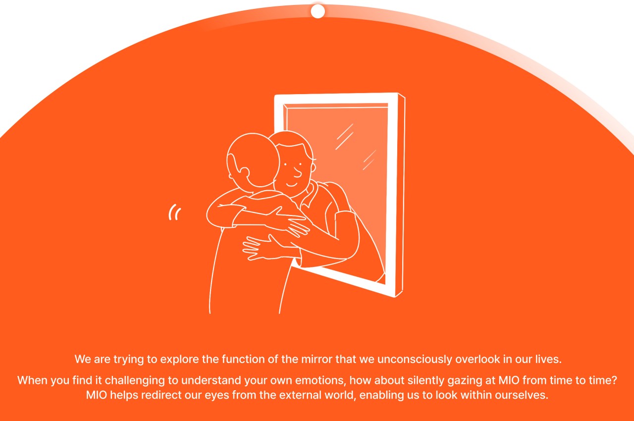
There are many things that we do out of habit in our lives, especially daily activities that we’ve gotten so used to that we could perform them with our eyes closed, at least figuratively speaking. Moving on autopilot is an important survival skill for modern-day humans, but it isn’t always a good strategy to apply to all things all the time, especially for our mental health. The idea of mindfulness or being present in the moment sounds almost so alien that people presume it requires some rigorous training or mental fortitude to do when all you really need is to pause from time to time and simply be aware of where you are and what you’re doing. That’s the kind of practice that this smart mirror product design tries to develop, motivating you to look inside yourself each time you look at your reflection.

Designer: Nahyun Kwon, Dayeong Kim, Mingyeong Chio

We look at a mirror several times a day but only a few of those times are we consciously checking ourselves for more than a split second. Whether we’re brushing our teeth, washing our faces, or even applying makeup, chances are we are thinking of other things while doing those actions. We don’t see or even recognize ourselves or our states, even when it’s directly staring at us.

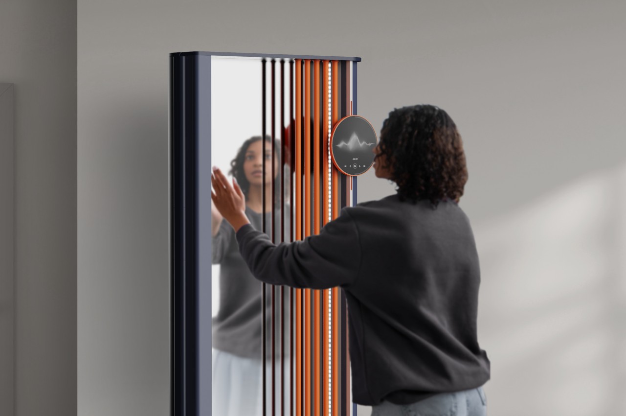
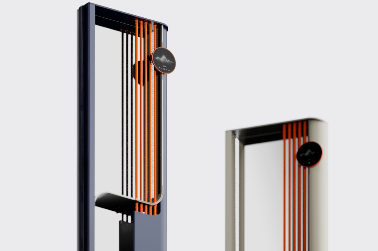
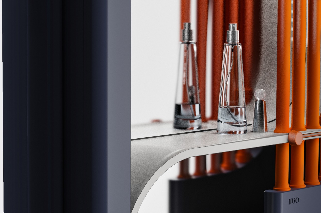
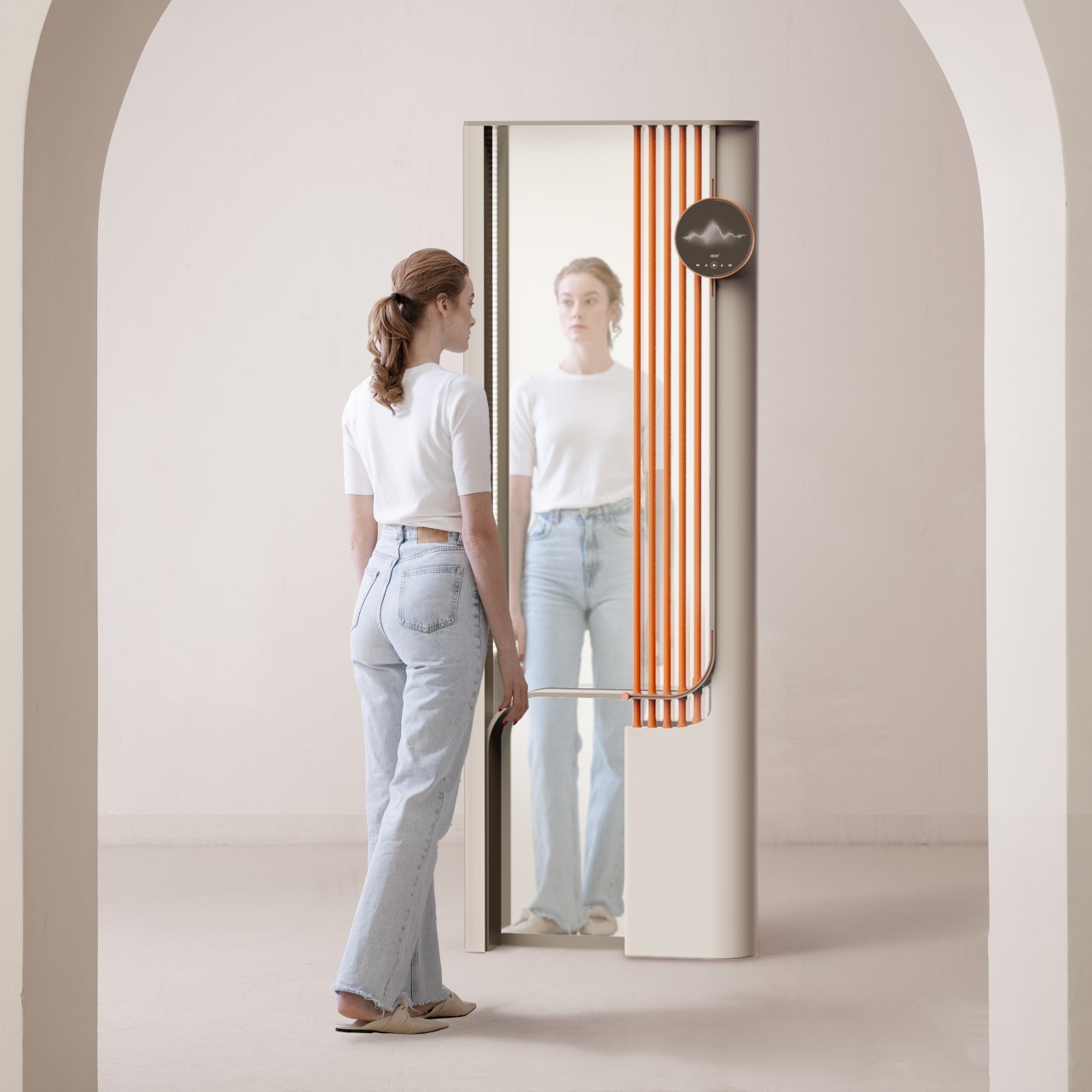
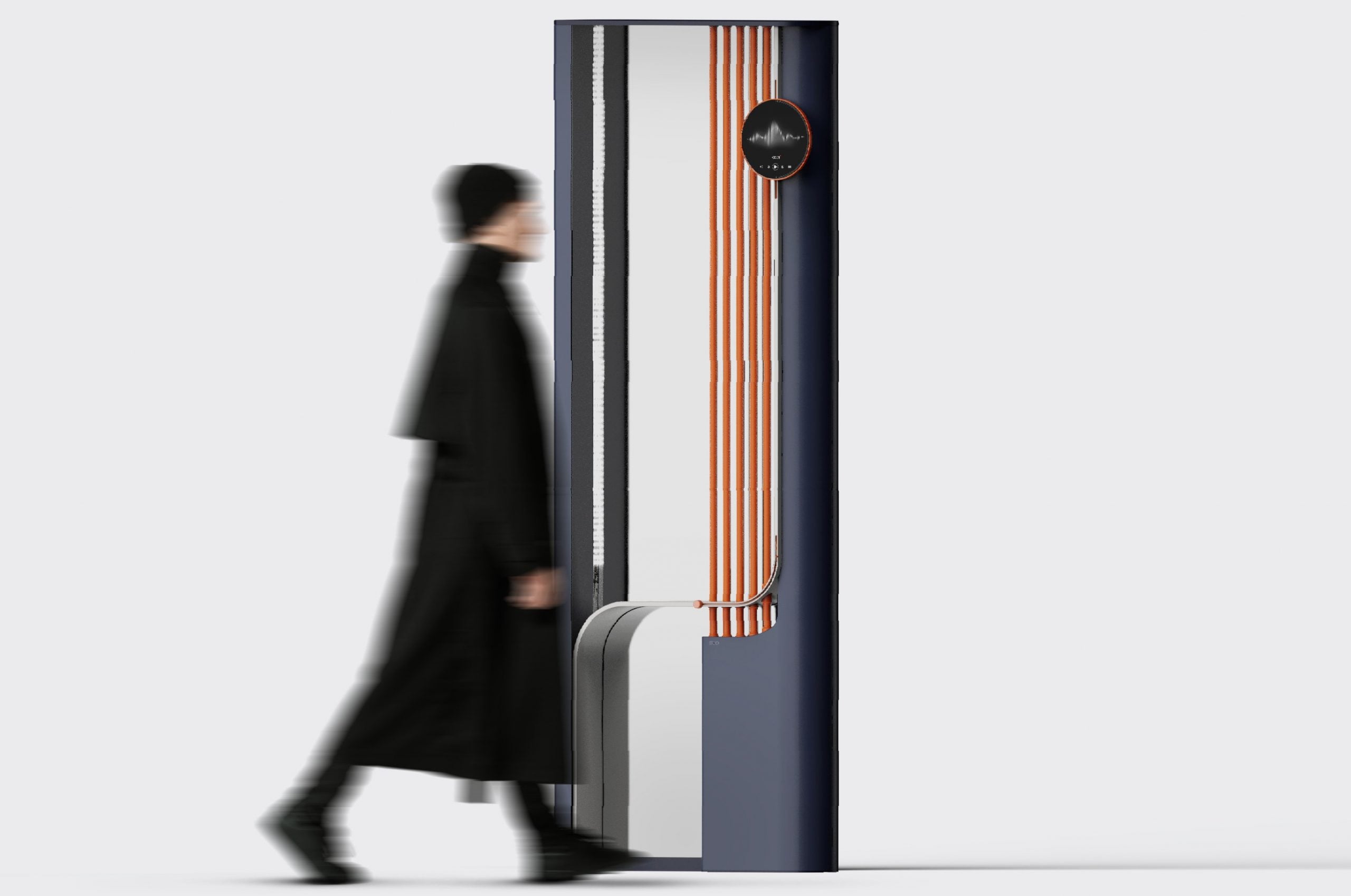
MIO is a mirror that encourages you to take a good hard look at yourself whenever you use it. Rather than nagging you multiple times a day to pause and exercise mindfulness, it simply associates the action with an activity you already do regularly until it becomes second nature. And it doesn’t do so using intrusive reminders or heavy-handed features but with gestures and controls that are integral to using the mirror in the first place.

https://mir-s3-cdn-cf.behance.net/project_modules/1400_opt_1/03592c187380207.658d8872c64b8.gif

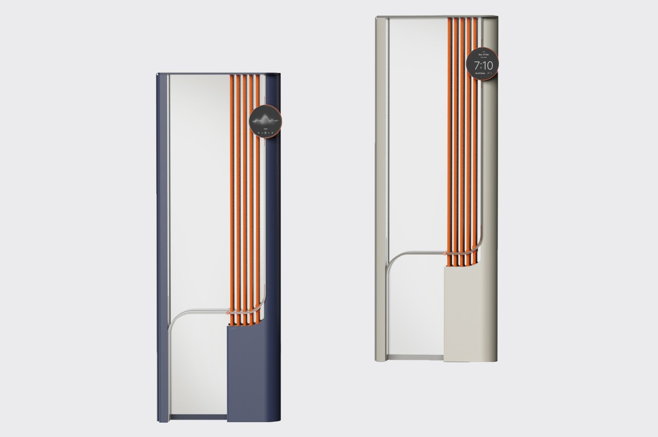
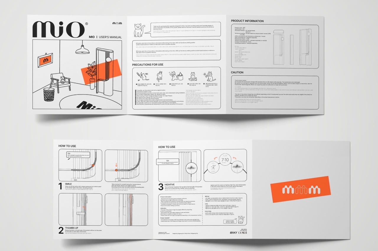
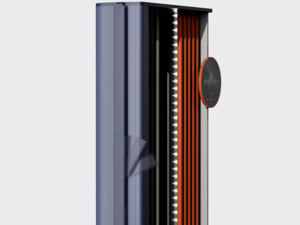
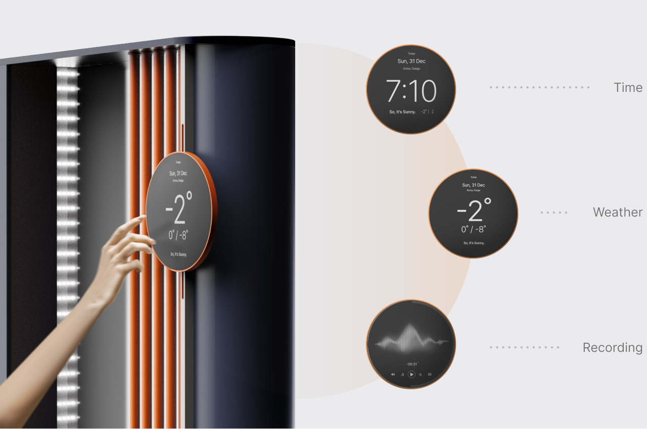
A lever on the side, for example, is needed to turn on the LED lights inside the frame for better illumination. The action and the control’s form are akin to a “thumbs up” gesture, reminding you to give yourself a pat on the back once in a while. There’s a “smile button” on the lower edge of the mirror that you can slide up to start a 1-minute recording of yourself, inviting you to smile your biggest smile or, at the very least, be truthful to the emotions you’re feeling at the moment. That button also acts as a timer for that recording as it slowly slides back down to its original position.

There is a separate circular display near the top and off to the side that shows the time, the weather, or other information you might need while preparing yourself and your face. Cycling through these screens of information requires touching the display, almost like giving it a high-five that, as silly as it might sound doing it by yourself, always generates good feelings. Whichever of MIO’s functions you use, it becomes a gentle reminder to take stock of your current emotional and mental state, at least long enough to see your true self before you rush off and lose yourself in the busyness of life.

The post Smart mirror concept encourages you to reflect whenever you look at yourself first appeared on Yanko Design.

SwitchBot’s new smart lock opens with voice commands, fingerprints, passcodes, and even your Apple Watch

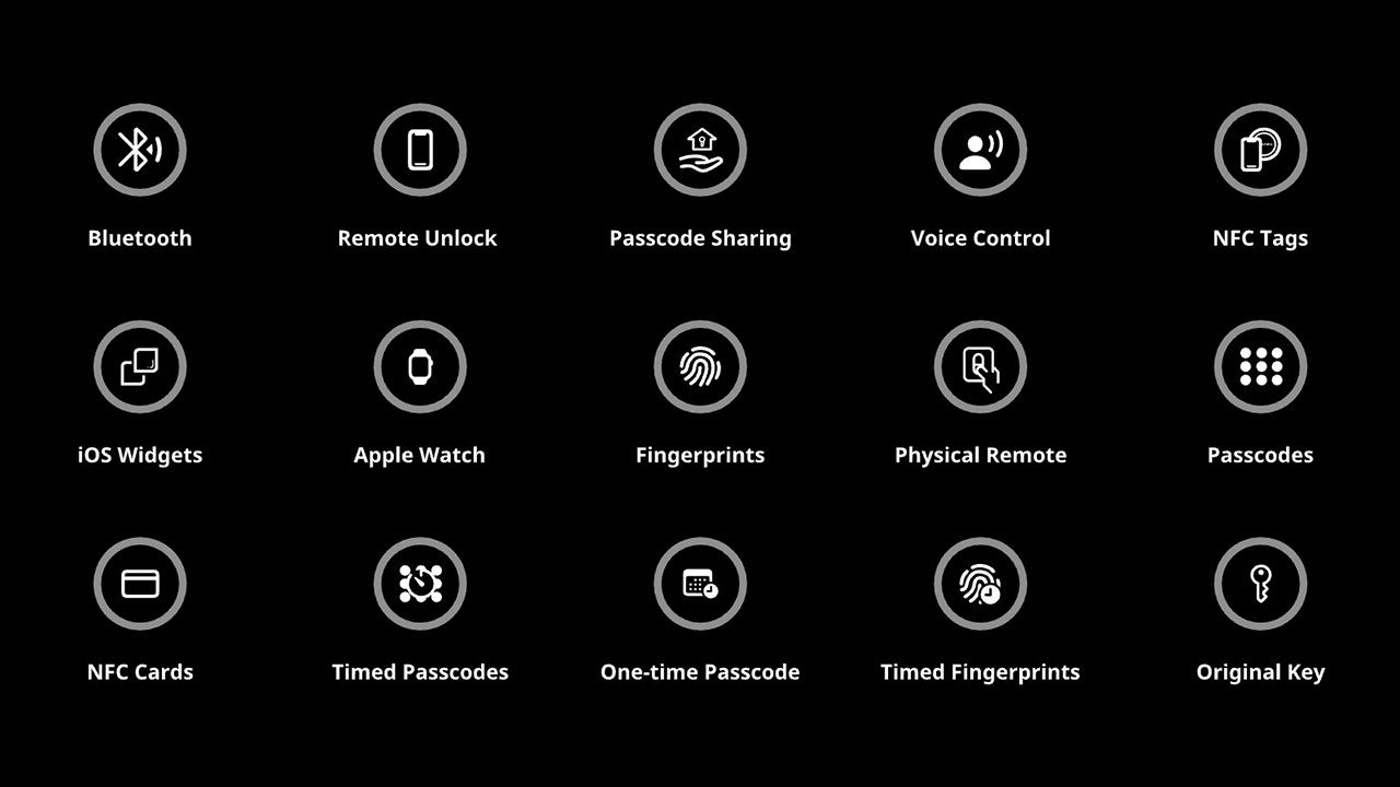
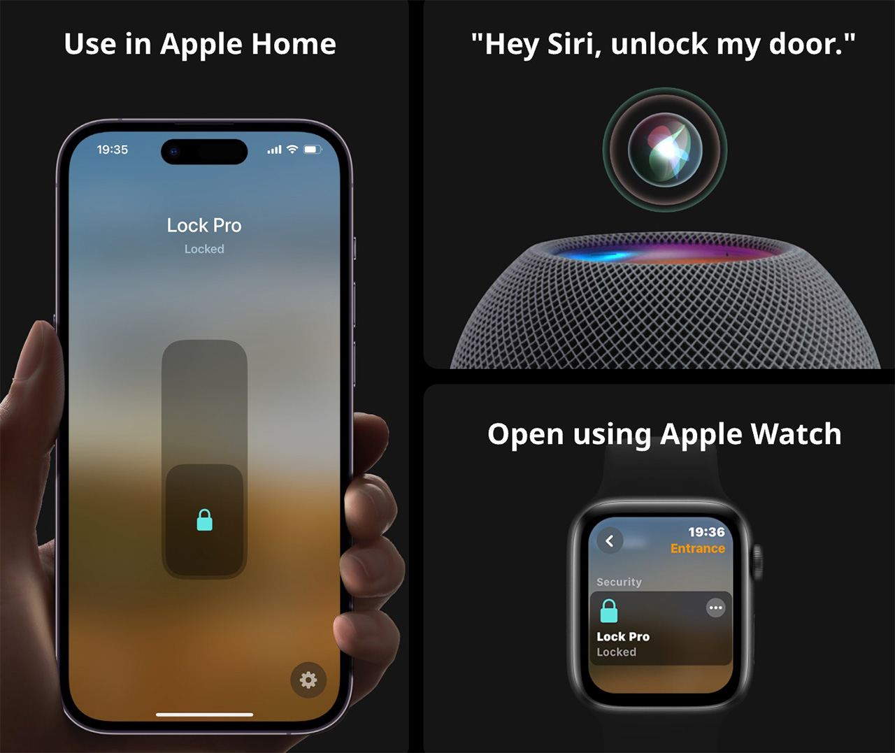
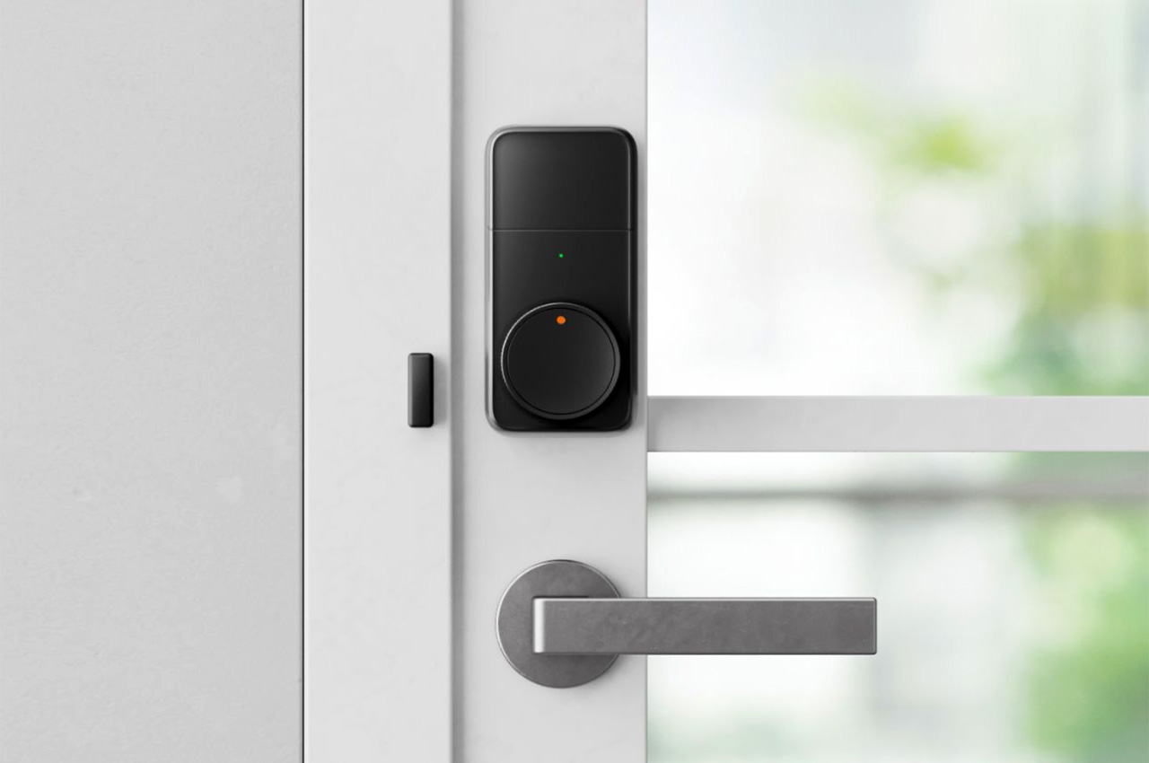
It’s 2024 and if you’re bummed that you can start your EV with your mobile phone, but can’t open the door to your house with it, the folks at SwitchBot just designed the perfect little accessory. Designed to retrofit onto your existing deadbolt door lock, the SwitchBot Lock Pro has 15 different unlocking options, from letting you use your phone or Apple Watch, to voice commands, biometrics, numeric PINs, or hey, even your regular key if you’re feeling a little old-fashioned. Or maybe get it to unlock when you say “Open Sesame” if you’re feeling extra whimsical!

Designer: Switchbot

Click Here to Buy Now: $89.99 $119.99 (Use Coupon Code on the Site to get $30 off). Hurry, deal ends soon!

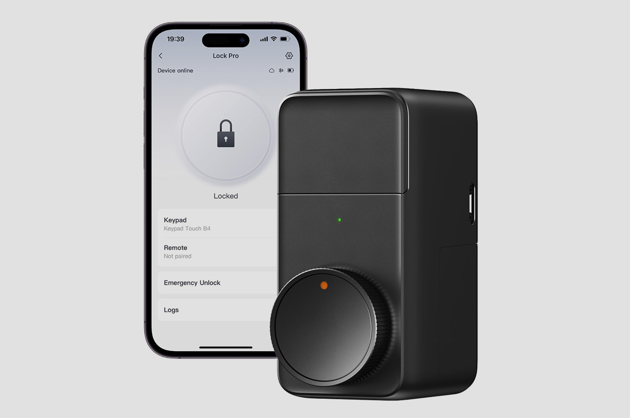
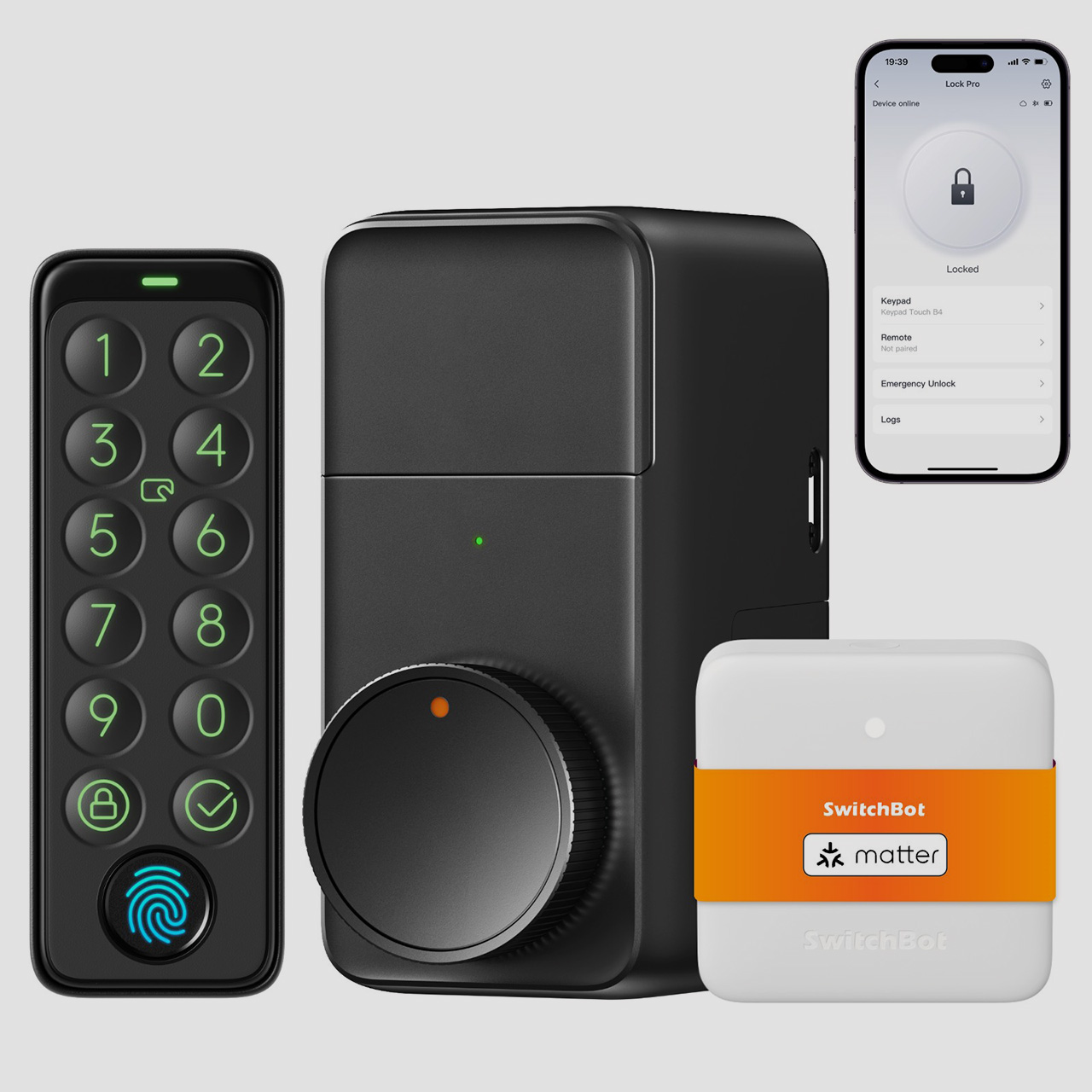
The Lock Pro follows in the footsteps of the original SwitchBot Lock, which retrofitted onto deadbolt locks to turn them into smart IoT locks. The new Pro variant still transforms deadbolt locks into smart ones, but comes with a sleeker design that integrates right into your door frame, a higher torque output that unlocks and locks doors with absolute ease, and even the inclusion of a number pad and biometric sensor that lets you unlock doors with a PIN or your fingerprint. There’s a minimal amount of assembly, the Lock Pro runs on replaceable AA batteries, and it also supports the Matter IoT protocol which means the Lock Pro can seamlessly communicate with all your other smart home devices, whether they’re from Google, Apple, Amazon, or any other third party company running on the Matter protocol.

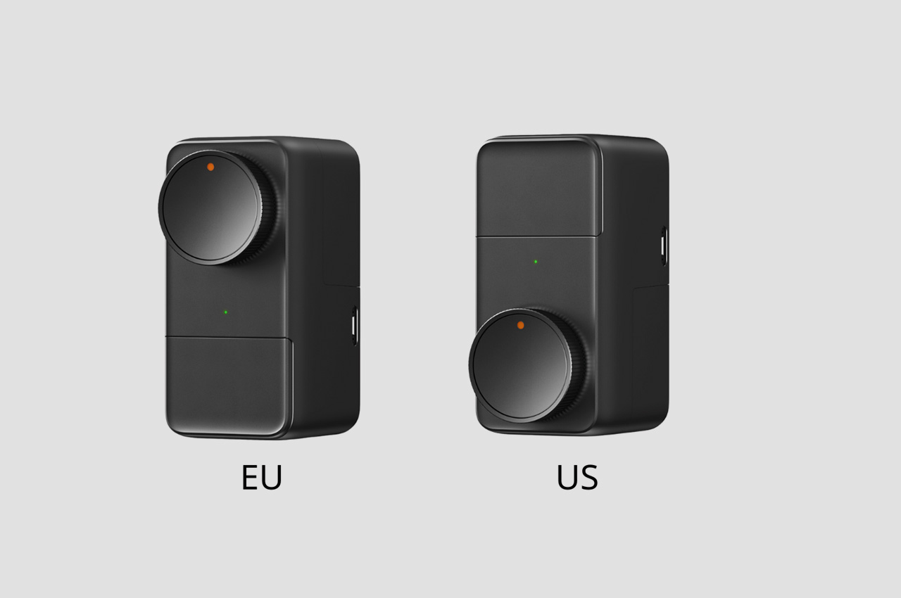
Designed with both American and European markets in mind, this retrofit smart lock integrates seamlessly into existing hardware, supporting all common deadbolt locks. Installation is a breeze, taking a mere 5 minutes – for US deadbolts, SwitchBot Lock Pro comes equipped with tailored adapters that allow for effortless cylinder changes, while European users can opt for different mounting plates based on the protrusion of their cylinder. This ingenious design eliminates the need for complex DIY modifications, making the transition to a smart lock a minimal-effort experience without any specialist tools or even requiring calling a handyman. You visit SwitchBot’s website to check whether the Lock Pro is compatible with your door lock for the US or the EU.

At the core of the SwitchBot Lock Pro lies an upgraded motor that boasts an impressive 20 kgf/cm² of torque – more than double the force of its predecessor. This increased power ensures smooth operation, even with multiple locks, and faster unlocking times, providing effortless entry every time. Whether you’re a tenant, apartment resident, or a smart home enthusiast, the SwitchBot Lock Pro is a must-have addition to your connected living space.

Fingerprint Enabled

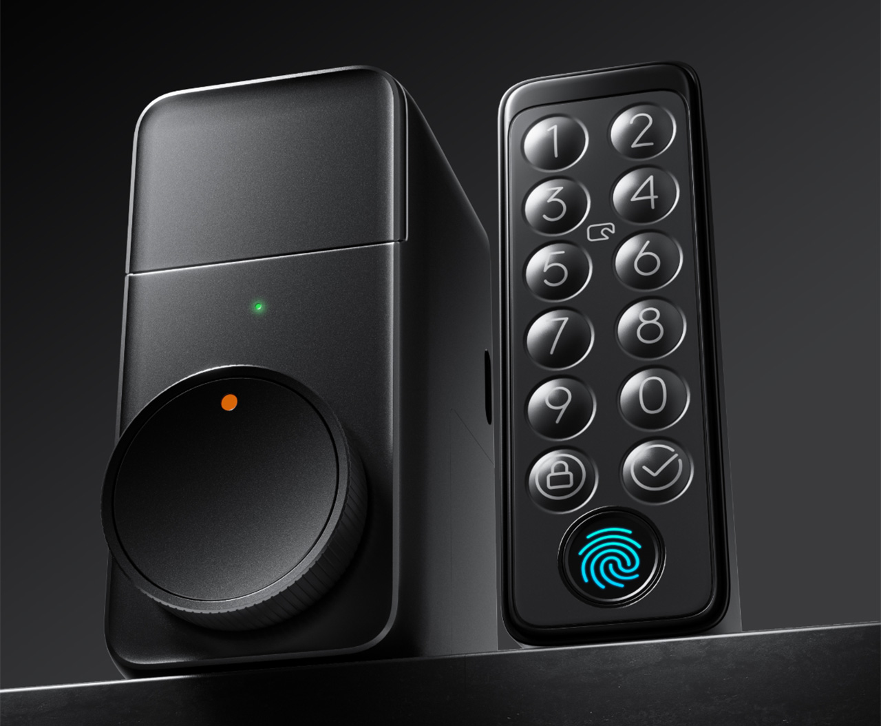
In essence, the Lock Pro builds on the sheer elegance of its predecessor, which allowed wireless locking and unlocking using Bluetooth devices like your phone or Apple Watch, or through smart home commands via the SwitchBot Hub. Retaining those existing features, the Lock Pro adds a few more for good measure, including a numeric keypad that sits on the outside, allowing residents (or any of your guests) to enter the house with a bespoke PIN code. Aside from the keypad, the SwitchBot Lock Pro sports a biometric sensor too, with a lightning-fast fingerprint recognition time of just 0.3 seconds. It can store up to 100 fingerprints and supports virtual passwords, emergency passwords, and fingerprints for enhanced security.

With up to 15 unlocking solutions available, including one-time passcodes, expiration passcodes, remote unlocking, voice unlocking, and Apple Watch unlocking, the SwitchBot Lock Pro offers a variety of usage methods that cater to pretty much all kinds of people whether they’re tech-savvy or tech-averse. Yes, you can still use your regular key, just in case you’re wondering! Support for Matter means your Lock Pro can also communicate with all your smart home devices, allowing you to remote lock/unlock your door or even set up routines (like automatically locking all doors after midnight). The Lock Pro, however, still requires the use of SwitchBot’s Hub to communicate via WiFi with other devices.

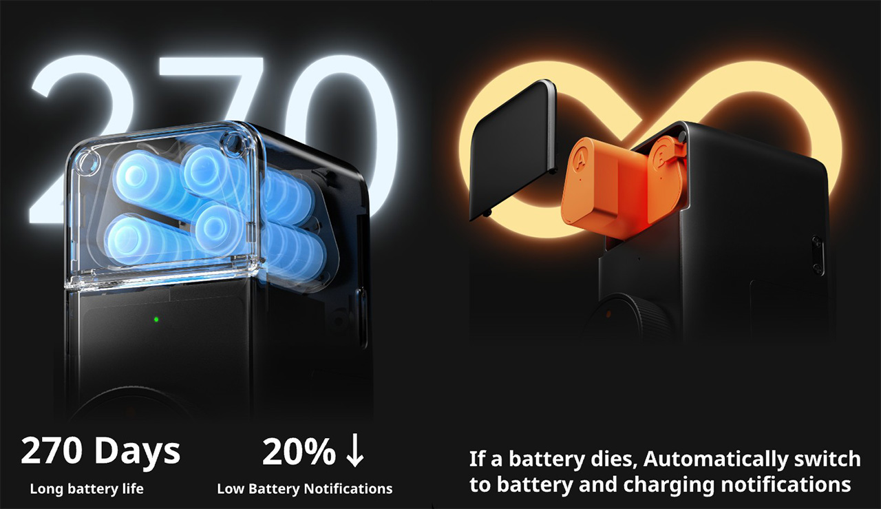
The SwitchBot Lock Pro runs on standard 4 x AA batteries, offering an impressive battery life of 6-9 months, 1.5 times longer than other retrofit smart locks. An optional SwitchBot Dual Power Pack offers an eco-friendly alternative to standard single-use batteries, with a rechargeable design and an ingenious relay power system that ensures uninterrupted use by letting you hot-swap one battery pack at a time while the Lock Pro runs solely on the second battery pack while one of them charges. Additionally, the Lock Pro features passive power supply unlocking, allowing access even if battery replacement is delayed.

Employing AES-128-CTR encryption at the software level, the Lock Pro provides robust protection against potential virtual threats. On the hardware front, the lock sports an auto-lock feature that utilizes a magnetic sensor, ensuring heightened safety and reliability by automatically securing the door based on its open/closed state, and surpassing the effectiveness of timer locks. Users can stay informed with real-time updates on lock and door statuses via their phones, and receive automatic reminders, ensuring peace of mind with every exit.

This isn’t SwitchBot’s first IoT rodeo – the company’s product roster features both standard as well as creative IoT devices like their award-winning curtain-opening robot, the button-pusher that turns regular switches into smart ones, and the Meter – a temperature and humidity sensor that lets you ensure every room in your house is at the right environment setting. The Lock Pro is a perfect addition to SwitchBot’s ecosystem, advancing their existing Lock product with newer features and more unlocking methods including keypad and fingerprint-based input. Whether you’re a family seeking convenience and security, an Airbnb host managing guest access, a fitness enthusiast with hands full of groceries, or a smart home aficionado seeking seamless integration, the SwitchBot Lock Pro offers a tailored solution. From fingerprint unlocking for family members to remote guest access for hosts, quick access for post-workout arrivals, and automated routines for smart home enthusiasts, the Lock Pro quite literally ‘unlocks’ a whole world of possibilities!

Click Here to Buy Now: $89.99 $119.99 (Use Coupon Code on the Site to get $30 off). Hurry, deal ends soon!

The post SwitchBot’s new smart lock opens with voice commands, fingerprints, passcodes, and even your Apple Watch first appeared on Yanko Design.

Govee RGBIC Neon Rope Light 2 Review: Helping Your Creativity Really Shine

PROS:


  • Highly flexible material for creating any shape or pattern

  • Minimalist design with black or white options to match your decor

  • Impressive lighting options and AI-generated effects

  • Easy customization with new Shape Mapping function

CONS:


  • Very difficult to reposition or modify after it's installed

  • Wi-Fi connection only supports 2.4GHz network band

RATINGS:

AESTHETICS
ERGONOMICS
PERFORMANCE
SUSTAINABILITY / REPAIRABILITY
VALUE FOR MONEY

EDITOR'S QUOTE:

With a more flexible design and powerful customization options, the Govee RGBIC Neon Rope Light 2 offers a powerful tool for everyone to express their designs in dazzling colorful lights.

Smart lighting is one of the easiest ways to get into smart homes. Often you simply have to screw bulbs or plug lamps in, connect them to your phone, and you’re instantly able to control them remotely or through automated schedules. That kind of smart light is practical and convenient but not exactly impressive, nor does it let you easily create the lighting atmosphere that you want without investing heavily in multiple expensive products. If you really want to jazz up your space and dazzle your guests or viewers, you’ll want something like programmable string or rope lights to leave a lasting positive impression. Govee just launched its latest product in that category, the RGBIC Neon Rope Light 2, promising better build quality, more extensive customization, and more intelligent smart features, so we put this second-gen smart rope light to the test if it can really become our kaleidoscopic paintbrush to brighten up the room with our creativity.

Designer: Govee

Click here to Buy Now: $99.99

Aesthetics
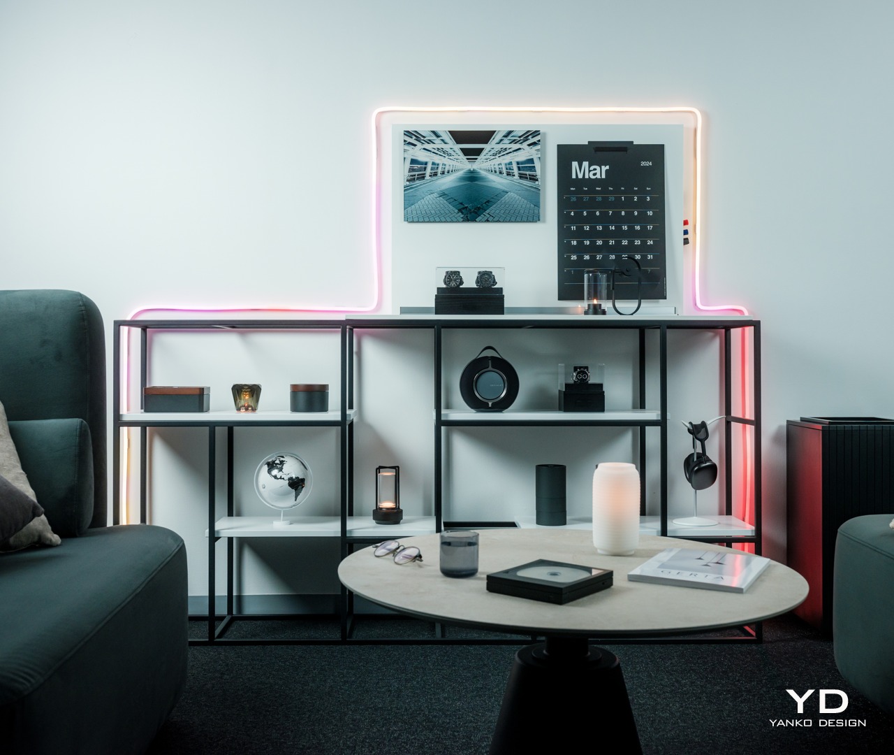
Right out of the box, you can already tell that the Govee RGBIC Neon Rope Light 2 is a class above your typical string light. You don’t see any braided cords or LED “bulbs.” Instead, you have a roll of tubing that looks clean, simple, and very bendable. It has a minimalist aesthetic that looks appealing even when the lights are turned off. Even better, Govee now offers black and white color options so that the rope can match whatever motif you have going. Of course, the actual area where light shines through is a translucent white surface, so you’ll still have to take that into account when designing around walls and furniture.
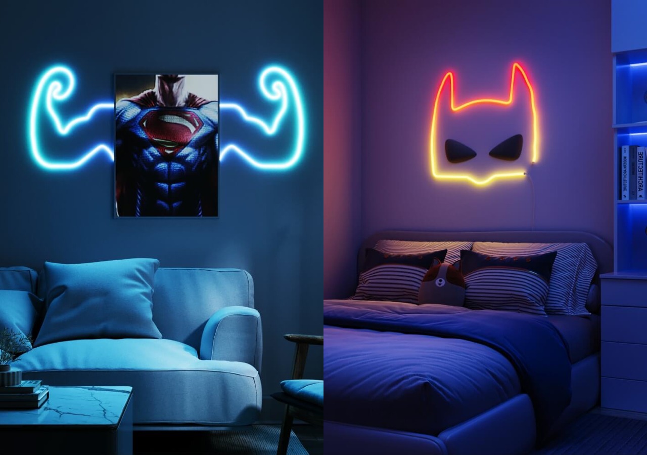
When the lights do turn on, the Govee Neon Rope Light 2 becomes a dazzling array of colors. With an astounding 420 of these RGBIC LEDs split into 42 zones, there is not a single inch that can’t be painted in a hue of your choosing. The lights are bright, not bright enough for being the main light source but perfect for setting the mood or adding accents to a room. And the sheer amount of effects you can use will never grow old.

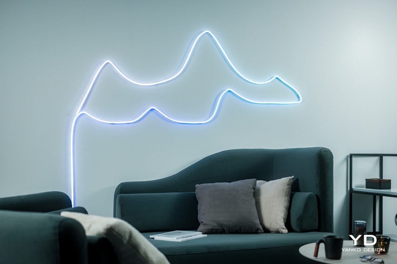
The most impressive part about the RGBIC Neon Rope Light 2’s appearance, however, is not the product itself but what you can make out of it. Thanks to an even more flexible material, you can easily design almost anything you want with the rope, from seemingly random patterns to carefully planned outlines of objects. This kind of flexibility, literally and figuratively, can inspire the artist in you, turning your wall into a canvas and the rope light into a brush paint of hundreds of colors.

Ergonomics
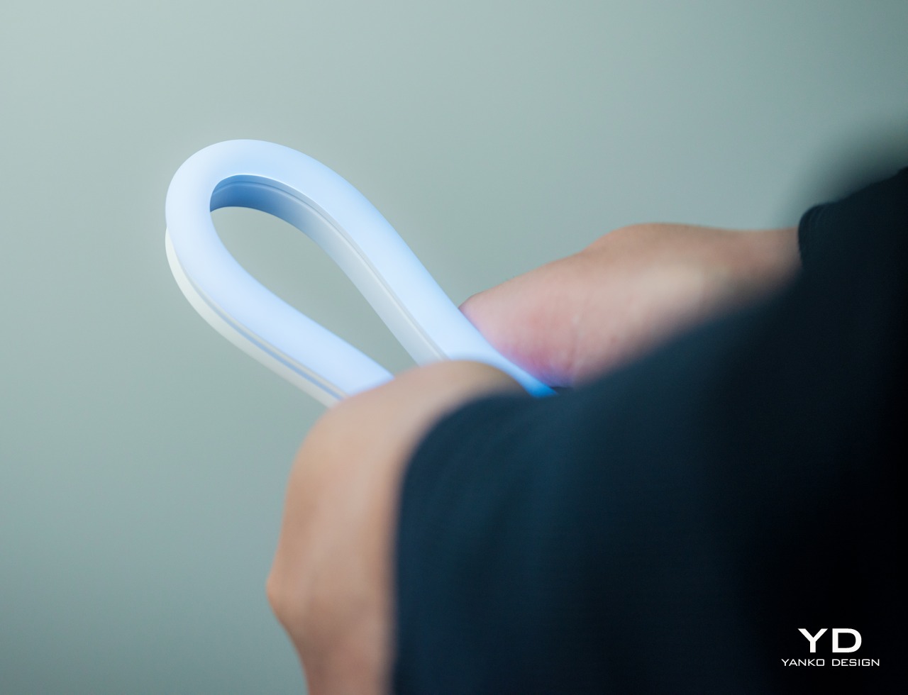
You won’t be holding the Govee RGBIC Neon Rope Light 2 whenever you use it, but you will naturally need to handle it when you’re installing it in the first place. It’s important for that process to be as easy and painless as possible, and Govee has thankfully ensured that it will be the case. Compared to its predecessor, this second-gen rope light is 14% more flexible and 14% lighter, key traits for something you’ll be bending a lot to your desired shape.

What all these mean is that you have more freedom to let your creativity loose in turning the rope light where you want it to go. Yes, you still have to mind the proper way to bend the rope light, but it’s pretty much common sense: you only bend it so the light is actually facing outward. The included bend clips that help the rope retain its shape have the same “outward bending” design, though neither the clips nor the rope actually stop you from bending it the wrong way, much to your own peril.
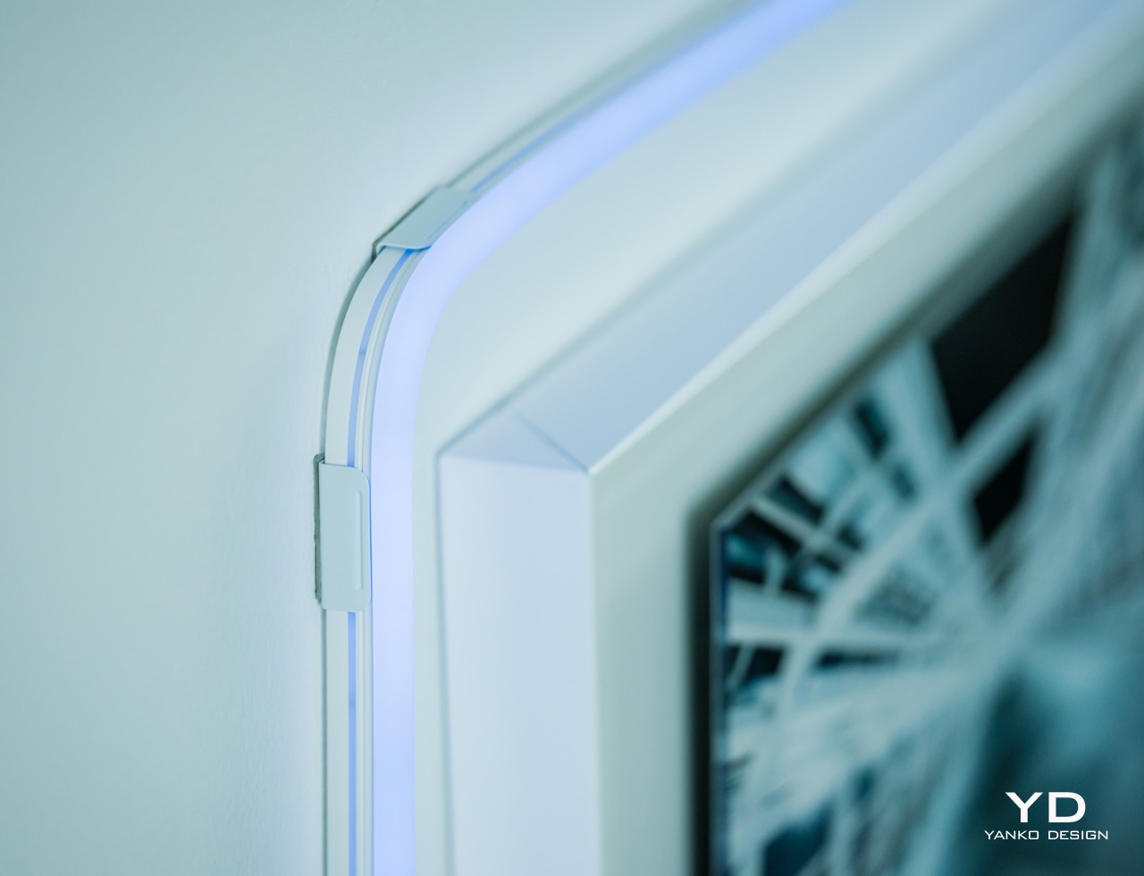
Despite its flexibility, the rope light won’t stay in that curved shape for long, so you’ll need to stick it with the built-in adhesives on its back. The good news is that these adhesives are extremely strong so you won’t have to worry about the rope going out of shape. The bad news is that they’re so strong that you won’t be able to easily remove them if you need to make changes. This means you have to be extra sure and careful that you have the final design you really want before you start sticking it to a surface. Hopefully, Govee will be able to come up with a more flexible solution someday that will let you reposition and reshape the light more easily.

Performance
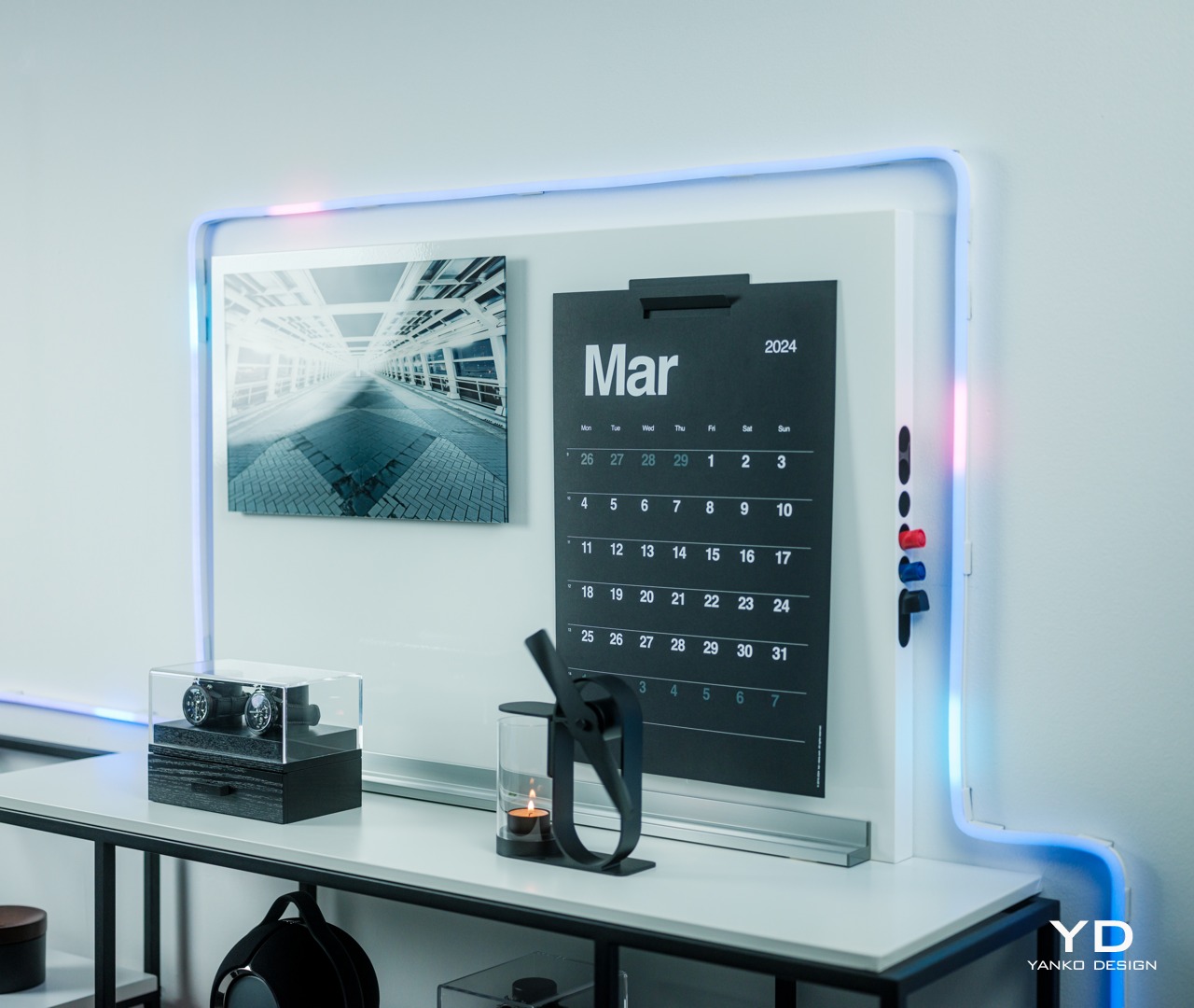
Govee’s RGBIC LED technology has been impressive from what we’ve seen in previous reviews, and the Neon Rope Light 2 is thankfully no different. There are two variants of the rope, one in 10ft/3m length and another in 16.4ft/5m, which is our review unit, with 42 and 70 segments of light, respectively. For the 5-meter rope, there are an impressive 420 LEDs running its length, with as many as 84 LEDs per meter. As with any Govee RGBIC product, you can control each of those segments separately, though you’ll most likely be doing it through lighting effects and scenes anyway.
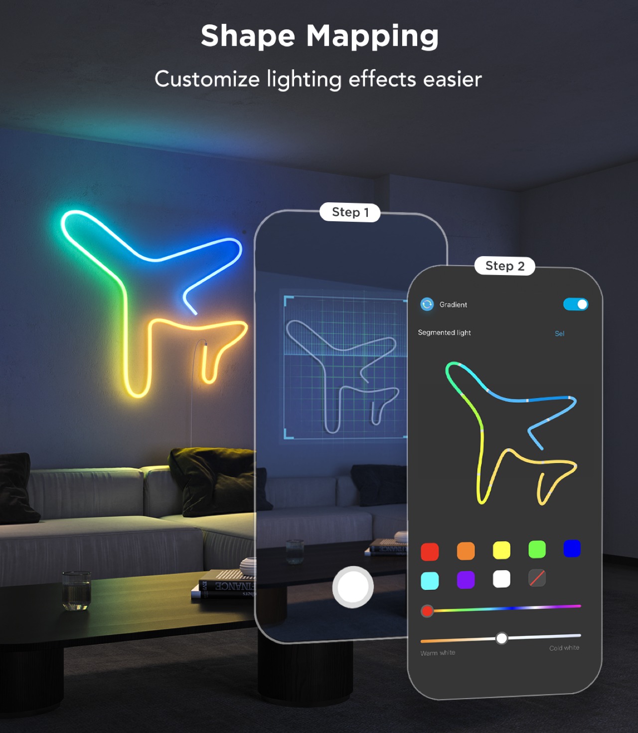
If you want to do things a bit more manually, Govee also has a nifty feature that makes the process a lot easier. With the app’s Shape Mapping mode, you can take a picture of your rope light design with your phone’s camera and then select which color goes to which segment, giving you full control of the composition without having to guess which part of the rope corresponds to which part of your design. Whether you’re going the full automated route with AI or exercising complete control over every LED, the Govee RGBIC Neon Rope Light 2 gives you the tools you need to express your design in a burst of color.
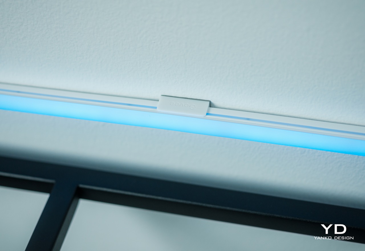
As mentioned earlier, the lights are pretty bright, though not blindingly so. The gamut of colors each LED supports is more than enough to cover every hue your eyes can detect, although it does lack the ability to display pure white without a dedicated white LED. Govee has a newer RGBICW that solves that problem, but that’s not available here on the RGBIC Neon Rope Light 2. You’ll have to make do with off-white blended from the combination of red, blue, and green, though that probably won’t be a problem for most use cases anyway.
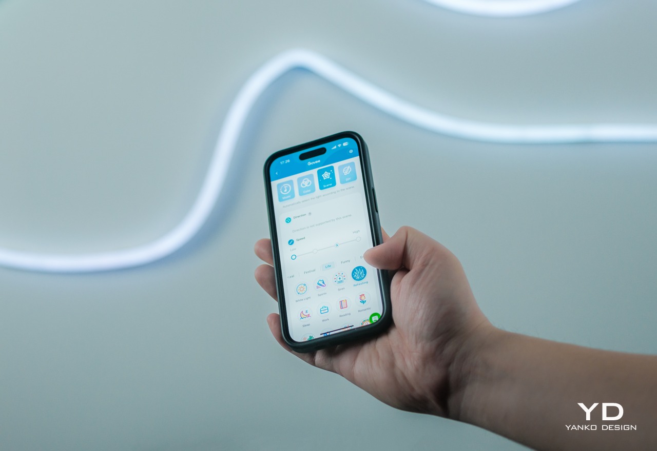
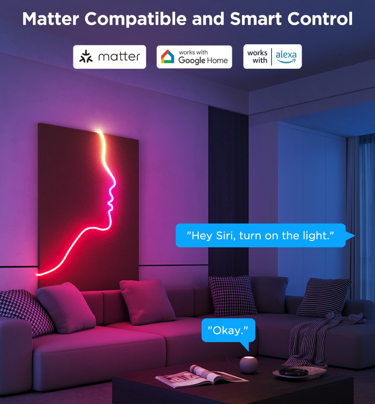
The rope light’s real strength, aside from its flexibility, can be found in the Govee Home App which is home (pun intended) to all the settings and customization options you can ever want. Connecting the rope light to your phone is easy peasy and is done over Bluetooth, after which you can remotely control the lights without breaking a sweat. If you do want to connect it to smart home platforms, particularly through the new Matter support, you’ll have to do it over Wi-Fi. It should be noted that, like many smart home devices so far, it requires a 2.5GHz Wi-Fi network so 5GHz-only routers will have difficulty making that connection.
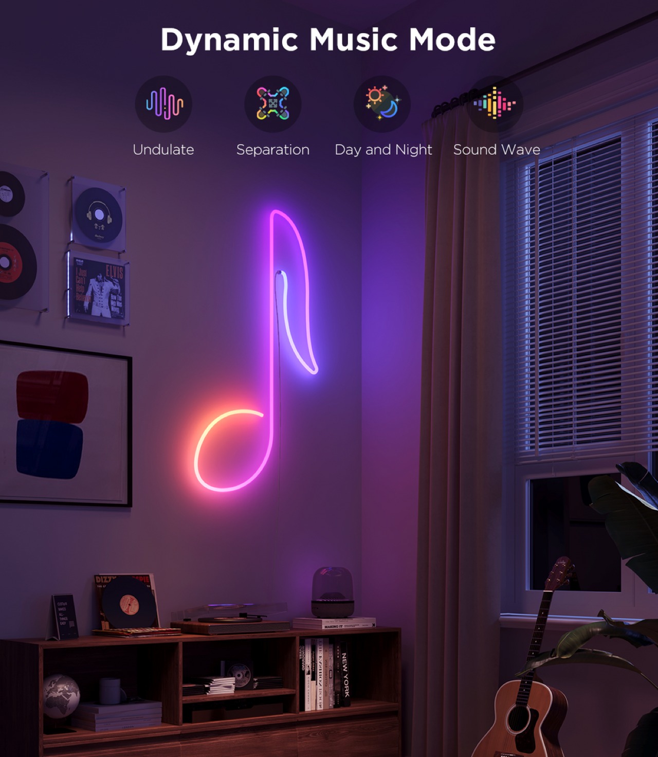
Govee provides a huge library of effects for the Neon Rope Light 2, including 12 Music Modes that can sync to the beat of music, and 64 Scene Modes with preset settings to cover a wide variety of occasions, seasons, and moods. Things get really interesting with the arrival of the AI Lighting Bot this March, which will let you harness the power of generative AI to create new effects not included in Govee’s catalog. Simply give it a prompt with specific elements, situations, and even brands and it will scour the Internet and its database to come up with the (hopefully) perfect combination that delivers what you asked for.

Sustainability

Like with string lights, the Neon Rope Light 2 suffers from the problem of becoming significantly less usable once LEDs start failing. Yes, you can probably live with one or two blank spots, but they’re there forever with no option to replace them individually. In fact, one of the Neon Rope Light 2’s greatest strengths, its clean and simple tubing, is also its greatest weakness in this regard. You can’t easily access the LED’s inside anyway, let alone repair or replace them. Your only recourse, in the final analysis, is to ship them for repairs or, worse, buy a new rope. Either way, that involves removing the rope light from its installation, which can be a laborious process.

As for the materials used for the RGBIC Neon Rope Light 2, we can perhaps presume that Govee is using standard synthetic materials like silicone. Yes, the material is lighter and more flexible now, but it’s not more sustainable. As Govee grows, we hope to see more efforts from the brand toward this aspect, especially since its products will be filling the market and homes.

Value
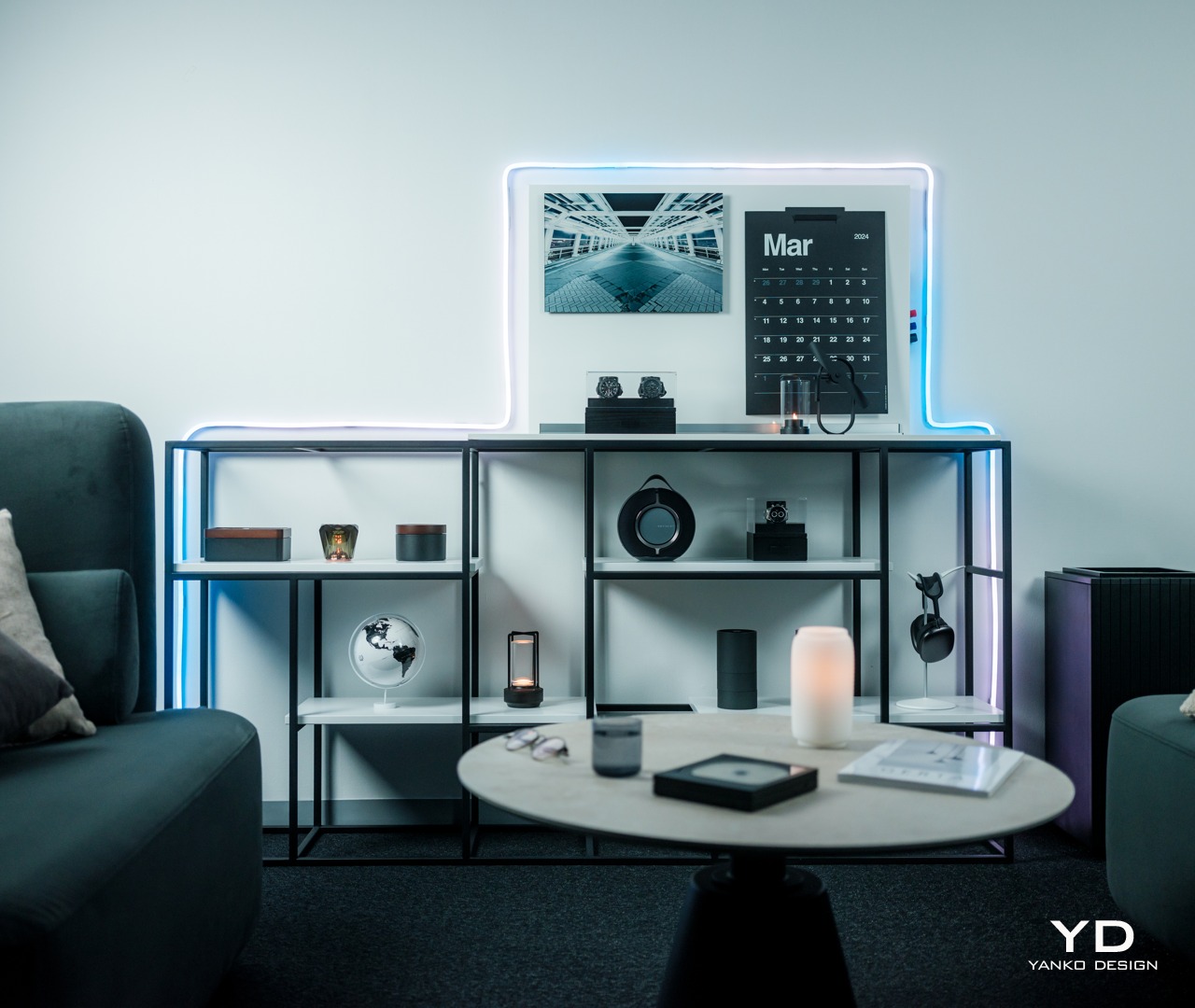
String lights try to offer a way to illuminate a path or shape, but they can only do so much in actually forming that shape. Worse, because of their inherent design, they’re often better off hidden from view so that their presence only becomes known once the lights turn on. While there will always be uses for string lights, the Govee RGBIC Neon Rope Light 2 delivers something new, different, and mind-blowing. It gives you the creative freedom to design your own lighting masterpiece without too much effort.

The more flexible and lighter material of this 2nd-gen rope light enables owners to really bend the light to the shape they want, and the impressive performance of Govee’s RGBIC LED technology really outshines the competition. Best of all, the Neon Rope Light 2 has a mind-blowing assortment of effects, from the upcoming AI-generated Lighting Bot to the easy-to-use Shape Mapping feature. All of these for an equally impressive price tag that makes the experience accessible to everyone.

Verdict
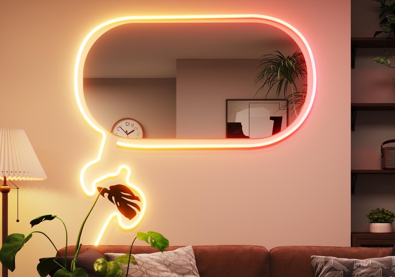
RGB lighting was once considered the domain of gamers who prefer dark corners just to show off their neon-lit equipment, but everyone has now grown to appreciate what a splash of color can do not just to brighten up a space but also to create a mood, amaze, and entertain. Many RGB lamps exist for that purpose, but the majority of them force owners to design around the lamps instead of having the products cater to their needs. Fortunately, Govee has the perfect solution to fix that problem.
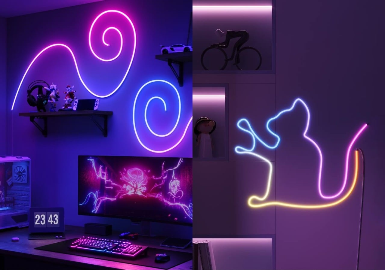
The Govee RGBIC Neon Rope Light 2’s upgraded flexibility allows you to “draw” on a wall or around furniture, giving you complete freedom to create the design that you want. An impressive library of effects from the Govee Home app lets you create the light show of your dreams, whether with the upcoming AI Lighting Bot’s assistance or with full control using the Shape Mapping tool. We wished it was just as easy to remove the rope light and create a different design as it was to install it the first time, but it’s a minor consideration that could happen in future versions of the product. All in all, the Govee RGBIC Neon Rope Light 2 delivers a very powerful tool for letting your creativity shine, literally.

Click here to Buy Now: $99.99

The post Govee RGBIC Neon Rope Light 2 Review: Helping Your Creativity Really Shine first appeared on Yanko Design.
Smart home camera and router concepts look like ghosts to be less conspicuous

Our homes are starting to get filled with smart gadgets, and not just the usual culprits like smartphones and tablets. From smart lamps to smart refrigerators, a lot of devices in our houses are now connecting to the Internet. While some of these try to blend in with the rest of your decor as much as they can, others just stand out like a sore thumb. Devices like home security cameras and routers still carry the aesthetics of their predecessors, which is impersonal, technical, and at times even disconcerting. While these products might be important in modern smart homes, they don’t need to be seen in order to function, which is why this concept design tries to make them almost literally fade into the background as if they were ghosts.

Designers: Seokhyun Ahn, Yejee Park, Cho Yumi, Yumin Shin, Myeongryun Kim, Dohyun Park, Lee Dahye, Kim Geonhee, Yang Yurim

We easily take for granted how things that look out of place can affect our minds and moods. Whether it’s a messy desk, a less-than-appealing piece of decoration, or clashing designs, the visual discomfort and confusion can actually bleed into your physical and mental state. They say that the best interfaces and designs are the ones that you barely notice, and what is the least noticeable thing if not a ghost?

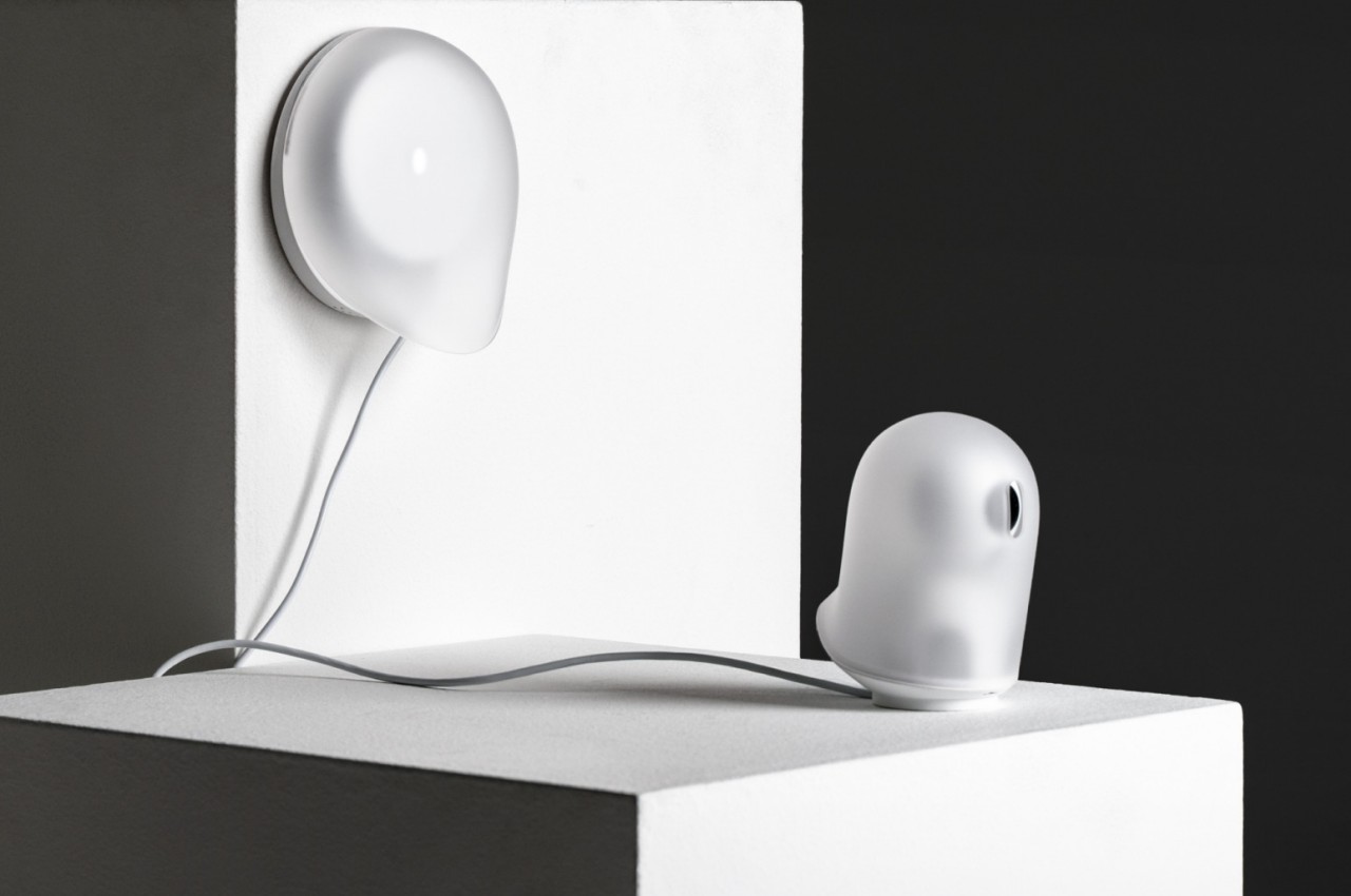
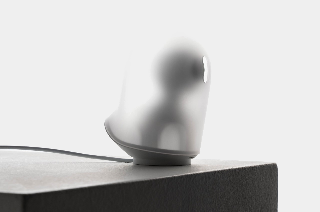
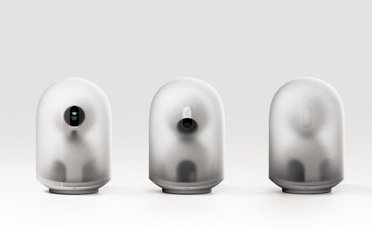
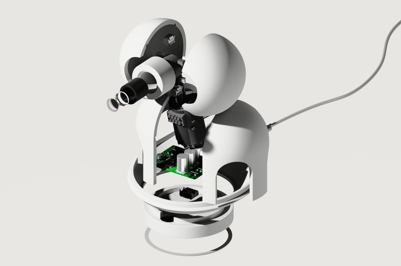
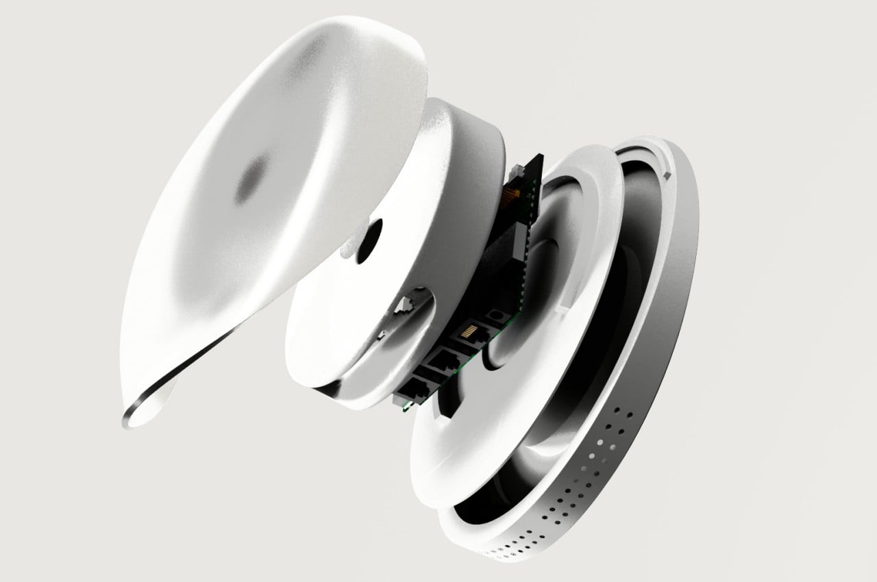
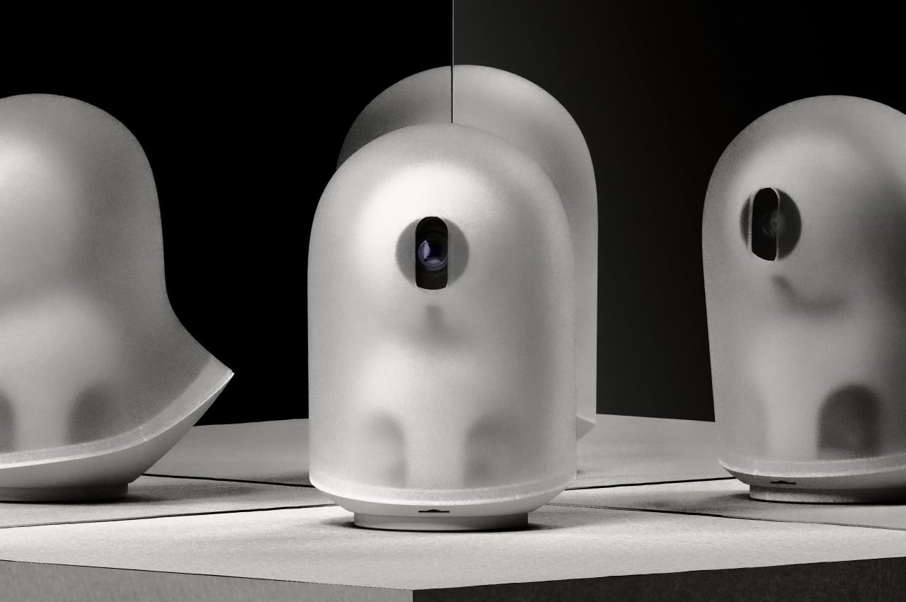
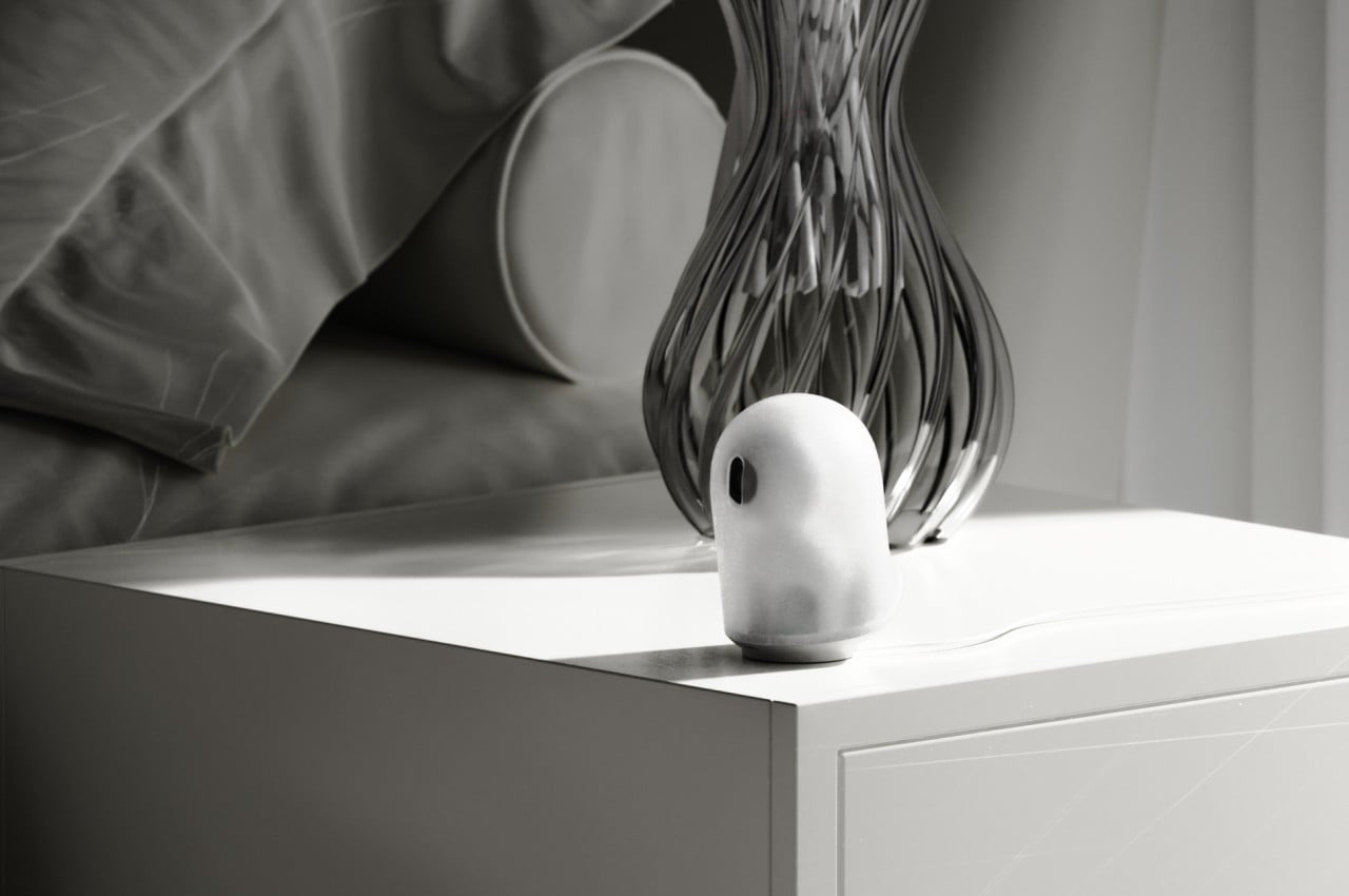
Geist, which literally means “spirit” or “ghost,” is a concept design that tries to make those smart home devices less noticeable. Rather than having a black sphere or rectangle that feels like it’s spying on you, the John Doe ghost camera has a translucent body that almost looks like a piece of cloth flying in the wind, just like your stereotypical ghost from cartoons. It is even slanted at an angle to give the impression that it’s levitating and floating as it moves forward. It does have an “eye” for the camera, but it can turn it down to protect your privacy, indicating that it isn’t recording at the moment.

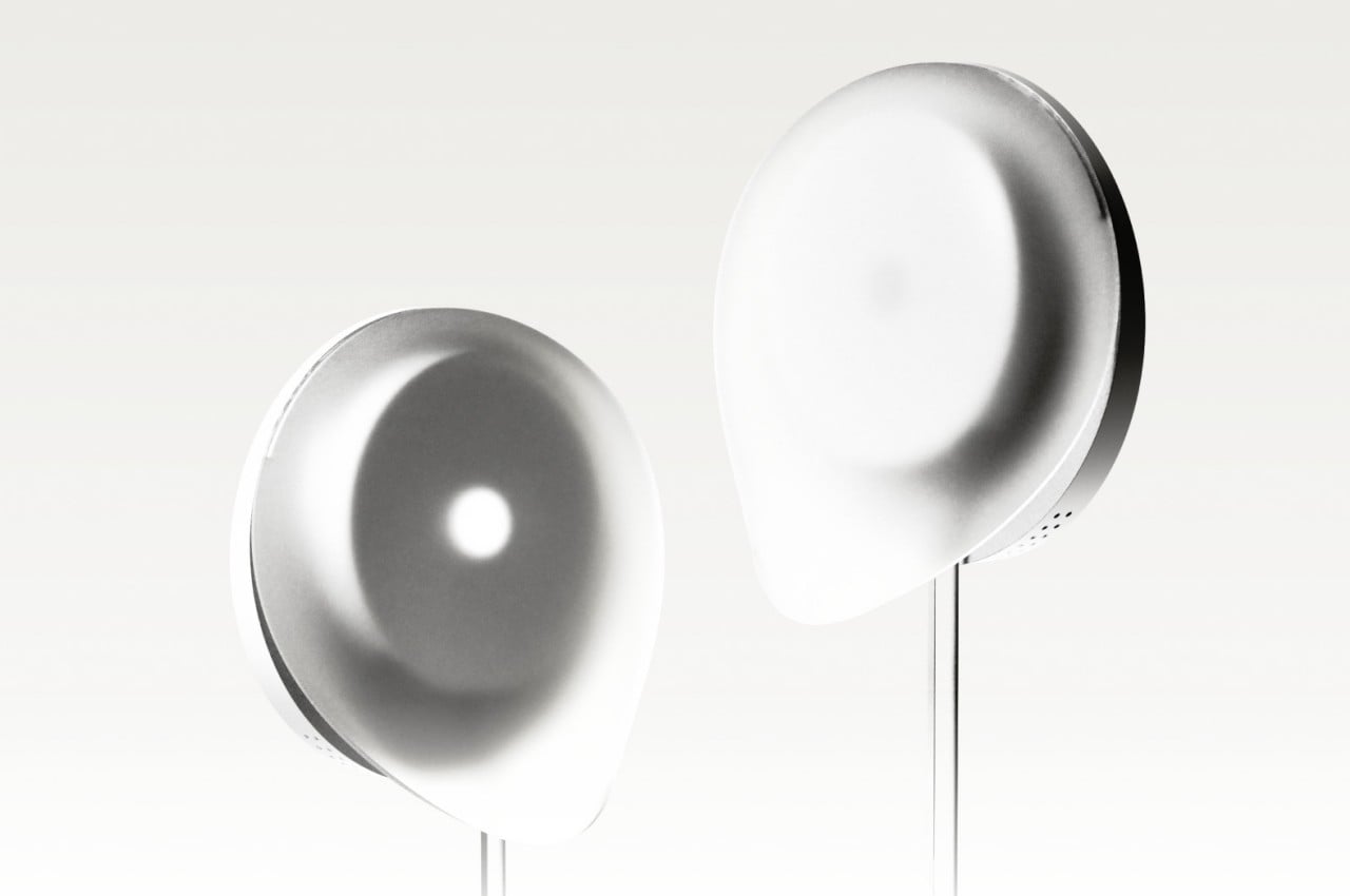
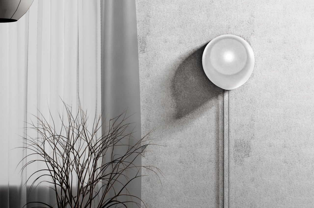
The Wi-Fi router Jane Doe takes on the shape of a gentle wisp of smoke or cloud. With an asymmetrical shape that is mounted vertically on a wall, it almost looks like a ghost passing through a solid surface. It’s impossible to completely hide some of the cables, particularly the power cable, but it at least forces these wires to go in a straight vertical line rather than ending up in a tangled mess.

Although the Geist concept design is actually meant to be less conspicuous and reduce visual discomfort, they can actually also have the opposite effect, depending on the person. Some might not be keen on seeing any representation of the paranormal, so anything that might remind them of ghosts might be even more uncomfortable. That said, the designs are aesthetically pleasing on their own, if you leave out the ghost association, so they still present a more pleasing aesthetic compared to the typical designs of these devices.

The post Smart home camera and router concepts look like ghosts to be less conspicuous first appeared on Yanko Design.

Smart pill dispenser concept safeguards your medicine from kids

Pill boxes and dispensers are becoming more common inside households, especially those with members that require daily medication for their health. The simplest designs are just containers with compartments for different days, but there are also more sophisticated machines that try to automate that routine so that you won’t forget to take your pills. Unfortunately, neither of these solutions takes into account unauthorized or accidental access to those medicines, especially by children for whom those drugs could very well be fatal. This smart pill dispenser concept tries to bring all those concerns together, offering not only a convenient tool but also a safe one for users as well as the people around them.

Designer: Anthony Chupp

The tedious work of taking medication regularly actually starts at the moment you allocate them for each day. Pill boxes and dispensers make it easier to dispense those pills and capsules, but they don’t exactly make it easy to fill them up in the first place. You might drop a pill or two on the floor in the process or, worse, drop them in the wrong compartment, forcing you to lose time trying to double-check and correct that mistake. We’re still a few steps away from a completely automated process that segregates and distributes those pills without human intervention, so any aid toward this part of the process will be significant, even if it still involves manually dropping in pills.

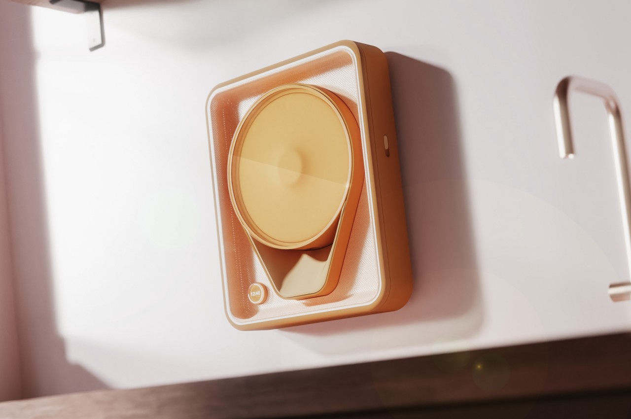
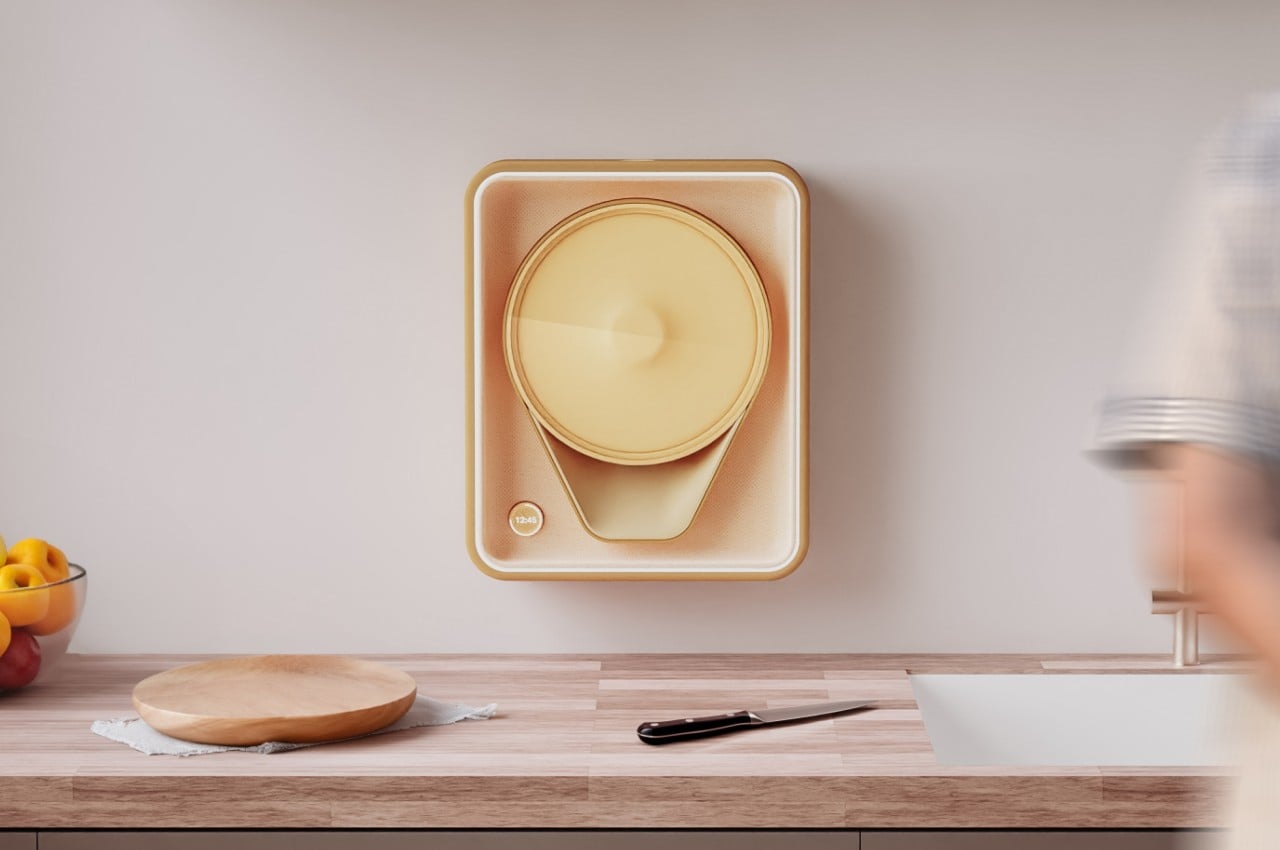
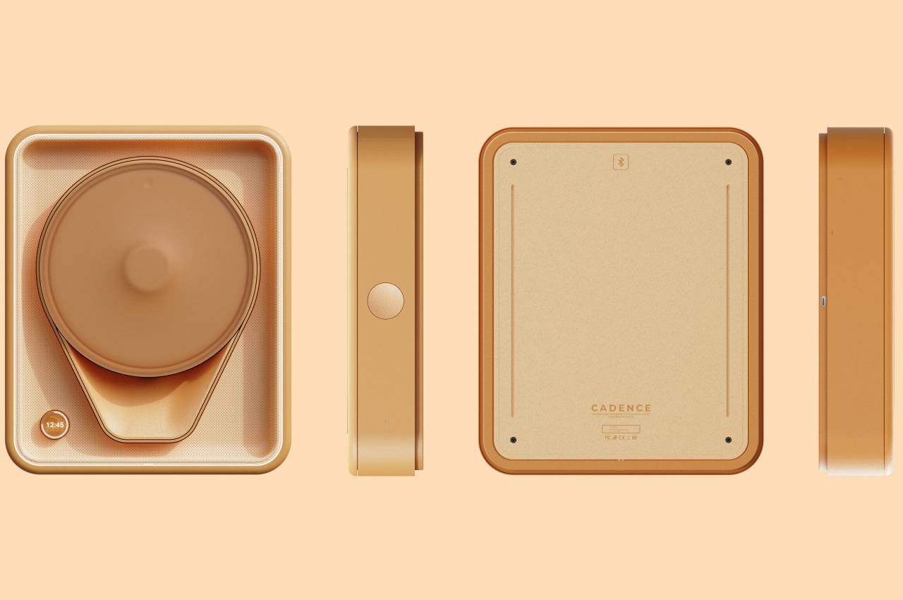
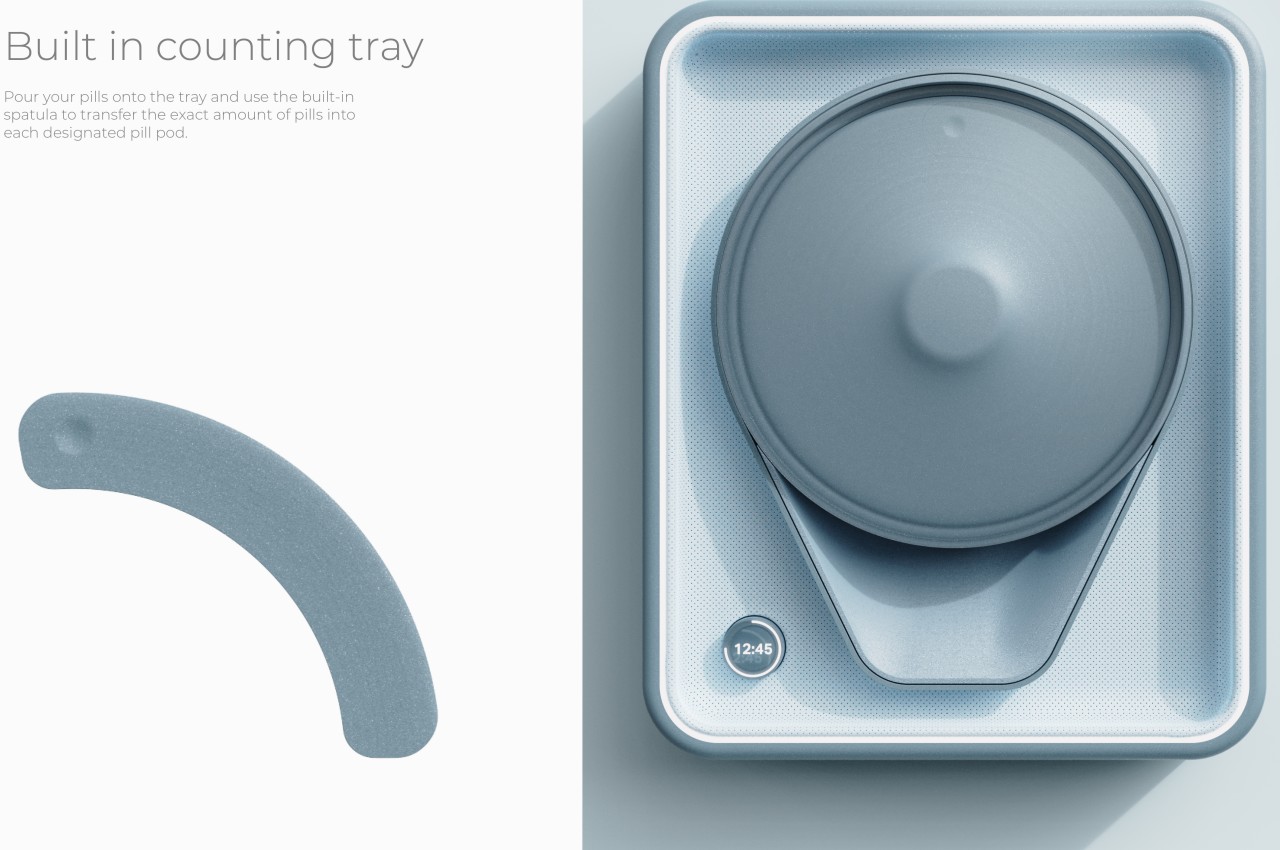
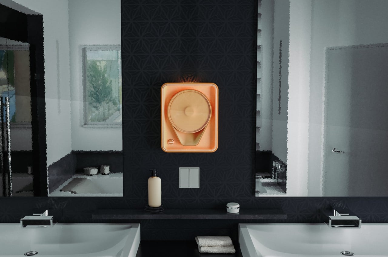
That’s the kind of help that the Cadence concept design offers, using a pharmacy-grade pill sorting plate that makes it easier to put pills where they belong. The specially-designed tray only has an opening for a single day so you don’t accidentally drop medicine inside compartments that have already been filled up. You can also just pour your pills on the tray and then use the built-in spatula to move the exact kind and number toward the opening.

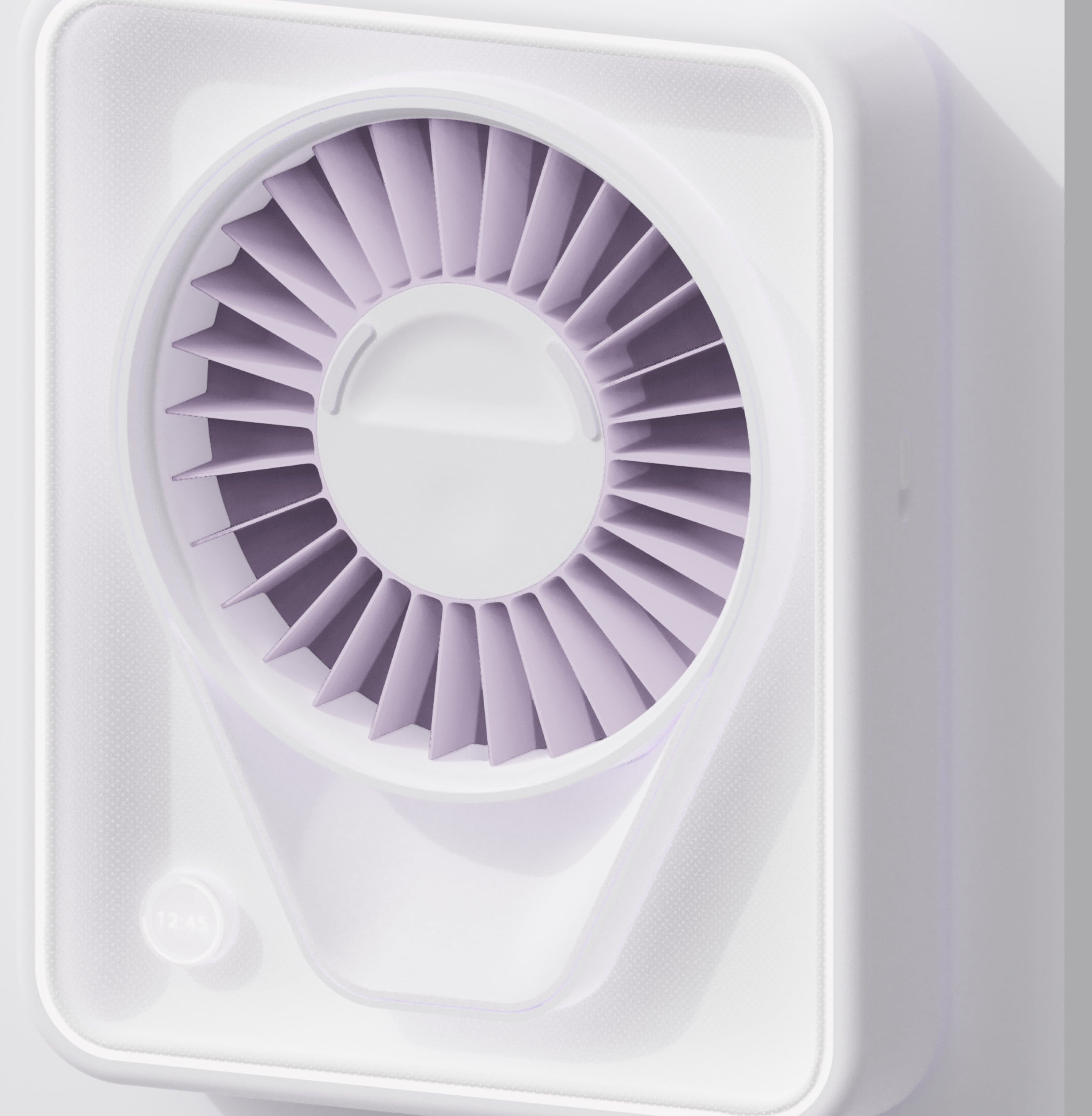
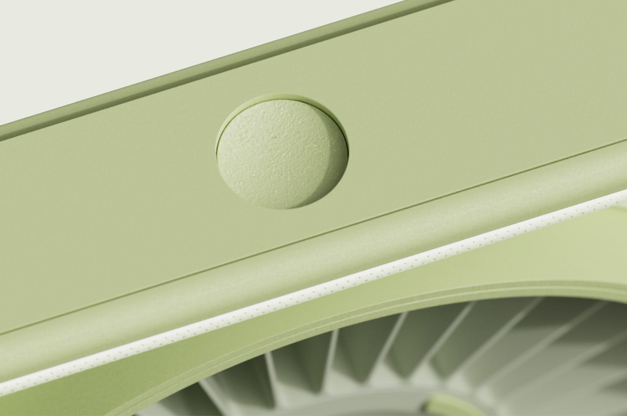
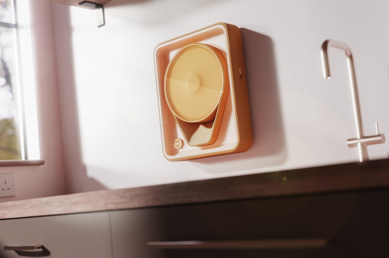
The smart pill dispenser has 30 slots arranged like spokes around a wheel. When it’s time to dispense the day’s dosage, it releases the pills down a dropper shaped to guide the pieces into a cup or glass for collection. And then it turns the wheel so that tomorrow’s pills will be ready for the next round. The button to dispense the pills for the day is located at the top, out of the reach of kids, while locks prevent those same children from accidentally getting into the dispenser itself and scattering its contents.

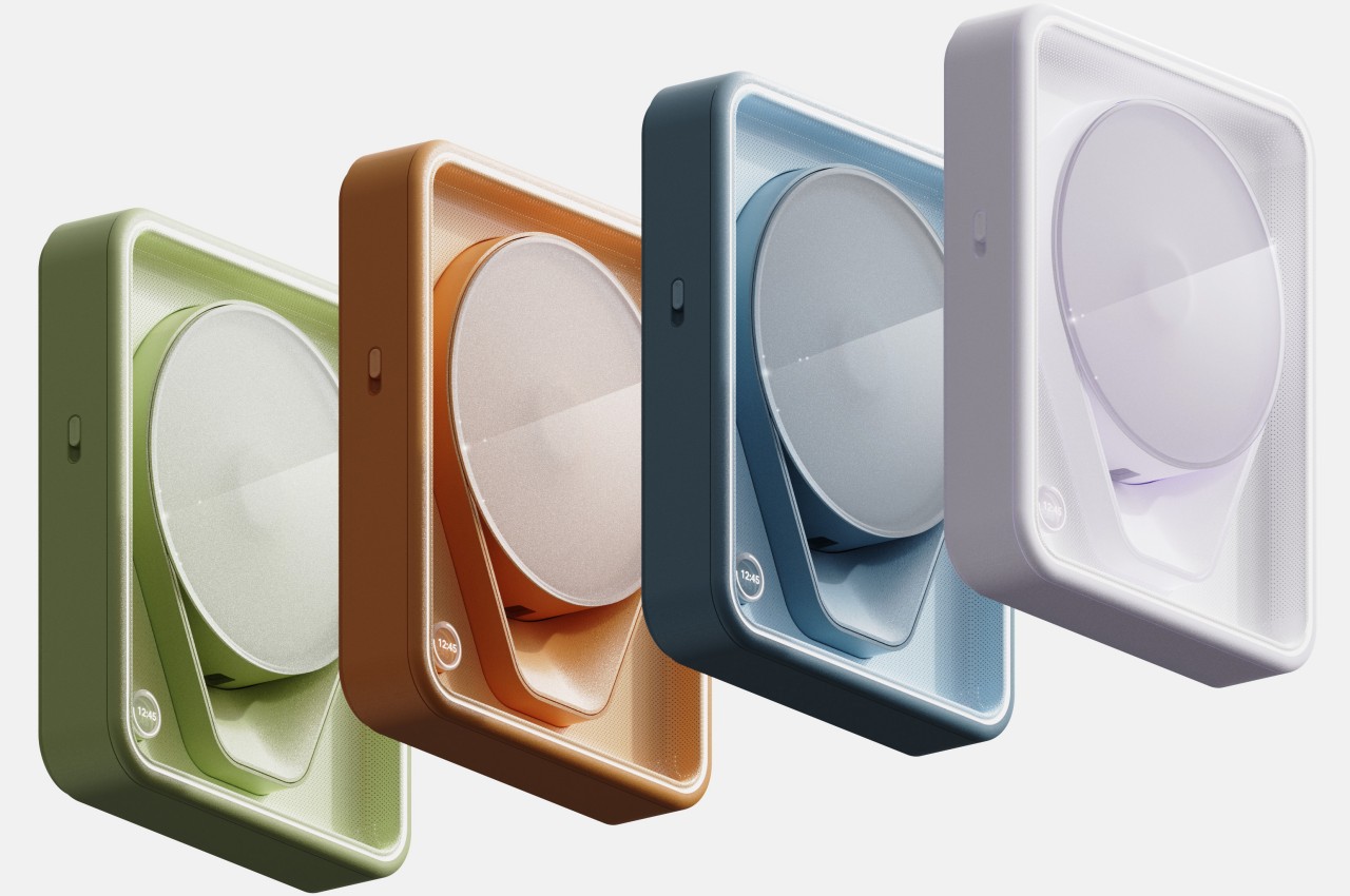
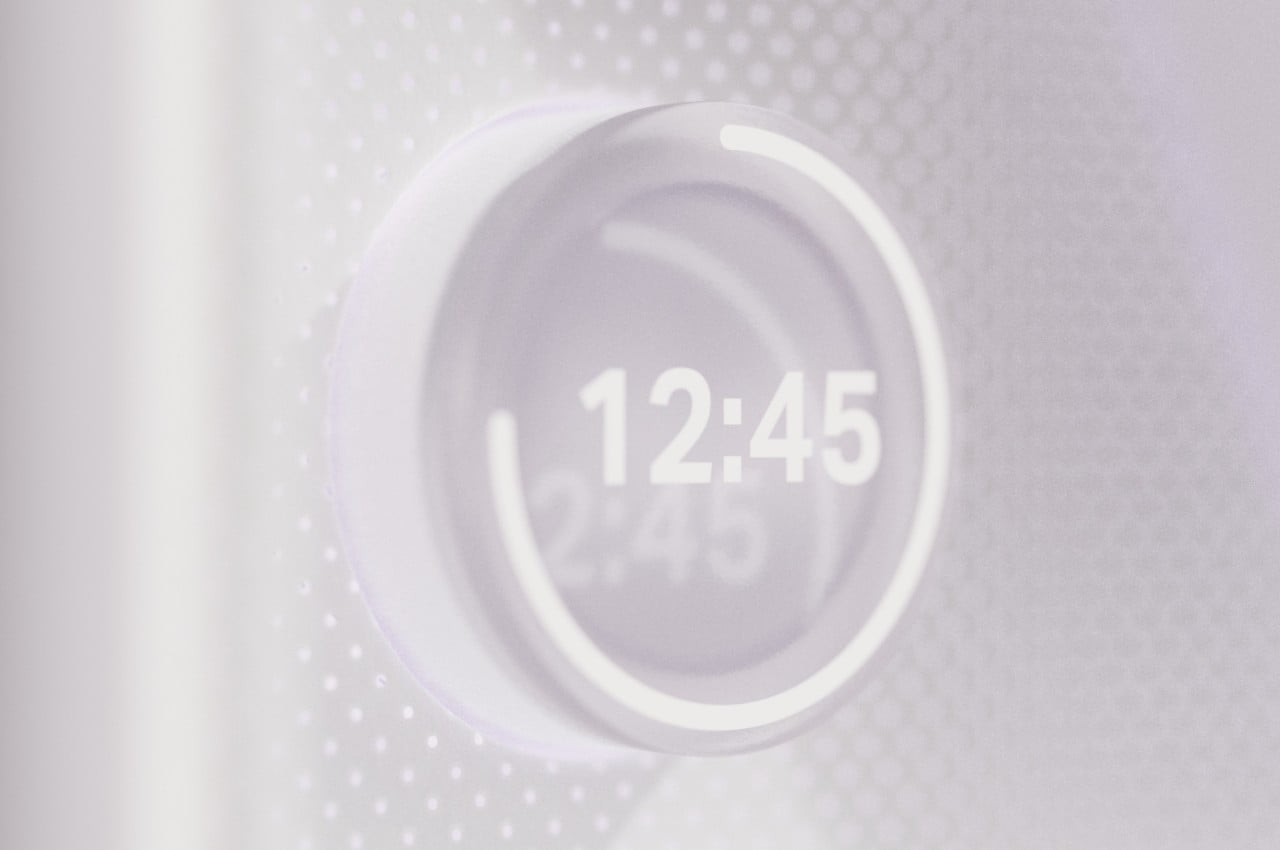
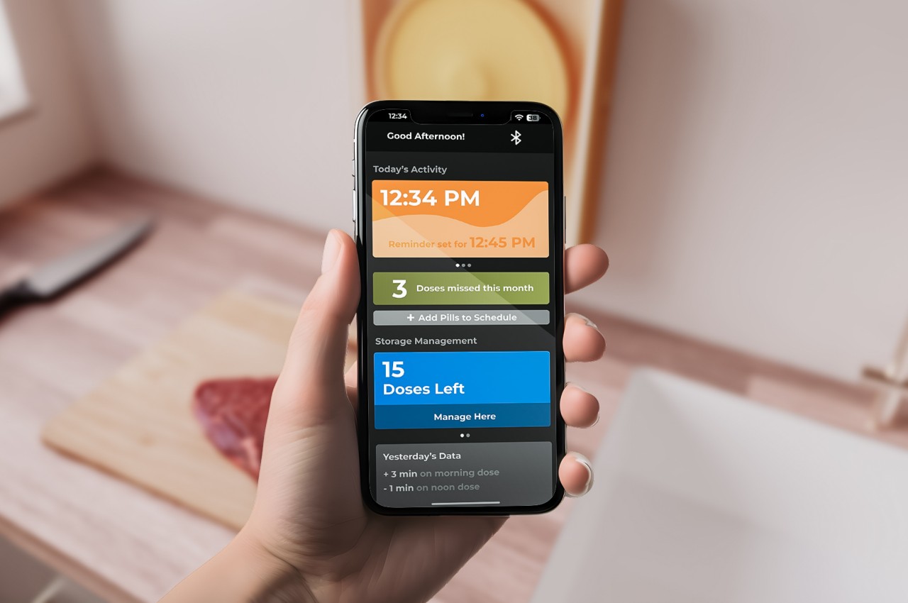
Of course, it wouldn’t be a smart pill dispenser if it didn’t have any hi-tech features. When connected to a mobile device, Cadence will be able to keep track of your intake, calculating how many doses you have left or how many you’ve missed in that month. The dispenser itself has a small digital clock in the corner to take note of the time, and an LED light strip around the box that gently catches your attention when it comes time to take your medicine. Cadence isn’t exactly a sophisticated smart device, but it’s this balance of digital and analog methods that actually makes the design concept even more effective.

The post Smart pill dispenser concept safeguards your medicine from kids first appeared on Yanko Design.

Smart display concept puts a cute face on smart home technology

As our homes start to get more connected to devices and the Internet, the number of screens also starts to increase. In addition to the phones, tablets, computers, and TVs that are already a staple of modern life, there are also smart displays that try to offer visual feedback to the things we usually only hear by voice from an AI-powered assistant. While many smart display designs try to blend in with the rest of the room, it’s really hard to hide a large conspicuous screen that needs to always to in view to be useful. This design concept tries to soften the blow of having such impersonal tech products inside your living space by giving a smart display a rather comical face that makes it feel more alive and a little bit friendlier.

Designer: Kai Xia

Smart displays are pretty much the evolution of voice-controlled smart speakers, giving a visual representation of the information you would normally get only through audio. Of course, it could also be used for other purposes, like displaying photos similar to a digital photo frame, playing videos, or even making video calls. The standard design of these devices, however, has more in common with those speakers or, worse, simply look like tablets slapped onto cylinders and boxes.

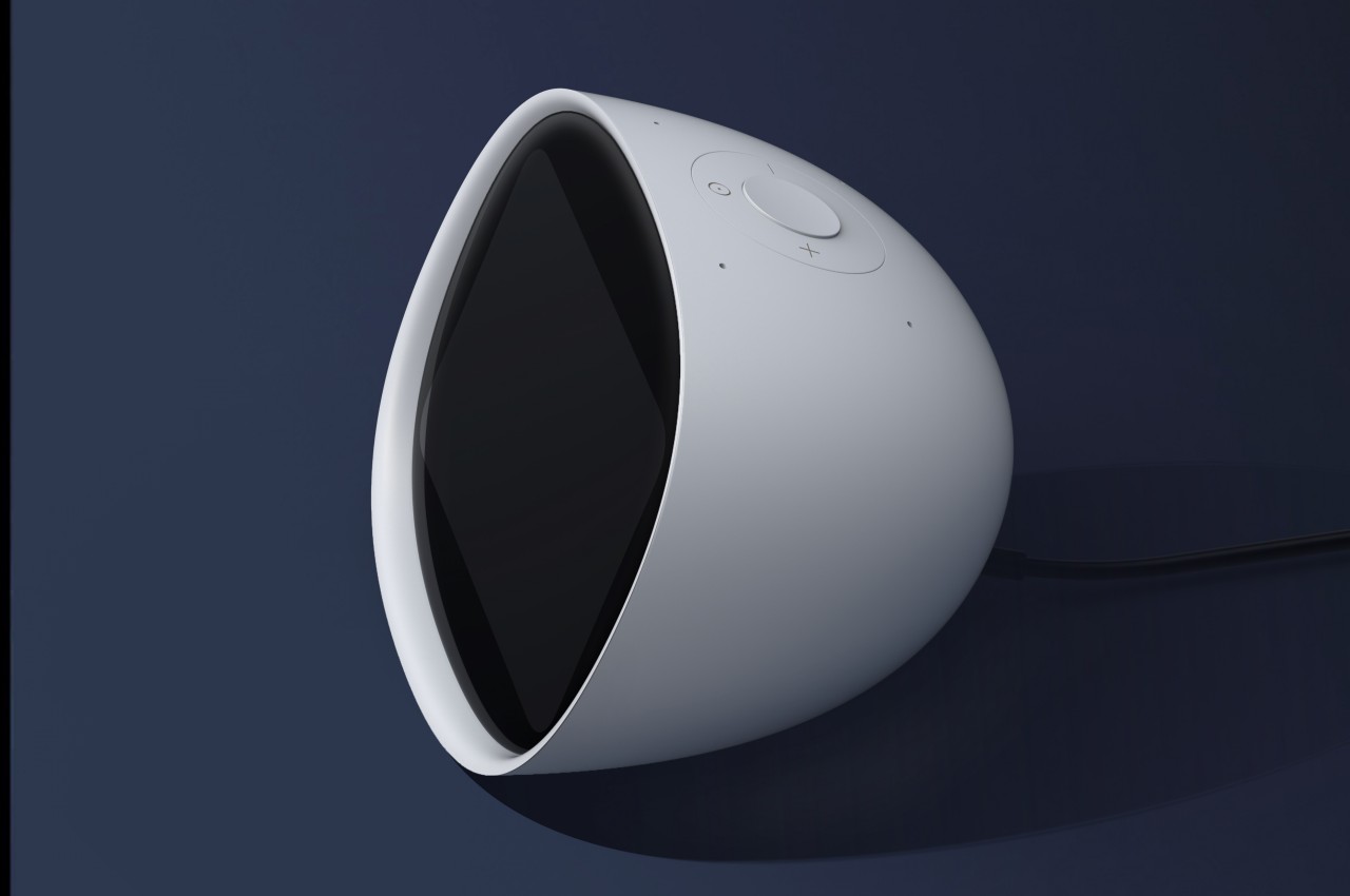
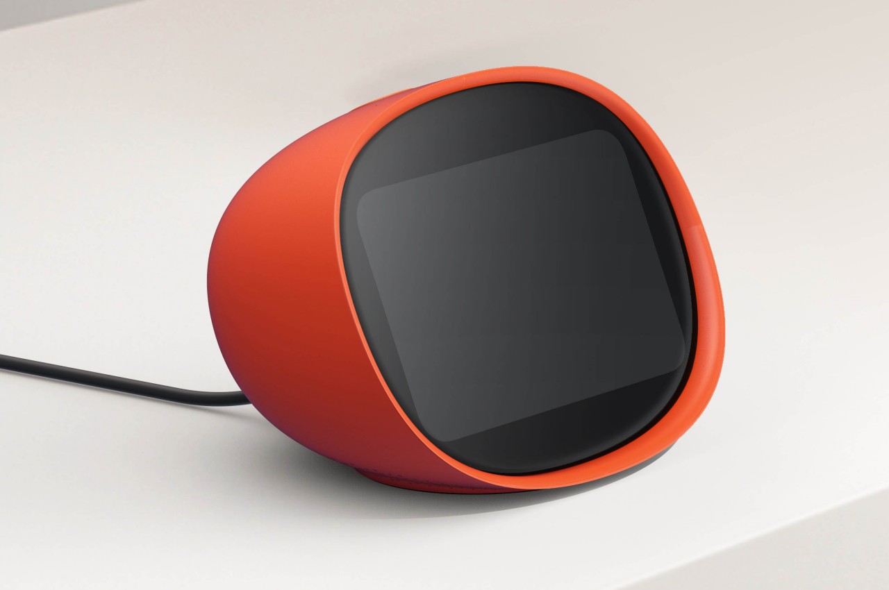
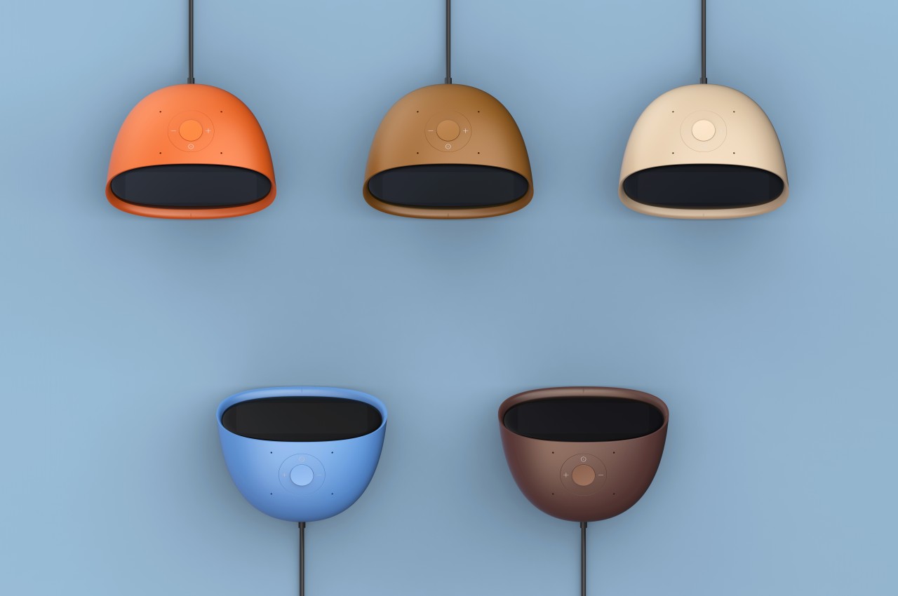
The Smart Pad concept tries to liven things up by changing the core design of the smart display. Objectively speaking, the 4-inch screen might actually seem too small for its purpose, but that also means you’re forced to show only the essentials rather than flooding the user with information. The smart display is also shaped like an egg, reminiscent of the old, colorful iMacs or even some vintage CRT TVs. This angles the screen at a comfortable level without having to resort to stands and external mechanisms.

The more important feature of the concept, however, is the cartoon-y face that can be displayed on the small screen. It might be a minor and optional detail, but it lends the gadget a bit of personality, making it feel more approachable and even human to some extent. It makes the Smart Pad feel less like an appliance and more like a companion, putting a face to that disembodied voice we always hear when we talk to such devices.

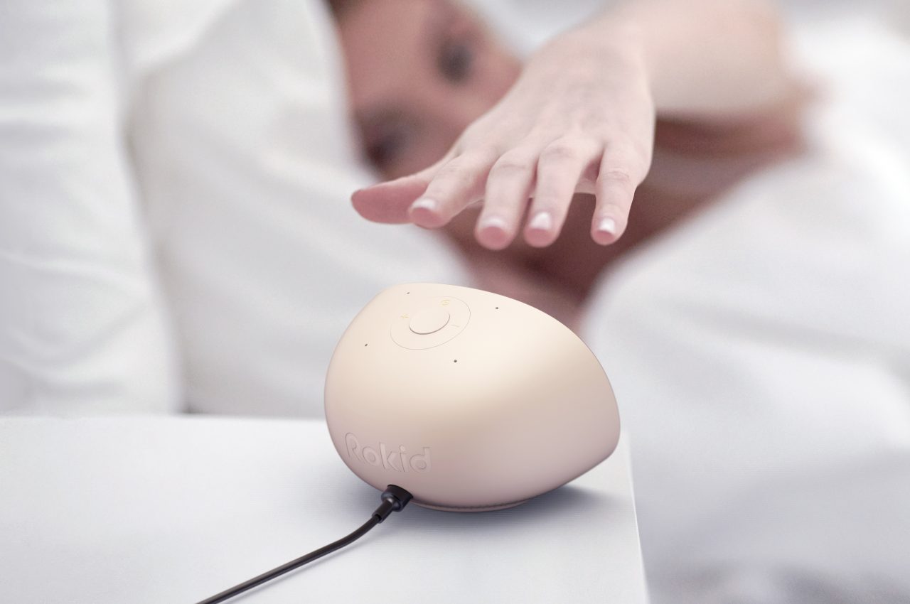
Of course, it’s also capable of the standard things that smart displays can do, at least in theory. That screen can play videos, display photos, and show information, but it might be less expressive because of its small size. That makes the device more suited for desks and bedside tables rather than living rooms, where seeing the screen up close is more natural.

The post Smart display concept puts a cute face on smart home technology first appeared on Yanko Design.

The Minimally Elegant ‘mui Board’ IoT dashboard gets upgraded at CES 2024 with Matter and ChatGPT support

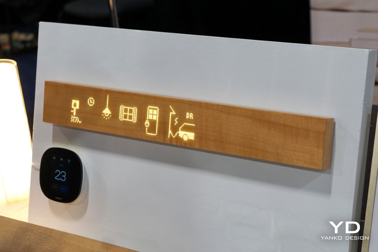
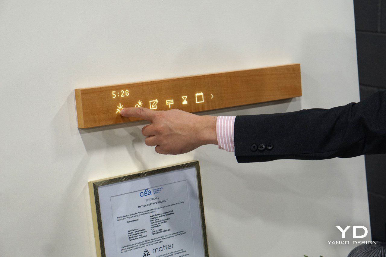
At first glance, the mui Board Gen 2 appears to be nothing more than a simple wooden plank, designed to be mounted on a wall. However, this unassuming piece of timber transforms into a touch-sensitive interface for controlling various aspects of a smart home. Imagine adjusting your lighting, curtains, thermostat, and even your speakers with a simple tap on this wooden surface.

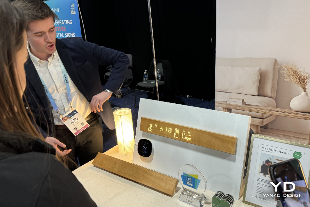
Now in its second generation after a successful run on Kickstarter back in 2022, the designers behind your smart home’s most minimally elegant accessory are back with round two. The mui Board Gen 2, which made its simultaneous debut at CES 2024 as well as Kickstarter, now comes with a few upgrades which include support for the Matter protocol, as well as integration with ChatGPT for a more innovative and intuitive smart home experience.

Designer: mui Lab

The second-generation Mui Board integrates the new Matter networking protocol, significantly broadening its compatibility with smart devices from tech giants like Apple, Google, and Amazon. This integration promises easy connectivity and enhances the Mui Board’s appeal as a universal smart home control hub​.

Additionally, the Gen 2 also gets ChatGPT integration via APIs, allowing you to interact naturally with your Mui Board to create schedules, task lists, and even ask questions and get answers on the backlit wood interface.

When not in use, the Mui Board slips into sleep mode, reverting to its original wooden plank appearance. This feature underscores the company’s ethos of blending technology seamlessly into the home environment, making it a subtle yet powerful addition to any room. The Gen 2 continues to use real wood veneers to give the mui Board its unique natural appeal. While the company only showcased the mui Board in a single color, it’ll be available in ‘natural’ and ‘dark’ veneer options at the end of its Kickstarter campaign.

What truly sets the mui Board apart is its focus on “calm technology.” Japanese company mui Lab, the creators of the mui Board, aims to reduce distractions and information overload in our daily lives. By minimizing the presence of glaring screens and providing a more discreet way to interact with smart devices, they hope to maintain a balance between connectivity and tranquility at home.

The post The Minimally Elegant ‘mui Board’ IoT dashboard gets upgraded at CES 2024 with Matter and ChatGPT support first appeared on Yanko Design.

GoveeLife Smart Space Heater Lite Review: Powerful Heat in a Small Package

PROS:


  • Compact, portable, and sleek design

  • Built-in basic thermostat for automatic temperature adjustment

  • Great safety features for households with children and pets

CONS:


  • Needs to be plugged directly into a wall socket

  • Touch buttons provide no tactile feedback

RATINGS:

AESTHETICS
ERGONOMICS
PERFORMANCE
SUSTAINABILITY / REPAIRABILITY
VALUE FOR MONEY

EDITOR'S QUOTE:

The GoveeLife Smart Space Heater Lite delivers quick, efficient, and safe heating wrapped in a compact and stylish package.

The holidays usually mean colder days, at least for those living in the northern part of the world, which also means rising costs in order to keep oneself warm and toasty. Fireplaces might sound and look romantic, but they’re not efficient, sustainable, or even safe. The same goes for gasoline-powered heaters, which also add an element of risk to people’s health. In this day and age, smart appliances play an important role in living a life of comfort without the downsides and expenses of traditional products, so it’s not really surprising that GoveeLife has launched a number of new smart space heaters for that very purpose. While Govee is probably best known for its smart lighting solutions, it established GoveeLife this year to focus on smart home appliances like heaters, humidifiers, smart kitchen appliances, and sensors, aiming to enhance convenience, optimize efficiency, and improve overall quality of life. In particular, the compact GoveeLife Smart Space Heater Lite piqued our interest, so we took it to the test to see if it’s really such a hot product or just hot air.

Designer: GoveeLife

Click Here to Buy Now: $29.99 $49.99 (40% off). Hurry, deal ends Dec 2nd.

Aesthetics

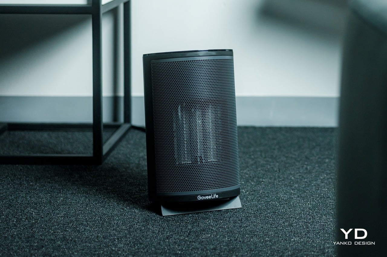
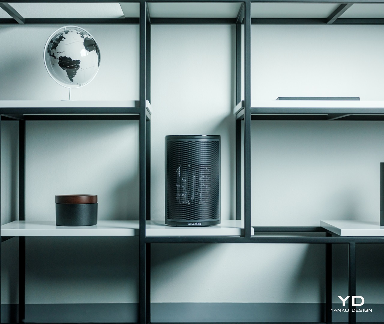
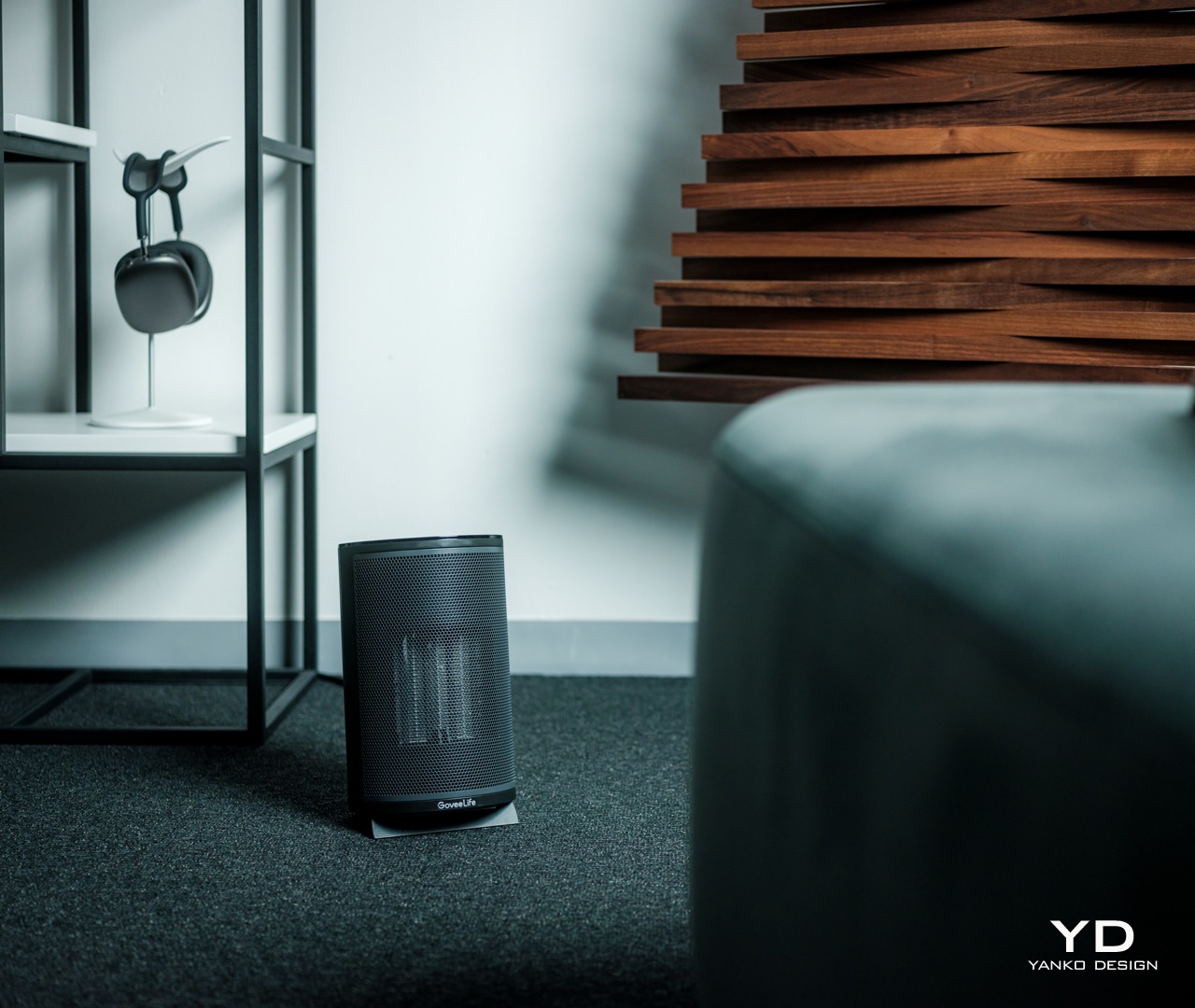
Air coolers, purifiers, and humidifiers have started to dress up and look more at home in our living spaces, taking on designs that blend well with the rest of the furniture or stand out in a pleasing way. Most space heaters, in comparison, look utilitarian and uninspired, making you think of them more like movable ovens or furnaces than a distinct class of their own. In that sense, the GoveeLife Smart Space Heater Lite sets itself apart with a design that is discreet and stylish, making it a fine addition to your room, no matter the motif you have going.

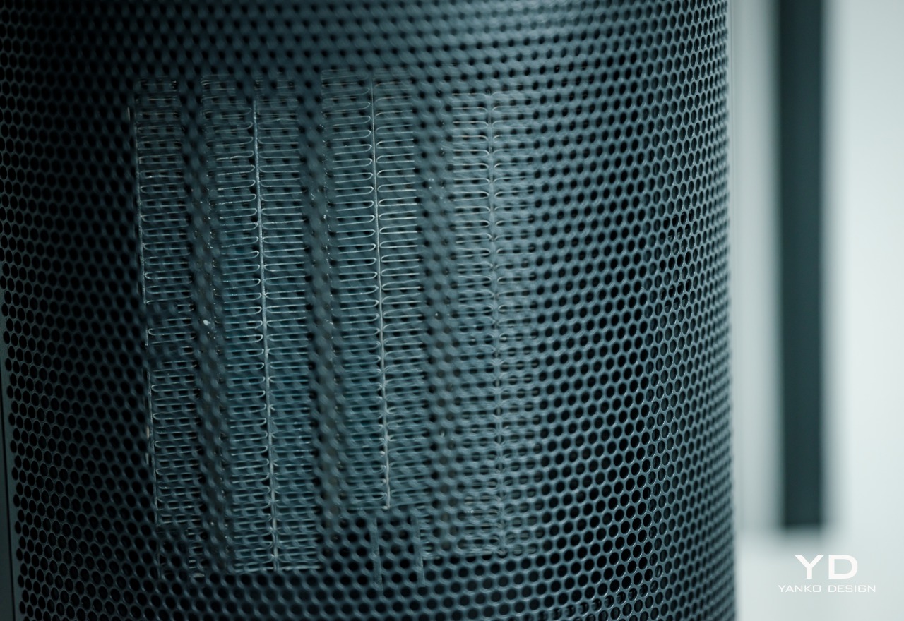
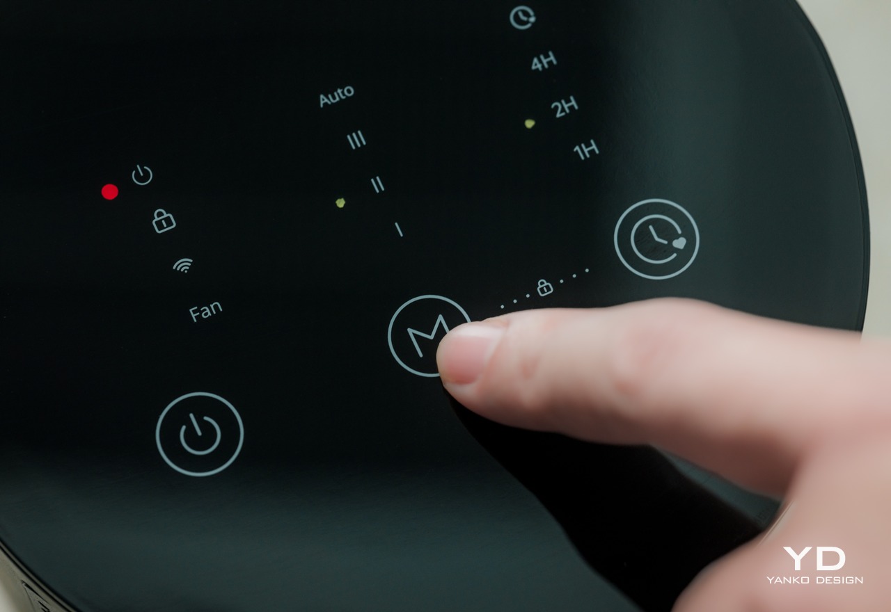
For starters, the smart space heater takes on a cylindrical shape with very minimal markings all around. The most distinctive part of the product is the silver grille in front where hot air blows out. It’s a perfect match for the black colorway, which is the review unit that we got, though the white version isn’t bad either, even if the grille does stand out more. The top holds the capacitive touch buttons and LED status indicators, though you might not look at those that much if you’ll be controlling the heater mostly through the Govee Home app.

The GoveeLife Smart Space Heater Lite, which is the smallest of its siblings, is only 9.1 inches tall and 5.9 inches in diameter. This compact size makes it ideal for any space, even in cramped corners or shelves. It’s also lightweight at only 3.63lbs, which means you can easily take it anywhere around the house. For bigger rooms and spaces, GoveeLife also offers the Smart Heater Pro and Smart Heater Pro Max. The only consideration you need to have is that the appliance has to be plugged in directly to a wall outlet, now through some power cord. That might be limiting for some, but the included 5ft power cable does address that issue to some extent.

Ergonomics

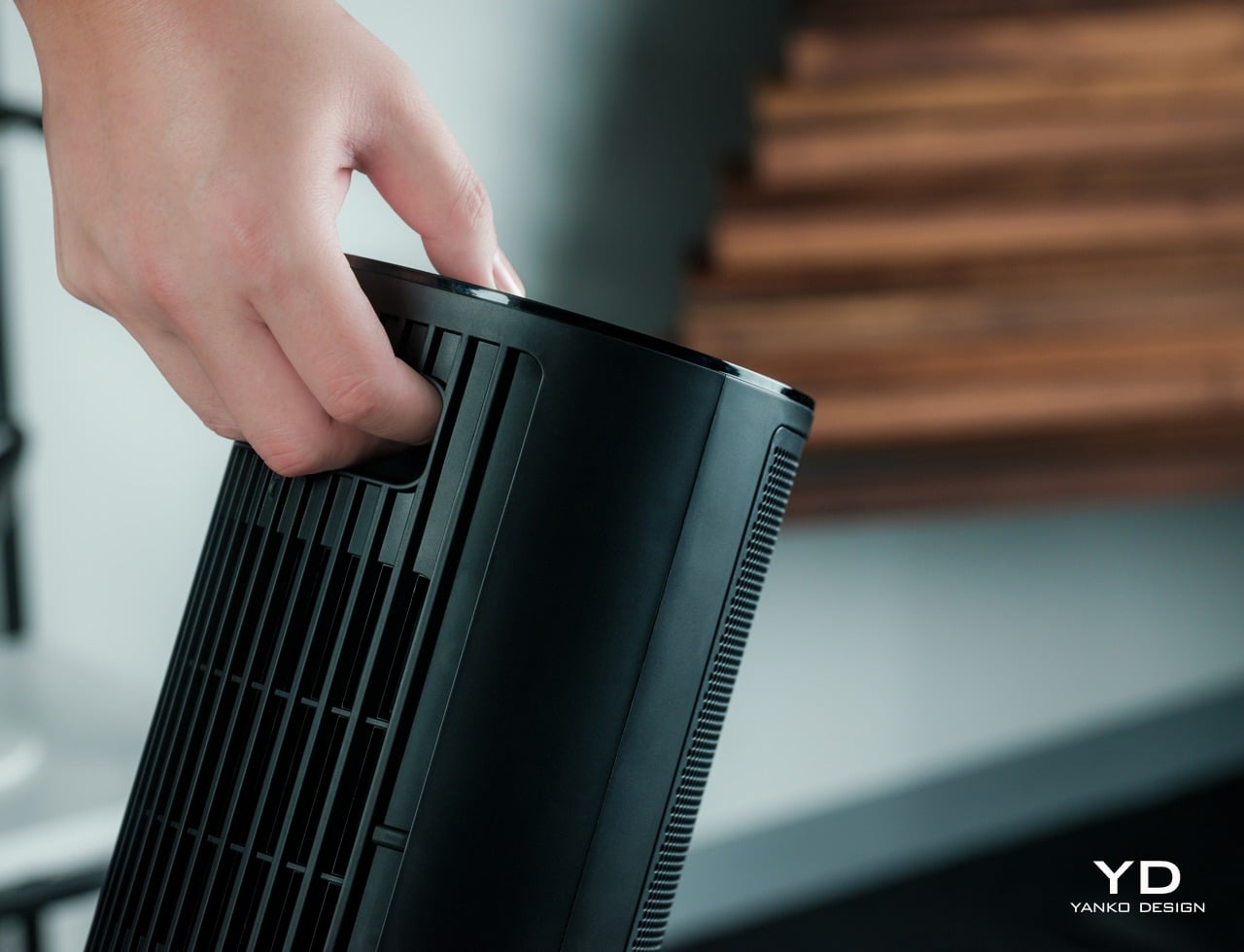
As mentioned above, the GoveeLife Smart Space Heater Lite is truly light on weight, so there will be no problem where you want to set it up. It doesn’t require a permanent installation either, so you can just lift it up and put it somewhere else if you’re not happy with the heat distribution. The integrated carrying handle on the back makes that easy, a clear sign that the heater isn’t meant to stay put in a single place forever. Of course, you’ll have to consider the airflow in the room and place the heater where it will have the best effect.

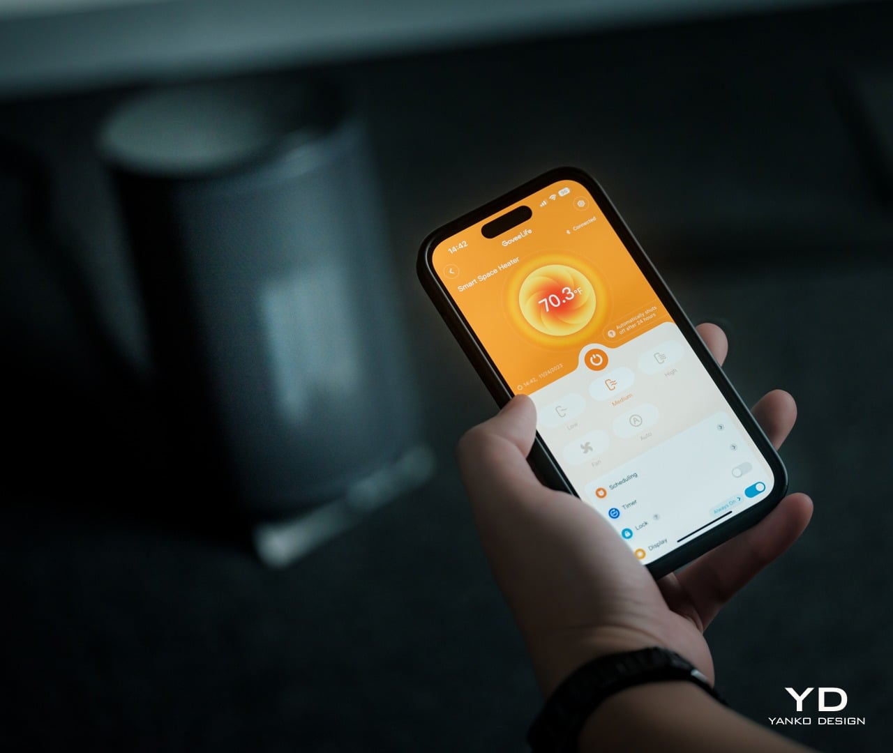
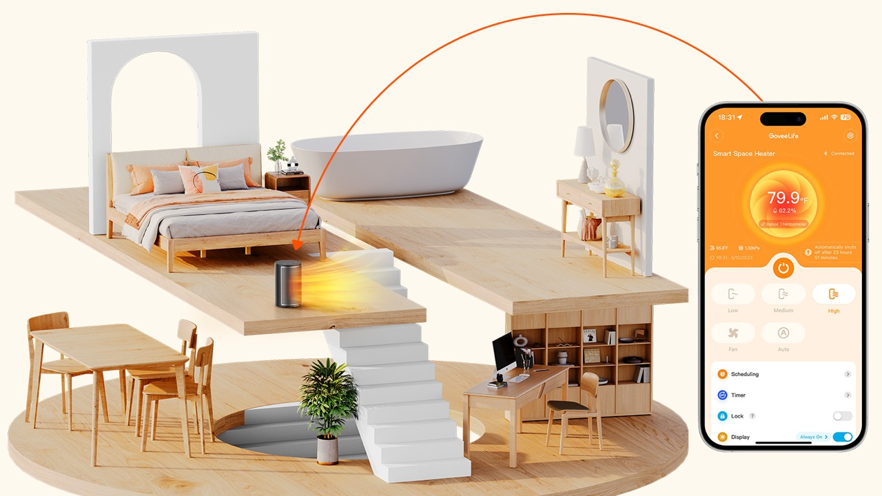
Setting up the appliance is just as easy as well, and all you need to do is connect the Smart Space Heater Lite to your phone via Wi-Fi or Bluetooth. The Govee Home mobile app has all the functions you need to control the heater, some of which won’t be available via the physical controls. Those controls come in the form of very flat, capacitive buttons on the top of the device. This kind of control definitely looks elegant and minimalist, but it lacks the tactile haptic feedback that our fingers and brains need to register that we’ve pushed a button. That might throw a few people off, but not enough to make it a huge issue, especially if you’ll be using the mobile app or voice control most of the time anyway.

Performance

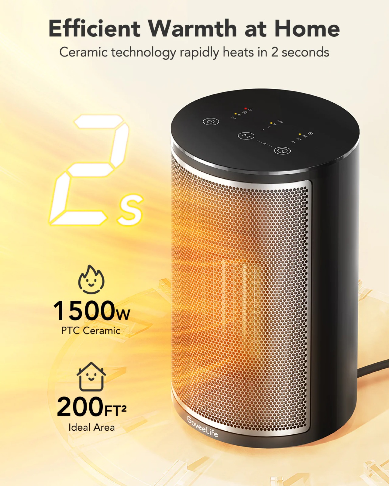
For such a small thing, the Smart Space Heater Lite packs quite a punch when it comes to heating. It uses a 1500W PTC (Positive Temperature Coefficient) ceramic heating element that only takes 2 seconds to rapidly heat an area. It works best for closed spaces under 200 square feet, so large living rooms might be a bit more difficult to heat up. The heater blasts hot air from the front, but its swivel feature allows that heat to spread across a wider range. You can even tilt the heater up so that it can reach higher areas.

Like air coolers, the GoveeLife Smart Space Heater Lite has four modes, five if you count “Auto.” These modes, which include fan, low, mid, and high, can easily be set with a single button that cycles through the modes or directly via the app. The more interesting mode, however, is “Auto,” which utilizes the heater’s built-in thermostat. To use it, you set the desired temperature in the app and the Smart Space Heater Lite will heat the room up to that temperature and then automatically switch off once it reaches that point. While you can switch to Auto mode using the heater’s buttons, you can only set the temperature through the app.

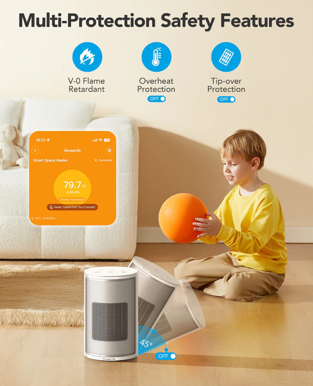
Since we’re dealing with heating elements and hot surfaces, it’s no surprise that GoveeLife loaded the heater with a lot of safety features, including a timer. For starters, the product itself is V-0 flame retardant to reduce the risks of fire and burning. There’s a control lock feature in the app that disables the on-device buttons, preventing anyone, especially children, from accidentally operating the heater. One of the best features, however, is the tip-over notification, which immediately alerts you through the app if the heater is knocked over by a person or a pet.

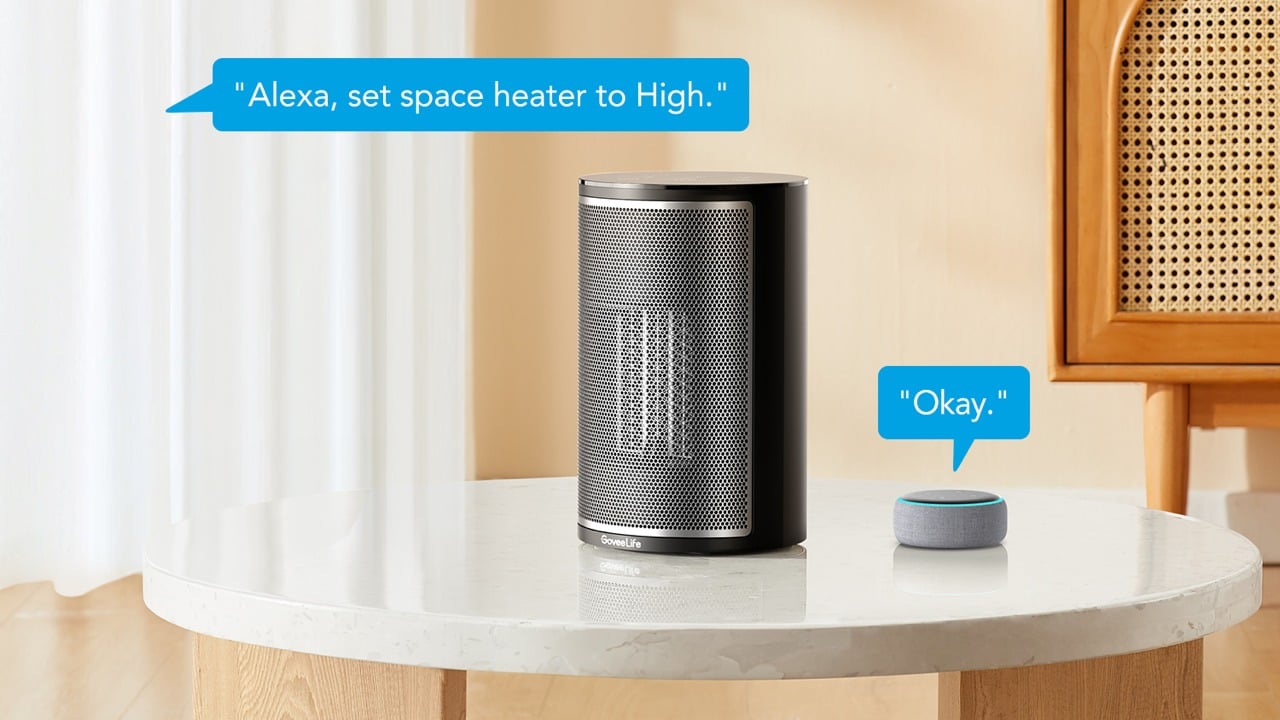
Of course, the Smart Space Heater Lite is “smart” for a reason, and it can integrate well with existing smart home platforms, including Apple Home, Google Home, and Amazon Alexa. That means convenient voice control, regardless of which platform you’re using. Not only that, but you can also add the heater to programmed scenes so that you can make sure your home is warm and toasty by the time you get home from work.

Sustainability

Unlike mobile devices and some gadgets, you’d expect appliances to be designed for the long haul. The choice of materials and their designs are made based on durability and longevity, though no device is immortal. Sooner or later, they get damaged or even broken beyond repair, which means a trip either to a service center or to a landfill. When this happens, the use of sustainable materials and the application of repairable designs play important roles in helping minimize their damage to the environment.

The GoveeLife Smart Space Heater Lite isn’t exactly an outlier in that regard, made from the typical mixture of plastics and metal. Self-repair is also out of the question, and you might find yourself striking out in finding a nearby service center, depending on where you live. Maybe the day will come when GoveeLife will be making easy-to-repair products that use recycled materials, and we’ll be keeping a close eye on this rapidly growing brand for that day.

Value

Space heaters are a bit less common than coolers and humidifiers, but they’re numbers are definitely rising. That’s especially true for smart heaters that are trying to ride on the smart home train. With so many to choose from, including from GoveeLife’s own catalogue, it’s only natural to ask what makes this Smart Space Heater Lite desirable enough to be worth your hard-earned cash.

In a nutshell, the GoveeLife Smart Space Heater Lite checks all the right boxes without going overboard with unnecessary features. The thermostat-driven Auto mode is a great money and power saver, and the rapid heating technology makes sure you get the desired warmth sooner rather than later. Its lightweight and attractive design makes it easy to place the appliance anywhere in the house, while excellent safety features ensure your kids and furry friends are out of harm’s way. Best of all, the $49.99 price tag isn’t too much to ask especially for something you’ll be using for a very long time.

Verdict

There has been a lot of focus on air coolers, purifiers, and humidifiers in the past year or so, but unpredictable weather and freak blizzards remind us that the other extreme is just as bad. Not many people give much thought to their heaters, at least until the electricity bill arrives. That’s when they need a smarter and more cost-efficient way to stay farm.

The GoveeLife Smart Space Heater Lite definitely fits the bill in that regard. It might not be sufficient for very large areas, but it’s more than enough for the majority of households and rooms. Smart and safety features take away most of the worry involved with appliances that generate heat, and integration with major smart home platforms means that you can be even more energy-efficient by only using the heater when it’s actually needed. More importantly, the Smart Space Heater Lite looks quite elegant in any setting, making it a potential centerpiece for your smart home decor.

Click Here to Buy Now: $29.99 $49.99 (40% off). Hurry, deal ends Dec 2nd.

The post GoveeLife Smart Space Heater Lite Review: Powerful Heat in a Small Package first appeared on Yanko Design.
Govee RGBIC Permanent Outdoor Lights Review: It’s a Holiday Everyday of the Year

PROS:


  • Relatively easy to install

  • Durable and weatherproof with IP67 rating

  • Bright and vibrant LEDs with 16 million colors

  • Powerful customization and control via app or smart assistants

CONS:


  • A bit expensive

  • Triangular light pattern might not appeal to some

  • Overwhelming mobile app

RATINGS:

AESTHETICS
ERGONOMICS
PERFORMANCE
SUSTAINABILITY / REPAIRABILITY
VALUE FOR MONEY

EDITOR'S QUOTE:

Bright, colorful, durable, and versatile, the high-quality Govee Permanent Outdoor Lights make sure you never have to buy and put up Christmas lights over and over again.

Christmas in Summer? Sure, why not? Especially if you can beat the summer heat and hold a raving ‘outdoor party at night. You’ll need to set the right atmosphere, though, to help your guests forget about the sweltering temperatures. And what better way is there to set a festive mood than with brilliant lights that dance to the music? Of course, those same outdoor lights could provide not only decoration but also safety at night, any time of the year. That’s the proposition that the Govee Permanent Outdoor Lights is making, replacing your Christmas lights and staying beyond the winter holidays to be used all year round. These aren’t the first outdoor fairy lights in the market, though, so we took these unique-looking LED lights outdoors, hooked them up, and lit up the house to see if it can rise to the challenge and stand proud apart from the crowd.

Designer: Govee

Click Here to Buy Now: $299.99.

Aesthetics

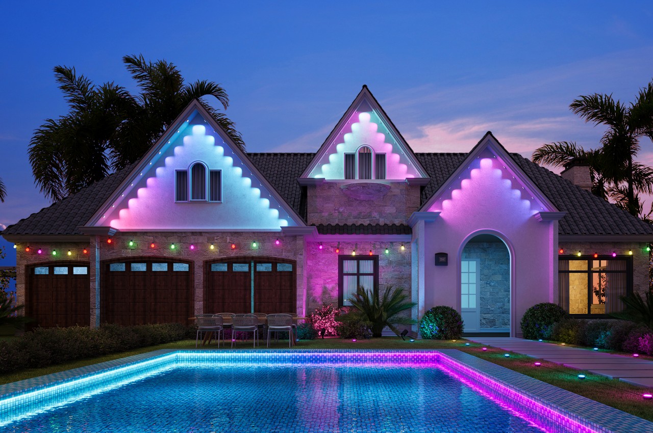
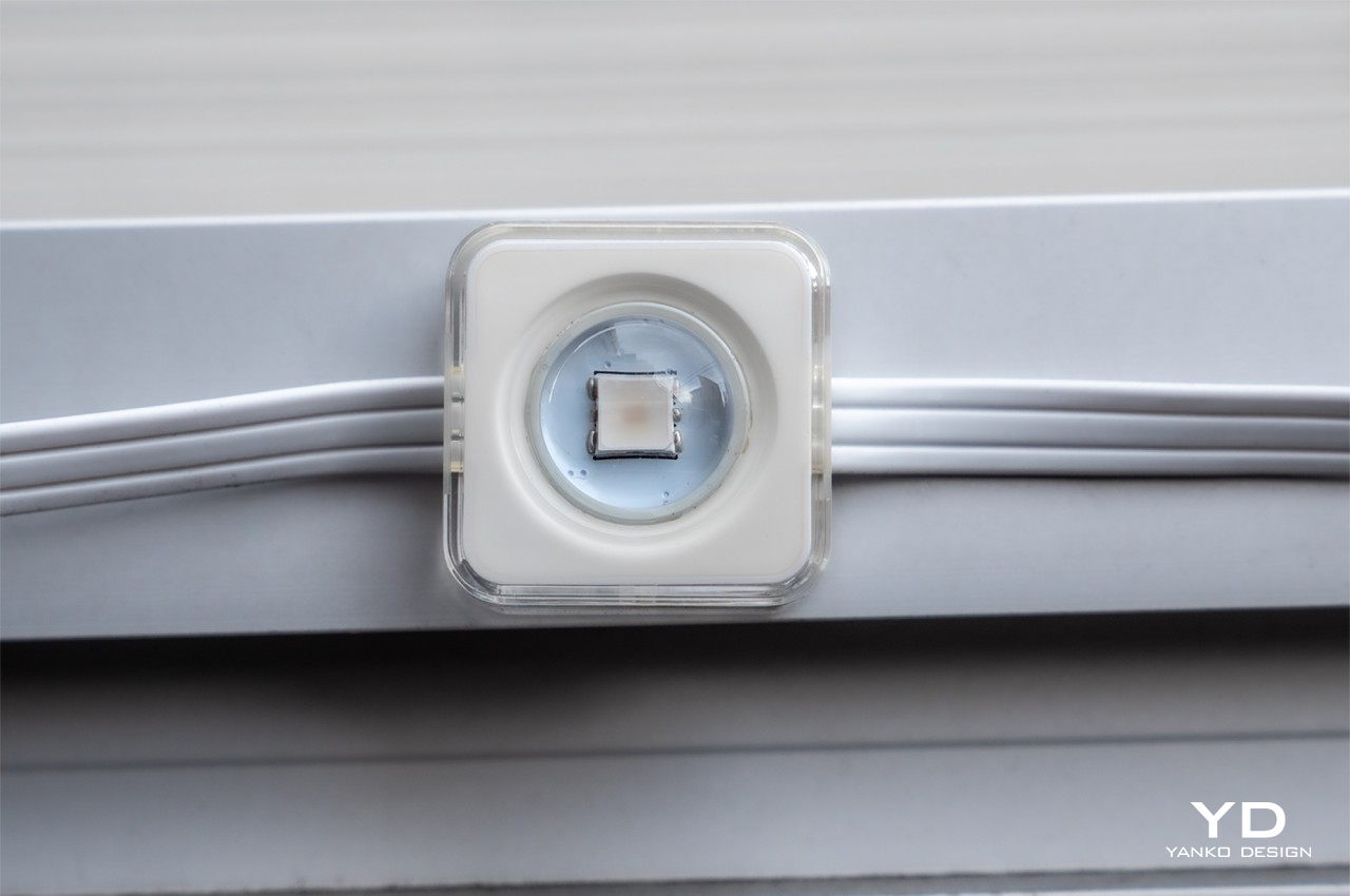
You’ve probably seen your fair share of outdoor lights, fairy or otherwise, but if you haven’t, suffice it to say that the Govee Permanent Outdoor Lights are nowhere near what you’d expect. Instead of bulbs sticking out of a strand of cable, you get LEDs enclosed in 3cm squares with a small clear dome covering the LED itself. Each square is set about a foot apart from each other on the flat cable, forming 6 segments that total a 100ft (50m) long string of light of lights that offers some flexibility in how you install them (more on that later). What all these mean is that the lights are designed to be minimalist and almost invisible, getting out of the way to let the lights take center stage.

Those lights definitely deserve all the attention because of their impressive output. Thanks to Govee’s RGBIC technology, each light is capable of showing any color within a range of 16 million. Of course, you won’t be looking at each LED on its own, and its real appeal comes through the combination of those lights, whether as a single stream of color or in a kaleidoscopic display. At 26 lumens per LED, the Outdoor Lights will definitely be an attention grabber, no matter what color you choose. That might also be a consideration you have to take in mind if there are related regulations about night lights in your area.
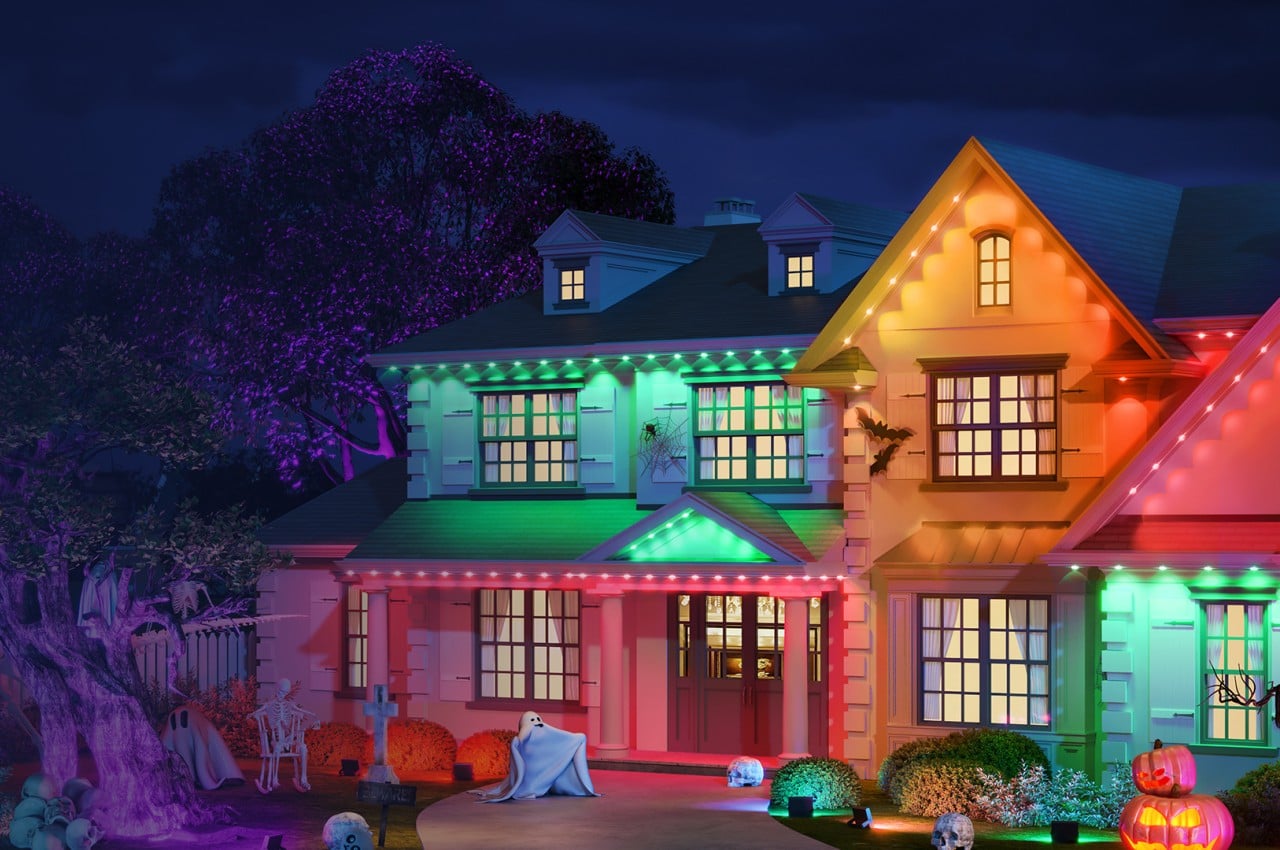
All-in-all, the Govee Permanent Outdoor Lights delivers a stunning visual, regardless of the holiday or occasion. They’re pretty much like super-powered Christmas lights you don’t have to take down and can use all throughout the year. You can even dim the lights a bit and use a solid swath of color to illuminate your house without making it look like you’re having a party every night. Thanks to its simple and minimalist design, there are no bulbs that stick out from roofs and eaves to steal the show. These outdoor lights are an effective and cost-effective way to make your house pop, any time of the year.

Ergonomics (Installation)

You won’t be handling these outdoor lights all the time, fortunately, but you will have to wrestle with them at least once when you install them on your house. Because they are meant to stay in their place, hence the “permanent” part of their name, you do have to take some time to properly plan out where you’ll be placing them. Fortunately, Govee is making it easy to install these strands of light, giving you plenty of flexibility to run the lights even along areas where you might not want to have any light at all.

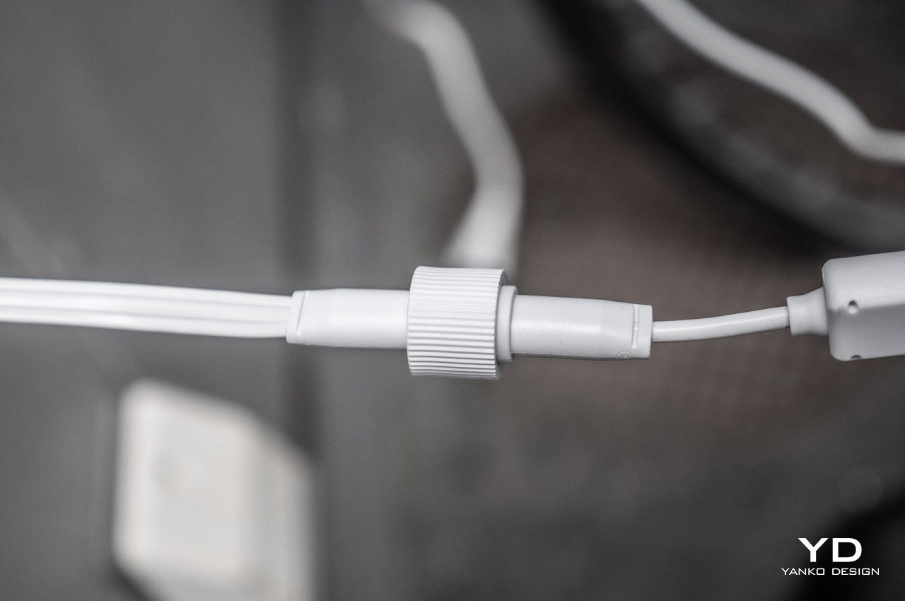
That’s because the 100ft (30m) string of LEDs is actually divided into 6 strands, each with clearly-marked waterproof connectors so you can easily tell which end connects to which. There are also extension cables included in the box, in case you need to run the lights down from roof to wall but want to leave gaps in the lighting in those transitional areas. This also means you don’t have to force yourself to use all six segments if you don’t need to. Conversely, you can also extend the length with another 100ft set or the 3-segment 50ft (30m) set that Govee also sells.

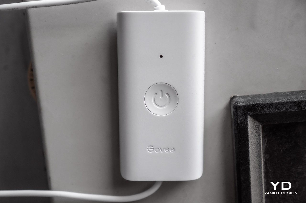
Once all the planning is done, installing the lights is relatively painless, though still needs a bit of work to pull off. Each light square has a 3M adhesive that lets you easily stick them to any flat surface outside your house. There are also clips you can use to keep wayward clips in line. Once all the lights have been installed, the last bit is connecting the control box and the power box to finally light up your house. Connecting the lights to the Govee mobile app is just as painless and you’ll be off playing with the settings and features in no time.

Performance

The Govee Permanent Outdoor Lights are definitely one of those things that you have to see to truly appreciate their value. The bright lights can effectively illuminate your house, adding not only flavor but also safety at night. The lights might actually be too bright, so you might want to put on covers or blinds on windows if the lights are anywhere near them.

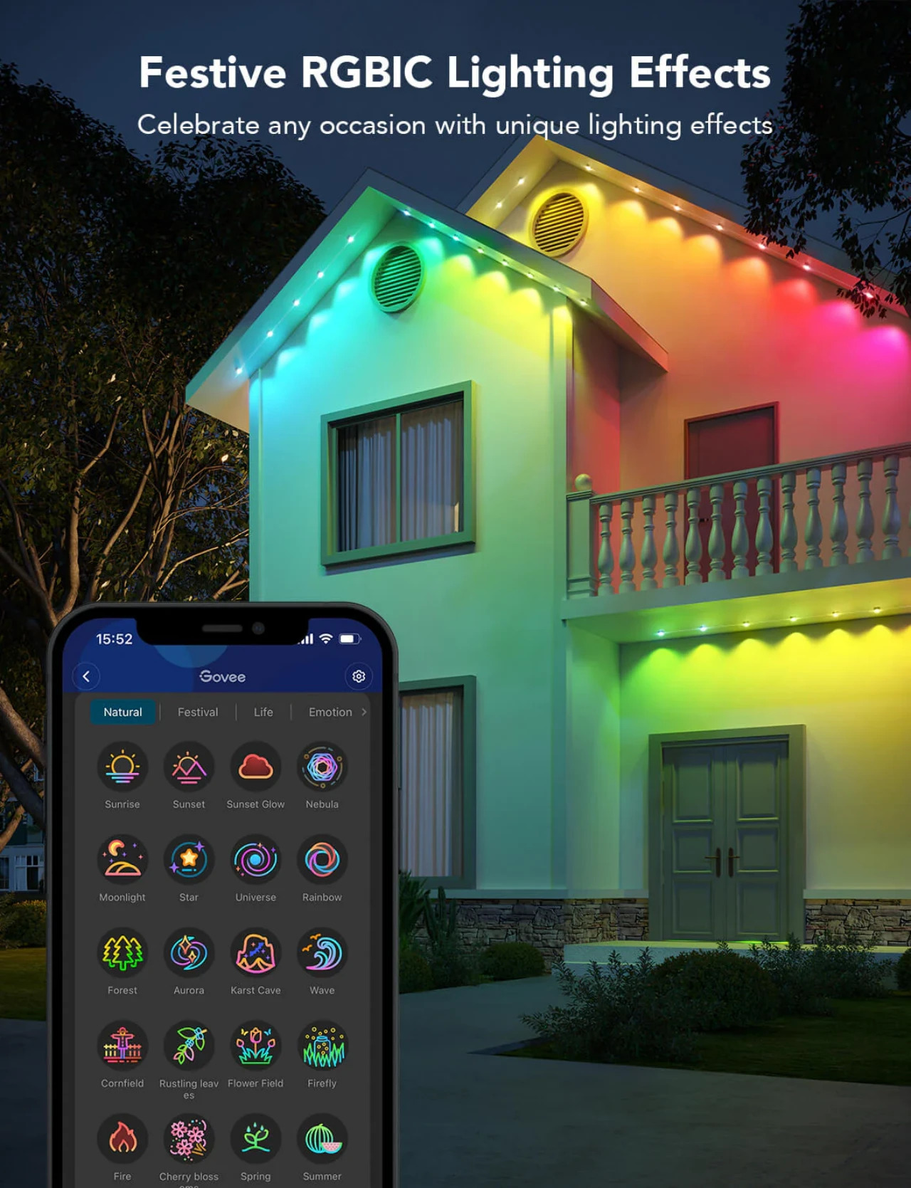
These Outdoor Lights are also smart lights, which means they’re meant to be controlled through a connected smartphone or via some smart assistants, particularly Amazon Alexa or Google Assistant. This is where the lights really shine, pardon the pun, thanks to the countless ways you can change the way they look or behave. In fact, the sheer number of options available on the app might be overwhelming and confusing for new users. Fortunately, there are also plenty of presets available, including over 70 scenes that let you set the right mood for given occasions.

While there are plenty of ways to configure the Govee Outdoor Lights, one of the most interesting and most dramatic is the Music Mode, where the lights react to the music and sound it hears either through the phone or its control box, making them dance to the beat. Even better, you can harmonize multiple Govee products through DreamView mode to create a captivating synchronized Light Show. And when the party’s done, you can just ask Alexa or Google Assistant to turn the lights into a more peaceful hue to call it a night.

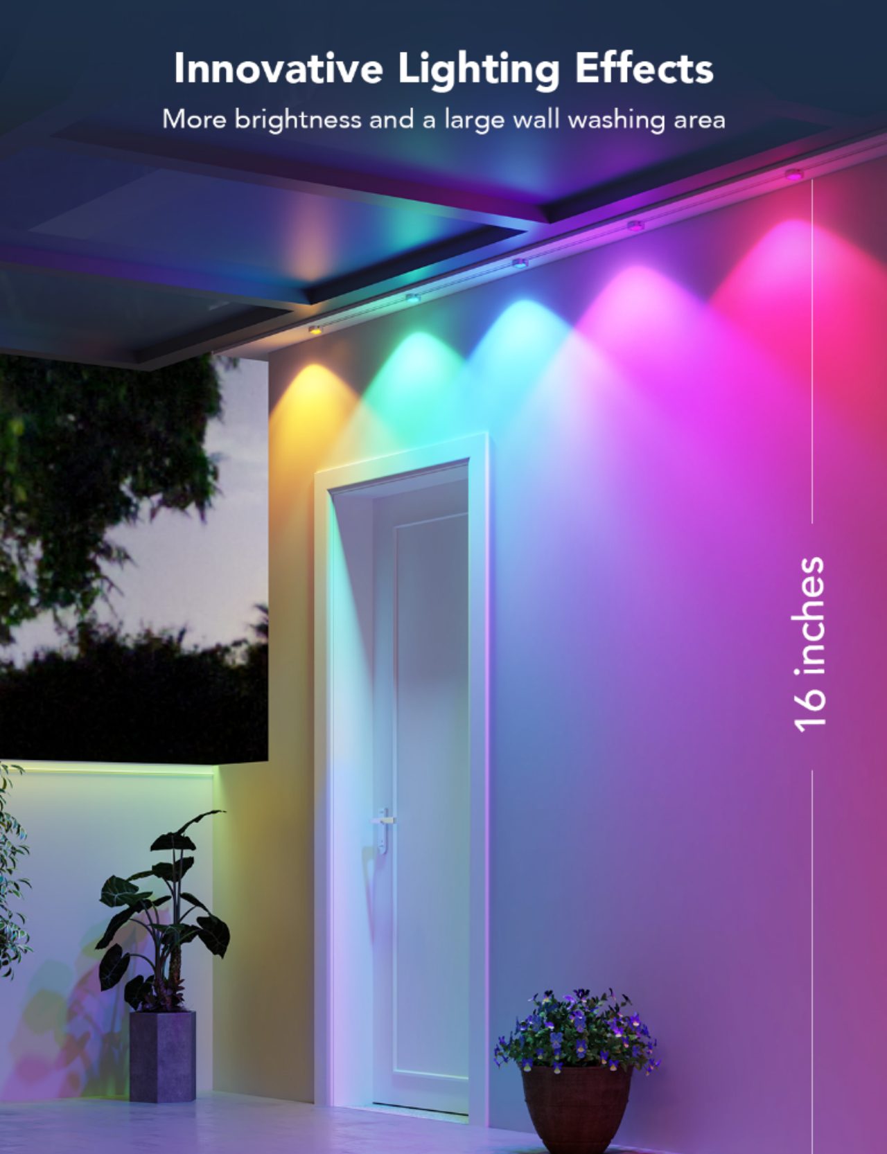
Due to its rather unique enclosure design, the light that the LEDs project has a rather distinctive triangular shape that’s even more visible if the lights are placed close to a wall. Unlike most fairy or string lights that wash the surroundings with a more or less even diffusion, the lights coming from the Govee Permanent Outdoor Lights look more like mini spotlights with a wide-angle spread. It creates a rather unique visual effect, like sharp ridges or stairs, it’s an aesthetic that won’t appeal to everybody. That could be a deal-breaking design that potential buyers will have to consider before making this rather substantial purchase.

Sustainability

Like many outdoor lights, the Govee Permanent Outdoor Lights make use of plenty of plastic and some rubber, not exactly the most environment-friendly materials. Given design and production requirements, however, this is hardly surprising, but it’s definitely a big opportunity for Govee to further take the lead in the smart lighting market. Imagine a brand that not only delivers powerful smart lighting but sustainable products as well. That could be Govee a few years down the line!

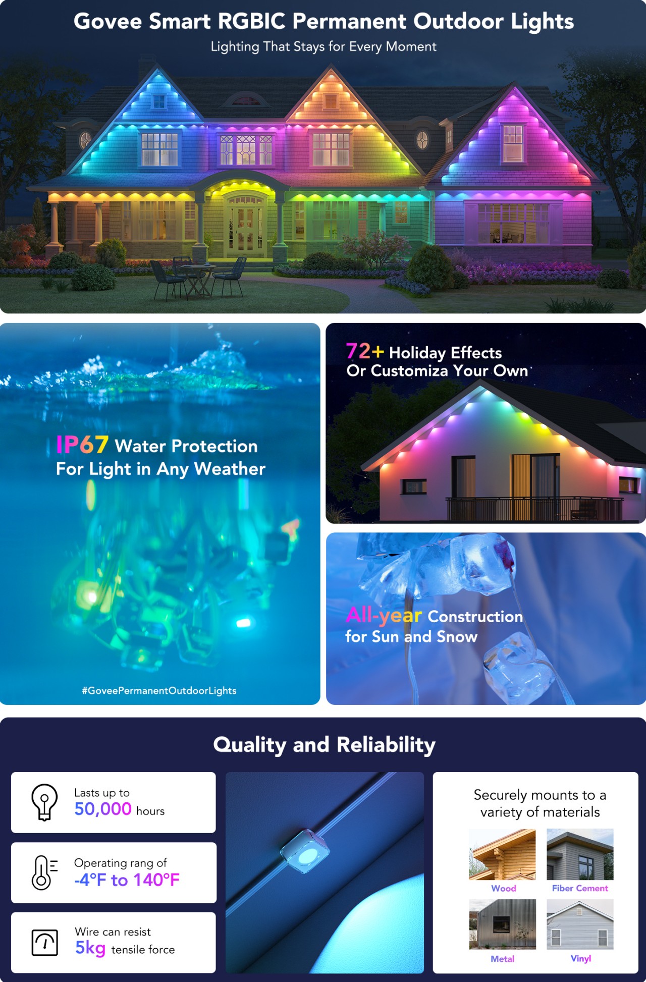
The company does make up for it by making sure that its products don’t meet their untimely demise quickly. In other words, Govee lights are built to last, and these Outdoor Lights are no different. In fact, they’re even better, boasting an IP67 dust and water resistance rating that makes them ideal for use even in inclement weather. Even the control box and adapter are IP65 rated, truly marking them safe for outdoor use. As for the LEDs themselves, they’re advertised with a lifetime of up to 50,000 hours, around 5 years if you use them 24/7 (which you won’t anyway). Govee makes these affirmations regarding the durability of the RGBIC Permanent Outdoor Lights:

  • Successful operation test at 140 ℉
  • Successful operation test at -40 ℉
  • Passed operation test at a water depth of 49ft
  • Withstood a tensile force of 11.02lb
  • Endured manual pulling of over 10 pounds

Value

It’s easy to do a double-take when you see the $299.99 price tag attached to these lights, but it’s a first impression that won’t last long. Yes, it is a bit steep and pricier than other outdoor fairy lights, but few or none of those can even offer half of what Govee delivers. Some, for example, won’t even last more than two seasons of limited use during holidays only, let alone regular use both on or off-season. Few can also offer a quick and easy method of installing lights that you’ll leave in place until they die many years later. You don’t have to dread removing the lights after the festivities and can just leave them there for the next occasion or as regular night lights for the house.

The Govee Permanent Outdoor Lights also offer a level of control and customization you might only find in more expensive brands. There is, in fact, an overwhelming number of settings you can tweak to your heart’s content, making these outdoor lights not only beautiful but also versatile. Given all that, the $299.99 figure doesn’t look bad at all, especially when you consider that it’s a longer-term investment that will last you for years compared to cheaper lights where you truly get what you pay for.

Verdict

Summer isn’t just about beaches and camping (or glamping). Night pool parties and quiet times out on the porch are also common activities during this season, both of which require the right lights to set the right mood. You could get different lights for different occasions, or you could get the Govee RGBIC Permanent Outdoor Lights and have a versatile outdoor lighting solution for any occasion.

With a modular design and easy installation process, these Govee outdoor lights offer more flexibility in where and how you want to put them up. The bright and vibrant colors of the LEDs help create the atmosphere that you want, while the powerful mobile app put an almost endless array of options at your fingertips. Whether it’s a holiday, a seasonal party, or just a dark night, the Govee Permanent Outdoor Lights will make your house stand out and make you the talk of the town.

Click Here to Buy Now: $299.99.

The post Govee RGBIC Permanent Outdoor Lights Review: It’s a Holiday Everyday of the Year first appeared on Yanko Design.