In today’s world, absolutely no one can live without their smartphones! I mean, I need mine by my side at all times, and I am quite heavily dependant on it. As we demand more and more from our smartphones, inventors and creators have been pushing all boundaries when it comes to this piece of tech! From a conceptual Tesla smartphone with an expanding conveyor-belt screen to a Harman Kardon smartphone concept with a massive speaker bump – smartphones these days are getting bigger and better than ever. This collection of innovative smartphone concepts is something all tech-heads would love to see in reality!


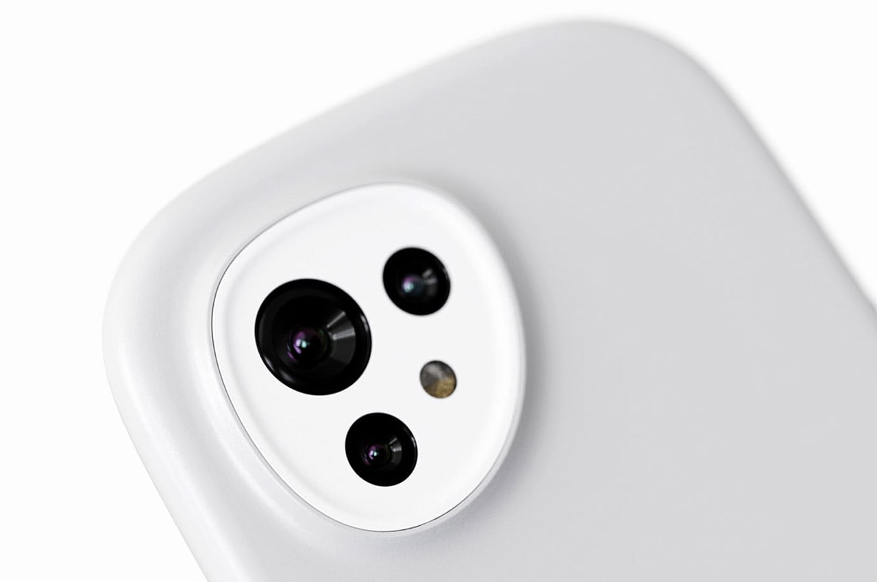
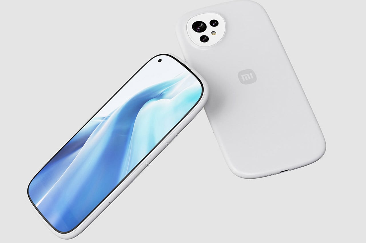
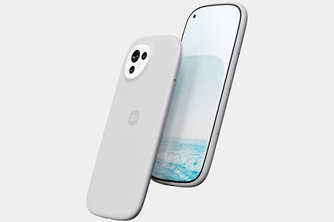
Industrial designer Yifan Hu has come up with the Xiaomi Mi phone of the future inspired by the brand’s latest venture into the “Alive” branding identity announced in March 2021. The phone follows the “Alive” philosophy to the core to signifying a profoundly active life. Have a closer look at the rounded body frame and the contoured camera module housing. Even the phone profile toggling button carries the same theme for visual uniformity. The device is pretty thin and looks ergonomically balanced to hold for the feel-good factor. Quite aptly, the new “Alive” themed logo on the back perfectly matches the overall design of the concept smartphone. Yifan imagines the device in wantable colors, including coral green, see blue, peppy orange, off white, and grey.


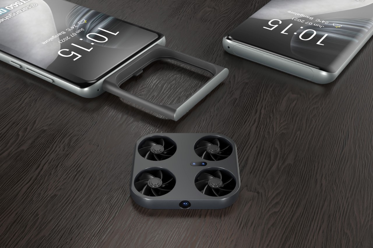
Sliding cameras on smartphones aren’t new, although Vivo’s concept takes it a couple of notches ahead. The patent shows a phone with a massive pop-out tray on the front. Within it, sits a tiny drone (sort of like the Air Selfie Drone from AirPix but smaller) with four propellers and a bunch of cameras and sensors. Fire your camera app and the tray instantly pops out and the drone takes off. A front-facing camera on the drone’s body lets you click photos (either of yourself or of landscapes) from a variety of vantage points, going above and beyond what your smartphone camera and your outstretched hand can do.


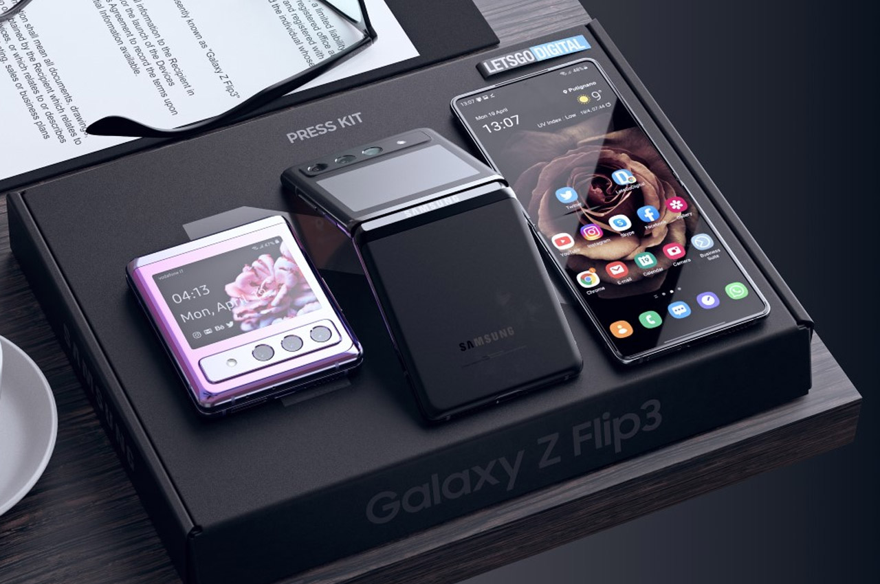
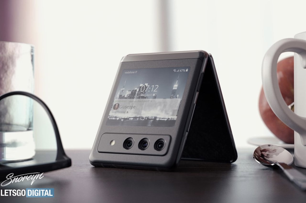
Not sure if it’s the design of the phone or the render quality, but 3D artist Giuseppe Spinelli really seems to have outdone himself with this concept phone. Spinelli’s rendition of the Galaxy Z Flip 3 sports the best parts of all of Samsung’s past phones. On the inside, it has even thinner bezels than its 2020 counterpart, a hole-punch camera for good measure, and that gorgeous vertical folding screen. Flip the phone over and it’s reminiscent of the Moto Razr, with a pretty neat secondary display, and a camera module with three lenses (a first for vertical folding phones).


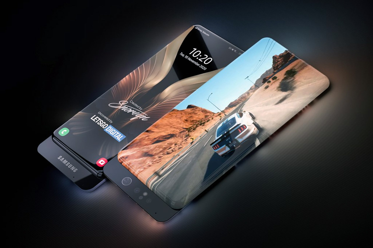
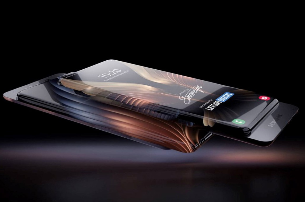
Meet the Samsung Galaxy Infinite Concept (at least that’s what I want to call it…), a phone with two wraparound displays that cover the front and back halves of the phone. I say halves because the phone has a minimal parting line running through it, because the Galaxy Infinite is, in fact, a slider phone! The sliding mechanism makes up for the fact that with a 100% screen-to-body ratio (on both the front AND the back), there’s really no space for cameras… so the Galaxy Infinite concept builds the cameras into the concealed surfaces that reveal themselves when the two halves slide apart. The phone comes with a single set of cameras that serve as both front and rear-facing shooters (because with a 100% display, the phone doesn’t really have a front or back). Slide the cameras out and you can either click rear-facing shots using the opposite screen as a viewfinder or use the same-side screen for viewing your selfies as you click them.


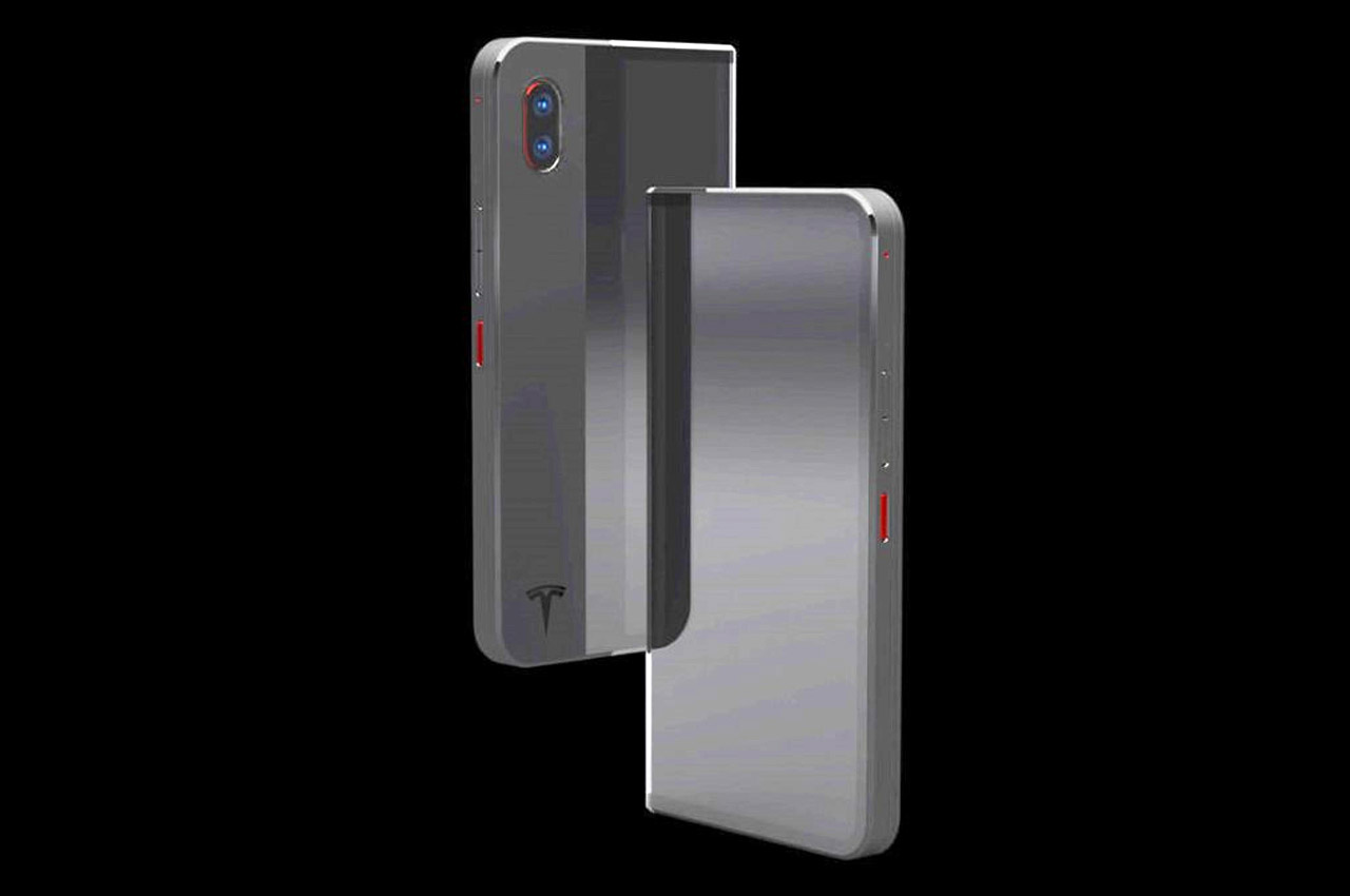
This is the conceptual Tesla C1 by Jeffrey Lee. It’s not a folding phone… it’s a sliding phone. A sliding phone with a sliding flexible screen. Part of the screen faces the back when the phone’s collapsed, acting as a notifications zone, while the remaining majority of the phone lay on the front, ready to be used normally. However, if you’re in the mood for something more than just normal, the C1 features a telescopic design that allows the phone to expand sideways… and when it does, the screen at the back effectively slides upwards and becomes the screen on the front.


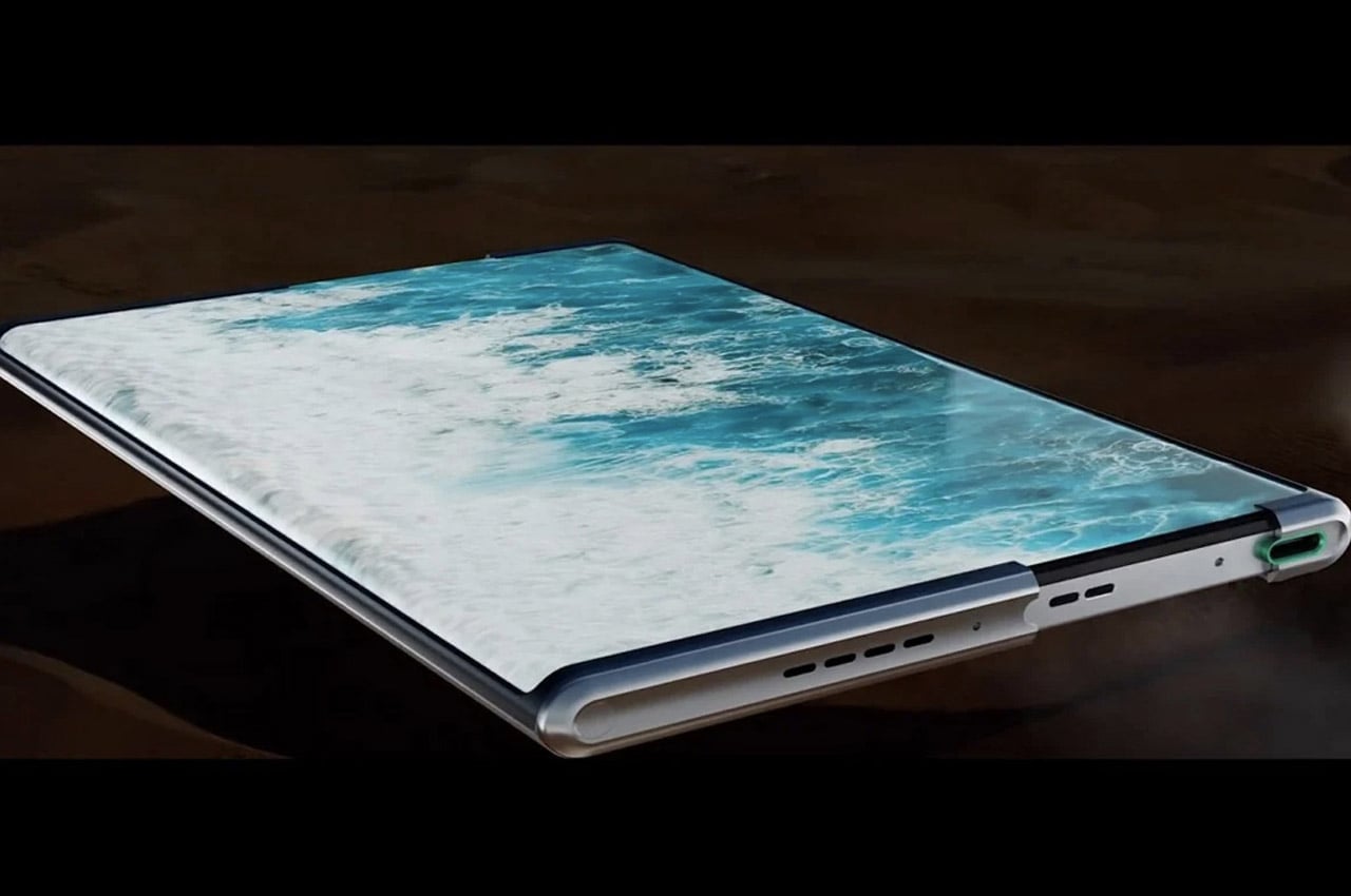
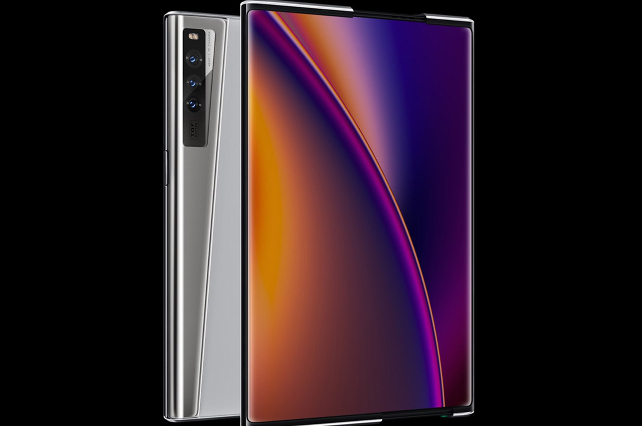
At their Inno Day 2020 event, the Chinese smartphone maker revealed the OPPO X 2021 rollable smartphone concept. Although TCL and LG have been tinkering with a similar concept, OPPO has created a prototype that is based on the continuously variable OLED display technology –sans any creasing that foldable phones are susceptible to with long term usage. The magic here is courtesy of the OLED display panel laminated on top of a “Warp Track” (just 0.1mm thick at its thinnest point) that tucks the display in a hidden compartment for a compact form factor and with the touch of a button, the display expands for a larger screen phone. OPPO has filed 122 patents for this rollable technology, out of which 12 are just for the scroll mechanism.


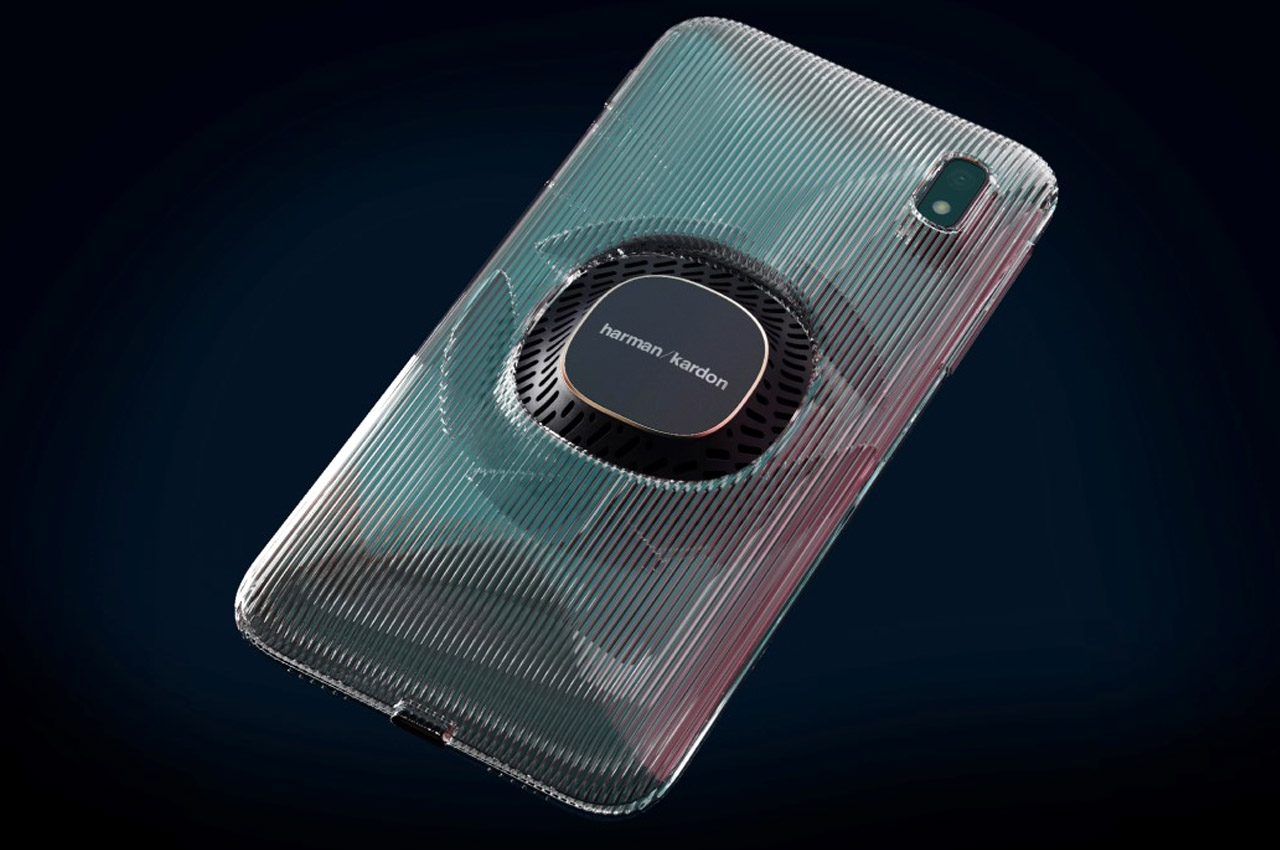
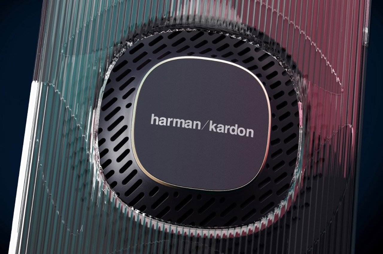
Say hello to the Harman Kardon Harmony, a conceptual smartphone created by James Tsai that says “Hold my beer” to the camera bump. The Harmony, on the other hand, comes with a pretty pronounced protrusion on its rear, owing to the presence of a powerful 360° speaker on the back of the smartphone. Styled to match Harman Kardon’s other speakers, the Harmony smartphone concept sports a 45° grille sitting under a transparent clad that helps guide airflow to maximize sound output while also protecting the smartphone itself, almost like a case would. Speakers are arguably more complicated than cameras because a relatively less powerful camera can be made better by using computational photography, but that same advantage can’t be extended to less-powerful speakers… which explains Harmony’s massive speaker-bump.


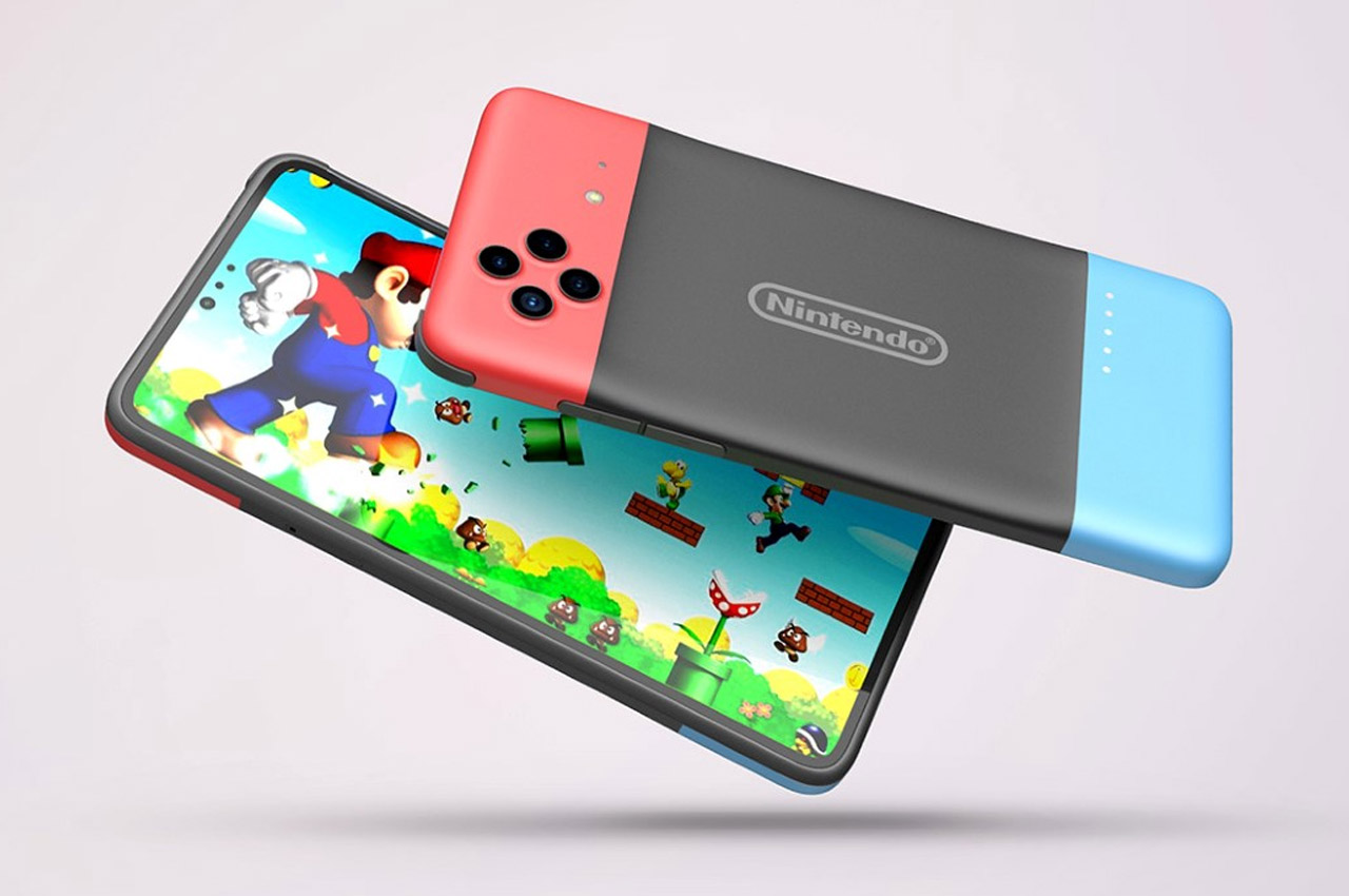
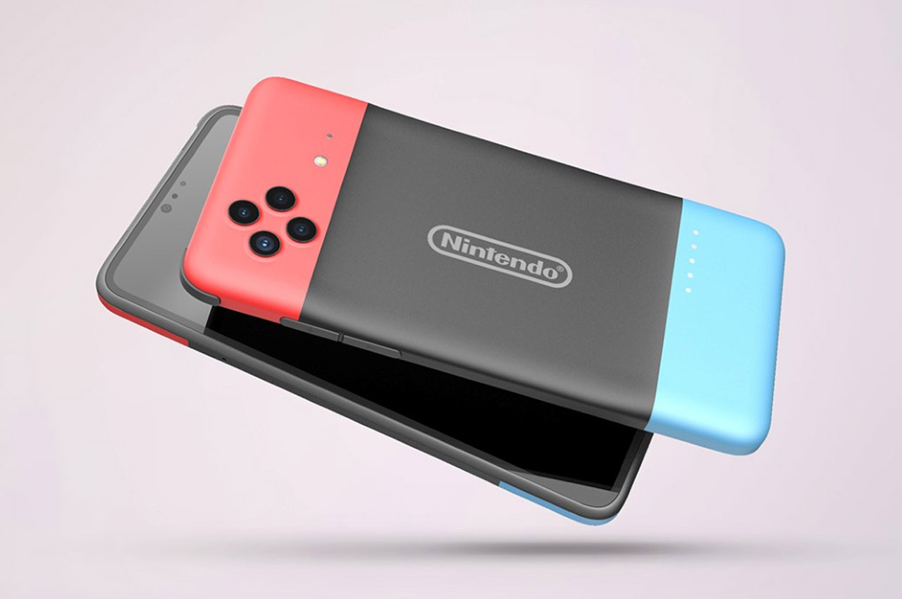
Titled the Nintendo Delight, this smartphone concept builds on the success of Nintendo’s Switch, making it even more portable and adding a few extra features to it. The Nintendo Delight replaces the need to carry your phone along with your gaming console. By combining the two together, it becomes your go-to device for gaming, browsing, social media, and everything in between. Designer Sophia Yen makes a pretty astute observation when she points out that the Switch is already an Android device (YouTuber Linus Tech Tips even demonstrates how to run Netflix on a Switch), and the Nintendo Delight simply builds on it, adding network capabilities and a camera to the mix.


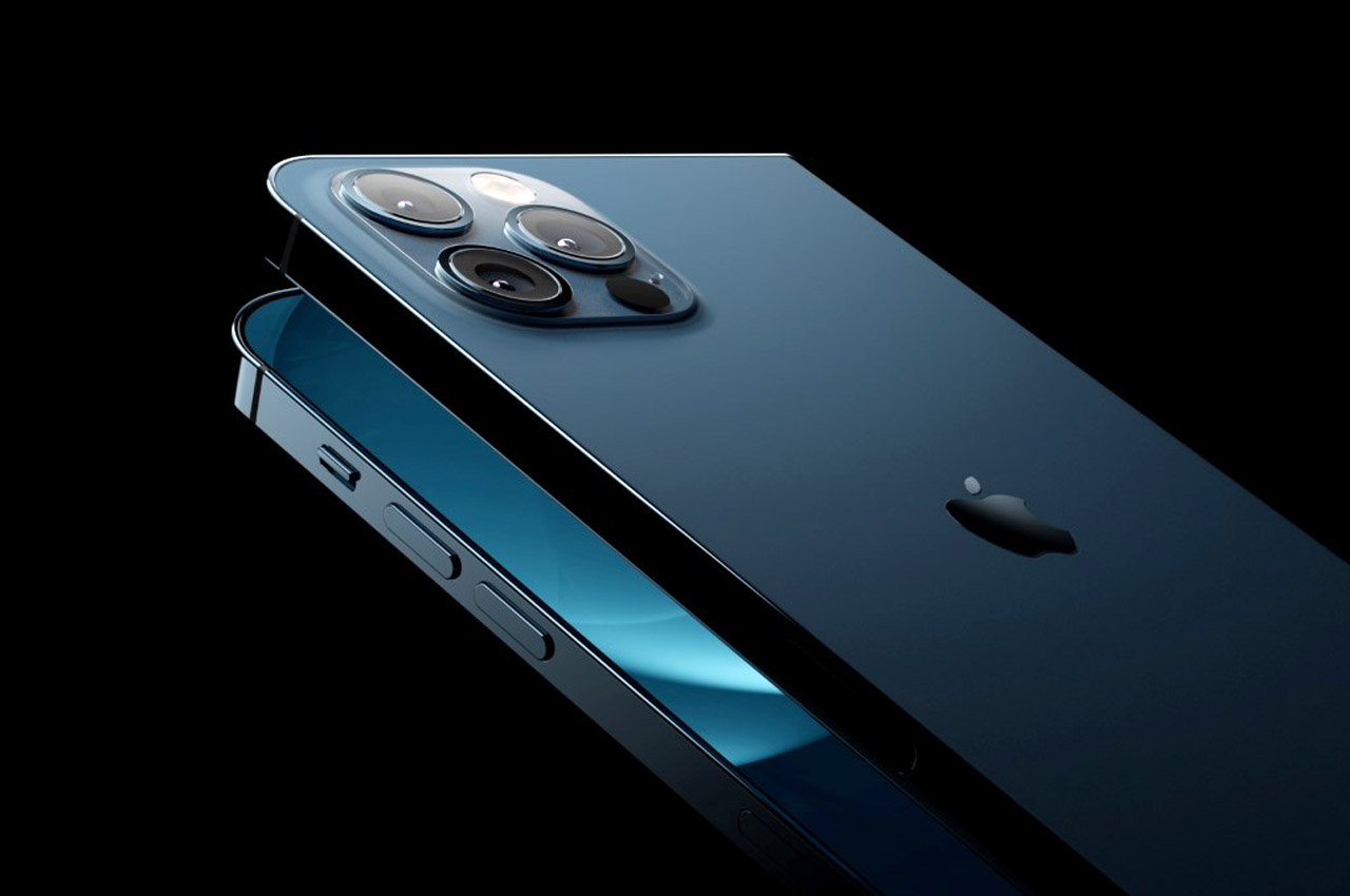
The iPhone Fold concept designed by Svyatoslav Alexandrov (for the YouTube channel ConceptsiPhone) comes in the familiar Galaxy Fold format, with a primary 6.3-inch screen on the outside, and a larger, 8-inch folding screen on the inside. It ditches FaceID for the reliable TouchID, and turns the entire primary display into a fingerprint sensor – so you can unlock your phone simply by swiping up. The lack of FaceID means a significantly smaller notch with just one front-facing camera for selfies. The back, however, comes with the iPhone 12 Pro’s entire camera setup, featuring wide, ultra-wide, and telephoto lenses, along with a flash and a LiDAR scanner. Open the iPhone up and it transforms into a squarish iPad Mini that’s designed to be perfectly portable.


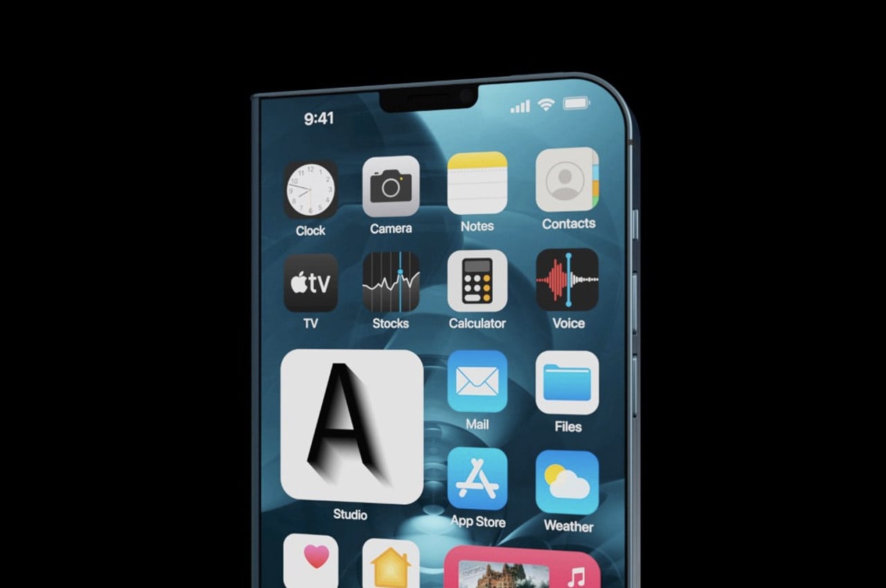
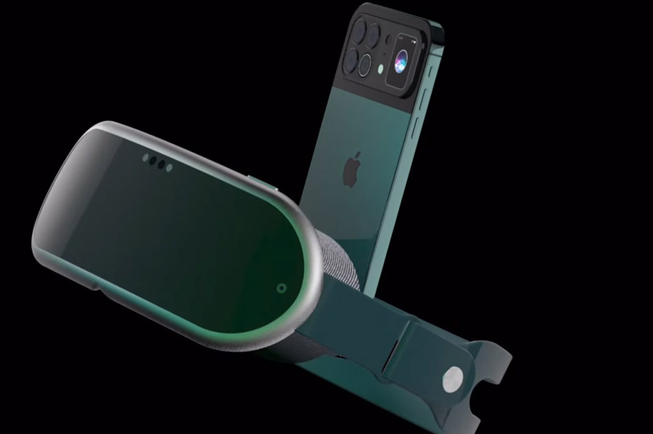
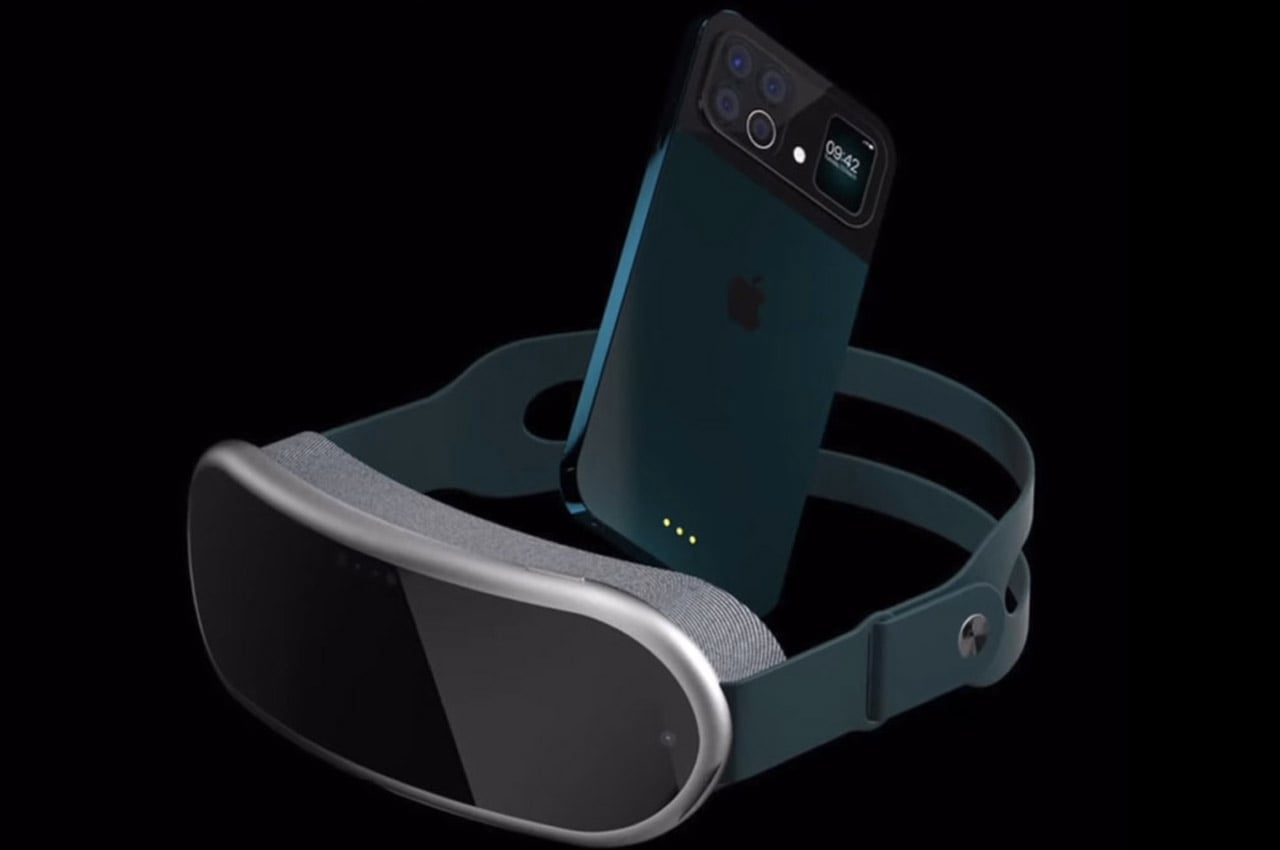
While iPhone 13 and the Apple VR headset cannot be launched in the same given timeframe – still it doesn’t deter imaginative designers from mustering up how the two products will look together. ConceptsiPhone has created a render of the two upcoming devices by Apple and mashed them together in a video dubbed iPhone 13 VR for creative writer’s delight. The VR headset is open to any imagination possible, and the folks over at ConceptsiPhone have taken that opportunity to show the world how the mixed reality headset will be like. It looks plush (after all it’s Apple) and is in sync with the design principles Apple has put in place for the headset – comfort and lightweight aesthetics. The strap looks reassuring as far as ergonomics go while the padding around the viewable area ensures utmost comfort.

