It’s sad to say, but the truth is that we spend the majority of our time on our phones. We’re always connected to the internet, and the digital way of life is our only way of life. However, Google started a digital wellbeing initiative in an attempt to reduce the time we spend on our smart devices, and to be honest they’re pretty cool ideas! One of them is the Envelope cover. London-based design studio Special Projects came up with the Envelope cover, hoping we would break away from the digital world, and enter the real world…even for a while.
Though it only works for the Pixed 3A at the moment, the cover is easily accessible! You download the app called Envelope on your Play Store App, print out the template for the envelope and assemble it right at home! All you need is some glue to patch it up together. Once you slide your phone into the case, it transforms your phone into a much simpler one. One version allows you to only make and receive calls and tell the time, whereas another one only lets you click photos and record videos. The Envelope app helps light up the printed buttons, enabling you to actually use your phone while in the case.
In a world where everything is digital, and actually living in the moment has become a rarity, Google has come up with an extraordinary design that could really help reduce our screen time, and help us give ourselves the peace and me-time we truly deserve. I do hope this initiative extends to other phone models soon…I need it!
Designer: Special Projects for Google


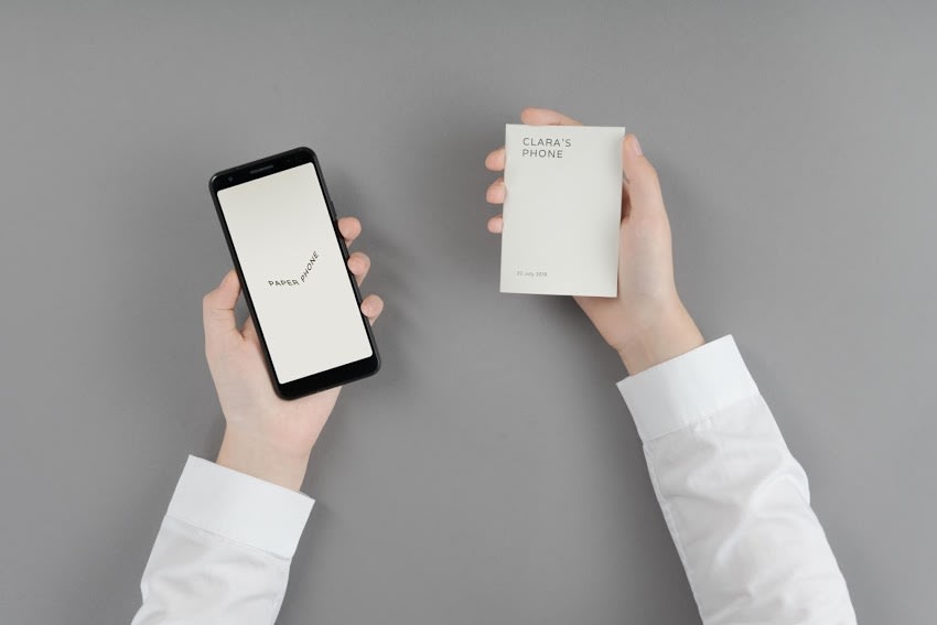 It feels like you're never far from your phone these days, and while having the entire accumulated knowledge of the world in your pocket is certainly useful, being constantly connected can also be a source of anxiety and stress. Enter Paper Phone, an...

