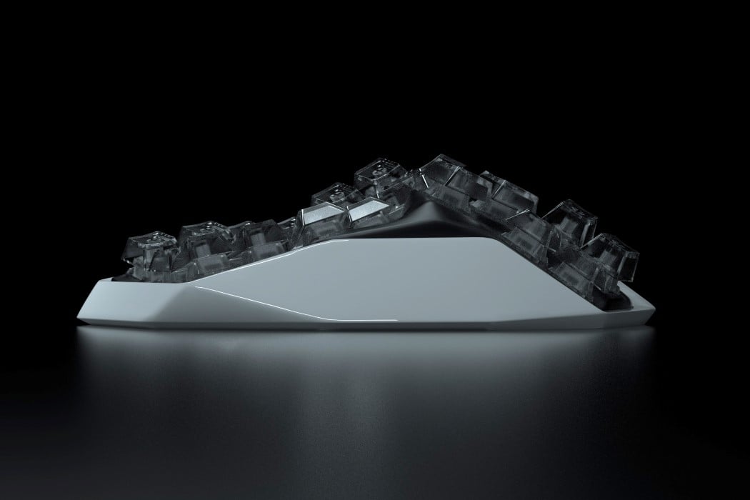
NUIO Flow Keyboard Will Blow Your Mind: Forget Everything You Knew About Typing!

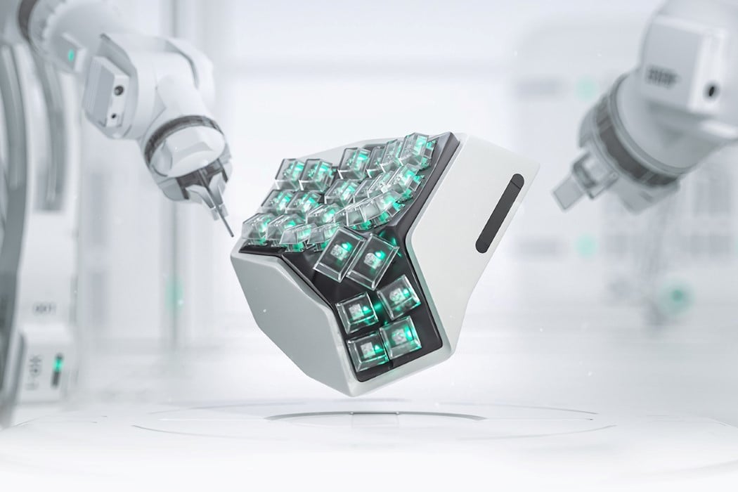
NUIO has launched a new vision for keyboards and peripherals, putting human comfort at the core of every design. Founded by Tom Wilson, a former Product Design Executive at Apple, and Greg Wilson, a former digital marketing leader at Digitas, NUIO is transforming ergonomic peripherals. Forget what you know about keyboards—the old designs are outdated. The Flow Keyboard reshapes the typing experience. It’s a reinvention designed to change how we interact with technology, focusing on comfort and usability. NUIO didn’t just update an old design; they started from scratch to create a tool that works with the natural movements of our hands and minds. This makes you wonder why all keyboards aren’t designed this way. Built around the human form, it breaks free from the conventions that have limited productivity for decades.
Designer: NUIO

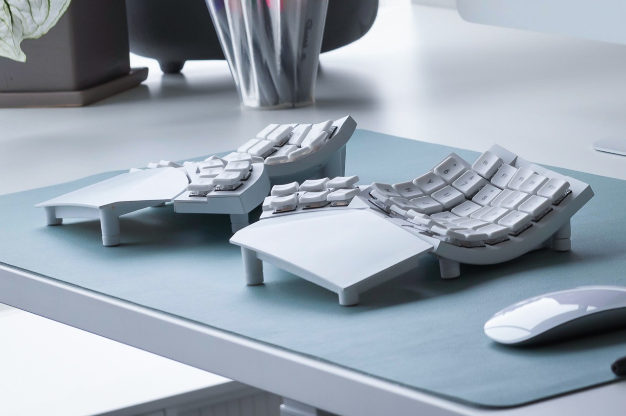
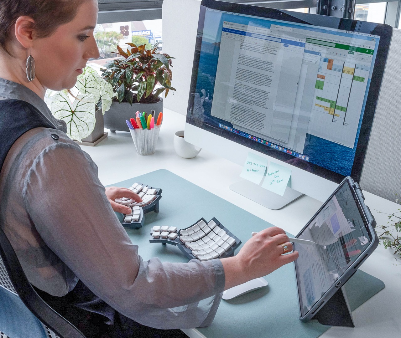
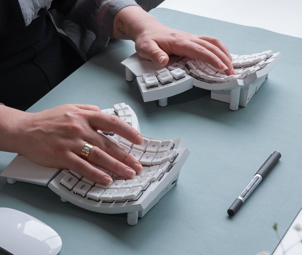
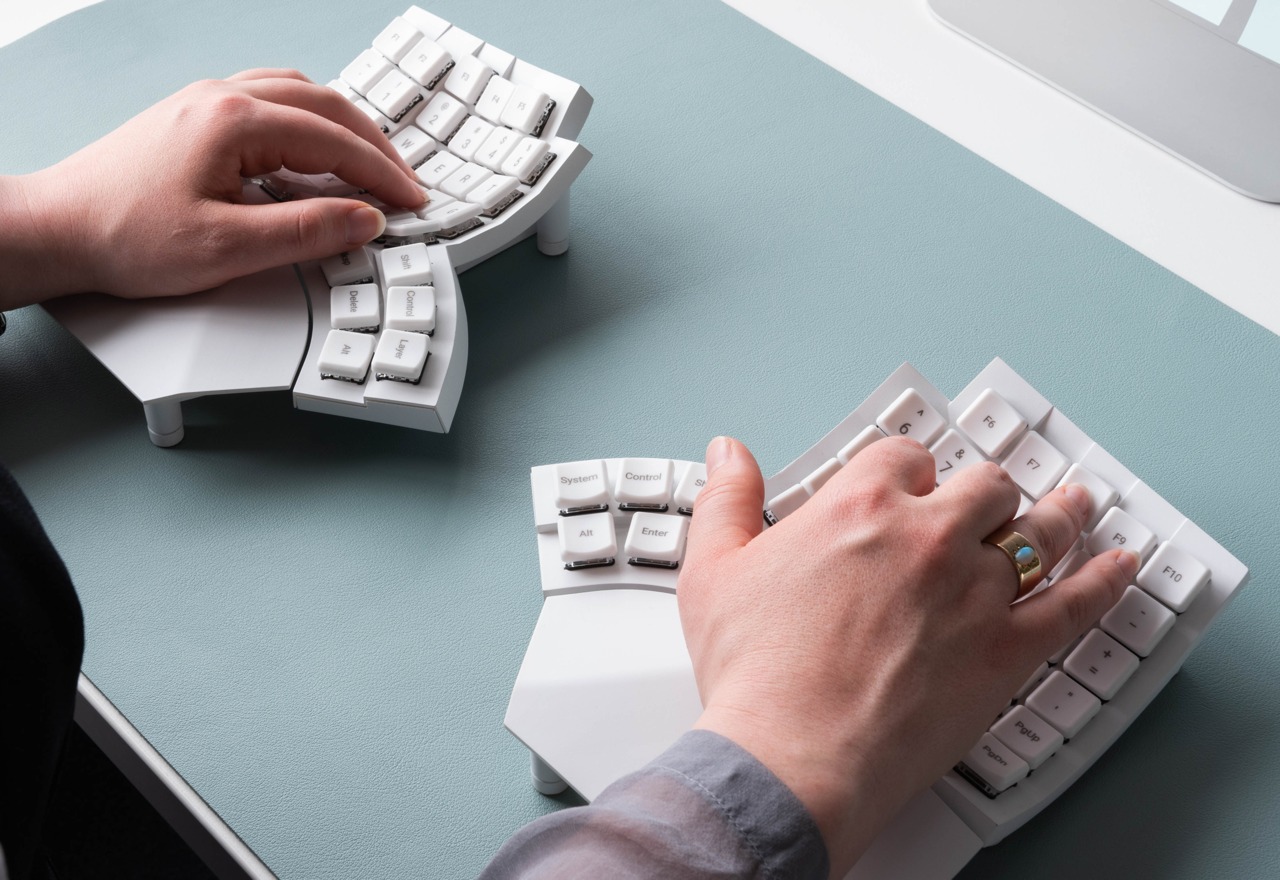
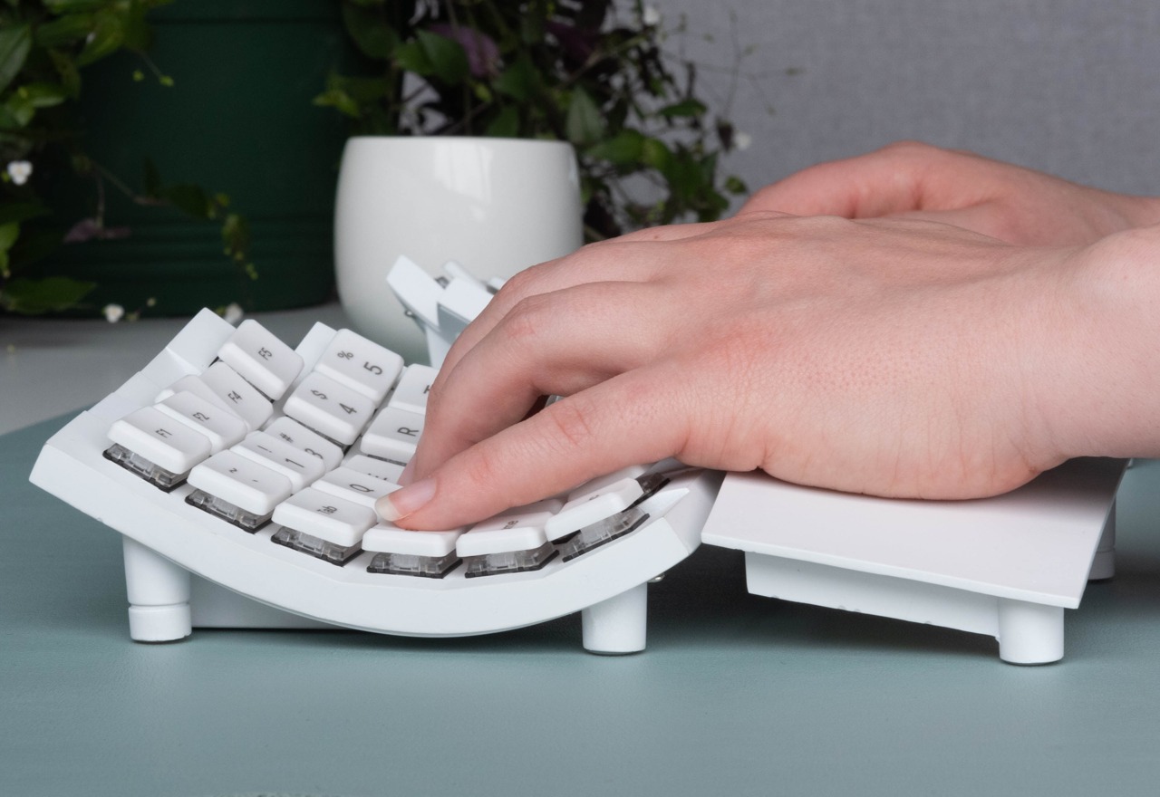
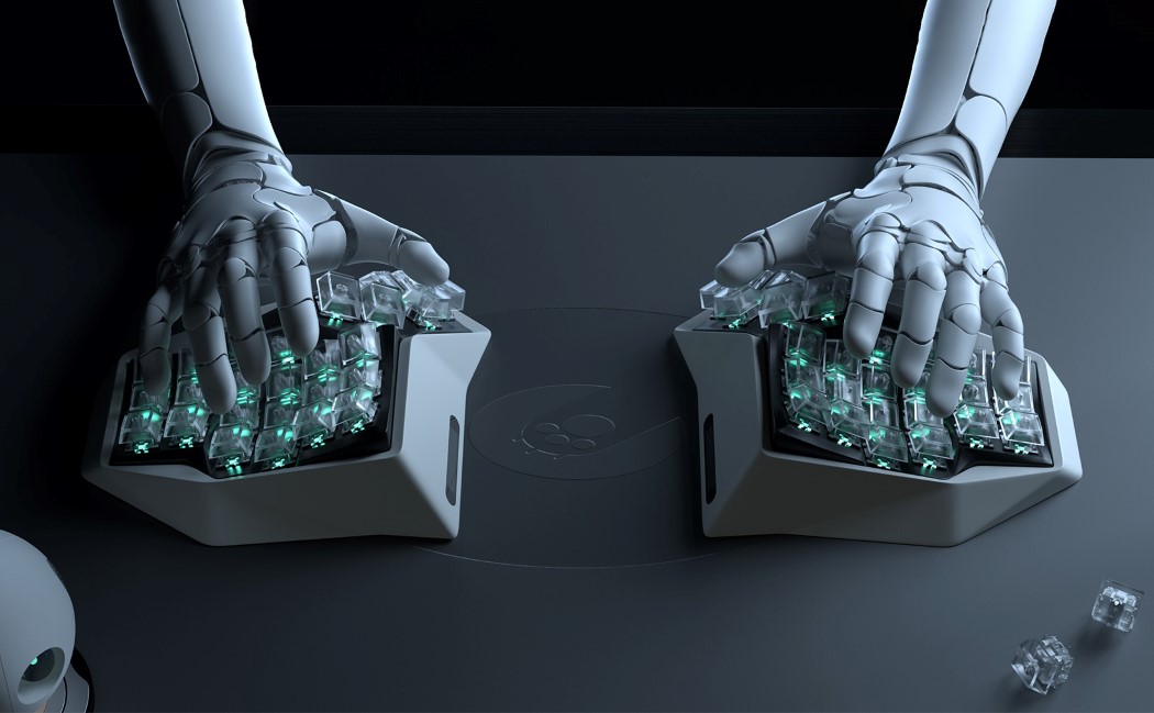
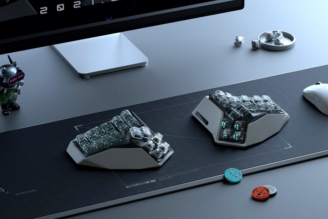
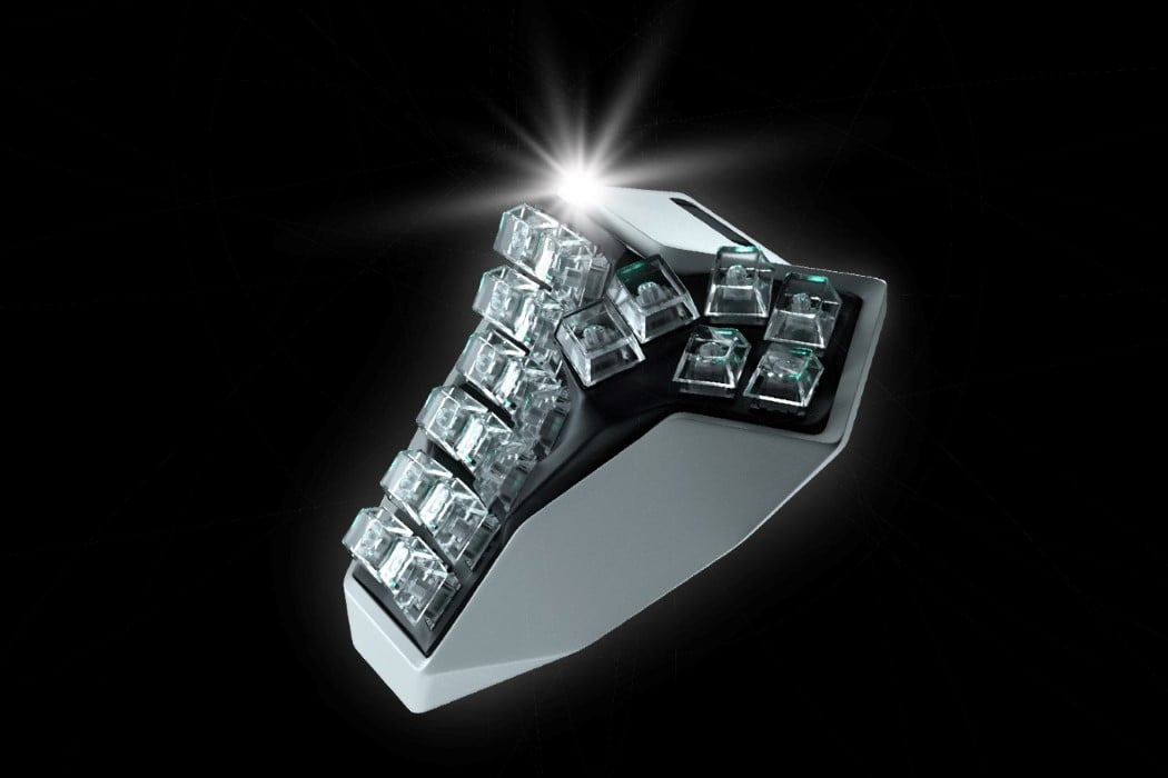
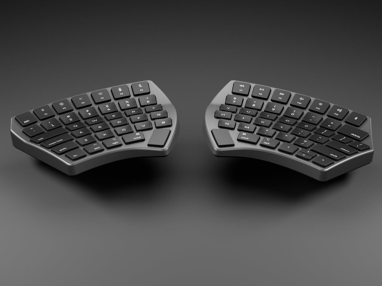
The split design is the first indication that NUIO plays by different rules, literally tearing apart old conventions. Traditional keyboards force our hands into unnatural positions, often resulting in discomfort or even injury over time. By splitting the keyboard into two halves, NUIO allows users to set the layout as wide or narrow as they want, tailoring it to their individual body type. Each half arcs gently in a 3-D radial wave that contours perfectly to the natural positioning of the hands. This focuses on creating a natural design that integrates seamlessly into your workflow.

Immersive Flow Through Design

The 3-D wave shape changes the dynamics of typing entirely. Unlike flat keyboards, which demand that your fingers reach out and adjust constantly, this design brings every key to your fingertips, almost like the keyboard knows where your fingers will land next. The entire process becomes smoother—you don’t think about typing, you think, and the keyboard flows with you. It’s an experience similar to an artist using the perfect brush, where the tool becomes an extension of their creativity. This is what NUIO means by “finding your flow.” NUIO’s design aims to potentially transform the typing experience, making it feel seamless and natural.

The concave keycaps are another masterstroke. NUIO has given each key a gentle dip, which fits the natural curve of your fingertips and provides a feeling of certainty with every press. When you strike a key, it feels definitive, eliminating the ambiguity that often comes with traditional, flatter keycaps. These aren’t keys—they’re extensions of your thoughts, finely tuned to transmit intention into action without hesitation.

Bold Design Statements and Apple Ecosystem Integration

NUIO understands that form is just as important as function. It is designed to complement the Apple ecosystem perfectly. The backlit keys and the seven premium color combinations offer aesthetic appeal; they speak to a personalized experience, a kind of ownership over the tool that users engage with daily.

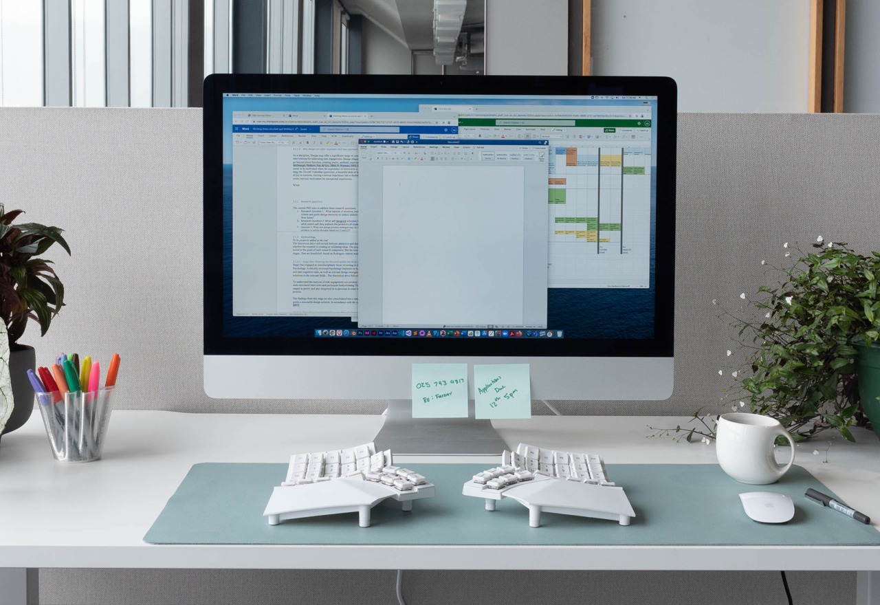
Whether choosing a sleek black design or a more colorful option, the keyboard is designed to fit into any space and enhance its visual appeal. It doesn’t just sit on the desk; it complements and elevates the entire workspace, adding an essential touch of personal style.

Accessories That Click—Literally and Figuratively

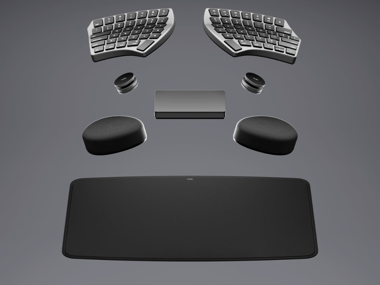
The NUIO Flow System, including the magnetic Deskpad, trackpad, and wristpads, is built to ensure seamless integration. The magnetic Deskpad serves as an extension of the Flow Keyboard, creating an ecosystem where each component—whether the keyboard halves, wristpads, or edge-to-edge glass trackpad—snaps into the ideal position.
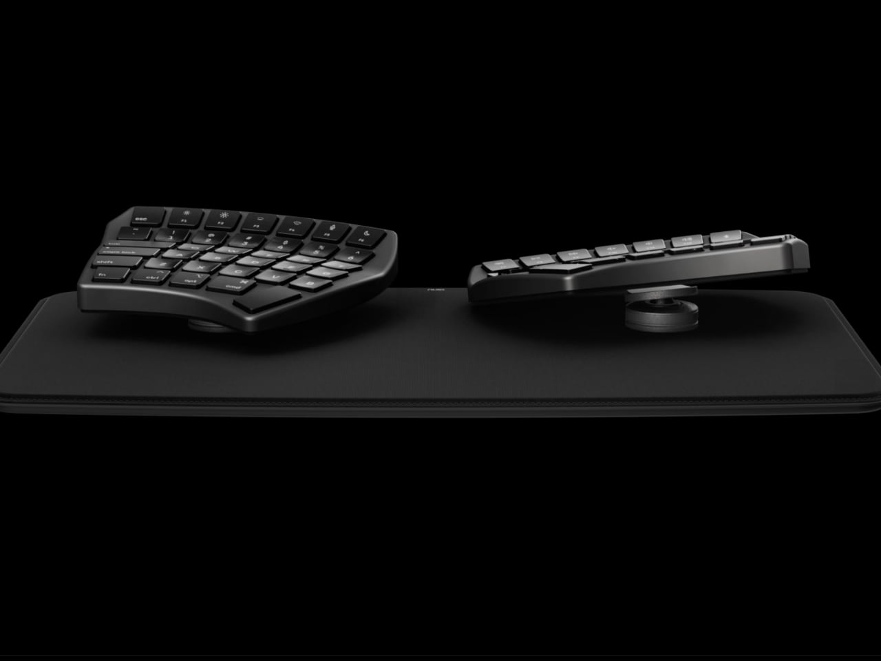
This snapping mechanism eliminates fuss, prevents shifting, and saves time—resulting in an elegantly organized workspace that adapts to users rather than forcing adaptation. Each element has a designated place, and every movement is deliberate and precise.

Wristpads That Disappear Into the Experience

Comfort is a key aspect of the NUIO experience, most notably seen in the Wristpads. Made from an innovative cushioning material, these wristpads provide support while remaining unobtrusive.

They’re designed to be so comfortable that they “disappear” during use, allowing focus and productivity to flourish. This level of consideration elevates NUIO’s approach beyond mere ergonomics—ensuring that tools are as invisible as possible, with only the work left in focus.

Built For Today, Ready for Tomorrow

NUIO’s Flow Keyboard and its accompanying peripherals are designed for creative professionals, focusing on high-quality materials and flexible configurations. The product suite, which begins shipping on December 1st at a starting price of $399, is available for pre-order today at HelloNUIO.com. Every detail, down to the USB-C charging and Bluetooth multi-device pairing, is about maximizing flexibility. Whether switching between devices or shifting from a desk to a coffee shop, the Flow Keyboard is a tool that transforms with users. It’s an entirely new kind of typing experience; it’s the centerpiece of a modular productivity system that bends to their will. The adjustable stands make sure the keyboard can be tented or tilted for optimal comfort, while the mechanical click trackpad adds familiar tactile feedback that feels right.
The post NUIO Flow Keyboard Will Blow Your Mind: Forget Everything You Knew About Typing! first appeared on Yanko Design.
RIP Ergonomic Keyboards, the Tetra boasts a Split Wireless Design, with an Elgato-style Display in the center

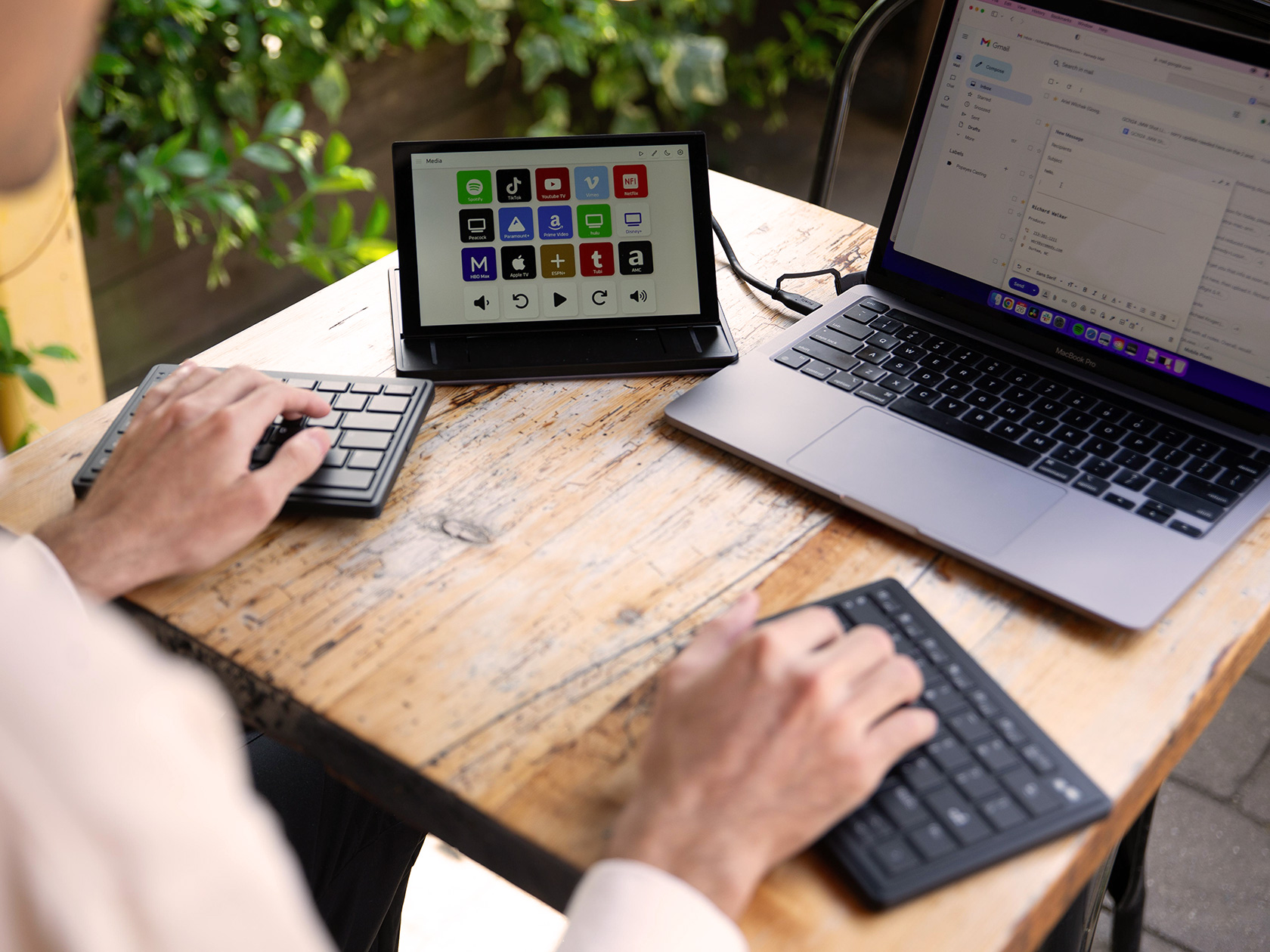
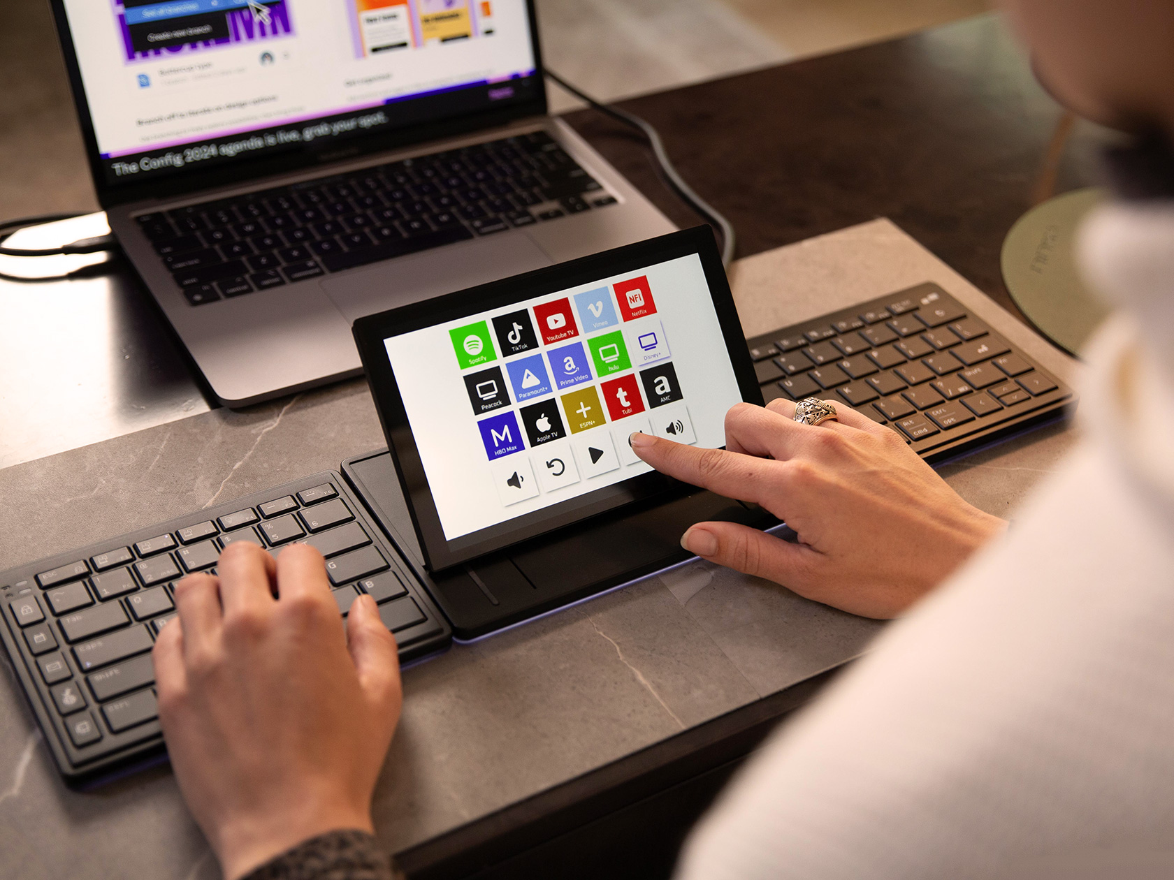
Remember the watershed moment when Steve Jobs unveiled the MacBook Air for the first time? He walked up on stage with a manila envelope, and opened it to reveal the thinnest laptop ever made. It changed how laptops looked from then on, and when people first saw the stunningly thin MacBook Air, everyone had the same question on their minds – why doesn’t my laptop look like this? The Tetra keyboard does the same thing for other keyboards. When you look at the Tetra for the first time, chances are you’ll have never seen anything quite like it before. It challenges the notion of keyboard design… and for the better. It’s more compact, easier to use, ruthlessly ergonomic, and comes with a world-first touchscreen display built right in. The keyboard splits in half, allowing you to place the parts wherever you want for a more comfortable typing experience… and the display tilts upwards or sits flat, transforming into a dock for widgets, shortcuts, playback controls, or a media center of sorts. Think Keyboard-Meets-Elgato-Stream-Deck.

Designers: Zikang Feng, Jarvie Liu, and Stephen Ng

Click Here to Buy Now: $249 $399 ($150 off). Hurry, only 5/405 left! Raised over $140,000.

Trust the folks at Mobile Pixels to come up with such a unique idea. The company first jumped to prominence with its plug-and-play laptop extending displays (lauded for their compact designs). These displays were targeted at one thing – boosting productivity through multi-display setups. The Tetra keyboard does the same too, in a matter of speaking. The split keyboard comes with its own dedicated screen that can be used as a secondary display or as a control center for apps and shortcuts. While keyboards are a first for Mobile Pixels, the Tetra highlights their bigger goal of enhanced productivity, thanks to a split wireless keyboard design that can be used in a variety of ways for a more comfortable and efficient typing experience.

SPLIT MODE

SPLICE MODE

Split keyboards aren’t new, conceptually. Most researchers noticed that a cramped keyboard, although compact in size, wasn’t great for your wrists and fingers. Over prolonged periods of time, people developed carpal tunnel and ulnar deviation (where your fingers end up deviating sideways) because of the way these keyboards were designed. The split keyboard was created as an ergonomic alternative, increasing the space between your left and right hands while typing, so that they’re in a much more relaxed position. The Tetra takes that concept and builds further on it, turning it wireless, while also introducing a display into the mix.

Use Bluetooth to Connect to Your Device (up to 3 devices with 3 channels).

Position keyboards at shoulder width for ergonomic comfort.

Customize Your Experience

Type Away!

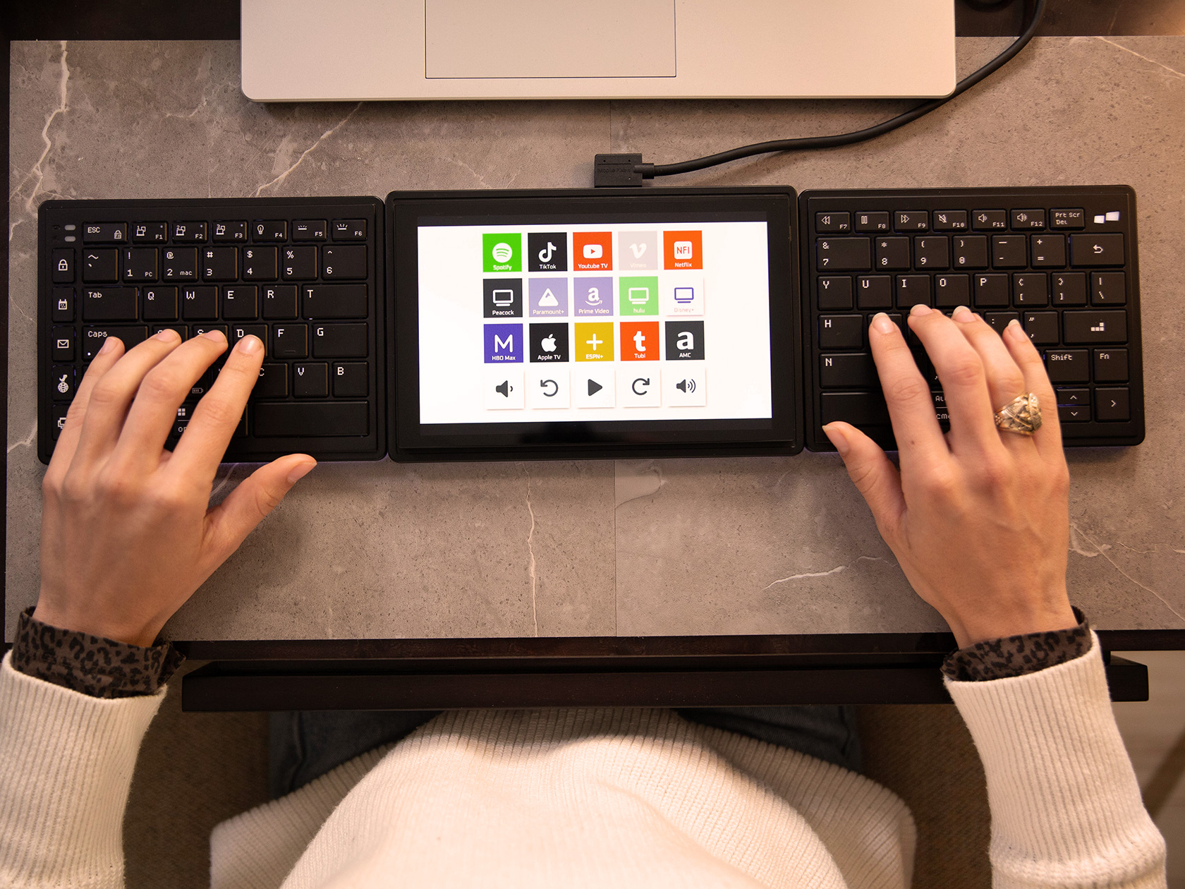
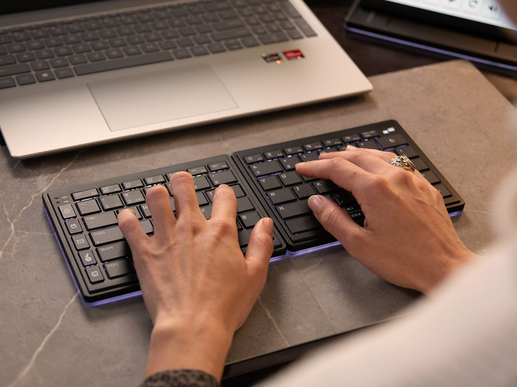
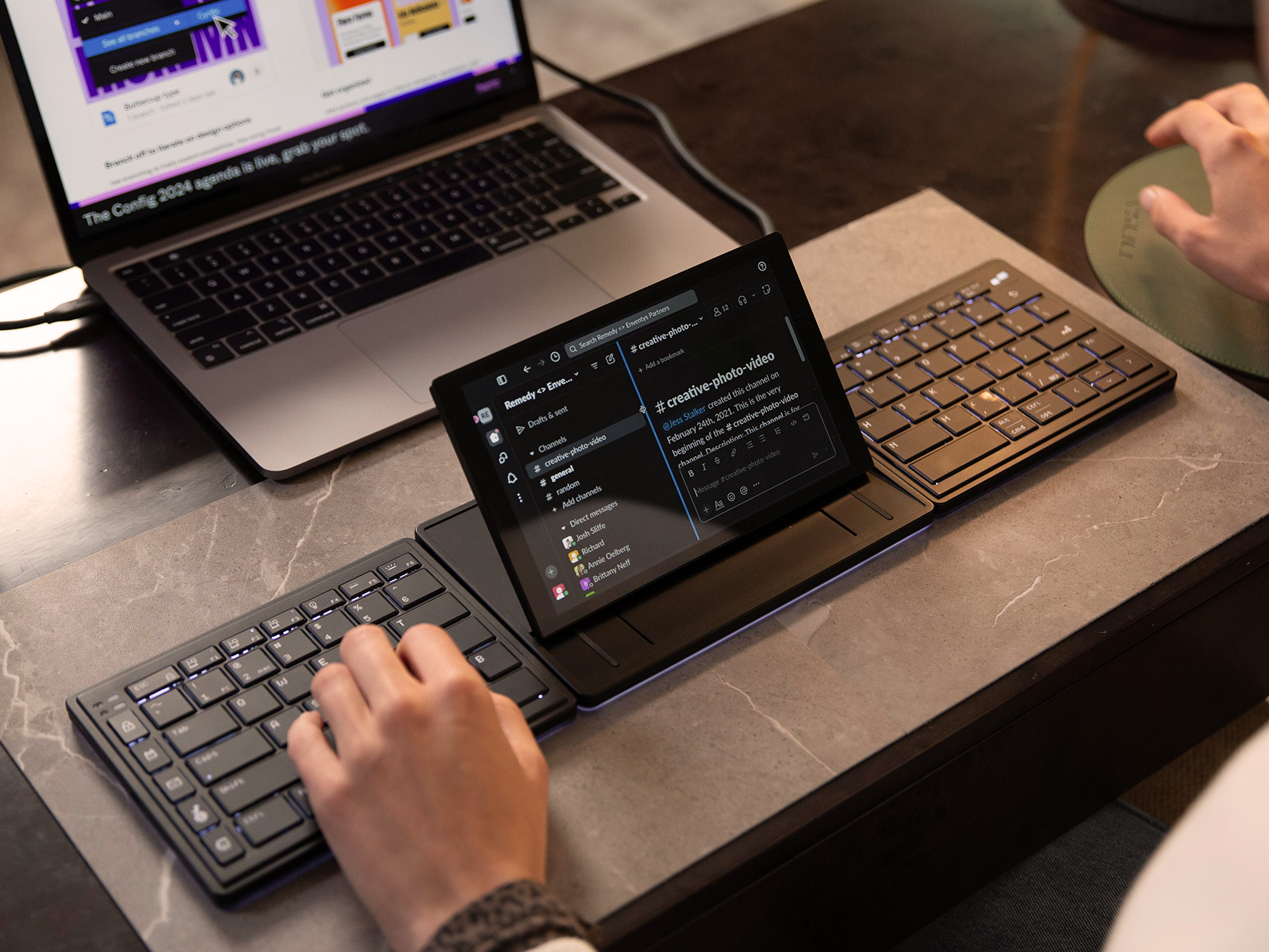
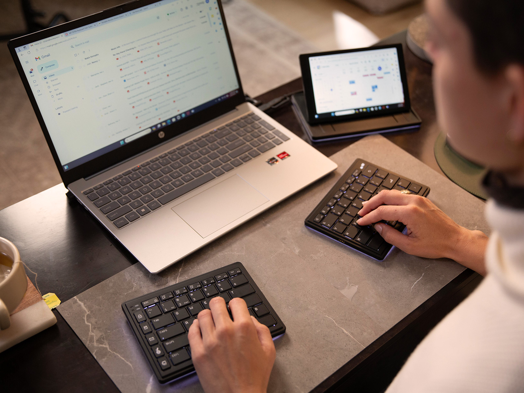
Broadly, the Tetra exists in three pieces – a central display unit, and the two keyboard halves that attach onto either side. Snap them together or use them independently, the Tetra gives you freedom to set your workspace up exactly the way you want. When attached together in a linear format, you’ve got a comfortable split keyboard with a screen in the middle. The screen functions as an extra display, a shortcut center, or perhaps even a trackpad if you want. The keyboards get spaced out on the left and right, allowing you to type comfortably without having your fingers and wrists bend awkwardly. Alternatively, you can snap the keyboard’s halves away from the display, accessing what Mobile Pixels calls the ‘Split Mode’. The keyboards then can sit anywhere on your desk, as can the screen, giving you full ergonomic freedom. If you want a more traditional keyboard experience, just the two keyboard halves can be attached to each other, creating a compact typing device, while the screen exists independently. Dubbed the ‘Stacked Mode’, this lets you opt for something that feels familiar, with the added benefit of a dock-style screen on the side.

Secondary Display

The keyboard comes with a 65% layout, split across its two halves. Scissor switches enable a fair amount of key travel, up to 1.3mm, and a backlight lets you type with ease. The keyboard halves and screen also have an underglow that feels reminiscent of gaming gear. 1200mAh batteries in each half of the keyboard allow it to operate wirelessly for hours if not days, and the central screen remains connected to your machine via a USB-C cable at all times. To charge your keyboard, simply snap them to the screen and pogo pins allow the Tetra to charge all the way through.

The screen is truly where Mobile Pixels’ innovation shines. It’s a little smaller than the ones that Mobile Pixels offers, measuring just 8 inches diagonally – but it’s an IPS LCD display with a 60Hz refresh rate and 300 nits of brightness. The screen stays connected to your machine at all times via cable, and sits on a unique tilting mechanism that lets you either lay it flat or tilt it upwards to face you. Touch sensitivity means you can control the display the way you would a tablet PC of sorts… and the Tetra offers a fair amount of flexibility in terms of how you use said display. You can use it as an extension of your PC or Mac’s shortcut bar, adding your favorite apps to it. Conversely, it also doubles as a media control center for playback, and even transforms into a tiny secondary display for extending or mirroring your screen. Use it to store notes while presenting on a video call. Turn it into a calculator. Allow it to be your dedicated Spotify device. Mobile Pixels created a special interface known as the Tetra Board App that you can use to customize your display. Yes, you can even load functions, tools, macros, and shortcuts, unlocking power-user potential while running apps like Photoshop, Premier, Final Cut, Logic Pro, After Effects, etc.

All this functionality and the Tetra still remains ruthlessly portable. The three components come apart and stack together, allowing them to be carried around with ease. There’s even a soft-fabric case to store your Tetra during travel, allowing you to slide it right into your laptop bag along with your charger and other accessories. I bet your existing ergonomic or split keyboard can’t boast this level of portability. The Tetra starts at $249 and ships globally starting September 2024.

Click Here to Buy Now: $249 $399 ($150 off). Hurry, only 5/405 left! Raised over $140,000.

The post RIP Ergonomic Keyboards, the Tetra boasts a Split Wireless Design, with an Elgato-style Display in the center first appeared on Yanko Design.

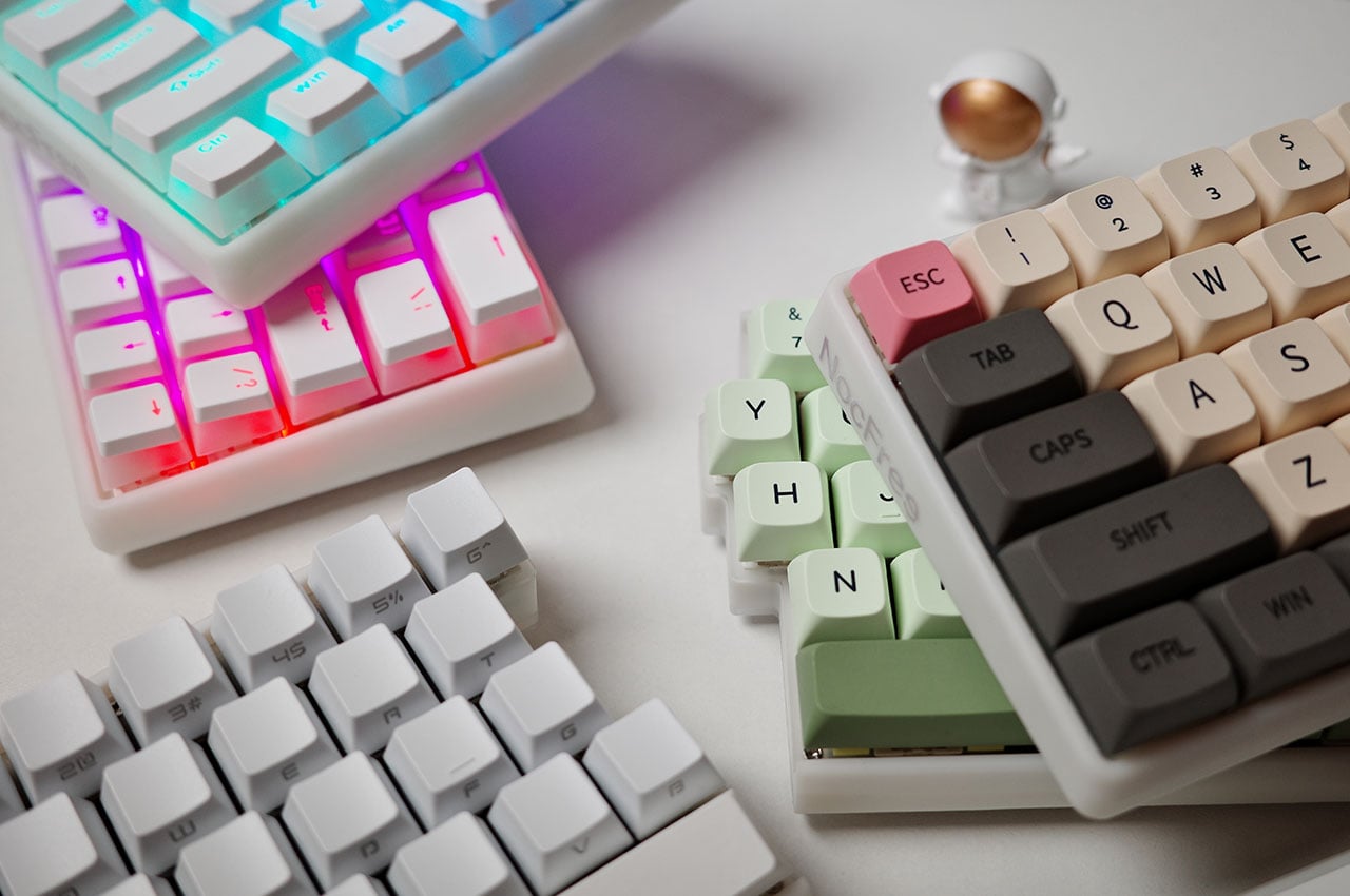
The NocFree Lite split wireless mechanical keyboard is an audaciously customizable piece of tech gear

I’m sure of one thing; you need to have great typing skills if you are to use a split keyboard. For example, if you are like me, who has to extend their right hand over the left to find an odd key: we are not designed for this gadget! That said, split keyboards are hailed for their typing comfort, and there are many ergonomists to back it up. The split keyboard: wired and wireless, are functional and comfortable alternative to traditional keyboards because these provide more flexibility.

As opposed to a traditional keyboard that forces you into a fixed, rather unnatural, typing position for an extended period of time, the split keyboard rips that apart in the middle so every user can find their most comfortable position. We have seen a handful, or rather more, iterations of a split keyboard in our time. If I recollect correctly, Naya Create keyboard that added a trackpad to the split design won a lot of accolades back in the day. Now NocFree wants to rival the Create and other similar options with unmatched adjustability offered by its accommodating form factor.

Designer: Solar (NocFree Team)

Click Here to Buy Now: $166 $210 (20% off). Hurry, deal ends in 48 hours!

Before we get into the details of the NocFree Lite, the first prototype of the spilt keyboard, be reminded that the changes in desk setup to address your posture issues and pains, may not be limited to the position of the desk. If you have swapped between sitting and standing desks and been through a range of lumber support chairs, without a respite; consider giving your keyboard a swap. Whether you prefer linear, tactile or clicky switches, the NocFree Lite has the options to be truly effective.

The idea of NocFree keyboard is not accidental. It was conceived after the designer Solar from Kowloon, Hong Kong, battling wrist pain and lower back discomfort, headed out to search for a solution. With the absence of a split keyboard of his choosing, the idea of NocFree was born. It is a keyboard that we would want to use daily, hours at the computer desk or a gaming rig, without feeling the strain on the wrist or the shoulders.

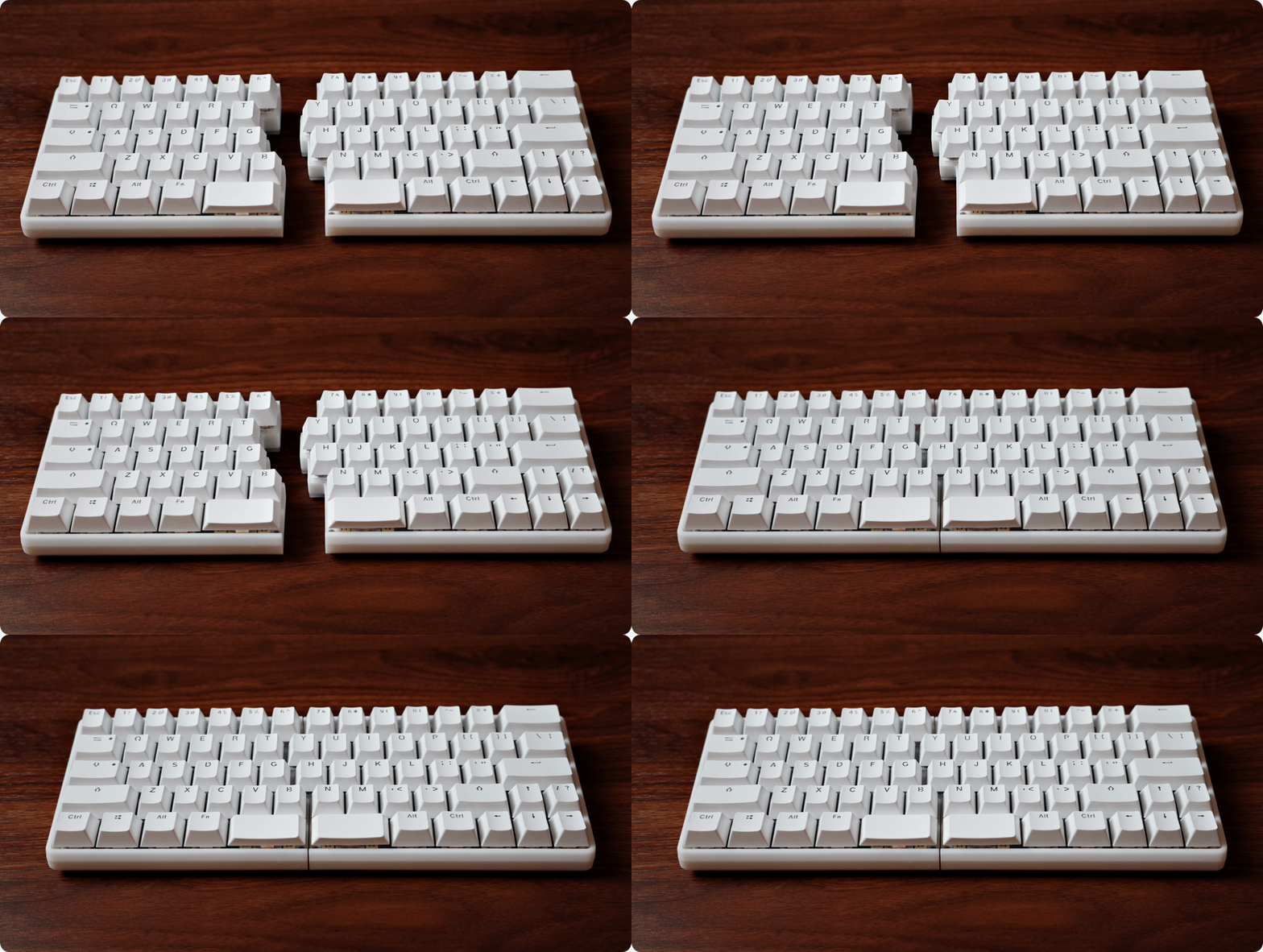
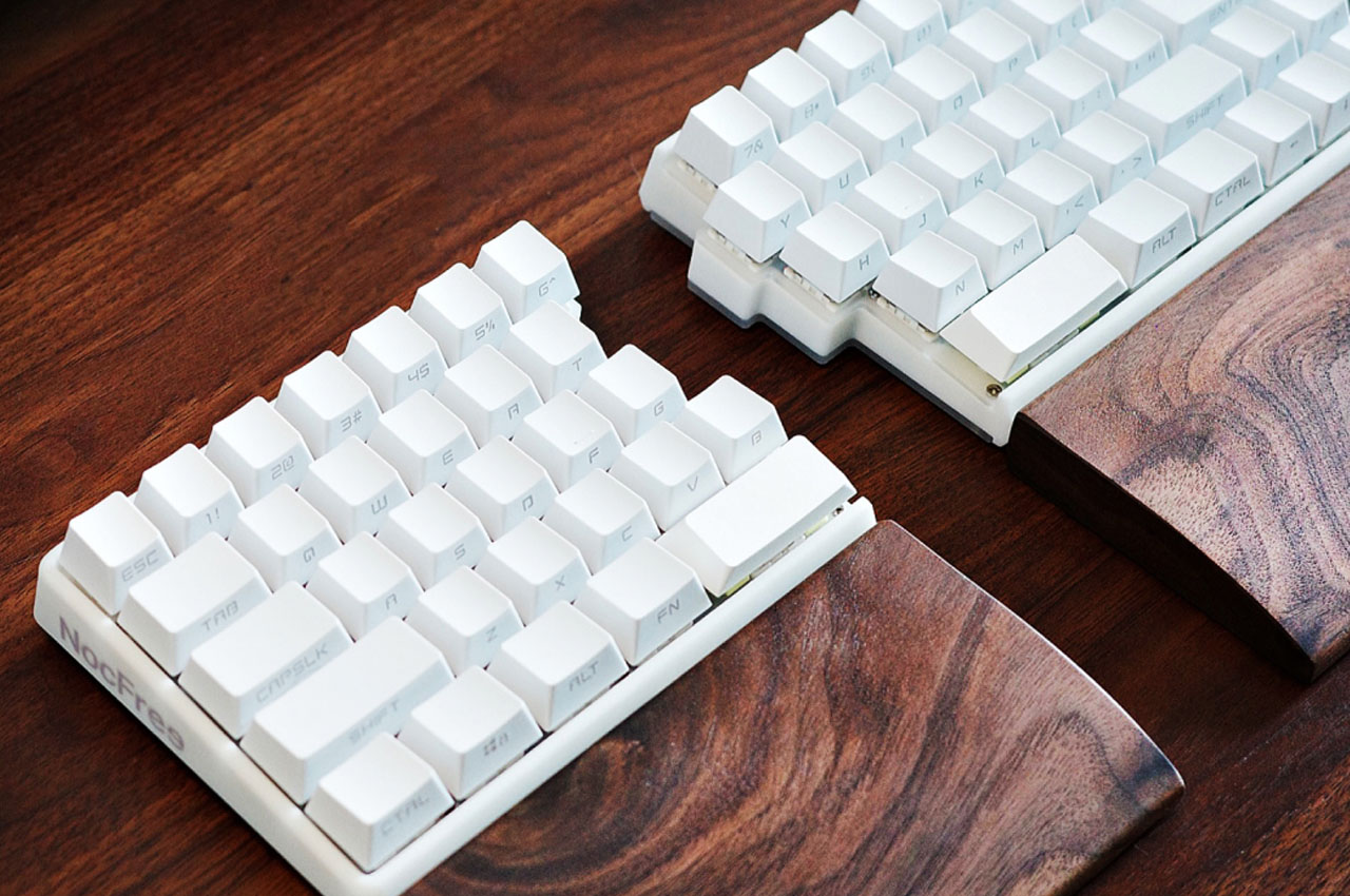
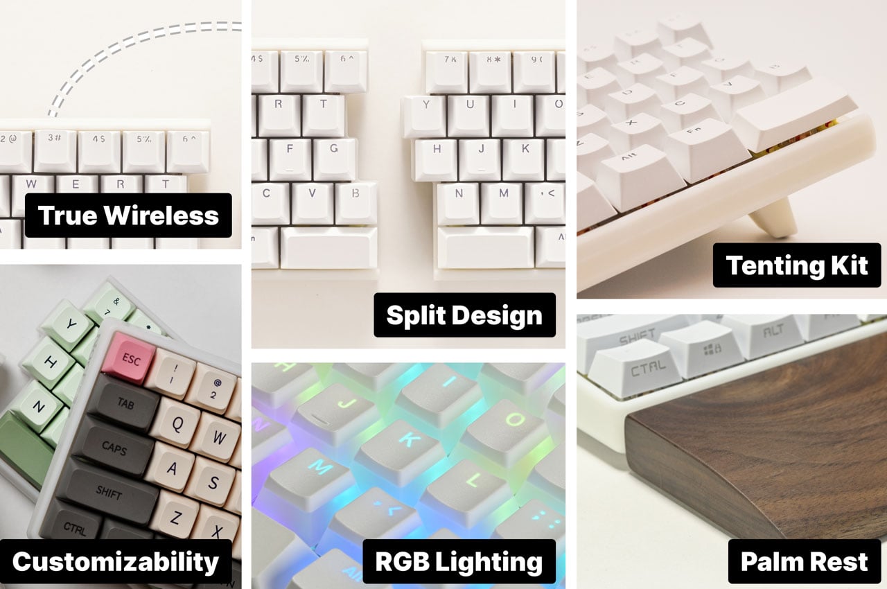
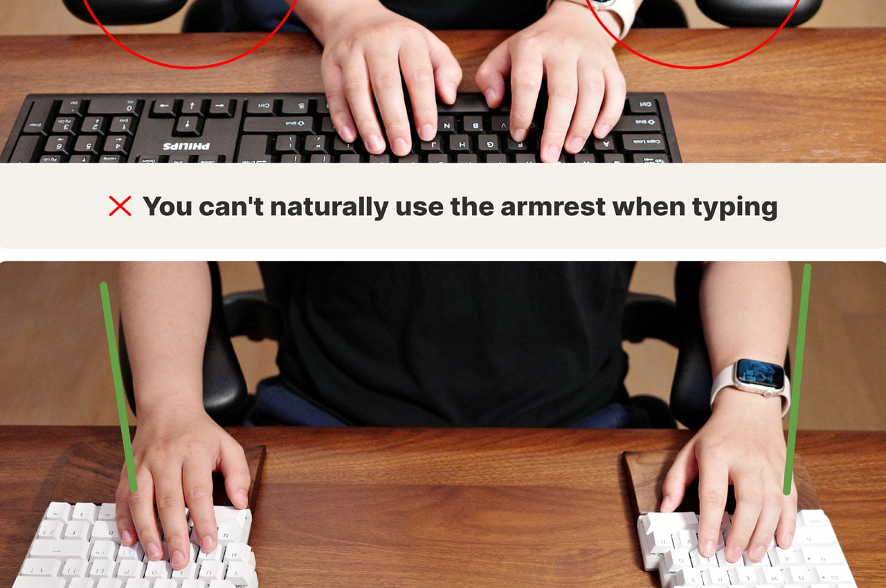
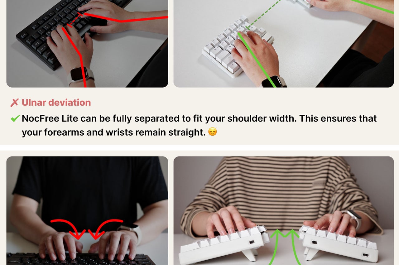
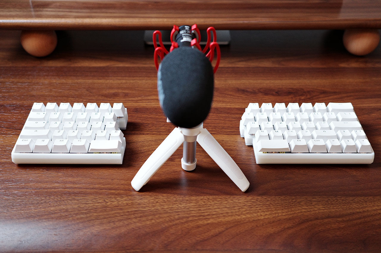
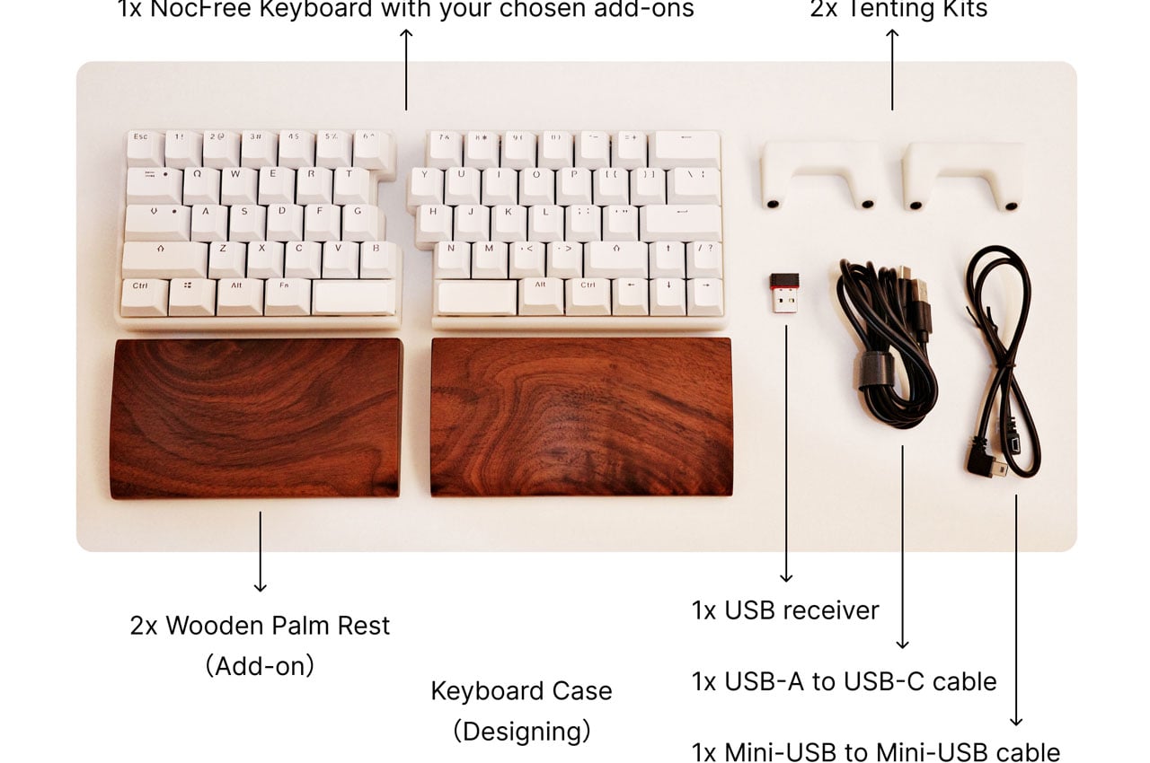
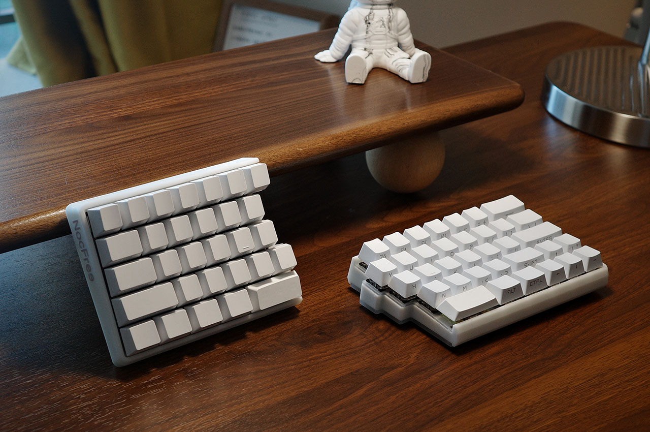
To ensure this, the NocFree Lite Split Wireless Mechanical Keyboard functions in two independent parts for user comfort. And when you want otherwise, the left and right sides of the keyboard can be effortlessly merged. So, with the NocFree, you can start with the fully merged keyboard and gradually separate it as the shoulder begin to feel the strain. The benefit in the latter position is beyond the comfort. The void between the two halves of the keyboard can offer prime desk real estate to place your documents, mouse or maybe a tablet to take notes.

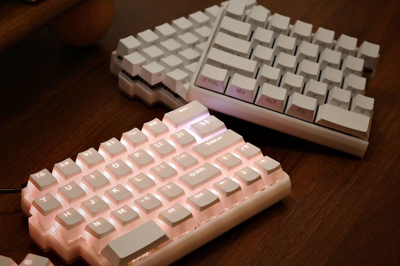
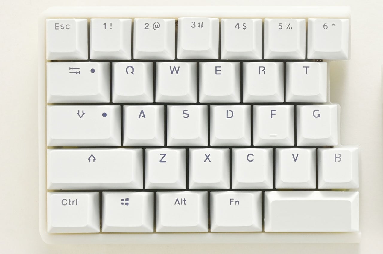
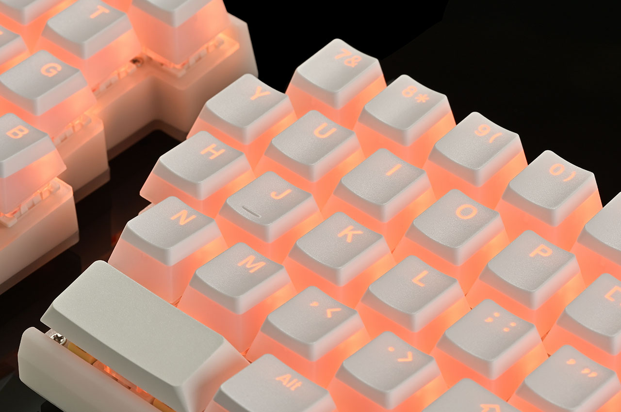
The sleek, adjustable layout of the NocFree Lite comprises 65 keys for utmost productivity. With the necessary keys for all the functionality you need, the keyboard is not a sitting duck. It offers a dazzling array of 31 lighting effects that you can customize for your choice of color, brightness, and transition speed. For further customization, NocFree Lite comes with a few keycap options that may cater to your unique style and preference.

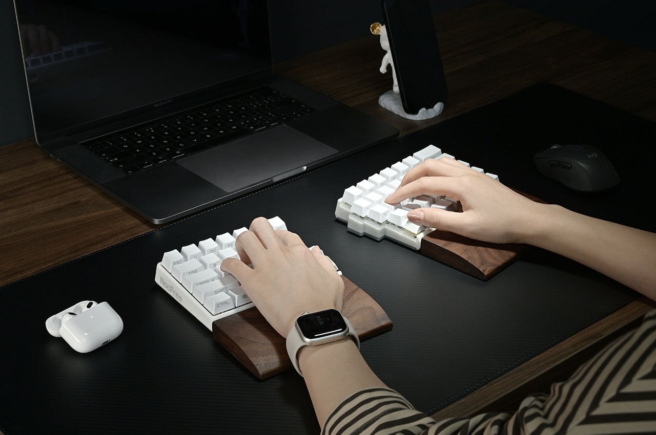
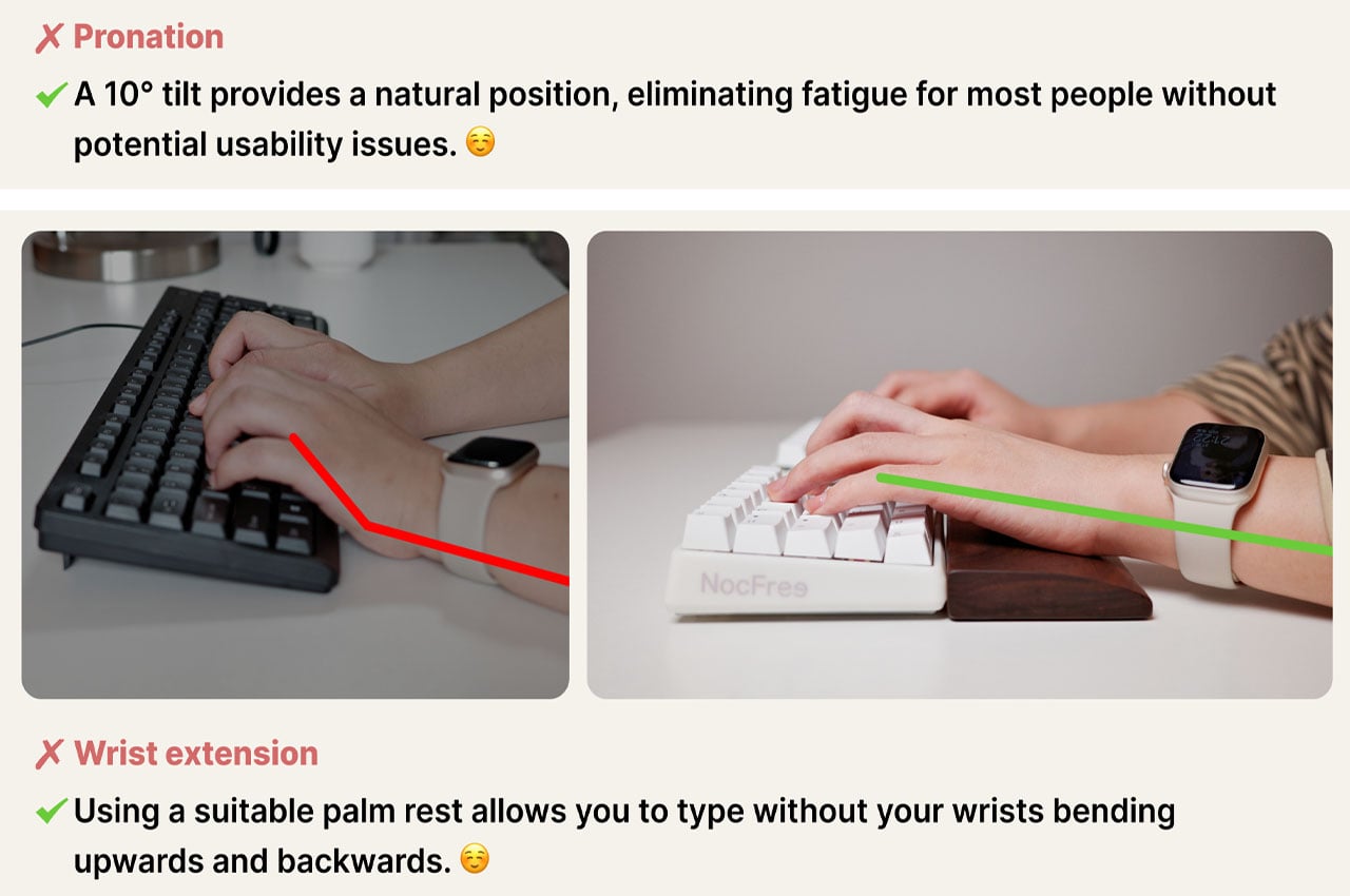
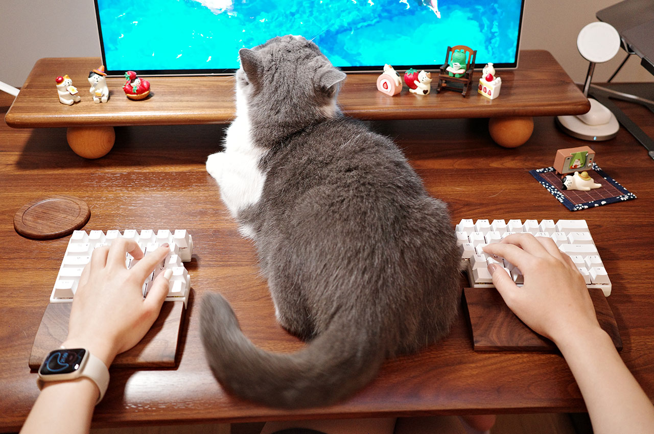
The NocFree Lite comes with a palm rest made from a single piece of walnut. This is also made to split with the keyboard and alleviates palm pressure in either use setting. According to the our information, 20 prototypes of the NocFree Lite have been made and tested, and the keyboard is ready for manufacturing. The idea behind the design is to move split keyboards from a niche to a mainstream choice, for which the makers are currently running an Indiegogo crowdfunding campaign, where prospective buyers can preorder a unit for $166.

Click Here to Buy Now: $166 $210 (20% off). Hurry, deal ends in 48 hours!

The post The NocFree Lite split wireless mechanical keyboard is an audaciously customizable piece of tech gear first appeared on Yanko Design.

Keychron’s latest split keyboard comes apart and joins back like two jigsaw puzzle pieces and I love it!

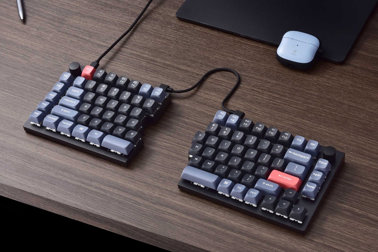
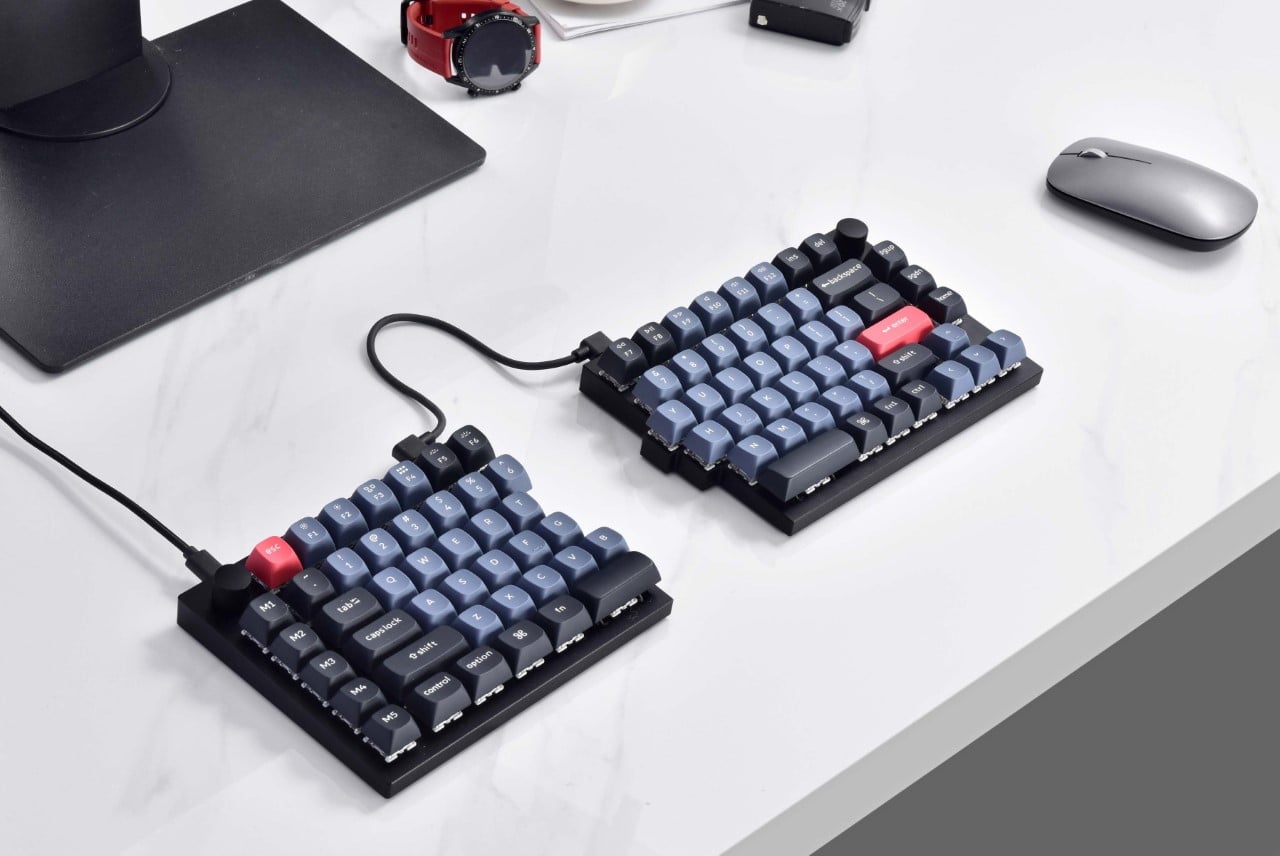
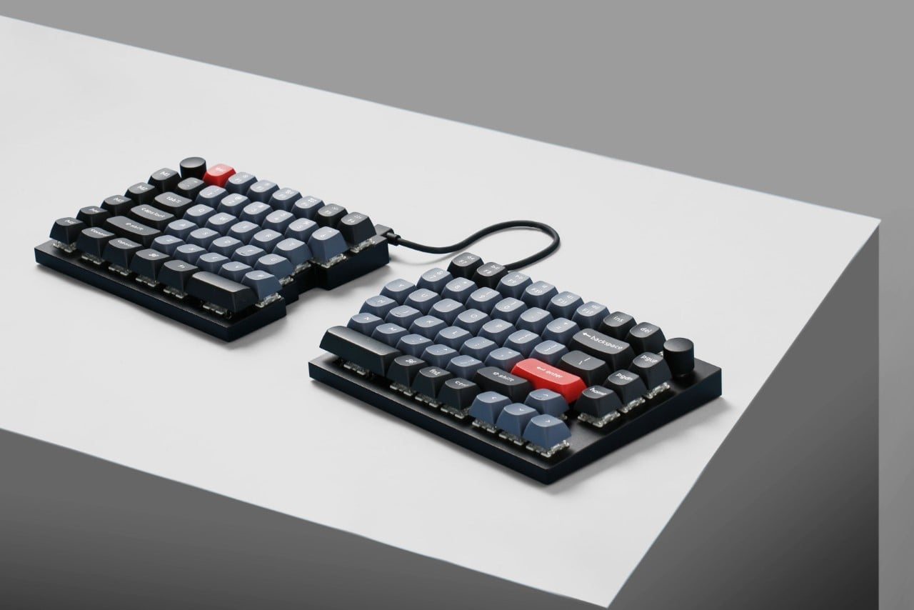
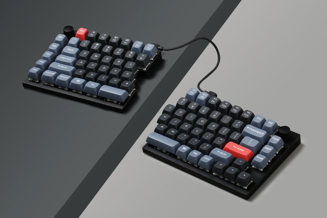
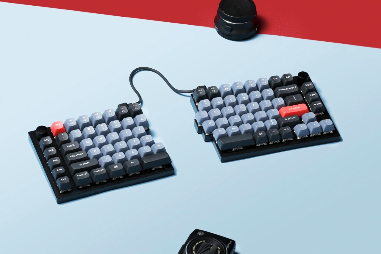
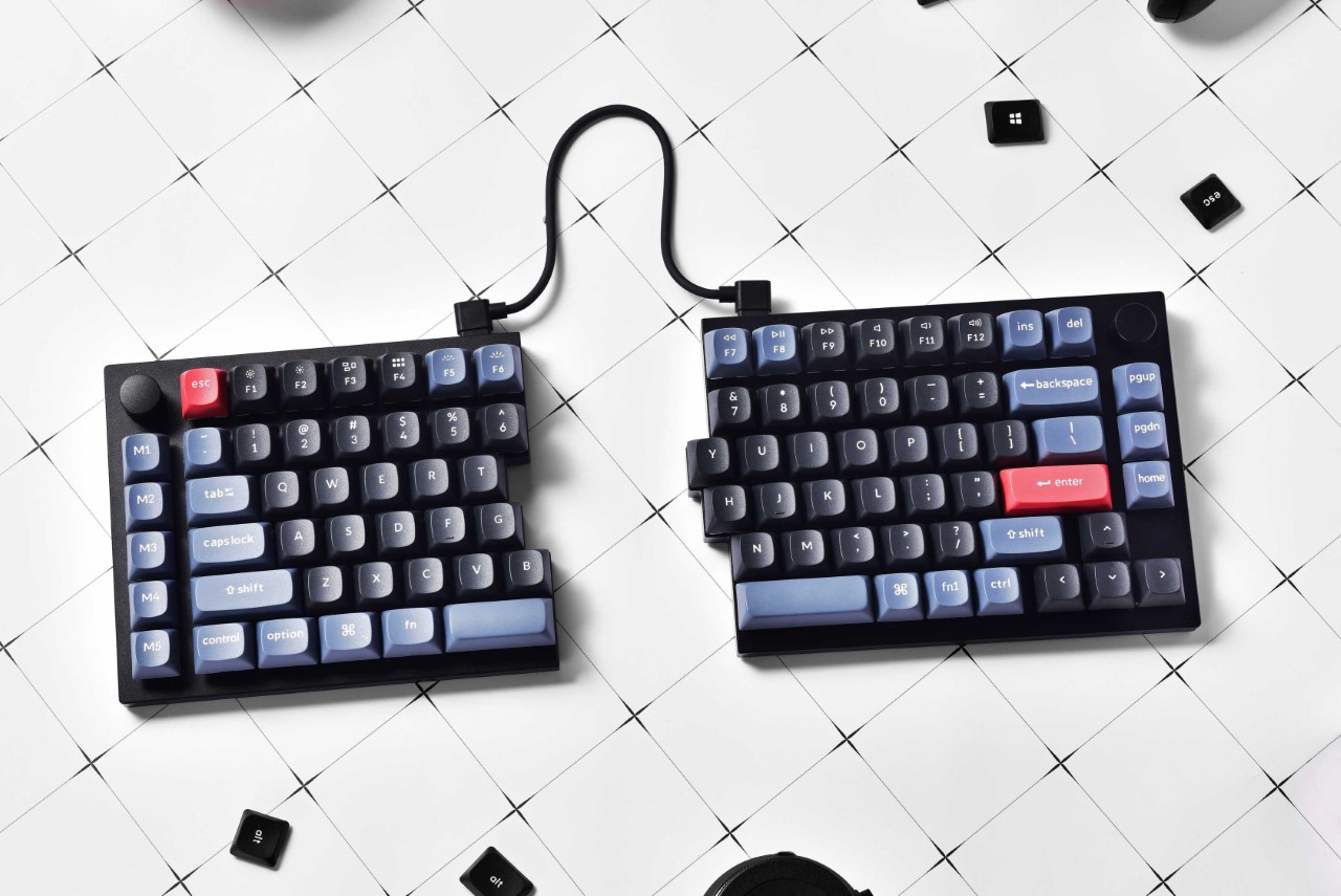
The world’s first split keyboard with the soul of a regular keyboard, the KeyChron Q11 QMK showcases a unique design that feels like someone took a chainsaw to your existing keyboard. Designed with two halves that look like they’ve been manually split apart, the Q11 QMK’s left and right units can be used independently, or together by connecting them with the bridge cable. The split line running through them is by far the most enticing bit about the device. The line’s jagged nature makes you want to place the two halves together to complete the keyboard, and even the name ‘Q11’ is a clever way to tell people that it’s the split version of the company’s Q1 keyboard!

Designer: Keychron

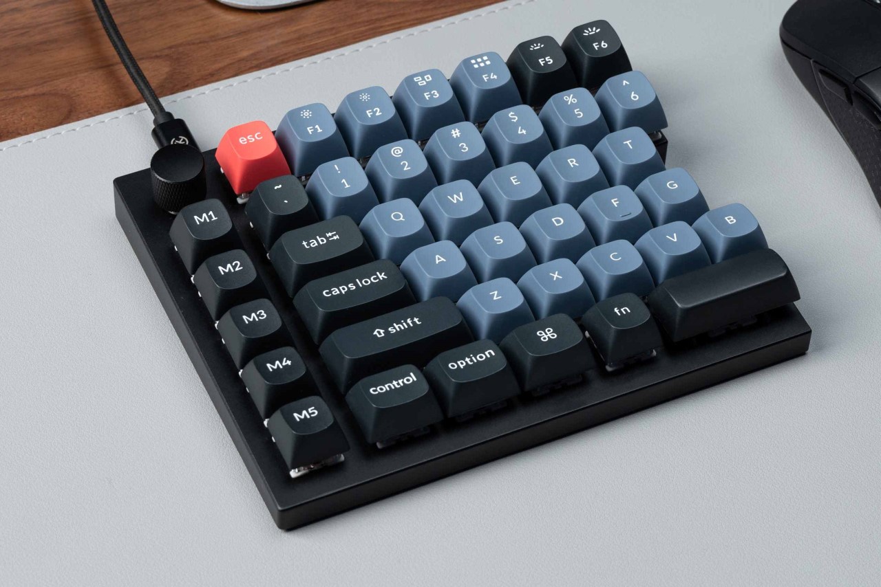
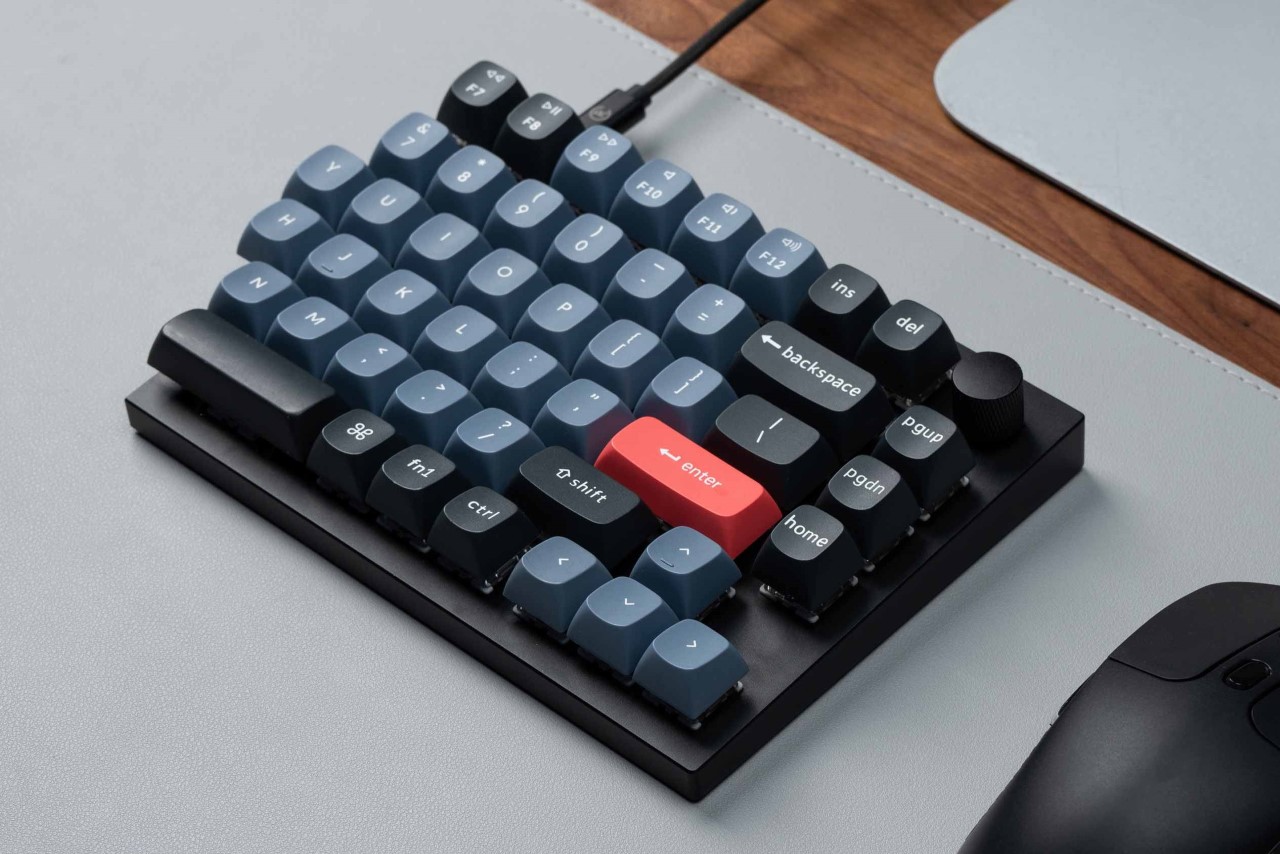
Built with a hefty CNC machined aluminum body, beautifully reliable Gateron G Pro switches, and a 75% layout, the Keychron Q11 QMK is both visually and functionally a work of art. All the keys are hot-swappable, a switch on the back lets you alternate between Windows and MacOS layouts, and encoder knobs on the top left and right can be assigned to a bunch of functions or macros, from scrolling to controlling volume, zooming in/out, adjusting screen brightness, or a host of other activities.

The split keyboard’s unique build lets you position and orient your two individual boards wherever you want, for a more comfortable typing experience. I wish there was a way to magnetically snap them together in a way that felt satisfyingly tactile, but that’s just my brain searching for some gestalt.

The keyboard’s metal body is crafted with 6063 aluminum that is processed through CNC machined, polished, anodized, sandblasted, and undergoes 24 more manufacturing stages, giving you something as pristine and beautiful as the Q11. It then comes outfitted with Gateron G Pro switches and south-facing LEDs, finally being topped off with double-shot OSA PBT keycaps that remain hot-swappable. Under the hood, you’ve got a powerful ultra-low-power ARM architecture microcontroller unit equipped with 128K Flash and a polling rate of 1,000 Hz, holding its own against most responsive gaming keyboards.

As its name suggests, the Keychron Q11 QMK comes with QMK/VIA support too, giving you the freedom to easily program and remap each key on the keyboard. The open-source firmware means endless possibilities for keyboard layouts, shortcuts, backlight effects, even the knob, and more.

Although most variants are sold out at the time of writing this, the Keychron Q11 QMK split keyboard is priced at $205, and comes fully assembled with either Gateron G Pro Red or Brown switches. The keyboard’s designed to be compatible out-of-box with Windows, MacOS, and Linux computers, and ships with a power cable, adapter, the bridge cable, and switch and keycap pullers for hot-swapping your keys.

The post Keychron’s latest split keyboard comes apart and joins back like two jigsaw puzzle pieces and I love it! first appeared on Yanko Design.

World’s first ‘wearable PC keyboard’ comes with a design that you can grab and use like a controller

The Grab Shell’s completely bonkers design was made as a response to the phrase “You can text, call, video chat, and play games while you walk. Why can’t you write code while you walk?” As bizarre as that ask is, it was the genesis of what became the Grab Shell keyboard – the only PC keyboard designed to be used in a handheld manner, like a massive wearable. The reason? Well, a software engineer behind the Grab Shell insisted that “walking around while typing is the most efficient way to collaborate when looking at the same shared screen.”

Designer: dotBravo

We’ve covered ergonomic keyboards, split keyboards, touchscreen keyboards, and even the odd spherical keyboard, but even for us, a portable, handheld keyboard controller is a first. Sure, you could say that most Blackberries had handheld QWERTY keyboards, and so do touchscreen phones today… but do they have mechanical switches, joysticks, scroll wheels, AND handles?

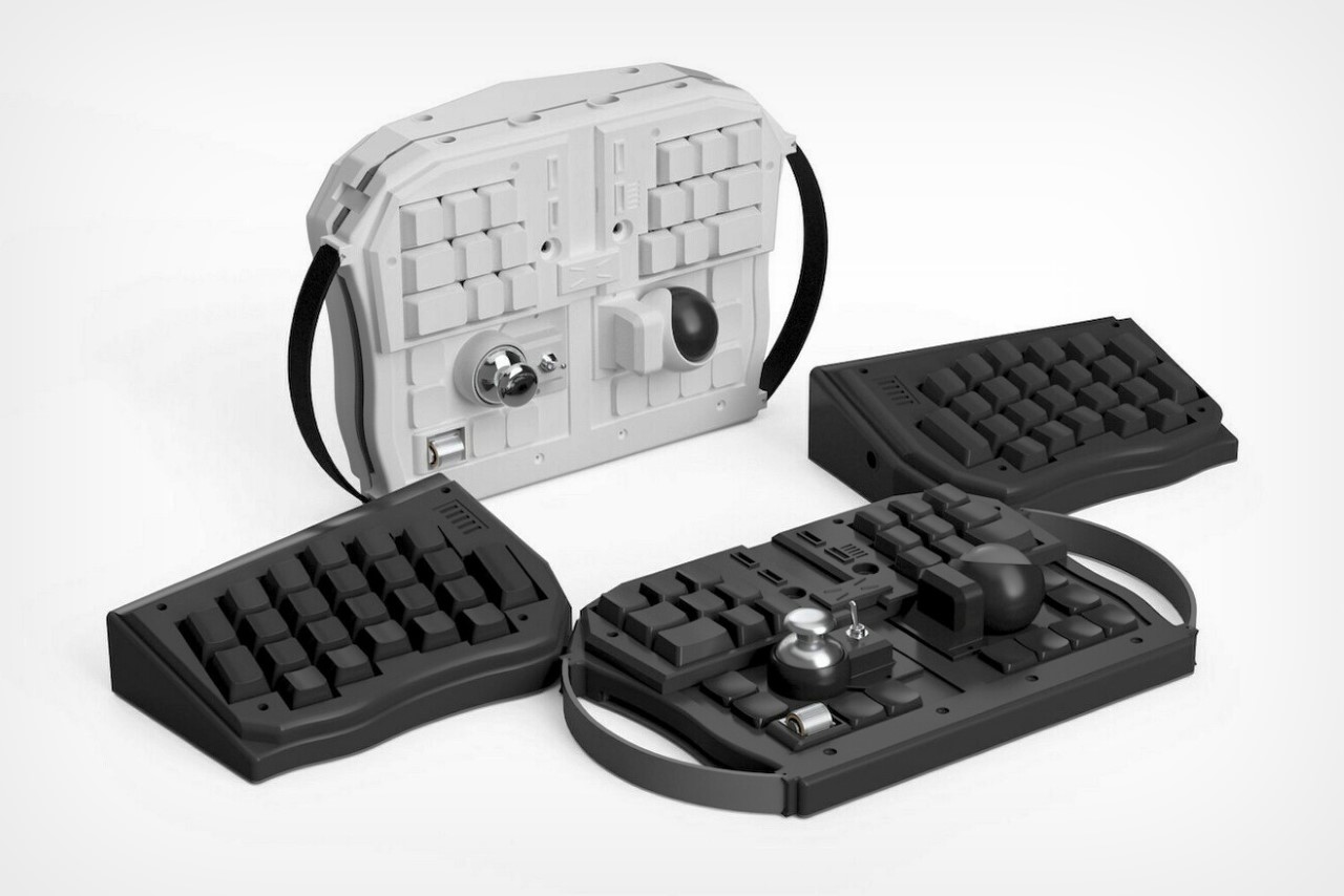
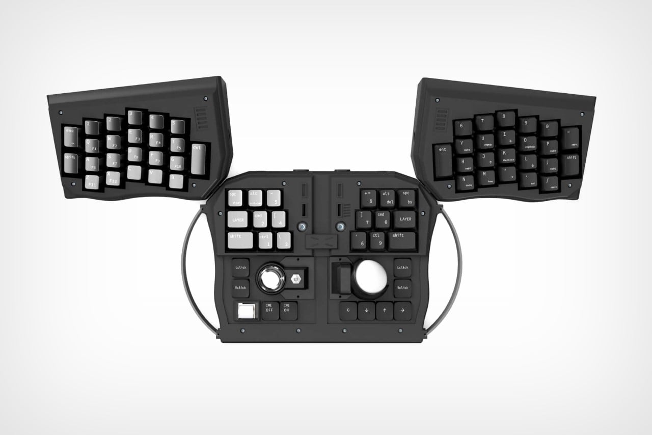
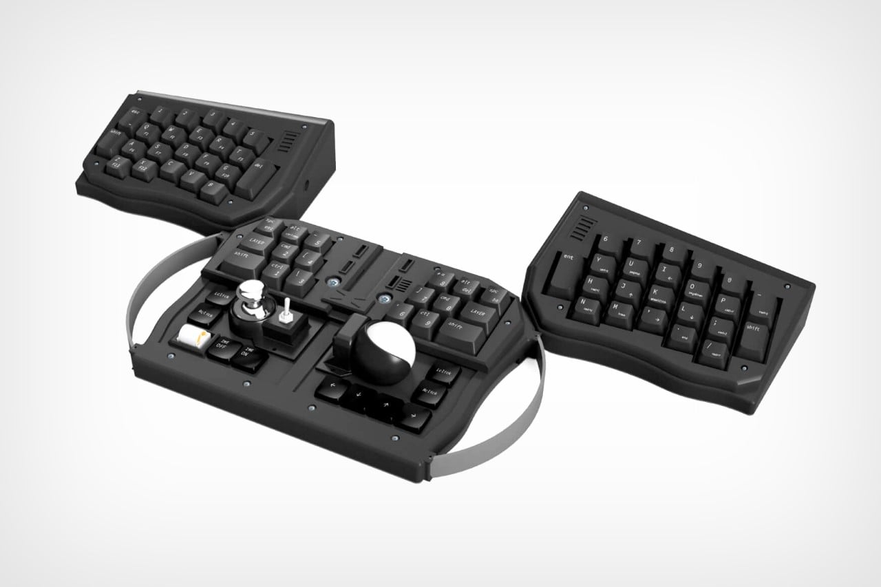
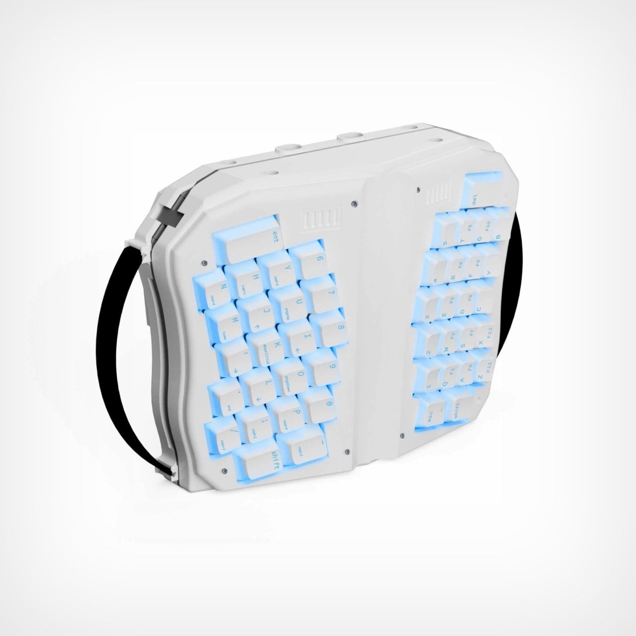
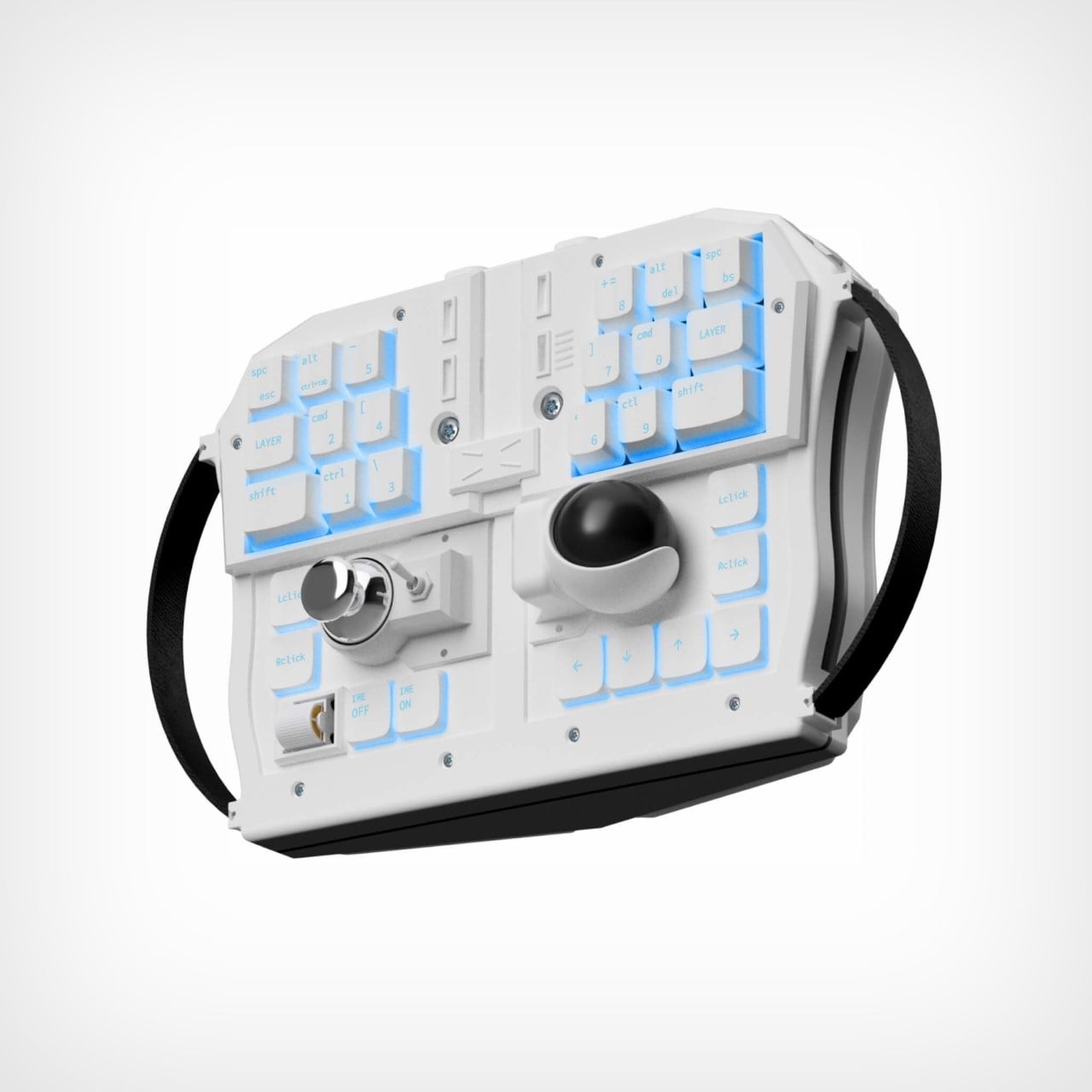
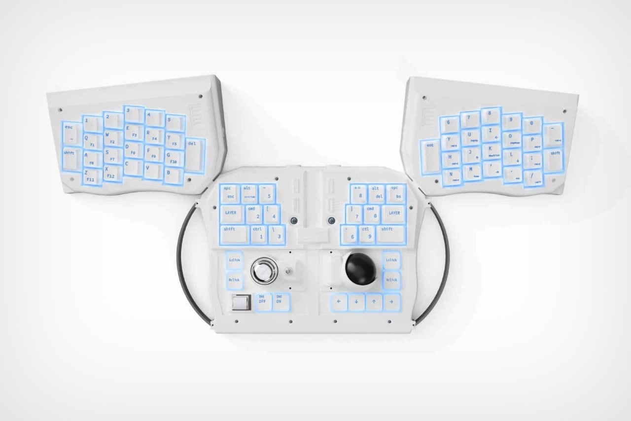
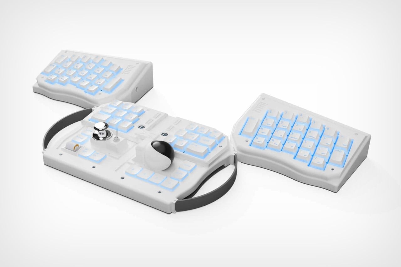
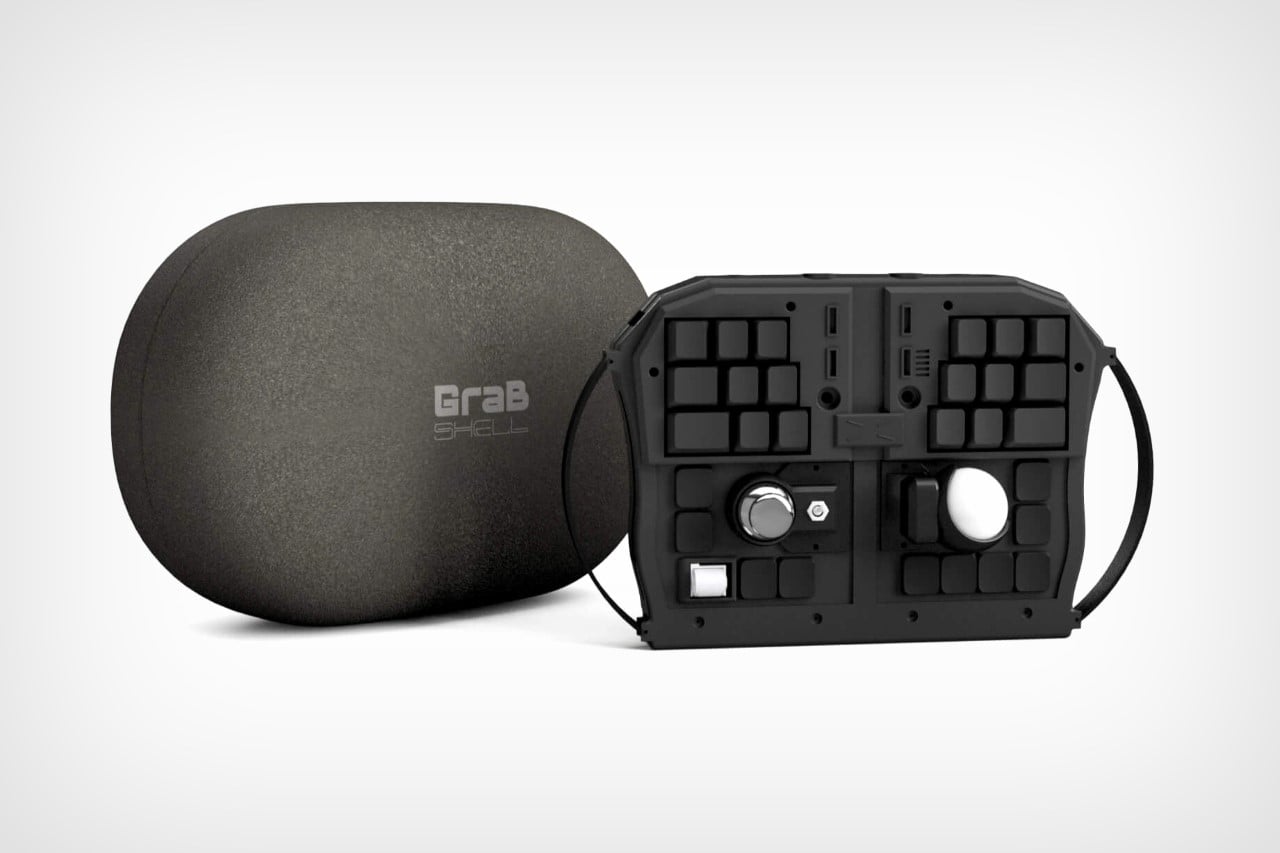
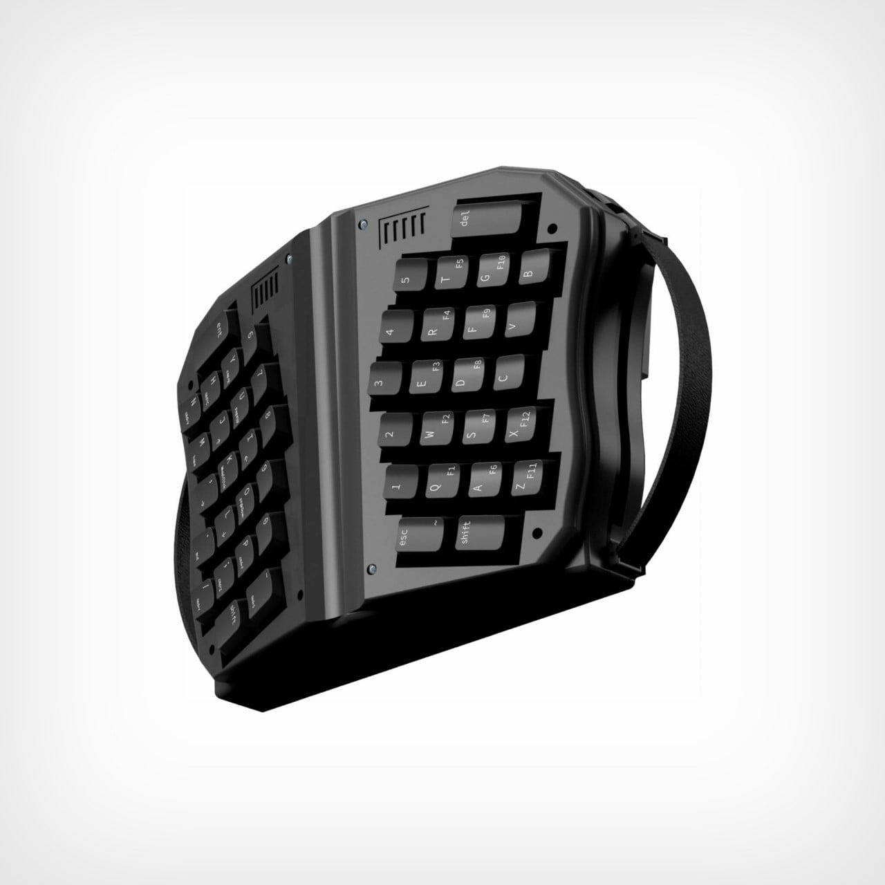
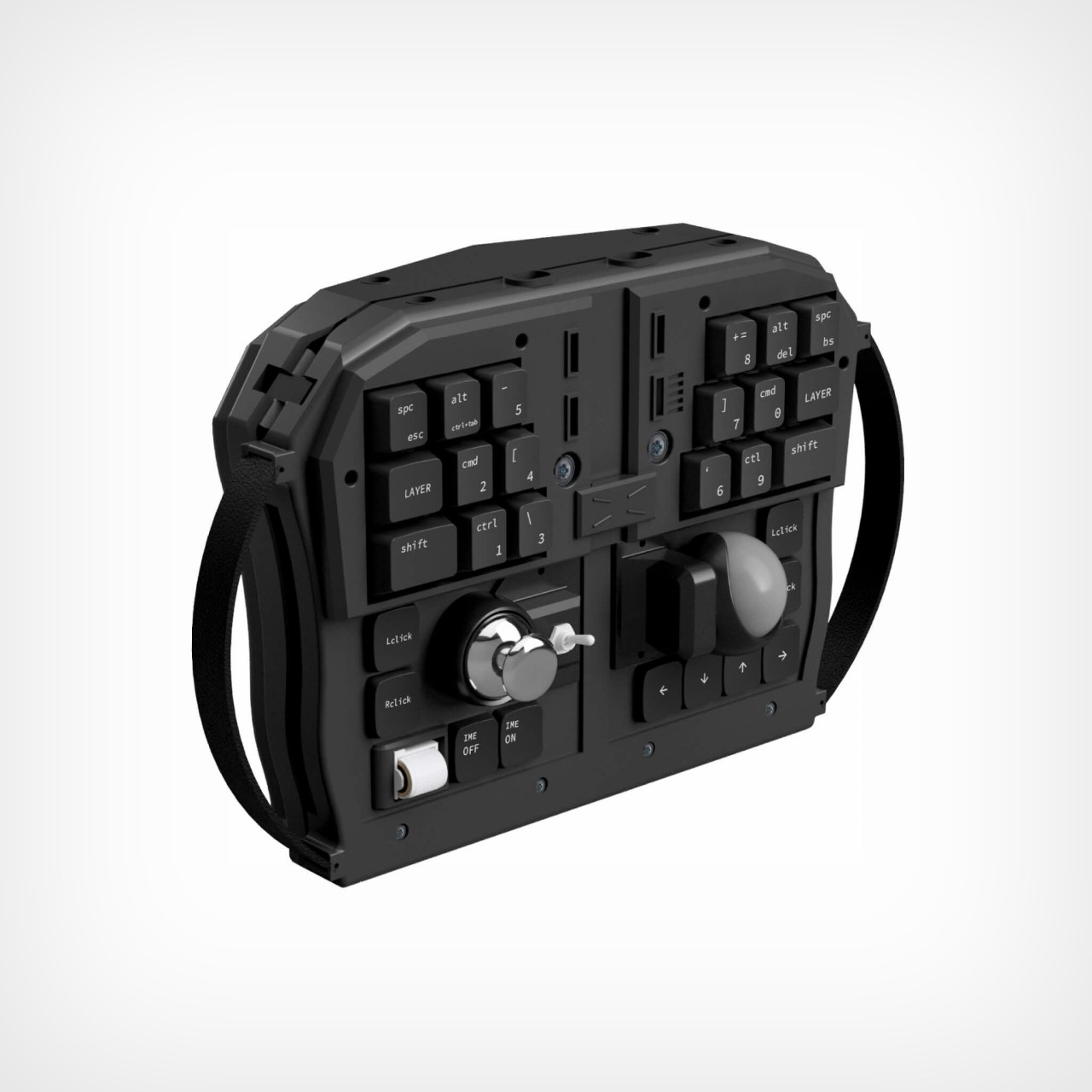
Meet Grab Shell, a new kind of keyboard that’s looking at a genre of productivity that sort of goes unnoticed – the moving kind. Most PC keyboards require you to be tethered to a tabletop surface (where the keyboard rests), but not the Grab Shell. Hold it in your hands like a Nintendo Switch and type on it in a natural manner. The keyboard features keys on both sides – QWERTY keys on the back for your fingers, and dedicated function keys and navigation controls on the front for your thumbs. Use it in a handheld manner while you work, or fold the keyboard open and type like you would on a conventional split keyboard. The Grab Shell empowers both kinds of use.

“The next generation will undoubtedly be a virtual native generation. In that case, it should be available for use in the virtual world,” say the designers behind the Grab Shell. “In other words, just as VR and AR devices are wearable, keyboards should also be wearable.”

Can’t argue with that logic.

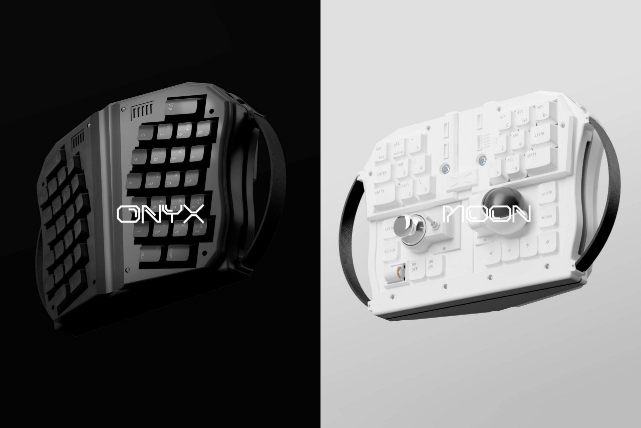
As is evident from the images, the GrabShell can be used in two ways – as a handheld controller in its ‘shut’ mode, and as a semi-conventional keyboard when opened out. I say semi-conventional just for the fact that the GrabShell opens into a rather odd shape with a split design that puts special keys like the enter button, the num-pad, and the arrow keys in the center. The center also features unique navigation controls like a scroll wheel, joystick, trackball, and a toggle switch that helps offset the need for a mouse with the keyboard. Dedicated Left and Right click buttons also feature on the keyboard’s design, along with layer keys, which are definitely a new addition. Designed by and for coders, who can sometimes be a fickle bunch, the entire keyboard is customizable too, with the ability to program different keystrokes, shortcuts, and macros to suit your needs. Also in the spirit of user freedom and absolute customizability, the Grab Shell connects wirelessly to both Windows and macOS devices too, with the ability to toggle between them, should you choose. A USB-C port lets you charge the keyboard or use it in wired mode, and a 2000mAh battery powers the Grab Shell for months without needing to be charged, so you can keep walking around as you code, type emails, play games, or just browse the internet.

Its strange format aside, the Grab Shell has all the trimmings of an actually satisfying mechanical keyboard. It uses the original layout for the QWERTY keys, albeit in a split-keyboard design, employing Cherry MX1A switches and ABS keycaps to create a keyboard experience that gamers, coders, and tech-geeks will absolutely love. Going above and beyond, the Grab Shell also comes with a toggle switch, joystick, scroll wheel, track-ball, left and right-click buttons, and literal handles that let you grab your keyboard and work without being bound to a desk. Moreover, the Grab Shell’s keys are completely backlit too, giving you the ability to work not just from anywhere but also pretty much at any time you feel productive! Don’t let anything get in the way of those all-night coding sessions!

The Grab Shell is available in two colors – Onyx Black and Moon White. Priced at a discounted $299, the Grab Shell is up for pre-order on its website, with deliveries beginning in June 2023.

The post World’s first ‘wearable PC keyboard’ comes with a design that you can grab and use like a controller first appeared on Yanko Design.

This $299 wireless keyboard is shaped like a pair of gloves to offer the best ergonomic layout

In 2012 when Apple debuted the first EarPods, Jony Ive made a rather important observation – the ear canal is a very complex shaped part of our body. It certainly isn’t circular, so the idea of circular earphones (which were the norm back then) was flawed, to begin with. The EarPods explored a design that complimented the shape of the human ear in a way that was designed to have a fit that’s as universally comfortable as it can get. That same shape was carried into the AirPods too, making them the most popular TWS earbuds in the world. The point is, a human-centric approach always makes a product experience better. It’s the same reason why an ergonomic chair feels much more comfortable to sit in as compared to a hard wooden chair, and why typing on touchscreens still absolutely sucks in comparison to typing on a proper keyboard. The Glove80, however, pushes the boundary by making the mechanical keyboard EVEN MORE human-centric.

Designers: Stephen Cheng & Chris Andreae

Click Here to Buy Now: $299 $400 (23% off). Hurry, only 24/250 left! Raised over $100,000.

Named after the fact that it’s inspired by a pair of gloves, the Glove80 is a split keyboard with an ergonomic design and layout that literally follows the shape of human hands. Designed over a period of 6 years, with over 500 comparative A/B tests, the overall form of the Glove80 effectively puts every key within the span of your fingertips, achieving a level of comfort that the EarPods did with their ear canal-inspired design.

The Glove80, as its name suggests, comes with 80 keys laid out in the shape of a pair of gloves (with 40 on each side), complete with palm-rests and adjustable feet for the most customizable experience. Its split-keyboard design allows your wrists, forearms, and shoulders to assume their most natural position, eliminating fatigue over time, and the unique layout lets you type without lifting your wrists or stretching your fingers, giving you a comfortable typing experience, without the risk of a carpal tunnel flareup.

The Glove80 even sports a patent-pending 6-key layout right underneath each thumb, letting you easily reach them with minimal movement. As a result, the keyboard’s typing experience isn’t just more comfortable, it’s faster too (since your fingers don’t travel as far).

Like any good keyboard on the market, the Glove80 supports wireless as well as wired use, offering the ability to connect to multiple Bluetooth devices (up to 4) simultaneously. Under the sculpted POM keycaps of the Glove80 sit low-profile mechanical Kailh Choc v1 switches, providing a wonderfully tactile experience that’s far better than the ones found on laptops. While choosing your Glove80, you can even select between clicky, tactile, or linear-style switches, and each Glove80 comes with a keycap puller and optional spare keycaps, letting you customize your key layout to suit your needs. The keyboard also ships with the open-source ZMK firmware which lets you add shortcuts, macros, and tweak the keyboard’s internal RGB lighting to your liking.

The ergonomic split keyboard weighs a total of 600 grams along with the detachable palm rests, and ships in either white or black. Moreover, its two-part design even enhances portability, making it less monolithic and bulky so you can easily pack it up and carry it anywhere. It runs on a USB-C connection (if you want near-zero-latency input for gaming) and is equipped with two 500mAh batteries (one within each half of the keyboard). The Glove80 runs on Bluetooth LE 5.2 for a seamless connection and is compatible with Windows, macOS, Linux, Android, iOS, iPadOS, and Chrome. You can grab your own Glove80 at a Super Early Bird 25% discount for $299 using the link below.

Click Here to Buy Now: $299 $400 (23% off). Hurry, only 24/250 left! Raised over $100,000.

The post This $299 wireless keyboard is shaped like a pair of gloves to offer the best ergonomic layout first appeared on Yanko Design.

Inspired by Westworld, the Am Hatsu is the world’s first split keyboard with an organic metal body

Look at the Am Hatsu keyboard and it instantly feels like it was fabricated by highly advanced robotic equipment. Part organic, part futuristic, the split keyboard was inspired by the sci-fi series Westworld. Its unique surface and key placement help relieve wrist pain while allowing you to sort of look like a cyborg as you browse the interwebs.

The Am Hatsu’s organically shaped metal surface is the result of 5-axis simultaneous CNC machining, an expensive fabrication technique that yields pretty remarkable results. The organic keyboard layout sits on a low-poly metal base, within which lies the keyboard’s internal hardware. The Am Hatsu runs on a low-frequency communication protocol that allows both keyboards to communicate with each other as well as your input device (laptop, desktop, tablet, etc) in real-time, ensuring that there’s absolutely zero lag between both keyboards while you type. “This ensures the best performance when it comes to power consumption, anti-interference ability, and latency”, says Angry Miao, the company behind Am Hatsu.

The keyboard was launched under Angry Miao’s “Make Art Not Tech” vision. It takes its inspiration from the intro sequence of HBO’s Westworld, where multiple specialized tissue-printing robots come together to build a living bionic man. The keyboard’s curved surface pays tribute to the sci-fi series while also aiming at enabling a much more comfortable typing experience by allowing your wrists to rest in their natural position. The unconventional 4×6 key layout also minimizes repeated movement of fingers, allowing you to type effortlessly.
The Am Hatsu is by no means your regular consumer-tech device. Its specialized manufacturing methods and state-of-the-art internals bring the keyboard’s price up to a mind-bending $1600 per unit. Early-bird purchasers will receive a special 20% discount by acquiring an NFT to authenticate their pre-order, although given how expensive it is to make one of these keyboards, your deposit is only eligible for a refund before July 29th – when production begins. The keyboard is limited to just 100 units in this initial run, so if you’ve got an arm and a leg to spare… although wait, you’ll need both arms to type!

Designer: Angry Miao

The Alpha Ergo is a simple, modern Keyboard that you can ergonomically adjust

While we have Taika Waititi slamming Apple’s keyboards just moments after winning his Oscar award, here’s a simple wireless concept that does something none of Apple’s products do… It adjusts to your needs.

Meet the Alpha Ergo, a wireless keyboard with a unique design that allows it to alternate between regular and split-keyboard layouts. This unique swiveling action allows you to adjust your keyboard’s design for more ergonomic typing, but that isn’t all. The Alpha Ergo’s seemingly large hinge element also serves as an interface with a touchscreen and dial giving you wide variety of extra functions. You can use the dial and screen to change in-program settings, toggle through options, switch between active apps, or assign pretty much any action to the controls based on which program in. The dial could work as a scope-zoom in a game, or as a volume knob in Spotify, or even a brightness/contrast control in Photoshop. Plus, the hinge’s form does the keyboard a service by propping it up as a slight angle, giving you a better keyboard that’s comfortable, adjustable, and is fitted with everything a power-user is looking for. The only caveat is a missing number pad.

Designer: Ryan Smalley