A Space X-inspired pen + more stationery designs recommended by Yanko Design to help product designers innovate + brainstorm

A set of great handy stationery designs are extremely critical for any product designer! These are the tools that help and support you through your creative process. They can either make or break your entire design process, so it’s imperative to have a collection that really lets you work easily, efficiently, and effectively. Yanko Design recommends these innovative and nifty stationery designs that every product designer must own! From a gadget that ensures you draw straight lines to a design that doubles up as a compass and a protractor, these products are sure to meet the unique needs and requirements of your creative process. You can thank us later! Enjoy.
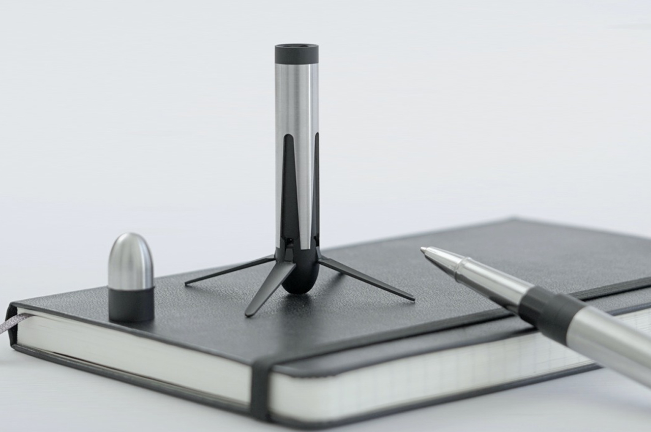
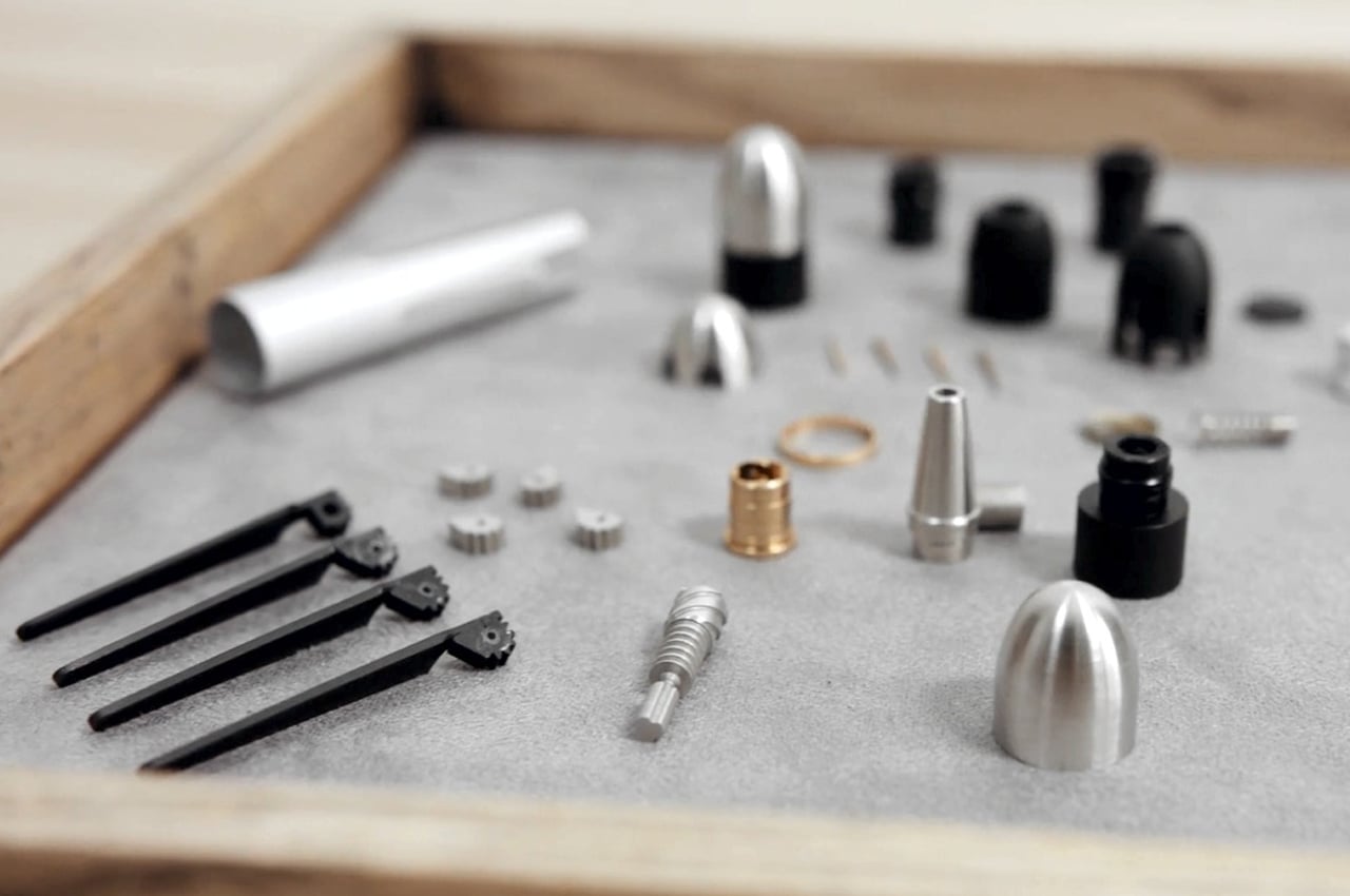
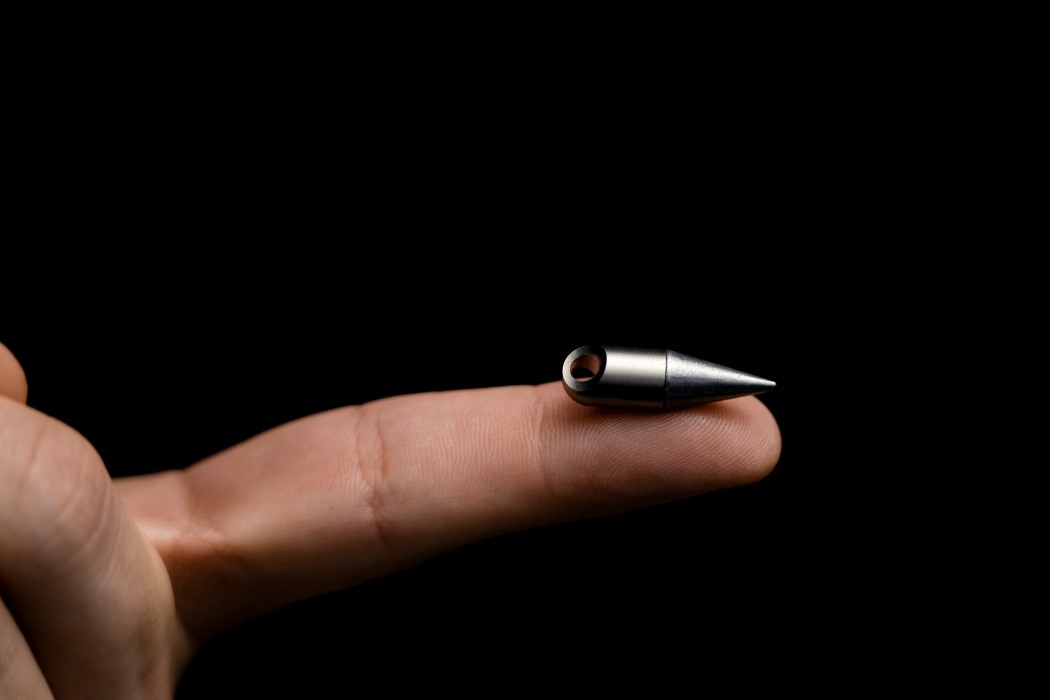
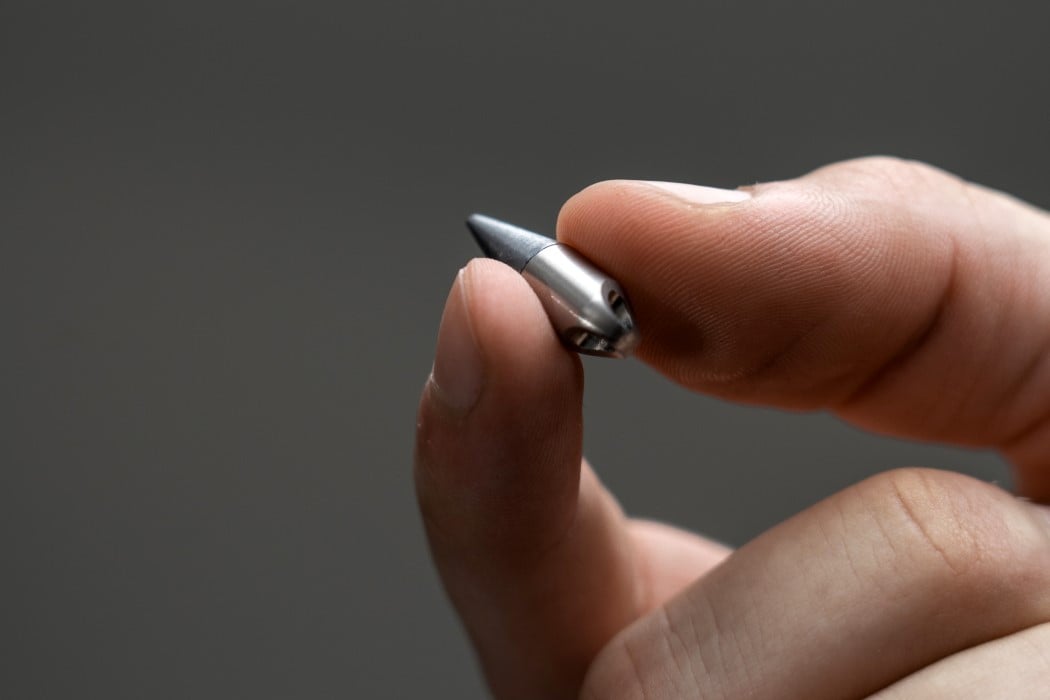
Inspired by the democratization of space travel and how one private company, founded by Elon Musk is leading the charge to make space-travel accessible to all, the Nominal Pen is literally designed to look like a rocket… making it perhaps the most literal take on the ‘space pen’. The pen’s name comes from the term ‘nominal’, often used for when everything’s going smoothly and according to plan. Designed as a celebration of SpaceX’s recent achievements of being the only private company to send humans to the ISS and bring them back (while even retrieving parts of the spaceship to be reused at a later date – something nobody’s ever done), the Nominal Pen models itself on the Falcon series of rockets (the Falcon 9 Block 5 in particular). The pen comes in a similar light+dark metal finish, featuring four retractable legs that open out, allowing it to stand vertically on its own… after all, it would be quite shameful to have to put a rocket-shaped pen in your pen-stand, right? The Nominal Pen’s retractable legs are operated by a twist-to-open mechanism machined right into the pen’s metal body… while the opposite end of the pen features a magnetic crew-capsule that detaches from the rocket-body!
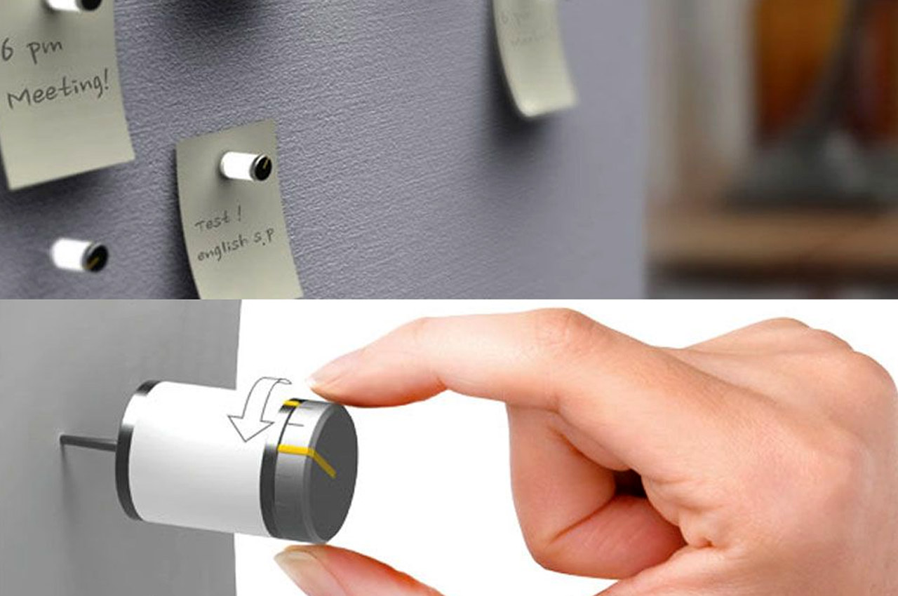
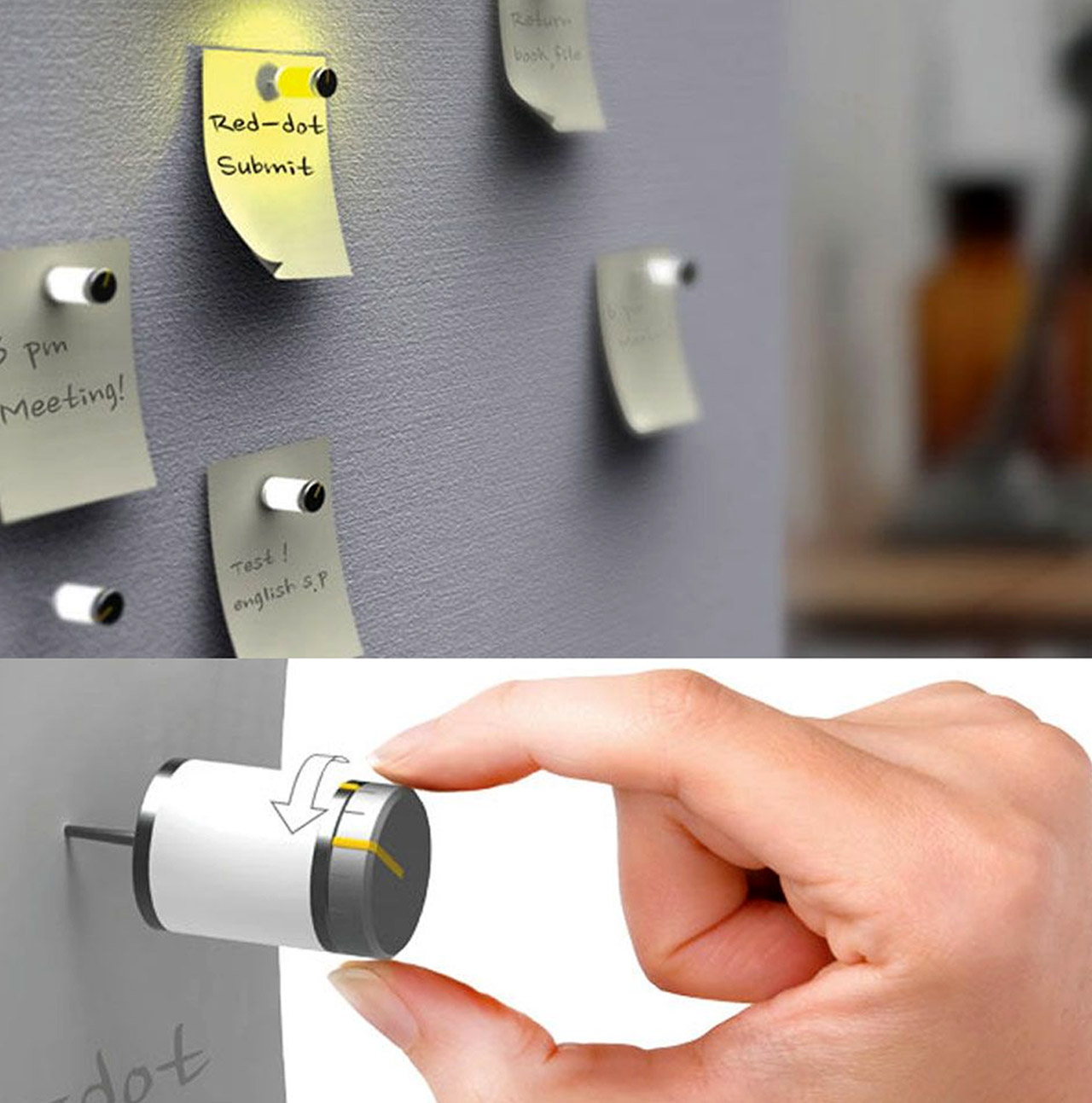
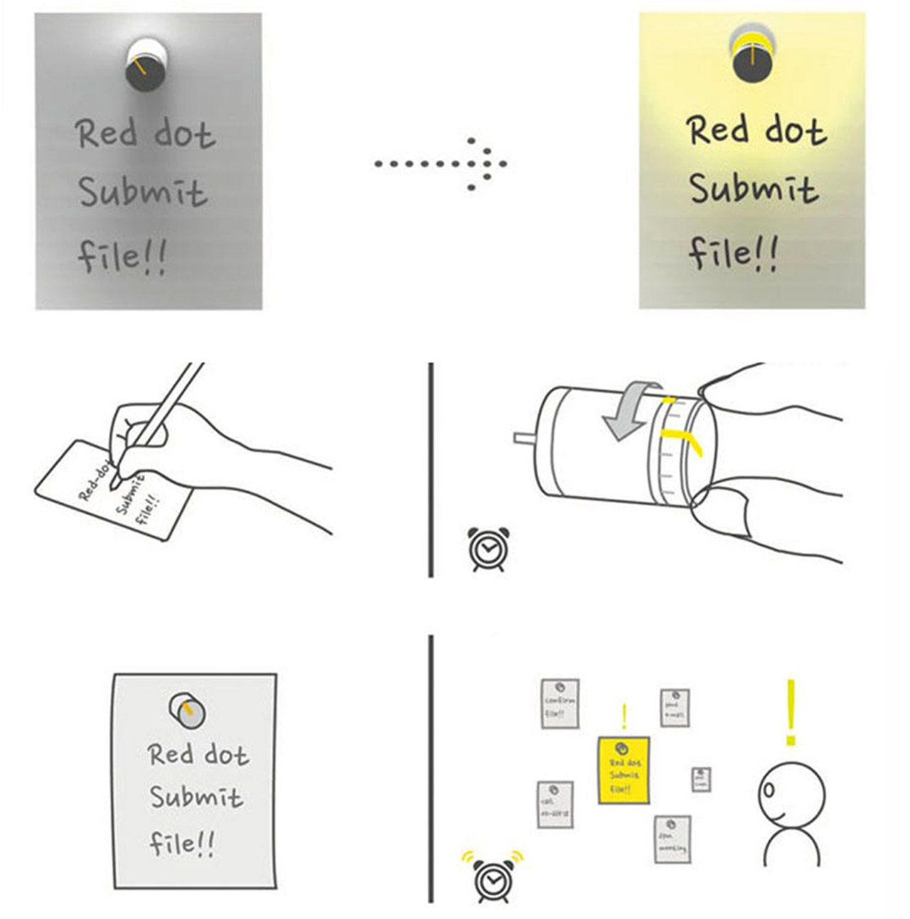
Designed by Kim Sung Min, ‘It’s Time to Read Me’, is an electric pin-up board, which lights up to remind you to reach the message attached to it, and follow through on it! You basically attach the little pins to your memos, set up the reminder time, and the pin will light up at the set time, reminding you to finish off your task! How cool is that?
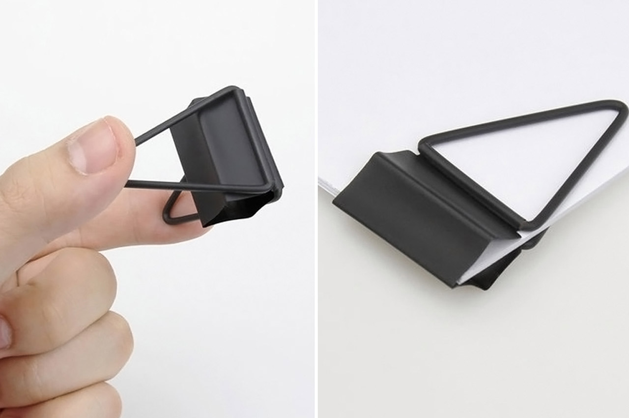
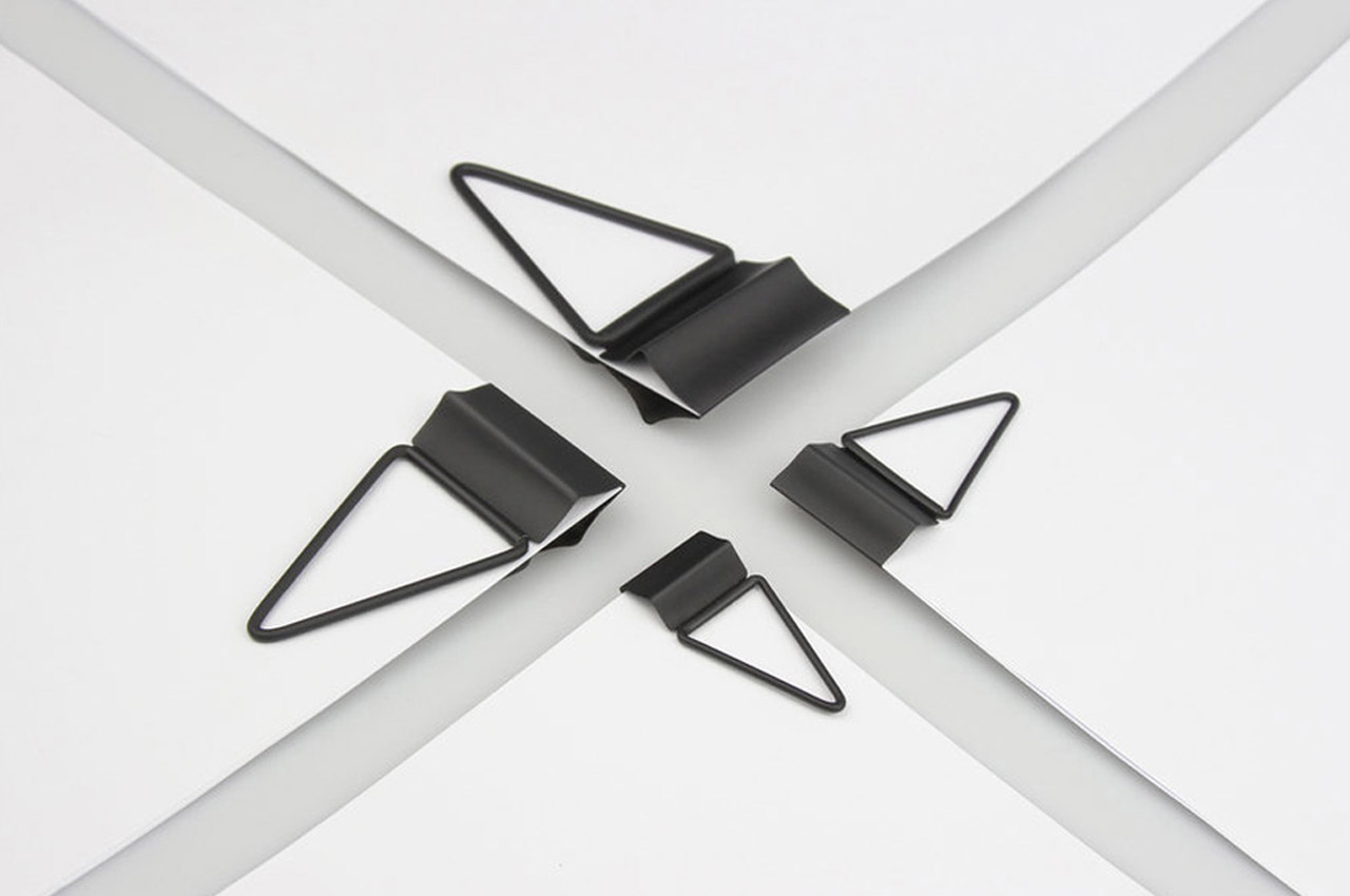
JaiYi identified that the existing clip while doing wonders to hold the paper in place also faces some ergonomic troubles – firstly, the pin’s handles tend to slip when we apply force to it. Secondly, the pressure points in the design are the creases in the pin which take the entire load, causing them to crack. On identifying these concerns JiaYi applied her design skills to transform the classic, and take it to the next generation along with us with the four-side long tail clip! The four-side long tail clip makes two simple yet radical changes – it elongates the handle of the pin, allowing us to apply the same amount of pressure while exerting lesser force and it adds a new pressure line, halfway through the design, helping relieve the pressure on traditional three creasings.
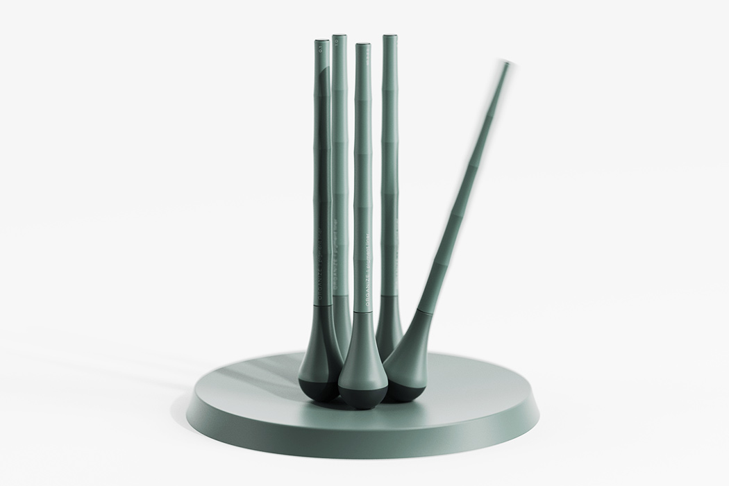

All designers can relate to the frustration of not being able to find that specific nib for their own. And maybe it’s Murphy’s Law but the case of the missing nib always happens when you are ready to start sketching. Keeping this in mind, Kim Minsu created ‘Organize’ – a pen and stand set that (yes, you guessed it) organizes your stationery. Just like a self-rigging toy, when left on the flat base it will return to the upright position thanks to the rounded and weighted bottom. The minimal form has been inspired by bamboos, specifically those little ones we keep in our homes for good luck. So when not in use Organize looks like an aesthetic piece in your interior setup.
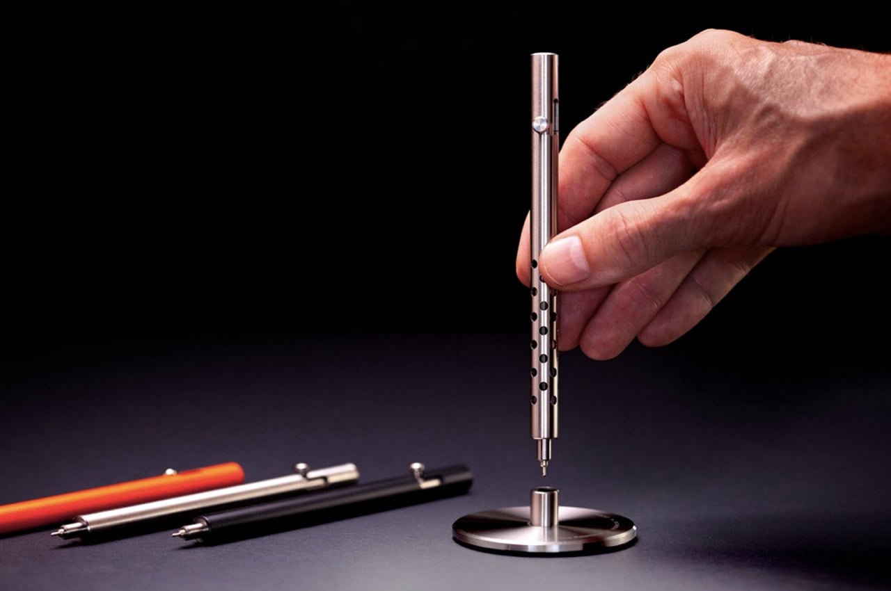
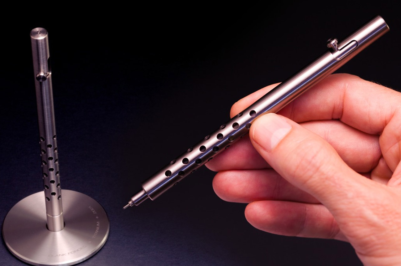
The Titanium INJECTOR Pen sports an incredibly minimal design with simple cylindrical construction, punctuated by the bolt-action mechanism which also prevents the cylindrical pen from rolling around. The innovative ‘Rapid-Bolt’ mechanism is an improvement on the status quo, with a much smoother deployment action that has an addictive fidget-like quality to it. The pen supports all Parker-style ink refills and comes entirely precision-machined from solid titanium, from the barrel to the inner components (with the exception of the spring), with no glue or plastic parts used in its assembly. This gives the Titanium INJECTOR Pen its unmatched durability and allows you to use the pen for decades at an end.
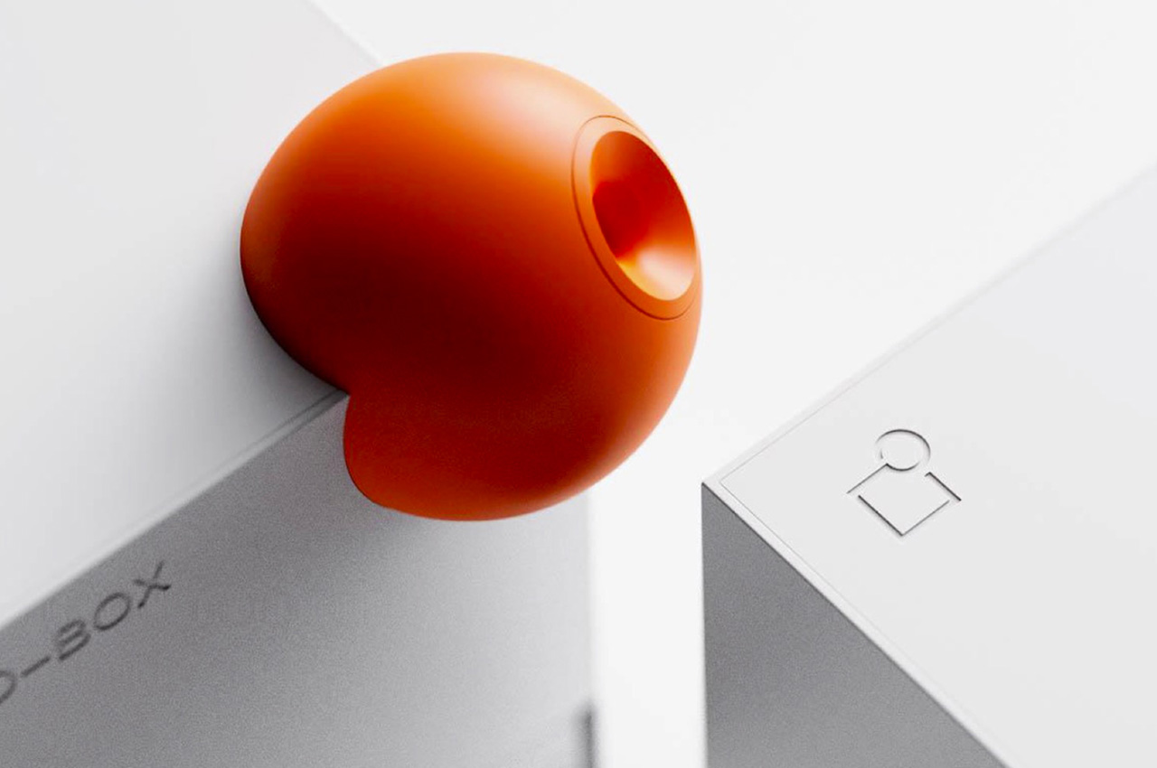
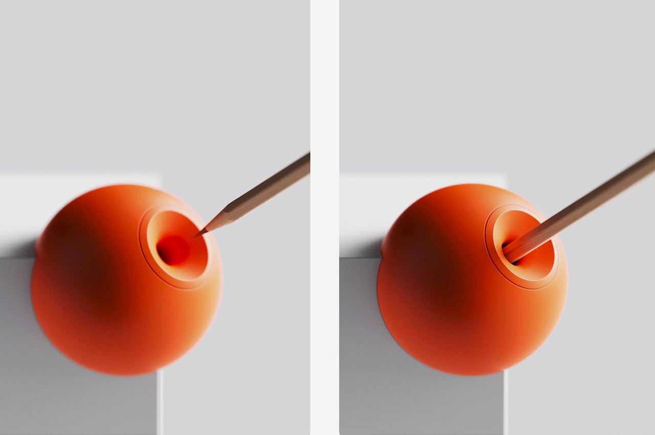
Meet the Co-Box, an electric pencil sharpener, minimal and geometric by design that is a worthy addition to every design nerd’s desk. The design is a white square shape, accentuated by an orange circle, reminiscent of the button we would see on our Braun machines. The circle also acts as an entry point for your pencil. The shavings get collected in a transparent box, to be disposed of at your convenience. The design history of our 20th century is filled with iconic design moments, each one a point in time when the object became a part of our everyday life, almost seamlessly – all because of the nature of their design. This sharpener encapsulates the same timeless spirit and just like you hang your favorite posters on your wall, every designer holds an object by their iconic design mentors on their desk.
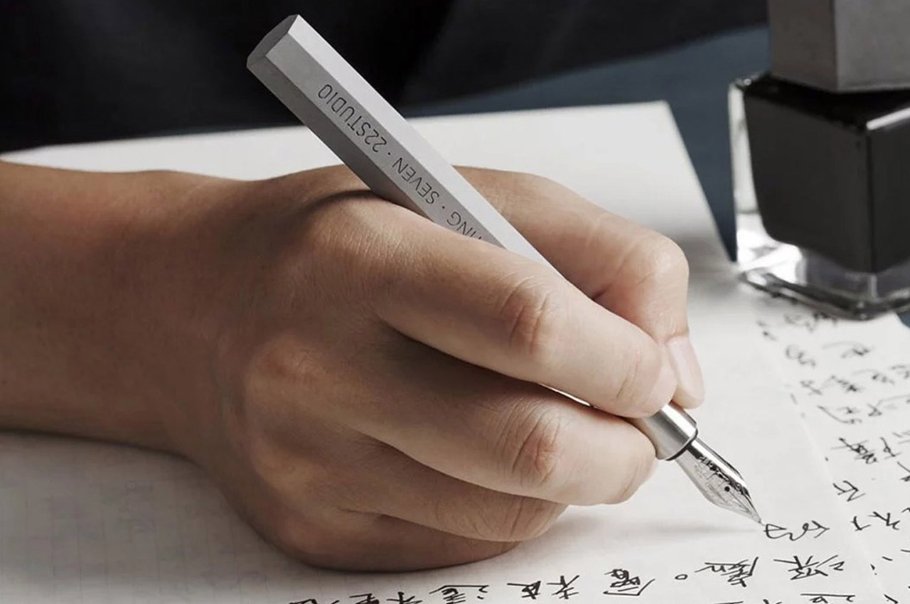
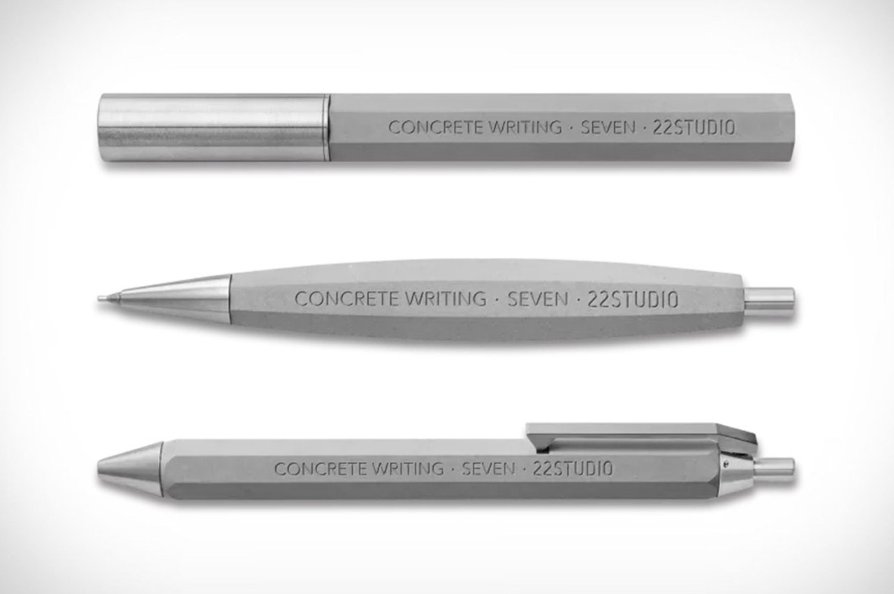
The stationery created by 22Studio is no less than art, these are made to last lifelong and passed down as family collectibles through generations. Concrete is used to make this pen because it adds a rich look without making it shiny or fancy – it is simple but makes a bold statement. The solid pen starts as a liquid mixture of different elements and then it is allowed to set like stone. The concrete pen is carefully designed and crafted by hand in the studio which gives it its unique personality. Books are considered as best friends, but this concrete stationery is a rock (literally!) we can lean on.
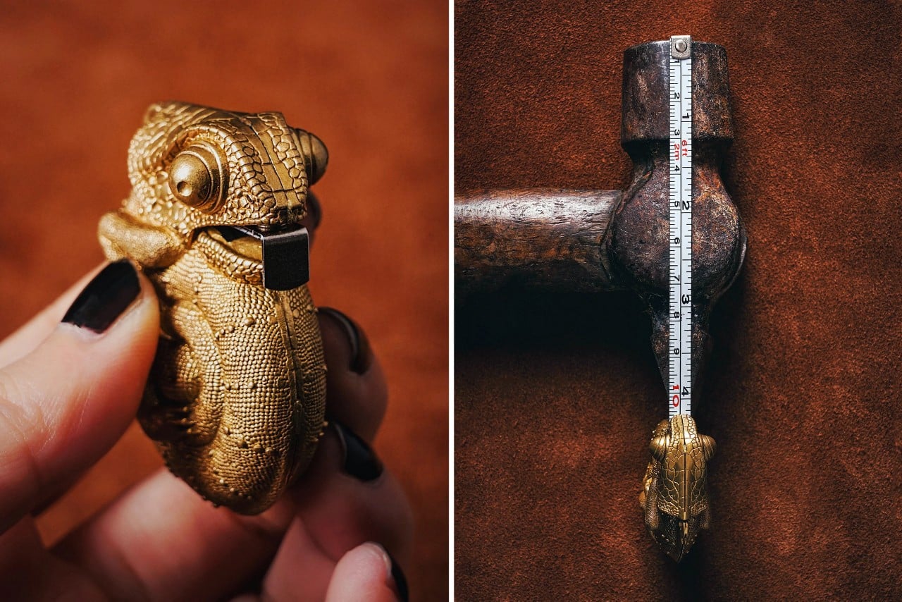
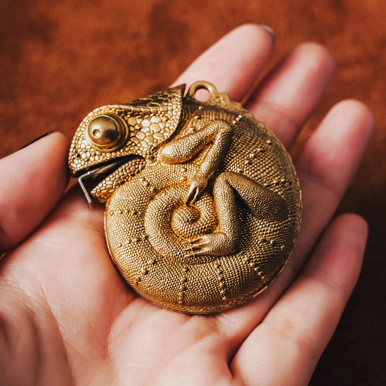
The chameleon’s camouflaging capability is in focus here too, as this EDC hides the measuring tape in plain sight. Look at those details!  The huge, bulby eyes, detailed scale texture, the ridges in the back, and the proportion of the overall design makes this a perfect fit for stationery enthusiasts the world over. Adding to the quirkiness of the design, the tongue of the chameleon is a measuring tape that extends up to 2 meters in length. The body of the chameleon measures a tiny 1.9 inches, making it perfect to hang onto your keychain for daily use. The body is made from brass and manganese steel, giving it a nice weight and a solid overall feel to the design.
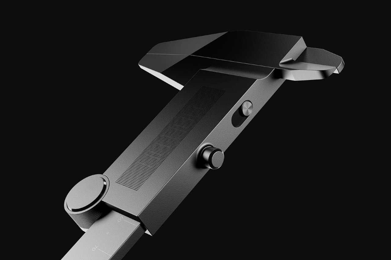
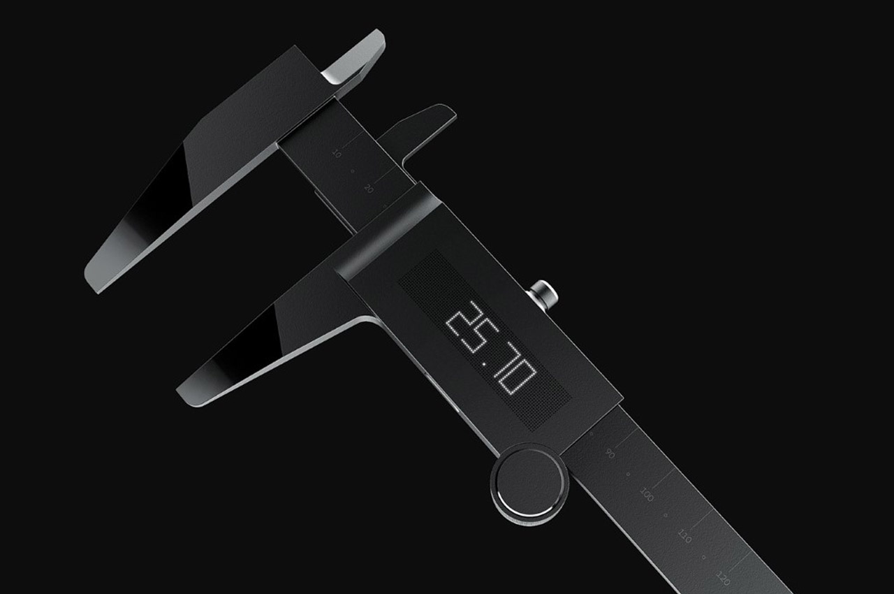
Designed in pure metallic matte black, with a form language of just geometric shapes like straight lines and circles (rather apt for geometric tools, I’d say), the XYZ set comprises a vernier caliper, measuring tape, compass, and laser dimensioner. They all look beautiful together as a family, and even separately. Minimal styling and a great UX unite them all. Each of them comes with a dotted matrix that behaves like a screen as individual LEDs behind the dots light up to beautifully and minimally give your measurements digital values. The numeric values even sync with your phone, so that you can digitally store all your entries for cross-referencing later.
push
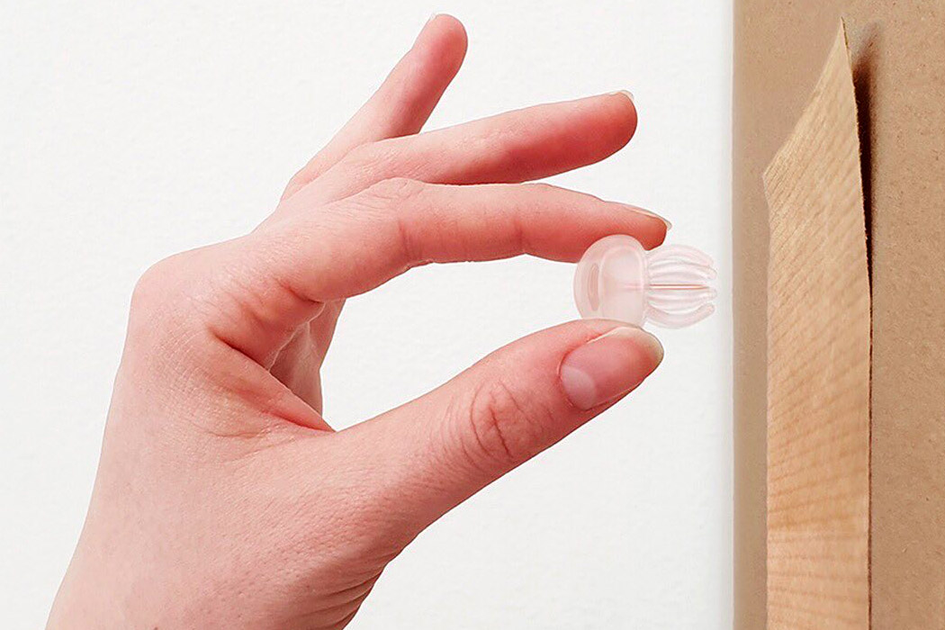
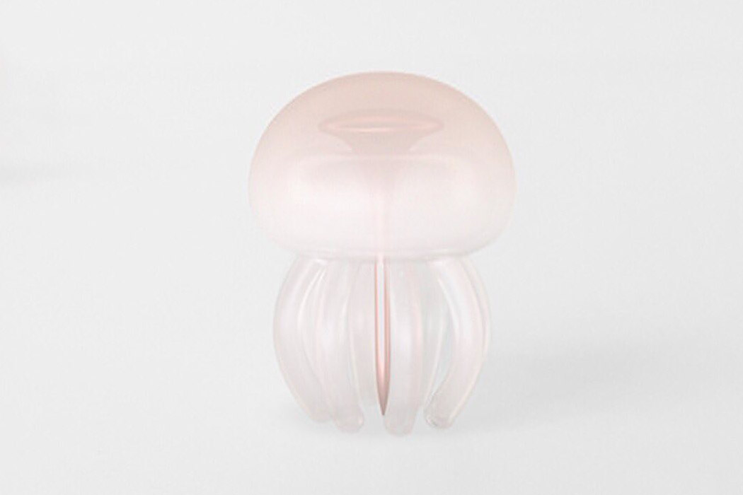
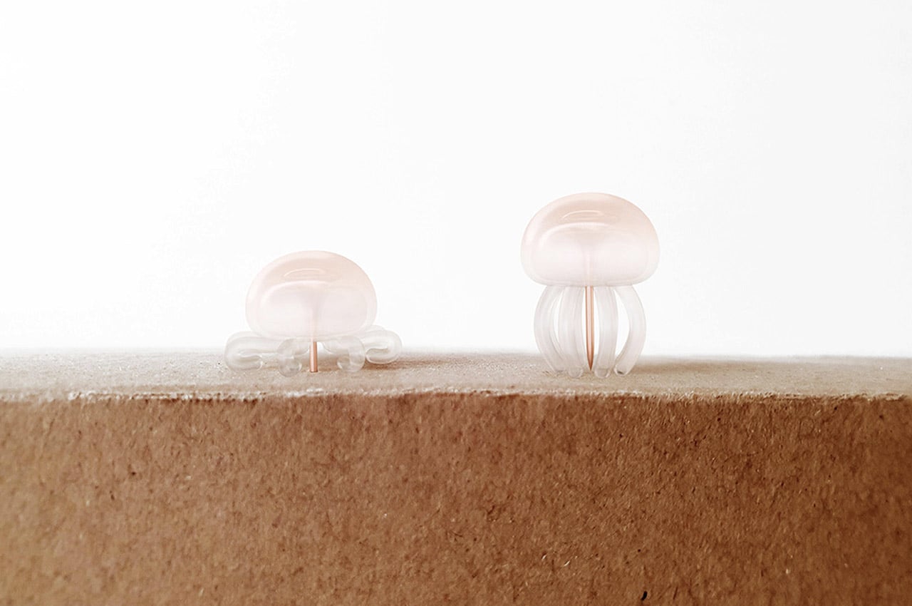
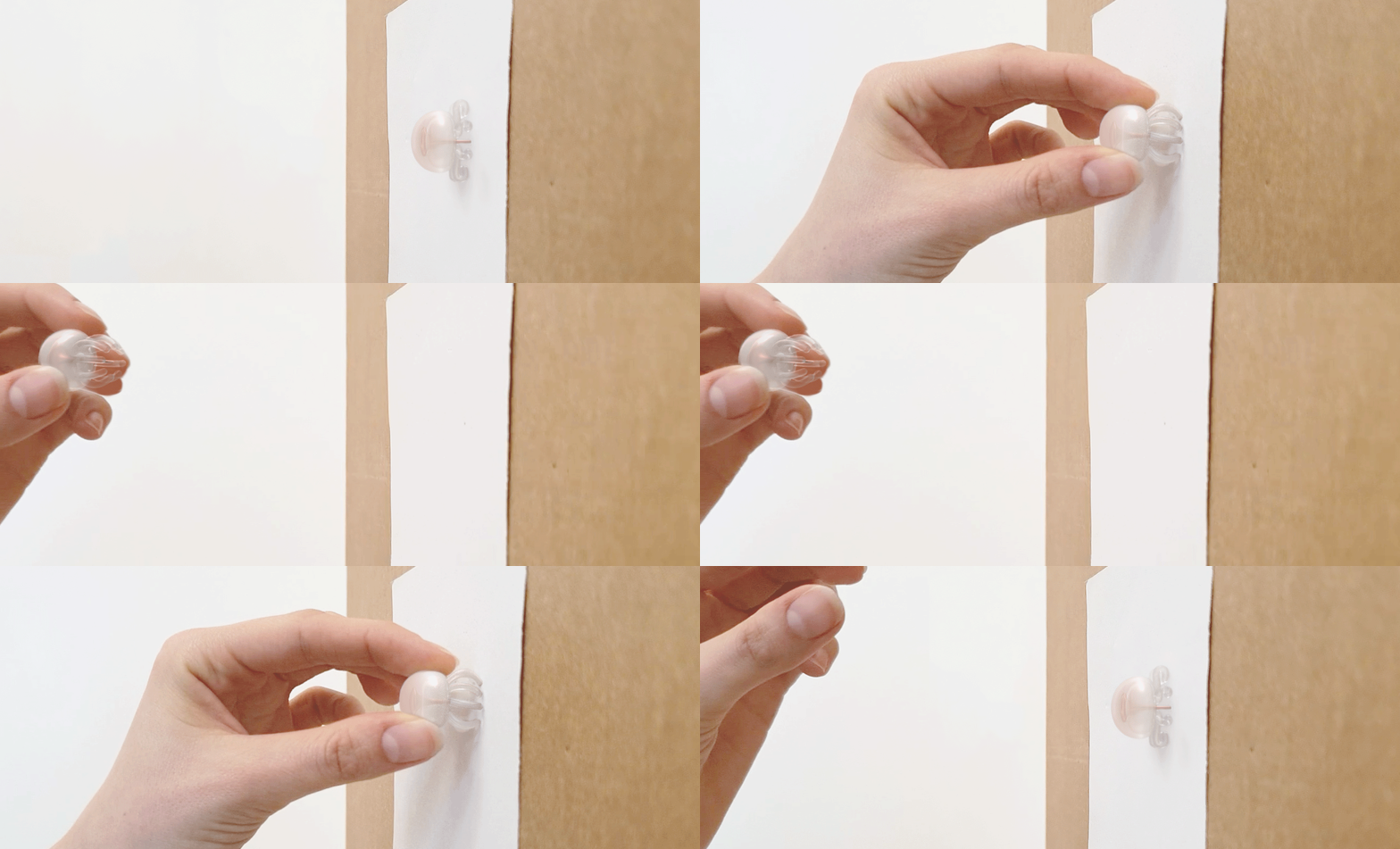
We love stationery design and especially cute ones inspired by animals! Medusa is a jellyfish-shaped push pin that moves like the actual jellyfish when pushed into the board, this one is gentler. The designer has made this push pin soft and translucent just like the real ones in the ocean. It’s also slightly colored to give it a fluid visual effect. The CMF and the simple movement of the pin work together to make Medusa a functional yet realistic ode to the marine marvel. The tentacles of the pushpin also serve as a way to keep your fingers safe from stray pointy pins. If this pinfalls and rolls under a table, your stray fingers will encounter the squishy silicone tentacles only.
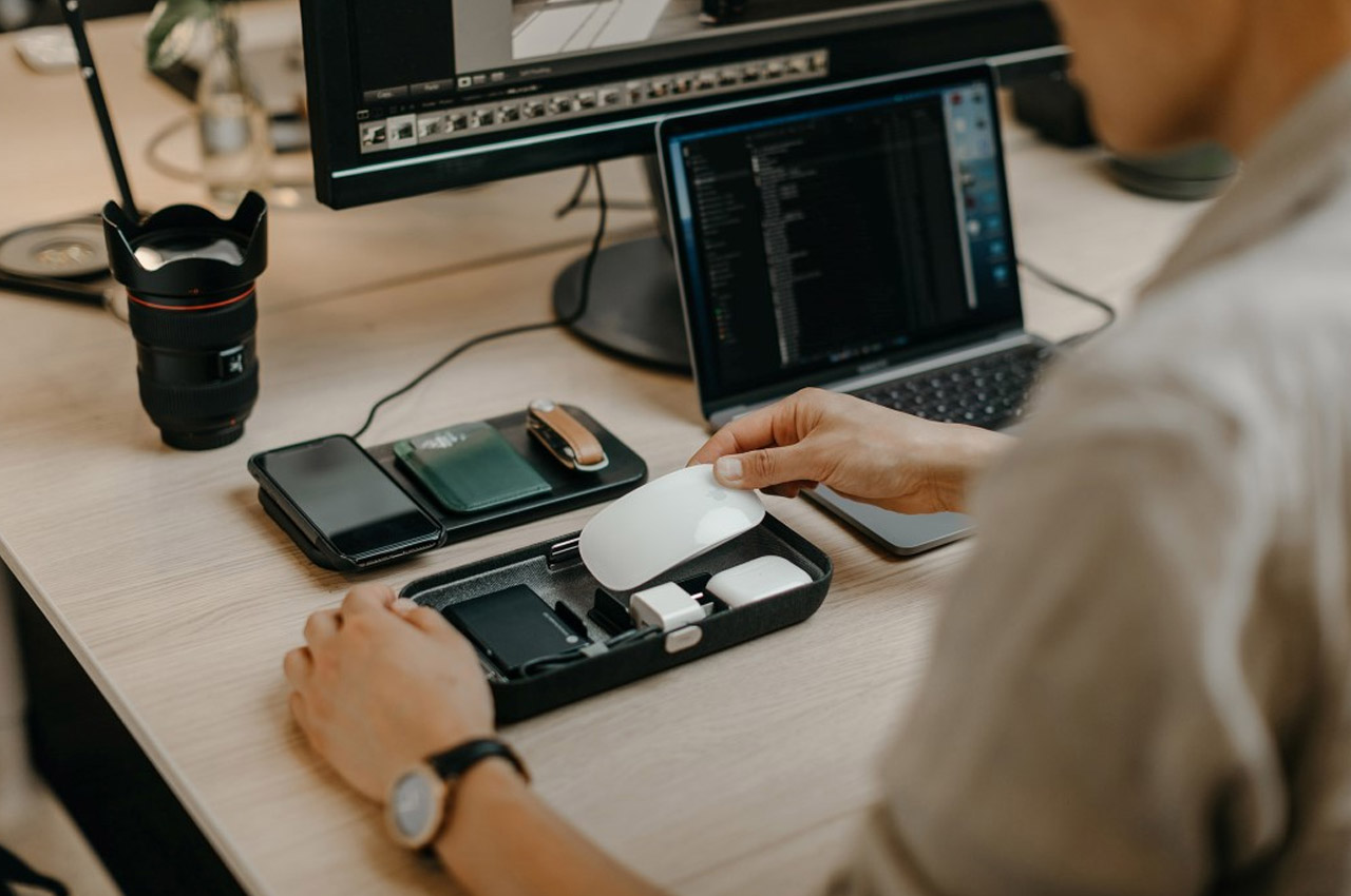

The Orbitkey Nest reinterprets the stationery box by acting as a storage container for not pencils and erasers, but for your EDC. Designed to complement your tech-filled life, the Nest is perfect for storing your chargers, cables, AirPods, hard disks, SD cards, pen drives, etc. It helps keep your workplace organized not just by containing your tech accessories, but also by allowing you to dock/rest your belongings on it. The Nest’s upper surface comes with a slight indentation, perfect for resting your wallet, keys, or watch, while a dedicated zone even acts as a wireless charger for your phone.
The Top 10 stationery designs that promise to be the best investments for your work from home desk!

Work from home is now the new norm! Although it can get boring at times. I mean your home is now your office, your office is now your home. You basically eat, sleep, work, and repeat the same old activities in the same old place. I’m always looking for little ways to brighten up my mundane workday! And I’ve come to find that a few innovative stationery designs can add that extra sparkle to your everyday work routine. I don’t know about you, but I always feel a rush of excitement before I use a new stationery product! Not only do these crafty designs excite you, but they can truly amp up your work from home productivity. Even the littlest of tasks are completed with more efficiency. So, we’ve curated some nifty stationery designs that we believe will truly be a valuable addition to your work from home desk. Be sure to invest in them!

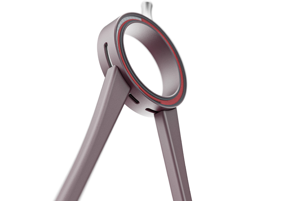
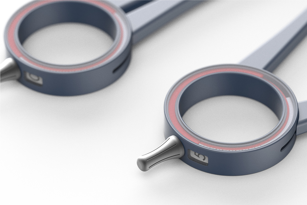
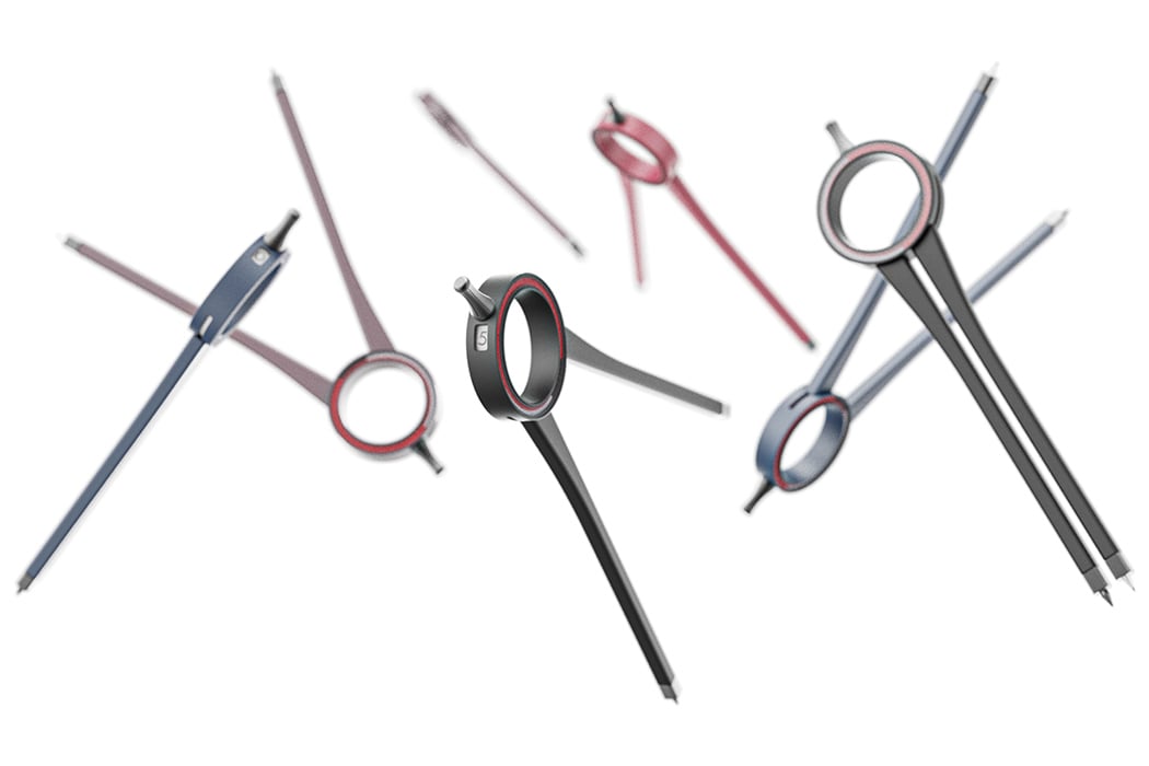
CARBU is a compass and a protractor – so if you are a student or a designer, you know exactly how convenient it is to have tools that serve more than one purpose. The user can make multiple circles without measuring the distance of the opening of the legs with a ruler. The slim legs of the compass on the inside are clogged with discs that are integrated with low-power magnets for smooth movements. The compass has a 2 disc system for accuracy – the inner one disc shows the measurement in a 0.2cm interval and this is amplified with a second disc that magnifies it for ease of viewing. The inner transparent case has two options – you can measure with degrees (for angles and arcs) and also without degrees for simpler things. The second transparent case that has a magnifying glass shows the distance between the two legs of the compass precisely. The discs also tell you if you are in compass mode or protractor mode.

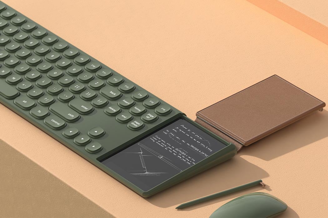
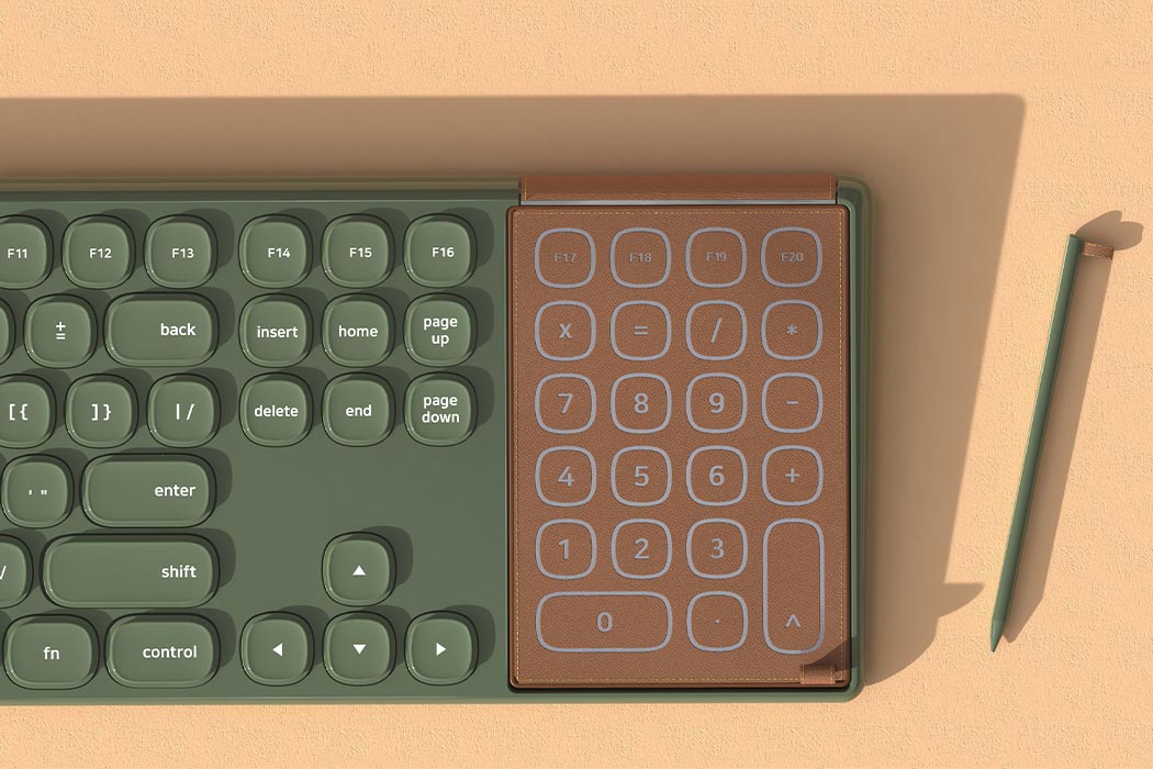
Designer Jeong Woo Kim created Ouverture – a conceptual keyboard accessory that is a number pad + a digital notepad when you flip the cover. It has a typing mode which is the number pad and a memo mode which is the writing pad. “The leather cover acts as a number pad on a conventional keyboard. Current from the fingertips passes through the special conductive fiber to the touchpad inside the leather cover,” explains Kim. A quick survey showed that 98% of people take notes when they are working on computers and 70% of them said it is uncomfortable and 34% complained that their desk tends to get messy or notes tend to get lost. With a device like Ouverture, your notes are saved as image files and your desk remains clutter-free.

This pen is quite literally timeless… in the sense that it will write forever, that too without a single drop of ink. The ForeverPen is a bit of a technological marvel that solves one of the most common problems in the world – needing to write but never find a pen around. Made from a unique silver composite, the ForeverPen writes without actually writing. Unlike a pen that leaves behind ink or a pencil that leaves behind graphite, the ForeverPen’s unique material can oxidize surfaces, leaving behind a mark without really wearing out or running out. In theory (and even practically), it lasts forever, letting you draw/write/doodle anytime or anywhere, infinitely.

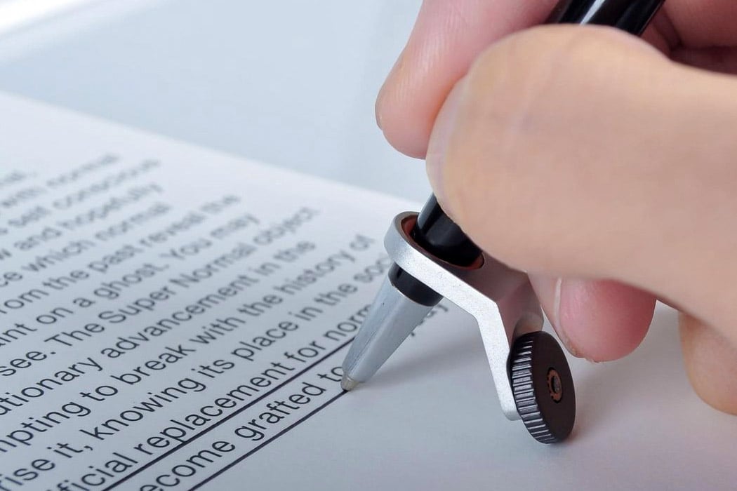
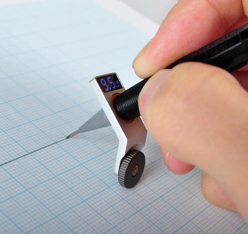
The Constrained Ball by Gihawoo Design is one of those concepts I can easily see myself buying from a late-night infomercial. I’m not saying it’s bad but the novel approach to a simple kind of problem is endearing. Fitted with a gasket, the gadget helps you draw straight lines and indicates the length. OMG, is this the end of the ruler’s dominance?!? No, but I quite like this concept. I’m a stickler for drawing straight lines. It’s either gotta be straight and perfect or it’s a no-go for me.

This is a jellyfish that stings gently! We love stationery design and especially cute ones inspired by animals! Designed by Fabio Verdelli, Medusa is a jellyfish-shaped push pin that moves like the actual jellyfish when pushed into the board. this one is gentler. The designer has made this push pin soft and translucent just like the real ones in the ocean. It’s also slightly colored to give it a fluid visual effect. The CMF and the simple movement of the pin work together to make Medusa a functional yet realistic ode to the marine marvel. Who wouldn’t like to have a box of these!

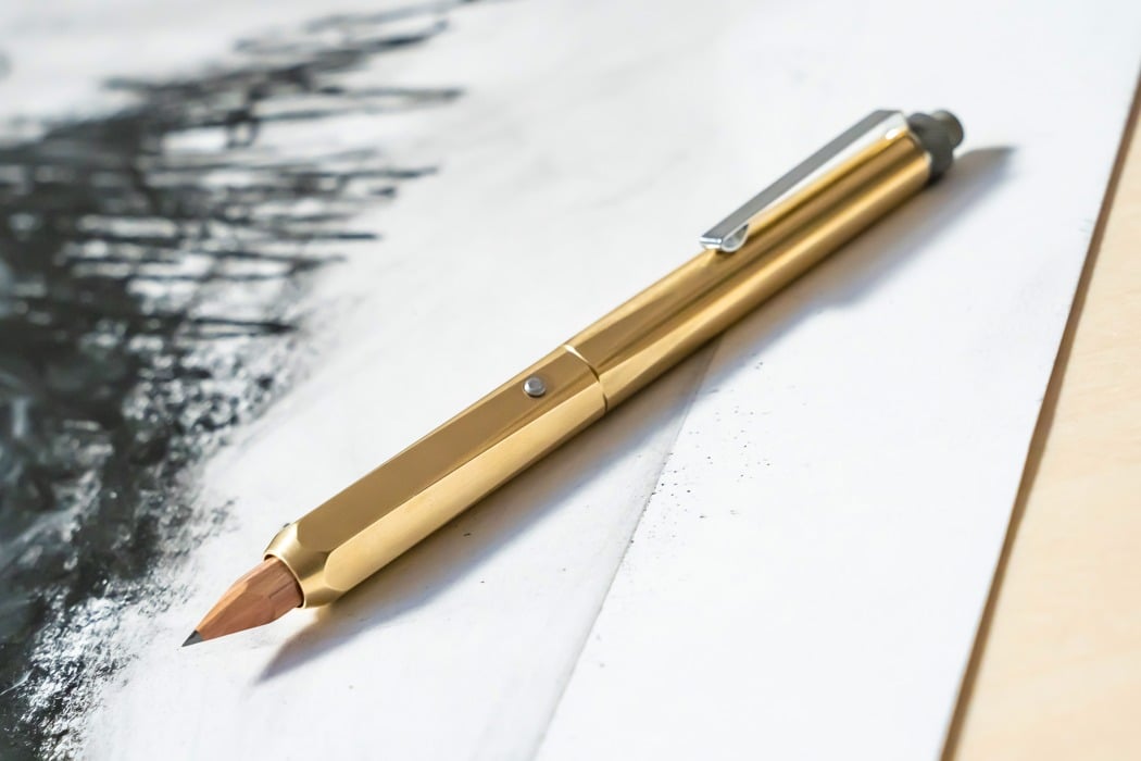
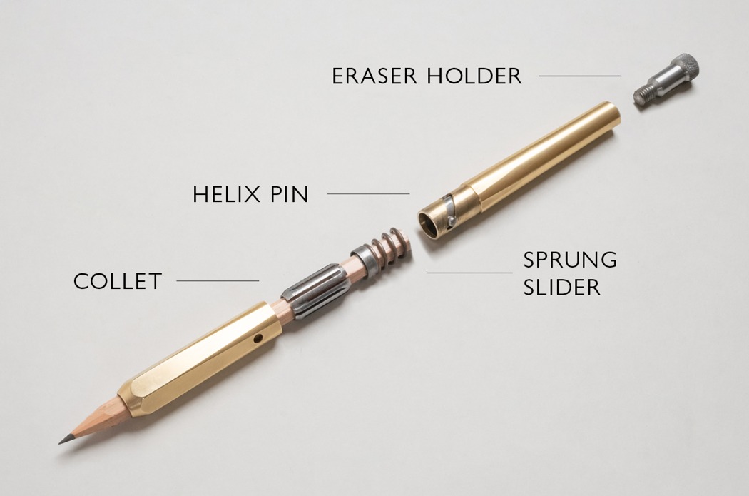
Meet the Ferrule, probably the most significant improvement to wooden pencils since they started putting erasers on the opposite end. The Ferrule is a brass pencil enclosure and extender. It upgrades the feeling of using a tiny, frail wooden pencil by enclosing it in a hexagonal brass body that gives you confident strokes, thanks to its weight, and a much more premium writing and drawing experience. The Ferrule works with all standard pencils (7-8mm in width) up to 120mm in length. Designed to function as a high-end pencil sleeve, the Ferrule works with short pencil stubs too, giving you a consistent premium writing experience throughout. It opens and closes with simple twisting action, allowing you to lock or release the pencil within with a satisfying click.

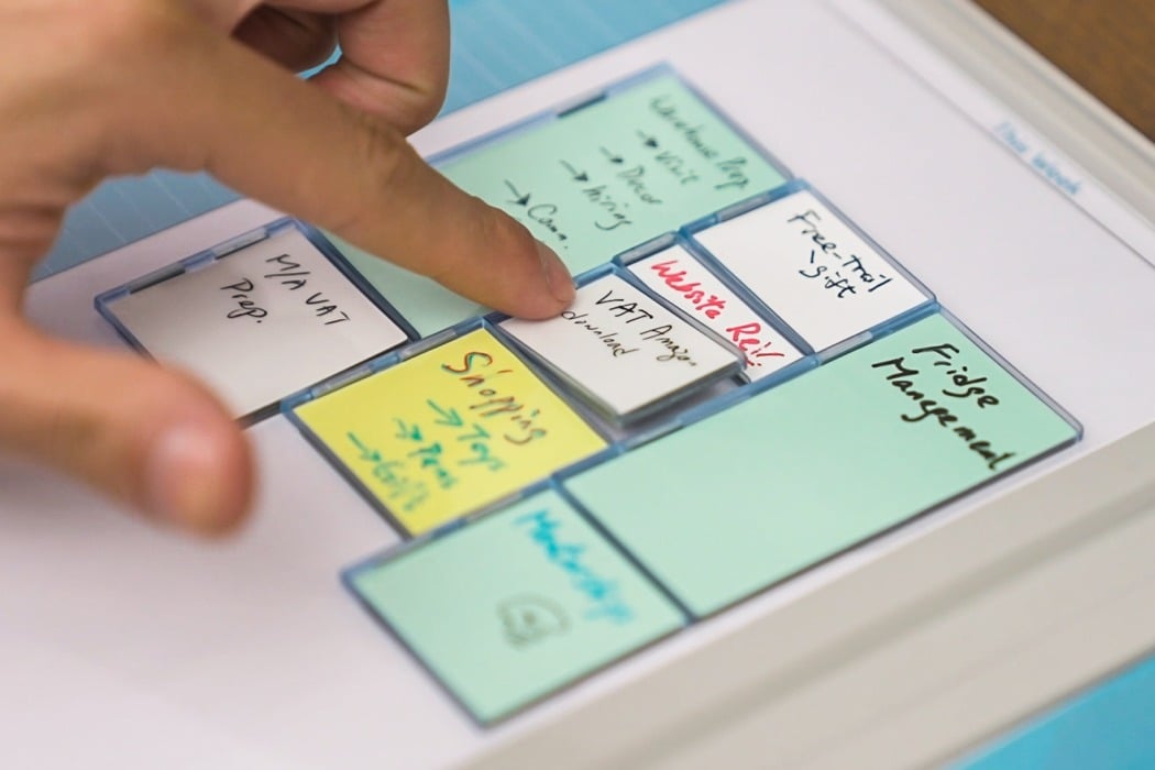
Reusable like a whiteboard, portable and sticky like a Post-it, the Mover Erase brings one of the workplace’s most effective features to your WFH setup. You see, in our transition from the office to the home office, we missed out on quite a lot. Sure, there’s an obvious lack of workplace gossip and office chit-chat, but we’re also missing out on the kind of tools that make us more productive. The ability to stick notes around our work desk, to walk up to a whiteboard, and really brainstorm effectively. To streamline your process in a way that makes you more productive and organized. The Mover Erase turns the whiteboard into a portable setup that you can carry around with you because productivity shouldn’t be limited to a ‘place’.

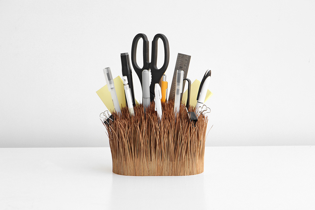
Outside/Inside was created to question the traditional understanding of a “vessel” and reimagine it with materials like pine needles to not only add more function but also give it a refreshing form. “What do you understand as a ‘vessel’? What image comes to mind if I tell you to describe it? Now, how far can you stretch that image? How far is too far?” asked the duo as they worked on reinterpreting the meaning through their design. Just like wild grass, it looks like the ‘vessel’ is growing from the surface it is kept on. What I love is the usage of pine needles because it is an underrated and under-explored natural material. Pine needles also bring a touch of nature inside on your shelf or desk. It also adds a poetic theme to the design as its colors, smell, and texture change over time letting you experience the ‘seasons’ of Outside/Inside.

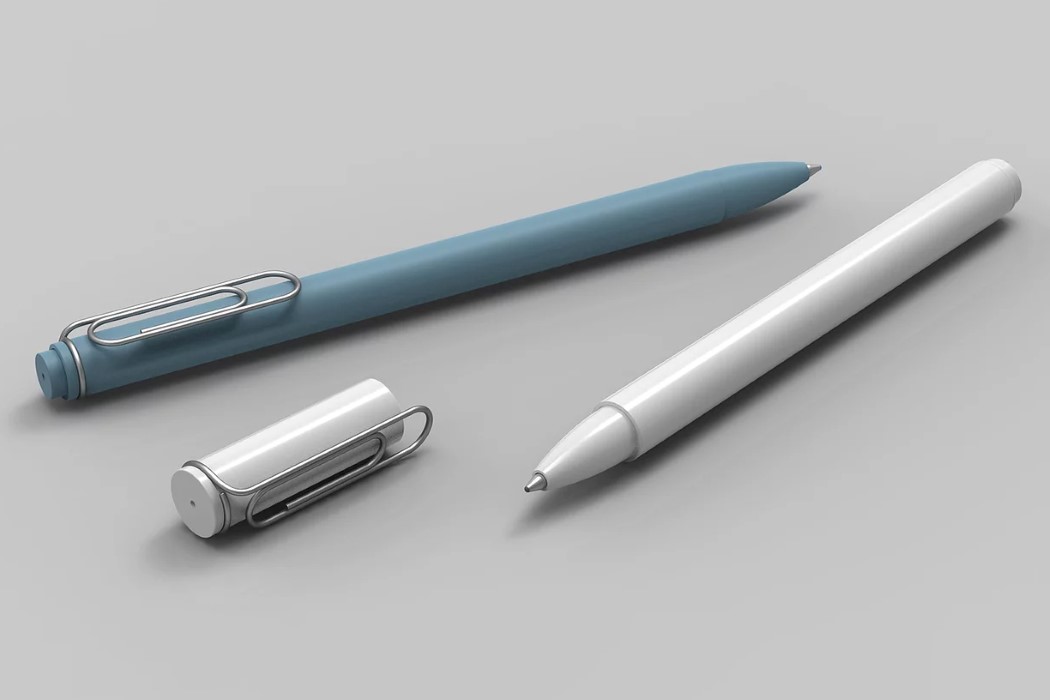
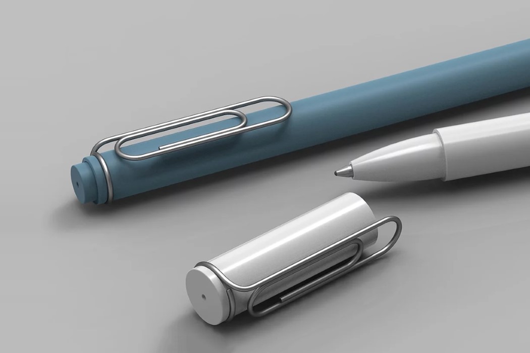
The Clip-Pen by Foxtail Gihawoo combines the traditional ballpoint pen with the even-more-traditional paper clip. The metal clip finds itself located on the pen-cap, where you’d normally see the cap’s pocket clip, creating a fusion that may seem weirdly clever at first, until weirdness wears right off and just feels like a good idea! The Clip-Pen retains its original functionality (of being able to be clipped to a pocket) but is capable of much more. You could use it to keep your pen and papers together, or just use the cap to hold your sheets while the ballpoint pen sits in your pen-stand.

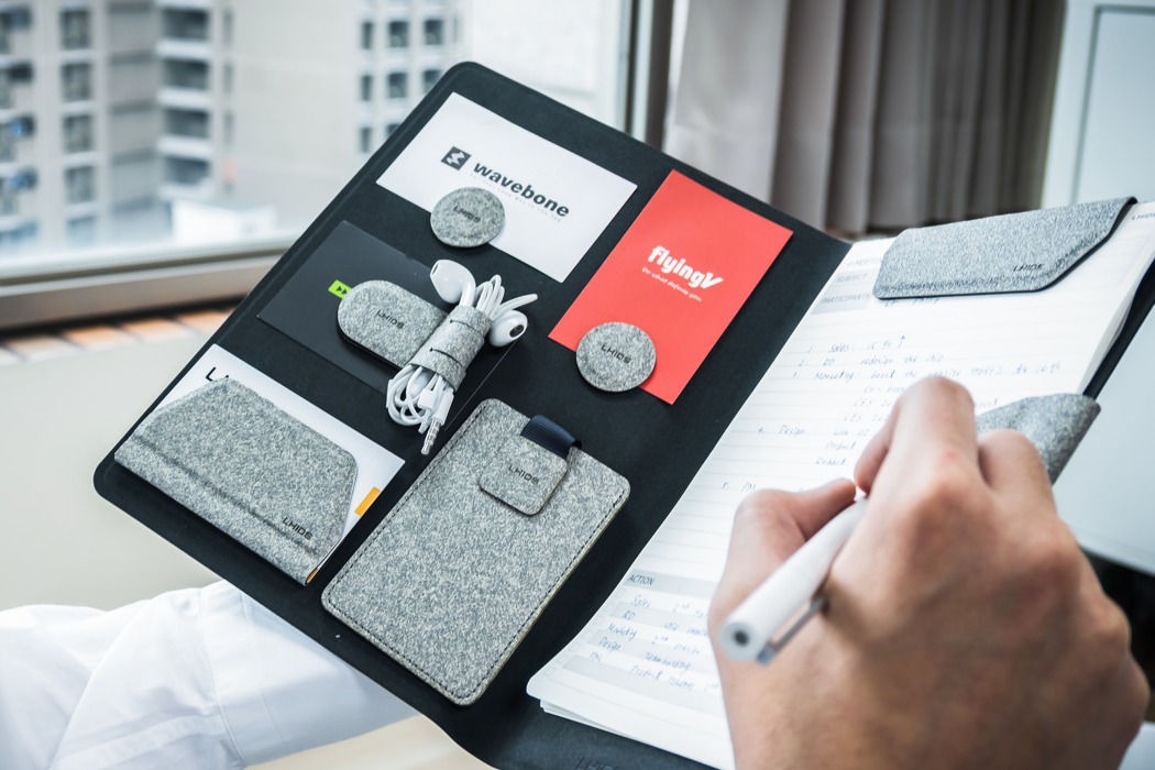
Created by LHiDS Creative, the MagEasy Folio and MagEasy Board use a combination of powerful magnets to help keep you organized and productive. The magnetic system, embedded within a durable and waterproof board, allows you to neatly arrange your life, from your keys and phone to your stationery, notepad, wallet, or even passport. The board and folio provide a canvas for MagEasy’s series of magnetic accessories which are powerful enough to hold keys in place as well as securely store your smartphone or wallet. MagEasy’s novel approach to organizing allows you to store all your everyday essentials in one place, so you don’t have to dig in your pocket for your wallet or keys, or in your bag for your pen, or a thumb drive.

Sleek futuristic product designs that are too good to be simply concepts!

April Fools’ Day is right around the corner, a lot of us are gonna be pranked by our friends or some or the other mischievous joker in our lives! In an ode to this prank-filled day, we’ve created a special collection of designs for you. These are a bunch of concepts, seemingly so real, cool, and mind-blowing that they’ll almost have you convinced that they’re actual tangible designs. These too good to be true designs are the epitome of innovation, creativity, form, and functionality. Not to forget, their dynamic good looks and aesthetics that’ll make you wish you could instantly buy them. Did these concept designs manage to fool you? Did you truly believe they’re real products that are available on the market? Have a look and see!

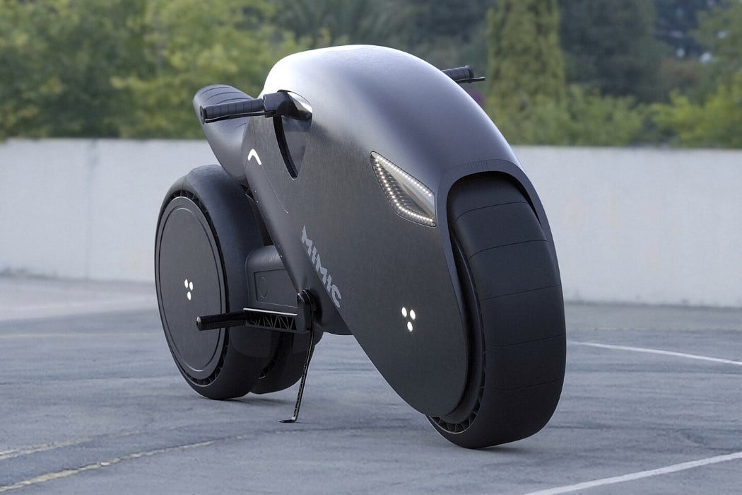
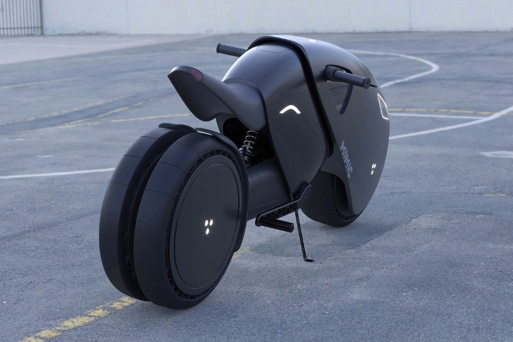
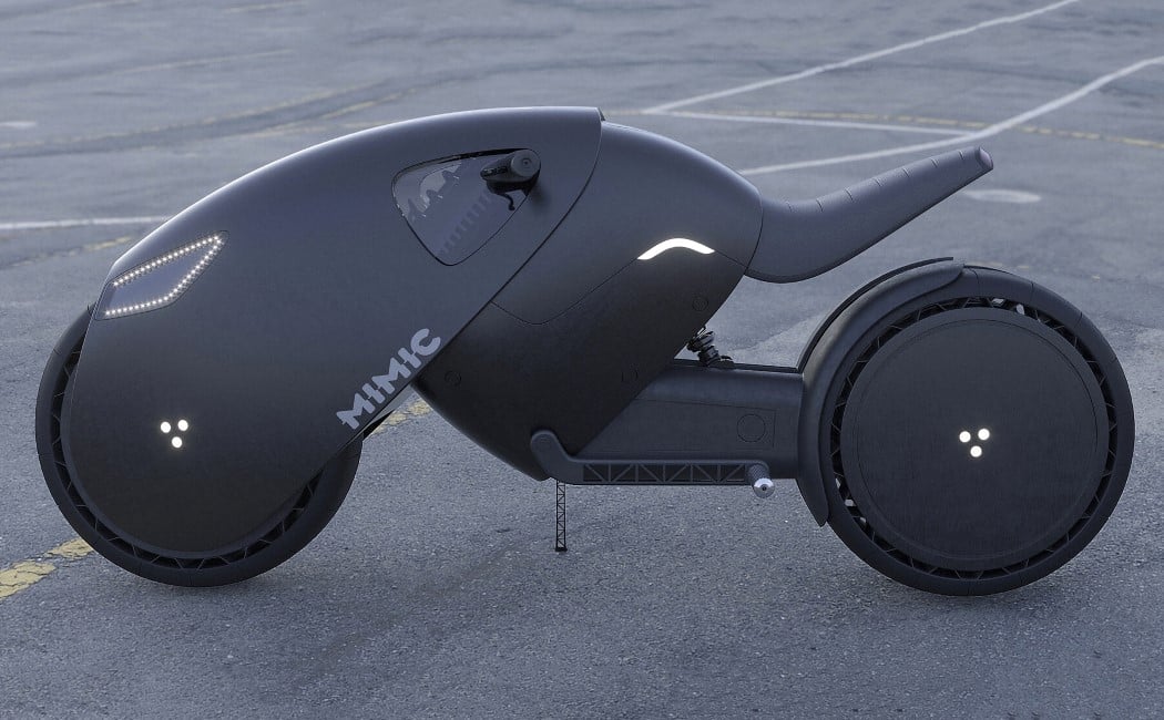
If it were up to King T’Challa, the MIMIC e-bike would be fitted with vibranium tech, but we’re going to stick to an electric power-train for now. This crouching-jungle-cat of a bike is a concept designed by Roman Dolzhenko. Outfitted with what looks less like a body and more like armor, the MIMIC e-bike comes with a rounded, Tron Light Cycle-inspired form with rounded elements and just an overall absence of straight lines or sharp edges. The e-bike has a dual-lamp headlight fitted on the front, looking almost like a menacing pair of eyes, and a dashboard that lays flush against the e-bike’s curved panther-esque body. Other noteworthy details include a cantilever seat, inverted handlebars with the brake levers facing the rider, and a three-hexagon logo on both the front and back wheel, a detail that pays tribute to Daniel Simon, designer of the Tron Light Cycle, who uses a similar hexagon insignia to mark his designs.

ring1

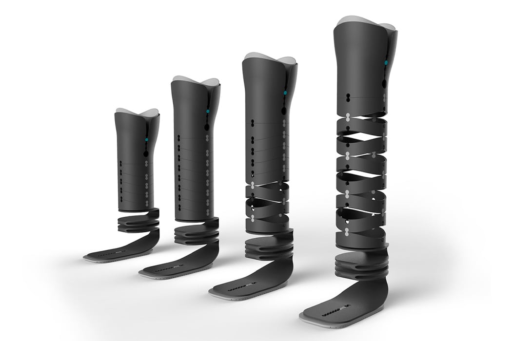
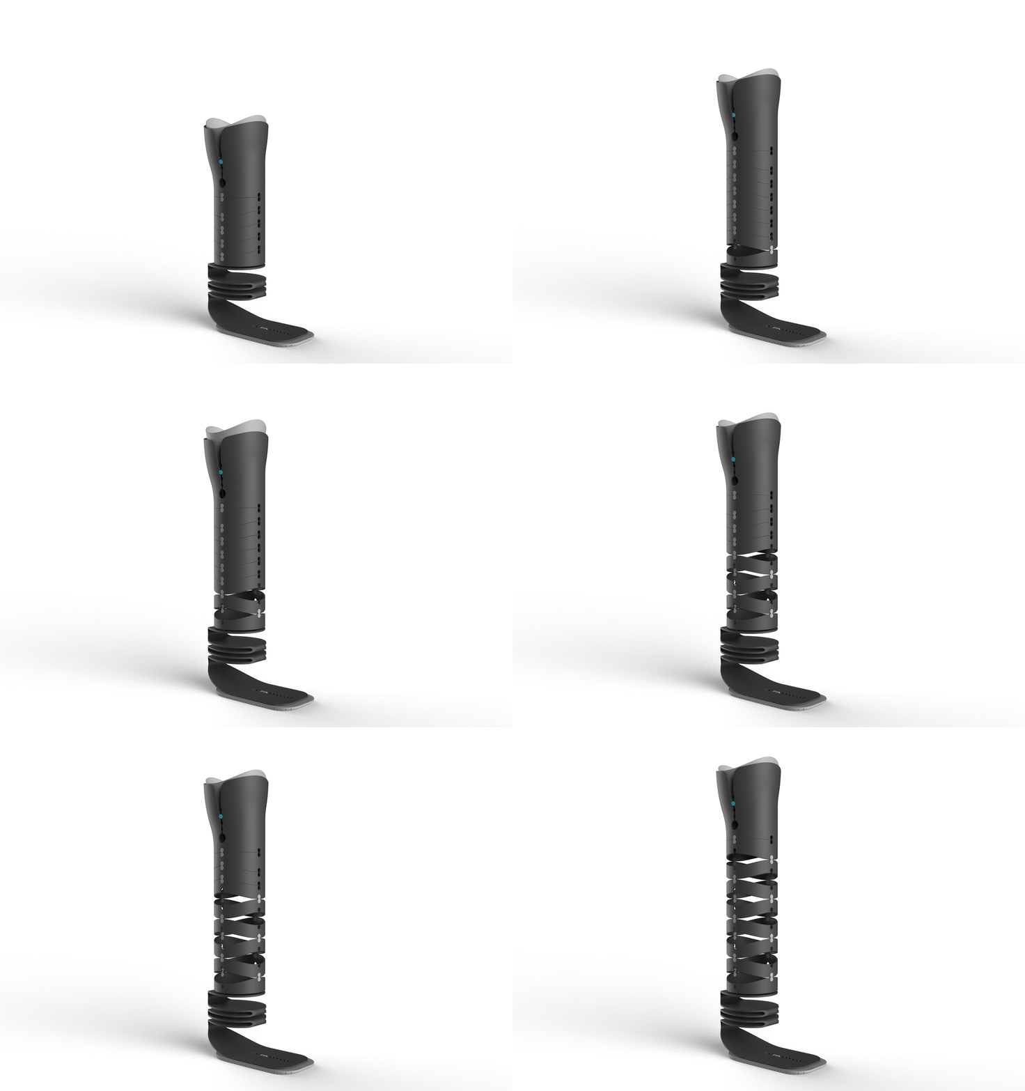
Ring is an adjustable, custom-made prosthetic leg designed specifically for transtibial amputee children in developing countries to help reduce costs while bettering their quality of life. The conceptual prosthetic leg aims to make the otherwise rigid medical equipment more flexible especially to fit seamlessly in the life of a growing child. The user will wear the leg and it can be adjusted it as they grow to make sure the fit is always optimal and comfortable. “Ring achieves this thanks to an adjustable foot portion to ensure an optimal stride as well as the upper portion that can be paired with additional rings to suit the person’s body as they grow and develop,” says Jeremic. Ring is a conversation starter that addresses the need for more modular healthcare equipment.

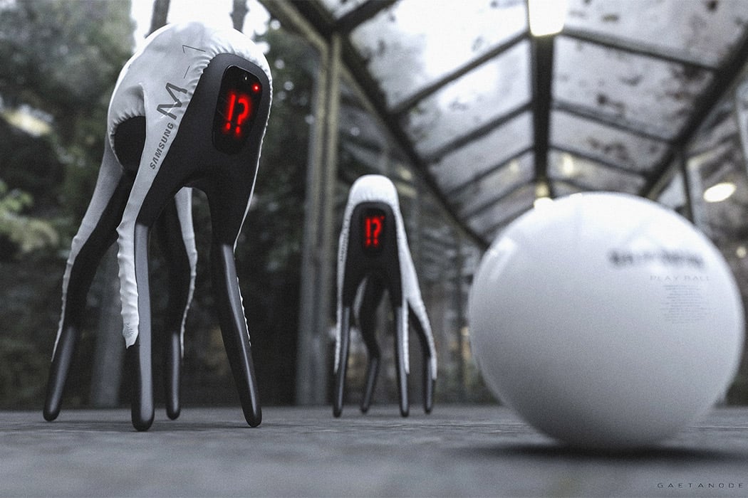
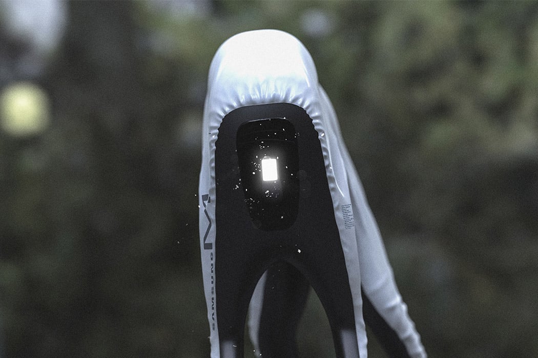
This conceptual Samsung dog bot replaces the dog’s features with a screen, so instead of a confused head tilt the face aka screen of the robot will show you a question mark. If the tech giants are to make a robot dog, using a screen as an interactive interface will save a lot more material than using plastic-like materials to replicate the real build of your pet. With the rapid rate at which AI is growing and the conceptual renders show, the dog bot will be able to chase balls and give you a leaping welcome when it senses your arrival. It is interesting how the design is so futuristic and yet when you look at it, you can tell it was made to resemble a dog. You may not even have noticed that the ‘tail’ is missing and yet our brains have evolved to associate emotion with robots.

The Constrained Ball by Gihawoo Design is one of those concepts I can easily see myself buying from a late-night infomercial. I’m not saying it’s bad but the novel approach to a simple kind of problem is endearing. Fitted with a gasket, the gadget helps you draw straight lines and indicates the length. OMG, is this the end of the ruler’s dominance?!? No, but I quite like this concept. I’m a stickler for drawing straight lines. It’s either gotta be straight and perfect or it’s a no-go for me.

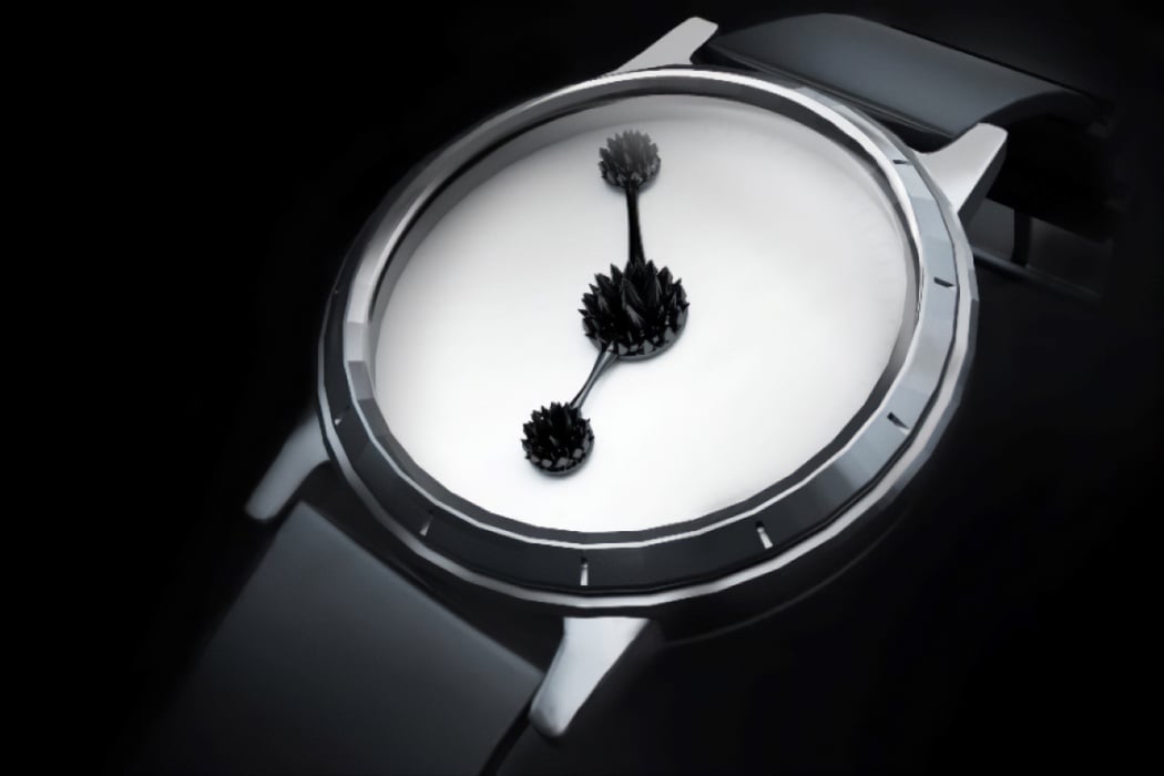
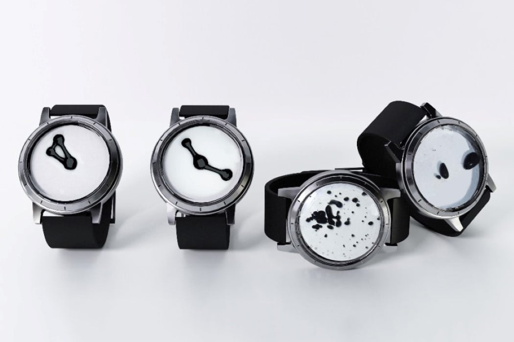
The idea of a watch has always been to deliver the time to you in a quick manner so you can go about your day. The usual interaction is just to glance at your watch and get on with business, but the INK-MAGNETIC watch takes a much more different approach. Rather than telling you the time so you can rush to complete your tasks or get the day over with, the Ink-Magnetic watch captivates you and helps you appreciate the seconds and minutes rolling by. The watch makes use of a ferrofluid chamber in its face, while magnetic hands manipulate the liquid from behind the scenes, creating a dynamic Rorschach-test-inspired piece of art that also happens to tell the time. In doing so, the Ink-Magnetic watch hopes to get you to pause for a bit and reflect on the beauty of time, instead of rushing through your day and not appreciating it!

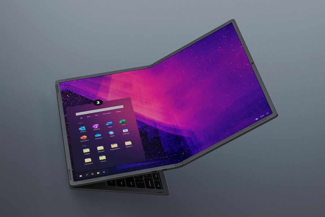
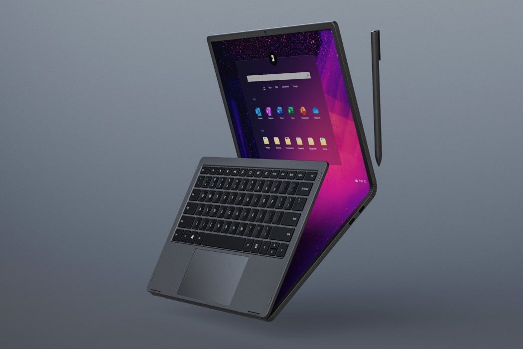
The Flexbook is like a laptop met a sandwich. Unlike most laptops, which have a two-part design connected via a hinge, the Flexbook has three parts. The main body, comprising your motherboard, electronics, ports, and keyboard… and around it, a two-part flexible screen that sandwiches the keyboard in the middle. The Flexbook can be traditionally used as a laptop with a 3:2 12.6-inch display, simply by opening it and using one half of the screen, or as a massive Wacom Cintiq-style tablet PC with a neat 4:3 17.8-inch touchscreen. This interchangeability is what makes the Flexbook such a unique laptop because it can alternate between being a laptop and a tablet, much like the Microsoft Surface, but with the advantage of a massive 17.8-inch screen in the form factor of a 13-inch laptop.

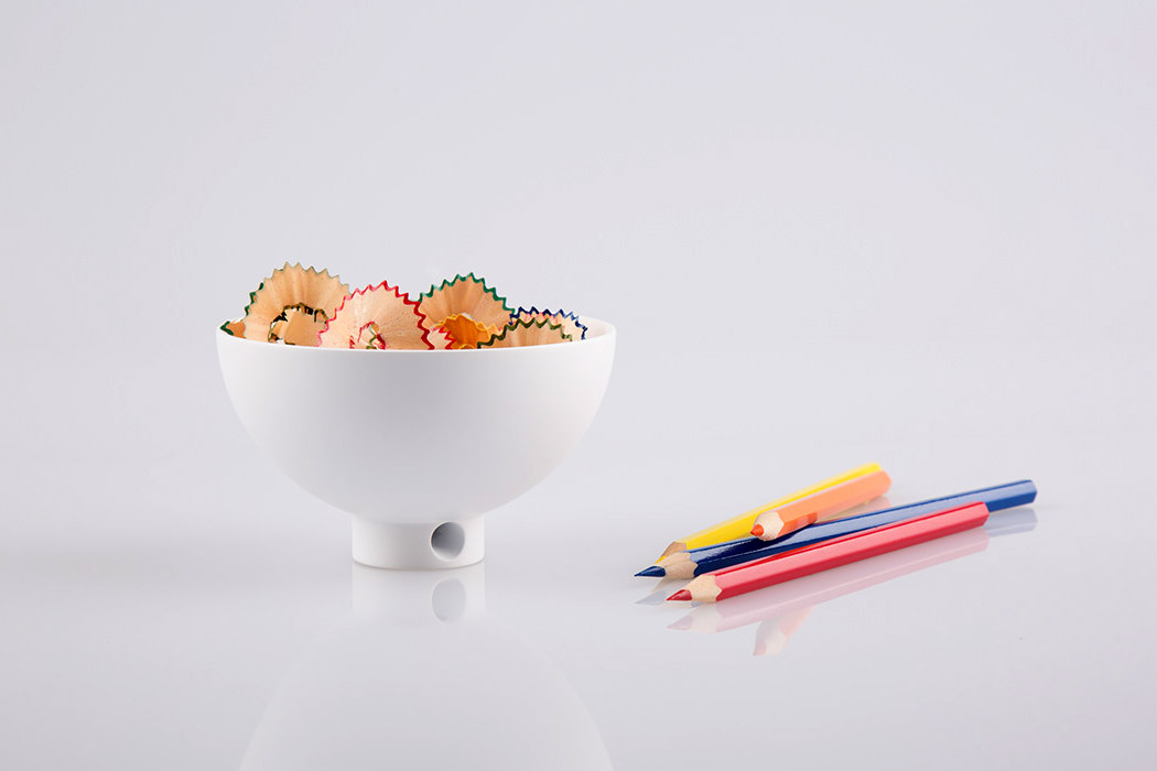
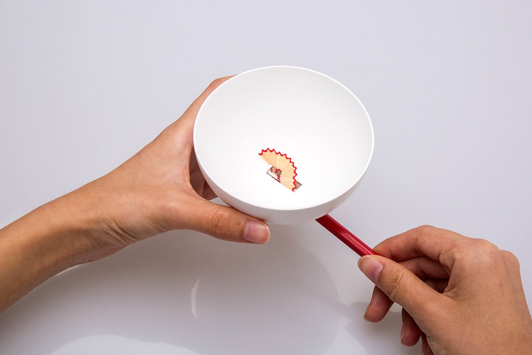
I’ve never paid much attention to pencil sharpeners. Simply because I consider them as a wholly functional product, which tends to create a mess, and lack any aesthetic value. However, designer Jiachun LV is here to prove me wrong. Jiachun’s Bowl Sharpener is shaped like a cute little soup bowl! The base of the bowl consists of the actual sharpener opening, through which you slip in your pencil, and begin to sharpen it. As you sharpen your pencil, the pencil shavings and the lead residue are stored in the bowl. If you’re sharpening color pencils, the different colored shavings create a beautiful visual! Since all the shavings have been collected in the bowl, it is relatively easy to throw them away. The sharpener’s bowl-like form ensures that the waste can be discarded in one go. No more shavings going astray, only to be found in some dingy corner of your desk.

Created as an homage to the classic Bugatti 57, the Next-57 celebrates every inch of the vintage car by modernizing it, exaggerating it, and making it even more beautiful. The result? A chariot fit for a king, with an incredibly elegant long body that tapers off at the front, exposes the axles on the front wheels, giving a chariot-like appearance, along with an interior that’s ensconced in luxurious red suede. The black and red combination is a statement in their own right. Giving the car its mysterious, million-bucks appearance, the chariot’s gloss-black exterior is a magnet for sharp highlights and high contrasts, making it look like a jewel on the road. The car’s long body starts with its edge-lit headlights, sitting between the externally-placed wheels. The wheels are covered by fenders that half-cover it, revealing the luxurious constellation-inspired rims behind, that shine and rotate as the wheels turn.

handy_vacuum_cleaner_2

handy_vacuum_cleaner_05

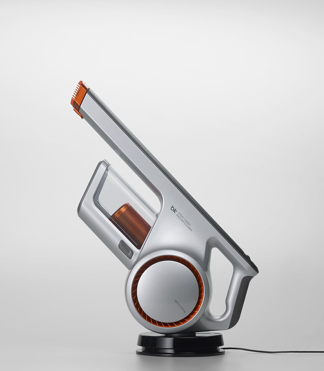
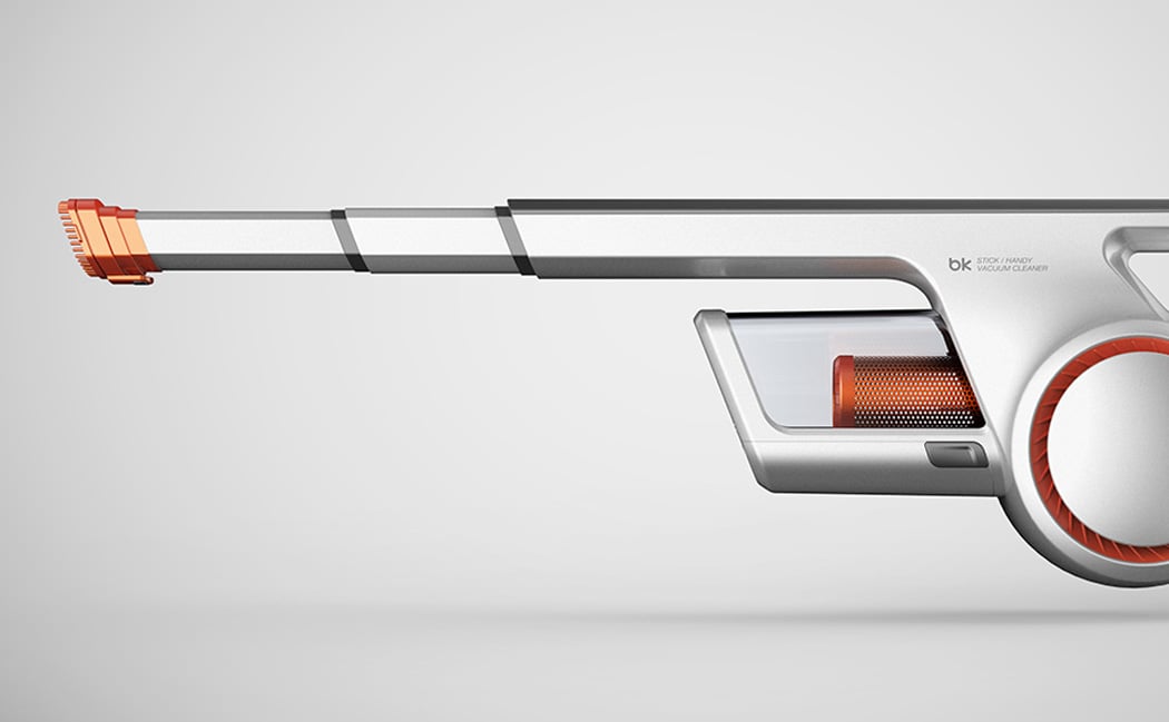
When you think of vacuums, there are probably a few images that come to mind – the engineering aesthetics of Dyson, the loveable face of Henry the Hoover, or the old reliable clunky hard-shelled Bosch and Siemens of the past. Well, what if you were to take the brilliance of both the emerging Chinese and Korean design languages and transform the handheld vacuum – you’d stumble upon the Handy Vacuum Cleaner designed by Myeonghoon Lee & Yubin Choi. This product is edgy, coming off as intimidating almost, something that you would pick up in the toughest of situations and never bat an eye. This handheld vacuum is a dust-royer. The cyclone and motor located just under the handle, have a visual appearance like that of a futuristic concept bike, adding a subtle flair with the orange highlight. There is one area that I feel Lee and Choi rushed, which was the charging unit. With the Dyson handheld vacuum, the charging unit can be mounted to a wall, like that inside a closet, and the interaction of docking the vacuum is an effortless process, a carefully thought out one.

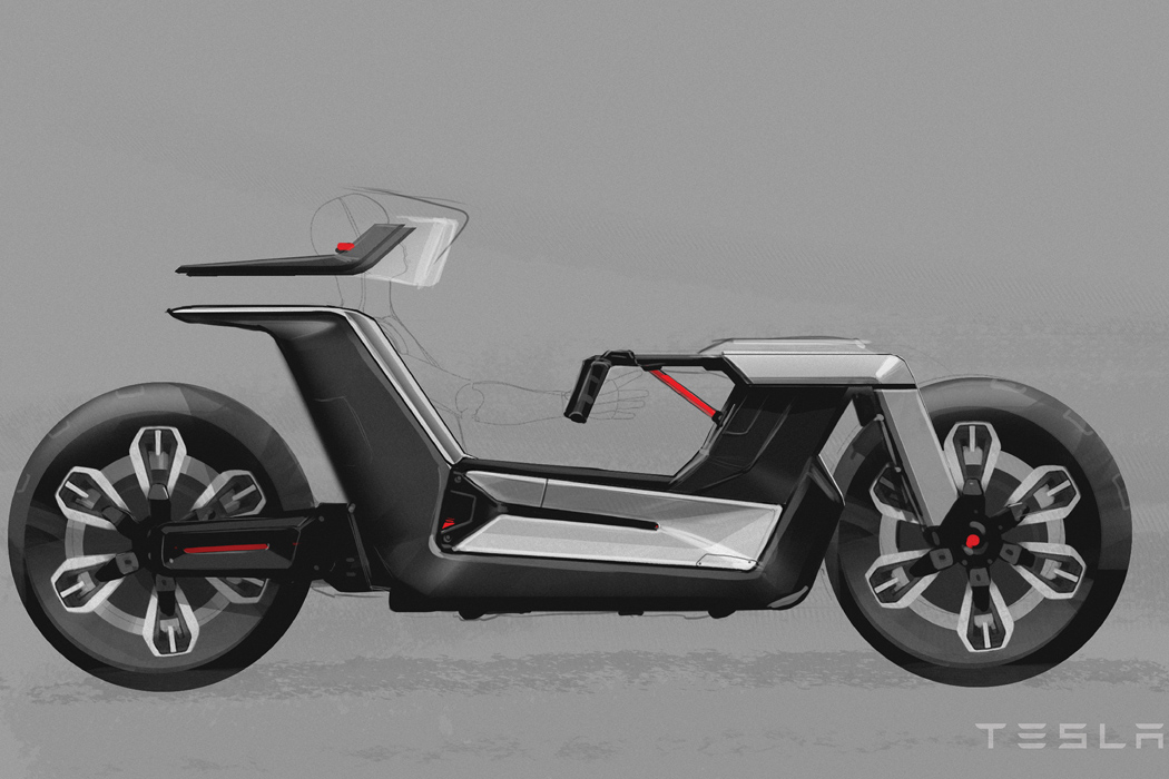
The concept dubbed ‘Tesla Model C’ is a rare combination of road safety, driving comfort, compact size, and driving dynamics! The duo put a lot of thought into designing the bike concept with a driver sitting position adopted from the four-wheelers. The steering column of the revolutionary ride extends out horizontally like that of an F1 car in handlebar-like form for superior grip at all times. The motorbike aesthetics are evident in the shape of the rear swing-arm and the two wheels’ positioning. Perhaps, the most exciting bit of the design is the flexibility in the parked position, which allows the driver to comfortably get out of the Tesla Model C and decreases the vehicle’s footprint for parked spaces. Now, isn’t that ingenious or what!

Yanko Design recommends stationery designs that are a must-have for product designers!

A set of great handy stationery designs are extremely critical for any product designer! These are the tools that help and support you through your creative process. They can either make or break your entire design process, so it’s imperative to have a collection that really lets you work easily, efficiently, and effectively. Yanko Design recommends these innovative and nifty stationery designs that every product designer must own! From a gadget that ensures you draw straight lines to a design that doubles up as a compass and a protractor, these products are sure to meet the unique needs and requirements of your creative process. You can thank us later! Enjoy.

The Constrained Ball by Gihawoo Design is one of those concepts I can easily see myself buying from a late-night infomercial. I’m not saying it’s bad but the novel approach to a simple kind of problem is endearing. Fitted with a gasket, the gadget helps you draw straight lines and indicates the length. OMG, is this the end of the ruler’s dominance?!? No, but I quite like this concept. I’m a stickler for drawing straight lines. It’s either gotta be straight and perfect or it’s a no-go for me.
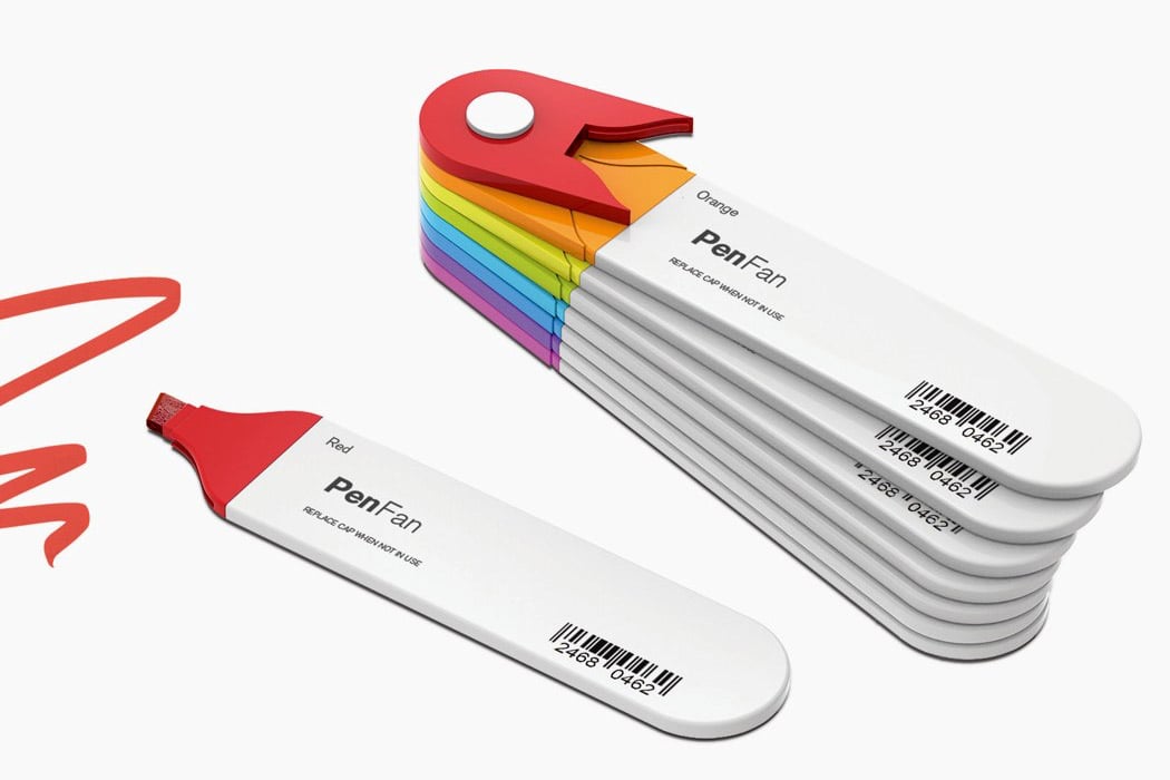
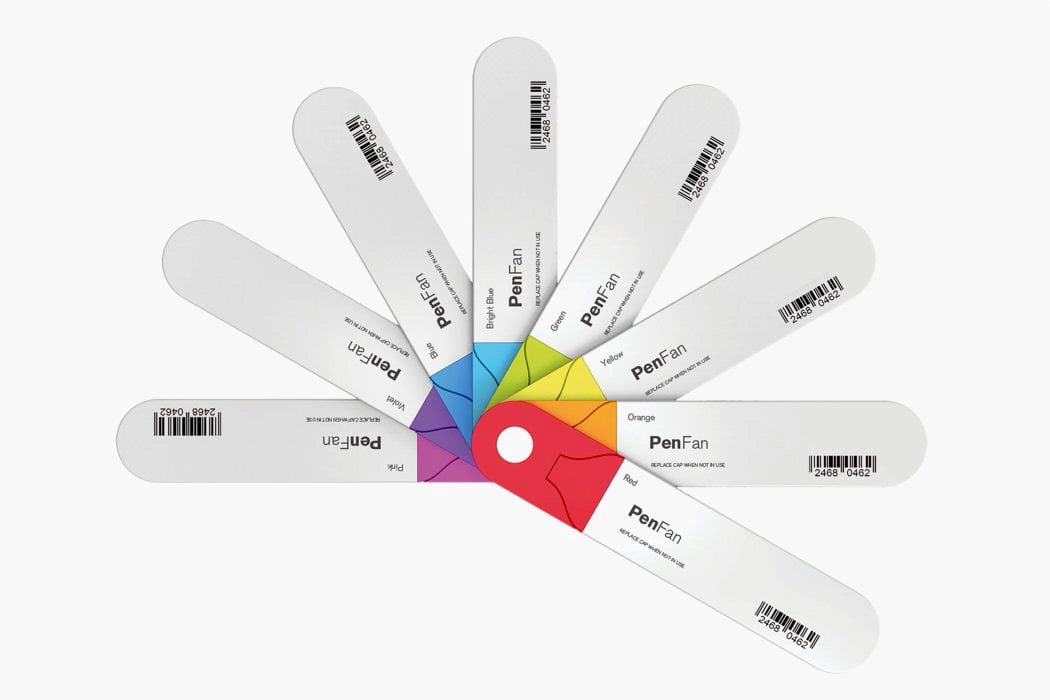
Created as a cross between a Pantone shade card and a stationery set, the Pen Fan fits 8 different flat-head sketch pens in a small, easy-to-carry set. The flat pens are connected to each other, forming a neat Japanese-fan style layout that displays all 8 colors for you to pick and choose from. Each individual sketch pen is detachable too, allowing you to snap off and on pens to create a palette of your choice! Stationery-hoarders, you’ve been warned!
Outside/Inside was created to question the traditional understanding of a “vessel” and reimagine it with materials like pine needles to not only add more function but also give it a refreshing form. “What do you understand as a ‘vessel’? What image comes to mind if I tell you to describe it? Now, how far can you stretch that image? How far is too far?” asked the duo as they worked on reinterpreting the meaning through their design. Just like wild grass, it looks like the ‘vessel’ is growing from the surface it is kept on. What I love is the usage of pine needles because it is an underrated and under-explored natural material. Pine needles also bring a touch of nature inside on your shelf or desk. It also adds a poetic theme to the design as its colors, smell, and texture change over time letting you experience the ‘seasons’ of Outside/Inside.

CARBU is a compass and a protractor – so if you are a student or a designer, you know exactly how convenient it is to have tools that serve more than one purpose. The user can make multiple circles without measuring the distance of the opening of the legs with a ruler. The slim legs of the compass on the inside are clogged with discs that are integrated with low-power magnets for smooth movements. The compass has a 2 disc system for accuracy – the inner one disc shows the measurement in a 0.2cm interval and this is amplified with a second disc that magnifies it for ease of viewing. The inner transparent case has two options – you can measure with degrees (for angles and arcs) and also without degrees for simpler things. The second transparent case that has a magnifying glass shows the distance between the two legs of the compass precisely. The discs also tell you if you are in compass mode or protractor mode.

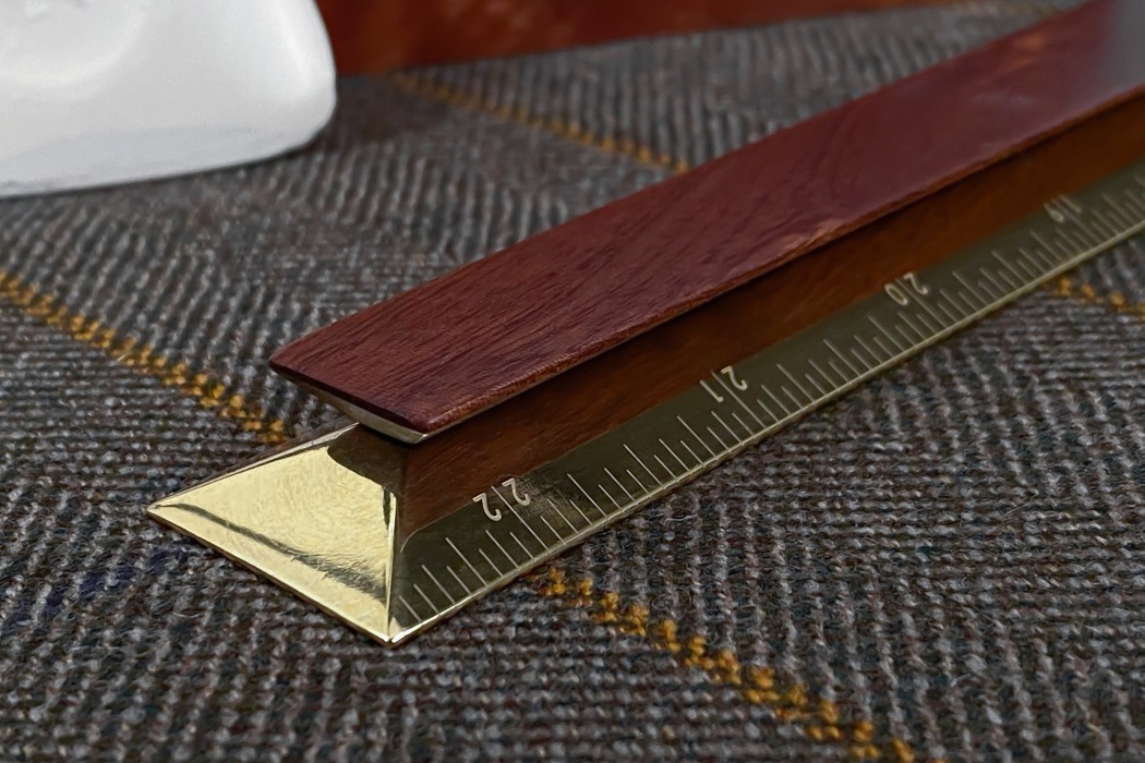
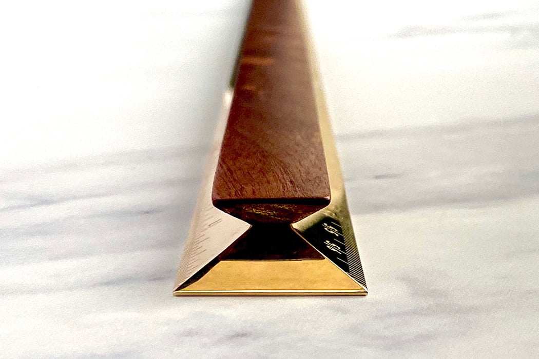
The Novus Rule is a product that prioritizes perfection and harmony over all else. It comes with a brass scale featuring a trapezoid cross-section, and a smaller, inverted trapezium wooden handle for grip. Sure, you’d wonder what makes the Novus Rule better than traditional rulers apart from its craftsmanship-appeal. Well, you see, the trapezium-shape of the brass ruler allows it to have much more tapered edges than a sheet-metal, plastic, or wooden scale. The Novus Rule exploits that, with an edge that’s as thin as 0.5mm, so your measurements practically touch the paper for better accuracy. The trapezium-shape even enhances readability, putting the numerics at an exact 28.8° angle that’s easier for you to see, and eliminates the warping that often happens when you apply pressure on regular flat metal rulers.

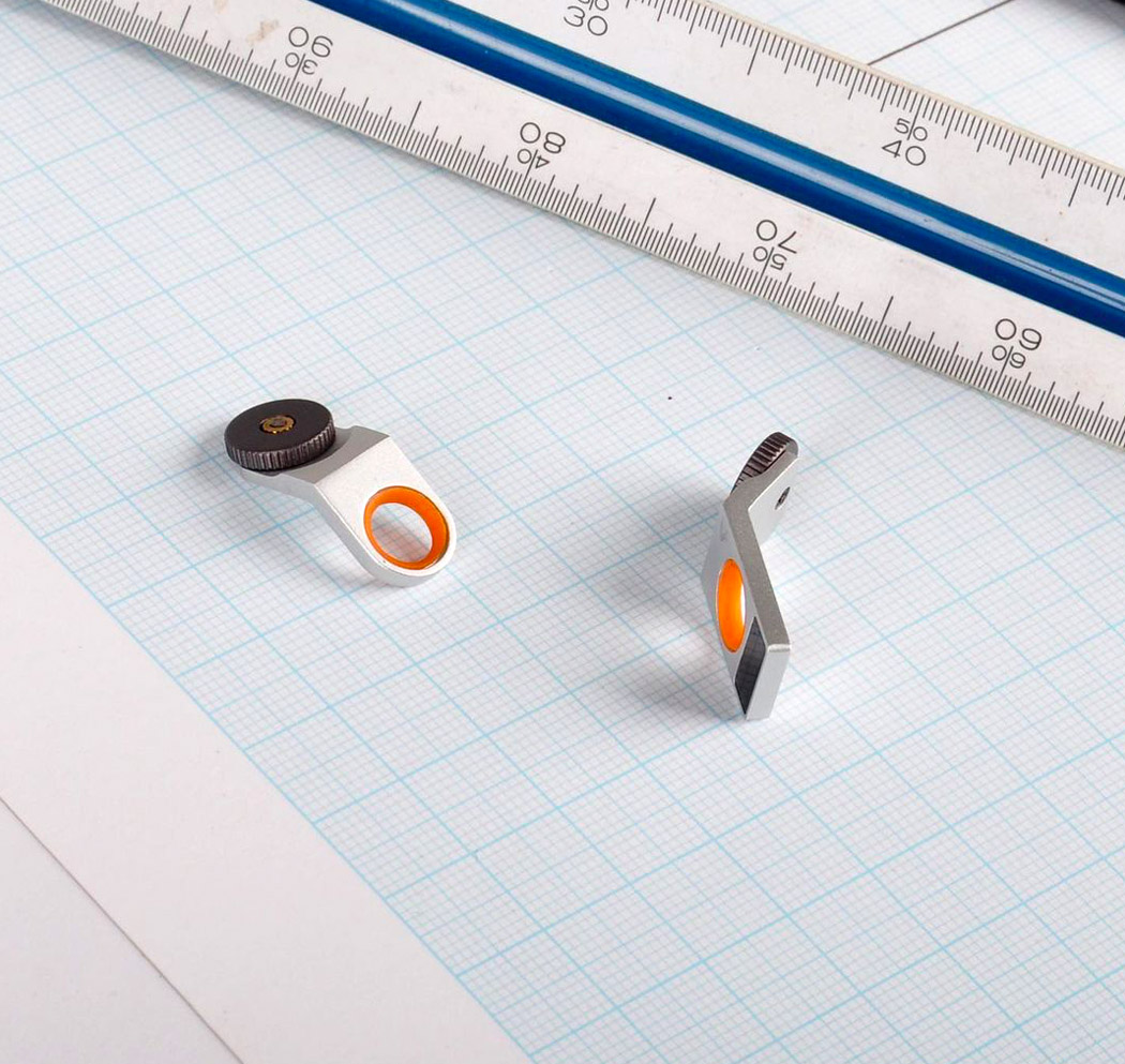
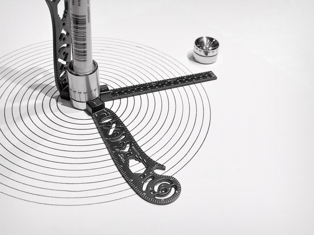
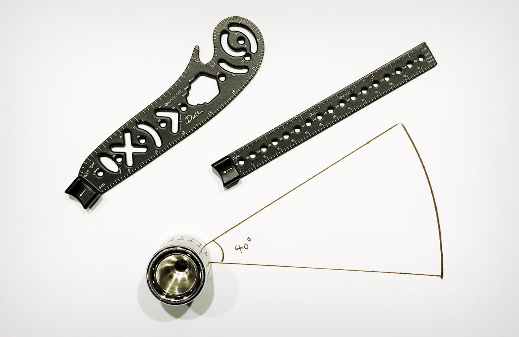
The Compass is a solid piece of machined stainless steel that works not just as a compass-guide, but also as a pen-stand. It has a hole at its base that you can use to place the Compass wherever you need and magnetically allows the ruler units to snap to it. Once magnetically attached, the ruler units swing freely at 360° around the base, allowing you to create circles and measure arcs nearly perfectly while achieving this feat without piercing the paper. Markings on the Compass base even let you measure degrees as you draw circular lines, giving you control and intuition, bundled together in tools that don’t change the way you make circles or lines, but just innovatively improve the process and cut the clutter, thanks to its minimal design.

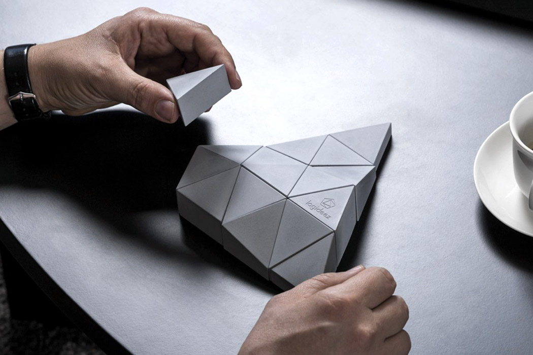
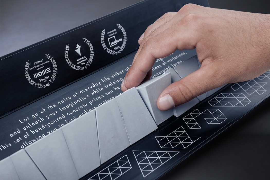
A little like the tangram meets the jigsaw meets the third dimension, the Logifaces puzzle by Logideez is a nice visual and mind exercise. The puzzle comprises a series of triangles of the same size, but different heights (at each vertex), and the only rule is, “Create a form by placing the prisms next to each other to build a continuous surface”. When completed, the Logifaces forms a large triangle with an undulating surface and a nice, concrete, brutalist appeal. The puzzle can be used as a toy, or even as decor, adorning places like work desks or coffee tables.

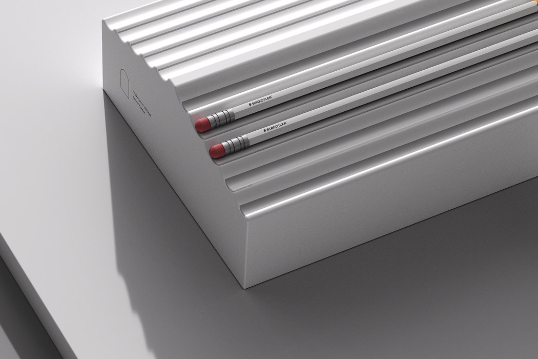
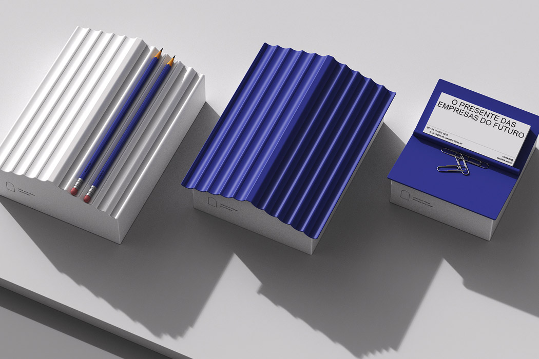
Industrial designer Jaekyoung Oh got the idea of pepping up the way we keep office supplies without losing the actual purpose and the essence. Keep enough pencils in the grooves of the (roof meant to hold the pencils/pens) and you’ll have a whole new roofed mini house on your desk. Take that obsession further and you can actually create a small town on your desk. Sounds liberating right? Other than that you can also keep the mini house minus the thatched roof to store paper clips, important business cards, or other office essentials that are required on daily basis. So even a couple of these on your desk would be just right to get you into that productive working regime. After all, small things like these help you get in the zone, and perform at your best!

clamp_basket_layout

clamp_basket_01

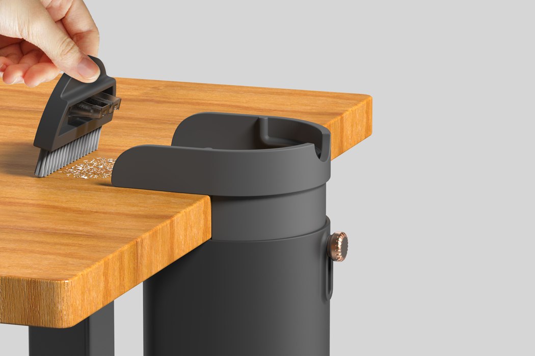
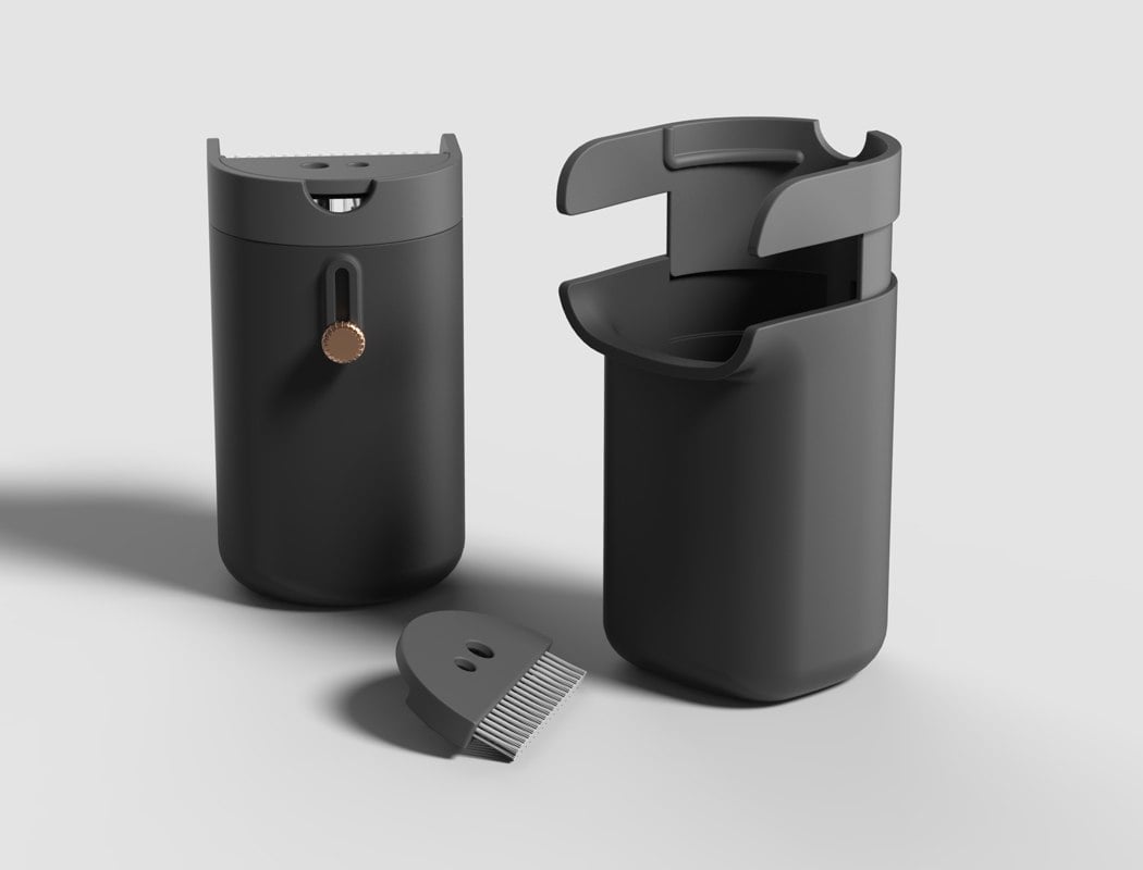
Clamp Basket by Seungwan Kang & Seonhee Shin does pretty much exactly what it says on the tin; it’s a small container that attaches to the side of the desk and allows the user to collect the rubber residue that is strewn across the work surface. A compact brush is neatly integrated into the top of the bin to ensure that every last bit of rubber is disposed of! Also featured on the top of the device is a pencil sharpener, which directly takes care of those annoying pencil shavings. Be it pencil shavings, crumbs, or even waste tissue, we think the Clamp Basket is a glam addition to every desk!

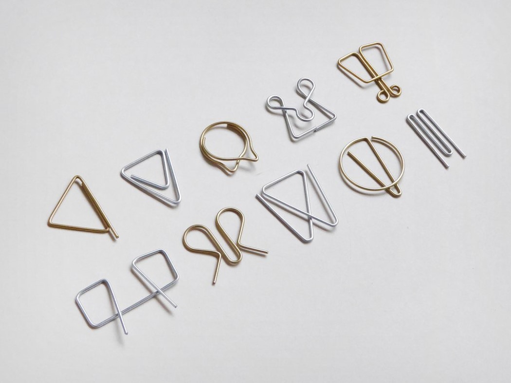
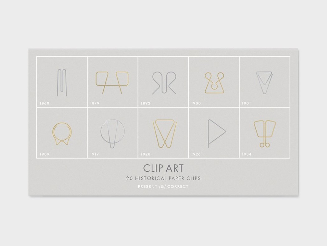
Clip Art by Present & Correct is a wonderful history lesson in paper clip design. The series features ten different paper clips from 1860 to 1934, recreated from ancient patent records. The Clip Art is a series worth collecting and admiring, especially for the way it captures how subtly different paper clips looked during the Art Nouveau and Art Deco periods and possibly even how visual styles could be partially dictated by industrial production techniques.