STEM subjects have evolved since I was a student. With assistance from projectors and computers, the teaching methods have changed in the process to provide interactive ways to impart learning. In most educational systems, old-school methods are still prevalent, and the first-hand experience in the classroom suggests that students often find it difficult to grasp scientific concepts. This means that there is scope for a method of teaching science and engineering, and this is where the ‘grasp it’ comes into the scene.
Designed by Augmented Haptics, and brainchild of Greg and Fabian, the rig is a demonstrative method of scientific teaching that classrooms will adopt instantly. The website of the product notes that – Dr Gregory Quinn (Gerg) and Fabian Schneider, design engineer and computer scientist respectively, came up with the idea of grasp it with the intention to make learning in engineering and science more effective, accessible and fun.
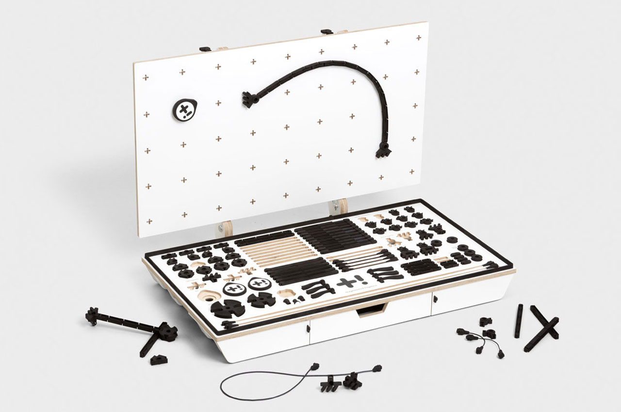
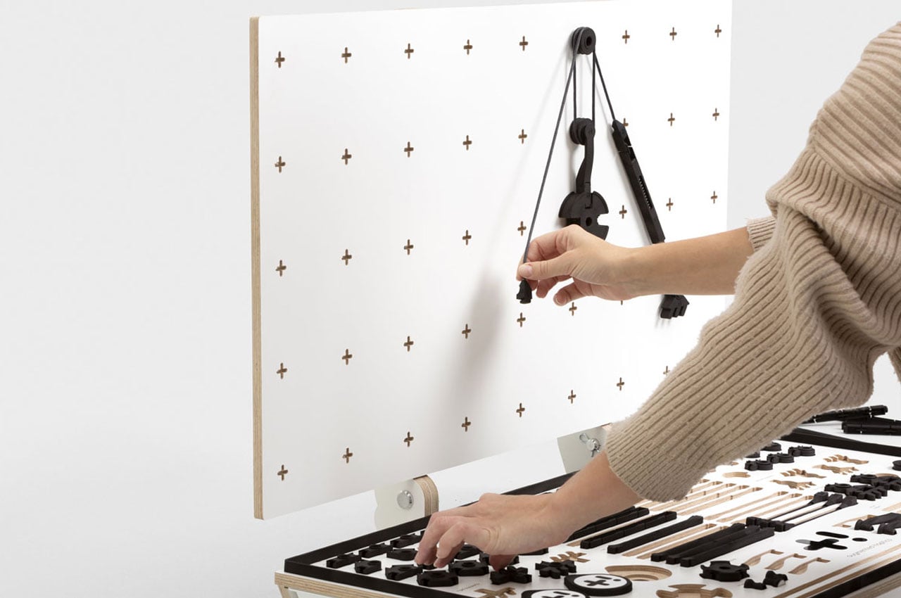
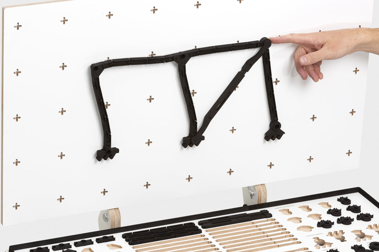
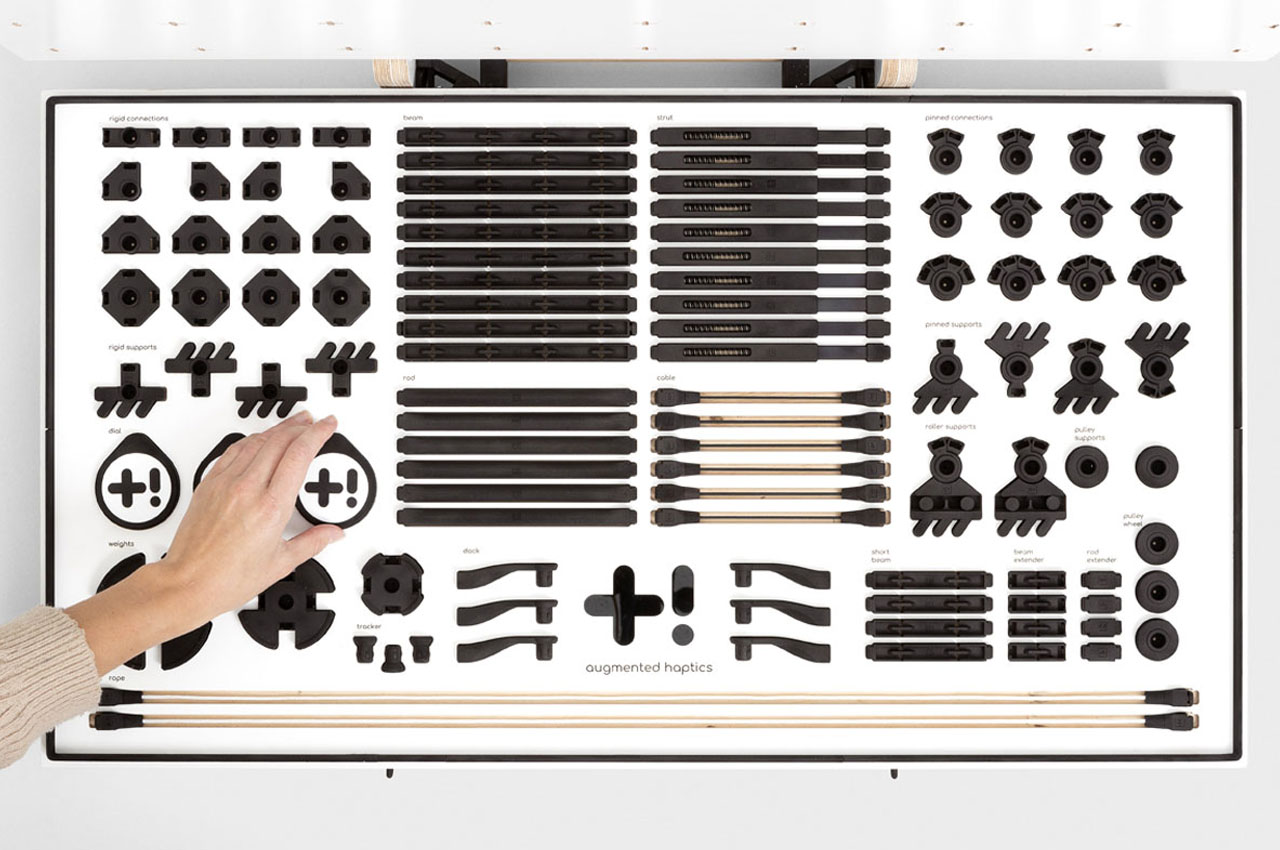
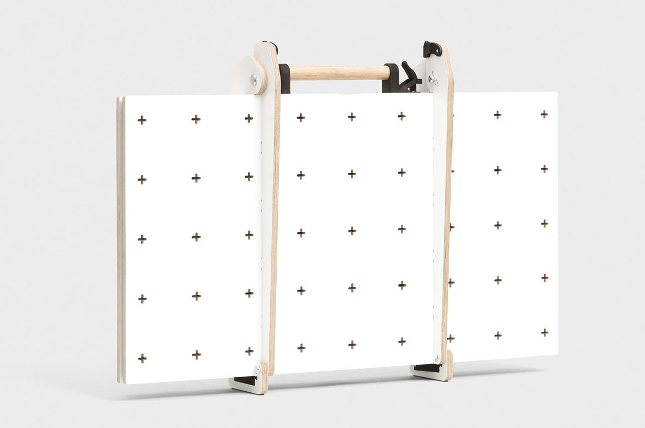
From how it appears, it’s a very portable and convenient box of possibilities. The suitcase-style teaching equipment made from wood can be easily carried by teachers into the classroom and opened up to reveal endless possibilities of interactive, haptic and demonstrative learning. Using the grasp it, comprising a set of LEGO-like plastic pegs that can be attached together to form various tangible structures that can be tweaked, twisted and rebuilt depending on usage. These modules can be fastened to the board (attached to the equipment) through the holes built into it.
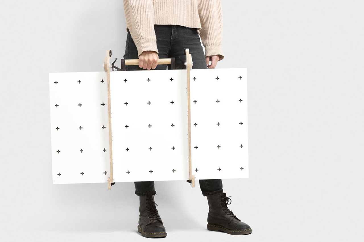
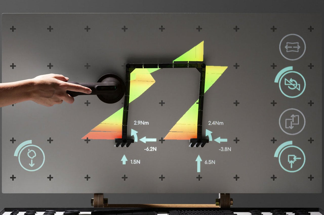
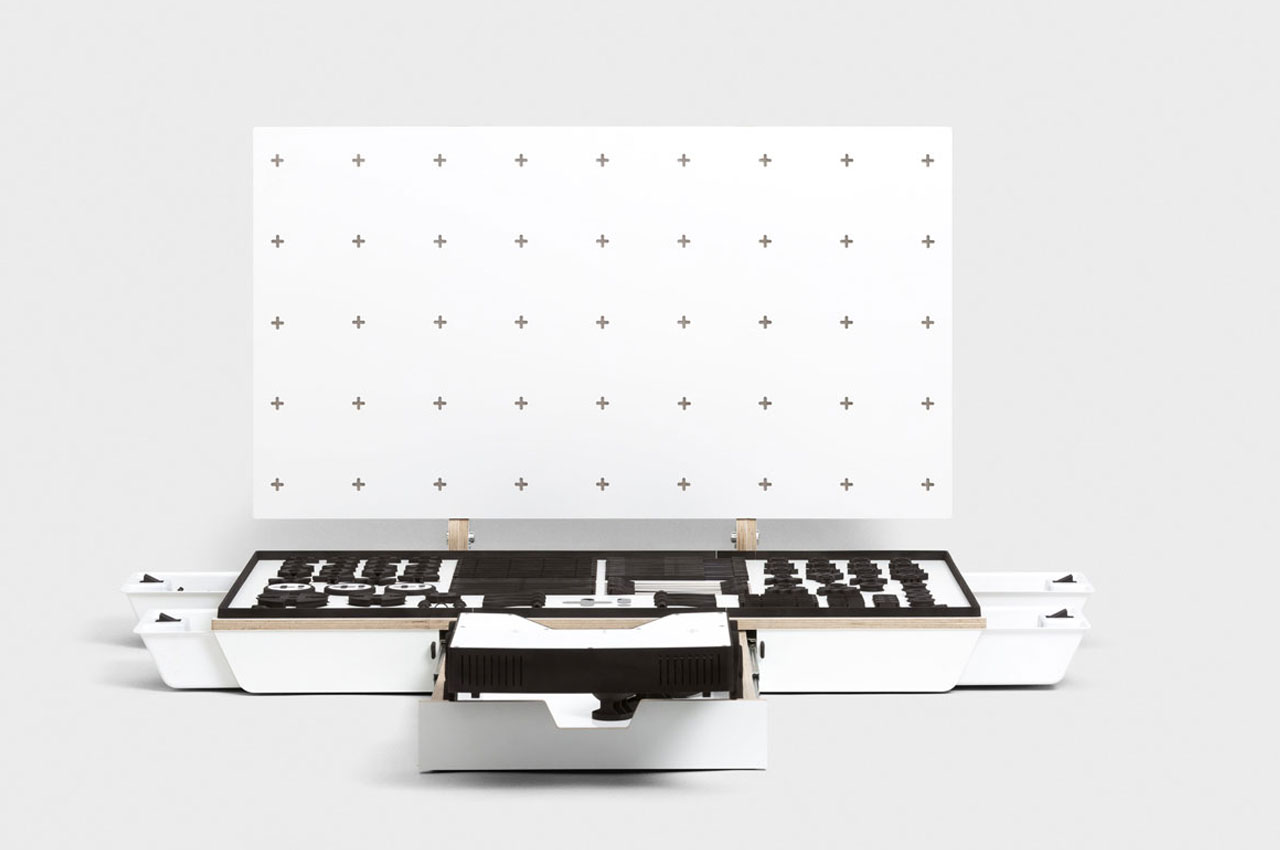
Interestingly, the grasp it presents a teaching method that keeps both teachers and students active. It is convenient to use and setup and inculcates the power of observation, thinking and reasoning in students. To this end, grasp it creates unlimited pedagogy possibilities using the power of touch and digital augmentation. The product comes with a small drawer that houses a tactile stick and a projector. When the interactive class of engineering demands, the projection can be turned on and the structures created using the plastic pegs can be applied with pressure at various points (using a tool). This can demonstrate the class with torque and force being applied on the creation to help them understand the reliability of a structure per se.
Grasp it is still a work in progress and limited to learning of science and engineering. It is expected to expand into many more STEM subjects including electronics, thermodynamics, computing and more.
Designer: Augmented Haptics
The post Learning science and engineering gets more effective, accessible, and fun with this portable teaching box! first appeared on Yanko Design.



 Concerns about Zoom's security are having a real impact on its use in remote education. Some US school districts, including large ones like New York City and Nevada's Clark County, have banned or disabled Zoom over security and privacy worri...
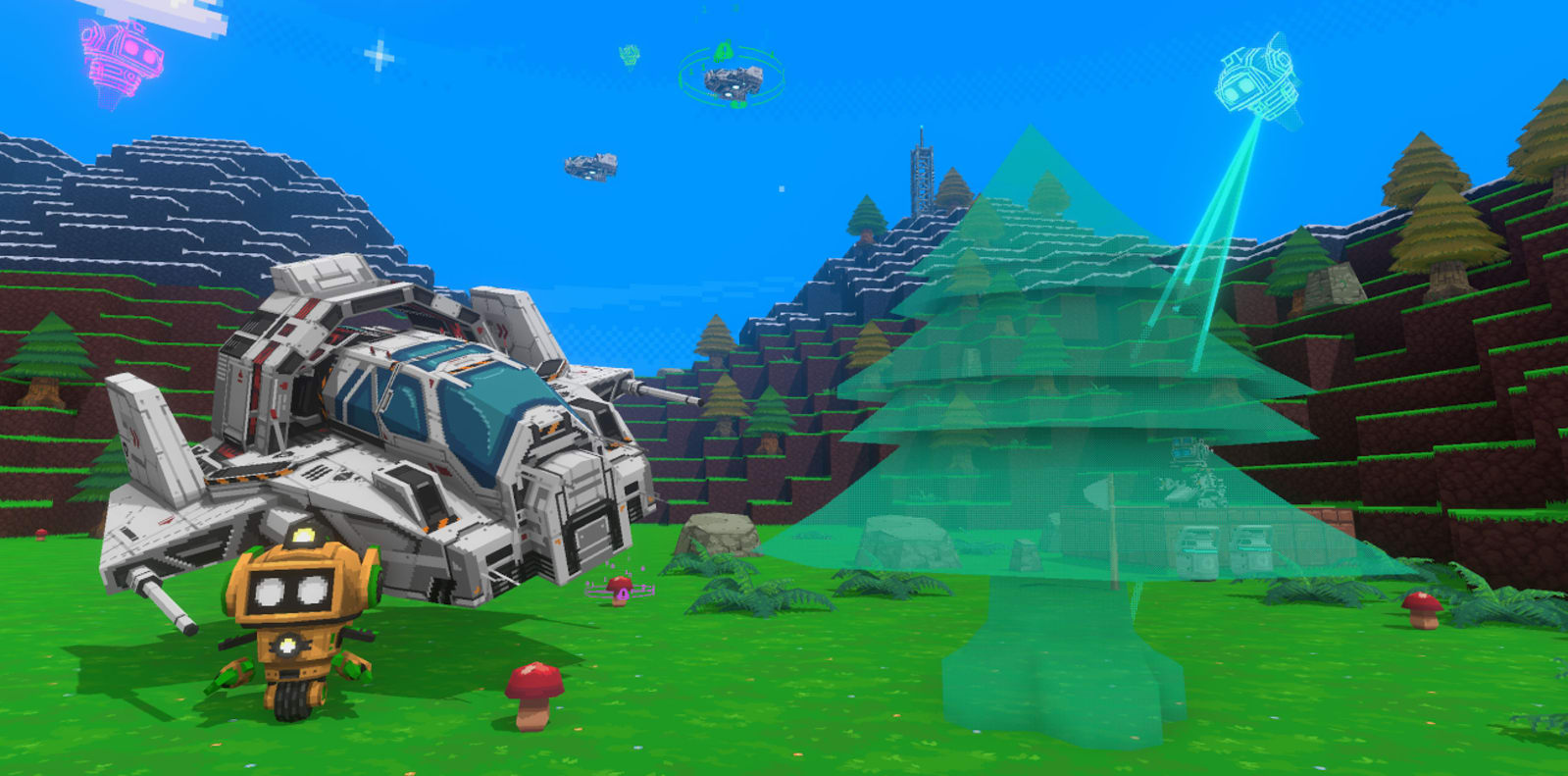 Google's in-house incubator, Area 120, has produced things like an app that teaches coding and tools to boost literacy. Now it wants to help gamers create their own 3D games, no experience necessary. Today, it launched Game Builder, a free platform t...
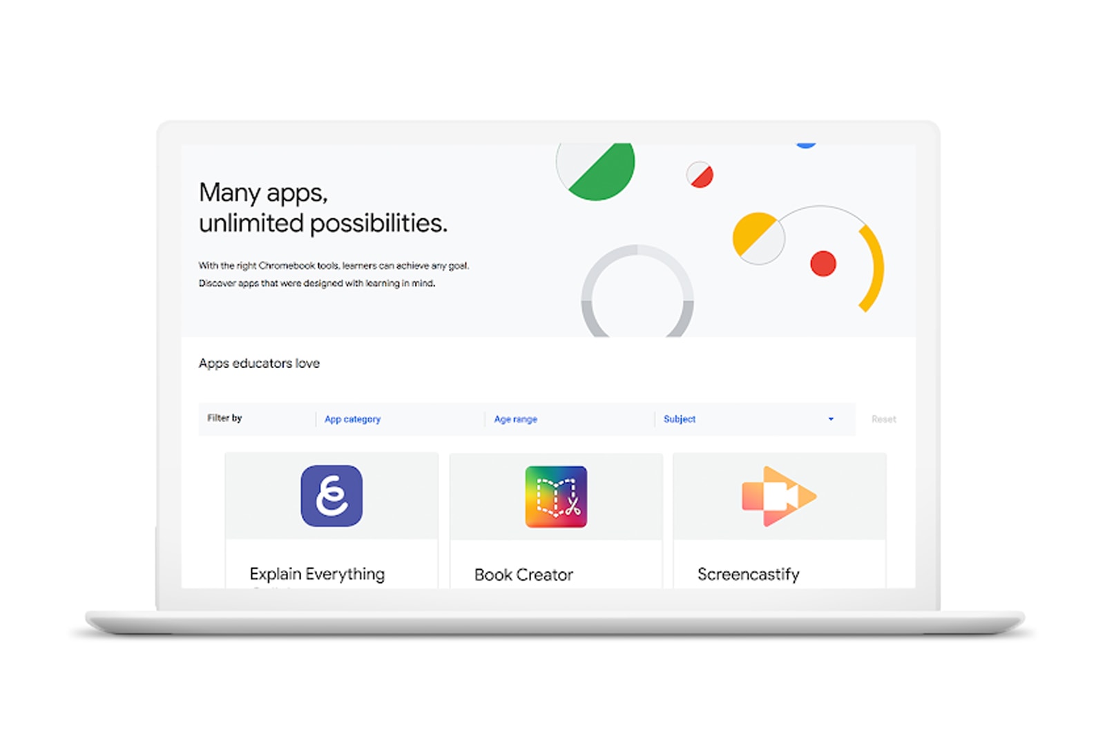 Many schools use Chromebooks, but they might not always know how to make the most of those systems in the classroom -- and Google knows it. The firm is launching a Chromebook App Hub that will both help teachers find activity ideas and connect insti...
 Under pressure to improve English skills among both teachers and students, Japan's Ministry of Education is turning to robots, according to NHK. Beginning in April, the ministry will launch a trial that will put English-speaking AI robots in around 5...
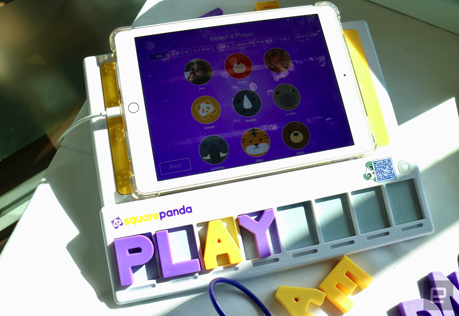 Andre Agassi, the legendary American tennis player, made an appearance at SXSW 2018 to announce a partnership with Square Panda, a startup that makes educational apps for kids. Through his Early Childhood Neuroscience Foundation, Agassi and Square Pa...

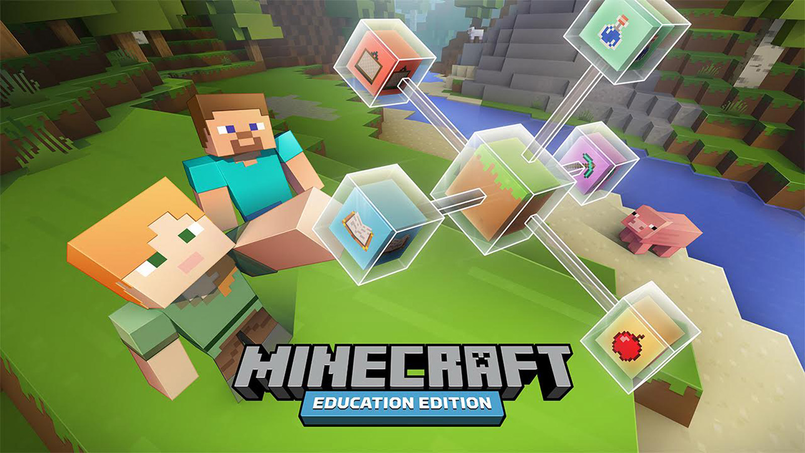 After offering teachers early access to Minecraft: Education Edition this summer, Microsoft's classroom-friendly version of the immensely popular sandbox game was formally launched at the beginning of November. Not everyone is keen on Minecraft being...