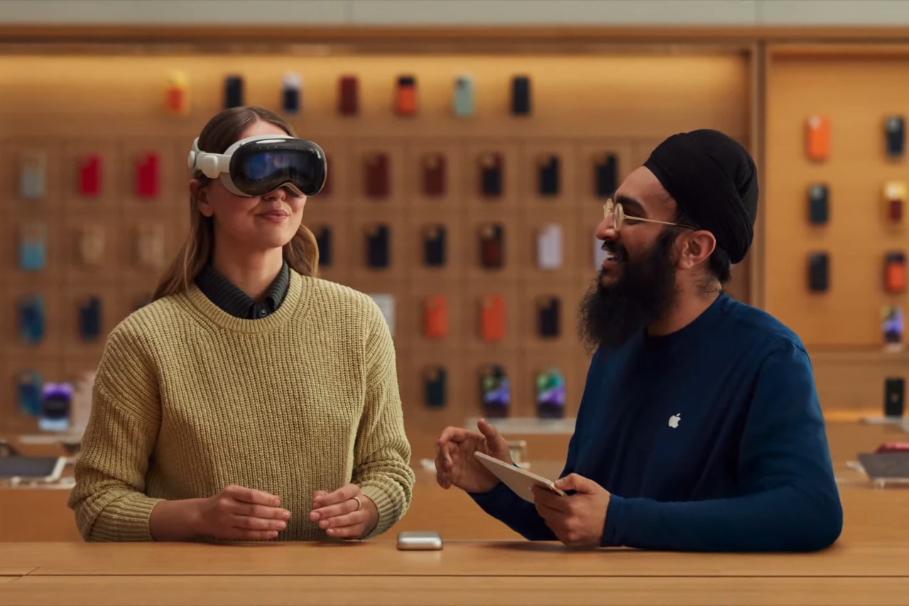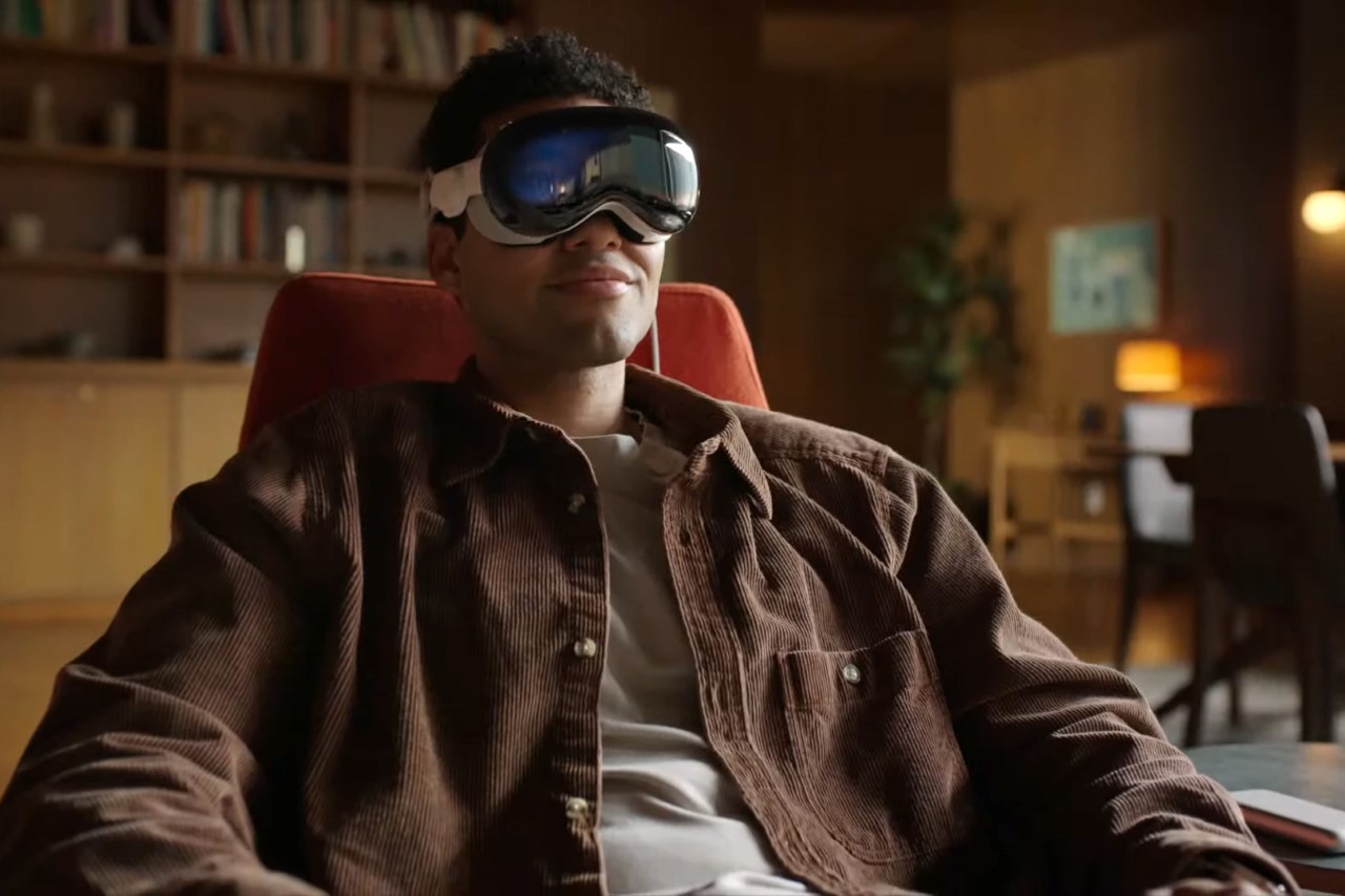
Apple Vision Pro: 5 Reasons Why The Headset May FAIL Despite Its High Popularity

Let me just get things out of the way by saying that I was one of the million people passionately glued to the YouTube screen watching the Apple WWDC keynote and the Vision Pro announcement. When Tim took the stage for the final time to coyly tease “One More Thing”, I felt the kind of goosebumps I’ve rarely felt before. Throughout the 40-minute-long presentation of the Vision Pro, my mind and heart were captivated by the sheer brilliance of this new device. I overwhelmingly loved everything I saw, but the tech commentator in my brain sent off some instant alarms.

As brilliant as the Vision Pro announcement was, there are still FIVE broad reasons why the Vision Pro could be a big crash-and-burn for Apple. Here’s what they are:

  1. Price
  2. Human Factors
  3. VR Fatigue/Boredom
  4. Inter Device Cannibalization
  5. Lack of Social Media Integration

Price

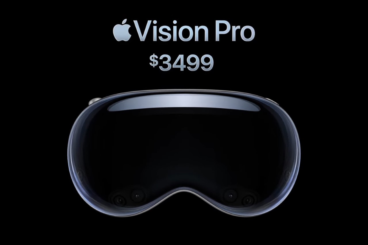
Months back when the Vision Pro was merely a figment of a tech commentator’s imagination, most rumors were that the device would be priced between $3000 and $10,000 USD, and would be available ONLY to developers to help set the groundwork for a public launch. The reality, however, is that this $3499 device was announced as a consumer product and not a developer one… and that changes things significantly. At a whopping $3499, the Vision Pro is much too expensive for the average user… and this can have negative effects on the product’s overall success. The Vision Pro’s ridiculous price tag sets an incredibly high barrier to entry for consumers, severely limiting how many people actually use the MR headset. This in turn disincentivizes the developers from constantly working on new apps, services, games, experiences, updates, etc. The lack of developer support in turn results in a flawed UX for Apple’s most elite, enthusiastic customer base. In order to combat this, Apple would either have to launch a cheaper, inferior product and become just another Meta, or go down the Microsoft route by just halting new product development, just like how Microsoft never released a new device after the 2019 Hololens.
Human Factors

The second crucial reason that could spell certain death for the Vision Pro is also closely tied to why Microsoft never developed a third Hololens – a large chunk of the human population tends to experience incredible nausea in a VR headset. During experimentations with AR headsets for military applications, Microsoft and DARPA realized that almost a third of all soldiers were becoming violently sick while wearing the Hololens. Between 10-30% of humans don’t respond well to virtual reality – the blurry, pixelated, uncanny valley of VR can sometimes cause the brain to think that it’s experiencing the blurred-vision symptoms of poisoning, which results in nausea and vomiting. The minute you have people adversely reacting to your product, it really doesn’t bode well for its future. Case in point, DARPA halted its plans to have military personnel wear AR glasses on the combat field.
VR Fatigue/Boredom

For the rest of the population who doesn’t have a sickness problem with VR, the novelty tends to wear off pretty quickly. Almost everyone who bought an Oculus reports finding it exciting for only a few months. After this, interest in the tech plateaus, and the VR headset end up sitting on a shelf or in the back of a cupboard, according to a significant majority of VR headset buyers. The erstwhile leader of the metaverse, Meta (Oculus), hasn’t really been able to crack this problem, despite constantly launching new experiences and games (and even announcing the Quest 3 just days ago). That being said, Apple deserves a tonne of credit for focusing so much of their time and effort on highlighting all the areas where the Vision Pro could be incredibly useful… but not everyone will be okay with the idea of perpetually having 4K screens an inch away from your eyeballs. VR Fatigue and Boredom are real; and even though the Vision Pro boasts of an entire day’s worth of battery life, chances are that people won’t want to be strapped into a VR headset for more than an hour a day.
Inter Device Cannibalization

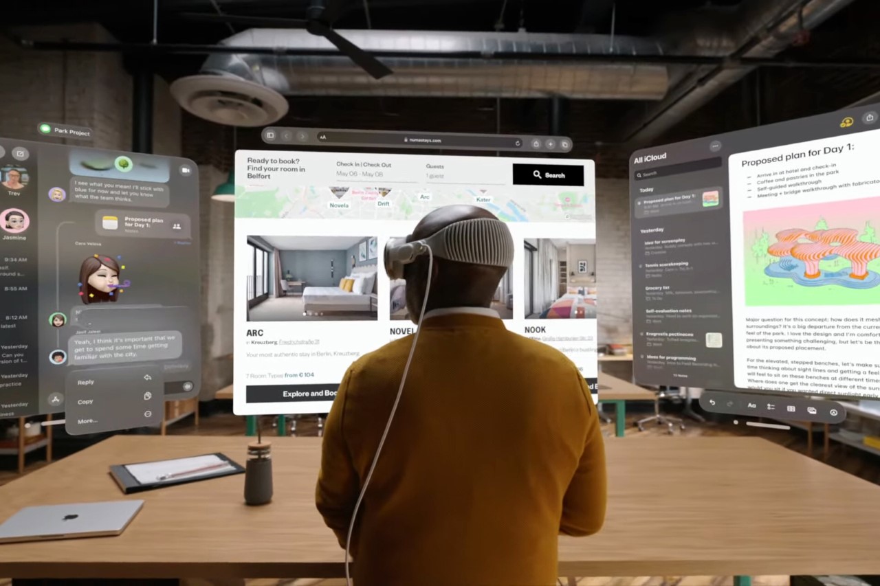
Interestingly enough, the Vision Pro’s success also depends on the failure of every other Apple device… which presents a unique stalemate for the company. Under normal circumstances, Apple’s devices encourage multitasking. You can work on your MacBook while listening to a podcast or music on your AirPods, you could watch Apple TV+ while browsing TikTok on your iPhone. The devices don’t really replace each other, and can coexist rather comfortably… but they can’t with the Vision Pro. The Vision Pro is designed to replace your MacBook, iPad, iPhone, Apple TV, and Apple Watch displays. Its built-in audio drivers also prevent you from wearing AirPods while you’re strapped into the headset. This effectively means all your other Apple devices are pretty much useless when you’re using the Vision Pro, and that poses a threat to Apple’s own hardware. If you’re watching a movie on the Vision Pro, you’re less compelled to buy the Apple TV 4K. If you’ve got a massive built-in virtual display, you don’t really need the Apple Pro Display XDR or the iMac, and if you can control virtual elements with finger gestures, you don’t need the iPad and you certainly don’t need the Apple Pencil. The success of the Apple Vision Pro hinges heavily on you NOT using any of Apple’s other devices… and as a result, the inverse is true too. If you’re much more comfortable with using an Apple TV, because you’re watching movies as a group… or if you’re working on the MacBook or iPad with the intent of collaborating with a co-worker right beside you, you’re probably not going to isolate yourself with a personalized mixed reality headset.
Lack of Social Media Integration

Here’s a statistic that still bends my brain to this day. In the year 2021, the entire world collectively watched 9.6 trillion minutes of Netflix according to data from the Wall Street Journal. That may sound like a lot, but it’s nothing compared to the staggering 22.6 trillion minutes spent watching TikTok. There’s really no debate that social media occupies an overwhelmingly higher amount of time than conventional entertainment… however, Apple didn’t highlight social media even ONCE in their entire 45-minute segment on the Vision Pro.

In the past 3 years, we’ve become so addicted and accustomed to how we browse and interact with social media on the smartphone, it’s nearly impossible to seamlessly shift that to a wearable platform. As a Quest 2 owner, I’ve opened Instagram only twice on the VR headset. Typing comments on a headset is a hassle, uploading stories/reels in a 9:16 portrait format on a virtual or mixed-reality headset just feels odd, and the smartphone has a solid reputation for rapidly creating and sharing content, while the Vision Pro doesn’t. Moreover, social media has thrived wonderfully on a small screen, so the idea of browsing TikTok on a massive virtual display really doesn’t present any major benefits.

Now Apple DOES have until next year to figure out how to overcome these problems, given that the Vision Pro doesn’t hit stores until 2024. This also gives Apple enough time to really gauge consumer and developer feedback, and adapt accordingly. More so than ever, it’ll also be interesting to see what the Vision Pro does for the metaverse, which has kind of been on life support up until now. Someone check in on Zuckerberg too, while we’re at it…
The post Apple Vision Pro: 5 Reasons Why The Headset May FAIL Despite Its High Popularity first appeared on Yanko Design.
Apple Vision Pro Just Brilliantly Destroyed Meta’s Entire Hardware Business… And Possibly Even Its Own

I’d really hate to be Mark Zuckerberg right now. In October 2021 he pivoted to the metaverse, only to pivot to AI in November 2022. Now, Apple’s Vision Pro stole his massive lead with a product so revolutionary, it’s probably going to crush his entire hardware ambitions.

Apple just announced the Vision Pro, an entirely new revolutionary product category, with a Mixed Reality headset that champions what they call “spatial computing” – an upgrade from the personal computing abilities of the laptop and smartphone. The brilliance of this is that it singlehandedly has the potential to redefine and reinvigorate the metaverse. The tragedy is that it also simultaneously kills all of Apple’s other businesses. The Vision Pro’s technical genius deserves an entire article on its own, but for now let’s just focus on exactly how magical this new product is, and what it means for Apple as a hardware company.

One More Thing…

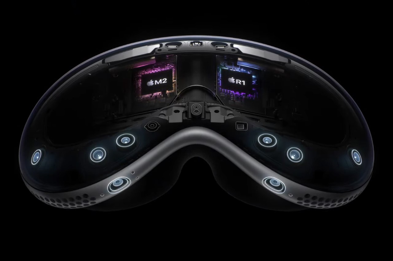
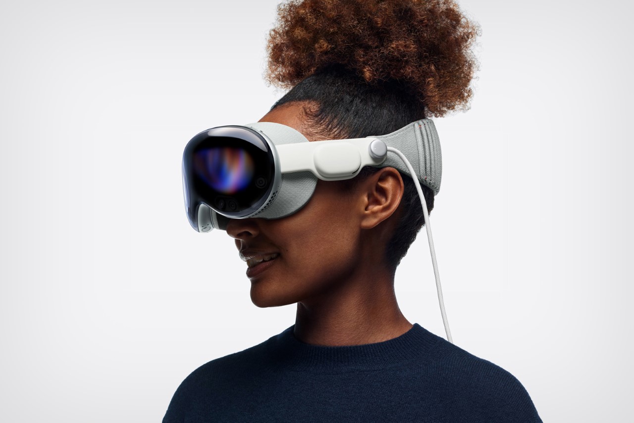
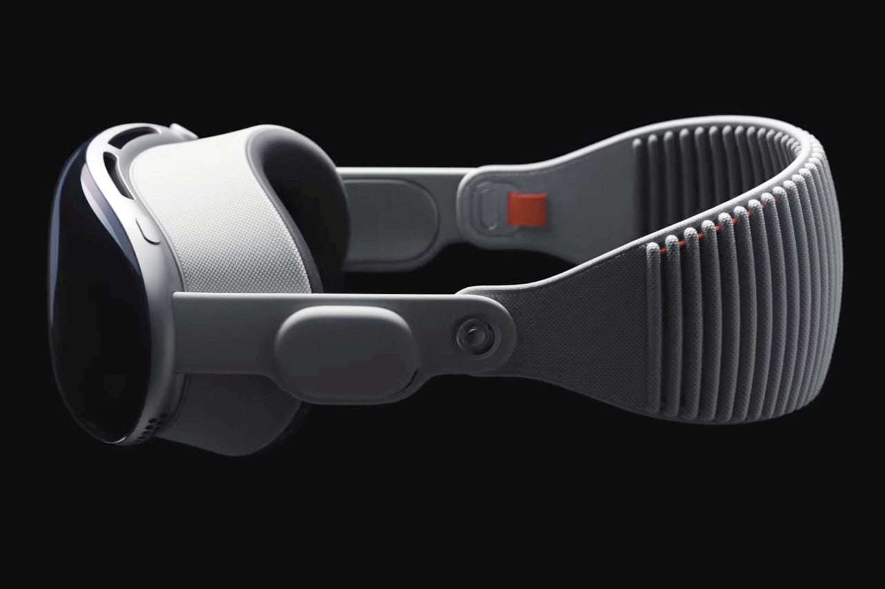
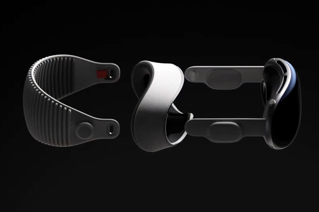
Just as WWDC was coming to a close, Tim Cook, with a twinkle in his eye, uttered the same words that Steve Jobs did when he unveiled Apple’s most revolutionary product – the iPhone. 16 years to that day, Cook’s reutterance of those words promises to disrupt the entire tech industry all over again. The Vision Pro is an MR headset that brings an entirely new category to Apple’s product offering. In short, it has two Apple Silicon chipsets (including an M2 chip), dozens of cameras and sensors, an iris recognition system that scans your eye for biometrics, directional audio units in the strap, two postage-stamp-sized 4K screens on the inside for immersive viewing, and a curved OLED display with a lenticular layer that lets other people see your eyes while you’re wearing the headset. That’s just the short version.

Apple’s Greatest Device Yet

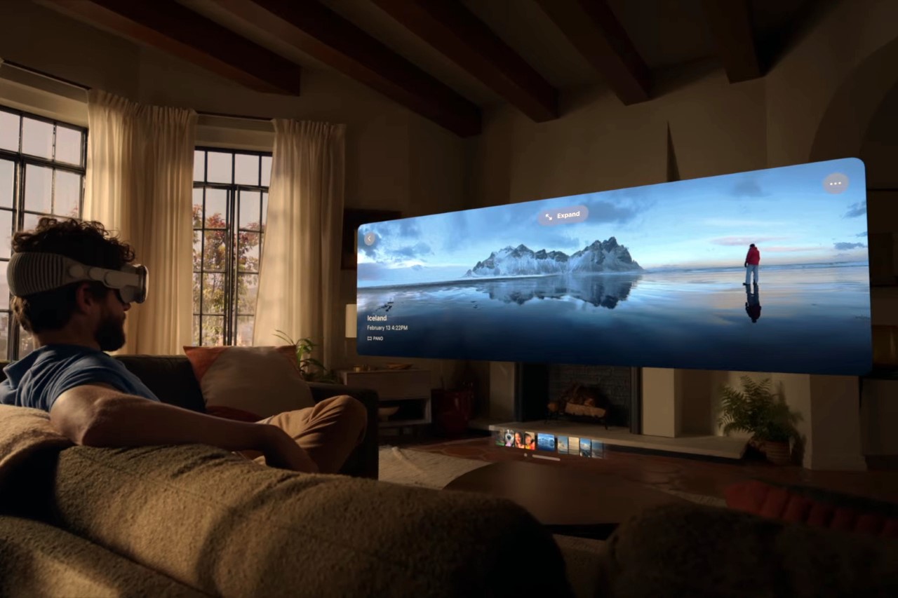
The Vision Pro turns your world into a computing device. You can work, play, watch movies, view 3D content, facetime with friends/family, and access every app on the App Store through it. There’s quite literally nothing you cannot do on the Vision Pro, which makes it such an incredible device. In fact, just announcing it and its features took up nearly an hour of the WWDC live stream, highlighting exactly how important it is to Apple’s future. In Tim Cook’s version of the future, the Vision Pro replaces computing devices entirely. You don’t need laptops, phones, watches, or even VR controllers to interact with the digital world. The Vision Pro handles your laptop or desktop’s abilities, allowing you to make presentations, write emails, edit files, and do practically anything on a massive virtual canvas. Similarly, you don’t need a phone or tablet when all your phone/tablet apps are available on the Vision Pro. When you’re relaxing, the Vision Pro gives you a massive screen to watch movies and TV shows, or even view 3D content or panoramic images immersively.

How the Vision Pro Redefines Computing

The Vision Pro’s interface isn’t really an interface anymore… It’s your entire world (or as Apple calls it, VisionOS). Everything you see is a canvas for a rectangular window. You can simultaneously have your work screen, a Pinterest board, and Ted Lasso existing within your visual periphery. Each element occupies 3D real estate in your vision, and isn’t bound by a screen. You can select, layer, resize, or move elements of your world simply by using your hands, eliminating the need for a controller. You can choose to see the world around you, or immerse yourself in a digital realm with a simple turn of a knob (or a crown), while still being connected to the world around you.

How the Vision Pro Redefines Interaction

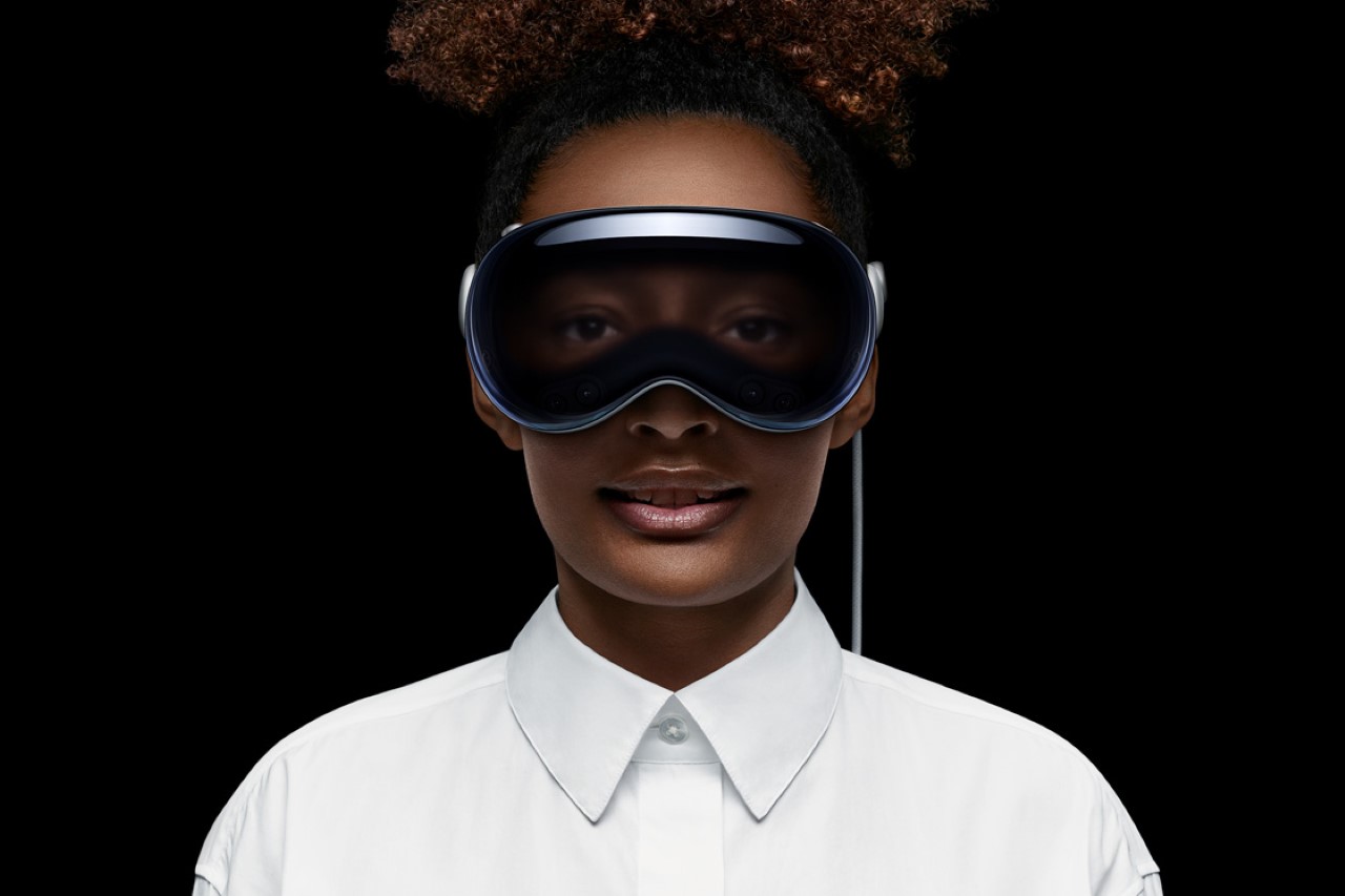
A screen on the front of the Vision Pro acts as your digital eyes (or what Apple calls EyeSight), so that when people are talking to you, they see your eyes. If you’re immersed in content, your eyes aren’t made visible on the screen, so they know not to disturb you – it’s a lot like how people know you’re not engaging with them if you’re not making eye contact. However, if they need to grab your attention while you’re in an immersive experience (like a movie), they can merely step close to you, and EyeSight kicks in. They suddenly become visible to you within your headset, and your eyes become visible to them. It’s an impressive handshake of multiple different technologies that resulted in Apple filing as many as 5000 patents for the Vision Pro device.

Meta is Royally Screwed

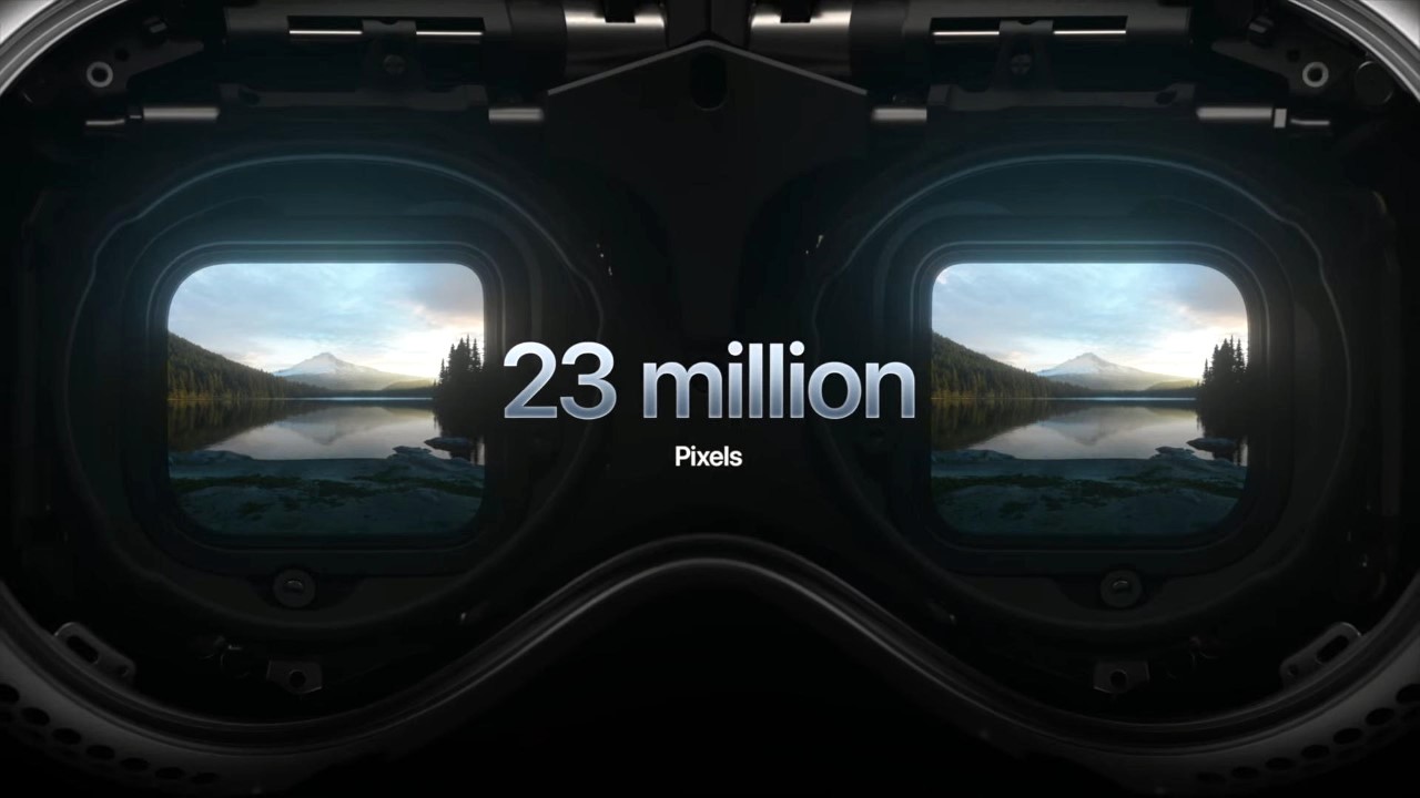
As impressive as Zuckerberg’s Meta Quest Pro is, it really doesn’t even hold a candle to Apple’s Vision Pro. The Apple Vision Pro is an incredibly meticulously designed product that runs on not one but TWO chipsets – an M2 chip and a new R1 chip that just handles how digital elements react with your physical world. It’s got two 4K screens on the inside with as many as 23 million pixels crammed into an area the size of a postage stamp – that’s the equivalent of 64 pixels in the space occupied by 1 pixel on the iPhone screen. The outside of the device has a screen too (a lenticular 3D one, no less), that projects your eyes so that people can make eye contact with you while you have the headset on. As far as sensors go, the Vision Pro has one LiDAR scanner, two TrueDepth cameras, two main cameras, four downward cameras, two side cameras, and two IR illuminators… just on the outside. The inside has four IR cameras and multiple invisible LED illuminators that track your eyes, letting you use them as a cursor. Your hands become the controls, allowing you to tap, pinch, and manipulate elements that your eyes look at. This entire interaction is just so complicated and nuanced, you don’t need a remote or VR controllers. Oh, did I mention, the Vision Pro uses OpticID, a new authentication system that scans your eyes, making it much more secure than TouchID and FaceID? Even Meta’s highest-end device (which is roughly 1/3rd the price of the Vision Pro) doesn’t have anywhere near as much impressive tech as the Vision Pro… and if I were Zuckerberg, I’d honestly be crying in a corner right now because in Meta’s own metaverse… they’re in second place.

An alliance with Disney

Strangely enough, the one person that shared the stage with Tim Cook was Disney CEO Bob Iger, who promised some great new partnerships between the world’s biggest tech company, and the world’s biggest entertainment company. Disney’s entertainment offerings are now going to be front and center in Apple’s Vision Pro, with a tight partnership between the two giants to make entertainment more immersive. This announcement also falls in line with Disney’s 100-year anniversary, going to show exactly how much Disney has to offer to its fans through the Vision Pro. Strangely enough, this core focus on entertainment excludes one major platform – social media. The Vision Pro doesn’t really do much to enhance how people interact with apps like Instagram, Facebook, or TikTok, which feels like a two-punch melee to Meta and Zuckerberg even more…

Apple may have shot itself in the foot too

Aside from its whopping $3499 price, the Vision Pro does something absolutely unique, in that it replaces every single other Apple device. When you’re strapped into the headset, you’re pretty much never going to look at an iPhone, MacBook, Apple Watch, iMac, or TV. Heck, you’re not even going to wear AirPods… and needless to say, that’s bad for Apple. The Vision Pro is such a strangely isolating experience that it stops you from using Apple’s other hardware devices… and that’s absolutely new. You can use your iPhone simultaneously with a MacBook, AirPods, Apple Watch, etc… but when you’re wearing the Vision Pro, every single other Apple device becomes unnecessary. Spatial computing is great for the Vision Pro, but it’s terrible for all of Apple’s other devices… and this poses an incredibly interesting threat to Apple’s hardware endeavors. Sure, if the Vision Pro takes off, Meta is absolutely, royally, wholeheartedly screwed because there’s no reason someone who wants a Vision Pro would settle for a Quest 2 or 3. However, it’ll be interesting to see if people who buy the Vision Pro ever buy a single other Apple computer like a MacBook, iPad, or Apple TV unit.

The post Apple Vision Pro Just Brilliantly Destroyed Meta’s Entire Hardware Business… And Possibly Even Its Own first appeared on Yanko Design.
Apple to Announce Their First Ever Augmented Reality Glasses in 3 days… Here’s What to Expect

Apple hasn’t launched a single new product category since they unveiled the AirPods back in 2016. Sure, the AirPods Max debuted in 2020, but it wasn’t a bold leap as much as natural progression. The point I’m really trying to make here is that it’s been a while since the company was ‘recklessly innovative’, and it seems like we might just get a taste of that three days from now at WWDC.

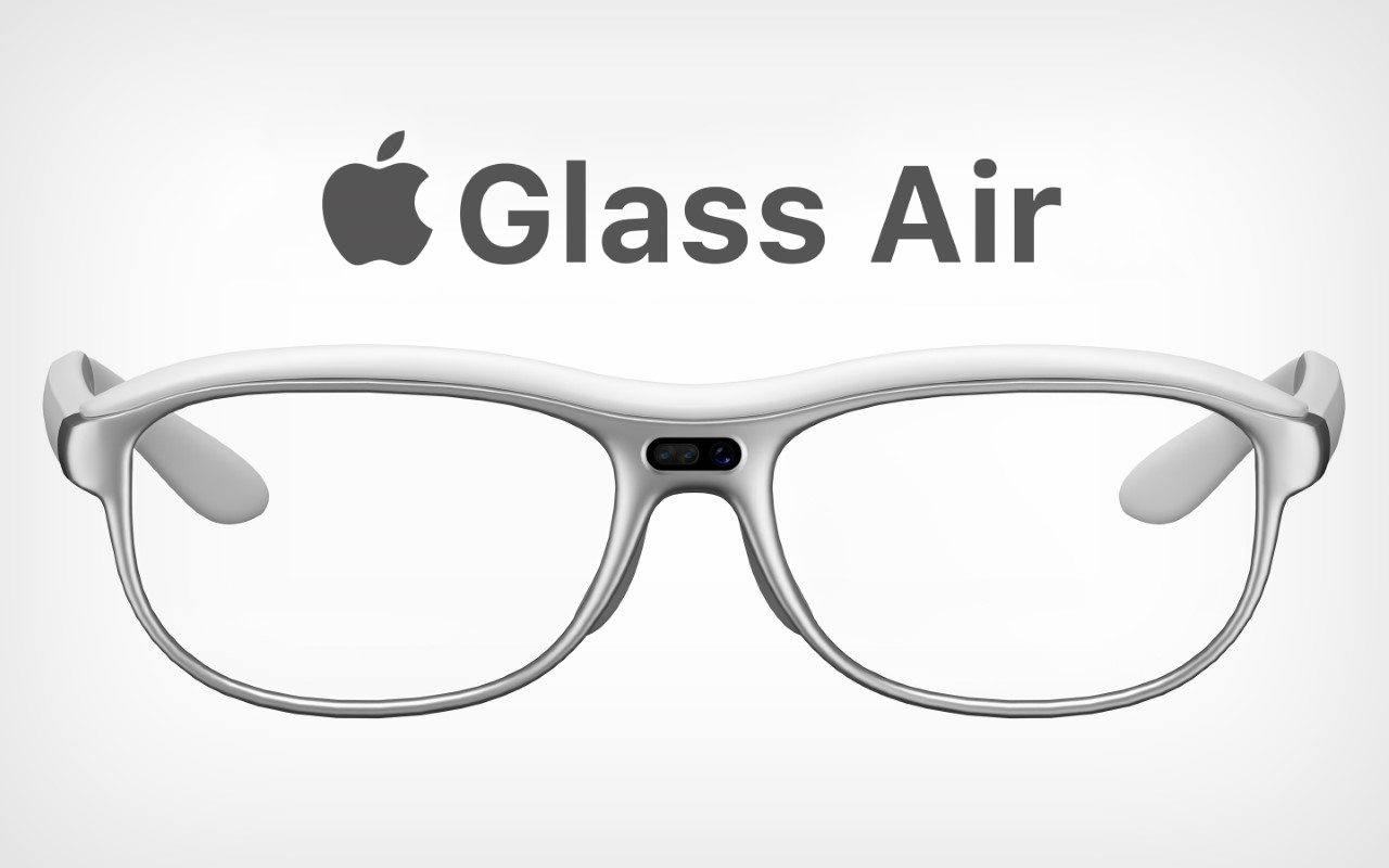
Augmented Reality has always been Tim Cook’s favorite buzzword, and he’s consistently pushed for Apple to have a presence in this space. It’s expected that all this will culminate in what analysts and leakers call “Reality”, Apple’s first XR headset. This cutting-edge device, expected to be unveiled at Apple’s Worldwide Developers Conference, aims to pioneer the relatively uncharted realm of mixed-reality technology. With a price tag of approximately $3,000, the ‘Reality’ headset has been seven years in the making, and has been apparently filled with controversy too, with a large chunk of Apple’s own employees expressing doubt and disdain. However, here’s everything we know about the Reality headset (or could it be a pair of glasses?) that’s set to launch this Monday.

Concept Images by Kylin Wu
(Rendered on KeyShot: Click Here to Download Your Free Trial Now!)

The headset’s design journey has oscillated between being thick and obtrusive, like your average VR headset, to being as slim as a pair of spectacles, or realistically, a pair of chunky ski goggles. At its heart, however, lies the innovative xrOS, designed to provide an interface that echoes the familiar iOS experience. The new operating system (which is pretty much confirmed thanks to a trademark filed by Apple in New Zealand) is set to revolutionize how users interact with their devices, presenting a traditional Home Screen in an entirely new dimension filled with apps and customizable widgets.

One of the most exciting features of ‘Reality’ is its ability to merge digital elements with the real world. The xrOS software could potentially project AR app interface elements onto actual objects, creating a seamless mixed-reality overlay effect. This represents a significant leap forward in AR technology, blurring the boundaries between the physical and digital worlds. According to MacRumors, the ‘Reality’ device will achieve this using “dual high-resolution 4K micro OLED displays with up to 3,000 pixels per inch for a rich, realistic, and immersive viewing experience.” To operate the device, the user’s hands and eyes will be monitored by over a dozen optical cameras. The user can select an on-screen item by simply looking at it and activate it by making a hand gesture, such as a pinch.

The core of xrOS will feature re-imagined versions of Apple’s staple apps. From Safari to Messages, Apple TV+ to Apple Music, users will have the flexibility to work with multiple apps simultaneously, ensuring a dynamic and engaging user experience. Apple is also set to transform existing services into immersive viewing experiences. Imagine watching videos in virtual reality as if on a giant screen, or engaging in guided meditations enhanced by immersive visuals, audio, and voiceovers. Services like Apple Fitness+, Apple TV+, and a 3D version of Apple’s collaborative Freeform tool are set to offer these radical experiences in xrOS. In addition to the reimagined versions of existing apps, Apple is likely to introduce new offerings tailored to the unique capabilities of the ‘Reality’ headset. These would include a Books app for immersive reading, a Health app focusing on psychological wellness, and a Camera app that can capture images from the headset’s cameras, promising a whole new level of interaction and engagement.

Apple is reportedly also working with a select number of game developers to help them update their existing content for mixed reality. Furthermore, Apple reportedly has a robust set of tools that will allow non-developers to create their own AR/VR experiences, even without coding skills. These user-created AR apps could be distributed on the App Store alongside developer-created apps​​.

The Reality headset doesn’t come without its fair share of controversy. It remains one of the most divisive products even within Apple’s own company, with multiple people leaving the project to move to other divisions within Apple, or leaving the company entirely. Multiple engineers have expressed their opinion that Tim Cook should wait before the product is “good enough” for consumers… a feeling that people on Apple’s board have expressed too. Cook gave multiple key executives and personnel a preview of the Reality headset a little over a month ago, one of them being credible Apple reporter Mark Gurman of Bloomberg. However, it seems like Cook’s been adamant about releasing the headset as soon as possible, although as a developer product rather than a consumer-ready gadget. This will probably help set the groundwork needed to make a much more consumer-friendly Reality headset somewhere down the line. Until then, we have our fingers crossed and our calendars set for June 5th, 10 am PST!

The post Apple to Announce Their First Ever Augmented Reality Glasses in 3 days… Here’s What to Expect first appeared on Yanko Design.
Apple iPhone 13 – Marginally Better Camera, Smaller Notch, Recycled Plastic (An honest guide to the new iPhone)


The fact that you’re here reading my opinion on the new Apple iPhone 13 is a responsibility I take incredibly seriously, but I’ll be honest… a lot of times innovation just gets sugar-coated. Throwing statistics like saying an iPhone is 40% faster and 10% lighter sounds incredibly enticing, but at the end of the day, a consumer is hardly expected to sit and measure an iPhone’s screen to see how much larger it is compared to its predecessor, or simultaneously run games on both phones and see if the newer one has 20% better graphics thanks to a 5-core GPU. As much as nerdy stats sound exciting, they honestly mean nothing to 99.9% of consumers when push comes to shove. So here’s my simplified overview of the new iPhone 13 – no technical jargon, no over-complicated charts, just simple facts.

The simple reason behind why I’m choosing this format is because there’s nothing measurably better in this year’s lineup. I’ve honestly seen the climate go through more drastic changes in a single year than the iPhone has this year. (And I’m not knocking on Apple… I just think this forced tradition of launching a new phone every year is getting tiring)

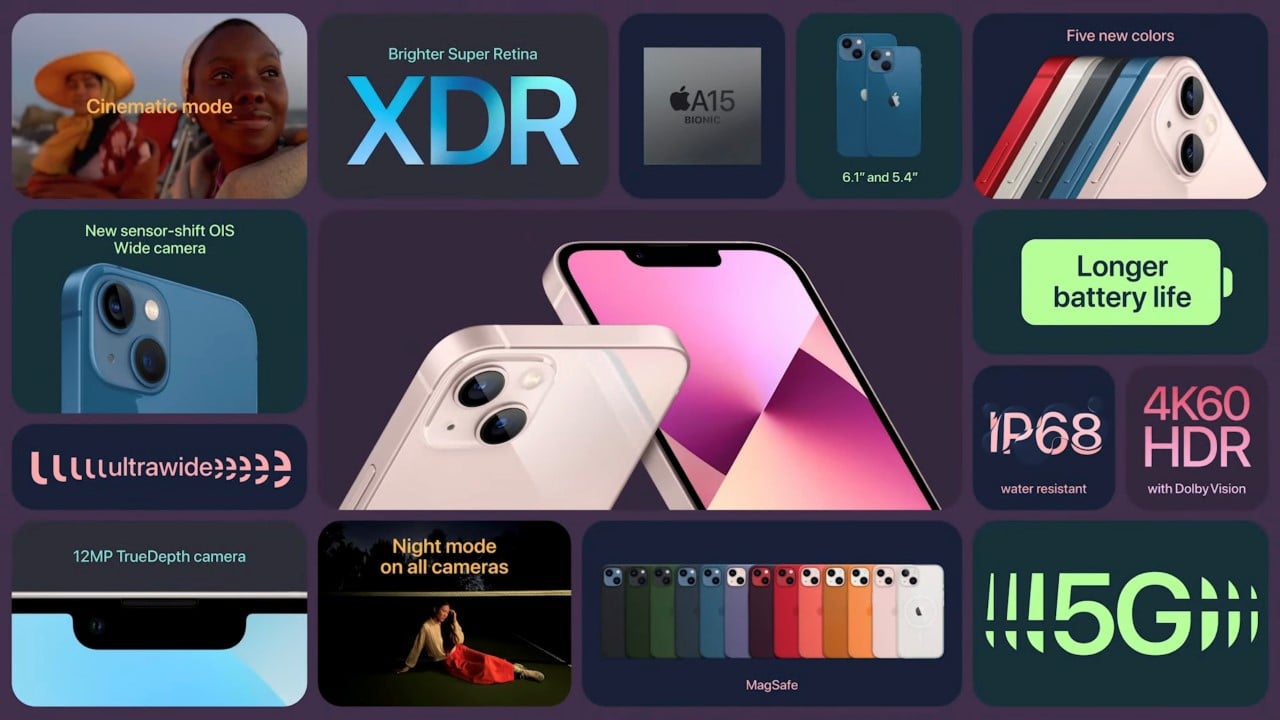
Apple introduced 5G and MagSafe with last year’s iPhones, so this is almost like a placeholder year for the company as the world combats a pandemic + chip shortage, and also as Apple prepares for much higher demand next year as people who bought the iPhone 11 and 12 will want to upgrade to the iPhone 14. So what’s new with this year’s iPhone? Not much if you’re looking for major changes. The notch is now slightly smaller (yet still very noticeable), the battery slightly bigger, the chip slightly better, the cameras have night mode, and you can now shoot cinematic videos where the focus shifts from one subject to another, like in films. Oh, and the iPhone 13 also uses plastic from recycled bottles in its antenna strips.

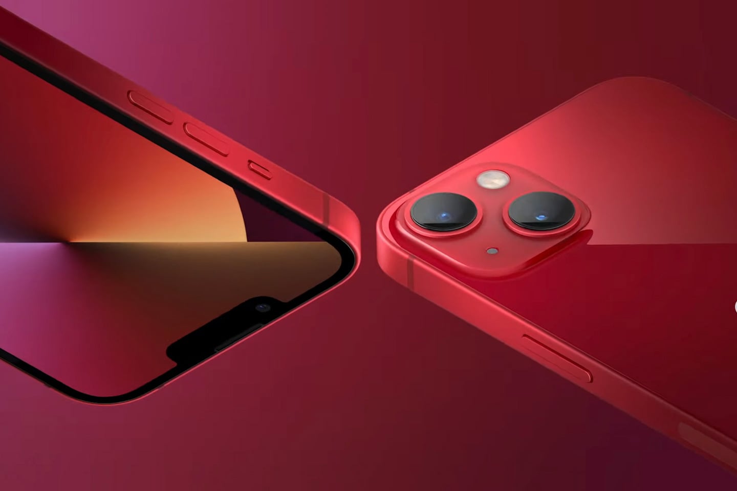
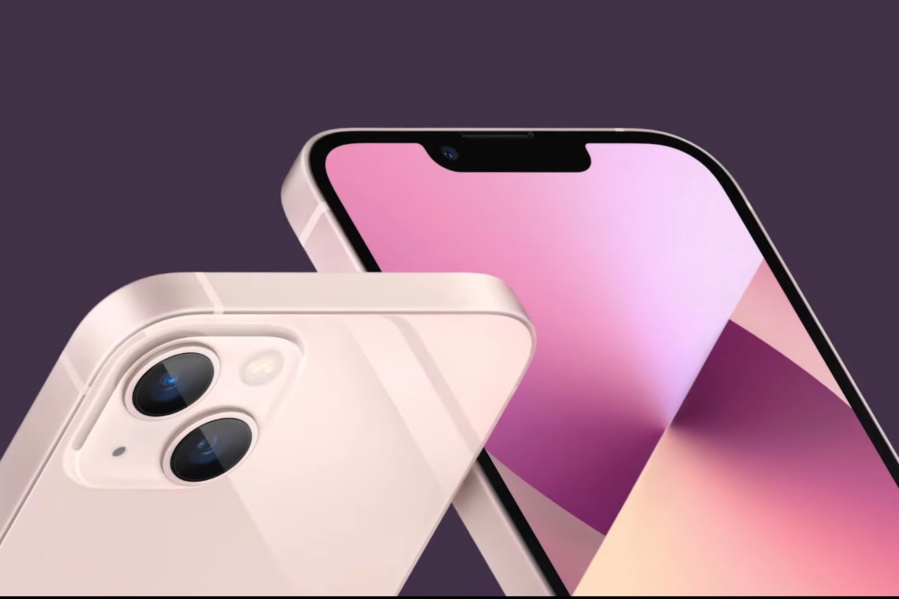
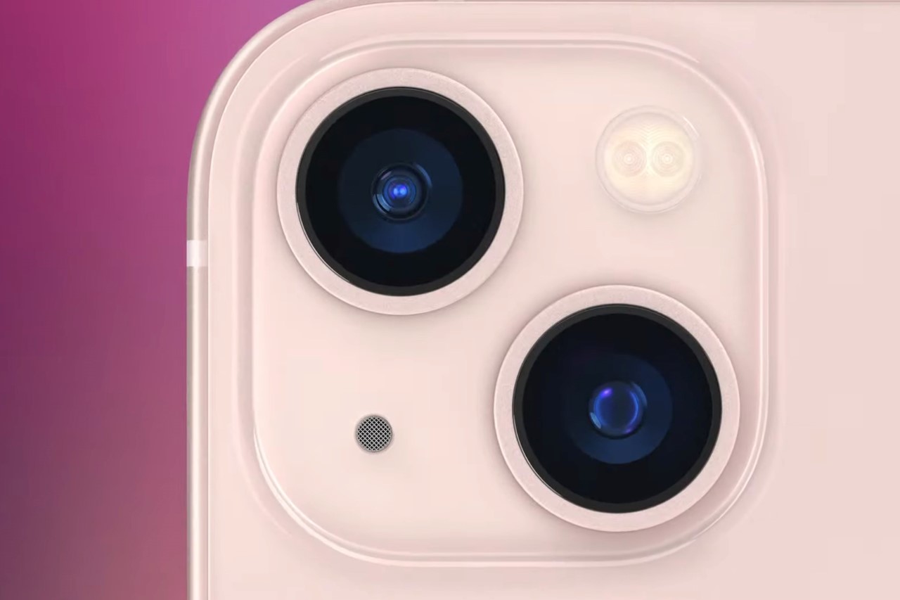
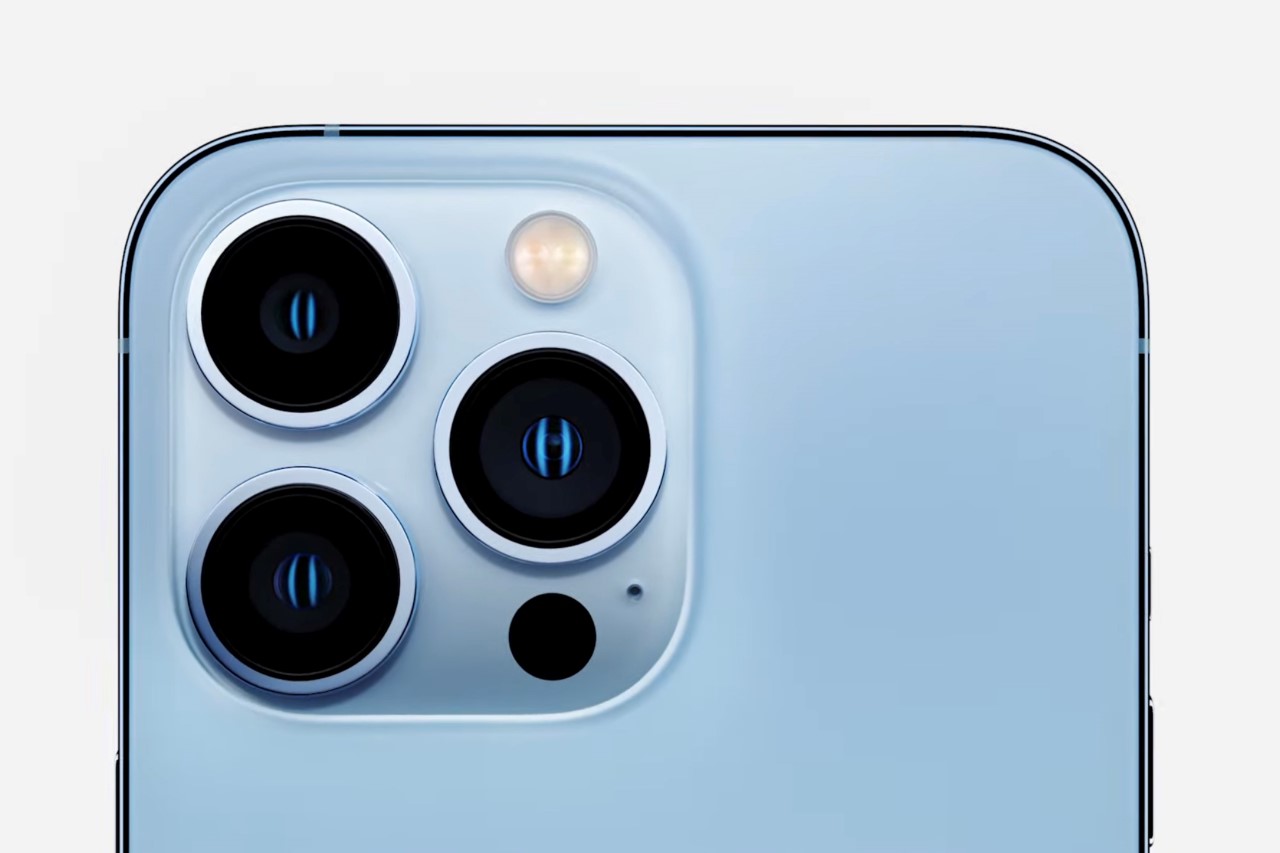
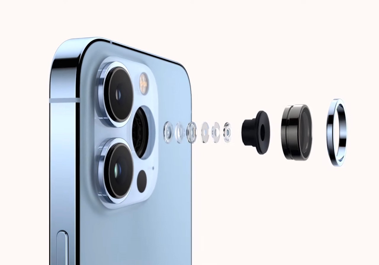
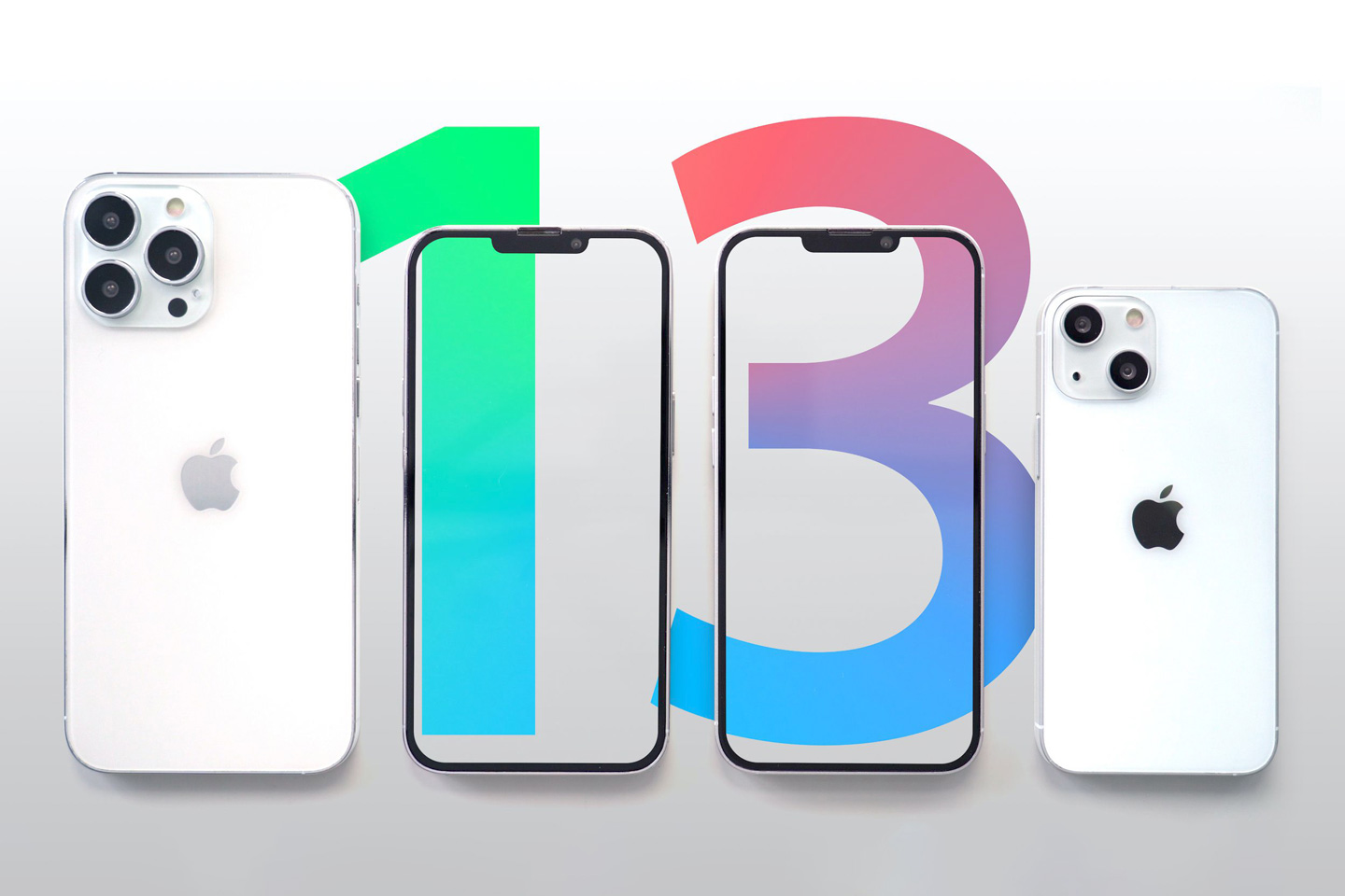
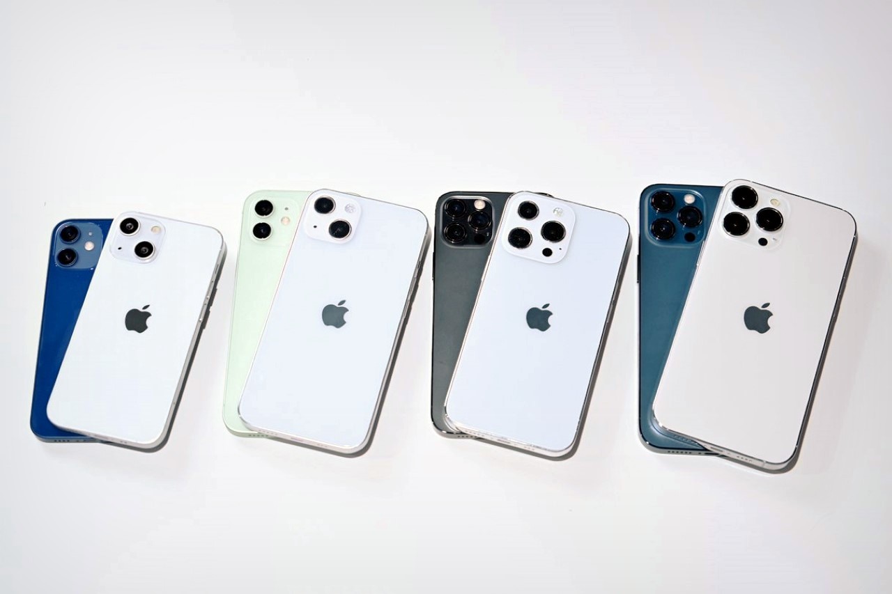
What just about visually sets the iPhone 13 and 13 Mini apart from last year’s iPhone 12 and 12 Mini is the marginally smaller notch (although a 20% size reduction isn’t really enough to make a difference), and the new camera layout on the back. The new diagonal layout, Apple claims, adds more space between the two lenses, allowing the internal sensors to be bigger. It’s enough to make this year’s iPhone 13 camera as good as last year’s 12 Pro. Pretty cool, but it isn’t unexpected to see cameras get better every year.

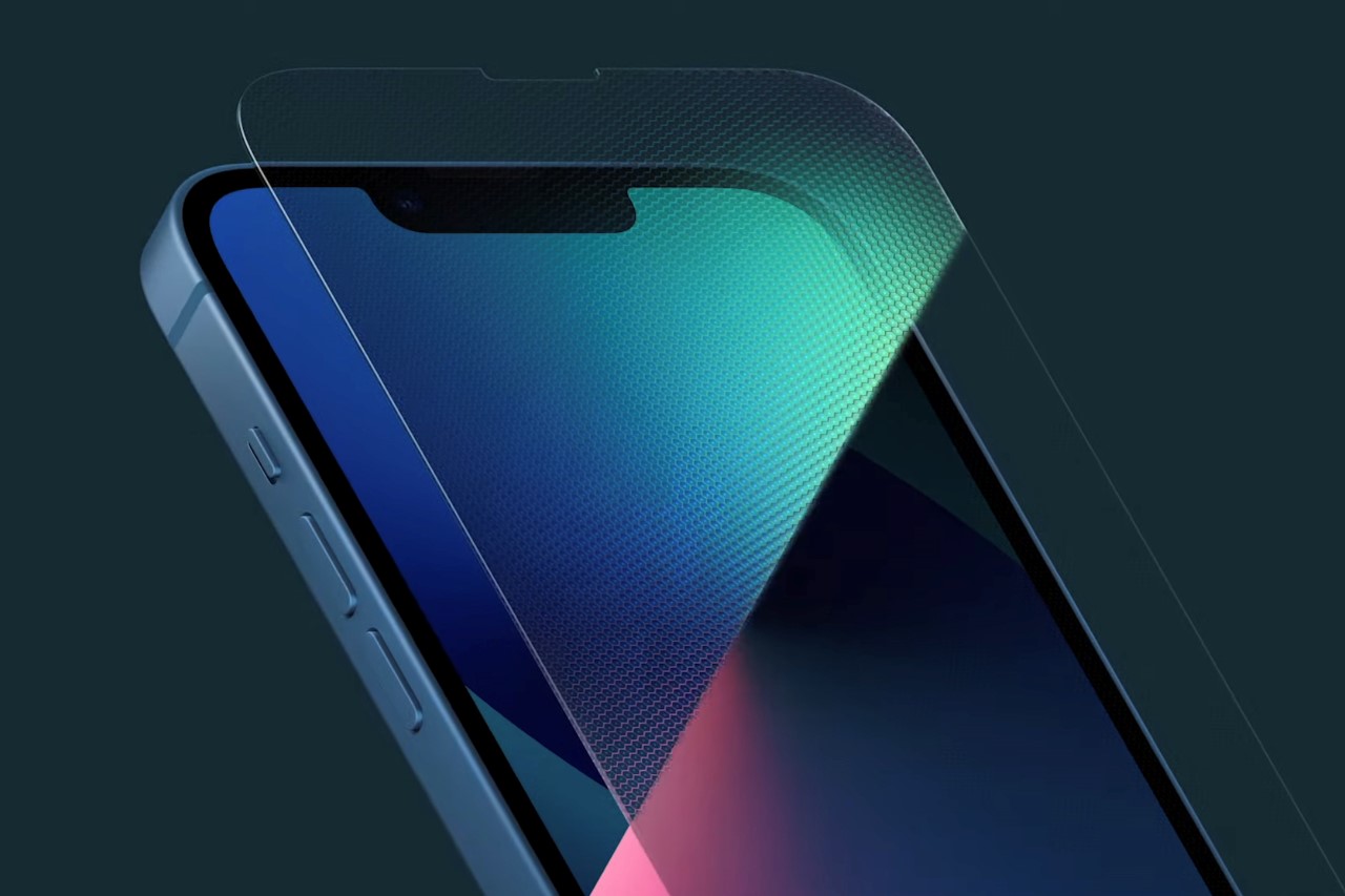
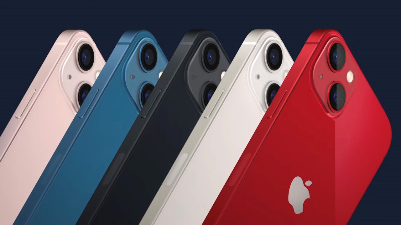
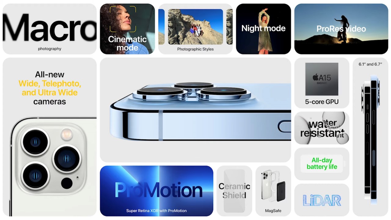
The new iPhone 13 and 13 Mini run on the A15 bionic chip, come with a slightly larger battery, and house a stronger Ceramic-Shield glass on the front. The antenna strips on the side of the phone use recycled plastic (from single-use bottles) along with recycled rare earth magnets, tungsten, gold, and other materials used in the phone. Like their predecessors, they support 5G and MagSafe, are available in 5 colors, and will ship without a charger.

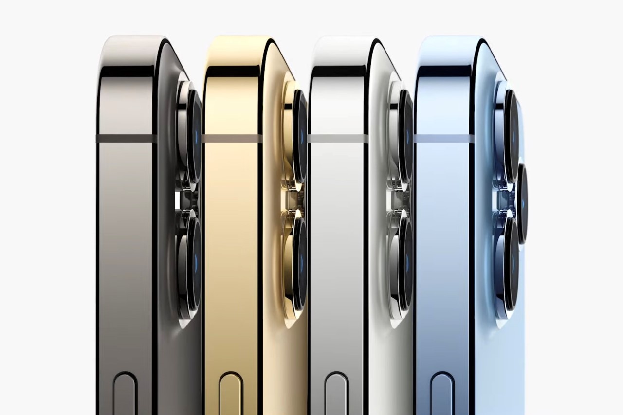
The iPhone 13 and 13 Mini are accompanied by the 13 Pro and 13 Pro Max, which come with the same shimmering stainless steel body and glass front and back. The front sports the smaller notch, while the back looks exactly the same. The Pro series come with 3 lenses, although Apple claims they’ve made major changes to all three of them, giving all of them Night Mode and the ability to shoot incredible shots no matter the lighting. A notable upgrade to the iPhone’s camera capabilities is the addition of Macro photography, which lets you now zoom in on really small subjects to capture tinier details.

The new cameras on the 13 and 13 Pro editions also support a rather interesting video feature called Cinematic Mode – which allows the camera to automatically and intelligently shift focus from subject to subject while you’re taking a video, just like in Hollywood films. Here’s a quirky little short film they shot entirely on the iPhone to show the Cinematic Mode in action.

Ultimately, the iPhone 13 and 13 Pro aren’t as game-changing as one would expect, although I partly blame us consumers for having such lofty standards each year. Yes, they’re incrementally better (as they absolutely should be), but not in a way that’s directly measurable… or warranting of an upgrade (unless you absolutely need it). If you’re looking at your iPhone 12 and wondering whether to line up outside the Apple Store for an upgrade, I’d tell you to sit this one out. Apart from a slightly smaller notch, you’re really not missing much; and if you want longer battery life, perhaps a $99 MagSafe battery pack could solve your woes?

Designer: Apple

The new Apple iPhone 13 may ‘connect directly to satellites’, allowing you to get cellular coverage even in remote areas

Steve Jobs was famous for disrupting industries. He started with computers, then music, then cellphones, and finally revolutionized the digital marketplace with the app store… Cook continued that legacy by further disrupting watches, and then conveniently reimagining payments, through the newly launched Apple Card. Seems like the iPhone 13 is set to disrupt connectivity as we know it, being one of the first consumer-grade phones to have direct satellite connectivity.

The news comes as a rumor from renowned analyst, Ming-Chi Kuo. While it’s common to make predictions only to have them fall slightly short, Kuo’s analyses and ‘leaks’ have an incredibly high success rate… and the veteran analyst just dropped a big bomb-shell a few hours ago – that the latest iPhone might have the ability to make satellite calls.

In a note to investors, Kuo made claims that the new iPhone would be able to connect directly with Low Earth Orbit (LEO) satellites thanks to a customized Qualcomm X60 baseband chip. Low Earth Orbit satellites recently gained popularity, thanks to Elon Musk’s efforts with his Starlink project – an initiative to flood the lower atmosphere with satellites that would provide internet to all corners of the globe. Operating at a level much closer to earth than traditional satellites, LEOs tend to avoid some of the more common pitfalls of satellite internet, like high latency, and frequent blackouts. Starlink is one of many companies launching these LEO satellites into space, and Kuo hints that the Qualcomm X60 chip in the iPhone 13 may just support some form of satellite connectivity. In layman’s terms, this would translate to better 5G coverage in areas that may not have the 5G towers or infrastructure… or even 3G or 4G connectivity for that matter. Sounds interesting, although my doubt remains… how much more expensive would this connectivity-feature be?

Featured Image via MacRumors

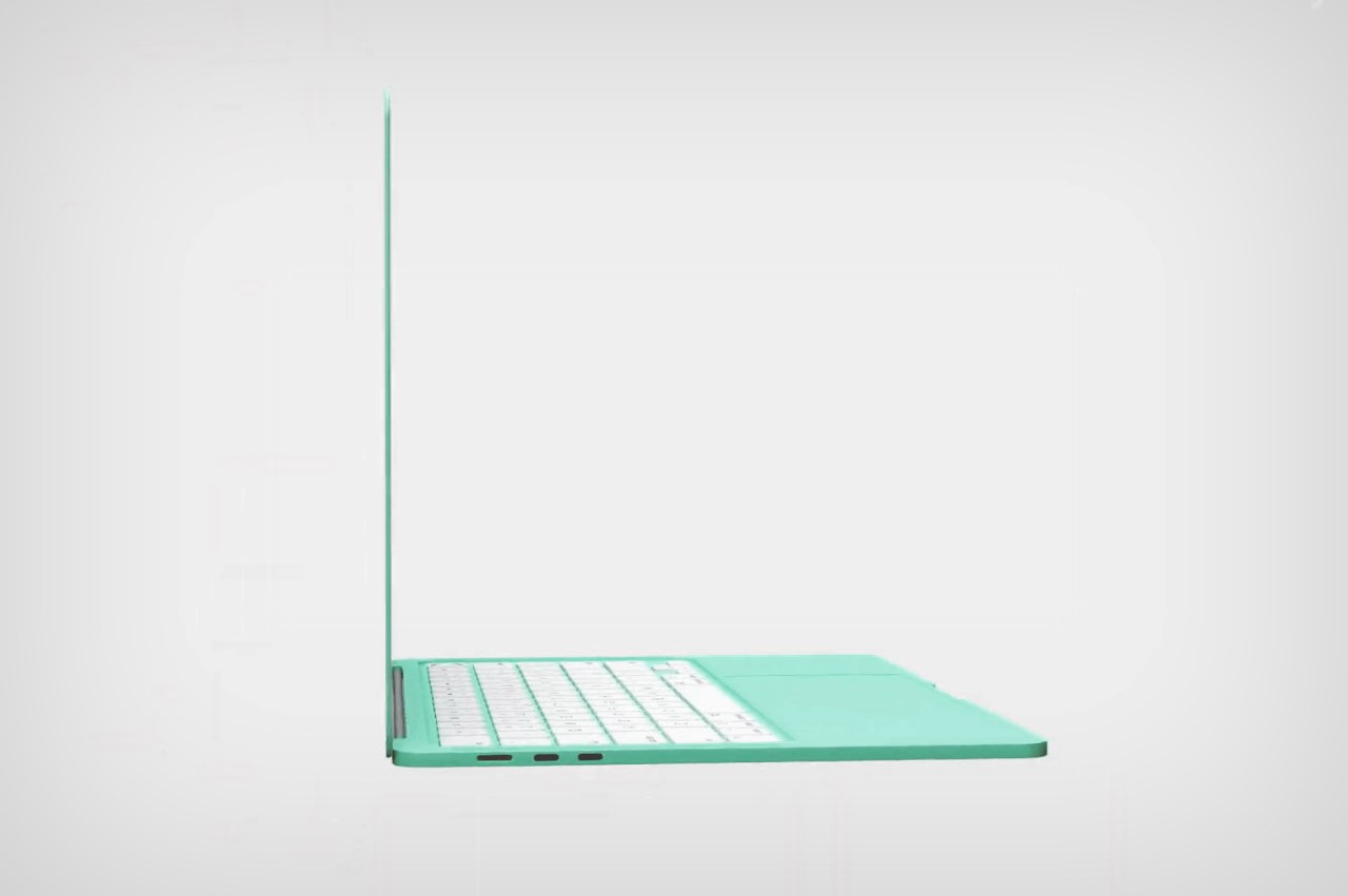
Could the Apple MacBook Air 2021 finally come in the iMac’s candy colors?


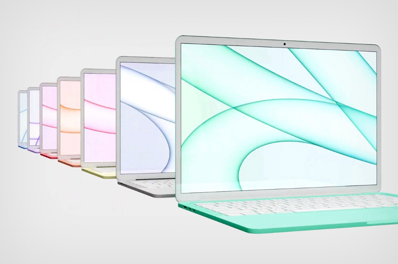
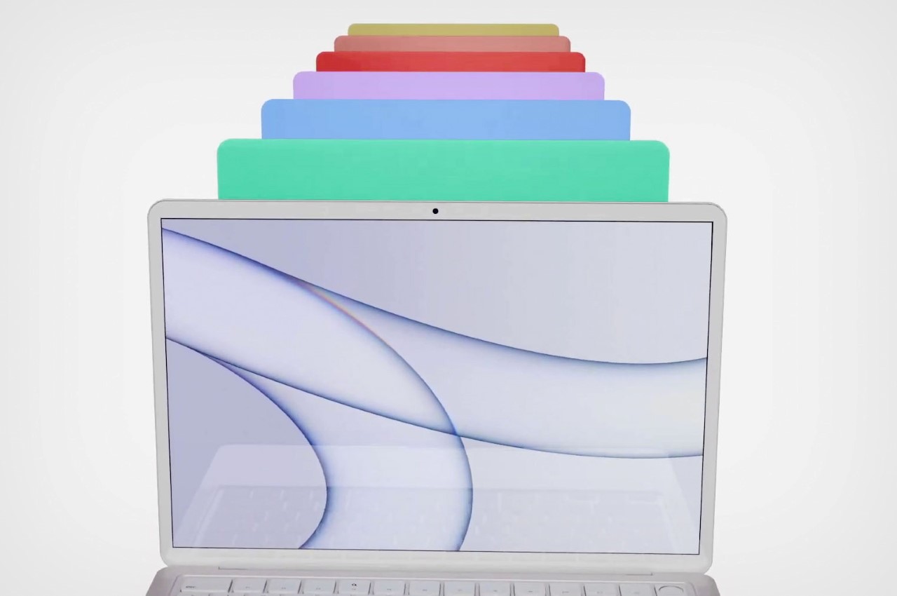
After the iMac got a refurbish this year at Apple’s Spring Loaded event, with a new slim 11.5-millimeter design, an M1 architecture, and those beautiful candy colors, it only seems natural that Apple carry that approach to its other Macs. Designer and visualizer, Devam Jangra’s put together a view to show us what candy-colored MacBook Airs could look like, and I won’t lie… I really like it!

If the colorful iMacs were a hat-tip to the candy-colored iMac G3 computers from 1998, these vibrant MacBook Airs most certainly pay a tribute to the old iBook G3s from 1999. It’s certainly been a while since Apple’s experimented with colored laptops – their latest foray was 6 years ago, with the rose-gold MacBook Air. Jangra’s concept video definitely shows why Apple should be less reticent and more open to creating colorful MacBooks… they spark joy, don’t they?!

Rumors of colored MacBooks have been in the air for a little over a month now. In a video back in May, famed leaker Jon Prosser stated that the company would reveal a MacBook lineup “very close if not identical to the shades that you see on the stands for the new 24-inch iMacs.”

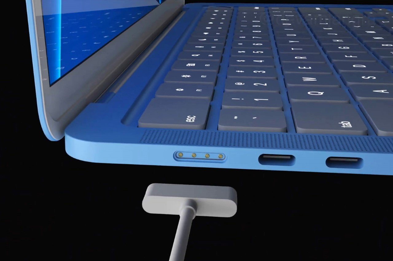
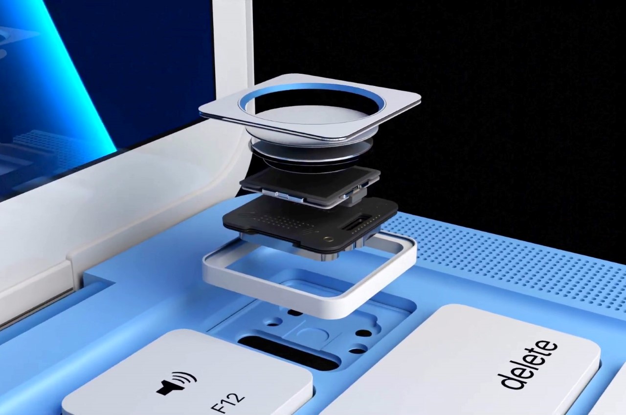
Another noteworthy feature that’s rumored to make a comeback apart from the candy colors, is MagSafe charging. Apple ditched the crowd-favorite technology a few years back for Thunderbolt charging, but if the leaks are credible, the wildly loved snap-on magnetic charging port is due to make a comeback. Jangra’s video showcases this too, while also putting two USB-C ports beside the charging port for good measure. The MacBook Air even comes with the iMac Keyboard-inspired TouchID key on the top right corner.

There’s really no saying if and when Apple would launch these. While the rumors DO come from credible sources, we’ve already had 3 Apple keynotes this year, and the only one left is the keynote in September/October, when Apple unveils their new iPhones, AirPods, and the Watch. That being said, maybe we could see this debut sometime next year, along with Apple’s highly anticipated M2 chip! I wouldn’t mind me some candy-colored iPads too!

Designer: Devam Jangra

Click below to read more!

Get the iMac-style workflow on your iPad Pro with Brydge’s standalone trackpad for iPadOS

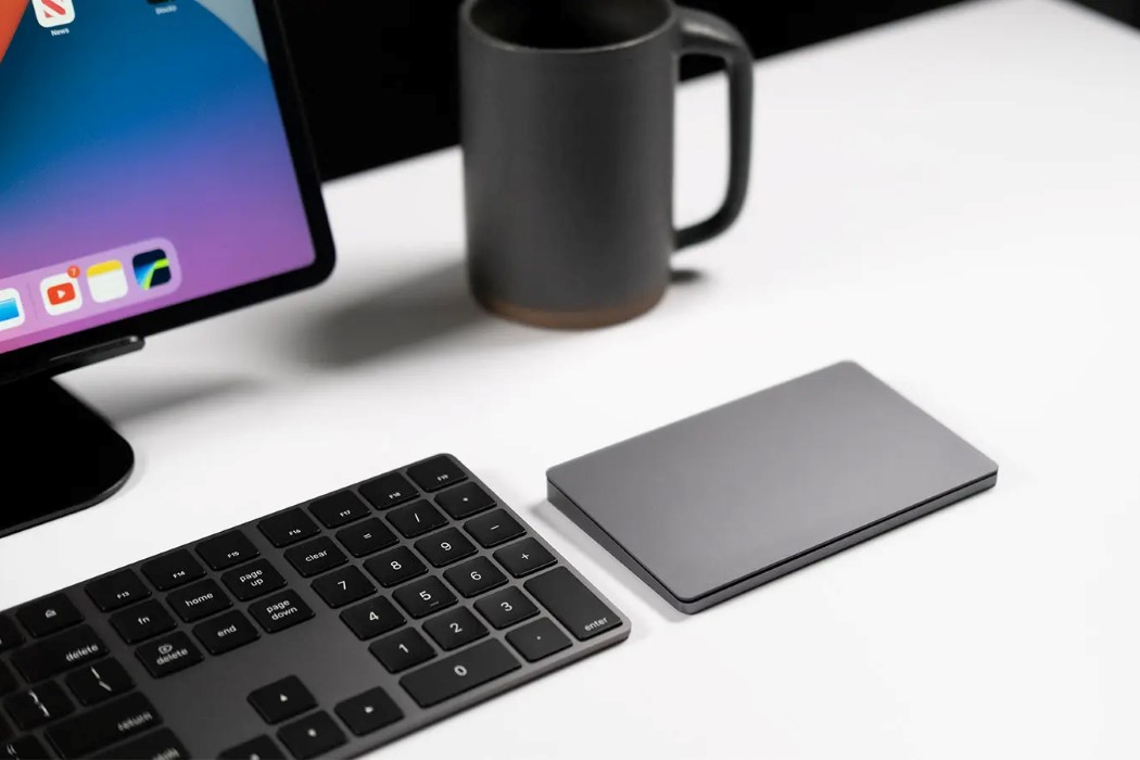
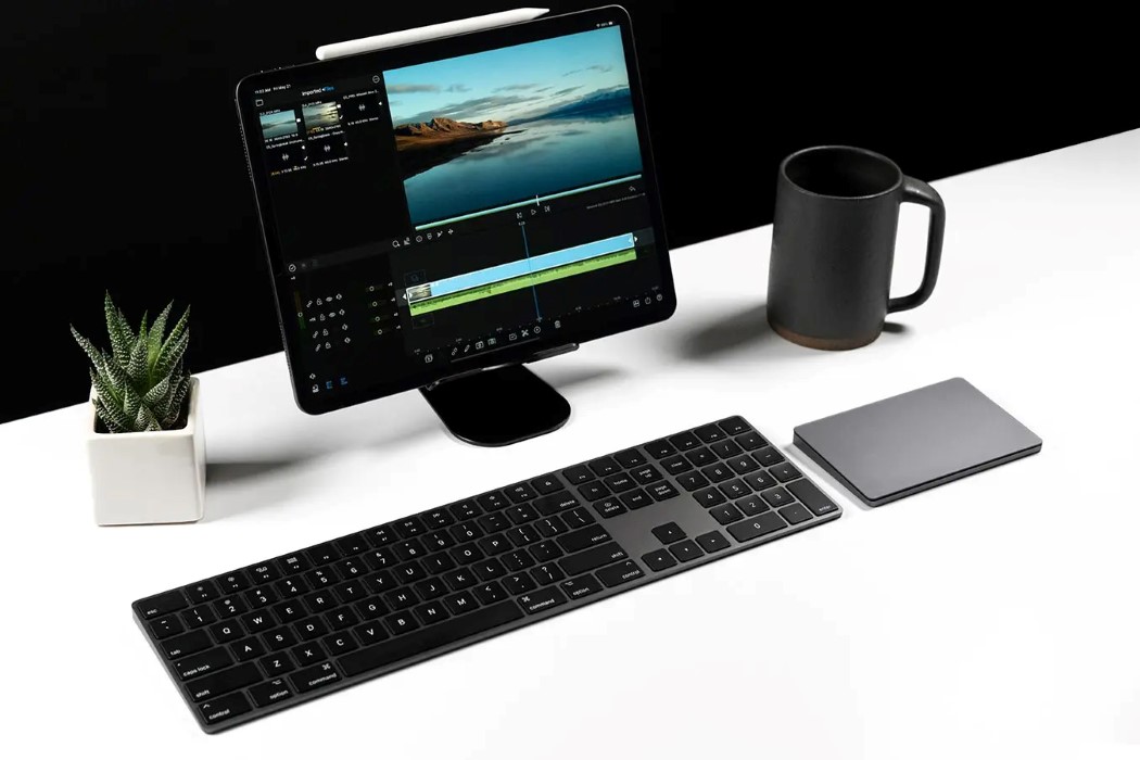
Your M1 iPad Pro is as good as an iMac… Brydge’s iTrack trackpad brings iMac-style functionality to it. Up until last month, Apple marketed the iPad as a laptop replacement, however that perception changed when the iPad was introduced alongside the iMac at Apple’s SpringLoaded event at the end of April, both with Apple’s supercharged M1 chip. The iPad is more than just a laptop now, it’s a machine with more processing power than most machines with Intel chips, and its graphical power is comparable to high-end gaming consoles. In short, it looks and behaves like an iMac with a touchscreen, so it just made sense to bring the iMac’s accessories to it too.

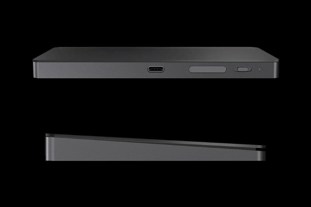
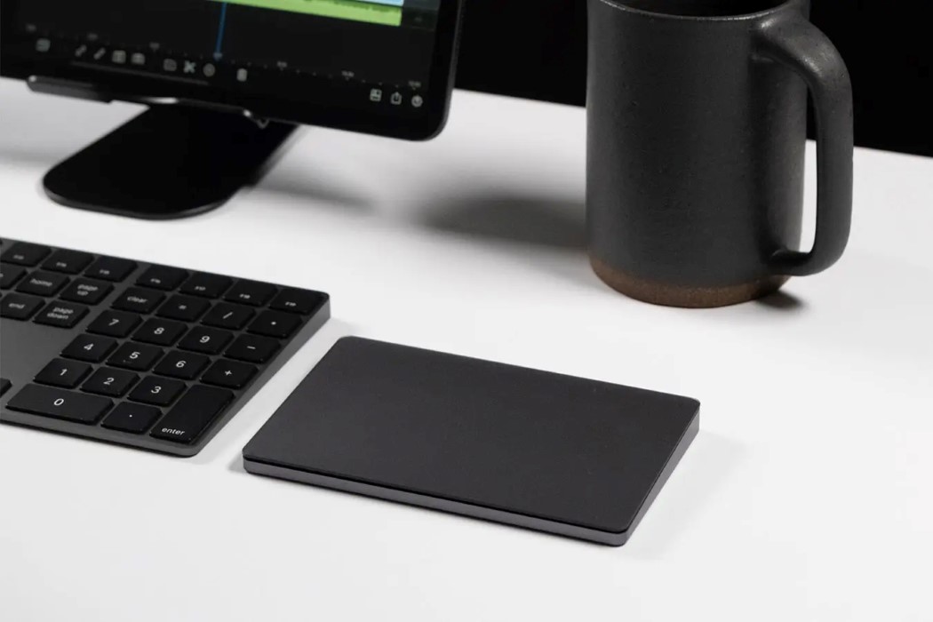
The iTrack comes from the fine folks at Brydge, who’ve developed some of the best accessories for Apple products over the years (they released a keyboard+trackpad attachment for the iPad before Apple did). Debuted at CES back in 2020, the iTrack (which officially launched just last week) is a compact multi-touch trackpad that’s designed to give your iPad workflow a significant upgrade. Styled to look just like Apple’s own Magic Trackpad 2, the iTrack is much smaller (with a 6.1-inch diagonal) and sports the same space-grey aluminum body and touch-sensitive glass top.

Designed to work seamlessly with iPadOS (versions 14.5 and higher), the iTrack automatically and instantly connects with your tablet via Bluetooth, providing an experience as seamless as Apple’s own trackpad. Sensors within the device detect subtle pressure differences that let you tap, scroll, swipe, and use other multi-touch features on your iPad Pro. Just like a Trackpad or a Magic Mouse, you can work within programs, intuitively select and edit text and spreadsheets, and switch between apps… besides, the iTrack even works seamlessly with other connected accessories like a keyboard or Apple Pencil, complementing most workflows.

The iTrack debuted back in 2020, but its launch wasn’t until last week, owing to delays because of the pandemic. It ships for $99.99 (that’s $20 cheaper than Apple’s Magic Trackpad 2), has a USB-C port for charging, and boasts of an impressive 6-month battery life on a full charge, with 2-hours of use every day.

Designer: Brydge

Unusual iPhone 14 (2022) render shows a smartphone with an L-shaped secondary display


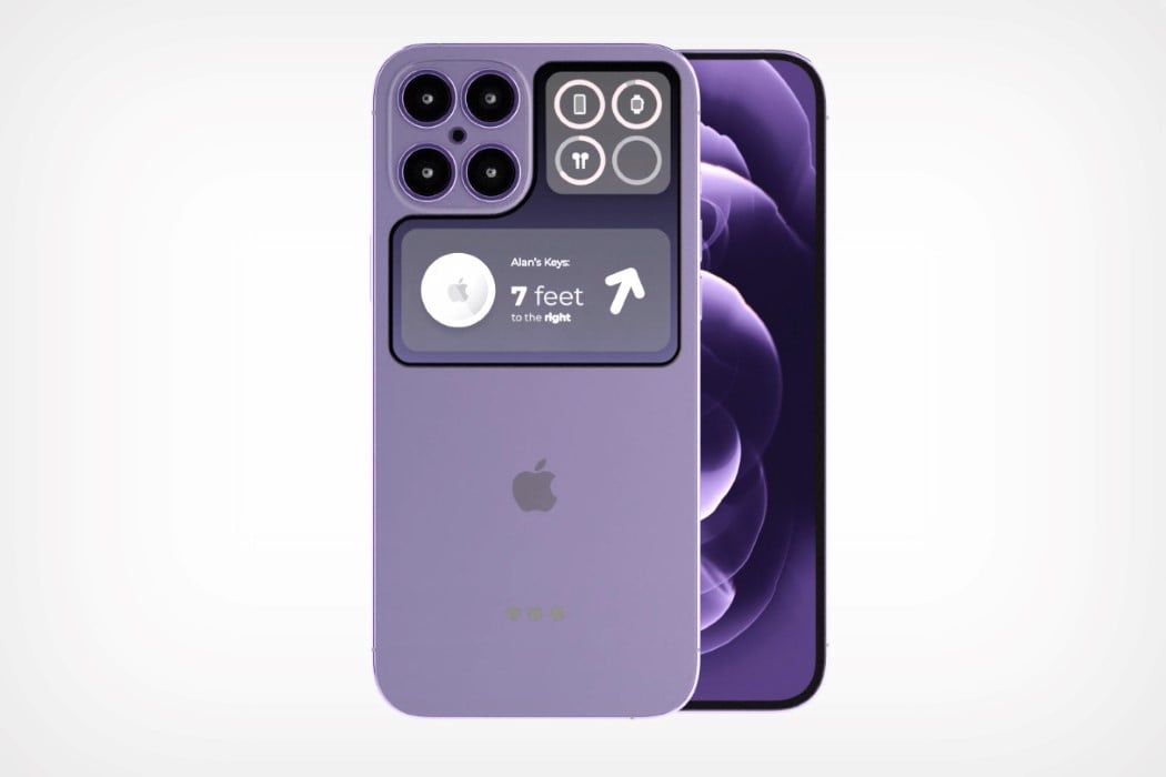
What happens inside Apple’s design studio remains one of the world’s most closely guarded secrets… it’s bad for consumers (because they’re often taken by surprise), but it’s great for concept designers who get tonnes of leeway when it comes to making experimental versions of their favorite gadgets. Meet the iPhone 14 concept from the mind of Max Burgos – for the most part, it looks just like a normal iPhone, except for the unique secondary display located on the back, wrapping around the camera module.

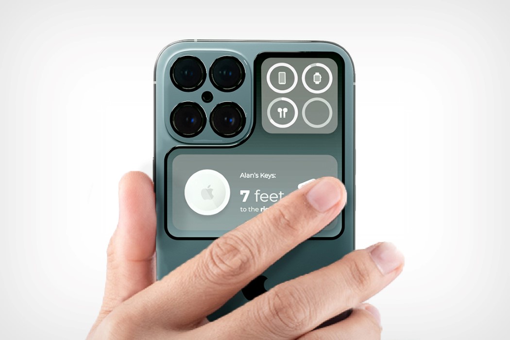
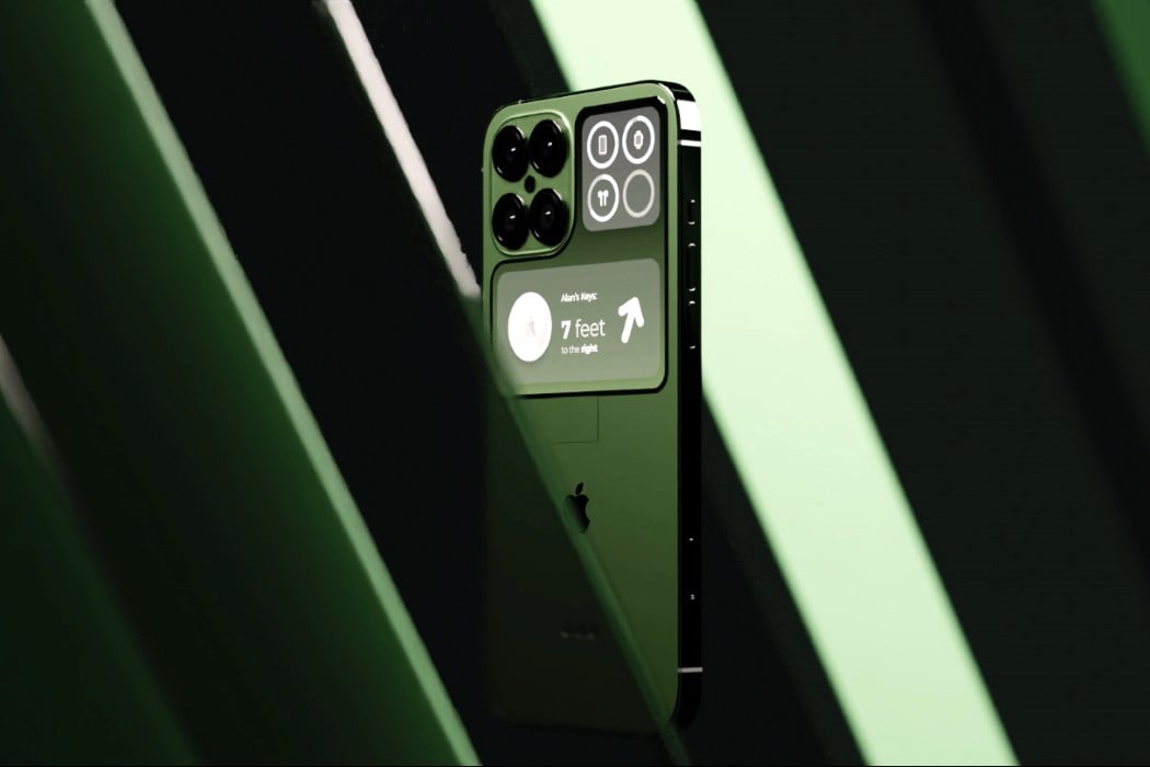
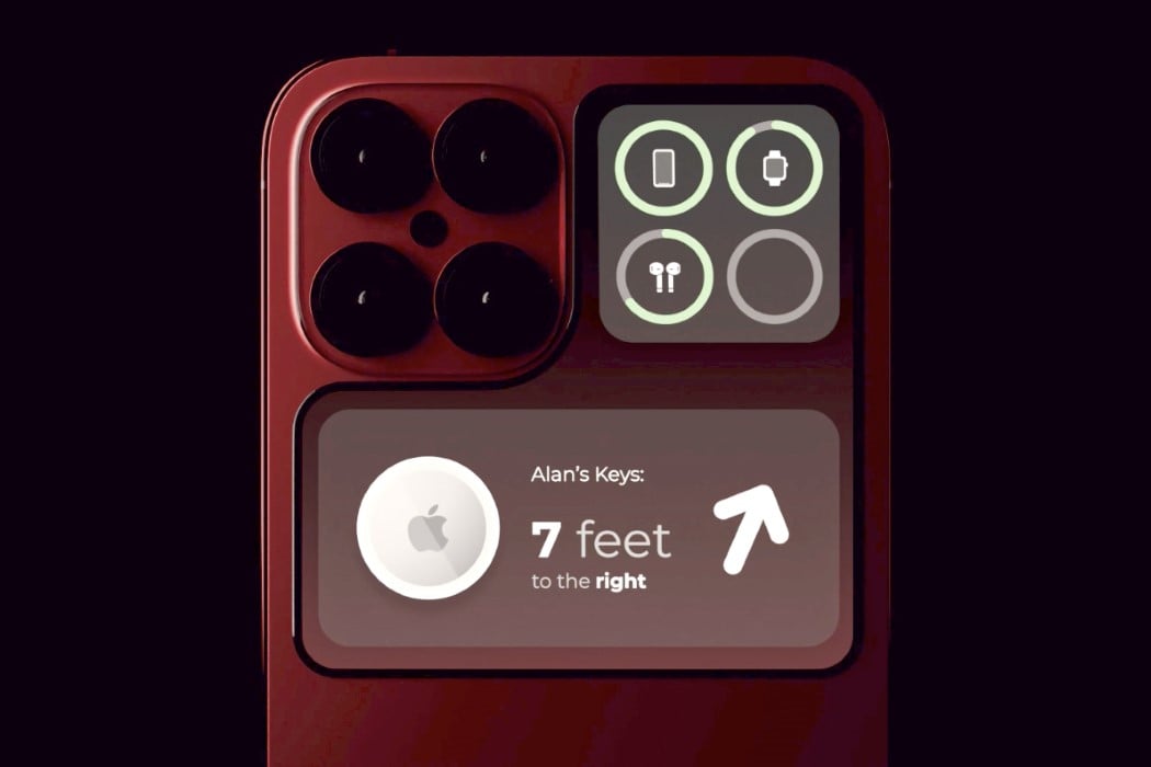
The iPhone 14 concept shows the unique symbiotic relationship displays have with cameras. On the front, the camera results in a notched display, on the back, however, the camera causes the display to take on an L-shaped design! As unusual as this secondary display may be, it actually serves as a way to reinforce Apple’s app ecosystem – here’s how. The secondary display could be prime real estate for interacting with Apple’s OWN apps. Apple’s clock would show up on the back, iMessage notifications could pop up on the screen, and it could even serve as a dashboard for AirTag tracking. The L shape provides a lot of freedom as far as interfaces go – Burgos even demonstrates how a rear-facing camera app would look, allowing you to click wide-angle selfies using the iPhone’s main camera!

While entirely conceptual (the iPhone 14 isn’t due for another 16 months), Max Burgos’ iPhone 14 exists as a fan-made design that reinforces HIS OWN wants and aspirations from an iPhone. It’s rare that the execs at Apple ever reach out for customer feedback, so these concepts are perhaps the only way in which consumers can actually express interest in new features or visual details. I’d even throw a 3.5mm jack into the concept, just for kicks!

Designer: Max Burgos Morjaen for ConceptsiPhone

Is Apple relaunching the iPod on its 20th Anniversary this year? Here’s why it could be a smart idea…

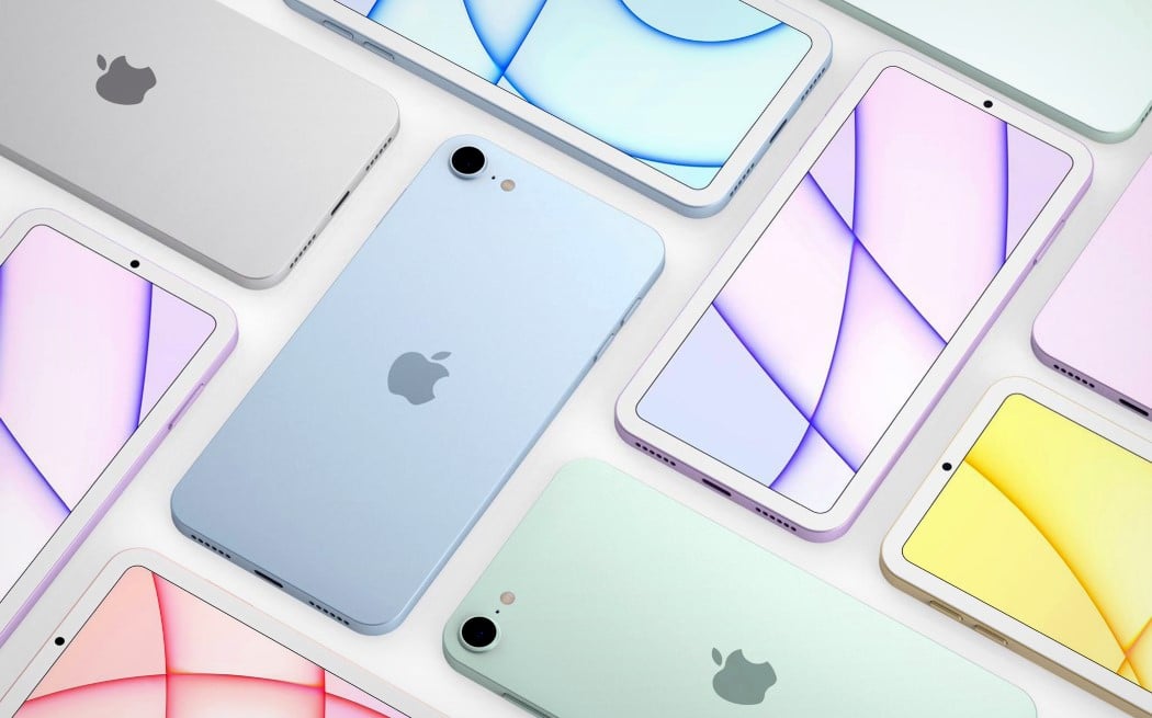
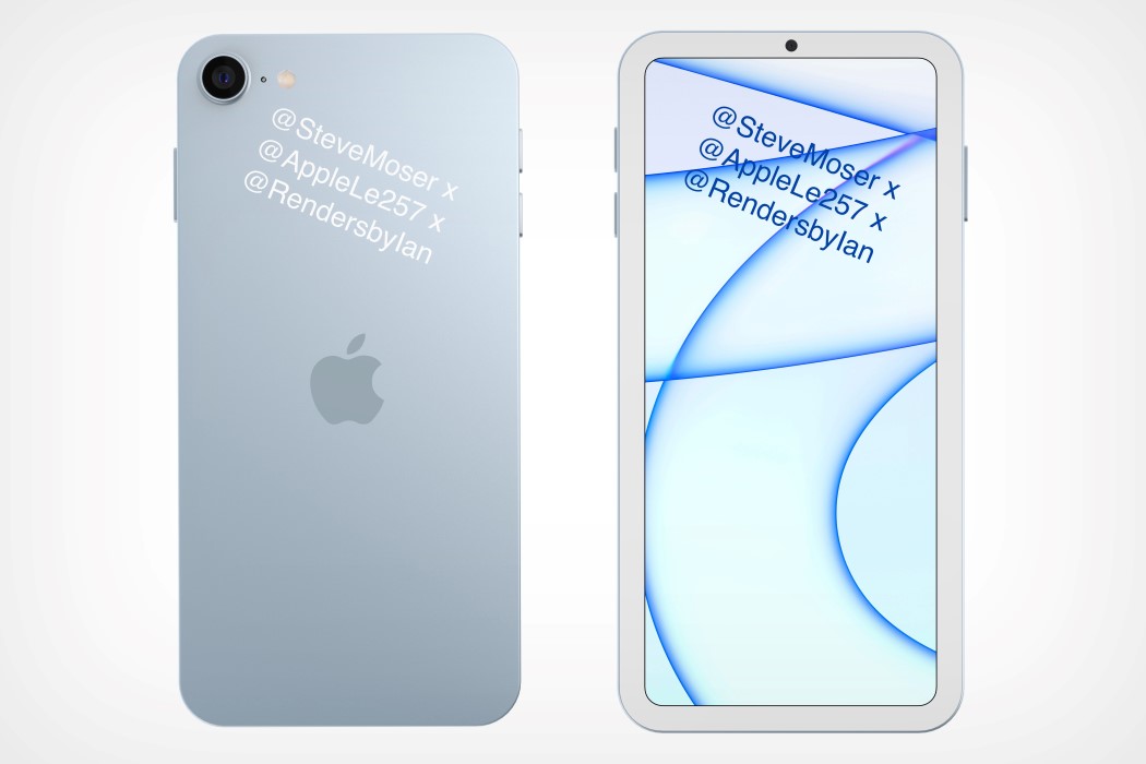
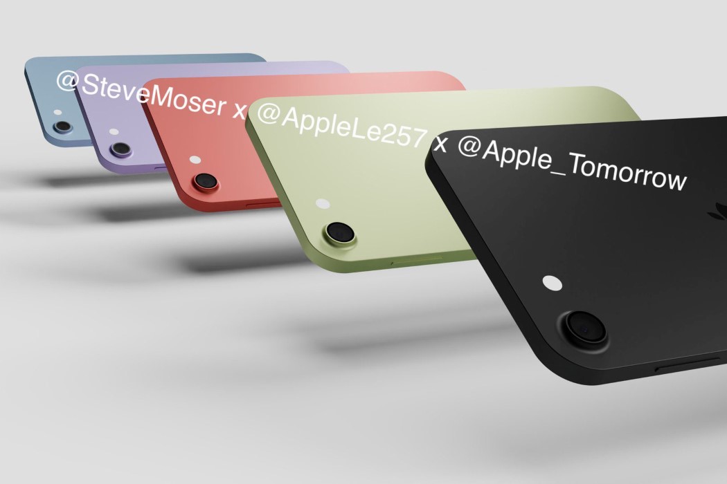
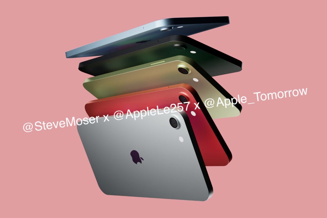
Four words – Lossless Audio, and Apple Arcade. These four words could just as easily the new iPod’s design brief. The Twitter rumor-mill’s working on overdrive after a few sources claimed that Apple could announce a new iPod this fall. A few designers even went so far as to create renders based on hearsay and leaks, and I’m absolutely here for it. A new iPod could be a pretty nifty product for a variety of reasons. Here are my thoughts.

Only last week Apple announced that lossless audio was coming to Apple Music. With a new iPod, it’ll be like Apple going into the music-streaming war guns-a-blazing. Spotify’s slowly but surely dominated this space, and the new iPod could almost be Apple signaling that it’s taking the music domain pretty seriously. The iPod could drum up major interest the same way the Moto RAZR did – nostalgia is a powerful force. Moreover, the hardware would be no different from the iPhone 5 or the iPhone SE, given that the renders look pretty much exactly like those devices.

Secondly, the new iPod has the ability to become Apple’s gateway device for a variety of iOS features (and probably even MagSafe, who knows). Kids could use it for listening to music, but could also potentially use the iMessage service on it. The iPod could leverage the power of Apple Arcade too, becoming a very affordable device that parents would buy for their kids in a heartbeat, tying them into the Apple ecosystem at an early age. The iPod has always been an impulse purchase (as opposed to the iPhone)… reissuing the gadget on its 20th anniversary absolutely makes a world of sense!!

Image Credits: Steve Moser, AppleLe257, and Apple_Tomorrow

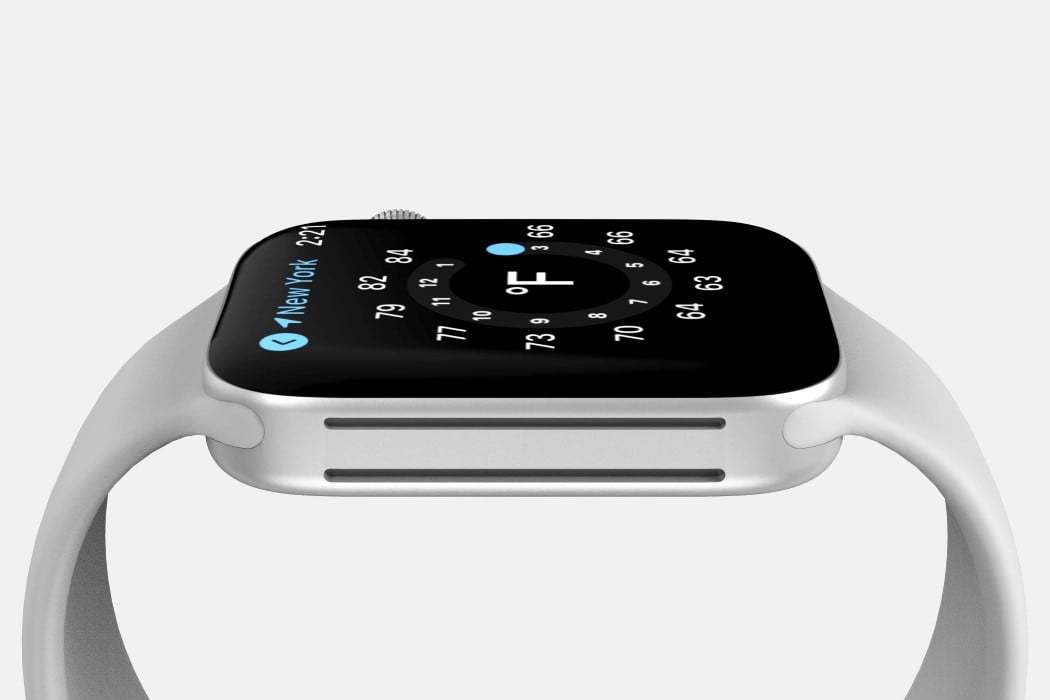
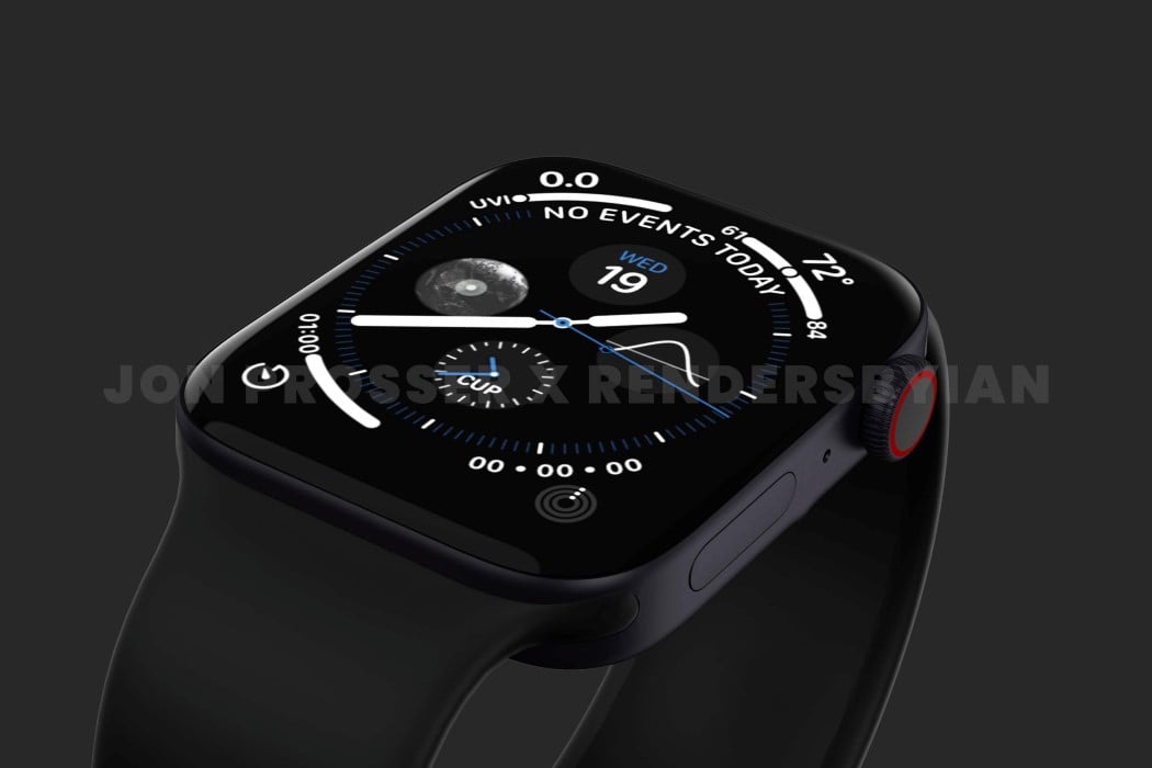
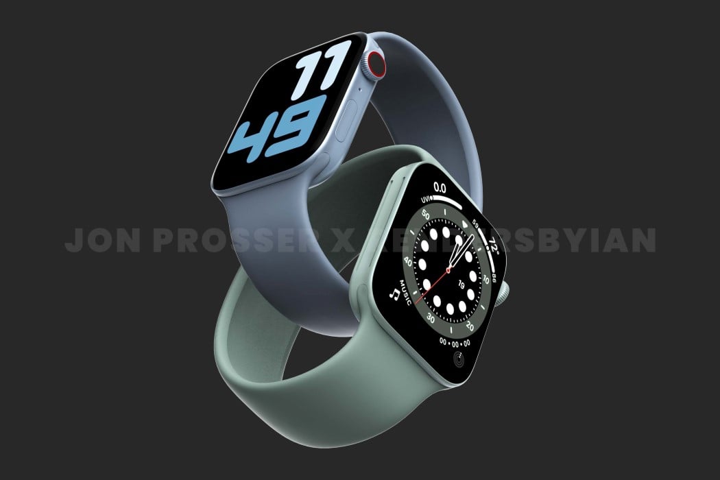
Is this the new Apple Watch Series 7? First-look renders show a flat-edge design inspired by the iPhone 12


I was today years old when I learned that the Apple Watch is the most popular watch in the world, overtaking Rolex to gain that title. Anyway, now that we have that tidbit aside, famed tech-leaker Jon Prosser is alleging that the world’s most popular watch is getting a redesign. Currently in its 6th series, the Apple Watch has seen only two major redesigns (with the second arguably boasting of a screen with thinner bezels) but it seems like the Cupertino-giant has giant plans for the 7th edition of its popular smartwatch… and it involves homogenizing its design to fit in with the iPhone and iPad’s form language.
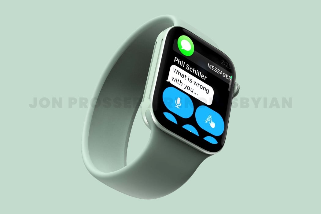
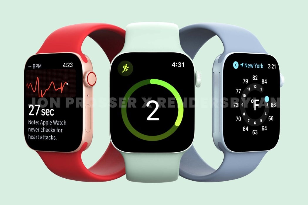
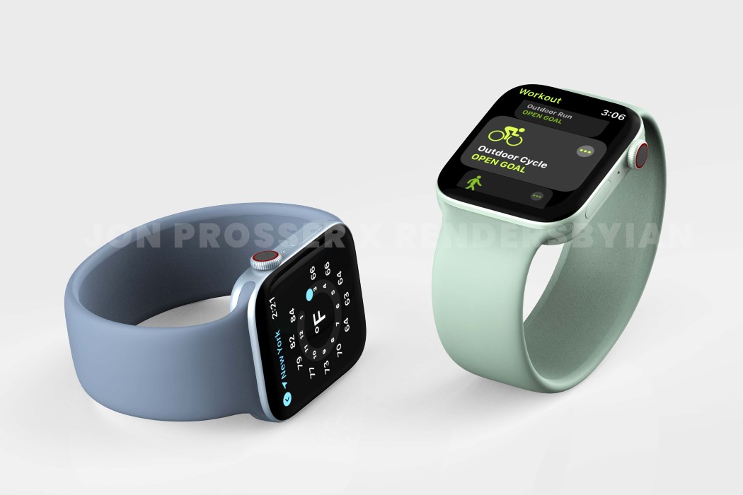
The rumor-mill of a new Apple Watch started back in 2020 when prominent Apple Analyst Ming-Chi Kuo hinted that a new design was in the works and could drop as soon as 2021. Now that we’re well into the year 2021, Prosser’s collaborated with Ian Zelbo to bring rumors and leaks to life in the form of pretty life-like renders. The renders are based on real images and CAD-file screenshots supplied to Prosser by his network of sources. In order to protect the sources yet still share the designs with everyone, Prosser and Ian created these renders to show us exactly what they saw, and it seems like Apple is really beginning to streamline their design language. The ‘magical slab of glass’ analogy seemed to work really well for the iPad and its flat-edge design language finally carried onto the iPhone 12 last year and the iMac this year. According to the renders, the Apple Watch is getting a similar design upgrade with flat sides as opposed to the rounded ones, giving its screen a larger-than-life presence with minimal bezel interference.

It’s worth noting that these renders do come with some caveats. For starters, they’re literally just renders. Prosser couldn’t get his hands on a spec sheet, so we don’t have any idea what’s on the inside of the watch and if there are any new sensors or features. In fact, the watches go by codenames in the supply line too, so for all we know, this might not necessarily even be the Apple Watch Series 7 but rather an incredibly early look at Series 8! One thing that definitely stands out is the Watch 7’s new color-schemes, especially that rather soothing moss green color that doesn’t just exist on the strap, it’s present on the anodized metal body too (iMac 2021 much?) I wonder if Apple’s planning on releasing an iPhone 12-style purple variant too.

Image Credits: Jon Prosser and Ian Zelbo