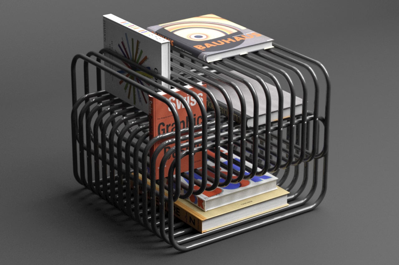
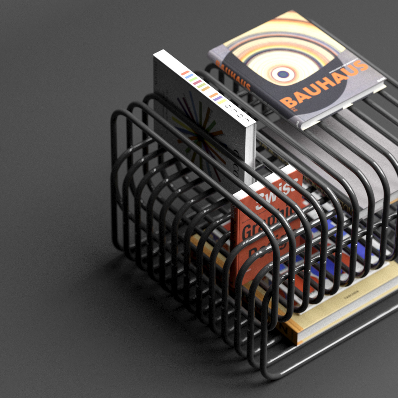
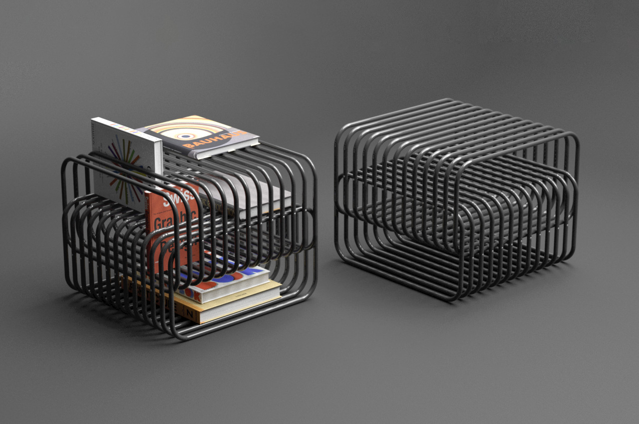
We’ve seen an almost endless train of design ideas for furniture, ranging from shelves to chairs to tables. The latter even come in different types, functioning as dining tables, work desks, or anything in between. Although table designs can vary greatly, the one thing that they all have in common is a solid and whole surface to place things on top of them. This is true for almost any piece of furniture as well since there always needs to be a flat surface to hold things or bodies. That’s the kind of standard design that this magazine rack and side table in one throws out the window, utilizing two intersecting groups of tubes to hold up books and magazines in an almost illusion-like manner.
Designer: Deniz Aktay
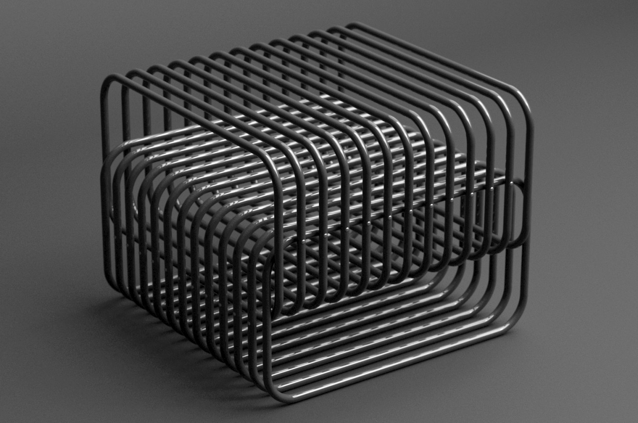
Although we rely on them critically, it’s almost too easy to trick our brains and our eyes with optical illusions and crafty designs. Logic would tell us that slipping a book into a slot like a grill would let the book fall without something to stop it. That “something,” however, doesn’t need to be the ground or a flat surface, just like what this Interspace magazine rack design concept tries to demonstrate.
The rather confusing piece of furniture is actually made of two groups, both of them a row of steel tubes bent to form a loop. Normally, if you put anything in the space between tubes, it would fall down to the opposite side. The trick that Interspace uses is to connect the two groups perpendicularly to each other while also leaving a small gap in the middle where the bottom of one extends beyond the top of the other or vice-versa.
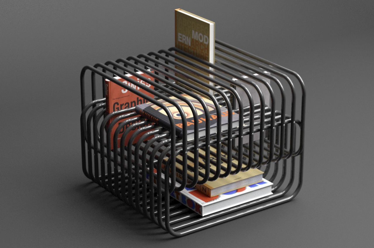
This creates a sort of natural “stopper” for anything that goes in between the gap since the intersecting tubes below it serve as the “floor” for the item. This works whether inserting the book from the top or from the side. The empty areas formed at the top and bottom of the structure also become spaces for reading materials that might be too thick for the grill. Because of the intersecting design of the tubes, arranging books can become almost like a puzzle, where you decide the best place for them in between the gaps.
The curious form of steel tubes intersecting with one another also creates a rather curious visual, almost to the point that it could confuse the eyes because of the play of form, light, and shadows. The top surface of the rack can also serve as a side table, admittedly for larger objects that don’t risk falling into the gaps. You could, theoretically, also put your drink on top, though it’s probably best to have some tray in between for good measure.
The post Magazine rack concept defies common sense with intersecting tubes to hold your books first appeared on Yanko Design.


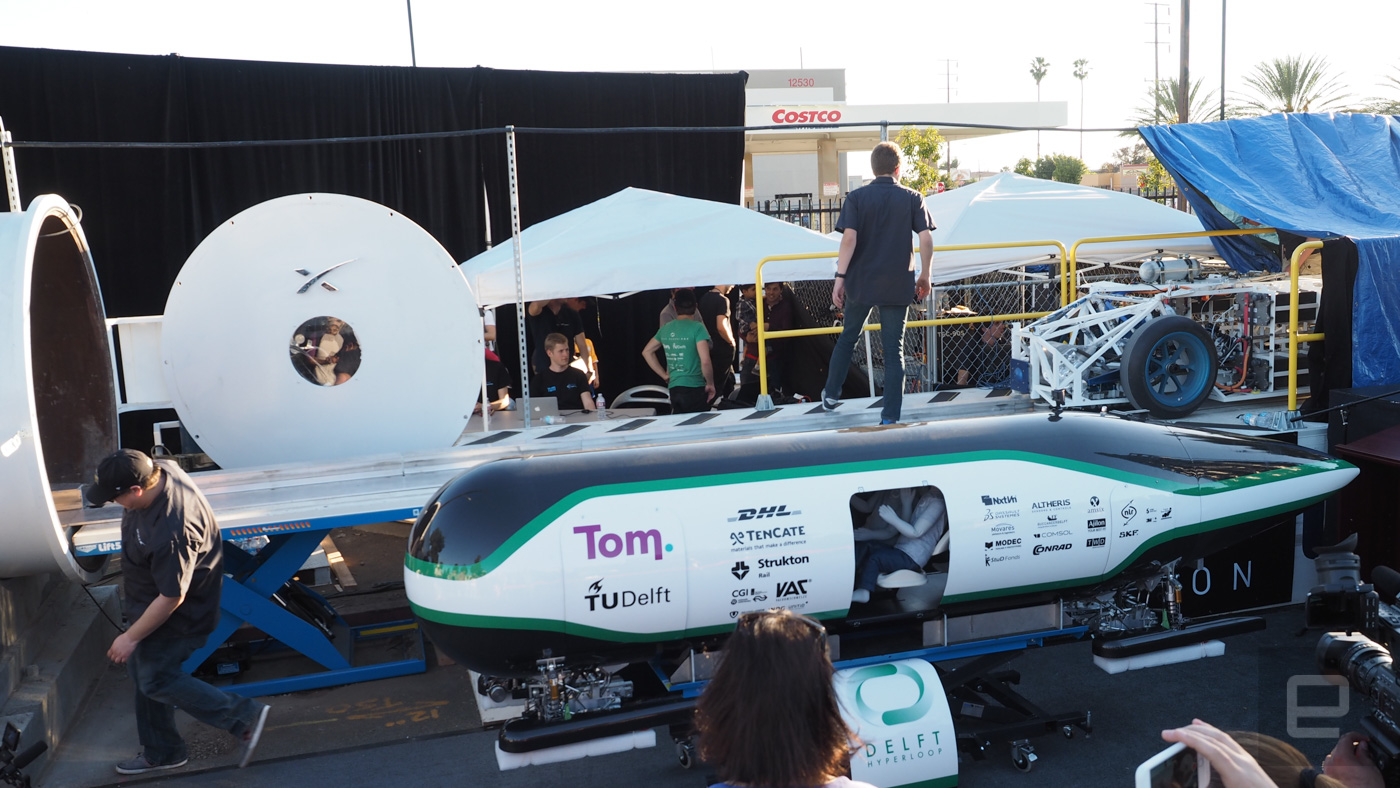 Last Sunday 27 teams brought their completed Hyperloop pods to SpaceX's headquarters in Southern California hoping to get time in the vacuum-sealed track. After a battery of tests by the judges, only three of the vehicles were deemed worthy of the tu...


