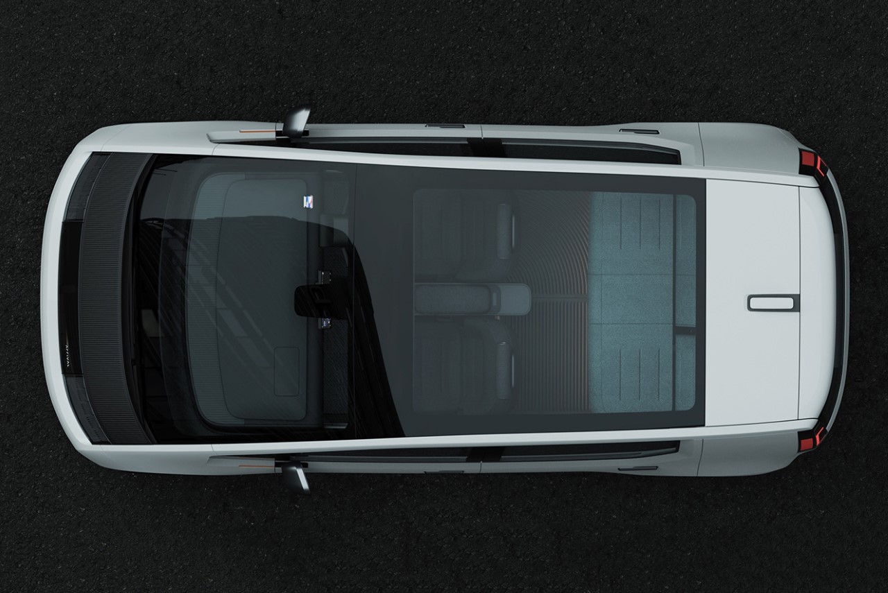
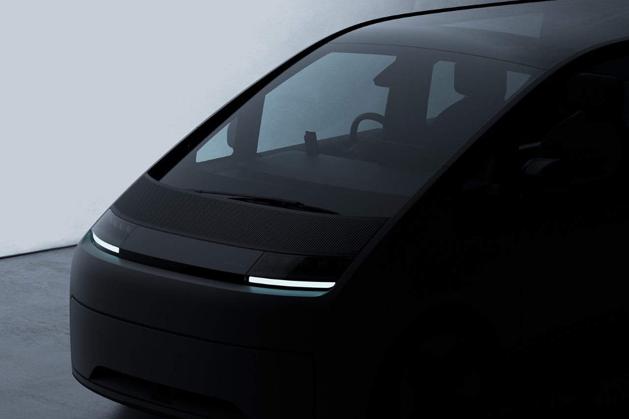
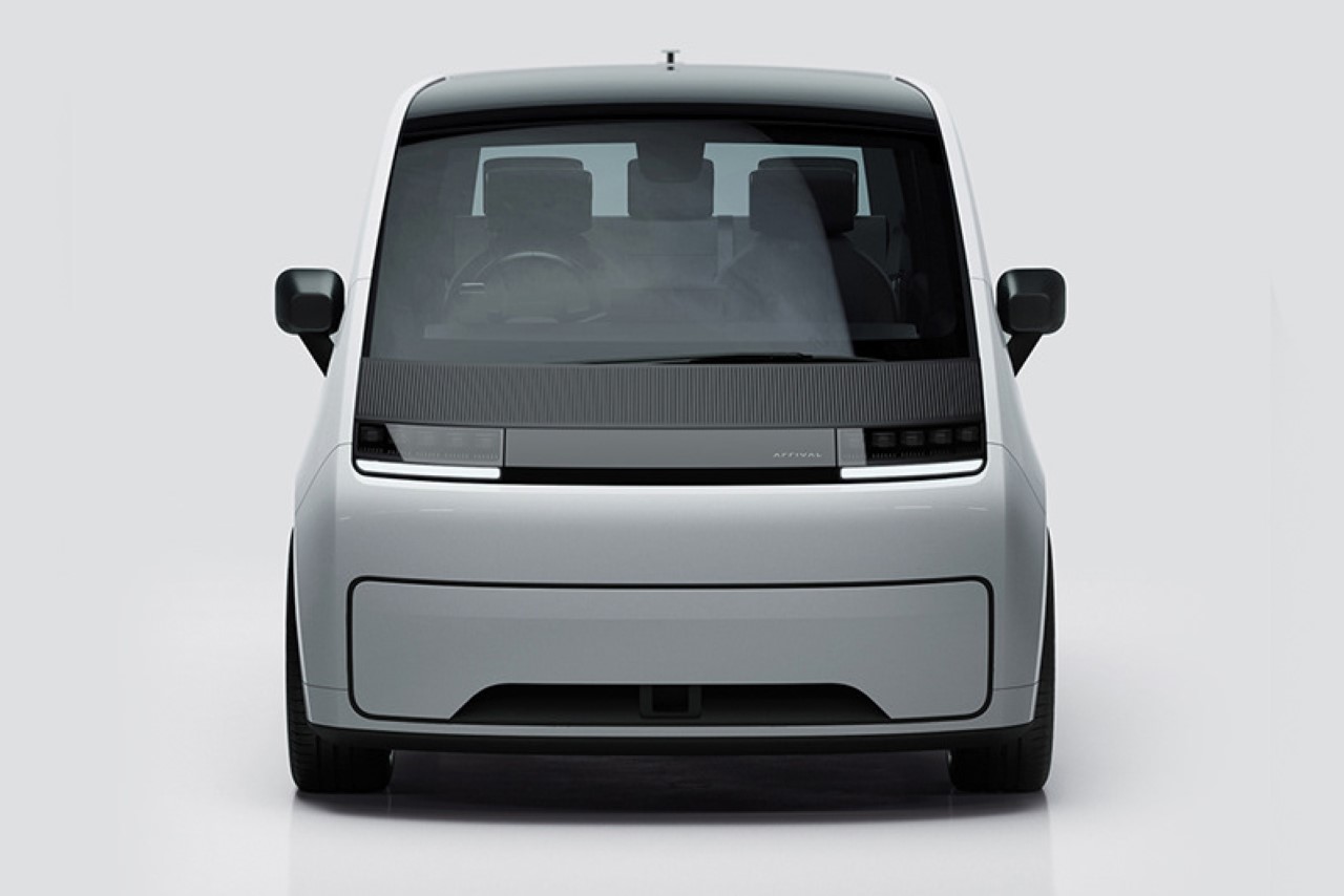
Dubbed “Design’s Secret Weapon” by Fast Company, Whipsaw’s designs are so ubiquitous they simply can’t be ignored. With over 300 design awards, and nearly a hundred clients comprising the likes of Meta, Google, Samsung, Dell, Ford, Sony, and Peloton, Whipsaw’s work exists across multiple industries, covering the kind of breadth that most design studios only dream of. The studio was founded by Dan Harden in 1999, headquartering in San Francisco, where Whisaw established inroads into what would eventually become the Silicon Valley of the world… However, its impact can be seen across diverse industries including consumer electronics, housewares, computing, robotics, medical, scientific, and commercial products.
This spotlight hopes to capture Whipsaw’s approach to design by chronicling some of its latest work and analyzing the design trends that emerge from them. Whipsaw’s multidisciplinary team of strategists, designers, and engineers work across four categories, covering all aspects of a product journey from research & strategy to industrial design, visual design, and mechanical engineering. In October last year, Harden even announced the formation of the Whipsaw Design Lab (WDL) – a space for designers to truly explore the potential of creative thinking without the constraint of technology, budget, or a ‘client concern’. “WDL has no requirements, clients, timelines, or limits. Just pure Design spelled with a capital D. And most of all, no compromises,” he says.
View More Projects on Whipsaw’s Website
Click Here to see Careers at Whipsaw
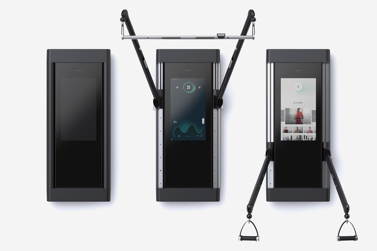
Tonal Strength Training System
Created over a period of 3 years, Tonal combines exercise with technology and machine learning to bring the gym trainer to your home. Tonal is a wall-mounted fitness device that offers a unique combination of modern hardware and personalized coaching. Unlike traditional gym equipment that relies on large metal plates and gravity, Tonal uses an electromagnetic resistance engine to provide smooth and precise weight in single-pound increments. This is supplemented by an intelligent touch-sensitive display that acts as your feedback machine, allowing you to measure every ounce of progress as you get through your reps.
The device was a result of a 3-year collaboration between Whipsaw and Tonal. Every aspect of its design was meticulously crafted to ensure optimal performance, durability, and aesthetics. When not in use, Tonal is sleek and unobtrusive, blending seamlessly into any wall. However, when activated, its arms pivot out on vertical columns, allowing for a wide range of exercises, including standing lat pulldowns, low squats, and lateral chest flys. Tonal marks a steady shift in home-based exercise, an emerging trend in the fitness space that also propelled companies like Peloton to fame.
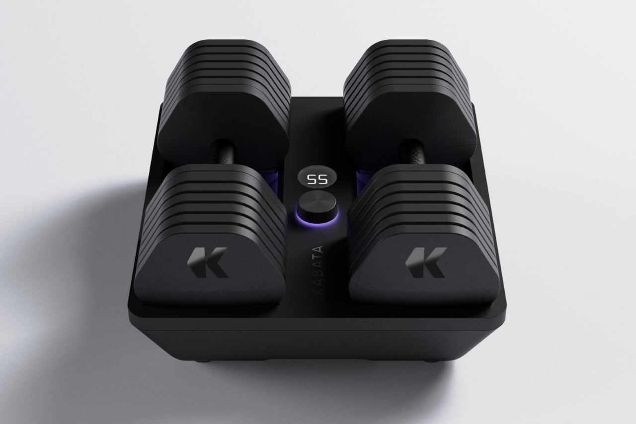
Kabata Smart Weights
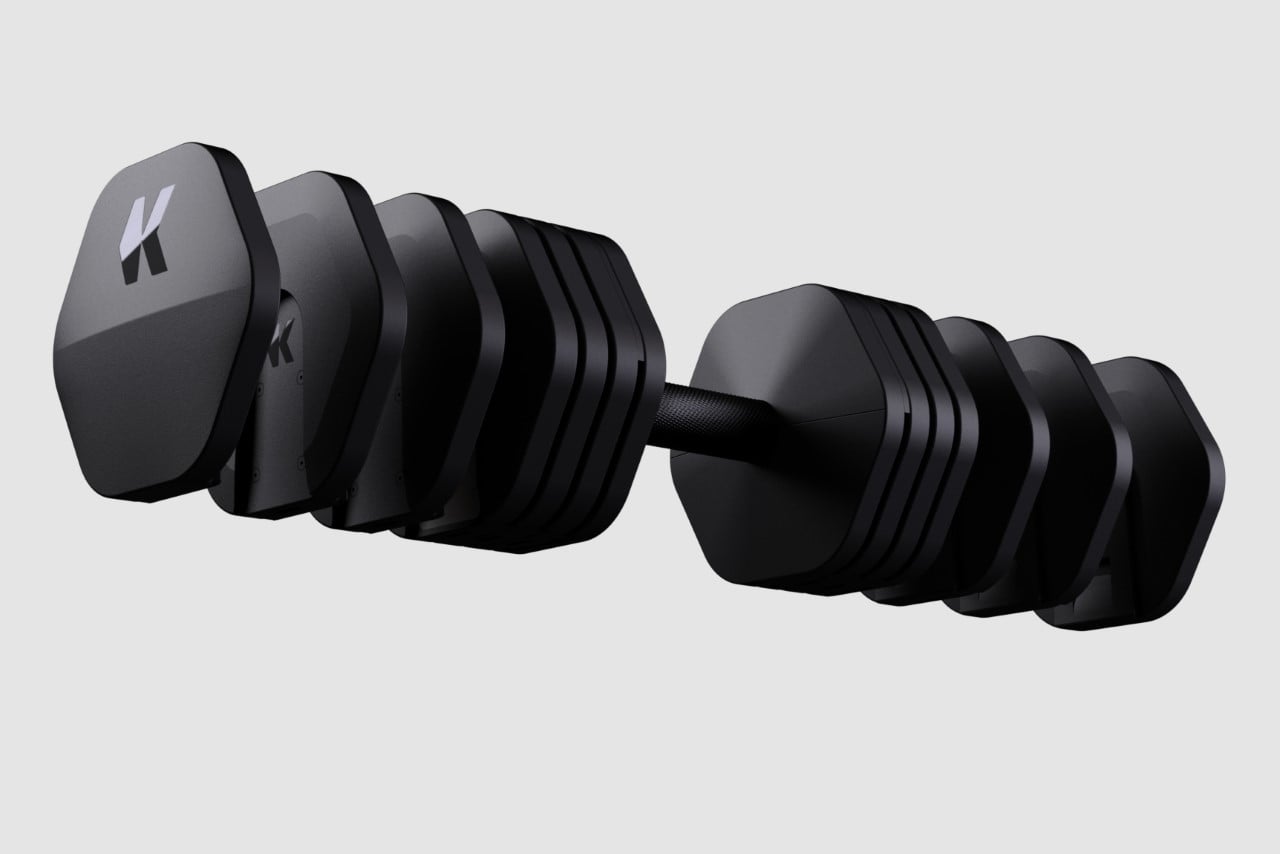
Yet another innovation in the fitness space, Kabata smart weights are a revolutionary set of adjustable-weight dumbbells designed for strength training. With just a simple turn of a knob, the weights can be instantly adjusted from 5 to 60 pounds. The weight plates are locked or unlocked together using a hidden camshaft mechanism, allowing you to assemble the desired total weight in 5-pound increments. The Kabata weight handles are equipped with advanced sensors that can detect movement, acceleration, angular velocity, and position, making it easier for you to optimize your workouts. Additionally, the handles feature haptic drivers that vibrate to correct your physical form and motivate you during your workout.
The Kabata isn’t your average pair of weights. The Kabata system is fully connected and comes with a mobile app that incorporates data analytics and predictive AI to automatically adjust the weights for you in tailored workout programs. The app pulls data from the weights to your smartphone, allowing you to access training programs, monitor key performance metrics, and share your workout with your community. This sleek system is a great example of how Whipsaw aims at modernizing a conventional product category by relying on bleeding-edge technology to truly uplift a product’s UX.
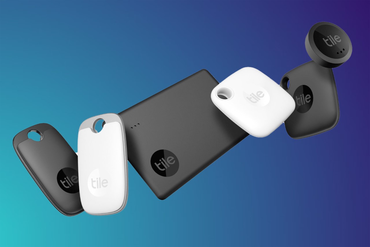
Tile Bluetooth Trackers
Creating a Bluetooth Tracker isn’t easy when it’s an absolutely new category. Tile’s first devices were sold in 2013, giving it a significant edge over other trackers like the AirTag, which came nearly 8 years later. This meant pretty much starting with an entirely blank page, which was the challenge for Whipsaw and Tile. The companies have been close collaborators ever since, working on all the newer SKUs like the Mate, Sticker, Slim, Pro, and Ultra. Each Tile device offers a greatly increased finding range of up to 400 feet, a louder ring, and voice-enabled finding through Amazon Alexa and Google Assistant. “We designed these trackers in several form factors with optional attachment methods in order to fit every use case, whether attached to a key chain, in a wallet, or directly adhered to your favorite items,” say the folks at Whipsaw. “There are many design improvements from our previous 2018 line, including smaller dimensions, lighter weight, and softer forms that feel great in the hand.” Tile was recently awarded #5 on Fast Company‘s list of Most Innovative Companies 2021.
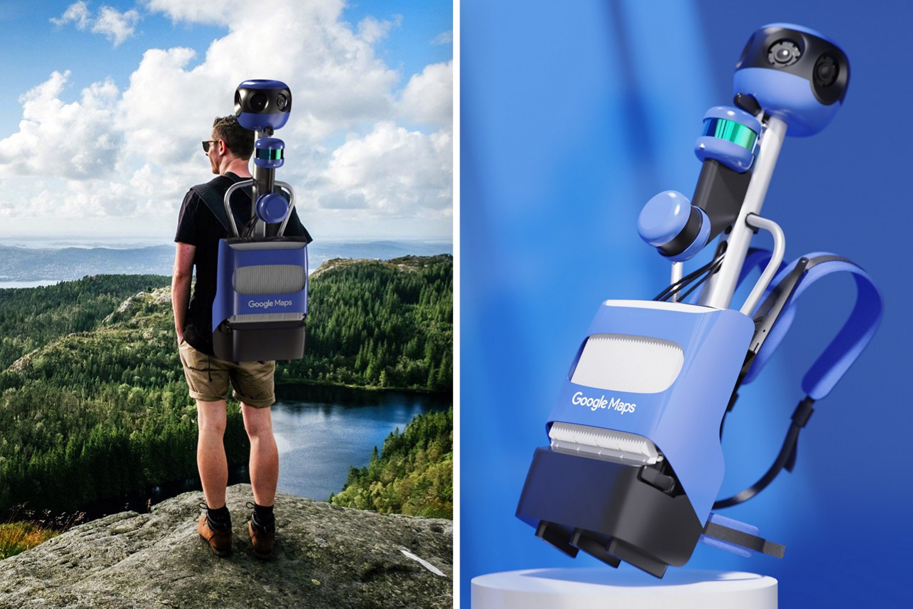
Google Trekker Backpack for Google Earth
Google’s Trekker backpack is a mapping device that works in tandem with Street View, Google Maps, and Google Earth. It captures and creates interactive maps of locations that are inaccessible to vehicles, such as nature trails, iconic landmarks like Machu Picchu, and crowded city centers. The Trekker is a valuable tool for cartographers due to its unique mobility, and it is currently being used to document some of the world’s most magnificent places for everyone to learn about and enjoy. It’s even spawned a sub-culture of travelers committed to revealing new frontiers and sharing their experiences with the global community.
The backpack is an all-in-one system that includes a 360-degree camera array, two positioning LIDARS for mapping terrains, a computer with heat sink cooling, and two hot-swap batteries. For Whipsaw, the challenge was to create a portable solution that was waterproof, highly durable, and worked seamlessly. Additionally, it was also prudent to make the Trekker backpack comfortable for extended wear time, ensuring it was well-balanced, lightweight, and easy to put on and take off.
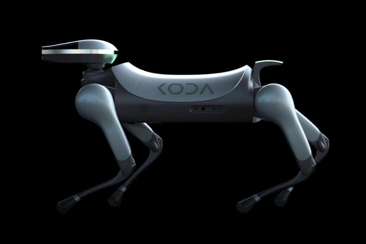
Koda AI Robot Dog
In 2018, Whipsaw was approached by KODA Inc. to collaborate on a project integrating their fusion multi-processor and AI-based software. The result was the KODA Robot Dog, the first high-end domestic robot dog to run on a decentralized blockchain network. Equipped with an 11 teraflop processor capable of A.I. machine-learning, the KODA Robot Dog relied on a hive-mind of sorts to optimize its behavior. It even sported four 3-dimensional surround-view cameras and 14 motors, including in the neck and tail, giving it dog-like gestural qualities. By sharing data with other KODA dogs on the network, the robot was able to learn from experiences it had never encountered before. For example, a KODA dog in Phoenix could learn how to avoid slipping on ice by receiving knowledge from other KODAs based in colder climates like Anchorage, Alaska, or Toronto, Canada. Whipsaw’s design ensured that the KODA Robot Dog retained a friendly, cute demeanor despite its incredible capabilities.
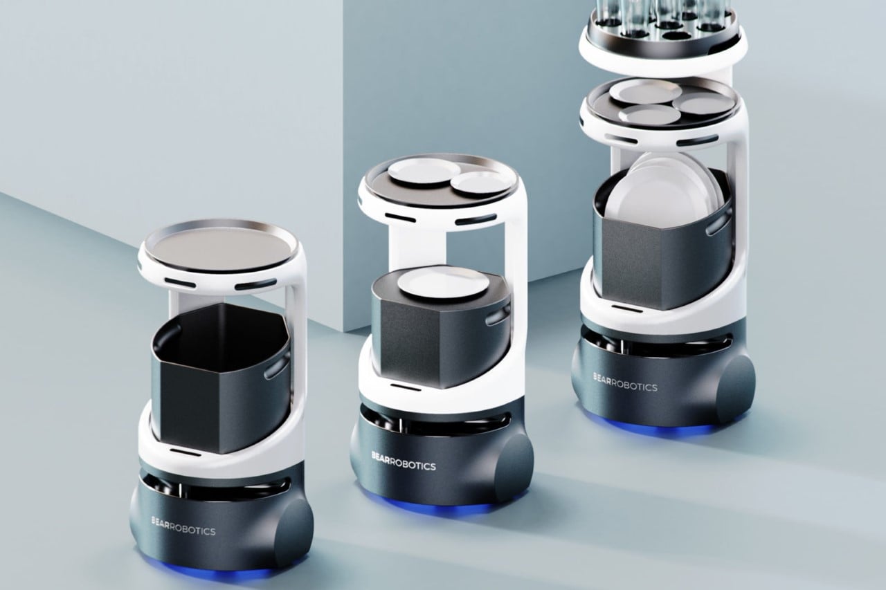
Bear Robotics Servi Food Service Robot
Sort of like a Roomba for hospitality, the Servi automates table-waiting with its unique design that’s built to help with restaurant workflows by both delivering food to tables and clearing the tables at the end of a meal. When guests arrive, Servi promptly welcomes them with a friendly voice and courteous gestures. Customers can easily place their order with Servi, who then transmits it directly to the kitchen. Once the order is prepared, Servi is equipped with one of her two top platforms to efficiently deliver the food to the designated table. While navigating, Servi adeptly avoids any individuals or obstacles in her path. After the meal, diners can conveniently place their dishes in Servi’s bottom bin as she returns to the table.
Whipsaw considered every type of restaurant environment while developing Servi’s custom design—from cramped and crowded rooms to gleaming banquet halls with spotless interiors—and made her as safe, quiet, and washable as possible. “We also packed a ton of technology into her small footprint so she never gets in the way,” the company says.
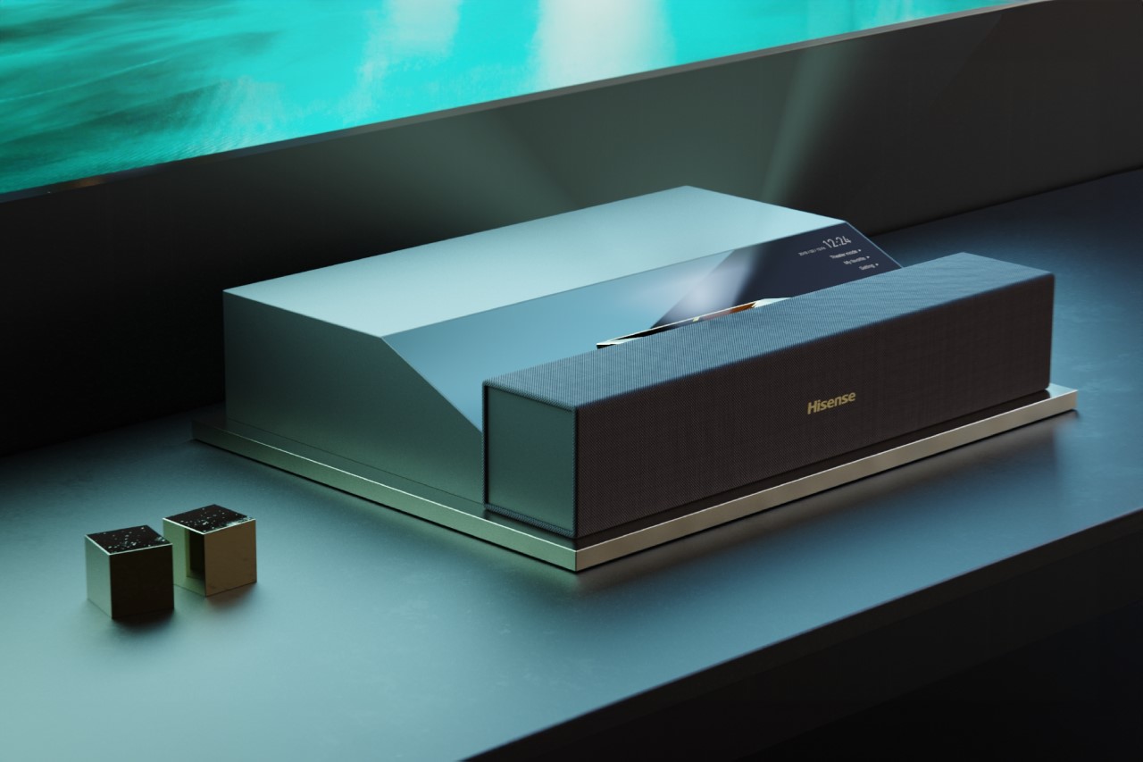
Hisense Projector
We’ve covered a fair number of projectors on YD, and UHT projectors seem to overwhelmingly be the future of the technology. They require no distance from your projection surface, and are capable of vivid, highly detailed imagery, while also projecting audio from in front of you to match the visuals. Hisense and Whipsaw worked extensively to develop a line of UHT projectors with timeless beauty, quality materials, unique form, and exquisite detailing. “Throughout this project, our primary goals were to innovate on product configurations that would be compact enough to compete with standard TVs and to create aesthetic solutions that would excite internal stakeholders and ultimately end-users,” say the Whipsaw team.
PacBio Revio Sequencing System
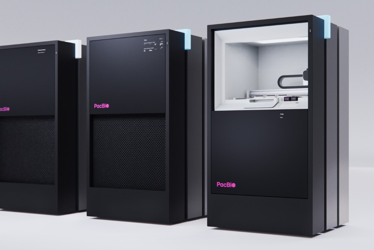
Proving that there’s really no industry that can’t benefit from Whipsaw’s approach to design innovation, the company worked with PacBio to help design Revio – a gene sequencing system that can be utilized for various purposes such as human genetic analysis, cancer research, and agricultural genomics. The Revio has the capability to sequence up to 1,300 whole human genomes annually for less than $1,000 per genome. Whipsaw collaborated with PacBio to create a new user interaction model and a stunning industrial design for the instrument, which includes an intuitive user interface.
Revio’s bold monolithic design creates an impression of solid reliability, sophistication, and cutting-edge tech. Meanwhile, the black towering box comes with a hint of color, tying in with PacBio’s own visual branding. “Every detail was meticulously crafted for perfection, from the single sheet of back-painted Gorilla glass on the sliding door to the Bugatti-inspired woven wire ventilation grill. The fit and finish are exemplary, with premium materials and textures throughout.”
View More Projects on Whipsaw’s Website
Click Here to see Careers at Whipsaw
The post Nike, Google, Tonal, Uber, Peloton: How Whipsaw’s Global Vision as a Design Studio is Changing Brands and Worlds first appeared on Yanko Design.

