Don’t eat Cheetos while gaming with this lightweight ‘hollow’ mouse

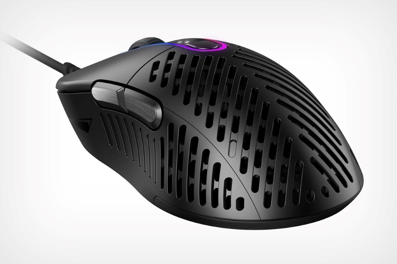
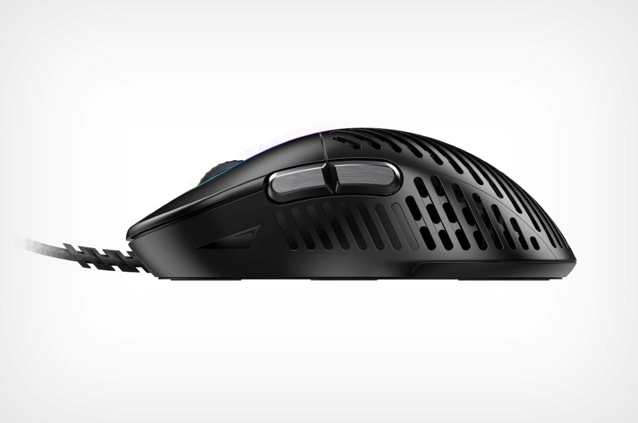
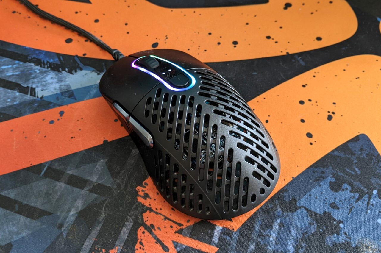
The Makalu 67 is an incredibly lightweight gaming mouse that weighs a mere 67 grams, thanks to its unique ‘ribcage’ outer body. However, it’s also notoriously difficult to clean if you’re the kind to snack on stuff while you game. The mouse’s outer shell comes with a grille-like design that helps provide strength while reducing mass… and I’ll say, it’s definitely really unique looking.

Designed and calibrated for hardcore gamers who want their gear to be as lightweight/maneuverable as possible (while being durable too), the Makalu 67 comes from MOUNTAIN, a tech company known for their gaming gear. Most mice come with organic, ergonomic, monolithic designs, but the Makalu 67 breaks that with a body that’s parametrically perforated to provide strength with less material. Just like a ribcage protects your vital organs without necessarily being one massive block of bone, Makalu 67’s ‘ribcage’ design conceals the tech within, while reducing a significant amount of material.

The Makalu 67 comes with a PAW3370 sensor for high accuracy, offering up to 19000 DPI, with the ability to change the resolution too, using a button right at the top. An RGB ring around the scroll lets you easily customize your mouse’s aesthetic, choosing from up to 16.7 million RBG colors. However, that patented ribcage design is perhaps its most standout element. Not only does it allow the mouse to be lightweight, it keeps your hands cool while you game too, allowing air to flow across your palms so they never get sweaty. The only problem is accidentally using the mouse with dirty or wet hands, and then being left with something that’s virtually impossible to clean. That means no Cheetos, Doritos, or Pringles around this bad-boy… and it’s best if you kept your beer or soft-drink away from it too. If the price for that sacrifice is a better gaming experience with more kills/victories, I think a bunch of gamers would be willing to make that sacrifice.

Designer: MOUNTAIN

Unusually creative cabinet opens by tilting forward!

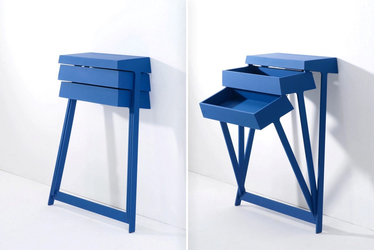
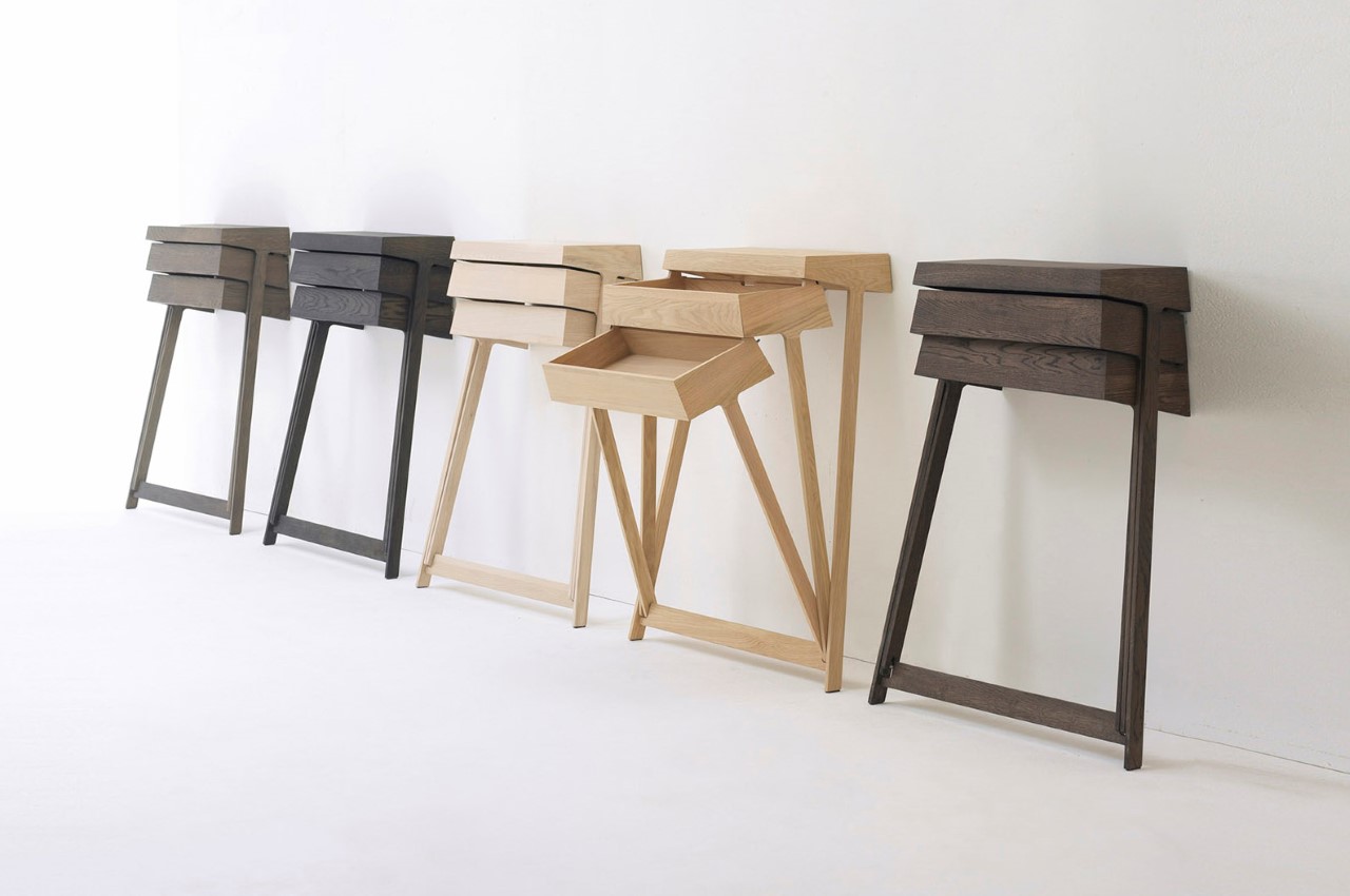
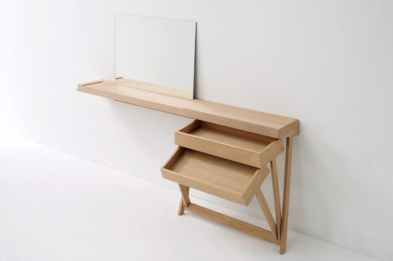
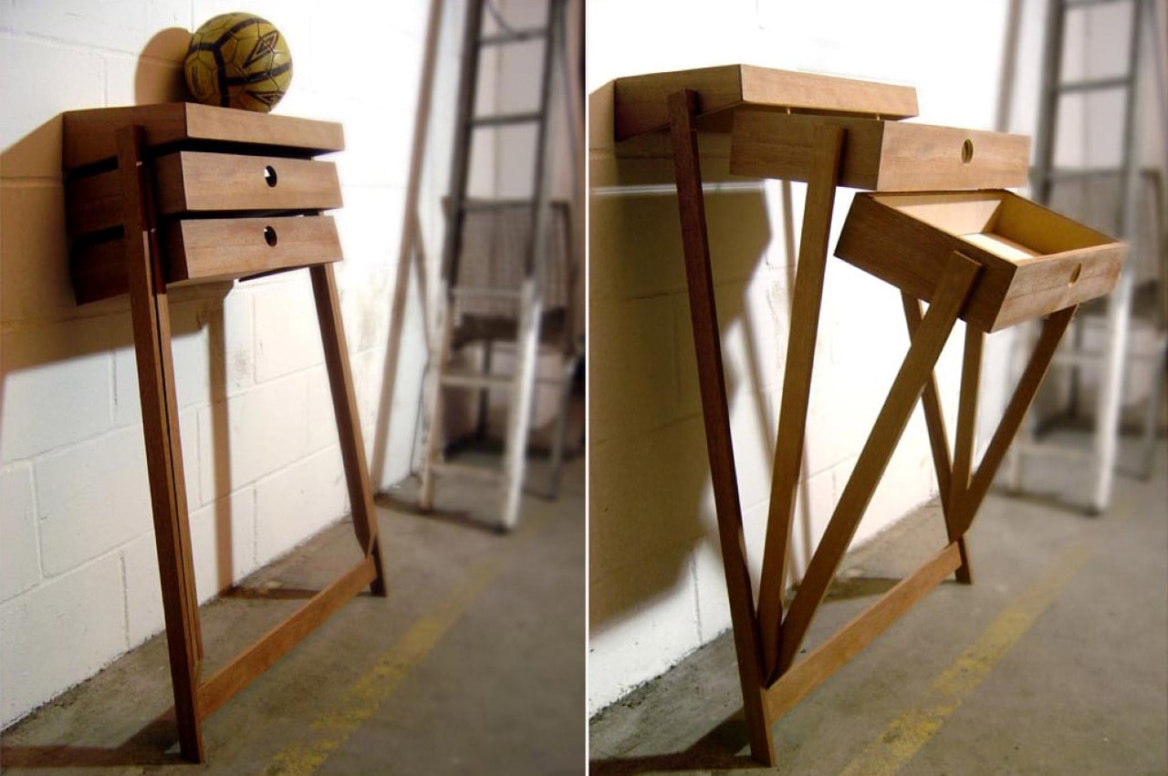
The Pivot rightfully uses gravity as a design feature! Instead of sliding drawers, a nifty little pivot joint at the base of this cabinet allows individual drawers to open by tilting forward. It’s clever, fun, and makes it easy to access your belongings without having to dig around! Just don’t expect it to be hyper-organized though!

Designer: Raw Edges Design Studio for Arco

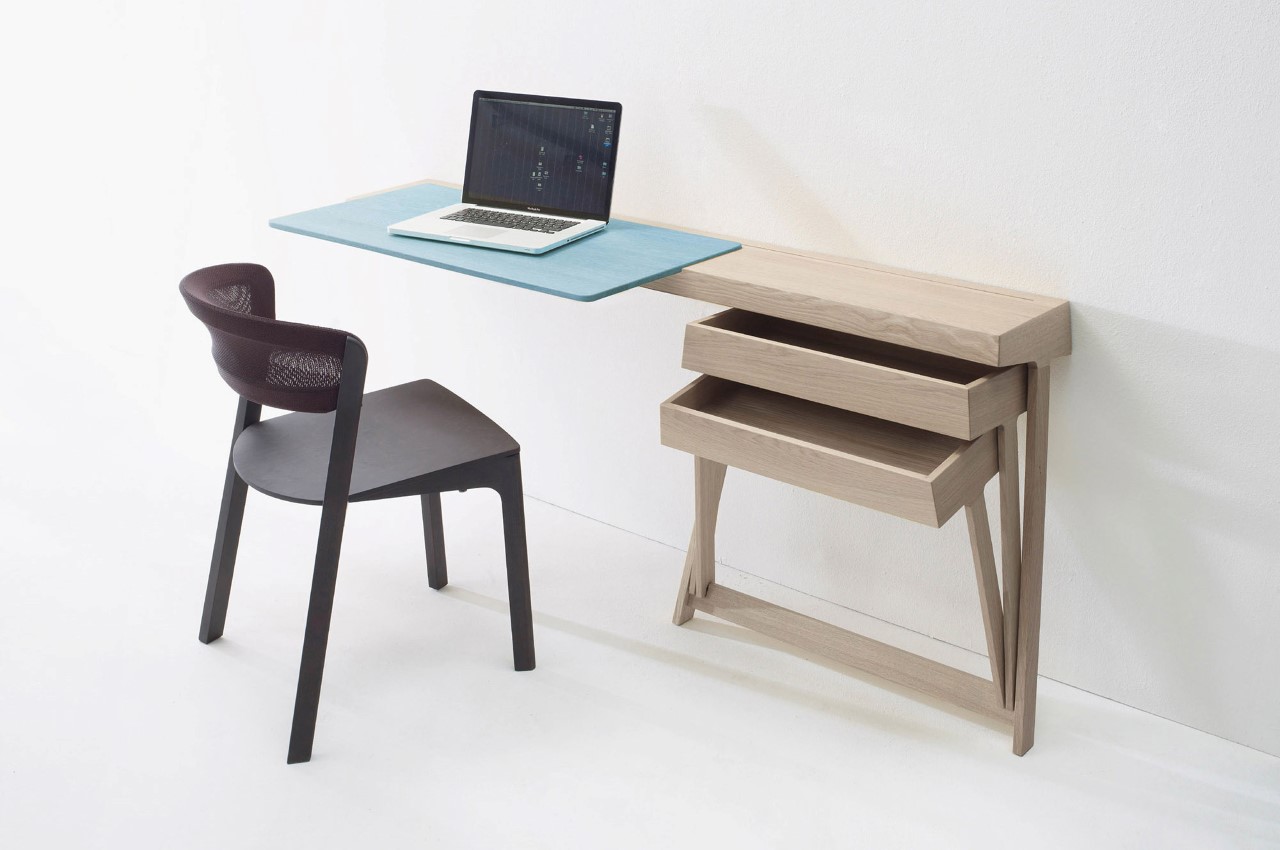
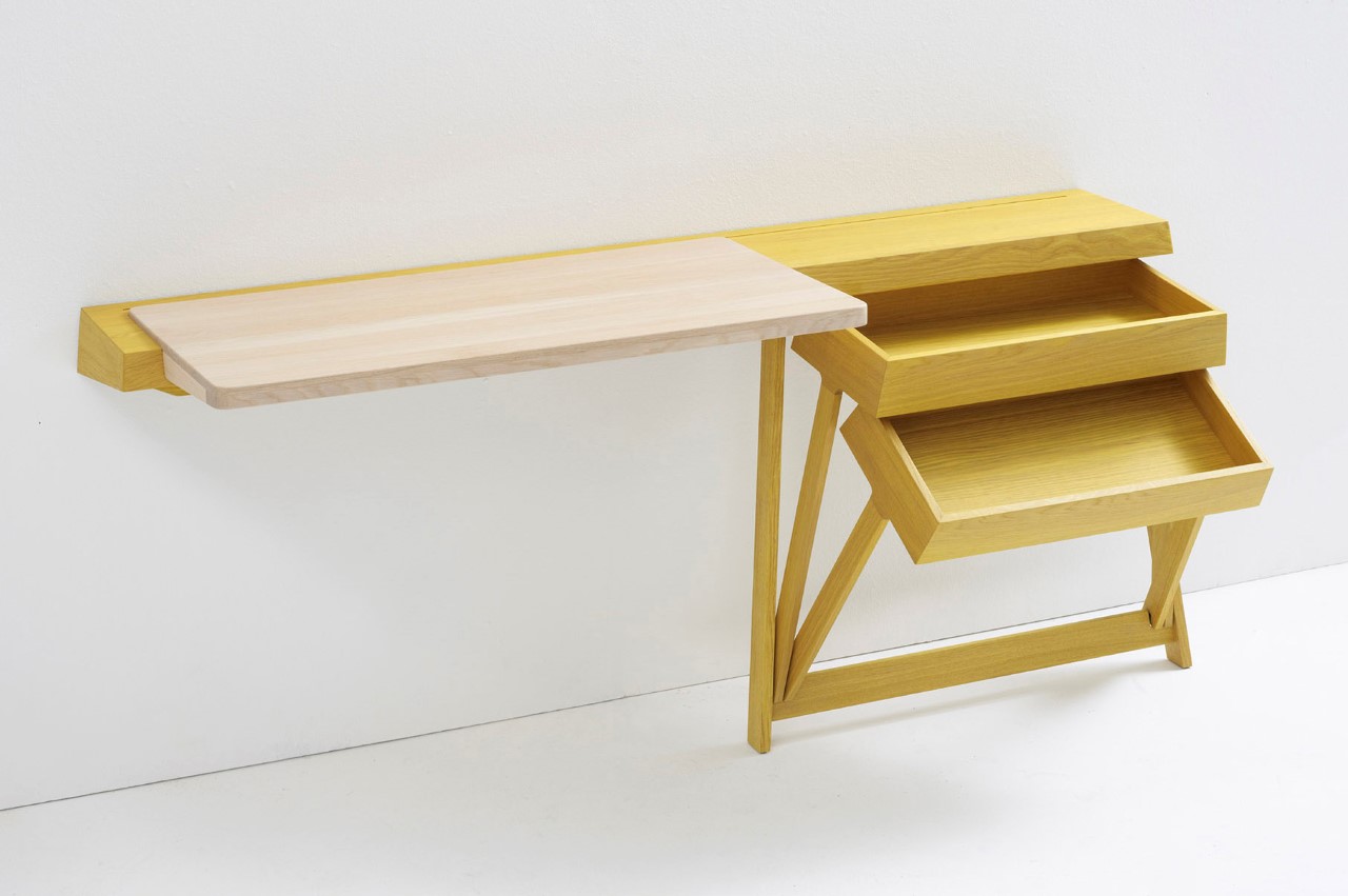
The Pivot is an incredibly fun chest of drawers designed to be used independently or as a part of a desk. The pivoting mechanism is convenient and easy to use, allowing the drawer to slide open with little to no effort since gravity does most of the work. There are no sliding components, no bearings and railings, and nothing that would cause the drawers to get jammed, forcing you to yell “PIVOTTT”! (I couldn’t NOT make that joke)

Its simplicity extends beyond the cabinet’s unique pivoting detail. The cabinet comes with a wall-mounted design, and sports just two legs, sort of like an easel. It’s definitely interesting to look at and probably a lot of fun to interact with!

LEGO as a viable design material? YouTuber uses 2000 LEGO bricks to build a functioning bass guitar…


It would be an unfair characterization to call LEGO a child’s toy. Clearly, the product’s an incredibly engaging and interactive DIY system for adults too, and has been used for everything from scale-down models to art projects, to even the rare full-size LEGO supercar… but rarely has LEGO been used as an actual material to build a real, working product.

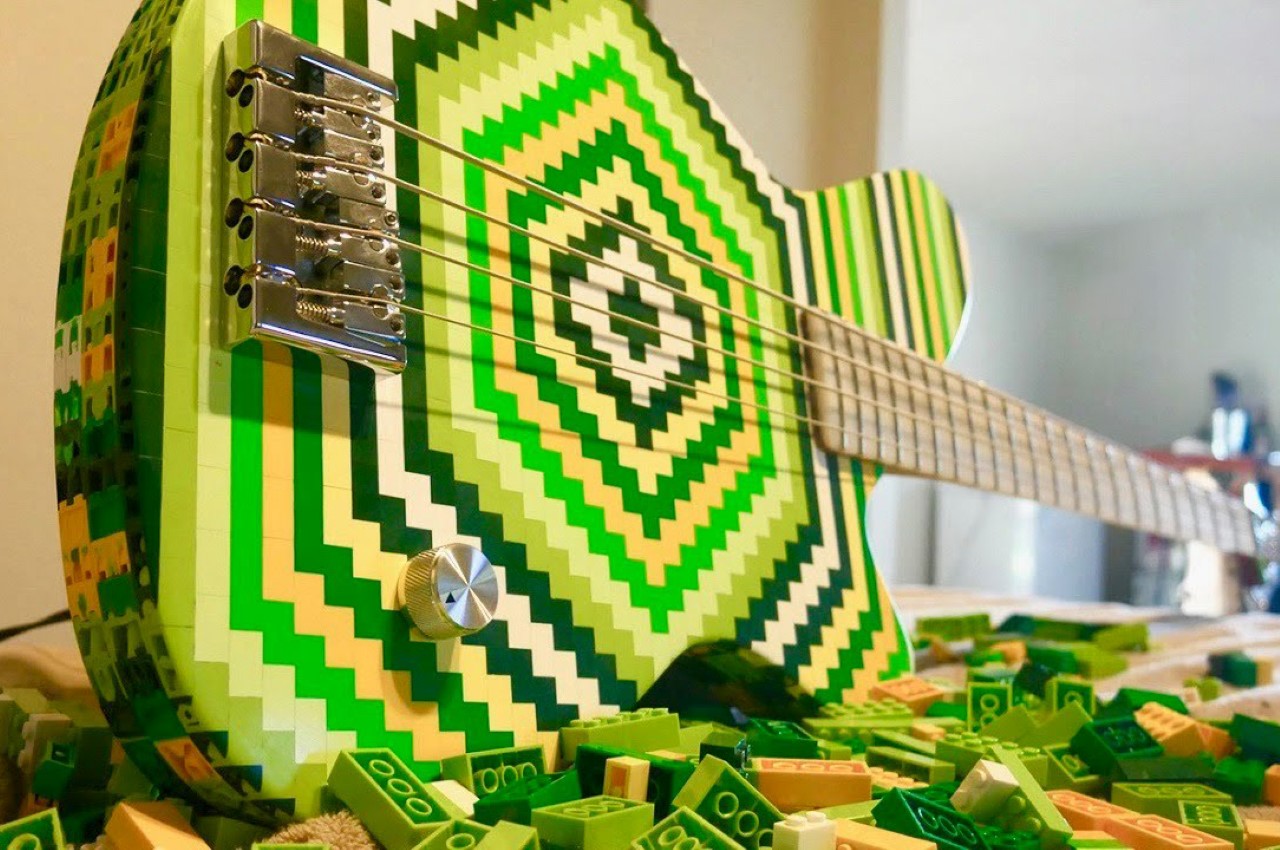
Trust wacky DIY YouTuber and musician Burls Art to take on a challenge though. The guy’s literally made guitars from the most absurd materials, including a skateboard, a shovel, and even 5000 coffee beans. His latest project? A bass guitar out of LEGO bricks… wait, let me be more specific, a fully functional electric bass guitar made from 2000 LEGO bricks.

Designer: Burls Art

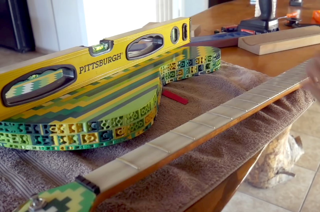
In the video, Burls Art details how LEGO is a pretty great choice to make the guitar in the first place. The interlocking pieces are pretty robust and the fact that you’ve got LEGO bricks in different colors makes it pretty easy to design your own pattern on the guitar. To assemble the piece, Burls plugs the LEGO pieces together in sheets, before layering them one above another and pouring epoxy resin to really seal them in place (the last thing you want is to have a guitar falling apart when you play an exceptionally funky slapping bassline). The guitar also uses a maple-wood board on the inside to reinforce it like a spine, to counter the amount of pulling force the strings will have. The wood + epoxy fretboard’s made from scratch too, as well as the headstock, which again uses LEGO bricks.

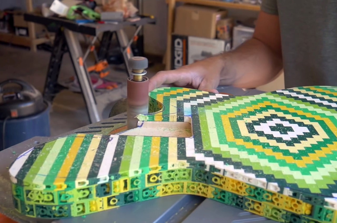
Once the guitar’s main body is assembled and the epoxy’s set, Burls drew the profile of the guitar on it and went to down using a sanding machine to cut the shape out. Unfortunately, this meant that the guitar wouldn’t have the LEGO brick’s signature pixelated silhouette, but then again, that guitar wouldn’t really be comfortable to play either. You can, however, see the brick’s hollow underside along the edge of the guitar. Burls decided not to fill in those uneven gaps with epoxy because it would unnecessarily add to the weight of the instrument. The overall piece weighed around 7 pounds, which was ideal for an electric bass guitar.

Once assembled, Burls took his new instrument out for a spin. He started off by playing the iconic Seinfeld bassline (at the 10:18 mark), before finally creating a neat composition using a combination of his LEGO bass, and his color-pencil guitar.

The novelty of the project aside, it’s rather fun to see how the LEGO bricks are used as an actual design/prototyping tool. With a little epoxy resin and a sander machine, it’s pretty easy to create your own prototypes too. It’s arguably faster than a 3D printer if you do your homework beforehand, and you don’t need to worry about multiple-filament 3D prints to get a colored output… just use colored bricks!

Unusual architectural designs that are every arch lovers delight!

Architecture is present in our everyday life in a very subtle way, shaping our reality – right from the stairs in our complex to the view we see from our windows. But once in a while, the architect decides to make a bold statement with their designs and this is a collection of such designs! Every design here challenges the traditional design aesthetics and methodology, creating a structure that is sure to wow you!

The Desert Pavilion by MEAN* was created to be a communal oasis of heritage and micro-ecology. When you look at the renders, the structure is a blend of local Bedouin architecture with space-age technology. The design team has envisioned an innovative use of 3D printed panels by deploying them onto a CNC bent steel pipe system. The structure is inspired by the merging of sound waves. To simulate a holistic tent-like structure, the team used a hybrid of 3D printed polymer shells on 3D printed concrete topography with the ‘Mesh Relaxation’ parametric strategy. Another fun fact – it can also be used as a case study for future Martian habitats!

Meet the Dune House by Studio Vural, a seaside holiday dwelling that is carved into sand dunes and operates without relying on public utilities. Using a vast solar field and miniature wind turbines, this house produces more energy than it consumes!

Alex Nerovnya’s Tesla-based render has us as intrigued as the Tesla Cybertruck originally did. We’re looking at a minimalist structure that features angular design, while large glass areas dominate the house, of course with a special place to park your matching truck!

Nestled between the Caspian Sea and the Sisangan Forest is a private residence designed by MADO Architects in the Sisangan province of Iran. The clients had one request, an intense focus on privacy. The architects placed concrete slabs in a tent-like manner allowing them to intersect one another creating a completely private residence without sacrificing the view!

The Flexhouse by Evolution Design is characterized by its ribbon-like and stark white façade. This unique dwelling is situated on the banks of Lake Zurich.

Meet the Qishe Courtyard renovated by ARCHSTUDIO, located in Beijing. This renovated building merges the traditional and modern technologies by using curved glass walls and a curved roof while retaining the original seven structures.

FM House designed by Alarcia Ferrer Arquitectos comes in muted concrete and with a roof that flows into the mountain. At first glance, you may have difficulty locating the house as it almost merges into its surroundings, trying to cause as little damage to the environment as possible.

The Sunken Courtyard building concept by Team Group and is based on a traditional Iranian method called Bagh Chal or literally, Sunken courtyard and was designed to protect the inhabitants from hot weather by staying below the ground level.

The Black House by German architect studio Buero Wagner is a stack of differently sized rooms (kind of like the Weasley House) clad in blackened wood extending a transparent cozy room encased in glass walls.

This luxury villa designed by Arthectonica in Canary Islands, Spain takes a new geometric yet minimal look to traditional architecture.

The JW-EX watch is sheer mechanical joy for the analog-lover

Every part of every watch of the JW-EX series was custom-designed to titillate your senses. The JW-EX watch obsesses over the magic of mechanical movements so much, that it’s literally called EX, or short for exaggeration.

Designed out of a love of complex mechanical movements and complications, Jason Chan of Jason Watches designed the JW-EX, the ultimate homage to spinning wheels, rotating gears, actuating springs, and multiple intricately shaped and assembled metal pieces dancing together in absolute synchronicity to depict the movement of time.

Not a single part of the JW-EX is pre-made. Every single bit of the JW-EX is made bespoke, giving you a watch that is unique in every right, from its construction to even the time-telling experience, because the JW-EX reinvents that too. Using the color red to denote the time, guiding you through the process of reading it, the JW-EX splits time into its fragments. Hours, minutes, and seconds sit at different locations on the watch, unlike traditional timepieces that use the concentric dial-and-hands method. Giving minutes the priority (because that’s what you tend to focus on the most) the watch puts the minutes counter right on top. To its bottom right sits an hour gauge, while the bottom left lies a rotating seconds disc that also lets you take a peek at the watch’s tourbillion right on the front.

The JW-EX uses a specially developed movement called the JW-7100 custom developed for the watch itself. It allows the JW-EX to be as brilliantly exaggerated, eccentric, and extra as it is, allowing hours, minutes, and seconds to all work in their independent zones, while also giving you a taste of the mechanical action in the seconds window as you tell the time. The JW-7100 comes with an 80 hour power reserve, and 5 ATM of water resistance. With 21 jewels, and an incredibly precise and intricate movement (visible from both the front and exhibition back) Jason believes it’s virtually impossible to own a movement this unique and bespoke at its competitive price tag, thanks to the disruptive power of crowdfunding.

The JW-EX comes in a 46mm wide 316L Stainless Steel case, with 4 Sapphire crystals covering the three displays on the front and the exhibition window on the back. Designed to pay an homage to the pre-electronic era of mechanical glory, the watch comes in a vintage-inspired almost-steampunk design with a steam-engine style gauge, and plate-pieces that sit on top of the steel body, almost as if they were riveted in place. The crown’s shifted to the 6 o’clock position, to exaggerating the watch’s bespoke, unique design, while the 1 year international warranty stands as a testament to Chan’s commitment to building and delivering timepieces of the highest quality!

Designer: Jason Chan (Jason Watches)

6 Unique Uses for VR


80s babies will tell you that virtual reality isn't just a recent development. There was the Virtual Boy, one of Nintendo's most prolific flops. Television loved virtual reality, and Hollywood...

6 Unique Uses for VR


80s babies will tell you that virtual reality isn't just a recent development. There was the Virtual Boy, one of Nintendo's most prolific flops. Television loved virtual reality, and Hollywood...

Huawei knows how to make phones that look unique

huawei_mate_20_pro_1

Ironically often pronounced ‘Who Are We’, Chinese smartphone brand Huawei is, in fact, the second biggest smartphone company in the world, second only to Samsung (followed by Apple at third place). The company, although banned in the USA because of the US-China trade war, knows how to create phones that look stunning and captivating. They pioneered the metallic gradient that literally breathed a new life into smartphones, and also were arguably the first big brand to push out a triple-lens camera setup on the smartphone. Moving on, the company has embraced the metallic gradient and the 3-lens setup with their latest phone too, the Mate 20 Pro. However, to keep away from the herds (who’ve begun copying the gradient too), Huawei’s introduced a patterned back too, although they still have a very rich blue-purple-black gradient variant too.

What’s also interesting is the way the cameras are laid out. Rather than opting for the iPhone X-ish camera setup on the side, the Mate 20 Pro concentrates all three lenses in the middle, into a square, pushing three lenses in 3 quadrants and a flash in the fourth. Personally, I like the way it’s executed. It adds a big black square to the top of the phone’s back and that gives the phone some character, and the camera some gravitas. However, there’s a visible lack of a fingerprint sensor on both the front and back, but Huawei says the screen will feature its own in-display fingerprint sensor, which could be a game-changer, given how successful the brand is in the east.

The phone also packs a few features that could make it an ‘iPhone-killer’ (although I personally detest using that phrase). It comes with its own HiSilicon Kirin 980 system on a chip, which is a big deal, because after Apple’s A12 Bionic chip, the HiSilicon Kirin 980 is the second 7nanometer chip, and the first in an Android phone. The phone will feature a 6.3 inch OLED screen that still retains the notch that will feature the receiver and a front-facing camera. No headphone jack on this one, though, but that isn’t a surprise, considering how most flagships quite literally don’t give a jack… but I’ll forgive that transgression, because the Mate 20 Pro looks oh-so-pretty! More on this when the phone officially launches!

Designer: Huawei

huawei_mate_20_pro_2

huawei_mate_20_pro_3