This bird-shaped USB flash drive concept pays homage to the data carriers of yesterday

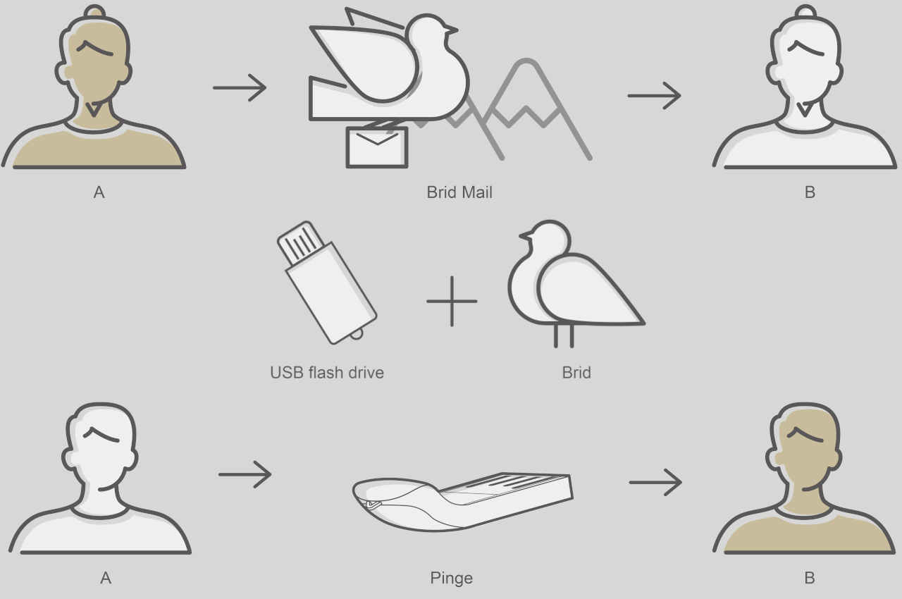
Owls sending mail might be pure fiction, but there was a time when birds were indeed used to send messages across distances. Taking advantage of their natural homing instincts, pigeons were used to send messages in the fastest way possible when using humans on horseback was too dangerous for various reasons. Of course, all that is ancient (or medieval) history by now, but the image of a mail-carrying bird has forever been etched into our minds. Some might even use that association to brand certain services that simply ferry bits and bytes of data from one device to another. That’s the inspiration behind this rather charming USB thumb stick concept, though its seemingly whimsical design carries some important practical implications as well.

Designer: SHS Shih
Even in this day and age of the cloud, it’s sometimes still more efficient, not to mention more secure, to store your files on a small USB flash drive. You have instant access to your data, as long as you can plug it into your device, and only those who can actually hold the flash drive in their hands can actually use it. Over the course of the years, the technology behind this gadget has moved forward by leaps and bounds and it’s now possible to see a 1TB flash drive, even if few can actually afford it.

未命名的作品

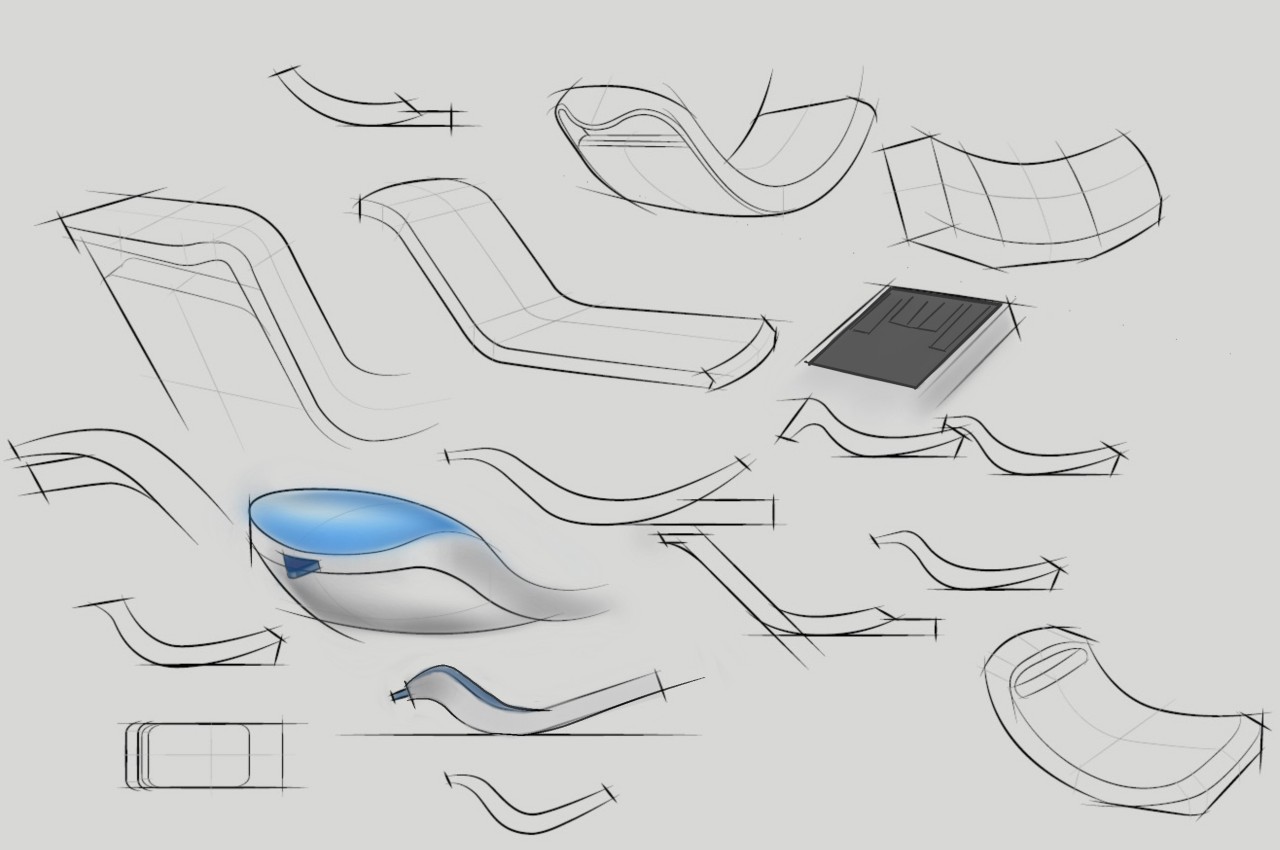
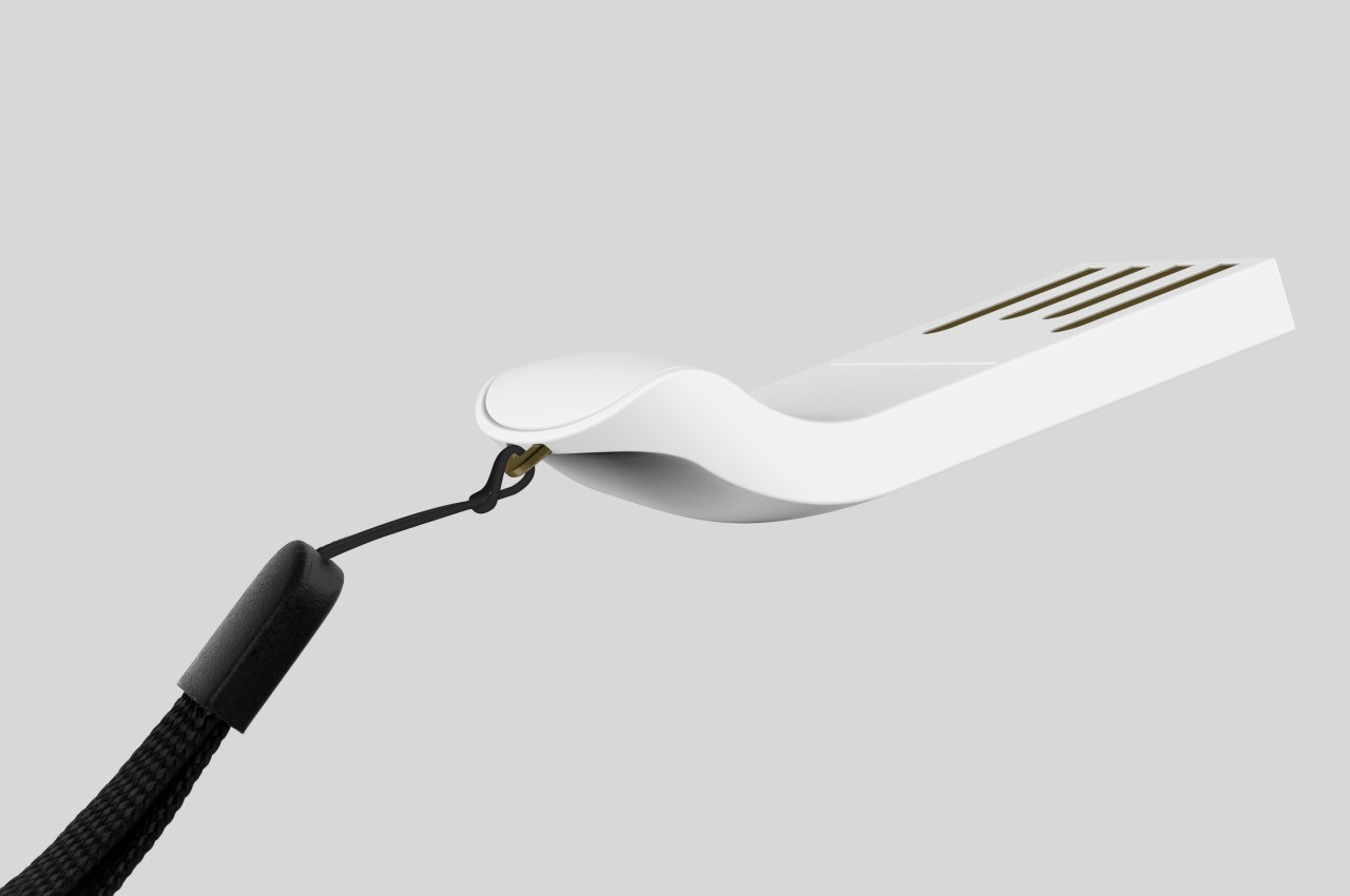
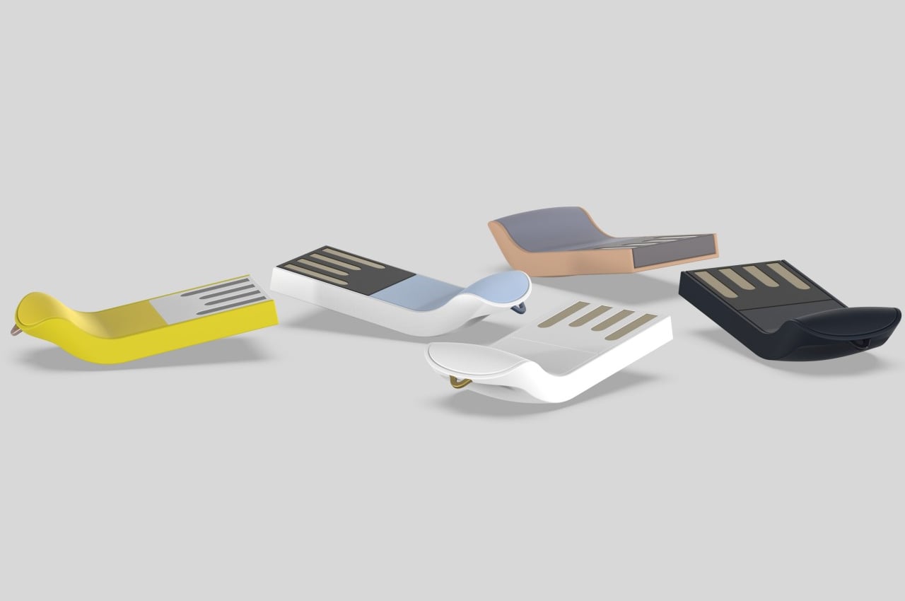
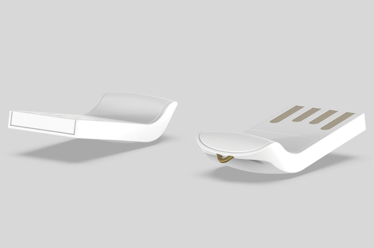
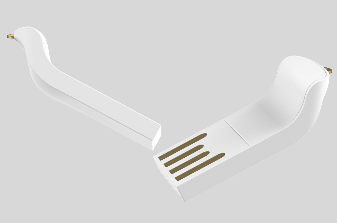
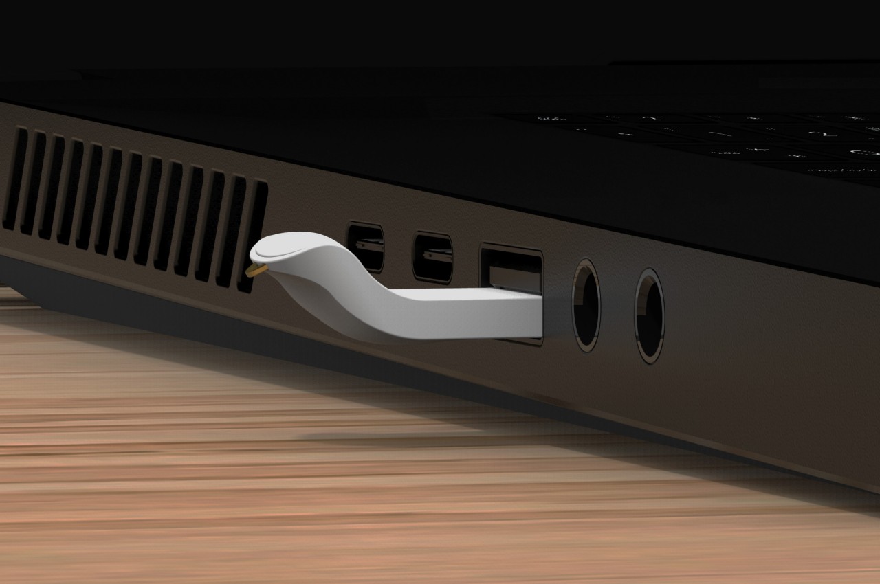
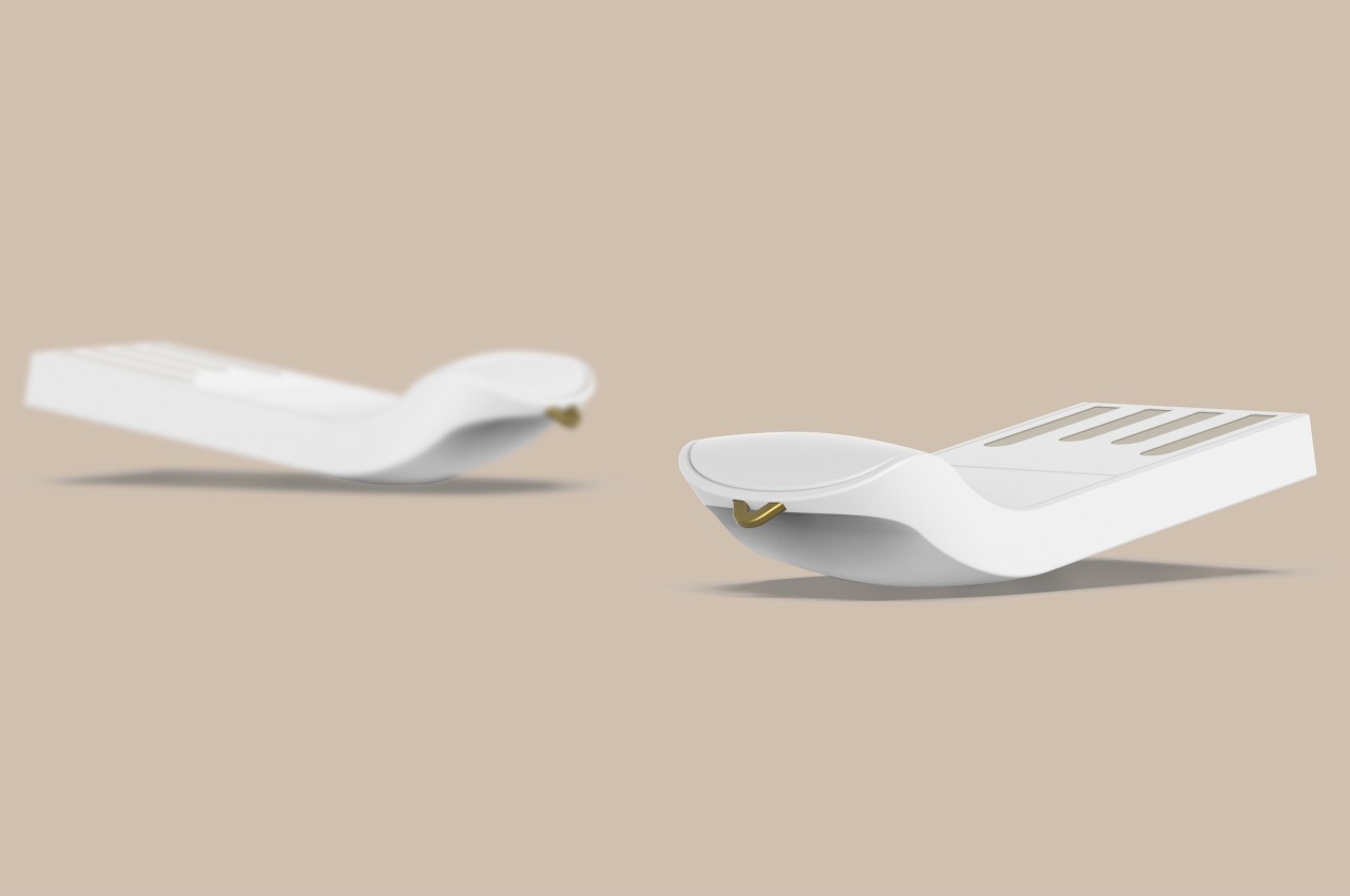
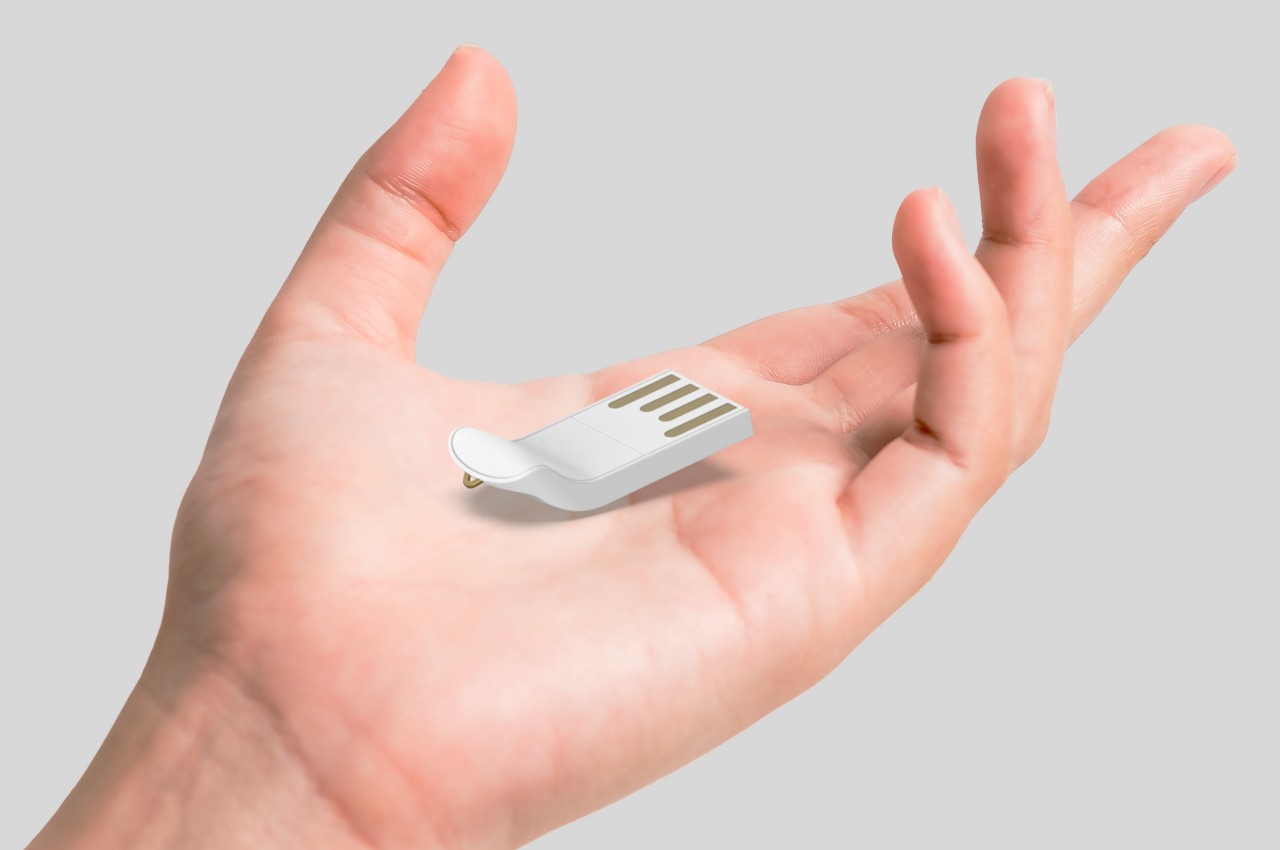
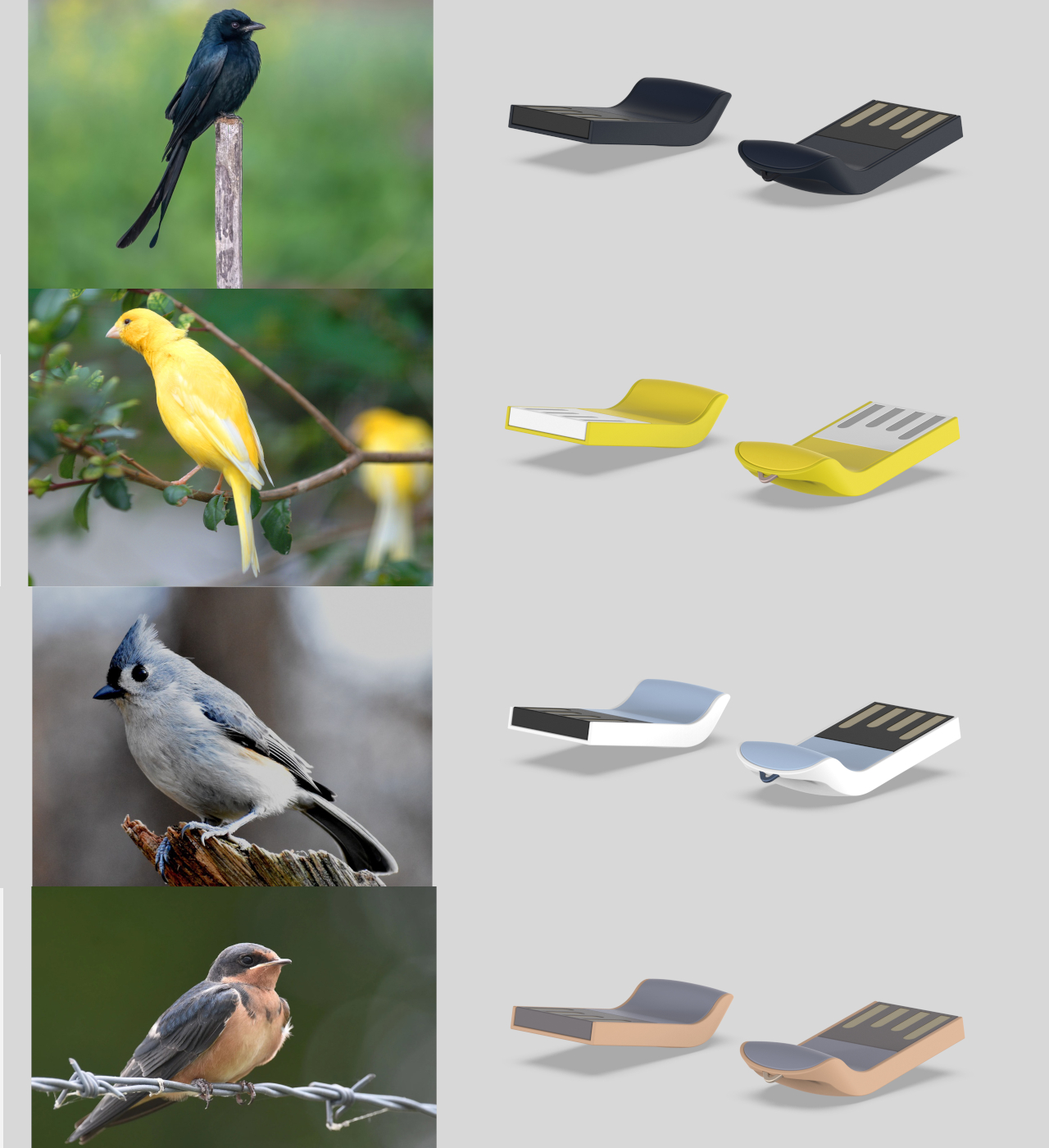
These advancements open up flash drives to more interesting designs, like this Pinge “bird-style” design concept. Right off the bat, you will notice that it isn’t your usual flash drive, even if you can’t immediately make out that it’s supposed to resemble a bird. Instead of staying flat as almost all flash drives do, its end curves upward, forming the bird’s neck and head. A small golden triangle protruding from that end forms the beak, but it also has the added function of being a pendant or lanyard hole. As you might have guessed, the actual USB interface is the bird’s tail, which is perfect considering the alternating white and gold lines resemble feathers, with some stretch of the imagination.
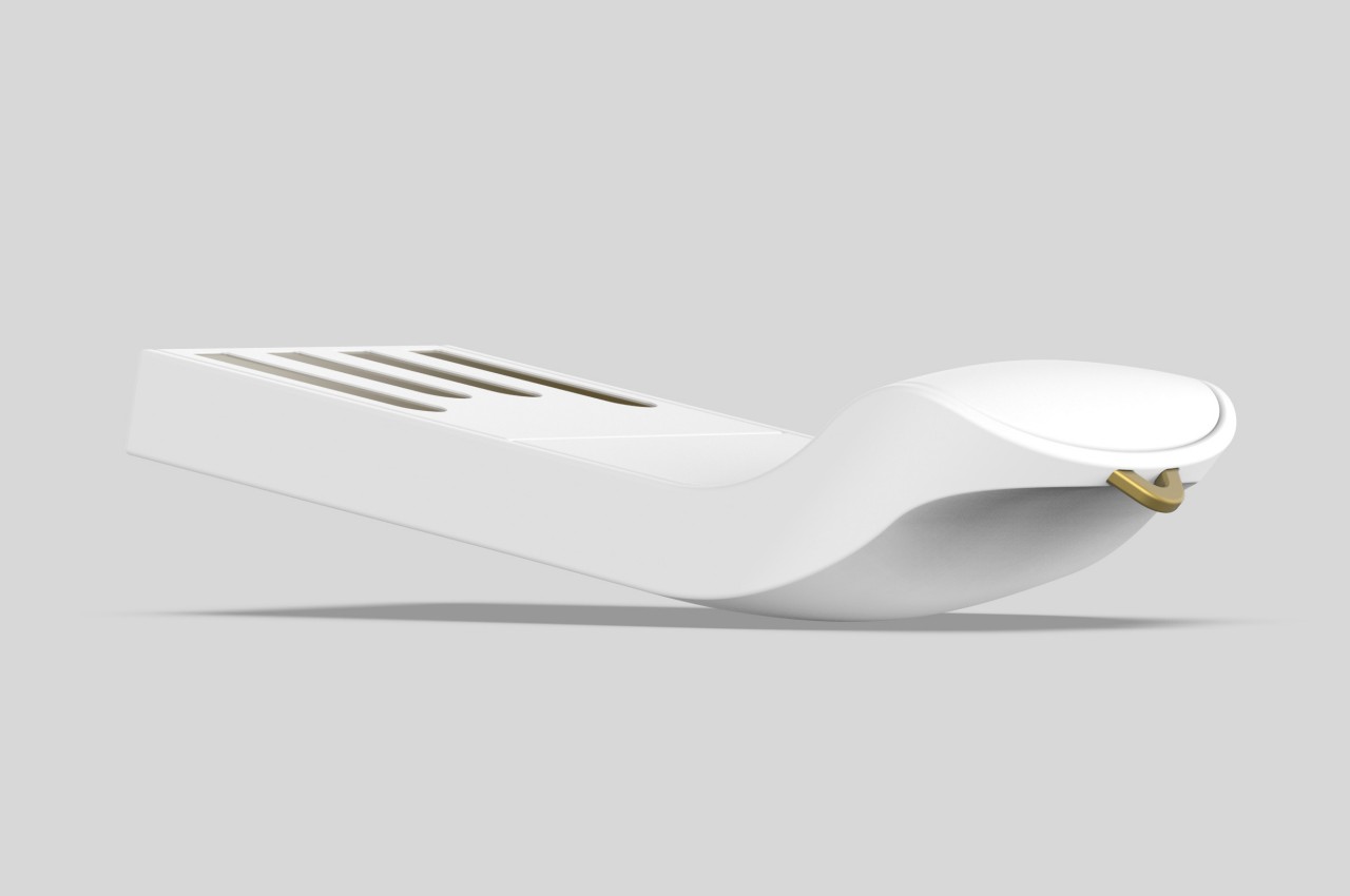
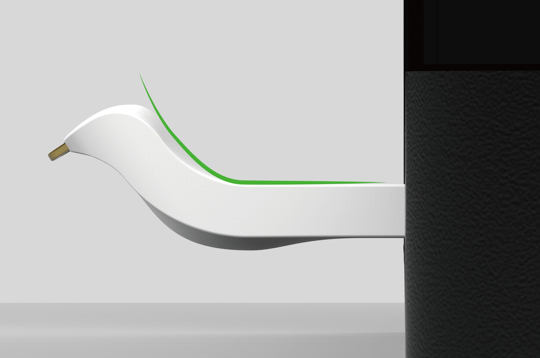
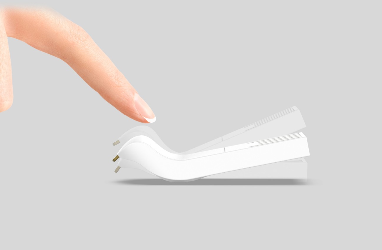
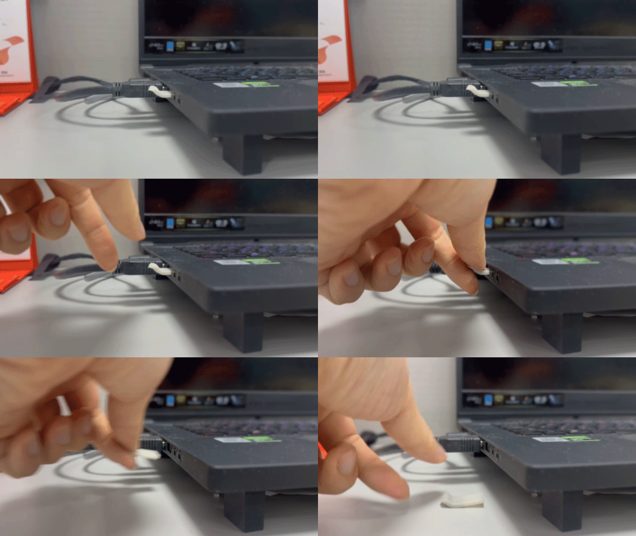
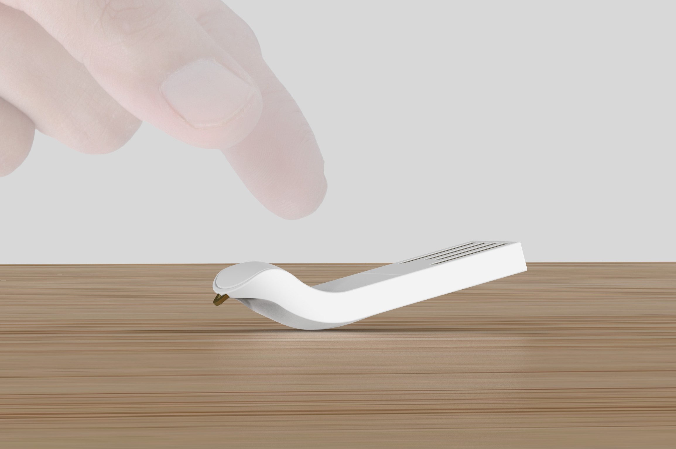
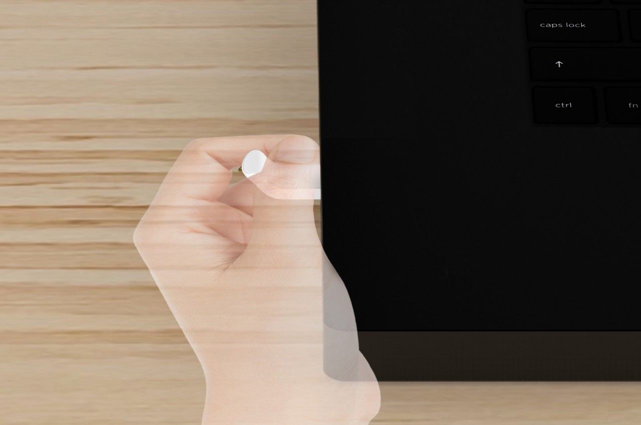
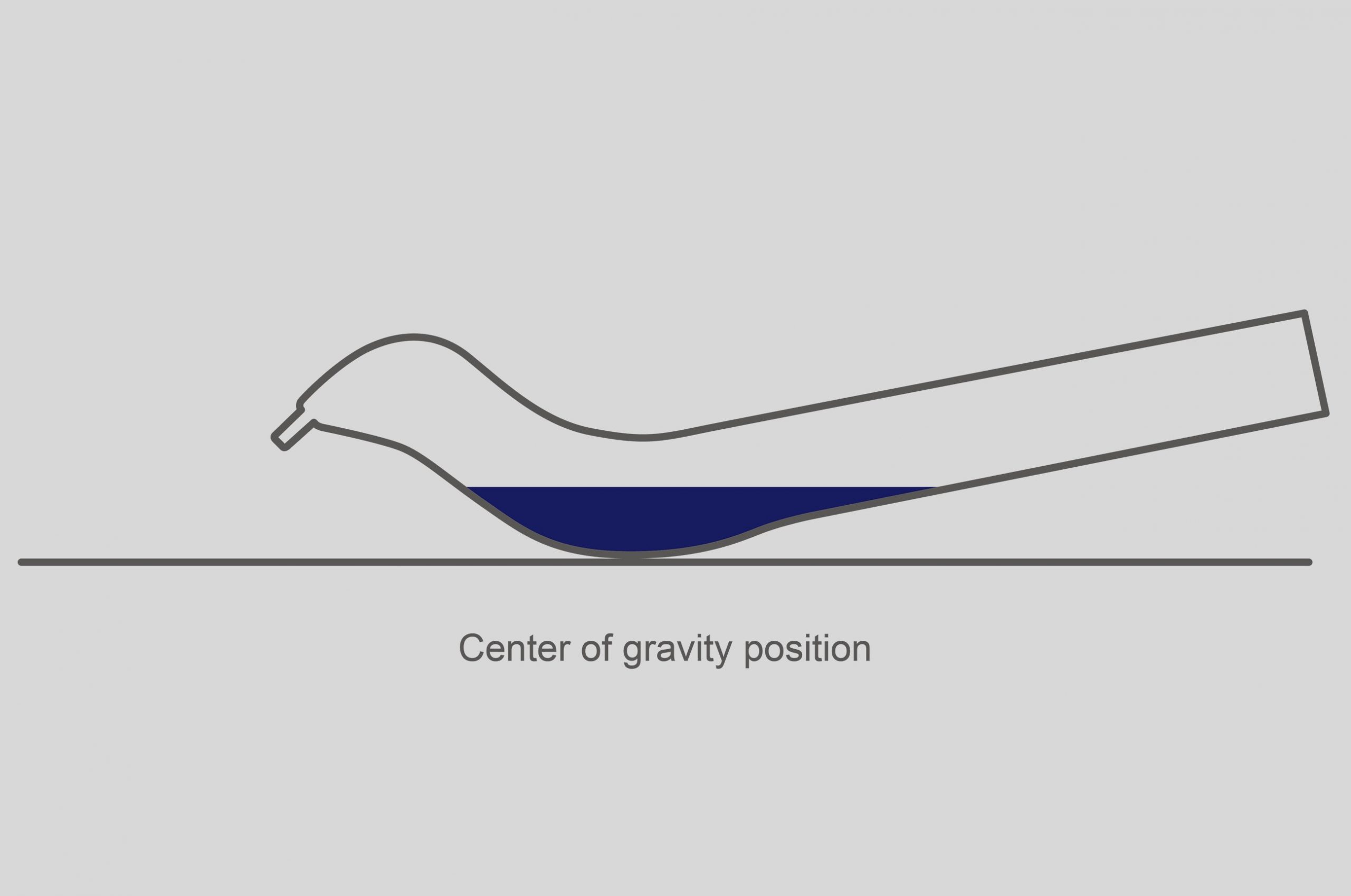
As unconventional as the design might be, it has merits that go beyond its eye-catching shape. The upward curve makes it easy to pick up the flash drive, and it gives your fingers something firm to hold onto when pulling it out from a computer. Curiously, putting Pinge down on a flat surface makes it rest on that curved portion thanks to a shifted center of gravity. That means that no matter how much you tip or rock the flash drive, it will always return to that stable position. Coincidentally, that makes Pinge a potential desk fidget toy.
1

Of course, there are drawbacks to such a non-flat design, like how the bird’s “head” might snag on things more easily or how it would take up more room in an accessory pouch. It might also make the flash drive more prone to breaking if something heavy was dropped on it or if it was sandwiched between too hard surfaces. It’s still an interesting design experiment, especially considering how most flash drive designs focus solely on functionality without paying attention to aesthetics. It doesn’t have to be the case, and it requires a bit of outside-the-box thinking to come up with interesting designs that don’t sacrifice functionality in return.
The post This bird-shaped USB flash drive concept pays homage to the data carriers of yesterday first appeared on Yanko Design.
This odd USB stick concept fits in between a laptop screen and keys so you never lose it

Files and digital content have become so important to our lives that it’s not surprising to see workers and students carrying a USB stick with them all the time. These data storage devices are designed to be small so that they are convenient to carry around, but their size can also become their downfall. It’s almost too easy to lose them in the black holes that are our bags or to forget them at home when you urgently need to work on your project. It would be great if you have that USB flash drive always attached to your laptop, but having it jutting out on the side is an accident waiting to happen. This concept design tries to solve that problem by ingeniously making the USB stick so thin that you can sandwich it between your laptop’s screen and keyboard without worrying about breaking anything in the process.

Designer: CLAIRE + LÉA

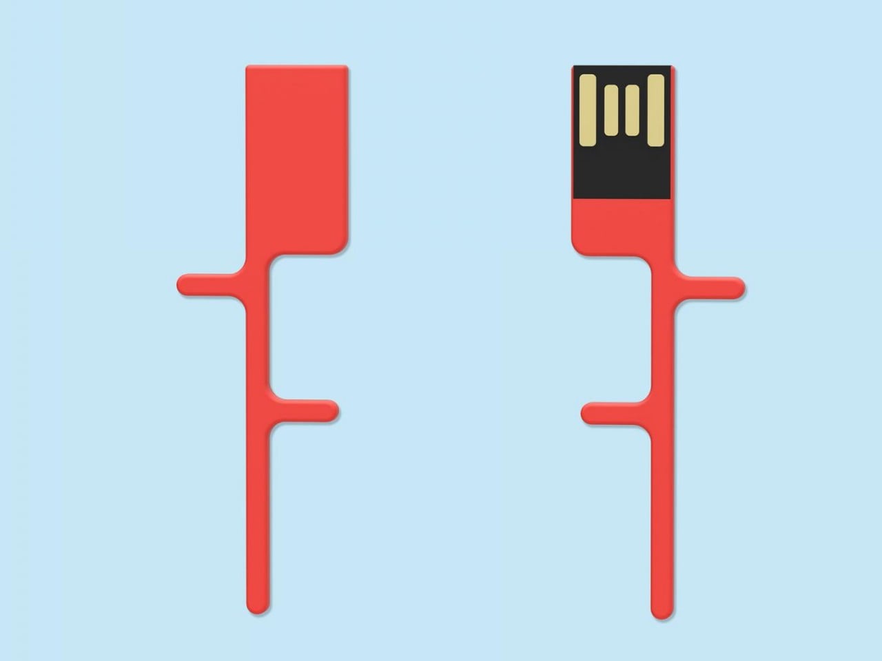
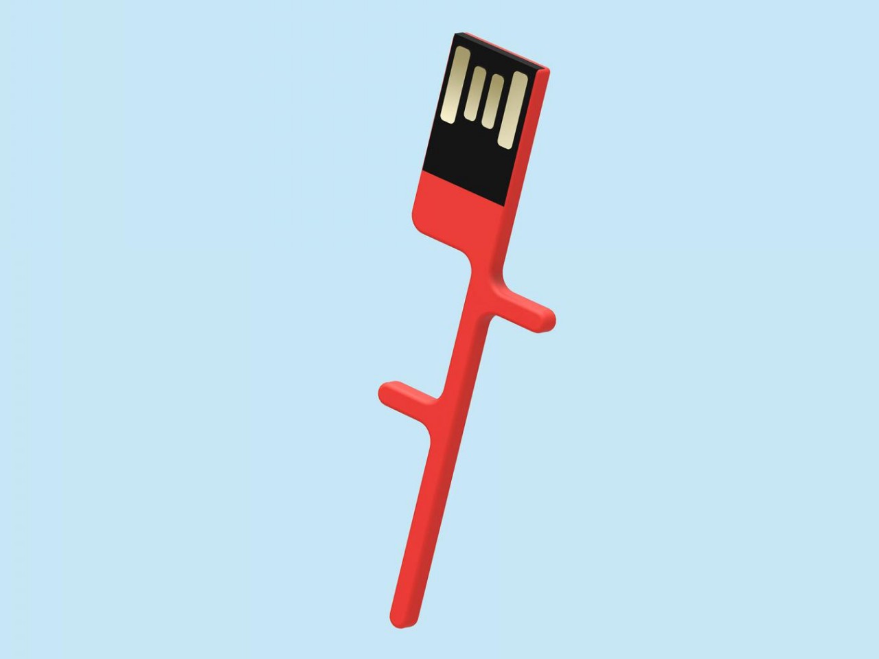
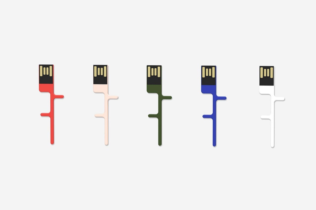
Thanks to advancements in technology and manufacturing processes, flash storage today can be extremely thin. Unfortunately, the traditional USB connectors for these peripherals are the reason for much of their bulk, so there are some designs that shed off the metal cages that shield the USB connectors, trading protection for convenience. The Saint Antoine USB key concept design takes that idea to the extreme by flattening the accessory while also shaping it into an unusual branch-like form.

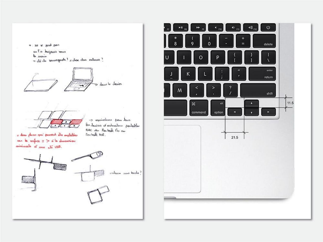
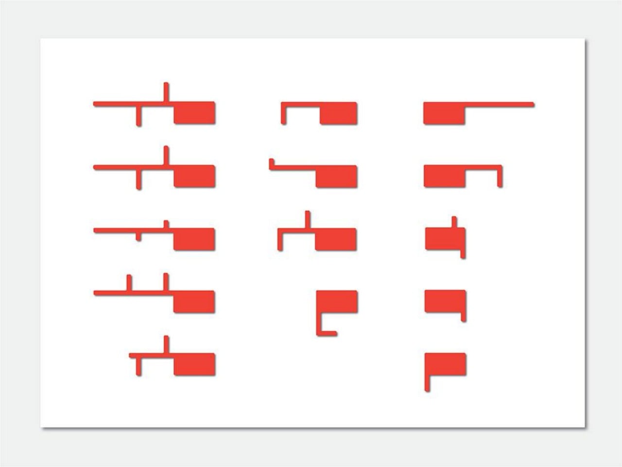
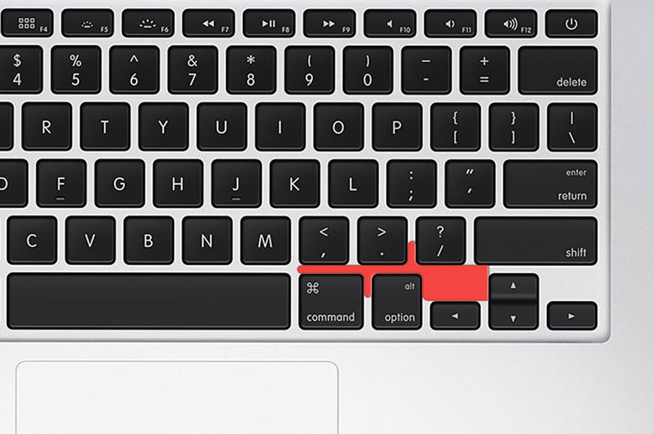
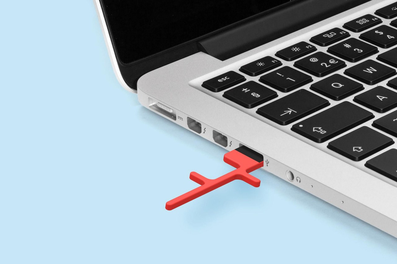
Simply having an extremely flat USB stick doesn’t exactly solve the problem mentioned earlier and even exacerbates it. It only makes the USB key harder to find and, more importantly, easier to break. What this concept does differently is to eschew the traditional rectangular form of these accessories into something that has small protrusions branching off a rather thin stem. This shape isn’t without its purpose, though, since that shape makes it possible to fit the USB key in between the keys of a laptop keyboard.

The idea behind this rather eccentric design is for the USB flash drive to rest in between specific laptop keys so that you never have to worry about losing it in transit. And since the design is so thin, it’s also safe to close the laptop lid on it since it won’t push into and puncture the screen. This way, you always have this USB key with you, ready to be used when you need it but getting out of the way when you don’t.

As interesting as the design might be, it does raise important technical and usability questions as well. Given the extremely thin shape of the chassis, there might not actually be enough room for the electronics necessary to store data. Having the USB key in between keys could also affect the typing experience, but removing it every time you need to type is also terribly inconvenient. More importantly, laptop keyboards vary from brand to brand and model to model, which means that one particular Saint Antoine shape might not fit any other laptop, making it an even more inconvenient and wasteful design.

The post This odd USB stick concept fits in between a laptop screen and keys so you never lose it first appeared on Yanko Design.
Anker Docking Station Monitor Stand frees some more room on your desk

Organizing your desk can be one of the most stressful chores of your life, especially if you have a mix of both analog and digital tools that you need to get stuff done. In addition to keeping everything in its proper place, cable management can become a necessity if you don’t want to let your desk look like a jungle. That’s not even considering yet the ergonomics involved, particularly when it comes to the proper monitor height to save your neck end eyes from strain. With so many factors to consider, it might come as a surprise that there could be one product that addresses all three at the same time, but that is exactly what Anker is proposing with its upcoming Docking Station that lets you get work done by getting unnecessary stuff out of the way.

Designer: Anker

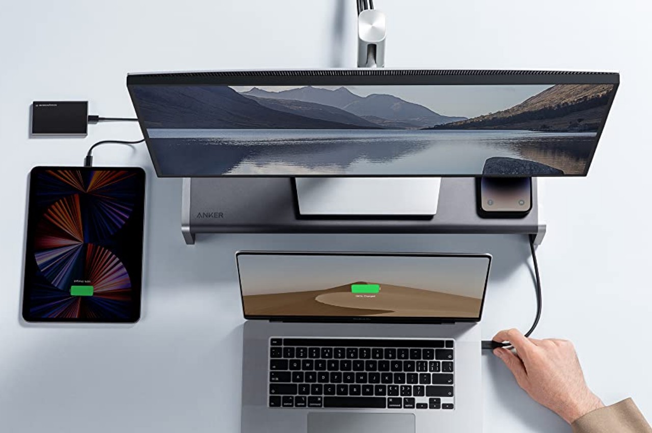
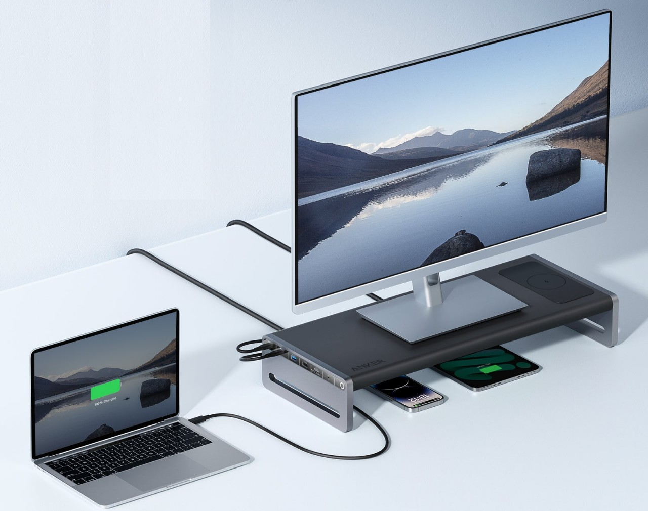
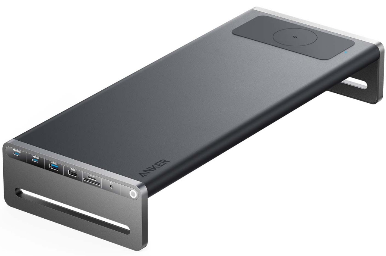
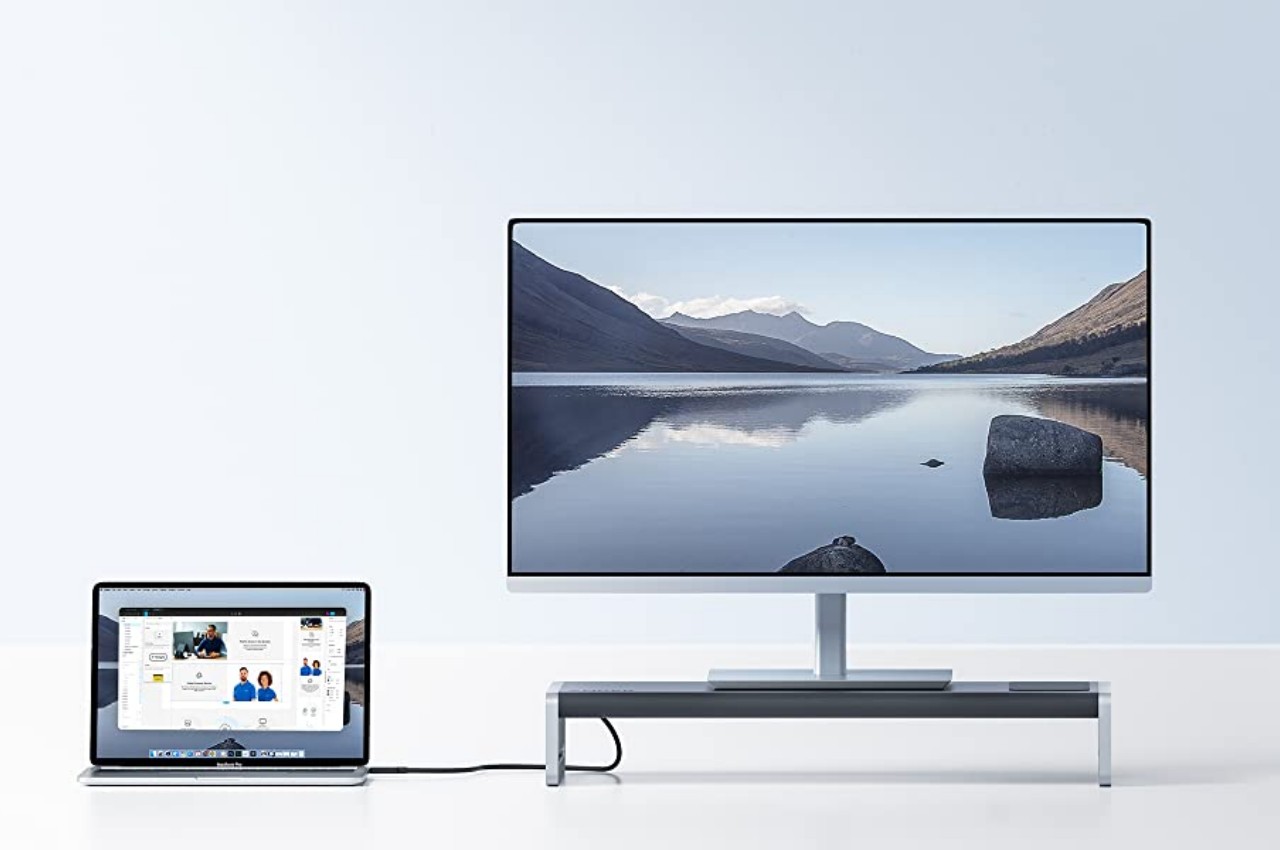
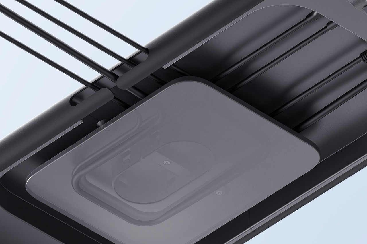
There are plenty of monitor stands in the market today designed to elevate computer screens to a more ergonomic height. Most of these do that and only that, which could be fine if you simply need something that props your monitor up a little higher. The new Anker 675 USB-C Docking Station, however, offers a lot more and helps get most of those pesky cables out of sight and out of mind, allowing you to deal with only the ones that you really need.

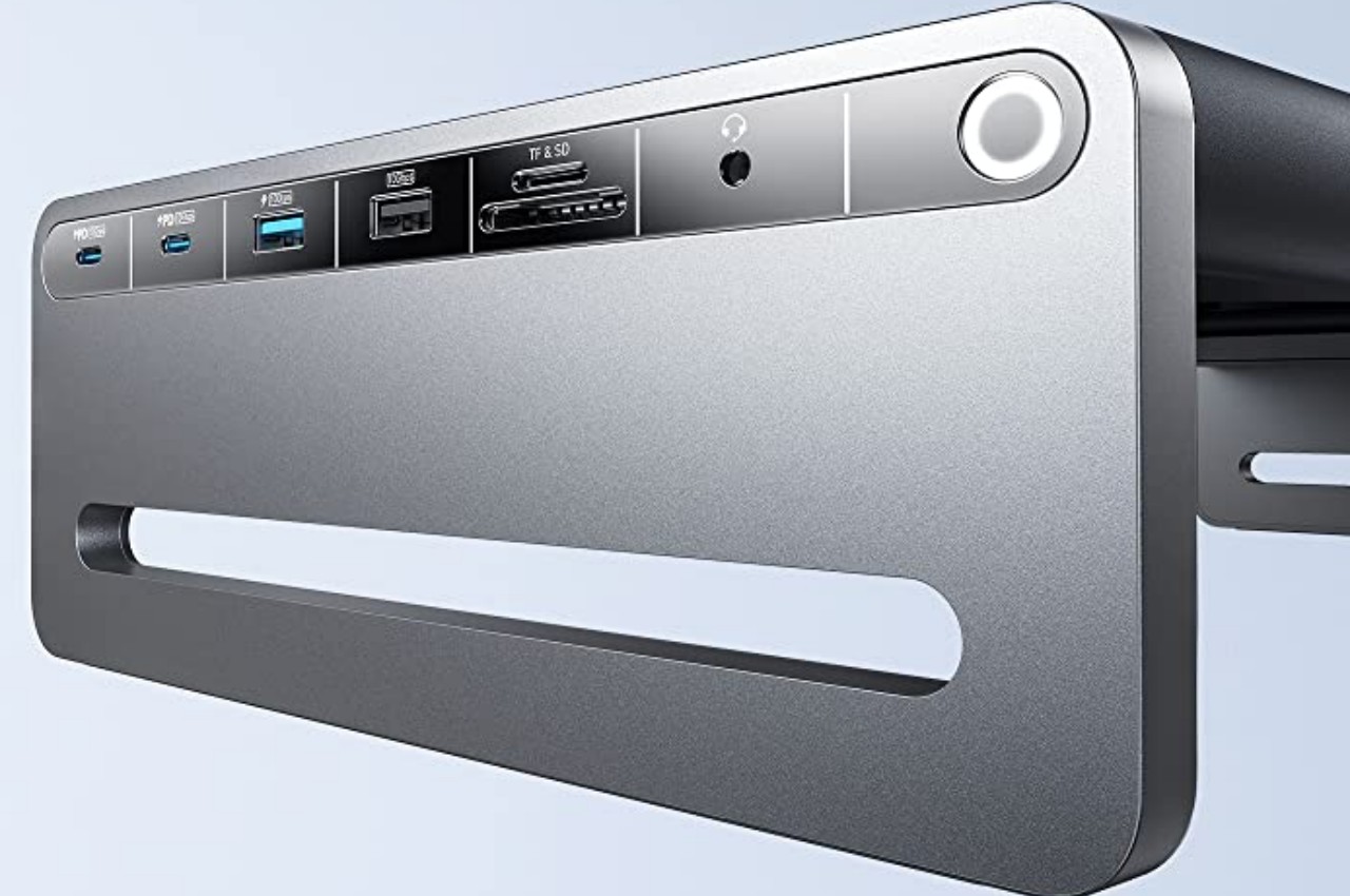
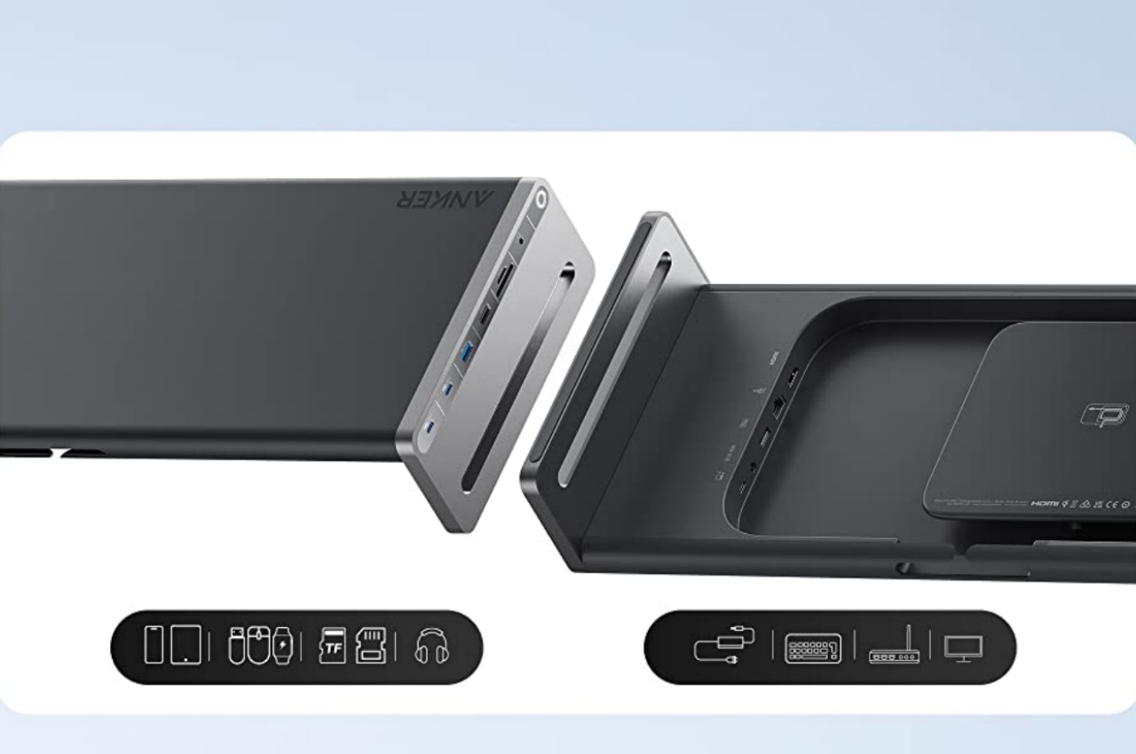
As its name suggests, this Anker Docking Station is really a hub of ports, and it definitely has plenty of those to go around. You won’t be lacking USB-A and USB-C ports, but there is also an HDMI port for your computer screen. There’s even a data card reader, so you won’t have to connect a separate peripheral for those one-off SD or microSD cards from cameras and devices. The most frequently accessed ports are placed on the left side of the dock for quick access, while others are hidden beneath the surface to prevent your hands from tripping over them. And as a bonus, there’s a wireless charging pad on the right side that supports most modern phones.

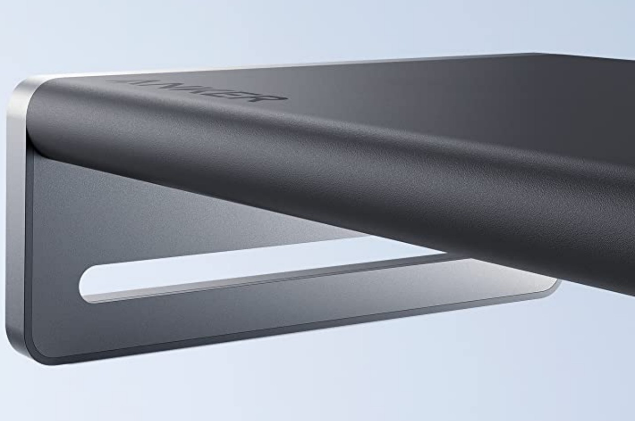
Unlike typical computer docks, the Anker 675 is a stylish accessory that won’t look out of place on your minimalist desk design. Made of aircraft-grade aluminum alloy, it’s surface can support a wide range of monitor sizes. The curved edges and corners give it an aesthetically pleasing form, which is just the break that your eyes and mind need when dealing with the pressures and stress of work life. Additionally, the empty space it leaves below is a perfect storage space for documents or even other devices that you want to keep within arm’s reach, even if they’re not immediately needed.

Keeping your desk tidy doesn’t always have to be a chore, even with all the cables running to and fro devices. The Anker 675 USB-C Docking Station Monitor Stand offers just the right amount of cable management to get these wires out of your hair while leaving some breathing room for the rest of your tools on your desk. Anker’s new product launches on January 30 for $250.

The post Anker Docking Station Monitor Stand frees some more room on your desk first appeared on Yanko Design.
This USB docking station has a novel way to keep your desk cable-free

In the past, the biggest source of clutter on people’s desks was paper that’s strewn around or stationery that hadn’t been returned to its proper storage. While those can still cause a mess on any surface, they’re relatively easier to tidy up by putting them back where they belong. As computers become more common in offices and homes, the cables that come to and from these machines have become even more problematic in maintaining a clean and neat worktable. It’s not as easy to get rid of these without losing functionality unless you go completely wireless, which carries its own set of drawbacks. Cable management solutions try to hide these essential eyesores from sight, but this docking station gives it a bit of a twist to make sure it doesn’t sacrifice accessibility in the process.

Designer: Humanscale Design Studio

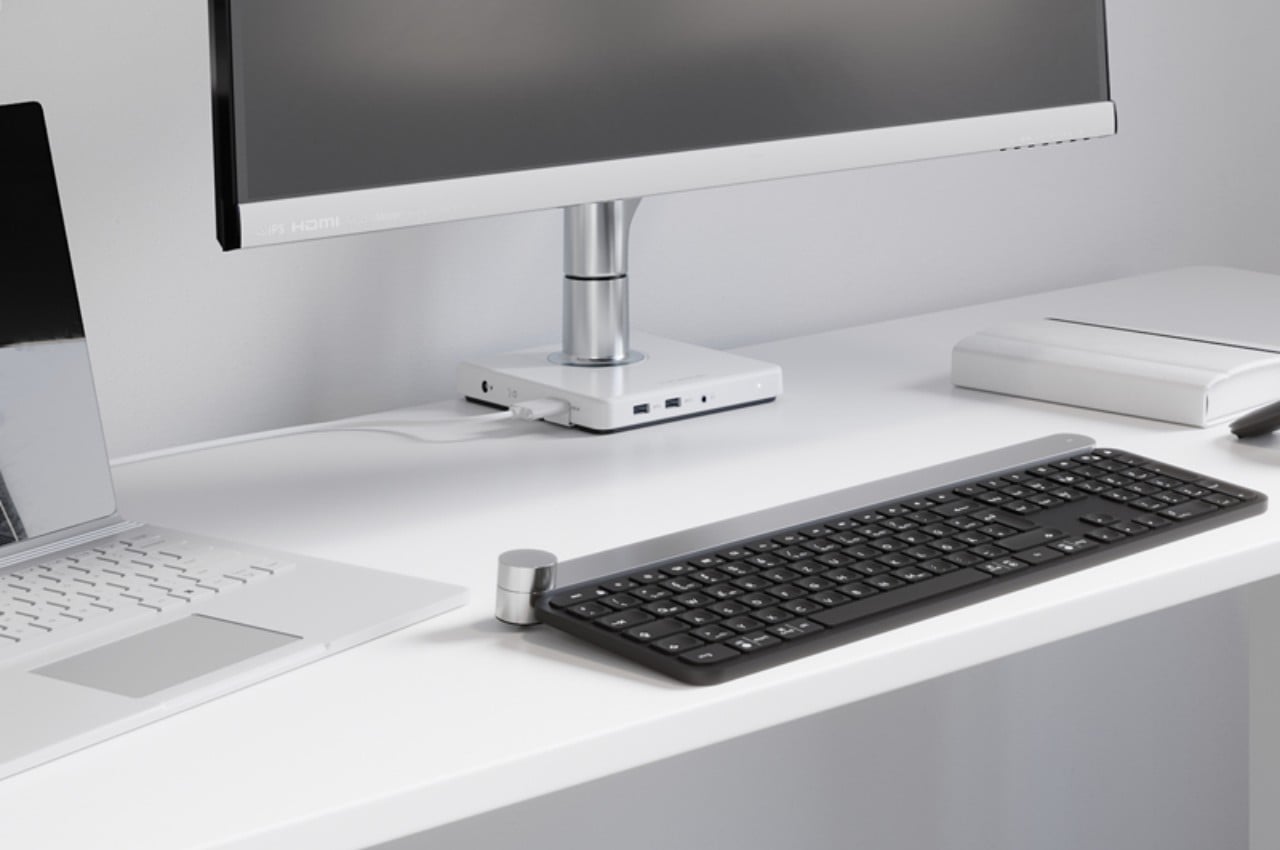
Most cable management solutions don’t simply organize computer and accessories cables to prevent them from going in different directions. Plenty of them, including those built into desks, also hide them from sight to keep them out of mind. There are USB docks and hubs that go under desks for that same purpose, but it comes at the cost of making it harder to actually plug and unplug peripherals quickly. Having the hub on the table, however, keeps things in the same place but isn’t as presentable as craftily hidden cables.

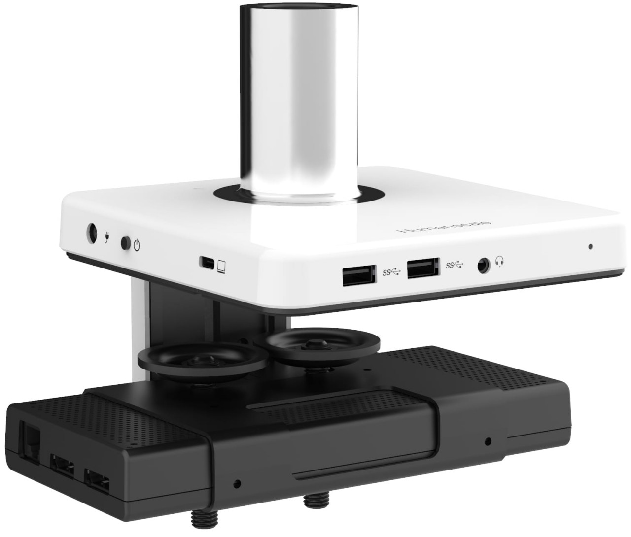
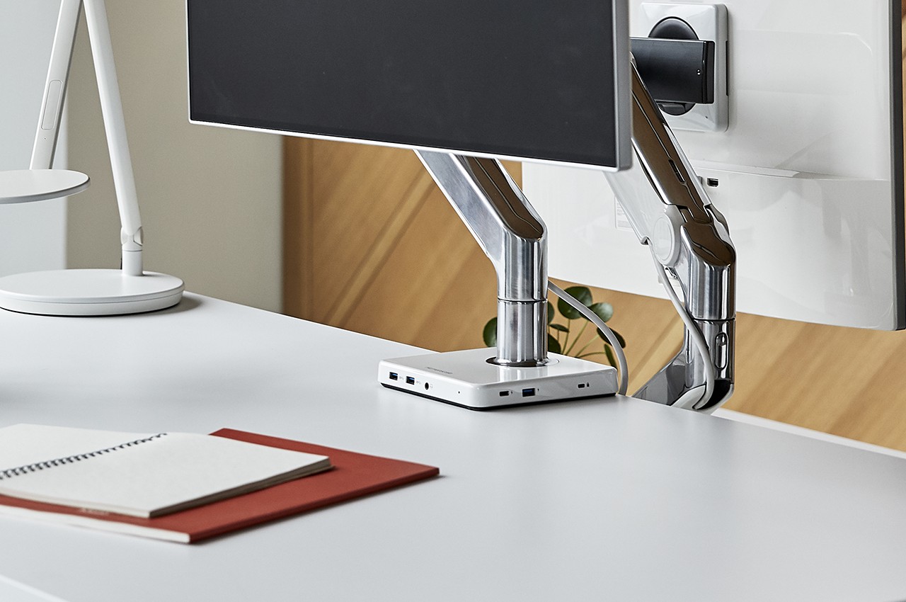
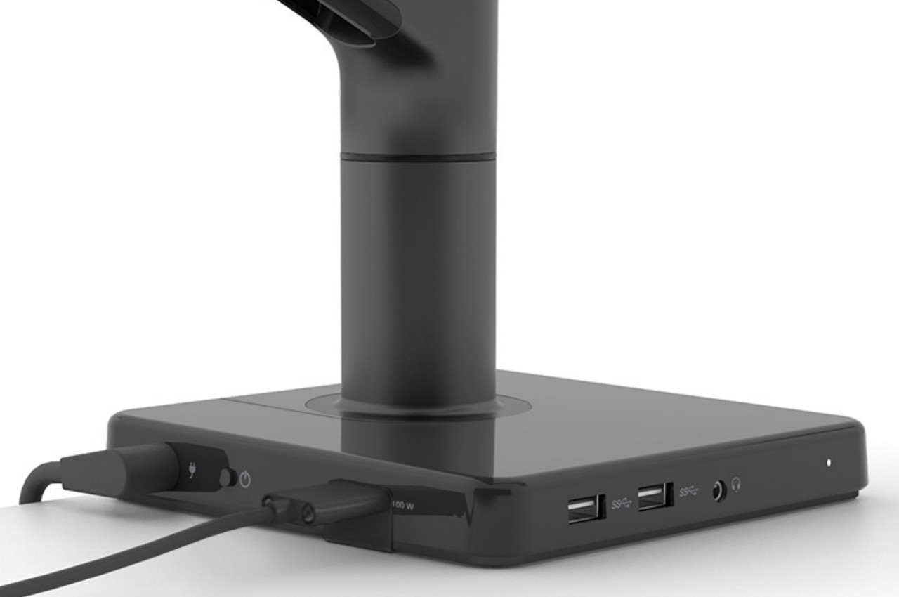
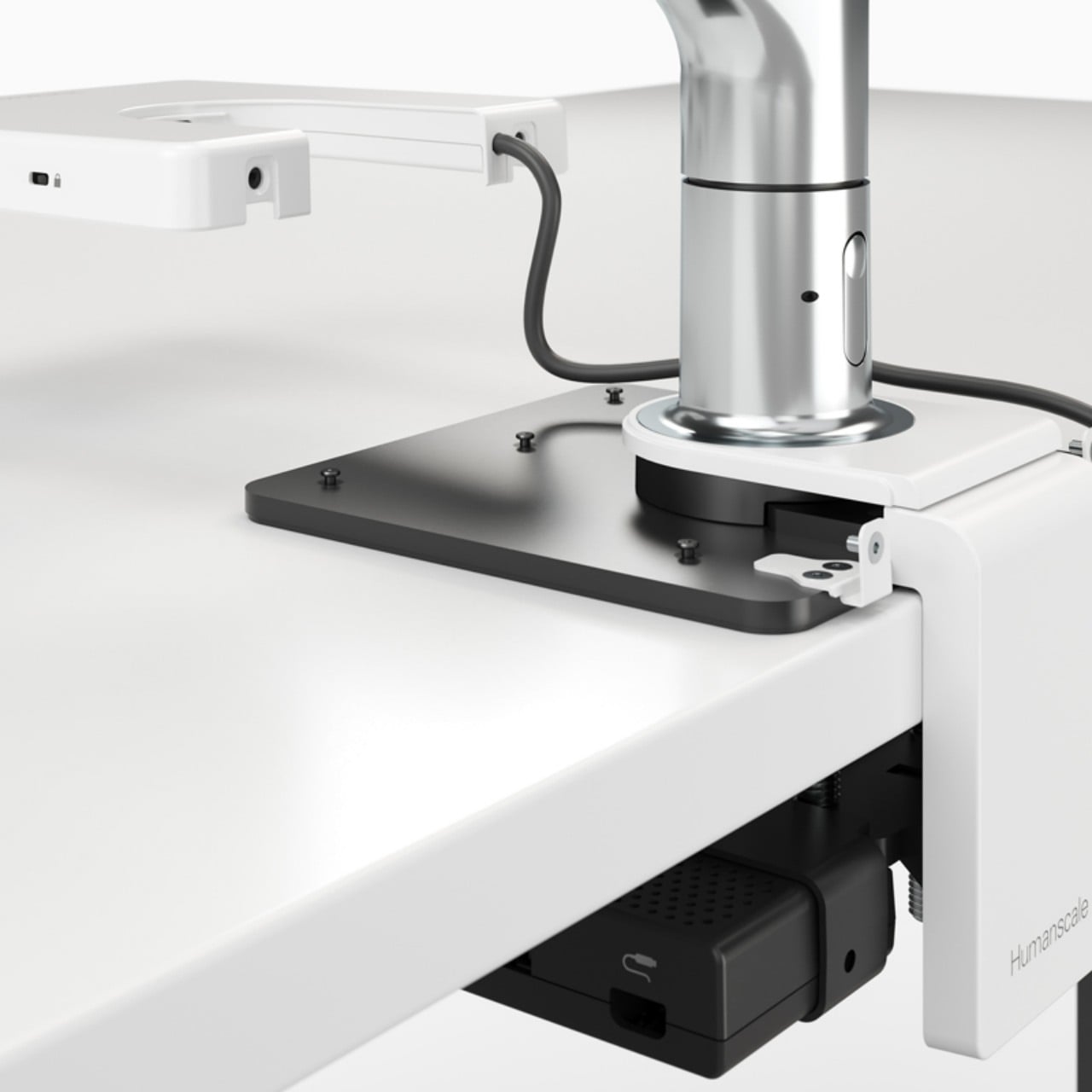
Humanscale’s M/Connect 2 works on the principle that not all of these cables and USB devices aren’t created equal. Some are rarely removed once they’re plugged in, like power cords, monitor cables, and even wired keyboards. Others, like dongles and external drives, do get inserted and removed multiple times, sometimes in a single day. This USB docking station’s solution is to actually split the ports between these two kinds of cables and hide those that don’t change often.

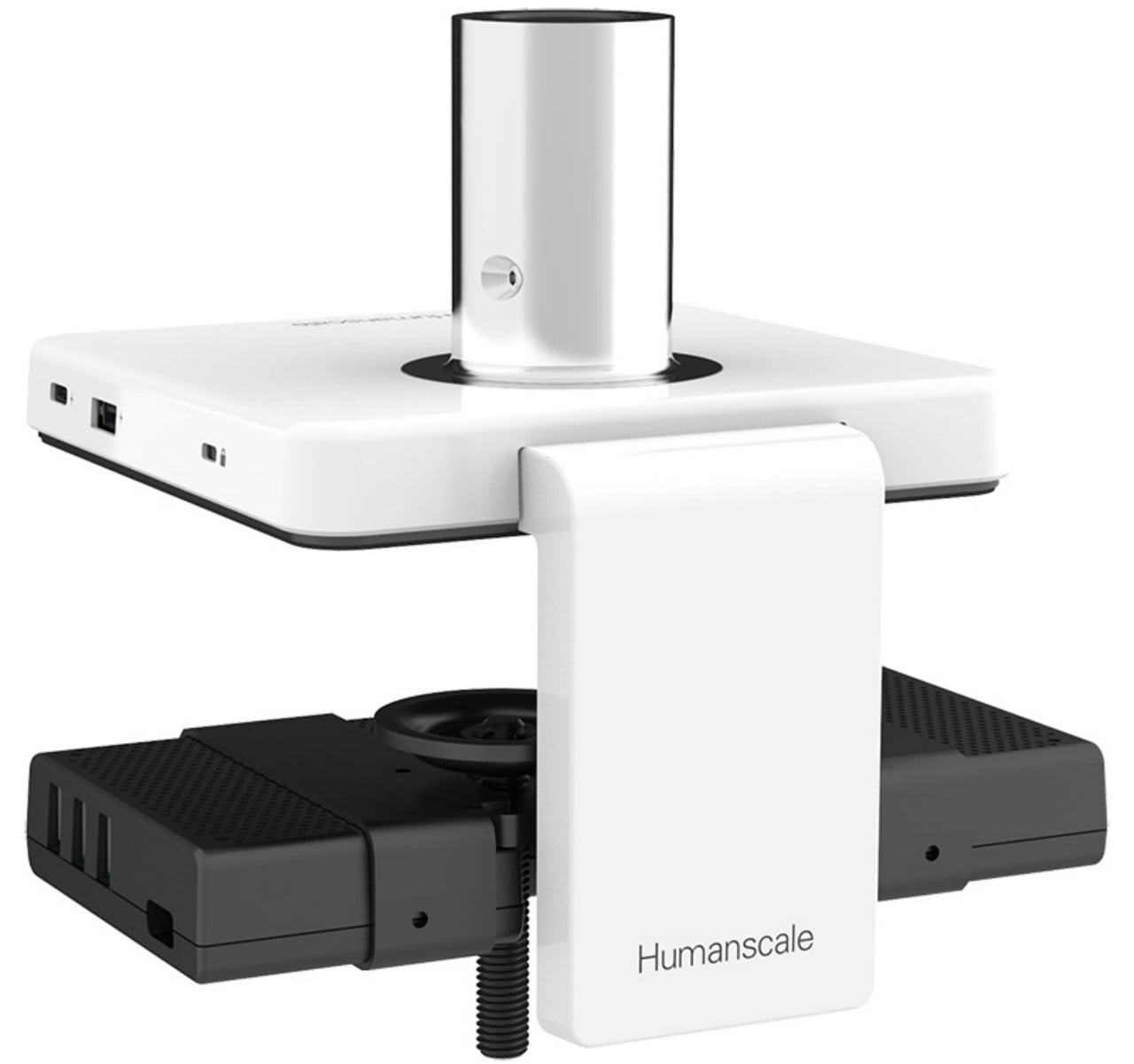
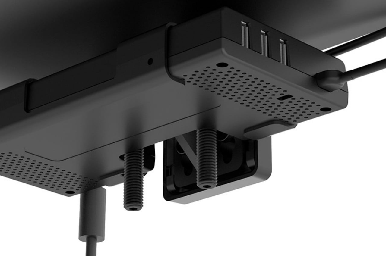
M/Connect 2 is designed like a clamp that attaches to an edge of a desk, preferably on the back, with ports above and below the table. The ports that are on the half underneath the desk are for cables and wires that can be conveniently hidden from view. The top half is practically a USB and Thunderbolt hub that provides the necessary ports for more transient devices and peripherals. This part is also modular so that the hub can be removed for repairs without having to disassemble the entire contraption.

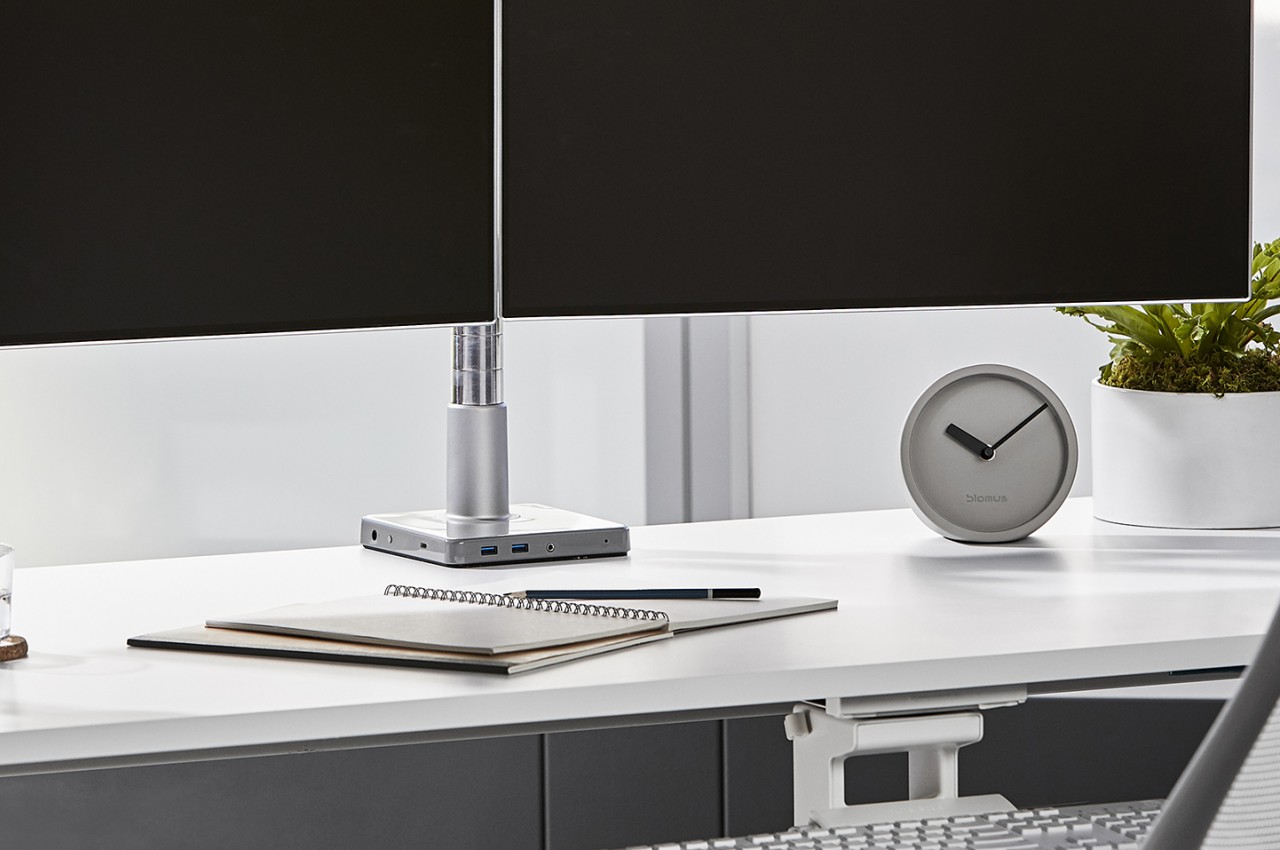
Another thing that makes the M/Connect 2 different from other docking stations is that it can be used in conjunction with a monitor arm to further reduce the amount of desk space that your computer accessories occupy. It can be used without such a monitor, too, making it a very versatile piece of equipment. Of course, it also looks quite elegant on top of any desk, which helps add to the ambiance that this innovative cable management system provides.

The post This USB docking station has a novel way to keep your desk cable-free first appeared on Yanko Design.

This snowy cabin set is actually a USB storage solution in disguise

Many of us have computer accessories as well as toys on our desks, so why not just combine the two to save space.

Given how much we rely on digital files and artifacts today, it wouldn’t be surprising if we all had a USB thumb drive or external hard drive in our possession. Some might even have memory cards that travel to and from digital cameras to our computers. These devices either take up space on our desk or get lost in our drawers, mostly because they don’t seem to have a good home in our workspaces. This concept, however, tries to solve that by designing USB drives and hubs to be just as decorative as they are functional.

Designers: Yeseul Kim, Edo Kim, Yu Shan Huang

A winter cabin in the mountains is probably the last thing you’ll think of when trying to look for a metaphor for USB drives. That said, the designers of this cabin desktop set found connections in the way both are thought of as transient locations for people or for data. They’re also places where some people make and store memories, another allusion to data stored in these data storage solutions.

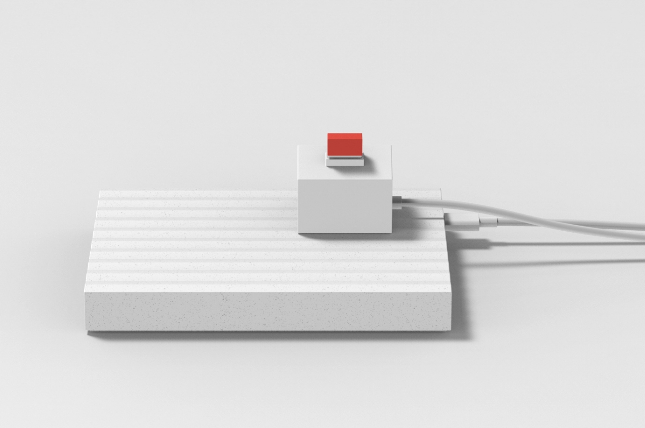
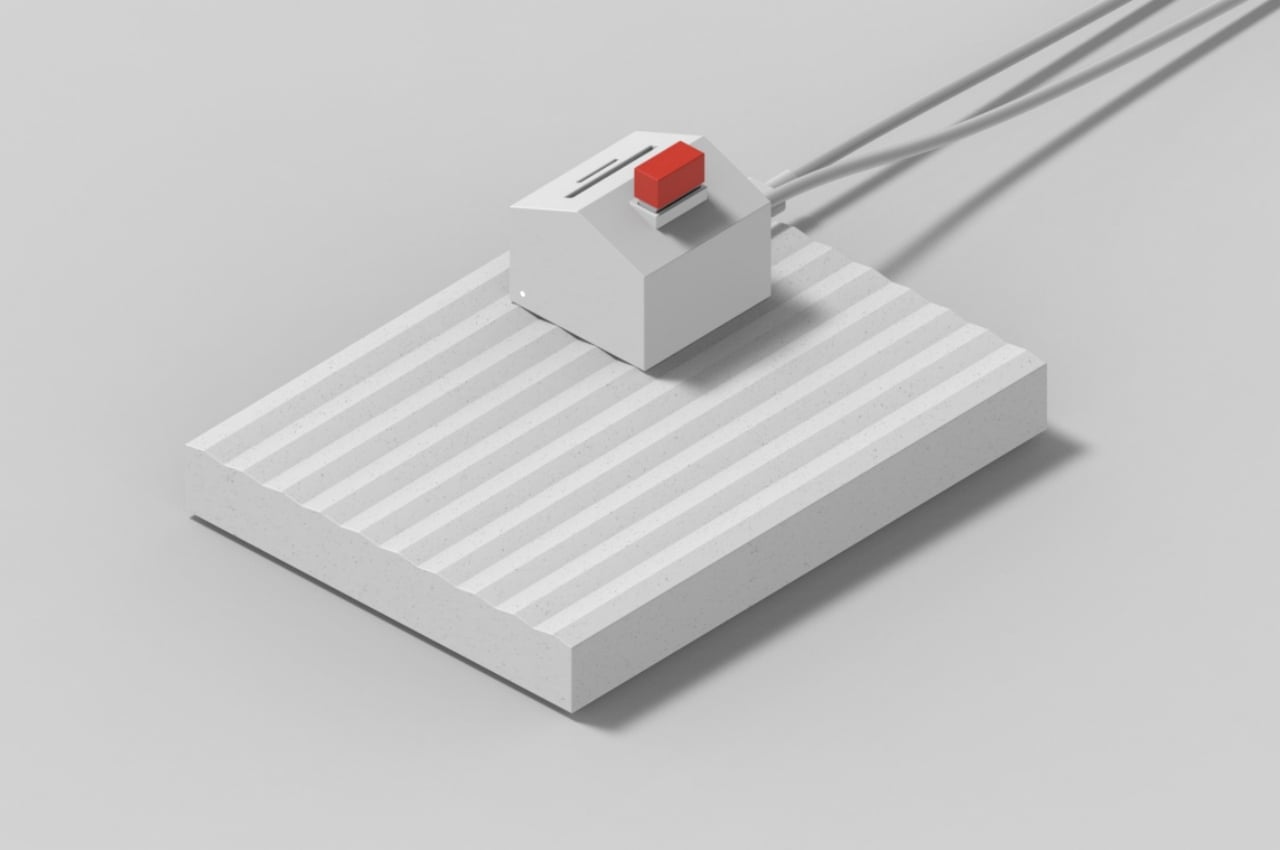
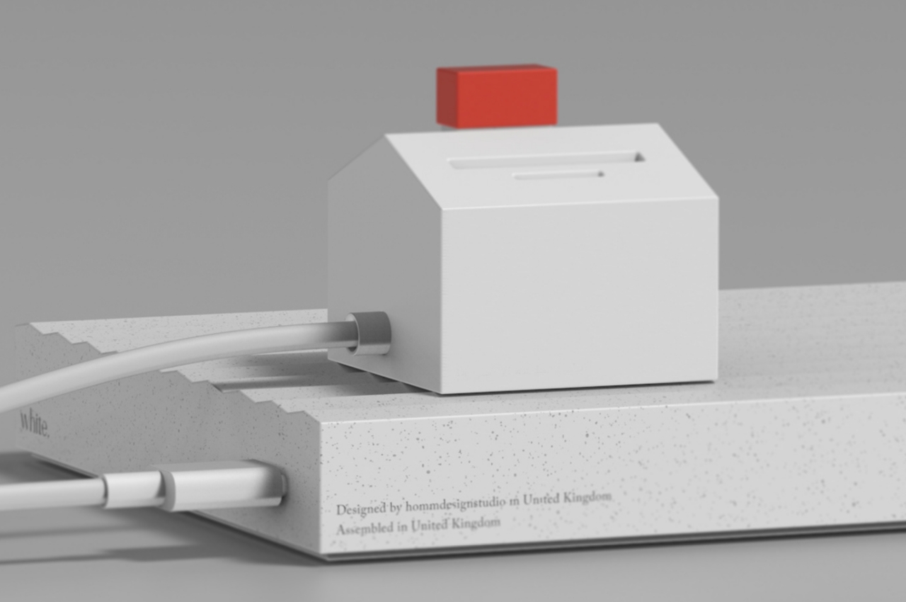
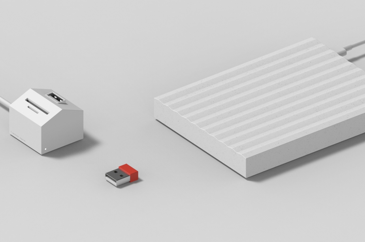
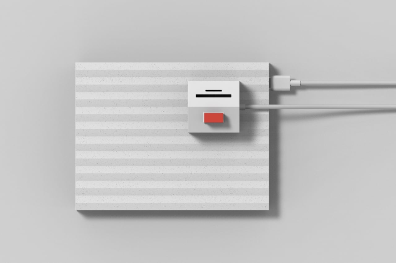
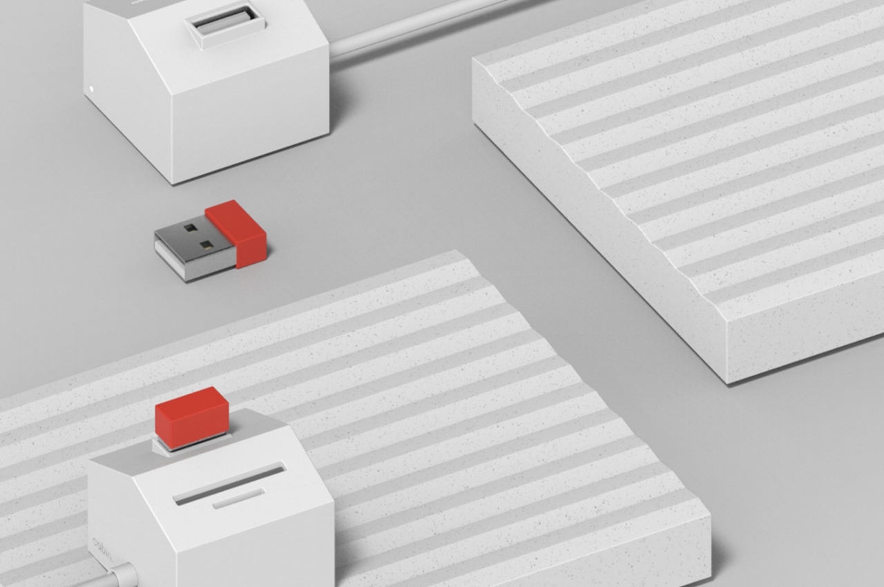
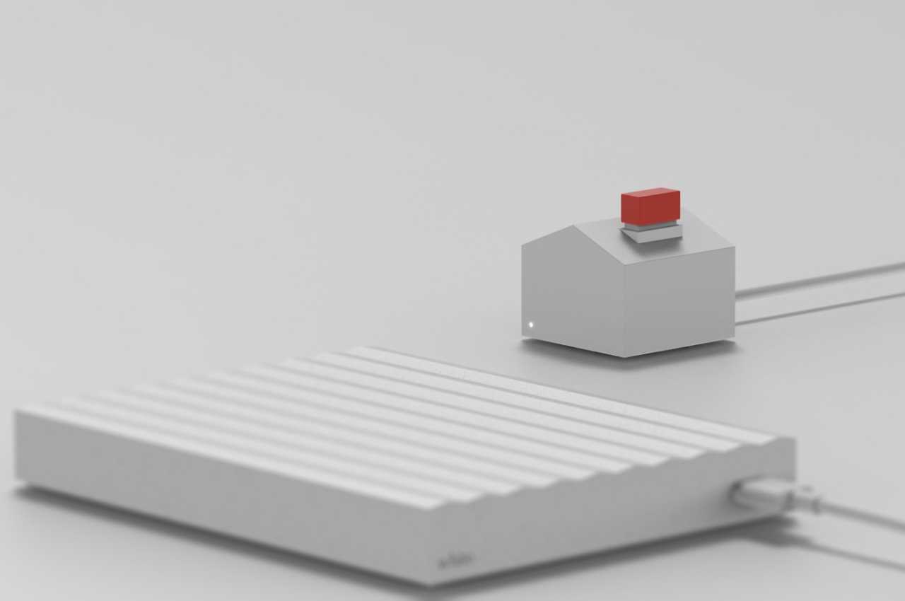
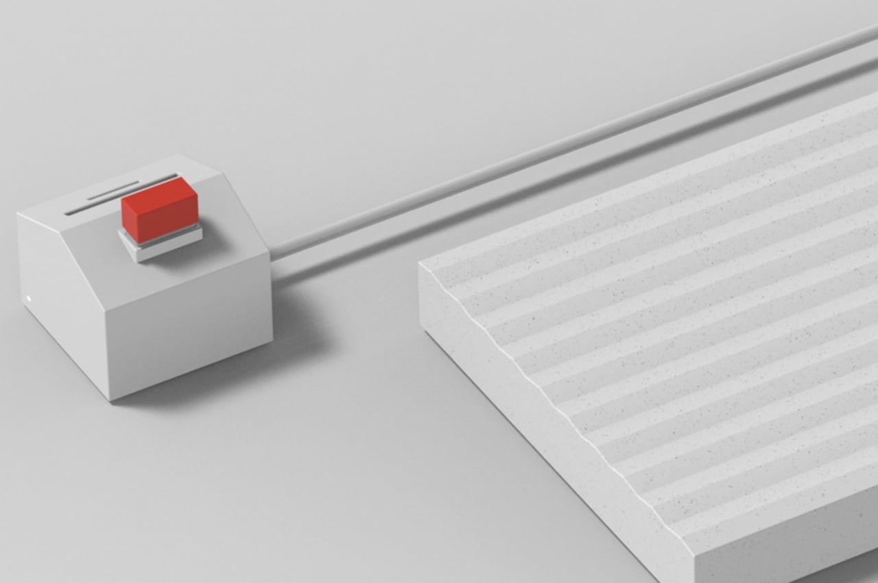
Whether you agree with that almost contrived explanation, it’s hard to argue that cabin is a rather creative way to blend utility and decoration in a fun way that doesn’t draw too much attention to itself. At first glance, the set looks like a white house with a red chimney set on top of a white plain. In truth, those three are also the three main parts of this deceptive computer accessory bundle.

The white box that serves as the base of the house is meant to be an external hard drive, with its ridges calling to mind white mountain tops in winter. The house is a USB hub with slots on the roof for data cards. That red chimney is actually the butt of a USB flash drive, though its size suggests it might have very little space for files inside.

The idea isn’t exactly groundbreaking, but it does raise the question of why very few manufacturers have dabbled in turning computer accessories into desk toys. The predominant minimalism trend in product design has flooded the market with nondescript and almost impersonal hubs and boxes. Perhaps it’s time for a change that will let people express their personality even through something as banal as a USB hub.

The post This snowy cabin set is actually a USB storage solution in disguise first appeared on Yanko Design.

This USB Hub concept brings a literal docking station to your desk

A lot of products these days extol the virtues of minimalist design, but one computer accessory idea goes the opposite direction to turn your workstation into a miniature battle station.

The number of devices we’ve become dependent on has grown considerably in the past few years. Ironically, the number of ports we can use to connect these with our computers has actually gone down. Some laptops, for example, have reduced those connectivity options to two USB ports, one of which might even be the only way to charge the portable computer. This has given rise to an innumerable number of so-called USB hubs and docks, most of which try to blend into the background. One concept, however, throws that convention out the window and tries to give science and science-fiction fans something to drool over.

Designer: Junwan Woo

“Docking station” isn’t a new term, but its meaning really depends on the context. For computer users, this often refers to accessories that expand the number of ports you can use. For space enthusiasts and sci-fans, it’s often a place where spaceships find their temporary home. In both cases, the docking station is almost like a metaphor for new experiences, and this hub, simply called “Docking,” puts a literal spin on that.

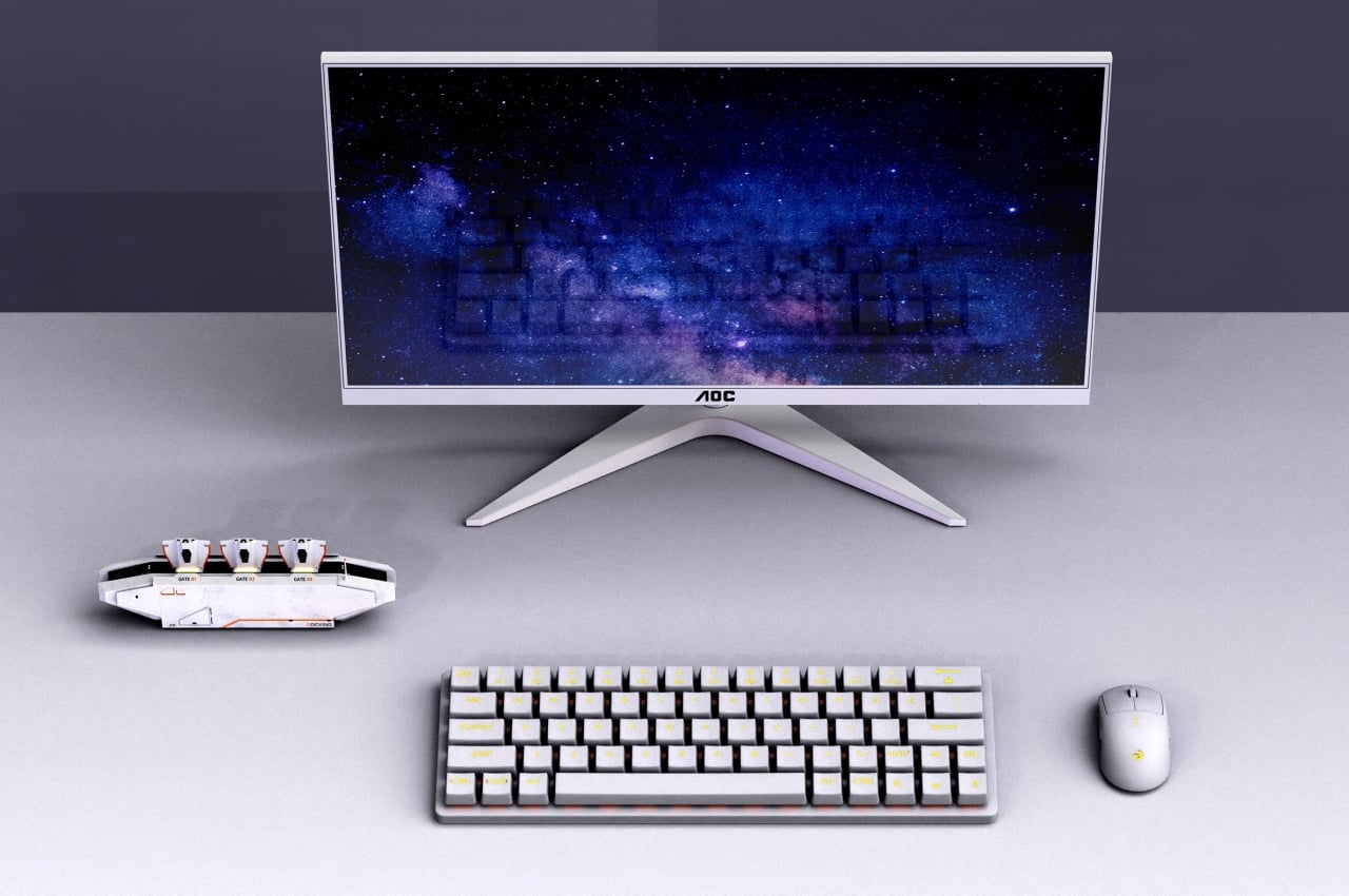
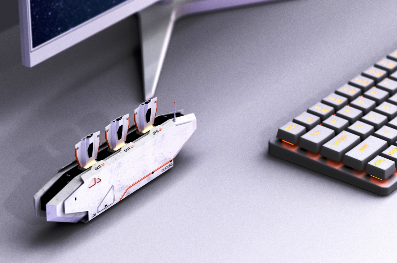
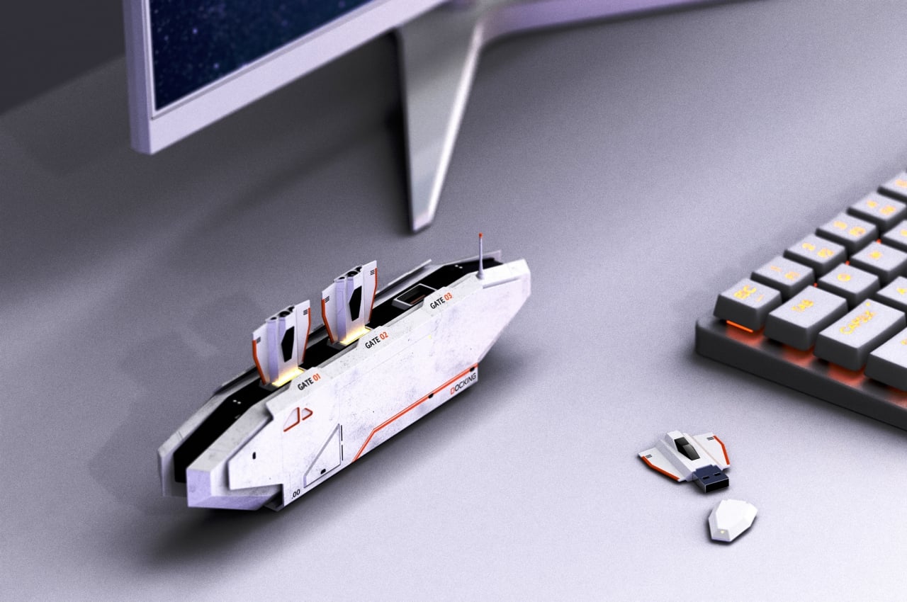
Instead of the small and nondescript USB docks that litter stores these days, the Docking station is bigger than what its function requires. It only has three full-sized USB ports, for example. Smaller hubs and docks than these also have room for HDMI ports, Ethernet ports, and more. Then again, as a concept, the implementation can be expanded as long as they don’t detract from the main design.

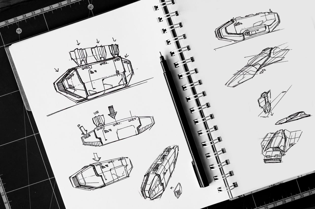
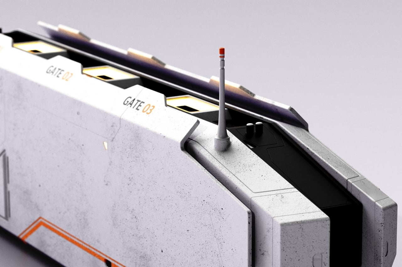
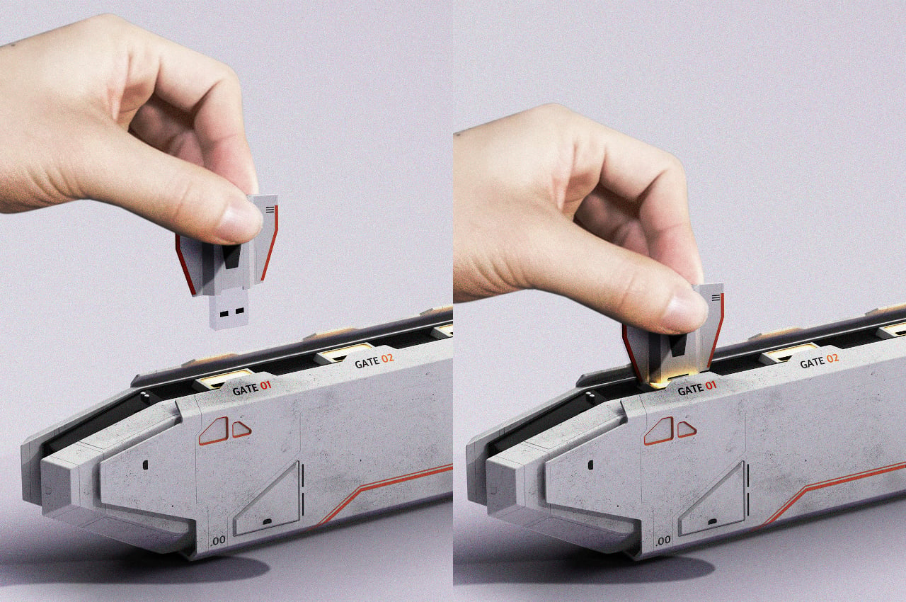
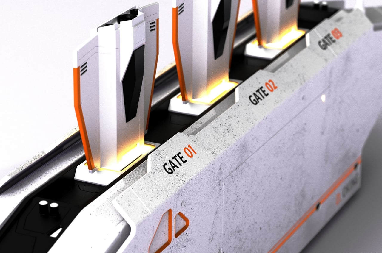
That design is, of course, a miniature docking station for USB drives in the shape of miniature ships. Although the ships look generic, the weathered white exterior of the station and orange accents are almost reminiscent of Rebellion colors in Star Wars. And as with any other Star Wars technology, the design looks both futuristic and retro at the same time.

The USB thumb drives themselves don’t seem to have anything special about them. Each USB port, however, lights up when something is inserted inside, a redundant indicator that still fits perfectly with the theme. Unfortunately, putting any other USB with a different design breaks the illusion, but the dock itself is already something worth talking about on its own.

It’s also going to take up a lot of desk space, but you wouldn’t be buying something like this just to keep your workstation looking tidy and clean. It’s a rather ingenious idea that mashes together two different interpretations of the same term, and it’s one of those concepts we wished actually got turned into a product you can buy.

The post This USB Hub concept brings a literal docking station to your desk first appeared on Yanko Design.
Adorable tiny ‘USB Christmas Tree’ lights up with LEDs as you plug it into your laptop!

Christmas Spirit meets the Spirit of Innovation!

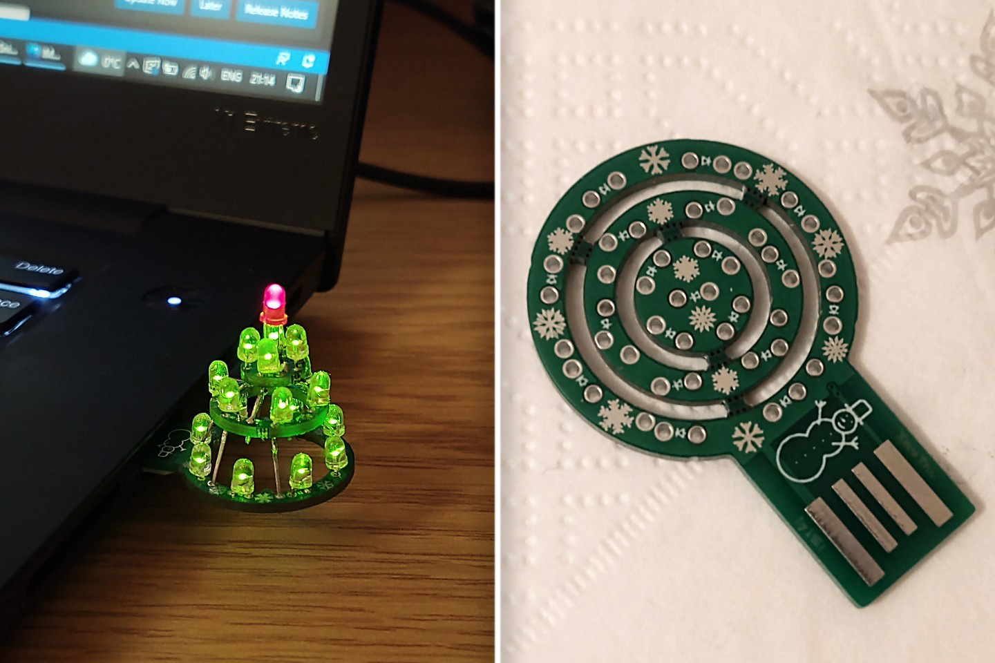
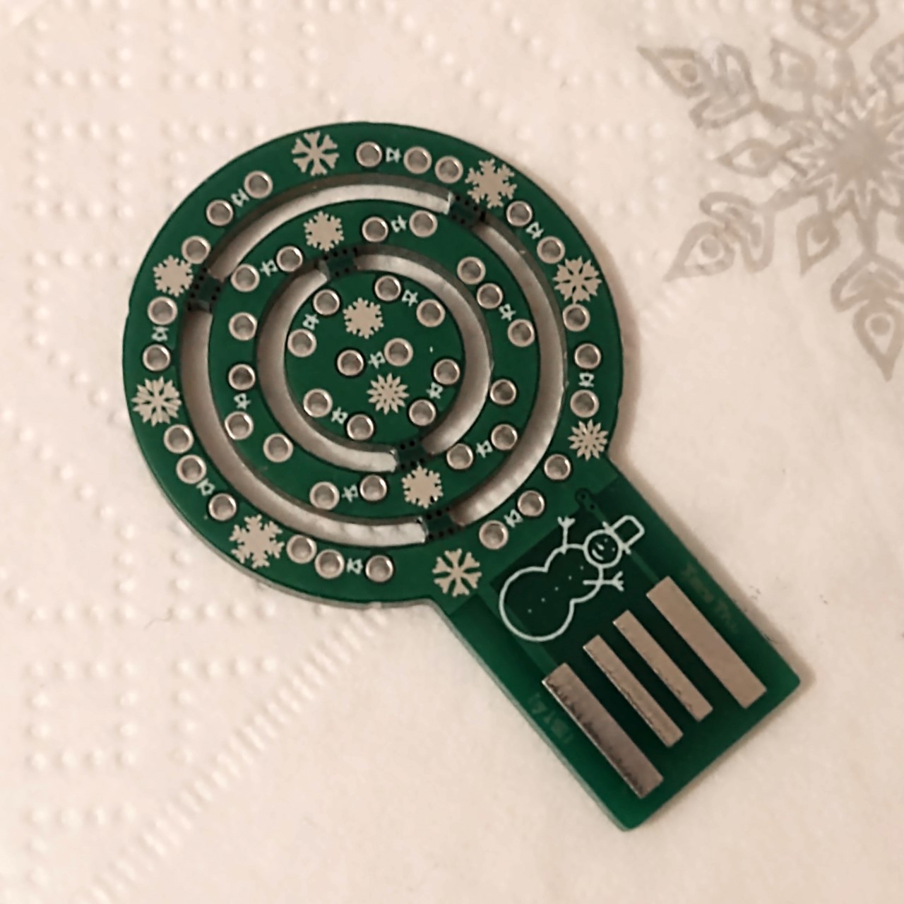
Sure, we aren’t in offices just yet, which means Secret Santa is a little more difficult this year, and chances are that office party won’t happen on the scale you expect it to. If for some reason, that’s giving you the blues, this absolutely adorable little gizmo should turn the frown upside down and spread some Christmas cheer while you work! The ‘PSB Xmas Tree’, as it’s labeled on Github, is a clever little PCB hack that plugs into your computer’s USB port and lights up like a tiny decorated tree. It’s incredibly DIY, but that’s precisely what I love so much about this tiny gizmo – the fact that it has this handmade personal touch!

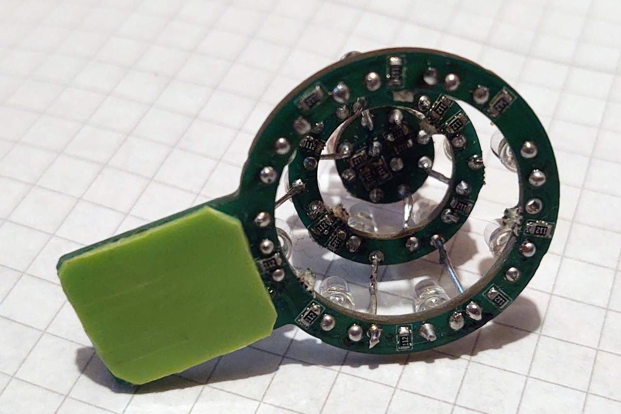
The PSB Xmas Tree is the work of a Github community member who goes by the name of Piotr SB. The tree features a custom fabricated PCB with concentric circles that pop out to give the ‘tree’ its conical shape. These circular boards are connected via LEDs, that get supplied with power from your laptop’s USB port. There’s definitely a rustic charm to it as you can see, and Piotr mentioned it hardly costs anything (the PCBs were ordered from JLCPCB for something like $2 for 5 pieces) and runs on low power too. Aside from the PCB, the tree needs 19 THT LEDs (preferably 18 green and 1 red) and 19 1k Ohm resistors to effectively run the entire rig. A little soldering and boom, you’ve got yourself a plug-and-play Christmas tree that may be small in size, but it definitely matches the enthusiasm of your large decked-up tree at home!

You can download the open-source files from Github using this link… and while we feel there’s a charm to assembling the tree as it is, you could totally 3D print a tree-shaped enclosure that covers the gadget, giving it a more finished look.

Designer: Piotr SB

The post Adorable tiny ‘USB Christmas Tree’ lights up with LEDs as you plug it into your laptop! first appeared on Yanko Design.
The Hot Cookie USB Mug Warmer Looks Like a Giant OREO

So how do you eat your OREO cookies? I like to carefully disassemble mine, scoop the creamy filling out with my bottom teeth, then eat the two chocolate cookies individually. The way I figure it, it’s like eating three cookies for the price (and calories) of one. While I really enjoy my sandwich cookie ritual, I’ve never thought about keeping my coffee warm with one.
Novelty gift maker Just Mustard makes this USB-powered mug warmer that looks just like an oversize OREO, though it says “Mustard” so they don’t have to pay Nabisco. Which makes me wonder… can you patent a cookie? I’m not sure. Of course, an OREO filled with mustard sounds disgusting, so try not to think about it that way. I guess it could be worse, and that white stuff could be mayonnaise. Also, don’t try and dip this cookie in milk, or you’ll end up electrocuting yourself.

If you can resist the temptation to bite into this giant-sized not-an-OREO cookie, you can grab this USB mug warmer over on Amazon (affiliate link) for about $18.