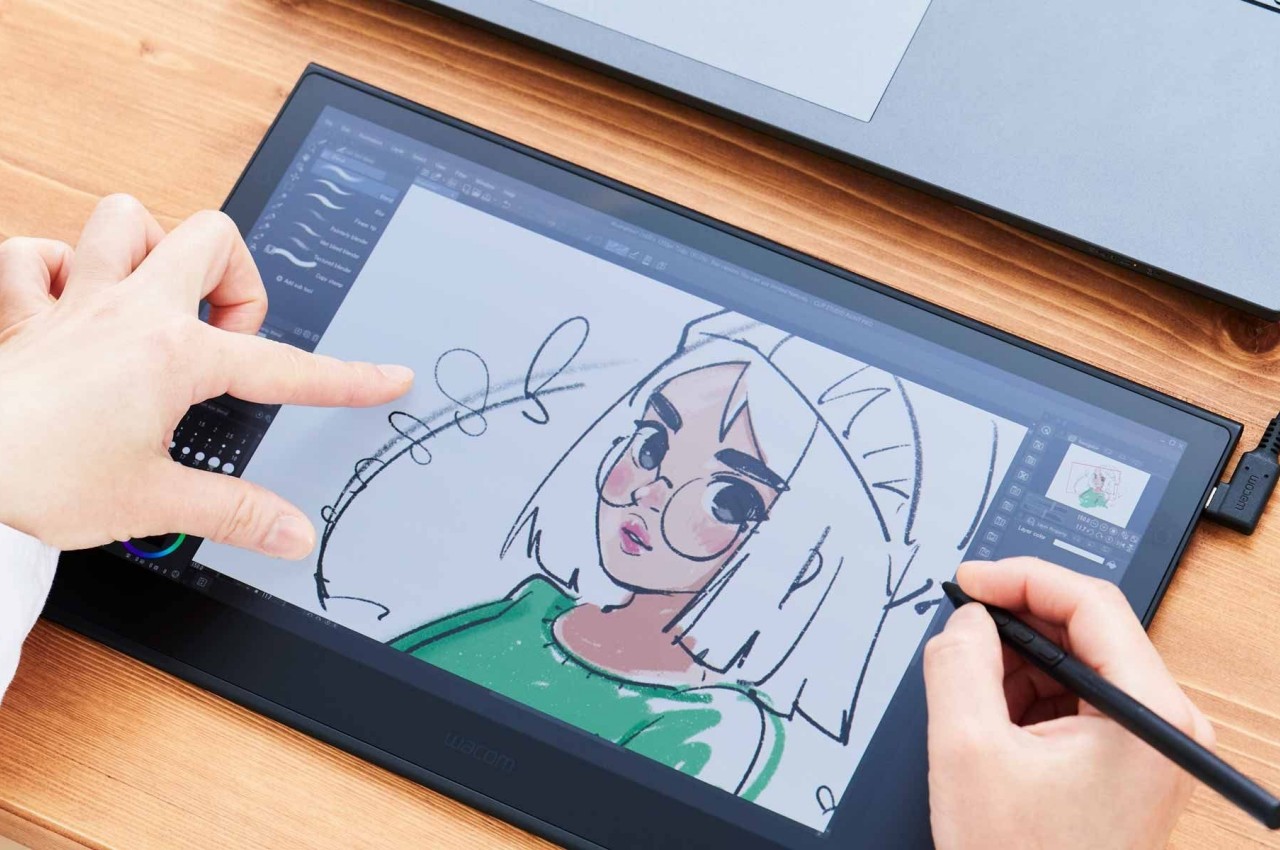
The new Apple Pencil Pro is a death-sentence for Wacom

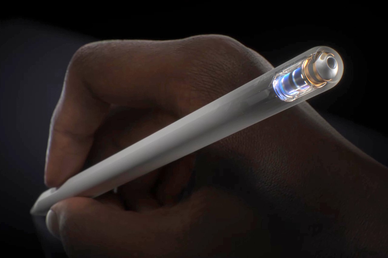
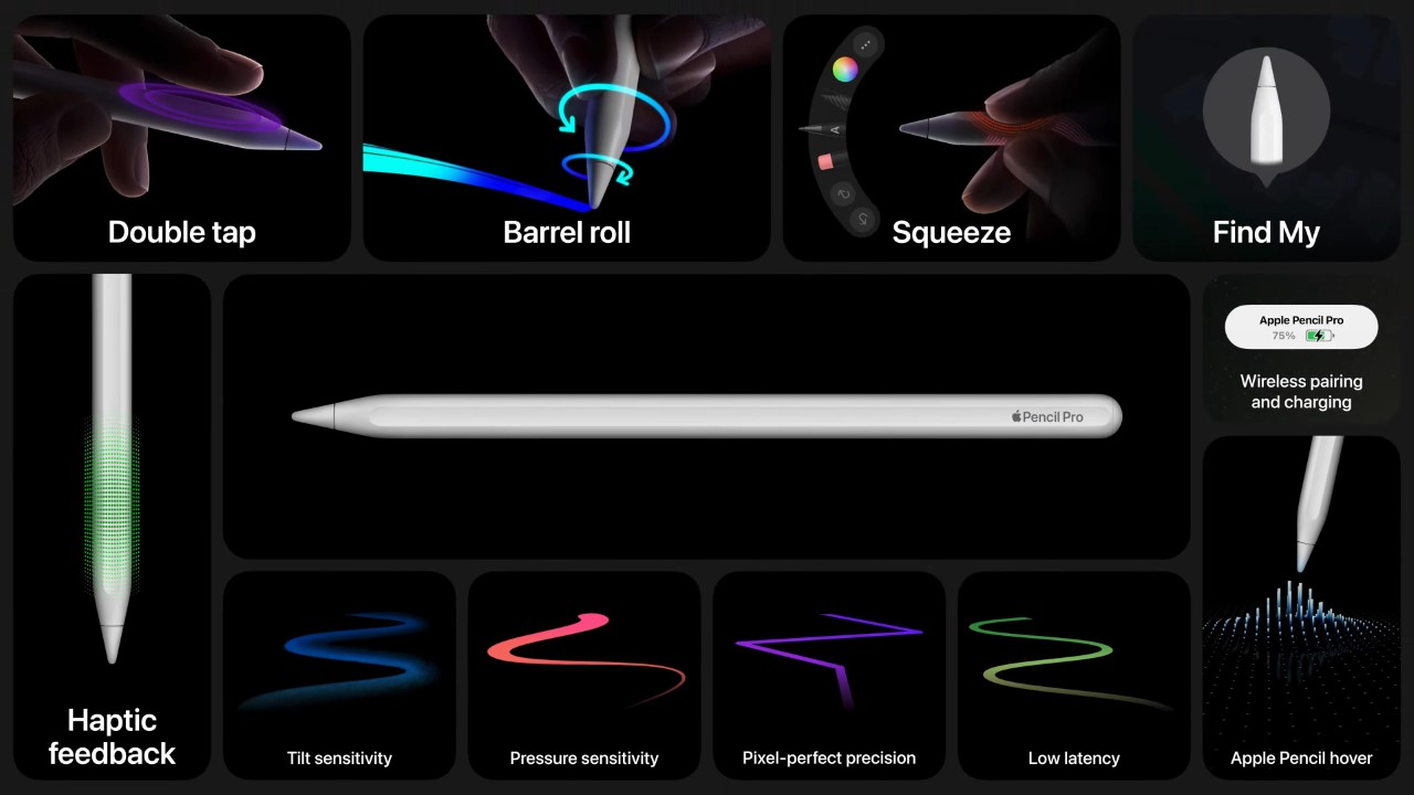
Wacom was once an industry leader in the sketching tablet PC market. However, it’s no match for the deadly combo of the new iPad Pro M4 and the Apple Pencil Pro. Announced at the iPad keynote yesterday, the new Pencil Pro packs features so unique, it makes regular capacitive styluses look like tools from the Stone Age. The new Pencil Pro has a new squeeze gesture to activate quick menus, can track rotation to have objects and brushes rotate in real-time (known as barrel roll), and even has a haptic motor for feedback – while still packing features from previous models like the hover feature, pressure and tilt sensitivity, and low-latency. If all that wasn’t enough, the Pencil Pro even has Find My support, allowing you to locate your stylus if it ever gets lost. The Wacom Pro Pen 3 on the other hand, has buttons.

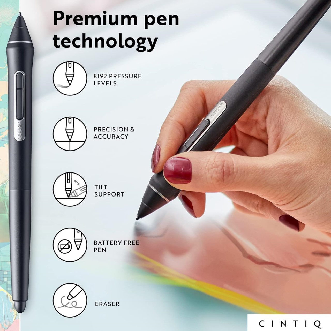
Styluses have existed for decades at this point, and if you asked anyone ten years back which was the most well-designed stylus and tablet combo for creatives, the answer would invariably be something from Wacom’s lineup. The company had three options back in the day, the budget Wacom Bamboo, the mid-range Wacom Intuos, and the flagship Wacom Cintiq. Apart from the Cintiq, none of the other tablets had screens – they were just massive trackpads that you could only draw on with styluses. The Cintiq was the closest thing to an iPad – it had a screen, allowed multi-touch gestures, and came with controls galore… the only problem was that it didn’t work independently, it needed to be tethered to a desktop or laptop to work. The Cintiq, along with the Intuos and Bamboo, came with a stylus that featured a pressure and tilt-sensitive tip, along with programable buttons that let you undo or redo tasks, and a stylus tip on the back of the pen also that activated the eraser, mimicking how most pencils come with erasers on their reverse tip. The styluses also operated without batteries, allowing for hours of sketching without needing to charge the pen periodically.

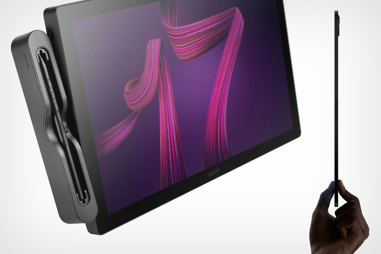
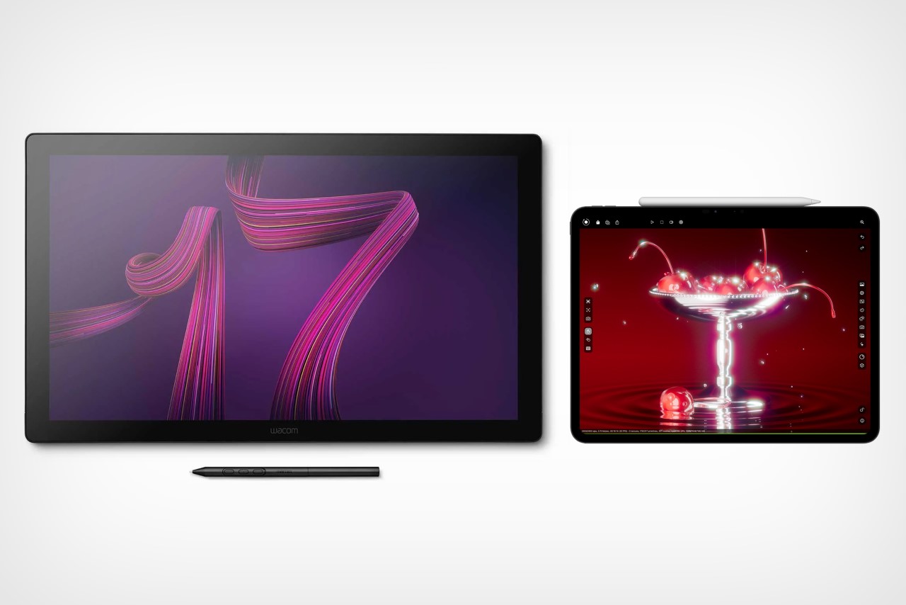
The Wacom Cintiq Pro is anywhere between 5-8 times thicker than the 2024 iPad Pro

Cut to yesterday when Apple dropped the iPad Pro M4 and the comparison is incredibly stark. For starters, whenever anyone asks me whether they should buy an iPad or a Wacom, the answer is almost always the former… because when you’re not sketching on the Wacom, it’s useless, but when you’re not sketching on the iPad, it’s still an iPad. The difference seems even greater with the new iPad Pro being Apple’s thinnest device yet at just 5.1mm thick, while the 16-inch Wacom Cintiq is a whopping 25mm thick – 5 times thicker than its competitor. Cut to the larger 22-inch Cintiq and it’s a staggering 40mm thick, or the equivalent of 8 iPad Pros stacked one on top of the other.

However, a hardware comparison between a trillion-dollar electronics giant and Wacom, that’s valued at just half a billion dollars doesn’t seem fair. What does seem fair, however, is to just look at one singular product to see how far Apple’s outpaced its competition – the humble stylus. Wacom played a critical role in perfecting its EMR stylus technology, which was game-changing a decade or so ago. The pens ran without batteries, could sense pressure and tilt with stunning accuracy, and an eraser on the rear, becoming the creative industry’s go-to for digital sketching. When Apple debuted the Pencil, it had the same features except without any buttons. The Pencil 2, on the other hand, got a tap feature that let you swap between brush and eraser, and a unique charging mechanism that allowed you to charge your stylus simply by snapping it to the side of an iPad (it subsequently also got a hover function with newer iPad models). Apple’s newly announced Pencil Pro, which dropped yesterday, however, is an entirely different beast.

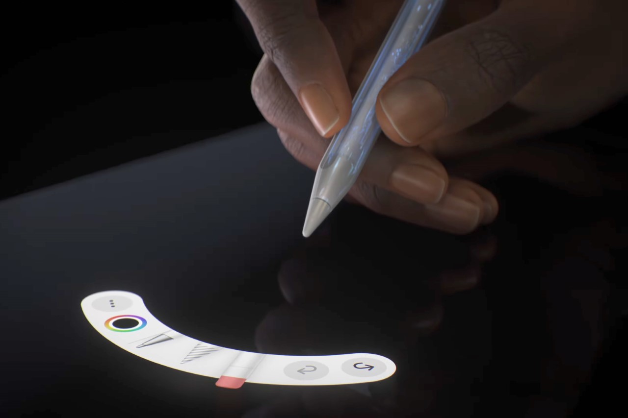
The new Pencil Pro has the hover function, lets you squeeze to activate a quick menu, and even supports barrel rolls that allow you to rotate brushes or objects simply by rotating your stylus. In true Apple fashion, it doesn’t have any buttons on it, but you can still tap to alternate between brush and eraser, and you even get a brush preview when your stylus is near the screen, letting you know how your brush is oriented. If all that wasn’t enough, the new Pencil Pro even packs Apple’s Find My feature, letting you locate a lost pencil through your iPad or iPhone.

The Pencil Pro can be squeezed to activate a quick menu

A great stylus on the iPad Pro, which already comes with an industry-leading chip, laptop-grade performance, a brilliant camera setup and LiDAR sensor, and an app store, basically makes the iPad or Wacom question moot. The only true advantage Wacom’s tablets have at this point is that they’re bigger than iPads, starting at 16 inches and maxing out at 27 inches diagonally. They also cost MUCH more than the iPad Pros, with the Cintiq Pro 16″ starting at $1599, and the Cintiq Pro 27″ having an eye-watering $3499 price tag. That’s Vision Pro territory for a sketching tablet.

The haptic motor gives you feedback when you squeeze the Pencil Pro

There still is a market for Wacom products. They’re massive, preferred by the hardcore animation and visual industries, and are platform-agnostic, which means you can easily run Windows or Linux programs on them, which most power users will appreciate over being limited to the iPadOS. But for the most part, the iPad Pro and Pencil Pro are so far ahead of their competition at this point, that they’ve made Wacom’s tablets (an already niche creative-focused gadget) even more niche… almost to the point of obscure.

The post The new Apple Pencil Pro is a death-sentence for Wacom first appeared on Yanko Design.

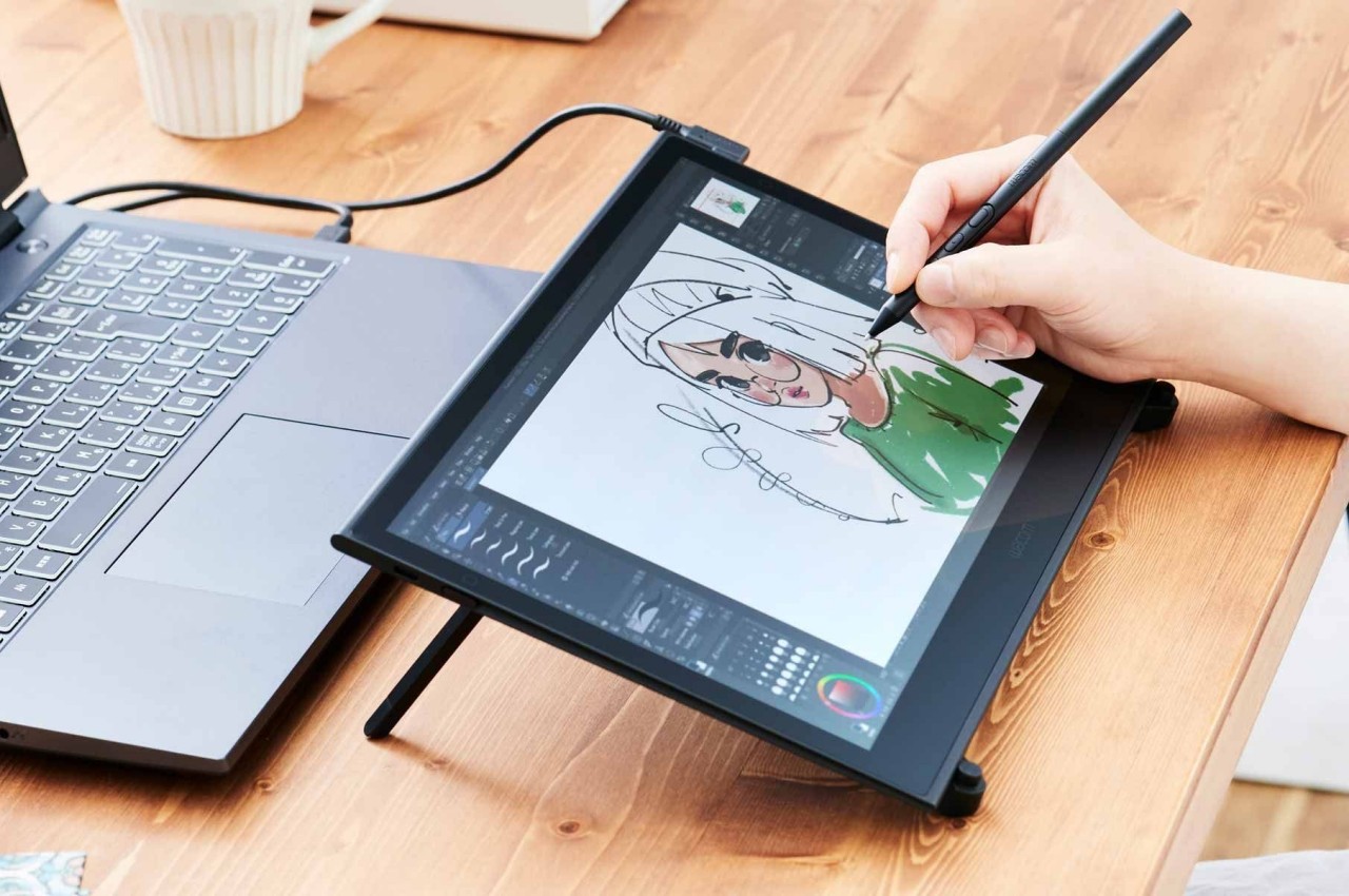
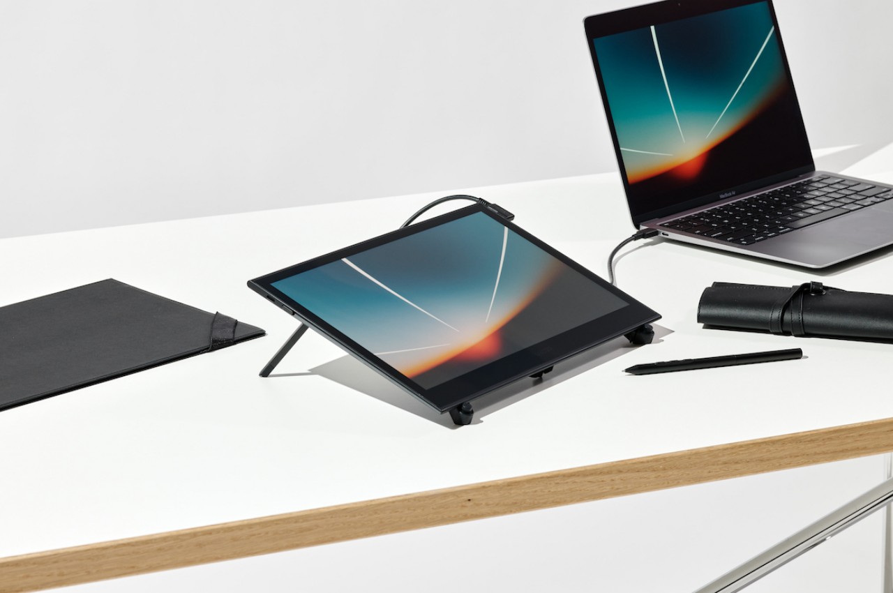
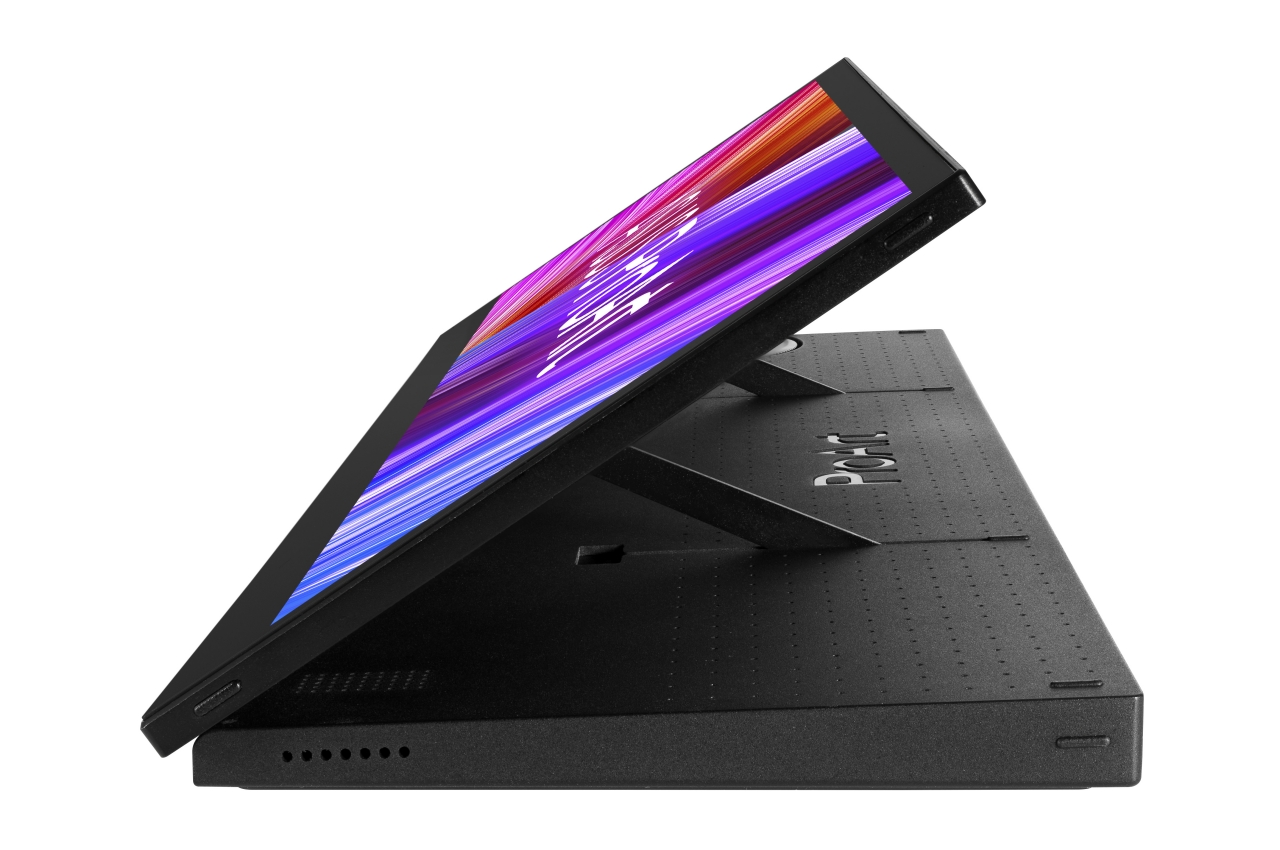
Wacom Movink pen display ventures into the world of portable OLED monitors

Inspiration can strike when you least expect it, but there are often places and events that can help get the creative juices flowing. The chatter of a lightly crowded cafe, the pause after attending a convention, or even simply moving from your desk to the couch can sometimes make you want to reach out for a sketchbook or even a digital canvas. The latter is fine if you have a tablet like an iPad, but if you prefer doing your designs on a computer, you’re a bit out of luck. Designers and artists these days need a certain degree of freedom and mobility, and Wacom is attempting to fill that need with a new product that isn’t just a screen you can draw on but also a beautiful computer monitor you can take anywhere you go.

Designer: Wacom

Wacom is like the Apple of the digital creative world, making products that let artists, designers, and engineers bring their ideas to life. Its Cintiq brand, in particular, has been the household name for years when it came to “pen displays” or screens you can draw on with a stylus. These have traditionally been as large as computer monitors, though there are now smaller options within the 13 to 16-inch range. While you can definitely shove the smallest Wacom Cintiq or One 12 inside a bag, their designs clearly shout that they’re really meant to be drawing tools more than anything else.

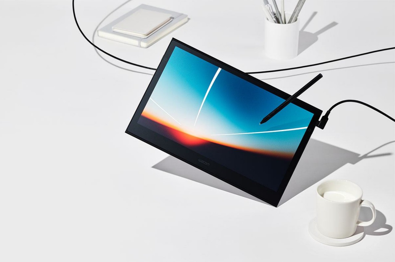
Wacom Movink’s biggest change might be technical, but it’s a technology that is allowing the brand to move in a slightly different direction from the rest of its pen displays. In a nutshell, it is Wacom’s first-ever OLED pen display, immediately setting itself apart from the LCDs of the rest of its portfolio. This gives it the advantage of being able to display richer and deeper blacks as well as a wider range of colors, which will help designs pop out better and be more color-accurate.

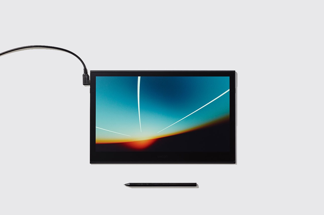
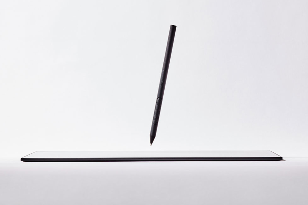
This OLED technology, however, also brings the advantage of making the Movink the thinnest and lightest of Wacom’s pen displays. It also has a sleeker design that looks more in line with portable monitors in the market today. Given that it does perform exactly like a portable OLED touch display, that’s not an inaccurate assessment. It still has thick bezels, but not as wide and egregious as on the Cintiq line. There’s also no rubber “bumper” around the edges, resulting in a simpler and more minimalist appearance.

Aside from the display upgrade, the Wacom Movink is functionally on par with the company’s other products. Where it really shines, however, is the newer and more modern design that makes it not only more portable but also more presentable. It’s not only a design tool made for designers but also one that designers will be proud to pull out of their bag and show off in public, empowering them to work on the go, whenever and wherever their muse calls.

The post Wacom Movink pen display ventures into the world of portable OLED monitors first appeared on Yanko Design.

Forget the iPad Pro… This Windows Tablet with a 13″ 2K screen and a Wacom Stylus is perfect for digital creators

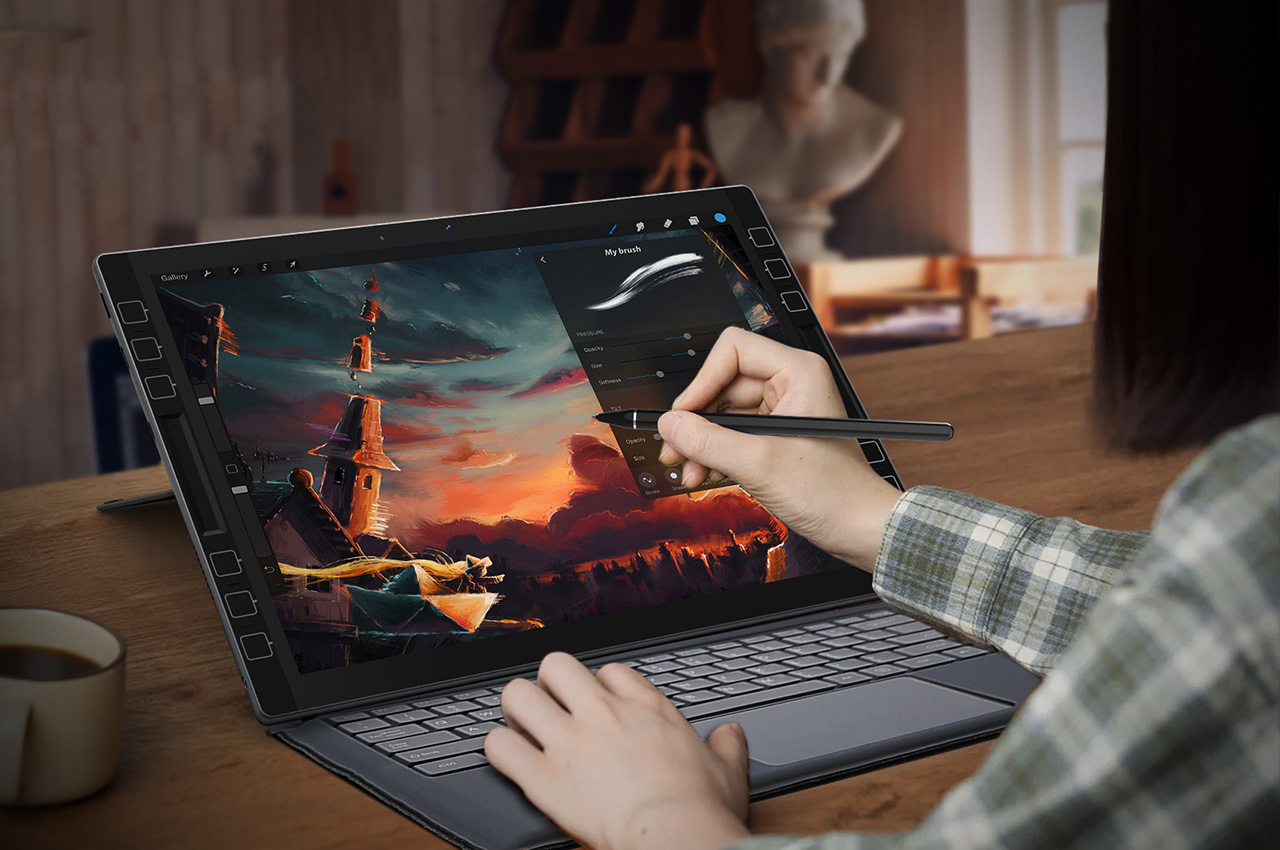
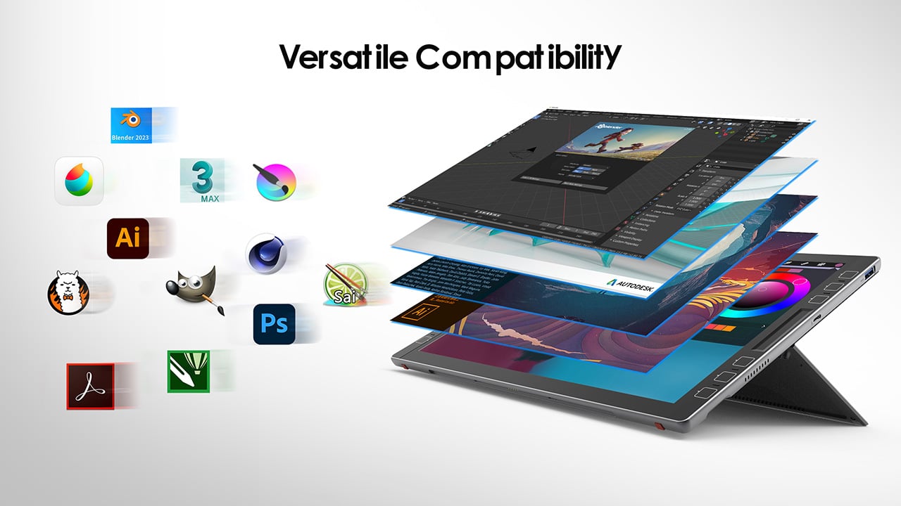
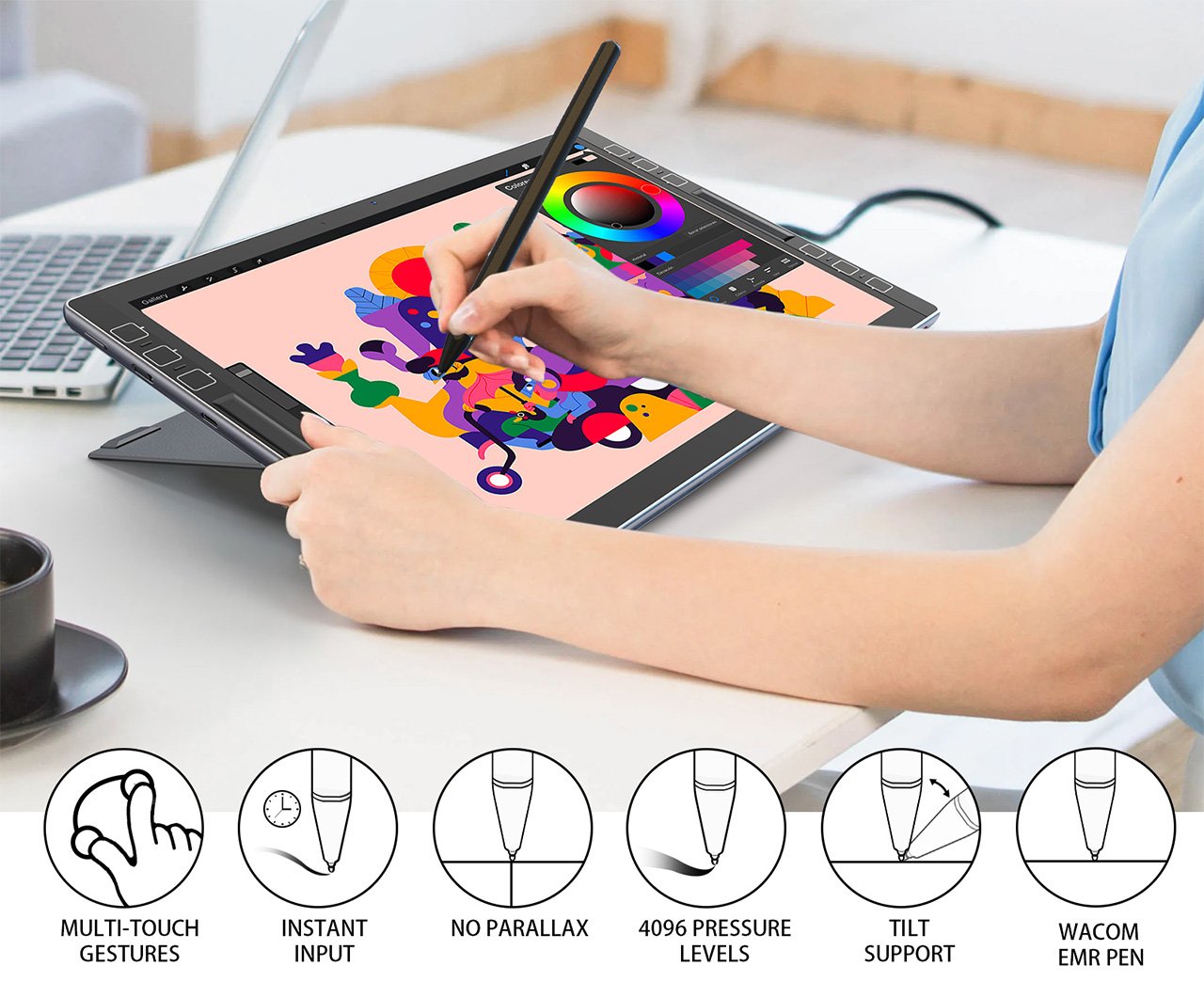
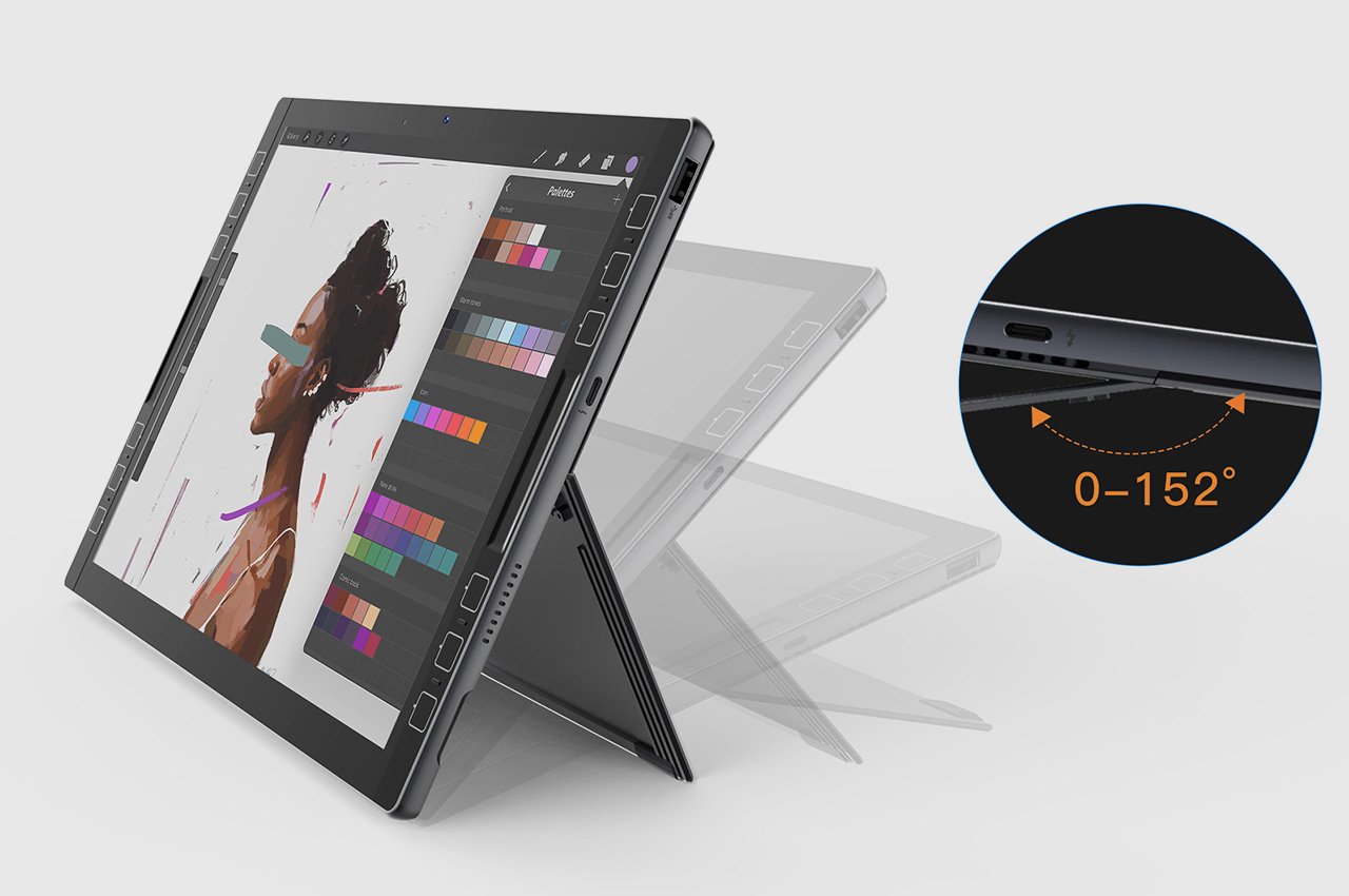
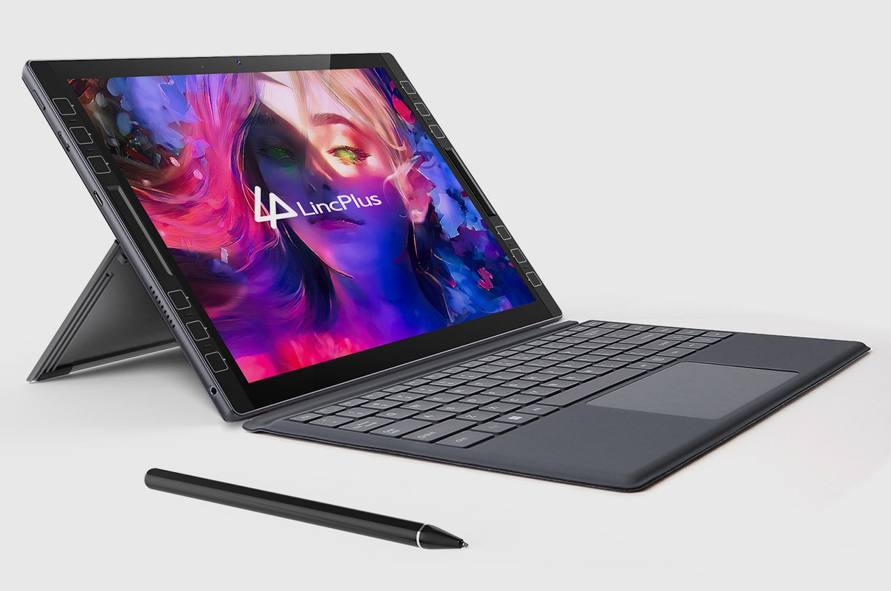
Under most normal circumstances, I wouldn’t be talking smack about the iPad Pro like this… but the LincStudio S1 Tablet offers some distinct advantages over its Apple-based counterpart. It’s bigger, has a 2K touchscreen with multitouch input, also comes with a highly precise Wacom stylus, runs Windows on a 4-core Intel i7 processor, and lets you use a whole slew of desktop-based software and apps to create content. That means you can carry your existing PC workflow onto the LincStudio S1, use AI-based programs with your workflow, and even rely on the 12 customizable shortcut keys on either side to cruise through work. When all’s said and done, 65W charging comes in exceptionally handy, letting you quickly juice your tablet for another round of design iterations… because creativity never takes a holiday, right?

Designers: Xiaohui Li and Bernhard Geisen

Click Here to Buy Now: $895 $1,279 (30% off). Hurry, only a few left!

Can’t use my favorite drawing software on iPad? Try LincStudio!

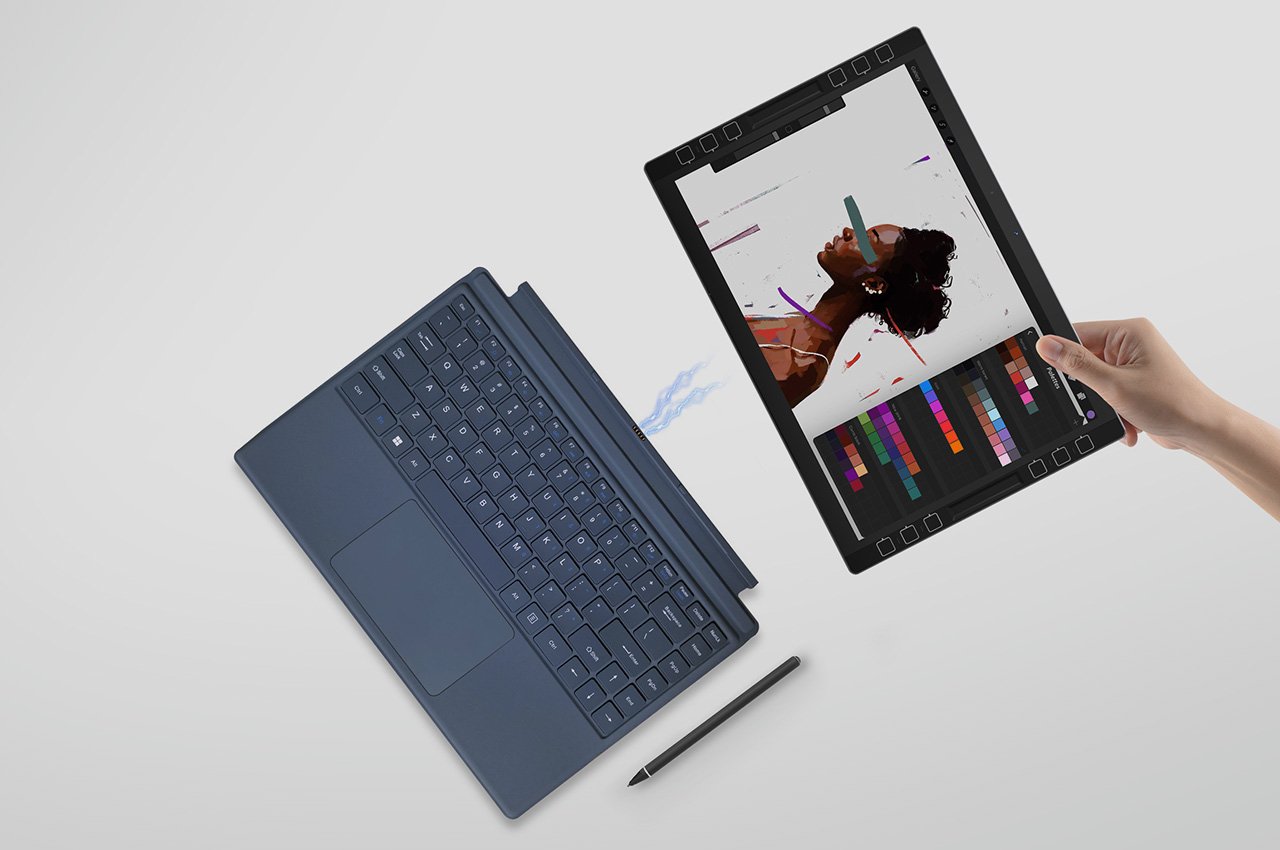
The perfect hybrid between a tablet and a laptop, the LincStudio S1 was designed keeping artists, 3D modelers, animators, designers, architects, or anyone in the creative profession in mind. Slim enough to fit into most laptop bags and weighing a paltry 1.1 kilograms, the LincStudio S1 comes with its own kickstand that lets you prop it up, giving you the freedom to use it in a variety of angles based on the kind of work you’re doing. A companion Wacom Shinonome stylus gives you precise control over your workflow, whether you’re sketching, reviewing detailed blueprints, or just taking notes, but if you do want to switch to a more traditional laptop-inspired typing experience, a keyboard connector at the bottom lets you snap on any keyboard, turning the LincStudio S1 into a makeshift laptop.

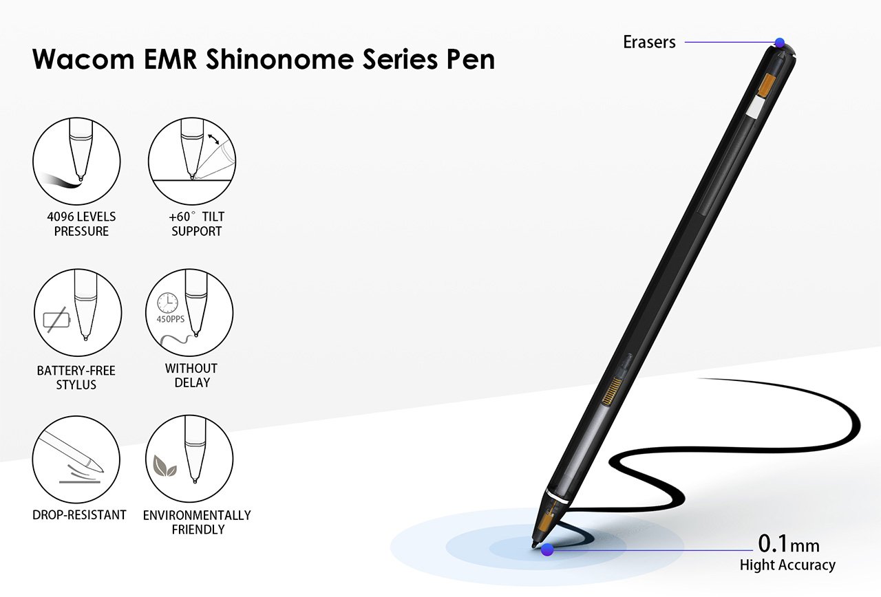
Wacom EMR Shinonome Series Pen

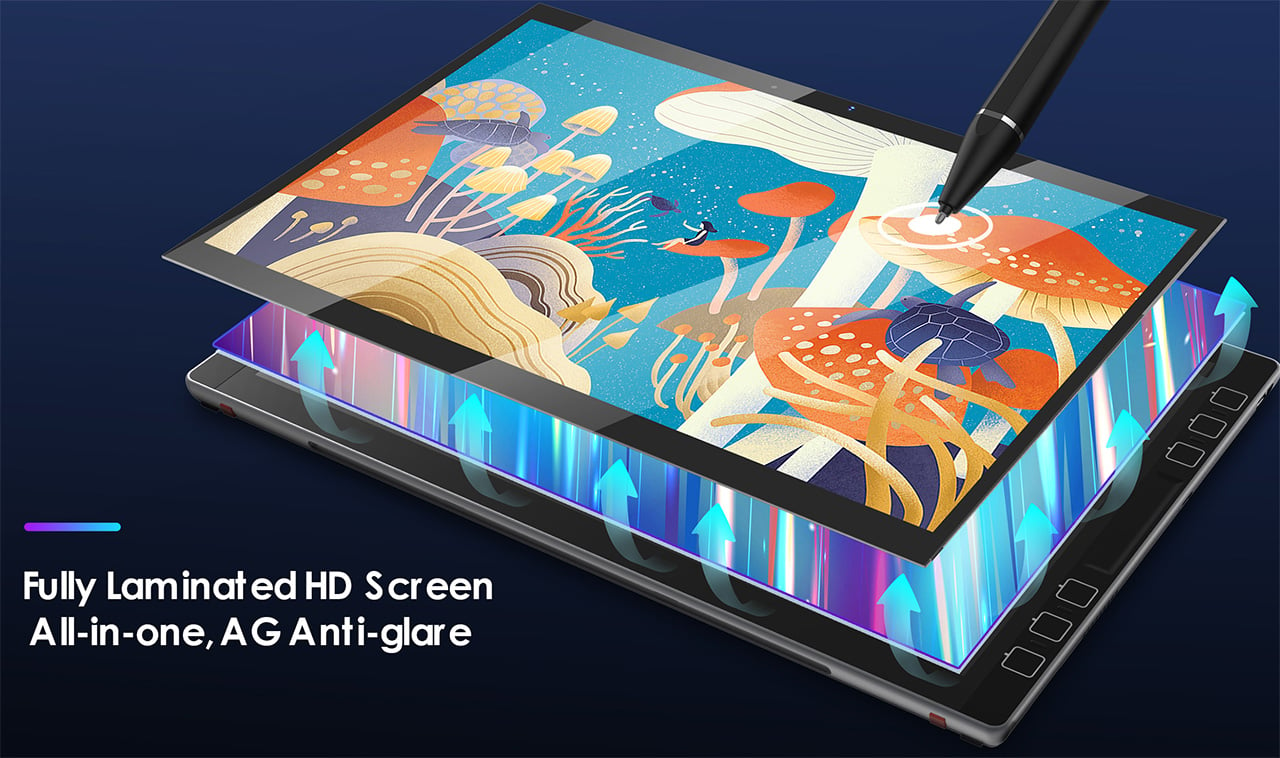
The problem with current tablets is that they get one crucial thing wrong – the operating system. A tablet isn’t supposed to be an enlarged phone, so the fact that it runs a version of a smartphone OS like Android or iPadOS just doesn’t make any sense. Where the LincStudio S1 differs is in recognizing this and giving creators the familiar Windows OS but in the avatar of a touchscreen tablet. The LincStudio S1’s 13-inch screen is perfect for sketching, editing, modeling, post-production, or any creative workflow, with support for multitouch that lets you interact with the Windows interface in a new way.

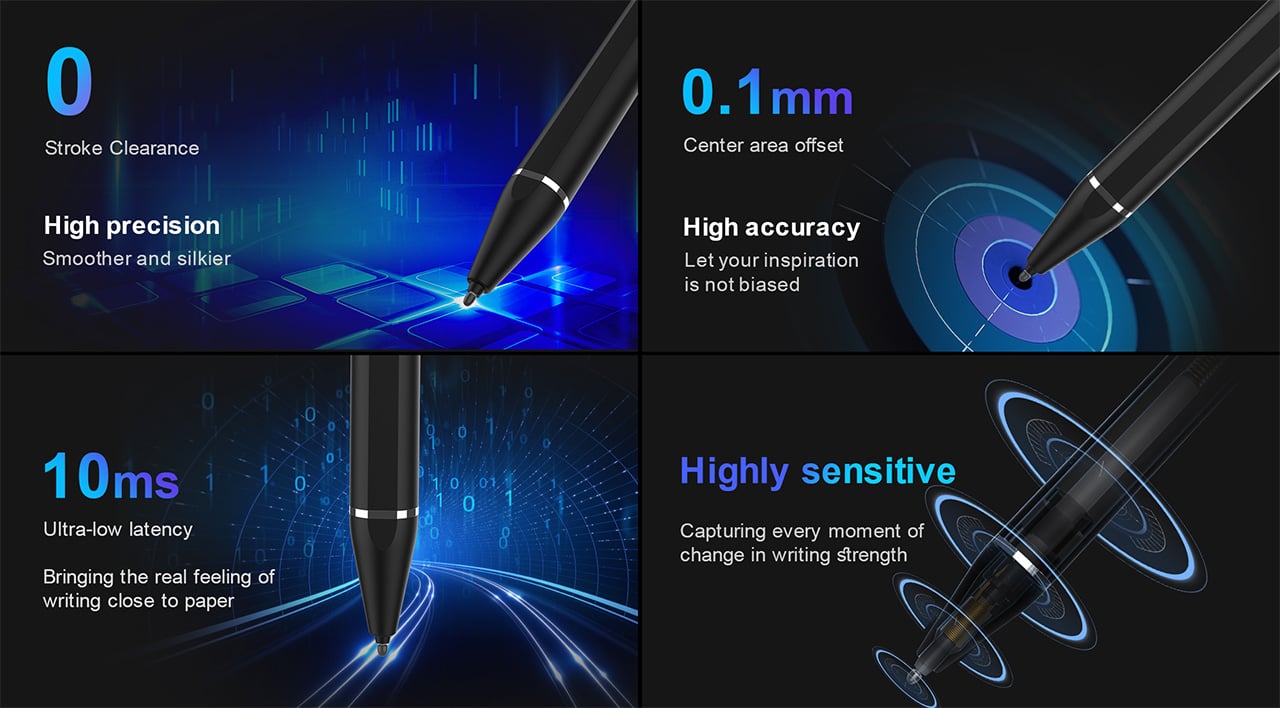
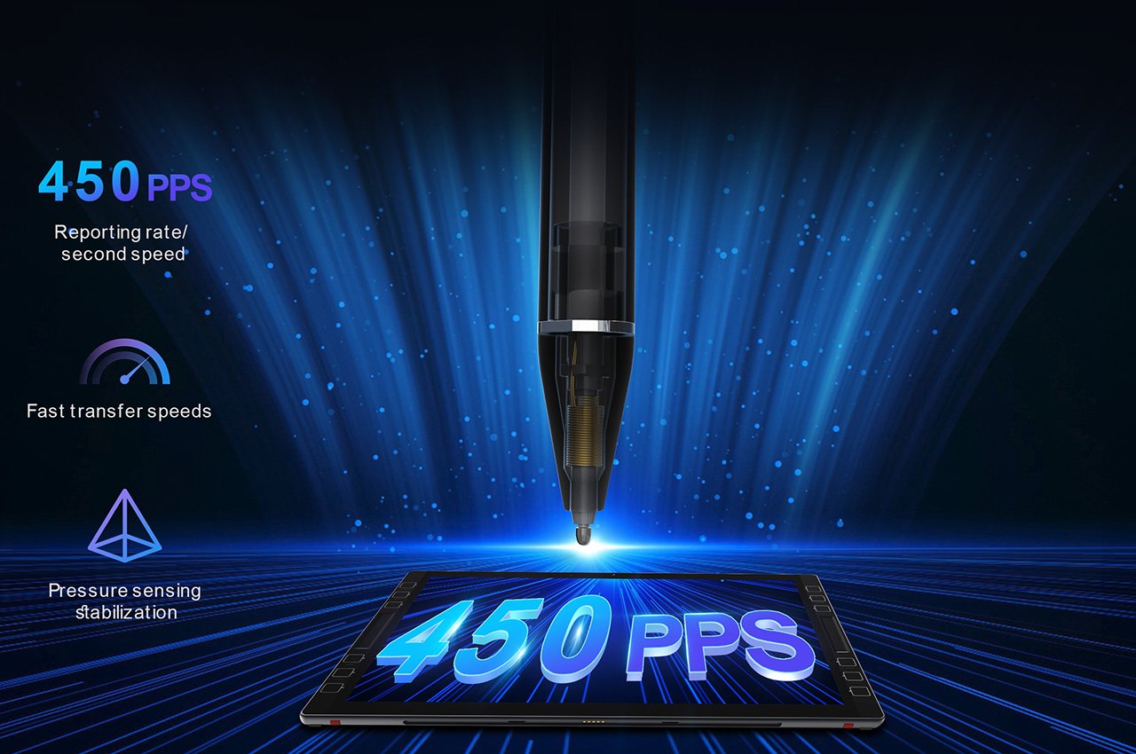
However, a tablet is only as good as the stylus it comes with, and the LincStudio S1 packs Wacom’s cutting-edge Shinonome EMR stylus. The stylus runs on electromagnetic resonance technology instead of capacitive technology, which gives it a winning combination of precision, responsiveness, and resolution over most standard styluses. Designed to be just as precise as Apple’s own Pencil, the Wacom Shinonome has 10-millisecond instant input (without parallax), comes with 4096 pressure levels, 450PPS resolution, and even has tilt support, making it a game-changer in illustration or sculpting apps.

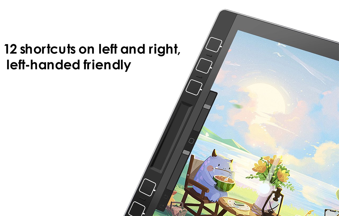
Meanwhile, the tablet sports dedicated shortcut buttons on its sides, allowing you to assign macros/functions to them that are specific to each program. Sort of like a Wacom tablet, you can use these shortcuts to perform certain tasks, toggle between brushes (in Photoshop), and play with parameters like brush size, opacity, screen brightness, volume, etc. The shortcuts are laid out on both the left and right side, allowing for ambidextrous use along with the stylus.

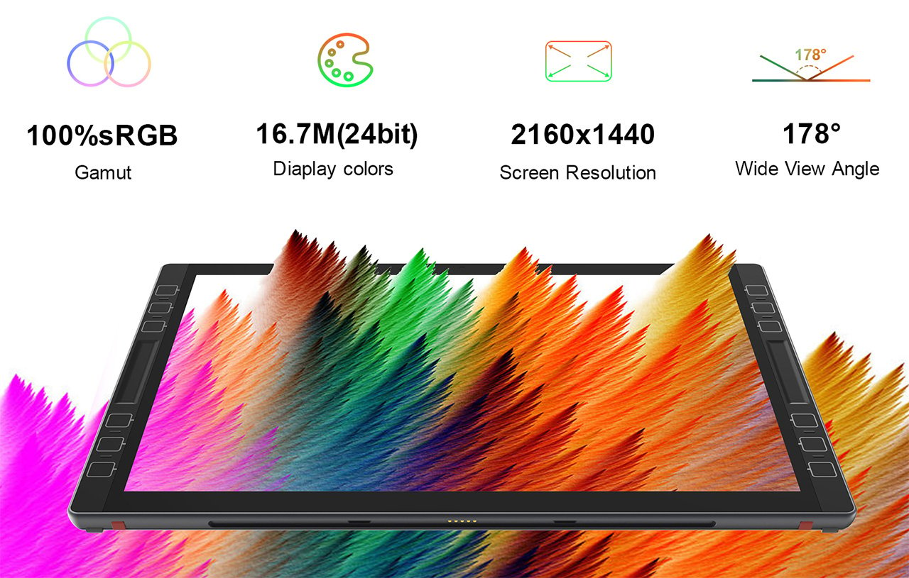
The LincStudio S1 itself comes with a sizeable 13-inch display boasting a resolution of 2160×1440, a 100% sRGB gamut, 16.7 million colors, and a wide 178° viewing angle. It’s powered by an 11th-gen Intel i7 processor, has 16GB RAM and 512GB storage, and comes running Windows 11 Pro right out of the box. In keeping with the ambidextrous design, the tablet has dual speakers, along with thunderbolt USB-C ports on both the left and right side. There’s also a USB-A port on one side for plugging in wireless peripherals or flash storage, and a 3.5mm jack for good measure, letting you connect speakers or headphones to your S1.

The tablet starts at a heavily discounted $895, which includes the Wacom stylus along with a Windows 11 Pro subscription (and is also significantly larger than most other tablets). In contrast, Microsoft’s Surface Pro 9 has similar specs, but with a whopping $1700 price tag (and the Surface Slip Pen sold separately). Apple’s no different, with a sizeable $1200 price tag for the 256GB 12.9-inch model, but an extra $79 for the pencil, $299 for the Magic Keyboard, and the inability to run desktop programs. The iPad Pro also famously lacks a kickstand, which the LincStudio S1 proudly includes in its design, and while the iPad Pro maxes out at 20W of charging, the LincStudio offers 65W charging capabilities, letting you juice your battery much faster than the competition. Perfect for creatives looking to get more hands-on with their workflows, the LincStudio offers the best of both laptop and tablet worlds.

Click Here to Buy Now: $895 $1,279 (30% off). Hurry, only a few left!

The post Forget the iPad Pro… This Windows Tablet with a 13″ 2K screen and a Wacom Stylus is perfect for digital creators first appeared on Yanko Design.

Xencelabs Pen Tablet Medium Bundle SE Review: Every Little Bit Counts

PROS:


  • Premium build quality and packaging

  • Includes plenty of extras, such as a glove, pen case, and two pens

  • Bundles versatile Quick Keys remote

  • Good performance and accuracy

CONS:


  • Expensive compared to other pen tablets (except Wacom)

  • A few driver quirks with Quick Keys remote

  • Tablet has too few shortcut keys without extra remote

RATINGS:

AESTHETICS
ERGONOMICS
PERFORMANCE
SUSTAINABILITY / REPAIRABILITY
VALUE FOR MONEY

EDITOR'S QUOTE:

A formidable rival to the Wacom Intuos, the Xencelabs Pen Tablet Medium Bundle SE offers impressive performance, premium aesthetics, value-add extras, and a rather daunting price tag.

Plenty of designers love the simple joys and liberating functionality of pen and paper, but it gets harder and harder to escape the call of the digital realm. When it comes to tools for turning ideas and designs into digital artifacts, Wacom’s drawing tablets have long held the lion’s share of the market and continue to do so, at least on the high end. Plenty of alternatives have popped up in the past years, each trying to nibble at that large pie, especially with exponentially more affordable offerings. Almost out of nowhere, a new competitor jumps into the fray, loudly challenging the long-time champion on its own turf. The Xencelabs Pen Tablet Medium makes quite a few promises, especially with its special Bundle, but are they just empty words or something that can truly stand the test of real-world problems? We put our creative hats on and give the pen a twirl to find out if this is a tool that designers and creatives can learn to love.

Designer: Xencelabs

Aesthetics

Even before you open the box, you already get the impression that this is no mere challenger. Granted, it goes back to the age of packaging that is more elaborate and sometimes wasteful than necessary, but it’s hard to deny that the quality of the Xencelabs Pen Tablet’s presentation definitely makes a good first impression. Fortunately, it isn’t just skin deep, and this high-quality trait continues to other parts of the product.

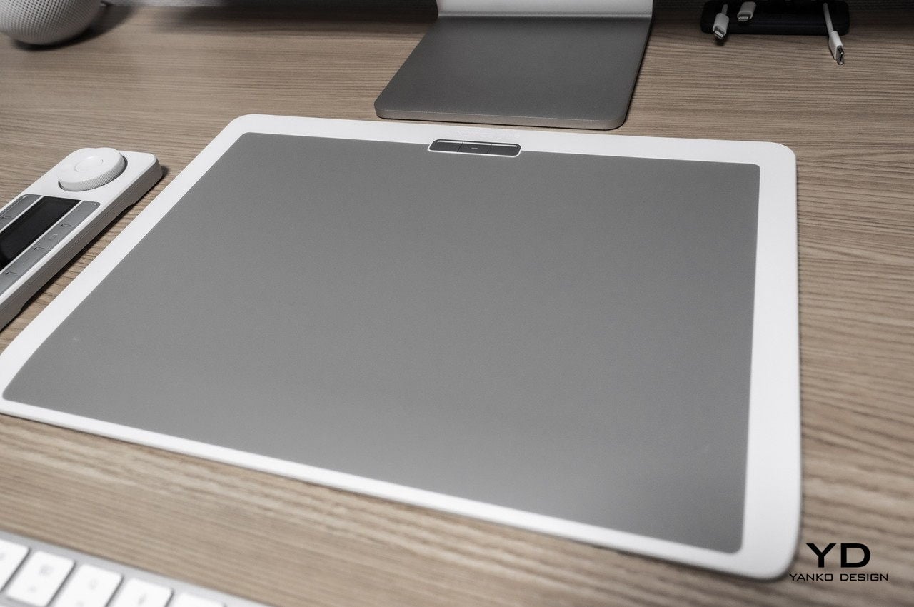
For one, you are immediately greeted by a tablet and accessories that are predominantly white with mixes of gray, a color scheme that is almost unheard of and unseen in the pen tablet industry. It’s definitely a nice touch that sets Xencelabs apart from its peers. Of course, not everyone will find this color appealing, and there’s a non-SE bundle that has the traditional black motif.
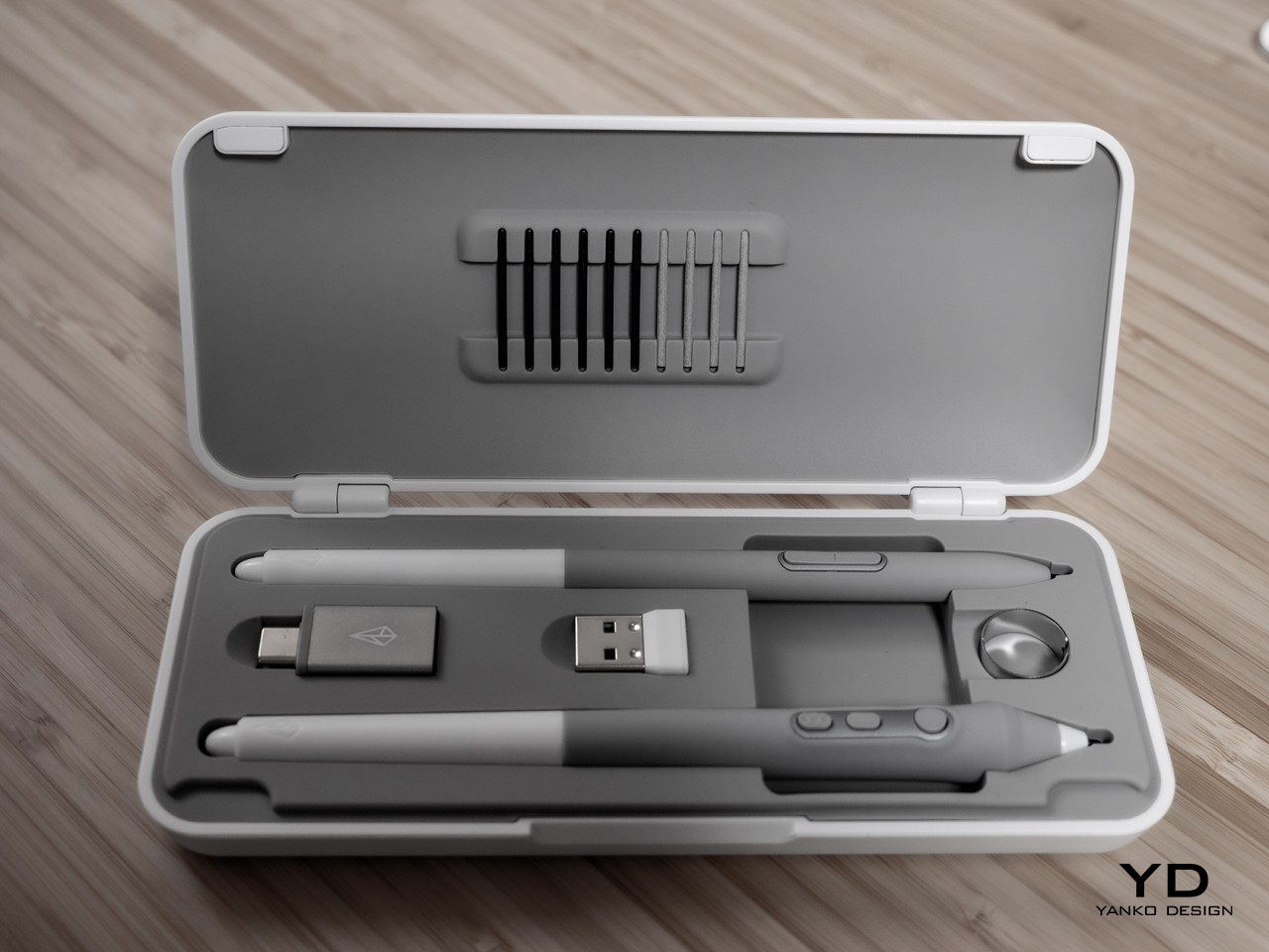
Although the Xencelabs Pen Tablet Medium is your typical plastic affair, you can definitely feel in your hand that it isn’t the cheap and flimsy kind of plastic. It has a solid build quality that will be important if you plan on bringing this along with you a lot. The white surfaces are smooth and shiny, while the grays have different textures, depending on their purpose. The drawing area, of course, has a frosted texture that produces a more realistic drawing experience, while the rubber grip on the pens makes them more comfortable to hold.

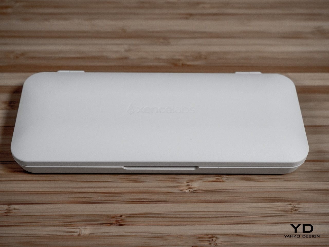
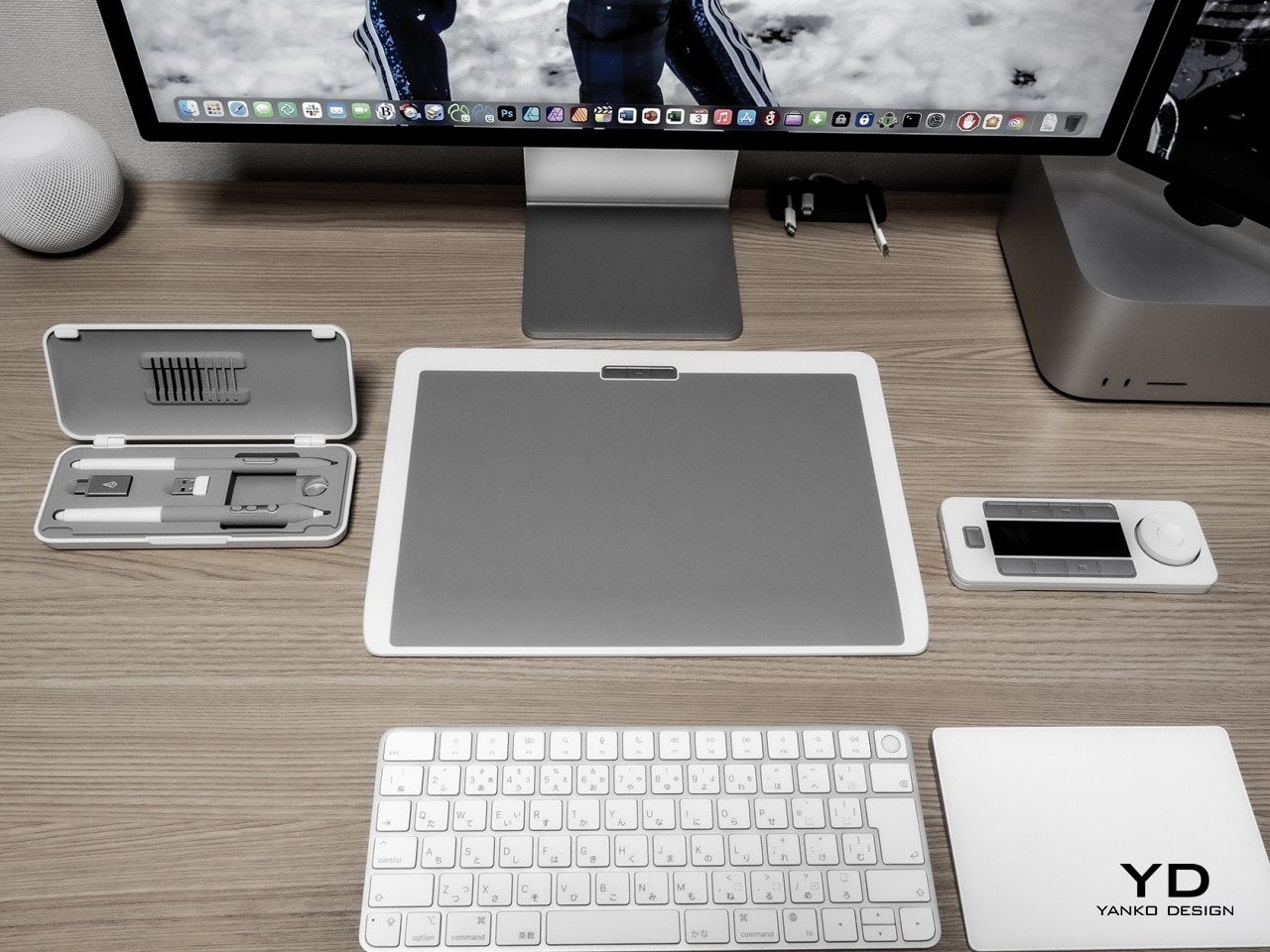
The package also comes with a pen case that fits the two bundled pens, replacement nibs, a USB cable, and dongles for wireless connection. A pen case is already a rare treat on other tablets, but one that looks stylish inside and out is an even bigger deal. All in all, both the tablet and its bundled accessories look as premium as Wacom’s high-end offering, which shouldn’t really be surprising considering how much this bundle costs.

Ergonomics

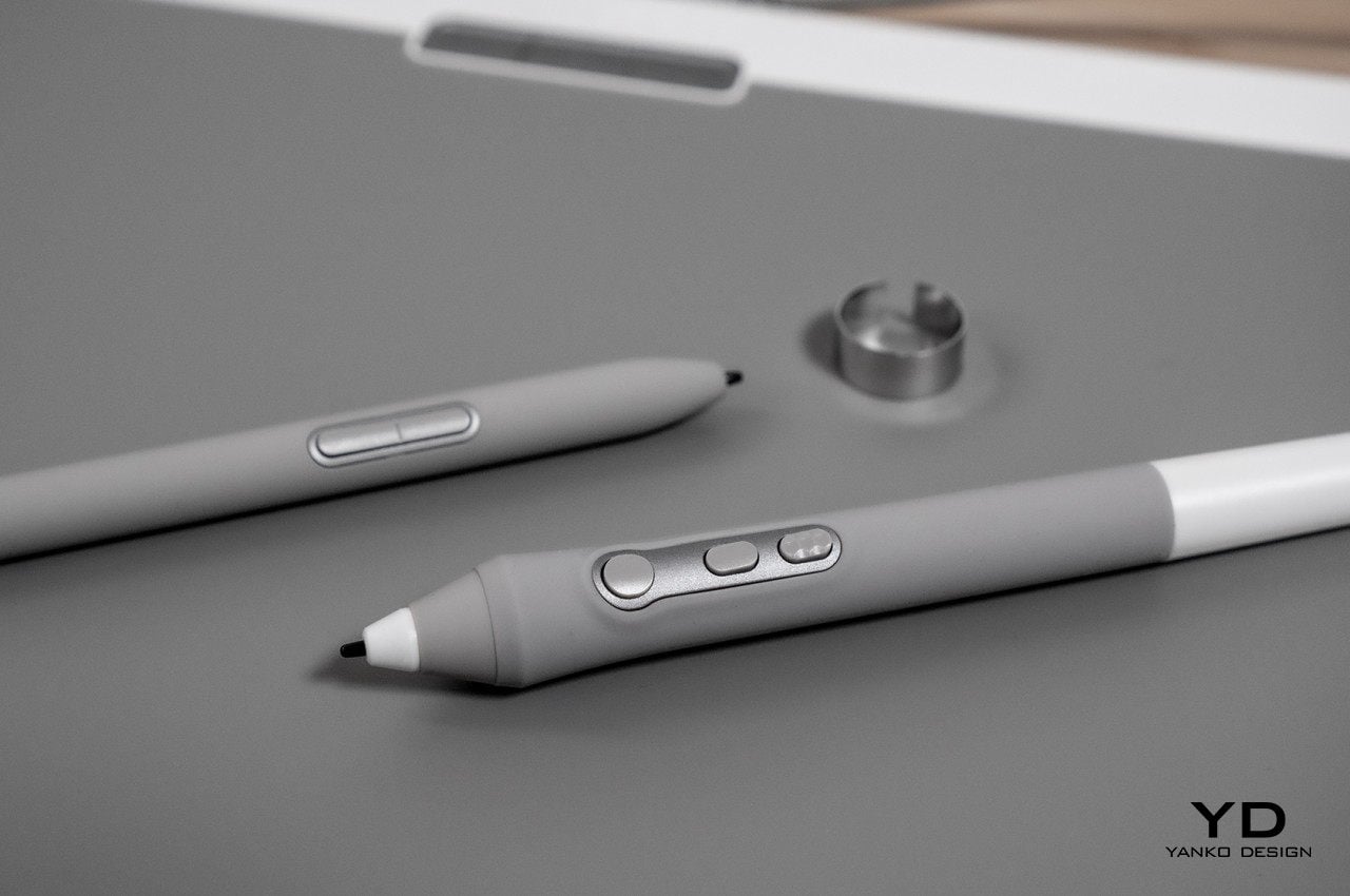
As a tool that you’ll be using as much as pen and paper, it is critically important that this tablet and its pen are comfortable to use, especially for long periods of time. Despite the “tablet” being the main part of the product, it is actually the pen’s ergonomics that is even more important. Fortunately, Xencelabs doesn’t disappoint in this area either, with not one but two pens to fit your preference and style. One is the typical Wacom-style pen that swells near the bottom before tapering at the tip, creating a bulbous shape that is something uncommon with normal ink pens. The other pen is the regular barrel, which is more common among laptops and mobile devices that support a stylus.

While both pens are comfortable to hold, the choice won’t simply be a matter of preference. The larger pen has three buttons, while the smaller rod only has two, forcing you to decide between functionality and form. Fortunately, missing a button isn’t as devastating as it sounds since there’s a remote that comes with the bundle. Both pens also have erasers on the opposite end that you can map to other functions, a feature that, so far, only Wacom has been offering.
The ergonomics of the drawing slate itself boils down to two things. First is how light or heavy it is to carry around, which, in this case, is more on the heavier side, which adds to the weight of the laptop you already have in your bag. The other aspect is how well it supports your hand and your wrist while you draw on it. Unlike any other pen tablet, the Xencelabs Pen Tablet Medium has a gently sloping bottom edge supposedly designed to be an ergonomic wrist rest. For those starting out with this tablet, that might indeed be comfortable, but those switching over from existing brands might find the curve a bit unfamiliar.

Performance

Xencelabs entered the drawing tablet scene with guns blazing, claiming to challenge Wacom on multiple fronts, especially the price. Of course, a lot of other brands have already been shouting the same thing, and their focus on the price tag produced less than impressive results. Admittedly, they have improved significantly over the years, but there’s still a gap between them and Wacom, a gap that the former Wacom employees that have formed Xencelabs are now trying to fill.

The good news is that Xencelabs isn’t all talk. Whichever of the two pens you choose, you’ll be able to get smooth, crisp lines with no jitter. You can definitely feel that 8,192 levels of sensitivity to the point that you might even want to dial it down a bit to suit your style and hand strength. The tablet’s surface has enough resistance that it doesn’t feel like you’re gliding plastic on glass, especially if you switch to the felt nibs that offer more traction. It’s definitely close to what you would expect from Wacom, but other more affordable tablets from XP-PEN, Huion, and the like are already catching up anyway, making this advantage less significant as time goes by.
The tablet’s value, however, goes beyond its raw drawing performance. For example, driver installation and software management has always been a bane of these computer peripherals, including Wacom. Xencelabs’ software, however, is almost perfect, except for a few glitches involving the included Quick Keys remote. The drivers work without problems, and the software to configure the tablet, pens, and remote is clearly labeled and easy to use. There are definitely a lot of features, almost too many for beginners.

One small but nice feature is the lights on the corners of the tablet’s active area, whose colors you can set on a per-app basis. It might sound inconsequential, but having very visible cues on the boundaries of the drawing area, as well as which app you’re focused on, can help a lot in staying sane during a crunch. That same light-changing feat can be seen on the remote’s dial, which can also change its hue depending on the mode it’s in.

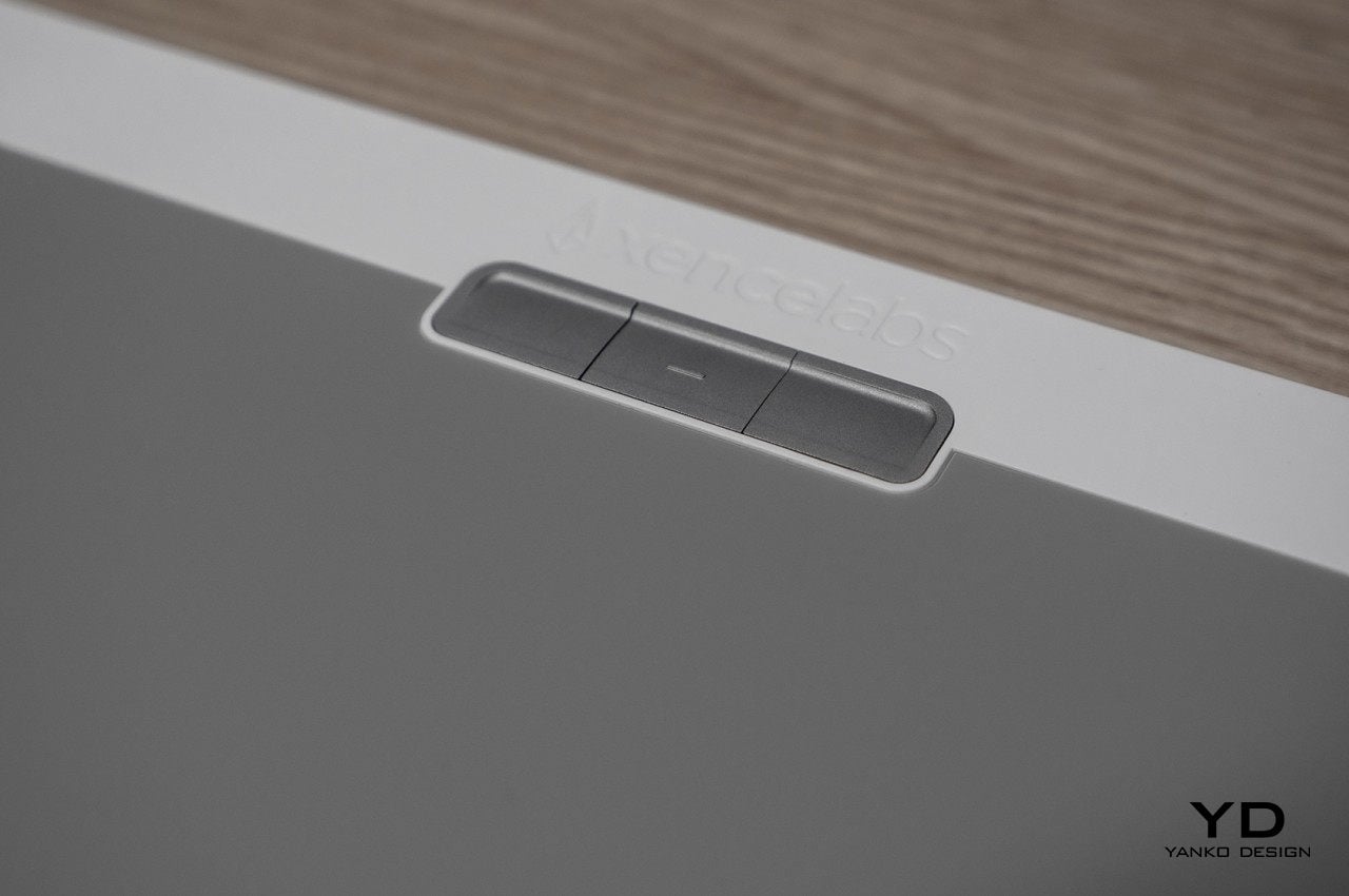
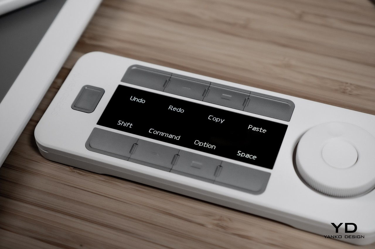
If the tablet and the pen are the stars of the show, the bundled Quick Keys remote plays the supporting role. An accessory that comes as an expensive add-on on other brands, the remote offers 8 keys that can be assigned to different functions and 5 modes that bump up the total to 40 configurable shortcuts. That’s not counting the LED-lit dial that can be used to, for example, zoom in and out or change the brush size with a simple twist. Unlike other similar remotes, it has an OLED display that doesn’t force users to memorize which button does which action. The remote definitely works great and is one of the highlights of this package. Although it’s technically an extra, it actually becomes a necessity because the tablet, unlike others of its kind, only has three buttons that are awkwardly placed at the top. That might be far too few for the professionals that Xencelabs is targeting, making this $99.99 remote an essential part of its proposition.
Another thing that sets the Xencelabs Pen Tablet Medium apart is that it can work both with a USB cable and the included wireless dongle. The latter offers more flexibility in setting up your workspace or when working away from your desk without having to deal with the instability of Bluetooth. It does mean you’d be giving up a USB slot even when going wireless, which can become even more problematic when you use up another slot for the Quick Keys remote.

Sustainability

As a device that needs to be thin and lightweight, it’s really no surprise that the Xencelabs Pen Tablet and its accessories use plenty of plastic, although the packaging thankfully doesn’t have that much. If that weren’t bad enough, the track record of these kinds of devices being repaired and recycled isn’t that good, and most consumers opt to throw away and replace broken products instead of getting them repaired, especially when repair costs far outweigh new purchases. In that sense, there is very little that Xencelabs does differently from its peers, at least nothing that it has proudly revealed yet.

As an extremely young brand, it’s probably not that surprising that Xencelabs is laser-focused on actually cementing its place in the market. It has pit itself against a giant, and its survival and success is currently the most critical aspect of its business. At the same time, however, it is a young brand that could have made a difference right from the start with a stronger and more visible sustainability commitment. Only time will tell if it can get up to speed in this aspect, presuming it actually makes it through its first products.
Value

From a design and performance perspective, the Xencelabs Pen Tablet Medium is already quite a heavy hitter. It performs just as well as an equivalent Wacom Intuos Pro but also goes even beyond that with features like wireless connectivity, configurable LED indicators, and two pens right off the bat. The bundled Quick Keys remote definitely adds to the value, something that you’d have to buy separately with other brands.

Things get a little less clear-cut, however, when you start talking about the price. At $380 for the white Bundle SE or $370 for the standard Black version, it isn’t exactly the most affordable kit outside of Wacom. If you remove the remote, you’re still left at $280, easily three times the price of a medium-sized pen tablet from XP-PEN or Huion. Of course, compared to Wacom, you’re actually saving quite a lot, especially if you consider all the extras you’re getting. Needless to say, the Xencelabs Pen Tablet Medium is in a middle ground of sorts, muddling its overall value when compared against more affordable options, with or without an extra remote.

Verdict

Although it is still the household name among drawing tablets, both with displays or without, Wacom is no longer the only player in the field. A lot of rivals have risen up and have eaten away at its bottom line. There might still be a discernible difference between Wacom and other players when it comes to performance, but that gap is closing after years of improvement and development. Suffice it to say, there isn’t any lack of “Wacom alternatives,” which is what makes Xencelabs’ arrival both surprising and a little bit questionable.

Make no mistake, the Xencelabs Pen Tablet Medium Bundle SE is impressive in almost all aspects. It looks and feels premium, especially with its uncommon white design, and its accuracy and responsiveness demonstrate its pedigree that can be traced back to Wacom itself. The bundle throws in plenty of nice extras, not least of which is the Quick Keys remote, which is still a great deal, even considering the price. It’s that price, however, that will cause many creatives to pause for thought when there are exactly many alternatives that can do just as well for a lot less. Xencelabs’ pricing makes a clear statement that it is aiming for Wacom’s throne, launching a premium device that puts it closer to the titleholder than other rivals. It remains to be seen, however, if this strategy will pay off or if the Xencelabs Pen Tablet will be a one-hit-wonder.
The post Xencelabs Pen Tablet Medium Bundle SE Review: Every Little Bit Counts first appeared on Yanko Design.

ASUS has an odd second screen that was designed with creators in mind

If you’re going to add a second monitor to your desk setup, wouldn’t you prefer something large enough to handle your work?

While many designers extol the virtues of simplicity and minimalism, they might also be the first to admit wishing they had more than just one computer screen at times. The jury is still out on whether multiple monitors help or hamper productivity, especially if they offer more opportunities for distraction, but some digital workers just can’t get by with a single display. That’s especially true for creatives in many fields, including designers and artists that might use something like a Wacom Cintiq to create their masterpieces. ASUS has been making portable monitors in order to help increase workers’ output, but its newest might be its strangest one yet.

Designer: ASUS

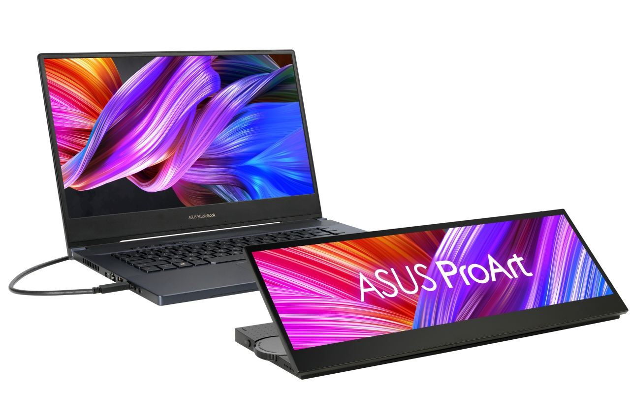
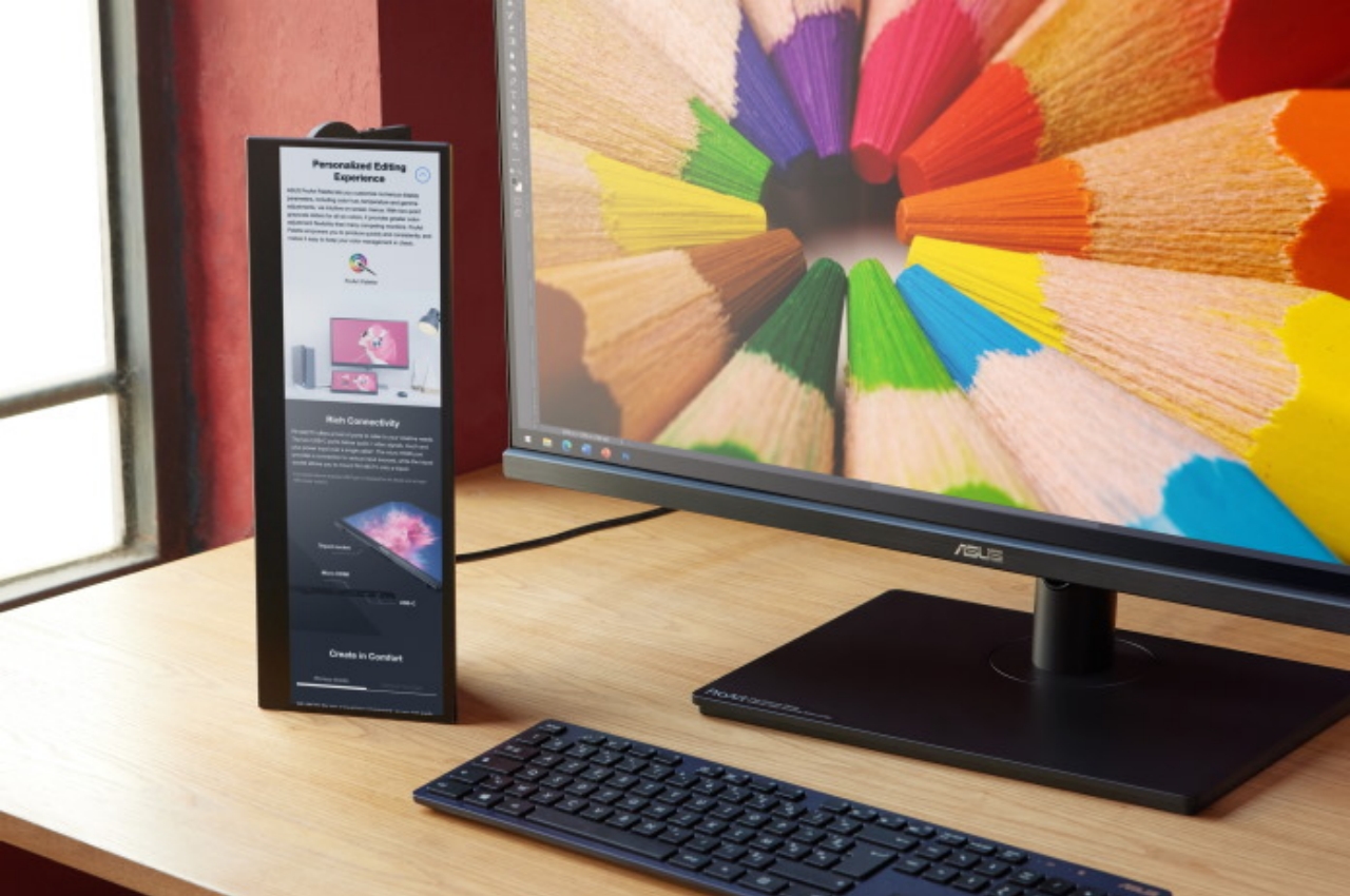
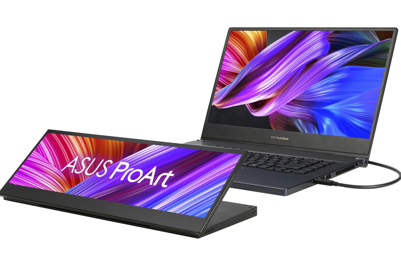
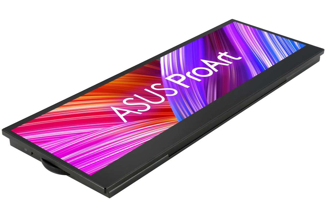
Almost all second monitors, portable or otherwise, come in sizes and forms that are meant to match your primary display. While those come in a wide range of sizes, they almost all have standard monitor aspect ratios, like 4:3, 16:10, or even the ultra-wide 21:9. In contrast, it’s difficult to group the ASUS ProArt Display PA147CDV with these because of its short but wide design.

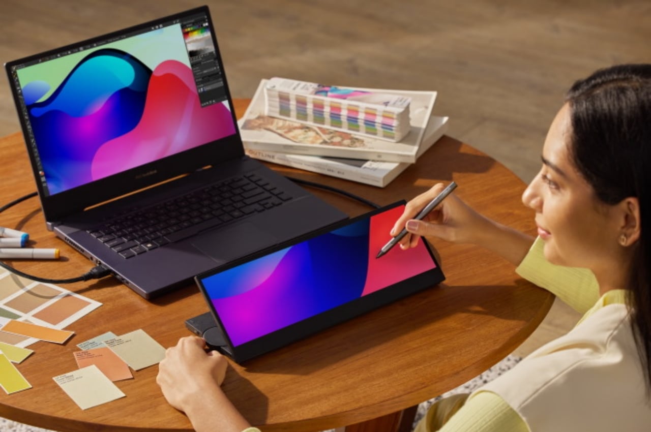
The 14-inch screen has a resolution of 1920×550, giving it a super-duper ultra-wide 32:9 ratio. It’s more like a strip of screen rather than a full monitor, and its unconventional design hints at its purpose. It’s meant more as an extension of your tools rather than your content, like a palette or another keyboard instead of a canvas. Those who have seen ASUS’ ZenBook Pro DUO laptop might be familiar with both this design and this use case because this is exactly like that laptop’s second screen.

The ProArt Display does function like a Wacom tablet display, supporting both ten-finger touch and pen input. The latter uses Microsoft’s Pen 2.0 Protocol, so there are plenty of active pens you can use with it. The screen supports 100% of the Rec. 709 and sRGB color gamuts to give artists and designers accurate color spaces. That said, the screen’s odd size and ratio don’t exactly make it ideal for long periods of work, and the low vertical resolution won’t do your work justice.

Of course, the ProArt Display PA147CDV’s main function isn’t to be a Wacom replacement but to be your extended keyboard of sorts. Specialized software allows creators to quickly access the most-used or most important functions of apps like Photoshop, Lightroom, Premiere Pro, and others. For everything else, ASUS’s app lets you customize the controls for apps that aren’t directly supported. And, of course, you can also use it as a second screen for references or unrelated information like news or social media. This way, you can limit the visual area these things occupy, which can hopefully also reduce their distracting powers.

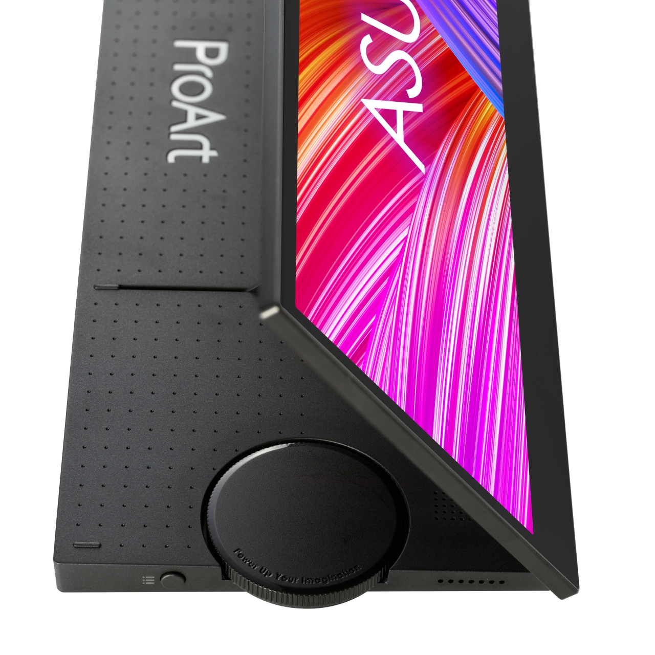
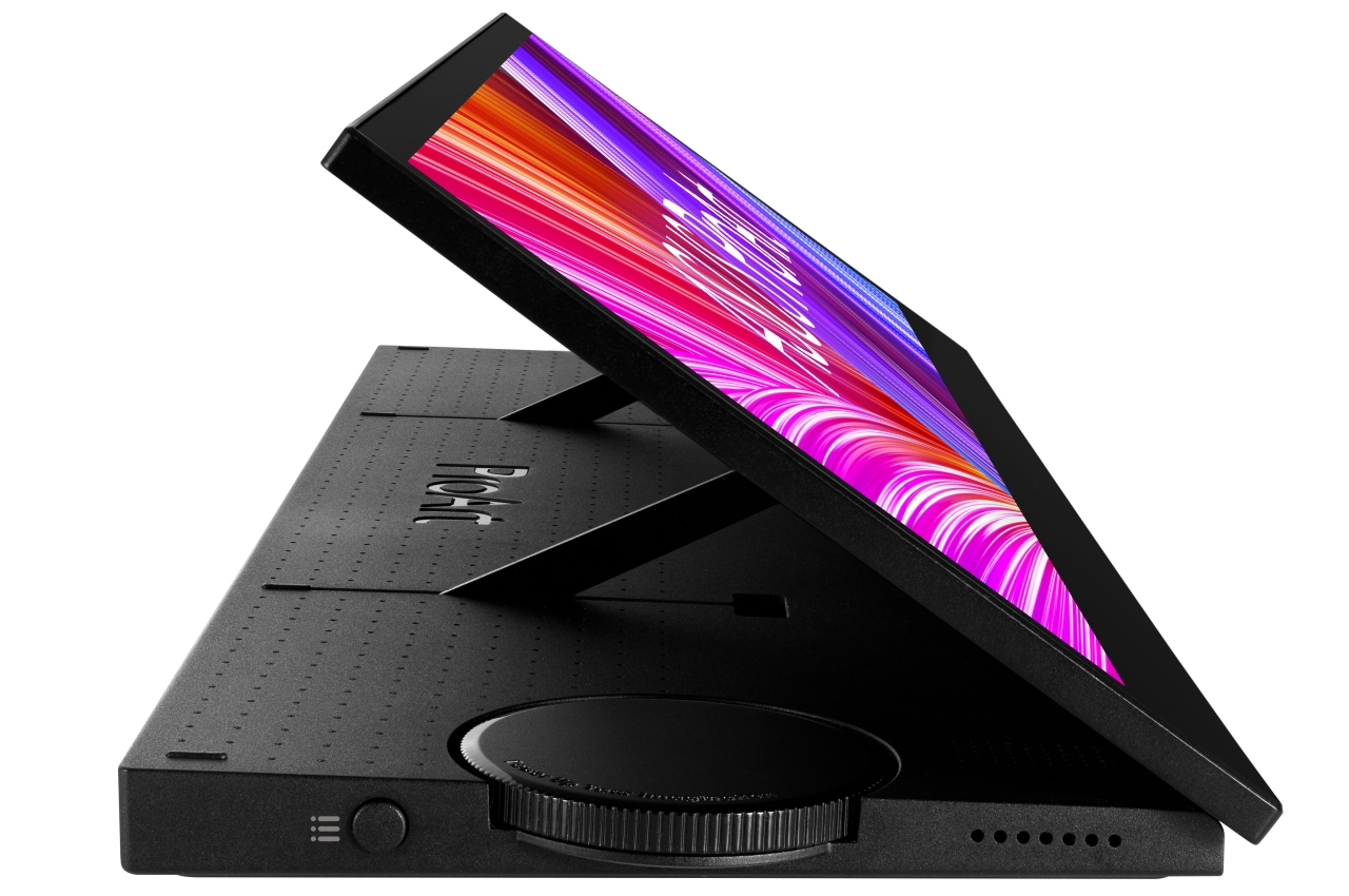
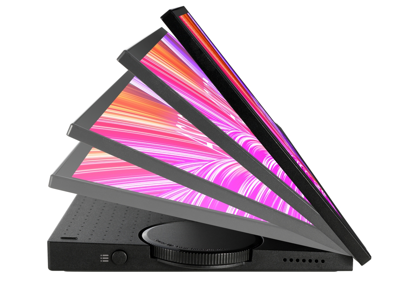
The ASUS ProArt Display PA147CDV has one other trick up its sleeve, a physical dial you can also map to specific actions, like changing brush sizes or scrubbing through a video timeline. This clearly marks this display as a tool for creatives but, unfortunately, also shows the device’s biggest design flaw. That dial is fixed on the left side of the device, which restricts it to a specific setup only. Left-handed people who use a stylus in their dominant hand won’t be able to easily use the dial as right-handed people.

The ProArt Display looks like an intriguing and novel new tool to empower designers, artists, engineers, editors, and all sorts of digital creatives, but also oddly snubs a good number of these people with its inflexible design. It would have been better if it were possible to change the position of the dial or change the orientation of the screen to accommodate left-handed workflows. It’s like being forced to use computer mice that have been designed for right-handed people only, without any consideration for the rest of the population. We won’t be seeing the ASUS ProArt Display PA147CDV until sometime this quarter, and hopefully, ASUS will have a better story to tell by then.

The post ASUS has an odd second screen that was designed with creators in mind first appeared on Yanko Design.
This nifty gadget turns any laptop or desktop monitor into a massive iPad Pro and Stylus


Plug the Hello X3 in the top left corner of any display (or any flat surface) and suddenly you have a stylus-capable screen that you can draw on, annotate against, and present with.

Up until just 5 minutes ago, I was ready to throw a little over a grand at a new, 12.9-inch M1 iPad Pro and the Apple Pencil. I’m honestly reconsidering now after stumbling across this $120 gadget that transforms any flat surface into a stylus-friendly touchscreen. Titled the YELANG Hello X3, this 3-axis-shaped device plugs onto the corner of any flat rectangular surface (although it’s much more useful when mounted on a display), practically turning it into an iPad. The Hello X3 works with displays as large as 27-inches, and comes along with a pressure-sensitive stylus too to rival the Apple Pencil.
Click Here to Buy Now: $120 $189 (37% off) Hurry! Just 14 hours left!

Currently in its third generation (hence the X3 suffix), the Hello X3 expands on what its previous generations could do. It comes with a camera-sensor that can now read surface areas that are anywhere between 10-27 inches, has 2mm precision (which is alright, to be honest), a 120 fps response time, and here’s the best part, compatibility with both Macintosh and Windows-based systems. Just plug it onto your iMac or your Windows desktop monitor and you’ve got yourself a massive tablet PC that you can sketch on, make models in, edit documents, sign papers, or even use in a bunch of other productivity apps and softwares. If you’re traveling, the Hello X3 plugs right off and is portable enough to be carried right in your bag along with the stylus.

The Hello X3’s universal design is perhaps its biggest selling point, but it’s also matched by the fact that setting it up on a new device is ridiculously simple. Just pop the gadget on the top-left of the screen (it works with left-handed as well as right-handed users), plug it in via USB, and you’re ready to calibrate it. To calibrate the Hello X3 to your screen, just tap the 4 corners of the display with the stylus and you’re done. The stylus is thick and grippy like a marker or a fountain-pen, and sports a pressure-sensitive tip that can make thicker strokes if you press harder and thinner strokes if you lightly touch a surface. In just minutes, your 4K monitor turns into a graphics tablet.

The Hello X3 works with regular surfaces too. If you’re not really comfortable with drawing on vertical surfaces (which, let’s face it, can get uncomfortable), just plug the Hello X3 onto a drawing pad or a clipboard and you’ve got yourself a makeshift tablet PC (remember the Wacom Intuos?). This setup works rather well when you’re using a projector too, instead of a laptop or a desktop monitor. Each Hello X3 comes along with its own drawing-board for good measure, and a stand for your stylus when it’s not in use. The stylus has a standby time of 120 days, and a use-time of 4 hours, although it charges completely in just under 30 minutes. The YELANG Hello X3 is currently in its final hours of funding and is set to ship as early as September. Grab it at its special early-bird price of $120 on Kickstarter!

Click Here to Buy Now: $120 $189 (37% off) Hurry! Just 14 hours left!

Apple patent reveals a new type of Pencil with replaceable nibs for different creative applications

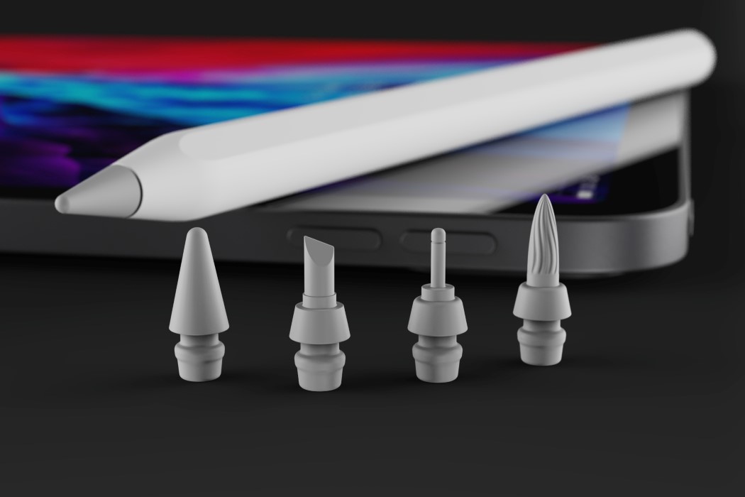
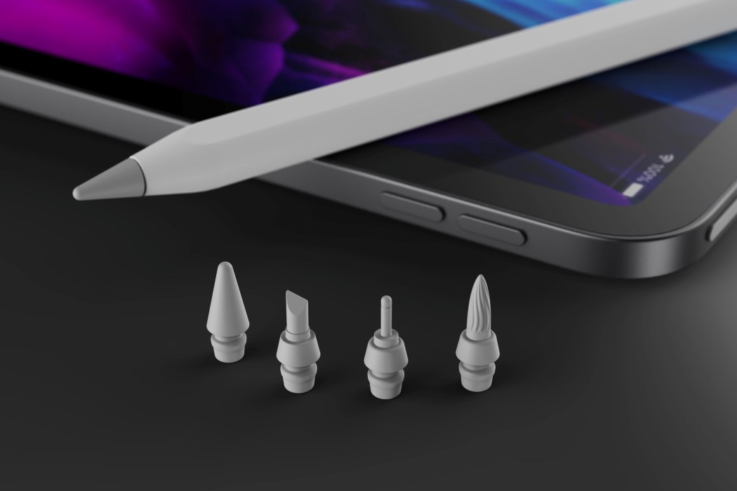
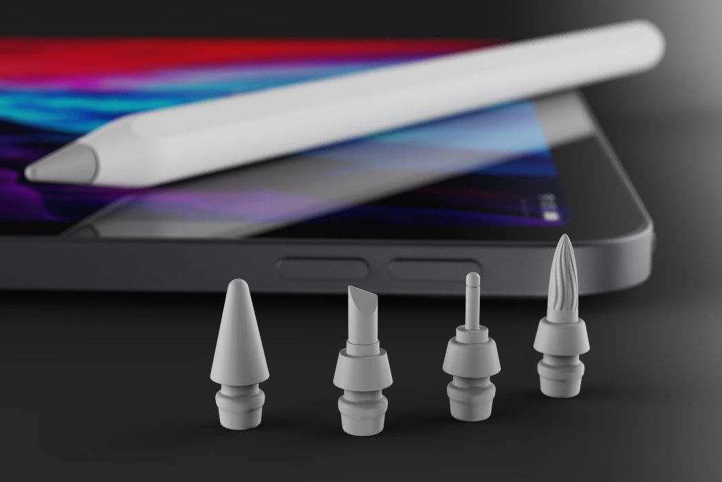
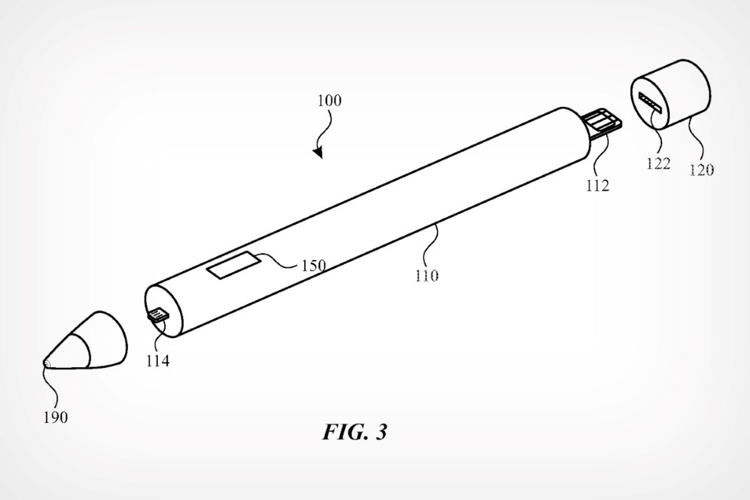
Watch out, Wacom and Adobe! In a new patent granted to Apple by the US Patent and Trademark Office, the company is reportedly looking at a next-generation Apple Pencil with swappable nib modules. While the patent doesn’t exclusively outline what these nibs would look like or be used for, it focuses more on the underlying technology, which would allow nibs to connect to the pencil handle via a special lightning-style connector.

The Apple Pencil is arguably the iPad Pro‘s secret sauce. Along with the Pencil, the iPad Pro becomes the ultimate creator’s setup (for both 2D as well as 3D creation). It would therefore make sense to explore how the Pencil could further become a ‘power-user’ tool, allowing creators to unlock new potentials. Yanko Design has imagined what these new nibs could look like, with explorations for more niche 2D uses. The interchangeable nibs include a fine-tip nib, a chisel nib, and a flexible brush-pen nib. Other nib styles could unlock 3D modeling features like being able to sculpt on the iPad.

While the current Apple Pencil has features like tilt recognition and pressure sensitivity, allowing it to function as any sort of drawing tool, the presence of a specialized nib helps seamlessly replicate the tactile experience of, say, drawing with a brush pen or a chisel marker. Moreover, the ability to replace nibs essentially increases the lifespan of the Pencil by allowing you to replace nibs when they wear down after constant use. “The filing suggests the nib could contain several different sensors for varying purposes. The component list includes tactile sensors, contact sensors, capacitive and touch sensors, a camera, a piezoelectric sensor, a pressure sensor, or a photodiode”, reports Apple Insider.

Designer/Visualizer: Sarang Sheth

Patent via: USPTO

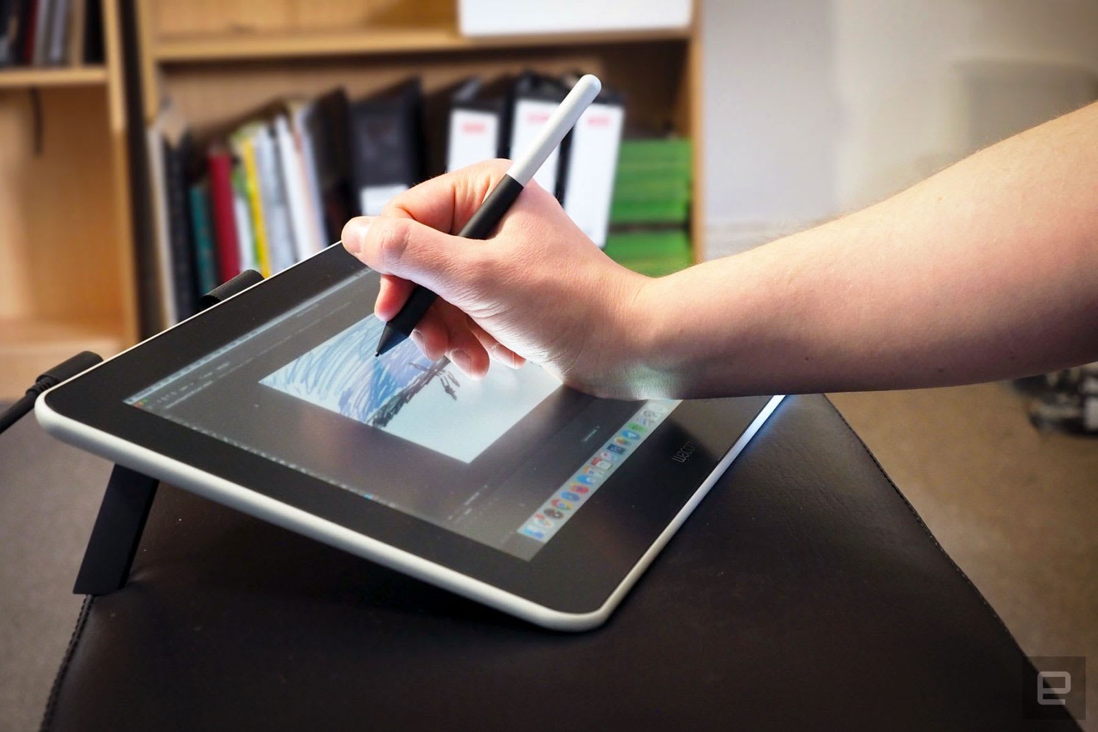
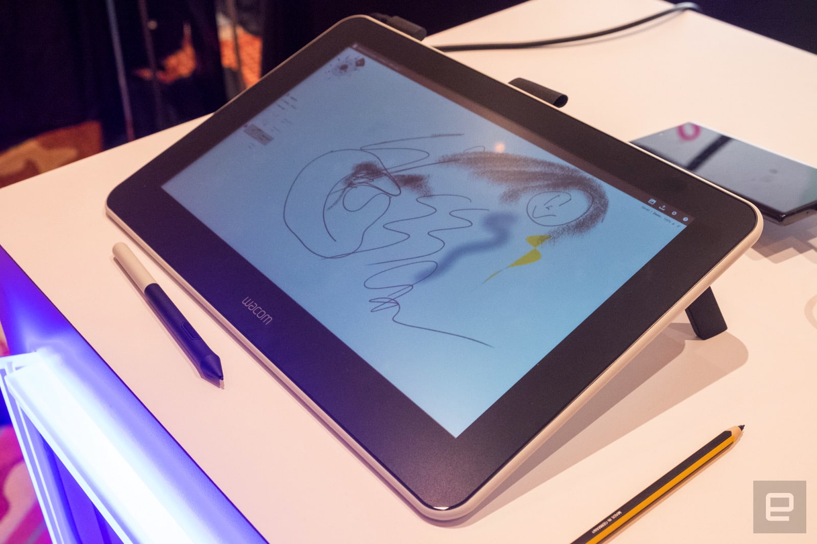
Wacom’s $400 One display is perfect for amateurs

If there's one problem with Wacom's drawing displays, it's that you can't really buy one if you're just a hobbyist. After all, their price and complexity means that if you own one, you're either a professional designer, or aspire to becoming one soon...