Nendo Installs A Carbon-Capturing Wall In A Contemporary Japanese Home

Most of our modern infrastructure and architecture is bad on concrete, and the production of cement used in concrete is one of the biggest causes of worldwide carbon dioxide emissions. This constitutes a serious issue that must be addressed, especially with the current state of our Planet Earth. In this effort, Nendo displays a specimen of a greener and cleaner way to construct and build with its Block-Wall House. The Block-Wall House is partially built using a new concrete that captures carbon dioxide instead of emitting it!

Designer: Nendo & Kajima Corporation
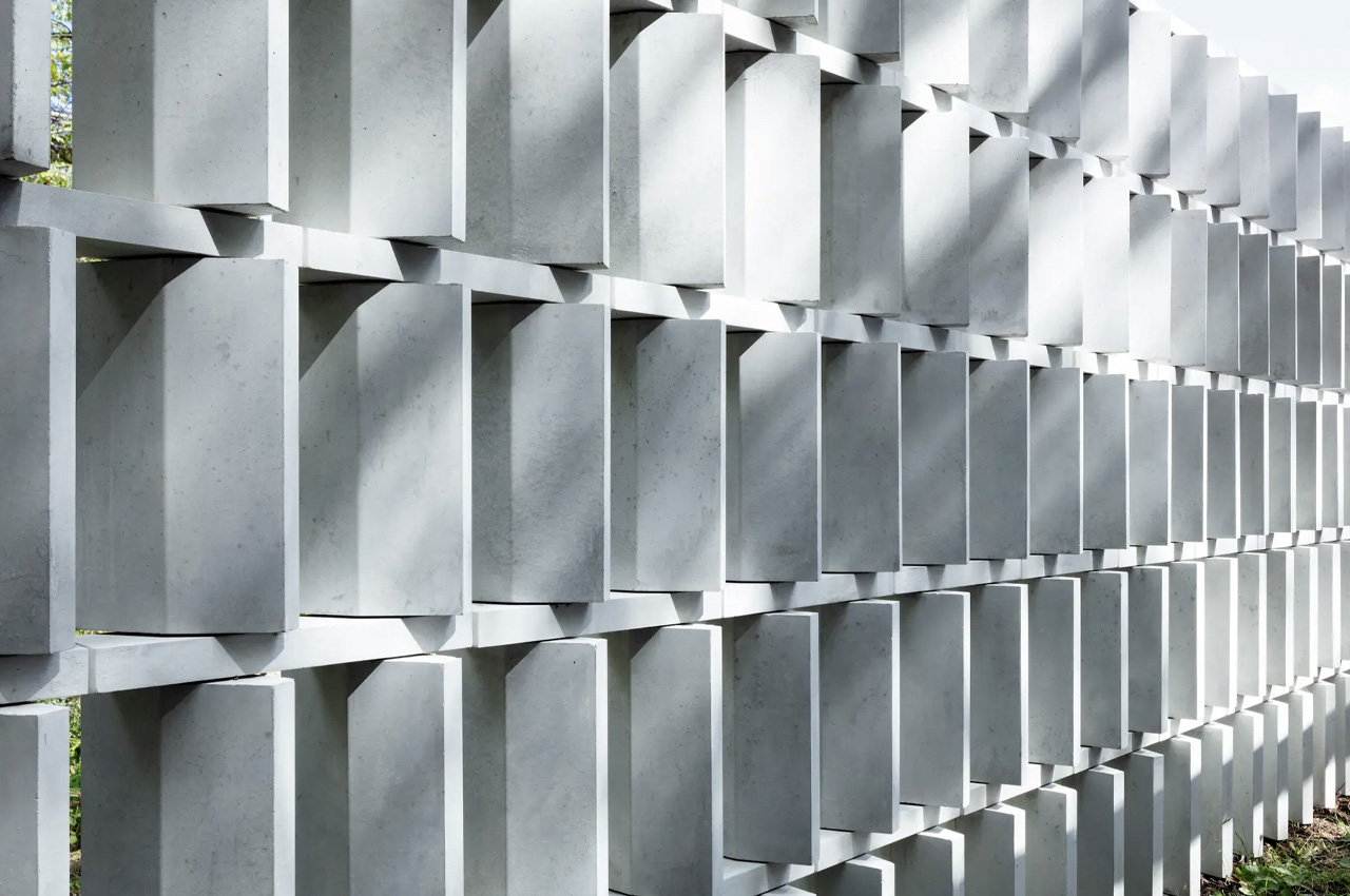
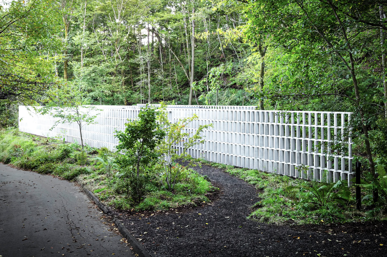
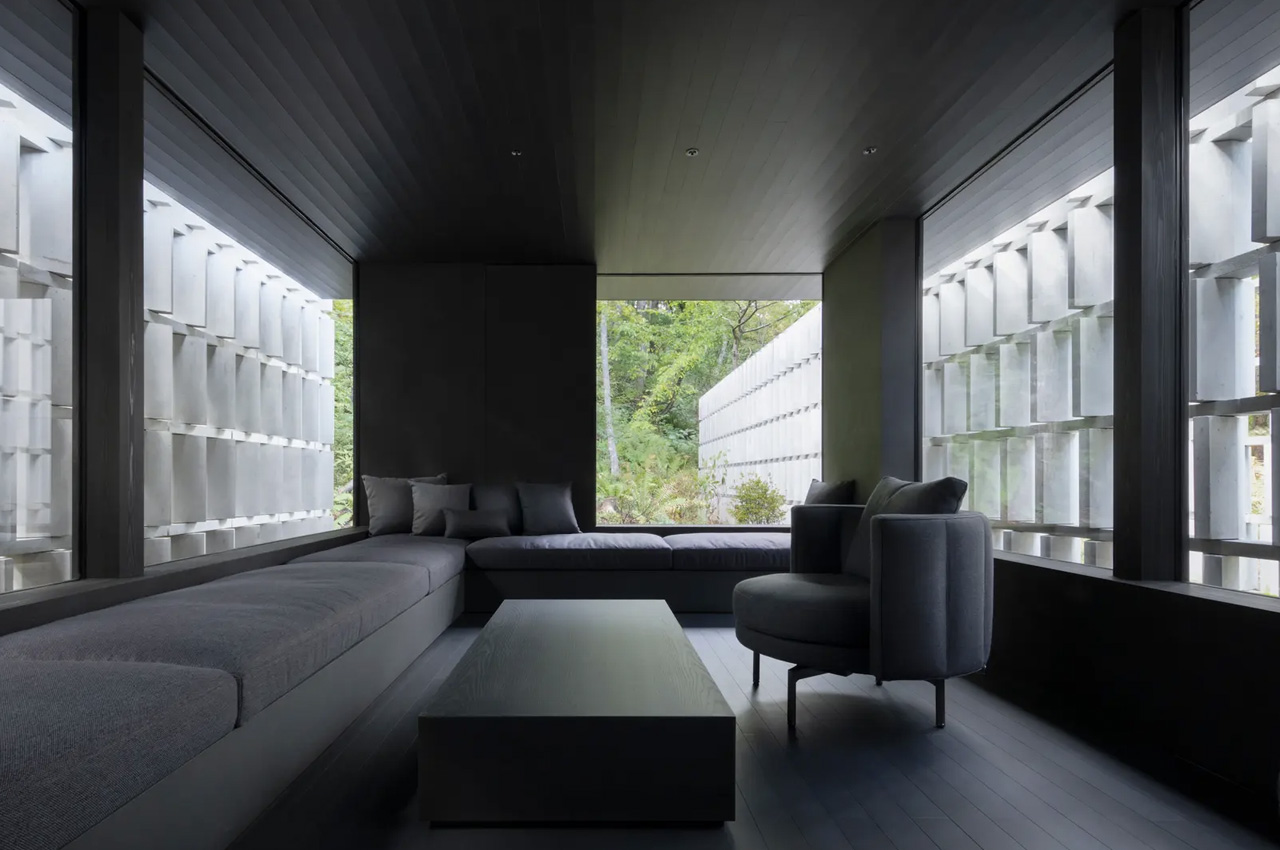
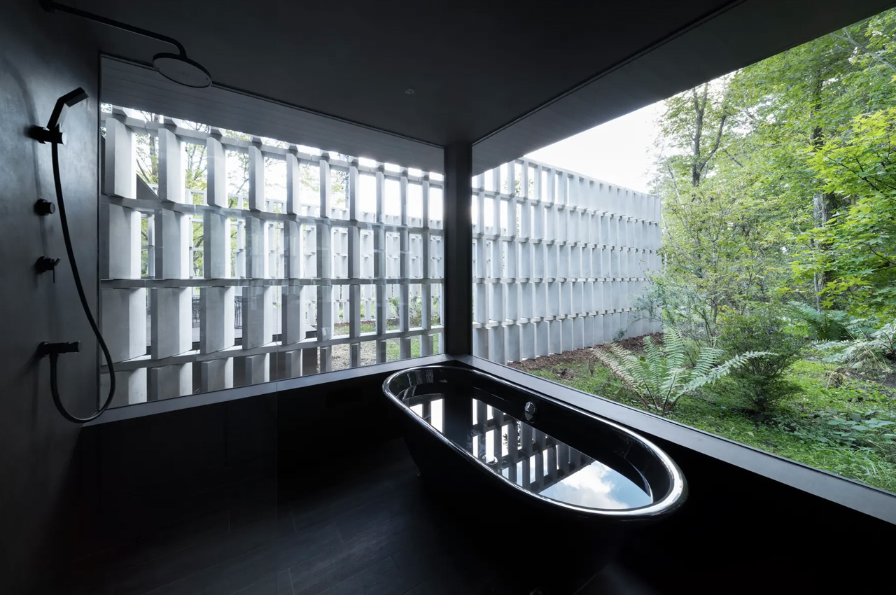
Tucked away in Japan’s Nagano Prefecture, the Block-Wall House is located next to a rural road. The house features a lot of glazing, to offer privacy against pedestrians and passing vehicles. The home is equipped with an angled screen which lets residents look out but makes it quite difficult for a passerby to glance inside. This screen is made using 2000 blocks which have been arranged in parallel rows to form five walls, with a length of 360 feet. This screen is made from the aforementioned sustainable and novel concrete!
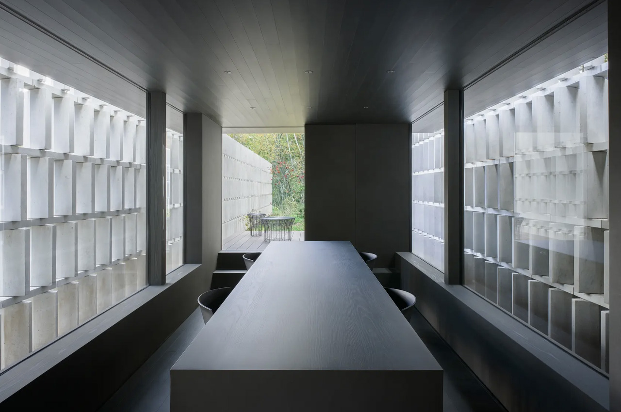
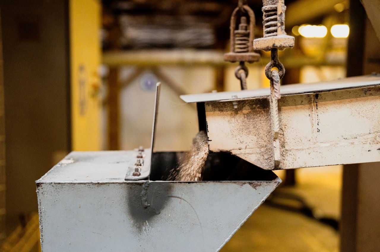
This newly developed concrete is made by the Kajima Corporation in collaboration with the Chugoku Electric Power Co, Denka, and Landes Co. The concrete is named CO2-SUICOM, and for its production, a special cement mixture is placed in a curing chamber, and carbon dioxide is pumped into the chamber for absorption. This absorbed CO2 gets stuck inside the concrete and is not released. It is as strong as regular concrete!

“Generally, concrete hardens through a chemical reaction between cement and water,” explains Kajima Corporation. “But with CO2-SUICOM, over half the cement is replaced with a material we call γ-C2S. Instead of reacting with water, γ-C2S reacts with the CO2 in the air to harden. After mixing the materials needed to create CO2-SUICOM, the concrete can be placed in a location with high CO2 levels so it can capture the CO2 and harden, trapping the gas inside. For example, a thermal power plant or other facility that produces carbon-heavy exhaust gases can redirect the gases into a carbon sequestration chamber, where concrete products made with CO2-SUICOM can be placed to capture the CO2 in the gases.”
Currently, the price of producing CO2-SIUCOM concrete is about three times higher than usual concrete in Japan. Hence, work is being done to bring down the price, and Kajima Corporation believes that the concrete will become more economical in the future.
The post Nendo Installs A Carbon-Capturing Wall In A Contemporary Japanese Home first appeared on Yanko Design.
Wall cladding made from corn cob waste brings sustainable construction materials

Construction is something that we probably cannot do without as we continue to build houses, buildings, and other structures. The quest for coming up with sustainable construction is ongoing as we look for materials that are eco-friendly and the process in creating them to be as sustainable as possible. There are a lot of waste in our world that can actually be used for other purposes instead of just becoming biomass as they are mostly used now. A breakthrough in terms of interior wall cladding is now available and it comes from the most unlikeliest of sources: corn cobs.

Designer: StoneCycling and Studio Nina van Bart

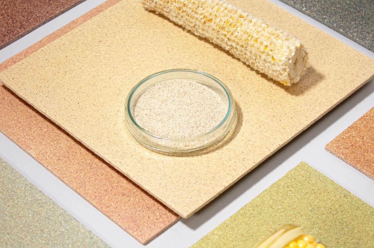
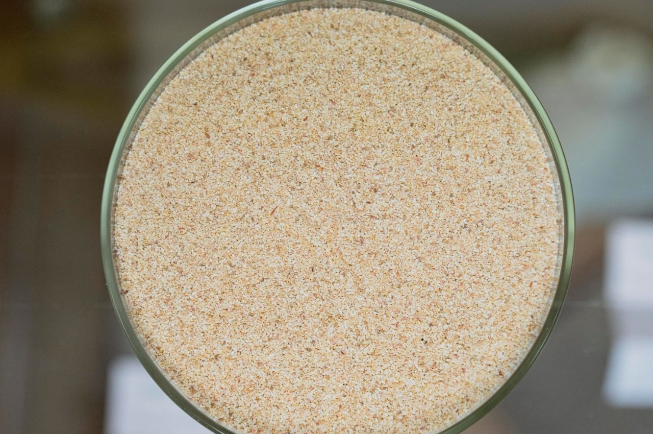
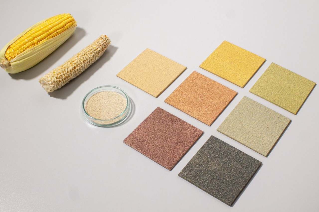
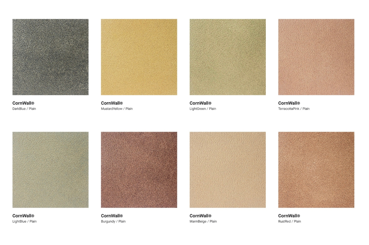
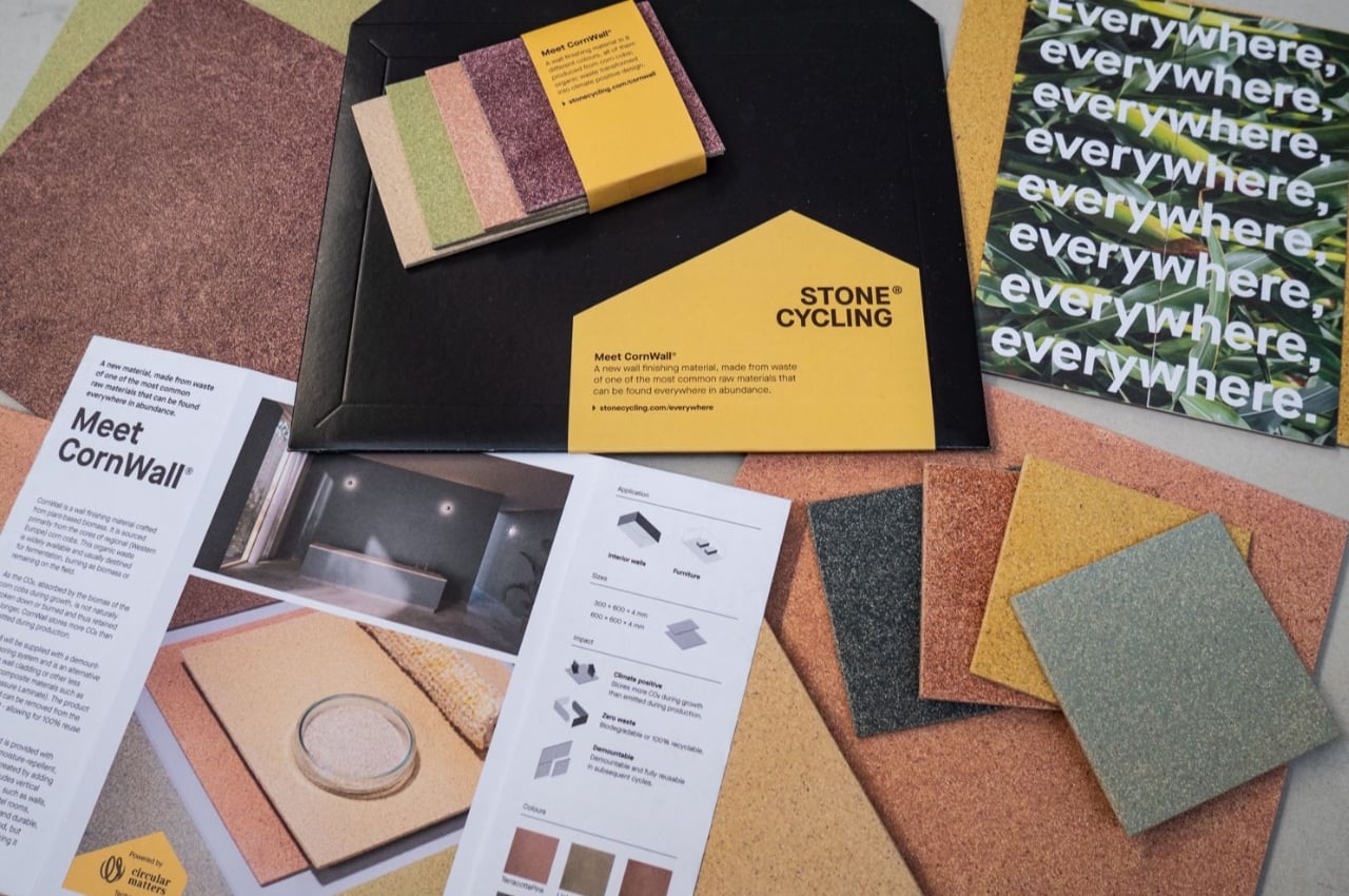
CornWall is an alternative to interior wall cladding that uses organic corn cobs, subjecting them to up to 150 degrees Celsius so as to activate and create “strong bonds”. Aside from using sustainable materials, the heating process is also eco-friendly as it uses sustainable energy. The electric heating process uses the solar panels on their factory’s roof. So from the materials to the process itself, we are seeing something that will lessen or leave no carbon footprints at all.

Mostly corn cobs are left on the fields or fermented or burned as biomass. But with this process, they are able to turn them into wall cladding. It is better than the usual ceramic wall cladding that is used or even composite materials like high pressure laminate (HPL). Another advantage to this is that it is able to store more carbon dioxide because of the absorbed CO2 already in it. It is also 100% reusable as it can be removed from interiors through the demountable anchoring system.

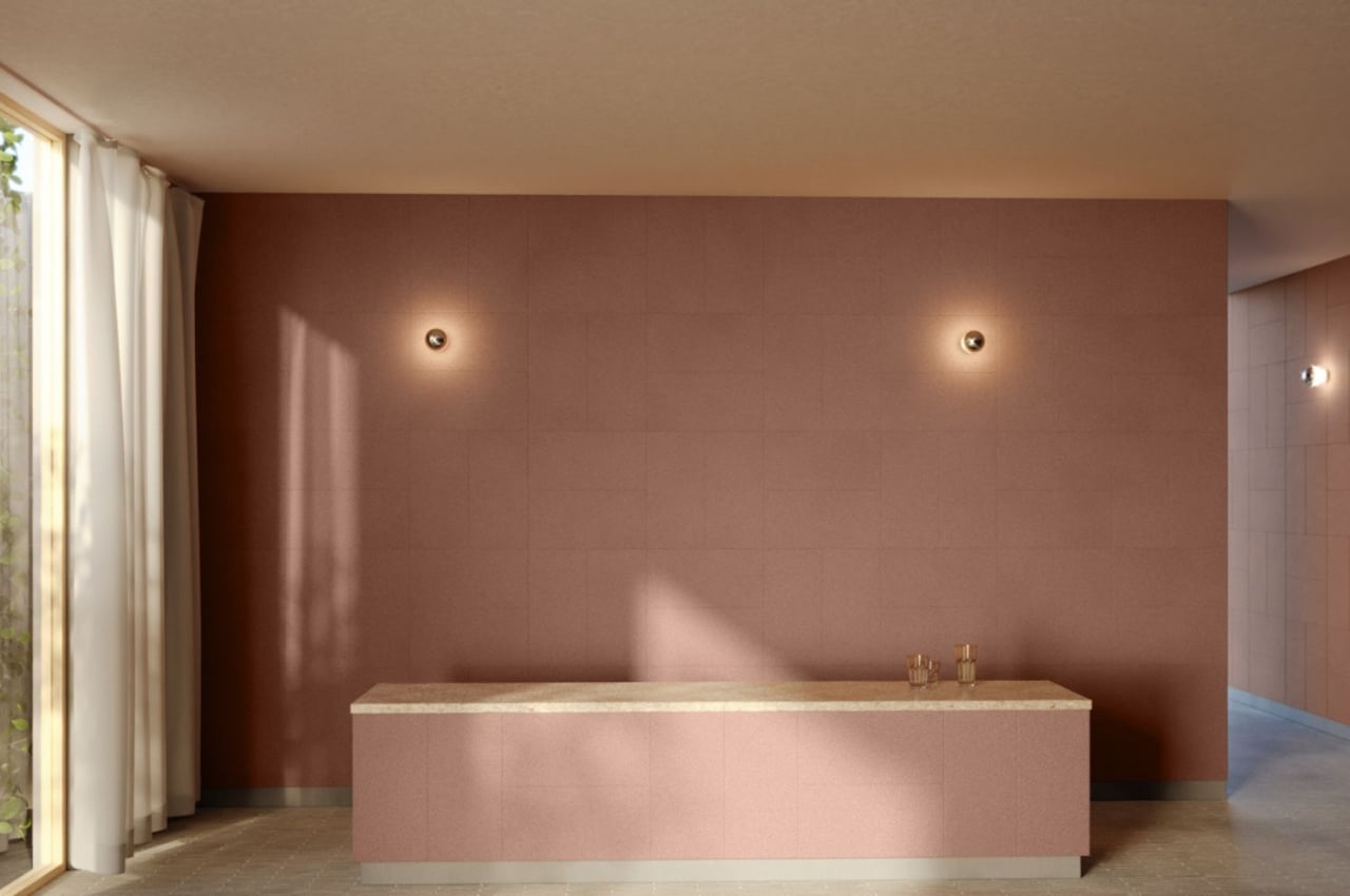
Based on the product photos, it doesn’t look much different from the usual wall cladding. It actually looks like those cork coasters that we’re seeing now. It comes in different colors loke DarkBlue, MustardYellow, TerracottaPink, etc. Hopefully we see even more construction materials that use sustainable materials and processes so we can have an industry that is more eco-friendly.

The post Wall cladding made from corn cob waste brings sustainable construction materials first appeared on Yanko Design.

The Frame wall pad elevates smart home design with Korean elegance and utmost IoT convenience

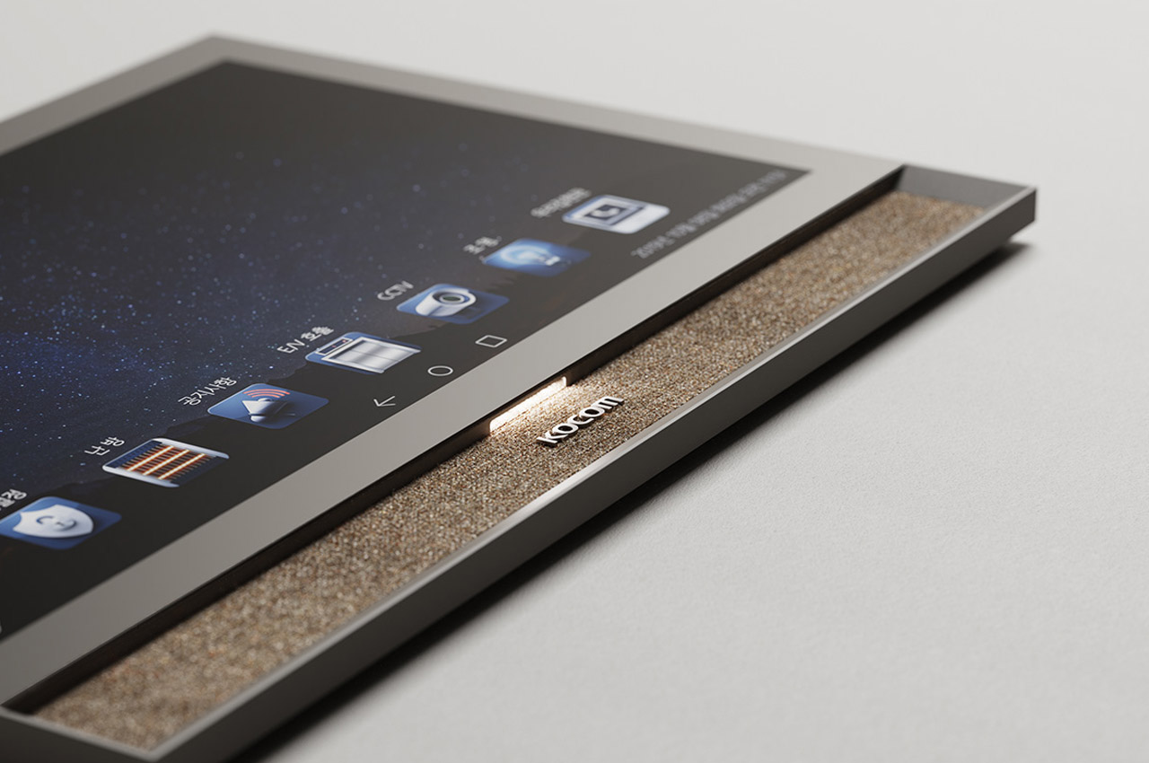
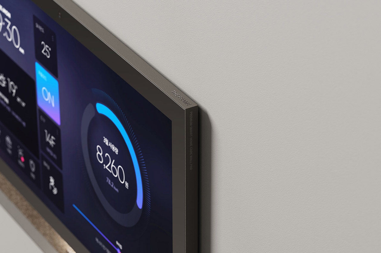
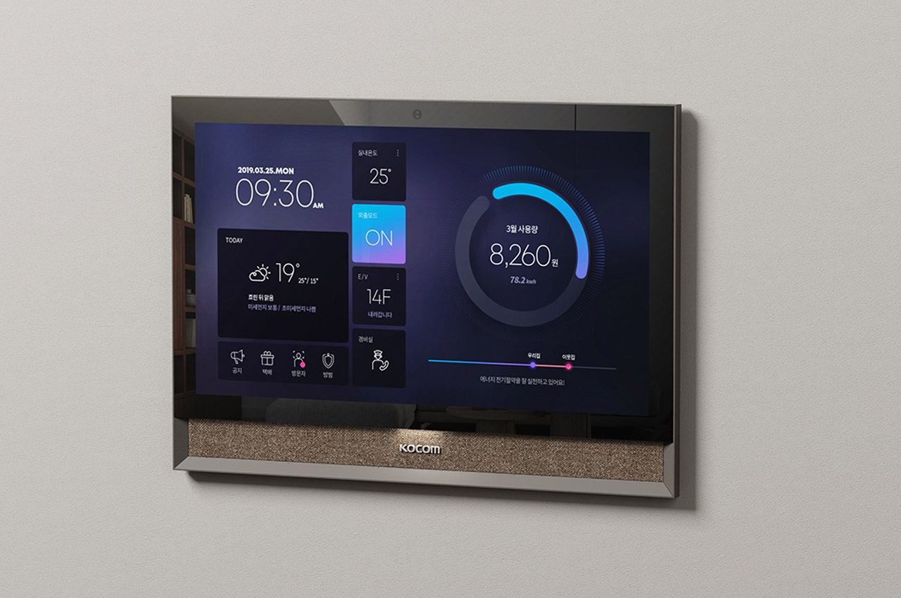
Step into the future of home technology with The Frame, a pinnacle creation for Kocom, the renowned Korean smart home appliance company. Crafted with precision and elegance, this wall pad is designed to redefine the smart home experience with absolute convenience and comfort.

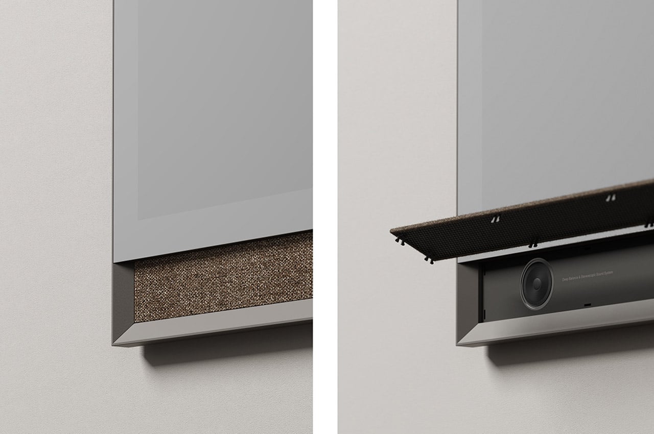
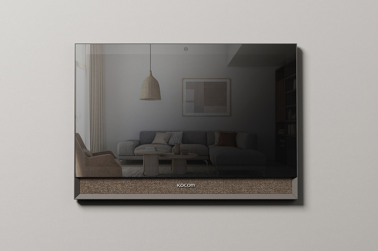
Measuring an impressive 13.3 inches, The Frame boasts a full-screen touch system, setting it apart as a sophisticated and user-friendly centerpiece on the wall of any living space. What distinguishes The Frame isn’t just its functionality but the impeccable design as well. Wrapped in a quiet yet charismatic color palette and adorned with the soft fabric of Kvadrat, the Frame strikes the perfect balance between technology and aesthetics.

Designer: Dive Design, Kyumin Hwang and Minki Kim

Imagine controlling your entire home’s IoT equipment and front door with a simple touch on this smart wall pad. Installed in apartments, The Frame seamlessly integrates into the most sophisticated living spaces, offering a new level of control and convenience making it more than just a device; a statement piece in your lifestyle!

The magic mirror display of The Frame not only offers a glimpse into the future but also seamlessly merges with high-end furniture, creating an illusion of it being a natural part of the interior. It is thus designed to break away from the mundane, The Frame’s unique presence defies the ordinary trend of ubiquitous white-boxed devices, so its minimalistic but luxurious colors and attention to detail set it apart as a design masterwork.

In a world flooded with smart home gadgets, The Frame stands out as an embodiment of elegance, and technological advancement. It’s a seamless integration of technology and artistry, elevating the very essence of what a smart home device can be. With its fusion of Korean sophistication, the Frame is little about what it does, but how it becomes an integral part of your modern living space!

The post The Frame wall pad elevates smart home design with Korean elegance and utmost IoT convenience first appeared on Yanko Design.
These hexagon tiles create a mesmerizing wall art that you can arrange in any way you want

Putting up decorations on a wall is always a big commitment, primarily because most fixtures are designed to be permanent. Circumstances, however, change far too often than one would imagine, and there will be times when you wish you could have designed a wall differently. Maybe you need to reclaim some wall space, or maybe you grew out of an old fad, or maybe you’re actually moving to a new place with a different wall setup. Whatever the case may be, most people will probably want to have the flexibility in designing their walls, even if it simply means being able to change the setup as needed or desired, even if it just means expanding or shrinking the design. That’s the kind of “open” design that this unique wall installation is trying to present using creative and sustainable design as well as a pinch of math.

Designer: Duffy London

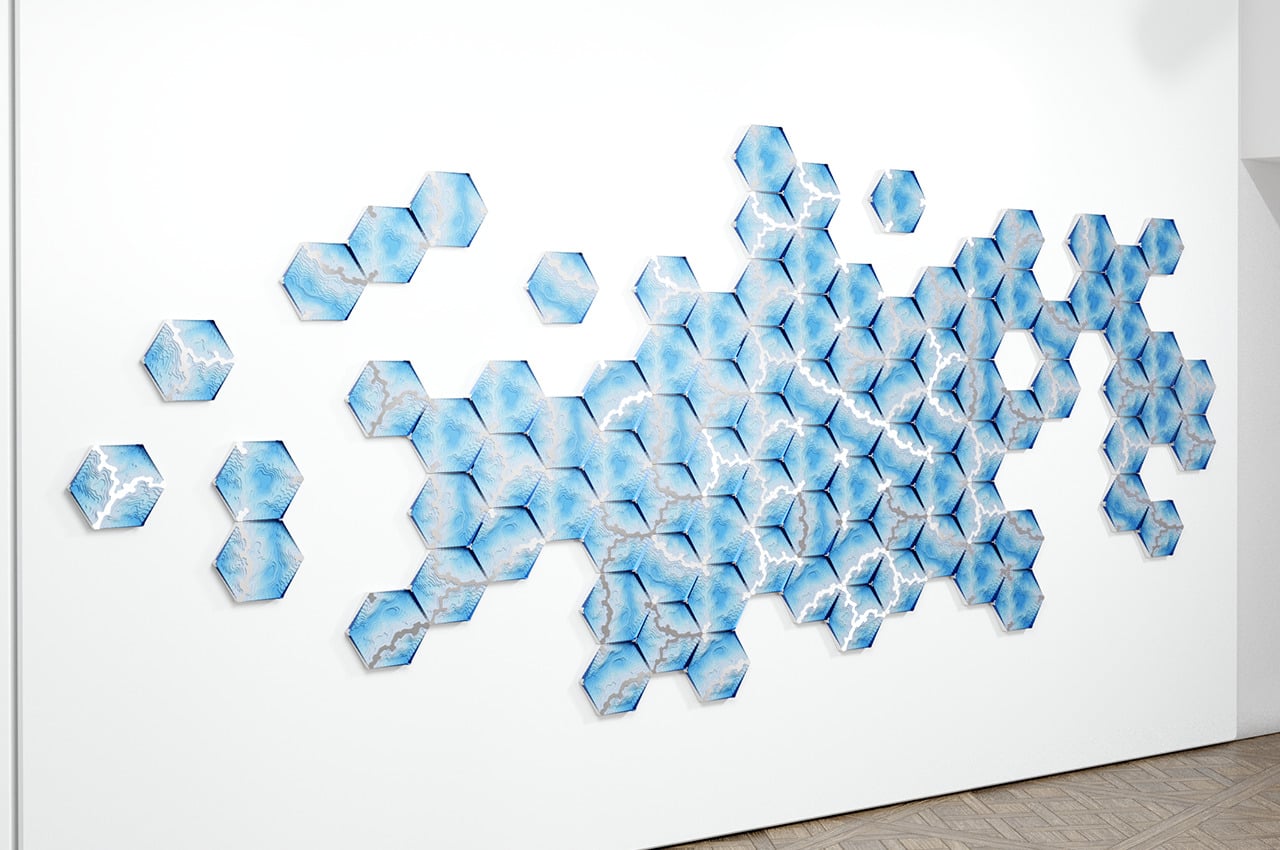
When people think of shapes, a hexagon is probably not going to be at the top of their lists, yet it turns out to be a rather versatile polygon with some hidden benefits when it comes to composition. Like a triangle, it has a rather interesting shape made of tilted lines, but like a square, it can be easily grouped together in different combinations to create a tiled pattern. When used with a mathematical tiling system called “Truchet Tiling,” you can even rotate the hexagons in different directions and you’d still end up with a pleasing whole that looks as if it were designed that way from the start.

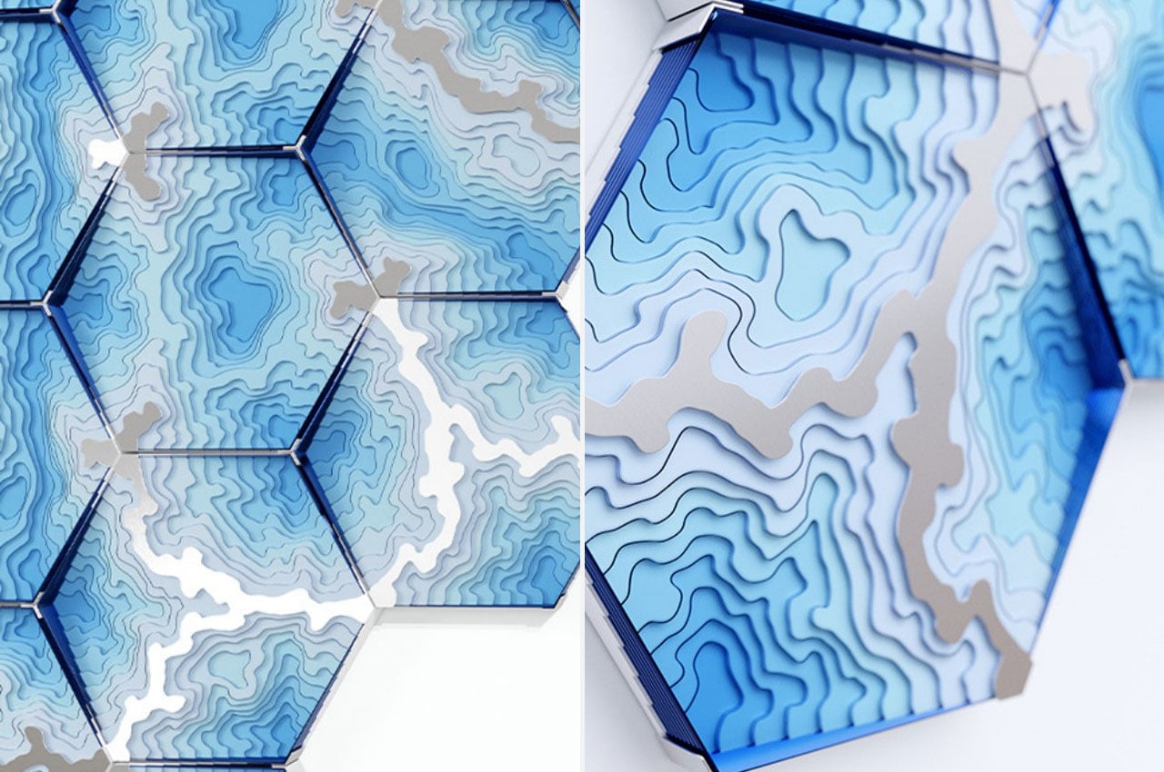
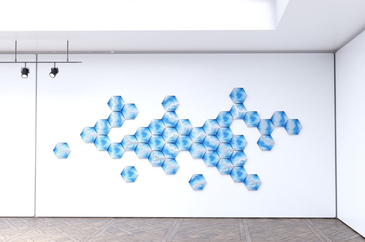
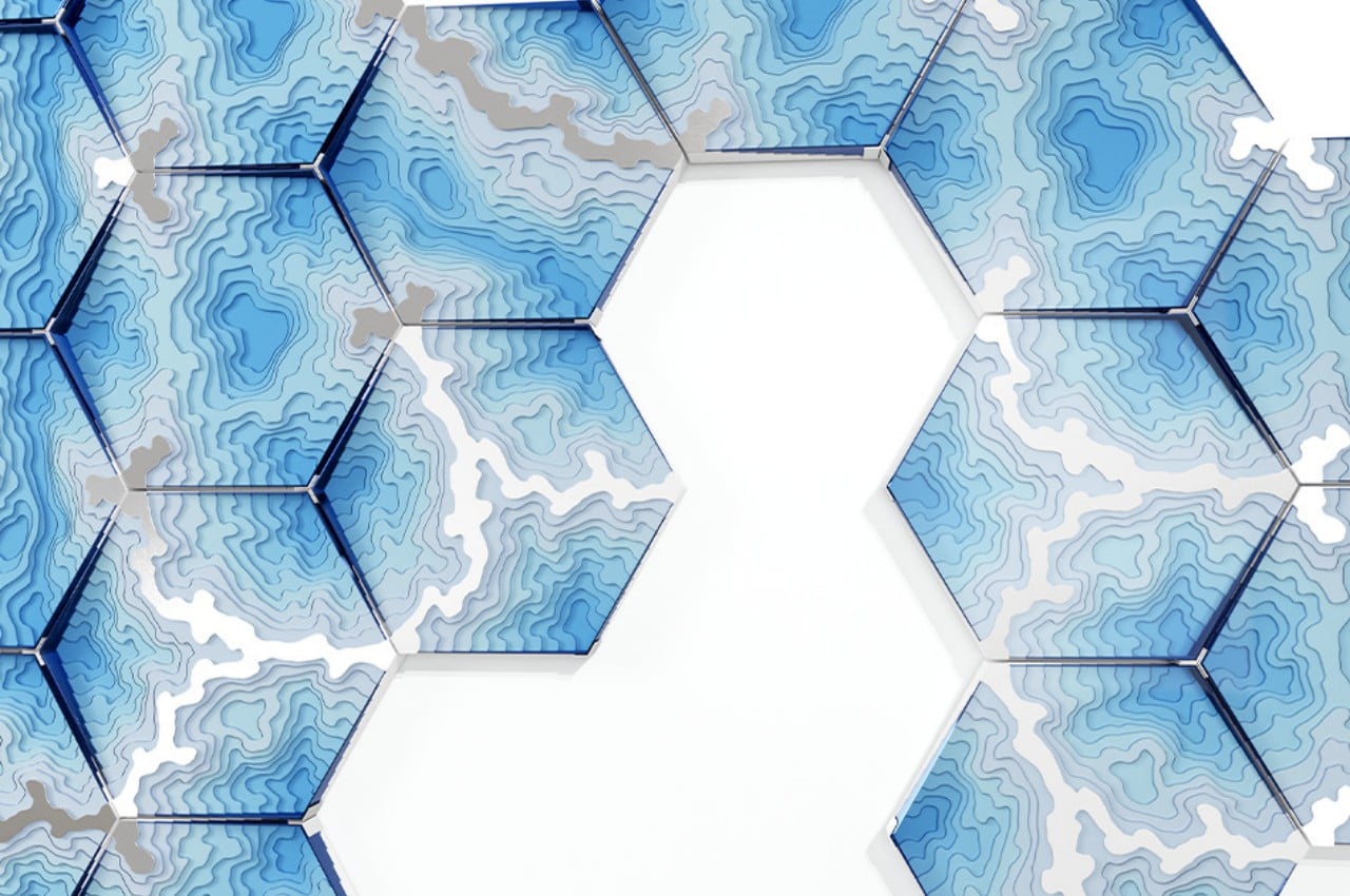
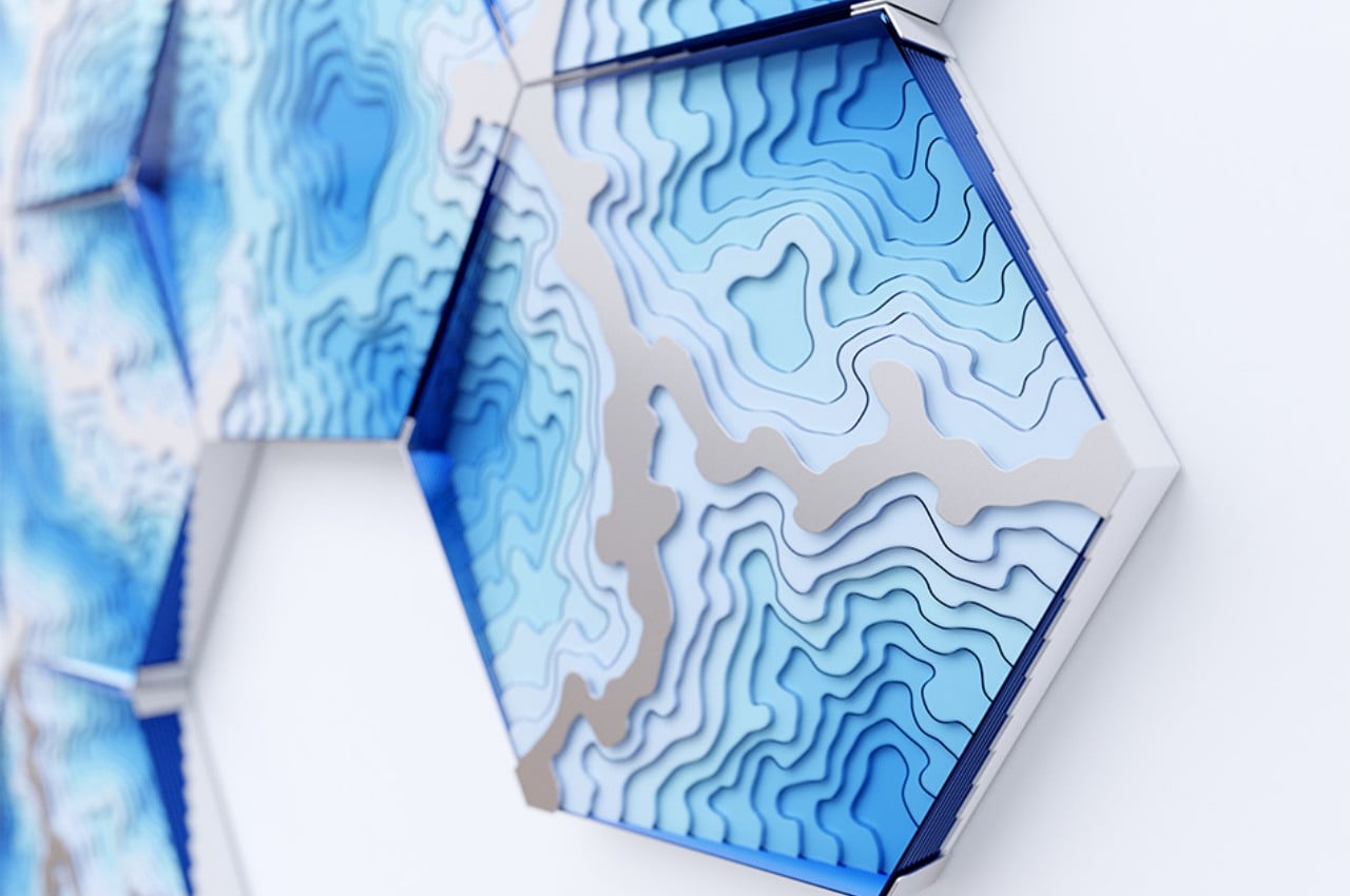
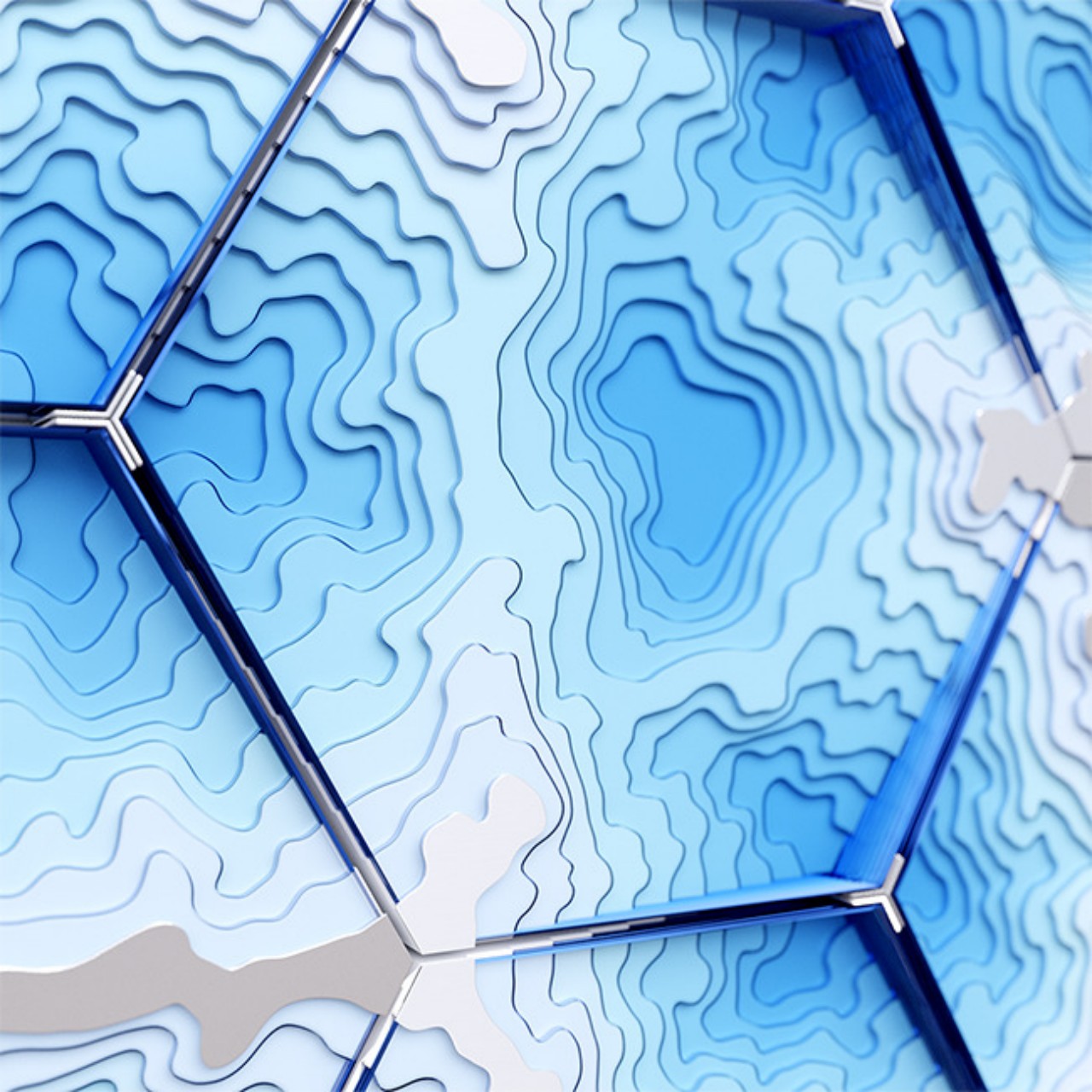
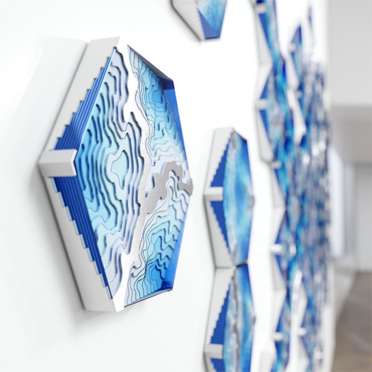
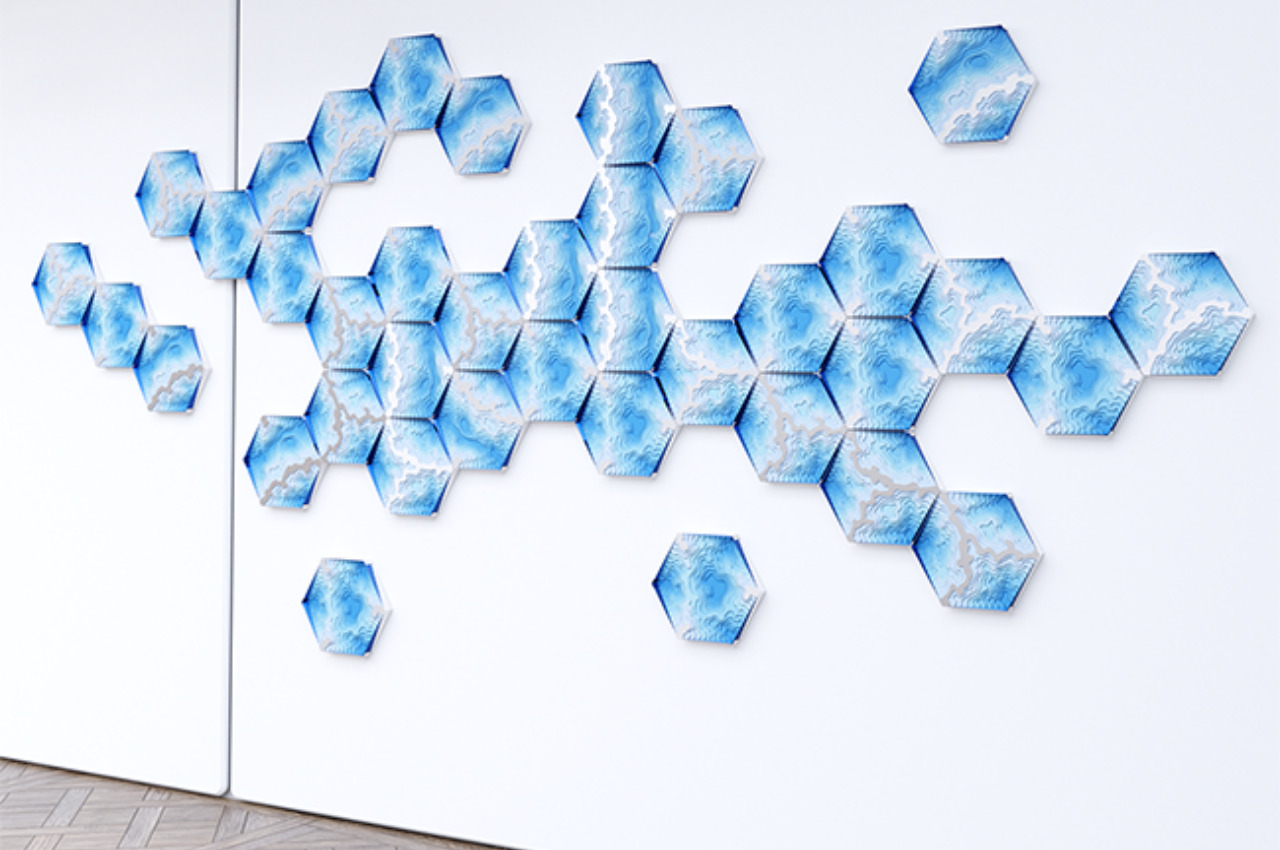
The Abyss Wall Tile was created using that principle to bring Duffy London’s famed Abyss design to a vertical plane. Just like the Abyss Table, each hexagon displays a layered design reminiscent of contour maps, particularly those of the ocean floors that lead your eyes toward abyssal depths. In this particular incarnation, however, there are three distinct patterns available and you can combine these hexagonal tiles to create a larger map-like composition on your wall. The clincher is that, no matter which direction you rotate the hexagons, you’ll still be able to combine them in a way that makes them look like a unified pattern.

What this means is that you have complete freedom in how you arrange the tiles and how many or how few you want to put up on your wall. You can even change the arrangement as you want, adding or removing pieces as needed. Of course, you still have to consider how these tiles will be mounted without being absolutely permanent, but with many options available today, that shouldn’t be much of a problem.

The Abyss Wall Tiles also has a sustainable angle to it, almost like a nod to the oceans that they portray. They use plexiglass, recycled plastic, and brushed stainless steel and are handcrafted to help reduce their impact on the environment. It’s a simple yet ingenious design that gives peace of mind as well as enjoyment as you immerse yourself within the abyss of your self-made ocean floor.

The post These hexagon tiles create a mesmerizing wall art that you can arrange in any way you want first appeared on Yanko Design.
This modular wall storage concept is perfect for tiny homes

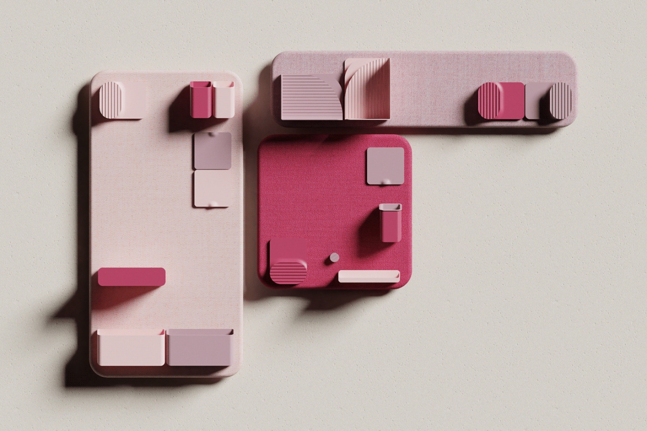
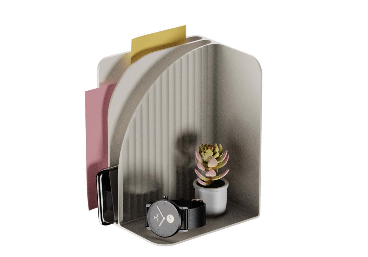
Thanks to the power of magnets, a blank wall can become a safe haven for all your things if you’ve already run out of places to store them.

The price of housing and living spaces has gone up considerably in the past decades, resulting in people trying to make do with more cramped accommodations. Conversely, the surge of interest in tiny homes has also spurred some creative thinking in new storage solutions with minimal footprints. In both these cases, traditional products like containers and cabinets just don’t cut it. Fortunately, a few new designs have started appearing lately, including one that lets you use the wall for something more functional and less decorative but still aesthetic.

Designer: Francesco Brunetti

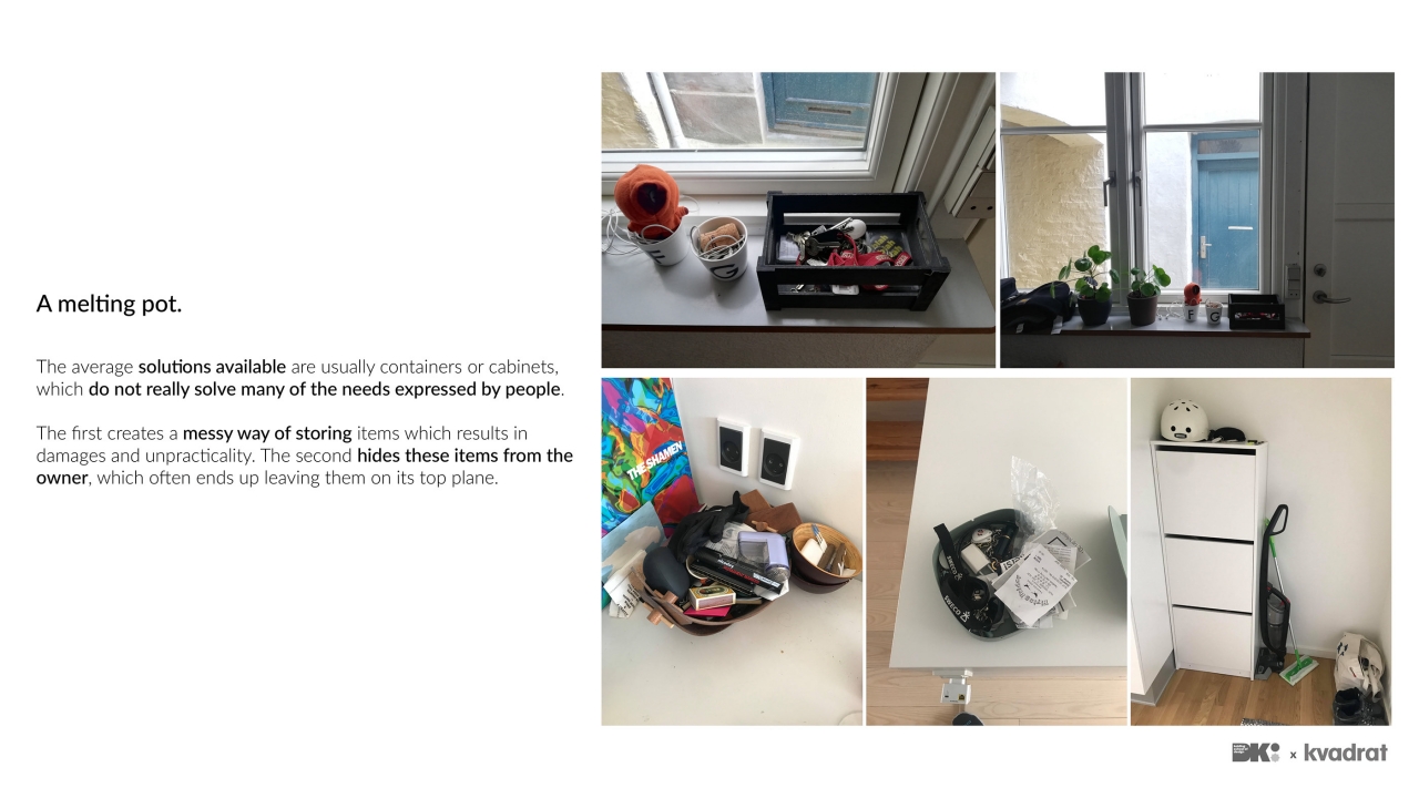
Typical containers store items in a messy way that potentially damages these objects, while cabinets don’t provide quick access or visibility to the things they hide inside. More importantly, these solutions often take up floor space which is already in short supply in small living quarters, even one to two-room apartments. That’s why some have considered unconventional spaces like stairs and walls as the next frontier in storage solutions, but few offer the same flexibility as shelves and drawers.

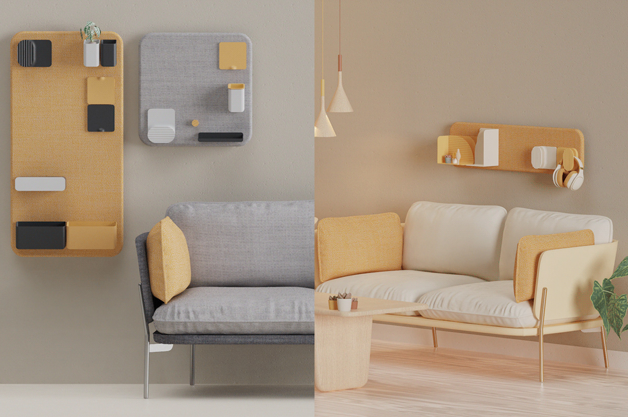
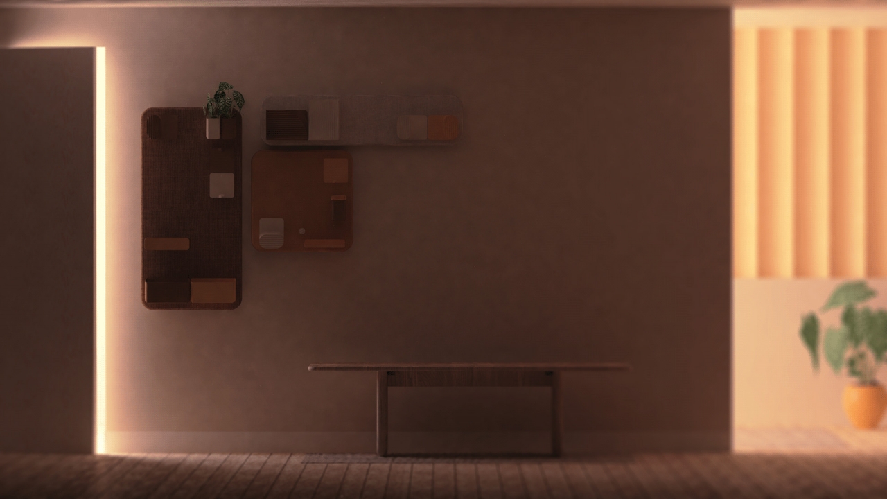
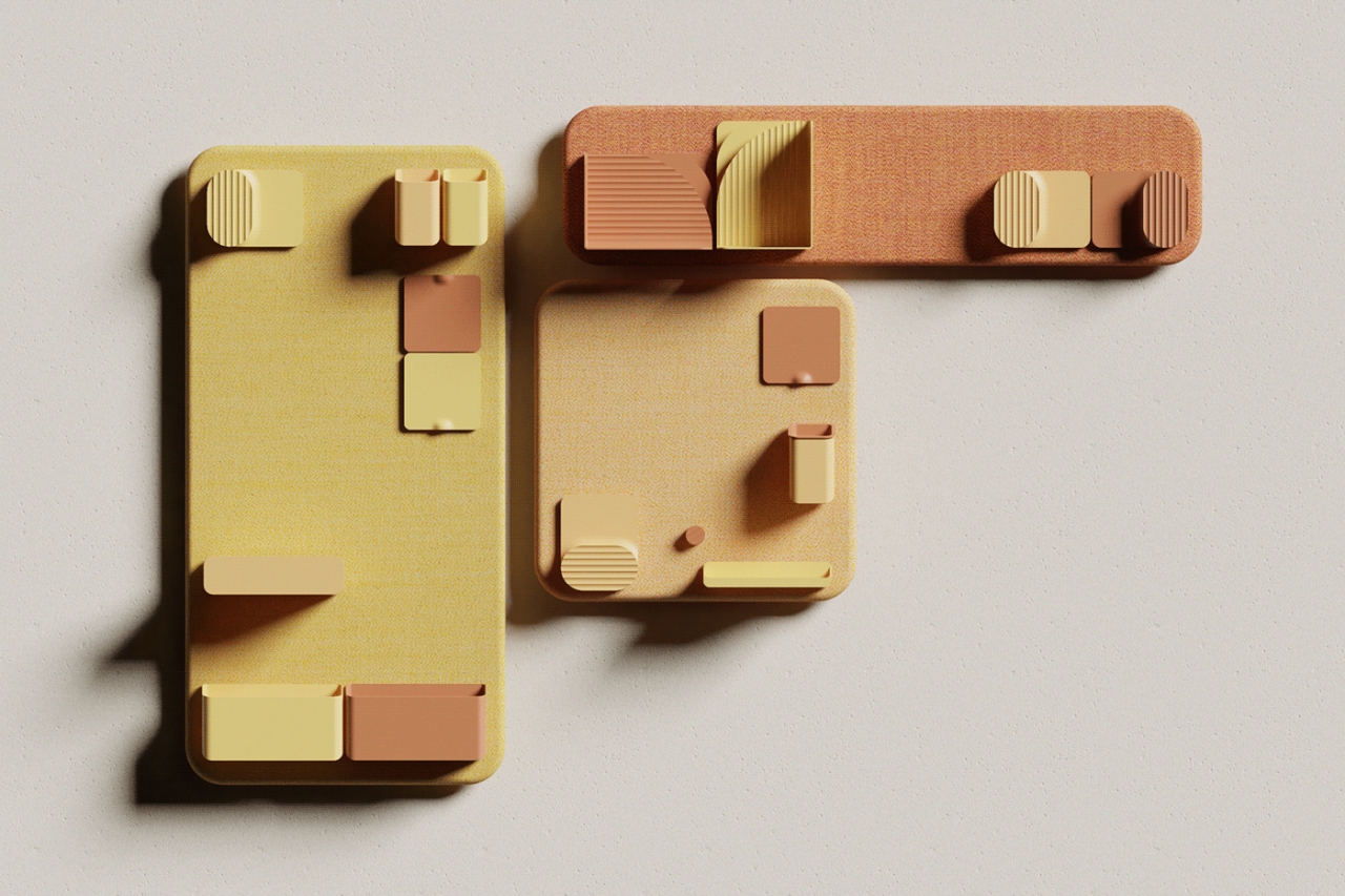
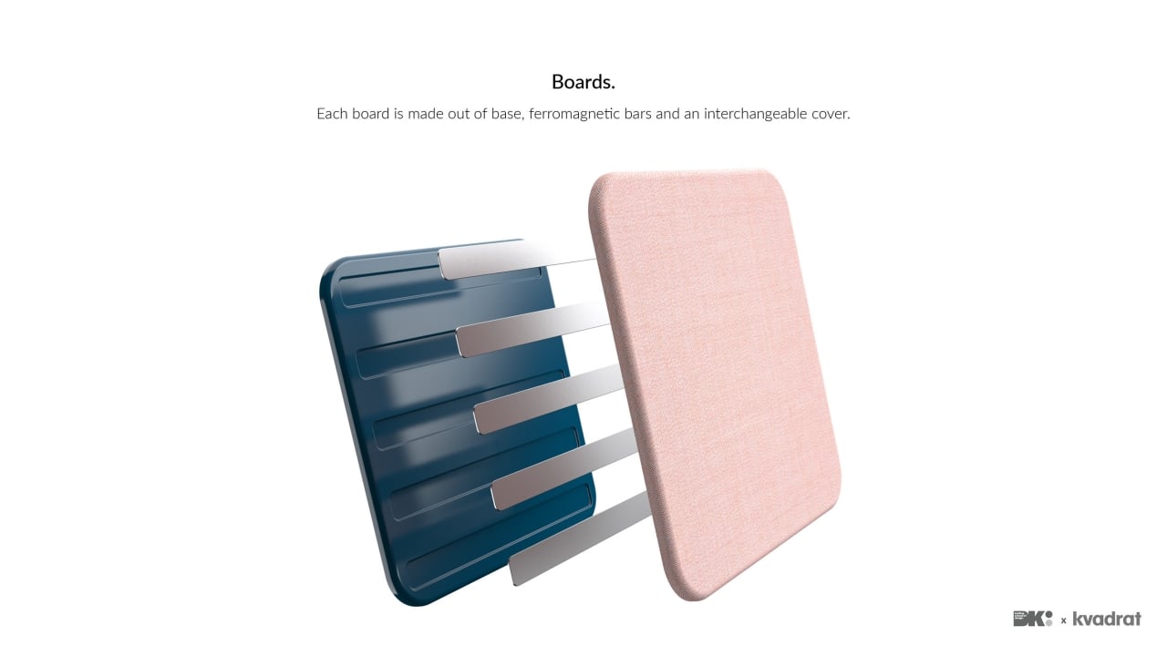
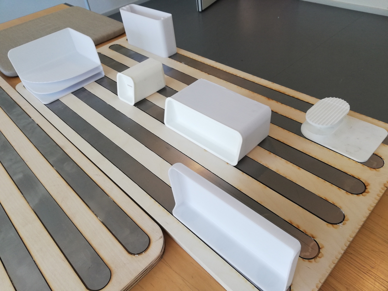
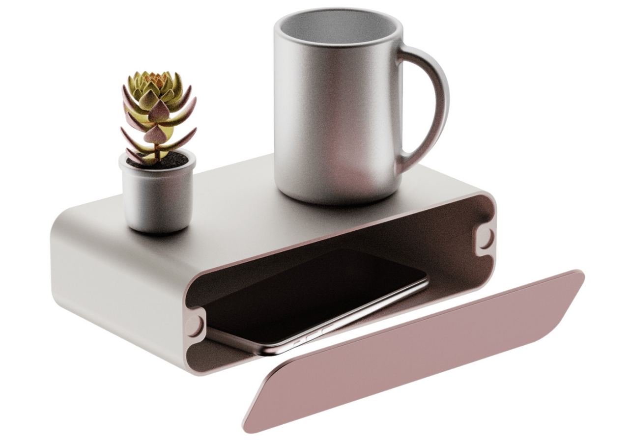
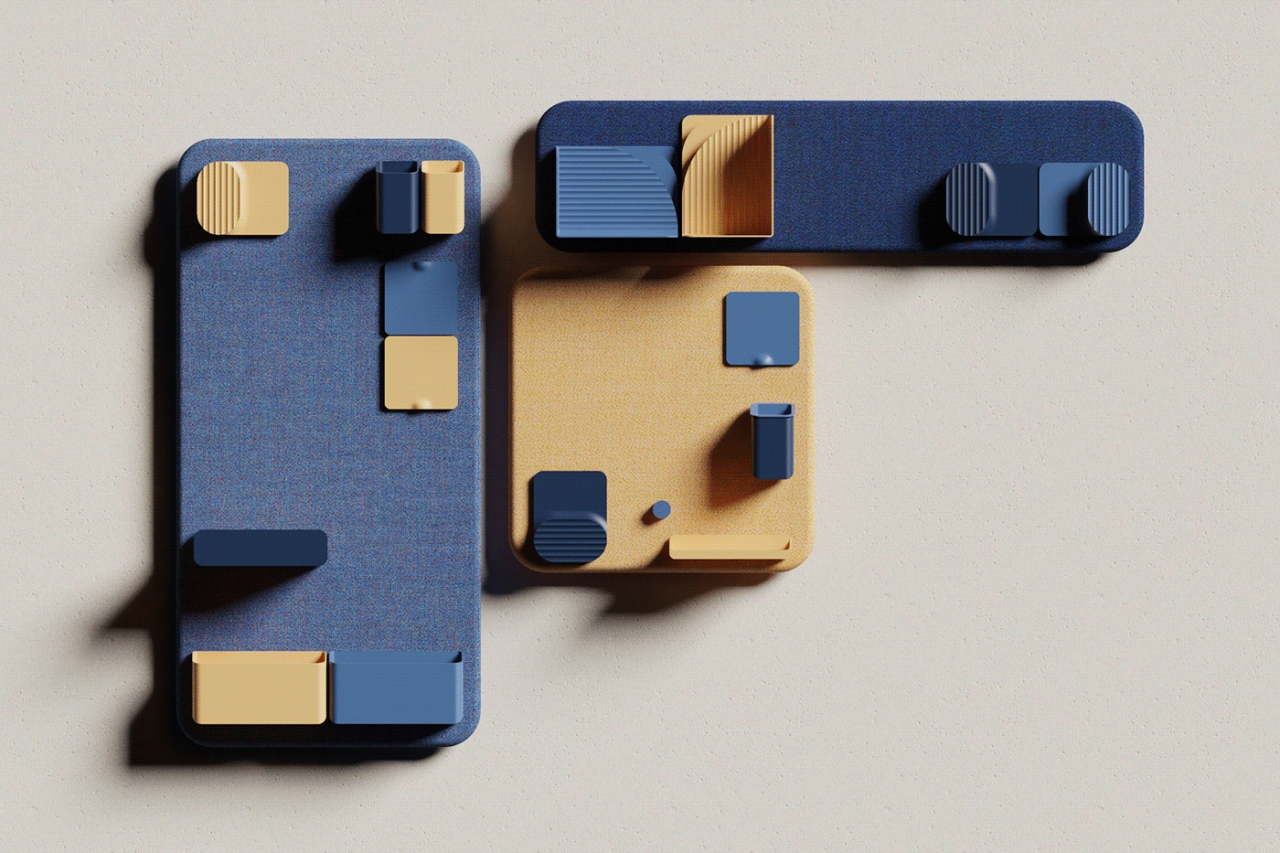
That’s where Brunetti’s Wall-it concept comes in, a storage solution that is can also be a decorative wall piece. Rather than limiting what you can hang on your wall to the manufacturer’s specifications, Wall-it lets owners decide where and how to hold different kinds of objects. This modular capability is thanks to the power of strong magnets that not only let you decide which containers to attach but also which boards to use.

dav

dav

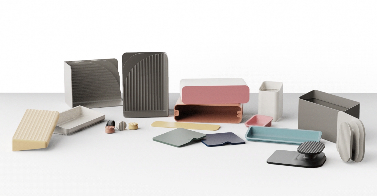
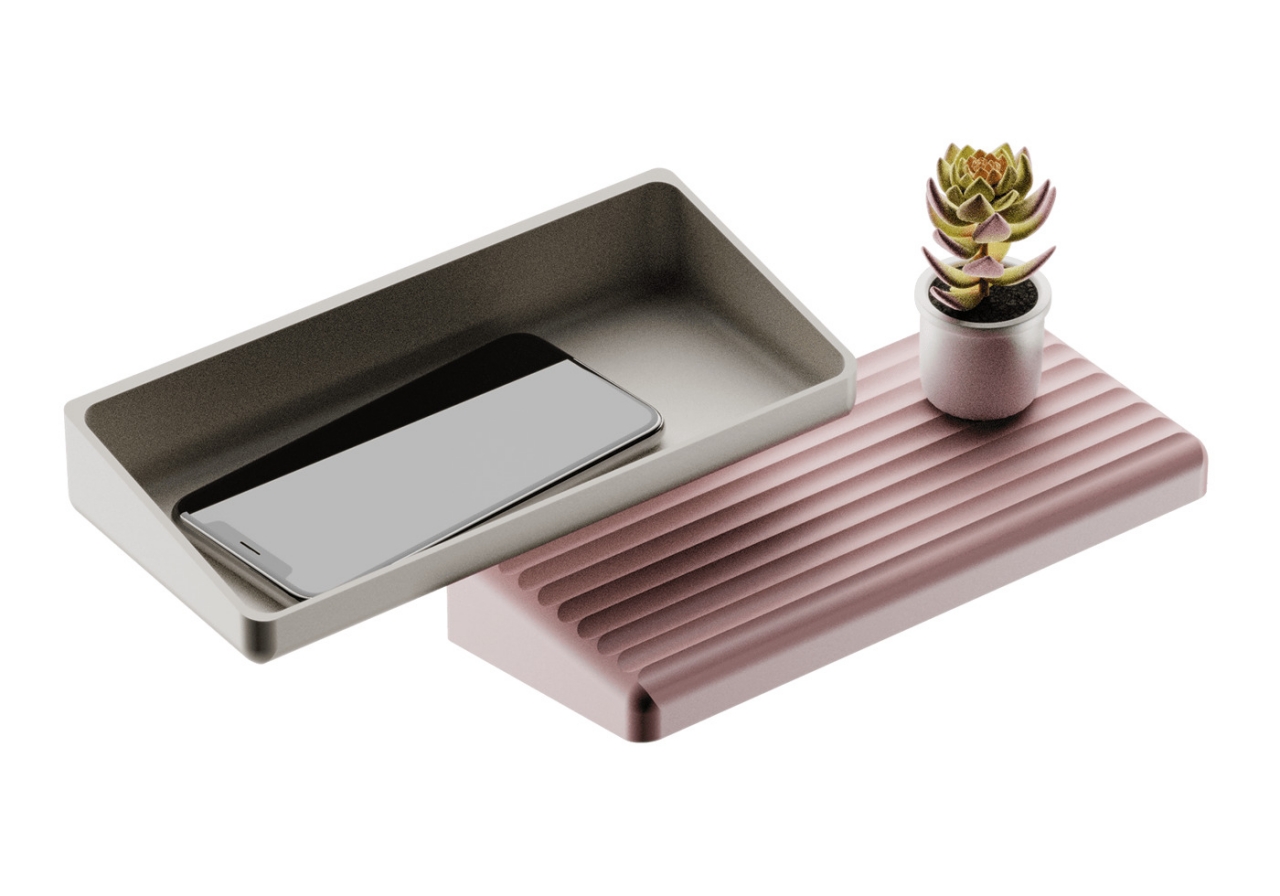
This is also where the aesthetic and decorative aspect of Wall-it comes in. The concept has room for over a dozen different accessories that can be used for different kinds of objects, like a hook for headphones and a box for smartphones. Users can mix and match not only the types of containers themselves but also the colors of the board and the accessories. You can choose to match their colors with the rest of the room or make them stand out visually with different hues.

There’s also a sustainable element to Wall-it, thanks to the materials that have been chosen for this concept. Bio-based PLA thermoplastic is significantly more recyclable than regular plastic, and the epoxy used to join the magnets with PLA can be dissolved by acidic solutions. Wall-it, therefore, presents a family of storage solutions that not only saves space but also saves the environment in the long run.

The post This modular wall storage concept is perfect for tiny homes first appeared on Yanko Design.
Endlessly modular smart LED panels turn your walls into dynamic light installations!

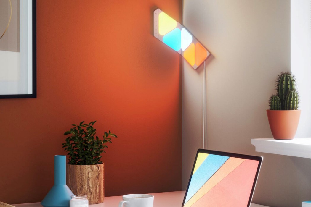
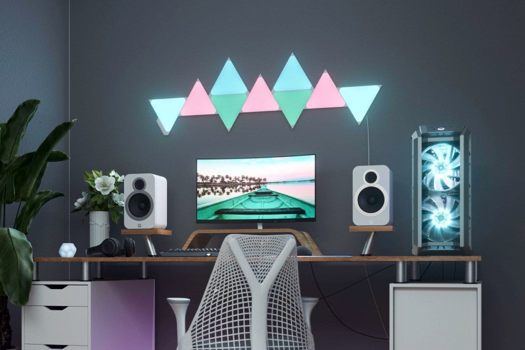
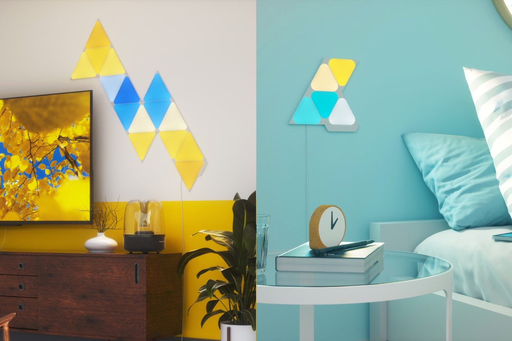
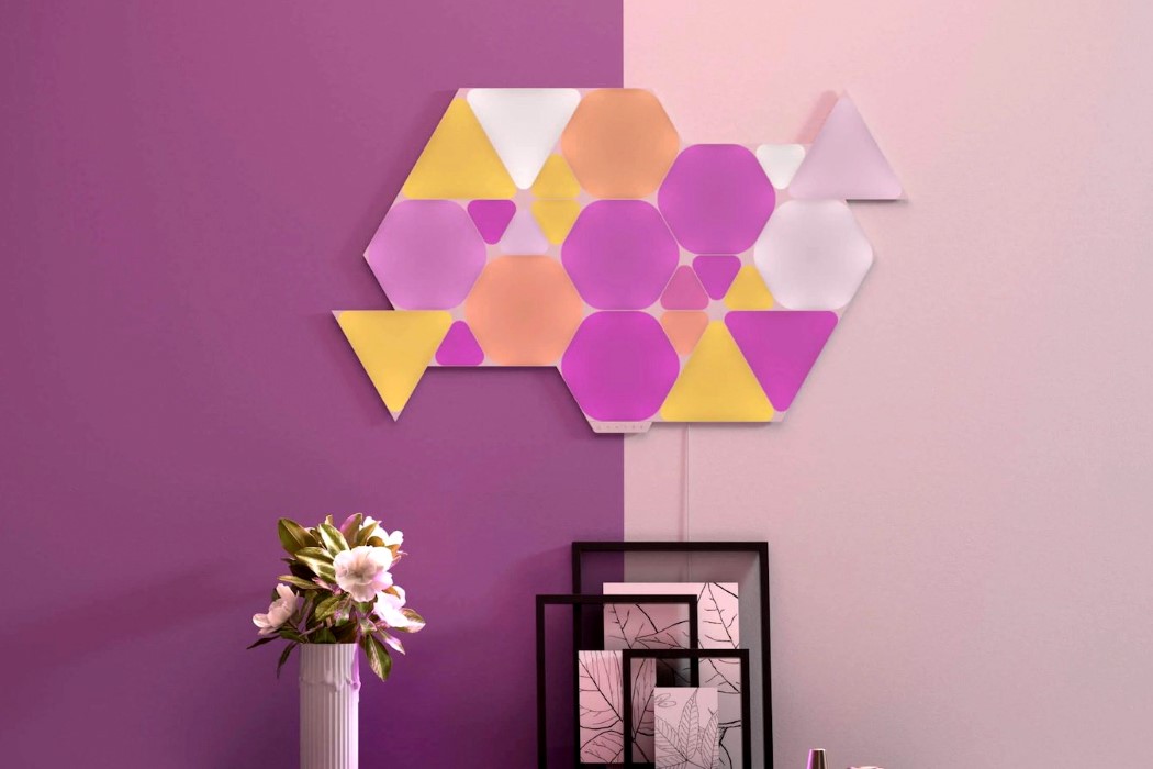
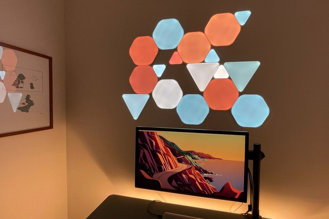
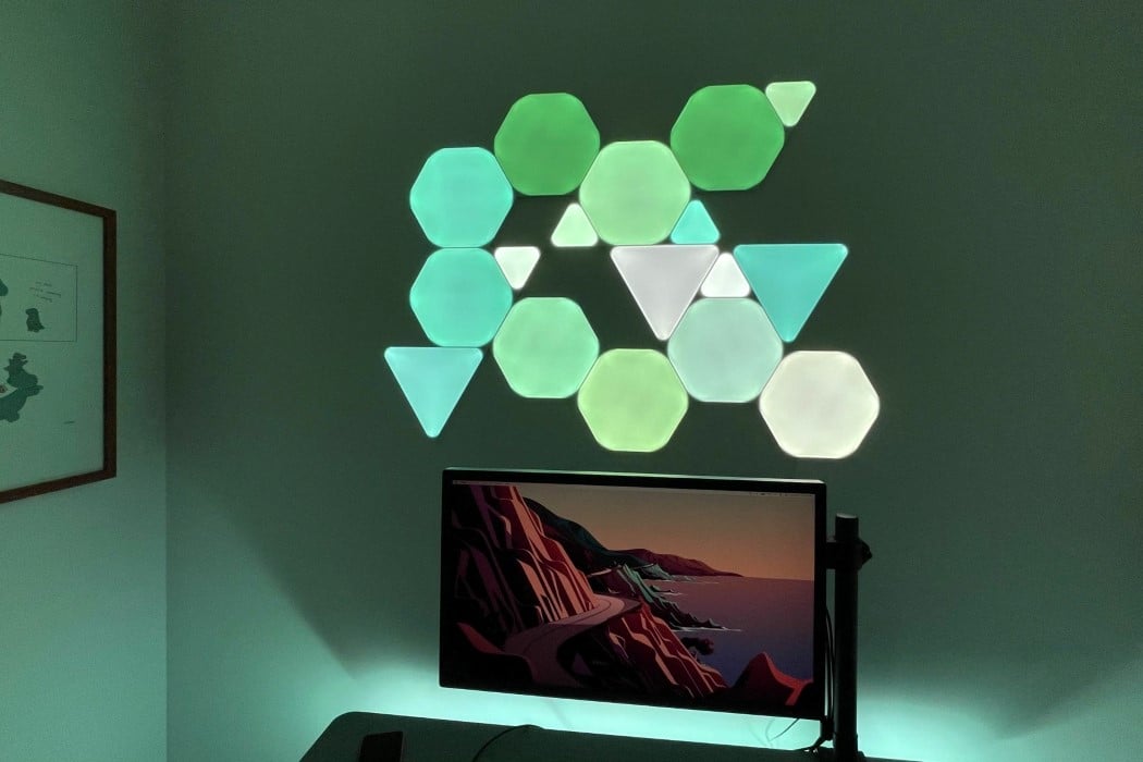
The year is 2021 and wallpaper has just been rendered obsolete. Meet the Nanoleaf Shapes, a series of slim, smart LED panels that come in geometric shapes and can be connected to one another to create a dynamic work of art on your walls. The modular panels can be used to create shapes, patterns, textures, even text, and they add a touch of color to spaces when off, but completely transform the ambiance of a room when switched on!

The Nanoleaf Shapes are infinitely customizable, like a jigsaw puzzle with no real end-goal. You can create the shape or graphic that you want, and the smart LED panels do the rest of the work. The panels can light up in as many as 16 million different colors, and can be customized within their smartphone app. The LayoutDetect™ feature allows the individual LED panels to identify the shape and layout of your design, and enables them to work in tandem with each other, behaving as a singular lighting unit. Once connected, you an use the panels as mere ambient lights, although they’re capable of much more. The smart LED panels work via touch, and can instantly be transformed into an interactive installation that changes hues when you touch any of the panels. Alternatively, they can connect to your smart speaker and change colors to the rhythm of the music you play, or better still, connect them to a television and activate the Match mode to make them light up with hues from your screen, turning your wall green when you watch a football match, blue when you watch an ocean documentary, or dynamically shift colors as you watch a movie! Your walls and room will never look dull again! And with 16 million colors to choose from, they definitely shouldn’t!
Designer: Nanoleaf Shapes

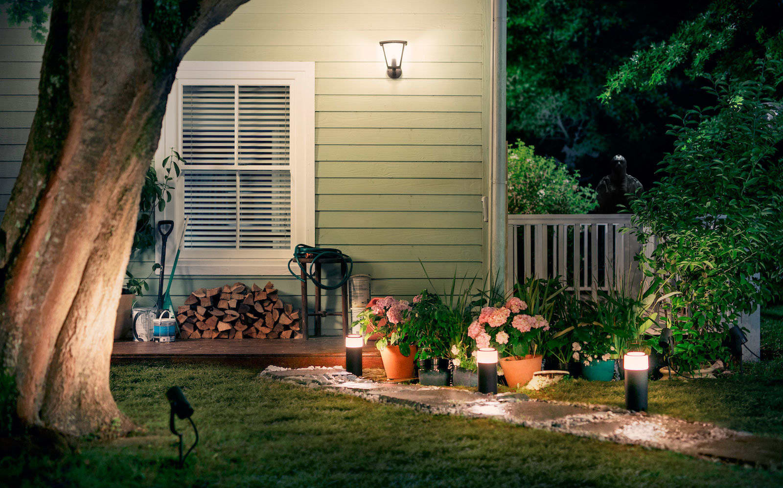
Philips seems to be working on more Hue outdoor lights

The Philips Hue smart lightbulb lineup already includes some outdoor lighting, but rumor has it that Philips will introduce more outdoor options, likely at CES. According to a leaked product catalog, found by Hueblog.de, Philips Hue is planning a pre...